Vue lecture

Linux tire un trait sur AppleTalk

C'est la fin d'une époque. Le noyau Linux, le cœur du système qui pilote le matériel et les communications, s'apprête à supprimer le support d'AppleTalk, ce vieux protocole réseau qu'Apple utilisait dans les années 80 et 90 pour faire dialoguer ses Mac entre eux avant que TCP/IP, le langage commun d'internet, ne s'impose partout.

À l'époque, c'était plutôt malin: vous branchiez deux machines et une imprimante, et elles se trouvaient toutes seules, sans la moindre configuration, du plug-and-play avant l'heure à un moment où monter un réseau relevait encore du casse-tête réservé aux initiés.

Aujourd'hui, plus grand monde ne parle ce dialecte. Il en subsiste quelques traces dans Bonjour, la techno maison qui détecte automatiquement imprimantes et appareils sur un réseau local, mais le protocole d'origine, lui, est mort depuis longtemps.

Près de 4000 lignes de code vont donc disparaître avec la version 7.2 du noyau, et Apple avait lui-même enterré AppleTalk dès 2009, du temps de Mac OS X Snow Leopard. Autant dire que le préavis a été large.

Le plus étonnant, c'est ce qui a déclenché le grand ménage. Ce n'est pas vraiment l'abandon par les utilisateurs, mais une vague de correctifs générés par intelligence artificielle qui a fini par saturer la liste de diffusion des développeurs réseau.

Depuis quelques mois, des outils basés sur des grands modèles de langage, balancent automatiquement des "corrections" de bugs sur du code que personne n'avait réclamé, pour un protocole que plus aucun matériel ne fait tourner.

Et chaque proposition, même inutile, mobilise un humain qui doit la lire, la tester et vérifier qu'elle ne casse rien ailleurs, du temps précieux soustrait au vrai travail de mainteneurs déjà débordés par les contributions légitimes.

C'est Jakub Kicinski, qui supervise toute la pile réseau du noyau, qui a fini par trancher: plutôt que de faire éplucher par ses équipes des patchs pondus en série par des machines pour réparer une techno morte, il a préféré retirer AppleTalk d'un seul geste.

Et il n'en est pas à son coup d'essai. Au cycle précédent, pour Linux 7.1, il avait déjà passé à la trappe ARCnet, l'ISDN, la radio amateur et toute une collection de vieux pilotes réseau oubliés, soit près de 138 000 lignes effacées d'un coup, dans ce qu'il a lui-même baptisé la "LLM-pocalypse".

Le code d'AppleTalk ne finit quand même pas tout à fait à la poubelle, puisqu'il rejoint AX.25 et la radio amateur dans un dépôt GitHub mis de côté, pour les rares curieux qui voudraient encore bidouiller avec.

Bref, c'est une première: des contributions automatisées qui font retirer du code encore fonctionnel. L'IA ne crée pas toujours. Parfois, elle déblaie.

Source : Phoronix

  •  

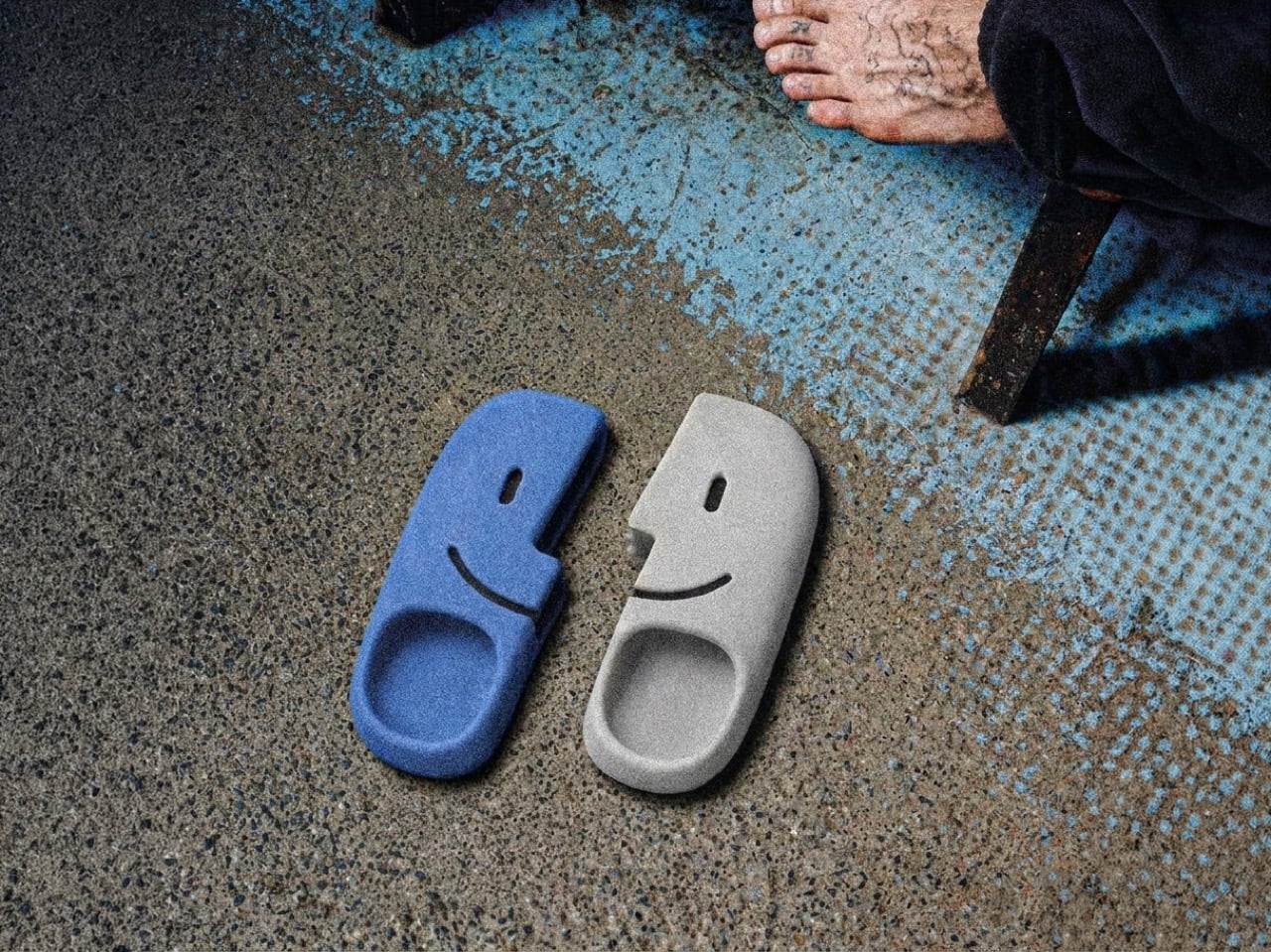
These MacOS-inspired flip flops are weird, playful, and sadly don’t come with Apple “Find My”

The mind of David Delahunty is something no LLM can capture. With the speed most marketing teams would be envious of, David churns out idea after idea on his Instagram, turning brands and visual icons into fun products that creatively challenge how you look at logos, shapes, and designs. We’ve covered a bunch before, including an MS Paint-inspired makeup kit, along with this Finder icon-inspired backpack. A recurring theme in Delahunty’s collection, the Finder icon ‘finds’ itself in a new avatar this time – interlocking flipflops.

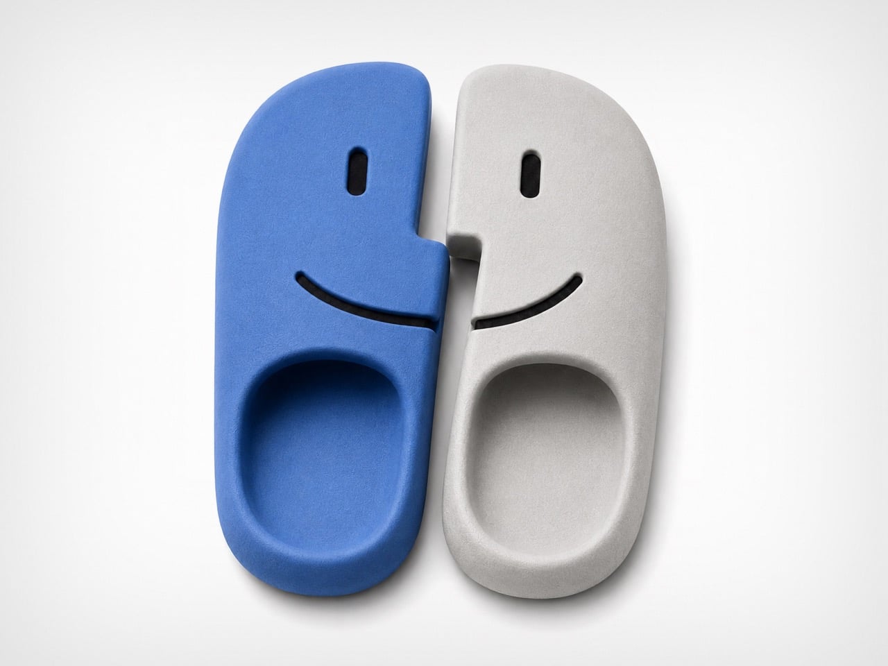
A lot of his designs lean on heavy visual puns, which make for great eye-candy on Instagram, but on rare occasions they make for great products too! Delahunty’s made MacOS Finder-inspired necklaces (which you can still buy, btw), and it’s about time that these flipflops enter the production hall of fame too. They’re fairly uncomplicated, molded as a single-piece polyurethane flip-flop, with left and right units being blue and white respectively. And no, a Latina mother throwing these at a misbehaving child wouldn’t classify as ‘Airdrop’.

Designer: David Delahunty

When Bill Hernandez and Steve Jobs designed the original Finder icon, I doubt they realized what meme material it possessed. The icon is innately memorable, but it’s also easily reproducible as different products – Delahunty’s flipflops are a great example. The icon is split into two, making it perfect to turn into flipflops, although that weird jagged central cut is a sort of unique challenge when it comes to wearability. However, with a fair amount of planning, it’s easy to account for the fact that the flipflops aren’t entirely bilaterally symmetrical. I guess that’s the beauty about them.

Each shoe is made the same way Crocs are – molded as a single piece with no interlocking, stitching, or gluing of extra parts. This makes each flipflop incredibly strong, fairly comfortable, and long-lasting. The flipflops in question come with cutouts that depict the Finder icon’s face too, which I think is a great idea because they serve as ventilation, so your footwear doesn’t smell like death because the polyurethane isn’t particularly breathable. The cutouts are great for airing the footwear out after a day at the beach too, although try not to get sand into them through the cuts – it’s no fun dealing with gritty shoes rubbing against your feet like literal sandpaper.

Delahunty’s mind works much faster than most people’s hands, so a lot of his ideas get mocked up using AI (it’s honestly one of the best examples of AI enhancing someone’s workflow). That being said, a lot of tweaking needs to be done before these shoes hit production. If you do want to wear your love for macOS on your feet, however, give Delahunty a follow on Instagram and be sure to drop him a message!

The post These MacOS-inspired flip flops are weird, playful, and sadly don’t come with Apple “Find My” first appeared on Yanko Design.

  •  

This iPhone Air 2 Concept Adds Two Cameras and Suddenly the Phone Makes More Sense

Every first-generation Apple product is essentially a beta test with a premium price tag, and the iPhone Air was no exception. The engineering was genuinely remarkable: 5.6mm thin, a large ProMotion display, A19 Pro performance, and battery life that surprised nearly everyone who reviewed it. What wasn’t remarkable were the two omissions that showed up in every single hands-on: one camera and one speaker, on a phone that cost $999. Those two complaints alone handed buyers a perfectly logical reason to spend the same money on a Pro instead. The Air needed a second generation the moment the first one shipped.

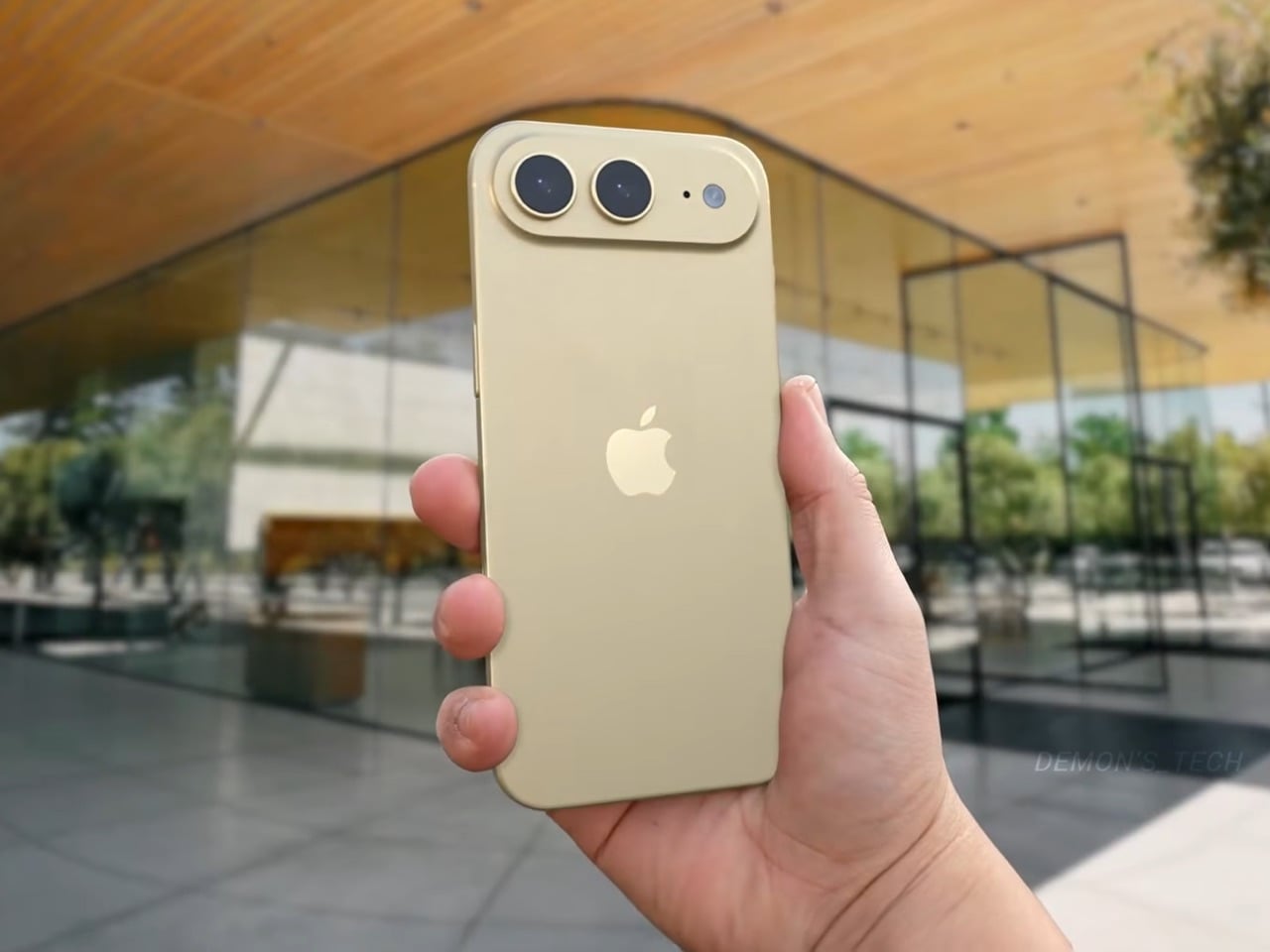
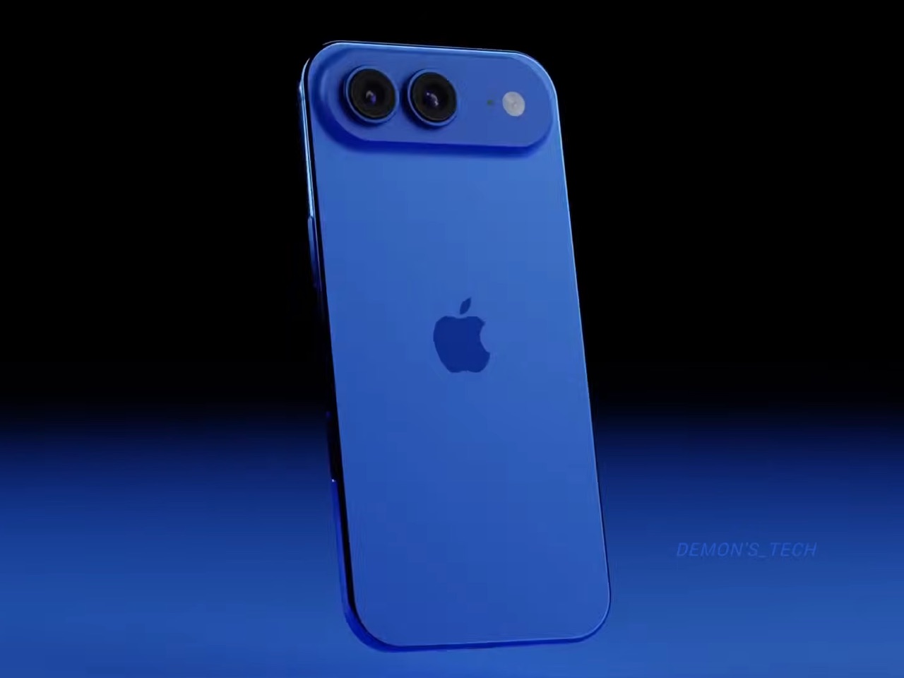
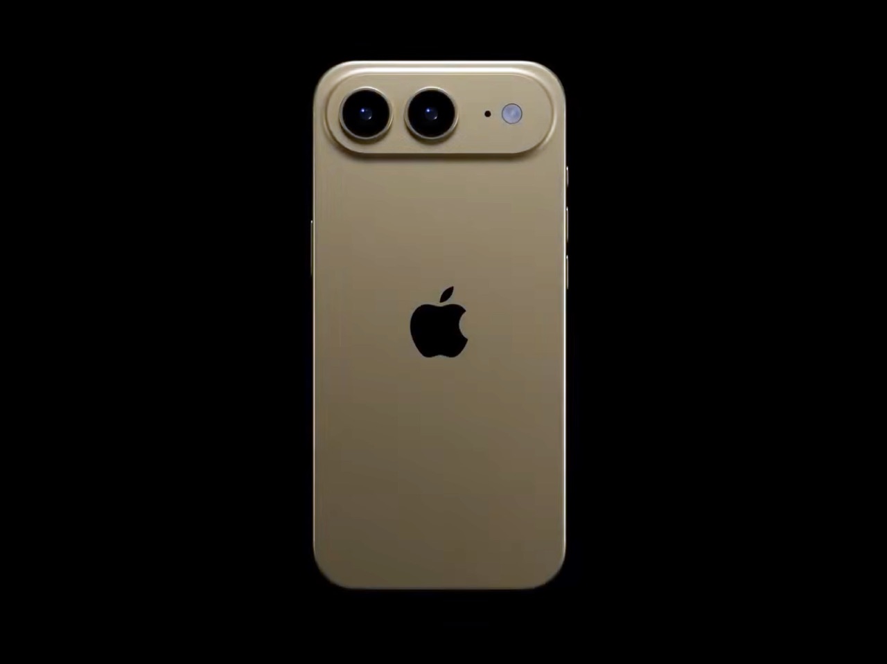
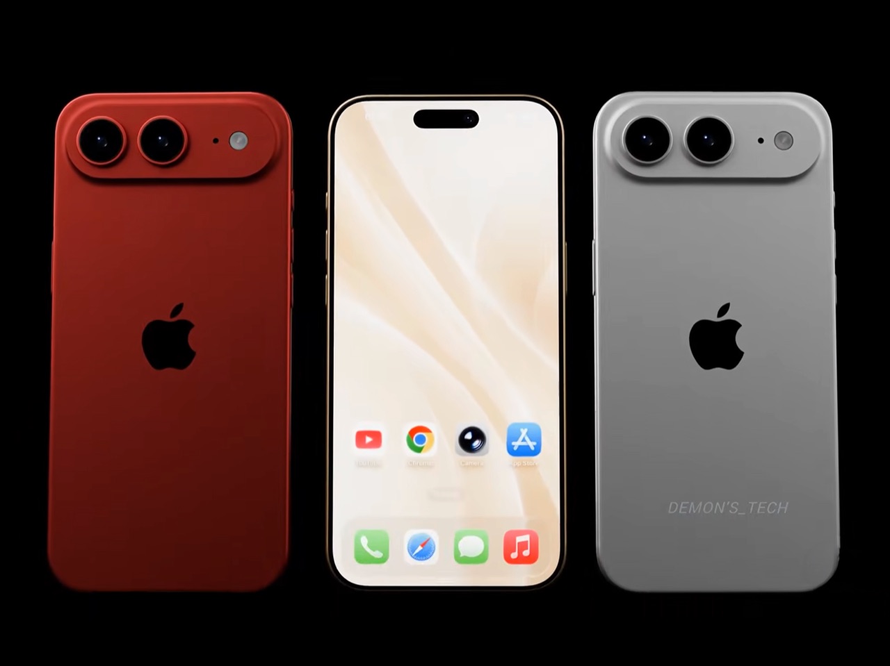
Demon’s Tech has imagined exactly what that second generation could look like, and the concept renders suggest Apple already has a clear path to making the Air the phone it should have been from the start. The dual-camera bar is wide and confident across the top of the phone, housing two lenses with room to spare. The rest of the body is pure restraint, a flat back, centered Apple logo, and a color range vivid enough to give the phone a personality that its specs can now actually back up. If the rumored stereo speaker and efficiency-focused N2 chip join that camera upgrade, the Air 2 goes from interesting to genuinely compelling.

Designer: Demon’s Tech

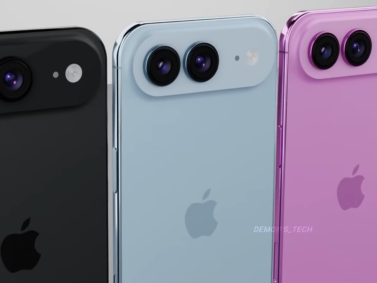
Two 48-megapixel sensors reportedly sit inside the pill-shaped housing, one primary and one ultrawide, which aligns with leaks from Chinese tipster Digital Chat Station suggesting Apple is going for a main-plus-ultrawide configuration rather than a telephoto. That choice makes sense for the Air’s positioning. Telephoto glass demands physical depth that a sub-6mm chassis simply cannot accommodate, and ultrawide coverage is what most non-Pro users actually miss day-to-day. The original Air’s single-lens bar always looked slightly incomplete, like a sentence that trailed off mid-thought, and Demon’s Tech addresses that by stretching the new pill-shaped housing almost the full width of the phone’s upper third, sitting flush and purposeful rather than apologetic. It is a small change on paper that transforms the entire visual logic of the back panel.

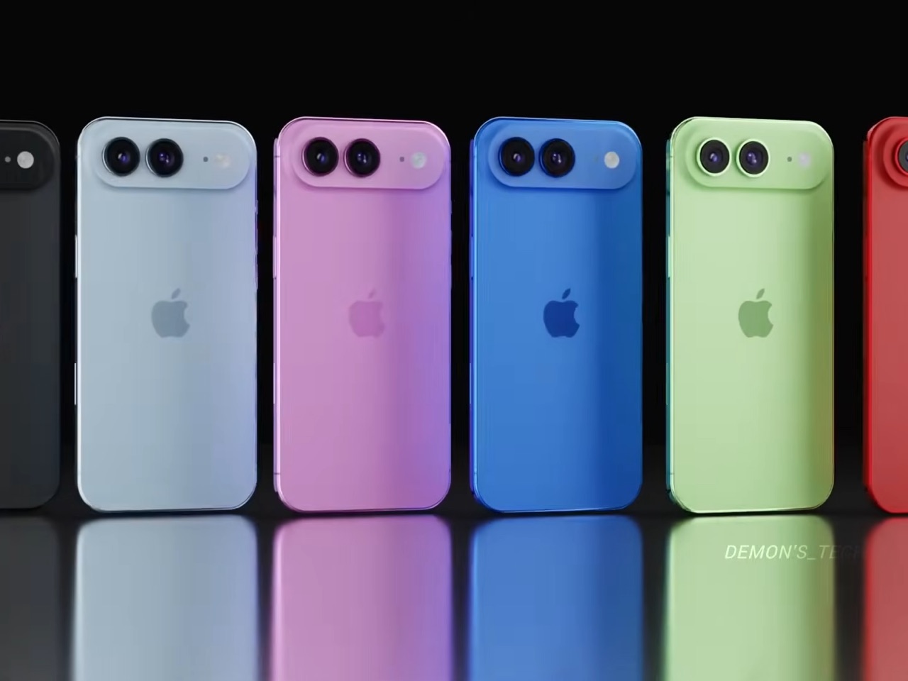
Apple shipped the original Air in four relatively restrained options: cloud white, sky blue, light gold, and matte space black. Demon’s Tech blows that palette wide open, running through violet, cobalt, mint green, and vivid red alongside the sandy gold seen in the hero shots, which is closer to what the iPhone 5C attempted in 2013, a phone that led with color as a statement rather than a courtesy. The Air’s lifestyle positioning actually supports this approach in a way the 5C’s budget framing never quite did. A phone you buy partly because it is extraordinarily thin is a phone you buy to be noticed, and being noticed in muted gold is considerably less fun than being noticed in electric blue. The renders make a quiet argument that Apple’s colorway restraint on the original Air was a missed opportunity, not a deliberate choice.

Twelve gigabytes of RAM paired with the A20 Pro keeps the performance story simple: this is a phone that matches the Pro lineup on silicon even if it concedes on optics. The sleeper upgrade is Apple’s rumored N2 efficiency chip, because getting better battery life out of a body that physically has less room for cells requires exactly this kind of architectural work, the same discipline that let the original Air post competitive endurance numbers despite its dimensions. Add stereo sound from a bottom speaker alongside the existing top one, and the two most common complaints about the first Air evaporate inside a single product cycle. That is a more focused corrective than Apple managed with either the Mini or the Plus, both of which spent multiple generations struggling to justify their existence. If Apple lands all of this at the same $999 price point, the value math finally starts working in the Air’s favor.

Apple has confirmed the Air line continues, with the second generation reportedly targeting a spring 2027 release window, landing after the iPhone 18 Pro, Pro Max, and foldable models ship in fall 2026. That later window gives Apple’s engineering teams more time to solve the thermal and battery challenges that come with building capable hardware into an impossibly thin frame, and it gives the Air its own launch moment rather than forcing it to compete for attention against a foldable iPhone. Demon’s Tech’s concept is the best visual argument yet for what that launch moment could look like: a phone that carries its thinness as a given rather than an excuse, and finally has the camera system and audio to back up everything the form factor promises.

The post This iPhone Air 2 Concept Adds Two Cameras and Suddenly the Phone Makes More Sense first appeared on Yanko Design.

  •  
❌