Vue lecture

5 Over-Ear Headphones That Look as Good When They’re Around Your Neck as When They’re on Your Head

The headphone has become something it was never originally designed to be: a silhouette. Worn around the neck on a subway platform or draped over a chair at a coffee shop, a great pair of over-ears communicates taste in much the same way a watch or a well-chosen bag does. The best ones are now designed with that resting moment in mind, not as an afterthought, but as a deliberate part of the brief.

What separates a good headphone from a great one is increasingly less about frequency response and more about how the object behaves when it’s not in use. The five pairs on this list earn their place on both counts. Worn on the head, they deliver. Worn around the neck, they still look like they were built by people who thought carefully about that exact resting moment, collarbone and all.

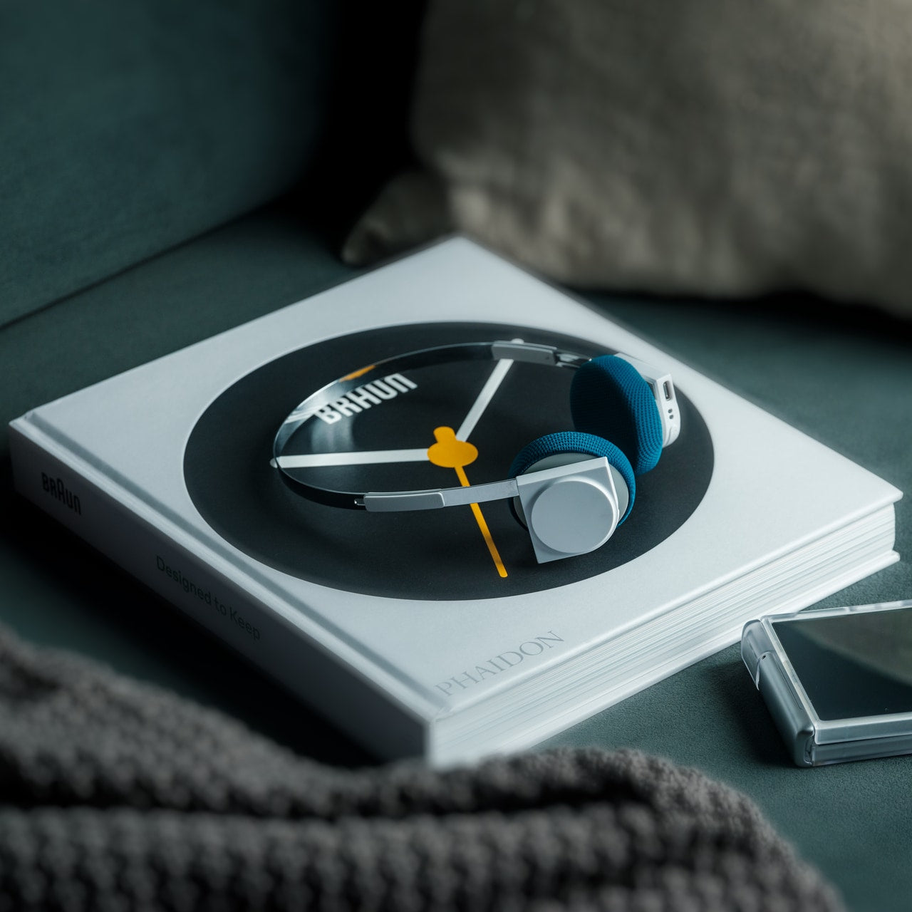
1. StillFrame Headphones
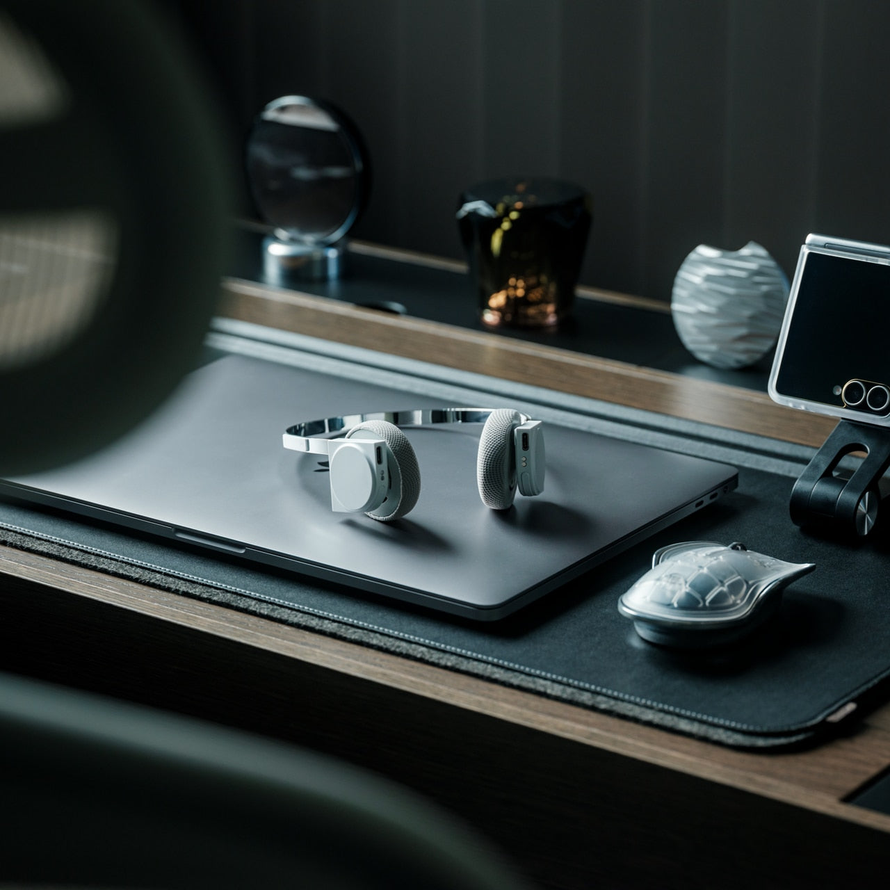
Most headphones achieve lightness by sacrificing material quality somewhere along the way. StillFrame achieves it by rethinking the entire structure from scratch. At 103 grams, it sits on your head with the kind of effortless presence most pairs spend an entire product page trying to claim. The ultra-minimal design, clean lines, no exposed hardware, and no decorative flourish anywhere on the frame is the kind of restraint that reads as confidence rather than budget constraint.

Around the neck, StillFrame does what minimal design always promises and rarely delivers: it disappears into your outfit rather than competing with it. The 24-hour battery means you’ll reach for these in the early morning and still have charge well into the evening without thinking about a cable. For anyone who wants headphones that age well, that look as right in three years as they do today, this is where the search ends.

Click Here to Buy Now: $245.00

What We Like

  • At 103 grams, this is one of the lightest over-ear headphones available without any sacrifice in build integrity, and the weightlessness is felt the moment you put them on
  • A 24-hour battery life means this pair genuinely runs from morning to night on a single charge, removing the low-battery anxiety that comes with most wireless headphones on the market

What We Dislike

  • Minimal colorway options are a direct consequence of the same design restraint that makes the StillFrame look this considered, and that trade-off is real and visible
  • With so little on the frame to grab visual attention, this pair asks you to commit fully to its design language, which rewards patience but does not suit every aesthetic

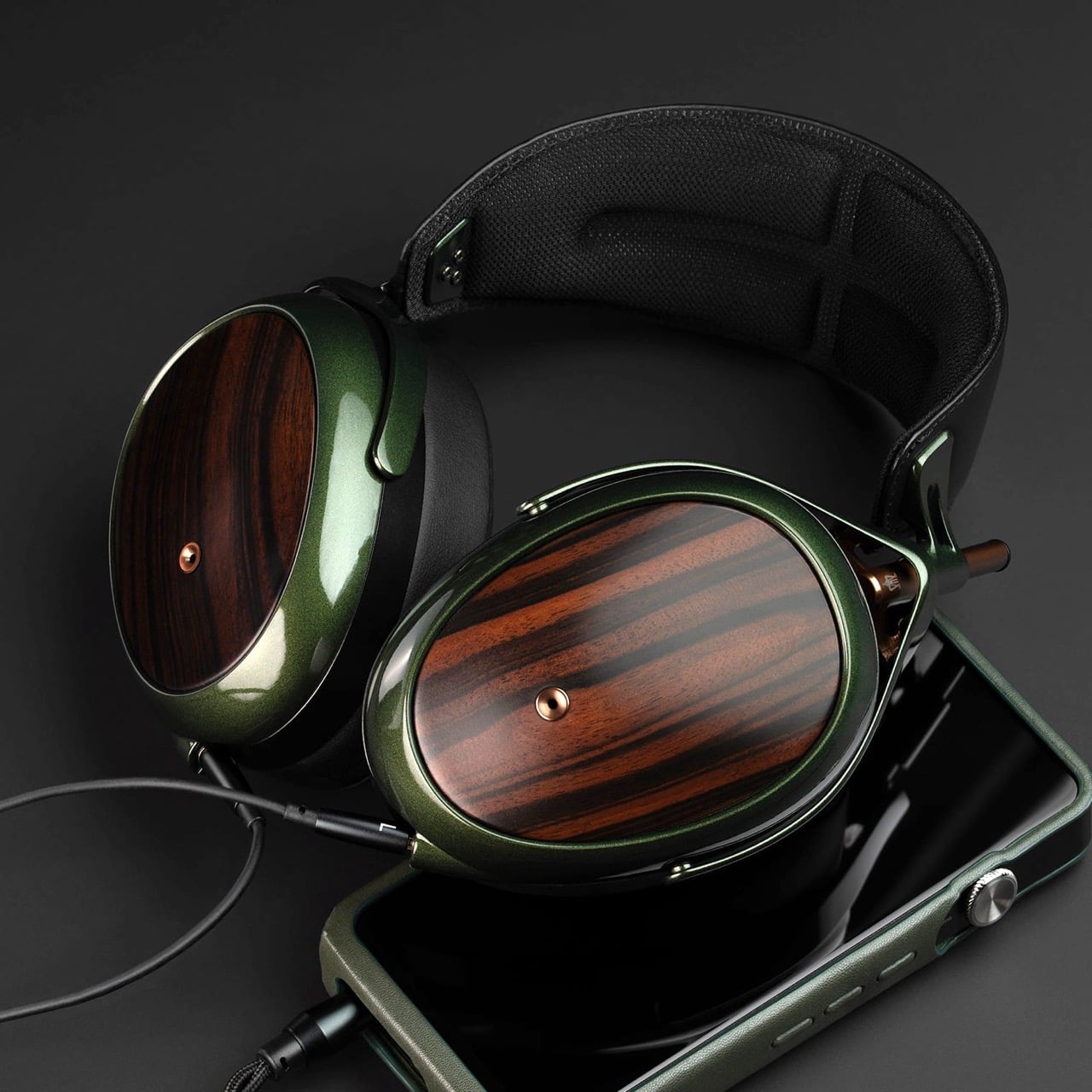
2. Meze Audio Strada
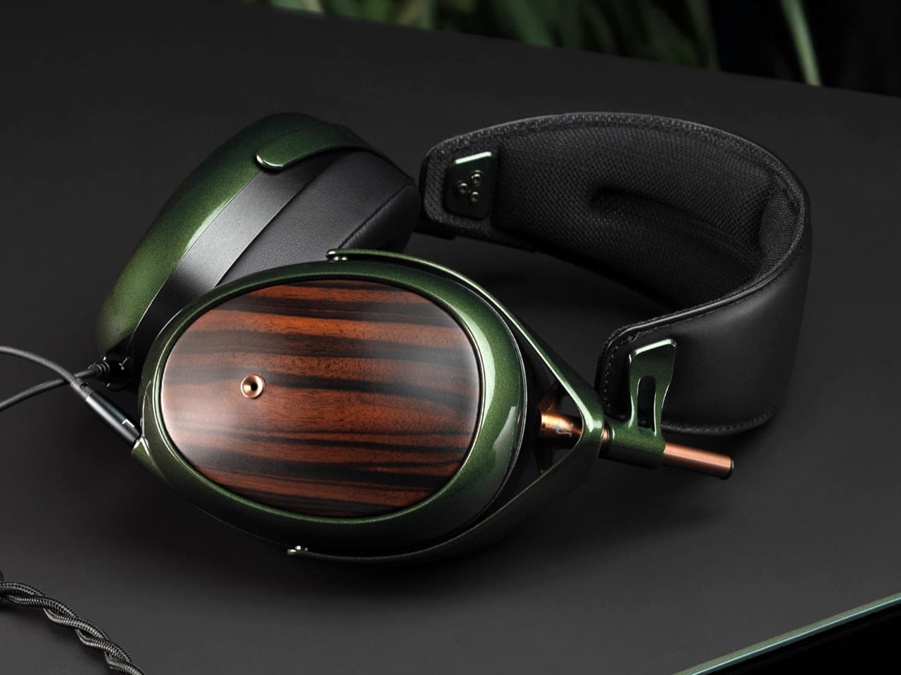
Romanian audio atelier Meze has spent two decades treating headphones as craft objects, and the Strada makes that philosophy fully explicit. Hand-carved walnut and ebony ear cups, each unique in grain and tone, sit alongside a magnetic ear pad system that snaps on and off cleanly, making them the first pair that genuinely anticipates its own aging. The leather headband drapes naturally against the collarbone. At $799, you’re investing in the idea that daily objects deserve this level of material care.

Worn around the neck, the Strada does something genuinely rare: it makes you look considered rather than plugged in. Those hand-carved wood cups catch light in a way that aluminum never quite manages, and the closed-back design delivers warmth and isolation without the clinical precision of most audiophile gear.

What We Like

  • The hand-carved wood ear cups make every unit genuinely one-of-a-kind, an unusual distinction in a product category that typically prizes consistency and uniformity above everything else
  • The magnetic ear pad system solves a real longevity problem that most headphone manufacturers still choose to ignore, making the Strada feel genuinely built for the long term from the start

What We Dislike

  • The warm, closed-back tuning leans toward intimacy over accuracy, which won’t satisfy listeners who prefer a flat, analytical sound profile for critical or reference listening sessions
  • No active noise cancellation at $799 is a deliberate aesthetic choice, but it will not suit everyone who regularly listens in open, noisy, or busy urban environments

3. Bang & Olufsen Beoplay H95
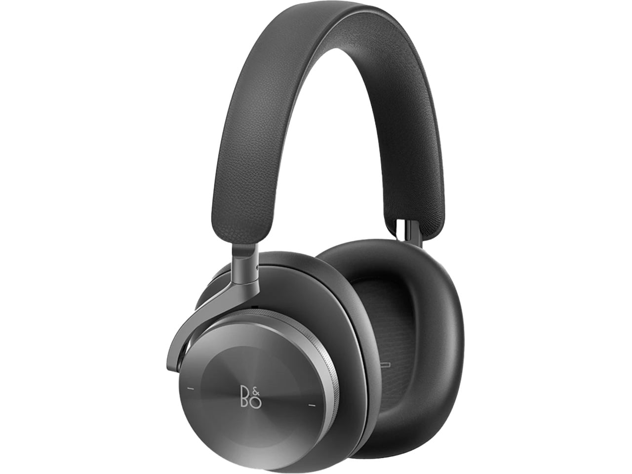
 Bang & Olufsen has been designing objects that make a room better simply by existing in it since 1925. The Beoplay H95 carries that logic to your ears. Brushed aluminum arcs support lambskin ear cushions with the quiet authority of something that was never trying to impress anyone. Custom 40mm titanium drivers deliver an expansive, unhurried soundstage, and 38 hours of battery life with ANC active means you rarely need to think about charging. At $1,250, it reads as inevitable rather than expensive.

Around the neck, the H95 makes its strongest case. The slim profile rests cleanly against the collarbone, the aluminum catches light without glare, and the lambskin ages into something better than what you started with. Vogue Scandinavia named it the headphone that pairs best with the softest cashmere roll-neck and a cocooning wool coat, which is not exactly a mid-range endorsement. The tactile control dial and hard carrying case complete the picture of a brand that hasn’t needed to shout for a century.

What We Like

  • Lambskin ear cushions and brushed aluminum give the H95 a material quality that makes every other pair on this list look like it is working a little harder to impress you
  • 38-hour ANC battery life is class-leading and genuinely difficult to match at any price point, making this the pair most likely to outlast a long-haul journey without any hesitation

What We Dislike

  • At $1,250, this is a significant investment for a product category where $400 already delivers very strong audio performance from multiple well-regarded and respected manufacturers
  • The control dial is elegant but carries a subtle learning curve that takes several days of regular use to feel completely intuitive and second-nature in the hand

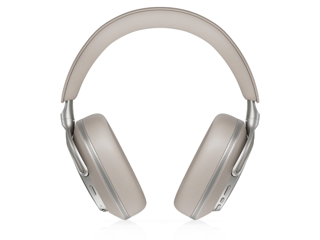
4. Bowers & Wilkins Px8 S2
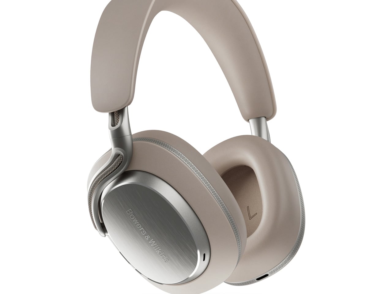
The Px8 S2 looks like it was designed by someone who spent too much time around luxury automobiles and not enough time worrying about what people thought. Diamond-quilted Nappa leather ear cups sit inside angular aluminum driver housings that don’t apologize for taking up space. Bowers & Wilkins built their reputation on speaker cabinets in British living rooms, and that obsession with material quality is fully present in the Px8 S2. At $799, it’s the most visually assertive pair on this entire list.

Worn on the head, the 40mm Carbon Cone drivers deliver a focused sound that rewards careful listening. Worn around the neck, the quilted leather and aluminum geometry create a silhouette that reads closer to jewelry than consumer electronics.

What We Like

  • The diamond-quilted Nappa leather ear cups are a genuinely distinctive design move that no other headphone brand at this price point is executing with this level of craft and conviction
  • 40mm Carbon Cone drivers bring the kind of focused sound detail that makes streaming audio feel like it might be holding something back, consistently rewarding attentive listeners on every session

What We Dislike

  • The angular form does not fold into a compact carry position, making the included case noticeably bulkier than most direct competitors when packed into a bag for daily commuting use
  • The firm clamping force is necessary for the acoustic seal, but it makes itself felt during extended listening sessions, which matters for anyone who wears headphones for several consecutive hours at a time

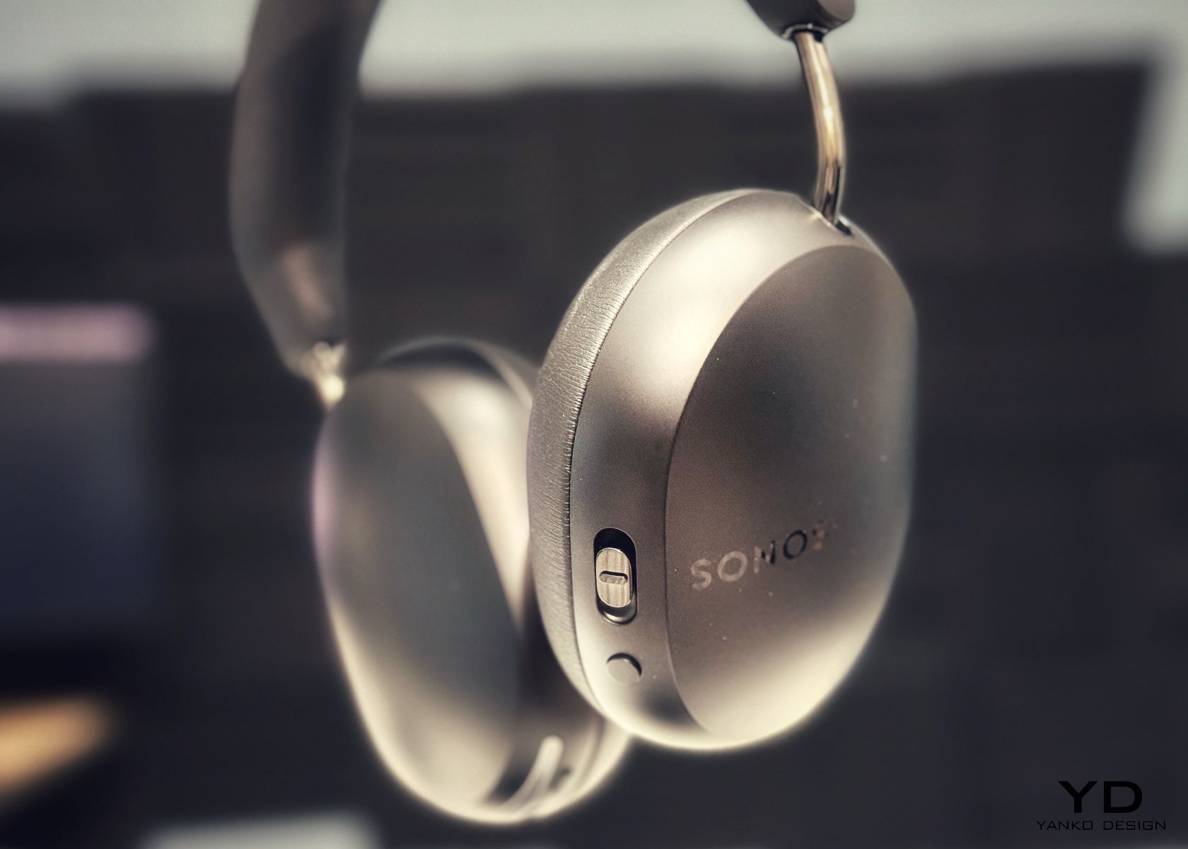
5. Sonos Ace
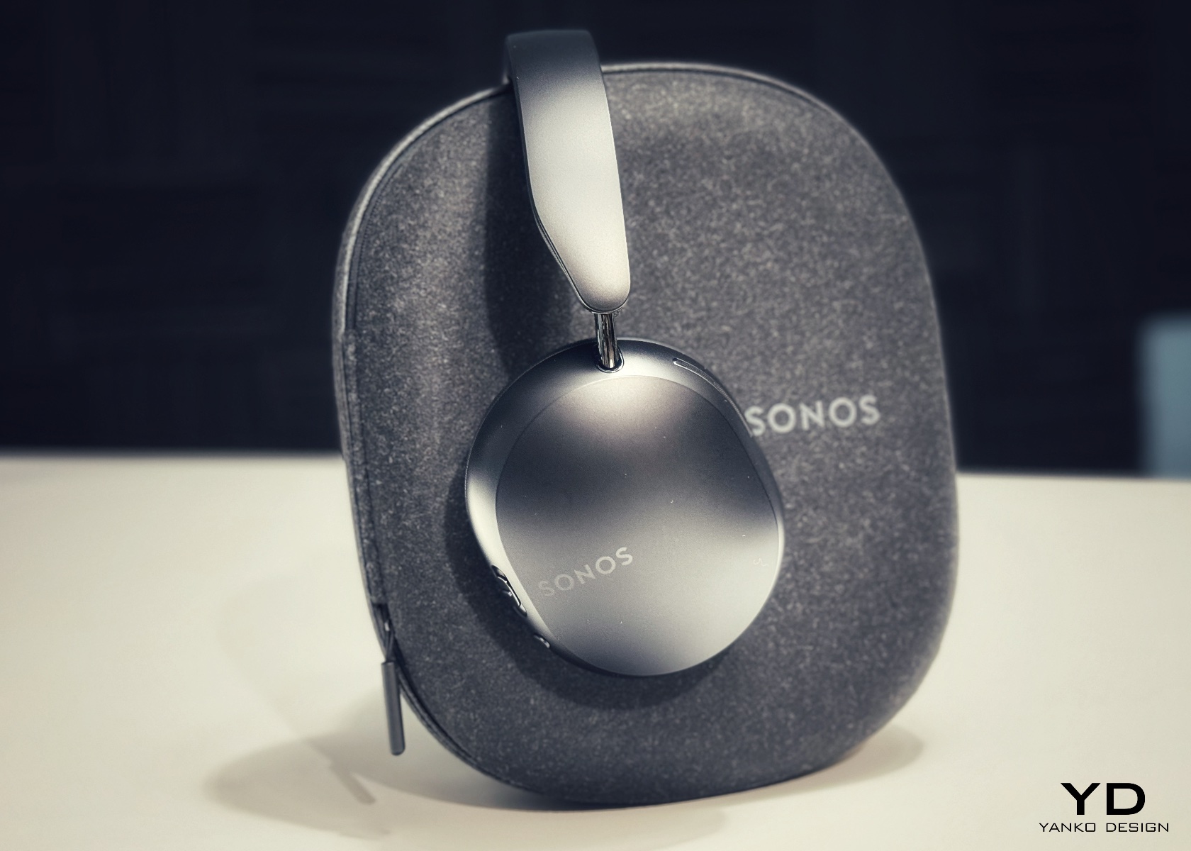
Sonos spent two decades being the most thoughtfully designed speaker company in the world before ever touching headphones. The Ace is what happens when a brand famous for restraint and material quality finally commits to an entirely new product category. Stainless steel arms, memory foam ear cushions, and a clean form in Midnight or White carry the same quiet authority as Sonos’s best home equipment. At $449, it sits below the B&O and B&W while fully matching them on design character and material coherence.

What makes the Ace genuinely stand out is what you don’t notice: no visible seams on the headband, no mismatched materials, no hardware that apologizes for itself. Active noise cancellation and a 30-hour battery complete a pair that wears as well around a neck as it sounds through the drivers, making it the most versatile pick on this list.

What We Like

  • The material cohesion across every surface, every finish, and every seam speaks one consistent and considered design language, which is an unusually disciplined achievement at the $449 price point
  • Active noise cancellation combined with a 30-hour battery puts the Ace ahead of most competitors on the two specifications that matter most for daily and travel listening

What We Dislike

  • The body is predominantly high-quality plastic rather than metal, which is a material trade-off that some buyers will feel at this price point relative to the B&O and B&W alternatives
  • Head-tracking spatial audio is most effective when paired with a Sonos home speaker system, limiting the feature’s full appeal for listeners who don’t already own Sonos hardware at home

The Best Headphones Are the Ones You Never Want to Take Off

What all five of these pairs share is a seriousness of intent that goes well beyond frequency response. They were built by companies that think about how objects live in the world, not just during a listening session, but on a train platform, at a desk, hanging around a neck. That’s a harder problem to solve than noise cancellation, and the brands that crack it tend to stay relevant far longer than those that don’t.

The range here runs from $449 to $1,250, but the price gaps matter less than they appear at first. What you’re really choosing between is design language: Romanian craft warmth, Scandinavian restraint, British precision, speaker-first material thinking, or clean minimalism that genuinely disappears. Any of these pairs earns the right to hang around your neck. The question is which one earns it in a way that feels made for how you actually move through the world/

The post 5 Over-Ear Headphones That Look as Good When They’re Around Your Neck as When They’re on Your Head first appeared on Yanko Design.
  •  

Apple Turns 50, and Its Most Ambitious Phone Hasn’t Even Launched Yet — 5 iPhone Fold Concepts

On April 1st, 2026, Apple turns 50. For a company that has spent half a century rewriting the rules of consumer technology, the milestone deserves something genuinely transformative. The Macintosh redefined personal computing. The iPod gave an entire generation a new relationship with music. The original iPhone, unveiled in 2007, combined a phone, a music player, and the internet into a single glass rectangle and made every competitor look outdated overnight. The iPhone Fold is real, and it’s coming.

Leaks from early 2026 paint a detailed picture: a book-style foldable powered by the A20 Pro chip on a 2nm process, backed by a 5,500mAh battery, with a 7.8-inch creaseless OLED inner display and a 5.5-inch outer screen. Pricing is expected to start around $2,400, and while a September announcement seems likely, most analysts believe shipments may not begin until December. Designers, modders, and concept artists have spent years filling the void with their own visions of a folding iPhone, each carrying a distinct theory about what Apple should prioritize. These five concepts map the full range of that imagination and capture exactly how much is riding on the real thing.

1. iPhone iFold by Michal Dufka — The Clamshell That Makes Sense

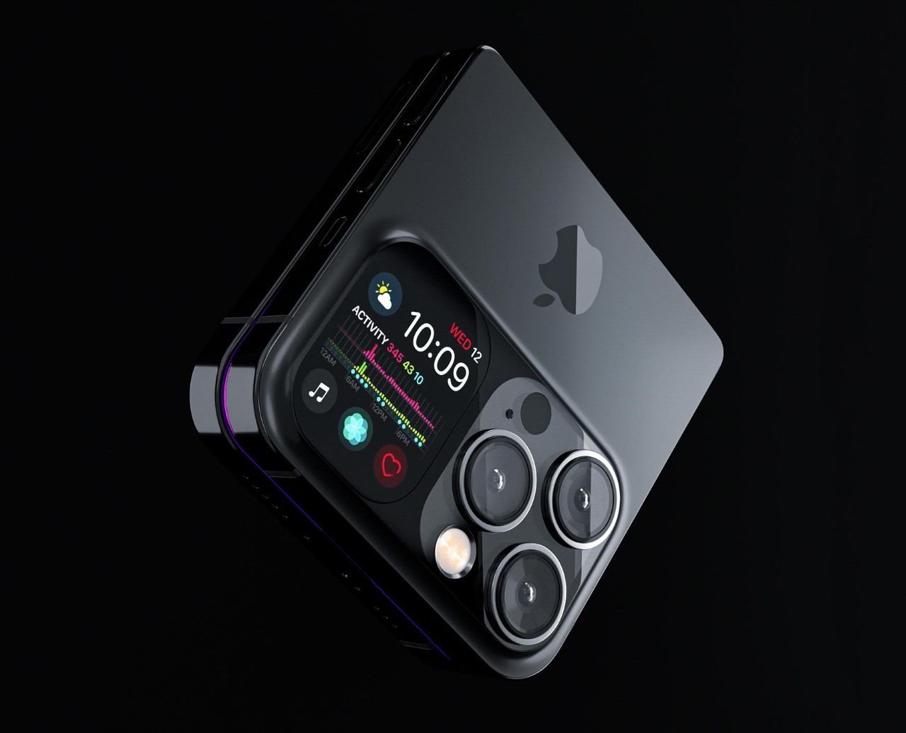
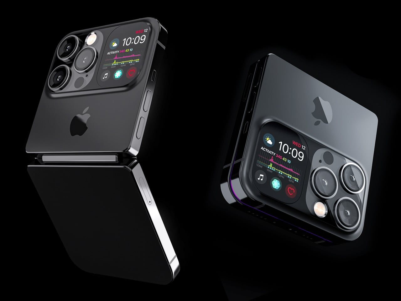
Designer Michal Dufka’s iPhone iFold is built on restraint. Rather than reinventing the iPhone’s entire identity, it applies a clamshell fold to the form factor people already love, drawing direct inspiration from the MotoRAZR and Samsung Galaxy Z Flip. The phone closes into a compact, pocketable square and opens into a full iPhone experience with a generously large display. For anyone who has quietly missed a phone that actually fits in a jeans pocket, this concept speaks to that feeling.

What sets the iFold apart is the secondary display placed beside the camera bump. When the phone is closed, that smaller screen surfaces notifications, time, and essential stats without requiring you to open the device at all. It functions almost like an Apple Watch built into the back of the phone. With Apple’s always-on display technology mature enough for this kind of ambient use, the dual-display setup feels less like speculation and more like a logical next step.

What We Like

  • The secondary display mirrors Apple Watch notification behavior, making glanceable information genuinely useful without ever opening the phone
  • The clamshell format makes the iPhone pocket-friendly for the first time in years without sacrificing screen size when it matters

What We Dislike

  • The clamshell form limits overall screen real estate compared to the expanded tablet surface that a book-style foldable provides
  • Hinge durability over sustained daily use is entirely unexplored here, and it remains the most critical engineering question for any clamshell design

2. iPhone Fold Ultra by 4RMD — When the Specs Match the Ambition

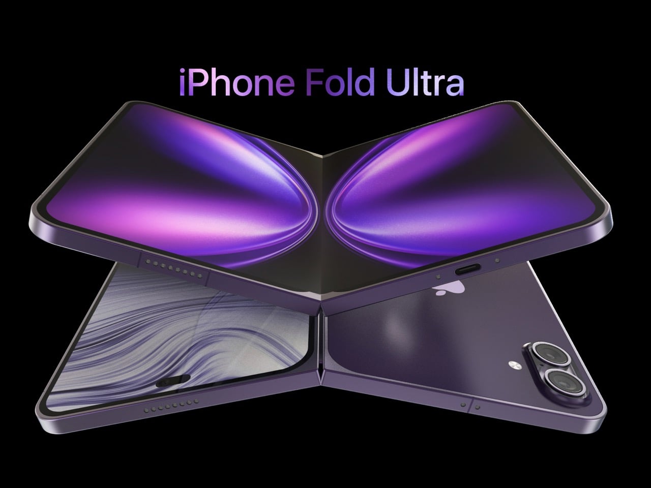
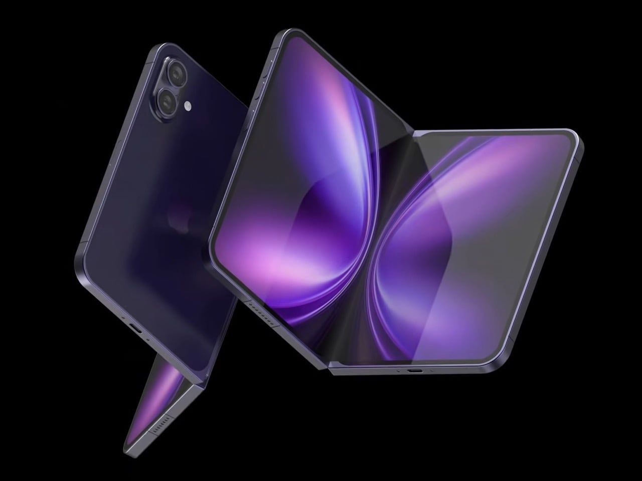
Design studio 4RMD’s iPhone Fold Ultra is grounded in credibility. Built directly from reported leaks rather than pure creative license, the concept presents a book-style foldable with dual 48MP rear cameras, a 24MP ultra-wide front camera, and the A20 Pro chip running on a 2nm process. Three color options appear across the renders: White, Black, and Deep Purple. At an estimated $2,299, this concept sits at the very top of Apple’s lineup with total conviction.

That Deep Purple colorway deserves its own moment. It is a deliberate callback to the iPhone 14 Pro’s most celebrated finish, and it lands differently on a book-style foldable. Something about that color on a device this ambitious reads as genuinely luxurious, the kind of finish that reframes a $2,299 price tag from a shock into a statement. 4RMD clearly understands Apple’s visual grammar, and this concept shows what happens when research and aesthetics share the same design space.

What We Like

  • Specs pulled from verified leaks give this concept real credibility, making it feel like a preview of what is actually coming rather than pure speculation
  • The Deep Purple colorway is a smart, crowd-pleasing callback to one of Apple’s most recognized and beloved finishes

What We Dislike

  • The “Ultra” label sets an expectation that demands exceptional build quality, and no concept can fully address whether the real device will deliver on that promise
  • Crease visibility across the inner display remains unaddressed, which continues to be the most persistent criticism of every book-style foldable on the market

3. iPhone Fold by Svyatoslav Alexandrov — The One That Replaces Two Devices

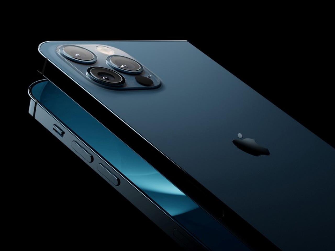
Svyatoslav Alexandrov’s iPhone Fold concept, created for the YouTube channel ConceptsiPhone, thinks in bigger terms than anything else on this list. Starting as a standard smartphone with a 6.3-inch outer display, it unfolds into a squarish 8-inch tablet that sits clearly in iPad Mini territory. This is not a phone with a bonus screen bolted on. It is a device designed to make carrying both an iPhone and an iPad feel genuinely redundant.

Alexandrov replaces Face ID with a full-display Touch ID fingerprint sensor, keeping the front notch minimal and clean. The rear carries the iPhone 12 Pro’s complete camera array: wide, ultra-wide, telephoto lenses, a LiDAR scanner, and flash. MagSafe compatibility and 5G readiness are already confirmed in the concept, adding meaningful weight to its productivity pitch. Whether the device supports the Apple Pencil is left open, but given an 8-inch inner display, its absence would feel like a missed opportunity.

What We Like

  • The full-display Touch ID is a clean and creative solution that keeps the front uncluttered while solving Face ID’s known complications on foldable form factors
  • The iPad Mini-sized inner screen makes a practical, real-world case for consolidating two devices into one without any meaningful compromise

What We Dislike

  • Removing Face ID eliminates one of the iPhone’s most seamless and trusted authentication features, which most users rely on dozens of times every day
  • Leaving Apple Pencil support unconfirmed weakens what should naturally be this concept’s strongest argument for productivity

4. iPhone Fold by Mechanical Pixel — The Foldable That Doesn’t Actually Fold

Mechanical Pixel’s concept takes the most unconventional approach on this list, and the reasoning is worth understanding. Rather than bending the iPhone itself, the design keeps the main body completely rigid and attaches a separate foldable display to the rear panel instead. The core phone experience remains exactly as people know it, maintaining the familiar dimensions and feel that iPhone users already rely on. That additional screen only enters the picture when a larger surface is specifically needed.

That rear foldable panel sits raised on a platform above the phone’s back, unfolding outward into a larger, squarish tablet surface when required. The layered profile is clearly visible from the side, giving the device a deliberately experimental and modular quality. The camera module remains in its standard position, completely unaffected by the additional display layer. The logic is unconventional, but the core argument of preserving the primary iPhone experience from any foldable compromise is genuinely hard to dismiss.

What We Like

  • Keeping the main body rigid entirely sidesteps the crease and long-term hinge durability problems that define every conventional foldable on the market today
  • The modular approach means the everyday iPhone experience is never degraded or compromised by the mechanics of the foldable element

What We Dislike

  • The raised rear platform creates an unrefined, layered side profile that sits well outside anything Apple’s design language has ever produced or endorsed
  • The prototype-like aesthetic makes it very difficult to imagine this direction surviving Apple’s notoriously demanding and detail-oriented product design process

5. iPhone V — The One Someone Actually Built

Every concept on this list exists as a digital render. The iPhone V is different. A YouTuber modder physically dismantled an iPhone X, extracted its internal components, and rebuilt the entire device inside a Motorola Razr chassis. The result is a working, folding iPhone that runs real iOS, carries a Retina-quality display, and folds in half like a classic flip phone. As a proof of concept, it is extraordinary. As a finished product, every question comes flooding in.

What makes the iPhone V genuinely compelling is not fit, finish, or polish, because it has none in any conventional sense. It is the straightforward fact that someone cared enough to prove the idea could actually work using parts that already exist. The folding mechanism and device thickness still need serious refinement. A working clamshell iPhone running authentic iOS is, in the end, a more persuasive argument for this form factor than any polished render has managed to be.

What We Like

  • The iPhone V is the only entry on this list that is fully functional, running real iOS inside an actual working clamshell device
  • Its physical existence proves the clamshell iPhone concept is viable using genuine Apple hardware, well beyond anything a render can demonstrate

What We Dislike

  • The repurposed Motorola Razr chassis produces a build that falls far short of consumer-grade fit, finish, and structural refinement
  • Hinge mechanism quality and overall device thickness remain significant engineering challenges that the mod cannot resolve, and they are exactly what Apple needs to solve

The Concepts That Made the Wait Worthwhile

Fifty years in, Apple is still the company that makes you wait. The iPhone Fold concepts here are not just exercises in creative imagination — they are a record of what designers and makers have been asking for, year after year. Some nailed the form factor. Others got the specs exactly right. A few did both. Together, they have shaped the entire conversation around a device that already feels utterly inevitable.

When the real iPhone Fold arrives, it will be measured against each of these visions. That is the power of concept design — it sets the bar before the product ships. Apple turning 50 while holding back its most ambitious device is pure theater. The design community has been writing this script for years. The only question is whether the real thing can live up to what the imagination has already built.

The post Apple Turns 50, and Its Most Ambitious Phone Hasn’t Even Launched Yet — 5 iPhone Fold Concepts first appeared on Yanko Design.
  •  

The 5 Best Furniture Designs of March 2026

March brought the kind of furniture that doesn’t need to announce itself. A student chair that shifts between sitting and lounging through physics alone. A coffee table whose legs look like they’re caught mid-step toward the door. A stool that opens from flat with a single press and no tools required. An office system built to reconfigure whenever the day asks for something different. A footstool that handles posture quietly, without making it your problem to manage.

What connects these five pieces isn’t a shared material or a shared aesthetic. What connects them is the absence of excess. Each one solves something real, and each one does it without layering on complexity to get there. That kind of restraint is harder to land than it looks. Most furniture design in 2026 is reaching for the new, for the bold, for the statement piece. These five reach for the right answer instead, and find it.

1. Tilt Chair

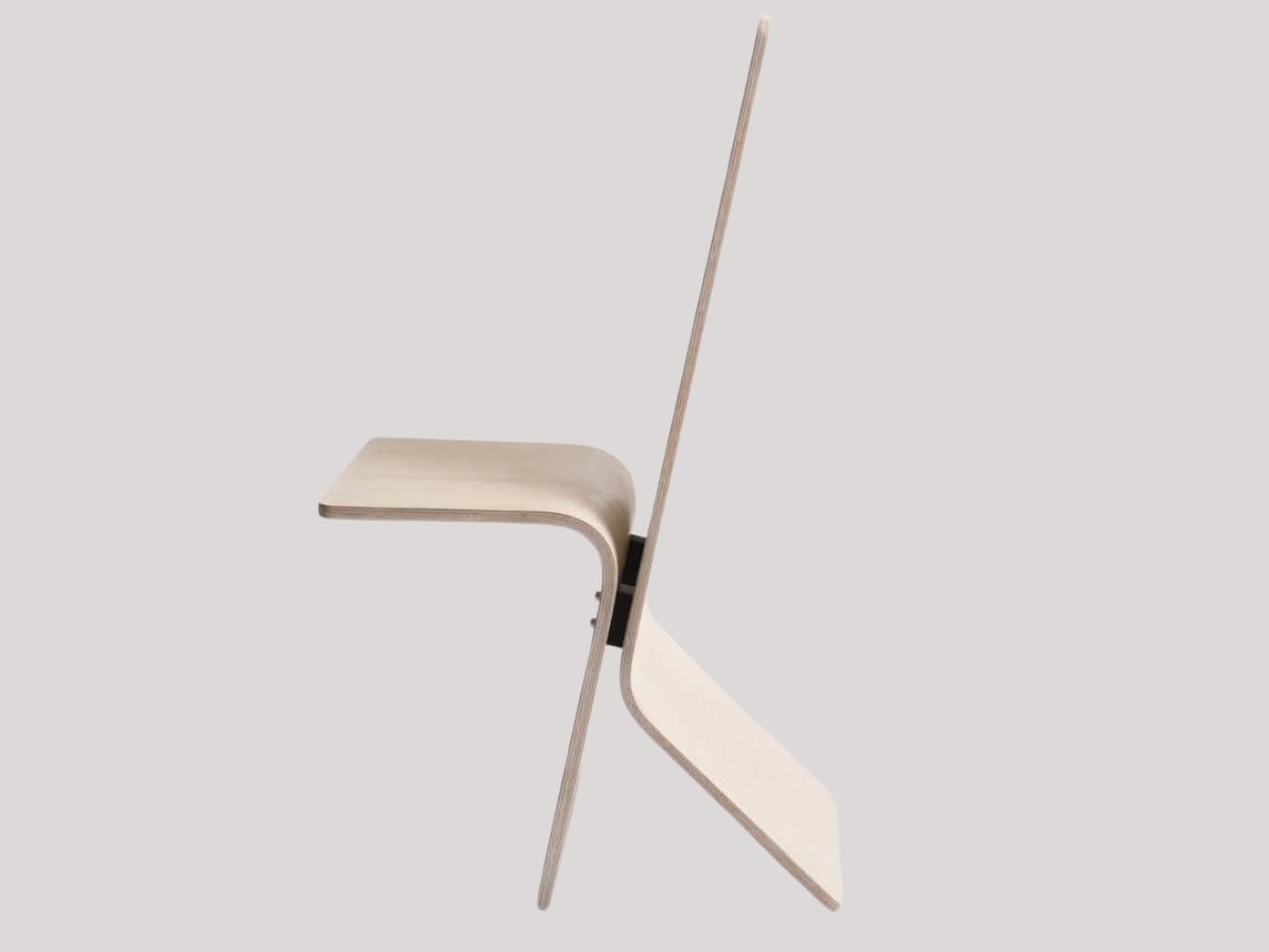
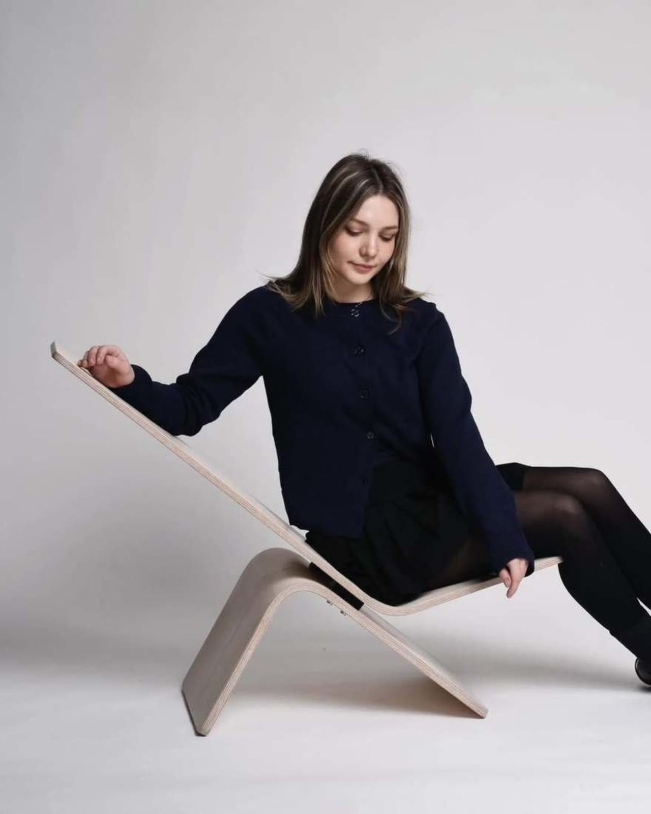
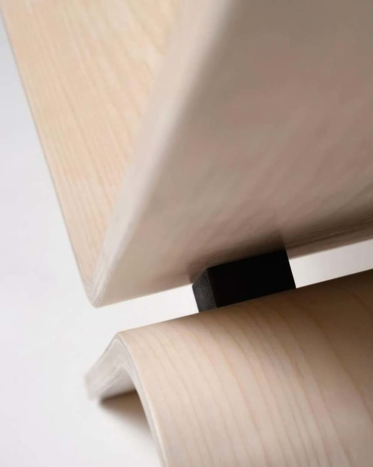
Manuela Hirschfeld is an industrial design student at Germany’s Hochschule Pforzheim, and her Tilt chair does exactly what the name suggests. Built from bent plywood, it shifts between upright and reclined with a single forward tilt. No levers, no hardware, just physics and balance. The restraint here is rare for student work. Most student designs reach for the complex or the speculative. Tilt strips everything back until the idea stands entirely on its own.

What makes it genuinely useful is how naturally it handles the shift between focused work and winding down. Most chairs make you choose one mode and stay there. Tilt lets your body make that call instead. Lean it forward, and the geometry changes. The bent plywood keeps it light and easy to move, so it works as well in a small apartment as it does in a studio or home office.

What We Like

  • No mechanical parts means nothing to replace or service over time
  • Dual function in a single lightweight form, no extra hardware needed

What We Dislike

  • The minimal plywood aesthetic may feel too sparse for warmer, more layered interiors
  • May not offer enough firm back support for users who need a fixed, stable position

2. Barefoot Collection

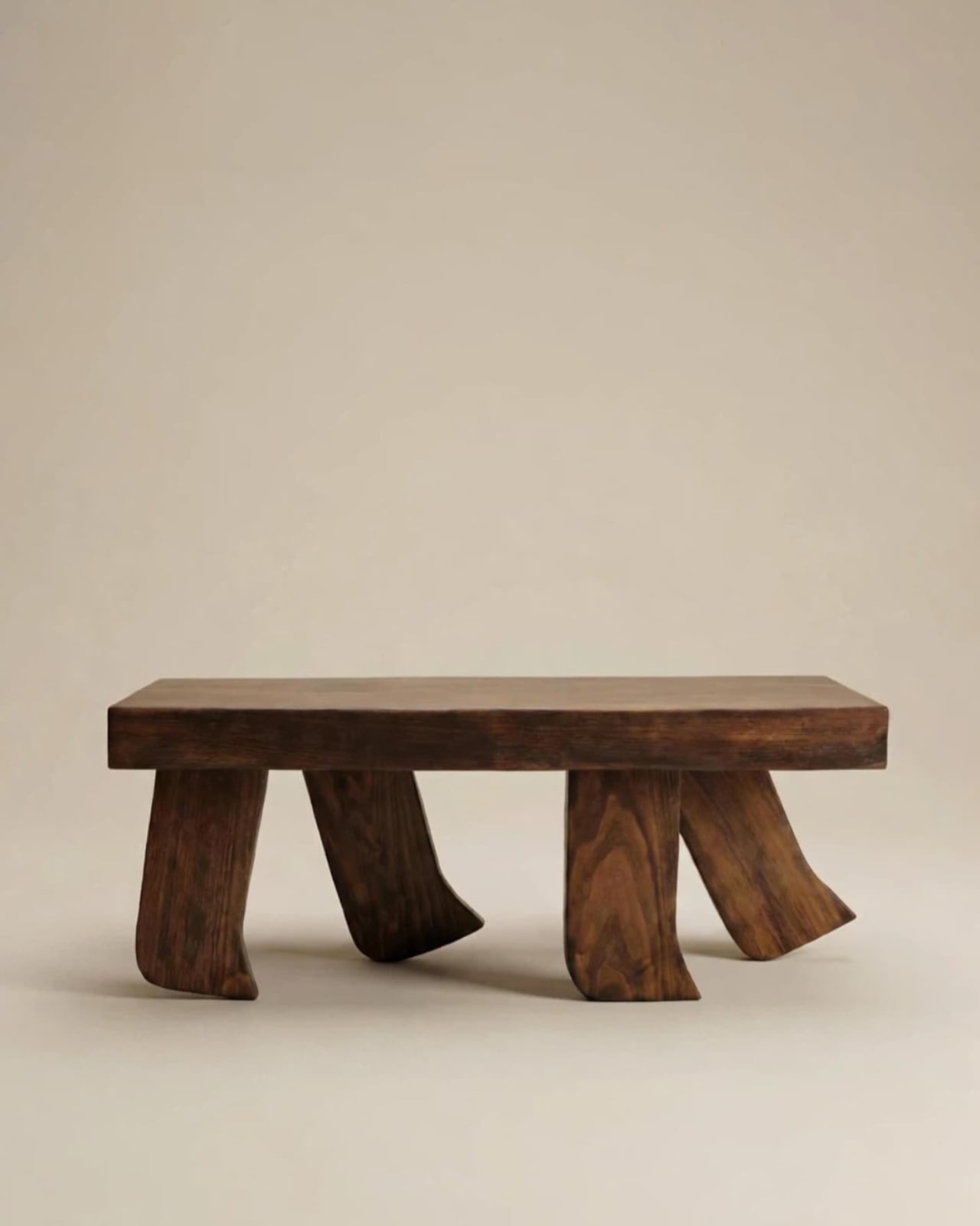
The Barefoot Collection started with a single image: a coffee table that looks like it’s walking away. The legs are carved from solid wood to simulate the arc and flex of a bare foot mid-step, while the tabletop stays completely flat and rectilinear. Stillness above, motion below. That contrast is the whole point, and it works better than it has any right to. The piece reads as coherent long before it reads as clever.

What you actually get is a coffee table that functions without apology and sparks a real conversation without ever trying to. Set a cup on it and forget the concept entirely. Then a guest walks in, does a double-take, and suddenly the room is talking. Most concept-led furniture exhausts you after a few weeks. Barefoot earns its place by being genuinely useful first and genuinely interesting second. That’s always the right order.

What We Like

  • Solid wood construction gives it real longevity, well beyond its visual appeal
  • Works as a fully functional surface while quietly holding a strong point of view

What We Dislike

  • The sculpted legs make it difficult to pair with more conventional, straight-lined furniture
  • The level of craft involved likely puts it at a higher price point

3. Press Stool

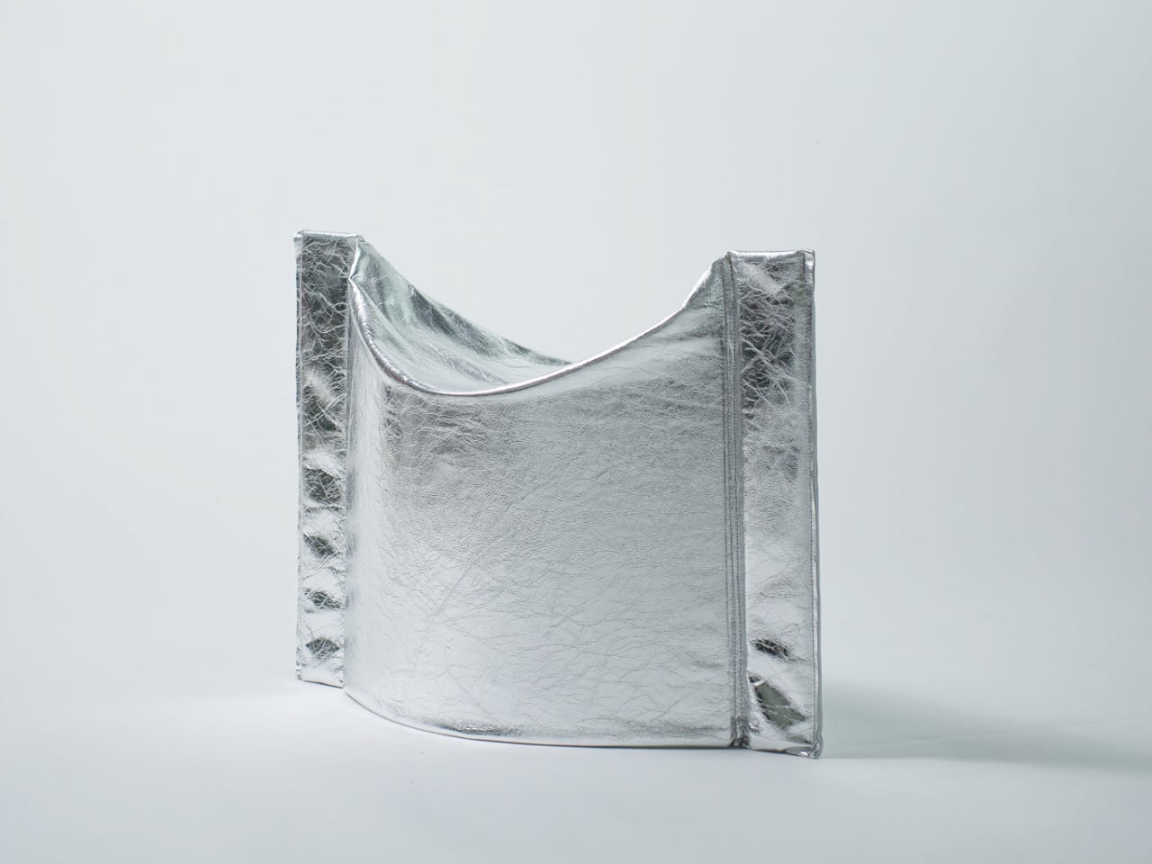
The Press Stool borrows its structural logic from folded paper. A flat sheet has no load-bearing strength, but fold it, and the forces redistribute across the geometry. Crease it further, and the form resists compression. That principle does all the work here. In its flat state, it collapses into a wide oval with a crinkled metallic silver surface that lands somewhere between industrial foil and fabric. One press and it opens. No legs, no bolts, no tools.

For anyone in a small apartment, it solves a storage problem while putting something worth looking at in the room. It ships flat, weighs little, and can slide under a bed or lean against a wall when it isn’t needed. Most fold-flat furniture looks like a compromise. The Press Stool looks intentional. The crinkled surface and gathered folded ends give it a presence that holds up even when it’s closed.

What We Like

  • Ships and stores completely flat, ideal for smaller homes and tight living spaces
  • No assembly required, the folded form does all the structural work

What We Dislike

  • The metallic silver finish is a strong statement that won’t suit every interior palette
  • Load capacity may be more limited compared to stools with conventional structural frames

4. Kylinc Modular Office System

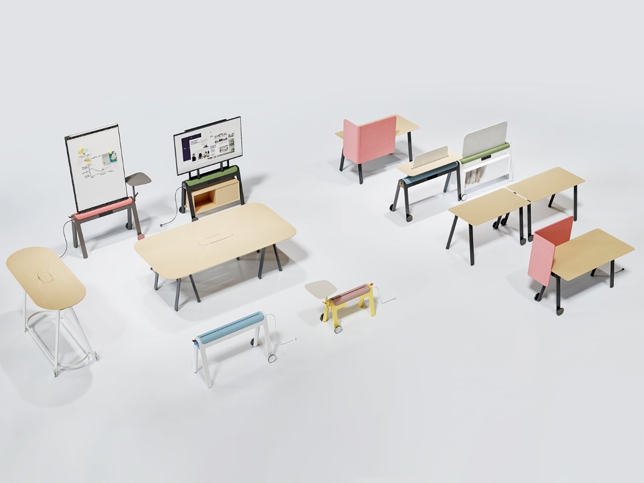
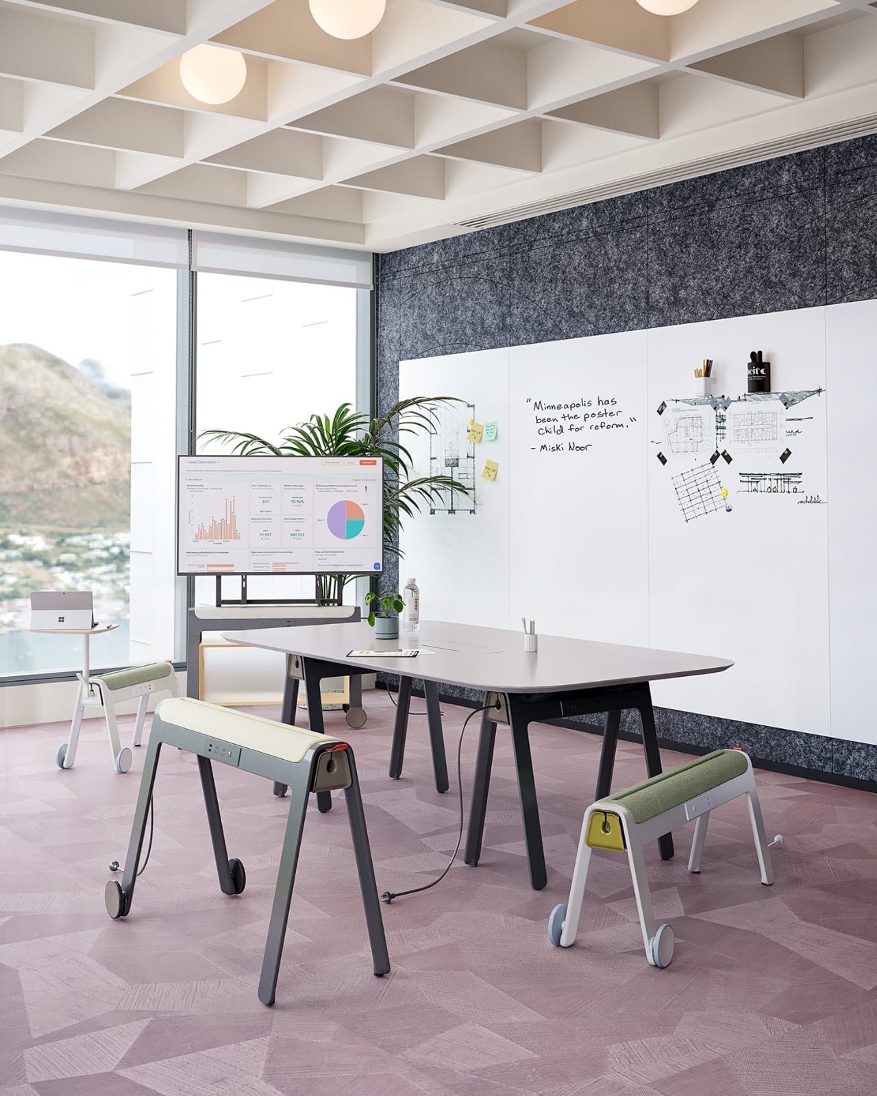
Kylinc treats the workspace like something that should change whenever the day asks it to. Each piece rolls on oversized wheels, which makes reconfiguring your office feel genuinely effortless rather than theoretically possible. Push pieces apart for a collaboration zone, pull them together for focused work. Power management is built directly into the furniture, with smart cable organization that keeps surfaces clean without any additional accessories to track down or manage.

The benefit shows up most for people working from home across a day that never asks the same thing twice. A static configuration works well some of the time and poorly the rest. Kylinc changes that without requiring much effort, which is the real difference between a system that actually gets used and one that stays fixed out of habit. The built-in cables move with the furniture. Your layout becomes something you actually control.

What We Like

  • Oversized wheels make real reconfiguration effortless, not just possible on paper
  • Integrated power and cable management keep the workspace clean without extra accessories

What We Dislike

  • Rolling furniture may feel less stable than fixed pieces for users who prefer an anchored setup
  • A full modular system likely carries a significantly higher upfront cost than standard office furniture

5. OTTO Footstool

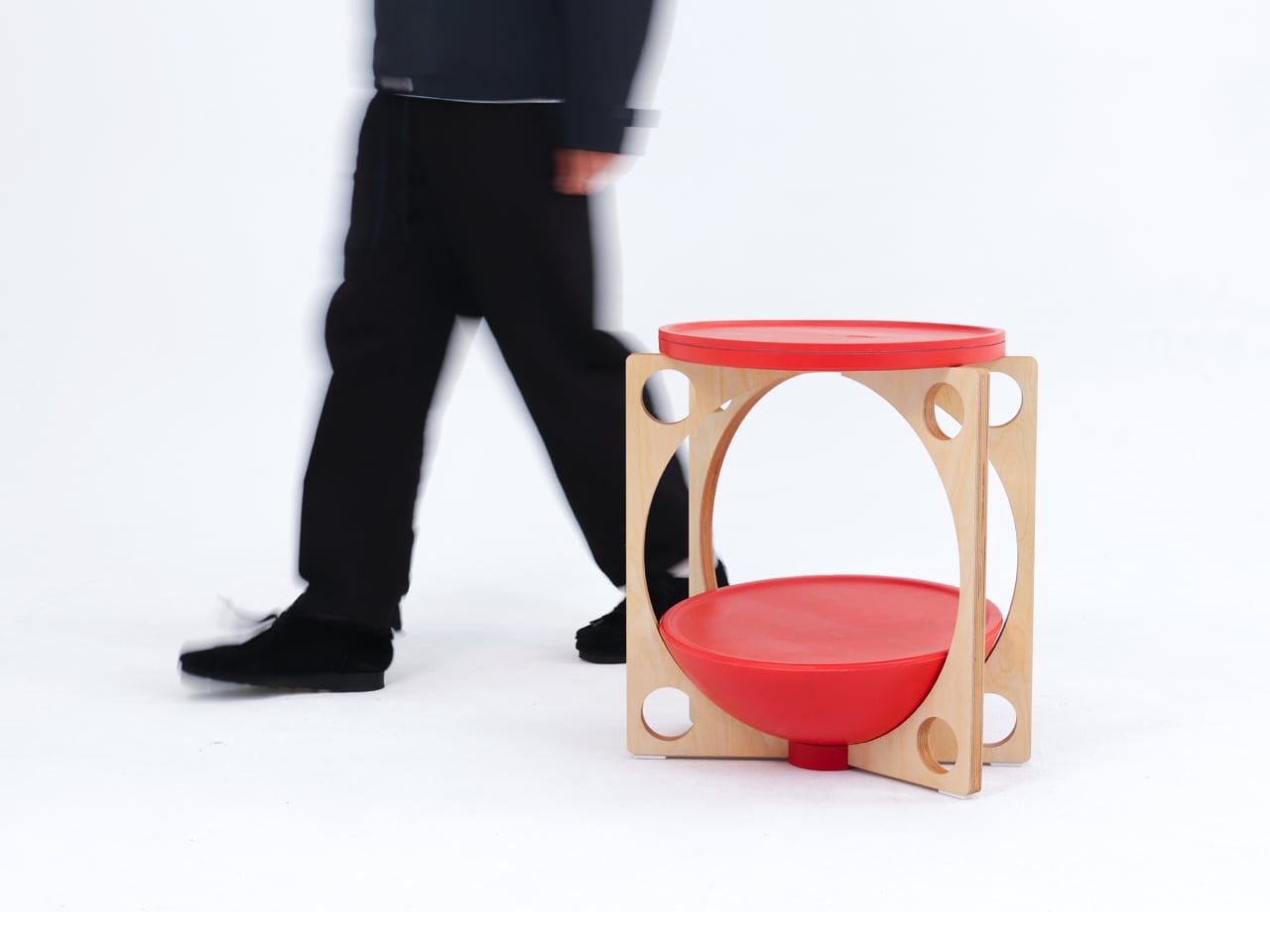
OTTO takes its name from the Korean roly-poly toy Ottogi, a round-bottomed figure that always rights itself because of its convex base. Designer Woonghee Ma applied that same logic to a footstool. The convex base means it rocks and shifts as your body moves throughout a long sitting session. No adjustment needed, no settings to configure. You shift weight, the stool moves with you, and that’s the whole mechanism.

For a home office that needs to support you without making a production of it, OTTO is exactly right. Most ergonomic products demand your attention to work. OTTO doesn’t. The passive rocking base handles posture support quietly while you stay focused on everything else. It also looks good, which matters more than it might seem for something you’ll look at every working day. Clean, compact, and entirely unpretentious about what it is.

What We Like

  • Passive rocking base provides ergonomic support through natural weight shifts, no settings required
  • Compact and well-proportioned, it works equally well in home and professional office settings

What We Dislike

  • The rocking motion may feel unfamiliar at first for users accustomed to fixed support
  • May not suit very low seating arrangements where foot elevation isn’t part of the setup

March Didn’t Make a Noise. It Made a Point.

What connects these five pieces isn’t an aesthetic or a material. It’s restraint. A chair that changes mode with one gesture. A table that earns its concept by being useful first. A stool that ships flat and opens in a second. A workspace that adapts without asking for your help. A footstool that supports you without ever drawing your attention to the fact that it’s doing so. That quiet confidence is what good design actually looks like in practice.

Most design coverage this month was busy chasing the big swing. The sculptural statement, the unexpected material, the idea that needs a paragraph of explanation before it lands. What these five pieces share is something quieter. They ask less of you. They make their case by fitting into your life rather than reshaping it around themselves. March didn’t produce the loudest furniture of the year. It produced some of the most considered. That’s always the better result.

The post The 5 Best Furniture Designs of March 2026 first appeared on Yanko Design.

  •  
❌