Vue lecture

Tesla Left a Glaring Gap in Every Model 3 and Model Y. This $379 HUD Fixes It.

Fighter pilots have had heads-up displays since the 1950s, because asking a human to look down at instruments while traveling at 600 miles per hour and making life-or-death decisions is an engineering failure, not a pilot failure. The technology migrated to production cars in 1988 when GM offered the first automotive HUD in the Oldsmobile Cutlass Supreme, and every generation of premium vehicle design since has treated it as table stakes. Tesla rewrote so many conventions of the automobile that it’s easy to forget it left one important capability behind. For all the innovation packed into the Model 3 and Model Y, their dashboards direct critical driving data to a screen mounted nowhere near where human eyes naturally rest during forward motion. TrantorVision built NeuroHUD to close that gap, and the Kickstarter campaign funded in 30 minutes.

Built alongside a community of over 4,000 Tesla owners from mid-2025 through early 2026, NeuroHUD projects Tesla driving data directly into the driver’s forward sightline rather than leaving it on a screen at center console height. Installation takes about one minute, requires no tools and no disassembly, and leaves the factory wiring completely untouched, keeping the manufacturer’s warranty intact. The compute module clips behind Tesla’s center screen and draws power through a single USB-C cable, with no hardwired connections and no vehicle modifications of any kind. From there, a dual-channel data system reads Tesla’s screen directly through AI cameras and simultaneously pulls deeper vehicle telemetry through the Tesla API, creating a richer information layer than either method could supply alone. The result covers speed, navigation, gear state, battery range, blind-spot alerts, and takeover warnings, all projected directly in the driver’s line of sight.

Designer: TrantorVision

Click Here to Buy Now: $379 $629 (40% off). Hurry, only a few left! Raised over $474,000.
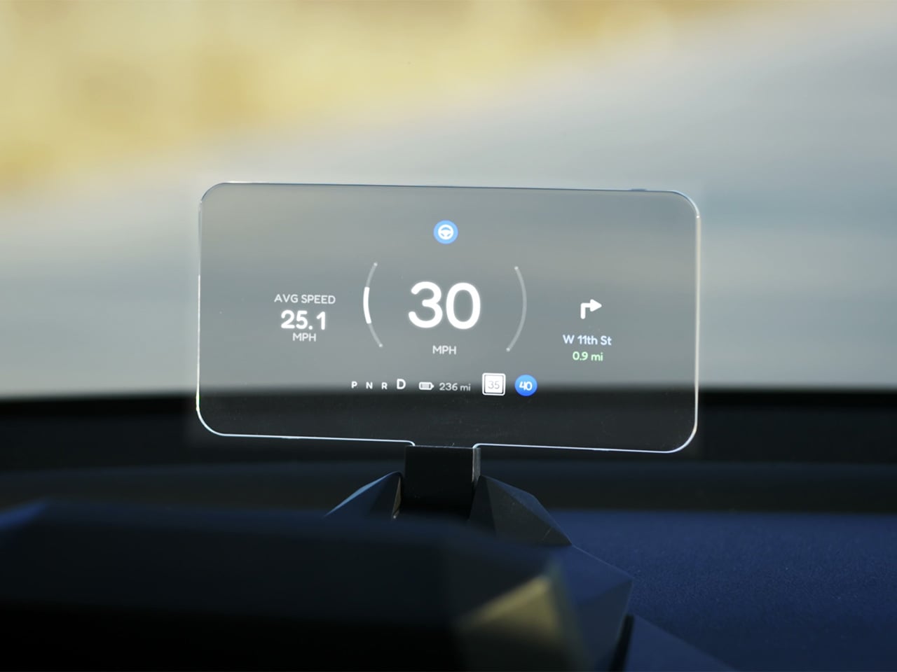
A pair of 150-degree AI fisheye cameras face Tesla’s display and read high-frequency data like speed at 50 Hz, fast enough to keep the HUD readout synchronized with the car’s actual state without perceptible lag at any velocity. Lower-frequency information, covering gear position, battery range, and navigation turns, arrives through the Tesla API on a separate channel, and the system routes each data type through the appropriate pipeline based on how quickly it needs to update. End-to-end latency on the AI vision side sits as low as 20 milliseconds, tighter than many production-fitted HUDs achieve through direct hardware integration. The onboard processor is a 6-core Arm DynamIQ chip paired with an Arm Mali G610 MP4 GPU and 4GB of LPDDR4 RAM, running Ubuntu Core Linux with Wi-Fi 6 and Bluetooth 5.4 connectivity. That compute specification would look comfortable in a mid-range Android tablet, which gives a sense of how much processing headroom TrantorVision has reserved for future OTA feature additions.

At 1,500 nits of peak brightness, NeuroHUD’s 4-inch TFT LCD panel is engineered specifically around the failure mode that sinks most aftermarket HUDs in real-world use: direct sunlight washout. The panel runs at 480×800 resolution with a 140-degree viewing angle, keeping displayed information legible across a wide range of driver head positions without requiring precise alignment to a narrow sweet spot. The modular Light Engine gives drivers a genuine choice of projection method rather than committing them to a single approach. Combiner Mode positions a semi-transparent screen in the driver’s sightline for the sharpest image quality, with projected information appearing to float in the forward visual field at a focal distance that keeps eyes aimed naturally at the road. Windshield Projection Mode throws the image directly onto the glass for a more immersive overlay, and both modes switch without tools or any hardware intervention.

HomeControl is a GPS-triggered garage automation system that learns the driver’s RF remote signal, geolocates the home driveway, and fires the garage door automatically as the car turns in, with a physical button for manual override available at any time. Screen Mirroring turns the HUD into a secondary phone display, meaning Google Maps or Waze can be projected directly onto the combiner or windshield without any dependency on Tesla’s native navigation system. UI customization runs three levels deep: a mobile app for toggling individual elements, a full UI editor for precise sizing and positioning of each data element, and an open API interface for users who want to build a custom renderer entirely from scratch. A community layer lets drivers share layouts or download configurations built by other NeuroHUD owners worldwide, making the display experience as much a living software product as a hardware one. The combination of GPS automation, open API access, and a community-driven layout library gives NeuroHUD a software depth that compounds as its user base grows.

TrantorVision began the project in January 2025 with the goal of building a heads-up display designed around Tesla’s unique display architecture from the ground up. By May 2025 an engineering prototype was assembled and the AI vision system validated through real-world road testing; by July the product was publicly announced with a community already exceeding 4,000 Tesla owners across multiple platforms. Production design locked in December 2025, with the first batch of production samples arriving in January 2026. The device supports Model 3 from 2017 to 2023, Model Y from 2020 to 2025, Model 3 Highland from 2023 onward, Model Y Juniper from 2025 onward, and the Cybertruck from 2023 onward, covering both left-hand-drive and right-hand-drive configurations with Model 3/Y Standard trim included. An OTA Compatibility Upgrade Service is built in, meaning the hardware is designed to receive future software capabilities without requiring a new unit.

The standard NeuroHUD carries an early bird price of $379 against a retail MSRP of $629, covering Tesla data integration, mobile app control, UI community access, the custom UI editor, screen mirroring, and CarPlay and Android Auto support. The NeuroHUD Pro steps to $429 at early bird pricing, down from $729 retail, adding HomeControl, Windshield Projection Mode, deeper Tesla API integration, and enhanced hardware built to grow its feature set through over-the-air updates. Both tiers ship with a windshield film, USB-C power cable, Thunderbolt cable, 12V car adapter, cable clips, and a quick start guide, backed by a one-year warranty. Shipping is free to the continental United States and Canada, with a flat $10 covering the EU, UK, Australia, Hong Kong, and all other worldwide regions, with customs fees covered for most major markets. Global delivery is scheduled to begin between September and October 2026.

Click Here to Buy Now: $379 $629 (40% off). Hurry, only a few left! Raised over $474,000.

The post Tesla Left a Glaring Gap in Every Model 3 and Model Y. This $379 HUD Fixes It. first appeared on Yanko Design.
  •  

Starbucks built a Yeti cooler for your Venti Iced Lattes, but you can’t buy one yet

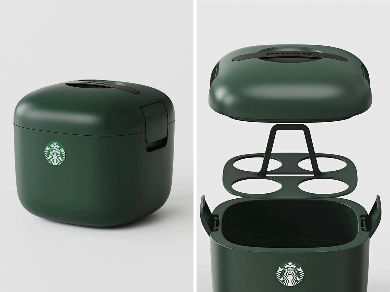
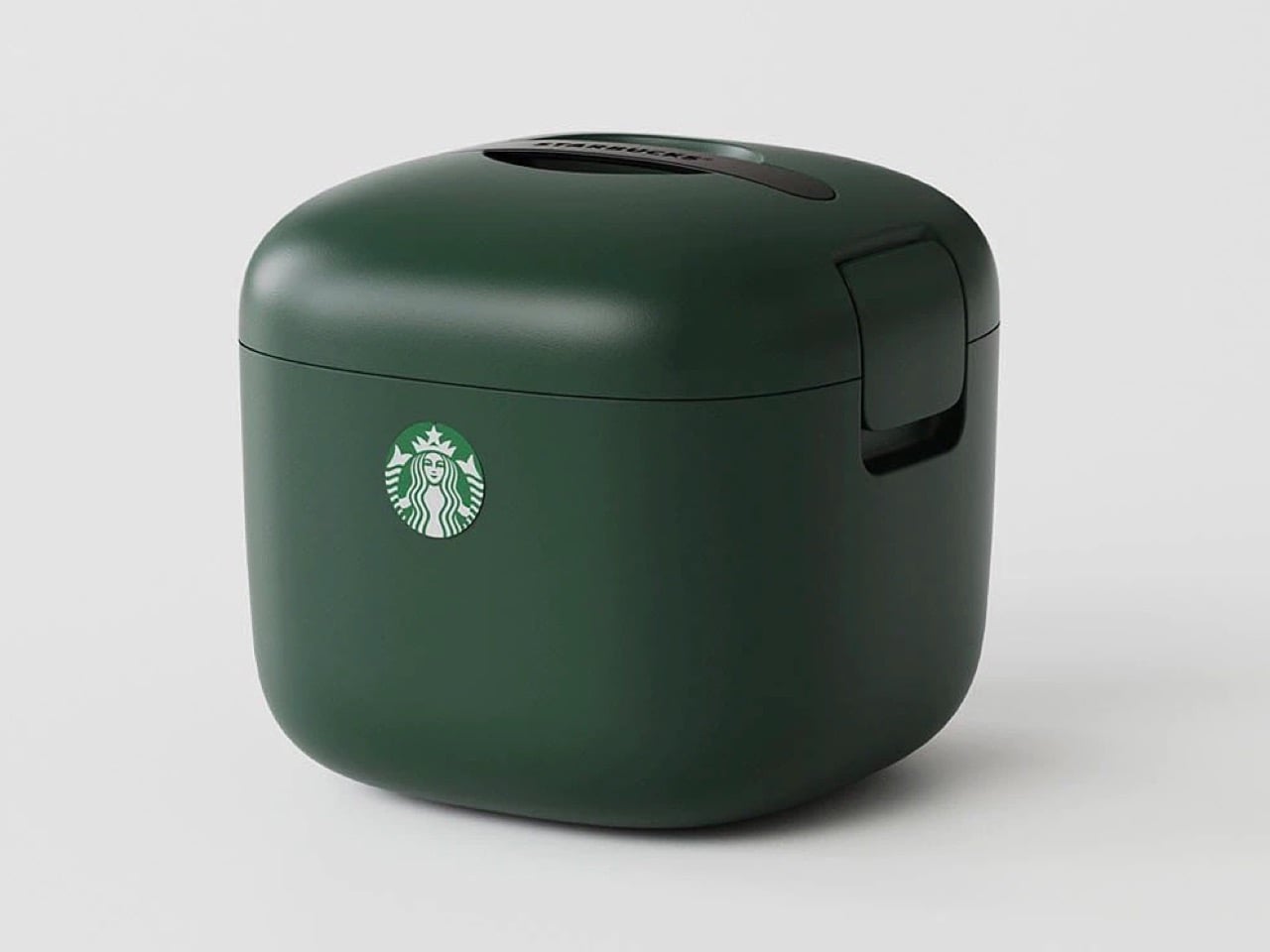
You know what’s ‘vertical integration’? Starbucks building its own cooler box for its own beverages. Meet the Yeti-alternative that’s designed not for your Budweisers, but for your venti iced lattes. It’s called the Starbucks Ice Box, and while it looks perfect from top to bottom, it has one problem: it’s only available in South Korea.

The design is deceptively simple but gets every detail right. Four individual cup slots keep drinks stable and separated, eliminating the float-and-tip chaos that happens when you throw tall cups into a standard cooler. A dedicated ice compartment sits at the bottom, isolated from the drinks themselves so you’re not fishing cups out of melted ice water an hour later. The domed lid has ventilation slots that allow air circulation without sacrificing insulation, and those side latches look substantial enough to actually keep everything secure when you hit a pothole. It’s wrapped in Starbucks’ forest green colorway, compact enough to fit behind a car seat or in a trunk corner, and clearly designed by people who have done the group coffee run enough times to know exactly where the pain points are. The proportions feel right in a way that general-purpose coolers never quite nail when you’re dealing with tall, narrow vessels.

Design: Starbucks Korea

This isn’t Starbucks’ first merch attempt. They’ve consistently pushed out loads of accessories over the years, mostly in eastern markets (like these TWS earbuds in collaboration with Samsung, and these $28 retro cameras that they debuted in China) although this one feels way more purposeful than any of their other launches. It’s something people will buy and use for years, rather than becoming just another collectible, and you know that if someone’s buying a Starbucks cooler, they’re a customer for life. Vertical integration for the win!

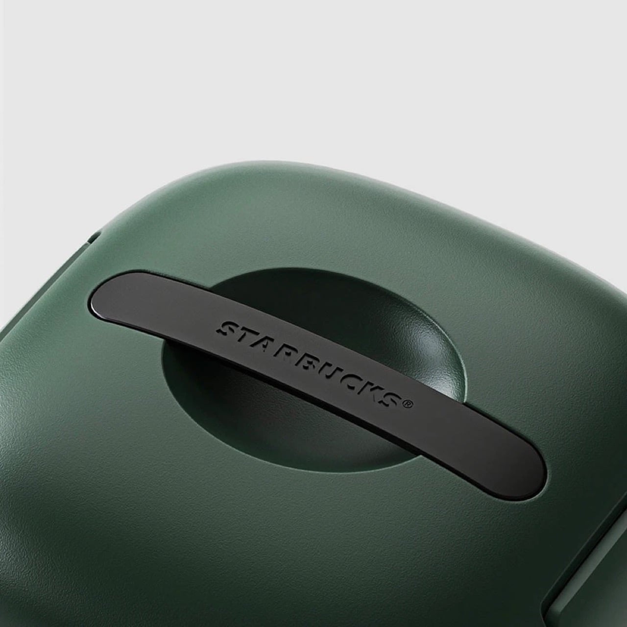
The design is as simple as it gets. The insulated walls keep the insides whatever temperature you want. Although built for iced drinks, you can put your hot beverages in too and have them piping even after hours. For iced drinks, you can also add ice packs into the cooler to chill them down further – just be careful they don’t drip or the cups could get soggy. A lift-out tray holds four venti drinks, because if you’re the kind to drink regulars, you probably wouldn’t be keeping them for hours. The clamp-lid ensures everything is locked in tight, and a Starbucks-branded handle sits flush against the top, giving the entire thing a gorgeously monolithic design.

The only place you can grab this right now is on obscure sites online. A Japanese website has it listed for ¥26,530 or $169 USD, not including shipping. If anyone in Starbucks’ global team is reading this, consider it your sign to manufacture this for the American and European audiences too, trust me, your annual turnover will thank you!

The post Starbucks built a Yeti cooler for your Venti Iced Lattes, but you can’t buy one yet first appeared on Yanko Design.

  •  

The Hermès Birkin Finally Has a LEGO Version and It Opens to Reveal A Secret Runway Inside

The Hermès Birkin has one of the most theatrical purchasing rituals in luxury retail. You cannot simply walk into a boutique on Rue du Faubourg Saint-Honoré and buy one. Hermès makes you earn it, building a relationship with a sales associate over months, sometimes years, demonstrating cultural fluency with the house before they’ll even have the conversation. The result is an object that carries as much mythology as it does resale value, a handbag that has become shorthand for a particular kind of aspirational excess that the internet finds endlessly fascinating.

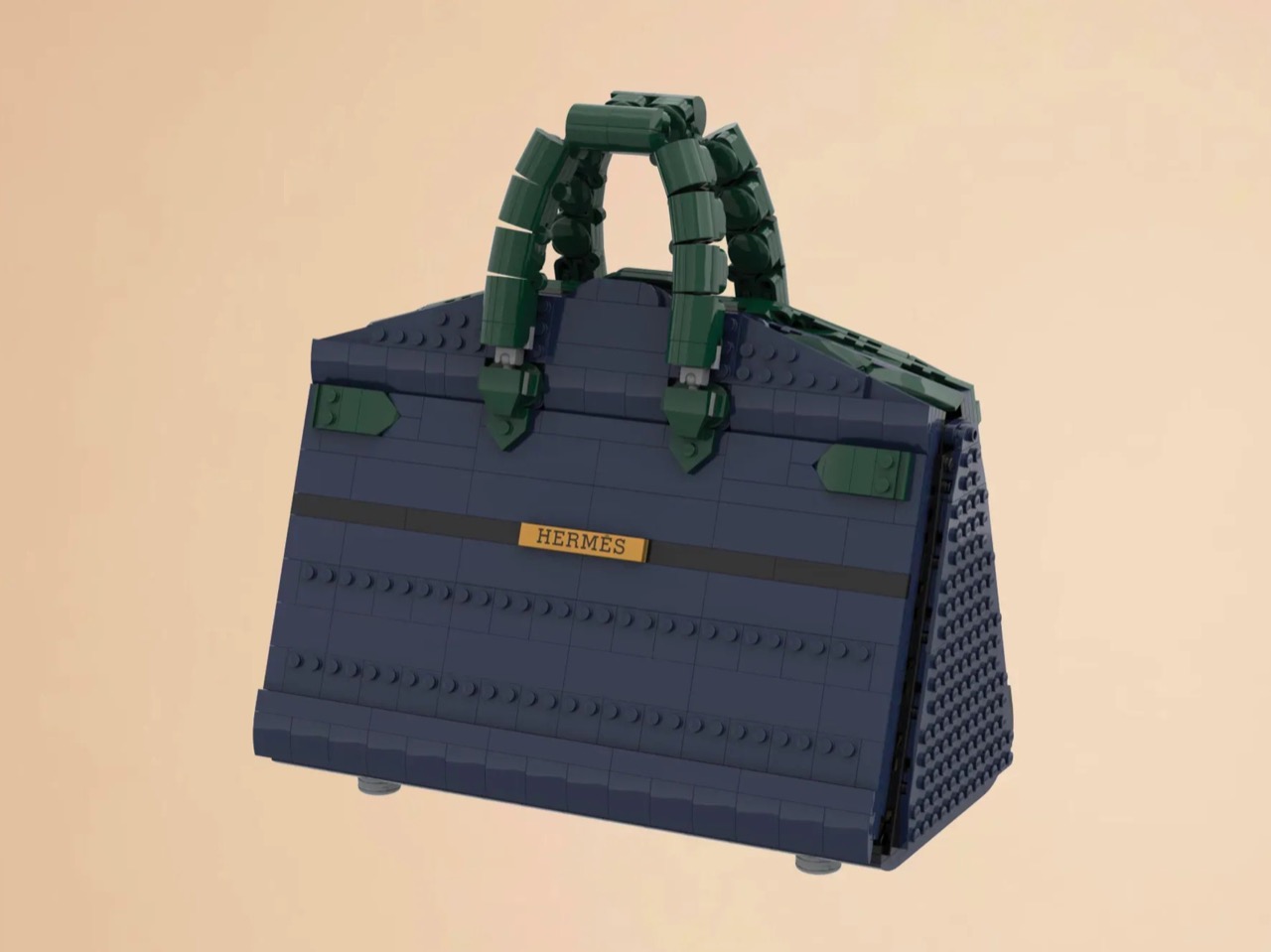
LEGO Ideas builders BOI_Design and KittyJW found a rather elegant workaround. Their MOC (My Own Creation) reimagines the Birkin 20 Faubourg, the special edition inspired by Hermès’s flagship Paris store, as approximately 1,400 bricks of deep navy, dark green, and gold. The exterior facade doubles as a miniature rendering of 24 Rue du Faubourg Saint-Honoré itself, complete with arched boutique windows and orange awnings. And it opens.

Designers: BOI_Design and KittyJW

The silhouette is immediately recognizable to anyone who has spent time in the vicinity of luxury retail, or, more realistically, scrolled past one on Instagram. The trapezoidal body is rendered in deep navy blue tiles, layered with a subtle horizontal banding that gives the surface genuine texture and depth. The handles arc overhead in dark green, assembled from linked Technic-adjacent elements that convincingly mimic the soft curve of the real bag’s leather grip. Gold hardware details sit at the clasp, at the side buckles, and along the turnlock assembly, and a tiny linked orange chain drops a red heart charm and a gold minifigure pendant in a detail that reads as both playful and surprisingly precise. Flip the bag around and the back panel is clean and quiet, just navy tiles and a gold Hermès tile sitting on a dark strap, which is exactly how the real thing looks.

The front face depicts three arched windows dressed with crisp white frames and orange awnings are spaced across the lower body, referencing the Haussmannian rhythm of the actual boutique facade at Faubourg Saint-Honoré. It takes a second to fully resolve in your eye, this thing that is simultaneously a handbag and a building, and that slight double-take is very much the point. The builders describe it as merging fashion and architecture into a single object, and looking at it straight on, that framing holds up completely.

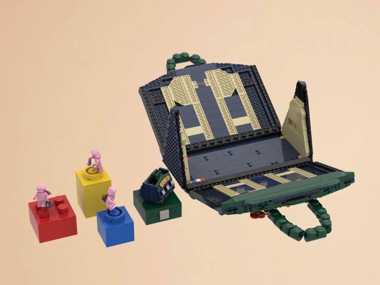
My favorite detail, however, is what happens when you open it. The lid swings up to reveal a hidden interior scene that commits fully to the bit. Three pink minifigures, each carrying a tiny handbag, are posed on oversized primary-color bricks in red, yellow, and blue, the kind of bold, joyful color blocking that feels distinctly LEGO while also evoking a fashion week runway setup. Nestled alongside them is a miniature Birkin 20 Faubourg bag rendered at a smaller scale, a self-referential easter egg that will land immediately with anyone paying attention. The interior lining is lined in cream and tan tiles, a genuinely considered touch that mirrors how a real Birkin’s suede interior contrasts against its exterior leather. At 28.5 centimeters wide and 29 centimeters tall, the whole thing has real physical presence on a shelf.

The build is currently gathering votes on LEGO Ideas, the community platform where fan submissions need to reach 10,000 supporters before LEGO’s internal team will formally review them for potential production. It’s early days for this one, but the concept has the kind of crossover appeal, fashion collectors, LEGO enthusiasts, Paris romantics, people who just want the Birkin experience without the two-year waitlist, that could carry it a long way. You can head to the LEGO Ideas page here to cast your vote.

The post The Hermès Birkin Finally Has a LEGO Version and It Opens to Reveal A Secret Runway Inside first appeared on Yanko Design.

  •  

This $45 Titanium Pocket Knife Uses Centrifugal Force and Neodymium Magnets Instead of A Button Lock

Most pocket knives are designed for the moment you need to cut something. The TiNova II is designed for that moment, but also for the five minutes after, when you find yourself opening and closing it just because the mechanism feels satisfying. That shift in priorities is intentional, and it required Ideaspark to rethink the entire knife after the first version shipped to over 1,300 Kickstarter backers in 2025.

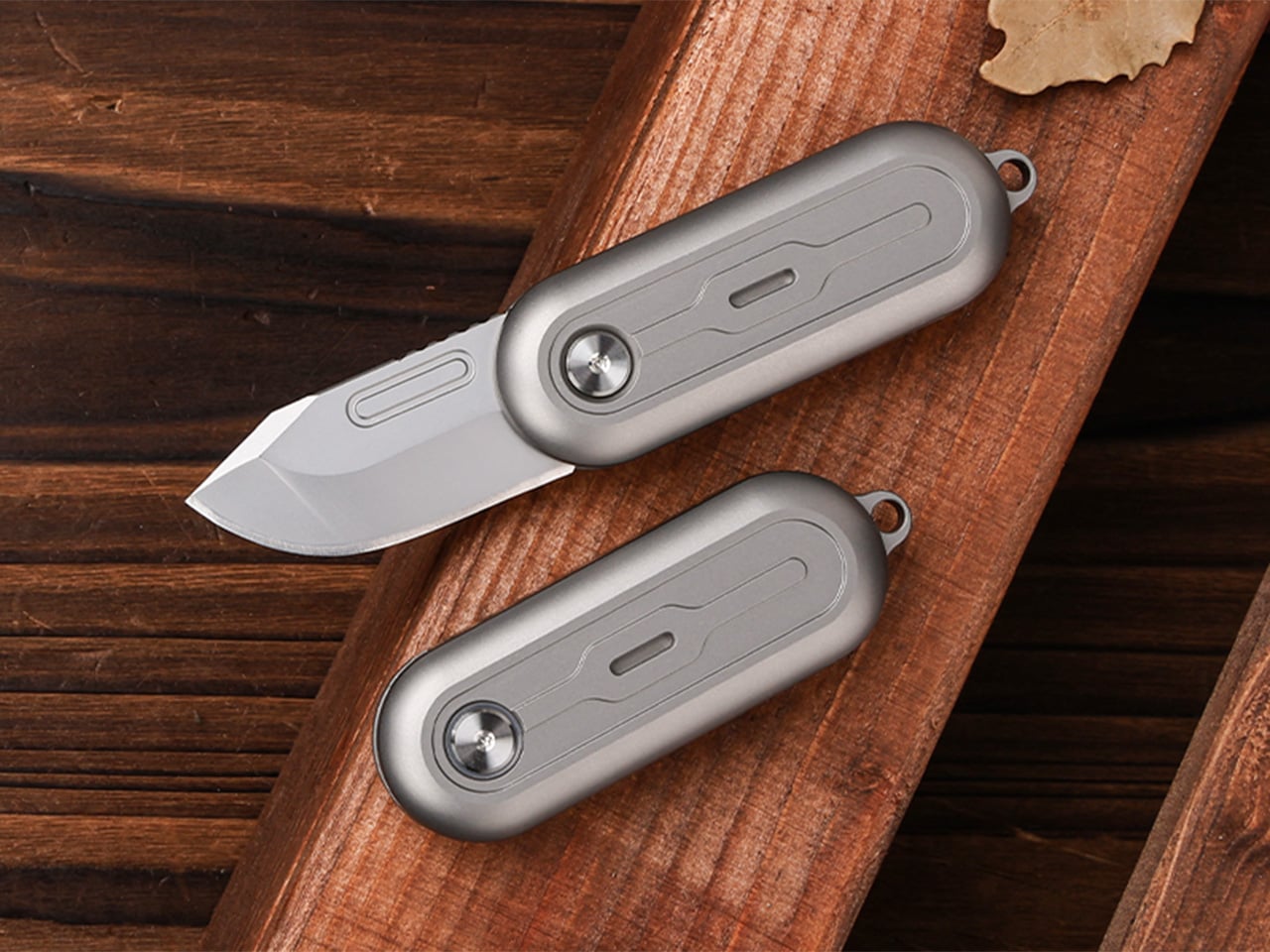
The mechanism itself is straightforward. Two titanium handle scales connect at a single roller bearing pivot point. One scale stays fixed, the other rotates a full 360 degrees around it. Neodymium magnets sit at strategic positions to create resistance, so when the blade swings open or closed, you get a crisp magnetic snap that locks it in place. Flick your wrist and the momentum carries the blade through a smooth rotation with a satisfying ‘click’. Hold it differently and you can coax out a slower, weighted spin. What changed between Gen 1 and Gen 2 is the body shape. The original had flat sides and sharp edges like a traditional folding knife. The TiNova II uses an oval profile that matches the natural curve your hand makes when your fingers relax into a loose fist. That single geometry change makes the knife feel completely different when you’re holding it, which matters when the whole point is creating something you’ll keep picking up. The magnetic resistance is tuned tight enough to keep the blade from accidentally deploying in your pocket, but smooth enough that you can flip it open one-handed without effort.

Designer: Ideaspark

Click Here to Buy Now: $49 $70 (30% off). Hurry, only 64/100 left! Raised over $62,000.

The handle scales are machined from Grade 5 titanium, the aerospace alloy that shows up in everything from jet engine components to high-end bike frames. The material delivers the strength-to-weight ratio you’d expect (the entire knife weighs 59.3 grams, roughly two U.S. quarters), but the more interesting property is how it wears. Titanium doesn’t corrode, rust, or tarnish the way steel does. Instead, it develops a patina over time, recording scratches and scuffs as a visual history of use. Every mark becomes permanent, which means the knife you carry for a year looks distinctly different from the one that arrived in the mail. Ideaspark leans into this with two finish options: a raw sandblasted titanium that shows wear immediately, and a black PVD coating that creates higher contrast when the underlying metal starts to peek through.

The blade is D2 tool steel, heat-treated to HRC 58-60. D2 sits in an interesting zone within the steel hierarchy. It holds an edge longer than most budget steels (think 8Cr13MoV or AUS-8), and is a go-to choice for premium knives. The choice here makes even more sense for a keychain knife where you’re cutting tape, breaking down cardboard, trimming threads, or slicing through packaging, with practically negligible wear and tear over time compared to a knife that experiences the brunt of rugged outdoor use. The blade profile is a drop-point with a full belly, which gives you a long cutting edge relative to the 40.5mm blade length. The curve naturally guides material into the sharpest part of the edge, making it effective for slicing motions even when you’re working with something as small as this.

At 64.4mm closed, the TiNova II is shorter than a standard credit card (85.6mm). Opened, the entire knife measures 100mm, just under four inches. The thickness is 12.4mm, slimmer than a stack of three coins. These dimensions put it squarely in the micro-folder category alongside knives like the CRKT Pilar or the Kershaw Chive, but the deployment method sets it apart. Most compact folders use a flipper tab or a thumb stud, mechanisms that require deliberate engagement. The TiNova II uses rotational momentum, which feels closer to spinning a fidget toy than opening a knife. The roller bearing does most of the work. Ideaspark uses what they call a Kugellager bearing (the German term for ball bearing), which is a pretty great way of saying their precision-made bearings boast the kind of well-engineered frictionless movement you’d expect from the Germans. The result is a glide that feels even smoother than air, with no grinding or resistance as the handle rotates.

The magnetic system does several jobs simultaneously. First, it holds the knife closed when it’s in your pocket, preventing accidental deployment. Second, it provides tactile and audible feedback at both the open and closed positions, giving you a satisfying click that confirms the blade is locked. Third, it creates just enough resistance during the spin to make the motion feel controlled rather than loose. The magnets are arranged to pull at the end of each rotation, which is why the knife doesn’t just spin freely like a bearing on a shaft. You feel the mechanism working with you, and that feedback loop is what makes the fidget factor so addictive. The physics here are simple but effective. The magnetic force increases as the scales approach their final position, so the last few degrees of rotation feel like they’re being pulled into place.

An elliptical body shape means there’s no fixed orientation when you’re holding it. You can rotate the knife in your palm, flip it between fingers, or just run your thumb along the curved surface. The absence of sharp edges or defined corners makes it comfortable to manipulate for extended periods, which sounds trivial until you compare it to a traditional rectangular folder that starts digging into your hand after a few minutes. Ideaspark claims this design philosophy came directly from user feedback on the Gen 1 model, where backers loved the mechanism but found the angular body uncomfortable during long fidget sessions. The oval profile solves that problem by removing pressure points entirely.

Two tritium slots run along the length of each handle scale, sized for 1.5mm x 6mm tubes. Tritium is a self-luminous isotope that glows continuously for around 25 years without batteries, charging, or external light. Drop a pair of green, blue, or orange vials into those slots and the knife becomes visible in complete darkness, which is useful for finding it in a bag or on a nightstand. The glow is subtle, not the kind of thing that lights up a room, but enough to catch your eye when you’re fumbling around in the dark. The tritium slots also add a small visual detail that breaks up the otherwise minimal design.

The blade deployment works two ways depending on how you hold it. The long spin involves gripping one handle scale and flicking your wrist, which uses centrifugal force to carry the other scale through a full 360-degree rotation. The motion is slow, weighted, and deliberate. The short flip is faster: a quick wrist snap that sends the blade open with a crisp tick as the magnets engage. Both methods work one-handed, and both feel satisfying in different ways. The long spin has a hypnotic, rolling quality. The short flip is sharp and immediate. You’ll find yourself alternating between them depending on your mood or how much time you’re killing during a meeting.

The knife comes with a keychain hole at one end, sized for a standard split ring. Slip it onto your keys and it disappears into the cluster, weighing less than most car fobs. The compact dimensions mean it works equally well on a wallet chain, a backpack strap, or worn as a necklace pendant if you’re leaning into the EDC-as-jewelry aesthetic. The tritium glow makes it viable as a functional piece of illuminated jewelry, though calling it that probably annoys traditional knife collectors who prefer their folders utilitarian and unadorned.

The TiNova II ships in two finishes: sandblasted (raw titanium) and black coated (PVD). Both finishes come with the same lifetime warranty, which covers manufacturing defects and structural failures. The knife is available now starting at $45 for the launch day special (36% off the $70 MSRP), with free worldwide shipping included. International shipping is scheduled for August 2026.

Click Here to Buy Now: $49 $70 (30% off). Hurry, only 64/100 left! Raised over $62,000.

The post This $45 Titanium Pocket Knife Uses Centrifugal Force and Neodymium Magnets Instead of A Button Lock first appeared on Yanko Design.

  •  

This strangely addictive gear-inspired magnetic fidget from METMO comes in brass, titanium, steel, and nylon

METMO has a talent for taking the visual drama of engineering and translating it into objects people want to touch, turn, and carry. The Grip reimagined the adjustable wrench after nearly 130 years of design stagnation. The Pen turned a dual-thread screw mechanism from 1892 into a fidget object. The Fractal Vise made a complex machinist’s tool into something people keep on their desks purely for the pleasure of operating it. Each time, the Leeds-based team finds a mechanical idea that was ahead of its moment, and rebuilds it with the precision and material quality the original never had.

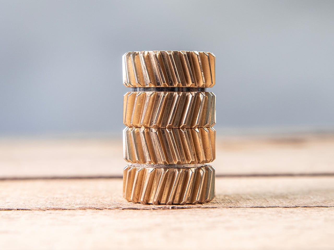
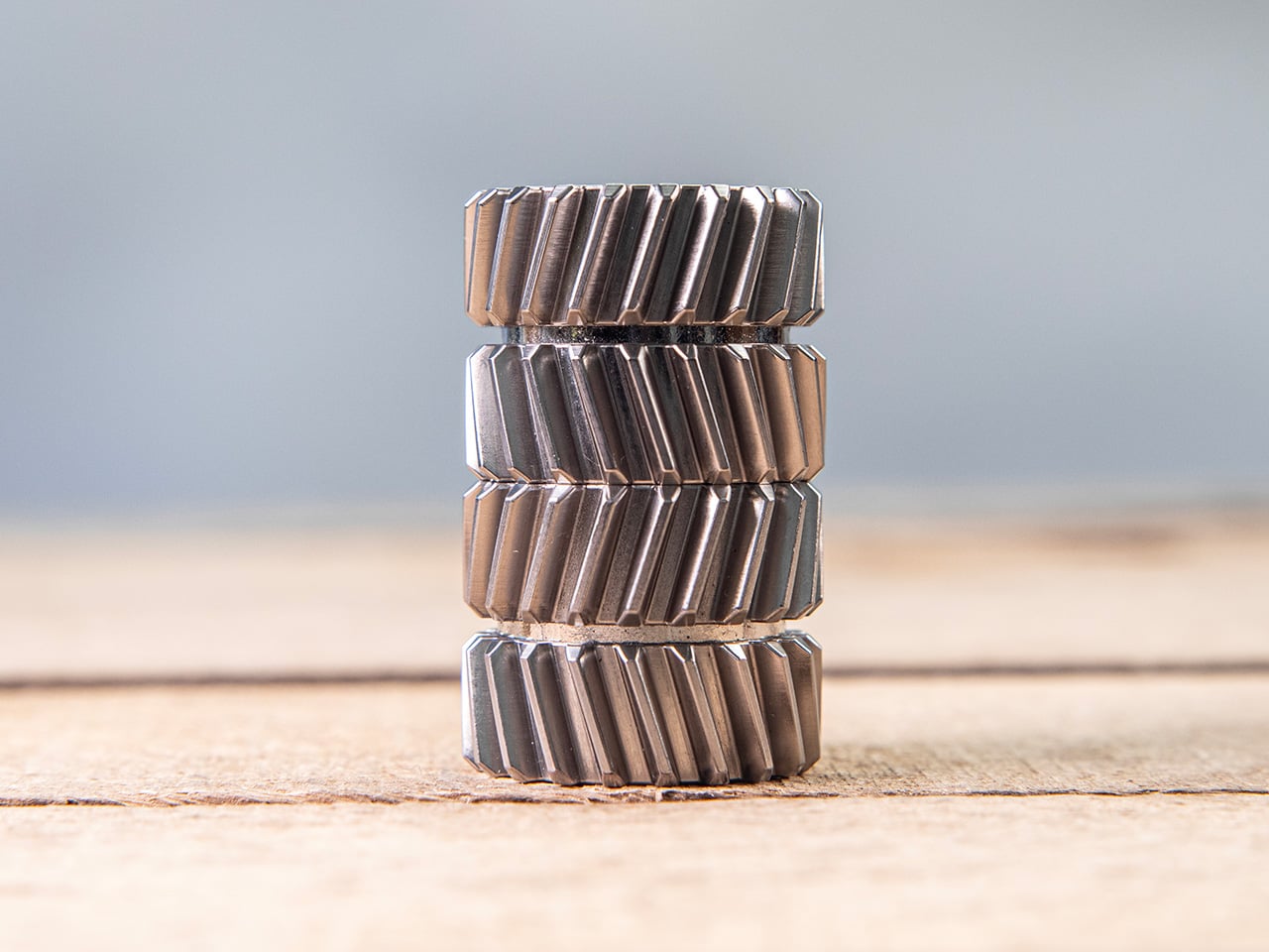
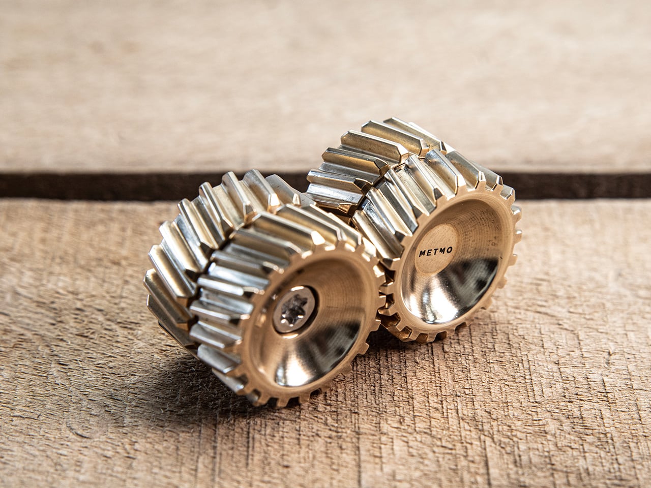
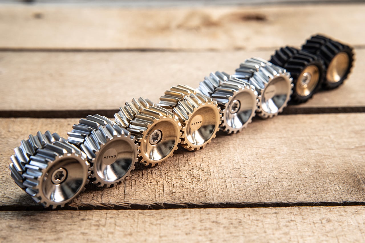
Helico follows that lineage, but takes a noticeably different turn. Where most METMO products carry a clear functional premise, this one leads with pure tactile indulgence, arriving as a compact magnetic form that looks carved from the DNA of helical gears. Every surface seems designed to catch the thumb, reflect light, and reward movement. It comes in four material variants, brass, stainless steel, Grade 5 titanium, and nylon, with each one shifting the personality of the object in a way that feels deliberate rather than cosmetic.

Designers: Sean Sykes & James Whitfield

Click Here to Buy Now: $115.

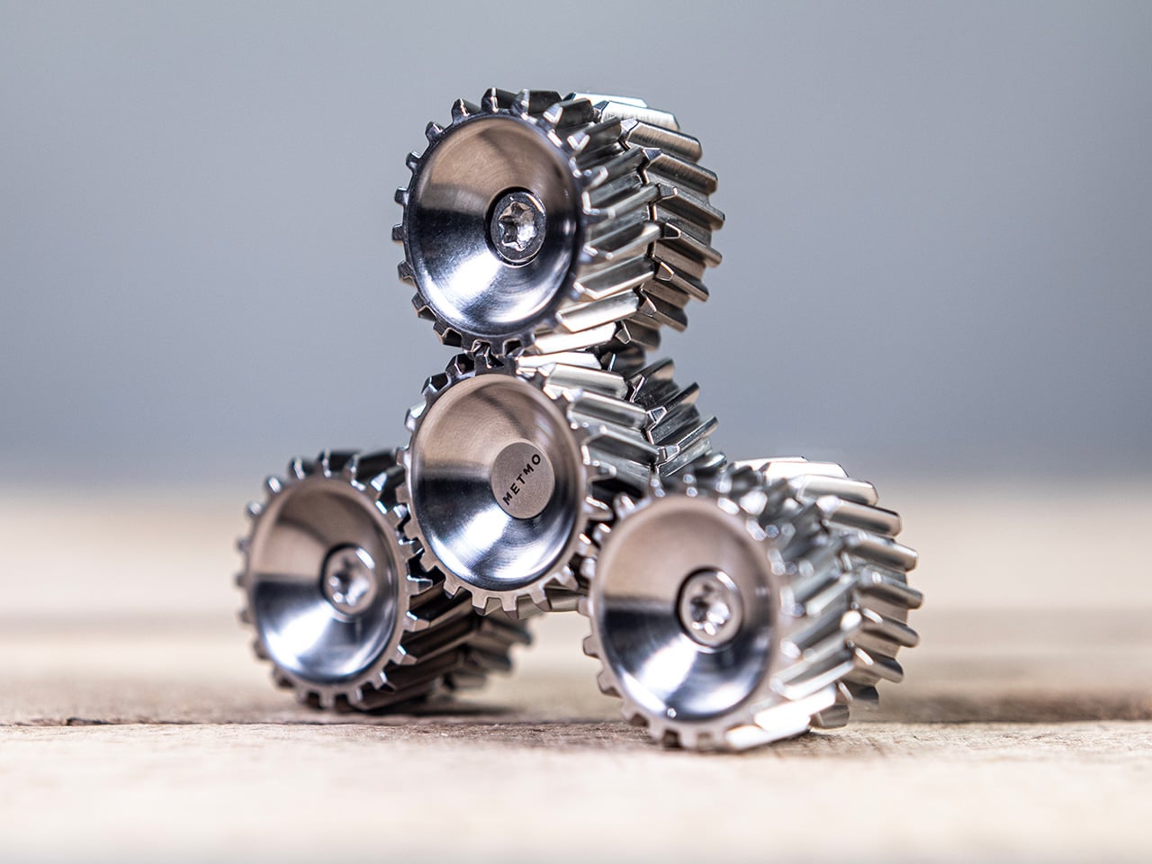
Two cylindrical modules stack vertically, held together by nickel-coated neodymium magnets sandwiched between each section. The magnets are strong enough to keep the stack stable in your hand but calibrated to let you pull sections apart, rotate them, and snap them back together without fighting the object. That separation-and-reconnection loop is where the fidget factor lives, and it turns out to be deeply satisfying in a way that is genuinely hard to articulate. The snap of two sections realigning carries a small but precise reward signal, the kind that makes you do it again immediately. METMO has effectively built a tactile feedback machine disguised as a gear stack.

The angled herringbone grooves channel the thumb naturally while turning every surface into a structure that catches and shifts light as the object rotates. Rolling Helico between your fingers produces a continuous tactile rhythm, a frequency of peaks and valleys that keeps your hands occupied without demanding any conscious attention. The geometry is more considered than it first looks, with the pitch and depth of each tooth calibrated to feel satisfying rather than sharp or aggressive. On the inside of each module, a smooth machined cup creates a deliberate contrast, a quiet surface that makes the exterior texture feel even more intentional by comparison. It is the kind of detail that shows up in product photos but only fully registers when you are holding the thing.

Brass is the version that photographs best and probably sells the story hardest. High tensile HTB1 brass carries real weight, that dense satisfying heft that makes an object feel purposeful rather than precious. It also ages, picking up patina in the spots where your fingers land most often, building a record of use that the steel and titanium versions simply do not. Stainless steel, machined from 316 grade stock, takes the opposite approach: clean, cool to the touch, corrosion-resistant, and visually neutral in a way that lets the geometry do all the talking. Between the two, I would call stainless the everyday carry option and brass the collector’s piece.

Grade 5 titanium is lighter than either brass or stainless, and that shift in weight changes the feel of the object more than you might expect. The same herringbone geometry that feels dense and substantial in brass becomes almost nimble in titanium, sitting in the pocket without any real presence until you reach for it. Titanium also carries those aerospace-adjacent associations that the EDC world never quite gets tired of, and METMO leans into that without apologizing for it. Nylon, specifically PA16, is the outlier of the four, lighter still and matte where everything else is reflective, making Helico feel more casual and approachable. It is the version for people who want the tactile experience on a budget, or who simply prefer their desk objects without the weight class.

Every instinct in the EDC market seems to demand that small objects justify their existence with a list of functions, bottle opener here, hex bit storage there, ruler along the side. Helico skips all of that entirely, and the confidence of that decision is a big part of what makes it interesting. There is no hidden tool, no secondary feature, no apologetic add-on to make the price feel earned. What you are paying for is the machining quality, the material, the magnet calibration, and the sensory experience of an object designed from the ground up to be handled. That kind of object is rare in a product category that too often dresses fidget toys as tools and tools as fidget toys.

The four material variants give Helico a range that most desk objects cannot claim, each one tuned differently enough to appeal to a genuinely different buyer. Brass for the collector who wants something that ages with them, titanium for the EDC enthusiast building a curated pocket, stainless for the person who wants precision without warmth, and nylon for everyone who just wants to fidget without overthinking it. METMO has always been good at making objects that look like they belong in a museum and work like they belong in a toolbox, and Helico sits at an interesting point on that spectrum, leaning harder toward the former than anything the studio has made before. Whether that signals a deliberate pivot or just a smart product line expansion is worth watching. Either way, it would be very easy to put one on your desk and never move it again.

Click Here to Buy Now: $115.

The post This strangely addictive gear-inspired magnetic fidget from METMO comes in brass, titanium, steel, and nylon first appeared on Yanko Design.
  •  

5 Over-Ear Headphones That Look as Good When They’re Around Your Neck as When They’re on Your Head

The headphone has become something it was never originally designed to be: a silhouette. Worn around the neck on a subway platform or draped over a chair at a coffee shop, a great pair of over-ears communicates taste in much the same way a watch or a well-chosen bag does. The best ones are now designed with that resting moment in mind, not as an afterthought, but as a deliberate part of the brief.

What separates a good headphone from a great one is increasingly less about frequency response and more about how the object behaves when it’s not in use. The five pairs on this list earn their place on both counts. Worn on the head, they deliver. Worn around the neck, they still look like they were built by people who thought carefully about that exact resting moment, collarbone and all.

1. StillFrame Headphones

Most headphones achieve lightness by sacrificing material quality somewhere along the way. StillFrame achieves it by rethinking the entire structure from scratch. At 103 grams, it sits on your head with the kind of effortless presence most pairs spend an entire product page trying to claim. The ultra-minimal design, clean lines, no exposed hardware, and no decorative flourish anywhere on the frame is the kind of restraint that reads as confidence rather than budget constraint.

Around the neck, StillFrame does what minimal design always promises and rarely delivers: it disappears into your outfit rather than competing with it. The 24-hour battery means you’ll reach for these in the early morning and still have charge well into the evening without thinking about a cable. For anyone who wants headphones that age well, that look as right in three years as they do today, this is where the search ends.

Click Here to Buy Now: $245.00

What We Like

  • At 103 grams, this is one of the lightest over-ear headphones available without any sacrifice in build integrity, and the weightlessness is felt the moment you put them on
  • A 24-hour battery life means this pair genuinely runs from morning to night on a single charge, removing the low-battery anxiety that comes with most wireless headphones on the market

What We Dislike

  • Minimal colorway options are a direct consequence of the same design restraint that makes the StillFrame look this considered, and that trade-off is real and visible
  • With so little on the frame to grab visual attention, this pair asks you to commit fully to its design language, which rewards patience but does not suit every aesthetic

2. Meze Audio Strada

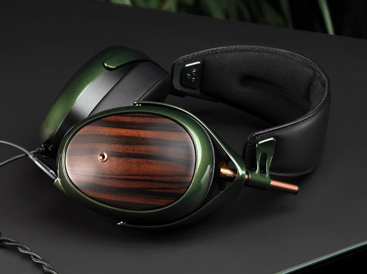
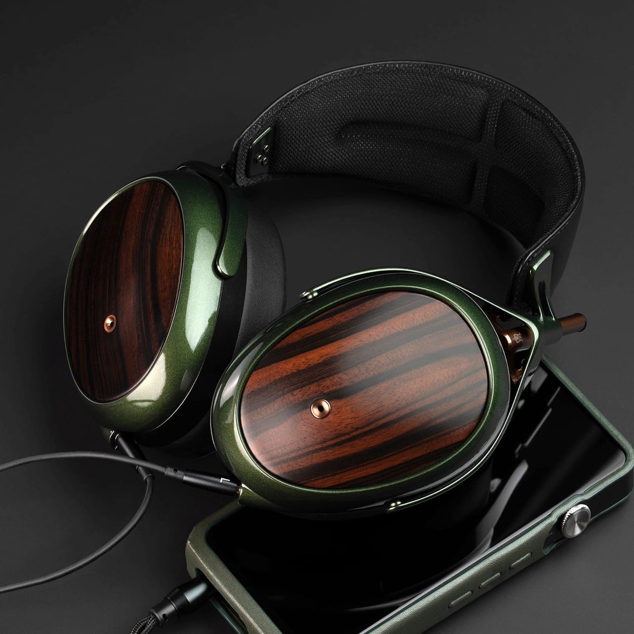
Romanian audio atelier Meze has spent two decades treating headphones as craft objects, and the Strada makes that philosophy fully explicit. Hand-carved walnut and ebony ear cups, each unique in grain and tone, sit alongside a magnetic ear pad system that snaps on and off cleanly, making them the first pair that genuinely anticipates its own aging. The leather headband drapes naturally against the collarbone. At $799, you’re investing in the idea that daily objects deserve this level of material care.

Worn around the neck, the Strada does something genuinely rare: it makes you look considered rather than plugged in. Those hand-carved wood cups catch light in a way that aluminum never quite manages, and the closed-back design delivers warmth and isolation without the clinical precision of most audiophile gear.

What We Like

  • The hand-carved wood ear cups make every unit genuinely one-of-a-kind, an unusual distinction in a product category that typically prizes consistency and uniformity above everything else
  • The magnetic ear pad system solves a real longevity problem that most headphone manufacturers still choose to ignore, making the Strada feel genuinely built for the long term from the start

What We Dislike

  • The warm, closed-back tuning leans toward intimacy over accuracy, which won’t satisfy listeners who prefer a flat, analytical sound profile for critical or reference listening sessions
  • No active noise cancellation at $799 is a deliberate aesthetic choice, but it will not suit everyone who regularly listens in open, noisy, or busy urban environments

3. Bang & Olufsen Beoplay H95

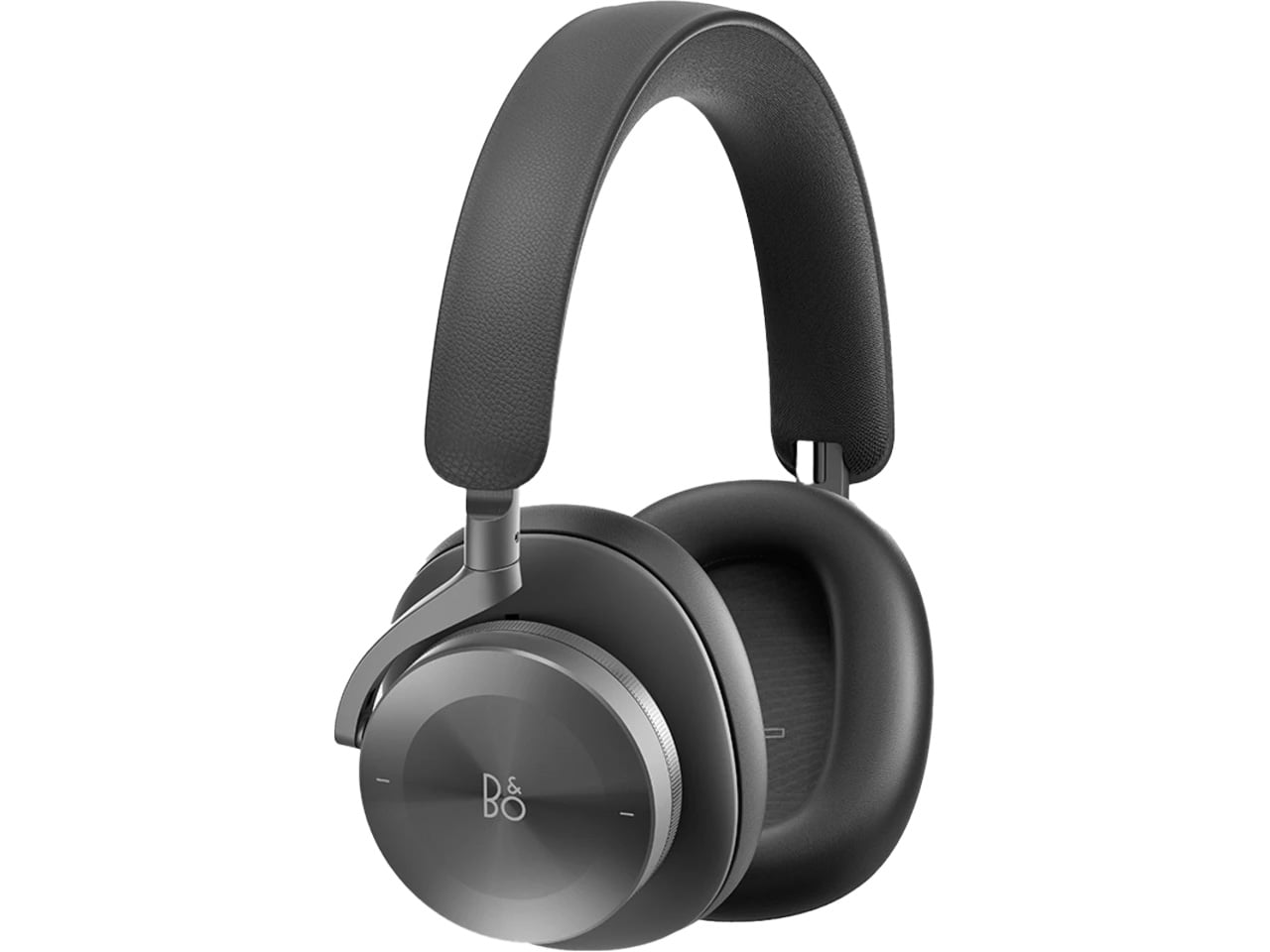
 Bang & Olufsen has been designing objects that make a room better simply by existing in it since 1925. The Beoplay H95 carries that logic to your ears. Brushed aluminum arcs support lambskin ear cushions with the quiet authority of something that was never trying to impress anyone. Custom 40mm titanium drivers deliver an expansive, unhurried soundstage, and 38 hours of battery life with ANC active means you rarely need to think about charging. At $1,250, it reads as inevitable rather than expensive.

Around the neck, the H95 makes its strongest case. The slim profile rests cleanly against the collarbone, the aluminum catches light without glare, and the lambskin ages into something better than what you started with. Vogue Scandinavia named it the headphone that pairs best with the softest cashmere roll-neck and a cocooning wool coat, which is not exactly a mid-range endorsement. The tactile control dial and hard carrying case complete the picture of a brand that hasn’t needed to shout for a century.

What We Like

  • Lambskin ear cushions and brushed aluminum give the H95 a material quality that makes every other pair on this list look like it is working a little harder to impress you
  • 38-hour ANC battery life is class-leading and genuinely difficult to match at any price point, making this the pair most likely to outlast a long-haul journey without any hesitation

What We Dislike

  • At $1,250, this is a significant investment for a product category where $400 already delivers very strong audio performance from multiple well-regarded and respected manufacturers
  • The control dial is elegant but carries a subtle learning curve that takes several days of regular use to feel completely intuitive and second-nature in the hand

4. Bowers & Wilkins Px8 S2

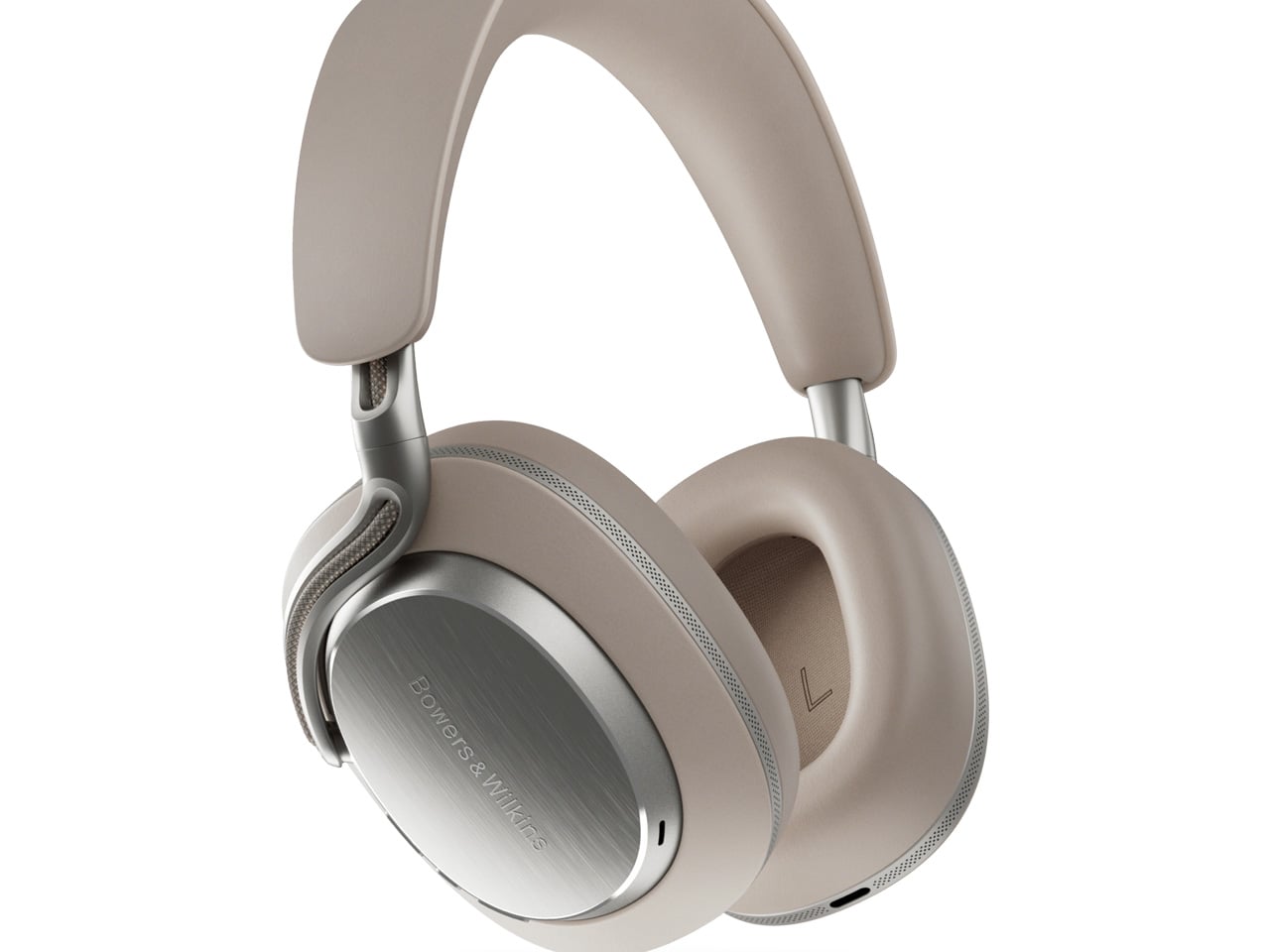
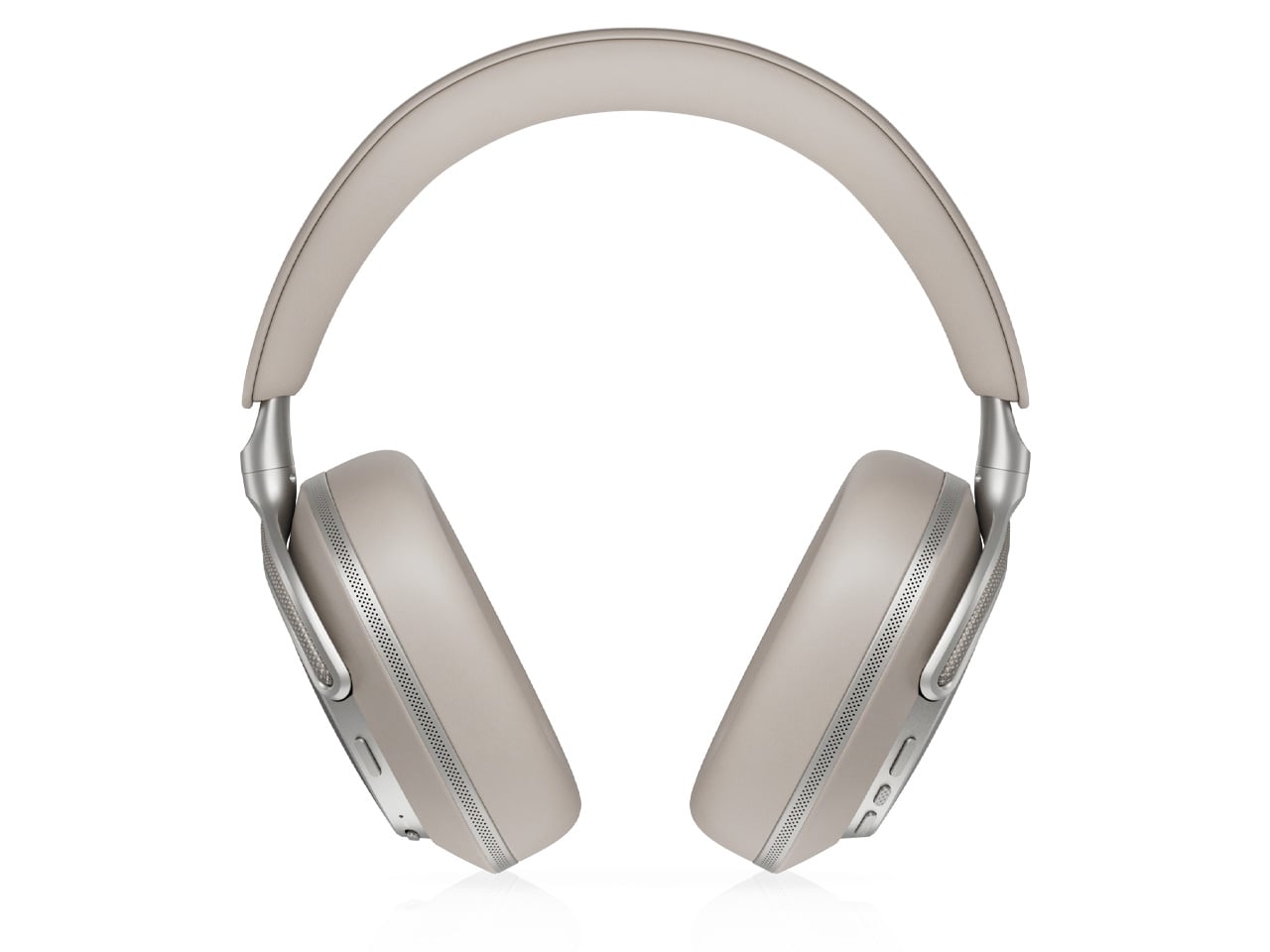
The Px8 S2 looks like it was designed by someone who spent too much time around luxury automobiles and not enough time worrying about what people thought. Diamond-quilted Nappa leather ear cups sit inside angular aluminum driver housings that don’t apologize for taking up space. Bowers & Wilkins built their reputation on speaker cabinets in British living rooms, and that obsession with material quality is fully present in the Px8 S2. At $799, it’s the most visually assertive pair on this entire list.

Worn on the head, the 40mm Carbon Cone drivers deliver a focused sound that rewards careful listening. Worn around the neck, the quilted leather and aluminum geometry create a silhouette that reads closer to jewelry than consumer electronics.

What We Like

  • The diamond-quilted Nappa leather ear cups are a genuinely distinctive design move that no other headphone brand at this price point is executing with this level of craft and conviction
  • 40mm Carbon Cone drivers bring the kind of focused sound detail that makes streaming audio feel like it might be holding something back, consistently rewarding attentive listeners on every session

What We Dislike

  • The angular form does not fold into a compact carry position, making the included case noticeably bulkier than most direct competitors when packed into a bag for daily commuting use
  • The firm clamping force is necessary for the acoustic seal, but it makes itself felt during extended listening sessions, which matters for anyone who wears headphones for several consecutive hours at a time

5. Sonos Ace

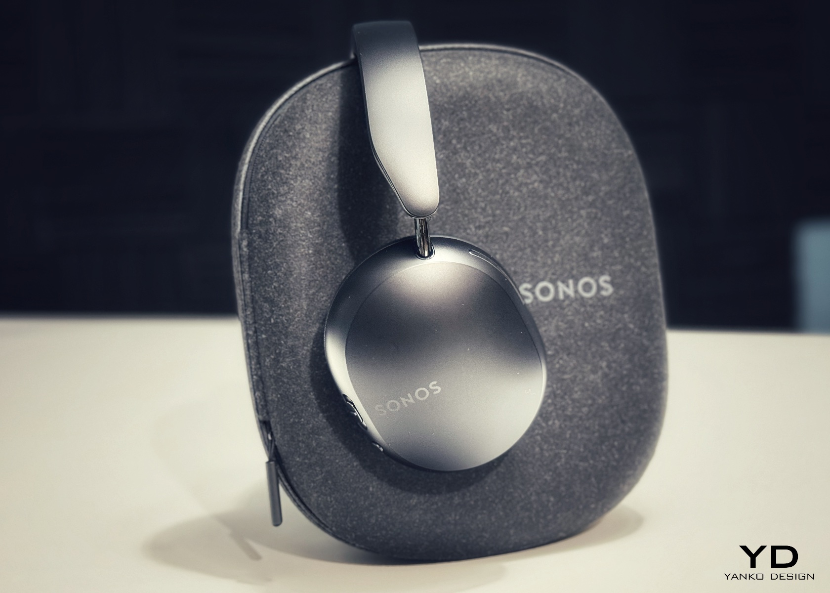
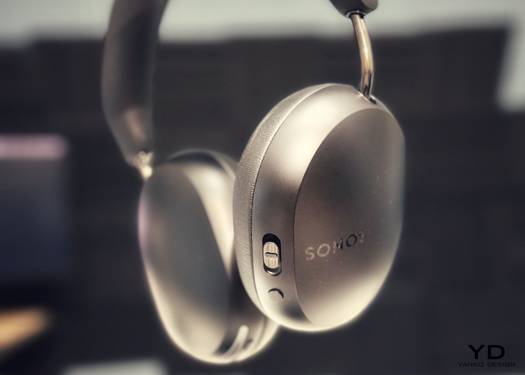
Sonos spent two decades being the most thoughtfully designed speaker company in the world before ever touching headphones. The Ace is what happens when a brand famous for restraint and material quality finally commits to an entirely new product category. Stainless steel arms, memory foam ear cushions, and a clean form in Midnight or White carry the same quiet authority as Sonos’s best home equipment. At $449, it sits below the B&O and B&W while fully matching them on design character and material coherence.

What makes the Ace genuinely stand out is what you don’t notice: no visible seams on the headband, no mismatched materials, no hardware that apologizes for itself. Active noise cancellation and a 30-hour battery complete a pair that wears as well around a neck as it sounds through the drivers, making it the most versatile pick on this list.

What We Like

  • The material cohesion across every surface, every finish, and every seam speaks one consistent and considered design language, which is an unusually disciplined achievement at the $449 price point
  • Active noise cancellation combined with a 30-hour battery puts the Ace ahead of most competitors on the two specifications that matter most for daily and travel listening

What We Dislike

  • The body is predominantly high-quality plastic rather than metal, which is a material trade-off that some buyers will feel at this price point relative to the B&O and B&W alternatives
  • Head-tracking spatial audio is most effective when paired with a Sonos home speaker system, limiting the feature’s full appeal for listeners who don’t already own Sonos hardware at home

The Best Headphones Are the Ones You Never Want to Take Off

What all five of these pairs share is a seriousness of intent that goes well beyond frequency response. They were built by companies that think about how objects live in the world, not just during a listening session, but on a train platform, at a desk, hanging around a neck. That’s a harder problem to solve than noise cancellation, and the brands that crack it tend to stay relevant far longer than those that don’t.

The range here runs from $449 to $1,250, but the price gaps matter less than they appear at first. What you’re really choosing between is design language: Romanian craft warmth, Scandinavian restraint, British precision, speaker-first material thinking, or clean minimalism that genuinely disappears. Any of these pairs earns the right to hang around your neck. The question is which one earns it in a way that feels made for how you actually move through the world/

The post 5 Over-Ear Headphones That Look as Good When They’re Around Your Neck as When They’re on Your Head first appeared on Yanko Design.

  •  

Air Purifier Filters Cost $100 a Year, but CUE Uses Water Instead

Air purifiers have become a common fixture in homes and offices, quietly working to keep indoor air breathable. Most of them follow the same basic formula, drawing air through a dry filter that captures dust, pollen, and airborne particles over time. When that filter reaches its limit, you throw it away and buy a replacement, or wash it if it’s the reusable kind. It’s a familiar routine, but not exactly a thoughtful one.

CUE Air Washer from Watervation is a 2-in-1 purifier and humidifier that takes a noticeably different approach. Rather than filtering air through a dry medium that slowly fills with grime, it washes the air with water, borrowing from how rain naturally clears the atmosphere of dust and pollen. It’s a concept that sounds simple in hindsight but actually changes quite a bit about how air care works.

Designer: Watervation

Click Here to Buy Now: $299 $575 (48% off). Hurry, only 41/975 left! Raised over $411,000.

The idea at the heart of CUE is surprisingly intuitive. Instead of holding contamination inside a dry filter, the device draws air through a water-based medium that strips airborne particles and gases from the air. Once the water turns dirty, you empty it, rinse the tank, and refill it, giving the device a clean start every day. There’s nothing to replace, and nothing to accumulate.

The technology behind CUE is Watervation’s patented RainTec system, and its most notable quality is what it doesn’t rely on. Most air washers need motorized water pumps to circulate liquid, but RainTec uses fluid dynamics instead. A spinning rotor generates a vacuum that draws water upward without any pump, eliminating the most common failure point in these devices and keeping the design considerably simpler.

What makes CUE genuinely practical is how naturally it handles two common problems at once. Dry air and airborne pollutants tend to go hand in hand, especially in bedrooms during winter or in home offices that don’t have great ventilation. Instead of running two separate appliances for purification and humidity, CUE handles both, covering spaces up to 300 sq ft, which fits most personal and domestic environments.

The ownership story is where CUE makes the strongest case for itself. Conventional air purifiers can cost over $100 per year in filter replacements alone, a figure that doesn’t stop growing the longer you use the device. CUE cuts that entirely by using water as its only medium. The maintenance routine comes down to emptying the tank, rinsing it, and refilling it with fresh water.

CUE is also one of those rare appliances that’s genuinely pleasant to leave out in the open. The cylindrical device has a dark upper housing and a clear lower tank that lets you watch the water action inside. There’s something calming about it. The swirling motion of water being spun and atomized gives the cleaning process a visible, almost meditative quality that isn’t common in this product category.

Performance testing by Korea Conformity Laboratories gives the product’s claims some independent backing. Results showed a 93.5% reduction in fine particulate matter, a 99.5% reduction in acetic acid, a 99% reduction in ammonia, and a 90% reduction in formaldehyde. The device also includes a built-in UV-C sterilization module that continuously disinfects the water tank while running, keeping the water hygienic throughout each cycle.

There’s a growing appetite for home appliances that earn their place on a shelf rather than hiding behind it. CUE Air Washer fits that thinking, handling air quality in a way that’s quieter, cleaner, and far less dependent on consumables than what came before. Watervation’s direction with this product hints at what home air care could look like when the design is as considered as the engineering behind it.

Click Here to Buy Now: $299 $575 (48% off). Hurry, only 41/975 left! Raised over $411,000.

The post Air Purifier Filters Cost $100 a Year, but CUE Uses Water Instead first appeared on Yanko Design.

  •  

No More Waiting in Line for Hot Water, This RV Heater Has 66,000 BTU

Summer has a way of changing the rules for RV travel. What was a relaxed weekend trip for one or two people becomes a full-blown family expedition, with everyone’s routines packed into the same tight space. Showers get longer, dishes pile up faster, and the morning rush gets more competitive. The systems you barely thought about in cooler months suddenly start to matter a great deal.

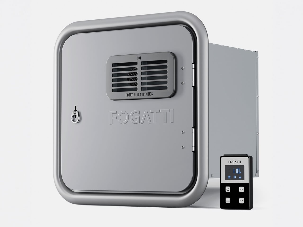
Hot water is one of the first things you notice when an RV can’t keep up. Waiting for the tank to recover, a cold burst just as you find a comfortable temperature, or having to ration usage when multiple people need the sink, these aren’t exactly the highlights of a road trip. The Fogatti InstaShower Ultra is a propane tankless water heater designed to change all of that.

Designer: Fogatti

Click Here to Buy Now: $799.99 $899.99 ($100 off). Hurry, deal ends in 48-hours. Website Link Here.

Picture a typical summer morning at a campground. Someone’s in the shower while another is getting breakfast going, and a third is at the sink washing up before everyone heads out for the day. That kind of simultaneous demand used to be a problem. With 66,000 BTU of rapid heating power and a maximum flow rate of 3.9 GPM, the InstaShower Ultra handles it without much fuss.

The end of a summer day outdoors tells a different story. Whether you’ve been hiking dusty trails, splashing around a lake, or just sitting in the heat all afternoon, everyone comes back to the RV needing a proper wash. A strong, steady shower makes that feel less like a chore and more like a reward, and you don’t have to queue up for it.

One of the more thoughtful bits of engineering is a built-in pre-mix system with a small mixing tank that balances temperature at startup. It addresses a familiar tankless annoyance, namely the cold burst before the heating kicks in. Once that’s handled, water comes out warm right away, and it’s the kind of improvement you only appreciate once it stops being a problem.

Temperature management doesn’t stop there, either. The heater uses segmented combustion that automatically adjusts heat output based on conditions. On a scorching summer afternoon, it scales back to prevent overheating. On a cool mountain evening or at higher altitudes, it ramps up accordingly. It’s a neat bit of self-regulation that keeps water temperature consistent, whether you’re parked in a sun-baked valley or somewhere up at 9,800 feet.

The InstaShower Ultra also activates at a flow rate as low as 0.5 GPM, which is considerably lower than what most standard tankless heaters require to kick on. That might seem like a minor detail, but it matters quite a bit on longer off-grid trips where every gallon counts. You aren’t forced to run the tap wide open just to get the heater going.

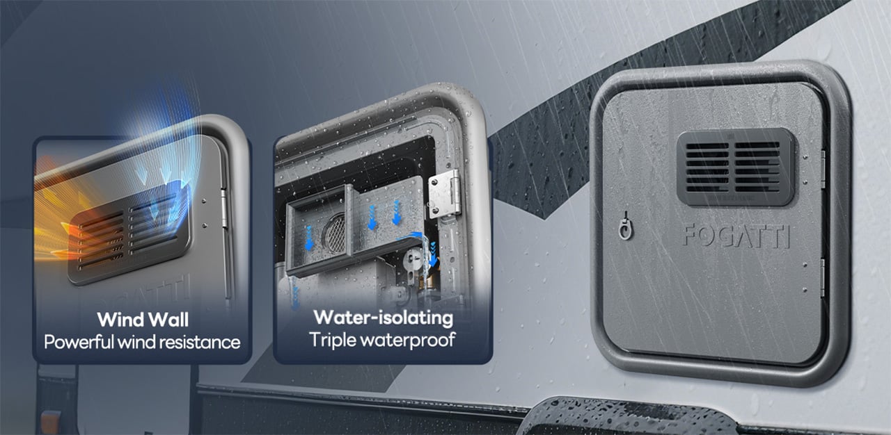
The weather is something a lot of buyers don’t think about until it’s too late. Summer storms roll in fast, and a water heater that can’t cope with heavy rain or strong gusts becomes a liability. HydroShield-Tech gives the InstaShower Ultra both windproof and waterproof resistance, with a NIDEC high-performance fan backing up the wind protection, so the heater keeps running when conditions outside take a turn.

For those still running on an older four- or six-gallon storage water heater, the InstaShower Ultra is a practical replacement. It comes with a door measuring 15 x 15 inches, designed to fit the cutout left by those older tanks, along with a decorative frame. Optional larger door frames are also available separately if your RV’s opening calls for a different fit.

Summer trips have a way of exposing which parts of the RV are actually ready for extended life on the road. A water heater might not top the pre-trip checklist, but it touches nearly every part of the daily routine, from the first shower of the morning to cleaning up after a late campfire dinner. Getting it right makes those routines a lot less stressful, and that’s the peace of mind that the Fogatti InstaShower Ultra delivers.

Click Here to Buy Now: $799.99 $899.99 ($100 off). Hurry, deal ends in 48-hours. Website Link Here.

The post No More Waiting in Line for Hot Water, This RV Heater Has 66,000 BTU first appeared on Yanko Design.

  •  

This iPhone Air 2 Concept Adds Two Cameras and Suddenly the Phone Makes More Sense

Every first-generation Apple product is essentially a beta test with a premium price tag, and the iPhone Air was no exception. The engineering was genuinely remarkable: 5.6mm thin, a large ProMotion display, A19 Pro performance, and battery life that surprised nearly everyone who reviewed it. What wasn’t remarkable were the two omissions that showed up in every single hands-on: one camera and one speaker, on a phone that cost $999. Those two complaints alone handed buyers a perfectly logical reason to spend the same money on a Pro instead. The Air needed a second generation the moment the first one shipped.

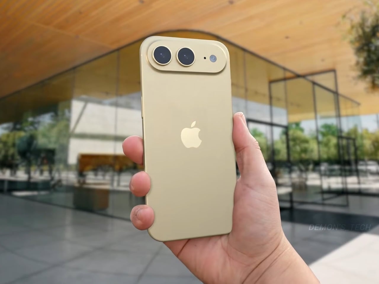
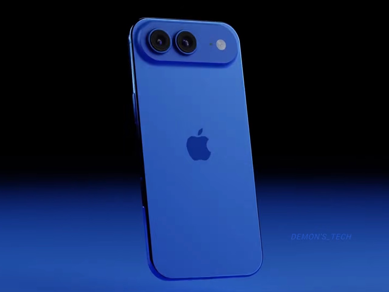
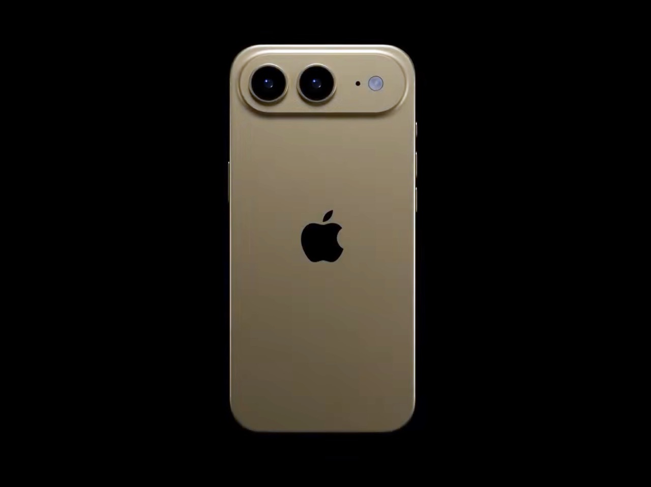
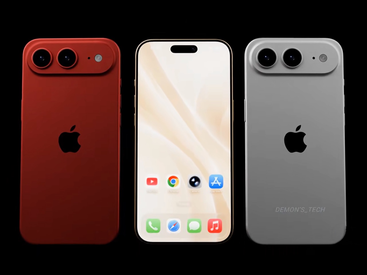
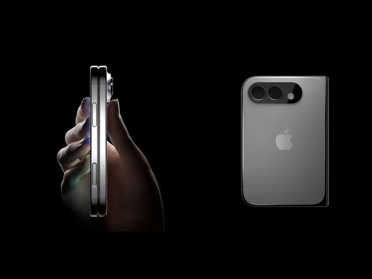
Demon’s Tech has imagined exactly what that second generation could look like, and the concept renders suggest Apple already has a clear path to making the Air the phone it should have been from the start. The dual-camera bar is wide and confident across the top of the phone, housing two lenses with room to spare. The rest of the body is pure restraint, a flat back, centered Apple logo, and a color range vivid enough to give the phone a personality that its specs can now actually back up. If the rumored stereo speaker and efficiency-focused N2 chip join that camera upgrade, the Air 2 goes from interesting to genuinely compelling.

Designer: Demon’s Tech

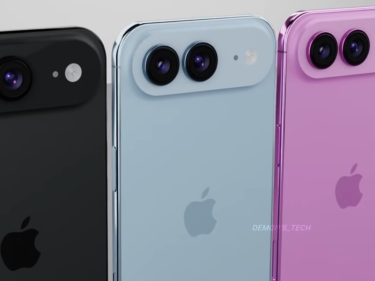
Two 48-megapixel sensors reportedly sit inside the pill-shaped housing, one primary and one ultrawide, which aligns with leaks from Chinese tipster Digital Chat Station suggesting Apple is going for a main-plus-ultrawide configuration rather than a telephoto. That choice makes sense for the Air’s positioning. Telephoto glass demands physical depth that a sub-6mm chassis simply cannot accommodate, and ultrawide coverage is what most non-Pro users actually miss day-to-day. The original Air’s single-lens bar always looked slightly incomplete, like a sentence that trailed off mid-thought, and Demon’s Tech addresses that by stretching the new pill-shaped housing almost the full width of the phone’s upper third, sitting flush and purposeful rather than apologetic. It is a small change on paper that transforms the entire visual logic of the back panel.

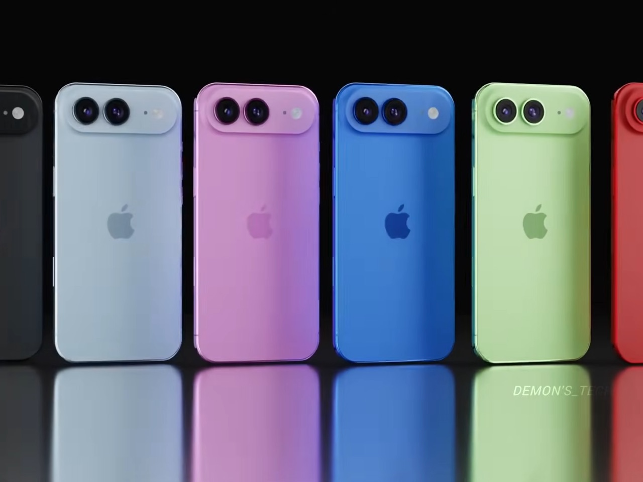
Apple shipped the original Air in four relatively restrained options: cloud white, sky blue, light gold, and matte space black. Demon’s Tech blows that palette wide open, running through violet, cobalt, mint green, and vivid red alongside the sandy gold seen in the hero shots, which is closer to what the iPhone 5C attempted in 2013, a phone that led with color as a statement rather than a courtesy. The Air’s lifestyle positioning actually supports this approach in a way the 5C’s budget framing never quite did. A phone you buy partly because it is extraordinarily thin is a phone you buy to be noticed, and being noticed in muted gold is considerably less fun than being noticed in electric blue. The renders make a quiet argument that Apple’s colorway restraint on the original Air was a missed opportunity, not a deliberate choice.

Twelve gigabytes of RAM paired with the A20 Pro keeps the performance story simple: this is a phone that matches the Pro lineup on silicon even if it concedes on optics. The sleeper upgrade is Apple’s rumored N2 efficiency chip, because getting better battery life out of a body that physically has less room for cells requires exactly this kind of architectural work, the same discipline that let the original Air post competitive endurance numbers despite its dimensions. Add stereo sound from a bottom speaker alongside the existing top one, and the two most common complaints about the first Air evaporate inside a single product cycle. That is a more focused corrective than Apple managed with either the Mini or the Plus, both of which spent multiple generations struggling to justify their existence. If Apple lands all of this at the same $999 price point, the value math finally starts working in the Air’s favor.

Apple has confirmed the Air line continues, with the second generation reportedly targeting a spring 2027 release window, landing after the iPhone 18 Pro, Pro Max, and foldable models ship in fall 2026. That later window gives Apple’s engineering teams more time to solve the thermal and battery challenges that come with building capable hardware into an impossibly thin frame, and it gives the Air its own launch moment rather than forcing it to compete for attention against a foldable iPhone. Demon’s Tech’s concept is the best visual argument yet for what that launch moment could look like: a phone that carries its thinness as a given rather than an excuse, and finally has the camera system and audio to back up everything the form factor promises.

The post This iPhone Air 2 Concept Adds Two Cameras and Suddenly the Phone Makes More Sense first appeared on Yanko Design.

  •  

ASUS Zenbook DUO (2026) Review: One Laptop, Two Screens, All Business

PROS:


  • Beautiful, nearly identical 14-inch 144Hz 3K OLED screens

  • Narrower hinge creates a more immersive visual experience

  • Ceraluminum design adds visual and tactile character

  • Powerful Intel Panther Lake performance and impressive battery life

CONS:


  • Quite pricey

  • No built-in card reader

  • RAM is soldered

RATINGS:

AESTHETICS
ERGONOMICS
PERFORMANCE
SUSTAINABILITY / REPAIRABILITY
VALUE FOR MONEY

EDITOR'S QUOTE:

The ASUS Zenbook DUO (UX8407) earns its premium with two stunning co-equal OLED screens, a sleeker hinge, and Intel Panther Lake performance built for serious work on the go.
award-icon

For a time, it seemed that foldable and rollable screens would be the future of laptops, just as they are positioned to be where smartphones are going. That was until people realized that what may be good for handheld devices might not work for 14-inch slabs with keyboards. Foldable laptops might still have their day, but they are too impractical and costly for now.

ASUS has chosen to instead design and deliver a solution for today’s needs and problems. Rather than a screen that folds just to save space, the Zenbook DUO has opted to expand the user’s workspace instead, bringing the productivity advantages of dual-monitor setups from desktops to laptops. This year’s ASUS Zenbook DUO (UX8407) does more than just upgrade the spec sheet. It is also adding a touch of style and elegance that makes a power user tool feel more considered.

Designer: ASUS

Aesthetics

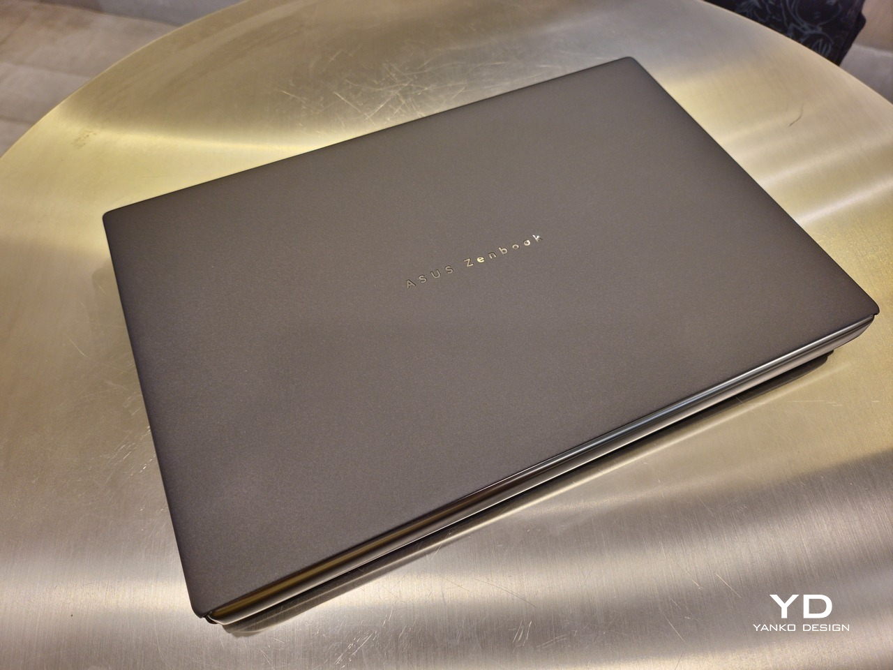
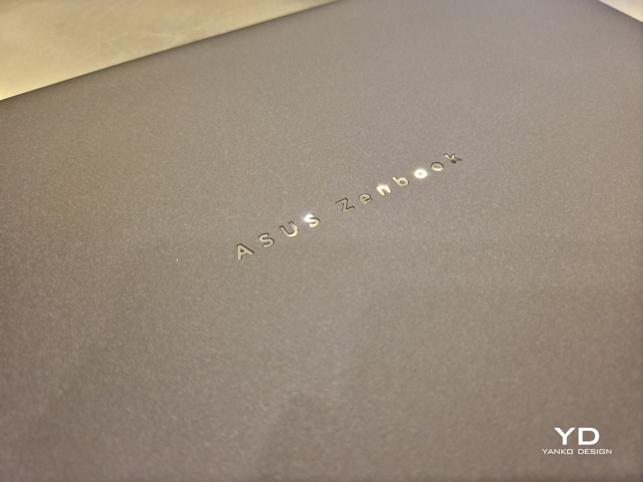
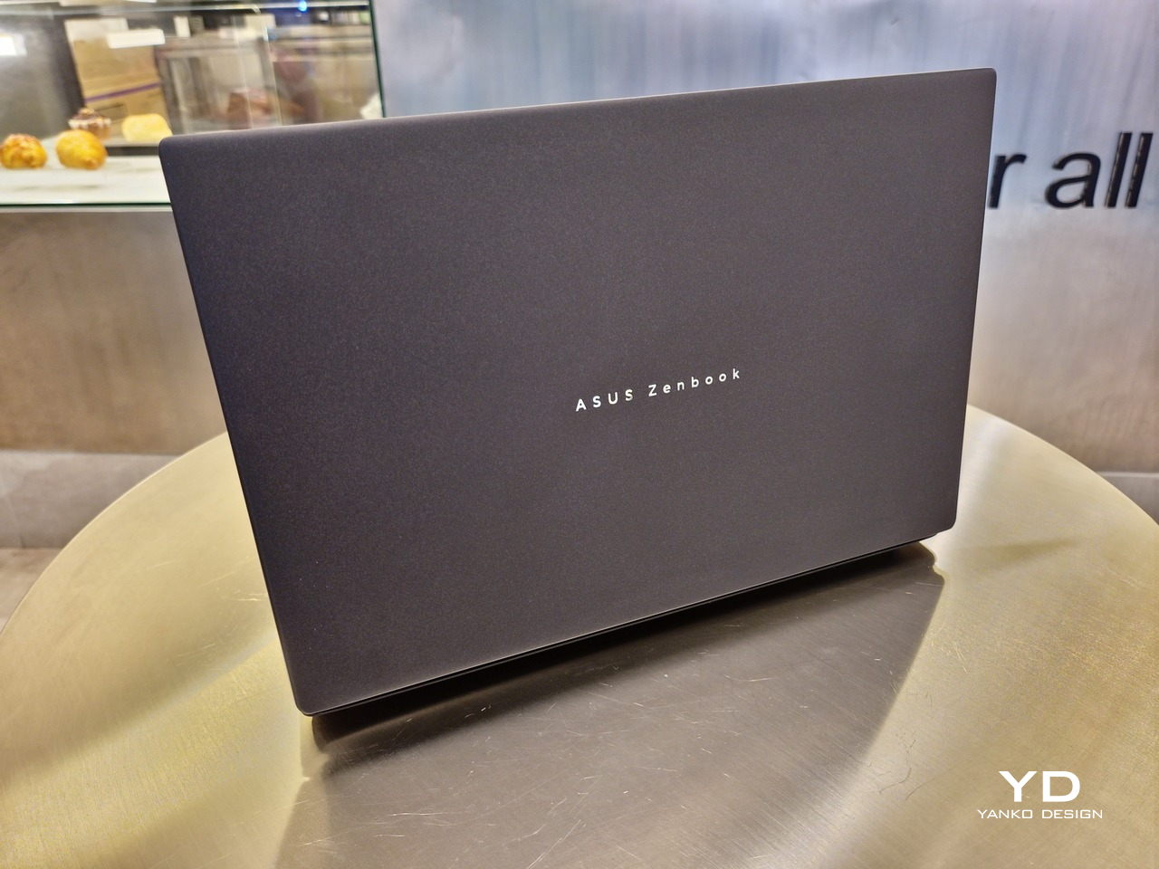
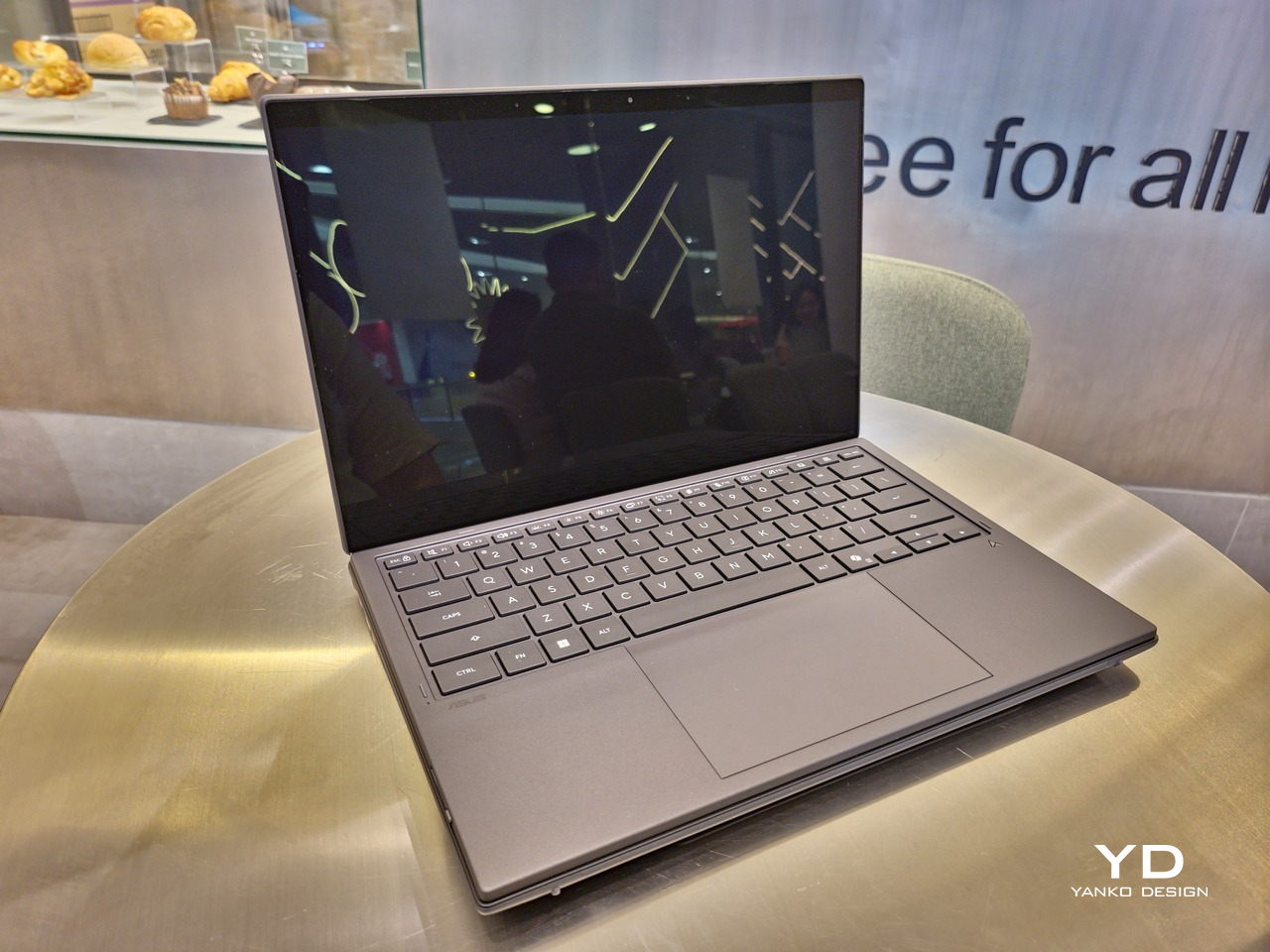
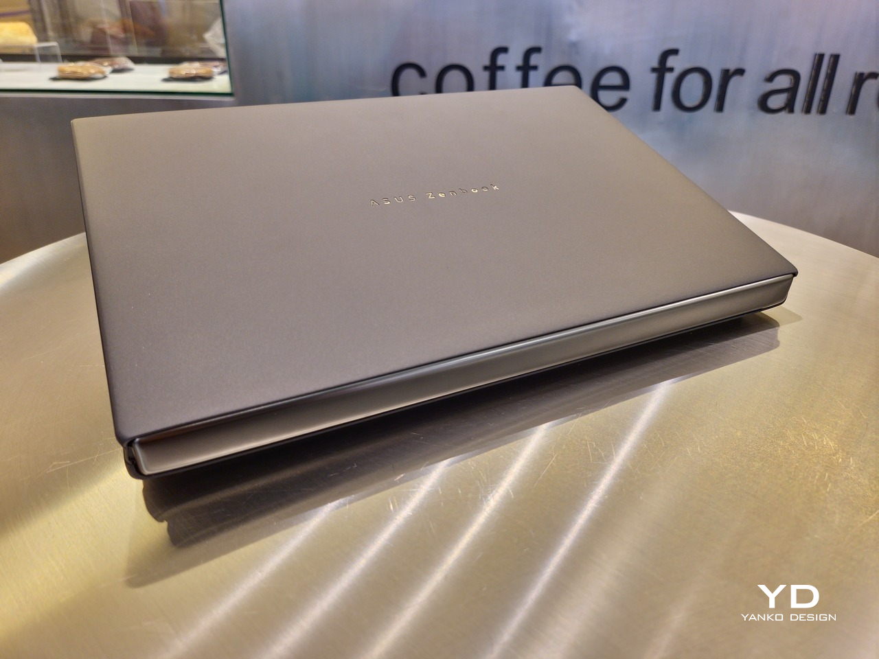
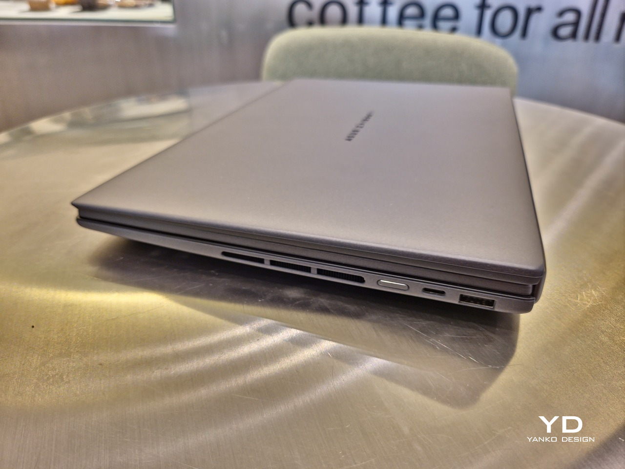
The 2026 ASUS Zenbook DUO (UX8407) is quite stunning in almost any form, whether it’s closed shut, opened like a laptop, or especially when it’s wide open. The lid cover exudes not only minimalism but also character, with a reflective “ASUS ZENBOOK” logo engraved against the Elephant Gray “Ceraluminum” surface, creating a simple yet eye-catching visual and material contrast.

That Ceraluminum is, of course, ASUS’s latest material innovation that uses a special oxidation process to give aluminum some ceramic-like properties, particularly durability and higher resistance to scratches. The end result is a material that isn’t just nice to look at but also pleasing to touch, giving the lid a texture that almost feels like stone or, well, ceramic. There is also a certain visual “roughness” to the Ceraluminum surface, setting it apart from the brushed metal or anodized appearances of its peers.

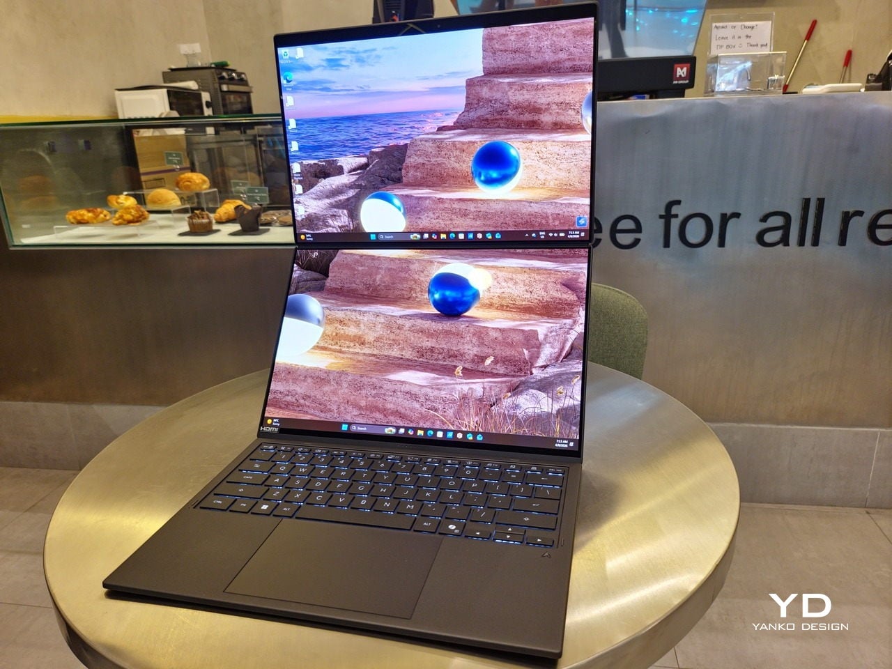
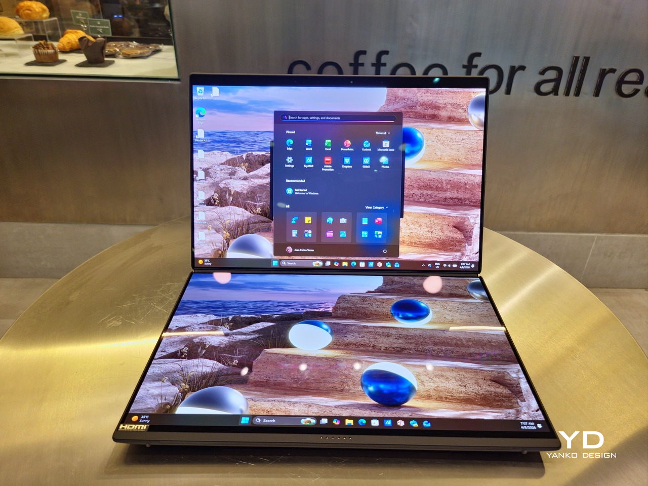
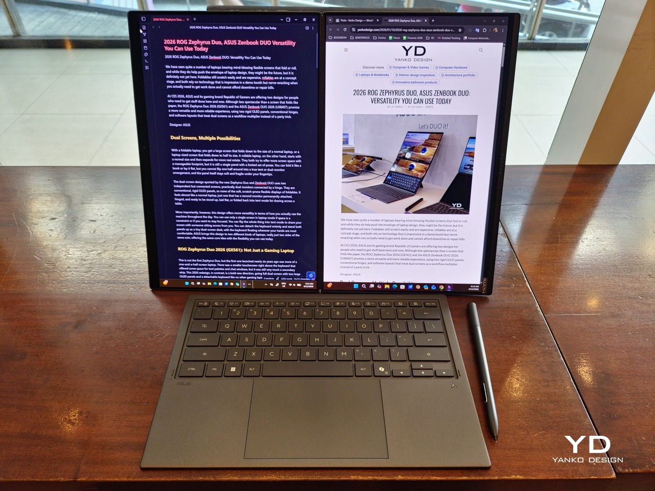
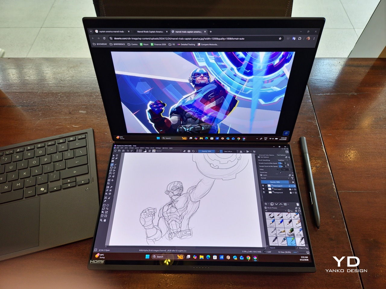
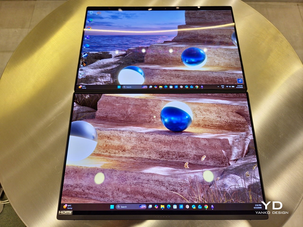
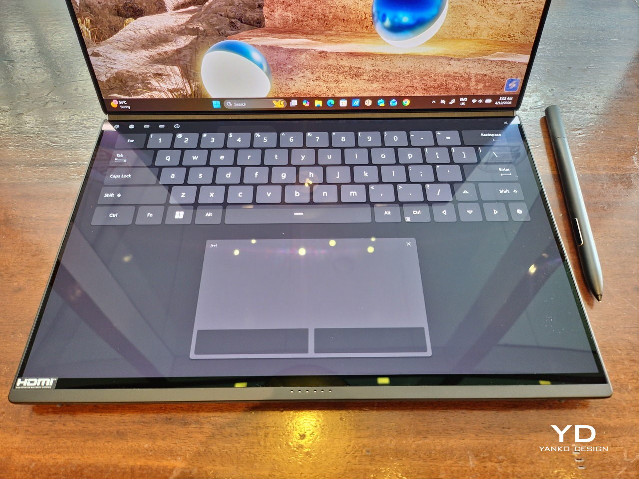
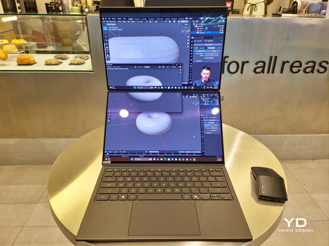
Of course, the real show happens when you open the laptop and lift the keyboard away, revealing two gorgeous 14-inch screens connected together by a hinge, no messy or awkward cables. For this iteration, ASUS poured its efforts into making that connection look even more seamless, not only by shrinking the bezels between the displays but also by developing a new “hideaway” hinge that narrows the gap from 25.31mm down to 7.6mm. Make no mistake, there’s still a very obvious separation between the two, but it is now less jarring, making it feel like you’re working with a screen that just happened to be split into two, rather than two screens stitched together.

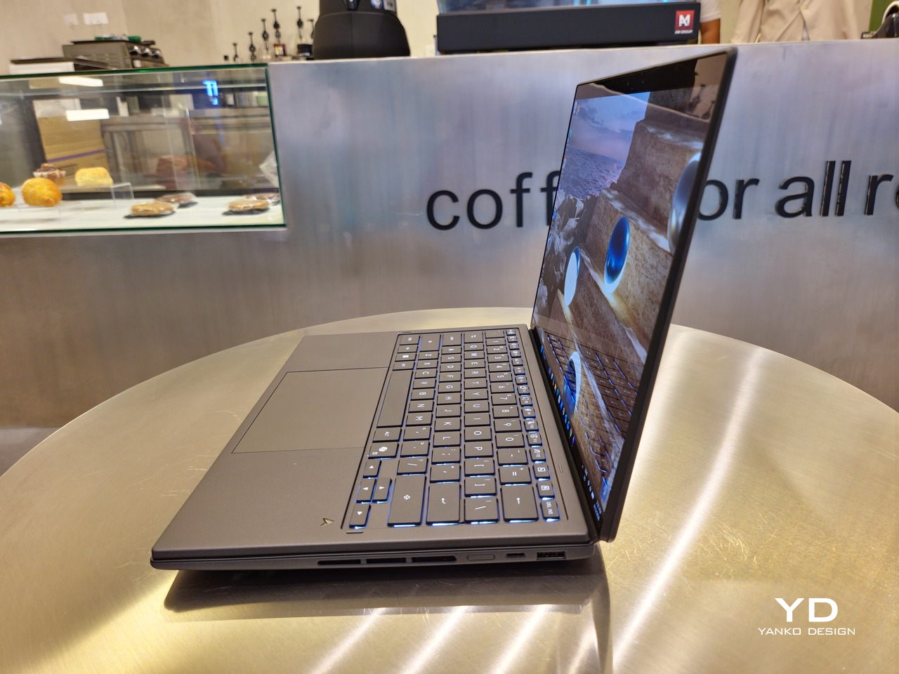
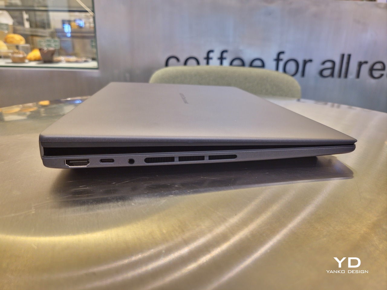
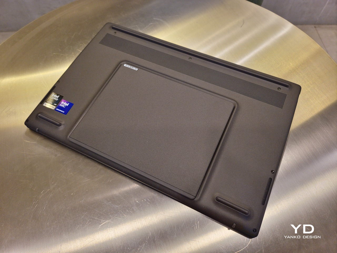
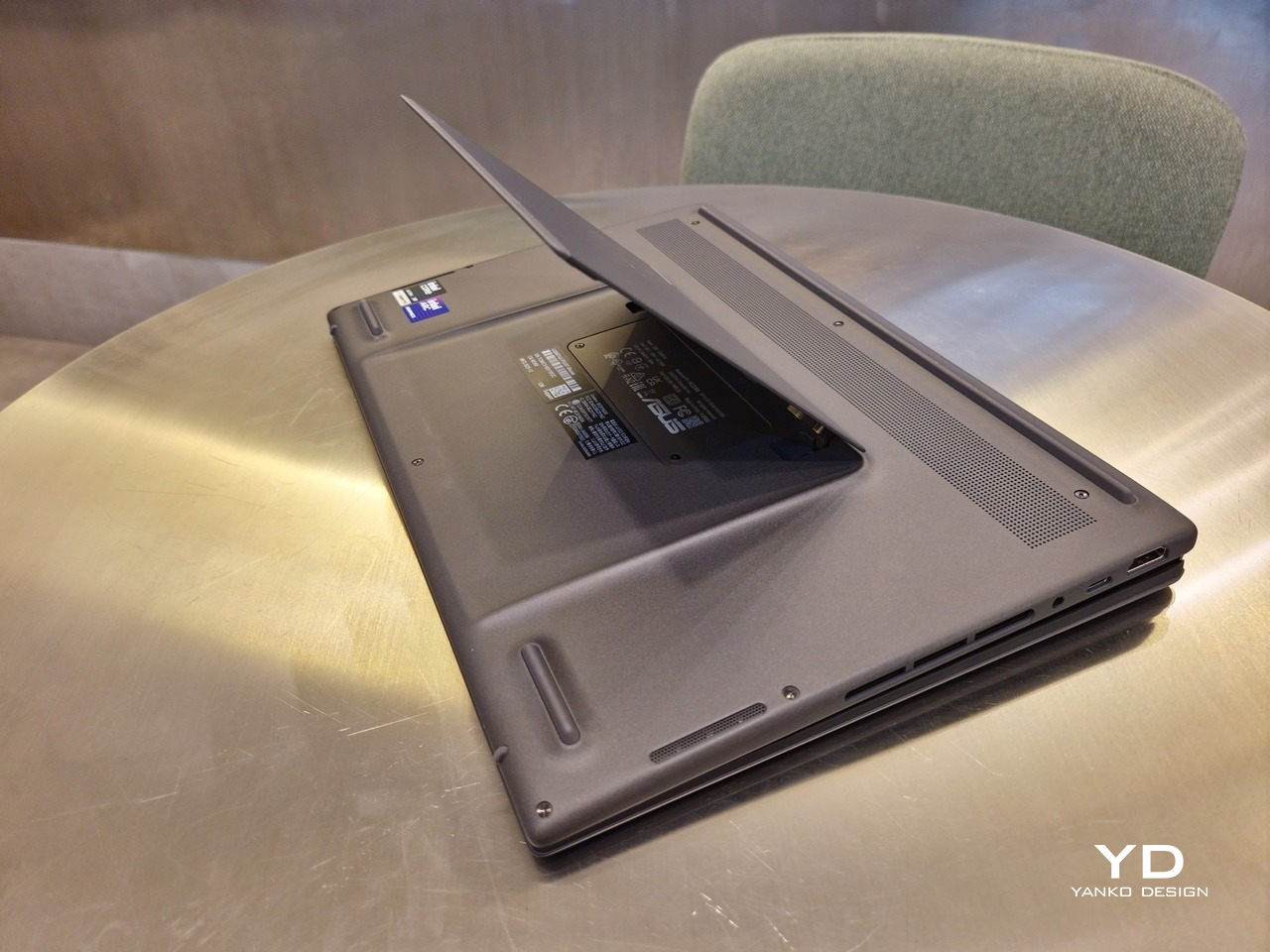
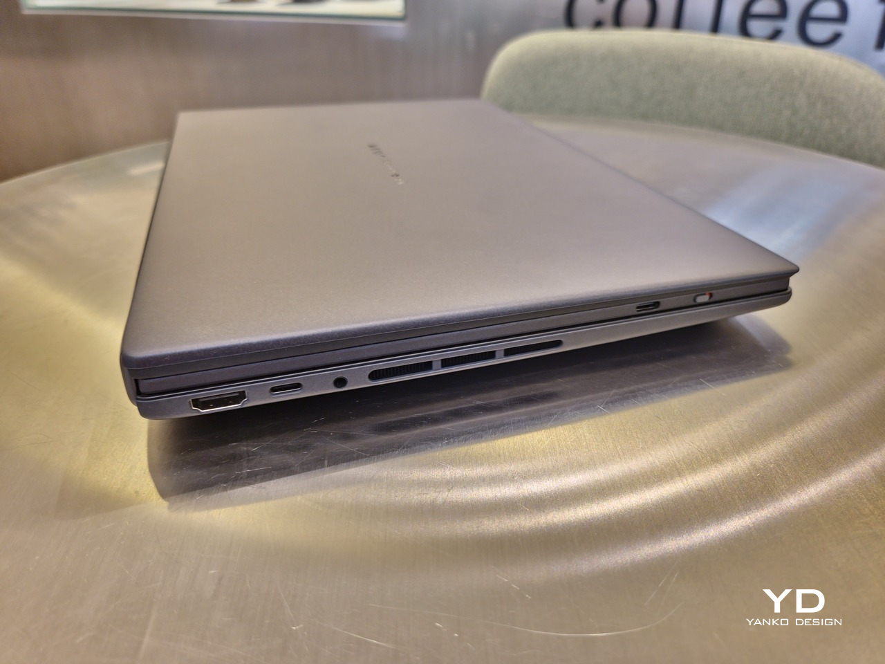
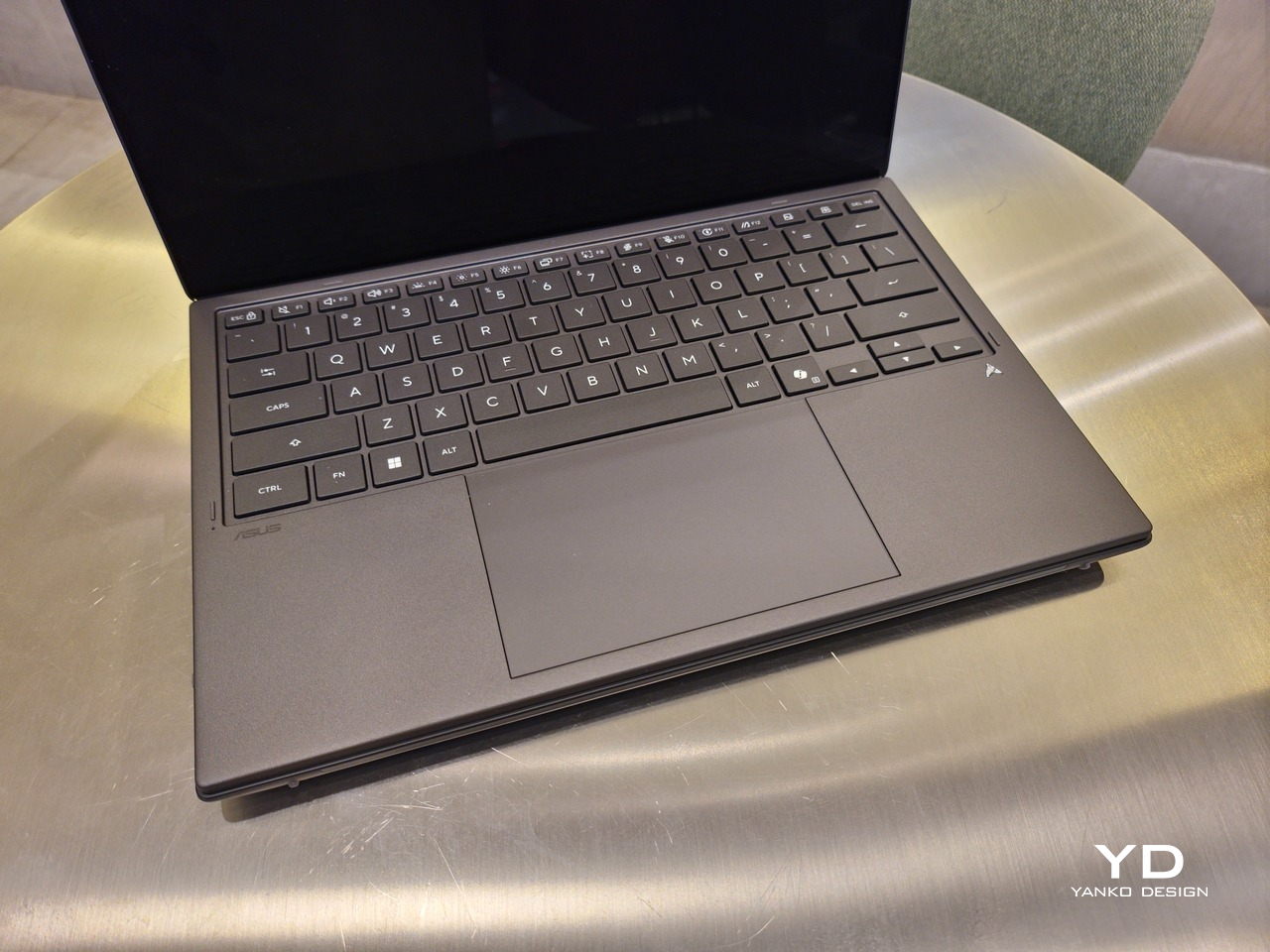
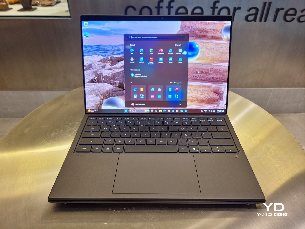
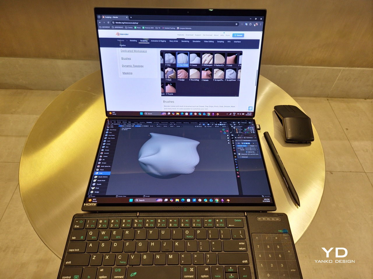
With the detachable Bluetooth keyboard resting on the second screen or when it’s closed, the Zenbook DUO (2026) looks almost like a normal laptop. You have a few (literally) ports on either side along with some air vents, and a wide-long grille at the bottom above the built-in kickstand. Your only clue that this isn’t a normal laptop is when you accidentally close the laptop lid without the keyboard attached, creating a very noticeable gap that, unfortunately, would also be an open invitation for small items to come in and scratch the screens.

Ergonomics

At 1.65kg (3.64lbs) with the Bluetooth keyboard attached, the ASUS Zenbook DUO (UX8407) isn’t exactly lightweight compared to other 14-inch laptops in the market, at least the non-gaming kind. That said, it’s not exactly on the heavier side either, especially when you consider that you’re carrying two 14-inch screens, not to mention a 99Wh battery, in a single bundle. In that context, it’s actually amazing how much ASUS was able to reduce the heft without cutting corners.

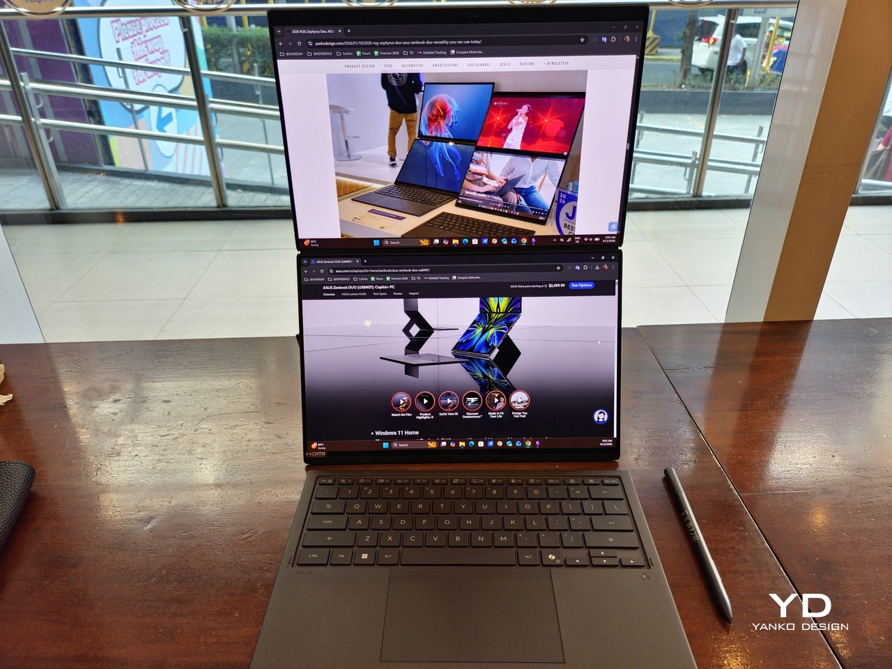
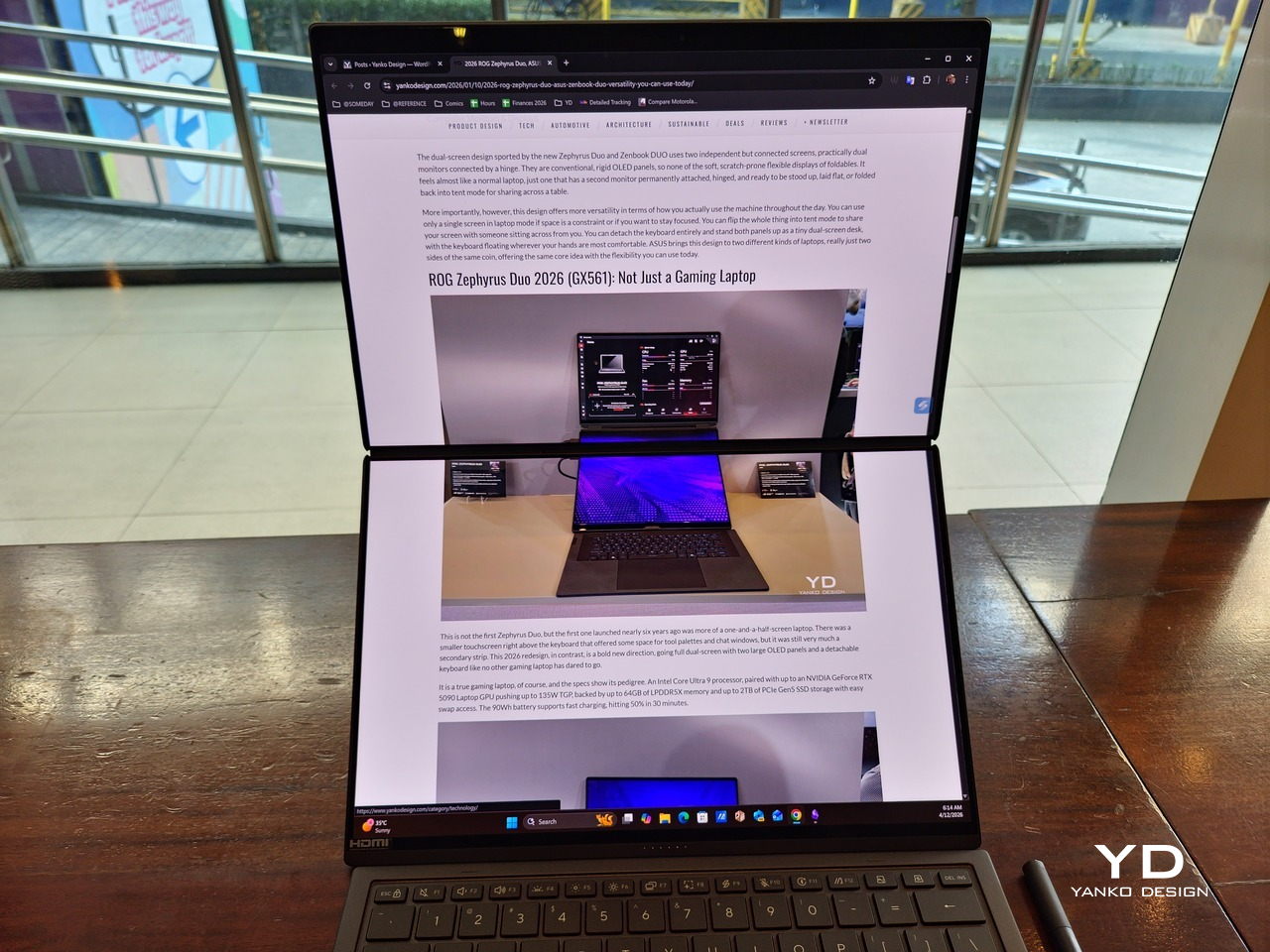
That said, having two connected displays brings its own ergonomics puzzle, something that ASUS seems to have finally solved almost to perfection. You have no less than 5 ways to use the laptop, from a normal laptop to two screens vertically stacked to the side-by-side “desktop mode”. While the hinge does most of the hard work, the built-in kickstand literally carries the burden, supporting that full weight (minus the keyboard) on its own.

The new kickstand is stronger, sturdier, and stiffer, providing confidence it won’t just suddenly close down. It can open to a maximum of 90 degrees, which is the angle you’ll need for desktop mode. That said, it also means that you only have possible angle for the displays in that mode, unless you have a separate stand to prop it up, which kind of defeats the purpose of having a built-in kickstand.

One thing to note in desktop mode is that you will naturally be sacrificing one side of ports. Thankfully, you can turn the Zenbook DUO (2026) which ever side up, whether you need an extra HDMI and headphone jack, or an extra USB-A port. Thankfully, both Thunderbolt 4 ports are equal in capabilities, so you don’t have to make a sacrifice on that end.

If there’s one thing I found a bit cumbersome in the Zenbook DUO’s design is that the power button sits so flushed against the frame. On the one hand, that means it won’t snag with anything in your bag, nor will it get triggered accidentally. On the other hand, it also makes it harder to locate it without looking or fumbling with your finger sliding across the edge repeatedly.

Performance

The ASUS Zenbook DUO (UX8407) is one of the early laptops to embrace Intel’s new Panther Lake chips, specifically the Intel Core Ultra 3 series. The dual-screen laptops comes in two options, one with an Intel Core Ultra 7 355 and the Intel Core Ultra X9 388H. In terms of CPU alone, these already represent a huge leap not just in performance but also in power efficiency, but the latter configuration pulls an even bigger feat.

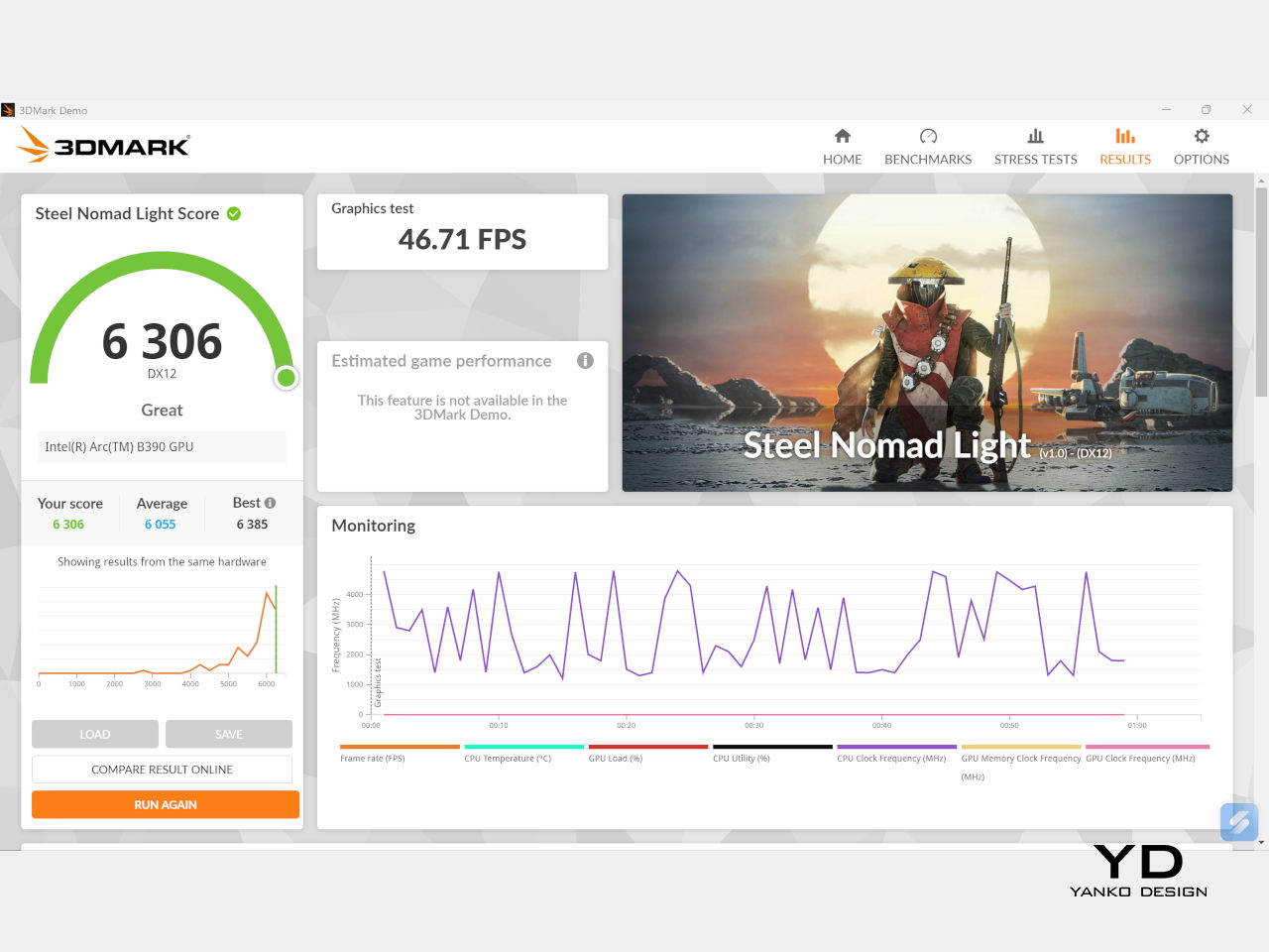
The review unit we received comes with an Intel Arc B390 GPU based the latest 3rd-gen Intel Xe graphics. Forget what memories you might have had of integrated Intel graphics, because we’re entering an era where you can actually play games with decent settings on it. Of course, your mileage may vary and benchmarks can only provide some general idea, but that all these specs mean is that the ASUS Zenbook DUO (2026) is built for serious productivity and creative work.

It is, after all, designed for heavy-duty computer users ranging from knowledge workers to creators who need to bring the productivity they enjoy on the desktop to wherever they go. Productivity suites, video editors, graphics programs, 3D modelers, and even games won’t make this flexible laptop break a sweat. And yes, that includes some AI shenanigans, thanks to an upgraded NPU as well.

Of course, this also means that it has enough muscle to support running two screens which, by default, is set to extended (versus mirroring each other). The beauty is that these two screens are nearly identical not just in size but also in capabilities, where other dual-screen laptops skimp on the second screen more often than not. We’re talking two 14-inch 3K (2880×1800) 144Hz Lumina Pro OLED displays. Both support touch and, more importantly, both support the ASUS Pen stylus.

In reality, there are very slight differences between the two screens in terms of full color gamut and maximum brightness, but you won’t notice it too much unless you are actively looking for it. In practice, most people will keep content they’re working on in one of two screens anyway, leaving the other as an auxiliary for references or controls.

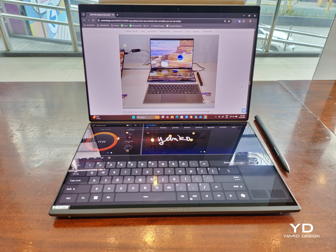
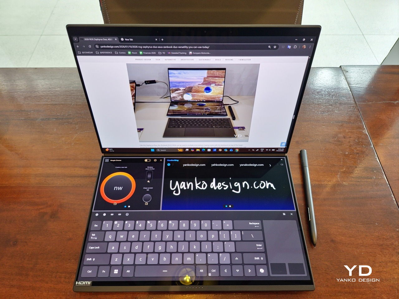
The latter is actually an interesting aspect of this dual-screen laptop, making the Zenbook DUO feel almost futuristic. While it does have a detachable keyboard, there might be times when you want to have more direct access to the lower touch screen without having to switch back and forth with the Bluetooth keyboard at the side. With a six-finger gesture, you can summon a half-height virtual keyboard, a half-height virtual keyboard with a virtual trackpad to the right, or a full-screen keyboard with a large trackpad below it, pretty much like the virtual equivalent of the physical keyboard.

Additionally, you can have other virtual knobs and sliders above the keyboard or as floating windows, thanks to ASUS’s Dial & Control app. These controls, which also include a numpad and an area for writing with a pen, can change depending on what app is currently in focus. With a browser window, it can have a button for a new tab or a dial for zooming in and out. Or it could be a knob for volume and a slider for screen brightness.

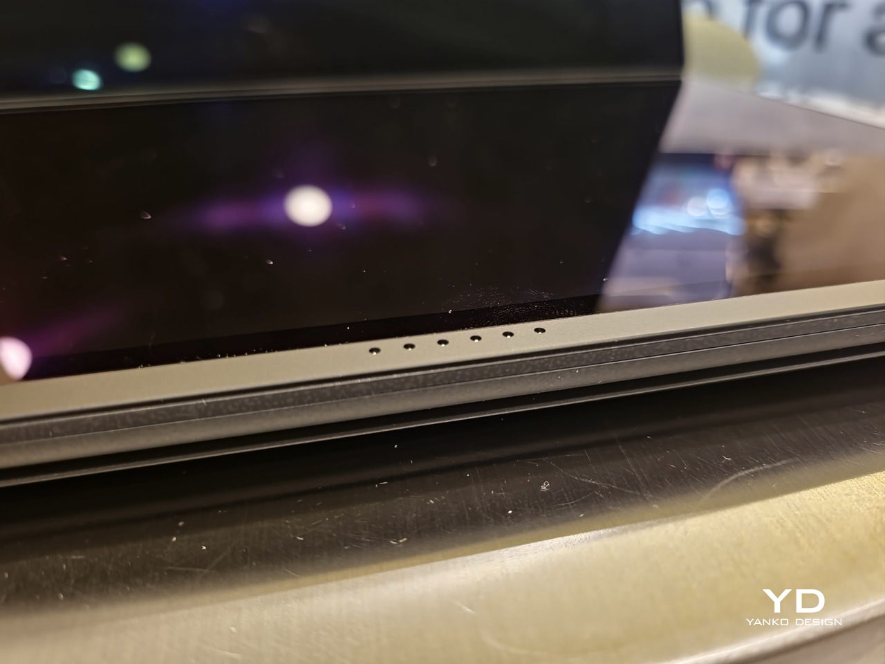
As for the detachable keyboard, it magnetically snaps into place, with retracting pogo pins creating a more stable connection than Bluetooth, though that is the only way to use it when it’s detached. That said, there are no notches or protrusions along the edges of the keyboard, so prying it away from that strong magnetic hold can take a bit of work. The keyboard charges when it’s lying on the laptop, but it can also be charged separately via USB-C. Key travel is decent, but the keys themselves feel a bit squishy. The large trackpad is sensitive, but the hydrophobic coating gives it too much resistance when gliding your finger across it.

The combination of the more power-smart Intel Panther Lake processor and the 99Wh battery tucked inside gives the ASUS Zenbook DUO (UX8407) quite a long uptime, even with both screens enabled. Even a battery of benchmarks and hours of typing and browsing has left a good 12% of battery left, rounding up to a little over 15 hours of use, just a little below ASUS’s advertised 18 hours (with two screens). The included 100W USB-C charging brick helps mitigate the battery loss, and the fact that you can easily use power banks to top up on the go makes the battery narrative even more compelling.

Sustainability

ASUS didn’t use to speak much about the sustainability of its laptops, but that has changed in recent years. The invention of Ceraluminum adds another level to that story, though a bit indirectly. In a nutshell, the material is meant to increase the durability and longevity of the product by protecting it from small accidents. Whether the ZenBook DUO uses sustainable materials, or at least what percentage of it does, isn’t public information.

That longevity, however, is also affected by how much you can upgrade or even repair the laptop. Given how unconventional its design is, it’s really no surprise that there isn’t much here in the way of upgrade options. You do have easy access to the SSD underneath the kickstand. The Zenbook DUO (2026) can support up to 2TB with a full-sized M.2 SSD. The 32GB RAM, however, is soldered down.

Value

The ASUS Zenbook DUO (UX8407) is a laptop on a mission. It is, in a nutshell, designed for people who thrive and need multi-tasking capabilities that they could only enjoy while chained to their desk (or awkwardly carrying a portable monitor). That actually covers a wide range of professions and industries, including creators, designers, office workers, executives, and, yes, gamers. In that sense, there can probably be no better tool for them than this.

In both performance and flexibility, the 2026 Zenbook DUO offers users the power they need, as they need it. Cramped for space on a plane? Just use it as a single-screen laptop, and no one will be the wiser. Need to collaborate with a team? Lay it out flat on the desk to give everyone the same perspective. Need to reference documents as you write? The book-like desktop mode has you covered.

That said, it’s definitely far from perfect. For a laptop aimed at creatives and professionals, the absence of a built-in SD card reader seems pretty odd. And then there’s the $2,699.99 price for the configuration that has the impressive Intel Arc graphics. That puts it way above most 14-inch ultra-thin laptops and in the range of gaming laptops. But then again, none of those have two 14-inch screens, either.

Verdict

Laptops with foldable screens admittedly look fancy and impressive. The big OEMs, including ASUS, are still playing around to find the formula that will finally make it feel more than just a fancy and expensive experiment. In the meantime, however, people need to get work done, and when it comes to that, nothing really beats using more than two screens.

You could always carry a portable screen along with your laptop, which is awkward, cumbersome, and inefficient, or you could grab the ASUS Zenbook DUO (UX8407). With an improved hinge, beautiful co-equal 14-inch displays, and an Intel Panther Lake processor that can handle almost anything you throw at it, the dual-screen laptop lets you choose the way you want or need to work. And it looks stylish to boot in any form, making sure you’ll be the envy of everyone in the coffee shop.

The post ASUS Zenbook DUO (2026) Review: One Laptop, Two Screens, All Business first appeared on Yanko Design.
  •  

The ZERO Chair Has No Welds, No Joints, No Apologies

Most chairs are built on compromise. You stack the legs, screw the seat, bolt the back, and somewhere in that assembly, a little bit of the original idea gets lost to the necessity of structure. Davide Bozzo’s ZERO Chair refuses to play that game entirely.

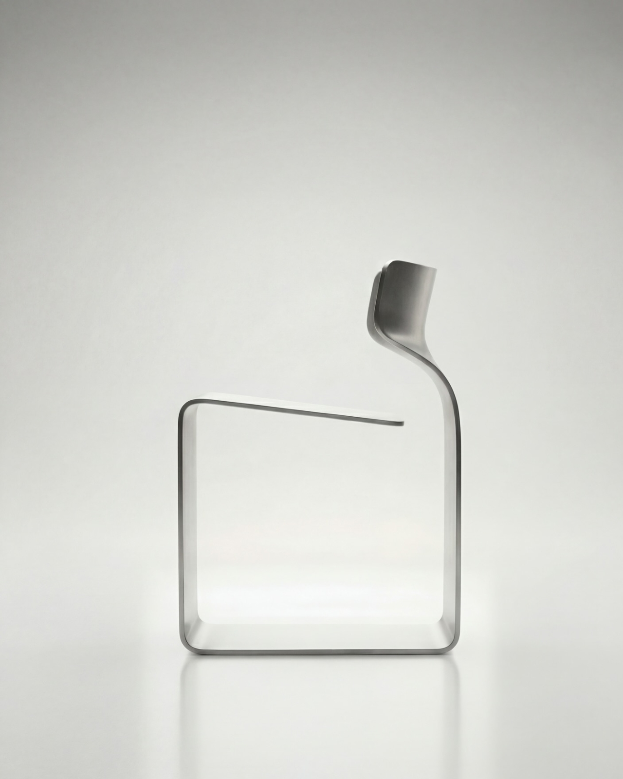
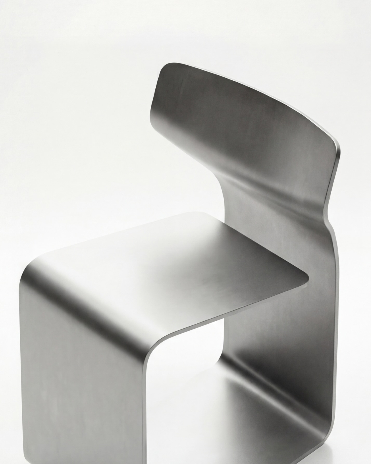
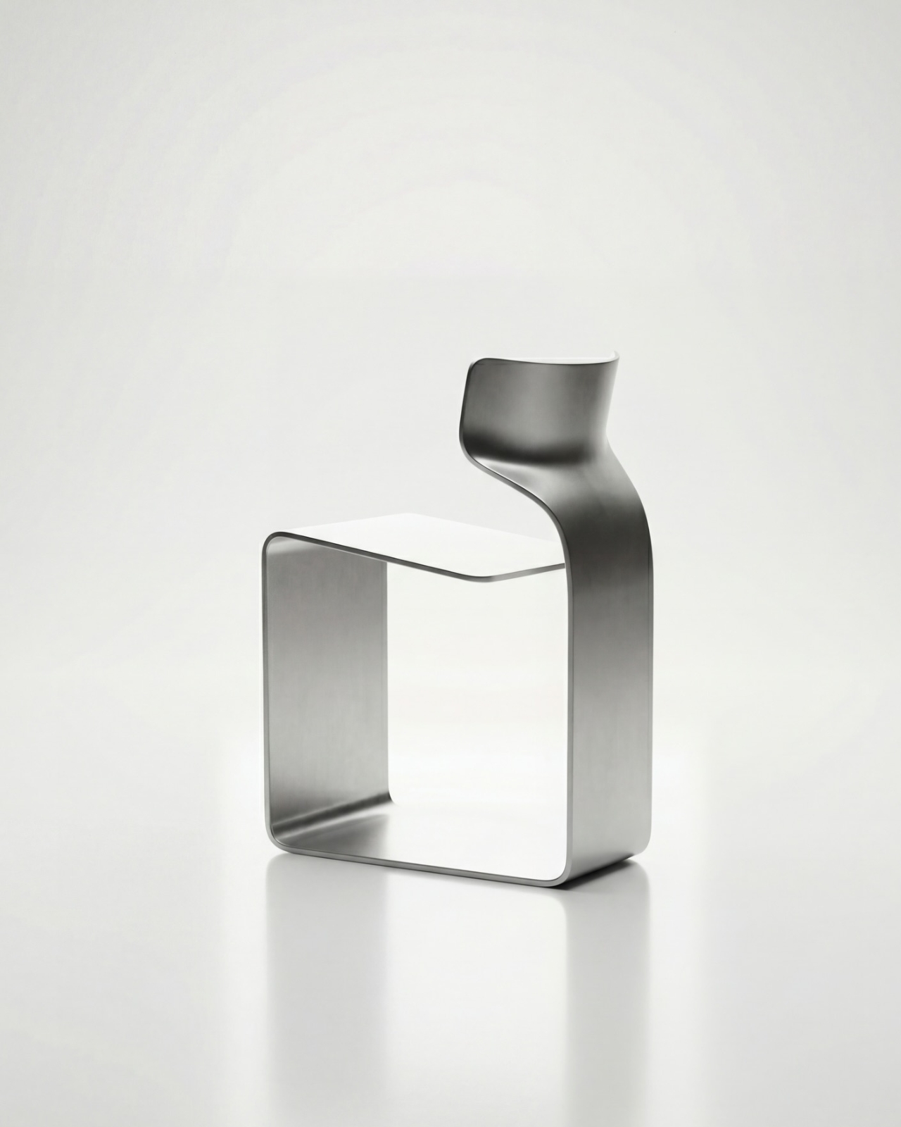
The concept is almost confrontationally simple: one single ribbon of metal, bent and curved into a complete chair. No welds holding two pieces together. No joints disguised under upholstery. No hardware quietly doing the heavy lifting behind the scenes. Just one continuous piece of material pushed into a form that includes the base, the cantilevered seat, and the backrest all at once. The name isn’t branding. It’s a philosophy.

Designer: Davide Bozzo

Looking at the photographs, the first thing I kept circling back to was the sheer audacity of the backrest. It doesn’t connect to the base through hidden brackets or clever joinery. It simply rises from the same ribbon, curving upward and backward in a motion that looks more like a wave caught mid-break than anything you’d typically call furniture. It’s graceful in a way that makes you slightly suspicious of it. How is this thing holding anyone’s weight?

The answer lies in what Bozzo describes as structural tension. Form doesn’t just follow function here. It is the function. The material itself carries the engineering logic. Every curve has a reason, and every bend is calculated to distribute load through the continuity of the form rather than through added components. It’s the same principle behind suspension bridge cables or the way a curved shell is structurally stronger than a flat panel. Applied to a chair, it feels almost radical.

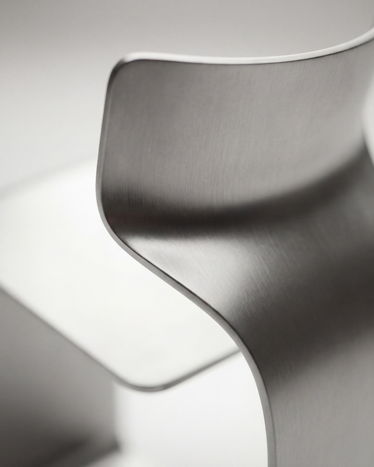
I’ll be honest. My first instinct was skepticism. A single-piece metal chair sounds like one of those design school exercises that makes for great renderings but falls apart under real scrutiny. But looking at the close-up photographs, especially the one capturing the S-curve where the seat meets the backrest, you start to believe it. The brushed metal finish shows actual material depth and actual intentionality in how the surface was treated. This isn’t a concept render floating in a void. It has weight and presence.

That said, I do have questions. Comfort is conspicuously absent from the conversation. Metal, even beautifully formed metal, is hard. The cantilevered seat gives some flexibility, which should help, but a chair without cushioning asks something significant of the person sitting in it. Bozzo’s design makes a statement about material honesty and structural purity, which I respect deeply, but at some point a chair has to be sat in. That’s the tension that makes it interesting rather than just pretty.

The piece also reads as a quiet counterargument to the current era of maximalist furniture. We’ve spent years surrounded by bouclé armchairs, curved velvet sofas, and furniture dressed up in layers of texture and warmth. Bozzo’s chair strips all of that away and asks whether furniture can earn your attention through restraint and engineering alone. My honest opinion? It can. Whether it earns a place in your living room is a different question entirely.

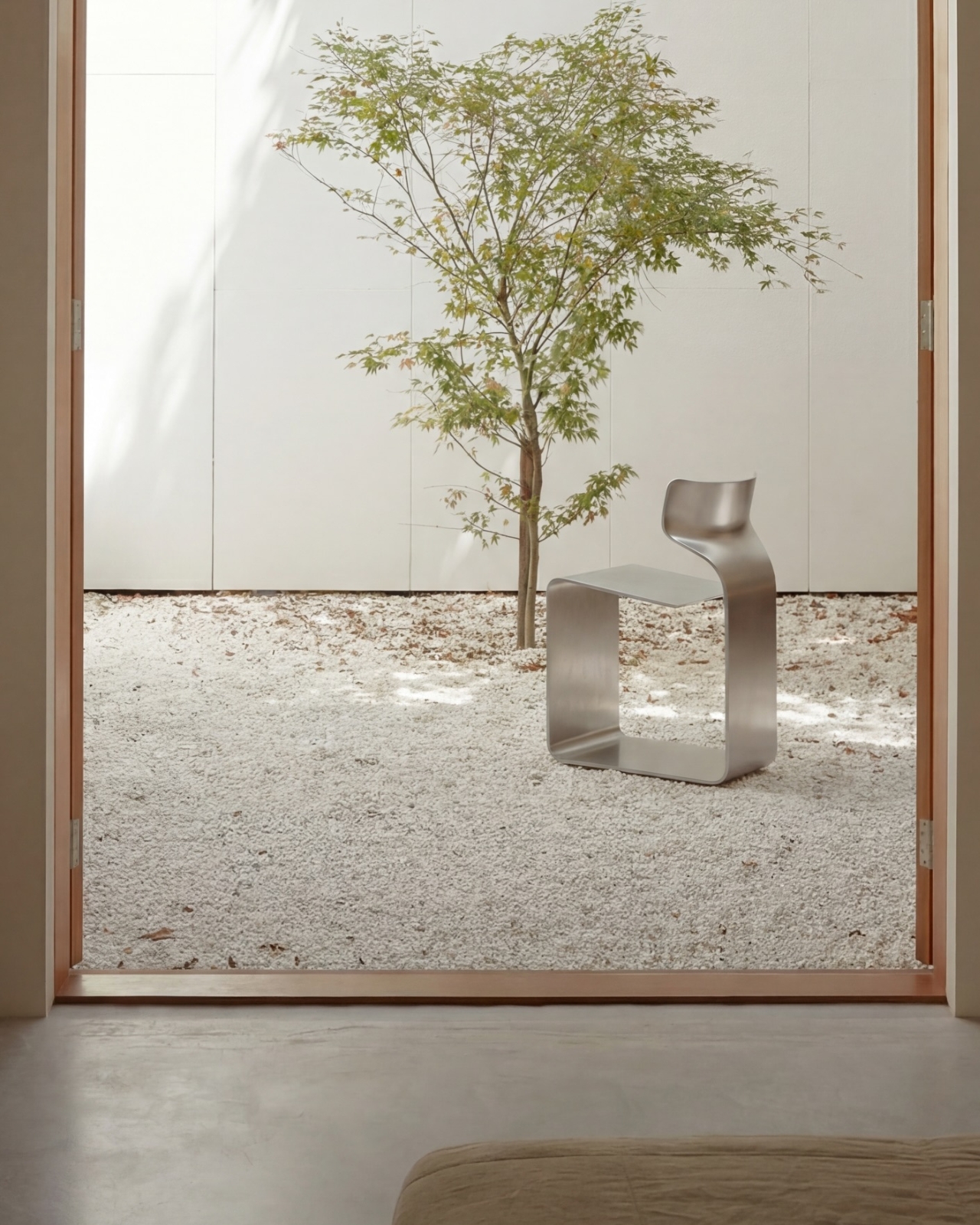
The chair also does something that doesn’t get discussed enough in design coverage: it makes the negative space part of the design. The open rectangle formed by the base creates a void that’s almost as deliberate as the metal itself. In the lifestyle image set against a Japanese garden backdrop, that void frames the gravel and ground beyond it. The chair becomes a viewfinder. That’s not accidental. That’s a designer who understands that what you leave out is just as powerful as what you put in.

Bozzo has been building a reputation for material-forward work. His stainless steel pet bowl Dune explored similar ideas around fluid curves in a single medium, but the ZERO Chair feels like a significant step up in ambition. It’s the kind of piece that stops you mid-scroll, makes you set your phone down, and actually think. That, more than any material specification, is probably the point.

The post The ZERO Chair Has No Welds, No Joints, No Apologies first appeared on Yanko Design.
  •  

The All-Black Kitchen Is 2026’s Hottest Design Trend — Here Are 8 Products That Nail It

Black has always carried weight in design. Authority, restraint, a quiet elegance that needs no announcement. In 2026, the all-black kitchen has shifted from a bold statement to a genuine design movement. What once felt too dramatic for the most-used room in the home now feels precisely considered. Designers and homeowners alike are gravitating toward the palette for its ability to make a space feel curated, intentional, and deeply sophisticated when executed well.

The shift runs deeper than cabinetry and countertops. It lives in the tools, the cookware, the lighting, every touchpoint that shapes how a kitchen performs and how it looks doing it. Finding pieces that commit to the aesthetic without sacrificing function is the real challenge. These eight products do exactly that, from carbon graphite cookware rooted in Japanese craft to a precision pour-over kettle engineered for serious brewing.

1. ANAORI Kakugama

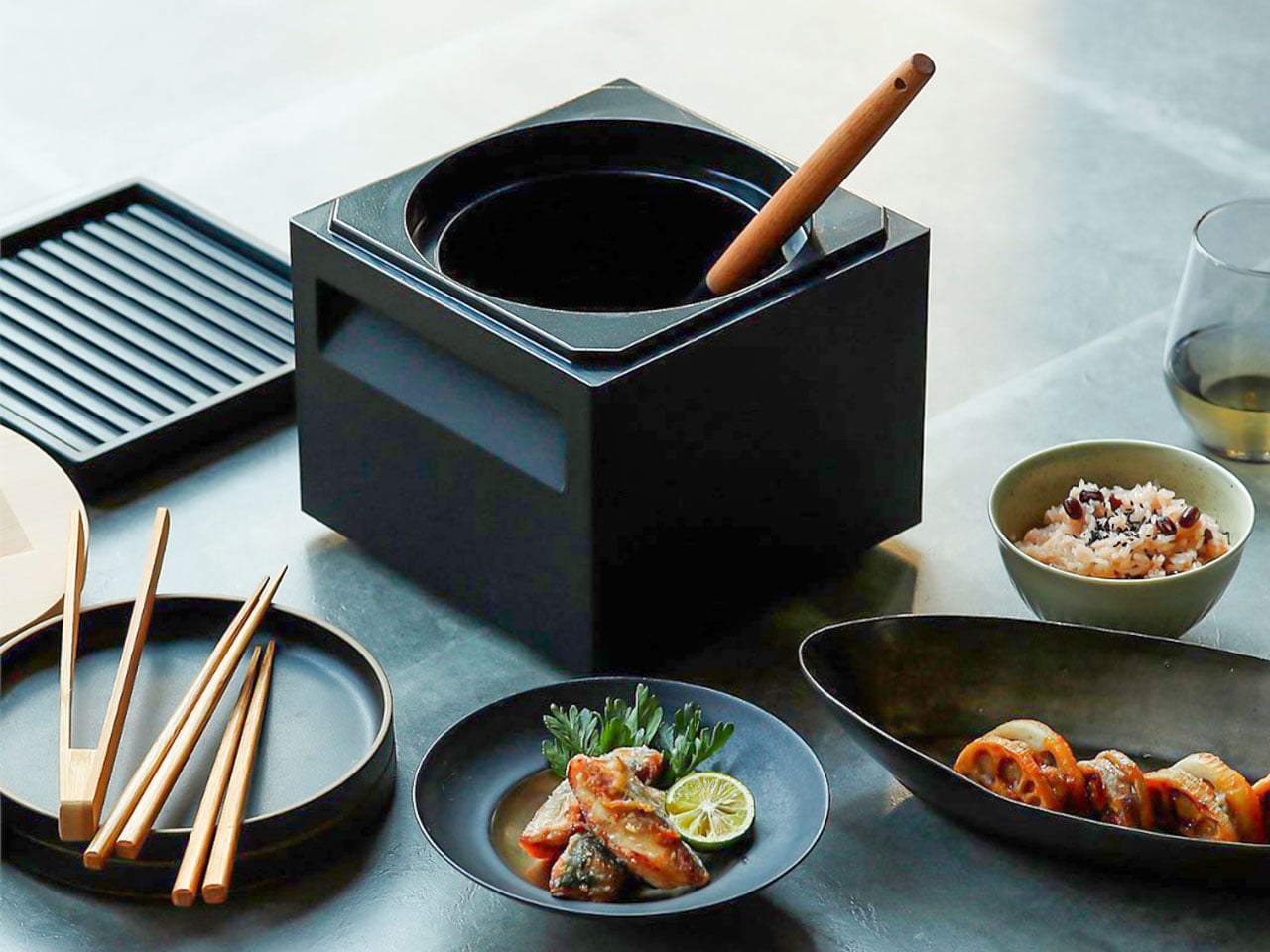
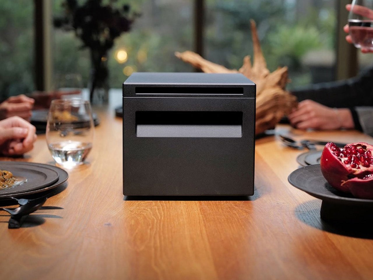
Carbon graphite isn’t a material you encounter in the kitchen, which is precisely what makes the ANAORI Kakugama so compelling. Crafted from solid carbon graphite, this Japanese cooking vessel carries a physical and conceptual weight that coated pans simply can’t match. Its matte black surface distributes heat with uncommon efficiency, significantly reducing the risk of scorching while preserving the natural flavors and nutrients of whatever is being prepared. This is cookware that approaches food with genuine respect.

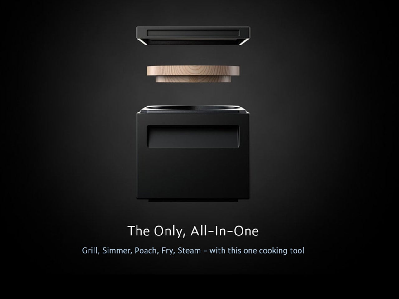
The kakugama’s range is quietly impressive. Designed to steam, poach, simmer, grill, and fry, it handles each technique without compromise, making it the kind of piece that earns a permanent position in the kitchen. The fragrant Japanese cypress lid adds something unexpected: as it heats, it releases a subtle, earthy aroma that transforms an ordinary cooking session into something closer to ritual. For the design-conscious cook who values craft as much as performance, this vessel is essentially irreplaceable.

What We Like

  • Carbon graphite construction delivers exceptional, even heat retention across every cooking method
  • The Japanese cypress lid adds a rare aromatic quality to cooking that no synthetic material can replicate

What We Dislike

  • The premium material and craftsmanship place this vessel at a significant price point above conventional cookware
  • Carbon graphite requires more attentive handling and care than standard kitchen materials

2. Obsidian Black Precision Chopstick Tongs

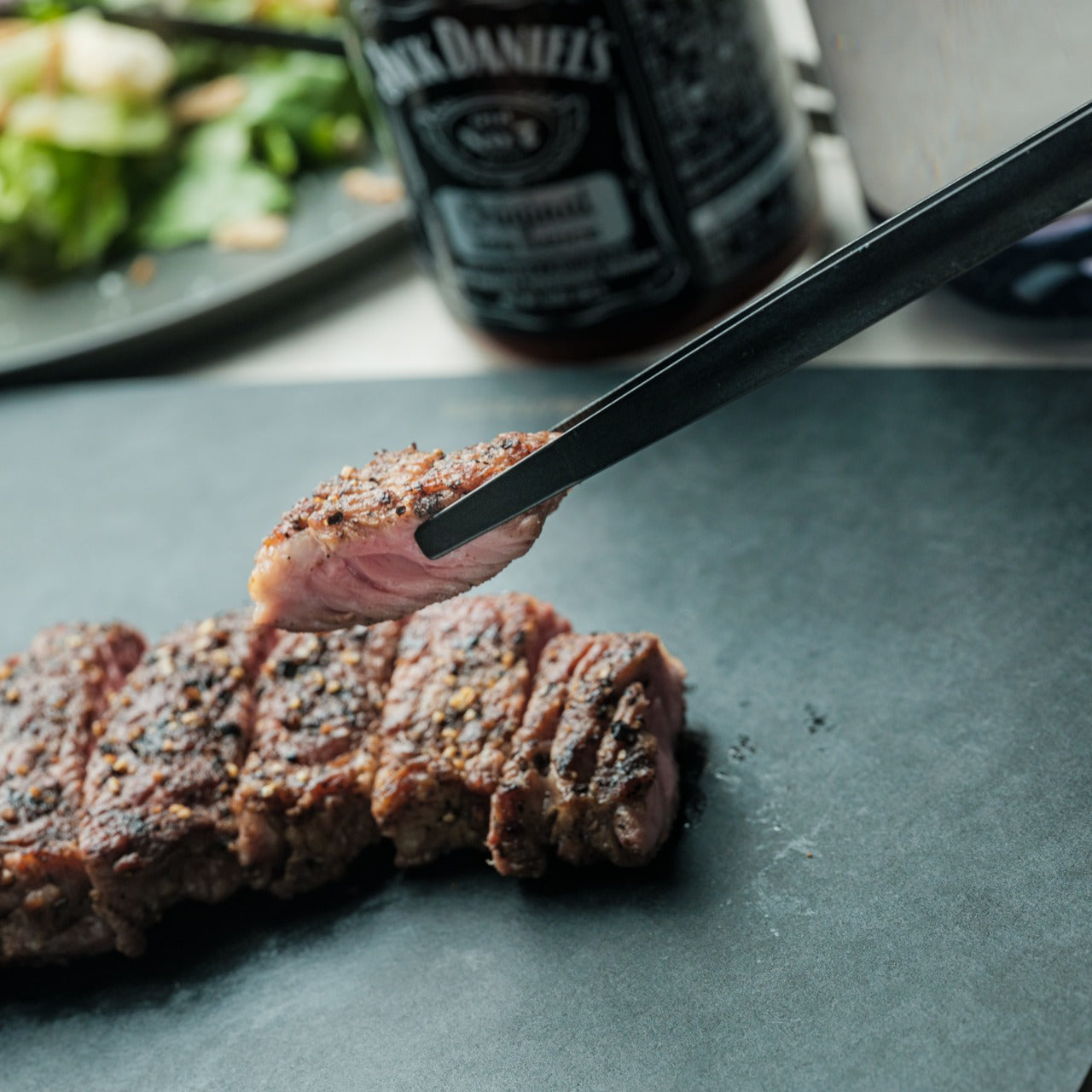
There’s a particular satisfaction in a kitchen tool that commits fully to its concept. Part of the Obsidian Black Kitchen Collection, the Precision Chopstick Tongs take their form directly from traditional Japanese chopsticks and engineer it for the demands of a modern kitchen. Made from SUS821L1 stainless steel, they’re light enough to handle delicate pieces of sushi yet durable enough for daily stovetop use. The result is a utensil that genuinely bridges the line between cooking instrument and tableware.

What sets these tongs apart from anything else in the drawer is the finish. A special metal processing technique ensures the obsidian’s black color resists scratching and peeling, maintaining its appearance through repeated use and washing. They work just as confidently plating sashimi at the table as they do flipping proteins in a pan. That dual-purpose quality is rare, and it’s exactly what earns a piece a permanent place in a kitchen where aesthetics and performance are equally weighted.

Click Here to Buy Now: $25.00

What We Like

  • The obsidian black finish is scratch and peel-resistant, holding its appearance through sustained daily use
  • Designed to function as both a cooking utensil and tableware, bridging the kitchen and dining with a single tool

What We Dislike

  • The chopstick form may require a brief adjustment period for those accustomed to conventional tong grips
  • The precision-focused design is less suited to tasks requiring wide or bulky gripping

3. Samsung Bake Ultra Concept

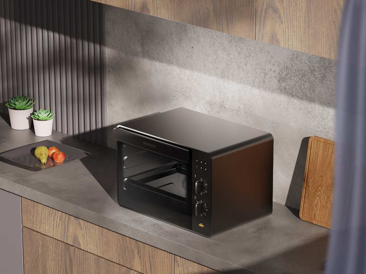
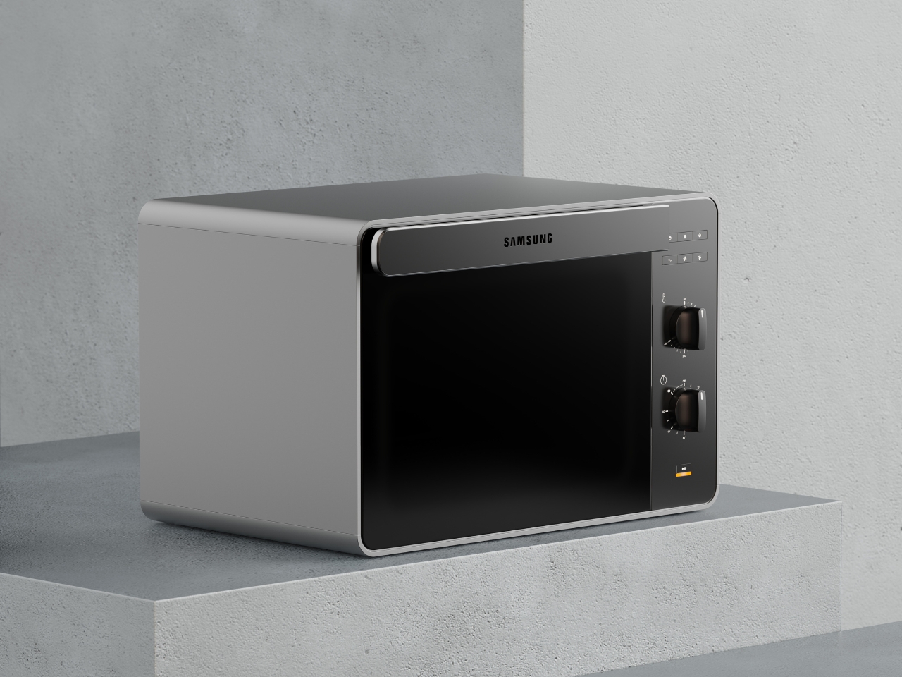
Concept appliances rarely look this resolved. Designed by Octavio Leon Villareal, the Samsung Bake Ultra approaches the compact electric oven with a formal discipline that separates considered design from merely clever design. Its two-tone composition, a soft gray body anchored by a black glass front, achieves a visual balance that reads as both contemporary and enduring. This isn’t minimalism for its own sake. It’s a deliberate formal decision that allows the Bake Ultra to feel entirely at home in kitchens ranging from industrial-chic to warm and considered.

The rounded edges are doing significant work. By softening what could easily have read as an overly boxy silhouette, Villareal gives the Bake Ultra an approachability that most compact ovens lack entirely. It doesn’t demand attention, but it consistently earns it. In an all-black kitchen where every object contributes to the room’s visual tone, an appliance this compositionally assured is genuinely valuable. The Bake Ultra wasn’t designed just to function. It was designed to belong.

What We Like

  • The two-tone design with black glass front integrates cleanly into an all-black kitchen without disrupting the visual flow
  • Rounded edges give the compact form an approachability that’s rarely achieved in kitchen appliance design

What We Dislike

  • As a concept design, the Bake Ultra is not yet available for consumer purchase
  • The soft gray body, while elegant, slightly departs from a fully committed all-black aesthetic

4. Iron Frying Plate

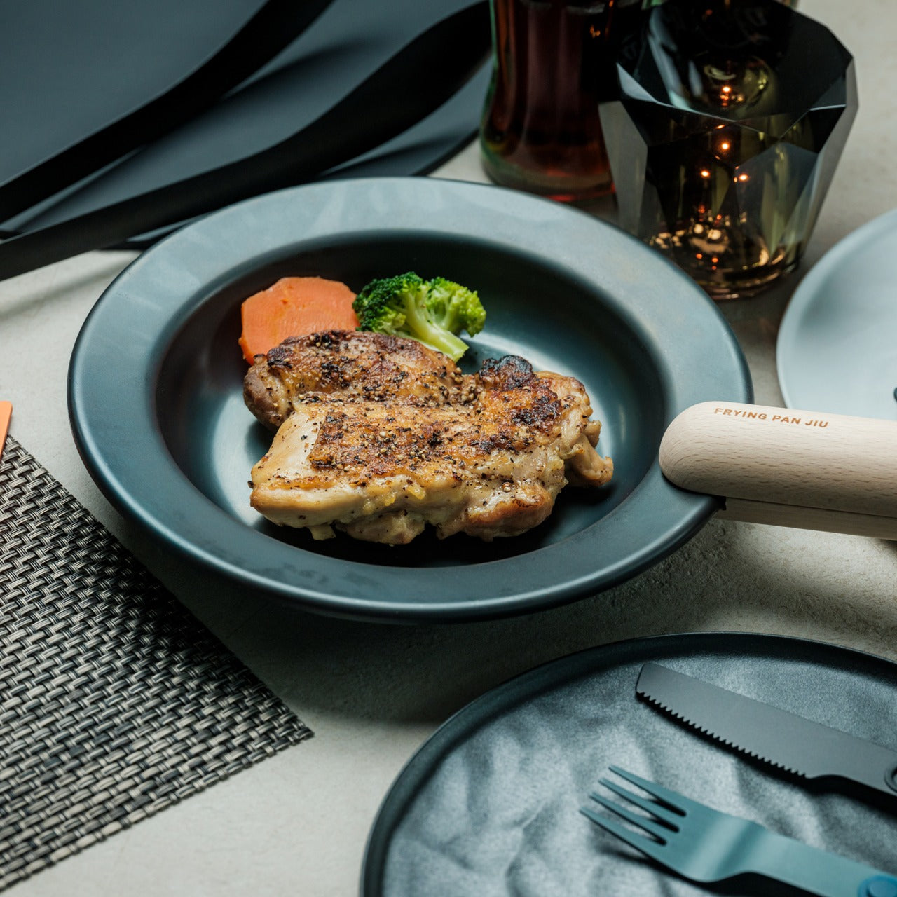
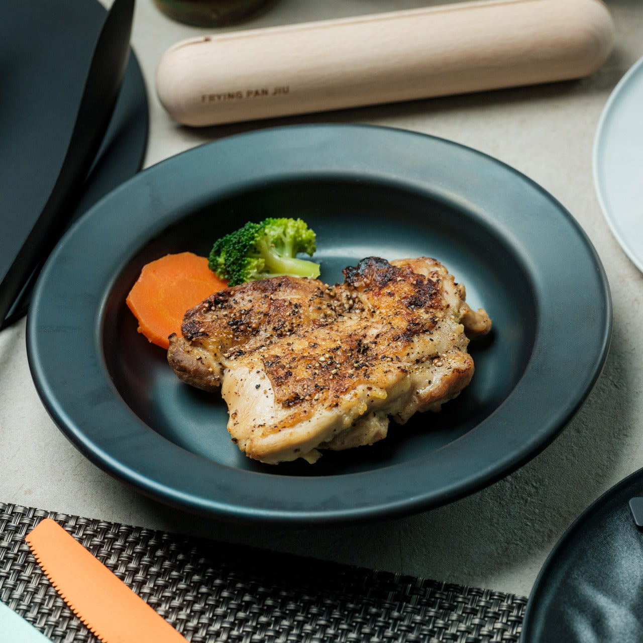
The Iron Frying Plate operates on a beautifully simple premise: eliminate the plate. Made from 1.6mm-thick mill scale steel, this uncoated, rust-resistant piece of cookware is designed to go from stove to table without interruption. There’s no ceramic coating to chip, no synthetic surface to question, just raw, well-engineered steel that builds character and natural seasoning with every use. The matte black mill scale finish slots into an all-black kitchen without any deliberate effort at all.

Its detachable wooden handle is one of those small design decisions that reveal serious thought about every moment of use. Attach it for cooking, remove it for serving, one-handed, no tools required. That seamless transition from cooking vessel to serving piece is exactly the kind of dual-function thinking that earns a product permanent space in a curated kitchen. JIU doesn’t try to be more than it is. It’s a frying plate, and it’s an excellent one.

Click Here to Buy Now: $69.00

What We Like

  • The uncoated mill scale steel surface develops natural seasoning over time, building flavor with every use
  • The one-handed detachable wooden handle enables a smooth transition from stovetop cooking directly to table service

What We Dislike

  • An uncoated steel surface requires regular seasoning and more attentive care than nonstick alternatives
  • The minimal form is best suited to simple preparations rather than sauce-heavy or complex dishes

5. HA1 Expert Hard Anodized Nonstick 10-Piece Set

If the all-black kitchen needs a workhorse, the All-Clad HA1 Expert set fills that role without compromise. Ten pieces of hard anodized, scratch-resistant nonstick cookware finished in a deep, uniform black that holds up to both heavy daily use and visual scrutiny. The anodized aluminum construction is reinforced with a stainless-steel base, delivering warp resistance and the kind of even, consistent heat distribution that makes routine cooking genuinely more reliable. This is a set built for people who cook seriously and care deeply about how their kitchen looks.

The range covers everything a fully functioning kitchen demands: two fry pans, two saucepans, a sauté pan, and a stockpot, each paired with a matching lid. Oven-safe to 500°F and induction-compatible, very little is left unaddressed. Double-riveted stainless steel handles hold securely through extended use, while tempered glass lids allow for monitoring without lifting. As a complete, coherent system in black, this set reads less like a collection of pots and more like an intentional design decision.

What We Like

  • Hard-anodized, scratch-resistant construction paired with long-lasting PTFE nonstick delivers durable, professional-grade performance
  • Fully induction compatible and oven safe to 500°F, covering virtually every cooking scenario without exception

What We Dislike

  • Glass lids are only oven safe to 350°F, considerably lower than the pans themselves
  • PTFE nonstick requires careful utensil choice and hand washing to preserve its surface longevity

6. Precision Chef Kitchen Scissors

Kitchen scissors rarely receive the design attention they deserve. The Precision Chef Kitchen Scissors are a deliberate exception. The oxidation-colored black finish isn’t cosmetic; it’s a durable surface treatment that resists deterioration, holding its appearance through years of regular use. The curved serrated blade is engineered specifically for cutting meat, reducing effort while improving both control and safety. In a kitchen where every object is chosen with intention, a pair of scissors is considered a meaningful detail that most kitchens quietly overlook.

The ergonomic structure goes beyond grip comfort. When laid flat, the blade is designed to avoid contact with the counter surface, a small but precise detail that speaks to the level of thought invested in this tool. Cutting through steaks, portioning pizza, or trimming vegetables, these scissors approach each task with the same quiet authority that an all-black kitchen demands. They are scissors genuinely designed to be seen as well as used, and they meet that standard on both counts.

Click Here to Buy Now: $95.00

What We Like

  • Oxidation coloring creates a durable black finish that resists fading and surface deterioration through sustained use
  • The curved serrated blade is purpose-engineered for meat cutting, improving control and reducing the effort required

What We Dislike

  • The specialized curved blade may feel less versatile for tasks that go beyond protein and general food prep
  • Ergonomic scissors with complex geometry can be more difficult to sharpen at home than straight-bladed alternatives

7. Melrose Pendant Light

Lighting in an all-black kitchen isn’t merely functional; it’s structural. The Steel Lighting Co. Melrose pendant operates as both. The 18-inch industrial dome in matte black is proportioned specifically for kitchen island use, casting a wide, even wash of light across the work surface below. American-made and UL-approved for both indoor and outdoor installation, this is a pendant built to perform as well as it looks. At 300 watts, it carries the capacity to anchor a kitchen island with genuine visual authority.

What makes the Melrose particularly thoughtful is its configurable interior. Available in white, matte black, or brass, the interior color shapes both the quality of reflected light and the overall tone of the fixture without altering its profile. In a black kitchen, a brass interior introduces a warm, considered counterpoint that prevents the space from reading as flat or one-dimensional. The matte black exterior remains constant throughout: commanding, clean, and entirely at home in a kitchen built around the same commitment to the color.

What We Like

  • Configurable interior color options in white, matte black, or brass allow for subtle tonal customization within a consistent exterior
  • American-made with indoor and outdoor UL approval, signaling a meaningful commitment to build quality and longevity

What We Dislike

  • At 12 pounds, installation may require additional structural consideration, depending on the ceiling construction
  • The industrial farmhouse silhouette may not suit kitchens with a strictly contemporary or ultra-minimal design direction

8. Fellow Stagg EKG Pro Electric Pour-Over Kettle

The Fellow Stagg EKG Pro is the kind of object that reframes where coffee fits in the morning. Its signature gooseneck spout delivers precise control over flow rate and stream consistency, the kind of control that produces a measurable difference in pour-over extraction. To the degree, temperature control heats and holds water exactly as programmed, while a high-resolution color display allows complete customization of brewing schedules, altitude adjustments, and temperature units. This is a kettle engineered with the seriousness typically reserved for professional brewing equipment.

The EKG Pro’s WiFi connectivity and scheduling capabilities are where it shifts from impressive to genuinely integrated into daily life. Program brewing schedules that adapt to your routine so the kettle is ready precisely when you are, no preheating, no guesswork. The sleek industrial design holds its own on a countertop alongside thoughtfully chosen cookware and tools. The hold function maintains brewing temperature for extended periods without wasting energy. In an all-black kitchen, this kettle earns its visible place every single morning.

What We Like

  • To-the-degree temperature control, combined with a gooseneck spout, delivers precision that measurably improves pour-over coffee quality
  • WiFi connectivity and programmable scheduling mean the kettle is ready exactly when needed, without any manual preheating

What We Dislike

  • Advanced features like WiFi and the color display come at a price point that significantly exceeds basic kettle alternatives
  • The gooseneck form is optimized for pour-over brewing and is less suited to general-purpose boiling tasks

The Kitchen Finally Got the Design Treatment It Deserved

The all-black kitchen doesn’t ask for compromise. Every product here demonstrates that designing in black means choosing objects with a strong point of view, ones crafted carefully, finished deliberately, and considered at every stage. The color is what makes the curation visible. It’s a shared language between objects that have little else in common except that they were each made to last, made to perform, and made to matter in the space they occupy.

What’s striking about 2026’s black kitchen movement is how completely it spans every category. Cookware, utensils, lighting, kettles: the commitment runs through the entire room. When each element carries the same visual weight, a kitchen stops being a collection of appliances and tools and becomes a genuinely designed space. That’s the standard these eight products are held to, and without exception, it’s the standard each one meets.

The post The All-Black Kitchen Is 2026’s Hottest Design Trend — Here Are 8 Products That Nail It first appeared on Yanko Design.

  •  

Bigme HiBreak Dual Has E Ink Up Front and a Round LCD in Back

Staring at a phone screen for hours isn’t kind to your eyes, and more people are finally taking that seriously. The backlit displays on most modern smartphones are tuned for vivid color and fast scrolling, but sustained use can lead to real fatigue. That growing awareness has pushed E Ink displays into smartphone territory, where their paper-like readability makes a lot of practical sense.

Bigme has been building its HiBreak series into a line of Android smartphones centered on E Ink displays, and the HiBreak Dual is its newest entry. Rather than simply updating the screen, Bigme gave this model two displays: a full-sized E Ink panel on the front and a compact circular LCD on the back, letting the phone handle information at two different levels of urgency.

Designer: Bigme

The main display is a 6.13-inch E Ink screen at 824 by 1,648 pixels, delivering 300 pixels per inch in greyscale mode. The color model supports up to 4,096 colors, and a frontlight with 36 brightness levels covers both dim interiors and bright outdoor settings. Because E Ink reflects ambient light rather than emitting it, reading outdoors is comfortable in a way that backlit displays simply aren’t.

What sets the HiBreak Dual apart from the rest of the lineup is its stylus support, a first for the HiBreak series. A 4,096-level pressure-sensitive pen lets you write, sketch, and annotate directly on the E Ink surface, turning the phone into something closer to a digital notebook. The paper-like texture of the display makes the experience feel more tactile and far less clinical than a standard touchscreen.

The circular LCD on the back measures 1.85 inches and pulls off a surprisingly wide range of tasks. It shows the time, notifications, music controls, and weather at a glance, and also doubles as a viewfinder for the 20MP main camera. Bigme even added an AI pet feature that generates an animated version of your actual pet from a photo, keeping it alive on that small round screen.

Despite the unconventional display setup, the HiBreak Dual doesn’t skimp on the fundamentals. Although dated, Android 14 with full GMS certification keeps the entire Google Play library accessible, and NFC support means Google Wallet and contactless payments work just as they would on any standard Android device. The 5MP front camera handles video calls and everyday selfies without issue, while a fingerprint sensor takes care of security.

Under the hood, the phone runs on a MediaTek Dimensity 1080 processor paired with either 8GB or 12GB of RAM and up to 256GB of internal storage, further expandable by an additional 2TB via microSD. A 4,500mAh battery gets through a full day without much drama, while 5G on dual SIM cards, Bluetooth 5.2, and dual-band WiFi take care of the rest.

Pricing starts at $519 for the 8GB/128GB model, with early bird options in the $359 to $409 range and a 12GB/256GB version also available. It’s a phone designed for people who spend a significant part of their day reading, writing, and staying on top of things through a mobile device, and who’d genuinely rather do it on a screen that asks a little less of their eyes.

The post Bigme HiBreak Dual Has E Ink Up Front and a Round LCD in Back first appeared on Yanko Design.

  •  

VitaLink Just Put a 13-Inch Screen and Keyboard Into One Foldable Slab

Working on the go rarely looks as tidy as productivity-tool adverts suggest. Most people who travel with serious work needs end up carrying at least two or three things that don’t quite fit together: a tablet or laptop, a compact keyboard if the touchscreen isn’t enough, maybe a portable monitor, and a cable situation that somehow multiplies every time you pack.

VitaLink is trying to simplify that. The concept combines a full-size keyboard and a large touch display into one foldable object in a CNC aluminum shell. Connect it to any USB-C device and your workspace expands immediately, without a separate stand, a monitor arm, or a bag pocket devoted to adapters. It folds down to 20mm and opens into something that feels genuinely designed.

Designer: VitaLink

Click Here to Buy Now: $279 $658 (58% off). Hurry, only 491/600 left! Raised over $37,000.

The integrated 13-inch display sits directly above the keyboard in what amounts to a compact laptop form factor. The screen runs at a 3840×1600 pixel resolution, a 2.4:1 ultra-wide format rather than a standard 16:9 panel, giving it an unusual amount of horizontal room. There’s enough space to keep two apps open side by side without either feeling squeezed into a corner.

The 180-degree hinge is what makes the compact form actually practical. When you’re done, everything closes into a flat 20mm slab that slips into a laptop sleeve without awkward bulk. The open footprint sits at around 34 × 15 cm, compact enough for a plane tray table, a crowded café counter, or a hotel desk that never seems to fit anything comfortably.

The panel supports 10-point touch, runs at 60 Hz, and delivers 298 PPI pixel density with 100% sRGB color coverage. Touching a screen this size changes how you interact with content. You can swipe, drag, and tap directly on the display while still using the keyboard below, which means managing layers in an editor, scrubbing a timeline, or pulling up references doesn’t require switching between input modes.

The keyboard uses scissor-switch mechanisms with 0.8mm of key travel and wider-than-typical spacing. That added spacing sounds like a minor detail until you’ve spent an hour trying to type accurately on a portable board that prioritizes size above everything else. Three RGB backlight modes let you set the visual tone, and the keys are designed to stay quiet enough for cafés and shared offices.

Two USB-C ports handle video, data, and power delivery through a single cable, and the plug-and-play setup works across Windows, macOS, Linux, iOS, and Android without requiring additional drivers. That compatibility extends to mini PCs, tablets, and handheld gaming consoles, so VitaLink isn’t tied to one kind of device. You’re not locked into a single workflow or a single ecosystem, which is most of the appeal.

Think about what that actually means. You’re in a hotel room with just your iPad and need a proper keyboard and enough screen space to write, edit, and reference something at once. Or you’re at a café with a mini PC and want a setup that doesn’t take over the whole table. Those are the moments where having the keyboard and the display in one object makes a real difference.

The aluminum body does more than keep things thin. CNC-machined aluminum with a frosted anodized finish gives it a rigidity that plastic travel accessories rarely have, protecting the display in transit and keeping the keyboard deck from flexing during typing sessions. It carries more like a slim hardcover notebook than a peripheral, which is a meaningful difference for anyone who’s dealt with a flimsy portable monitor in a crowded bag.

There’s something worth noting in the fact that portable work setups have gotten faster without necessarily getting more cohesive. The bag is still a loose collection of things that don’t quite belong together. VitaLink is at least making a case that the keyboard and the display belong in a single intentional object, built from the start for people whose work doesn’t stay in one place.

Click Here to Buy Now: $279 $658 (58% off). Hurry, only 491/600 left! Raised over $37,000.

The post VitaLink Just Put a 13-Inch Screen and Keyboard Into One Foldable Slab first appeared on Yanko Design.

  •  

Someone Made The E-Ink Kindle Smartphone That Amazon Refused To Make

Amazon has spent nearly two decades perfecting the Kindle, turning it into the default eReader for millions of people, and in all that time they’ve steadfastly refused to shrink it down to pocket size or open it up to the broader Android ecosystem. They had every opportunity to merge the best parts of their Kindle line with the form factor of a smartphone, creating a distraction-free reading and productivity device that could actually fit in your jeans pocket and run the apps you already use. Instead, they kept the Kindle locked into its walled garden, kept it at 6 inches or larger, and left a gaping hole in the market for anyone willing to build what they wouldn’t. DuRoBo took that opportunity and ran with it, launching the Krono, a 6.13-inch E Ink tablet running full Android 15 that costs $279.99 and does exactly what Amazon has spent years pretending nobody wants.

The Krono packs an E Ink Carta 1200 display at 300 PPI (matching the sharpness of a Kindle Paperwhite), an octa-core processor, 6GB of RAM, 128GB of storage, a 3,950 mAh battery, and a unique side-mounted Smart Dial that controls screen refresh, frontlight adjustment, voice recording, and web browsing through a single rotary knob. It weighs just 173 grams, measures 154 x 80 x 9 mm, and is available in black or white from DuRoBo’s site or Amazon US. The pitch is straightforward: it’s an eReader, a voice note-taker, a podcast player, and a music device all in one, built on an open platform that lets you install whatever reading app, productivity tool, or communication software you actually want to use. It launched in August 2025 and started shipping in September, quietly carving out space in the niche that BOOX’s Palma lineup has been dominating for the past year.

Designer: DuRoBo

Six gigs of RAM in an E Ink device is borderline excessive in the best possible way, especially when most eReaders ship with 2GB or less and struggle the moment you try to run anything beyond the stock reading app. The 128GB of storage means you can load an absurd library of ebooks, PDFs, audiobooks, and whatever else without ever worrying about running out of room. Running Android 15 (not some ancient fork, but the actual current OS) gives the Krono access to the full Play Store ecosystem, which is exactly what Amazon has been allergic to for years. You want Kindle, Libby, Moon+ Reader, Pocket, Instapaper, Obsidian, and Spotify all on one device? The Krono lets you do that. A Kindle will let you read Kindle books and maybe listen to Audible if you’re lucky. That’s the entire difference.

The Smart Dial highlights DuRoBo’s industrial design philosophy most clearly – instead of burying every interaction behind capacitive touch menus (which E Ink refresh rates make tedious), they mounted a physical rotary dial on the side of the device that you can press and rotate to trigger different actions depending on context. It’s a design choice borrowed more from cameras and audio gear than from tablets, and it gives the Krono a tactile, mechanical quality that most E Ink slabs completely lack. The back of the device features what DuRoBo calls the Axis, a strip housing six small breathing lights that glow softly on a schedule to gently nudge you back toward focused reading or work. It’s a wellness-adjacent UX detail that could easily feel gimmicky, but in the context of a device explicitly marketed as a “focus hub,” it at least makes thematic sense. The whole package is clearly designed to feel intentional and calm, a deliberate counterpoint to the dopamine-optimized chaos of a smartphone.

DuRoBo is positioning the Krono hard into the distraction-free productivity and mindfulness lane, framing it as the device you reach for when you want to read long-form content, capture ideas through voice notes, or listen to podcasts without getting dragged into Instagram or TikTok. The dual-tone frontlight (warm and cool adjustment) and the paper-like texture of the Carta 1200 display are meant to make extended reading sessions comfortable in a way that backlit screens never quite manage. The built-in speaker and Bluetooth support let it double as a surprisingly capable audio player for music, audiobooks, and podcasts, which gives it utility beyond just being a reading slab. The open Android platform means you can customize it to fit whatever workflow you actually need, whether that’s Notion for notes, Pocket for saved articles, or Spotify for background music while you write. Amazon would never build this, because opening the Kindle platform would undermine their entire content ecosystem lock-in strategy.

The Krono is available now for $279.99; with a fitted TPU case is sold separately, designed to accommodate both the Smart Dial and the Axis breathing lights without blocking either. At that price point, it’s competing directly with the BOOX Palma (which runs around $280 depending on configuration) and sits well above Amazon’s Kindle Paperwhite but below their Kindle Scribe. Whether the Smart Dial, the breathing lights, and DuRoBo’s focus-first branding are enough to justify choosing it over a Palma or just installing a launcher on a Kindle will depend entirely on how much you value that design identity over raw software polish.

The post Someone Made The E-Ink Kindle Smartphone That Amazon Refused To Make first appeared on Yanko Design.

  •  

The LEGO Metal Slug Diorama With Adjustable Cannons, POWs, and Mid-Air Grenades Is Here

By 1996, the arcade was dying. Virtua Fighter and Tekken had the crowds. Sega’s racing cabinets had the spectacle. The conventional wisdom was that 2D games were finished, and anyone still making pixel art sidescrollers was simply behind the curve. Then Nazca Corporation released Metal Slug on SNK’s Neo Geo hardware, and the conventional wisdom had to sit quietly in a corner for a while. The game’s hand-animated sprites moved with a fluidity that polygon games couldn’t touch, and the humor, panicking soldiers, grateful POWs tossing rocket launchers, a tank that waddled like a toy, made the whole thing feel alive in a way that pure technical showmanship never quite manages.

LEGO Ideas builder MagicBrick has captured a freeze-frame of that world in brick form, reconstructing the game’s iconic jungle mission with 2,701 pieces and 6 minifigures locked into a scene of swamp terrain, rebel soldiers, dense jungle vegetation, and the squat, waddling Super Vehicle-001 tank at the center of it all. It’s a dense, affectionate build made by someone who clearly lost many, many credits to this game, and it shows in every deliberately chosen detail, from the mid-jump Marco Rossi clutching a Heavy Machine Gun to the bearded POW standing by with a reward.

Designer: MagicBrick

The scene is structured like a freeze-frame from the game itself, which is exactly the right instinct. MagicBrick describes the goal as capturing “a dynamic instant where everything is in motion: jumps, actions, and interactions come together to recreate the fast-paced feeling typical of the game,” and the build delivers on that. Marco Rossi in his red jacket is airborne, Heavy Machine Gun in hand. Tarma Roving, yellow jacket, stands ready with a pistol and knife. Three Rebel Army soldiers in green uniforms and helmets fill out the opposition, armed with bazookas and rifles. The swamp base uses tiles in multiple shades to sell the terrain, jungle trees and palms crowd the background, and the brick-built backdrop reflects the arcade color palette of the original game rather than any attempt at realism. That last decision is a smart one. Metal Slug was never interested in realism, and neither is this.

The Super Vehicle-001 is the centerpiece, and MagicBrick has packed a surprising amount of function into a compact footprint. The rear cannons are adjustable, the tracks are functional, and antennas complete the silhouette. Scattered across the scene are the environmental details that will hit Metal Slug veterans like a reflex: ammo crates, yellow barrels, a hanging fish skeleton, a parachute, and both the Heavy Machine Gun and Rocket Launcher power-up pickups rendered in brick. My favorite touch, though, is the grenade sequence, a classic cartoon-logic arc of thrown grenades ending in a mid-air explosion, frozen in plastic at exactly the right moment of absurdity.

Topping the whole structure is the Metal Slug logo itself, rendered in a red-to-orange gradient that makes the build read as a display piece as much as a playset. It’s that combination of environmental storytelling, playable features, and genuine fan knowledge that separates builds like this from generic video game tributes.

LEGO Ideas is the platform where fan-designed MOCs (My Own Creations) gather community votes, with 10,000 supporters needed to trigger an official LEGO review and potential production as a retail set. MagicBrick’s Metal Slug submission hit 100 supporters almost immediately after going live and has been picking up Reddit traction since. If you grew up feeding tokens into a Neo Geo cabinet, head to the LEGO Ideas page and cast your vote here.

The post The LEGO Metal Slug Diorama With Adjustable Cannons, POWs, and Mid-Air Grenades Is Here first appeared on Yanko Design.

  •  

Pictures of iPhone Fold appear online, just before Apple’s supposed foldable hits engineering challenges


Apple’s first foldable phone, the Apple’s first foldable phone, iPhone Fold (if that’s how it will be called) is one of the most anticipated smartphones in recent memory. While Apple remains tight-lipped about anything concerning the awaited device, rumors, leaks, and concepts have flooded our memories over the years with what the iPhone Fold is and what it will be like.

2026 is suggestively the magical year when Apple is expected to launch the foldable iPhone. It has been an unperturbed timeline in almost all the reports we have seen. In the same loop – but without a timeline – a recognized Apple leaker, Majin Bu has shown “actual design of the iPhone Fold” in the latest leaked pictures.

Designer: Apple

It’s “more beautiful than the previous one,” Bu notes in his update on X, stating that he believes this is “the final design of the future iPhone Fold.” How much context there is in the claim, only time will tell, but Bu has had some correct Apple-related predictions in the past, which suggests he could have some substance to back his claim.

From the leaked pictures, one can visually notice that the camera bump on the back of the foldable device is significantly smaller than that seen in previously rumored designs. The images appear more than renders and supposedly of a prototype, showing the iPhone in a book-style foldable form factor. Appearing to open horizontally to reveal a tablet-like display on the inside.

If the 2026 timeline is to go by – it’s Apple’s golden jubilee year as well – the iPhone Fold should ship alongside the iPhone 18 Pro slated for release in fall this year. But according to a new report from Nikkei Asia, the launch could be delayed. Nikkei reports that Apple has encountered a major setback in the engineering test phase of the foldable iPhone. There have been previously report concerning the foldable display’s crease, but this time, the report notes that the Cupertino giant is facing “more complex engineering challenges than anticipated.” If the issues persist, they could, “in a worst-case scenario,” delay the iPhone Fold launch schedule by some months. It could even mean a postponement until 2027.

Earlier this year, it was rumored that Apple had entered into the manufacturing phase of its first foldable device at Foxconn. New revelations, however, suggest Apple is “notifying” its component suppliers about the possibility of a delay in the “component production schedule for the new foldable iPhone.”

Despite the reports and unauthorized leaks, one thing is definite now. Foldable iPhone – by whatever moniker it comes – is clearly on the horizon. Apple will soon have a competitor for the Samsung Fold and other foldable smartphones on the market. If it is anything like the iPhones that rocked the smartphone world in the late 2000s, the iPhone Fold could repeat that in the late 2020s.

The post Pictures of iPhone Fold appear online, just before Apple’s supposed foldable hits engineering challenges first appeared on Yanko Design.

  •  

These $100 Open-Ear Earbuds Won’t Fight Your Glasses, Hair, or Hat

Open-ear earbuds have had a genuine moment over the past year, and it’s easy to understand why. About half of all earbud users have moved toward them, drawn by ambient awareness, ear health, and the comfort of not having anything plugged into their ear canals. The category has grown quickly, and the question now is which designs actually get it right.

The Skullcandy Push 540 Open enters that picture with a clear sense of what’s been bothering people. Thick earhooks that compete with glasses, neckbands that catch on hair and collars, and touch controls that trigger every time headwear grazes the sensor aren’t fringe complaints; they’re consistent ones. Skullcandy took that feedback and built the 540 Open around fixing each of them.

Designer: Skullcandy

Anyone who has worn open-ear hooks alongside glasses or a hat knows the small but mounting annoyance of too much hardware competing behind the ear. Skullcandy trimmed the earhook thickness based on direct user feedback, and the result is a fit that holds without adding friction to whatever you’re already wearing. It’s the kind of detail you only notice once you stop thinking about it.

The neckband gets the same thoughtful treatment. Unlike rigid or snapping designs found on competing options, Skullcandy’s version drapes naturally, so it won’t fight longer hair or push against a jacket collar. When you pull it off mid-run and don’t have the case on you, the magnetic closure lets it wrap cleanly around your wrist or neck without turning into a tangled nuisance.

Think about what it’s actually like to be deep into a trail run, layered up in a gaiter and hat, headphones that have stayed put the whole time, traffic audible from a distance. That’s the version of open-ear audio the 540 Open is built for. The over-ear hanger keeps things locked in, and the open design keeps the world around you audible.

Battery life is where the 540 Open puts some distance between itself and the competition. At 10 hours per earbud with 32 more in the case, it totals 42 hours, compared to six per earbud for both the Shokz Open Fit Air and JBL Soundgear Sense. The IP44 rating and a 10-minute rapid charge round it out for full days outdoors.

For anyone who trains with a hat on, the ability to disable the touch sensors entirely is a quietly significant option. Most open-ear earbuds don’t offer it. Audio comes from 12mm dynamic drivers, and Bluetooth 5.3 with multipoint pairing means two devices can stay connected at once, so moving between a phone and a laptop mid-workout doesn’t require any extra steps.

At $99.99, it’s $20 less than the Shokz Open Fit Air and $60 less than the JBL Soundgear Sense. What’s more interesting than the price gap is that it doesn’t get there by skimping. Better battery life, a flexible neckband that cooperates with real-world dressing, and comfort details from user feedback aren’t the kind of things that make headlines, but they’re what make the difference on a long day outdoors.

The post These $100 Open-Ear Earbuds Won’t Fight Your Glasses, Hair, or Hat first appeared on Yanko Design.
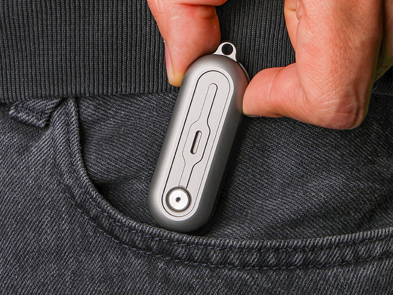
  •  

This Minimalist Analog World Clock Is the Upgrade You Didn’t Know Your Desk Needed

This 12-sided clock turns global timekeeping into a calmer desk ritual

Keeping up with different time zones sounds simple until it becomes part of your everyday routine. You check your phone before a call, open another tab to confirm the hour, do a quick mental calculation, and still second-guess whether it’s too early in Tokyo or too late in New York. Not to forget the perils of push-notifications – a quick check of time leads you down a drain of doom-scrolling that you take an hour to return from! To add a layer of analog convenience in this increasingly digital setup, I present the Rolling World Clock.

Why Traditional World Clocks Never Quite Feel Right

The Rolling World Clock takes a familiar category and gives it a much smarter form. Instead of relying on screens, menus, or a row of tiny city labels, this analog desk object turns world time into a simple physical interaction. Built with 12 sides, each representing a major timezone city, it lets you roll from one location to another and instantly read the local time with a single hand. It’s a cleaner, more tactile answer to a problem that has long been solved in ways that feel unnecessarily digital.

Designer: MASAFUMI ISHIKAWA .Design

Click Here to Buy Now: $49 Hurry, only a few left!

Change time zones with a single roll.

Using The Analog Experience Feels Better

That analog quality is a big part of the appeal. There’s a growing interest in devices that help people step back from constant digital interaction, and this clock fits neatly into that trend without feeling nostalgic for nostalgia’s sake. It still solves a modern problem, especially for people working with global teams or keeping in touch with friends and family abroad, but it does so in a way that feels grounded and human. You’re not swiping, tapping, or toggling between screens. You’re just rolling the object in your hand and reading the time.

Built for modern routines, expressed through simple interactions.

The city lineup also makes it genuinely useful. The 12 sides cover major global time zones, including London, Paris, Cape Town, Moscow, Los Angeles, Karachi, Mexico City, New York, Shanghai, Tokyo, Sydney, and New Caledonia. That gives it enough range to be practical for a wide variety of work and lifestyle needs, whether you’re coordinating meetings, planning travel, or just trying not to message someone at the wrong hour.

Built for a More Intentional Desk

For the desk setup fanatics, there’s also a strong aesthetic argument here. The Rolling World Clock is available in black and white, two finishes that make it easy to integrate into a modern desk setup without fighting for attention. It has the kind of understated presence that works especially well for young professionals who want their workspace to feel differentiated without becoming visually noisy. It’s functional, yes, but it also reads as a design object, the sort of piece that quietly signals taste.

Clean lines, one hand, no distractions.

That balance of utility and personality is what makes this more than a novelty. If you work across cities, collaborate with clients in different regions, or simply like the idea of keeping global time visible without adding another glowing screen to your day, this clock makes a strong case for itself. It taps into a broader shift toward analog tools that feel slower, more deliberate, and more human, while still solving a very modern problem.

Feels as good in the hand as it looks on the desk.

Why It’s Worth Picking Up Now

At $49, the Rolling World Clock lands in a sweet spot for a desk upgrade that feels distinctive without being overcommitted. It also has the kind of giftable appeal that comes from being both useful and conversation-worthy. And with only a few left, it carries just enough urgency to make hesitation a risky move.

If your desk could use an object that feels smarter, calmer, and more intentional than another digital widget, the Rolling World Clock is worth grabbing now. It’s currently available in the Yanko Design Shop in black and white, and with limited stock remaining, this is one of those rare functional design pieces you probably shouldn’t wait on.

The post This Minimalist Analog World Clock Is the Upgrade You Didn’t Know Your Desk Needed first appeared on Yanko Design.

  •  

Satechi’s $130 Foldable 3-in-1 Charger Now Hits 25W for iPhones

Wireless charging was supposed to simplify things. Instead, most Apple users end up with a tangle of pads and cables on the nightstand, one for the iPhone, another for the Apple Watch, and a separate spot for the AirPods. The technology meant to reduce friction has become its own kind of mess, especially for anyone who’s ever scrambled for a Watch charger before a morning flight.

Satechi’s 3-in-1 Foldable Wireless Charging Stand with Qi2 25W takes aim at that problem. The San Diego brand has updated its best-selling foldable charger with a meaningful upgrade, bumping wireless power delivery for compatible iPhones to 25W, a notable jump from the 15W ceiling most MagSafe-compatible pads have been stuck at. It’s built as a proper desktop stand, not just something you tolerate next to the lamp.

Designer: Satechi

Set the phone down on the magnetic charging surface, and Qi2’s built-in alignment snaps it into position so you don’t lose power from an off-center placement. The Apple Watch sits at a comfortable angle on its dedicated fast-charge module, while the AirPods rest on their own pad below. All three charge simultaneously from a single cable going to the wall, with nothing to juggle.

Apple Watch fast charging requires MFi certification, and Satechi has that covered. The stand supports Series 7 and newer, including Ultra and SE models. Advanced safety protections manage heat and prevent power loss when all three pads are active at once. The magnetic surface on the phone pad also ensures it stays correctly positioned even if you accidentally nudge it during the night.

Then there’s the folding design, which is where the stand earns its keep as a travel companion. It collapses into a flat form that fits easily in a carry-on without much bulk, then unfolds into the same stable stand you’re used to at home. There’s no need to rethink your charging setup just because you’ve checked into a different room across town or across the world.

Satechi also includes a 45W USB-C power adapter in the box, which sounds like a minor detail until you’re unpacking in a foreign hotel room. The adapter ships with US, EU, and UK plug attachments, meaning it works across different countries without needing a separate travel adapter. That’s a small but thoughtful decision for anyone whose travels take them to multiple regions throughout the year.

Available now on Satechi.com and Amazon, the stand retails for $129.99 in Space Black. It’s a higher investment than a single-device pad, but consolidating three separate chargers into one that travels as well as it sits on a desk makes that gap easier to justify. For Apple ecosystem users tired of the cable pile next to the bed, this stand offers a much cleaner end to every day.

The post Satechi’s $130 Foldable 3-in-1 Charger Now Hits 25W for iPhones first appeared on Yanko Design.
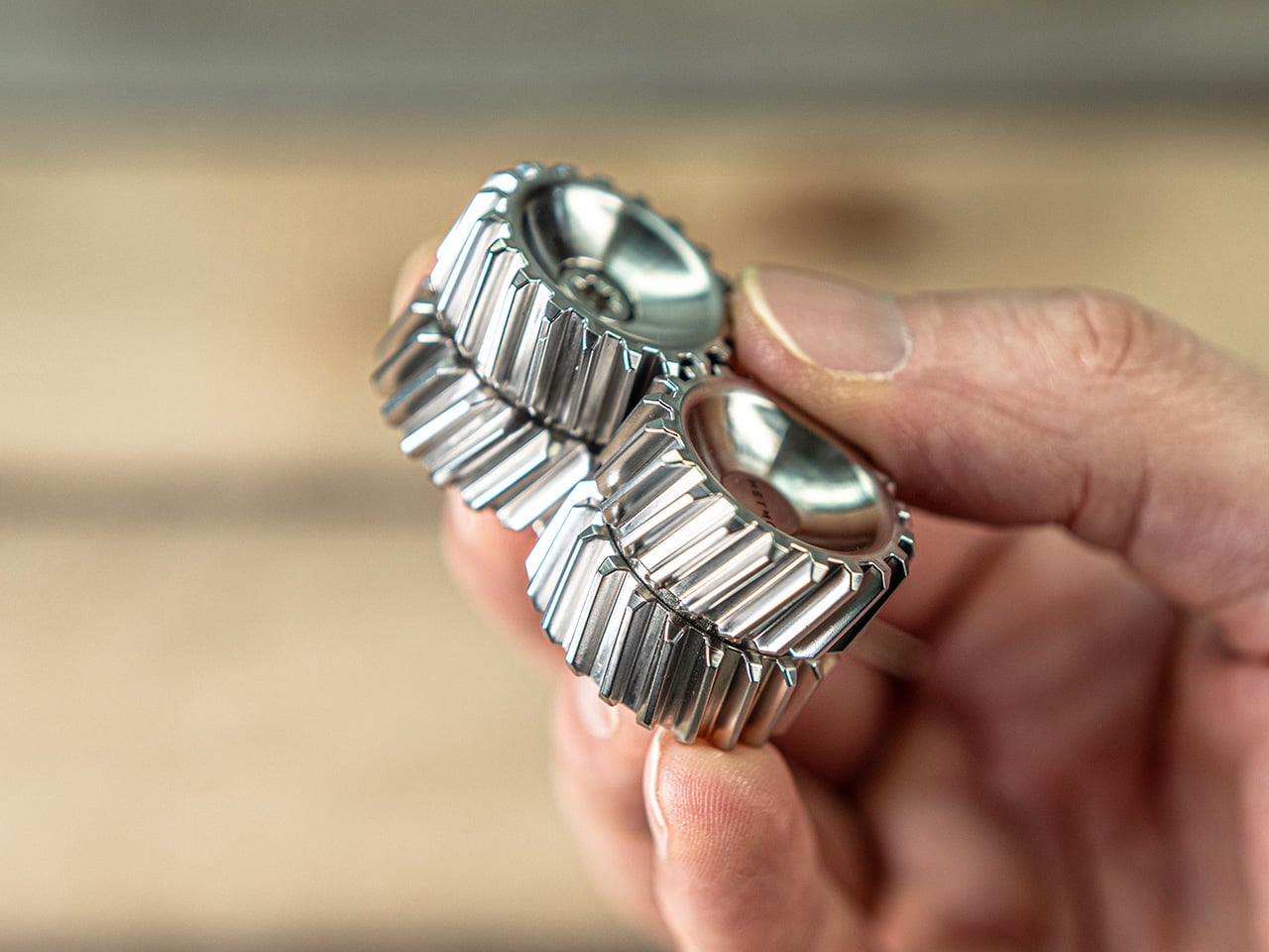
  •  
❌