Vue lecture

A Mouse You Can Squeeze Like a Stress Ball While You Work

The computer mouse hasn’t changed much in decades. Still mostly hard plastic, still shaped like a bar of soap, still asking your hand to grip something that gives absolutely nothing back. The rest of the desk setup has evolved, ergonomic chairs, standing desks, wrist rests, but the one device your hand touches for eight hours straight has remained stubbornly rigid and deeply uninteresting.

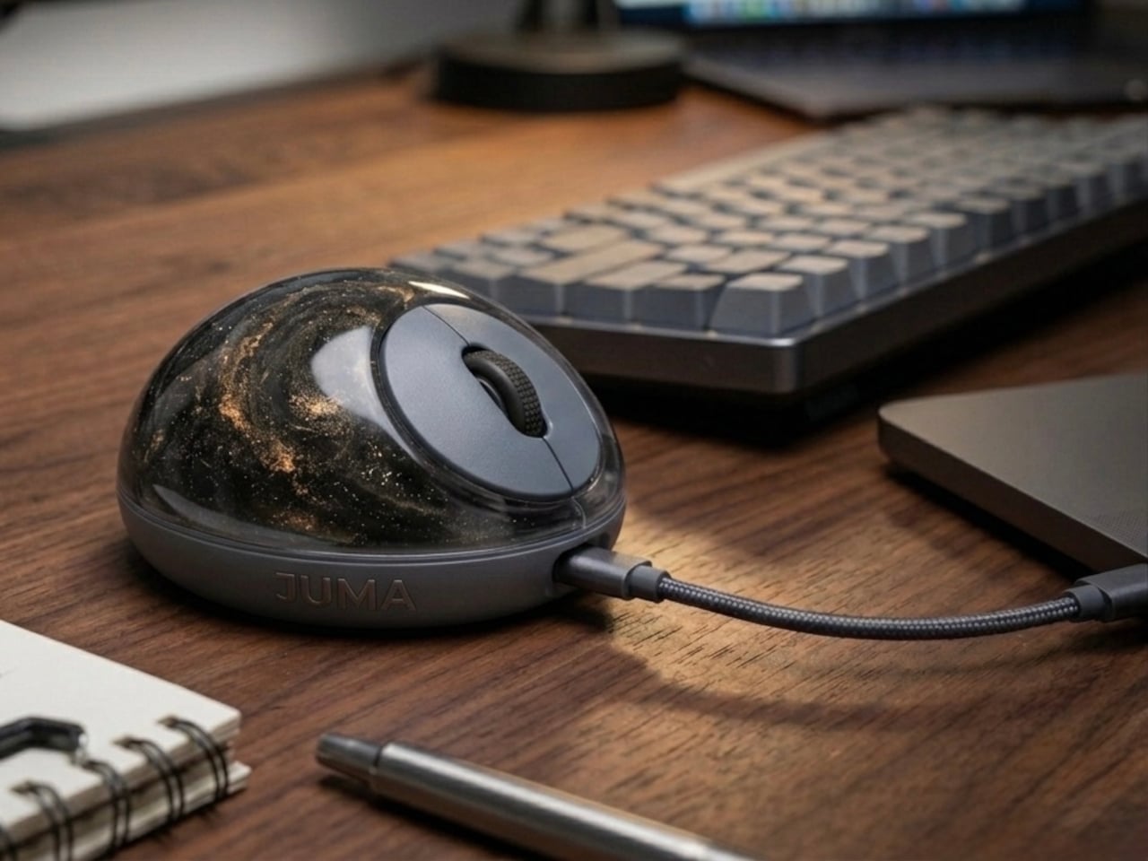
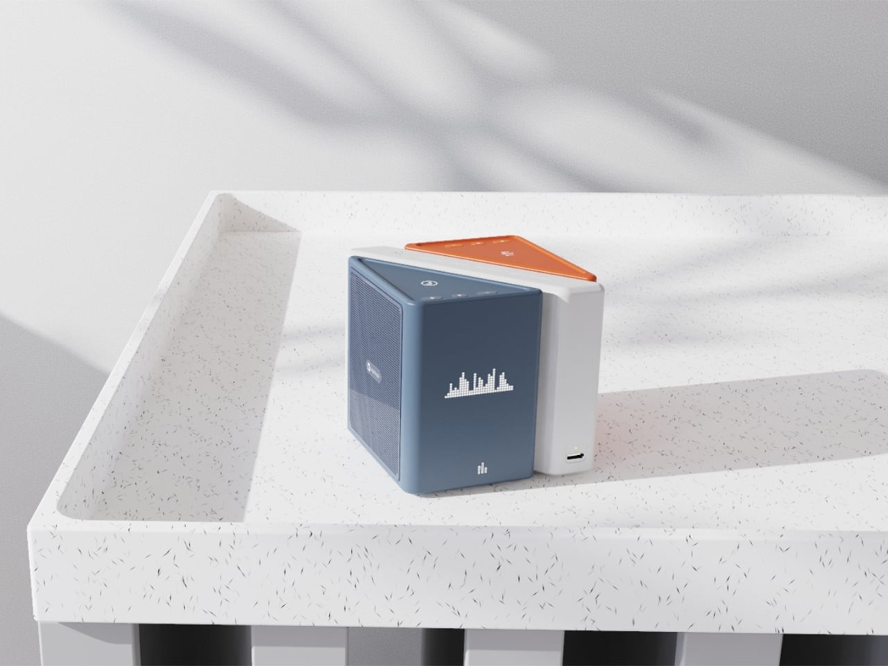
The PILLIGA mouse concept makes a fairly obvious argument for why that should change. Instead of hard plastic, the entire upper chassis is a squishy, flexible membrane packed with a viscous, translucent gel. It’s the same basic impulse that makes people reach for a stress ball mid-meeting, except it’s also the thing you need to get any work done.

Designer: Guillermo Gonzalez

The thinking behind it is straightforward enough. Deadline pressure builds, calls run long, and the urge to fidget becomes almost impossible to ignore. Rather than keeping a stress ball in the desk drawer as a separate ritual, the mouse folds that habit directly into the tool that’s already in your hand. You can squeeze, press, or knead the gel without ever lifting your hand off your workflow.

The dome shape isn’t just for show, either. It follows the natural arch of your palm rather than forcing your hand flat against a hard surface, and the gel underneath absorbs the kind of low-level muscular strain that builds up quietly over hours of clicking and scrolling. It’s the sort of ergonomic consideration that usually requires its own dedicated accessory, not just a different material.

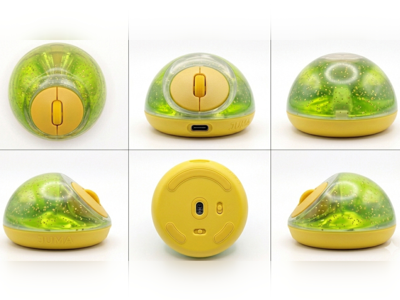
The controls themselves are sensibly laid out. A flat circular interface sits embedded in the front of the mouse, cleanly split for left and right clicks, with a textured, rubberized scroll wheel running between them. A USB-C port at the front handles charging, keeping the wireless design intact without the inconvenience of a separate charging dock. The bottom carries the optical sensor and power switch.

What makes the PILLIGA mouse concept genuinely interesting is how far it extends color as a design element. The gel comes in several variants, from vivid green with gold flecks and a blue version scattered with purple glitter, to darker, more subdued options that look considerably more at home on a professional desk. Each colorway pairs with a matching base and click interface, making the whole thing feel deliberate.

That range matters. The more reserved colorways hint that this isn’t a novelty item for a niche corner of the internet; it works just as comfortably on a professional desk as it does on a creative’s workstation. The gel doesn’t make it look cheap. It makes it look like something designed by someone who gave serious thought to what a mouse should feel like.

Concepts like the PILLIGA are more useful as provocations than promises. Computer mouse design has been coasting on the same assumptions for decades, and the idea that your primary input device could also be physically satisfying to hold hasn’t come up often enough. The gel-filled body raises the question, and that’s honestly more than most peripheral design manages to do.

The post A Mouse You Can Squeeze Like a Stress Ball While You Work first appeared on Yanko Design.

  •  

Forget Smarter AI, This Robot Thinks Presence Is the Point

We keep building AI to do more. More answers, more speed, more certainty. Designer Mehrnaz Amouei looked at that trajectory and asked a fundamentally different question: what if we built AI to be more present instead? The result is POCO, a soft robotic companion that might be one of the most quietly radical design concepts to emerge in recent years. It doesn’t talk over you, doesn’t flood you with information, and it doesn’t pretend to know things it doesn’t know. POCO sits with you. Literally.

At its core, POCO is a soft, tactile object that pairs with a smartphone, which serves as its computational brain and face. A soft textile body wraps around the device, transforming rigid, glass-and-metal technology into something that moves, breathes, and gestures in response to your presence. Together, they create something that sits somewhere between object, creature, and companion, and that deliberate ambiguity is very much intentional. You’re not quite sure what to call it, and that’s entirely the point.

Designer: Mehrnaz Amouei

Amouei developed POCO through research at the University of Illinois at Chicago, grounding the project in studies on loneliness and trust. Her findings indicated that people don’t actually want AI that projects certainty or control. They want availability and responsiveness. They want something that shows up without taking over. From those findings came the concept of “constructive interdependence,” a design philosophy where POCO’s limitations aren’t bugs to be patched but features embedded directly into the interaction model itself. The robot communicates what it can and cannot do through its behavior and physical states, which is a level of honesty you don’t often get from technology that typically overpromises and underdelivers.

I think that matters more than it might initially seem. The dominant conversation around AI right now is almost entirely about expansion: more capability, more integration, more autonomy. POCO pushes back on that without being preachy about it. It reframes the question of what good AI design actually looks like, and the answer it offers isn’t “smarter,” it’s “more trustworthy.” That is a genuinely different value system, and it feels overdue.

The sustainability dimension is also worth paying attention to. Rather than introducing new hardware and generating more electronic waste, POCO repurposes a device most people already own. That decision isn’t just a nice bonus; it’s built into the concept from the start, aligning with the UN’s Sustainable Development Goals around mental well-being and responsible consumption. In product design terms, that means the project was developed with a broader cultural and environmental context in mind, not just a user persona sitting in a lab.

Physically, POCO responds to touch, movement, and environmental cues. It adapts to a user’s preferences while maintaining a consistent identity, which is a surprisingly nuanced balance to strike in any product, let alone one sitting at the intersection of soft robotics and emotional design. Because interaction happens through touch rather than voice commands or screen taps, there’s an intentional slowing down embedded in the experience. You can’t rush a tactile exchange the same way you can type faster or speak louder. That shift from speed to presence feels like a meaningful counter-proposal to how most tech is currently designed. We’ve grown so accustomed to interfaces that demand our attention that a device asking only for our company reads almost as radical.

POCO has already earned an Honorable Mention from the International Design Awards and drawn coverage from major design publications. Whether it ever moves into consumer production remains an open question. But as a design statement, it’s doing exactly what the best concept work should: prompting us to reconsider what we actually want from the technology we live with, and whether expanding capability was ever really the right goal. Maybe the most interesting AI isn’t the one that knows the most. Maybe it’s the one that knows when to just stay close.

The post Forget Smarter AI, This Robot Thinks Presence Is the Point first appeared on Yanko Design.

  •  

vivo X300 FE Review: The Compact Flagship That Earns Its Keep

PROS:


  • Compact, comfortable, and premium design

  • Powerful 50MP main and telephoto cameras

  • Large battery with fast wired and wireless charging

  • Long-term software support

CONS:


  • Mediocre 8MP ultra-wide camera

  • Uncommon horizontal camera design

  • A bit pricier than most "small flagships"

RATINGS:

AESTHETICS
ERGONOMICS
PERFORMANCE
SUSTAINABILITY / REPAIRABILITY
VALUE FOR MONEY

EDITOR'S QUOTE:

The vivo X300 FE proves that a compact phone doesn't have to feel like a lesser one.

Premium smartphones have been trending bigger, heavier, and more visually imposing for years. It’s reached the point where “flagship” is almost synonymous with large, and carrying one all day feels less like convenience and more like a commitment. The compact phone hasn’t disappeared, but finding one that doesn’t sacrifice performance, battery life, or camera quality in exchange for a smaller footprint has been genuinely difficult.

That’s the gap the vivo X300 FE is aiming to fill. It pairs a 6.31-inch flat display with a Snapdragon 8 Gen 5 chipset, a 6,500 mAh battery, and a ZEISS co-engineered camera system, all within a compact design that stays remarkably light for its class. On paper, it reads like a phone that shouldn’t be this compact. But does it actually work in practice? We give it a spin to find out.

Designer: vivo

Aesthetics

The X300 FE follows a flat-design language that’s become increasingly standard among more expensive flagships. There aren’t any curved glass edges or aggressively contoured surfaces, just a clean, rectangular form with ultra-narrow bezels, an aerospace-grade aluminum frame, and a front face that looks symmetrical and composed. The centered punch-hole is small and unobtrusive, and those slim borders give the display a neat, purposeful presence that doesn’t need theatrics to feel premium.

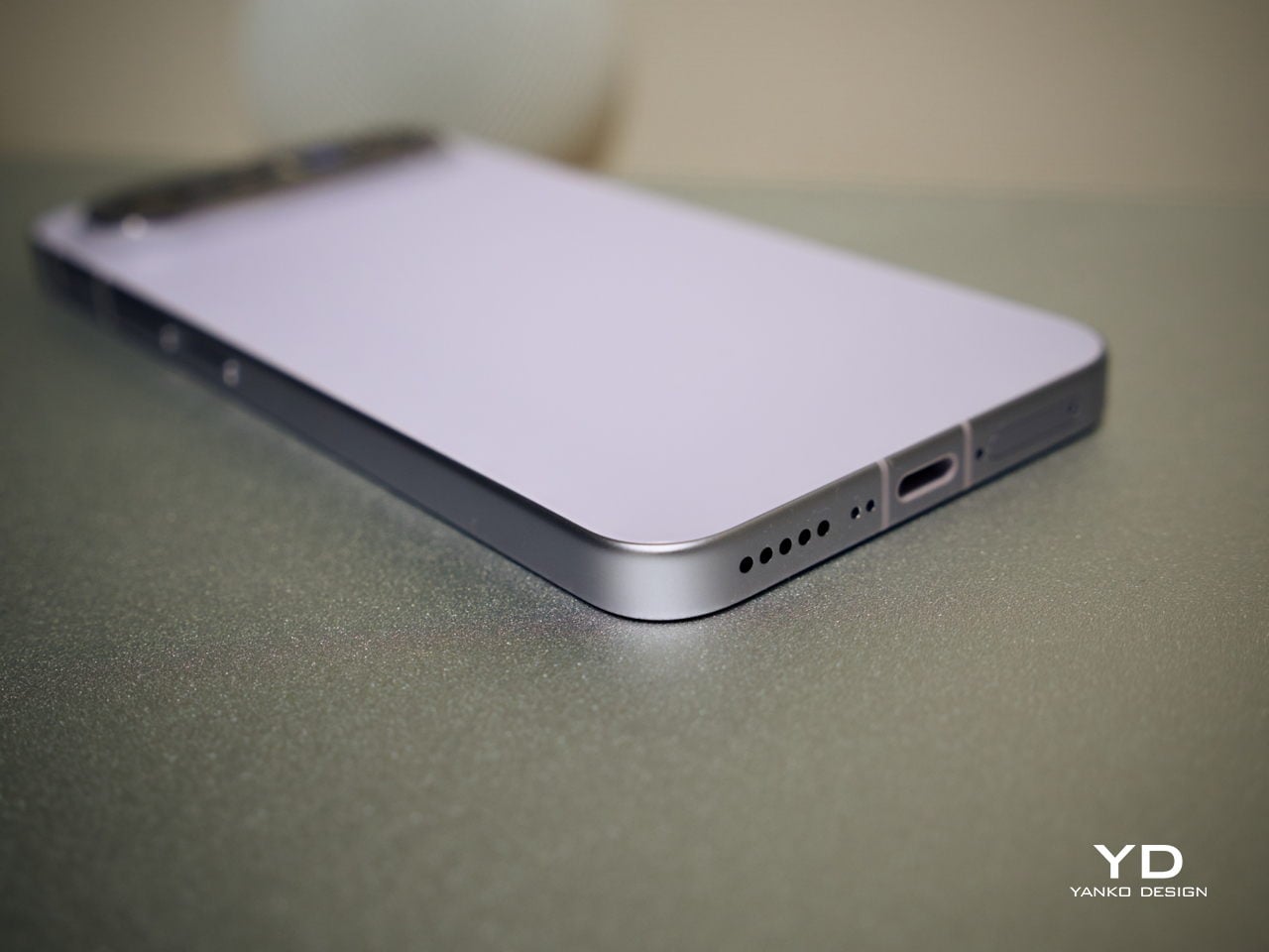
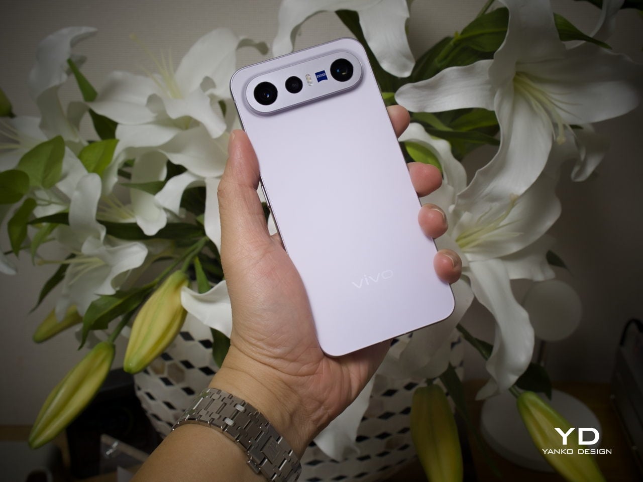
Our review unit came in white, which turns out to be a great choice for a phone this carefully considered. The matte rear panel uses vivo’s Metallic Sand AG glass treatment, giving it a soft, slightly chalky texture that resists fingerprints well and picks up ambient light in a way that shifts subtly between warm and cool tones. It doesn’t try to be eye-catching; it just looks well-made.
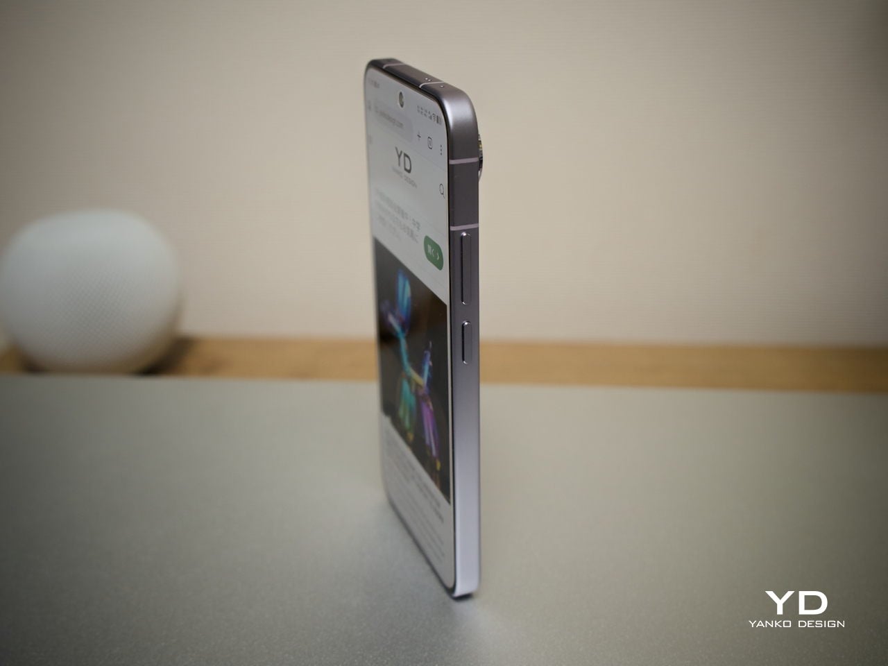
The flat aluminum frame wraps cleanly around the body, with edges that make it comfortable to grip without feeling sharp or slippery. The white model measures 8.10mm thick and weighs 192g, a hair more than the other colorways, but those differences don’t register in hand. What does register is the overall sense of a phone that’s been assembled with genuine attention to detail.

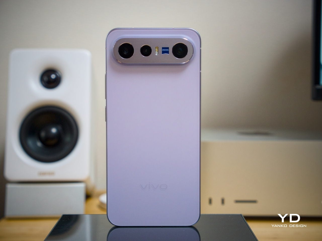
The camera module deserves its own mention. Rather than going for the oversized circular island that’s become visual shorthand for “serious camera phone,” vivo opted for a horizontal bar that spans the upper portion of the back. Three lenses are arranged neatly across it, with a ZEISS badge centered between them. It’s recognizable and distinctive without domineering the rest of the design. Admittedly, it’s going to be a divisive design, but it at least lets the vivo X300 FE easily stand out from the competition.

Ergonomics

At 150.83mm tall and 71.76mm wide, the X300 FE sits firmly in one-handed territory. It isn’t trying to be a miniature phone. It’s simply sized more sensibly than most flagships on the market. You can reach across the screen without adjusting your grip, slip it into a front pocket without thinking, and hold it for extended periods without the wrist fatigue bigger phones tend to bring.
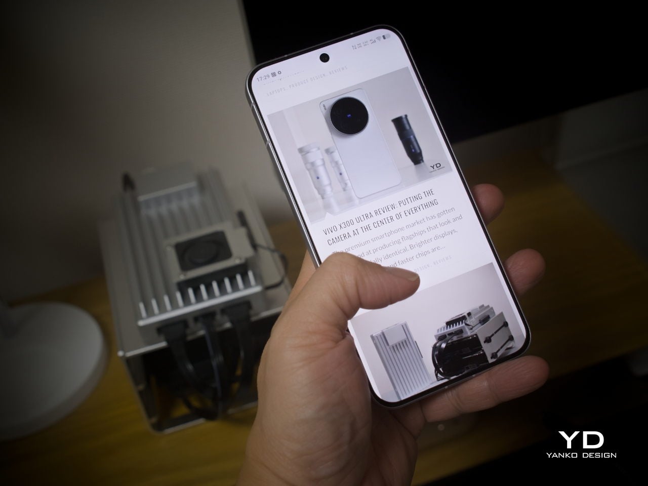
The 192g weight for the white model falls in a range that feels present without being burdensome. There’s enough substance here to reinforce the premium feel of the materials, but not so much that you’re constantly aware of it. The 8.10mm profile isn’t exactly wafer-thin, though that’s a reasonable trade-off for a 6,500 mAh cell packed inside a frame this compact.

The flat-sided frame also contributes more to the ergonomic experience than it might seem. It gives your palm a stable, consistent surface to press against during typing and scrolling, which feels more controlled than on rounded-edge designs. The compact footprint, flat back, and balanced weight distribution all work together to make this a phone that feels designed around how it’s actually used.

Performance

The Snapdragon 8 Gen 5 inside doesn’t need much introduction. It’s a flagship-class mobile processor, and the X300 FE puts it to good use. The 12GB RAM, expandable with another 12GB taken from the generous 512GB storage, clearly marks it as a class above your typical mid-tier compact phone. It runs Origin OS 6, based on the current Android 16 release, embracing a more minimalist and flat aesthetic that perfectly matches the phone’s design.

Day-to-day tasks feel completely effortless, from switching between apps and browser tabs to occasional gaming sessions, and nothing about the experience suggests the compact body is in any way holding the hardware back. Thermals are pretty impressive, given the vivo X300 FE’s size, but its compact form factor might work against it when it comes to how you hold it during those long periods.

Thankfully, the display backs that up well. It’s a 6.31-inch LTPO AMOLED panel with an adaptive refresh rate of 1 to 120 Hz, a 1.5K resolution at 460 PPI, and a local peak brightness of 5,000 nits. The 2,160 Hz PWM dimming also makes prolonged reading and scrolling noticeably more comfortable on the eyes, a detail that matters far more than most spec sheets would have you believe.

Then there’s the battery, arguably the X300 FE’s most impressive engineering accomplishment. A 6,500 mAh cell in a phone this slim and light isn’t something you see every day, and in practice, that capacity means genuine all-day endurance with room to spare. The 90W wired and 40W wireless charging mean you’re rarely stuck waiting long when it runs low, at least with the appropriate chargers.


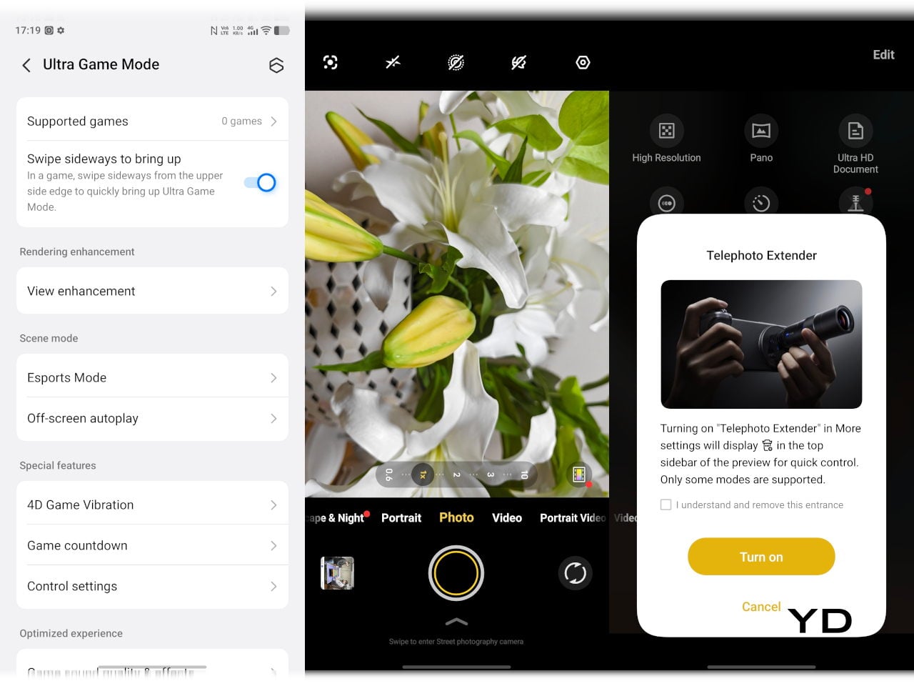
The camera system is led by a 50 MP ZEISS main camera and a 50 MP ZEISS super-telephoto camera, with an 8 MP ultra-wide rounding out the rear. The main and telephoto cameras handle portraits, street photography, and concert scenes with real confidence. An optional telephoto extender accessory also exists for those who want extended reach, though it’s firmly in niche territory.

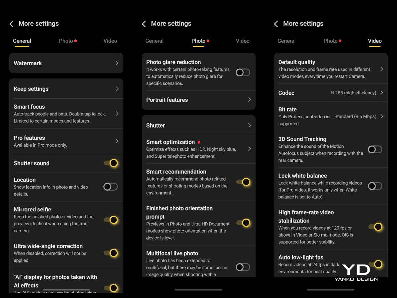
The results are impressive, especially when starting to zoom in on subjects. Even without the telephoto extender, you can enjoy clear and detailed shots, even at night. The 8MP ultra-wide, though usable, is a bit of a letdown, but vivo had to cut some corners to bring down the price and differentiate this model from its more powerful and more expensive siblings. You do have a ton of settings to tweak to get your perfect shot, but even the defaults are good enough to make fleeting moments more memorable.
Sustainability

The X300 FE carries IP68 and IP69 dust and water resistance ratings, alongside an SGS five-star drop resistance certification, giving it a reassuring level of durability for daily use. It also carries an SGS five-star drop resistance certification, which gives it more formal durability credentials than most phones in its class. Together, those ratings make a convincing case for a phone built to survive daily life without requiring any particularly careful handling.

Software longevity is where the X300 FE makes its strongest long-term case. On that front, vivo is committing to five years of OS upgrades, seven years of security maintenance, and a five-year smooth experience promise. That support window is competitive with the best in the Android space, and it signals that this phone is meant to be genuinely used for years, not replaced the moment something newer comes along.
Value

At around €1,000, The X300 FE isn’t a budget phone, and it doesn’t try to be. It competes in the premium compact flagship space, where the particular combination it offers is harder to find than you’d expect. A current-generation chipset, a genuinely large battery, fast wired and wireless charging, ZEISS-branded imaging, and a durable premium build in a package that remains notably light for a flagship is a rare and coherent offering.

The person this phone is designed for isn’t shopping for the biggest or most spec’d-out device available. It’s someone who wants a phone that keeps pace with their life without dominating it, one that fits in a jacket pocket, lasts a full day, and still takes genuinely good photos. Frequent travelers, urban commuters, and anyone who’s tired of unwieldy flagships will feel right at home here.

Verdict
The vivo X300 FE is the kind of compact flagship that doesn’t feel like a compromise once you’re actually using it. The design is restrained and coherent, the battery is frankly impressive for the size, the chipset handles everything you throw at it, and the camera does its best work in exactly the situations most people find themselves in, out in the world rather than on a lab bench.

What the X300 FE offers is a phone that’s easy to carry, genuinely long-lasting, and capable enough for the photography and day-to-day demands you’ll actually encounter. It’s well built, well supported, and clearly designed with a specific kind of person in mind. That clarity of purpose is refreshing, and for the right buyer, it’s exactly what makes this phone worth serious consideration.

The post vivo X300 FE Review: The Compact Flagship That Earns Its Keep first appeared on Yanko Design.

  •  

5 Over-Ear Headphones That Look as Good When They’re Around Your Neck as When They’re on Your Head

The headphone has become something it was never originally designed to be: a silhouette. Worn around the neck on a subway platform or draped over a chair at a coffee shop, a great pair of over-ears communicates taste in much the same way a watch or a well-chosen bag does. The best ones are now designed with that resting moment in mind, not as an afterthought, but as a deliberate part of the brief.

What separates a good headphone from a great one is increasingly less about frequency response and more about how the object behaves when it’s not in use. The five pairs on this list earn their place on both counts. Worn on the head, they deliver. Worn around the neck, they still look like they were built by people who thought carefully about that exact resting moment, collarbone and all.

1. StillFrame Headphones

Most headphones achieve lightness by sacrificing material quality somewhere along the way. StillFrame achieves it by rethinking the entire structure from scratch. At 103 grams, it sits on your head with the kind of effortless presence most pairs spend an entire product page trying to claim. The ultra-minimal design, clean lines, no exposed hardware, and no decorative flourish anywhere on the frame is the kind of restraint that reads as confidence rather than budget constraint.

Around the neck, StillFrame does what minimal design always promises and rarely delivers: it disappears into your outfit rather than competing with it. The 24-hour battery means you’ll reach for these in the early morning and still have charge well into the evening without thinking about a cable. For anyone who wants headphones that age well, that look as right in three years as they do today, this is where the search ends.

Click Here to Buy Now: $245.00

What We Like

  • At 103 grams, this is one of the lightest over-ear headphones available without any sacrifice in build integrity, and the weightlessness is felt the moment you put them on
  • A 24-hour battery life means this pair genuinely runs from morning to night on a single charge, removing the low-battery anxiety that comes with most wireless headphones on the market

What We Dislike

  • Minimal colorway options are a direct consequence of the same design restraint that makes the StillFrame look this considered, and that trade-off is real and visible
  • With so little on the frame to grab visual attention, this pair asks you to commit fully to its design language, which rewards patience but does not suit every aesthetic

2. Meze Audio Strada

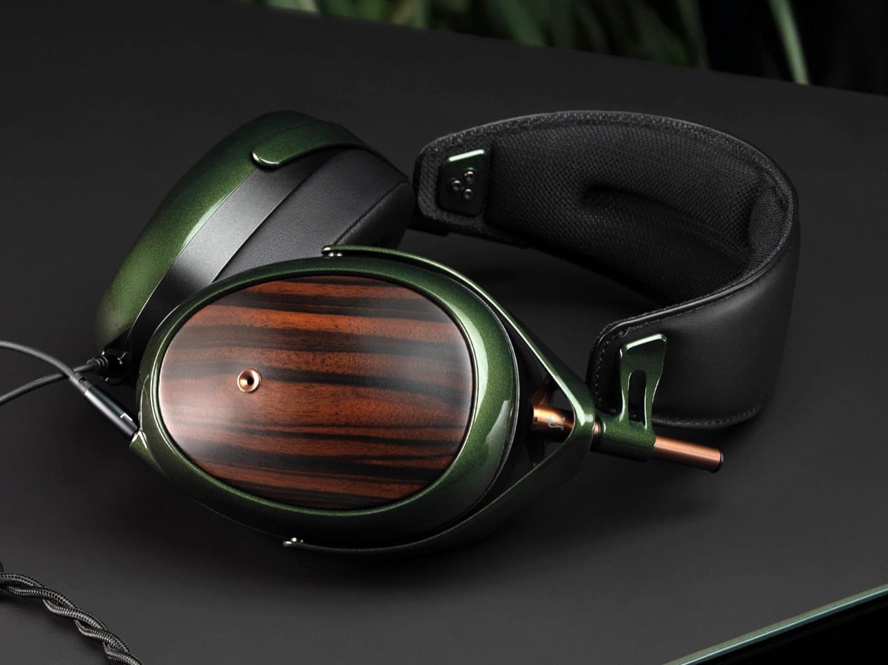
Romanian audio atelier Meze has spent two decades treating headphones as craft objects, and the Strada makes that philosophy fully explicit. Hand-carved walnut and ebony ear cups, each unique in grain and tone, sit alongside a magnetic ear pad system that snaps on and off cleanly, making them the first pair that genuinely anticipates its own aging. The leather headband drapes naturally against the collarbone. At $799, you’re investing in the idea that daily objects deserve this level of material care.

Worn around the neck, the Strada does something genuinely rare: it makes you look considered rather than plugged in. Those hand-carved wood cups catch light in a way that aluminum never quite manages, and the closed-back design delivers warmth and isolation without the clinical precision of most audiophile gear.

What We Like

  • The hand-carved wood ear cups make every unit genuinely one-of-a-kind, an unusual distinction in a product category that typically prizes consistency and uniformity above everything else
  • The magnetic ear pad system solves a real longevity problem that most headphone manufacturers still choose to ignore, making the Strada feel genuinely built for the long term from the start

What We Dislike

  • The warm, closed-back tuning leans toward intimacy over accuracy, which won’t satisfy listeners who prefer a flat, analytical sound profile for critical or reference listening sessions
  • No active noise cancellation at $799 is a deliberate aesthetic choice, but it will not suit everyone who regularly listens in open, noisy, or busy urban environments

3. Bang & Olufsen Beoplay H95

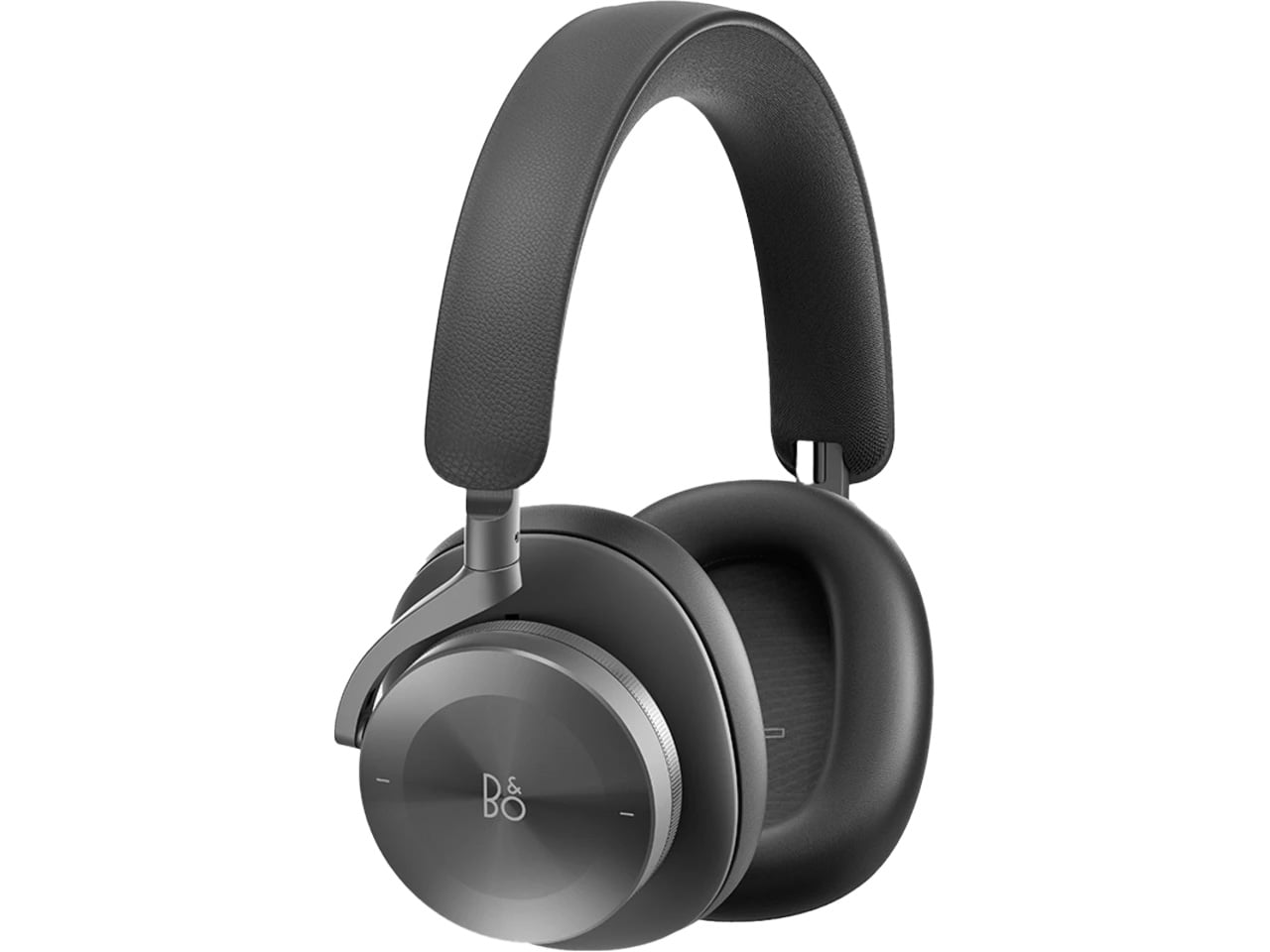
 Bang & Olufsen has been designing objects that make a room better simply by existing in it since 1925. The Beoplay H95 carries that logic to your ears. Brushed aluminum arcs support lambskin ear cushions with the quiet authority of something that was never trying to impress anyone. Custom 40mm titanium drivers deliver an expansive, unhurried soundstage, and 38 hours of battery life with ANC active means you rarely need to think about charging. At $1,250, it reads as inevitable rather than expensive.
Around the neck, the H95 makes its strongest case. The slim profile rests cleanly against the collarbone, the aluminum catches light without glare, and the lambskin ages into something better than what you started with. Vogue Scandinavia named it the headphone that pairs best with the softest cashmere roll-neck and a cocooning wool coat, which is not exactly a mid-range endorsement. The tactile control dial and hard carrying case complete the picture of a brand that hasn’t needed to shout for a century.

What We Like

  • Lambskin ear cushions and brushed aluminum give the H95 a material quality that makes every other pair on this list look like it is working a little harder to impress you
  • 38-hour ANC battery life is class-leading and genuinely difficult to match at any price point, making this the pair most likely to outlast a long-haul journey without any hesitation

What We Dislike

  • At $1,250, this is a significant investment for a product category where $400 already delivers very strong audio performance from multiple well-regarded and respected manufacturers
  • The control dial is elegant but carries a subtle learning curve that takes several days of regular use to feel completely intuitive and second-nature in the hand

4. Bowers & Wilkins Px8 S2

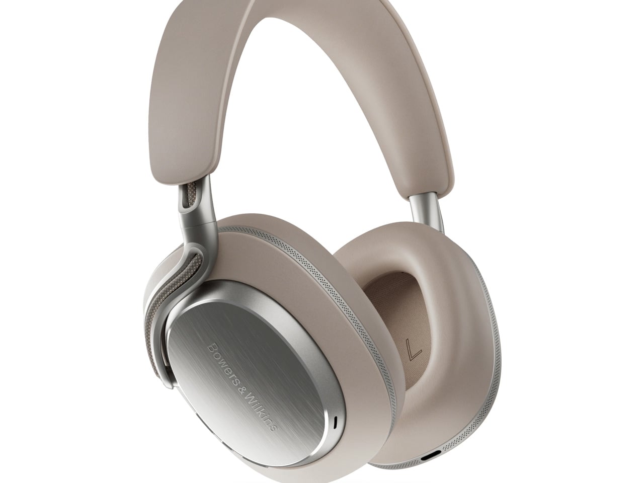
The Px8 S2 looks like it was designed by someone who spent too much time around luxury automobiles and not enough time worrying about what people thought. Diamond-quilted Nappa leather ear cups sit inside angular aluminum driver housings that don’t apologize for taking up space. Bowers & Wilkins built their reputation on speaker cabinets in British living rooms, and that obsession with material quality is fully present in the Px8 S2. At $799, it’s the most visually assertive pair on this entire list.

Worn on the head, the 40mm Carbon Cone drivers deliver a focused sound that rewards careful listening. Worn around the neck, the quilted leather and aluminum geometry create a silhouette that reads closer to jewelry than consumer electronics.

What We Like

  • The diamond-quilted Nappa leather ear cups are a genuinely distinctive design move that no other headphone brand at this price point is executing with this level of craft and conviction
  • 40mm Carbon Cone drivers bring the kind of focused sound detail that makes streaming audio feel like it might be holding something back, consistently rewarding attentive listeners on every session

What We Dislike

  • The angular form does not fold into a compact carry position, making the included case noticeably bulkier than most direct competitors when packed into a bag for daily commuting use
  • The firm clamping force is necessary for the acoustic seal, but it makes itself felt during extended listening sessions, which matters for anyone who wears headphones for several consecutive hours at a time

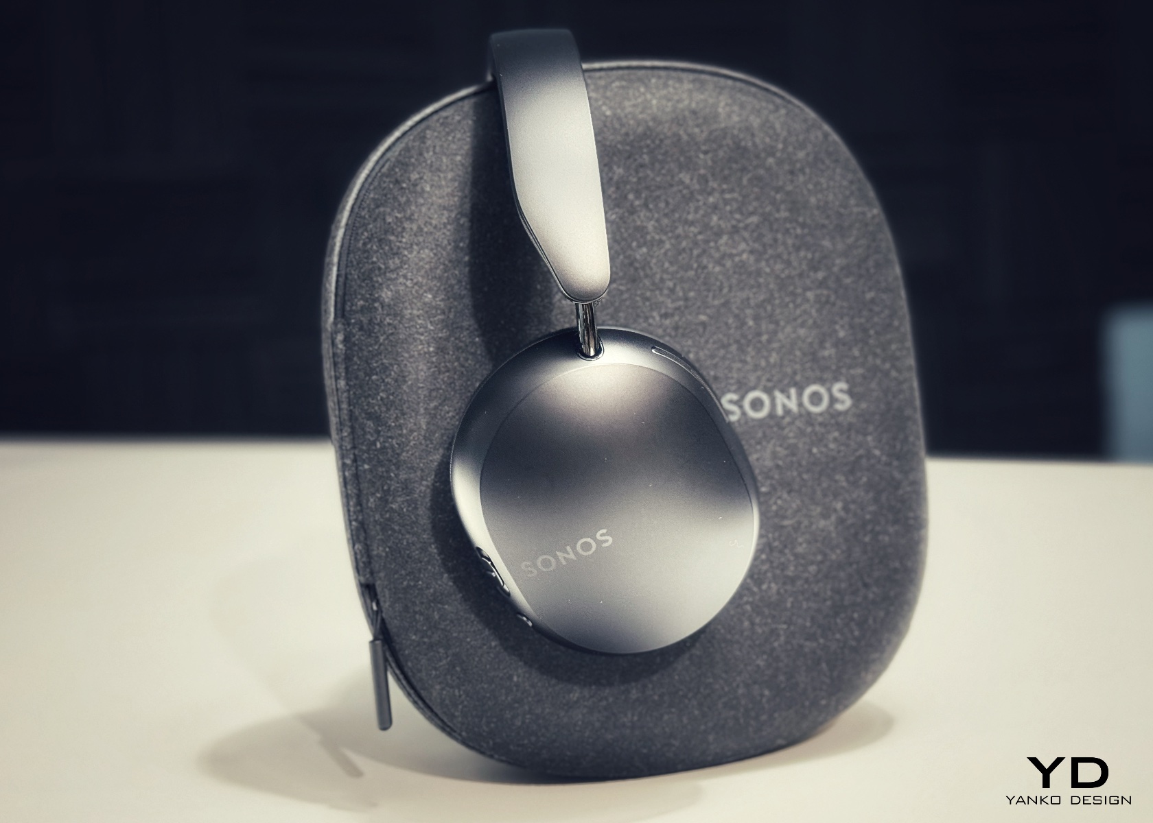
5. Sonos Ace

Sonos spent two decades being the most thoughtfully designed speaker company in the world before ever touching headphones. The Ace is what happens when a brand famous for restraint and material quality finally commits to an entirely new product category. Stainless steel arms, memory foam ear cushions, and a clean form in Midnight or White carry the same quiet authority as Sonos’s best home equipment. At $449, it sits below the B&O and B&W while fully matching them on design character and material coherence.

What makes the Ace genuinely stand out is what you don’t notice: no visible seams on the headband, no mismatched materials, no hardware that apologizes for itself. Active noise cancellation and a 30-hour battery complete a pair that wears as well around a neck as it sounds through the drivers, making it the most versatile pick on this list.

What We Like

  • The material cohesion across every surface, every finish, and every seam speaks one consistent and considered design language, which is an unusually disciplined achievement at the $449 price point
  • Active noise cancellation combined with a 30-hour battery puts the Ace ahead of most competitors on the two specifications that matter most for daily and travel listening

What We Dislike

  • The body is predominantly high-quality plastic rather than metal, which is a material trade-off that some buyers will feel at this price point relative to the B&O and B&W alternatives
  • Head-tracking spatial audio is most effective when paired with a Sonos home speaker system, limiting the feature’s full appeal for listeners who don’t already own Sonos hardware at home

The Best Headphones Are the Ones You Never Want to Take Off

What all five of these pairs share is a seriousness of intent that goes well beyond frequency response. They were built by companies that think about how objects live in the world, not just during a listening session, but on a train platform, at a desk, hanging around a neck. That’s a harder problem to solve than noise cancellation, and the brands that crack it tend to stay relevant far longer than those that don’t.

The range here runs from $449 to $1,250, but the price gaps matter less than they appear at first. What you’re really choosing between is design language: Romanian craft warmth, Scandinavian restraint, British precision, speaker-first material thinking, or clean minimalism that genuinely disappears. Any of these pairs earns the right to hang around your neck. The question is which one earns it in a way that feels made for how you actually move through the world/

The post 5 Over-Ear Headphones That Look as Good When They’re Around Your Neck as When They’re on Your Head first appeared on Yanko Design.

  •  

Air Purifier Filters Cost $100 a Year, but CUE Uses Water Instead

Air purifiers have become a common fixture in homes and offices, quietly working to keep indoor air breathable. Most of them follow the same basic formula, drawing air through a dry filter that captures dust, pollen, and airborne particles over time. When that filter reaches its limit, you throw it away and buy a replacement, or wash it if it’s the reusable kind. It’s a familiar routine, but not exactly a thoughtful one.

CUE Air Washer from Watervation is a 2-in-1 purifier and humidifier that takes a noticeably different approach. Rather than filtering air through a dry medium that slowly fills with grime, it washes the air with water, borrowing from how rain naturally clears the atmosphere of dust and pollen. It’s a concept that sounds simple in hindsight but actually changes quite a bit about how air care works.

Designer: Watervation

Click Here to Buy Now: $299 $575 (48% off). Hurry, only 41/975 left! Raised over $411,000.

The idea at the heart of CUE is surprisingly intuitive. Instead of holding contamination inside a dry filter, the device draws air through a water-based medium that strips airborne particles and gases from the air. Once the water turns dirty, you empty it, rinse the tank, and refill it, giving the device a clean start every day. There’s nothing to replace, and nothing to accumulate.

The technology behind CUE is Watervation’s patented RainTec system, and its most notable quality is what it doesn’t rely on. Most air washers need motorized water pumps to circulate liquid, but RainTec uses fluid dynamics instead. A spinning rotor generates a vacuum that draws water upward without any pump, eliminating the most common failure point in these devices and keeping the design considerably simpler.

What makes CUE genuinely practical is how naturally it handles two common problems at once. Dry air and airborne pollutants tend to go hand in hand, especially in bedrooms during winter or in home offices that don’t have great ventilation. Instead of running two separate appliances for purification and humidity, CUE handles both, covering spaces up to 300 sq ft, which fits most personal and domestic environments.

The ownership story is where CUE makes the strongest case for itself. Conventional air purifiers can cost over $100 per year in filter replacements alone, a figure that doesn’t stop growing the longer you use the device. CUE cuts that entirely by using water as its only medium. The maintenance routine comes down to emptying the tank, rinsing it, and refilling it with fresh water.

CUE is also one of those rare appliances that’s genuinely pleasant to leave out in the open. The cylindrical device has a dark upper housing and a clear lower tank that lets you watch the water action inside. There’s something calming about it. The swirling motion of water being spun and atomized gives the cleaning process a visible, almost meditative quality that isn’t common in this product category.

Performance testing by Korea Conformity Laboratories gives the product’s claims some independent backing. Results showed a 93.5% reduction in fine particulate matter, a 99.5% reduction in acetic acid, a 99% reduction in ammonia, and a 90% reduction in formaldehyde. The device also includes a built-in UV-C sterilization module that continuously disinfects the water tank while running, keeping the water hygienic throughout each cycle.

There’s a growing appetite for home appliances that earn their place on a shelf rather than hiding behind it. CUE Air Washer fits that thinking, handling air quality in a way that’s quieter, cleaner, and far less dependent on consumables than what came before. Watervation’s direction with this product hints at what home air care could look like when the design is as considered as the engineering behind it.

Click Here to Buy Now: $299 $575 (48% off). Hurry, only 41/975 left! Raised over $411,000.

The post Air Purifier Filters Cost $100 a Year, but CUE Uses Water Instead first appeared on Yanko Design.

  •  

No More Waiting in Line for Hot Water, This RV Heater Has 66,000 BTU

Summer has a way of changing the rules for RV travel. What was a relaxed weekend trip for one or two people becomes a full-blown family expedition, with everyone’s routines packed into the same tight space. Showers get longer, dishes pile up faster, and the morning rush gets more competitive. The systems you barely thought about in cooler months suddenly start to matter a great deal.

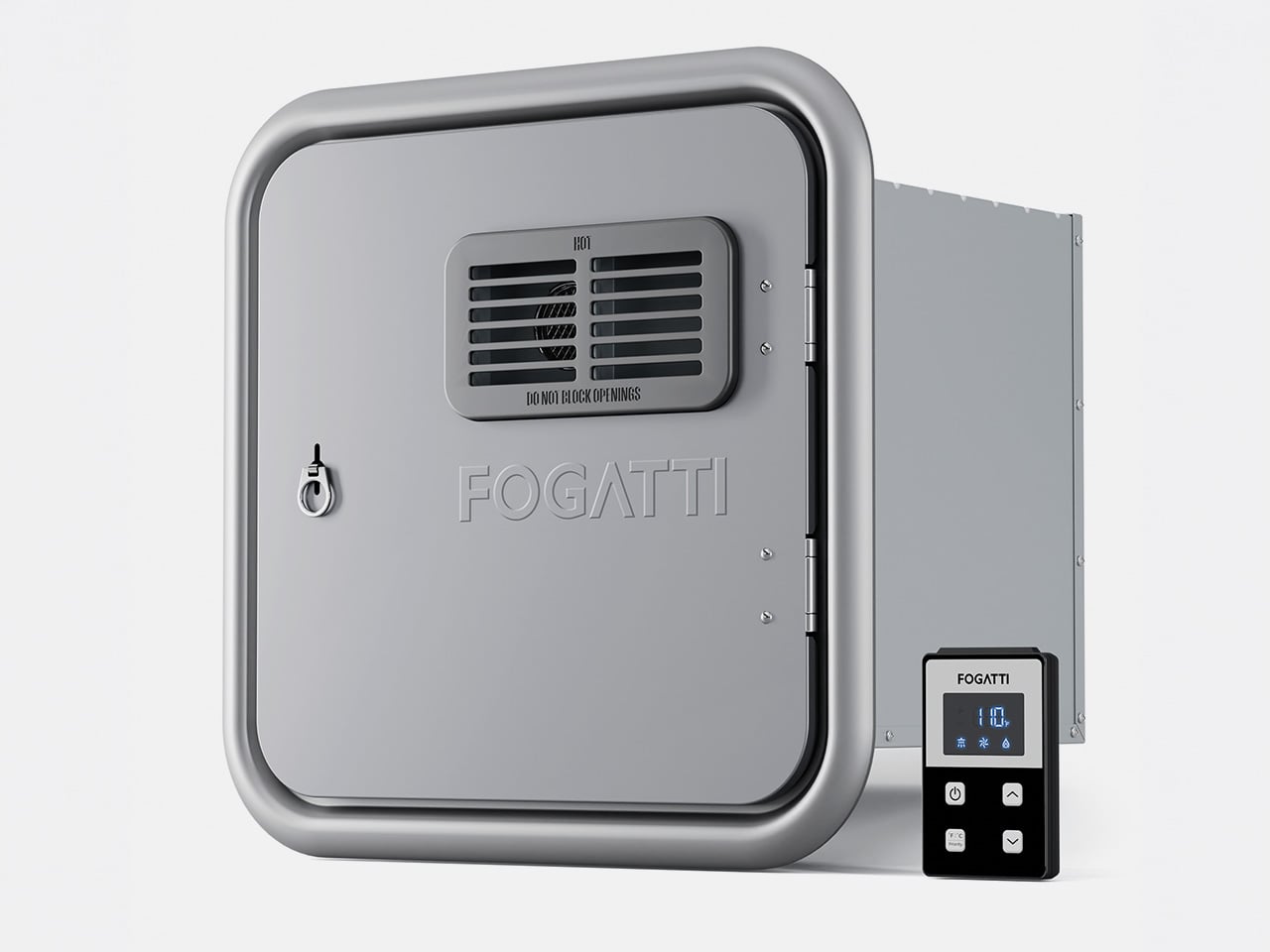
Hot water is one of the first things you notice when an RV can’t keep up. Waiting for the tank to recover, a cold burst just as you find a comfortable temperature, or having to ration usage when multiple people need the sink, these aren’t exactly the highlights of a road trip. The Fogatti InstaShower Ultra is a propane tankless water heater designed to change all of that.

Designer: Fogatti

Click Here to Buy Now: $799.99 $899.99 ($100 off). Hurry, deal ends in 48-hours. Website Link Here.

Picture a typical summer morning at a campground. Someone’s in the shower while another is getting breakfast going, and a third is at the sink washing up before everyone heads out for the day. That kind of simultaneous demand used to be a problem. With 66,000 BTU of rapid heating power and a maximum flow rate of 3.9 GPM, the InstaShower Ultra handles it without much fuss.

The end of a summer day outdoors tells a different story. Whether you’ve been hiking dusty trails, splashing around a lake, or just sitting in the heat all afternoon, everyone comes back to the RV needing a proper wash. A strong, steady shower makes that feel less like a chore and more like a reward, and you don’t have to queue up for it.

One of the more thoughtful bits of engineering is a built-in pre-mix system with a small mixing tank that balances temperature at startup. It addresses a familiar tankless annoyance, namely the cold burst before the heating kicks in. Once that’s handled, water comes out warm right away, and it’s the kind of improvement you only appreciate once it stops being a problem.

Temperature management doesn’t stop there, either. The heater uses segmented combustion that automatically adjusts heat output based on conditions. On a scorching summer afternoon, it scales back to prevent overheating. On a cool mountain evening or at higher altitudes, it ramps up accordingly. It’s a neat bit of self-regulation that keeps water temperature consistent, whether you’re parked in a sun-baked valley or somewhere up at 9,800 feet.

The InstaShower Ultra also activates at a flow rate as low as 0.5 GPM, which is considerably lower than what most standard tankless heaters require to kick on. That might seem like a minor detail, but it matters quite a bit on longer off-grid trips where every gallon counts. You aren’t forced to run the tap wide open just to get the heater going.

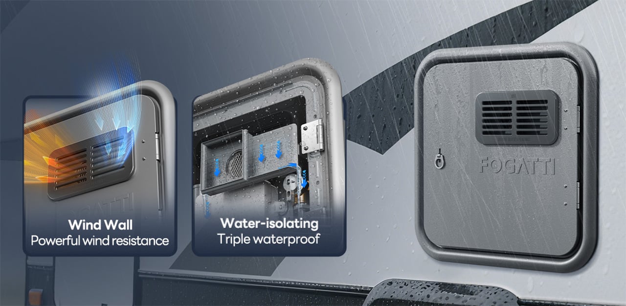
The weather is something a lot of buyers don’t think about until it’s too late. Summer storms roll in fast, and a water heater that can’t cope with heavy rain or strong gusts becomes a liability. HydroShield-Tech gives the InstaShower Ultra both windproof and waterproof resistance, with a NIDEC high-performance fan backing up the wind protection, so the heater keeps running when conditions outside take a turn.

For those still running on an older four- or six-gallon storage water heater, the InstaShower Ultra is a practical replacement. It comes with a door measuring 15 x 15 inches, designed to fit the cutout left by those older tanks, along with a decorative frame. Optional larger door frames are also available separately if your RV’s opening calls for a different fit.

Summer trips have a way of exposing which parts of the RV are actually ready for extended life on the road. A water heater might not top the pre-trip checklist, but it touches nearly every part of the daily routine, from the first shower of the morning to cleaning up after a late campfire dinner. Getting it right makes those routines a lot less stressful, and that’s the peace of mind that the Fogatti InstaShower Ultra delivers.

Click Here to Buy Now: $799.99 $899.99 ($100 off). Hurry, deal ends in 48-hours. Website Link Here.

The post No More Waiting in Line for Hot Water, This RV Heater Has 66,000 BTU first appeared on Yanko Design.

  •  

MUJI-Meets-Cyberpunk Vinyl Record Player Glows Like an Ambient Light and Charges Wirelessly

Minimalism in product design has gotten boring. We’re swimming in smooth white rectangles, touch controls that offer zero feedback, and devices designed to vanish. Apple spent two decades training the industry to sand away every visible seam, and now we live in a world where a Bluetooth speaker looks like a cylinder because a cylinder offends nobody. Bang & Olufsen understood early that audio equipment could occupy space like sculpture, could earn its place in a room through presence instead of absence. Teenage Engineering proved that mechanical honesty and playful geometry could coexist with premium materials. Both approaches work because they have a point of view.

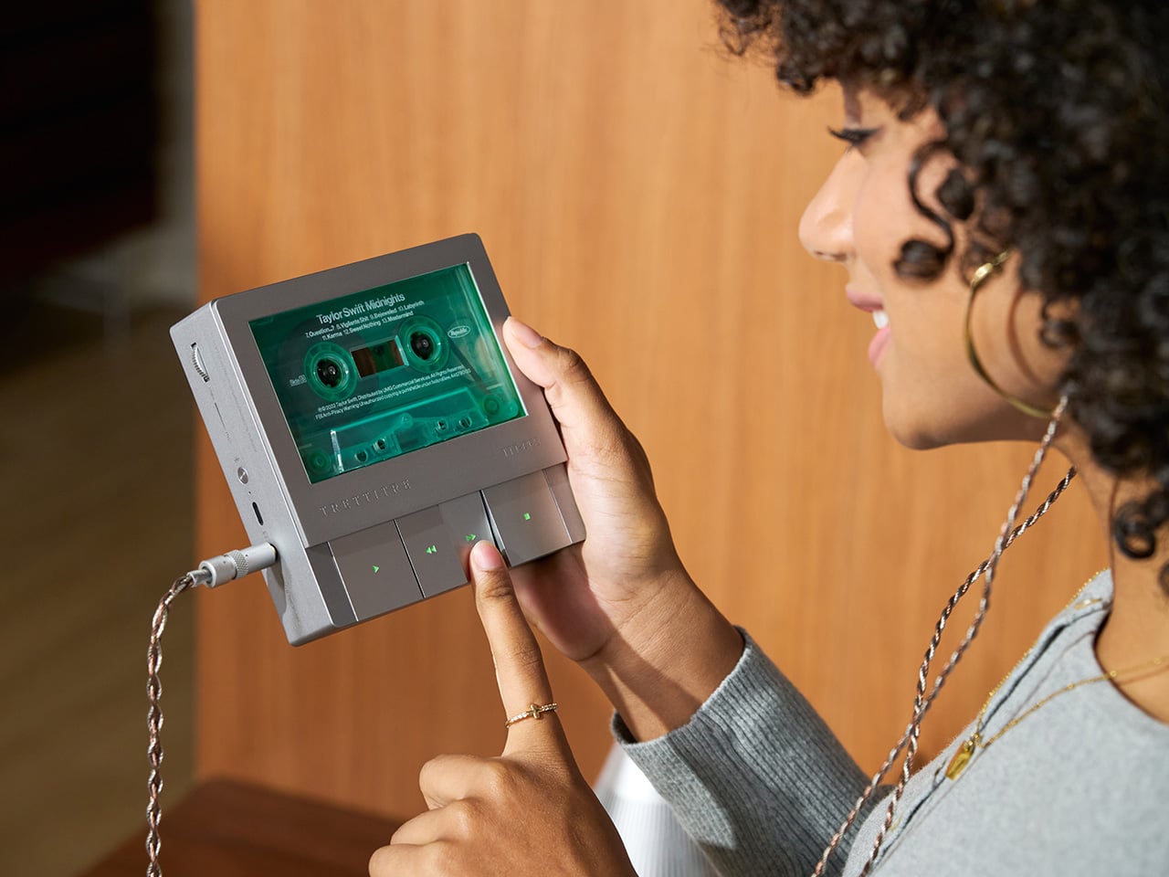
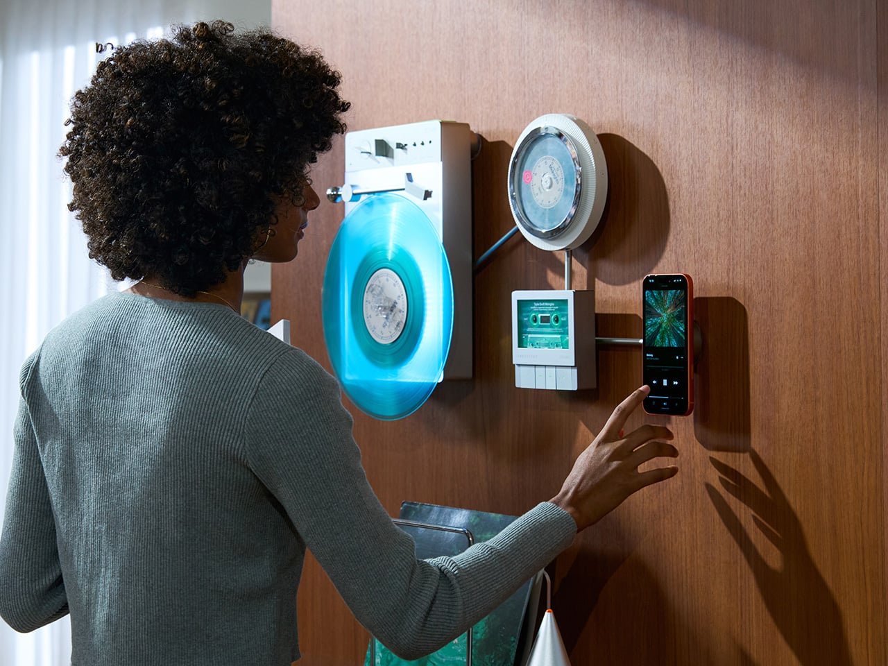
TRETTITRE’s TTT series combines those instincts into something harder to categorize. The TTT-LP3 wireless vinyl player uses CNC-machined aluminum for the main frame and features a diffused lighting panel that spreads light evenly across the surface when music plays. The TTT-DP3 Bluetooth CD player takes inspiration from a UFO-like form with a transparent magnetic cover that rotates open to reveal the spinning disc. The TTT-CP3 cassette player uses a metal housing with sharp geometric lines and mechanical transport keys that deliver clear physical response. All three mount on the TTT-W magnetic modular wall rack, turning physical media playback into a visible, functional part of interior design.

Designers: Noah – Founder & Designer, Trettitre

Click Here to Buy Now: $229 $449 ($220 off). Hurry, only 55/99 left! Raised over $654,000.

TTT-LP3: A Vinyl Player That Doubles as Ambient Light

The back of the LP3 includes a hidden mounting structure that allows it to hang directly on a wall. You can mount it vertically so the record becomes part of the visual display, or go for the classic horizontal layout. When you want to move it, you lift the silicone leather handle at the top and take it down. The player detaches easily and gives you the freedom to listen wherever you choose. Traditional turntables usually stay exactly where you put them, limiting your options for when and where you listen. The LP3 works a little differently because of the battery and the wall mount’s wireless charging system, which keeps it powered without a visible cable.

Behind the LP3 sits a diffused lighting panel that spreads light evenly across the surface of the unit. When it’s on, the entire body of the player glows softly, designed to feel closer to ambient lighting than decorative lighting. You can change the lighting effects with the touch of a button. When a record spins, the moving shadows create a quiet visual effect. You can also leave the player mounted on the wall as a soft light source even when no music is playing. That ambient quality pushes the LP3 from well-designed product into something more considered: a slow, breathing light fixture that happens to play records.

The LP3 uses a self-balancing tonearm system that automatically sets the correct pressure when the player powers on. You place the record on the platter and lower the needle, and the system handles the rest. Many turntables require careful calibration before they can be used properly, with tonearm balance, tracking pressure, and counterweight adjustment all part of the process. For experienced collectors that process can be enjoyable, but for beginners it often feels complicated. The LP3 removes that barrier entirely while preserving the tactile experience people enjoy. The player supports both 33 RPM and 45 RPM records, and includes a manual control dial that allows small adjustments to playback speed (roughly ±0.5%), useful for older records that may not spin perfectly at their original speed anymore.

Wireless audio is handled through Qualcomm Bluetooth v5.3 with SBC, aptX, aptX HD, and aptX Adaptive, which allows higher-quality and lower-latency wireless audio than basic Bluetooth streaming. For wired setups, the player also includes a 3.5mm audio output. The built-in battery provides up to 6 hours of vinyl playback or up to 3 hours when used purely as an ambient light source. Full specs: dimensions 342×233×87mm, weight 1430g, Audio-Technica AT3600L moving magnet stereo cartridge, CNC-machined aluminum frame with silicone leather carrying strap. The LP3 arrives in June 2026 for Early Bird backers, May 2026 for Fast Delivery backers.

TTT-DP3: Giving the Compact Disc Its Aura Back

The DP3 keeps the reliability of CDs but gives the player a different visual presence. The design takes inspiration from a UFO-like form with a transparent magnetic cover. When the cover rotates open, the disc is partially visible as it spins, turning something simple into a small visual moment. A CD player shaped like a flying saucer with a rotating transparent lid is an audacious idea, and it works because it doesn’t try to evoke nostalgia. It reframes a CD player as a mechanical object of curiosity, something you watch as much as use.

The control buttons include raised tactile dots combined with a gold-embossed finish, making it easy to identify the buttons by touch alone. You can pause or skip tracks without needing to look down at the player. A small OLED display on the player shows track numbers, playback status, and battery level. The interface is intentionally simple so the information you need is visible immediately. A built-in battery allows the DP3 to run for several hours on its own, so you can move it from room to room, bring it to a small gathering, or take it while traveling. Full specs: Ø170×27mm, 324g, supports CD-DA and HDCD formats, Bluetooth 5.4, SNR >70dB, THD <3%, ABS+PC+Metal construction. The DP3 ships in May 2026.

TTT-CP3: Cassette Hardware for Modern Audio Setups

The CP3 keeps the tactile mechanical elements people associate with tapes while updating the electronics inside. The player uses a metal housing with sharp geometric lines that give it a distinctly industrial appearance. Instead of trying to imitate retro plastic designs, the CP3 leans into a more modern interpretation of cassette hardware. The playback controls use independent mechanical keys similar to piano keys. Each press has a clear physical response. Play, rewind, and stop feel deliberate instead of soft or mushy.

Inside the CP3 sits a Bluetooth module that allows cassette audio to stream wirelessly to speakers or headphones. The player decodes analog audio signals with high precision, helping reduce background noise and preserve more detail from the original recording. The result still sounds like cassette tape, but with greater clarity. Full specs: 122×120×32mm, 360g, supports Type I-IV cassette cartridges, Bluetooth 5.4, SNR ≥55dB, THD <3.5%, Metal+PC+ABS construction. The CP3 ships in May 2026.

When Storage Becomes Part of the Spectacle

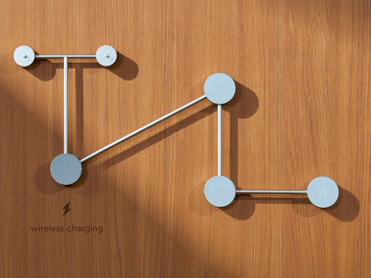
The TTT-W Magnetic Modular Wall Rack uses an all-metal geometric structure that allows multiple TTT players to be arranged into a clean wall display while keeping them organized and ready to use. The rack integrates magnetic alignment and wireless charging for the vinyl player, so the LP3 can stay powered without visible cables while being part of the room’s design. Two configurations are available: a T-shaped rack (263×196×27mm, 300g) and a magnetic modular wall rack (612×302×27mm, 775g, combined style T+3). Both support wireless charging at 5-10W and use USB-C 5V 2A input.

The Supporting Cast, from Sculptural Speakers to Planar IEMs

TRETTITRE offers a range of add-ons designed to complement the TTT system. The TreSound1 Speaker arrives in concrete and wooden editions, delivering 2×30W + 1×60W output power with a 1″ tweeter, 2.75″ mid-range, and 5.25″ subwoofer for 30Hz-25KHz frequency response. The conical speaker features 360° surround sound, Bluetooth 5.2 with Qualcomm aptX HD, and a sculptural form that occupies space like a piece of furniture. The TreSound Mini is a portable Bluetooth speaker with a 5200mAh battery, 30W RMS output, and 360° surround sound. The TTT-E3 in-ear headphones use a 13mm planar magnetic driver with a 4-strand silver-copper hybrid conductor, available in 3.5mm and 4.4mm configurations. An aluminum alloy side table (300×300×750mm, 1.75kg, max load 50kg) rounds out the ecosystem.

What It Costs to Build the Setup, and When It Ships

The TTT-LP3 wireless vinyl player is available at $229 for Early Bird backers (June 2026 delivery), down from a planned $449 MSRP. The TTT-DP3 Bluetooth CD player is priced at $79 standalone ($179 MSRP), while the TTT-CP3 cassette player is also $79 standalone ($199 MSRP). If you’re a bonafide audiophile, a $399 bundle gets you all three devices. Optional add-ons include the TreSound Mini Bluetooth Speaker at $169 ($299 MSRP), TreSound1 Wooden Edition at $449 ($659 MSRP), TreSound1 Concrete Edition at $499 ($799 MSRP), TTT-E3 planar IEMs at $139 ($239 MSRP), and the TTT Side Table at $89 ($199 MSRP). The campaign runs through April 9, 2026, with worldwide delivery beginning May 15, 2026.

Click Here to Buy Now: $229 $449 ($220 off). Hurry, only 55/99 left! Raised over $654,000.

The post MUJI-Meets-Cyberpunk Vinyl Record Player Glows Like an Ambient Light and Charges Wirelessly first appeared on Yanko Design.

  •  

A Tiny Pinwheel Is Doing What AI Giants Won’t

Every time you type a prompt into ChatGPT, something happens somewhere far away. Servers spin up. Electricity moves. Carbon gets generated. The whole transaction is so clean and invisible on your end that it might as well not be happening. That’s by design, and it’s worth thinking about. Although with the way we use technology these days, we seldom think about the consequences on our environment.

London-based creative studio Oio wants to change that, starting with a small 3D-printed box and a bright yellow pinwheel. Their project, the Hot Air Factory, is a domestic AI device that processes your questions and requests locally, without connecting to the cloud, and every time it thinks, it physically exhales. Hot air pushes out of the top of the device and spins that cheerful little pinwheel. The harder it thinks, the faster it spins. You’re watching computation happen in real time, which turns out to be a surprisingly powerful thing.

Designer: Oio

The concept is simple: make the invisible visible. We know AI uses energy. We’ve read the headlines. But knowing abstractly that data centers are energy-hungry is different from watching a pinwheel turn every time you ask your AI assistant to summarize something. One is a statistic. The other is a moment of honest accountability.

What makes the Hot Air Factory smart, beyond its obvious design appeal, is how it translates cost into human-readable terms. It doesn’t give you kilowatt-hours because most people have no idea what that means. Instead, it tells you something like “that prompt cost the equivalent of brewing a cup of tea” or “watching Netflix for five minutes.” Suddenly the math becomes personal. Suddenly you start wondering whether you really needed a 500-word AI response to a question you could have Googled.

Oio co-founder Matteo Loglio describes it as “a small, domestic AI that reveals the hidden energy cost behind every prompt.” The factory also lets you dial up or down the level of intelligence it uses. Want a quick answer? Use a lighter model, spend less energy. Need something more complex? Crank it up, and watch that pinwheel work for it. You can even schedule your heavier prompts for the night shift, when energy is cleaner and the grid is quieter. These are design decisions that carry real ethical weight, and they’re baked in with zero condescension.

The playfulness and the seriousness aren’t in conflict here. They’re exactly the point. The Hot Air Factory is built in a Frutiger Aero visual language, all soft curves and clean optimism, the kind of aesthetic that makes you want to put it on a shelf next to your plants. But underneath that approachable exterior is a genuinely complicated machine running open-source large language models on a local GPU. It looks like something a friendly robot would carry. It functions like a small act of protest.

AI companies have very little incentive to make their energy costs legible to users. Invisibility is convenient. It keeps things frictionless. It keeps you prompting without thinking about the bill. A report from the US Department of Energy projected that by 2028, data centers could account for 12% of total electricity consumed in the US. That’s not a small number, and it keeps growing every time we treat AI like it runs on good intentions and cloud magic.

The Hot Air Factory isn’t saying AI is bad. It isn’t demanding you stop using it. What it’s doing is quieter and more persuasive than that. It’s asking you to look. To see. To feel, just a little, what your digital habits cost in the physical world. That’s the argument made not through a lecture or a campaign, but through a yellow pinwheel spinning in your living room.

Design can do that. Sometimes a small, well-made object says more than a policy paper ever could. The Hot Air Factory is currently looking for collaborators to help bring it to a wider audience, still working its way from experiment to something anyone can own. If the goal is conscious computing, the first step might just be this: a tiny box, a spinning fan, and the quiet discomfort of watching a machine breathe.

The post A Tiny Pinwheel Is Doing What AI Giants Won’t first appeared on Yanko Design.

  •  

Anker’s $70 Power Strip Clamps to Your Desk, Keeps Cables Off Floors

Desks have gotten more crowded. Between the laptop, the monitor, the phone, and whatever Bluetooth peripherals have accumulated over the past few years, keeping everything charged without making a mess has become its own challenge. Power strips have always been the go-to solution, but most still end up on the floor or behind furniture, at the end of a cable that creates the very clutter it was supposed to fix.

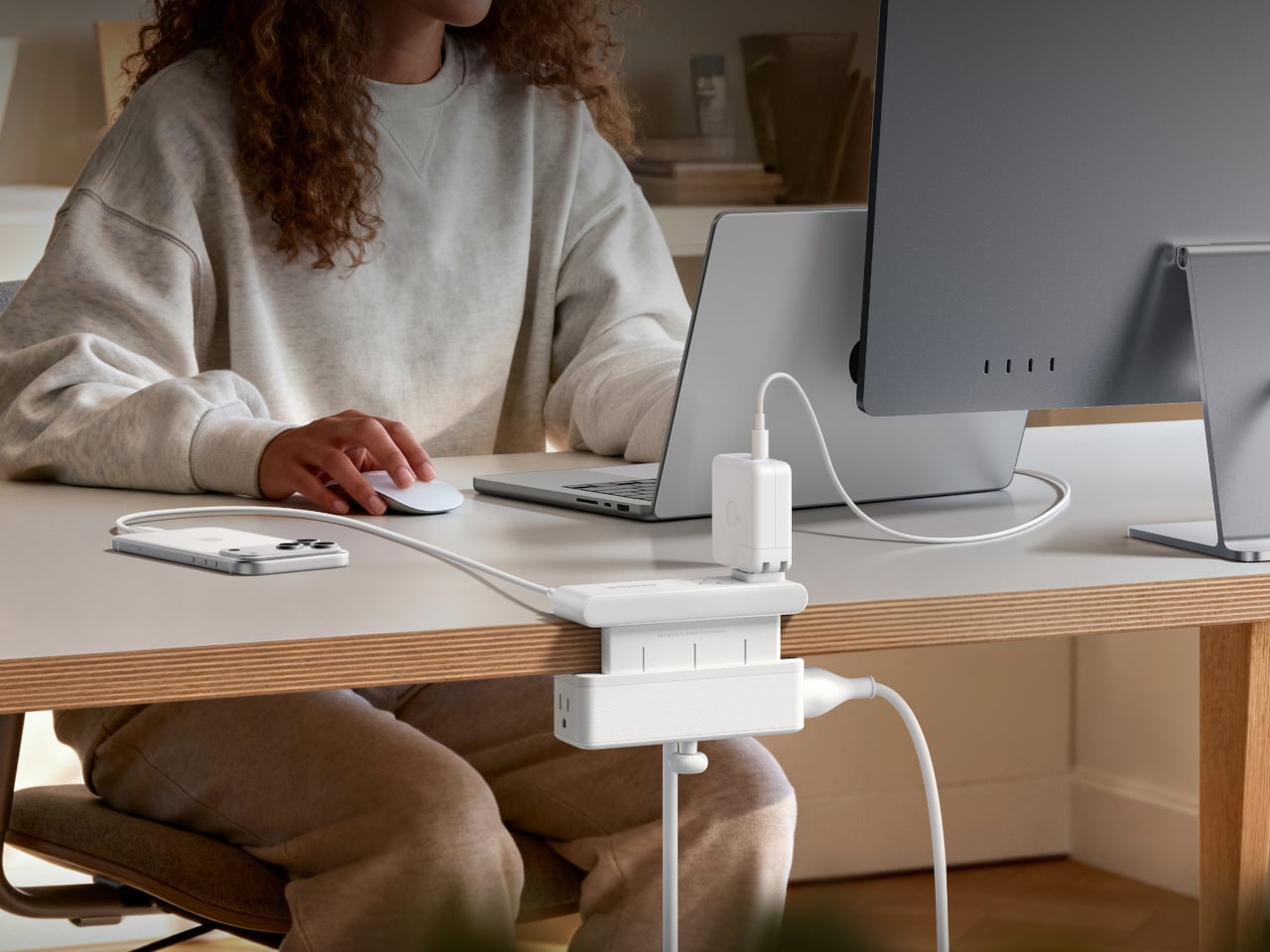
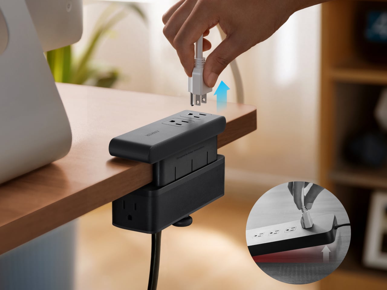
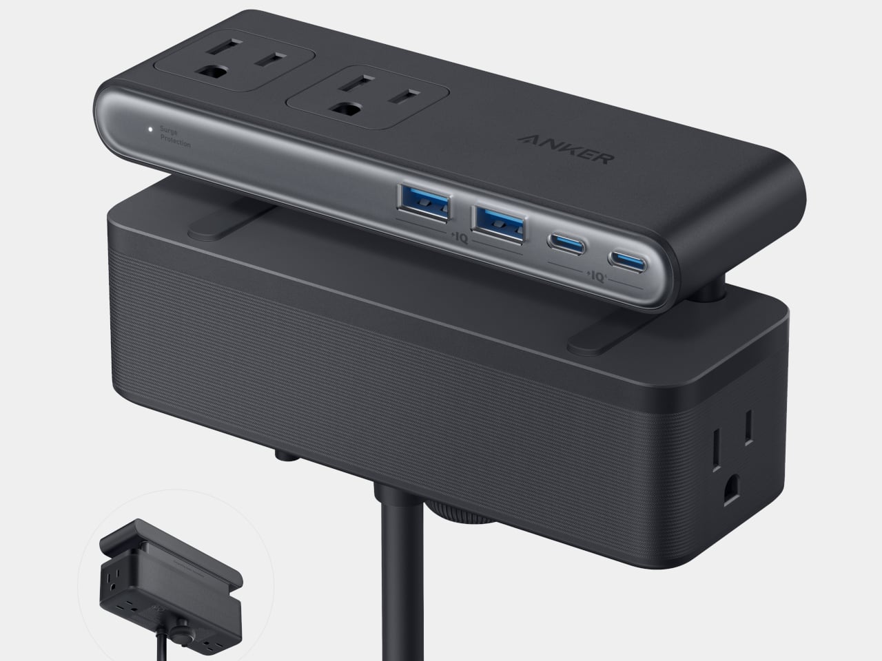
Anker’s Nano Power Strip (10-in-1, 70W, Clamp) approaches that problem from a different angle, quite literally. Instead of sitting on a surface or hiding under a desk, it clamps onto the desk edge, putting 10 ports right where they’re actually useful. First unveiled at CES 2026 and now available in the US for $69.99, it aims to reduce the mess that most power strips quietly make worse.

Designer: Anker

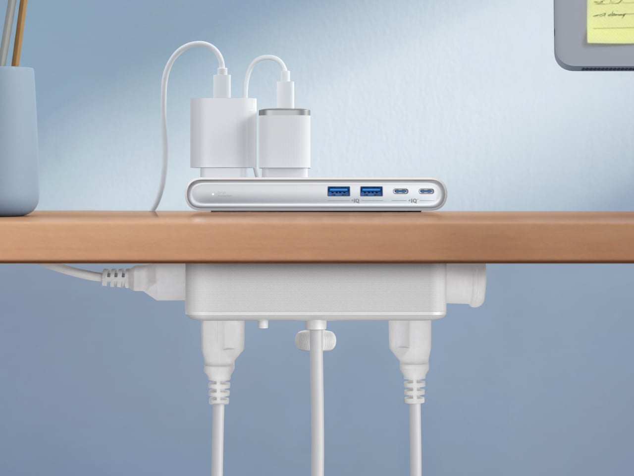
The clamp structure sits on either side of the desk edge, with ports distributed across its upper and lower sections. Six AC outlets handle the larger plugs, while two USB-A and two USB-C ports take care of smaller devices. Splitting the ports between two zones keeps things from crowding on one side, a small but practical detail that makes the strip feel properly considered rather than just generously stocked.

The USB-C charging capability is where the performance stands out. A single USB-C port can deliver up to 70W, enough to run a MacBook or most other laptops without needing a separate wall adapter. That output relies on GaN technology, which keeps the strip slim at just 0.75 inches thick despite the power output, and avoids the extra heat and bulk that older charging components tend to generate.

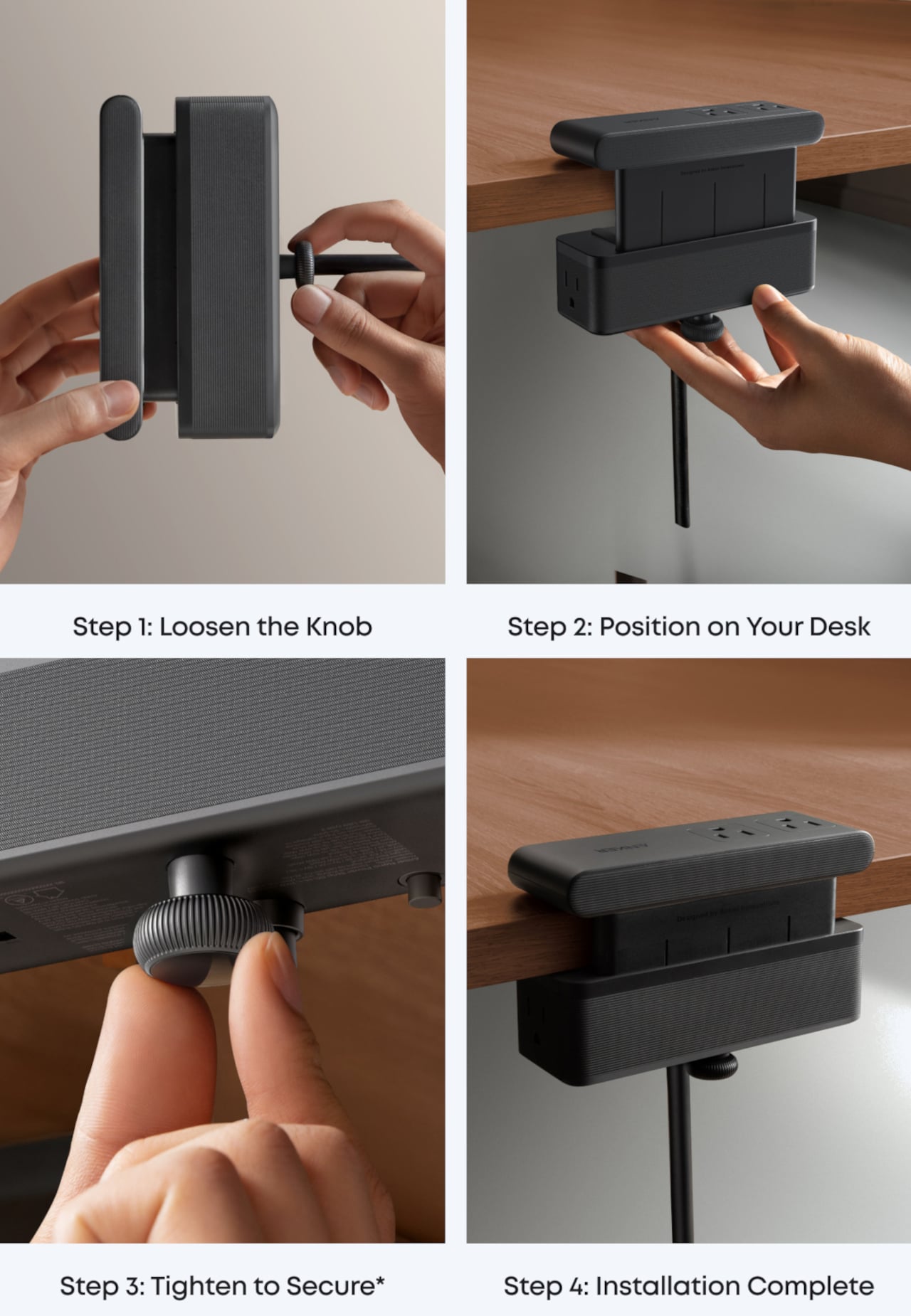
Installing it takes seconds. The adjustable clamp fits desk edges between 0.6 and 1.8 inches thick, covering most standard desks, and locks in firmly enough for one-hand use. That might sound like a minor detail, but plugging in a cable while the strip shifts around is exactly the kind of daily irritation that compounds. A stable mount means you’re not bracing the strip with your other hand every single time.

Anker also built in 1,500J of surge protection, along with a smart overload mechanism that includes a reset button. When it trips, the button pops out to cut power instantly. Press it again, and it’s back to normal. It’s a simple failsafe, but a useful one on a strip mounted at desk height, where a sudden power surge or overloaded circuit could easily go unnoticed until something stops working.

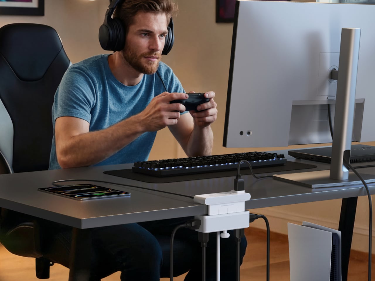
Anker markets it for gaming and office setups alike, and it’s easy to see why. Gaming desks accumulate powered accessories faster than most, from peripherals to controllers to headset chargers. The dual-zone layout helps spread those cables rather than pile them in one corner, and the 0.75-inch profile doesn’t take up surface space or interfere with the kind of clean, organized desk that people actually put effort into building.

Cable clutter isn’t going anywhere, but it can at least be contained. The Nano Power Strip doesn’t reinvent the power strip so much as it rethinks where one should live. At $69.99, it’s a reasonable ask for 10 ports, 70W of GaN-powered fast charging, and a desk-mounted solution that keeps the tangle off the floor and closer to where it actually gets used.

The post Anker’s $70 Power Strip Clamps to Your Desk, Keeps Cables Off Floors first appeared on Yanko Design.

  •  

Apple Turns 50, and Its Most Ambitious Phone Hasn’t Even Launched Yet — 5 iPhone Fold Concepts

On April 1st, 2026, Apple turns 50. For a company that has spent half a century rewriting the rules of consumer technology, the milestone deserves something genuinely transformative. The Macintosh redefined personal computing. The iPod gave an entire generation a new relationship with music. The original iPhone, unveiled in 2007, combined a phone, a music player, and the internet into a single glass rectangle and made every competitor look outdated overnight. The iPhone Fold is real, and it’s coming.

Leaks from early 2026 paint a detailed picture: a book-style foldable powered by the A20 Pro chip on a 2nm process, backed by a 5,500mAh battery, with a 7.8-inch creaseless OLED inner display and a 5.5-inch outer screen. Pricing is expected to start around $2,400, and while a September announcement seems likely, most analysts believe shipments may not begin until December. Designers, modders, and concept artists have spent years filling the void with their own visions of a folding iPhone, each carrying a distinct theory about what Apple should prioritize. These five concepts map the full range of that imagination and capture exactly how much is riding on the real thing.

1. iPhone iFold by Michal Dufka — The Clamshell That Makes Sense

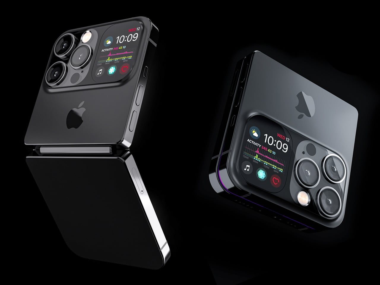
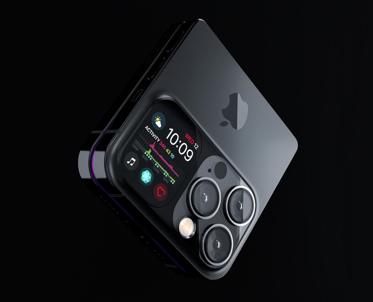
Designer Michal Dufka’s iPhone iFold is built on restraint. Rather than reinventing the iPhone’s entire identity, it applies a clamshell fold to the form factor people already love, drawing direct inspiration from the MotoRAZR and Samsung Galaxy Z Flip. The phone closes into a compact, pocketable square and opens into a full iPhone experience with a generously large display. For anyone who has quietly missed a phone that actually fits in a jeans pocket, this concept speaks to that feeling.

What sets the iFold apart is the secondary display placed beside the camera bump. When the phone is closed, that smaller screen surfaces notifications, time, and essential stats without requiring you to open the device at all. It functions almost like an Apple Watch built into the back of the phone. With Apple’s always-on display technology mature enough for this kind of ambient use, the dual-display setup feels less like speculation and more like a logical next step.

What We Like

  • The secondary display mirrors Apple Watch notification behavior, making glanceable information genuinely useful without ever opening the phone
  • The clamshell format makes the iPhone pocket-friendly for the first time in years without sacrificing screen size when it matters

What We Dislike

  • The clamshell form limits overall screen real estate compared to the expanded tablet surface that a book-style foldable provides
  • Hinge durability over sustained daily use is entirely unexplored here, and it remains the most critical engineering question for any clamshell design

2. iPhone Fold Ultra by 4RMD — When the Specs Match the Ambition

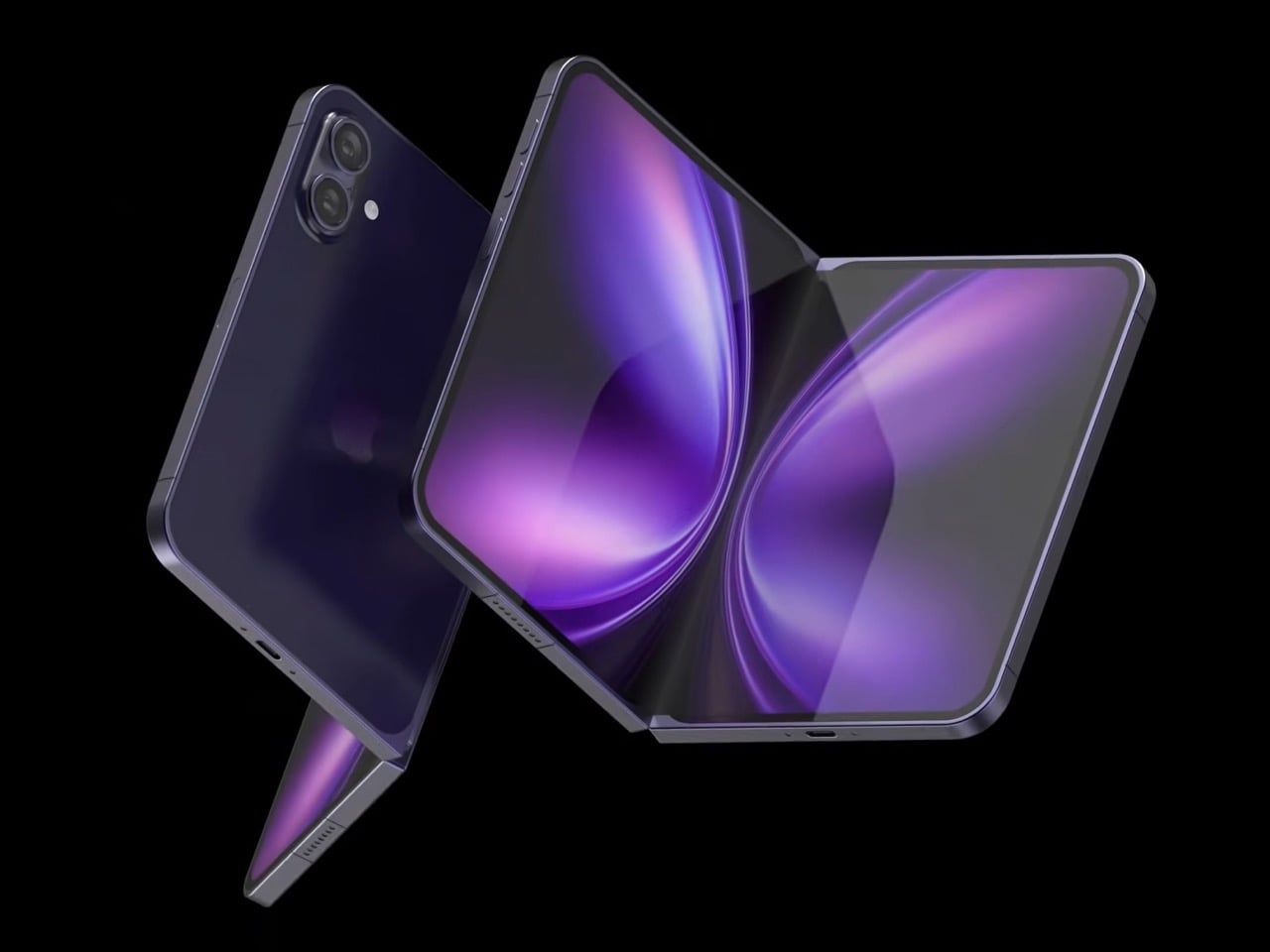
Design studio 4RMD’s iPhone Fold Ultra is grounded in credibility. Built directly from reported leaks rather than pure creative license, the concept presents a book-style foldable with dual 48MP rear cameras, a 24MP ultra-wide front camera, and the A20 Pro chip running on a 2nm process. Three color options appear across the renders: White, Black, and Deep Purple. At an estimated $2,299, this concept sits at the very top of Apple’s lineup with total conviction.

That Deep Purple colorway deserves its own moment. It is a deliberate callback to the iPhone 14 Pro’s most celebrated finish, and it lands differently on a book-style foldable. Something about that color on a device this ambitious reads as genuinely luxurious, the kind of finish that reframes a $2,299 price tag from a shock into a statement. 4RMD clearly understands Apple’s visual grammar, and this concept shows what happens when research and aesthetics share the same design space.

What We Like

  • Specs pulled from verified leaks give this concept real credibility, making it feel like a preview of what is actually coming rather than pure speculation
  • The Deep Purple colorway is a smart, crowd-pleasing callback to one of Apple’s most recognized and beloved finishes

What We Dislike

  • The “Ultra” label sets an expectation that demands exceptional build quality, and no concept can fully address whether the real device will deliver on that promise
  • Crease visibility across the inner display remains unaddressed, which continues to be the most persistent criticism of every book-style foldable on the market

3. iPhone Fold by Svyatoslav Alexandrov — The One That Replaces Two Devices

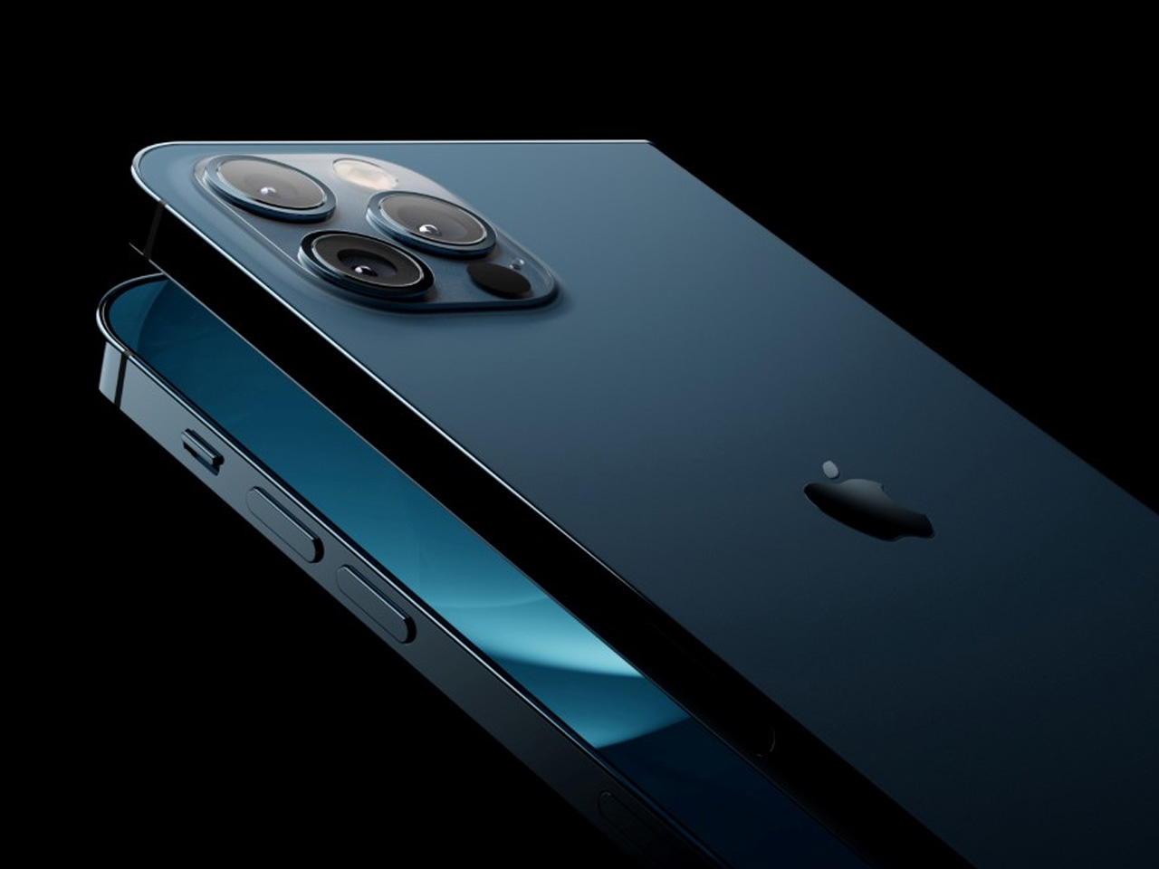
Svyatoslav Alexandrov’s iPhone Fold concept, created for the YouTube channel ConceptsiPhone, thinks in bigger terms than anything else on this list. Starting as a standard smartphone with a 6.3-inch outer display, it unfolds into a squarish 8-inch tablet that sits clearly in iPad Mini territory. This is not a phone with a bonus screen bolted on. It is a device designed to make carrying both an iPhone and an iPad feel genuinely redundant.

Alexandrov replaces Face ID with a full-display Touch ID fingerprint sensor, keeping the front notch minimal and clean. The rear carries the iPhone 12 Pro’s complete camera array: wide, ultra-wide, telephoto lenses, a LiDAR scanner, and flash. MagSafe compatibility and 5G readiness are already confirmed in the concept, adding meaningful weight to its productivity pitch. Whether the device supports the Apple Pencil is left open, but given an 8-inch inner display, its absence would feel like a missed opportunity.

What We Like

  • The full-display Touch ID is a clean and creative solution that keeps the front uncluttered while solving Face ID’s known complications on foldable form factors
  • The iPad Mini-sized inner screen makes a practical, real-world case for consolidating two devices into one without any meaningful compromise

What We Dislike

  • Removing Face ID eliminates one of the iPhone’s most seamless and trusted authentication features, which most users rely on dozens of times every day
  • Leaving Apple Pencil support unconfirmed weakens what should naturally be this concept’s strongest argument for productivity

4. iPhone Fold by Mechanical Pixel — The Foldable That Doesn’t Actually Fold

Mechanical Pixel’s concept takes the most unconventional approach on this list, and the reasoning is worth understanding. Rather than bending the iPhone itself, the design keeps the main body completely rigid and attaches a separate foldable display to the rear panel instead. The core phone experience remains exactly as people know it, maintaining the familiar dimensions and feel that iPhone users already rely on. That additional screen only enters the picture when a larger surface is specifically needed.

That rear foldable panel sits raised on a platform above the phone’s back, unfolding outward into a larger, squarish tablet surface when required. The layered profile is clearly visible from the side, giving the device a deliberately experimental and modular quality. The camera module remains in its standard position, completely unaffected by the additional display layer. The logic is unconventional, but the core argument of preserving the primary iPhone experience from any foldable compromise is genuinely hard to dismiss.

What We Like

  • Keeping the main body rigid entirely sidesteps the crease and long-term hinge durability problems that define every conventional foldable on the market today
  • The modular approach means the everyday iPhone experience is never degraded or compromised by the mechanics of the foldable element

What We Dislike

  • The raised rear platform creates an unrefined, layered side profile that sits well outside anything Apple’s design language has ever produced or endorsed
  • The prototype-like aesthetic makes it very difficult to imagine this direction surviving Apple’s notoriously demanding and detail-oriented product design process

5. iPhone V — The One Someone Actually Built

Every concept on this list exists as a digital render. The iPhone V is different. A YouTuber modder physically dismantled an iPhone X, extracted its internal components, and rebuilt the entire device inside a Motorola Razr chassis. The result is a working, folding iPhone that runs real iOS, carries a Retina-quality display, and folds in half like a classic flip phone. As a proof of concept, it is extraordinary. As a finished product, every question comes flooding in.

What makes the iPhone V genuinely compelling is not fit, finish, or polish, because it has none in any conventional sense. It is the straightforward fact that someone cared enough to prove the idea could actually work using parts that already exist. The folding mechanism and device thickness still need serious refinement. A working clamshell iPhone running authentic iOS is, in the end, a more persuasive argument for this form factor than any polished render has managed to be.

What We Like

  • The iPhone V is the only entry on this list that is fully functional, running real iOS inside an actual working clamshell device
  • Its physical existence proves the clamshell iPhone concept is viable using genuine Apple hardware, well beyond anything a render can demonstrate

What We Dislike

  • The repurposed Motorola Razr chassis produces a build that falls far short of consumer-grade fit, finish, and structural refinement
  • Hinge mechanism quality and overall device thickness remain significant engineering challenges that the mod cannot resolve, and they are exactly what Apple needs to solve

The Concepts That Made the Wait Worthwhile

Fifty years in, Apple is still the company that makes you wait. The iPhone Fold concepts here are not just exercises in creative imagination — they are a record of what designers and makers have been asking for, year after year. Some nailed the form factor. Others got the specs exactly right. A few did both. Together, they have shaped the entire conversation around a device that already feels utterly inevitable.

When the real iPhone Fold arrives, it will be measured against each of these visions. That is the power of concept design — it sets the bar before the product ships. Apple turning 50 while holding back its most ambitious device is pure theater. The design community has been writing this script for years. The only question is whether the real thing can live up to what the imagination has already built.

The post Apple Turns 50, and Its Most Ambitious Phone Hasn’t Even Launched Yet — 5 iPhone Fold Concepts first appeared on Yanko Design.

  •  

7 Handheld Gaming PCs That Actually Look Like the Future — Not a Fisher-Price Toy

The handheld gaming PC market has a design problem. For every device that earns a second look, there are three more that look like they escaped from a toy aisle — chunky plastic grips, aggressive LED halos, fonts borrowed from energy drink cans. It adds up to a category that has historically rewarded specs over sensibility, power over the kind of quiet confidence that makes an object worth owning.

That’s starting to change. A new wave of devices is rethinking what portable gaming hardware should look and feel like: objects you’d carry without embarrassment, leave on a clean desk, or hand to someone who doesn’t play games, so they can appreciate the craft before they’ve touched a button. Some of these seven handhelds earn their place through industrial restraint. Others earn it through engineering honesty — upgradeability, connectivity, or a refusal to treat the buyer as someone who only needs to be impressed in the first five minutes. What they all share is an understanding that good design is a feature, not a finish.

1. AYANEO 3

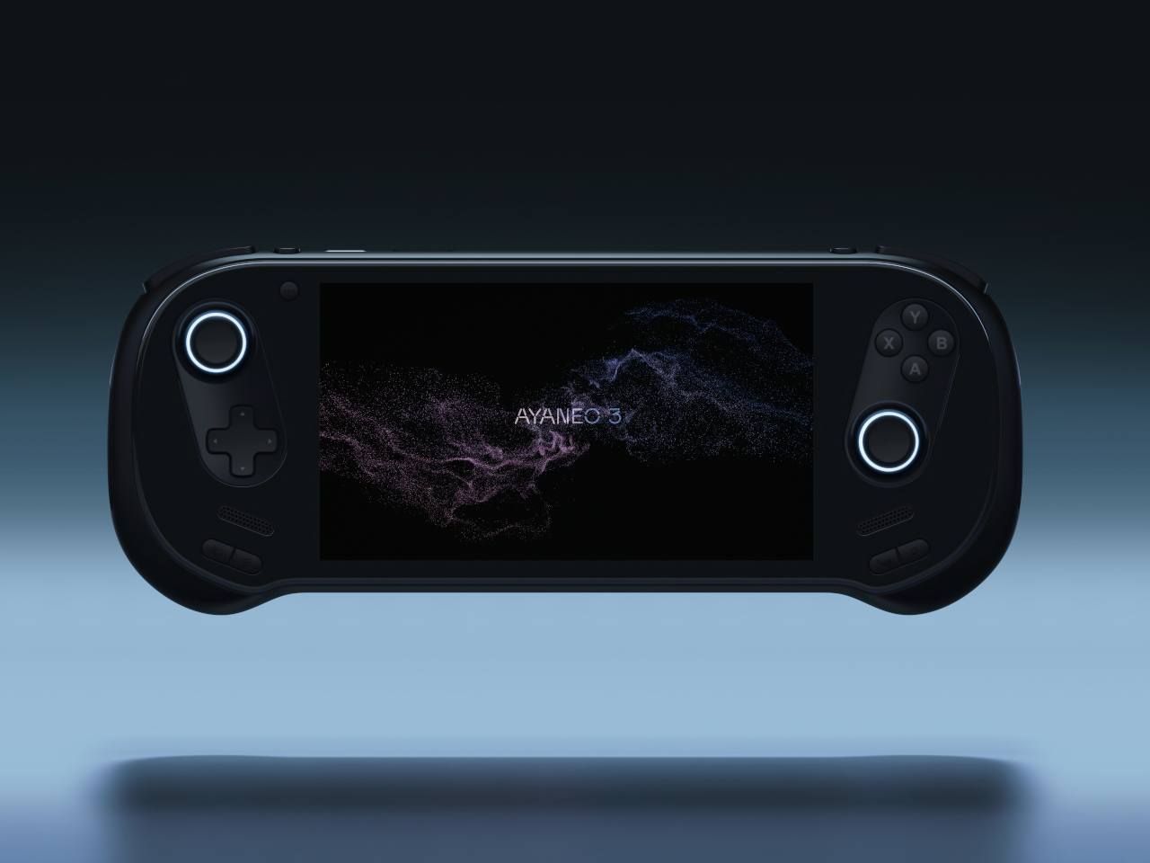
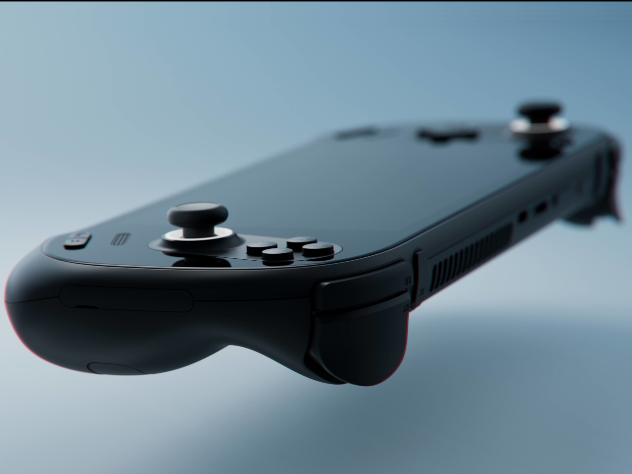
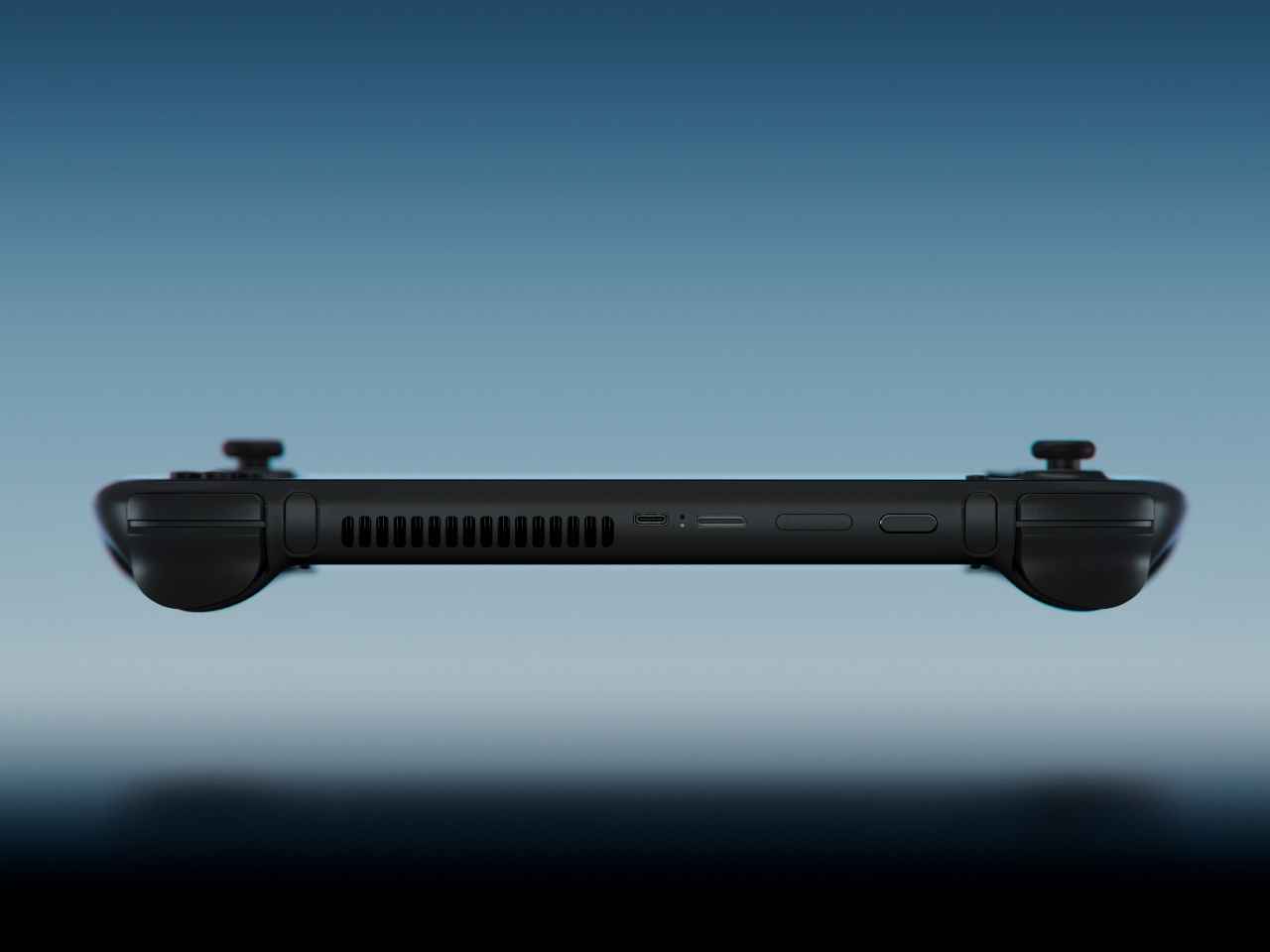
The curves are the story. AYANEO’s third flagship iteration takes a category that has historically prioritized power over personality and gives it something more interesting: softness. The smooth, pleasing curves on the AYANEO 3 extend beyond the ergonomic grip area on the back to the corners of the device itself, rounding off every edge that might otherwise make the hardware feel aggressive or alienating. It is a small visual distinction that makes an enormous tonal difference. The result is a device that looks like it was designed for people rather than exclusively for the kind of person who already knows what a TDP setting is and can tell you why it matters.

The diagonal orientation of the analog joysticks and D-Pad mirrors the Xbox controller arrangement, which is one of those invisible ergonomic improvements you only register when a device gets it wrong. The larger back buttons are a genuine upgrade in theory, giving players more surface area to work with during extended sessions. Their positioning, though, introduces the real possibility of accidental presses during intense gameplay. This trade-off will feel familiar to anyone who has tried to improve on a layout that was already functional. The AYANEO 3 makes the strongest argument for design as a feature in its own right. Whether that argument is worth the price is the question you’ll be asking yourself after you pick it up for the first time.

What We Like:

  • Rounded, curve-forward chassis makes it the most approachable-looking handheld in its category
  • Diagonal joystick and button orientation mirrors Xbox ergonomics for more natural long-session play

What We Dislike:

  • Back button placement may result in accidental presses during fast-paced gameplay
  • Softened design language may not satisfy players who want their hardware to read as purposeful and performance-oriented

2. Acer Nitro Blaze 7

Acer enters the handheld arena with something the market actually needed: a device that solves Windows gaming’s most persistent pain point before you even load your first title. The AMD Ryzen 7 8840HS packs 39 AI TOPS, placing it on the same performance tier as many AI-powered laptops currently on the market. Paired with the AMD Radeon 780M and 16GB of RAM, the Nitro Blaze 7 arrives as serious hardware in a compact form. The 7-inch 1920×1080 144Hz IPS touchscreen with 100% sRGB color gamut coverage is the kind of display specification that makes comparable handhelds feel like compromises — vibrant and bright enough that even the darkest visual environments read clearly on screen.

What separates the Nitro Blaze 7 from the competition isn’t the chip — it’s the software thinking wrapped around it. The Acer Game Space feature consolidates titles from every platform and source into a single unified library, removing the multi-menu navigation friction that makes Windows gaming handhelds feel like a productivity task compared to SteamOS devices. Touchscreen support lets players interact directly with interface elements rather than routing everything through controller input, which matters more than it sounds when you are three minutes into a launch session and still navigating settings. The dedicated hotkey that drops you straight into your library is a small thing that solves a real and recurring problem, and that is exactly the kind of design thinking this category needs to normalize.

What We Like:

  • Acer Game Space consolidates multi-platform libraries into one interface, fixing Windows gaming’s biggest UX friction point
  • 144Hz IPS display with 100% sRGB delivers premium visual quality for a 7-inch handheld screen

What We Dislike:

  • The IPS panel means the Blaze 7 lacks the contrast depth and blacks of OLED competitors
  • At 7 inches, the display is smaller than the growing number of competitors now shipping with 8-inch screens

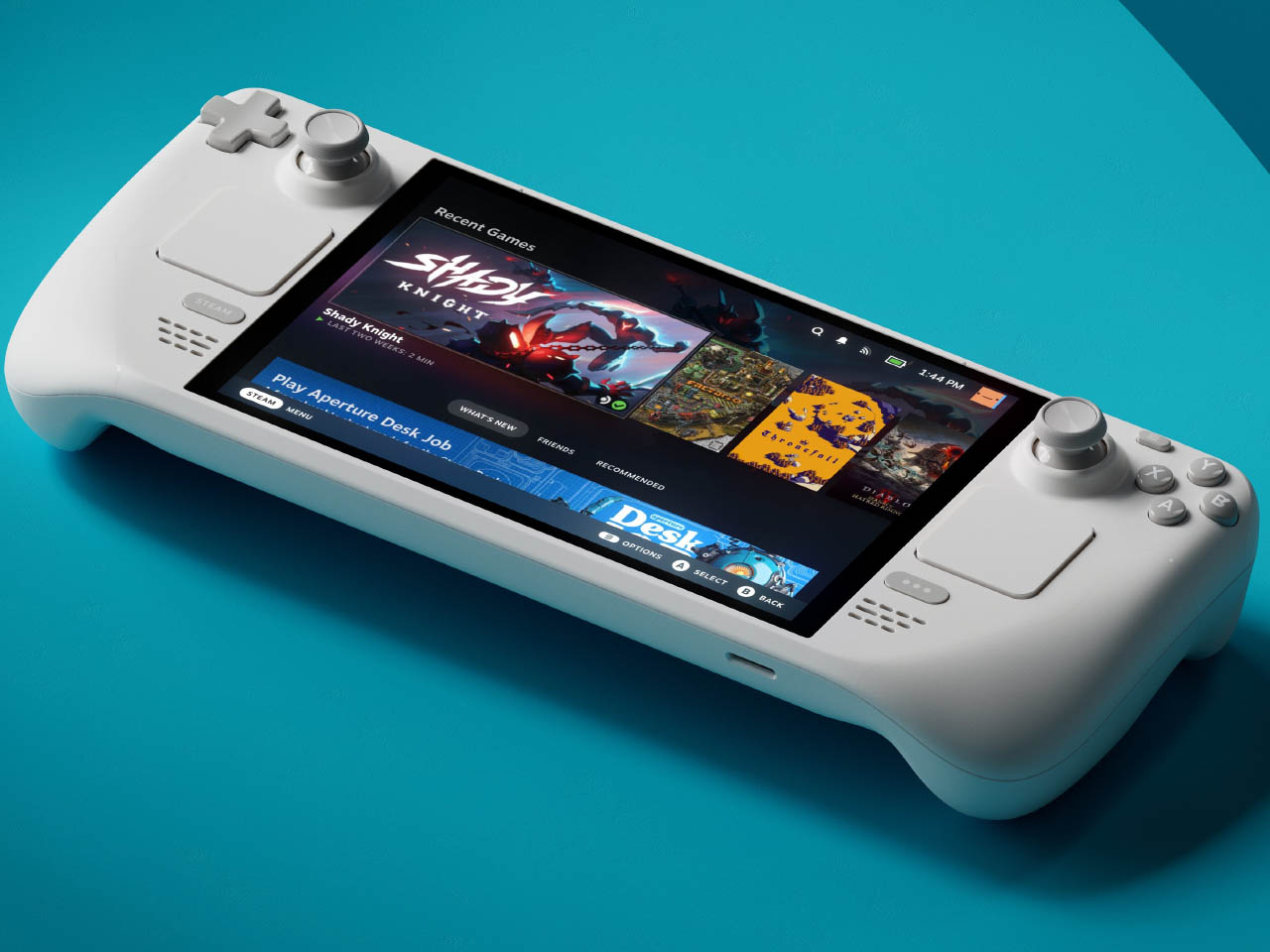
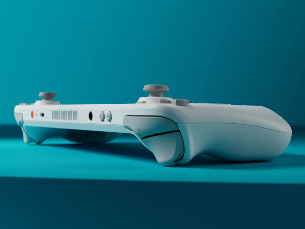
3. Steam Deck OLED Limited Edition White

Valve’s limited edition white Steam Deck is the rare hardware release that justifies its price premium through object quality alone. The off-white shell with gray buttons and a single orange power button is a restrained, confident color story that most hardware brands spend years failing to tell. The OLED panel with HDR support already positioned the standard Steam Deck a visual step above the LCD models, and the white chassis makes that contrast even more vivid — display colors read differently against a lighter surround, and the overall effect is closer to a premium consumer electronics object than a gaming peripheral. Valve pairs the device with a matching white carrying case and a microfiber cloth, because they know exactly what that surface will attract daily.

Available only in the 1TB configuration, the limited edition white Steam Deck is not a casual purchase — it is priced above the standard black variant, and that premium is entirely about the colorway rather than any specification difference. Valve has been direct about the potential for further bold color options depending on how this version performs in the market, and the design language of this release suggests they genuinely understand that hardware can carry emotional weight beyond its spec sheet. Their stated commitment to continued software and hardware improvements also changes the calculus on what the purchase represents. You are not buying a device at its peak; you are buying into an object that the people who made it intend to keep improving.

What We Like:

  • The off-white and orange colorway is the most considered visual design statement in the handheld gaming category
  • 1TB OLED configuration with HDR support represents the best display quality available in a handheld gaming PC

What We Dislike:

  • The white shell will show dirt and wear significantly faster than the black variant, demanding frequent cleaning
  • Limited edition pricing premium is cosmetic rather than functional, which makes it a harder case to make to practical buyers

4. MSI Claw 8 AI+

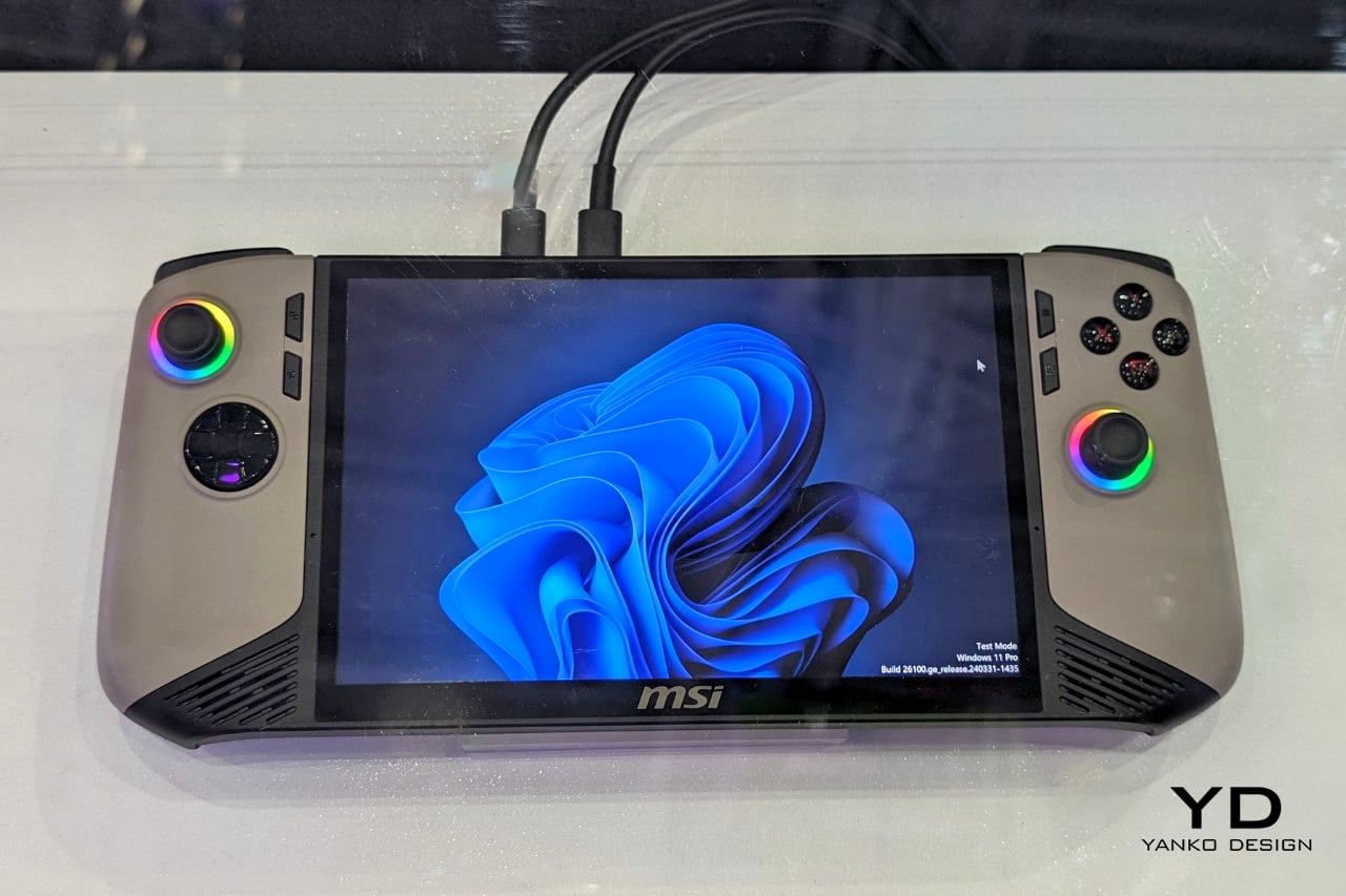
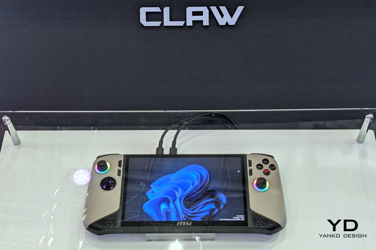
MSI’s second attempt at a handheld gaming PC makes a strong case for listening. The original Claw’s 53Wh battery was one of the most discussed disappointments in gaming hardware, and the Claw 8 AI+ responds with an 80Wh unit that matches the ROG Ally X — immediately removing that criticism from the conversation. The redesigned chassis is more comfortable to hold than the original, which sounds like a modest correction but represents the difference between a product you use and one you tolerate through a session. The 8-inch display at 1080p and 120Hz is the screen you can actually picture using across several hours without fatigue, and the overall hardware package reflects a manufacturer that took its first attempt as useful data rather than a finished result.

The dual Thunderbolt ports are the detail that separates the Claw 8 AI+ from most of its direct competition. In a category where connectivity has generally been an afterthought, Thunderbolt transforms the device into something more versatile than a dedicated gaming handheld. It can drive an external display, connect high-speed peripherals, and function as a desktop replacement when docked — a use case that justifies the form factor for people who travel and need their hardware to earn its carry weight across more than one context. MSI’s continued driver support for the original Claw also signals something about the relationship they want to build with buyers, which matters when you are deciding which ecosystem to invest in for the long term.

What We Like:

  • 80Wh battery resolves the original Claw’s most criticized weakness, matching the ROG Ally X for endurance
  • Dual Thunderbolt ports offer versatility that positions the device beyond pure gaming into broader portable computing

What We Dislike:

  • 1080p resolution on an 8-inch screen sits at the market standard rather than pushing the category forward
  • The redesigned chassis was not available for hands-on evaluation at launch, leaving the real-world grip feel unconfirmed

5. ADATA XPG Nia

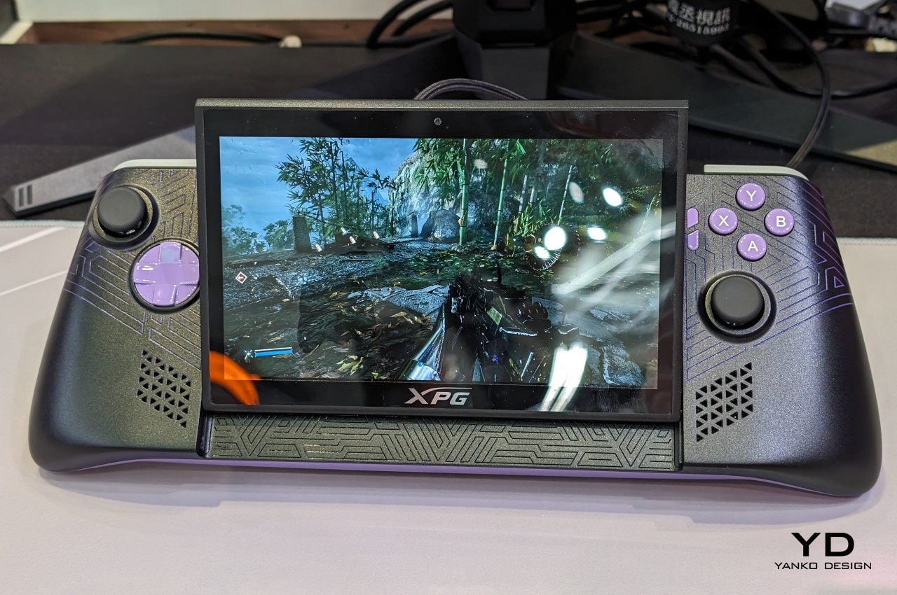
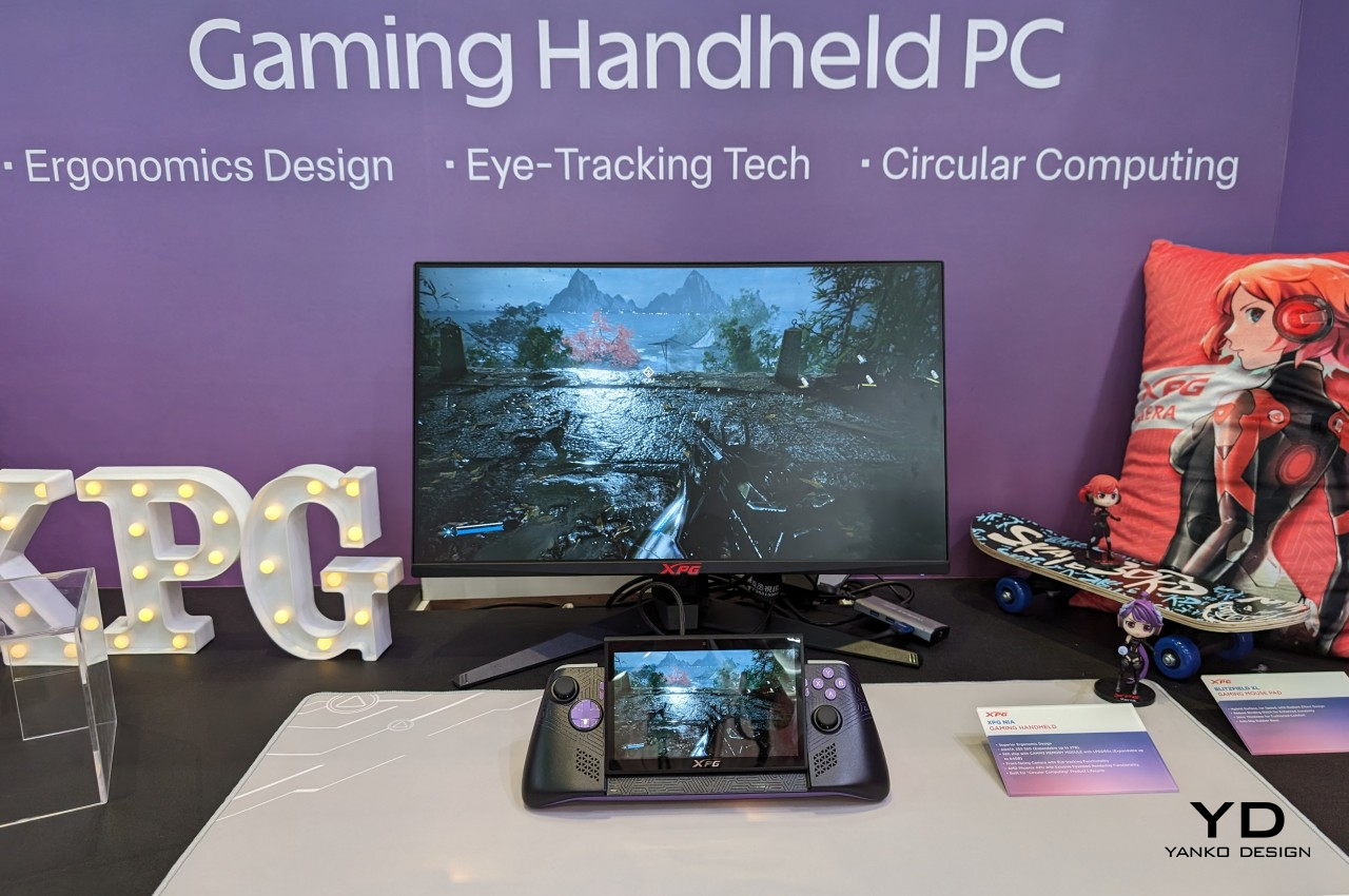
The XPG Nia arrives with a design philosophy that most handheld manufacturers have been too conservative to commit to: repairability as a genuine feature. The use of LPCAMM2 memory modules, which are not soldered to the motherboard, makes this one of the very few handheld gaming PCs where upgrading the RAM is a realistic possibility rather than a route to a voided warranty. The M.2 2230 SSD slot handles storage upgrades in the same way, borrowing the kind of upgrade-friendly architecture that better laptops have offered for years. ADATA, better known for its data storage solutions than gaming hardware, brings exactly the right technical background to a product that treats longevity as a design consideration rather than an inconvenience.

This matters more than it sounds in a category that has normalized the idea of buying new hardware every two years because your existing device can’t be updated. Handheld PCs are essentially miniature laptops running laptop-grade hardware with constrained cooling, which has traditionally meant buyers are locked into the specs they purchase on day one. The XPG Nia pushes back against that assumption. It may not carry the brand recognition of Valve or ASUS, but the decision to make memory and storage user-upgradable in a handheld gaming PC is genuinely forward-thinking hardware design. The category is full of devices optimized for the unboxing moment. The XPG Nia is designed for year three.

What We Like:

  • Upgradable RAM via the LPCAMM2 module makes it one of the only handhelds built for long-term ownership
  • Upgradable M.2 2230 SSD slot extends the device’s useful lifespan well beyond its launch-day specifications

What We Dislike:

  • Real-world ease of RAM upgrades remains unproven, as LPCAMM2 is a relatively new memory format
  • ADATA’s identity as a storage brand creates unanswered questions around long-term software support and gaming ecosystem depth

6. GPD Pocket 4

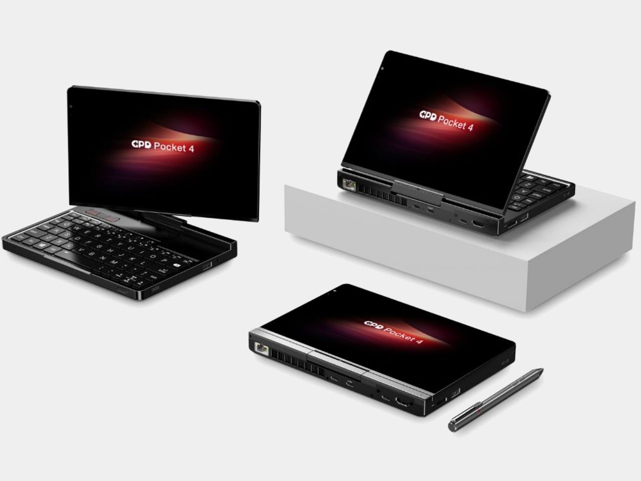
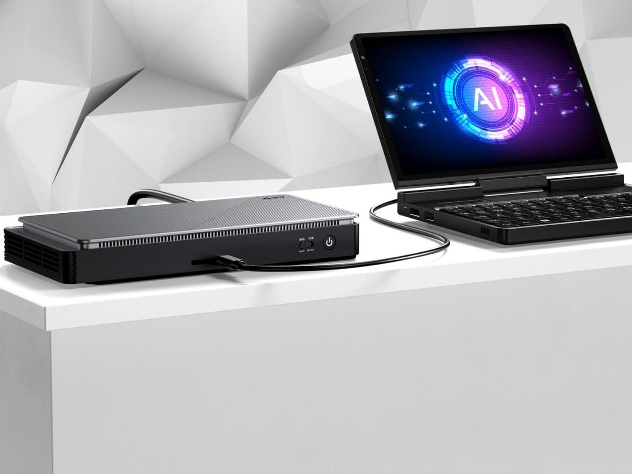
The GPD Pocket 4 does not belong in this list by conventional logic, and that is precisely why it does. There are no joysticks, no D-pad, no face buttons. What it has instead is a compact clamshell form factor built around a full QWERTY keyboard, a small touchpad in the upper right corner designed for right-thumb operation in a two-handed grip, and mouse buttons positioned on the opposing side for the left thumb. The AMD Ryzen AI 9 HX 370 with AMD Radeon 890M graphics, 64GB of RAM, and up to 4TB of upgradable NVMe SSD storage inside this chassis is a genuine statement about what a pocket-sized device can accomplish. It is a handheld PC for the person who refuses to separate productivity from portability.

Where most devices in this roundup are gaming handhelds that can also browse the web, the Pocket 4 is a legitimate laptop replacement that can also play games within certain limits. Content creation, entertainment, productivity, and travel computing are all addressed by hardware that fits in a jacket pocket. The 44.8Wh battery is the honest trade-off — you are carrying a compressed laptop, not an augmented gaming console, and the battery reflects that compromise directly. For the person who travels constantly and wants one device that handles most things well rather than two devices that each do one thing perfectly, the Pocket 4 makes more sense than almost anything else in this roundup. It is the most unusual recommendation here, and the most interesting.

What We Like:

  • Full laptop-grade specifications, including up to 64GB RAM and 4TB upgradable storage in a genuinely pocketable form factor
  • Functions as a true laptop replacement for content creation and productivity without requiring a second device

What We Dislike:

  • No gaming controls confine its gaming capability to keyboard-compatible titles only
  • The 44.8Wh battery is significantly smaller than competitors that prioritize gaming endurance over overall portability

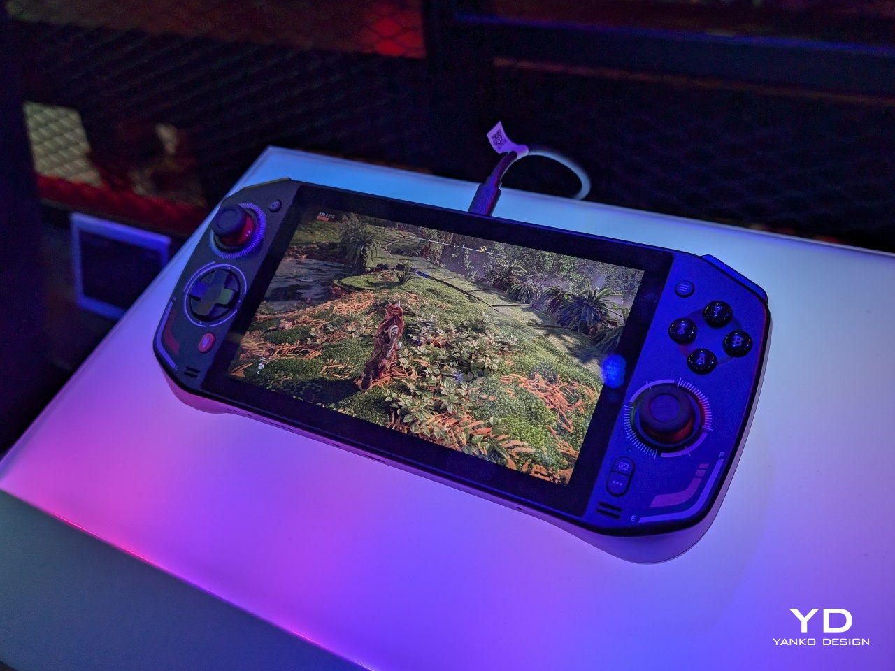
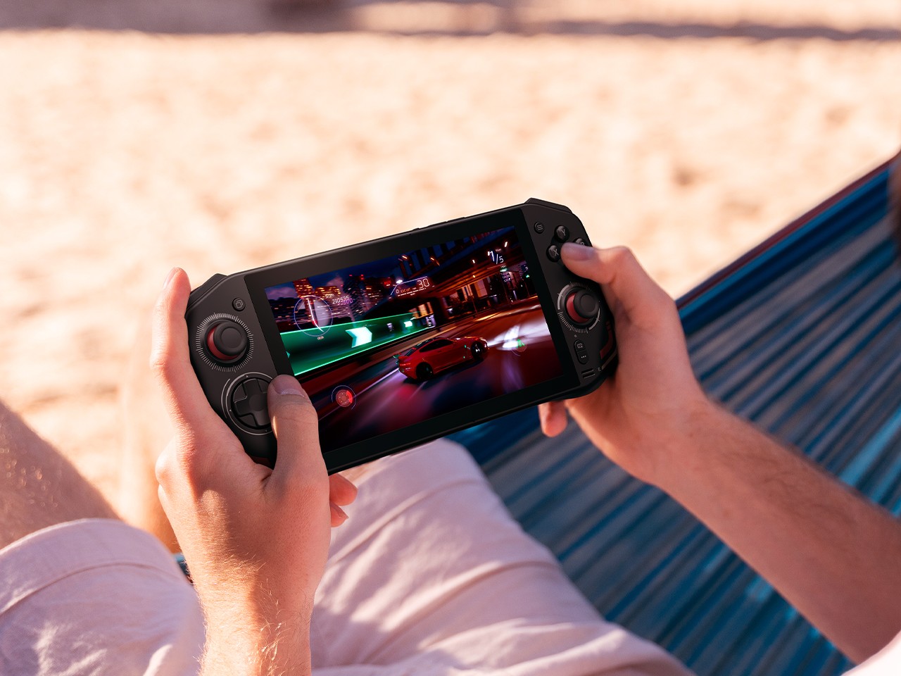
7. ZOTAC ZONE

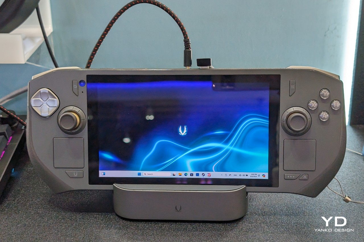
The ZOTAC ZONE wears its Steam Deck influence openly and then raises the conversation. The OLED display puts it in rare company — most handheld gaming PCs are still shipping IPS panels, and the presence of an OLED screen here is not incidental. The PlayStation-style button layout mirrors Valve’s device directly, setting it apart from the Xbox-influenced arrangement that the rest of the Windows handheld market has effectively standardized around. The built-in kickstand is the detail that reveals the ZONE’s genuine design thinking. It is an obvious feature that a surprising number of handheld PCs have decided to leave out, and its presence changes how the device lives in practice — on a plane tray table, a cafe counter, or a hotel room desk, where you’d rather not hold the thing for two hours straight.

The configurable controls are where the ZONE earns its premium positioning. Two-stage adjustable triggers and programmable dials around each joystick represent the most granular control customization available on any handheld gaming PC currently on the market. It runs more recent hardware than the Steam Deck, inside a chassis that clearly understands what it is trying to be. The steep price is a real barrier, and the ZONE will not make sense for every buyer. For the player who has worked through two or three handheld PCs already and knows precisely what they want from their next one — better controls, better display, a stand, and hardware that will not feel dated inside eighteen months — this is the device that was built with them specifically in mind.

What We Like:

  • Built-in kickstand and OLED display address two genuine gaps in the Steam Deck’s design, both meaningfully improving day-to-day use
  • Two-stage adjustable triggers and programmable joystick dials offer the deepest control customization in the handheld gaming PC category

What We Dislike:

  • Premium pricing places the ZONE significantly above most competing devices, narrowing its realistic audience
  • Strong visual and layout parallels to the Steam Deck make it a difficult upgrade pitch for buyers already in Valve’s ecosystem

The Category Grows Up

The seven devices above represent a category finally learning to want more from itself. Some of them get there through craft — the AYANEO 3’s considered curves, the ZOTAC ZONE’s OLED display and kickstand, the Steam Deck’s limited edition color story. Others earn their place through a harder kind of honesty: the XPG Nia’s upgradable RAM, the GPD Pocket 4’s refusal to be just one thing, the Claw 8 AI+’s willingness to publicly correct its own mistakes.

What unites all seven is a seriousness about the object itself — a sense that the person holding the device deserves hardware that respects their intelligence, their living space, and the money they are spending. The Fisher-Price era of handheld gaming PCs is not entirely over. But these seven devices are making a strong case for what comes after them.

The post 7 Handheld Gaming PCs That Actually Look Like the Future — Not a Fisher-Price Toy first appeared on Yanko Design.

  •  

LG’s World-First 1Hz Panel Gives the Dell XPS 48% More Battery

Battery life has been one of the laptop industry’s most persistent design headaches, especially among Windows notebooks. Despite significant gains in chip efficiency, the display consistently ranks among the biggest power consumers in any portable computer. Most laptop screens refresh at a fixed rate regardless of what’s actually on them, which means the panel keeps drawing full power even when you’re sitting completely still, reading a document with nothing on screen changing at all.

LG Display’s new Oxide 1Hz panel is the first mass-produced LCD laptop screen that doesn’t work that way. Rather than holding a fixed rate, it reads what’s on screen and drops to 1 Hz when the content is static, then scales back up to 120 Hz for video or gaming. LG began mass production on March 22, 2026, claiming the first-ever achievement of this at scale.

Designer: LG, Dell

The technology relies on custom circuit algorithms and a new oxide material applied to the panel’s thin-film transistor. That oxide holds an electric charge longer than conventional LCD materials, letting the screen maintain a still image without continuously refreshing it. LG claims the result is up to 48% more use on a single charge versus existing solutions, which is a significant number if it holds up in everyday use.

In practice, this matters most during the parts of a workday you spend the bulk of your time in. Checking emails, reading through documents, and sitting on a static slide during a meeting are all moments where a 60 Hz or 120 Hz screen burns power for no real benefit. The Oxide 1Hz panel handles those scenarios at a fraction of the usual draw without any visible difference.

When you do pull up a video or launch something that demands smooth motion, the panel doesn’t hesitate. It detects the change and jumps back up to 120 Hz automatically. There’s no mode to switch into, no setting to toggle, and no trade-off to manage. It just adjusts based on what’s happening on screen, which is how this kind of feature should work in the first place.

The first laptops to ship with this panel are the Dell XPS 14 and Dell XPS 16 for 2026, both unveiled at CES 2026 in January. The LCD option on both models runs at 1920 x 1200 pixels and 500 nits of brightness. Dell’s OLED option only drops as low as 20 Hz, which means the more affordable LCD configuration actually wins on low-power behavior.

Here’s where it gets interesting from a design standpoint. The display is one of the biggest power consumers in any laptop, so a screen drawing significantly less power during typical use creates real headroom for designers. They can use that headroom to maintain battery size and gain extra runtime, or to trim the battery slightly for a lighter, thinner chassis without giving up the battery life buyers already expect.

Of course, LG is already planning a 1 Hz OLED version of this technology for 2027, which is when things could get more interesting. OLED handles contrast and color in ways LCD can’t match, and pairing that quality with proper low-refresh-rate behavior could push portable laptop design further than it’s been able to go. For now, the Oxide 1Hz LCD is in something you can actually go out and buy.

The post LG’s World-First 1Hz Panel Gives the Dell XPS 48% More Battery first appeared on Yanko Design.

  •  

The Projector Concept That’s Almost Too Beautiful to Use

Most concept designs exist to generate buzz, collect awards, and then quietly disappear. The BeoLens Horizon, a projector concept imagined by French industrial designer Baptiste Baumeister, feels different. It feels like a glimpse into a future that Bang & Olufsen should absolutely be building right now.

If you’re not familiar with B&O, the short version is this: the Danish audio brand has been setting the benchmark for luxury consumer electronics since 1925. Their products don’t just sound good; they’re designed to be desired as objects. The BeoSound Shape, the BeoVision Harmony, the Beosound Theatre, all of them treat your living room like a gallery wall. Baumeister clearly understands that DNA, and with BeoLens Horizon, he runs with it in a direction that feels genuinely exciting.
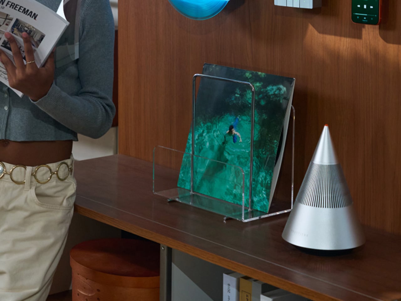

Designer: Baptiste Baumeister

The design comes in two distinct configurations. The first is a horizontal, low-profile unit that sits flat on a surface like a refined soundbar crossed with a Scandinavian jewelry box. The second is a taller, cylindrical form that reads more like a speaker column or a sculptural object you’d place on the floor. Both share the same material vocabulary: light ash wood, brushed gold-toned aluminum, and tightly woven acoustic fabric in warm grey. It’s the kind of material combination that makes you think of an architect’s weekend house rather than a tech showroom.

The horizontal unit is particularly interesting because of how it conceals the projector itself. A wooden slat panel sits on top, almost like a miniature version of those slatted screens you see in high-end Japanese interiors, and the lens assembly slides out from beneath it. The 4K projection capability is written right into the design, quietly labeled without fanfare. There are no aggressive vents, no branding that screams for attention, no black plastic anywhere. It’s restrained in a way that feels almost provocative in a market where most projectors try hard to look “cinematic” and end up looking aggressive instead.

The controls are worth noting too. Rather than a touchscreen or a button cluster, Baumeister places minimal icon-etched controls directly into the wood panel. A Bluetooth symbol, a pair of directional arrows, a power circle. They’re barely visible until you know to look for them, which feels very much in keeping with how B&O has always approached interaction design, treating it as something that should feel intuitive and slightly magical rather than mechanical.

Looking at the exploded view of the horizontal model, you can see just how much thought went into the layering of components. The speaker array sits sandwiched between the wood base and the metal-framed top, with the projector mechanism occupying the central cavity. It’s genuinely elegant engineering, even if this is still a concept. Baumeister also developed a series of small-scale physical prototypes exploring the form from different angles, which you can see in a lineup of matte black study models. That process matters. It tells you this isn’t just a pretty render; it’s a design that was worked through with real hands.

Here’s my honest opinion: the TV industry has been coasting on size for years. Bigger screens, thinner bezels, more pixels. But the BeoLens Horizon asks a more interesting question. What if the device itself was worth looking at even when it was off? What if the experience of owning the hardware was part of the experience of using it? These aren’t new ideas in the B&O world, but a projector built around this philosophy feels like a genuinely fresh proposition, especially as ultra-short-throw technology continues to improve.

Baumeister is a young designer out of Strate, a design school in Lyon, and BeoLens Horizon joins a portfolio that already shows a real feel for the intersection of material craft and technology. Whether Bang & Olufsen ever picks this up or not, the concept makes a compelling case that the future of home cinema doesn’t have to look like a gadget. It can look like something you actually want to live with.

The post The Projector Concept That’s Almost Too Beautiful to Use first appeared on Yanko Design.

  •  

When Your Speaker Is Also a Puzzle, Music Hits Different

Most speaker designs ask a pretty simple question: how do we make this thing louder and smaller? Merge asks a completely different one. How do we make music something you can actually take apart?

Created by a five-person design team, Junchuan Shi, Junhao Lv, Xiangzhao Meng, Ping He, and Genghao Ma, from a cross-institutional collaboration across Sichuan Vocational and Technical College, CityU Macau, TUT, and QZUIE, Merge is a conceptual speaker system that just picked up a 2025 European Product Design Award in the Consumer Electronics category. It’s the kind of student concept that makes you wonder why no major brand has thought of it first.

Designers: Junchuan Shi, Junhao Lv, Xiangzhao Meng, Ping He, Genghao Ma

The central idea is deceptively clever. Merge physically separates music into its component layers: the accompaniment on one module, the vocals on another, and the full combined sound handled by the complete assembly. You choose what you hear depending on how the pieces are arranged. Pull the vocal module away, and you’ve got an instant karaoke track. Keep just the vocal module, and you hear a singer stripped back from all the production. Snap everything together and you get the whole song. It sounds gimmicky when you describe it that way, but it really isn’t. It’s an intuitive way to interact with music that streaming apps, for all their data and algorithms, still haven’t cracked with the same sense of physical satisfaction.

The three modules connect via electromagnetic induction, which also handles charging between units. That detail matters more than it sounds. It means the product doesn’t rely on fiddly clips or pins; the connection is seamless and the experience stays clean. When you hold all three pieces assembled, they sit together like a solid little object. When you pull them apart, you’re not wrestling with latches. You’re just… separating music.

Visually, the design is confident without being loud. The modules are geometric and compact: a rectangular flat piece, a squared speaker body, and a triangular wedge that caps the top when assembled. The whole thing sits in your palm like a premium toy, which is very much the point. The team describes the tactile experience of rearranging the modules as analogous to playing with building blocks, and that framing is spot on. Listening becomes a physical act rather than a passive one. You’re not adjusting a slider on an app; you’re literally picking up a piece of the song and putting it somewhere else.

The color language is considered too. The renders show options in slate blue, orange-coral, silver metallic, and white-grey, each colorway with its own character but all sharing the same graphic vocabulary: pixel waveform icons and quiet typography showing floating lyrics directly on the module surface. It reads like something between a well-designed toy and a serious piece of consumer electronics, which is an interesting space for a speaker to occupy.

I’ll be upfront: Merge is still a concept. It won in the EPDA’s conceptual category, and it hasn’t crossed into production territory yet. That’s a long road, and the audio technology behind splitting tracks in real time at the hardware level would require serious engineering. The images are renders and physical prototypes, not retail-ready products. But the best conceptual design has always worked like that. It shows an industry where something should go, even when the technology and the business case haven’t fully caught up yet.

What makes Merge genuinely compelling is that it treats the listener as someone with curiosity rather than just convenience-seeking habits. The assumption baked into most audio product design is that people want everything done for them, simplified, smoothed over. Merge assumes the opposite: that people might actually enjoy engaging with the layers of a song, touching them, moving them around. Given how obsessed the current cultural moment is with stems, remixes, and stripped-back sessions, that assumption feels exactly right.

Whether it ever becomes a product you can buy, Merge is already doing the thing good design is supposed to do. It makes you look at something ordinary and ask why it was never done this way before.

The post When Your Speaker Is Also a Puzzle, Music Hits Different first appeared on Yanko Design.

  •  
❌