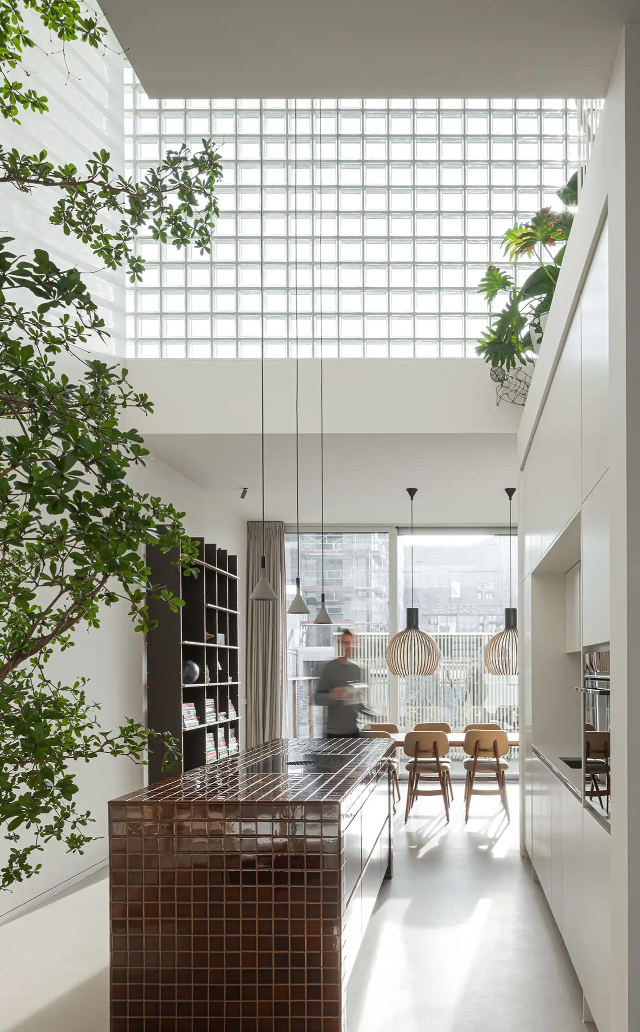
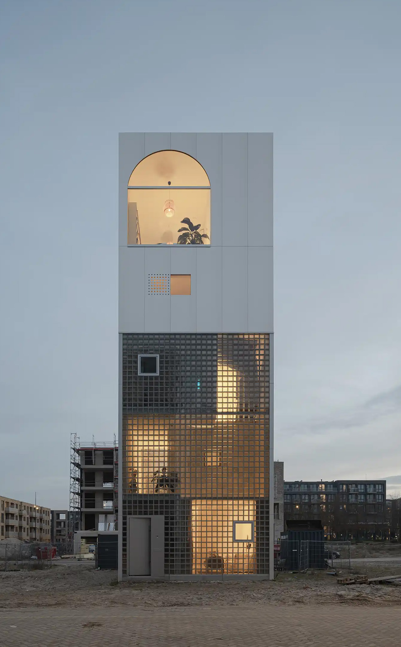
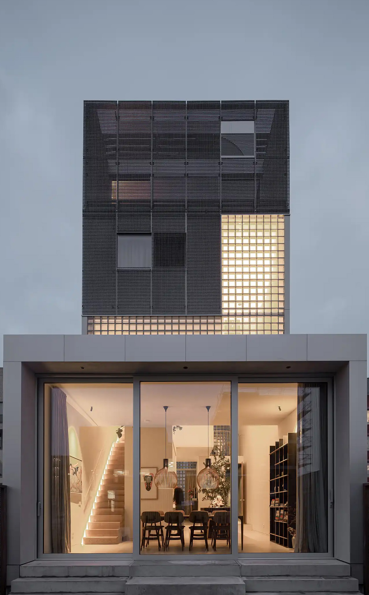
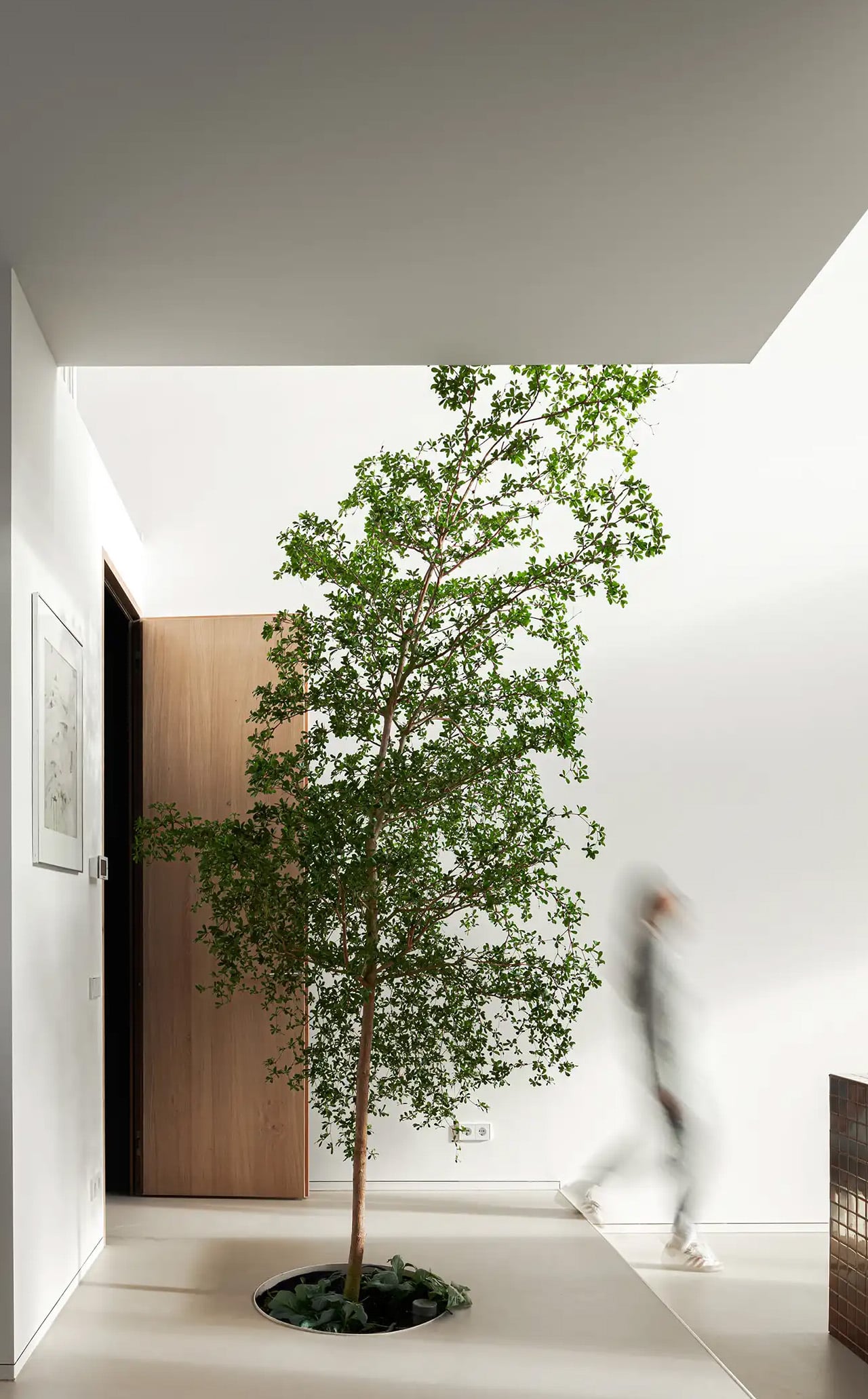
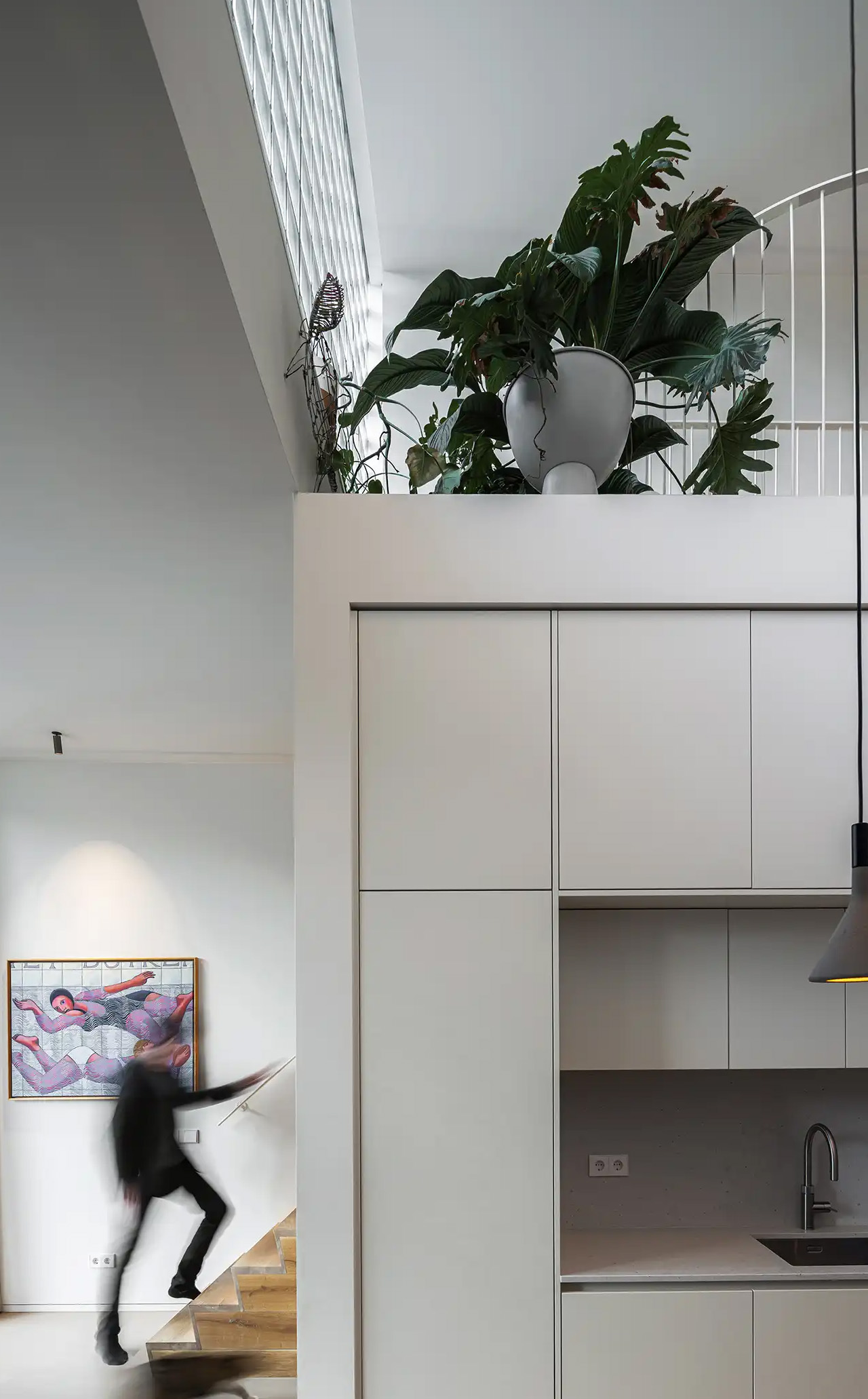
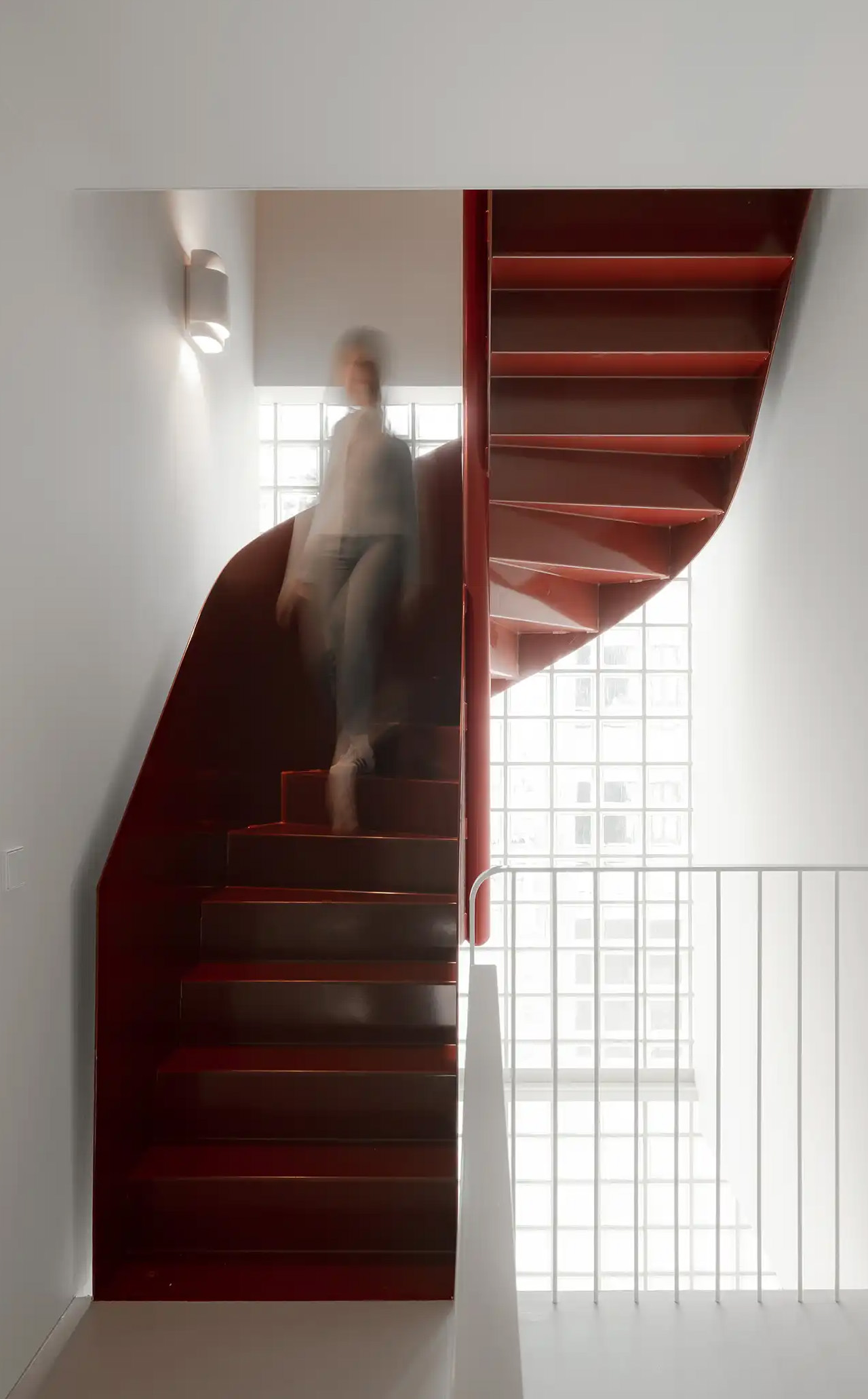
What does a home look like when you throw out the floor plan entirely? For Amsterdam-based firm Studioninedots, the answer is a tower of playfully stacked boxes, each one dedicated to a single moment in life, that rises above one of the Dutch capital’s newest neighborhoods. Completed in 2025, Light House sits on Centrumeiland, a newly developed artificial island district defined by its self-build culture and strong sustainability ambitions.
The project began with a simple brief from a couple with two children who wanted a home that would genuinely bring them together. Rather than anchoring daily life to the ground floor the way most houses do, Studioninedots dedicated each of the family’s key activities — eating, gathering, cooking, relaxing — to its own distinct volume, then arranged those volumes vertically into a single, tightly considered composition. The result is a 257-square-meter residence that feels less like a stacked building and more like a small vertical neighborhood.
Movement through the home unfolds through a sequence of open passages and compressed zones, where shifts in scale produce entirely different spatial moods. Smaller, enclosed areas carve out space for focused, quieter activities, while larger voids open up visual connections across levels, dissolving any conventional sense of what is above and what is below. Hovering above the kitchen is a sheltered, secluded volume ideal for yoga or film watching, while the journey through the house culminates at the top in what the architects describe as a “holiday home” within the city. Flanked by arched ceiling-height glass openings, this 14-metre-high gathering room commands panoramic views across the IJmeer lake.
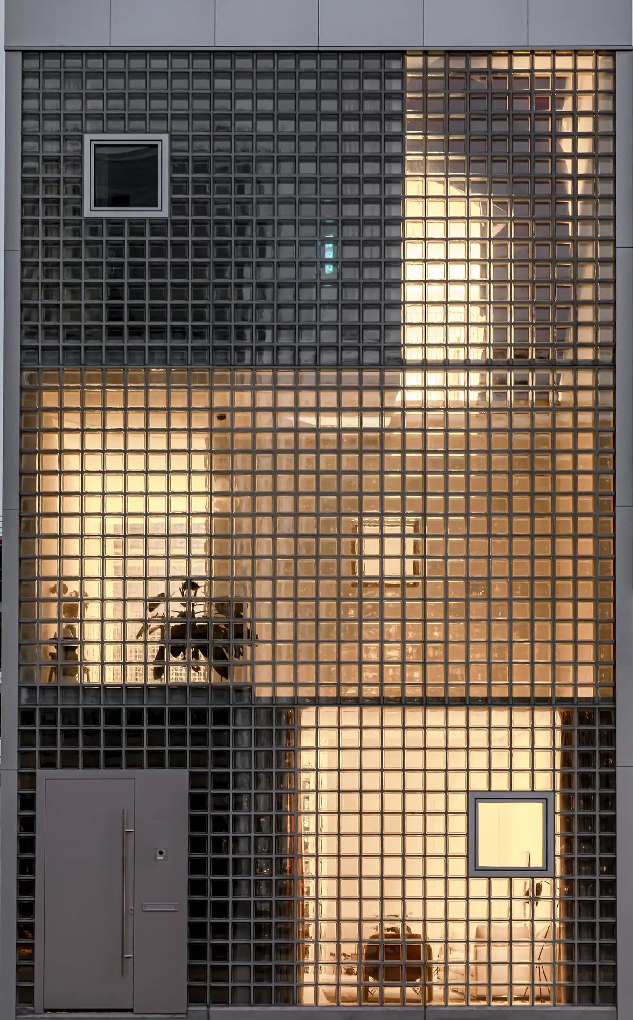
The facade does a lot of the design’s heavy lifting. A wall of square glass blocks wraps the front of the building, filtering natural light into the interior while abstracting the life inside, offering privacy without sacrificing the warmth of daylight. At night, the facade glows from within, giving the house an almost lantern-like presence on the street.
Sustainability is baked into the structure itself. Light House is built as a lightweight system using prefabricated timber components inside a steel frame, a circular and modular method that allows for flexibility, long-term adaptability, and ease of disassembly. The layout is not fixed either, as children grow and priorities shift, the home can be reconfigured to meet whatever the family needs next. Light House is a rare thing: a home that feels entirely personal yet completely considered, one where architecture quietly gets out of the way and lets life fill the space.
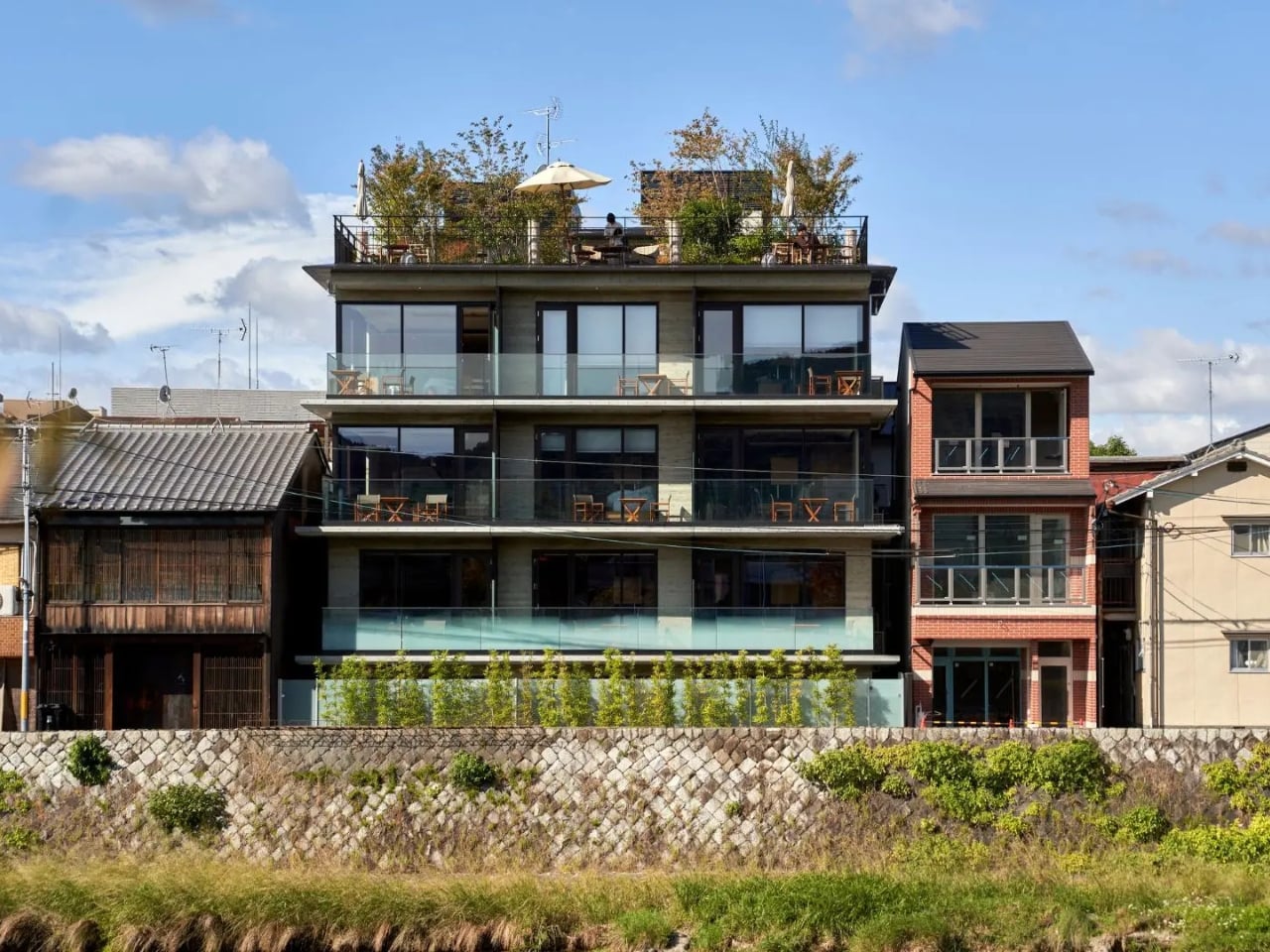
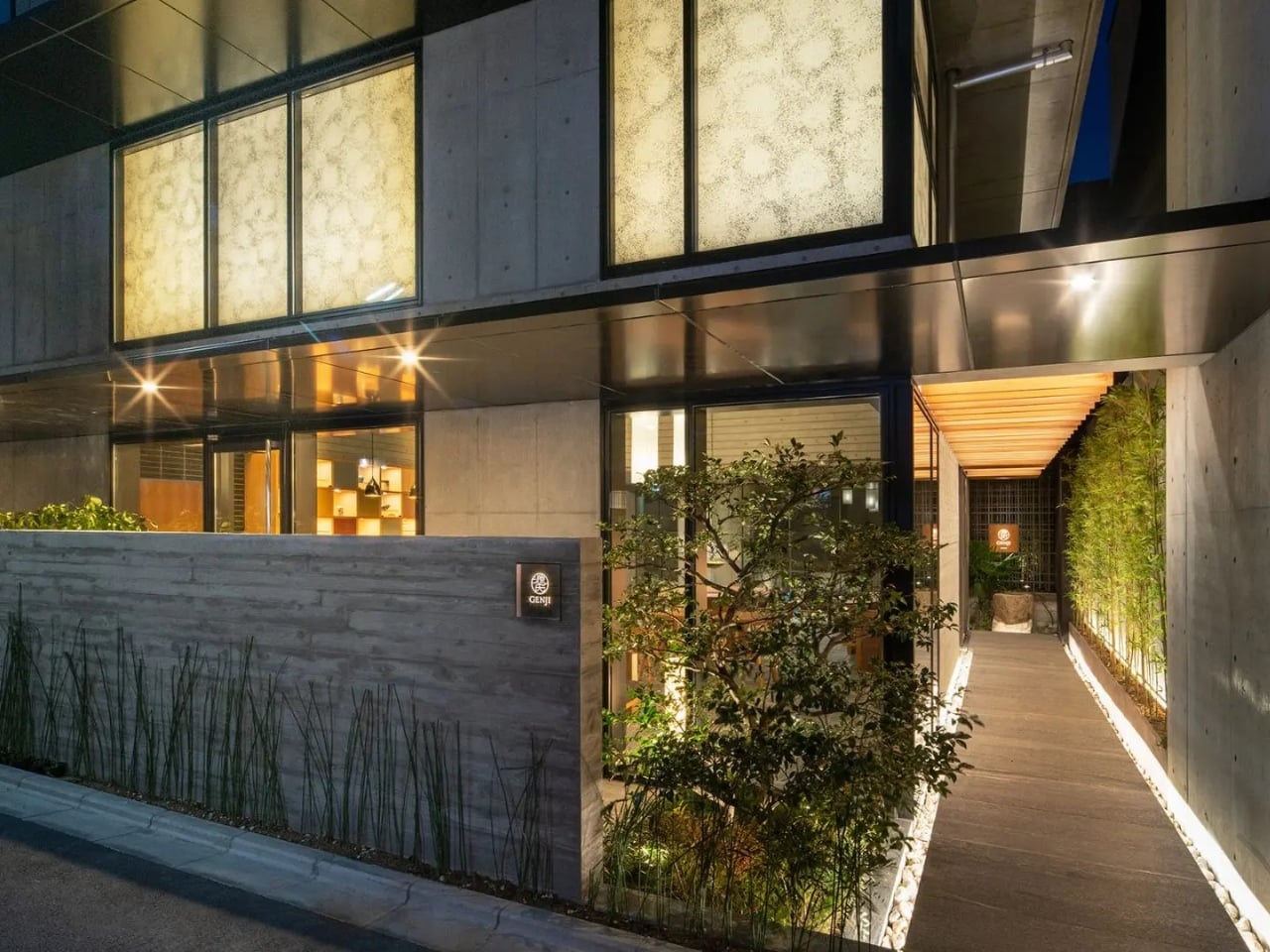
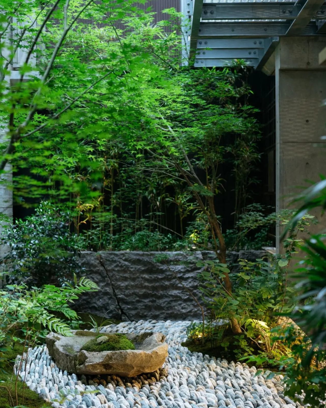
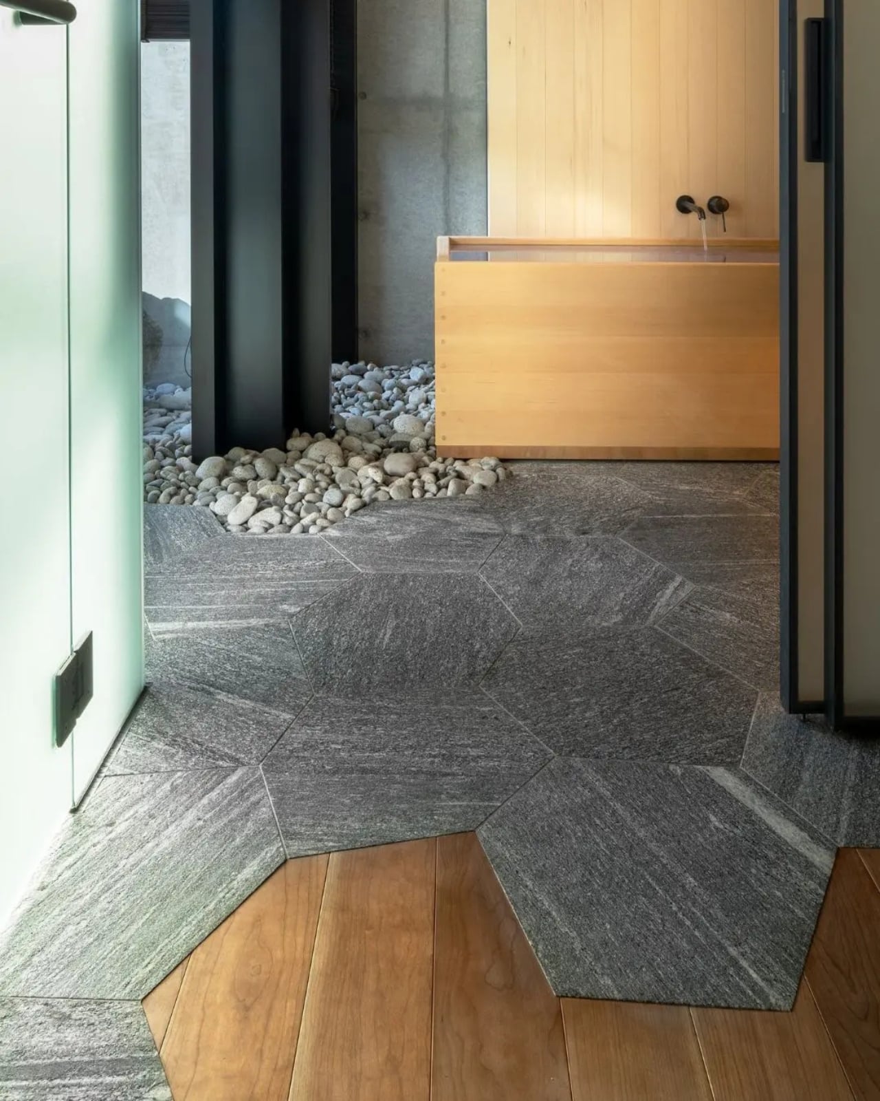
Most hotels ask you to check in. Genji Kyoto asks you to pay attention. Nestled along the Kamo River in Kyoto, Japan, this 19-room boutique hotel is the kind of place that architects talk about in hushed, reverent tones. And for good reason. It was designed by Geoffrey P. Moussas of Design 1st, a New York-born, MIT-trained architect who has called Kyoto home since 1994. That detail matters more than it might seem.
Moussas didn’t fly in with a mood board and a deadline. He has spent over three decades restoring and redesigning more than 40 traditional Japanese structures: machiya townhouses, tearooms, kura storehouses, and even a 400-year-old Buddhist temple. His work has been featured in the Financial Times, CNN, and NHK, and exhibited at Kiyomizu Temple and Nijo Castle. When someone like that builds a hotel, you’re not just booking a room. You’re stepping into a lifetime of accumulated understanding.
The concept behind Genji Kyoto traces back to an 11th-century Japanese novel, The Tale of Genji, widely considered one of the world’s first novels. When the design team discovered that the hotel’s site was historically tied to the story’s actual locations in Kyoto, the whole project shifted. The design moved away from a simple machiya prototype and toward the aesthetic world of the Heian period, over a thousand years ago. But Moussas wasn’t interested in imitation. His approach was to distill the spirit of Heian architecture, specifically the Shinden Zukuri style, characterized by pavilions woven through interconnected gardens, rather than recreate its surface. That distinction is everything. It’s the difference between a themed restaurant and a genuinely good one.
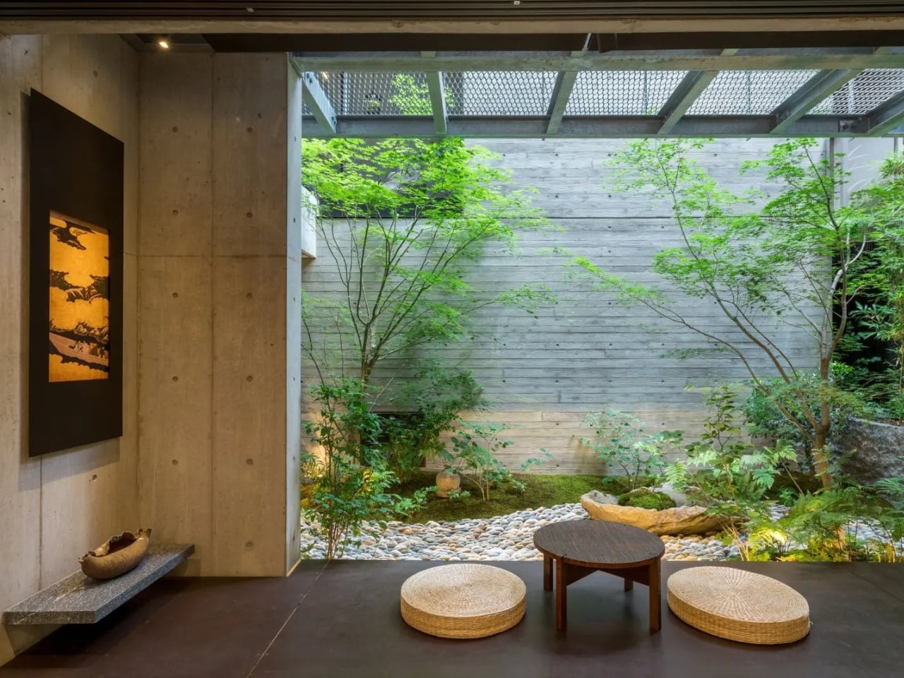
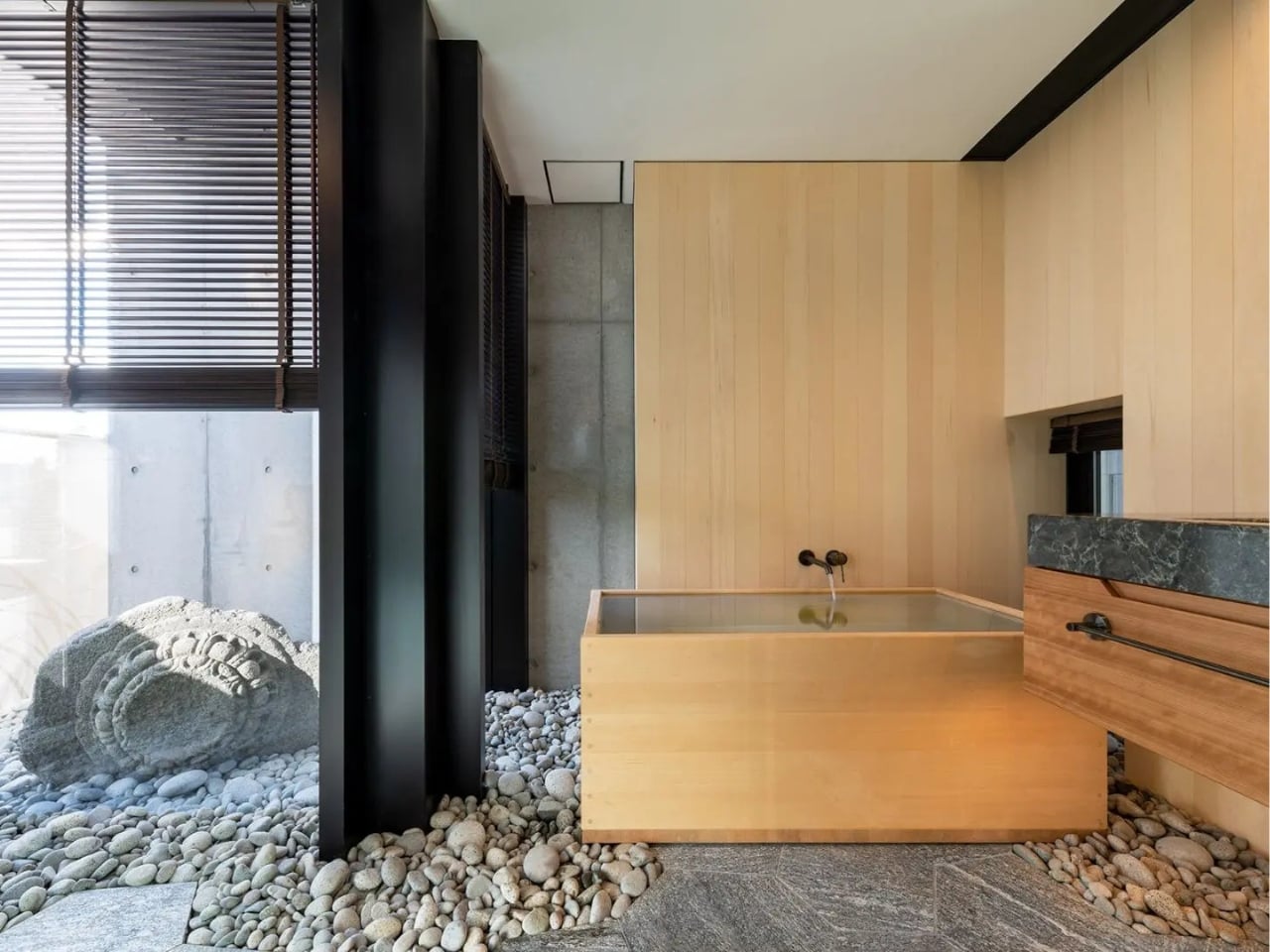
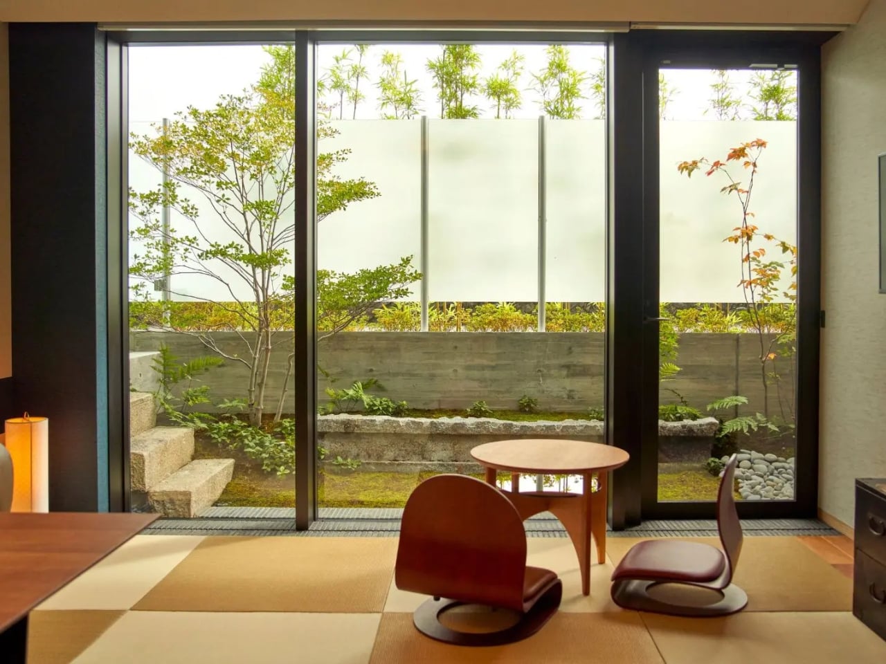
The guiding philosophy here is a Japanese concept called Teioku Ichinyo, which translates roughly to “building and garden are one.” Every spatial decision at Genji Kyoto flows from this idea. Gardens aren’t decorative; they’re structural. They guide movement, frame views, and carry what the Japanese call ki, the life force that animates a space. Even the small tsubo pocket gardens tucked around the guest rooms, a tradition dating back to Heian palace residences, do serious work, turning what could be a blank interior wall into a living, breathing view.
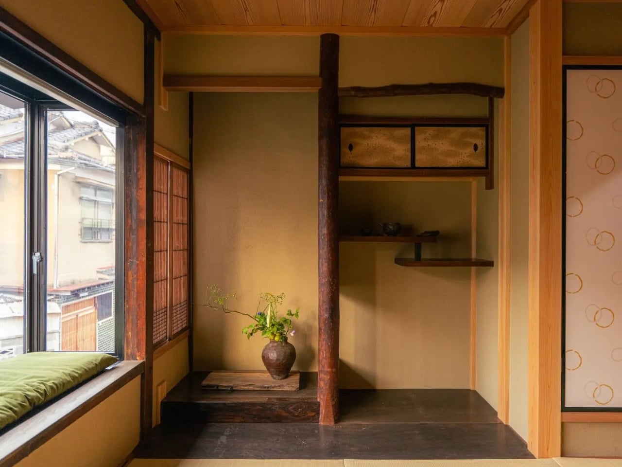
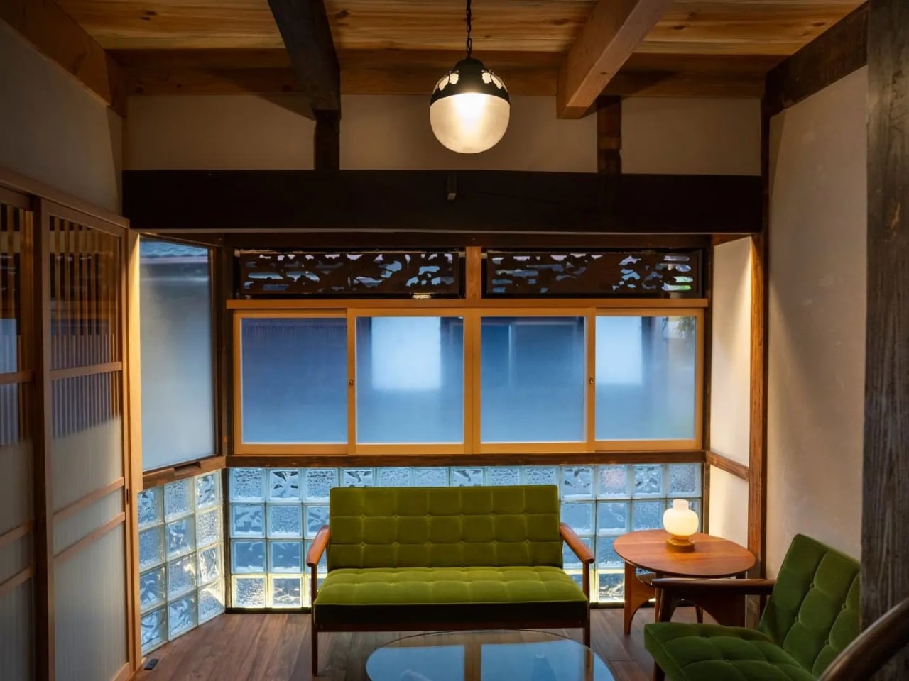
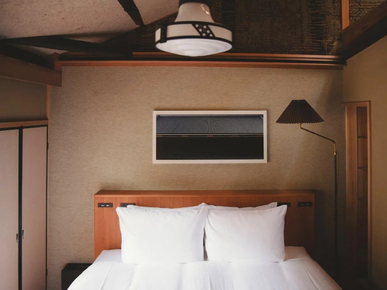
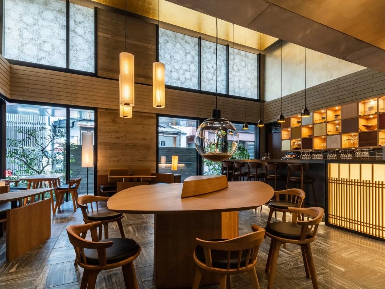
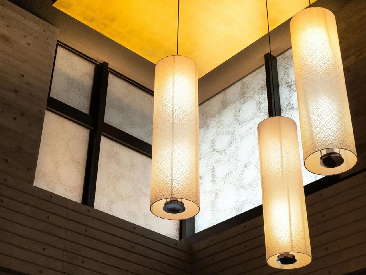
The materials are just as considered. Cedar-imprinted concrete shows up throughout the hotel, hard surfaces pressed with the warmth of wood grain, creating a tension that reads as both ancient and completely new. Large-scale washi paper panels function as architectural elements, not just decoration. Guest rooms have solid cherry wood floors, tatami mats made from natural rush, and furniture entirely handmade by Kyoto craftsmen. Jun Tomita, who handled interior design alongside Moussas, drew motifs directly from The Tale of Genji for every custom piece. And then there’s the detail I keep coming back to: during construction, a heritage water basin and a small shrine were discovered on-site. Rather than remove them, the team built the garden around them. That kind of decision tells you everything about where the priorities were.
There are 19 rooms in total, each one different. River views, city views, garden views. No two stays are the same, and that’s by design. Each room also features an original painting by a Kyoto artist, with every piece drawing on a different theme from The Tale of Genji, so even the art tells a chapter of the same story. Moussas has said he wanted guests to have a different experience every time they return, and the hotel is built to make that true. The rooftop garden and bar take it further still, offering panoramic views that make the hotel feel like it belongs to the entire city, not just its footprint.
Genji Kyoto’s real achievement isn’t any single detail. It’s the commitment to depth over spectacle. A lot of contemporary design is about the first impression, the photograph, the wow moment. This hotel asks for more time than that. It reveals itself in layers, the way a good book does. You have to slow down. You have to look twice. That’s a rare ask in hospitality. And it’s a rarer thing to pull off.
Most public art earns its place on a pedestal and stays there. It asks you to look, maybe photograph it, and walk away. The relationship between viewer and work rarely extends beyond that brief transaction. That’s been the convention for a long time, but there’s a growing push for installations that don’t just occupy public space but actually do something within it.
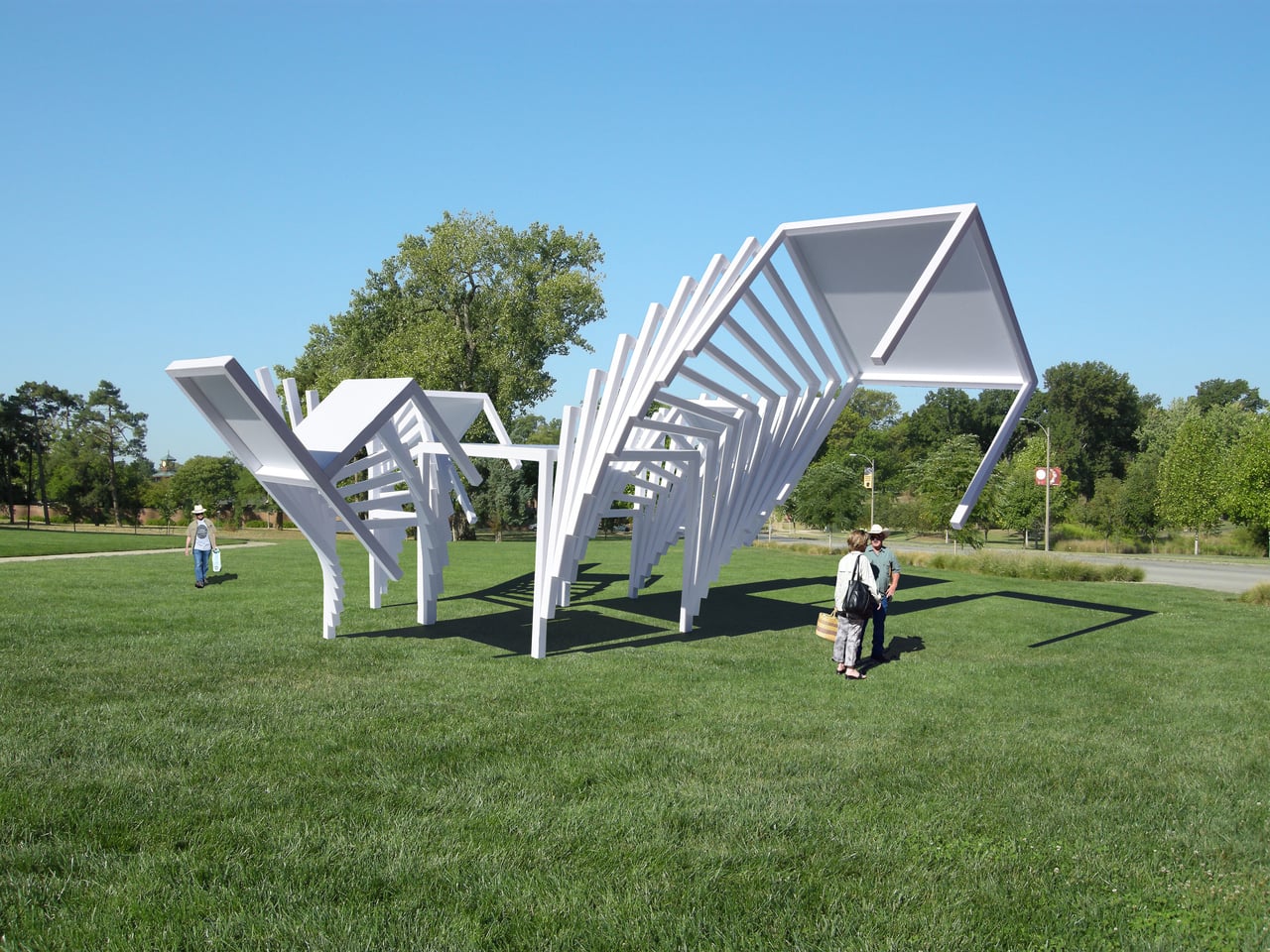
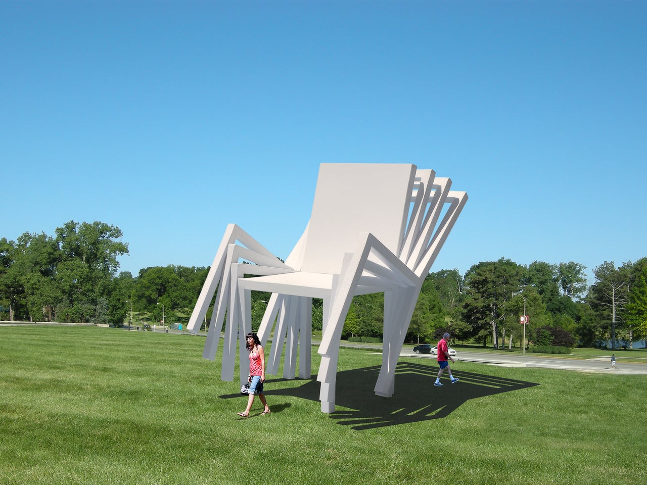
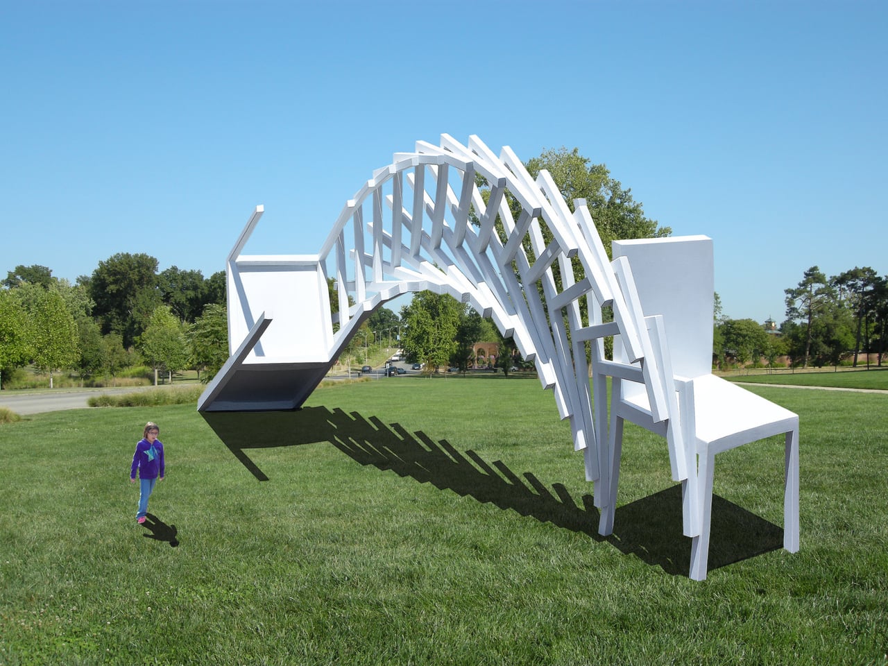
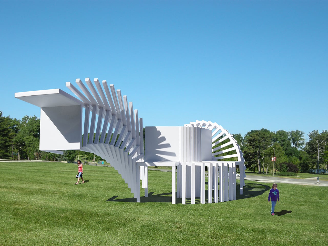
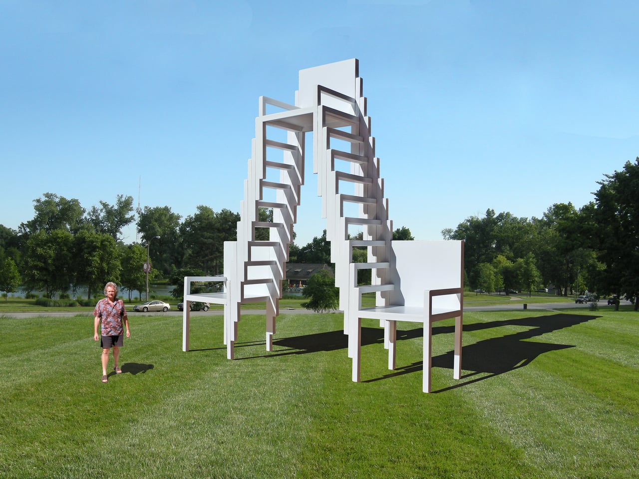
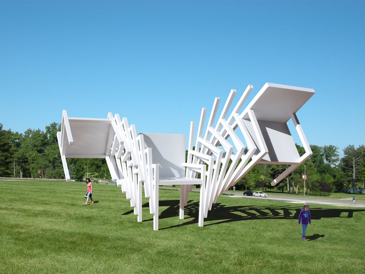
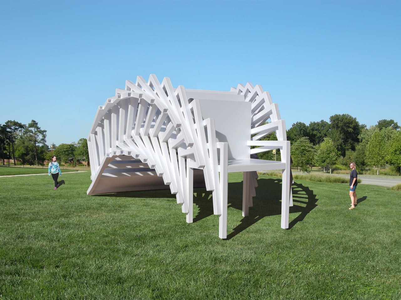
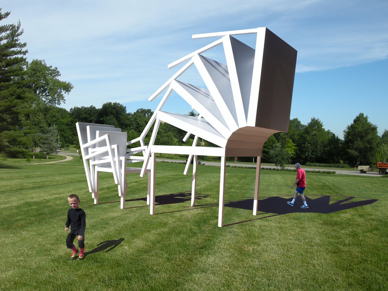
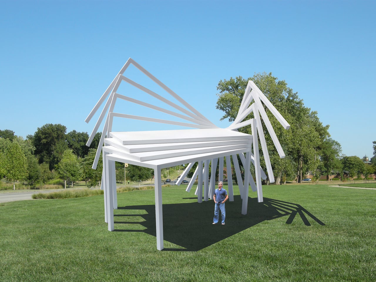
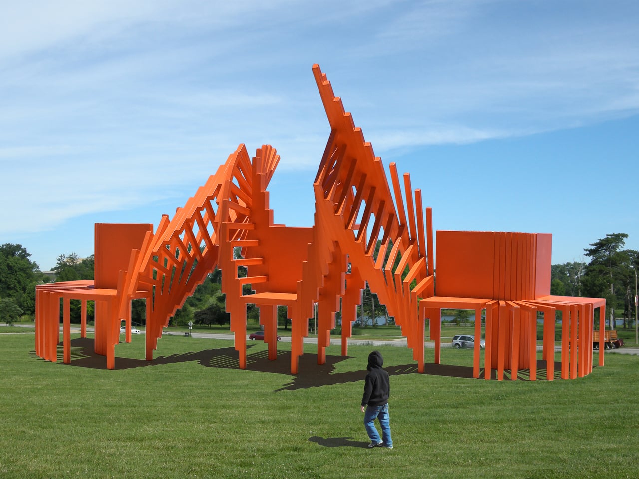
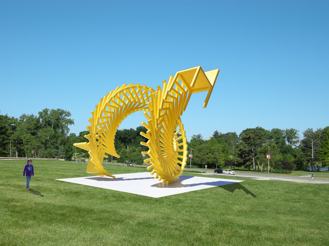
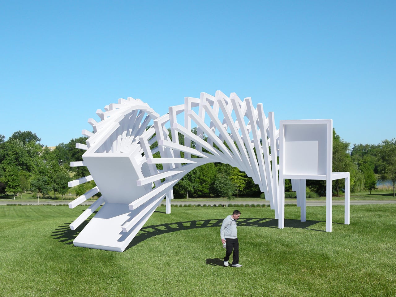
Michael Jantzen has been exploring that tension for years. His Moving Furniture series applies a simple idea to ordinary chairs and tables: take each object’s form and repeat it in progressive intervals as if capturing it mid-movement, then connect those moments into a single piece. The result is something you can still sit in or set a drink on, even if it no longer looks quite built for that.
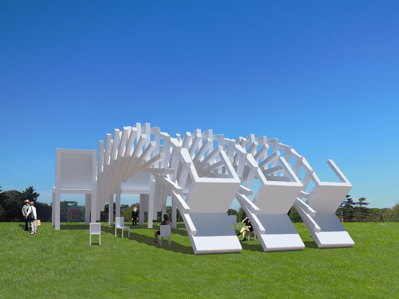
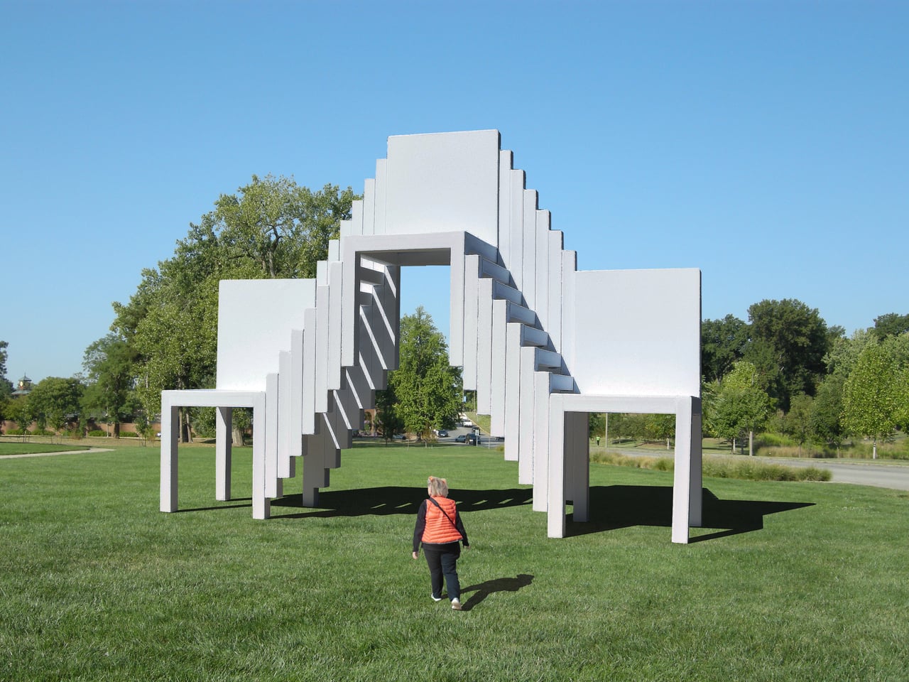
Monumental Moving Furniture takes that same concept into architectural territory. Built from painted steel, the series consists of abstracted chair and table forms, each generated by moving the original object through space and time and locking its path into a chain of connected segments. At this scale, what started as a reference to everyday objects feels closer to a building than a piece of furniture.
The method behind each piece is consistent. A chair or table is set in motion through space and time, with each interval frozen and joined to the next. Some pieces move only part of the original form; others shift the whole thing. The result is a structure that stops belonging to any single discipline and starts reading as furniture, sculpture, and architecture at once.
Despite being too large to sit in, these sculptures aren’t purely decorative. Each is large enough to walk under and through, giving it a practical function as a pavilion and shelter. That’s not something most public art can claim. Instead of asking people to observe from a polite distance, these structures pull you in, turning a passive encounter into something more physical and immediate.
The series covers both chair forms and table forms, each treated with the same sequential abstraction. Individual pieces have also been grouped into configurations that suggest more complex structures, as if each were a building block for something larger. Painted in vivid, solid colors like white, orange, and yellow, each structure commands attention from a distance and rewards a closer look once you’re standing beneath it.
Public spaces deserve more than objects to look at. They deserve things to experience. Monumental Moving Furniture earns its place on both counts, offering structures large enough to shelter visitors while giving them something genuinely puzzling to engage with. These forms don’t demand reverence. They invite curiosity, exploration, and the kind of slow, circling attention that good public space has always been designed to encourage.
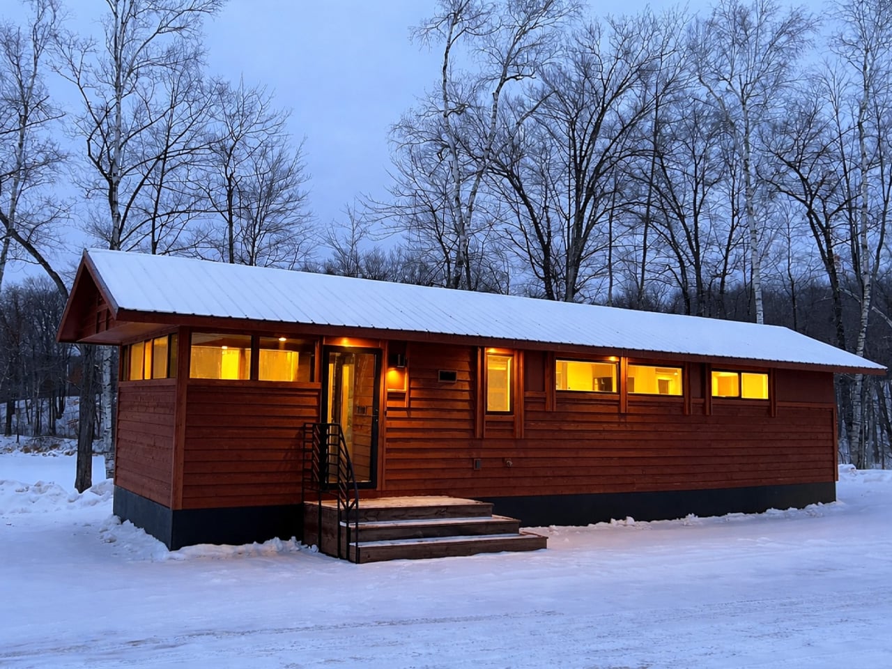
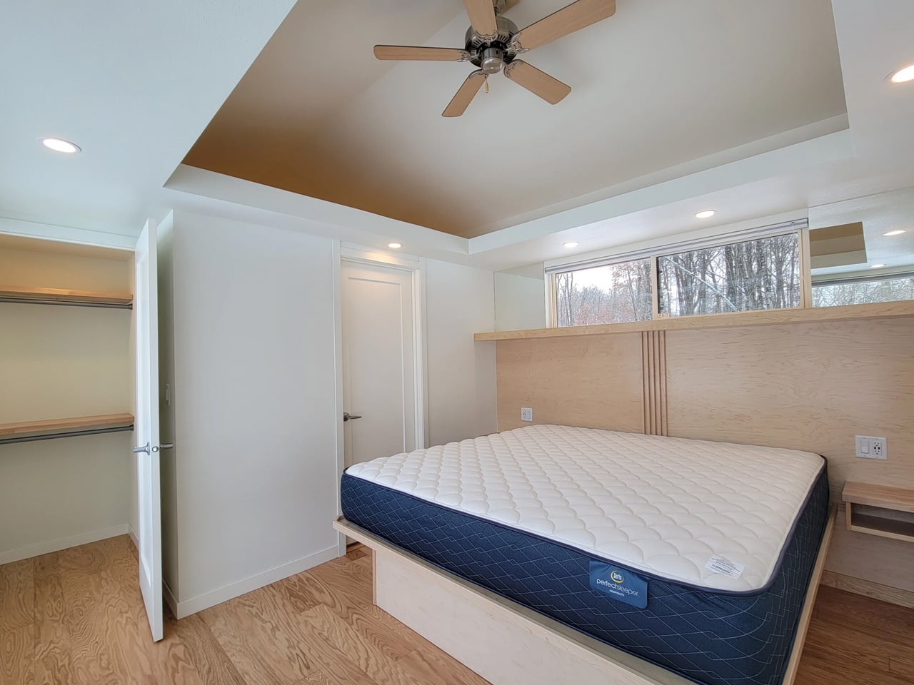
The tiny house world has long wrestled with one unavoidable tension — the desire for light, openness, and space against the hard constraints of a compact footprint. Escape’s Shoreline Glass House doesn’t just address that tension; it dissolves it entirely. This recently completed park model is one of the most spatially generous and light-saturated tiny homes to come out of the category in recent memory, and it earns that distinction without resorting to multi-level gymnastics or lofted sleeping quarters.
What immediately sets the Shoreline Glass House apart is its commitment to single-floor living. It has a length of 47 ft (14.3 m) and an increased width of 12 ft (3.6 m), which makes for a much larger interior than is typical for the format, comparable in fact to a small apartment. That extra width is the key differentiator. Where most tiny homes feel like corridors with furniture squeezed in, the Shoreline opens up laterally, giving rooms a genuine sense of proportion that doesn’t demand you constantly recalibrate your spatial expectations.
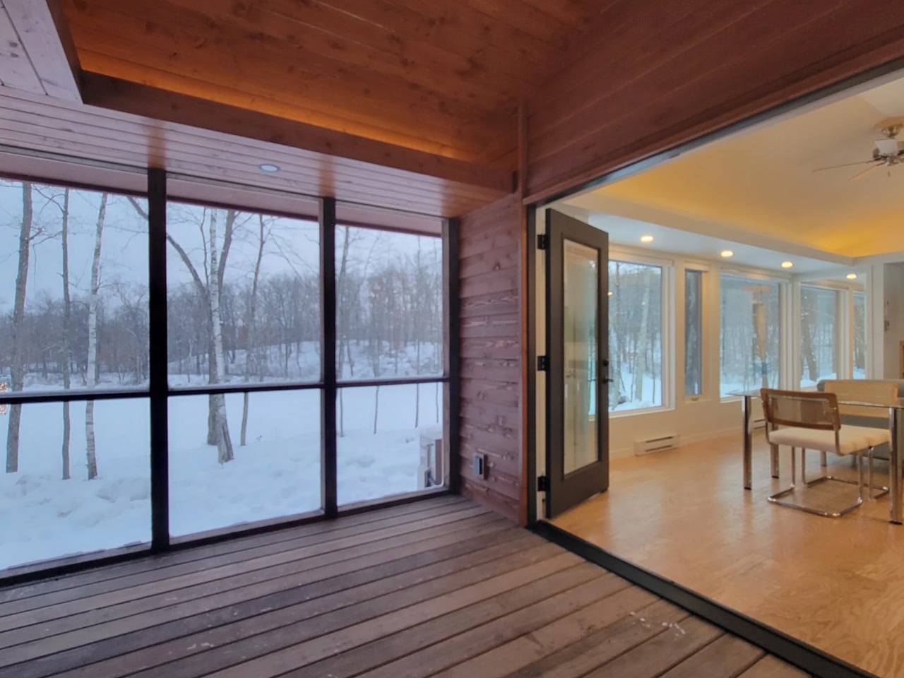
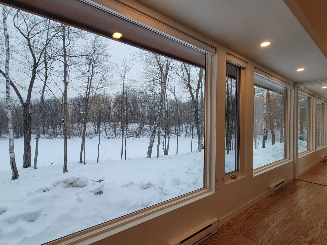
The name earns its keep on the exterior, too. The Shoreline Glass House features a light-filled interior thanks to 30 ft (9 m) of glazing running along one wall, flooding every corner of the home with natural light throughout the day. It’s a design move that blurs the line between inside and out, making the home feel anchored to its surroundings rather than sealed off from them. Entry is through a large enclosed porch, a smart buffer zone that expands the functional living area while adding that coveted semi-outdoor layer that tiny home dwellers often sacrifice first.
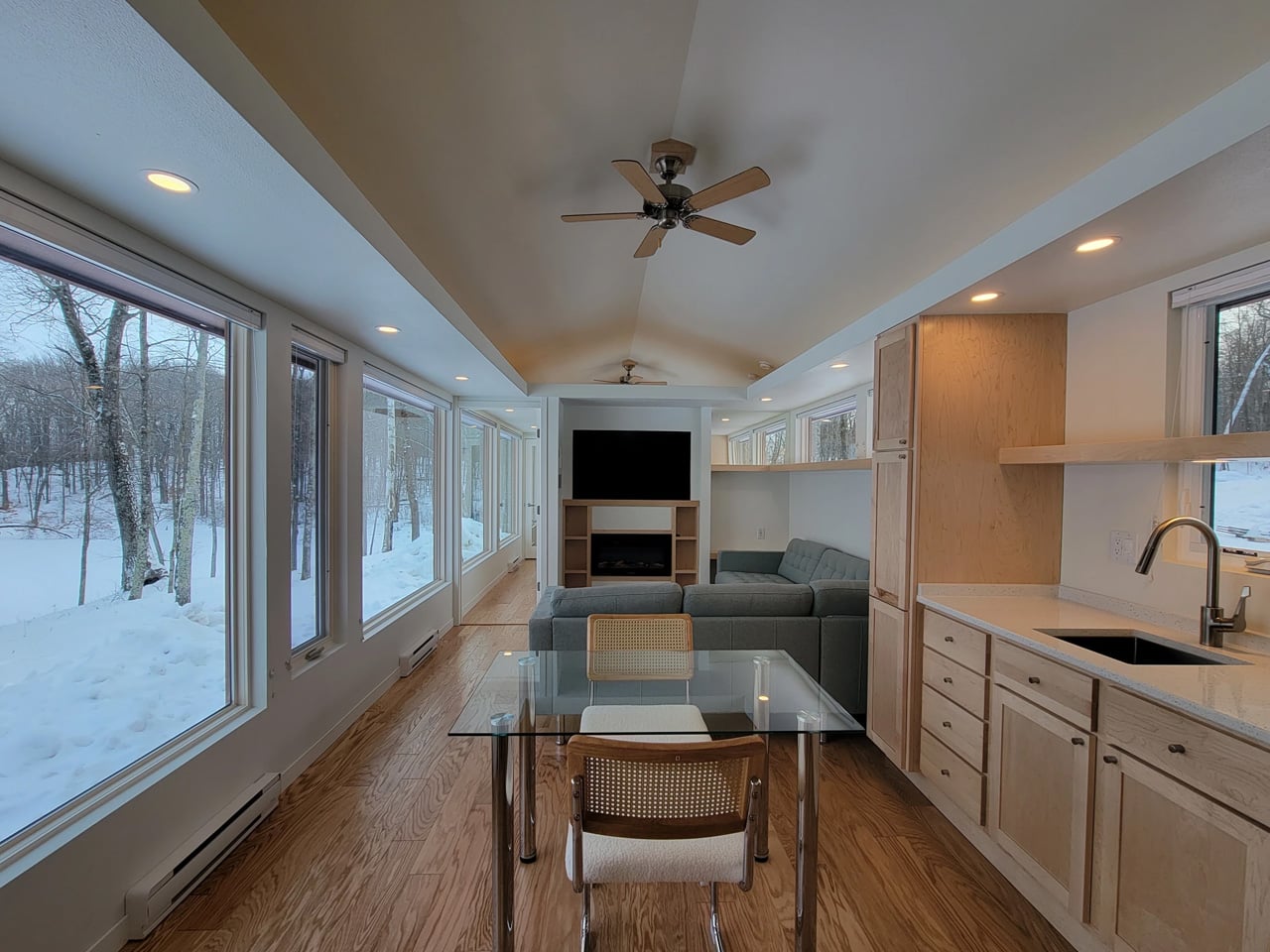
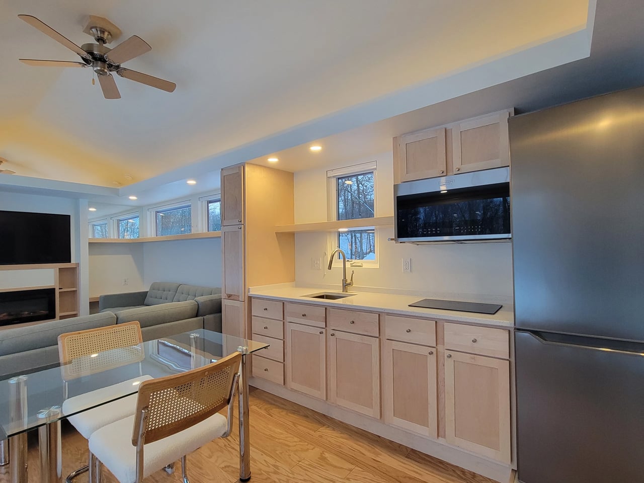
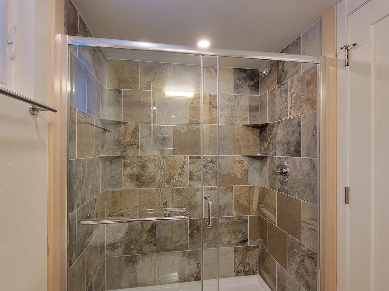
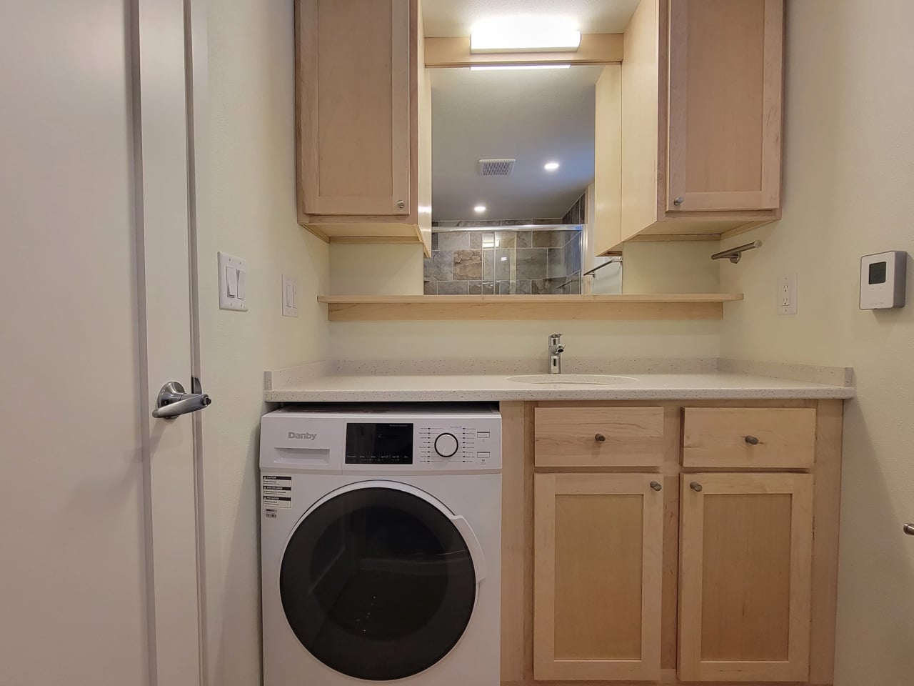
Inside, the layout is open-plan, with the living and kitchen area flowing seamlessly from one end to the other. The bathroom includes a large glass-enclosed shower with a width of 5 ft (1.5 m), a specification that sounds modest until you realize most tiny house showers are barely wide enough to raise both arms. A walk-in closet rounds out the domestic comforts, alongside an oversized sofa that signals Escape’s intent clearly: this is a home designed for staying in, not just passing through.
As a non-towable park model, the Shoreline Glass House isn’t chasing the nomadic lifestyle that defines much of the tiny house market. It’s built for permanence, or at least long-term settlement, and the design reflects that. Every decision, from the floor-to-ceiling glazing to the full-width bathroom, prioritizes livability over portability. The result is a tiny house that finally makes the case that going small doesn’t have to mean giving anything up.
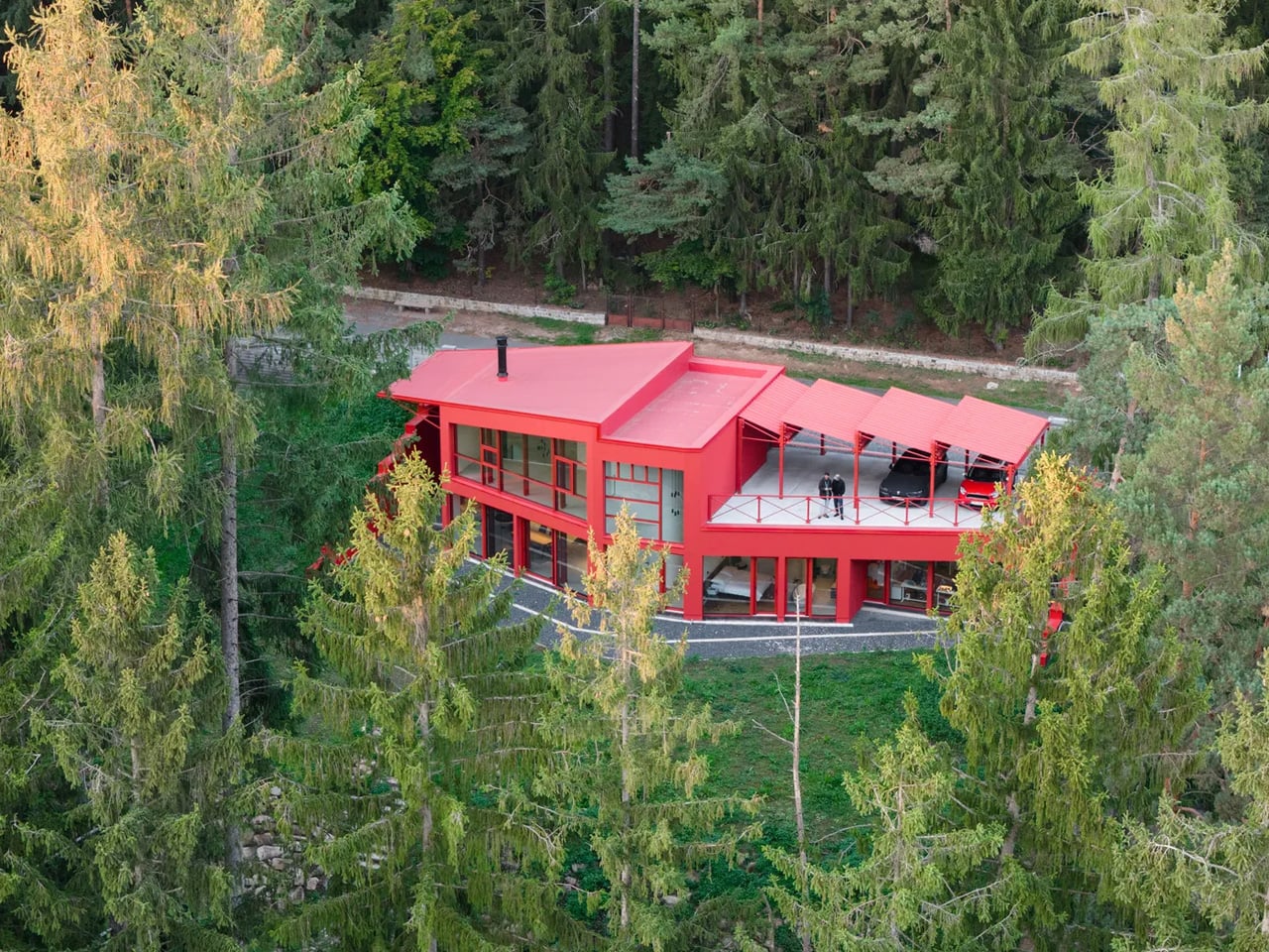
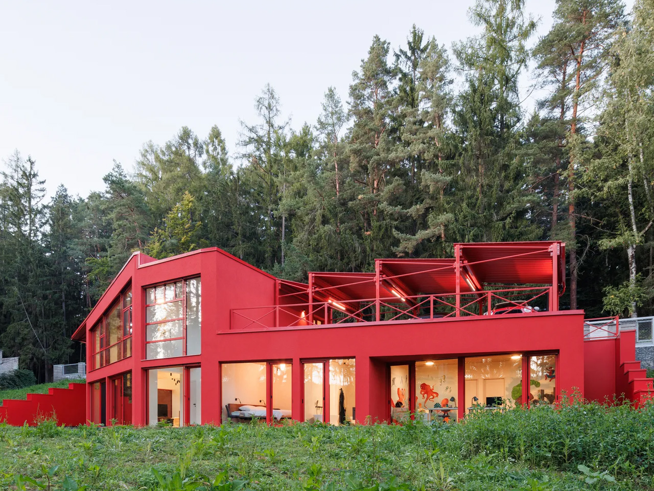
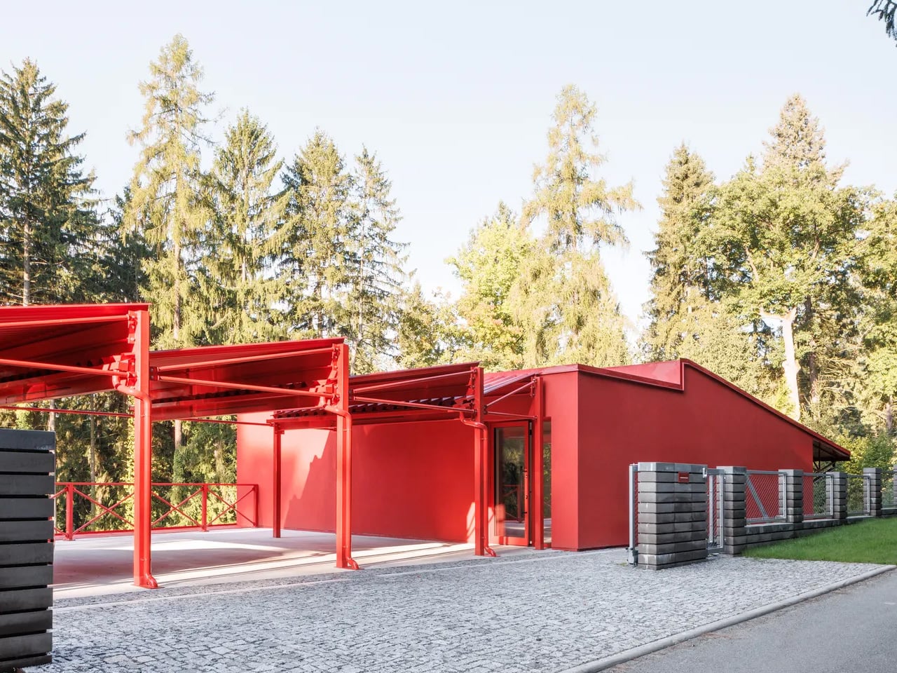
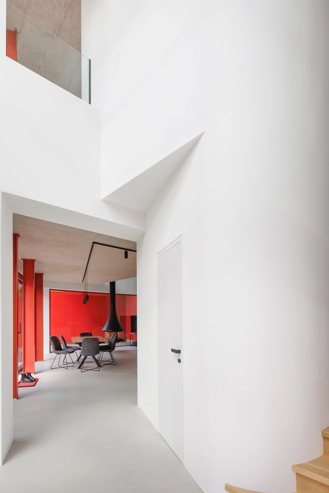
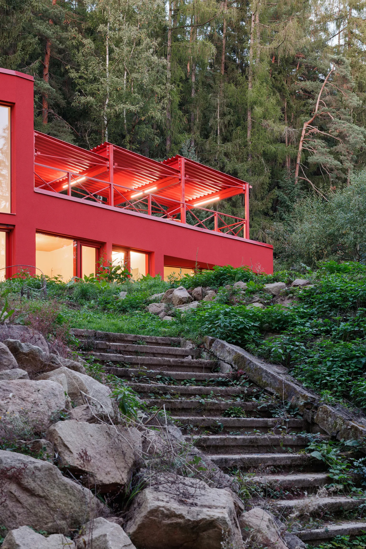
Deep in the spruce forests of Jevany, a municipality of barely 800 people in the Czech Republic’s Central Bohemian Region, a flash of cherry red cuts through the trees. This is Villa Jevany, a new residence by local studio Architektura, and it has absolutely no interest in blending in. Where most forest homes default to timber, stone, and muted tones, Architektura went the other way entirely, dressing the structure in saturated red steel and calling it exactly what it is: a deliberate, uncompromising act of contrast.
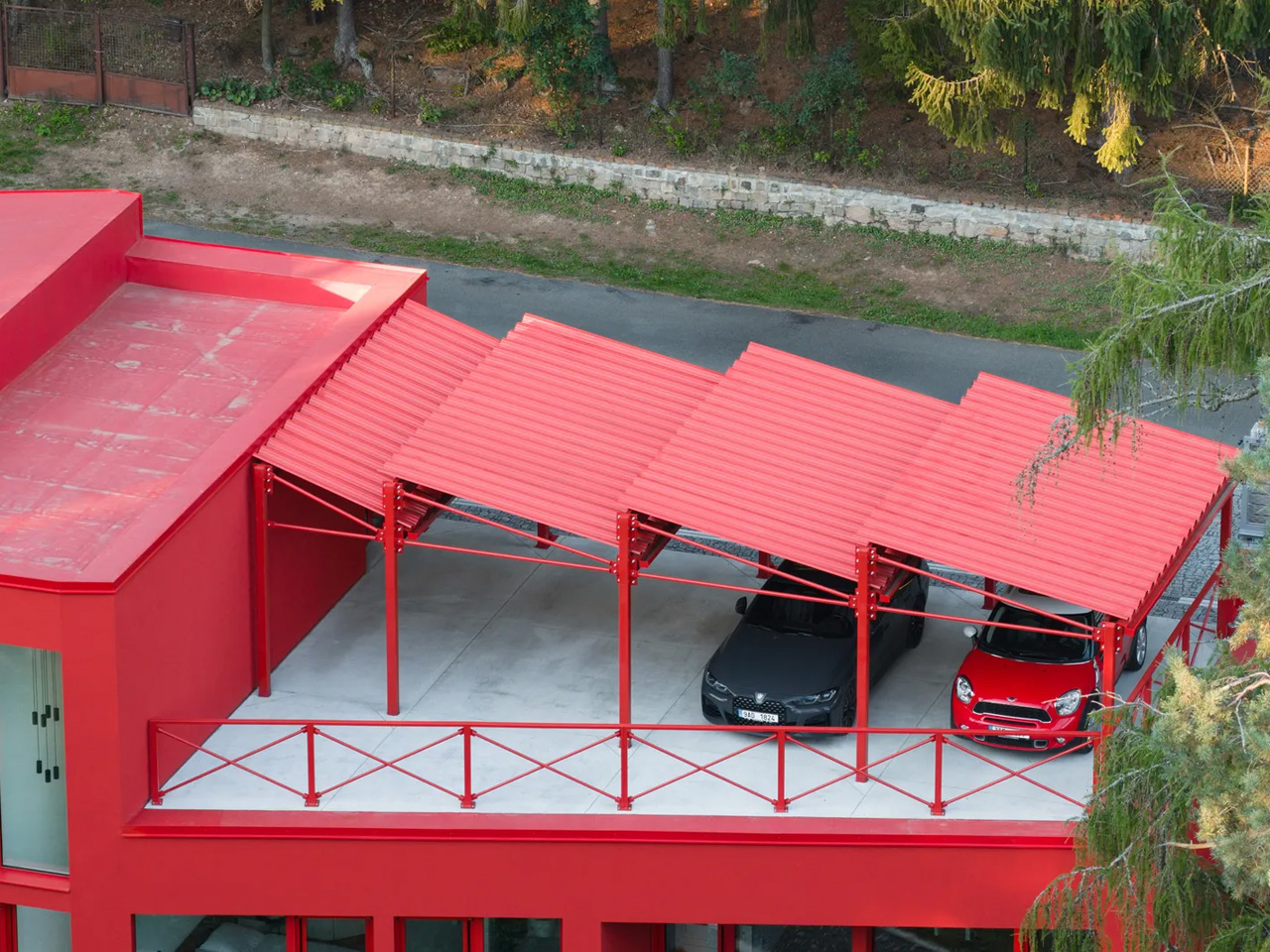
The site itself set the terms. The plot spans a generous 3,027 square meters on a steep southern slope, inhabited by deer, birds, and mature trees that tower up to ten meters above the building level. Architektura responded by carving the villa into the hillside rather than placing it on top, creating a structure the studio describes as an “organism” embedded in the earth. The red steel skeleton, visible in the sawtooth carport roof from the moment of arrival, signals that this is industrial thinking applied to domestic life, and it doesn’t apologize for it.
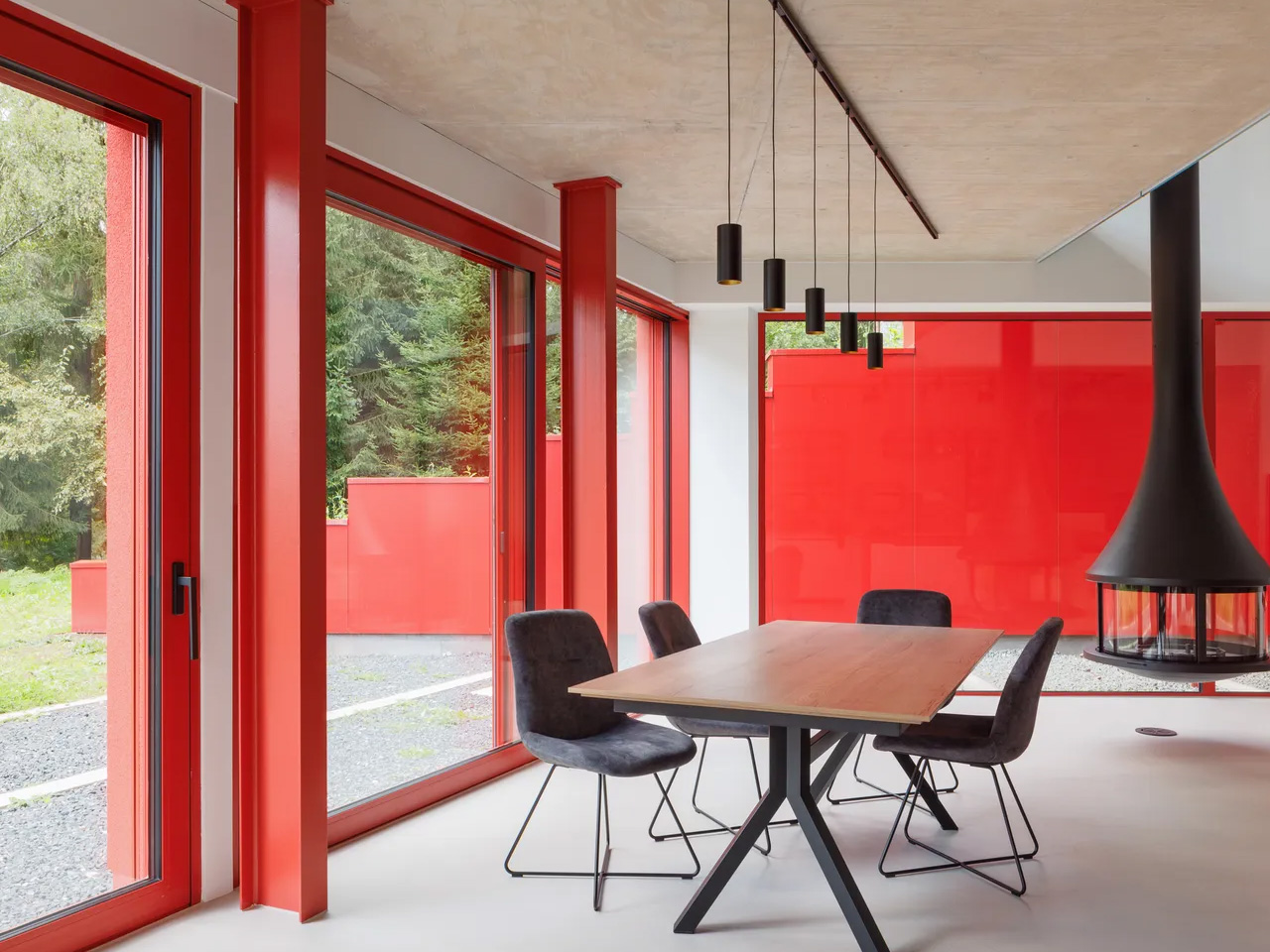
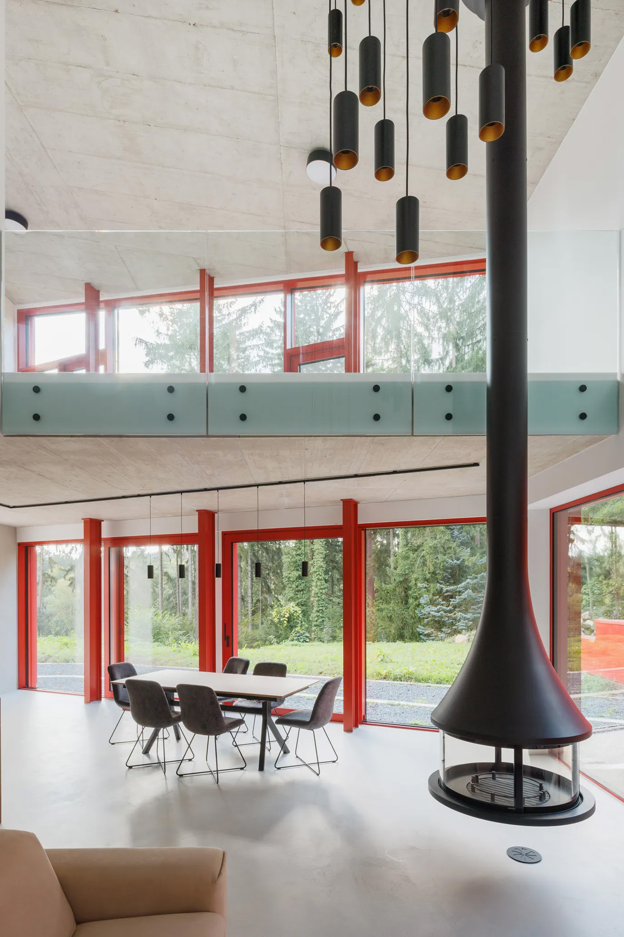
The colour choice is rooted in theory as much as instinct. Architektura used green and red as complementary colors, a logic borrowed from the colour wheel and, more pointedly, from abstract art. The irregularly divided glazing across the façade draws a quiet reference to Mondrian, the rhythmic geometry of the windows creating a visual tension against the organic verticality of the trees behind them. From the road, the house reads almost like a painting hung in the forest. From the inside, the forest becomes the painting.
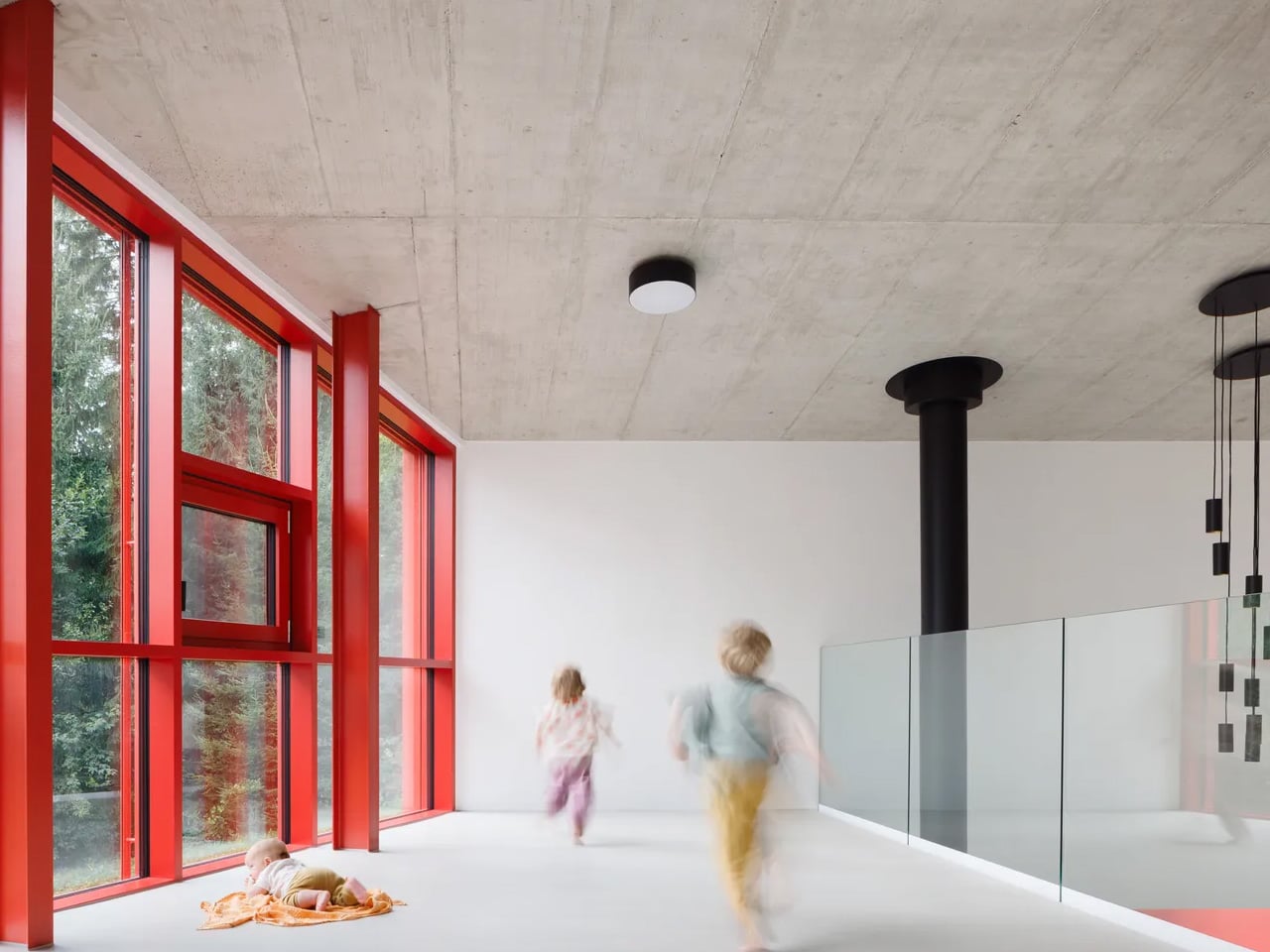
Internally, the layout unfolds across five distinct levels. The entrance opens into a hall with a 3.5-meter ceiling height, where a curved wall guides visitors into the main living space, or what the architects call the “day zone.” Here, industrial red steel windows frame the surrounding green; white walls meet black details; reddish stone counters anchor the kitchen alongside a floating steel fireplace. It’s a space of deliberate contrasts, domestic in function and raw in feeling.
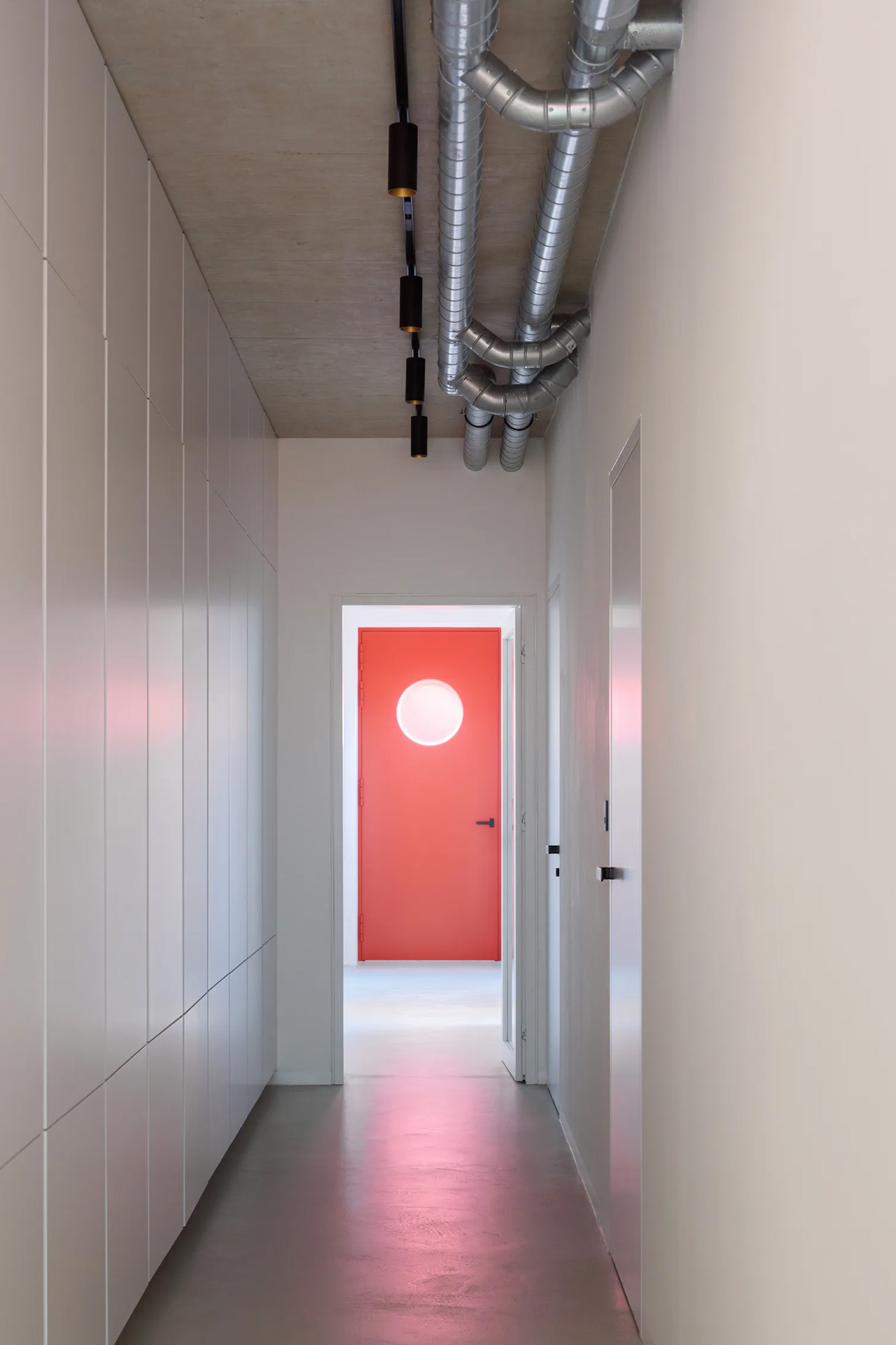
The private quarters, reached through a long corridor lined with minimalist white cabinetry, are stripped of excess. The parents’ suite and children’s rooms are quiet and restrained, a counterpoint to the drama of the exterior. Terraces and balconies extend the living area into the canopy itself, turning the house into what Architektura intended all along: not just a place to live, but a place to look.
In 1914, Ludwig Wittgenstein did something that, depending on your perspective, was either the most logical or the most eccentric thing a Cambridge-trained philosopher could do. He left England behind and built a tiny wooden cabin on the steep shoreline of Lake Eidsvatnet in Skjolden, Norway. The only way to reach it was by boat, or by walking across ice in winter. His mentor Bertrand Russell reportedly told him it would be lonely. Wittgenstein replied that he “prostituted his mind talking to intelligent people.” The anecdote is funny, but the philosophy behind it was completely serious.
What Wittgenstein found in that remote hut was the particular kind of quiet that forces real confrontation with your own thoughts. He was productive there in ways he couldn’t replicate anywhere else, later writing to a colleague that he “couldn’t imagine working anywhere as he did there,” and that the place had “a quiet seriousness” he found nowhere else. Some of his foundational thinking for Tractatus Logico-Philosophicus took shape in that small space, part of it on a boat his friend David Pinsent sailed across the Sognefjord. A philosopher doing his deepest work on open water, surrounded by mountains. That image stays with you.
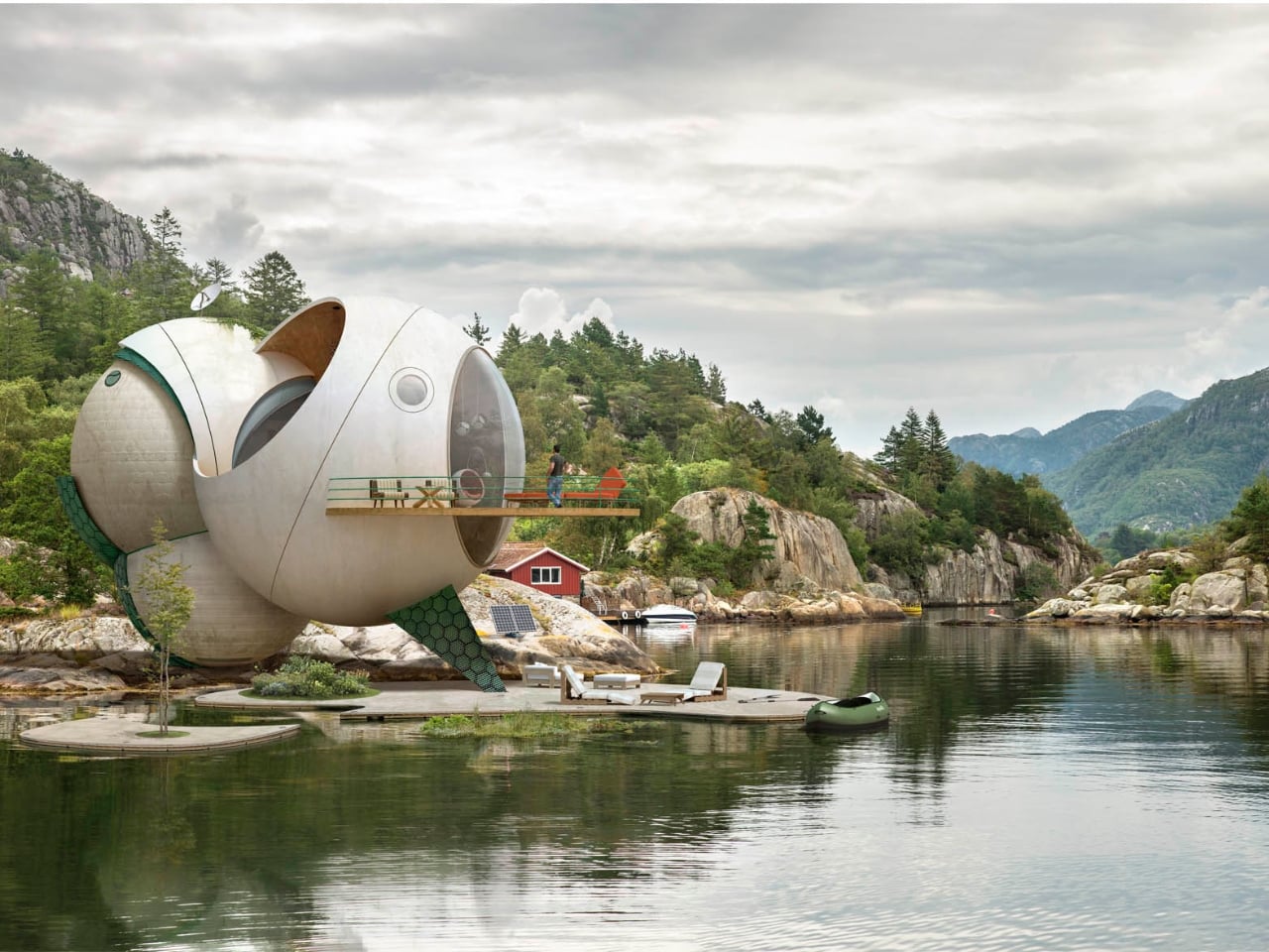
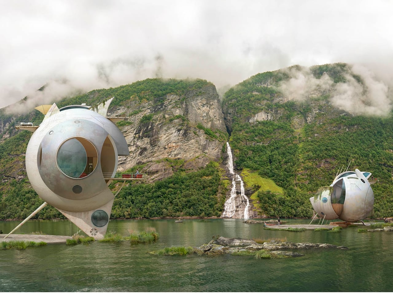
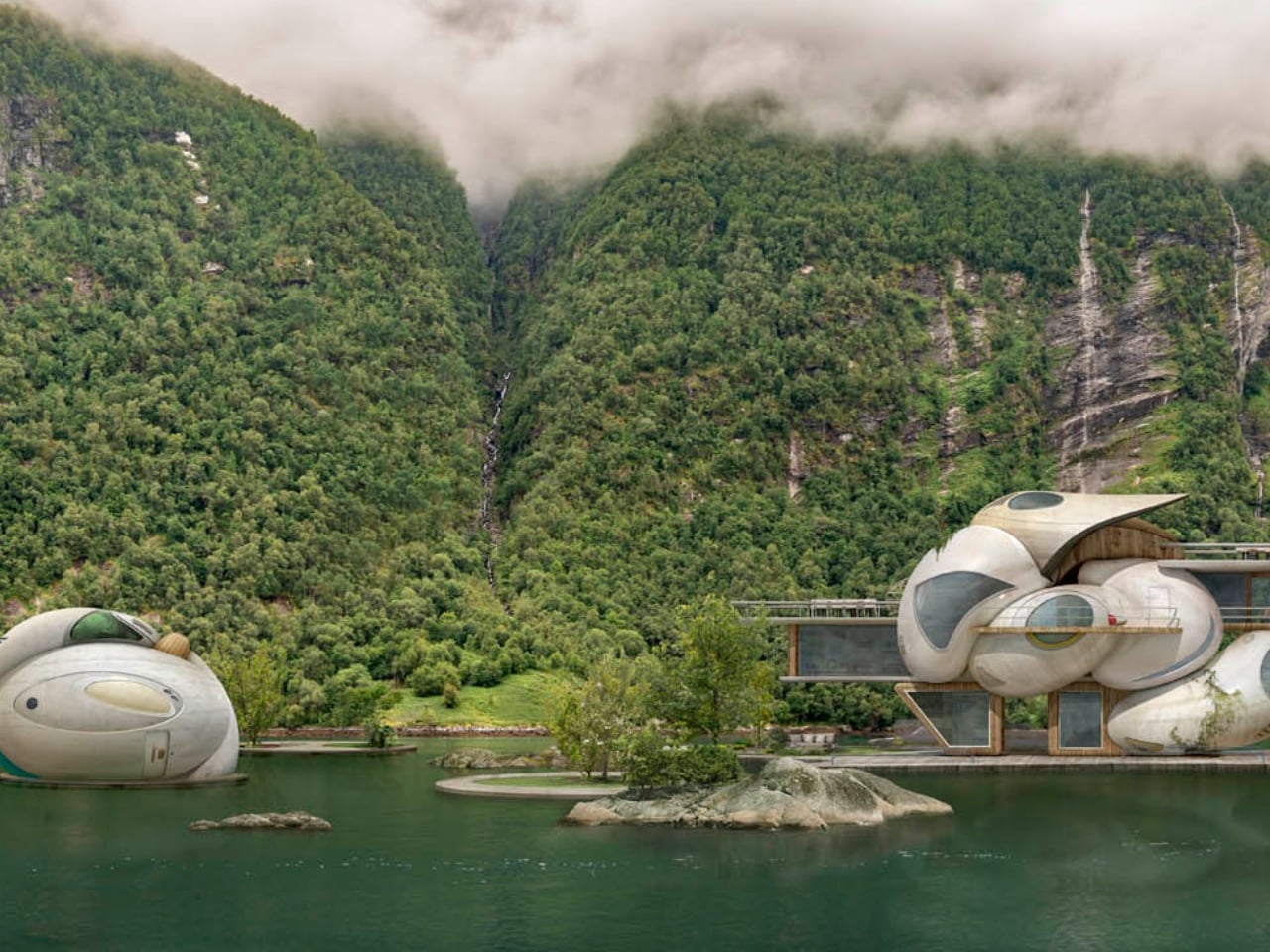
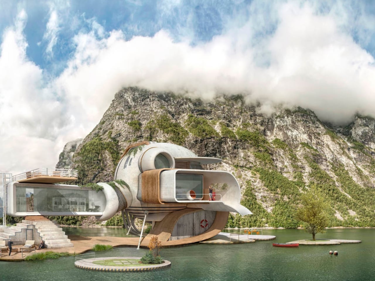
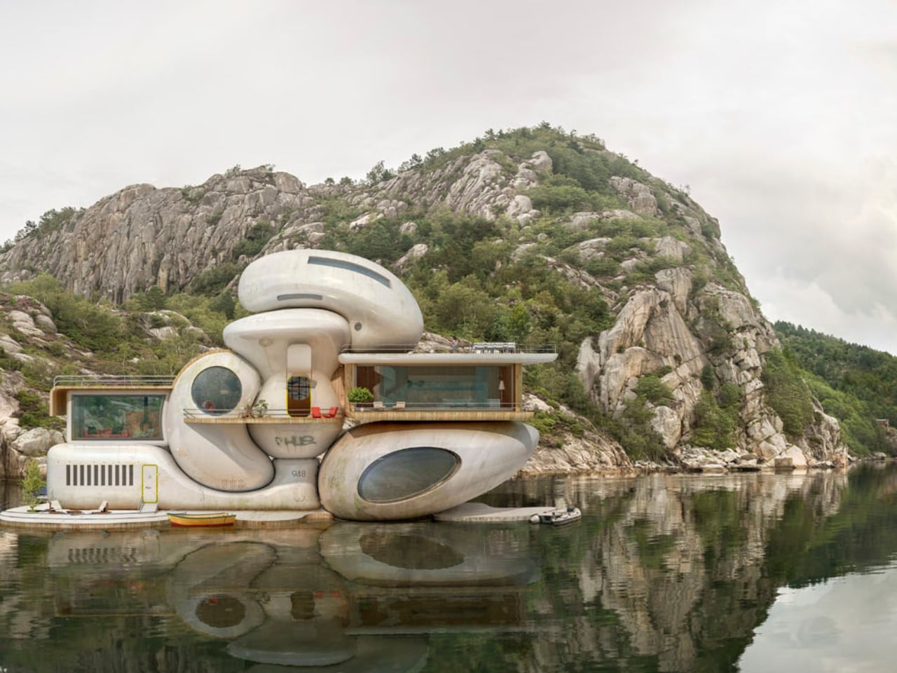
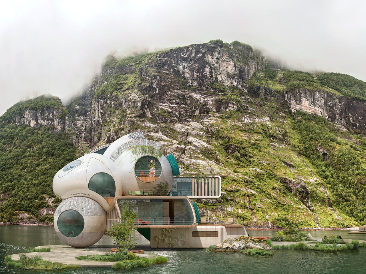
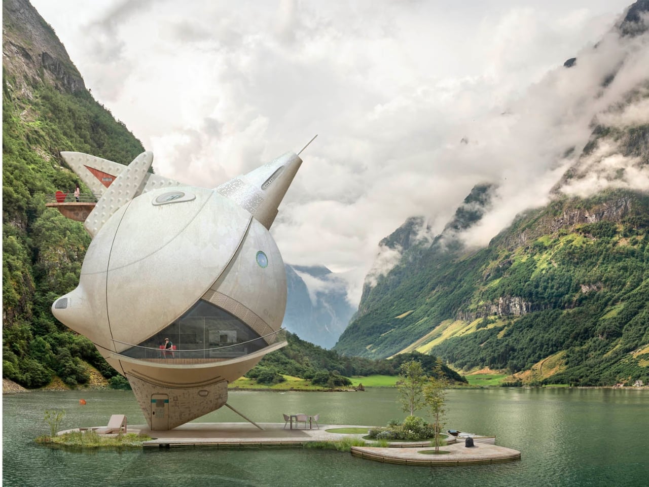
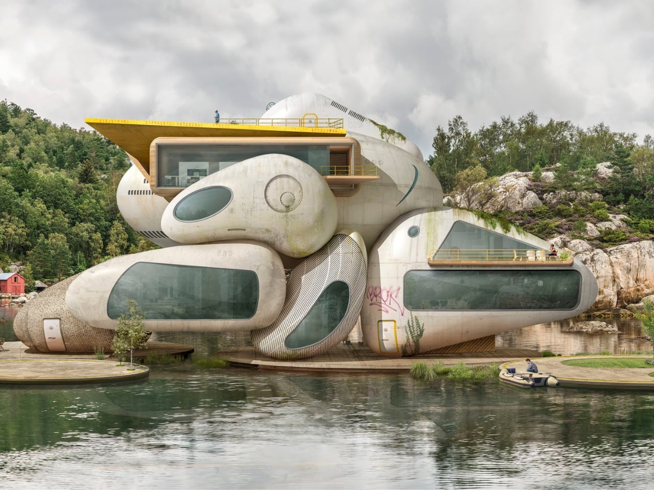
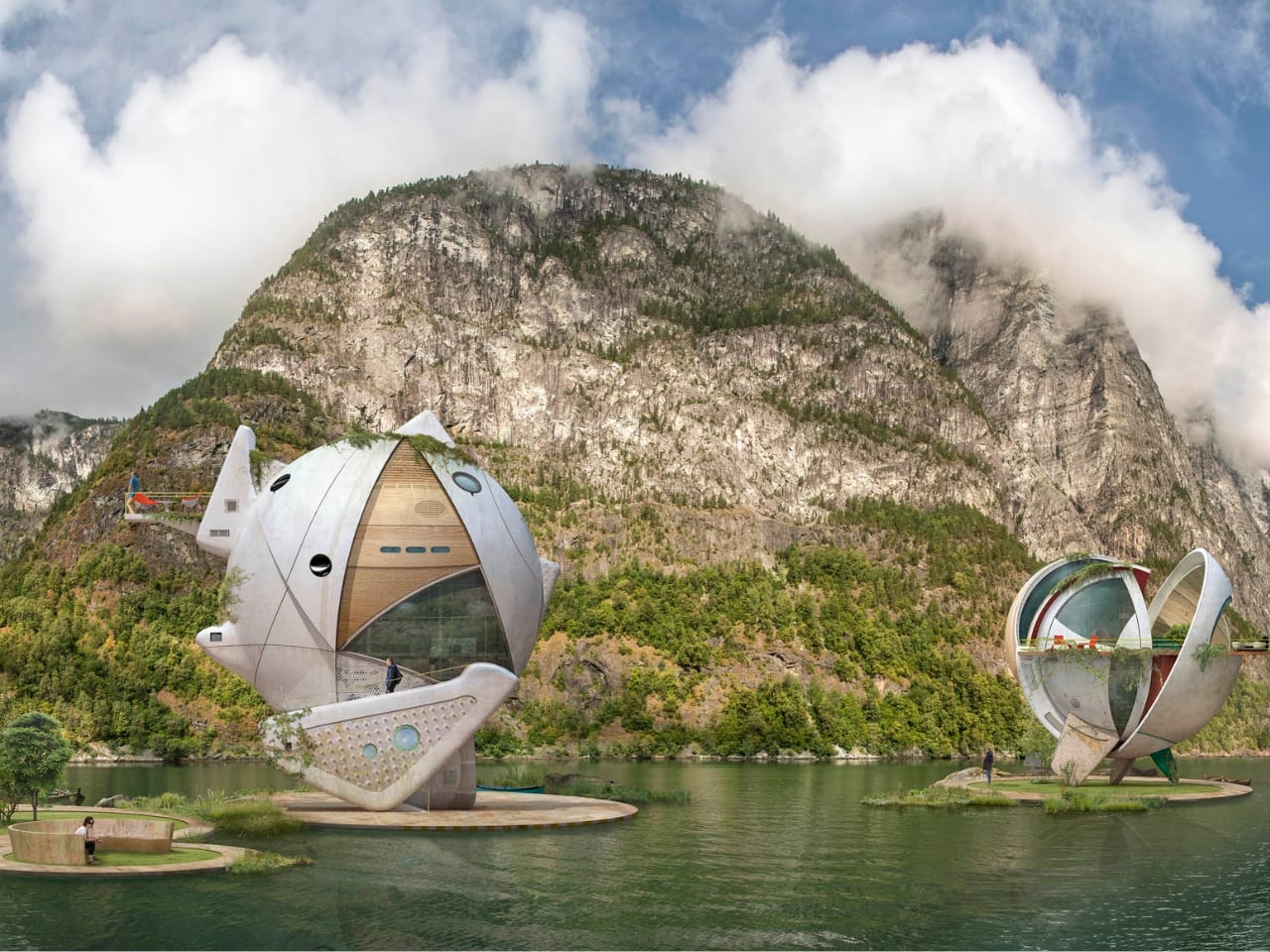
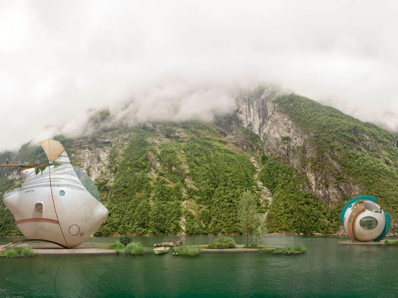
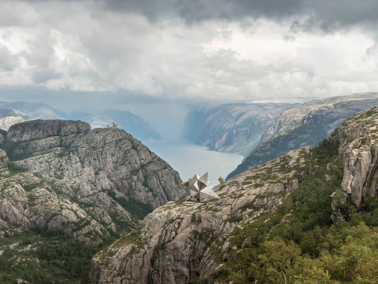
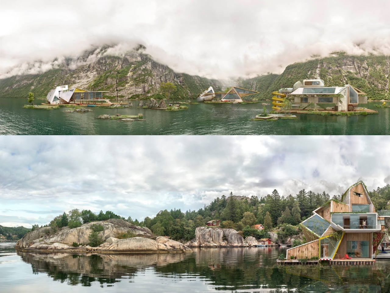
Spanish artist Dionisio González clearly felt it too. His series, Wittgenstein’s Cabin, takes that founding image as both premise and provocation. González works across photography, digital manipulation, and what you might call architectural fiction, and his practice has long focused on reimagining how people live in extreme or overlooked conditions. For this project, he envisioned a cluster of amphibious dwellings set directly on the Norwegian fjords, floating on artificial islands against the same vast and indifferent landscape that Wittgenstein once sought out. They are not proposals for construction. They are something closer to visual arguments.
The structures themselves are striking. Made primarily of weathered metal, they feel industrial and oddly organic at the same time. Each one has its own distinct form, but they share a visual family resemblance, like siblings built from the same strange blueprint. They sit on the water in ways that feel simultaneously precarious and deliberate. González has spoken about being drawn to “the confrontation, the frontality” of Wittgenstein’s original cabin with the fjord. For Wittgenstein, the water wasn’t backdrop. It was the actual condition of his solitude. González takes that thought and makes it architectural.
The project keeps pulling me back to one of the more persistent tensions in design conversation: the relationship between isolation and creative thought. The idea that you need to escape in order to think clearly is ancient, but it feels newly charged when genuine silence has become a luxury most people can’t really access. González frames philosophy itself as an “amphibian endeavour,” something that lives between the stable and the fluid, the settled and the speculative. His floating cabins give that metaphor a shape and a weight. They’re not quite houses. They’re more like habitable hypotheses.
None of these structures are intended to be built, and I think that’s precisely where their power lies. Architectural fiction as a practice asks you to sit with ideas rather than just objects. It creates room to think seriously about how we want to inhabit the world, even when the answer falls outside what’s commercially or technically possible. González’s designs carry a visual seriousness that separates them from pure fantasy, a quality that makes them feel genuinely worth spending time with.
Wittgenstein wanted to disappear from the world in order to think more clearly inside it. González takes that same instinct and places it on open water, wrapped in oxidized metal, asking what solitude actually looks like when landscape isn’t just a setting but a condition of being. The answer he offers is beautiful and strange, which feels entirely fitting for a project named after one of the twentieth century’s most beautiful and strange minds.
The architectural world is shifting toward materials that feel grounded, honest, and deeply connected to the earth. Instead of relying on high-energy industrial products, designers and homeowners are embracing approaches that honor the planet’s natural tectonics. In this movement toward true sustainability, rammed earth has re-emerged as a powerful, modern choice for those seeking beauty, integrity, and a low-carbon footprint.
Its tactile layers and sculptural warmth create spaces that feel rooted, calm, and inherently biophilic. Rammed earth offers durability, thermal comfort, and long-term value, transforming simple structures into timeless experiences and reflecting the five pillars driving its revival.
1. Low-Carbon Construction
Rammed earth stands out as a low-carbon building method because its main ingredient, subsoil, is often sourced directly from the construction site or nearby. This drastically cuts transportation emissions. Unlike concrete or brick, rammed earth requires no firing, kilns, or intensive chemical processes. Its formation relies on simple mechanical compaction and moisture, keeping the embodied energy among the lowest of any mainstream wall system.
This approach makes each project inherently more responsible and materially honest. By using local resources and eliminating energy-heavy manufacturing, rammed earth aligns with global decarbonization goals. It has become a preferred choice among forward-thinking firms committed to sustainable, large-scale performance.
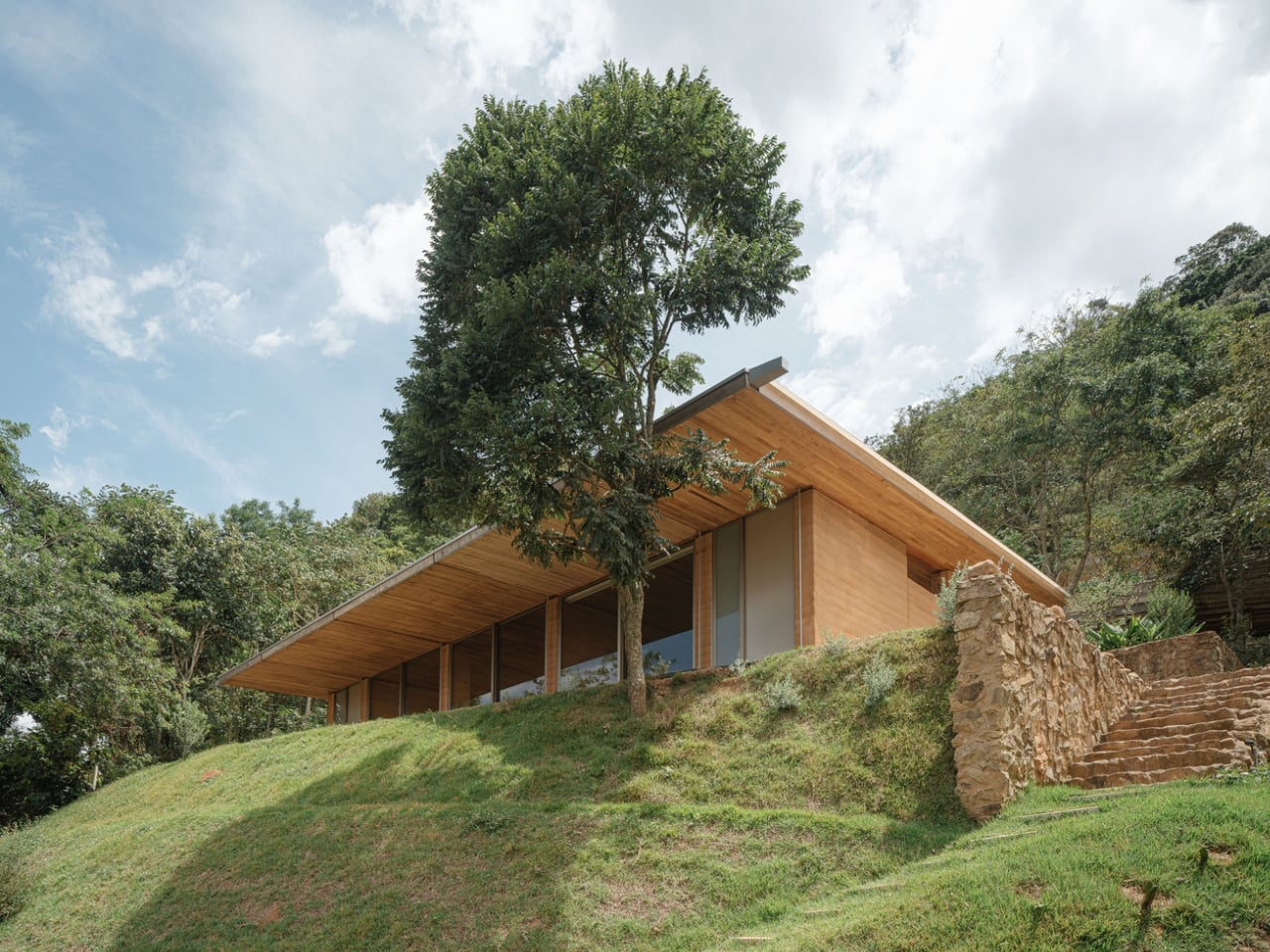
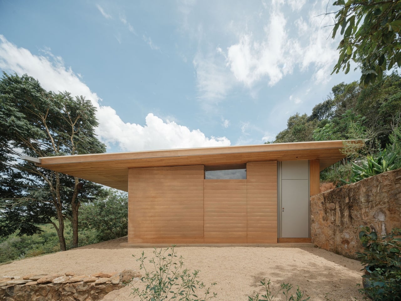
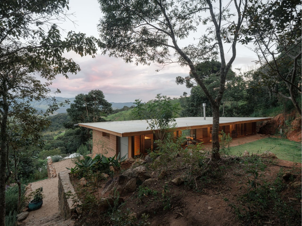
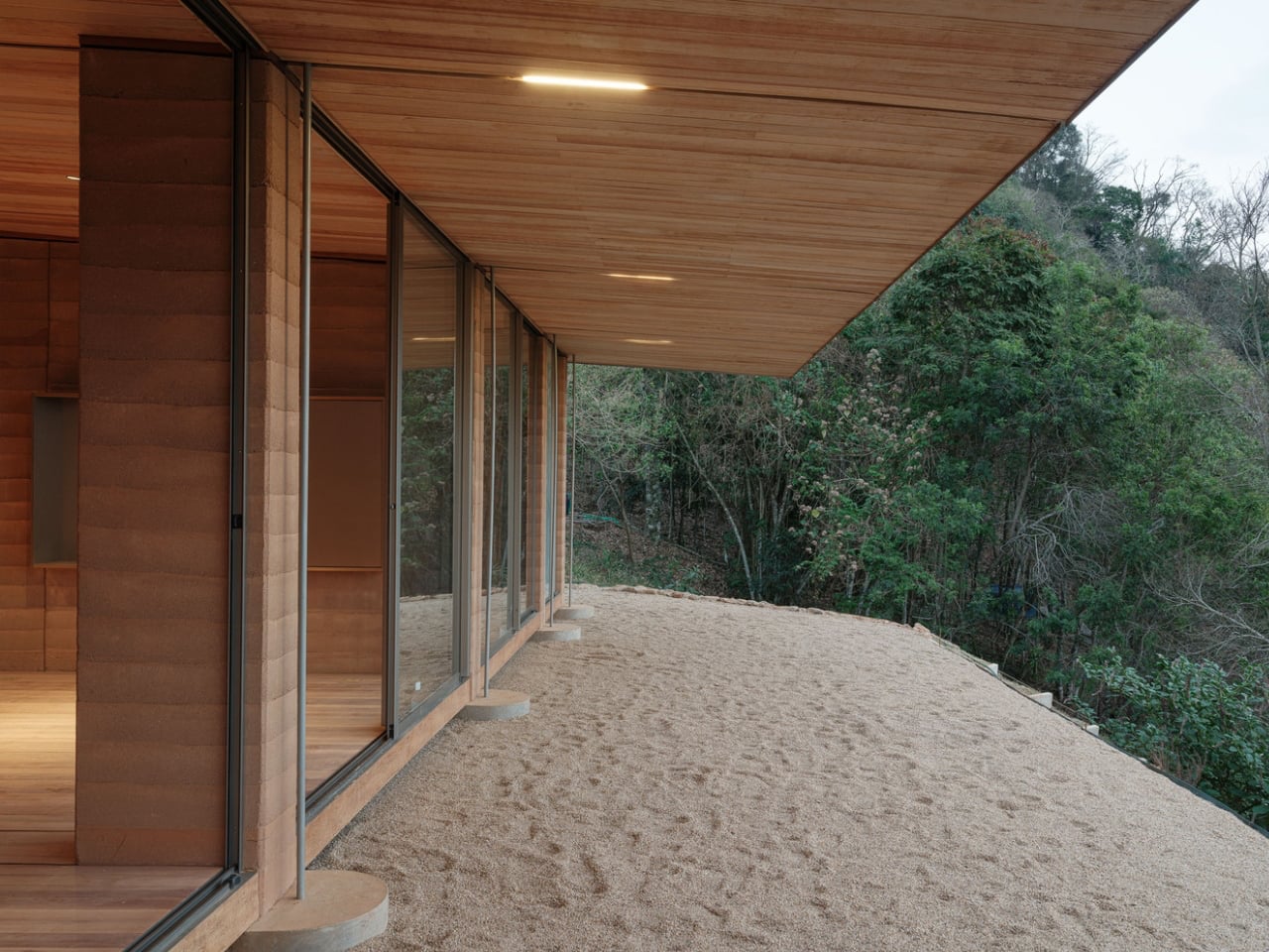
Arquipélago Arquitetos’ Piracaia Eco-Village in rural São Paulo exemplifies sustainable home design, using rammed earth construction to create affordable, eco-friendly residences. Located in the village of Piracaia, the development currently includes three homes ranging from a 538-square-foot studio to a 1,245-square-foot two-bedroom unit. Each home features rammed-earth walls formed from local soil, providing structural strength and natural insulation. A modular design allows the system to be easily replicated or scaled, offering flexibility and efficiency.
Large clerestory windows bring in natural light while preserving privacy, and the aluminium roofs are designed to harvest rainwater for everyday use. Wood panels and steel tie rods ensure stability and structural integrity. Initiated by a resident who sought a deeper connection to nature and community, the project stands as a model for sustainable rural living—embracing local resources, traditional techniques, and modern architectural thinking to shape a more conscious way of life.
2. Honors Raw Materiality
Rammed earth’s signature beauty lies in its dramatic, layered texture, which is an architectural reflection of geological time. Each compacted lift reveals natural striations shaped by the soil’s mineral makeup, giving every wall a distinct, site-specific identity. This visual honesty creates an immediate sense of grounding, making the material feel ancient and deeply contemporary.
In double-height spaces, these walls do more than define boundaries as they hold light, absorb warmth, and shift subtly throughout the day. The result is an atmosphere that feels calm, elemental, and immersive. The wall becomes an artwork in itself, guiding the mood, rhythm, and spatial flow of the entire home.
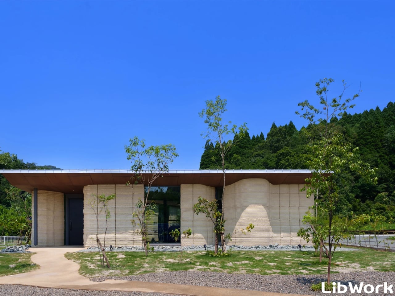
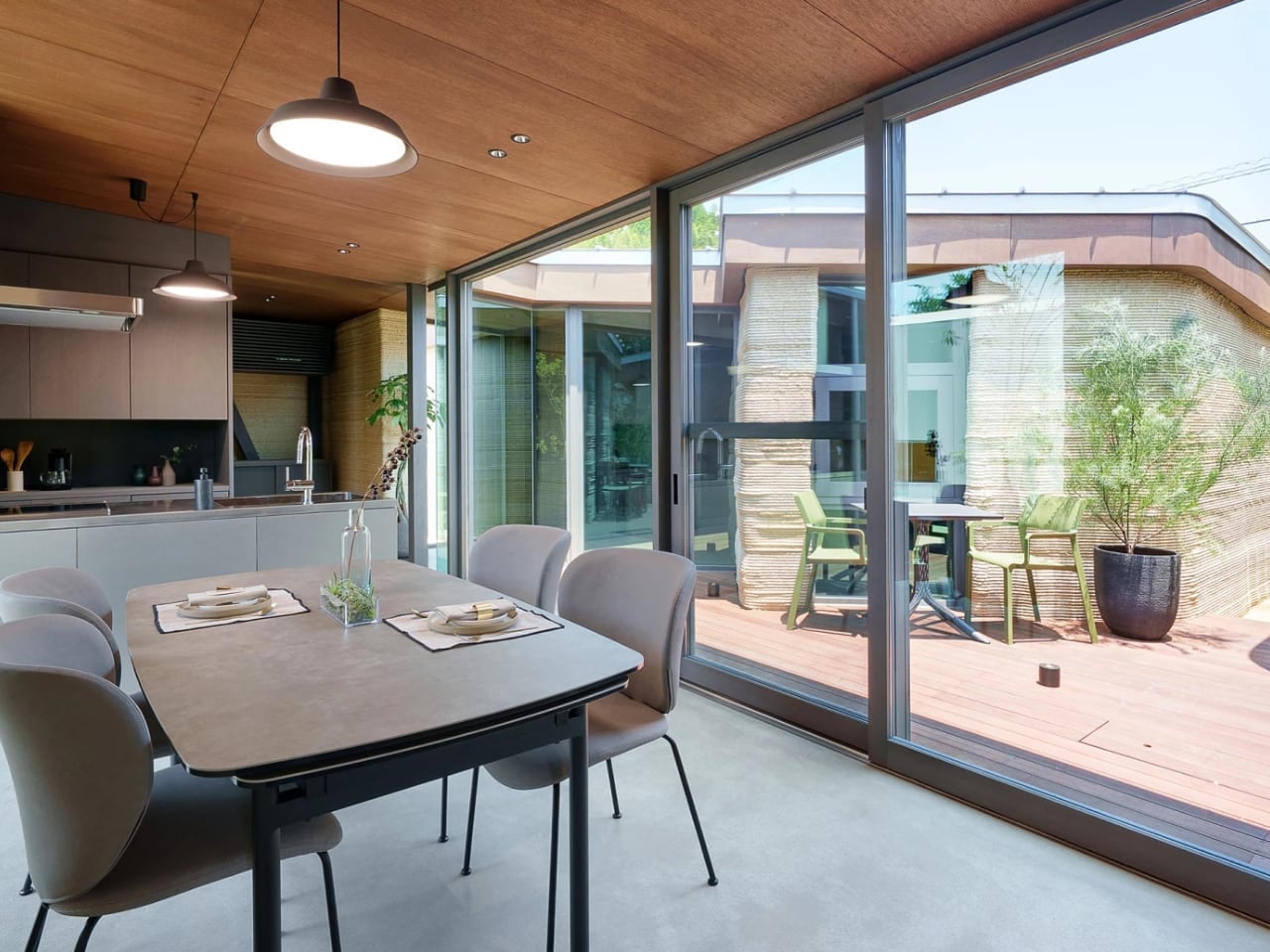
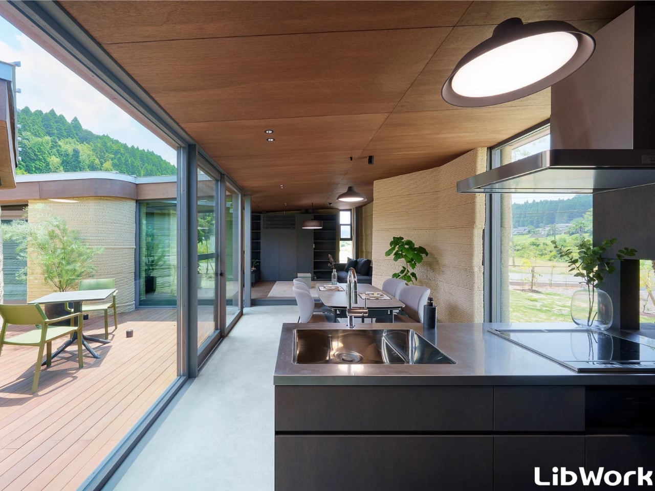
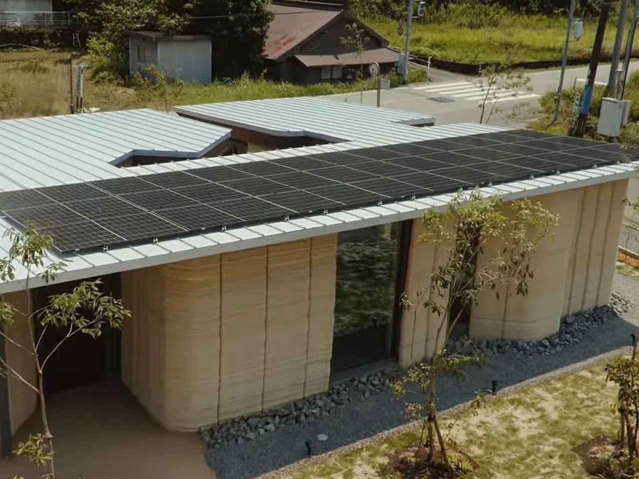
Japanese architecture studio Lib Work has introduced the Lib Earth House Model B, a 1,076-square-foot home made primarily from 3D-printed soil. Located in Yamaga, Kumamoto Prefecture, and developed with Arup and WASP, this project represents a significant departure from traditional concrete construction. The single-story structure features gently curved walls and a ribbed exterior texture, showcasing the potential of combining ancient materials with advanced printing technology. Constructed from a mix of soil, sand, slaked lime, and natural fibres, the home cuts typical construction emissions by more than half while promoting durability and thermal performance.
Inside, the design balances minimalism and warmth, with natural light accentuating the earth walls’ varied textures. Embedded sensors monitor moisture and structural performance discreetly, improving long-term sustainability. The flat roof accommodates future solar or water systems, highlighting a practical integration of eco-friendly features.
3. Natural Temperature Control
Rammed earth excels in passive design because of its dense, high–high-thermal-mass composition. These walls act as natural thermal batteries, absorbing heat throughout the day and releasing it slowly at night. This steady modulation of indoor temperatures reduces sharp fluctuations and minimizes dependence on mechanical heating or cooling systems. For homeowners and designers, this means long-term savings and an impressive ROI on energy infrastructure.
Beyond performance, the material elevates the visual and spatial experience. Its ability to regulate climate naturally eliminates the need for excessive mechanical fixtures, creating cleaner lines and a more intentional aesthetic. Rammed earth becomes both structure and climate strategy in one.
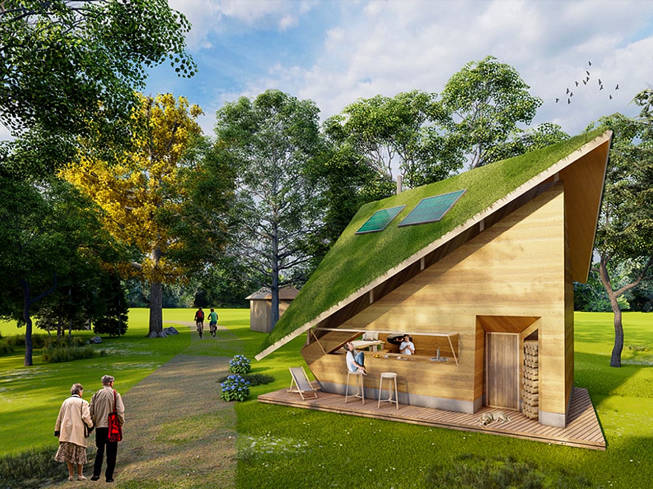
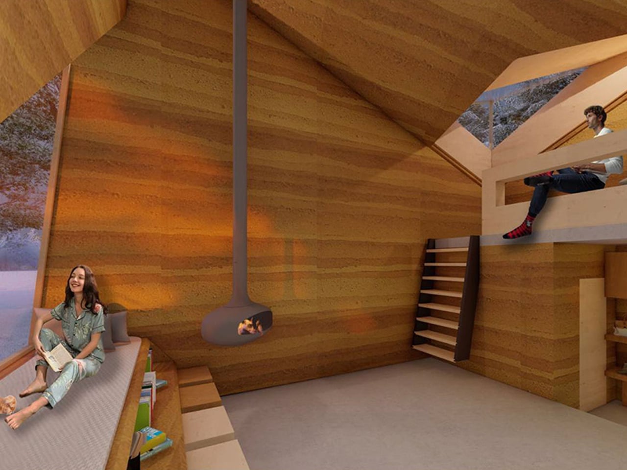
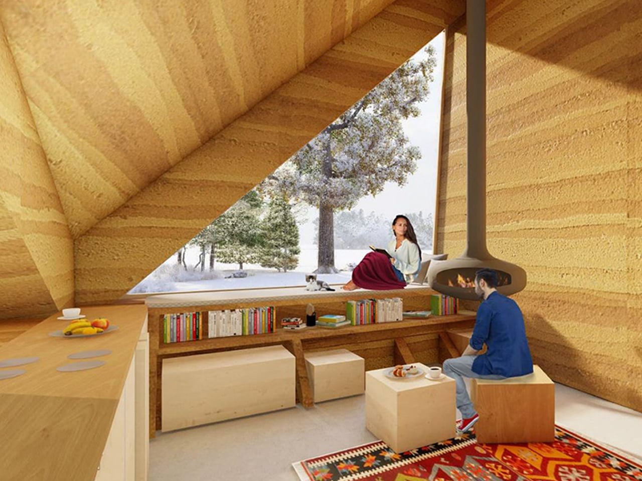
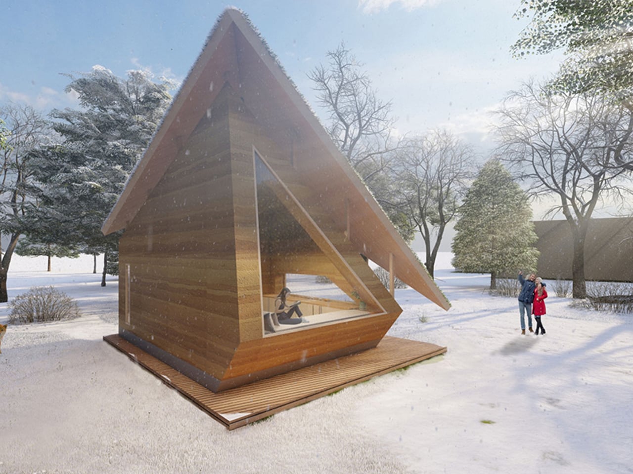
The Rammed Earth House in Slovenia reimagines the early 20th-century farmhouse by combining ancient building methods with modern solar technology. Designed by architects Merve Nur Başer, Aslı Erdem, and Fatma Zeyneb Önsiper, the tiny home uses rammed earth, a sustainable technique dating back thousands of years – along with a concrete foundation and timber framework. Inspired by Slovenian architect Oton Jugovec’s floating roof, the house also features an extended green roof to protect the structure from erosion caused by Dobrava’s varied climate of rain, snow, and humidity.
Oriented to optimise passive heating and cooling, the Rammed Earth House is carefully positioned to capture winter sunlight and block summer heat. Strategically placed windows enhance natural ventilation throughout the year, while the roof supports solar panels, a rainwater harvesting system, and an integrated septic tank. The interior layout further improves efficiency, with fewer windows on the north side to minimize heat loss and more on the west to capture warmth when needed.
4. Built for Centuries
Modern rammed earth, lightly stabilized with cement, delivers exceptional compressive strength and long-term durability. Its dense composition makes it naturally fire-resistant, pest-resistant, and remarkably stable across changing climates. History reinforces this reliability with rammed-earth structures around the world having survived for centuries, proving the material’s endurance far beyond typical contemporary systems.
For homeowners, this resilience translates directly into value. The walls demand minimal upkeep and offer a long structural lifespan, financially sound over decades. Their inherent thickness also enhances acoustic comfort, reducing noise transfer and improving the quality of everyday living within the home.
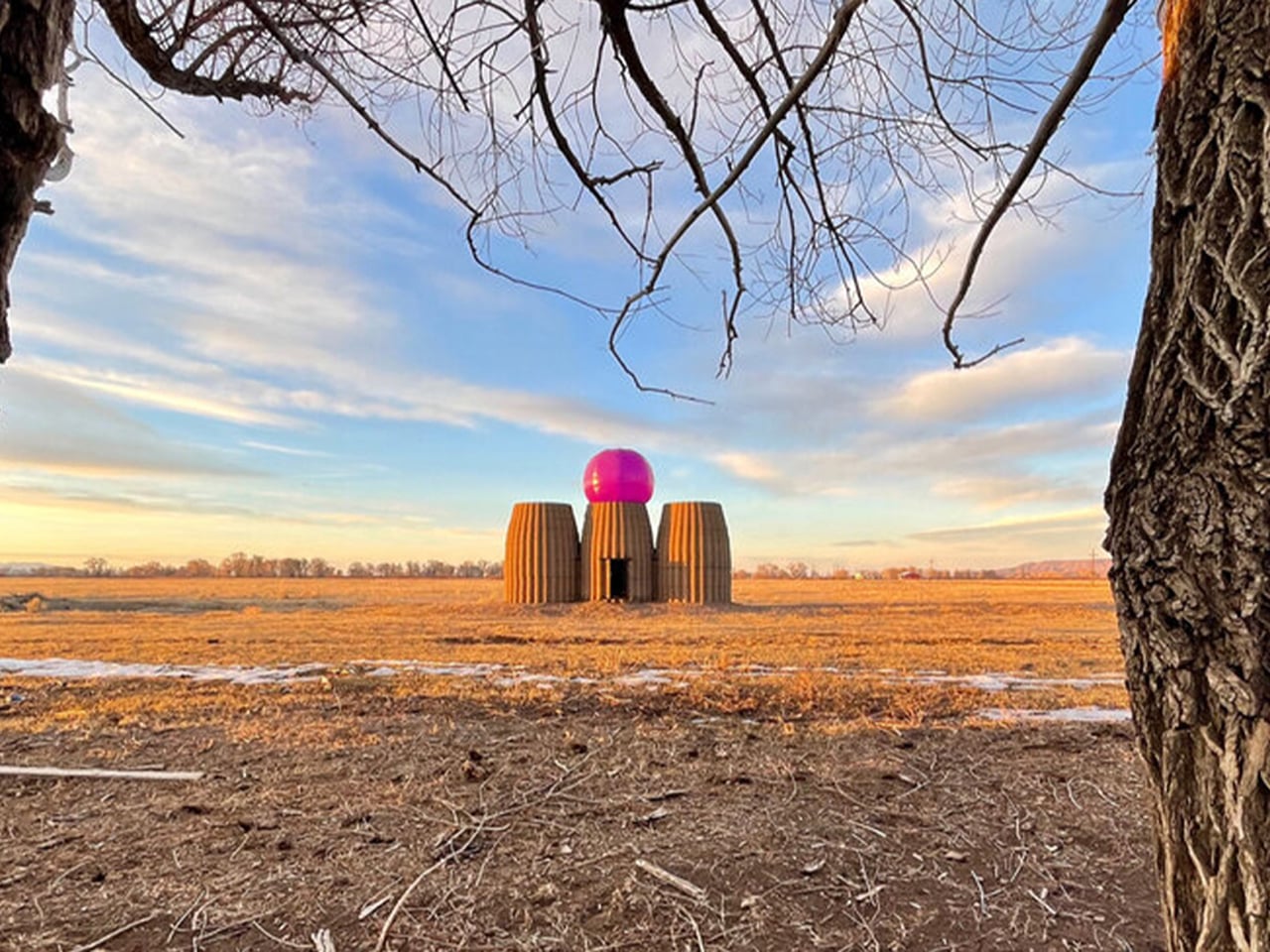
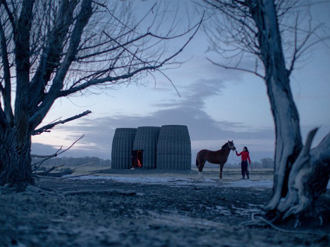
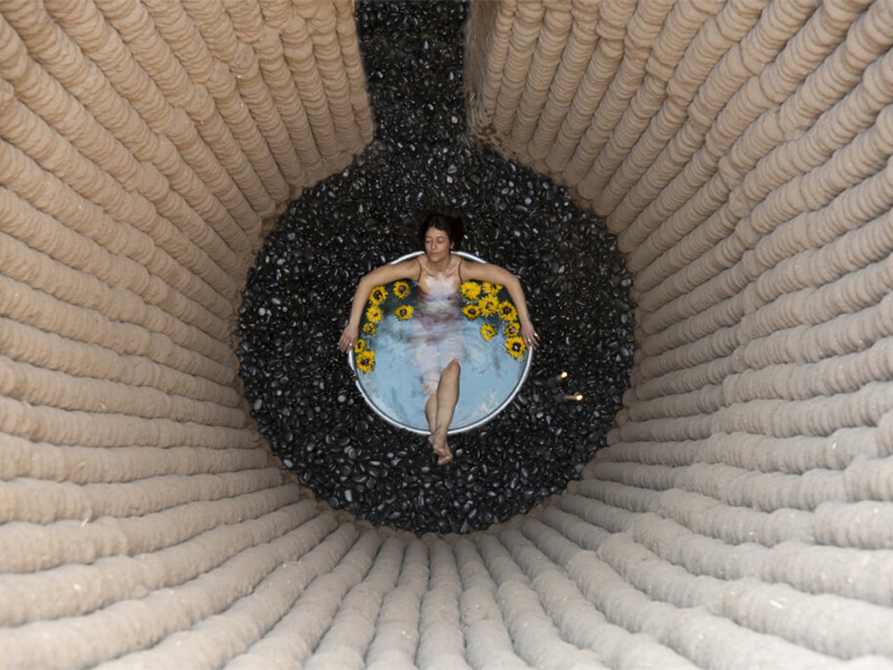
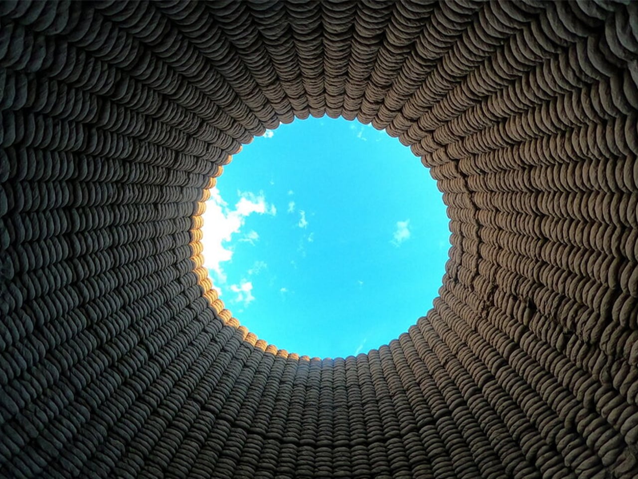
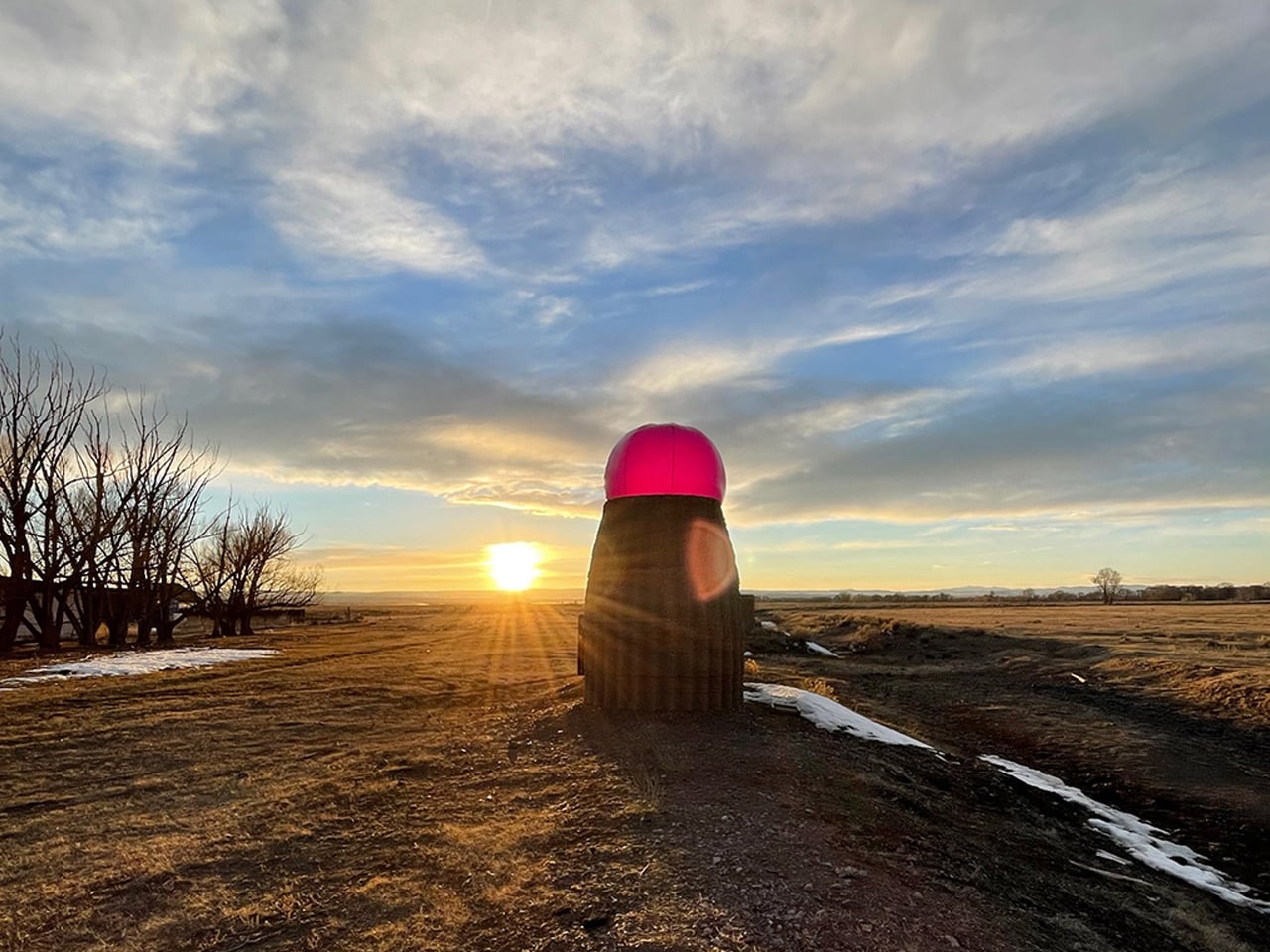
Casa Covida is a modern reinterpretation of ancient building methods that merges traditional materials like mud, clay, and straw with advanced 3D-printing technology. Developed by Emerging Objects, the project showcases how earth-based architecture, used by nearly 30% of the global population, can be revived for contemporary living. Built in Colorado’s San Luis Valley using a SCARA robotic printer, the structure is made from an adobe blend and features three interconnected zones: a central space with a hearth, a sleeping area furnished with reclaimed beetle kill pine, and a bathing zone with a river-stone-embedded tub. An inflatable cactus-inspired roof adds weather protection and visual intrigue.
Designed for two people, Casa Covida acts as a prototype to explore how ancient techniques can coexist with digital fabrication. The 3D-printed walls, custom earthen cookware, and natural insulation demonstrate how sustainability and innovation can shape the future of housing.
5. Celebrates Nature-Rooted Architecture
Rammed earth grounds a home not just physically but culturally, drawing directly from the soil that defines its region. By using material sourced from the site itself, the architecture gains a deep sense of place and authenticity. This alignment with biophilic design principles creates a natural, instinctive connection between occupant and landscape, allowing the structure to feel both contextual and emotionally reassuring.
The experience is more than visual as it is tactile and psychological. The walls embody local history, climate, and geology, offering a timeless identity that outlasts design trends. In this way, rammed earth supports well-being while honoring the land it stands on.
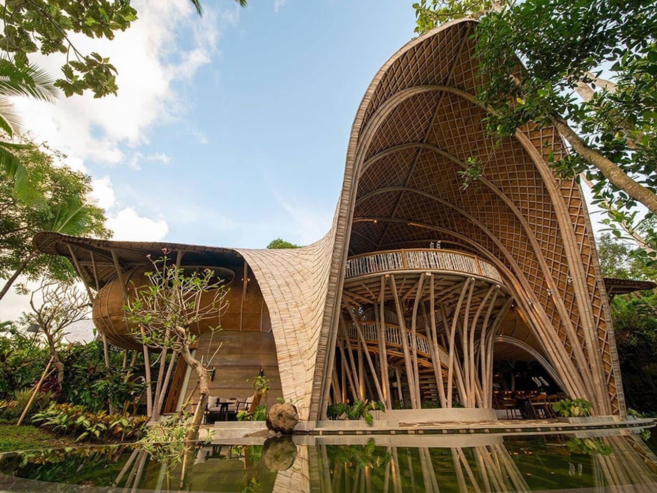
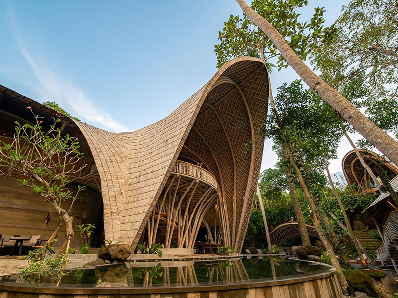
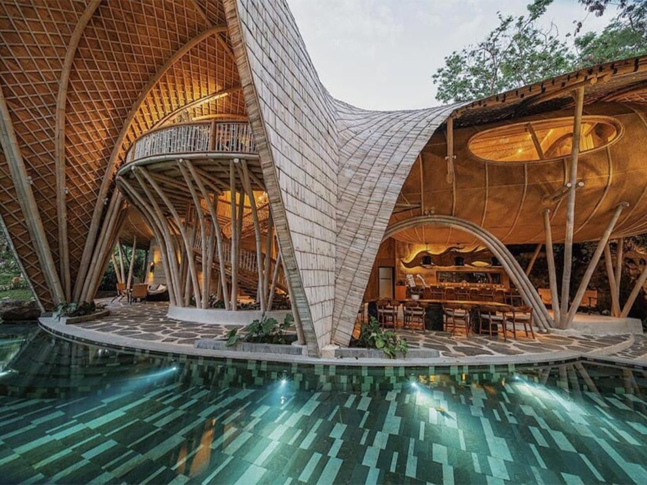
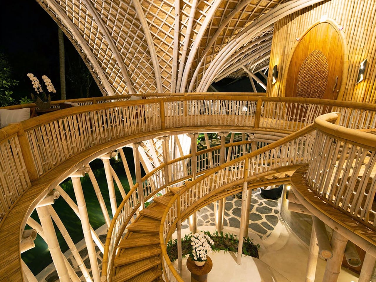
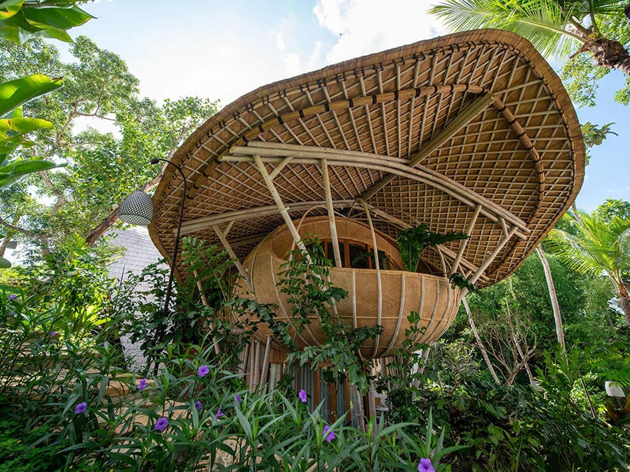
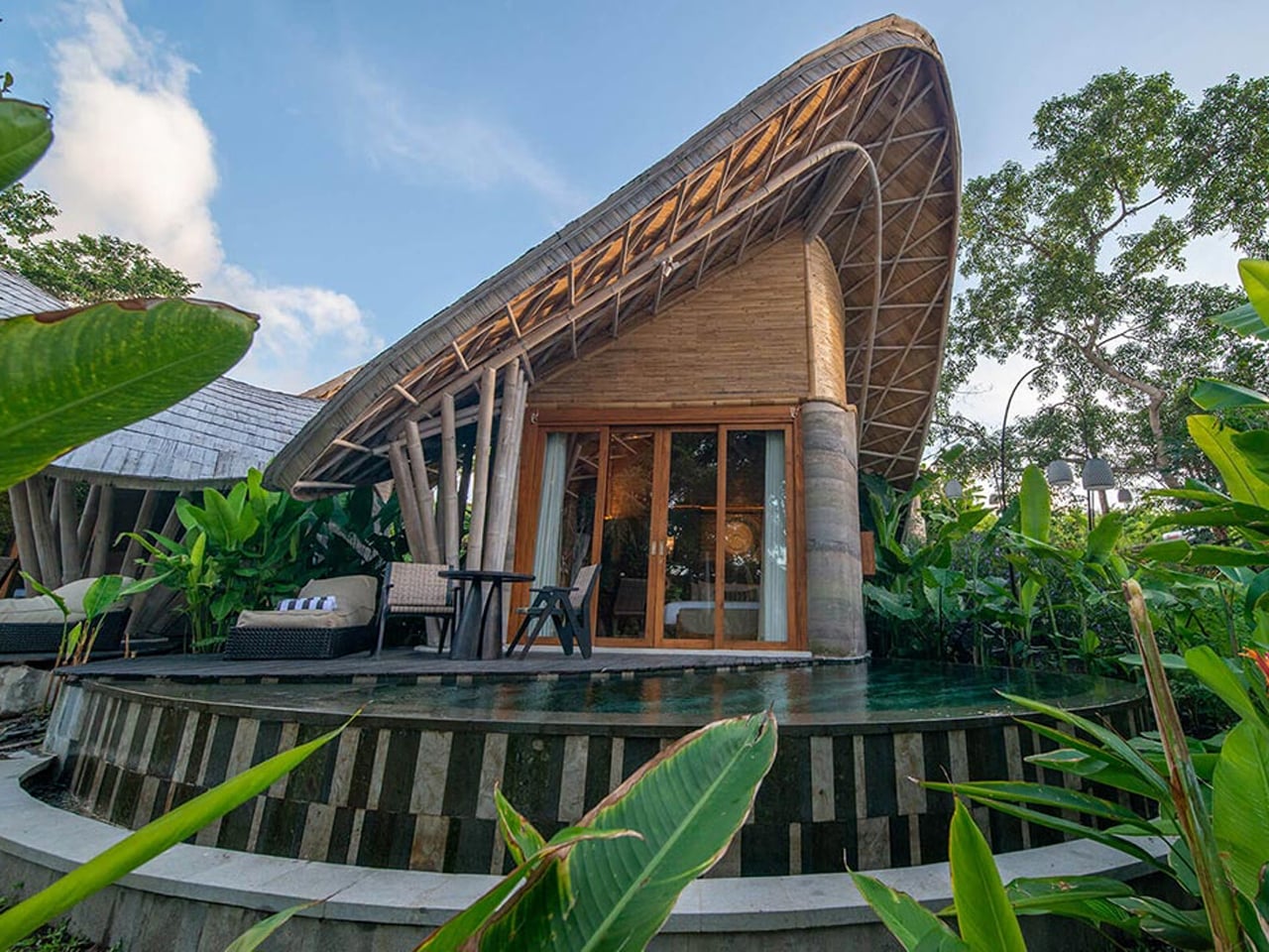
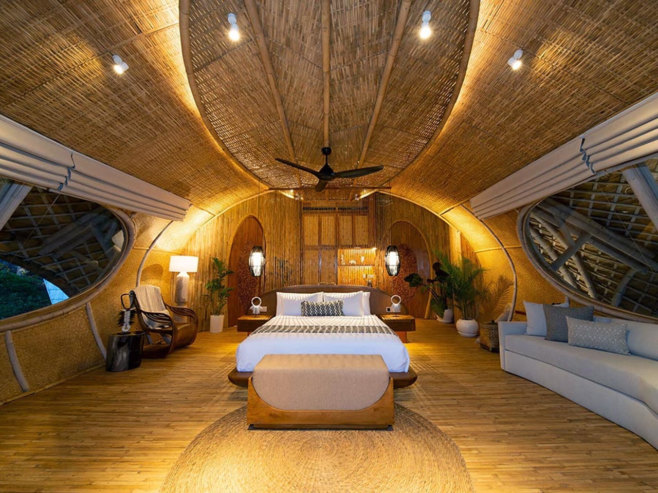
Contrary to the belief that sustainability requires sacrificing comfort, Ulaman Eco-Retreat Resort in Bali demonstrates that ecological responsibility can coexist with luxury. Designed by Inspiral Architects, this carbon-neutral resort is constructed primarily from bamboo and rammed earth, locally sourced materials that significantly reduce environmental impact.
Situated in Kaba-Kaba village, the resort showcases the structural and aesthetic potential of sustainable materials. Rammed earth, used for the ground-level walls, offers a low-emission alternative to concrete, while the curvilinear bamboo roofing blends cultural authenticity with structural beauty. Powered by hydroelectric energy from a nearby river, the resort includes a cliffside yoga studio and a meandering pool designed to reflect natural surroundings.
Rammed earth’s resurgence is not a design fad but a meaningful answer to today’s calls for beauty, sustainability, and lasting value. By choosing this ancient yet future-ready material, homeowners invest in sustainable luxury that elevates both life and environment. Its layered, monolithic presence creates a sanctuary that endures quietly elegantly, deeply responsible, and profoundly connected to the earth it rises from.
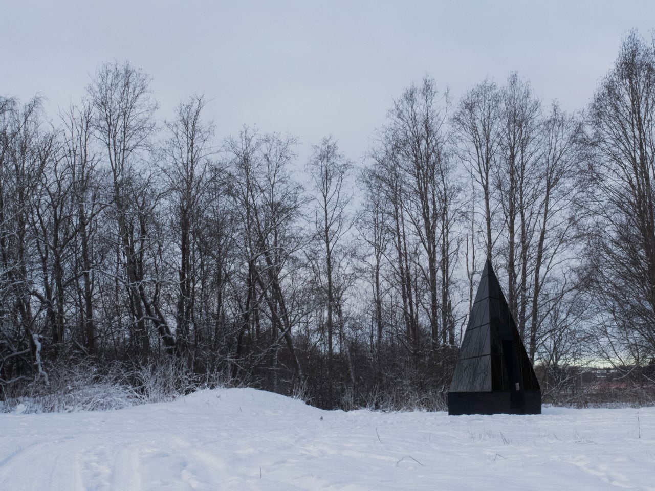
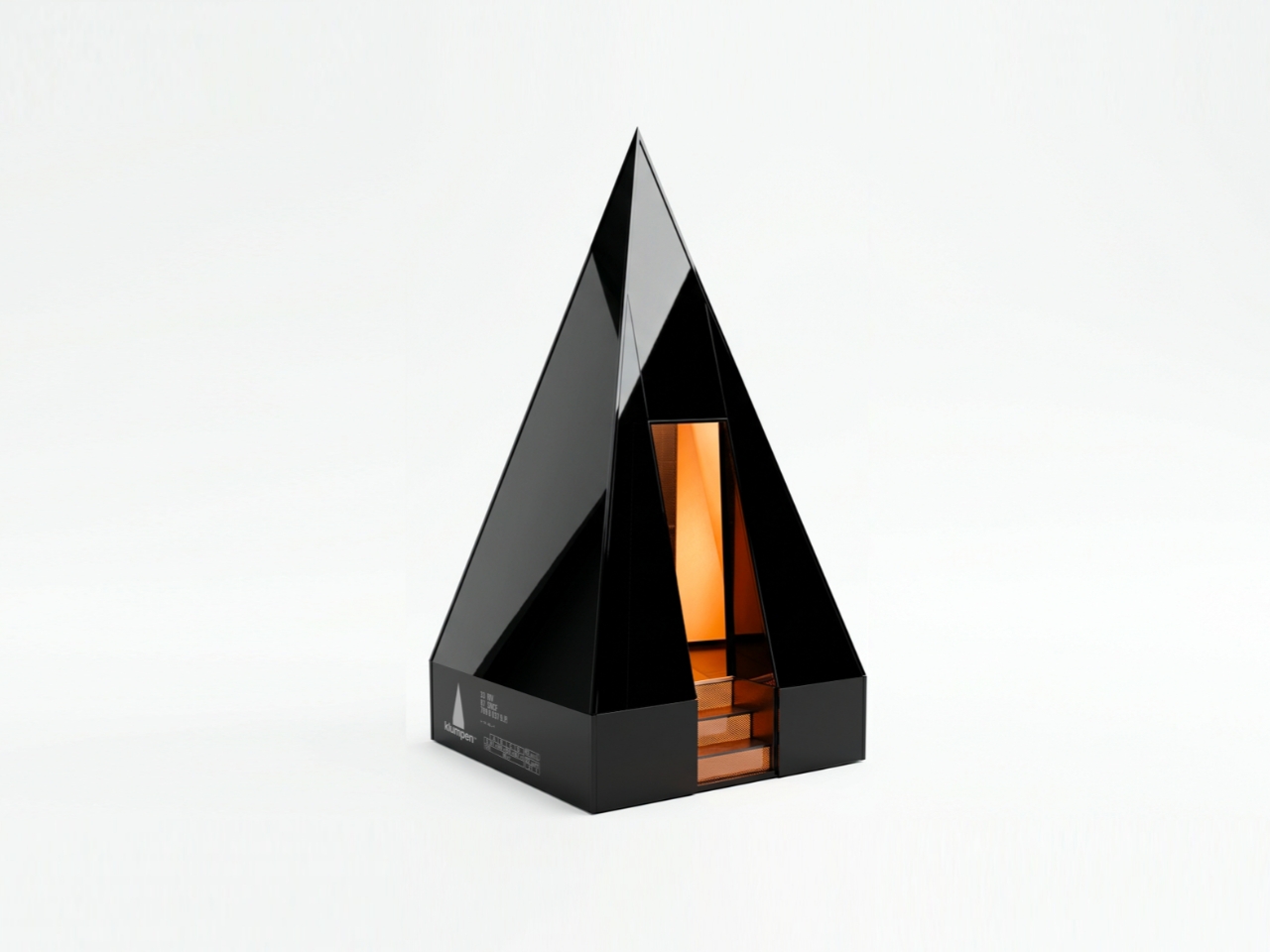
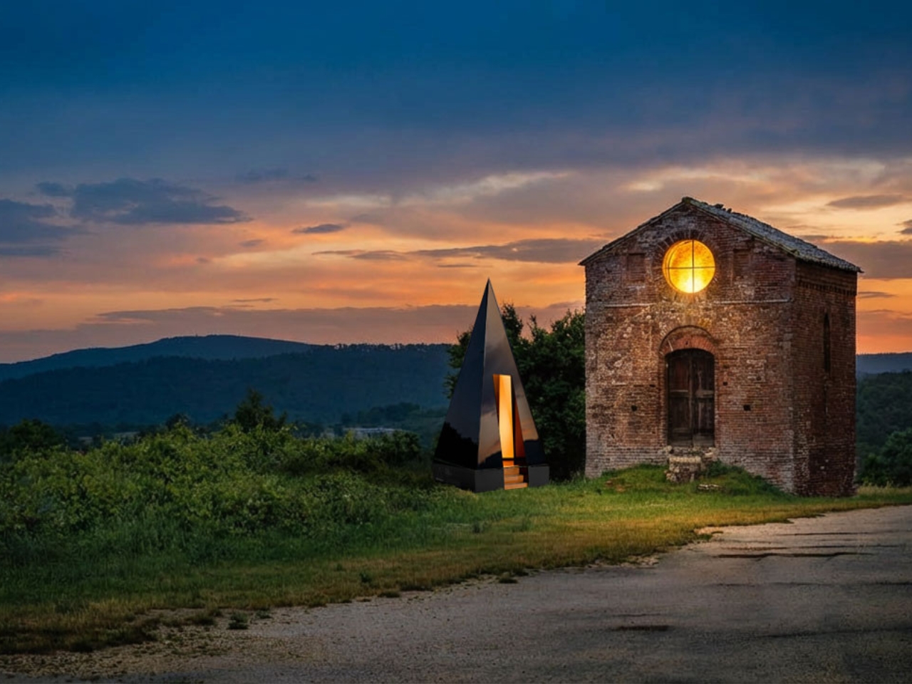
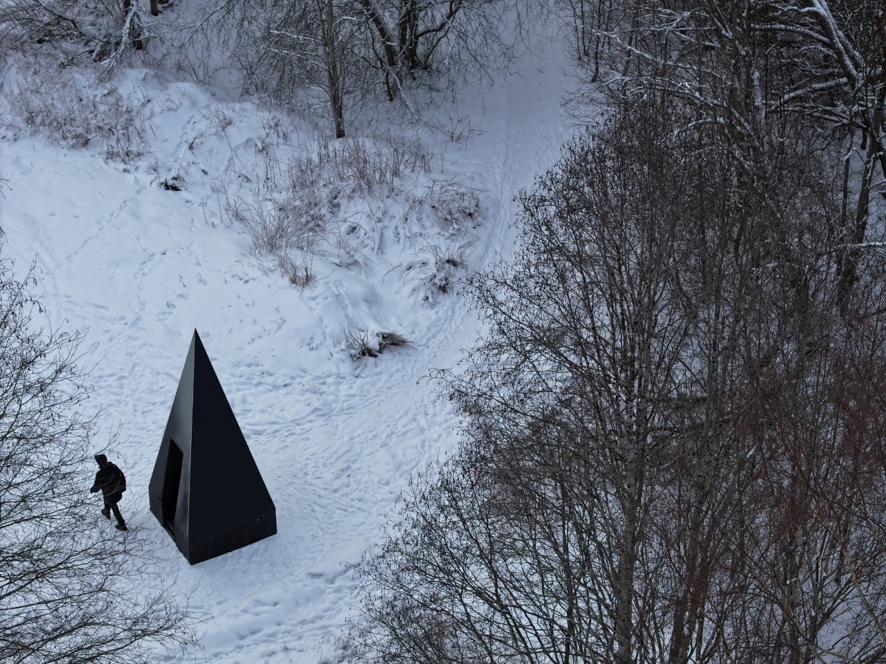
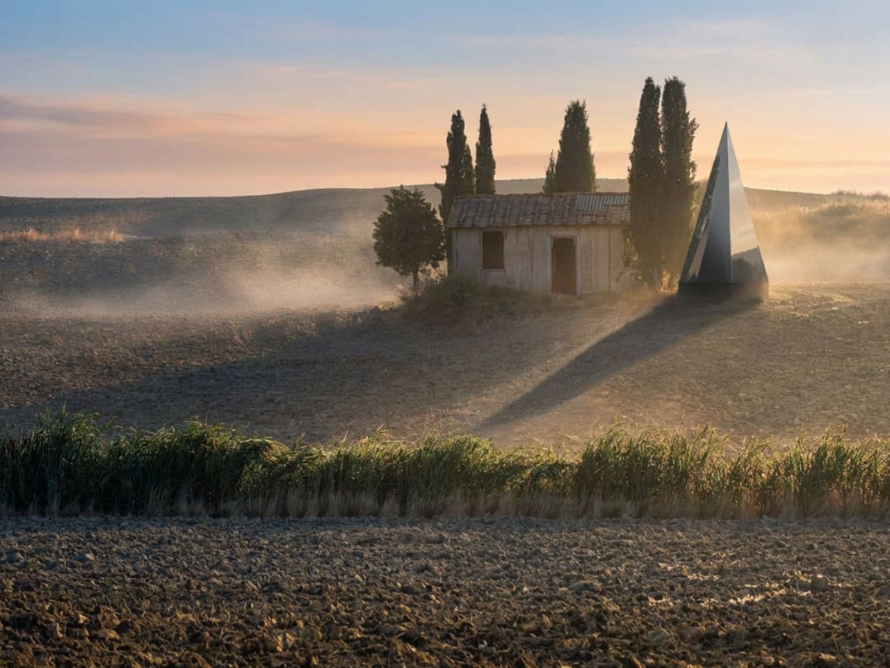
The first time I saw a photo of Klumpen, I thought someone had dropped a monolith into the Arctic tundra. A matte black pyramid, impossibly sharp against the snow, with a sliver of warm amber light cutting through its entrance. It looks like a prop from a science fiction film. But it is very much real, very much functional, and it is arriving very soon.
Klumpen is the work of Himmelsfahrtskommando, a Swedish architectural duo that includes designer Hannah Mazetti, with a studio name that roughly translates to “suicide mission” in German. Whether that is a philosophical statement or a dark joke about building in the Nordic winter, I am genuinely not sure. What I do know is that the thing they have built is one of the more quietly radical design objects I have come across in years. It asks a deceptively simple question: what if you did not need permission to be somewhere?
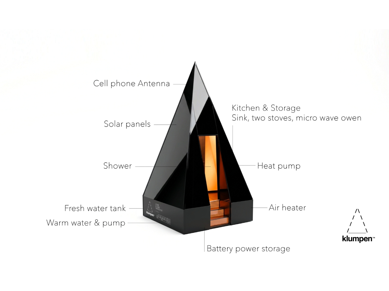
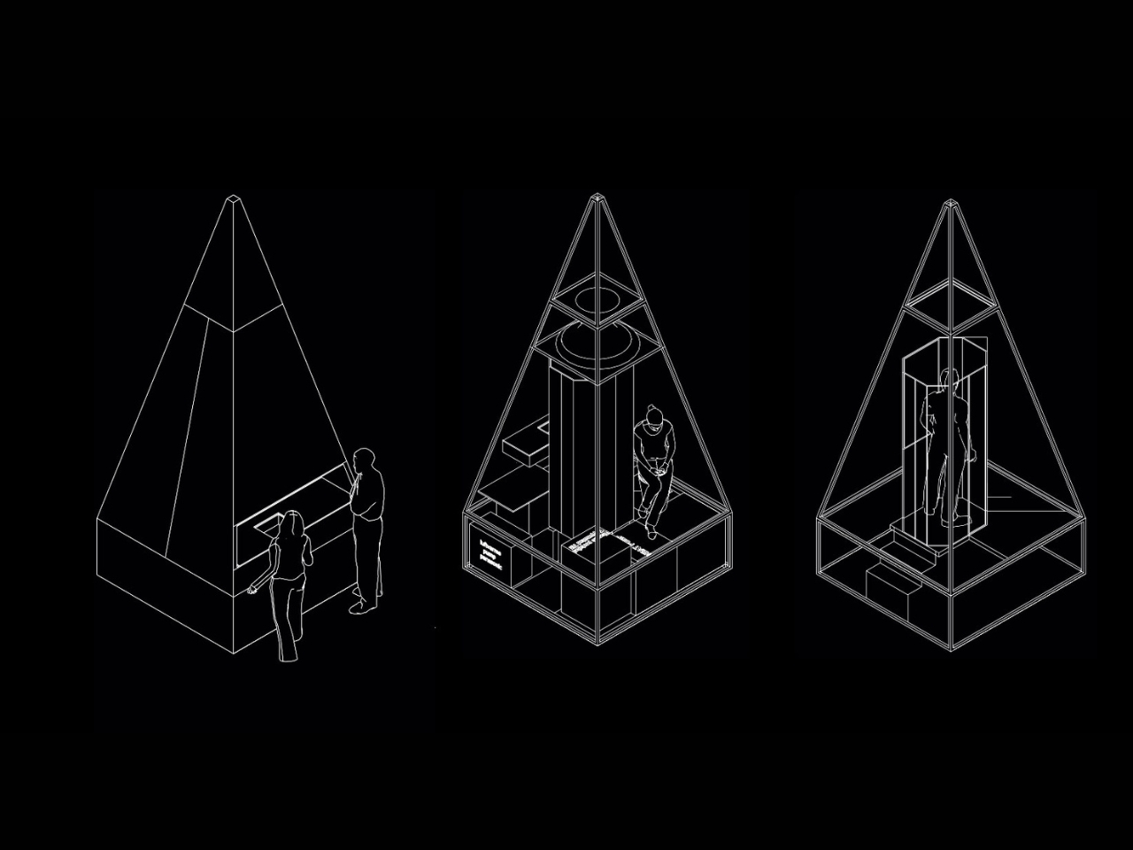
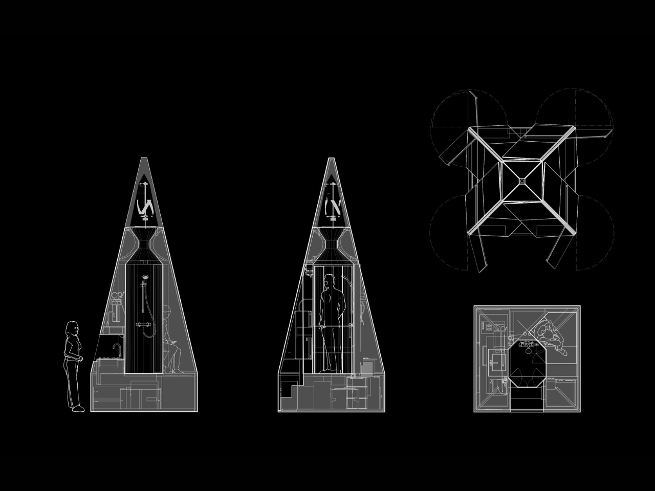
At just 7 square metres, Klumpen is technically a utility structure. But calling it that feels like calling the iPhone a phone. Inside this factory-built pyramid is a complete off-grid living infrastructure: a photovoltaic solar array running at 450 to 600 volts DC, a 7.5 kWh battery for storage, an air-to-water heat pump, a closed-loop greywater recycling system, satellite broadband, a shower, a lavatory, and a kitchen with two stoves, a sink, and a microwave. The pyramid shape, for the record, is not an aesthetic choice. The designers say it is simply the most efficient envelope for the specific stack of systems inside. Form follows function, very literally.
The prototype has already been tested through a real Arctic winter in northern Sweden, which tells you something important about how seriously they are taking this. It is one thing to announce a sleek off-grid concept on a design blog. It is another to actually freeze-test it in the dark of a Scandinavian January. The first production batch ships in September 2026, with a target retail price of $35,000.
That price will draw raised eyebrows, and fair enough. $35,000 is not nothing. But compare it to the cost of running utility lines to a remote plot of land, the legal labyrinth of planning permissions, the months of plumber schedules and contractor delays, and suddenly a plug-and-play pyramid starts to look like a reasonable proposition. You set it down on flat ground. You press ON. No permits. No plumbers. No waiting at the utility company. That is genuinely the promise.
I keep thinking about what that actually means for people. We have become so accustomed to depending on invisible infrastructures that we rarely stop to notice the stranglehold they have on where and how we can live. Want to build a simple structure on a piece of land you own? Prepare for months of negotiations with people who have never seen the land. Klumpen is not a protest against that system, exactly. It is something quieter. An elegant sidestep.
The designers frame this in terms of ownership and autonomy, drawing a line from ancient democracies, where property meant political voice, to a present where most people in the industrialised world either rent or carry mortgages on homes they will spend decades paying off. The argument is a little romantic, but it does not feel wrong. The degree to which we have outsourced control of our most basic needs, from electricity and water to warmth and connectivity, to external systems we cannot touch or meaningfully influence is worth taking seriously.
Is Klumpen going to solve the housing crisis? No. But the most interesting design objects rarely solve the biggest problems outright. What they do is shift the way people think about what is possible. A 7-square-metre pyramid that makes you genuinely independent of the grid, dropped in a meadow or on a hillside or beside a frozen lake in northern Sweden, does exactly that. It reframes a shed as a statement. The first batch launches in September. I would not be surprised if the waitlist fills fast.
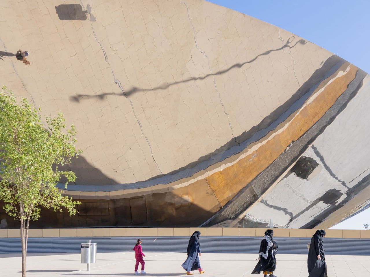
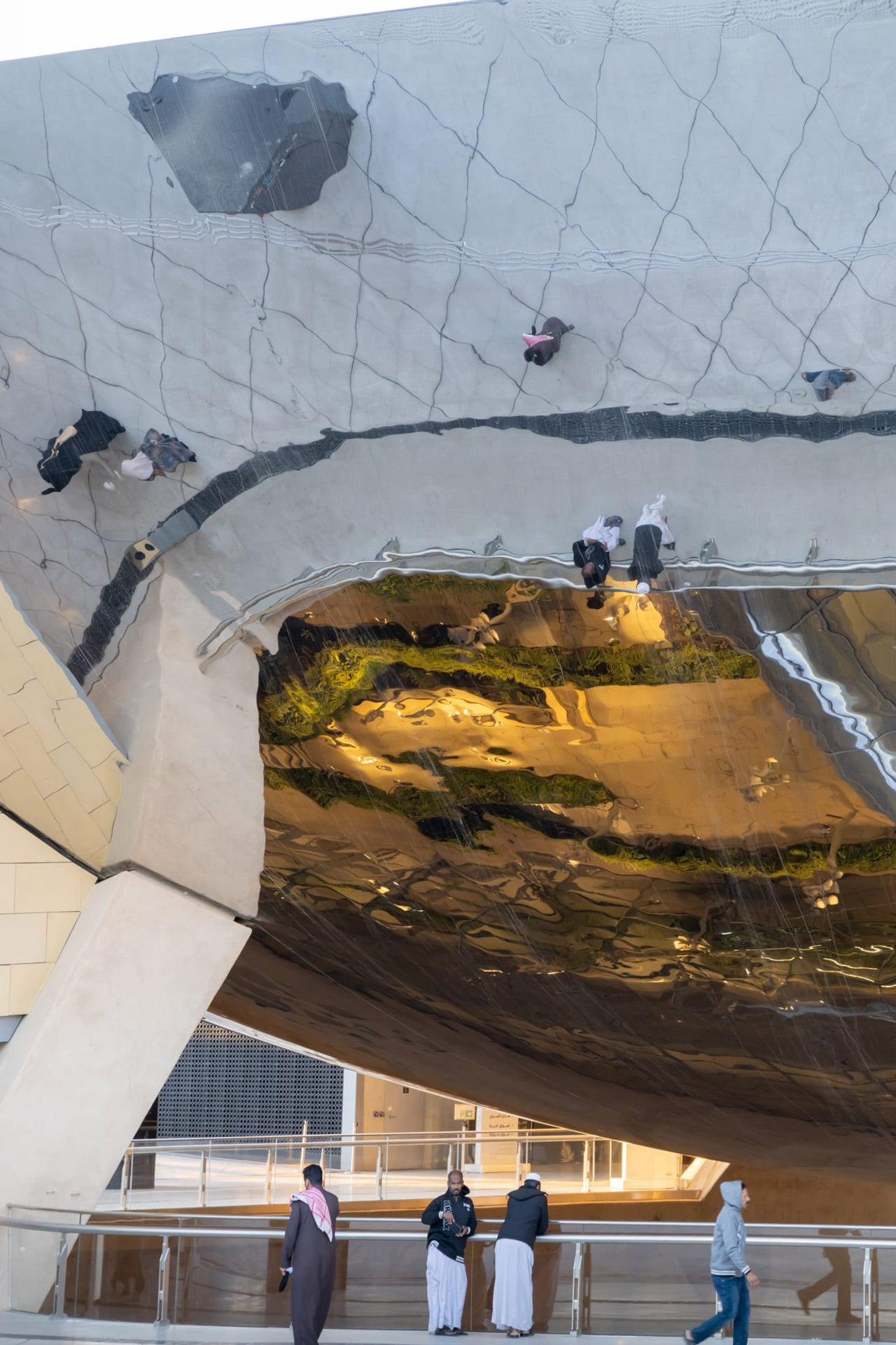
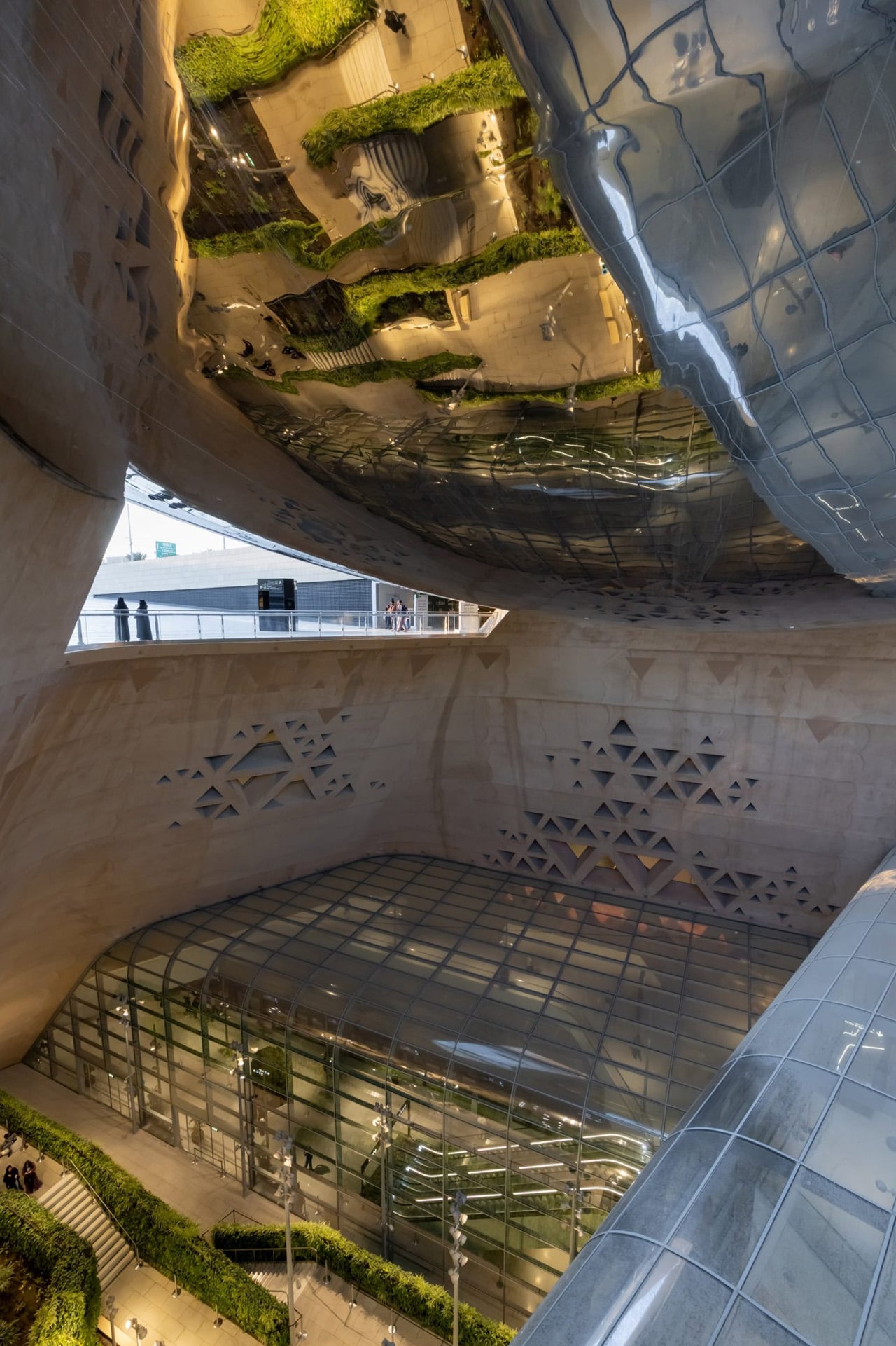
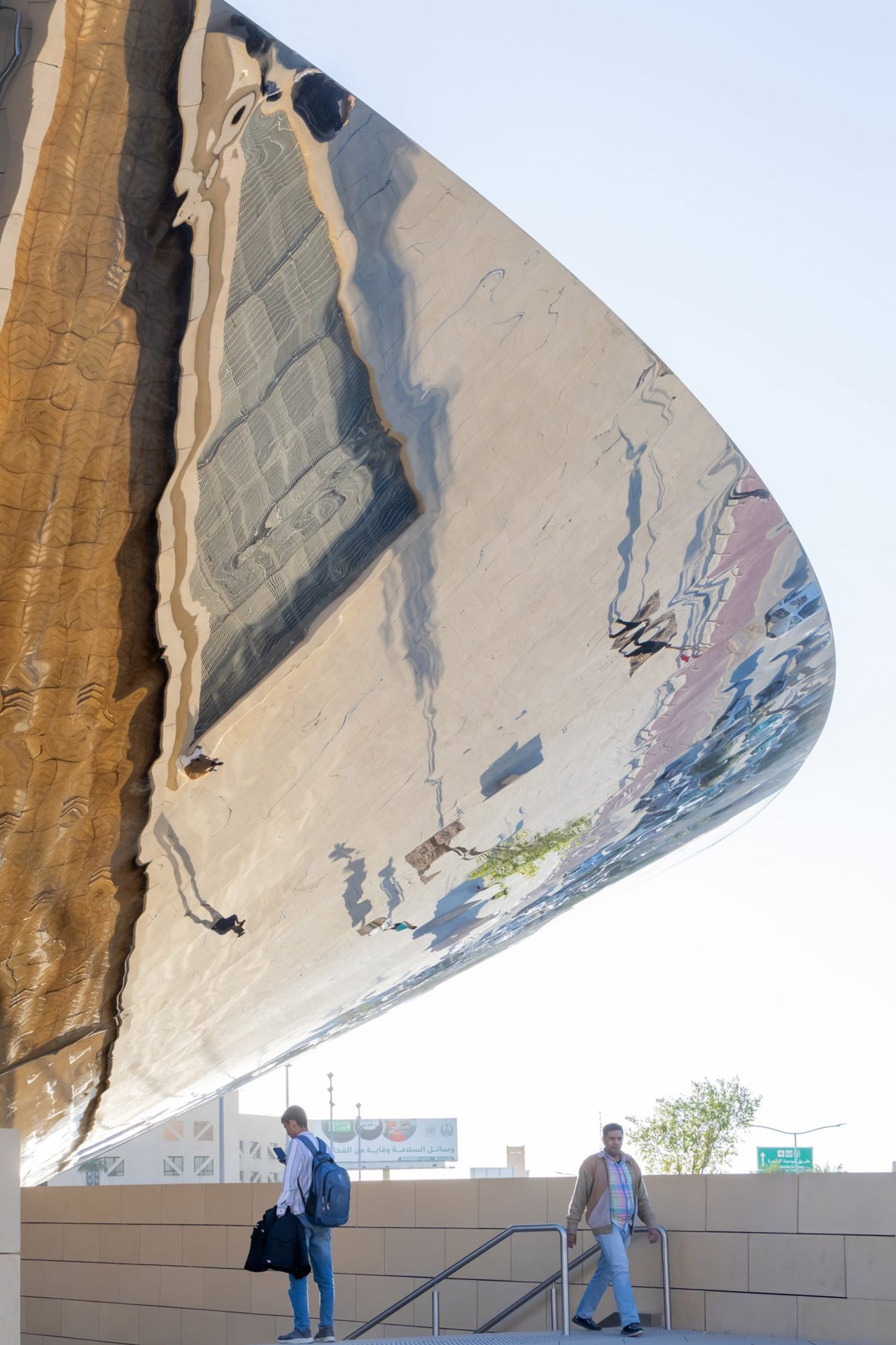
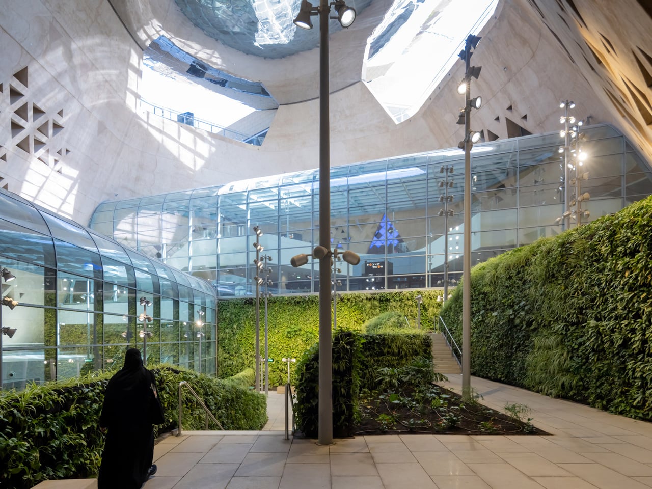
There is a moment, the architects at Snøhetta will tell you, when you step off the train at Qasr AlHokm and look up, and the entire city of Riyadh looks back at you. That is not a metaphor. It is exactly what happens beneath the station’s sweeping, mirror-polished stainless steel canopy, where a 360-degree reflection of the surrounding cityscape floats above commuters like a living panorama. It is disorienting in the best possible way, and entirely intentional.
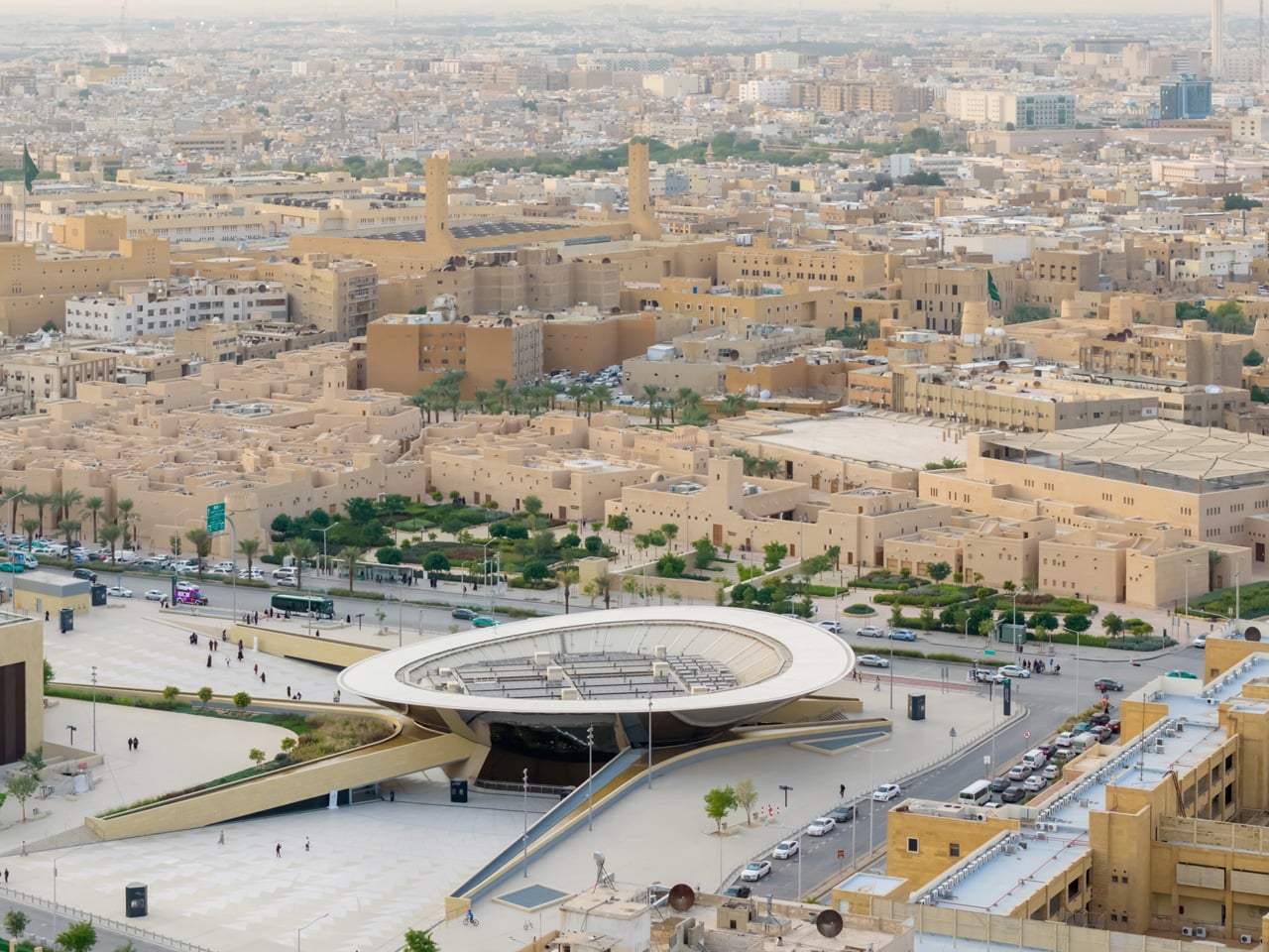
Completed in 2025, the Qasr AlHokm Metro Station is one of four primary hubs within Riyadh’s expansive new metro network, a system now carrying up to 3.6 million passengers daily since it entered full operation in January 2025. The station sits in the heart of the historic Al Qiri district, adjacent to an Eid prayer field and a mosque, and within walking distance of the old palace grounds, a location that demanded both architectural sensitivity and civic ambition.
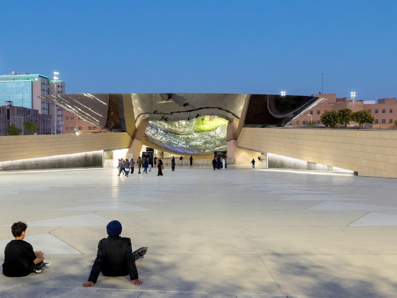
Snøhetta, working in collaboration with One Works and Cremonesi Workshop (Crew), first won the competition brief in 2012. The central concept remained remarkably consistent from that early vision: a transit station designed as an open urban plaza, where the threshold between city and subway is dissolved rather than defined. The bowl-shaped canopy, its underside ground to a flawless mirror finish, acts as what the team describes as an urban periscope. From above ground, the city is reflected downward into the station. From below, the underground world is projected back out. “Likewise, if you’re coming from the city, you look up into the canopy, and it mirrors everything that happens below,” explained Snøhetta partner Robert Greenwood.
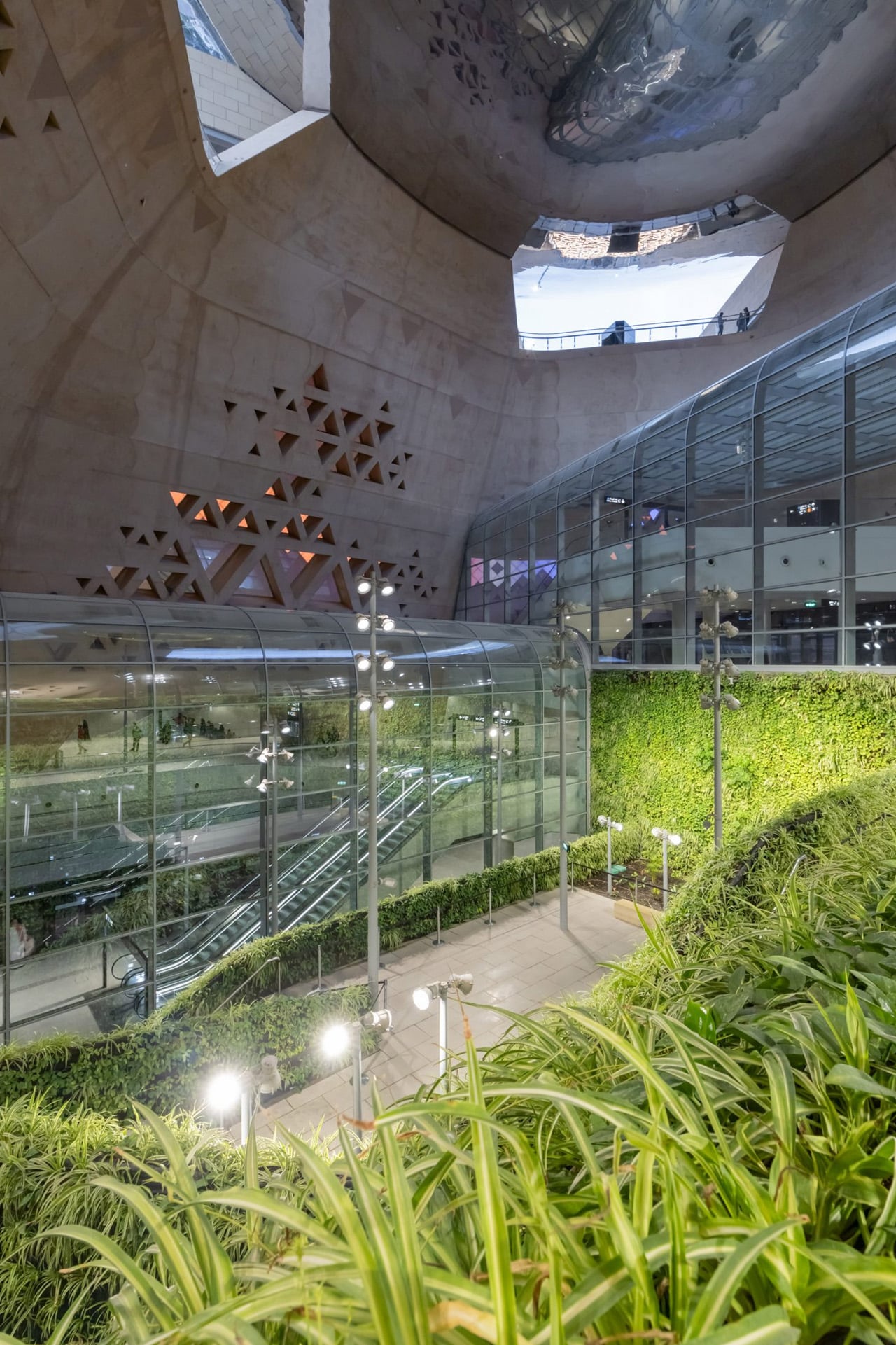
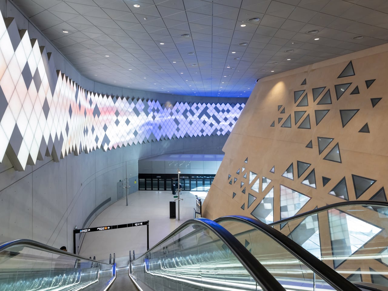
Sloped terrazzo floors draw visitors naturally under the canopy and into the station’s layered interior. There, a truncated cone-shaped atrium wall, its surface perforated by triangular openings drawn from the regional Najdi architectural tradition, encloses one of the station’s most unexpected gestures: a lush underground garden. In a city defined by heat and aridity, this green pocket offers genuine respite. Indigenous tree planting, natural ventilation, and photovoltaic panels complete a sustainability framework that goes well beyond a token gesture.
The building has not gone unrecognized. In November 2025, the Prix Versailles, presented under the patronage of UNESCO and the International Chamber of Commerce, named Qasr AlHokm one of the seven most beautiful train stations in the world, placing it alongside some of global architecture’s most celebrated transit spaces. What Snøhetta has built here is more than a station. It is a civic room, a place where infrastructure earns the right to be called architecture.

 Connexion