For most people, the smartphone screen is where focus goes to die. Even when you pick one up with a purpose, the bright OLED glare, the notifications, and the endless scroll have a way of pulling you elsewhere. Screen fatigue is real, blue light is a genuine concern, and the push for digital wellness has grown loud enough that even tech companies have started quietly acknowledging it.
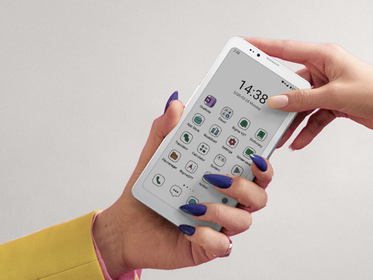
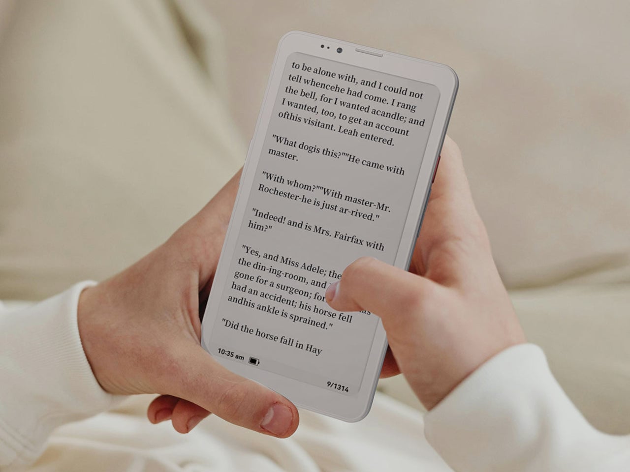
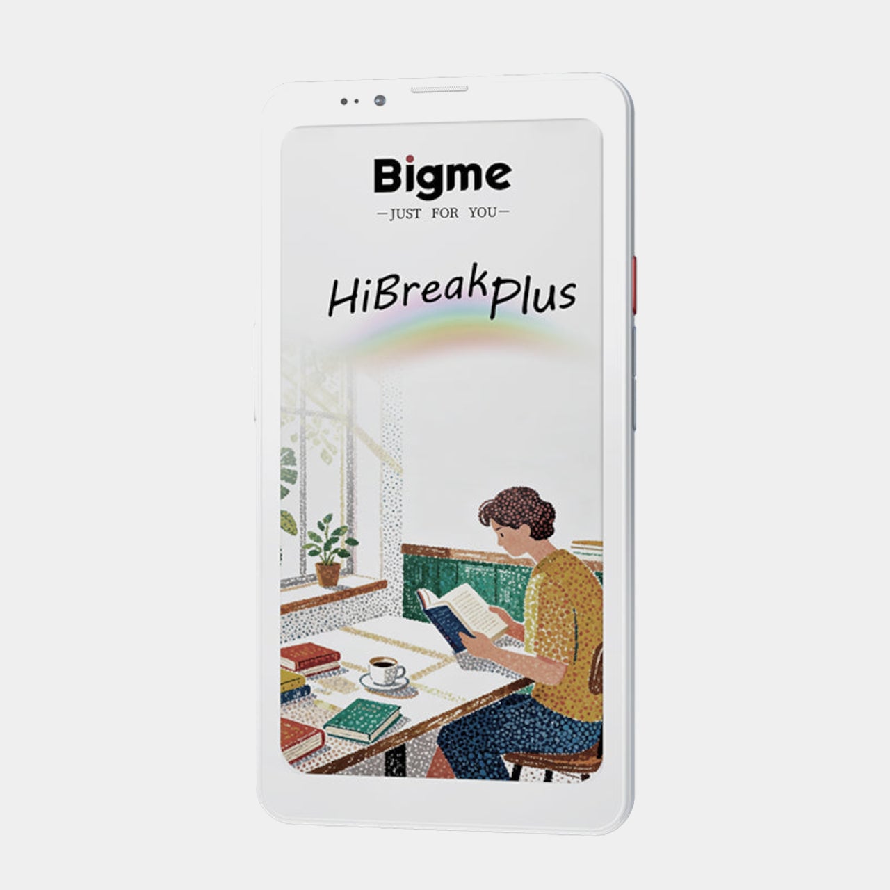
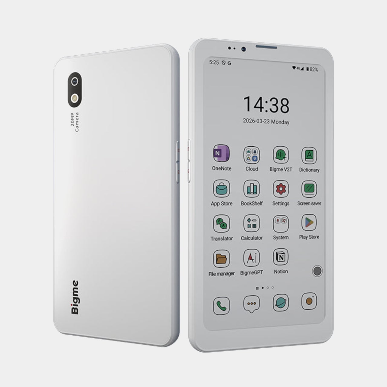
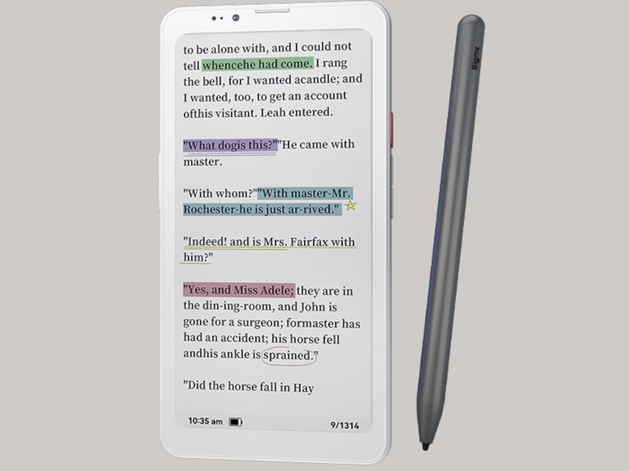
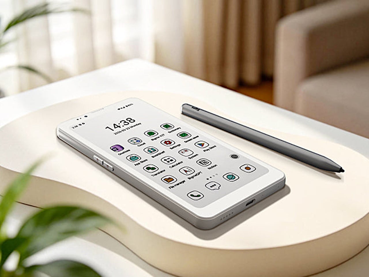
The Bigme HiBreak Plus takes a different approach to the smartphone entirely. Built around a 6.13-inch E Ink Kaleido 3 color display, it runs on Android 14 with full Google Play support and connects via dual 4G SIM, making it a genuinely functional phone. But unlike everything else in your pocket, it defaults to a mode that’s easier on the eyes and harder to mindlessly abuse.
E Ink displays on smartphones have always had one obvious weakness: the refresh rate. Previous devices refreshed so slowly that casual scrolling felt like a real chore. The HiBreak Plus addresses that with a remarkably high 52 FPS refresh rate for an E Ink display, making it responsive enough for reading, annotating, and light browsing without the ghost-image flicker that dogged earlier E Ink phones.
The display’s advantages don’t stop at being easy to look at. E Ink panels are naturally readable under direct sunlight without any brightness cranked up, which means you can check maps, take notes outdoors, or read in the afternoon light without squinting. There’s no backlight shining toward your face either, just a soft, paper-like surface that reflects the ambient light around it.
A front light with 36 brightness levels handles the dimmer end of things. It reads the surrounding environment and automatically calibrates brightness and color temperature, going from a cool, crisp tone for morning work to a warm amber glow at night. There’s no digging through menus or manually adjusting sliders; the phone handles it quietly in the background, adapting to wherever you happen to be.
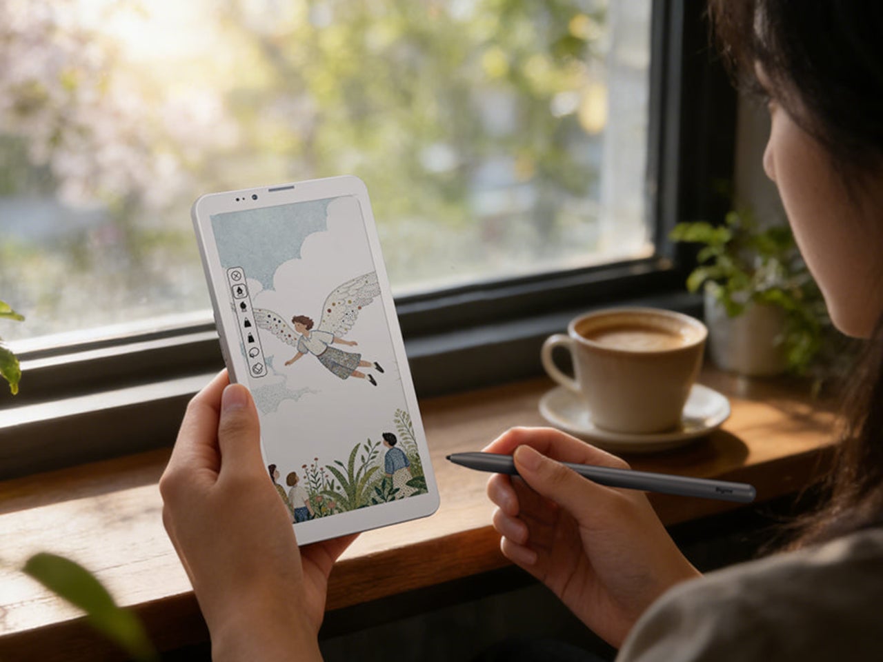
Handwriting support, via an optional stylus, adds another layer to what the phone can do. Writing directly on the E Ink surface feels closer to putting pen to paper than tapping on glass. It makes the HiBreak Plus a natural fit for jotting down thoughts during a commute, capturing ideas in a meeting, or working through a long reading session with annotations in the margins.
The rest of the specs are functional rather than flashy: an octa-core processor, 4GB of RAM, 64GB of storage, GPS, a fingerprint sensor in the power button, and a 4500 mAh battery that should comfortably outlast most conventional smartphones thanks to the energy-efficient E Ink display. The whole package weighs just 193g, light enough to slip into a shirt pocket without a second thought.
Of course, there are some downsides as well, ones that go beyond the screen refresh rate and color vibrancy. Although not exactly outdated, 4G LTE caps data speed significantly, and the rather modest RAM and storage capacity don’t do it any favors either. That said, at a $299 price point ($249 on pre-order), you are getting a pocket-sized color e-reader that can also make calls and connect to the Internet, without the usual distracting trappings of a smartphone.
The line between work and home has blurred into an architectural dialogue. Today’s hybrid living isn’t about working from the kitchen counter but about rethinking how domestic spaces support productivity and calm. Designers now aim to create environments that balance efficiency with ease, where furniture performs multiple roles without sacrificing elegance or comfort.
For high-net-worth homeowners, this shift is about investing in experiences that enhance their lifestyle and property value. Portable chairs and adaptive workstations have evolved into design essentials, dynamic and ergonomic, fluid enough to move with the rhythms of daily life, redefining how we live and work within our spaces.
1. Ergonomic Intelligence and Wellness Value
The strength of any portable workspace lies in its ergonomic foundation. Temporary, low-quality setups often lead to long-term strain and reduced focus. True wellness ROI comes from minimizing physical fatigue through design that supports the body’s rhythm, integrating temperature-responsive materials, balanced support, and kinetic flexibility rather than relying on surface aesthetics alone.
When selecting furniture, prioritize chairs with dynamic lumbar support and workstations with seamless height adjustment. The ideal setup becomes a biophilic cocoon, comforting, adaptive, and attuned to your natural movement, ensuring that even during long digital sessions, productivity and physical harmony remain perfectly aligned.
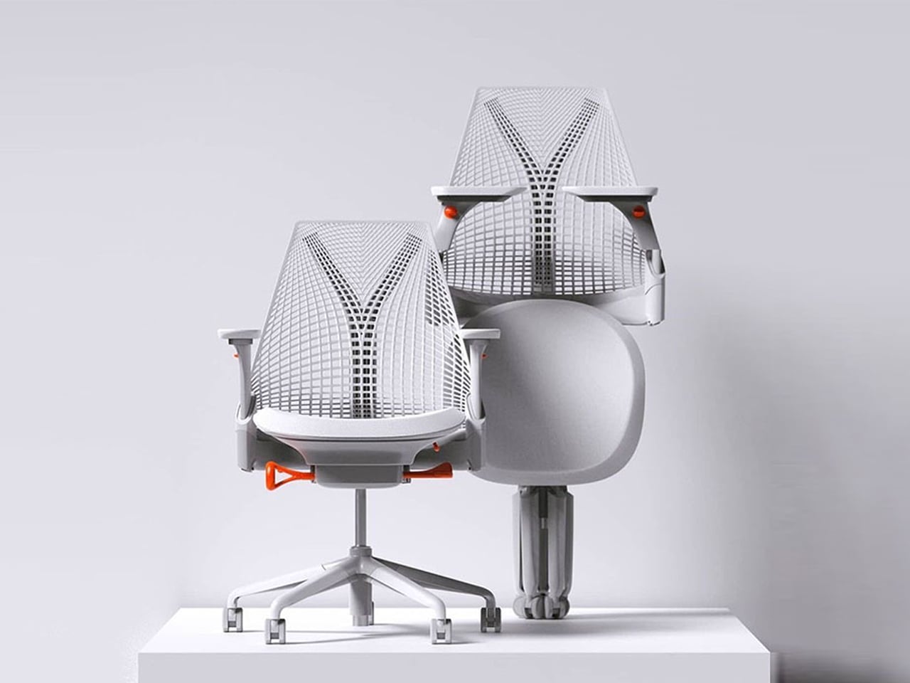
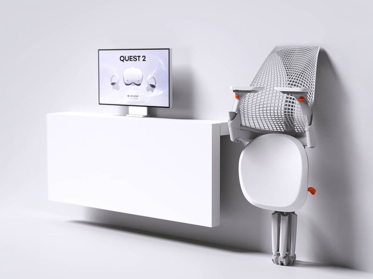
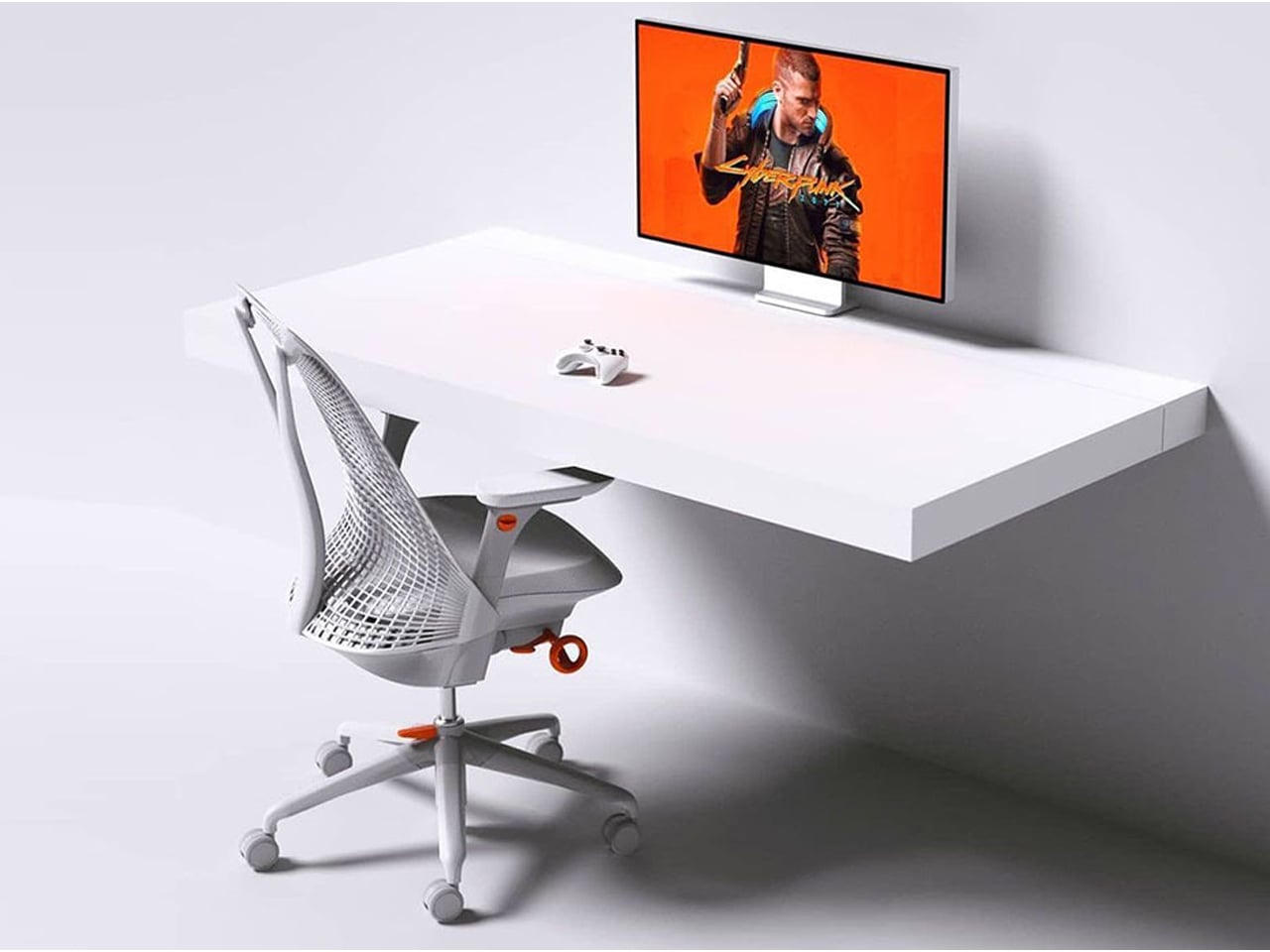
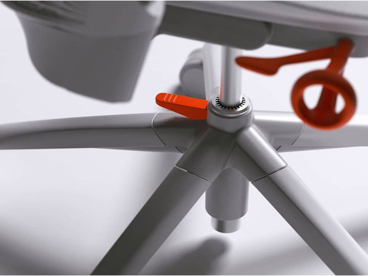
The Sayl concept chair by Charley reflects the changing ways we live, work, and play. As homes have evolved into hybrid offices, gyms, social spaces, and relaxation zones, our furniture needs have changed too. Charley even considers the hours we spend gaming or binge-watching, recognizing that chairs today must support multiple activities while remaining comfortable and functional. Designed by Herman Miller, the Sayl chair combines high-end design with practical usability, allowing users to maximize their space without sacrificing luxury or ergonomics.
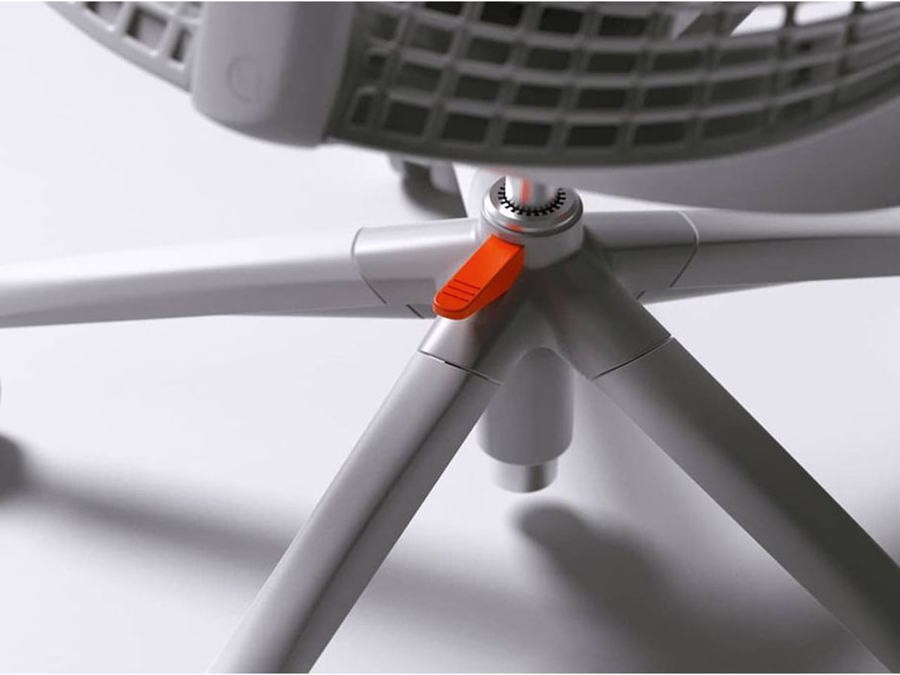
The chair’s muted grey tones ensure it blends effortlessly into any interior, while bright orange accents draw attention to pivotal touchpoints, making it intuitive to use. A foot pedal mechanism allows the chair to collapse easily, providing a convenient, space-saving solution for modern homes. In the post-pandemic era, furniture design has shifted towards modular, flexible, multifunctional, and compact solutions. The Sayl chair embodies all these qualities, offering a versatile, stylish, and practical seating option for today’s hybrid lifestyle.
2. Aesthetic Integrity and Material Authenticity
Every portable unit should carry a strong aesthetic value that complements its architectural surroundings. Materials must feel genuine and timeless, like solid wood, brushed metal, and high-performance textiles that reveal craftsmanship rather than conceal it. This honesty of composition creates visual depth and emotional connection, reinforcing the idea that beauty lies in authenticity, not imitation.
The design should remain sculptural yet understated, integrating seamlessly into curated interiors. Its finish must align with the home’s palette, allowing it to coexist gracefully within the space. When not in use, it should rest as a quiet architectural accent rather than a workplace intrusion.
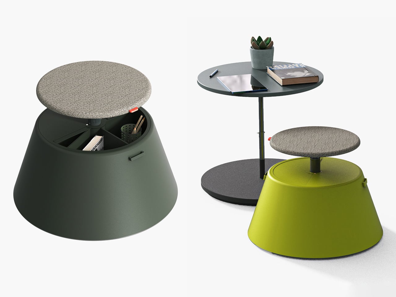
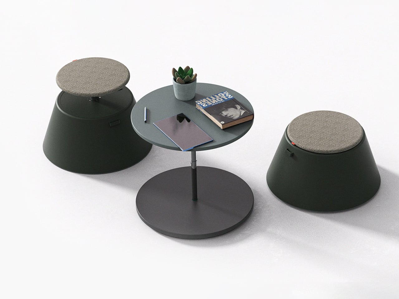
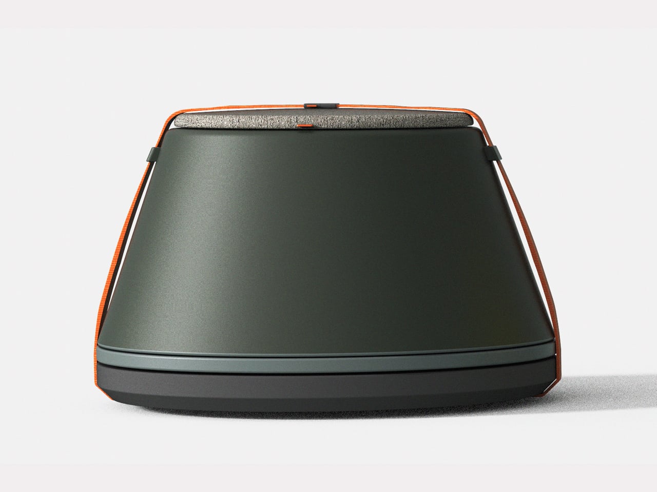
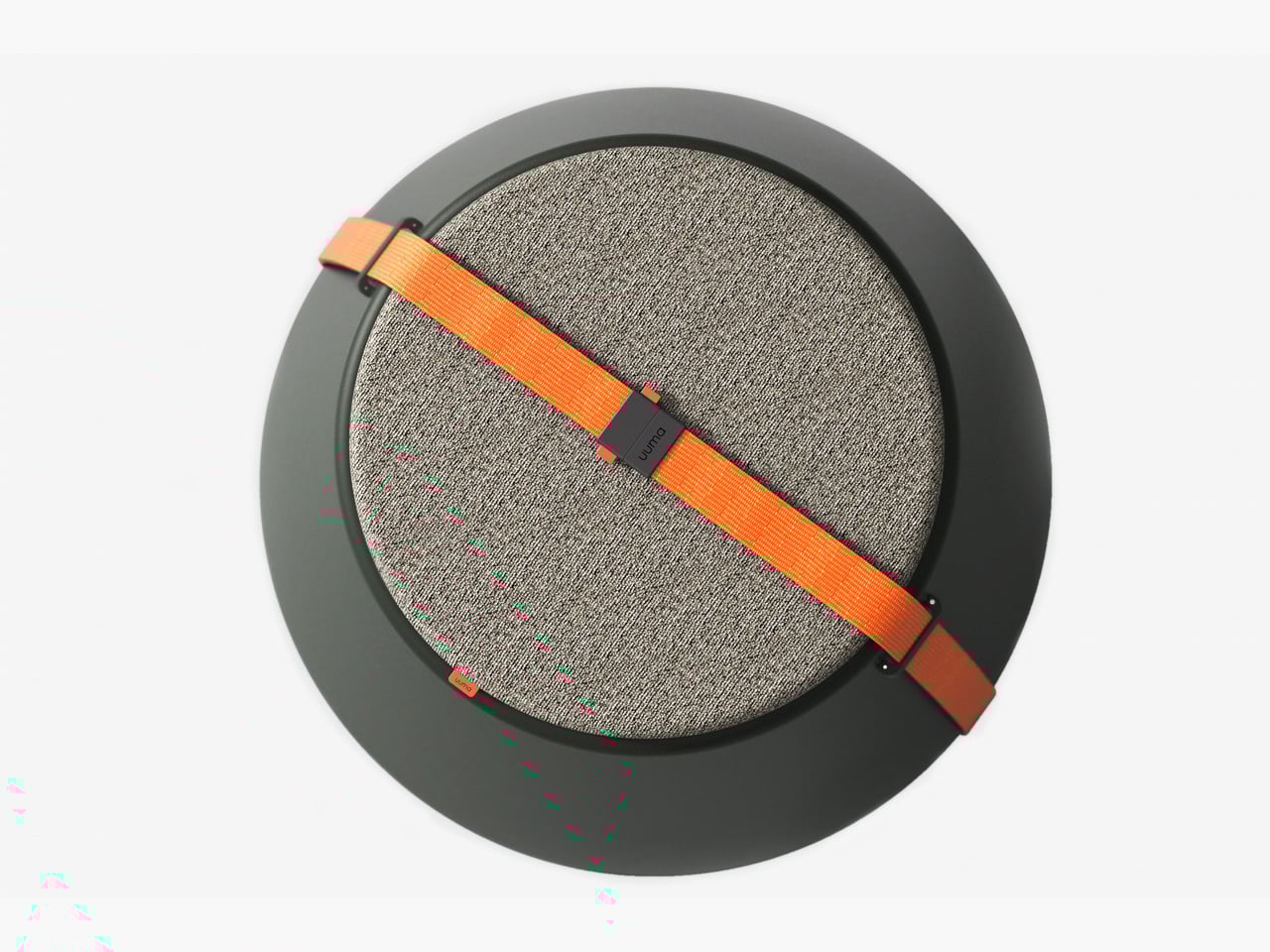
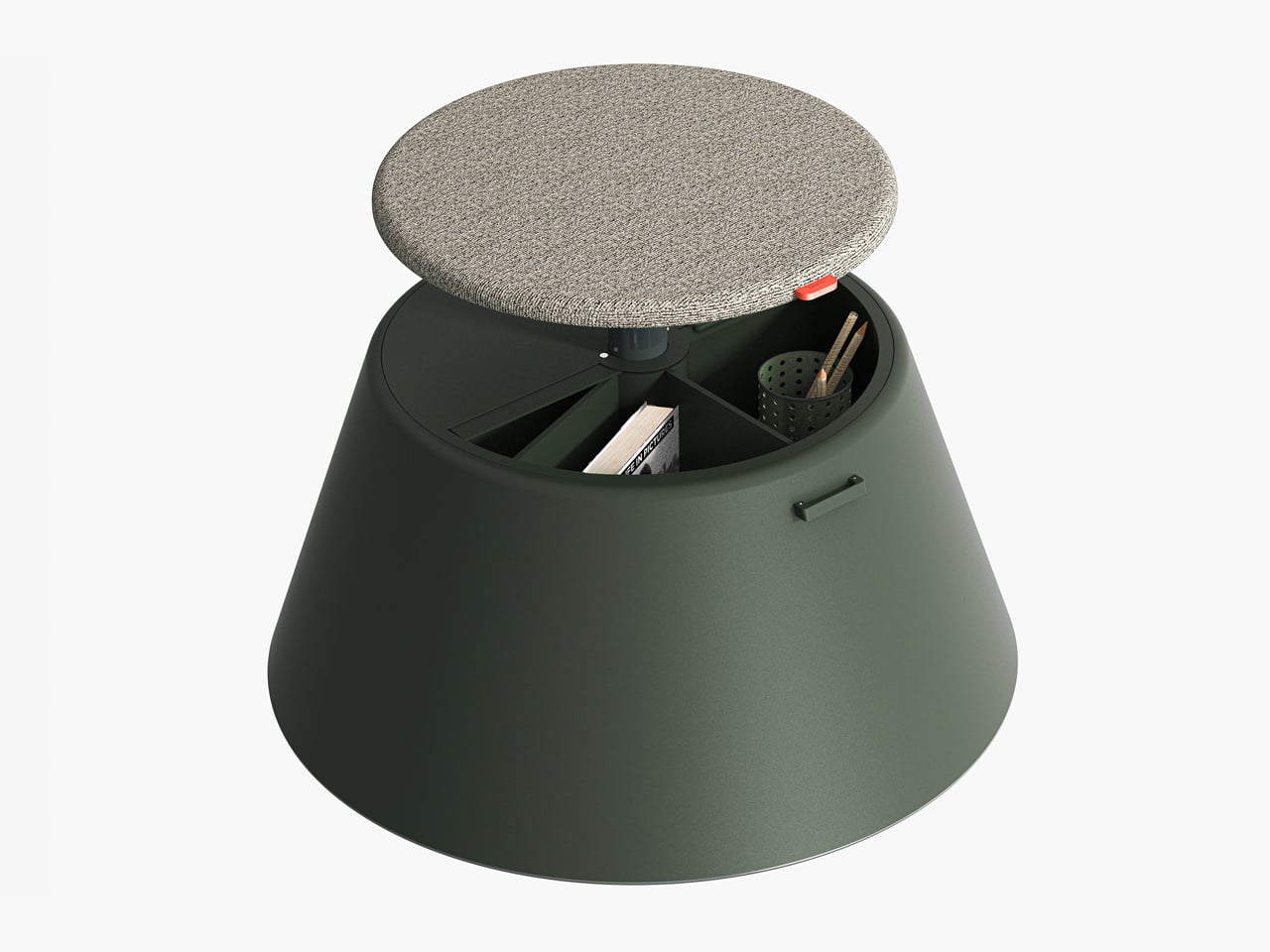
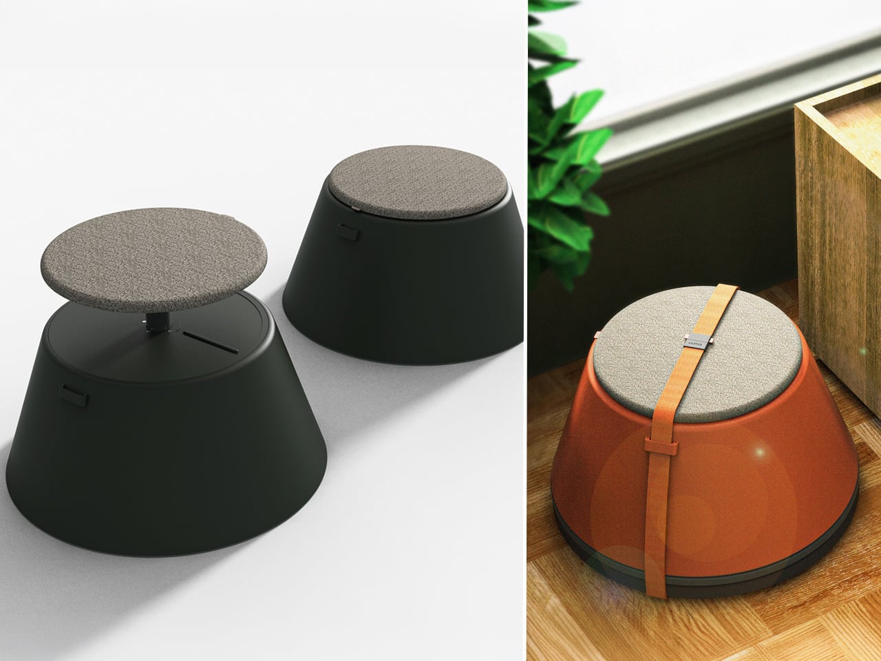
Working from home has spared many from long commutes and office distractions, yet it has also made work feel more solitary. Sitting by the same wall each day, even in a well-designed home office, can feel disconnected from the world beyond virtual meetings. While folding furniture remains popular for its space-saving benefits, stackable, all-weather alternatives are emerging as a smarter choice. Industrial designer Gökçe Nafak introduces the uuma, a portable table-and-chair combo designed as a single stackable unit that transitions effortlessly between indoor and outdoor settings.
Perfect for those who enjoy working in the garden, on the balcony, or in flexible spaces, the uuma blends convenience with creativity. Made from fibreglass, it is lightweight, durable, and sustainable. Its modular design features a height-adjustable metal frame and detachable parts that assemble easily. The chair transforms into a table within moments, offering comfort, portability, and style in three vibrant, modern colors.
3. Spatial Flow and Footprint Efficiency
The effectiveness of any modern workstation depends on how well it manages spatial flow. In compact urban homes, every inch counts, making footprint reduction a key design priority. A thoughtfully designed system should retract or fold away seamlessly, minimizing its physical presence while supporting the need for adaptable, multi-functional living spaces that evolve throughout the day.
Mobility and refinement define its usability. Tables and desks should transition effortlessly from work to leisure, enabling a quick shift from boardroom mode to family dining. Silent, non-marking wheels and intuitive movement reflect superior engineering and respect for interior balance.
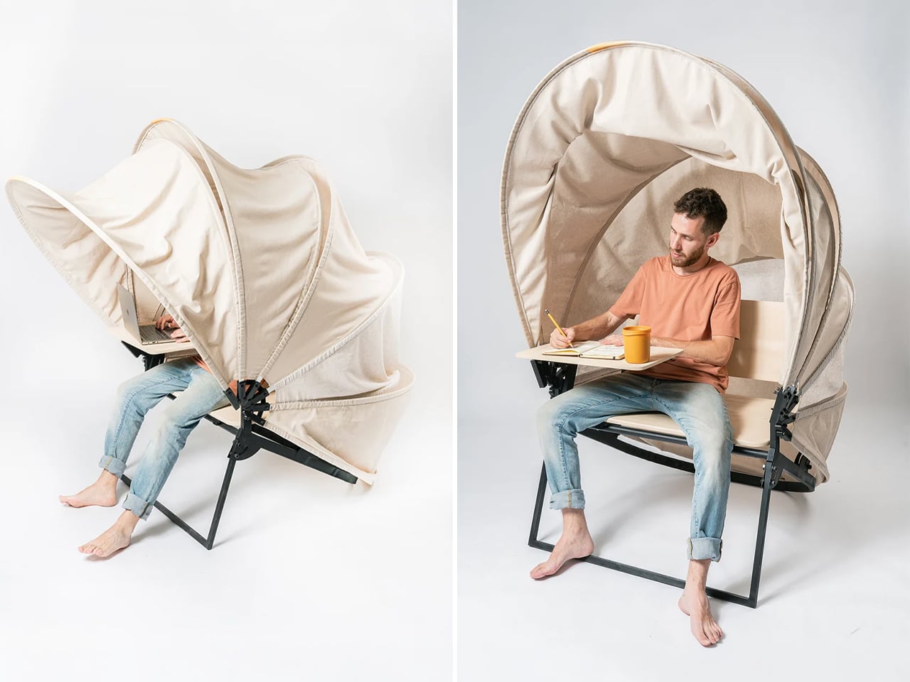
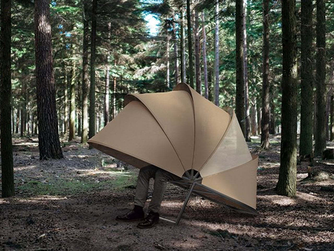
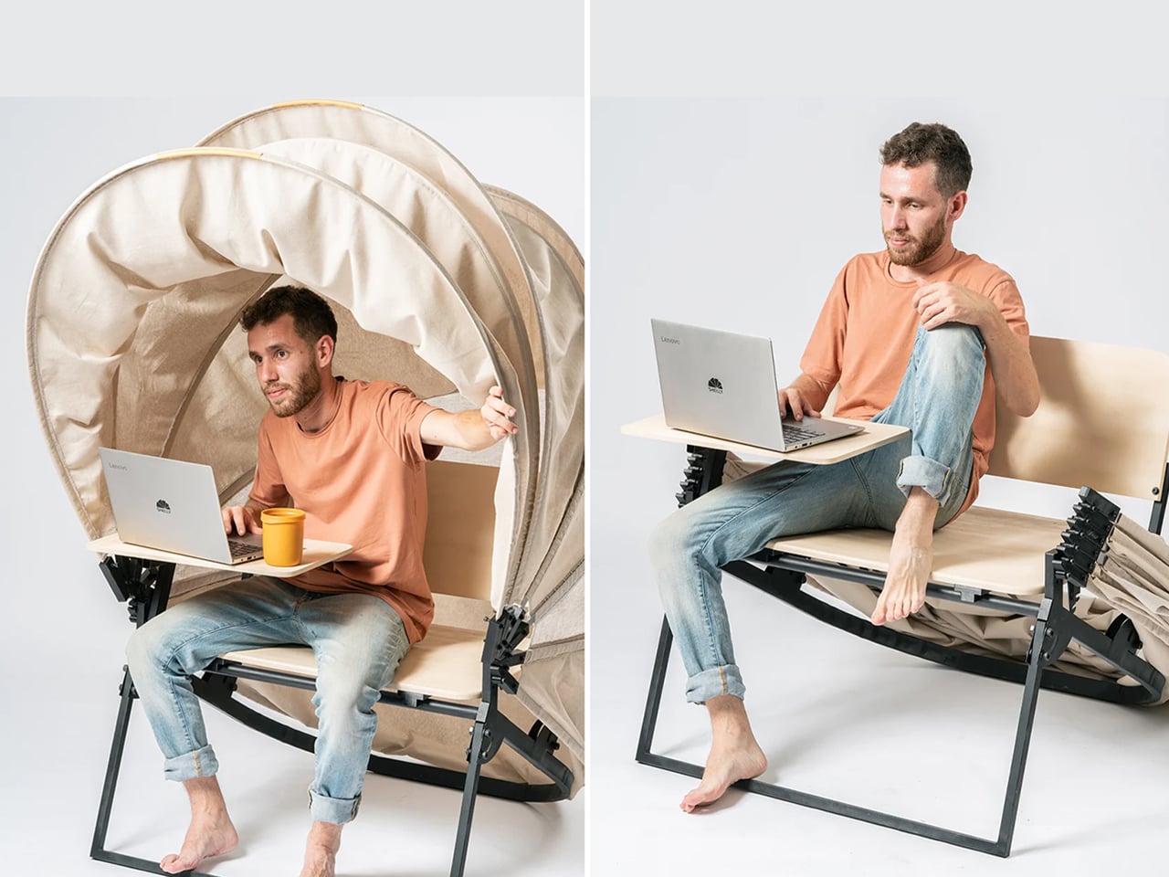
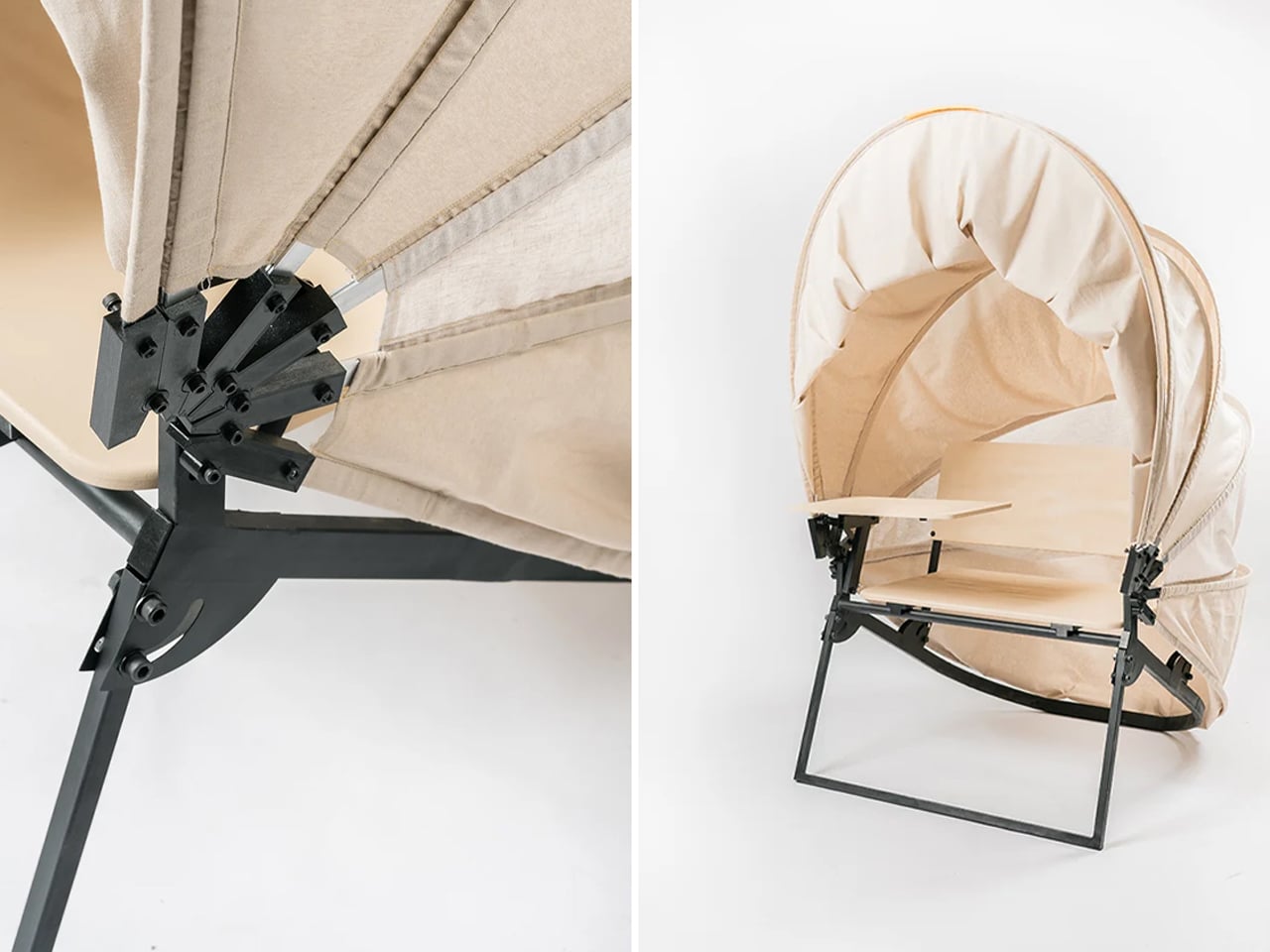
In a shared workspace like WeWork, or a peaceful spot under a tree, flexibility defines modern work culture. Industrial designer Matan Rechter responded to this shift with Shelly, a personal outdoor workspace that combines privacy, shade, and portability for those who prefer working outside. Inspired by the remote work movement, Shelly was designed to bring focus and comfort to outdoor environments like public parks.
Its name comes from its shell-like canopy that folds in and out with ease. Built from lightweight aluminium profiles and durable Cordura fabric, Shelly shields users and electronics from harsh UV rays. The canopy’s retractable design, reminiscent of an armadillo’s shell, provides instant shade and convenience. Compact and portable, Shelly transforms outdoor work into a comfortable, productive, and stylish experience anywhere, anytime.
4. Technological Integration and Power Autonomy
A modern hybrid workstation should function as a self-sufficient ecosystem, anticipating digital needs without visual clutter. True design intelligence lies in seamless connectivity, like built-in charging, concealed wiring, and intuitive access that keeps the workspace both elegant and efficient. Power autonomy ensures independence from fixed outlets, supporting the growing demand for mobility and flexibility in home environments.
Features such as integrated induction charging pads, hidden cable channels, and optional battery packs transform furniture into an adaptive tool. These enhancements merge aesthetics with performance, allowing users to remain connected, productive, and untethered within any architectural setting.
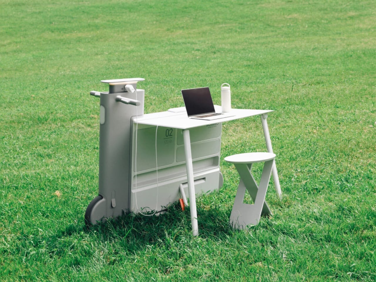
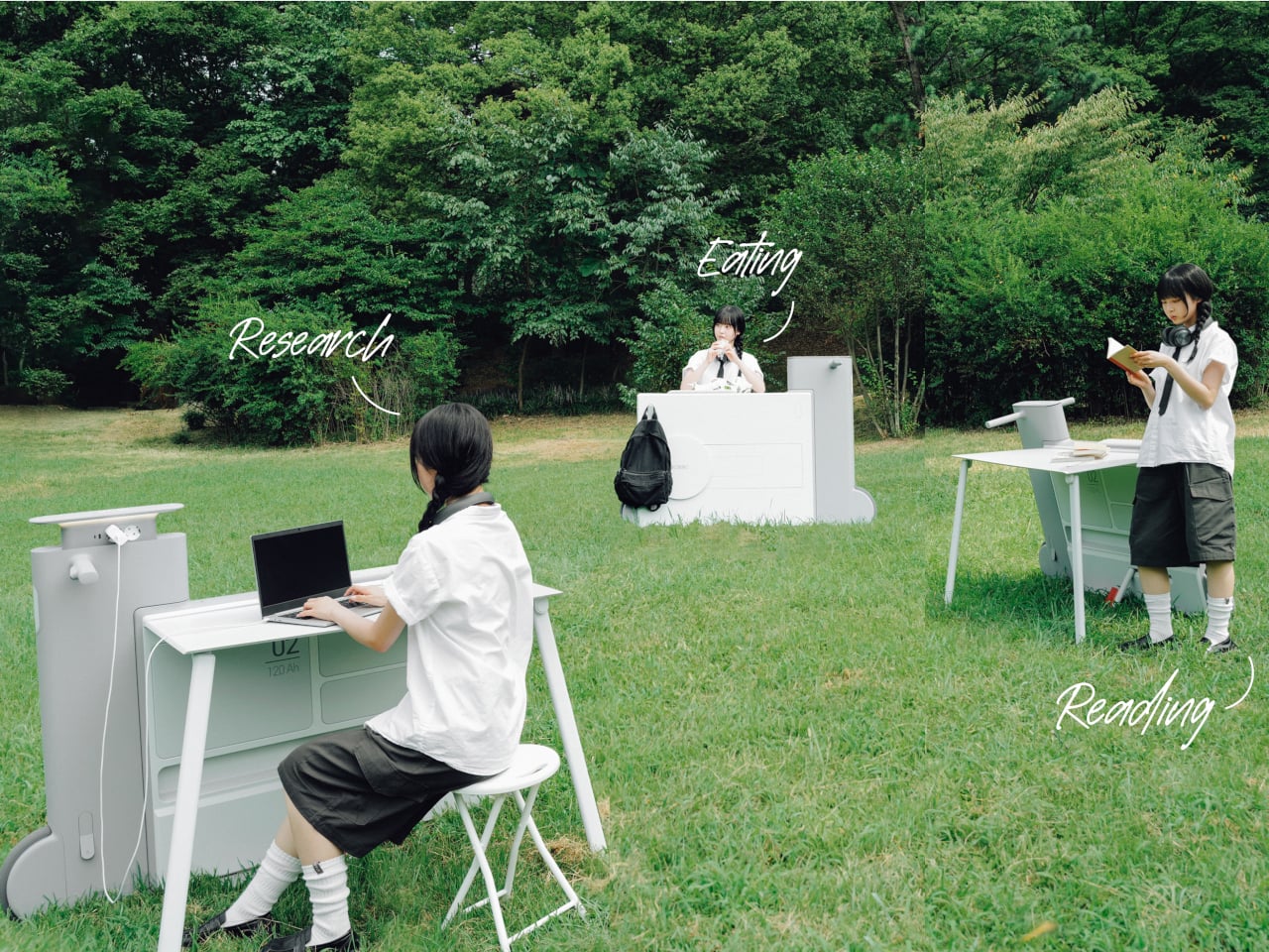
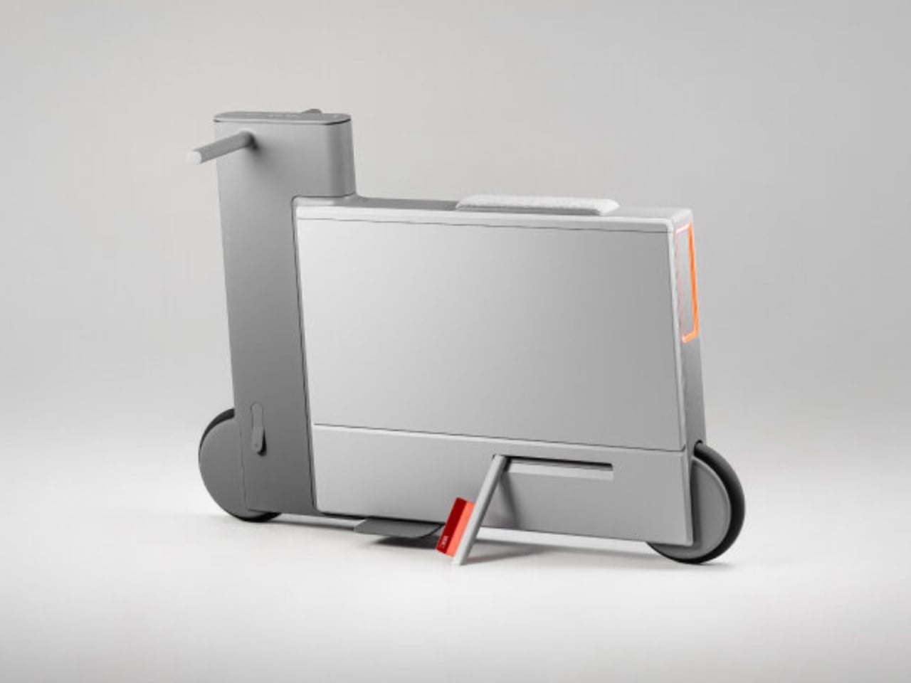
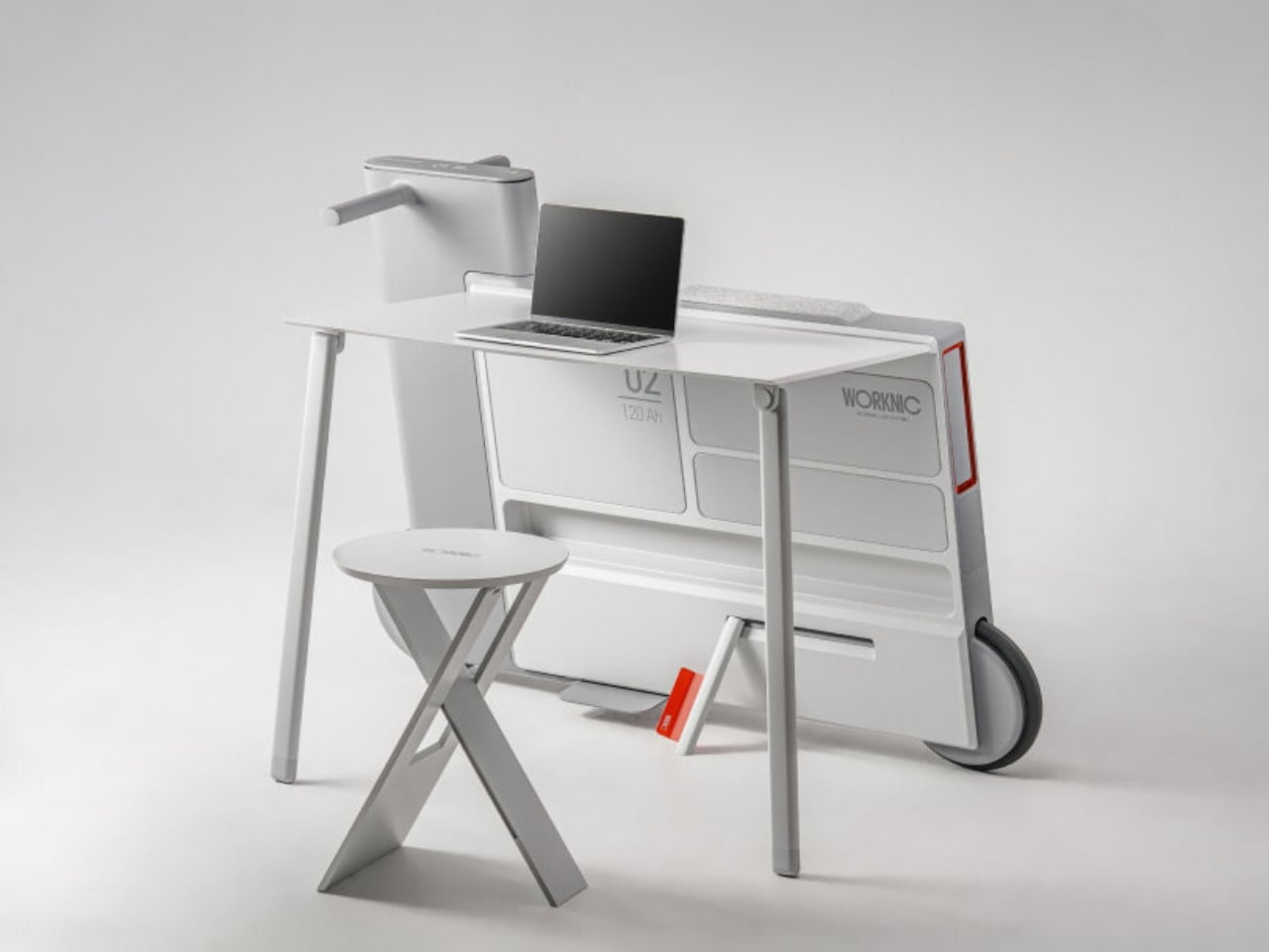
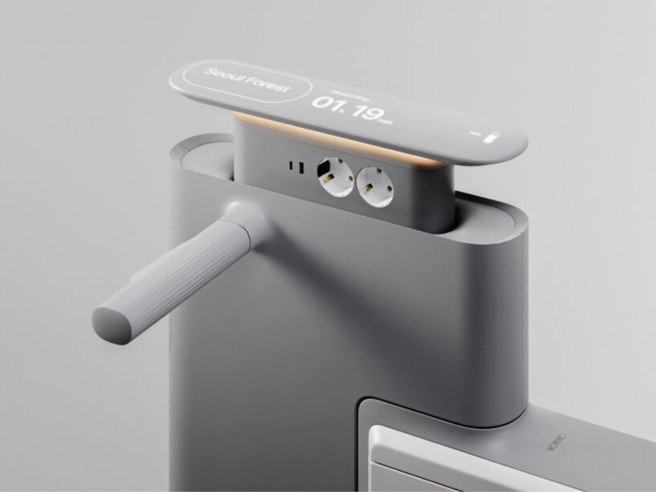
Another standout example is Worknic, a portable desk developed through the Samsung Design Membership program, sponsored by Samsung Electronics. Designed for flexibility, Worknic allows users to set up a functional workspace anywhere, whether in a home, park, or even on the beach, giving them the freedom to change their environment whenever needed.
The desk is built on wheels, making it easy to move and position in the ideal spot. Once in place, it unfolds to reveal a worktable, stands, and a built-in power source, while a pull-out stool completes the setup. Although details about battery life, weight, and additional features are limited, the concept prioritizes mobility, convenience, and adaptability. Worknic offers a creative solution for those who want a portable, fully equipped office that keeps productivity and inspiration in balance.
5. Design Resilience and Longevity Investment
For discerning homeowners, longevity defines true value. A well-crafted workstation should possess design resilience, built to endure daily use while retaining its original elegance and performance. This durability ensures a higher return on investment, setting it apart from fast furniture options that quickly lose both form and function.
Choosing established design houses and proven construction techniques guarantees structural integrity and timeless appeal. A five-to-ten-year warranty offers assurance that the piece is not just a purchase but a long-term architectural companion, blending endurance with refined craftsmanship for years of dependable, sophisticated use.
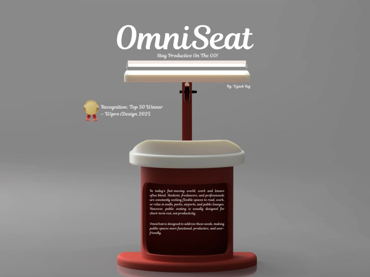
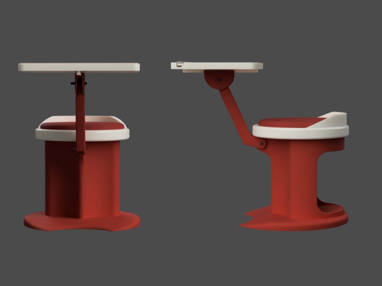
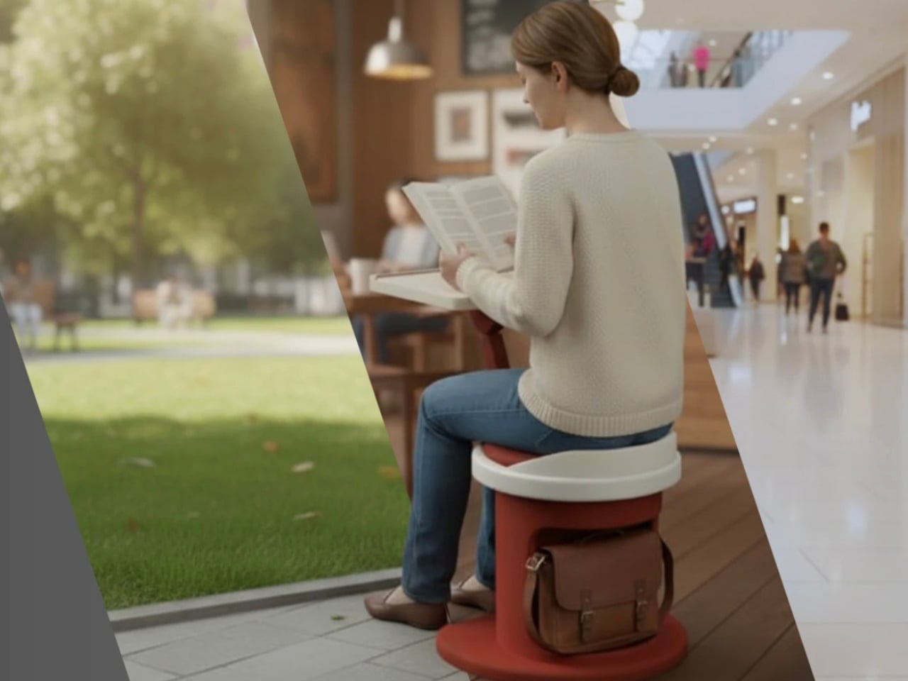
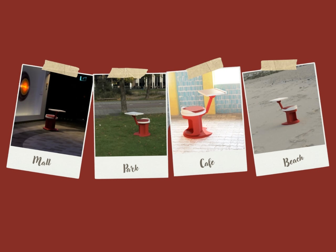
For those constantly on the move, finding a comfortable place to rest or work can be challenging. Cities often lack public resting areas beyond cafés and restaurants, making it tempting to carry a portable chair, though the idea quickly loses appeal due to its bulk and inconvenience. Recognising this need, designer Tejash Raj created the OmniSeat, a compact and ergonomic seating concept designed for people who stay productive while travelling, commuting, or working outdoors.
The OmniSeat features a lightweight frame, built-in storage, and device holders, all folding neatly into a slim form that fits in a backpack or attaches to a bike rack. A detachable tray accommodates laptops or tablets, with cable clips to keep cords tidy. Combining portability, comfort, and function, the OmniSeat offers a glimpse into the future of mobile workspaces.
The high-design portable workstation redefines the boundaries of work and home, merging productivity with tranquillity. It transforms interiors into fluid, balanced spaces where focus meets ease. Its true value lies in the freedom to work anywhere, capturing sunlight, inspiration, and connection without sacrificing comfort or creativity.
Most smartphones are designed to be impossible to put down. The screen faces up on every table, the display lights up for every notification, and the cost of checking it one more time is exactly zero. That’s not an accident. The hardware removes friction from compulsive use because removing friction is what makes these devices feel indispensable. The tinyBook Flip concept asks a different question entirely: what if the phone were designed to get out of the way?
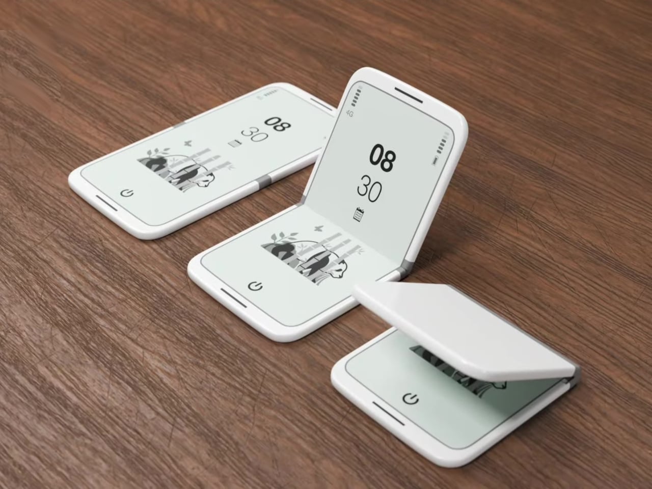
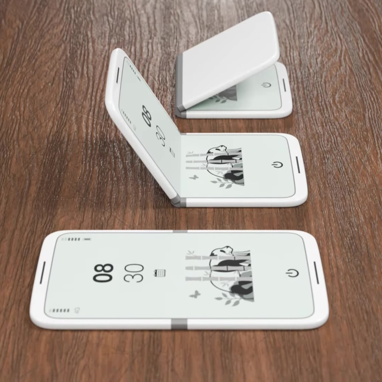
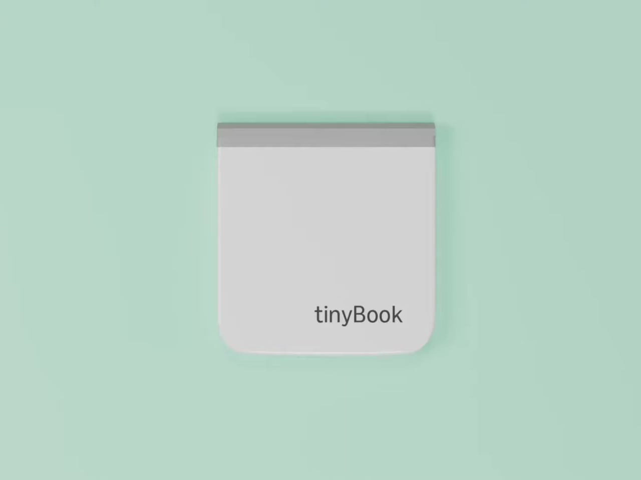
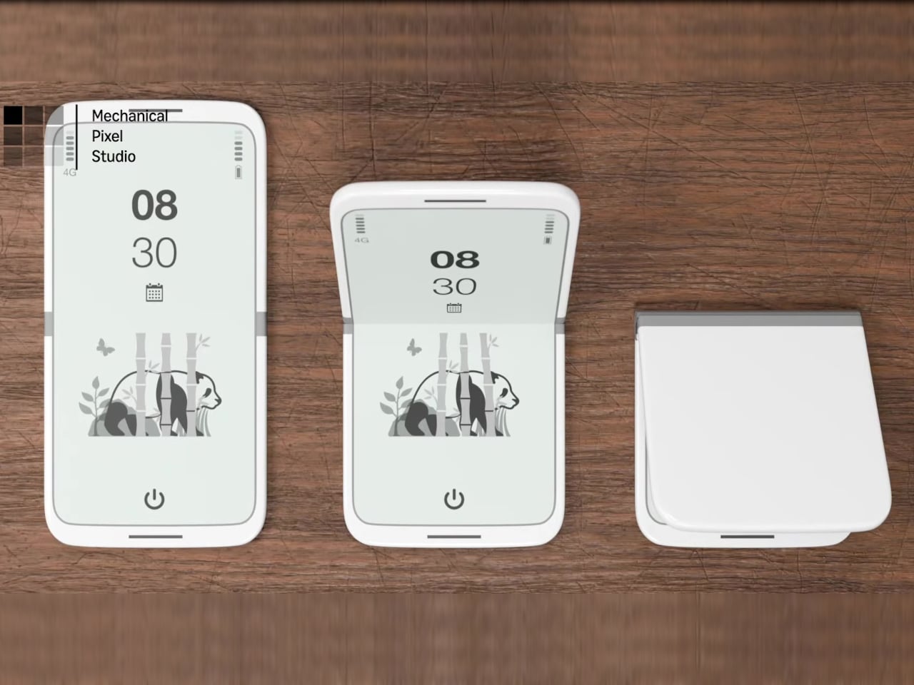
The tinyBook Flip is a vertical foldable phone concept built around a 6.1-inch E Ink display. Closed, it collapses into a compact, near-square form with rounded corners and a matte white finish, something closer in proportion to a folded notecard than a smartphone. The screen disappears entirely when the device is closed shut. No glowing rectangle sitting face-up on the desk, no ambient reminder that there are things to check. Just a small, quiet object.
Designer: Pixel Dynamics
That folded form is doing more work than it might seem. Opening the phone requires a deliberate physical action, and that small added step changes the behavioral math. A reflexive grab becomes a conscious decision. The friction is minimal in absolute terms, maybe two seconds, but two seconds of resistance is often enough to interrupt the loop. The concept treats that interruption as a design feature, which puts it in genuinely different territory from most phones.
The E Ink display adds a second layer of resistance, and this one is less subtle. E ink refreshes slowly, renders in grayscale or muted colors, and handles fast-moving content poorly. Social media feeds become tedious. Short-form video becomes unwatchable. Anything built around color, motion, and rapid visual feedback stops working the way it was designed to. This is precisely the point. The screen’s limitations aren’t engineering compromises left over from an earlier era of display technology; they’re structural properties that make certain behaviors genuinely unpleasant to sustain.
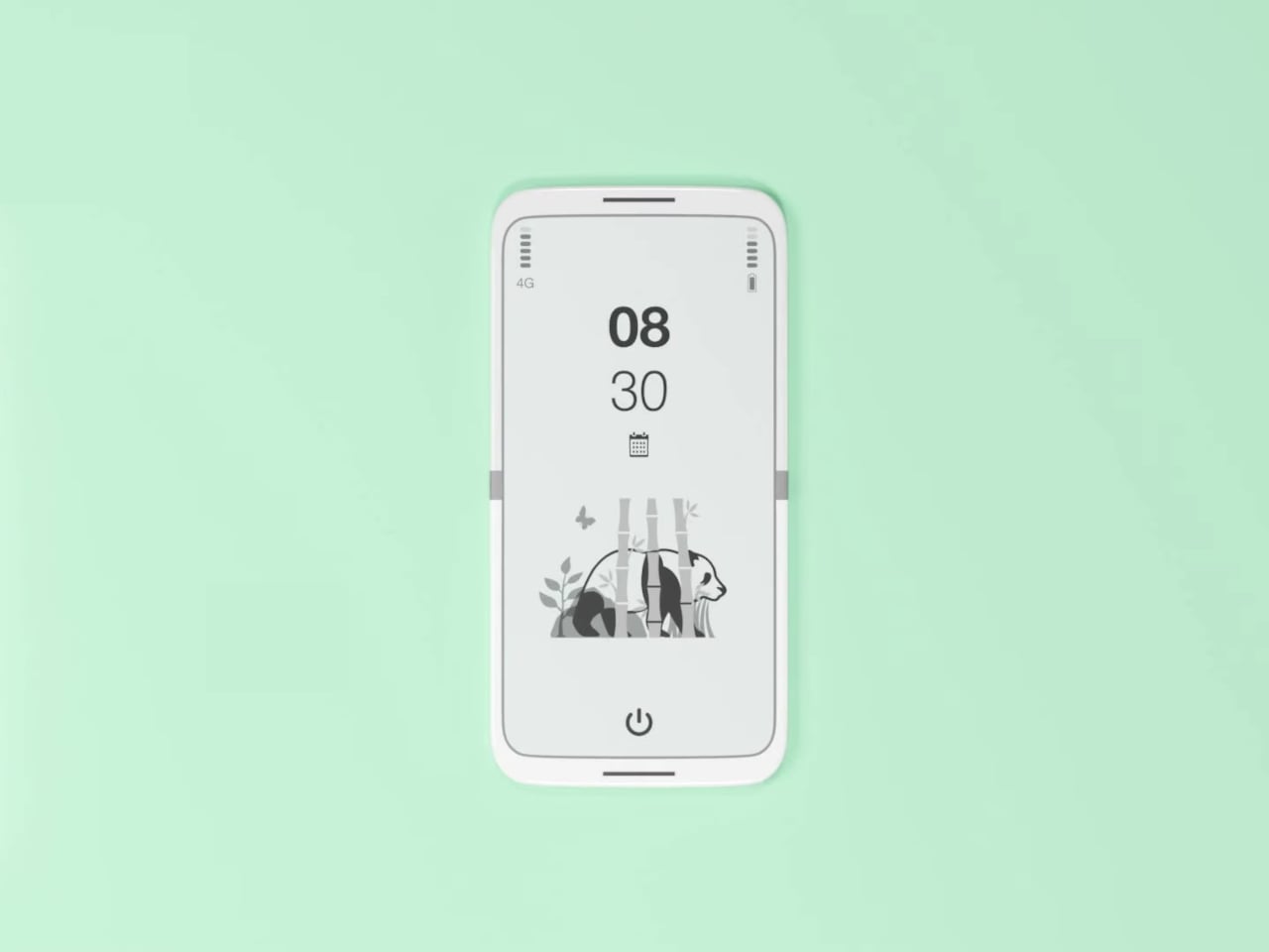
What E Ink handles well is a shorter list, but a coherent one. Text reading, messaging, calendars, and static interfaces are all comfortable at E Ink’s native pace. The renders of the tinyBook Flip show a UI built around exactly these strengths: a large clock face, a calendar widget, and a grayscale illustrated wallpaper. The interface doesn’t reach for capabilities the display can’t support. The phone isn’t trying to do everything; it’s trying to do a narrower set of things without apology.
Foldable E Ink panels aren’t a speculative technology. The hardware exists at the component level and has already appeared in experimental e-readers, though no consumer phone has shipped with one in any meaningful volume. The tinyBook Flip isn’t imagining impossible components; it’s proposing a form factor that manufacturers haven’t yet committed to producing. The distance between those two things is largely commercial, not technical.
There’s also something worth noticing about how the device reads as a physical object in social space. Closed, the tinyBook Flip looks like almost nothing. No visible screen, no status indicators, no glow. A phone that carries no visual weight when it’s not in use sends a different signal than one that’s always broadcasting its presence. Putting it down means it actually disappears from the environment, not just from your hand.
That said, the concept leaves some real friction points unaddressed, and not the intentional kind. E Ink handles camera use, live navigation, video calls, and authentication apps poorly. A foldable hinge adds mechanical complexity and thickness that clean renders tend to obscure. The tinyBook Flip looks resolved in this form, but a production version would have to make tradeoffs that these images don’t show and the concept doesn’t acknowledge.
Still, the more interesting question isn’t whether this specific device could ship. It’s whether a phone that makes itself harder to misuse is a reasonable design goal at all, or whether that’s just a way of describing a phone that most people wouldn’t actually want. The tinyBook Flip lands firmly on one side of that question. Whether the market agrees is a different problem entirely.

 Connexion