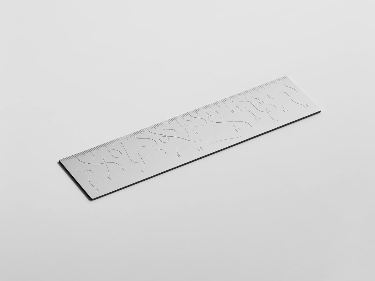
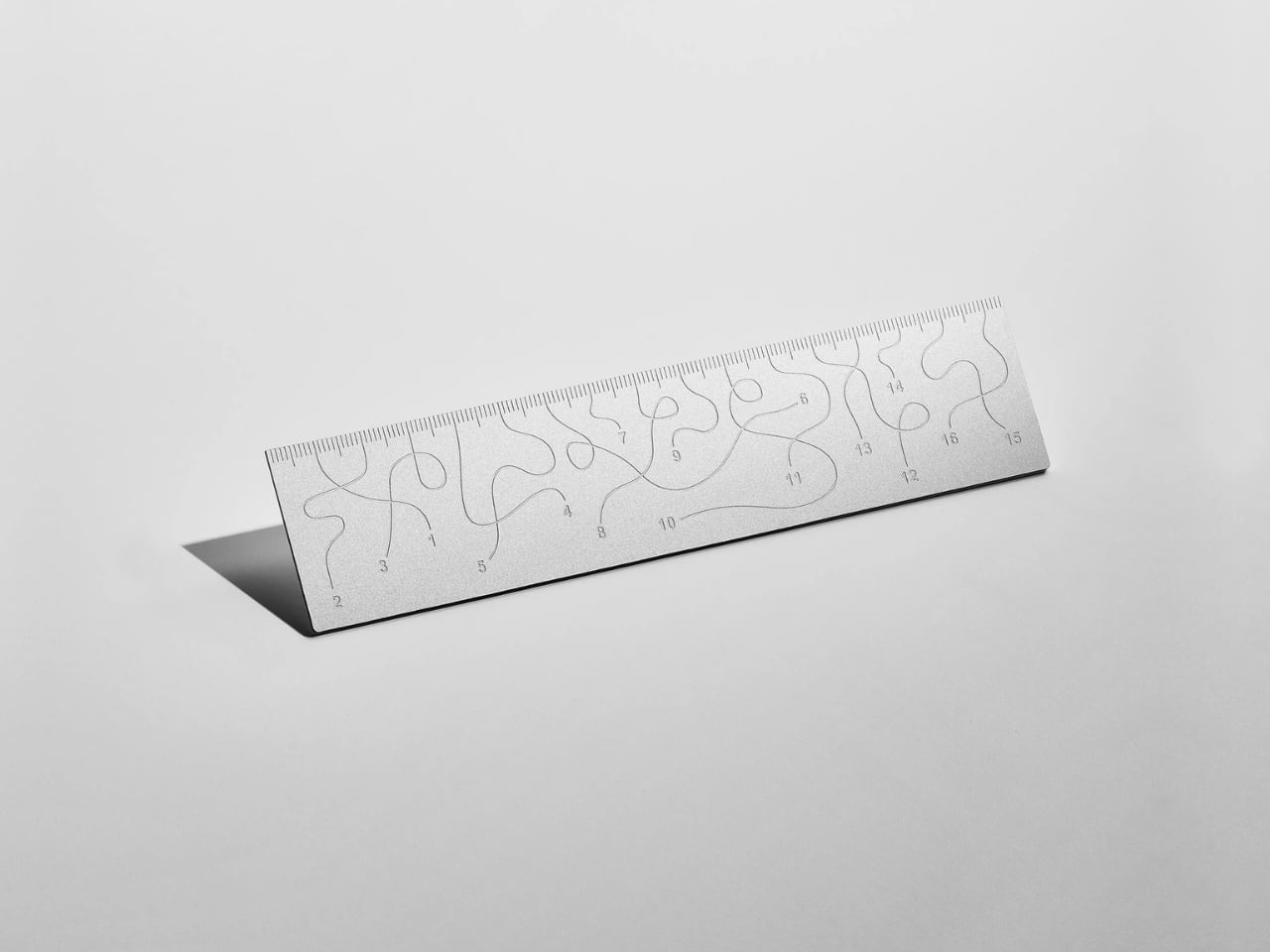
Pick up the WAY ruler and the first thing you notice is that it feels exactly right. It’s small, made from anodized aluminum, and has the kind of weight and finish that signals intention without announcing itself. It’s the sort of object that sits comfortably in a shirt pocket or on the edge of a desk and looks like it belongs in both places. Then you look closer at the markings, and something shifts.
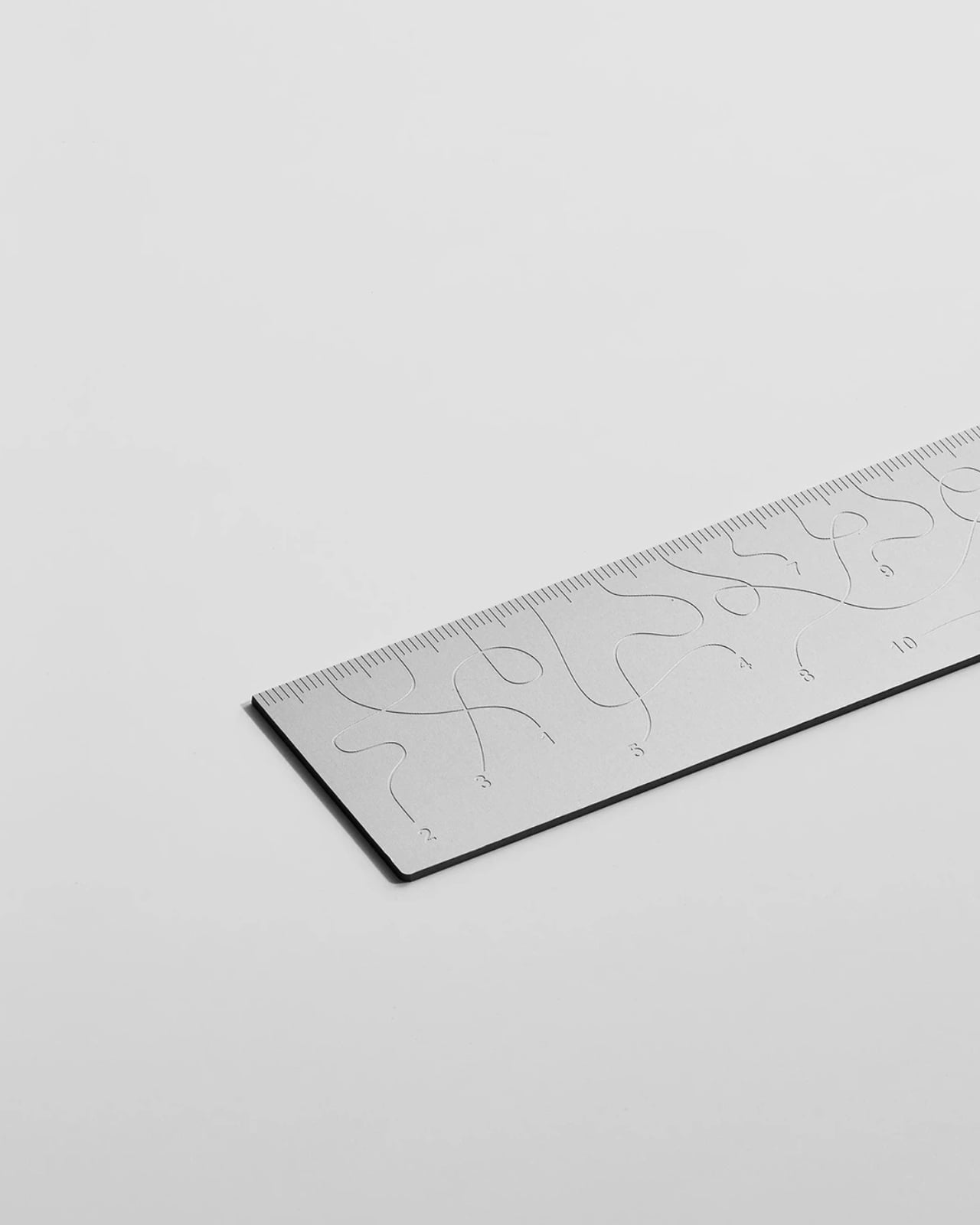
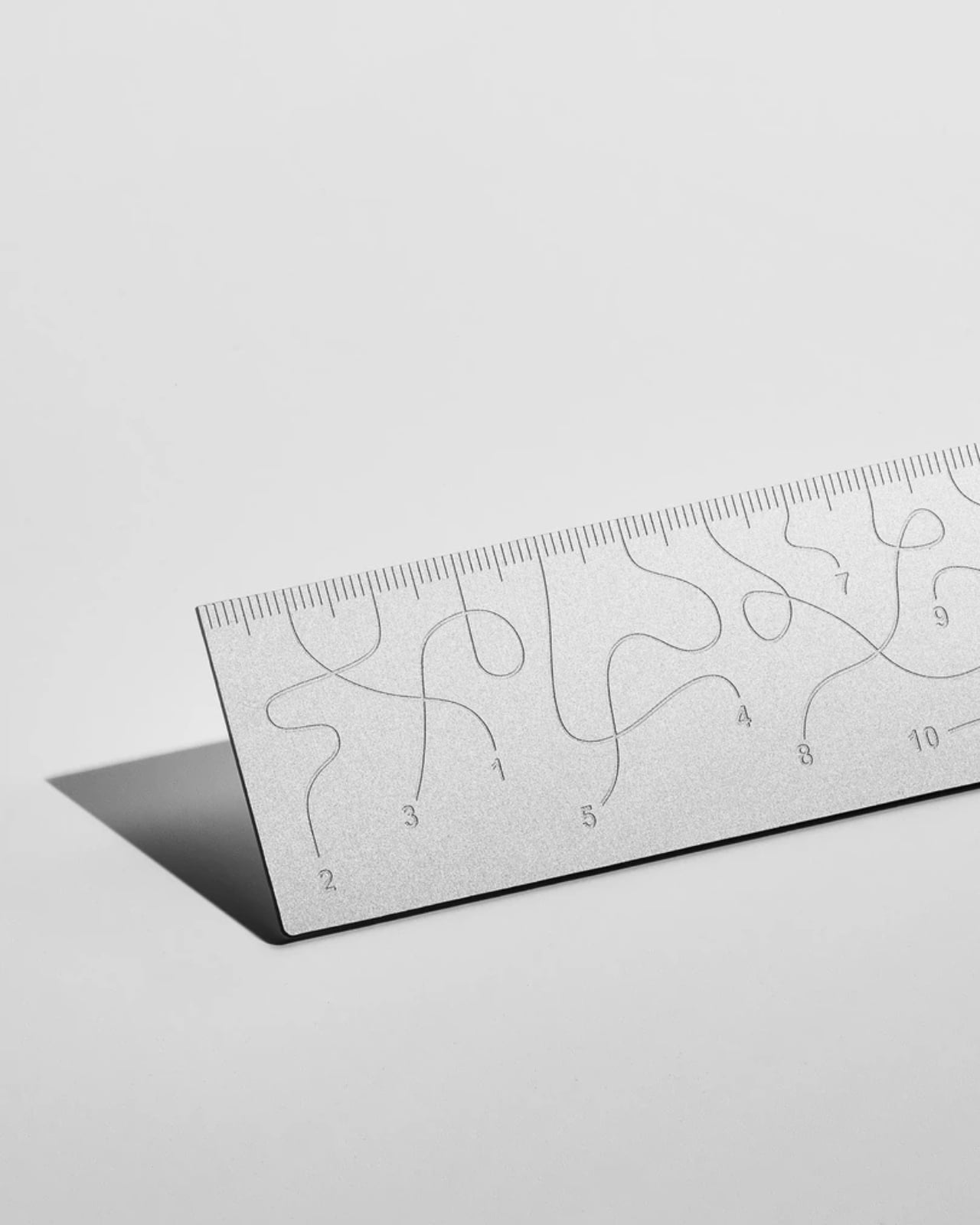
The inscriptions on the WAY don’t run in a clean, predictable line the way ruler markings are supposed to. They wind. They curve and drift across the surface of the aluminum like a path traced through a landscape, referencing, quite literally, the idea of small winding roads and the wandering nature of travel and discovery. The numbers and measurements are there, engraved directly into the material with digital precision, but they’re arranged in a way that asks you to slow down and actually read them rather than glance and move on. It’s legible. Just not immediately.
The engraving itself is worth paying attention to. Kral chose to cut the inscriptions directly into the anodized aluminum rather than printing or applying them as a secondary layer. That decision gives the markings a permanence and a tactility that you don’t get with most production objects at this scale. You can feel the grooves if you run a finger across the surface. The graphic quality of the lettering is considered without being decorative for its own sake. It reads as design that knows exactly what it’s doing, which is what makes the playfulness land rather than feel arbitrary.
The object is small enough to be considered an accessory as much as a tool. Kral has always worked at a scale that pays attention to how things actually live in your hands and in your space, and the WAY is consistent with that. It doesn’t try to be a statement piece in the way that some design objects do, where the visual drama is the whole point. The WAY is quieter than that. The drama is embedded in the detail, in that moment when you realize the markings are doing something unexpected and you have to orient yourself before you can use it.
That slight disorientation is the concept, and it’s a sharp one. There’s a real tension running through modern product design right now, one where the drive to make something visually striking starts to work against the thing it was actually built to do. We’ve all used something that looked incredible but made us work harder than we needed to. Packaging that’s beautiful but impossible to open. Interfaces that prioritize visual elegance over intuitive use. Apps designed to delight that end up frustrating. The WAY ruler doesn’t rail against any of that. It just holds up a small, well-made mirror to it. It’s more of a wink than a manifesto.
The difference between a provocation and a critique matters here. Kral isn’t punishing you for picking up the WAY. The experience of using it is still pleasant. The aluminum feels considered, the engraving is precise, and the object as a whole is genuinely lovely. He’s not making something bad on purpose to prove a point. He’s making something that’s slightly impractical in a very deliberate, very elegant way, and letting you sit with that paradox.
And he followed through on it. The WAY isn’t a prototype or a one-off shown at a design fair and then retired to a shelf. Kral produced a batch and sells them directly through his studio’s website. That matters. It means the object gets to exist in the world the way all good design should, in someone’s hand, on someone’s desk, doing its quiet, considered, slightly inconvenient thing in real life.
At a time when so much product design either chases pure utility or drifts so far toward aesthetics that it forgets what it was originally supposed to do, the WAY ruler manages to be a little bit about both. It’s funny, it’s beautiful, and it makes you think. A ruler, of all things. Leave it to Tomas Kral.
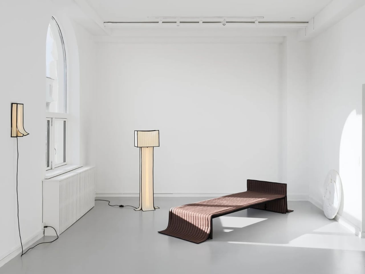
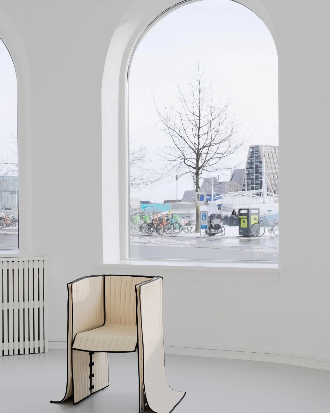
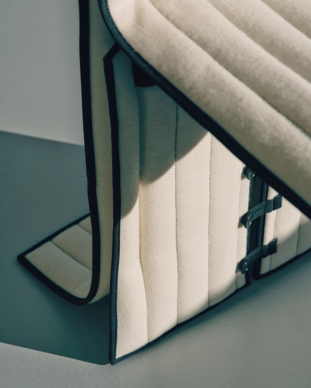
Most upholstered furniture is essentially furniture under stress. Fabric gets stretched, stapled, pulled taut, and forced into submission over rigid frames. It is, fundamentally, a question of control. Danish designer Lærke Ryom looked at that process and decided to do the opposite. Her debut solo exhibition, Raiments, now open at Innenkreis gallery in central Copenhagen, is built entirely around that single act of refusal.
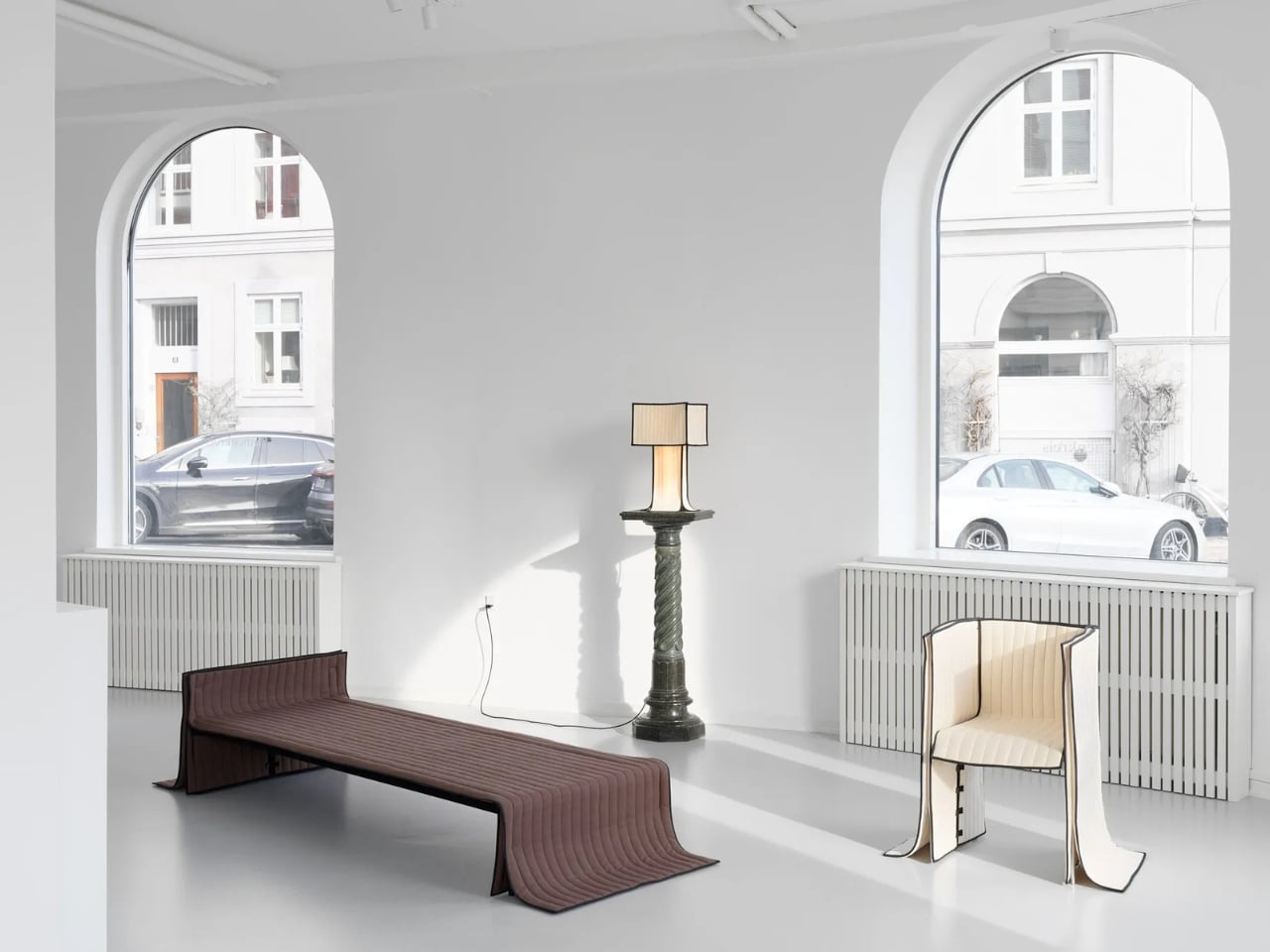
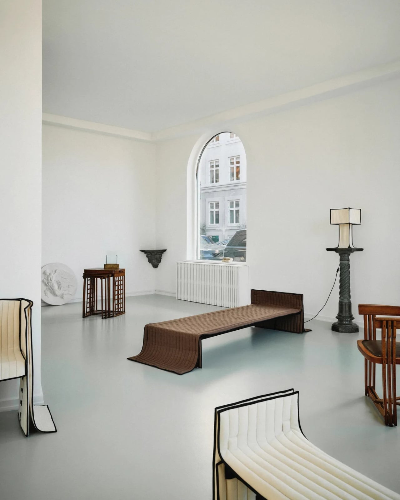
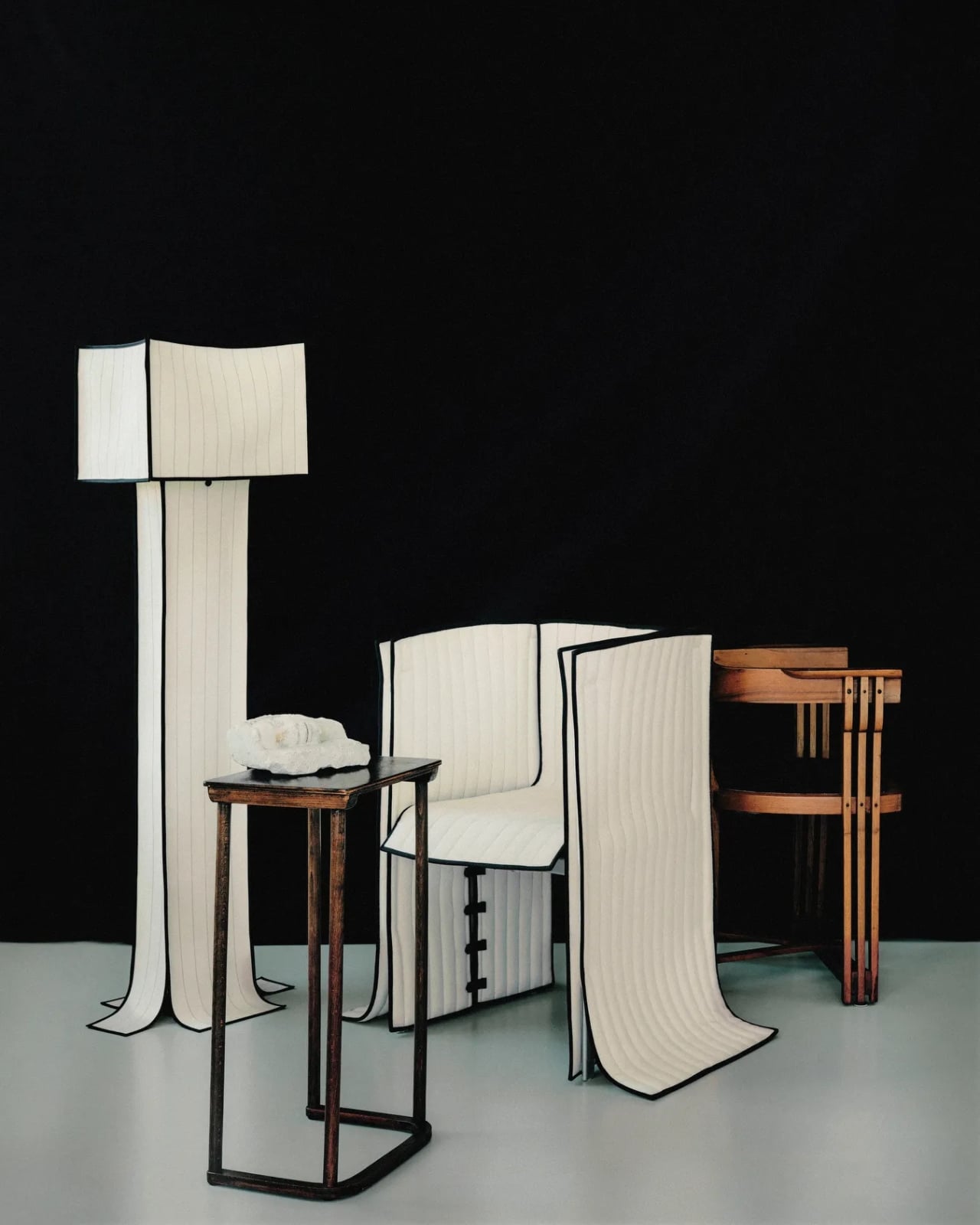
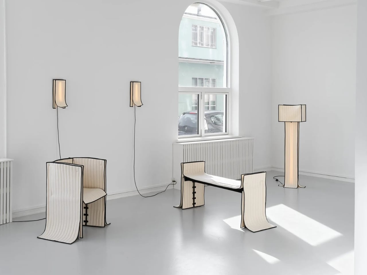
The collection includes a daybed, a chair, a bench, table lamps, a floor lamp, and wall lamps, all presented in soothing cream and chocolate-brown hues. The palette is calm and considered, which makes sense. These are pieces that ask you to slow down and look closely, because the detail is where the story actually lives.
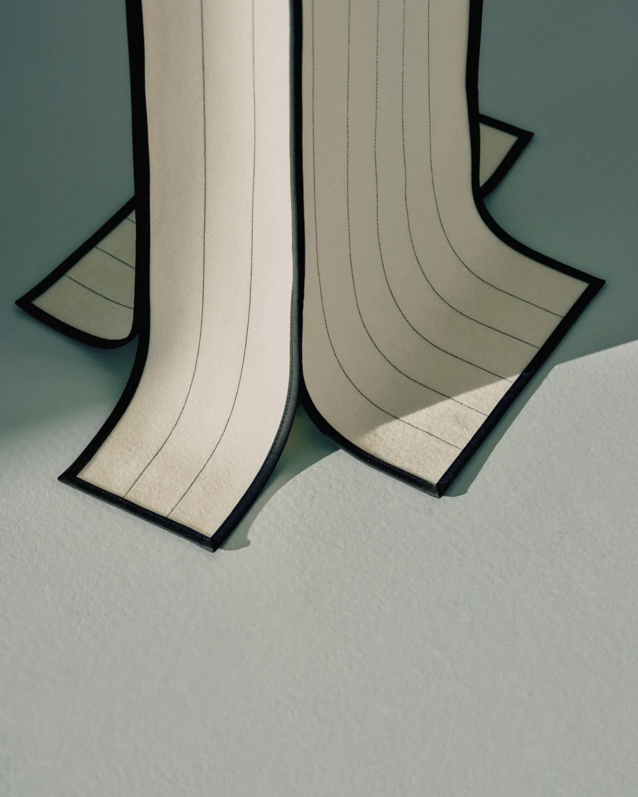
The daybed is probably the clearest expression of the concept. Long, low, and dressed in Kvadrat wool with visible quilting stitches running across its surface, it reads more like a made bed than a piece of showroom furniture. The fabric is not pulled over the form but rather allowed to settle onto it, the way a well-cut linen drapes over a body. The powder-coated steel frame beneath does its structural job quietly, without announcing itself.
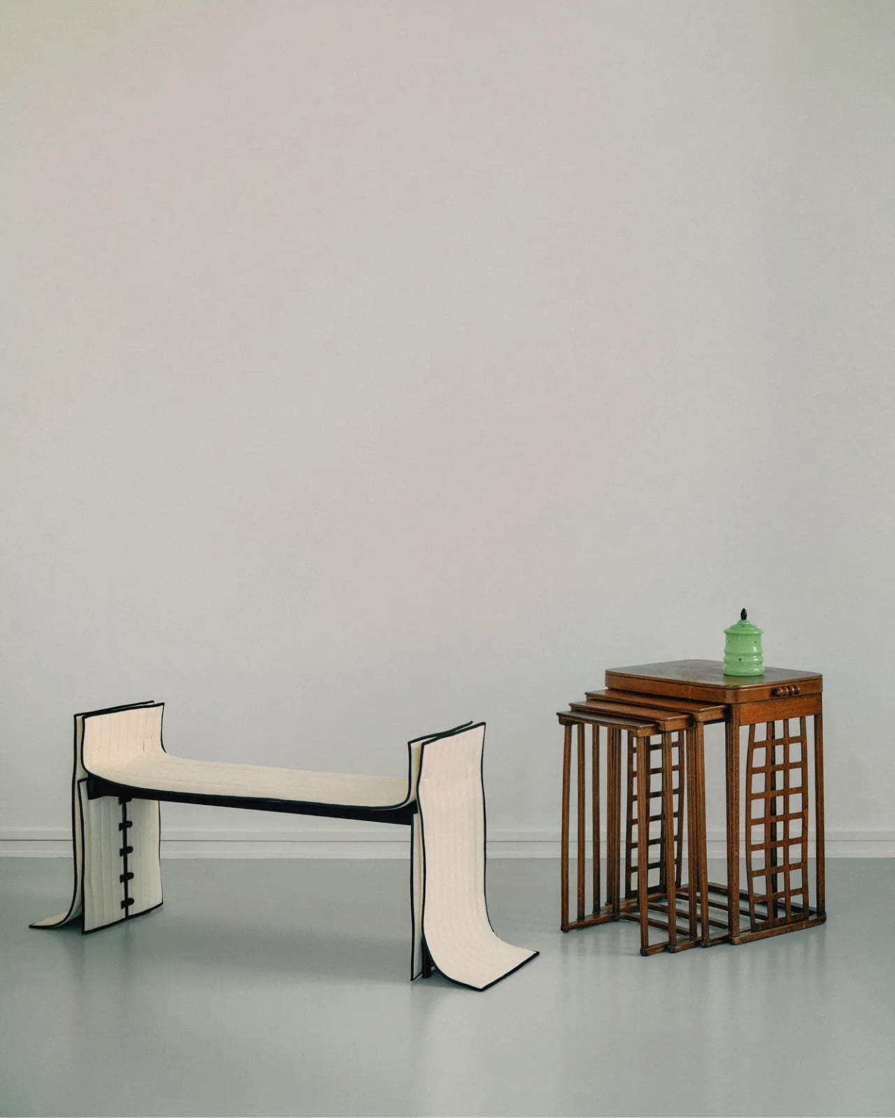
The bench follows a similar logic. Compact and precise, it carries the same quilted wool surface and the same twill weave edge banding that appears across the collection. That edge band is a detail worth pausing on. Ryom chose it specifically because twill weave is a technique rooted in clothing and home textiles rather than furniture. “It places the upholstery pieces somewhere in between,” she has said, “adding to the feeling of a tailored piece rather than upholstery.” It is a small choice with a large effect on how the finished object feels.
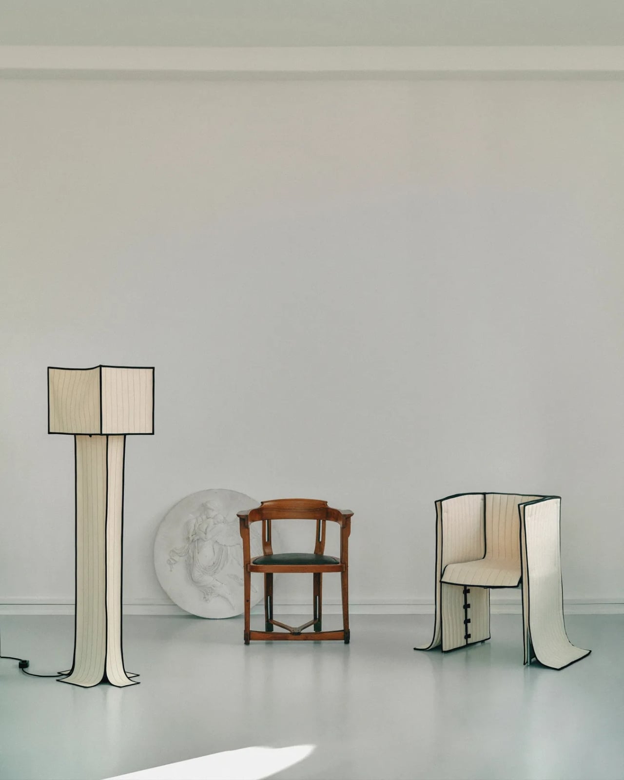
The chair, built on an aluminium frame rather than steel, is the lightest piece structurally, and it shows. It sits with a kind of ease that heavier upholstered chairs rarely manage. The wool covers it without gripping it, and the stitching adds just enough surface interest to reward a second look without demanding one.
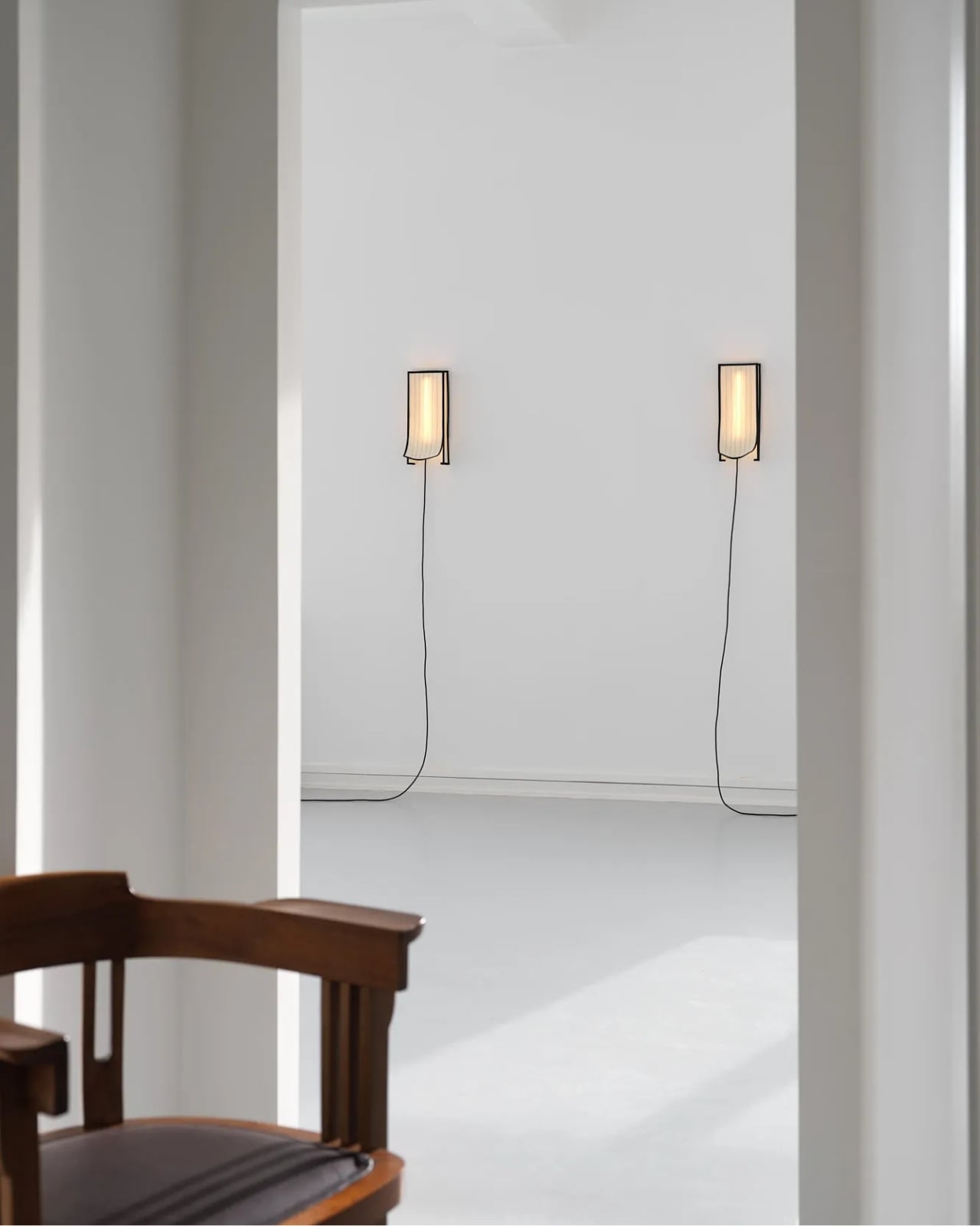
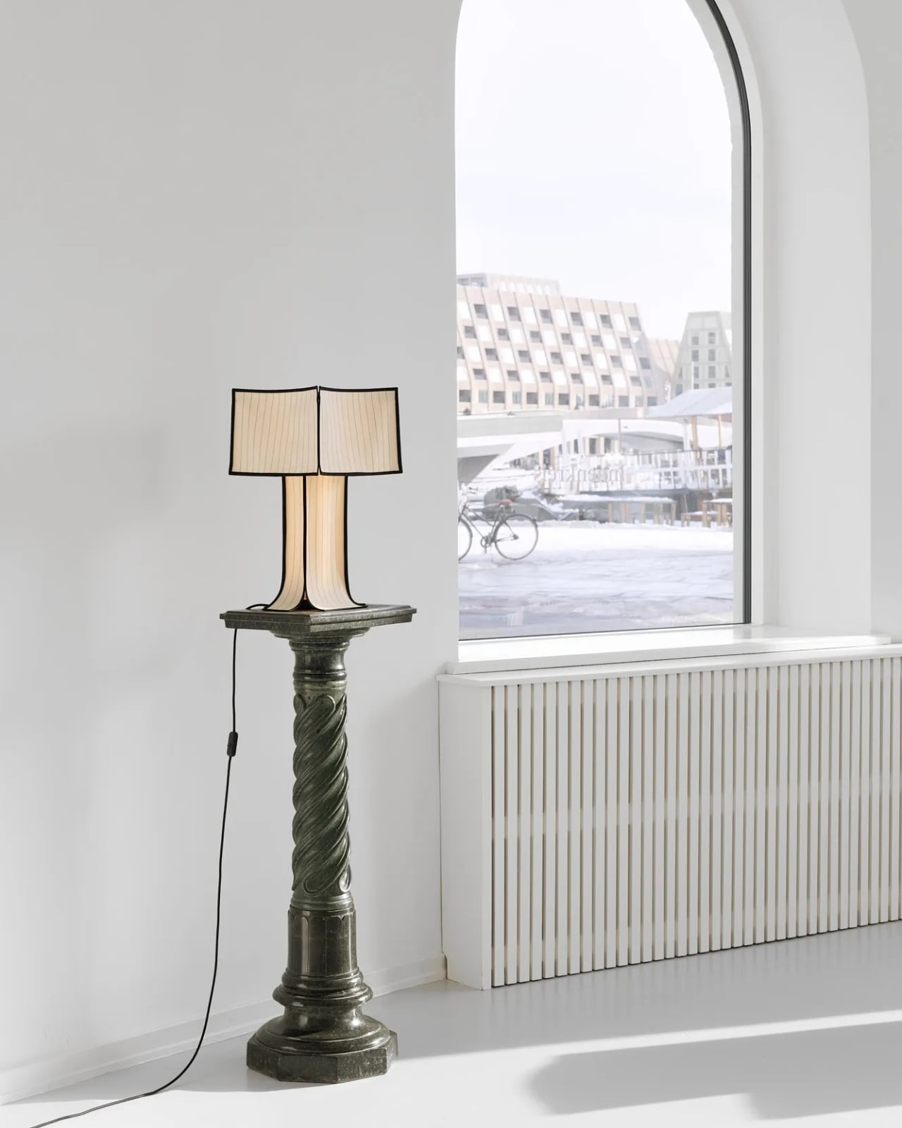
The lighting pieces are where the tailoring metaphor gets genuinely interesting. The floor lamp and table lamps, both on powder-coated steel bases, incorporate fabric shades that are constructed the same way as the seating pieces, draped and stitched rather than stretched and glued. The wall lamps, built on stainless steel bases, carry the same approach. Seeing the textile treatment applied to lighting as well as furniture makes the collection feel like a genuine system of thinking rather than a one-off experiment. Ryom is not just applying a technique to a single object type. She is testing a philosophy across an entire interior.
Underlying all of it is a material choice that matters. The Kvadrat wool she selected deliberately lacks visible weaving, which gives the stitching room to become the primary surface detail. The quilting is not decorative in a fussy sense. It is structural and honest, doing exactly what it appears to do, which is hold the fabric in place without adhesives or staples. The result is upholstery that can be disassembled, repaired, and eventually recycled. The clothes metaphor is not just aesthetic. It is practical in the most direct way possible.
Ryom, born in 1995 and working out of The Factory for Art and Design in Copenhagen’s Amager district, has been exploring alternative upholstery techniques for several years. Raiments feels like the point where that exploration becomes a fully formed position. The pieces are not minimal for the sake of it. They are restrained because restraint is what the concept requires. Every choice, from the aluminium chair frame to the stainless steel wall lamp bases to the twill edge banding, is in service of the same idea: that furniture should be dressed, not wrestled.
Whether or not that idea changes how people think about upholstery at large is probably too early to say. But Ryom has made a collection that is hard to look at and then go back to thinking about furniture the old way. That, for a debut solo show, is more than enough. Raiments is on show at Innenkreis, Herluf Trolles Gade 28, Copenhagen, through 23 May.
The water coming out of your tap has traveled through infrastructure that, in many American cities, predates the internet by several decades. Municipal treatment plants catch most of what they’re supposed to catch, but aging pipes, PFAS compounds from industrial and agricultural runoff, and lead from corroding plumbing each leave their own signature in what eventually fills your glass. Two people living thirty miles apart can have genuinely different water problems, and the solution that works perfectly in one kitchen may be entirely wrong for the other. Spring tends to be when many families actually act on this, a natural reset point where the habits and home conditions worth changing finally get real attention.
Waterdrop Filter has spent the better part of the last decade building a filtration lineup that treats water quality as a variable, not a constant. Five of their systems are currently on sale on Amazon through March 31st, spanning the full range of how people actually live: renters who can’t drill into cabinets, families running a high-demand kitchen with PFAS and lead on their radar, people who want their minerals preserved, and anyone who wants instant hot filtered water without the plumbing commitment. Each one is built around a different problem, and this guide helps narrow down which one is built around yours.
Waterdrop Filter G3P800 Tankless RO System: The Under-Sink Performer That Stays Out of Sight
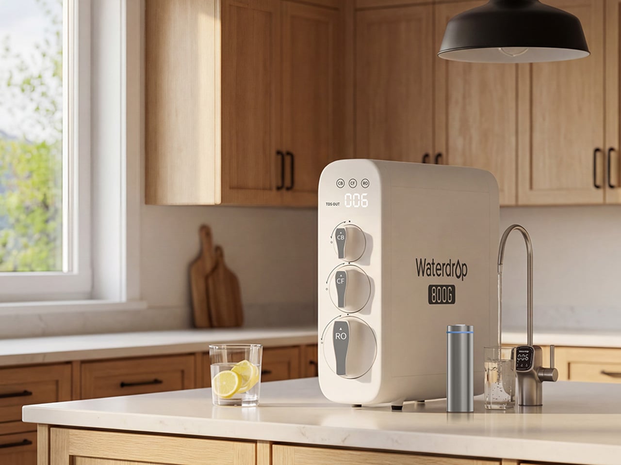
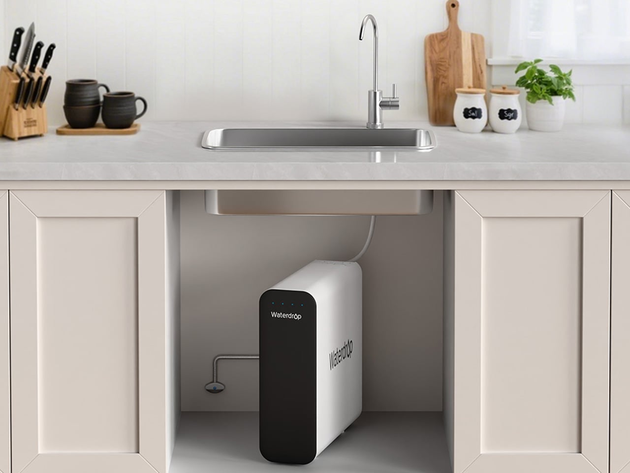
For families thinking seriously about what’s actually in their water this spring, the G3P800 is where Waterdrop Filter’s under-sink lineup earns its bestseller status. The concerns driving most of those conversations, PFAS compounds, lead from aging pipes, chlorine byproducts, are precisely what this system addresses. Its 10-stage RO filtration achieves 98% PFOA reduction, 99% PFOS, and over 99% lead, numbers that carry particular weight for households with infants, pregnant women, or elderly members. NSF/ANSI certifications across standards 42, 53, 58, and 372 back those claims with third-party verification. The tankless design reclaims 50 to 70 percent of under-sink cabinet space, and the UV sterilization stage catches bacteria and viruses that even a high-precision RO membrane cannot address alone.
At 800 gallons per day, the G3P800 handles the full rhythm of a busy family kitchen, from drinking water and cooking to coffee and baby formula preparation. A brushed nickel smart faucet displays real-time TDS readings and filter status at a glance, keeping the system legible without demanding attention. The 3:1 pure-to-drain ratio reflects a genuine shift in responsible RO design, producing meaningfully less drain water than older systems. Spring tends to be the moment families finally act on water quality concerns sitting in the back of their minds, and the G3P800 meets that decision with something durable, rigorously certified, and quietly capable of handling daily household demand for years.
Waterdrop Filter X12 RO System: The Flagship That Puts Minerals Back Where They Belong
Where the G3P800 is built for families who want serious filtration at serious capacity, the X12 is for those willing to push further. At 1,200 gallons per day across 11 stages of precision RO filtration, it represents Waterdrop Filter’s most complete answer to the growing list of contaminants giving health-conscious households pause this spring. The PFAS reduction figures here are among the strongest in the lineup, achieving 98.88% PFOA and 98.97% PFOS reduction, alongside a greater than 99.87% lead reduction rate. Certified against NSF/ANSI standards 58 and 372, the X12 carries the kind of third-party verification that families with infants or elderly members look for before trusting a system with daily drinking water and formula preparation.
What genuinely separates the X12 from most flagship RO systems is what it does after filtration. Reverse osmosis at this level of thoroughness strips water down comprehensively, which is where the built-in alkaline mineralization stage earns its place. Calcium and magnesium are reintroduced post-filtration, supporting bone health over time and restoring the balanced, naturally mineral-rich character that makes water taste the way good water should. For families prioritizing both purity and nutritional quality, particularly those with growing children, that combination is difficult to replicate elsewhere. The smart digital faucet handles real-time TDS monitoring and filter life tracking with the same quiet intelligence found across the range. Spring health resets tend to go deeper for some households, and the X12 is designed for exactly that level of commitment.
Waterdrop Filter DLG-P: Serious PFAS Protection Without the Installation Headache
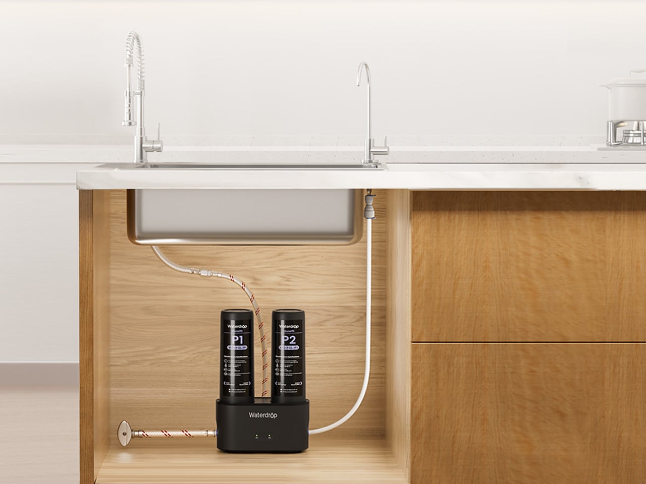
The conversation around PFAS and lead tends to center on high-capacity RO systems, and for good reason. But the reality of how many people actually live, in rentals, in first homes, in apartments where permanent under-sink modifications are off the table, means that access to serious water filtration has historically required commitment that many households simply couldn’t meet. The DLG-P is Waterdrop Filter’s answer to that gap. It installs in around three minutes without specialist tools, routes filtered water through an innovative dual-outlet design serving both a dedicated drinking faucet and the main kitchen tap, and achieves 99.7% PFOA and 99.6% PFOS reduction that rivals systems at considerably higher price points. For renters prioritizing PFAS protection this spring, those numbers reframe what budget-friendly filtration can actually deliver.
The system reduces chlorine, fluoride, sediment, and odors across its filtration stages, covering contaminants that affect daily drinking water quality in the most direct ways. A smart filter life indicator removes guesswork from maintenance, flagging replacement needs before performance drops. Filter cartridge replacement takes around three seconds, keeping upkeep genuinely frictionless for fast-paced households where the water filter is expected to work reliably in the background. The black finish gives it a contemporary presence that holds up in modern kitchen environments, and the compact footprint respects the limited under-sink space that comes with rental kitchens. For those who have looked at the G3P800 or X12 with interest but need a solution that fits a different budget and living situation, the DLG-P covers more ground than its entry price suggests.
Waterdrop Filter TSU: The Case for Filtration That Knows When to Stop
Not every household is starting from the same water quality baseline. In homes where municipal supply is reasonably clean but carrying chlorine taste, sediment, bacteria, and trace heavy metals like lead, deploying a full reverse osmosis system is a longer route than necessary. The TSU operates on that logic. Its 0.01-micron ultrafiltration membrane reduces 99.9% of bacteria, intercepts rust, sediment, fluoride, and heavy metals including lead, while leaving the water’s natural mineral content completely intact. Where the X12 reintroduces calcium and magnesium through a dedicated remineralization stage, the TSU simply never removes them, which for households with acceptable source water is both more efficient and more elegant.
What makes the TSU particularly compelling as a spring upgrade is what it doesn’t require. No electricity, no pump, zero wastewater, running entirely on standard water line pressure with nothing added to the utility bill. The 3-stage tankless system saves 50 to 70 percent of under-sink cabinet space. A brushed nickel dedicated faucet comes included, and the filter lifespan runs up to 24 months, meaning maintenance stays minimal across nearly two years. For busy families where easy installation and low ongoing upkeep matter as much as performance, the zero-waste design also reduces environmental impact and running costs over time. For households that want clean water supporting healthier spring routines without rebuilding their entire under-sink setup, the TSU makes a case that’s difficult to argue with.
Waterdrop Filter C1H: Countertop RO With a Trick Up Its Sleeve
Every system covered in this guide has required going under a sink. The C1H abandons that requirement entirely. It sits on the counter, plugs into a standard outlet, connects to a water source without drilling or permanent modification, and starts delivering six-stage reverse osmosis filtered water with no installation window and no landlord conversation. The 0.0001-micron RO membrane targets the same field of contaminants that motivates most spring filtration upgrades, including PFAS, chlorine, heavy metals, and TDS. The detachable tank design means it moves between a kitchen, an office, or a bedroom without friction, which matters for parents with young children or elderly family members who want safe, filtered water accessible across different rooms rather than anchored to a single tap.
The feature that sharpens the C1H’s appeal for spring routines is instant hot water delivered in three seconds across five adjustable temperature settings. Morning tea, pour-over coffee, baby formula, and quick meal preparation all lose the waiting step that a separate kettle introduces. A Favorite Mode remembers preferred temperature and volume combinations so the same result comes out consistently. Smart touch controls manage everything from volume selection to real-time TDS monitoring and filter life tracking. The 3:1 pure-to-drain ratio and a twelve-month filter lifespan keep both environmental impact and ongoing upkeep to a minimum. For households that have followed this guide and still need a solution on entirely different terms, the C1H closes that gap with confidence.
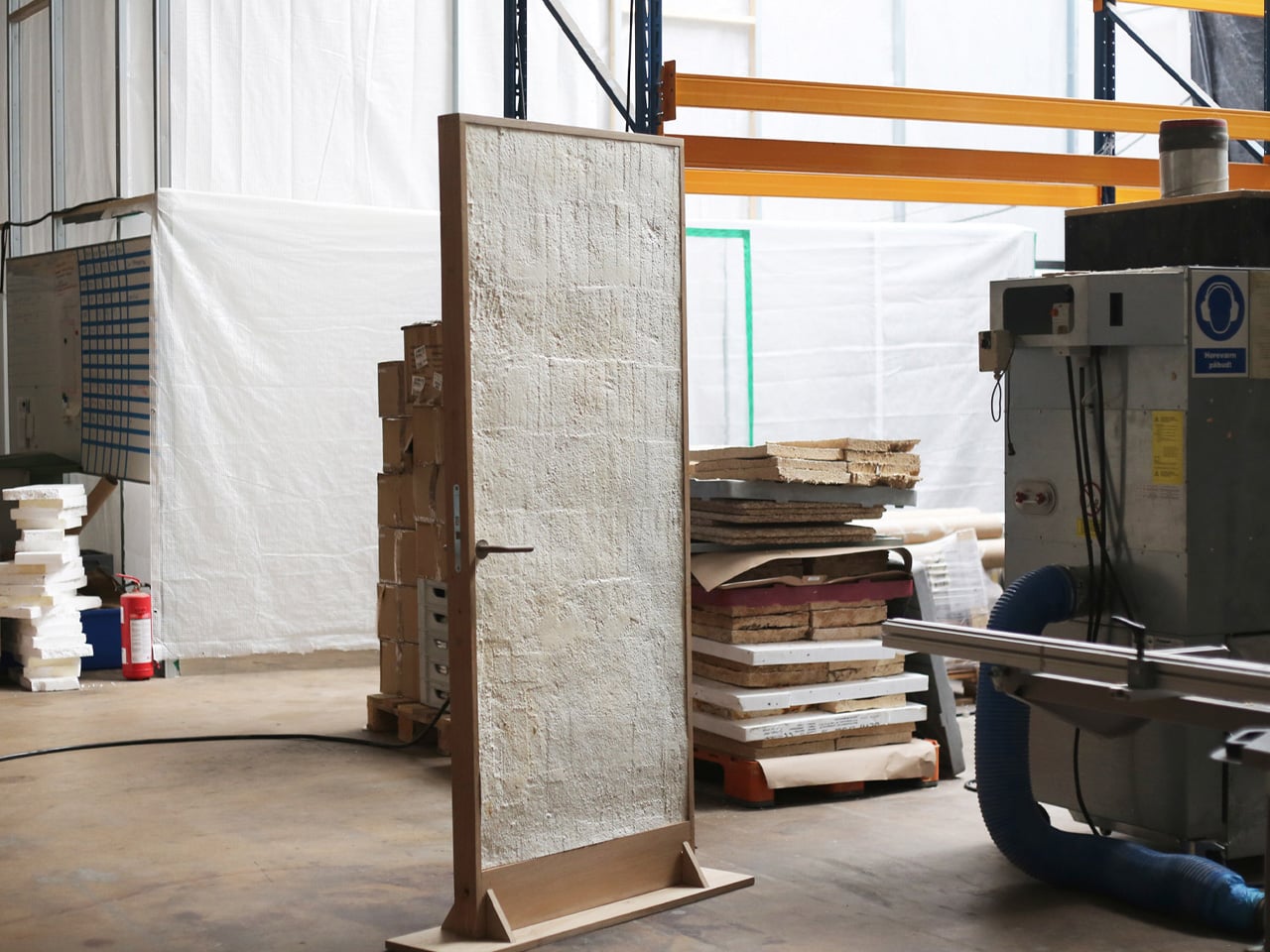
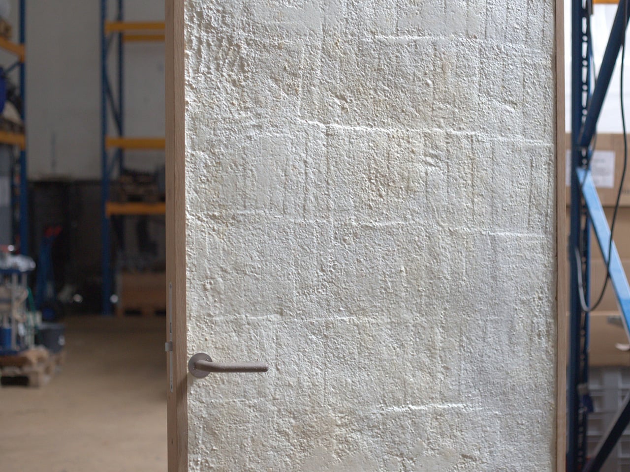
What if the door you walk through every day was grown from fungi? Danish mycelium company Rebound and architecture studio Det Levende Hus have partnered to create what they claim is the world’s first mass-produced interior door with a core cultivated from fungal mycelium. Currently in the prototype phase, the door is part of a broader collection of bio-based interior and sliding doors designed for modern living spaces, and it may quietly redefine what architectural materials can be.
The concept is straightforward but radical. Rebound cultivates the fast-growing root structure of fungi inside a mould, producing a rigid, lightweight panel with natural sound-absorbing qualities. That mycelium core is then enclosed within a timber frame built from reclaimed and surplus wood, including offcuts sourced from Danish flooring manufacturer Dinesen, meaning the door carries minimal material waste from start to finish.
Rebound co-founder Jon Strunge sees this as a direct challenge to the construction industry’s dependence on slow-growing hardwoods. “We wanted to demonstrate how regenerative, high-performance mycelium-based materials open opportunities for new, innovative, and scalable building components,” he said. The growing process takes roughly two weeks and is designed to scale industrially, making these doors a production-ready proposition rather than a one-off experiment.
What makes the design particularly noteworthy is its adaptability. Colour and surface texture can be altered during the growing process itself, removing the need for post-production finishing. The current prototype presents a smooth, silky surface, but the material can shift in tone and can also be finished with a layer of clay for a warmer, earthier aesthetic.
Structural performance was equally prioritised. A bio-based layer incorporated during the growing process stiffens the door and improves fire resistance, a bio-welding method that adds reinforcement without glue or additional manufacturing stages. The door was also designed to comply with current building standards for private homes, particularly around fire and moisture resistance, making it a credible candidate for real construction.
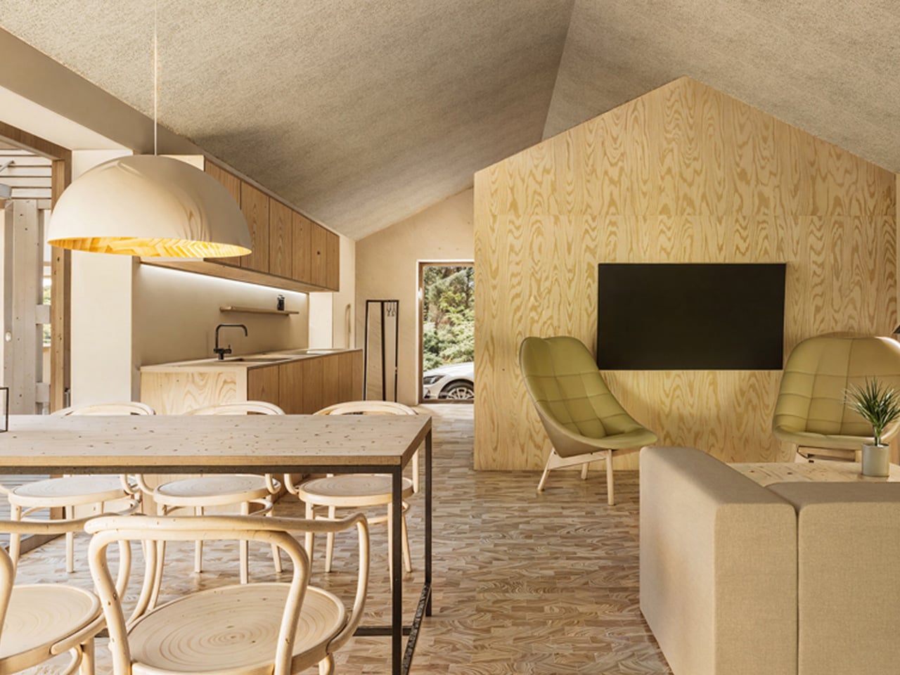
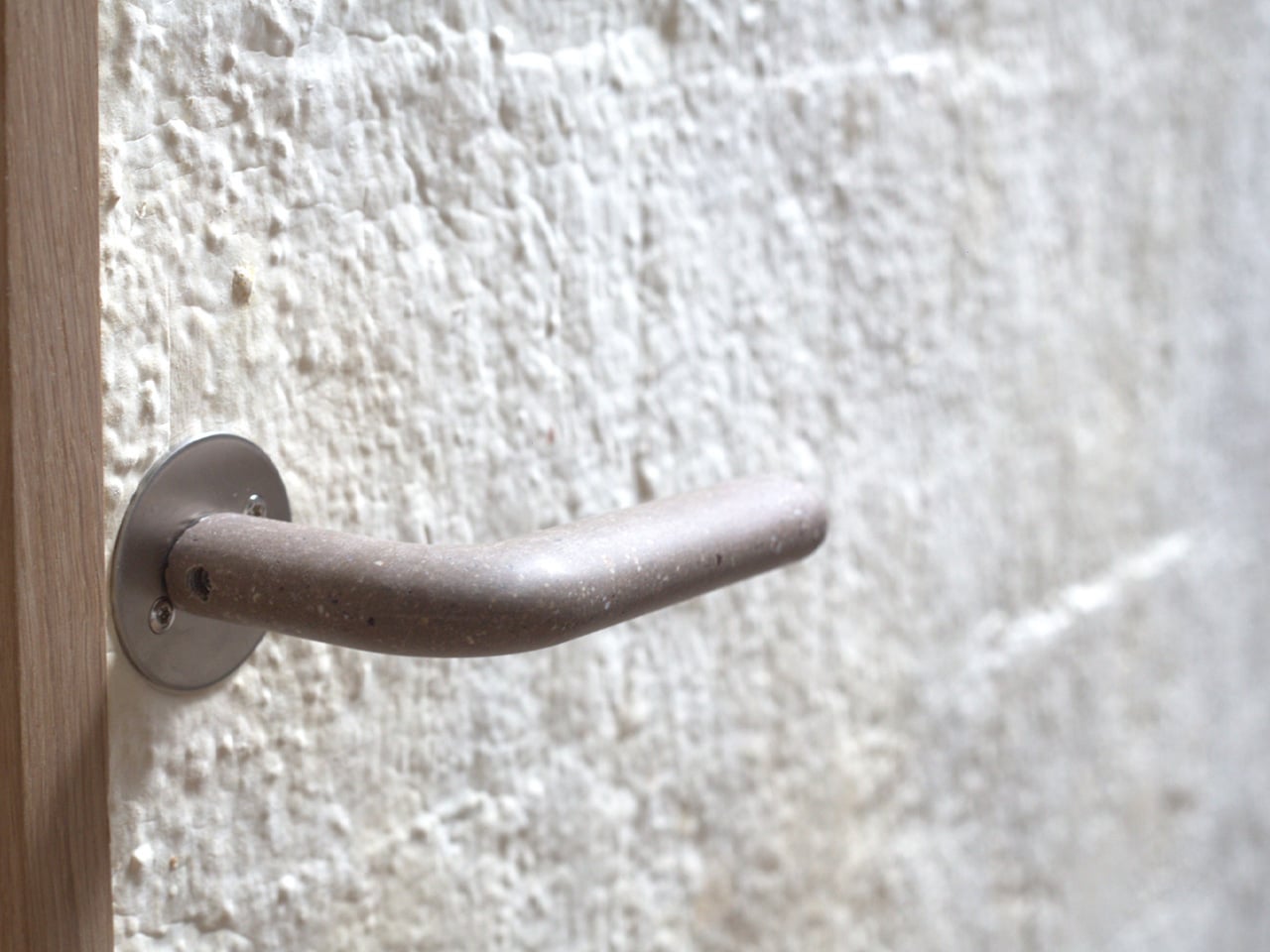
The first real-world application will be at Kaerhytten, a low-impact housing project in Ramloese, Denmark, designed by architect Jens Martin Suzuki-Højrup, scheduled for completion in 2026. The prototype also features a door handle by architect Bjarne Hammer for Danish brand Randi, the Moom handle cast from recycled seashells, adding a tactile detail that mirrors the door’s material ethos. Looking ahead, Rebound and Det Levende Hus are expanding into mycelium-based acoustic wall panels and ceilings. As Suzuki-Højrup put it, “It’s about how natural materials can transform our experience of space, visually, acoustically, even emotionally.”
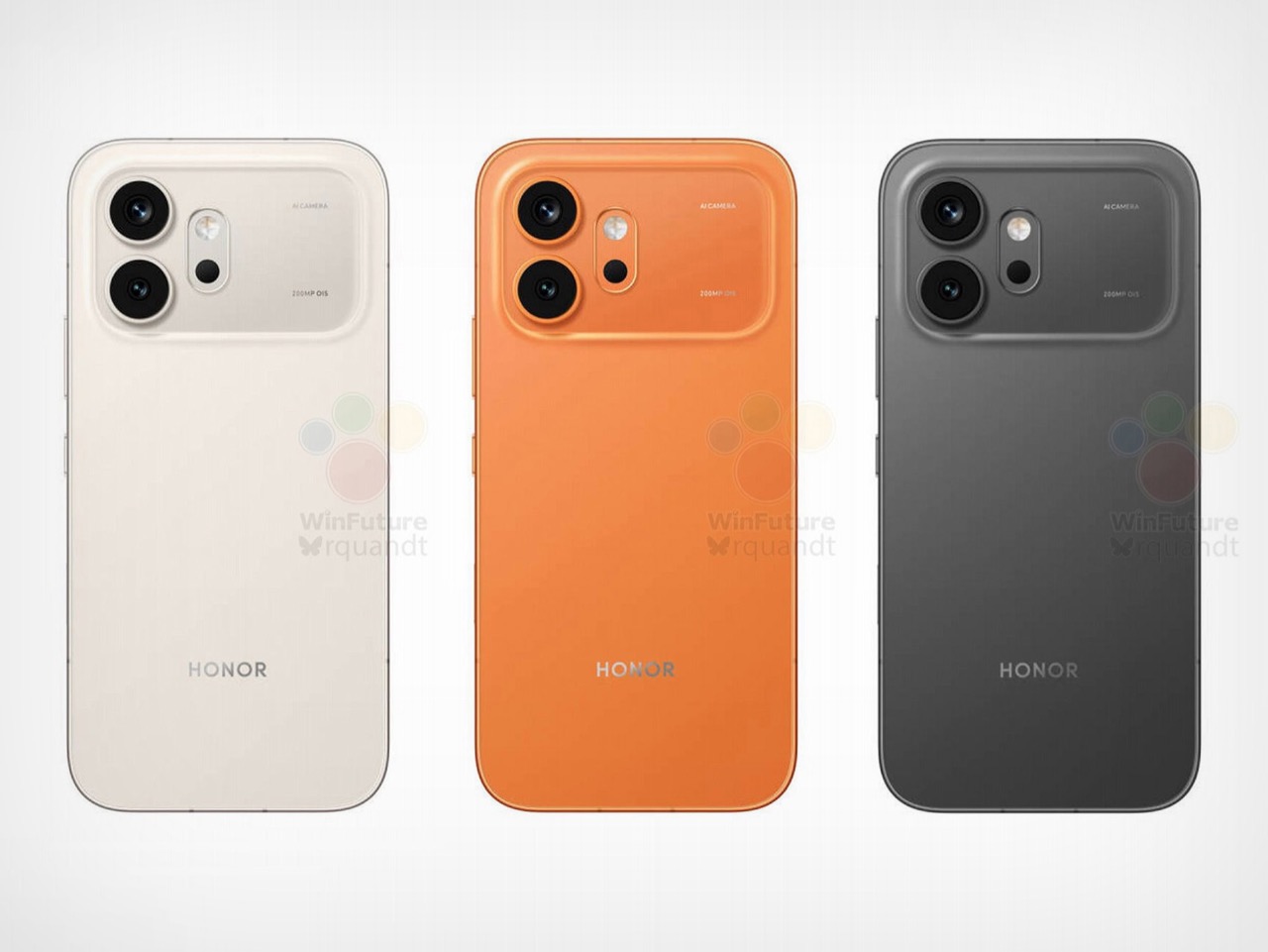
I have to hand it to Honor, they are consistent. When I wrote about the Magic8 Pro Air and its striking similarity to the iPhone Air, I thought we had seen the peak of their “inspiration.” It turns out that was just the warm-up act. The main event has arrived in the form of the Honor 600 and 600 Pro, and this time they have perfectly mimicked the iPhone 17 Pro. The new renders, courtesy of WinFuture, show a design that lifts every key element from Apple’s latest flagship. The full-width camera bar, the arrangement of the lenses, the flat metal frame, and even the color options are all present and accounted for. It’s a remarkable feat of reverse-engineering that feels both impressive and completely shameless.
What makes this strategy so fascinating is that Honor isn’t just making a cheaper clone. They are using the familiar, market-tested design as a vessel for a totally different philosophy. The Honor 600 is expected to ship with a 200MP camera and a 9,000mAh battery, specs that are practically alien to Apple’s ecosystem. It’s a phone designed to look like an iPhone from a distance but to function like an endurance-focused Android powerhouse up close. Honor is essentially telling the world that you can have Apple’s style without having to accept Apple’s compromises, and that’s a powerful message.
Designer: HONOR
The horizontal camera bar is not just vaguely similar, it’s dimensionally faithful. Both models feature the same raised rectangular module spanning nearly the full width of the device, with lenses, flash, and sensor cutouts arranged in a configuration that directly mirrors Apple’s layout. The standard Honor 600 goes with a dual rear camera setup, with its LED flash and laser autofocus tucked into a separate pill-shaped island below. The Pro model steps it up with a triple-lens arrangement, going all-in on the vertical stack. Even the colorways follow Apple’s playbook closely, with glossy black, metallic gold, and a bright orange finish that lands somewhere between homage and photocopy. Honor’s team clearly studied the iPhone 17 Pro with the intensity of an art student sketching a masterpiece in a museum.
The hardware rumors add even more intrigue to the picture. A 9,000mAh silicon battery in a flagship-tier device is almost unheard of in 2026, delivering the kind of multi-day endurance that the iPhone 17 Pro can only dream about. Both phones also get a 6.57-inch 120Hz OLED display at 1.5K resolution, wireless charging, a 3D ultrasonic in-display fingerprint sensor, and a Snapdragon 8 series chipset. There’s even a dedicated camera button on the side, which is, yes, another very Apple-like touch. Honor is effectively saying: if you love how the iPhone looks but wish it prioritized endurance and camera specs over thinness, we built that phone for you. Whether that resonates with buyers remains to be seen, but the logic behind it is hard to argue with.
In the world of Formula-1 world championships are won by the slender margin of milliseconds that turn into big margins after every passing lap. The level of engineering in the pinnacle of Motorsports is unparalleled, and the drivers competing for the top podium step do every little thing that gives them a strategic advantage over their rivals.
Personal training is a part of the drill to stay in top shape, but the real deal is to polish the skills and gain telemetry data in the racing sims that very closely mimic the nuances of each track on the season calendar. With the hybrid era, the need for simulating the real track conditions has become even more important, given the metamorphosis this sport is undergoing. A good simulator plays a vital role in giving the F1 and F2 drivers a fair idea of areas to improve, or develop strategic maneuvers that can be finally implemented on the track.
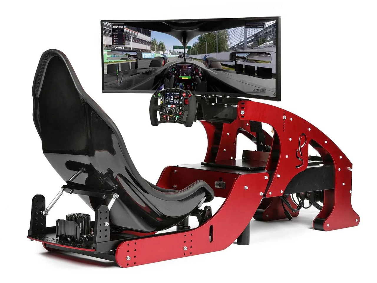
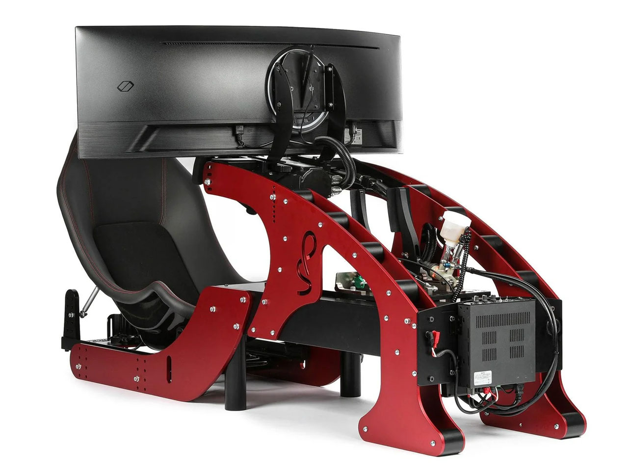
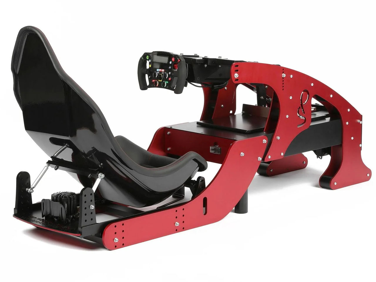
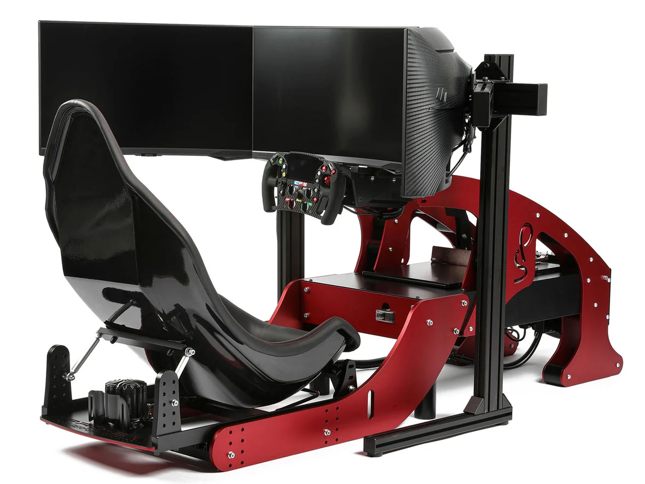
With over two decades of motorsport experience and trusted by over 250 professional racers, Cool Performance now brings its most advanced F1 sim racer for professionals and motorsports fans. Current F1 drivers who train their driving skills on the Formula Pro Simulator include Lando Norris, Carlos Sainz, Sebastian Vettel and Alex Albon. Founder Oliver Norris has designed the simulator from the ground up with tons of experience in his own Motorsports journey and his brother Lando’s last couple of successful F1 seasons.
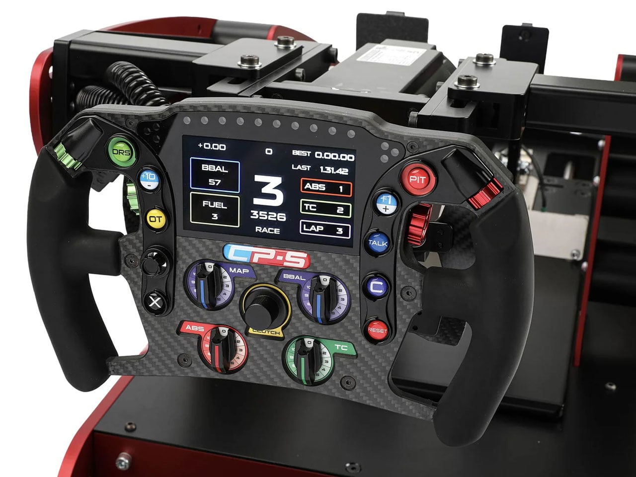
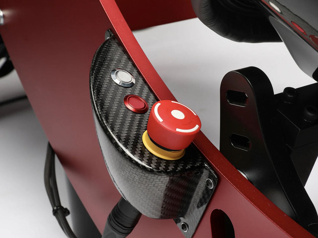
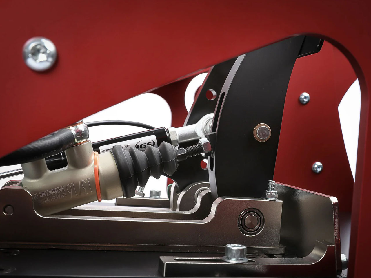
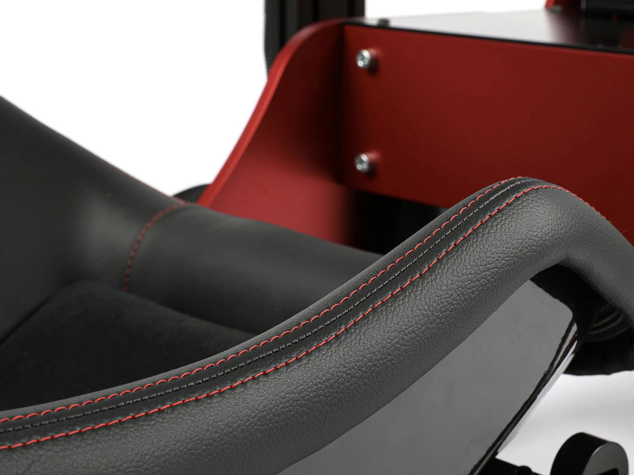
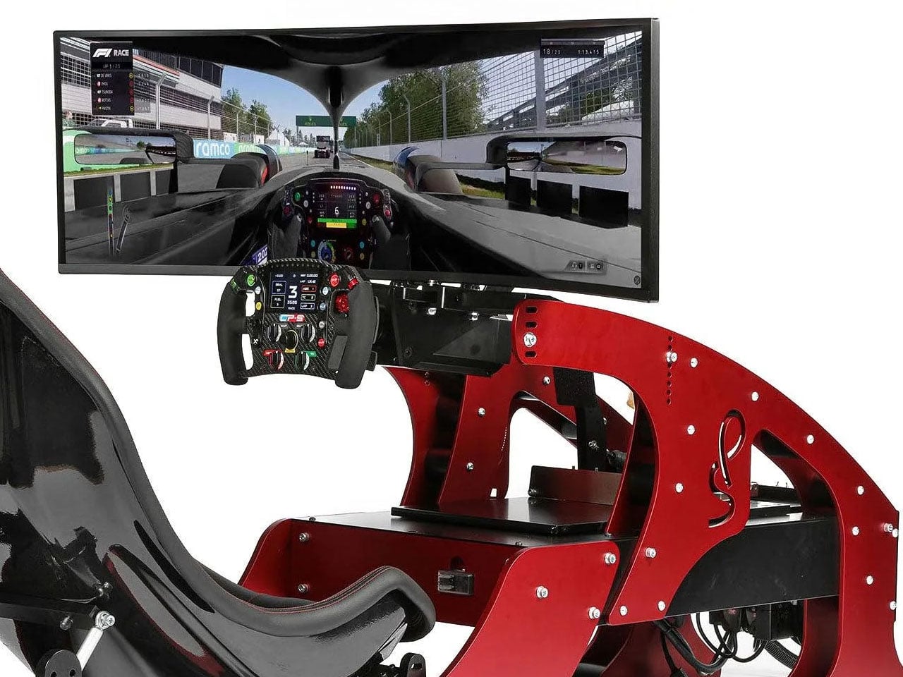
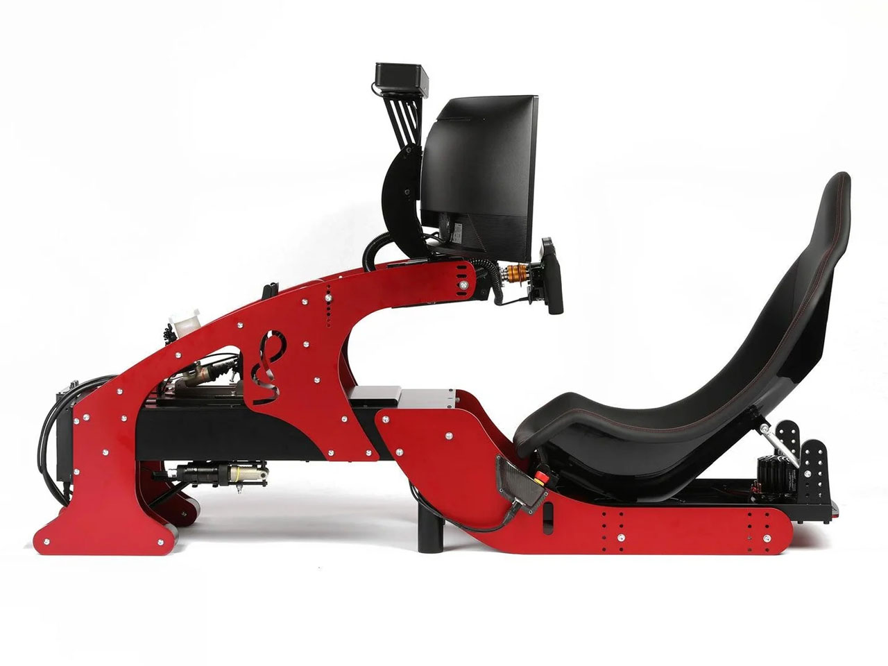
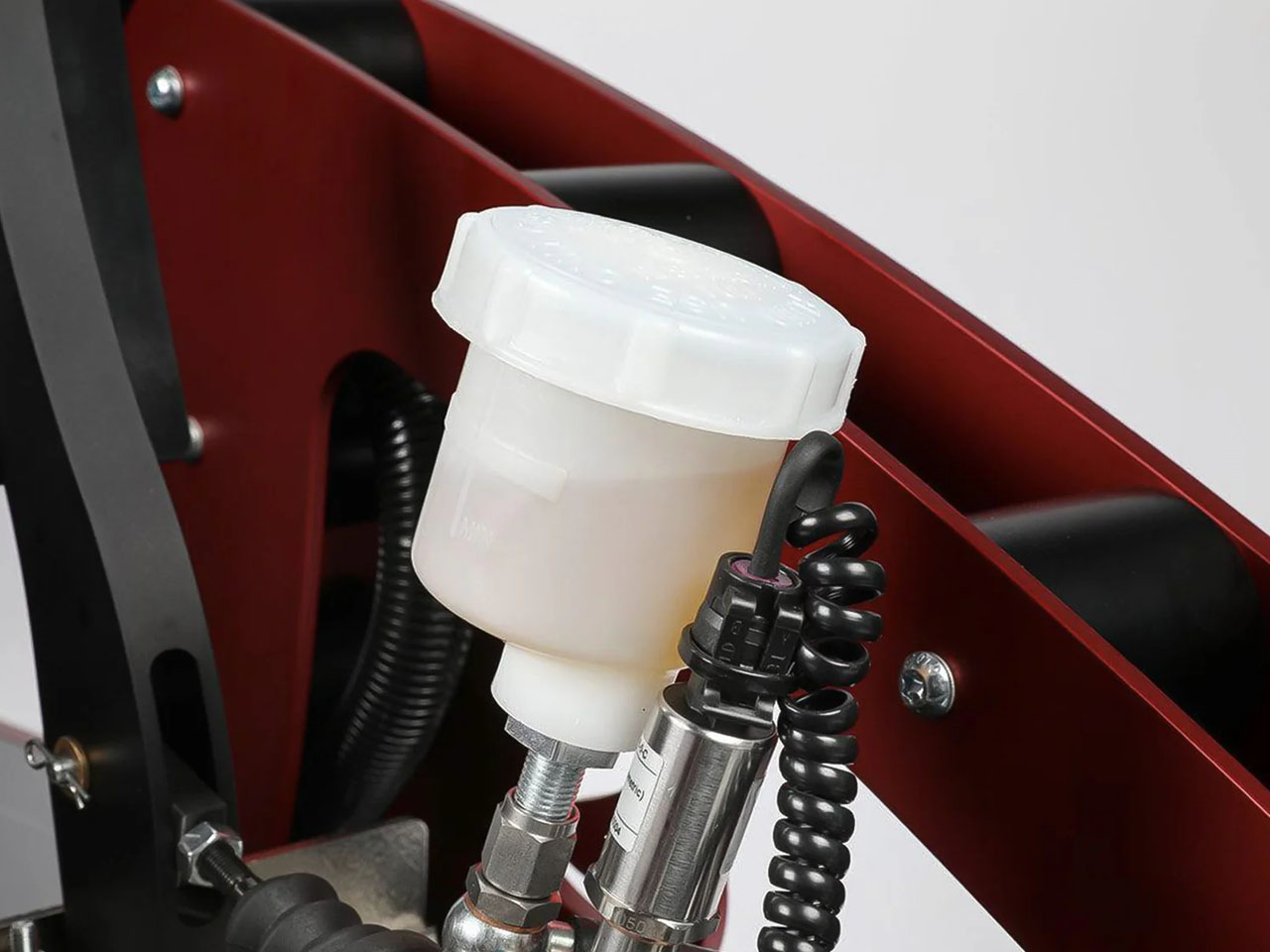
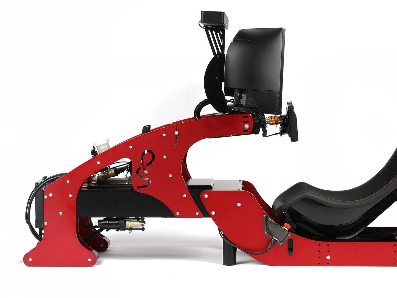
The professional-grade simulator has a precision-designed cockpit and race seat to recreate the realism of FPV in the single-seater racer. To simulate the nuances of a Formula -1 car riding the tarmac, the simulator has a high-torque force feedback steering and a Leo Bodnar SimSteering 2 base. This lets the sim racer feel every little bump of the chicane or the minute grip changes when the car is steered off the racing line. Braking in Formula 1 is way more challenging than your average SUV. That is mimicked by the CP-S hydraulic pedals with an AP Racing master cylinder support, which can simulate 200 kgs of braking force. For that, you’ll require immense strength in your core and lower body.
Every little detail of this F1 simulator is narrowed down to the last millimeter, much like the Formula 1 cars. Right from the highly technical CP-S Formula steering wheel that has virtually everything right at arms distance for the driver, to the CP-S custom hydraulic pedals, nothing gets better than the Cool Performance’s option. Clearly, if you want to feel the realism and the tiny details of Formula 1, this is it. Each one of the Formula Pro F1 simulators is custom-manufactured and tested by Oliver and Adrian Quaife-Hobbs in Kent, United Kingdom.
Eager buyers can opt for a single curved screen setup or a multiscreen array for better realism. If you are a purist, then the UK-based manufacturer can create a bespoke version of the sim to fit your specific needs. The Formula Pro simulator price starts from $40,950 and can go higher depending on the add-ons demanded or the bespoke modifications required.
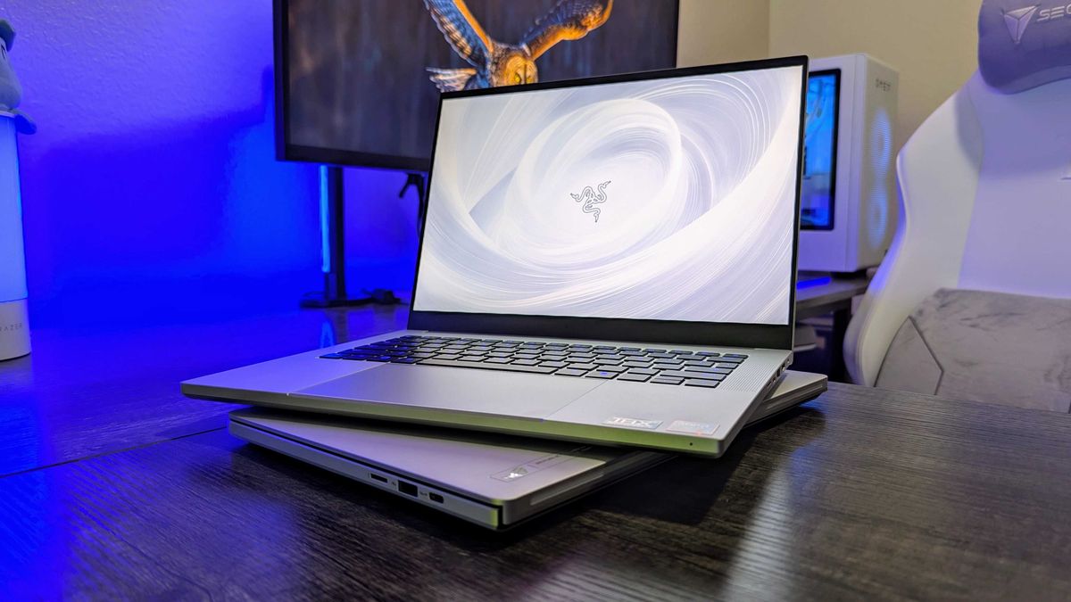
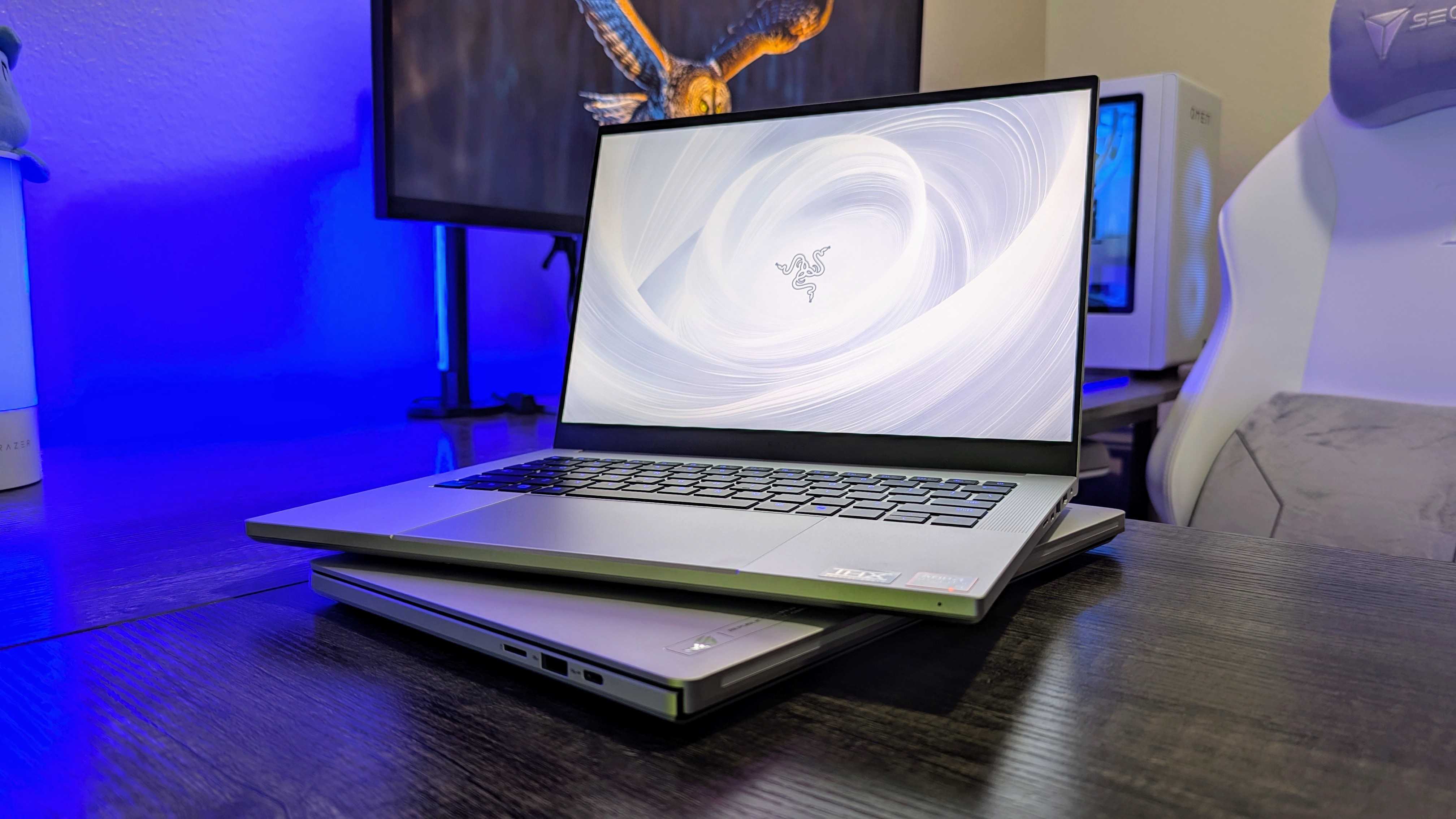
Razer has taken the wraps off its Blade 16 for 2026, and it's a significant refresh that now builds on Intel's Core Ultra Series 3 "Panther Lake" chips. Here's what you need to know (and where you can buy it today).
Razer Blade 16 (2026)
A look at the refreshed Razer Blade 16 for 2026, complete with Intel CPUs and NVIDIA GPUs.
Windows 11 Brings Back the Movable Taskbar After years of complaints… it’s finally happening. 👉 Microsoft is bringing back the movable taskbar in Windows 11—and users are calling it one of the best changes yet. 👀 What’s Changing? For the first time since Windows 11 launched, you’ll soon be able to: Move the taskbar to […]
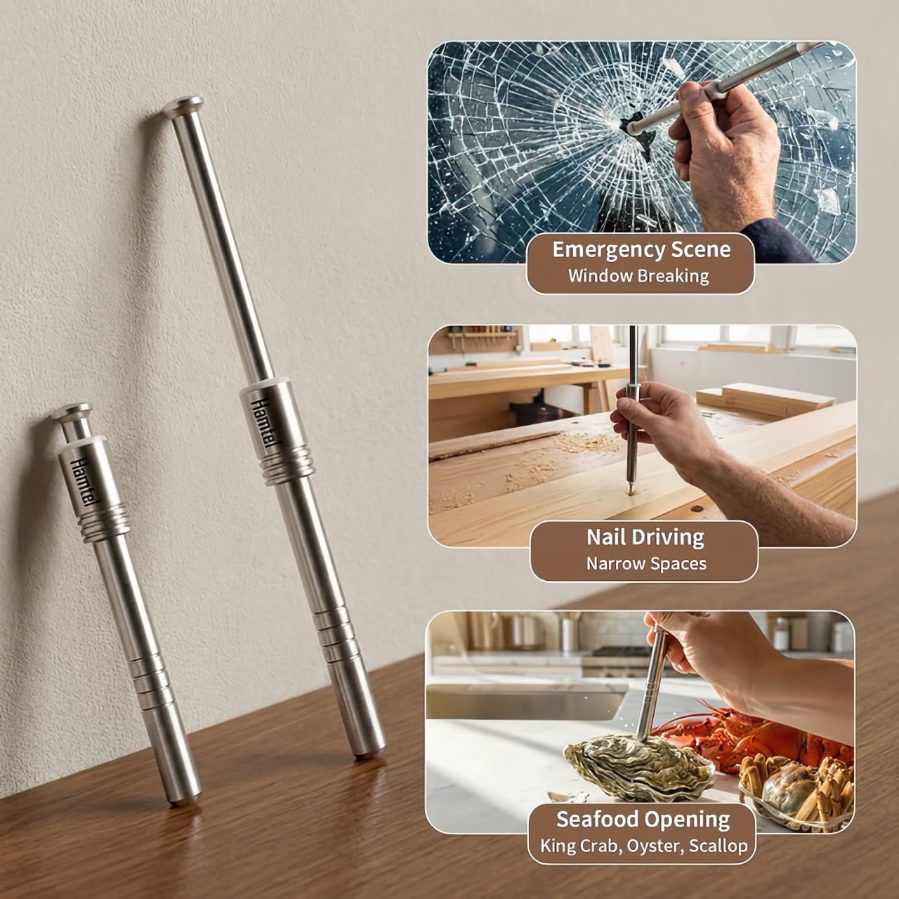
Think for a moment about three common tools: the nutcracker that sends shell fragments flying across the room, the bulky hammer you have to retrieve for the simple task of hanging a photo, and the emergency window breaker you bought for your car but have since forgotten about. Each serves a purpose, yet each comes with its own inconvenience, whether it’s mess, cumbersomeness, or the simple fact that it’s never around when you actually need it. These are the kinds of minor but persistent frustrations that we tend to accept as normal, the small design flaws in our daily routines.
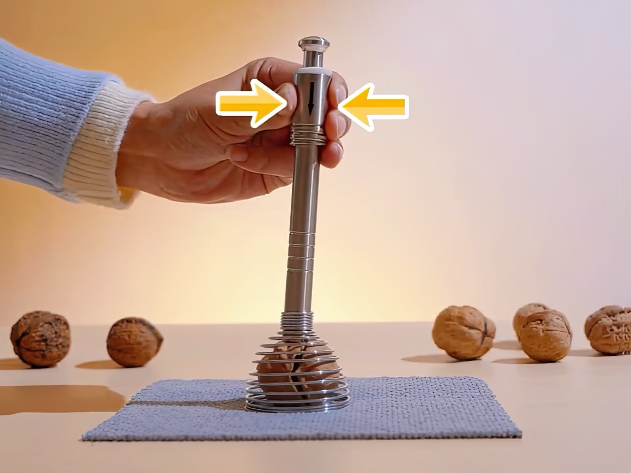
The Hamtel was born from a refusal to accept those flaws. It was conceived as a direct answer to these distinct problems, elegantly combining their solutions into a single, compact device. Its core function is a spring-loaded impact mechanism that cracks nuts with precision, eliminating mess and preserving the kernel. With a simple adjustment, that same tool becomes a capable mini-hammer for light-duty tasks. Finally, its tungsten steel tip provides the reliable performance of a dedicated car safety hammer, creating a single tool that is practical enough for daily use and critical in an emergency.
The real draw for anyone with an appreciation for good gear is the sheer tactile satisfaction of its action. You pull back the plunger to arm the manganese alloy steel spring, a process that feels deliberate and mechanical, like chambering a round. Placing the tip on the target and pressing down unleashes an explosive force reportedly moving at over 530 meters per second. This impact-driven deployment is what separates it from every dull lever-action cracker on the market. It’s a clean, contained, and frankly, an incredibly cool way to apply force. This is the kind of thoughtful engineering that gets EDC enthusiasts talking, turning a mundane kitchen task into an opportunity to use a well-made instrument.
The body is stainless steel, providing a solid, weighted feel in the hand, while the business end features a high-hardness tungsten steel tip rated at HRC60+. This is the material specification you expect in high-end cutting tools or industrial equipment, not something designed to crack walnuts. This choice is critical for its dual-purpose role as a car window breaker, ensuring the tip remains sharp and effective even after repeated use. That effectively means your walnut or macadamia or brazil nut stands absolutely no chance. The tip works remarkably well against seafood too, letting you crack into crab and lobster claws/shells without breaking out industrial equipment.
This precision translates directly to its performance in the kitchen. It boasts a 95% kernel preservation rate, a number that seems ambitious until you consider the physics at play. Instead of crushing a shell with slow, brute force, the Hamtel delivers a sharp, localized impact that fractures the shell without pulverizing the contents. This makes it just as effective for delicate jobs, like cracking open crab legs or lobster claws without shredding the meat inside. It brings a surprising level of finesse to a category of tools typically defined by their crudeness, making it a genuinely useful upgrade for any kitchen.
Initial pricing puts the Hamtel at $66, which is a compelling entry point considering its planned retail is set at $124. Logistics are refreshingly simple, with a flat $9 shipping fee for delivery anywhere in the world. An optional nut pick can be added for just a few dollars, making it a complete package for dealing with stubborn shells. For the price of a single-purpose emergency tool, you’re getting a device that serves three distinct functions, some life-changing, others life-saving. But for most of the time, bon appetit!
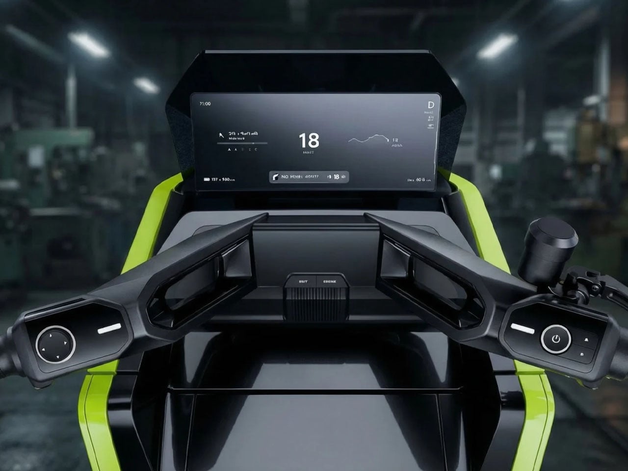
Two-wheelers have always demanded a certain level of skill and balance from riders, especially at low speeds or when navigating crowded city streets. OMO X by Omoway attempts to change that equation by introducing what the company describes as the world’s first mass-produced self-balancing electric motorcycle. Designed around advanced robotics and artificial intelligence, the new age electric bike blends traditional scooter convenience with autonomous technology that aims to make urban mobility easier and safer.
At the core of the two-wheeler is Omoway’s newly introduced OMO-ROBOT architecture, a full-stack control platform that integrates sensors, perception systems, decision-making software, and mechanical actuation into a unified framework. The system combines aerospace-grade gyroscope technology with reinforcement-learning models to continuously stabilize the motorcycle. This architecture allows the OMO X to maintain balance on its own, even when stationary, eliminating one of the biggest challenges riders face on two-wheeled vehicles.
The balancing capability is achieved through a Control Moment Gyroscope (CMG) module. Using the principle of angular momentum, the spinning gyroscope actively stabilizes the vehicle, keeping it upright without rider input. Beyond simply preventing tip-overs, the system also supports a range of riding assistance features. These include slip prevention on wet surfaces, assistance while cornering, and obstacle-avoidance capabilities designed to enhance safety during everyday riding.
Omoway is also positioning the OMO X as a highly intelligent mobility device. The scooter incorporates a network of sensors and cameras that continuously monitor the surrounding environment and feed data into an AI-based riding system. This enables features such as adaptive speed adjustments, hazard detection, and automated safety responses if the system identifies a potential risk. Some demonstrations have even shown the scooter maneuvering on its own, driving onto a stage without a rider, and responding to remote commands through a smartphone app.
Another notable capability is automated parking. Instead of requiring riders to maneuver the bike into tight urban spaces manually, the OMO X can guide itself into a parking spot once a location is selected. The system relies on its self-balancing capability and onboard sensors to navigate safely, a feature that reflects the growing overlap between robotics and personal transportation.
The electric scooter’s futuristic design further reinforces its technological identity. Its sharp, angular styling and distinctive lighting signature give it a modern aesthetic that stands apart from traditional scooters. In a way, it carries the Tesla Cybertruck aesthetic, with a continuous front light bar replacing a conventional headlamp and creating a visually striking presence on the road.
Production plans for the OMO X are already underway. The company announced that the model has entered mass production following its global launch event in Singapore, with pre-orders expected to open in April 2026. Indonesia has been selected as the first launch market, where the electric scooter will debut commercially in Jakarta shortly afterward. Omoway is reportedly working with multiple regional distributors and plans to establish a dealer network of more than 100 locations in the country.
The line between work and home has blurred into an architectural dialogue. Today’s hybrid living isn’t about working from the kitchen counter but about rethinking how domestic spaces support productivity and calm. Designers now aim to create environments that balance efficiency with ease, where furniture performs multiple roles without sacrificing elegance or comfort.
For high-net-worth homeowners, this shift is about investing in experiences that enhance their lifestyle and property value. Portable chairs and adaptive workstations have evolved into design essentials, dynamic and ergonomic, fluid enough to move with the rhythms of daily life, redefining how we live and work within our spaces.
1. Ergonomic Intelligence and Wellness Value
The strength of any portable workspace lies in its ergonomic foundation. Temporary, low-quality setups often lead to long-term strain and reduced focus. True wellness ROI comes from minimizing physical fatigue through design that supports the body’s rhythm, integrating temperature-responsive materials, balanced support, and kinetic flexibility rather than relying on surface aesthetics alone.
When selecting furniture, prioritize chairs with dynamic lumbar support and workstations with seamless height adjustment. The ideal setup becomes a biophilic cocoon, comforting, adaptive, and attuned to your natural movement, ensuring that even during long digital sessions, productivity and physical harmony remain perfectly aligned.
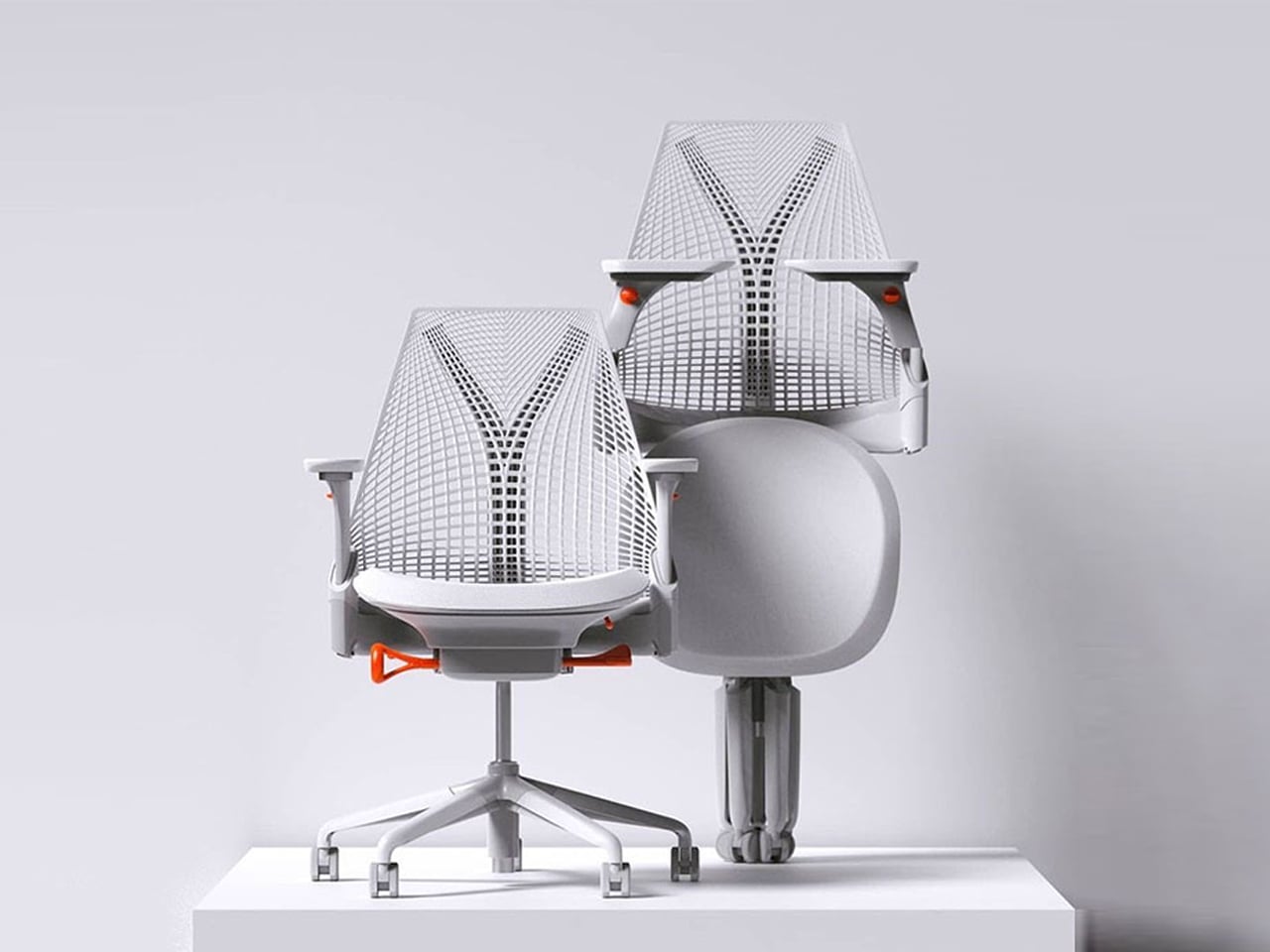
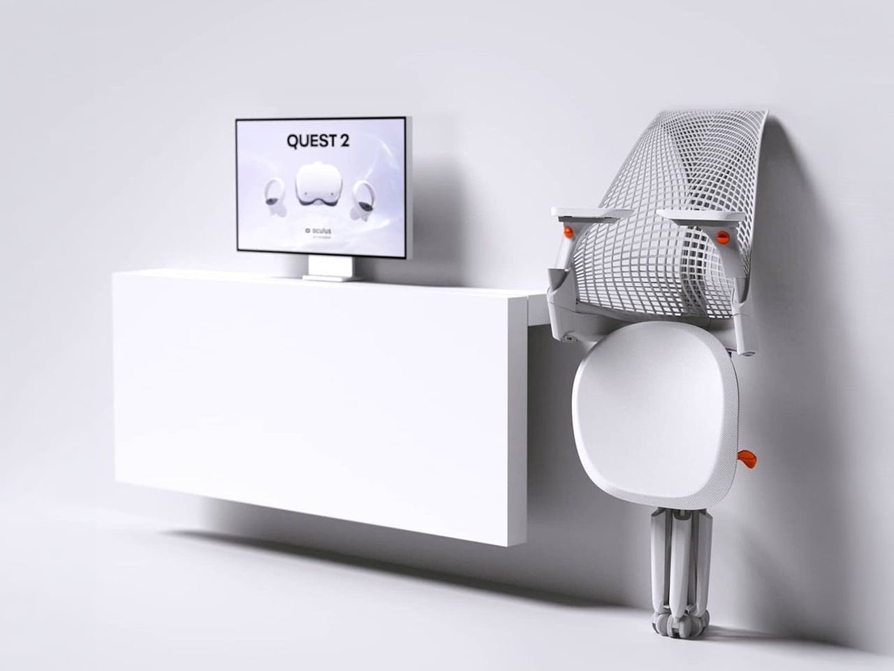
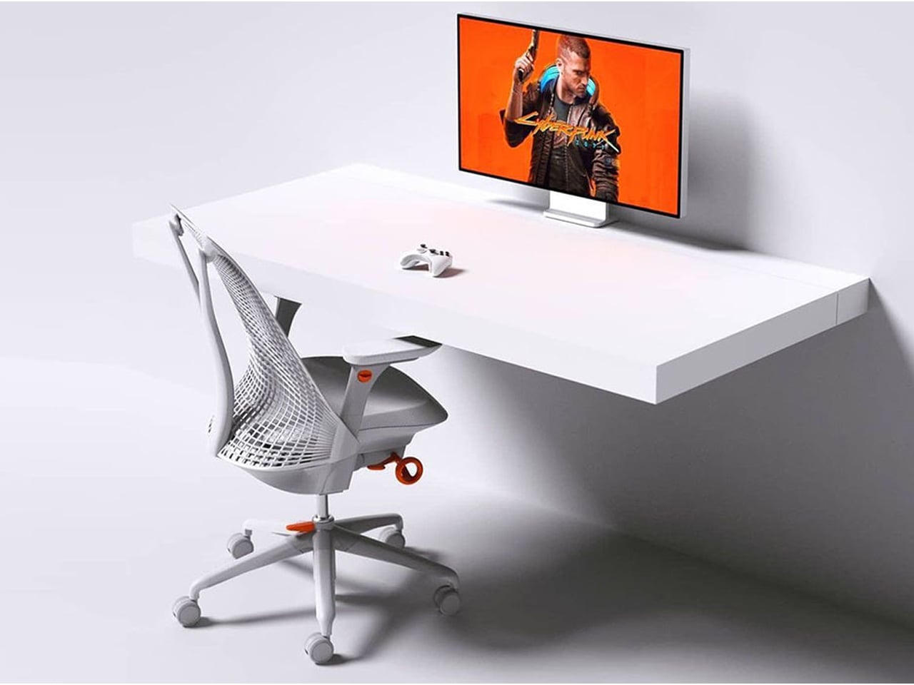
The Sayl concept chair by Charley reflects the changing ways we live, work, and play. As homes have evolved into hybrid offices, gyms, social spaces, and relaxation zones, our furniture needs have changed too. Charley even considers the hours we spend gaming or binge-watching, recognizing that chairs today must support multiple activities while remaining comfortable and functional. Designed by Herman Miller, the Sayl chair combines high-end design with practical usability, allowing users to maximize their space without sacrificing luxury or ergonomics.
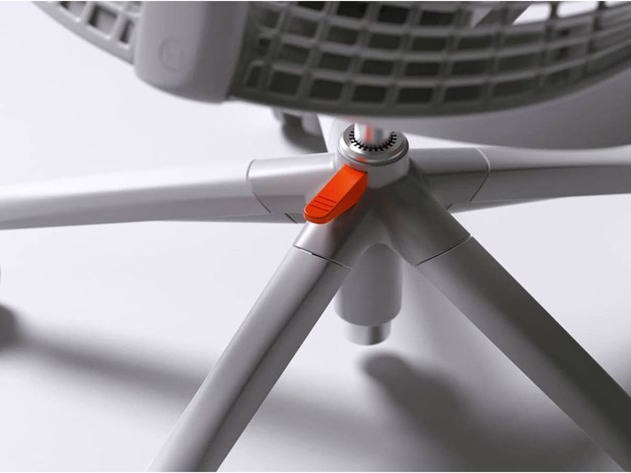
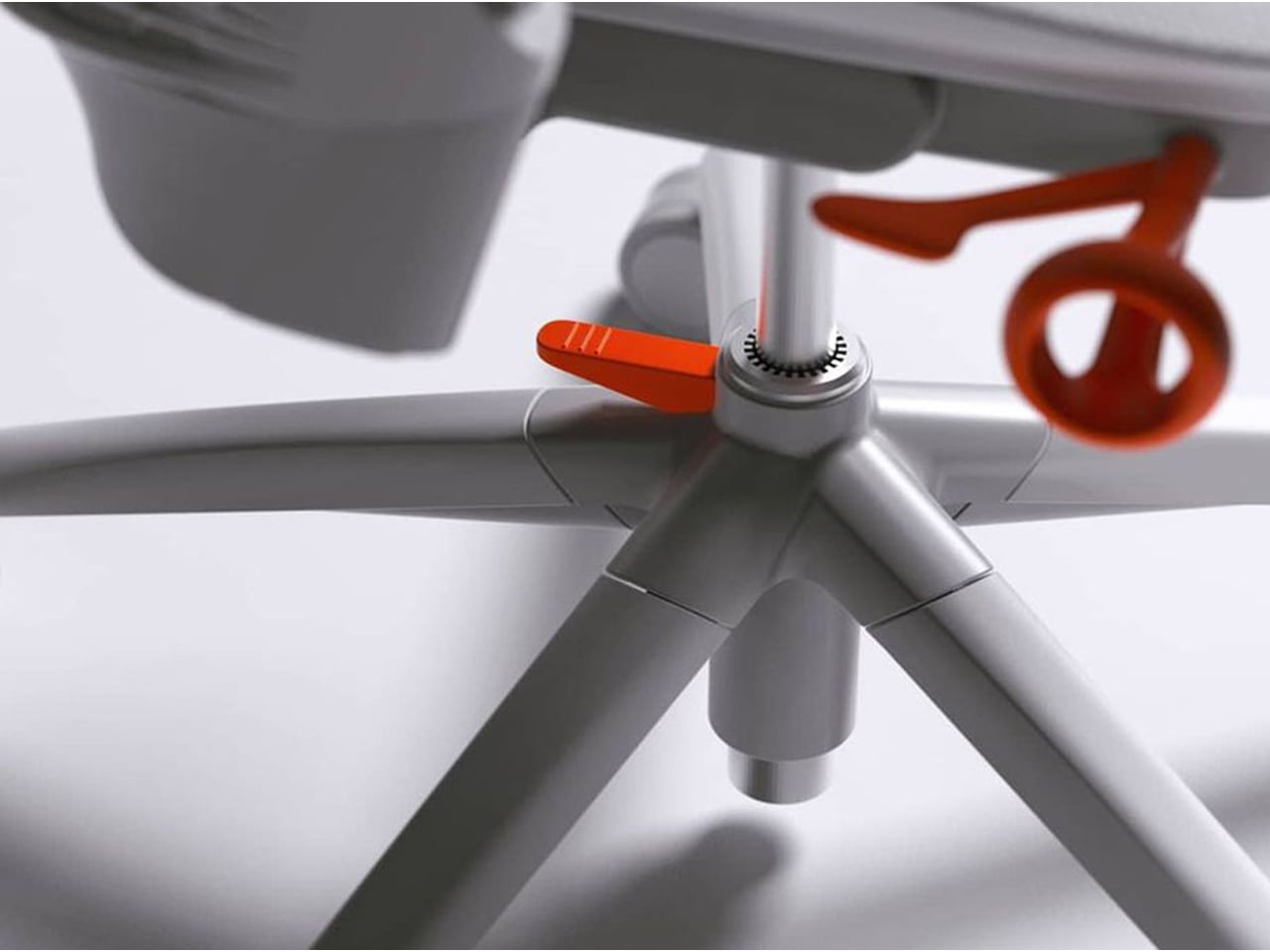
The chair’s muted grey tones ensure it blends effortlessly into any interior, while bright orange accents draw attention to pivotal touchpoints, making it intuitive to use. A foot pedal mechanism allows the chair to collapse easily, providing a convenient, space-saving solution for modern homes. In the post-pandemic era, furniture design has shifted towards modular, flexible, multifunctional, and compact solutions. The Sayl chair embodies all these qualities, offering a versatile, stylish, and practical seating option for today’s hybrid lifestyle.
2. Aesthetic Integrity and Material Authenticity
Every portable unit should carry a strong aesthetic value that complements its architectural surroundings. Materials must feel genuine and timeless, like solid wood, brushed metal, and high-performance textiles that reveal craftsmanship rather than conceal it. This honesty of composition creates visual depth and emotional connection, reinforcing the idea that beauty lies in authenticity, not imitation.
The design should remain sculptural yet understated, integrating seamlessly into curated interiors. Its finish must align with the home’s palette, allowing it to coexist gracefully within the space. When not in use, it should rest as a quiet architectural accent rather than a workplace intrusion.
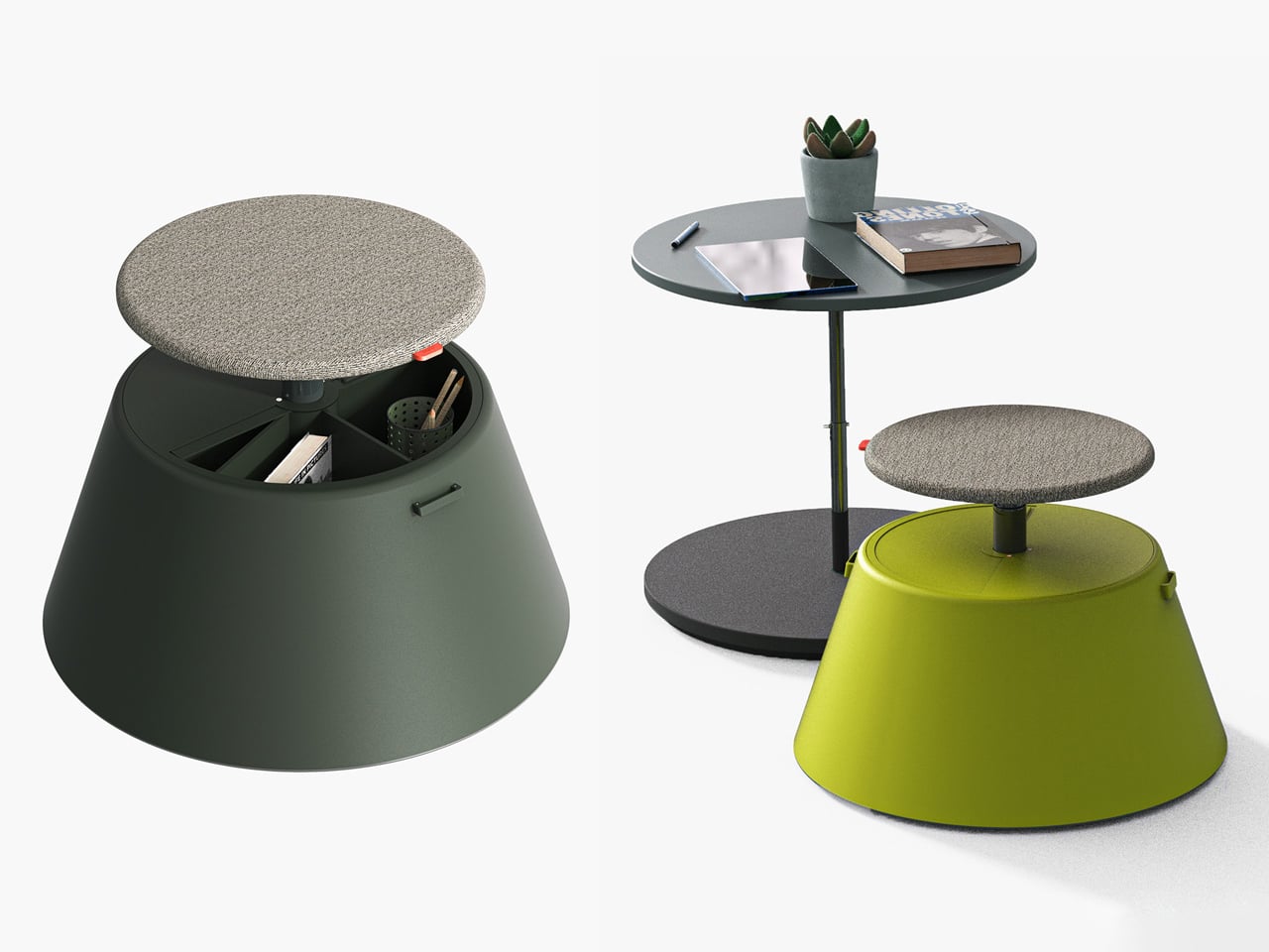
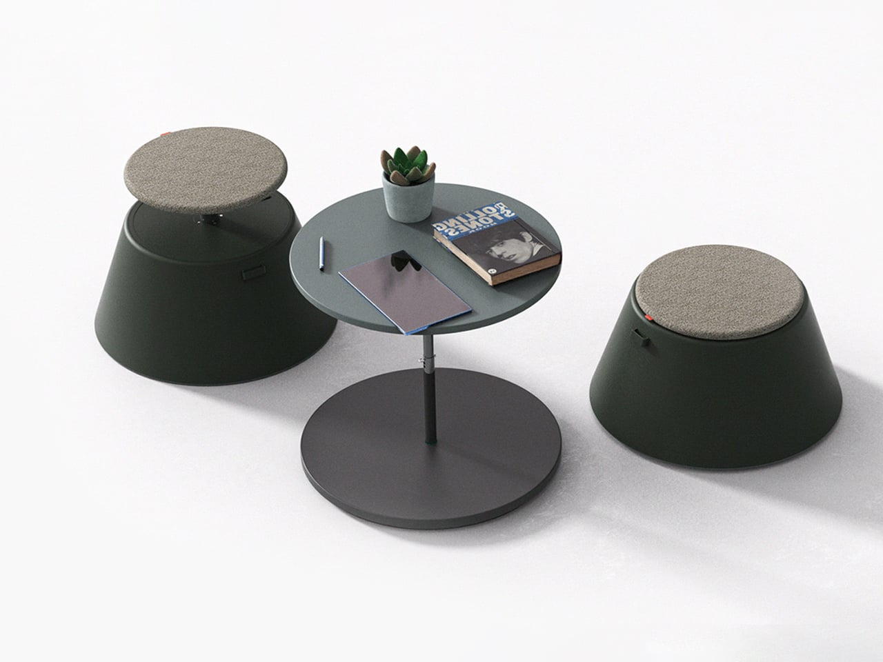
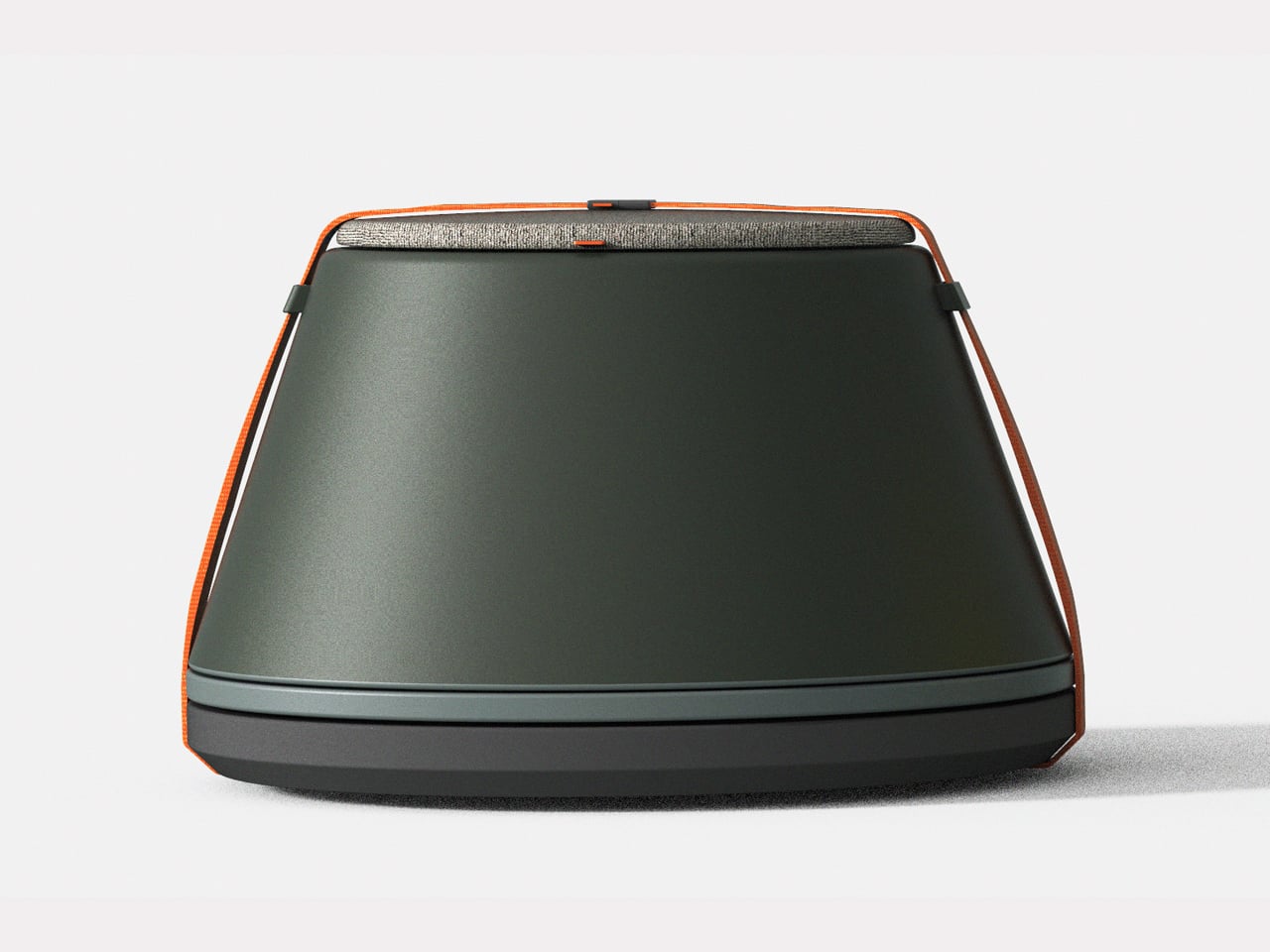
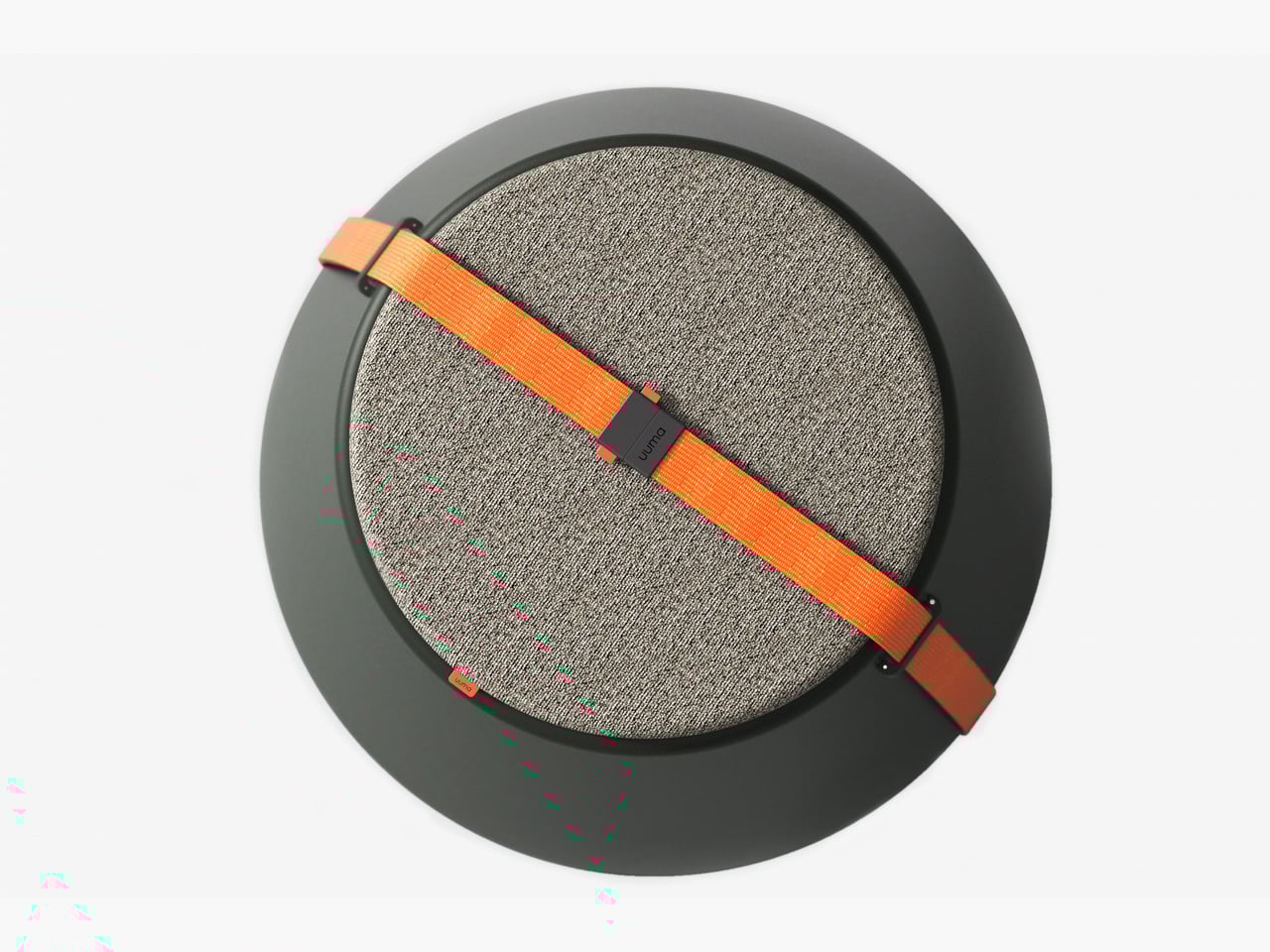
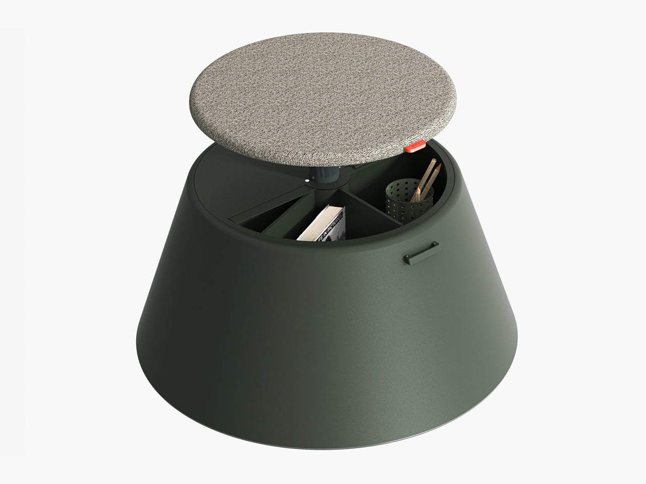
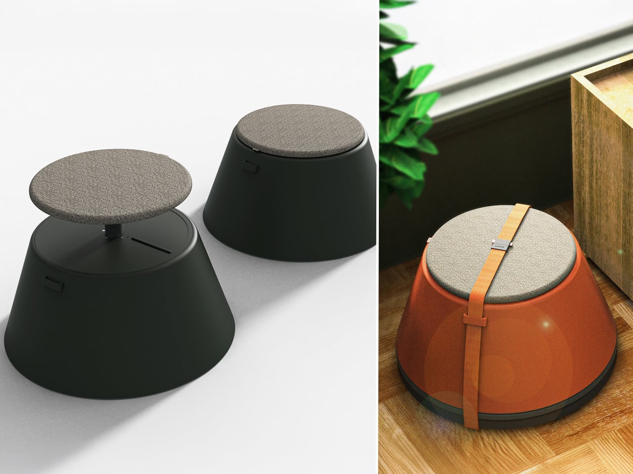
Working from home has spared many from long commutes and office distractions, yet it has also made work feel more solitary. Sitting by the same wall each day, even in a well-designed home office, can feel disconnected from the world beyond virtual meetings. While folding furniture remains popular for its space-saving benefits, stackable, all-weather alternatives are emerging as a smarter choice. Industrial designer Gökçe Nafak introduces the uuma, a portable table-and-chair combo designed as a single stackable unit that transitions effortlessly between indoor and outdoor settings.
Perfect for those who enjoy working in the garden, on the balcony, or in flexible spaces, the uuma blends convenience with creativity. Made from fibreglass, it is lightweight, durable, and sustainable. Its modular design features a height-adjustable metal frame and detachable parts that assemble easily. The chair transforms into a table within moments, offering comfort, portability, and style in three vibrant, modern colors.
3. Spatial Flow and Footprint Efficiency
The effectiveness of any modern workstation depends on how well it manages spatial flow. In compact urban homes, every inch counts, making footprint reduction a key design priority. A thoughtfully designed system should retract or fold away seamlessly, minimizing its physical presence while supporting the need for adaptable, multi-functional living spaces that evolve throughout the day.
Mobility and refinement define its usability. Tables and desks should transition effortlessly from work to leisure, enabling a quick shift from boardroom mode to family dining. Silent, non-marking wheels and intuitive movement reflect superior engineering and respect for interior balance.
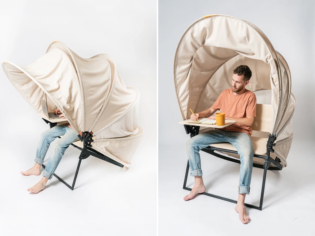
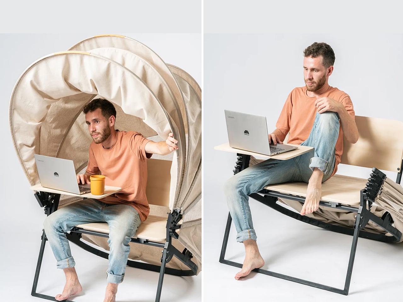
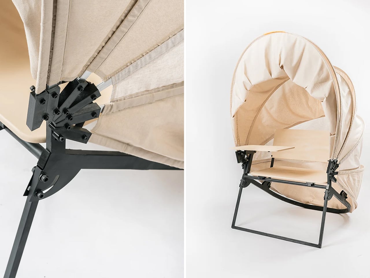
In a shared workspace like WeWork, or a peaceful spot under a tree, flexibility defines modern work culture. Industrial designer Matan Rechter responded to this shift with Shelly, a personal outdoor workspace that combines privacy, shade, and portability for those who prefer working outside. Inspired by the remote work movement, Shelly was designed to bring focus and comfort to outdoor environments like public parks.
Its name comes from its shell-like canopy that folds in and out with ease. Built from lightweight aluminium profiles and durable Cordura fabric, Shelly shields users and electronics from harsh UV rays. The canopy’s retractable design, reminiscent of an armadillo’s shell, provides instant shade and convenience. Compact and portable, Shelly transforms outdoor work into a comfortable, productive, and stylish experience anywhere, anytime.
4. Technological Integration and Power Autonomy
A modern hybrid workstation should function as a self-sufficient ecosystem, anticipating digital needs without visual clutter. True design intelligence lies in seamless connectivity, like built-in charging, concealed wiring, and intuitive access that keeps the workspace both elegant and efficient. Power autonomy ensures independence from fixed outlets, supporting the growing demand for mobility and flexibility in home environments.
Features such as integrated induction charging pads, hidden cable channels, and optional battery packs transform furniture into an adaptive tool. These enhancements merge aesthetics with performance, allowing users to remain connected, productive, and untethered within any architectural setting.
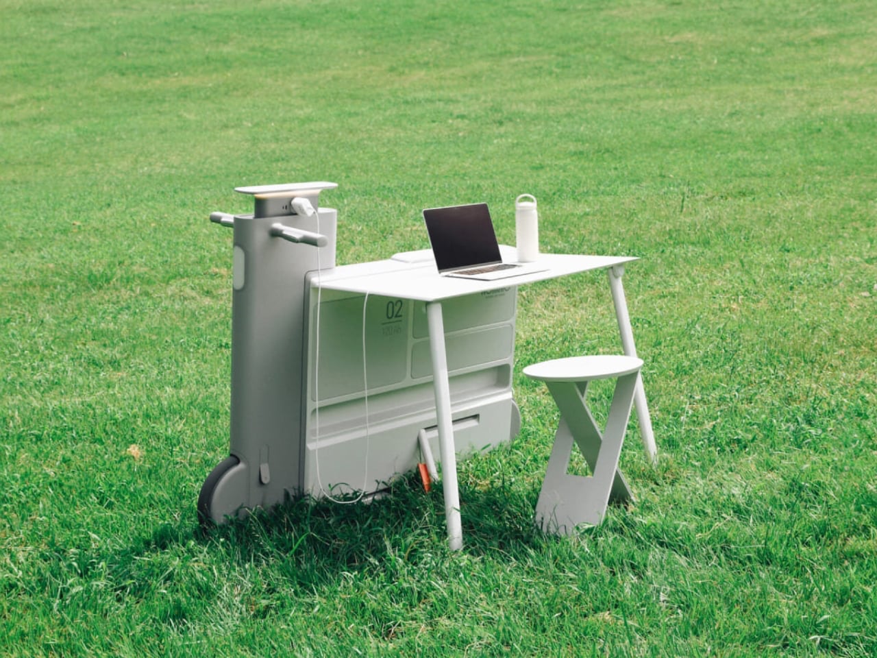
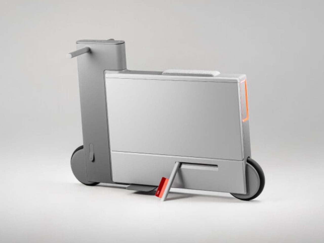
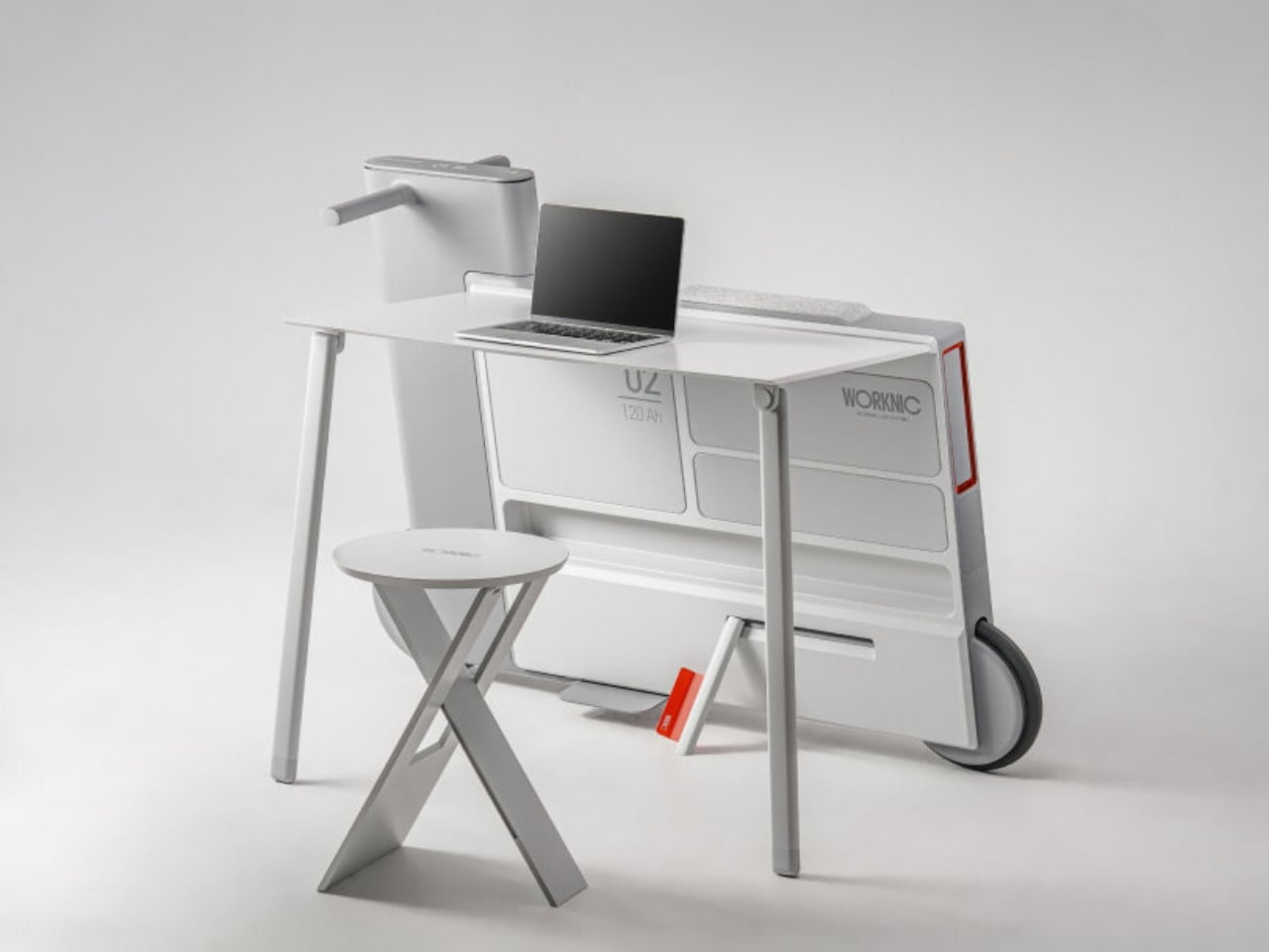
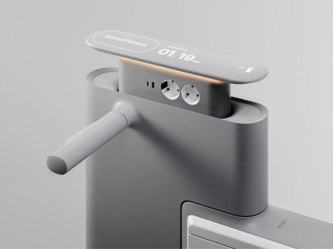
Another standout example is Worknic, a portable desk developed through the Samsung Design Membership program, sponsored by Samsung Electronics. Designed for flexibility, Worknic allows users to set up a functional workspace anywhere, whether in a home, park, or even on the beach, giving them the freedom to change their environment whenever needed.
The desk is built on wheels, making it easy to move and position in the ideal spot. Once in place, it unfolds to reveal a worktable, stands, and a built-in power source, while a pull-out stool completes the setup. Although details about battery life, weight, and additional features are limited, the concept prioritizes mobility, convenience, and adaptability. Worknic offers a creative solution for those who want a portable, fully equipped office that keeps productivity and inspiration in balance.
5. Design Resilience and Longevity Investment
For discerning homeowners, longevity defines true value. A well-crafted workstation should possess design resilience, built to endure daily use while retaining its original elegance and performance. This durability ensures a higher return on investment, setting it apart from fast furniture options that quickly lose both form and function.
Choosing established design houses and proven construction techniques guarantees structural integrity and timeless appeal. A five-to-ten-year warranty offers assurance that the piece is not just a purchase but a long-term architectural companion, blending endurance with refined craftsmanship for years of dependable, sophisticated use.
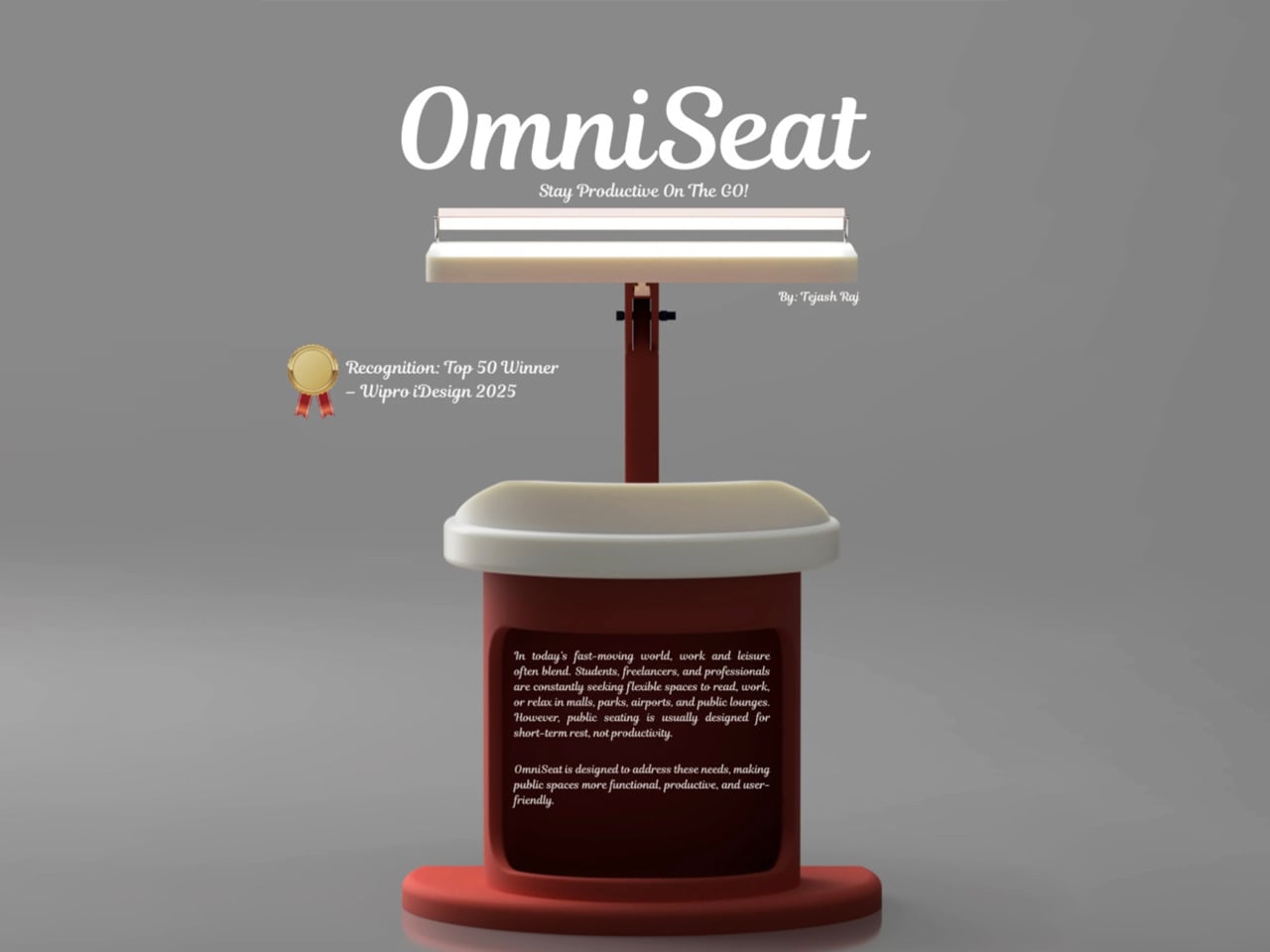
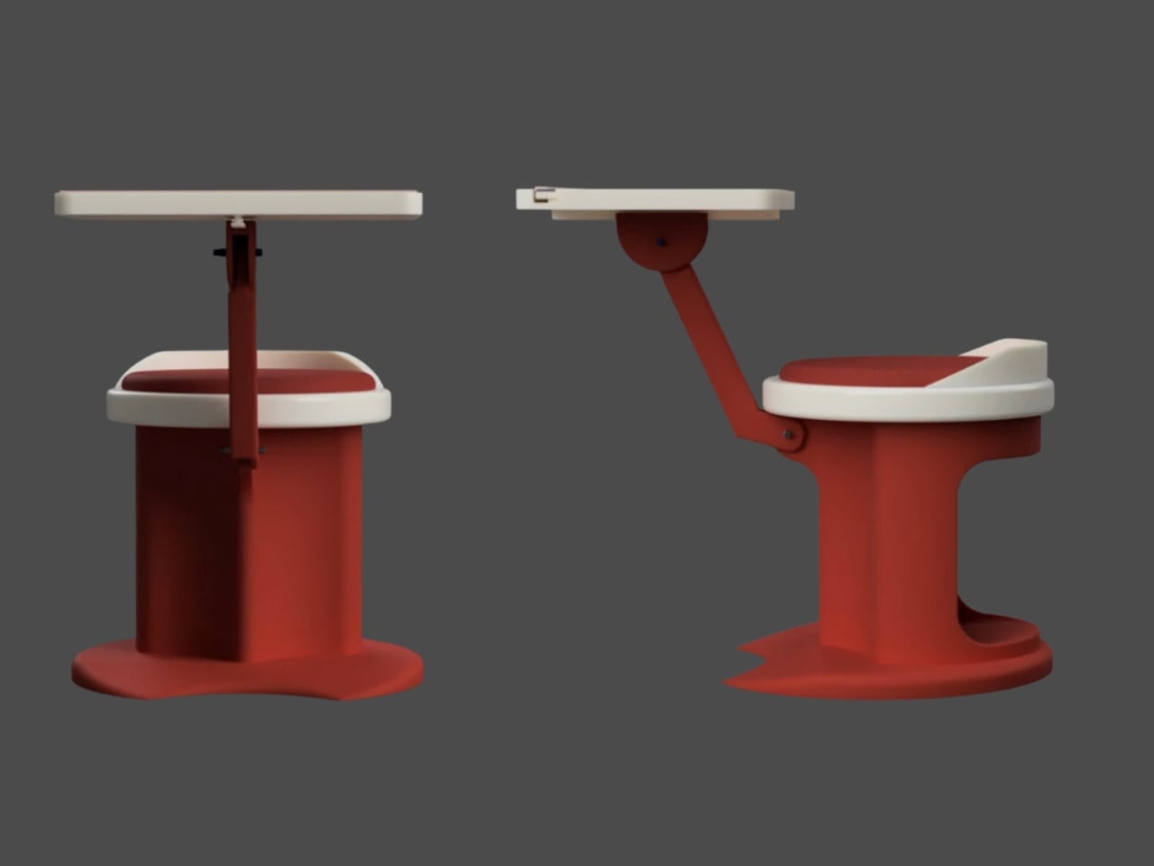
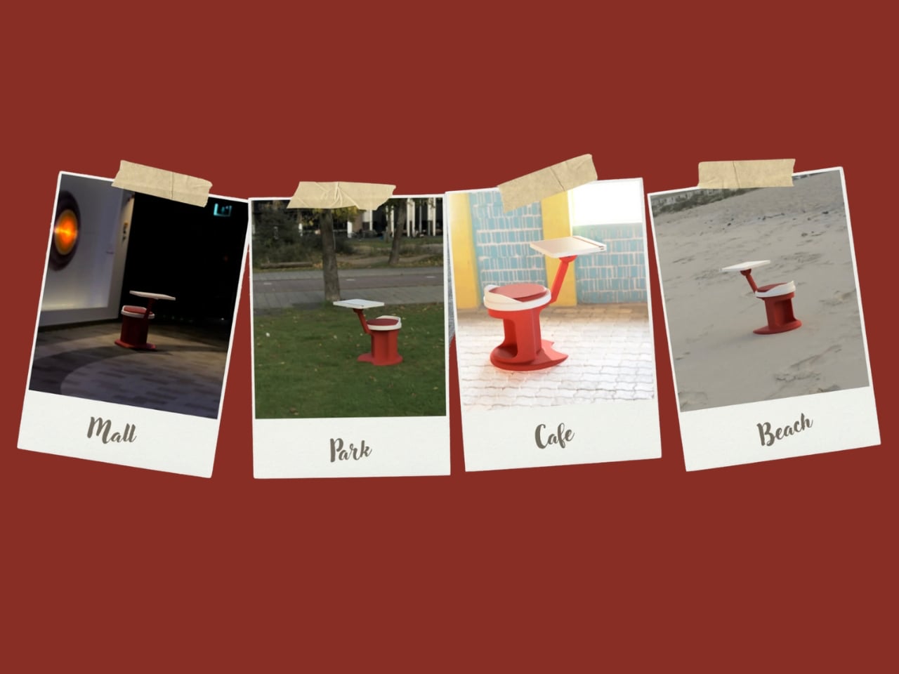
For those constantly on the move, finding a comfortable place to rest or work can be challenging. Cities often lack public resting areas beyond cafés and restaurants, making it tempting to carry a portable chair, though the idea quickly loses appeal due to its bulk and inconvenience. Recognising this need, designer Tejash Raj created the OmniSeat, a compact and ergonomic seating concept designed for people who stay productive while travelling, commuting, or working outdoors.
The OmniSeat features a lightweight frame, built-in storage, and device holders, all folding neatly into a slim form that fits in a backpack or attaches to a bike rack. A detachable tray accommodates laptops or tablets, with cable clips to keep cords tidy. Combining portability, comfort, and function, the OmniSeat offers a glimpse into the future of mobile workspaces.
The high-design portable workstation redefines the boundaries of work and home, merging productivity with tranquillity. It transforms interiors into fluid, balanced spaces where focus meets ease. Its true value lies in the freedom to work anywhere, capturing sunlight, inspiration, and connection without sacrificing comfort or creativity.
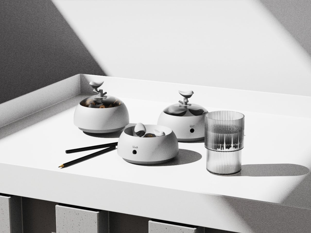
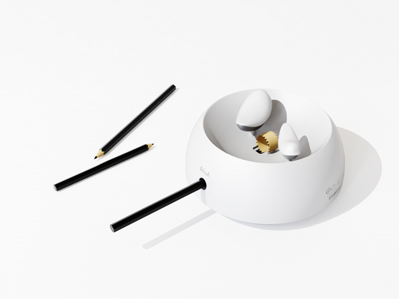
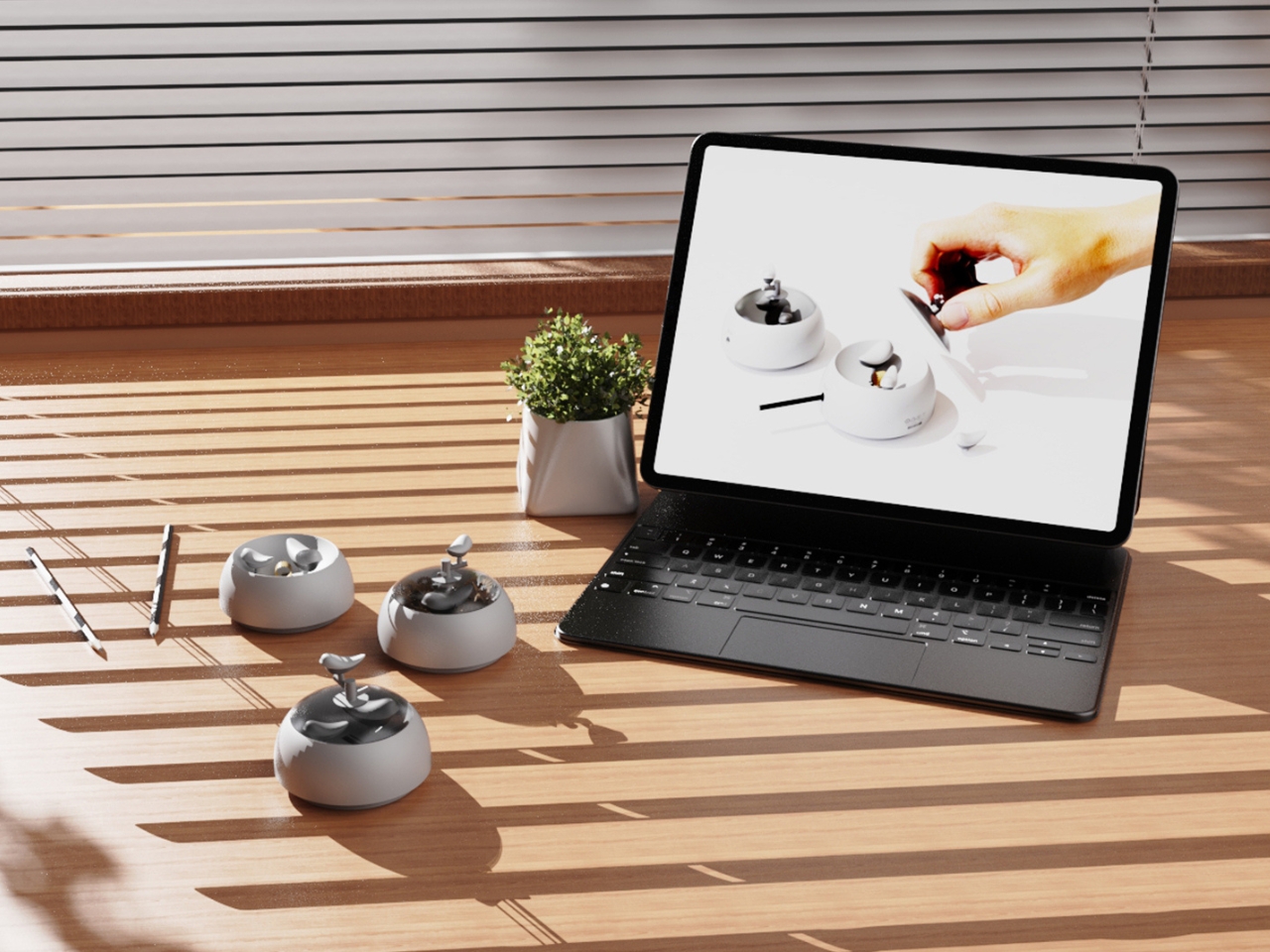
Most desk objects get ignored. They sit there doing their one job, collecting dust around the edges, and we never really think about them again. NEST, a conceptual pencil sharpener designed by a team of five students from TUST, UNNC, and CAU, is a direct challenge to that dynamic. It recently took home the winner prize at the 2025 European Product Design Award in the Conceptual Work & Office Product Design category, and the reason it won feels obvious the moment you understand what it actually does.
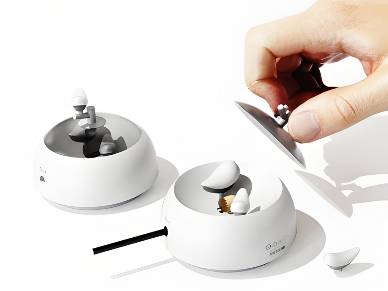
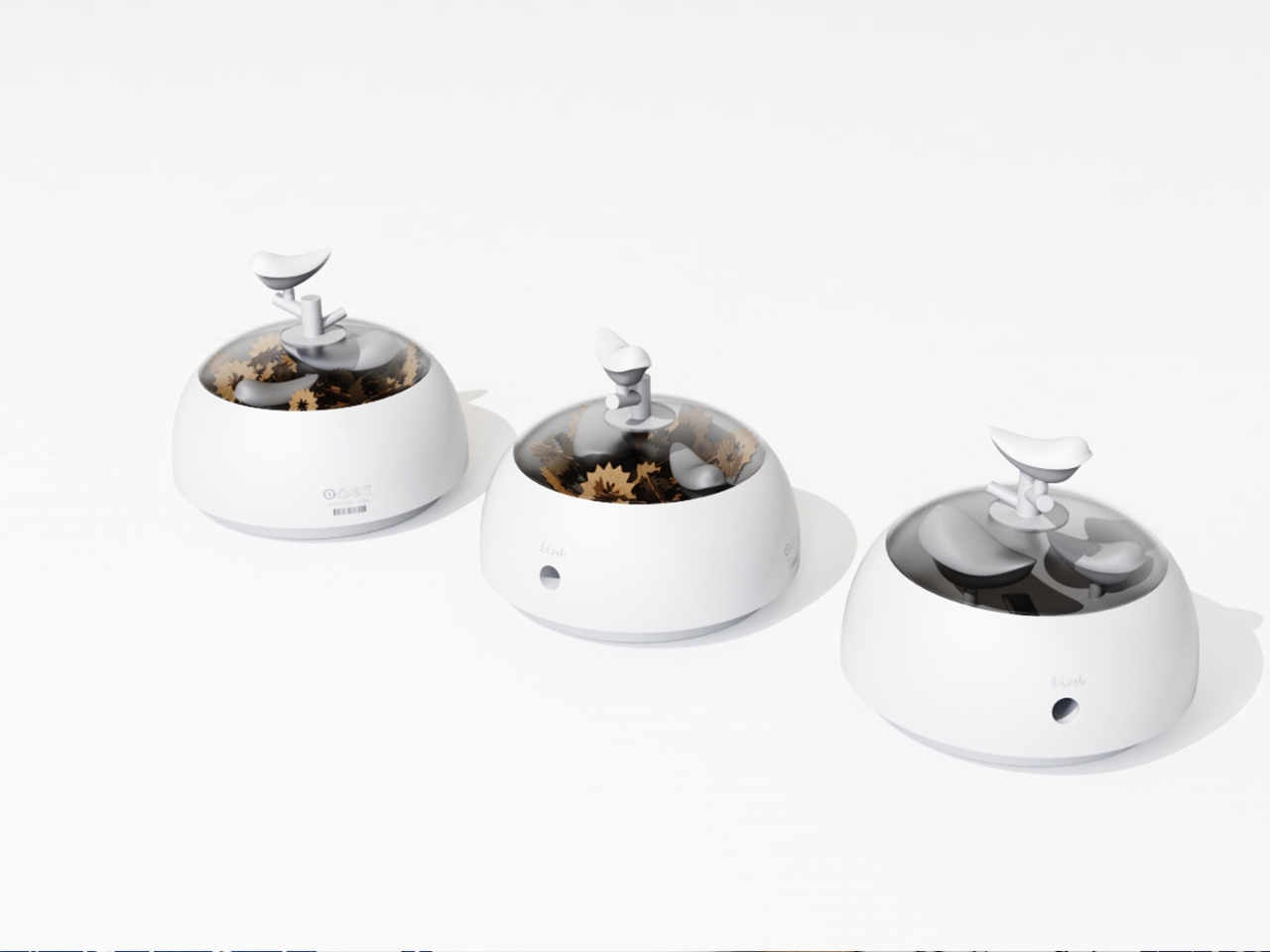
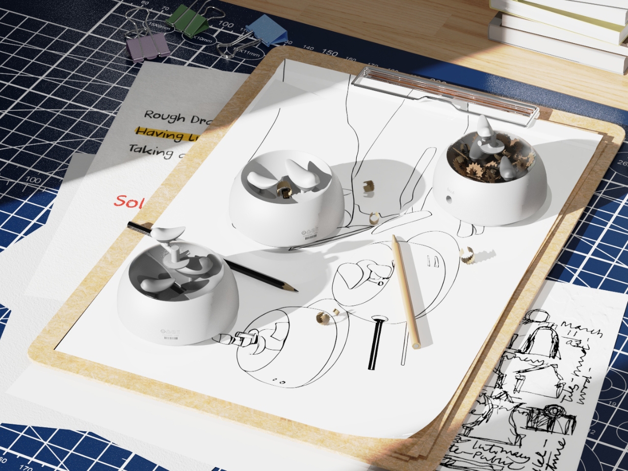
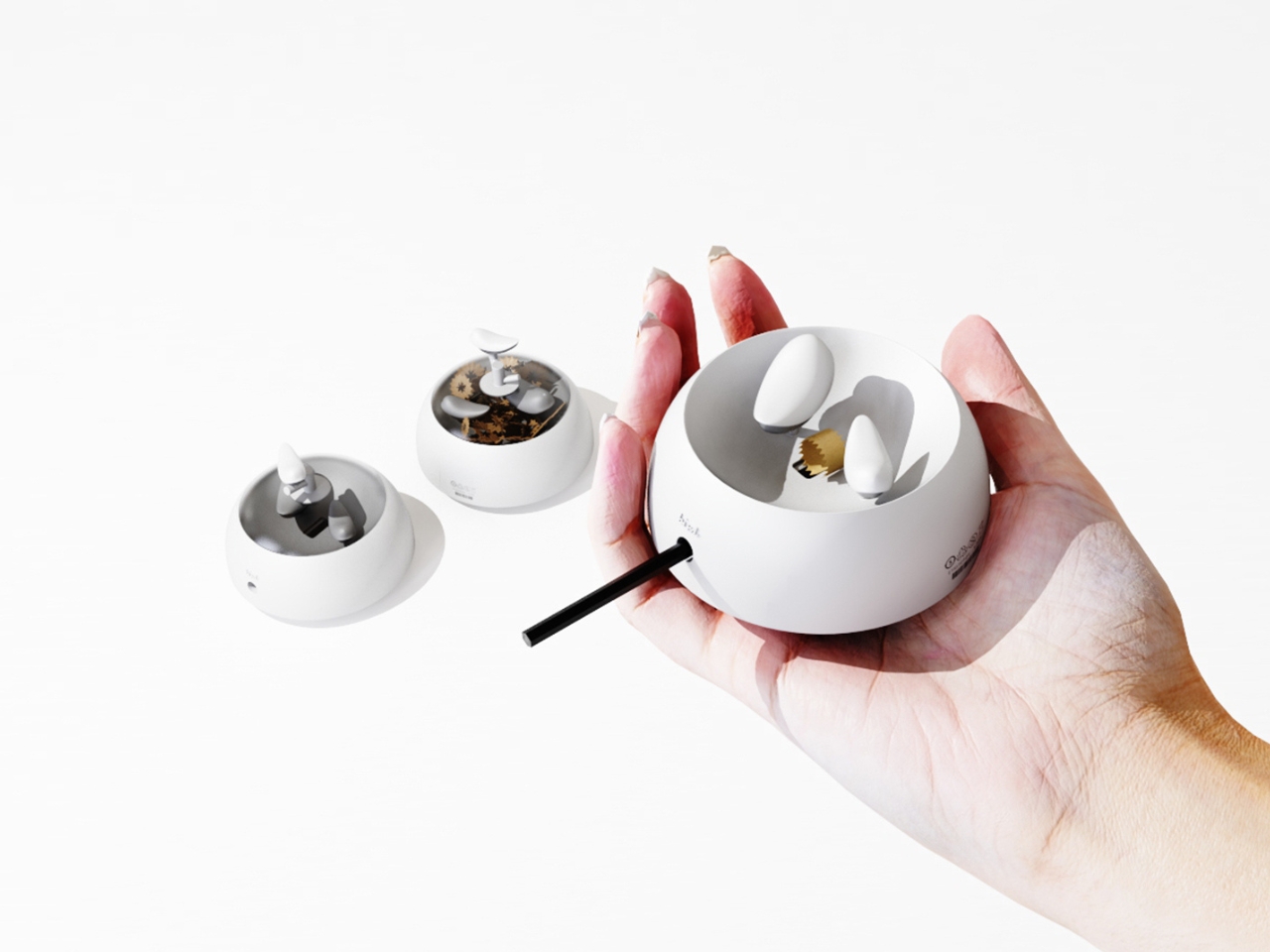
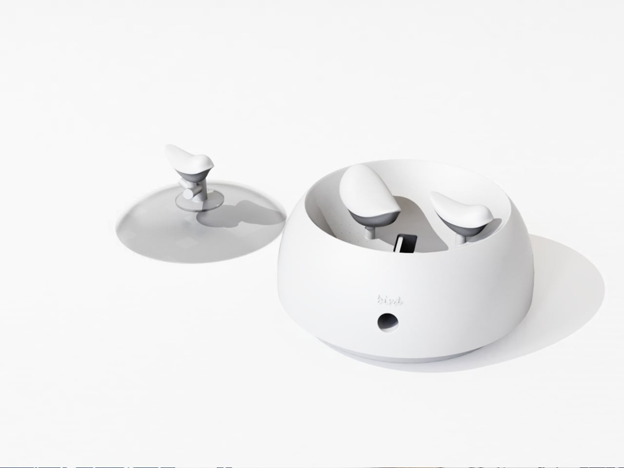
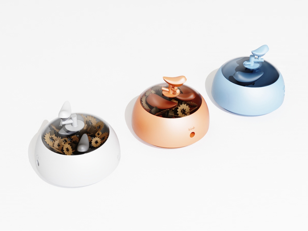
The concept is deceptively simple. A small bird figurine sits inside a rounded, bowl-shaped container. As you sharpen your pencil, the curling wood shavings collect beneath the bird, gradually building up like the gathered material of a real nest. By the time the container needs emptying, the little bird looks as if it has been nesting all along, settled into a soft, spiraling bed of wood ribbons. It is a beautifully accidental image that the design deliberately engineers into being, and once you picture it, it is very hard to unsee.
The real strength of NEST is the intelligence of its metaphor. Lead designer Zebin Qiao and the team didn’t just borrow a visual from nature and paste it onto a product. They found a genuine structural parallel between the act of using the sharpener and the act of nest-building, then made sure the user experiences that parallel in real time. That is not an easy thing to pull off. Most product design that reaches for nature ends up with surface decoration or an illustrative graphic on a box. NEST earns its metaphor because the metaphor lives in the function, not on top of it.
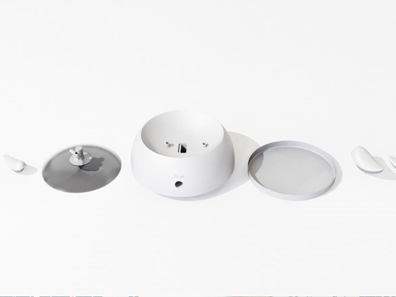
The second layer of the design is the lid. It doubles as a perch, fitted with a minimal branch element. When you are not sharpening, the tiny bird figurine can be lifted out of the interior and placed on the branch, transforming the whole object into a quiet desktop ornament. This dual-state approach means the product shifts personality depending on how you use it. It is a working tool when you need it, and a miniature sculpture the rest of the time. I genuinely appreciate designs that respect both modes of being at a desk, the productive and the contemplative.
I will admit my first instinct when I encounter “award-winning conceptual product” is mild skepticism. Conceptual work can drift toward spectacle and lose interest in whether the thing would actually function. NEST sidesteps that problem by grounding every design choice in real, physical behavior. The shavings accumulate because that is what shavings do. The bird sits because the container holds it. Nothing is forced or artificially staged. The charm is a byproduct of the function, which is exactly the right way around. It gives the design an integrity that a lot of more expensive, more elaborate objects simply do not have.
The color variants are worth noting too. The design comes in white, a warm terracotta tone, and a soft powder blue, each with a matching bird. It is a small decision that makes the object feel personal rather than clinical, and it opens the door to something close to a collecting impulse. You are not just buying a sharpener. You are picking a companion for your desk, which is a particular kind of intimacy that few office products ever manage to create.
At its core, NEST is making an argument that utility does not have to be neutral. That the objects we interact with daily can carry meaning, invite attention, and reward a small amount of patience. A student design team from three Chinese universities made that argument with a pencil sharpener, and they made it convincingly enough to win a major European award. That is not nothing. If anything, it is the kind of design thinking we need more of, the sort that finds poetry in the ordinary without making you feel like you are trying too hard to appreciate it.
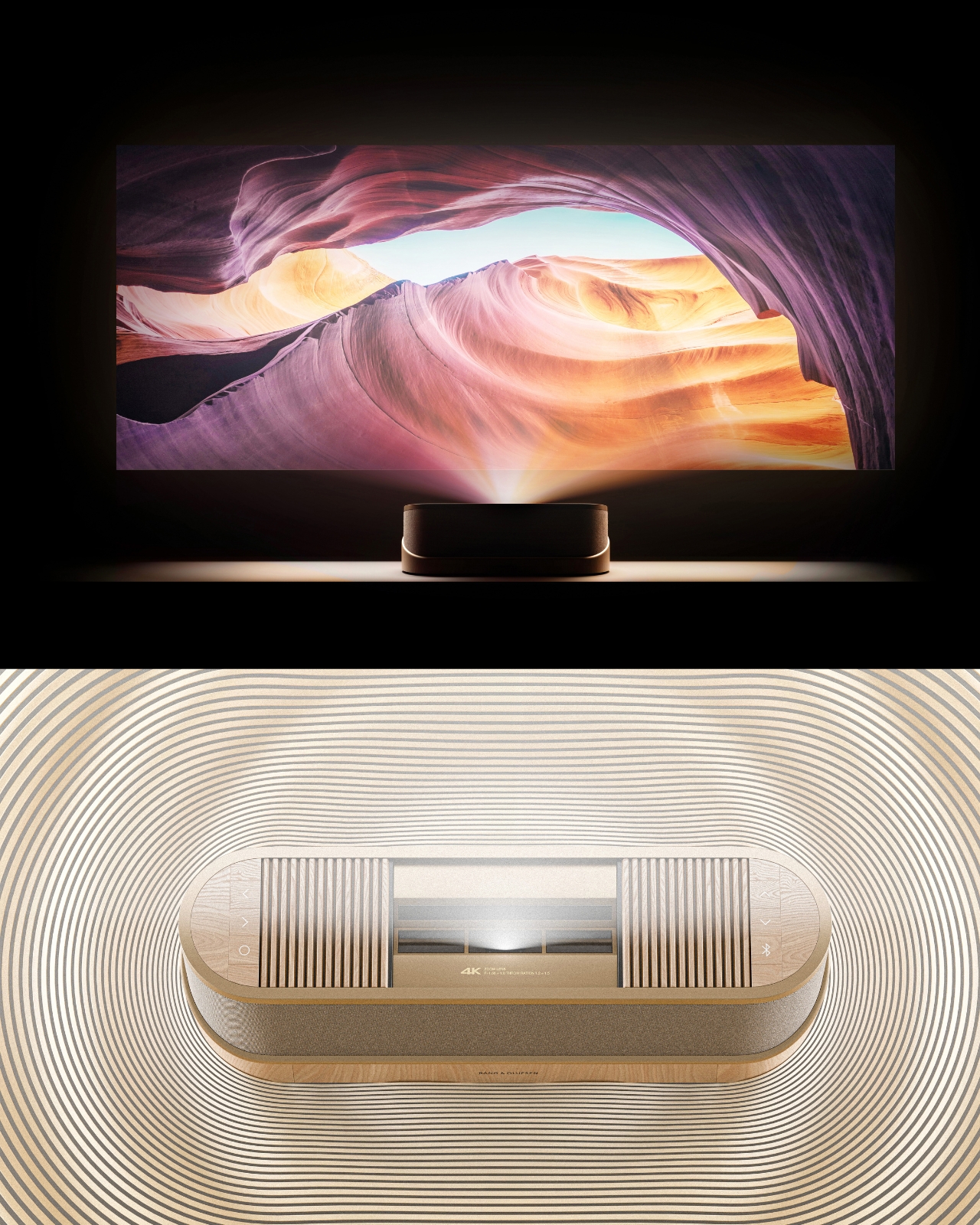
Most concept designs exist to generate buzz, collect awards, and then quietly disappear. The BeoLens Horizon, a projector concept imagined by French industrial designer Baptiste Baumeister, feels different. It feels like a glimpse into a future that Bang & Olufsen should absolutely be building right now.
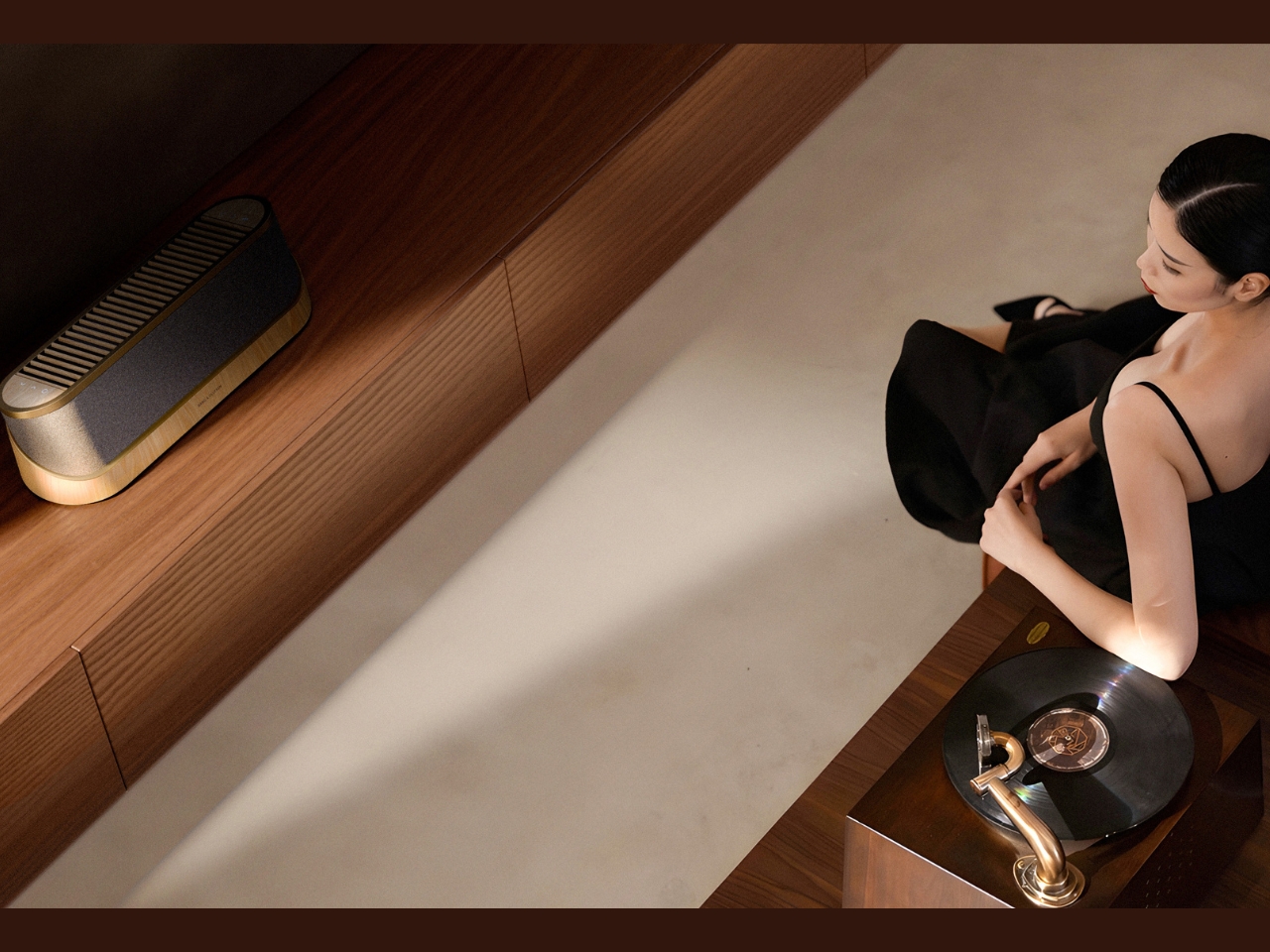
If you’re not familiar with B&O, the short version is this: the Danish audio brand has been setting the benchmark for luxury consumer electronics since 1925. Their products don’t just sound good; they’re designed to be desired as objects. The BeoSound Shape, the BeoVision Harmony, the Beosound Theatre, all of them treat your living room like a gallery wall. Baumeister clearly understands that DNA, and with BeoLens Horizon, he runs with it in a direction that feels genuinely exciting.
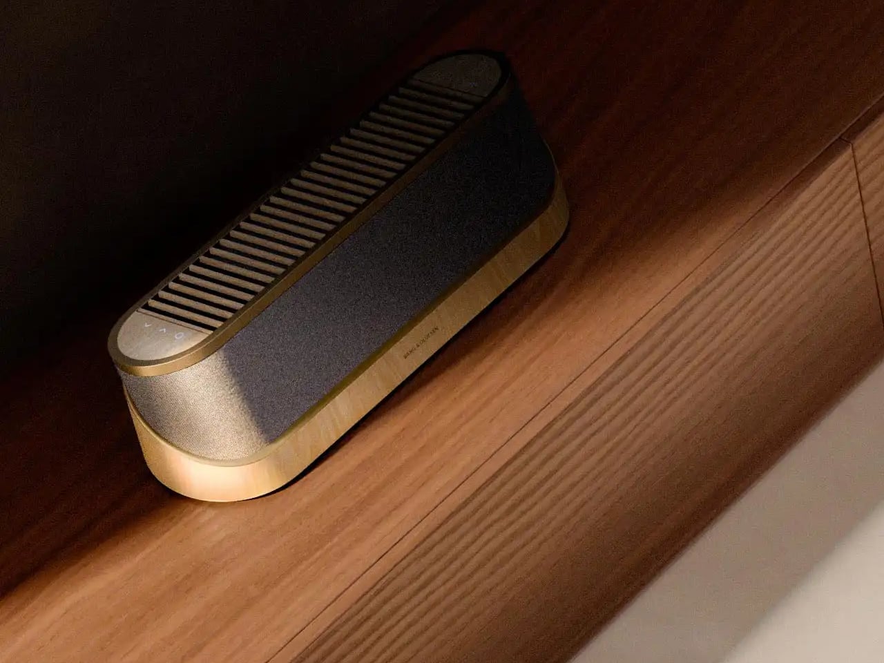
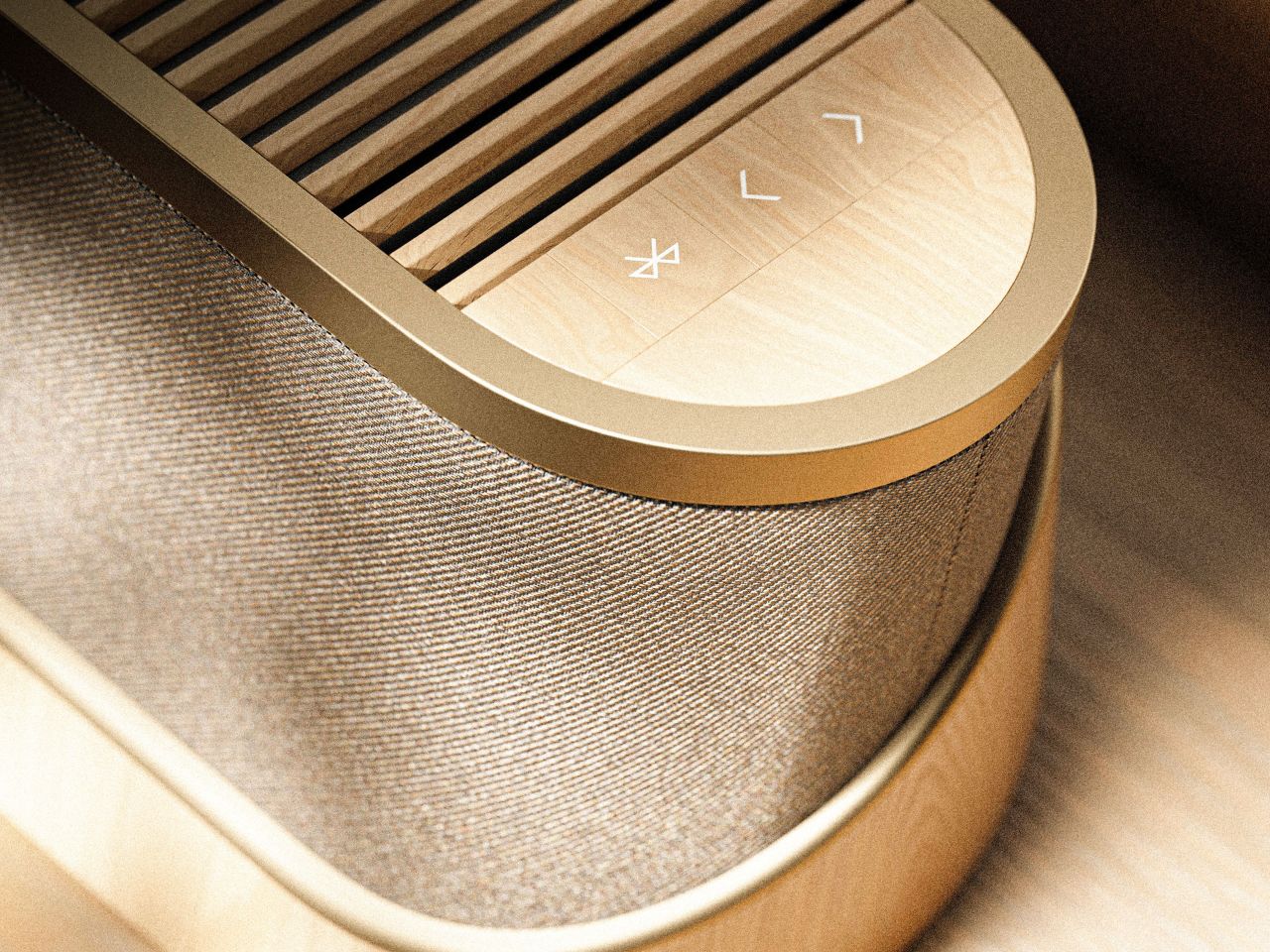
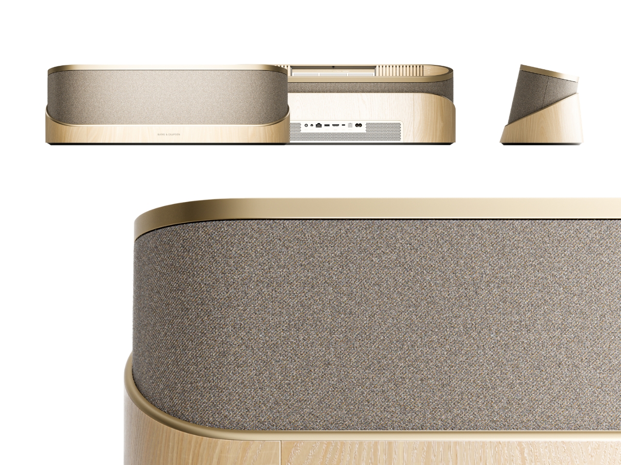
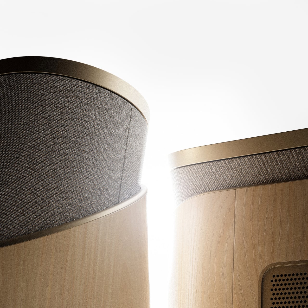
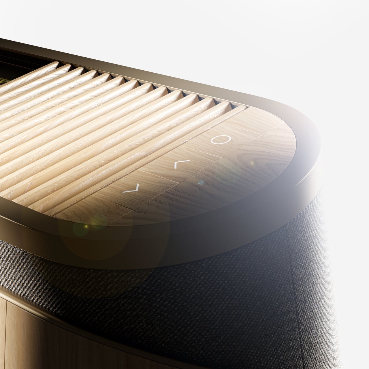
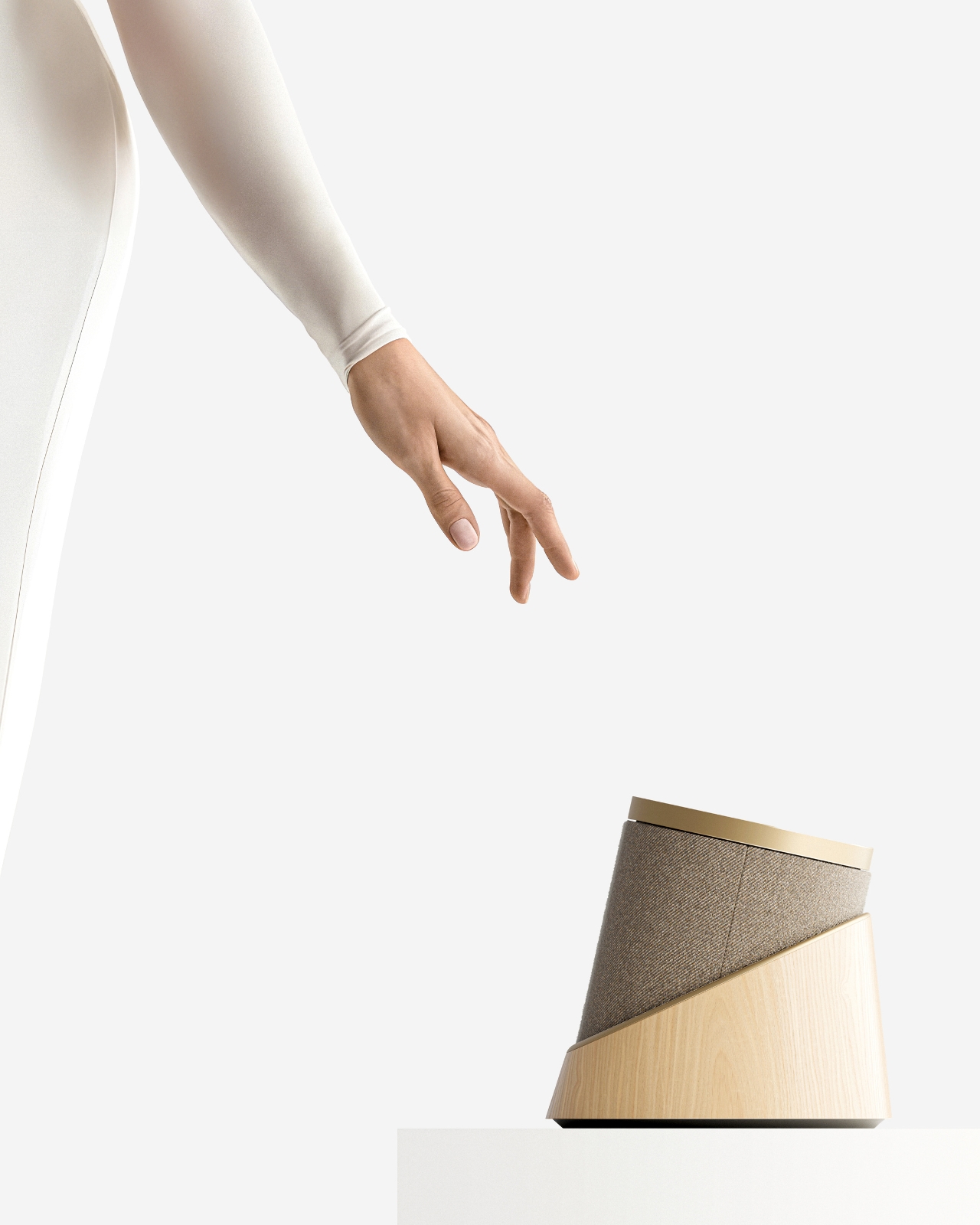
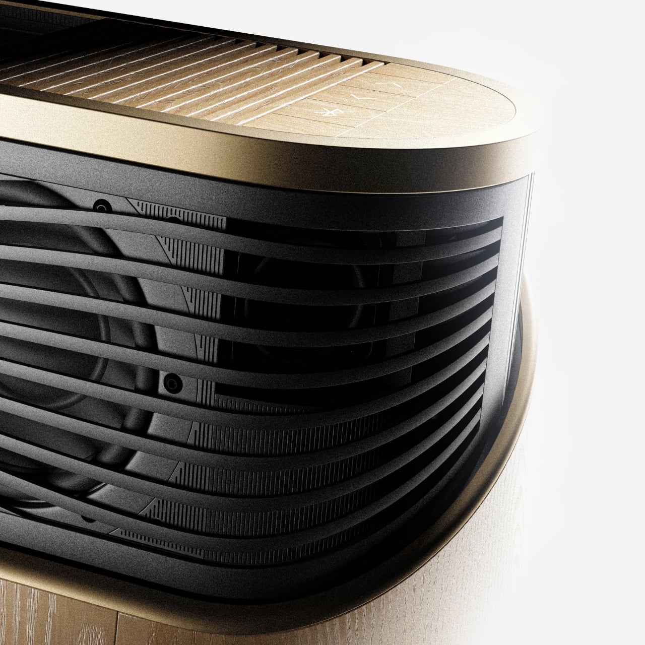
The design comes in two distinct configurations. The first is a horizontal, low-profile unit that sits flat on a surface like a refined soundbar crossed with a Scandinavian jewelry box. The second is a taller, cylindrical form that reads more like a speaker column or a sculptural object you’d place on the floor. Both share the same material vocabulary: light ash wood, brushed gold-toned aluminum, and tightly woven acoustic fabric in warm grey. It’s the kind of material combination that makes you think of an architect’s weekend house rather than a tech showroom.
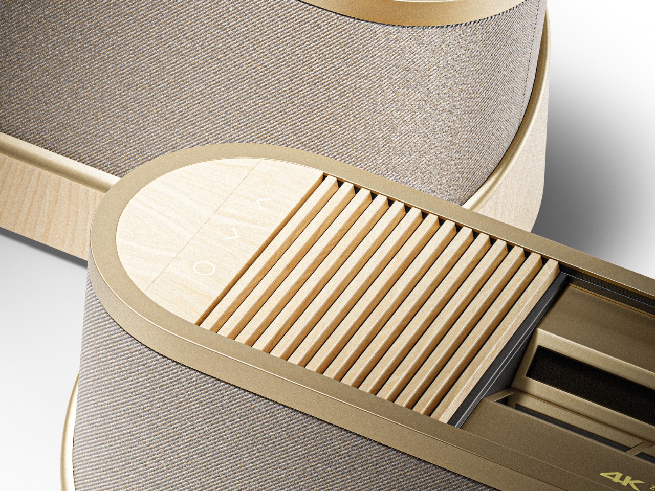
The horizontal unit is particularly interesting because of how it conceals the projector itself. A wooden slat panel sits on top, almost like a miniature version of those slatted screens you see in high-end Japanese interiors, and the lens assembly slides out from beneath it. The 4K projection capability is written right into the design, quietly labeled without fanfare. There are no aggressive vents, no branding that screams for attention, no black plastic anywhere. It’s restrained in a way that feels almost provocative in a market where most projectors try hard to look “cinematic” and end up looking aggressive instead.
The controls are worth noting too. Rather than a touchscreen or a button cluster, Baumeister places minimal icon-etched controls directly into the wood panel. A Bluetooth symbol, a pair of directional arrows, a power circle. They’re barely visible until you know to look for them, which feels very much in keeping with how B&O has always approached interaction design, treating it as something that should feel intuitive and slightly magical rather than mechanical.
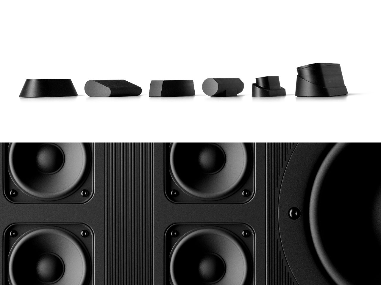
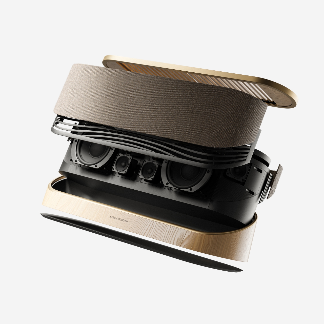
Looking at the exploded view of the horizontal model, you can see just how much thought went into the layering of components. The speaker array sits sandwiched between the wood base and the metal-framed top, with the projector mechanism occupying the central cavity. It’s genuinely elegant engineering, even if this is still a concept. Baumeister also developed a series of small-scale physical prototypes exploring the form from different angles, which you can see in a lineup of matte black study models. That process matters. It tells you this isn’t just a pretty render; it’s a design that was worked through with real hands.
Here’s my honest opinion: the TV industry has been coasting on size for years. Bigger screens, thinner bezels, more pixels. But the BeoLens Horizon asks a more interesting question. What if the device itself was worth looking at even when it was off? What if the experience of owning the hardware was part of the experience of using it? These aren’t new ideas in the B&O world, but a projector built around this philosophy feels like a genuinely fresh proposition, especially as ultra-short-throw technology continues to improve.
Baumeister is a young designer out of Strate, a design school in Lyon, and BeoLens Horizon joins a portfolio that already shows a real feel for the intersection of material craft and technology. Whether Bang & Olufsen ever picks this up or not, the concept makes a compelling case that the future of home cinema doesn’t have to look like a gadget. It can look like something you actually want to live with.
Most speaker designs ask a pretty simple question: how do we make this thing louder and smaller? Merge asks a completely different one. How do we make music something you can actually take apart?
Created by a five-person design team, Junchuan Shi, Junhao Lv, Xiangzhao Meng, Ping He, and Genghao Ma, from a cross-institutional collaboration across Sichuan Vocational and Technical College, CityU Macau, TUT, and QZUIE, Merge is a conceptual speaker system that just picked up a 2025 European Product Design Award in the Consumer Electronics category. It’s the kind of student concept that makes you wonder why no major brand has thought of it first.
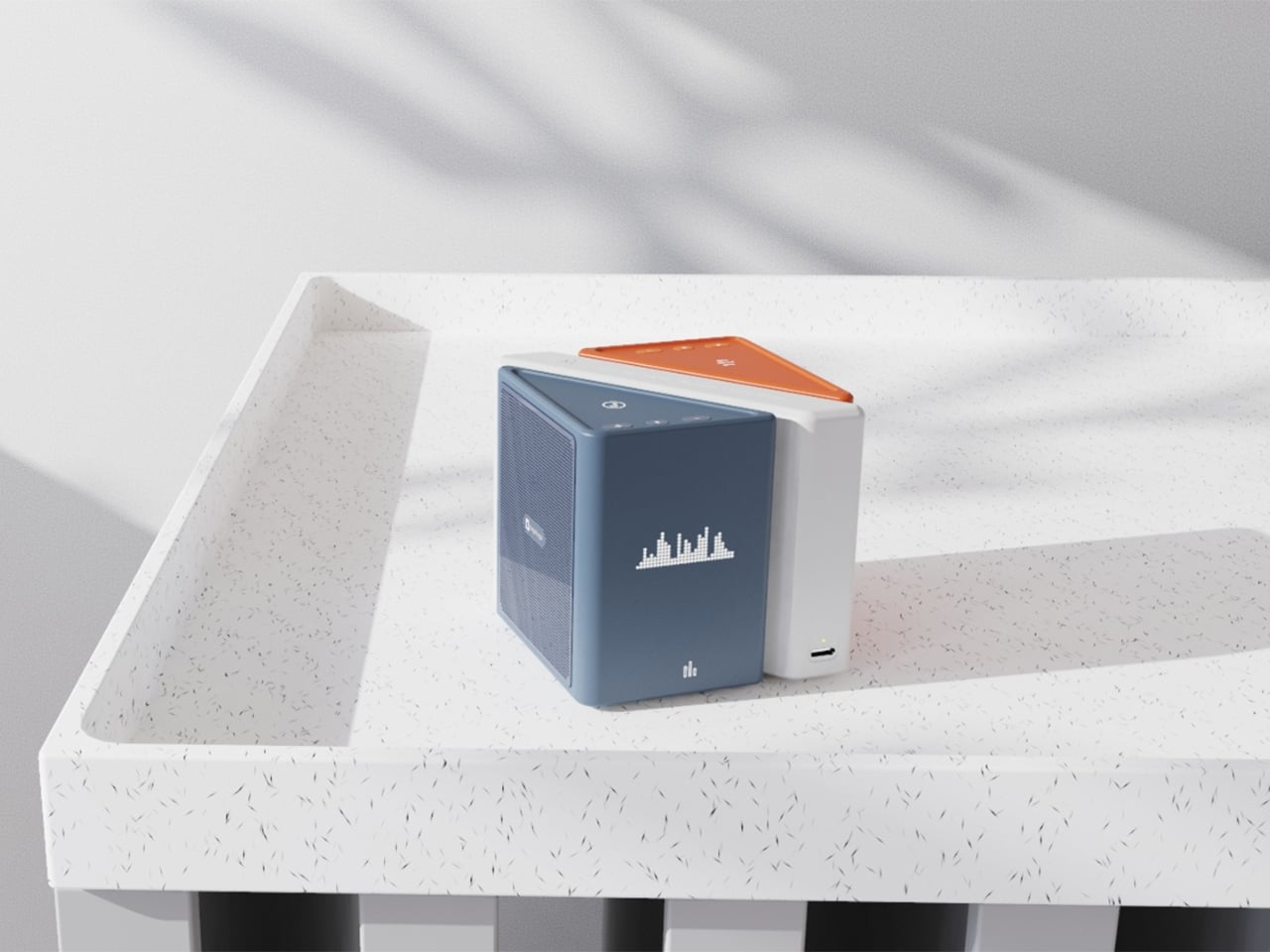
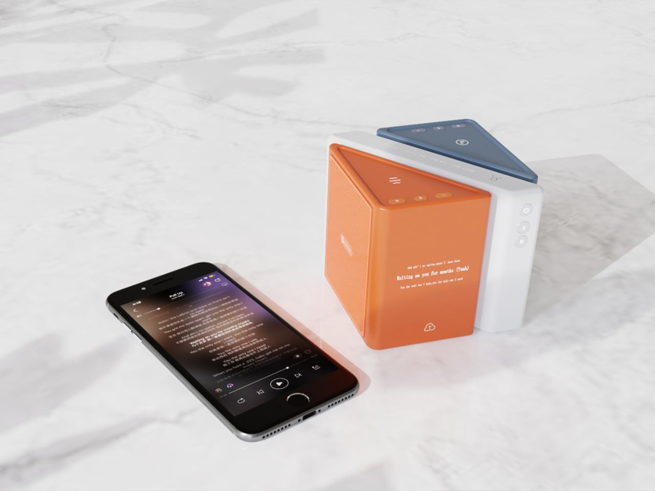
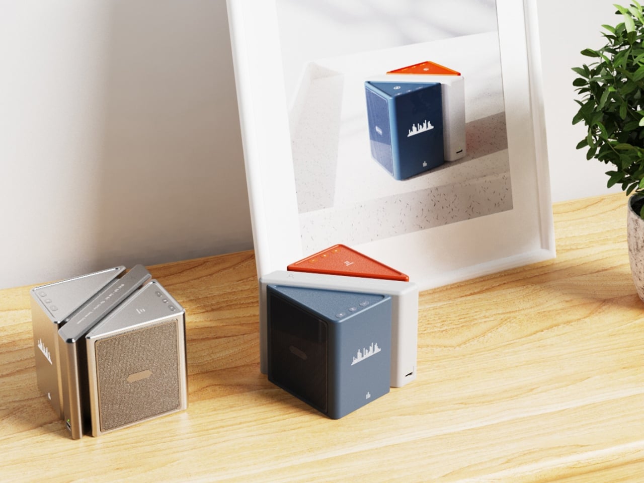
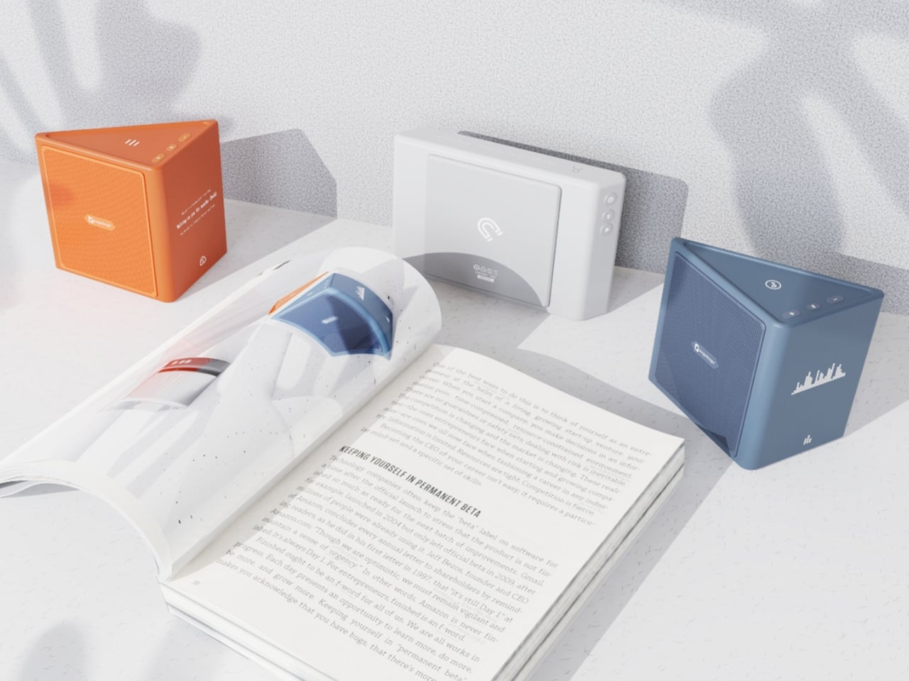
The central idea is deceptively clever. Merge physically separates music into its component layers: the accompaniment on one module, the vocals on another, and the full combined sound handled by the complete assembly. You choose what you hear depending on how the pieces are arranged. Pull the vocal module away, and you’ve got an instant karaoke track. Keep just the vocal module, and you hear a singer stripped back from all the production. Snap everything together and you get the whole song. It sounds gimmicky when you describe it that way, but it really isn’t. It’s an intuitive way to interact with music that streaming apps, for all their data and algorithms, still haven’t cracked with the same sense of physical satisfaction.
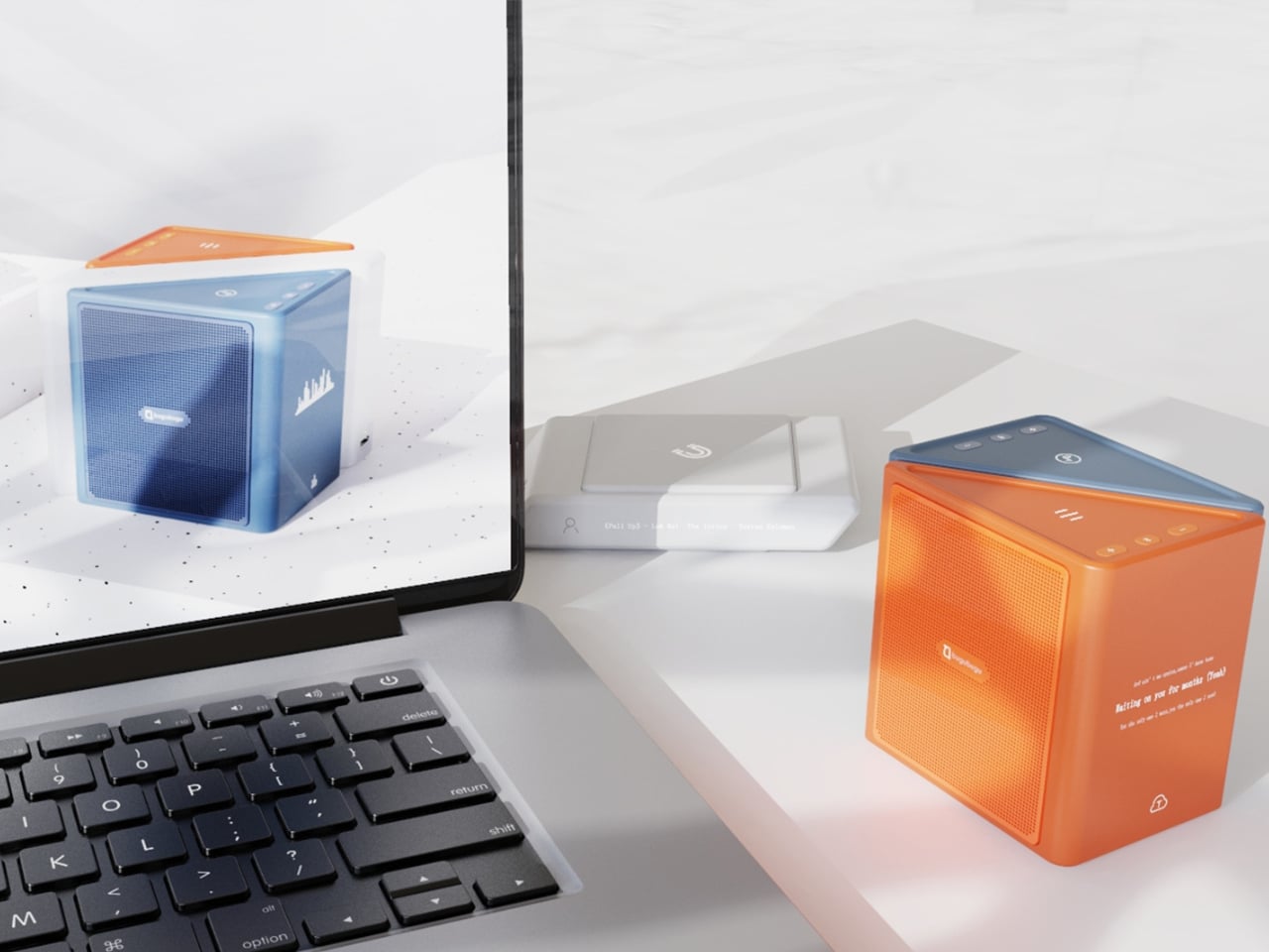
The three modules connect via electromagnetic induction, which also handles charging between units. That detail matters more than it sounds. It means the product doesn’t rely on fiddly clips or pins; the connection is seamless and the experience stays clean. When you hold all three pieces assembled, they sit together like a solid little object. When you pull them apart, you’re not wrestling with latches. You’re just… separating music.
Visually, the design is confident without being loud. The modules are geometric and compact: a rectangular flat piece, a squared speaker body, and a triangular wedge that caps the top when assembled. The whole thing sits in your palm like a premium toy, which is very much the point. The team describes the tactile experience of rearranging the modules as analogous to playing with building blocks, and that framing is spot on. Listening becomes a physical act rather than a passive one. You’re not adjusting a slider on an app; you’re literally picking up a piece of the song and putting it somewhere else.
The color language is considered too. The renders show options in slate blue, orange-coral, silver metallic, and white-grey, each colorway with its own character but all sharing the same graphic vocabulary: pixel waveform icons and quiet typography showing floating lyrics directly on the module surface. It reads like something between a well-designed toy and a serious piece of consumer electronics, which is an interesting space for a speaker to occupy.
I’ll be upfront: Merge is still a concept. It won in the EPDA’s conceptual category, and it hasn’t crossed into production territory yet. That’s a long road, and the audio technology behind splitting tracks in real time at the hardware level would require serious engineering. The images are renders and physical prototypes, not retail-ready products. But the best conceptual design has always worked like that. It shows an industry where something should go, even when the technology and the business case haven’t fully caught up yet.
What makes Merge genuinely compelling is that it treats the listener as someone with curiosity rather than just convenience-seeking habits. The assumption baked into most audio product design is that people want everything done for them, simplified, smoothed over. Merge assumes the opposite: that people might actually enjoy engaging with the layers of a song, touching them, moving them around. Given how obsessed the current cultural moment is with stems, remixes, and stripped-back sessions, that assumption feels exactly right.
Whether it ever becomes a product you can buy, Merge is already doing the thing good design is supposed to do. It makes you look at something ordinary and ask why it was never done this way before.
Anchorman: The Legend of Ron Burgundy turned twenty in 2024, and somehow, the film has only gotten funnier with age. What started as a Will Ferrell comedy about a hilariously fragile male ego navigating the very real 1970s newsroom gender wars became one of the most quoted, most meme’d, most endlessly rewatchable comedies in modern American film history. “I’m kind of a big deal,” “I love lamp,” “60% of the time it works every time” – the lines are so deeply embedded in pop culture at this point that people quote them without even knowing where they came from. San Diego’s most legendary fictional anchor deserves better than a passing reference in a listicle, and LEGO Ideas builder footonabrick clearly agrees.
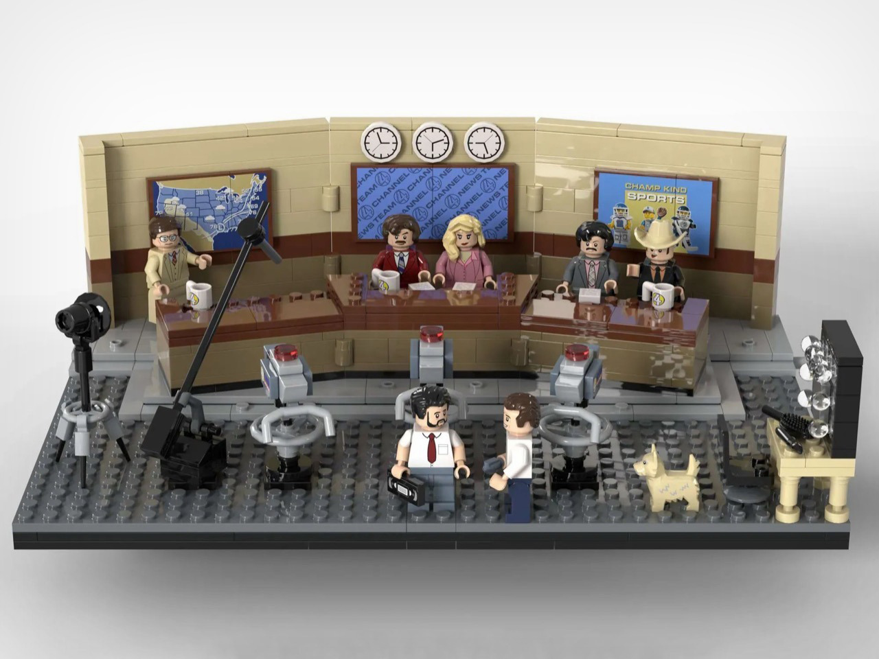
The result is a just-over-1,500-piece MOC (My Own Creation) that reconstructs the Channel 4 News Team’s world with an almost obsessive attention to detail, covering the broadcast studio, the newsroom offices, and even the KVWN news van parked out front. The studio section is immediately recognizable: a curved tan backdrop wall, three wall clocks ticking away above the anchor desk, dual blue Channel 4 News Team screens flanking the set, and the full team seated behind that iconic brown desk with their Channel 4 mugs. It looks like a freeze-frame from the film, and that’s entirely the point.
Designer: footonabrick
The broadcast desk is the centerpiece, and footonabrick nails the warm tan-and-brown palette of that gloriously dated 70s newsroom aesthetic. Ron and Veronica sit front and center behind their Channel 4 mugs, with Brian Fantana, Champ Kind, and Brick Tamland flanking them across the curved desk. The curved wall behind them is one of the trickier builds to pull off cleanly in LEGO, and the segmented panel construction keeps it looking smooth without losing the layered depth of the real set. Camera equipment on the studio floor, a boom-arm mic stand, and a vanity mirror station on the side round out the production floor detail beautifully.
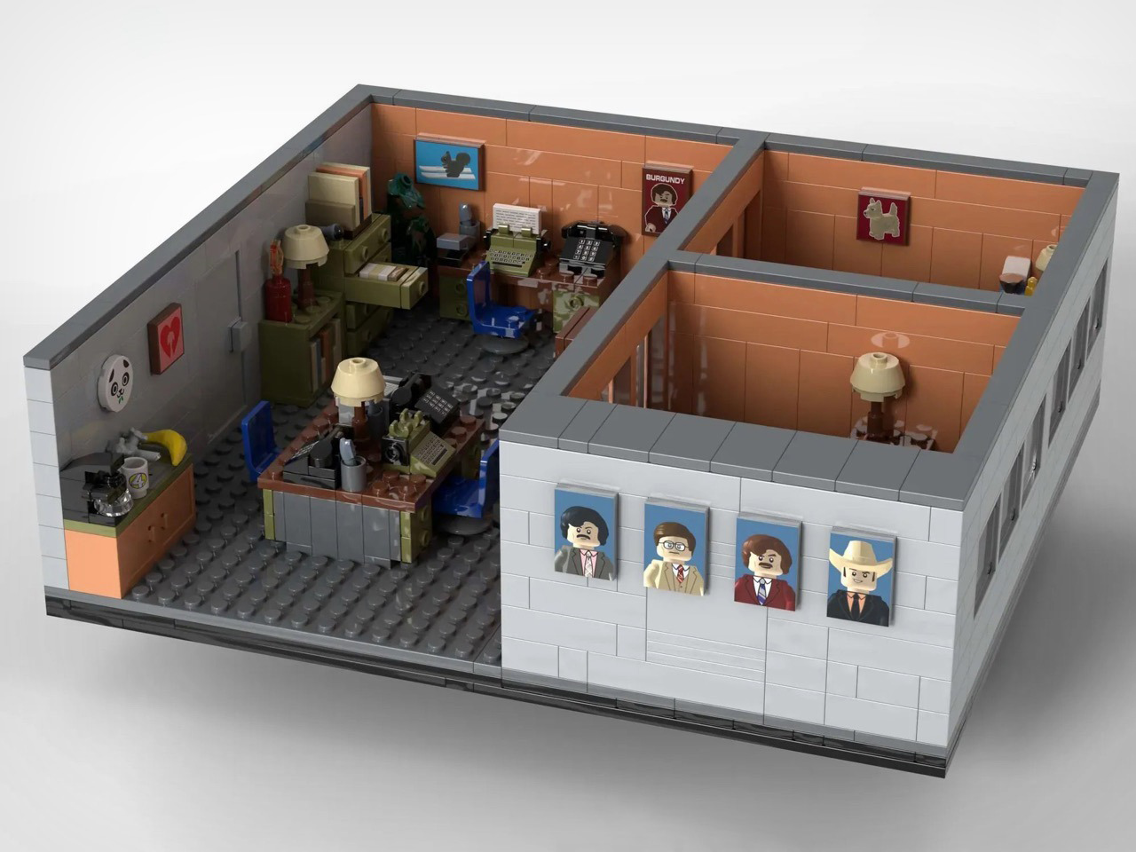
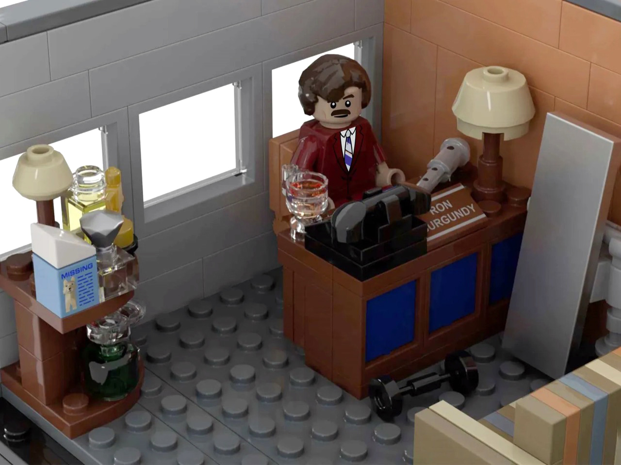
Turn to the office areas and you’ll find a bunch of details and easter eggs. Ron’s private office has his nameplate desk, a glass of scotch rendered in a transparent amber round piece, and a “Missing” poster for Baxter tucked onto a side shelf. Brian Fantana’s cologne closet, one of the film’s most beloved gags, is recreated with an open cabinet stocked with colourful brick-built bottles, with a “Brian Fantana” book sitting on his desk for good measure. The hallway outside features a glass-panel wall looking into Ron’s office, and a Ron Burgundy door nameplate that even Veronica would have to respect. My favorite detail, though, is the row of four team portrait tiles mounted on the exterior office wall, each one a miniature LEGO-art-style illustration of the Channel 4 crew. Tiny, considered, and completely unnecessary in the best way.
The eight minifigures are pitch-perfect. Ron arrives in his burgundy suit with a jazz flute and a scowl that says “I have many leather-bound books.” Brick Tamland, naturally, comes with his trident. Champ has his signature cowboy hat, Fantana carries what appears to be a cologne bottle, and Veronica is rendered in her pink suit with that particular expression of someone perpetually tolerating Ron’s nonsense. Baxter the dog is included as a separate figure, and there’s even a bonus Ron on a tiny red bicycle, which is exactly the kind of specific deep-cut that separates a good MOC from a great one.
footonabrick’s Anchorman set is currently gathering votes on LEGO Ideas, the community platform where fan-created MOCs (My Own Creations) need 10,000 supporters to trigger an official LEGO review and potential retail production. With 344 votes on the board and 421 days left on the clock, there’s plenty of runway. If you want to see this land on store shelves, head to the LEGO Ideas page and cast your vote. You stay classy.
Track Trailer, the name behind the famous Tvan off-road camper trailers, needs little introduction. It has been powering the overlanding experience in Australia and worldwide for a good part of four decades now. Over the years, we have seen some interesting variants of the Tvan, which has now reached the MK6. The sixth iteration in the successful portfolio, Tvan MK6 Model, retains the same aluminum body, which runs in the bloodline, but is more spacious and even more comfortable.
As the appearance suggests, the new Tvan MK6 is available in four variants and is almost identical to its predecessors. What changes are the interior space and the headroom, which make the MK6 a different entrant in the same effective branding of the world’s toughest off-roading trailer.
Track Trailer first tried reworking the interior space with the MK5 model. It was done staying within the confines of the Tvan styling: no pop-up roof attachment, but a slight raise in roof height. With the MK6, the company has also stayed true to its design ideology. It has only increased headroom, stretched the neck forward, and pushed the sides of the trailer outward to increase the interior space by up to 20%.
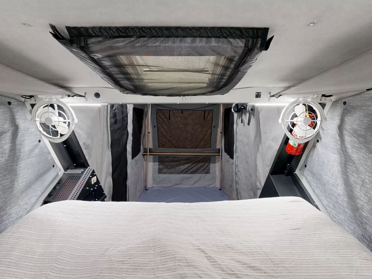
The expansion to the trailer permits more natural light inside the cabin, which is constructed using an aluminum sandwich-panel construction. Moreover, the MK6 features a durable chassis based on an advanced suspension system that enables it to roll comfortably on rugged terrains and off-road destinations. With its ruggedness assured, the camping trailer is ideal for all types of adventures, which is facilitated by its quick setup and clever storage designed throughout its exterior and also on the inside.
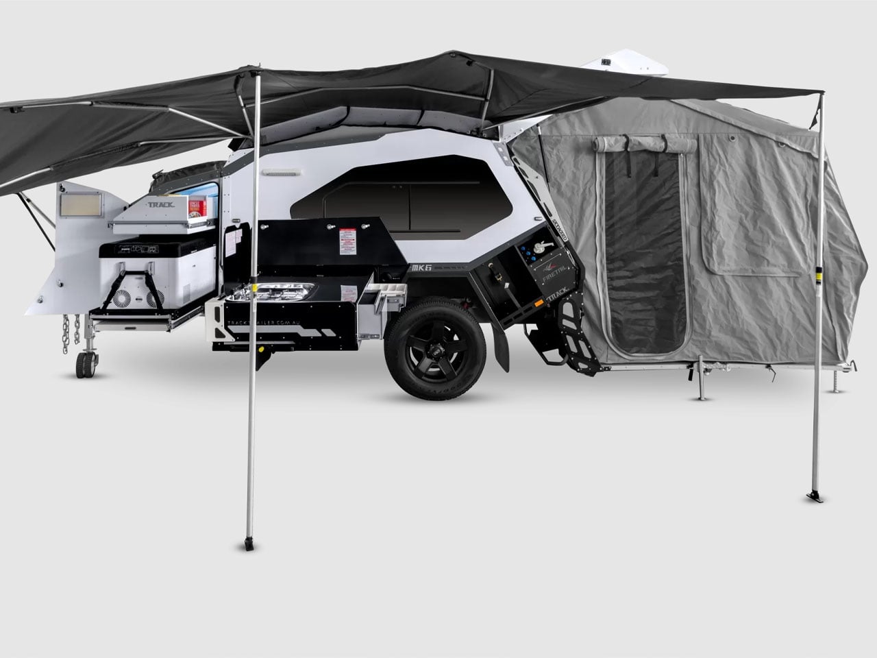
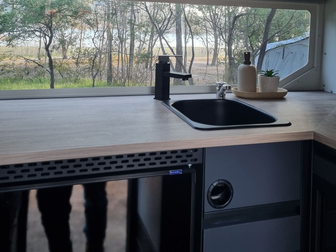
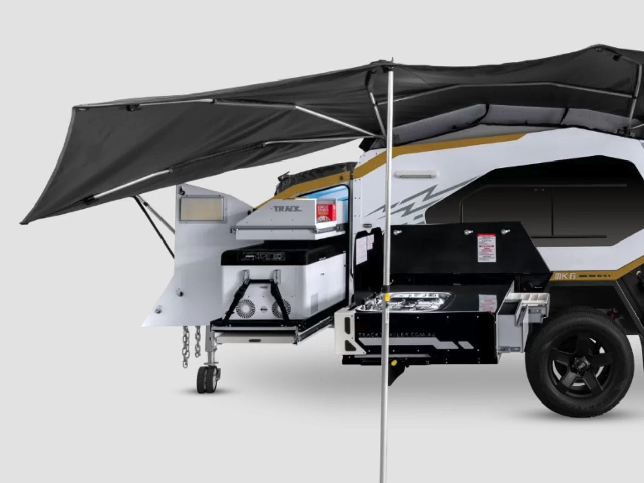
MK6 measures 16-foot-long and 6.3 feet wide, the trailer has an interesting storage cabinet in the extended nose up front, comprising a pantry and up to 95 liters fridge/freezer. Slightly further back is the slide-out kitchen with a three-burner gas stove, a full-size sink connected to a 108L fresh water tank, and a storage drawer topped with a prep area.
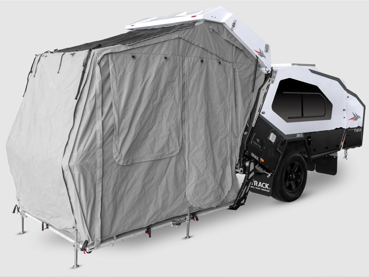
The most interesting part of the MK6 camping trailer is the rear hatch design. It features Track Trailer’s patented Skyward Lift Up Deck, which combines the hatch and the hard-floor deck. The electric lock system allows the two to lift up in unison for quick and direct access into the living space of the trailer. Just when you need it, a tent can be attached to the trailer to increase the living quarters.
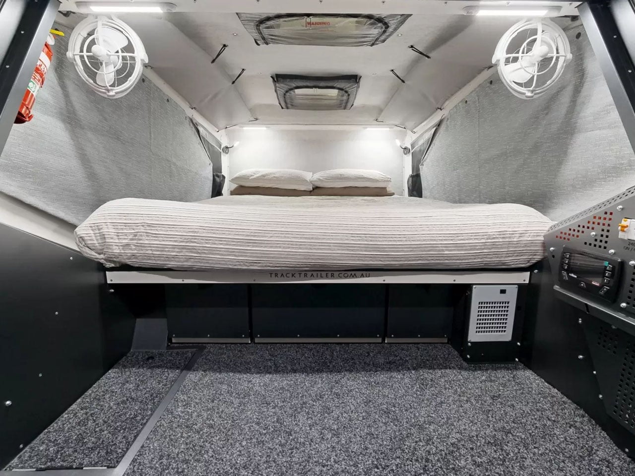
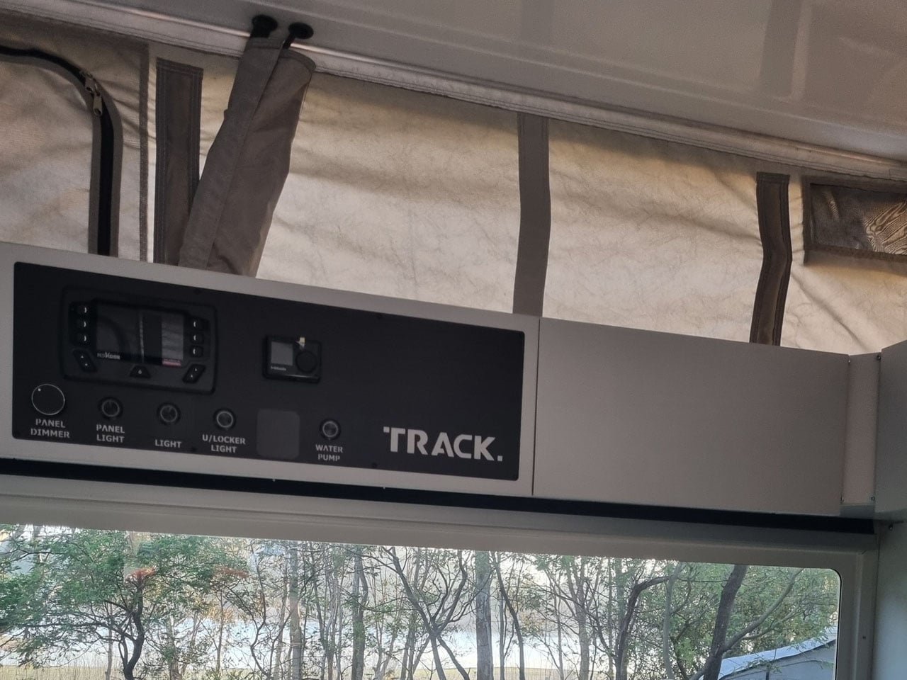
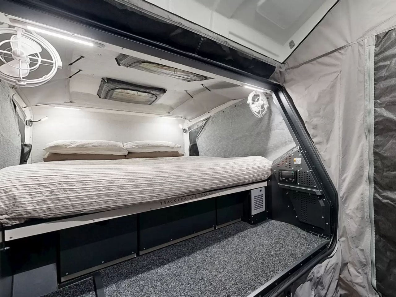
Inside is a double bed surrounded by large windows and overhead and sidewall storage. LED lighting and dual roof hatches complete the design. Since the MK6 is available in four variants, each is designed differently for off-the-grid living. The entry-level Inspire features a 125Ah lithium battery that draws energy from a 200W rooftop solar panel, while a 350W inverter takes care of the power backup. Firetail accommodates a pair of 125Ah batteries, a 2000W inverter, and some premium features in the kitchen.
Tvan MK6 Murranji adds a 200W solar panel to the Firetail setup, but leaves out the inverter. The top-of-the-line, Lightning, on the other hand, comes with a 500Ah battery. It features a 2,000W inverter and a 360W solar panel to complete its all-electric setup. Each of these models can have further upgrades with add-ons like awnings and more. MK6 starts at AU$69,900 (approximately $50,000) with the mentioned amenities.
Microsoft has officially announced a final date for the retirement of Microsoft Defender Application Guard (MDAG) for Windows 11 as part of its broader shift in security architecture. Support for the hardware-based isolation tool will end on November 10, 2026. It also marks the end of an era for the Hyper-V-based container technology. Microsoft Defender […]
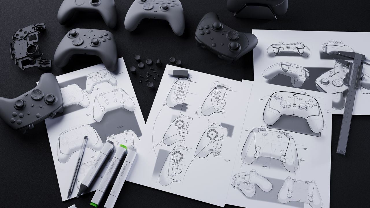
I was given the opportunity to chat with Charlie Bolton, Razer's Global Head of Design, to learn how Razer designs and releases its popular gaming products.
The latest Razer Blade 14 is an incredible laptop, and it's also the company's best seller. Starting at $2,300, though, who should actually buy this device?

 Connexion
















































 Microsoft has officially announced a final date for the retirement of Microsoft Defender Application Guard (MDAG) for Windows 11 as part of its broader shift in security architecture. Support for the hardware-based isolation tool will end on November 10, 2026. It also marks the end of an era for the Hyper-V-based container technology. Microsoft Defender […]