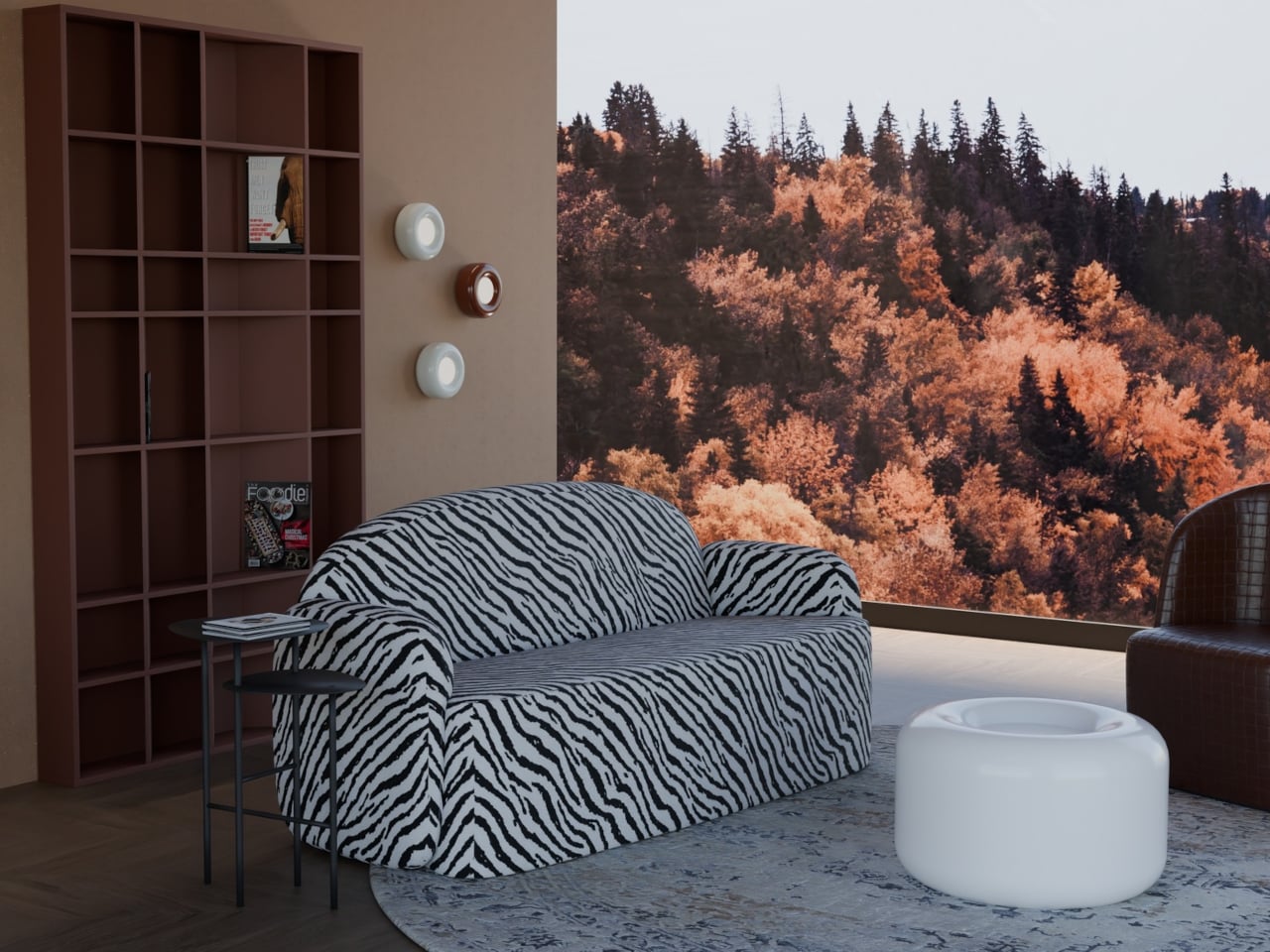
The interiors most people aspire to these days tend to share a common trait: they’re clean, restrained, and almost aggressively neutral. Scandinavian minimalism, Japandi aesthetics, and muted palettes have dominated home design for years, and while there’s nothing wrong with a well-curated beige room, a lot of modern spaces have started to feel emotionally flat, like showrooms rather than places where people actually live.
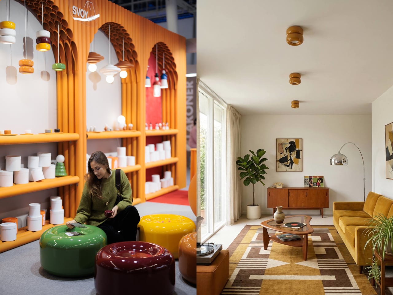
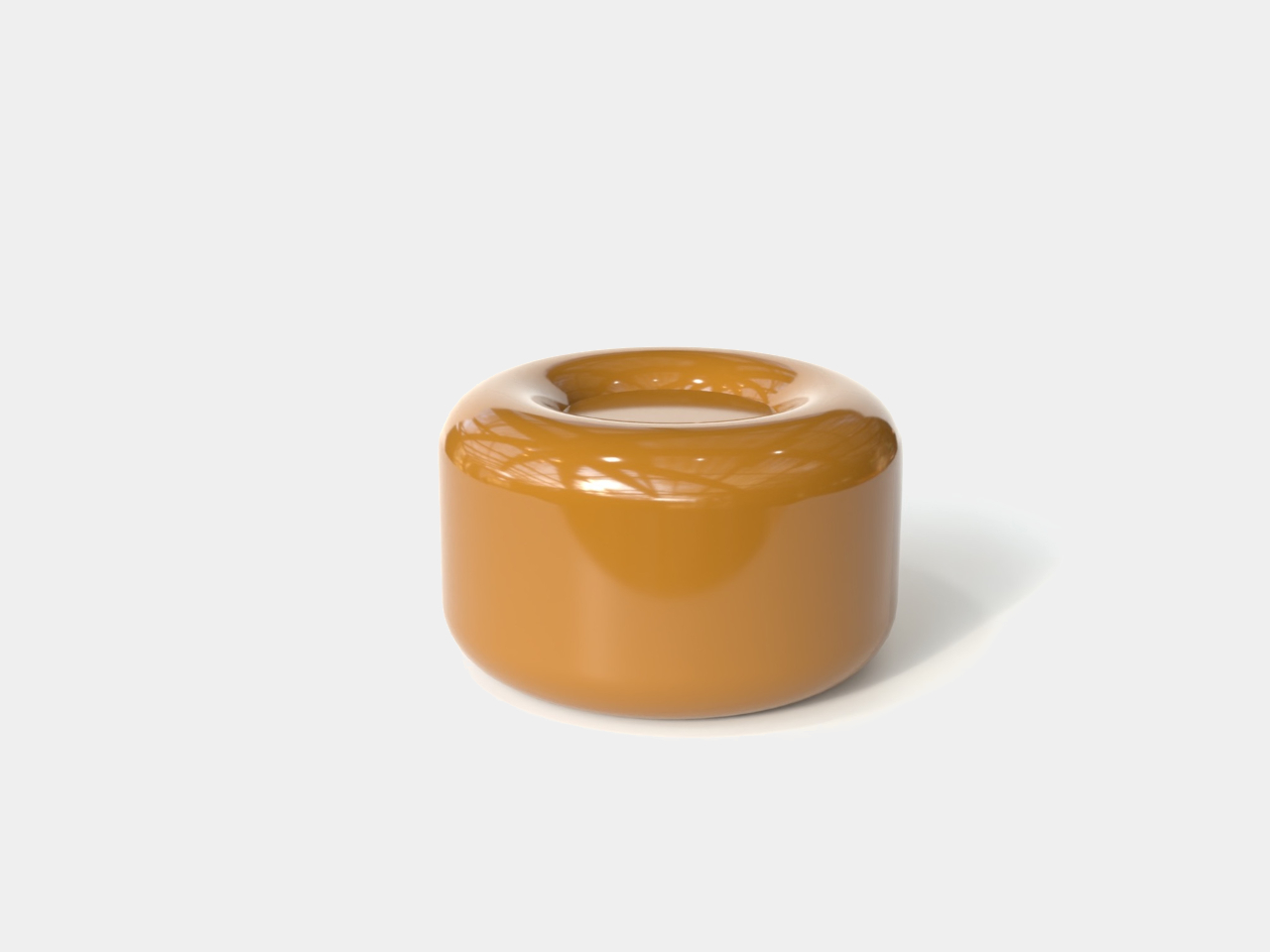
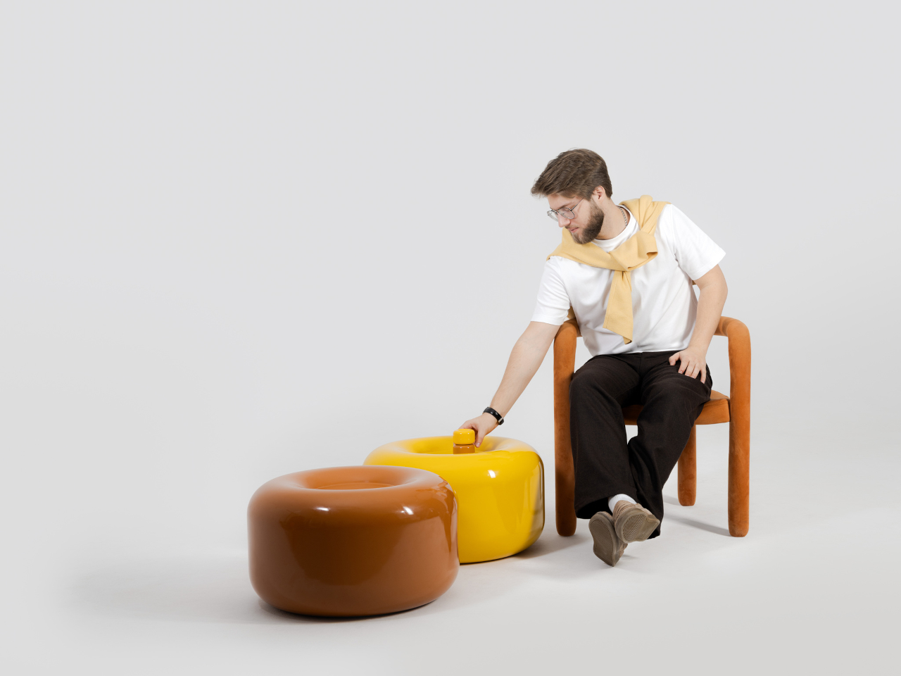
That’s where the Caramel collection comes in. Designed by Moscow-based product designer Maxim Tatarintsev in collaboration with Russian brand Svoy Design, this new series of ceramic lighting and furniture takes a very different approach to interior objects. Rather than adding another understated piece to a polished shelf, it reaches back to a simpler, sweeter time, asking whether a lamp or a side table can carry something as intangible as joy.
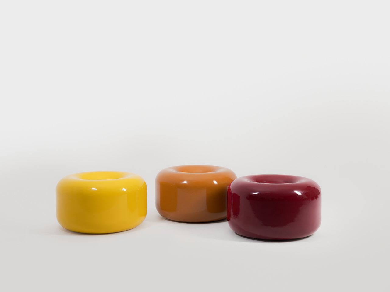
Tatarintsev’s inspiration came from a period of deep personal reflection. Amid what he describes as the noise of contemporary life, he looked inward and found his answer in childhood, specifically in the candy that practically every kid growing up in the 90s and early 2000s would recognize. That small, glossy, jewel-toned caramel sweet became both his muse and his design vocabulary, shaping everything from the forms to the color palette.
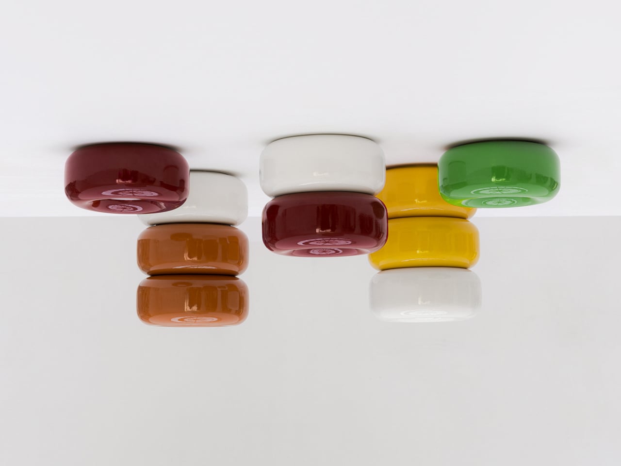
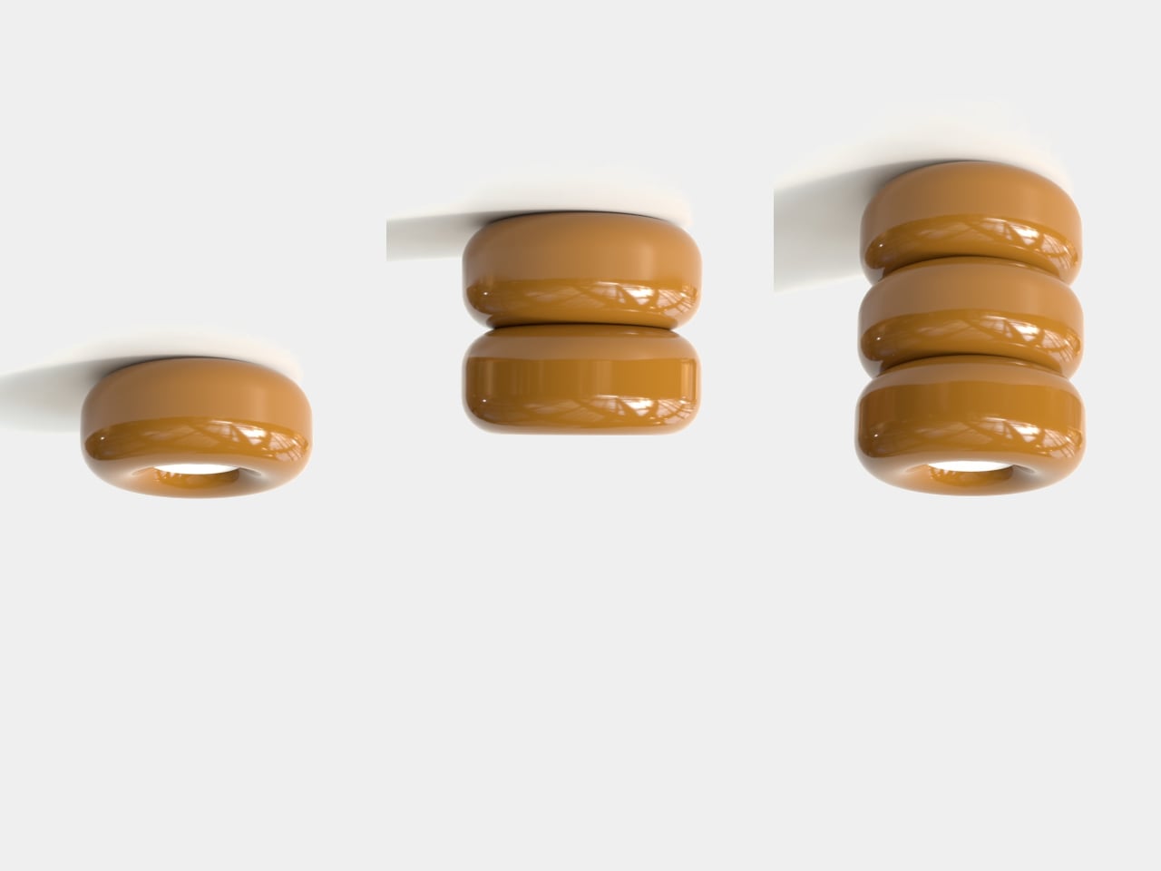
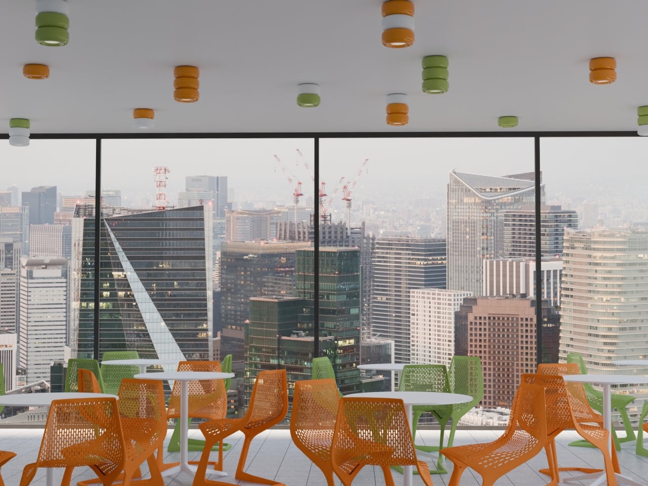
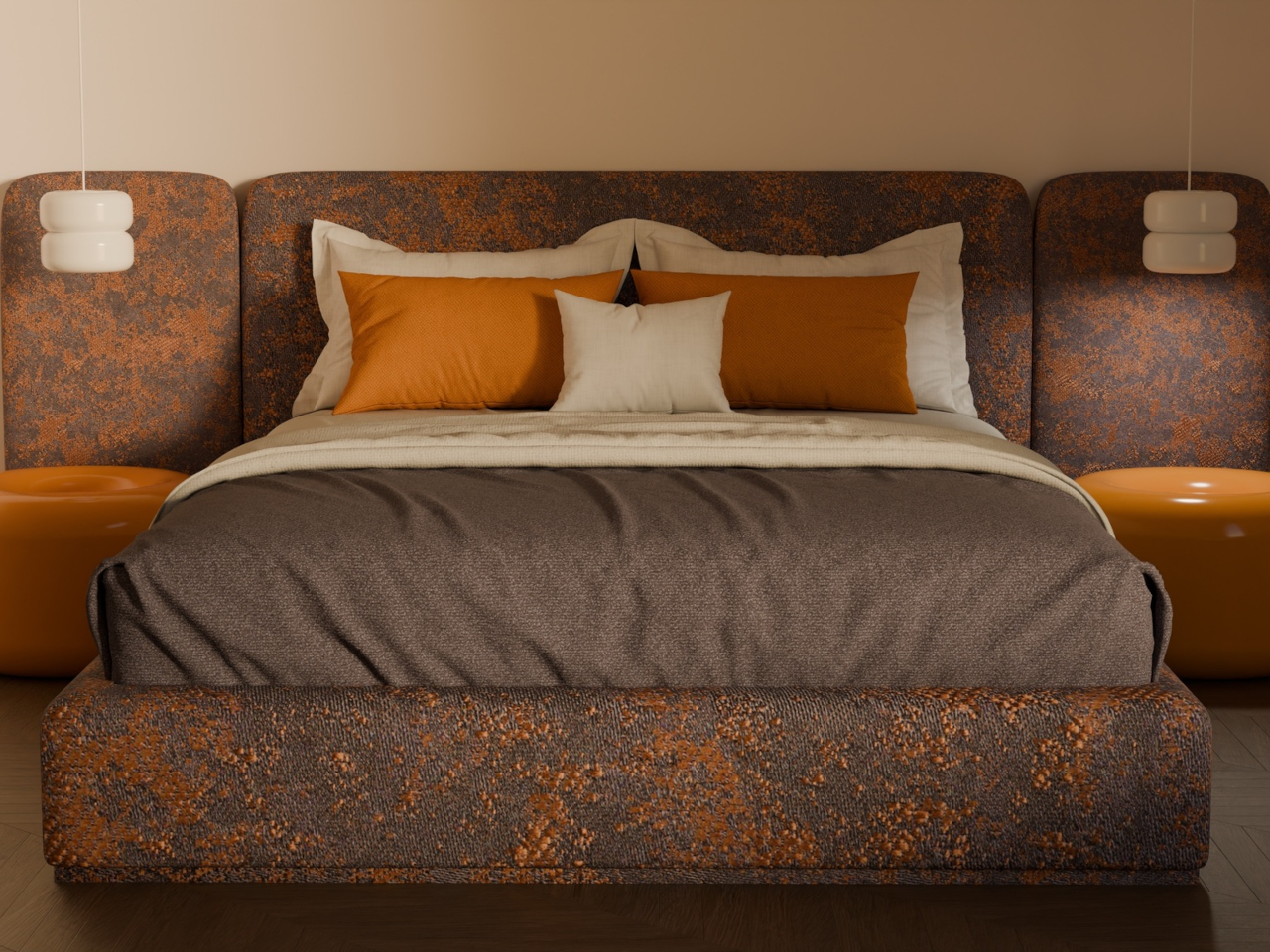
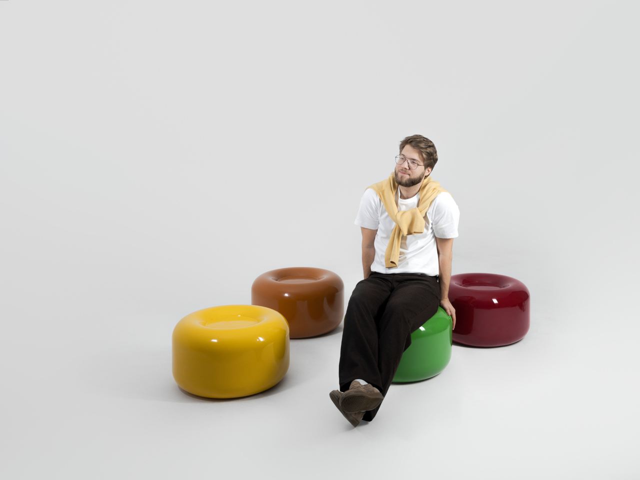
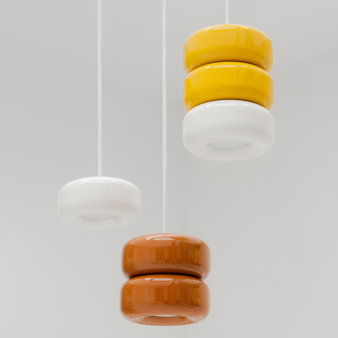
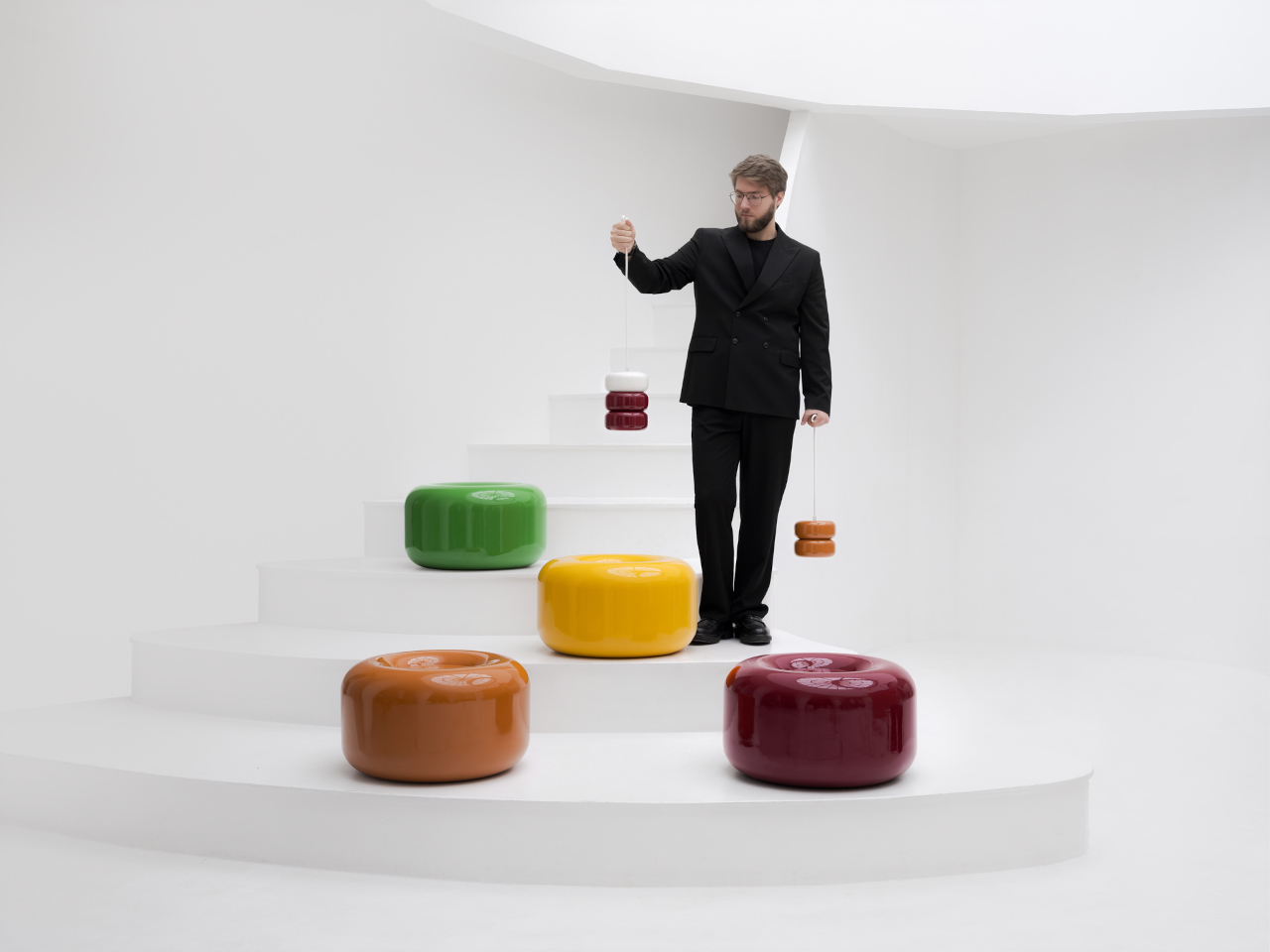
The collection spans pendant lights, ceiling fixtures, and wall-mounted lamps, all crafted from semi-porcelain, as well as a low-profile side table made from a proprietary composite material. What stands out is the modular approach: each ceramic unit can be combined and reconfigured, letting you stack or cluster them into different lighting arrangements depending on the mood or corner of the room you’re working with.
Think of it like assembling your own arrangement from a jar of sweets. One configuration might call for a single pendant above a kitchen island; another might cluster a few units along the ceiling of a reading nook. The point isn’t to follow a prescribed layout but to put that creative decision in the hands of the person actually living in the space, not just the designer who furnished it.
The craftsmanship behind the lighting is traditional and deliberate. Each piece starts as a slip-cast semi-porcelain form, drying for several days before being fired at 1,100°C inside a muffle furnace. A coat of glaze and paint follows, giving the finished modules their signature smooth, candy-like sheen. It’s a fairly labor-intensive process for what might look like a simple geometric shape, but that’s precisely what gives each piece its quiet depth.
The side table takes a different manufacturing route altogether. Made from a proprietary composite rather than ceramic, it’s significantly more durable and comes in two versions, one for indoor use and one for covered outdoor settings. At first glance, it reads as a low, rounded ottoman, and people will probably be unable to resist using it as a delicious seat instead.
None of that is accidental. Tatarintsev’s stated goal wasn’t to produce pretty objects but to create what he calls “emotional anchors,” pieces capable of sparking a genuine reaction in whoever encounters them. A set of lamps you can rearrange on a whim, a table that moonlights as a seat, and a color palette borrowed from childhood treats make for a collection that gives any room a personality it actually earned.
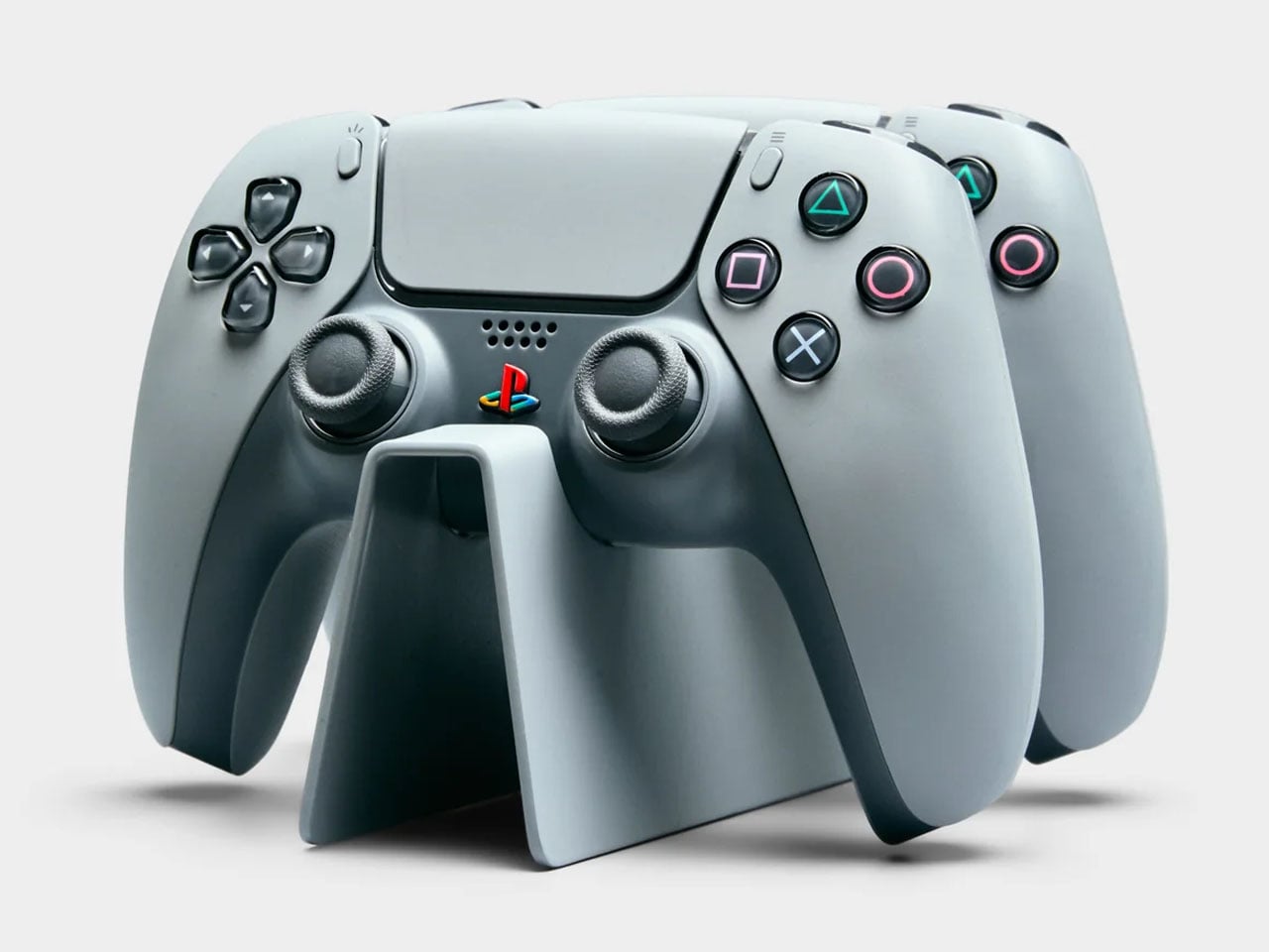
PlayStation turned 30 a couple of years ago, and milestones like this rarely pass quietly in the consumer electronics world. Sony marked the occasion with a special edition PlayStation 5 and accompanying accessories finished in a nostalgic gray tone inspired by the original PS1 console. If you were among the lucky few who managed to get hold of that anniversary edition styled after the classic PlayStation color scheme, there is now an equally themed piece of furniture designed to show it off in the living room.
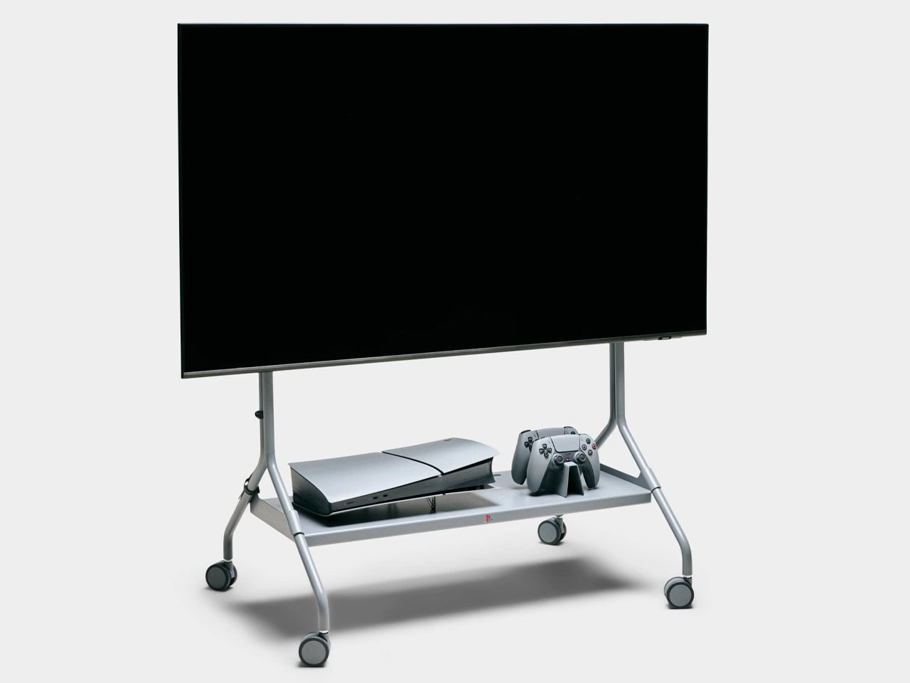
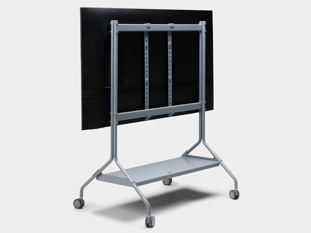
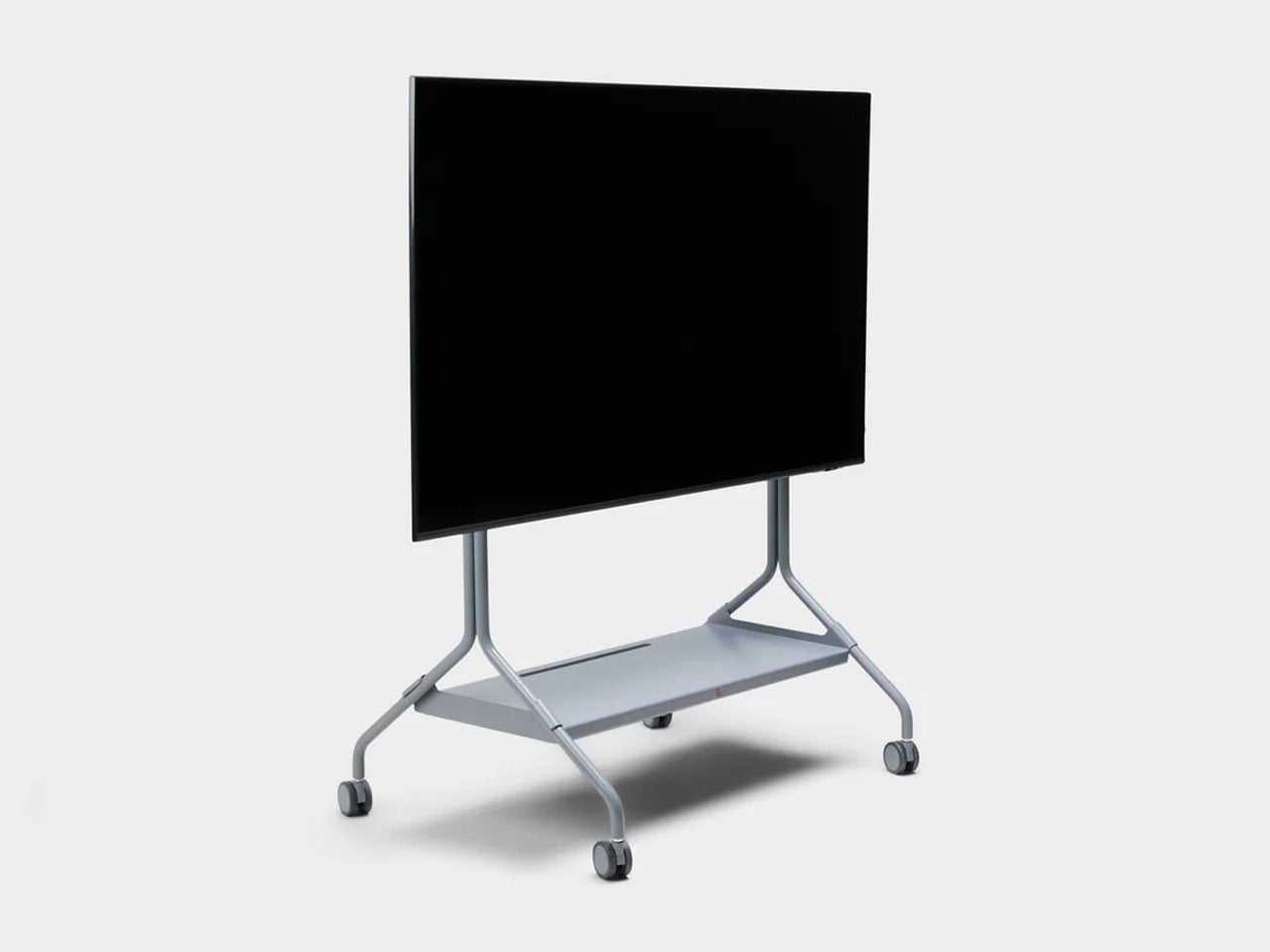
Designed in collaboration with Danish furniture maker Pedestal, PlayStation Norway has introduced a statement accessory that celebrates gaming culture as much as it serves a functional purpose. The Moon Legacy Edition TV stand arrives in a muted “Legacy Gray” finish that reflects the iconic tone of the original PlayStation console. The visual connection immediately creates a retro aesthetic, making it particularly appealing for collectors who appreciate the history of gaming as much as the hardware itself.
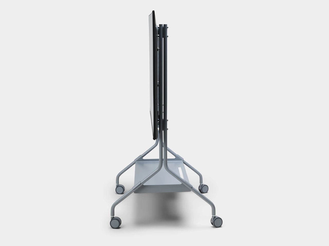
Beyond the nostalgic color palette, the stand follows Pedestal’s minimalist Scandinavian design philosophy. The frame is constructed from powder-coated steel with a satin finish, giving the structure a sturdy and refined appearance while maintaining a relatively lightweight build. Despite the industrial material choice, the design remains clean and understated, allowing the console and TV setup to remain the visual focus. The stand measures roughly 42 inches high, 31 inches wide, and 21 inches deep, and weighs just under 33 pounds, making it substantial enough for stability without feeling overly bulky. It supports flat-screen televisions between 40 and 70 inches and can handle loads of up to about 110 pounds, which comfortably covers most modern TVs and gaming setups.
The Moon Legacy Edition sits on premium furniture wheels with soft polyurethane coating, allowing the entire entertainment setup to move easily between spaces. For users who rearrange their living room or occasionally shift their gaming setup to different areas, the wheeled base offers flexibility that traditional TV cabinets often lack. The stand also adheres to the widely used VESA mounting standard, meaning it is compatible with most flat-screen television brands currently on the market.
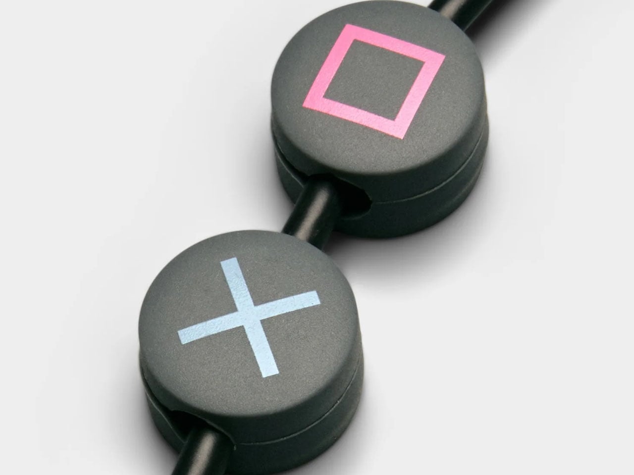
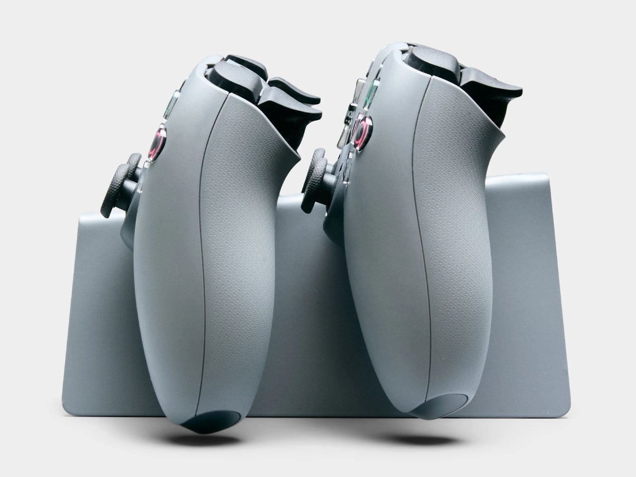
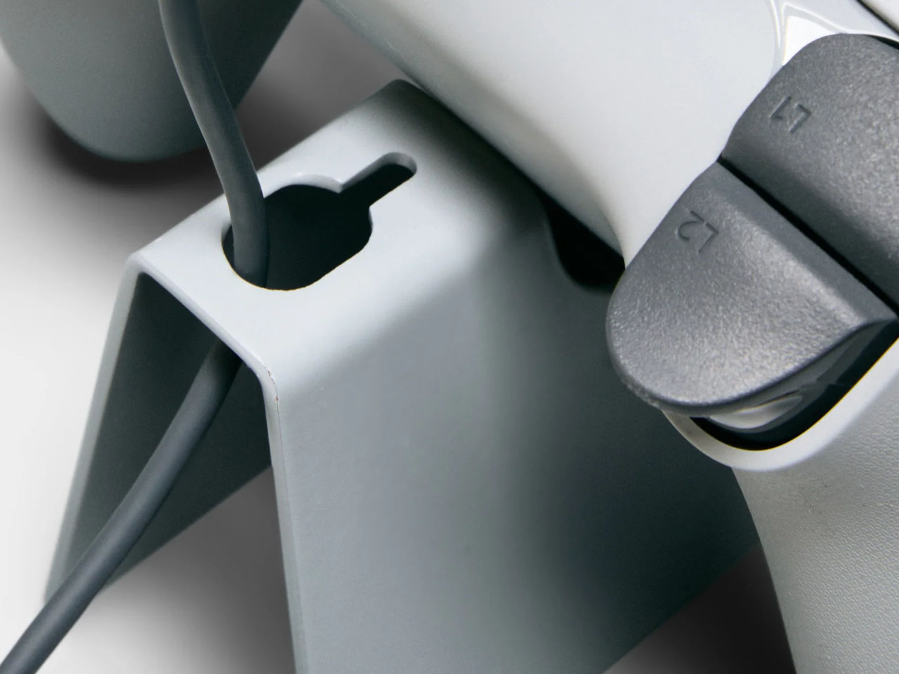
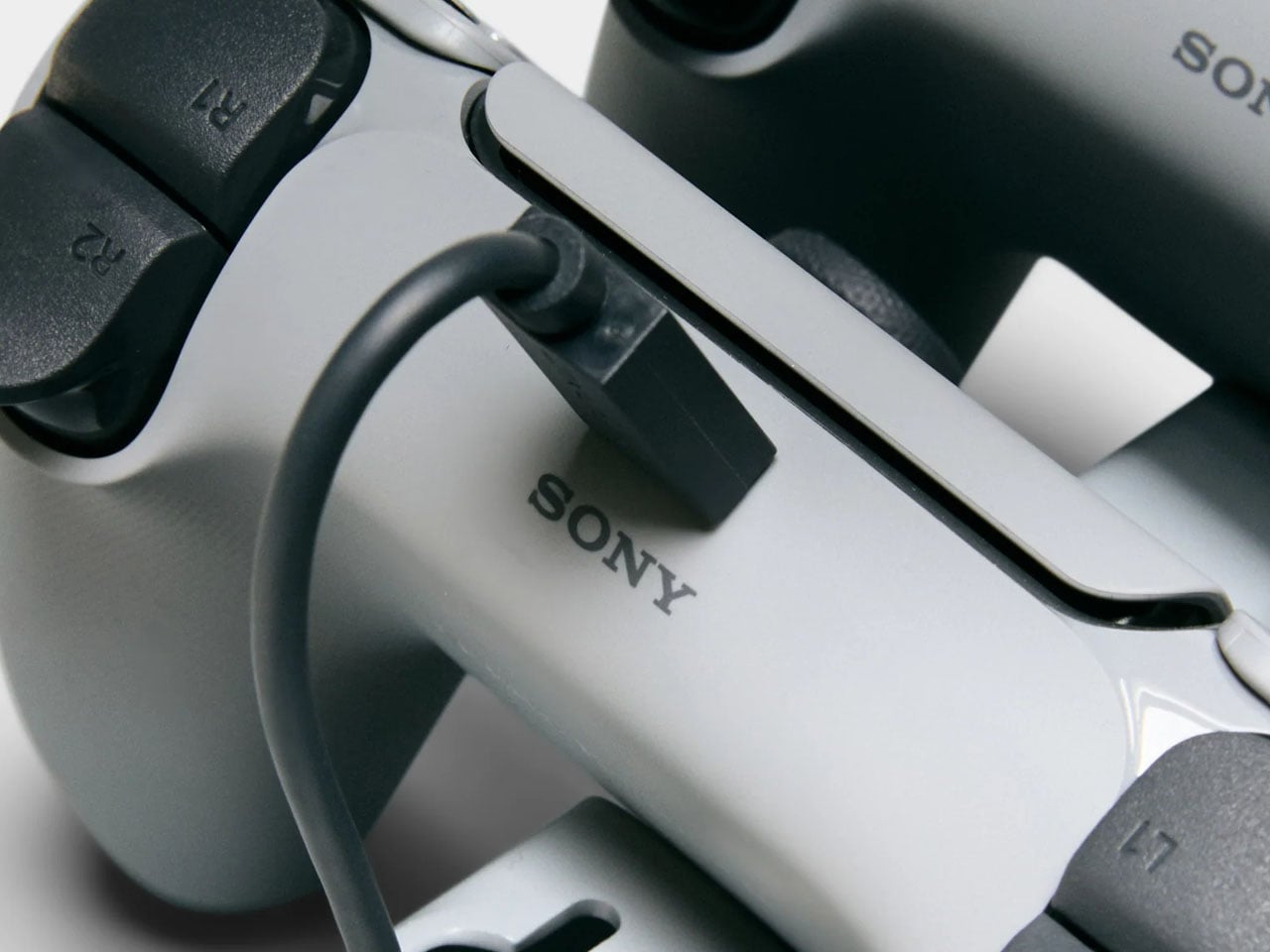
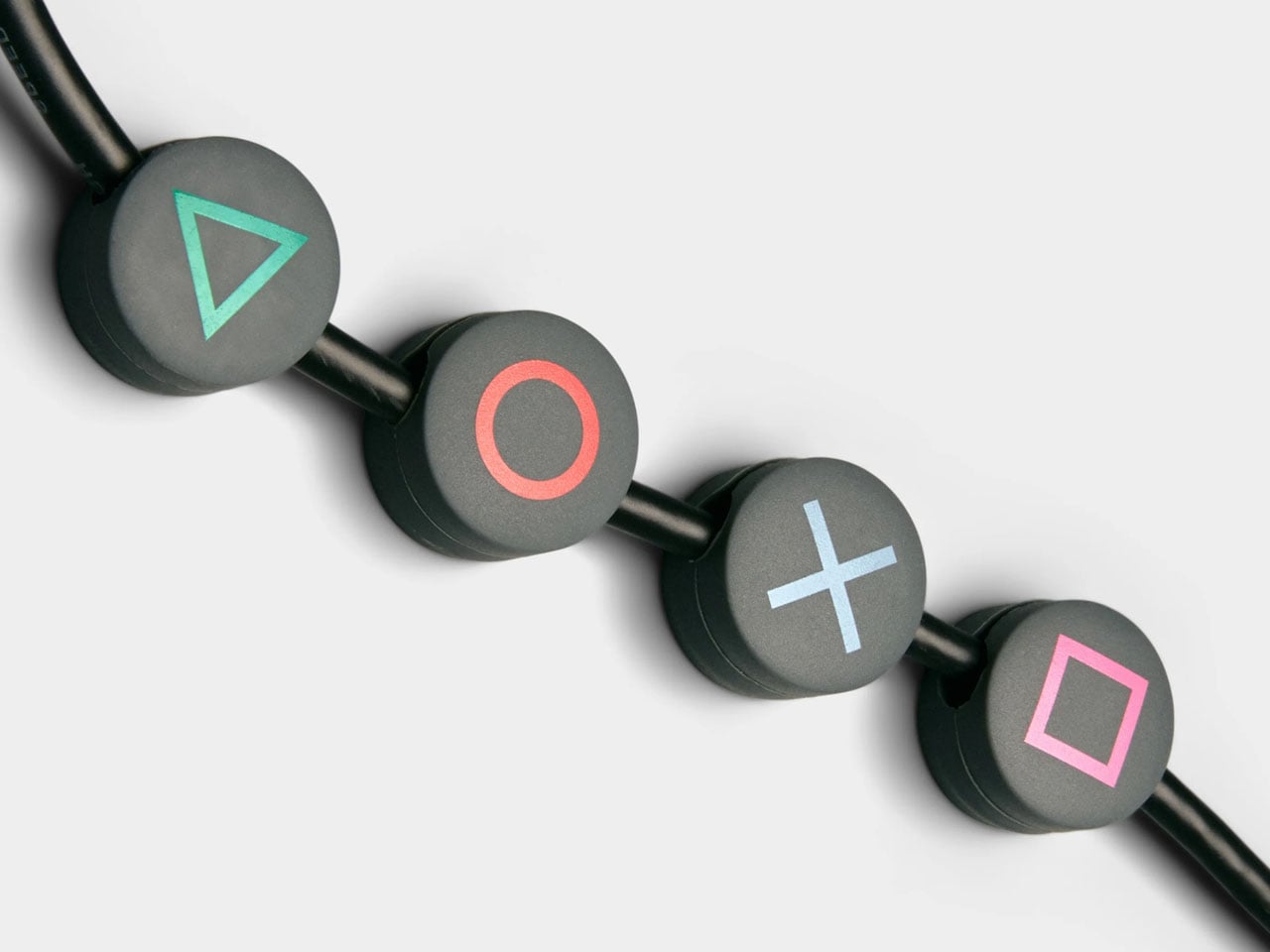
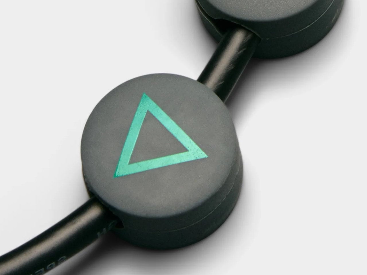
Functionality extends beyond simply holding a TV. The limited-edition package includes a matching Legacy Shelf and a controller stand, giving players a dedicated place to display a controller or store accessories. Additional cable management accessories, such as cable dots and cable ties, are also included to help keep wires organized and out of sight. The shelf adds a subtle display area that can hold game cases, collectibles, or other gaming gear without interrupting the stand’s minimal design language.
The Moon Legacy Edition TV stand is priced significantly higher (approximately $775) than the normal version, which costs $385, reflecting its limited-edition status. The price covers only the stand and included accessories; neither the television nor the PlayStation console is part of the package. As a result, the stand clearly targets dedicated fans and collectors who value the design connection to PlayStation history rather than simply looking for a functional TV stand.
Foldable phones have reached a point where the form factor itself is no longer the talking point it once was. The big, dramatic “look how it folds” moment has settled into a quieter rhythm of iterative refinement, with each generation tweaking dimensions and chasing thinner profiles. Most buyers know what a modern book-style foldable looks like, and the language of change has shifted from shape to substance.
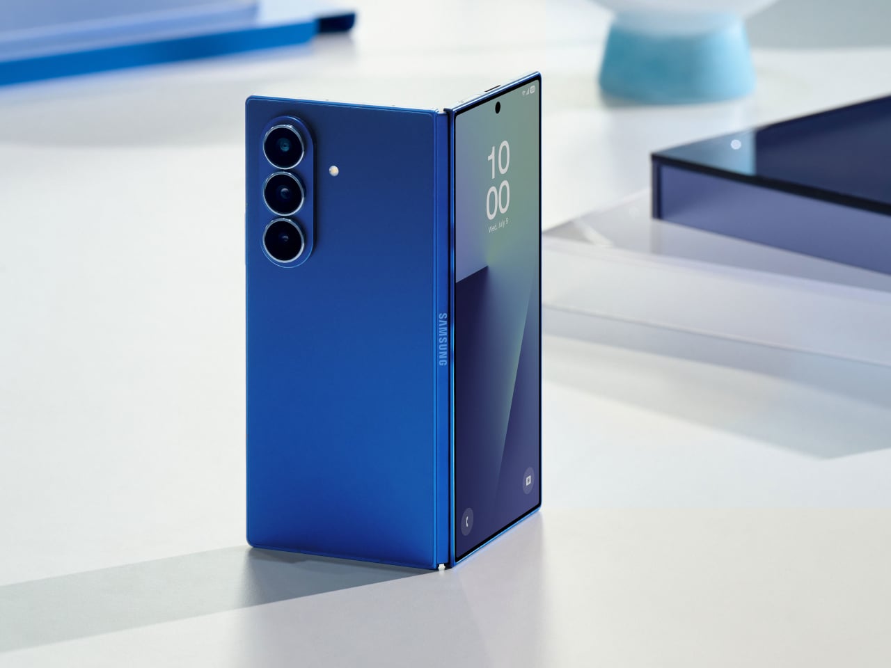
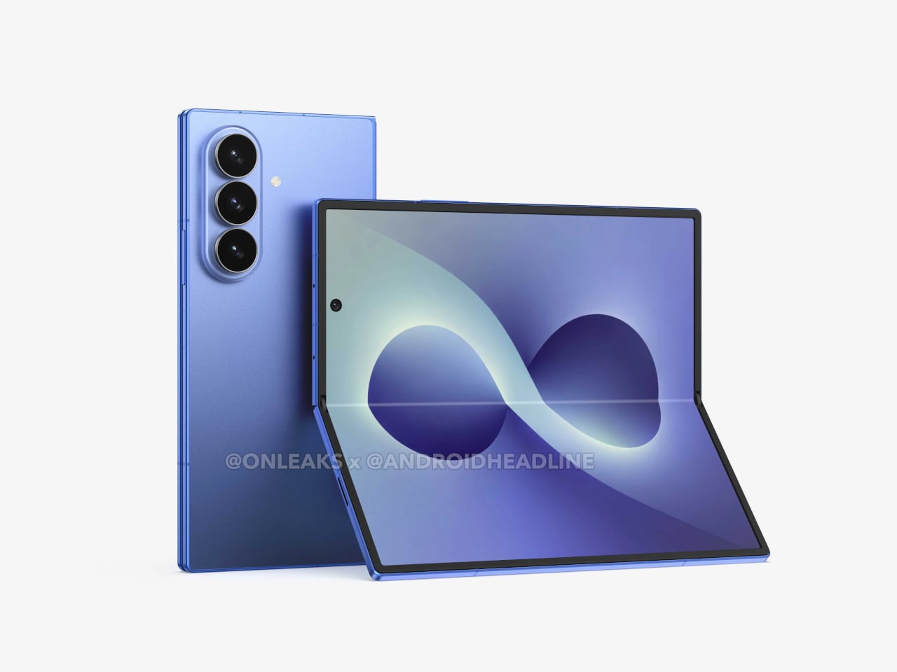
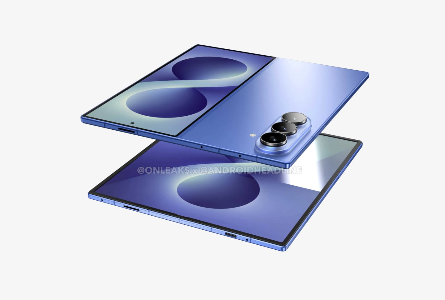
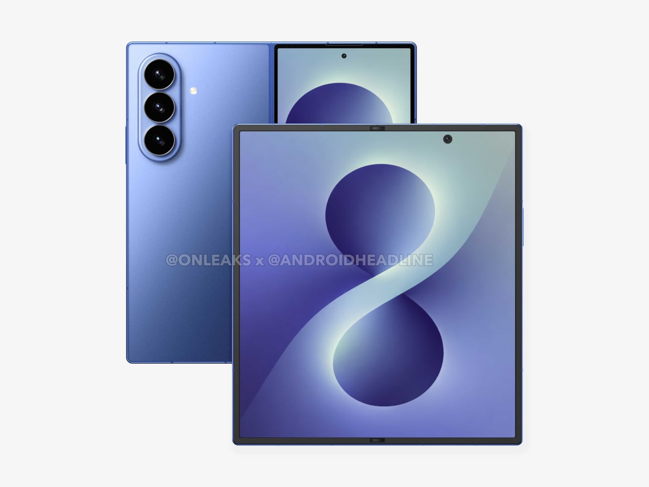
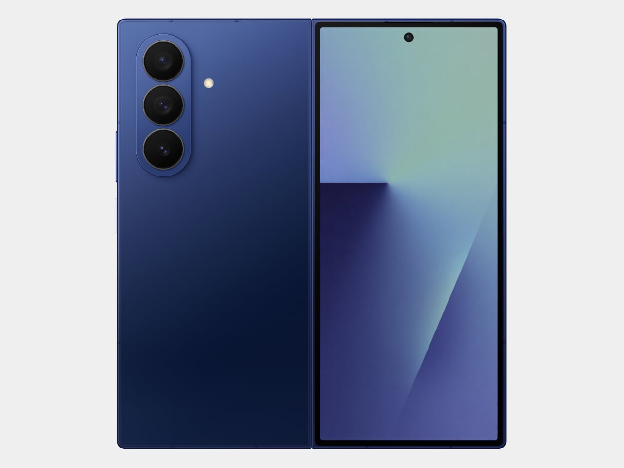
That’s the situation shaping the Samsung Galaxy Z Fold 8 conversation right now. Leaked CAD-based renders show a design that’s nearly indistinguishable from the Z Fold 7 pictured above: same flat sides, same sharp corners, same camera layout. The cover screen sits at 6.5 inches and the inner display at 8 inches, both unchanged. If you handed someone these renders without context, they’d probably just guess it was another angle of last year’s model.
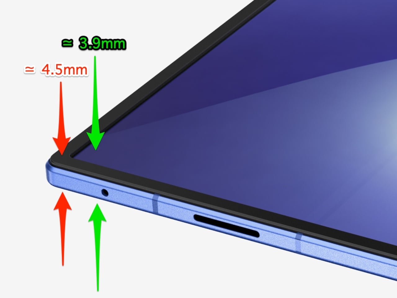
There’s one notable external difference, though, and it actually goes in the wrong direction. The leaked dimensions put the Z Fold 8 at 4.5mm thick when open and 9mm folded, compared to the Fold 7’s 4.2mm and 8.9mm. That’s a slight regression for a phone that went to considerable lengths to slim down the year prior. It’s not dramatic, but for a device that made a point of its thinness, it’s worth flagging. That said, the 4.5mm figure includes the protruding bezels around the display; it’s actually just 3.9mm thin.
The likely reason for that extra thickness is one of the better leaks so far: the possible return of S Pen support. Samsung dropped the stylus from the Fold 7, and that’s been a consistent complaint from the people who actually used it for note-taking or sketching on that wide inner canvas. If the S Pen does come back, a fraction of a millimeter is a fair trade for most of those users.
The battery theory, however, is probably more probable. A jump from 4,400 mAh to a rumored 5,000 mAh would mark the first capacity upgrade since the Galaxy Z Fold 3, and pairing that with 45W wired charging, up from 25W, addresses one of the more persistent frustrations with this lineup. Spending less time near an outlet matters more on a device you’re likely using across more tasks throughout the day.
The camera is also in line for a significant upgrade, according to the same leak. The main sensor is rumored to still be 200MP, and the ultrawide jumps from 12MP to 50MP. That ultrawide improvement in particular has been a long time coming. The gap between the Fold’s main and ultrawide cameras has been noticeable enough that it’s affected how people use the phone outdoors.
All of this is still leak territory, of course, pulled from CAD renders and a specs tipster ahead of what’s expected to be a July 2026 Unpacked announcement. Samsung hasn’t confirmed any of it, and final specs frequently shift between early renders and launch day. The Z Fold 8 is shaping up to be a phone that looks familiar and updates what actually needs updating, but none of that is official yet.
March brought the kind of furniture that doesn’t need to announce itself. A student chair that shifts between sitting and lounging through physics alone. A coffee table whose legs look like they’re caught mid-step toward the door. A stool that opens from flat with a single press and no tools required. An office system built to reconfigure whenever the day asks for something different. A footstool that handles posture quietly, without making it your problem to manage.
What connects these five pieces isn’t a shared material or a shared aesthetic. What connects them is the absence of excess. Each one solves something real, and each one does it without layering on complexity to get there. That kind of restraint is harder to land than it looks. Most furniture design in 2026 is reaching for the new, for the bold, for the statement piece. These five reach for the right answer instead, and find it.
1. Tilt Chair
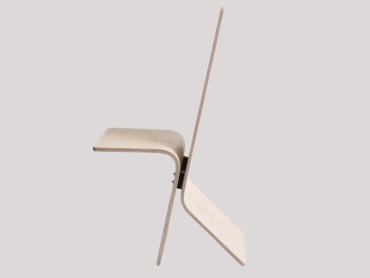
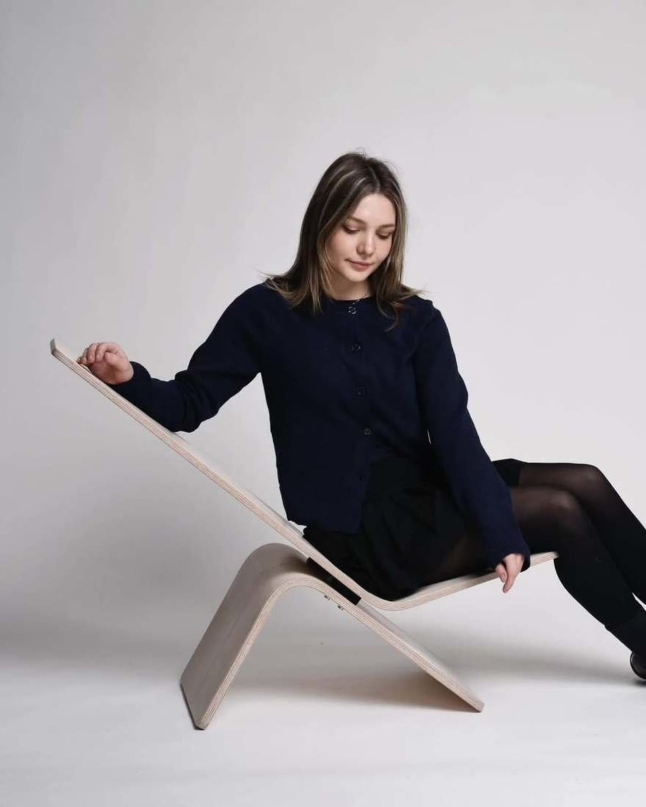
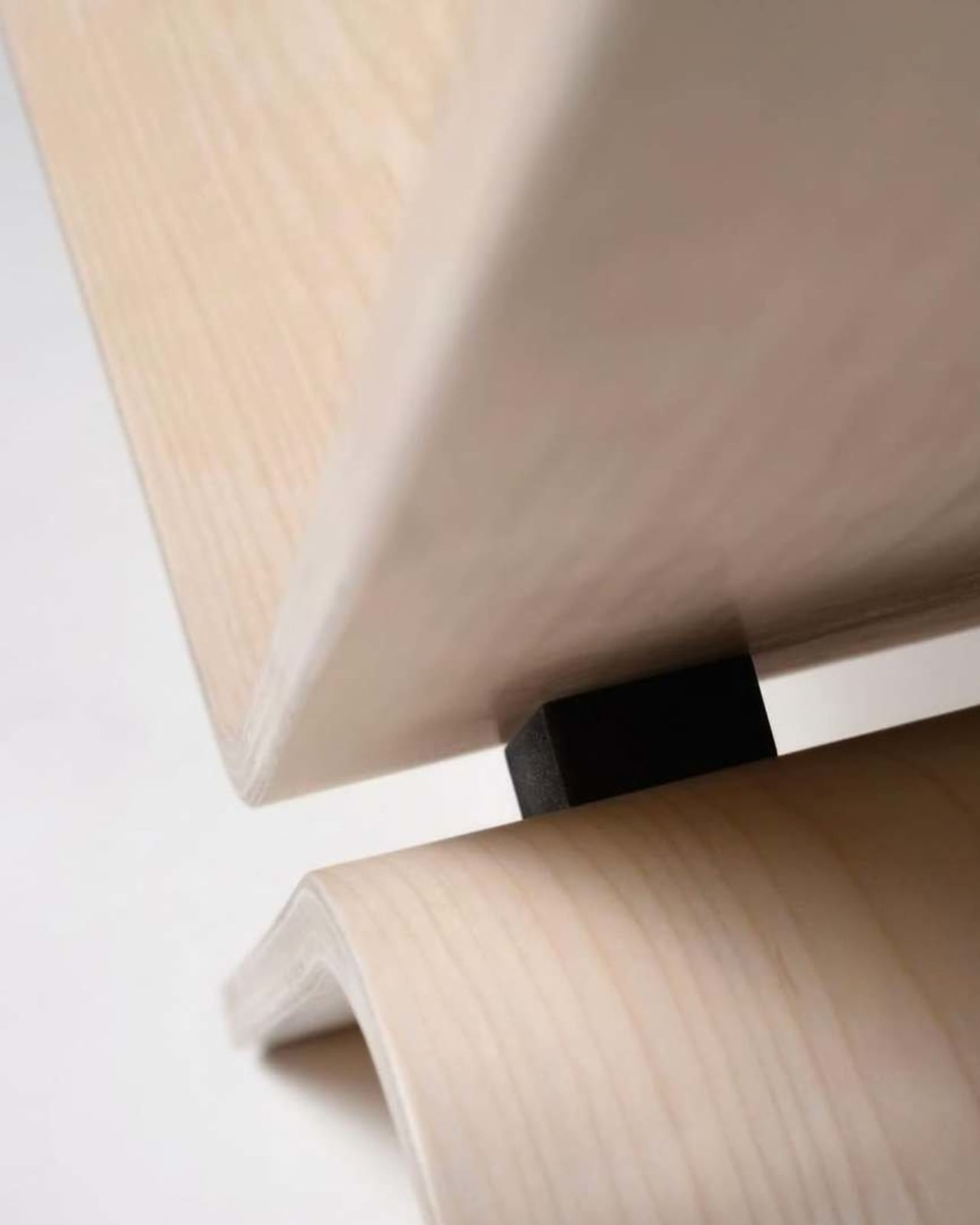
Manuela Hirschfeld is an industrial design student at Germany’s Hochschule Pforzheim, and her Tilt chair does exactly what the name suggests. Built from bent plywood, it shifts between upright and reclined with a single forward tilt. No levers, no hardware, just physics and balance. The restraint here is rare for student work. Most student designs reach for the complex or the speculative. Tilt strips everything back until the idea stands entirely on its own.
What makes it genuinely useful is how naturally it handles the shift between focused work and winding down. Most chairs make you choose one mode and stay there. Tilt lets your body make that call instead. Lean it forward, and the geometry changes. The bent plywood keeps it light and easy to move, so it works as well in a small apartment as it does in a studio or home office.
What We Like
No mechanical parts means nothing to replace or service over time
Dual function in a single lightweight form, no extra hardware needed
What We Dislike
The minimal plywood aesthetic may feel too sparse for warmer, more layered interiors
May not offer enough firm back support for users who need a fixed, stable position
2. Barefoot Collection
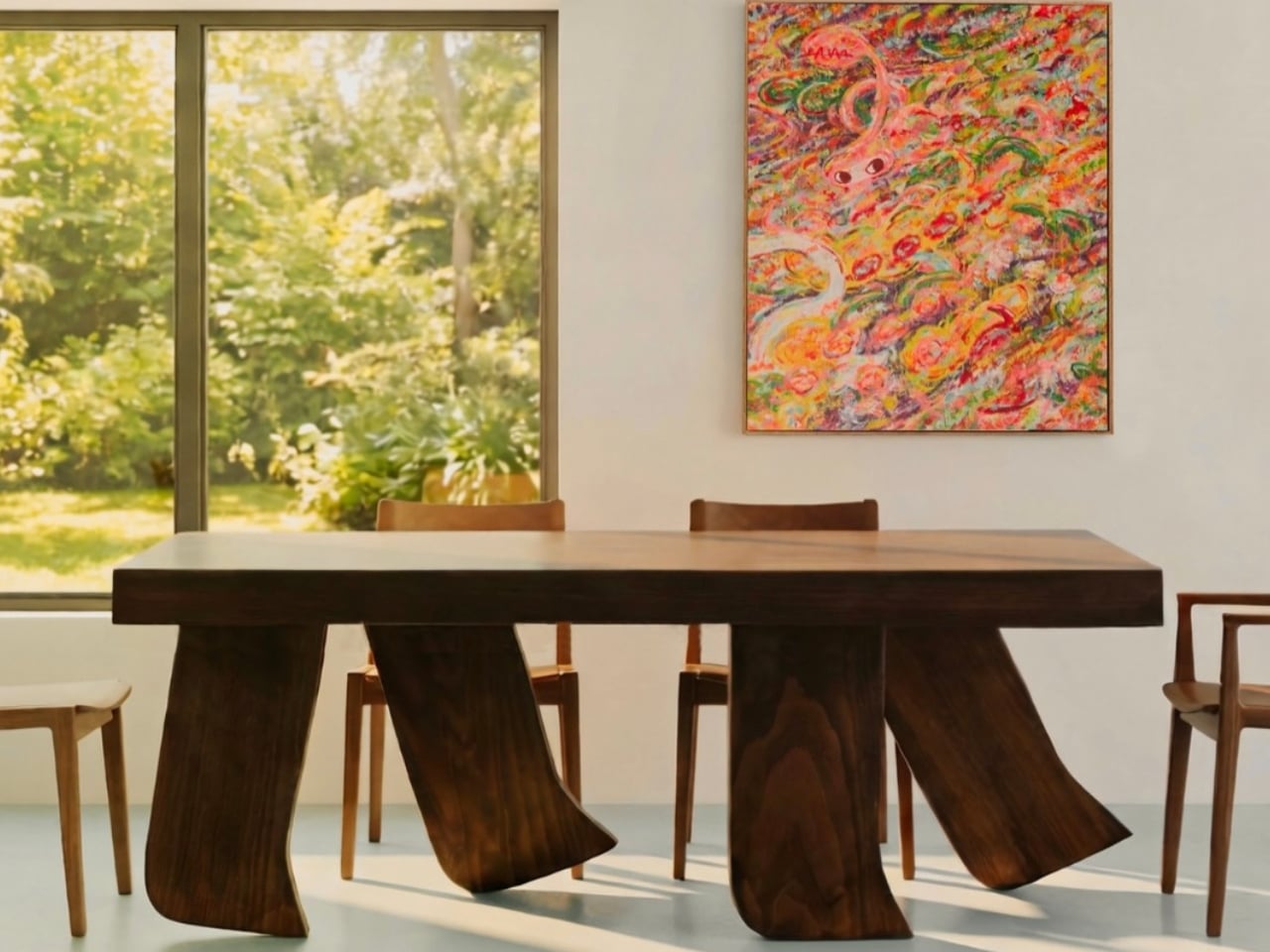
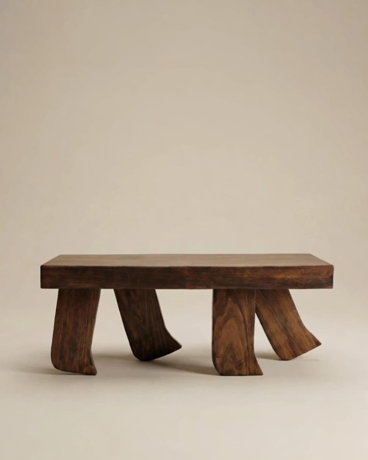
The Barefoot Collection started with a single image: a coffee table that looks like it’s walking away. The legs are carved from solid wood to simulate the arc and flex of a bare foot mid-step, while the tabletop stays completely flat and rectilinear. Stillness above, motion below. That contrast is the whole point, and it works better than it has any right to. The piece reads as coherent long before it reads as clever.
What you actually get is a coffee table that functions without apology and sparks a real conversation without ever trying to. Set a cup on it and forget the concept entirely. Then a guest walks in, does a double-take, and suddenly the room is talking. Most concept-led furniture exhausts you after a few weeks. Barefoot earns its place by being genuinely useful first and genuinely interesting second. That’s always the right order.
What We Like
Solid wood construction gives it real longevity, well beyond its visual appeal
Works as a fully functional surface while quietly holding a strong point of view
What We Dislike
The sculpted legs make it difficult to pair with more conventional, straight-lined furniture
The level of craft involved likely puts it at a higher price point
3. Press Stool
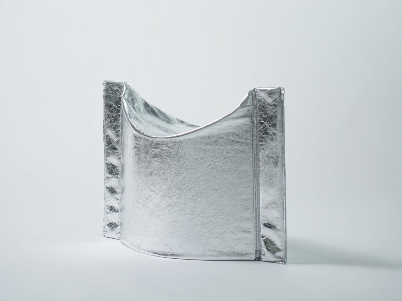
The Press Stool borrows its structural logic from folded paper. A flat sheet has no load-bearing strength, but fold it, and the forces redistribute across the geometry. Crease it further, and the form resists compression. That principle does all the work here. In its flat state, it collapses into a wide oval with a crinkled metallic silver surface that lands somewhere between industrial foil and fabric. One press and it opens. No legs, no bolts, no tools.
For anyone in a small apartment, it solves a storage problem while putting something worth looking at in the room. It ships flat, weighs little, and can slide under a bed or lean against a wall when it isn’t needed. Most fold-flat furniture looks like a compromise. The Press Stool looks intentional. The crinkled surface and gathered folded ends give it a presence that holds up even when it’s closed.
What We Like
Ships and stores completely flat, ideal for smaller homes and tight living spaces
No assembly required, the folded form does all the structural work
What We Dislike
The metallic silver finish is a strong statement that won’t suit every interior palette
Load capacity may be more limited compared to stools with conventional structural frames
4. Kylinc Modular Office System
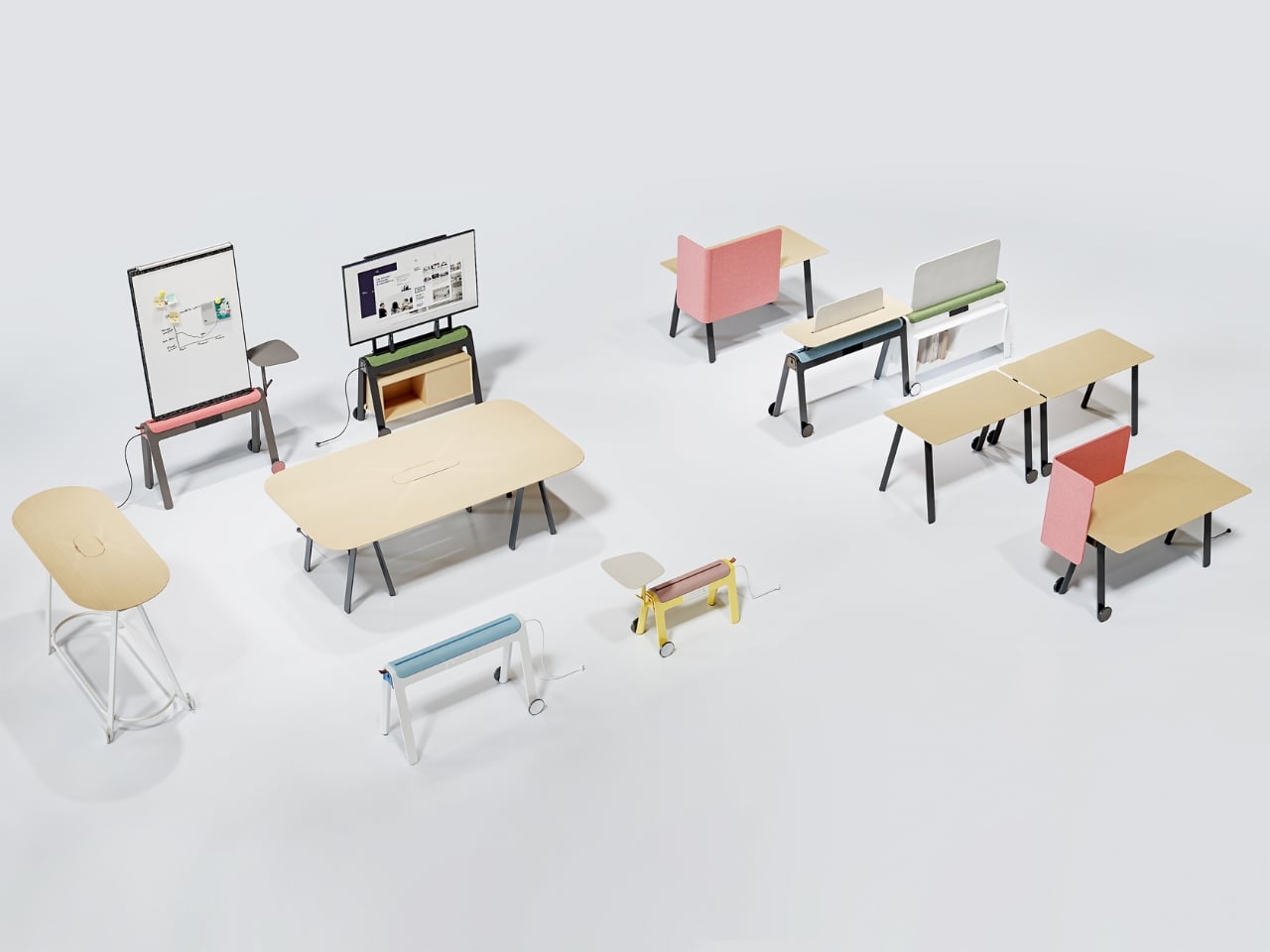
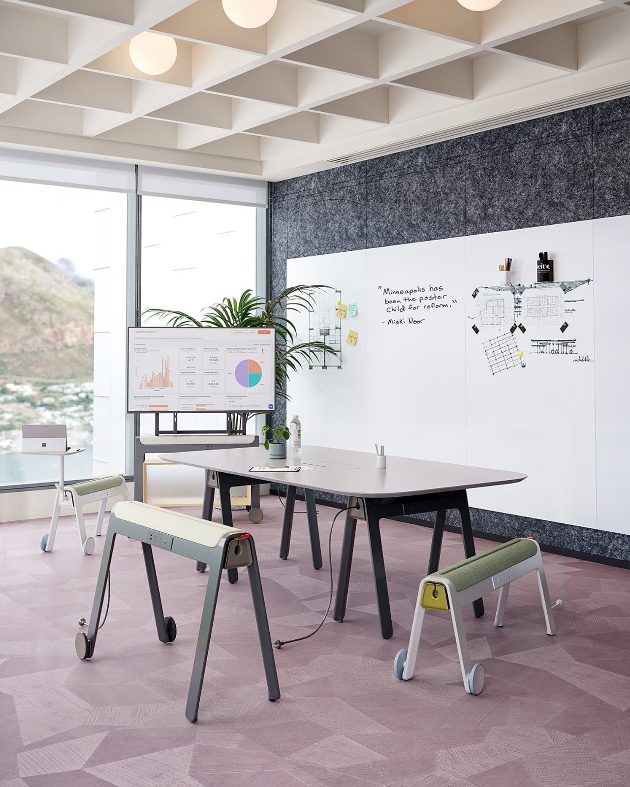
Kylinc treats the workspace like something that should change whenever the day asks it to. Each piece rolls on oversized wheels, which makes reconfiguring your office feel genuinely effortless rather than theoretically possible. Push pieces apart for a collaboration zone, pull them together for focused work. Power management is built directly into the furniture, with smart cable organization that keeps surfaces clean without any additional accessories to track down or manage.
The benefit shows up most for people working from home across a day that never asks the same thing twice. A static configuration works well some of the time and poorly the rest. Kylinc changes that without requiring much effort, which is the real difference between a system that actually gets used and one that stays fixed out of habit. The built-in cables move with the furniture. Your layout becomes something you actually control.
What We Like
Oversized wheels make real reconfiguration effortless, not just possible on paper
Integrated power and cable management keep the workspace clean without extra accessories
What We Dislike
Rolling furniture may feel less stable than fixed pieces for users who prefer an anchored setup
A full modular system likely carries a significantly higher upfront cost than standard office furniture
5. OTTO Footstool
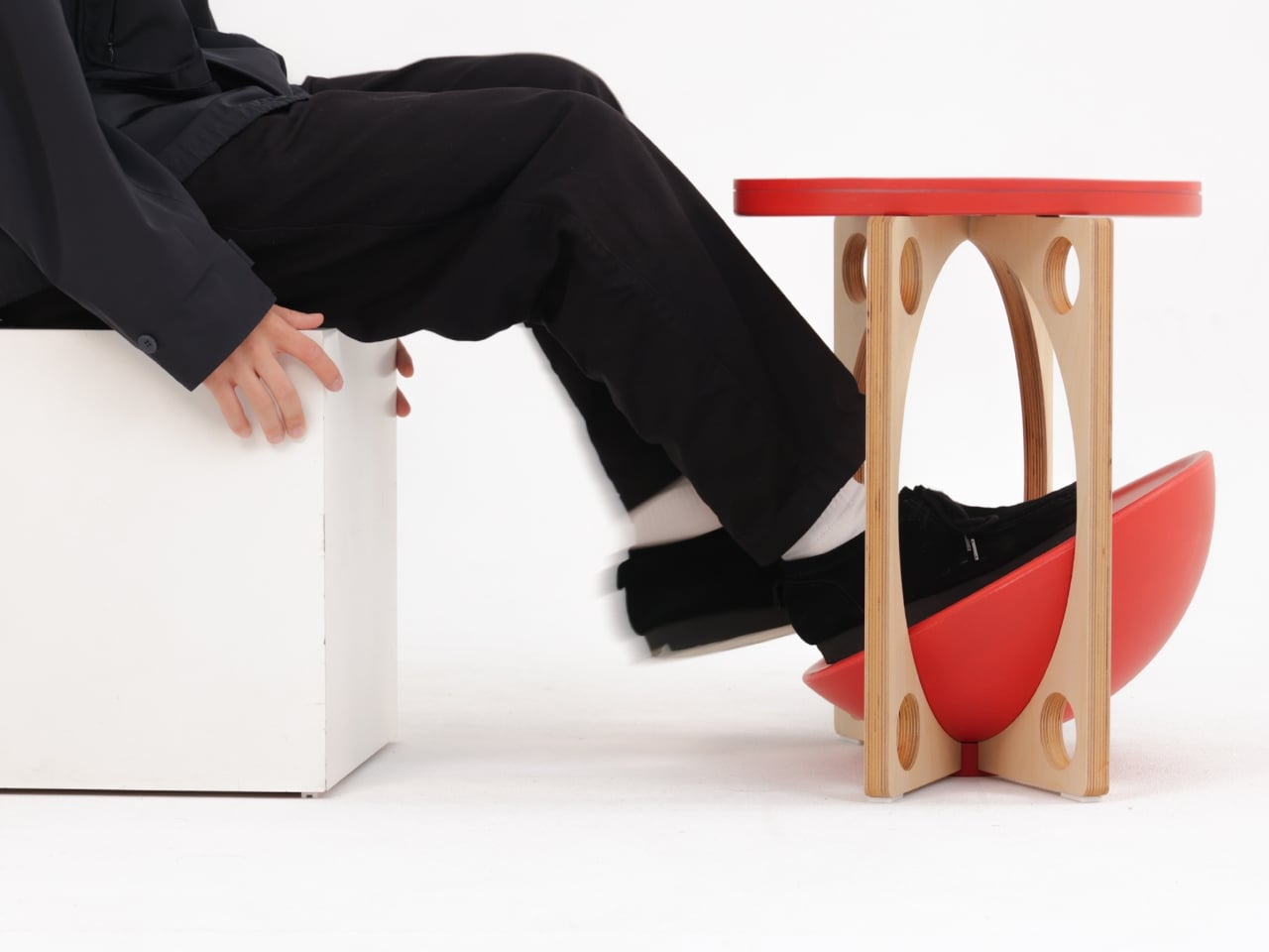
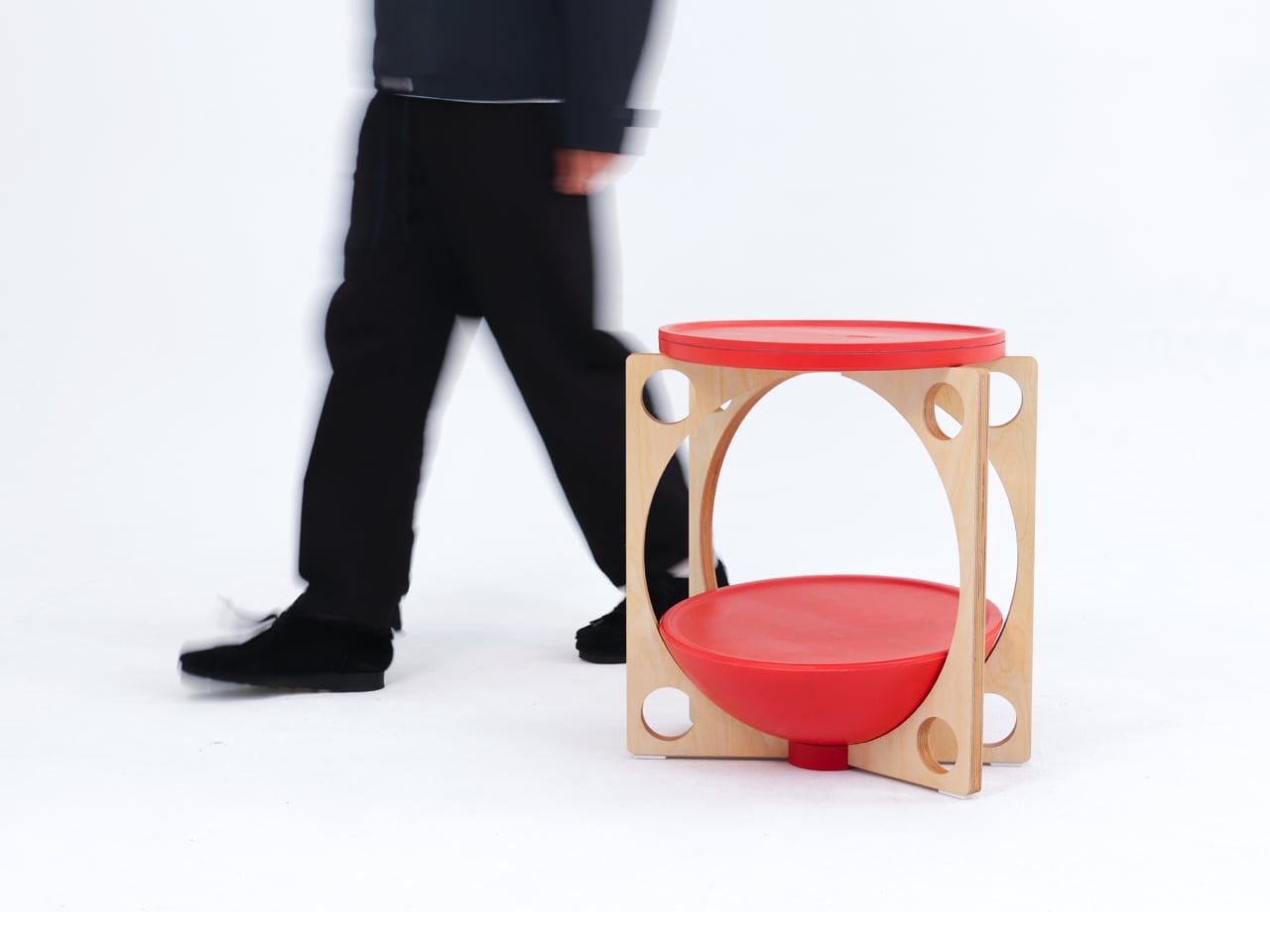
OTTO takes its name from the Korean roly-poly toy Ottogi, a round-bottomed figure that always rights itself because of its convex base. Designer Woonghee Ma applied that same logic to a footstool. The convex base means it rocks and shifts as your body moves throughout a long sitting session. No adjustment needed, no settings to configure. You shift weight, the stool moves with you, and that’s the whole mechanism.
For a home office that needs to support you without making a production of it, OTTO is exactly right. Most ergonomic products demand your attention to work. OTTO doesn’t. The passive rocking base handles posture support quietly while you stay focused on everything else. It also looks good, which matters more than it might seem for something you’ll look at every working day. Clean, compact, and entirely unpretentious about what it is.
What We Like
Passive rocking base provides ergonomic support through natural weight shifts, no settings required
Compact and well-proportioned, it works equally well in home and professional office settings
What We Dislike
The rocking motion may feel unfamiliar at first for users accustomed to fixed support
May not suit very low seating arrangements where foot elevation isn’t part of the setup
March Didn’t Make a Noise. It Made a Point.
What connects these five pieces isn’t an aesthetic or a material. It’s restraint. A chair that changes mode with one gesture. A table that earns its concept by being useful first. A stool that ships flat and opens in a second. A workspace that adapts without asking for your help. A footstool that supports you without ever drawing your attention to the fact that it’s doing so. That quiet confidence is what good design actually looks like in practice.
Most design coverage this month was busy chasing the big swing. The sculptural statement, the unexpected material, the idea that needs a paragraph of explanation before it lands. What these five pieces share is something quieter. They ask less of you. They make their case by fitting into your life rather than reshaping it around themselves. March didn’t produce the loudest furniture of the year. It produced some of the most considered. That’s always the better result.
Battery life has been one of the laptop industry’s most persistent design headaches, especially among Windows notebooks. Despite significant gains in chip efficiency, the display consistently ranks among the biggest power consumers in any portable computer. Most laptop screens refresh at a fixed rate regardless of what’s actually on them, which means the panel keeps drawing full power even when you’re sitting completely still, reading a document with nothing on screen changing at all.
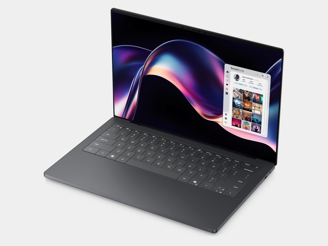
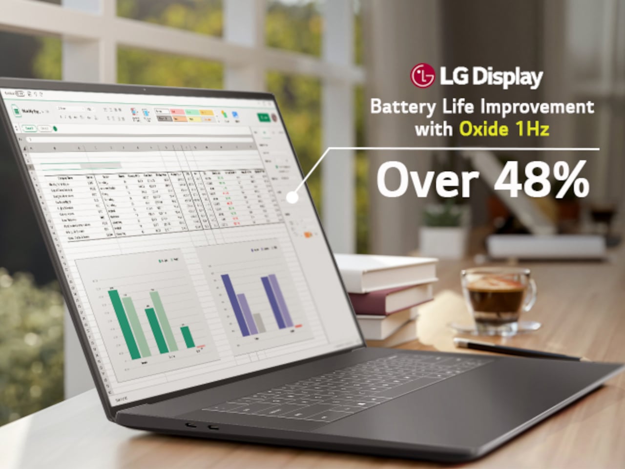
LG Display’s new Oxide 1Hz panel is the first mass-produced LCD laptop screen that doesn’t work that way. Rather than holding a fixed rate, it reads what’s on screen and drops to 1 Hz when the content is static, then scales back up to 120 Hz for video or gaming. LG began mass production on March 22, 2026, claiming the first-ever achievement of this at scale.
The technology relies on custom circuit algorithms and a new oxide material applied to the panel’s thin-film transistor. That oxide holds an electric charge longer than conventional LCD materials, letting the screen maintain a still image without continuously refreshing it. LG claims the result is up to 48% more use on a single charge versus existing solutions, which is a significant number if it holds up in everyday use.
In practice, this matters most during the parts of a workday you spend the bulk of your time in. Checking emails, reading through documents, and sitting on a static slide during a meeting are all moments where a 60 Hz or 120 Hz screen burns power for no real benefit. The Oxide 1Hz panel handles those scenarios at a fraction of the usual draw without any visible difference.
When you do pull up a video or launch something that demands smooth motion, the panel doesn’t hesitate. It detects the change and jumps back up to 120 Hz automatically. There’s no mode to switch into, no setting to toggle, and no trade-off to manage. It just adjusts based on what’s happening on screen, which is how this kind of feature should work in the first place.
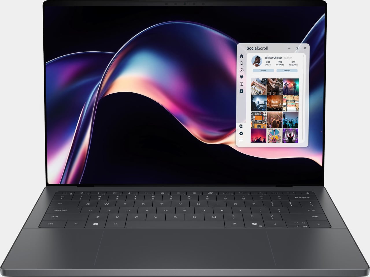
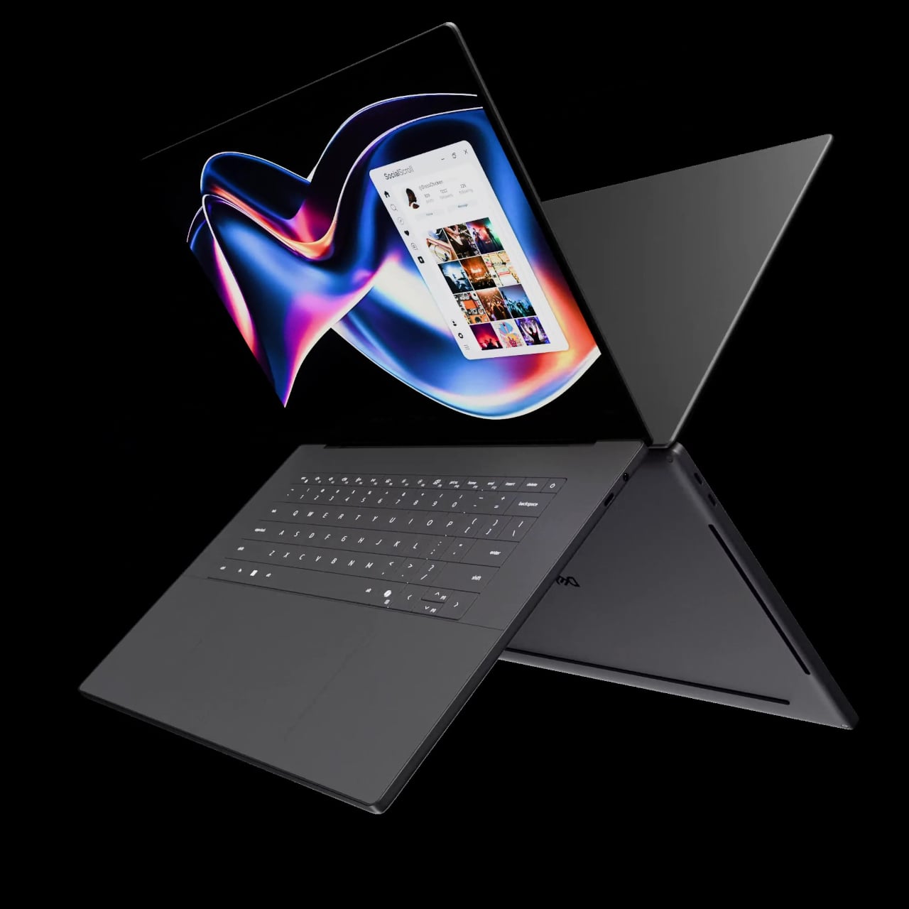
The first laptops to ship with this panel are the Dell XPS 14 and Dell XPS 16 for 2026, both unveiled at CES 2026 in January. The LCD option on both models runs at 1920 x 1200 pixels and 500 nits of brightness. Dell’s OLED option only drops as low as 20 Hz, which means the more affordable LCD configuration actually wins on low-power behavior.
Here’s where it gets interesting from a design standpoint. The display is one of the biggest power consumers in any laptop, so a screen drawing significantly less power during typical use creates real headroom for designers. They can use that headroom to maintain battery size and gain extra runtime, or to trim the battery slightly for a lighter, thinner chassis without giving up the battery life buyers already expect.
Of course, LG is already planning a 1 Hz OLED version of this technology for 2027, which is when things could get more interesting. OLED handles contrast and color in ways LCD can’t match, and pairing that quality with proper low-refresh-rate behavior could push portable laptop design further than it’s been able to go. For now, the Oxide 1Hz LCD is in something you can actually go out and buy.
Think for a moment about three common tools: the nutcracker that sends shell fragments flying across the room, the bulky hammer you have to retrieve for the simple task of hanging a photo, and the emergency window breaker you bought for your car but have since forgotten about. Each serves a purpose, yet each comes with its own inconvenience, whether it’s mess, cumbersomeness, or the simple fact that it’s never around when you actually need it. These are the kinds of minor but persistent frustrations that we tend to accept as normal, the small design flaws in our daily routines.
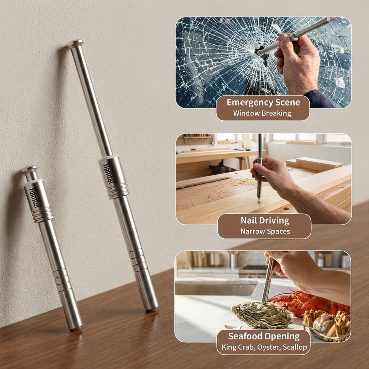
The Hamtel was born from a refusal to accept those flaws. It was conceived as a direct answer to these distinct problems, elegantly combining their solutions into a single, compact device. Its core function is a spring-loaded impact mechanism that cracks nuts with precision, eliminating mess and preserving the kernel. With a simple adjustment, that same tool becomes a capable mini-hammer for light-duty tasks. Finally, its tungsten steel tip provides the reliable performance of a dedicated car safety hammer, creating a single tool that is practical enough for daily use and critical in an emergency.
The real draw for anyone with an appreciation for good gear is the sheer tactile satisfaction of its action. You pull back the plunger to arm the manganese alloy steel spring, a process that feels deliberate and mechanical, like chambering a round. Placing the tip on the target and pressing down unleashes an explosive force reportedly moving at over 530 meters per second. This impact-driven deployment is what separates it from every dull lever-action cracker on the market. It’s a clean, contained, and frankly, an incredibly cool way to apply force. This is the kind of thoughtful engineering that gets EDC enthusiasts talking, turning a mundane kitchen task into an opportunity to use a well-made instrument.
The body is stainless steel, providing a solid, weighted feel in the hand, while the business end features a high-hardness tungsten steel tip rated at HRC60+. This is the material specification you expect in high-end cutting tools or industrial equipment, not something designed to crack walnuts. This choice is critical for its dual-purpose role as a car window breaker, ensuring the tip remains sharp and effective even after repeated use. That effectively means your walnut or macadamia or brazil nut stands absolutely no chance. The tip works remarkably well against seafood too, letting you crack into crab and lobster claws/shells without breaking out industrial equipment.
This precision translates directly to its performance in the kitchen. It boasts a 95% kernel preservation rate, a number that seems ambitious until you consider the physics at play. Instead of crushing a shell with slow, brute force, the Hamtel delivers a sharp, localized impact that fractures the shell without pulverizing the contents. This makes it just as effective for delicate jobs, like cracking open crab legs or lobster claws without shredding the meat inside. It brings a surprising level of finesse to a category of tools typically defined by their crudeness, making it a genuinely useful upgrade for any kitchen.
Initial pricing puts the Hamtel at $66, which is a compelling entry point considering its planned retail is set at $124. Logistics are refreshingly simple, with a flat $9 shipping fee for delivery anywhere in the world. An optional nut pick can be added for just a few dollars, making it a complete package for dealing with stubborn shells. For the price of a single-purpose emergency tool, you’re getting a device that serves three distinct functions, some life-changing, others life-saving. But for most of the time, bon appetit!
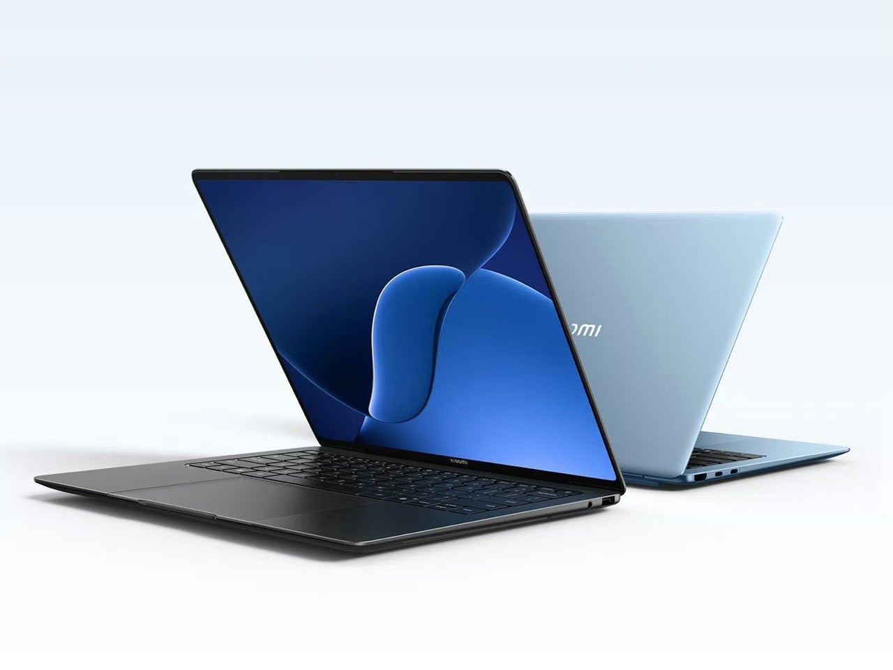
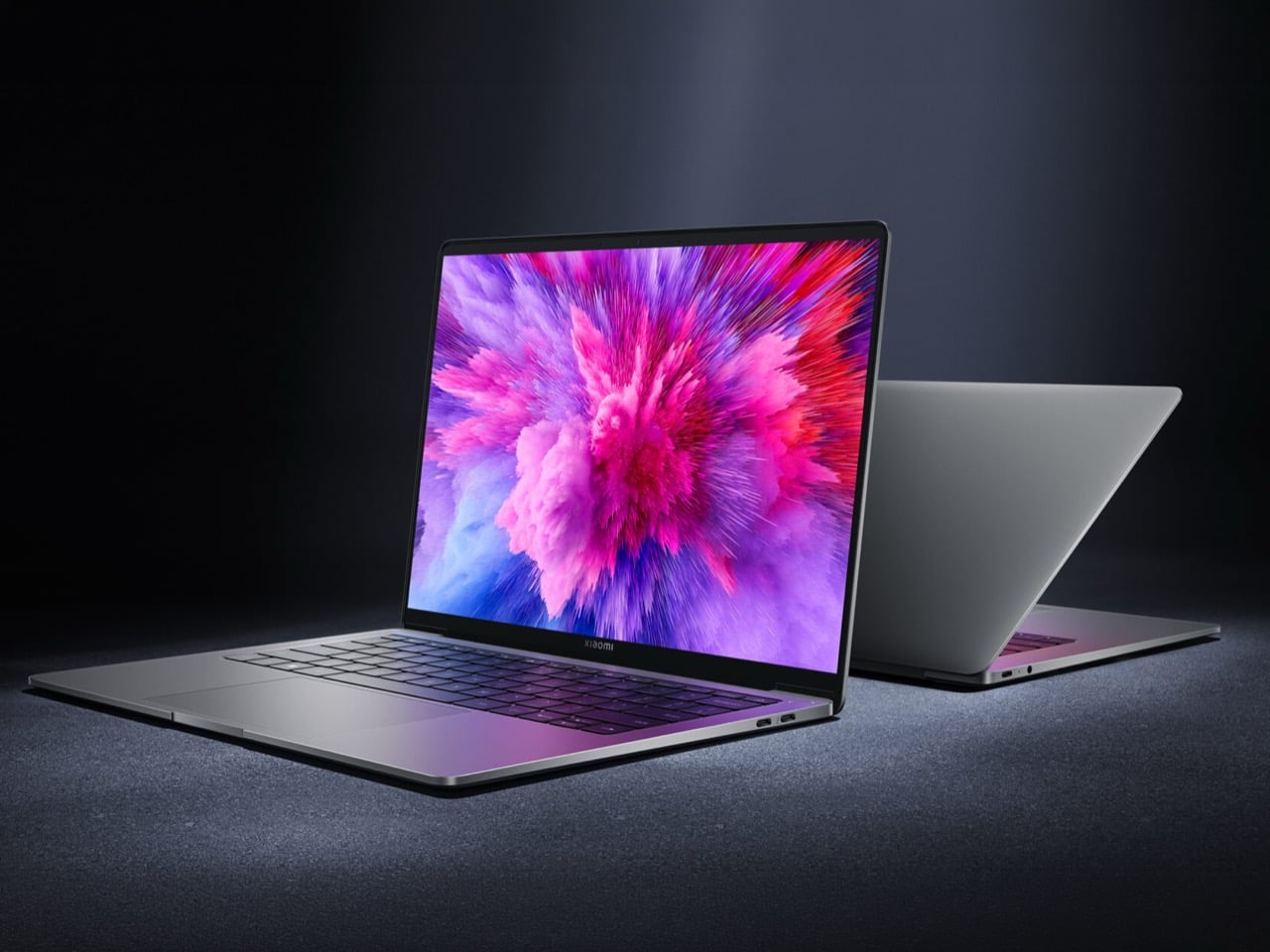
The laptop market has a predictable rhythm. Apple sets the benchmark, everyone else reacts. Since the M1 MacBook Air landed in late 2020 and redrew the definition of thin-and-light computing, the entire Windows ultrabook category has essentially been running in response to that one product. Some challengers land close, most fall short on one or two crucial dimensions, and the cycle repeats. What makes Xiaomi’s return to the laptop space interesting is that the company has been watching all of this from the sidelines for four years, and the Book Pro 14 it just launched in China reads less like a desperate catch-up attempt and more like a deliberate, calculated swing at a very specific gap in the Air’s armor.
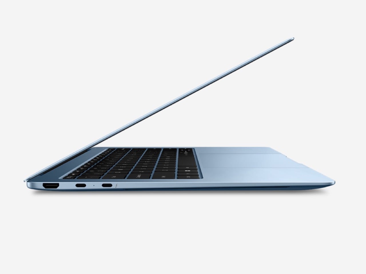
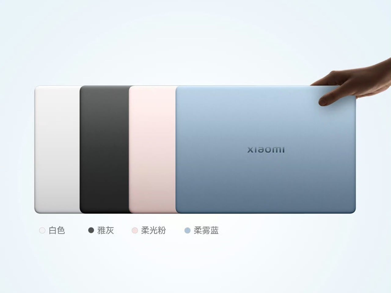
Xiaomi has just made a discreet release in the laptop segment after a four-year break, returning with the Book Pro 14, a capable thin-and-light that positions itself as a direct answer to the MacBook Air. The headline spec is the display: a 14.6-inch OLED panel with touchscreen support, 3.1K resolution, a 120Hz refresh rate, and a peak brightness of 1,600 nits. Under the hood, Xiaomi equips the notebook with Intel’s Panther Lake platform, up to an Intel Core Ultra 7 358H, with 24GB RAM on the base configuration and 1TB of SSD storage. Pricing, when converted from Chinese yuan, puts the laptop at approximately $1,275, just over $100 more than a base M5 MacBook Air, and for that small premium you get a higher-resolution 120Hz OLED panel, more RAM, and a more robust port selection.
Designer: Xiaomi
You’re probably itching to ask about ports, because the MacBook Air famously doesn’t pack enough of them. The Book Pro 14 includes Thunderbolt 4, USB-C, USB-A, HDMI 2.1, and a 3.5mm audio jack, compared to the MacBook Air’s two Thunderbolt 4 ports and a headphone jack. That is a meaningful difference for anyone who has ever reached for a dongle mid-presentation or had to choose between charging and connecting to a display. Xiaomi’s decision to include a full-size HDMI port and a USB-A jack signals an awareness that real-world desk setups are messier than Apple’s minimalist port philosophy acknowledges. Whether that matters to you depends entirely on your workflow, but it is a deliberate product decision and one that reads as a direct response to a documented frustration with the Air.
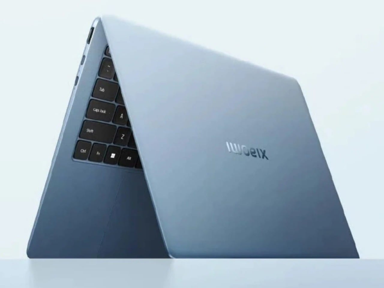
The Book Pro 14 achieves a weight of 1.08 kg and a thickness of 14.95 mm through a chassis built from magnesium alloy with a carbon fiber lid. That actually makes it lighter than the M5 MacBook Air, which tips the scales around 1.24 kg, and the thickness is comparable. Keeping the specs cool is a three-channel cooling system incorporating a high-performance fan, a 10,000mm² vapor chamber, and graphene cooling components capable of sustaining 50W of continuous performance. That last figure matters more than it might initially seem. Apple’s fanless MacBook Air is a thermally constrained machine, and sustained workloads do cause it to throttle, a tradeoff that has been well-documented since the M1 era, and a system that can sustain 50W continuously without a corresponding weight penalty represents a genuine engineering achievement.
Xiaomi makes bold claims on the Book Pro 14’s battery life, overshooting even the latest M5 MacBook Air by nearly two hours. The 72Wh battery is rated for up to 19.8 hours of continuous use, with the 100W fast charging system capable of restoring 50% in approximately 26 minutes. The MacBook Air M5 posts similarly impressive endurance numbers in real-world use, so this will be a tightly contested dimension. The Intel Panther Lake architecture powering the Book Pro 14 is also the first Intel mobile platform in recent memory that genuinely changes the conversation around Windows laptop efficiency, borrowing a page from Apple’s playbook by targeting the sub-10W idle efficiency range that made the M-series Macs so compelling. Independent testing will be the real arbiter here, but the stated numbers are ambitious enough to take seriously.
The Book Pro 14 is currently only available in China, with no clear indication of a global release date, which severely limits its immediate relevance for the overwhelming majority of potential buyers. Xiaomi has a track record of launching products domestically and gradually expanding to other markets, and given the attention this machine has received in the first 24 hours of coverage, the commercial logic for a global rollout is hard to argue against. The question is timing. If Xiaomi moves quickly, the Book Pro 14 could arrive in Western markets before the M5 MacBook Air has fully consolidated its footprint. If the rollout stalls or gets diluted through regional variants with compromised specs, the window closes. The hardware is genuinely compelling, and the only outstanding question that actually matters is whether Xiaomi’s global distribution ambitions match what the engineering team has clearly delivered.
The line between work and home has blurred into an architectural dialogue. Today’s hybrid living isn’t about working from the kitchen counter but about rethinking how domestic spaces support productivity and calm. Designers now aim to create environments that balance efficiency with ease, where furniture performs multiple roles without sacrificing elegance or comfort.
For high-net-worth homeowners, this shift is about investing in experiences that enhance their lifestyle and property value. Portable chairs and adaptive workstations have evolved into design essentials, dynamic and ergonomic, fluid enough to move with the rhythms of daily life, redefining how we live and work within our spaces.
1. Ergonomic Intelligence and Wellness Value
The strength of any portable workspace lies in its ergonomic foundation. Temporary, low-quality setups often lead to long-term strain and reduced focus. True wellness ROI comes from minimizing physical fatigue through design that supports the body’s rhythm, integrating temperature-responsive materials, balanced support, and kinetic flexibility rather than relying on surface aesthetics alone.
When selecting furniture, prioritize chairs with dynamic lumbar support and workstations with seamless height adjustment. The ideal setup becomes a biophilic cocoon, comforting, adaptive, and attuned to your natural movement, ensuring that even during long digital sessions, productivity and physical harmony remain perfectly aligned.
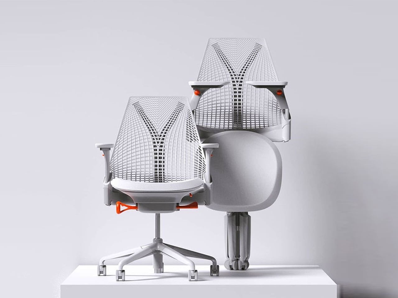
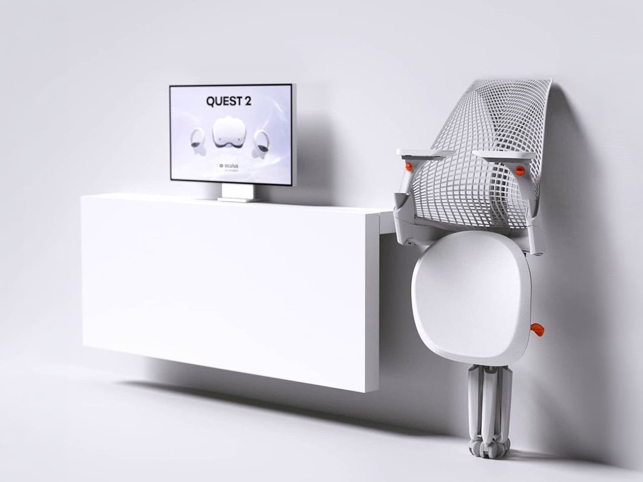
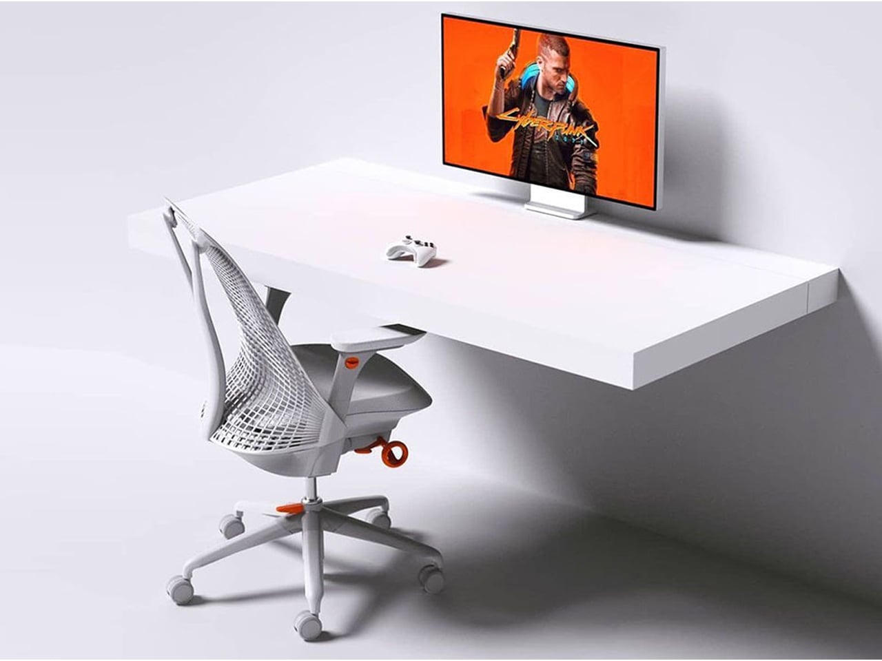
The Sayl concept chair by Charley reflects the changing ways we live, work, and play. As homes have evolved into hybrid offices, gyms, social spaces, and relaxation zones, our furniture needs have changed too. Charley even considers the hours we spend gaming or binge-watching, recognizing that chairs today must support multiple activities while remaining comfortable and functional. Designed by Herman Miller, the Sayl chair combines high-end design with practical usability, allowing users to maximize their space without sacrificing luxury or ergonomics.
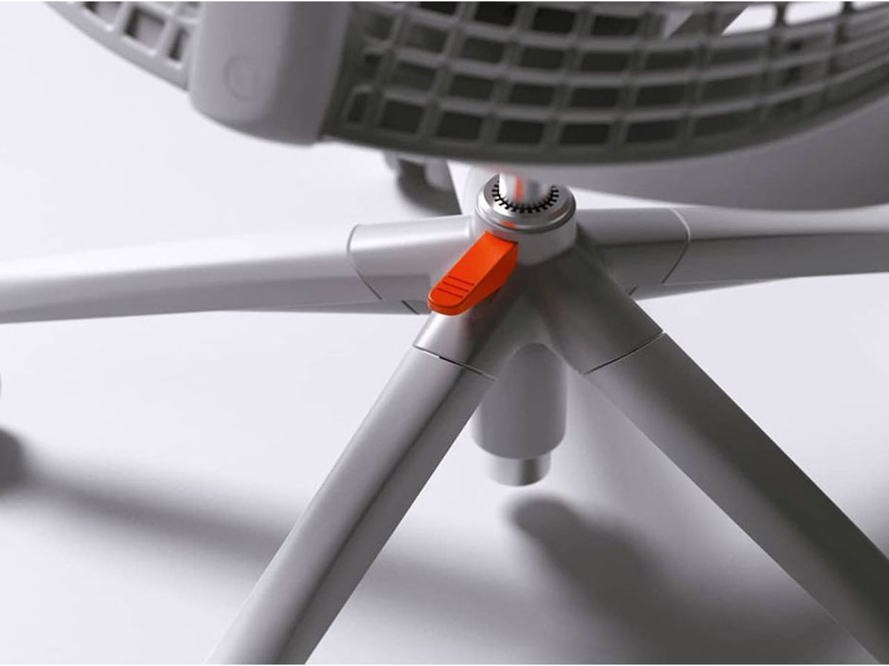
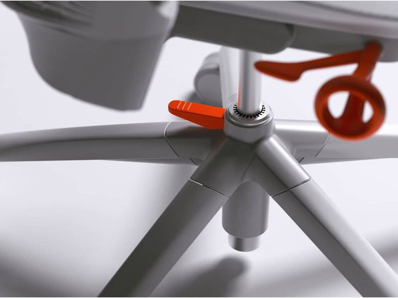
The chair’s muted grey tones ensure it blends effortlessly into any interior, while bright orange accents draw attention to pivotal touchpoints, making it intuitive to use. A foot pedal mechanism allows the chair to collapse easily, providing a convenient, space-saving solution for modern homes. In the post-pandemic era, furniture design has shifted towards modular, flexible, multifunctional, and compact solutions. The Sayl chair embodies all these qualities, offering a versatile, stylish, and practical seating option for today’s hybrid lifestyle.
2. Aesthetic Integrity and Material Authenticity
Every portable unit should carry a strong aesthetic value that complements its architectural surroundings. Materials must feel genuine and timeless, like solid wood, brushed metal, and high-performance textiles that reveal craftsmanship rather than conceal it. This honesty of composition creates visual depth and emotional connection, reinforcing the idea that beauty lies in authenticity, not imitation.
The design should remain sculptural yet understated, integrating seamlessly into curated interiors. Its finish must align with the home’s palette, allowing it to coexist gracefully within the space. When not in use, it should rest as a quiet architectural accent rather than a workplace intrusion.
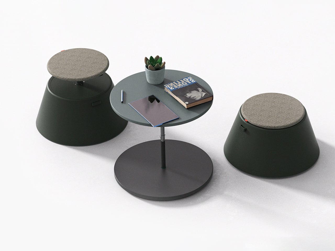
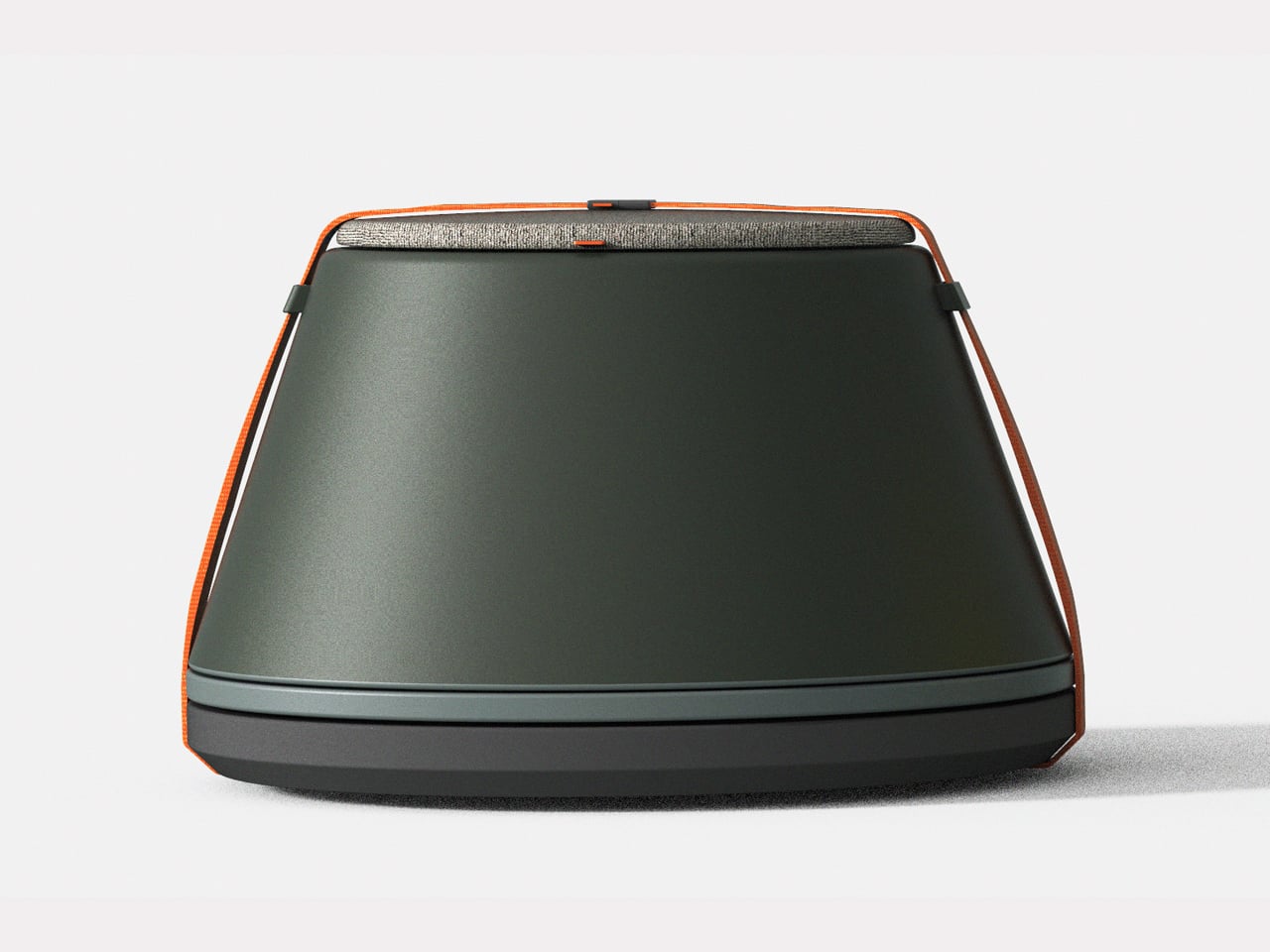
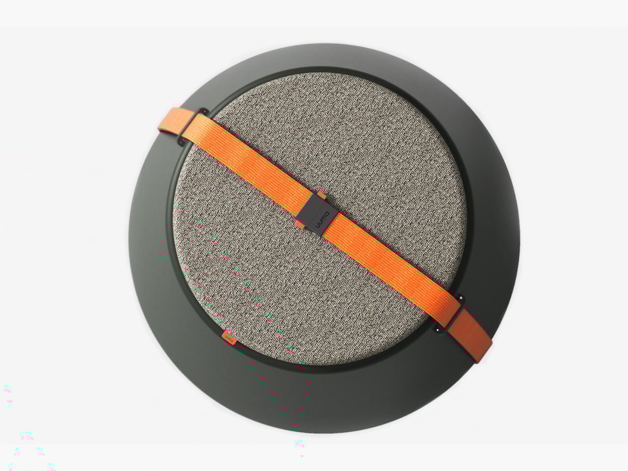
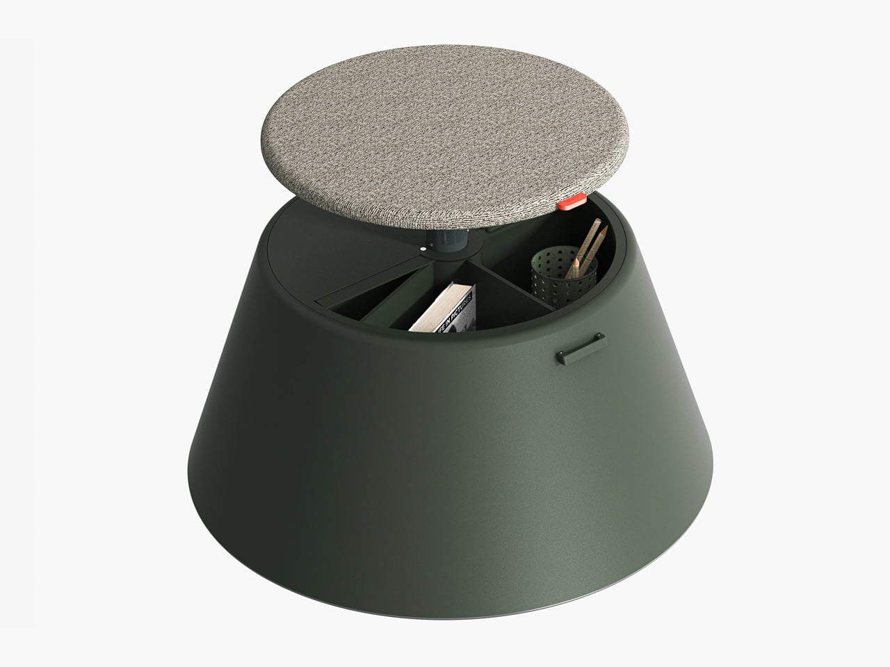
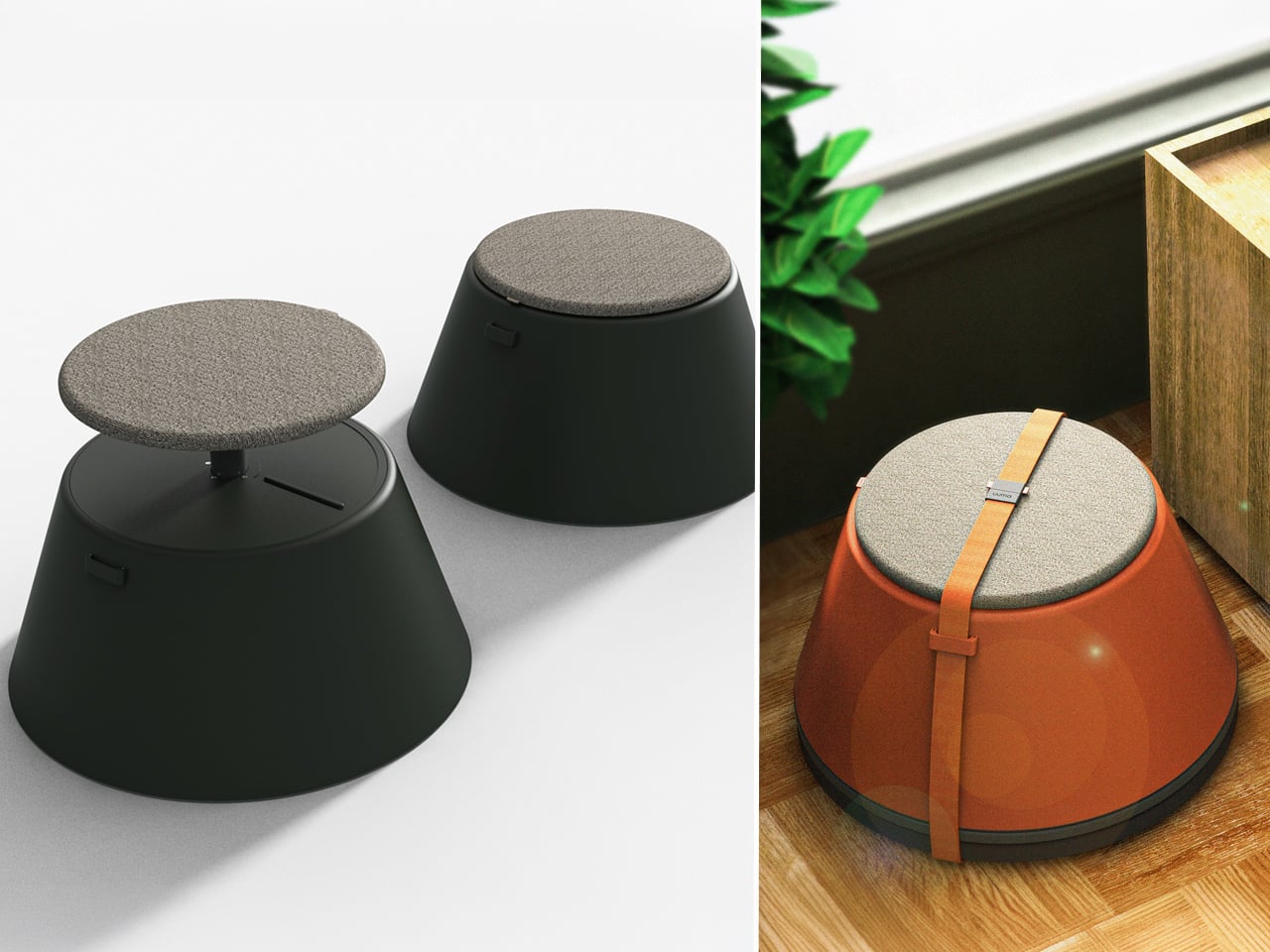
Working from home has spared many from long commutes and office distractions, yet it has also made work feel more solitary. Sitting by the same wall each day, even in a well-designed home office, can feel disconnected from the world beyond virtual meetings. While folding furniture remains popular for its space-saving benefits, stackable, all-weather alternatives are emerging as a smarter choice. Industrial designer Gökçe Nafak introduces the uuma, a portable table-and-chair combo designed as a single stackable unit that transitions effortlessly between indoor and outdoor settings.
Perfect for those who enjoy working in the garden, on the balcony, or in flexible spaces, the uuma blends convenience with creativity. Made from fibreglass, it is lightweight, durable, and sustainable. Its modular design features a height-adjustable metal frame and detachable parts that assemble easily. The chair transforms into a table within moments, offering comfort, portability, and style in three vibrant, modern colors.
3. Spatial Flow and Footprint Efficiency
The effectiveness of any modern workstation depends on how well it manages spatial flow. In compact urban homes, every inch counts, making footprint reduction a key design priority. A thoughtfully designed system should retract or fold away seamlessly, minimizing its physical presence while supporting the need for adaptable, multi-functional living spaces that evolve throughout the day.
Mobility and refinement define its usability. Tables and desks should transition effortlessly from work to leisure, enabling a quick shift from boardroom mode to family dining. Silent, non-marking wheels and intuitive movement reflect superior engineering and respect for interior balance.
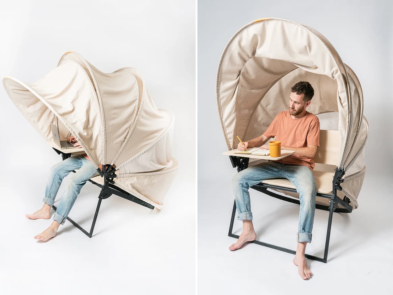
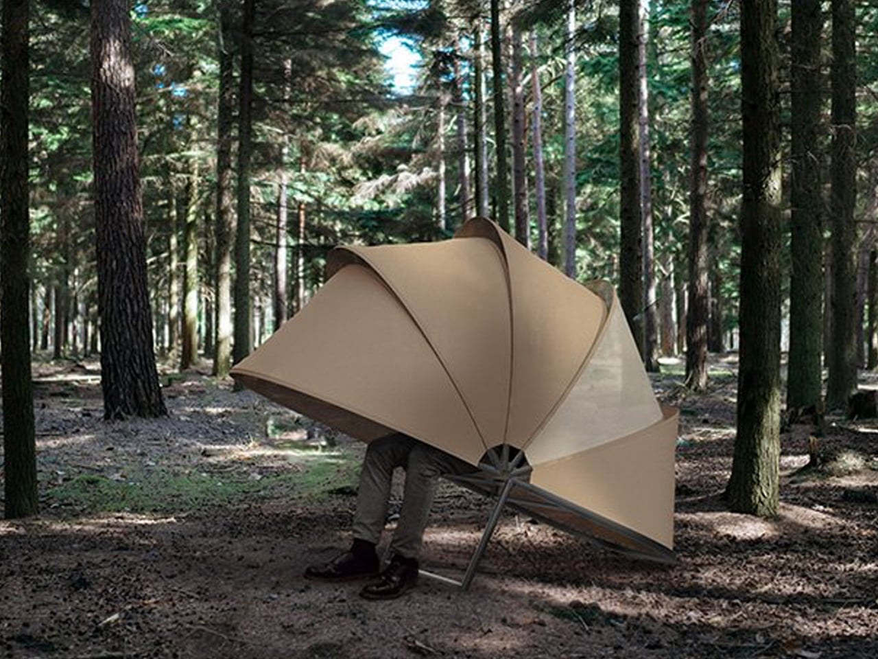
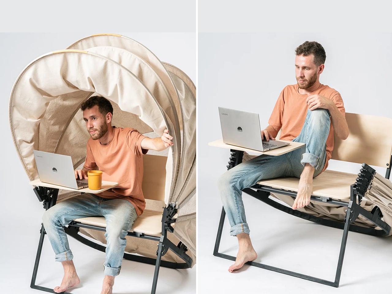
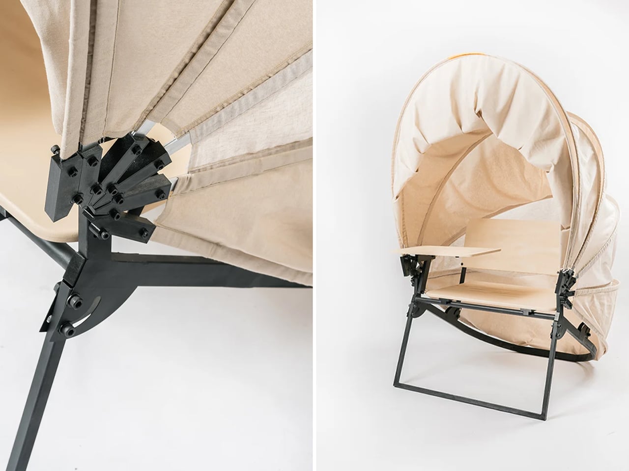
In a shared workspace like WeWork, or a peaceful spot under a tree, flexibility defines modern work culture. Industrial designer Matan Rechter responded to this shift with Shelly, a personal outdoor workspace that combines privacy, shade, and portability for those who prefer working outside. Inspired by the remote work movement, Shelly was designed to bring focus and comfort to outdoor environments like public parks.
Its name comes from its shell-like canopy that folds in and out with ease. Built from lightweight aluminium profiles and durable Cordura fabric, Shelly shields users and electronics from harsh UV rays. The canopy’s retractable design, reminiscent of an armadillo’s shell, provides instant shade and convenience. Compact and portable, Shelly transforms outdoor work into a comfortable, productive, and stylish experience anywhere, anytime.
4. Technological Integration and Power Autonomy
A modern hybrid workstation should function as a self-sufficient ecosystem, anticipating digital needs without visual clutter. True design intelligence lies in seamless connectivity, like built-in charging, concealed wiring, and intuitive access that keeps the workspace both elegant and efficient. Power autonomy ensures independence from fixed outlets, supporting the growing demand for mobility and flexibility in home environments.
Features such as integrated induction charging pads, hidden cable channels, and optional battery packs transform furniture into an adaptive tool. These enhancements merge aesthetics with performance, allowing users to remain connected, productive, and untethered within any architectural setting.
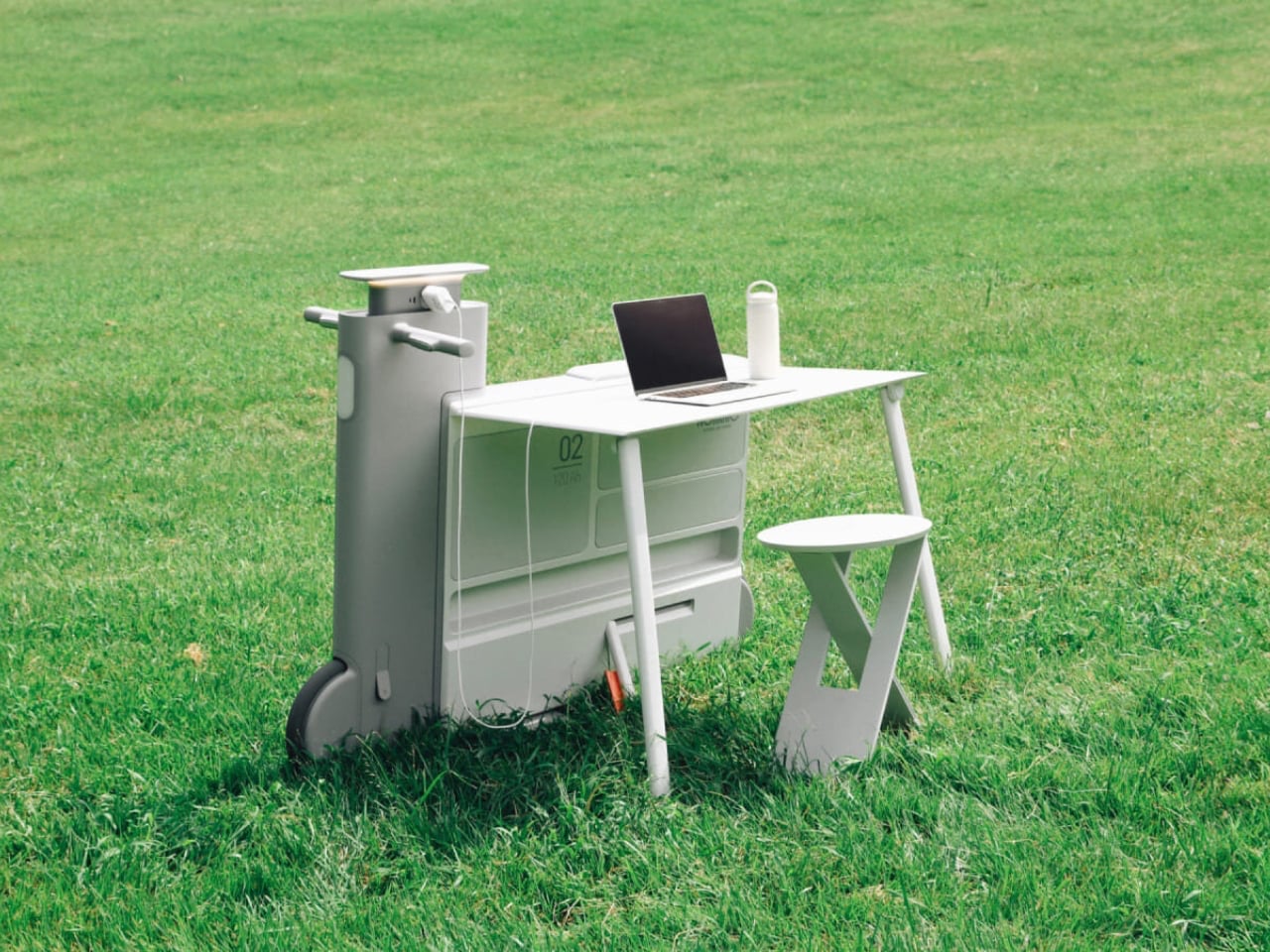
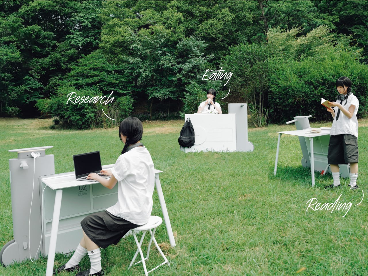
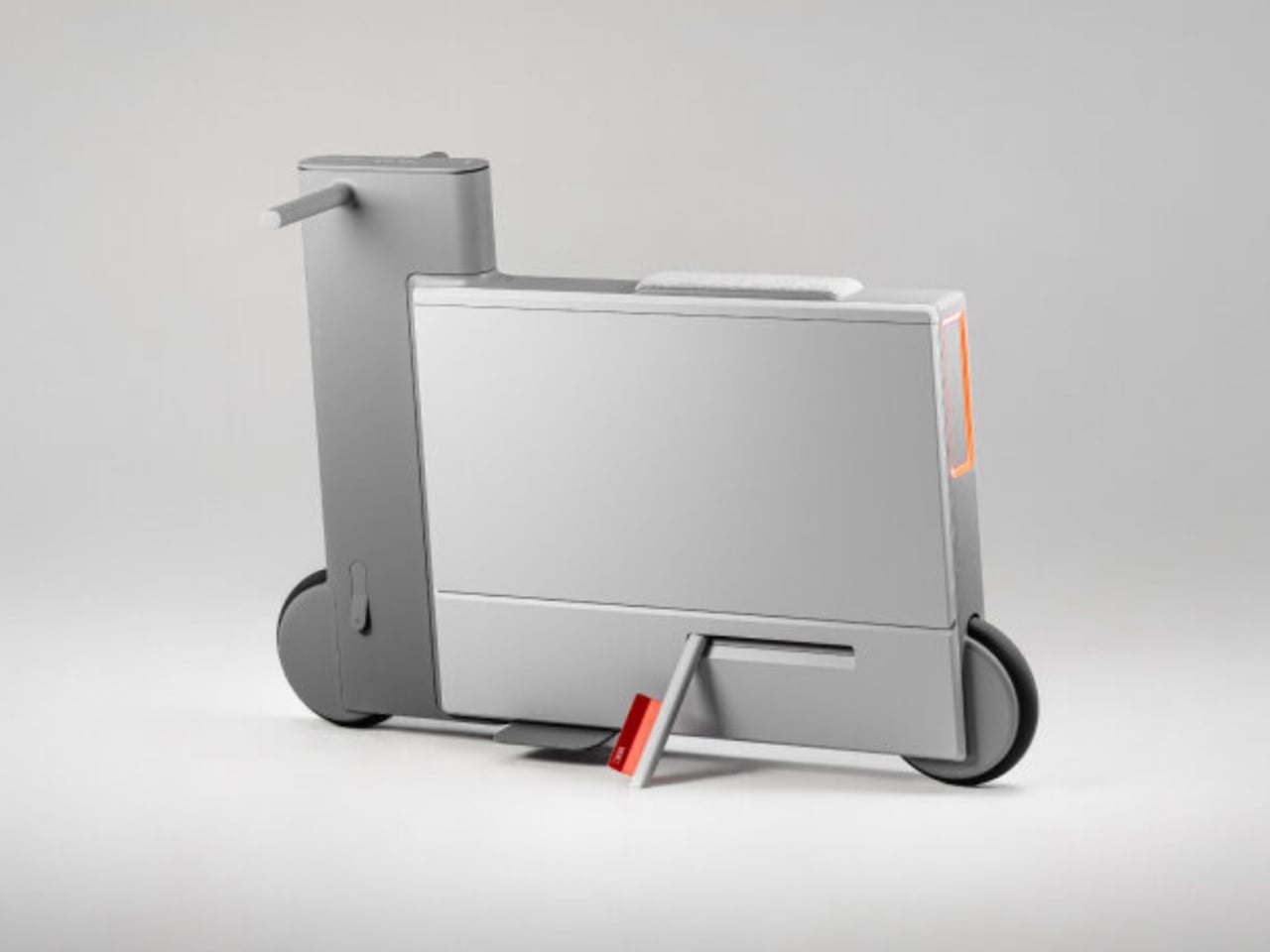
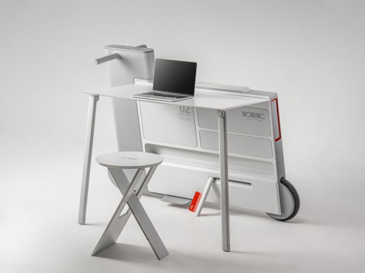
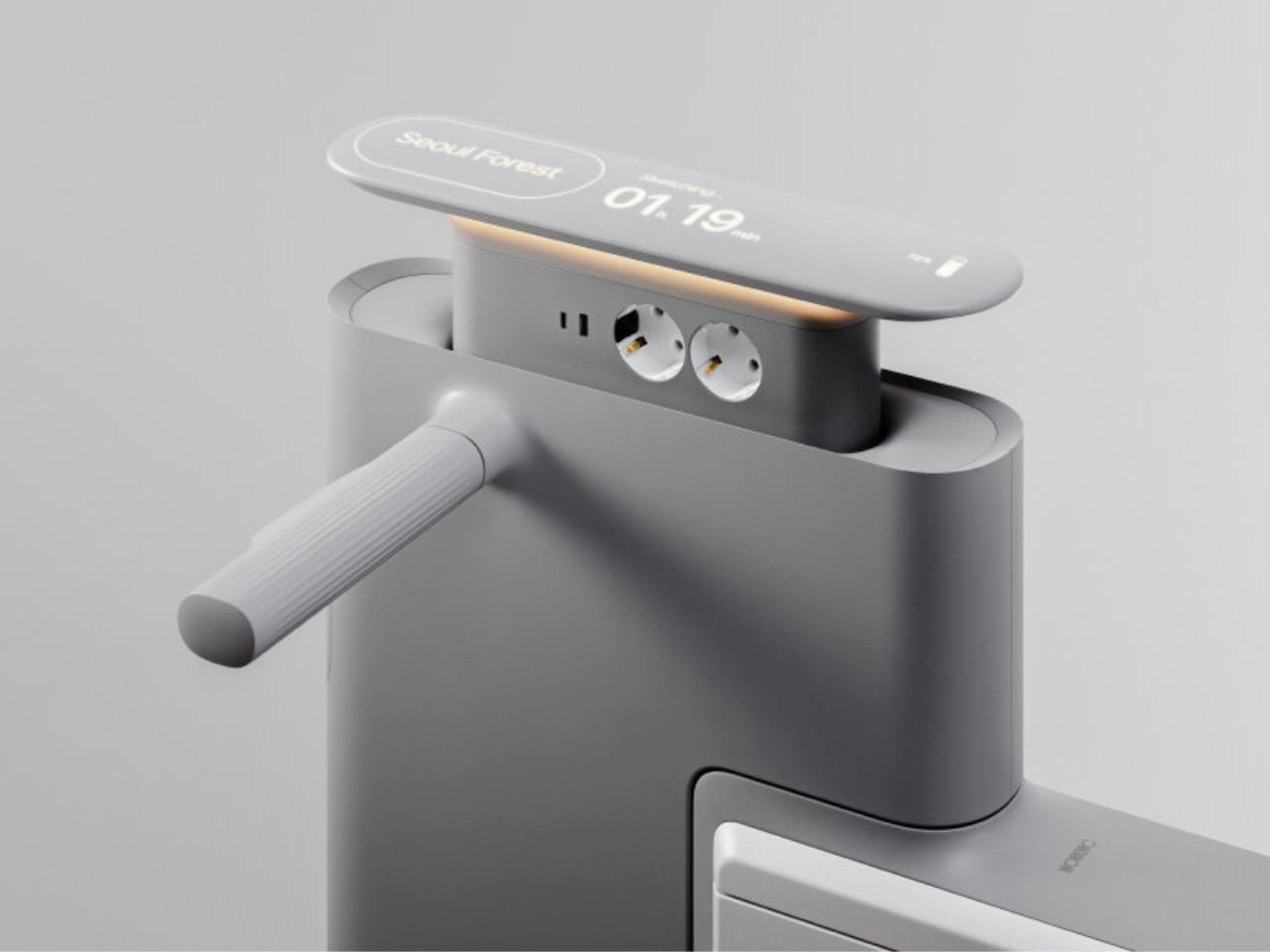
Another standout example is Worknic, a portable desk developed through the Samsung Design Membership program, sponsored by Samsung Electronics. Designed for flexibility, Worknic allows users to set up a functional workspace anywhere, whether in a home, park, or even on the beach, giving them the freedom to change their environment whenever needed.
The desk is built on wheels, making it easy to move and position in the ideal spot. Once in place, it unfolds to reveal a worktable, stands, and a built-in power source, while a pull-out stool completes the setup. Although details about battery life, weight, and additional features are limited, the concept prioritizes mobility, convenience, and adaptability. Worknic offers a creative solution for those who want a portable, fully equipped office that keeps productivity and inspiration in balance.
5. Design Resilience and Longevity Investment
For discerning homeowners, longevity defines true value. A well-crafted workstation should possess design resilience, built to endure daily use while retaining its original elegance and performance. This durability ensures a higher return on investment, setting it apart from fast furniture options that quickly lose both form and function.
Choosing established design houses and proven construction techniques guarantees structural integrity and timeless appeal. A five-to-ten-year warranty offers assurance that the piece is not just a purchase but a long-term architectural companion, blending endurance with refined craftsmanship for years of dependable, sophisticated use.
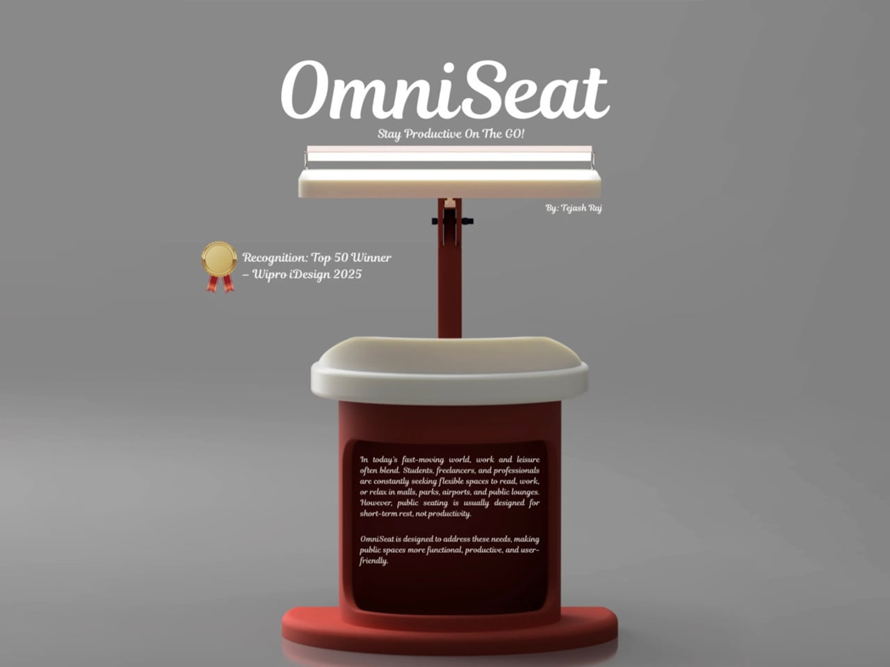
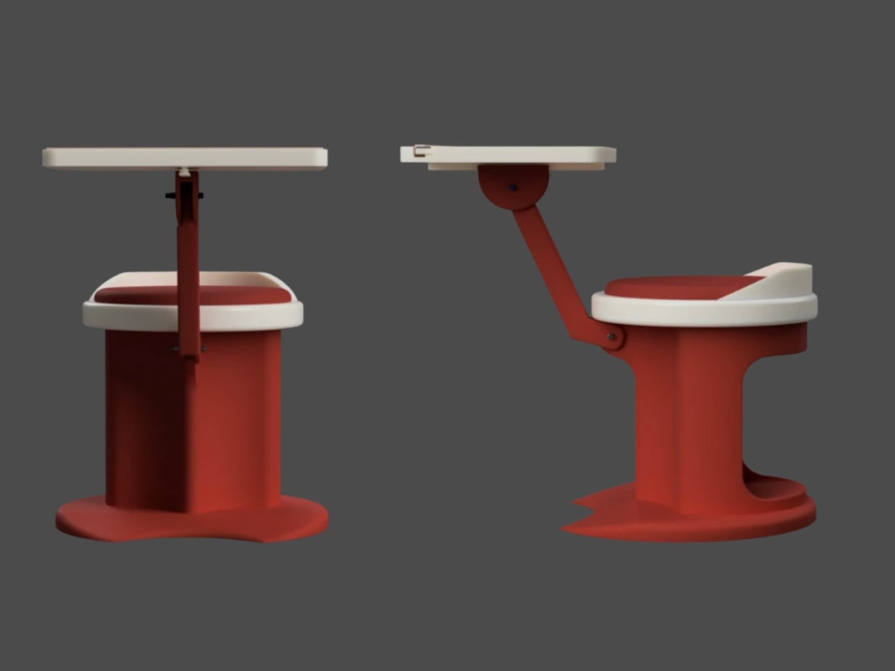
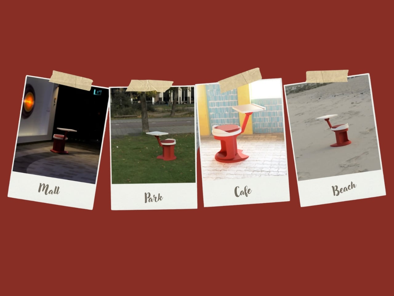
For those constantly on the move, finding a comfortable place to rest or work can be challenging. Cities often lack public resting areas beyond cafés and restaurants, making it tempting to carry a portable chair, though the idea quickly loses appeal due to its bulk and inconvenience. Recognising this need, designer Tejash Raj created the OmniSeat, a compact and ergonomic seating concept designed for people who stay productive while travelling, commuting, or working outdoors.
The OmniSeat features a lightweight frame, built-in storage, and device holders, all folding neatly into a slim form that fits in a backpack or attaches to a bike rack. A detachable tray accommodates laptops or tablets, with cable clips to keep cords tidy. Combining portability, comfort, and function, the OmniSeat offers a glimpse into the future of mobile workspaces.
The high-design portable workstation redefines the boundaries of work and home, merging productivity with tranquillity. It transforms interiors into fluid, balanced spaces where focus meets ease. Its true value lies in the freedom to work anywhere, capturing sunlight, inspiration, and connection without sacrificing comfort or creativity.
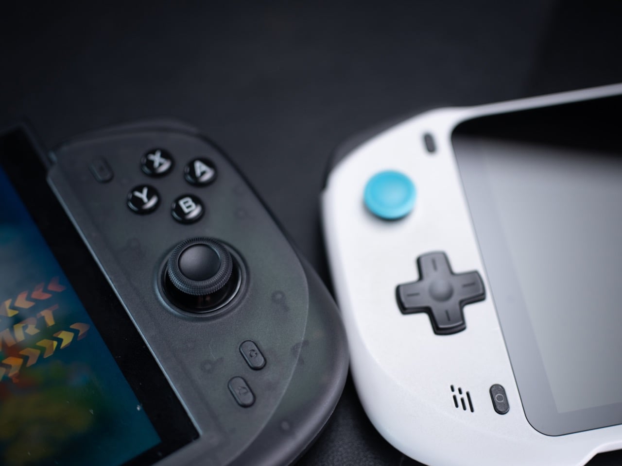
When the Nintendo Switch 2 arrived in June 2025 at $449.99, it came with a 7.9-inch display, a faster processor, and a Joy-Con that doubles as a mouse. What it didn’t come with was a comfortable way to hold it for long sessions. The handheld form factor has always been a compromise between portability and ergonomics, and for players who log serious hours, that compromise starts showing up as wrist fatigue, awkward thumb angles, and a nagging wish for something with a proper grip. The accessory market has tried to fill that space for years, with results ranging from decent to deeply uninspiring.
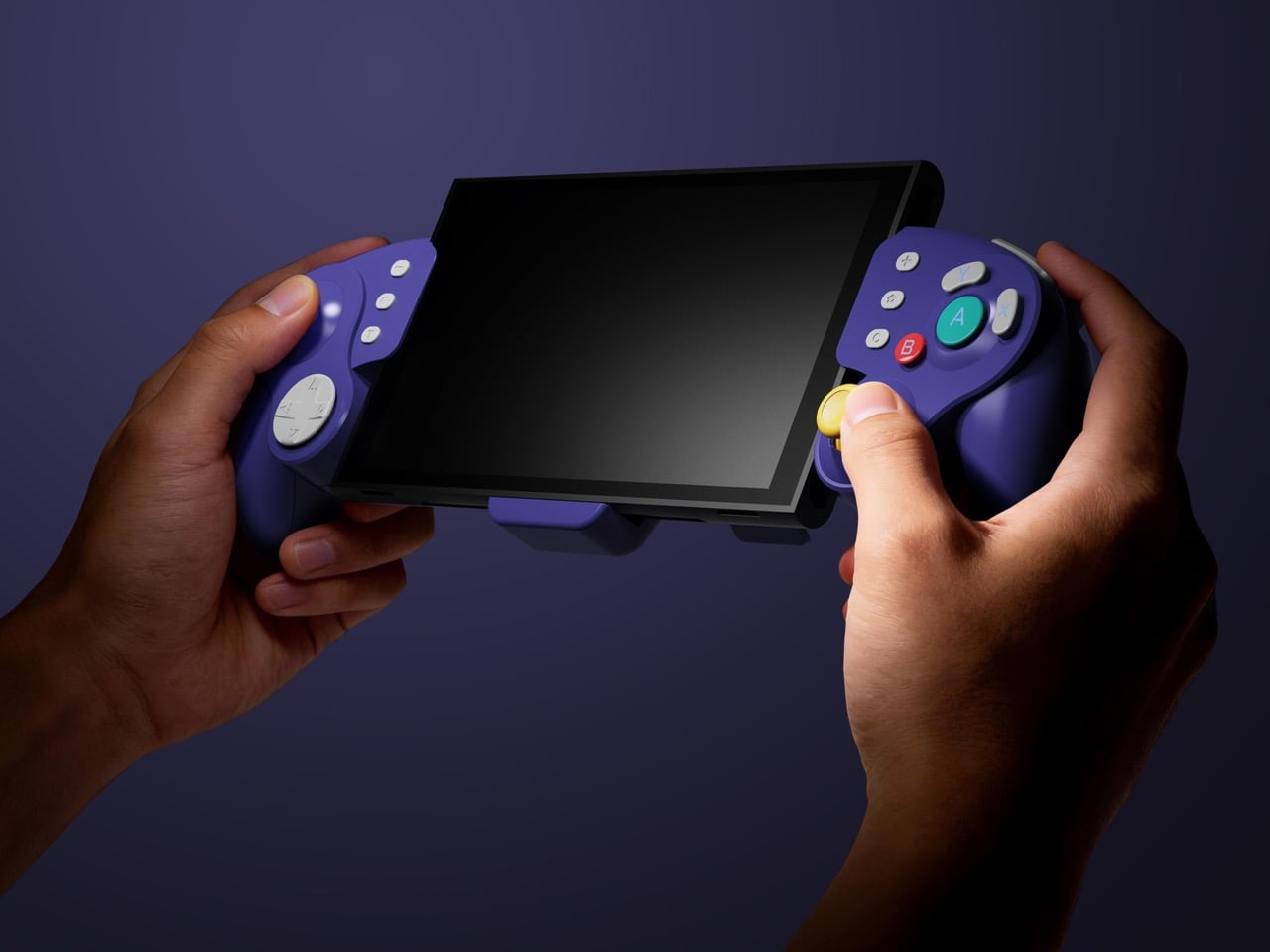
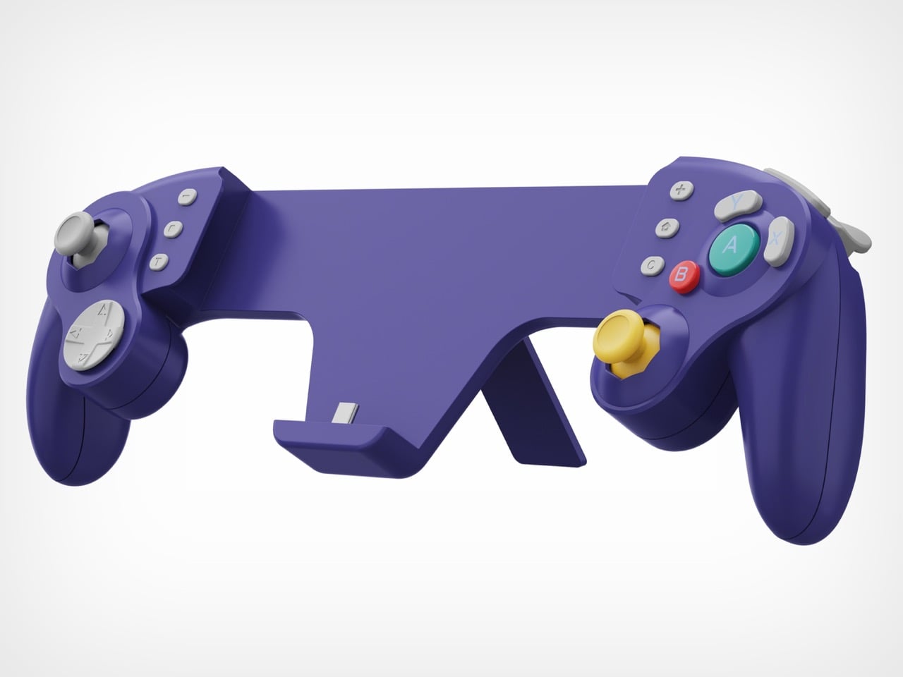
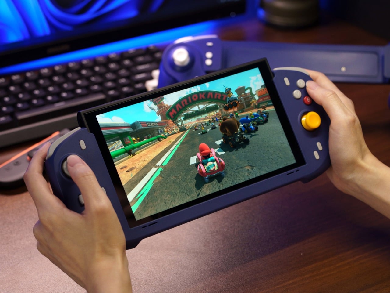
Abxylute’s answer comes in two forms: the N6 and the N9C, both deck-style controllers purpose-built for Switch 2 play. The N6 wraps the console in a full-size ergonomic grip with Hall-effect joysticks, native 9-axis motion control, a dedicated C Button for GameChat, and adjustable vibration levels the player can cycle through without leaving a session. The N9C leans into personality, drawing from GameCube design DNA with mechanical buttons, trigger switches, and a capacitive joystick system paired with swappable gates.
Joy-Cons were engineered for flexibility: detachable, shareable, usable solo or in pairs, functional as individual controllers for two-player sessions on a single console. That versatility comes at the cost of ergonomics, because a controller small enough to slide into a rail and function independently will never offer the grip depth, trigger travel, or palm support of something purpose-built for extended solo play. The N6 and N9C abandon that modularity entirely in favor of doing one thing exceptionally well, which is making handheld Switch 2 sessions feel like you’re holding a full-size controller instead of a tablet with thumbsticks glued to the sides. The tactile feedback is immediate and familiar, the kind of responsiveness you get from hardware designed around sustained single-player sessions rather than multi-function compromise. Both controllers connect via wired USB-C, skipping wireless pairing lag entirely, because when the target is solo handheld performance, eliminating variables takes priority over flexibility.
The N6’s open-top design is the first thing people will argue about online, and they’ll mostly be wrong. The Switch 2 stands over 11 cm tall, and a fully enclosed grip pushes that height further, putting your palms in the kind of awkward hover position that builds exactly the fatigue you were trying to avoid. Abxylute held the grip height at 8.5 cm, matching full-size controller proportions, so your palms have something to rest against rather than squeeze. The 7-inch grip width sits narrower than the console body deliberately, keeping your hands at a natural, relaxed spread instead of forcing them wide across a bulky frame. The physics of holding something for two hours straight are pretty straightforward, and this design reads those physics correctly.
Hall-effect joysticks solve a specific, measurable problem that standard potentiometer sticks fundamentally cannot. Potentiometer sticks use resistive contact that physically degrades over repeated use, which is why drift rates climb after a year or two of regular play. Hall-effect reads joystick position magnetically, with zero physical contact between moving components, and the N6 bumps the stick travel angle to 23 degrees compared to 18 degrees on Joy-Con, giving your thumbs more range for fine-grained inputs. A POM anti-wear ring around each stick handles mechanical stability without adding stiffness or noise to the movement. It’s a small detail, but the kind that separates purpose-built hardware from a generic controller with a different shell. On a device you use daily, that engineering choice compounds in your favor in a way that contact-based sticks simply never will.
Inputs across the N6 break down by material type, and the distinctions matter. ABXY buttons use conductive rubber for cushioned presses that reduce finger fatigue; the D-pad uses tactile switches for sharper directional accuracy; shoulder buttons deliver tactile clicks for faster responses in action-heavy play; and the linear digital triggers provide a genuine 0-100% input range rather than binary on/off clicks. That trigger range matters considerably in racing games and anything relying on gradual pressure inputs. Vibration adjusts at four levels, 0%, 40%, 70%, and 100%, switchable via button combo directly on the controller, bypassing the game-by-game settings adjustment that the Pro Controller requires. The grip’s internal structure forms a resonance chamber that redirects the Switch 2’s speakers forward and reinforces bass by around 10%, which you’ll register in a quiet room as fuller, punchier audio than bare Joy-Cons produce.
The N9C is doing something more niche and, honestly, more interesting. Where the N6 chases Pro Controller parity, the N9C chases the GameCube controller’s specific feel, complete with a centered A button and asymmetric face layout, rebuilt for a modern console using mechanical micro-switches and ALPS tactile shoulder buttons. Capacitive joysticks sidestep magnetic interference entirely, and the swappable 8-way and circular gate rings mean you can dial in a tight directional gate for fighters and swap to a smooth circular gate for platformers. A built-in battery hatch holds two replaceable batteries that reverse-charge the Switch 2 directly during play. Most grips on the market ignore battery life almost entirely, and a reverse charge system that powers the Switch 2 directly from the controller is a differentiator almost nothing else in this category offers.
The N9C carries four programmable rear buttons, two per side compared to the N6’s one per side, and each supports the same macro-recording system that chains directional inputs and actions into a single trigger. Switch 2 system-level button remapping works natively, requiring no third-party software, so a custom layout travels across every game without reconfiguring anything. An integrated rear stand sets the N9C apart from virtually every grip in this category, giving the Switch 2 a propped tabletop angle without relying on the console’s own kickstand. The primary connection is wired USB-C for ultra-low latency, with BLE available for configuration only, keeping the input chain clean during actual play. Every N9C ships with both C-stick and ring-style joystick caps in the box, so players can dial in the stick feel before the packaging hits the trash.
Mass production kicked off in March 2026, with shipping expected between April and June. Super Early Bird pricing runs $79 for the N6 (retail $110) and $89 for the N9C (retail $120), with a bundle sitting at $159. Nintendo’s own Pro Controller for Switch 2 retails at $79.99 and carries none of the Hall-effect sticks, programmable back buttons, or turbo functionality. Abxylute has shipped over 120,000 units across more than 20 projects to 100,000-plus customers, so the production infrastructure exists. What they’re solving for is specific: handheld Switch 2 play that performs at Pro Controller level without forcing players to accept the Joy-Con’s ergonomic ceiling as permanent.
Most smartphones are designed to be impossible to put down. The screen faces up on every table, the display lights up for every notification, and the cost of checking it one more time is exactly zero. That’s not an accident. The hardware removes friction from compulsive use because removing friction is what makes these devices feel indispensable. The tinyBook Flip concept asks a different question entirely: what if the phone were designed to get out of the way?
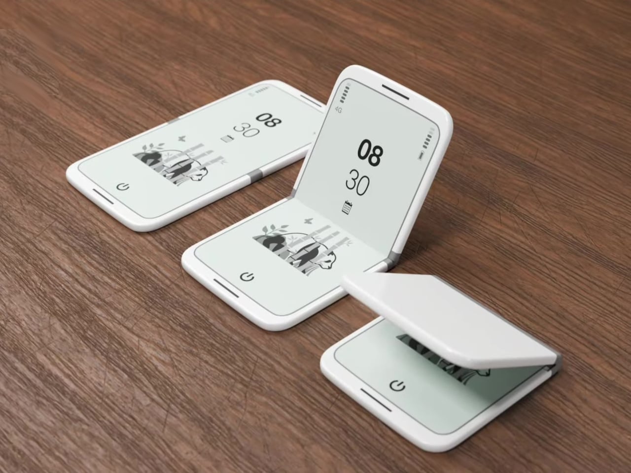
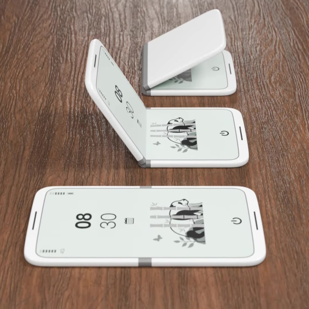
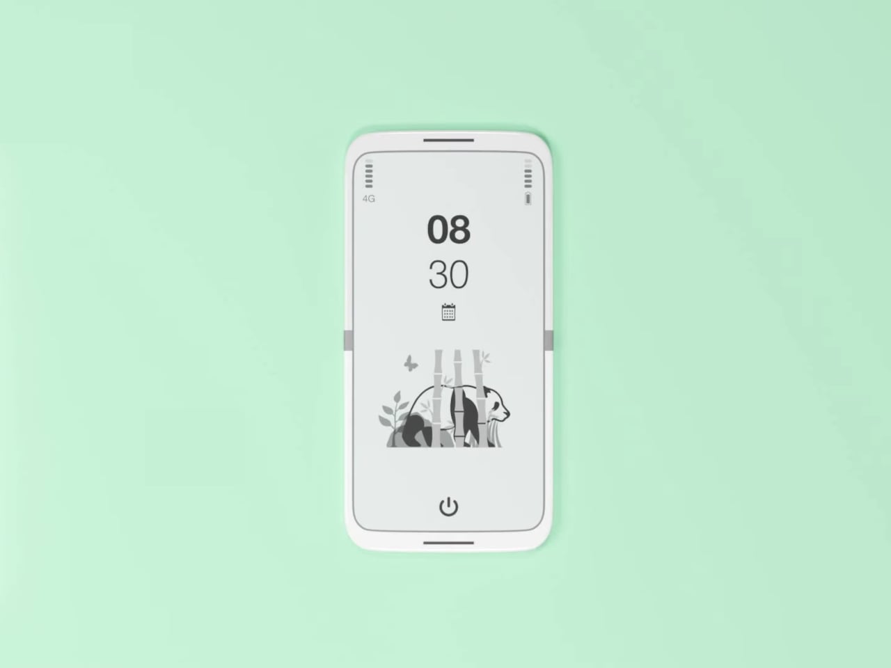
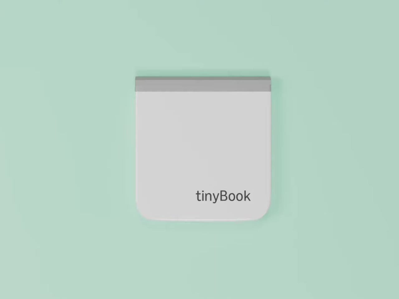
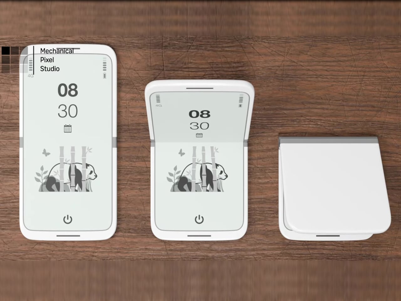
The tinyBook Flip is a vertical foldable phone concept built around a 6.1-inch E Ink display. Closed, it collapses into a compact, near-square form with rounded corners and a matte white finish, something closer in proportion to a folded notecard than a smartphone. The screen disappears entirely when the device is closed shut. No glowing rectangle sitting face-up on the desk, no ambient reminder that there are things to check. Just a small, quiet object.
Designer: Pixel Dynamics
That folded form is doing more work than it might seem. Opening the phone requires a deliberate physical action, and that small added step changes the behavioral math. A reflexive grab becomes a conscious decision. The friction is minimal in absolute terms, maybe two seconds, but two seconds of resistance is often enough to interrupt the loop. The concept treats that interruption as a design feature, which puts it in genuinely different territory from most phones.
The E Ink display adds a second layer of resistance, and this one is less subtle. E ink refreshes slowly, renders in grayscale or muted colors, and handles fast-moving content poorly. Social media feeds become tedious. Short-form video becomes unwatchable. Anything built around color, motion, and rapid visual feedback stops working the way it was designed to. This is precisely the point. The screen’s limitations aren’t engineering compromises left over from an earlier era of display technology; they’re structural properties that make certain behaviors genuinely unpleasant to sustain.
What E Ink handles well is a shorter list, but a coherent one. Text reading, messaging, calendars, and static interfaces are all comfortable at E Ink’s native pace. The renders of the tinyBook Flip show a UI built around exactly these strengths: a large clock face, a calendar widget, and a grayscale illustrated wallpaper. The interface doesn’t reach for capabilities the display can’t support. The phone isn’t trying to do everything; it’s trying to do a narrower set of things without apology.
Foldable E Ink panels aren’t a speculative technology. The hardware exists at the component level and has already appeared in experimental e-readers, though no consumer phone has shipped with one in any meaningful volume. The tinyBook Flip isn’t imagining impossible components; it’s proposing a form factor that manufacturers haven’t yet committed to producing. The distance between those two things is largely commercial, not technical.
There’s also something worth noticing about how the device reads as a physical object in social space. Closed, the tinyBook Flip looks like almost nothing. No visible screen, no status indicators, no glow. A phone that carries no visual weight when it’s not in use sends a different signal than one that’s always broadcasting its presence. Putting it down means it actually disappears from the environment, not just from your hand.
That said, the concept leaves some real friction points unaddressed, and not the intentional kind. E Ink handles camera use, live navigation, video calls, and authentication apps poorly. A foldable hinge adds mechanical complexity and thickness that clean renders tend to obscure. The tinyBook Flip looks resolved in this form, but a production version would have to make tradeoffs that these images don’t show and the concept doesn’t acknowledge.
Still, the more interesting question isn’t whether this specific device could ship. It’s whether a phone that makes itself harder to misuse is a reasonable design goal at all, or whether that’s just a way of describing a phone that most people wouldn’t actually want. The tinyBook Flip lands firmly on one side of that question. Whether the market agrees is a different problem entirely.
Anyone who has worked remotely long enough knows the moment a single laptop screen stops being enough. It’s usually the day you’re cross-referencing three documents at once, or the morning you realize your financial model needs a live chart in one window while you edit formulas in another. The standard fix is an external monitor or a portable screen extender, which works fine until you’re hauling a bag that feels like it’s punishing you for being productive.
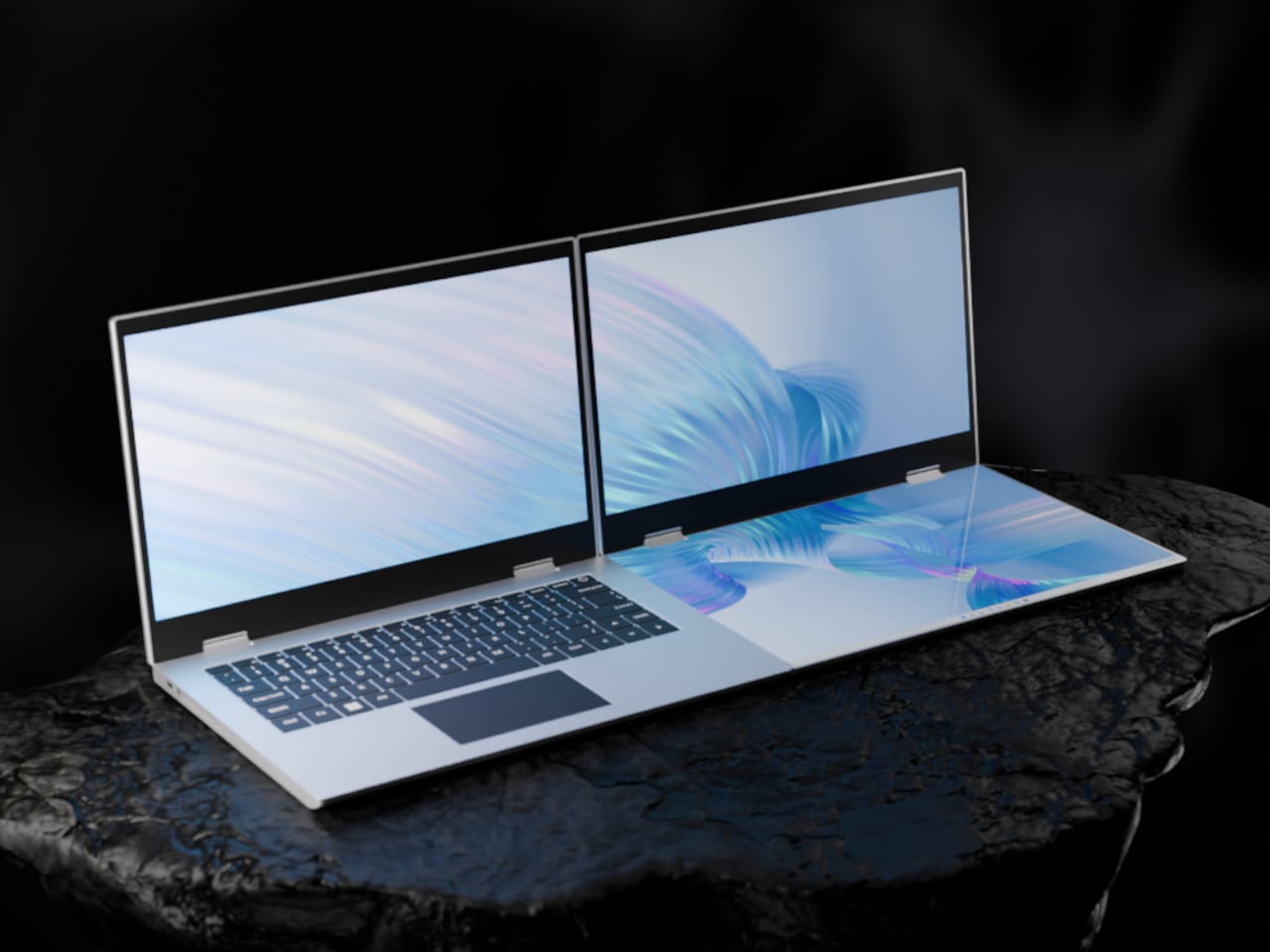
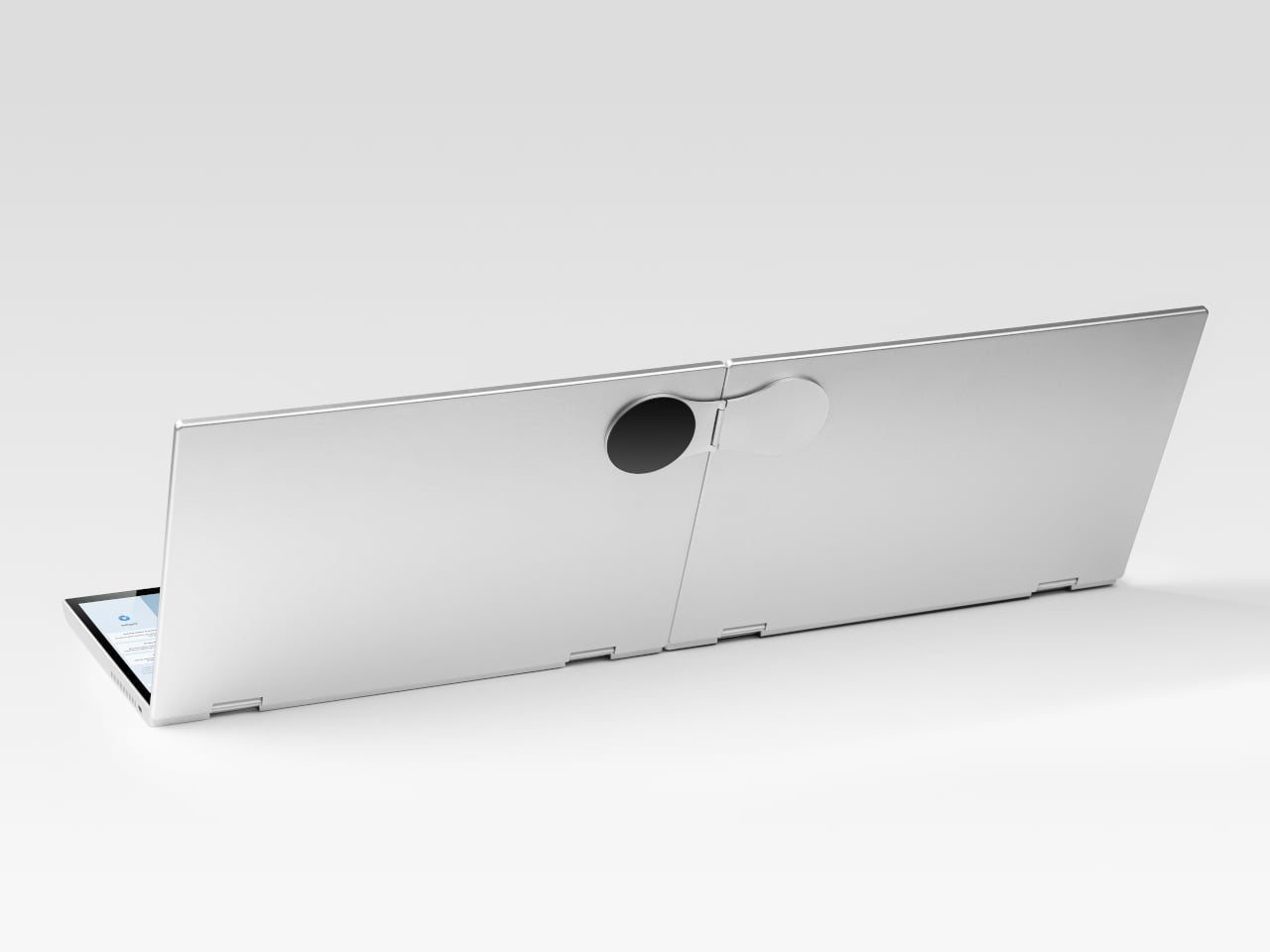
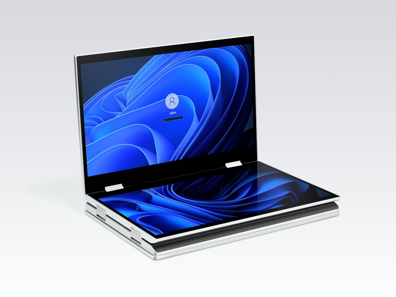
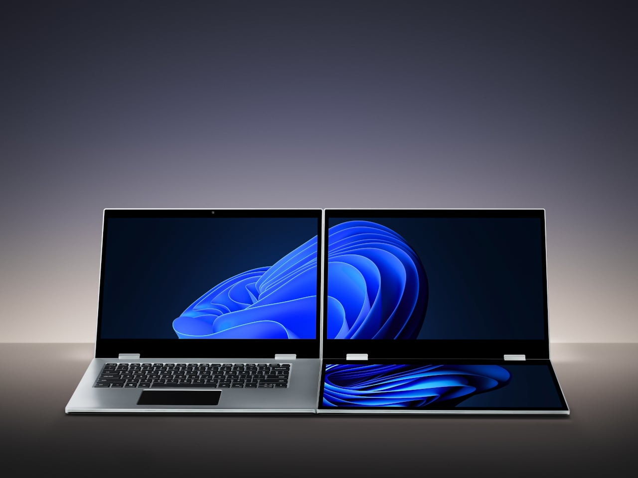
The XbooK takes a different approach by folding three full 14-inch touchscreens into a single aluminum laptop body that closes to just 1.5 inches thick. At 7.5 lbs, it’s heavier than a typical ultrabook. The tradeoff, though, is straightforward: you’re not carrying a laptop plus accessories. You’re carrying the whole setup in one piece.
All three screens run at 1920×1080 with 400 nits of brightness each. The machine is powered by an Intel Core Ultra 7 with 32GB of DDR5 RAM and a 1TB SSD, with Wi-Fi 7 and Bluetooth 5.0 onboard. That’s capable hardware, though nothing unusual for a mid-to-high-range laptop in 2025. What makes those specs interesting here is what they’re pushing: 42 inches of combined touchscreen that unfolds in seconds without a single cable involved.
In full Workstation Mode, all three screens run simultaneously alongside an embedded mechanical keyboard and a 10-point touchpad. Connectivity covers Thunderbolt 4, two USB-C ports, and an AUX jack, with a 1,600×1,200 front camera that’s sharper than most built-in laptop cameras. The 70Wh battery has to power all of that, and battery life under a three-screen load is something any serious buyer should push the company on before committing.
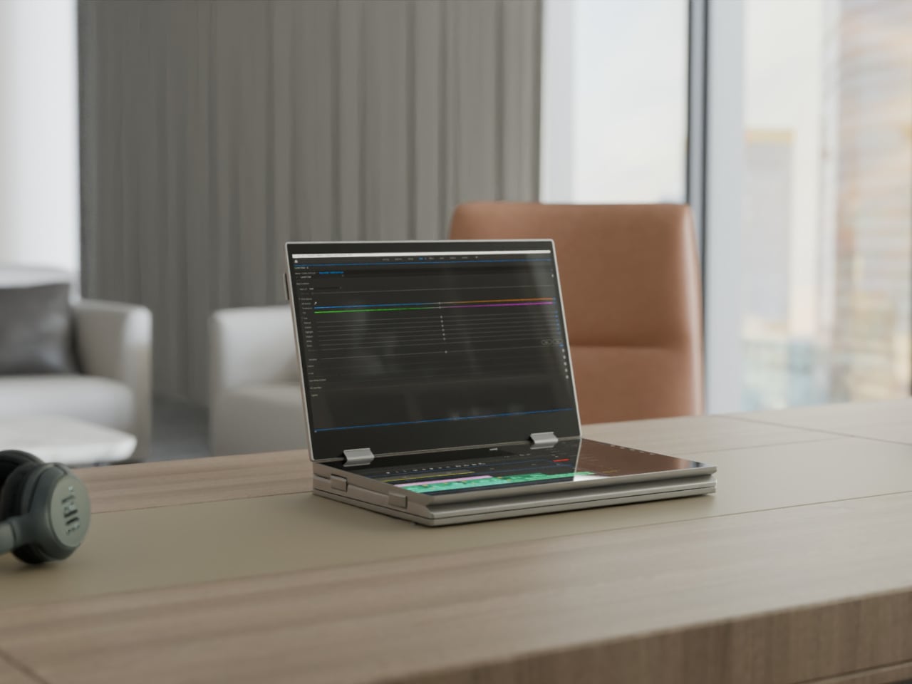
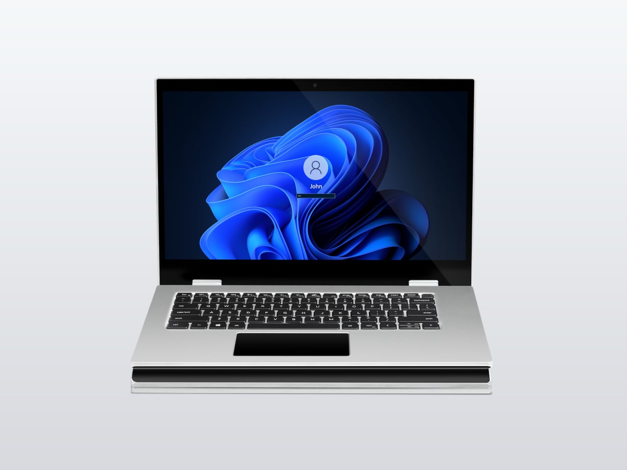
For days when the full spread is overkill, the XbooK also works in a two-screen mode or as a conventional single-screen laptop. The latter folds everything up and makes the device look surprisingly ordinary from the outside, except for the two thick slabs sitting underneath the keyboard. That adaptability is one of the more genuinely practical aspects of the design: you’re not locked into the workstation configuration every time you open the lid.
At $1,999 (down from a listed $2,999), it’s priced for professionals who already spend that much on monitors and docking stations. XbooK ships from the US with orders promised to be processed within 3 to 5 business days. The refund-before-shipping policy and fulfillment language have the texture of a startup still scaling up. Spending that much on a device from a company with no established hardware track record is a different kind of commitment than buying from a brand with a decade of products behind it.
Screen real estate is one of the last things portable computing has consistently failed to solve, and most multi-screen laptop concepts have been either too fragile or too awkward for daily travel. The XbooK has a cleaner physical premise than anything built around magnets or external rails. How the hinges and chassis hold up after a year on the road, though, is still an open question that no amount of spec-sheet confidence can close.
There’s a version of a desk setup that communicates everything about how little thought went into it. A black mesh organizer from the bottom shelf of a supply closet. A mouse pad that came free with something else. A cable clip in beige. The desk functions, technically, and does so with a level of visual enthusiasm that matches a waiting room.
The accessories below were designed by people who thought about this harder. Some carry authentic 1970s Italian design heritage. Some are running AI in the background to actively shape your environment. One contains material roughly 20 million years older than the Earth it now rests on. What they share is a quality of intentionality. Each was built as an object worth keeping on a desk, not just stashing in a drawer, because it earns its surface area through how it works, how it looks, or both at once. For men who have graduated from the corporate supply closet aesthetic, these eight represent a meaningfully different set of options.
1. Lenovo AI Workmate Concept
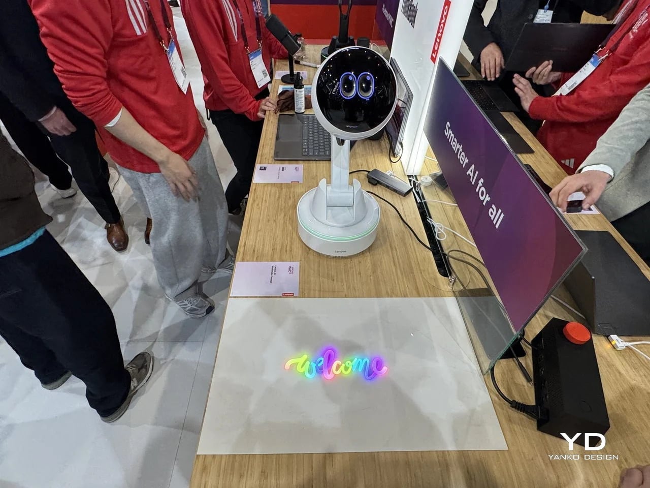
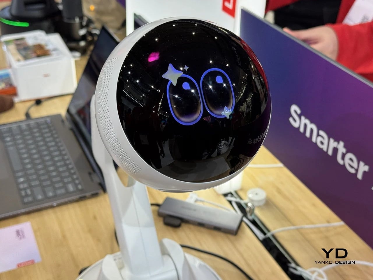
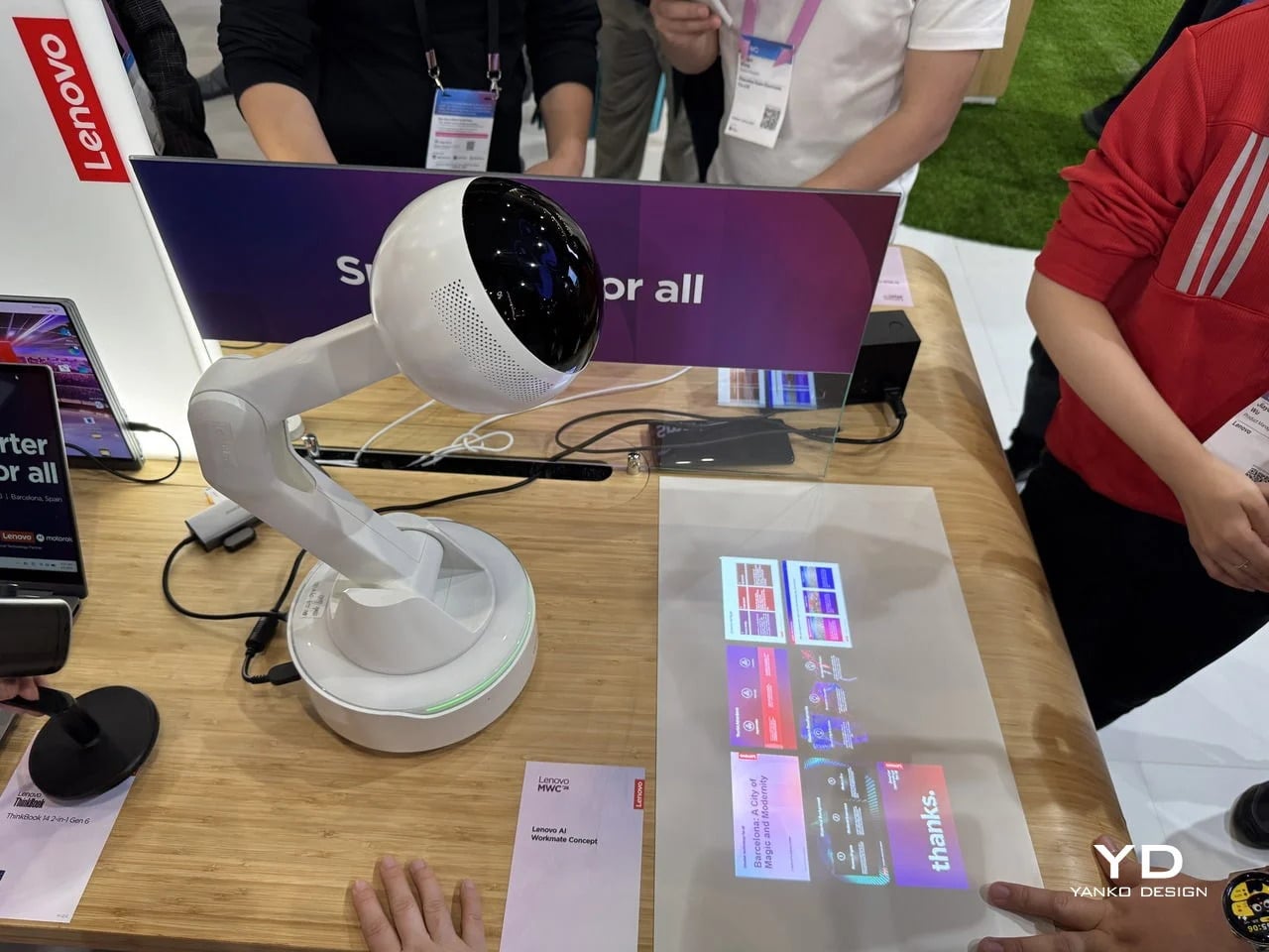
Working alone all day carries a specific kind of friction that most desk setups quietly ignore. Questions accumulate, decisions pile up, and the AI tools meant to support you sit behind a keyboard input that gives nothing back spatially or visually. Lenovo’s AI Workmate Concept, unveiled at MWC 2026, takes that problem seriously enough to build a physical object around it. The result is a desk companion in the most literal sense: a spherical head on an articulated arm mounted on a circular base, with animated eyes on its front display that shift and orient as it processes and responds. The form is compact, the presence is deliberate, and the intent is clear from the first time it moves.
The arm is the most consequential design decision here. Because it moves, the Workmate can orient itself toward whatever holds attention in front of it, a document laid flat on the desk, a person leaning back in their chair, or something happening at the periphery. That range of motion is what separates it from a smart speaker that has been given a screen and called a companion. Spatial awareness is embedded in its posture, not just its software. For men who spend long hours alone at a desk and find text-based AI interaction increasingly impersonal and context-free, the Workmate proposes something more honest about what presence and assistance can look like from an object sharing your workspace.
What We Like
Articulated arm gives the device genuine spatial awareness, orienting toward objects and people rather than remaining static
Animated eyes on the front display make AI interaction feel more present and less transactional than any screen-based interface
What We Dislike
Currently a concept unveiled at MWC 2026, with availability, pricing, and final specs still unconfirmed
The novelty of animated eyes may carry more emotional weight than the practical functionality justifies over time
2. Levitating Pen 2.0: Cosmic Meteorite Edition
Most pens sit on a desk and do nothing interesting when they’re not being used. The Levitating Pen 2.0 Cosmic Meteorite Edition refuses that arrangement entirely. It floats at a 23.5-degree angle above its magnetic base, creating a suspension that stops people mid-sentence when they notice it. The design draws from spacecraft aesthetics, specifically the visual language of the USS Enterprise, and the tip incorporates a genuine fragment of Muonionalusta meteorite, a material approximately 20 million years older than the Earth it now rests on. It functions as a working ballpoint pen, which means it is simultaneously a collector’s object, a desk focal point, and a writing tool occupying the same physical form.
What keeps this from reading as pure novelty is how it behaves in your hands. The Levitating Pen is fidget-worthy in the best sense, the kind of object you reach for during a long call or a pause between tasks without consciously planning to. For men who collect objects with a verifiable reason behind them, the meteorite tip offers something most limited editions simply don’t: provenance with a story that doesn’t require a certificate to feel real. You’re holding material from beyond the solar system. That fact changes the weight of the object in your hand when you stop to think about it, and that shift is exactly what separates a desk accessory from a desk object worth keeping.
Genuine Muonionalusta meteorite tip connects the pen to a tangible, verifiable piece of cosmic history
Magnetic levitation display creates a desk focal point that requires no ongoing maintenance once positioned
What We Dislike
The floating display requires a flat, stable surface, limiting where it can sit effectively
Limited edition production means restocking after sellout is not guaranteed for future buyers
3. BOB Desk Organizer
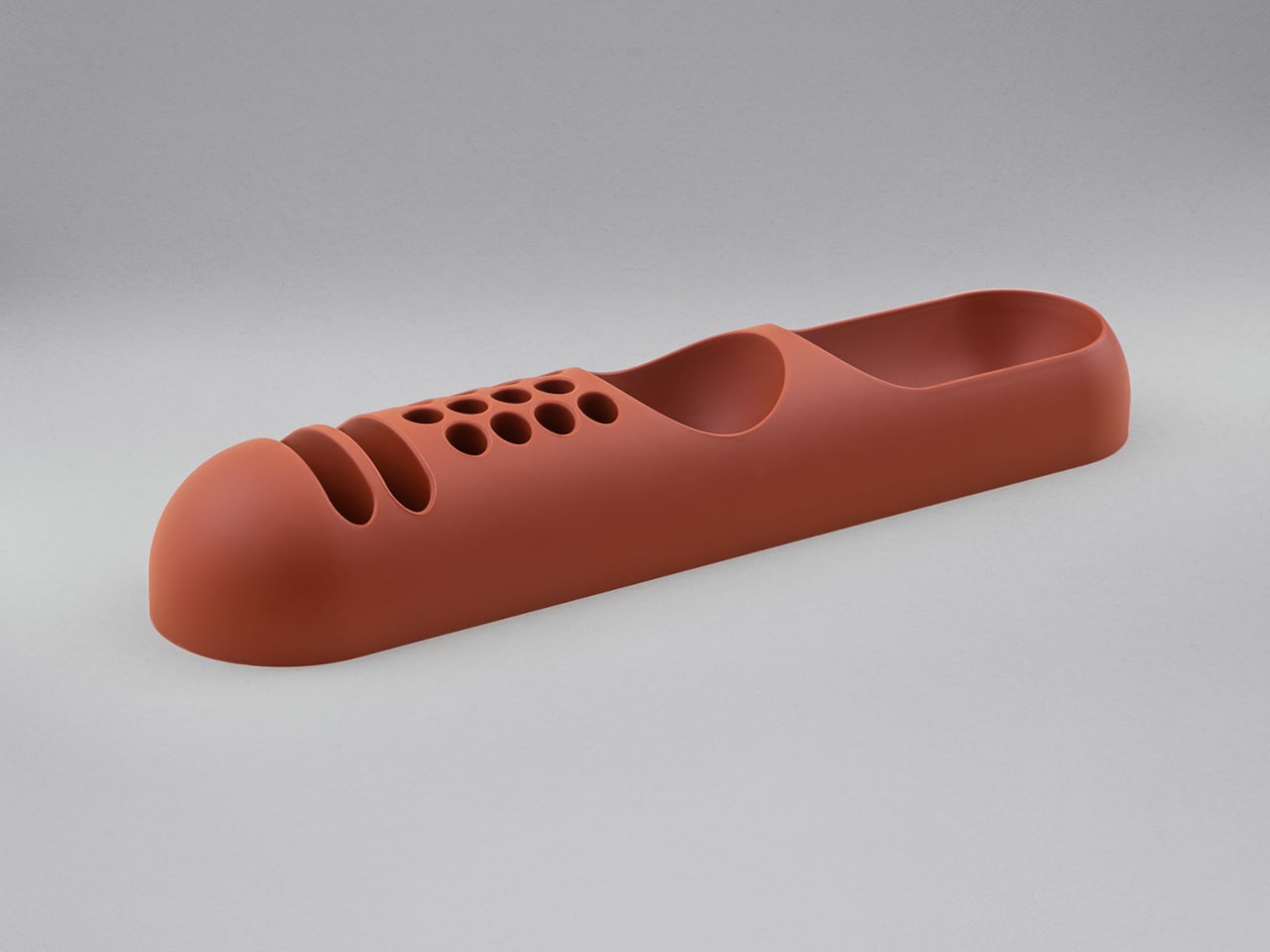
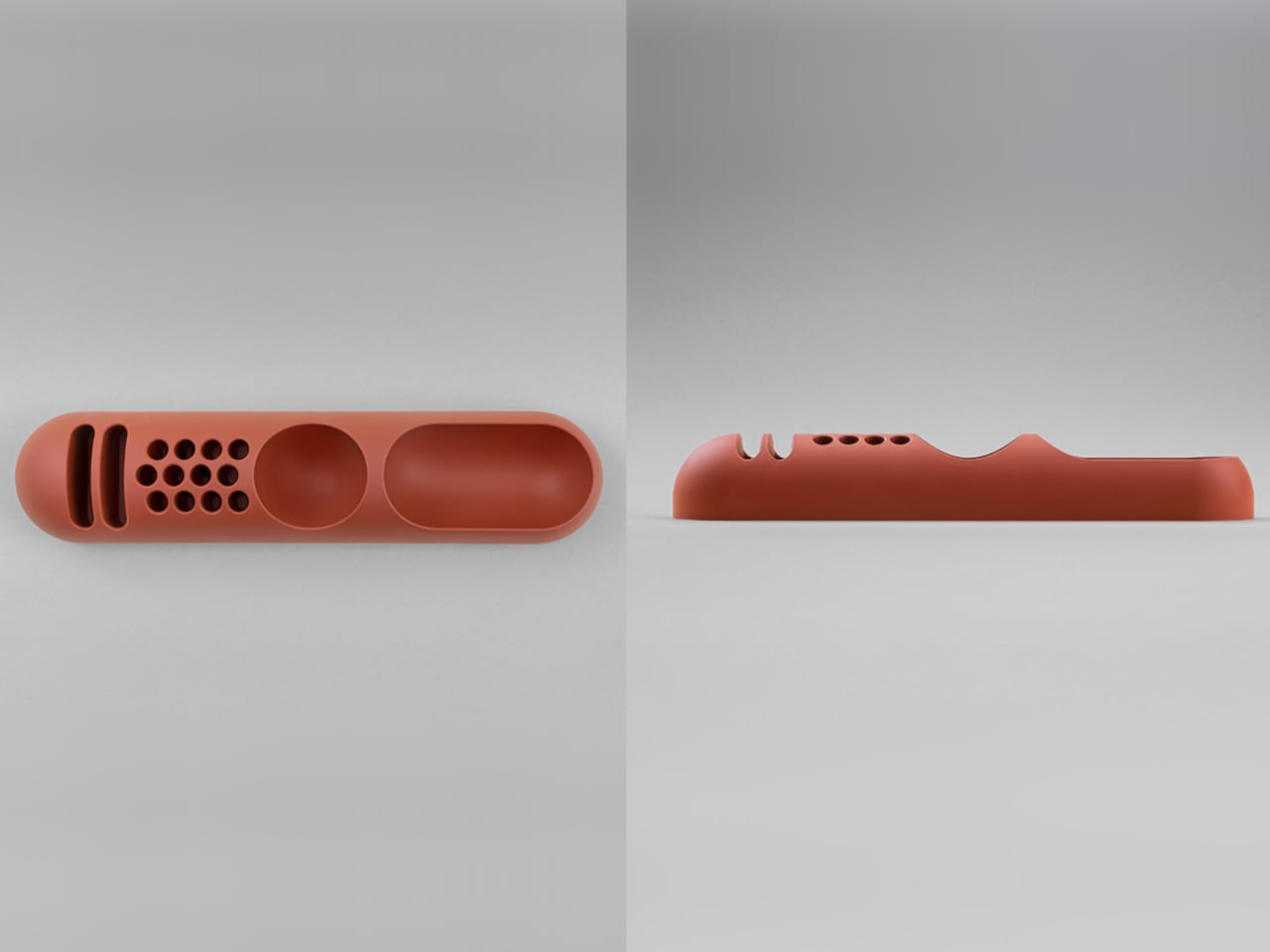
Joe Colombo designed BOB in 1970, at a time when desk organizers were either plastic trays with zero intentionality or overengineered systems that looked more complicated than the mess they were supposed to fix. He chose neither direction. BOB is a compact polyurethane gel form, elongated and low-profile, almost pill-shaped when viewed from above, with one end rising into a soft dome and the other tapering nearly flat. B-Line, an Italian label dedicated to reissuing objects from discontinued original molds, brought it back in 2023 across five colorways: terracotta, slate blue, mustard yellow, warm white, and a frosted translucent version called ice. The selection alone suggests a designer thinking about rooms rather than offices.
The top surface divides into three functional zones without any visible partition between them. The dome end opens into a large oval scoop for bulkier items. The center holds a three-by-four grid of individual circular holes, each sized precisely for a single pen or brush. The tapered tail offers two horizontal slot grooves for flat objects like rulers or small notebooks. None of this reads as a feature list in person. It reads as a single continuous gesture that happens to keep things organized along the way. For men who want a desk object with actual design history behind it rather than a branding story retrofitted over generic injection molding, BOB is nearly impossible to improve on.
What We Like
Rooted in authentic 1970s Italian design history, reissued from Joe Colombo’s original mold by B-Line
Three distinct functional zones are built into one continuous organic form with no visible hardware or dividers
What We Dislike:
Polyurethane gel construction may show surface wear or discoloration with extended daily use
The low-profile form works best for lighter objects and may not support heavier desk tools effectively
4. DEEP
DEEP operates on a premise most desk lamps don’t bother with: the working environment around you should configure itself to match what you are about to do, rather than waiting for you to adjust it manually. Switch it on with a spinning-top-inspired power button, tell it whether you’re studying, coding, reading, or doing creative work, and it adjusts both light quality and ambient sound before you’ve had to think about either. A camera positioned at eye level monitors your focus state in real time, functioning like a built-in productivity coach without requiring a separate app or a separate device taking up additional surface area.
What separates DEEP from a connected lamp with a smart home feature set is what it does across repeated sessions. The system saves your manual adjustments over time, builds a personal profile from the conditions that consistently work best for you, and begins applying them automatically without being prompted. Side buttons allow precise overrides for days when the default doesn’t fit. For men whose desks have become cluttered with single-function devices that each do one thing adequately, DEEP represents a genuine consolidation. It folds a lamp, an ambient sound environment, and a passive focus monitor into a single object that becomes more attuned to how you work the longer it stays on your desk.
What We Like
AI builds a personal focus profile across sessions and applies your optimal working conditions automatically over time
Combines lighting, ambient sound, and real-time focus monitoring without requiring any additional hardware
What We Dislike
Camera-based focus tracking may feel uncomfortable for users sensitive to passive environmental monitoring
Ambient sound adjustment effectiveness varies significantly based on an individual’s working environment and noise tolerance
5. Rolling World Clock
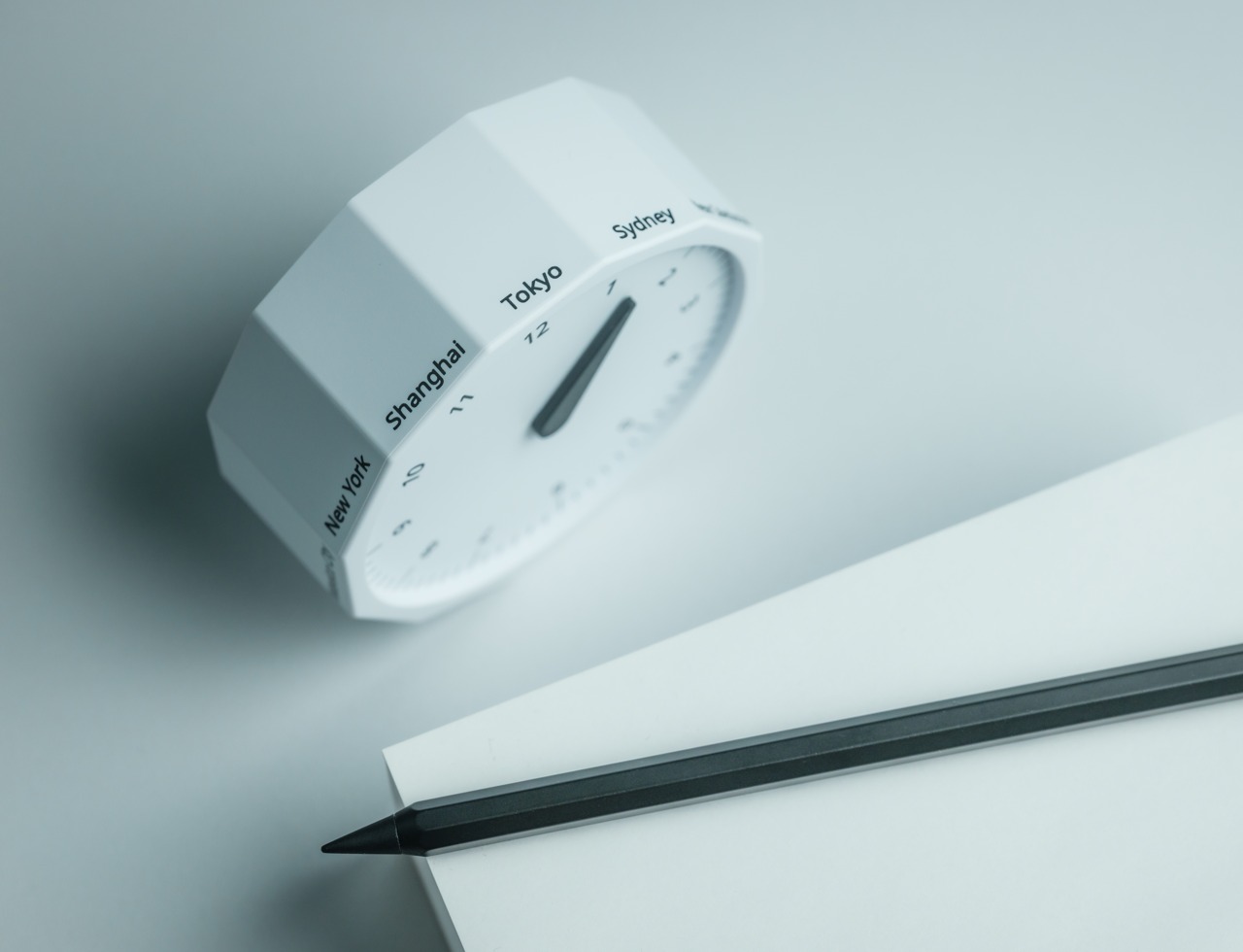
Every desk clock tells you one thing. This one tells you twelve. The Rolling World Clock is a 12-sided object with a single hand and an operation that couldn’t be more direct: set it on any face, and the hand reads the correct local time for the city printed on that side. The twelve cities span the major global time zones, including London, Paris, Cape Town, Moscow, Los Angeles, Karachi, Mexico City, New York, Shanghai, Tokyo, Sydney, and New Caledonia. For men who manage work across multiple time zones or simply have family spread across continents, the mental arithmetic of figuring out what time it is somewhere else is one of the more persistent small irritations in a working day, and this object removes it without adding a screen.
The design decision that makes this worth keeping on a desk rather than just owning is the total absence of anything unnecessary. No digital display. No charging cable. No app. Just a tactile, rollable object you turn to the city you need and set down. Available in black and white, it occupies desk or shelf space without reading as a gadget or demanding attention it hasn’t earned. There’s a quiet pleasure to the interaction that most clocks don’t provide: the act of picking it up, choosing a place in the world, and reading the time. There is a physical engagement with global time that a phone screen never manages to replicate.
Covers twelve major time zones in a single tactile object with no digital display, no app, and no charging required
Minimal form reads equally well on a desk or shelf without visually registering as a tech accessory
What We Dislike
A single clock hand requires slightly more reading attention than a digital display for precise timekeeping
The 12-city selection covers major zones well, but may not include every specific time zone a user needs regularly
6. Fidget Cube
The case for keeping a dedicated fidget object on a desk is more rational than it sounds from the outside. Restless hands during long calls, slow-loading processes, or decisions you’re turning over without fully committing to are a real and recurring part of working at a desk, and the Fidget Cube was built precisely for that condition. Six sides offer six different tactile surfaces: a cluster of clickable buttons, a gliding joystick, a row of flip switches, a smooth surface designed for the thumb’s natural breathing motion, a rolling ball set into one face, and a spinning disc. The variety means your hands will find a preferred surface quickly and return to it across the session without thinking about it.
What keeps this from reading as a toy is the restraint built into how it was designed. It doesn’t look out of place on a desk or conference table, particularly in the Midnight black colorway, which sits visually neutral among the standard dark objects that populate most professional environments. For men who have noticed that physical repetitive movement genuinely sharpens how they think through a problem, this is one of the more honest tools available at any price point. It takes a real behavioral truth seriously and gives your hands a quiet, clean way to act on it without disrupting anyone around you or drawing attention to what you’re doing.
What We Like
Six distinct tactile surfaces address a wide range of fidgeting habits within one compact, pocketable object
Discreet colorways, particularly Midnight black, keep it visually neutral in professional desk environments
What We Dislike
Some click mechanisms can produce an audible sound in quiet rooms or during video calls
Serves no secondary organizational function on a desk, occupying surface space with a purely tactile purpose
7. MOFT Z Sit-Stand Desk
Sit-stand desks have spent years being expensive, physically large, or permanently locked to a specific room. The MOFT Z takes a completely different approach, collapsing to something closer to a slim notebook in thickness while delivering a full ergonomic range through an origami-inspired Z-structure. It provides one standing mode and three seated position angles, which is enough postural variety to meaningfully shift how you feel across a long working session. For men who divide their time between home, a co-working space, a client’s office, or anywhere other than a fixed desk, the ability to carry a sit-stand setup in a bag removes an ergonomic compromise that most standing desk products are structurally incapable of solving.
The weight is what makes it a genuine solution rather than a clever concept. Ergonomic equipment that stays home because it’s too heavy or awkward to transport defeats the purpose of improving how you work across different locations. The MOFT Z doesn’t have that problem. Unfold it in seconds, set your laptop on the surface, and you’ve built the same ergonomic posture you’d have at a standing desk that costs several times more and cannot leave the floor it occupies. For anyone who has watched their posture decline steadily across a long afternoon of flat laptop work, this is a practical correction that goes where you go and requires no tools, no assembly, and no installation to use.
What We Like
Origami Z-structure provides one standing mode and three seated positions with no setup tools required
Ultra-lightweight, paper-thin folded profile makes it genuinely portable across different working locations
What We Dislike
Surface area restricts how much additional equipment can sit alongside a laptop in standing mode
Stability may be reduced under heavier setups or on surfaces that aren’t completely flat and firm
8. LEGO-Style Silicone Cable Organizer
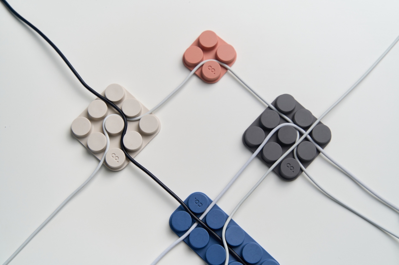
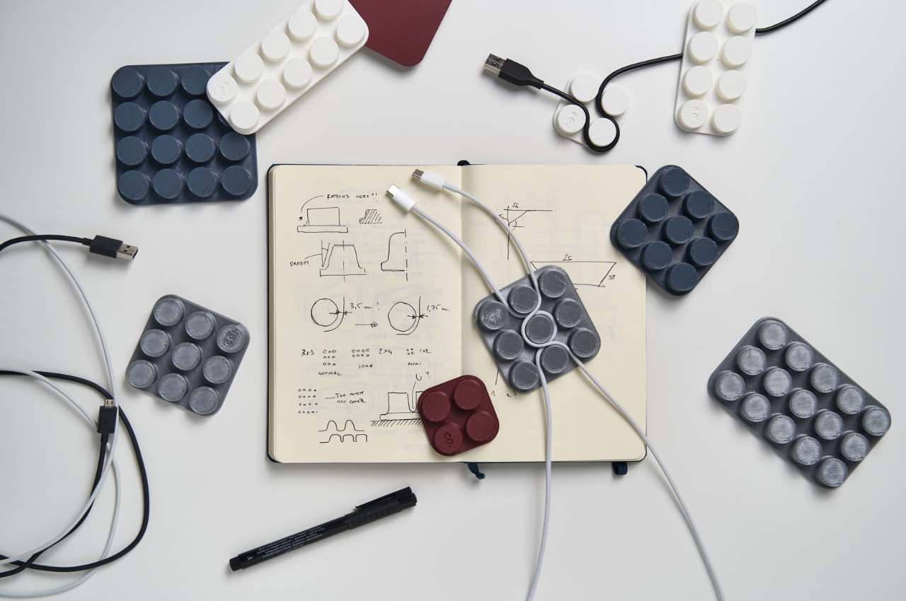
Cable management has a way of being solved temporarily and then quietly abandoned. The solution works for a week, then a new cable enters the setup, or the organizer shifts position, or it turns out the adhesive left a mark on the desk. This silicone cable organizer approaches the problem differently. Shaped after a lozenge pack, it uses peg-topped cylindrical columns to wrap and hold individual cables in separate, stable positions. Multiple units can be stacked or arranged in rows, and three sizes cover the range from a single charging cable to a full multi-device setup: a 2×2 mini, a 3×3 medium, and a 2×5 large, with the option to place two cables on top of each other within the same row.
The design was born from a specific personal frustration: cables tangling with other items inside a bag, the kind of small recurring annoyance that accumulates into a genuine grievance over time. That origin shows in how focused the solution is. There’s no overengineering, no branded clip mechanism, no custom routing system that only works with certain cable gauges. The micro suction tape base grips the desk surface firmly without permanent adhesion, meaning it moves when the setup changes and holds when it doesn’t. For men who have gone through two or three cable management products and quietly abandoned all of them, the directness here is precisely the argument for this being the last one you need.
What We Like
Three modular sizes cover setups from a single cable to a full multi-device workspace without custom parts
Micro suction tape base holds securely without permanent adhesion, leaving the desk surface undamaged
What We Dislike
Silicone material collects lint and dust more readily than hard plastic alternatives
The LEGO-inspired visual style reads as playful and may not suit every desk aesthetic preference
The Best Desk Is One You Actually Thought About
A desk says something whether you intend it to or not. It communicates how seriously you take the hours you spend there, what kind of work you believe deserves a proper environment, and whether the objects around you were chosen or simply accumulated. The eight accessories above represent a different kind of accumulation, one where every item on the surface has a reason to be there, a story worth telling, or a function that genuinely improves how the day moves.
None of them require a complete overhaul. One rolling clock, one floating pen, one lamp that learns how you work — any single object from this list shifts the energy of a desk in a direction worth going. The corporate supply closet aesthetic isn’t inevitable. It just tends to win by default when no one pays attention. These eight are the case for paying attention.
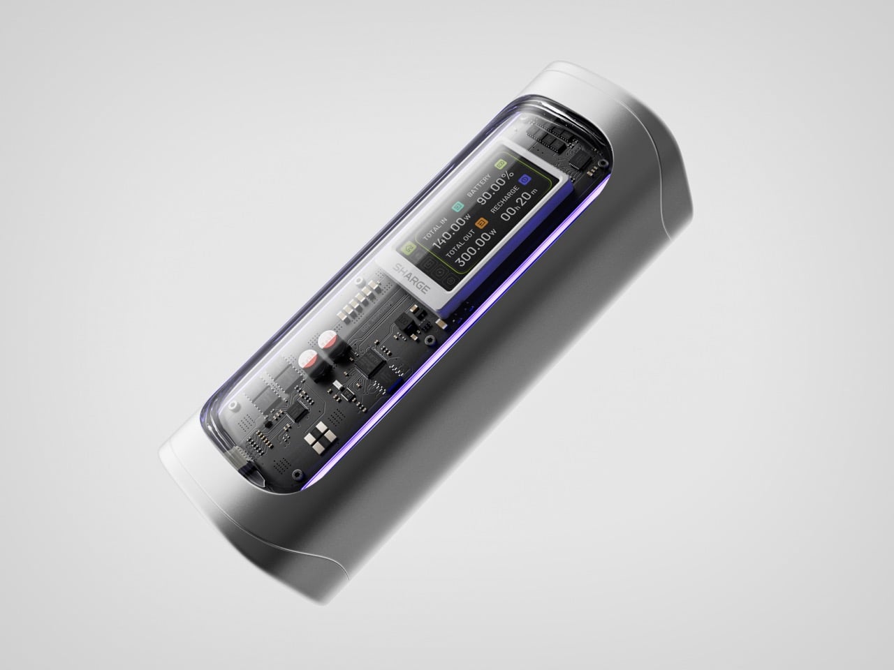
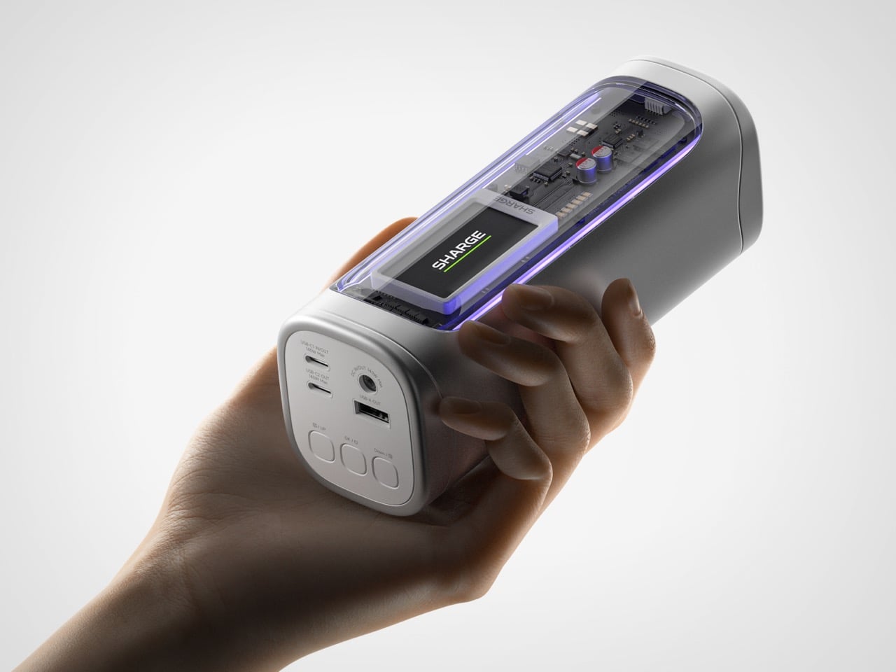
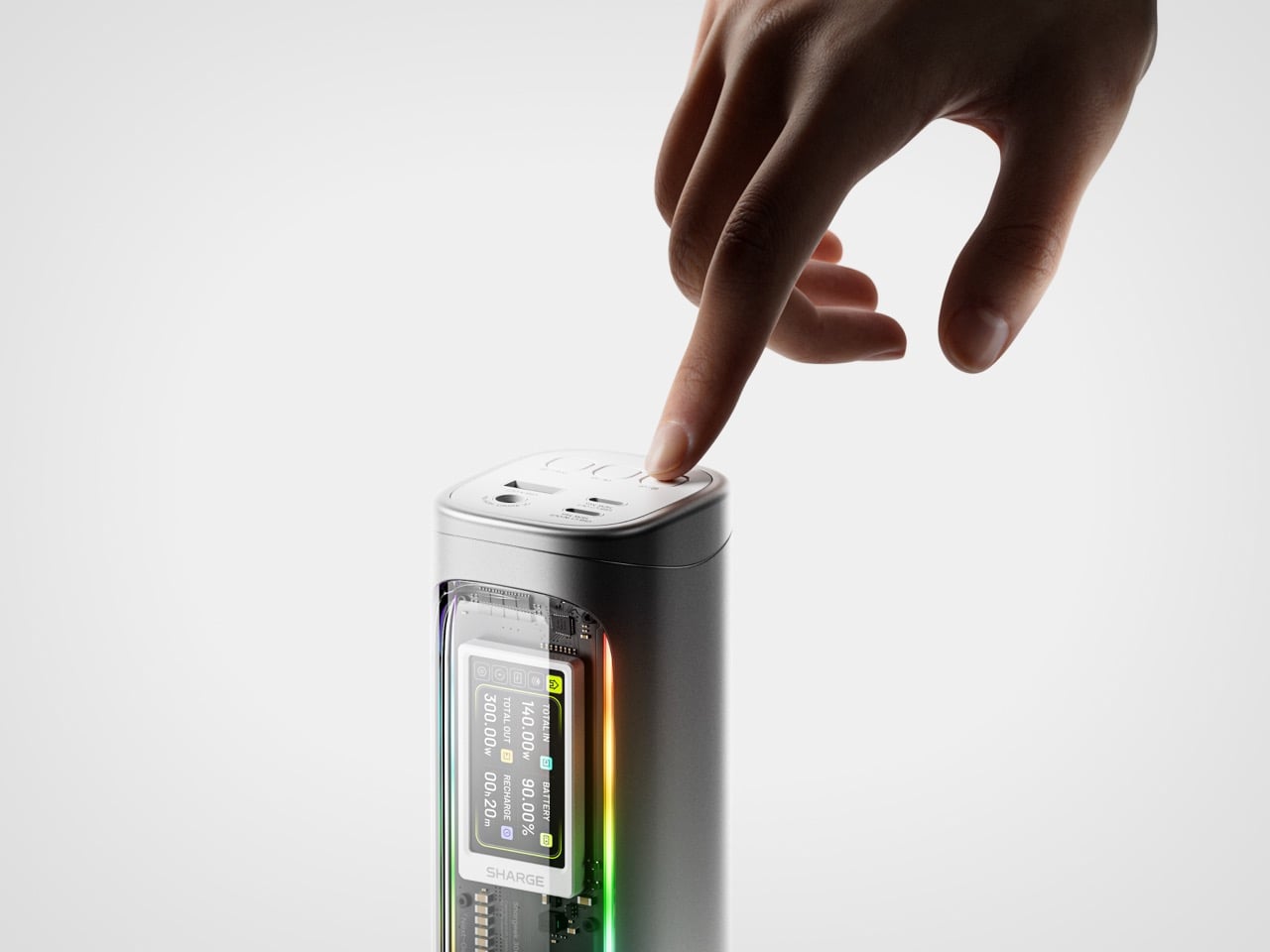
Power banks have spent years being boring on purpose. Black rectangles, white rectangles, the occasional textured finish. The category settled into a kind of utilitarian invisibility, as if the industry collectively decided that anything carrying electrons should look like a bar of soap. SHARGE never got that memo. The Shargeek 300 looks like a prop from a near-future thriller, with transparent panels revealing glowing circuitry beneath, RGB light bars running along its flanks, and a CNC aluminum body that catches light the way expensive things tend to. It belongs on a desk you’d actually want to show people.
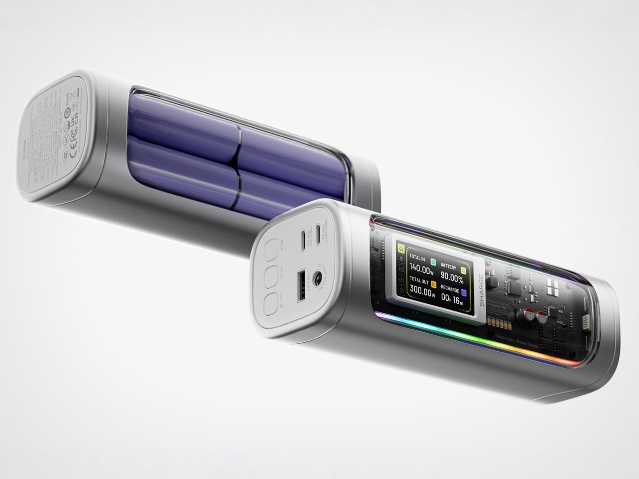
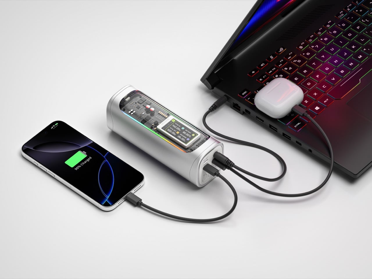
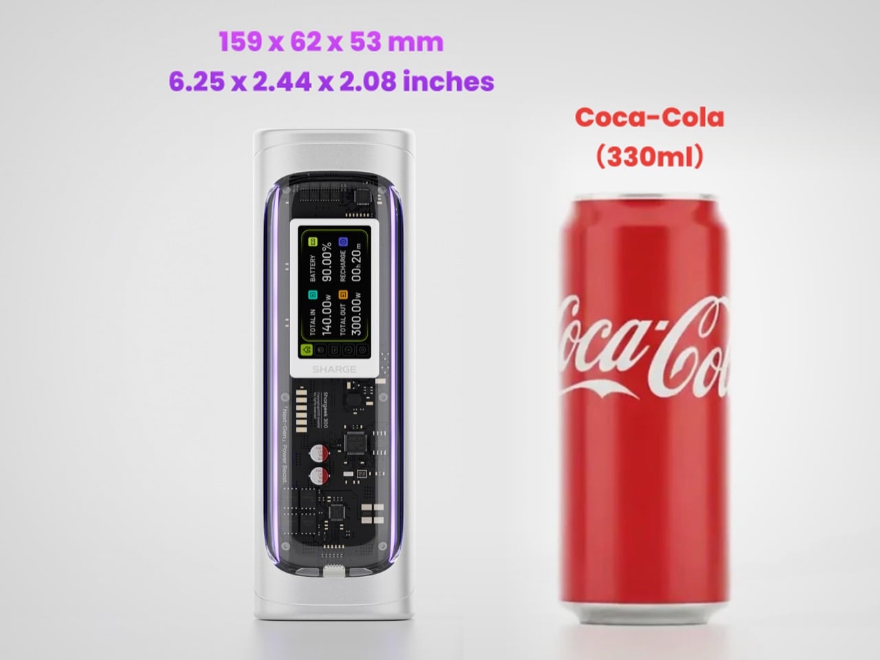
Founded in 2020, SHARGE built its identity around the conviction that charging hardware deserves the same design attention as the devices it powers. The original Shargeek 100, launched in 2021, was the proof of concept: a transparent, display-equipped power bank with DC charging that found a devoted audience almost immediately. The Shargeek 300 is what four years of that bet looks like fully cashed in. It pushes 300 watts of total output, enough to charge two 16-inch MacBook Pros simultaneously while still fast-charging a smartphone on a third port. The 24,000mAh battery lands at 86.4Wh, sitting just under the 100Wh threshold airlines enforce for carry-on batteries. Recharge time from flat to full is 75 minutes with a 140W input. The whole unit is roughly the size of a 330ml can of cola. SHARGE spent 40 months getting here, and the result makes most rivals in the category look underprepared.
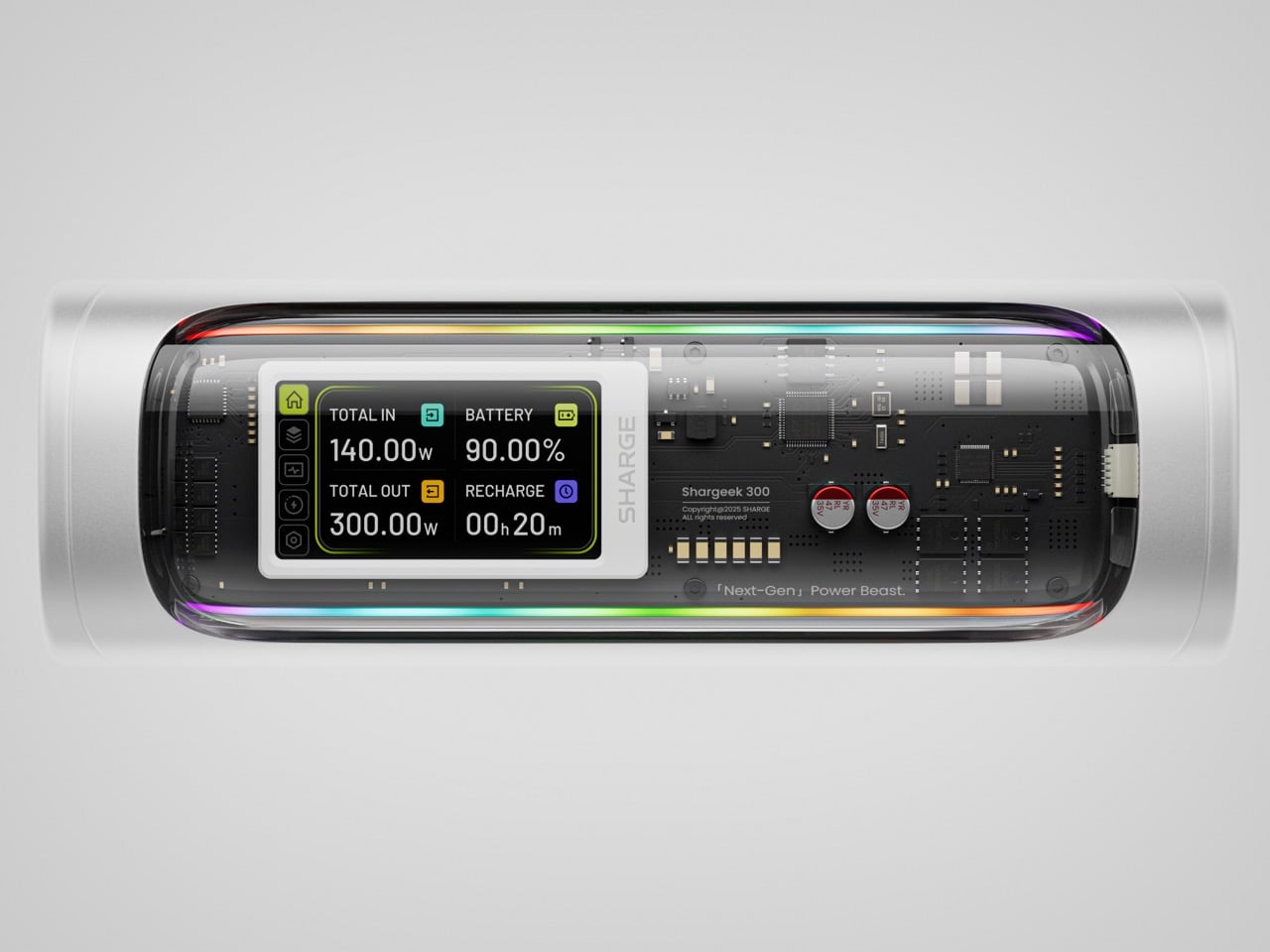
That meticulous attention to detail is most obvious in the physical construction. The main body is a matte silver CNC aluminum frame, which is then given a 180-grit sandblasted, anodized finish for a smooth, premium feel. The company’s head of production is even quoted as personally comparing the feel of every unit to an iPhone to ensure they are equally premium. The signature transparent casing is not just a window, but a piece of safety equipment, made from V0 flame-retardant, UL94-certified polycarbonate that resists both scratches and heat. The dual RGB light bars are fully customizable, allowing users to adjust brightness, change colors, and cycle through effects via the onboard display, turning a functional object into a piece of personalized desk art.
Inside that striking shell is technology that sets a new benchmark for portable power. The Shargeek 300 is the first power bank to use the same Full-Tab Battery Cell technology pioneered by Tesla. This design significantly lowers internal resistance compared to conventional cells, a change that unlocks faster charging speeds, higher sustained output, and superior heat dissipation. This internal efficiency is the key to how a device this compact can safely manage a 300W total output without overheating or degrading quickly. The advanced battery structure results in a longer-lasting, more stable power source that can handle the demanding, continuous power draws required by high-performance laptops and other professional equipment, putting truly next-generation power in your hands.
This power is routed through a versatile array of four output ports designed to handle nearly any device. The stars of the show are the two USB-C ports, both of which support the Power Delivery 3.1 standard to deliver a massive 140W of power each. This is what allows the Shargeek 300 to simultaneously fast-charge two 16-inch MacBook Pros at their maximum charging speed. A third USB-A port provides up to 20W for legacy devices and smartphones. The fourth and most unique port is the adjustable DC barrel port, a feature carried over from the Shargeek 100. It now supports up to 140W and its voltage can be manually set between 5V and 28V, unlocking compatibility with a world of gear that USB-C cannot serve, from professional camera equipment to high-performance drones. The 24,000mAh capacity provides enough energy for approximately one full charge of a modern MacBook Pro, six charges for an iPhone 16 Pro, or two charges for an iPad Pro.
The user experience is managed through a 1.9-inch IPS display, which is 60% larger than the screen on the previous model. It provides a level of control that is unheard of in this category. Beyond showing real-time input and output wattage, the display allows you to monitor battery health, track charging cycles, and check internal temperatures. You can use it to precisely adjust the DC output voltage, set a custom welcome message, and configure the RGB lighting. This smart display transforms the power bank from a simple battery into an intelligent power hub. This intelligence extends to its handling of delicate electronics. A dedicated Low-current Mode ensures that devices like earbuds, smartwatches, and fitness trackers receive a safe, optimized charge, preventing the overcharging that can damage the small batteries in those devices.
This combination of raw power and intelligent control is backed by a comprehensive suite of safety features, including overvoltage, undervoltage, short-circuit, and real-time temperature protection. This commitment to safety extends to its travel-readiness. Crucially, the power bank’s 24,000mAh capacity is engineered to a rating of 86.4Wh, keeping it comfortably under the 100Wh limit imposed by airlines for carry-on luggage. This makes it one of the most powerful charging solutions that can be legally carried onto a plane, a critical detail for mobile professionals. The low standby power consumption is another practical benefit, allowing the Shargeek 300 to retain over 90% of its charge after 15 days of inactivity. For anyone who has pulled a power bank from a bag after weeks only to find it unexpectedly dead, this is a genuinely valuable feature.
The Shargeek 300 starts at $199 but is available at a discounted $159 price for earlybird backers. Cobble together $209 and you can get the power bank along with its companion Pixel 140W PD 3.1 wall charger from Sharge with its adorable pixel-matrix display. The Shargeek 300 comes with a 12-month warranty, and ships globally as early as May 2026.
I have to be upfront: I did not expect a tumbleweed to be one of the most exciting design concepts I’d encounter this year. Tumbleweeds, in the cultural imagination, belong to Westerns and dusty ghost towns. They’re the kind of thing that drifts across an empty street right before a showdown, the universal shorthand for desolation. So when I first came across the Wasteland Nomads: Bionic Tumbleweed Sower System by Yizhuo Guo, I laughed a little. But as I looked closer, I started getting impressed.
Guo is a multidisciplinary designer with a master’s degree in Material Futures from Central Saint Martins, and she has previously collaborated with Google DeepMind. Her work appeared at Milan Design Week 2024. She is, in other words, someone who operates at the intersection of cutting-edge materials science and ecological design thinking. With Wasteland Nomads, developed alongside Daheng Chu through the University of the Arts London and Imperial College London, she took the one plant most associated with barren landscapes and used it as a blueprint for restoring them. The logic is almost poetic. The tumbleweed doesn’t fight the desert. It works with it. It uses wind as its engine and travels wherever the landscape allows. Guo’s question, essentially, was: what if we could engineer something that did exactly the same thing, but deliberately seeded the ground as it went?
Designer: yizhuo guo
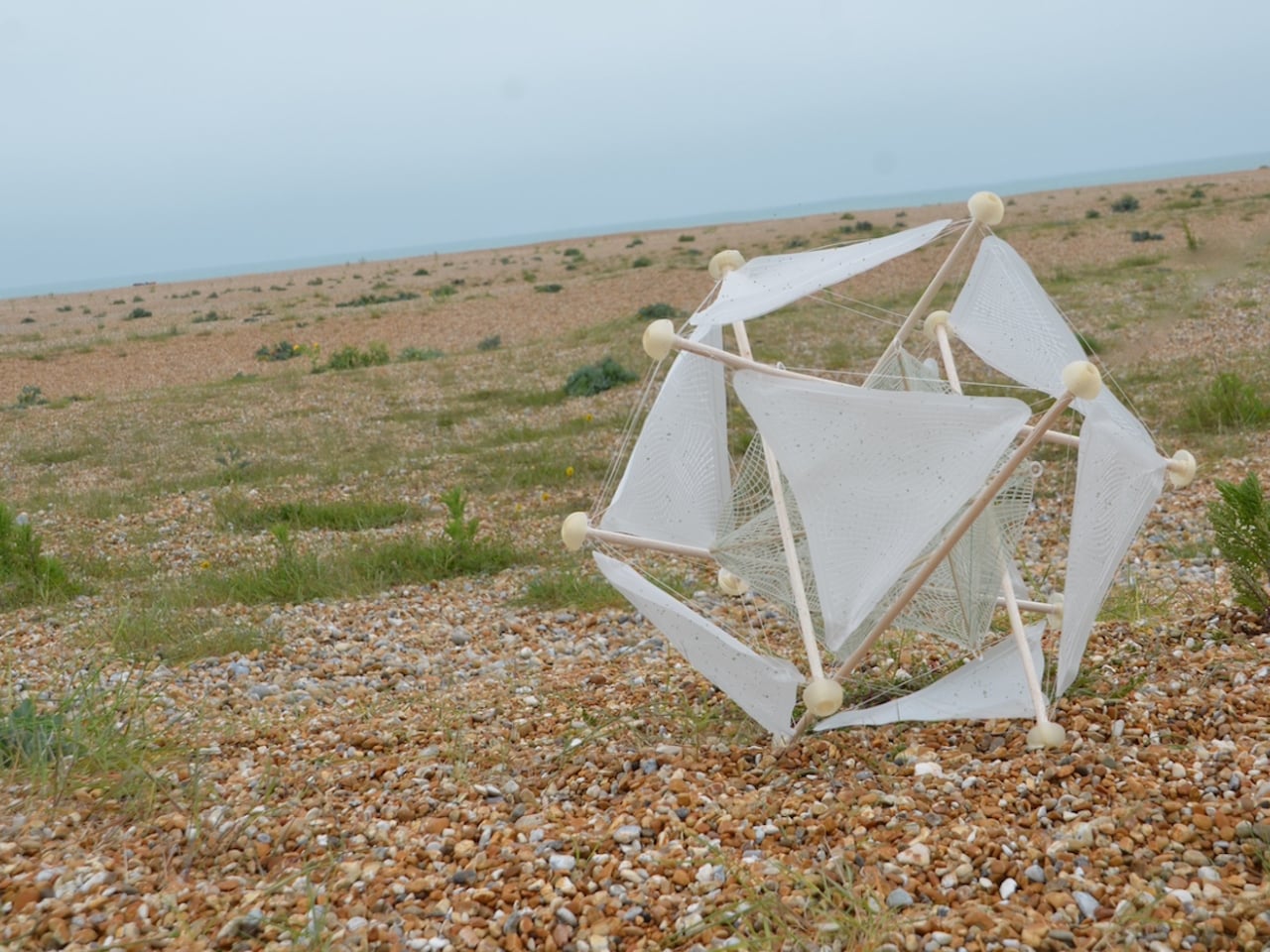
The result is a biomimetic seeding device built entirely on the principles of passive robotics. No batteries, no circuits, no external power source required. Lightweight biodegradable support rods form a tensile, hollow spherical structure that mirrors the tumbleweed’s own elastic form. The outer skin is made from a moisture-responsive biodegradable composite, and seeds are housed within it. When the device rolls into an environment where humidity conditions are right, the skin begins to break down and disperse those seeds directly into the soil. It boosts soil oxygen, contributes to carbon sequestration, and by the very end of its journey, the device has fully merged with the ground it was trying to restore. No waste. No remnants. Just land.
That last part is the detail I keep returning to. Most ecological technology, even the well-intentioned kind, still leaves something behind. A plastic housing. A metal component. A depleted battery that needs to go somewhere. This dissolves into the very ecosystem it is trying to rebuild. The design does not just mimic nature. It eventually becomes nature. That is a fundamentally different relationship between technology and environment than what we are used to seeing, and it matters more than it might initially seem.
The project took home a 2025 European Product Design Award in the Eco Design Products category, which feels well deserved, though I suspect this is only the beginning of the conversation around it. Guo has already accumulated a striking list of recognitions, including the iF Design Award in Germany and multiple honors from Chinese design institutions. She is clearly a designer who thinks at the systems level, not just asking what something looks like, but how it lives, decays, and eventually reintegrates.
Climate design can sometimes feel exhausting in its abstraction. We have all scrolled past enough speculative renderings of glowing, utopian landscapes to develop a healthy skepticism toward the genre. Wasteland Nomads doesn’t do that. It starts with a specific, urgent problem, the accelerating degradation of viable land across arid regions of the planet, and it finds the answer not in some new synthetic innovation but in a plant that has been quietly solving the same problem for millions of years. The tumbleweed has been moving seeds across hostile terrain since long before we were here to watch it. We just never thought to pay close enough attention.
That, I think, is what makes this design genuinely moving. Biomimicry at its most honest is not about clever engineering. It’s about being willing to slow down long enough to watch how the world already works, and being humble enough to follow what you find. Guo was clearly paying attention. Now let’s see where it rolls.
The retro handheld market has a strange problem. The hardware keeps getting better, the screens get sharper, the processors get faster, and yet most of these devices land looking like prototypes someone forgot to finish. Generic shells, forgettable proportions, and LED lighting as a substitute for actual design thinking. For a category built entirely on nostalgia, very few of these devices actually look like they belong to any era at all.
That tension is what one Reddit user decided to address. Starting with a Retroid Pocket 5, a $199 Android handheld running a Snapdragon 865 and a 5.5-inch AMOLED display, the mod layers Sony and Nintendo branding onto the same shell. Vinyl decals, translucent polycarbonate, a 3D-printed volume rocker from Etsy, and a cable replaced in PS2 color. The result looks less like a sticker job and more like a concept render from an alternate 1999.
The translucent shell is doing most of the work. It pulls from the visual language of the N64’s Funtastic series, those clear and atomic-purple controllers Nintendo released in the late 1990s, where showing the circuitry was the design choice rather than concealing it. Over a piano-black grip body with PlayStation-colored face buttons, the frosted polycarbonate shifts from grey to near-white depending on the light. It shouldn’t feel considered. It does.
The branding placement is where intent becomes clear. The Sony wordmark sits centered on the upper face, exactly where it appeared on a PSOne. Below it, the PlayStation four-color logo. At the bottom bezel, the Nintendo badge mirrors its position on a Game Boy Advance SP. None of it is licensed, of course. These are adhesive vinyls placed by someone who grew up with both systems and wanted their coexistence on one device to feel inevitable rather than absurd.
Not everything here reaches backward. The analog sticks are translucent caps over hall-effect sensors, lit teal on the left and purple on the right, owing nothing to 1999. That generation didn’t have RGB anything. The lighting reads as a concession to the present; the one feature announcing this is still an Android device in 2025, not a prototype from some alternate Sony-Nintendo licensing meeting. Whether it sits comfortably alongside the retro shell is a fair question.
The rear view shifts the frame again. A large dual-grip body in smooth black rubber dominates the back, a clear plastic hinge connecting the screen to grip in full view, structural and unapologetic. The 3D-printed volume rocker at the top edge puts a physical control where fingers naturally land. The back half feels closer to a DualShock than a Game Boy, which is either the point or the problem, depending on what you wanted this thing to be.
Flip to the front screen, and the emulator grid makes the whole thing literal. DuckStation for PS1, Dolphin for GameCube, PPSSPP for PSP, melonDS for Nintendo DS, and a live PS2 wallpaper cycling behind all of it. This device runs both companies’ libraries simultaneously without asking permission from either. The branding on the shell, in that context, stops being a novelty and starts reading as a plain statement of what the hardware already does.
The retro handheld category is large enough now that sameness has become its default. The Retroid Pocket 6, the current flagship from the same manufacturer, drew community criticism for being indistinguishable from competitors: glass front, LED sticks, rounded edges, and no particular character. A fan mod building identity out of borrowed logos is one response to a problem the manufacturers haven’t solved. It’s also just someone enjoying a hobby and being honest about what they want.
The hardware to play PS1, PS2, GameCube, and Game Boy Advance all on one screen already exists and costs under $200. What the market hasn’t resolved is what that device should actually look like, or whose name should go on it. This mod doesn’t answer either question. It just makes the gap between what’s technically possible and what anyone has bothered to design feel a little harder to dismiss.

 Connexion