❌

Vue lecture

Antonia Tiny House Offers a Bedroom Without the Climb
Loft bedrooms look efficient on paper. Move the bed upstairs, and suddenly there’s room for a proper kitchen or a sofa below. But that saved space comes with a compromise: stairs to navigate at night and a ceiling that may not let you stand upright. I’d rather have a little less cleverness in the floor plan and a bedroom I can simply walk into.

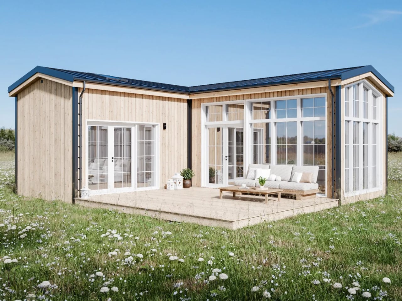
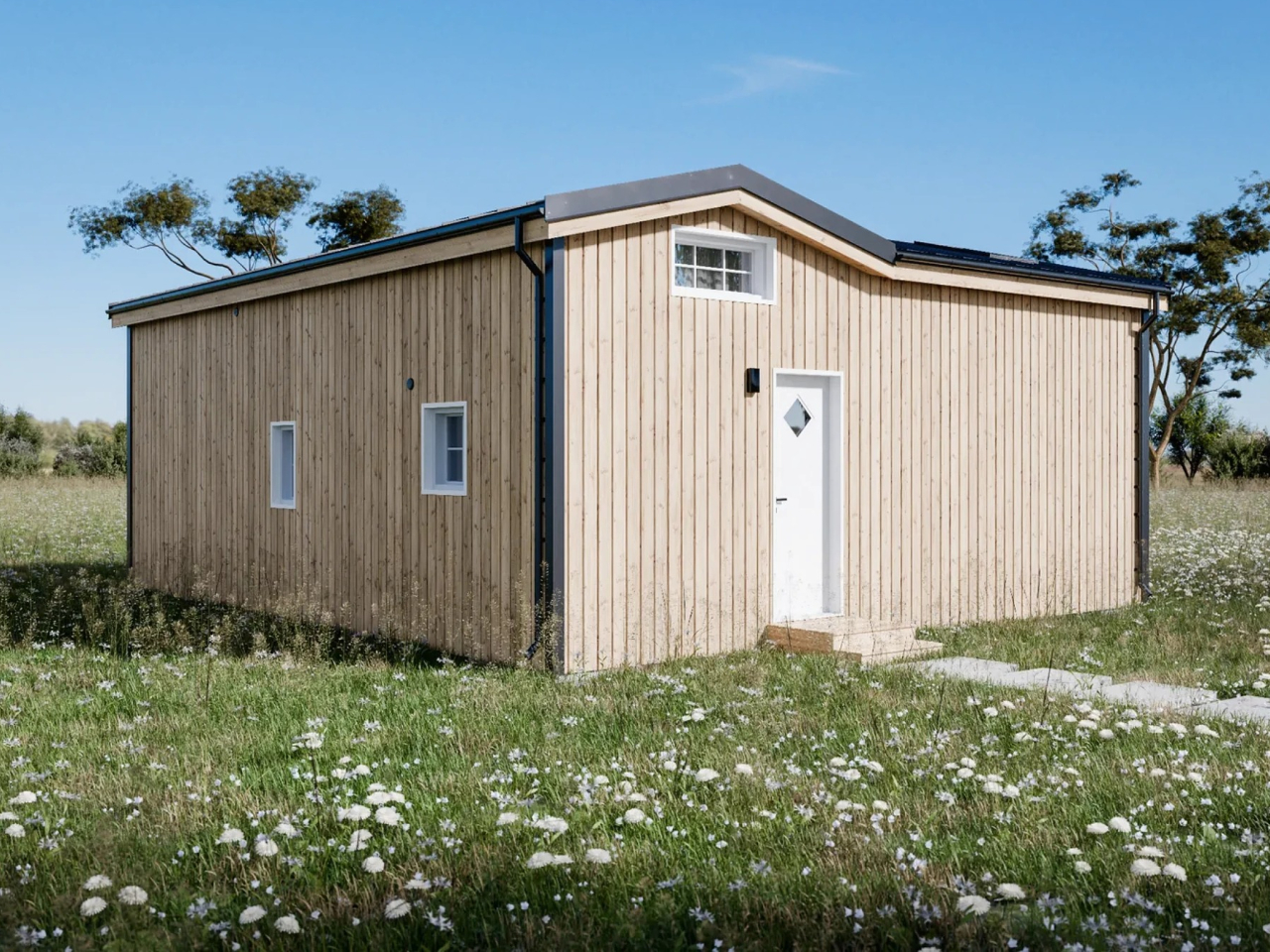
That’s the appeal of Antonia, an orderable modular home from Swedish company Vagabond Haven. Its main bedroom stays downstairs, while roughly 635 square feet across two levels leave room for a second sleeping area above. Two modules form an L around a terrace, giving the layout a useful bend rather than the proportions of a towable cabin. It’s designed to settle onto a foundation, delivered by truck and positioned by crane.

Designer: Vagabond Haven
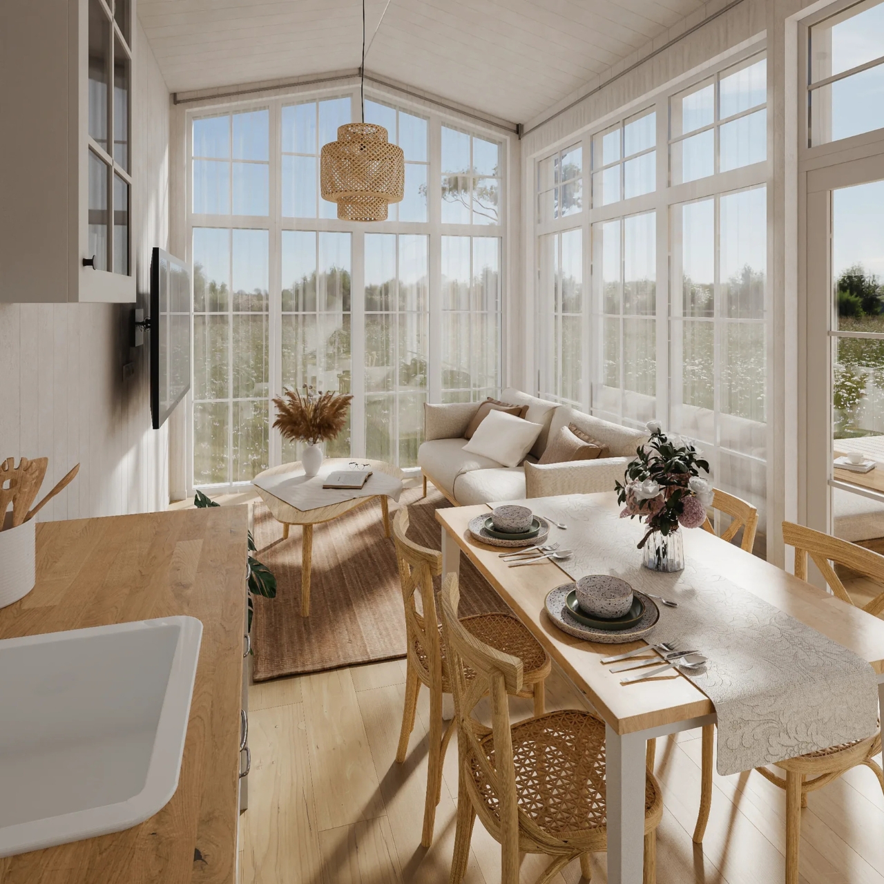
That bend in the floor plan does useful work. The living area occupies one wing, while the bedroom, bathroom, and stairs occupy the other. Between them, the terrace sits inside the L, reached through glass doors from both the living room and the downstairs bedroom. In the published renderings, outdoor seating makes this corner read as another place to spend time, not merely a landing outside the door. The images are illustrative, so finishes and details may change.

I like that the outdoor space has a clear relationship to the rooms around it. A deck can be generous and still feel detached from daily life if getting there means walking around the house. Here, the layout suggests an easy route from cooking dinner to eating outside. That’s a more convincing use of limited space than counting every square foot of decking as though it were another climate-controlled room.
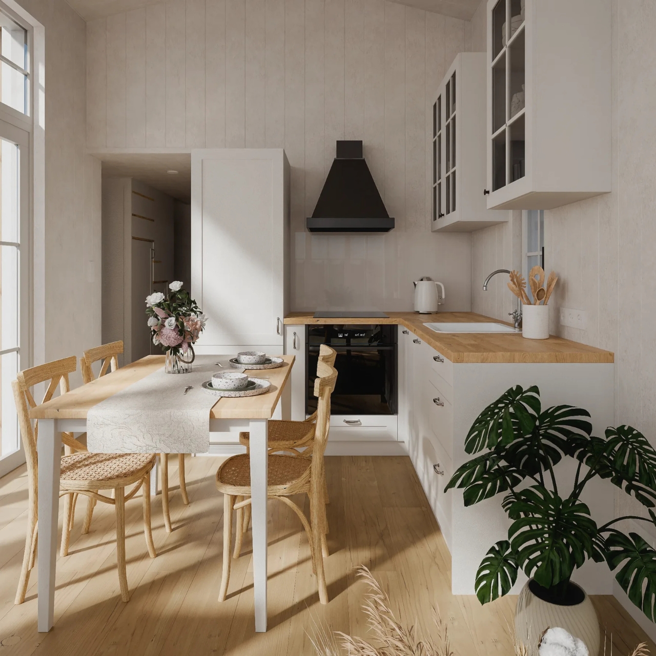
Indoors, the kitchen and living room share a high ceiling because the loft stays over the opposite wing. The kitchen follows its own L-shaped plan, with a sink, cooktop, oven, and refrigerator/freezer in the illustrated furnished setup. A dishwasher is optional, and a four-seat dining table sits nearby. The proportions matter more to me than the styling: a table that can remain a table is preferable to furniture that needs a nightly transformation.

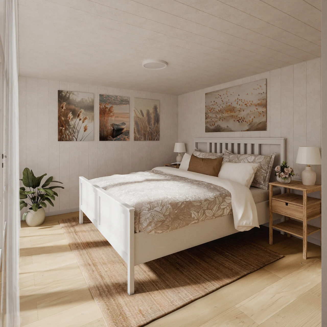
The material palette is restrained: vertical Thermopine siding outside, a steel-sheet roof, laminate flooring, and Forestia/Huntonit interior panels. White cabinetry and pale wood tones give the renderings a familiar cottage feel. More importantly, the ground-floor bedroom is shown with a double bed and fitted wardrobes, while the bathroom accommodates a shower, vanity, toilet, and washer/dryer. Those aren’t glamorous features. They’re the infrastructure that lets a small home function beyond a weekend.
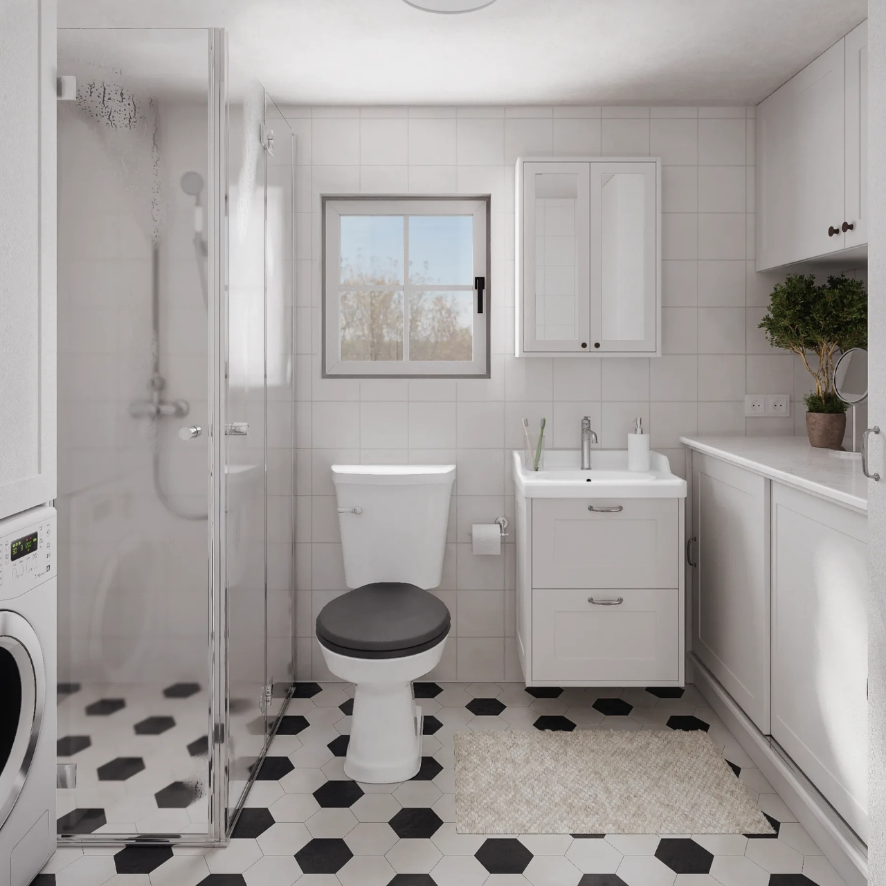
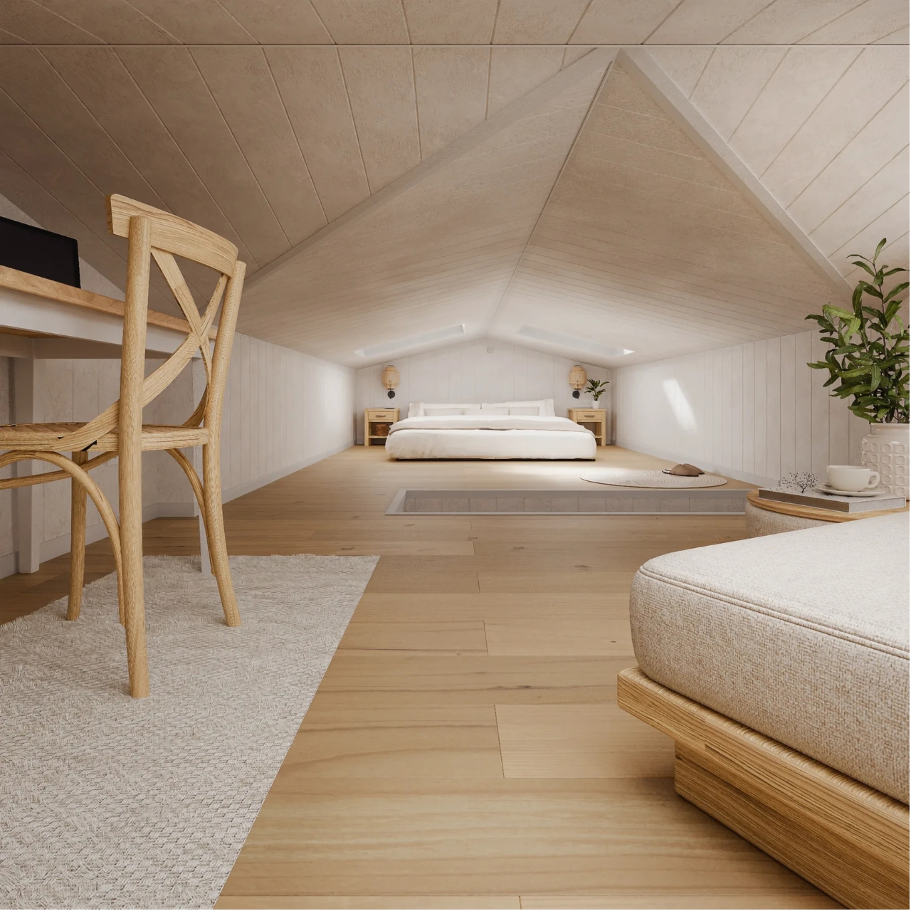
Upstairs, the compromise is more visible. The loft rendering shows a second double bed, a desk, and seating beneath a low pitched ceiling, with stairs providing access. I’d see this as useful guest space or an occasional work retreat before making it the primary bedroom. Keeping the downstairs option means the house doesn’t ask everyone to accept the same relationship with stairs, headroom, and getting up at night.

Pricing needs the same practical reading. Vagabond Haven lists the unfurnished Antonia at €67,500 before VAT, with a €77,500 furnished example configuration. The base price isn’t the price of the staged interior: the company excludes items including heating, appliances, bathroom fittings, the terrace, delivery, and utility connections. Its stated delivery market is Europe, so these figures shouldn’t be mistaken for a ready-to-install U.S. offer. A beautiful rendering doesn’t make those additional decisions disappear.

I’d pay particular attention to where it lands. With so much glass facing the terrace, choosing what those windows overlook would be part of making this layout work. A view of trees and a view of a neighbor’s kitchen aren’t interchangeable. Antonia makes an appealing case for letting outdoor space shape a small home, but that makes its eventual setting just as important as what arrives on the truck.
The post Antonia Tiny House Offers a Bedroom Without the Climb first appeared on Yanko Design.
  •  

A 26-Foot Tiny Home That Refuses to Go Beige

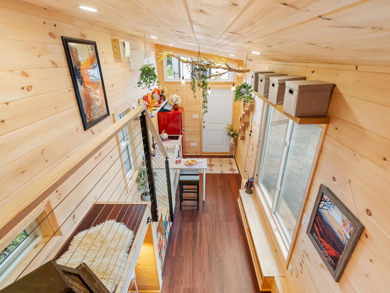
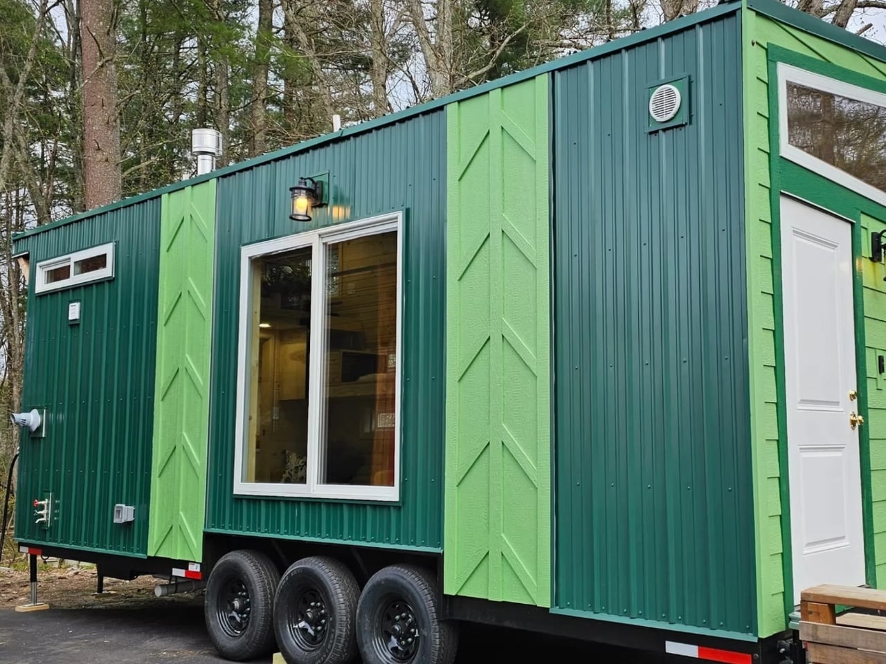
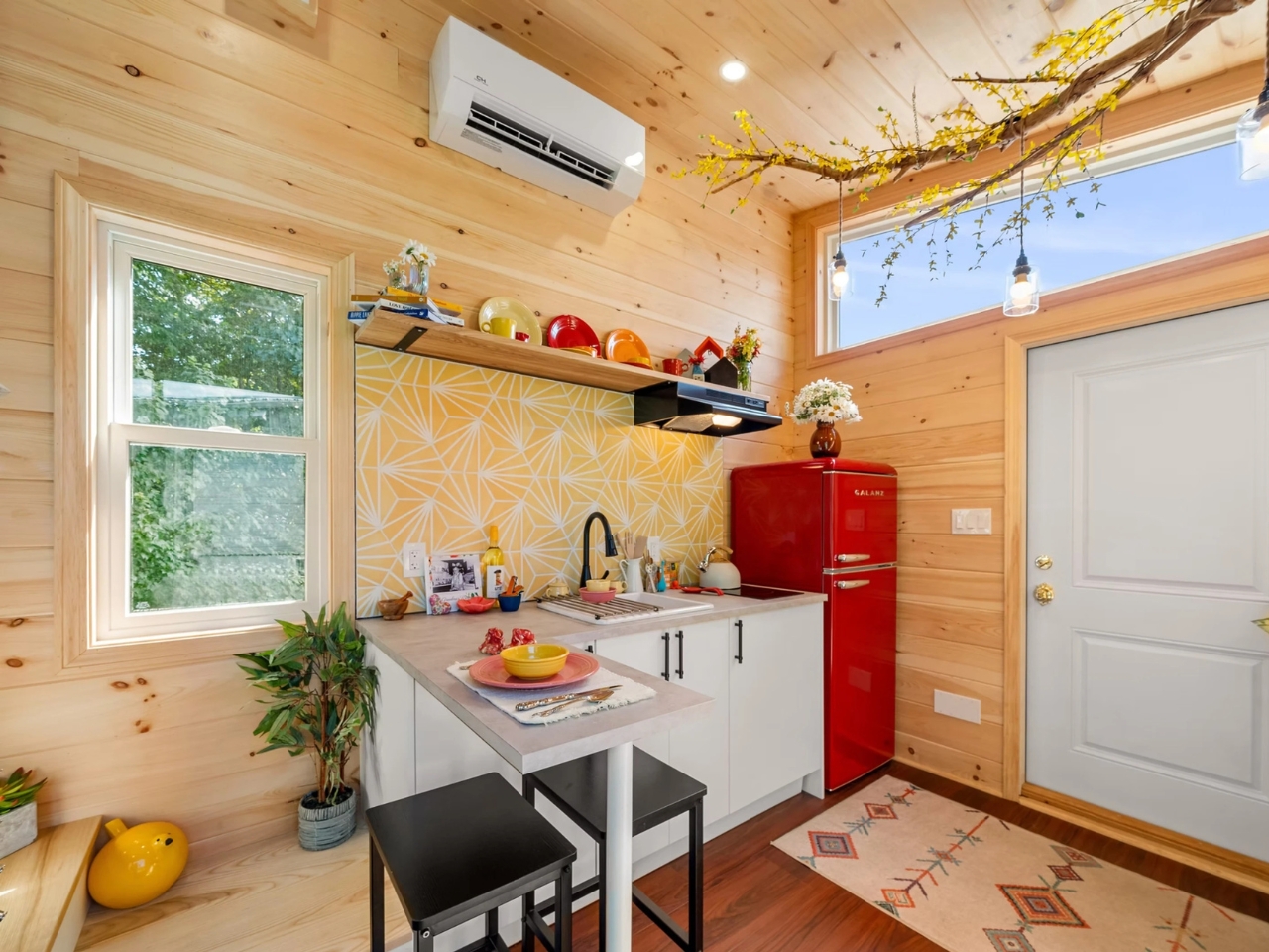
The Brightside puts the kitchen beside the front door, so the first thing you encounter is a place to make dinner. That feels like a sensible starting point for a small home. The problem with squeezing everyday life into 250 square feet is deciding which routines get compromised. Backcountry Tiny Homes gives cooking and eating a prominent role in this 26-foot, towable design for one or two people, rather than leaving them whatever space remains.

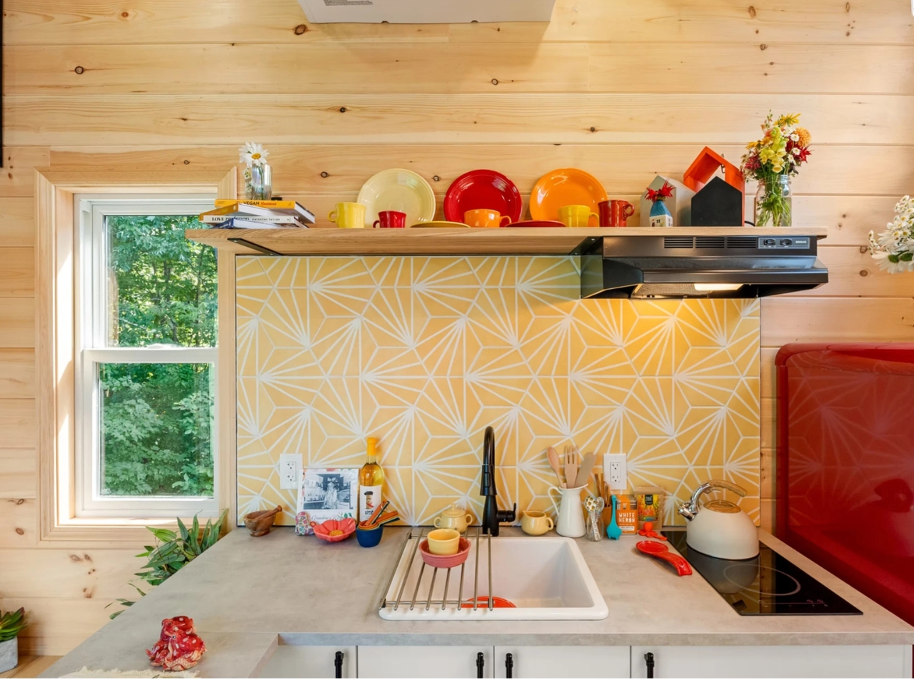
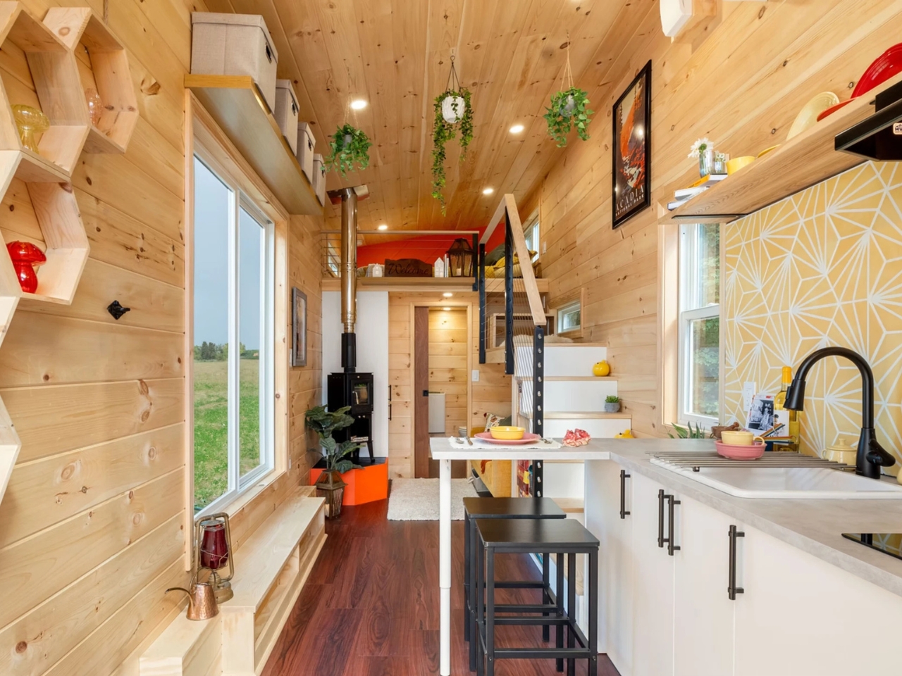
The kitchen includes a two-burner electric cooktop, a 10-cubic-foot refrigerator, a ceramic sink, and laminate counters with a detachable dining table. It’s a modest setup, not a chef’s fantasy, but I like having an actual spot to sit down with a plate. Two burners would suit my expectations for cooking here: a skillet, a pot, and some acceptance that Thanksgiving probably needs another venue.

Designer: Backcountry Tiny Homes

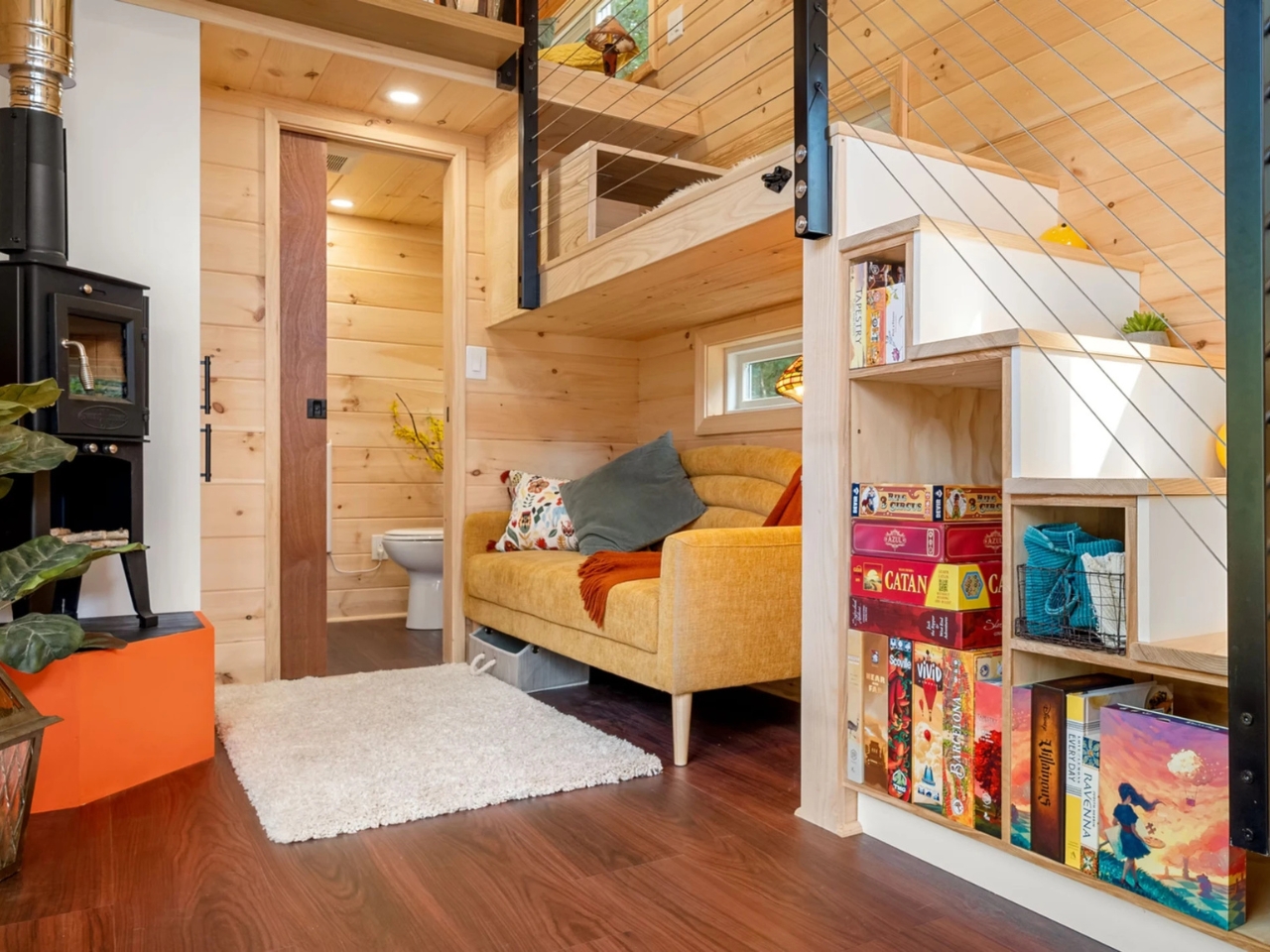
The photographed interior is much less restrained about color. A red retro-style refrigerator sits beside a yellow patterned backsplash, surrounded by natural wood. A suspended branch carries pendant lights, giving the kitchen a slightly handmade, woodland character. I’m fond of that willingness to be cheerful. Choosing a smaller home shouldn’t require signing up for a lifetime of beige. Here, the refrigerator gets to contribute to the room’s personality instead of being an appliance to disguise.

Of course, giving the kitchen priority means making choices elsewhere. The sofa tucks beneath the staircase, which also incorporates storage. That arrangement uses the space below the route upstairs, but I’d want to check seated headroom before committing. It’s a clever use of volume with a practical test attached. The place you settle into after dinner needs to feel inviting enough to use every night, and a floor plan can’t establish that completely.

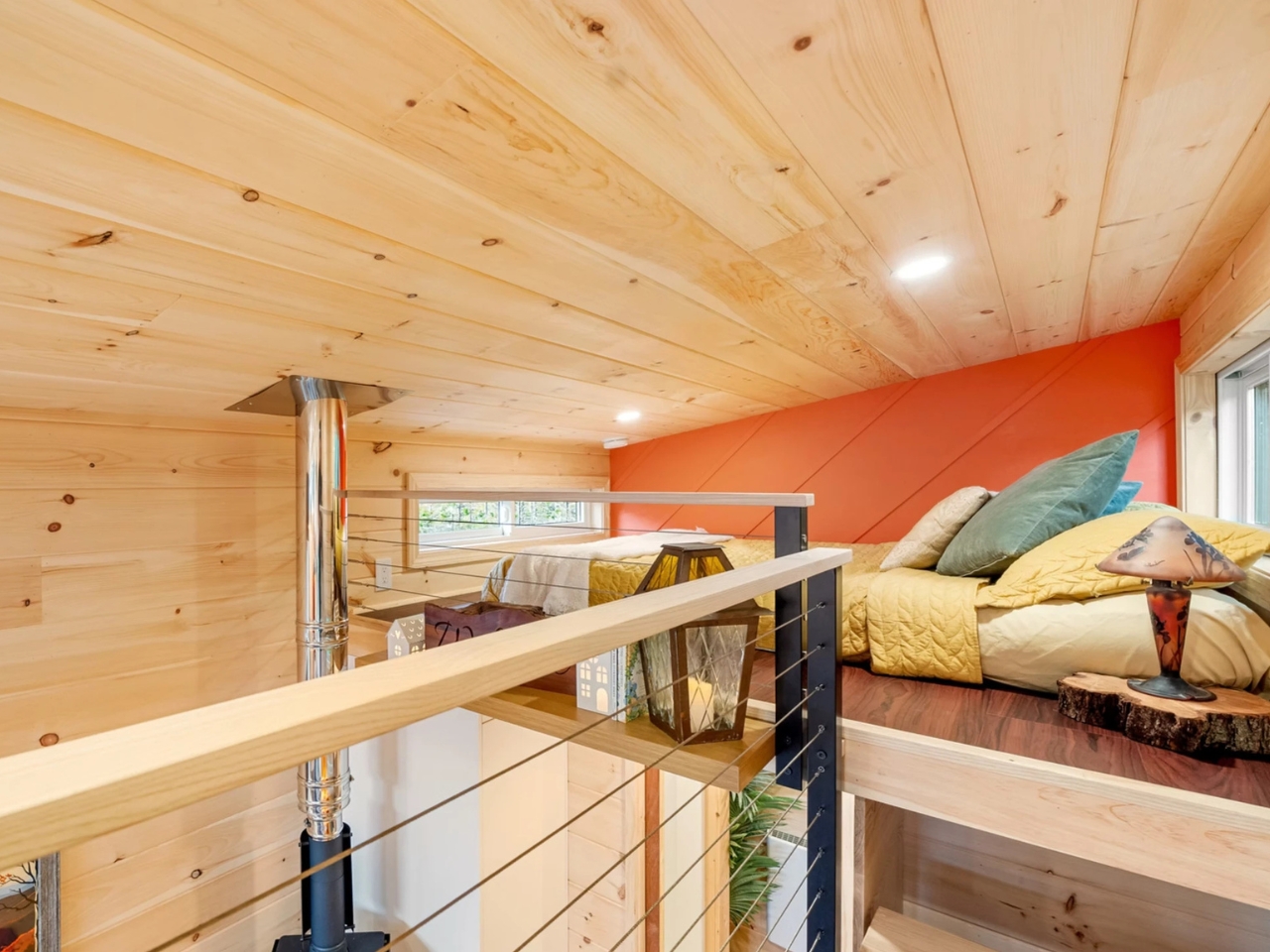
Upstairs, the builder says the loft accommodates a queen mattress, reached by stairs and a cable-railed walkway. The sleeping area has a maximum headroom of 3 feet, 5 inches, so nobody should confuse it with a conventional upstairs bedroom. I appreciate stairs over a ladder, but they don’t erase the low ceiling. For someone happy to reserve the loft for sleeping, that compromise may be reasonable. For someone who dislikes crouching, it’s significant.

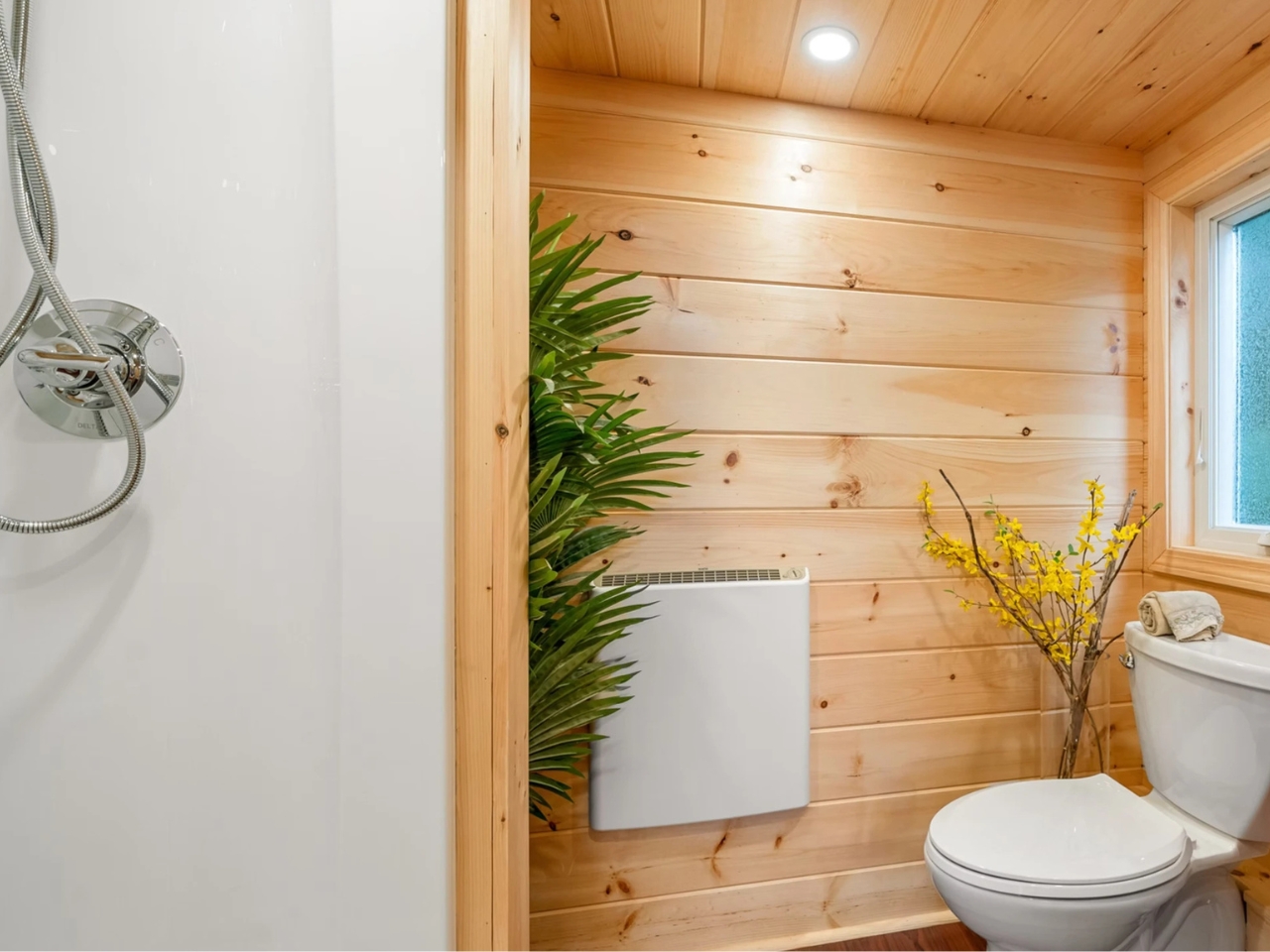
The bathroom provides a plumbed toilet, a vanity sink, and a 32-inch shower. Laundry isn’t included as standard, although the company offers options during the design phase. That last detail deserves attention because washing clothes is part of living somewhere, not an optional lifestyle accessory. I’d sort out that routine before choosing finishes. A home can make excellent use of its footprint and still need a few practical decisions from its owner.

Backcountry currently lists the Brightside at $106,750 turnkey, $99,025 unfurnished, or $53,380 as a shell, excluding taxes. The word “unfurnished” needs careful reading here: that version omits the refrigerator and woodstove as well as furniture. I wouldn’t treat the three prices as interchangeable ways to buy the same experience. They represent different amounts of work, equipment, and spending left to the buyer.

The shell is particularly important to understand. Backcountry describes it as a dried-in structure with a completed exterior, but without utilities, roof and wall insulation, or interior finishes. That could appeal to someone with the skills and appetite to finish a home themselves. It isn’t a move-in-ready bargain hiding behind a different label. Personally, I’d weigh the appeal of making it my own against the time required to make it livable.

The Brightside’s most persuasive decision, for me, is leaving room for a meal that doesn’t happen on the sofa. I’d happily consider a smaller living area to keep that everyday ritual intact. But I’d make that choice with the loft dimensions and laundry plan beside me. The useful question isn’t how many features fit inside. It’s which spaces you’ll still enjoy using on an ordinary Tuesday.

The post A 26-Foot Tiny Home That Refuses to Go Beige first appeared on Yanko Design.
  •  

Lavvu’s Tiny Home Has a Bathtub and Hidden Storage

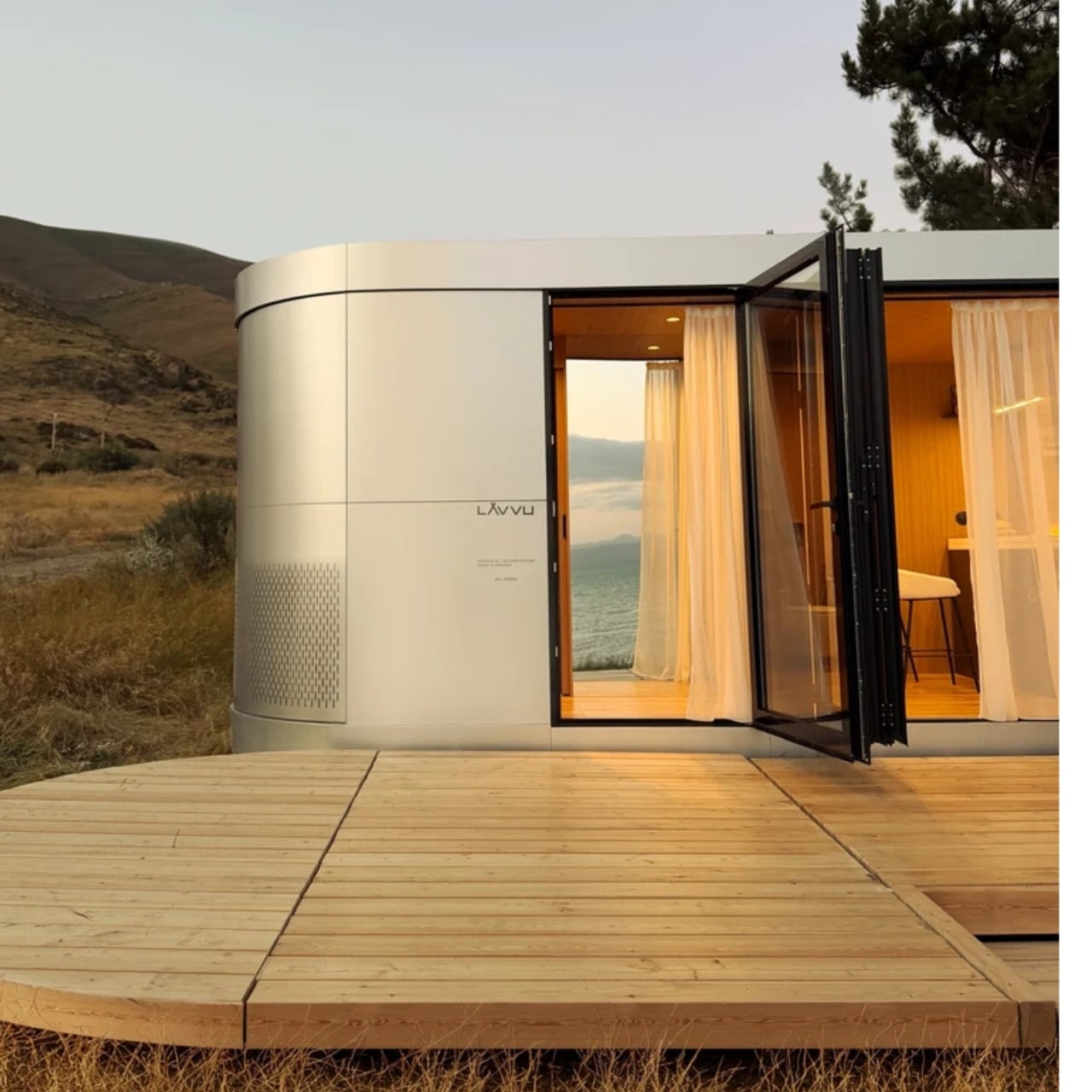
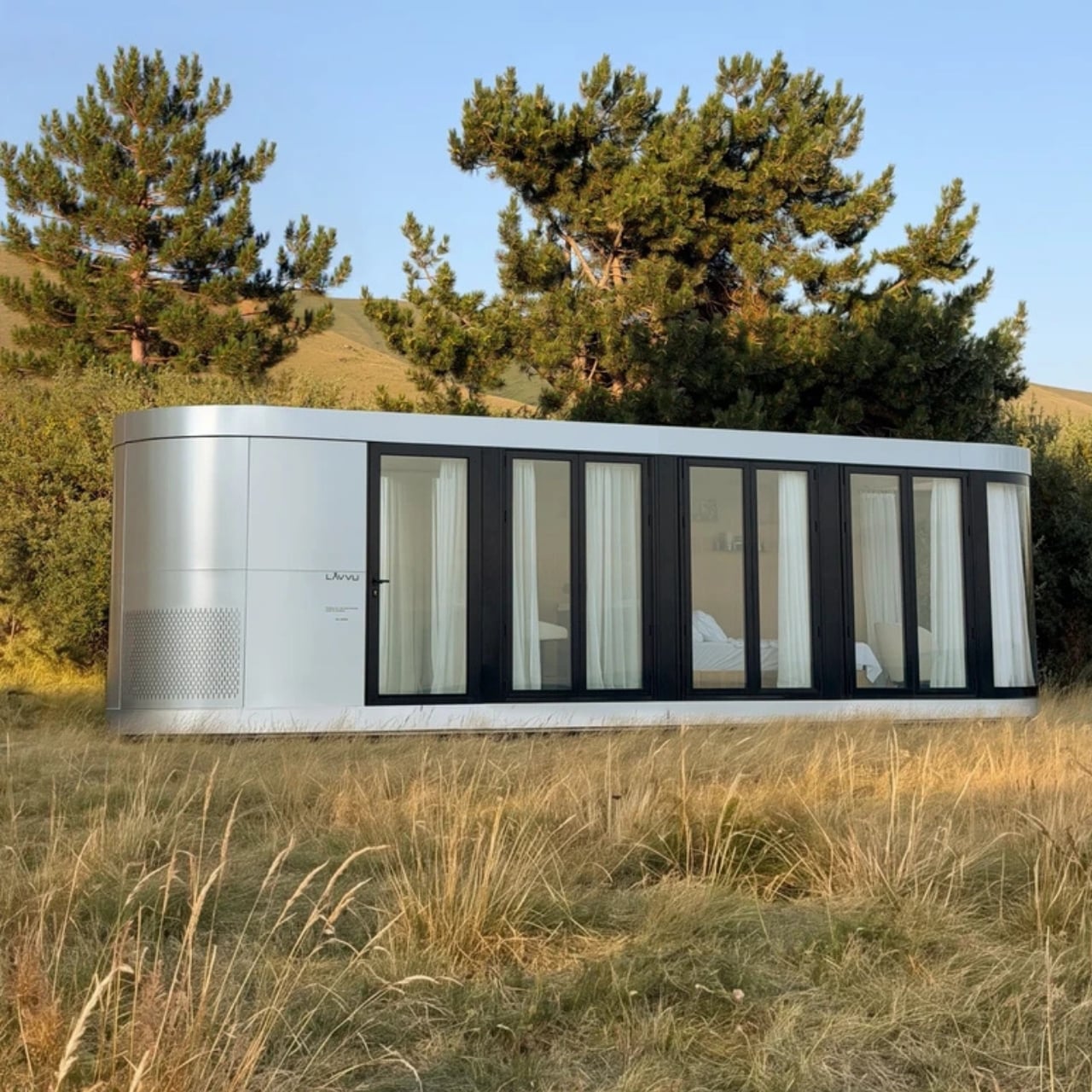
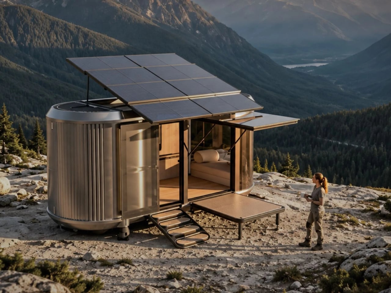
A full-size bathtub is a wonderfully stubborn thing to put inside a tiny home. Lavvu includes one in its published XL specification, despite having only about 237 square feet to work with. That choice gets straight to the problem these modular homes tackle: shrinking a dwelling without making everyday life feel like a series of concessions. I like that the answer leaves room for a soak.

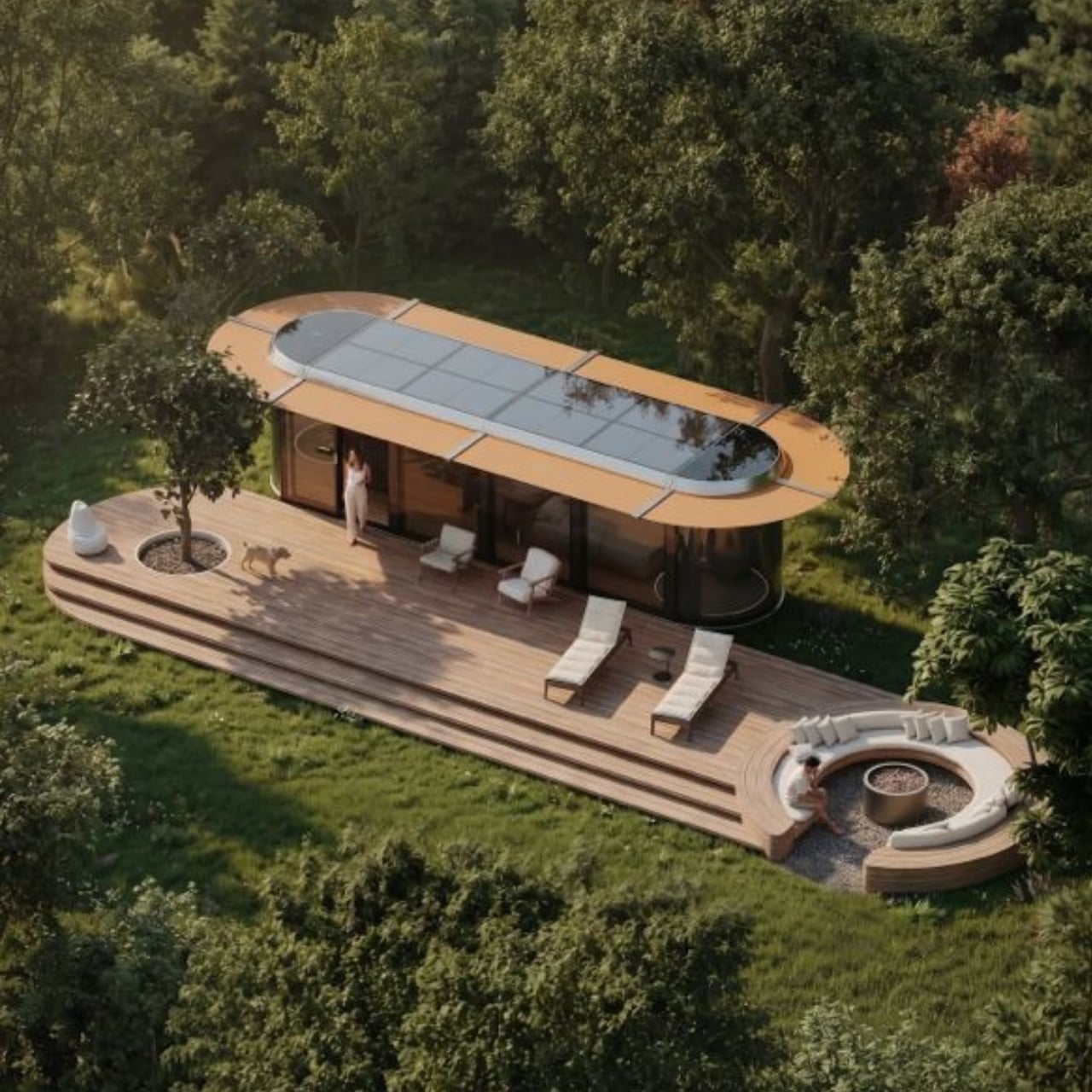
Lavvu offers four sizes, from roughly 108 to 237 square feet, with the XL credited to architecture studio Re:Büro. The company is promoting the range for preorder, an important distinction between an appealing design and an immediately available place to live. These are furnished homes, but buyers shouldn’t assume that every size includes every feature shown in the company’s presentation. The XL is the clearest expression of the idea.

Designer: Lavvu

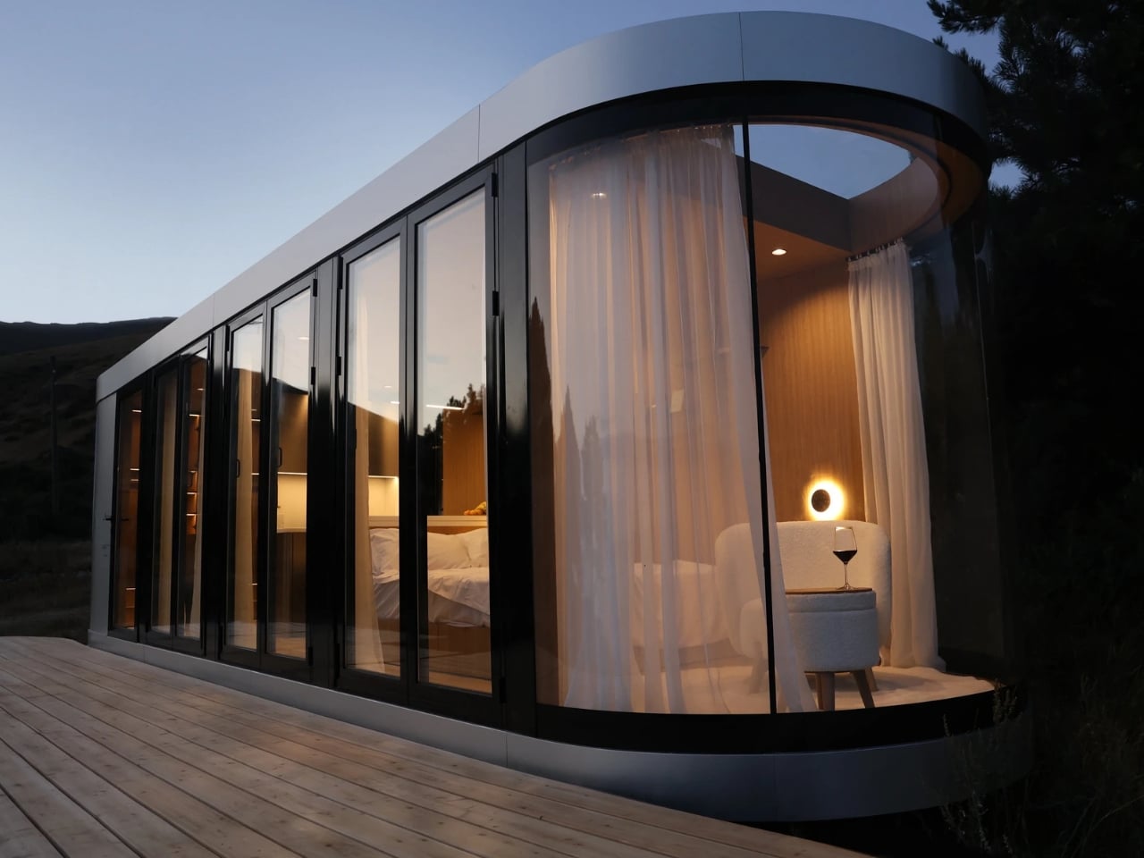
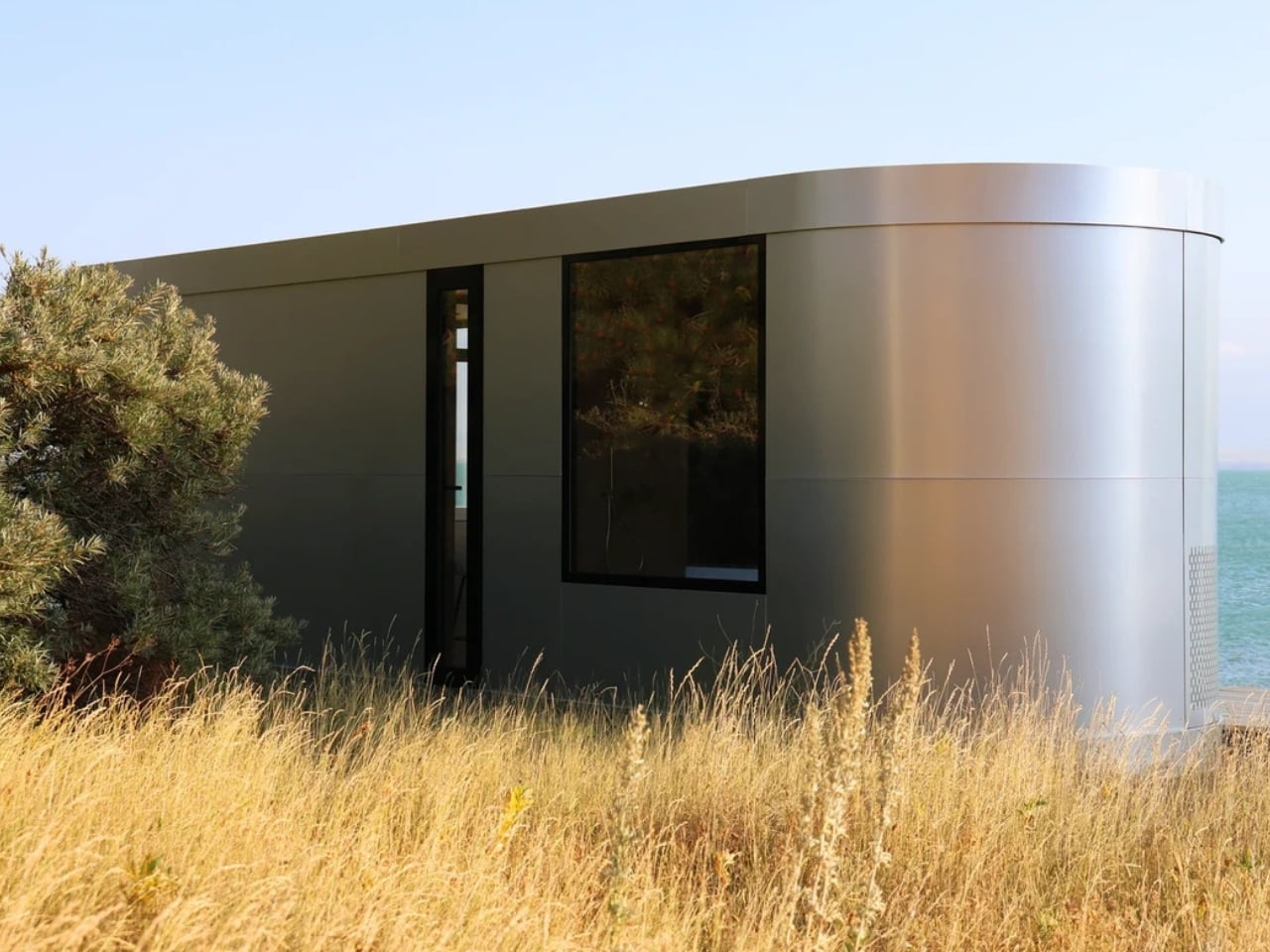
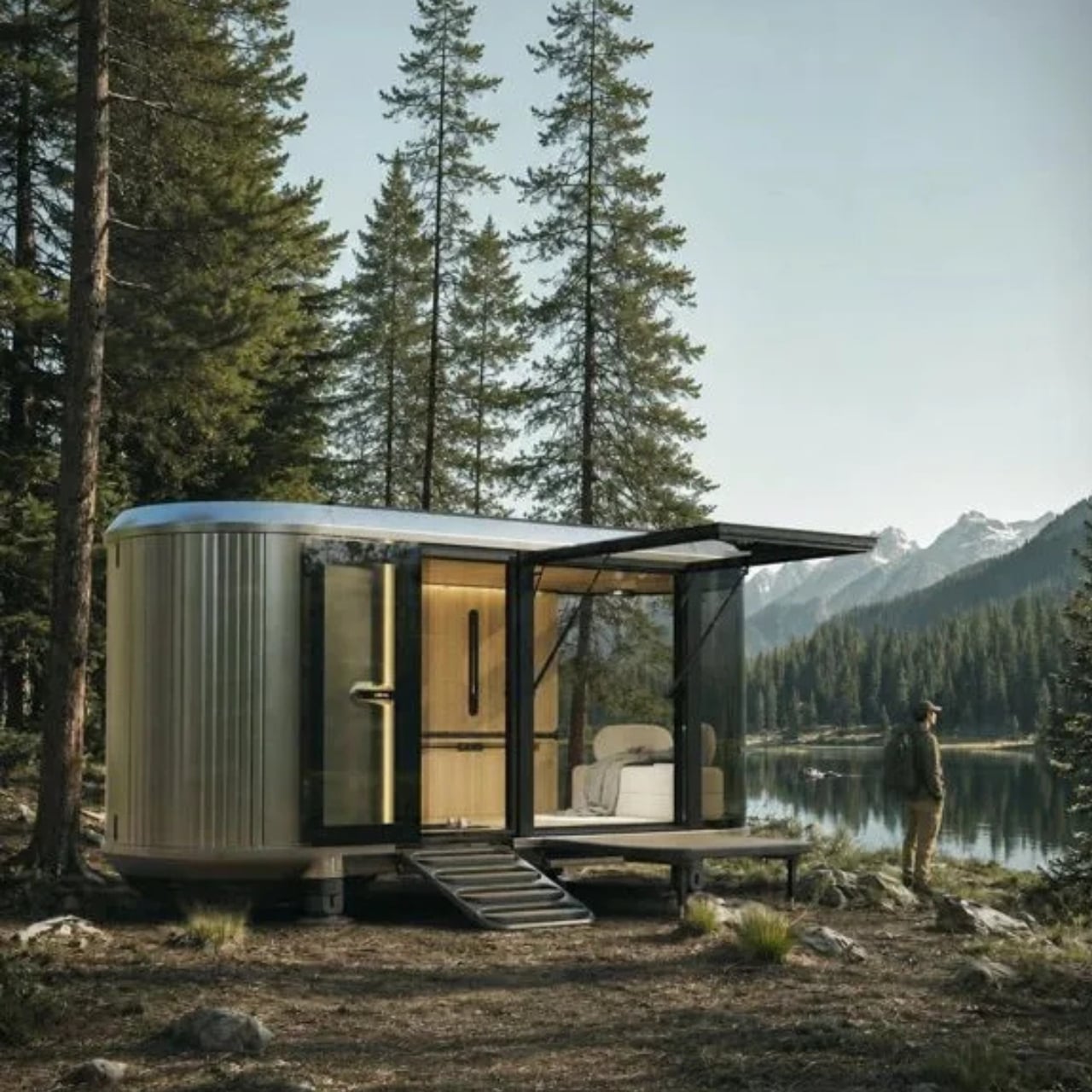
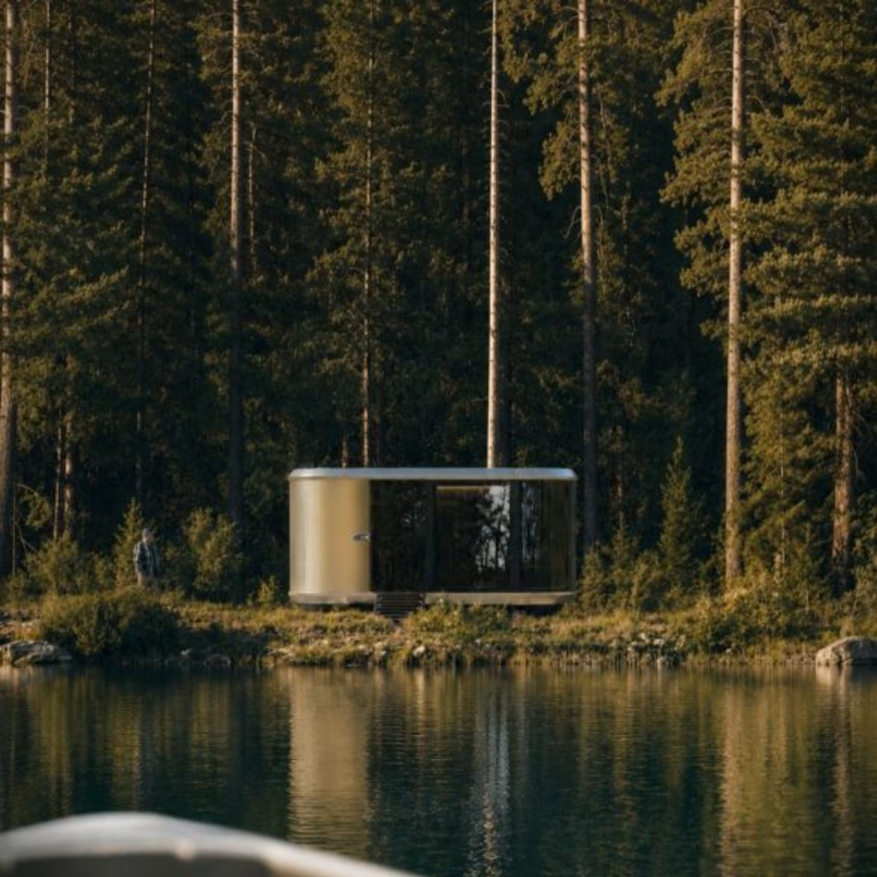
In the promotional imagery, rounded corners and vertically ribbed exterior surfaces give the cabins a slightly retro, almost transportation-inspired appearance. Inside, wood-toned surfaces soften that impression. The large glazed end is the visual centerpiece, framing the landscape rather than leaving it outside a small window. I prefer this approach to making a tiny house resemble a miniature suburban one. The proportions acknowledge that you’re occupying a compact space, while giving your eyes somewhere farther away to land.

The kitchen makes a more practical argument. Lavvu specifies a built-in refrigerator, dishwasher, and two-burner induction cooktop, along with a sliding island that adjusts to provide seated legroom or accommodate standing use. That movable surface is a detail I appreciate. A fixed counter has to commit to one relationship with your body. Letting it shift recognizes that breakfast, food preparation, and moving through a narrow room don’t all require the same arrangement. Small spaces need that kind of flexibility more than another decorative flourish.

Storage gets similar attention. The published XL description includes drawers beneath the bed, nearby shelves, and a wardrobe with hanging space and dedicated shoe storage. These aren’t especially glamorous features, which is precisely why they matter. I’m more persuaded by a place to put yesterday’s clothes than by an immaculate room with no visible possessions. Built-in storage gives the design a plausible way to absorb ordinary belongings, although it doesn’t remove the need to edit what you own.

All that glass makes the setting a meaningful part of the design decision, too. The imagery places the cabins beside water and trees, where openness is the attraction. I’d be less enthusiastic about the same arrangement facing a neighbor’s kitchen. For me, the panoramic end makes the most sense as a retreat with a carefully chosen outlook. Privacy deserves as much attention as the view when deciding where one belongs.

“Mobile” also needs a realistic reading here. Lavvu says its homes travel as fully assembled modules on a trailer or flatbed platform. That describes transportable architecture, not a camper you casually hitch up for a weekend. I see the appeal in having the interior assembled before delivery, but the destination still matters. Access arrangements and installation are questions to resolve with the maker, rather than details to mentally crop out of the scenic pictures.

The listed prices reinforce that this is a considered purchase: the smallest S module starts at €45,000, while the XL starts at €75,000, both before tax. Those are the company’s euro-denominated starting prices, not verified delivered prices for an American property. I’d want a site-specific quote, a confirmed equipment list, and delivery details before treating either number as a complete budget. The distinction matters more than a tempting headline price.

For me, Lavvu’s strongest idea is giving small routines enough space to remain recognizable. Sit at a counter with room for your knees. Put shoes away. Keep a book beside the bed. Take a bath if that’s your preferred way to end the day. I wouldn’t mistake this for an easy answer to every housing need, but as a compact retreat, its attention to ordinary domestic habits makes the design worth considering.

The post Lavvu’s Tiny Home Has a Bathtub and Hidden Storage first appeared on Yanko Design.
  •  

Inside Carl Maston’s Ventura Beach House, Built Around a Brick Chimney

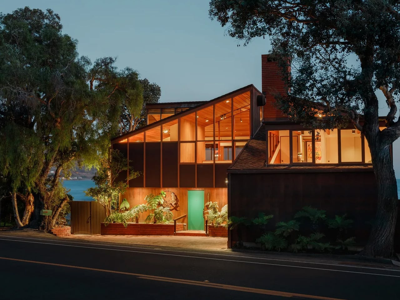
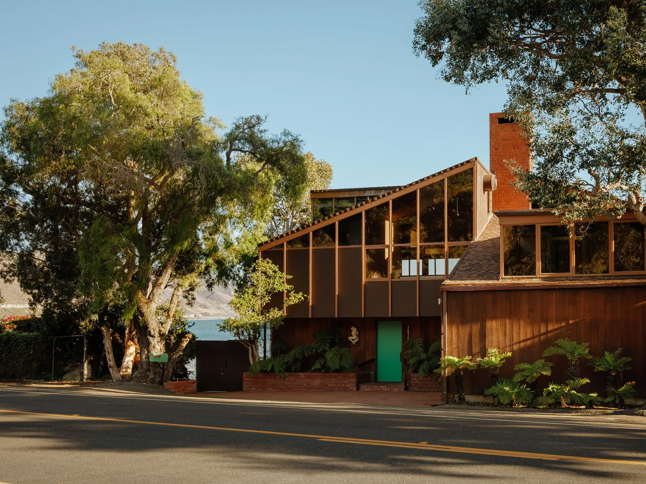
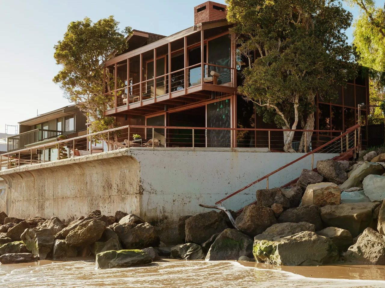
A substantial brick chimney rises through the center of Carl Maston’s Ventura beach house, giving the oceanfront home a surprisingly grounded heart. Completed in 1984, the Susman House sits above a sandy cove at Faria Beach, with views toward the Channel Islands. Its original brief was appealingly specific: preserve the spirit of a traditional California cabin within a contemporary home.

That request came from Tracy “Babs” Susman, who commissioned the house with her partner on land previously owned by her sister and brother-in-law. Maston answered with cedar siding, brick floors, generous glazing, and a roofline that creates a distinctive silhouette. The materials carry the cabin connection without making the house feel like an exercise in rustic nostalgia.

Design: Carl Maston

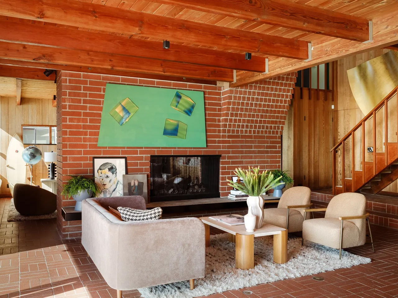
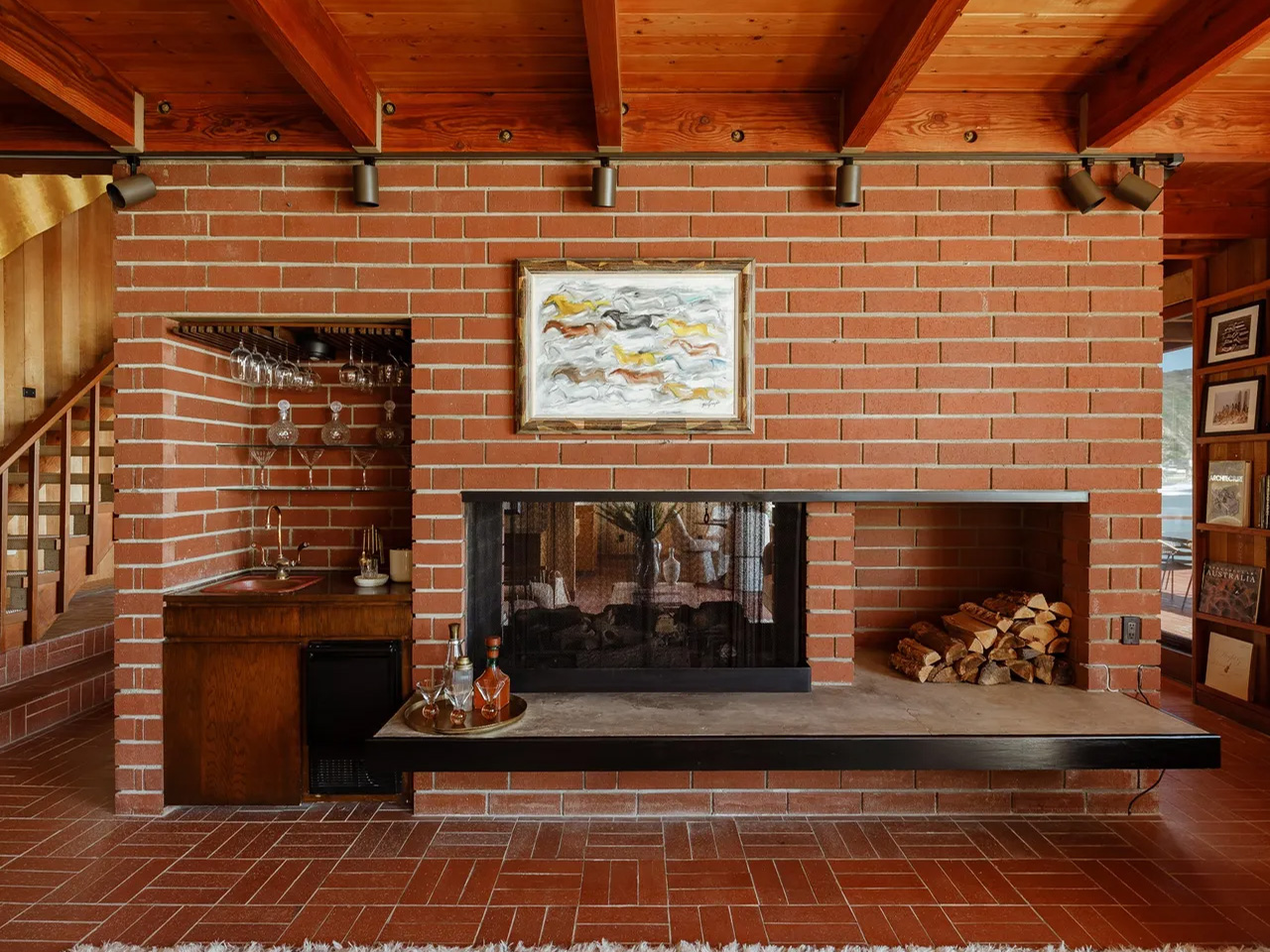
Across 2,640 square feet, the layout gives shared spaces a clear relationship to both the fireplace and the coastline. An informal lounge connects with the dining area and kitchen, while a double-sided fireplace also serves a den. A full bathroom sits behind a cedar wall. These divisions give the lower floor distinct places to settle without separating every activity into an enclosed room.

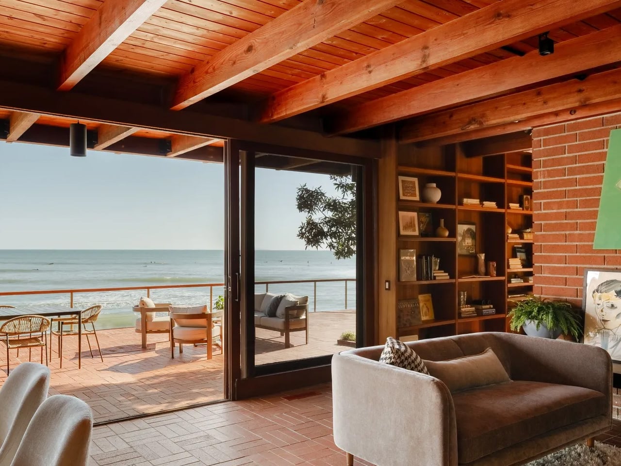
The living-room photographs reveal how much work the material palette does. Exposed timber beams establish a steady rhythm overhead, while brick flooring extends around the broad hearth. Wood paneling and shelving reinforce the sense of enclosure. Against that textured interior, the glazed openings become especially legible: they frame the coast while leaving plenty of solid, tactile surfaces around the seating area.

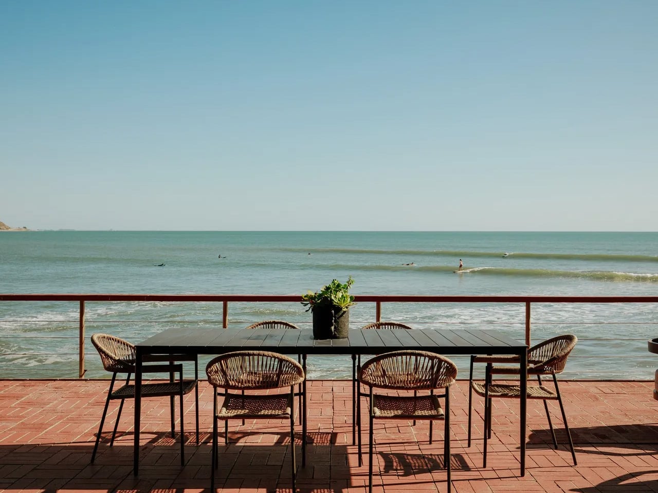
Floor-to-ceiling sliding doors open toward the ocean, and the brick paving continues onto the patio. Carrying the floor material outside gives the terrace a direct visual relationship with the rooms behind it. The kitchen keeps its own character through an original wood-slat ceiling, with a view of the bay available from the sink. Even the more ordinary household tasks have a place along the waterfront.

Upstairs, three bedrooms and a separate sitting area occupy the spaces beneath the sloping roof. A central atrium and landing wrap around the brick chimney, with internal glazing allowing light to reach deeper into the house. Rather than treating circulation as leftover space, Maston makes the route between rooms part of the architectural experience, linking the upper level visually with the living area below.

Photographs show timber-framed internal windows beside the chimney, their angular tops following the roof. That arrangement makes the building’s geometry readable from within. The house is currently listed for $5.1 million, and its selling appeal extends beyond the waterfront address. Maston gave the interior enough substance to hold attention even when the ocean is outside the frame.

The post Inside Carl Maston’s Ventura Beach House, Built Around a Brick Chimney first appeared on Yanko Design.
  •  

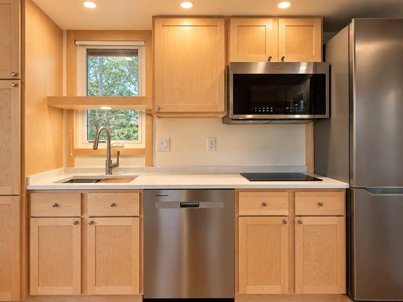
This 47-Foot Glass House by Escape Reframes Everything You Thought About Tiny Living

The Glass House by Escape arrives at a moment when the tiny home conversation desperately needed a reset.It’s a park model that reads less like a compact shelter and more like someone took a considered, light-soaked apartment and simply decided it didn’t need to be attached to a city block.

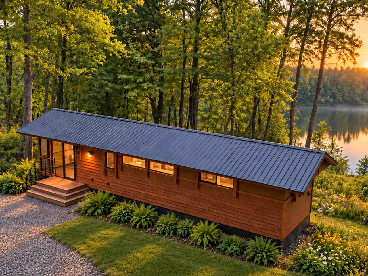
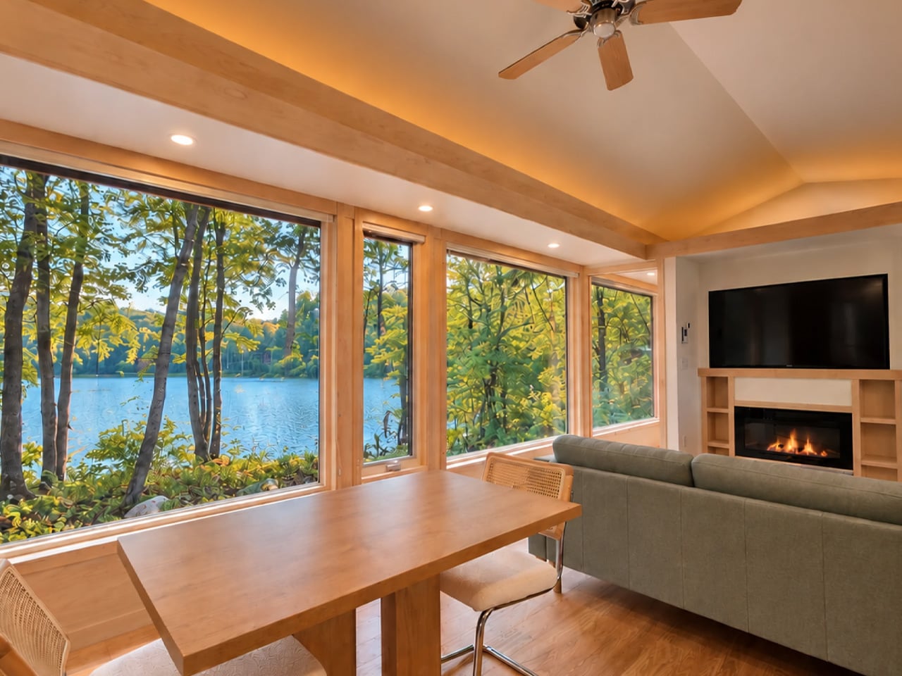
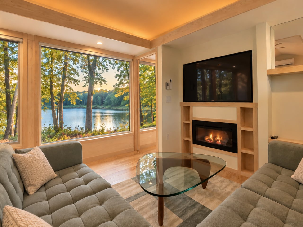
The structure stretches 47 feet long and 12 feet wide — uncommonly generous proportions for this category — finished in cedar that ages the way good materials should. But the defining move here is the glazing. One full wall runs 30 feet of continuous windows, pulling in light, landscape, and the kind of visual depth that makes a space feel genuinely expansive rather than merely tolerable. It’s a single-floor layout, which matters more than it sounds. No loft ladder, no crouched ceilings. Just clean, lateral living that prioritizes how a space feels to move through over how many square feet it can claim on paper.

Designer: Escape

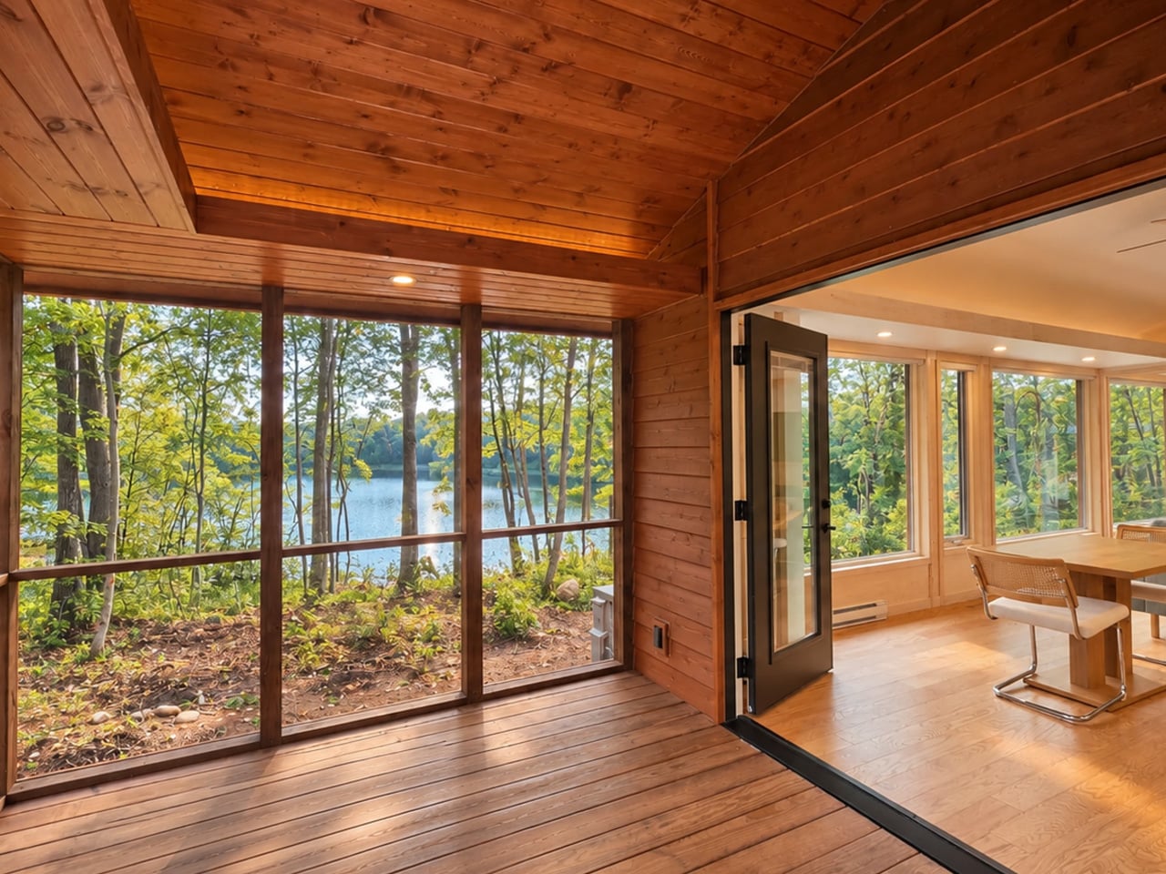
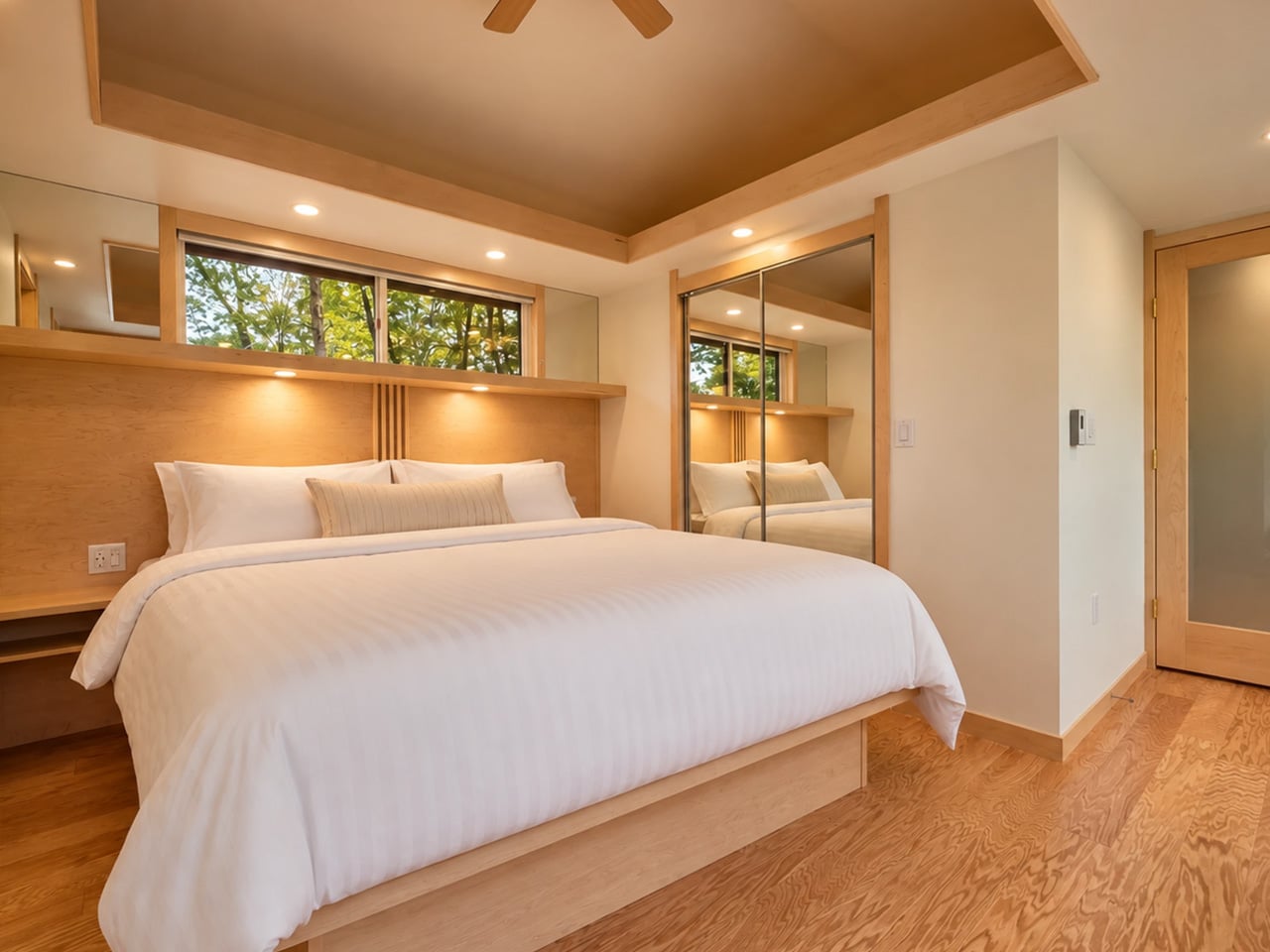
The interior holds up to its exterior promise. The kitchen is equipped with a full-size fridge/freezer, dishwasher, induction cooktop, and a combination microwave/convection oven — the kind of spec sheet that signals the designers were thinking about real use, not Pinterest renders. The bathroom features a large glass-enclosed tiled shower, a vanity sink, and a proper flushing toilet with generous storage built around it. The bedroom carries the same commitment to glazing — framing a view of the surrounding landscape rather than walling it out. An enclosed porch extends the footprint further, offering an indoor/outdoor zone that shifts with the weather and the mood.

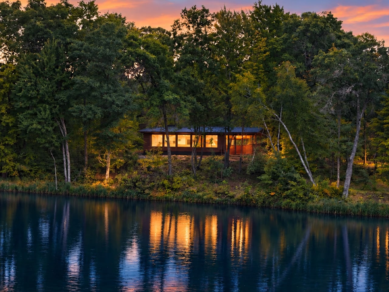
Escape, which has been building award-winning tiny homes for over 30 years, currently has the Glass House on view at its Canoe Bay Village property in Wisconsin — which is worth noting, because it suggests the design isn’t purely aspirational. It exists in a real landscape, subject to real seasons, and it holds its own.

What makes the Glass House interesting as a design object isn’t just its size or its spec list. It’s the underlying argument it’s making: that living small doesn’t require a philosophy of sacrifice. The single-floor plan, the wall of glass, the proper kitchen — these aren’t luxury additions. They’re the baseline of what attentive design looks like when it’s applied to a form that usually settles for less. The Glass House doesn’t settle.

The post This 47-Foot Glass House by Escape Reframes Everything You Thought About Tiny Living first appeared on Yanko Design.
  •  

One Architect Quietly Ditched Rent for a 1sqm Treehouse Office

Munich has some of the steepest commercial rents in Germany, and anyone who has tried to lease even a modest studio space knows the arithmetic rarely works in a small firm’s favor. Brokers, multi-year contracts, square footage priced by the centimeter. When the Munich architecture practice Opposite Office needed a new home base, founder Benedikt Hartl looked at those numbers and decided the smartest move wasn’t a smaller office or a coworking membership. It was no office at all, at least not the kind anyone pays rent on.

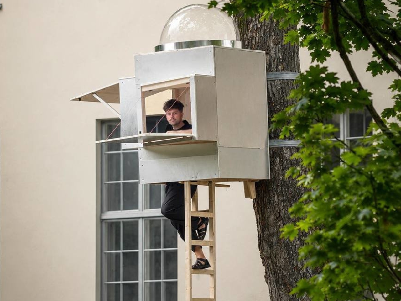
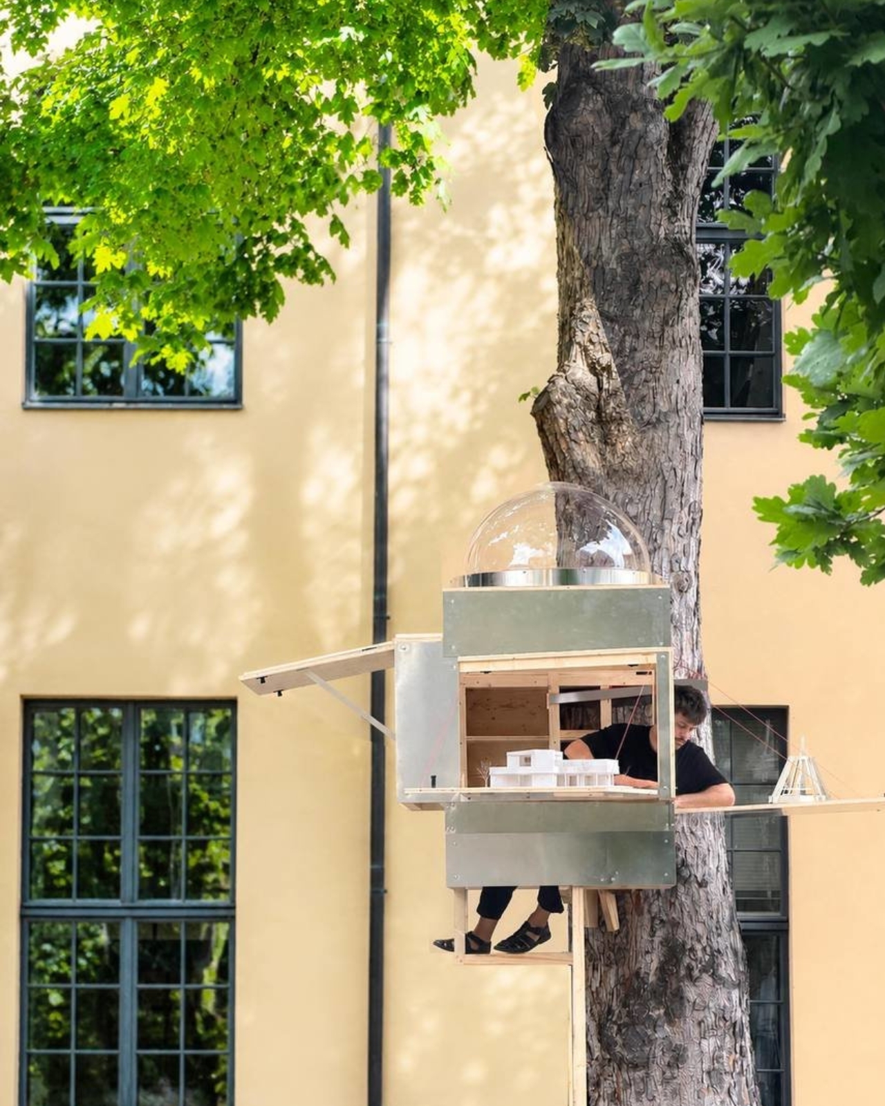
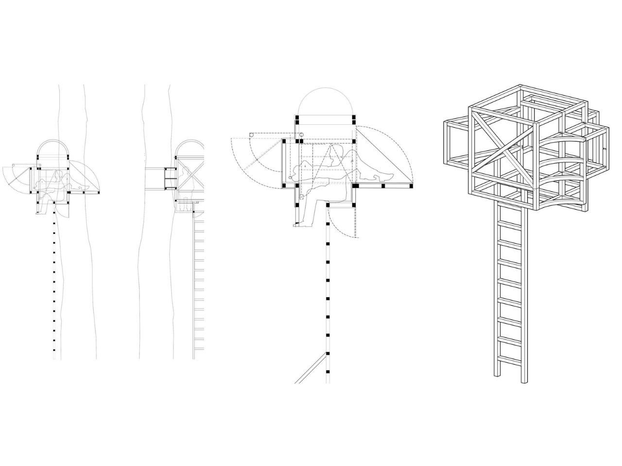
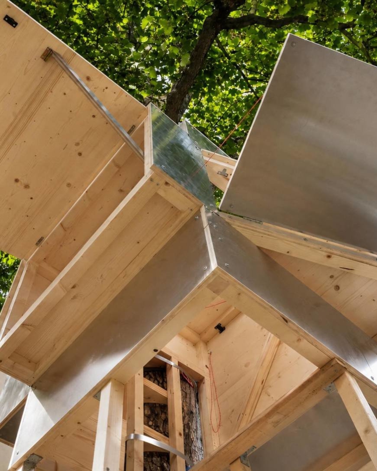
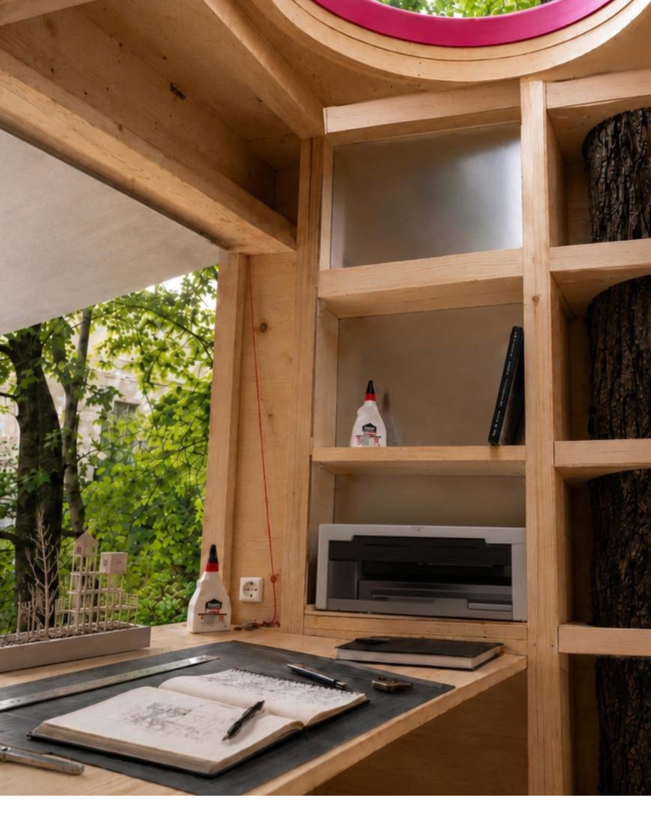
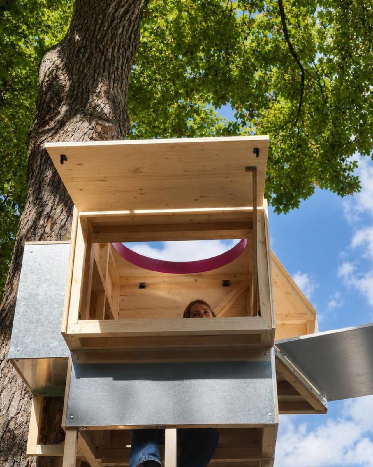
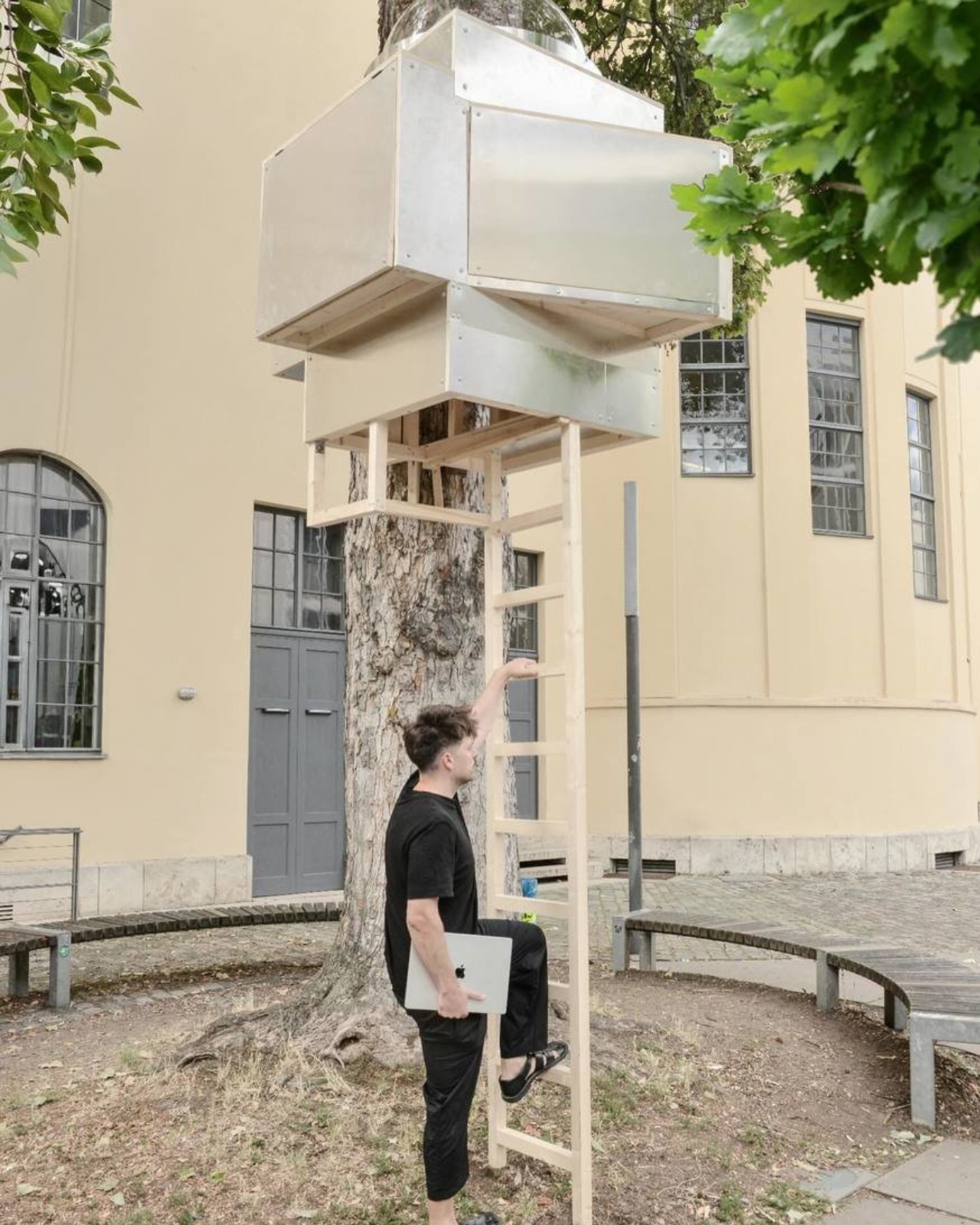
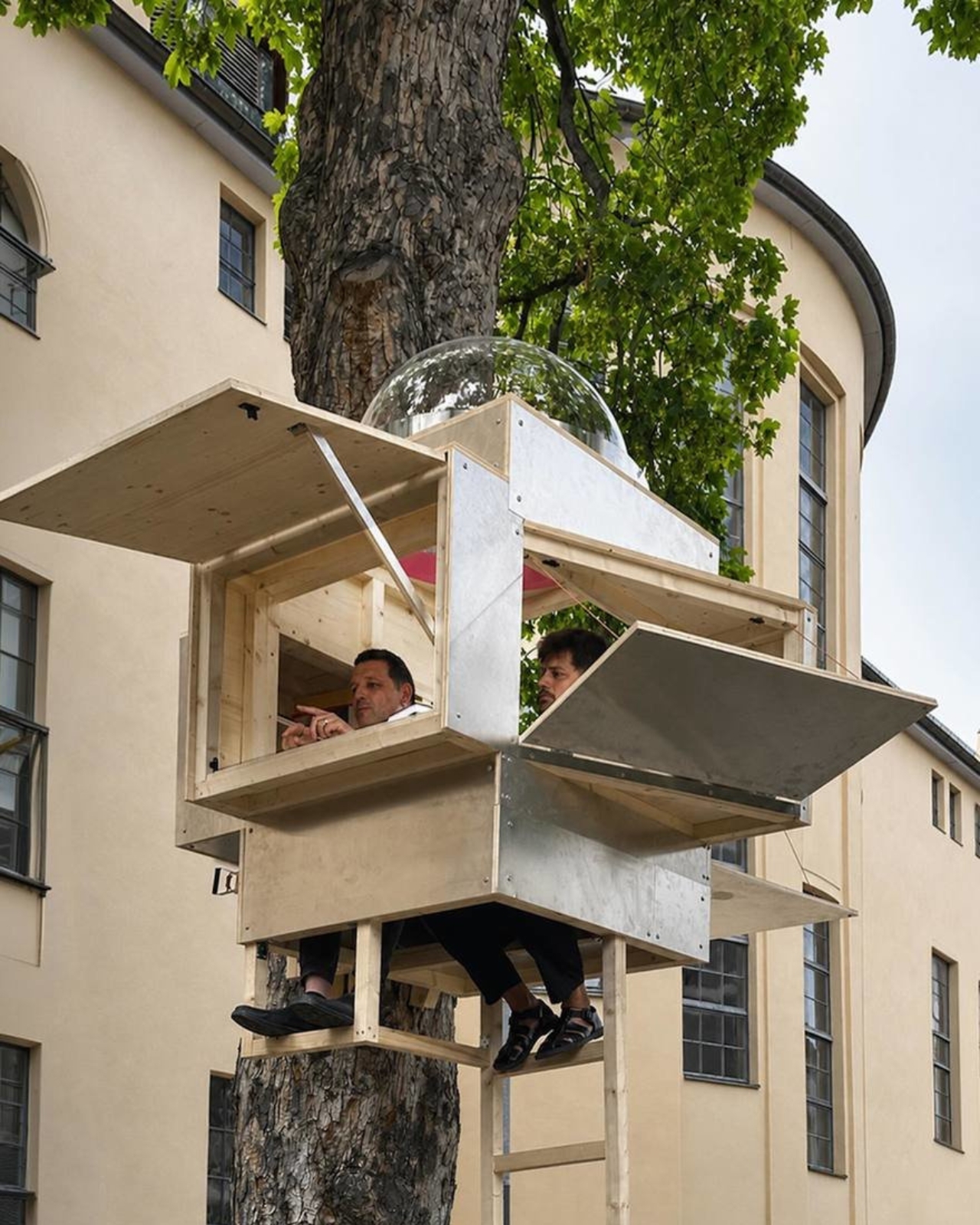
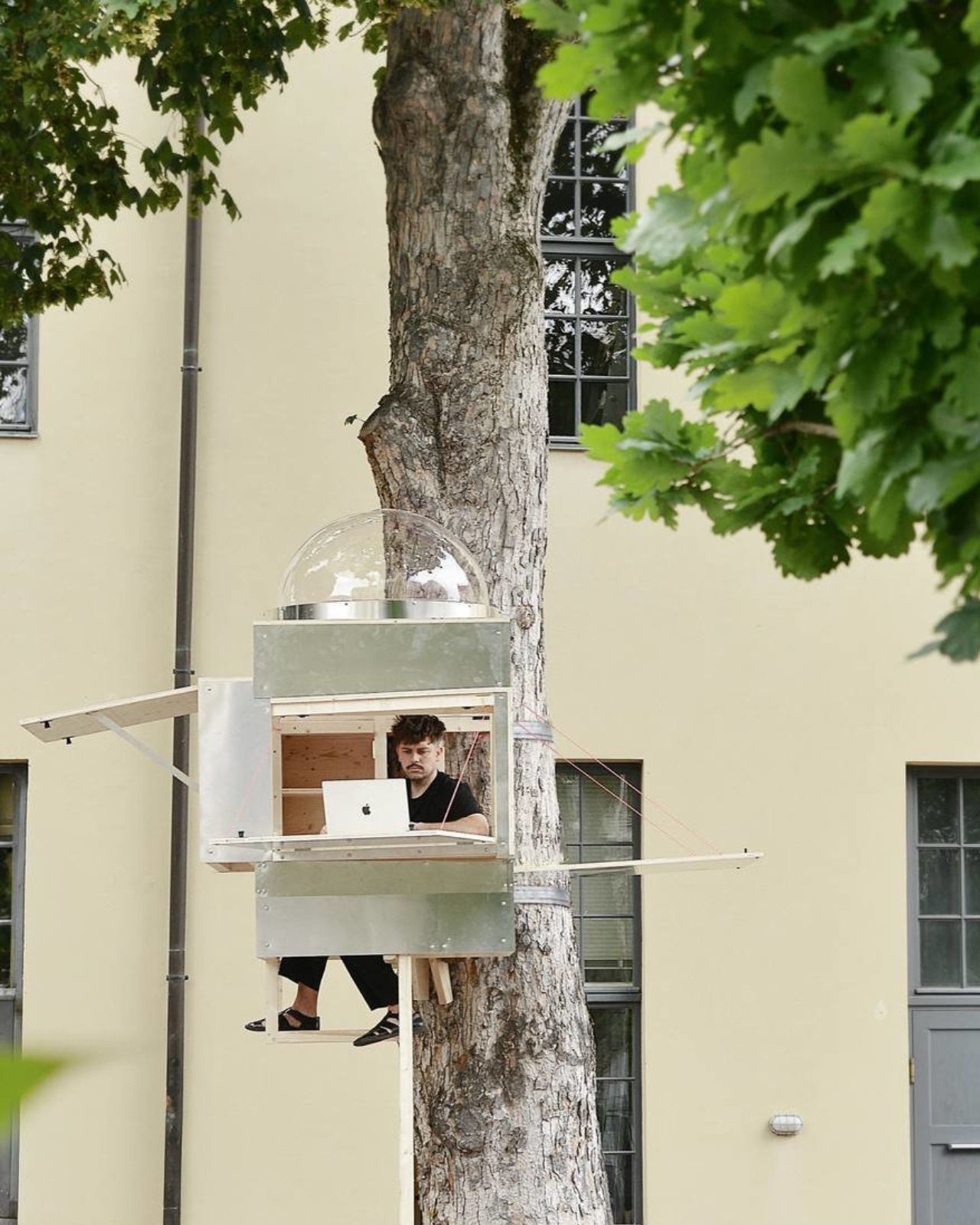
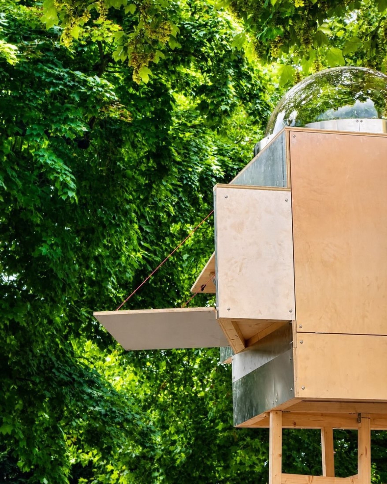
The result is Baumhaus Office, a roughly one-square-meter cube strapped to a tree on the campus of Bauhaus-Universität Weimar, built from spruce timber, plywood, and an aluminum shell that Hartl half-jokingly describes as “UFO-like.” A ladder gets you up to it. Inside, there’s shelving, a small desk, and fold-down panels that expand the workspace just enough to fit two or three people if everyone keeps their elbows in. A domed skylight sits overhead, so instead of staring at a drop ceiling, you get a view of the canopy. Two ratchet straps, cushioned with protective matting so the bark doesn’t suffer, hold the whole thing to the trunk. Hartl secured permission from the university’s president to install it there temporarily, and he’s designed it to come down just as easily and go up somewhere else.

Designer: Benedikt Hartl

His explanation for the whole exercise is refreshingly blunt. Rather than compete with Munich’s rental market, he moved the office out of it entirely and into the trees. He’s also put out an open call, only half-kidding, for anyone with a spare tree and a good view who doesn’t intend to charge him for it.

There’s an obvious punchline in a firm shrinking its footprint to one square meter, but the joke has a point buried in it. Opposite Office already works across borders on projects that rarely require a fixed headquarters, so the studio started asking why it needed a permanent lease at all. That question lands differently depending on where you’re reading this, but it lands. Downtown office towers in plenty of American cities have sat half empty for years now, landlords still pricing space as if 2019 never ended, and companies quietly deciding that a conference room and a Zoom link cover most of what used to require a floor plan. Baumhaus Office takes that same skepticism about commercial real estate and pushes it to its logical, slightly absurd conclusion. If the point of an office is a roof, a desk, and a door you can close, a tree does two of those things for free.

Opposite Office has framed the project as a nod to Cosimo, the boy in Italo Calvino’s “The Baron in the Trees” who abandons ground level entirely and never comes back down. I like that reference more than the usual sustainability talking points that get bolted onto projects like this. It’s not really about wood versus concrete. It’s about changing your vantage point on purpose, even briefly, to see whether the thing you assumed you needed was actually optional the whole time.

I’ll admit the practical side of me has questions. Winter in Thuringia is not gentle, and a plywood cube with a skylight is not insulation in any serious sense. But treating this as a permanent HQ misses the point Hartl is making. It’s a provocation with a ladder, built to prove that an architecture studio’s real asset is the people doing the thinking, not the address on the lease. Whether or not Baumhaus Office survives its first real storm, it’s already done its job: it made a very expensive problem look, for a moment, genuinely small.

The post One Architect Quietly Ditched Rent for a 1sqm Treehouse Office first appeared on Yanko Design.
  •  

IKEA’s Tiny Houses Quietly Admit Your Messy Home Is Fine

Even though I have enough space to have people over, the fact that my place is terribly messy stops me from inviting family and friends. I don’t want to spend an entire day just stuffing stuff I want to hide into my boxes and closets. That’s not a design problem. That’s a me problem and more specifically, a modern life problem, and it happens to be the exact one IKEA just built a series of dollhouses to talk about.

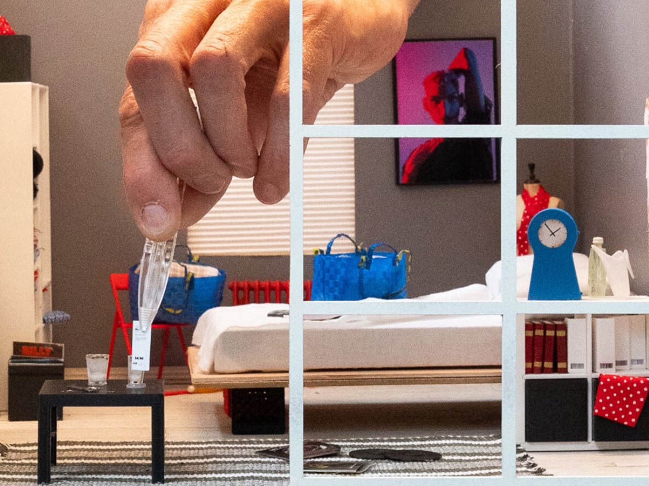
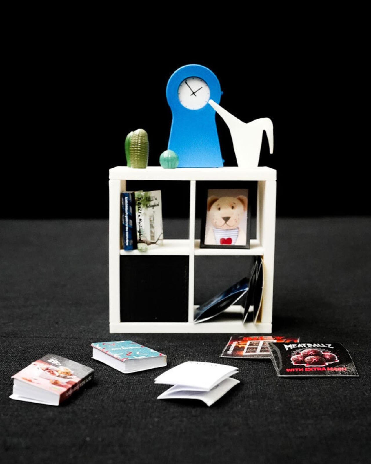
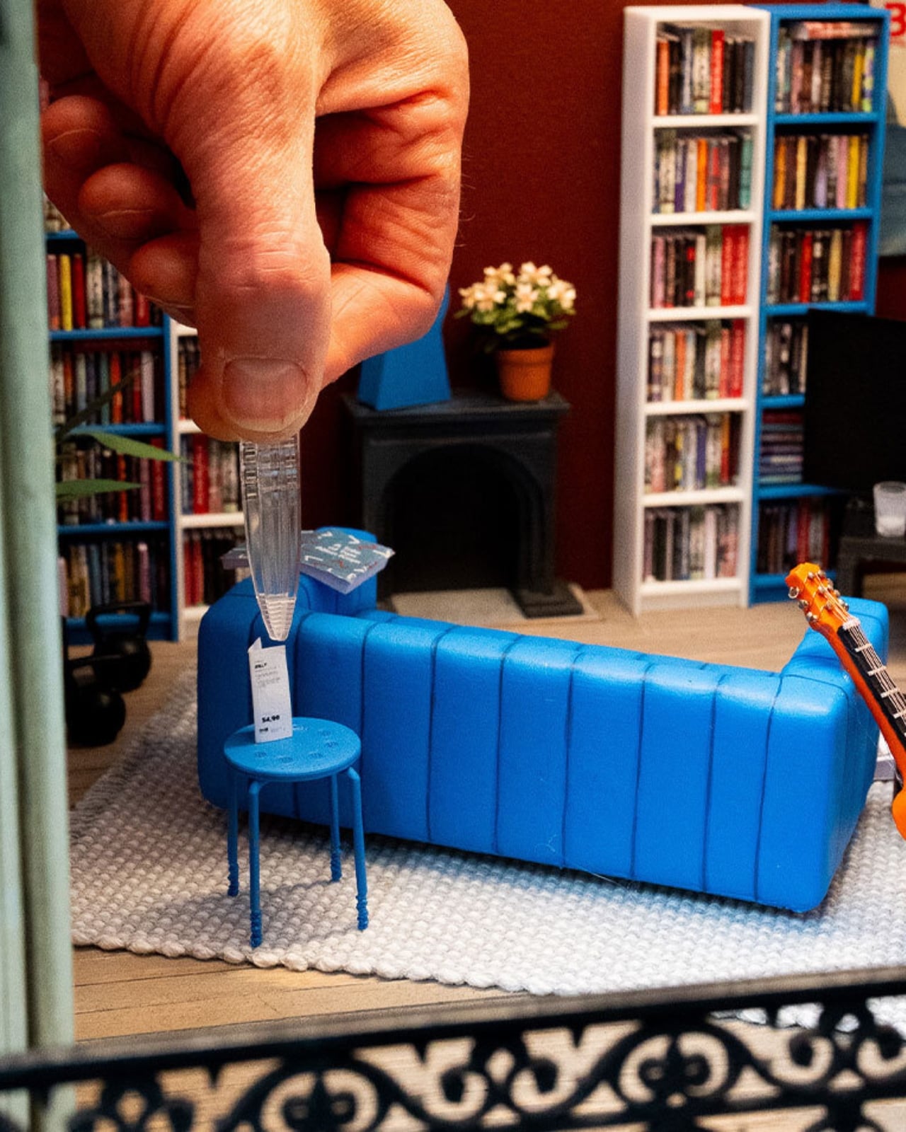
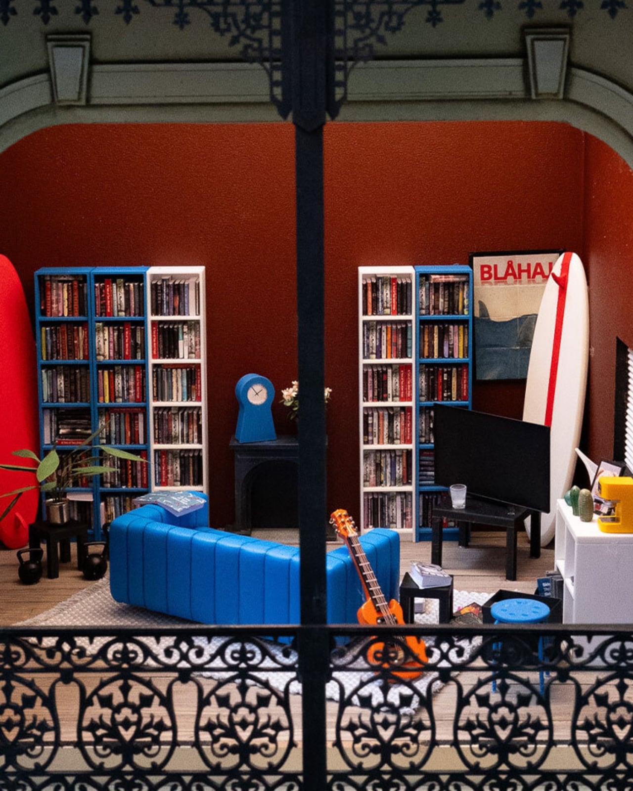
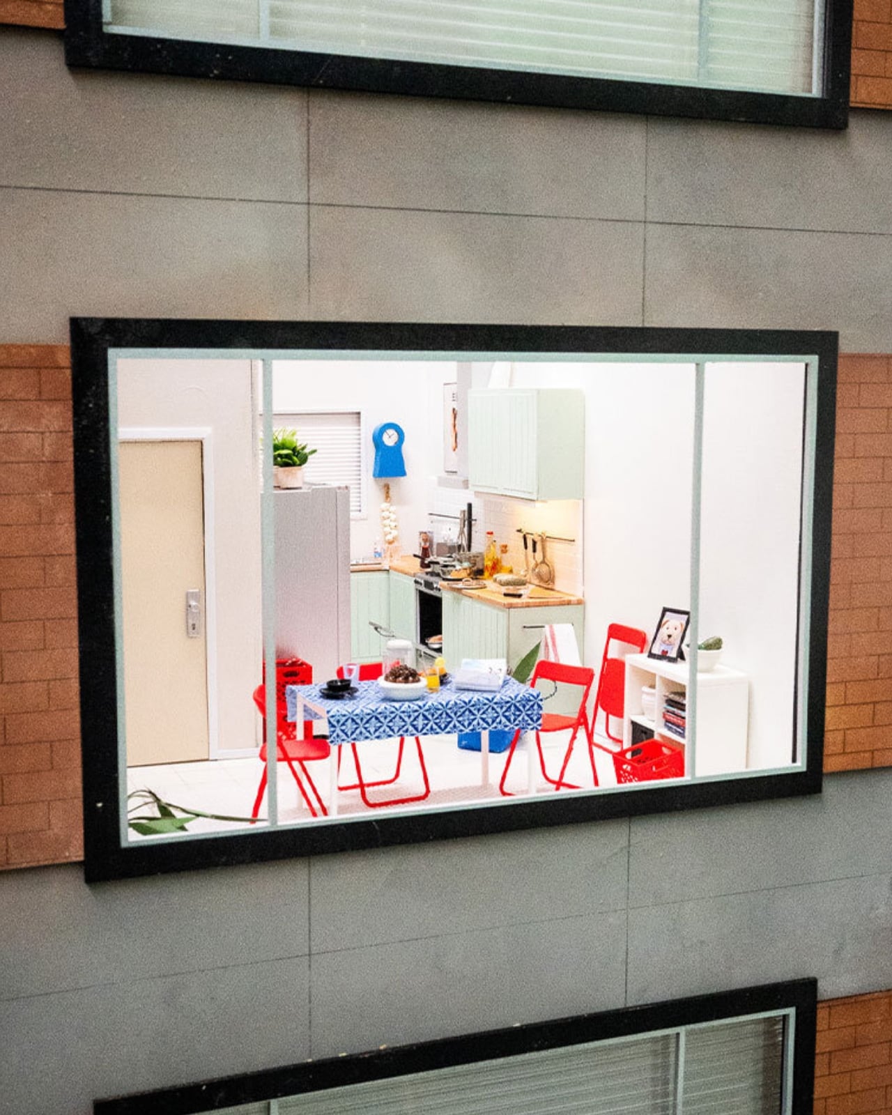
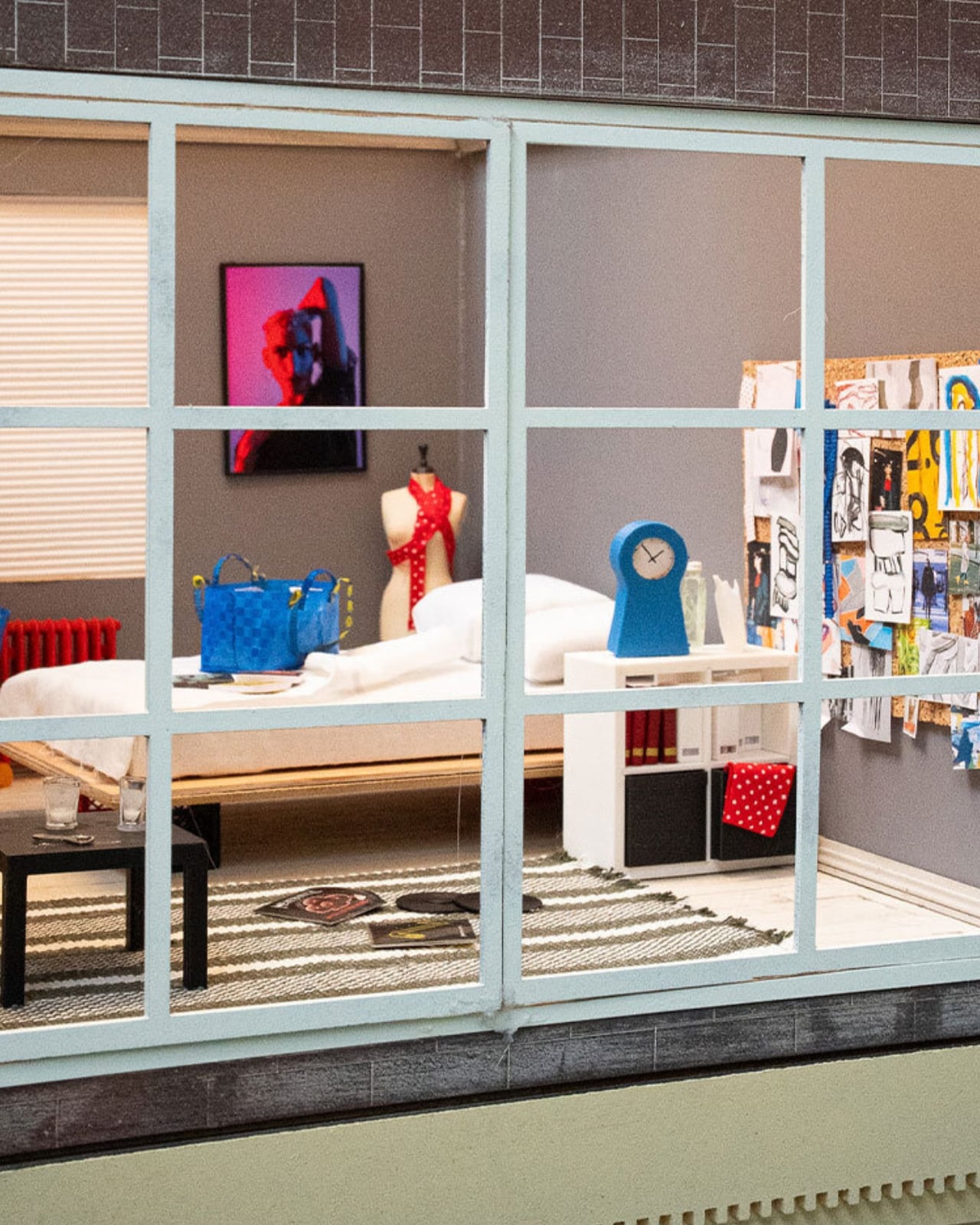
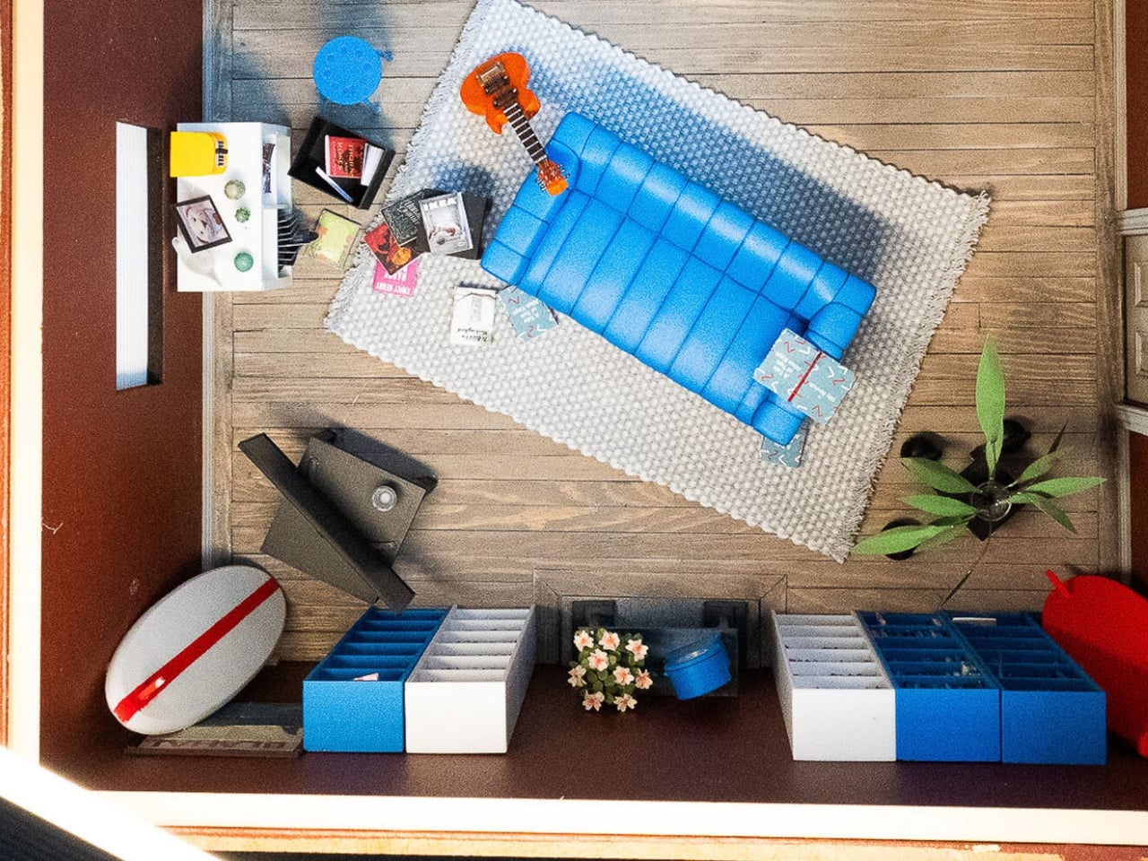
The company recently installed handcrafted miniature homes, built at a precise 1:12 scale, in public spaces across Melbourne, Chengdu, and Beijing. They’re gorgeous, obsessively detailed little things made by Stockholm-based miniature artist Christopher Robin Nordström, who goes by TokyoBuild online. But they’re not really about scale-model furniture. They’re about the fact that our homes are now expected to be office, gym, classroom, and sanctuary all at once, in the same square footage we’ve always had, while somehow still looking like a magazine spread. That expectation is exhausting, and most of us already know it.

Designer: Christopher Robin Nordström for IKEA

IKEA backed this up with a survey of more than 30,000 people across 31 countries, and the headline number is the kind of thing you want to text a friend: 59 percent said they’d rather live somewhere characterful than somewhere manicured. Not a landslide, but a real majority, and a fairly clear rejection of the sterile, everything-matches aesthetic we’ve been sold for the last decade.

I like that the tiny houses lean into locality instead of pretending every home looks the same everywhere. The Melbourne model has a miniature BILLY bookcase stacked with tiny novels and sports memorabilia. The Chengdu and Beijing versions center on scaled-down METOD kitchens instead, because that’s where those homes actually live and breathe. It’s a small choice, but it says the quiet part out loud: nobody’s home is supposed to look like a showroom, because nobody’s life actually happens in a showroom.

Nordström said something that stuck with me more than any stat in the report. He explained that when you build in miniature, you can’t include everything, so every object has to earn its place, and you realize a home isn’t defined by how much it contains but by what people choose to make room for. That’s a graceful way to describe editing your life down to what matters, and it applies just as well at full scale as it does at one twelfth of it.

The behavioral data is where this stops feeling like a marketing campaign and starts feeling like a mirror. Nearly one in five people admit to keeping gifts they never wanted, just to avoid hurting someone’s feelings. More than a quarter hide mementos from past relationships, a habit slightly more common among men. Ten percent have actually canceled plans with friends because their place felt too messy to host, and over a third shuffle clutter from room to room right before guests arrive. Some people use their oven purely for storage, which, if I’m honest, sounds familiar to at least one junk drawer I refuse to open around visitors.

What strikes me isn’t that people are messy. It’s that so many of us are quietly performing tidiness for other people instead of actually living in our own space. IKEA’s pitch, wrapped up in tiny bookshelves and miniature kitchens, is refreshingly modest: you don’t need a renovation to fix that. You need smarter storage and permission to stop apologizing for your actual life.

The tiny houses tour wraps up soon, but IKEA Open House continues in stores through September, built around the same idea at real scale, with the kind of affordable, small-footprint fixes most of us can actually use. Whether or not you ever walk through it, the message is worth sitting with. Perfect homes are rare. Honest ones are just about everywhere, once you stop hiding them.

The post IKEA’s Tiny Houses Quietly Admit Your Messy Home Is Fine first appeared on Yanko Design.
  •  
❌