❌

Vue lecture

A Pop-Up Book Vase Offers Six Looks Without Extra Vases

I am not much of a flower person and, consequently, not much of a flower vase person. As much as I know that they can add to the aesthetic beauty of any space, I don’t have much space to display them or add to my messycore clutter. Also, most flower vase designs don’t appeal to me enough that I’d actually make space for them. But as a certified book lover, anything that’s close to the look of a book is something I might actually consider.

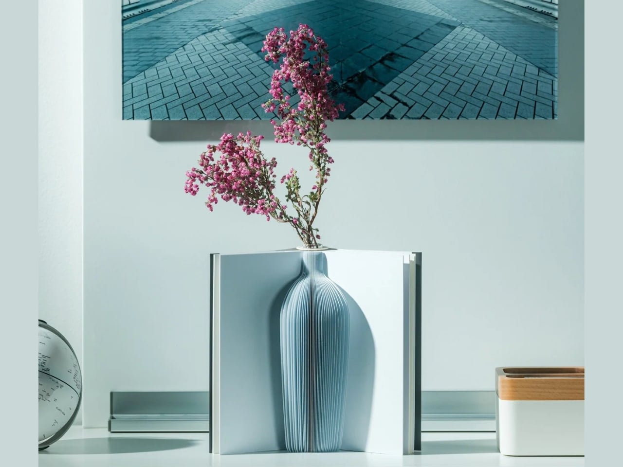
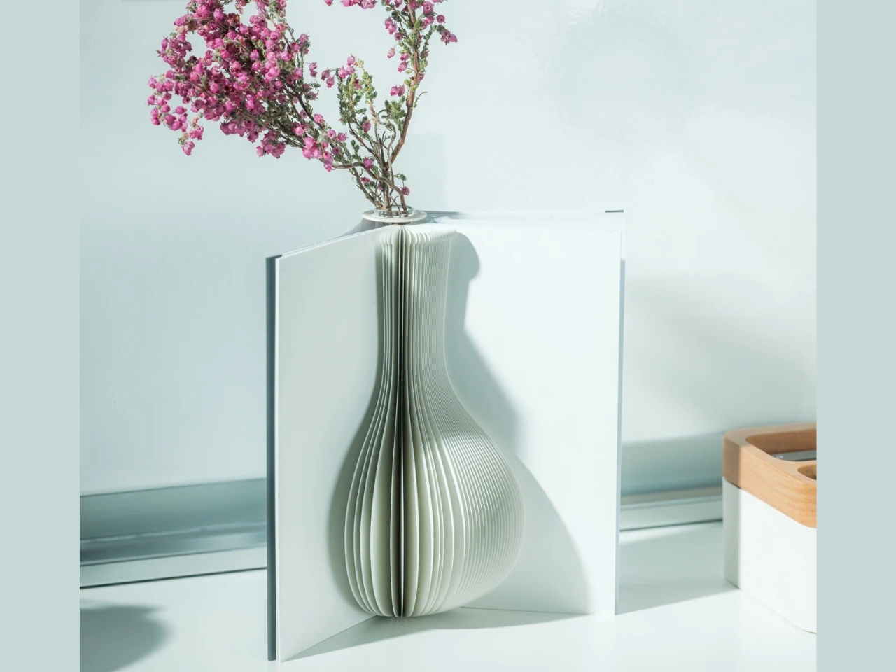
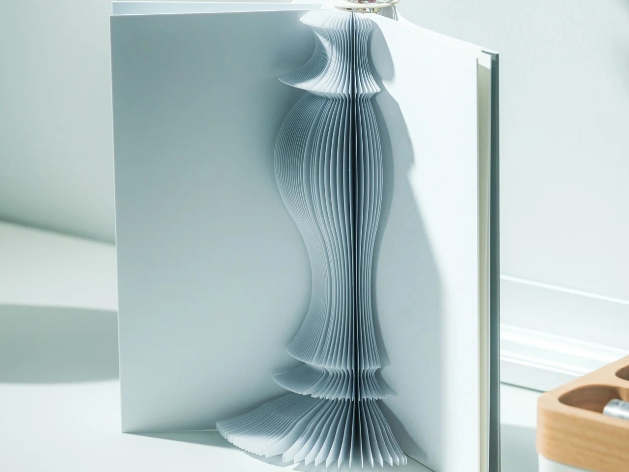
The Pop-up Book Vase is one such flower display that has a certain look I might go for if I decide to buy a few flowers and display them. It uses a book aesthetic where you can turn the page and get a new look with its three-dimensional paper vase silhouette. This way, you get a different look by switching among the three designs if you’re the kind of person who wants something new to look at every once in a while.
Click Here to Buy Now: $45.00

The way this vase is designed goes beyond printing a book pattern on a regular vase. The flowers go into a glass test tube, which fits into the book’s spine. Each book has three vase shapes that you can change as you turn the page. Turning the book upside down changes which end of the silhouette is wider, so you get something new again. You basically get six possible configurations of a vase in just one object, rather than six separate containers.

That division between the materials is what makes the idea work. The paper creates the decorative shape, while the glass holds the water. MECLI calls the design Flowery Tale and specifies water-resistant paper, but that doesn’t mean you should treat the whole thing like a waterproof vessel. The brand advises wiping up water promptly and letting the paper dry thoroughly before storing it. I’d still keep the messy part of refilling away from my actual books.
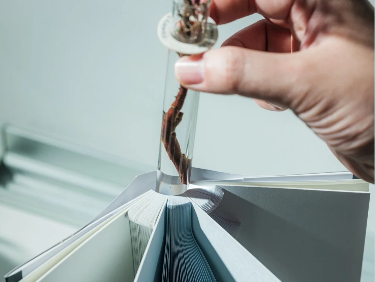
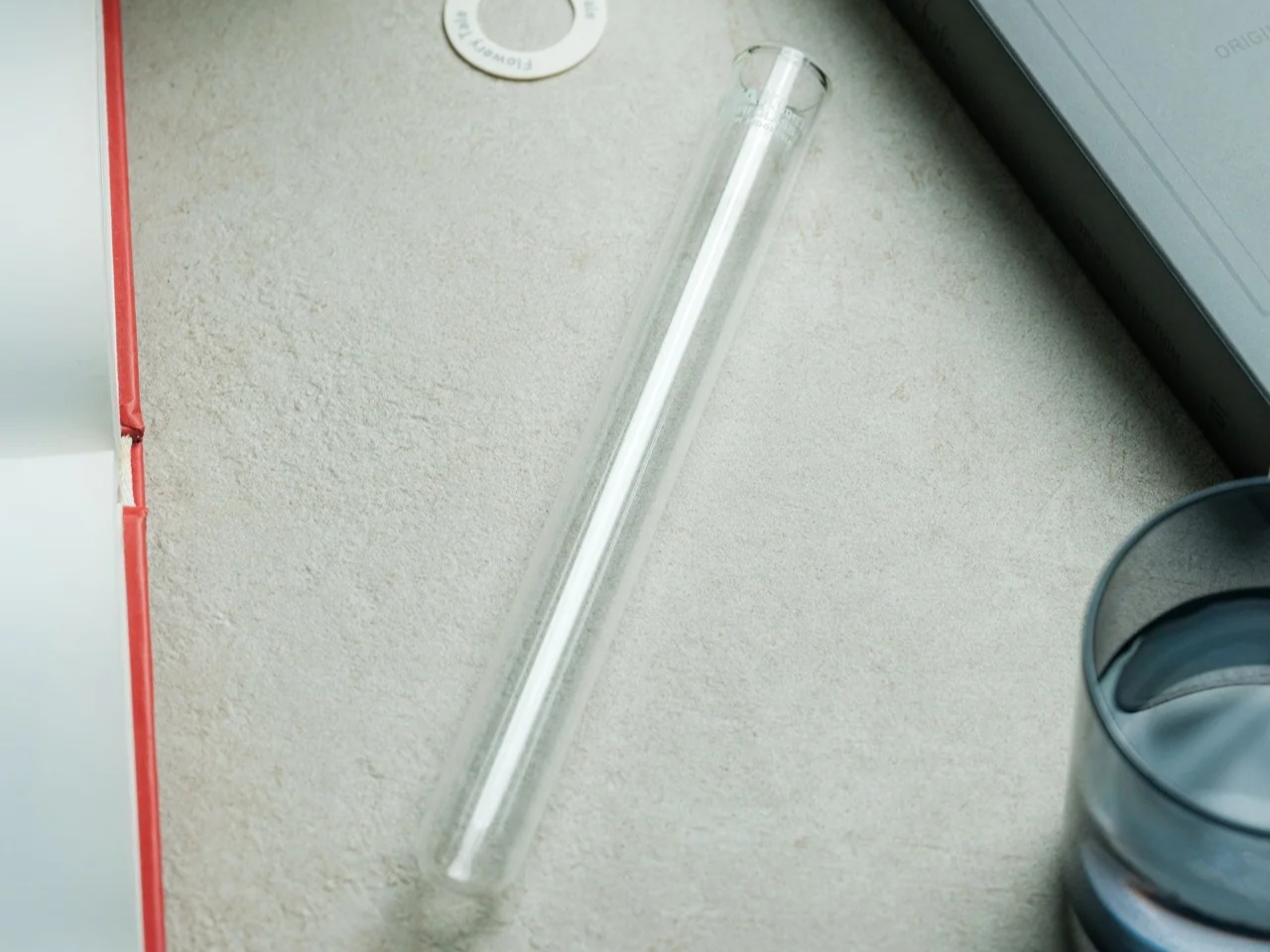
The storage aspect is probably what appeals to me most. MECLI says you can return it to a bookshelf when it’s not in use. The closed book measures approximately 3.9 inches wide, 1.2 inches deep, and 7.2 inches tall. For someone who doesn’t regularly buy flowers, that’s more useful than having an empty vase taking up display space between bouquets. It still needs room when open, of course, so I wouldn’t expect it to magically solve my clutter problem. But I like that it has somewhere to go when the flowers are gone.

It’s also a nice option for someone who wants a small floral gesture rather than a full centerpiece. The test-tube format suggests starting with a single bloom instead of trying to squeeze in a large bouquet. For me, that makes the idea of displaying flowers feel a little less like another decorating project. The page-turning is part of the appeal, too: I’d be choosing a shape to go with the flower rather than buying another vase.
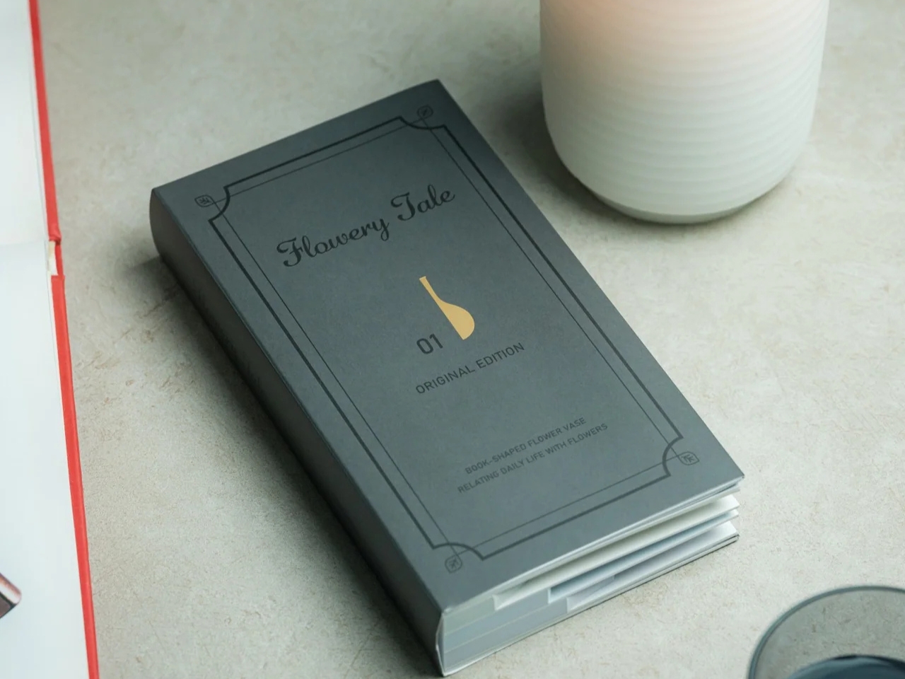
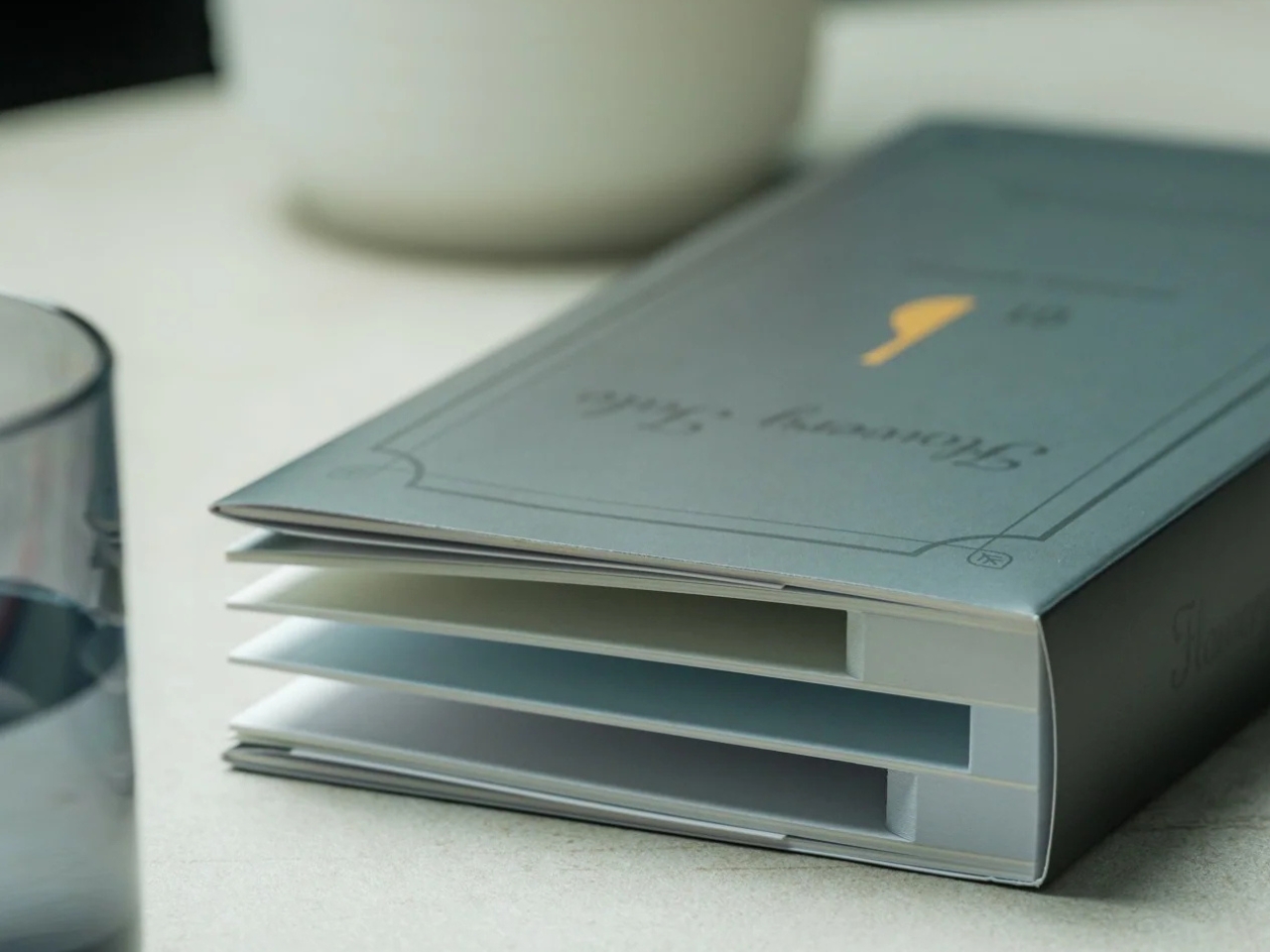
At $45, though, the Pop-up Book Vase is a decorative purchase rather than the cheapest way to display a flower. IKEA’s VILJESTARK, a 6¾-inch glass vase listed at $1.99 in the US, handles the basic job for much less. Its shape stays the same, whereas the Pop-up Book Vase offers changing silhouettes and book-shaped storage. If all you need is a small container for a stem, IKEA makes more financial sense. Here, the extra money is buying the paper construction and the pleasure of changing the display.

I don’t think this would suddenly turn me into someone who always has fresh flowers at home. But it gives me a reason to consider making room for one. A vase that can spend its downtime on a bookshelf feels more suited to my habits than one that needs a permanent spot on the table.
The post A Pop-Up Book Vase Offers Six Looks Without Extra Vases first appeared on Yanko Design.
  •  

Neo-Brutalist Vases Look Like Tiny Towers, Even Without Flowers

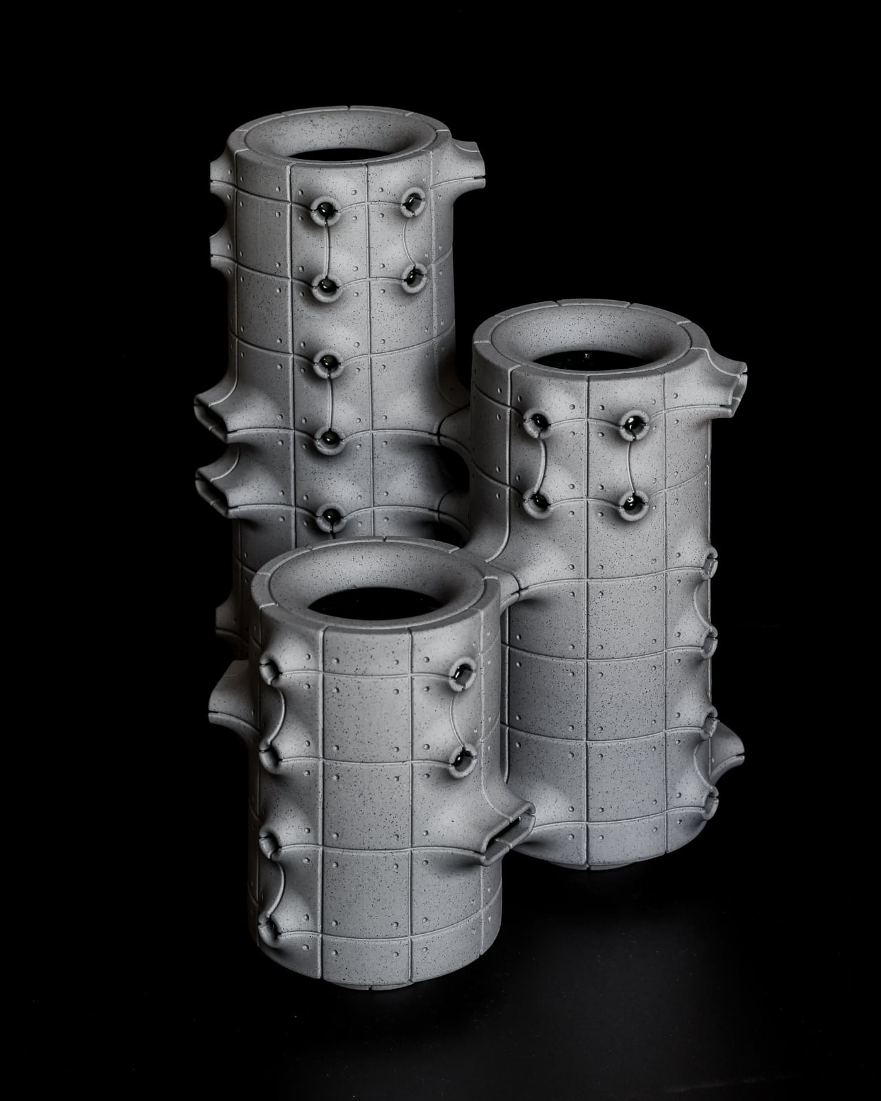
An empty vase can make a shelf look oddly unfinished, as though the flowers were supposed to do all the decorating. Aleksander Kozera’s Neo-Brutalist Vases offer a convincing way around that small domestic problem. Created under his Warsaw-based Yird Ceramics brand, these ceramic vessels have enough architectural detail to hold attention on their own. I’d be inclined to leave them empty before deciding what, if anything, belongs inside.

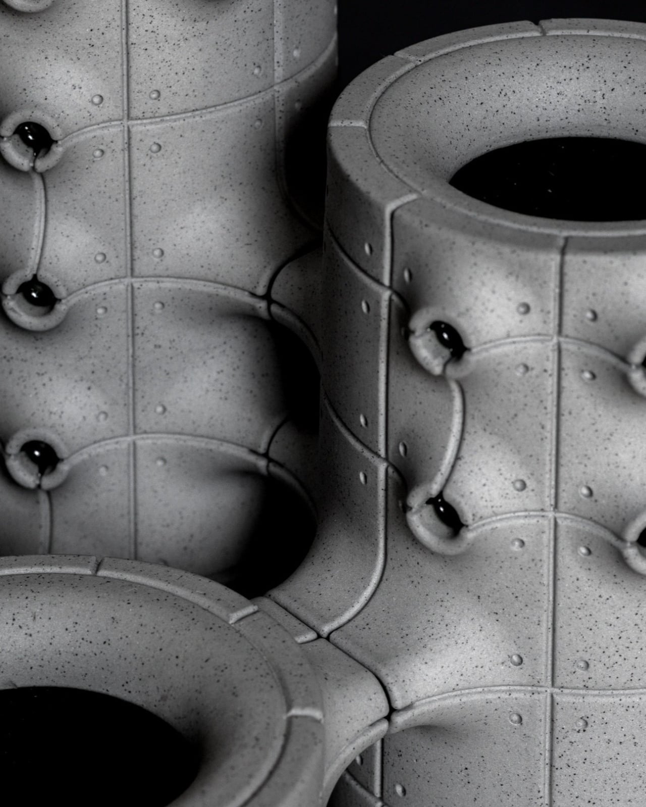
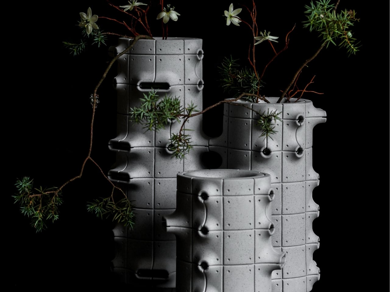
Their cylindrical bodies are divided into rectangular panels, with tiny indentations that suggest construction details on a concrete facade. Circular recesses interrupt that grid, while curved projections extend from the sides like abbreviated balconies or exposed joints. The effect lands somewhere between an architectural model and a piece of science-fiction set dressing. They look a little like infrastructure for a very small, very design-conscious civilization, which is part of their appeal.

Designer: Aleksander Kozera

The concrete resemblance comes from the ceramic body itself. According to the collection’s Łódź Design Festival description, Kozera uses porcelain casting slip with ceramic pigments and black grog to produce that raw, concrete-like finish. In the close-up photographs, dark speckles break up the gray surface. That texture matters visually: without it, the panel lines and repeated circles could read as a smooth plastic prop. Instead, the surface gives the geometry some grit.

The modular approach also makes the collection more interesting than a row of differently sized cylinders. The festival describes vessels that can be combined and arranged into larger compositions. In the photographs, neighboring forms create narrow gaps, overlapping projections, and changing silhouettes. I like the possibility of treating a shelf as a small architectural composition rather than lining up three matching accessories. The vessels share a vocabulary without looking identical from every angle.

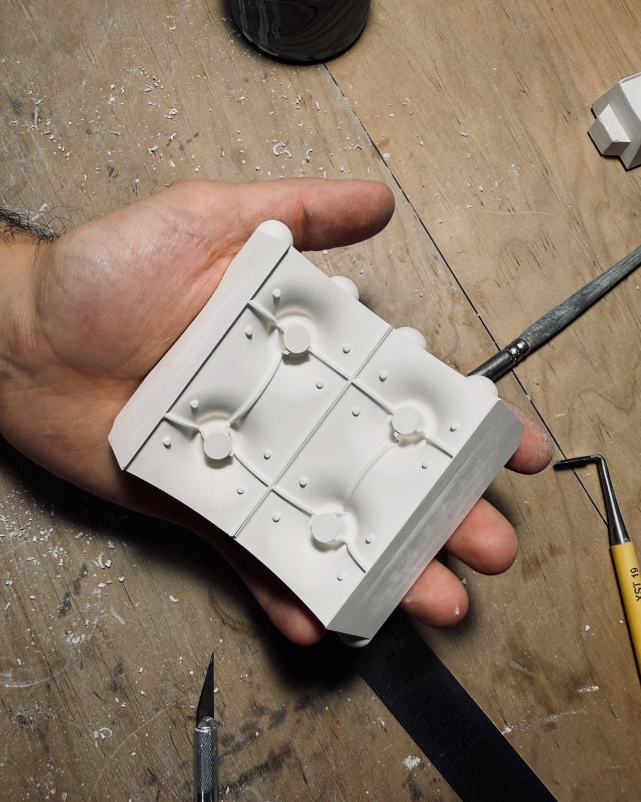
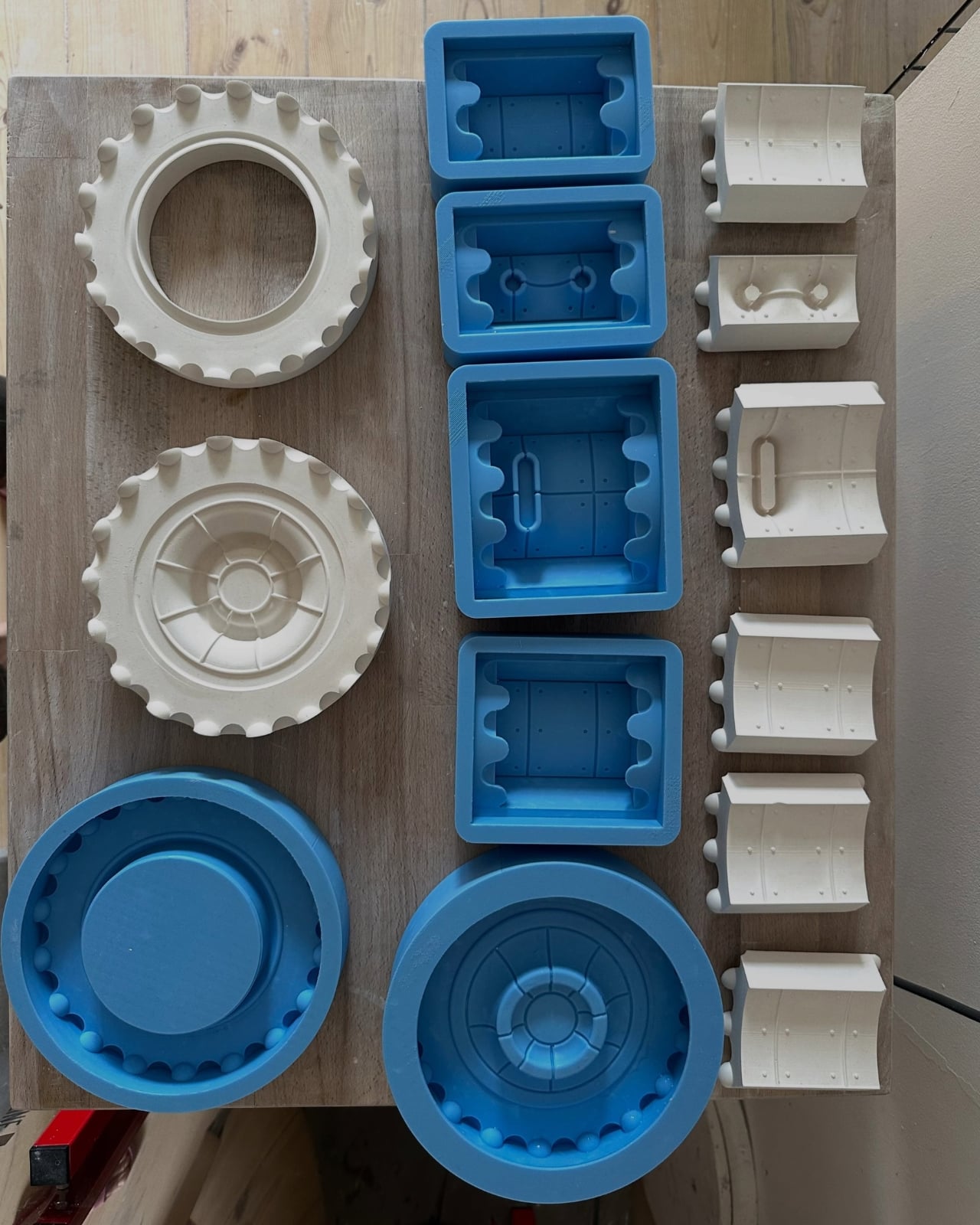
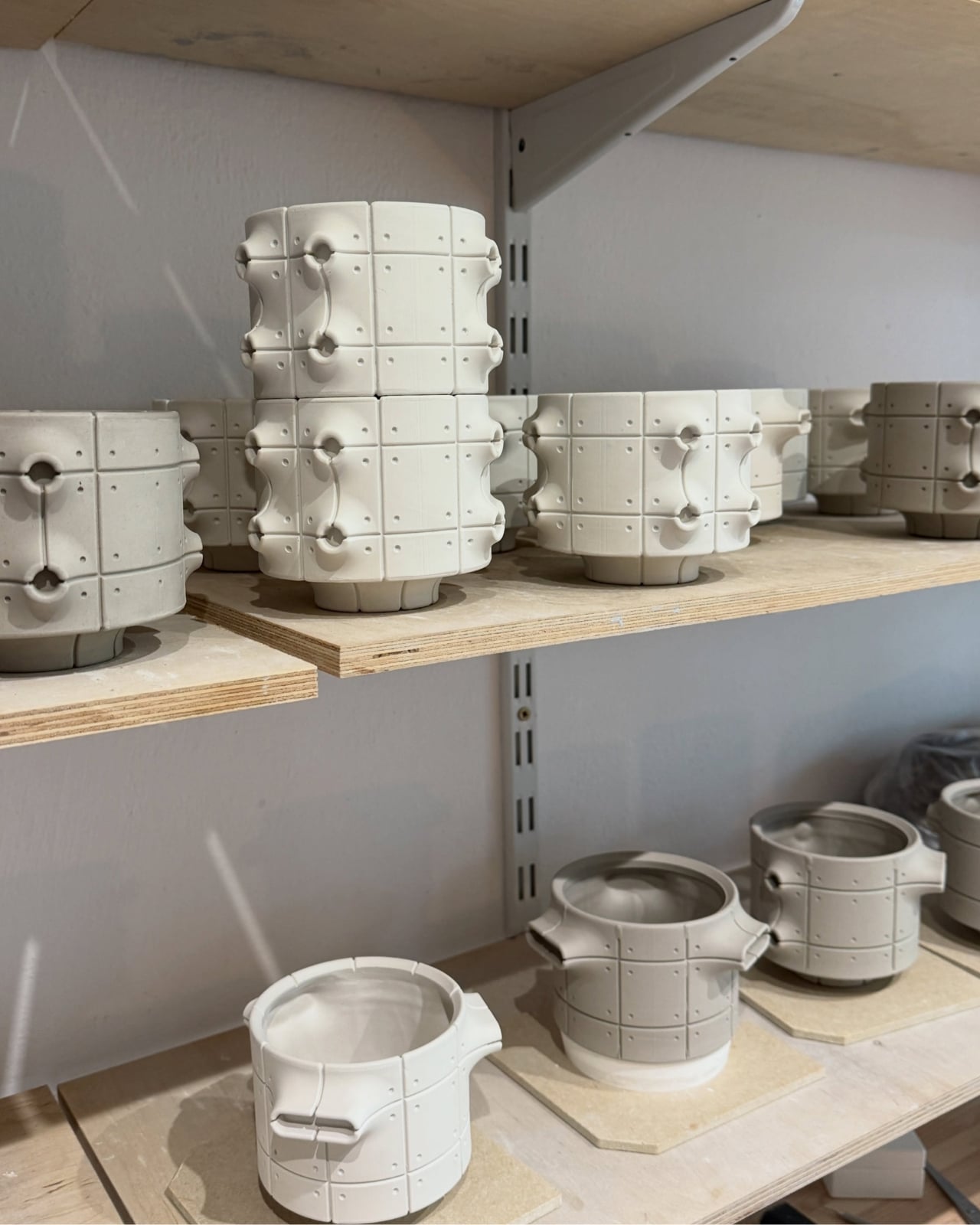
Kozera’s broader studio process helps explain that controlled repetition. He describes beginning with digital modeling, then 3D-printing master forms used to make plaster molds for slip-casting porcelain. That’s a useful distinction for anyone assuming these are printed plastic objects or directly printed ceramics. Digital tools establish the geometry, while casting translates it into ceramic. The workshop photographs make that relationship tangible, showing shaped components and molds alongside vessels at different stages of production.

The finish introduces another layer of detail. The collection description specifies a translucent green glaze, with the small exterior “windows” individually glazed by hand. The green is restrained enough that the photographed pieces still read predominantly as gray architectural objects. I prefer that decision to an all-over glossy finish. Small glazed areas give the eye somewhere to pause without obscuring the panel divisions or competing with the speckled body.

Flowers change the balance considerably. In the styled photograph, branching stems stretch above and across the vessels, disrupting all those disciplined horizontal and vertical lines. The arrangement is sparse enough that the ceramic remains visible, which seems the right approach. A dense supermarket bouquet might conceal much of the detail that makes these worth looking at. A few irregular branches would let the architecture and the plant material each have some breathing room.

My reservation is mostly about where they would live. These are visually busy objects, even with their limited palette. On a shelf already crowded with books, collectibles, and patterned ceramics, the small recesses and projecting edges could get lost. I’d give one a relatively clear stretch of console or place a group against a plain wall. That’s a styling preference, but the design rewards enough space to read its silhouette.

These are physical ceramic works rather than render-only proposals, and the collection is listed as selected for the make me! 2026 exhibition at Łódź Design Festival. That listing does not establish retail pricing or US availability, so it shouldn’t be mistaken for a confirmed shopping announcement.

For me, the strongest choice is the attention given to the sides of each vessel. Turn one, and the relationship between grid, recess, and projection changes. That gives the object a reason to stay on display after the stems are gone, without asking an empty vase to pretend it’s waiting for its next assignment.

The post Neo-Brutalist Vases Look Like Tiny Towers, Even Without Flowers first appeared on Yanko Design.

  •  
❌