Vue lecture

Never Lose Your Keys Again With a Tracker That Glows in the Dark

For forgetful people like me, trackers have basically become a must-have. Whether you’re clipping one onto your wallet, your car keys, your backpack, or whatever it is you absolutely cannot afford to lose, these little devices help you do exactly what they promise: keep track. The only catch is that a lot of trackers tend to look alike, and if you’re relying on appearance alone instead of the connected app, it’s easy to accidentally grab the wrong one.

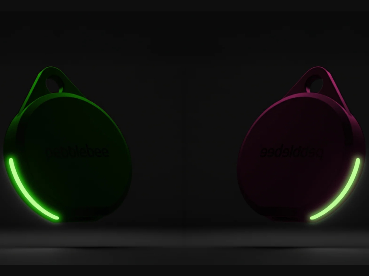
If you’re after a tracker that actually stands out, and one that can even glow in the dark, Pebblebee’s latest Evercolor drop might be exactly what you need. Evercolor is the brand’s limited-edition color program built exclusively for its Clip 5 tracker, and the newest release, called Neon Pulse, comes in two eye-catching shades: Techno Lime and Hotline Pink. Pebblebee describes the collection as perfect for “bold self-expression and a fresh-season reset,” and honestly, it’s hard to disagree.

Designer: Pebblebee
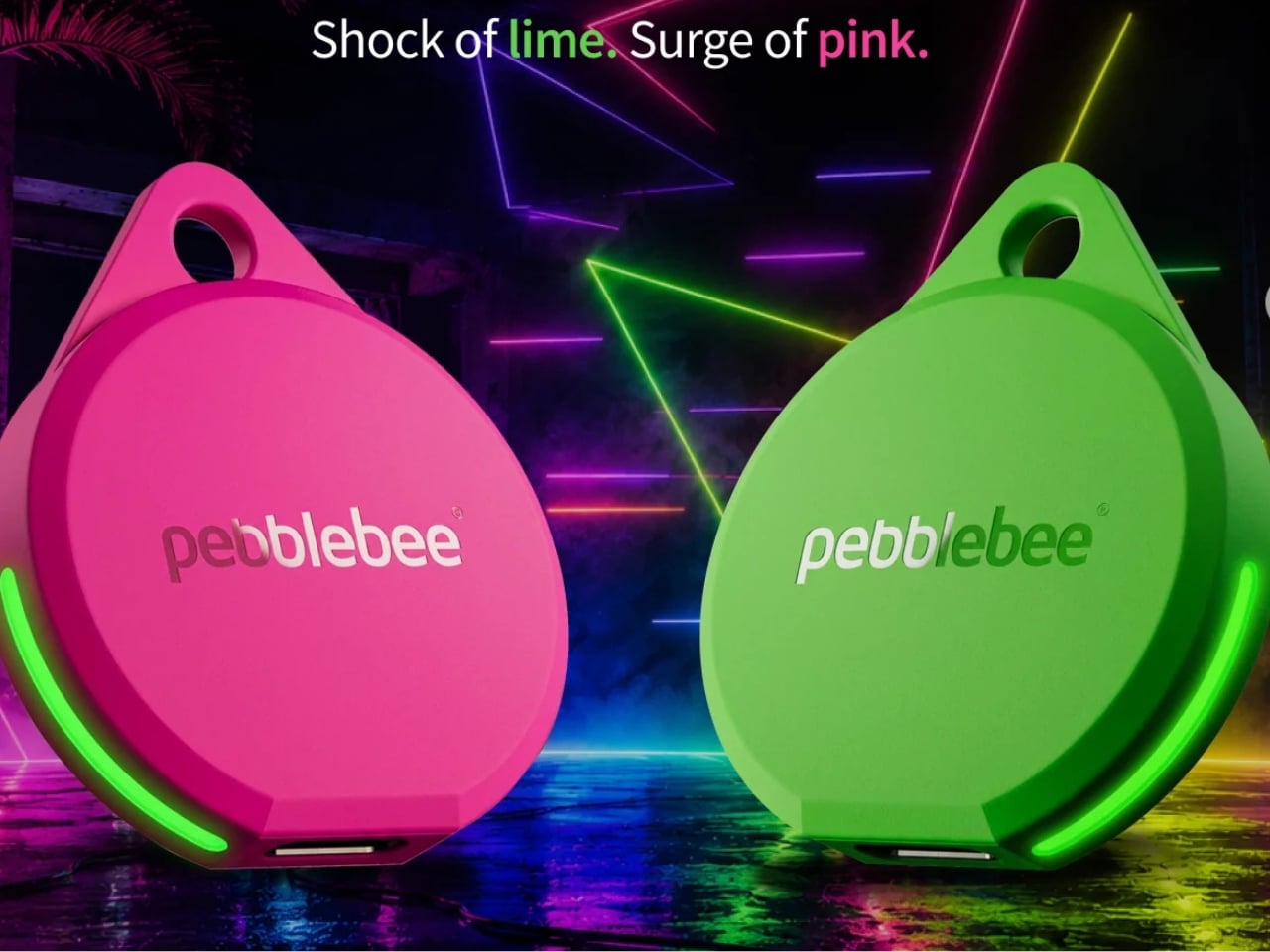
Evercolor has rolled out plenty of standout colors before, but Neon Pulse marks the first time the program has added glow-in-the-dark accents. That means your tracker stays visible even after its LED switches off, so you’re not just relying on the app to tell you where your item is. You can actually spot it in the dark, as long as it’s somewhere within eyesight.
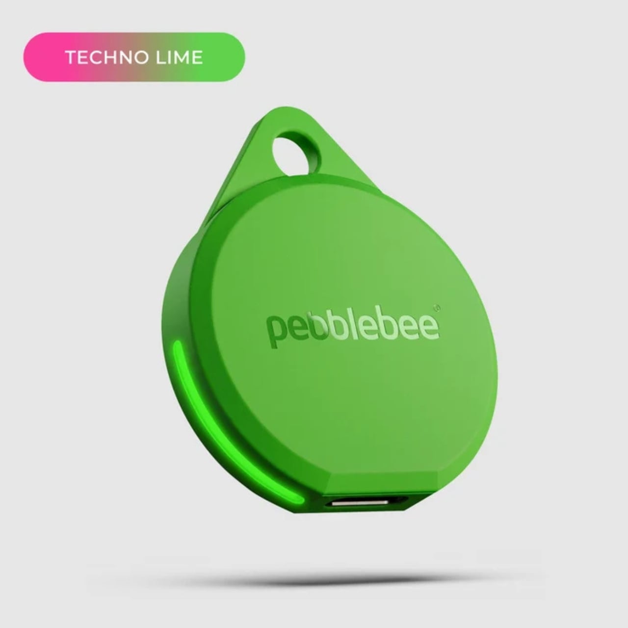
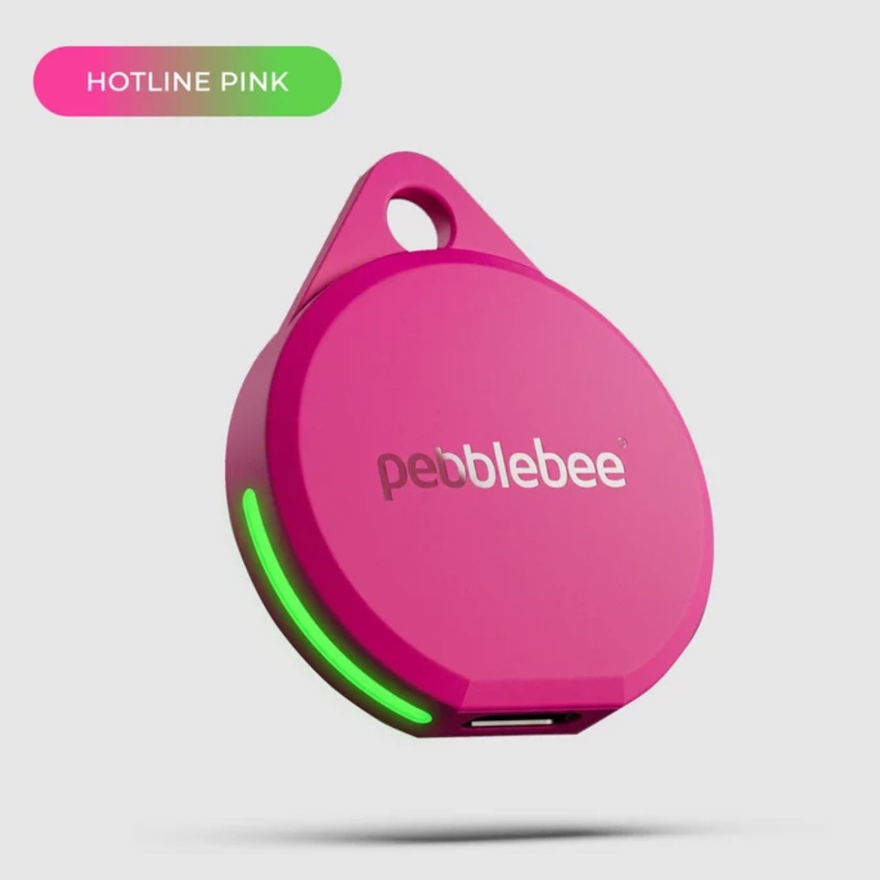
Keep in mind that this is a limited-edition release, so if hot pink and neon green happen to be your colors, you’ll want to grab them soon. Pebblebee rolls out new Evercolor shades every twelve weeks, and once a drop sells out, it’s gone for good, no restocks. Previous collections like Freeze Frame and Heatwave Hijinks have already sold out, so if Neon Pulse catches your eye, don’t wait too long to add it to your cart.


Underneath all that color, though, it’s still the same reliable Clip 5 that Pebblebee originally released. It works with both Apple and Android devices, so you don’t have to worry about switching phones down the line. The rechargeable battery lasts up to a year on a single USB-C charge, which means no more digging through drawers for spare coin batteries. It also boasts a direct Bluetooth range of about 500 feet, roughly double what a lot of competitors offer, plus access to a global crowd-network for finding your stuff even farther away. On top of that, you get a 130dB siren, a bright LED strobe, and IP66 water resistance, so it can handle a little rain or an accidental splash without missing a beat.

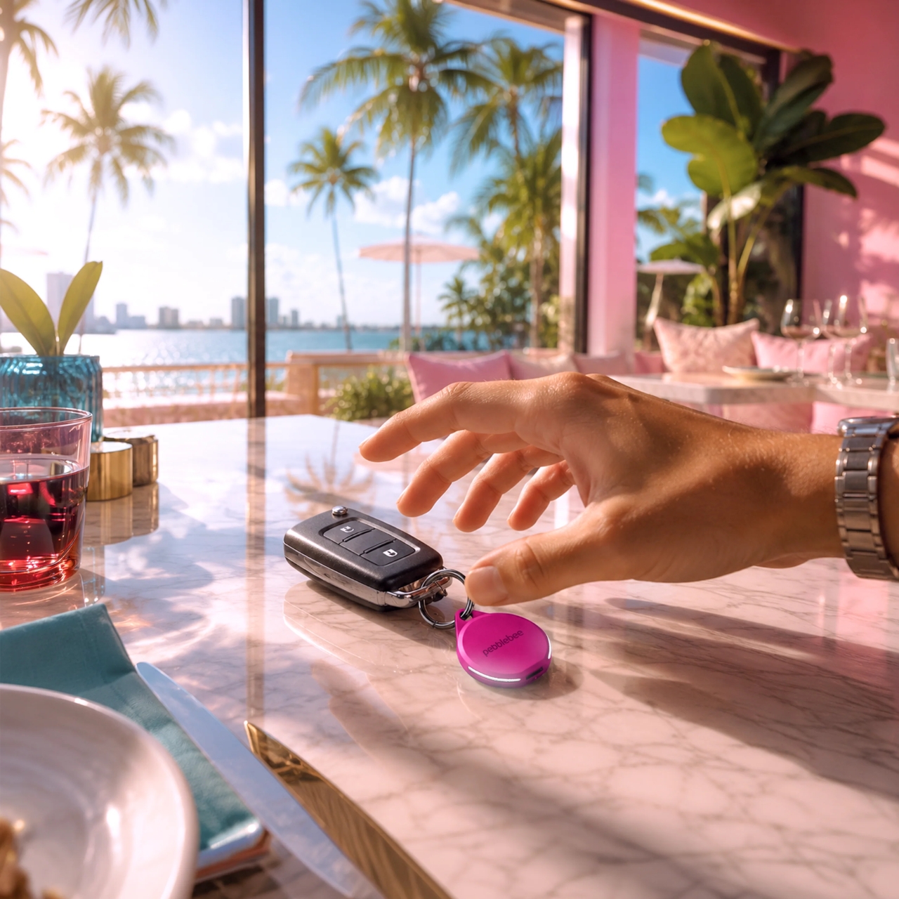
It’s also worth noting that Neon Pulse still costs the same $34.99 as the standard Clip 5, so you’re not paying extra just for the fresh colorway. There’s also a free built-in safety feature called Alert, which can notify you if an unfamiliar tracker seems to be following you, a nice bit of peace of mind on top of everything else. Design-wise, the compact clip-on shape makes it look less like a tech gadget and more like an accessory for your bag, wallet, or keychain. Add in the bright, playful colorway, and it becomes even more fashionable, dare we say, kind of cool. So if your main complaint about trackers has always been that they all look the same, Neon Pulse is built to solve exactly that problem.
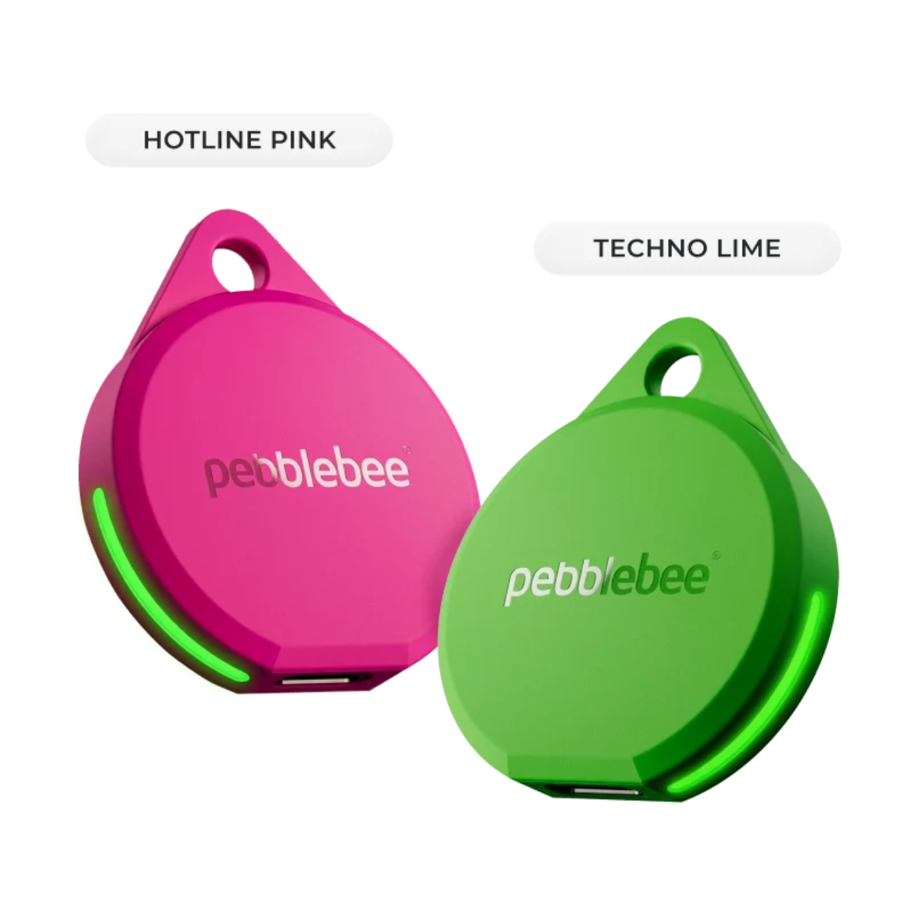
At the end of the day, a tracker is only useful if you can actually tell it apart from the pile of identical black and white gadgets everyone else seems to own, and if you enjoy using it enough to keep it clipped on in the first place. Pebblebee’s Neon Pulse drop checks both boxes, combining genuine utility with a design that feels personal rather than generic. Whether you’re the type who loses your keys weekly or you just want your tech to match your personality, this drop is worth a look before it disappears for good. And if pink and green aren’t quite your vibe, it might be worth keeping an eye on Pebblebee’s page anyway. With a new Evercolor drop landing every twelve weeks, there’s a good chance your perfect color combo is just around the corner.
The post Never Lose Your Keys Again With a Tracker That Glows in the Dark first appeared on Yanko Design.
  •  

The $179 iPhone Speaker That Never Needs Charging

You’ve been waiting for your favorite artist to release their latest album, counting down the hours until it finally drops on your streaming service of choice. You open your phone and press play… and you’re a little disappointed. It’s not that the album isn’t great, it’s that your phone’s speaker doesn’t do it justice. You want something to amplify that sound right now, but your external Bluetooth speaker hasn’t been charged in weeks.

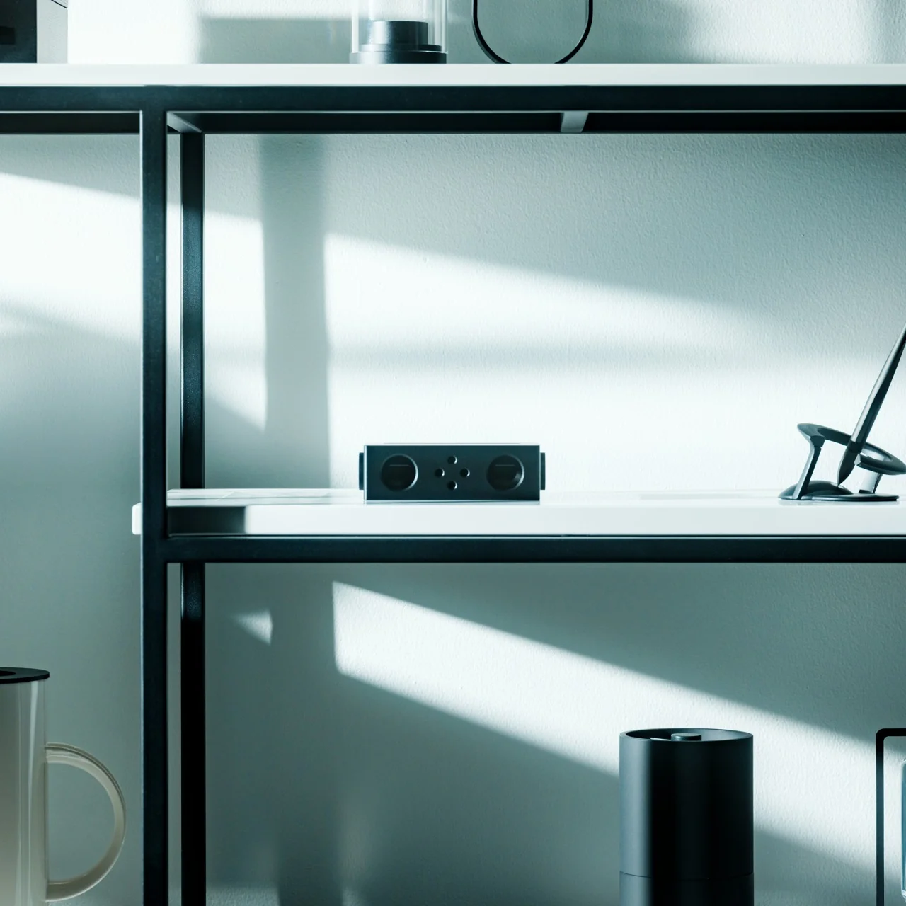
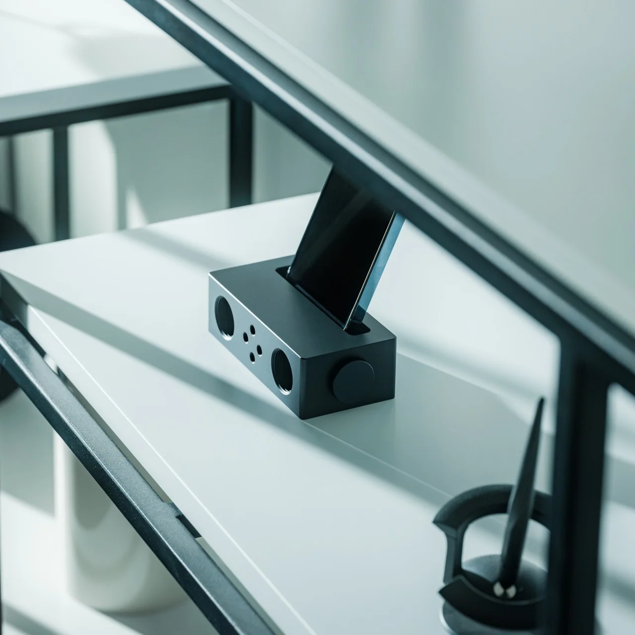
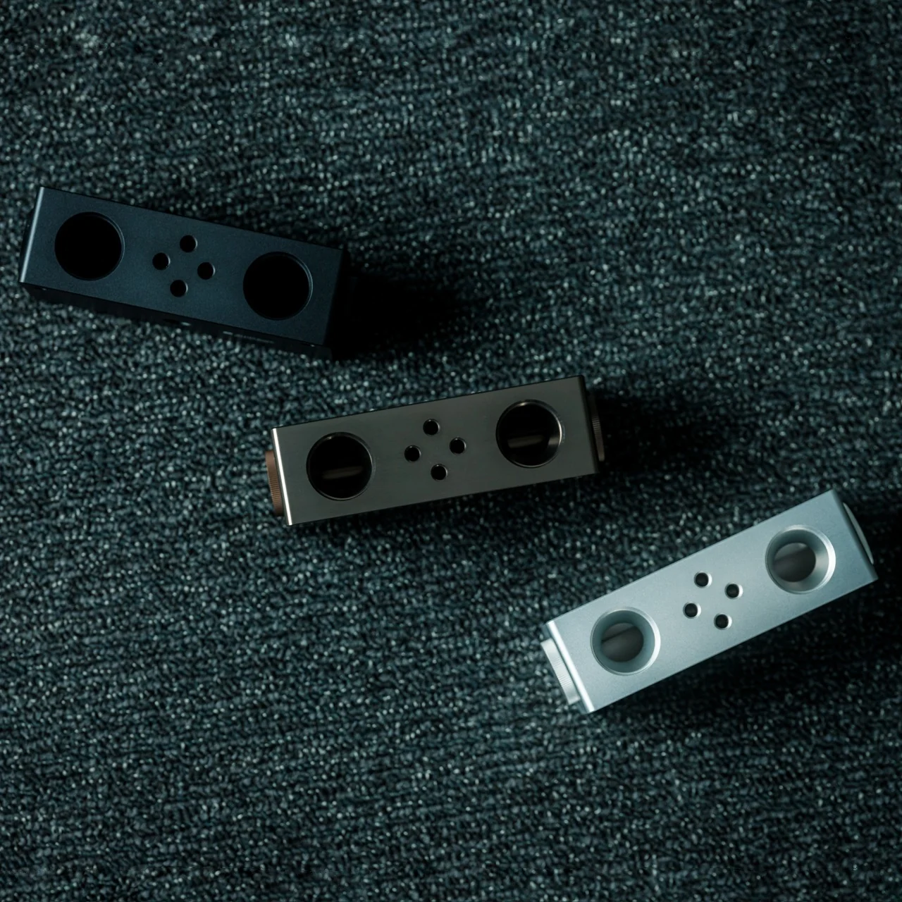
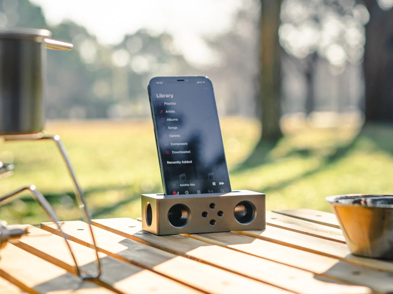
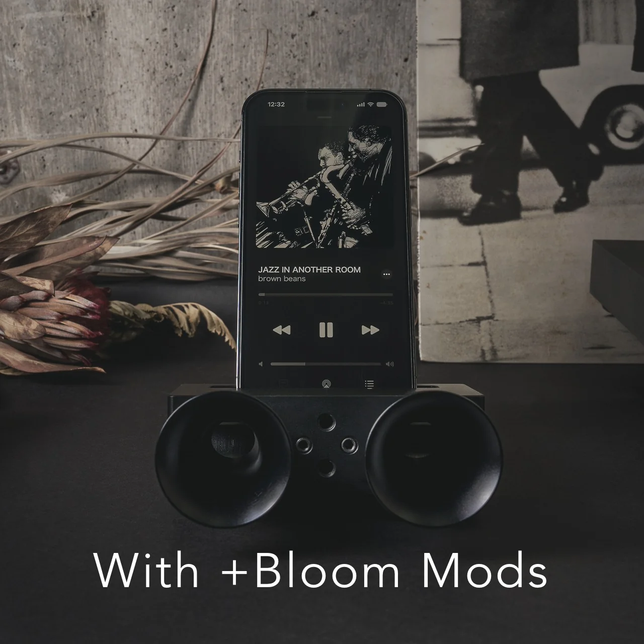
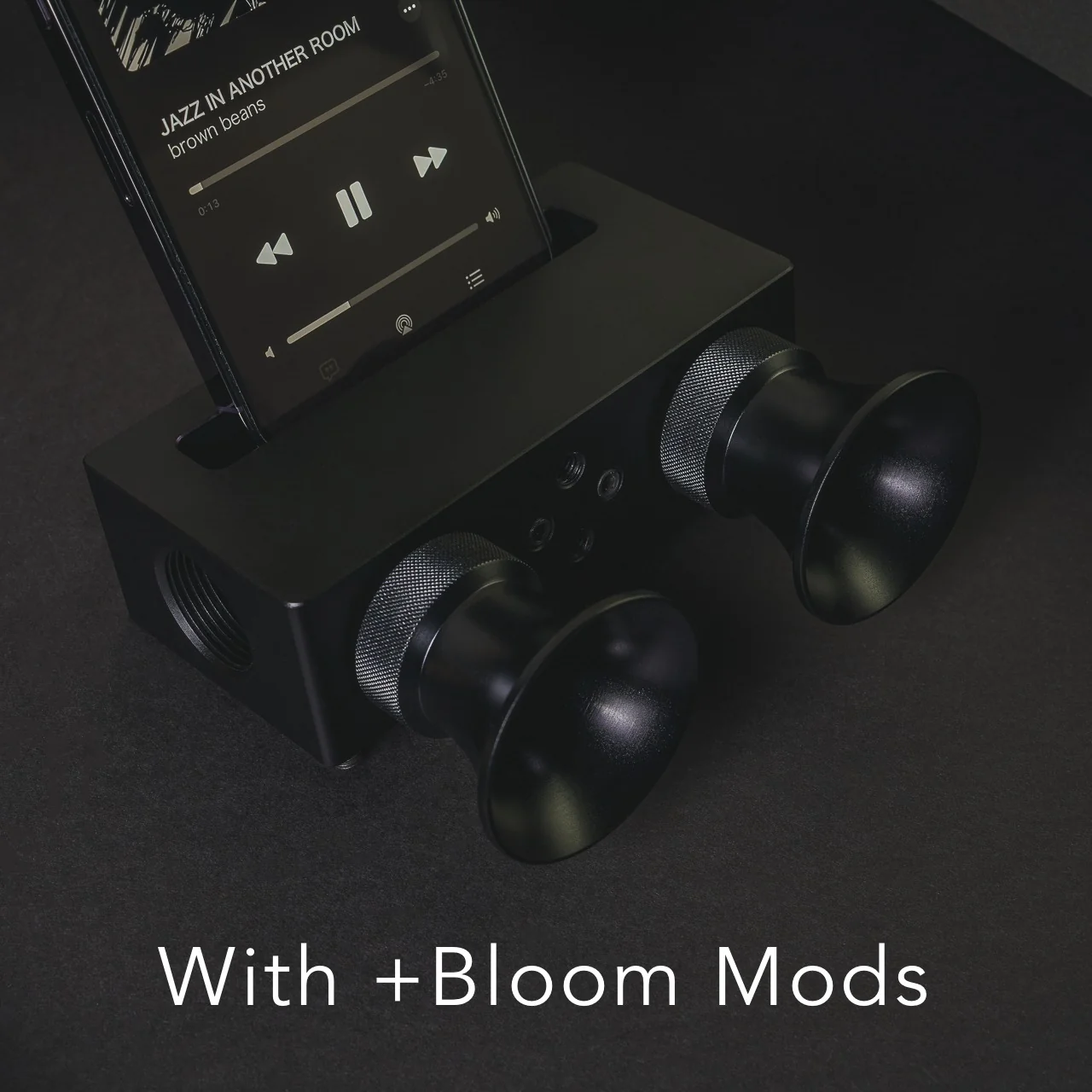
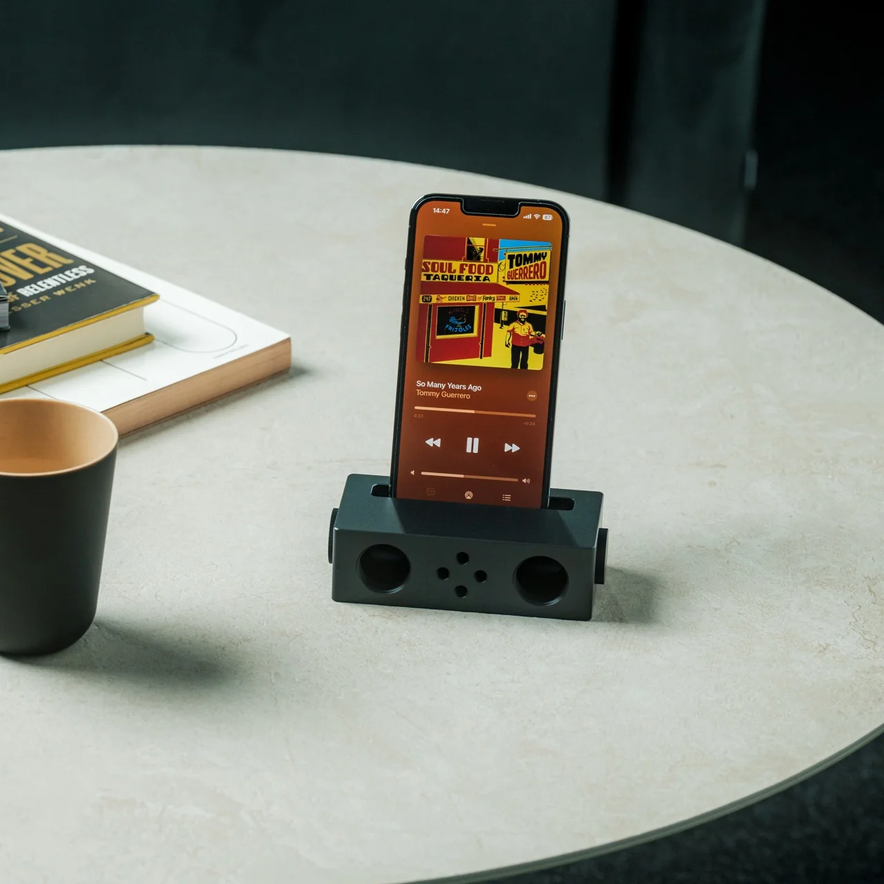
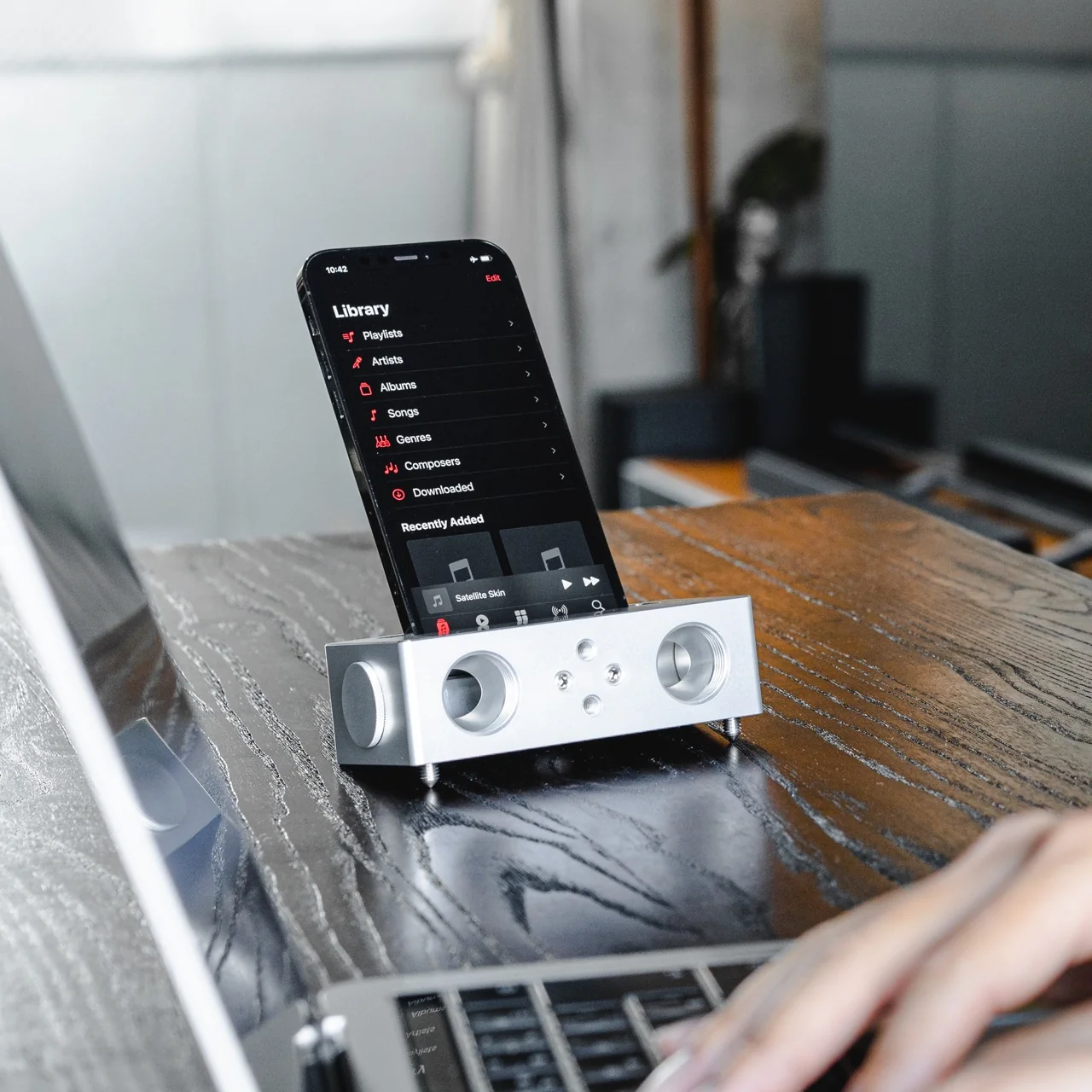
The Battery-free Amplifying iSpeakers can solve that problem for you, and you won’t need a single cable or Bluetooth connection to make it happen. This “dumb” speaker is actually smart enough to rely purely on acoustic engineering, channeling and amplifying the sound waves coming out of your phone so your music, podcast, or call sounds noticeably fuller than it would through your built-in speaker alone.

Click Here to Buy Now: $179.00

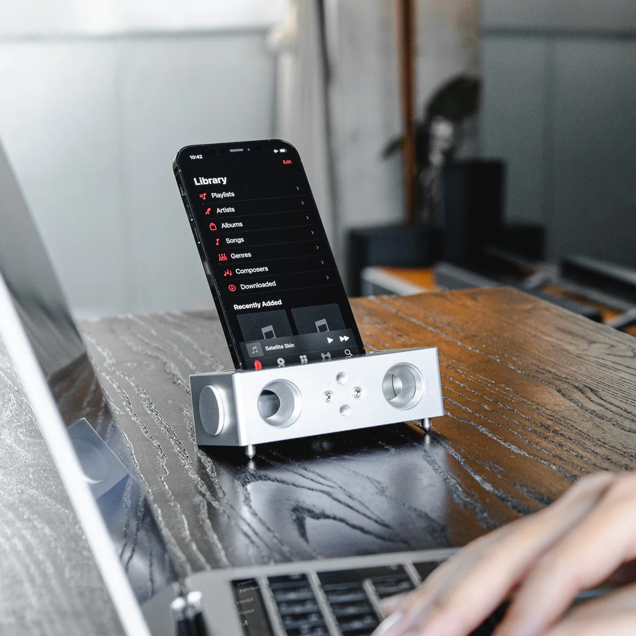
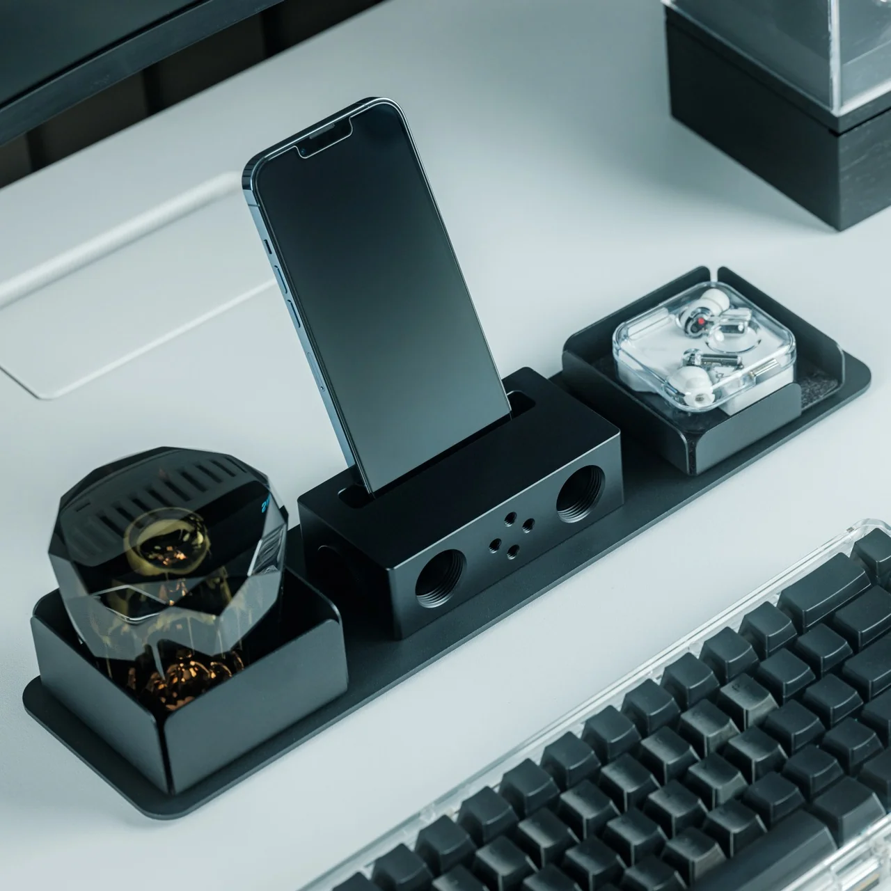
Designed by Ooi Masato and made in Japan, this battery-free device lives up to its name: it uses a precision-machined metal slot that cradles whatever phone you own, instantly amplifying whatever you’re playing. There’s no pairing process, no cord to plug in, and no anxious glance at a battery icon wondering if your speaker will cut out mid-song. You set your phone down, and it just works.

Design-wise, the iSpeakers follow a clean, minimalist aesthetic that looks just as at home on a cluttered work desk as it does on a nightstand or a bookshelf. The body is shaped around the golden ratio, giving it a visual balance that feels intentional rather than accidental (the kind of object you’d leave out on display rather than tuck into a drawer). It’s compact enough to toss in a bag, so you can bring your amplified sound with you to a picnic, a hotel room, or a friend’s backyard without hunting for an outlet. And because there’s no port, connector, or wireless protocol involved, it works with virtually any phone you own, including Apple’s freshly announced iPhone 18 Pro lineup and its first ever foldable, the iPhone Ultra, unveiled at today’s “Surprise and Shine” event. All you have to do is let the speaker slot cradle your phone’s speaker grille; there’s no compatibility chart to check and no software update to wait on.

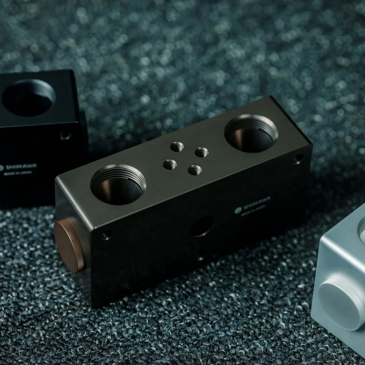
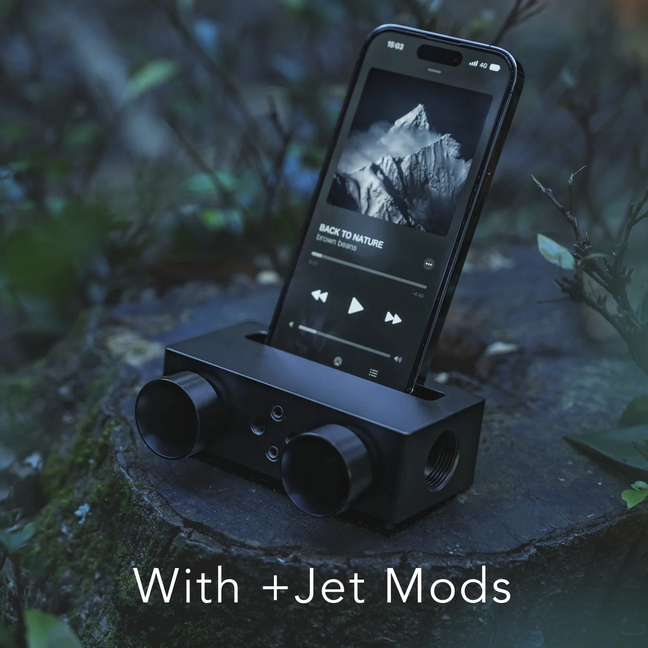
The speaker itself is milled from Duralumin, the same lightweight, vibration resistant alloy used in aircraft construction. That means you’re getting a premium feel along with genuine durability. This isn’t a flimsy accessory that’ll crack after a few drops in your bag. The Japanese craftsmanship and golden ratio proportions give it a quiet sophistication that fits in seamlessly next to your laptop or coffee mug. If you want to get more out of it, you can also pick up the +Bloom and +Jet attachments, which let you customize how the sound projects, whether that means directing it upward for a fuller room fill or downward for a more intimate listening experience.

So how does this stack up against the Bluetooth speakers already crowding your shelf? Take a brand like JBL, whose Flip series has become a go-to for portable audio. Those speakers sound great and pump out serious volume, but they still ask you to charge them, remember to pair them, and eventually deal with a battery that won’t hold a charge like it used to. The iSpeakers skip all of that by design. You’re trading a bit of raw volume and bass depth for something Bluetooth speakers simply can’t offer: a device that will sound exactly the same in ten years as it does today, with zero maintenance and zero electronic waste. At $179, it’s priced closer to a premium Bluetooth speaker than a budget one, but you’re paying for a very different kind of value: permanence, craftsmanship, and simplicity over specs and app connectivity.

At the end of the day, the Battery-free Amplifying iSpeakers isn’t trying to replace your Bluetooth speaker for a backyard party. It’s solving a much smaller, more common frustration: the moment when you just want your phone to sound better, right now, without any setup. For anyone tired of charging cords, pairing screens, and speakers that die at the worst possible moment, this is a refreshingly simple fix, and a genuinely beautiful object to boot. Sometimes the smartest tech is the kind that doesn’t need power at all.

The post The $179 iPhone Speaker That Never Needs Charging first appeared on Yanko Design.
  •  

Laptops Sealed Computers Shut, ARTISAN ALTO Snaps Them Back Open

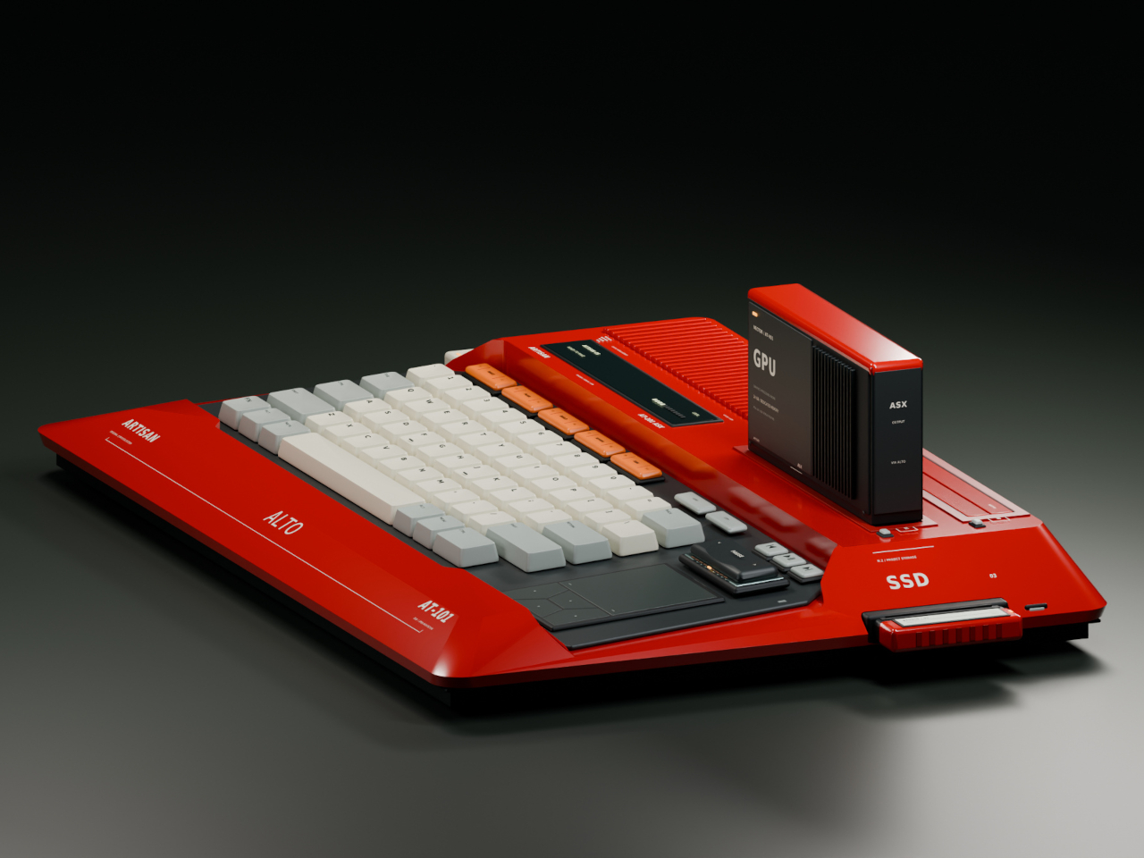
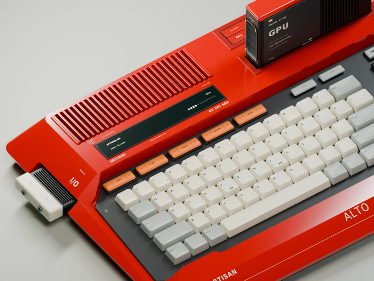
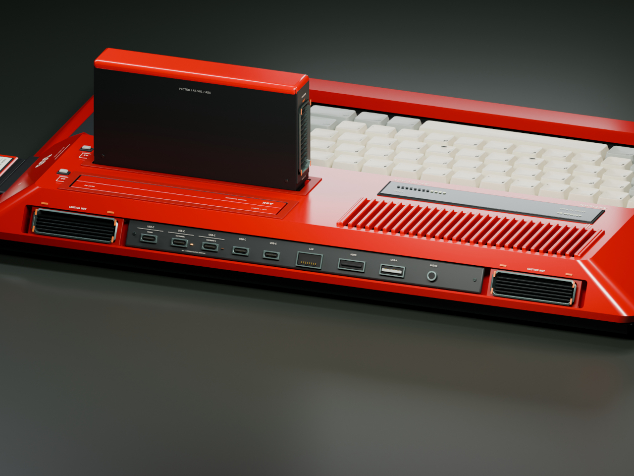
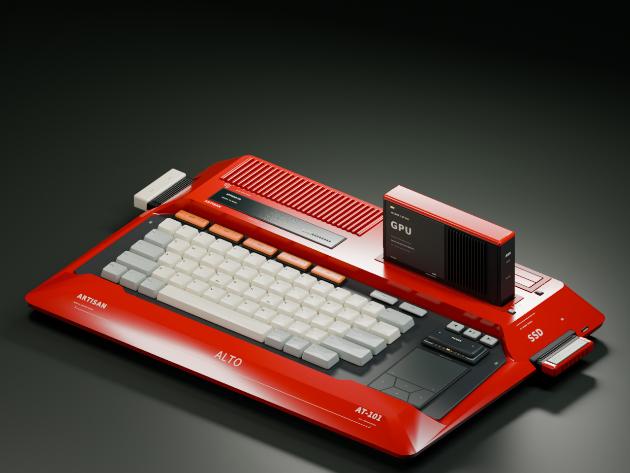
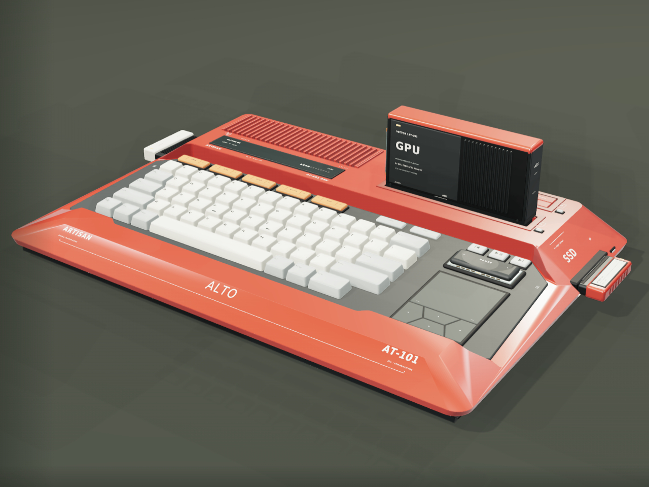
Home computers used to snap open like toolboxes, cartridges sliding in for a new game or a new skill. That idea mostly disappeared once sealed laptops took over, but the ARTISAN ALTO AT-101 brings it back with a vermilion shell that looks like it walked straight out of 1984 and a system built for how people actually tinker today. It’s a machine designed to grow alongside whatever you’re currently obsessed with.

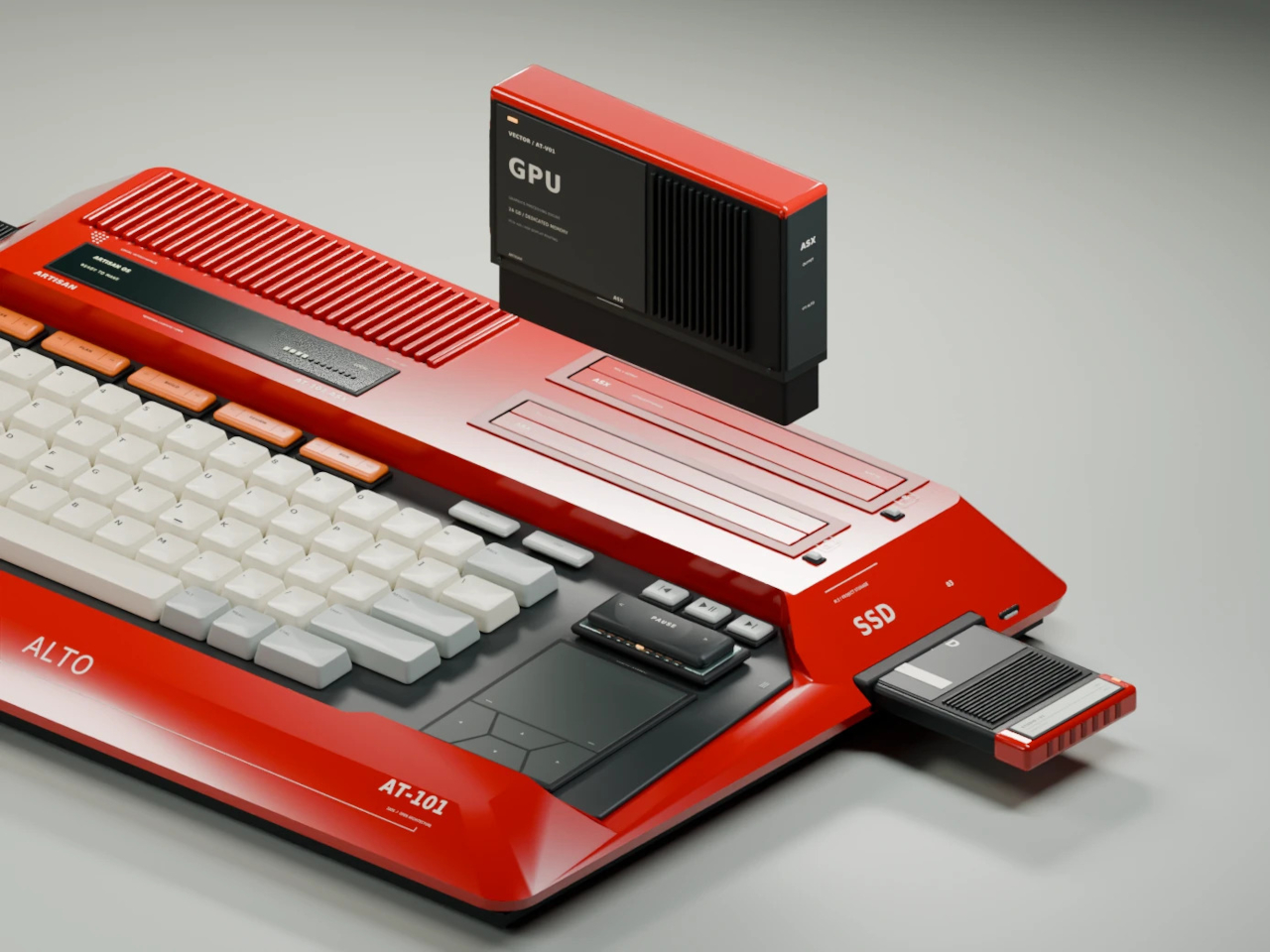
The trapezoidal red housing wastes no time signaling its intentions. Sculpted, concave ivory keycaps sit beside red cooling louvres, and a keyboard opening cuts diagonally through the sloping side, turning what could’ve been a flat slab into something with genuine presence on a desk. This is a machine built to be looked at, not tucked behind a monitor.

Designer: Leo Botinelly

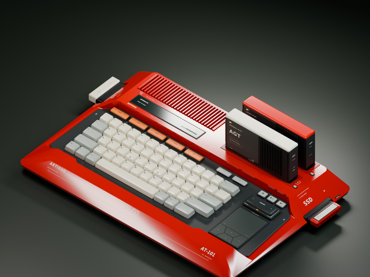
That vintage-inspired shell hides a distinctly modern expansion idea. Upright cartridges slot into place to add graphics power, sound capability, retrocomputing modes, or an AI companion, while smaller side modules handle specialist interfaces and individual projects. Recording a demo, building out a more ambitious scene, or reviving an old favorite game all become a matter of swapping in the right module rather than replacing the whole machine.

The standout pairing puts VECTOR, a compute cartridge, alongside COMPANION, an AI agent module with its own ivory-crowned housing. Together they form what the concept calls a personal cyberdeck, one where your context and your processing power both live in the same two bays. Everything from your conversation history to your working files stays local, an intentional counterpoint to how most AI tools currently function.

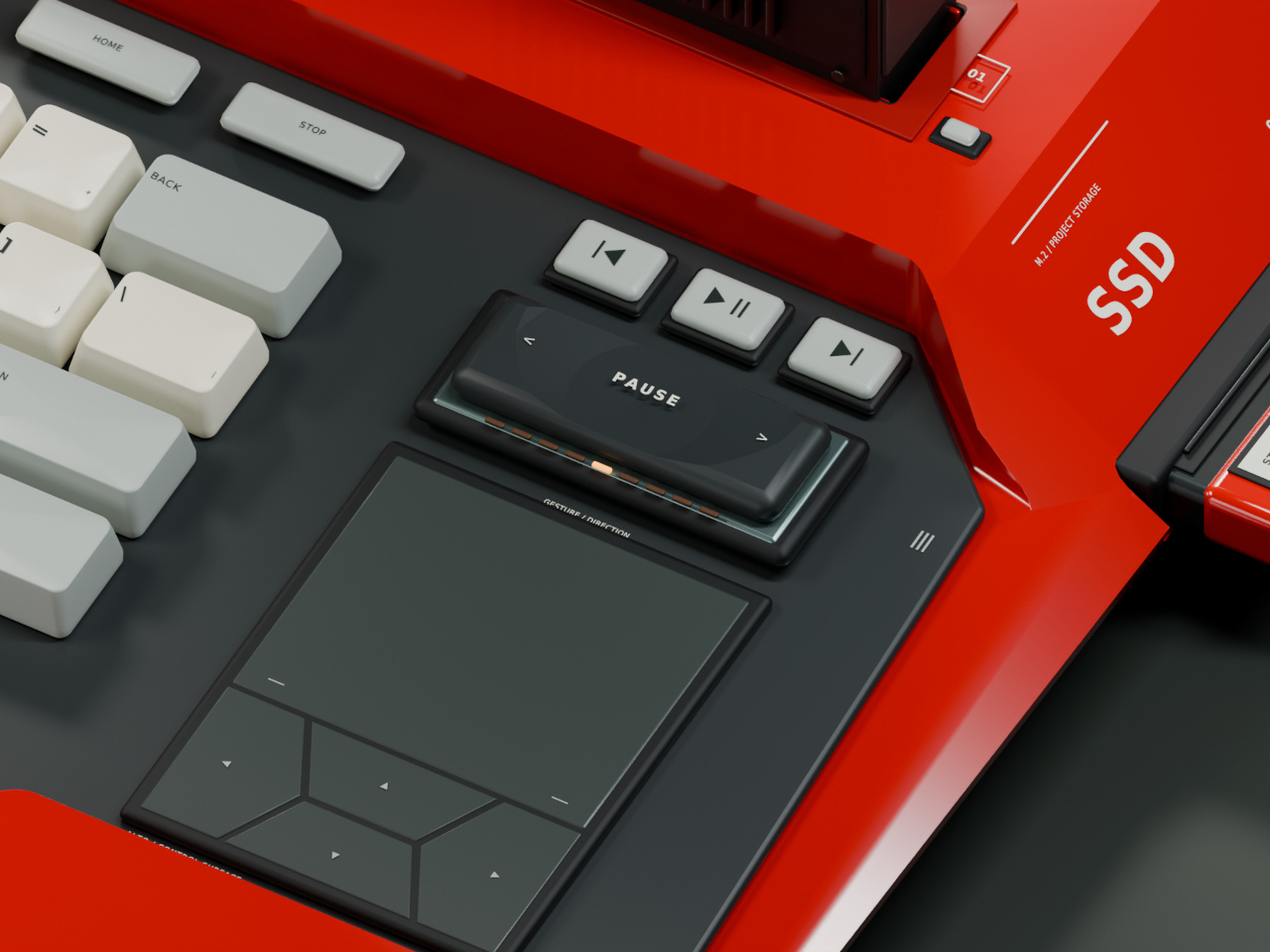
Five multifunction keys handle creative shortcuts without forcing a trip through a menu, while a dedicated PAUSE rocker lets you freeze, rewind, or speed through whatever’s running, treating time itself as something you can grab and adjust mid-task. A touchpad and four flush cursor keys merge into a single continuous surface on the right side, keeping navigation under the same hand that’s already resting there.

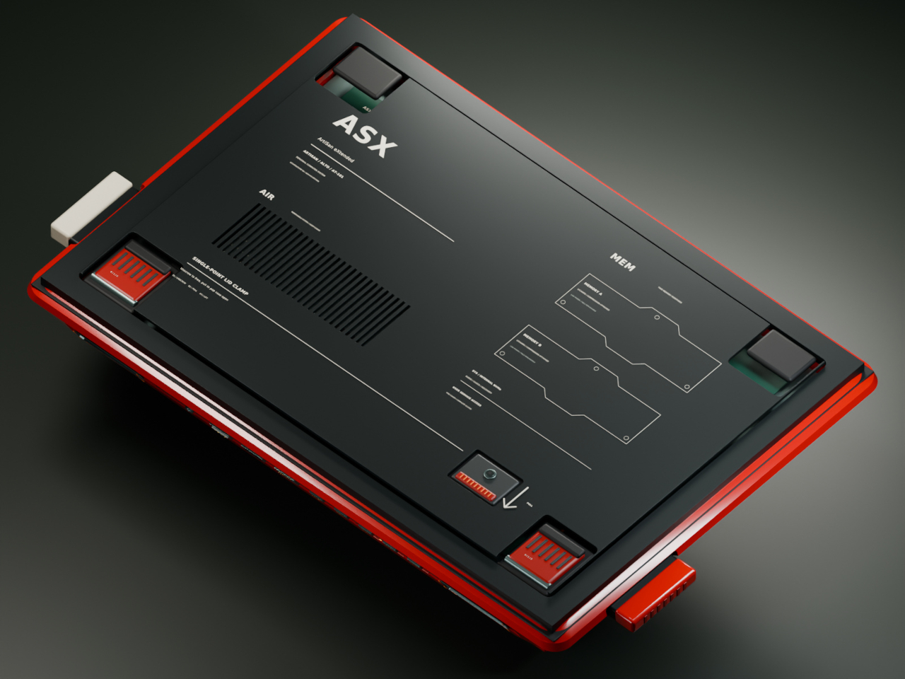
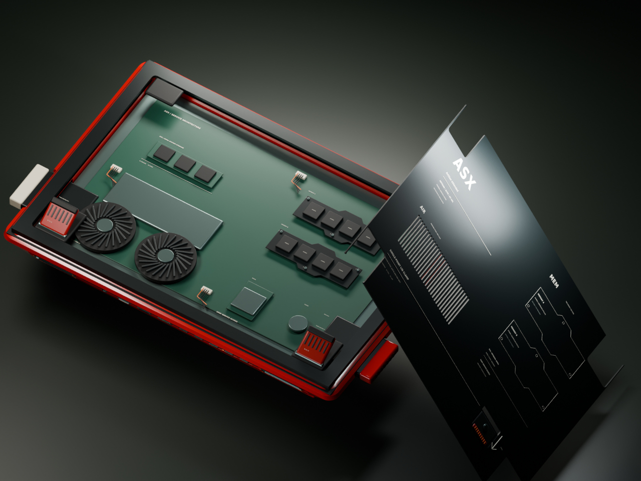
Flip the machine over and the same philosophy continues. Memory access sits in the open rather than buried under layers of casing, rear supports adjust to match your desk setup, and a single screw releases the service clamp entirely. Every one of these choices treats a computer’s insides as something worth respecting, not hiding behind warranty stickers and proprietary screws.

Around back, a compact connector panel handles the practical side of daily use. USB-C power sits alongside labeled ports for two cartridges, additional USB-C connections, LAN, HDMI, USB-A, and audio, all routed cleanly to keep cables from tangling across the front of a desk. Even the exhaust vents get a considered shape, flanking the connector panel like a pair of small turbines venting heat from all that cartridge-driven ambition.

The post Laptops Sealed Computers Shut, ARTISAN ALTO Snaps Them Back Open first appeared on Yanko Design.

  •  

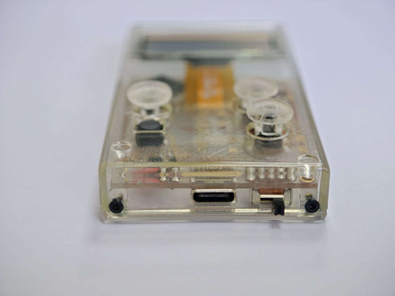
Clear-Shell Game Boys Never Made the Screen Transparent, Arduview Did

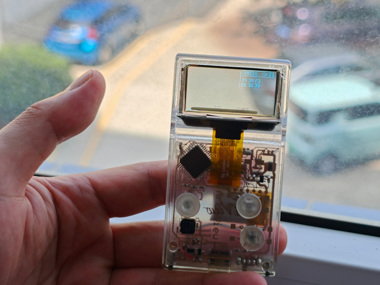
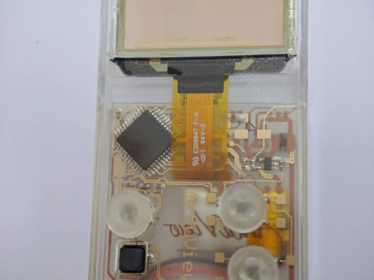
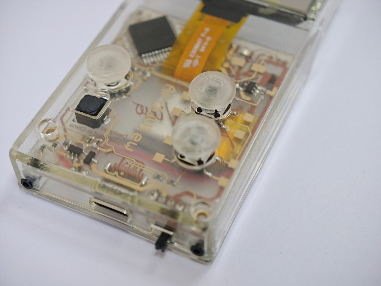
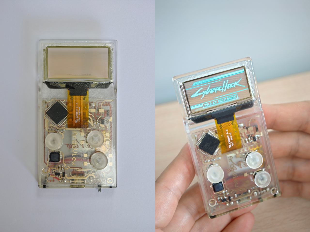
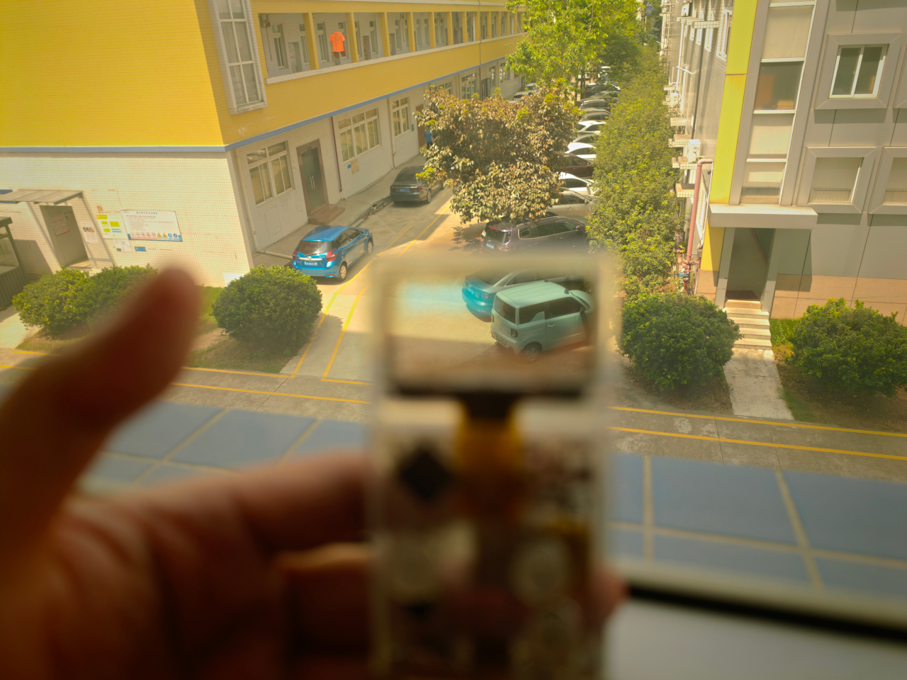
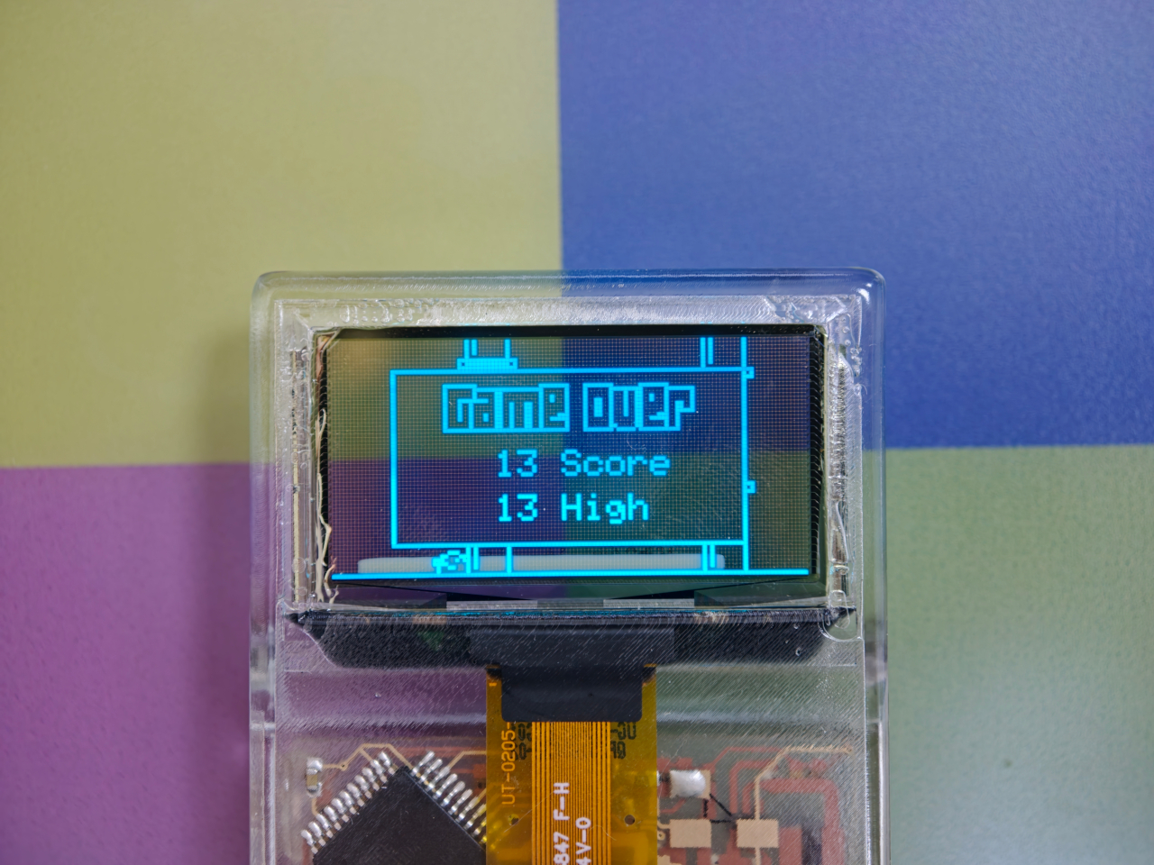
Every gadget on a desk is built to hide what makes it work. Phones, consoles, controllers, they’re all sealed slabs designed to keep the copper and silicon out of sight. Arduview refuses that logic entirely. Its shell is clear, its circuit board is clear, and its OLED display lets you watch pixels light up while seeing straight through to the components producing them.

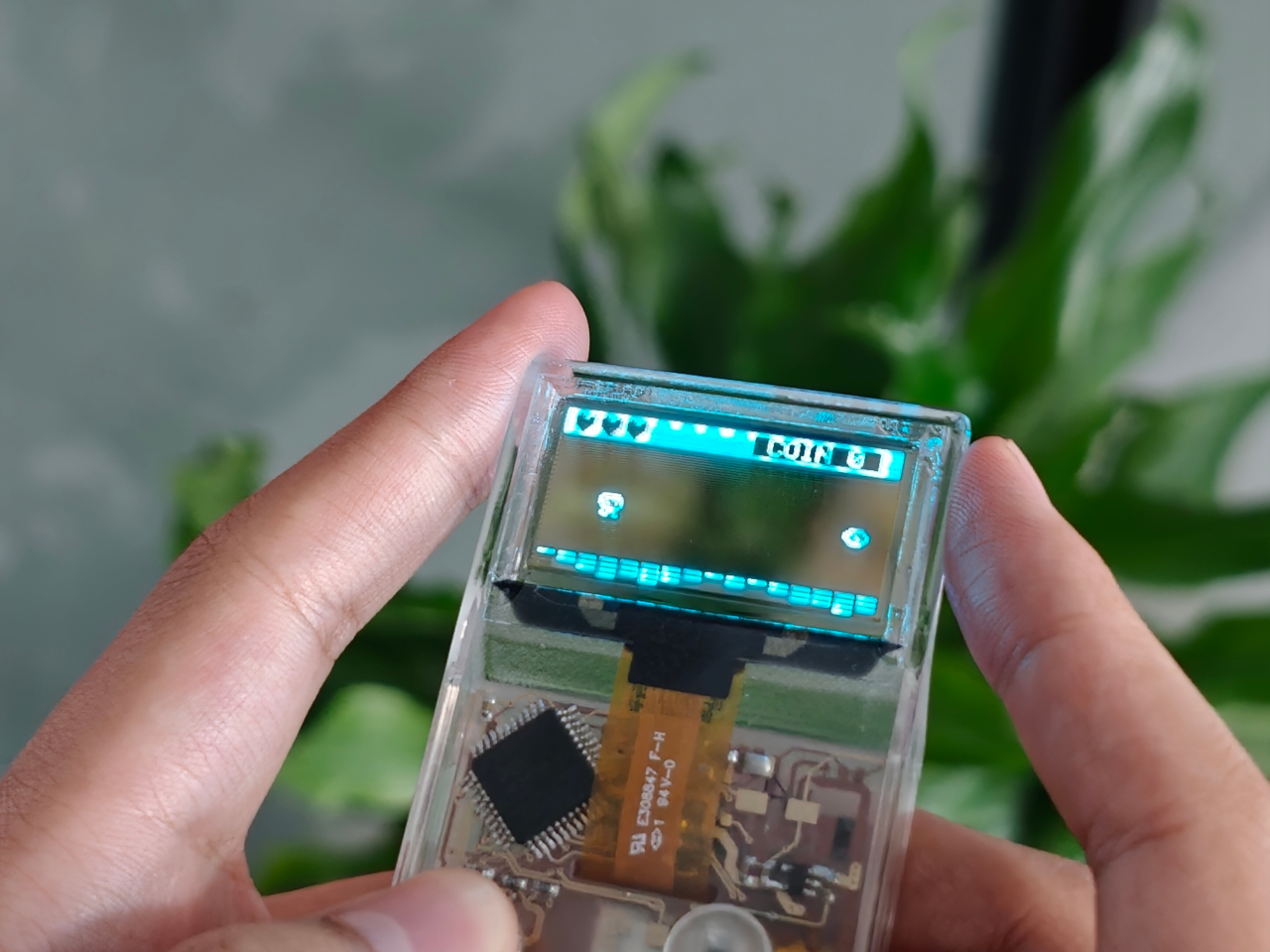
Retro handhelds have flirted with transparency before. Clear-shell Game Boys and modded Miyoo units let you glimpse a shadow of the board through tinted plastic, but the display itself stayed opaque, a black rectangle sitting in an otherwise see-through frame. Arduview closes that gap by making the screen itself transparent, so nothing on the device breaks the illusion of looking clean through it.

Designer: Louis Huang

Peer through the front and the internals aren’t just visible; they’re the entire visual identity. The board, the chip, an orange copper flex cable, the button domes, and the USB-C port all sit in plain view, arranged the way a watchmaker might arrange gears behind sapphire crystal. Nothing here was designed to be hidden later. It was designed to be looked at from day one.

That philosophy extends to how the thing works, not just how it looks. Built on Arduboy, an open-source handheld platform, Arduview skips the layers that usually complicate small electronics. There’s no app store hunting, no Wi-Fi pairing, no account setup standing between you and 400 preloaded games. Power it on and it plays, the same instant gratification that made simple handhelds addictive in the first place.

At 50 grams and roughly the footprint of a credit card, the size does real work here. A device this small and this light stops being a dedicated gaming session and starts being something you carry the way you’d carry a keychain or a pocketknife, small enough to disappear until the moment you want it. Pull it out on a train platform or set it on a desk between meetings, and it reads less like a toy and more like a curiosity someone can’t resist picking up.

That reaction seems to be the entire point. A transparent gadget invites touching in a way an opaque one never does, because there’s an implicit dare in showing your internals: come look closer. Arduview leans into that dare completely, treating the space usually reserved for a case as prime real estate for the very thing most companies spend their design budgets concealing.

Retro gaming has always had a strong current of nostalgia running through it: chunky buttons, pixel art, low-resolution charm. Arduview borrows all of that while adding something genuinely new to the mix: a device that looks like it belongs in a display case at a design museum as much as it belongs in a pocket.

The post Clear-Shell Game Boys Never Made the Screen Transparent, Arduview Did first appeared on Yanko Design.
  •  

Your Second Screen Can Finally Work With No Cables and No Outlet

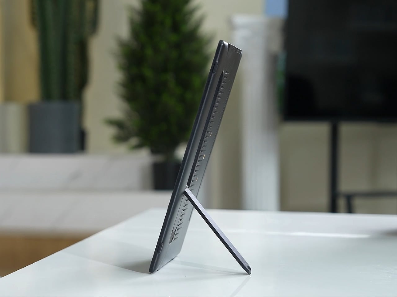
Desks are overrated. So are the cables that come with them. The 4URPC is a 15.6-inch wireless touchscreen monitor built for people who’d rather not be chained to an outlet just to get a bigger screen. It’s slim, self-powered, and ready to mirror whatever’s on your phone, tablet, or laptop the moment you need more room to work, watch, or play.

Cutting the cord doesn’t mean cutting functionality. The monitor mirrors an iPhone or Android device through a peer-to-peer wireless connection, no home Wi-Fi or app required. For streaming platforms like YouTube, Netflix, or Hulu, connecting to Wi-Fi and tapping the built-in TV Cast icon sends video to the screen. Either way, there’s no dongle to lose or cable to untangle before the movie starts.

Designer: 4URPC

Click Here to Buy Now: $219 $399 (45% off). Hurry, only 451/600 left! Raised over $181,000.

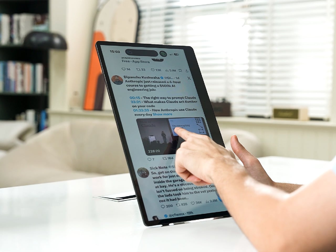
The more interesting trick happens after mirroring starts. The 10-point touchscreen can send input back to the connected phone, turning the monitor into a larger, shared control surface. Flip through photos with a friend, walk a colleague through a presentation, or hand someone the reins without handing over your phone. It’s a shift that makes shared screen time less awkward.

None of this would matter much if the monitor were bulky. At half an inch thick and just over 2 pounds, it’s built to disappear into a backpack rather than dominate it. The matte, textured shell keeps fingerprints and glare to a minimum, and a fold-out kickstand on the back means setup takes seconds on a desk, a kitchen counter, or the arm of a couch.

A built-in 4,000 mAh battery backs up that portability by taking the wall outlet out of the equation. Setting up on a train, in a hotel room, or on a patio doesn’t mean scouting for the nearest plug first. That same battery can lend a charge to a connected phone, turning the monitor into a backup power bank when the moment calls for it.

Plug it into a laptop with a USB-C cable, and the 4URPC switches roles, becoming an extended display rather than a wireless mirror. Dragging a browser tab, a chat window, or a reference document onto the second screen takes a second, and the touchscreen works over the wired connection. The laptop stays focused on the main task while the extra display handles everything else.

The screen also rotates between landscape and portrait without any fuss, which sounds minor until it changes how you use it day to day. Landscape suits video calls, games, and spreadsheets, while portrait mode fits scrolling through documents, reading long articles, or checking social feeds. Switching between the two takes a twist of the stand, not a trip through a settings menu.

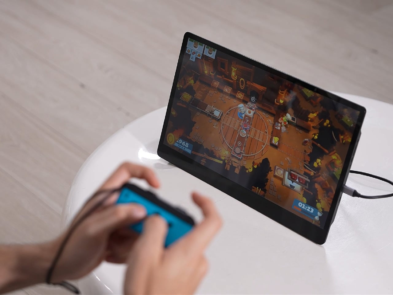
Compatibility runs wide enough that most people won’t need to think twice before connecting. Wireless mirroring covers iPhones, Android phones running version 10 or later, MacBooks, and most Windows laptops, while the wired USB-C or HDMI input works with game consoles, streaming boxes, and the Nintendo Switch. There’s no software to install and nothing to configure; connecting the device and turning it on is the entire setup process.

Under the glass sits a 1920×1080 matte IPS panel running at 60 Hz, built more for comfortable, glare-free sessions than eye-popping color numbers. Dual USB-C ports split power delivery and video duties, small stereo speakers cover casual audio, and a VESA mount plus a standard camera screw thread add mounting options beyond the built-in stand. It’s a practical set of choices rather than a flashy one.

There’s something telling about a monitor that assumes you won’t always be sitting at the same desk tomorrow. Work has scattered across kitchen tables, coffee shops, and airport gates for a while now, and screens are only starting to catch up. The 4URPC doesn’t try to be the sharpest or brightest display around; it just tries to be wherever you happen to land next.

Click Here to Buy Now: $219 $399 (45% off). Hurry, only 451/600 left! Raised over $181,000.

The post Your Second Screen Can Finally Work With No Cables and No Outlet first appeared on Yanko Design.
  •  

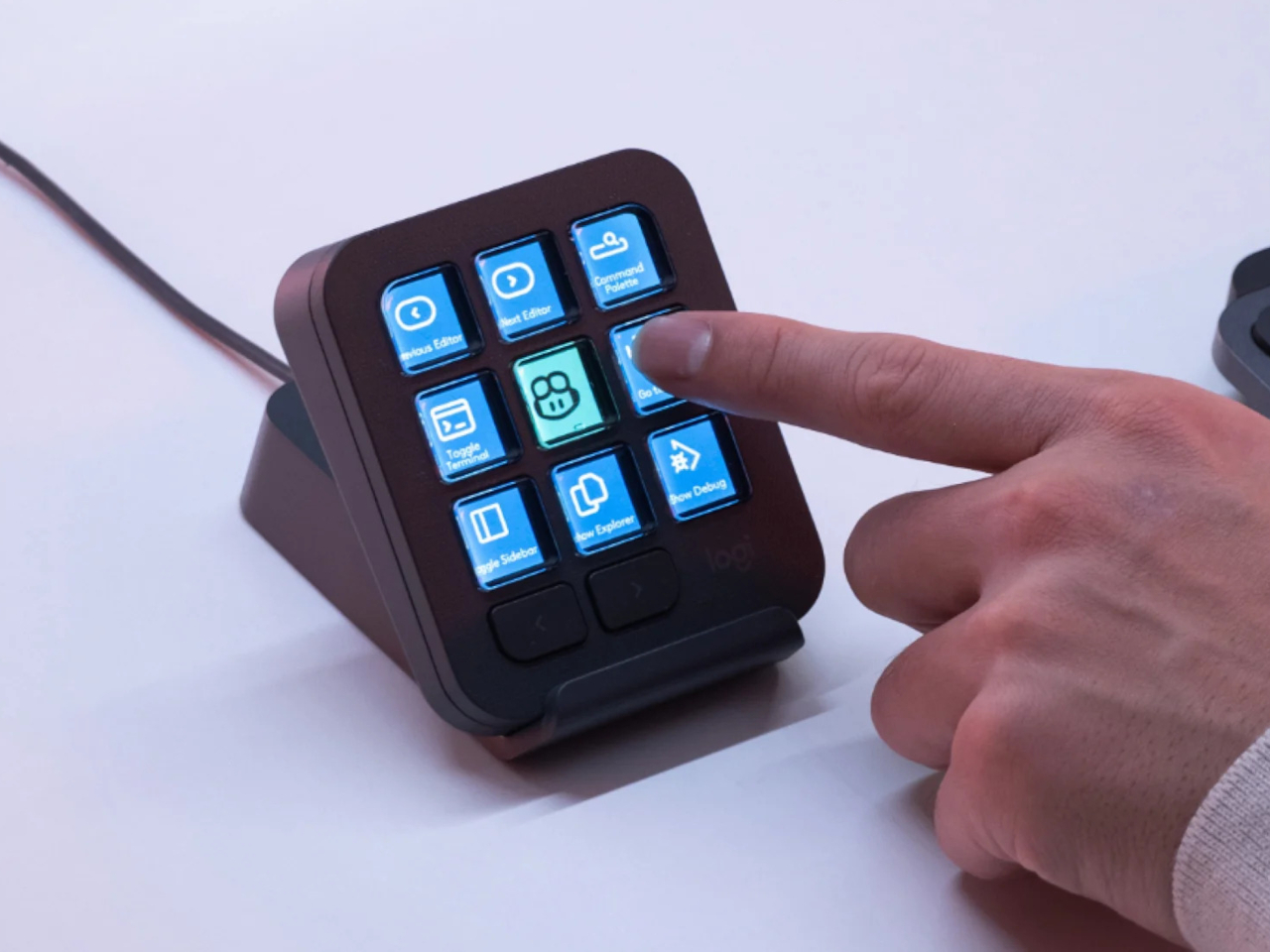
The $100 Keypad That Puts Each AI Coding Tool Behind Its Own Button

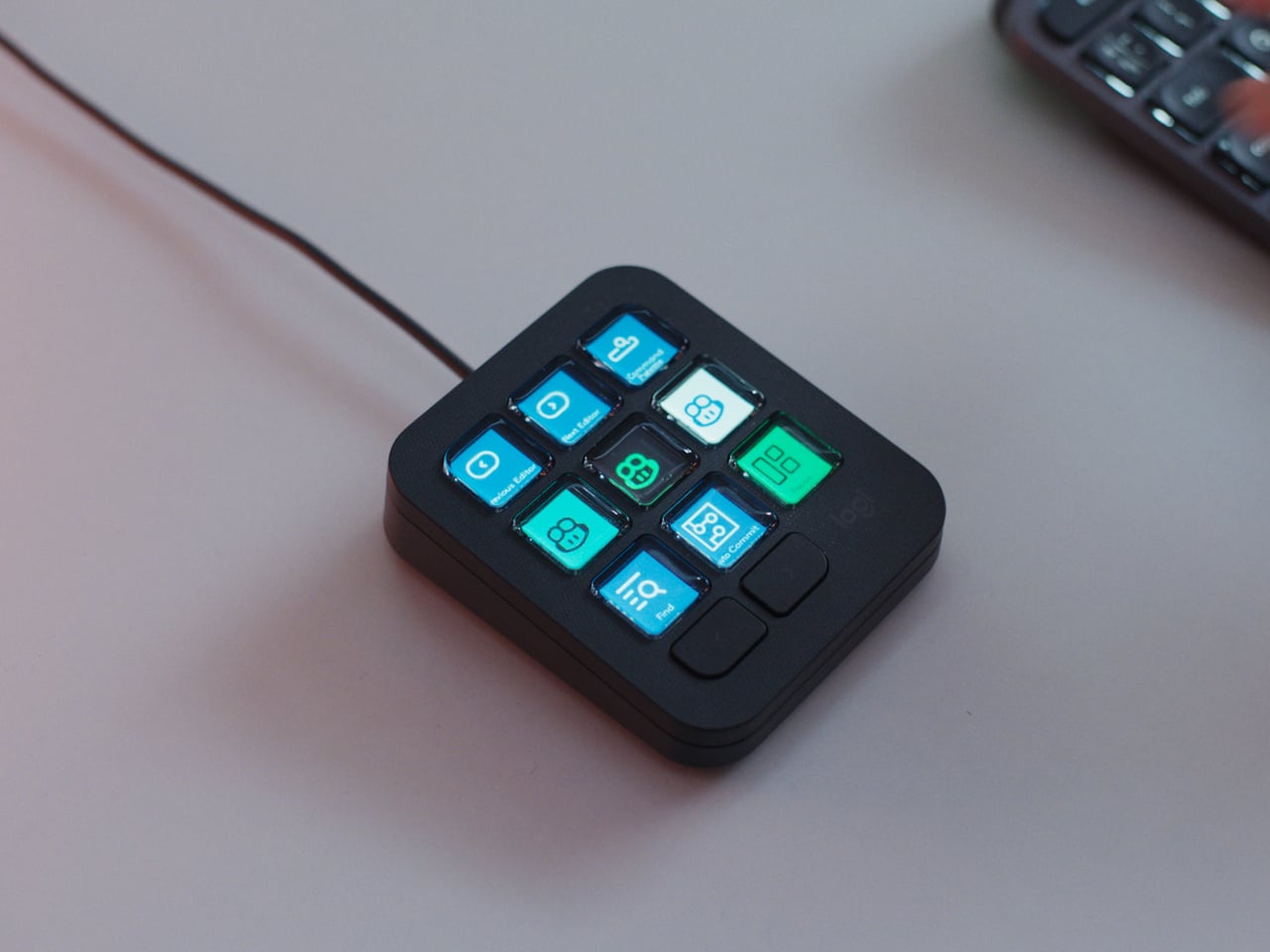
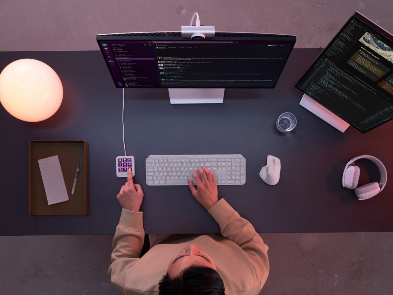
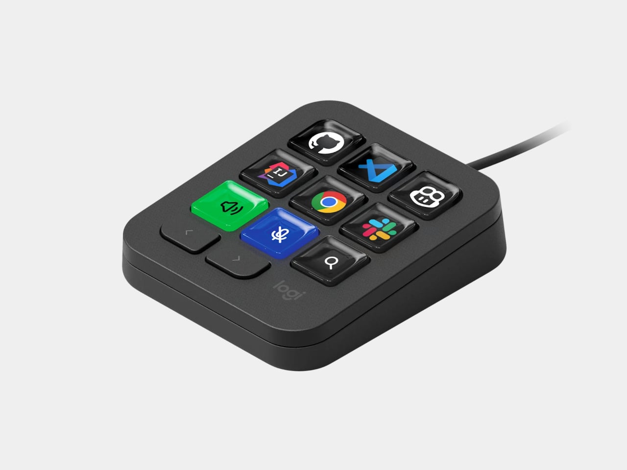
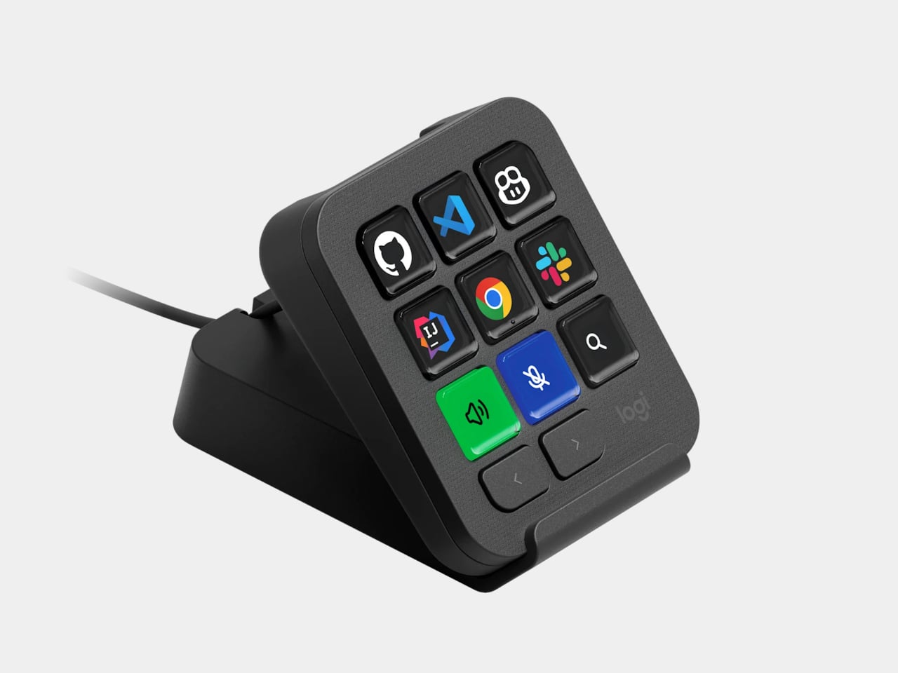
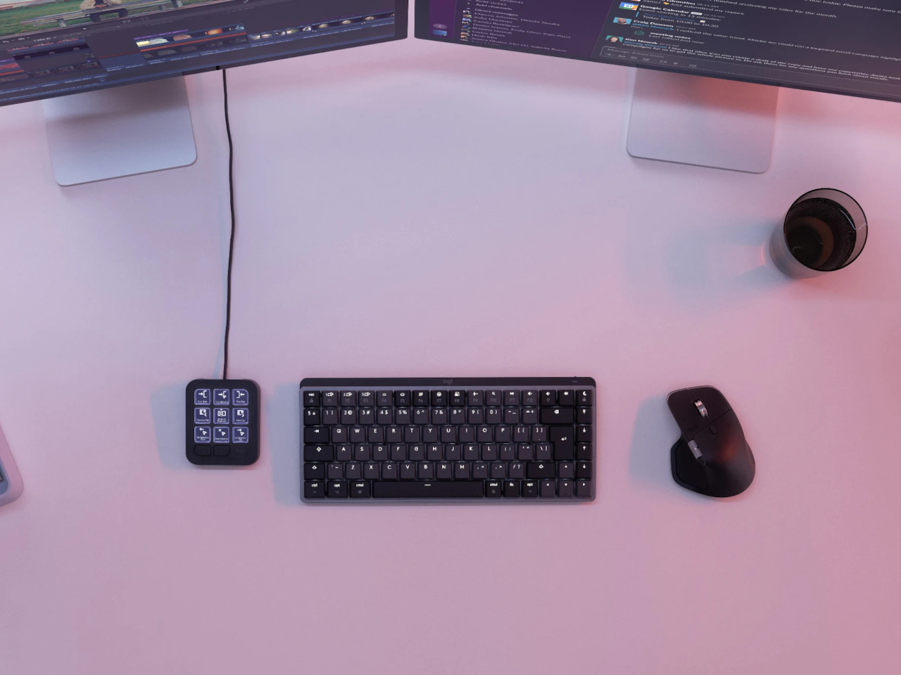
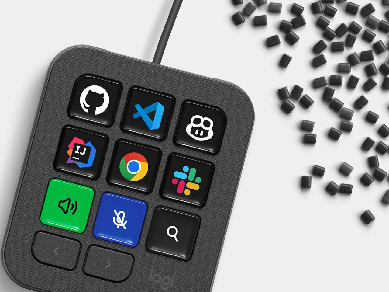
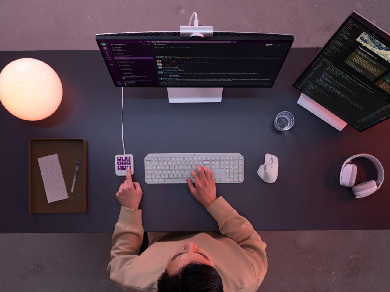
Every developer juggling AI agents right now knows the feeling of context switching until the whole workflow blurs together. Copilot suggests something in one window, Claude Code runs a task in another, and a dozen prompts live scattered across notes and muscle memory. The Logitech MX Keypad exists to collapse all of that into nine small screens sitting next to the keyboard, each one a physical shortcut into a specific piece of that chaos.

Every key on the keypad carries its own full-color LCD display, so instead of memorizing which function key does what, you glance down and see an icon that actually represents the command underneath it. Press one, and it can refactor a function, trigger a prompt macro, or hand off a task to an AI agent entirely. That small visual feedback loop turns an abstract keyboard shortcut into something closer to a labeled button on a control panel.

Designer: Logitech

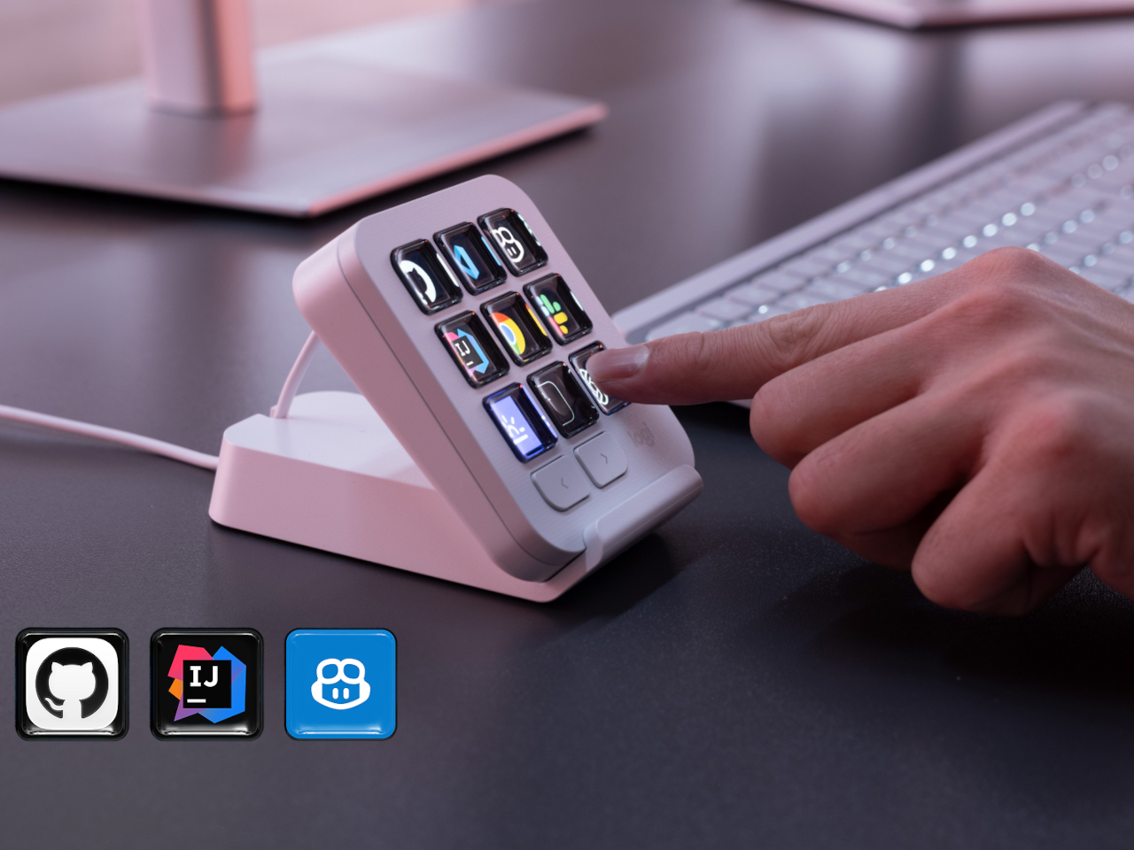
What makes the hardware worth paying attention to is where Logitech chose to draw the compatibility line. Instead of building this around one coding environment, the MX Keypad works across GitHub Copilot, Claude Code, VS Code, and IntelliJ IDEA at once. A developer bouncing between an IDE and a terminal-based AI agent doesn’t need separate tools for each, just a different page of keys pulled up on the same nine buttons.

That pattern of paging matters more than it sounds. The keypad can hold multiple profiles, so switching from a Python project running through Copilot to a JavaScript refactor handled by Claude Code becomes a single tap rather than a mental reset. Anyone who has lost a train of thought hunting through browser tabs for the right prompt will recognize the value in never breaking eye contact with the code itself.

Underneath the surface, the MX Keypad ships with prebuilt plugins that Logitech had developers test directly against real coding platforms, rather than shipping generic templates and hoping they fit. An SDK opens the door further, letting teams build their own tools around internal workflows, while a community marketplace means the plugin library keeps growing without waiting on Logitech’s own release schedule.

None of that ambition comes wrapped in bulky, wasteful materials either. The body is made with recycled plastics, keeping the hardware in line with the sustainability commitments Logitech has built into its broader MX ecosystem. It is a small detail, but for a device meant to live permanently on a desk, it matters that the object itself doesn’t feel disposable.

At $99.99, the MX Keypad occupies a strange but clarifying position in a developer’s setup. It doesn’t replace a keyboard, and it doesn’t try to be an AI tool in its own right. Instead, it works like a translator between fast-moving human intent and the growing swarm of coding agents developers now manage daily, one labeled key at a time.

The post The $100 Keypad That Puts Each AI Coding Tool Behind Its Own Button first appeared on Yanko Design.
  •  

An Android Drawing Tablet With 127 Layers That Still Feels Like Paper

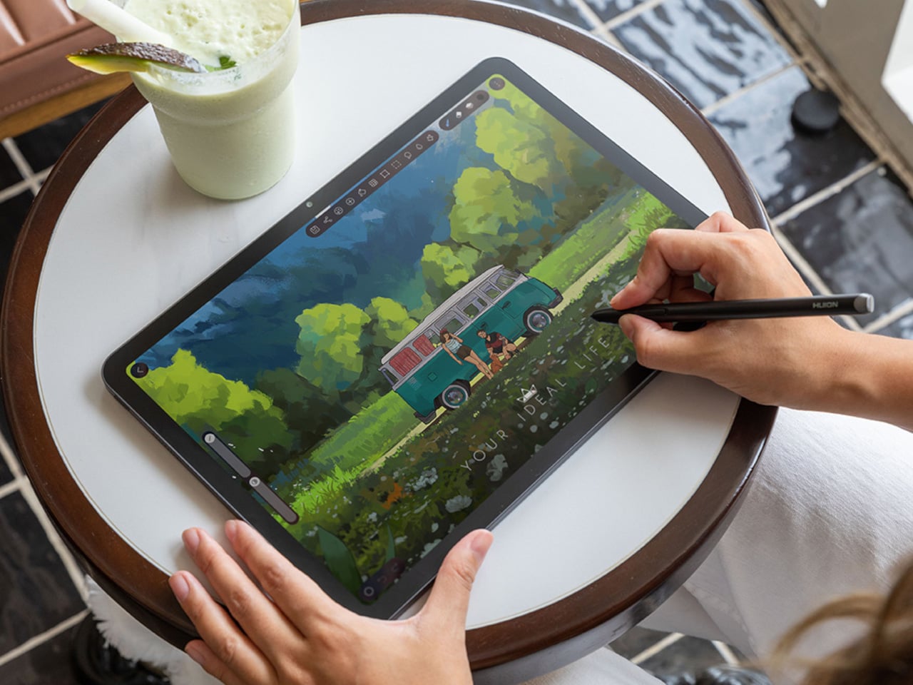
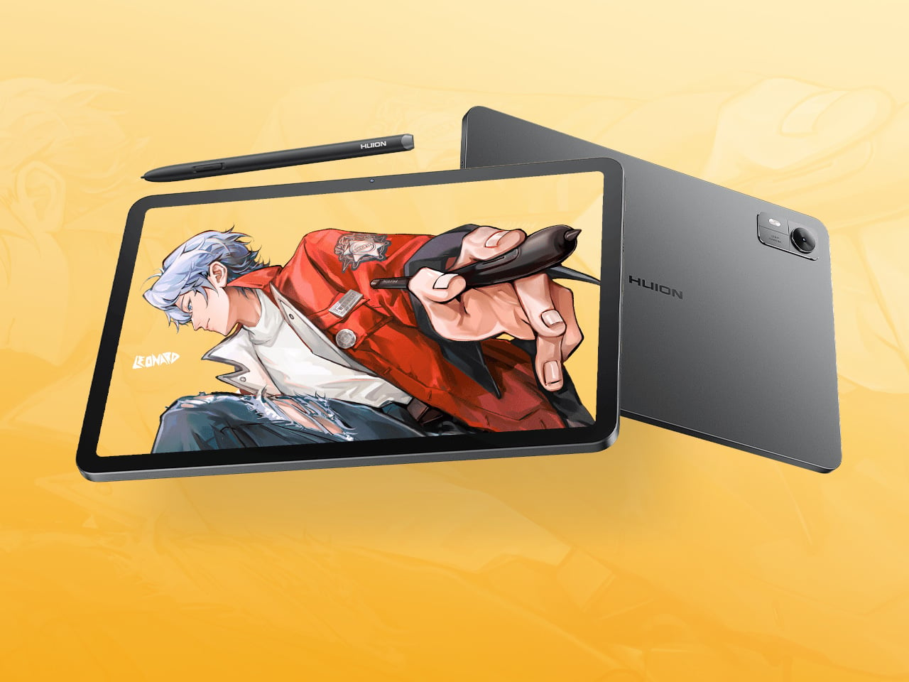
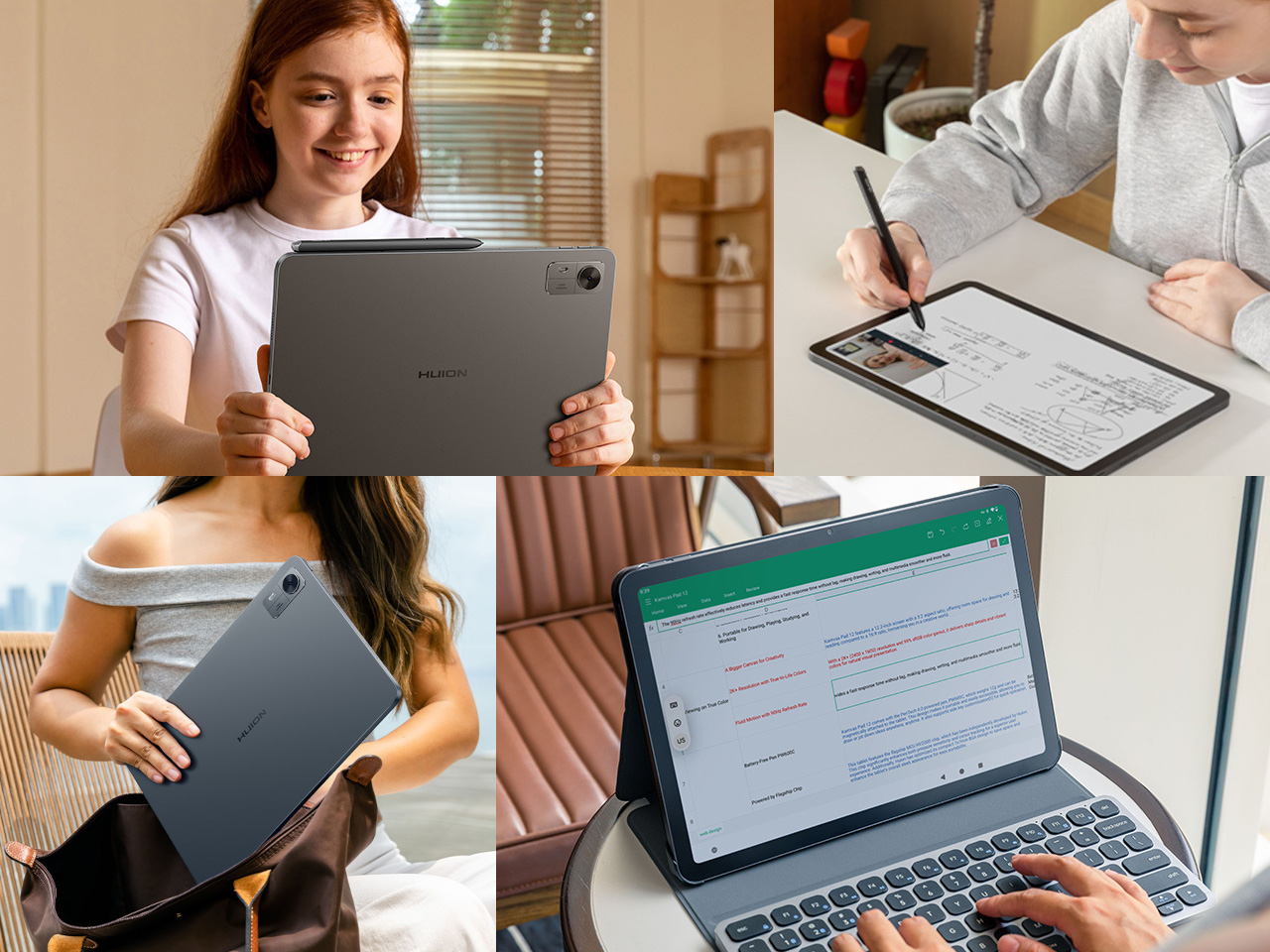
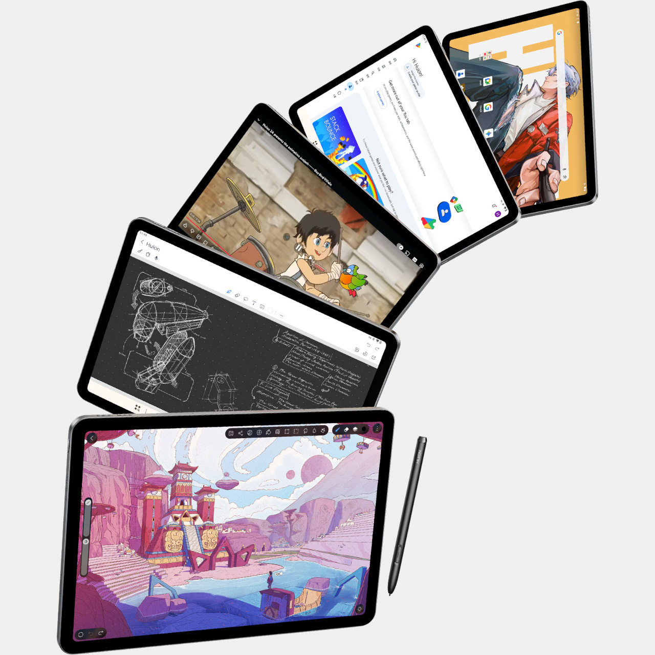
Most Android drawing tablets make you choose between a screen that feels like paper and hardware fast enough to keep up with a real workflow. The Kamvas Pad 12 refuses that trade-off. Huion built a 12.2-inch standalone tablet around a textured, paper-like display and paired it with enough processing power to hold 127 layers open without stuttering, treating the screen as a genuine canvas rather than a stylus afterthought.

That screen runs a 3:2 aspect ratio instead of the usual 16:9, and the difference shows up the moment you start sketching. A wider canvas means fewer awkward crops when composing a portrait or a page layout, and it doubles as a better shape for reading documents or comics without letterboxing. Combined with a 90Hz refresh rate, linework tracks the pen smoothly instead of lagging a beat behind your hand.

Designer: Huion

Canvas Glass 3.0 does the quieter work here. The surface is nano-etched for texture, so the pen tip grips the way it would on actual paper, while a soft-light treatment and anti-glare coating keep long sessions from turning into eye strain. Setting up near a window or working outdoors doesn’t wash out the display, which matters more than most spec sheets give it credit for.

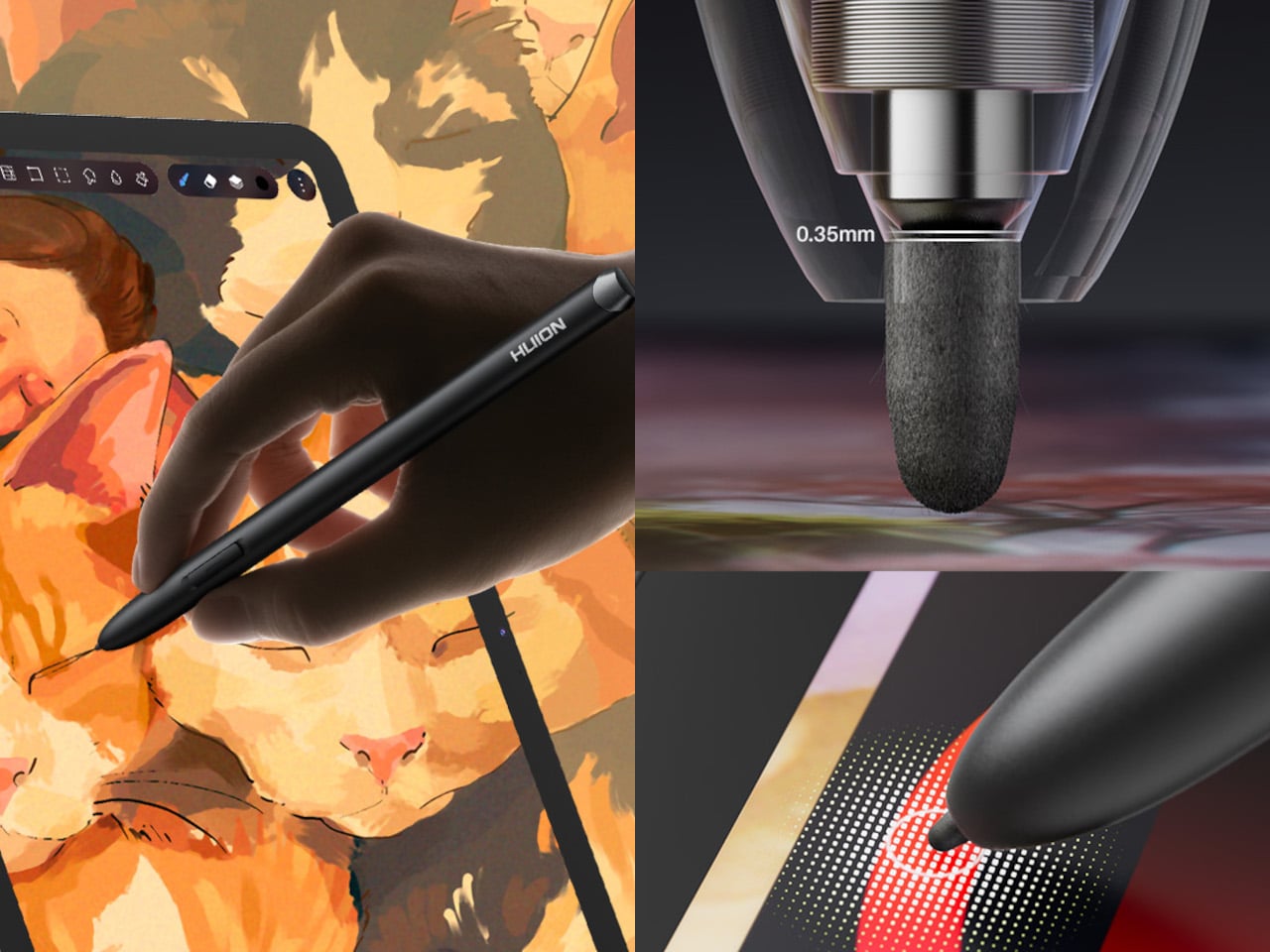
The PW600C pen leans into that same philosophy of getting out of the way. It’s battery-free, weighs just 12 grams, and snaps magnetically onto the tablet body instead of needing a separate case or loop. Someone sketching on a train can toss the pen against the tablet’s edge between stops and trust it’ll still be there, without fishing through a bag for a charging cable or a lost cap.

Underneath, an eight-core MediaTek Genio 720 chip and 8GB of RAM handle the kind of multitasking that used to choke budget Android tablets, running multiple layers and apps without the frame drops that make digital painting frustrating. At 16,384 pressure levels and 60-degree tilt support, the stylus itself translates a feather-light highlight or a bold ink stroke with the kind of nuance that used to be reserved for pricier displays.

Storage tops out at 256GB onboard with room to expand to 1TB, so a growing library of finished pieces, reference photos, and half-done sketches doesn’t force anyone into constant cleanup. Android 16 and full Google Play access mean the tablet isn’t locked into a single app either. Clip Studio Paint, ibisPaint X, MediBang Paint, and Huion’s own HiPaint all come preloaded, ready for whichever workflow fits the project at hand.

Battery life rounds out the case for treating this as a genuine mobile setup instead of a tethered accessory. An 8,000mAh cell inside a 7.8mm metal body keeps the Kamvas Pad 12 running for roughly eight hours, long enough for a full day of sketching at a café or a cross-country flight without hunting for an outlet. That kind of stamina turns a drawing tablet into something closer to a sketchbook you never outgrow.

The post An Android Drawing Tablet With 127 Layers That Still Feels Like Paper first appeared on Yanko Design.
  •  

Xiaomi 18 Fold Hands-On: Got Here Before Apple, Can It Beat Samsung?

Xiaomi has chosen an interesting moment to return to foldables. The company has not released a book-style foldable since the Mix Fold 4, which launched in 2024, and now it is back with the Xiaomi 18 Fold just as compact foldables are starting to get more attention. Samsung has also added a foldable in this compact format to its lineup, and Apple is widely expected to unveil its first foldable iPhone at its September 9 event with a similar form factor in mind.

That puts the Xiaomi 18 Fold in an interesting spot. It is not just Xiaomi coming back to foldables after a break. It is also arriving just as this smaller book-style format looks like it could become the next big thing.

Designer: Xiaomi

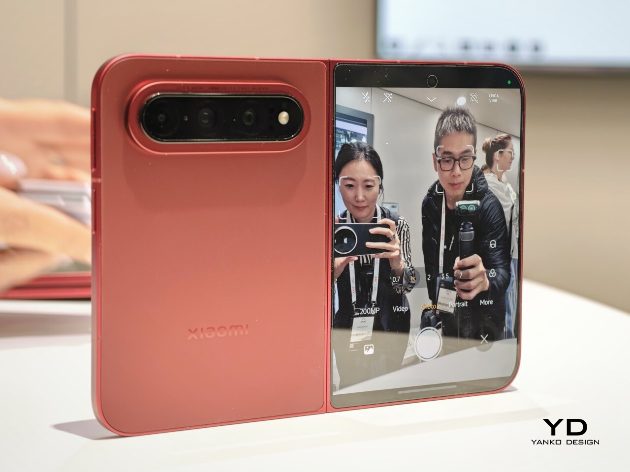
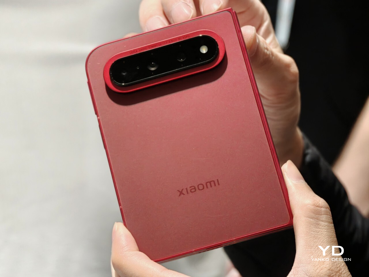
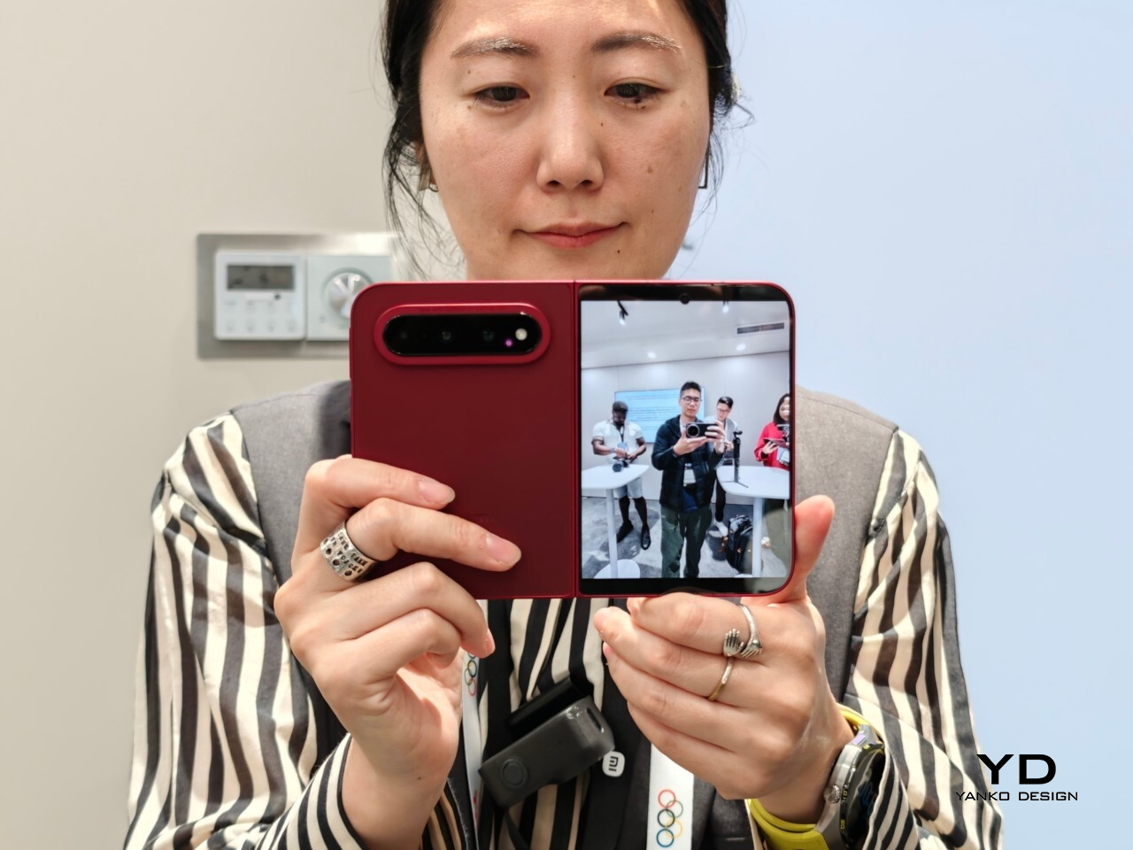
Xiaomi is positioning the 18 Fold as its first mid-size flagship foldable. It weighs 7.73 ounces (219g), measures 0.42 inches thick when folded (10.68mm), and opens out to just 0.20 inches thick (5.02mm), with a folded footprint of 4.64 x 3.29 inches (117.8 x 83.6mm). In person, it feels thin, though not unusually thin by the standards of today’s premium foldables. More importantly, it feels expensive in a good way. The matte texture on the back and frame gives it a softer, understated finish, while the rounded corners and flat frame help the phone look clean and modern.

The unit I handled was the deep red version, and it is a bold color in person. It stands out more than the usual black or silver foldable palette without feeling too loud. It also happens to echo the deep red finish rumored for Apple’s first foldable, which makes the comparison hard to miss. The 18 Fold comes in Black, White, Red, and a Ceramic Version.

In practice, though, this is still a two-handed phone whether it is folded or unfolded. Even closed, the body is compact in one sense but still broad enough that I did not think of it as something built for easy one-handed use. That is not really a criticism. It just comes with the territory.

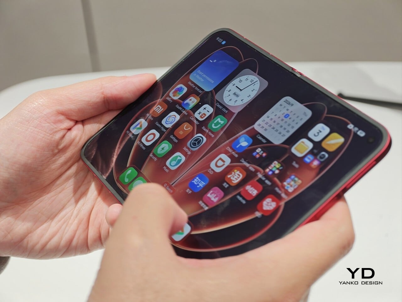
The outer display is a 5.38-inch panel, while the inside opens up to a 7.58-inch main screen. Xiaomi says both displays share the same aspect ratio, which is meant to make the transition from one to the other feel more natural. I could not fully judge how well that works in daily use from a short demo, but one benefit stood out right away. Video felt more immersive than on squarer foldables because there was less black bar space above and below the image.

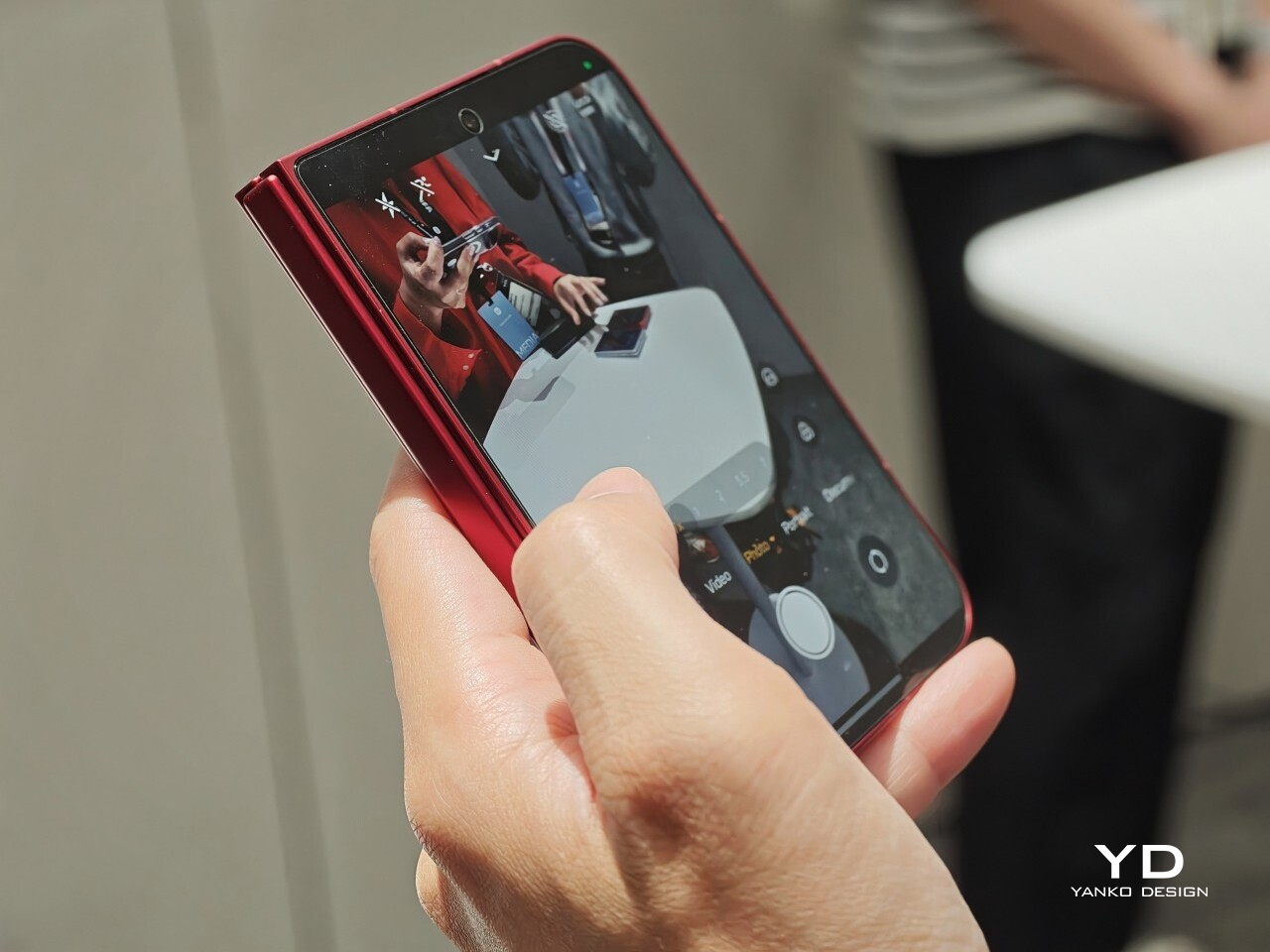
The software also looked well suited to the shape. Animations felt smooth in my brief demo, and I did see split-screen and floating window support in action. The unfolded UI felt more like a small tablet than a stretched phone, which is what you want on a device like this. Xiaomi has also placed one speaker on the top edge and another on the bottom edge on the opposite side, which should help give the phone a more balanced stereo effect when it is open.

The hinge left a good first impression too. I cannot really say whether it felt especially firm or especially smooth, because my time with the device was limited, but it did feel sturdy. The crease was handled well too. Looking straight at the display, I only really noticed it from certain angles rather than all the time. More importantly, I could barely feel it when running a finger across the center, which was better than I expected.

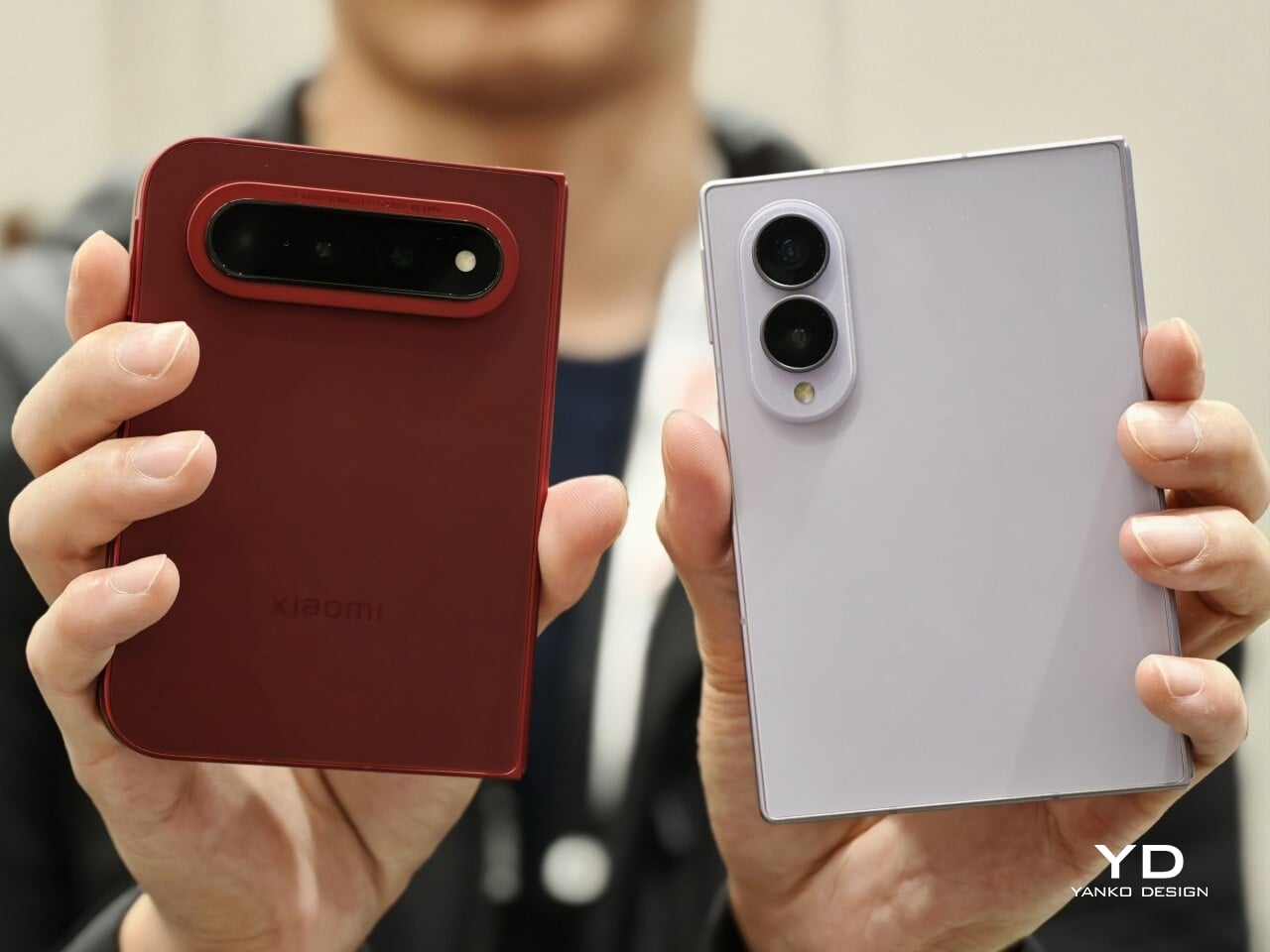
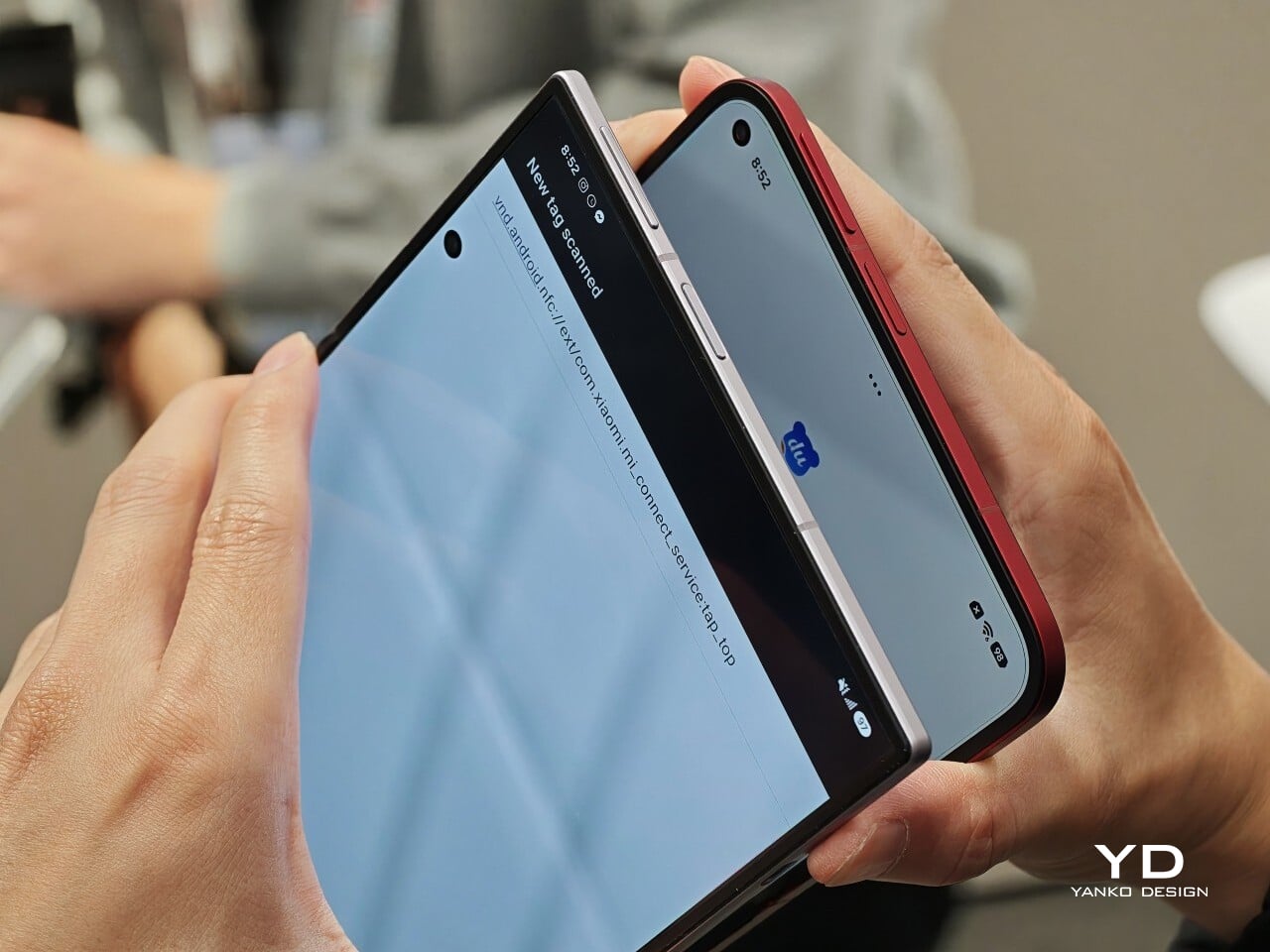
Left: Xiaomi 18 Fold, Right: Galaxy Z Fold 8

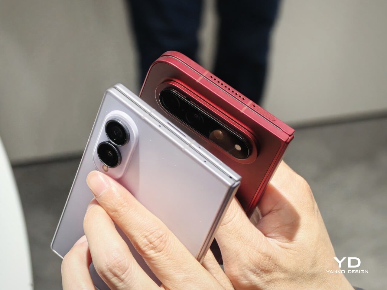
Left: Galaxy Z Fold 8, Right: Xiaomi 18 Fold

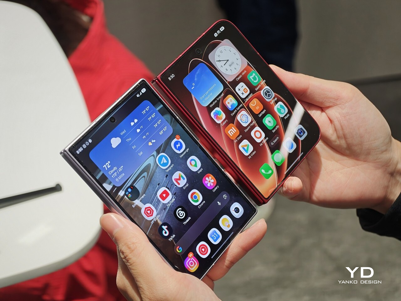
Left: Galaxy Z Fold 8, Right: Xiaomi 18 Fold

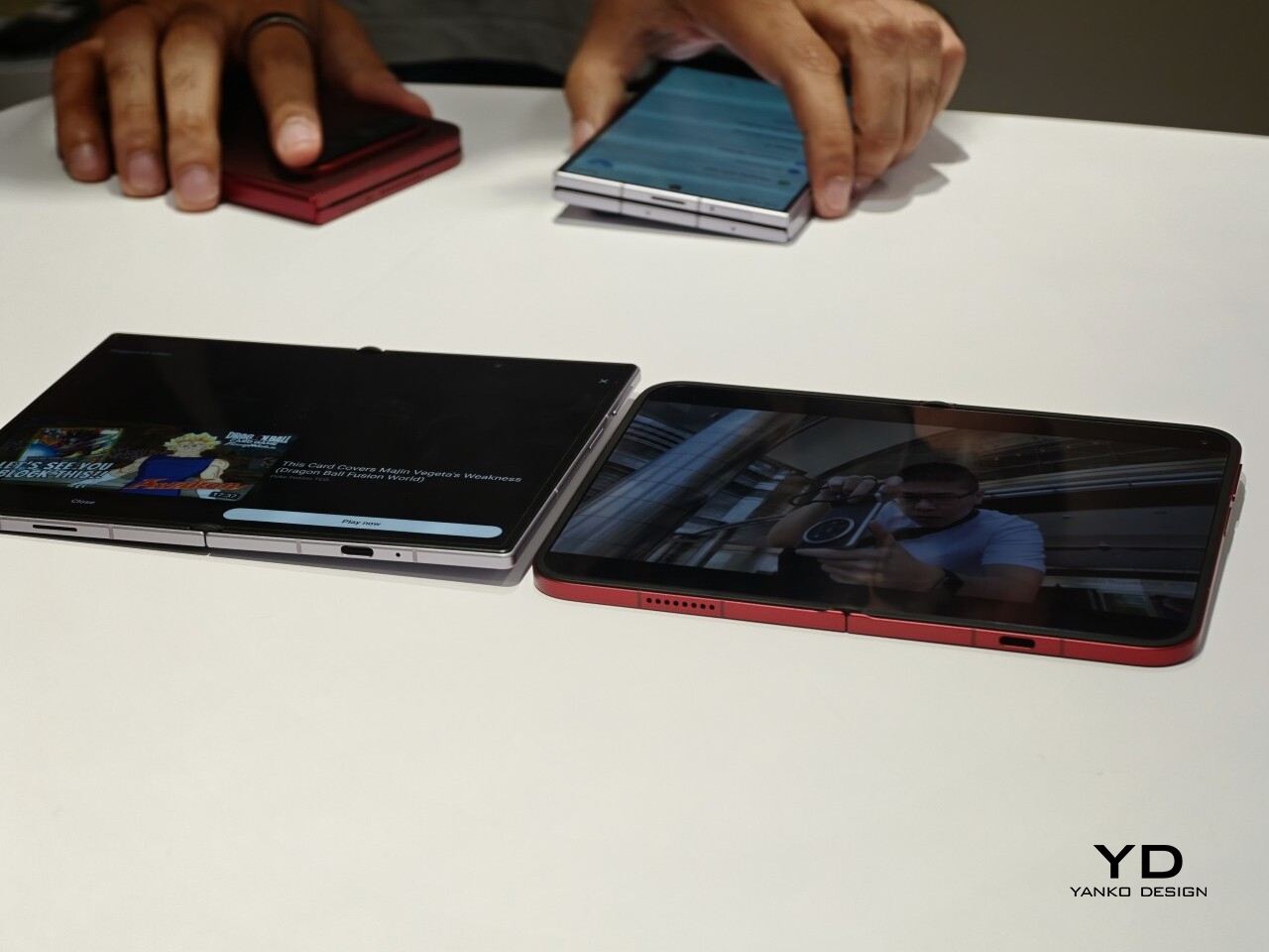
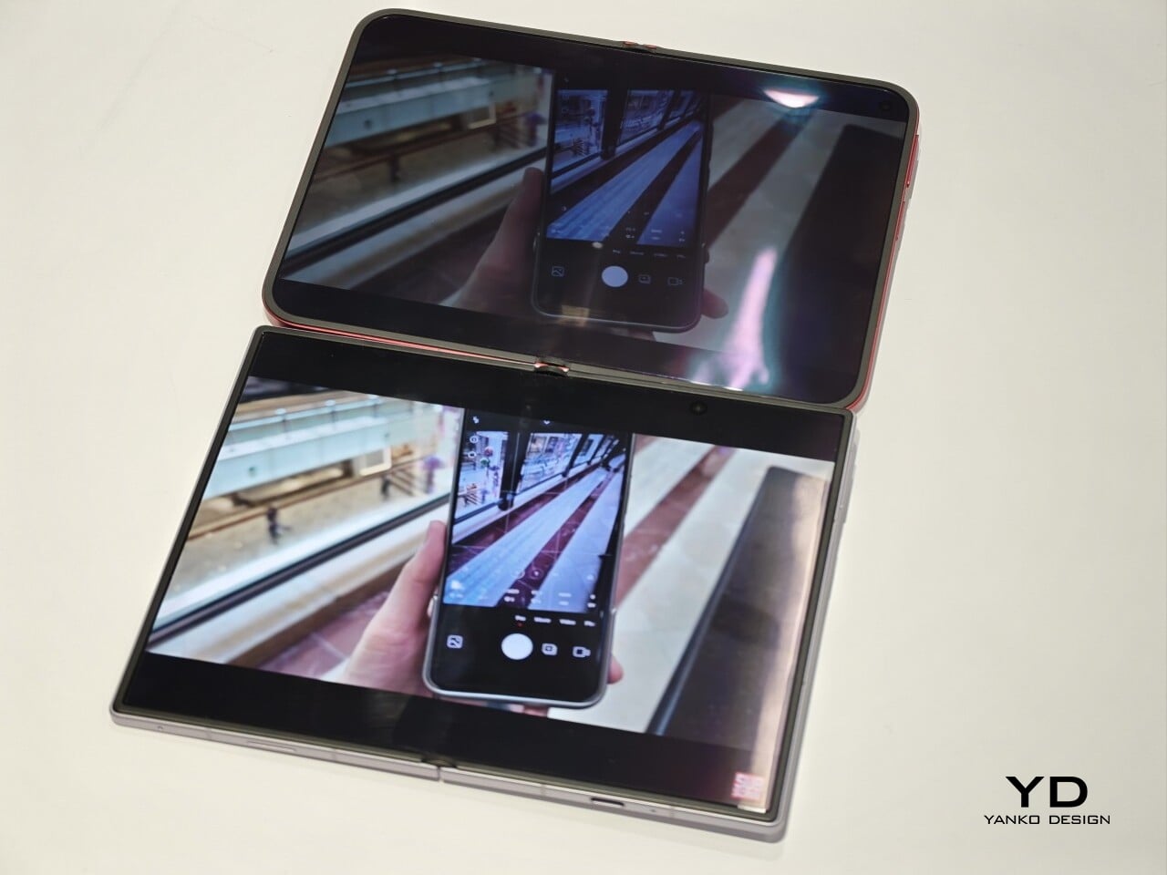
I also compared the Xiaomi 18 Fold side by side with Samsung’s Galaxy Z Fold 8. Samsung’s device measures 4.88 x 3.22 x 0.38 inches when folded (123.9 x 81.9 x 9.7mm), 6.35 x 4.88 x 0.18 inches when unfolded (161.4 x 123.9 x 4.5cm), and weighs 7.09 ounces (201g), so it is a little lighter and a bit thinner than Xiaomi’s foldable in some areas. But the difference was not just about dimensions. Samsung’s inner screen was noticeably brighter to my eyes. At the same time, the Xiaomi 18 Fold had one practical advantage that stood out immediately. When placed on a desk, it did not wobble, while the Samsung did.

Left: Galaxy Z Fold 8, Right: Xiaomi 18 Fold

Left: Galaxy Z Fold 8, Right: Xiaomi 18 Fold

Top: Xiaomi 18 Fold, Bottom: Galaxy Z Fold 8

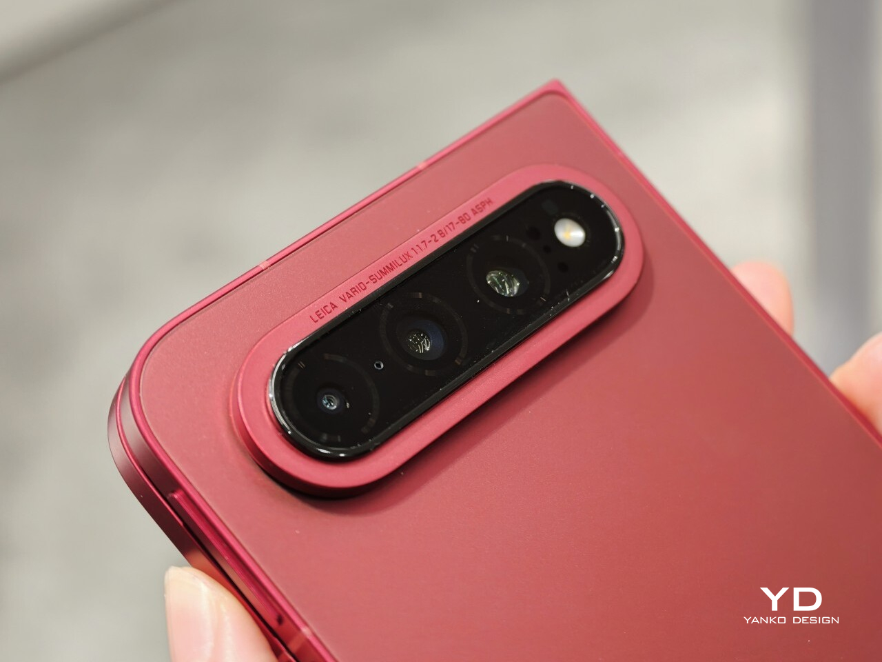
The biggest surprise for me was the camera. Xiaomi is using a 200MP Leica triple-camera system, led by a 200MP main camera and backed by a 50MP Leica periscope telephoto with an 80mm equivalent focal length. In my short time with the phone, the telephoto camera was the part that stuck with me most. I tried zoom, and the 3.5x telephoto setup immediately felt like one of the most interesting parts of the device. Stability also felt good even at higher magnification, which made the zoom feel more usable, not just more dramatic. The camera bump also did not seem overly large, and its oval-shaped, two-step raised design gives it some presence without taking over the whole back.

My time with the Xiaomi 18 Fold was brief, and this hands-on really only scratched the surface. Even so, the phone already feels like a polished return to book-style foldables. Pricing starts at RMB 10,999, or roughly $1,640, for the 12GB/256GB model, and Xiaomi said it will be available in China only for now.

The post Xiaomi 18 Fold Hands-On: Got Here Before Apple, Can It Beat Samsung? first appeared on Yanko Design.
  •  
❌