Connexion

Why CMF’s New Milk Carton Speakers Are So Irresistible To Look At
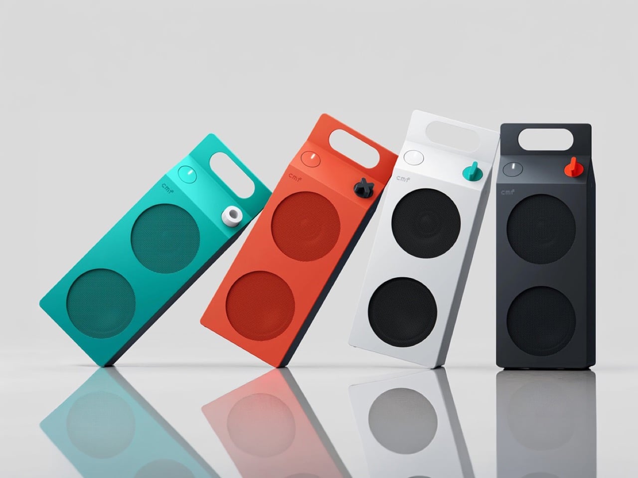
Everyone has held a milk carton, which is exactly why CMF’s new speakers are so hard to stop looking at. CMF, the budget sub-brand of Nothing, shaped its first Bluetooth speakers like gable-top cartons, a form that toy manufacturer John Van Wormer of Toledo, Ohio, patented in 1915 as the Pure-Pak. Your brain files that silhouette under breakfast, fridge door, and home before it even registers the grille. Then the colors and a deliberately mismatched knob finish the job. Black cylinders and bricks have run the speaker aisle for a decade, so a carton is practically a plot twist.
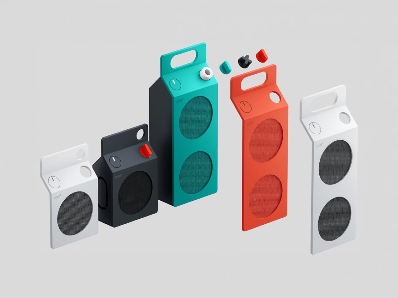
The CMF Speaker S ($59) and Speaker M ($109) launched October 12 at nothing.tech and select retailers, in white, dark grey, turquoise, and orange. CMF’s own product pages cite a carton’s sharp geometry as the inspiration, so the resemblance is deliberate. A sloped roof carries the knob where a carton’s screw cap would sit, and the M’s top fin doubles as a carry handle. The front panel and knob pop off, which turns each speaker into a base for swapping or 3D printing. Both are IP68 too, so the carton can sit on a patio table without a worry.
Designer: CMF by Nothing
The carton’s anatomy, rebuilt as a speaker face
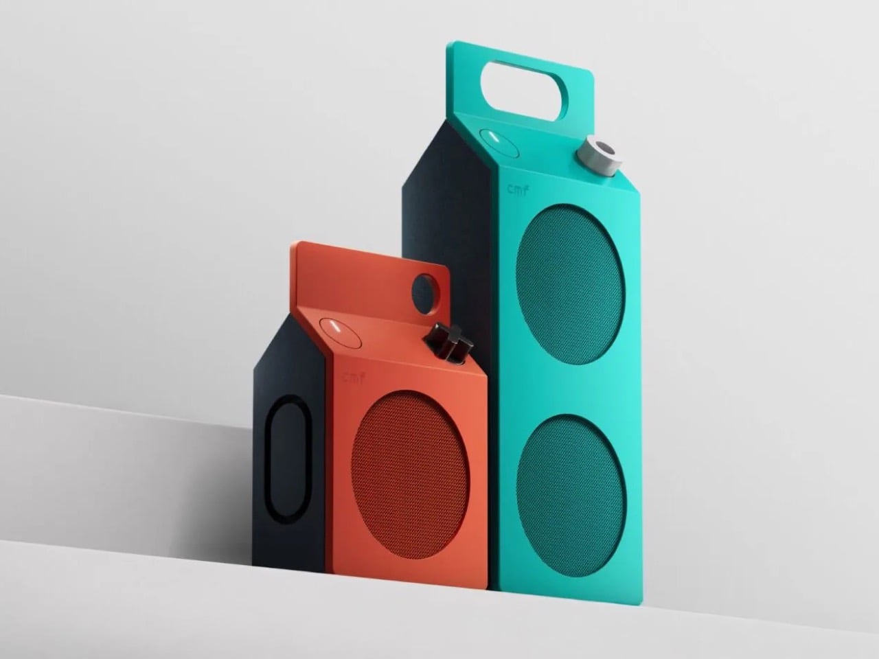
A carton has three recognizable parts, and CMF kept all three. The sloped gable roof becomes the top edge of a folded color panel that wraps over from the front face. The sealed top seam becomes the M’s raised fin with a handle cutout, while the S settles for a round cutout in the corner. The screw cap, a carton upgrade Elopak dates to 1991, becomes a knob you press and turn. On the orange and turquoise models, a dark grey body sits behind the panel, so the color reads like printed paperboard around a core.
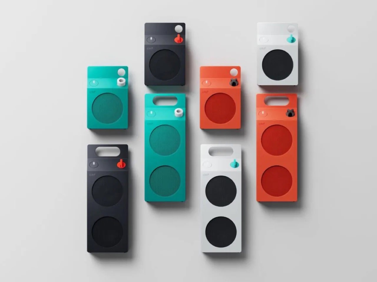
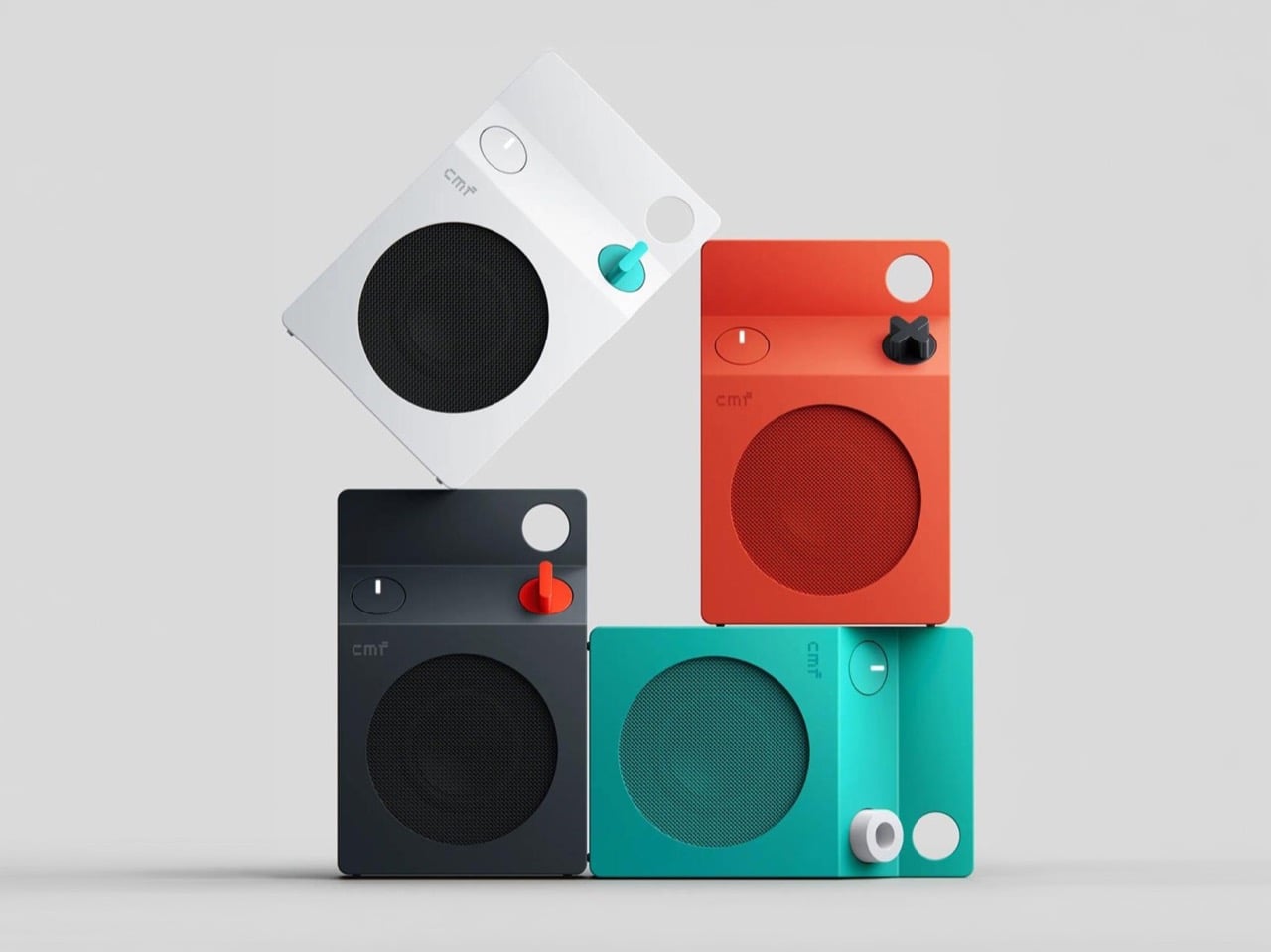
The grilles do the decorating. On the turquoise model the mesh is a deeper teal, on the orange it turns brick red, and on white and dark grey it goes black, so each face is a flat field with big circles punched in. The M stacks two of them, the S gets one, and a small pixel-style cmf wordmark sits above like a tiny brand stamp. An oval button with a white light bar is the only other mark besides the knob. That is very few elements, all of them deliberate.
Pint-and-quart proportions and a color system with a mismatched knob

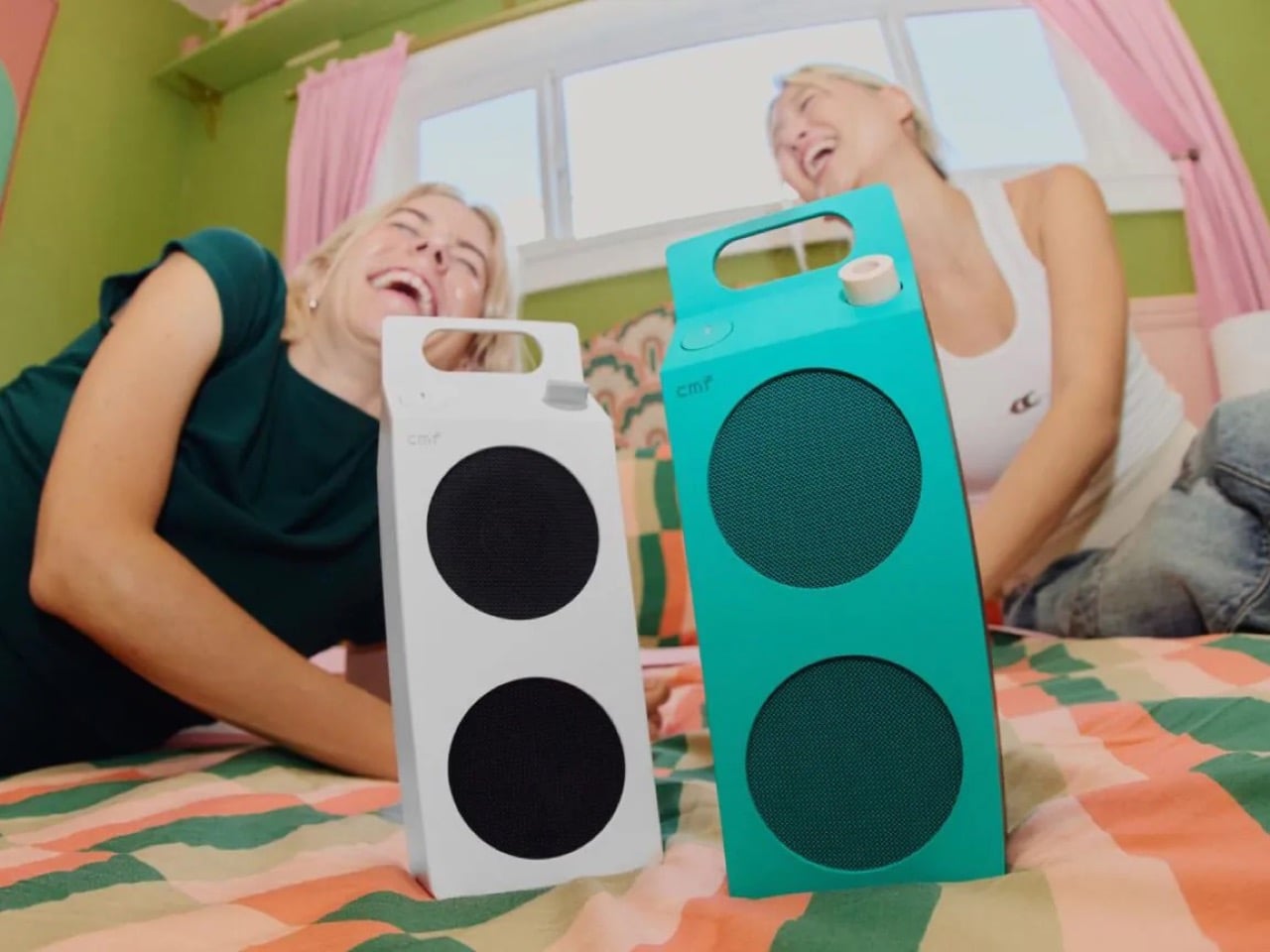
The S measures 5.1 by 3.3 by 1.7 inches (130.5 by 85 by 44mm). The M stretches to 8.7 inches (220mm) tall at the same 85mm width, so the pair reads like a pint and a quart of the same product. Helen Sanematsu’s 1999 AIGA Journal essay on milk packaging argued that cartons get their punch from standing in rows, with color separating the varieties. CMF’s launch imagery lines up four colors across two sizes, which plays that exact game. Put them on a shelf together and you get a dairy case designed by someone with great taste.
Each colorway gets its own knob: a black X on orange, a white ring on turquoise, a red paddle on dark grey, and a teal paddle on white. That deliberate mismatch gives every speaker a single accent, like a bright cap on a carton. Pop it off and you can mix freely or 3D print your own, a habit that follows the CMF Phone 1, whose community printed everything from Lego-friendly backs to a foam dart launcher. We once featured a fan concept for a CMF speaker that went retro radio. The carton is the braver call.
Drivers, battery life, and durability behind the carton
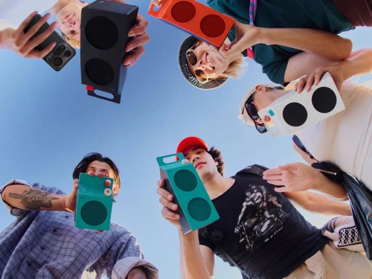
The S pairs a 1.8 inch (45mm) driver with two passive radiators, unpowered diaphragms that beef up bass, for 10W. The M adds a 2.8 inch (70mm) woofer and 0.6 inch (16mm) tweeter for 35W RMS, a continuous power rating. Both claim 18 hours at 50 percent volume with Ultra Bass on, enough for a workday and the commute. A 10 minute charge buys an hour while you hunt for your keys. They survive 30 minutes in nearly 5 feet (1.5 meters) of water and passed a 30 inch (0.76 meter) drop test.
The S costs $59 and the M $109, and both are on sale now at nothing.tech and select retailers. That puts a distinctive object within impulse-buy range, which is unusual for a design this committed. It is the rare budget speaker that makes you want to rearrange a shelf. Van Wormer’s carton survived a century by being easy to hold, stack, and carry, and a portable speaker wants the same three traits. Somebody finally noticed a great speaker shape was sitting in your fridge door all along.
The post Why CMF’s New Milk Carton Speakers Are So Irresistible To Look At first appeared on Yanko Design.