Vue lecture

Your iPhone’s Portrait Mode Was Fake for a Decade – The iPhone 18 Pro Changes That With A Real Aperture

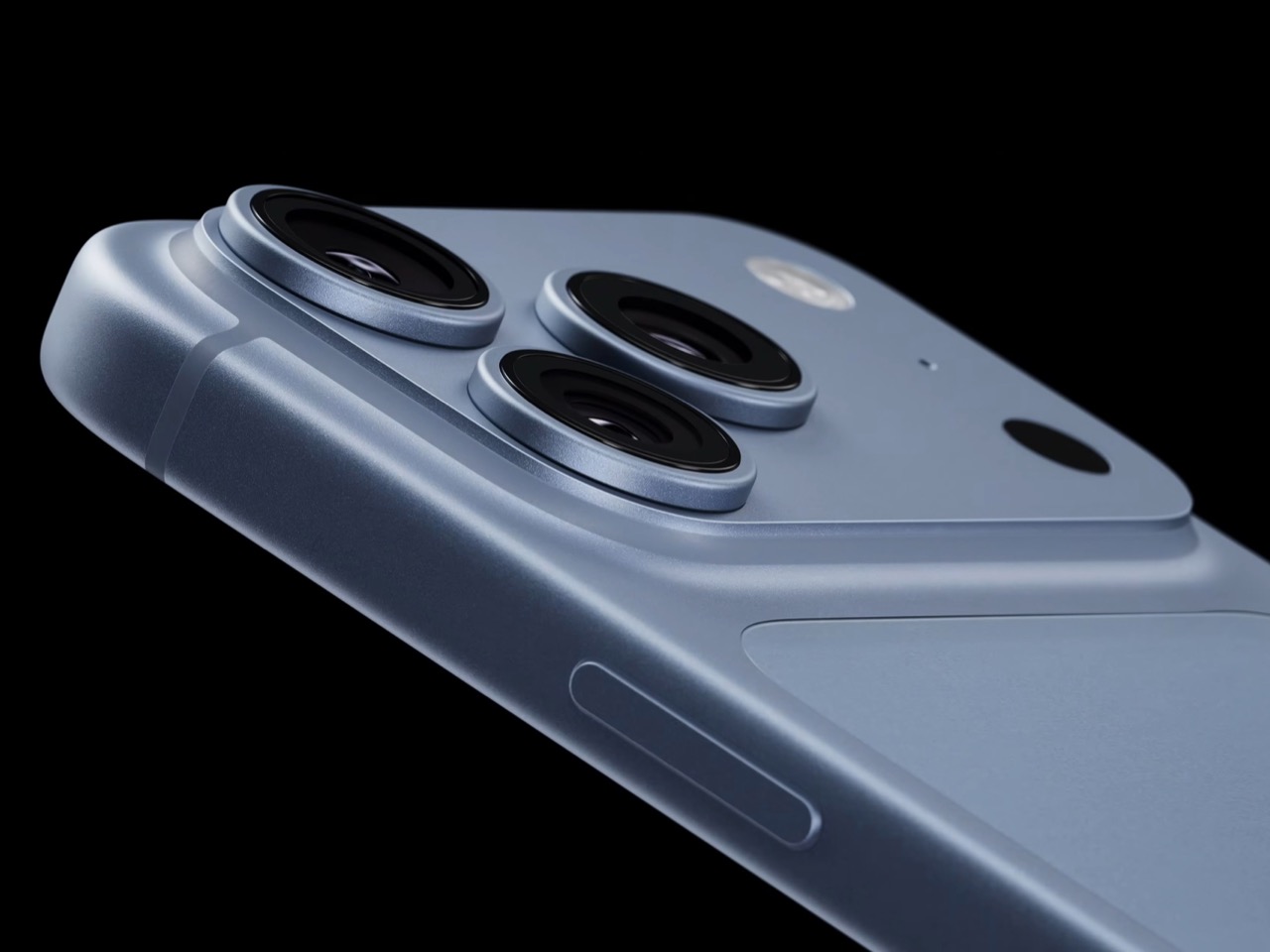
Would you be shocked to hear that the “Portrait Mode” on your iPhone all these years was ‘fake’? Well, it’s real as in the background is actually blurred, but it isn’t blurred because the camera captured it that way, it’s all been software trickery for the past decade… until now. Six laser cut blades, each thinner than a human hair, are about to change that. The iPhone 18 Pro’s new main camera can physically open and close its lens for the first time in iPhone history, and that single mechanical change rewrites how the blur behind your subject actually gets made.

Here’s the quick version of how Portrait Mode has worked since 2016. Your iPhone takes the shot, uses a second lens or depth data to figure out roughly where you end and the background begins, then runs software over the image to blur everything behind that outline. It’s a clever guess dressed up as photography, and it’s why hair strands sometimes disappear into a smudge or a stray earring gets blurred along with the wall behind it. The new aperture system skips the guessing entirely. The lens itself controls how much of the scene stays sharp, the same way it’s always worked on a real camera.

Designer: Apple
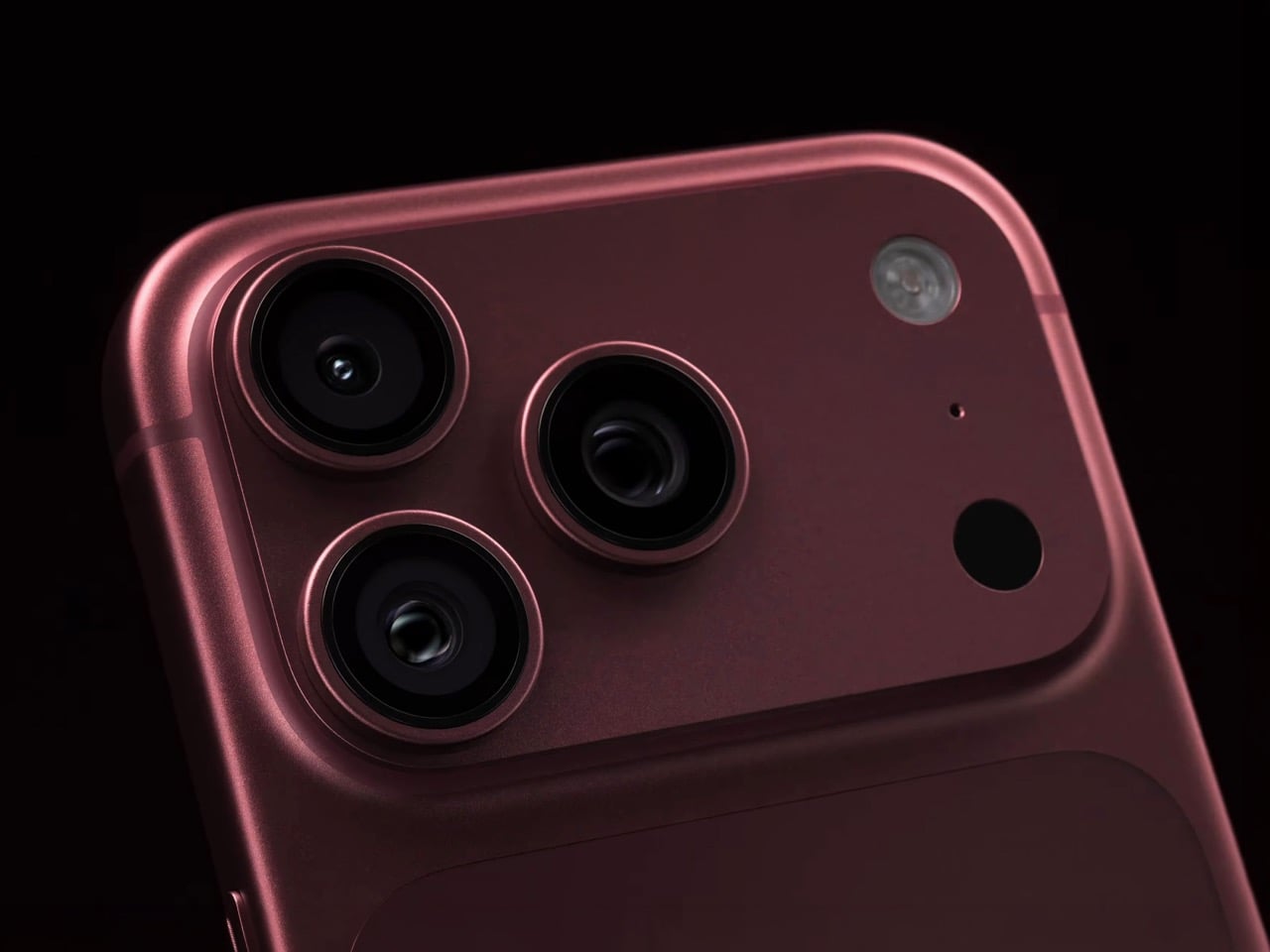
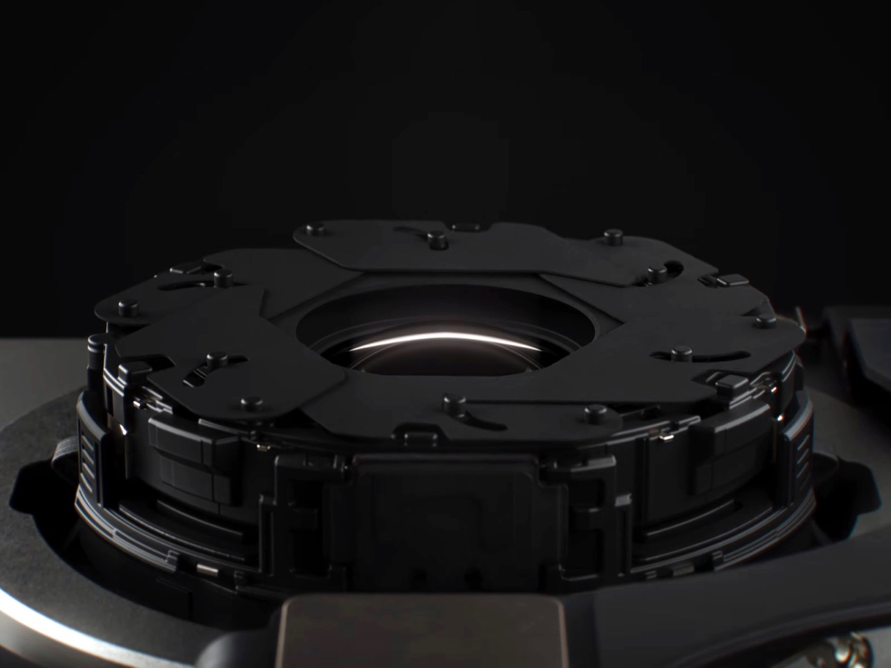
So how does a phone this thin pull off something that usually needs a chunky lens barrel? Apple built a system of six laser cut blades, each one thinner than a strand of hair, arranged around the main lens and moved by a tiny rotor mechanism. Together they shift the aperture through four stops, all the way down to f/1.48, with the camera defaulting to a f/1.8 for everyday portraits and opening or closing automatically depending on what it’s looking at. In low light it opens wider to pull in around 50 percent more light, which should mean cleaner night shots and sharper astrophotography without cranking up the ISO and adding grain.
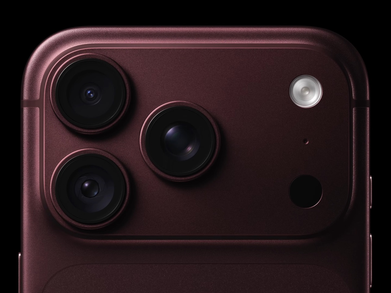
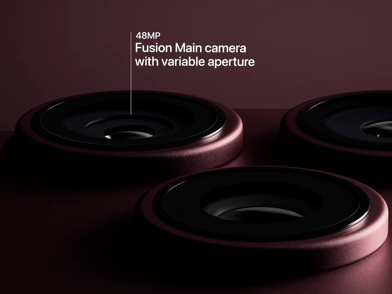
Because this is optical now instead of computational, the depth falls off the way it would on an actual camera lens. Hair, glasses, jewelry, the fine stuff that always tripped up the old software blur, should render properly instead of getting smeared into the background by accident. Close the aperture down and you get more of the scene in focus for group shots, which is the same tradeoff photographers have been making with real cameras for a century. It’s just that now your phone gets to make that tradeoff too.
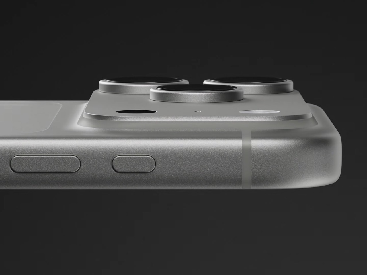
Apple didn’t stop at making the hardware smarter, it also handed a lot of that control directly to you. The redesigned camera app now includes Pro Controls, letting you manually pick one of the four aperture settings yourself, check exposure with an actual histogram, dial in white balance, and adjust shutter speed for motion blur or freeze frame shots. Third party camera apps are getting access to the same aperture system through an updated API, so this isn’t going to stay locked inside Apple’s own app for long. Photography folks who like getting hands on with their settings finally have a real reason to poke around the camera app instead of leaving everything on auto.
The upgrade carries over into video too. Cinematic mode effects can now be applied after you’ve already shot the footage, and it supports 60fps for smoother half speed slow motion. Time-lapse jumps to 4K with Dolby Vision HDR. None of that depends directly on the aperture blades, but it’s part of the same larger push this year to hand serious creative control to people who just want to point their phone and shoot something that looks intentional.
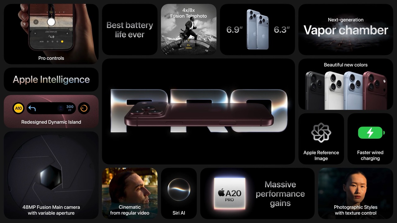
All of this sits inside a redesigned Pro body that now uses color matched aluminum and back glass, available in Black, Silver, the new Glacier, and a genuinely gorgeous Burgundy that photographs beautifully next to the camera module. The iPhone 18 Pro starts at $1,199 and the Pro Max at $1,299, both up for preorder September 12 and shipping September 18. For a feature that lives entirely inside a few hair thin blades you’ll never actually see moving, it might end up being the most noticeable camera change Apple has made in years.

The post Your iPhone’s Portrait Mode Was Fake for a Decade – The iPhone 18 Pro Changes That With A Real Aperture first appeared on Yanko Design.
  •  

The iPhone Duo just killed the Dynamic Island, the SIM tray, and the demand for an iPad Mini

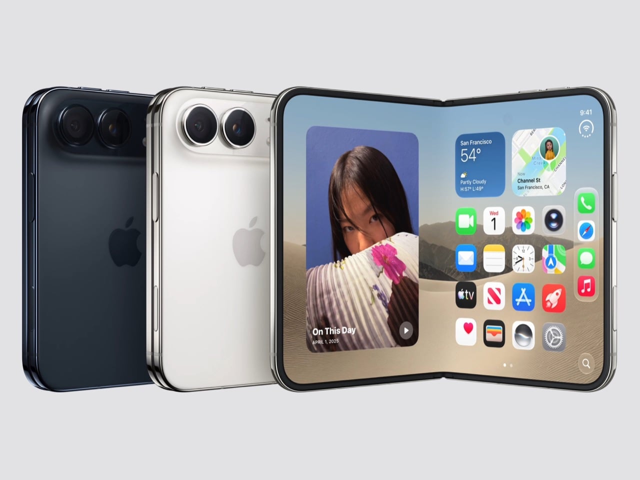
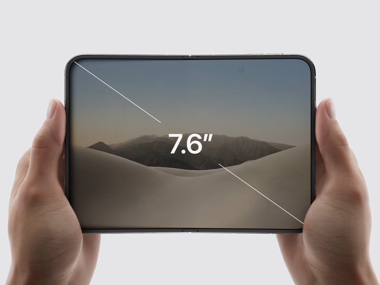
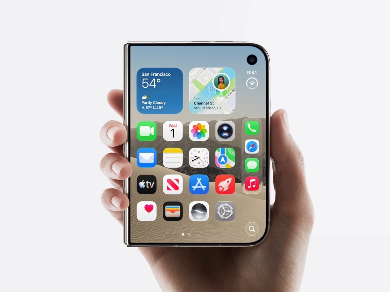
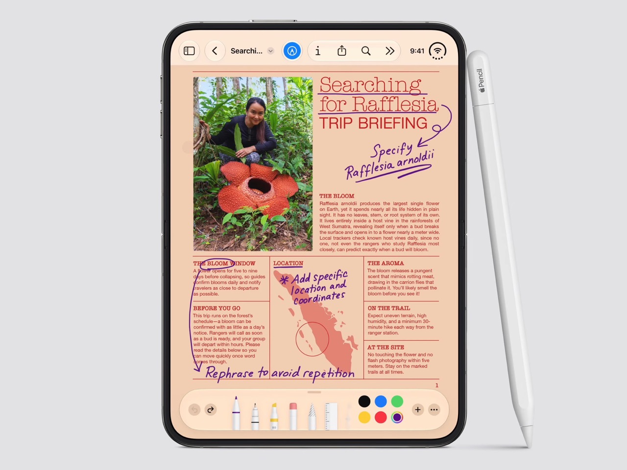
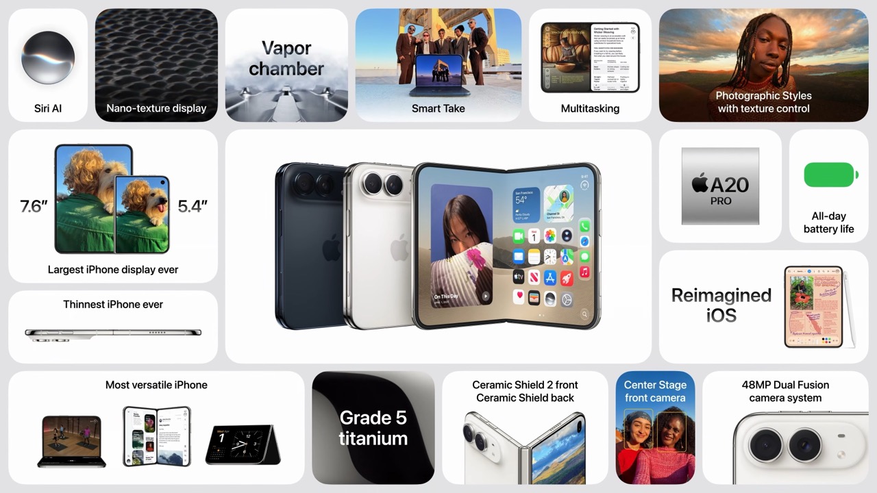
Spare a thought for the iPad Mini, which had a perfectly good career until this morning. Apple’s $1,999 iPhone Duo arrives October 23 with a 7.6-inch inner display that takes Apple Pencil with USB-C later this year and runs two apps side by side, which covers roughly everything the Mini was for, except the Mini does not fit in your jeans. It also killed the dynamic island, swapping it for a punch hole outside and a FaceTime camera tucked under the inner screen. And it killed the SIM tray worldwide, because the thinnest iPhone ever made had no room left for sentiment.

Apple never announces any of this. It ships the replacement and lets the old thing stop making sense on its own schedule. The Duo is a whole product built out of things Apple decided to stop carrying, and the interesting part is how little you miss any of them once you see what moved into the empty space. John Ternus called it the most transformational change to iPhone since the original, which I not only agree with, I think I’d take it a step further by saying – this is such a dramatic leap for the iPhone that it stops being an iPhone. It isn’t an iPad either. It’s something completely different.

Designer: Apple

Apple refused to build a squarish slab that happens to close, and said so from the stage, calling out rivals whose square inner screens box movies into oversized black bars. The Duo lands at roughly passport size, with an asymmetric profile: two rounded corners on the right, squared geometry at the hinge. That asymmetry does something clever, because it tells your hand which edge to open before your brain gets involved. It reads like a small hardcover you want to crack open, which is a strange compliment to pay a phone. Somebody fought for that shape in a review meeting, and I am glad they won.

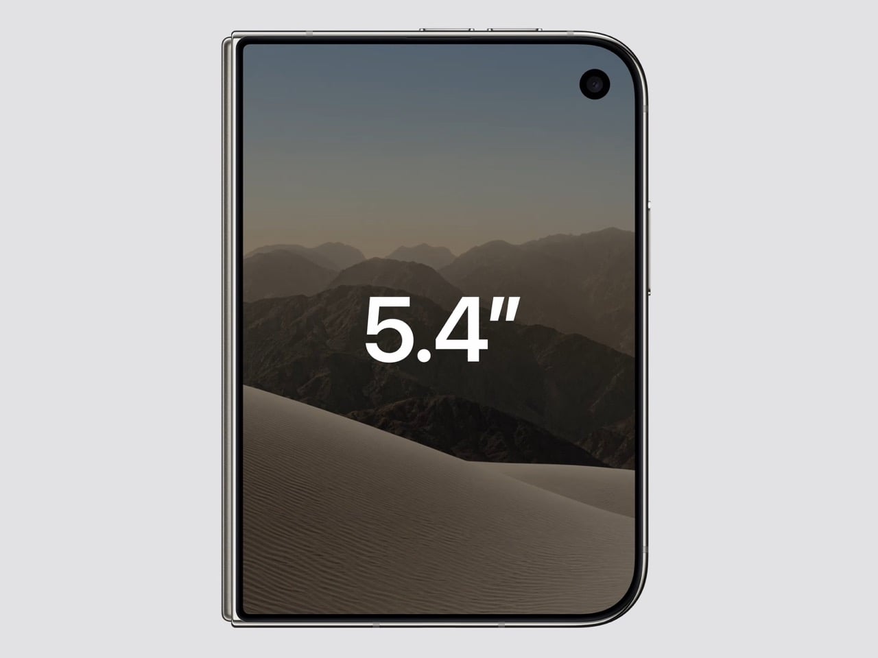
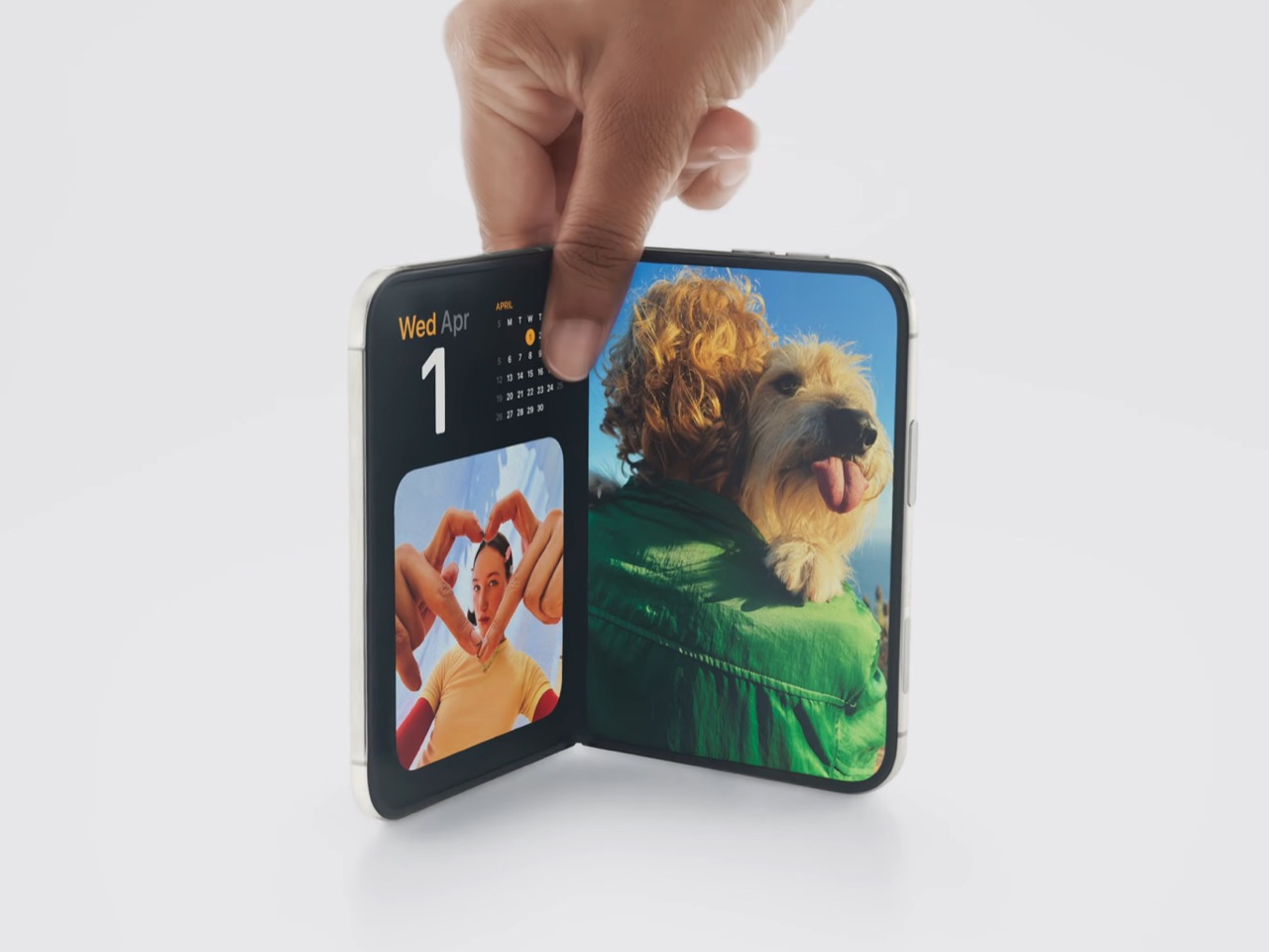
Both displays share a single aspect ratio, which is the decision the whole product rests on. Closed, the 5.4-inch outer panel delivers 90 percent of an iPhone 18 Pro’s screen area, so it works as a complete phone rather than a notification window. Open, the 7.6-inch inner canvas runs 50 percent larger than an 18 Pro Max. Because the proportions match, content scales between the two instead of reflowing awkwardly every time you fold, and the movie you started on the cover screen simply gets bigger. Every foldable before this one asked you to accept a jarring transition, and Apple designed the jarring part out.

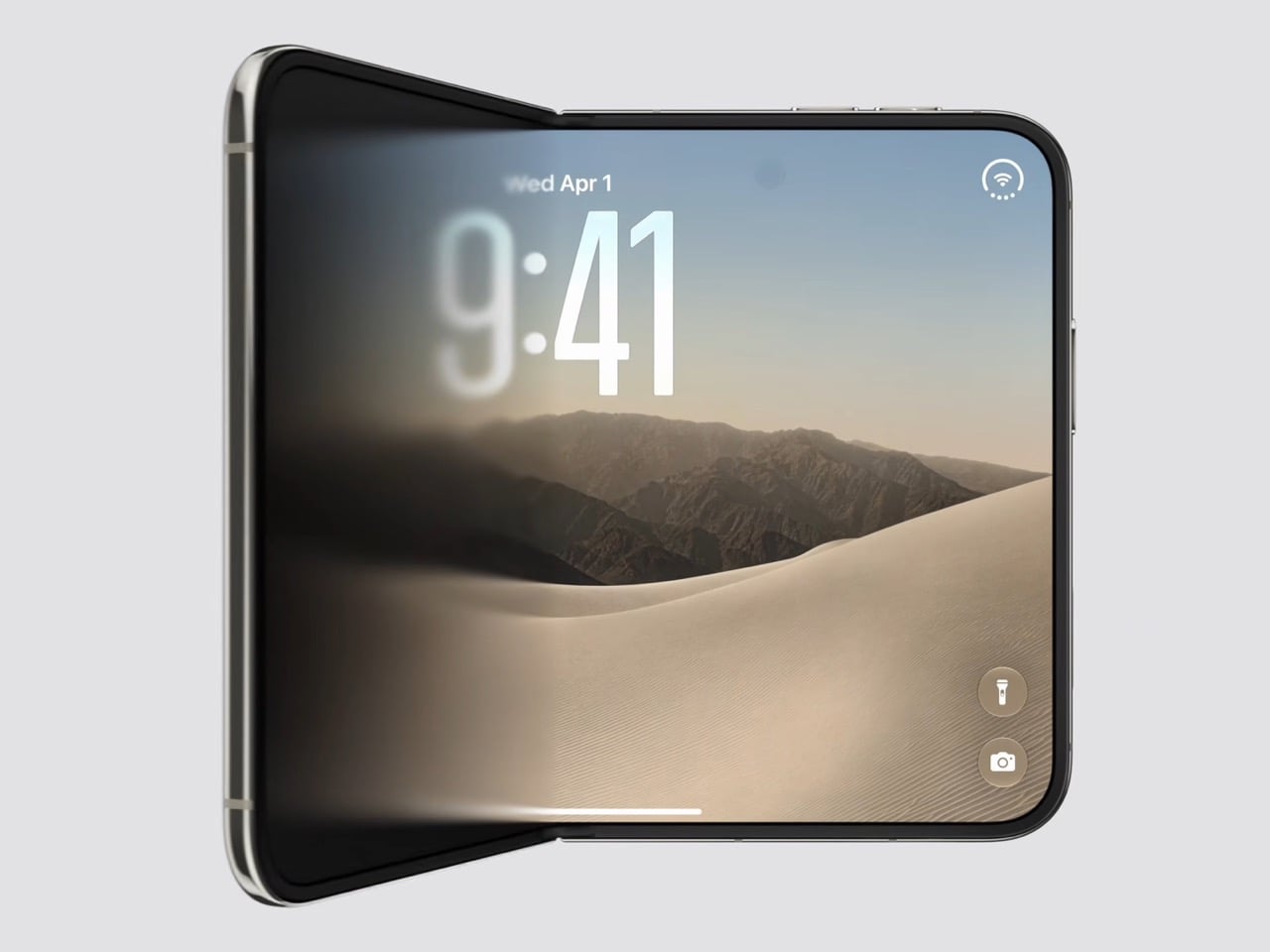
Content flows between the two displays as the phone opens, expanding out of the cover screen and settling into the larger canvas without a stutter. I would put that transition ahead of anything Samsung, Google or Oppo has shipped on a folding device, and it is the single most beautiful piece of UI in the category right now. The matched aspect ratio is what makes it possible, because there is no reflow to disguise, only a scale. Controls stay locked in place along the side while the content grows around them. Watching it happen is the closest a phone has come to feeling like sleight of hand.

The crease is the thing people notice first on a foldable, and Apple has more or less made it disappear. A matte nano-texture finish across the inner display cuts glare and flattens how the fold reads, so the eye stops finding the seam. It also solves the other foldable complaint nobody talks about, which is the cheap plastic feel of a folding panel under your fingertip. Real glass sits above and below the display, and the whole stack is built to stop the panel distorting after a few thousand folds. Nine years of waiting bought Apple a fold you have to hunt for.

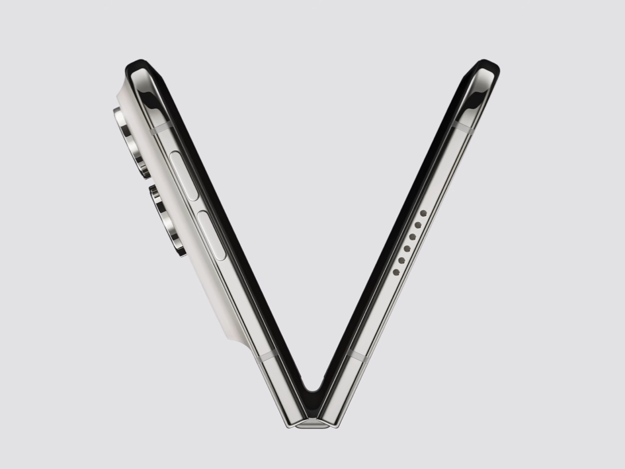
Grade 5 titanium forms the frame, polished to a mirror finish and broken by a hinge cover in contrasting micro-blasted texture. That pairing is the sharpest visual detail on the object, a bright reflective body interrupted by one matte band at the spine, and it gives the closed device a piece of jewelry quality that photographs beautifully in star white. Ceramic Shield protects the back, Ceramic Shield 2 the front, and the whole thing carries an IP68 rating. Pulling that dust and water rating across a moving joint is genuinely difficult engineering. The night sky colorway, a deep navy, is the one I would actually buy.

The dock is vertical now. iOS 27 moved essential controls to the side of the screen, freeing vertical space for content and landing the buttons under your thumb, which rewrites a layout convention Apple has held since 2007. The status bar compresses into a corner and the Dynamic Island turns sideways along the edge of both displays. Every first-party app had to be relaid out to make this coherent, and the fact that it still reads unmistakably as iOS is the real achievement here. Nobody outside Apple would have been permitted to move that dock.

Fold it halfway and iOS slides content away from the crease, giving you a laptop-style prop for video calls, a hands-free camera rig, and a bedside alarm face that wakes you with a gentle glow. StandBy now runs even when the phone is off charge, turning it into a photo frame or widget hub the moment you set it down. The speakers retune themselves depending on how far apart the two halves are sitting. One device, half a dozen legible postures, all of them designed rather than discovered by users after launch. The alarm clock pose alone will sell a few thousand units.

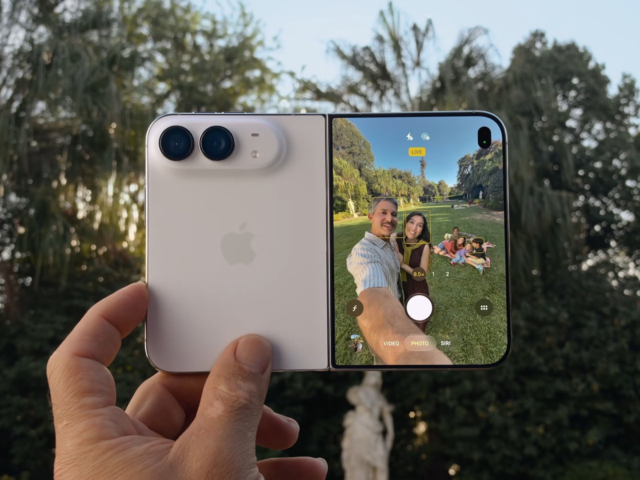
The cameras take advantage of having a second screen. Duo Preview throws a live feed onto the outer display so your subject can see themselves and fix their own framing, which ends a decade of “can you take it again.” Kid Cue plays Peanuts animations to make toddlers look at the lens. Smart Take watches the scene and fires the shutter once everyone is finally posed, killing the timer scramble. A 48MP Fusion Main with a 2x telephoto handles the actual imaging, alongside the same 48MP Ultra Wide found on the iPhone 18 Pro.

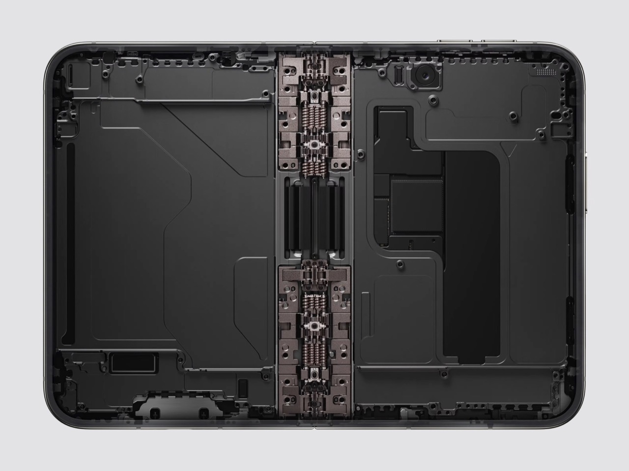
Going eSIM only across every market freed the internal volume for one battery per side, managed so the pair behaves as a single cell, delivering 31 hours of video on the inner display and 44 on the outer. I will miss the tray as a traveler, and I also suspect Apple has wanted it gone for years, because a physical port punched through the frame is a liability on a device chasing IP68 across a hinge. A20 Pro drives both panels, and fast charging reaches 50 percent in around 20 minutes. Some deletions are grief. This one is mostly relief.

Touch ID in the side button is a real step back from Face ID on a two thousand dollar phone, and it exists because a TrueDepth array had nowhere to live. Apple Pencil support arrives later this year rather than at launch, which softens the iPad Mini argument for a few months. The bezels look chunky beside a Galaxy Z Fold 8, and the folded body still reads thick in the hands-on shots. At $1,999, a hundred dollars over the Fold 8 and five hundred under what everyone predicted, Apple showed up nine years late and priced like it was early. Pre-orders open October 16.

The post The iPhone Duo just killed the Dynamic Island, the SIM tray, and the demand for an iPad Mini first appeared on Yanko Design.
  •  

Apple’s First Foldable iPhone Could Be Called “iPhone Duo” — Here’s What We Know So Far

Apple’s long-rumored foldable iPhone may finally be getting closer to reality, and the name could be one of the biggest surprises. While earlier reports have suggested that Apple could call its first foldable iPhone Ultra, a new rumor claims the device may instead launch as the iPhone Duo. The name reportedly appeared through a third-party […]

  •  

Xiaomi 18 Fold Hands-On: Got Here Before Apple, Can It Beat Samsung?

Xiaomi has chosen an interesting moment to return to foldables. The company has not released a book-style foldable since the Mix Fold 4, which launched in 2024, and now it is back with the Xiaomi 18 Fold just as compact foldables are starting to get more attention. Samsung has also added a foldable in this compact format to its lineup, and Apple is widely expected to unveil its first foldable iPhone at its September 9 event with a similar form factor in mind.

That puts the Xiaomi 18 Fold in an interesting spot. It is not just Xiaomi coming back to foldables after a break. It is also arriving just as this smaller book-style format looks like it could become the next big thing.

Designer: Xiaomi

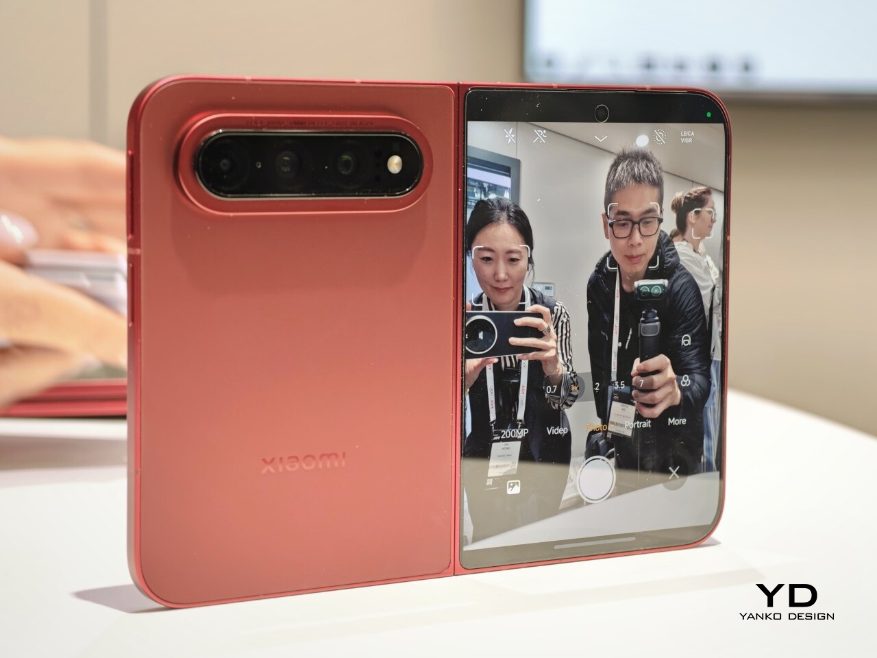
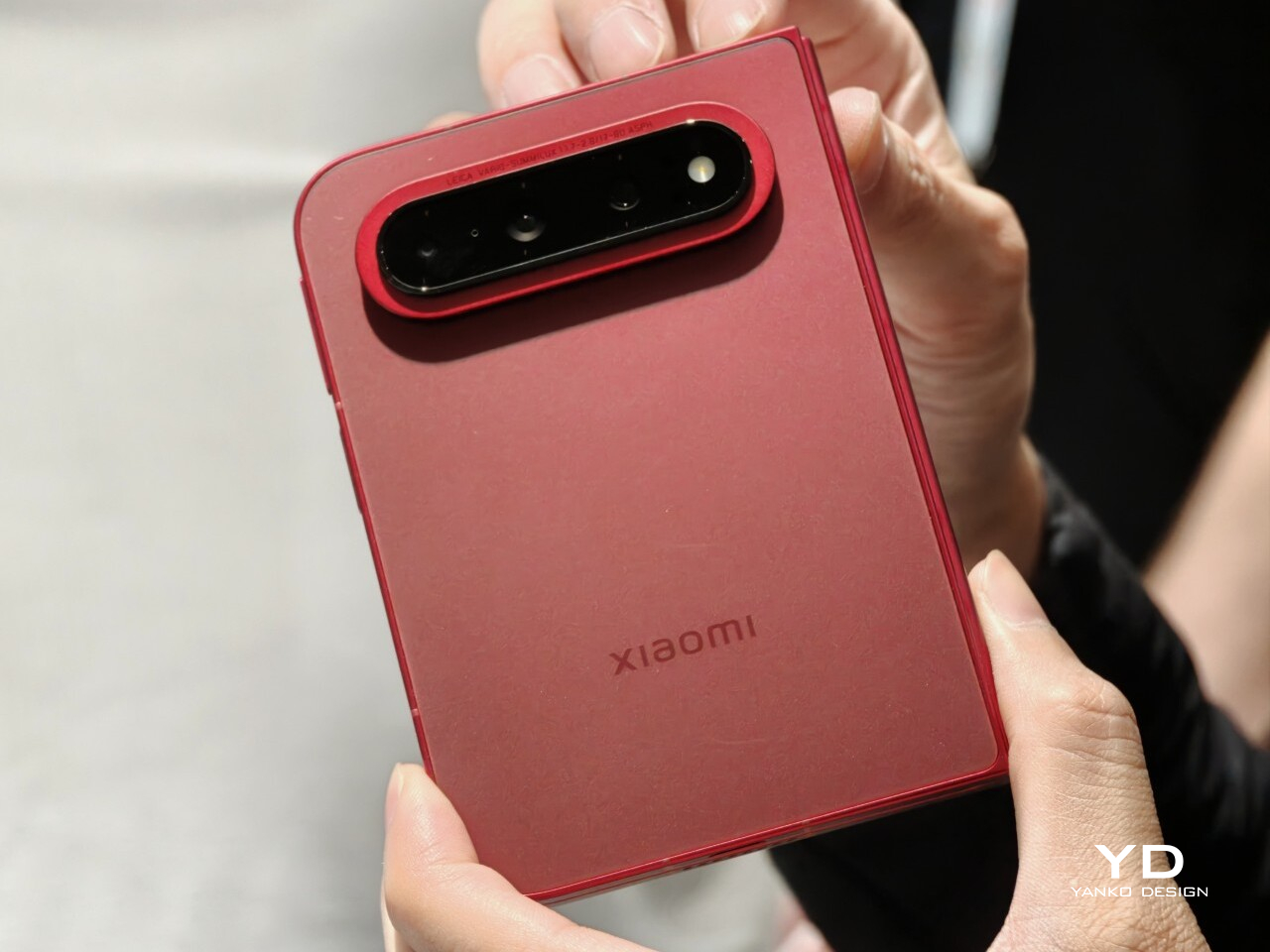
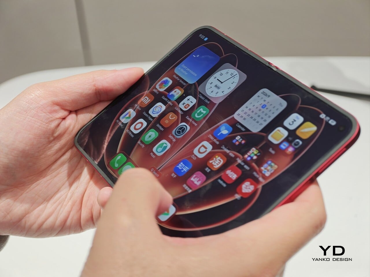
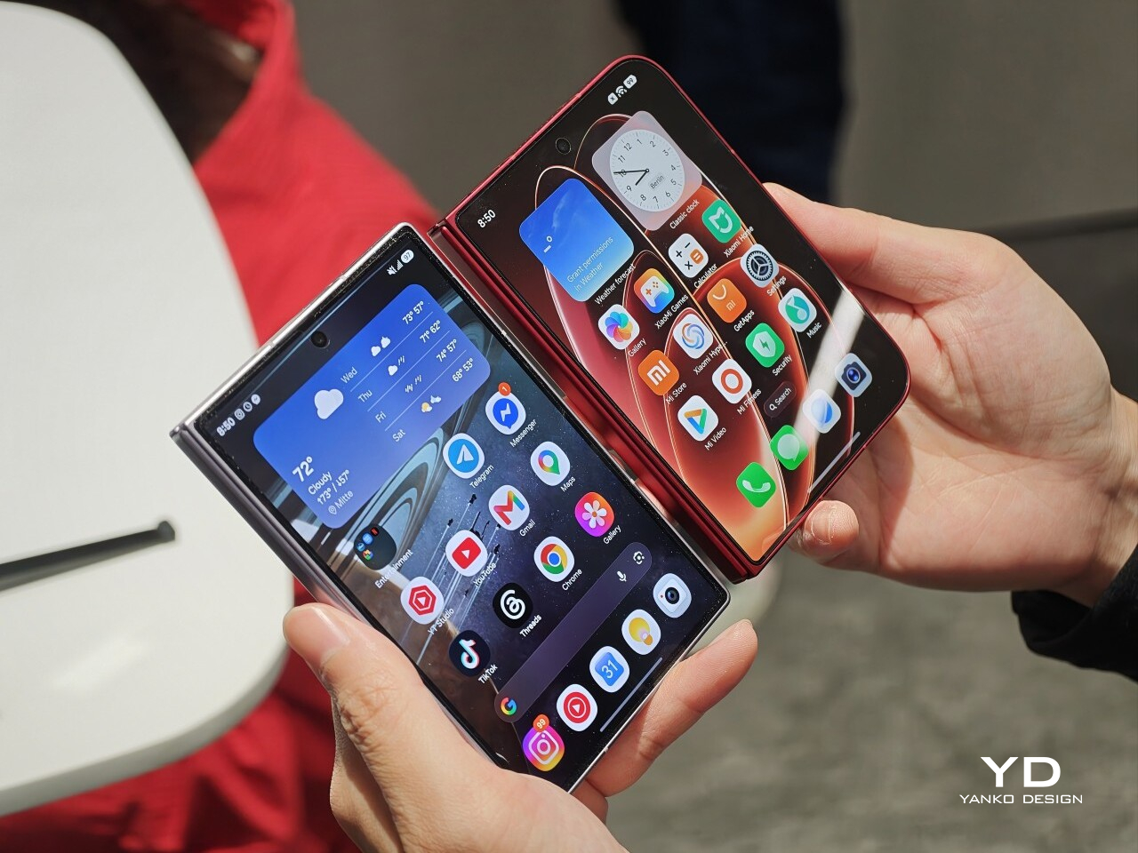
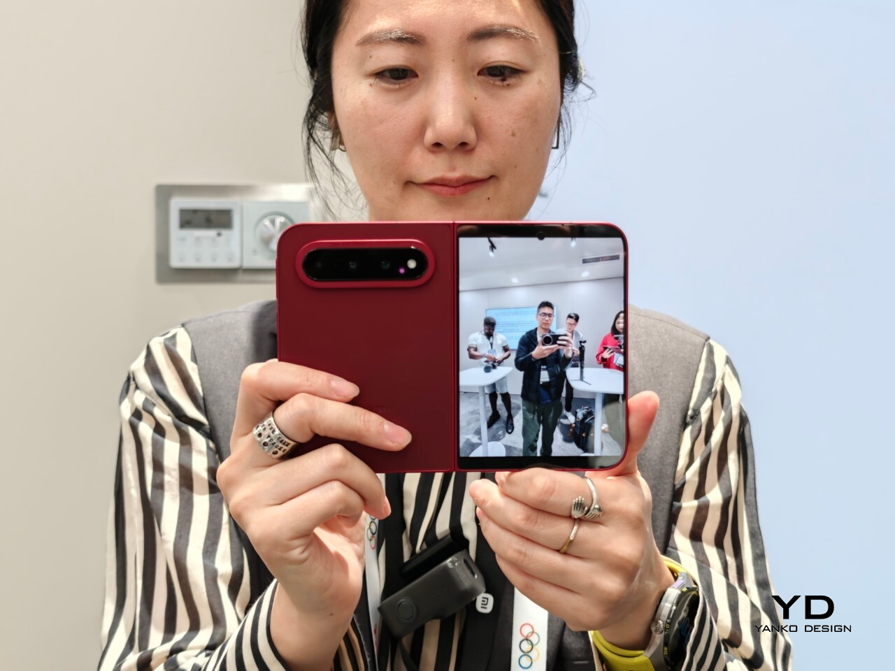
Xiaomi is positioning the 18 Fold as its first mid-size flagship foldable. It weighs 7.73 ounces (219g), measures 0.42 inches thick when folded (10.68mm), and opens out to just 0.20 inches thick (5.02mm), with a folded footprint of 4.64 x 3.29 inches (117.8 x 83.6mm). In person, it feels thin, though not unusually thin by the standards of today’s premium foldables. More importantly, it feels expensive in a good way. The matte texture on the back and frame gives it a softer, understated finish, while the rounded corners and flat frame help the phone look clean and modern.

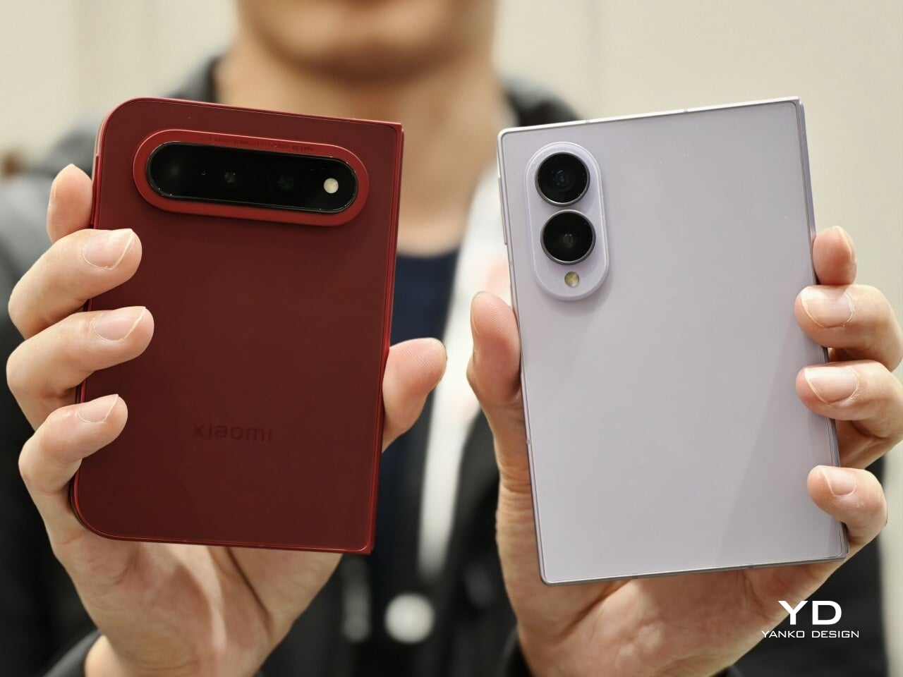
The unit I handled was the deep red version, and it is a bold color in person. It stands out more than the usual black or silver foldable palette without feeling too loud. It also happens to echo the deep red finish rumored for Apple’s first foldable, which makes the comparison hard to miss. The 18 Fold comes in Black, White, Red, and a Ceramic Version.

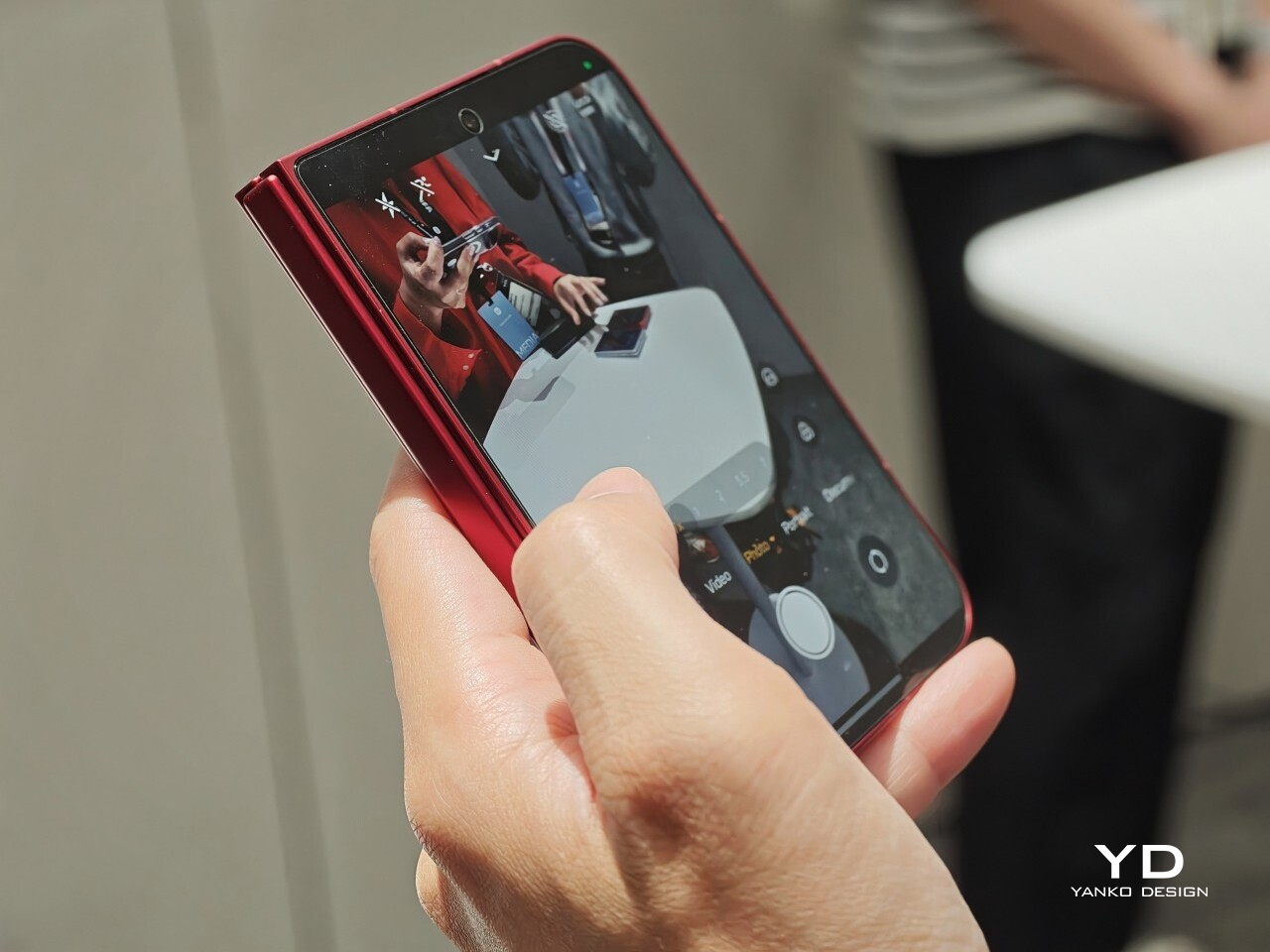
In practice, though, this is still a two-handed phone whether it is folded or unfolded. Even closed, the body is compact in one sense but still broad enough that I did not think of it as something built for easy one-handed use. That is not really a criticism. It just comes with the territory.

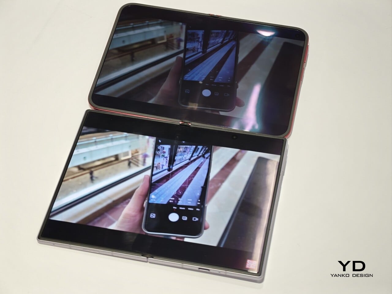
The outer display is a 5.38-inch panel, while the inside opens up to a 7.58-inch main screen. Xiaomi says both displays share the same aspect ratio, which is meant to make the transition from one to the other feel more natural. I could not fully judge how well that works in daily use from a short demo, but one benefit stood out right away. Video felt more immersive than on squarer foldables because there was less black bar space above and below the image.

The software also looked well suited to the shape. Animations felt smooth in my brief demo, and I did see split-screen and floating window support in action. The unfolded UI felt more like a small tablet than a stretched phone, which is what you want on a device like this. Xiaomi has also placed one speaker on the top edge and another on the bottom edge on the opposite side, which should help give the phone a more balanced stereo effect when it is open.

The hinge left a good first impression too. I cannot really say whether it felt especially firm or especially smooth, because my time with the device was limited, but it did feel sturdy. The crease was handled well too. Looking straight at the display, I only really noticed it from certain angles rather than all the time. More importantly, I could barely feel it when running a finger across the center, which was better than I expected.

Left: Xiaomi 18 Fold, Right: Galaxy Z Fold 8

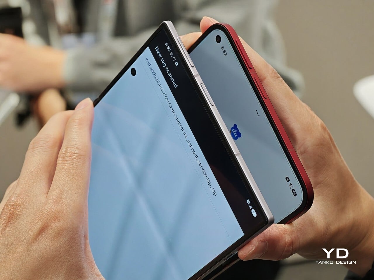
Left: Galaxy Z Fold 8, Right: Xiaomi 18 Fold

Left: Galaxy Z Fold 8, Right: Xiaomi 18 Fold

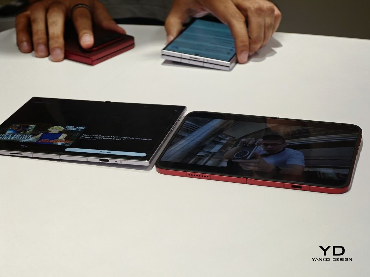
I also compared the Xiaomi 18 Fold side by side with Samsung’s Galaxy Z Fold 8. Samsung’s device measures 4.88 x 3.22 x 0.38 inches when folded (123.9 x 81.9 x 9.7mm), 6.35 x 4.88 x 0.18 inches when unfolded (161.4 x 123.9 x 4.5cm), and weighs 7.09 ounces (201g), so it is a little lighter and a bit thinner than Xiaomi’s foldable in some areas. But the difference was not just about dimensions. Samsung’s inner screen was noticeably brighter to my eyes. At the same time, the Xiaomi 18 Fold had one practical advantage that stood out immediately. When placed on a desk, it did not wobble, while the Samsung did.

Left: Galaxy Z Fold 8, Right: Xiaomi 18 Fold

Left: Galaxy Z Fold 8, Right: Xiaomi 18 Fold

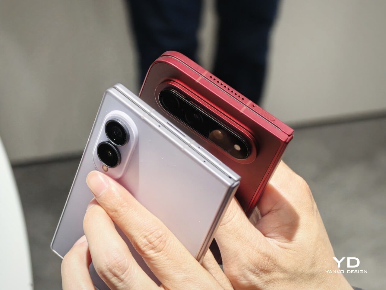
Top: Xiaomi 18 Fold, Bottom: Galaxy Z Fold 8

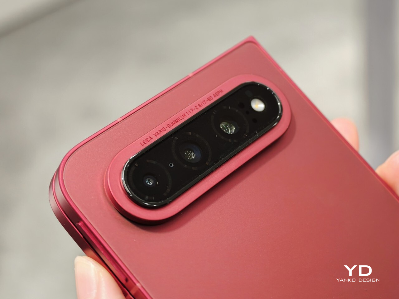
The biggest surprise for me was the camera. Xiaomi is using a 200MP Leica triple-camera system, led by a 200MP main camera and backed by a 50MP Leica periscope telephoto with an 80mm equivalent focal length. In my short time with the phone, the telephoto camera was the part that stuck with me most. I tried zoom, and the 3.5x telephoto setup immediately felt like one of the most interesting parts of the device. Stability also felt good even at higher magnification, which made the zoom feel more usable, not just more dramatic. The camera bump also did not seem overly large, and its oval-shaped, two-step raised design gives it some presence without taking over the whole back.

My time with the Xiaomi 18 Fold was brief, and this hands-on really only scratched the surface. Even so, the phone already feels like a polished return to book-style foldables. Pricing starts at RMB 10,999, or roughly $1,640, for the 12GB/256GB model, and Xiaomi said it will be available in China only for now.

The post Xiaomi 18 Fold Hands-On: Got Here Before Apple, Can It Beat Samsung? first appeared on Yanko Design.
  •  

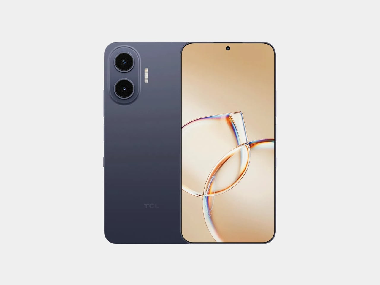
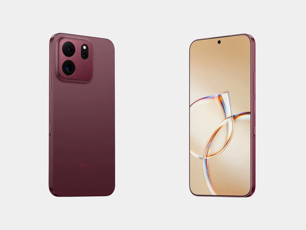
TCL’s P80 Pro and Ultra Are the Phones That Replaced Your Kindle Too

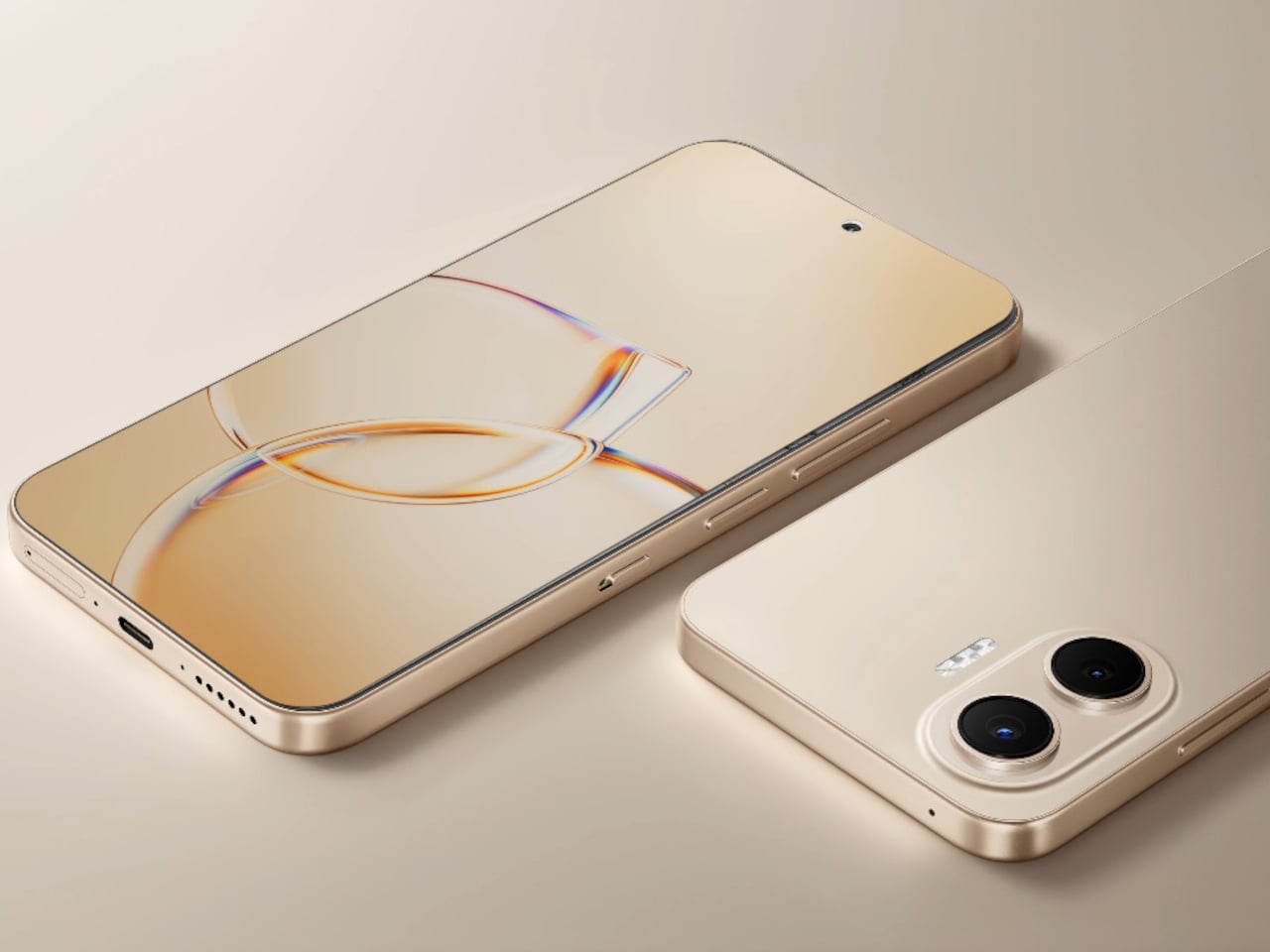
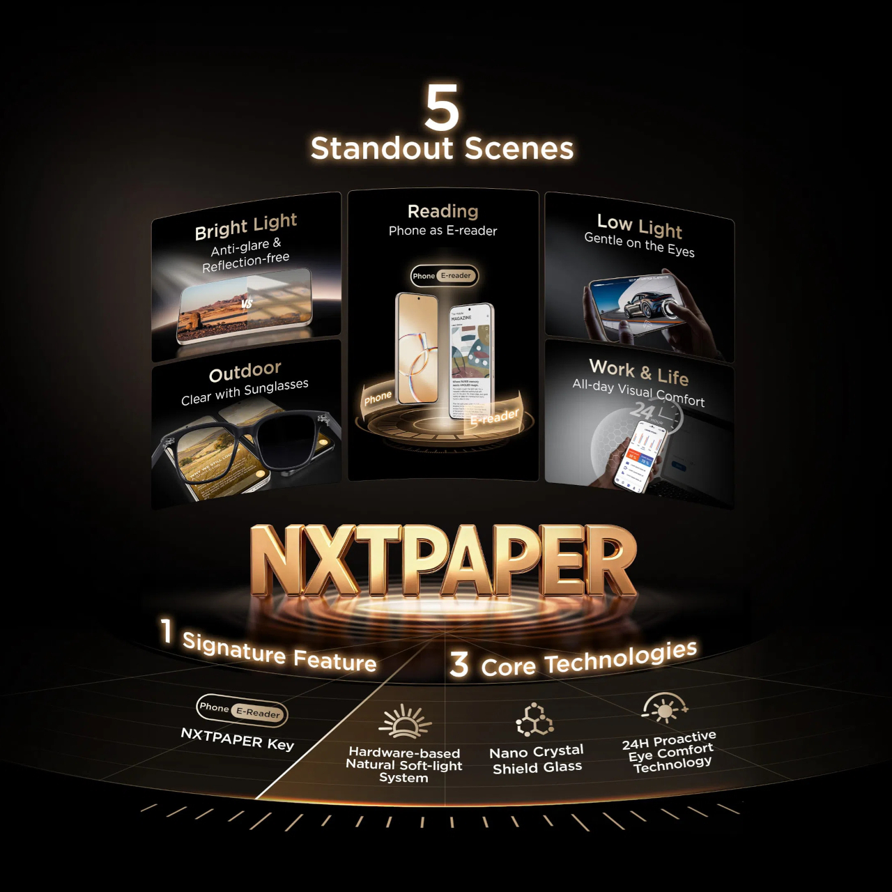
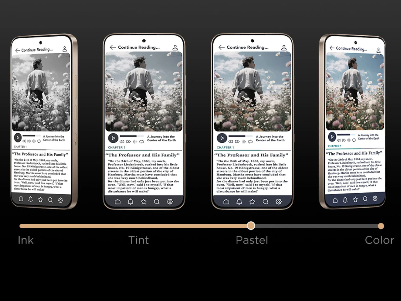
TCL’s P80 Ultra and P80 Pro prove a phone screen doesn’t have to pick one personality and stick with it. Unveiled at IFA 2026 in Berlin, both handsets fold a vivid AMOLED panel and TCL’s paper-like NXTPAPER technology into the same sheet of glass, letting the display shift moods with a flick of a switch instead of forcing a trade-off between color and comfort.

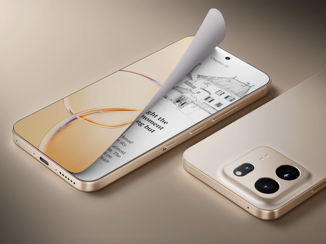
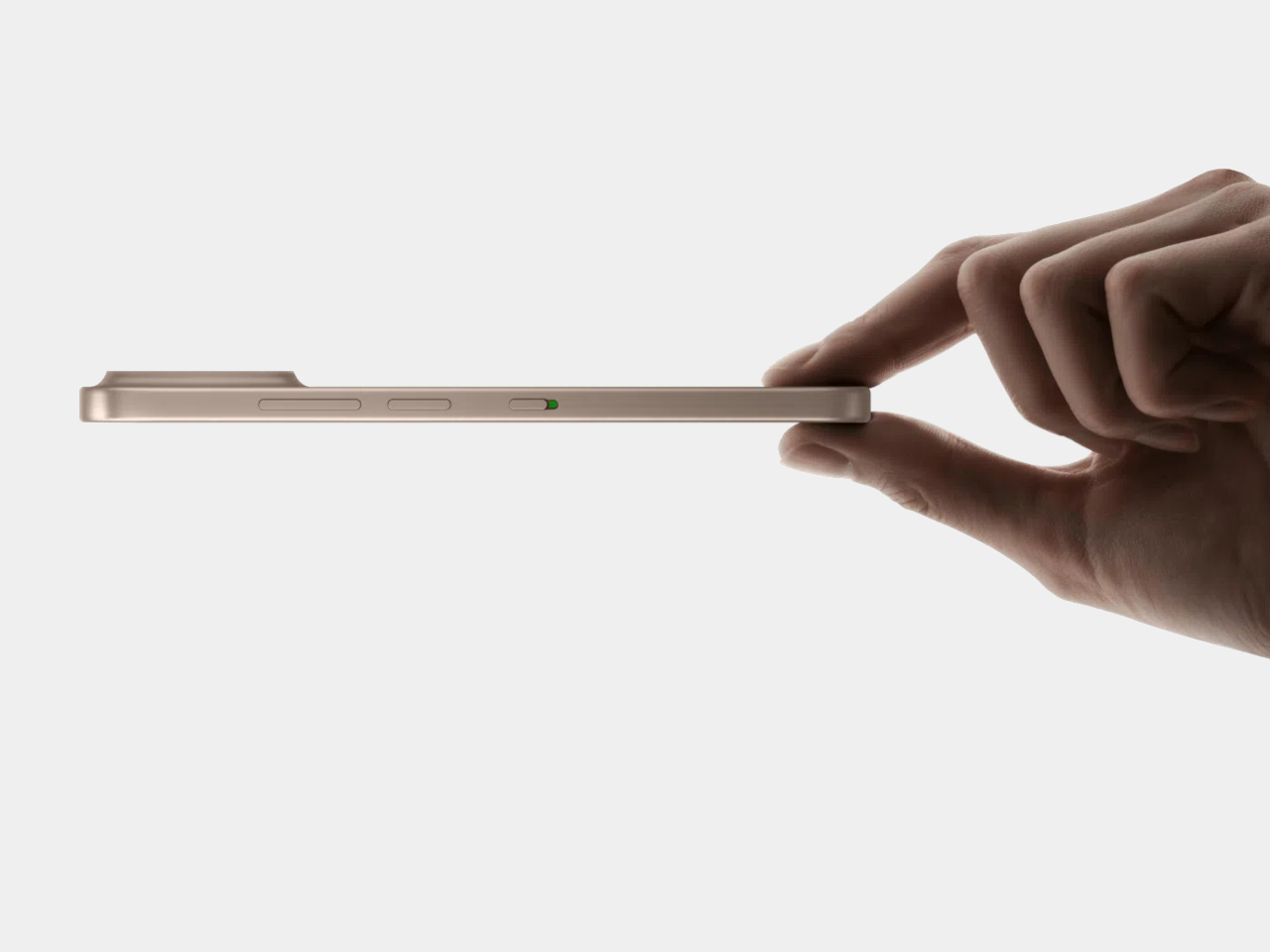
Run a finger along the frame, and you’ll find a thin slider, a small physical detail that carries plenty of weight in daily use. Slide it, and the 6.83-inch panel drops its saturation, taking on a warmer, textured look that mimics a printed page. A commuter buried in a novel or someone proofreading a document late at night gets a screen that behaves like paper, without losing the sharpness underneath.

Designer: TCL

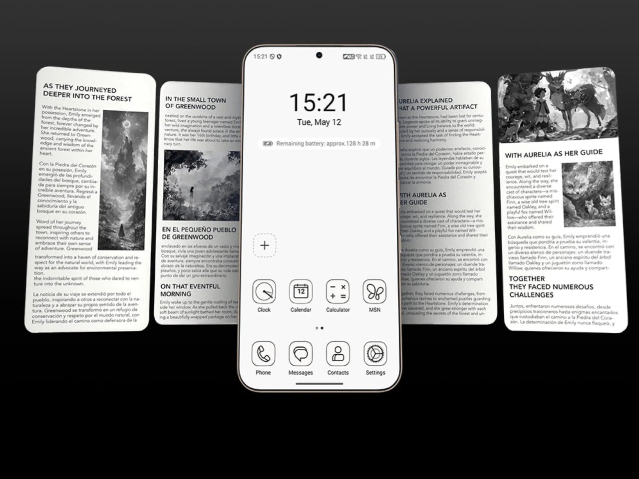
Push that same slider one notch further, and the screen drops color entirely for Max Ink Mode, a stripped layout that silences notifications except for calls and texts. It reads like a design decision as much as a software one, TCL betting people want to quiet their phone rather than mute it completely. The payoff is a battery that can stretch across roughly a week of steady reading.

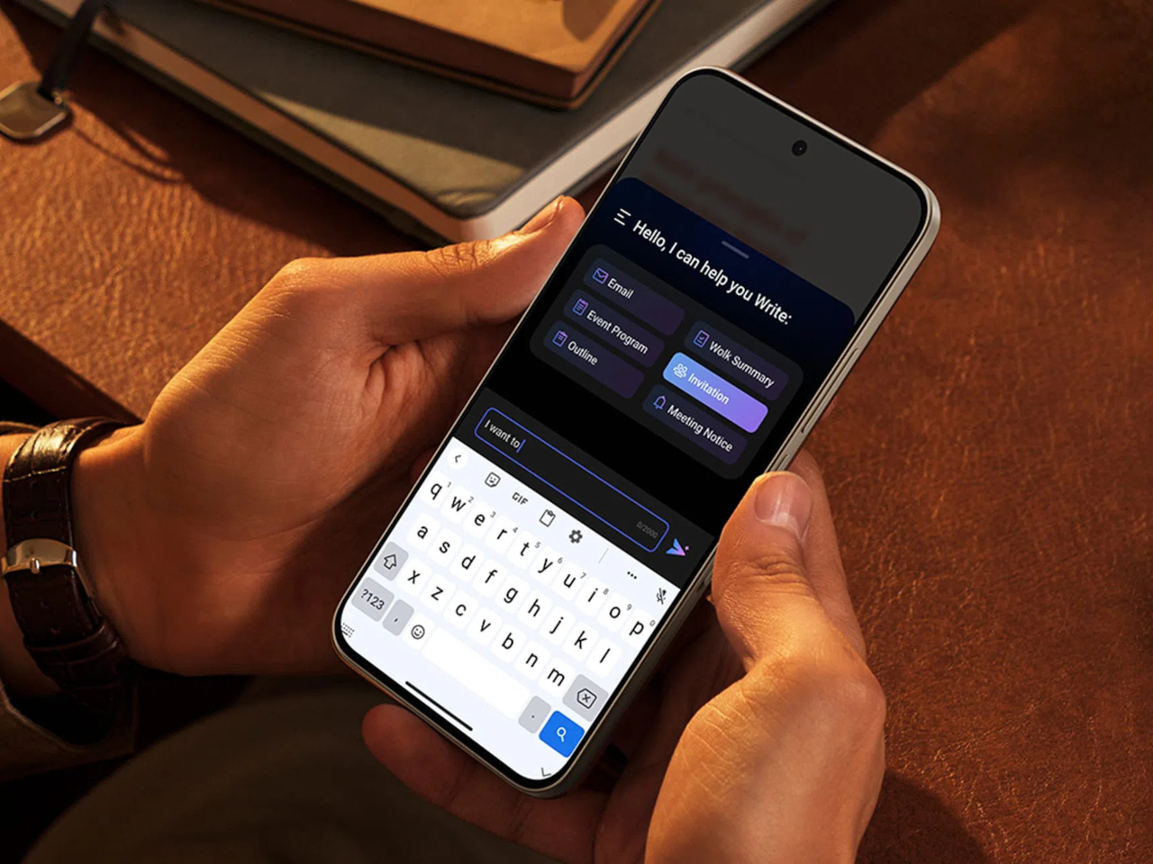
That reading-first mindset carries into the software too. Both phones can convert e-books into audiobooks or podcast-style narration using on-device AI, giving Max Ink Mode a voice to lean on when eyes need a break instead of ears. It is a small addition, but it treats the slower, paper-like mode as a genuine feature rather than a bolted-on gimmick for a keynote slide.

None of that would matter if the screen looked washed out the rest of the time, so TCL leaned on a 1.5K AMOLED panel that hits 3,200 nits and covers the full DCI-P3 color range. A Nano Crystal Shield coating cuts glare enough to keep the display readable under direct sun, marking TCL’s first pairing of NXTPAPER with OLED rather than the LCD panels it used before.

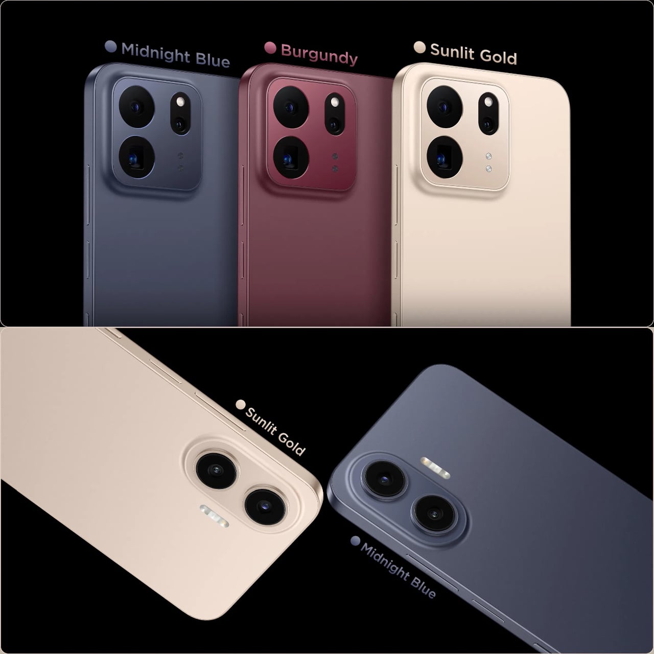
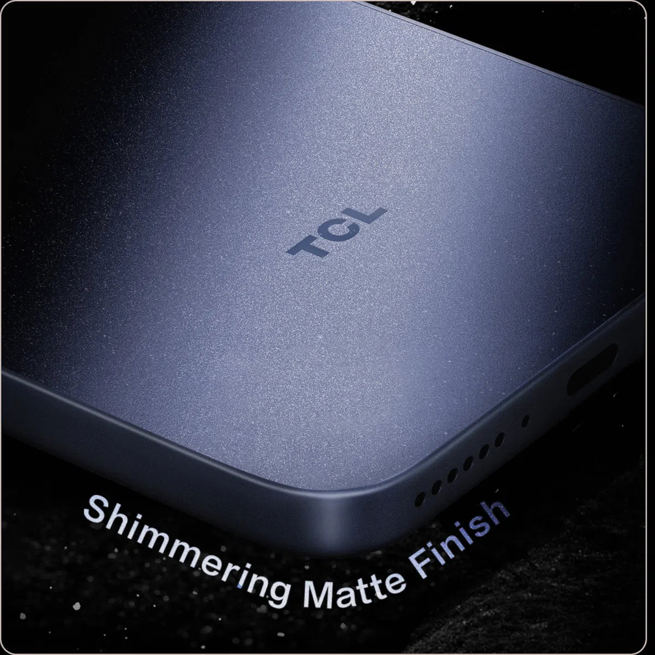
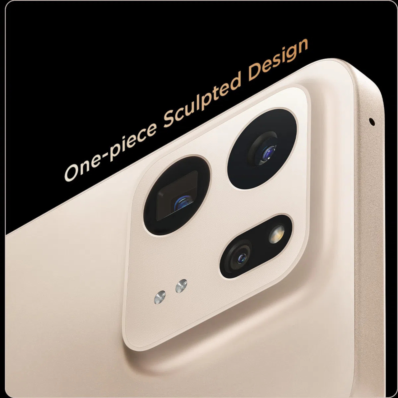
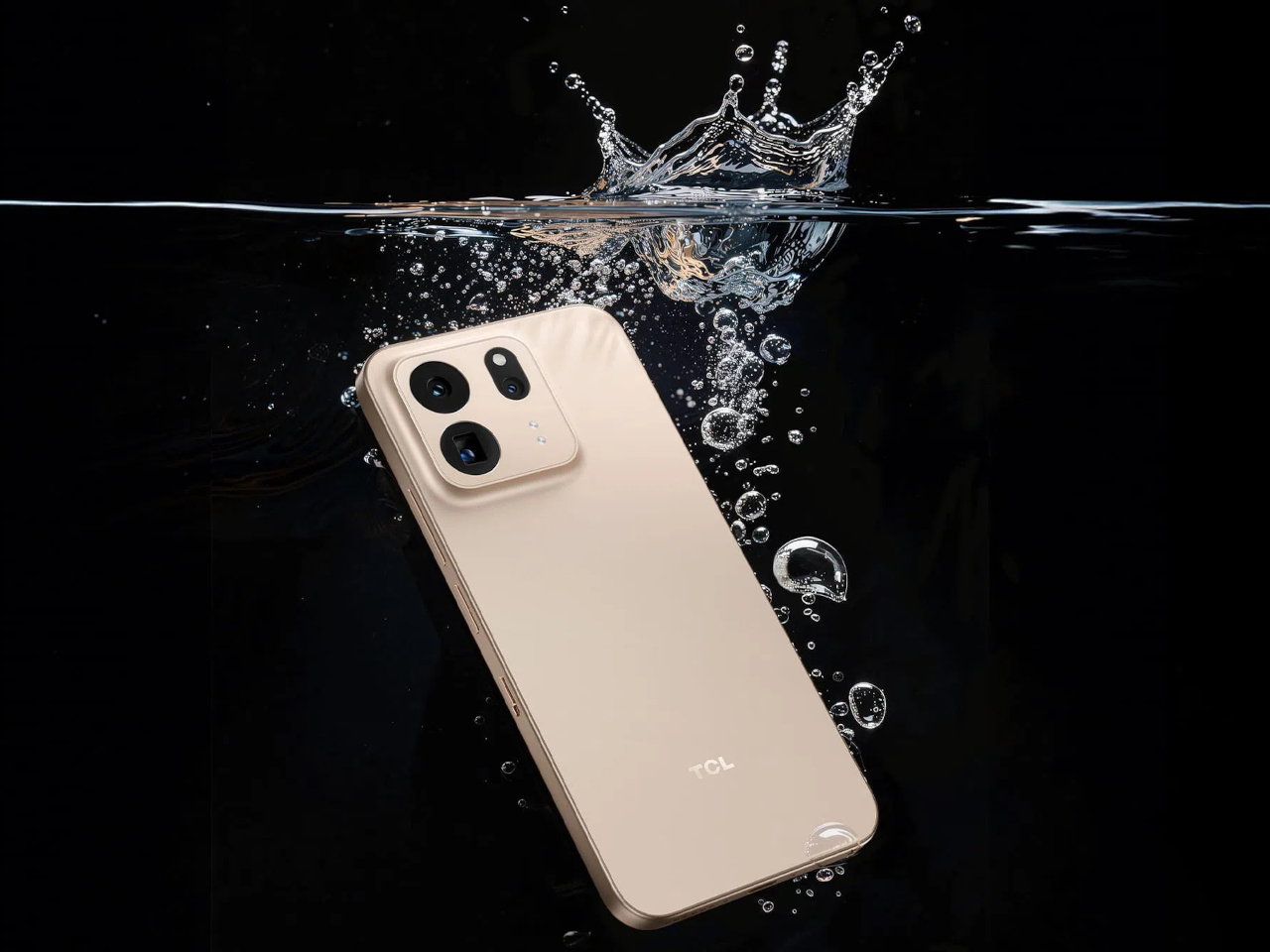
The frame wrapping that screen is aluminum rather than the plastic often found at this price, giving both phones a sturdier grip without piling on bulk. TCL backs that up with an IP68 rating against dust and water, plus MIL-STD-810H certification for the inevitable drop. Buyers get to pick between Sunlit Gold, Burgundy, and Midnight Blue, three finishes that lean more toward jewelry-box color choices than typical slab-of-glass smartphone palettes.

Where the two models part ways is around the back. The P80 Ultra carries a 50-megapixel main camera next to a 50-megapixel periscope lens for 3x optical zoom, tucked into a housing shaped to avoid throwing off the phone’s balance. The P80 Pro drops the periscope for a simpler dual-camera arrangement, trading reach for a slimmer build that still shares the same main sensor and 8-megapixel ultrawide.

TCL is rolling both phones out across Europe first, with the P80 Ultra priced from €549 (around $635) and the P80 Pro starting at €429 (around $500), before a Latin American launch follows in October. A wider release is expected to reach additional regions afterward. In a category full of identical glass rectangles, these two phones actually behave differently depending on what someone needs from them that day.

The post TCL’s P80 Pro and Ultra Are the Phones That Replaced Your Kindle Too first appeared on Yanko Design.
  •  

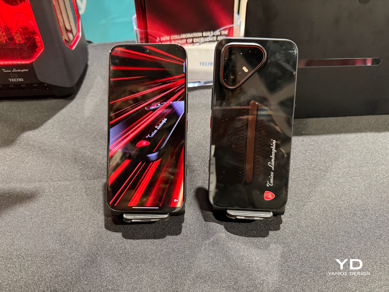
TECNO and Tonino Lamborghini Prove You Can’t Fake a Real Collab

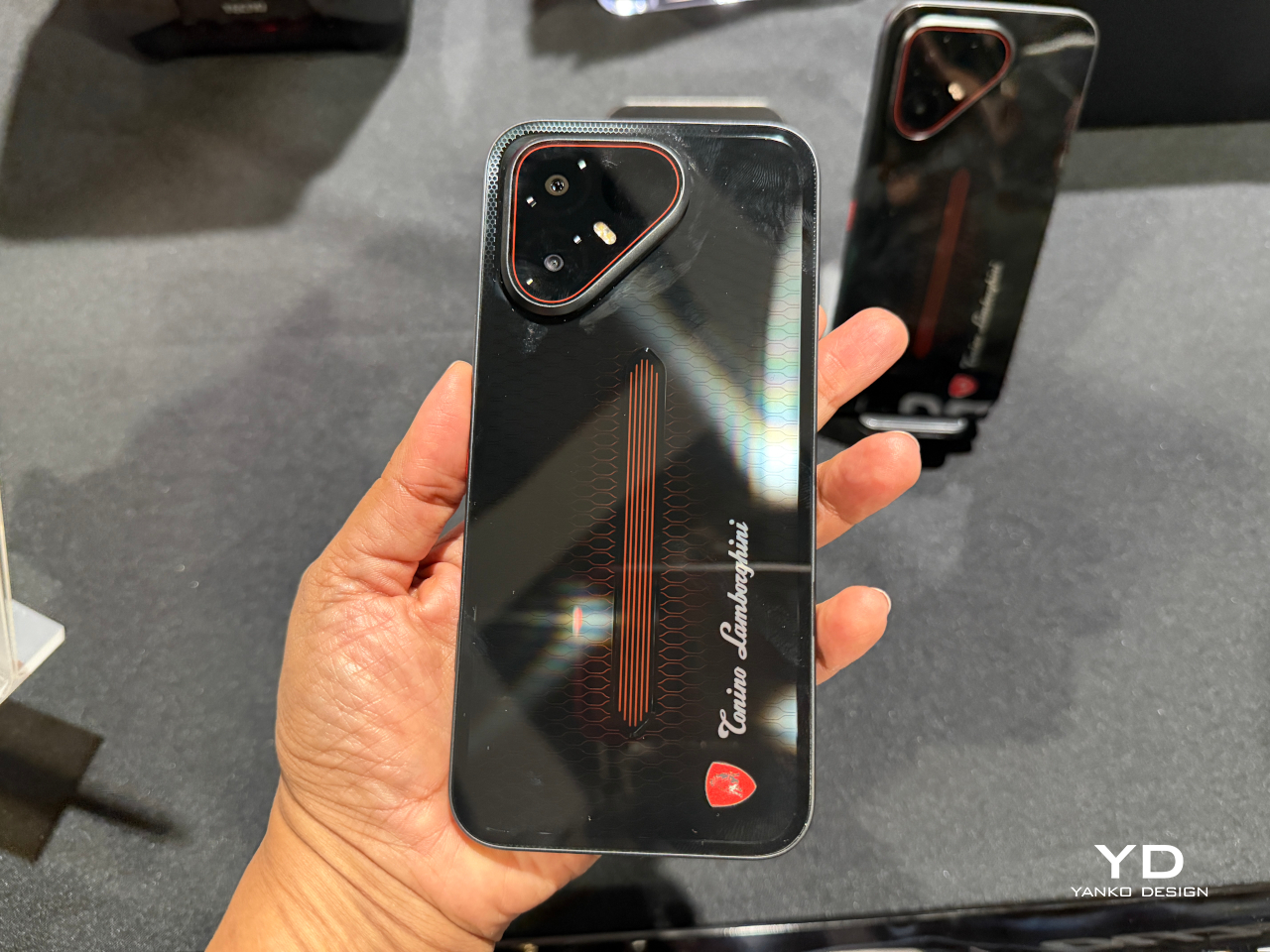
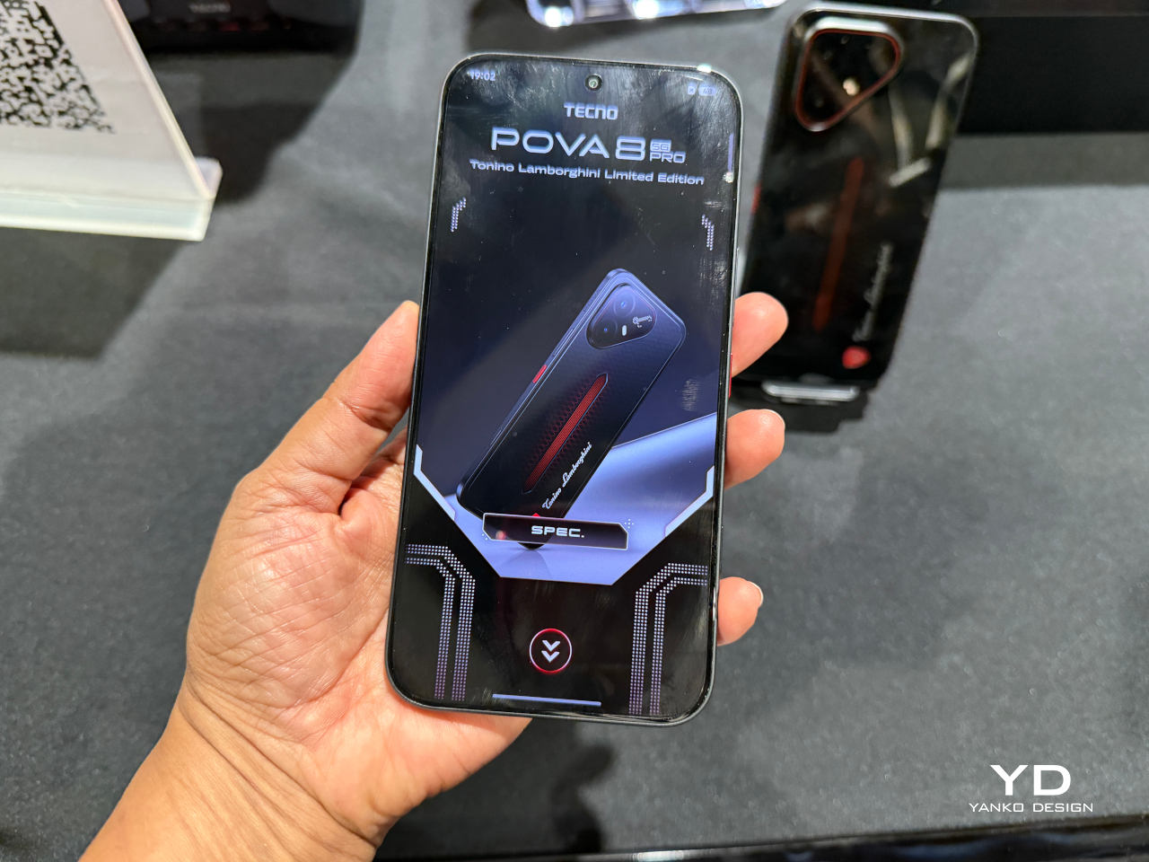
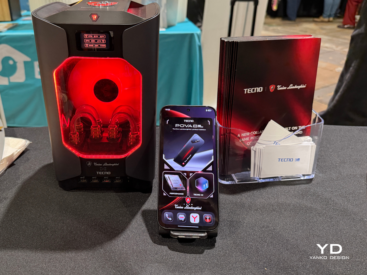
Slapping a famous badge on a phone’s back panel is the easy version of a brand partnership. TECNO and Tonino Lamborghini clearly wanted the harder version instead. The POVA 8 Pro 5G Tonino Lamborghini Limited Edition builds its entire identity around a black-and-red palette and a hexagon pattern lifted straight from Lamborghini’s mechanical heritage, then carries that language past the glass and into the software running underneath.

The rear panel does the heaviest visual lifting. A dual-layer stacking process gives it a reflective quality built from countless internal mirror structures that refract and redirect light, so red accents seem to surface and sink back into shadow as the phone tilts in your hand. A physical height difference between the two layers adds genuine spatial depth, echoing the layered geometry found in actual mechanical engineering rather than faking it with a printed graphic.

Designer: TECNO x Tonino Lamborghini

That commitment doesn’t stop at the hardware. A bespoke interface theme reworks dozens of icons in matching black-and-red tones with glass-like material effects, while a custom boot animation and ringtone carry the same mechanical energy into everyday use. Opening the phone in the morning feels less like waking up a generic Android device and more like starting an engine built around a specific mood.

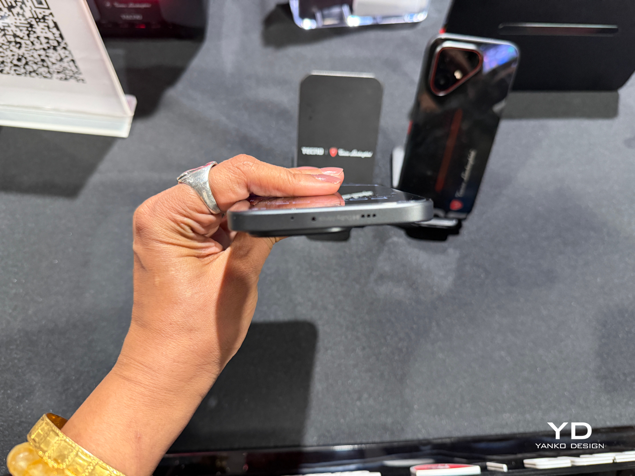
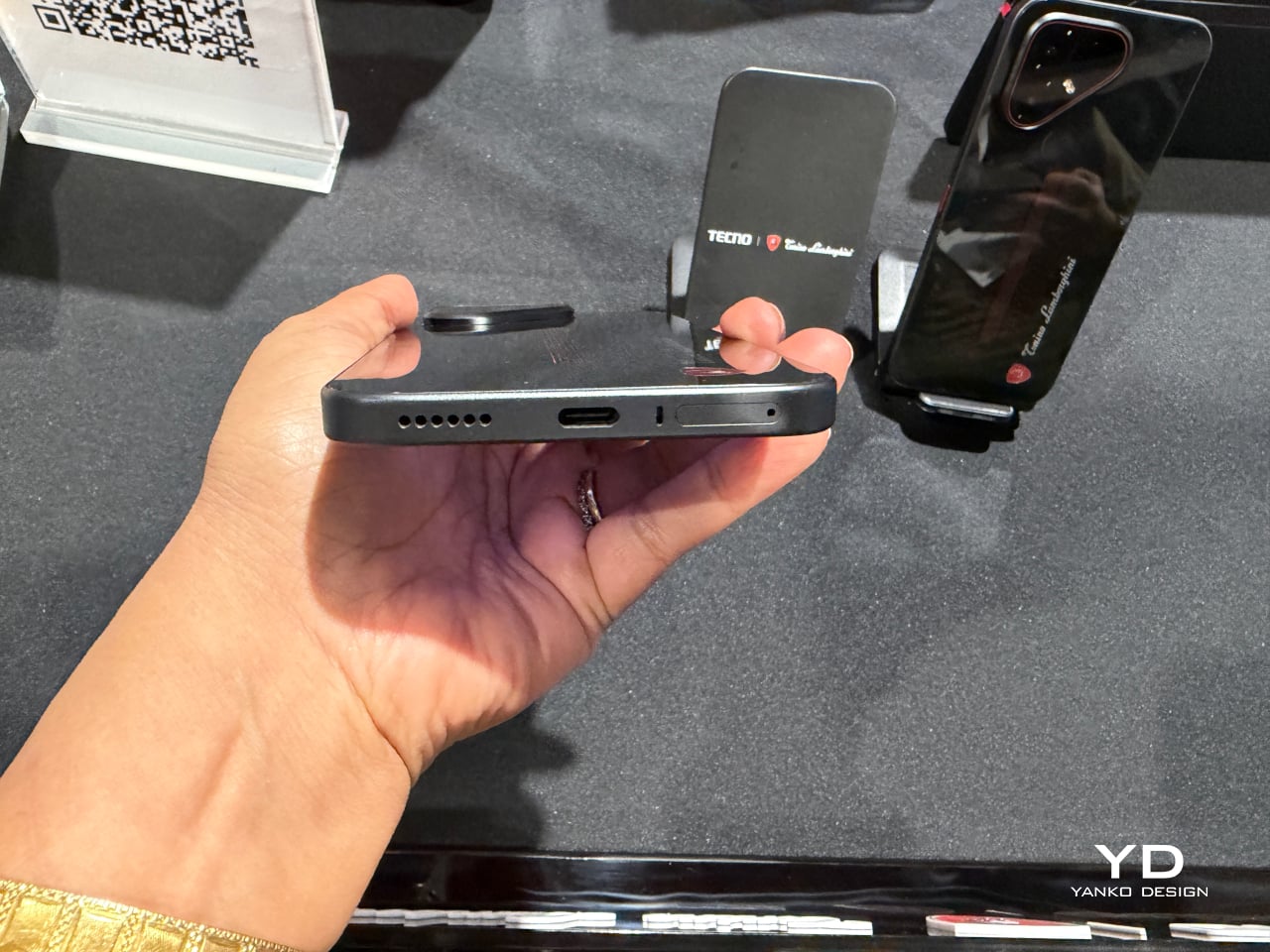
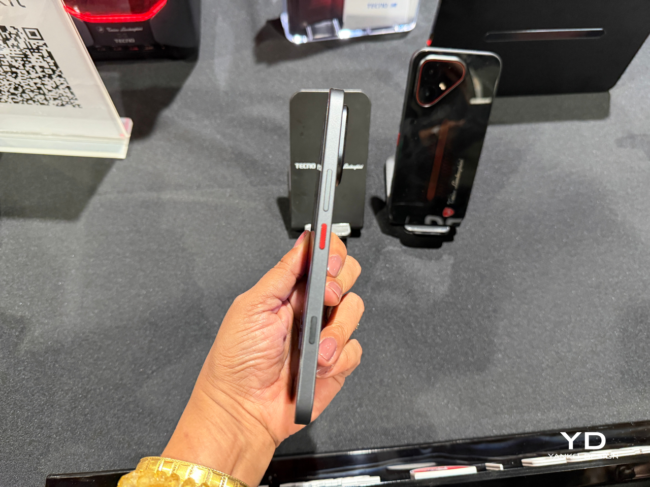
Underneath the styling sits a dual-chipset setup pairing a MediaTek Dimensity 7400 Ultimate platform with a TECNO-built P1 Graphic Chip, backed by a vapor chamber cooling system spanning over 22,000mm² of dissipation area. That combination pushes supported titles as high as 144FPS, turning a commute or a lunch break into legitimate gaming time instead of a compromise. A dedicated one-tap button on the side keeps favorite apps and gaming shortcuts one press away.

Photography leans on a Sony-engineered LYTIA 700C sensor with a larger light-sensitive area, giving low-light shots and handheld video noticeably steadier results thanks to built-in optical stabilization. A 50MP high-pixel mode and 2x lossless zoom cover the detail-obsessed shots, while an 8MP ultra-wide lens handles group photos and landscapes without anyone needing to step backward to fit everyone in frame.

The 6.78-inch AMOLED display pushes brightness to 4,500 nits and refreshes at 144Hz, numbers that matter most outdoors under direct sun or during fast-paced gaming sessions where lag ruins the moment. A touch layer rated for wet and oily fingers keeps the screen responsive through rain, sweat, or sunscreen-covered hands, useful for anyone who refuses to put their phone down just because the weather did.

Durability rounds out the package rather than acting as an afterthought. Corning Gorilla Glass 7i, IP69-rated water and dust resistance, and SGS 5-Star Drop certification mean the phone can survive a dropped call turning into a literal drop without ending the relationship. A 6,500mAh battery retains over 80% of its health after 2,000 charge cycles, translating to roughly six years of daily use before a real decline sets in.

TECNO and Tonino Lamborghini spent more effort here proving that a licensing deal can produce something with actual mechanical thinking behind it, rather than a badge glued onto commodity hardware. The result reads less like a co-branded accessory and more like a phone that happens to share a bloodline with the cars.

The post TECNO and Tonino Lamborghini Prove You Can’t Fake a Real Collab first appeared on Yanko Design.
  •  

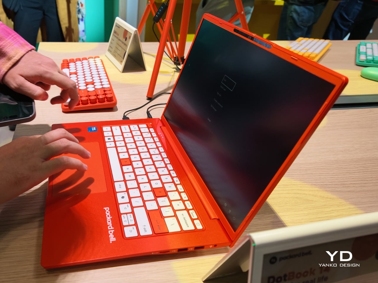
Acer’s Packard Bell Crashed IFA 2026 Like a Box of Crayons

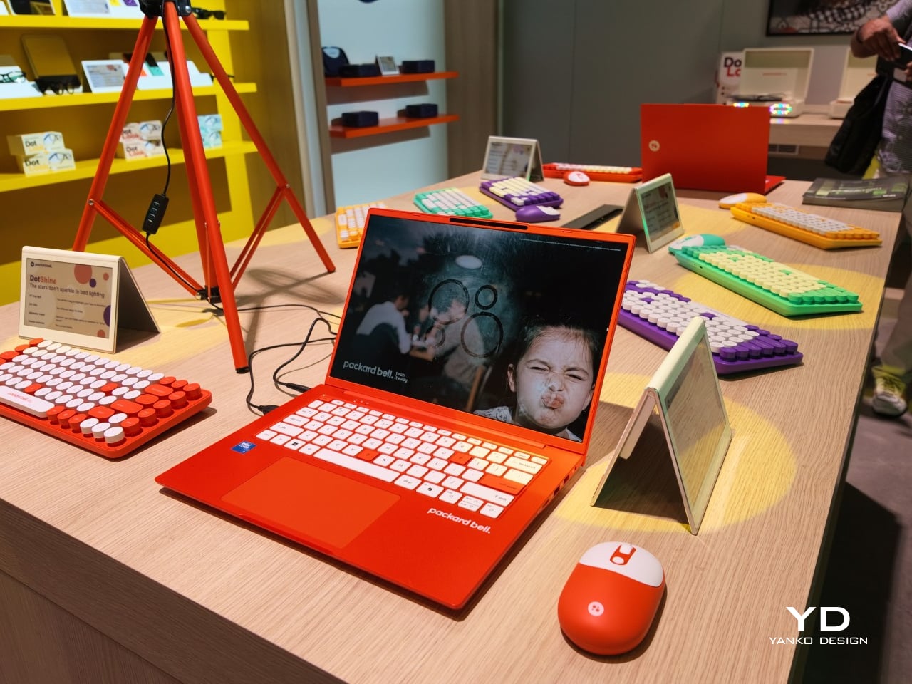
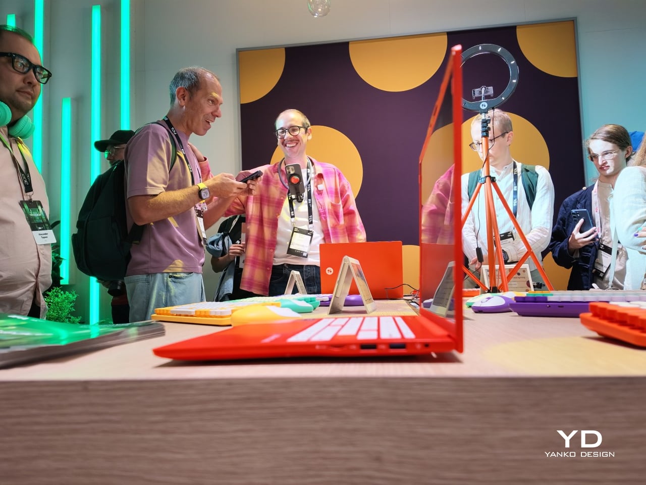
Packard Bell spent a century teaching people that new technology doesn’t have to feel intimidating, and its 100th birthday present to itself leans hard into that idea. Under Acer’s ownership, the brand relaunched at IFA 2026 with a philosophy it calls “Tech it easy,” built around a lineup that trades beige plastic and quiet corporate design for colors loud enough to notice from across a room. Four products anchor that comeback, and each one argues that everyday tech gains something when it stops taking itself so seriously.

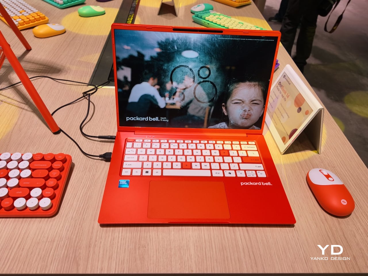
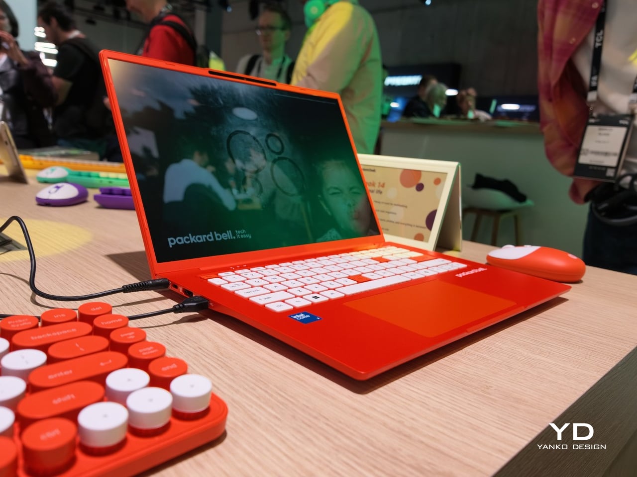
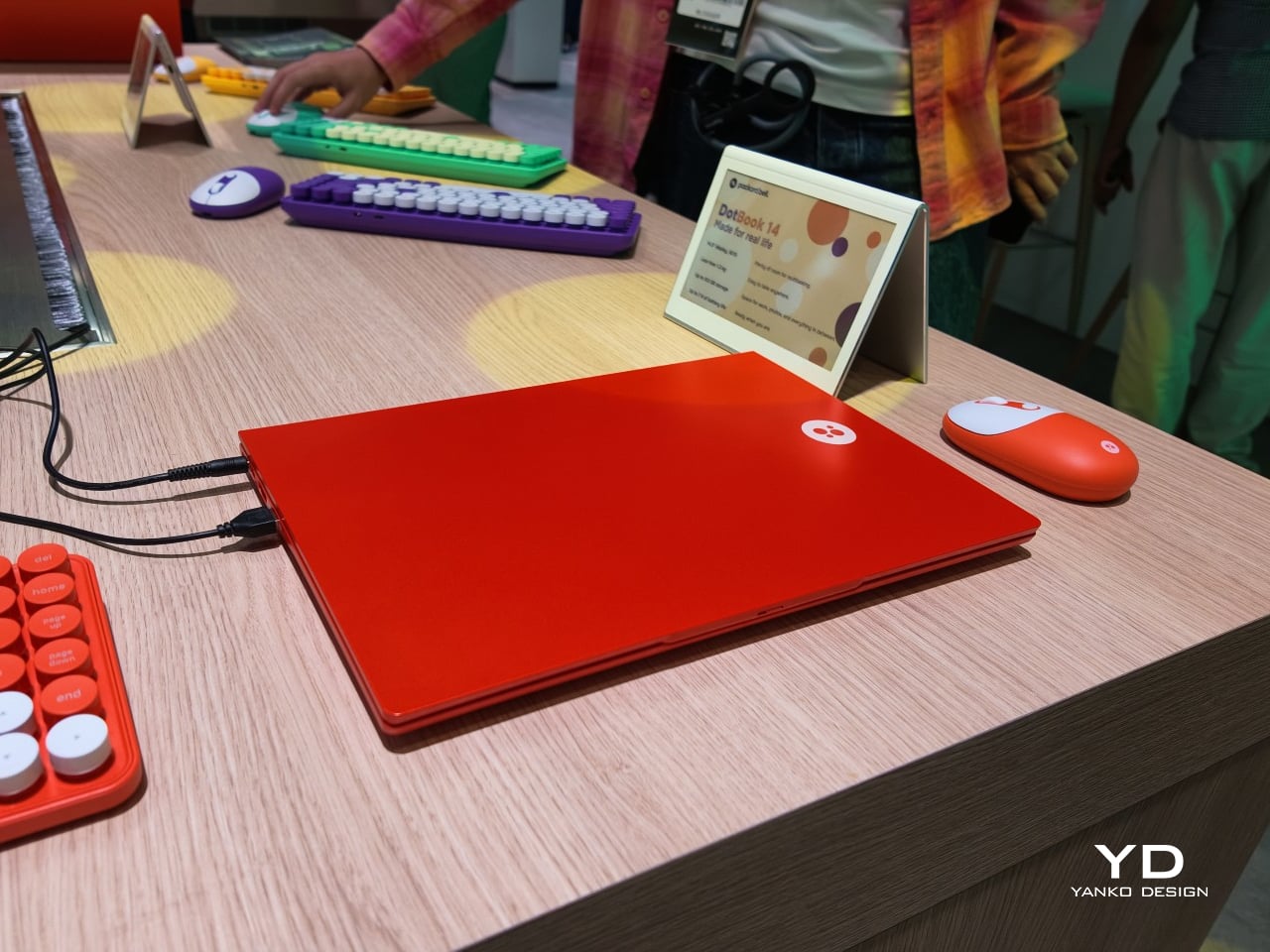
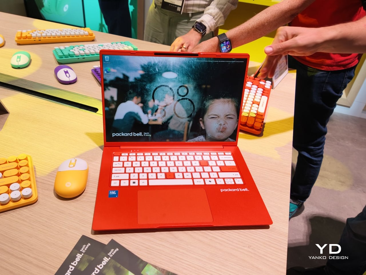
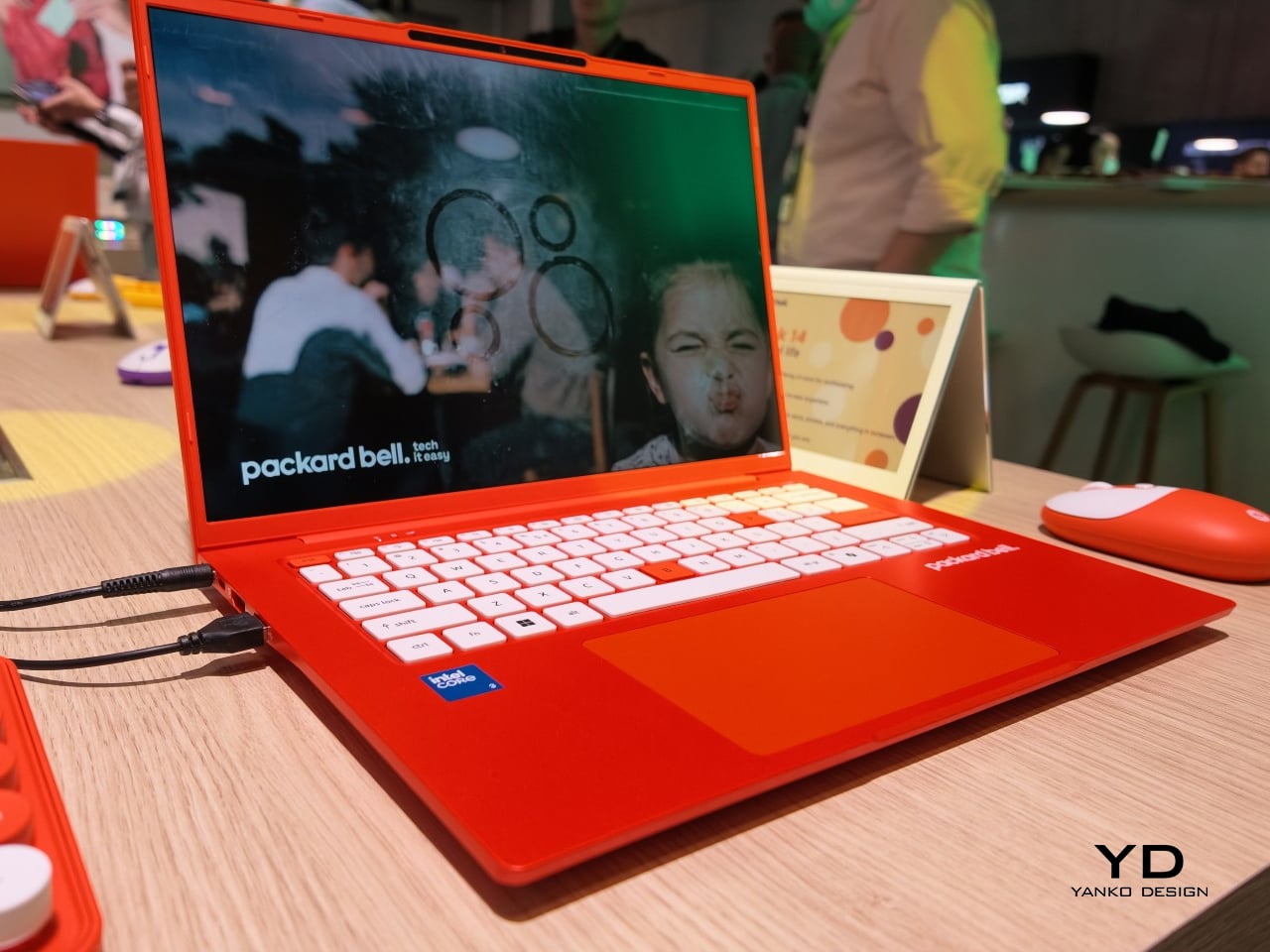
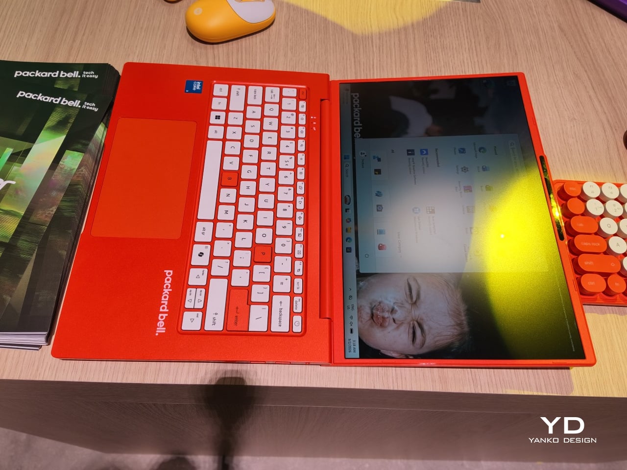
The DotBook carries the heaviest expectations as the collection’s flagship, a 14.5-inch laptop finished in a red-orange shell bright enough to spot on a crowded coffee shop table. Weighing under 1.3 kg and measuring just 17.9mm thin, it’s built for browsing, streaming, and everyday work rather than chasing benchmark scores, backed by up to 512GB of storage and 16GB of memory running quietly under Windows 11. It’s a laptop designed to disappear into a bag, not a spec sheet debate.

Designer: Acer

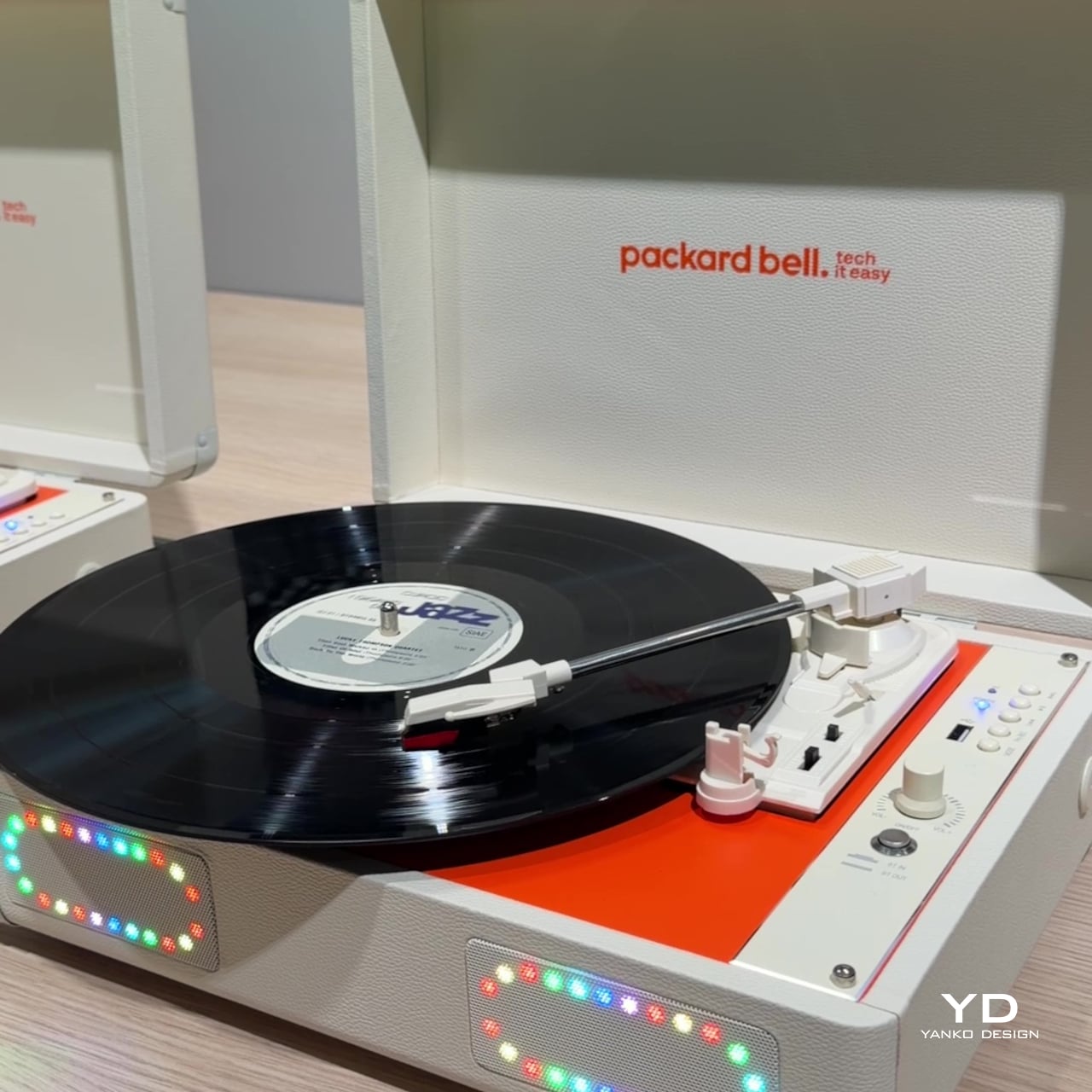
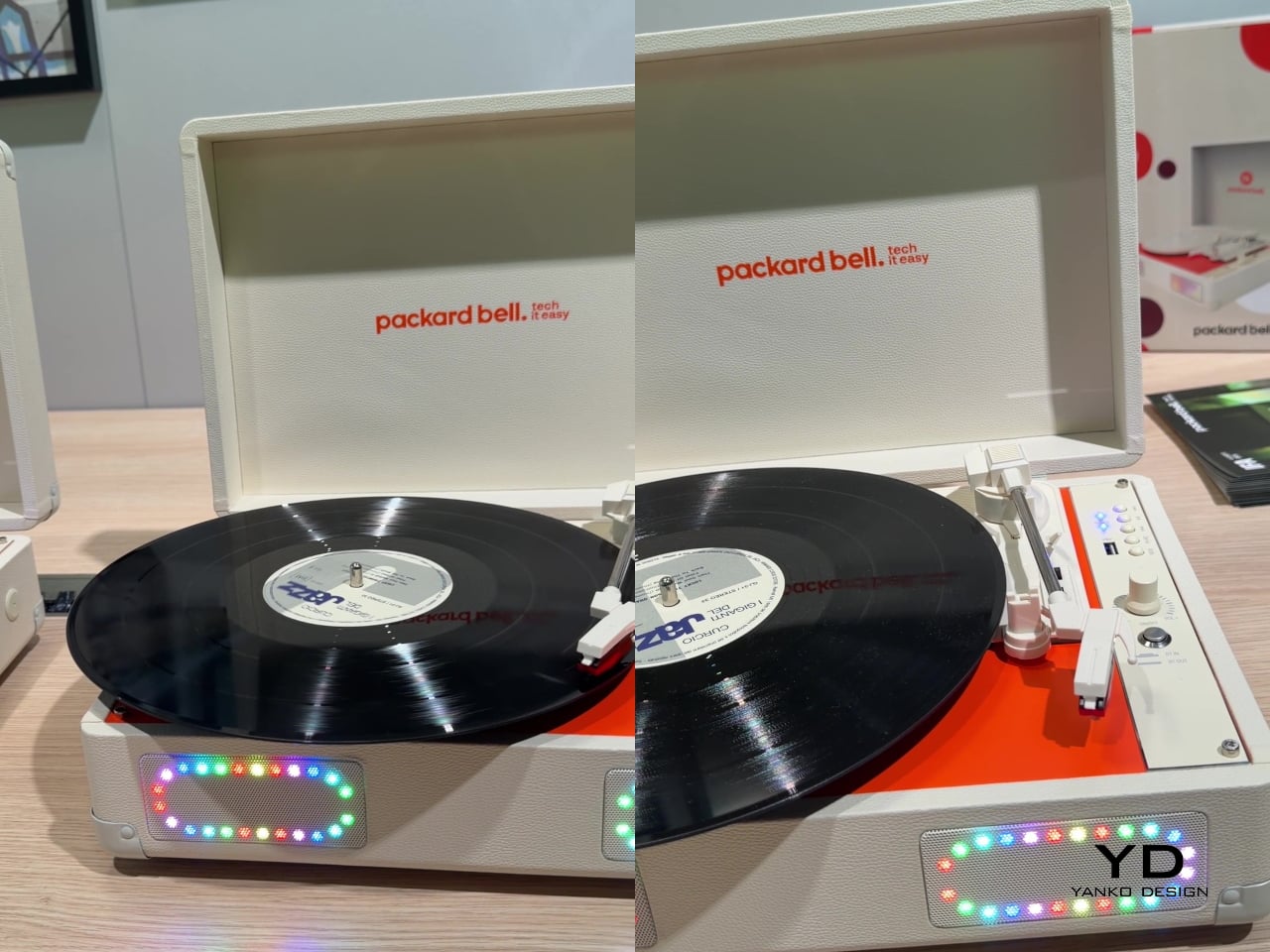
Where the DotBook plays it relatively straight, the DotLoop commits fully to spectacle. Housed inside an actual briefcase shell with a 1970s silhouette, the turntable pops open to reveal a working tonearm flanked by RGB-lit speaker grilles that glow while a record spins. Two built-in 3W speakers handle sound on their own, though Bluetooth and RCA outputs let the DotLoop hand audio off to a proper stereo system whenever the moment calls for something louder.

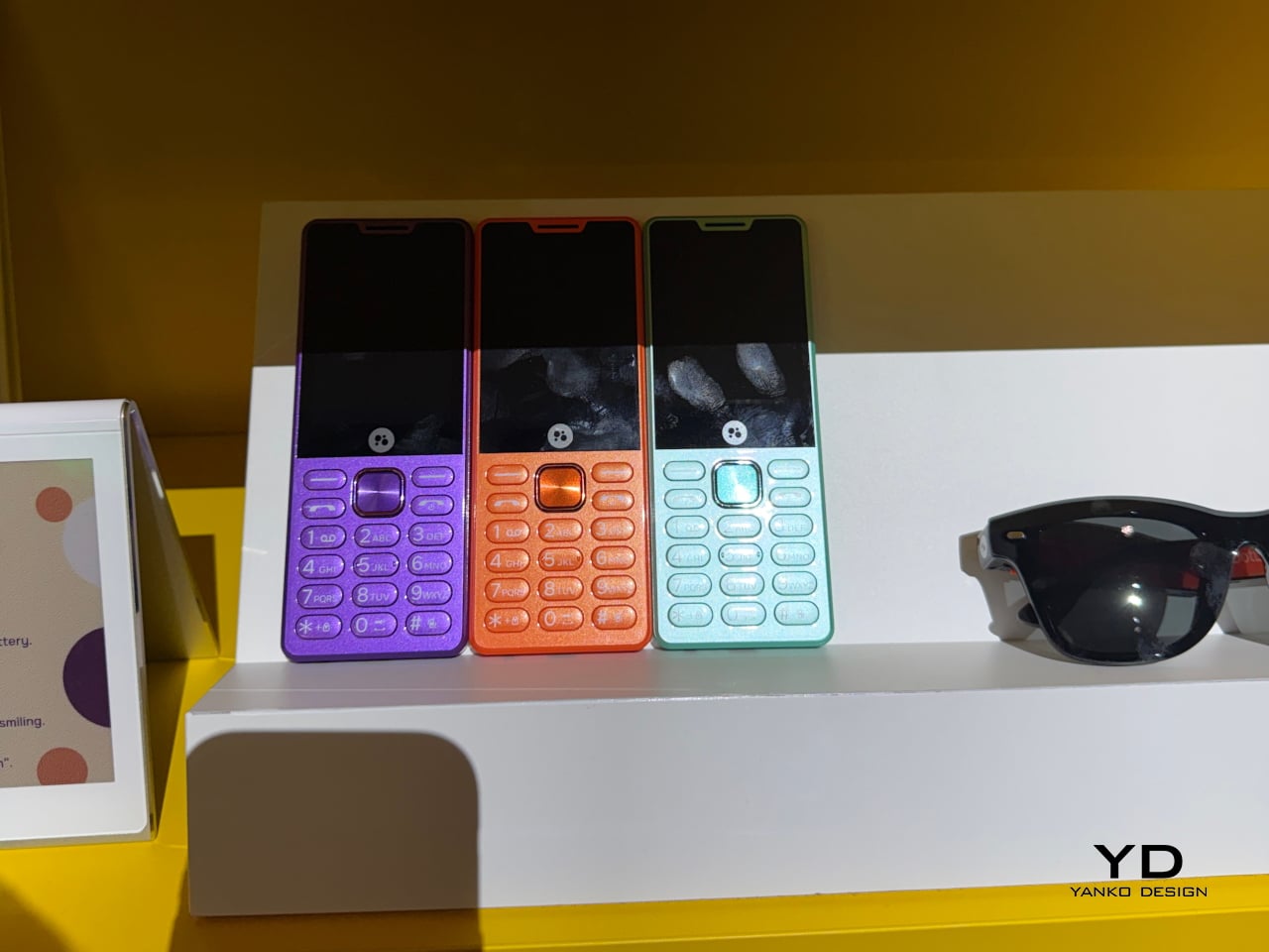
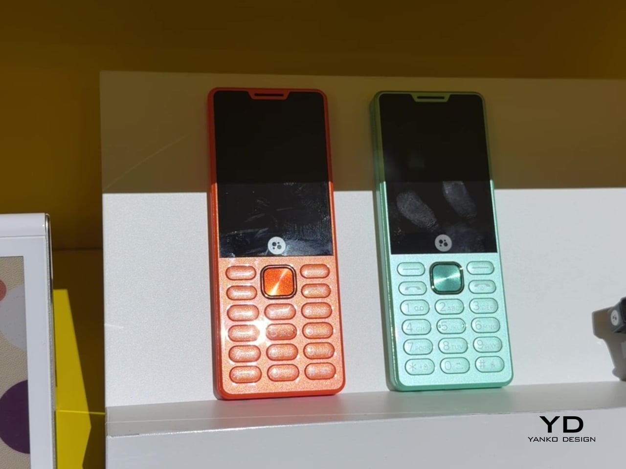
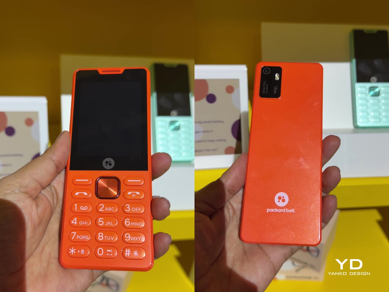
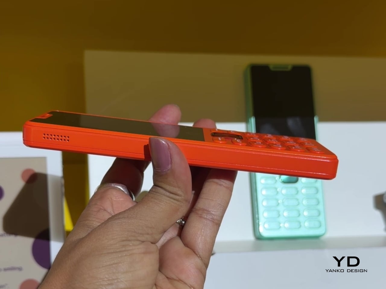
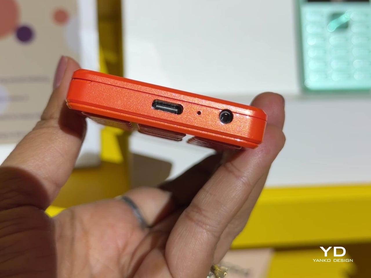
That willingness to have fun with format extends into the DotLine, a feature phone built for anyone tired of feeding a smartphone’s constant appetite for attention. A 2.8-inch display and physical keypad keep the experience deliberately simple, while an 1800mAh battery stretches across roughly two weeks between charges, a number that sounds almost mythical next to a modern flagship’s overnight anxiety. Four color options keep it from feeling like a consolation prize.

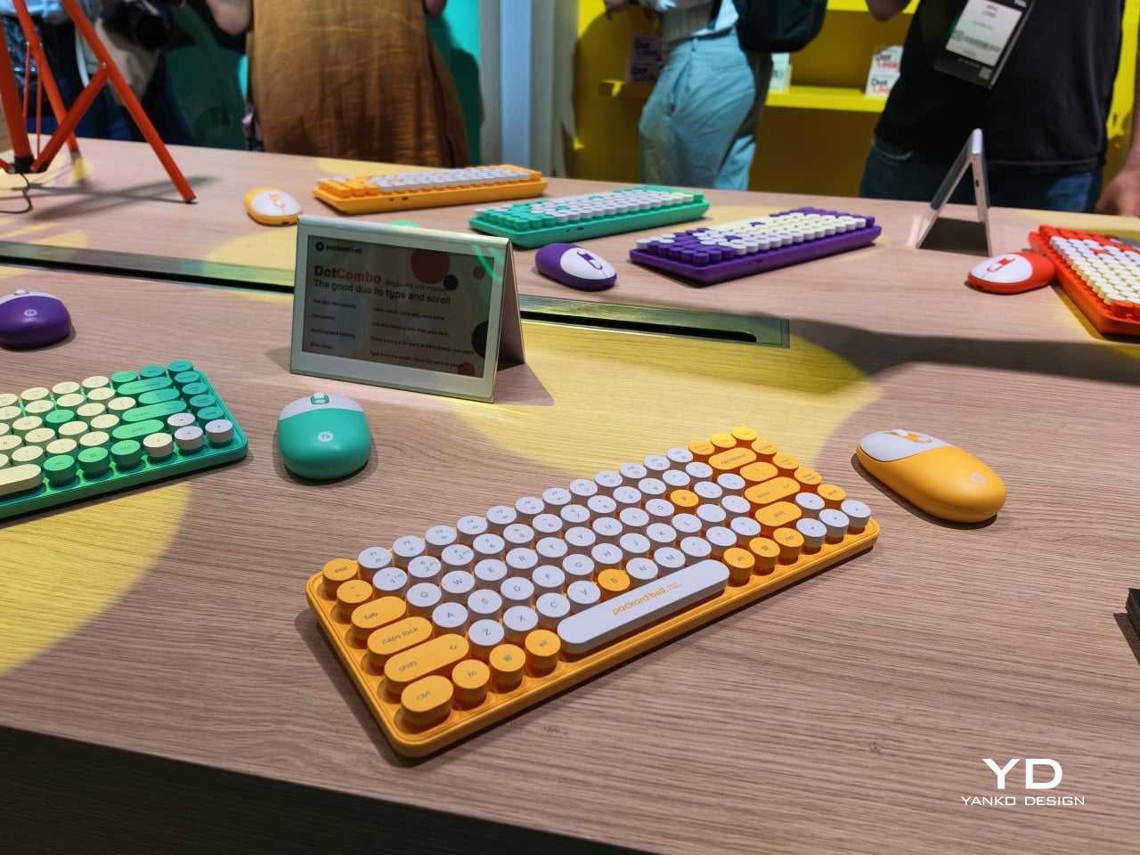
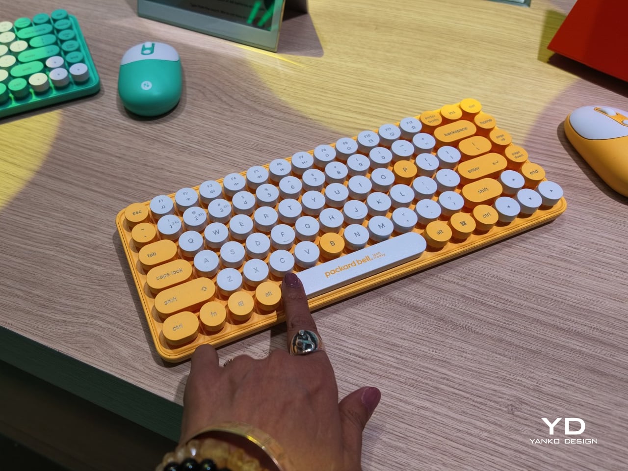
Rounding out the focus lineup, the DotCombo bundles a keyboard and mouse into a single color-matched purchase, eliminating the usual mismatched beige-on-black desk setup that so many peripherals default to. Both pieces run on rechargeable batteries good for hundreds of charge cycles, connecting over Bluetooth or a 2.4GHz receiver without a single AA battery required. Round keycaps borrowed from typewriter design give the whole thing a tactile, almost toy-like presence on a desk.

Beyond these four, Packard Bell rounds out its centennial collection with a portable speaker (DotTune), audio glasses (DotLook), a ring light for creators (DotShine), matching headphones (DotBass), and even a countertop food steamer (Steasy), all sharing the same saturated color palette and straightforward pricing. None of them ask for much attention individually, but together they paint a lineup unwilling to blend into a beige office shelf.

Pricing stays approachable across the board, with the DotBook starting around €499 (around $578), the DotLoop at €149 (around $173), the DotLine at €69 (around $80), and the DotCombo at just €39 (around $45). Packard Bell’s return proves that a century-old brand can still find something new to say, mostly by refusing to whisper it.

The post Acer’s Packard Bell Crashed IFA 2026 Like a Box of Crayons first appeared on Yanko Design.
  •  
❌