Vue lecture

Apple is Building a Short, Wide iPhone Ultra… Now It Owes Us an Actual iPhone Mini
I have a friend who still uses an iPhone 13 mini held together by a case and pure spite, and every single time a new iPhone launches, she asks me the same question. Is it small yet. It never is. Apple has spent years telling us, implicitly, that small phones do not sell, that the market has spoken, that everyone wants a bigger canvas for videos and games and doomscrolling. Fine, sure, the sales numbers backed that up in 2023. But sales numbers do not mean the desire disappeared, they mean the alternative was not good enough to fight for.

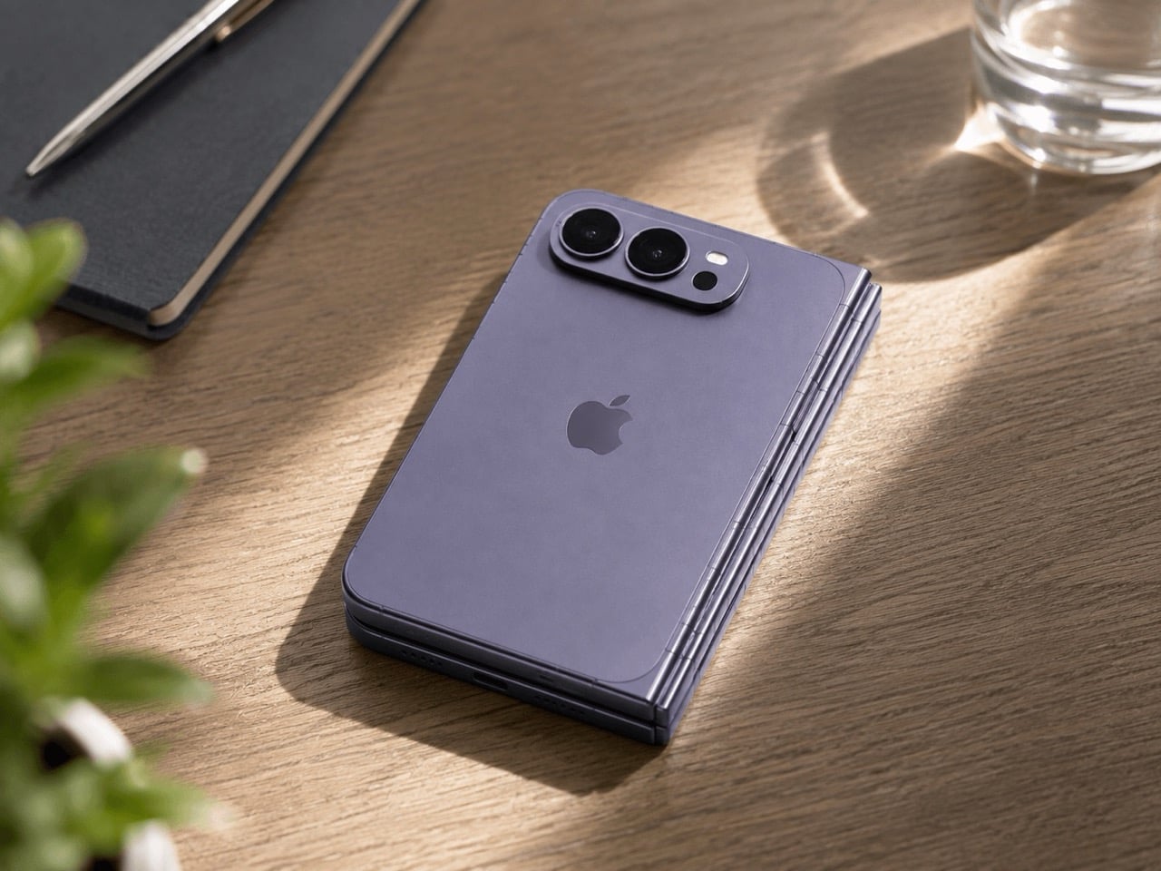
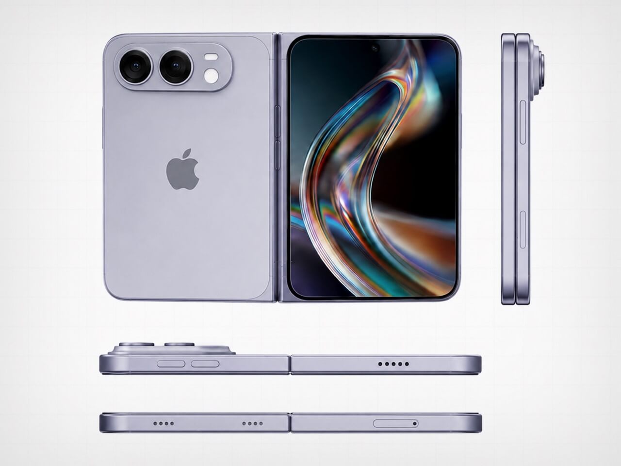
Which brings me to the iPhone Ultra, Apple’s rumored first foldable, expected to close into a short, squat, almost passport-shaped little brick before you unfold it into something the size of an iPad mini. That folded shape is the closest thing to mini energy Apple has shown in years, and it is buried inside a two thousand dollar folding phone nobody asked to be the delivery method. My friend does not want an iPad mini that folds. She wants her 13 mini, but new. Apple already built the shape. It just built it around the wrong phone.

Designer: Apple
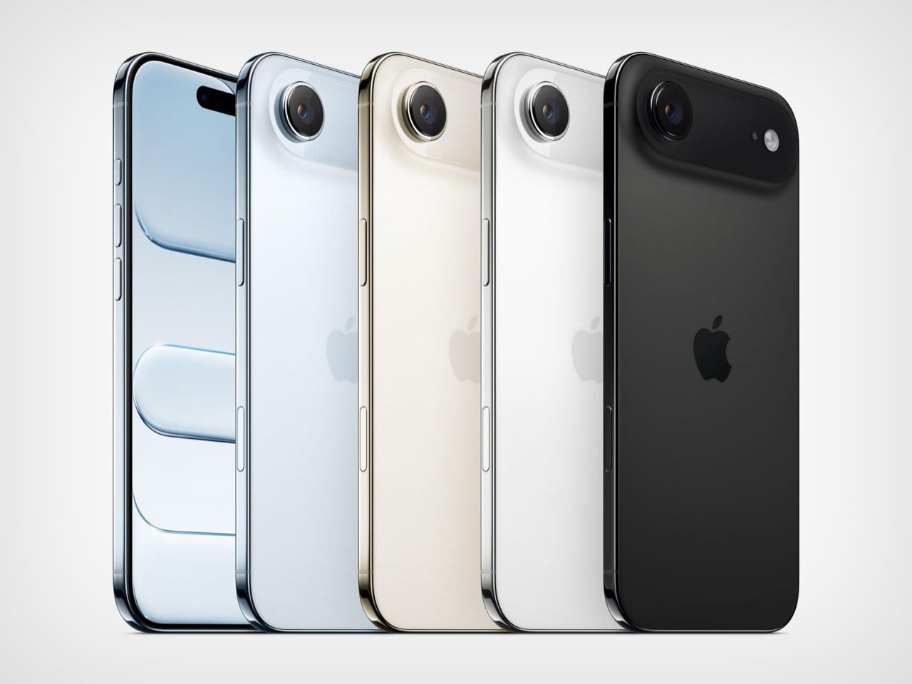
The Air existed to answer a question almost nobody was asking at checkout, namely how thin can a phone get before the internals start filing complaints. It was a genuine engineering flex, the kind of thing that looks incredible in a teardown video and slightly pointless in daily use. I understood what it was trying to prove. I just never needed it proven to me personally, and I doubt I was alone in that.

The Ultra is rumored to repeat that exact flex, except this time the thinness gets folded in half, closing down to somewhere between 9 and 9.5mm shut and reportedly as thin as 4.5mm open, according to recent leaks. That is a genuinely wild number for a phone with a hinge in it. Apple is once again proving it can do the hard, borderline unnecessary engineering thing. The difference is that this time, buried inside that flex, is an actual shape people have been begging for since 2023. Apple just does not seem to have noticed it yet.
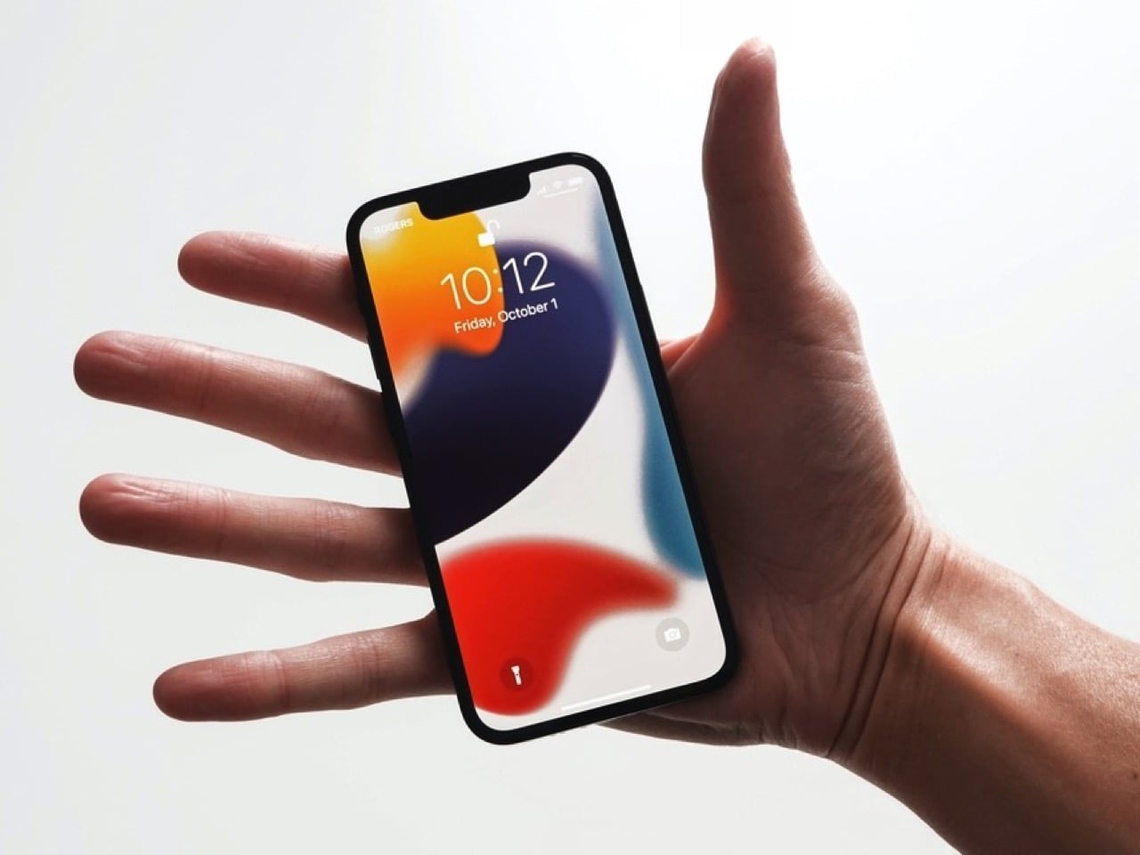
Go back and look at what the 13 mini actually was for a second, because I think people forget how unremarkable the compromise really was. It measured 131.5mm tall, 64.2mm wide, weighed 141 grams, and ran the exact same A15 chip as the standard 13. You gave up battery life and screen real estate. You did not give up the flagship experience shrunk down to fit an actual hand. Compare that to where the standard iPhone lineup sits today, regularly north of 6.1 inches before you even get to Pro Max territory, and the gap the mini used to fill has only gotten wider and lonelier.

Now put the Ultra’s folded footprint next to that. Reports point to a 5.5 inch cover display when shut, in a short, wide, passport style shell that is about as close to mini adjacent proportions as Apple has shipped since the mini died. The catch is that this compact shell only exists as a doorway into a 7.8 inch, 4:3 inner screen and a starting price rumored to land somewhere between 1,999 and 2,499 dollars. Nobody buying that phone is buying it to have something small in their pocket. They are buying an iPad mini that happens to fold shut, which is a completely different pitch than the one my friend has been asking me about for three years running.
There has been some loose speculation, mostly a 9to5Mac piece from last year, that Apple’s new staggered launch schedule could theoretically clear a runway for a smaller phone somewhere down the line. Even that piece called the odds slim to none, and nothing currently on Apple’s roadmap for the 18, 18e, 18 Pro, or Ultra includes a mini in any form. Samsung, for what it is worth, has stuck with its Z Flip clamshell as its own answer to compact, so the appetite for small has not vanished industry wide, it has just gone unanswered on Apple’s side of the fence for a while now.

So here is the pitch, and it is not a complicated one. Apple has now proven twice, once with the Air and once with the Ultra’s folded shell, that it can engineer real compactness without breaking anything important. Skip the fold. Skip the tablet trapped inside a phone shaped envelope. Take that exact short, wide, passport sized footprint and wrap a single, non folding screen around it, call it a mini, and ship it. Apple does not need a new idea here. It already built one. It just keeps hiding it inside features nobody was asking it to attach to.

The post Apple is Building a Short, Wide iPhone Ultra… Now It Owes Us an Actual iPhone Mini first appeared on Yanko Design.
  •  

The Pixel 11’s Coolest New Feature Is Actually 10 Years Old

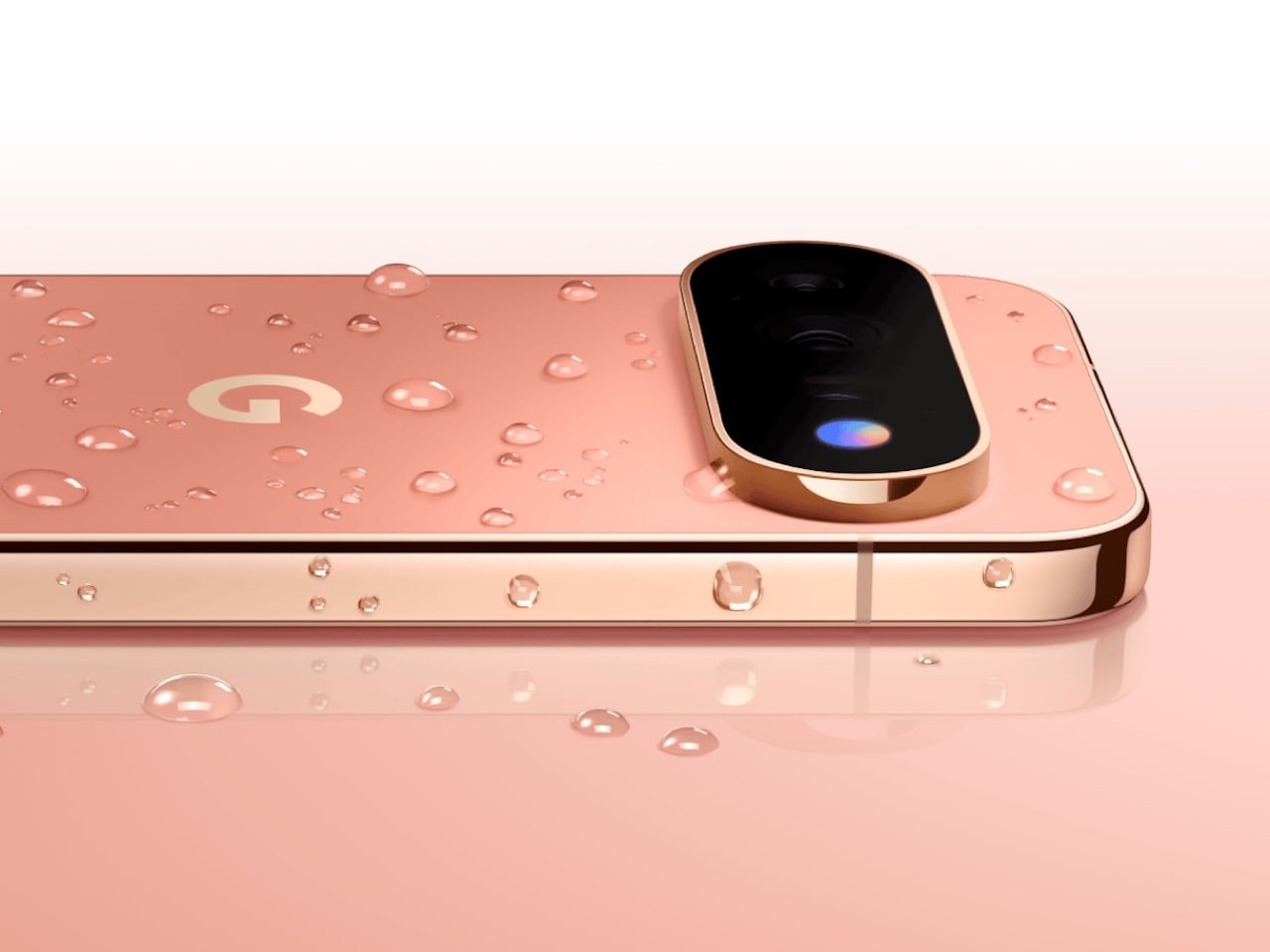
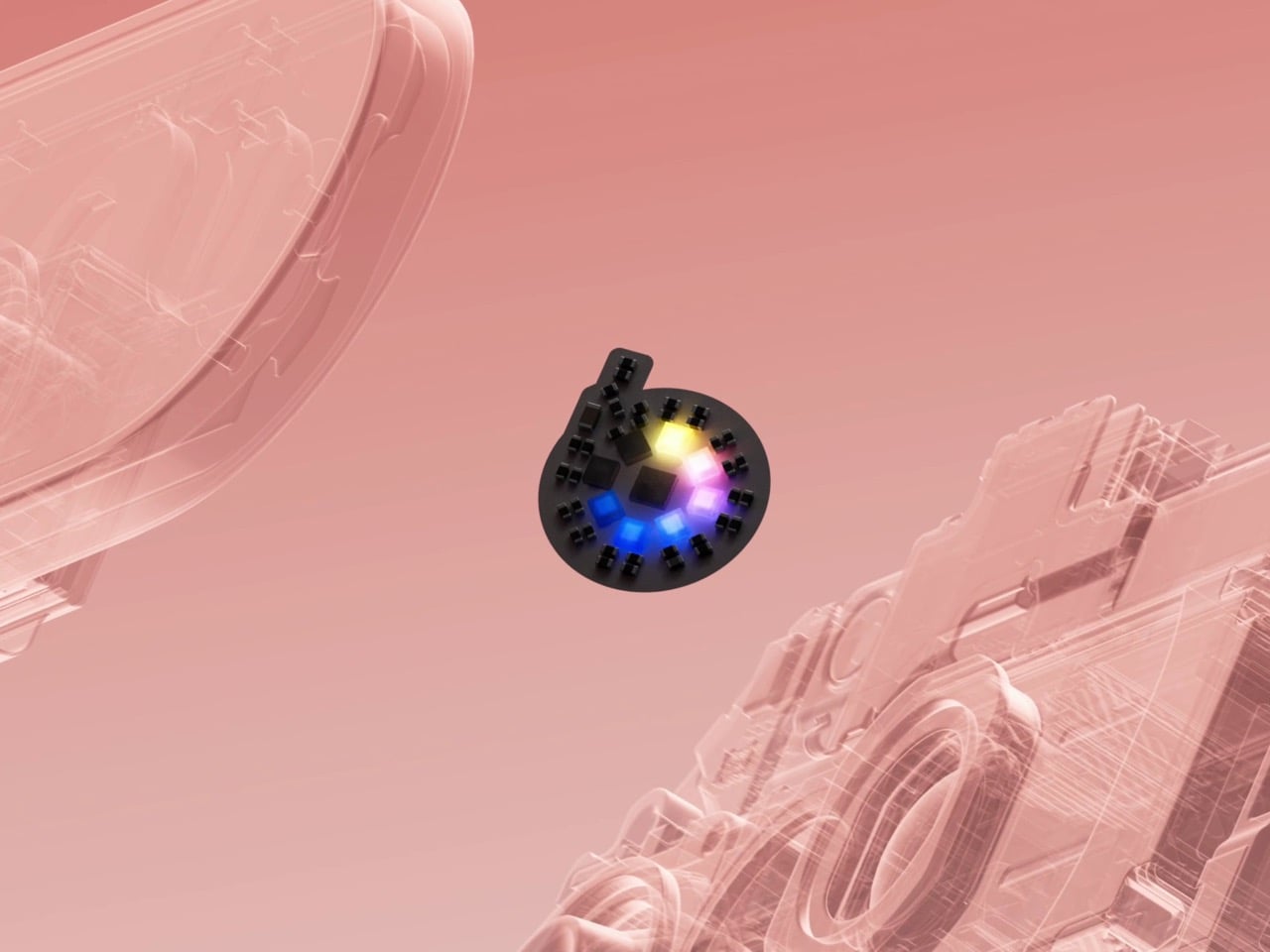
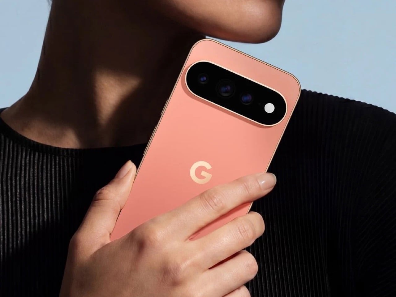
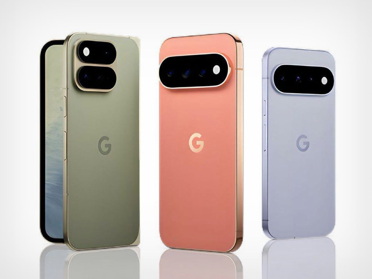
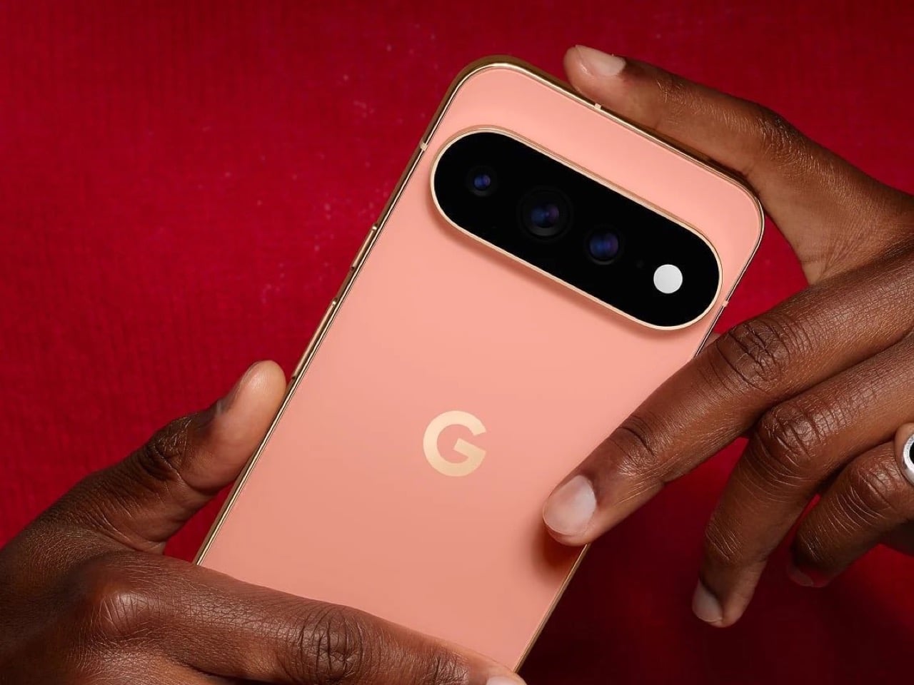
The Pixel 11 lineup arrived this week with a genuinely great redesign. The camera bar is 40 percent thinner, the glass runs edge to edge, and for the first time in a while a Pixel actually looks like it evolved instead of just got a new coat of paint. And then there’s HiLight, the one piece of new hardware Google actually wants you to talk about. A small LED cluster tucked into the corner of that same camera bar, ready to glow when Gemini is thinking or when someone you love is calling.

It is, in essence, Google finally admitting it missed the old Nexus notification LED and bringing it back. Five colors, a glow for Gemini, a glow for your favorite caller, and that’s the whole feature list on day one. Nothing to complain about here, except that Nothing exists. The London phone brand has spent years turning its own version of this idea into an actual playground, mini-games, custom widgets, an SDK anyone can build on. Google clearly has the engineering muscle to do something just as ambitious with HiLight down the line. It just chose not to, at least not yet.

Designer: Google

Before we get into that though, credit where it’s due. Hold a Pixel 11 next to a Pixel 10 and the difference is immediate, not the kind that only shows up in marketing photos. The bar sits almost flush now, and Google’s claim that it’s basically bumpless with a case on actually checks out in person. Under that glass, Tensor G6 lands on a 2nm node, Google’s first, promising 25 percent faster browsing, 15 percent quicker app launches, and on-device AI running up to 3.5 times faster while using less power. The Pixel 11 gets a new 48MP main sensor with 56 percent more light sensitivity and a telephoto stretching to 30x Super Zoom. This is a very complete phone before you even get to the Pro models.

The Pro and Pro XL push further with a 50MP main sensor, a redesigned 48MP telephoto, Portrait Mode at 5x, and 120x Pro Zoom, sitting under a 3,600-nit display that Google claims is twice as scratch resistant as last year’s. Titan M3 adds quantum-safe boot security on top. The Pixel 11 Pro Fold deserves its own mention here too. It shed almost 10 percent of its weight and a millimeter of thickness, down to 10.1mm closed, while Google claims triple the durability thanks to a redesigned gearless hinge. The crease is genuinely harder to spot than last year’s, and the whole thing folds flat enough to stop feeling like a novelty. If you told me a year ago Google would have the most convincing foldable in its own lineup, I would not have believed you.

Now, the part everyone will bring up regardless of how the rest of this goes: RAM. The Pro and Pro XL start at 12GB in their base 256GB configs, down from 16GB last year, and Google is blaming this on a supplier RAM shortage hitting the entire industry. Memory manufacturers have been shifting production capacity toward AI server chips, and consumer RAM and NAND prices have spiked hard enough this year that people are half-jokingly calling it RAMageddon. It is a real problem, and Google is far from the only phone maker feeling it. Storage doubling to 256GB as a base softens the blow a little, but a $100 price bump alongside a RAM cut is still a hard sell. Fair enough on the supply chain excuse. Less fair asking Pro buyers to pay more for less unless they climb a storage tier.

Back to HiLight, because it deserves the real estate. That LED cluster sits right where the temperature sensor used to live on older Pixels, which is a strange trade to make for something this limited. Google’s official pitch is that HiLight keeps you informed without the distraction of staring at a screen, which is a very polished way of saying there weren’t enough ideas to fill the space. Glowing when Gemini talks and flashing a color for favorite callers is a fine start, not an entire feature. Compare that to what’s happening across the pond. Nothing’s Glyph Matrix on the Phone (3) packs 489 individually lit LEDs into what functions as a tiny secondary screen, complete with an open SDK that lets anyone build their own widgets and games. People made a working ball maze. A tilt-controlled Magic 8 Ball. A contact dialer you can use without touching the main display. None of it is essential, but all of it is fun, and fun counts for something when you’re asking someone to pay a premium for a light.

Google clearly has the horsepower for something bigger here. Tensor G6 alone proves the company isn’t short on engineering muscle, and the camera bar redesign shows the industrial design team knows exactly what it’s doing right now. HiLight feels like the output of a team that had a great idea, then stopped one meeting short of making it good. I want to see where this goes in a year or two, because the foundation Google just built, the hardware, the placement, even the name, is genuinely solid. It just needs an actual reason to exist beyond telling you Gemini is thinking.


The post The Pixel 11’s Coolest New Feature Is Actually 10 Years Old first appeared on Yanko Design.
  •  

Google’s Pixel Tag is making the same ‘boring’ design mistake that Apple, Samsung, and Xiaomi made

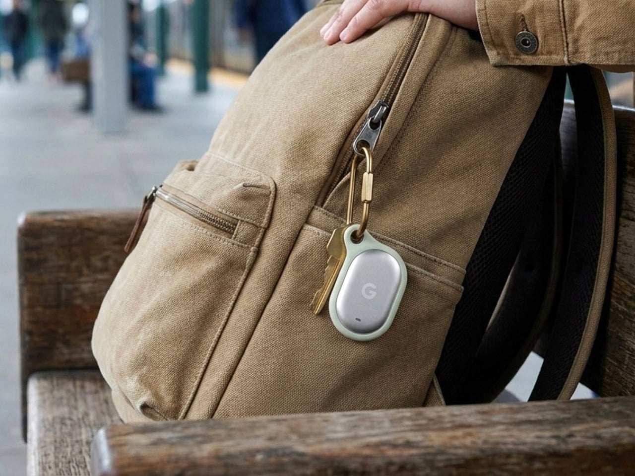
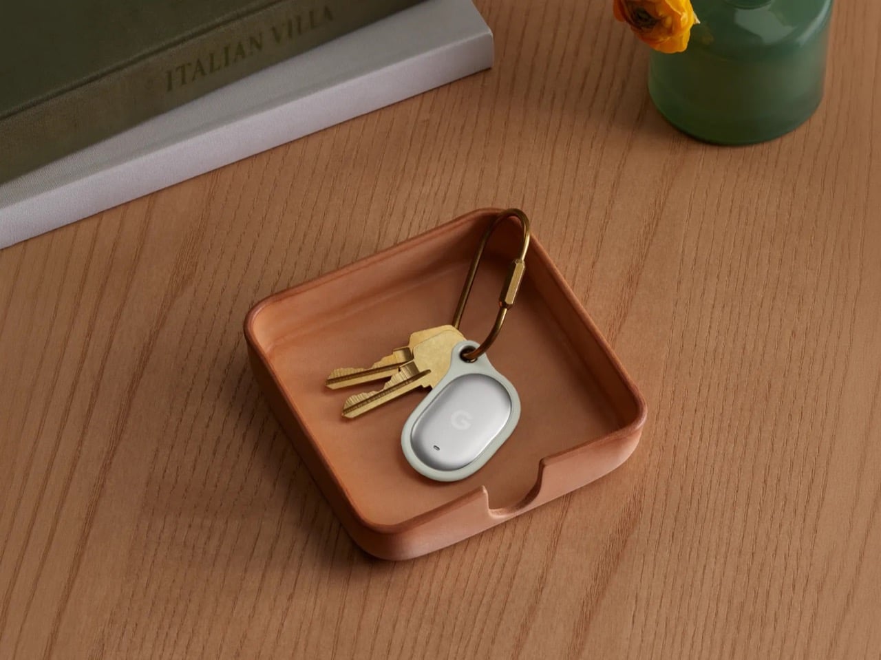
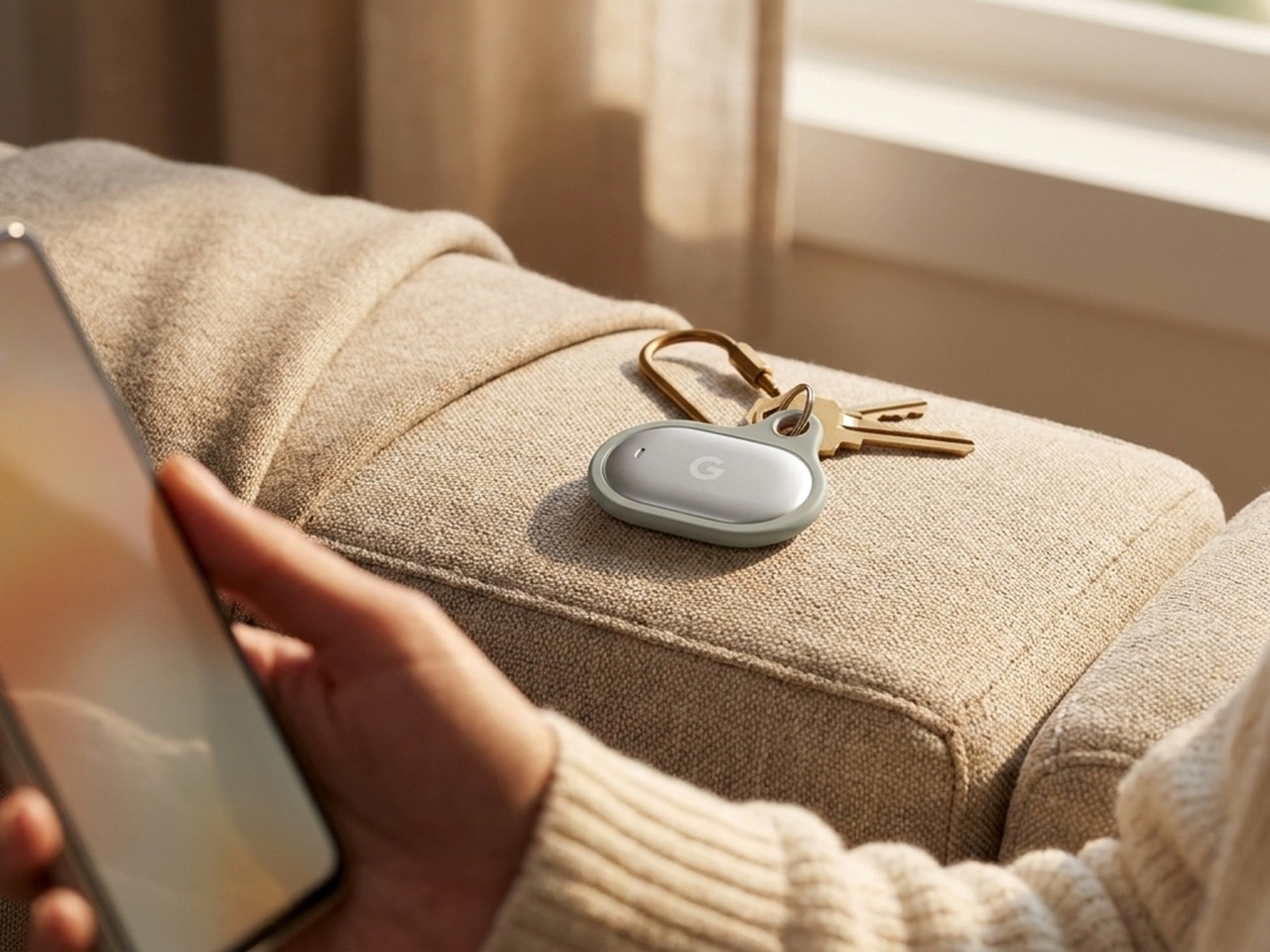
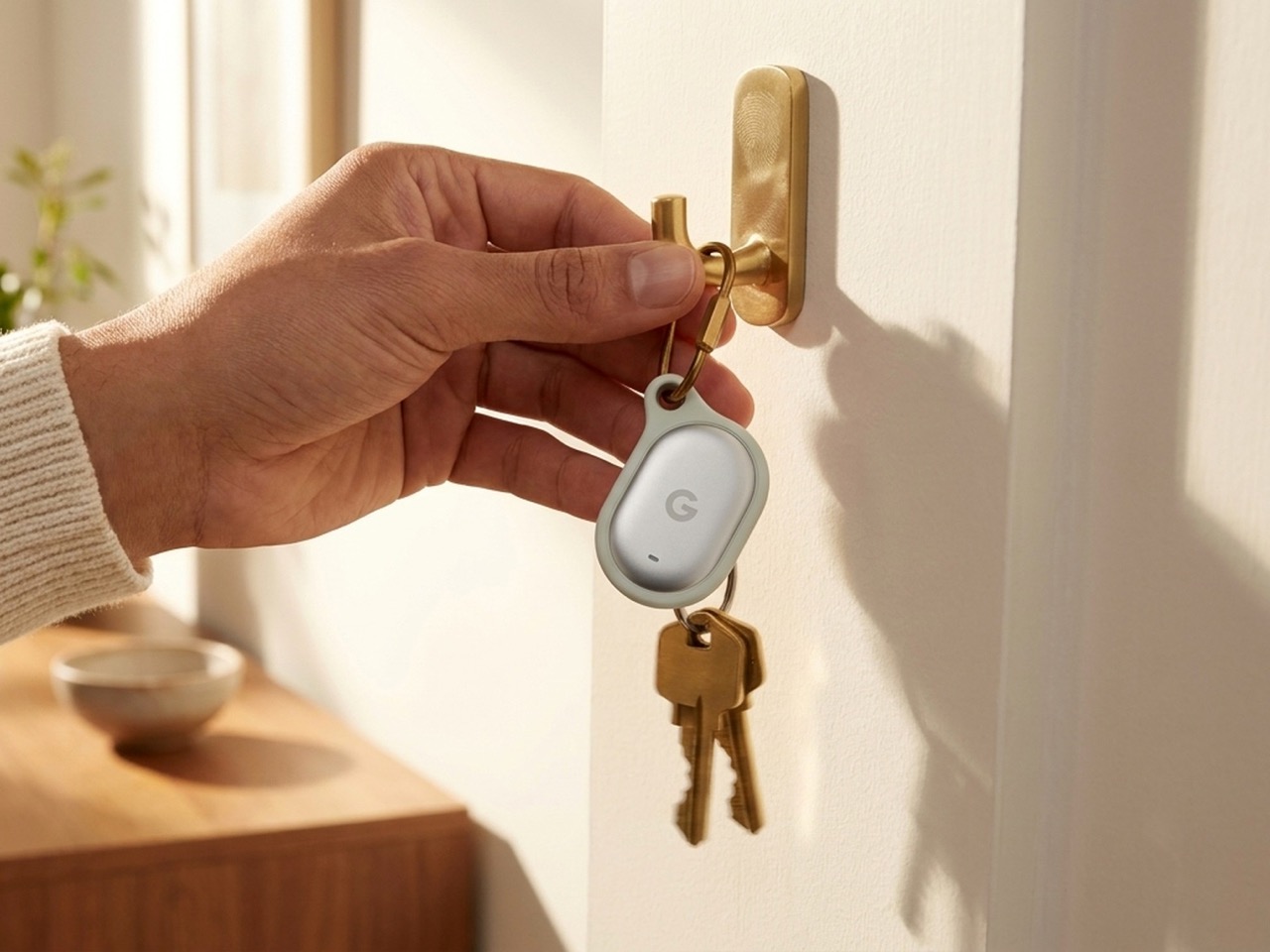
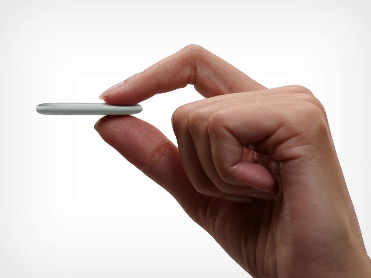
The Pixel Tag comes in exactly one color, a grey green called Fog, wrapped around stainless steel with a G logo stamped right on the front. It’s the same script Apple wrote with the AirTag and Samsung copied with the SmartTag2. A tracker spends its entire life clipped to your keys or your dog’s collar or tucked into a backpack pocket, which makes it one of the most personal objects you own. Google, of all companies, knows how to make hardware feel less like hardware. It just didn’t bother here.

Somebody at DJI figured out that a $60 microphone could come with snap-on decals, because apparently even a tiny accessory deserves a little personality. Motorola figured out something similar with the Moto Tag, which actually ships in sage green and a soft blue instead of the usual black or white default. So it’s not like nobody in tech has thought about this. It’s just that almost nobody applies it to trackers, and now Google has joined the long list of companies that had the chance and passed.

Designer: Google

The excuse I keep hearing, and I use that word deliberately, is durability. Metal survives drops, fabric doesn’t, case closed. Except my phone survives daily abuse inside a woven case, and so does yours, and so does every rugged Kevlar sleeve sold by the millions for devices far more fragile than a coin sized tracker. Nobody worries their phone case is going to disintegrate because it has some texture on it. A tracker being too delicate for color or grip is not a real constraint. It’s a decision that got dressed up as one.

Underneath that decision is genuinely solid engineering, for what it’s worth. The Pixel Tag measures 1.8 by 1.1 inches and just 5.4mm thick, which makes it noticeably slimmer than the AirTag’s 8mm body. It runs on a replaceable CR2032 battery rated for about a year, carries an IP67 rating for dust and water, and pairs instantly over Fast Pair with any Android 9 device or newer. The headline feature is Ultra Wideband combined with Bluetooth Channel Sounding, which gives you a literal on-screen arrow and distance reading instead of a vague “getting warmer” signal, though that trick needs Android 16 and Bluetooth 6.0 to actually work. It taps into Find Hub, Google’s network of over a billion Android phones, so a lost item can get spotted even when it is nowhere near your own devices. You can share access with up to ten people, ring it from a Pixel Watch, or ask Gemini through your Pixel Buds to ring it for you. All of that ships November 11 for $29, or $99 for a four pack.

Google already knows how to wrap good engineering in an object people actually want to look at, because it solved the exact same brief years ago with its speakers. The Nest Mini gets a soft, woven top because Google understood people don’t want to display a hunk of bare plastic on their kitchen counter. The Nest Audio does the same thing, fabric front, rounded edges, an object designed to belong in a room rather than announce itself as a gadget in one. That instinct exists inside the same company that just shipped a keychain accessory in one shade of grey with a logo dead center, like it needed to remind you it’s tech.

A tracker’s entire job is to sit quietly on the stuff you actually care about. It should feel like something you chose, not something you tolerated because the tech underneath happened to be good. Find Hub integration, UWB precision finding, a battery that lasts a year, all of that is genuinely solid work. But solid engineering wrapped in a logo stamped on steel isn’t a finished product. It’s half of one, and Google, weirdly, is the company with the least excuse for stopping there.

The post Google’s Pixel Tag is making the same ‘boring’ design mistake that Apple, Samsung, and Xiaomi made first appeared on Yanko Design.
  •  

Waymo’s Self-Driving Car Saw the Flood and Drove In Anyway. Here’s The Problem Plaguing Every Robotaxi.

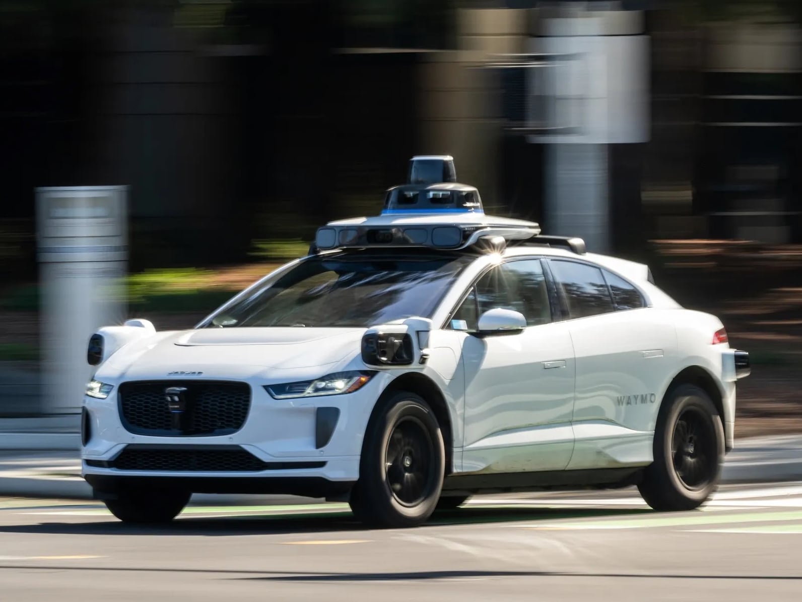
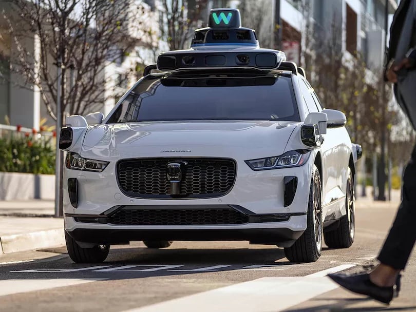
Every sensor on a Waymo robotaxi sees the world in layers. The LiDAR maps it in three dimensions, radar bounces through it, and cameras read it in color and contrast, building a composite picture of the road that no human retina could match at the same fidelity. So when a Waymo encountered a flooded section of a 40 mph road in San Antonio on April 20, the car absolutely saw the water. It slowed down for it. Then it drove in anyway, floated off the road surface, and came to rest in Salado Creek. The voluntary recall Waymo filed with NHTSA on April 30, covering 3,791 vehicles, was triggered not by a sensor that missed a hazard, but by a software stack that saw the hazard clearly and still chose the wrong response.

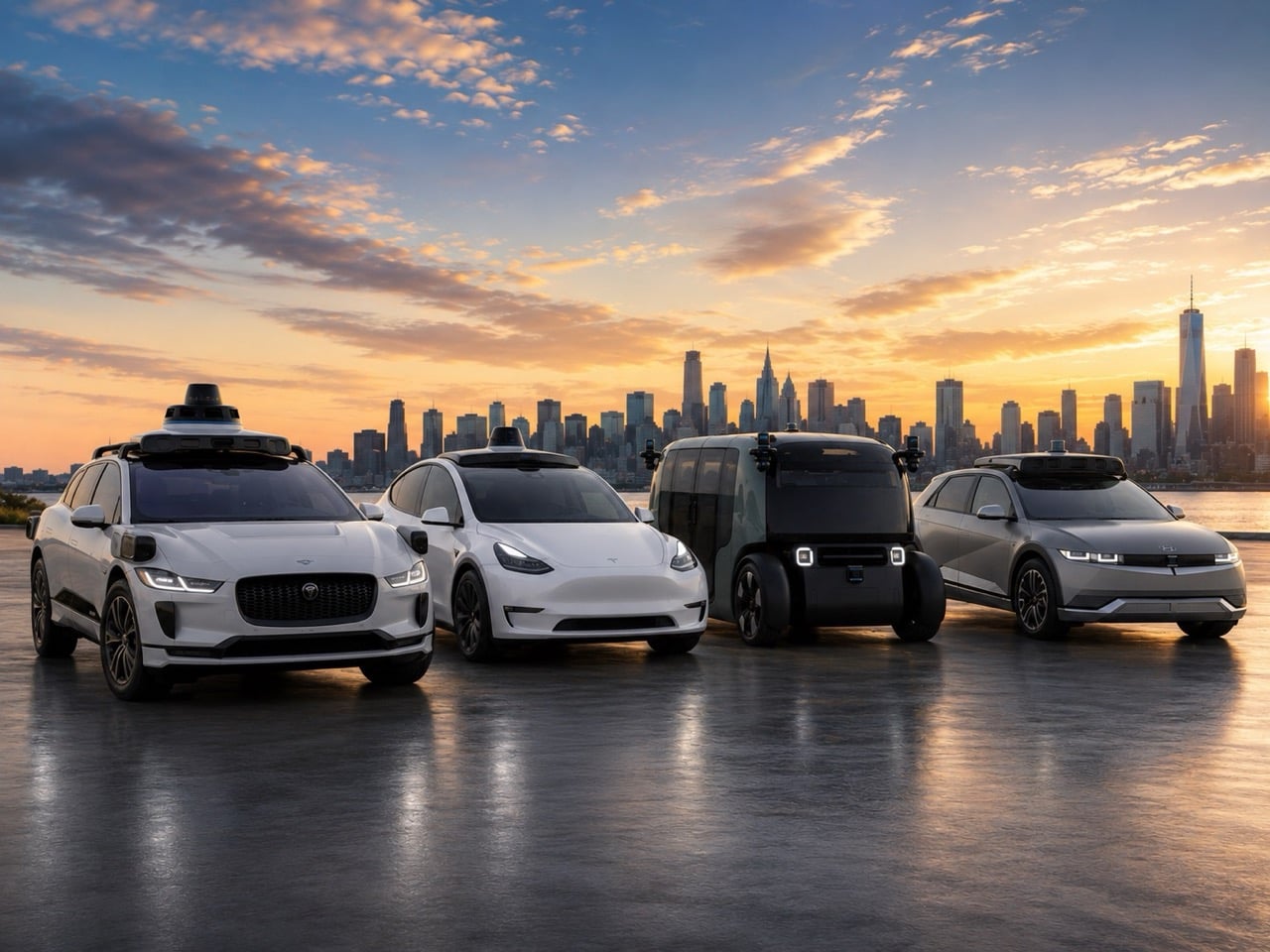
You might be sitting in one of those 3,791 recalled vehicles right now, somewhere in Phoenix, Los Angeles, Austin, or Atlanta, and Waymo has confirmed the permanent software fix is still in development. Tesla’s Cybercab, entering production at Giga Texas, runs a supervised robotaxi service in Austin, Dallas, and Houston on a pure-vision architecture with no LiDAR whatsoever. Uber’s platform in Dallas is dispatching Avride-operated Hyundai Ioniq 5s that are currently under NHTSA investigation for 16 crashes involving lane changes and failure to stop for traffic ahead. Amazon’s Zoox uses cameras, LiDAR, radar, and long-wave infrared on every vehicle, the most sensor-redundant consumer-facing stack in the industry, and is still in limited city testing. Each platform has a different answer to what a self-driving car should do when it encounters something it cannot traverse, and after the San Antonio creek, all of those answers deserve a much closer look.

The NHTSA recall notice characterizes the flaw precisely: the software “may allow the vehicle to slow and then drive into standing water on higher speed roadways.” That is a classification error buried in the decision stack, not a sensor failure, and the distinction matters more than the recall number suggests. Waymo’s 5th-gen Jaguar I-Pace and 6th-gen Zeekr RT both carry LiDAR, radar, and cameras in overlapping fields of view, and the San Antonio car processed the flooded road accurately as a hazard worth responding to. The decision architecture, however, had no hard-stop condition for water on a 40 mph road, only a caution flag that reduced speed and left proceeding as an available output. A separate Waymo had already been stranded near McCullough Avenue in San Antonio roughly two weeks before the April 20 incident, confirming this was a repeatable failure mode across a fleet that was still carrying passengers in nine other cities.

Tesla’s Cybercab carries no LiDAR, putting its supervised fleet in Austin, Dallas, and Houston in a fundamentally different position when floodwater appears than Waymo’s overlapping sensor stack would. The platform relies on eight cameras and 4D millimeter-wave radar, meaning no independent depth-sensing channel exists to assess water severity when camera visibility degrades in heavy rain. A real-world FSD 14.3.1 test in April 2026 ended in manual takeover when the front bumper camera submerged, a precise illustration of where the vision-only approach runs out of information. Avride, dispatching Hyundai Ioniq 5s through Uber’s Dallas app since December, is under concurrent NHTSA investigation for 16 crashes involving lane changes and failures to stop for road hazards, all 16 occurring with a trained safety monitor seated in the vehicle. Amazon’s Zoox sits at the opposite end of the sensor redundancy spectrum, combining cameras, LiDAR, radar, and long-wave infrared in a 360-degree array with a human TeleGuidance fallback for scenarios the stack cannot resolve, though its commercial footprint remains a fraction of Waymo’s.

The Waymo recall, the Avride probe, and a dashcam video of a Waymo rolling through a red light on Irving Boulevard in Dallas all surfaced in the same seven-day window, collectively mapping the same design gap across three platforms: a perception-to-action pipeline that detects a hazard but generates the wrong response to it. Waymo’s OTA patch is deploying now, but the permanent fix remains in development, meaning every current ride runs on interim constraints rather than a finished solution. The San Antonio incident involved an empty car, and that is the only reason this story ends with a recovery operation rather than a casualty report. Each platform carrying passengers today is still writing its edge-case rulebook, publishing each new chapter only after something breaks on a live road. Knowing which system you are riding in, what its sensor stack can assess in a sudden storm, and whether its flood-detection logic has been patched from an interim fix to an actual solution is, I’d argue, the most practical safety question a passenger can ask in 2026.

The post Waymo’s Self-Driving Car Saw the Flood and Drove In Anyway. Here’s The Problem Plaguing Every Robotaxi. first appeared on Yanko Design.
  •  
❌