❌

Vue lecture

This Modular Building Concept Assembles Homes From Four-Foot-Wide Slices

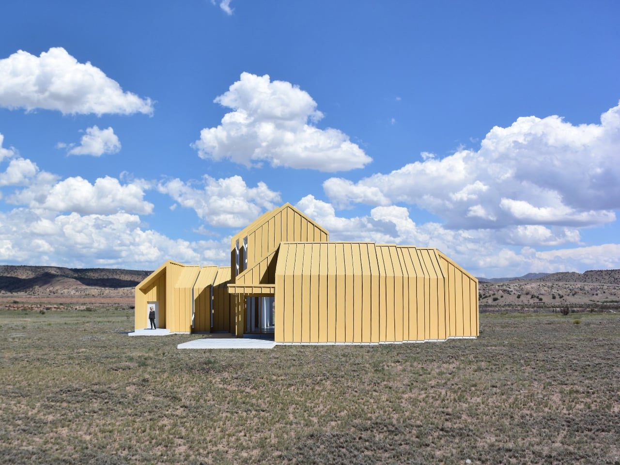
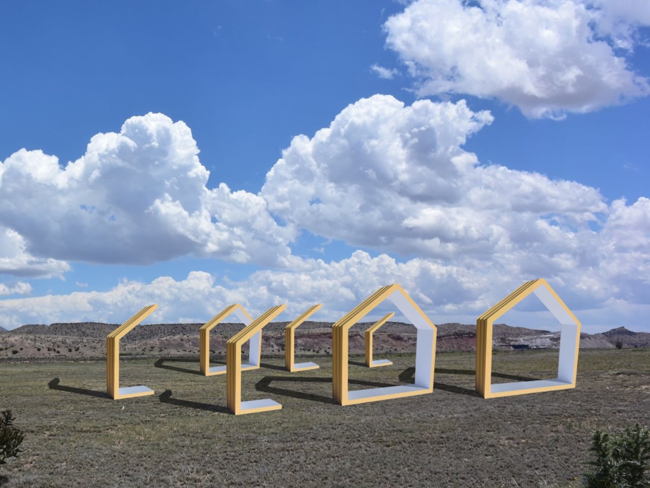
Changing a home’s layout usually means working around walls that have no intention of moving. The Segmented Building System concept approaches that problem by treating a building as a series of four-foot-wide sections, rather than one permanent shell. This unconventional architecture proposes a house that could be dismantled and reassembled instead of demolished when circumstances change.

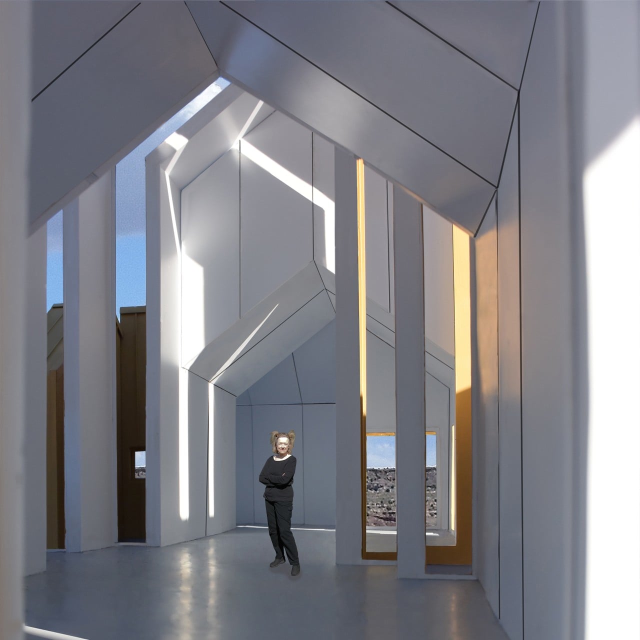
Each section is conceived as a slice through a building, combining floor, wall, and roof panels into a complete or partial profile. Structural insulated foam panels would form these pieces, which could arrive separately or already assembled. The four-foot measurement describes the segment’s width, not the room’s overall span, so the proposal isn’t asking anyone to squeeze into a very narrow little house.

Designer: Michael Jantzen
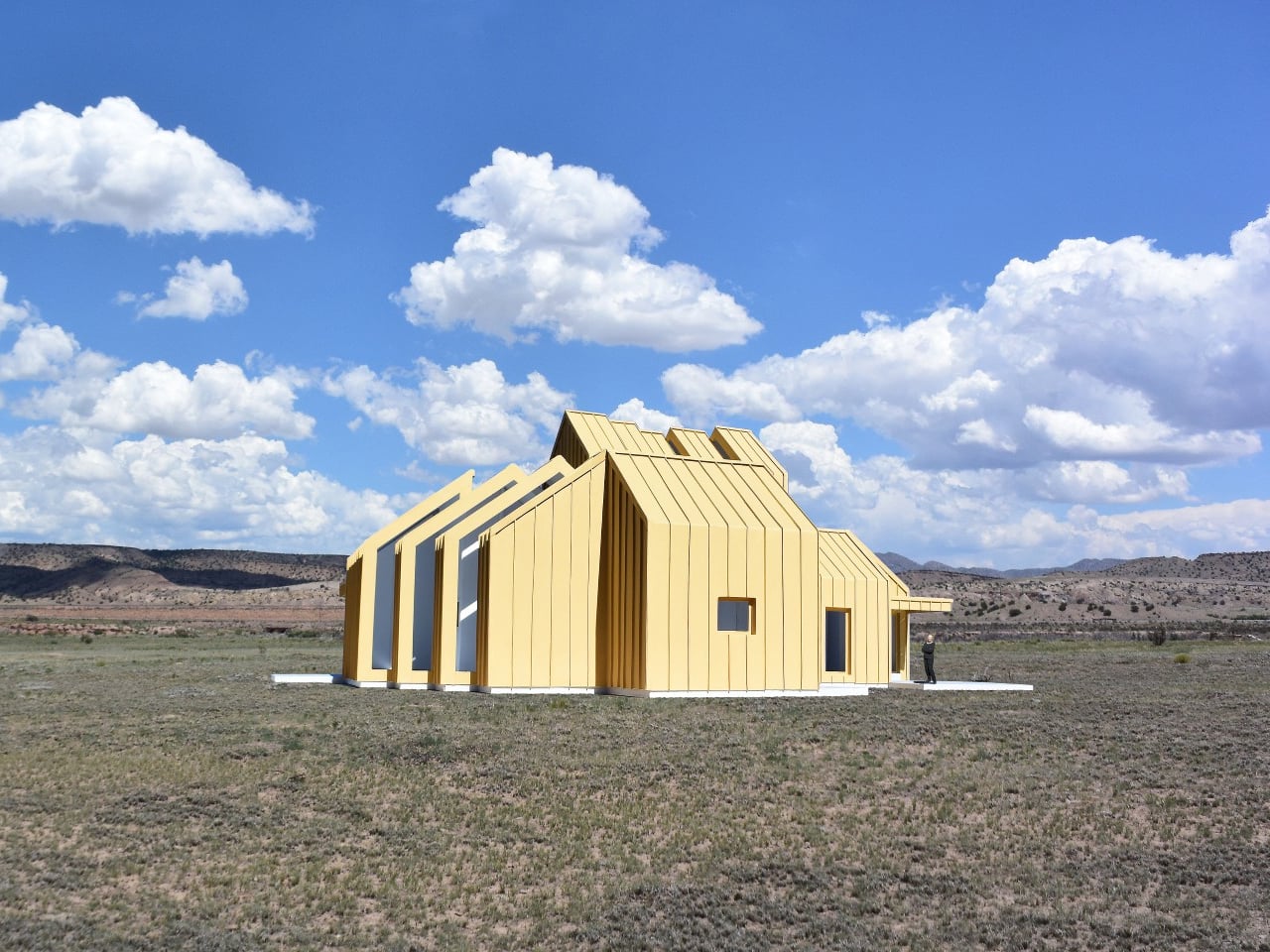
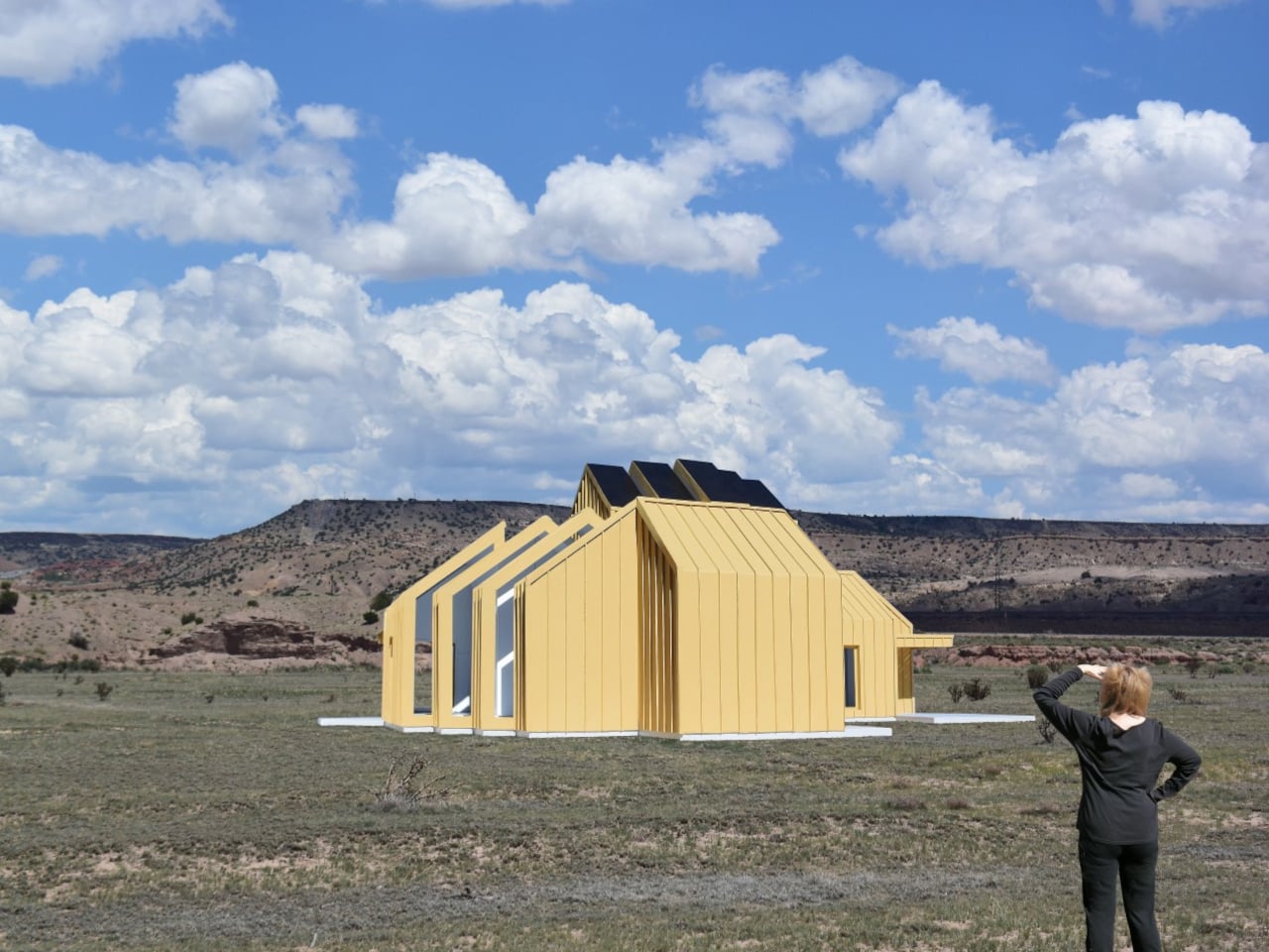
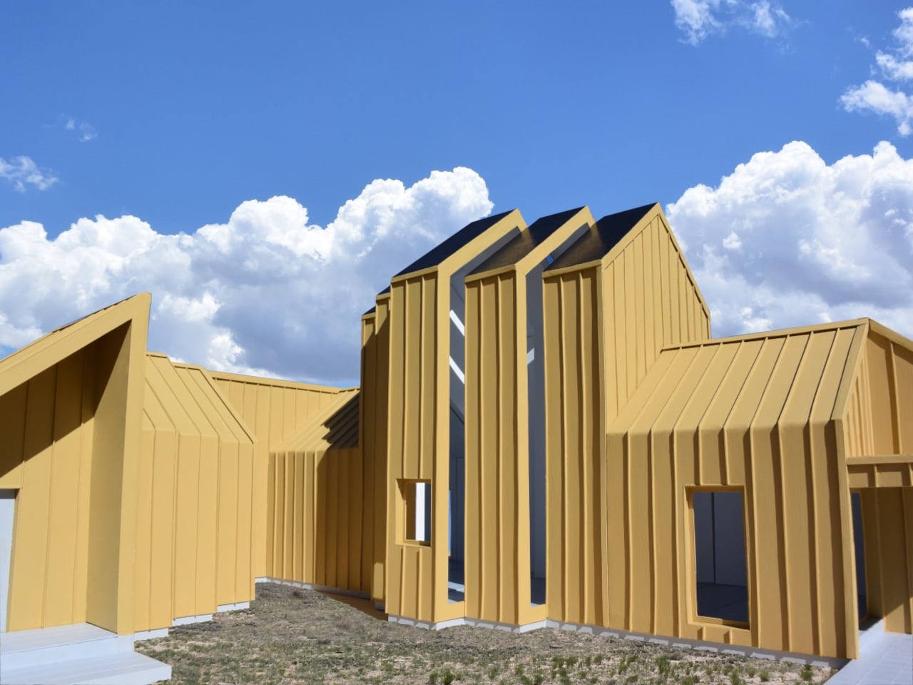
Repeating those slices would let a building stretch, while combining full and half profiles would allow it to branch sideways. Their varying heights could give a shared living area a taller ceiling and keep adjoining spaces lower. Rather than committing to a single box-shaped module, the idea is to assemble different volumes from related parts, with their rooflines following the changes below.

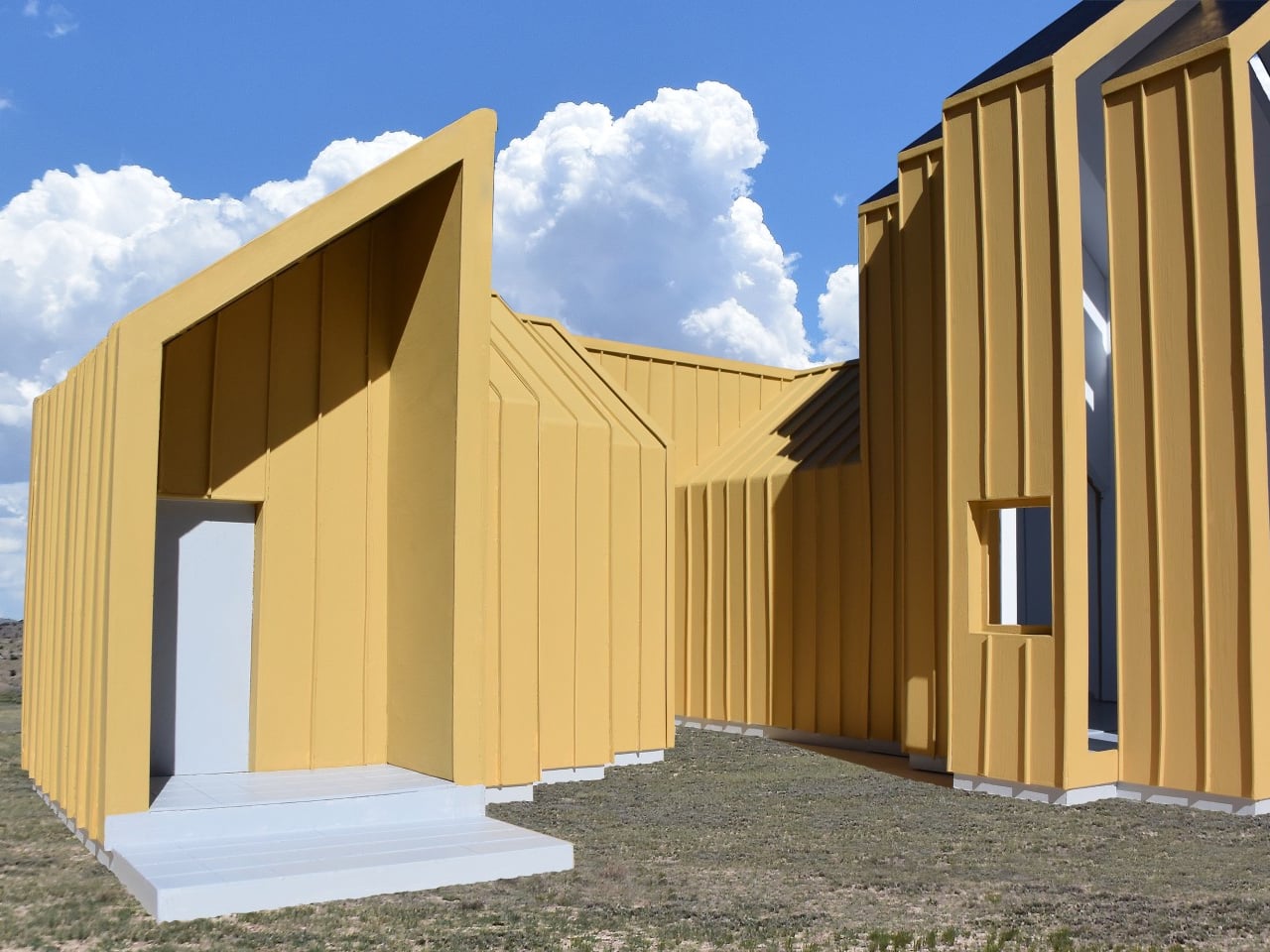
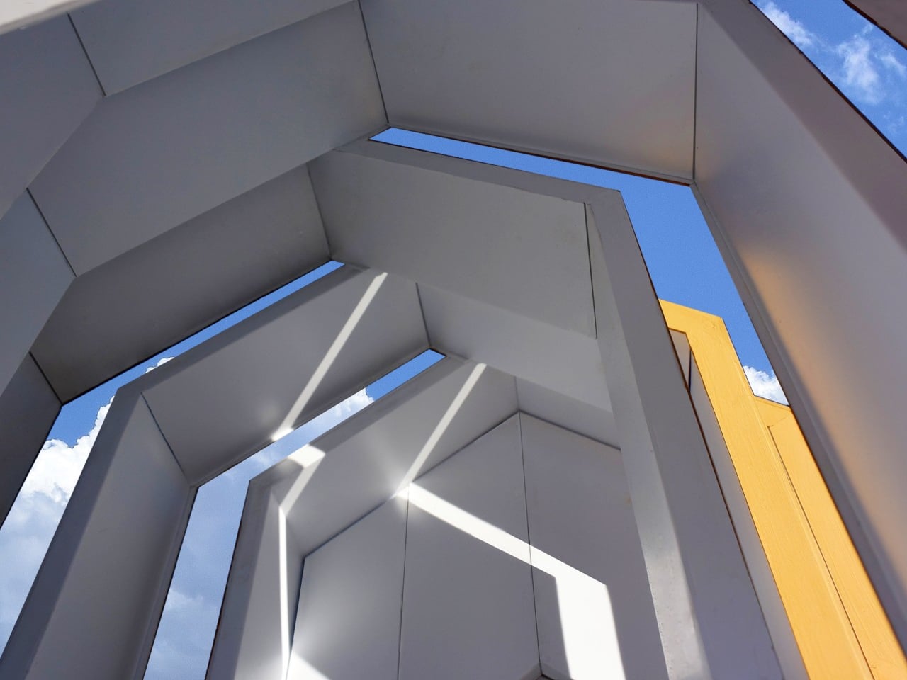
The more interesting move, however, is to slide neighboring profiles out of alignment. Glass would fill the gaps, turning the joints between sections into narrow openings for daylight. Those openings could continue from the walls into the roof, bringing light into a tall central space. Instead of treating every seam as something to hide, the concept makes some of them part of the architecture.


The exterior isn’t tied to its mustard-yellow finish, either. Metal or cement-composite boards are proposed as cladding options, applied before delivery or after assembly on site. That gives the same underlying system room for different appearances, rather than making one facade part of the deal. Solar panels could also attach to the segments, with off-grid operation among the ambitions for the system.

Of course, rearranging a house wouldn’t be quite as casual as rearranging its furniture. The segments would attach to a prefabricated concrete perimeter foundation shaped for the chosen layout. Moving them elsewhere would still mean preparing a suitable base and reconnecting the building’s services. The proposal describes reusable sections, not a finished home you can simply pick up and drop onto any empty plot.

The point of taking those sections apart would be to use them again, perhaps in a different arrangement at another location. That’s a useful distinction from grinding a demolished building into material for something else. The ambition is to keep a usable building section intact. A change of address or layout wouldn’t require giving up the pieces that already made up your home.
The post This Modular Building Concept Assembles Homes From Four-Foot-Wide Slices first appeared on Yanko Design.

  •  

San Siro’s Proposed Replacement Uses a Concrete X-Frame to Support Its Sweeping Roof

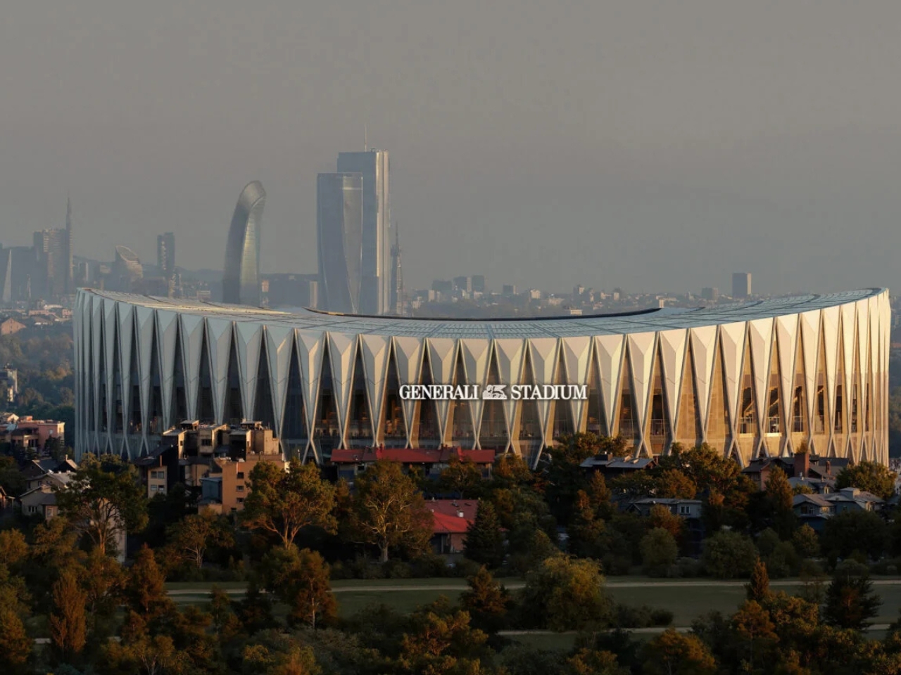
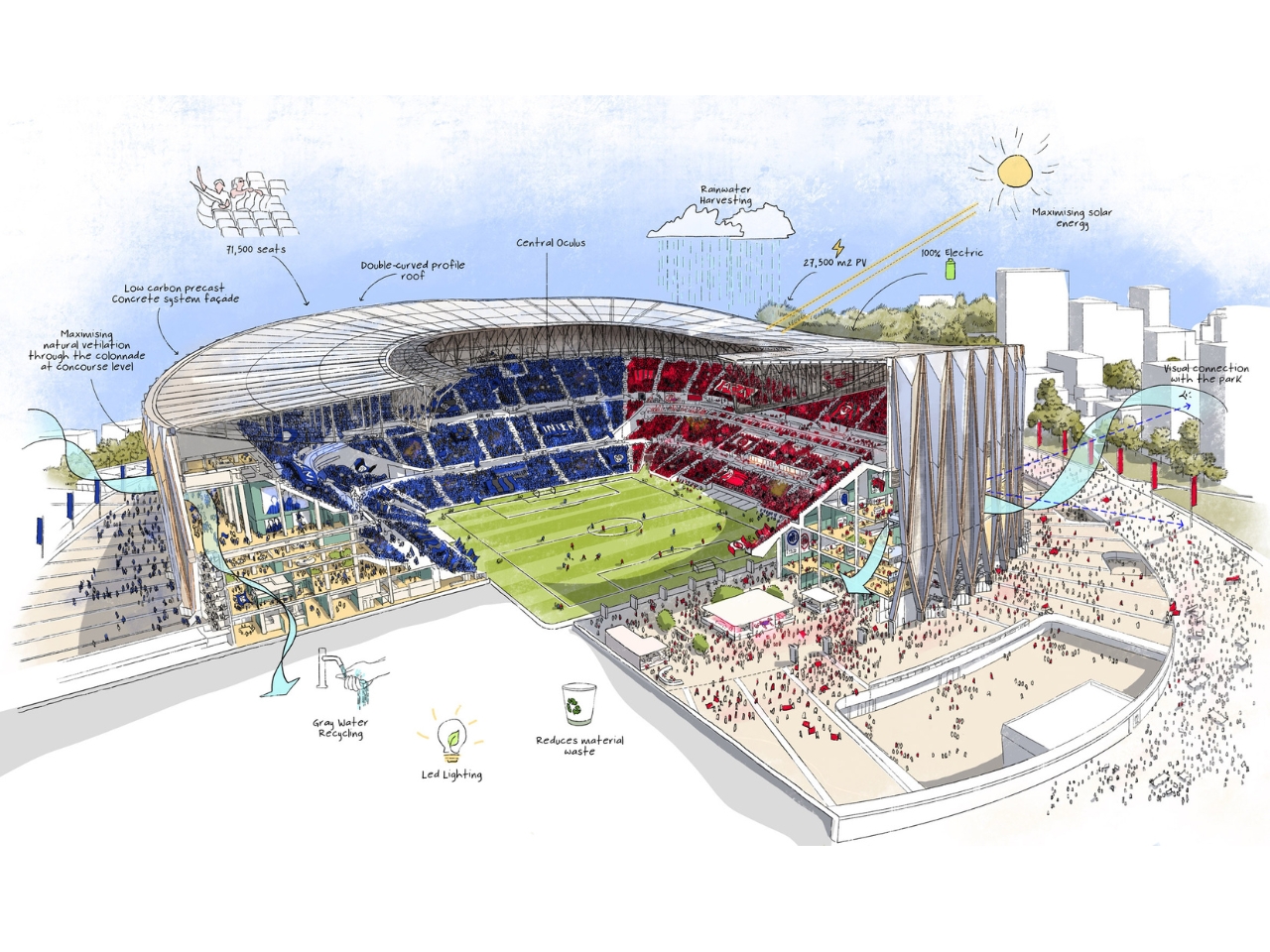
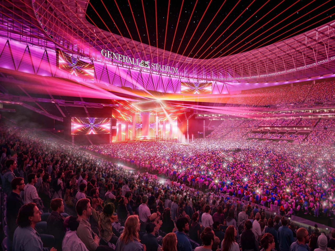
I’m not a fan of either AC Milan or Inter Milan, but as a football fan, visiting Stadio Giuseppe Meazza, more popularly known as San Siro, is an item on my bucket list. However, time is running out for me to actually do that, as most of the iconic stadium is planned for demolition after its replacement opens. That’s because the clubs are planning Generali Stadium, the future shared home of two of the biggest football clubs in Italy.

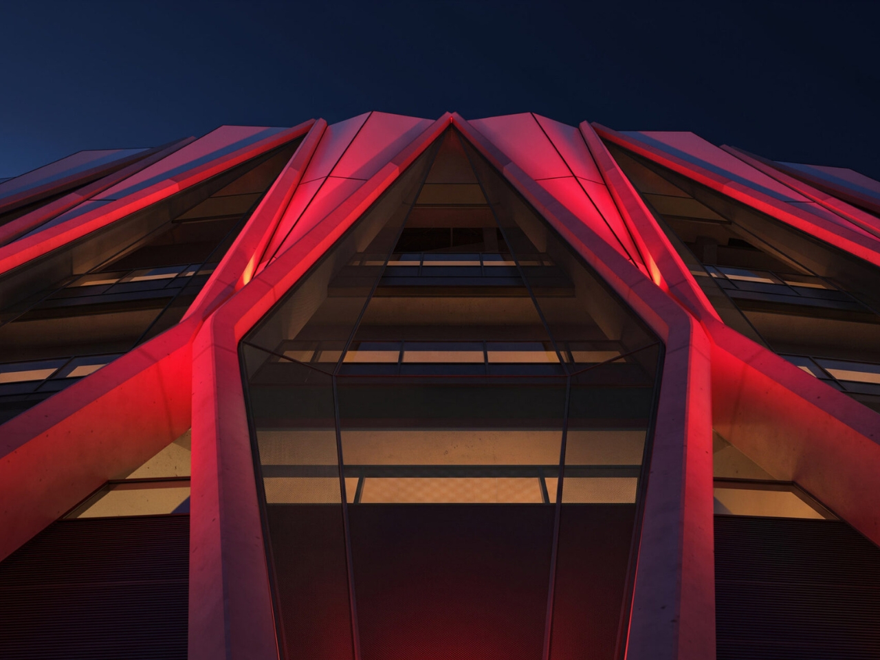
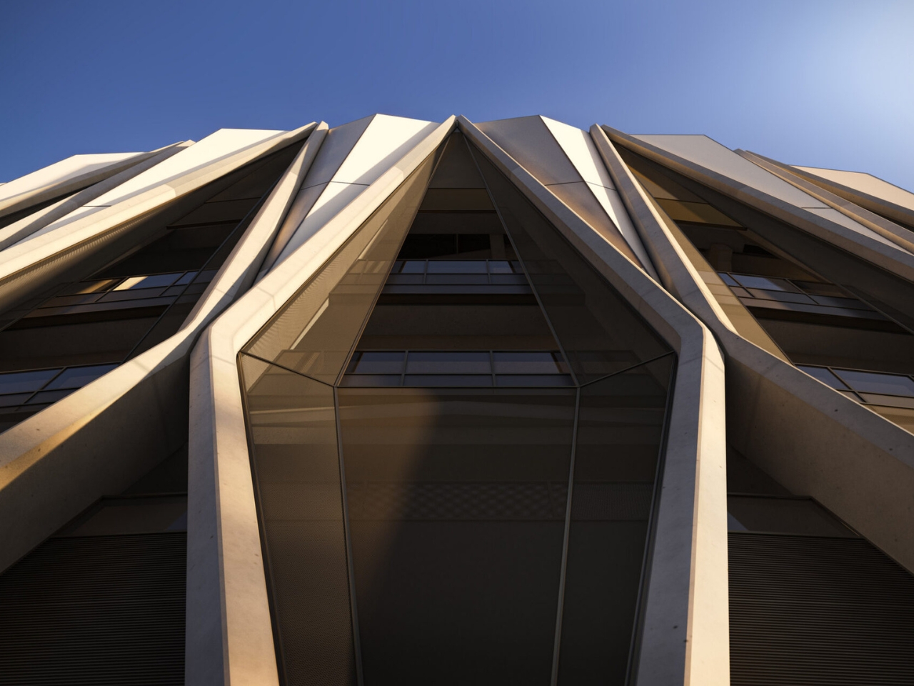
Now the proposed design for the 71,500-seat stadium, by architecture studios Foster + Partners and MANICA, has been unveiled. The clubs presented it on October 29, 2026. What’s most striking about the plans is how the X-frame makes the structure itself the architecture. The concrete frame extends from the colonnades, across the facade, and upward to support the roof. Its repeated geometry gives the building its identity while making its structural role visible.

Designers: Foster + Partners and MANICA

According to the clubs, that geometry draws on Italian engineering and the craftsmanship of Milan’s Duomo. The connection is an architectural reference rather than an attempt to reproduce the cathedral. What interests me more is the exposed supporting framework: the stadium’s most recognizable feature also explains something about how the enormous building stands up.

Inside, the focus shifts from concrete to the crowd. Two seating tiers form a continuous bowl around the field, with two steep supporter sections, or Curvas, behind the goals. Each would accommodate approximately 11,700 fans, with seating inclinations reaching 37 degrees. The arrangement is intended to bring supporters closer to the action. For a football fan, that relationship between the stands and the field is more compelling than another impressive exterior.

The double-curved roof also does more than shape the silhouette. The project website says it would incorporate 27,500 square meters of photovoltaic panels, while the clubs describe acoustic engineering intended to intensify the atmosphere. Those are useful ambitions, although the amount of solar electricity generated and the sound of a full stadium can’t be judged from renderings. A dramatic roof isn’t proof of either.

Arrival gets some attention, too. Diamond-shaped entrances would offer glimpses into the stadium before opening onto panoramic concourses with city views. Naturally ventilated colonnades form part of that approach. These spaces give the architecture a role before anyone reaches their seat, although open-looking entrances alone don’t establish how quickly thousands of spectators will actually move through them on matchday.

The plan also extends beyond the ticket gates. The stadium would anchor a 281,000-square-meter redevelopment incorporating public spaces, landscaped areas, retail, and leisure facilities. The aim is to give residents reasons to visit outside matchdays. That’s potentially the most useful part for people who aren’t interested in either club: somewhere to spend time without attending an event. Its everyday value will depend on how much space remains genuinely public and welcoming.

The clubs also promise enhanced accessibility, which deserves attention alongside the dramatic seating bowl. I’d want to know how step-free routes, companion seating, and views when neighboring supporters stand are handled. A designated space is only part of the experience; getting from the entrance to that space matters just as much.

For now, this remains a proposal moving through design and planning. Construction is expected to begin in 2028, with the first match targeted for the 2031/32 season, subject to approvals. That opening target should not be confused with a confirmed deadline for demolishing San Siro.

I can appreciate the logic of designing outward from the supporter sections, even while feeling reluctant about what this replacement means. Bringing fans closer and giving the neighborhood usable public space are worthwhile goals. The harder test will be whether ordinary supporters feel the new building belongs to them. The concrete frame will make the stadium recognizable; the experience of arriving, finding a seat, and watching a match will determine whether people want to return.

The post San Siro’s Proposed Replacement Uses a Concrete X-Frame to Support Its Sweeping Roof first appeared on Yanko Design.

  •  

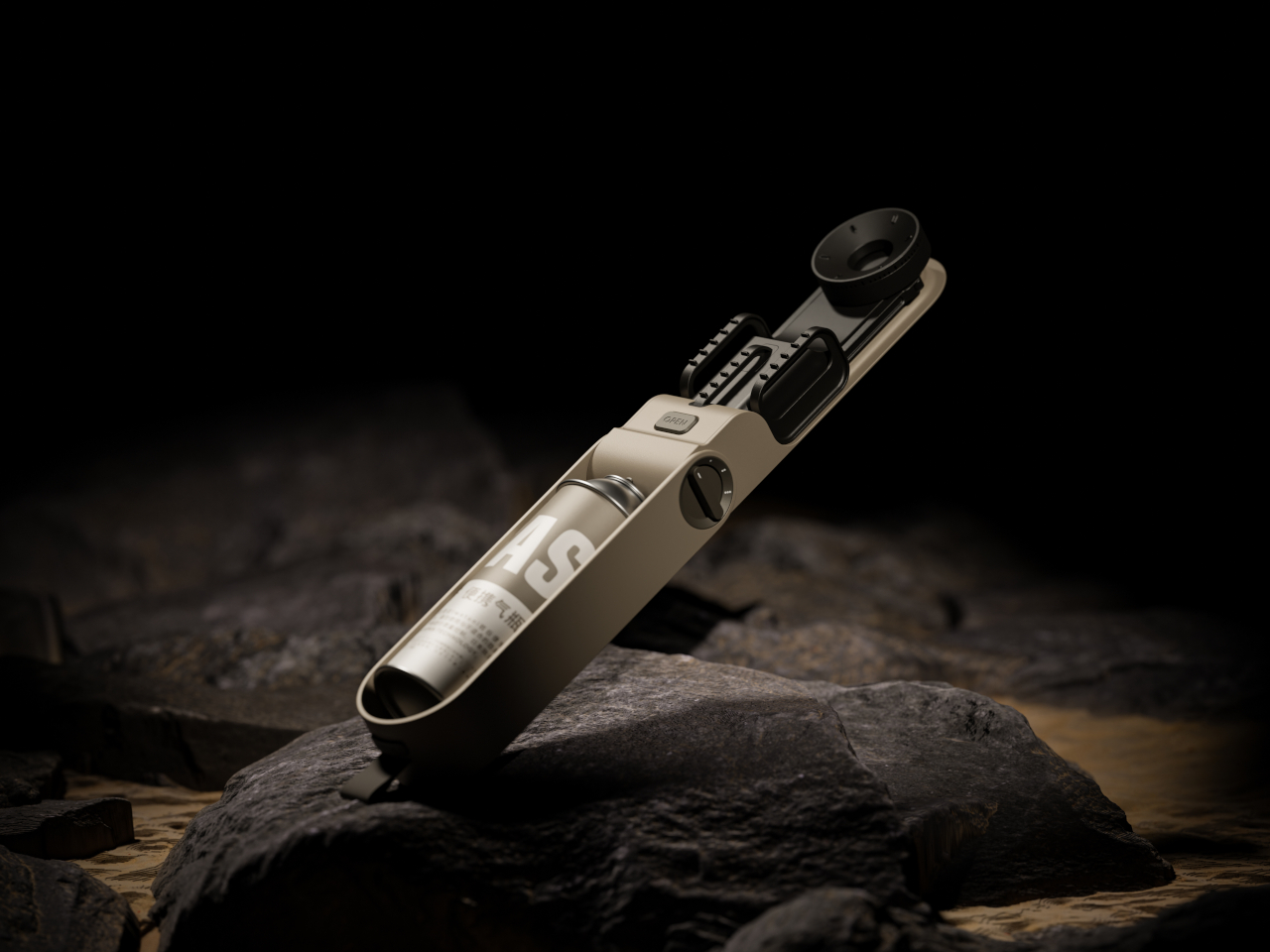
Easy Cooking Stove Concept Folds Its Burner and Pot Supports Into One Case

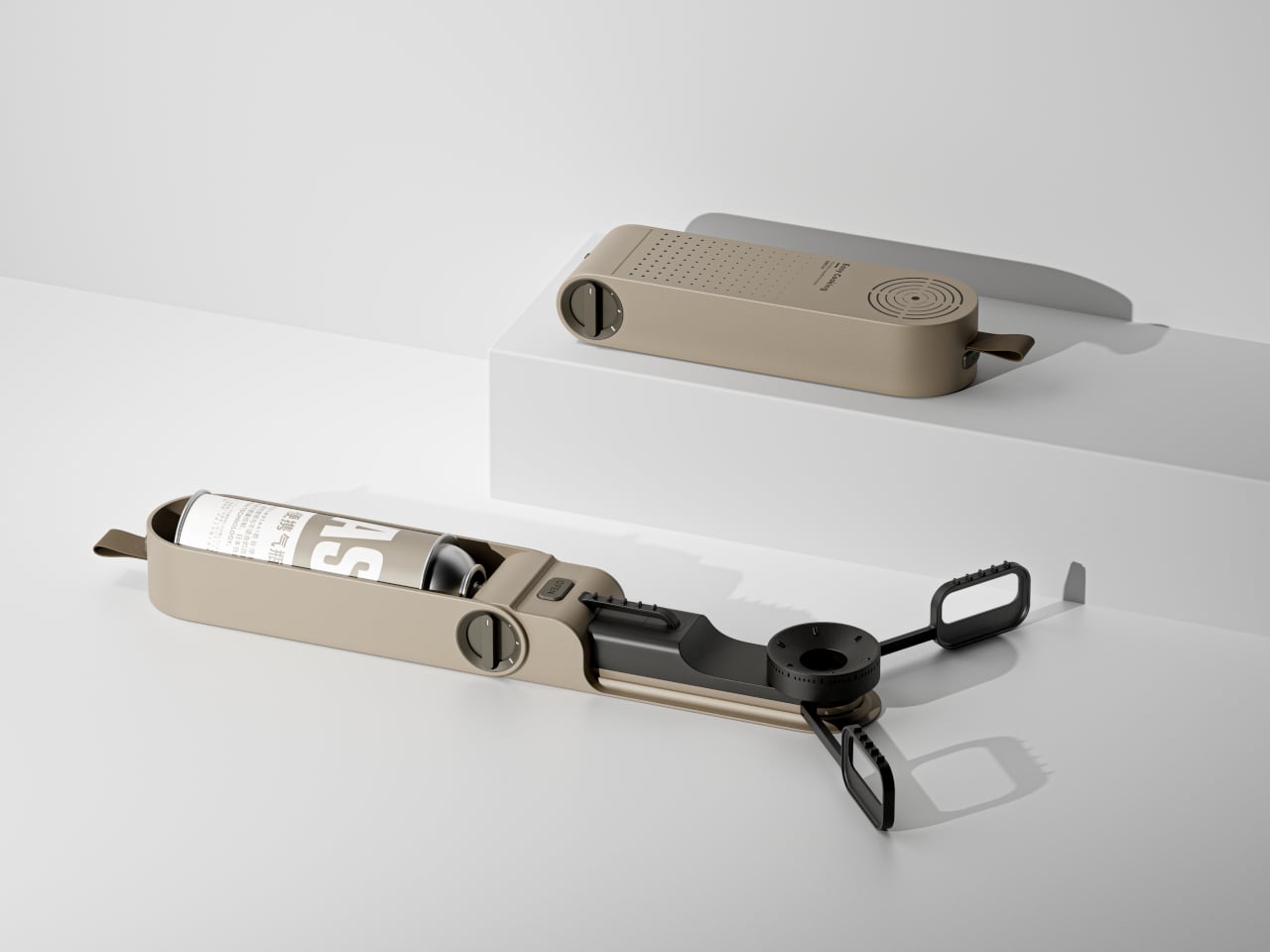
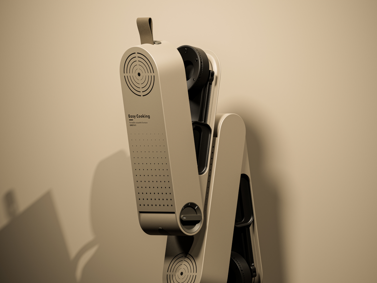
Camping stoves can be awkward things to pack, especially when the burner and pot supports insist on keeping their cooking shape inside your bag. Easy Cooking approaches that problem with a folding stove concept that tucks its parts into an elongated, rounded case. Developed in 2023, it proposes a smaller package for the trip without making you assemble a kitchen from loose pieces.

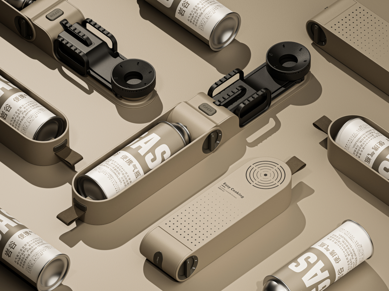
The closed body has a sandy beige finish, interrupted by black details and a short fabric loop at one end. Concentric slots near the opposite end echo the circular burner hidden inside, while a field of smaller perforations breaks up the broad face. It’s a restrained way to give camping equipment some character without covering it in rugged-looking armor or oversized branding.

Designers: Hao Kong, Qi Qiu

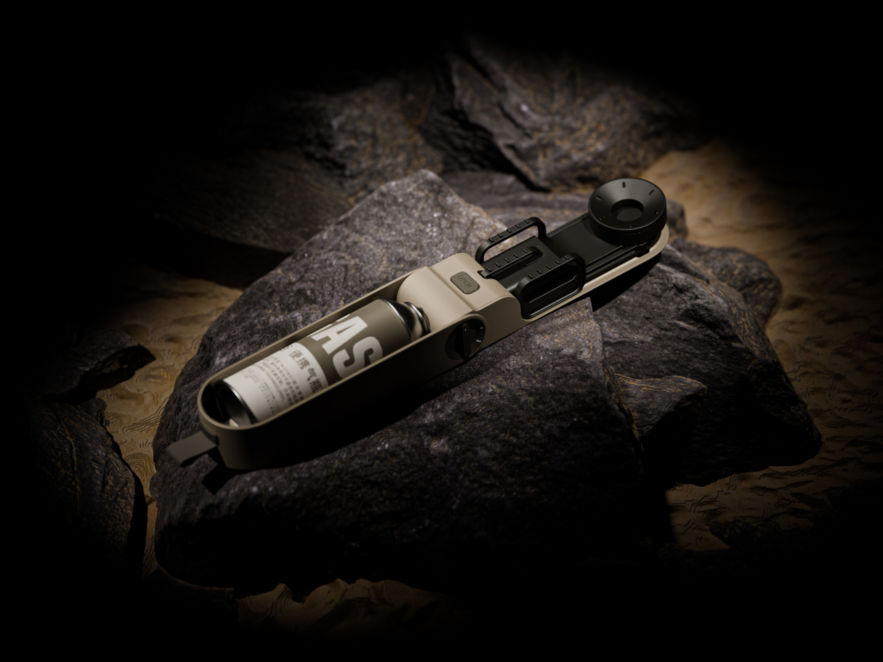
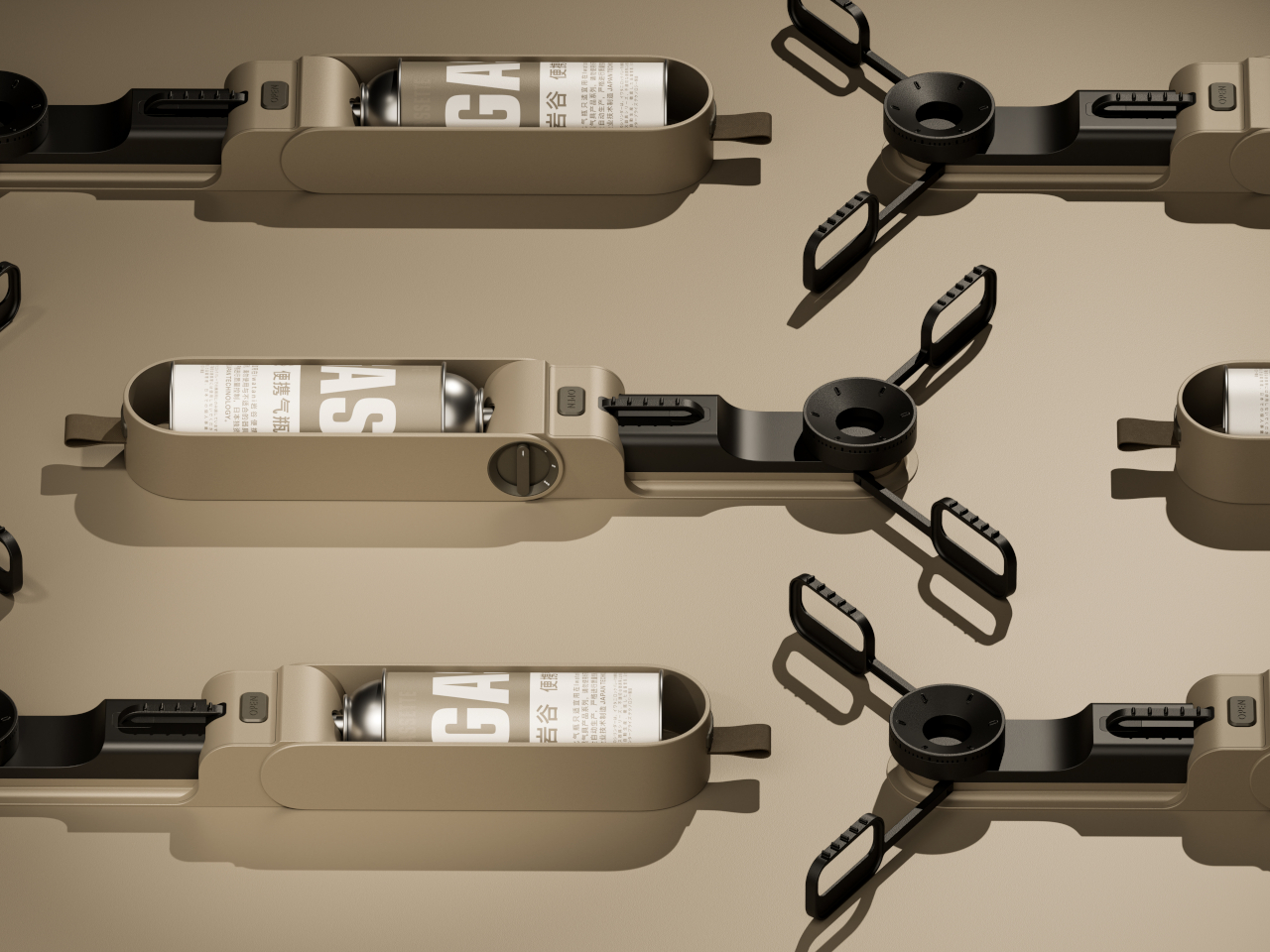
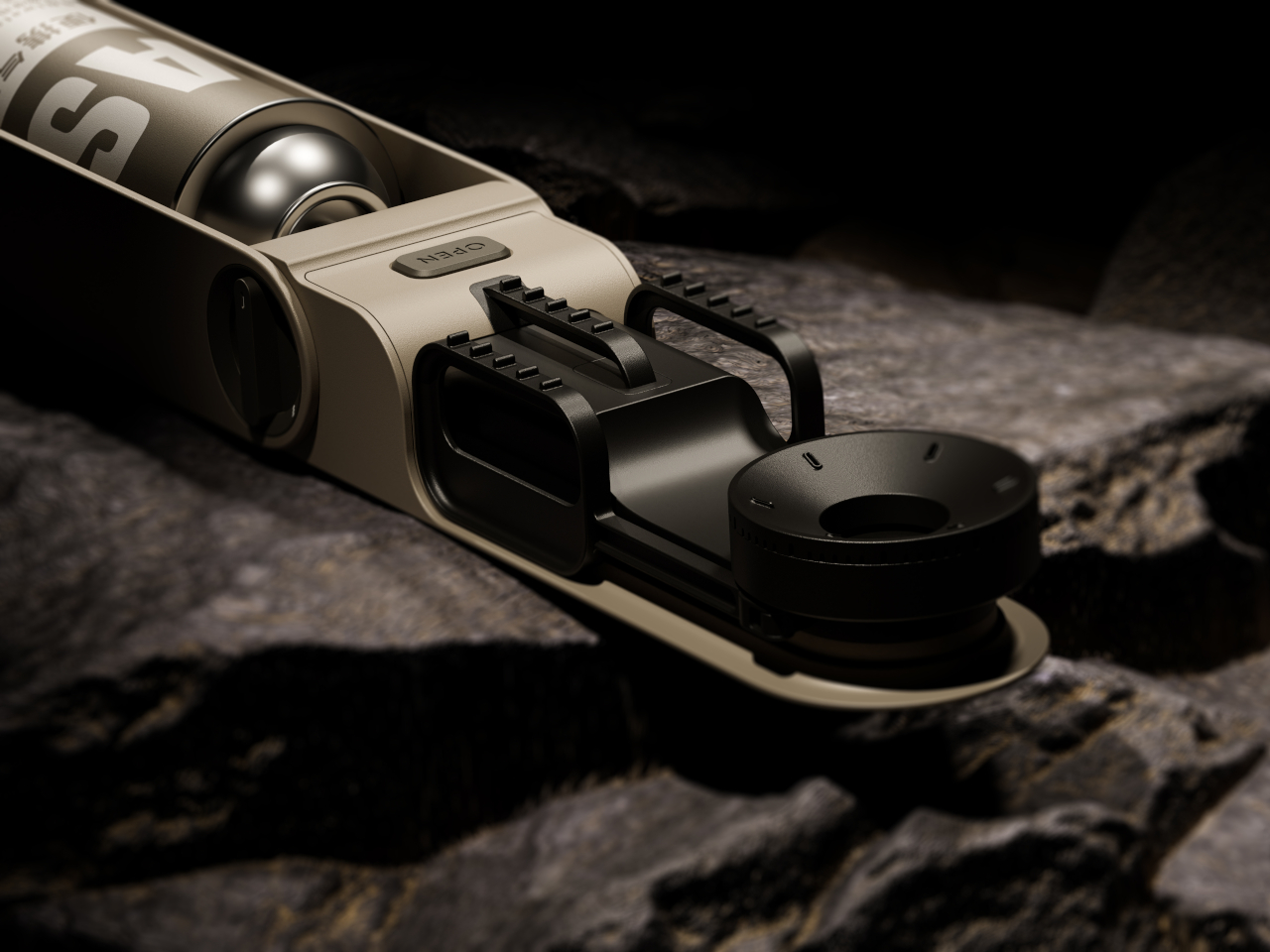
Opening it changes the relationship between those parts. The burner extends away from the housing, and three serrated pot supports spread around it to create a cooking position wider than the packed form. Folded inward, those supports nest alongside the burner. The proposal concentrates on rearranging what a stove needs, rather than giving a conventional rectangular cooktop a handle and calling it portable.

The fuel cartridge sits lengthwise inside the open housing, keeping the supply beside the burner rather than requiring a separate fuel hose. A large rotary dial occupies the side, and an OPEN label marks a separate control on top. Those familiar physical cues suggest where to begin, although the presentation doesn’t explain the ignition system or the cartridge’s locking and release mechanisms.

That arrangement would make sense for a quick outdoor meal, when you want to put a kettle on without unpacking a boxy tabletop appliance. The enclosure serves two jobs: concealing the burner for transport and accommodating the cartridge once the stove is deployed. Its usefulness would depend on how easily those parts move, especially after grit and food residue get into the joints.

There’s a precedent for this kind of transformation. Snow Peak’s Home & Camp Burner, released in 2019, also folds its burner into an enclosure that holds a butane cartridge during use. Easy Cooking explores that packing problem with a flatter, capsule-like outline. The shared idea makes the details of deployment more interesting than any suggestion that folding a stove is entirely new.

Easy Cooking remains a concept rather than an established retail product. There’s no mention of dimensions or weight figures to demonstrate how much space it saves, and material grades aren’t specified. The folding supports leave practical questions about how a full pot would be held above the ground, particularly when stirring or lifting it could shift the load across that narrow structure.

Heat management matters as much as the folding trick. Snow Peak warns that certain cookware can radiate enough heat toward its canister to create a hazard, a reminder of what’s at stake when fuel and flame share a small footprint. Making the stove disappear for travel is appealing; keeping its fuel from overheating once a pan goes on top demands more care.

The post Easy Cooking Stove Concept Folds Its Burner and Pot Supports Into One Case first appeared on Yanko Design.

  •  

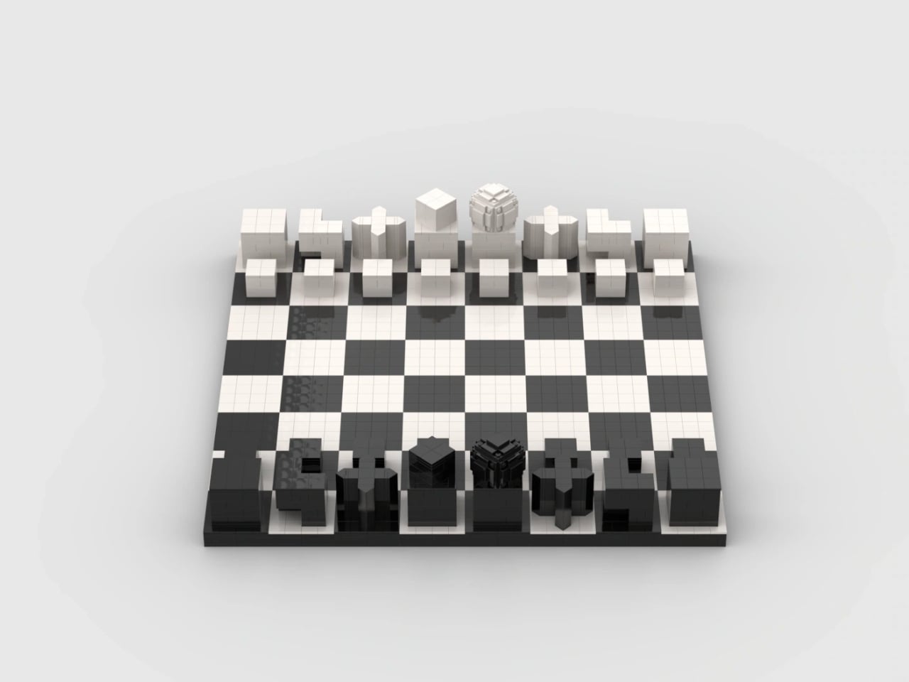
LEGO Bauhaus Chess Concept Has Hidden Clues to Its Moves

A knight’s horse-shaped head is easy to recognize, but it offers no clue about that peculiar L-shaped move. That’s a small frustration with learning chess: identifying the pieces and remembering what they do are two separate tasks. I like the idea of giving their shapes a little more responsibility, especially when the alternative is explaining the knight’s movement for the fifth time.

Pinke Gans’s Bauhaus Chess Set, a LEGO Ideas fan concept, takes that possibility as its starting point. According to the designer, the idea emerged during a summer visit to the Bauhaus Museum in Weimar, Germany, where Josef Hartwig’s geometric chess pieces brought LEGO bricks to mind. It’s an appealing connection: a construction system built around basic shapes meets a chess set designed to make those shapes meaningful.

Designer: Pinke Gans

Hartwig designed his Bauhaus chess set in 1923, while working at the school in Weimar. Its abstraction wasn’t simply a matter of removing decorative details. The pieces used their forms to communicate their movement, replacing familiar figures with a geometric vocabulary. A minimalist chess set can still leave you memorizing arbitrary symbols; Hartwig’s approach gives some of those symbols a practical explanation.

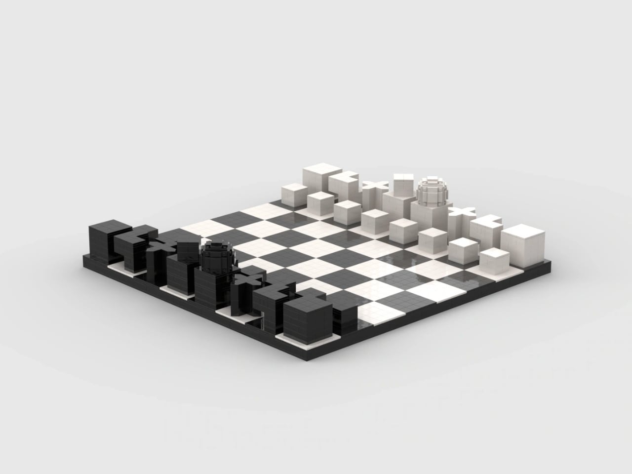
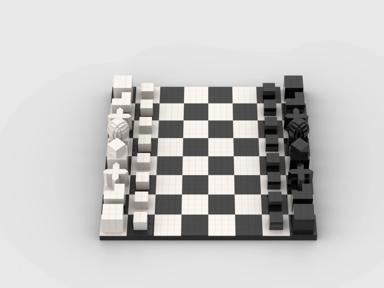
The knight is the clearest example. Its stepped shape echoes its L-shaped movement, while the bishop’s diagonal cross relates to its diagonal paths across the board. Pinke Gans’s version carries those recognizable forms into bricks. These are useful memory cues, not a complete substitute for learning the rules. Nobody should expect a small cube to explain every complication of a pawn’s first move or capture.

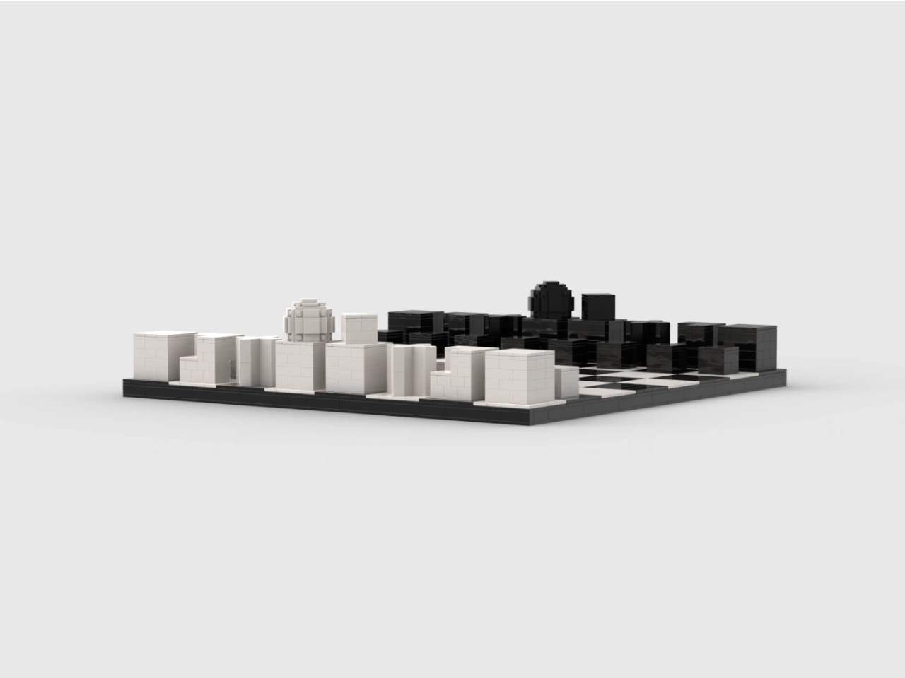
In the supplied images, the queen provides the most conspicuous departure from all those straight edges. Its rounded top becomes a faceted, layered construction, with individual elements visible around its surface. Nearby, the king has a smaller cube turned relative to its base. Together, they introduce enough variation to interrupt the rows of blocks. The brick-built approximation of a sphere gives the queen a texture of its own.

That translation is more interesting to me than a perfectly smooth replica would be. Historical examples of Hartwig’s set were made in wood, so rebuilding the forms in LEGO changes how their surfaces read. Here, joints and tile seams remain visible. They establish a second, finer grid within the larger chessboard pattern, making the construction legible even where exposed studs don’t dominate the design.

The board itself stays restrained: black and white squares, a dark perimeter, and no elaborate scenery competing with the pieces. From the lower viewing angles, the arrangement resembles a small collection of architectural models. I could see this earning its place on a living room table because the visual interest comes from proportion and repetition, rather than decoration.

There is a potential usability tradeoff, though. If you already recognize conventional chess silhouettes instantly, a geometric set asks you to learn a different identification system before its logic becomes helpful. A blocky king and a rounded queen might be clear once explained, but that doesn’t establish faster recognition during play. The images also can’t tell us how securely the pieces hold together when repeatedly picked up.

The project is presented as a LEGO Ideas proposal, rather than an announced retail set. That distinction deserves to stay attached to the enthusiasm. Fan product ideas that reach 10,000 supporters may be considered for production, but reaching that threshold doesn’t itself put a box on store shelves. This submission shouldn’t be treated as a confirmed release or given an imagined price.

For me, the strongest reason to want it is the opportunity to assemble the shapes before playing with them. Building a knight’s stepped form could make its design rationale more tangible than simply reading an explanation beside a finished piece. You’d still need to learn chess. But spending a little time constructing the thing that represents a move seems like a particularly appropriate introduction to Hartwig’s idea.

The post LEGO Bauhaus Chess Concept Has Hidden Clues to Its Moves first appeared on Yanko Design.
  •  

Voxel the Robot Wants to Tidy Your Home Without Looking Human

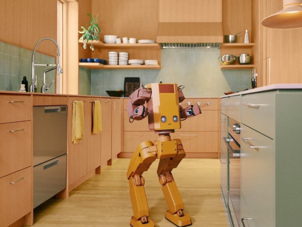
A mustard-yellow body, rosy arms, and bent legs make this household robot look like it might wander out of an animated movie and ask where you keep the mugs. Its illuminated eyes sit low on a boxy torso, leaving a lot of forehead, if that’s even the right word. I like the awkward proportions. They give it character without trying to pass for a person.

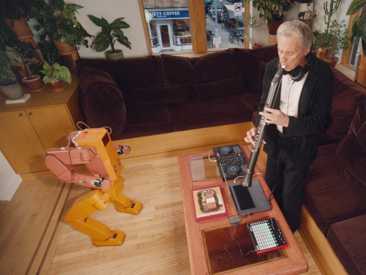
Called Voxel, the robot is being developed by New York company Tuesday Labs to tackle the little jobs that keep a home from staying tidy. Put the book away. Bring over a drink. Water the plants. Remember where the wallet went. Those are the four roles outlined for the robot: Home Reset, Fetch, Tend, and Find.

Designer: Tuesday Labs

For now, though, Voxel is a development prototype, not a household appliance you can order for next weekend. Tuesday Labs expects to substantially redesign its hardware before delivery, and its reservation agreement says appearance, capabilities, and specifications may change significantly. That distinction matters here because the version we’re admiring is also a design proposal, not a settled promise about what arrives at your door.

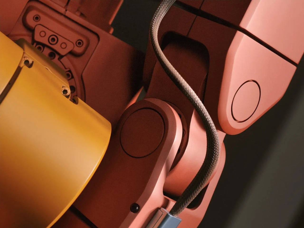
Still, I’m glad the proposal has a point of view. The warm colors and exposed joints make Voxel look approachable to me, while the unapologetically mechanical body avoids the strange social expectations of a realistic human face. Tuesday Labs works with illustrators, animators, and character designers on its robots. You can see why that matters: a machine sharing your kitchen has to be tolerable company, even when it isn’t doing anything.

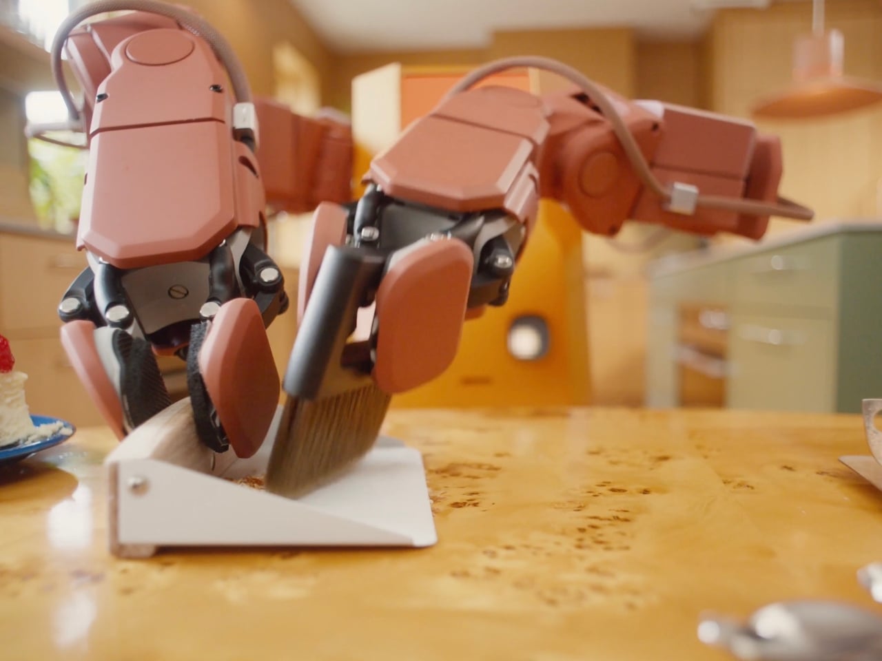
The hardware description is more practical than the cartoon styling suggests. Each arm has seven degrees of freedom and an actuated wrist, intended to help it maneuver around counters, shelves, and doors. The grippers have just one degree of freedom. That’s a relatively simple hand for a complicated environment, and I’d judge it by how consistently it handles everyday objects rather than how convincingly it imitates fingers.

Find is the feature that makes the premise feel especially relatable. Tuesday Labs says Voxel would tell you where it last saw a misplaced object. That’s a modest but useful distinction: remembering the wallet on the counter is different from magically knowing where it is now. I’d take a dependable last sighting over a confident guess, particularly during the familiar scramble to get out the door.

The plant-watering brief also sets a sensible scale for the ambition. I don’t need a robot to perform an elaborate dinner routine to understand the appeal of getting small chores off my list. The harder question is how much setup and supervision those chores would require. A helper that needs constant rescuing would simply create another household responsibility.

That attentive presence raises a less photogenic design issue, too. Voxel’s listed vision system includes stereo RGB cameras and wide-field vision. Before putting one in my living room, I’d want clear answers about what gets recorded, what stays on the robot, and who can access it. The published privacy policy covers the website, purchases, and reservations; it doesn’t establish those operating details for a robot inside the home.

The financial commitment is equally worth slowing down for. Reservations cost $200 and are fully refundable before an order is placed. The estimated purchase price is $20,000, not a fixed final price, and deliveries are expected to begin in 2028, potentially later. A reservation buys an opportunity to purchase, not a finished machine or a guaranteed arrival date.

At that price, charm would get Voxel my attention, but it wouldn’t settle the decision. I’d want to watch it repeat the same ordinary tasks, unassisted, in a room that hadn’t been carefully arranged for it. Keep the odd proportions and the expressive eyes. Just make the useful behavior as convincing as the character. A robot earns its place beside the couch by giving you fewer reasons to get up.

The post Voxel the Robot Wants to Tidy Your Home Without Looking Human first appeared on Yanko Design.

  •  

RAY’s 3D Print Scraper Concept Refuses to Be Another Rectangle

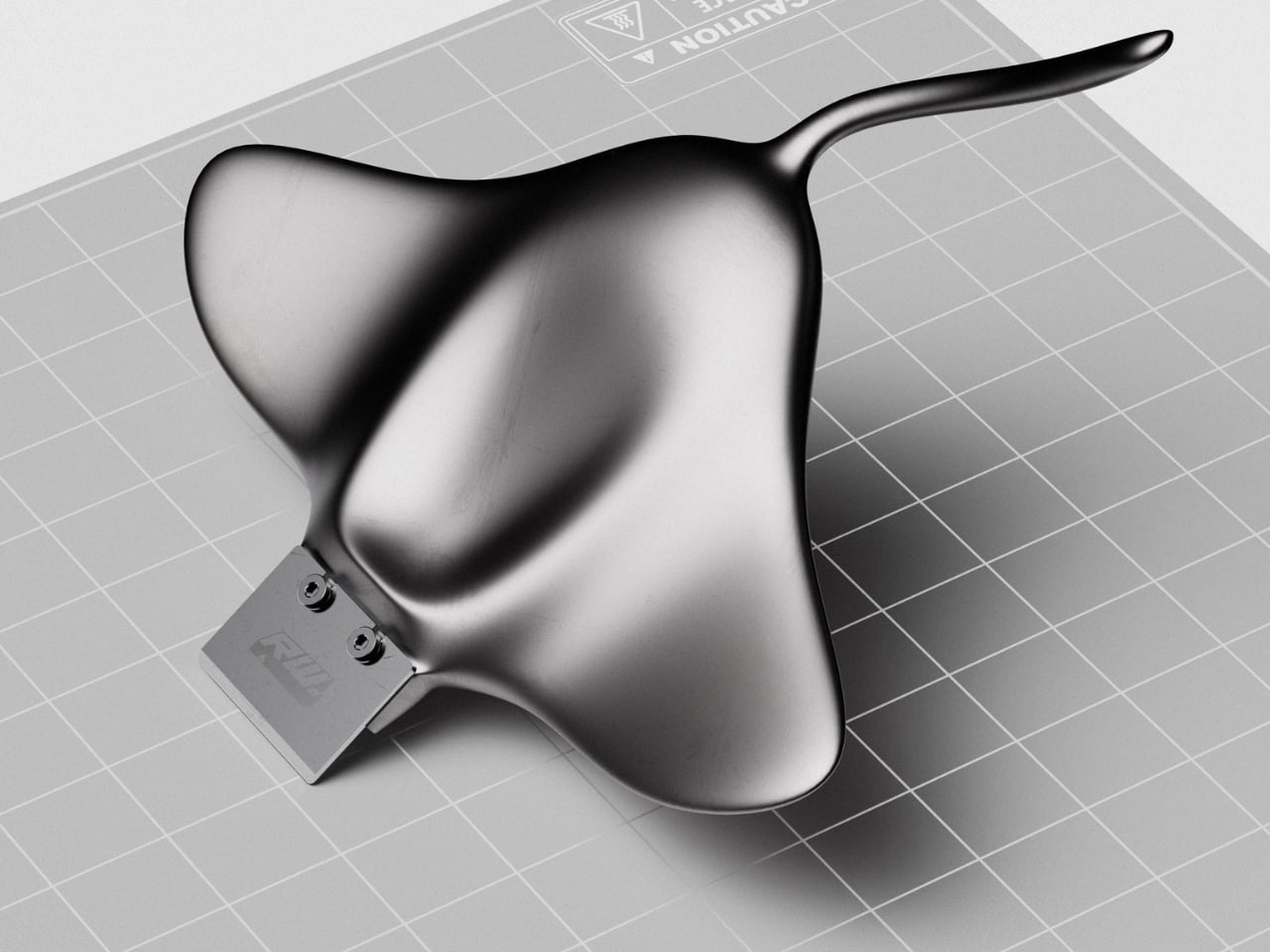
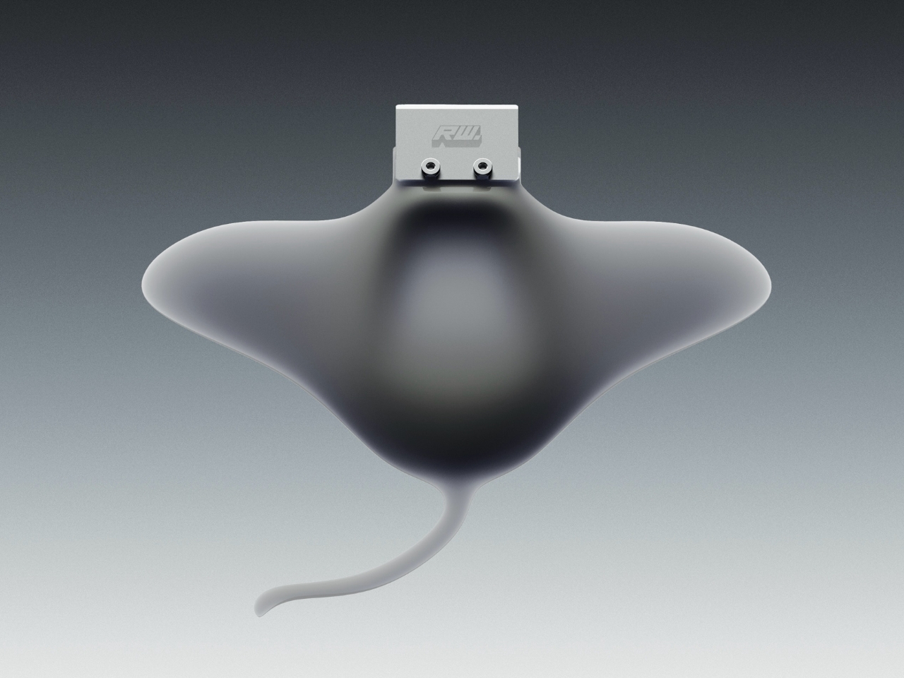
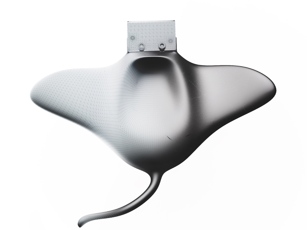
The little rectangular blade gives RAY away. Without it, Marija Kucurski’s stingray-shaped design could pass for a small sculpture, all sweeping fins and a curling tail. It’s actually a concept for a 3D print scraper, a tool meant to help release stubborn plastic from a printer’s build surface. Presented through renderings on Render Weekly, it gives an unglamorous workshop accessory a silhouette I’d happily leave out on the bench.

The practical problem is straightforward: a print needs to stay attached while it’s being made, but removing it afterward can take care. Prusa recommends letting its flexible steel sheets cool before bending them to release a print, sometimes using a spatula for assistance. RAY explores a handle for that scraping job while tackling a second, more personal frustration. Kucurski wanted to get away from the cubes, rounded rectangles, and racetrack shapes that had started to feel repetitive.

Designer: Marija Kucurski

In her project description, Kucurski compares working with SubD to playing with pizza dough or clay. That experimentation led her toward a stingray. I like how modest that explanation is. There’s no elaborate story about the ocean teaching us to scrape plastic more efficiently. She wanted to try a different shape, followed the modeling process, and arrived at an animal whose broad body gives the tool a recognizable identity. Sometimes that’s a perfectly worthwhile starting point.

Seen from above, RAY spreads outward into two rounded wings, with a raised central body flowing into a slender, curved tail. The dark, metallic-looking surface catches light across those changes in curvature, making the body feel more sculpted than assembled. That’s a visual effect in the renderings, not confirmation of a particular material. The blade sits at the front, interrupting those soft contours with a plain rectangle and two exposed fasteners.

A separate visualization makes the proposed grip clearer. A hand cradles the broad body, with the thumb resting near the center and fingers supporting the wings from underneath. The tail extends back toward the wrist rather than serving as a conventional narrow handle. That arrangement suggests a different relationship between hand and tool: more of a palm-supported object than something held by a stick. I’d be curious to see how that translates when applying pressure close to the build plate.

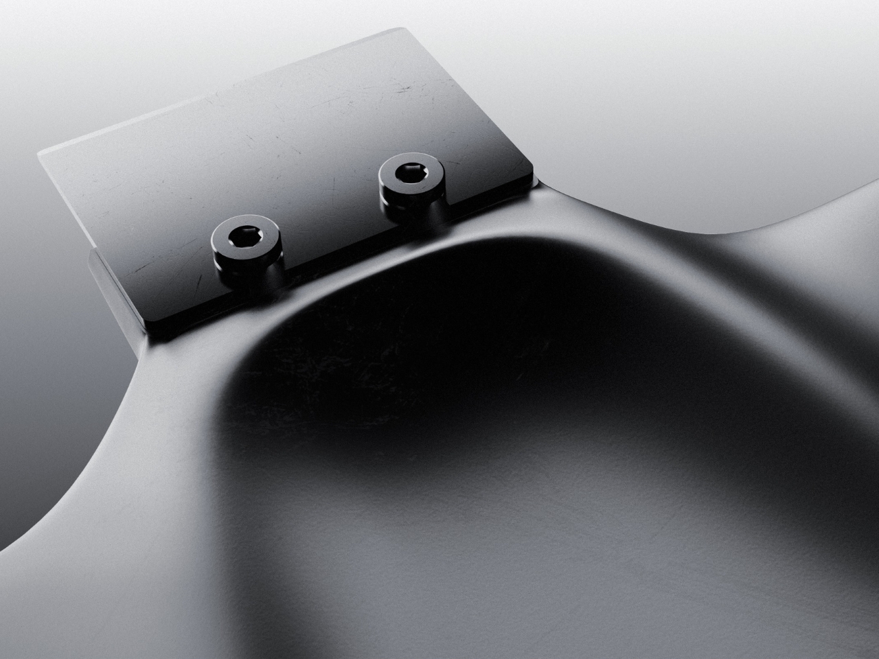
The blade attachment is a useful visual anchor. Two visible screw heads keep the business end legible, so the animal reference doesn’t completely swallow the tool’s purpose. I appreciate that decision. A perfectly uninterrupted stingray would make a cleaner sculpture, but the exposed hardware gives RAY a little workshop credibility. It also draws attention to the connection that would need to hold up during use.

My hesitation is mostly about the tail. It completes the stingray immediately, and removing it would make the design less memorable. But I’d want to know whether it contributes anything to handling or simply asks for extra space in a drawer. The wide wings raise a similar question about storage. Neither concern ruins the idea. They’re the ordinary negotiations that make a playful concept interesting once you imagine it sharing a bench with other tools.

The available presentation doesn’t establish grip comfort, scraping performance, or compatibility with particular build surfaces. Those details would matter more than the silhouette if RAY moved toward production. Even a beautiful scraper needs to respect the surface underneath it. Prusa specifically cautions against damaging the sheet when using a spatula and recommends slipping it beneath the model while the sheet is slightly bent, rather than digging into a flat surface.

Still, I’m glad Kucurski followed the less predictable shape. I don’t need every tool to resemble a sea creature, but I do enjoy a design that makes its maker’s curiosity visible. RAY earns attention through the sweep of its body and the almost comically practical blade attached to its front. The next step would be putting that expressive form to work, finding out which curves help the hand and which ones are simply along for the ride.

The post RAY’s 3D Print Scraper Concept Refuses to Be Another Rectangle first appeared on Yanko Design.

  •  

Titanium Smart Glasses Concept Refuses to Hide Its Tech

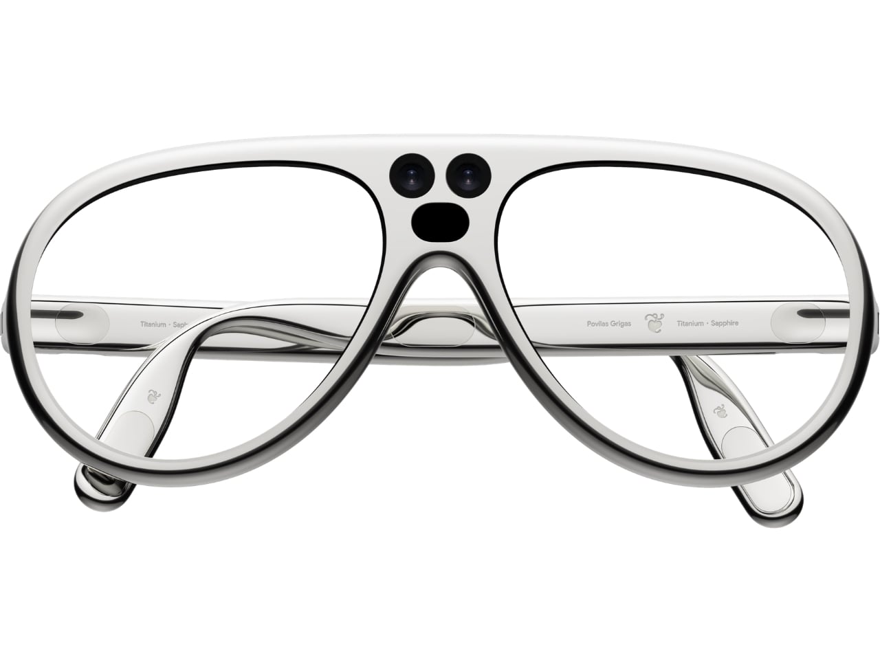
Fitting a computer into a pair of glasses creates an awkward design problem: the electronics need room, but the result still has to belong on someone’s face. Povilas Grigas approaches that tension without pretending it can disappear. His Glasses concept gives the hardware a deliberately different silhouette, treating smart eyewear as its own design category rather than ordinary frames with a technological secret. I like that starting point.

Developed for his 2024 design BA thesis, the mixed-reality concept imagines an alternative to being tethered to a phone or desktop screen. The ambition is to make computing available through something worn rather than something you continually look down at or sit in front of. That’s an appealing proposition, although moving digital information closer to your eyes doesn’t automatically make it less demanding of your attention.

Designer: Povilas Grigas

Visually, these glasses have enough personality to carry that discussion. The broad, rounded lens openings sit within a flowing silver-colored frame, while the bridge has two dark circular elements above an oval opening. In the front view, that arrangement almost resembles a tiny surprised face. It’s an unexpectedly playful detail in an otherwise polished object. To my eye, the overall effect lands somewhere between sculptural eyewear and a science-fiction costume department with unusually good taste.

Grigas specifies CNC-milled, polished grade 5 titanium for the frame and optically polished sapphire crystal for the lenses. Those are proposed material choices, not evidence that the finished glasses would feel featherlight or survive everyday abuse. Still, I appreciate the intention behind them. A computer worn this prominently deserves the material attention we give a watch or a favorite pair of glasses, especially if the expectation is that it becomes part of someone’s daily appearance.

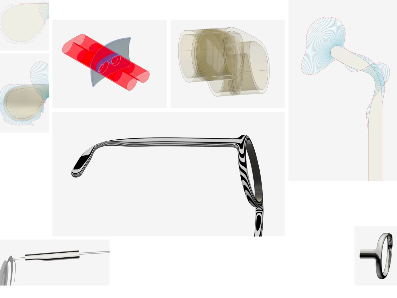
The frame’s outline follows the bones around the eyes, according to Grigas, and the vision sensors occupy the bridge for a centered point of view. That placement gives the front a clear organizing feature. Rather than scattering visually competing details across the brow and corners, the design concentrates its most conspicuous technology near the middle. It’s a convincing composition, even if a convincing composition is only one part of making wearable computing practical.

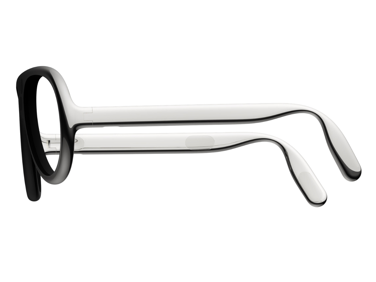
From the side, the arms look substantial, with long, smooth surfaces that curve downward behind the ears. Their thickness is part of the visual identity rather than a detail the presentation tries to conceal. I’d rather see that volume handled deliberately than watch a designer chase thinness at the expense of the overall shape. Here, the broad arms and generous front feel like parts of the same object.

The personal question is whether I’d want such a distinctive object defining my face every day. I’m not sure, and that uncertainty is worth keeping in the conversation. Glasses are unusually intimate technology because people look through them while other people look at them. A frame can be beautifully resolved and still feel wrong for an individual wearer. I’d want more than an impressive image before deciding these belonged in my routine.

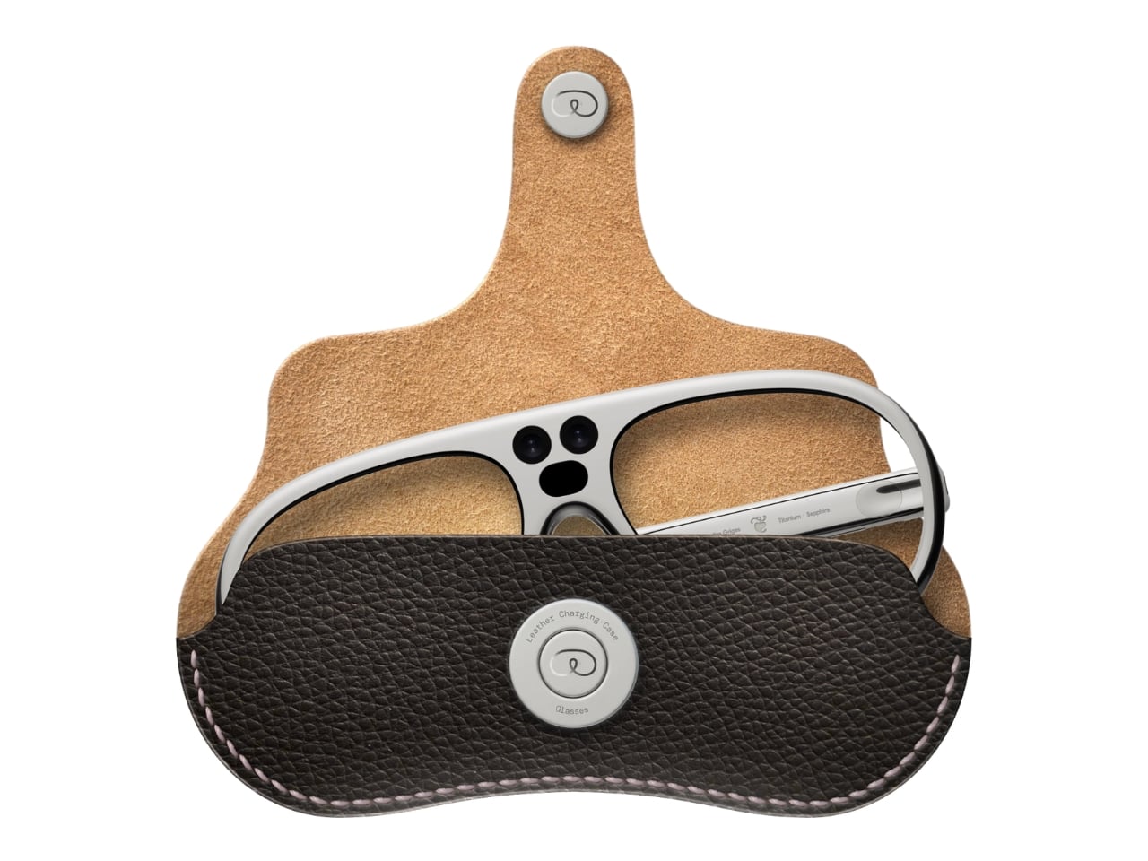
The proposed leather charging case helps make that routine easier to imagine. The glasses fold flat inside it, and the presentation shows a dark, textured exterior with visible stitching and a circular metal closure. It reads as an eyeglass accessory rather than a miniature electronics bag. More importantly, putting the glasses away feels like a recognizable action. I find that more reassuring than an expectation that a wearable computer should remain on your body indefinitely.

For now, this is an academic design proposal, not a demonstrated replacement for your laptop. Its presentation doesn’t establish battery endurance, display quality, or long-term comfort, so those questions remain open. What earns my interest is the willingness to give computing a visible presence without making the frame look apologetic. I wouldn’t ask these glasses to pass as ordinary eyewear. I would ask whether their eventual usefulness could earn the space they occupy on my face.

The post Titanium Smart Glasses Concept Refuses to Hide Its Tech first appeared on Yanko Design.

  •  

Neo-Brutalist Vases Look Like Tiny Towers, Even Without Flowers

An empty vase can make a shelf look oddly unfinished, as though the flowers were supposed to do all the decorating. Aleksander Kozera’s Neo-Brutalist Vases offer a convincing way around that small domestic problem. Created under his Warsaw-based Yird Ceramics brand, these ceramic vessels have enough architectural detail to hold attention on their own. I’d be inclined to leave them empty before deciding what, if anything, belongs inside.

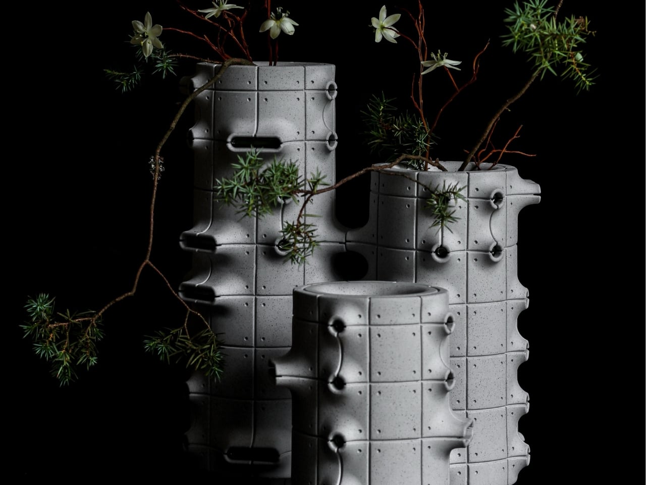
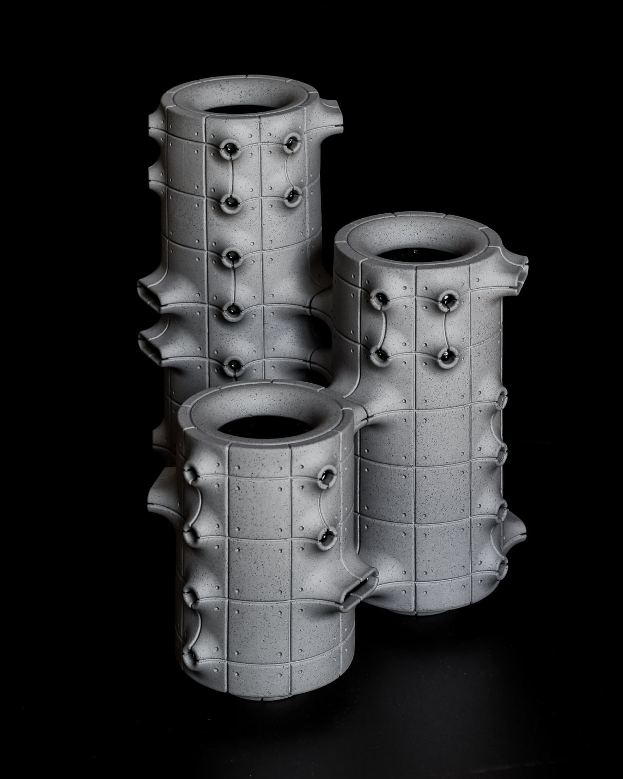
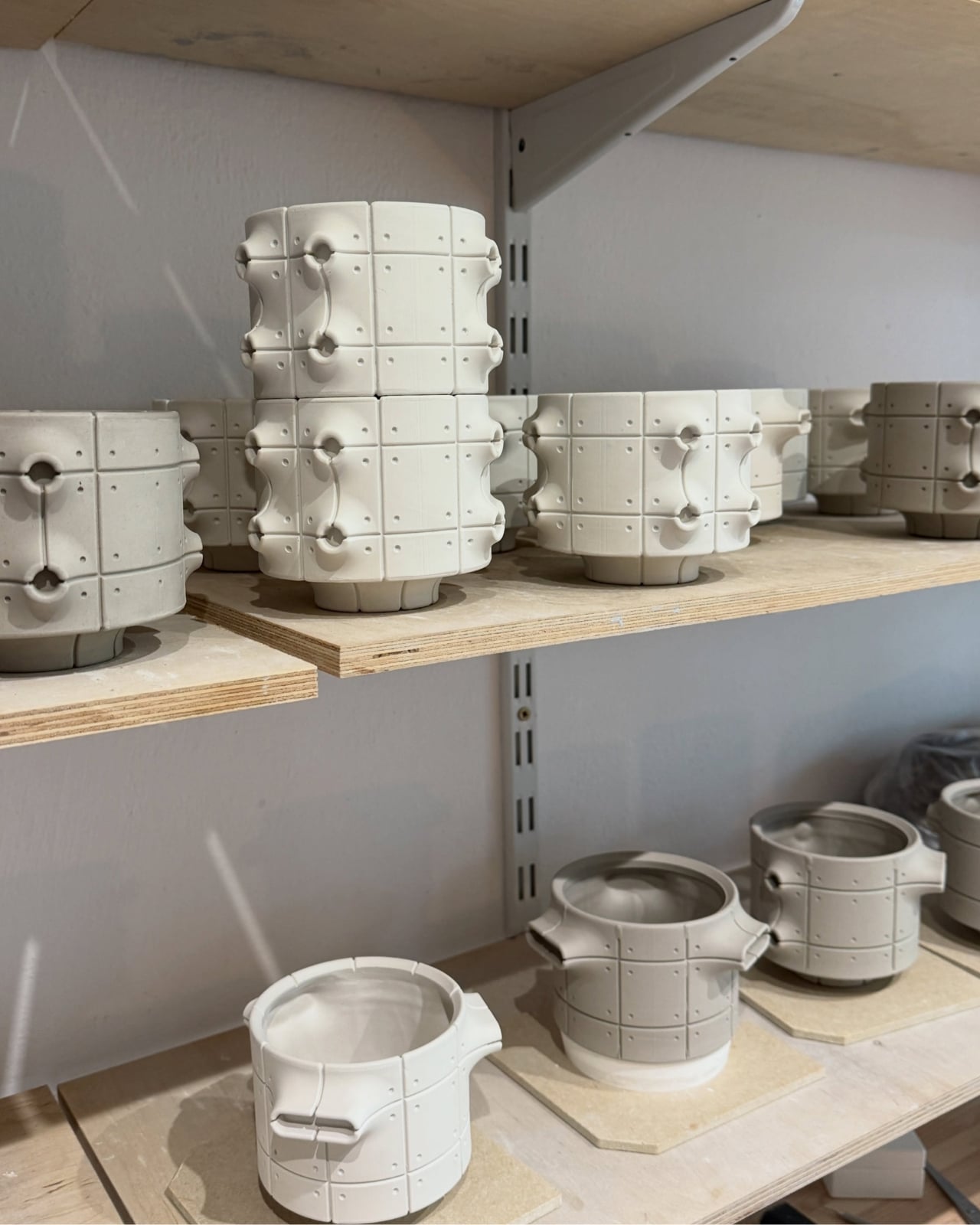
Their cylindrical bodies are divided into rectangular panels, with tiny indentations that suggest construction details on a concrete facade. Circular recesses interrupt that grid, while curved projections extend from the sides like abbreviated balconies or exposed joints. The effect lands somewhere between an architectural model and a piece of science-fiction set dressing. They look a little like infrastructure for a very small, very design-conscious civilization, which is part of their appeal.

Designer: Aleksander Kozera

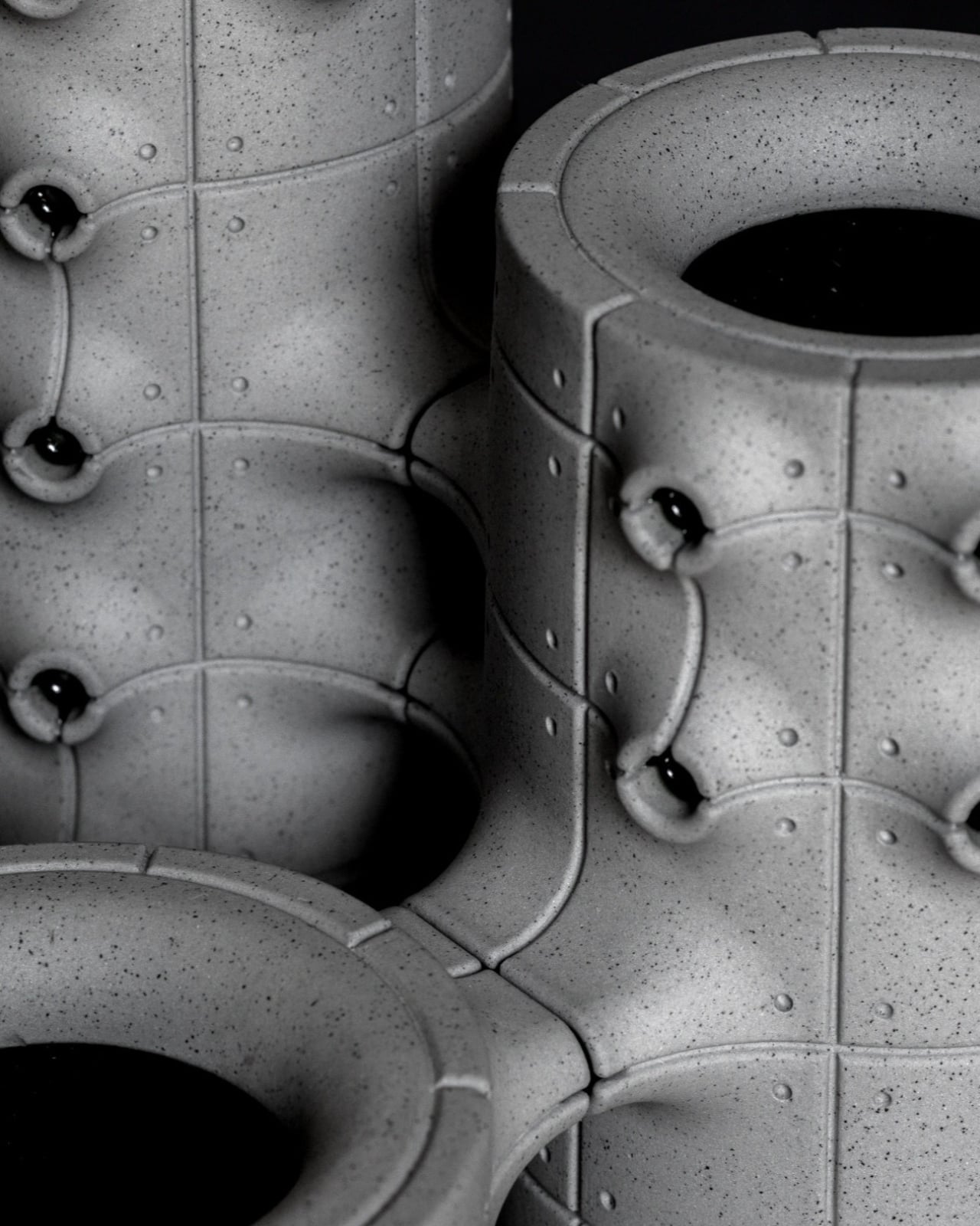
The concrete resemblance comes from the ceramic body itself. According to the collection’s Łódź Design Festival description, Kozera uses porcelain casting slip with ceramic pigments and black grog to produce that raw, concrete-like finish. In the close-up photographs, dark speckles break up the gray surface. That texture matters visually: without it, the panel lines and repeated circles could read as a smooth plastic prop. Instead, the surface gives the geometry some grit.

The modular approach also makes the collection more interesting than a row of differently sized cylinders. The festival describes vessels that can be combined and arranged into larger compositions. In the photographs, neighboring forms create narrow gaps, overlapping projections, and changing silhouettes. I like the possibility of treating a shelf as a small architectural composition rather than lining up three matching accessories. The vessels share a vocabulary without looking identical from every angle.

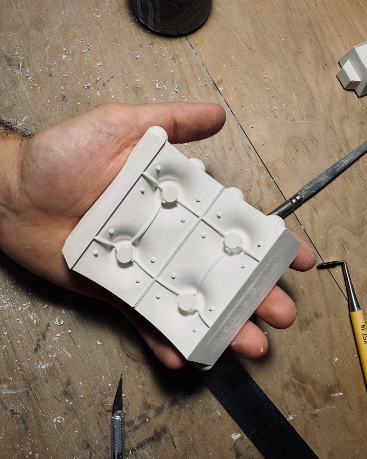
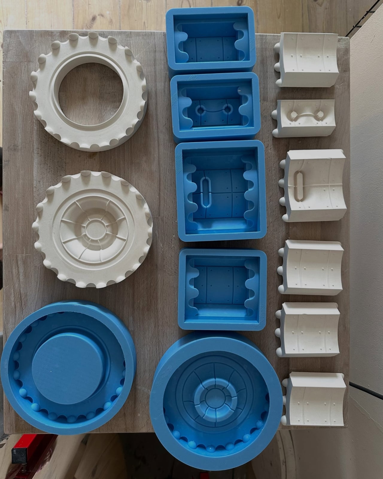
Kozera’s broader studio process helps explain that controlled repetition. He describes beginning with digital modeling, then 3D-printing master forms used to make plaster molds for slip-casting porcelain. That’s a useful distinction for anyone assuming these are printed plastic objects or directly printed ceramics. Digital tools establish the geometry, while casting translates it into ceramic. The workshop photographs make that relationship tangible, showing shaped components and molds alongside vessels at different stages of production.

The finish introduces another layer of detail. The collection description specifies a translucent green glaze, with the small exterior “windows” individually glazed by hand. The green is restrained enough that the photographed pieces still read predominantly as gray architectural objects. I prefer that decision to an all-over glossy finish. Small glazed areas give the eye somewhere to pause without obscuring the panel divisions or competing with the speckled body.

Flowers change the balance considerably. In the styled photograph, branching stems stretch above and across the vessels, disrupting all those disciplined horizontal and vertical lines. The arrangement is sparse enough that the ceramic remains visible, which seems the right approach. A dense supermarket bouquet might conceal much of the detail that makes these worth looking at. A few irregular branches would let the architecture and the plant material each have some breathing room.

My reservation is mostly about where they would live. These are visually busy objects, even with their limited palette. On a shelf already crowded with books, collectibles, and patterned ceramics, the small recesses and projecting edges could get lost. I’d give one a relatively clear stretch of console or place a group against a plain wall. That’s a styling preference, but the design rewards enough space to read its silhouette.

These are physical ceramic works rather than render-only proposals, and the collection is listed as selected for the make me! 2026 exhibition at Łódź Design Festival. That listing does not establish retail pricing or US availability, so it shouldn’t be mistaken for a confirmed shopping announcement.

For me, the strongest choice is the attention given to the sides of each vessel. Turn one, and the relationship between grid, recess, and projection changes. That gives the object a reason to stay on display after the stems are gone, without asking an empty vase to pretend it’s waiting for its next assignment.

The post Neo-Brutalist Vases Look Like Tiny Towers, Even Without Flowers first appeared on Yanko Design.

  •  

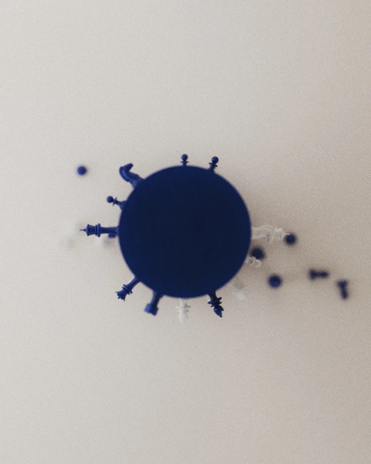
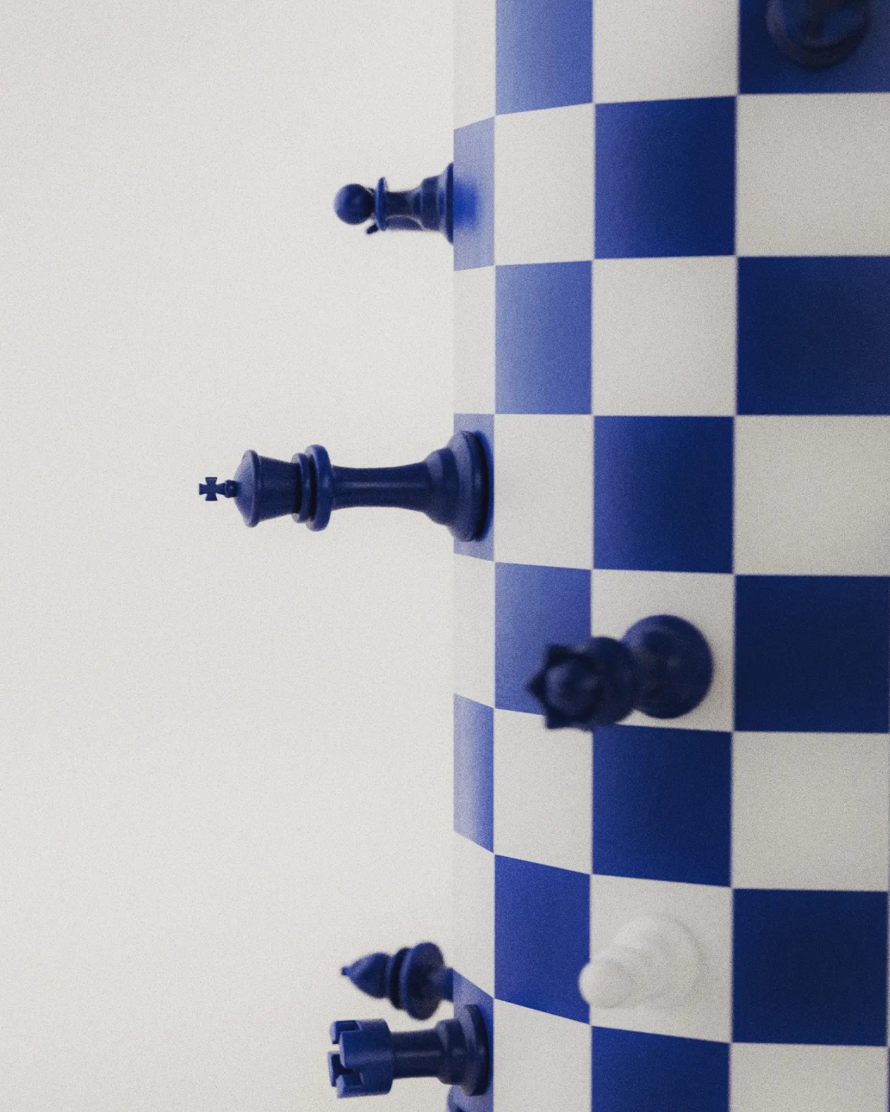
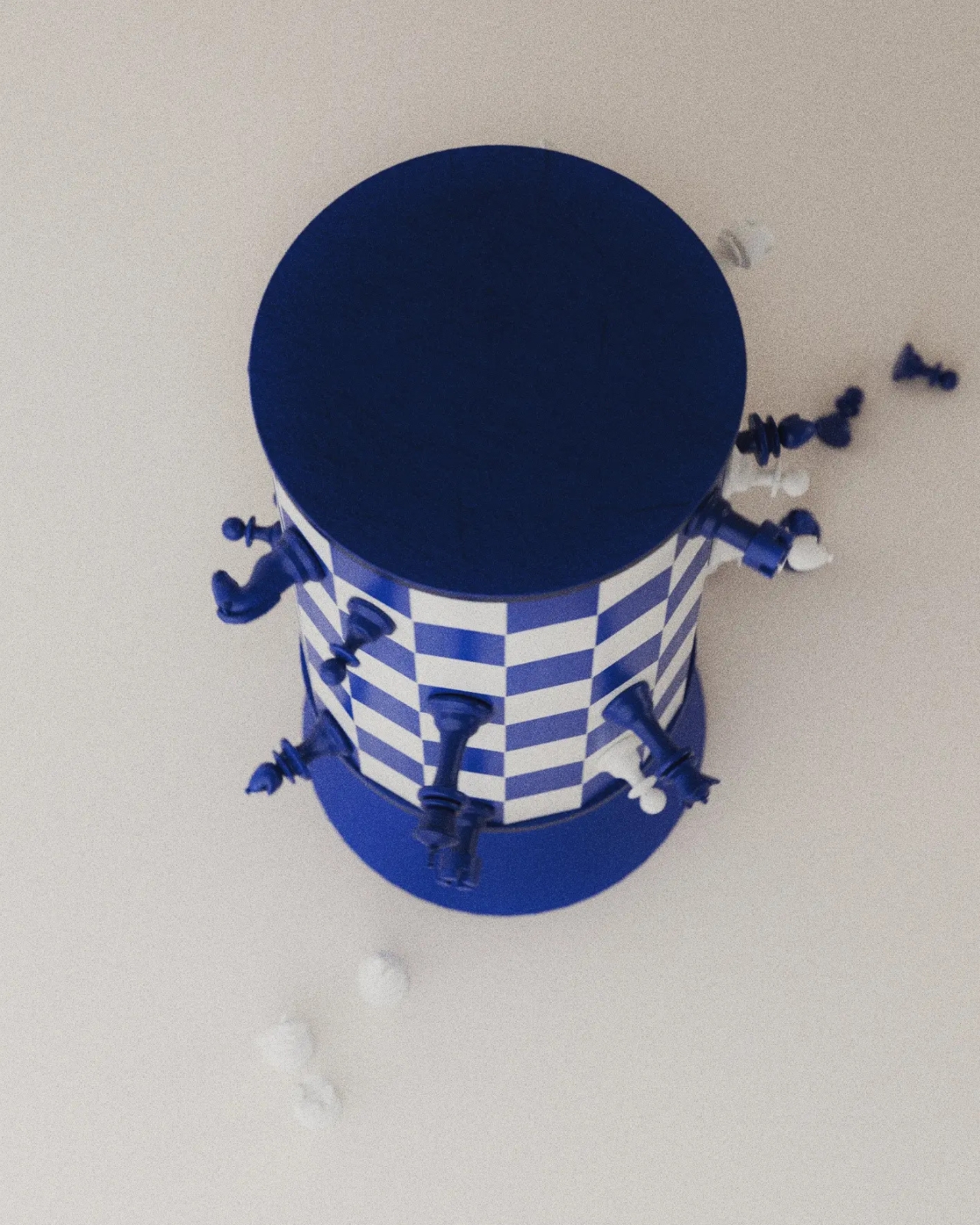
Chess Without a Flat Board: Turner’s Rotating Tower Concept

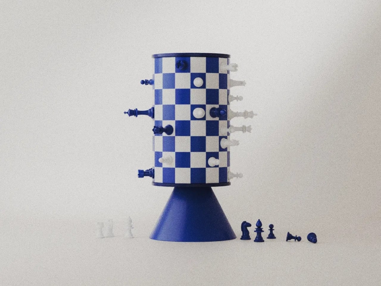
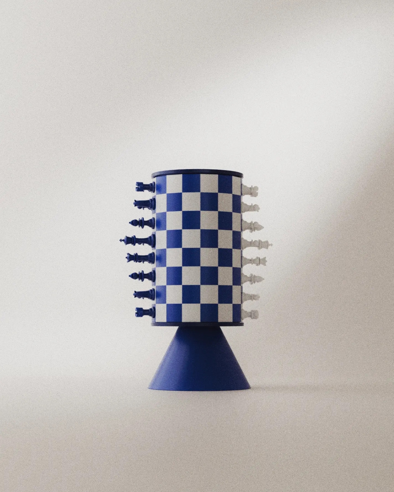
A blue king sticks straight out from a checkerboard cylinder, looking remarkably composed for a piece that should be falling onto the table. That sideways stance explains Turner, a rotating magnetic chess concept by Joffey, faster than a technical diagram could. The immediate problem is gravity: a vertical playing surface needs a way to keep its pieces attached. Magnets provide the proposed answer, letting the familiar chessboard curl upright without leaving its army in a heap.

Created for Day 04 of #productober, under the prompt “magnetic,” Turner explores what happens when a board loops back into itself. It’s a concept rather than a finished product, and I like that its ambition is playful rather than pretending chess needs fixing. The appeal is seeing a familiar game become an object you might want to leave out, even between matches.

Designer: Joffey

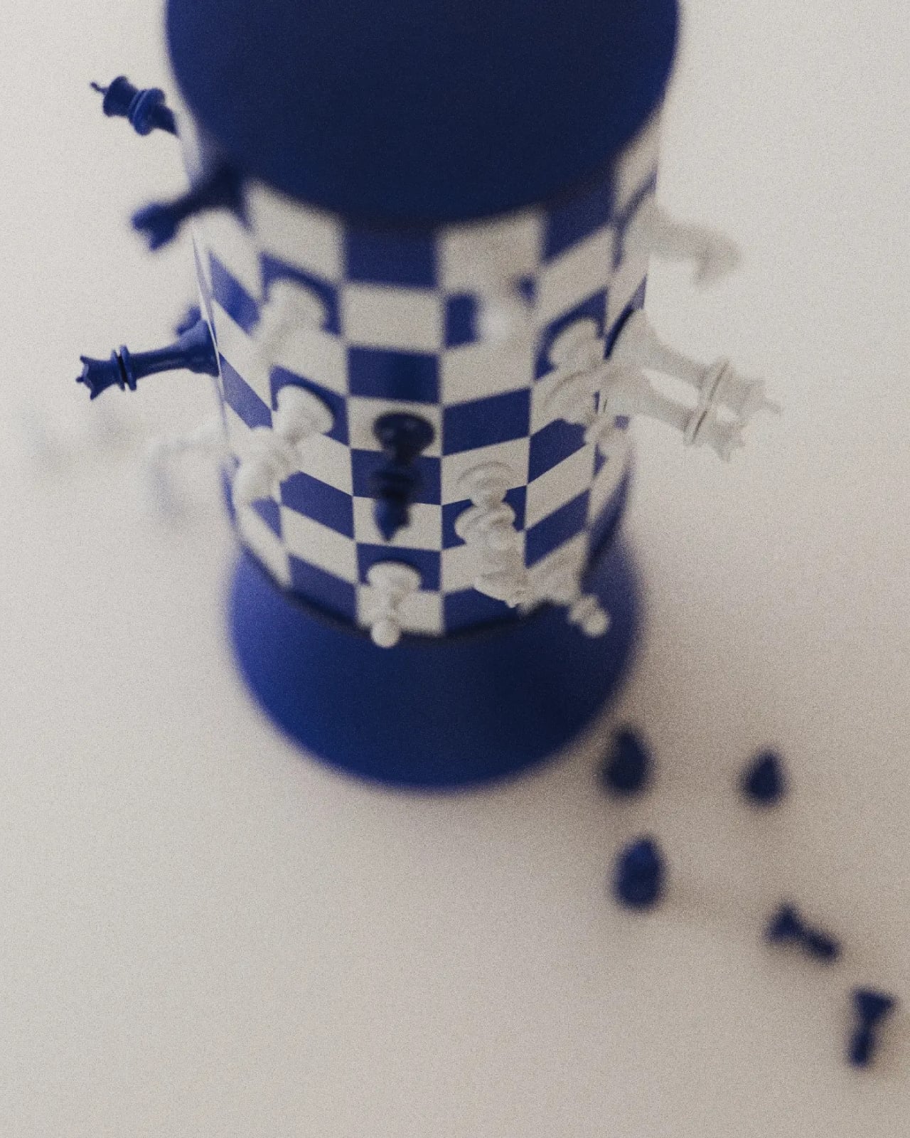
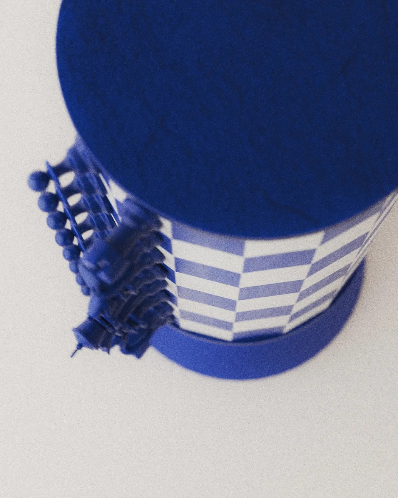
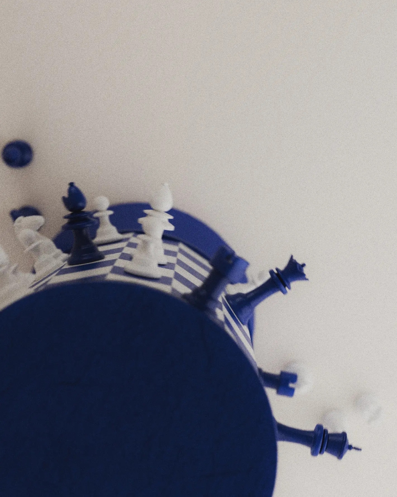
The supplied images show a blue-and-white grid wrapped around a tall cylinder, capped by dark blue circular ends and supported by a flared pedestal. The base gives it the presence of a small tabletop sculpture. From some angles, it resembles an unusually elaborate trophy. From others, the pieces projecting around its circumference make it look like a tiny planet populated entirely by royalty and horses.

The color does a lot of work here. Deep blue replaces the expected black, giving the set a softer domestic character without sacrificing the contrast with white. I’d happily take that over another aggressively futuristic chess redesign. The pieces retain recognizable silhouettes, so the unfamiliar board has familiar companions. You can still pick out a knight or a king without learning a whole new visual language.

Magnetism also earns its place in the design. Remove it, and the central idea stops working. The pieces are intended to cling to the curved surface while the board rotates, bringing different areas into view. That makes turning the board part of the interaction. Instead of simply surveying a flat field, players would need to reveal portions of the position as they go.

That’s also where my enthusiasm meets a practical reservation. A flat chessboard lets both players inspect the entire position at once. Turner’s cylinder necessarily conceals part of the grid from any single viewpoint. Rotation offers a way to look around it, but remembering what’s on the far side could become another demand on your attention. I can imagine enjoying that extra spatial puzzle. I can also imagine wanting my ordinary board back during a particularly complicated game.

The looping surface raises another question: what happens at the point where opposite edges meet? Joffey’s description suggests a changed way of playing, but the supplied material doesn’t establish a complete rule set. It would be a stretch to assign new movement rules to the pieces. Still, the possibility is intriguing. Joining edges could have consequences beyond appearance if the designer chooses to make that continuity part of play.

I appreciate that Turner doesn’t disguise every familiar feature in pursuit of novelty. The pedestal, restrained palette, and recognizable pieces give your eye enough to understand before the curved grid complicates things. Even the pieces set beside the base in the images help establish scale and context, although no dimensions are provided. You understand that this belongs on a table, within reach, rather than behind glass.

For a developed version, I’d care as much about the feel of removing a pawn as the appearance of the cylinder. Magnetic attachment would need to resist slipping while allowing deliberate moves without an awkward tug. The rotation would need similar care: easy enough to use, controlled enough not to become a distraction. Those are unresolved details, but they’re also where an appealing rendering could become a satisfying physical object.

Turner makes me curious enough to want a game, provided someone explains the rules first. Its appeal lies in having to look around a chessboard that usually gives you everything at once. That could be an entertaining complication, even if it never replaces the flat board in the closet.

The post Chess Without a Flat Board: Turner’s Rotating Tower Concept first appeared on Yanko Design.
  •  

Scooby-Doo Birkenstock Concepts Actually Look Like the Gang

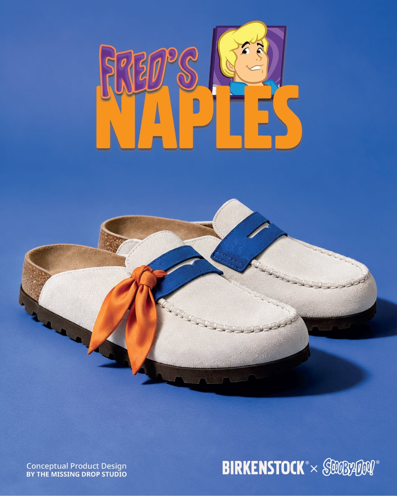
A turquoise strap and a tiny “SD” tag turn a caramel clog into Scooby-Doo before you even register the spots. That’s the appeal of “Scooby Birks,” an unofficial Birkenstock × Scooby-Doo concept collection by The Missing Drop. It addresses a familiar design problem: how to wear your affection for a cartoon without looking like you borrowed something from the costume aisle. I’d rather recognize a character through those details than a giant printed face.

Before anyone starts planning a purchase, these are imagined products, not manufactured prototypes. The project has no affiliation with or endorsement from Birkenstock or Warner Bros. Its six designs borrow familiar footwear silhouettes to interpret Mystery Inc. and the Mystery Machine. That distinction matters because the presentation, right down to the packaging, has the confidence of an actual retail campaign.

Designer: The Missing Drop

Scooby’s Boston is the clearest introduction to the idea. Its brown, suede-like surface carries irregular dark patches, while the turquoise buckle strap takes the place of his collar. The dangling gold-colored tag completes the reference. Moving a collar onto an existing shoe strap is an economical decision: the designer gives a familiar component another meaning without needing to reshape the entire clog. Even the rounded toe feels appropriate for this particular character.

Shaggy’s Boston would be my pick, partly because the joke is so pleasantly literal. The concept imagines olive-green shaggy shearling across the upper, paired with a rust-colored, corduroy-textured strap and a little biscuit charm. His green shirt and brown pants become a material palette. It’s deliberately scruffy, but the buckle and recognizable clog shape keep it from reading as a novelty slipper. I’d happily lose the charm and keep everything else.

Velma gets a red Mantova Mary Jane with orange ribbing around the interior, a reference to her sweater that rewards a closer look. It’s probably the easiest design here to separate from its inspiration and wear as an ordinary shoe. Daphne’s purple Namica takes the opposite approach, adding a lavender sole band and a bright green scarf tied beside the buckle. The wedge gives her interpretation a dressier profile, although that dangling scarf raises a practical question about keeping it clear of the ground.

Fred’s Naples translates his outfit into a cream-colored loafer-style upper, blue detailing, and an orange scarf knot. I like the way the moccasin-style stitching gives that polished character a slightly more relaxed expression. Then there’s the Mystery Machine Arizona, with turquoise straps, lime edging, and orange flowers. Including the van is a smart expansion of the collection: it offers a recognizable reference for someone who loves the show but doesn’t particularly identify with one member of the gang.

The shoebox deserves attention, too. Inspired by Scooby Snacks, it uses turquoise, a broad lime diagonal, orange flowers, and oversized “Scooby Birks” lettering. The palette connects it to the van as well as the fictional treats. I like that the packaging allows itself to be louder than the footwear. A box can carry the full cartoon enthusiasm while the shoes get on with being something you might build an outfit around.

The response suggests that this visual shorthand travels well. Designer Julien Buisson-Fizellier, who identifies the project as his work, reported nearly 8 million TikTok views. That’s his reported figure, not evidence of purchase demand, but it helps explain the concept’s appeal as a shared image. You can recognize the reference, pick a favorite, and send it to someone without needing a lengthy explanation.

My reservation is how easily the campaign’s polish could outpace a viewer’s attention to its concept label. The more convincing an imaginary collaboration looks, the more important that disclosure becomes. Still, the design lesson is worth taking seriously. Scooby’s collar already behaves like a strap; Daphne’s scarf can sit beside a buckle. Those connections give the collection its personality. I’d want a real version to preserve that specificity, even if the loose accessories needed another pass before leaving the drawing board.

The post Scooby-Doo Birkenstock Concepts Actually Look Like the Gang first appeared on Yanko Design.
  •  

CHEKT’s Chessboard Refuses to Hide Its Layered Design

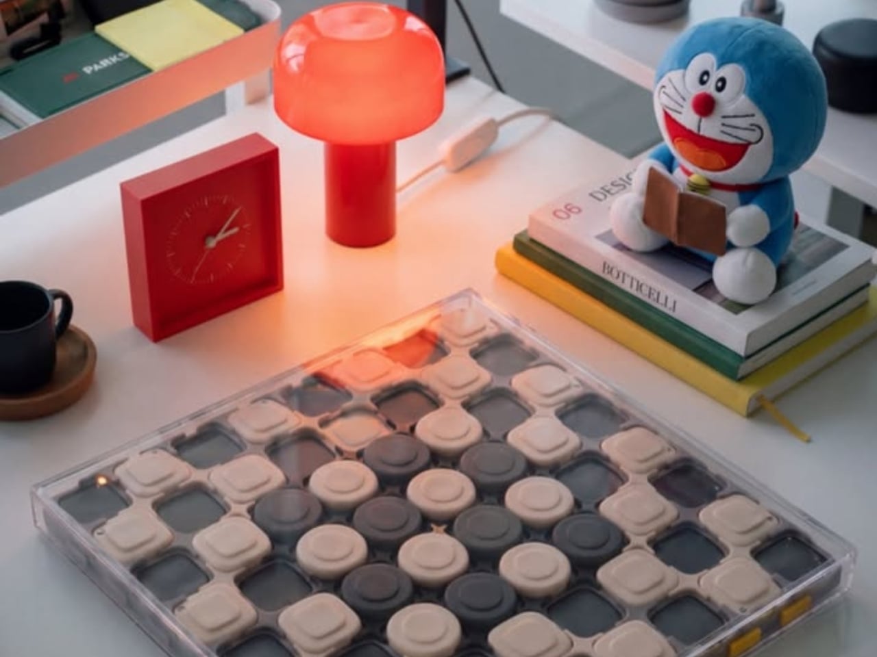
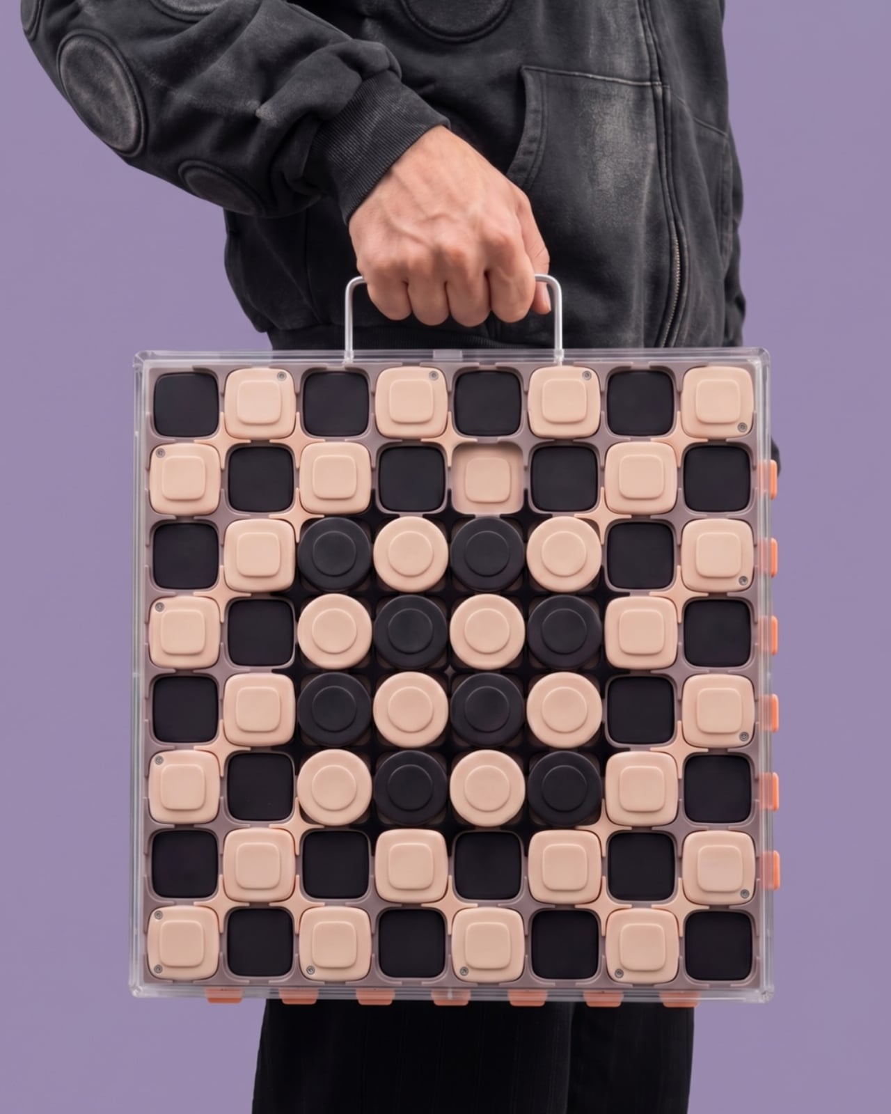
The carrying handle on Jess Wiseman’s CHEKT board is the detail that makes the design click for me. Chessboards have an awkward domestic life: leave one out and it claims a chunk of your table; put it away and playing becomes another thing to unpack. CHEKT’s board design considers that friction through a clear enclosure with a handle, while giving the familiar checkerboard a visual personality closer to a desk accessory than a formal game set.

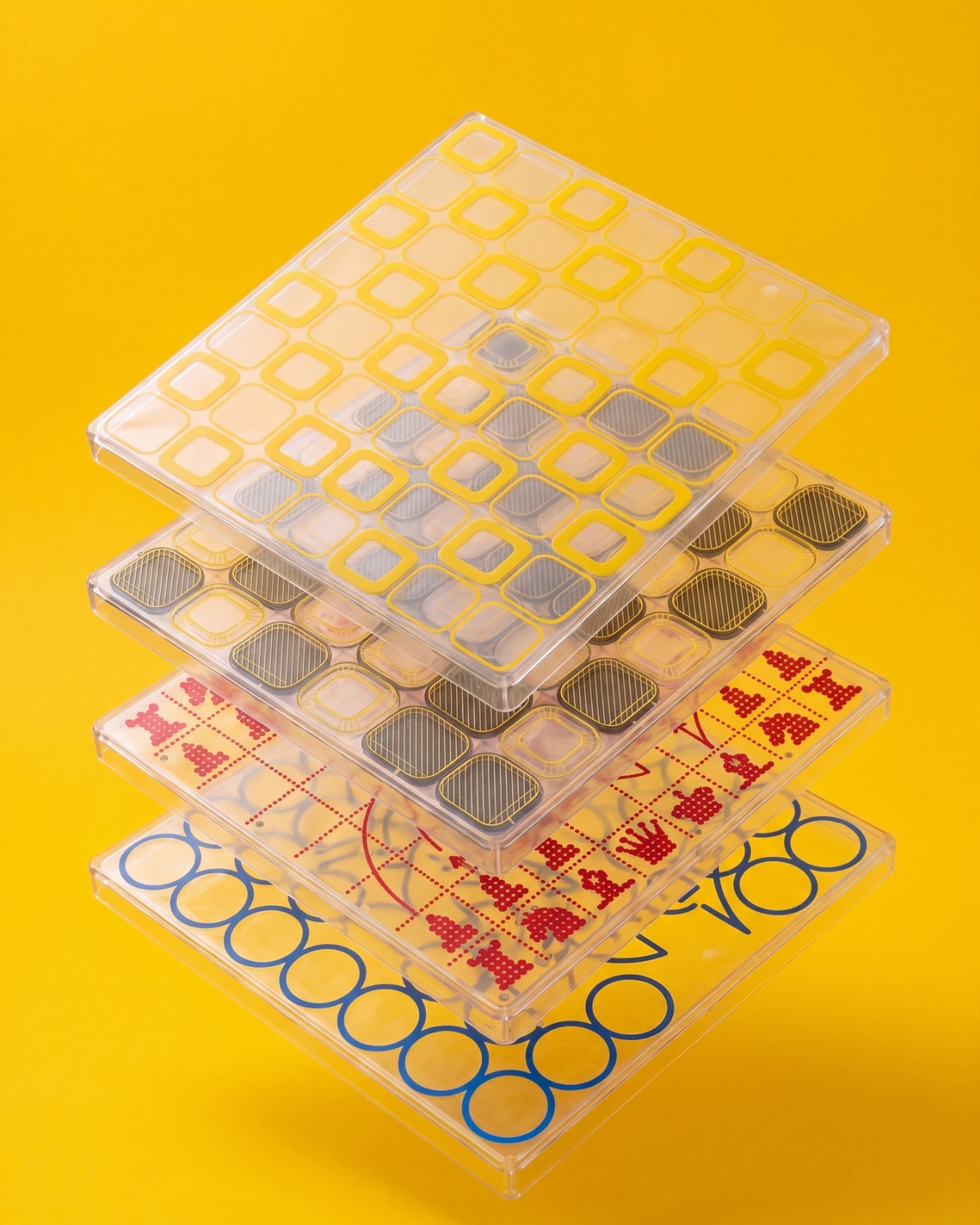
It also addresses a smaller, relatable problem: choosing a board usually means committing to one look. The supplied images show four transparent shells with different graphic treatments, suggesting a way to change the board’s appearance without replacing the underlying object. That’s a more interesting proposition than another beautifully finished slab. I like objects that leave room for your taste to change, especially when they’re likely to spend as much time sitting around as being used.

Designer: Jess Wiseman

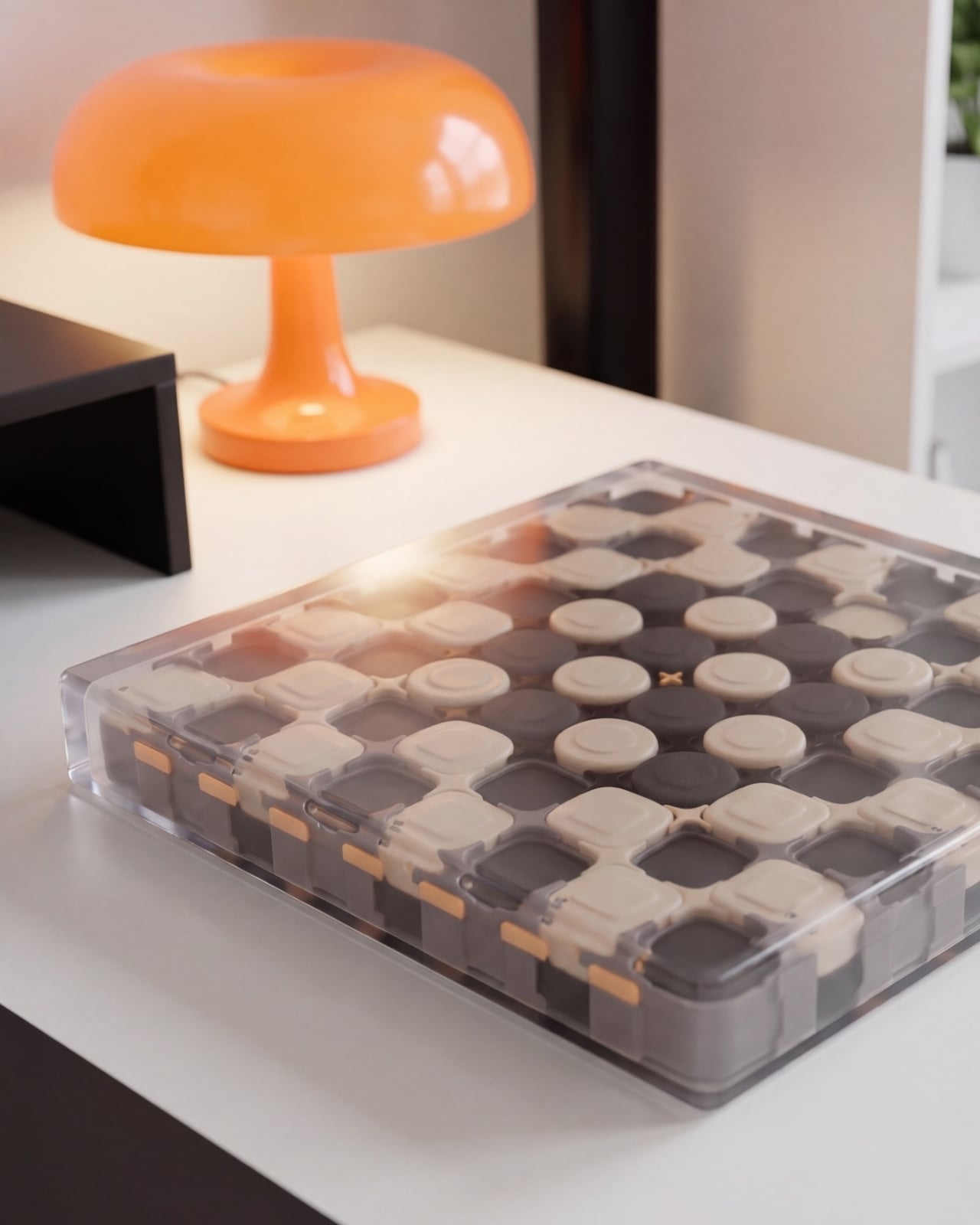
Underneath those shells, CHEKT has an eight-by-eight grid of black and pale peach forms. Rounded corners soften the geometry, and the raised surfaces make it look almost like an oversized keyboard. Circular details occupy the middle area, while square forms dominate elsewhere. The images don’t establish what those individual components do mechanically, so I wouldn’t call them buttons or switches. Visually, though, they give the board depth and rhythm that a printed checkerboard doesn’t have.

The clear outer enclosure makes those layers visible rather than hiding them behind a finished exterior. Small orange details along the edges interrupt the black-and-peach palette, and the slim, silver-colored handle gives the whole thing a faint briefcase quality. It’s playful without relying on a novelty shape. Sitting on a desk beside an orange mushroom lamp in one image, the board looks quite comfortable sharing space with objects chosen for their appearance.

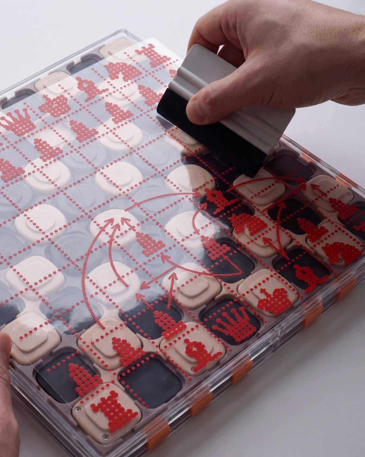
The shell graphics are where the design becomes especially expressive. One uses yellow outlines around the squares, another introduces dark diagonal hatching, and a third has red, dot-built chess-piece illustrations. The fourth features large blue circles and angular linework. They offer different degrees of visual busyness, which matters. A graphic you enjoy looking at across the room might be less welcome when you’re trying to read a complicated position. I’d probably start with the quieter option.

One image shows a hand wiping drawn red arrows from the illustrated shell. That suggests a useful secondary role as a surface for working through moves, explaining a position, or marking an idea before clearing it away. It’s an appealing detail for casual learning because the discussion can happen directly over the board. The specific writing tools and surface compatibility aren’t established here, but the pictured interaction gives the transparent layer a purpose beyond changing the color scheme.

That ability to annotate is arguably more compelling than making a chessboard resemble a collectible gadget. You can imagine two people tracing a possible move rather than trying to explain everything through gestures. It wouldn’t replace learning the rules or recognizing positions, but it could make that conversation easier to follow. For me, this is where the graphic design starts earning its place: the surface becomes something you can use, not merely something to admire.

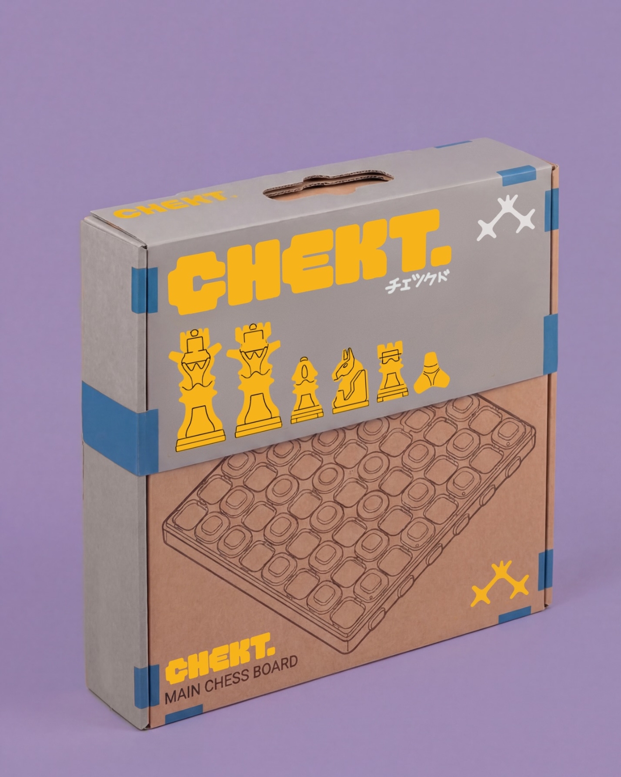
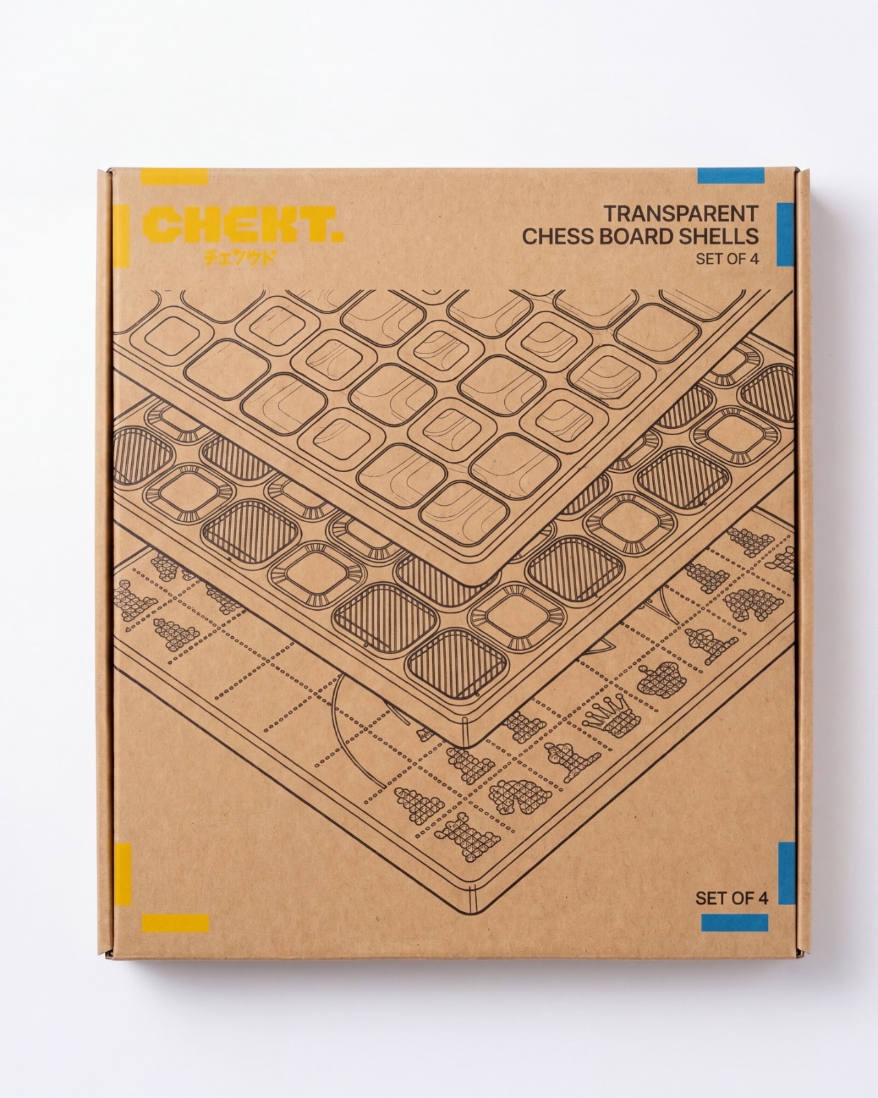
The packaging carries the same attitude. Oversized yellow CHEKT lettering, blue corner accents, chess-piece drawings, and diagrams of the layered board give the boxes a lively, almost hobby-kit character. The shell package explicitly labels its contents as a set of four, making the customization idea legible before anything is opened. I appreciate that clarity. Attractive packaging is more persuasive when it helps explain what the object is, rather than asking the branding to do all the work.

I’d still want to know how the shells attach, how easily their surfaces scratch, and whether the added graphics complicate play. Those answers would determine whether CHEKT feels practical rather than merely photogenic. But the design’s appeal is already clear: it gives a familiar game a place in a less formal room, with an appearance that doesn’t have to be permanent. A chessboard you can carry, customize, and potentially draw on offers several reasons to take it off the shelf.

The post CHEKT’s Chessboard Refuses to Hide Its Layered Design first appeared on Yanko Design.

  •  

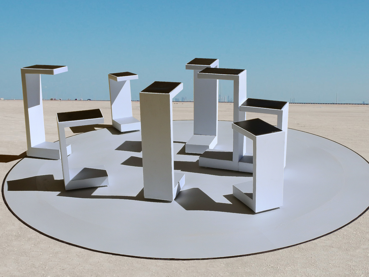
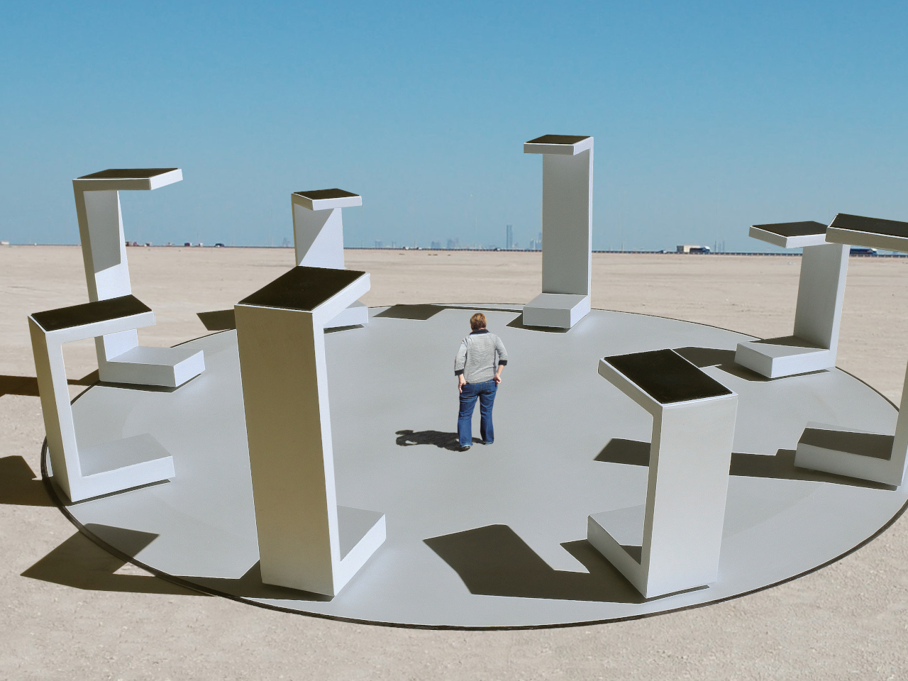
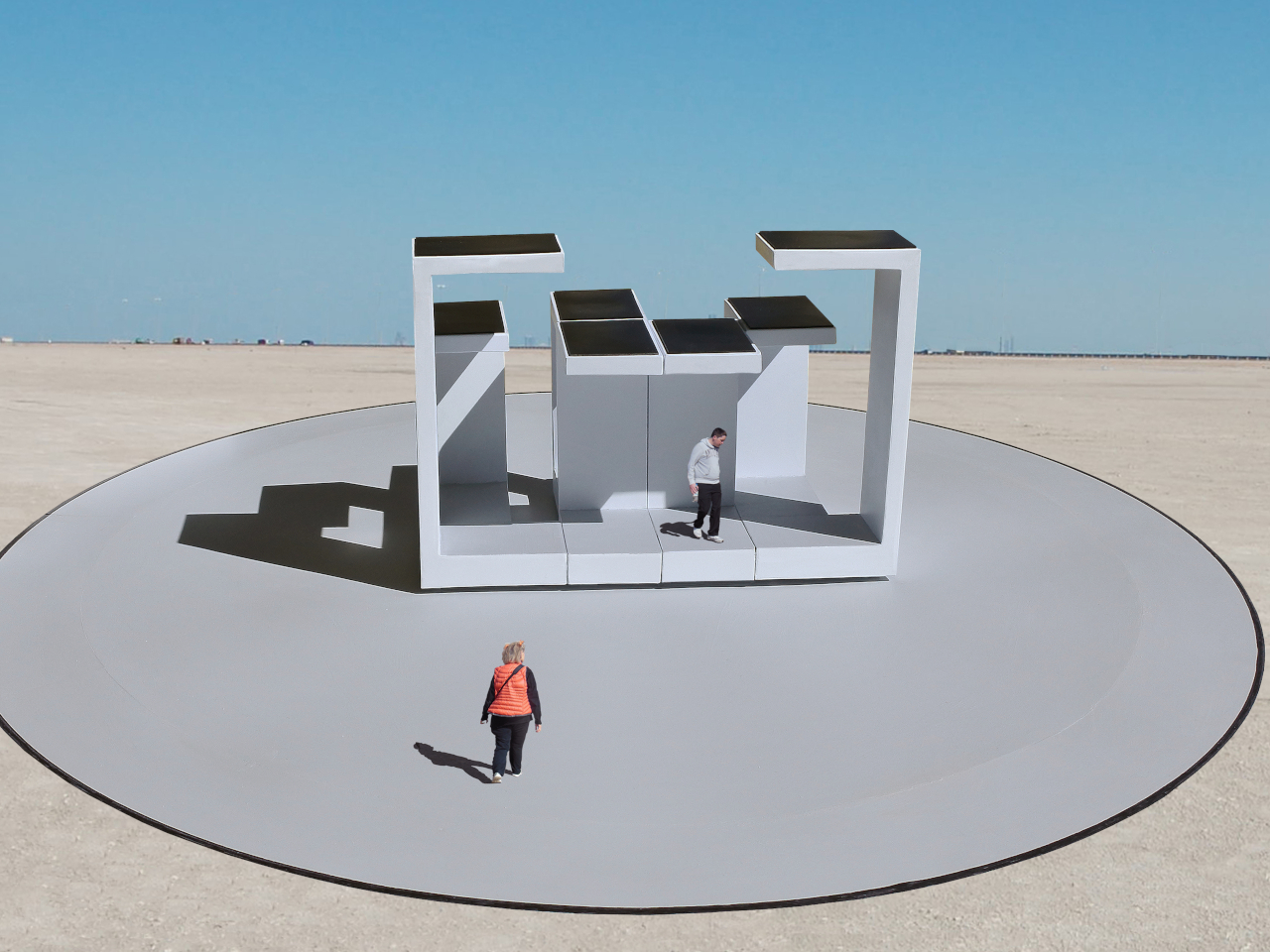
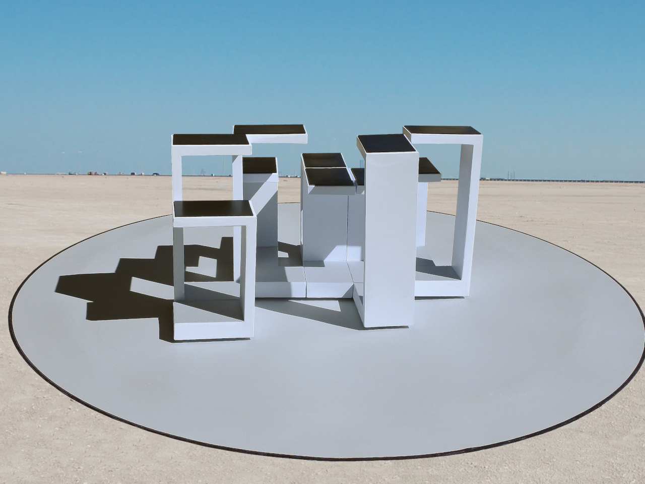
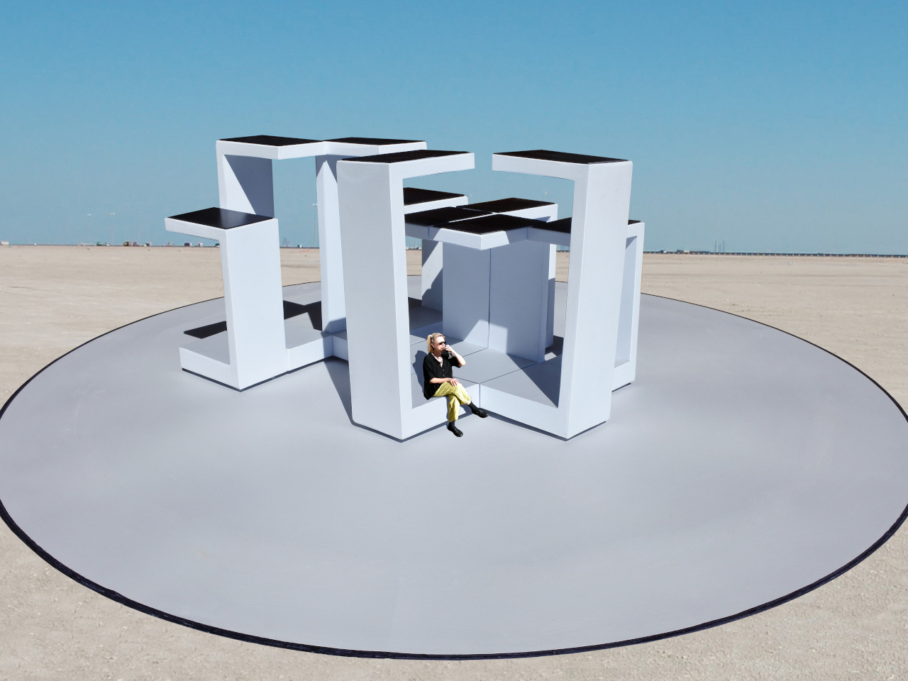
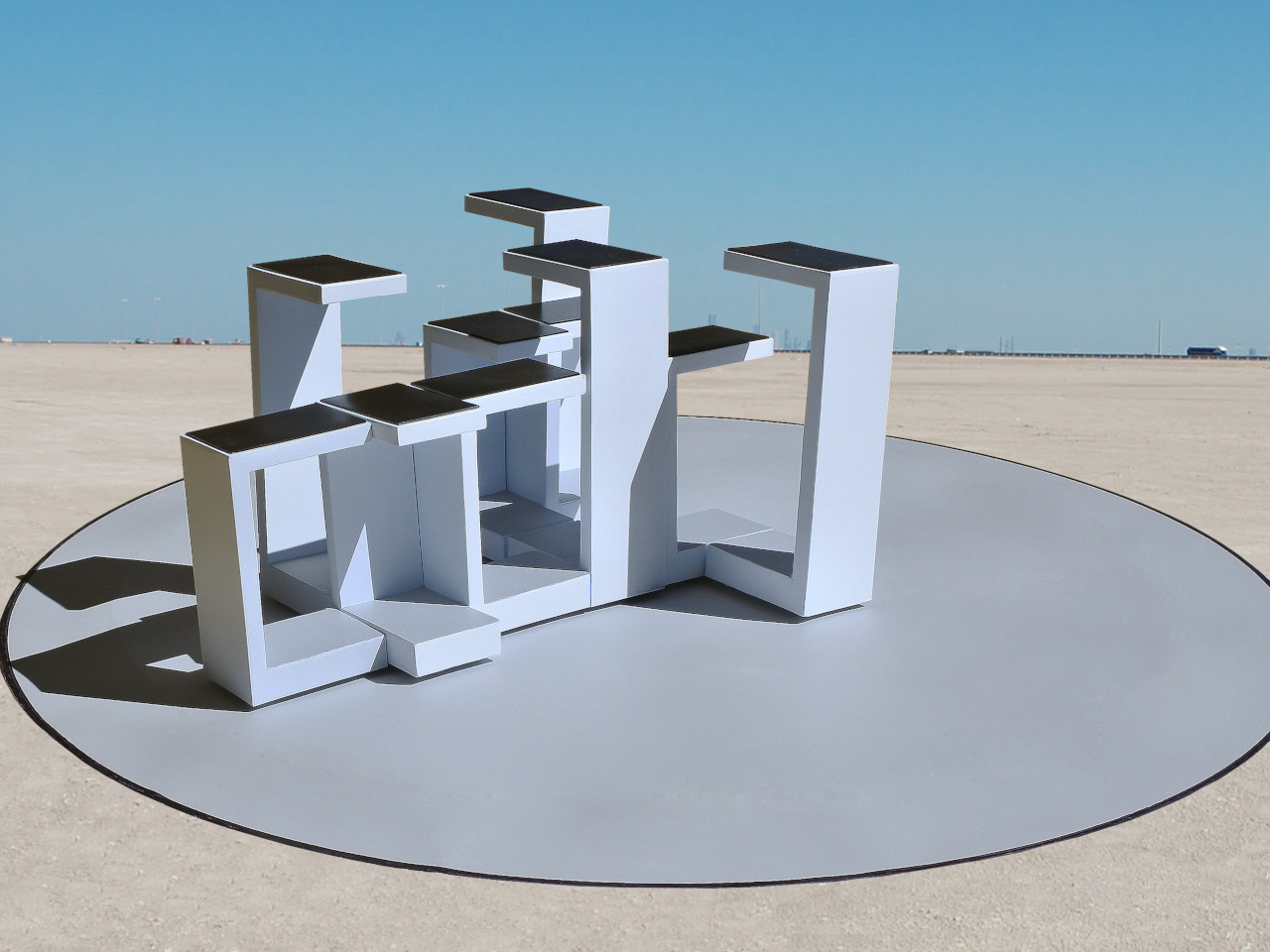
This Robotic Pavilion Concept Would Change Its Layout Only When Empty

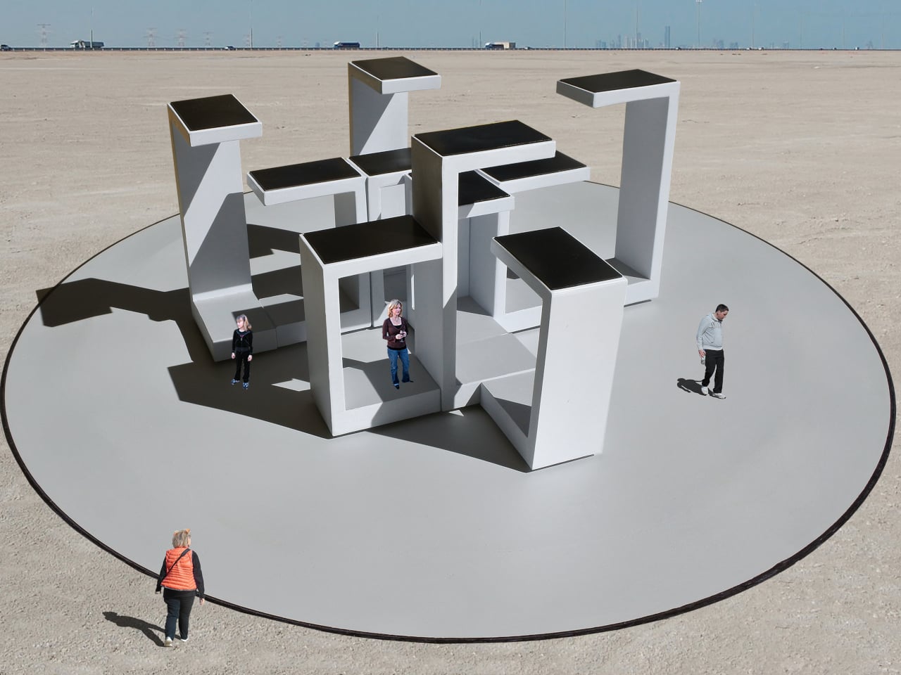
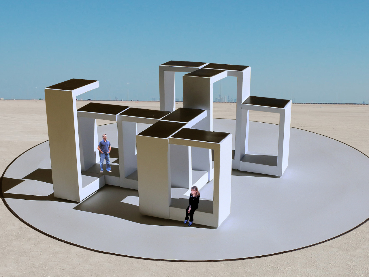
A public pavilion can give people somewhere to gather, but returning to it usually means finding the same spaces and following the same paths. Self-Assembling Robotic Environments explores a more flexible alternative: mobile architectural sections that could rearrange themselves between visits. This unbuilt public art concept would pause whenever someone enters, letting people explore one arrangement before the space changes for another group.

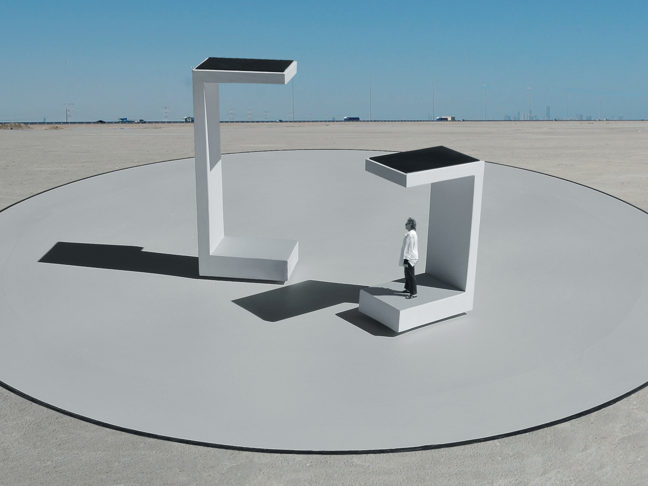
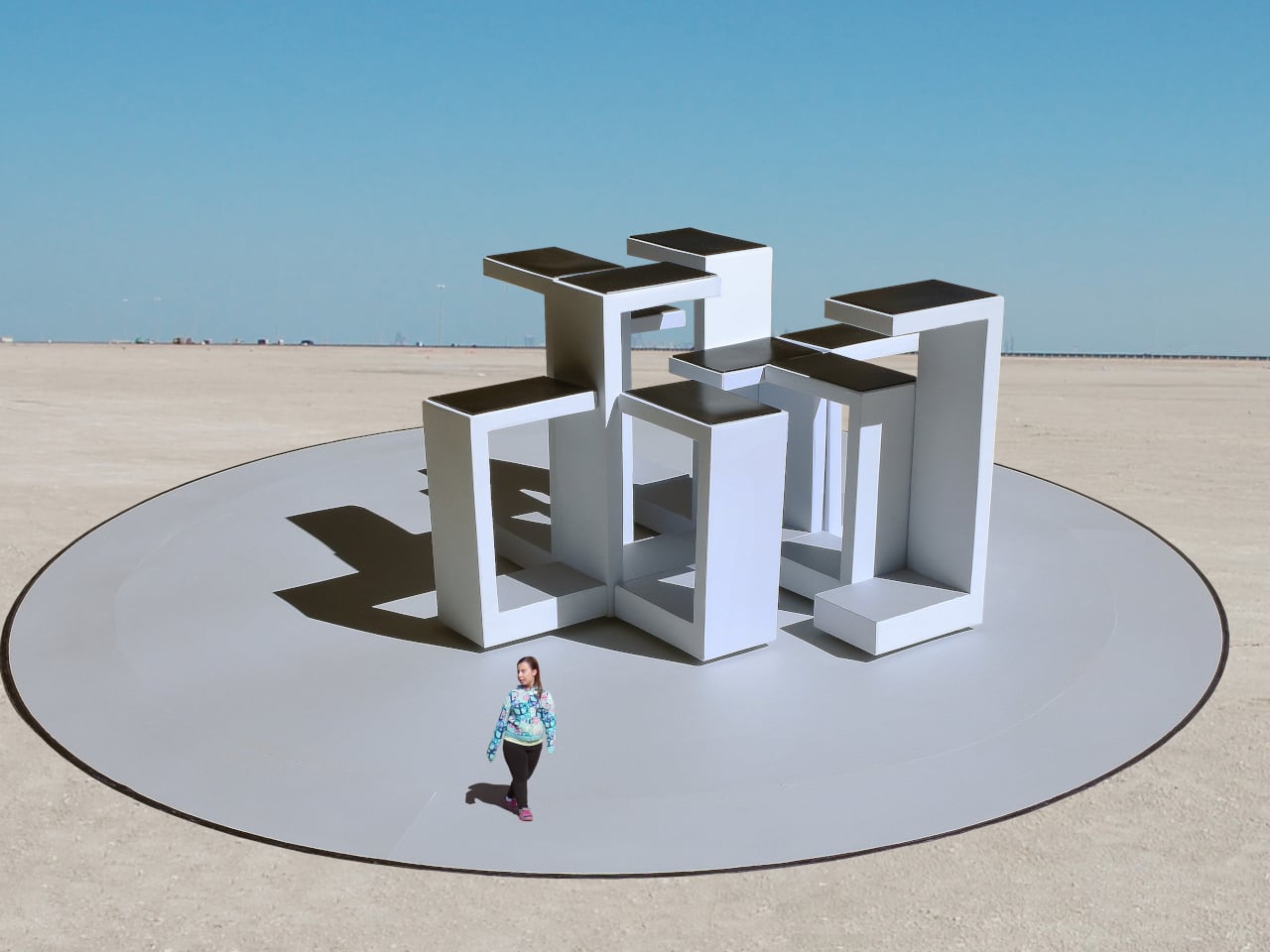
Each section combines a floor, wall, and roof in a large C-shaped profile, like a little shelter with its sides left open. Two versions stand about 10 and 14 feet tall, both four feet wide. Place several together, and those simple shapes could become passages or covered pockets. Separate them again and the same pieces would offer a different place to wander.

Designer: Michael Jantzen

Of course, rearranging those sections wouldn’t mean asking someone to wheel them into position. Each floor would contain its own computer, sensors, motors, wheels, and battery, allowing the entire unit to travel forward, backward, or sideways. The wall and roof would move with it. The robotics aren’t proposed as equipment that builds the installation and then leaves; they’d remain part of the architecture.

Rather than following one permanent floor plan, the modules would use artificial intelligence to decide on their positions through majority agreement. The proposal doesn’t explain how they would evaluate possible arrangements, though. A gap between two units could become a passage, while several facing one another might define a gathering spot. The same pieces could give visitors different ways to use the space.

The roof would do more than shelter whoever stands beneath it. Solar cells on top would recharge the battery inside the floor, keeping the proposed power supply within each moving section. It’s a sensible place to collect sunlight, but the project doesn’t specify how much energy movement would require. Keeping these large pieces in motion isn’t as simple as putting solar panels overhead.

A black perimeter would mark the robots’ territory, containing their movements within a circular arena. Sensors would watch for people or objects entering that space, pausing every module until the area is clear. You wouldn’t be expected to dodge a moving wall while exploring. The intended sequence is straightforward: the pieces rearrange when empty, then hold their positions while visitors are inside.

That rule still needs engineering before anyone could walk in. Detecting a visitor isn’t the same as stopping safely, and the project doesn’t establish braking distances or structural performance. Raised floor sections also need an accessible way in. These are questions for a working installation, rather than reasons to dismiss the idea, but the concept drawings don’t settle them on their own.

For visitors, the pause could make staying put part of the interaction. Sit inside a sheltered corner for a while, and that particular arrangement would remain available until everyone leaves. A later group might find a different route or gathering spot. Someone lingering to finish a conversation would therefore be doing something rather unusual: keeping a version of the architecture from disappearing yet.

The post This Robotic Pavilion Concept Would Change Its Layout Only When Empty first appeared on Yanko Design.
  •  

Orbit Clock Concept Lets You Pick Up Its Hour and Minute Markers

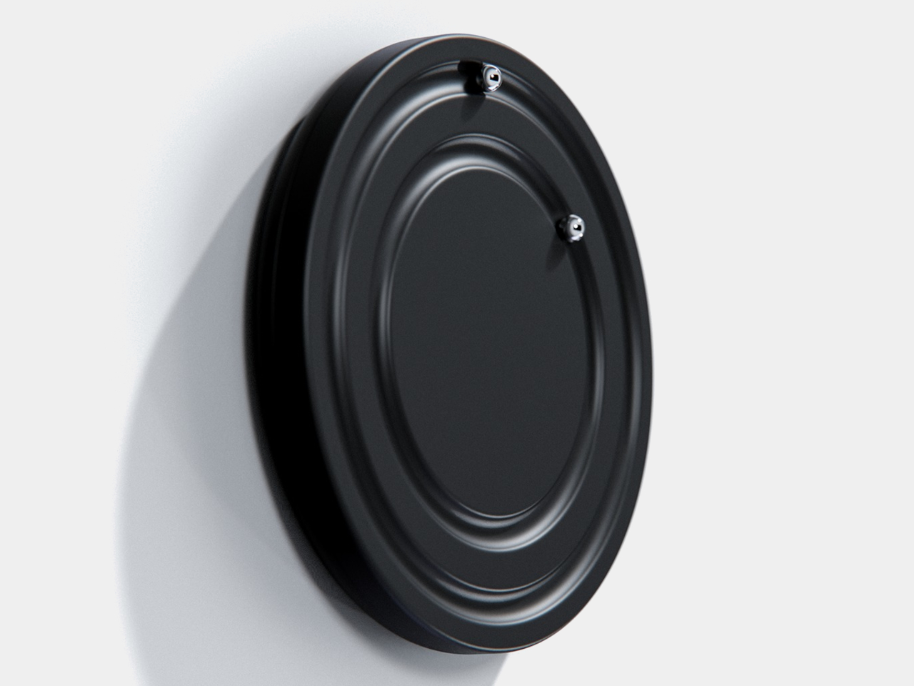
Clocks have become so familiar that we barely think about what their hands are doing. They point to positions around a circle, a habit that Orbit keeps while removing the hands themselves. This ultra-minimalist clock concept replaces them with two magnetically held metal spheres, giving time a physical presence you can reach and remove, instead of leaving it behind protective glass.

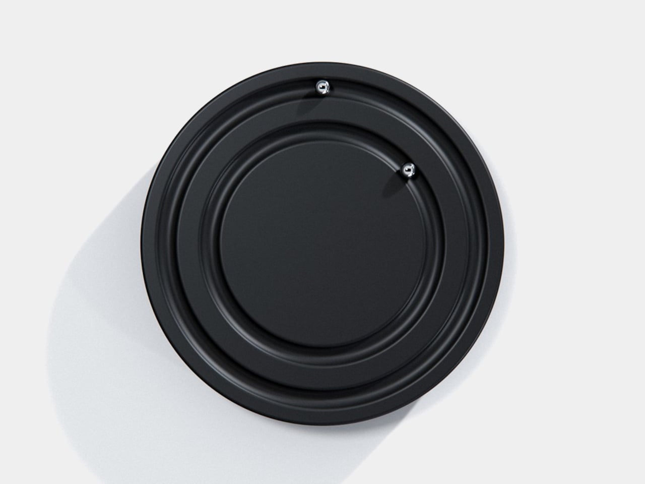
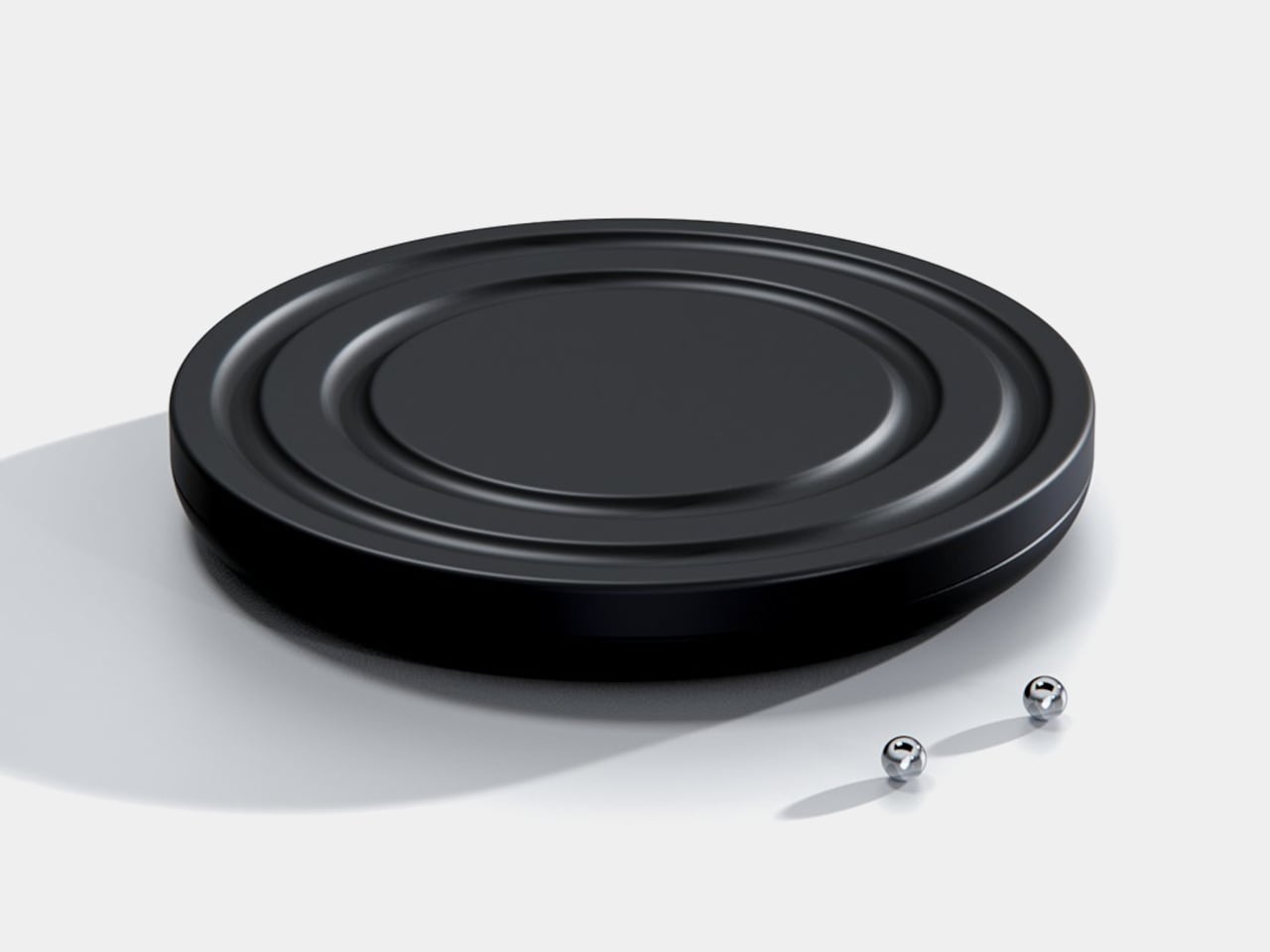
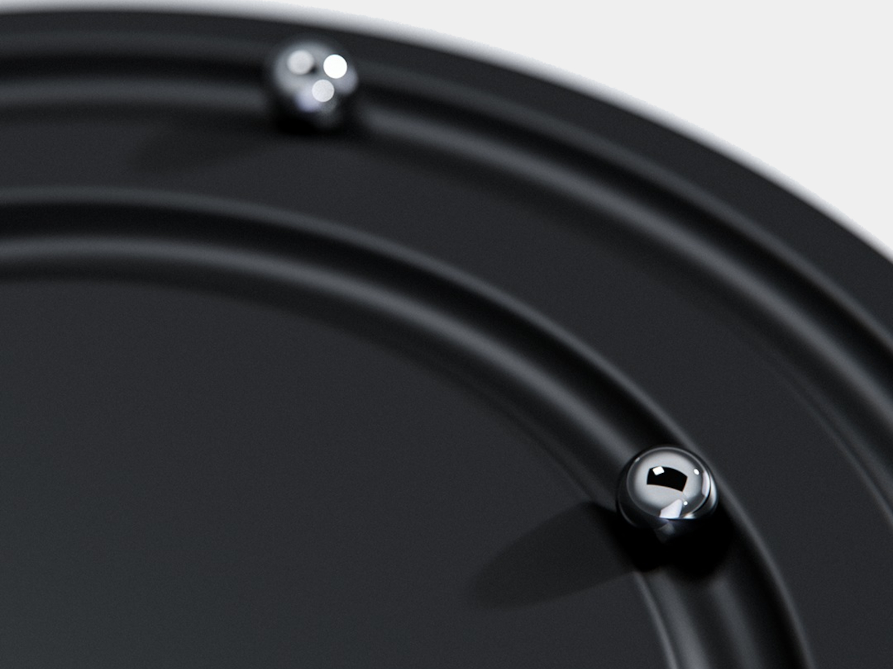
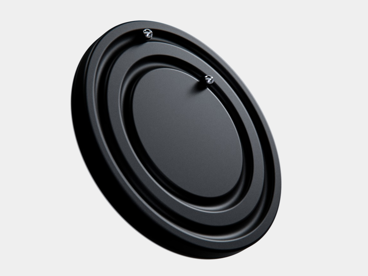
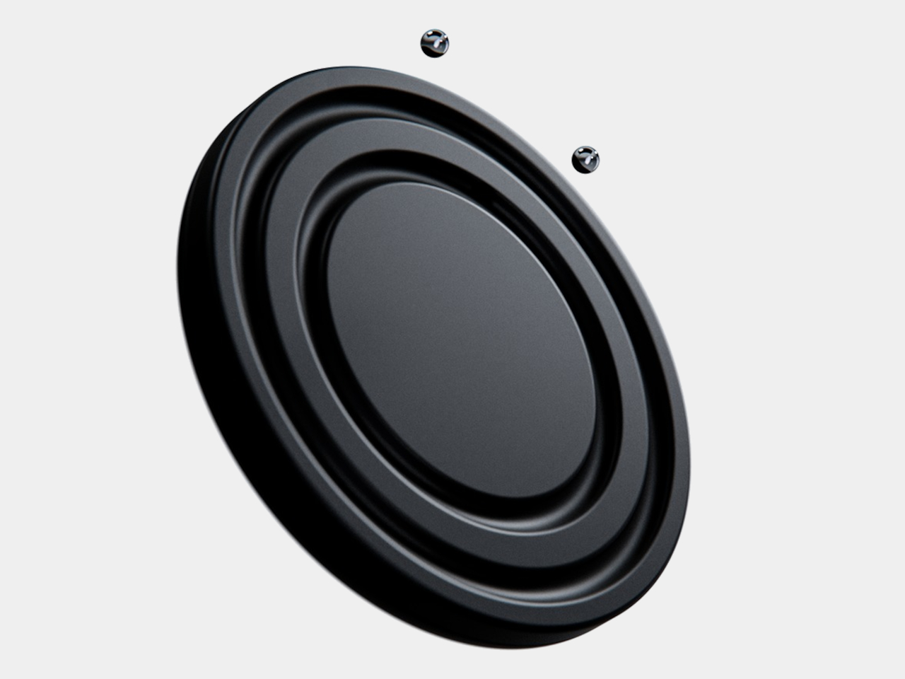
The face is a dark circular disk with two concentric recessed tracks, each carrying a polished sphere. There’s no cluster of numerals or central pin to interrupt the surface. Instead, the grooves give the small bearings separate paths, while their reflective finish contrasts with the darker background. The clock’s relief supplies the detail that printed markings would normally provide on a conventional dial.

Designer: Liam de la Bedoyere (boredeye.design)

One sphere represents the hours and the other the minutes, preserving the basic logic of an analog clock. You still look for positions around the face, only without a pair of hands connecting those positions to the center. That makes the idea less unfamiliar than it initially sounds. Reading it doesn’t call for learning an entirely new code, although some adjustment seems inevitable.

Of course, removing all those markings comes with a compromise. Estimating the hour should be simpler than judging an exact minute on an unmarked circle. Orbit could suit a living room where a glance is enough to keep track of the afternoon. Checking how many minutes remain before catching a train might make you rather grateful for the numbers on your phone.

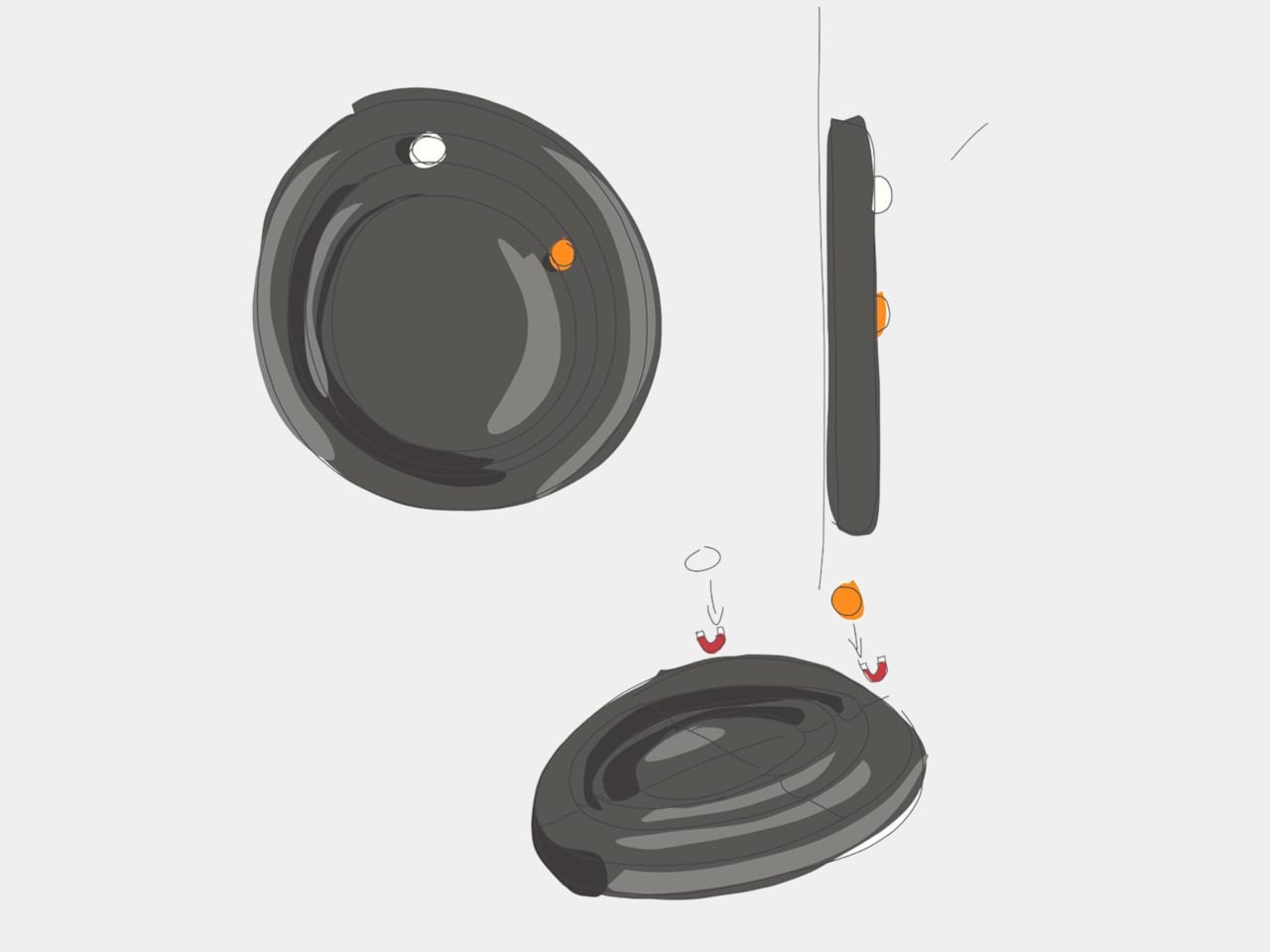
The more unusual part is that the spheres aren’t permanently trapped in their tracks. Magnetic attachment is intended to let you lift each one away and put it back, adding a tactile interaction to an object usually left alone. That’s a surprisingly playful detail for such a restrained design, especially when removing both markers would leave the clock with nothing to tell you.

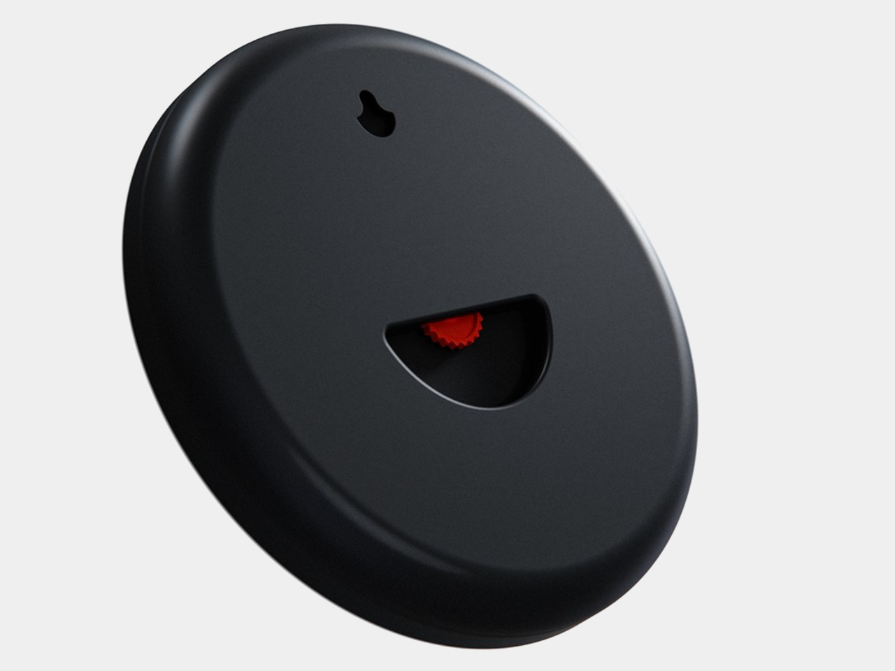
There’s a sculptural quality to the body itself, with a rounded outer edge and circular channels that give the black surface depth. A rear keyhole slot provides for wall mounting, keeping that face upright without a separate stand. The name Orbit feels appropriate here, with two small spheres occupying rings around an empty center, rather than hands meeting at a shared pivot point.

Orbit remains a concept, so there’s no established price or availability to weigh against those compromises. Its detachable markers do suggest a rather different relationship with a wall clock, though. Reach for the face and you’re handling the things that tell the time. Just make sure those little spheres don’t end up somewhere less useful, such as behind the living room sofa.

The post Orbit Clock Concept Lets You Pick Up Its Hour and Minute Markers first appeared on Yanko Design.
  •  

A Reading Light That Actually Clips to Your Hair, Not Your Book

Any bookworm worth their salt has experienced reading a book under the covers with a flashlight after their parents said it was time for lights out. When we got older and no longer had to follow a bedtime, we switched to bedside lamps or clip-on reading lights. Those two options, however, come with their own set of problems. A bedside lamp isn’t always the most comfortable option, especially when you need to change positions while lying down. A clip-on light, meanwhile, adds extra weight to the book, and you may have to keep adjusting it as you read.

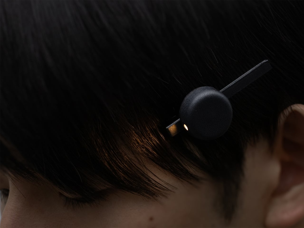
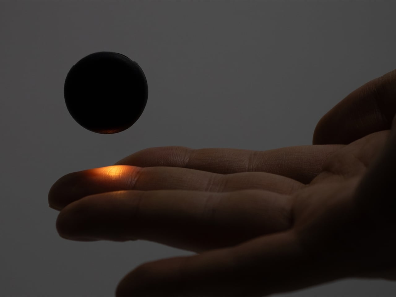
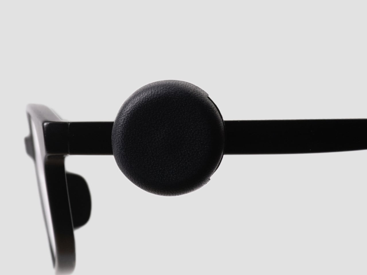
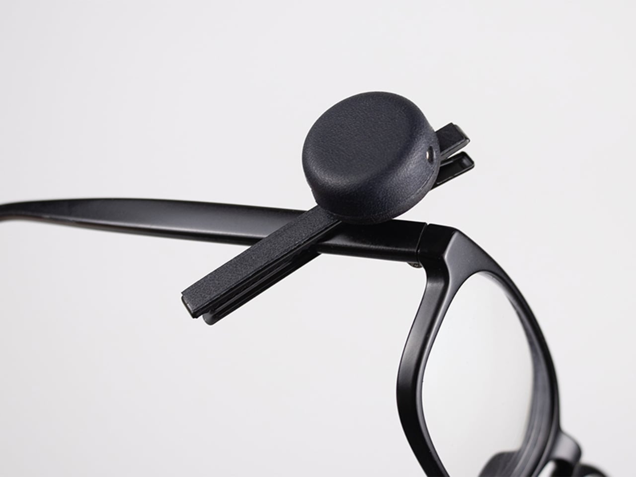
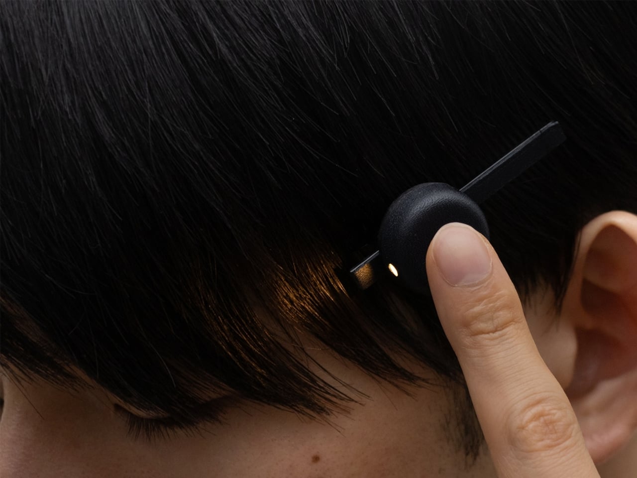
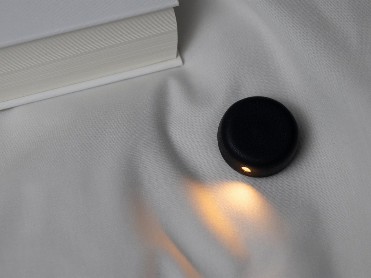
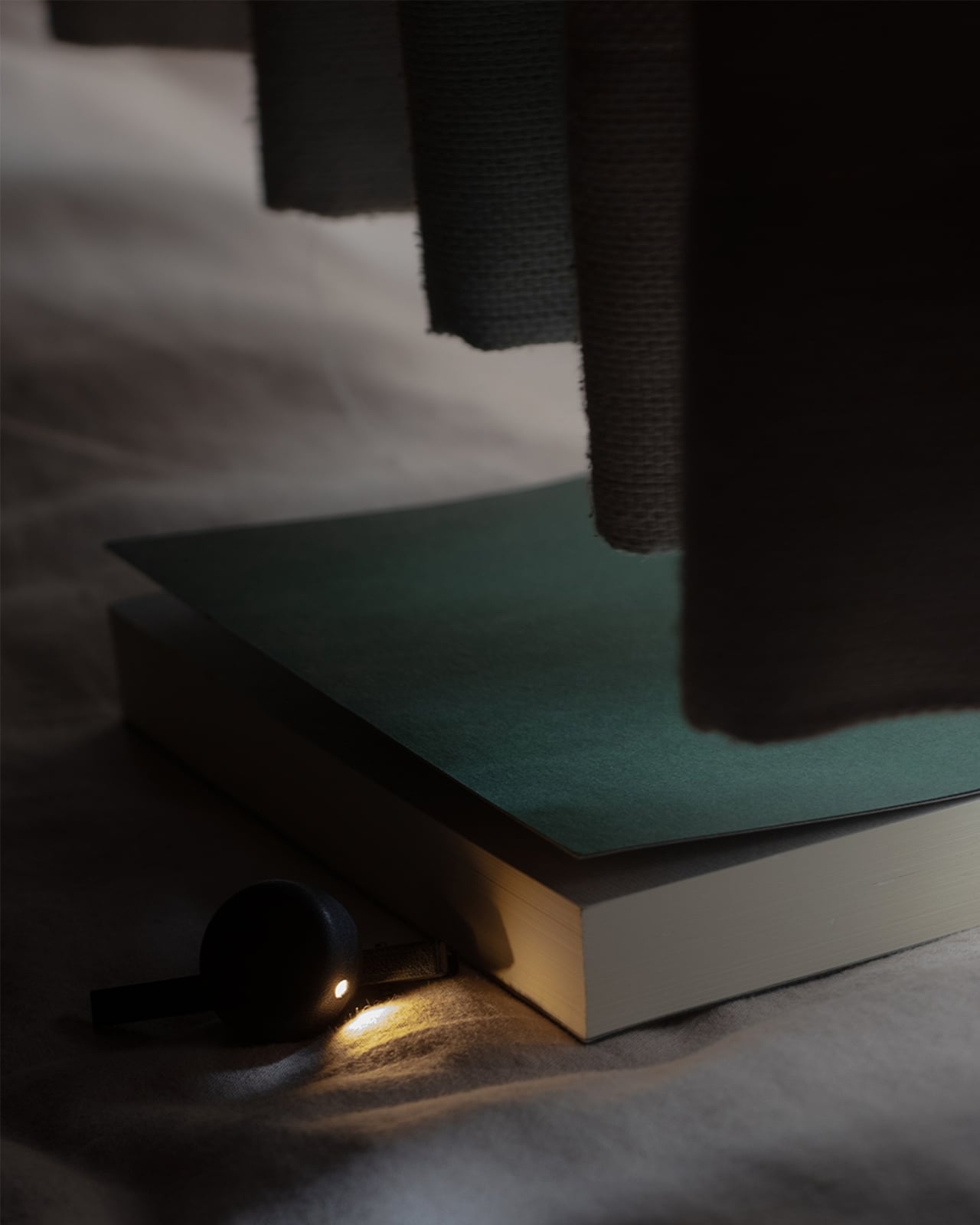
This is the problem that Ryo Matsuoka seeks to solve with the concept for the Wearable Reading Light. As the name implies, it’s a light that you actually wear, so it moves with you as you read while lying in bed. The small light attaches magnetically to a clip worn in your hair. It can also attach directly to eyeglass frames made of magnetic metal, though not to every pair of reading glasses. You can angle the light toward your book while reading with the room lights off before going to sleep.

Designer: Ryo Matsuoka

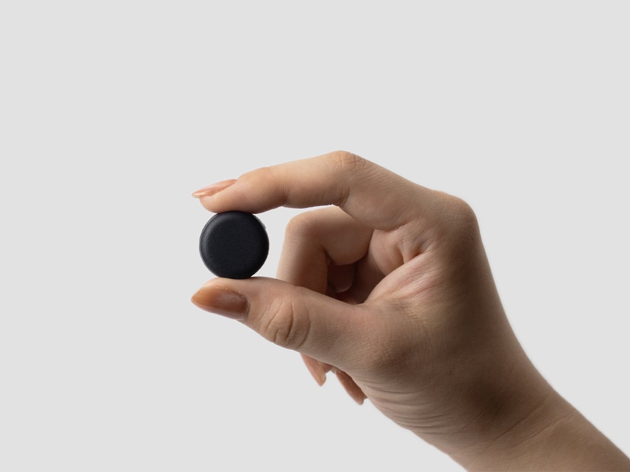
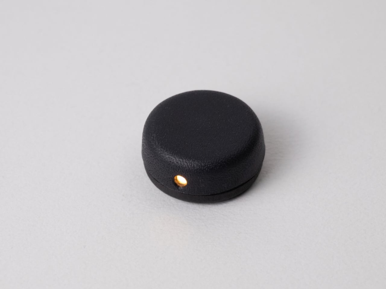
The light has a wet-formed leather exterior, with three-dimensional shaping that gives it a smooth, rounded form. It doesn’t really look like your typical reading light; it’s designed to look more like a small accessory. The light unit measures 24 × 24 × 12 mm (about 0.94 × 0.94 × 0.47 inches) and weighs only 4.5 g (about 0.16 ounces), so it adds very little weight to what you’re wearing. Its compact shape also keeps it from looking like a headlamp when it’s clipped into your hair.

The indigo-dyed wood is another detail worth noticing. Together with the leather, it gives the device a more crafted appearance than you might expect from a small electronic gadget. Matsuoka has kept the technology out of sight beneath the leather, leaving the exterior clean and simple. In the photos, you mostly see a dark, rounded form and the small opening where the light shines through.

You can adjust the brightness across three levels, since the amount of light you want may depend on your surroundings or personal preference. There’s a hidden button to switch the light on, while a touch sensor controls the dimming. Those controls matter for something this small: you can make adjustments without adding a prominent switch to the design. The magnetic connection also lets you change the light’s angle, so you’re not stuck with one position if you shift around in bed.

It uses a replaceable coin battery, such as a CR1632, rather than a built-in rechargeable one. That means you won’t have to stop reading to charge it, provided you have a spare battery on hand. Matsuoka chose this approach with long-term use in mind: when the battery runs out, you can replace it instead of retiring the whole light because its rechargeable battery has degraded. The leather and wood were selected with that same idea in mind, as materials the designer expects to age well over time.

There’s also a dedicated storage case made from the same wet-formed leather and wood. It holds both the light and the clip, giving these tiny pieces a place to go when you’re done reading. That’s a practical touch for an object small enough to disappear among the things on a nightstand or at the bottom of a bag. It also makes the light feel like a complete design rather than just a clever attachment.

What makes the Wearable Reading Light interesting isn’t simply that it’s small. It’s that Matsuoka has moved the light away from the book altogether. You can hold a paperback without a clip tugging on its cover, and the light can stay with you when you change positions. For anyone who likes to end the day with a few pages in bed, that could make a familiar routine a little more comfortable. The concept doesn’t promise to replace every bedside lamp, but it offers an alternative for readers who have never quite found the right place to put one.

The post A Reading Light That Actually Clips to Your Hair, Not Your Book first appeared on Yanko Design.
  •  

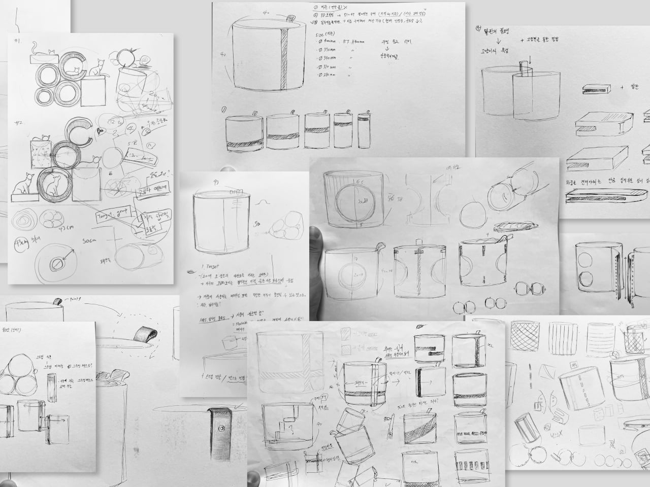
Bloom Built a Cat Tower Around the Cat You Haven’t Got Yet

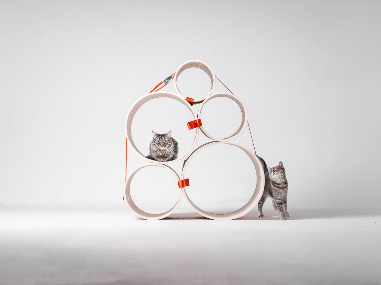
A kitten might be happy with a hideaway, but give it a few months and that same nook starts looking cramped. Add another cat, and a single perch becomes contested territory. Bloom takes that problem literally, building a cat tower from separate cylindrical modules that can be arranged as its occupants grow. It starts small instead of demanding space for a feline family.

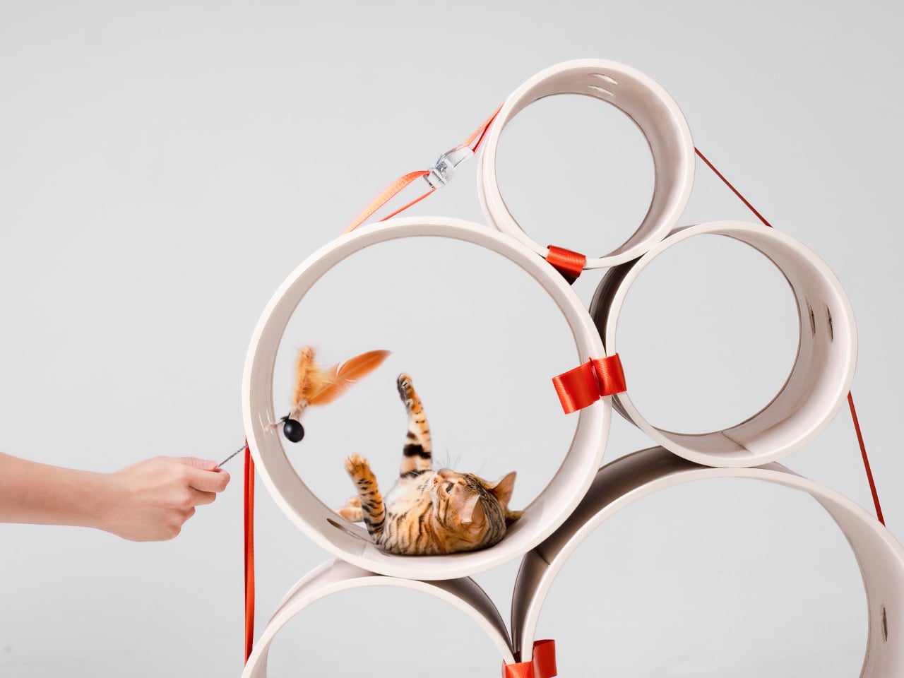
Most cat towers arrive as a collection of platforms, posts, and houses, whether your cat needs all of them or not. Their bulk can make a living room feel as if it has been furnished around the pet. Bloom swaps that predetermined silhouette for a cluster of open tubes, each one a place to curl up, climb through, or watch the room.

Designers: Joonseo Choi, Taewoon Kang

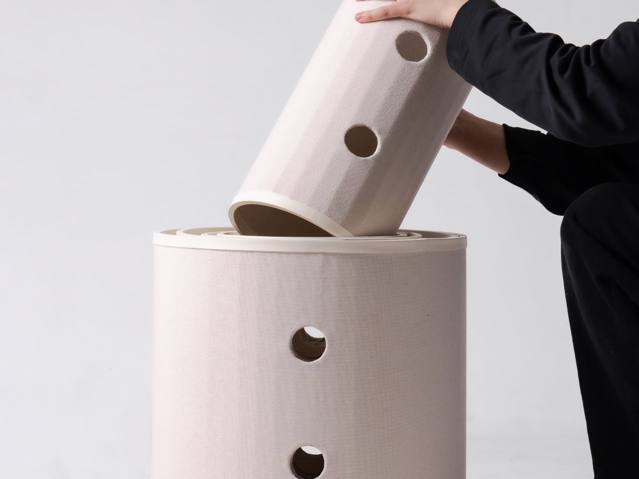
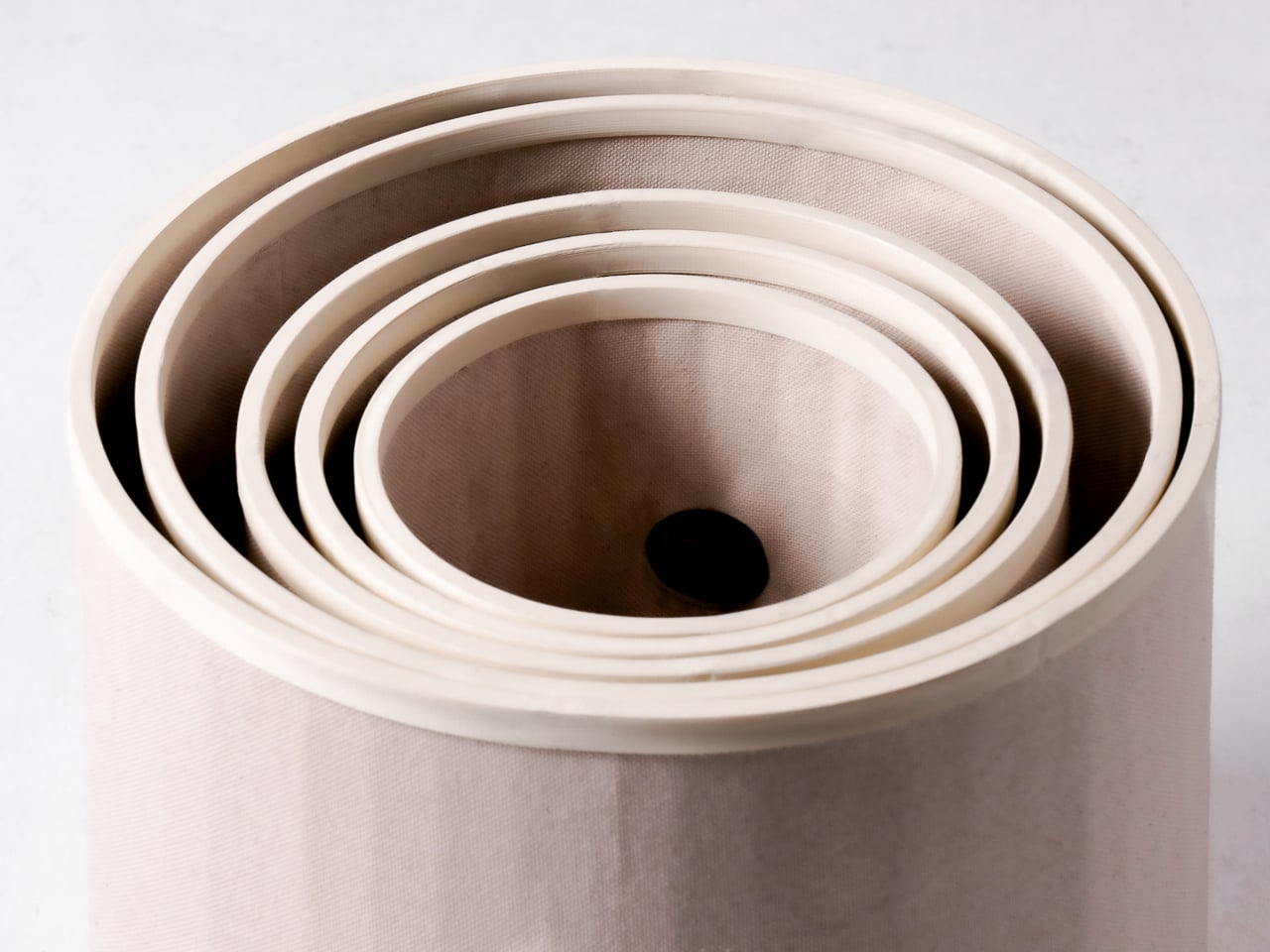
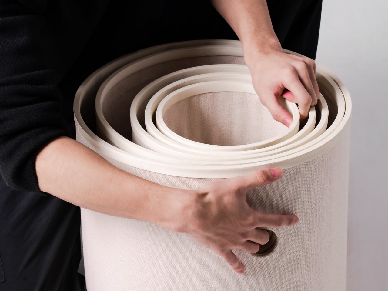
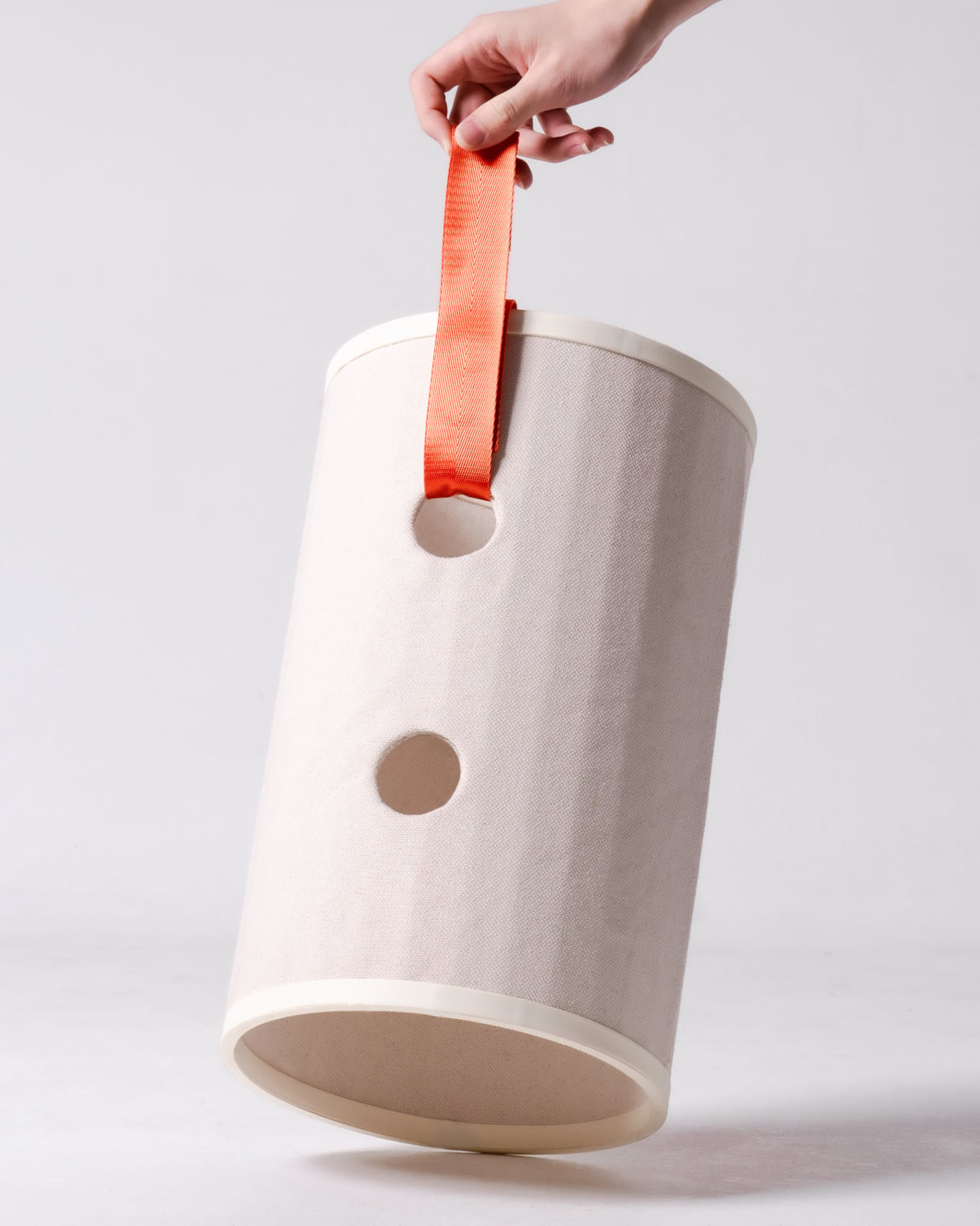
Those cylinders come in several diameters, so arranging them feels closer to stacking play objects than assembling pet furniture. A smaller cat can settle into a tighter opening, while a larger one has room to stretch out in a wider tube. The circles also give Bloom its character: soft, repeating forms that can take different shapes instead of committing your room to one tower.

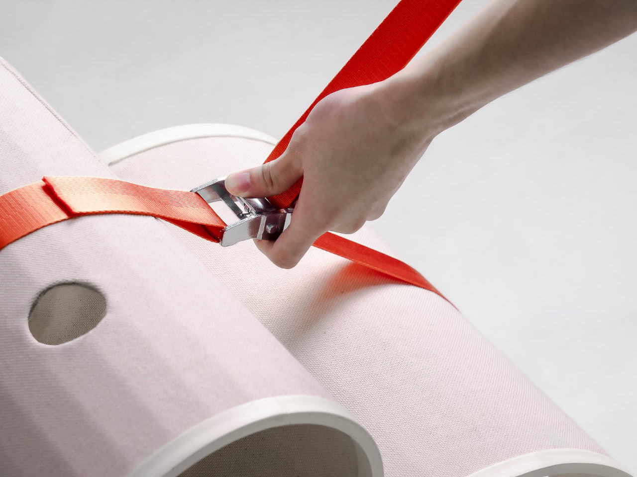
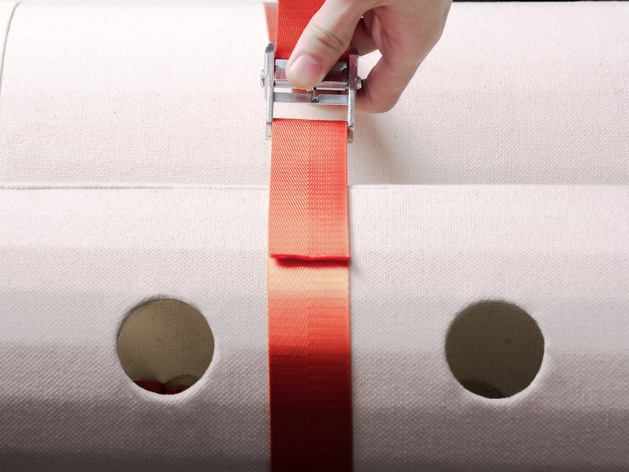
Of course, loose tubes wouldn’t make much of a cat tower once the occupants started leaping about. Bloom uses orange straps to hold the modules together, with hook-and-loop fastening that makes them easier to attach and detach. The straps add a punch of color to the pale cylinders, but their important job is letting you change the arrangement without committing to a rebuild.

You might begin with two tubes near the sofa, then add another when your kitten starts climbing above everybody’s heads. If a second cat joins the household, a wider cluster could give each animal somewhere to pause without fighting over the same opening. The exact layout can follow the cats, rather than asking them to adapt to whatever configuration came in a box.

The holes along the sides serve another purpose beyond giving the straps somewhere to attach. Slide a toy toward one, and a cat tucked inside has something to investigate, while you get a way to join the game without reaching into the tube. It’s a detail, but it turns the enclosed space into somewhere for interaction rather than just another hiding place.

There are still questions a concept can’t answer. A tall arrangement would need to stay steady under a cat’s weight, especially if one launches itself at an upper opening. Bloom doesn’t specify load limits or explain how every possible configuration would be supported, so that flexibility shouldn’t be mistaken for unlimited stacking. For now, its flexibility remains an intriguing, unproven design proposition.

Still, Bloom understands something about cats that a fixed tower often misses: the creature you bring home won’t always be small, and it might not always be alone. Its tubes can be rearranged as that story changes, while its openings leave room for curiosity. The furniture doesn’t need to grow overnight; it can take shape alongside the animals that claim it.

The post Bloom Built a Cat Tower Around the Cat You Haven’t Got Yet first appeared on Yanko Design.
  •  

A Pocket Concept Built to Catch Design Ideas Before They Get Away

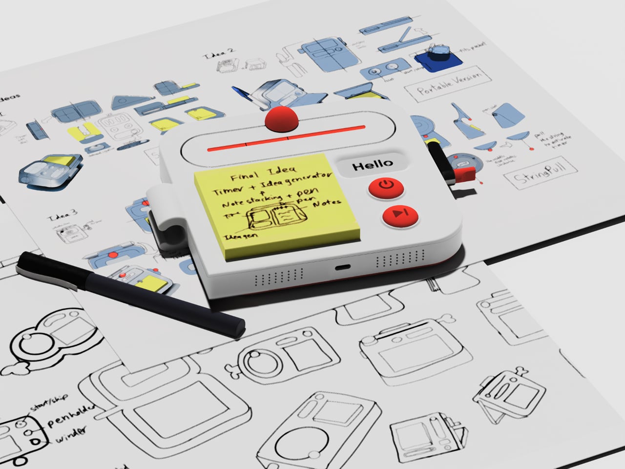
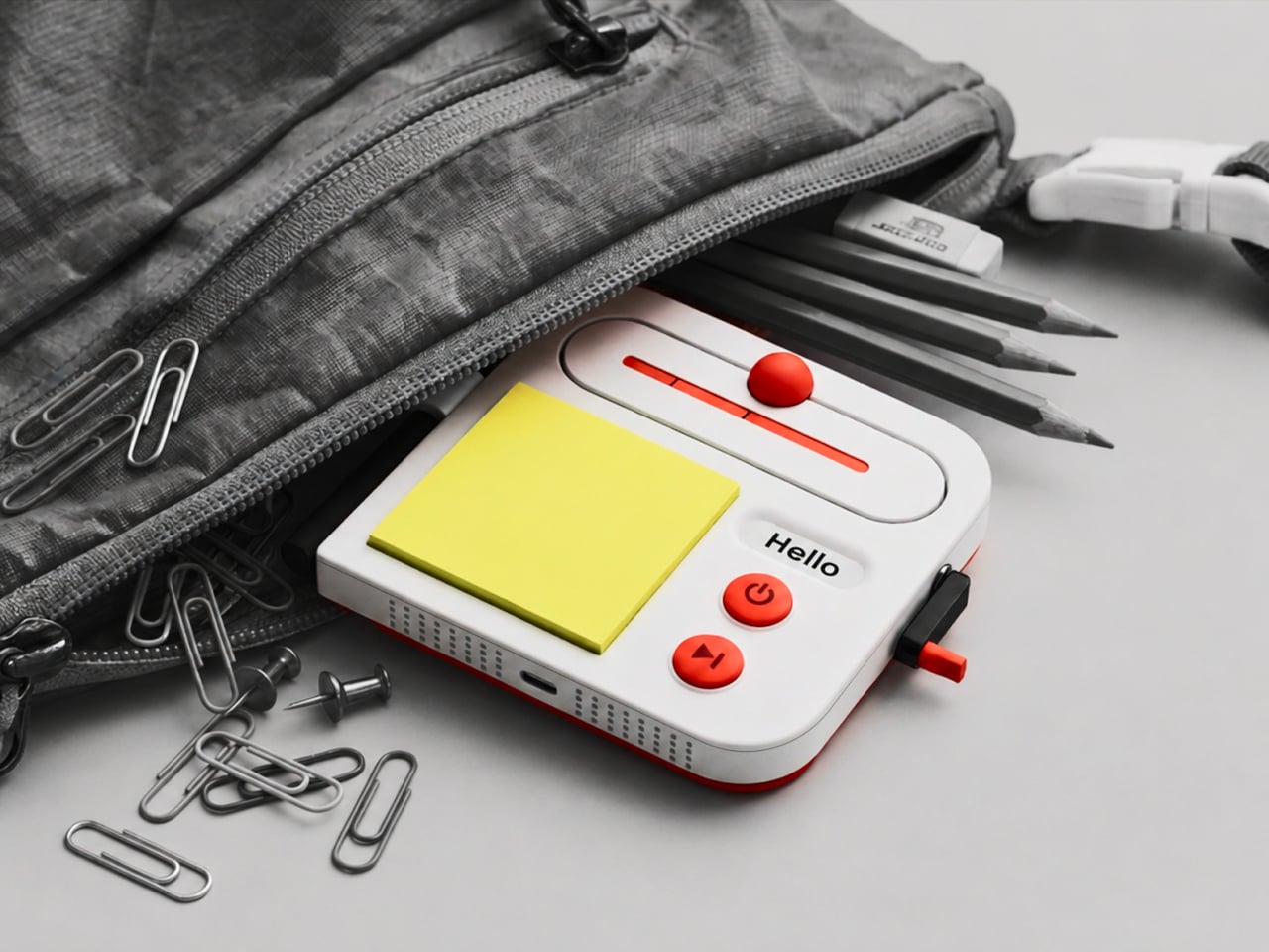
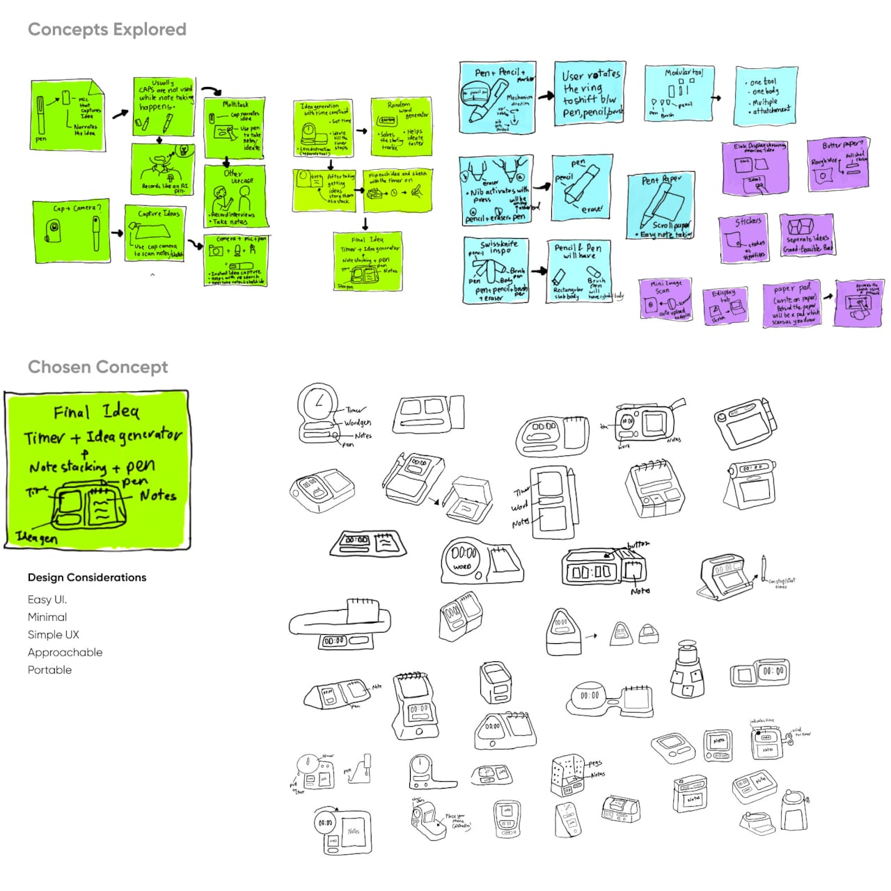
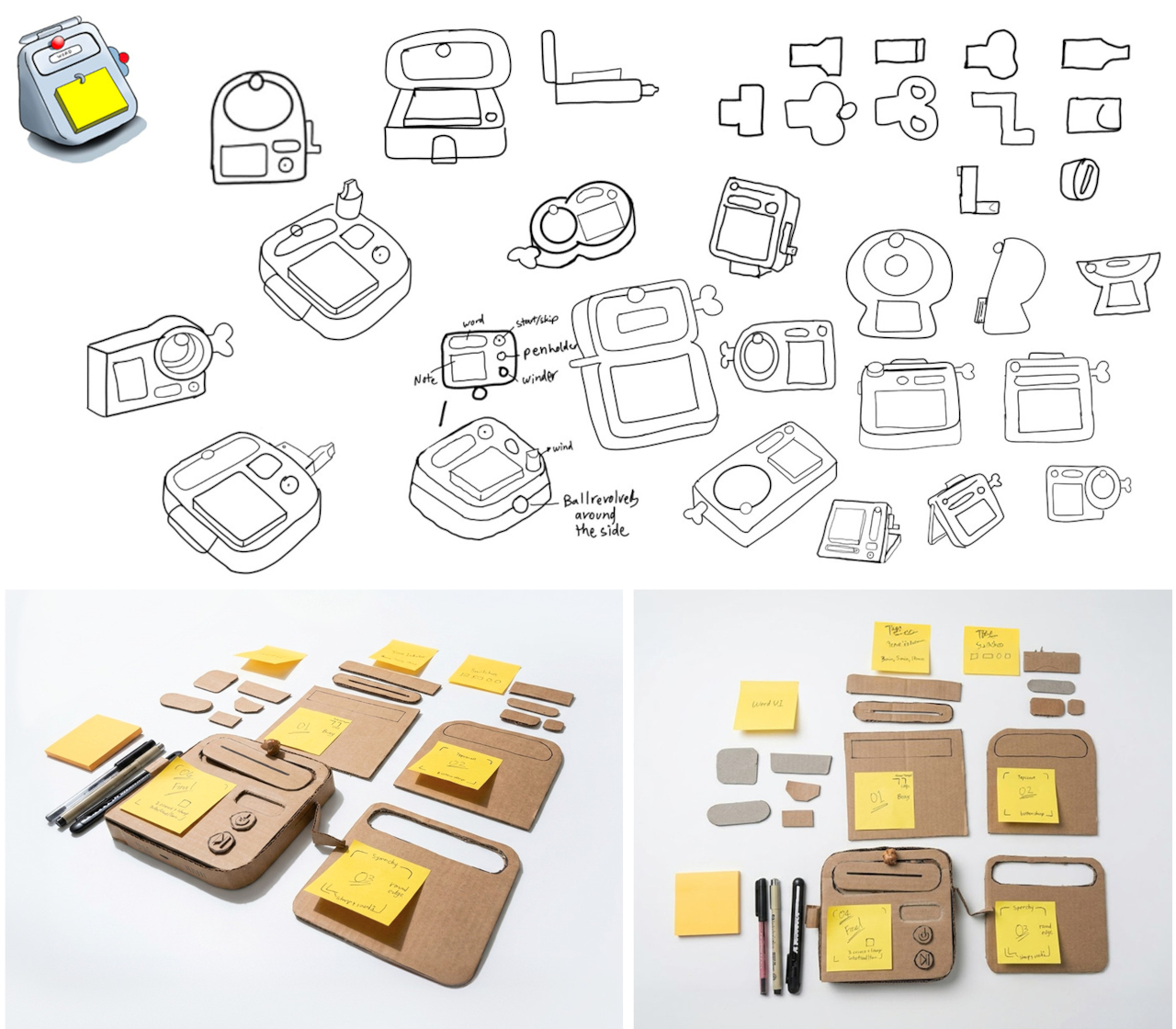
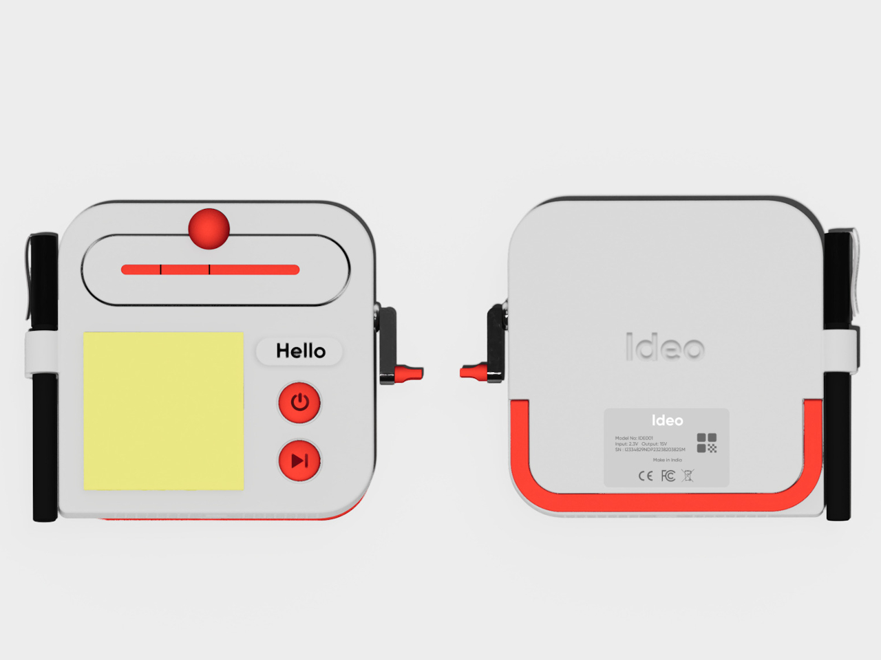
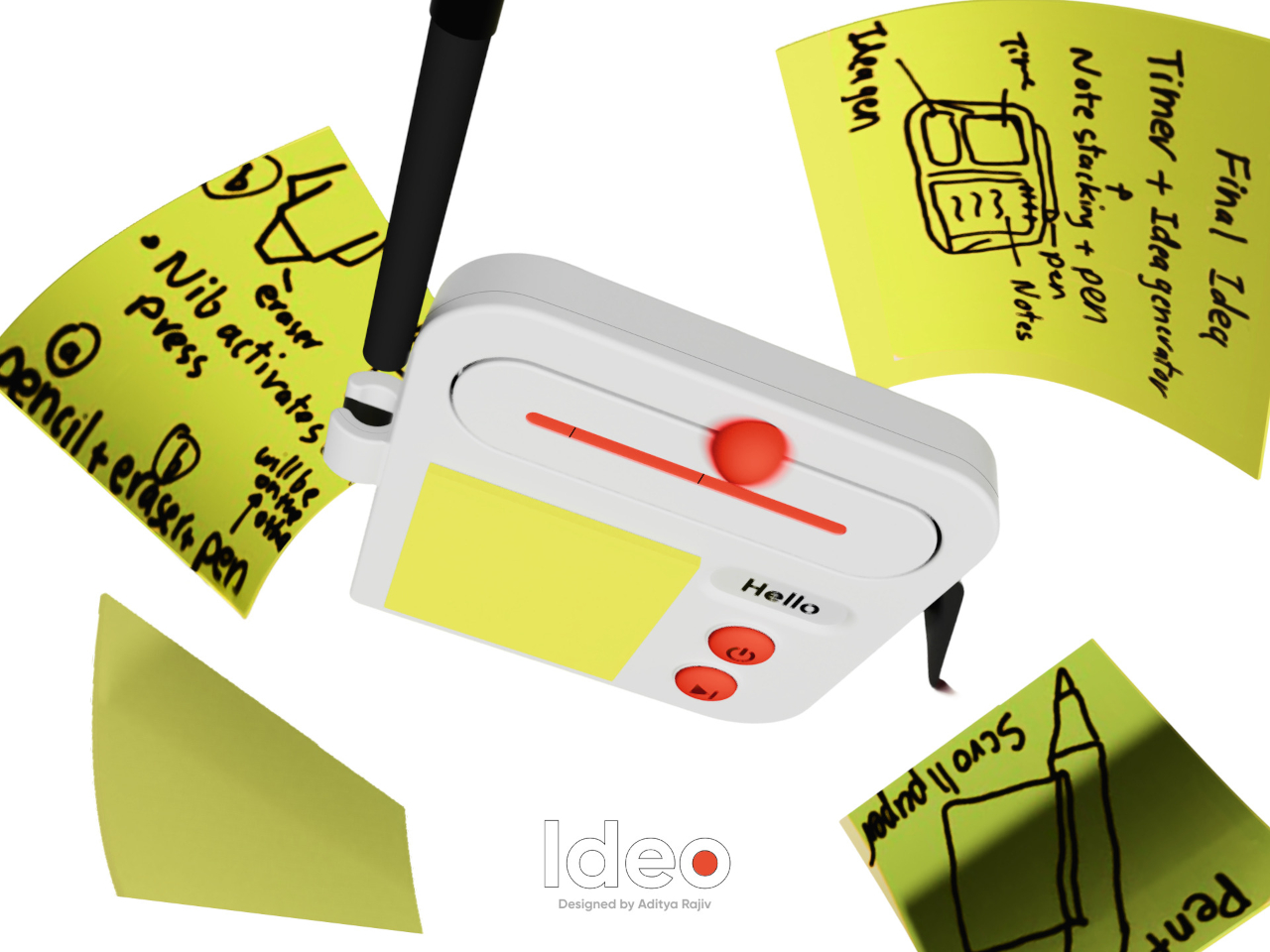
Good ideas don’t always wait until you’ve found the right pen and an empty page. For industrial designers, a quick sketch can turn into a note, then vanish while they’re looking for something to write on. Ideo is a pocket-sized concept that puts a sticky-note pad, a crank-set timer, and a random-word prompt in one place, giving those fleeting thoughts somewhere to land.

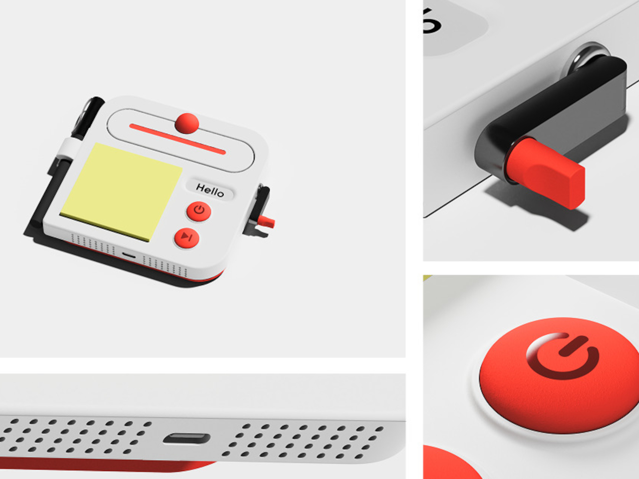
The trick isn’t to replace a sketchbook or ask a computer to finish your thinking. It’s to keep the small tools for getting started within reach. A pen clips to one side of the rounded body, while a stack of sticky notes takes up much of the front. You can jot down a shape, a measurement, or a question before it slips away.

Designer: Aditya Rajiv

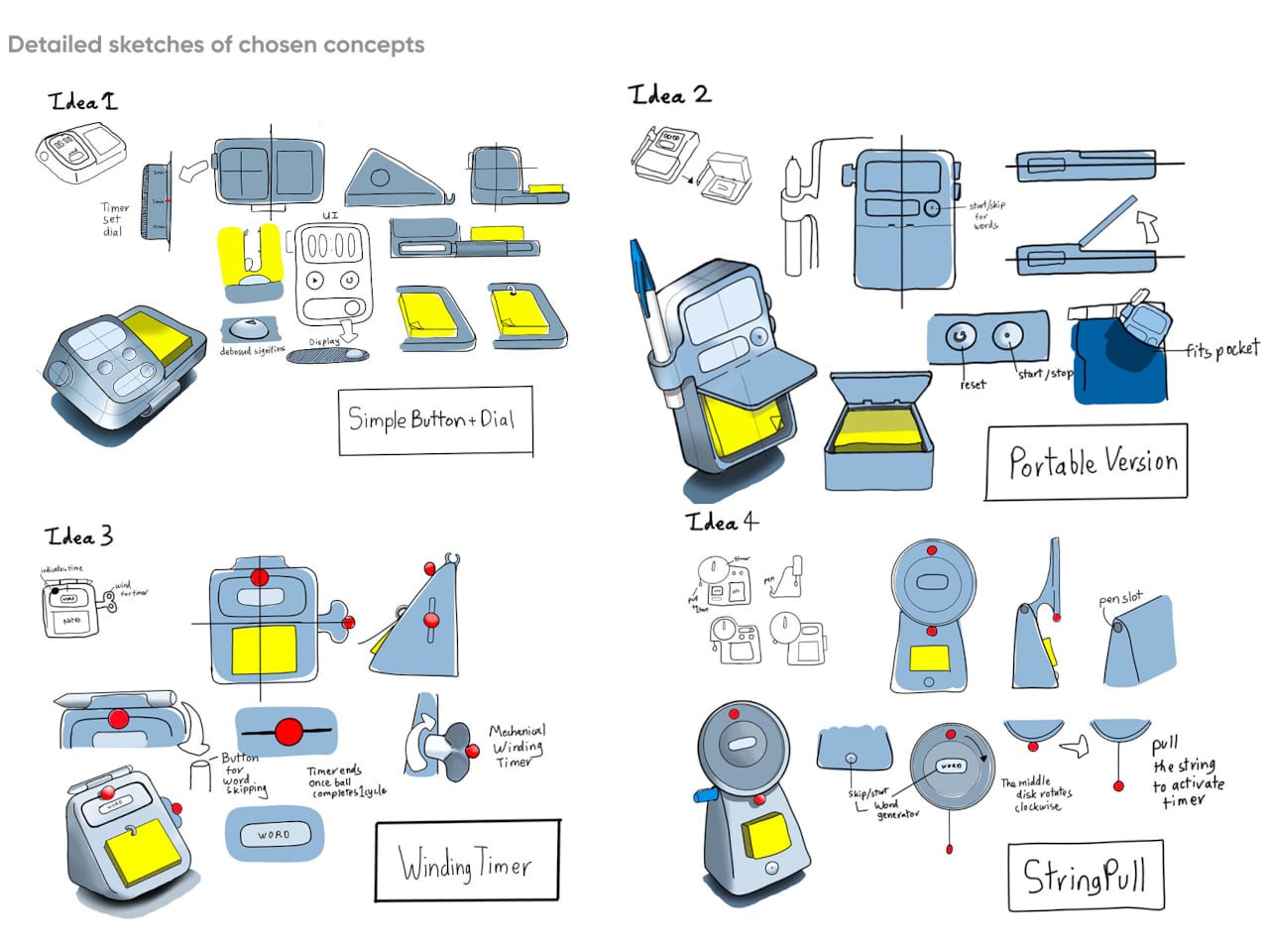
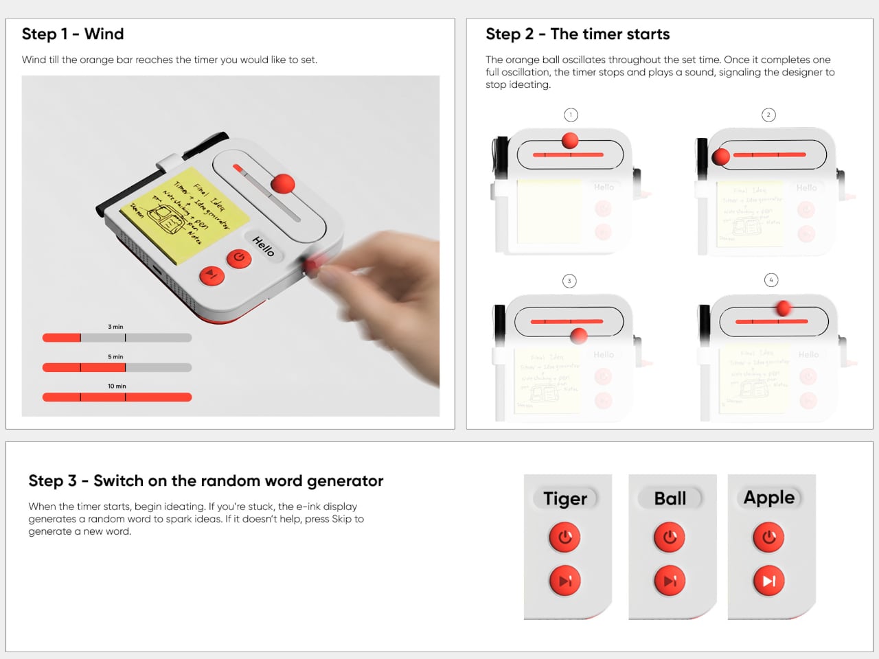
Then there’s the timer, which makes the device a little stranger than an ordinary stationery holder. Turn the crank on the side until the orange bar reaches your chosen duration, and a bright ball moves along the track as time passes. When its cycle finishes, the concept calls for a sound. That gives a short sketching session a visible beginning and end.

A blank note can be surprisingly intimidating when someone asks you for three different directions before lunch. Ideo responds with an e-ink display that presents a random word, such as “tiger” or “apple,” to nudge your thoughts somewhere unexpected. If the word doesn’t help, a physical button skips to another. This isn’t some AI that tries to take over your thinking process but, rather, a nudge to keep your pen moving.

During a workshop, you might have a few minutes to sketch a handle before the group moves on to another idea. The timer keeps that deadline obvious, while the note stays attached to the device until you’re ready to place it beside other sketches. Having the prompt nearby could help when your first drawing feels too much like the one you made yesterday.

There’s a playful contrast between the quiet white housing and its red controls, with the yellow notes taking up nearly half the front. The broad knob and two large buttons look approachable rather than like the controls on a complicated drawing tablet. It almost looks like a child’s toy, which is the perfect idiom for playful and unhindered ideation.

The concept understands a small but familiar delay: the moment between having an idea and finding a place for it. A notepad and pen handle that first step, while the timer and word generator give you a reason to start drawing instead of staring at a blank sheet. Ideo is still a concept, of course, but the scramble for a pen makes its arrangement seem practical.

The post A Pocket Concept Built to Catch Design Ideas Before They Get Away first appeared on Yanko Design.
  •  

Google’s Fix for One-Handed Typing Is a Rolling Belt of Letters

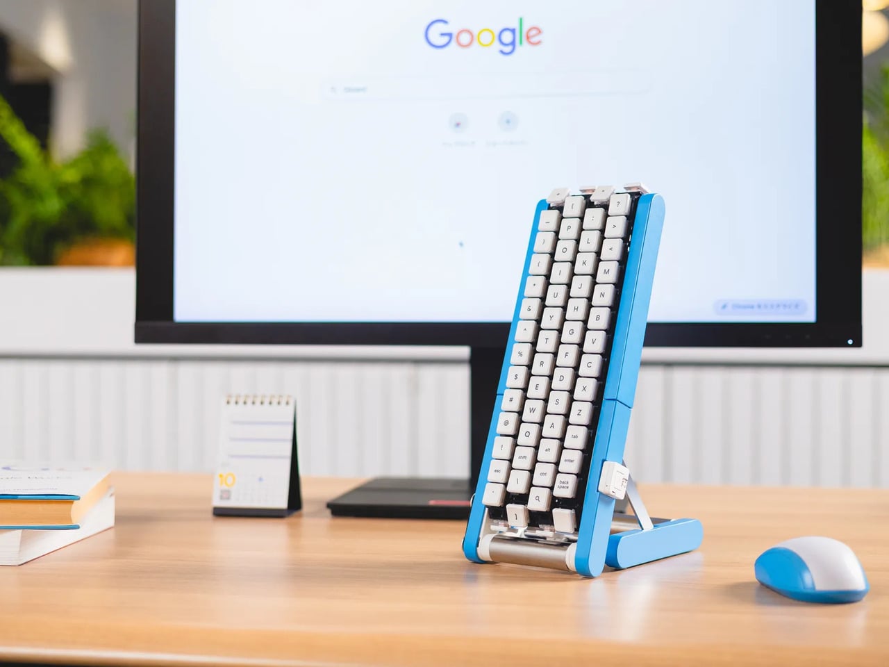
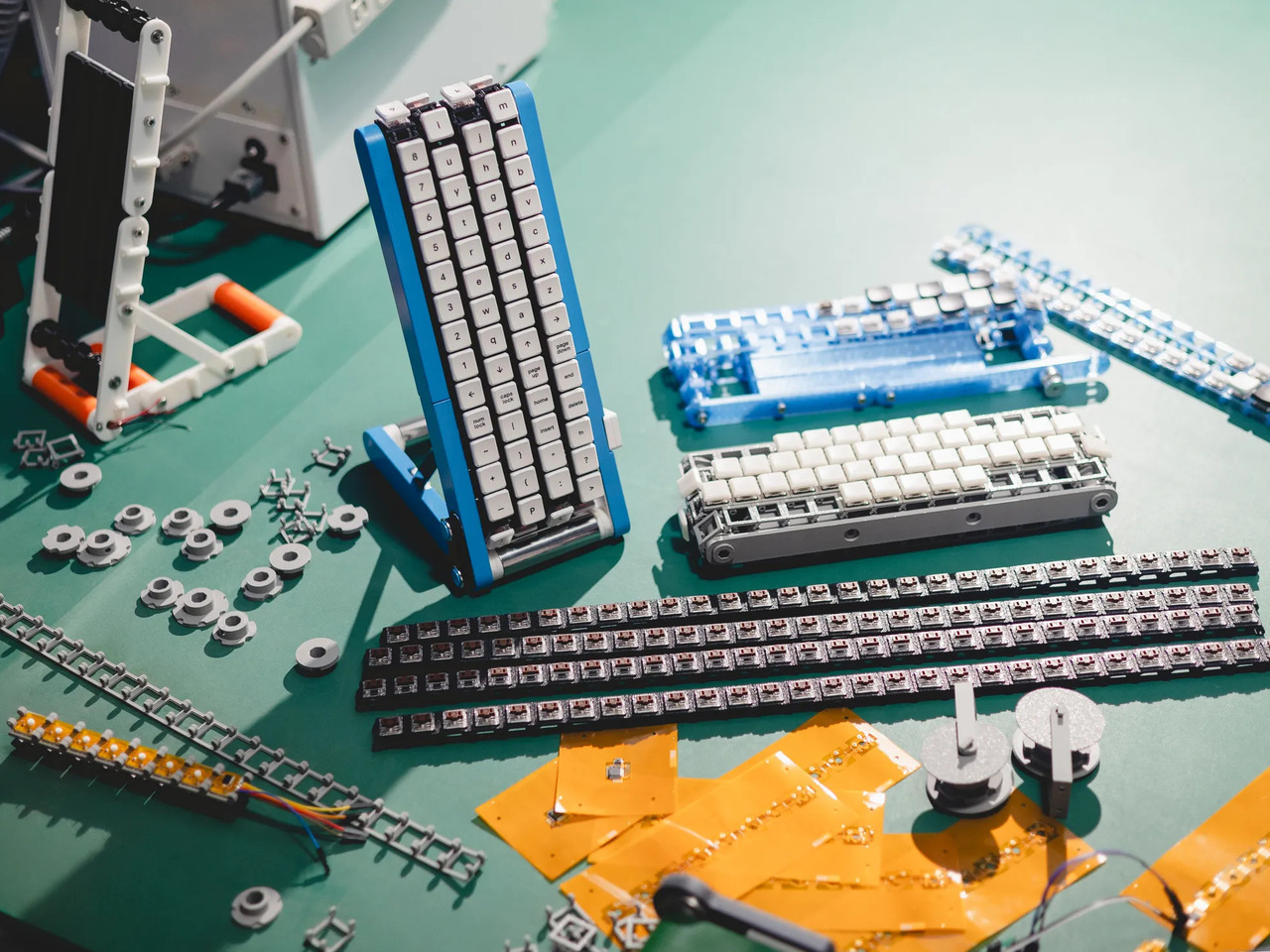
Typing with one hand usually means stretching a finger across a keyboard while the other hand holds a drink or works a mouse. Google’s Gboard team has a wonderfully impractical fix: put the keys on a conveyor belt and let them come to you. Its Rotating Keyboard stands upright on a desk, asking your finger to stay put while the letters keep moving.

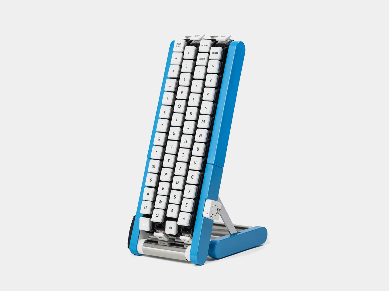
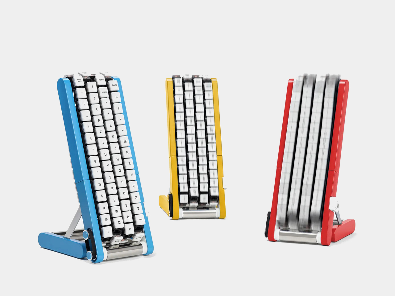
Regular keyboards assume your hands will travel between stationary keys, a reasonable arrangement that has survived decades of typing. Google reverses that relationship by mounting rows of keycaps on loops that travel around rollers. The tall blue frame and angled stand make the moving assembly feel closer to a miniature factory machine than a computer peripheral, which is probably part of the joke.

Designer: Google Japan

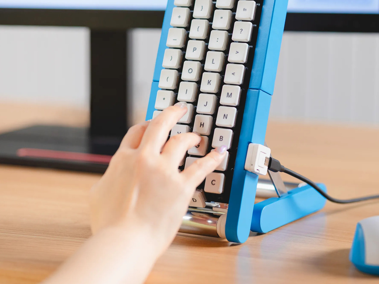
Instead of looking down for a letter, you watch for the right key to arrive and press it as it passes. Google says each belt carries 29 keys and can input both uppercase and lowercase letters. That might let one hand stay near the same spot, though it also turns typing into a timing exercise, especially when the next letter takes its time coming around.

Imagine answering an email with a cup of tea in your free hand. On a conventional keyboard, you’d either put the cup down or hunt for letters one finger at a time. Here, the moving keys do the traveling while you wait at the front of the machine. Google also suggests using your free hand on a mouse, which sounds suspiciously like extra work.

There’s an oddly earnest design lesson underneath the silliness. Questions about ergonomics often begin with who a familiar object was made for, and Google has taken that thought to a ridiculous extreme. The upright arrangement might use less horizontal desk space than a full keyboard, but it trades that footprint for height, moving parts, and the need to watch every passing key.

Google plays along with its own premise, floating ideas for faster movement, longer belts with more characters, shorter versions for phones, and different colors. None of those variations is a promised product. Even the keyboard itself isn’t headed for stores; the team has released open-source plans for a similar device instead. That keeps the joke open to anyone curious enough to build one.

The date is part of the gag, too. Google chose October 1 as a nod to the familiar 101-key keyboard, rather than waiting for April Fools’ Day. It’s the team’s 15th keyboard proposal, continuing a habit of treating ordinary typing as a problem that needs an absurdly elaborate solution. A conveyor belt is hardly the first thing most people would try.

You’re unlikely to write a novel by chasing letters around this contraption, and that isn’t really the point. Google has built a physical answer to a question no keyboard maker was asking: what if the keys did all the moving? It’s a ridiculous way to type an email, but an effective way to notice how much we expect our fingers to do.

The post Google’s Fix for One-Handed Typing Is a Rolling Belt of Letters first appeared on Yanko Design.
  •  

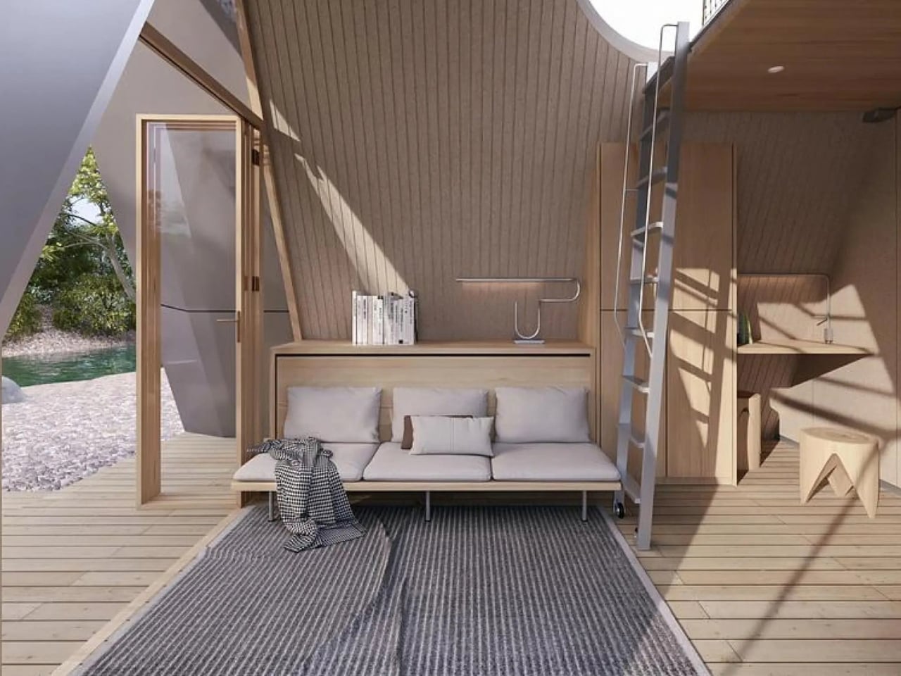
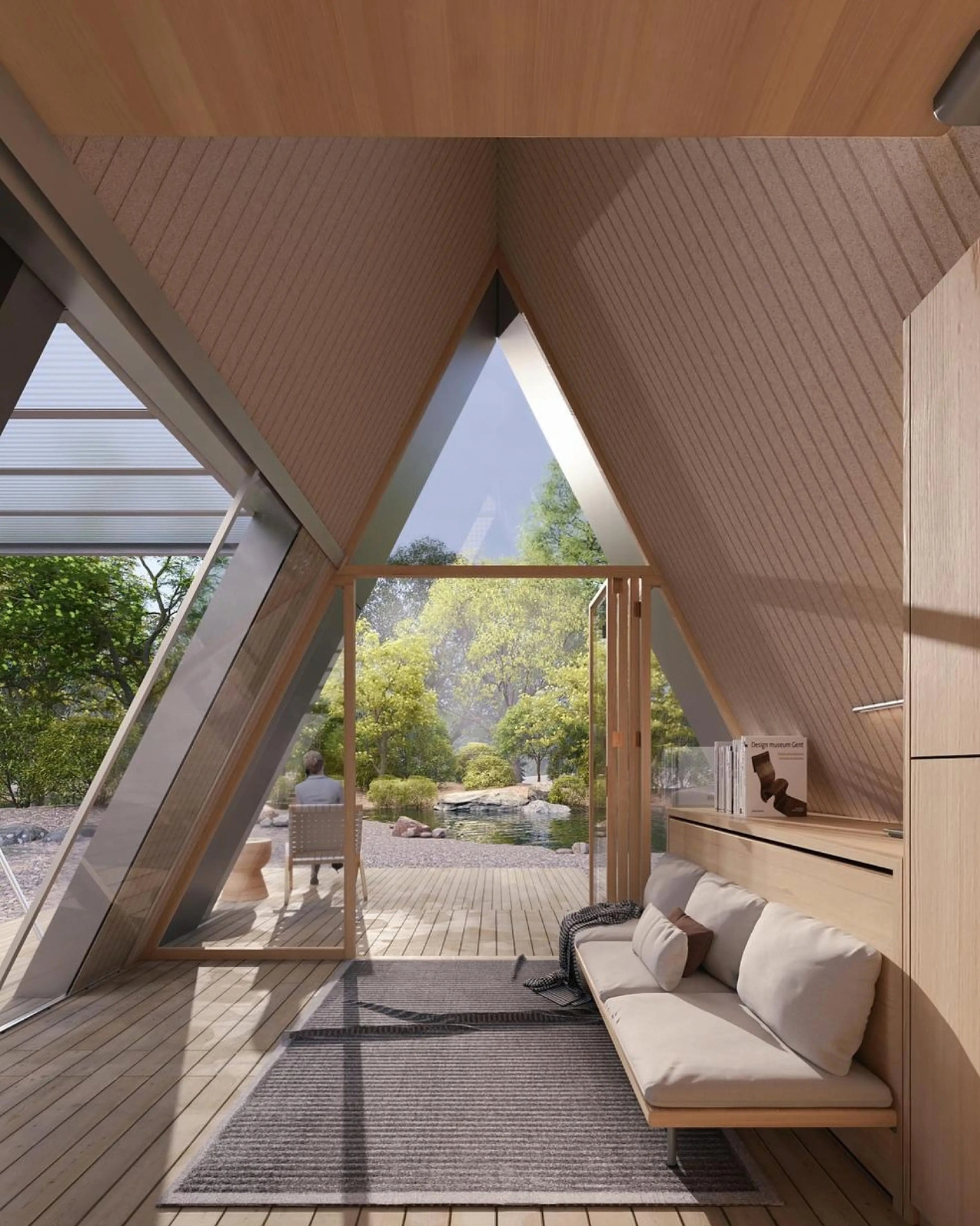
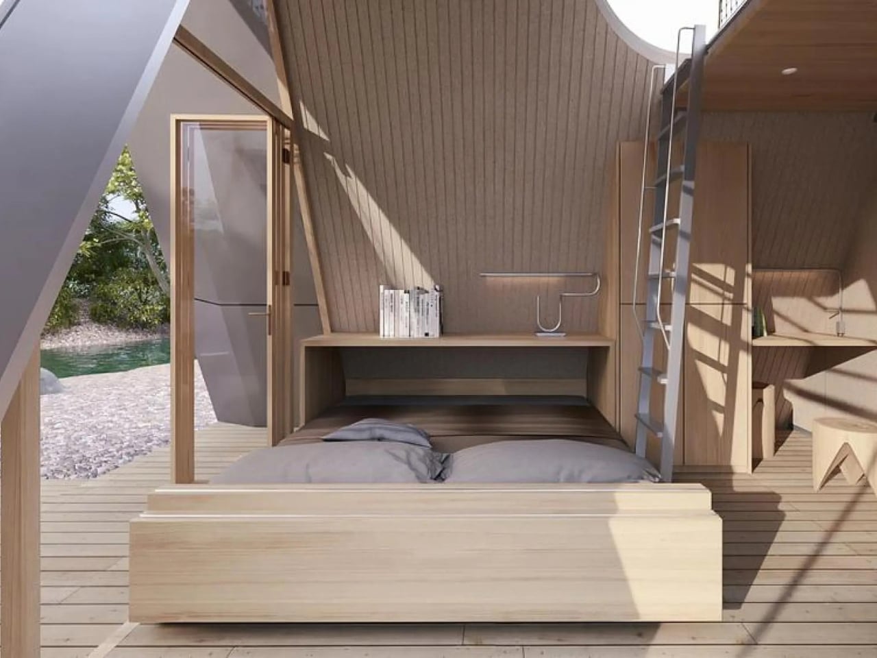
A Folding Tiny Home That Refuses to Feel Like Camping

Camping has always come with a quiet trade-off. You get the freedom of being anywhere, but you give up the comfort of being somewhere. Tents leak, campers feel cramped, and cabins can’t move with you when the season changes. Atelier Lune, a US-based design studio, just built something that refuses to make you choose.

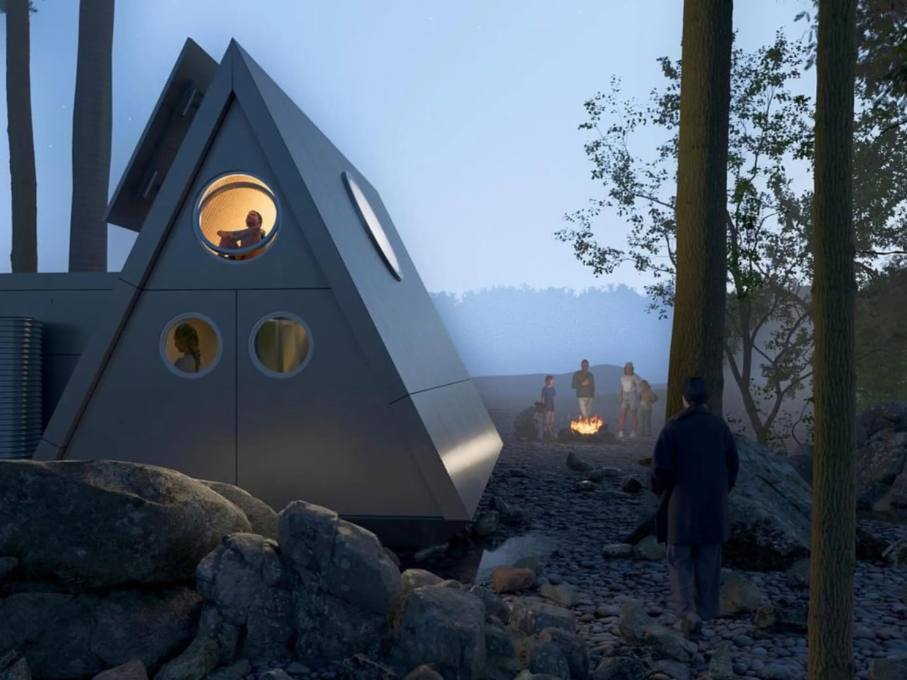
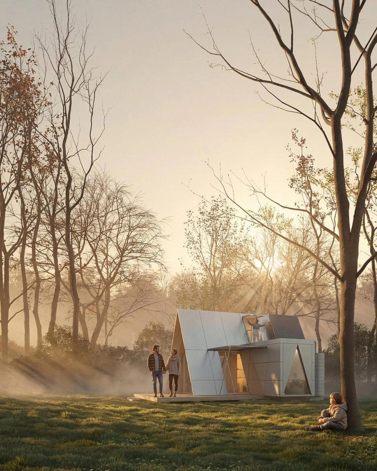
It’s called Camping House. The idea is simple to say and genuinely hard to execute: a home that tows behind a standard SUV, unfolds like a tent within a couple of hours, and then behaves like real architecture once it’s standing. Architect Na Shen, who previously worked at Gensler and Zaha Hadid Architects before starting her own studio, designed the whole structure around that tension between mobility and permanence, and you can feel that intention in every decision she made.

Designer: Atelier Lune

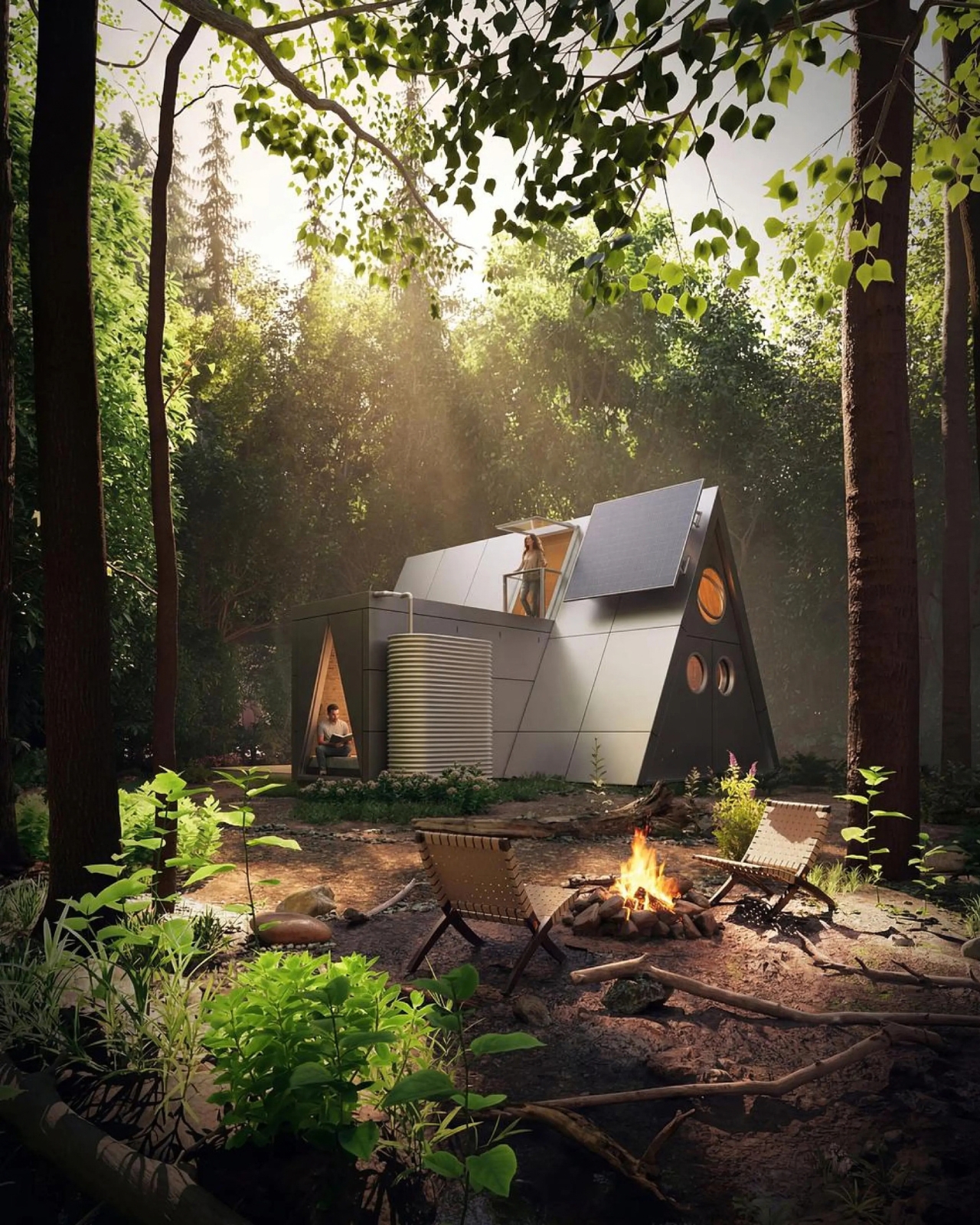
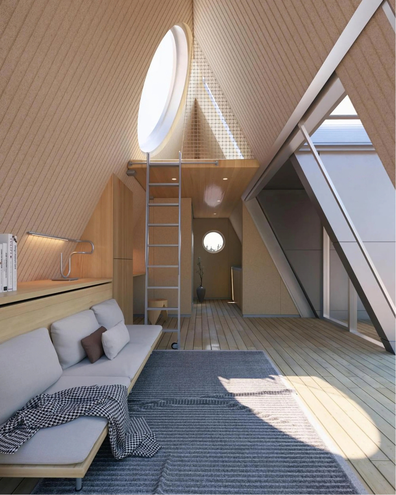
That last part is the actual innovation. Plenty of tiny homes are mobile, but most of them stay rigid once you get them there, basically a smaller box on wheels. Camping House does something different. The structure is a folding shell that fans open on-site into a steep A-frame, then locks into place with weather-sealed joints and insulated panels built to hold up through an actual winter. The A-frame isn’t just an aesthetic choice either. It’s structurally efficient, sheds rain and snow naturally, and creates a dramatic interior volume that reads much larger than the footprint suggests.

The system is built around three modules the studio calls Ports. The Residential Port handles living and sleeping, with furniture that flips from day mode to night mode in seconds. The Utility Port carries a real kitchen and a real bathroom, not a camper-van compromise version of either. The Extended Port clips on when you need a workspace, storage, or room for guests. You arrive, stabilize the base, release the hinges, and the shell swings open into a two-level interior that looks nothing like what fit on the trailer an hour earlier. The joinery and panel system that makes this possible is where most of the real design work lives, hidden in the hinges and seals rather than announced by the exterior.

What makes this feel like it’s arriving at the right moment is who it’s actually for. Remote work untethered a lot of people from a single address, and the appetite for spending real time outdoors, not just weekend camping but seasonal living, has grown alongside it. Camping House is designed with that shift in mind: off-grid solar integration, rainwater harvesting, passive cross-ventilation through a solar chimney, and no permanent foundation required. It leaves the ground beneath it essentially undisturbed, which matters if you’re setting up somewhere ecologically sensitive, or if you just don’t want to explain a poured foundation to a national forest.

There’s a practical honesty to designing for departure instead of designing for permanence. Most residential architecture asks how a building holds its ground. Camping House asks how a building lets go of it. Multiple units can even couple together into small clusters, which opens the door to uses beyond personal travel: disaster relief housing, temporary shelter during regional housing shortages, or small eco-tourism outposts that can be struck at the end of a season without leaving scars.

None of this is on the market yet. It’s a concept, and concepts have a habit of staying concepts. But two people can reportedly assemble it in under two hours, which is a modest ask for what you get in return: a structure with actual dignity, not a glorified pop-up tent with delusions of permanence.

The bigger idea Camping House is testing is whether shelter has to pick a lane between temporary and permanent. For a long time, those felt like separate categories with separate architecture. This project treats them as two settings on the same machine. Whether or not this exact version reaches driveways, the question it’s asking, why should mobility mean sacrificing comfort, feels like one more designers are going to keep chasing.

The post A Folding Tiny Home That Refuses to Feel Like Camping first appeared on Yanko Design.
  •  

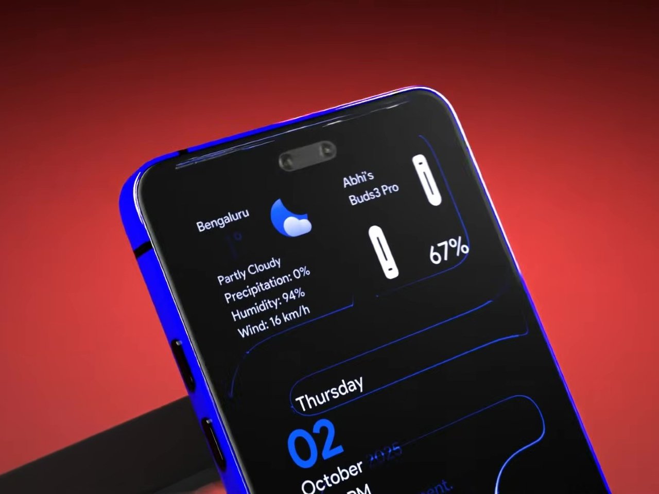
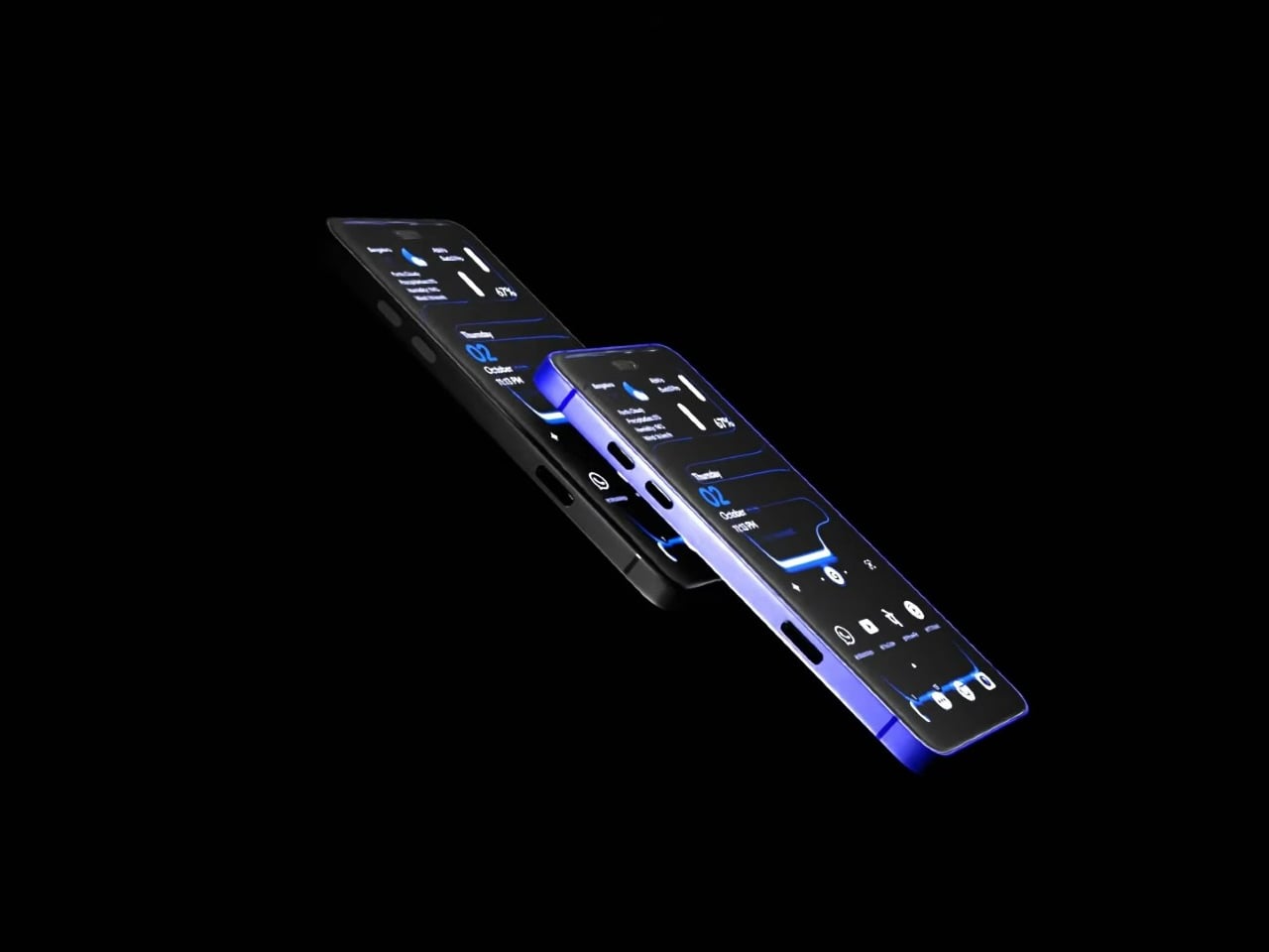
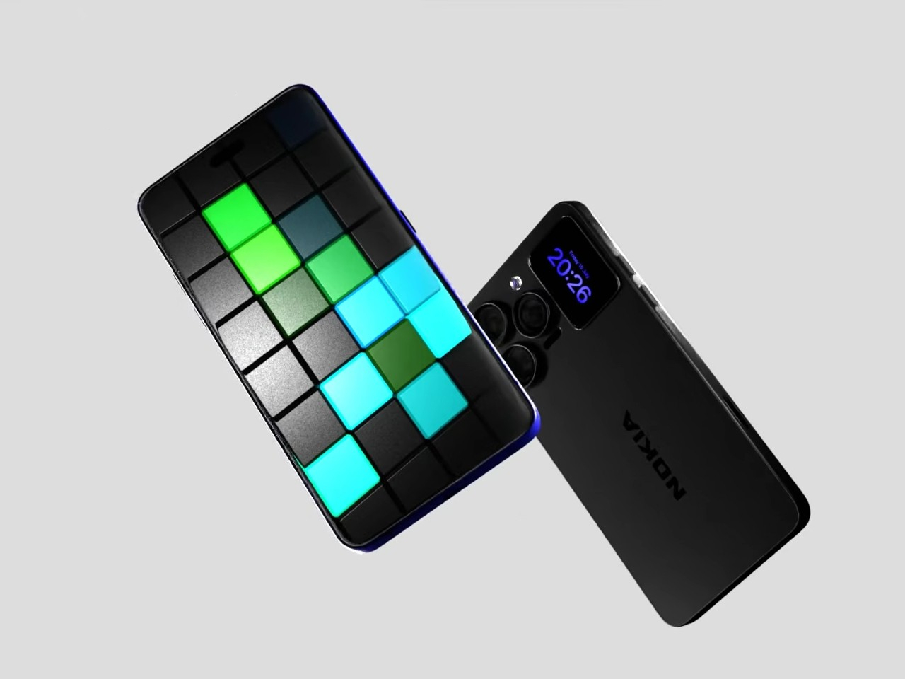
A Fan Imagined Nokia’s Comeback With One Feature Worth Stealing

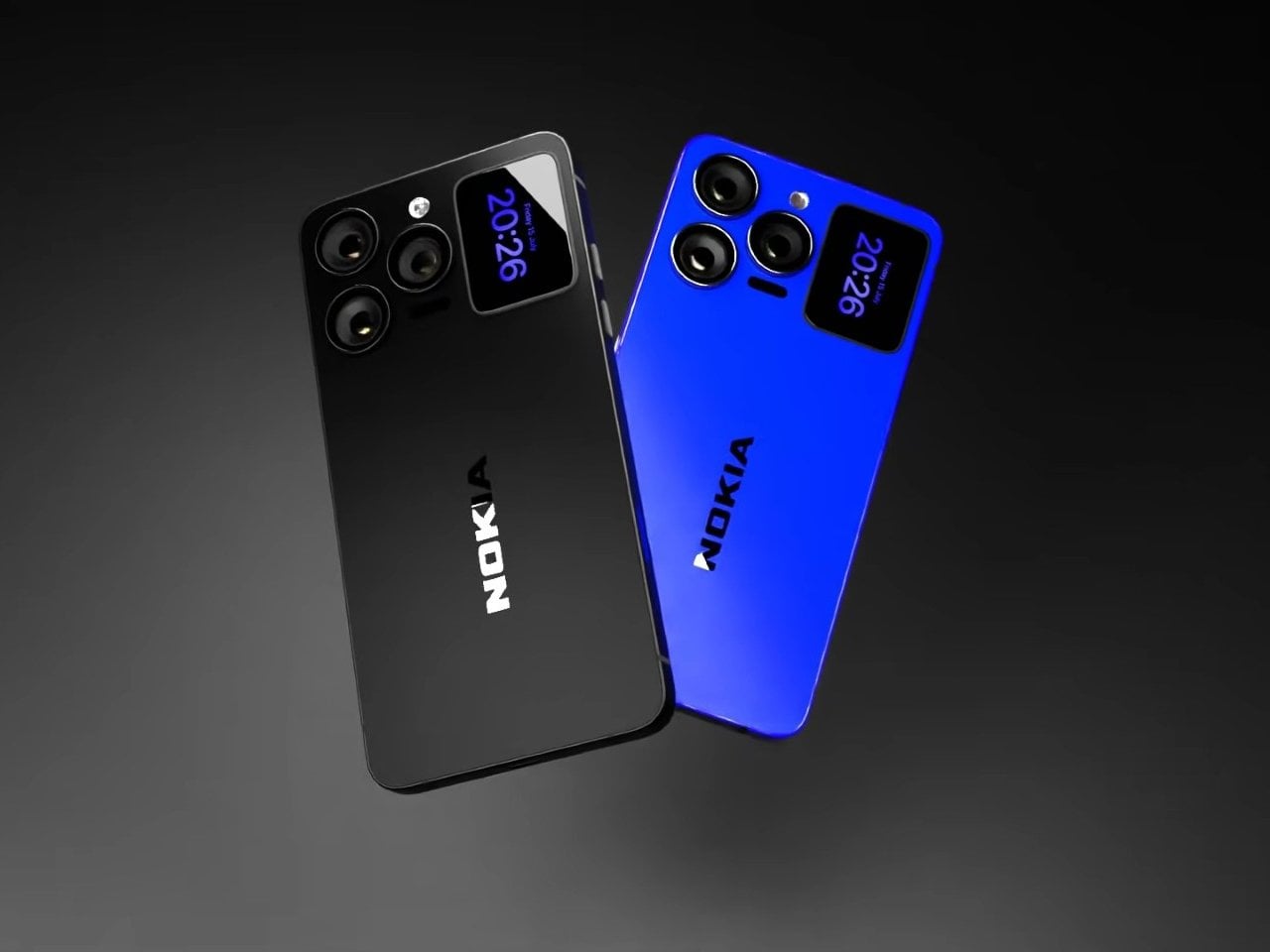
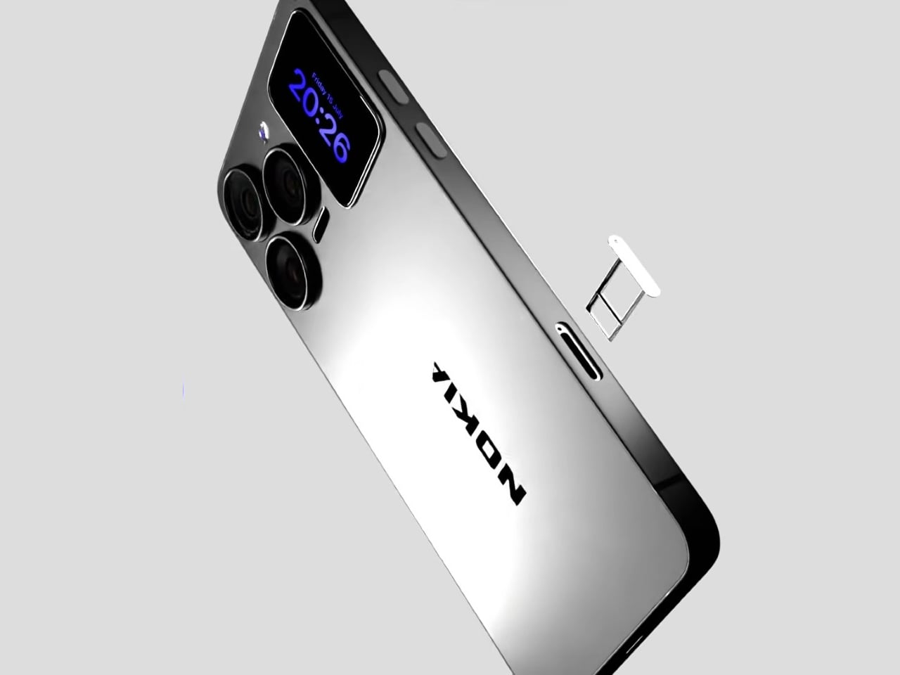
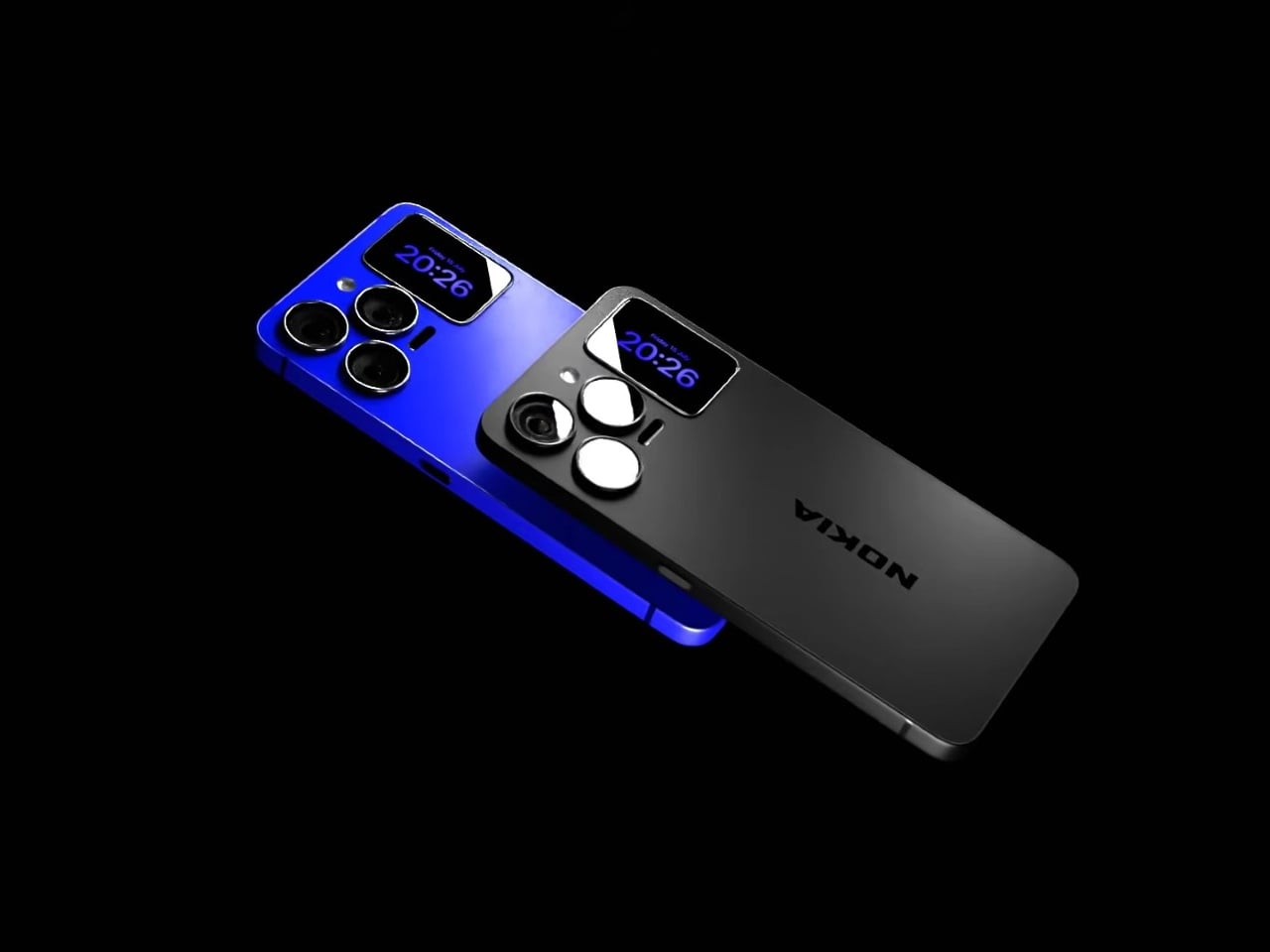
Nokia’s phone business has been fading for years, reduced mostly to budget handsets sold under license, so a concept calling itself the N90 Ultra was never going to become a real product. It’s a fan-rendered video, not a leaked roadmap, and it borrows a legendary name attached to a swivel-barrel camcorder phone from 2005. What it does get right is a smaller, more interesting idea already spreading across actual flagships: a second screen living on the back of the phone.

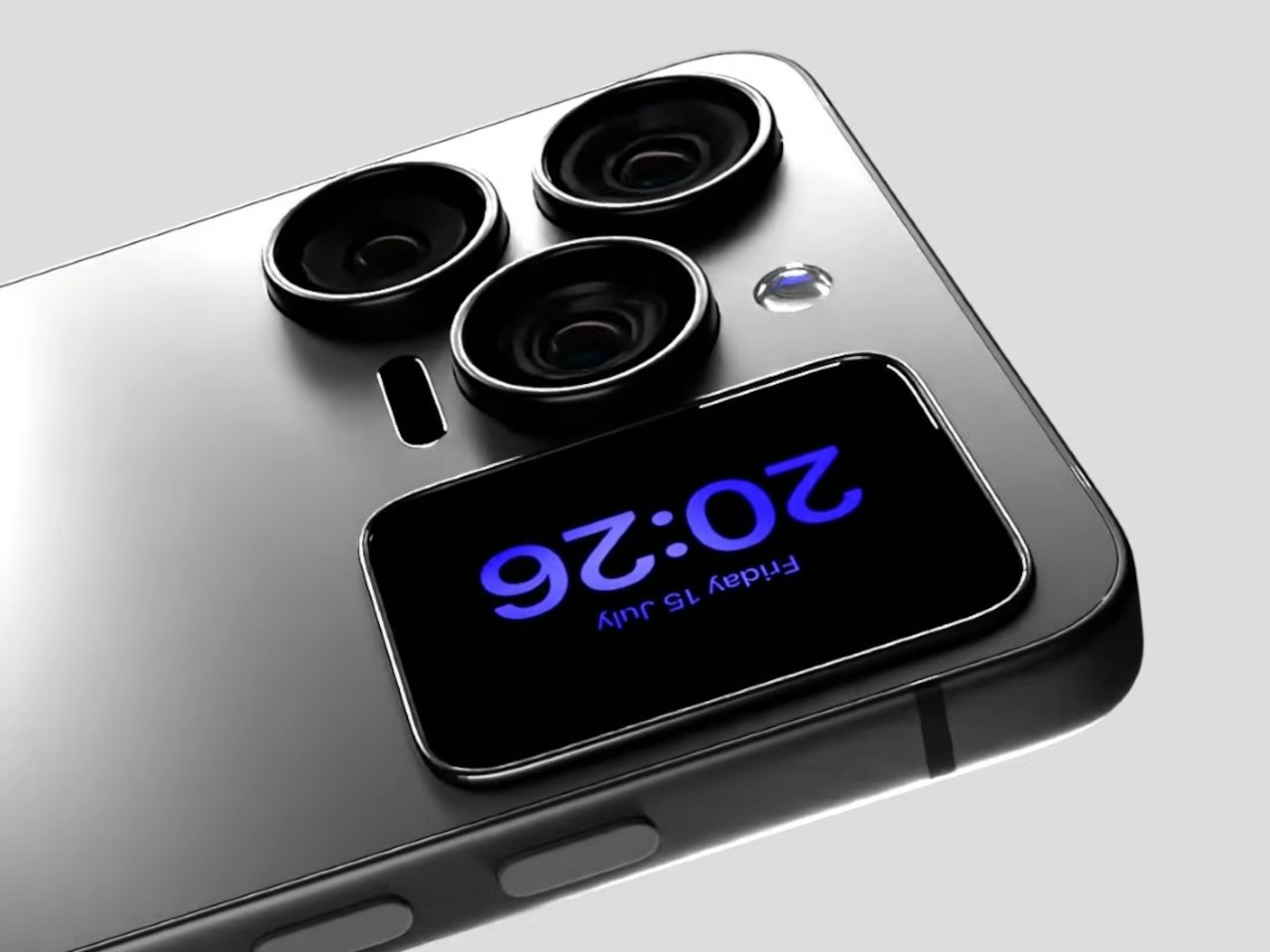
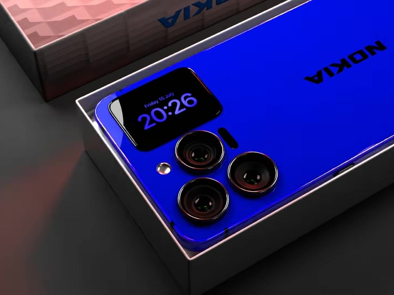
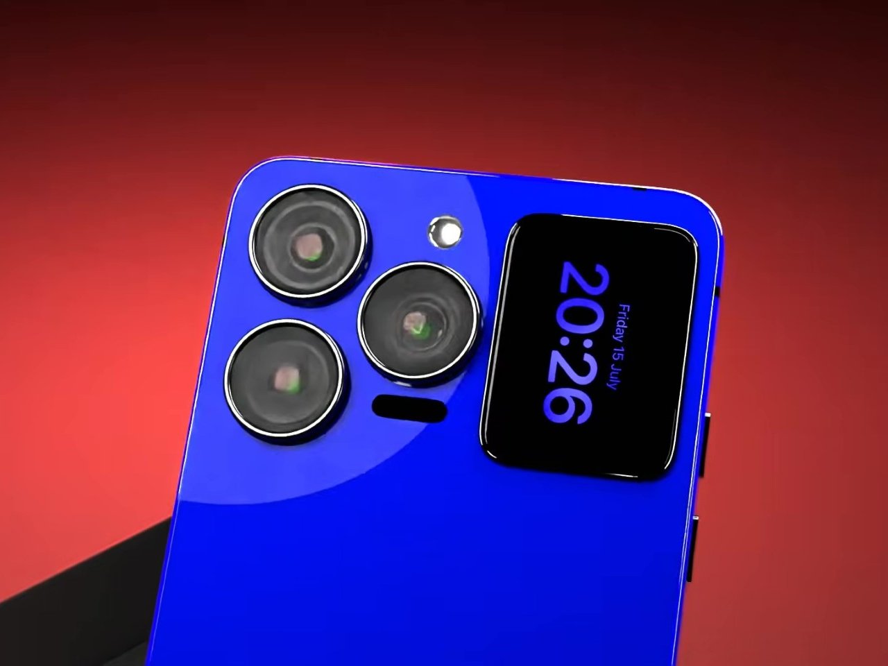
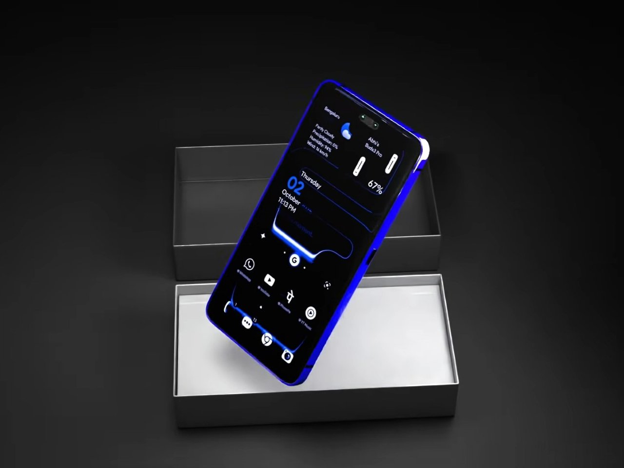
That rear panel holds a titanium alloy frame finished in a glossy cobalt blue or a graphite silver, with a raised visor housing three lens rings alongside a small rectangular display. Instead of sitting blank until a camera app opens, that mini-screen shows the time, the date, and glanceable notifications, all without waking the main display. It’s a small addition, but it changes how often a phone actually needs to come out of a pocket.

Designer: AndroidLeo (Concept)

A phone left face down on a desk during a meeting no longer has to stay silent about the time or a new message. A glance at the back shows both, then nothing more demanding follows, no bright wake screen lighting up a quiet room. That’s the appeal secondary displays have chased since Xiaomi and Meizu first tried the format years back, trimming how often the front screen needs to switch on at all.

The concept pushes its camera claims further than any current phone can back up, listing a 200 MP main sensor with 8K recording and a 200x zoom figure that would require optics no slim smartphone body can physically fit without an extending lens barrel. Two different Snapdragon chipsets get listed side by side too, a sign the spec sheet reads more like a wish list than an engineering plan. None of that undermines what’s genuinely worth noticing here.

The mini-display sitting flush against the camera visor is the detail carrying real design weight, because it reflects a question phone makers keep circling back to: how much information really needs a full screen turned on. Some phones use that rear space purely for decoration, a small strip showing a logo or a battery percentage and nothing else. Others, like this concept, treat it as a working display capable of running widgets, a clock face, or quick status checks.

Nokia returning to flagship phones remains unlikely no matter how sharp a fan render looks, and the camera math here falls apart well before any of these specs reach a factory floor. What holds up is the smaller premise underneath all of it, that a phone’s back panel can carry its own useful screen instead of sitting there as blank glass. That idea keeps showing up across the industry, with or without a Nokia badge attached to it.

The post A Fan Imagined Nokia’s Comeback With One Feature Worth Stealing first appeared on Yanko Design.
  •  

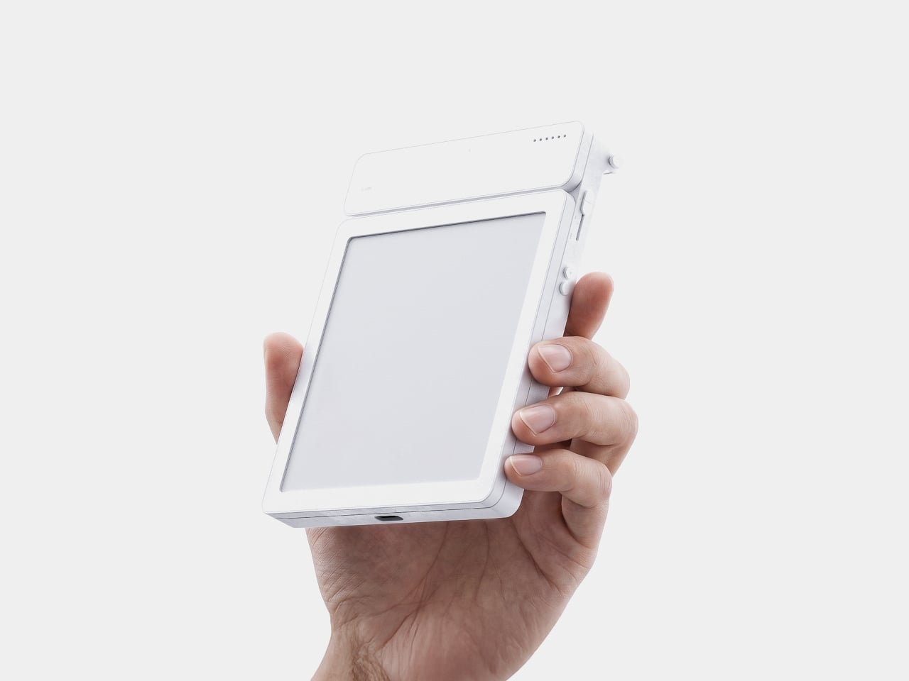
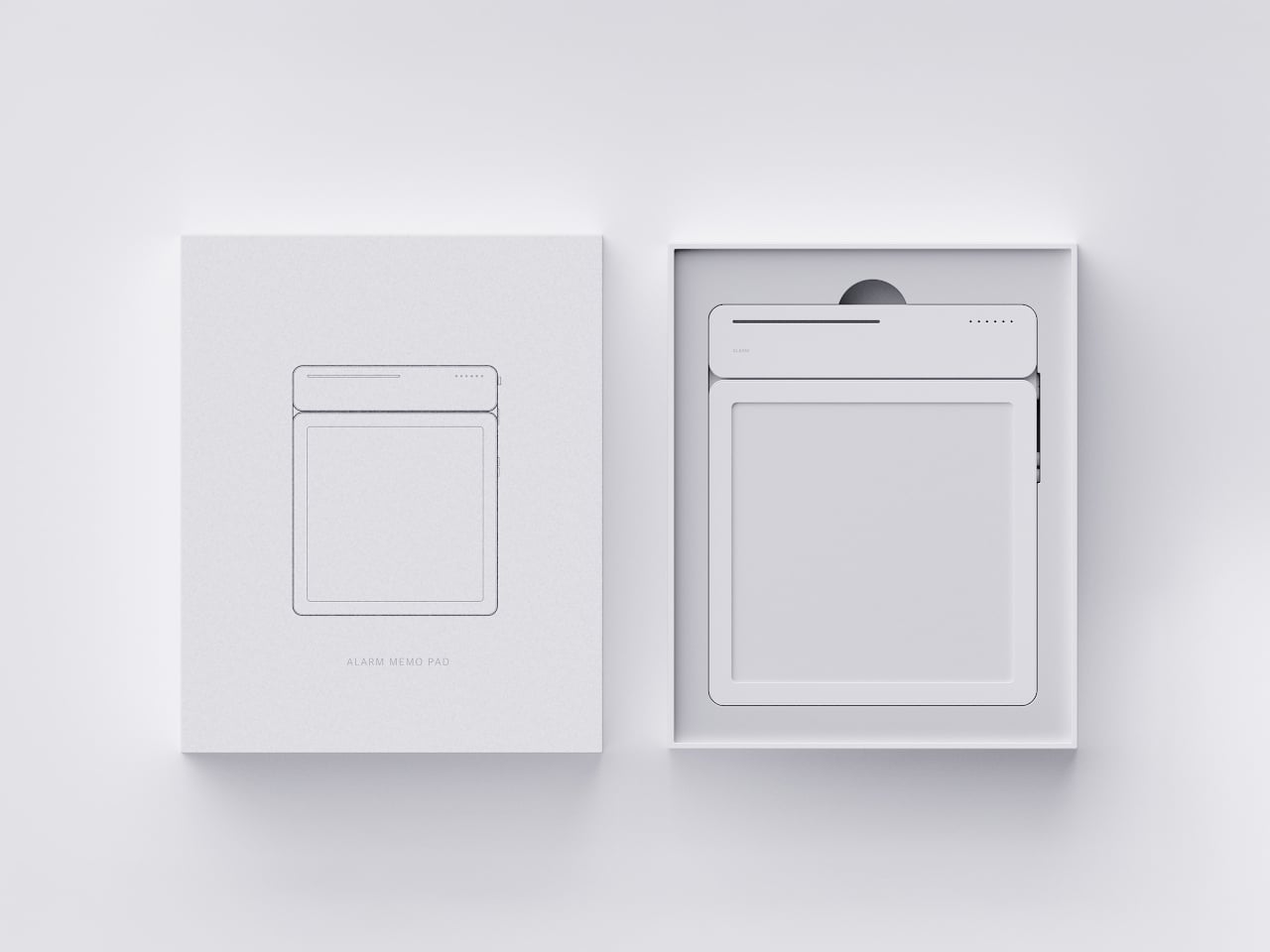
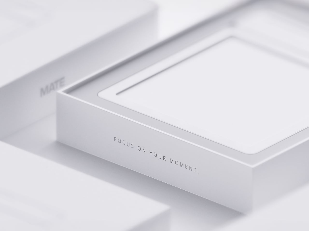
MATE Works Like a Sticky Note That Sets Its Own Alarm When You Write

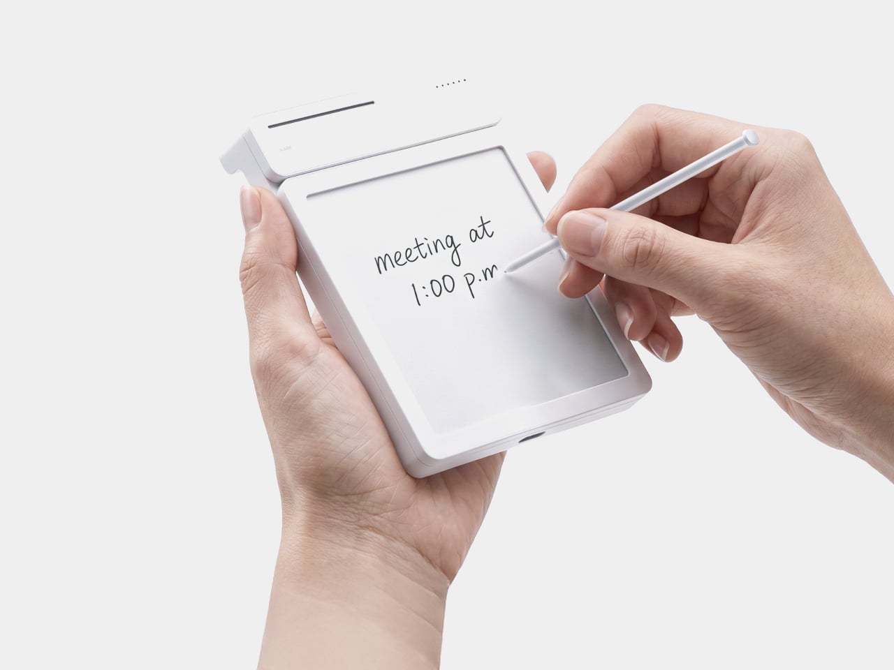
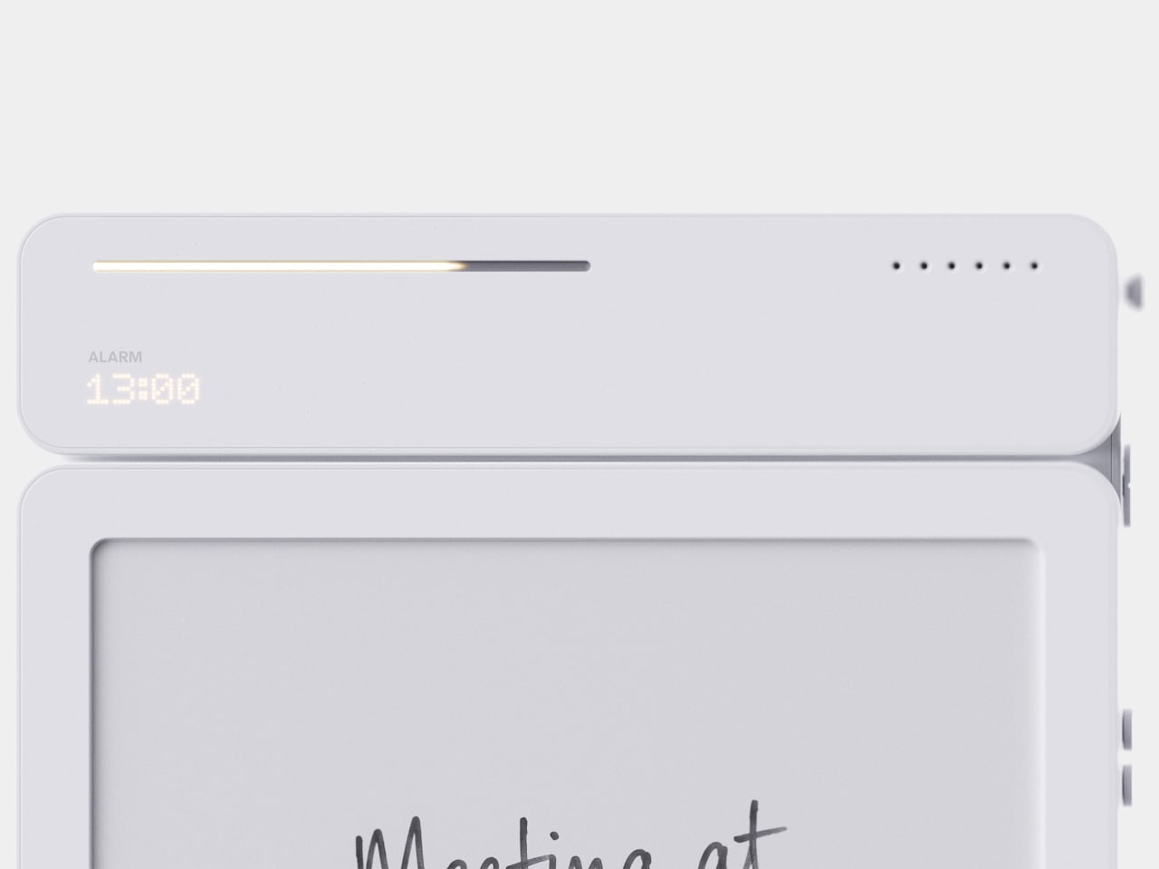
Setting a reminder on a phone means unlocking a screen, opening an app, and typing on a keyboard, three steps that break whatever train of thought led to needing the reminder in the first place. MATE skips all of that by reading your own handwriting instead. Write “meeting at 1:00 p.m.” on its E-ink panel with the built-in pen, and the device sets the alarm itself, no app, no unlocking, no menu to dig through.

That handwriting recognition is the entire premise, and it works because the device treats a note and a task as the same object rather than two separate steps. The moment it detects a time written into the text, it quietly converts that scribble into a scheduled alert running in the background. Nothing about the note’s appearance changes. It still just looks like something you jotted down on paper.

Designer: Geonwoo Kang

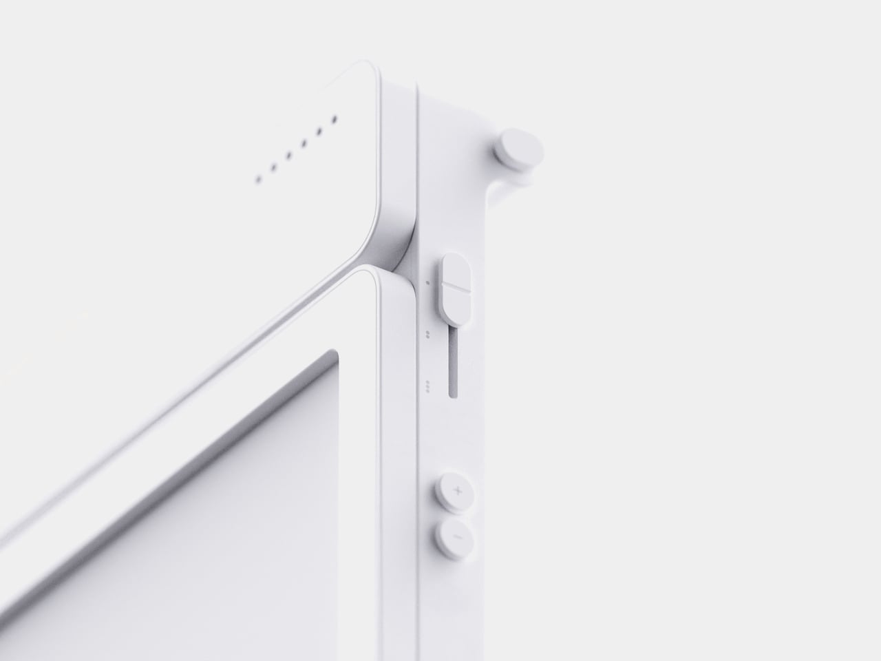
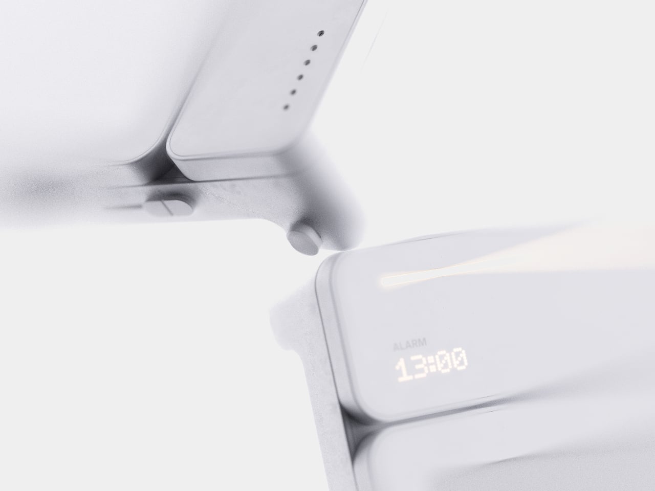
A thin LED bar along the top edge handles the countdown, giving a glance-able sense of how much time remains without requiring a full screen wake or a swipe through settings. When the set time actually arrives, the alarm sounds and stops the instant you tap the panel, keeping the entire alert cycle contained to the same physical surface where the note was written in the first place.

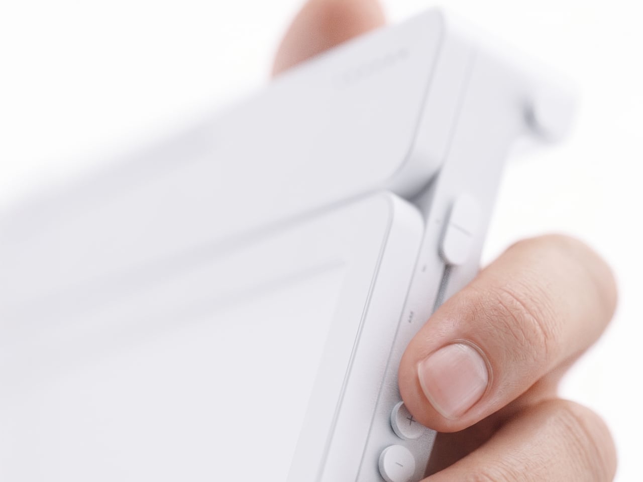
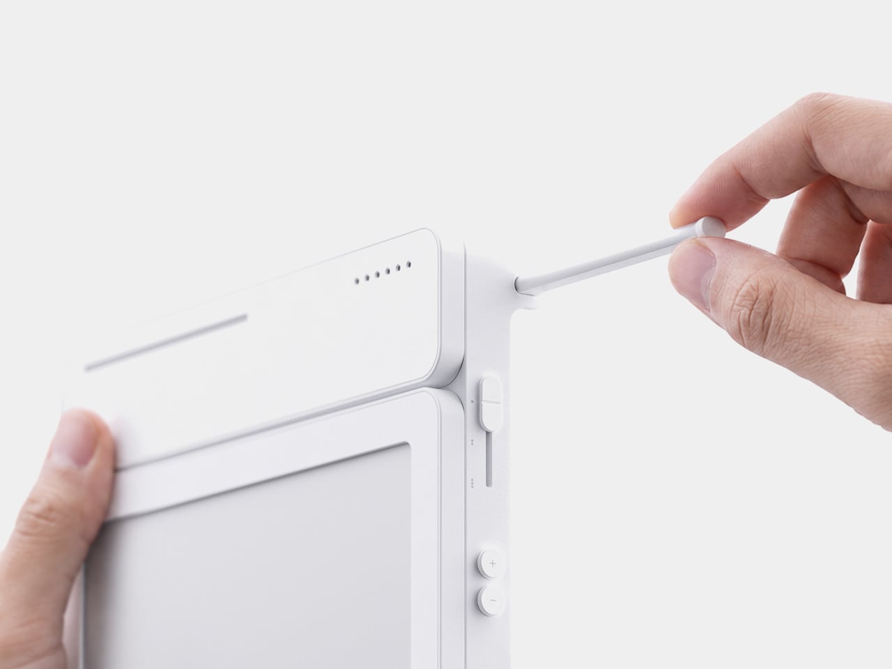
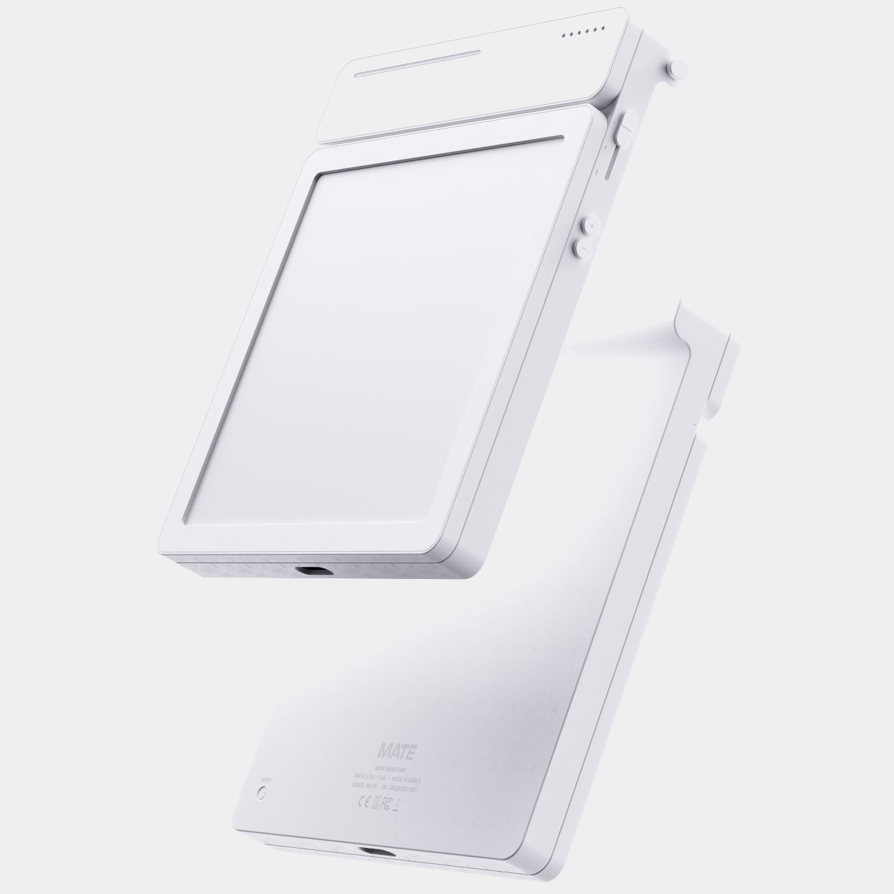
Because handwritten notes pile up fast, MATE handles multiple pages through a three-stage physical slider running down one side, letting you flip between up to three saved notes with a flick of a finger. That’s a deliberately low-tech solution to a problem most gadgets solve with a touchscreen menu, and it works specifically because a slider takes zero attention to operate correctly on the first try.

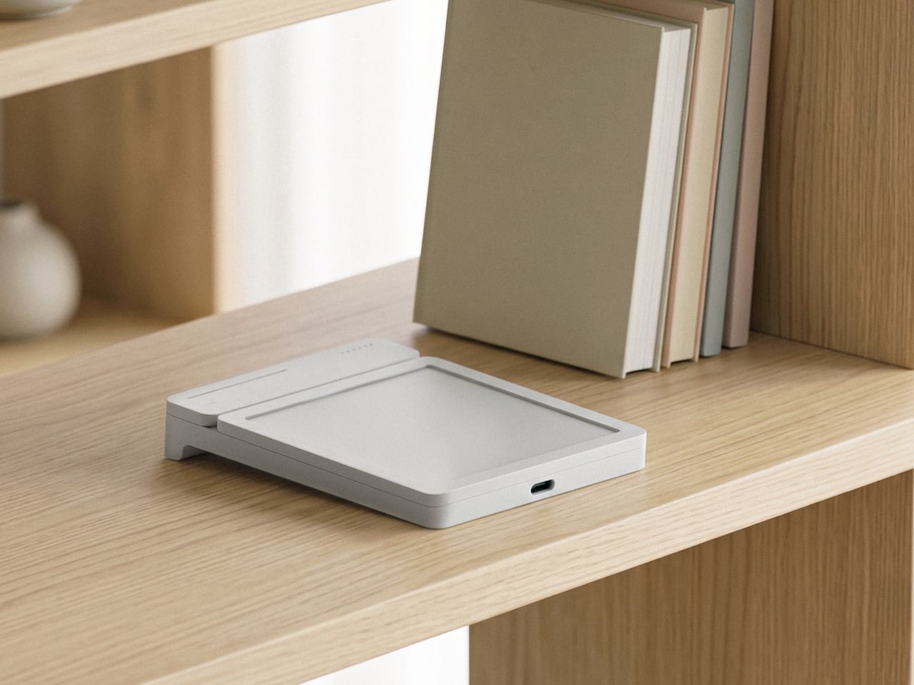
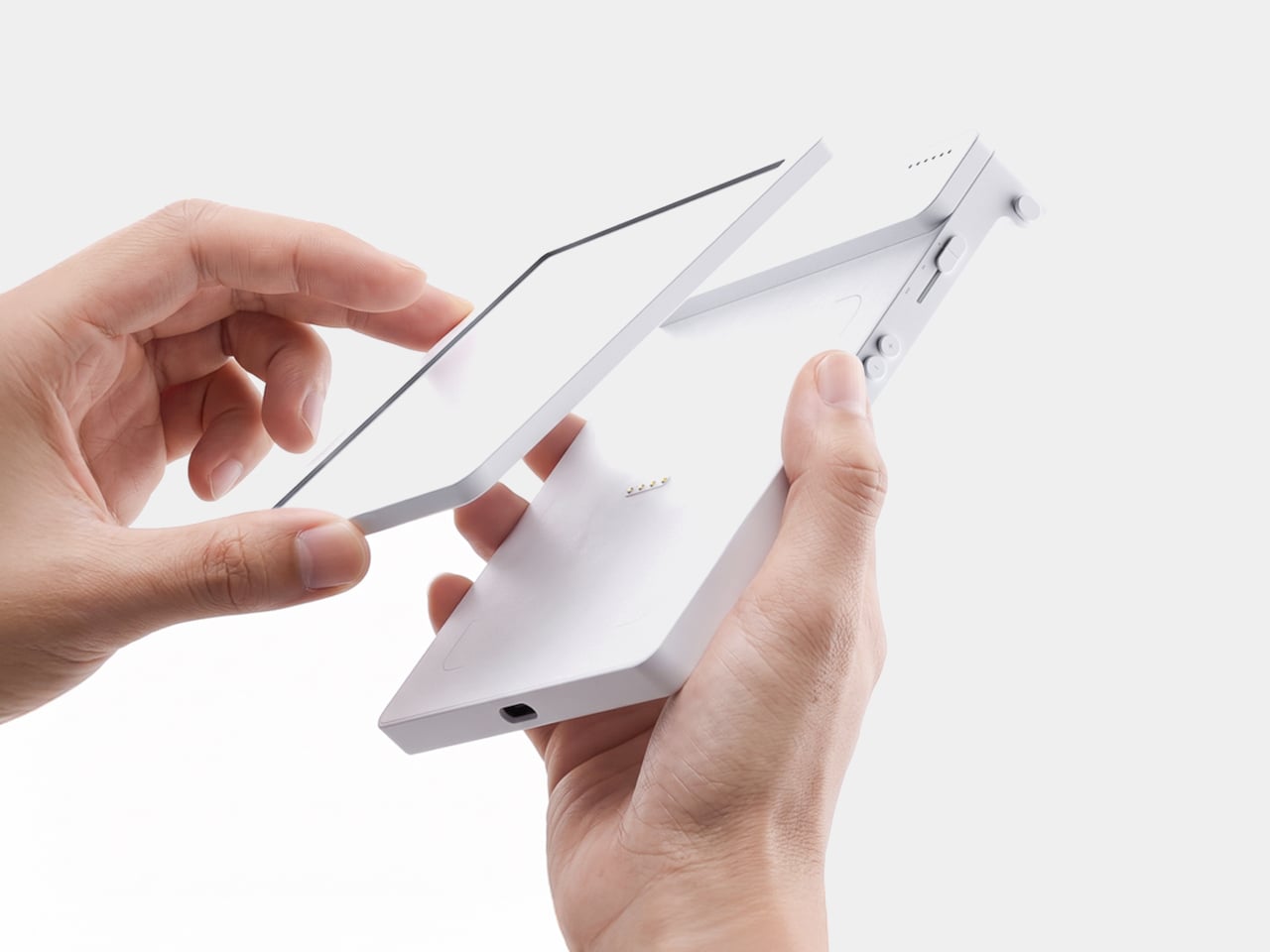
The memo pad itself doesn’t have to stay locked into the main body either. It detaches from its dock and relies on built-in magnets to stick onto a partition wall or a metal filing cabinet, turning a handheld notepad into a fixed reminder posted wherever it’s actually needed. A grocery list stuck to a fridge door works the same way a sticky note always has, just with an alarm quietly running underneath it.

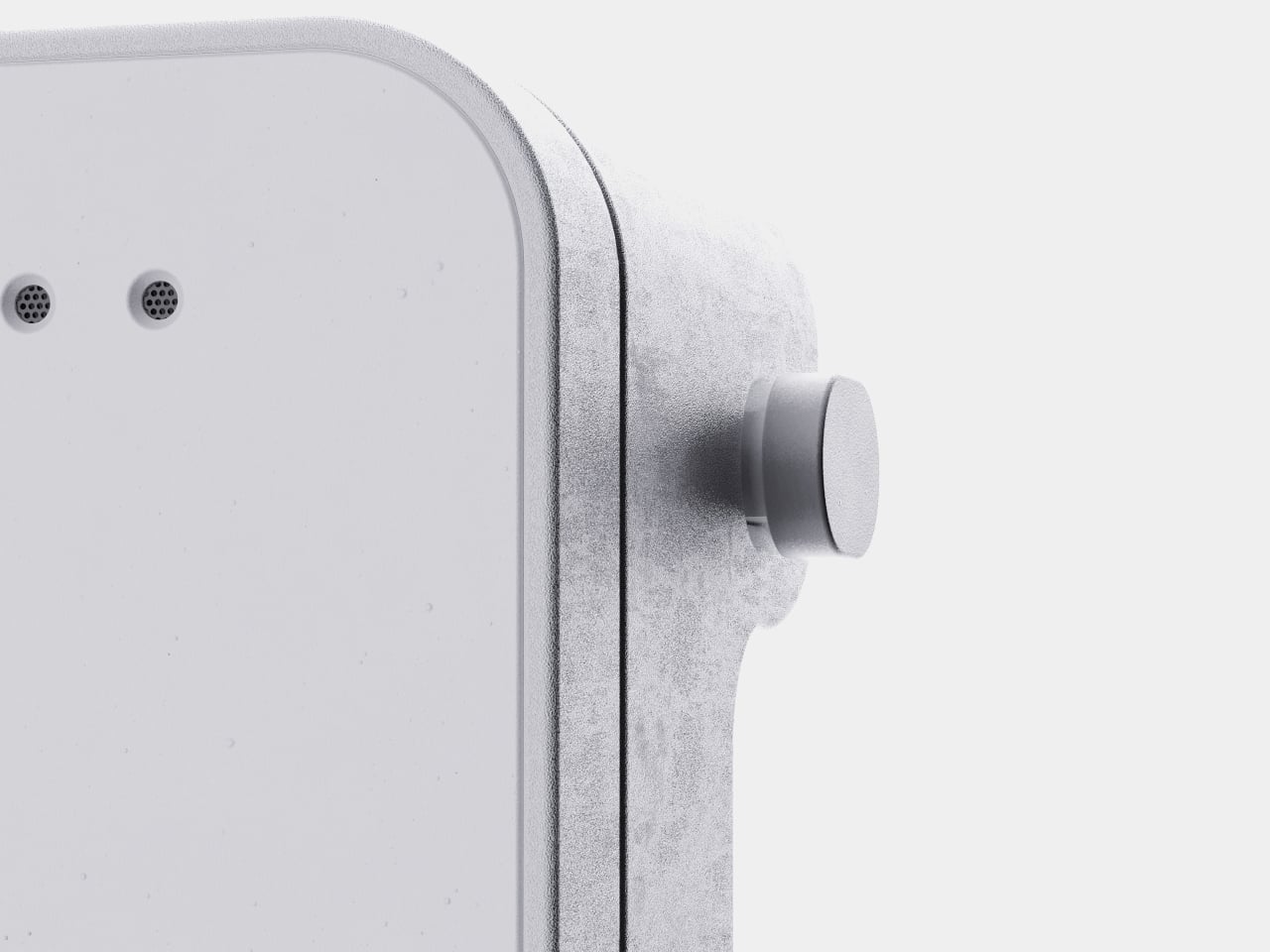
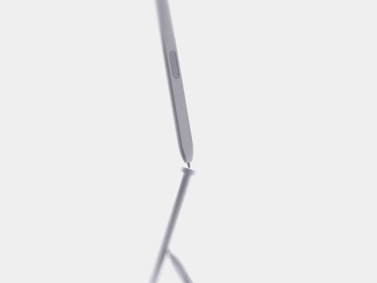
Even the pen gets a small, deliberate design decision most styluses skip. It nests into a groove at the top of the device rather than rattling around loose in a bag or a drawer, solving the single most common complaint about any stylus-based gadget: losing the one piece that makes the whole thing work. Reaching for a note and finding the pen missing defeats the entire point of a device built around spontaneous handwriting.

None of MATE’s individual pieces, the E-ink panel, the physical slider, the magnetic pad, would stand out much alone. Put together, they describe a specific kind of object: something meant to sit on a desk quietly doing one job well, catching a thought before it disappears and holding onto it until the moment it’s actually needed.

The post MATE Works Like a Sticky Note That Sets Its Own Alarm When You Write first appeared on Yanko Design.
  •  
❌