Vue lecture

Il y a de nouveaux articles disponibles, cliquez pour rafraîchir la page.

Virginia Sin’s KEEP Collection Makes Order Look Like Art

There’s a certain satisfaction in putting things exactly where they belong. Keys on the hook. Jewelry in a tray. Pens in their place. It sounds mundane, but anyone who’s experienced it knows it’s anything but. I am not the most organized person in the world but whenever I see well-designed stationery or office supplies, I feel the need to get them just to have something interesting looking in my workspace.

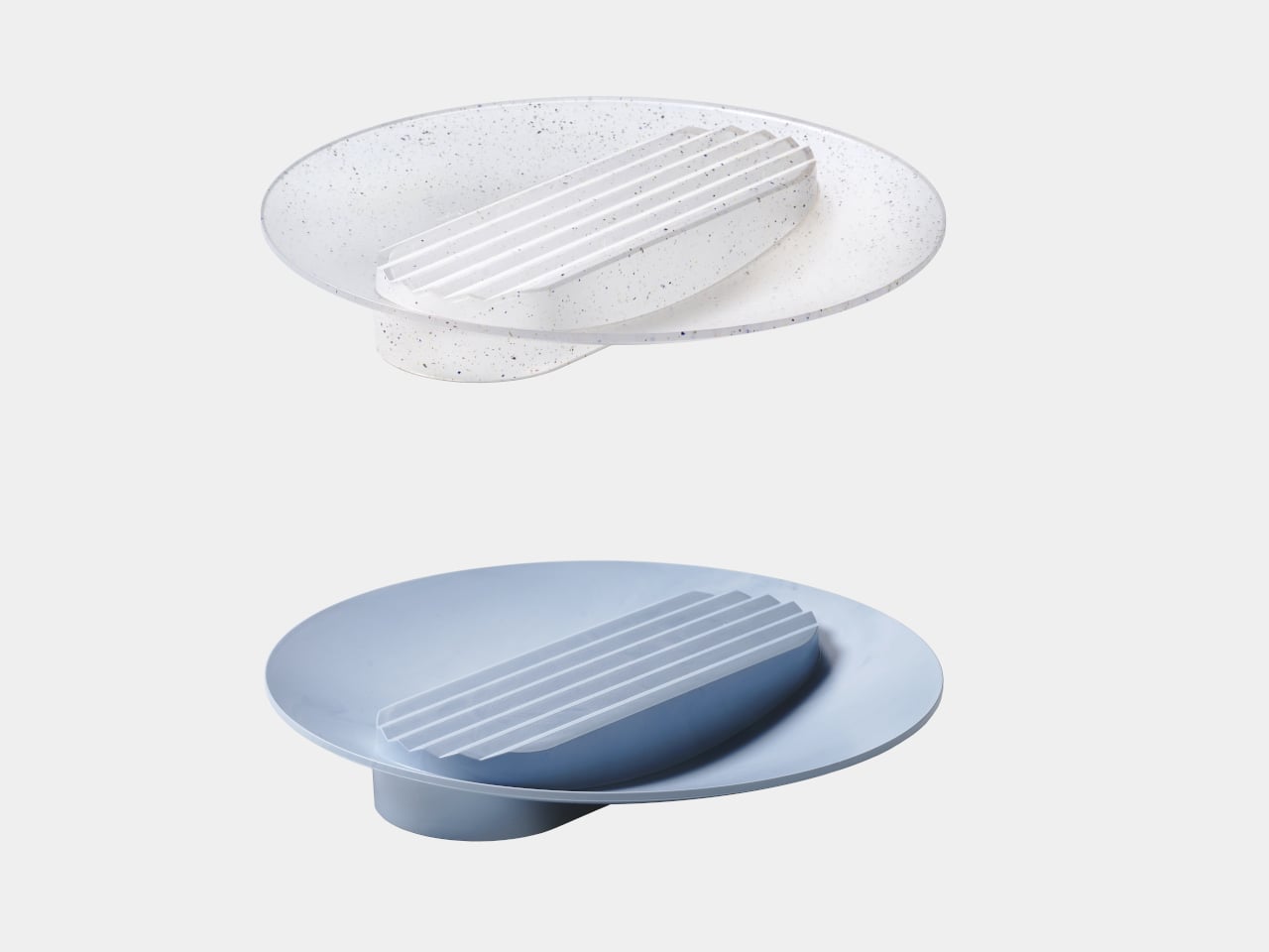
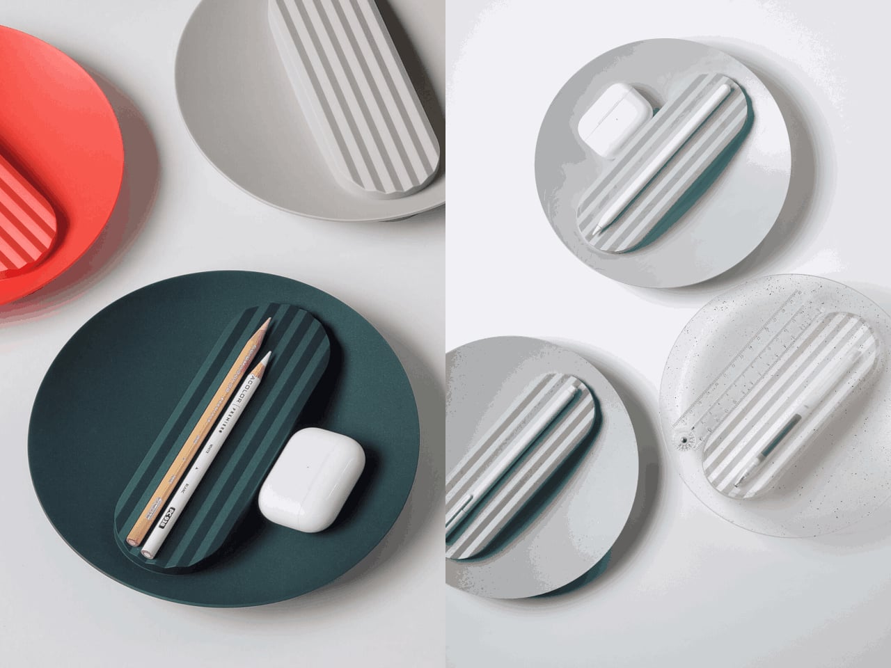
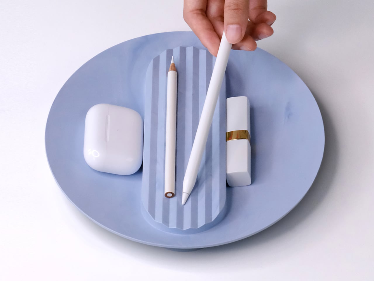
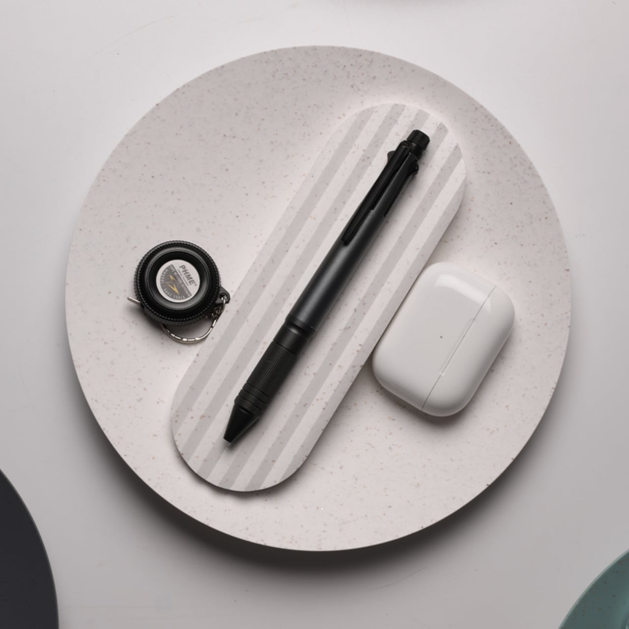
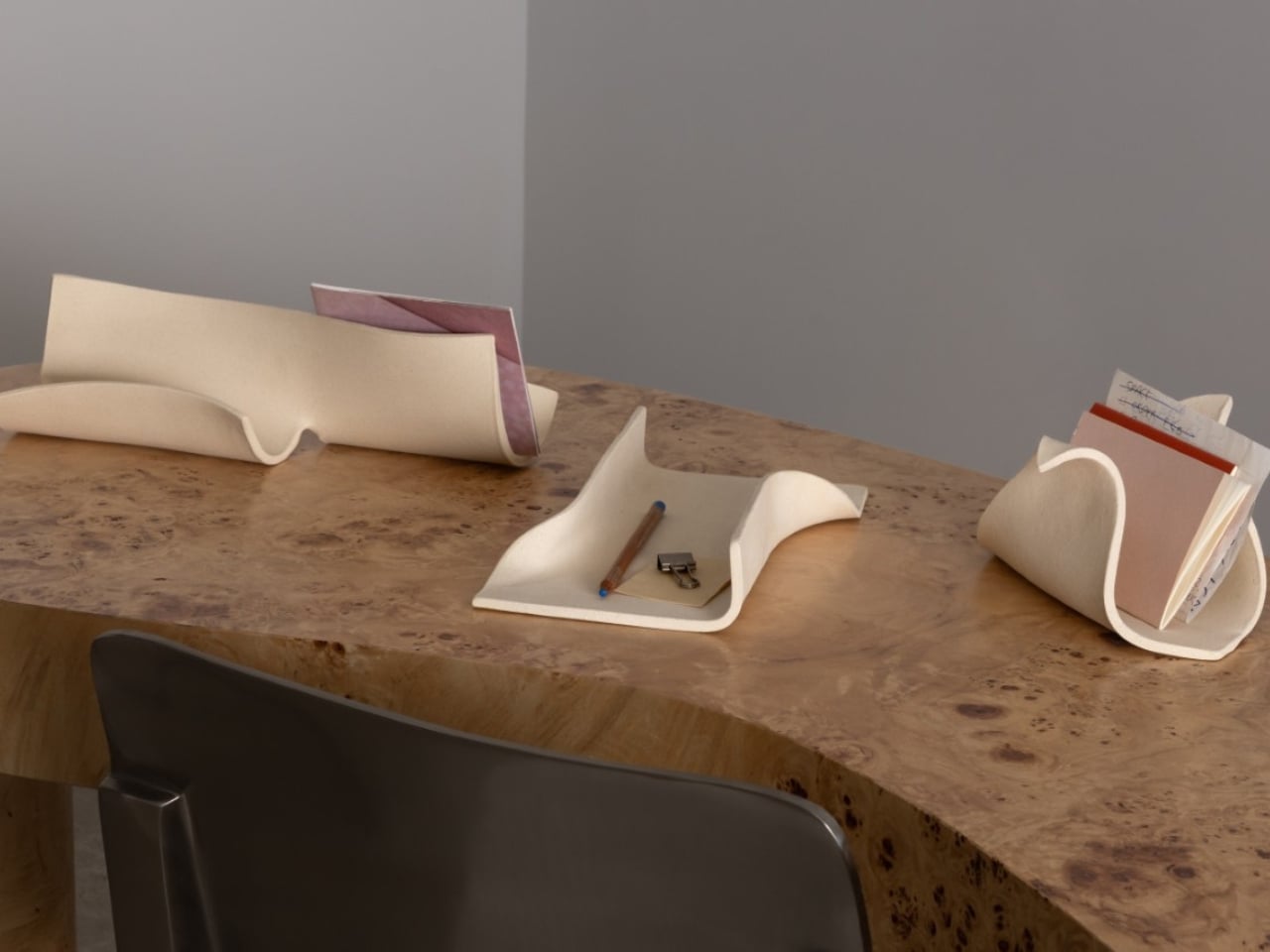
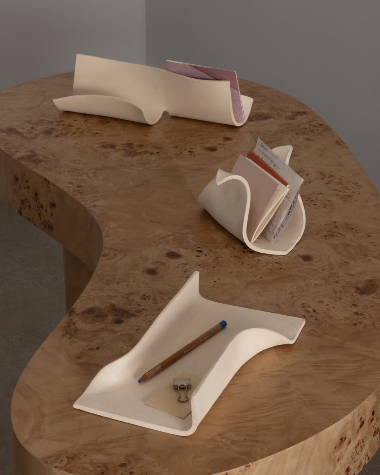
Virginia Sin, the Brooklyn-based ceramics designer and founder of SIN, built her latest collection around that very feeling. The KEEP Collection is three pieces: the FORMARA Organizer, the ARCHIVA Tray, and the CACHE Organizer. That’s it. No sprawling lineup, no unnecessary additions. Just three carefully considered ceramic objects designed to hold the small things that tend to scatter across your desk, dresser, or entryway table.

Designer: Virginia Sin

What makes KEEP different from your average catchall tray is how it treats visibility as a feature, not an oversight. The pieces are shaped to encourage intentional placement rather than concealed storage, so your objects remain visible and accessible at all times. The soft curves and contained volumes aren’t just pretty to look at; they’re doing quiet, practical work. Sin described the collection as “a meditation on how form holds space: for objects, for order.” She’s not just making storage. She’s making something you’d want to look at even when it’s empty.

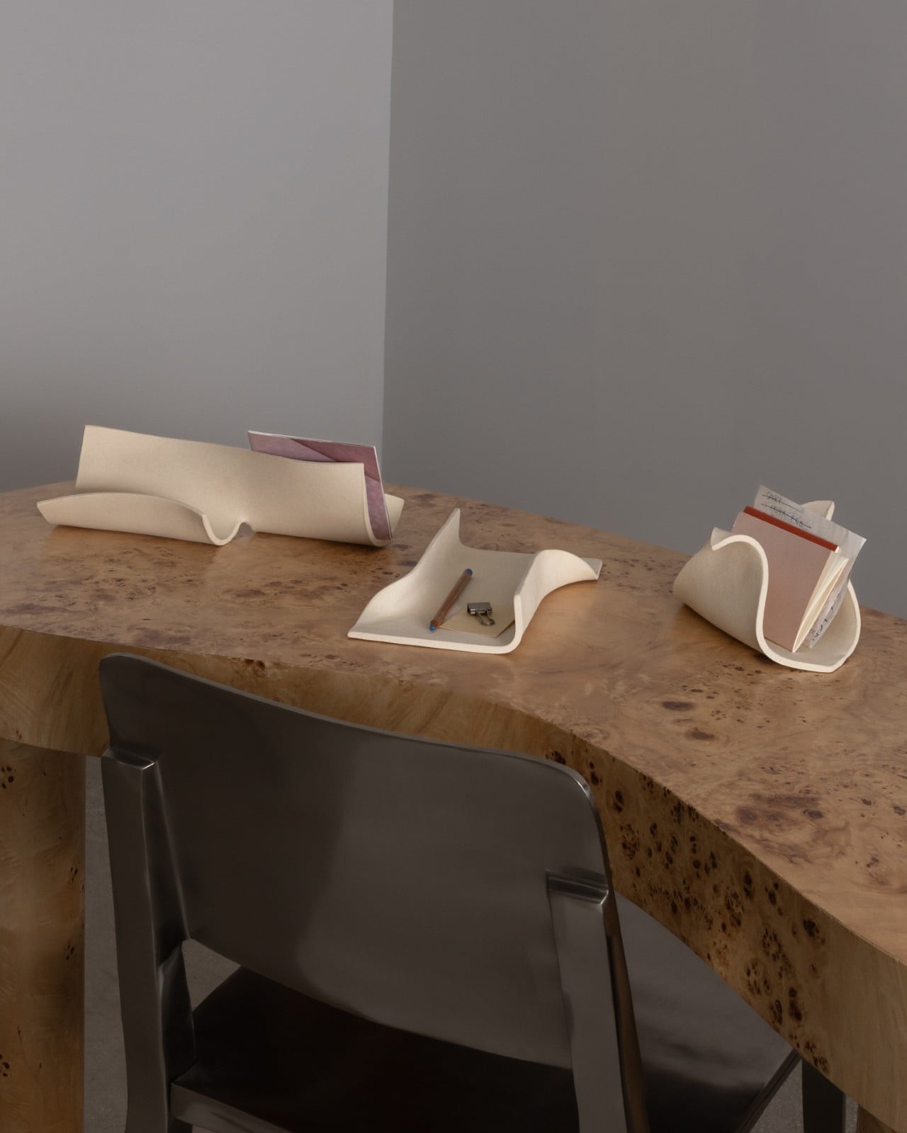
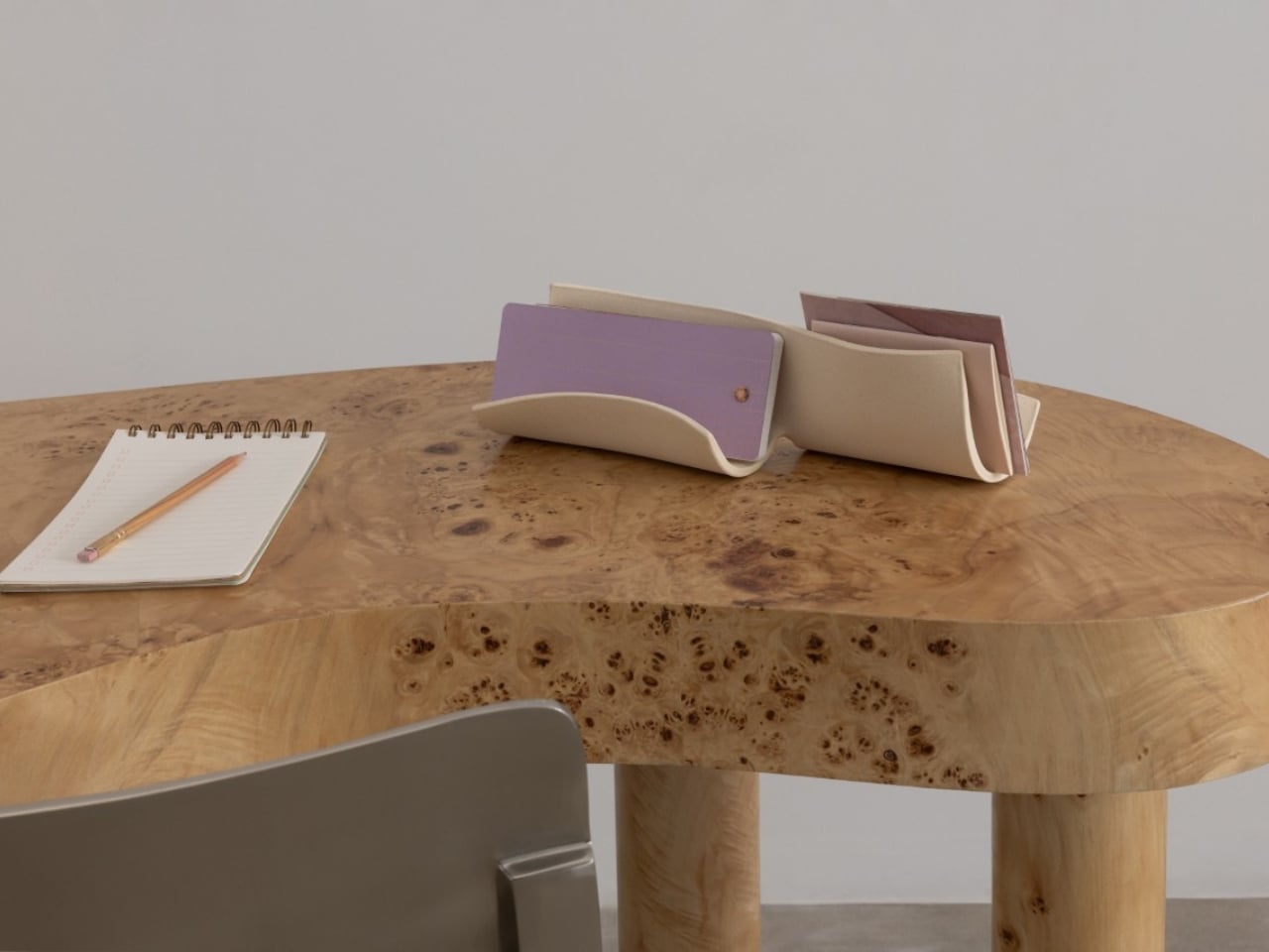
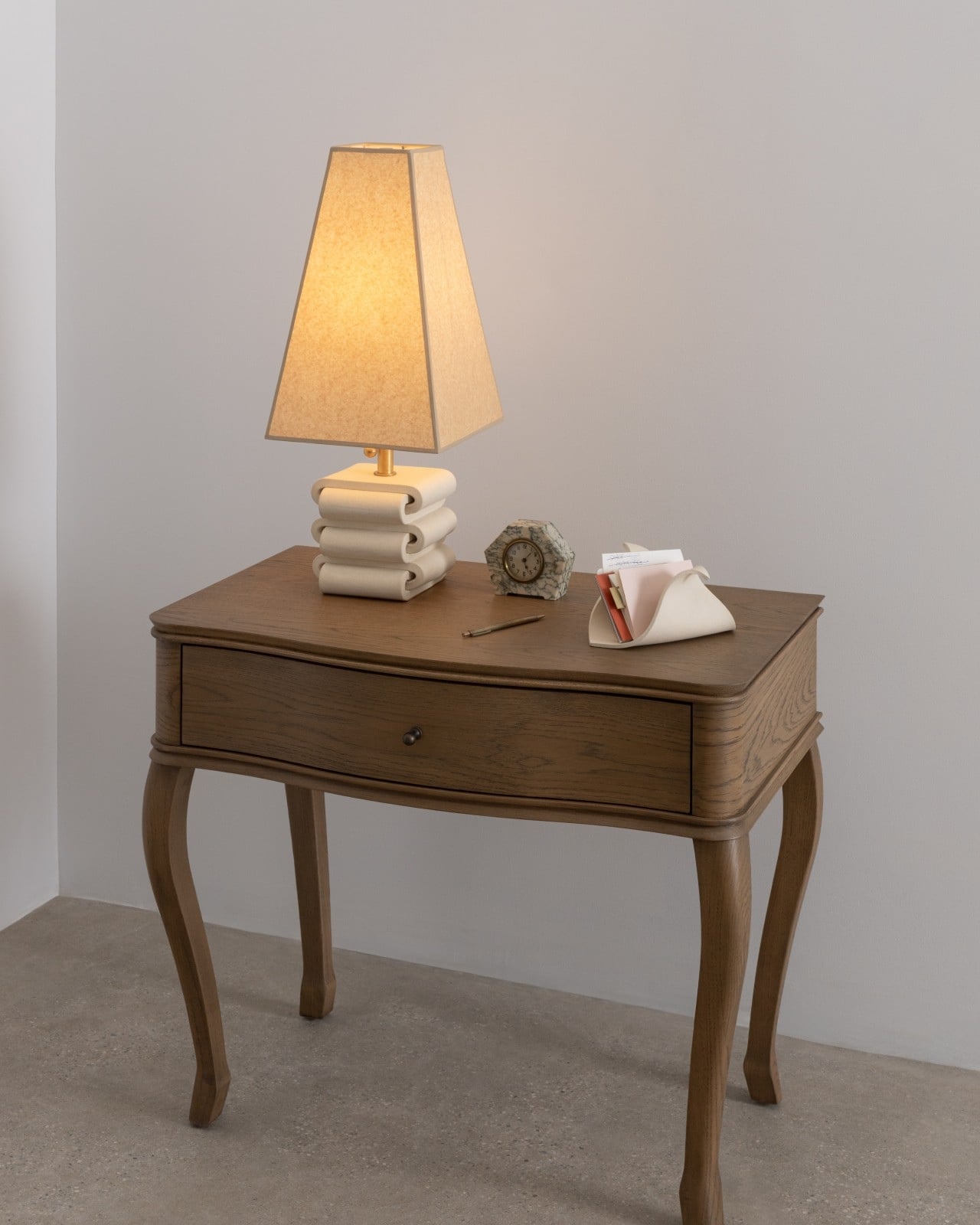
Each piece has its own personality. The FORMARA Organizer ($148) is the most organic of the three. With two gentle compartments flowing side by side, it recalls the shape of a bamboo shoot split open or water running through carved channels. It’s the one you’d reach for when you want your jewelry or hair accessories somewhere beautiful, not just somewhere reachable. It’s perfect to also place some notebooks or paper materials in it since it’s high enough.

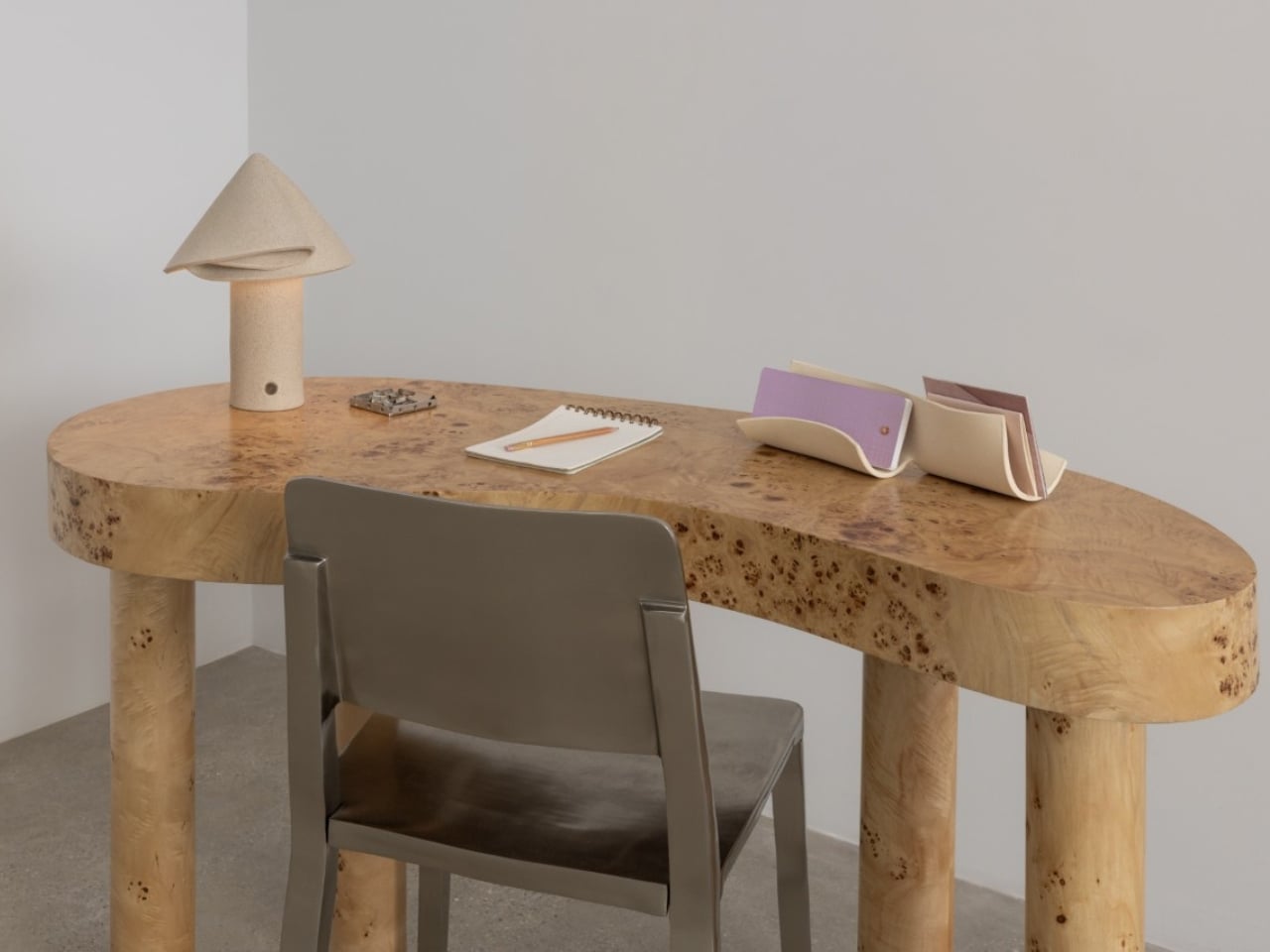
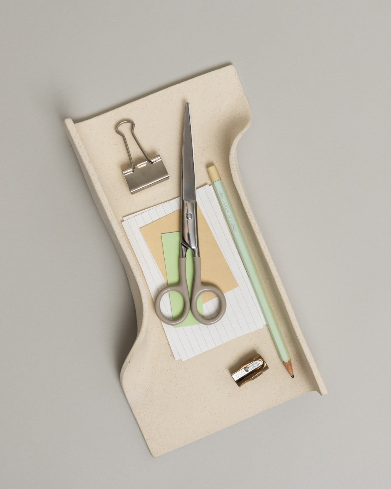
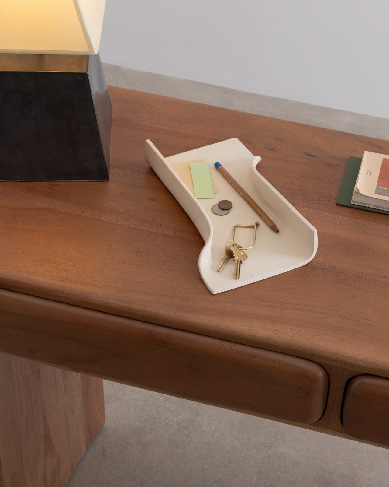
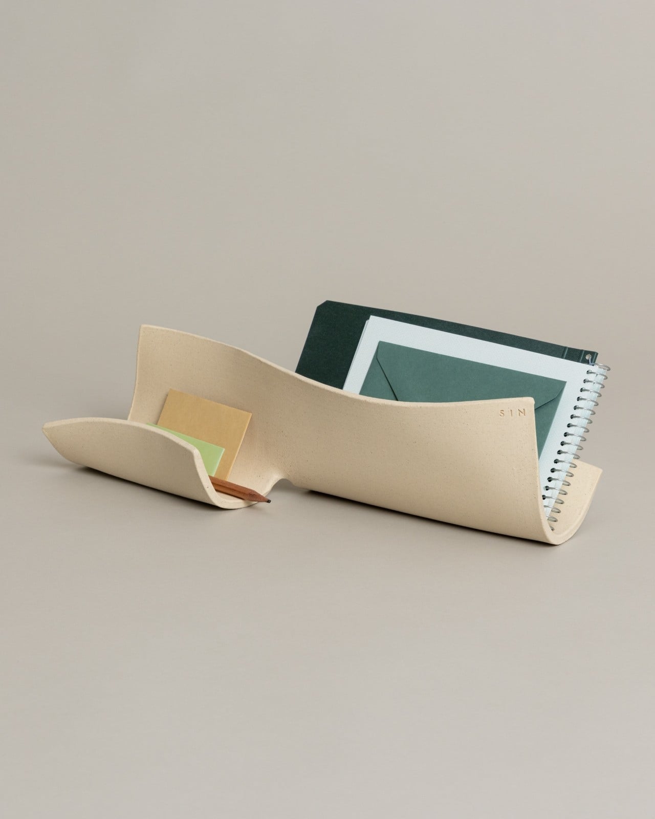
The ARCHIVA Tray ($120) takes the opposite approach. Its clean edges and angular planes recall the structure of an architectural model, sharp, balanced, and quietly commanding. At 10.5 inches long, it’s the workhorse of the collection, perfect for corralling pens, notes, or the rotating cast of small objects that always end up on a desk. It looks like something you’d find in a very well-edited design studio, which is exactly the point.

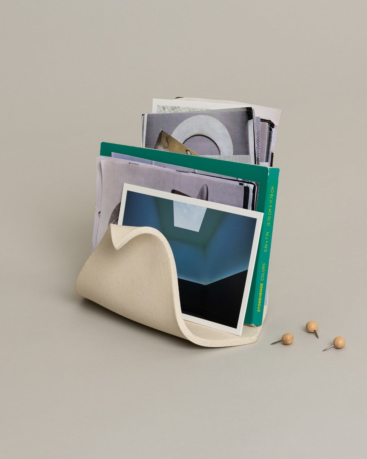
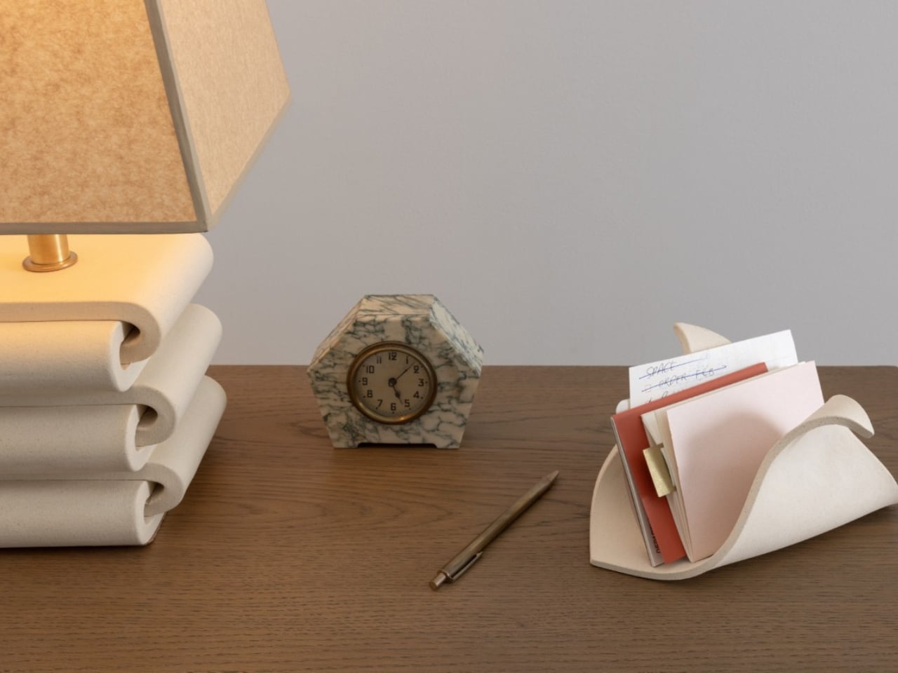
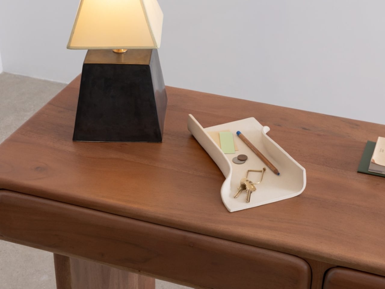
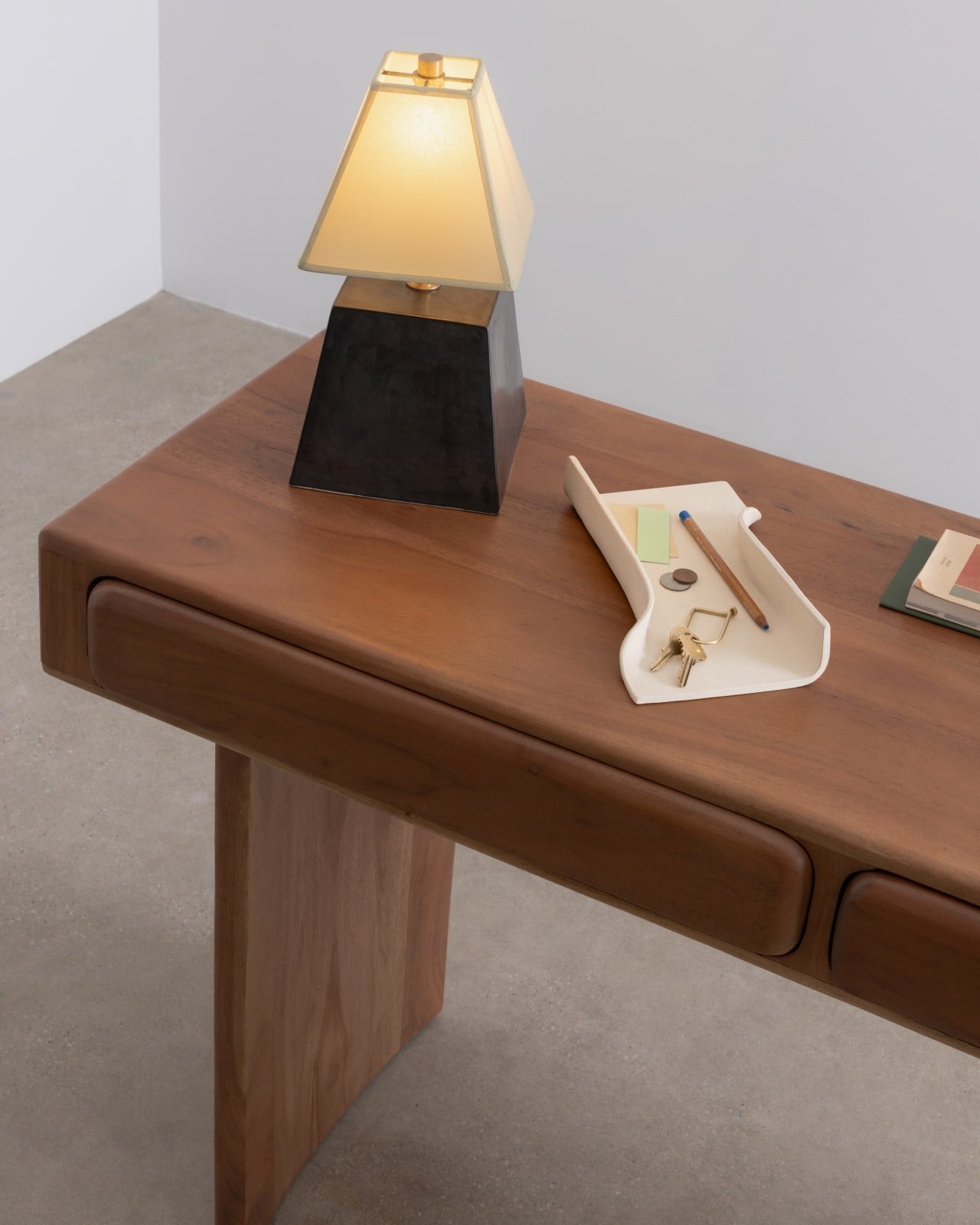
Then there’s the CACHE Organizer ($120), and it might be the most quietly clever of all. Its triangular form transforms what is essentially an everyday fold into something that feels like a gesture. The depth makes it practical for taller items like markers, scissors, or rolled-up sketches, but the shape gives it enough visual presence to hold its own as a sculptural object. At 8.5 inches long and 4 inches tall, it fits comfortably on a nightstand or shelf without demanding attention.

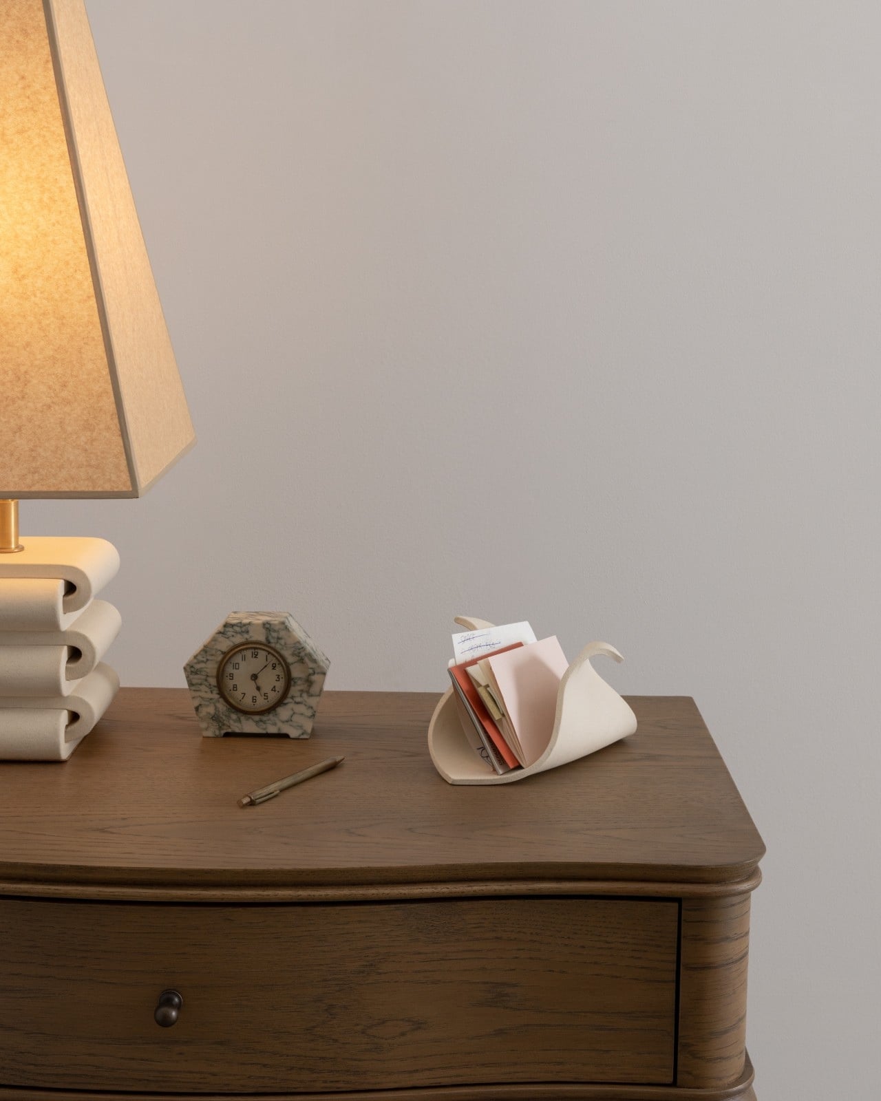
All three pieces are handmade in stoneware at SIN’s Brooklyn studio and finished in a warm bone colorway that sits somewhere between cream and natural clay. The matte finish keeps the focus on form rather than surface, which is the right call. These pieces are about shape doing the heavy lifting.

SIN is no small name in the design world. Virginia Sin’s work has been featured in Architectural Digest, The New York Times, and Goop, and her porcelain paper plates were used at Eleven Madison Park. The KEEP Collection is the latest chapter in a body of work that consistently asks what everyday objects can look like when someone genuinely thinks them through.

The collection lands at exactly the right cultural moment. There’s a growing appetite for owning fewer, better things. Pieces that earn their spot on a shelf. Design that doesn’t shout. KEEP fits that conversation without feeling like it was made for it. The forms feel too considered, too quiet, too genuinely useful to be trend-driven. That’s the mark of design built to last. The KEEP Collection is available now at virginiasin.com.

The post Virginia Sin’s KEEP Collection Makes Order Look Like Art first appeared on Yanko Design.

3D-Printed Guitar Amp Desk Organizer Brings Concert Energy to Your Boring Monday Morning

The contrast between Sunday night at a concert and Monday morning at your desk is brutal. One moment you’re lost in the music, feeling every guitar riff vibrate through your chest. The next, you’re answering emails and pretending last night’s euphoria wasn’t real. The transition back to routine work feels especially cruel when the weekend gave you a taste of something electric.

That’s where a little whimsy helps. These 3D-printed guitar amp pen holders from LionsPrint bring a fragment of that musical energy to your workspace. They’re compact at 3.5 inches per side, but the details are spot-on: authentic speaker grilles, control panels, and designs inspired by the amplifiers that power actual rock shows. You can personalize them with custom text in silver or gold. They won’t replace the thrill of live music, but they’re a small reminder that the mundane is just temporary.

Designer: LionsPrint

The thing about good desk accessories is they need to justify their existence beyond pure function. A pen holder is essentially a container with holes. You could use a coffee mug. But LionsPrint clearly understood that musicians and music fans have a specific relationship with amplifiers that goes beyond their utility. These aren’t random music references slapped onto office supplies. They’re recognizable silhouettes: Marshall stacks with their iconic script logo, Fender’s clean lines, Yamaha’s distinctive branding. The 3D printing allows for texture work that would be impossible with traditional manufacturing. Those speaker grilles have depth and pattern variation that catches light differently depending on angle.

At 3.5 x 3.5 x 3.5 inches, the dimensions work perfectly for standard desk real estate. Small enough that they don’t dominate your workspace, large enough that they actually hold a functional amount of pens, scissors, and whatever other tools accumulate throughout a workday. The cube format keeps them stable. No tipping over when you’re fishing for a specific marker at 2 AM during a deadline crunch.

The customization option elevates these beyond typical musician merch. You can add text in metallic silver or gold finishes, which means your studio name, your band’s logo, or even an inside joke with your bandmates can live on your desk. Most “gifts for guitarists” feel like afterthoughts, designed by people who think all musicians are the same. This actually lets you claim ownership of the aesthetic instead of just passively receiving someone else’s idea of what music fans want.

LionsPrint sells these through Etsy starting at $19.98 USD before shipping. The price sits in that sweet spot where it’s low enough to impulse buy after a particularly soul-crushing Monday, but high enough that the 3D printing quality actually delivers on the details. You pick your amp style, add your custom text if you want it, and suddenly your desk has at least one object that doesn’t make you question your life choices. Small victories count when you’re counting down to the weekend.

The post 3D-Printed Guitar Amp Desk Organizer Brings Concert Energy to Your Boring Monday Morning first appeared on Yanko Design.

Tray210 Proves Recycled Plastic Doesn’t Have to Look Grey and Boring

Recycled plastic products often fall into two camps: grey utilitarian bins or loud, speckled experiments that feel more like proof of concept than something you want on your desk. Tray210 recycled, a collaboration between Korean studio intenxiv and manufacturer INTOPS under the rmrp brand, takes a different approach, using recycled plastics and waste additives to create a tray that feels like a considered object first and an eco story second, treating material diversity as part of the design language.

Tray210 recycled is a circular tray with three compartments, an evolution of the original Tray210 form. It grew out of INTOPS’ grecipe eco-material platform and hida’s CMF proposals, which is a long way of saying it is the result of a tight loop between material science and industrial design. The goal was to pursue material diversity and break away from the cheap recycled stereotype, making something that belongs in sight rather than hidden under a desk.

Designer: Intenxiv x INTOPS

The form is intuitive, a 210 mm circle with a raised, ribbed bar running across the middle and two shallow wells on either side. The central groove is sized for pens, pencils, or chopsticks, and the ribs keep cylindrical objects from rolling away. The side compartments are open and shallow, perfect for earbuds, clips, rings, or keys. It is the kind of layout you understand at a glance without needing instructions or labels; just place your pen where the grooves are.

The material story is where Tray210 recycled gets interesting. Multiple recycled blends reflect their sources: Clam and Wood use 80 percent recycled PP with shell and wood waste, Charcoal adds 15 percent charcoal to 80 percent recycled PP, and Stone uses 10–50 percent recycled ABS. Transparent and Marble variants use recycled PC or PCABS with ceramic particles or marble-like pigment. Each colorway is visually tied to its waste stream, making the origin legible and intentional.

The aim is to create a design closer to the lifestyle rmrp pursues, breaking away from the impression recycled plastic generally gives. The Clam and Wood versions read as soft, muted pastels with fine speckling, Charcoal feels like a deep, almost architectural grey, and Stone and Transparent lean into translucency and particulate. Instead of hiding the recycled content, the CMF work uses it as texture and character, closer to terrazzo or stoneware than to injection-molded scrap that just happens to be grey.

The combination of clear zoning and tactile surfaces makes Tray210 recycled feel at home on a desk, entryway shelf, or bedside table. The central groove keeps your favorite pen or stylus always in the same place, while the side wells catch whatever tends to float around, from SD cards to jewelry. The different material stories let you pick a version that matches how you want the space to feel: calm, earthy, industrial, or a bit more playful.

A simple tray can carry a lot of design thinking, from intuitive ergonomics to material storytelling and responsible sourcing. Tray210 recycled is not trying to save the world on its own, but it does show how recycled plastic can be turned into something you actually want to touch and keep in sight. For people who care about both what an object does and what it is made from, that is a quiet but meaningful upgrade over another anonymous catch-all that eventually ends up in a drawer.

The post Tray210 Proves Recycled Plastic Doesn’t Have to Look Grey and Boring first appeared on Yanko Design.

❌