Vue lecture

Il y a de nouveaux articles disponibles, cliquez pour rafraîchir la page.

The Modular Cat Habitat That Turns Playful Curiosity Into Living Architecture

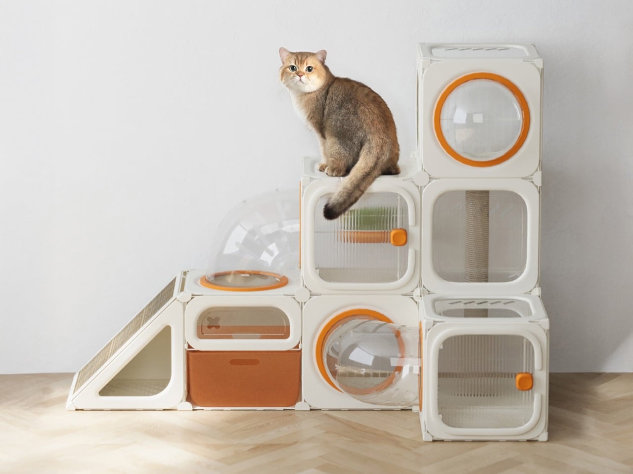
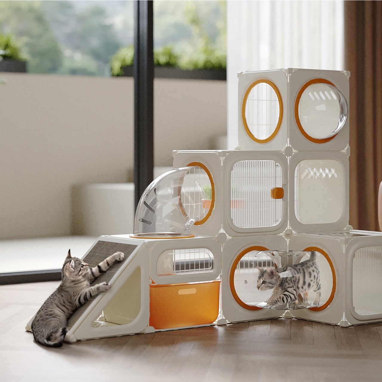
What if we designed homes the way cats would design them? Not human homes with a token scratching post in the corner but true spatial systems built around curiosity, vertical exploration, territorial comfort, and play. The N Plus Magic House begins precisely at that question, reframing pet furniture not as an accessory but as architecture scaled for feline psychology. Instead of treating a cat house as a static object, this project treats it as a living spatial framework, one that evolves alongside its inhabitant.

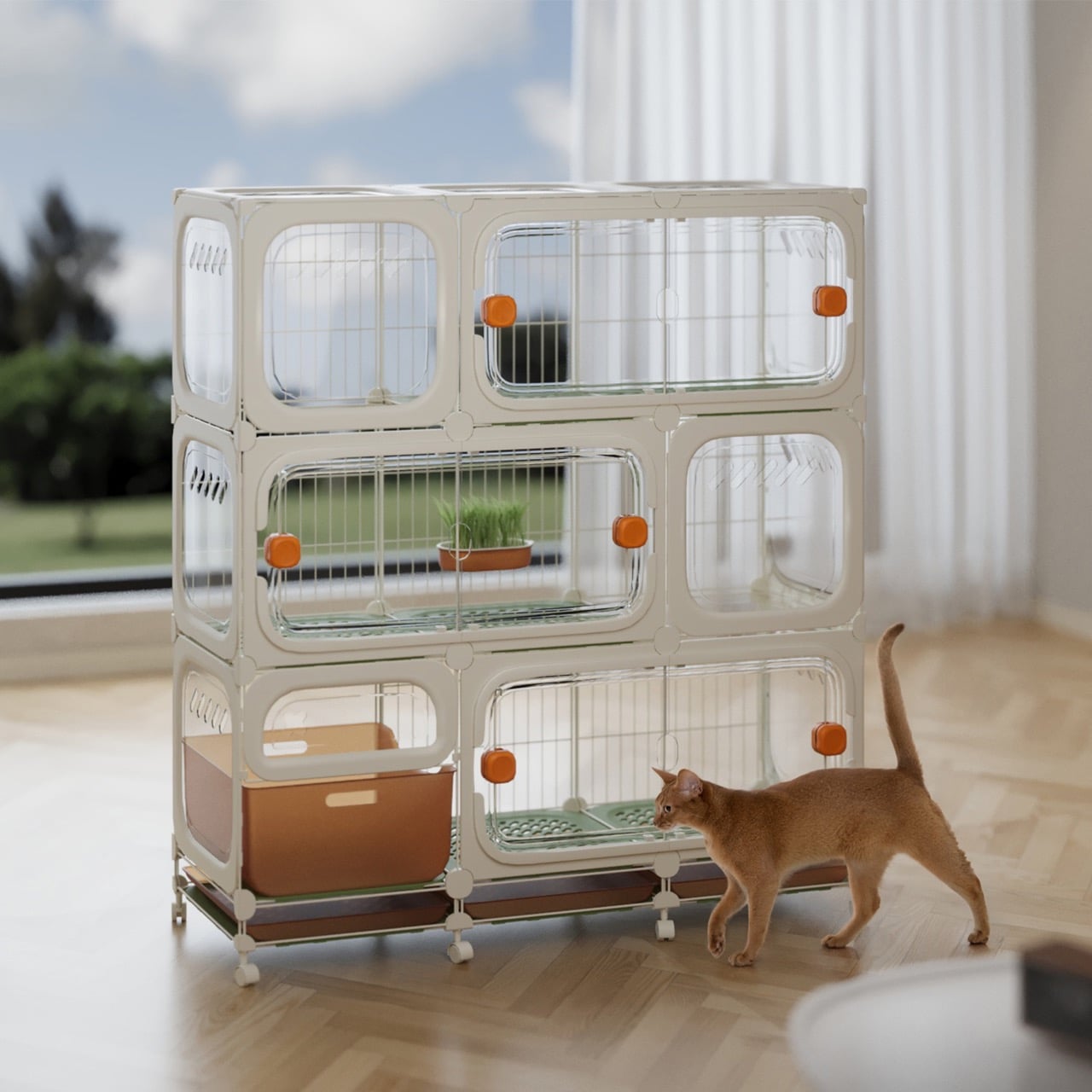
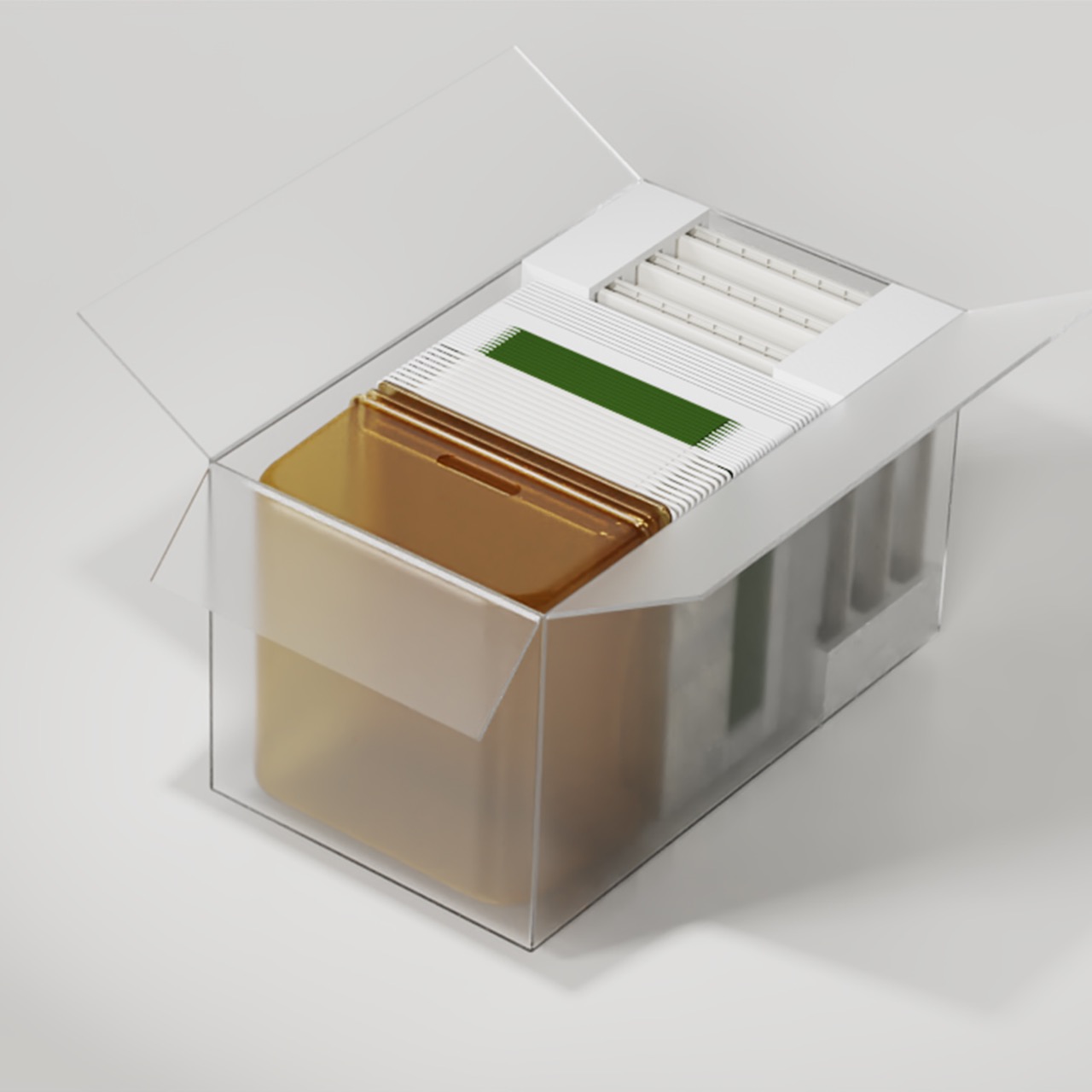
Today’s pet owners increasingly see their cats as emotional companions rather than animals that merely coexist in domestic space. That shift has quietly created a design problem. Traditional cat houses, even elaborate ones, tend to be fixed structures. They may be visually impressive, but they impose constraints on placement, adaptability, and long-term usability. The N Plus Magic House flips that paradigm by introducing modularity as its core philosophy. Rather than selling a finished form, it offers a system of standardized units that can be assembled, rearranged, expanded, or reduced as needed. The result is less like furniture and more like a customizable habitat kit.

Designer: Taizhou Hake Technology Co., Ltd

The genius of the design lies in its simplicity. Each module functions independently yet connects securely through precision-engineered connectors. Owners assemble structures by inserting panels into slots and stacking them like building blocks. No technical expertise, tools, or installation manuals are required. This intuitive construction method does something subtle but powerful. It turns pet care into participation. Instead of buying a finished object, users become co-designers of their cat’s environment. That interaction strengthens the emotional bond among the owner, the pet, and the space.

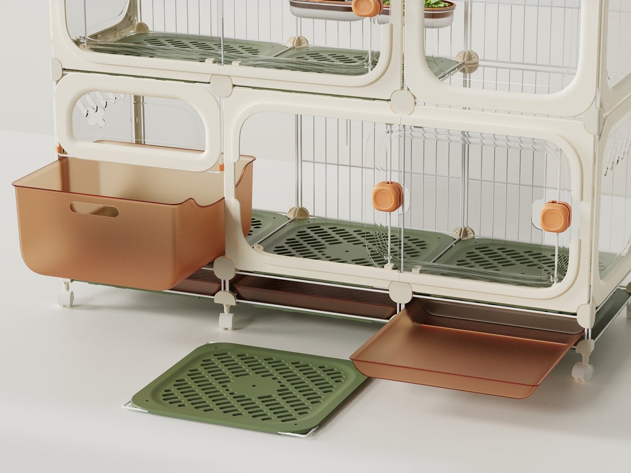
Material choices reinforce the system’s practicality. The structure combines impact-resistant PP resin, transparent PET panels for visibility, and carbon steel mesh for structural integrity. These materials balance durability with safety while allowing owners to monitor their pets without disturbing them. The manufacturing processes, such as injection molding and automatic wire welding, ensure consistency, precision, and reliability across units. Every element reflects careful alignment with feline behavior and safety requirements.

Behind the scenes, the development team approached the project with a research-driven mindset. They studied cats’ behavioral patterns, analyzed existing products on the market, and mapped owner expectations. One of the biggest technical challenges was maintaining structural stability while preserving modular flexibility. The solution was a custom connector engineered to withstand pressure and weight while preventing slippage. Its textured surface increases friction, ensuring modules remain firmly locked during use. This small component is arguably the system’s unsung hero. It transforms a playful concept into a reliable architectural structure.

Developed in Taizhou, Zhejiang Province, between July 2023 and November 2024 and later exhibited internationally, the N Plus Magic House represents a broader shift in product design thinking. It signals a move away from static ownership toward adaptive systems, objects that respond to changing needs over time. In a world where personalization defines modern consumer expectations, this approach feels less like a novelty and more like a glimpse into the future of domestic product design.

The post The Modular Cat Habitat That Turns Playful Curiosity Into Living Architecture first appeared on Yanko Design.

This Award-Winning Pen Floats Like a Cloud on Your Desk

Remember the last time you picked up a pen and actually stopped to look at it? Most of us don’t. We grab whatever’s lying around, scribble a note, and move on with our day. But designer Leila Ensaniat is challenging that autopilot relationship we have with one of our most familiar tools. Her creation, Pulse, recently snagged the Golden A’ Design Award for 3D Printed Forms and Products, and it’s easy to see why this isn’t your average ballpoint.

Pulse is what Ensaniat calls a “floating pen,” and that description actually makes sense once you see it. Drawing inspiration from the quiet, effortless drift of clouds, the pen feels less like a writing instrument and more like a small sculptural moment on your desk. It’s the kind of object that makes you pause, which is pretty rare when we’re talking about something as mundane as a pen.

Designer: Leila Ensaniat

What makes this design really interesting is how it blends old-school craftsmanship with cutting-edge technology. The pen features biomorphic patterns that look like they grew organically rather than being designed, and they’re created using lost wax casting in aluminum, silver, bronze, and gold. That’s a centuries-old metalworking technique typically reserved for jewelry and art pieces, not everyday writing tools. But that collision of traditional craft and contemporary design thinking is exactly what gives Pulse its unique character.

Ensaniat, who has a background as an industrial designer at Cisco specializing in consumer electronics, brings a tech-world sensibility to object design. Her approach centers on human-centered design, which basically means she’s thinking hard about how we actually interact with objects rather than just how they look on a shelf. With Pulse, that philosophy translates into something that feels natural in your hand while also making you reconsider what a pen can be.

The surface treatments are particularly thoughtful. Those nature-inspired patterns aren’t just decorative, they enhance both the visual appeal and the tactile experience of holding the pen. It’s a detail that matters more than you’d think. When an object feels good to touch, when it has texture and weight that seems intentional, it changes your relationship with it. You’re more likely to keep it on your desk, to reach for it specifically, to actually care about this tool that usually gets treated as disposable.

What’s fascinating about Pulse is how it sits at the intersection of sculpture and utility. The design explores that balance between being something you want to look at and something you actually need to use. Plenty of designer pens lean too hard into the luxury angle and end up feeling precious and impractical. Others focus purely on function and look forgettable. Pulse seems to nail that middle ground where form and function aren’t competing, they’re collaborating.

The project also gave Ensaniat deeper insight into the metal finishing and plating industry, which might sound technical but is actually important. Understanding how materials behave, how different metals can be worked and finished, how surface treatments hold up to actual use, that knowledge separates decorative design from functional design. A beautiful pen that tarnishes after a week or feels unbalanced when you write isn’t really good design, it’s just good marketing.

Created for her brand N I L A, which focuses on integrating technology seamlessly into everyday life, Pulse represents a broader design philosophy about making thoughtful, human-centered objects that solve real problems while also being distinct and meaningful. It’s an approach that feels increasingly relevant as we’re surrounded by more and more identical mass-produced stuff. Pulse won’t revolutionize how we write, and it’s not trying to. But it does suggest that even the most familiar, seemingly finished objects in our lives still have room for fresh thinking. Sometimes all it takes is a designer willing to ask why something has to be the way it’s always been, then having the skill to actually answer that question with something better.

The post This Award-Winning Pen Floats Like a Cloud on Your Desk first appeared on Yanko Design.

This New Sofa Compresses Like an Accordion (Fits in Your Cart)

Remember when buying a sofa meant measuring doorways, hoping it would fit in the elevator, and bribing friends with pizza to help you haul it up three flights of stairs? Designer Yuqi Wang just made all of that obsolete with the Accordion Modular Sofa, and the concept is as brilliant as it sounds.

The whole design centers on one genius idea: what if you only needed one type of module to create any sofa configuration you could imagine? The Accordion does exactly that with a single base unit that compresses and expands like its musical namesake. Through an internal structure made from high-resilience foam, wooden side panels, climbing ropes, and adjustable knobs, each module can change its size and curvature to fit whatever space you’re working with.

Designer: Yuqi Wang

What makes this really clever is how it solves multiple problems at once. Traditional modular sofas usually require you to buy different shaped pieces (corner units, armrests, middle sections) and hope you’ve guessed right about what you need. With the Accordion system, you’re working with identical modules that transform as needed. Want a compact loveseat for your apartment? Use two modules. Need a sprawling sectional for your living room? Add more units and configure them however you like. The possibilities aren’t just numerous, they’re practically endless.

But here’s where it gets even better. Because these modules compress, the whole thing ships flat-packed in a way that actually makes sense. We’re talking small enough to literally place in a shopping cart and carry out yourself. No more waiting weeks for delivery windows or paying outrageous shipping fees. The compression feature dramatically cuts down on packaging waste, storage costs, and the carbon footprint of transportation. It’s the kind of sustainable design choice that doesn’t require you to sacrifice anything in return.

The inspiration came from watching an accordion player perform, where Wang noticed how the instrument’s bellows compress and expand with such fluidity. That rhythmic movement translated into furniture creates something that feels almost alive, like the sofa adapts to you rather than the other way around. The technical execution involved studying compression mechanisms from various industrial applications before landing on a prototype that was both simple and effective.

For anyone who’s moved apartments multiple times or likes to rearrange furniture seasonally, this is a game changer. Your sofa can literally grow or shrink with your needs. Hosting a party? Expand it. Need more floor space for a home workout? Compress it down. The adjustable knobs make reconfiguring straightforward enough that you won’t need tools or an engineering degree.

The design world has taken notice. The Accordion Modular Sofa won the Golden A’ Design Award in Furniture Design for 2025, one of the most prestigious recognitions in the field. This isn’t just a participation trophy either. The Golden award represents first-rate, outstanding design that genuinely advances the intersection of art, science, and technology. What’s exciting is that this isn’t some far-off concept. The sofa is scheduled to hit the market in October 2025, which means you could actually have one of these in your home soon. It represents a shift in how we think about furniture ownership, moving away from bulky investments that lock you into one configuration toward adaptable pieces that evolve with your lifestyle.

The Accordion Modular Sofa proves that innovative design doesn’t have to be complicated or precious. Sometimes the best ideas are the ones that make you wonder why nobody thought of them sooner. A sofa that compresses for transport, expands for comfort, and reconfigures endlessly from a single module type? That’s the kind of practical magic that makes design truly great.

The post This New Sofa Compresses Like an Accordion (Fits in Your Cart) first appeared on Yanko Design.

Why This Air Conditioner Filter Took Design Cues from Your Toolbox

Let me tell you about something that caught my eye recently. When was the last time you actually looked forward to cleaning your air conditioner filter? Yeah, I thought so. But the folks at ZHEJIANG ZHONGGUANG ELECTRICAL CO.,LTD have done something pretty clever that might change how we think about one of home maintenance’s most tedious tasks. Their Snapcool air conditioner just won a Golden A’ Design Award, and here’s why it deserves your attention.

Picture a tape measure. You know that satisfying feeling when you pull out the metal strip and it snaps back into place with a smooth click? Now imagine that same mechanism applied to your AC’s filter system. That’s exactly what the design team behind Snapcool did, and the result is both practical and surprisingly delightful.

Designer: ZHEJIANG ZHONGGUANG ELECTRICAL CO.,LTD

The whole concept flips conventional air conditioner design on its head. Most AC units hide their filters behind awkward panels that require tools, patience, and sometimes a bit of cursing to remove. Snapcool mounts its filter system on the side, where it slides in and out with the ease of extending a measuring tape. This isn’t just about making maintenance easier (though it definitely does that). It’s about turning a chore into something almost fun.

What really makes this design sing is the eye-catching orange filter compartment. It’s not just there to look cool, though it certainly does that. The bold color serves as a constant visual reminder to check your filter status, which means you’re more likely to keep up with maintenance and enjoy better air quality. It’s the kind of thoughtful detail that shows someone actually considered how people interact with these machines in real life, not just in a sterile testing environment.

The aesthetics matter here too. Traditional air conditioners tend to be those white boxes we tolerate but don’t exactly love. Snapcool breaks that mold with its sleek, modern shape that actually looks like it belongs in a contemporary home. There’s something inherently futuristic about its design language. It feels less like an appliance and more like a piece of tech you’d actually want to show off. This project came to life through collaboration between six team members: Jinghong Zhang, Yuxin He, Menglin Xie, Yuhui Xu, Haiping Hou, and Xiaojun Yuan. Their collective vision demonstrates what happens when designers stop treating home appliances as purely functional objects and start seeing them as opportunities for innovation and delight.

The recognition from the A’ Design Award isn’t just a trophy for the mantle. It’s validation of a broader shift happening in product design right now. We’re moving away from the idea that utilitarian objects should be invisible or purely functional. Instead, designers are asking why everyday items can’t be both beautiful and practical, why they can’t spark a little joy even as they perform mundane tasks.

ZHEJIANG ZHONGGUANG ELECTRICAL CO.,LTD, operating under their OUTES brand, has been building a reputation for integrated climate control solutions across hotels, universities, factories, and residential buildings. This isn’t their first rodeo with design excellence either. They’ve racked up six A’ Design Awards, proving that Snapcool isn’t a fluke but part of a consistent commitment to pushing boundaries in HVAC design.

What strikes me most about Snapcool is how it challenges our assumptions. We’ve collectively decided that air conditioners should be forgettable white boxes tucked into corners. But why? There’s no rule that says climate control can’t have personality. There’s no law stating that filter maintenance must be annoying. The tape measure inspiration is genius because it’s so obvious in hindsight. We’ve had this perfectly functional, satisfying mechanism sitting in our tool drawers for decades, and it took creative thinking to realize it could solve a problem in a completely different context.

Snapcool represents a future where even the most utilitarian objects can bring a smile to our faces. Where maintenance becomes less of a burden and more of an experience. Where our living spaces are populated by thoughtfully designed products that respect both our intelligence and our desire for beauty. Sometimes the best innovations aren’t about inventing something entirely new. They’re about looking at old problems through fresh eyes and borrowing brilliance from unexpected places.

The post Why This Air Conditioner Filter Took Design Cues from Your Toolbox first appeared on Yanko Design.

When Your Speaker Is Also a Statement: The Tresound Mini

Sometimes the best tech isn’t the loudest. It’s the one that makes you pause and actually look at it before you press play. That’s what designers Yong Cao and Jianfeng Lv have managed to pull off with the Tresound Mini, a desktop Bluetooth speaker that refuses to be just another black box on your desk.

At first glance, this compact speaker looks like it wandered in from a modern art gallery. Its cone-shaped design is clean, almost architectural, with a minimalist aesthetic that feels intentional without being precious about it. The form isn’t just for show, either. TRETTITRE, the emerging HiFi brand behind the speaker, describes itself as bridging traditional audio quality with something more forward-thinking, and you can see that philosophy at work here.

Designers: Yong Cao and Jianfeng Lv

The Tresound Mini recently won the Golden A’ Design Award in the Audio and Sound Equipment Design category, which is one of those achievements that signals serious design cred. But awards aside, what makes this speaker interesting is how it thinks about the desktop experience differently. Instead of trying to dominate your workspace with aggressive angles or flashy lights, it takes a more refined approach. The design integrates seamlessly into your environment, whether that’s a home office setup, a creative studio, or just a corner of your apartment where you actually get things done.

Art Director Yong Cao and Designer Jianfeng Lv, both from China, approached this project with a focus on what they call the “deep integration of brand design and product design”. That sounds like design speak, but what it really means is that every element serves a purpose. The cone shape isn’t arbitrary. It contributes to the audio performance while also giving the speaker a distinctive profile that stands out without screaming for attention. It’s the kind of design that works equally well in a carefully curated Instagram photo or just sitting there doing its job.

Let’s talk about the packaging, because this is where things get genuinely clever. Instead of going with the typical cardboard box and foam inserts, the Tresound Mini comes with a carrying bag that’s wet-pressed from bamboo fiber pulp. This isn’t just packaging in the traditional sense. It’s designed to double as a carrying case, making the speaker genuinely portable. The bamboo fiber approach is both environmentally friendly and cost-effective, reducing packaging waste while providing actual protection for the product. It’s the kind of thoughtful detail that shows someone was actually thinking about the full lifecycle of the product, not just the unboxing moment.

The portability factor is key here. Desktop speakers traditionally live in one spot, tethered to your workspace. But the Tresound Mini was designed with the understanding that people move around now. You might want it on your desk in the morning, out on a balcony in the afternoon, or in your kitchen while you’re cooking dinner. The compact size and that bamboo fiber carrying bag make that kind of flexibility possible.

TRETTITRE positions itself as catering to “the new generation of HiFi enthusiasts”, which is a smart read of where audio culture is heading. There’s a growing audience that cares about sound quality but doesn’t want to sacrifice design or deal with the bulk and complexity of traditional HiFi setups. They want something that sounds good, looks intentional, and fits into spaces that might not have room for a full speaker system. The Tresound Mini seems built specifically for that demographic.

What’s interesting about this design is how it challenges the assumption that good audio equipment needs to look technical or industrial. There’s no display screen, no visible screws, no aggressive branding. Just a clean geometric form that happens to deliver quality sound. It’s the audio equivalent of those minimal tech accessories that proved you don’t need to sacrifice aesthetics for function.

The success of the Tresound Mini might signal a broader shift in how we think about desktop audio. As more people work from home or create hybrid living and working spaces, there’s an appetite for products that perform well without dominating the visual landscape. We want our tech to be good at what it does, but we also want it to feel like it belongs in our actual lives, not in a showroom.

Yong Cao and Jianfeng Lv have created something that manages to be both functional and thoughtful. The Tresound Mini proves that when you approach product design with real consideration for how people actually use things, you can create something that transcends its basic function and becomes worth talking about.

The post When Your Speaker Is Also a Statement: The Tresound Mini first appeared on Yanko Design.

This Award-Winning Bookstore Looks Like a Portal to Outer Space

Picture walking through a bustling marketplace in China and suddenly stumbling upon what looks like a giant celestial machine that’s crashed through the ceiling. That’s exactly the vibe designer Li Xiang was going for with the Huai’an Zhongshuge Bookstore, and let me tell you, this place is absolutely wild.

Located in Jiangsu Province and completed in 2023, this isn’t your typical cozy corner bookshop with reading nooks and potted plants. Instead, Li Xiang of X+Living studio created something that feels like you’ve stepped through a portal into another dimension. The bookstore just snagged the 2025 Platinum A’ Design Award in Interior Space and Exhibition Design, which is basically the design world’s way of saying “this is incredibly special.”

Designer: Li Xiang

What makes this space so mind-blowing? It’s all about those massive three-dimensional structures that look like astronomical instruments floating inside the store. Imagine concentric rings and geometric forms inspired by celestial mechanics, all reimagined as bookshelves and display areas. The books themselves seem to defy gravity, positioned on these dramatic structures in ways that make you feel like you’re browsing a library floating somewhere in deep space.

But here’s the thing that really gets me about this design. Li Xiang didn’t just want to create something that looked cool for Instagram (though it absolutely does). There’s a deeper philosophy at work here. He describes the project as tearing open a spacetime rift in the midst of everyday city life, which sounds dramatic but actually makes total sense when you think about it.

Li Xiang believes that in our fast-paced modern world, many people have lost the ability to dream. We get stuck in routines, moving through identical concrete cityscapes, dealing with the mundane realities of daily life. His idea was to create a space where people could detach from all that, even just briefly, and rediscover something more imaginative within themselves. As he puts it, the architectural space becomes an extension of dreamlike reality, a spiritual revelation suspended above the ordinary city below.

That’s pretty powerful stuff for a retail space, right? But it works because the design truly commits to the concept. Those exaggerated celestial forms aren’t just decoration. They break up the monotony of reinforced concrete and rectangular spaces that dominate urban architecture. When you’re surrounded by these cosmic structures, your brain kind of has no choice but to shift gears and enter a different mental space.

What I really appreciate is how this fits into the broader Zhongshuge philosophy. This bookstore chain follows a principle of “chain but not replicate, each store with its own cultural style.” So while there are other Zhongshuge locations across China, each one tells its own story and creates a unique experience. The Huai’an location chose to go full sci-fi spectacular, and the results speak for themselves.

From a technical standpoint, pulling this off wasn’t simple either. The project had to overcome some seriously complex spatial and structural challenges to create that feeling of cosmic vastness within what’s actually a confined retail area. Those massive rings and irregular geometric forms needed precise engineering to work safely while maintaining that surreal, gravity-defying aesthetic.

There’s something really special about seeing retail design pushed this far. We’re used to stores being functional, maybe pleasant, occasionally stylish. But Li Xiang took a different approach entirely, creating an environment that prioritizes experience and emotion over conventional retail logic. It’s architecture that values your mental space, that wants you to feel something beyond just the transaction of buying books.

If you’re someone who gets excited about the intersection of design, technology, and culture, this bookstore represents something important. It shows us that commercial spaces don’t have to be boring or predictable. They can be destinations, experiences, even forms of art that make us think differently about the everyday spaces we move through. And maybe, just maybe, they can help us remember how to dream a little.

The post This Award-Winning Bookstore Looks Like a Portal to Outer Space first appeared on Yanko Design.

Handcrafted Porcelain Dinnerware Redefines Everyday Dining Through Craft, Light, and Ritual

Porcelain dinnerware has long been shaped by the logic of industrial production. Uniform forms, limited color palettes, and standardized finishes dominate the contemporary table, reducing porcelain to a neutral backdrop rather than an active part of the dining experience. This porcelain dinner set positions itself in deliberate contrast to that reality. It proposes a quieter, more thoughtful vision in which craft, material honesty, and visual sensitivity redefine how everyday meals are experienced.

At the core of the design lies a simple but powerful idea: food presentation should be as engaging as flavor. Dining is not only an act of nourishment, but also one of attention, rhythm, and atmosphere. By merging handcrafted processes with functional versatility, the set bridges modern living and nostalgic familiarity. It feels contemporary in its restraint, yet warm in its tactile and visual language.

Designer: Monte Porcelain

The collection consists of four pieces designed as a cohesive system: a glass, a bowl, a deep plate known as the Saturn plate, and a service or supla plate. Rather than assigning each object a single rigid purpose, the designer embraced multi-use functionality. This approach reflects evolving dining habits, where objects are expected to adapt fluidly across meals, occasions, and spaces.

The glass is conceived as more than a vessel for drinks. Its form allows it to function equally well as a dessert or snack bowl, encouraging informal and flexible use. The bowl supports a wide range of meals, from soup and salad to breakfast cereal and hot appetizers. Along its upper edge, engraved firefly patterns introduce a subtle decorative layer. These motifs are filled with glaze, ensuring a smooth, sealed surface that interacts gently with light, adding depth without distracting from the food itself.

The Saturn plate is designed for both sauced and non-sauced dishes, such as pasta and main courses. Its flat-edged form frames the food cleanly, while the patterned base enriches the visual composition of the plate. The service plate anchors the set, offering generous proportions suitable for main course presentations or layered pasta services. Together, the four pieces create a table setting that is expressive yet balanced.

Material integrity and production ethics play a central role in the project. White porcelain, often referred to as bone porcelain, was selected for its suitability for food contact, durability, and timeless visual quality. Each piece was cast using high-quality porcelain clay in plaster molds, then fired at 1230 degrees with transparent glaze. The firefly patterns were engraved using a special technique and selectively colored or left transparent, allowing light to pass through while remaining fully sealed and hygienic.

The project was developed over an eight-month period, beginning in June 2024 and completed in February 2025 at the Monte Porcelain Ayvalık Workshop. Every stage of production was carried out by hand, including molding, casting, glazing, and painting. Throughout the process, a fair production approach was maintained, with careful consideration for environmental responsibility and respect for nature. No living creatures were harmed at any stage.

Dishwasher safe, food safe, and designed for long-term daily use, the set demonstrates that handcrafted objects can be both poetic and practical. Recognized within international design contexts such as the A’ Design Award & Competition, this dinnerware collection repositions porcelain as an active participant in the dining ritual. It invites users to slow down, notice light and texture, and rediscover the quiet pleasure of thoughtfully designed everyday objects.

The post Handcrafted Porcelain Dinnerware Redefines Everyday Dining Through Craft, Light, and Ritual first appeared on Yanko Design.

Step Inside this Giant Kaleidoscope That Feels Like it Descended From Krypton

When Li Hao’s Pop Star View Platform first appeared in the landscape, it probably broke a few people’s brains. This isn’t your typical public art installation that politely sits in a corner being contemplative. Instead, it’s a massive crystalline beast that looks like it crash-landed from Krypton, all faceted surfaces and impossible geometry that shifts from alien fortress to disco ball depending on the light. The structure is based on an icosahedron, but Li Hao has exploded and reconstructed it into something that feels both mathematically precise and completely otherworldly. You’re looking at what happens when someone takes sacred geometry and runs it through a kaleidoscope filter.

The visual impact is absolutely bonkers in the best possible way. Those iridescent panels catch and fracture sunlight into a spectrum that would make a prism jealous, creating this constantly shifting light show that transforms throughout the day. At sunset, the thing becomes a beacon of pure color that radiates across the landscape like some kind of interdimensional lighthouse. The dichroic glass or film coating on each facet creates that oil-slick rainbow effect, where purples bleed into teals, oranges melt into magentas, and the whole structure seems to pulse with its own internal energy.

Designer: Li Hao

What’s brilliant about Pop Star is how it plays with scale and perception. From a distance, it reads as this monolithic alien artifact, but as you get closer, the complexity of the internal structure reveals itself. Those black steel frames create a secondary geometric pattern within each colored panel, adding depth and visual texture that keeps your eye engaged. The mesh or perforated elements in some sections let you see through the structure, creating layers of transparency that make the whole thing feel less solid and more like a hologram materializing in space.

Creating a structure this large with so many angled surfaces while maintaining structural integrity requires serious computational design work. Each joint has to handle complex load distributions, and the panel mounting system needs to accommodate thermal expansion while keeping those pristine edges aligned. The fact that it doubles as a viewing platform means the internal framework has to support human traffic, adding another layer of complexity to what could have been just a sculptural statement.

Pop Star View Platform earned its Golden A’ Design Award by doing something most public art fails at: it creates genuine wonder without being pretentious about it. Whether you’re a design nerd who appreciates the mathematical elegance or just someone walking by who stops dead because holy shit, what is that thing, the installation delivers. It’s Instagram-ready spectacle with serious conceptual depth, proving that sometimes the most effective way to make people think about space, light, and perception is to build something so visually arresting they can’t look away.

The post Step Inside this Giant Kaleidoscope That Feels Like it Descended From Krypton first appeared on Yanko Design.

❌