❌

Vue lecture

Two Hidden Mechanical Movements Power One Slim Louis Erard Watch
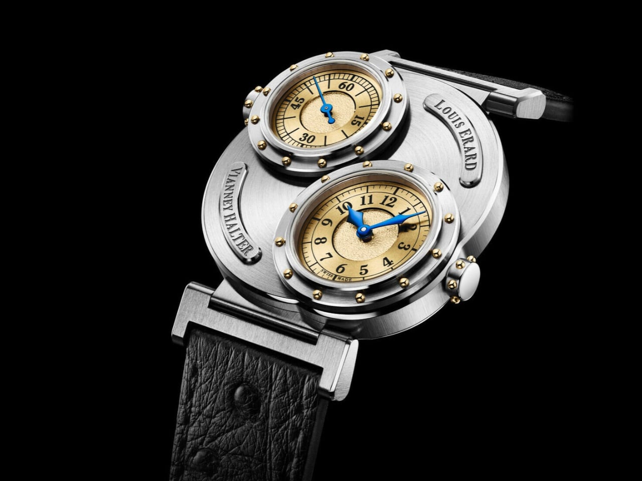
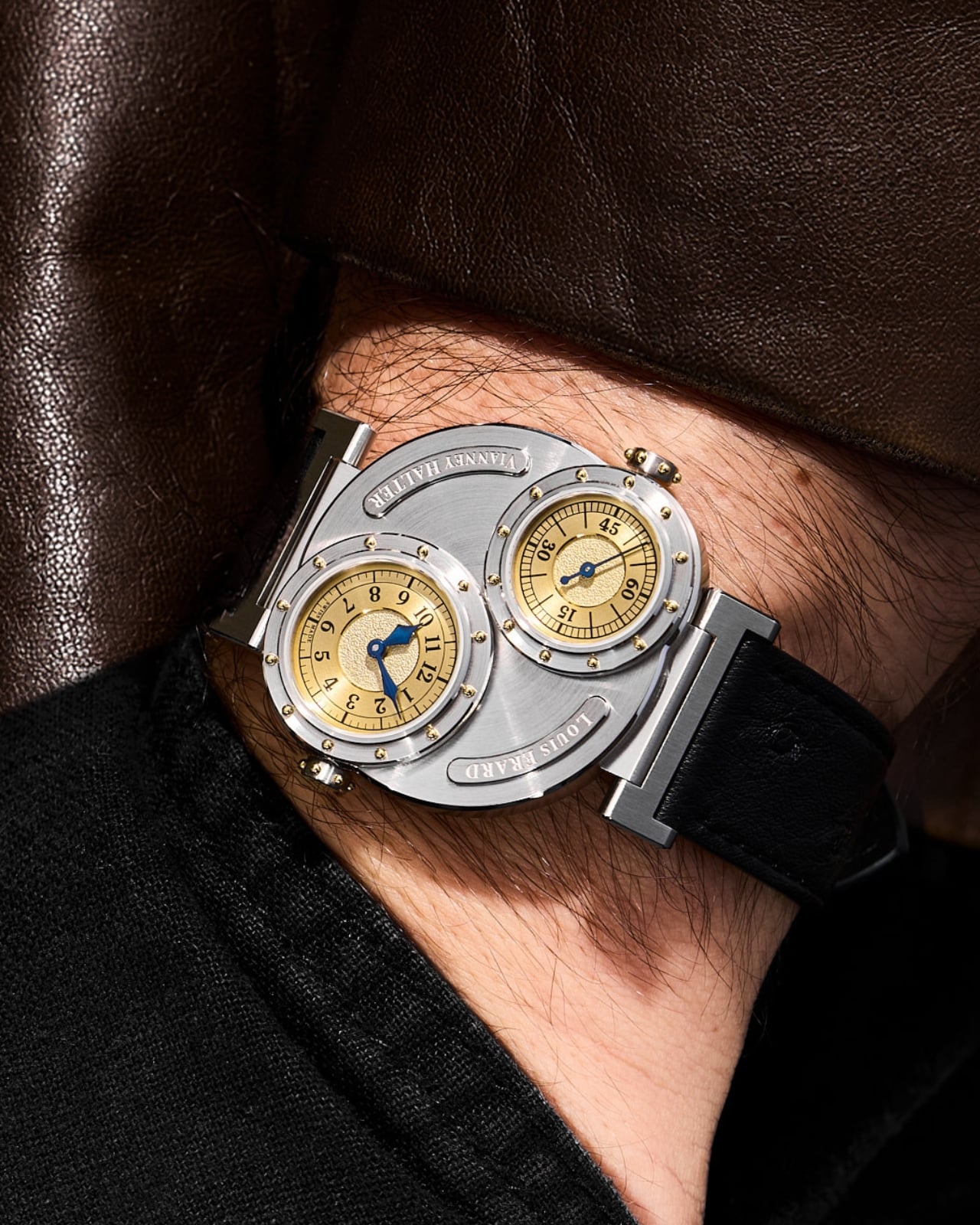
Two riveted portholes occupy the face of the Louis Erard × Vianney Halter Futur Antérieur, making it look like submarine equipment that escaped into a jewelry case. One window tells the hours and minutes. The other gives the seconds their own stage. I like the extravagance of that arrangement, especially because this limited-edition mechanical watch tackles a specific design challenge: delivering Halter’s distinctive aesthetic in a less prohibitively expensive package.

At roughly $6,000 before taxes, “less expensive” needs context. Halter’s Antiqua, the perpetual-calendar watch he introduced in 1998, occupies a six-figure collecting universe. The Futur Antérieur translates its porthole architecture into a simpler watch that tells the time. Nobody needs to pretend that makes it affordable. Still, I appreciate a collaboration that preserves an independent watchmaker’s recognizable ideas rather than borrowing a famous name and printing it on an otherwise ordinary dial.

Designers: Louis Erard × Vianney Halter
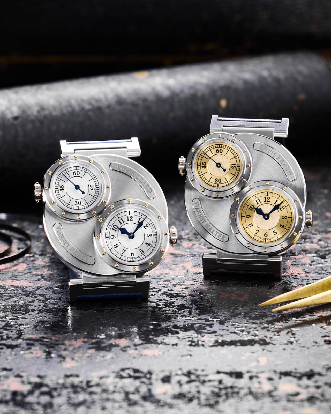
The cleverest decision sits behind those windows. Two separate Sellita SW100 automatic movements power the displays, one handling hours and minutes, the other running the seconds. That sounds wonderfully excessive for such basic information, and it is. But it also gives each dial its own mechanical foundation. Rather than developing an elaborate mechanism to reposition the indications, the designers have used two small, existing movements to support the layout they wanted.

Two movements might suggest a second time zone, but that isn’t what you get. Design Milk reports that Louis Erard chose running seconds partly because keeping two movements sufficiently aligned for dual-time use would be difficult at the intended price. That’s useful context, and a reminder that the extra mechanism serves the design more than the feature list. I’d approach this as an expressive object, not a purchase justified by having more functions.
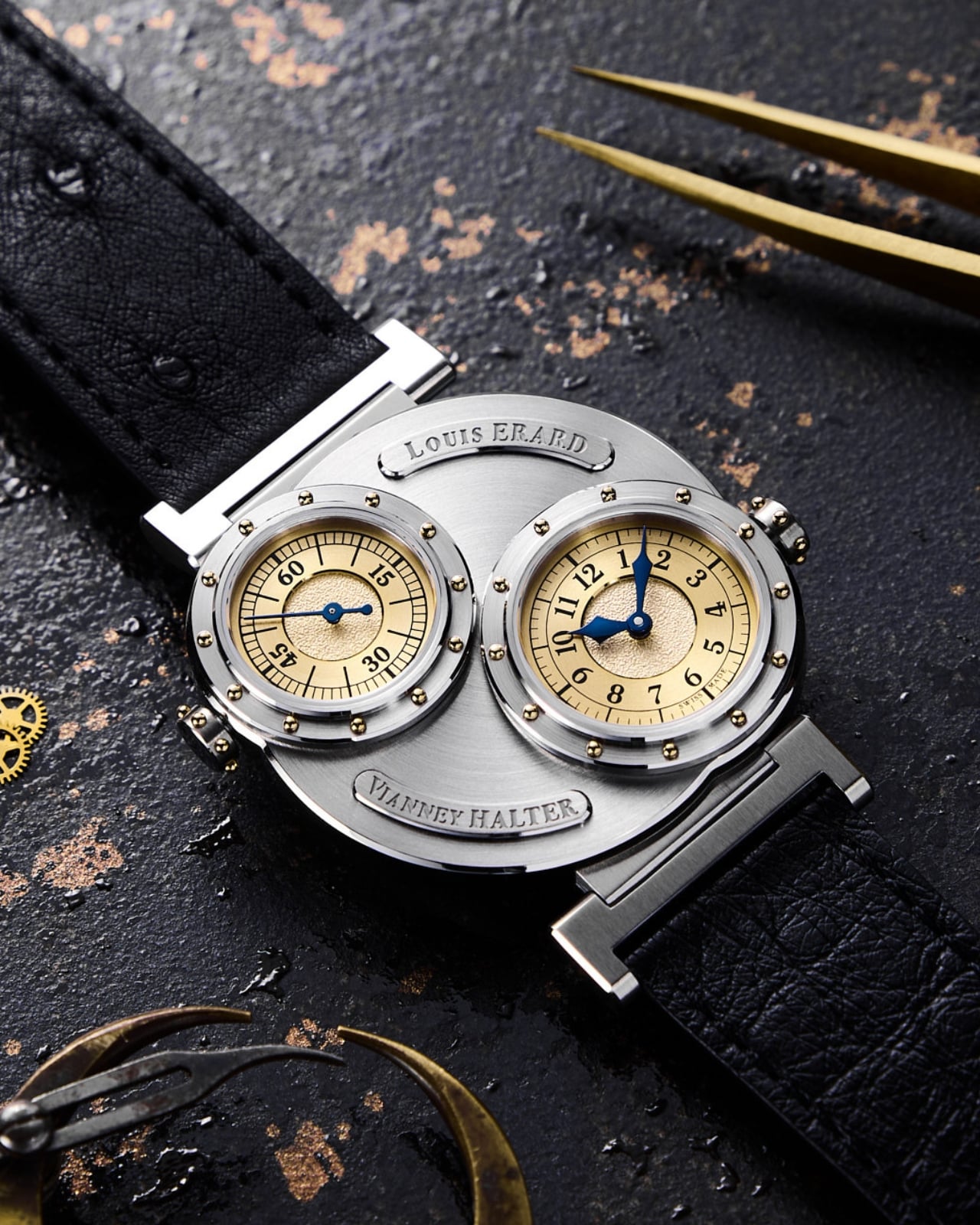
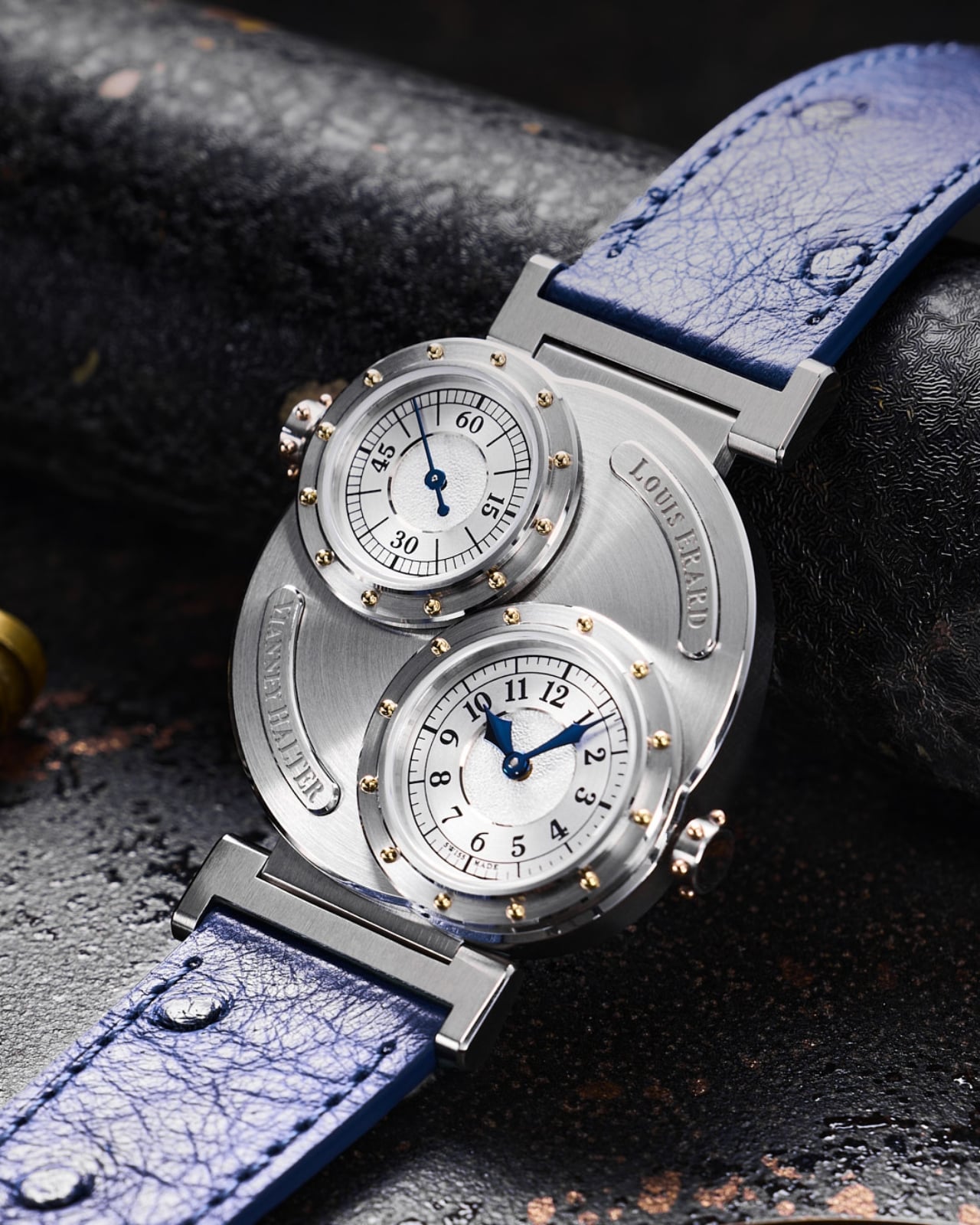
The dimensions help that expression avoid becoming a costume. Its stainless-steel case measures 38mm across and 44mm long, with a thickness of just 8.85mm. Those numbers matter because the raised windows and prominent crowns could easily suggest a much chunkier watch in photographs. On paper, the profile is restrained. I haven’t worn it, but I appreciate the decision to keep this much visual activity within relatively compact dimensions.

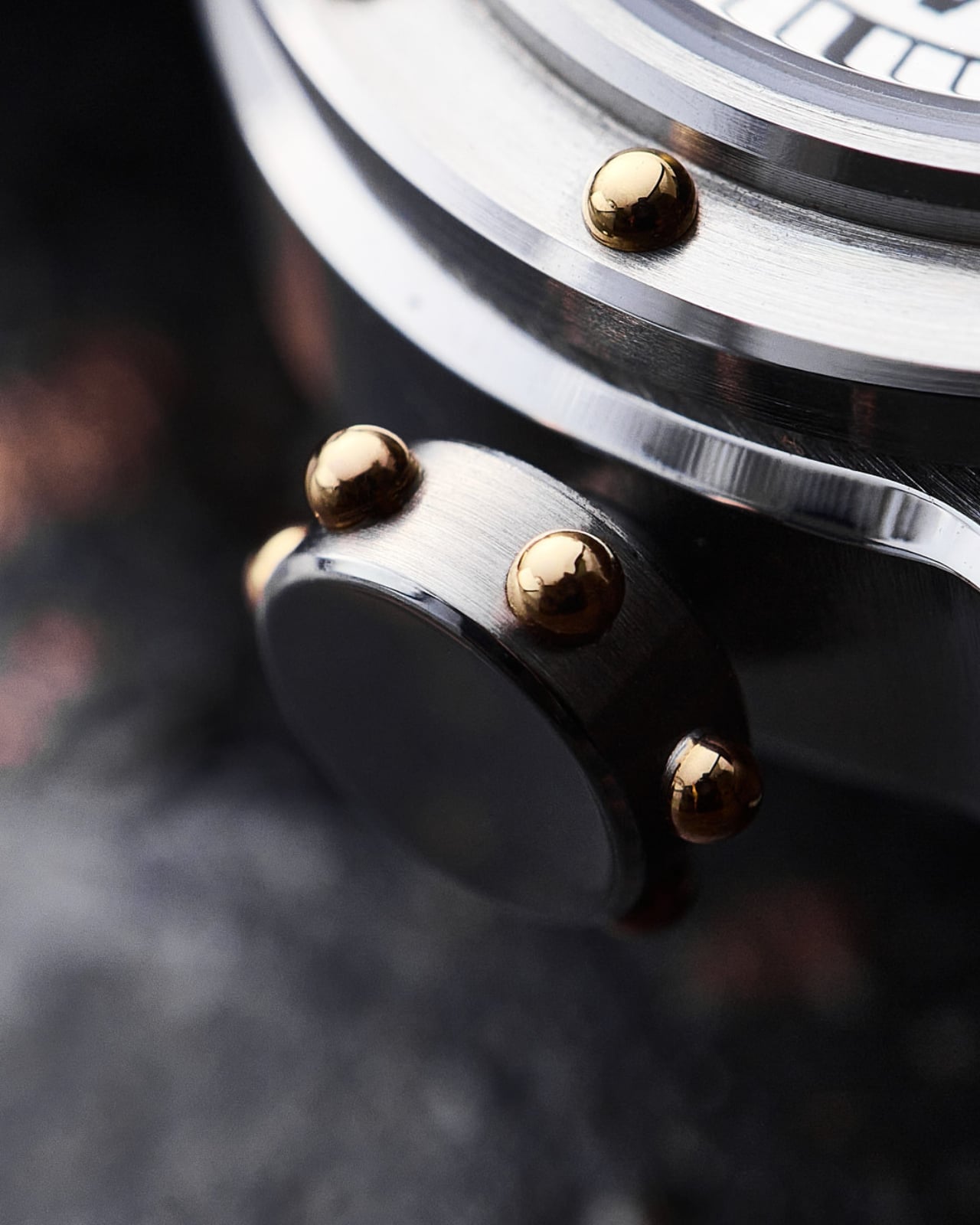
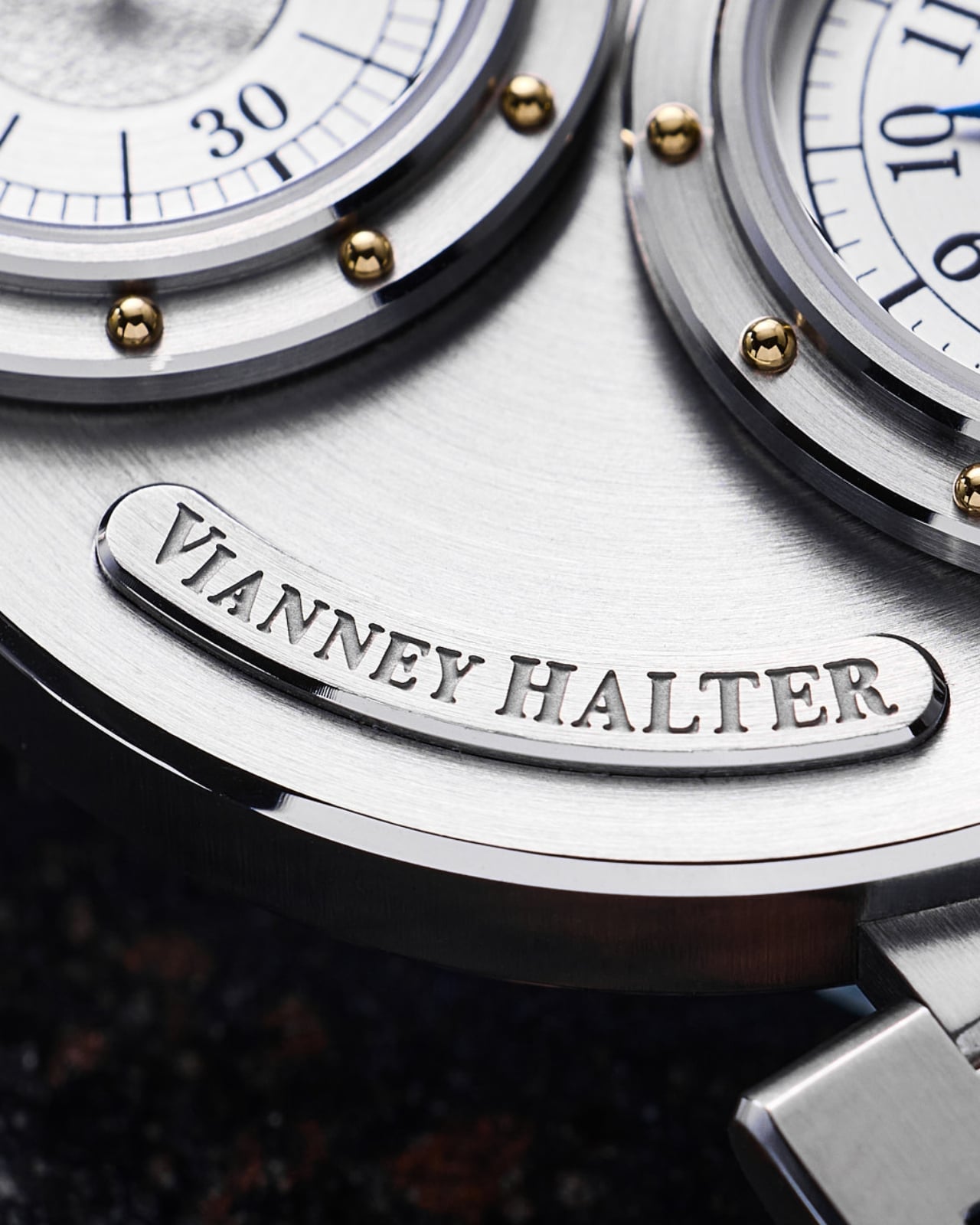
Look closer and the metalwork carries much of the personality. Each bezel has 12 yellow-gilt rivets, while each crown gets six. Brushed steel sits beside polished edges, and the blue steel hands introduce a cooler color against those warm accents. In the product images, the separate nameplates feel almost like labels attached to an old scientific instrument. The appeal, for me, comes from those specific details rather than the broad steampunk label.
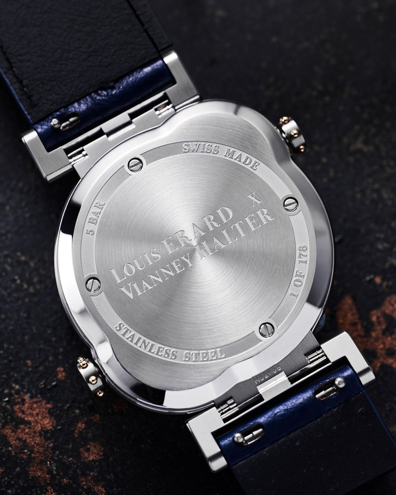
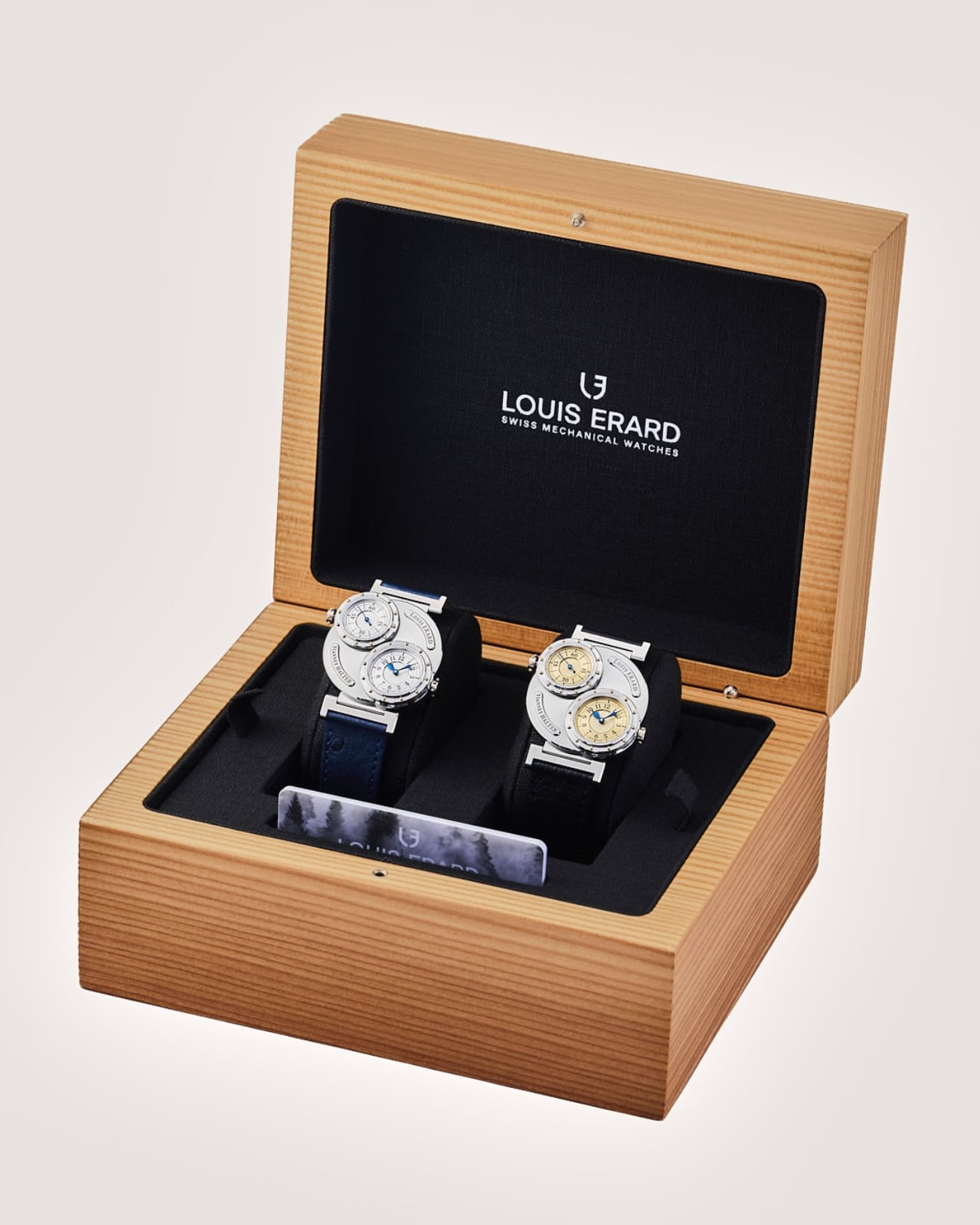
The two versions pull that character in slightly different directions. Gold combines gold-toned dials with a black ostrich-leather strap. Silver pairs silver-toned dials with blue ostrich leather, picking up the color of the hands. I’d choose Silver. Its cooler palette lets the little gold rivets register as individual details instead of joining a larger wash of gold. The asymmetrical layout already has plenty to say without needing a louder color scheme.

There are ordinary ownership considerations beneath the unusual face. Louis Erard specifies a minimum 38-hour power reserve for each movement, with 42 hours typical. Leave it unworn for a weekend and you may return to a stopped watch. Quick-change strap bars offer a more convenient detail, letting owners change the strap without making that another complicated operation. These are worth considering alongside the sculptural appeal.

Each version is limited to 178 pieces and listed at CHF 4,950 before taxes. As of November 6, 2026, both are marked sold out on Louis Erard’s website. That scarcity limits the accessibility argument, even at this lower price. Still, the design itself makes sense to me: keep the familiar task of reading hours and minutes, then spend the mechanical extravagance on giving the passing seconds an unnecessarily handsome room of their own.
The post Two Hidden Mechanical Movements Power One Slim Louis Erard Watch first appeared on Yanko Design.
  •  

Embru’s Patio Chair Can Get a New Seat Without a New Frame

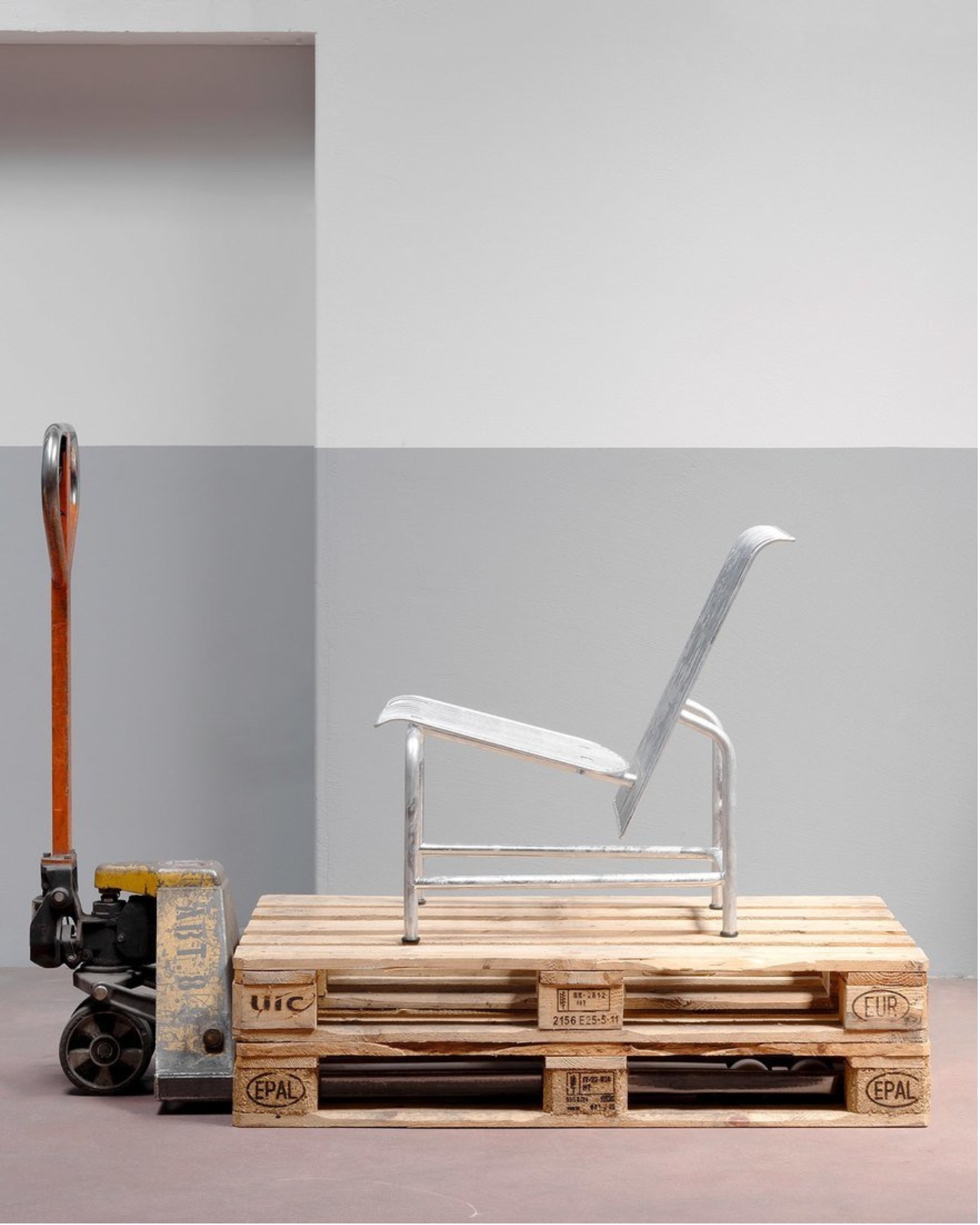
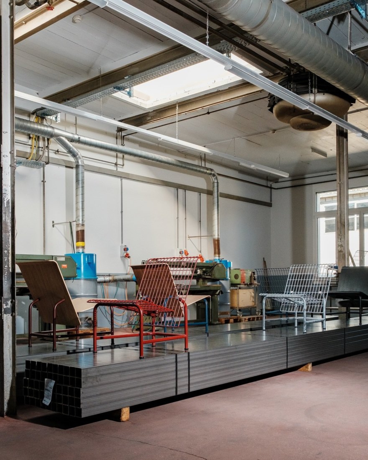
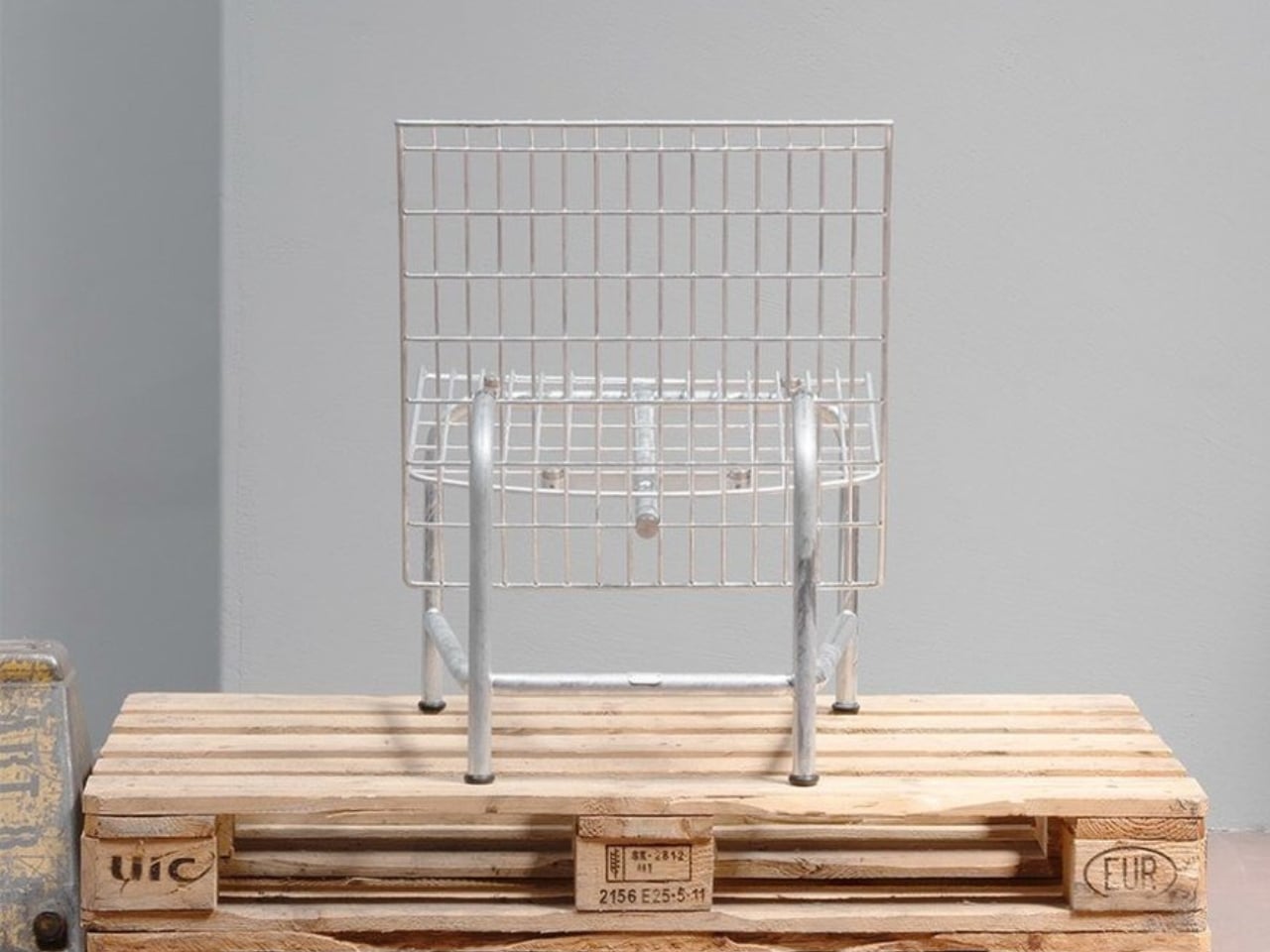
A wire-grid lounge chair sounds like a hard sell for an afternoon off. Yet Moritz Schmid’s Patio Chair for Swiss furniture maker Embru has a visual ease that makes me want to give it a chance. The open seat and back leave much of the chair transparent, while the frame gives it a clear outline. Its more persuasive detail, though, addresses a familiar frustration: having to replace an entire object because one part has given up.

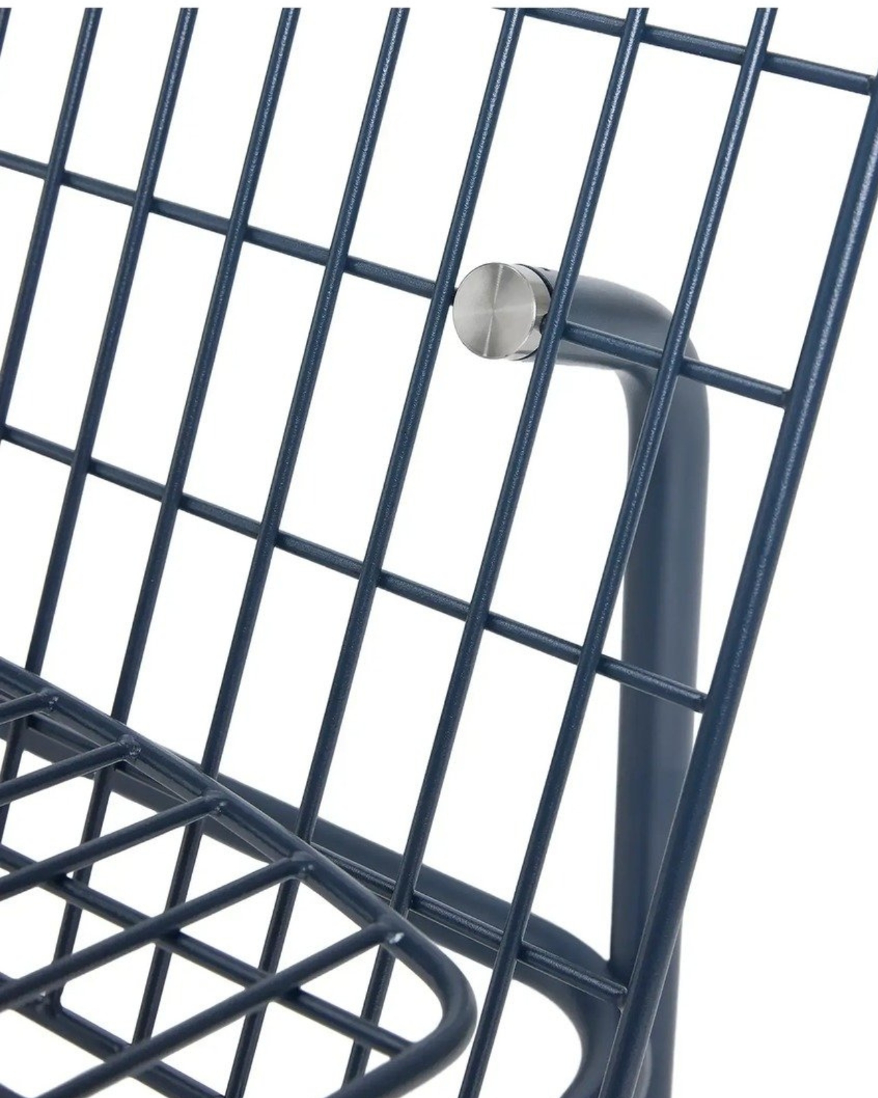
Embru describes the construction as modular, with individual components that can be replaced or repaired. A specially developed mounting system accommodates different seating surfaces. That makes the announced chair interesting beyond its appearance. If the seat becomes damaged, the design allows the remaining structure to stay in use. I’d rather see that possibility built into a chair from the beginning than encounter it as an expensive customer-service question later.

Designer: Moritz Schmid for Embru

The visible connection between backrest and frame is worth a closer look. In Embru’s detail photograph, a circular metal fitting interrupts the blue grid, making the attachment point part of the composition. It’s a small, deliberate-looking piece of hardware, and I like that it hasn’t been disguised. You can read the chair as an assembly of parts. Visually, that gives the repairability story a little credibility before anyone starts explaining the engineering.

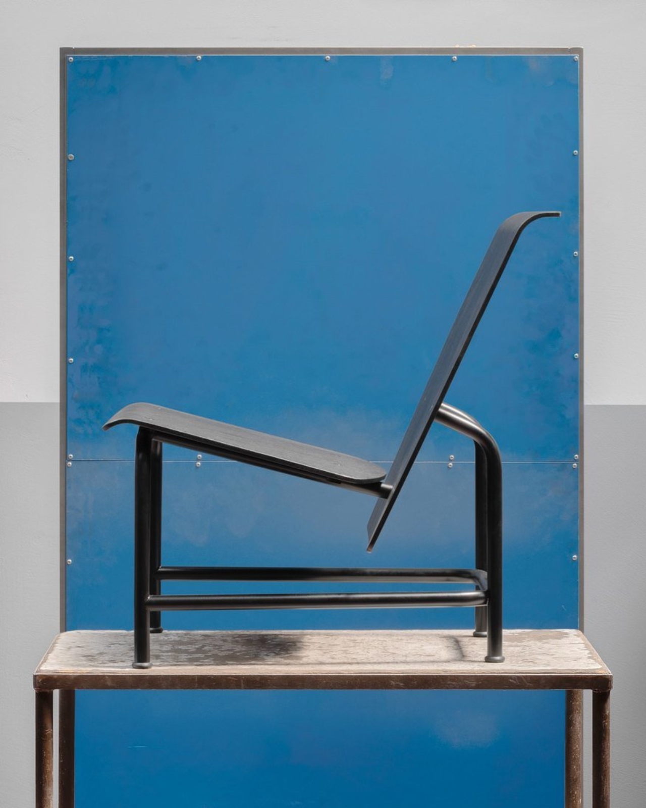
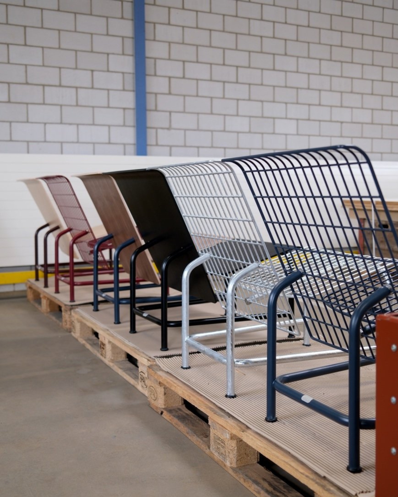
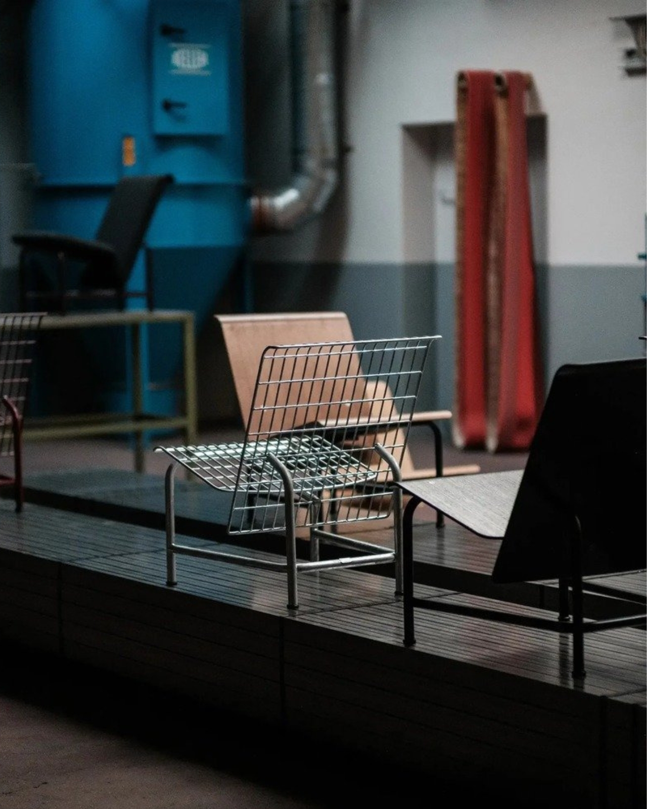
The material options give that construction another purpose. Embru plans an outdoor grid version and an indoor version with wood-veneer panels, including oak, ash, black ash, and walnut. Listed finishes include wine red, gray-blue, black, and silver hot-dip galvanizing. My preference would be the gray-blue grid: it gives the industrial geometry enough color to feel intentional without turning the chair into the loudest object on the patio.

The wood version changes the visual balance considerably. Where the grid lets the background pass through, the broad panels create solid planes. The rear view of the black version makes this especially clear: the backrest reads almost like a sheet suspended above the slender frame. That’s a useful distinction for anyone who likes the underlying shape but doesn’t want outdoor furniture setting the tone inside their living room.

Schmid has explored related territory with Embru before. His earlier Park Chair uses a tubular steel frame, with curved rear legs that give a straightforward garden chair an unexpectedly animated profile. Embru says that design was developed around the manufacturing capabilities at its Rüti factory. I appreciate that context because it makes the Patio Chair feel less like an isolated styling exercise. There’s an ongoing conversation here between a designer, a material, and the people equipped to shape it.

Appearance only gets a lounge chair so far, of course. I’d want to sit in the grid version before calling it an all-afternoon favorite. The photographs establish its shape, not how the seating surface feels after an hour with a book. For me, that’s the unresolved question that matters most. An appealing frame and replaceable parts are good reasons to pay attention, but neither substitutes for getting comfortable. The word “lounge” still has work to do.

Embru currently expects the Patio Chair to become available at the end of 2026. Its preview doesn’t provide a price or confirm US availability. I’d also want to know how replacement parts will be ordered and priced. Designing a component to come off is valuable; making its replacement straightforward to obtain is what turns that decision into a useful ownership benefit.

Still, the premise earns my interest. I don’t need every chair to become a family heirloom, and I’m wary of furniture being described as timeless before anyone has lived with it. I do want the option to keep a chair I like when one component wears out. The Patio Chair gives that ordinary expectation a considered form. Provided the parts support follows through, its most attractive feature may become apparent years after the first photograph.

The post Embru’s Patio Chair Can Get a New Seat Without a New Frame first appeared on Yanko Design.

  •  

A Pop-Up Book Vase Offers Six Looks Without Extra Vases

I am not much of a flower person and, consequently, not much of a flower vase person. As much as I know that they can add to the aesthetic beauty of any space, I don’t have much space to display them or add to my messycore clutter. Also, most flower vase designs don’t appeal to me enough that I’d actually make space for them. But as a certified book lover, anything that’s close to the look of a book is something I might actually consider.

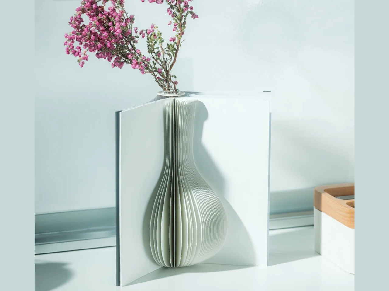
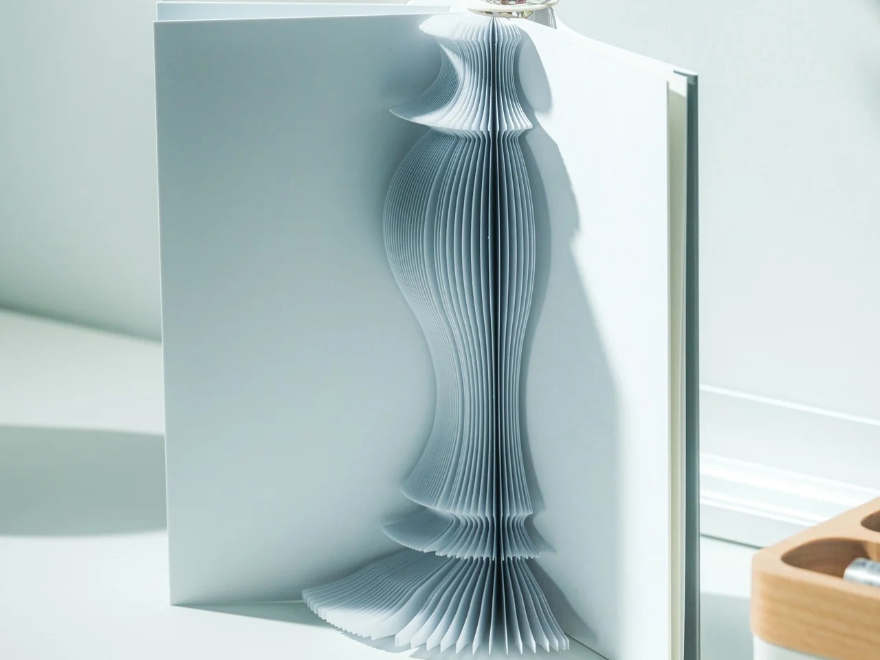
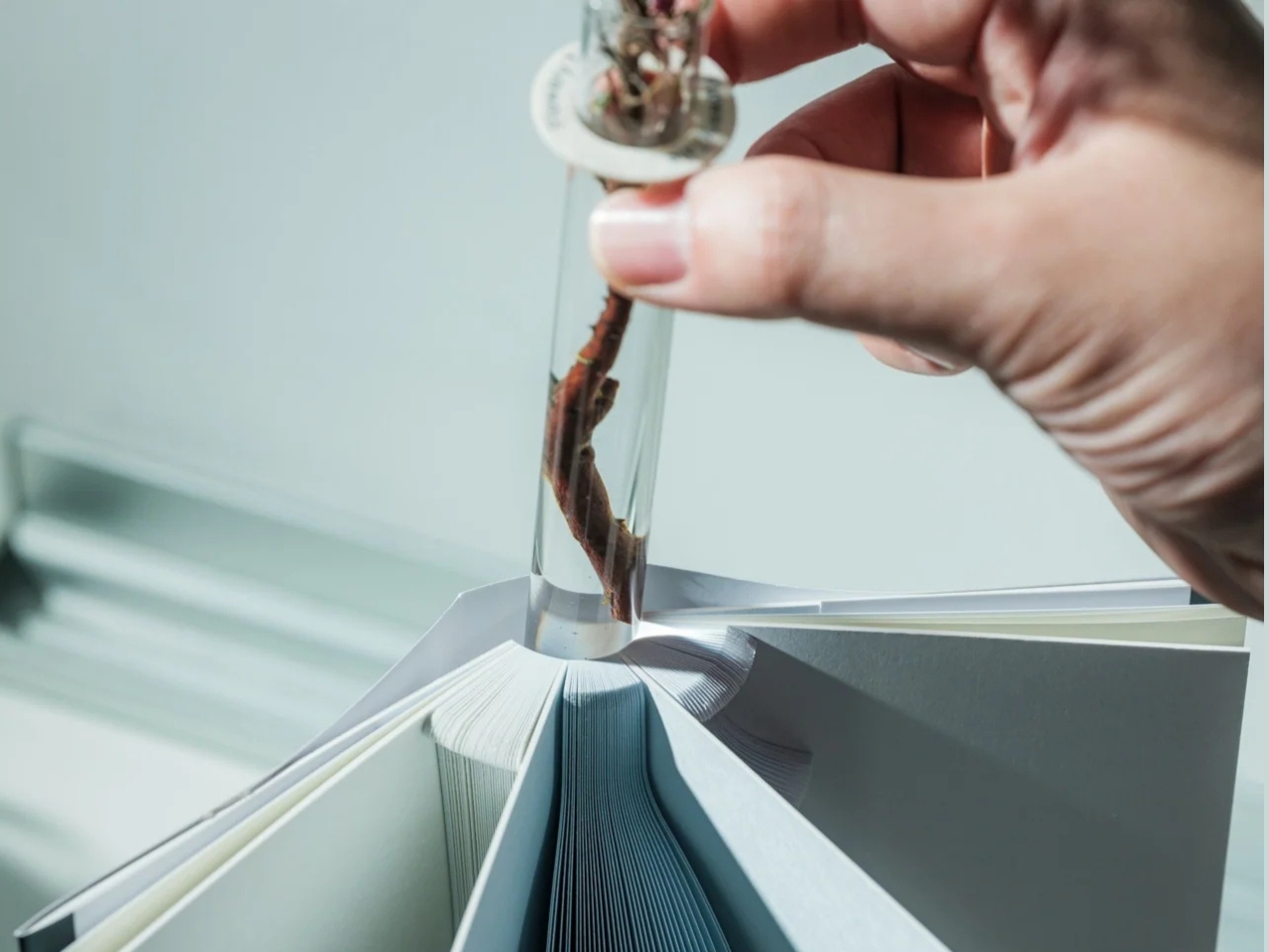
The Pop-up Book Vase is one such flower display that has a certain look I might go for if I decide to buy a few flowers and display them. It uses a book aesthetic where you can turn the page and get a new look with its three-dimensional paper vase silhouette. This way, you get a different look by switching among the three designs if you’re the kind of person who wants something new to look at every once in a while.

Click Here to Buy Now: $45.00

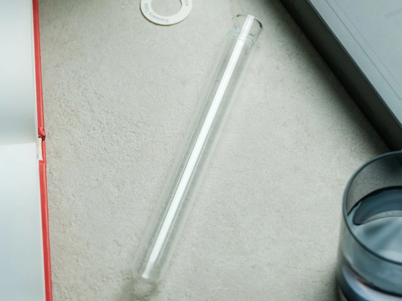
The way this vase is designed goes beyond printing a book pattern on a regular vase. The flowers go into a glass test tube, which fits into the book’s spine. Each book has three vase shapes that you can change as you turn the page. Turning the book upside down changes which end of the silhouette is wider, so you get something new again. You basically get six possible configurations of a vase in just one object, rather than six separate containers.

That division between the materials is what makes the idea work. The paper creates the decorative shape, while the glass holds the water. MECLI calls the design Flowery Tale and specifies water-resistant paper, but that doesn’t mean you should treat the whole thing like a waterproof vessel. The brand advises wiping up water promptly and letting the paper dry thoroughly before storing it. I’d still keep the messy part of refilling away from my actual books.

The storage aspect is probably what appeals to me most. MECLI says you can return it to a bookshelf when it’s not in use. The closed book measures approximately 3.9 inches wide, 1.2 inches deep, and 7.2 inches tall. For someone who doesn’t regularly buy flowers, that’s more useful than having an empty vase taking up display space between bouquets. It still needs room when open, of course, so I wouldn’t expect it to magically solve my clutter problem. But I like that it has somewhere to go when the flowers are gone.

It’s also a nice option for someone who wants a small floral gesture rather than a full centerpiece. The test-tube format suggests starting with a single bloom instead of trying to squeeze in a large bouquet. For me, that makes the idea of displaying flowers feel a little less like another decorating project. The page-turning is part of the appeal, too: I’d be choosing a shape to go with the flower rather than buying another vase.

At $45, though, the Pop-up Book Vase is a decorative purchase rather than the cheapest way to display a flower. IKEA’s VILJESTARK, a 6¾-inch glass vase listed at $1.99 in the US, handles the basic job for much less. Its shape stays the same, whereas the Pop-up Book Vase offers changing silhouettes and book-shaped storage. If all you need is a small container for a stem, IKEA makes more financial sense. Here, the extra money is buying the paper construction and the pleasure of changing the display.

I don’t think this would suddenly turn me into someone who always has fresh flowers at home. But it gives me a reason to consider making room for one. A vase that can spend its downtime on a bookshelf feels more suited to my habits than one that needs a permanent spot on the table.

The post A Pop-Up Book Vase Offers Six Looks Without Extra Vases first appeared on Yanko Design.
  •  

Diden Spider Robot Climbs Steel Walls and Actually Welds Them

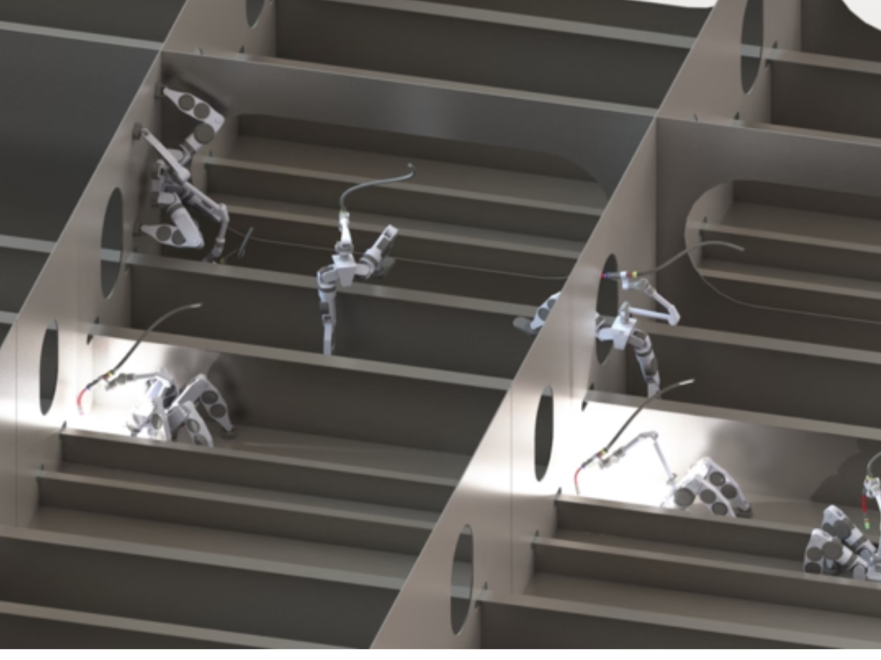
A welding tool is only useful if you can get it to the seam. Inside a ship’s steel structure, that can mean bringing a worker, equipment, and a platform into position before the actual welding begins. It’s the less glamorous side of industrial work, and arguably one of the more compelling reasons to build a climbing robot.

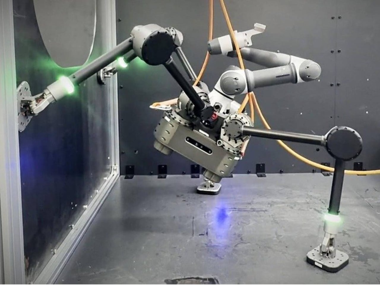
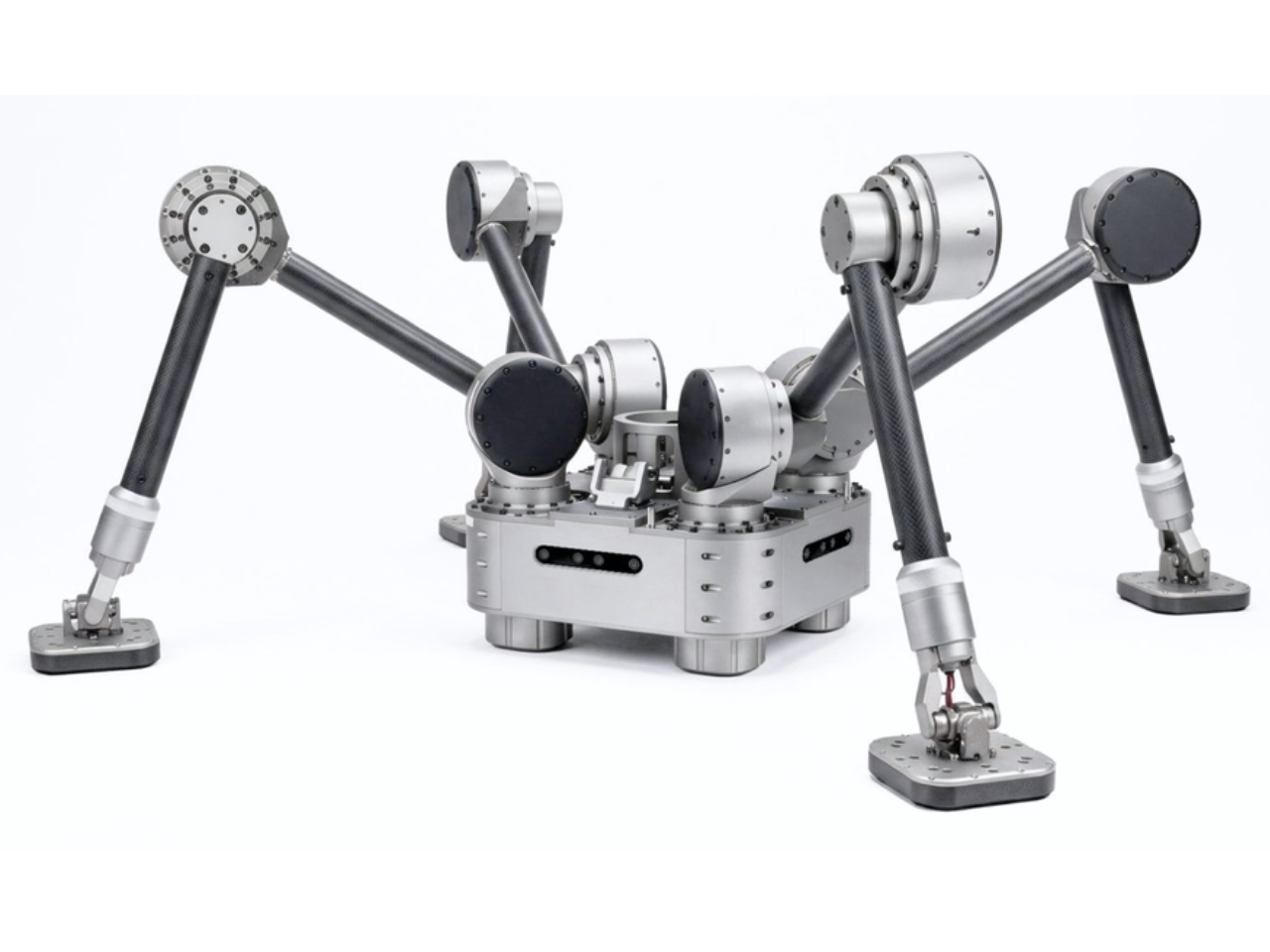
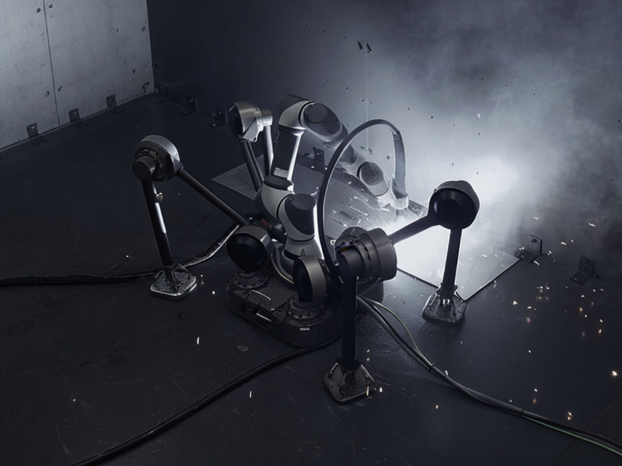
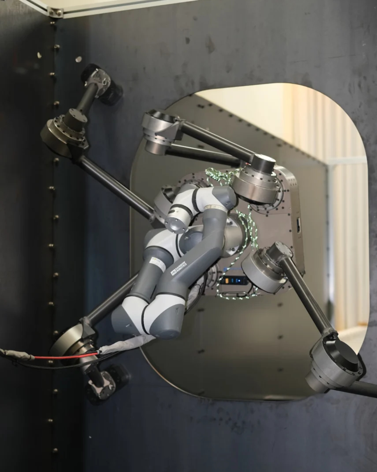
South Korea’s Diden Robotics approaches that problem with four widely spread legs and magnetic feet. Its Diden Spider is designed to carry welding equipment onto steel walls and ceilings, taking the tool to places that are awkward for people to reach. I like how directly its strange-looking body answers the task. The low stance and broad footprint aren’t there to give it personality. They help it stay attached while carrying equipment that has a job to do.

Designer: Diden Robotics

That spider shape also came from a practical failure. In a company interview, co-founder and COO Youngha Shin explains that early, dog-shaped configurations struggled when turning sideways on walls. The arrangement left fewer joint actuators supporting the body, and feet that failed to sit flat could cause the robot to flip. Spreading the legs outward kept the body closer to the wall and improved how the feet met the surface. The silhouette follows the problem.

The feet use electropermanent magnets, which deserve a little attention because they make the whole idea possible. An electrical pulse switches their magnetic state on or off. Once attached, they don’t need a continuous supply of electricity to maintain that magnetic hold, according to Diden. That doesn’t make the entire robot power-free. Its joints, sensors, and computing still have work to do. It means staying attached doesn’t require constantly feeding electricity into the magnets.

Diden rates the Spider 30 configuration for a payload of 30 kilograms, roughly 66 pounds. That capacity is important because climbing alone doesn’t accomplish much welding. The platform needs to carry useful equipment once it gets there. Diden describes interchangeable task modules, including robotic manipulators and inspection equipment. I find the traveling-tool-platform idea more compelling than treating the machine as a single-purpose mechanical welder. Its mobility could serve different jobs along the same steel structure.

One of my favorite details is much smaller than the legs. Shin says feedback from people using the robot led Diden to add LEDs to its feet, allowing them to see whether each foot had attached. That’s a sensible concession to human nerves. A control system may know its magnetic foot is holding, but someone watching expensive equipment hang from steel deserves a readable signal, too.

Finding the work is another challenge. Diden describes a navigation system that compares live, three-dimensional sensor data with a ship’s CAD model to estimate position and orientation. Its mapping system also reconstructs nearby obstacles from depth-camera data. In practical terms, the robot needs to understand where it is and what blocks its next step. A magnetic grip provides attachment; navigating a cluttered structure requires a separate layer of perception and control.

This is a physical machine with reported industrial use, rather than a speculative rendering. Diden says Spider 30 has completed field deployment at major Korean shipyards and that its welding results have been applied to vessels in production. Separately, Maeil Business Newspaper reported in May 2026 that Diden had completed sales to some major Korean shipbuilders. Those are meaningful signs of progress, although neither establishes dependable performance over every production shift.

I’d judge it by the less photogenic parts of the job: repeatable weld quality, maintenance demands, setup time, and how often somebody needs to intervene. Still, the design makes a persuasive starting argument. It gives an awkwardly placed tool a way to reach its work. If that removes even some occasions when a person has to climb into position with welding gear, the unusual body has earned its place.

The post Diden Spider Robot Climbs Steel Walls and Actually Welds Them first appeared on Yanko Design.
  •  

A 26-Foot Tiny Home That Refuses to Go Beige

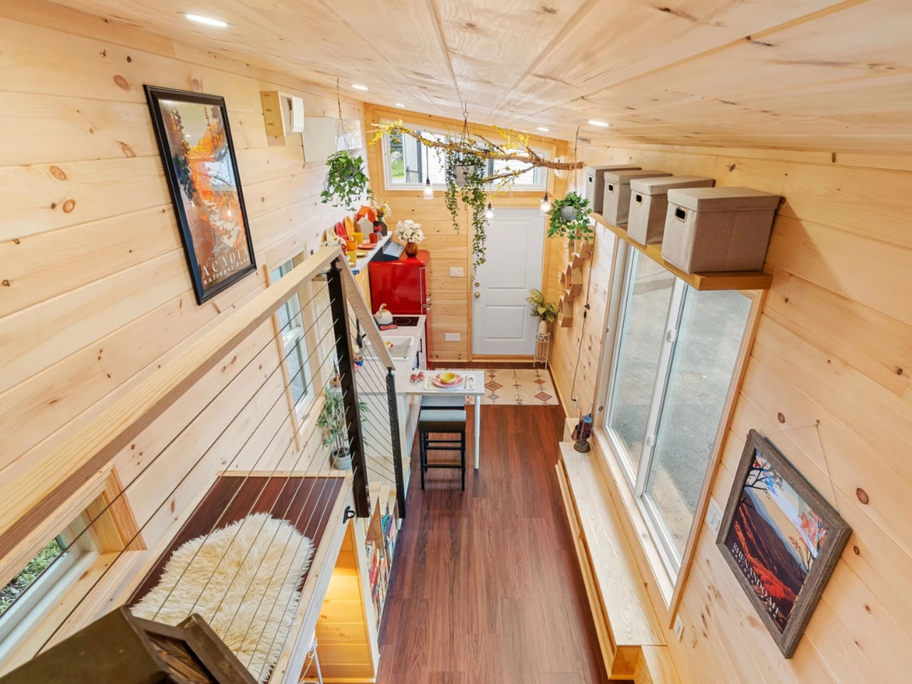
The Brightside puts the kitchen beside the front door, so the first thing you encounter is a place to make dinner. That feels like a sensible starting point for a small home. The problem with squeezing everyday life into 250 square feet is deciding which routines get compromised. Backcountry Tiny Homes gives cooking and eating a prominent role in this 26-foot, towable design for one or two people, rather than leaving them whatever space remains.

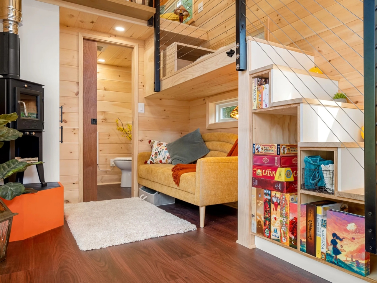
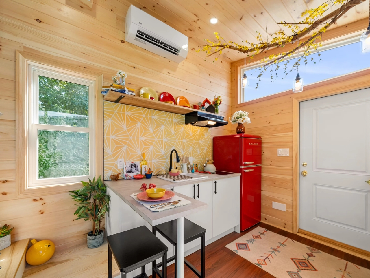
The kitchen includes a two-burner electric cooktop, a 10-cubic-foot refrigerator, a ceramic sink, and laminate counters with a detachable dining table. It’s a modest setup, not a chef’s fantasy, but I like having an actual spot to sit down with a plate. Two burners would suit my expectations for cooking here: a skillet, a pot, and some acceptance that Thanksgiving probably needs another venue.

Designer: Backcountry Tiny Homes

The photographed interior is much less restrained about color. A red retro-style refrigerator sits beside a yellow patterned backsplash, surrounded by natural wood. A suspended branch carries pendant lights, giving the kitchen a slightly handmade, woodland character. I’m fond of that willingness to be cheerful. Choosing a smaller home shouldn’t require signing up for a lifetime of beige. Here, the refrigerator gets to contribute to the room’s personality instead of being an appliance to disguise.

Of course, giving the kitchen priority means making choices elsewhere. The sofa tucks beneath the staircase, which also incorporates storage. That arrangement uses the space below the route upstairs, but I’d want to check seated headroom before committing. It’s a clever use of volume with a practical test attached. The place you settle into after dinner needs to feel inviting enough to use every night, and a floor plan can’t establish that completely.

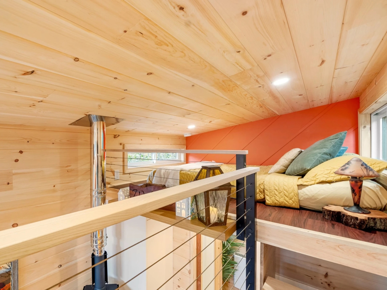
Upstairs, the builder says the loft accommodates a queen mattress, reached by stairs and a cable-railed walkway. The sleeping area has a maximum headroom of 3 feet, 5 inches, so nobody should confuse it with a conventional upstairs bedroom. I appreciate stairs over a ladder, but they don’t erase the low ceiling. For someone happy to reserve the loft for sleeping, that compromise may be reasonable. For someone who dislikes crouching, it’s significant.

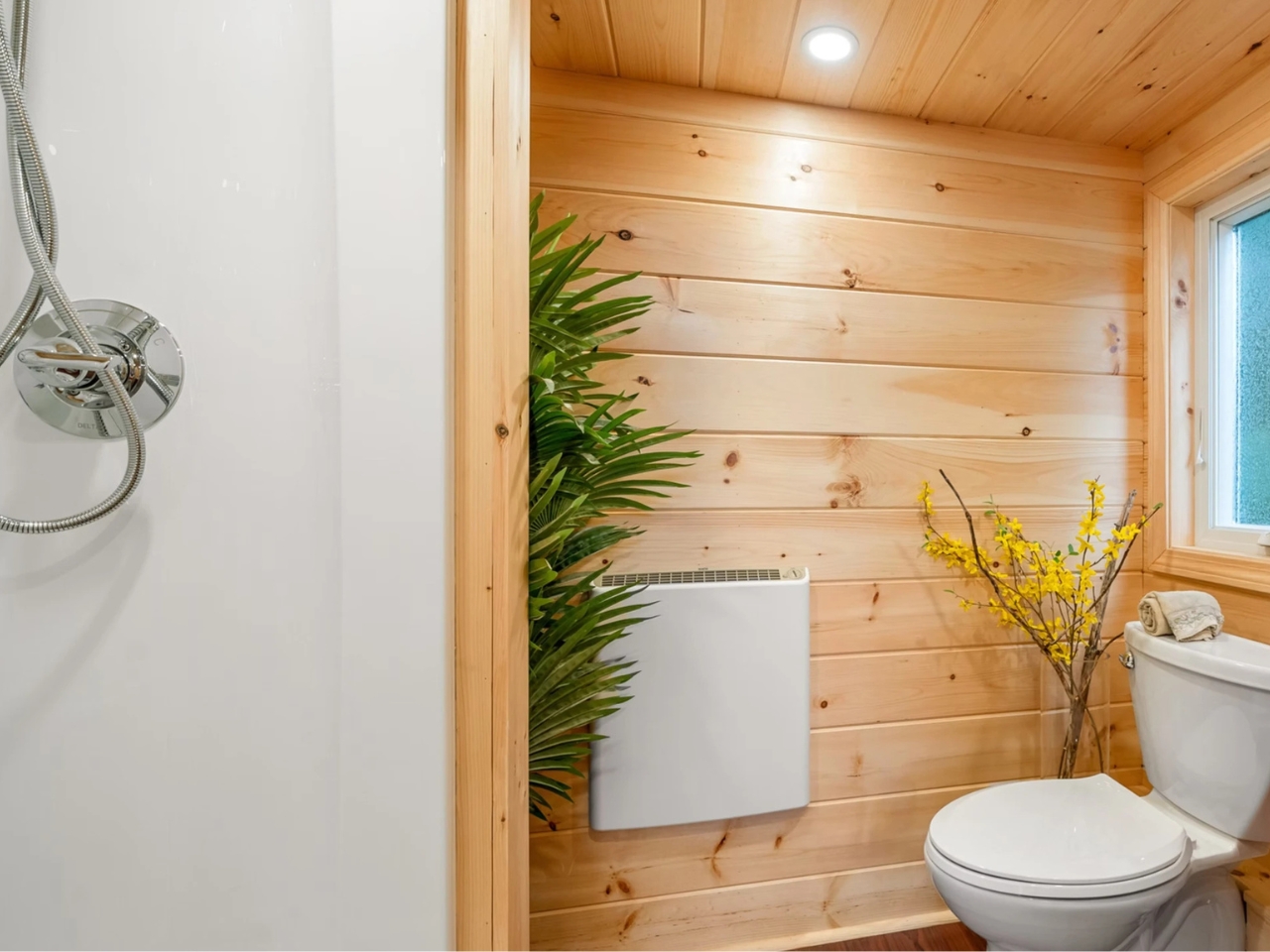
The bathroom provides a plumbed toilet, a vanity sink, and a 32-inch shower. Laundry isn’t included as standard, although the company offers options during the design phase. That last detail deserves attention because washing clothes is part of living somewhere, not an optional lifestyle accessory. I’d sort out that routine before choosing finishes. A home can make excellent use of its footprint and still need a few practical decisions from its owner.

Backcountry currently lists the Brightside at $106,750 turnkey, $99,025 unfurnished, or $53,380 as a shell, excluding taxes. The word “unfurnished” needs careful reading here: that version omits the refrigerator and woodstove as well as furniture. I wouldn’t treat the three prices as interchangeable ways to buy the same experience. They represent different amounts of work, equipment, and spending left to the buyer.

The shell is particularly important to understand. Backcountry describes it as a dried-in structure with a completed exterior, but without utilities, roof and wall insulation, or interior finishes. That could appeal to someone with the skills and appetite to finish a home themselves. It isn’t a move-in-ready bargain hiding behind a different label. Personally, I’d weigh the appeal of making it my own against the time required to make it livable.

The Brightside’s most persuasive decision, for me, is leaving room for a meal that doesn’t happen on the sofa. I’d happily consider a smaller living area to keep that everyday ritual intact. But I’d make that choice with the loft dimensions and laundry plan beside me. The useful question isn’t how many features fit inside. It’s which spaces you’ll still enjoy using on an ordinary Tuesday.

The post A 26-Foot Tiny Home That Refuses to Go Beige first appeared on Yanko Design.

  •  

Baseus Sleep SK1 Brings Bedtime Audio Without Earbuds

Since I live alone, listening to music or podcasts before I sleep is not really an issue, as there’s no one to complain about the sound. But when I share a hotel room or someone sleeps over, this may become a problem. Sure, there are earbuds, but I have this irrational fear that they may get buried deep in my ears when I fall asleep and move around. One possible solution would be speakers that can sit under the pillow and play close to my ears, with the aim of keeping the sound from bothering other people in the room.

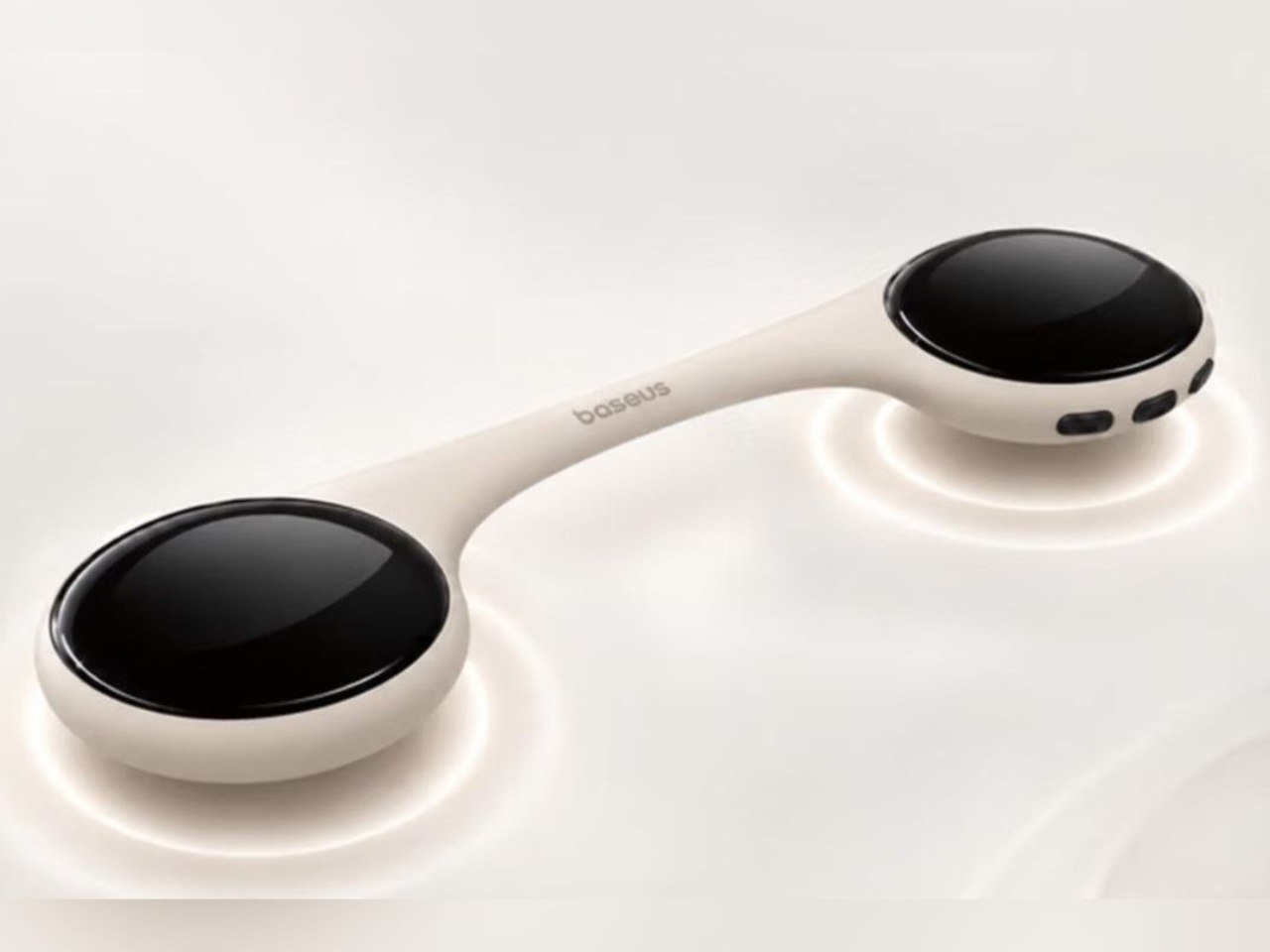
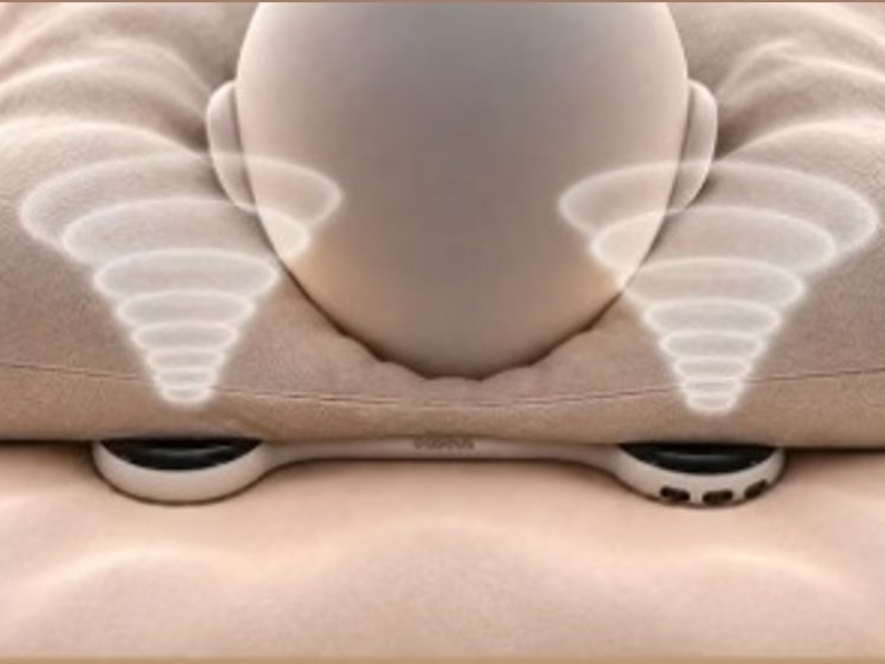
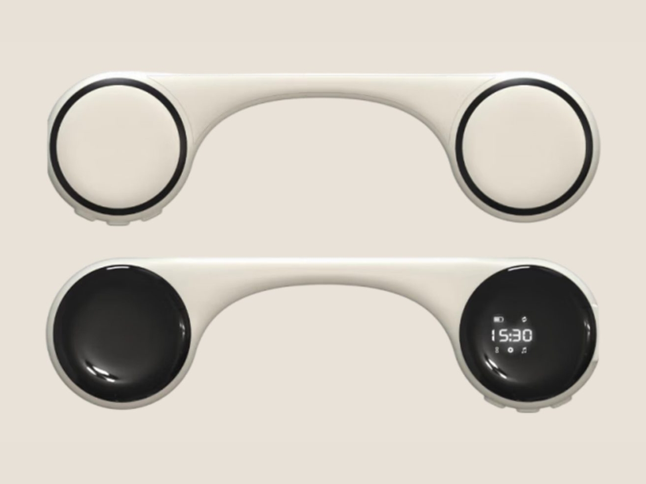
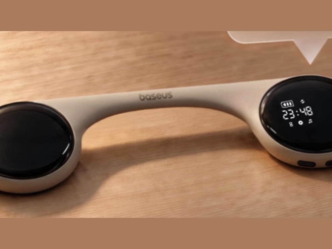
The Baseus Sleep SK1 is one such speaker. It uses what Baseus calls micro-vibration conduction to carry audio through the pillow to your ears. Basically, your pillow becomes part of the audio system, while two sound-producing units are intended to direct the music, audiobook, or podcast toward the sleeper’s head. The idea is to keep the listening area small rather than fill the bedroom with sound.

Designer: Baseus

The Sleep SK1 looks like a Bluetooth speaker, with two circular pods joined by a narrow, curved bridge. It looks more like connected pucks than a bedside speaker. Its reported dimensions are about 6.5 by 1.8 by 0.55 inches, and it weighs roughly 1.55 ounces. The low profile is designed to minimize intrusion, although that doesn’t mean you won’t feel it through a compressed pillow. Comfort would still need to be tested.

The device has three physical buttons around the edge of one pod for operating the speaker. There’s also a digital display integrated into one circular face, showing the time, operating mode, and remaining battery level. That gives you another way to check the time when you wake up in the middle of the night instead of automatically reaching for your phone. Of course, you’d still have to uncover the display if it’s underneath your pillow.

For people who prefer background sounds to music or conversation, Baseus says its companion app offers more than 100 sound options, including rain, ocean waves, campfire sounds, and ASMR. You can also set up to 10 alarms for different schedules. The alarms use the same pillow-directed approach, which could be useful if you need to get up before the person sleeping beside you.

Baseus claims more than 10 hours of playback from the built-in 300 mAh battery, which would cover an overnight listening session if it holds up in practice. Charging is via USB-C, with a full charge reportedly taking about two hours. For something intended to stay beneath a pillow, the useful part is having enough battery life to use it without leaving a charging cable attached.

Your pillow is an important part of the setup, though. The Gadgeteer reports that Baseus recommends pillows up to about 3.1 inches thick and suggests increasing the volume for thicker pillows or when sleeping on your back. That makes pillow thickness and sleeping position things to consider before buying. Turning the volume up may help you hear, but whether it stays quiet enough for someone nearby is another question.

The SK1 is listed on JD.com in China, with a reported price of 184 yuan. That shouldn’t be mistaken for a confirmed US retail price, and an official US release hasn’t been established in the available sources. It’s worth checking regional availability and app support rather than assuming an imported unit will offer the same experience everywhere.

For me, the appeal is being able to listen without putting anything in my ears. But I’d want to know how clearly a podcast comes through my own pillow and how much of it someone else can hear. Those would be the deciding factors for me. If the SK1 can keep a familiar voice close to my pillow without sharing the whole conversation with the room, that would be a good enough reason to consider it.

The post Baseus Sleep SK1 Brings Bedtime Audio Without Earbuds first appeared on Yanko Design.

  •  
❌