Vue lecture

A Bell-Powered Playground for Collective Listening

French artist Céleste Boursier-Mougenot is widely known for uncovering the musical potential of objects and materials that were never intended to function as instruments. Rather than composing music in a conventional sense, he creates situations in which sound emerges through movement, interaction, chance, and the surrounding environment. His exhibition points de suspension, presented at Frac Normandie in Caen as part of the Normandie Impressionniste Festival, extends this approach across the cloister and galleries of a former seventeenth-century convent.

At the center of the courtyard is envolée, a playable musical installation made from swings and antique church bells. A circular steel structure, reminiscent of the bandstands that once animated public gardens, supports eight wooden swings. Above each one hangs a bronze bell of a different size, allowing every swing to produce its own distinct tone when set in motion.

Designer: Céleste Boursier-Mougenot
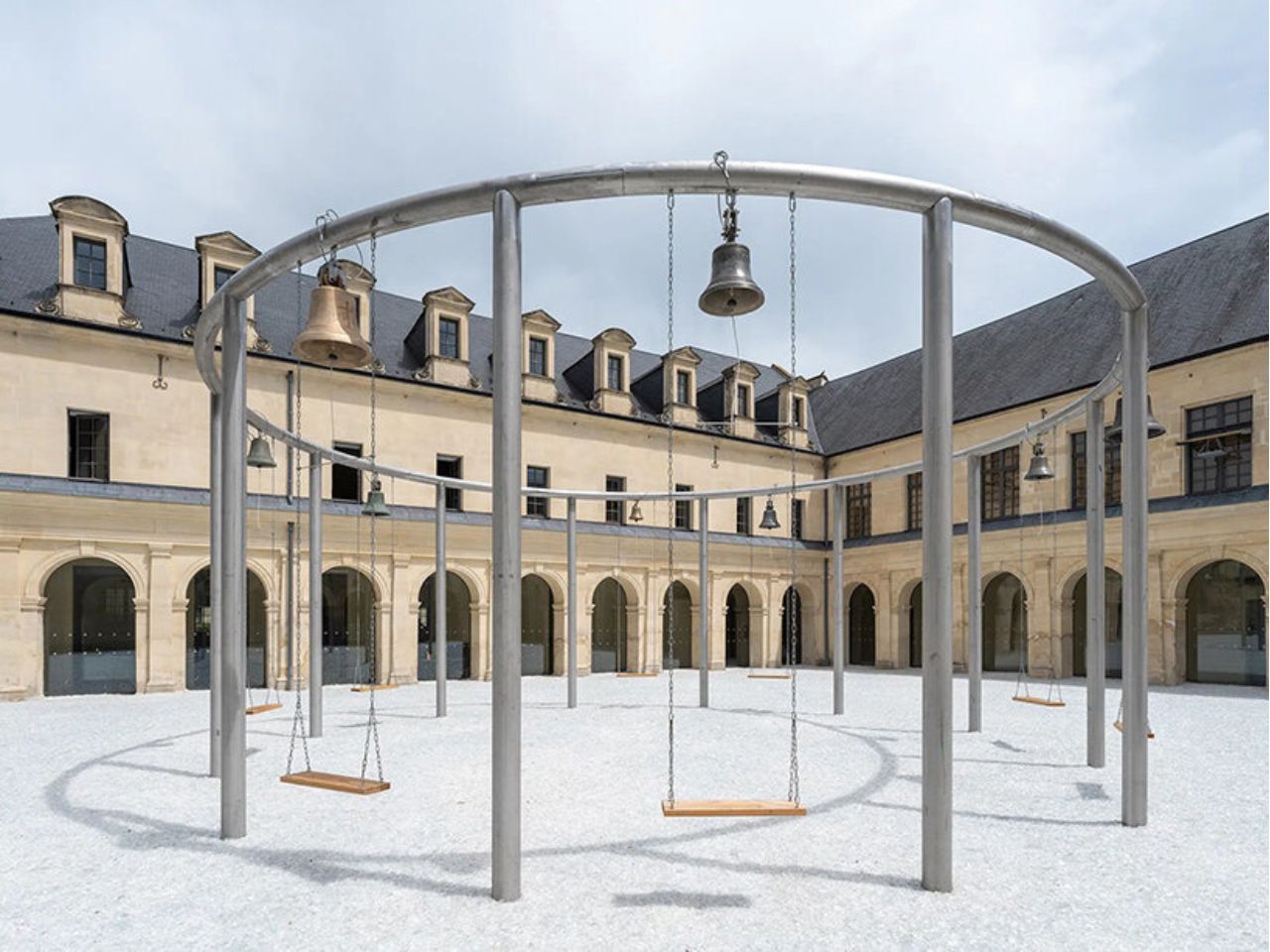
Visitors are invited to sit, push away from the ground, and activate the installation through the familiar movement of swinging. As the wooden seats rise and fall, the bells respond with changing rhythms and overlapping tones. No two performances can be repeated precisely. The resulting composition depends on how many people participate, how quickly they move, and whether their rhythms align or interrupt one another.

Boursier-Mougenot does not prescribe a melody for the group to perform. Instead, he designs the conditions from which a collective composition can emerge. The work only becomes fully active through the gestures of its participants, temporarily transforming strangers into performers. Individual actions accumulate into a shared sonic environment, allowing visitors to influence one another without needing to speak or coordinate deliberately.

The swing itself introduces another cultural and emotional layer to the installation. Appearing across civilizations as an object of ritual and recreation, it has been associated with ancient Egypt, seasonal festivities, springtime renewal, and the ornamental gardens of seventeenth-century France. It has also been understood as an object marking transitions between childhood and adulthood.

Within envolée, this nostalgic object is reframed as a device for reconsidering how bodies inhabit a public space. Swinging no longer belongs exclusively to childhood. It becomes a method of synchronizing movement, sound, attention, and proximity. The participant is simultaneously a listener, a performer, and an active component within the installation.

Extending beneath the structure is plage, a 900-square-meter field of crushed glass. Its shimmering surface resembles a crystalline body of water, reflecting the architecture, changing light, and movements of the visitors above it. The material produces an intentionally ambiguous landscape: dry yet apparently fluid, solid yet visually unstable. The courtyard of the former convent is consequently transformed into a glittering garden or an abstract lake, where the church bells form an evolving open-air score.

The experience continues inside the galleries with cameraobscura. Here, Boursier-Mougenot enlarges the optical principle of the camera obscura to the scale of an exhibition room. The exterior courtyard and its moving installation are projected upside down across the interior space, creating an immersive, inverted landscape. Suspended swings encourage visitors to pause beneath this reversed horizon, observing the world outside from an unfamiliar perspective.

The ringing bells remain audible indoors, connecting the projected image with the actions taking place outside. Sound shapes the perception of the moving image, while the projected movement gives visual form to the composition being created in the courtyard. Seeing and listening can no longer be understood as separate experiences. Instead, the two installations operate together, collapsing the boundaries between image, sound, architecture, and bodily movement.
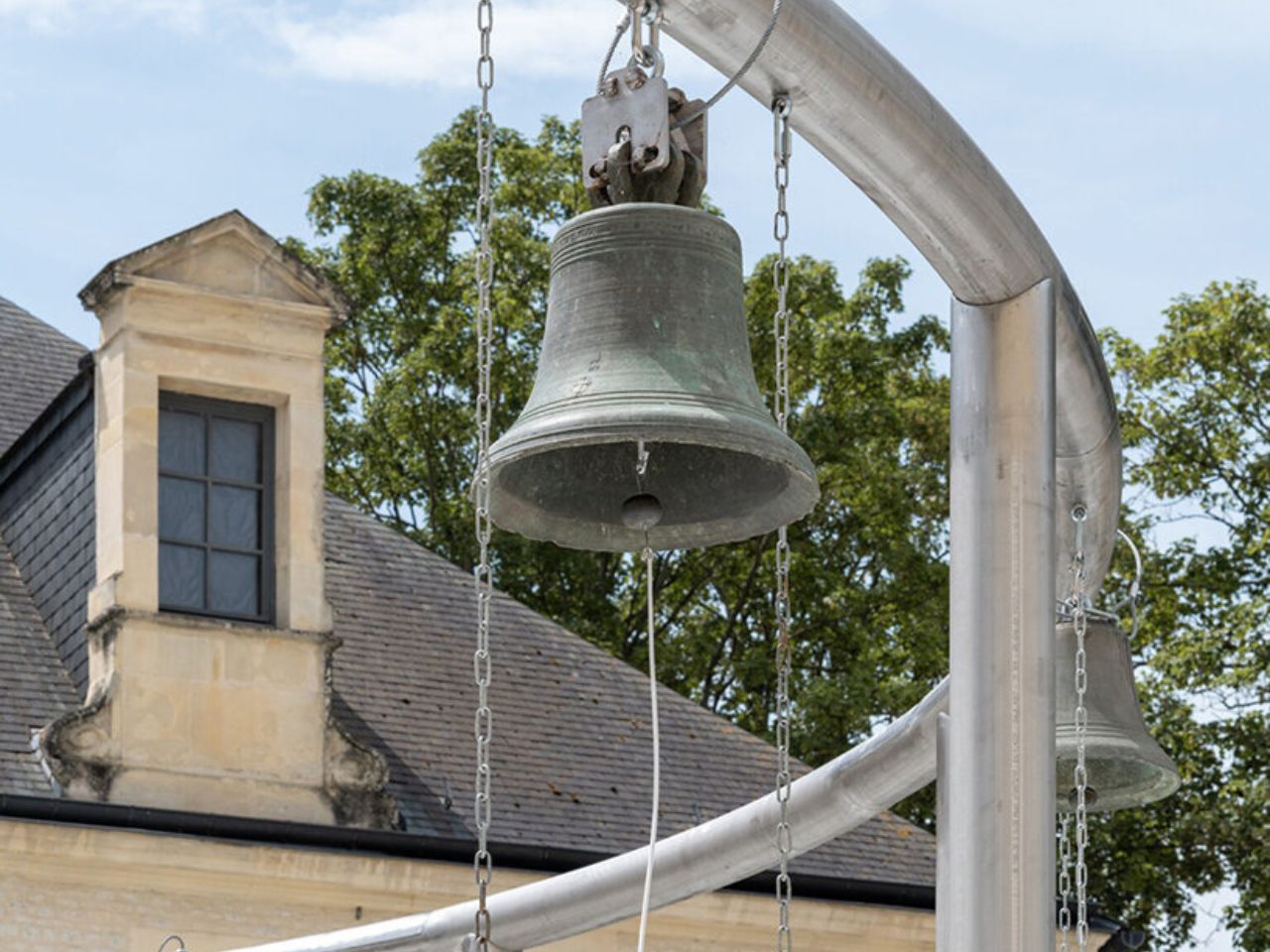
Throughout his practice, Boursier-Mougenot draws resonance from ordinary materials and situations. At Frac Normandie, however, the instrument expands beyond the swings and bells to include the convent’s architecture, the reflective glass landscape, the changing light, and the people who temporarily occupy the site.

Points de suspension does more than ask visitors to interact with an artwork. It proposes another way of inhabiting public space—one that values curiosity, play, unplanned encounters, and collective attention. Through a simple act of swinging, visitors are encouraged to remain in the space a little longer, listen to those around them, and participate in a composition that belongs to no single person.

The post A Bell-Powered Playground for Collective Listening first appeared on Yanko Design.
  •  

Insta360’s foldable drone patent targets DJI Neo 2 at sub-250g

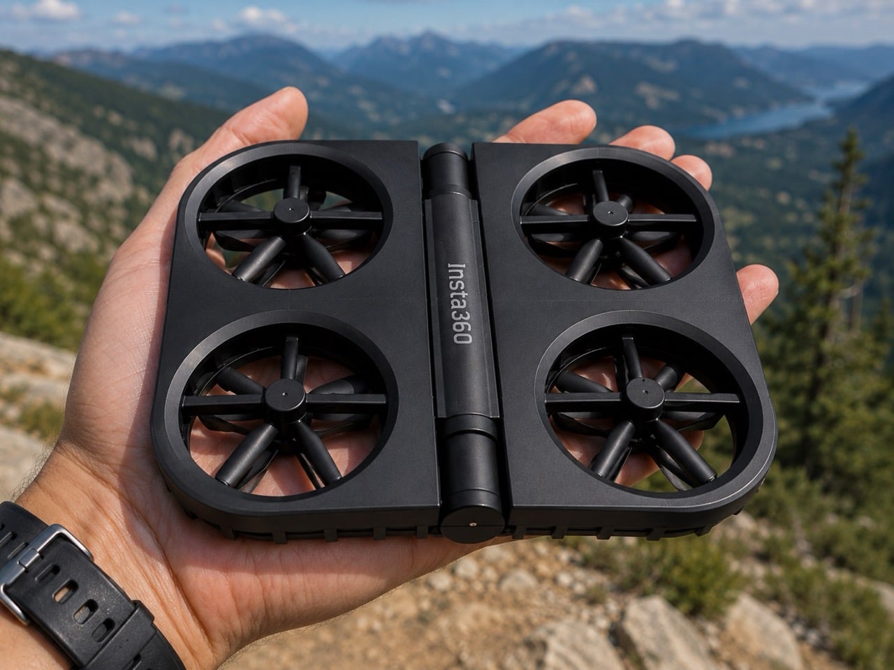
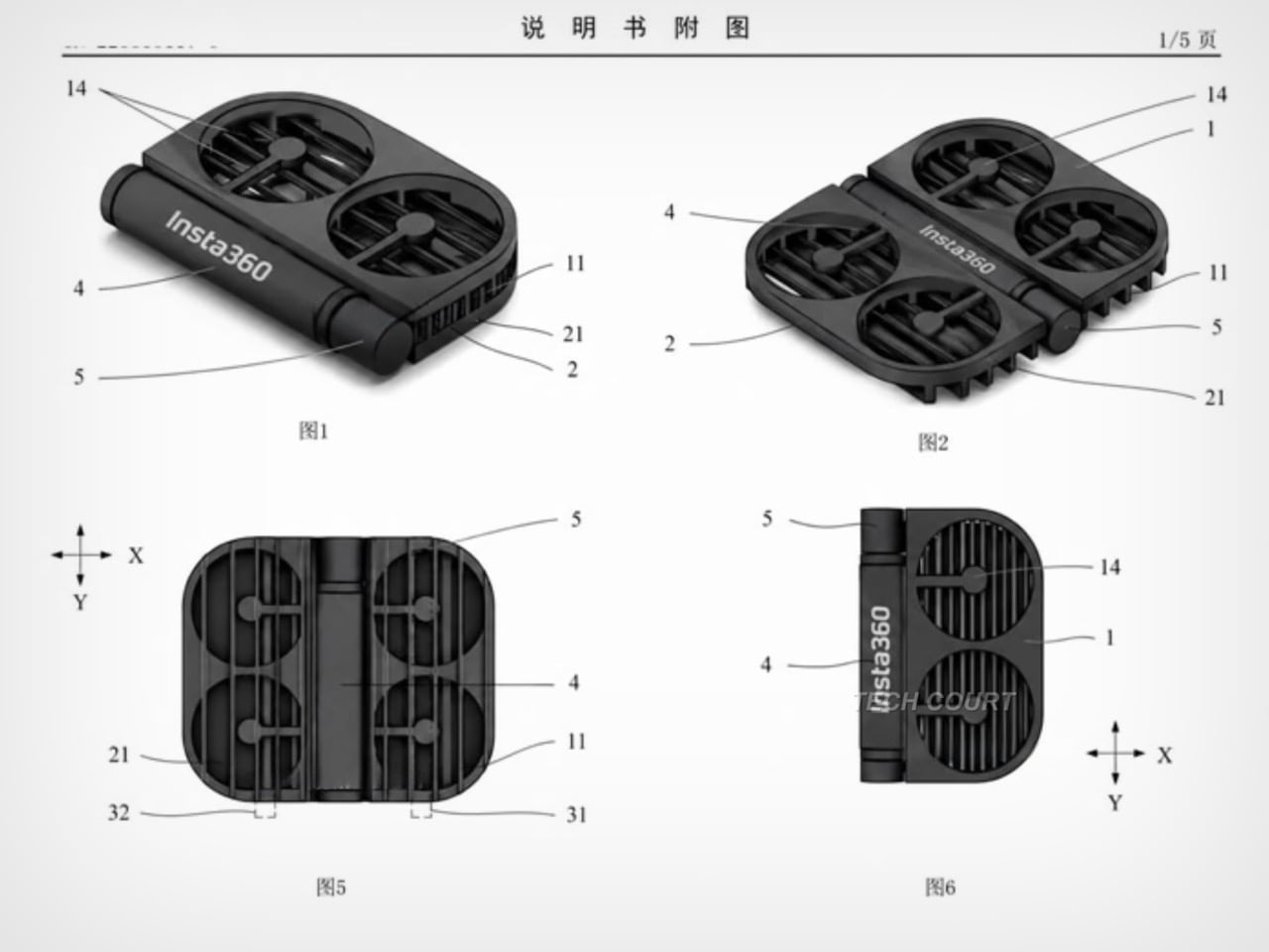
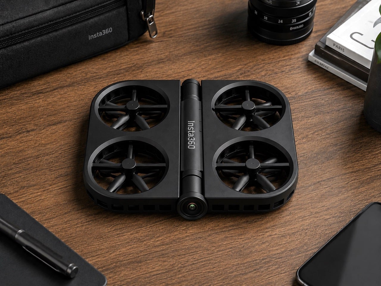
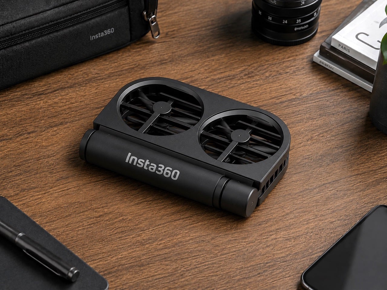
Insta360 built its reputation on cameras that see in every direction at once. It’s literally in their name. The X series made 360-degree capture accessible; the Luna Ultra brought Leica optics to a handheld gimbal. Flying something, though, is a different category of challenge, and the patent images that appeared in July 2026 show the company working through what a foldable drone looks like with Insta360 DNA. The illustrated design at the bottom shows folding arms, a ring-shaped propeller guard, and a dedicated locking mechanism, a form factor that prioritizes the moment of packing away just as much as the moment of takeoff.

DJI’s Neo 2 has the casual drone segment largely to itself in the sub-250g category, with a rigid one-piece frame and a 19-minute flight time that have made it a reliable default for creators who want aerial footage without the complexity of a serious drone setup. Insta360 entering that space would break what has effectively been a two-player market, with Zero Zero Robotics’ HoverAir as the only real alternative. The folding design alone gives Insta360 a structural argument against the Neo 2; a potential 360-degree camera, if it materializes, would give it a creative one. What a wonderful year for foldables, eh? We’re expecting a folding iPhone in September, and Insta360 might give us a folding drone too!

This isn’t just some forum rumor, either. The patent images (from patent file CN223865117U), which started making the rounds on July 16th and were highlighted by outlets like Tech Court, are pretty specific. They show a drone body with the “Insta360” logo stamped on it, with fully folding arms that tuck into the chassis and a distinctive ring-shaped guard protecting the propellers. There’s even a dedicated locking mechanism detailed, which tells you just how seriously they’re taking the whole “fold-and-go” concept. This is a design that screams it was made to be stuffed into a pocket, not carefully placed in a bespoke case.

But here’s the thing: this isn’t Insta360’s first aerial rodeo. Before they decided to put their own name on a drone, they sent in a scout team under the sub-brand Antigravity. The A1 drone they launched was, frankly, a bit of a monster: a sub-249g drone with a wild dual-lens setup that shot 8K 360-degree video and made the drone itself invisible in the footage. It was a spec-sheet beast and a clear shot across DJI’s bow, proving Insta360 had the engineering chops to compete in the sky. It was their way of testing the waters.

Now, it looks like they’re done testing. This new patent is the second, more direct shot. And here’s the kicker: for a company obsessed with 360-degree video, the patent images don’t show a fisheye lens. At all. It’s a huge question mark hanging over the whole project. Are they hiding the tech, or are they planning to launch a drone that, for the first time, doesn’t have their signature feature? If they’re aiming for a rumored sub-$200 price point, leaving the 360 camera on the cutting room floor might be the only way to get there. It’s a move that would be both shocking and, in a weird way, perfectly logical.

You also can’t forget that this is all happening while the two companies are actively suing each other in China. This isn’t friendly competition; it’s a full-blown hardware rivalry. Insta360 came for DJI’s gimbals, tested the drone market with a sub-brand, and is now preparing a direct assault on DJI’s most accessible drone. With a release window expected somewhere between late 2026 and early 2027, we’re not just watching a new product being born. We’re watching the next chapter in a tech soap opera, and it’s about to get very, very interesting.

The post Insta360’s foldable drone patent targets DJI Neo 2 at sub-250g first appeared on Yanko Design.
  •  

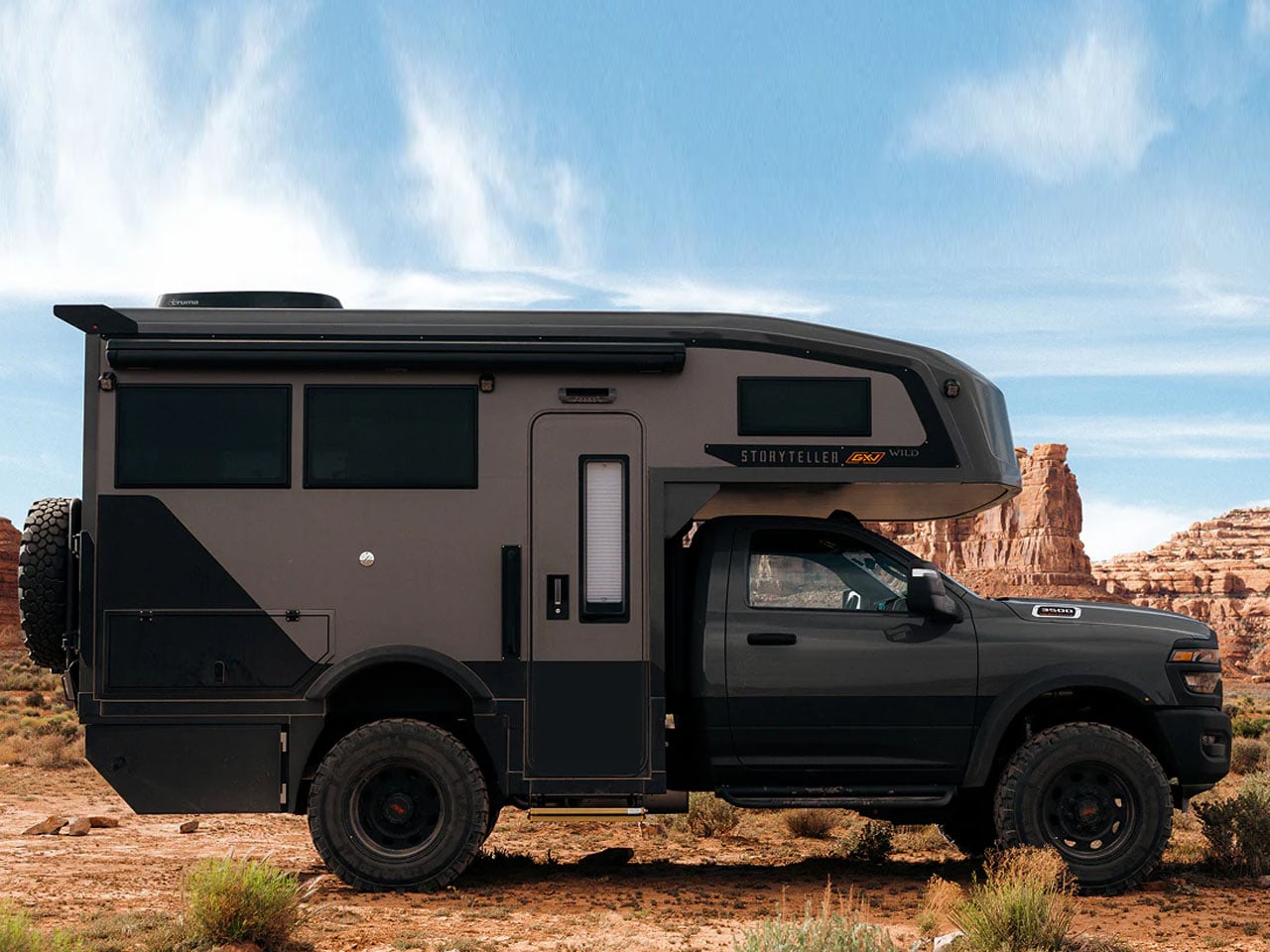
Storyteller’s new GXV Wild is built for luxury off-grid camping without compromise

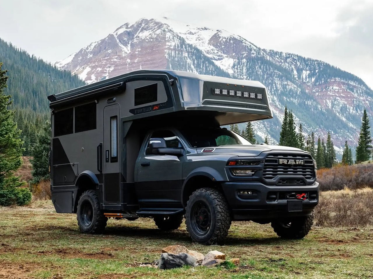
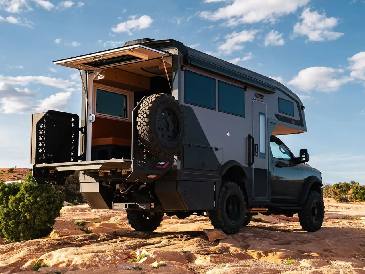
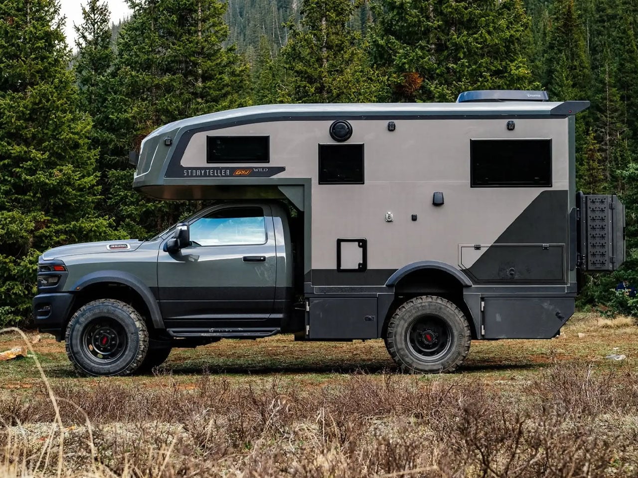
Storyteller Overland added Global Expedition Vehicles (GXV) under its umbrella in 2022. The tale for the two adventure camper and overland rig manufacturers, respectively, has been around about on the same lines. Continuing in a combined form factor now, the new 2027 GXV Wild is introduced to upscale the idea of overland living from Storyteller’s lens.

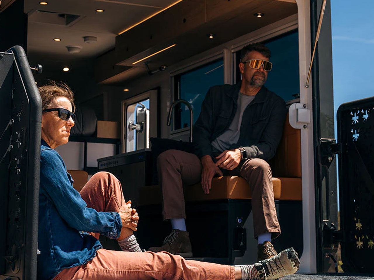
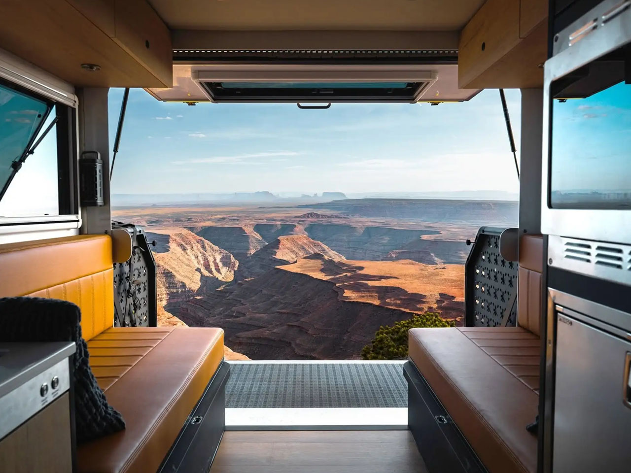
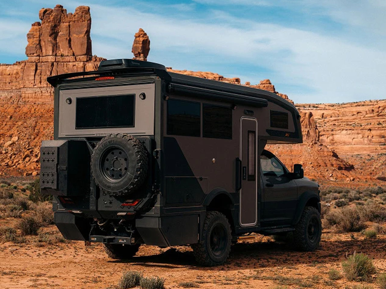
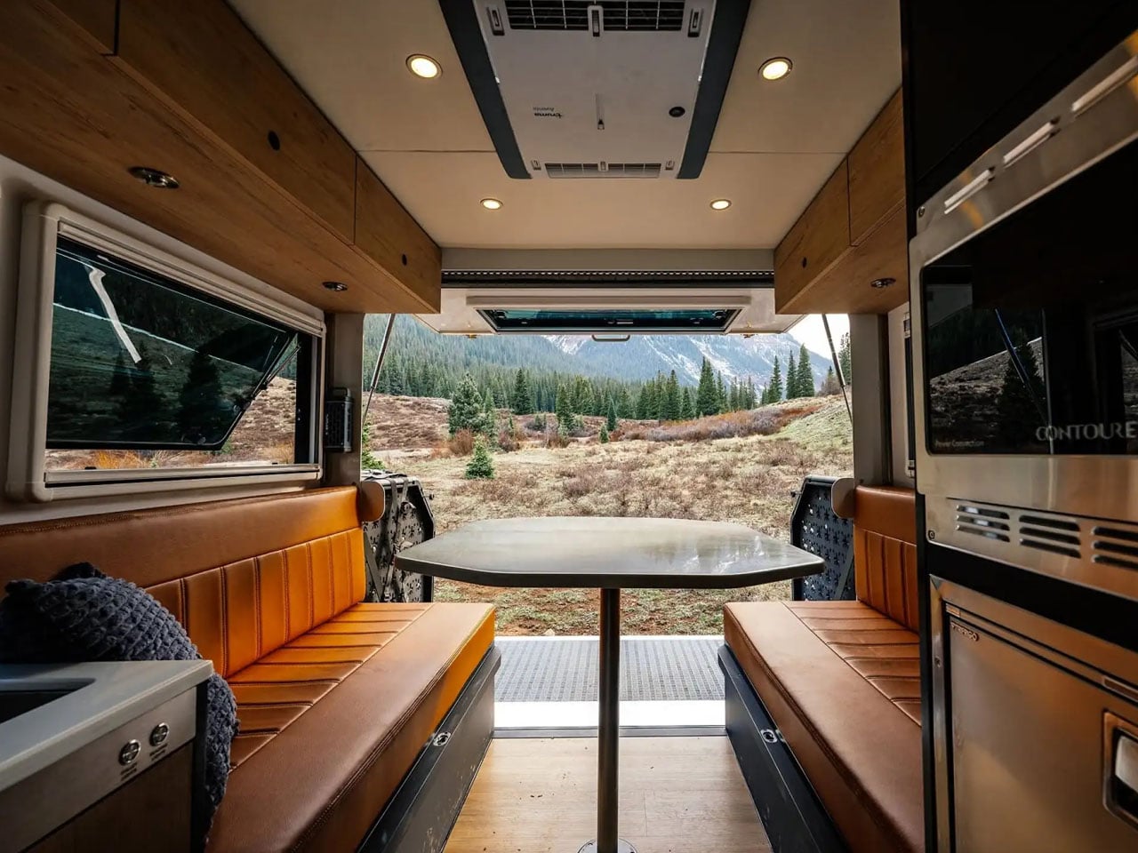
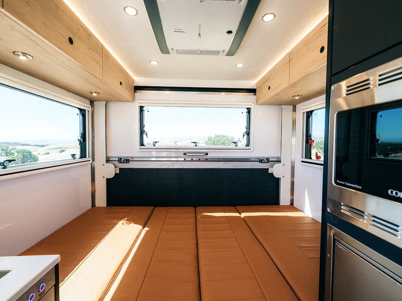
The adventure truck is based on the Ram 3500 single-cab chassis. That leaves the Wild catering to only a couple on the road. It can, we will learn later how, accommodate up to four people at camp. But what’s actually fascinating about the truck, beyond the overlanding compatibility and off-grid preparedness, is how the interior is designed to permit a congenial harmony between the inside and outside.

Designer: Storyteller Overland

Built on the Ram chassis, which draws power from a 6.4L HEMI V8 engine delivering 375 hp and 429 lb-ft of torque, you already have a capable machine. To keep it performing at its best, Storyteller has kept it lightweight but tweaked it to add an AEV suspension kit with a 3-in lift and forged-aluminum wheels wrapped in all-terrain tires. The camper part is made using laminated insulated fiberglass walls and floor. The roof uses insulated panels, and windows feature dual panes (again for better insulation), ensuring year-round operability.

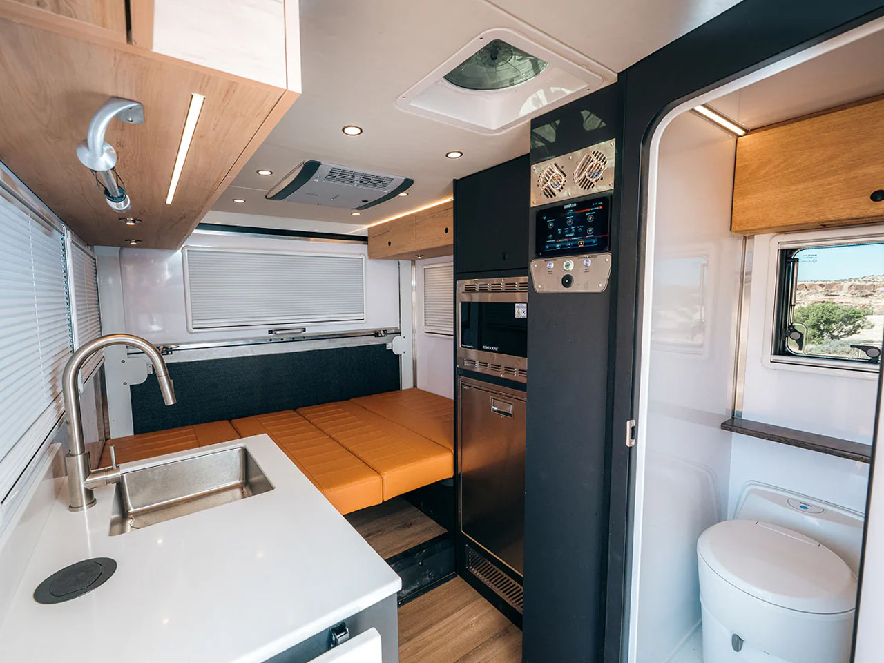
With the modifications to the chassis, the rig – measuring 23 feet long and 11.3 feet high – has a payload capacity of 1,000 lbs and a 14,000-lb GVWR. The Stroyteller GXV Wild can also tow up to 10,000 lb. if you have additional cargo to cargo, in the FlipOut Deck. Some of the truck campers this size we have seen compromise with bathroom space, but that’s the difference with the Wild. It has a dedicated bathroom, next to the alcove. It features a cassette toilet, sink, and a shower that gets water from the 189 L fresh tank and also has a 76 L gray water tank onboard.

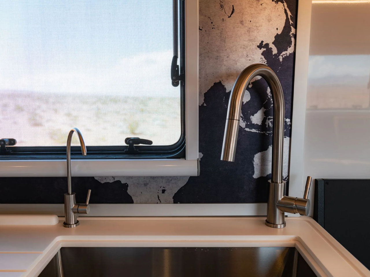
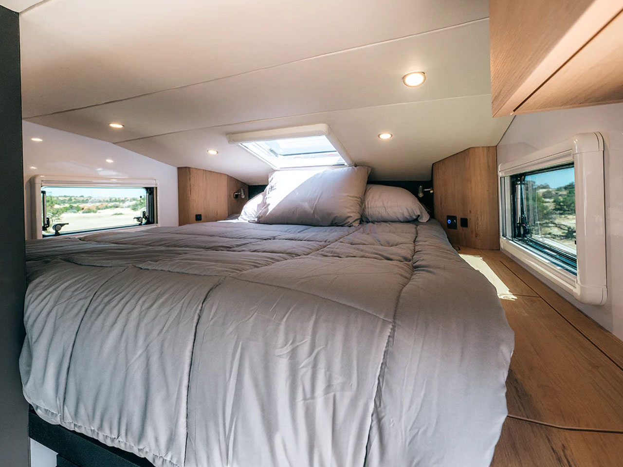
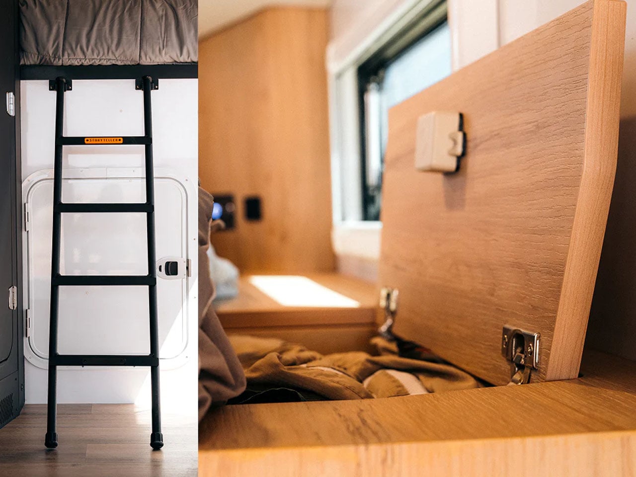
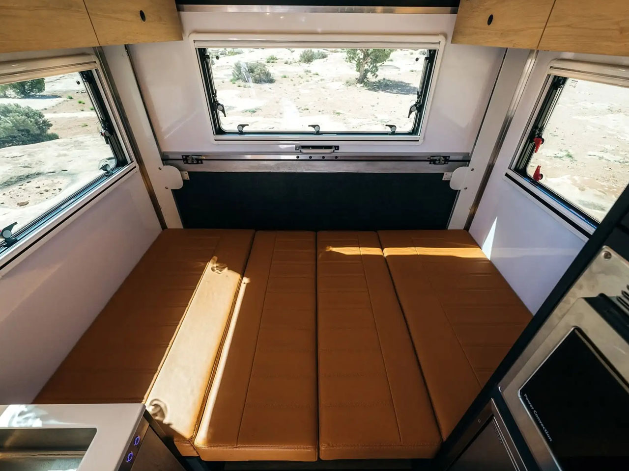
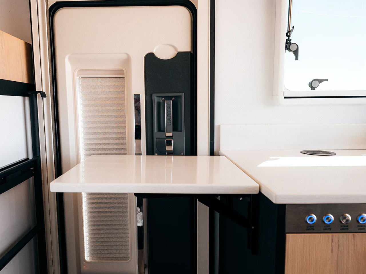
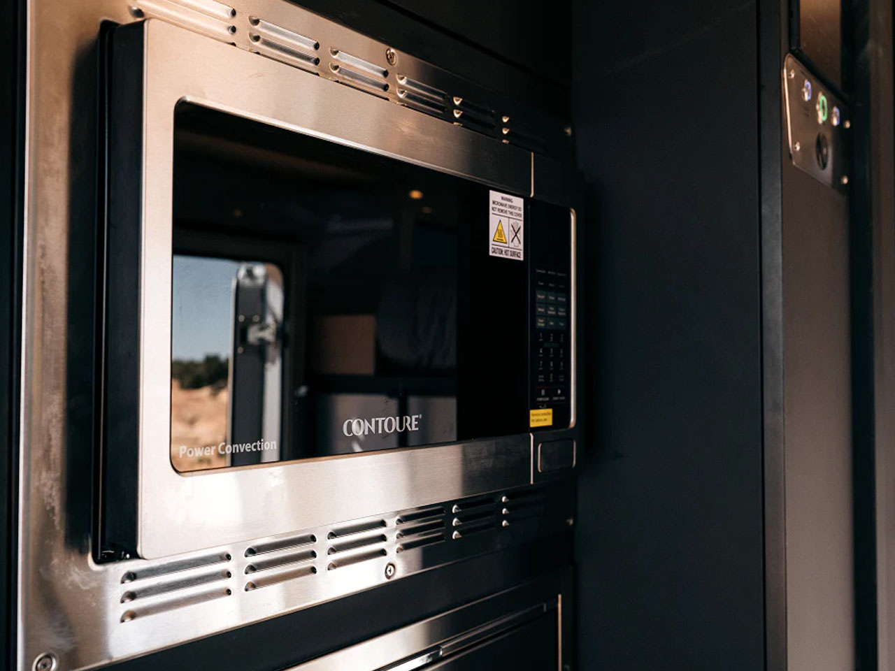
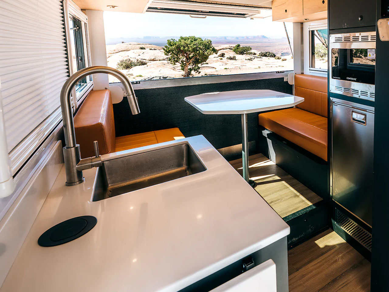
Opposite the bathroom, you have the kitchen with a portable induction cooker, a stainless steel sink, and a flip-up counter space extension. 116-L Vitrifrigo fridge/freezer, microwave and other appliances are aligned next to the convertible four-seat dinette with leather seating. When you want a little more space, the FlipOut Deck drops down and opens up your camp. On the far side is the main bed in the cabover loft. Together with the convertible dinette bed, you can have a sleeping space for four people in the Wild.

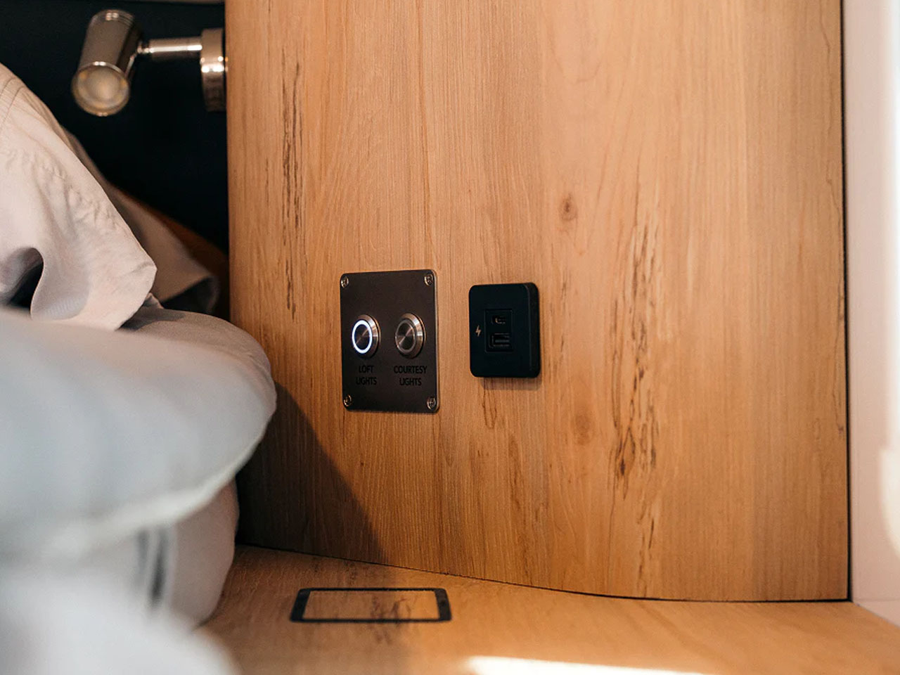
GXV Wild maintains off-grid convenience with the 400W of solar panels (expandable up to 800W), 12-kWh electrical system, and a 4,500W inverter. For all-season convenience, the insulated interior is furnished with a 13.5K-BTU rooftop air conditioner and a 14K-BTU hydronic heating system. Storyteller Overland is planning to sell the 2027 GXV Wild starting at $299,898. What do you think?


The post Storyteller’s new GXV Wild is built for luxury off-grid camping without compromise first appeared on Yanko Design.

  •  

Stanley doesn’t make gym equipment… but this stylish kettlebell proves it should

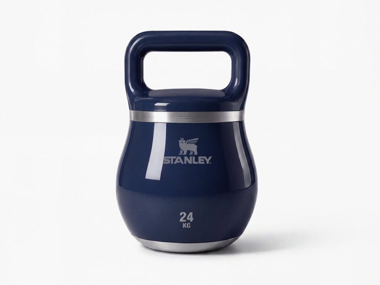
Fill a Stanley tumbler with a yogurt-based smoothie from bottom to top and you actually end up getting an arm workout. A 40oz Stanley cup can weigh close to 4lbs or upwards of 1.5 kilograms if filled to the brim with something dense like a smoothie or a thick latte. Jane Morelli just decided that if she was gonna give her arms a workout, why simultaneously rely on ugly looking kettlebells? Morelli superimposed Stanley’s design language onto kettlebells and the result looks just gorgeous.

Every gym equipment I’ve used has looked boringly functional. The kettlebells at my gym come in bright colors, but that’s just a color-code so you know the difference between a lighter and a heavier kettlebell even if the number on it wears off (it almost always does). Morelli’s design merely bridges two worlds together, and I won’t lie – the results look like the most seamless collab ever imagined. My only gripe is, I wish these kettlebells were actually tumblers too!

Designer: Emanuele Jane Morelli

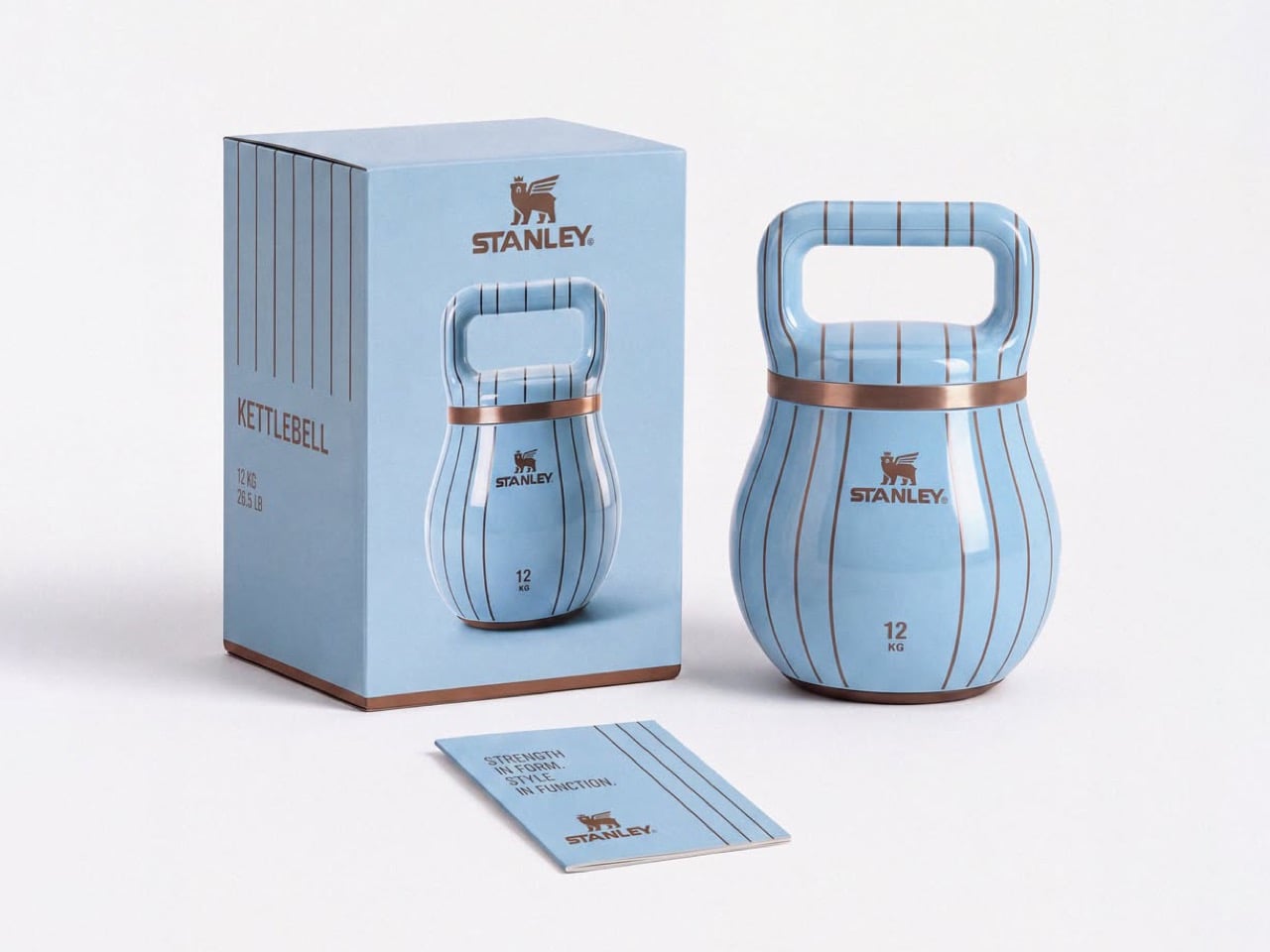
Haute gym equipment might not be a category but these kettlebells definitely make a case for it. Each one is styled with chic curves, and a color palette I’d only expect from companies like Hermès or Stanley. Subtle pastel shades, punctuated by just one hot pink color for the yoga-moms who need their gym equipment to be as flashy as their gym outfits. Each kettlebell has a lacquer-like sheen on it, along with the Stanley logo emblazoned on the front, larger than the weight units below it because that’s what matters more. The style statement.

I get that I can sound a little ironic, but I’m all for brand crossovers. (The only time I really object is when Tesla does stuff like manufacturing vodka or whistles because they seem to be obsessed with side quests and not really making any cars). This one piques my fancy because Stanley isn’t just a social statement, it’s perfect for fitness-freaks too who love chugging protein shakes from their 30-40oz cups, or sharing Strava stats superimposed against their Stanley cups just to paint a picture of how much ‘aura’ they have.

Morelli’s done a pretty remarkable job of simply yet effectively distilling Stanley’s brand language onto a piece of gym equipment, without necessarily caricaturing the Stanley cup’s silhouette. The kettlebells have a separate, distinct character, and the dual-band colors on each individual kettlebell represents a palette that feels distinctly high-fashion yet accessible. Quite like the company’s big, beautiful, nearly indestructible tumblers.

The post Stanley doesn’t make gym equipment… but this stylish kettlebell proves it should first appeared on Yanko Design.
  •  

The Foldable E Ink Book Is Finally Taking Shape

The e-reader has been one of the most static product categories of the past two decades. Since the first Kindle appeared in 2007, the form factor has barely evolved: a single screen, a flat back, and dimensions roughly matching a paperback. These devices have gotten lighter, sharper, and more waterproof, but the fundamental design assumption has stayed the same. They’re books without the book part.

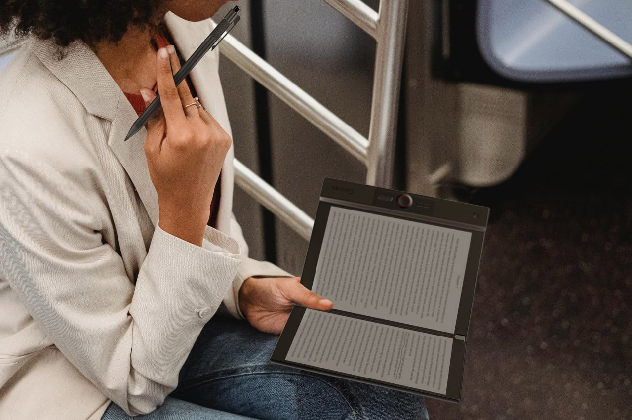
A growing number of designers have been working on a different premise: what if an e-reader actually opened like a book? One with two E Ink panels and a real hinge, held the way you’d hold a paperback, where left and right pages exist as physical space. That shared ambition has driven a small but serious cluster of projects building quietly over the past five years.

The proof that e-paper could bend

The idea of folding an E Ink display isn’t new. Back in 2020, E Ink Corporation demonstrated a hinged prototype showing that a bending e-paper panel could survive the mechanical stress of being folded. It never reached retail shelves, but it answered the one question that mattered most at the time: whether the material itself could handle the geometry of a real book.

Designer: E Ink

That prototype didn’t solve everything. It was a controlled demonstration with no commercial roadmap, no software, no battery life to speak of, and no clear form factor beyond the fold itself. What it gave the industry was proof that flexible e-paper was a viable building block rather than a permanent research curiosity. Every foldable E Ink project that came after built on that understanding.

The book illusion finally made real

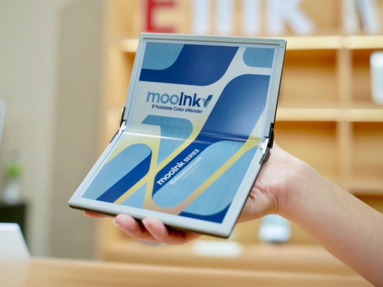
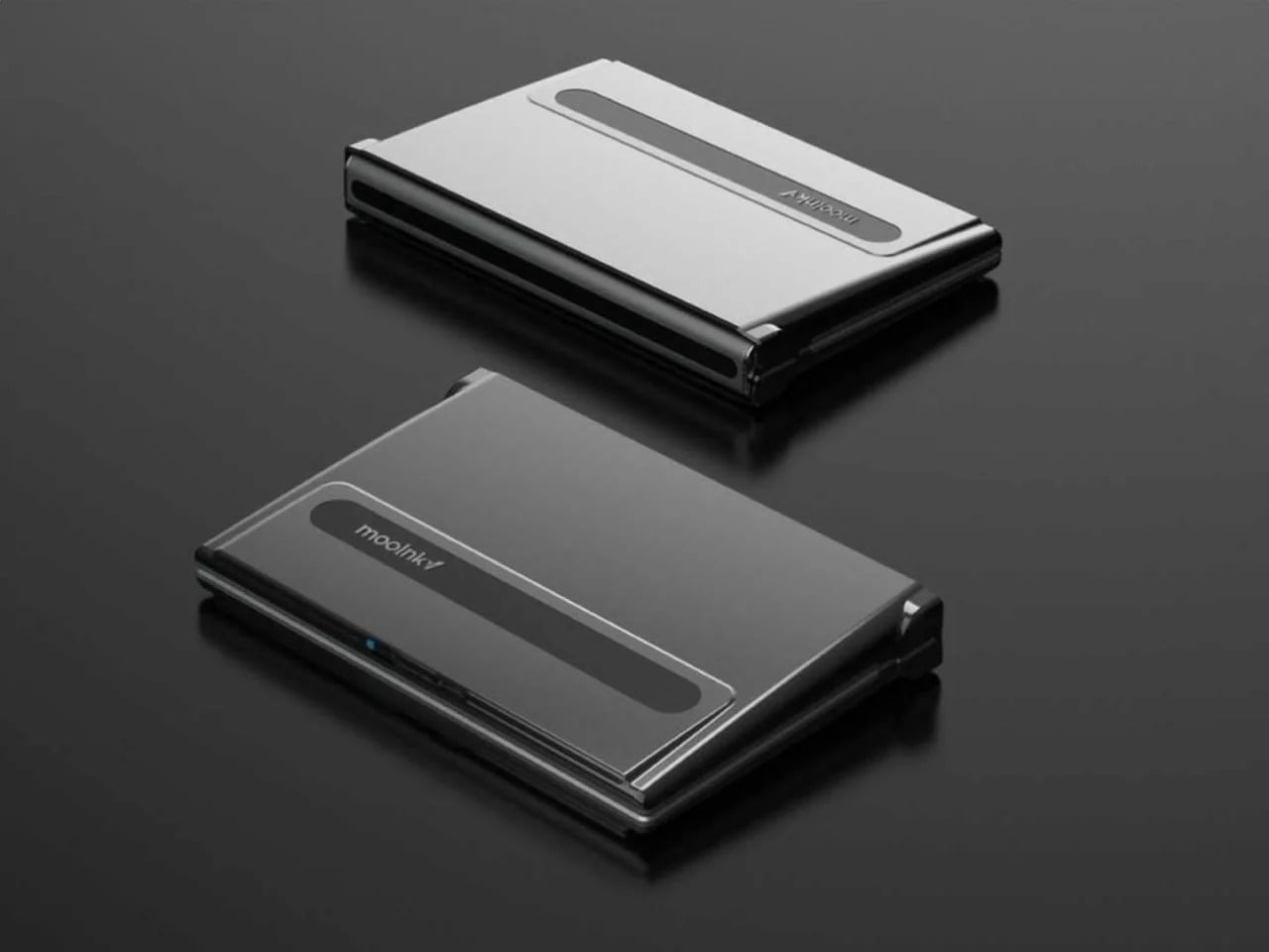
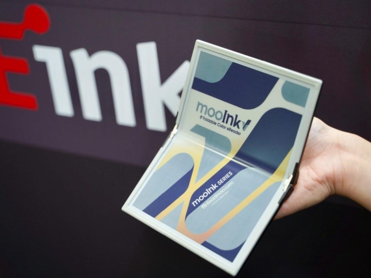
Readmoo’s Mooink V was the first design to make the flexible E Ink concept feel emotionally legible to a general audience. It’s built around an 8-inch Gallery 3 color e-paper display developed in collaboration with E Ink, one that folds down the middle to make the device small enough to pocket when closed and wide enough to feel like a slim paperback when open.

Designer: Readmoo

The color display matters more than it might seem. Gallery 3 renders close to 50,000 colors at 300 PPI, expanding the format beyond plain text to illustrated books, comics, and magazines. The fold reportedly passed 200,000 bending tests during development, and when fully open, the crease isn’t dramatic enough to register as a flaw so much as an honest design trade-off.

Mooink V hasn’t had the smoothest road to market, though. Despite genuine buzz at trade shows including Touch Taiwan and SID Display Week, no confirmed retail availability or street price had materialized as of mid-2026. The design made the foldable E Ink book look and feel tangible in a way earlier prototypes hadn’t. Whether it gets there commercially is a different and still open question.

Two screens, no crease

Not everyone building a book-shaped e-reader was willing to bet on a single flexible panel. A parallel design school took a more pragmatic approach: pair two conventional E Ink screens with a well-engineered hinge and let the gutter do the work. The result avoids crease anxiety entirely since neither panel has to bend, though it trades the seamless page illusion for a visible seam you’d have to accept.

Designer: LCFC (Hefei) (a Lenovo Subsidiary)

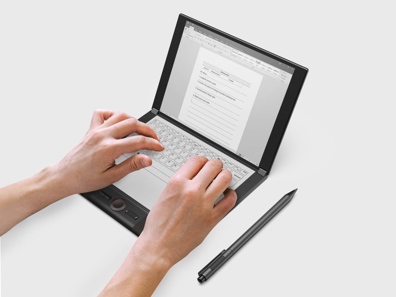
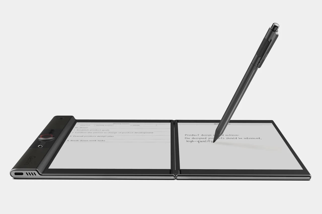
LCFC’s Gemini took the productivity angle furthest, giving both E Ink panels enough real estate to function almost like a laptop, with reading material open on one side and an active workspace on the other. The InkReader Duo concept took a more compact approach, fitting two E Ink screens into a phone-sized form, which made it feel less like a desk tool and more like a pocket notebook.

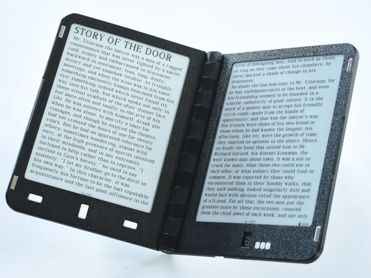
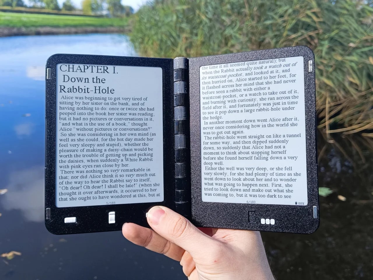
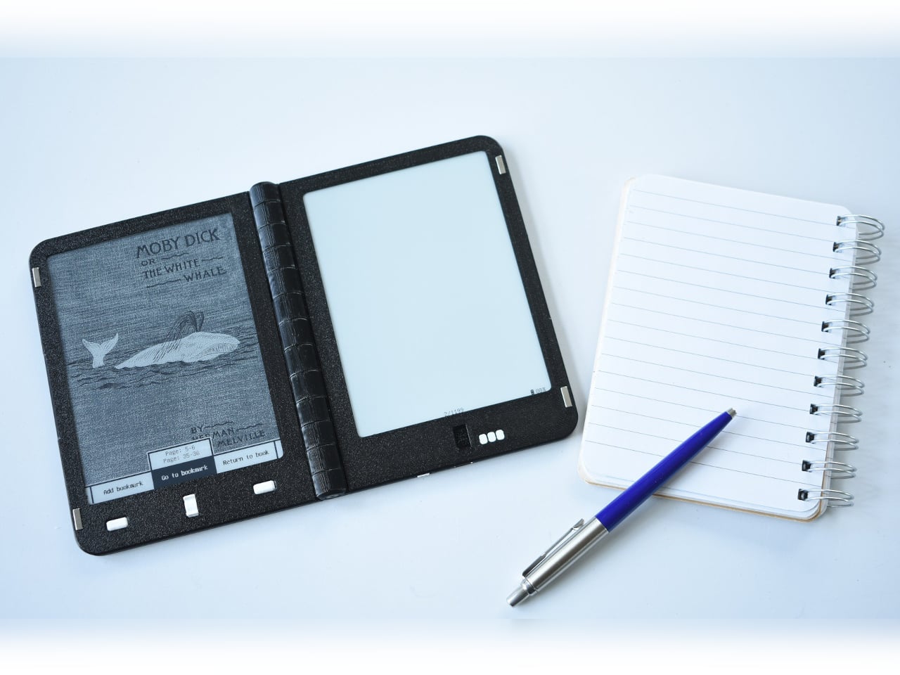
Diptyx went in a different direction altogether. Rather than chasing consumer polish, the project leaned into open-source principles, building a two-panel hinged e-reader without the lock-in that defines most commercial platforms. It isn’t the most refined interpretation of the book-shaped reader, but it made a clear point: the hardware problem was increasingly solvable, and the real challenge was getting the software and ecosystem right.

Designer: Martijn den Hoed

When a second screen isn’t enough

Not every dual-screen device fits cleanly into this story. The Bluegen OKPad pairs an E Ink panel with a regular LCD screen, which makes for a versatile tablet but undermines the unified reading experience that makes an E Ink book feel coherent. Switching between two fundamentally different display types introduces a visual disconnect that software bridging alone can’t fully smooth over.

Designer: Bluegen

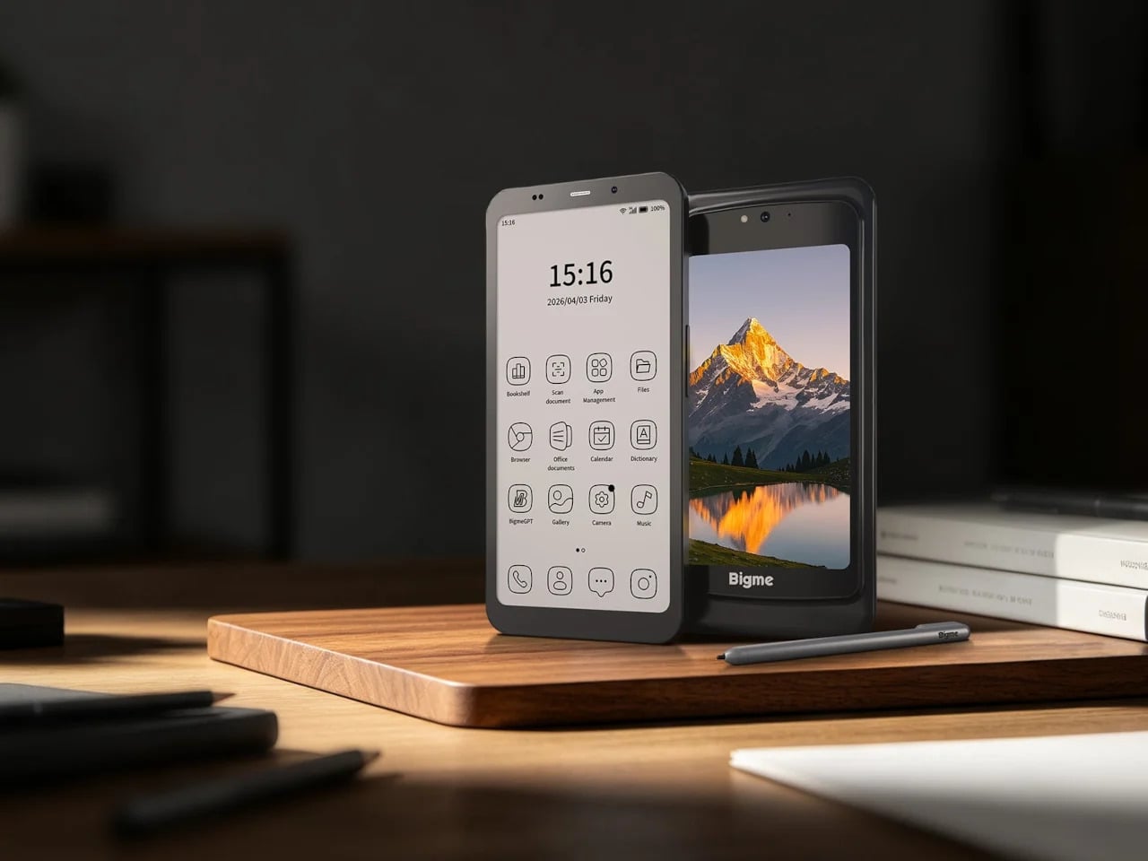
Bigme’s HiBreak Dual 2 runs into a different kind of problem. It’s a smartphone with a secondary E Ink display on the back, which is a genuinely clever idea for managing notifications and extending battery endurance, but it’s shaped and used like a phone rather than a book. A second screen doesn’t automatically recreate the spatial logic of reading a bound object.

Designer: Bigme

Inkleaf and the case for two pages

Inkleaf is the most pragmatic entry in the foldable E Ink space so far. Instead of chasing a seamless fold, it pairs two 10.3-inch Carta E Ink panels in a notebook-style hinge, with one side for reading and the other for writing. The seam between them works as a gutter rather than a flaw, and the design doesn’t try to hide it.

That workflow proposition is what makes Inkleaf interesting beyond its form factor. Having reference material on one panel while taking notes on the other removes a friction point that every single-screen reader quietly ignores. You don’t need to switch apps, scroll back, or memorize what you just read before writing something down. It’s aimed at a different kind of reader than a Kindle typically serves.

Designer: Kameron Yu

Inkleaf is currently collecting early-access signups ahead of an August 2026 launch, with a broader public release targeted for 2027. That’s a staggered timeline worth noting: the hardware still has to prove itself beyond initial demos, and the software will matter as much as the panels themselves. Carta E Ink is a sensible fit for a writing-focused device, but actual daily use remains the real test.

What Kindle still has to answer for

None of this means the Kindle is suddenly irrelevant. Amazon’s device still wins on price, ecosystem depth, and a friction-free reading experience built up through years of software refinement. If all you want to do is buy a book and read it on a train, nothing in this group of foldable experiments beats a Paperwhite for simplicity. The incumbents aren’t losing sleep yet.

What these devices do expose is a design gap Amazon hasn’t seriously tried to close. A Kindle displays text efficiently, but it doesn’t recreate the spatial logic of reading a bound book: two visible pages, a sense of position, a natural place for margin thoughts. Those aren’t features that get patched in through a software update, which is why the form-factor conversation is overdue.

That’s what this group of foldable and dual-screen E Ink devices has been quietly building toward for the past five years. Not a product category defined by any single winner, but a shared argument about what a digital reading device could look like if it started from the book rather than the screen. Whether any of them fully delivers on that is a question 2027 will help answer.

The post The Foldable E Ink Book Is Finally Taking Shape first appeared on Yanko Design.
  •  

Leatherman’s Weirdest Tool Drop Yet Is Strangely Genius

Leatherman has always been the brand you could count on to do one thing extremely well: pack an absurd number of tools into a deceptively small package. But Garage Batch #009 doesn’t follow that playbook at all, and I think that’s exactly why it’s worth talking about.

The Garage line is Leatherman’s unofficial skunkworks. It’s where the company test-markets experimental tools in limited batches, which means low quantities, no guarantees of a permanent future, and a demographic of buyers who treat a tool drop like a sneaker release. Batch #009, officially named the Adapter, is a ratcheting bit driver that looks unlike anything else in Leatherman’s catalog. Core77 put it best when they noted that if you didn’t know any better, you’d think it was someone’s industrial design school thesis project. That’s not a criticism. It’s kind of a compliment.

Designer: Leatherman

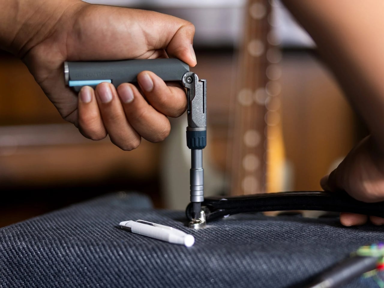
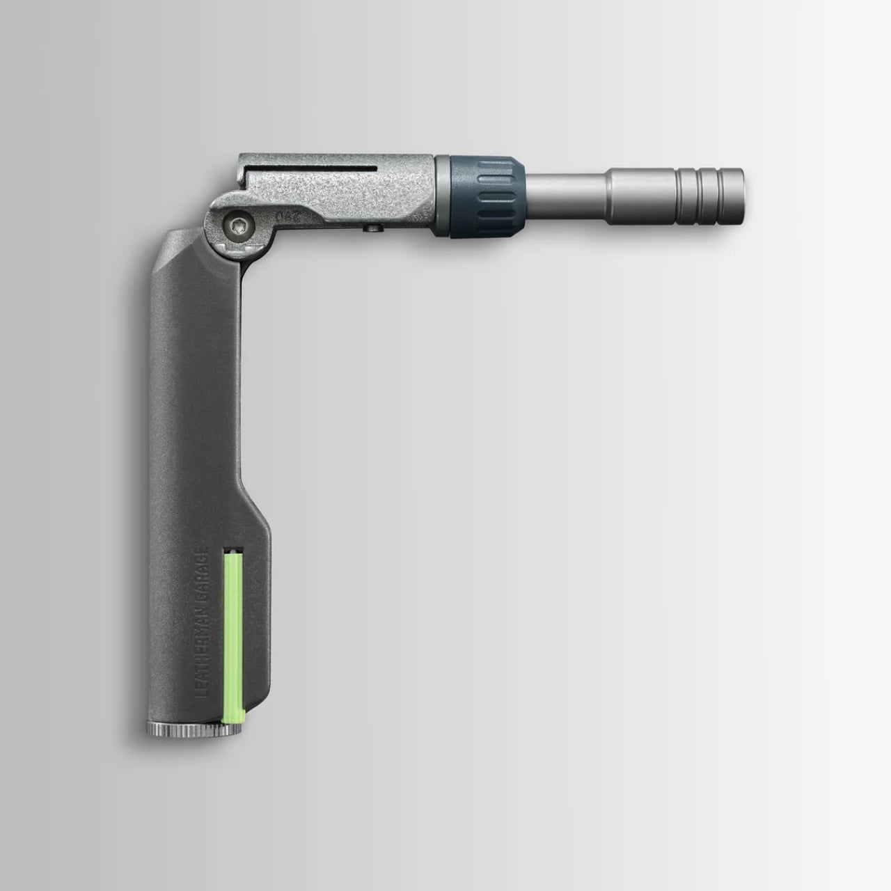
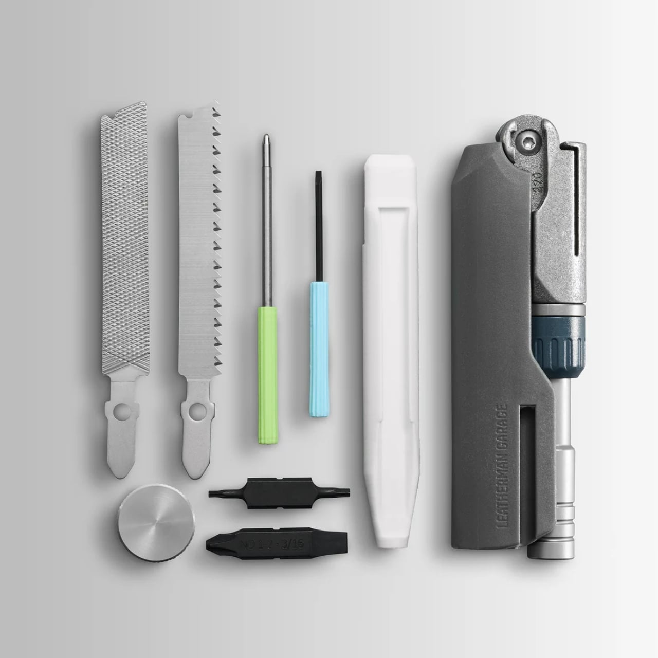
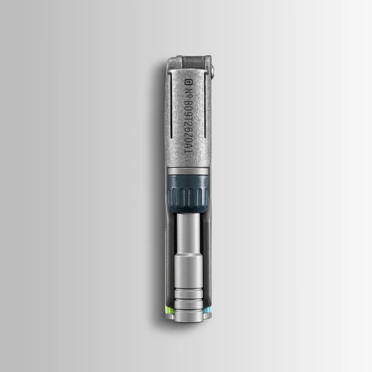
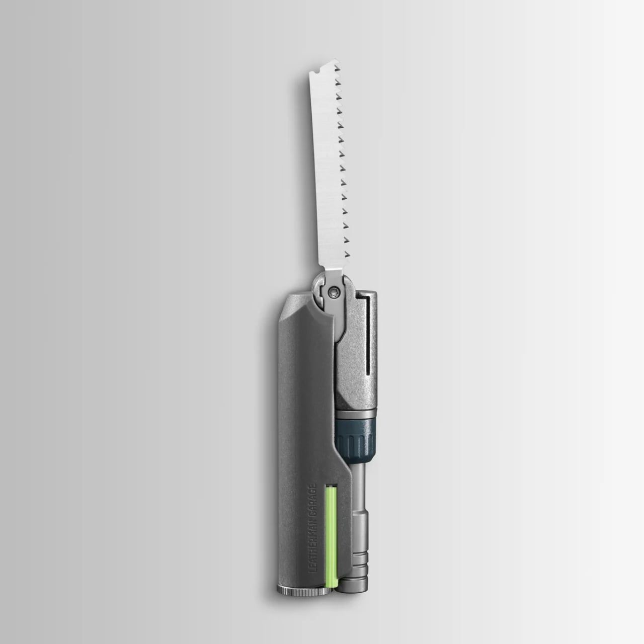
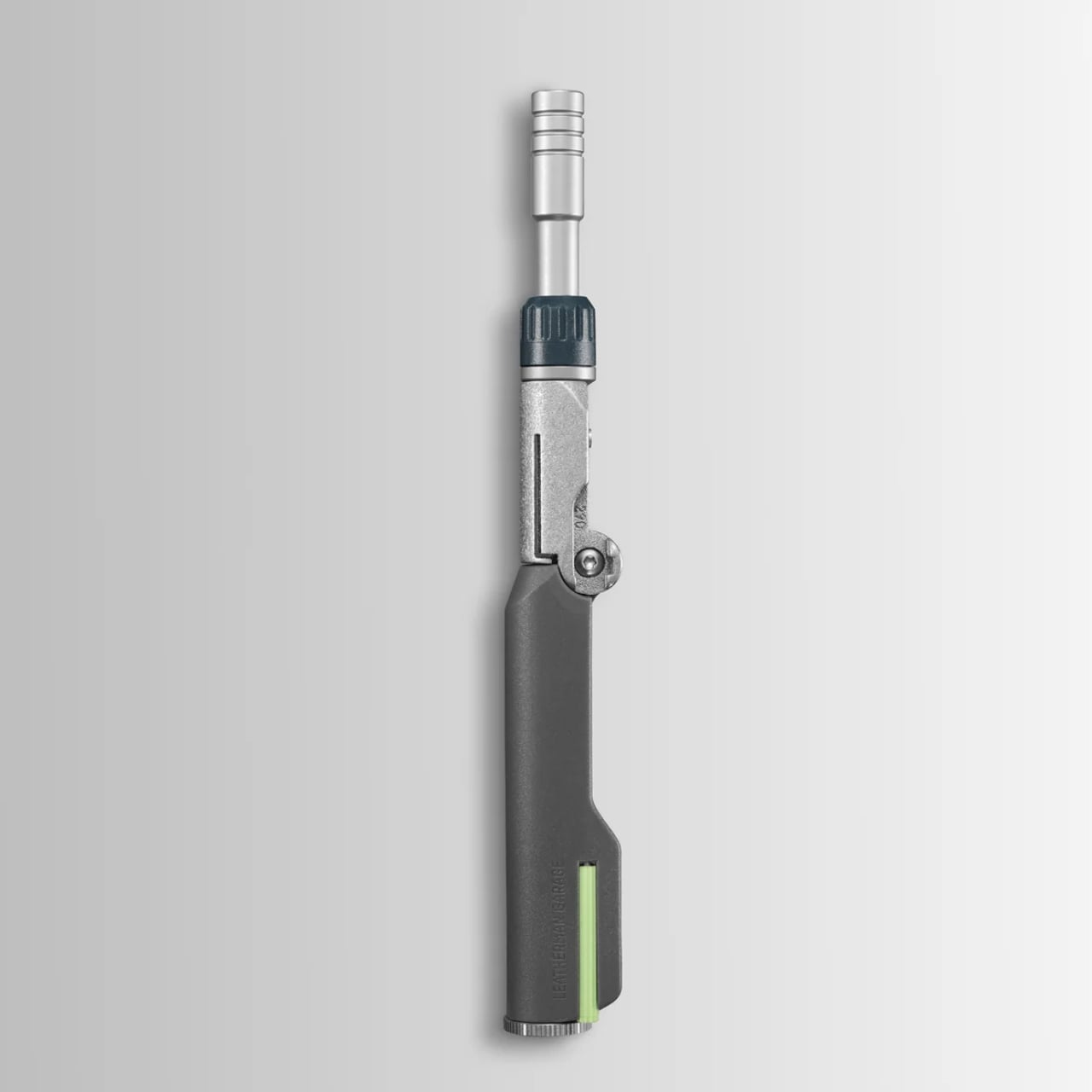
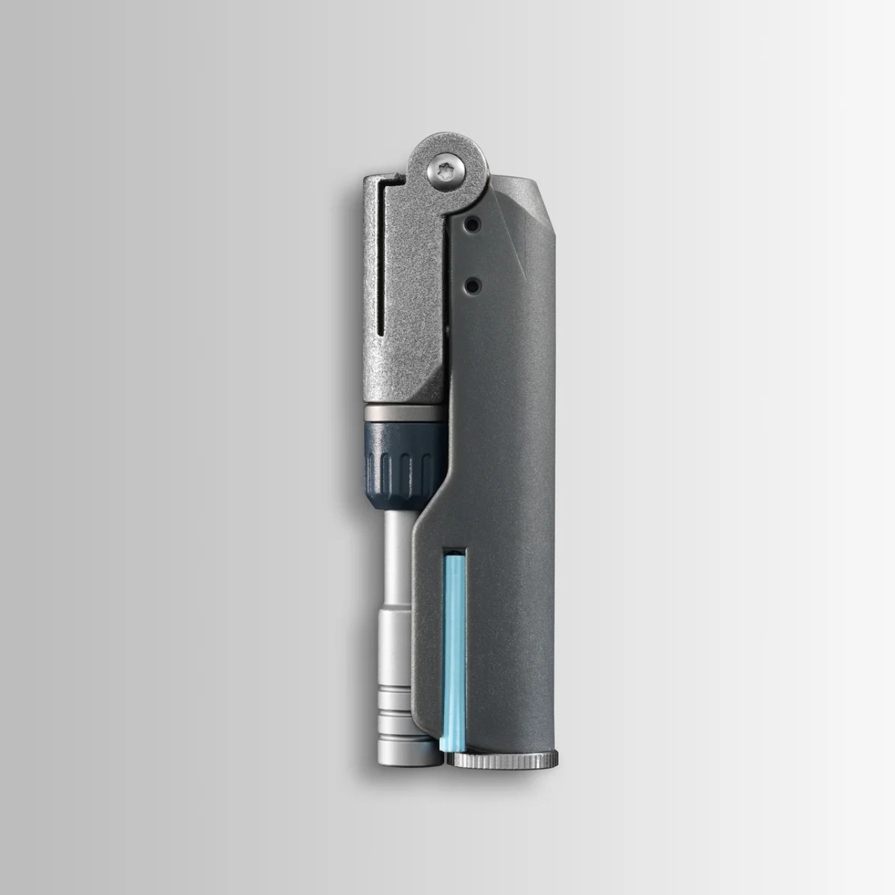
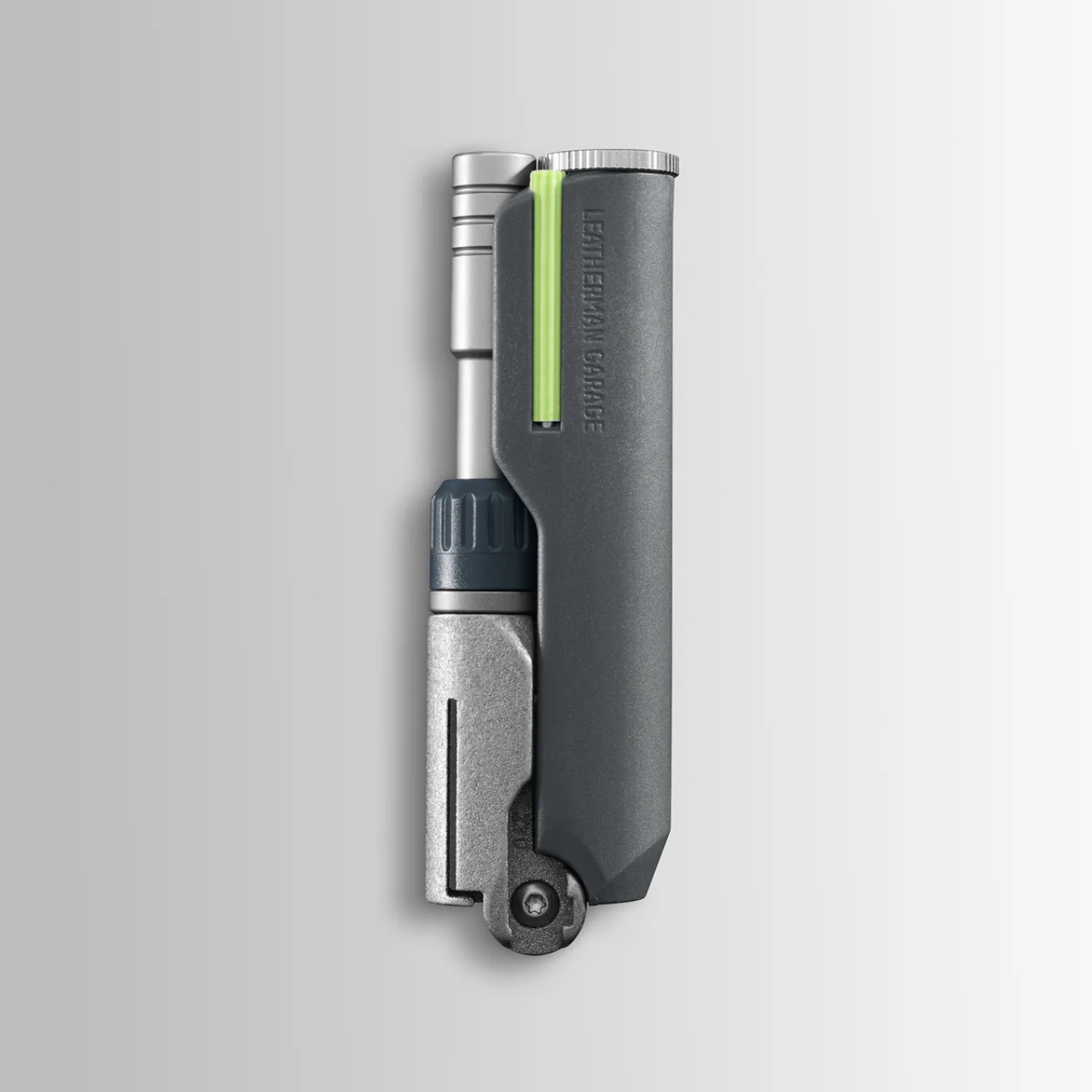
The Adapter is built from 3D printed titanium, which gives it that slightly precious, proof-of-concept feel you don’t usually associate with something you’d use to fix a cabinet hinge. It folds at a hinge joint and can be configured in three positions: fully extended for reach, bent at 90 degrees for torque leverage, and folded shut for compact carry. The ratcheting mechanism works in forward, reverse, and locked positions, so you’re not doing that annoying micro-repositioning shuffle every time you need to drive a screw. That alone is a genuinely useful upgrade over most compact bit drivers on the market.

But here’s the part that turns this from “useful niche tool” into “object I want to own”: the handle. Leatherman tucked a wood saw, a metal file, and two bits inside the handle compartment, all secured with a screw cap. They also stowed a mini ballpoint pen and an eyeglass screwdriver in there. If that sounds like the setup for a very organized person’s favorite fidget toy, you’re not wrong. The neon green accent strip on the handle doesn’t exactly scream jobsite. It says something closer to “I paid attention in design school and I have opinions about EDC.”

I want to be honest about the audience here. The Garage line isn’t really for the electrician or the contractor who needs to pull a hundred screws before lunch. It’s for the person who has a Wave on their keychain and a thing for limited-edition objects that are also actually functional. One reviewer summed it up with a note of friendly resignation: “I guess I have to accept the reality that Leatherman is like Supreme now.” That quote has been floating around the internet, and whether it’s a dig or a badge of honor probably depends on who you’re asking. I’d argue it’s both.

The drop sold out fast. High demand on a small batch is Leatherman’s way of gauging whether something deserves to graduate into a full production run, which is a smart and low-risk way to innovate. Not everything from the Garage line makes it. But the Adapter feels like a strong candidate for becoming a permanent fixture, because once you get past the art-project aesthetics, the core concept is genuinely practical.

Compact ratcheting bit drivers with smart storage have a real market. People are constantly trying to slim down their tool kits without sacrificing capability, and a folding driver that also carries your most-reached-for accessories covers a lot of ground in a small footprint. The 3D printed titanium construction keeps it light without making it feel cheap, and the three-position folding system solves an actual ergonomic problem that flat bit drivers have always had.

Whether you’re a gear collector who watches tool drops the way other people watch sneaker releases, or just someone who wants a smarter carry for weekend projects, the Adapter makes a case for itself without needing to oversell anything. Leatherman took a weird swing, and it mostly landed.

The post Leatherman’s Weirdest Tool Drop Yet Is Strangely Genius first appeared on Yanko Design.
  •  

This One-Wheel robot could patrol your property while you stay away

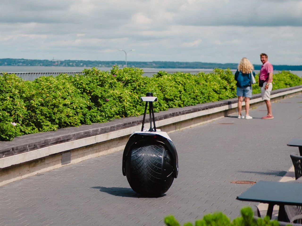
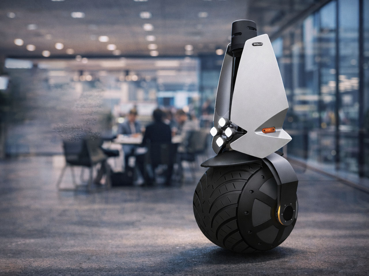
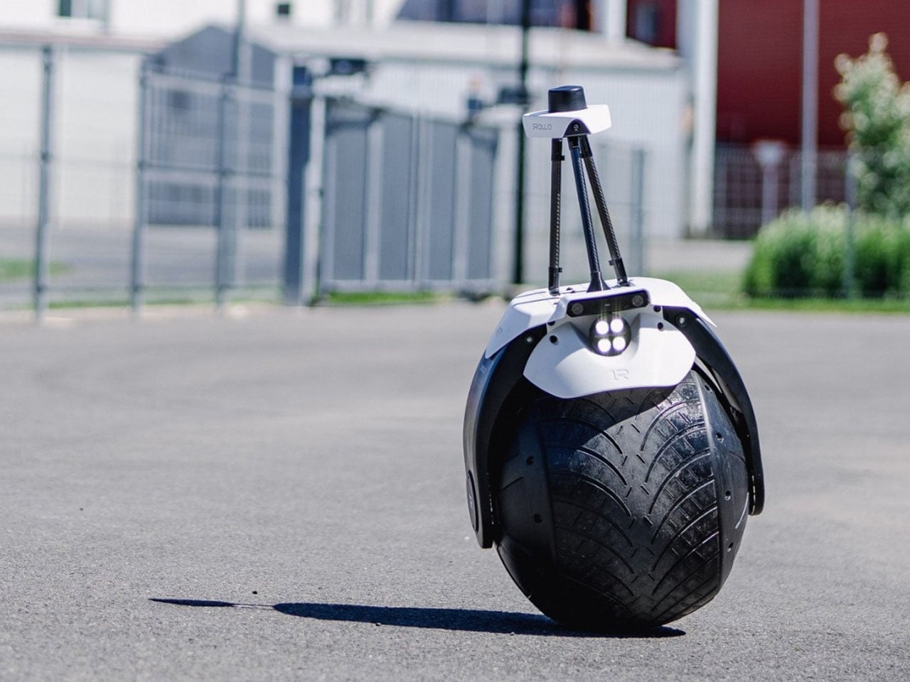
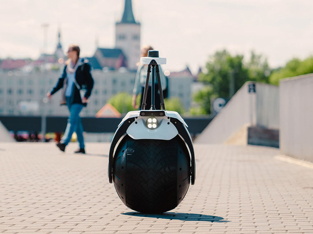
Most security robots are designed like small autonomous cars, with a bulky body and enough room for all the fancy tech. 1ROLLO, however, adapts a radically different approach. Developed by Estonian startup Rollo Robotics, this autonomous security robot balances on a single large wheel, turning an unusual piece of robotics into a practical patrol machine for large properties.

The 1ROLLO is built around a vertically oriented spinning flywheel housed inside its main wheel. Gyroscopic forces help the bot remain upright while moving, while the internal mechanism allows it to lean and change direction. The result is a remarkably narrow robot that can move independently through spaces that might be less accessible to larger wheeled security platforms.

Designer: Rollo Robotics

Despite its unconventional appearance, the 1ROLLO surveillance robot is designed for serious security work. Its autonomous navigation system combines 360-degree computer vision with RTK GNSS positioning, allowing the robot to follow mapped patrol routes while navigating around obstacles. It can detect movement and objects, record video, recognize license plates, and monitor for potentially dangerous gases, including carbon monoxide. The idea is to shift routine security patrols from people to machines without completely removing human oversight. This is estimated to save up to 80 percent of the cost that would otherwise be incurred using manual methods.

When the robot detects something unusual, it can alert a remote operator over 4G, 5G, or Wi-Fi. The operator can then access a live video feed, speak to people near the robot using its microphone and speaker, or dispatch a human guard if the situation requires intervention. A cloud-based management platform is intended to make the system scalable, allowing one operator to monitor multiple robots simultaneously. That could make the 1ROLLO particularly useful for expansive sites where continuously patrolling every corner would require significant manpower.

The robot measures approximately 60 x 60 x 140 centimeters and weighs around 35 kilograms according to the company’s specifications, while more recent reporting has described a 45-kilogram version with a higher top speed of up to 30 km/h. The company has also stated a battery runtime of up to eight hours, after which the robot can autonomously return to a charging station. Its IP65-rated enclosure protects against dust and water jets, supporting outdoor operation.

Rollo Robotics sees potential applications across airports, data centers, industrial facilities, corporate campuses, manufacturing sites, hospitals, hotels, and critical infrastructure. The robot could also find a role in environments such as mining operations, construction sites, oil and gas facilities, and gated communities, where autonomous monitoring could complement existing security teams.

Rollo Robotics plans to offer the surveillance robot through a Robotics-as-a-Service model. Customers would pay for access to the system while receiving maintenance, software updates, support, and future hardware upgrades as part of the service. The 1ROLLO is still evolving, with the company working to improve its performance in challenging weather and busy environments. Commercial availability is expected in 2027, but its single-wheel architecture already makes it an intriguing alternative to the increasingly familiar fleet of four-wheeled security robots.


The post This One-Wheel robot could patrol your property while you stay away first appeared on Yanko Design.
  •  

Twelve South Just Built a $130 Charger That Won’t Ruin Your Nightstand

The nightstand has become one of the messiest surfaces in a home. A charging cable snaking across the top, a phone lying flat or propped against whatever happens to be nearby, maybe a watch charger completing the pile. Most accessories designed to address this solve the function while ignoring the furniture, leaving something clinical and plastic sitting next to things that actually belong in a bedroom.

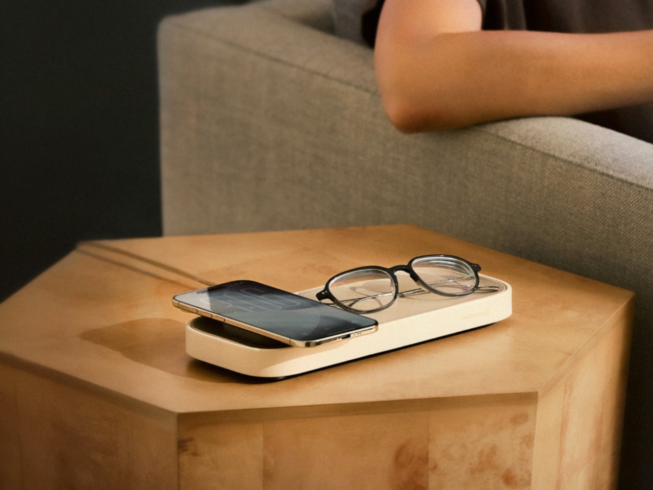
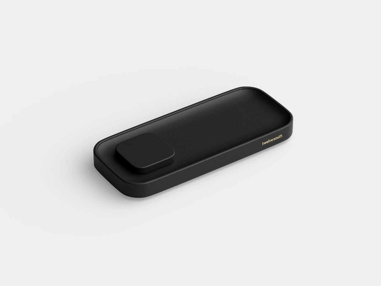
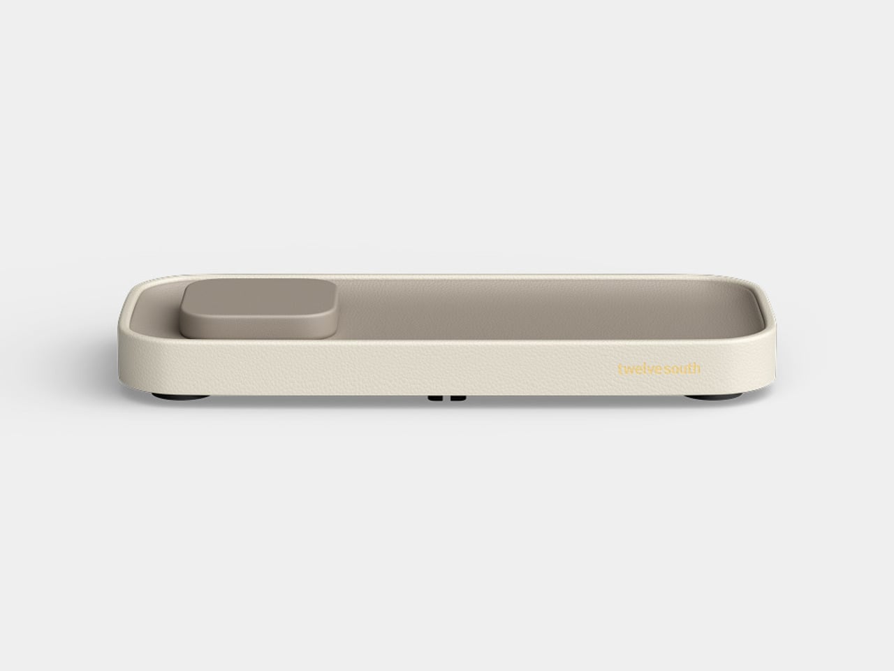
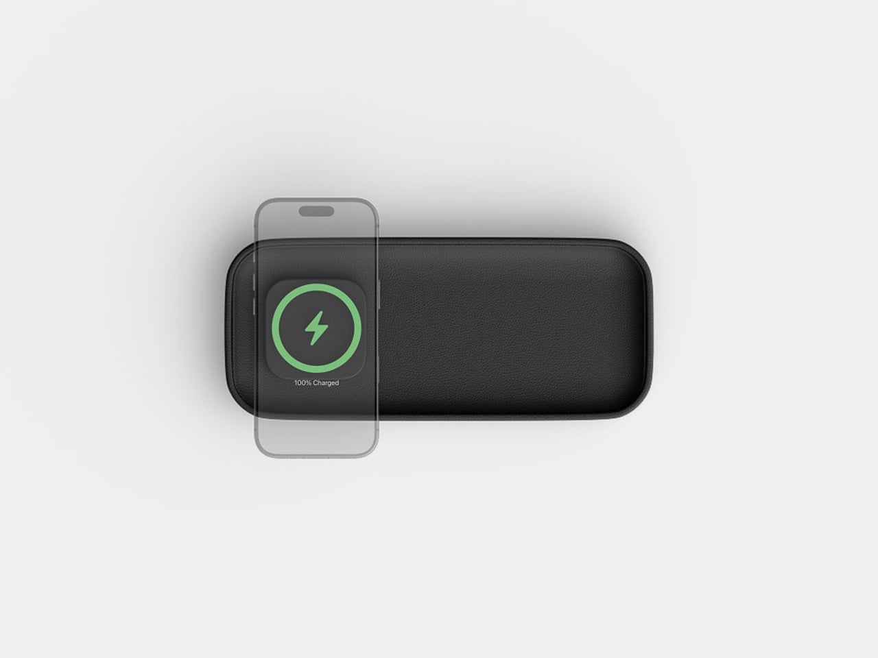
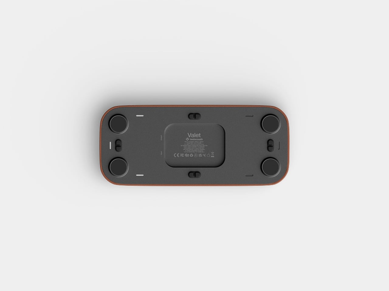
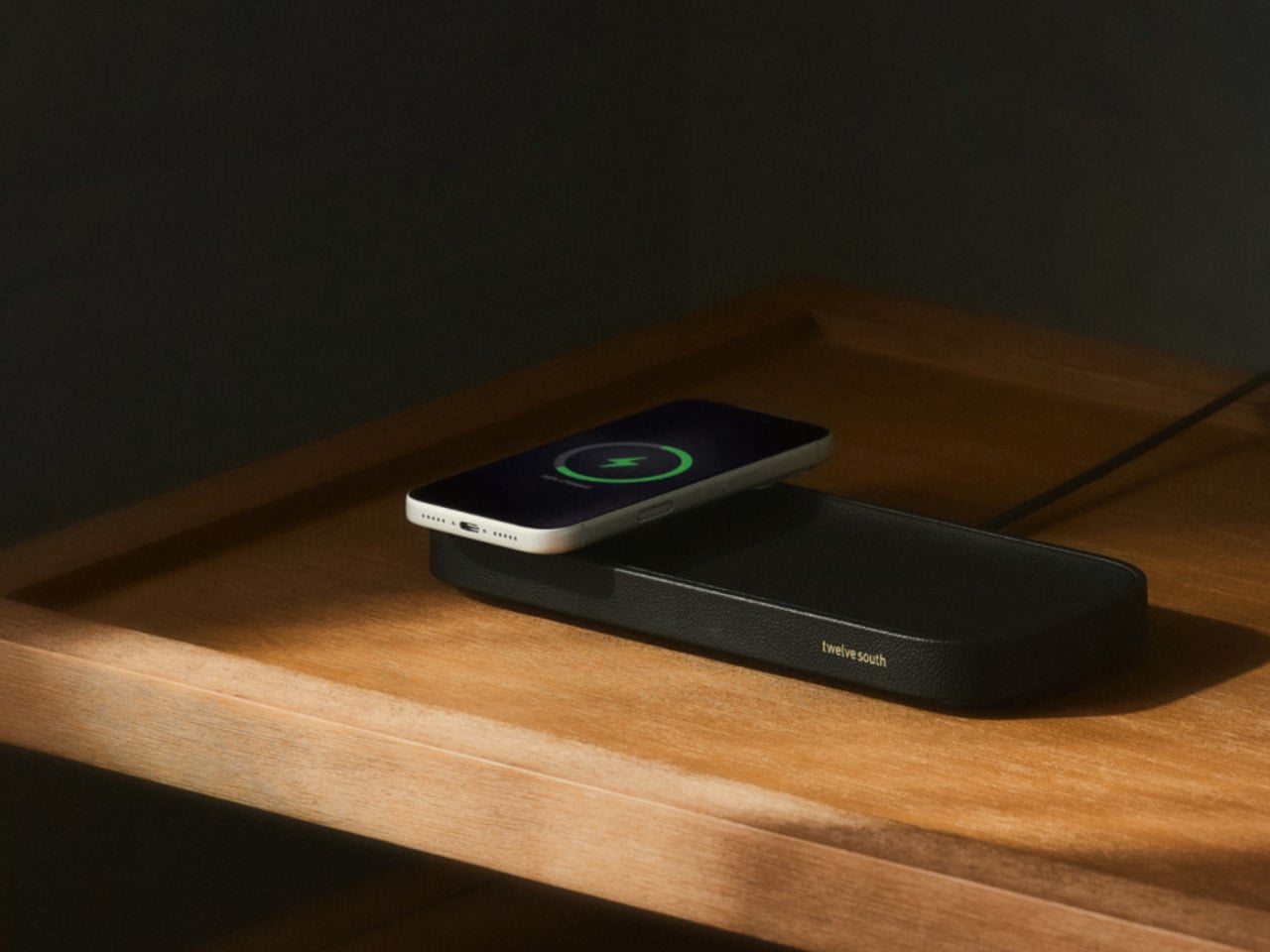
The Valet 4.25 from Twelve South approaches the problem differently. It’s a compact leather catchall tray with a 25W Qi2 wireless charger built into one end, sized specifically for nightstands and bedside tables. The idea isn’t to be a charger that fits in a room; it’s to be an object that actually belongs there, starting with its materials and ending with how it behaves overnight.

Designer: Twelve South

The base is a weighted zinc alloy frame wrapped entirely in Nappa leather, which keeps it planted on the surface without rubber feet or suction tricks. The tray measures 4.25 inches across, making it a tighter proposition than the brand’s original 7.5-inch Valet but considerably more appropriate for the average nightstand, where every spare inch is already committed to something else.

There’s a small but deliberate feature called the Goodnight Glow. When you set your phone down to charge, the tray pulses a soft light for eight seconds to confirm the connection, then fades completely. It doesn’t stay lit through the night. For something sitting beside you while you sleep, that restraint is more considered than it sounds, and it makes double-checking whether your phone is actually charging almost unnecessary.

The wireless output is a meaningful upgrade over the original Valet, which topped out at 15W via Qi2. The new model delivers 25W, which is the full MagSafe speed that newer iPhones can receive. The smaller size doesn’t come at the expense of performance; if anything, it corrects the one technical criticism that followed the larger model since it launched at CES earlier this year.

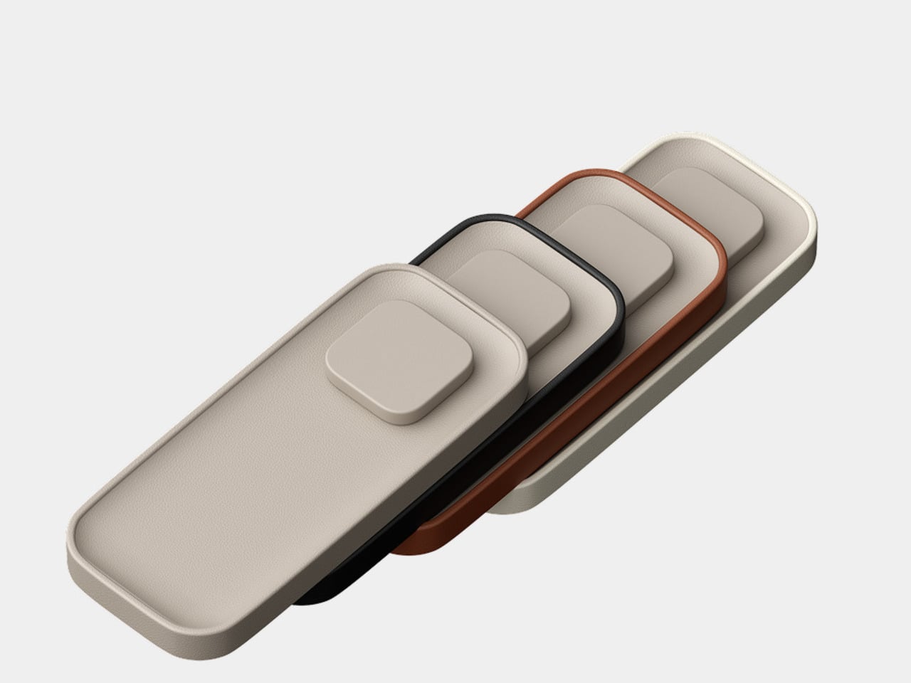
The outer frame is removable and interchangeable, available in four leather colors: black, taupe, brown, and ecru. The body itself comes in either black or taupe Nappa leather, giving you enough combination room to match most bedroom furniture without much deliberation. The tray can also be oriented four ways, letting you position the charging pad on either side or rotate the whole thing to fit a narrower nightstand.

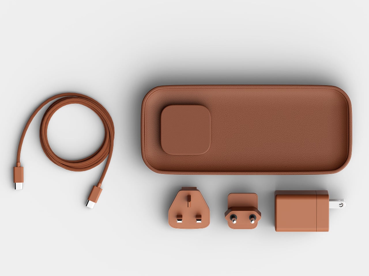
There’s a USB-C port tucked under the base for a second device, though at 10W it’s a step down from the 35W the larger Valet offers. It’ll handle a pair of earbuds or a smartwatch overnight, but it’s not fast-charging territory. The smaller tray is the other concession, reducing the landing area for everyday items compared to what the 7.5-inch version can comfortably hold alongside a phone.

At $129.99, it’s $50 less than the larger model and carries the same premium material finish. The Valet 4.25 is narrowly focused for a specific spot in the home, the kind where spending more on something you see every morning is easier to justify when it actually looks right. The Nappa leather and zinc alloy construction give it a permanence that most chargers, regardless of cost, rarely manage.

The post Twelve South Just Built a $130 Charger That Won’t Ruin Your Nightstand first appeared on Yanko Design.

  •  

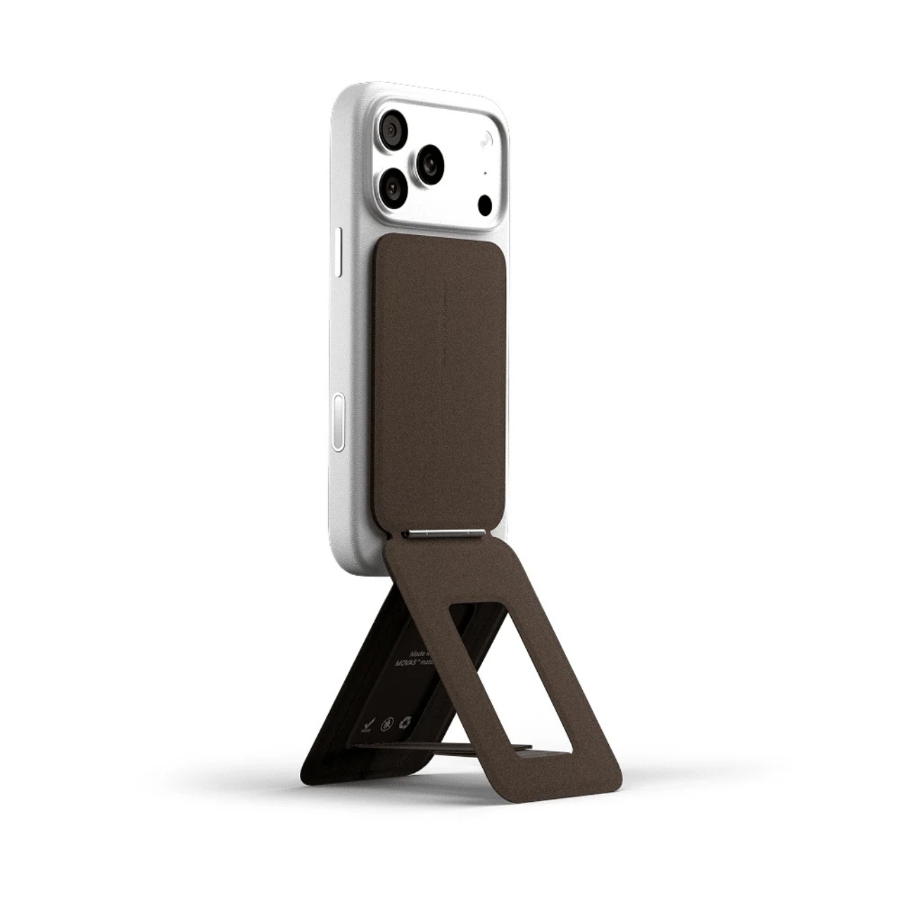
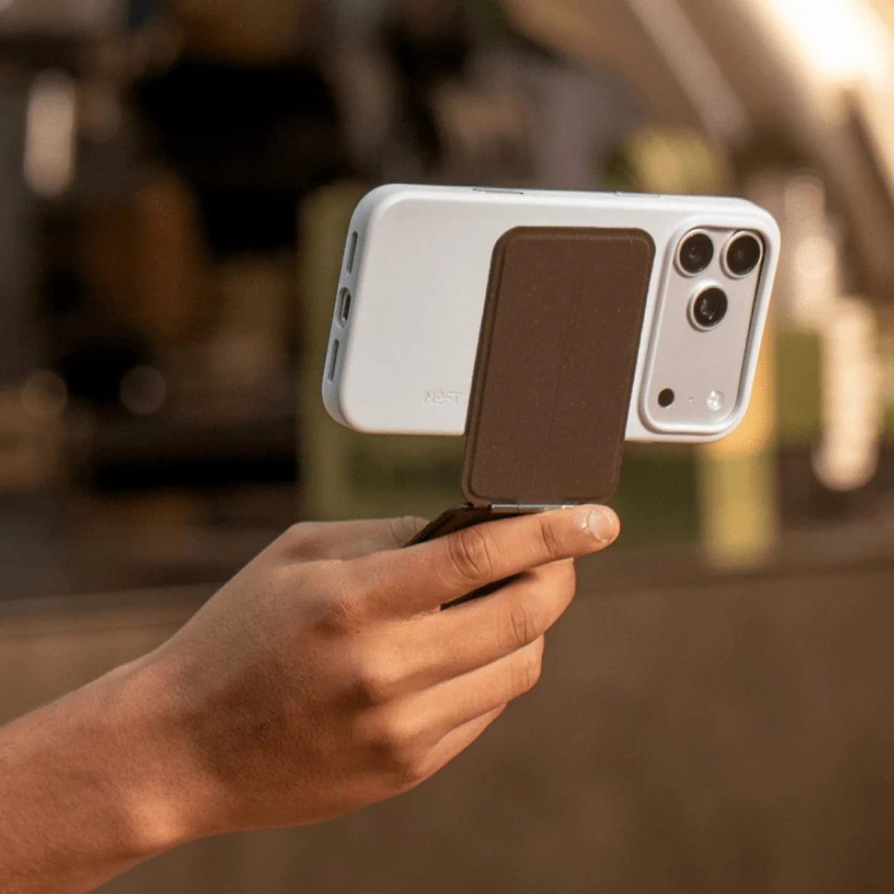
Your Phone and Laptop Stand Could Be Made From Recycled Coffee Grounds

Every morning, millions of people brew their coffee, toss the grounds, and move on. It’s such a routine act of disposal that few of us stop to think about where all that spent coffee actually goes. MOFT apparently did think about it, and the result is one of the more genuinely interesting design stories to come out of the tech accessories space in recent memory.

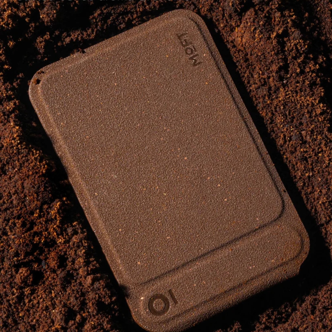
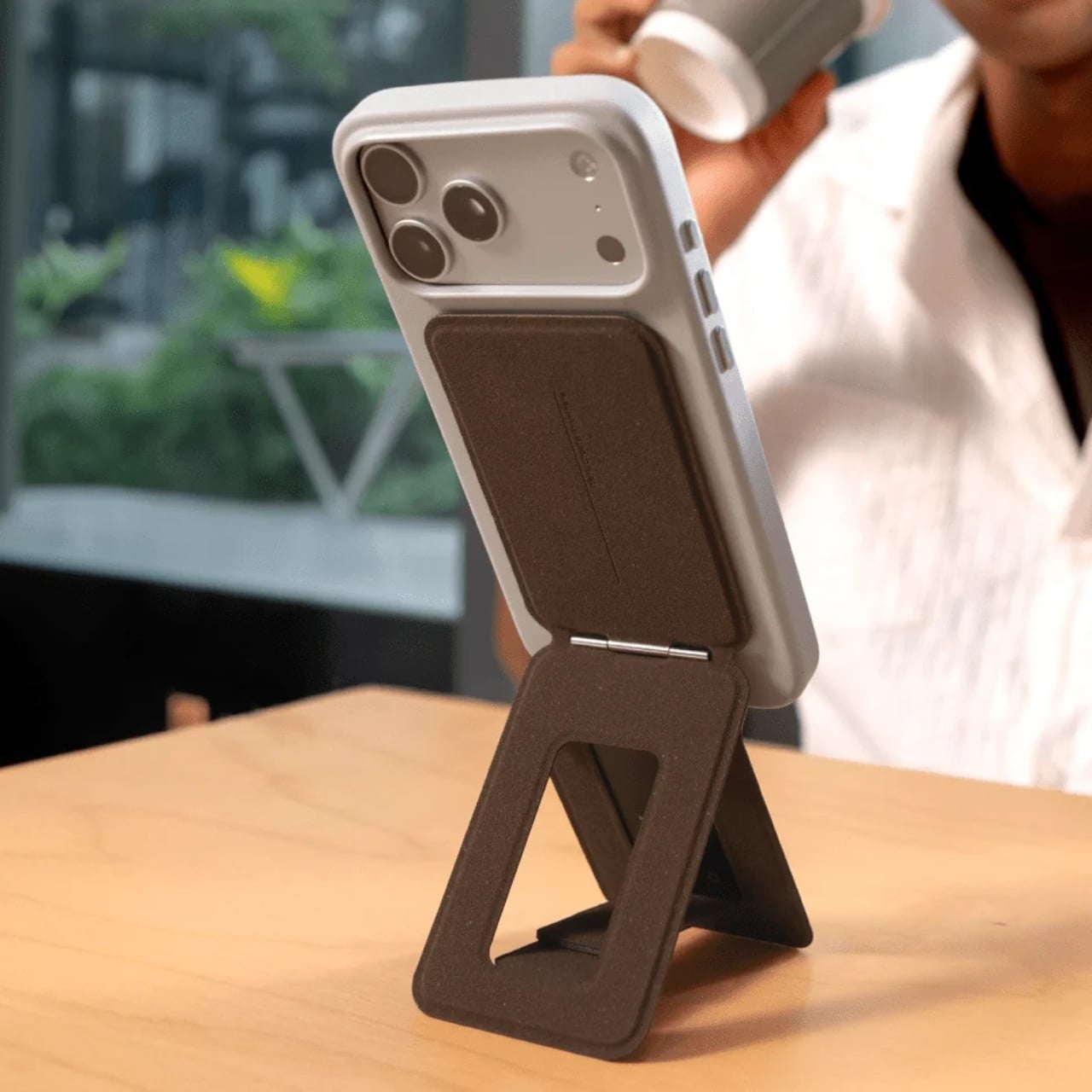
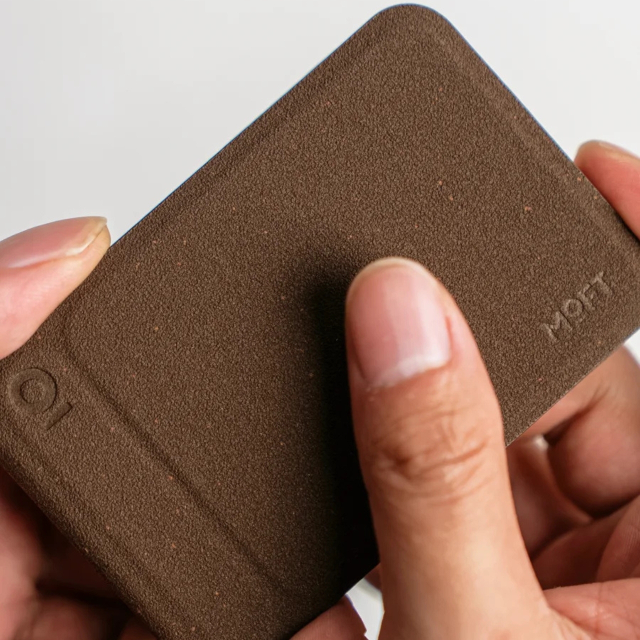
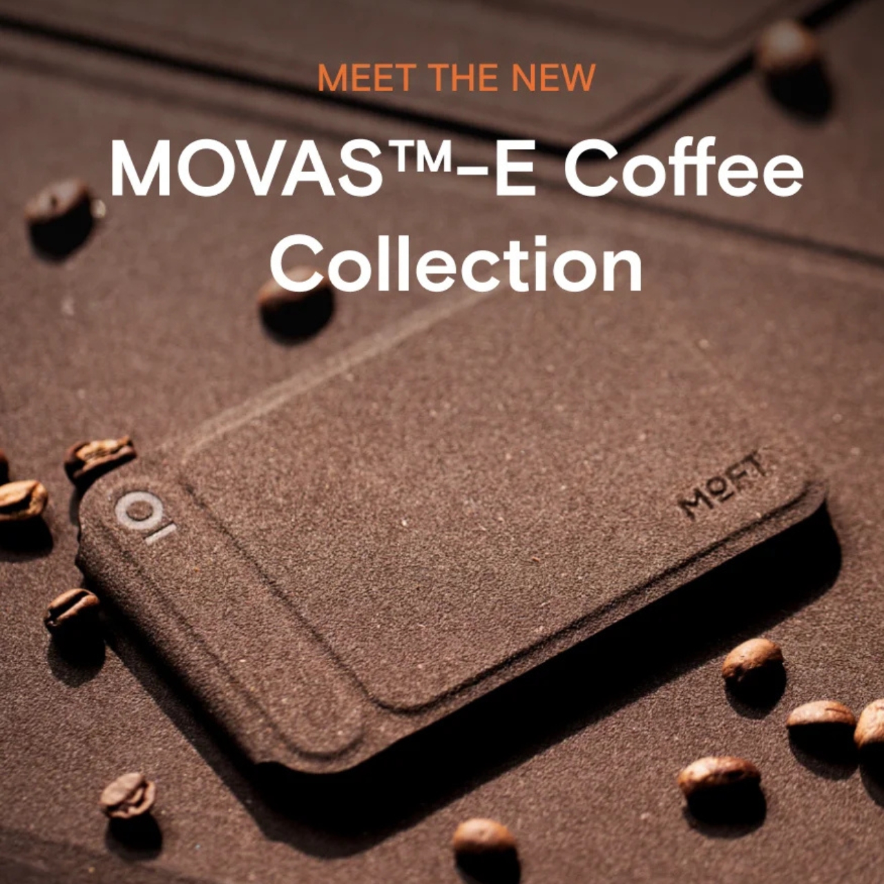
The MOFT MOVAS-E Coffee Collection is a new line of accessories built from a bio-based leather crafted from recycled coffee grounds. MOFT combined spent coffee grounds with waterborne bio-based polyurethane to create what they’re calling a new generation of bio-based leather. The material replaces both conventional leather and traditional synthetic alternatives, which makes the origin story feel less like a marketing angle and more like an actual shift in how the brand approaches materials.

Designer: MOFT

MOFT has already built a strong reputation for thoughtful material choices. Their MOVAS vegan leather line has been a staple in the premium accessories space for a while now, known for that soft, slightly textured finish that feels surprisingly luxurious on a phone MagSafe stand. The MOVAS-E Coffee Collection takes that established foundation and adds a genuine layer of purpose to it, pushing the material story well beyond aesthetics and into something more intentional.

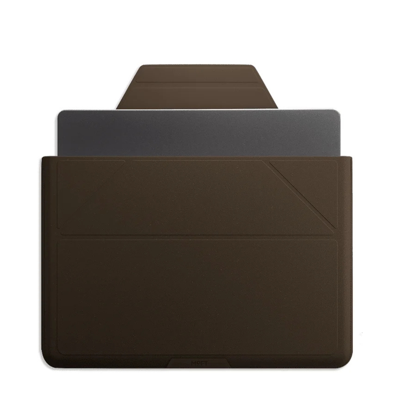
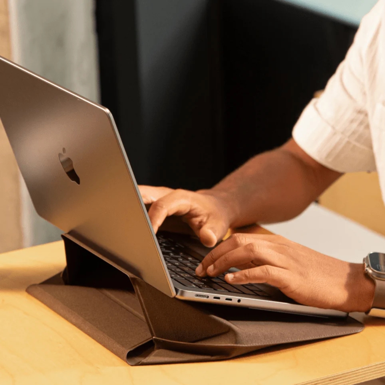
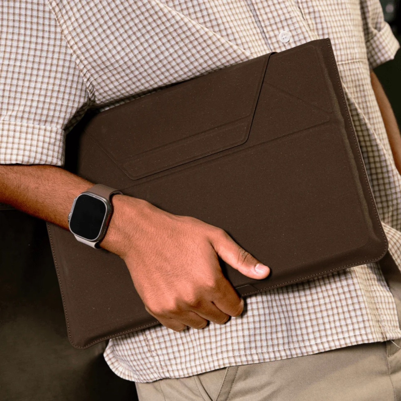
The collection includes products like a laptop Carry Sleeve, all finished in warm, coffee-toned colorways that look like they were pulled straight from a specialty café mood board. The tones are earthy and rich without veering into something overly minimal or clinical. If you’ve ever wished your tech accessories matched the aesthetic of a beautifully lit coffee shop corner, MOFT seems to have designed this one with exactly that feeling in mind. The tagline for the collection is “Brewed for Flow,” and it’s hard to argue with that framing.

The packaging is also part of the story. MOFT went with a frosted, minimalist design they describe as food-safe, durable, and fully recyclable. It’s the kind of packaging decision that often goes unnoticed by most buyers, but it signals that the sustainability angle here isn’t just surface-level. When a brand puts the same thought into the box as the product inside, that’s usually a sign the commitment runs deeper than a trend cycle.

I’ll be honest: the sustainable materials conversation in tech accessories can feel exhausting. Every other brand is slapping the word “eco” on something and calling it a revolution. MOFT’s approach feels different, not because they’ve reinvented the wheel, but because the product doesn’t sacrifice anything to get there. The MOVAS-E Coffee Bio-Leather still delivers the same premium tactile quality that made their original MOVAS line popular. It’s stain-resistant, smooth, and has that matte finish that photographs well without ever looking cheap. The material carries its origins gracefully.

The timing of this collection feels culturally right, too. Coffee has become more than a beverage. It’s an aesthetic, a lifestyle marker, a ritual that people build their mornings around. The idea that your phone stand or laptop sleeve could be a physical extension of that daily ritual is a small but clever act of brand storytelling. It doesn’t feel forced. It feels like a natural fit for the kind of person who already gravitates toward MOFT: someone who pays attention to the things they carry.

Whether or not bio-based leather made from coffee grounds becomes a broader standard for tech accessories, MOFT is asking the right questions here. What do we do with the waste streams already woven into our daily lives? How do we make sustainable choices feel desirable rather than merely dutiful? The MOVAS-E Coffee Collection doesn’t answer everything, but it’s a compelling and well-designed start.

If you’ve been looking for a reason to upgrade your tech carry, this collection offers one that goes a little deeper than color options. It’s the kind of purchase that earns a second look, and a story that’s surprisingly easy to tell when someone asks where you got your case.

The post Your Phone and Laptop Stand Could Be Made From Recycled Coffee Grounds first appeared on Yanko Design.
  •  

This 341-Square-Foot Tiny Home Proves You Don’t Need More Space — Just Smarter Space

Most tiny homes ask you to forgive something. The Amelia doesn’t. It speaks that language fluently — treating constraint as a design language rather than something to apologize for.

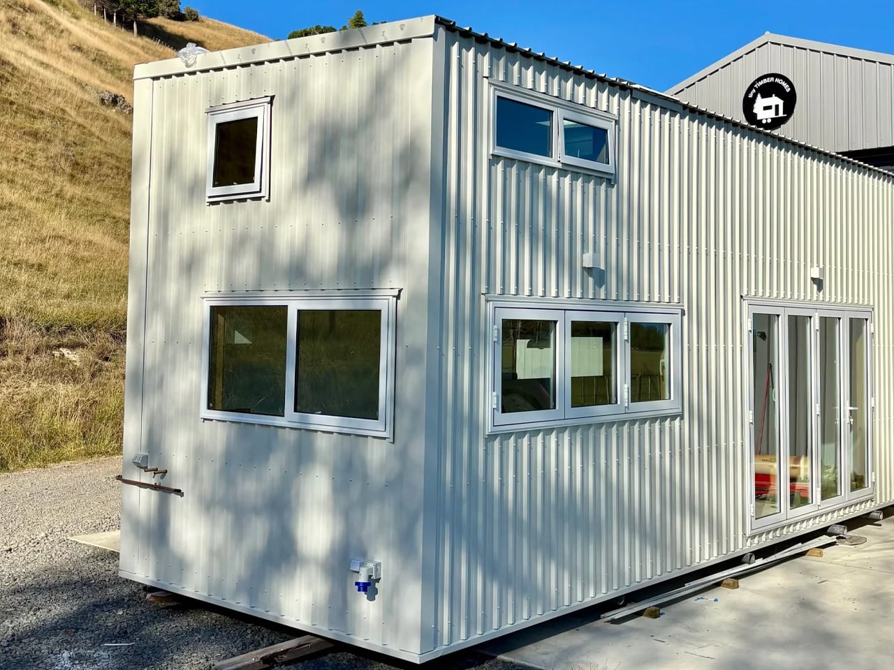
Stretching 26 feet long and 8.5 feet wide, the Amelia sits on a double-axle trailer and clocks in at 341 square feet of living space. It wears white board-and-batten siding with a maintenance-free steel base and a snap-lock metal roof — clean, unfussy, built to hold up wherever you put it. The kind of exterior that looks deliberate rather than compromised.

Designer: Teacup Tiny Homes

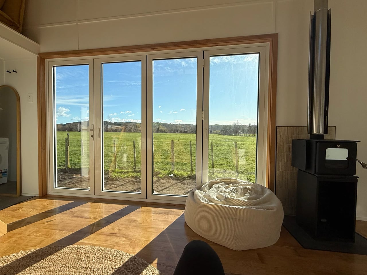
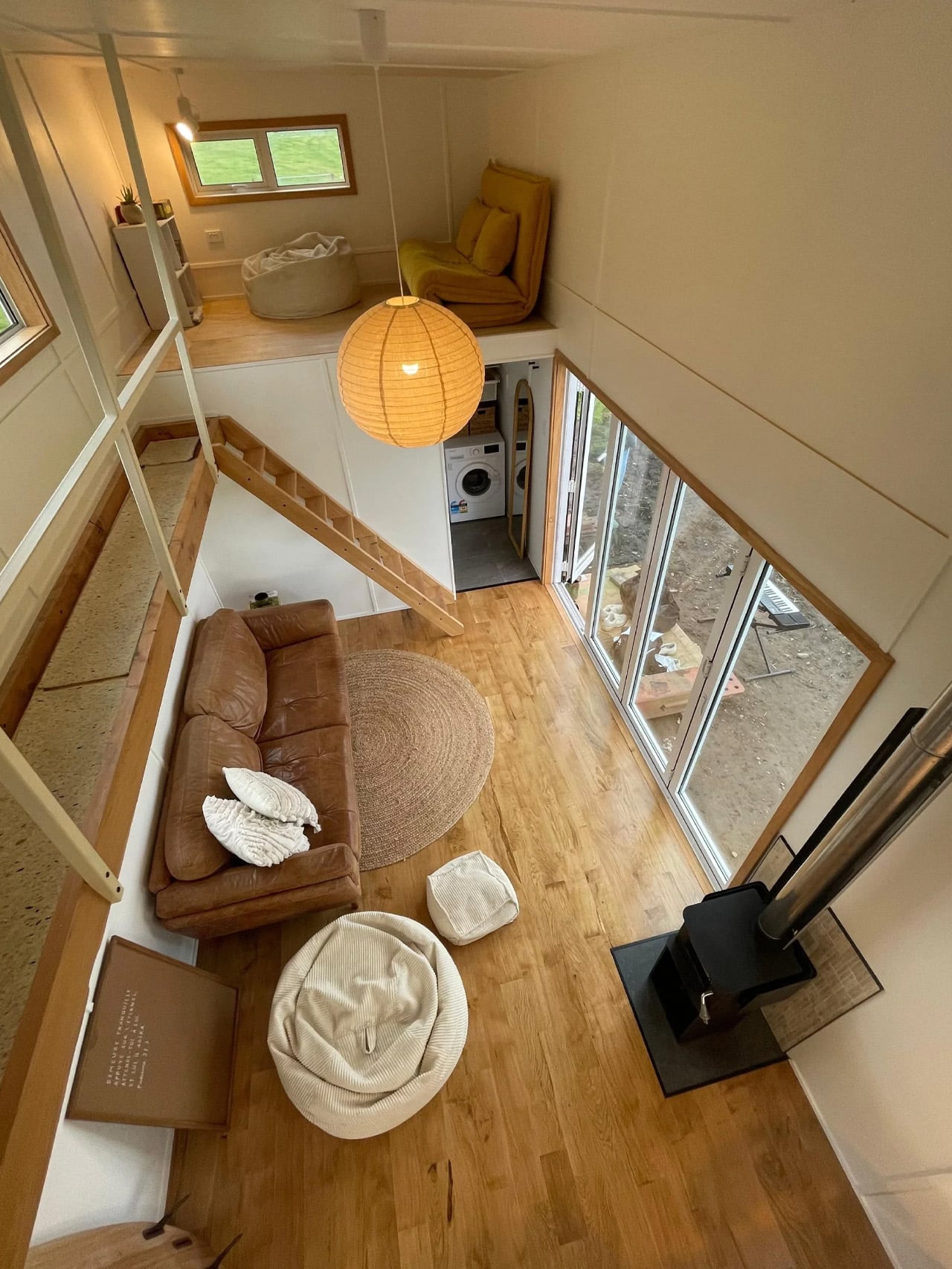
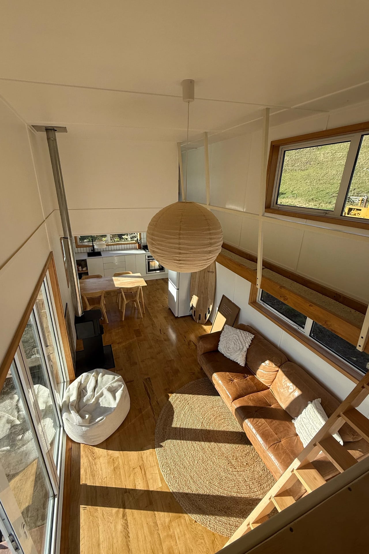
Step inside and the first thing you notice is the light. Generous dual-pane, low-E windows fill the living room with natural brightness, and the layout feels considered rather than cramped. There’s room for a full sofa — a sofa bed is available as an upgrade — alongside a large storage unit. A propane-powered underfloor heating system keeps the ground level comfortable year-round, complemented by a mini-split air conditioning unit and a Lunos heat recovery ventilator for air quality. The Amelia was built for Canadian winters, and it shows.

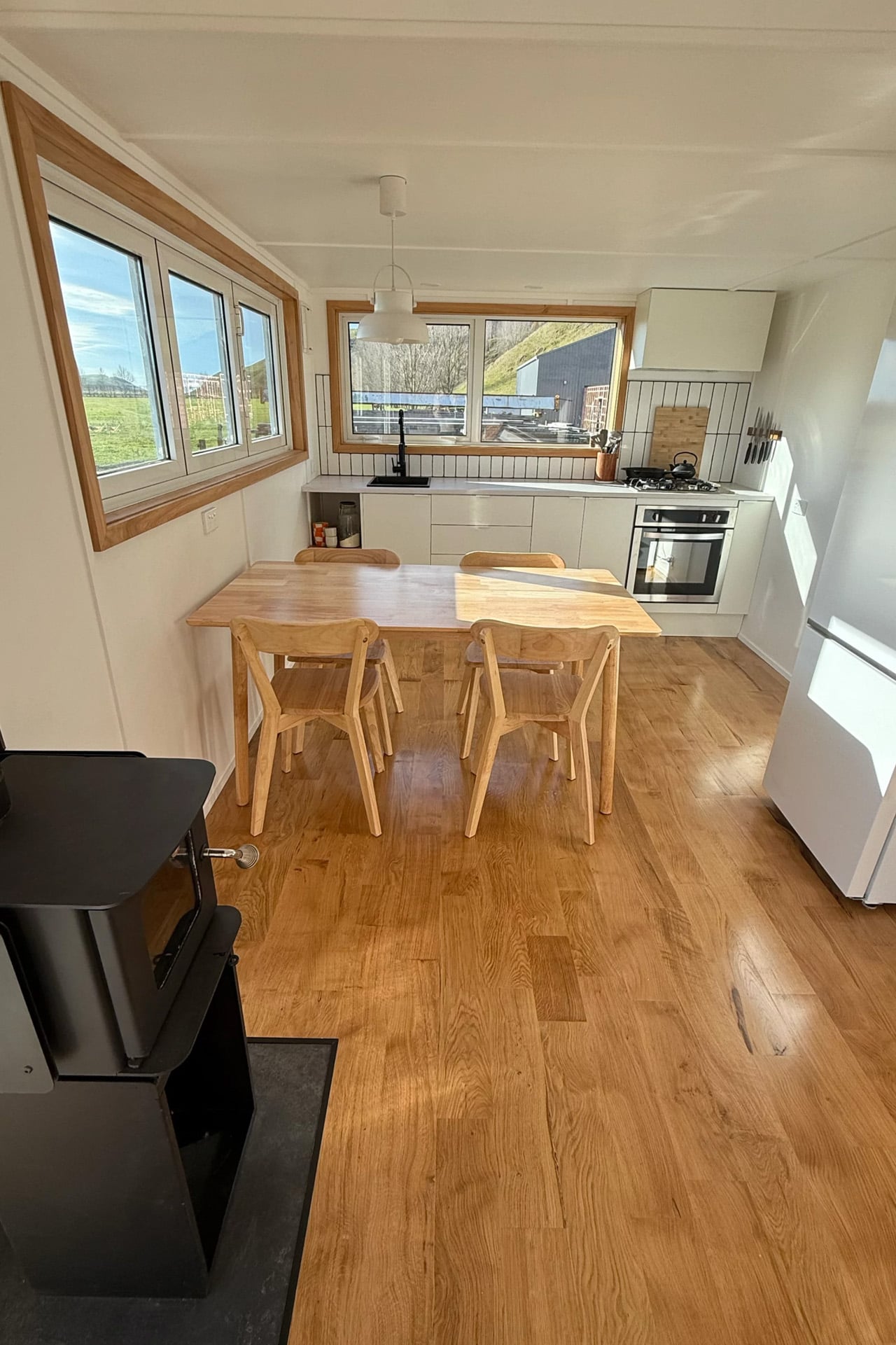
The kitchen sits just past the living area and does not ask you to compromise. A white apron-front farmhouse sink anchors the space, joined by a four-burner Furrion propane range, an oven, a fridge-freezer, a stainless over-the-range microwave, and a large pull-out pantry. Waterfall-edge marble-like countertops run along the perimeter, with an eating bar doubling as a workstation. Every detail, from the soft-close cabinet doors to the black Kohler pull-down faucet, feels chosen rather than settled for. It is the kind of kitchen that makes cooking feel like something worth doing.

A sliding door connects the kitchen to the bathroom — a thoughtful detail that keeps the living zone open. Inside, a 30×30 stand-up shower with easy-clean fiberglass walls, a custom vanity with a rectangular vessel sink, and an oversized round medicine cabinet handle the essentials without feeling like a compromise. There is also a laundry rough-in for those who want to add machines later.

Two loft bedrooms occupy the upper level. The main loft, positioned over the kitchen, fits a king-size bed behind a slatted privacy wall. The secondary loft, accessed by a removable wooden ladder above the living room, handles a queen or king with room to spare. A storage-integrated staircase is available as an upgrade and is worth it for full-time living.

The Amelia starts at roughly US$102,000 and is available for delivery across the United States and Canada. Teacup Tiny Homes, a 100% female-owned Alberta-based builder operating since 2016, offers significant customization across layouts, materials, and finishes. For a home this size, it carries a lot of conviction.

The post This 341-Square-Foot Tiny Home Proves You Don’t Need More Space — Just Smarter Space first appeared on Yanko Design.
  •  
❌