Vue lecture

Tomas Kral Made a Ruler You Can’t Quite Read on Purpose
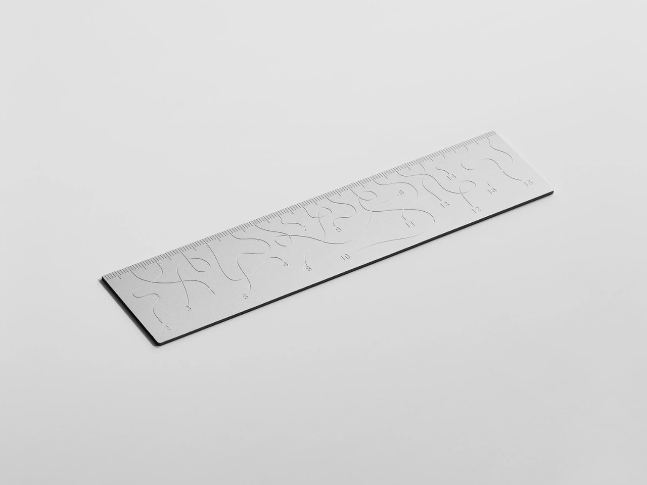
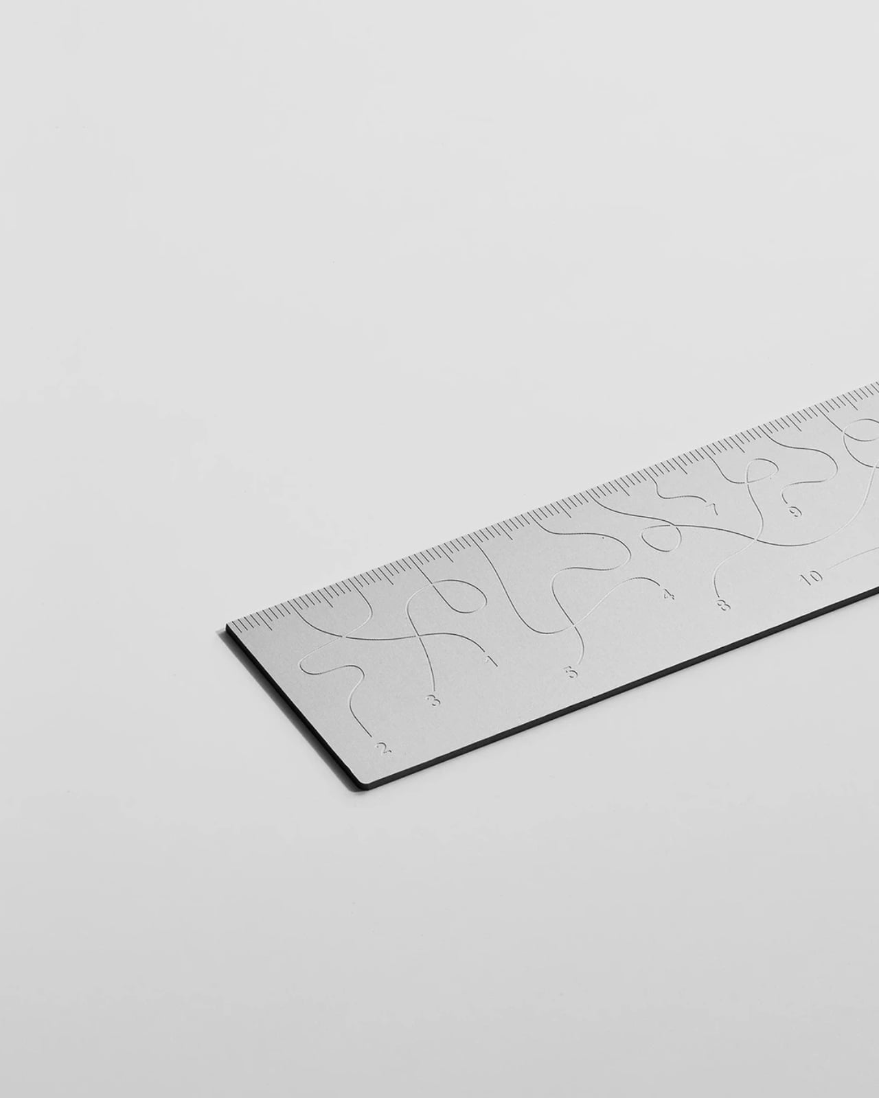
Pick up the WAY ruler and the first thing you notice is that it feels exactly right. It’s small, made from anodized aluminum, and has the kind of weight and finish that signals intention without announcing itself. It’s the sort of object that sits comfortably in a shirt pocket or on the edge of a desk and looks like it belongs in both places. Then you look closer at the markings, and something shifts.

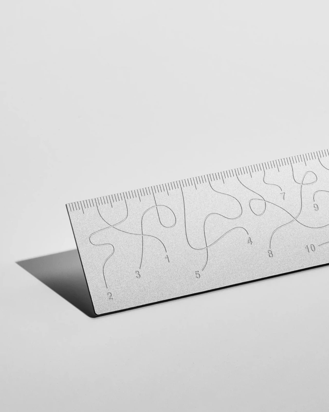
The inscriptions on the WAY don’t run in a clean, predictable line the way ruler markings are supposed to. They wind. They curve and drift across the surface of the aluminum like a path traced through a landscape, referencing, quite literally, the idea of small winding roads and the wandering nature of travel and discovery. The numbers and measurements are there, engraved directly into the material with digital precision, but they’re arranged in a way that asks you to slow down and actually read them rather than glance and move on. It’s legible. Just not immediately.

Designer: Tomas Kral
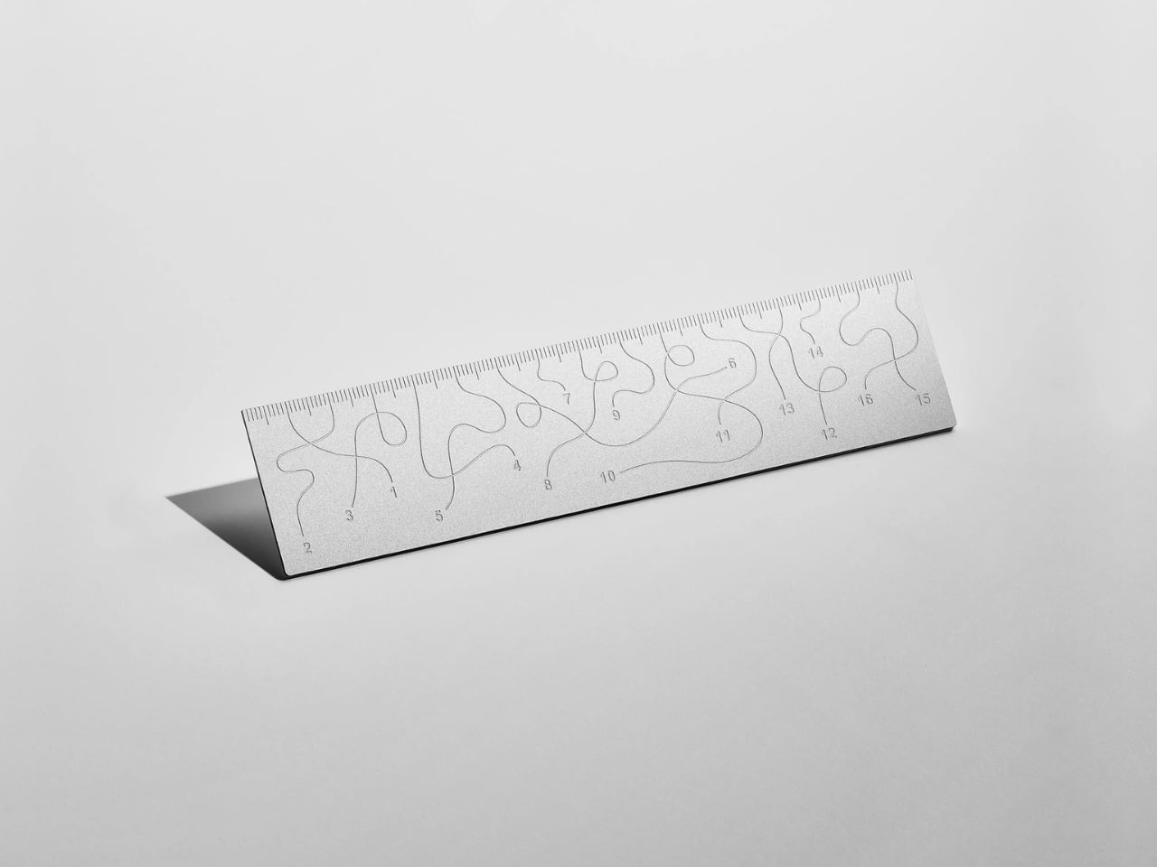
The engraving itself is worth paying attention to. Kral chose to cut the inscriptions directly into the anodized aluminum rather than printing or applying them as a secondary layer. That decision gives the markings a permanence and a tactility that you don’t get with most production objects at this scale. You can feel the grooves if you run a finger across the surface. The graphic quality of the lettering is considered without being decorative for its own sake. It reads as design that knows exactly what it’s doing, which is what makes the playfulness land rather than feel arbitrary.

The object is small enough to be considered an accessory as much as a tool. Kral has always worked at a scale that pays attention to how things actually live in your hands and in your space, and the WAY is consistent with that. It doesn’t try to be a statement piece in the way that some design objects do, where the visual drama is the whole point. The WAY is quieter than that. The drama is embedded in the detail, in that moment when you realize the markings are doing something unexpected and you have to orient yourself before you can use it.

That slight disorientation is the concept, and it’s a sharp one. There’s a real tension running through modern product design right now, one where the drive to make something visually striking starts to work against the thing it was actually built to do. We’ve all used something that looked incredible but made us work harder than we needed to. Packaging that’s beautiful but impossible to open. Interfaces that prioritize visual elegance over intuitive use. Apps designed to delight that end up frustrating. The WAY ruler doesn’t rail against any of that. It just holds up a small, well-made mirror to it. It’s more of a wink than a manifesto.
The difference between a provocation and a critique matters here. Kral isn’t punishing you for picking up the WAY. The experience of using it is still pleasant. The aluminum feels considered, the engraving is precise, and the object as a whole is genuinely lovely. He’s not making something bad on purpose to prove a point. He’s making something that’s slightly impractical in a very deliberate, very elegant way, and letting you sit with that paradox.

And he followed through on it. The WAY isn’t a prototype or a one-off shown at a design fair and then retired to a shelf. Kral produced a batch and sells them directly through his studio’s website. That matters. It means the object gets to exist in the world the way all good design should, in someone’s hand, on someone’s desk, doing its quiet, considered, slightly inconvenient thing in real life.

At a time when so much product design either chases pure utility or drifts so far toward aesthetics that it forgets what it was originally supposed to do, the WAY ruler manages to be a little bit about both. It’s funny, it’s beautiful, and it makes you think. A ruler, of all things. Leave it to Tomas Kral.
The post Tomas Kral Made a Ruler You Can’t Quite Read on Purpose first appeared on Yanko Design.
  •  

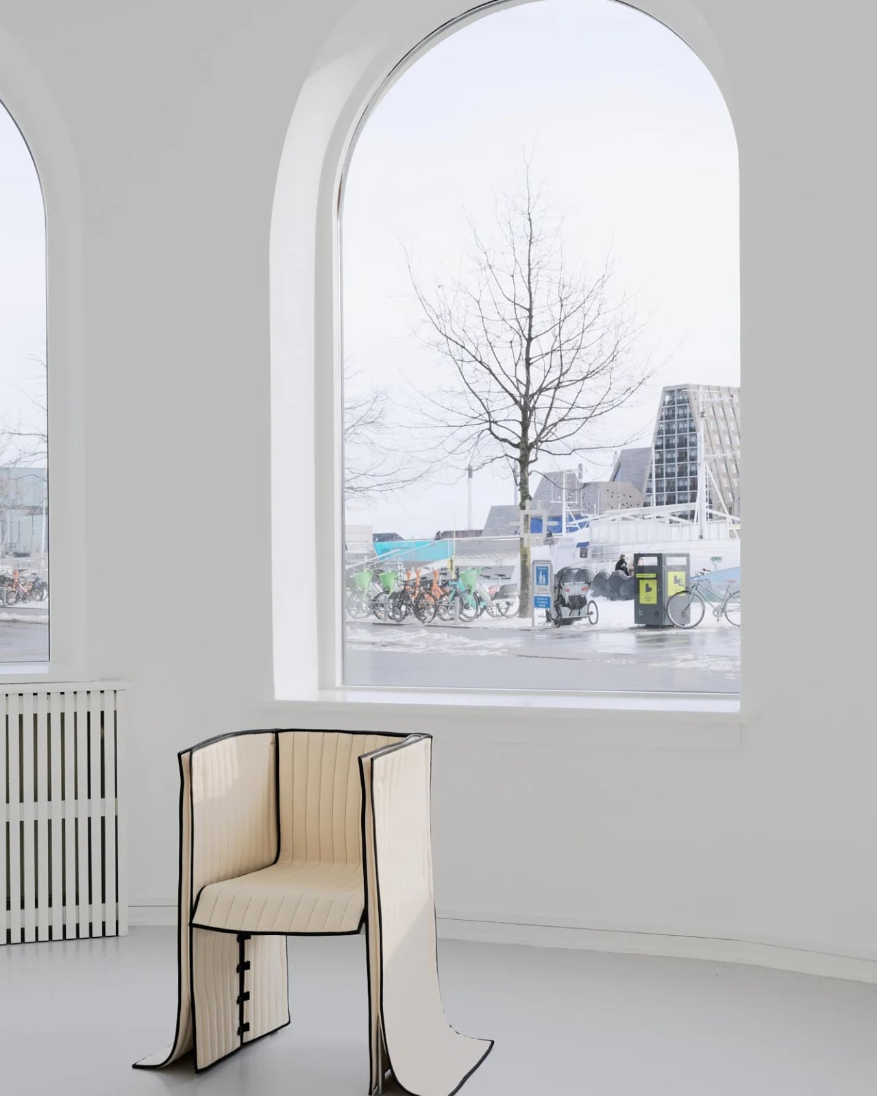
Forget Upholstery: Lærke Ryom Tailors Furniture Instead

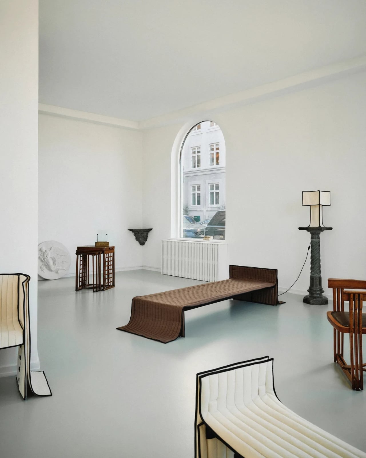
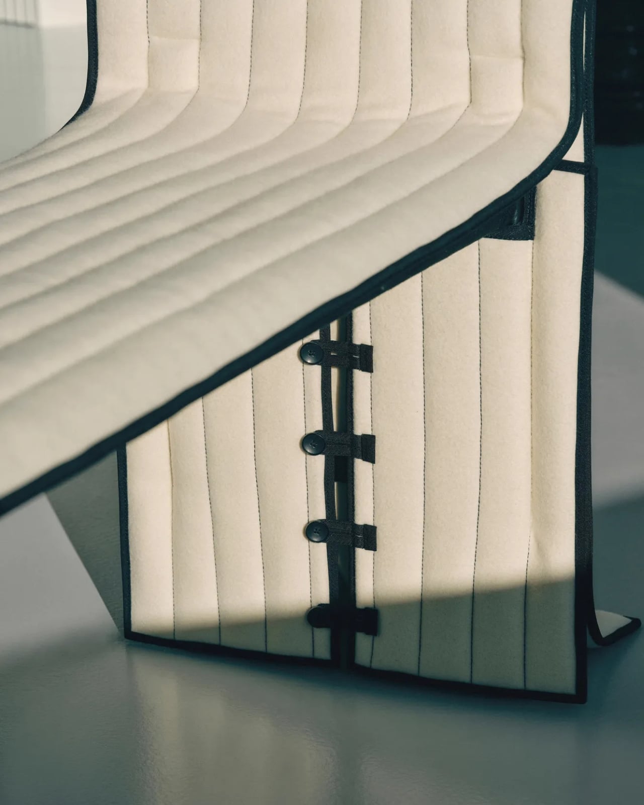
Most upholstered furniture is essentially furniture under stress. Fabric gets stretched, stapled, pulled taut, and forced into submission over rigid frames. It is, fundamentally, a question of control. Danish designer Lærke Ryom looked at that process and decided to do the opposite. Her debut solo exhibition, Raiments, now open at Innenkreis gallery in central Copenhagen, is built entirely around that single act of refusal.

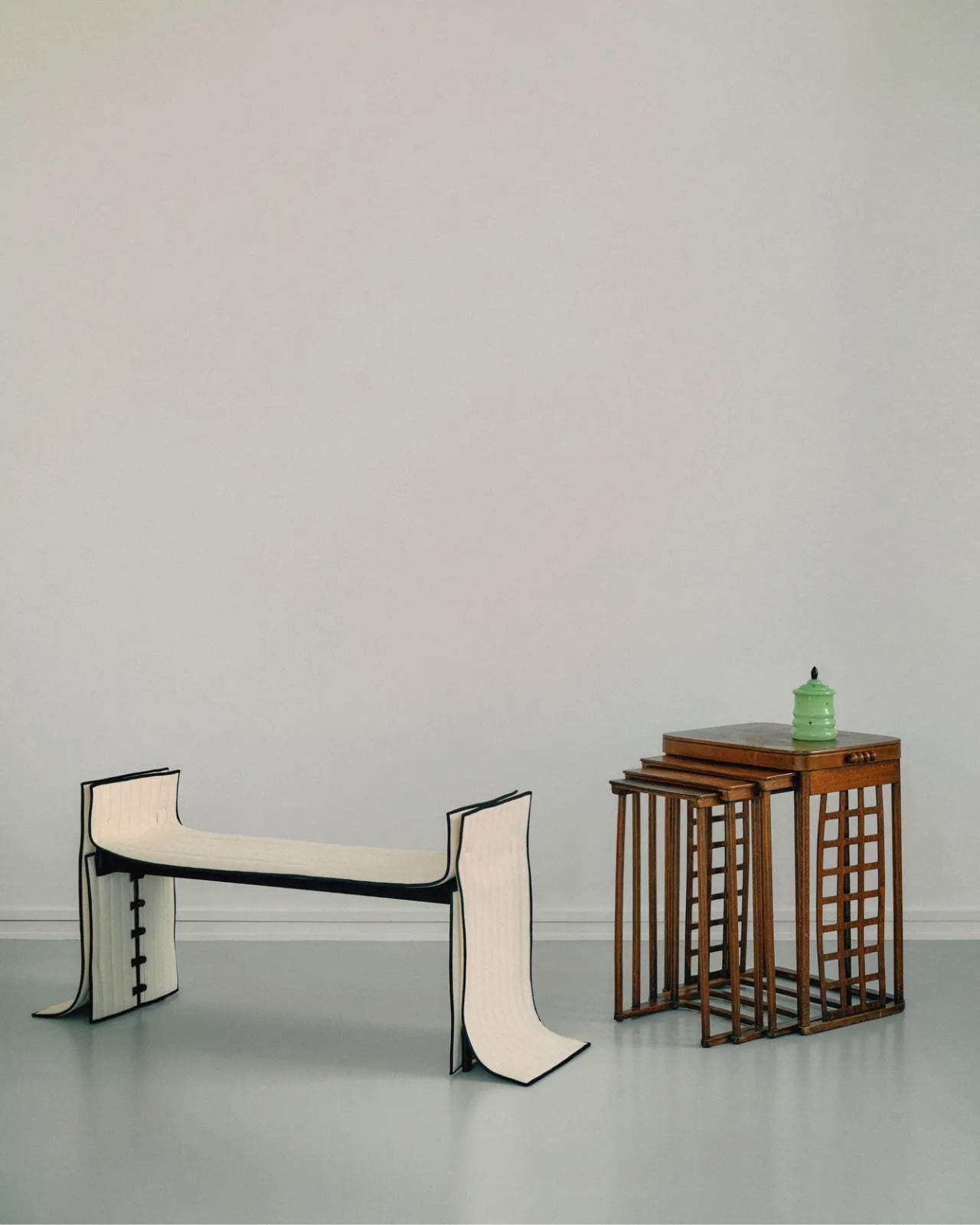
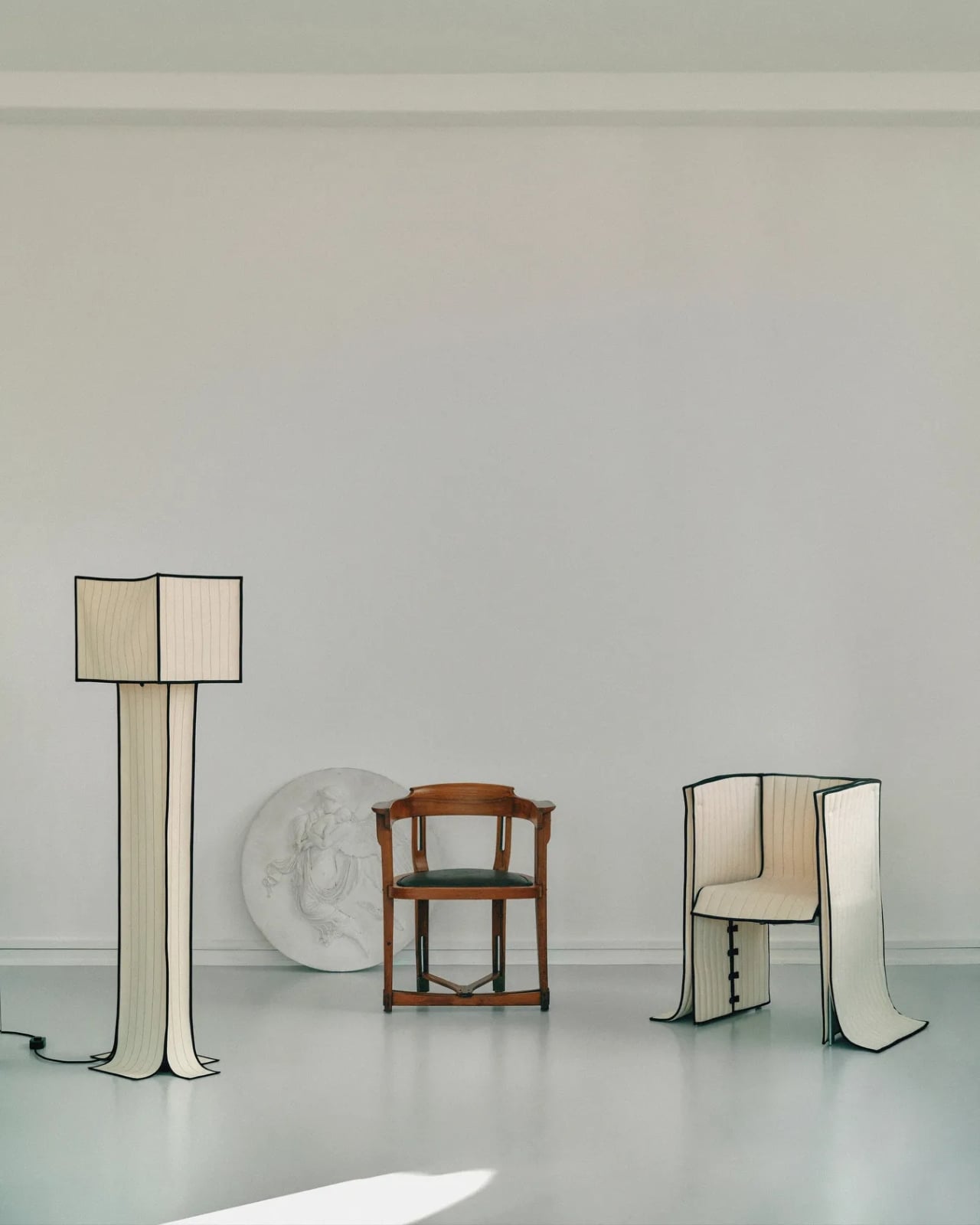
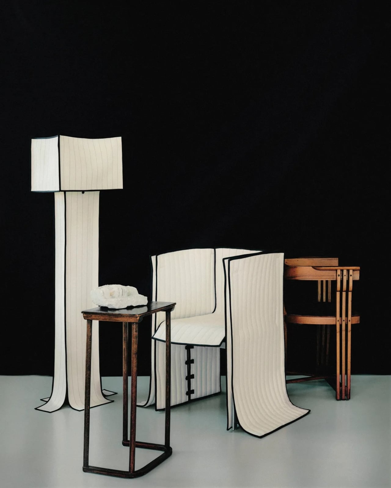
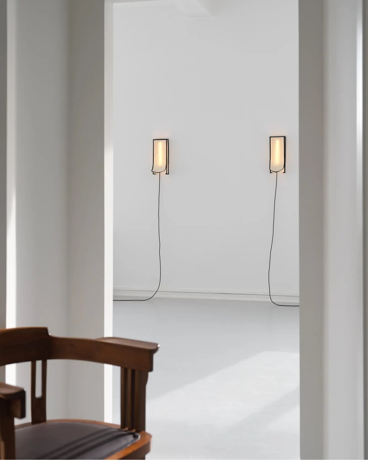
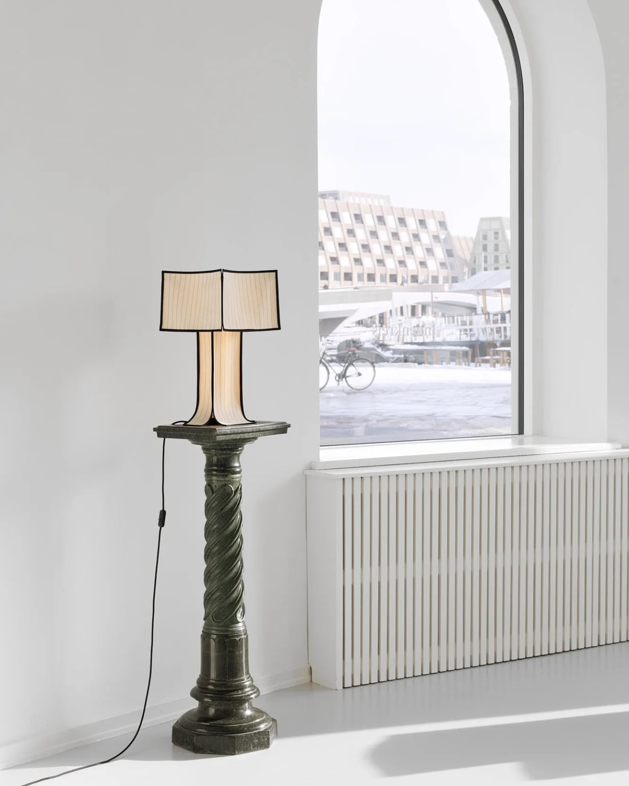
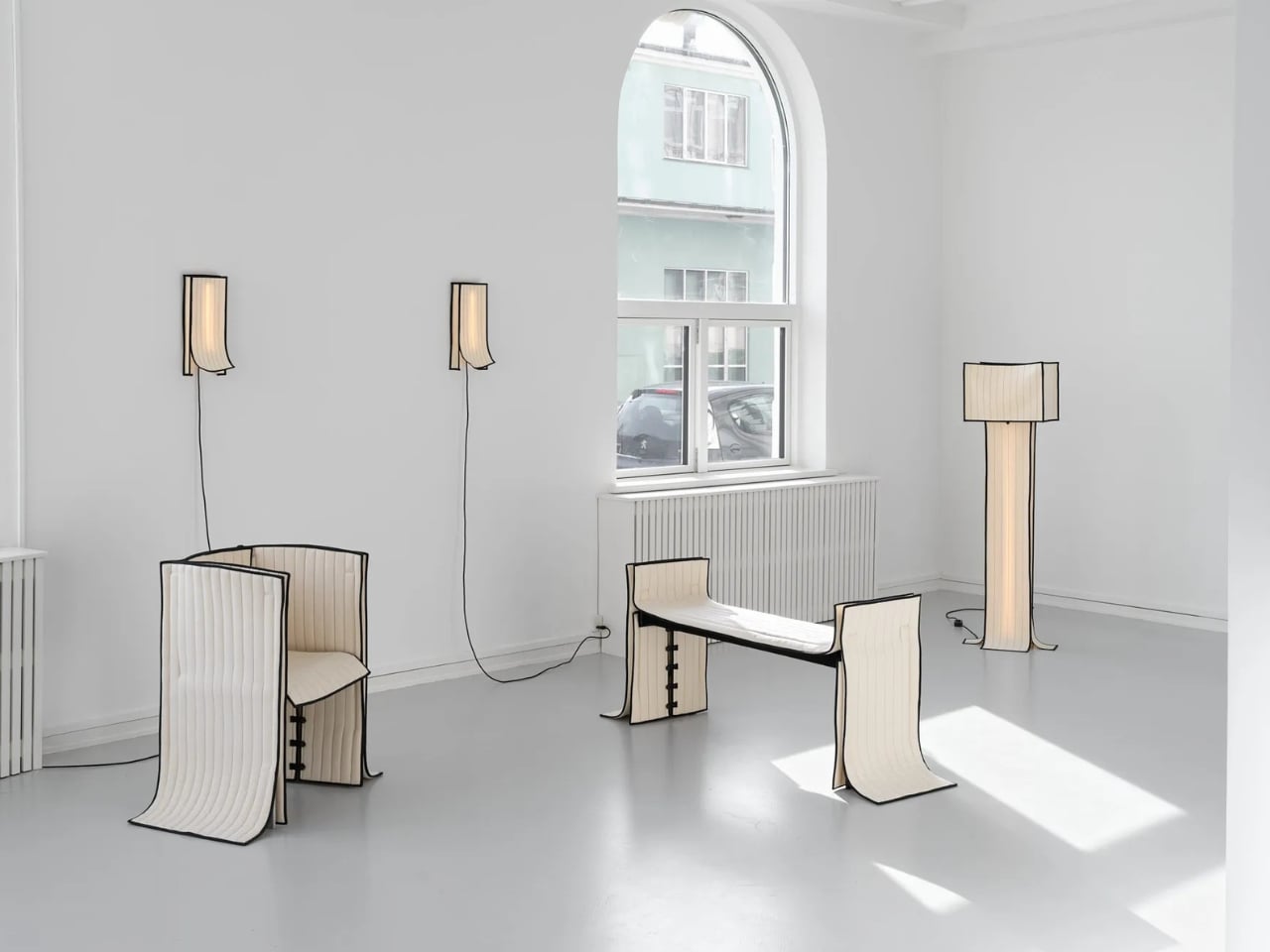
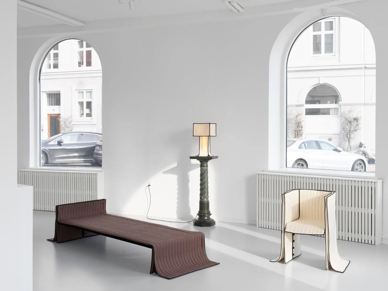
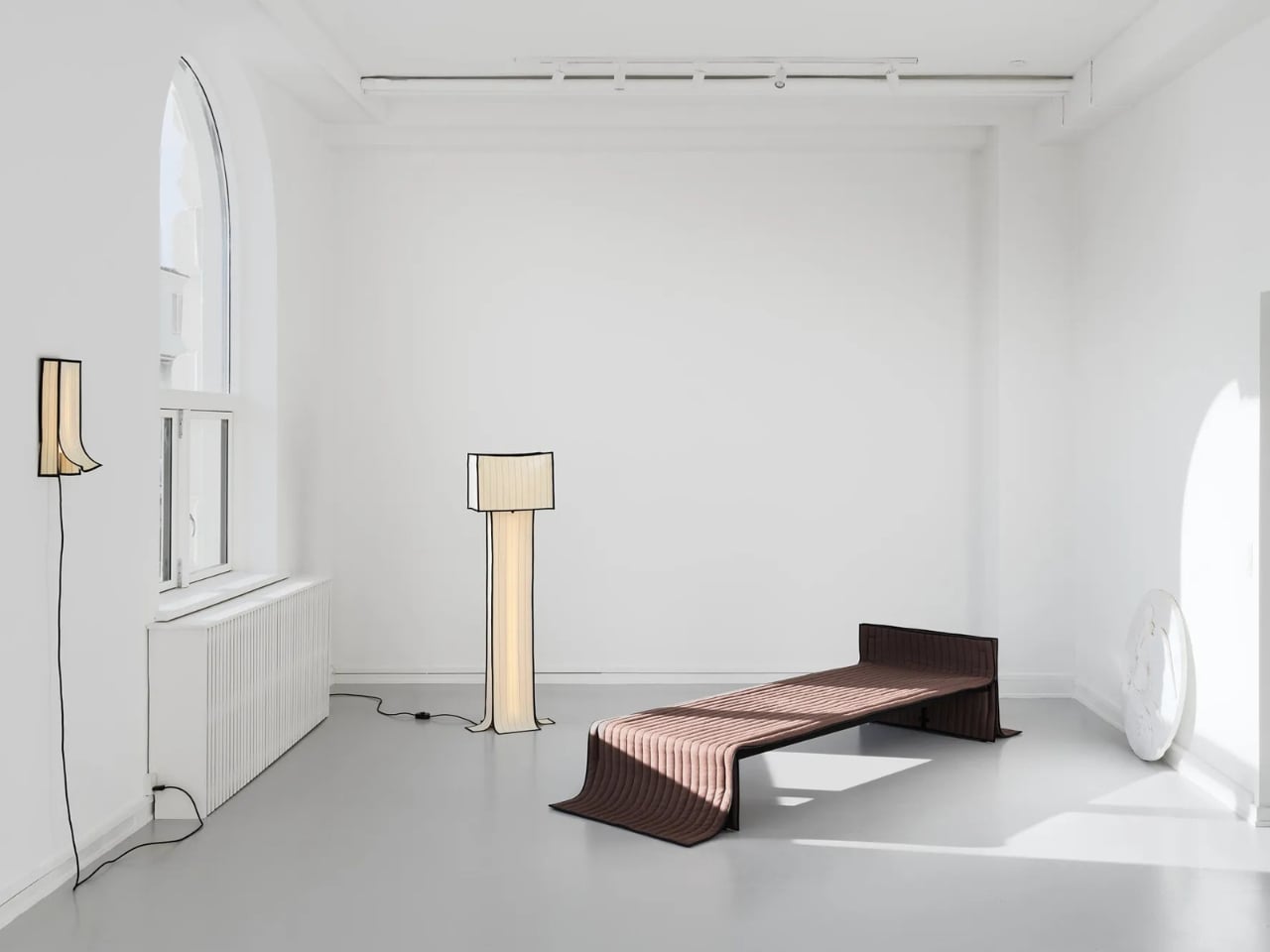
The collection includes a daybed, a chair, a bench, table lamps, a floor lamp, and wall lamps, all presented in soothing cream and chocolate-brown hues. The palette is calm and considered, which makes sense. These are pieces that ask you to slow down and look closely, because the detail is where the story actually lives.

Designer: Laerke Ryom

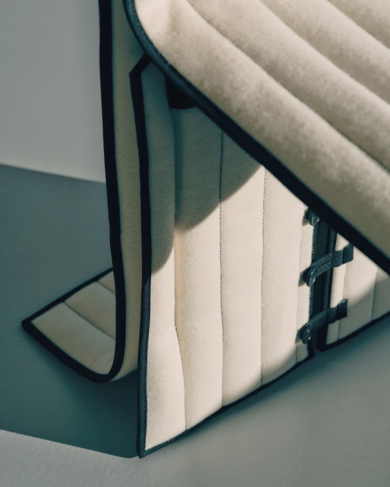
The daybed is probably the clearest expression of the concept. Long, low, and dressed in Kvadrat wool with visible quilting stitches running across its surface, it reads more like a made bed than a piece of showroom furniture. The fabric is not pulled over the form but rather allowed to settle onto it, the way a well-cut linen drapes over a body. The powder-coated steel frame beneath does its structural job quietly, without announcing itself.

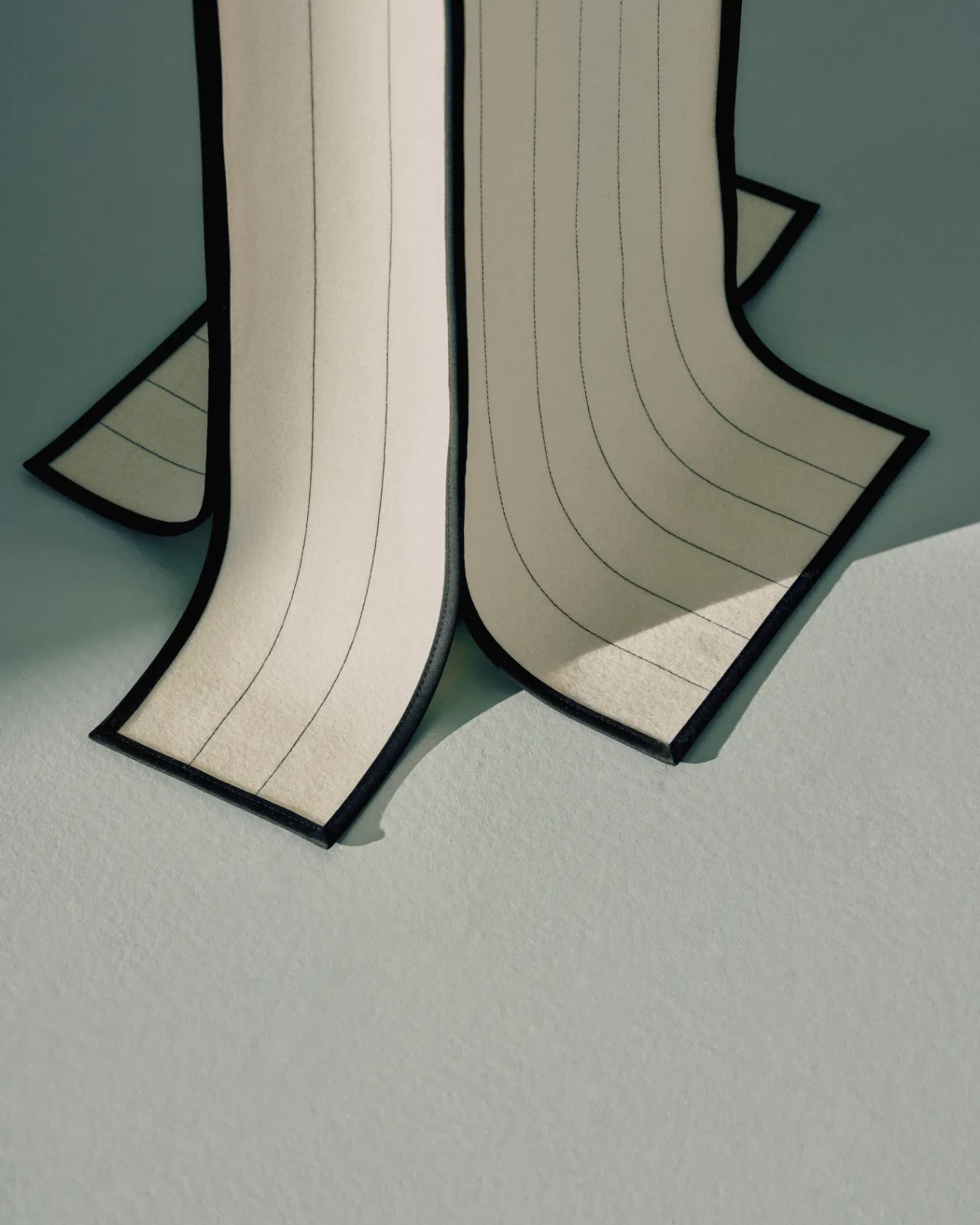
The bench follows a similar logic. Compact and precise, it carries the same quilted wool surface and the same twill weave edge banding that appears across the collection. That edge band is a detail worth pausing on. Ryom chose it specifically because twill weave is a technique rooted in clothing and home textiles rather than furniture. “It places the upholstery pieces somewhere in between,” she has said, “adding to the feeling of a tailored piece rather than upholstery.” It is a small choice with a large effect on how the finished object feels.

The chair, built on an aluminium frame rather than steel, is the lightest piece structurally, and it shows. It sits with a kind of ease that heavier upholstered chairs rarely manage. The wool covers it without gripping it, and the stitching adds just enough surface interest to reward a second look without demanding one.

The lighting pieces are where the tailoring metaphor gets genuinely interesting. The floor lamp and table lamps, both on powder-coated steel bases, incorporate fabric shades that are constructed the same way as the seating pieces, draped and stitched rather than stretched and glued. The wall lamps, built on stainless steel bases, carry the same approach. Seeing the textile treatment applied to lighting as well as furniture makes the collection feel like a genuine system of thinking rather than a one-off experiment. Ryom is not just applying a technique to a single object type. She is testing a philosophy across an entire interior.

Underlying all of it is a material choice that matters. The Kvadrat wool she selected deliberately lacks visible weaving, which gives the stitching room to become the primary surface detail. The quilting is not decorative in a fussy sense. It is structural and honest, doing exactly what it appears to do, which is hold the fabric in place without adhesives or staples. The result is upholstery that can be disassembled, repaired, and eventually recycled. The clothes metaphor is not just aesthetic. It is practical in the most direct way possible.

Ryom, born in 1995 and working out of The Factory for Art and Design in Copenhagen’s Amager district, has been exploring alternative upholstery techniques for several years. Raiments feels like the point where that exploration becomes a fully formed position. The pieces are not minimal for the sake of it. They are restrained because restraint is what the concept requires. Every choice, from the aluminium chair frame to the stainless steel wall lamp bases to the twill edge banding, is in service of the same idea: that furniture should be dressed, not wrestled.

Whether or not that idea changes how people think about upholstery at large is probably too early to say. But Ryom has made a collection that is hard to look at and then go back to thinking about furniture the old way. That, for a debut solo show, is more than enough. Raiments is on show at Innenkreis, Herluf Trolles Gade 28, Copenhagen, through 23 May.

The post Forget Upholstery: Lærke Ryom Tailors Furniture Instead first appeared on Yanko Design.

  •  

A Coat Rack With 16 Hooks That Disappear When Not in Use

Every entryway tells a story, and most of the time, it’s one you’d rather not have visitors read. A coat draped over another coat. A bag looped onto an already-occupied hook. A scarf hanging off the edge of something that was never meant to hold it. We’ve all been there, and for some reason, we keep buying the same row-of-hooks solution as if more hooks were ever really the answer.

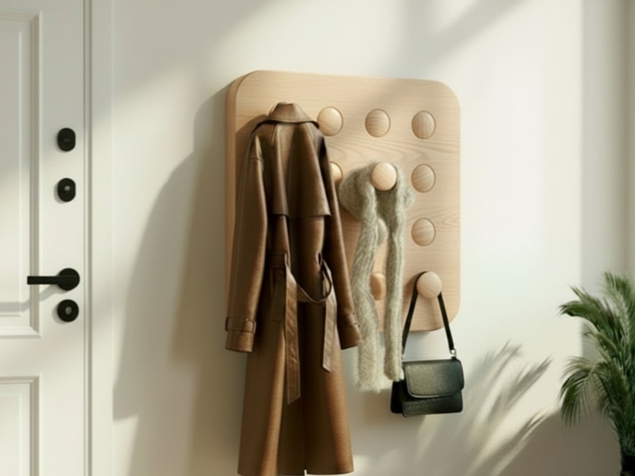
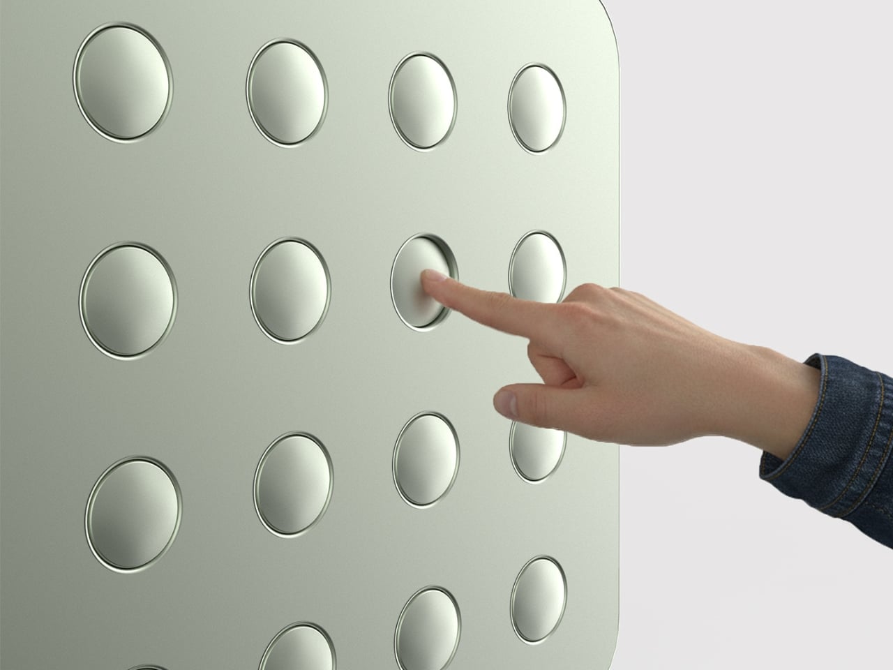
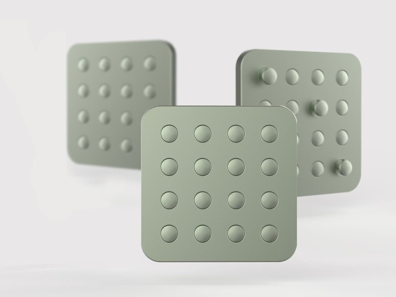
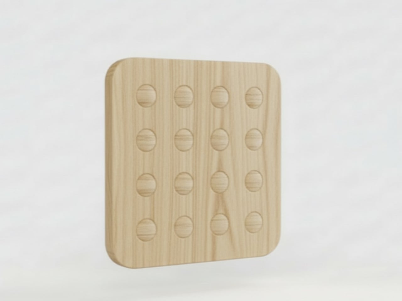
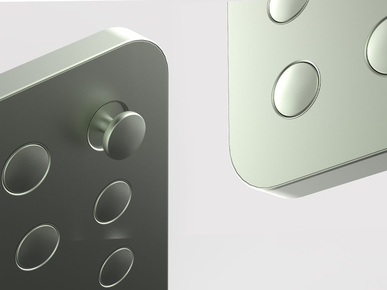
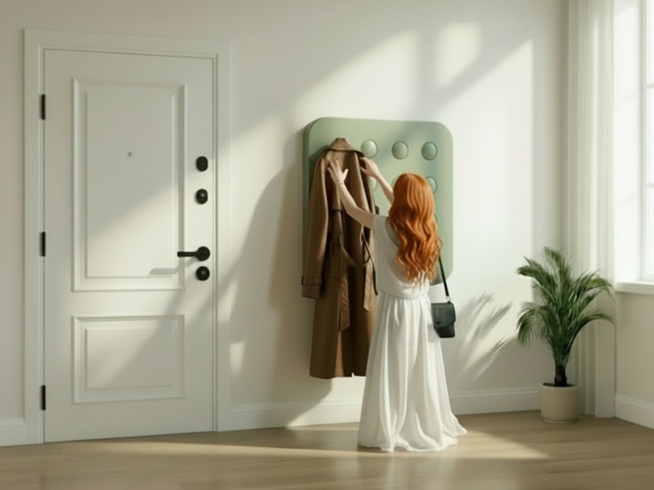
That’s what makes Elif Bulut’s coat rack concept so quietly radical. At first glance, it looks more like a piece of wall art than storage hardware. It’s a square panel with 16 circular elements arranged in a neat 4×4 grid, mounted completely flush against the wall. No hooks jutting out. No protruding arms. Just a flat, calm surface sitting there, completely unassuming, until you actually need it.

Designer: Elif Bulut

The concept is push-to-use. Press one of those circles and it extends outward into a hanging point. Press it again and it retreats back into the panel. Each circle is independently controlled, which means you decide how many hooks you want, where they go, and how many stay dormant on any given day. It’s the kind of interaction that feels satisfying in the same way clicky keyboards or popping bubble wrap does. Tactile, deliberate, and oddly fun.

1

I’ll admit that when I first saw this, my brain went straight to “pop it” fidget toys. And I don’t think that’s an accident. Bulut is working with a visual and tactile language that’s immediately familiar, maybe even nostalgic, and redirecting it toward something genuinely useful. That’s a smart design move. When a product taps into something people already instinctively want to touch, you’ve already won half the usability battle before anyone reads a word of product copy.

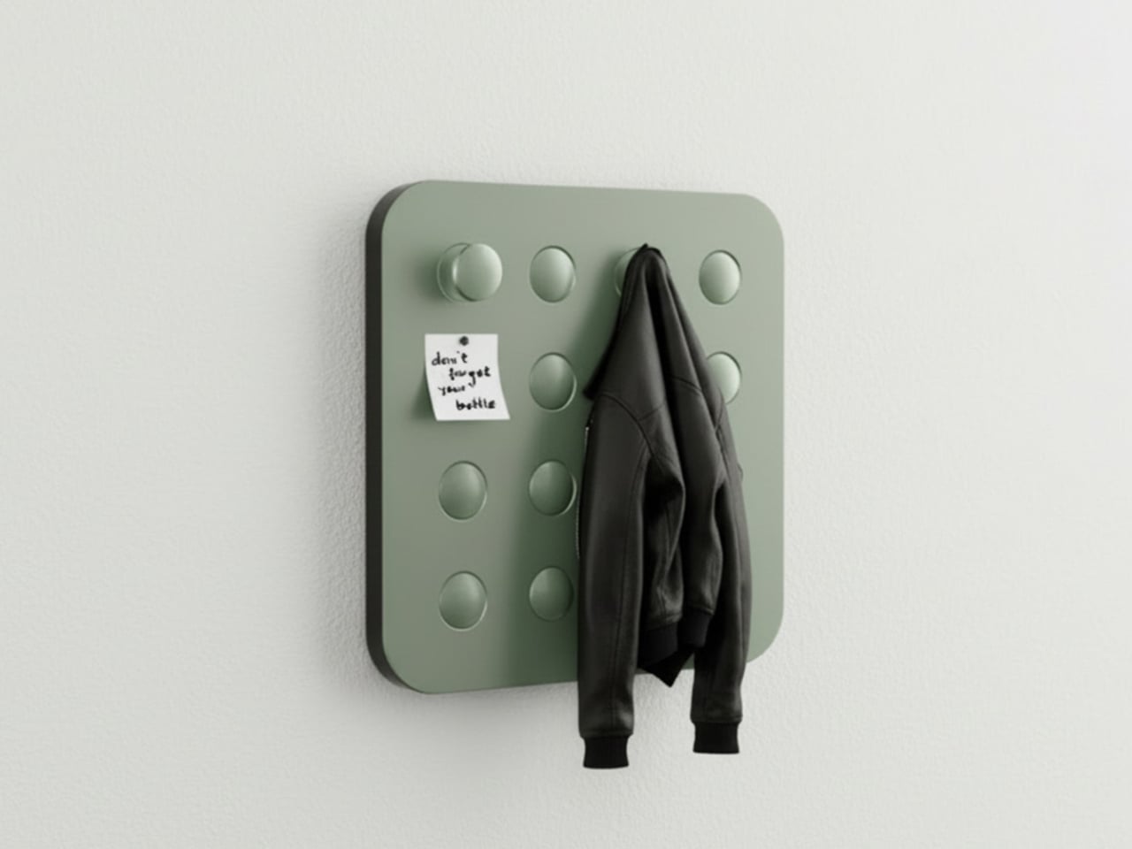
The design is grounded in a real observation: people pile coats on top of each other even when there are open hooks nearby. The problem was never really about the number of hooks. It was about how fixed, static structures force you to adapt to them instead of the other way around. A coat rack that responds to you, that only extends what’s needed and retreats the rest, changes that relationship entirely. The wall stays clean. The space stays calm. The hooks are there when you call for them, and invisible when you don’t.

The entryway has been chronically undervalued in home design for a long time. It’s the first thing you see when you come home and the last thing you interact with before you leave. Bulut is clearly thinking about that rhythm. One of the concept renderings even shows a small sticky note pinned to the panel, reading “don’t forget your bottle.” That single detail hits differently than any technical specification could. It grounds the whole concept in the messy, forgetful, real way people actually move through their mornings, and it signals that the designer is paying attention to life, not just surfaces.

What also works is the restraint. Bulut hasn’t tried to make this product do too much. It doesn’t track your habits, connect to an app, or announce itself as a smart home device. It’s just a better, quieter version of something we’ve had for decades. The intelligence is in the form, not the firmware. In a design landscape where everything is trying to become a gadget or justify itself with an AI feature, that choice is worth noticing.

Whether this moves from concept to production is a different conversation, but as a piece of industrial design thinking, it lands. It asks a question that sounds simple but clearly wasn’t: what if your coat rack only took up as much space, visually and physically, as you actually needed it to? The answer turns out to be a flat panel that waits patiently on your wall, ready to show up the moment you press it. That’s not a small idea dressed up in minimal aesthetics. That’s just good design.

The post A Coat Rack With 16 Hooks That Disappear When Not in Use first appeared on Yanko Design.
  •  
❌