Vue lecture

UGREEN’s Power Bank Uses Liquid Cooling, and You Can Actually Watch It
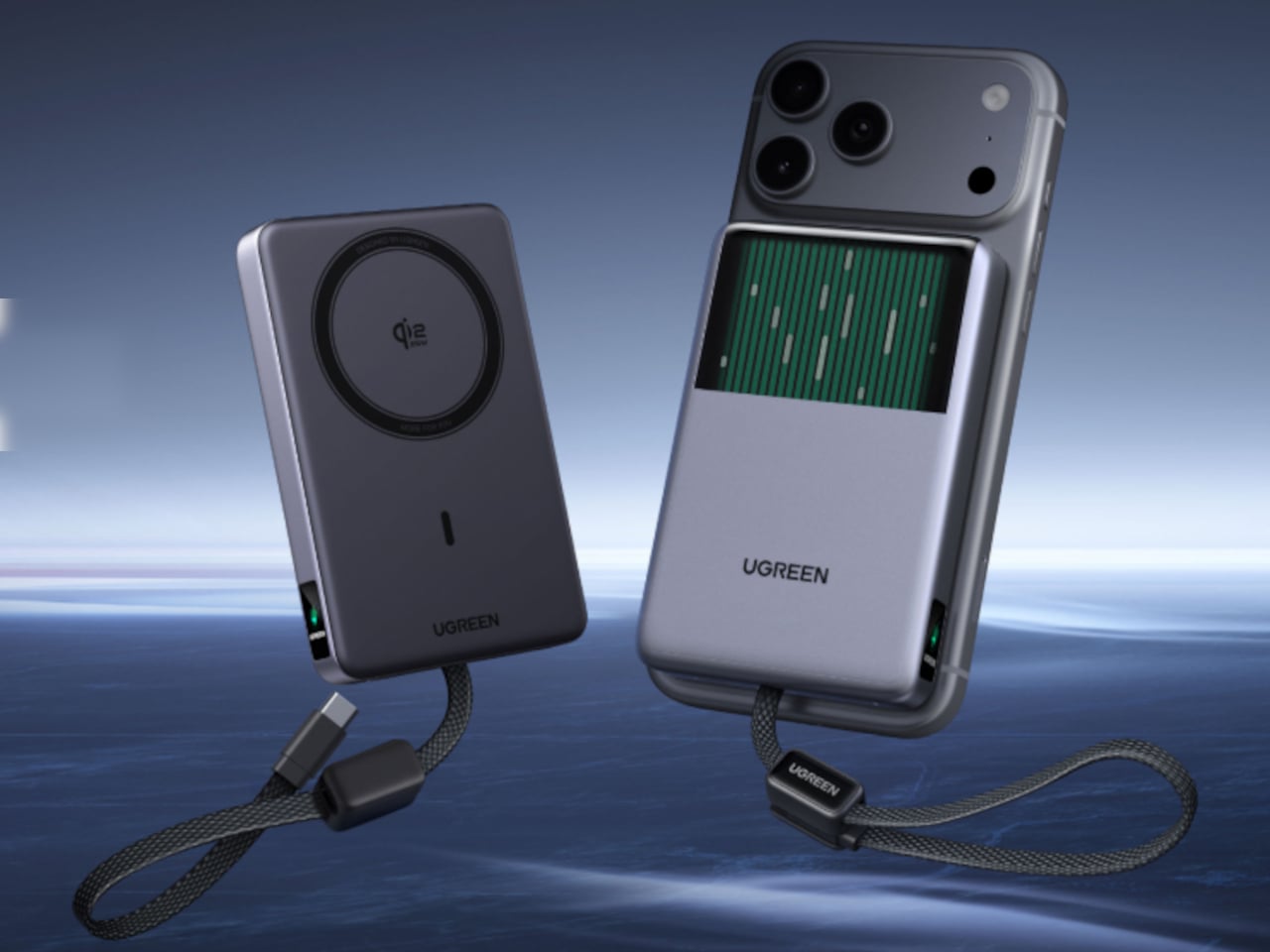
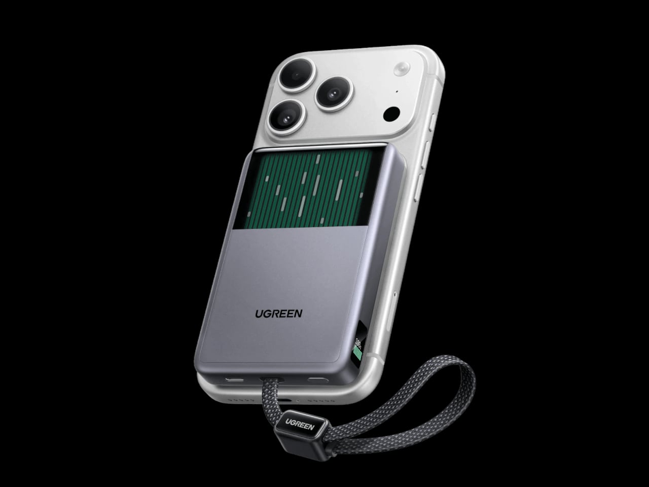
UGREEN’s MagFlow Pro treats overheating as a design problem worth solving with actual engineering, not just a bigger heat sink. This 10,000mAh magnetic power bank borrows liquid cooling from gaming PCs and squeezes it into a pocket-sized charger, aiming to keep wireless charging fast without turning your phone into a hand warmer along the way.

Qi2 charging has always had a dirty secret hiding under its magnetic convenience. Wireless systems lose up to 30% of their power as heat during transfer, which means a phone sitting at 25W often throttles down within minutes to avoid overheating. UGREEN built the MagFlow Pro around fixing that exact bottleneck rather than just chasing a bigger battery number.

Designer: UGREEN
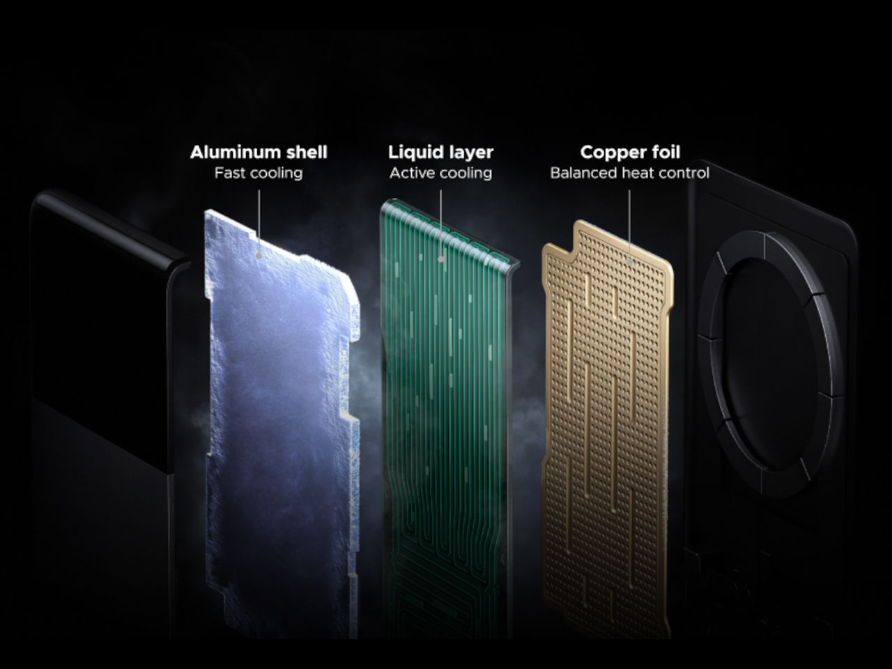
Inside sits CryoPulse, a cooling system built around a micro-pump that circulates liquid coolant past the charging coil and other heat-generating components. Copper foil spreads that heat further, while a layout that physically separates key parts keeps warmth from concentrating in one spot. It is a scaled-down version of what keeps a gaming rig from throttling under load, just built to survive inside a phone charger.
A transparent panel on the front turns that entire process into something you can actually watch, showing coolant moving through the internal channels while your phone charges. It is an odd, almost theatrical touch for a power bank, but it doubles as reassurance that the system is doing its job. UGREEN calls it the Cyber Window, and it is hard to look away from once it is running.
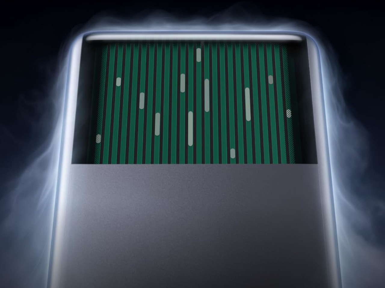
That cooling translates into real numbers, too. UGREEN claims the system keeps peak surface temperatures on a phone up to 18°F below its own reference benchmark, letting a device hold onto higher wattage for longer instead of stepping down early. In practice, that means someone topping up before a flight or during a commute gets closer to advertised charging speeds instead of a slow crawl once things heat up.
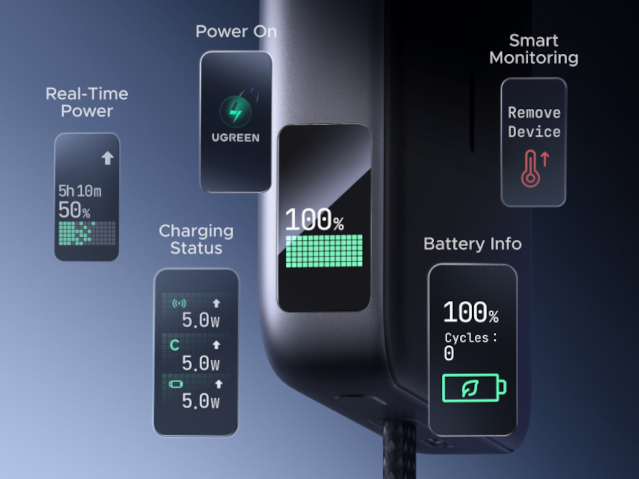
A small display embedded in the shell keeps track of charging wattage, remaining battery percentage, cycle count, and cooling status, turning what used to be a guessing game into actual visible data. Paired with a built-in USB-C cable capable of 30W and a combined output of up to 45W, the MagFlow Pro can charge a phone, tablet, and another accessory simultaneously without demanding a bag full of extra cables.

If the battery degraded quickly, all of those fancy features would be pointless, so UGREEN built the cell around Dymondcell 2.0 protection, retaining more than 80% of its capacity after 800 charge cycles. It also survived seven hours of continuous overcharge testing without failure, a detail aimed squarely at anyone who leaves their charger plugged in overnight out of habit rather than necessity.
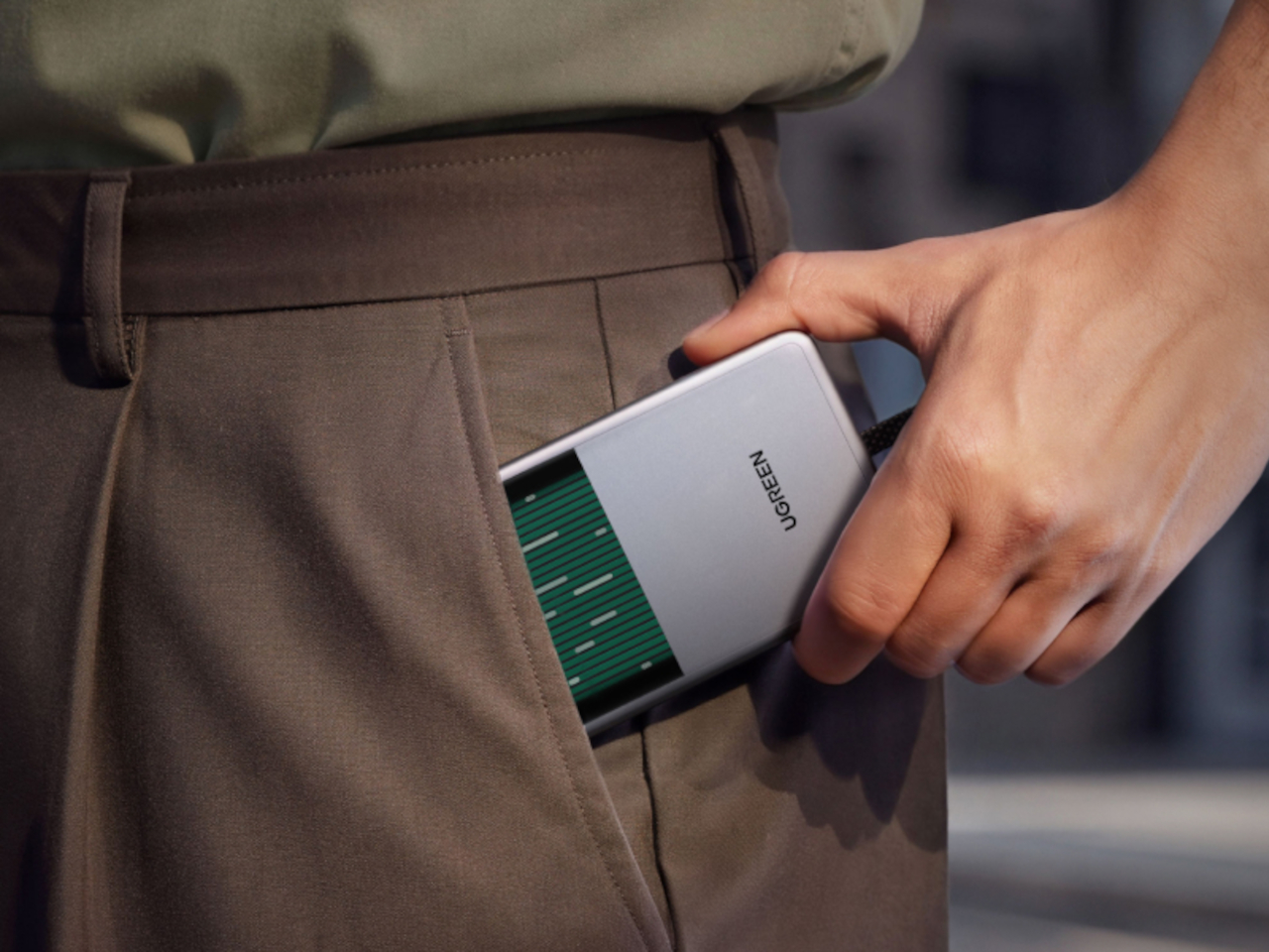
At $149.99, the MagFlow Pro costs considerably more than other 10,000mAh power banks on the market, and that price tag puts real weight behind its cooling claims. It is a bet that people charging phones daily care as much about consistent performance and battery longevity as they do about raw capacity, and that a bit of visible engineering can justify paying extra for it.

The post UGREEN’s Power Bank Uses Liquid Cooling, and You Can Actually Watch It first appeared on Yanko Design.
  •  

TCL’s P80 Pro and Ultra Are the Phones That Replaced Your Kindle Too

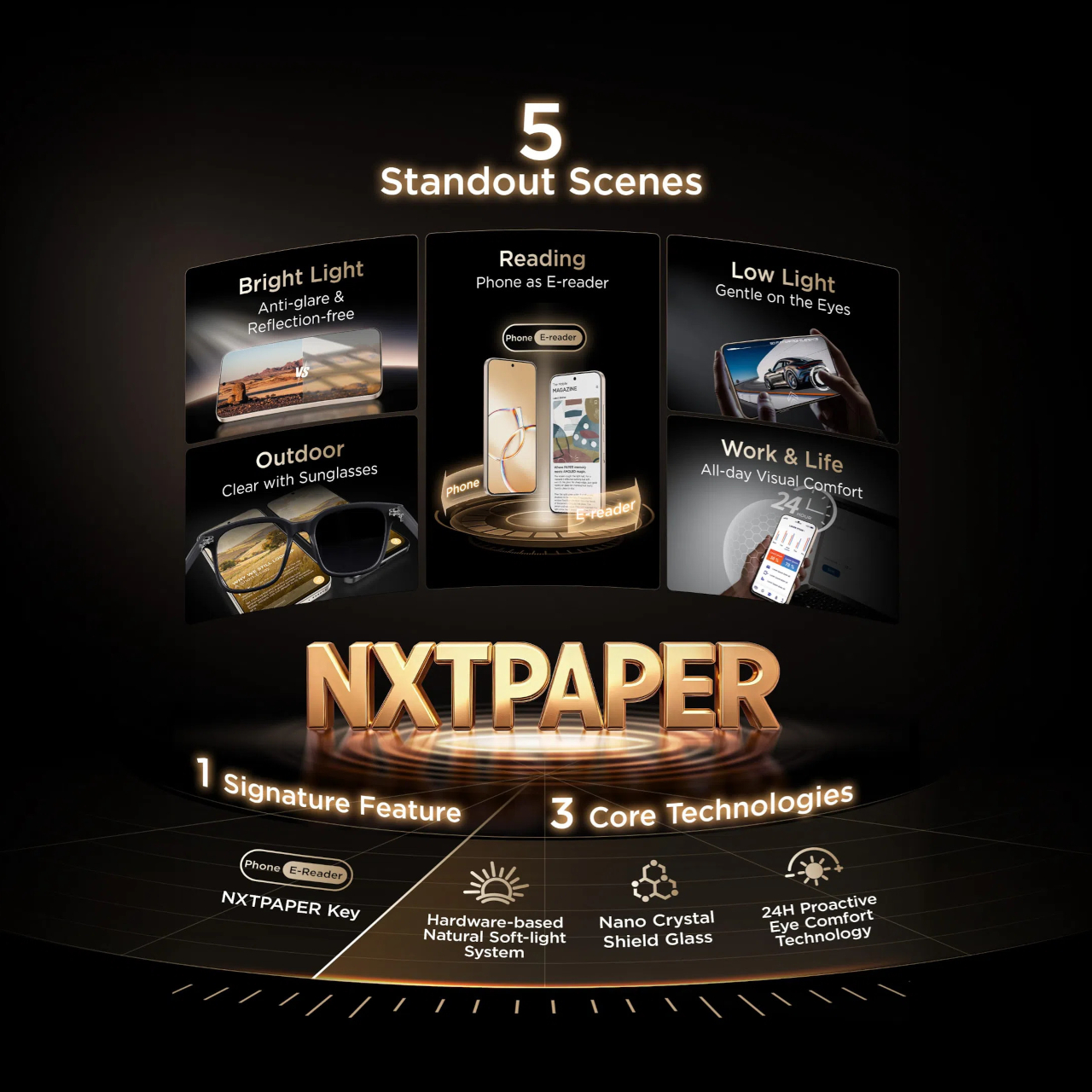
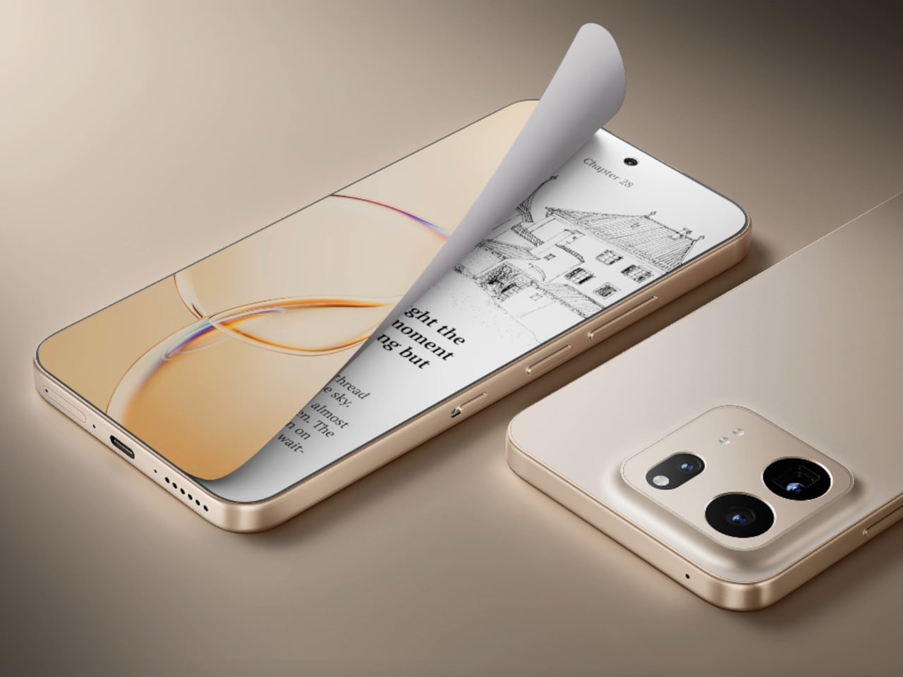
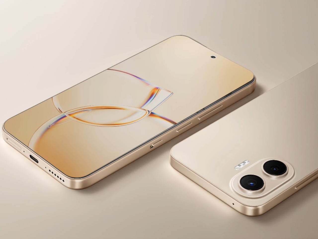
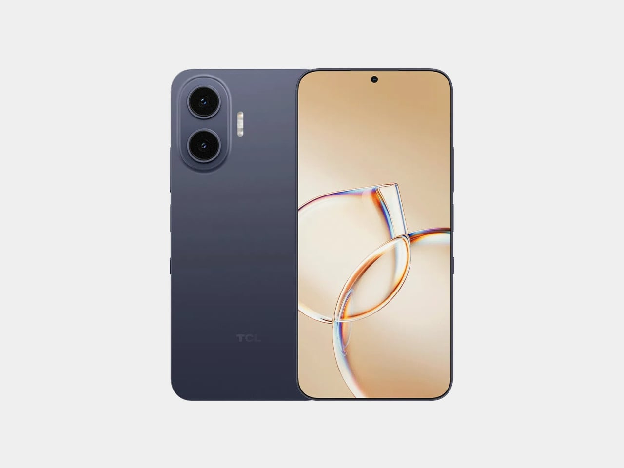
TCL’s P80 Ultra and P80 Pro prove a phone screen doesn’t have to pick one personality and stick with it. Unveiled at IFA 2026 in Berlin, both handsets fold a vivid AMOLED panel and TCL’s paper-like NXTPAPER technology into the same sheet of glass, letting the display shift moods with a flick of a switch instead of forcing a trade-off between color and comfort.

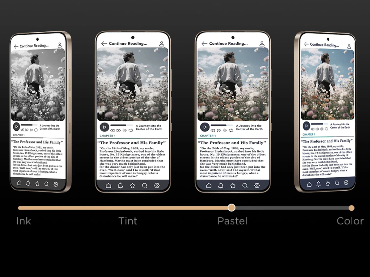
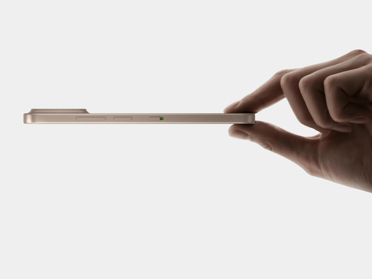
Run a finger along the frame, and you’ll find a thin slider, a small physical detail that carries plenty of weight in daily use. Slide it, and the 6.83-inch panel drops its saturation, taking on a warmer, textured look that mimics a printed page. A commuter buried in a novel or someone proofreading a document late at night gets a screen that behaves like paper, without losing the sharpness underneath.

Designer: TCL

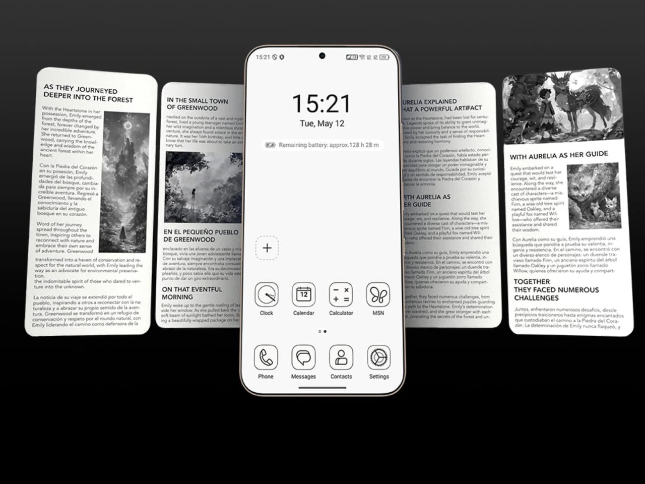
Push that same slider one notch further, and the screen drops color entirely for Max Ink Mode, a stripped layout that silences notifications except for calls and texts. It reads like a design decision as much as a software one, TCL betting people want to quiet their phone rather than mute it completely. The payoff is a battery that can stretch across roughly a week of steady reading.

That reading-first mindset carries into the software too. Both phones can convert e-books into audiobooks or podcast-style narration using on-device AI, giving Max Ink Mode a voice to lean on when eyes need a break instead of ears. It is a small addition, but it treats the slower, paper-like mode as a genuine feature rather than a bolted-on gimmick for a keynote slide.

None of that would matter if the screen looked washed out the rest of the time, so TCL leaned on a 1.5K AMOLED panel that hits 3,200 nits and covers the full DCI-P3 color range. A Nano Crystal Shield coating cuts glare enough to keep the display readable under direct sun, marking TCL’s first pairing of NXTPAPER with OLED rather than the LCD panels it used before.

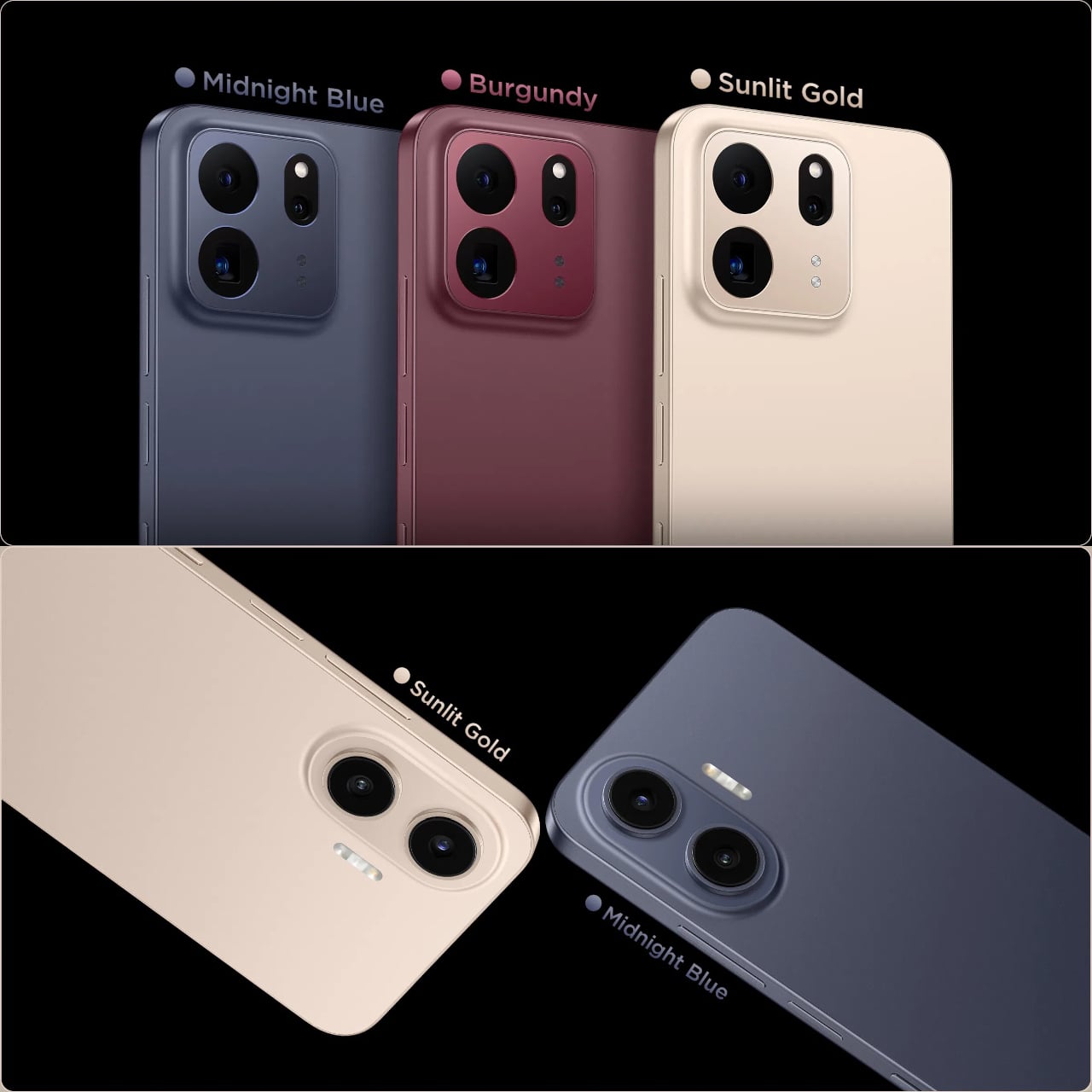
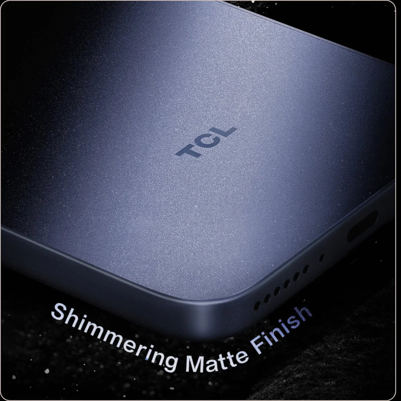
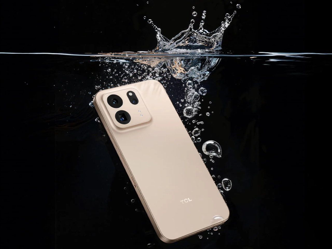
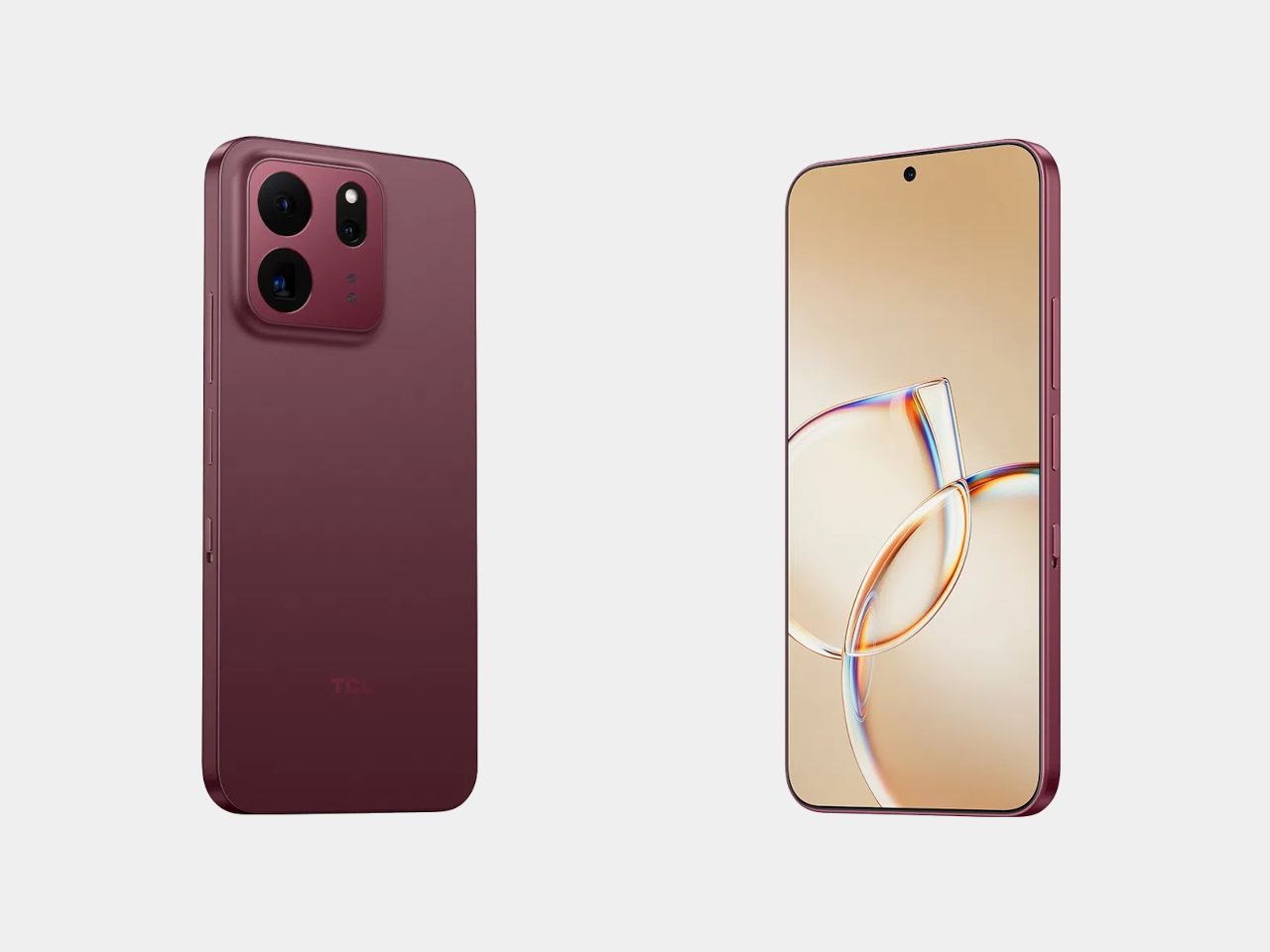
The frame wrapping that screen is aluminum rather than the plastic often found at this price, giving both phones a sturdier grip without piling on bulk. TCL backs that up with an IP68 rating against dust and water, plus MIL-STD-810H certification for the inevitable drop. Buyers get to pick between Sunlit Gold, Burgundy, and Midnight Blue, three finishes that lean more toward jewelry-box color choices than typical slab-of-glass smartphone palettes.

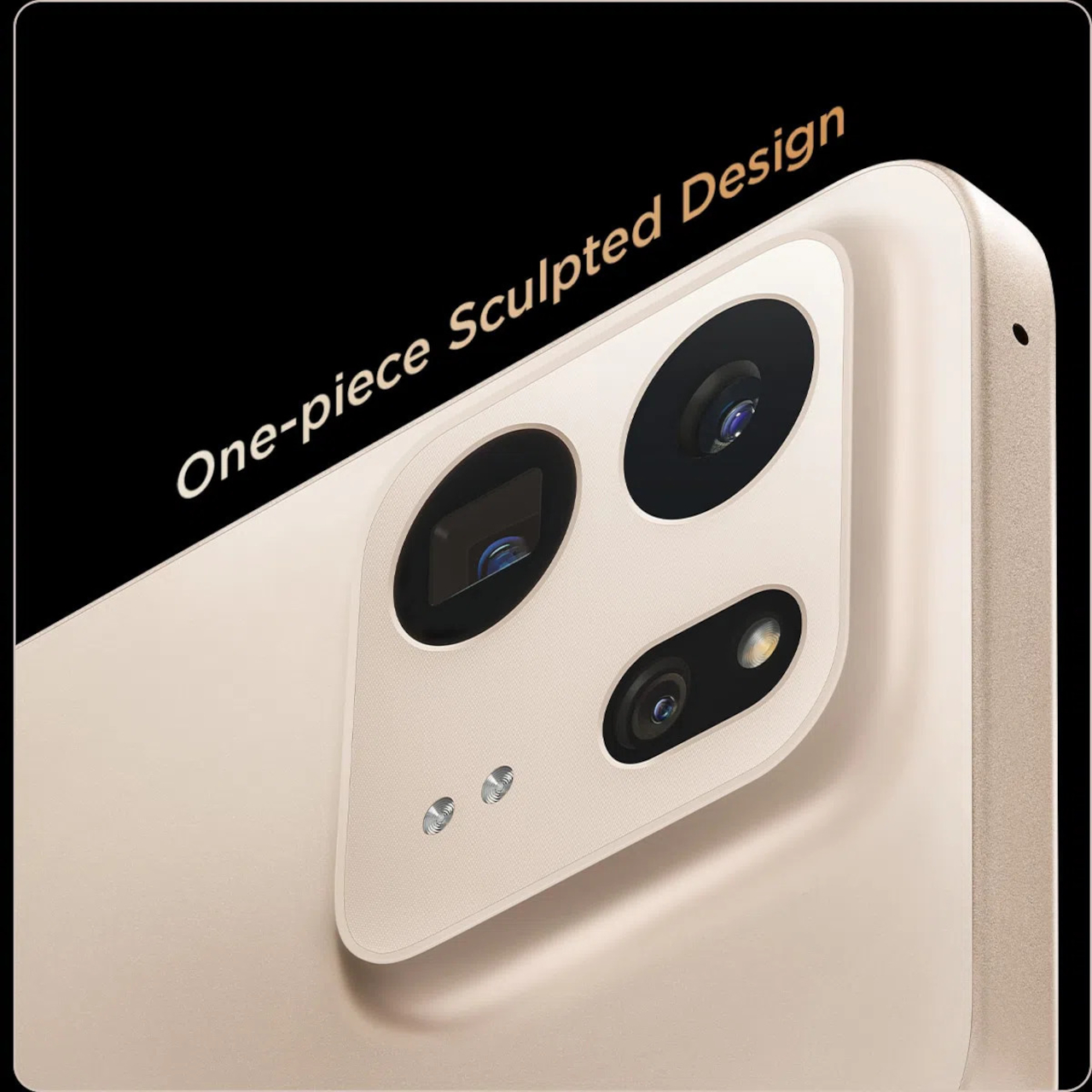
Where the two models part ways is around the back. The P80 Ultra carries a 50-megapixel main camera next to a 50-megapixel periscope lens for 3x optical zoom, tucked into a housing shaped to avoid throwing off the phone’s balance. The P80 Pro drops the periscope for a simpler dual-camera arrangement, trading reach for a slimmer build that still shares the same main sensor and 8-megapixel ultrawide.

TCL is rolling both phones out across Europe first, with the P80 Ultra priced from €549 (around $635) and the P80 Pro starting at €429 (around $500), before a Latin American launch follows in October. A wider release is expected to reach additional regions afterward. In a category full of identical glass rectangles, these two phones actually behave differently depending on what someone needs from them that day.

The post TCL’s P80 Pro and Ultra Are the Phones That Replaced Your Kindle Too first appeared on Yanko Design.

  •  

TECNO and Tonino Lamborghini Prove You Can’t Fake a Real Collab

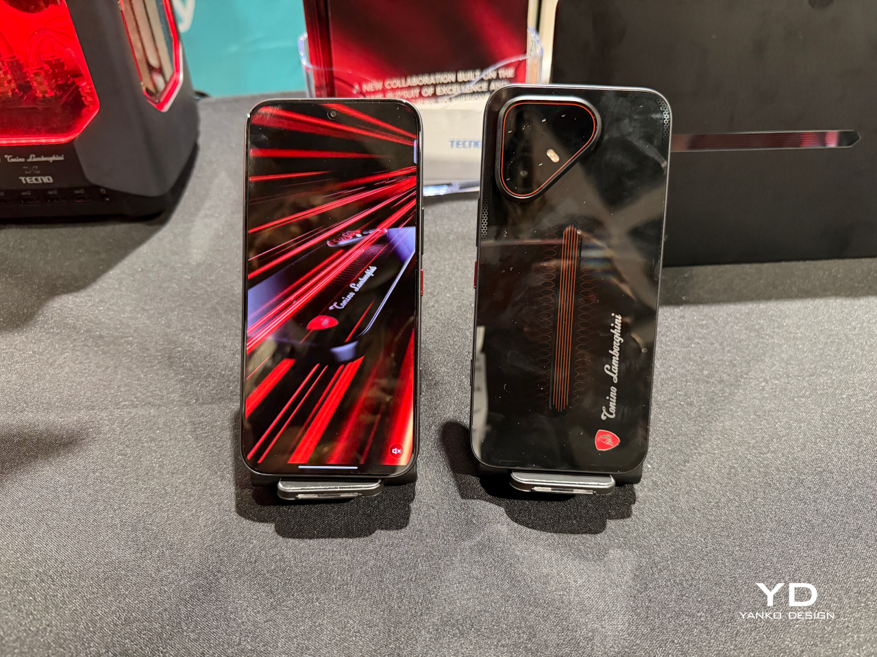
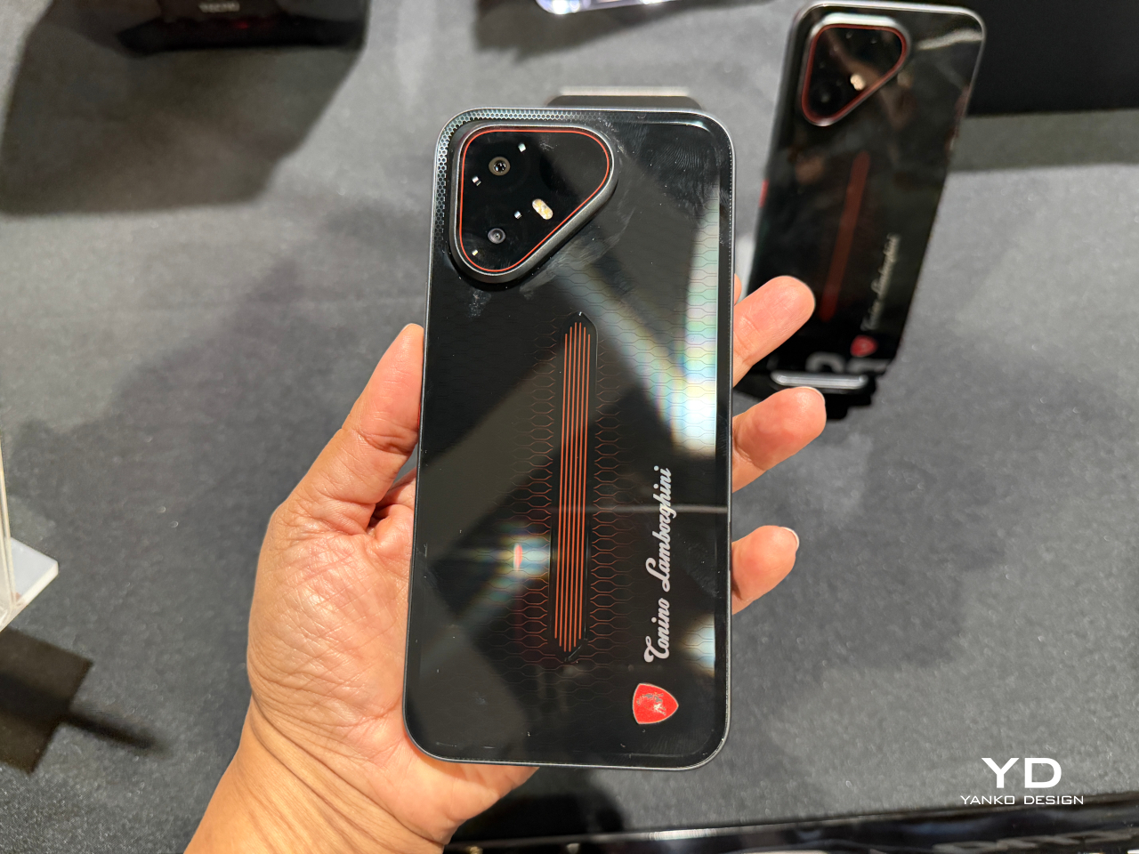
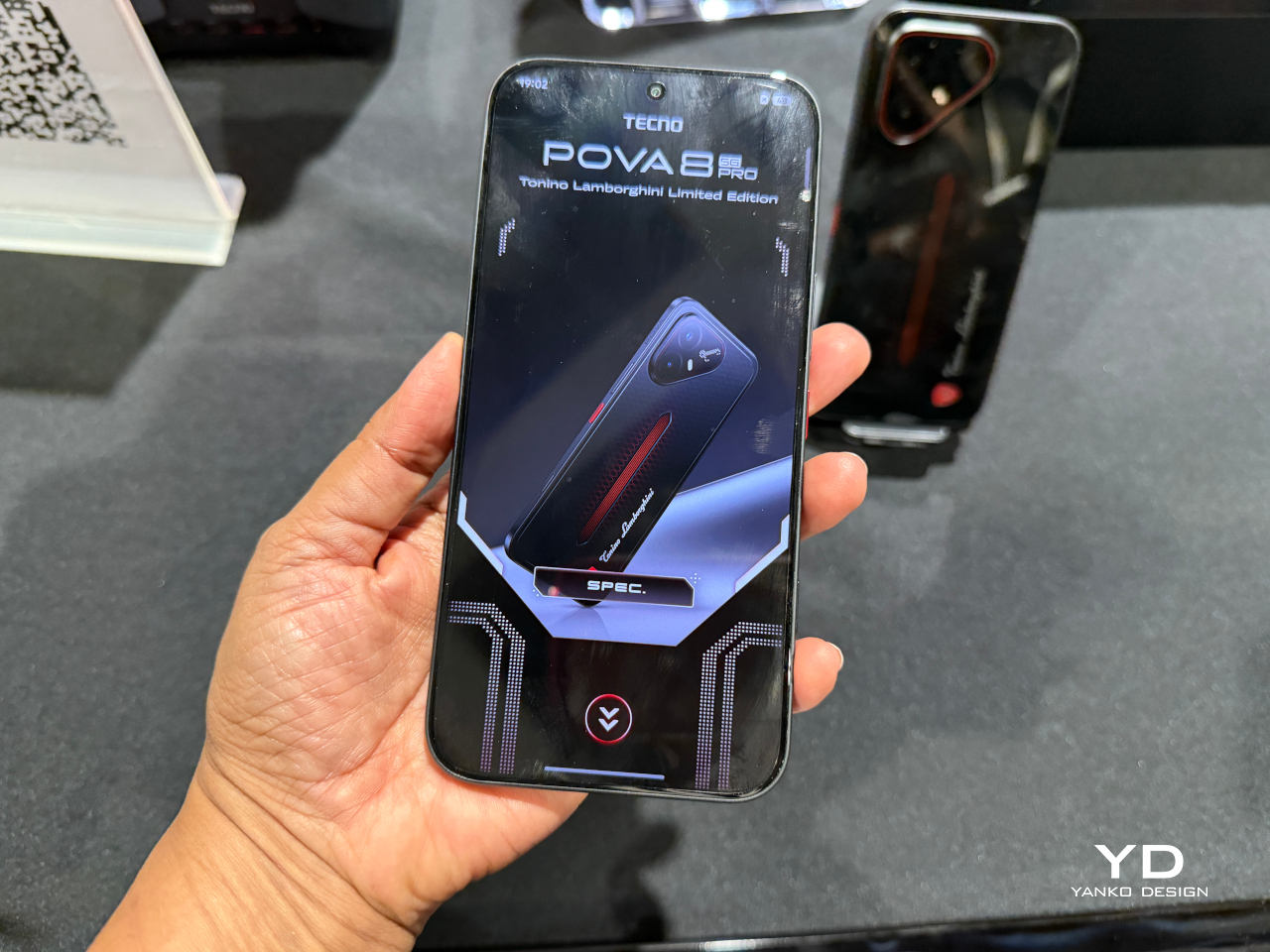
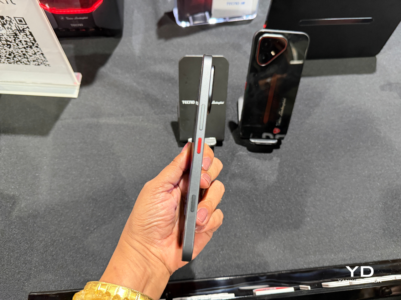
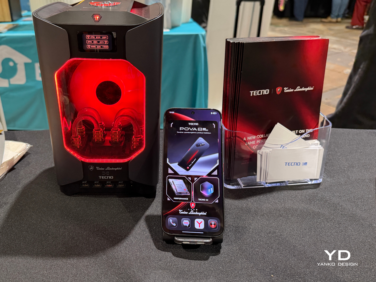
Slapping a famous badge on a phone’s back panel is the easy version of a brand partnership. TECNO and Tonino Lamborghini clearly wanted the harder version instead. The POVA 8 Pro 5G Tonino Lamborghini Limited Edition builds its entire identity around a black-and-red palette and a hexagon pattern lifted straight from Lamborghini’s mechanical heritage, then carries that language past the glass and into the software running underneath.

The rear panel does the heaviest visual lifting. A dual-layer stacking process gives it a reflective quality built from countless internal mirror structures that refract and redirect light, so red accents seem to surface and sink back into shadow as the phone tilts in your hand. A physical height difference between the two layers adds genuine spatial depth, echoing the layered geometry found in actual mechanical engineering rather than faking it with a printed graphic.

Designer: TECNO x Tonino Lamborghini

That commitment doesn’t stop at the hardware. A bespoke interface theme reworks dozens of icons in matching black-and-red tones with glass-like material effects, while a custom boot animation and ringtone carry the same mechanical energy into everyday use. Opening the phone in the morning feels less like waking up a generic Android device and more like starting an engine built around a specific mood.

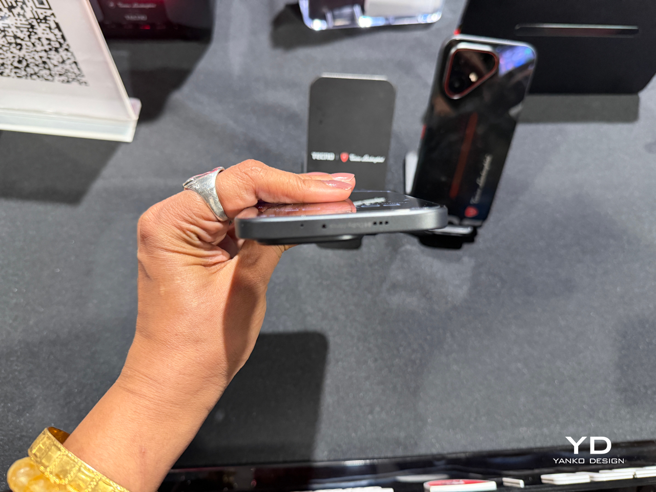
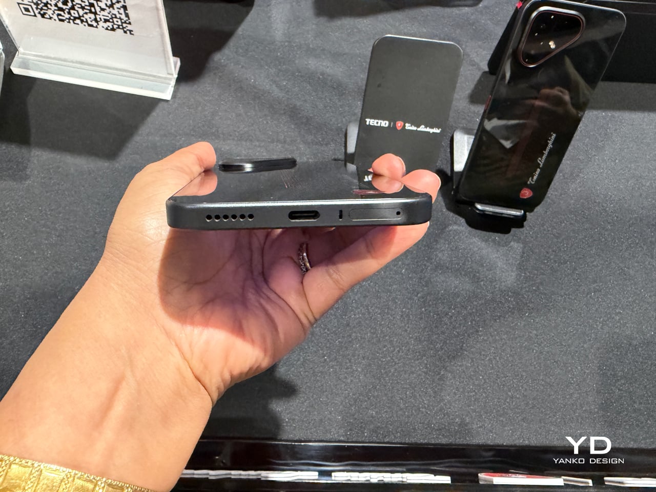
Underneath the styling sits a dual-chipset setup pairing a MediaTek Dimensity 7400 Ultimate platform with a TECNO-built P1 Graphic Chip, backed by a vapor chamber cooling system spanning over 22,000mm² of dissipation area. That combination pushes supported titles as high as 144FPS, turning a commute or a lunch break into legitimate gaming time instead of a compromise. A dedicated one-tap button on the side keeps favorite apps and gaming shortcuts one press away.

Photography leans on a Sony-engineered LYTIA 700C sensor with a larger light-sensitive area, giving low-light shots and handheld video noticeably steadier results thanks to built-in optical stabilization. A 50MP high-pixel mode and 2x lossless zoom cover the detail-obsessed shots, while an 8MP ultra-wide lens handles group photos and landscapes without anyone needing to step backward to fit everyone in frame.

The 6.78-inch AMOLED display pushes brightness to 4,500 nits and refreshes at 144Hz, numbers that matter most outdoors under direct sun or during fast-paced gaming sessions where lag ruins the moment. A touch layer rated for wet and oily fingers keeps the screen responsive through rain, sweat, or sunscreen-covered hands, useful for anyone who refuses to put their phone down just because the weather did.

Durability rounds out the package rather than acting as an afterthought. Corning Gorilla Glass 7i, IP69-rated water and dust resistance, and SGS 5-Star Drop certification mean the phone can survive a dropped call turning into a literal drop without ending the relationship. A 6,500mAh battery retains over 80% of its health after 2,000 charge cycles, translating to roughly six years of daily use before a real decline sets in.

TECNO and Tonino Lamborghini spent more effort here proving that a licensing deal can produce something with actual mechanical thinking behind it, rather than a badge glued onto commodity hardware. The result reads less like a co-branded accessory and more like a phone that happens to share a bloodline with the cars.

The post TECNO and Tonino Lamborghini Prove You Can’t Fake a Real Collab first appeared on Yanko Design.

  •  

Cloud AI Means Someone Else Has Your Data, MINISFORUM Fixes That

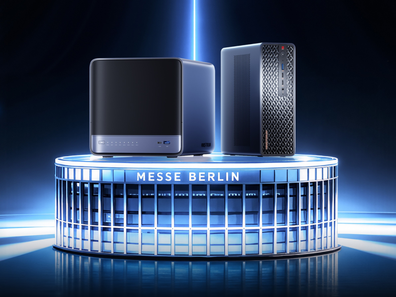
Running a serious AI model at home usually means renting someone else’s cloud server and hoping your data stays private along the way. MINISFORUM built its newest pairing to remove that trade-off entirely. The AI Agent NAS N5 MAX-P495 and AI Mini Workstation MS-S1 MAX-P495 combine for up to 131 TOPS of AI compute performance, 192GB of memory at 8533 MT/s, and up to 160GB of graphics memory, enough headroom to keep the heavy lifting on a desk instead of in a data center.

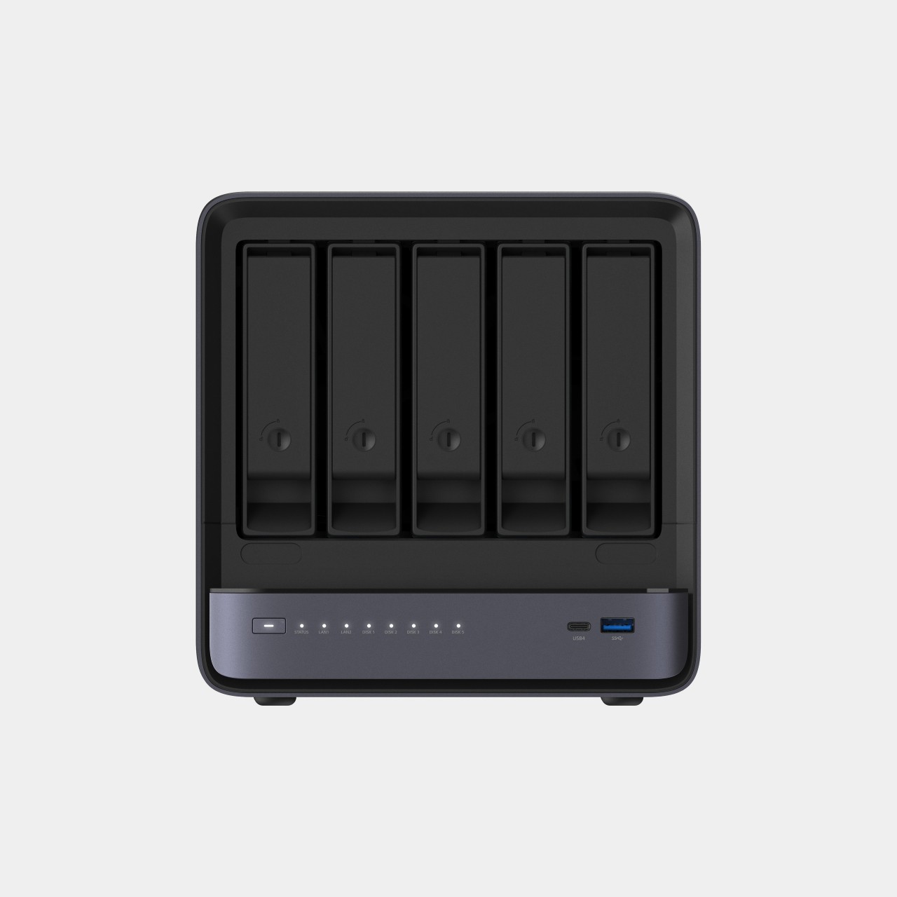
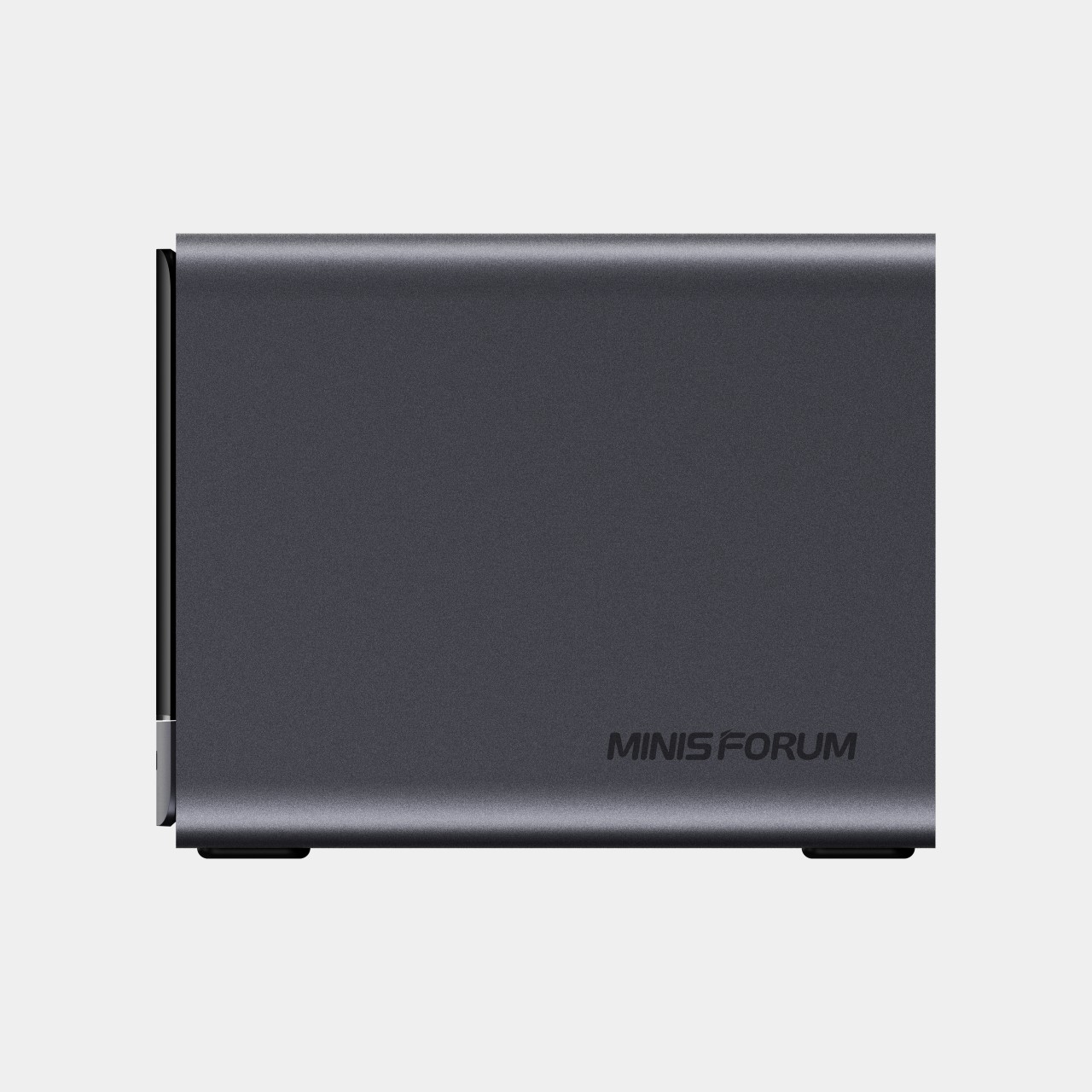
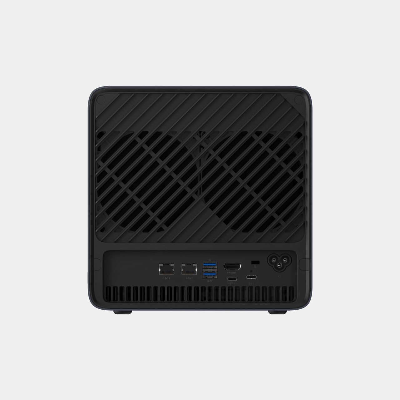
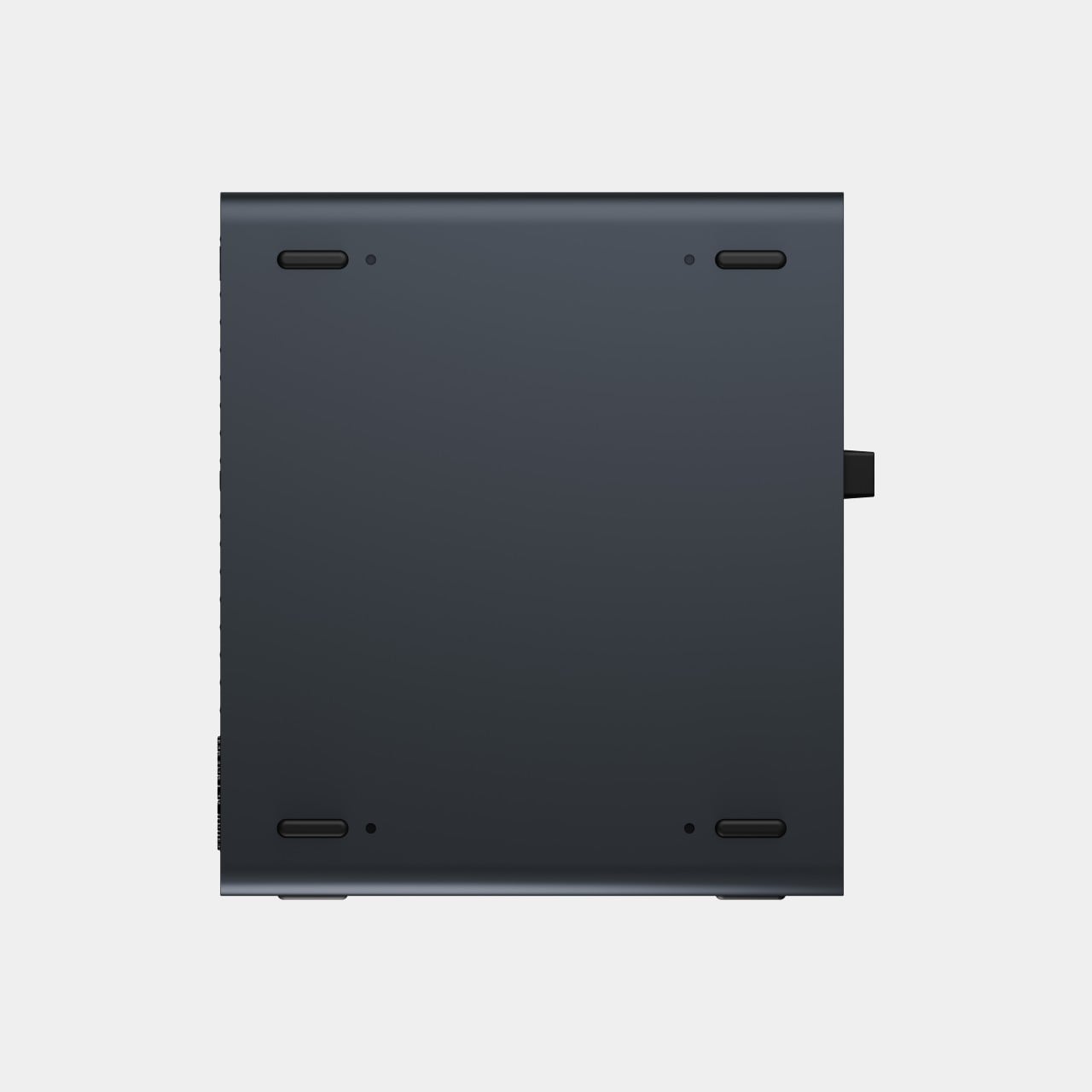
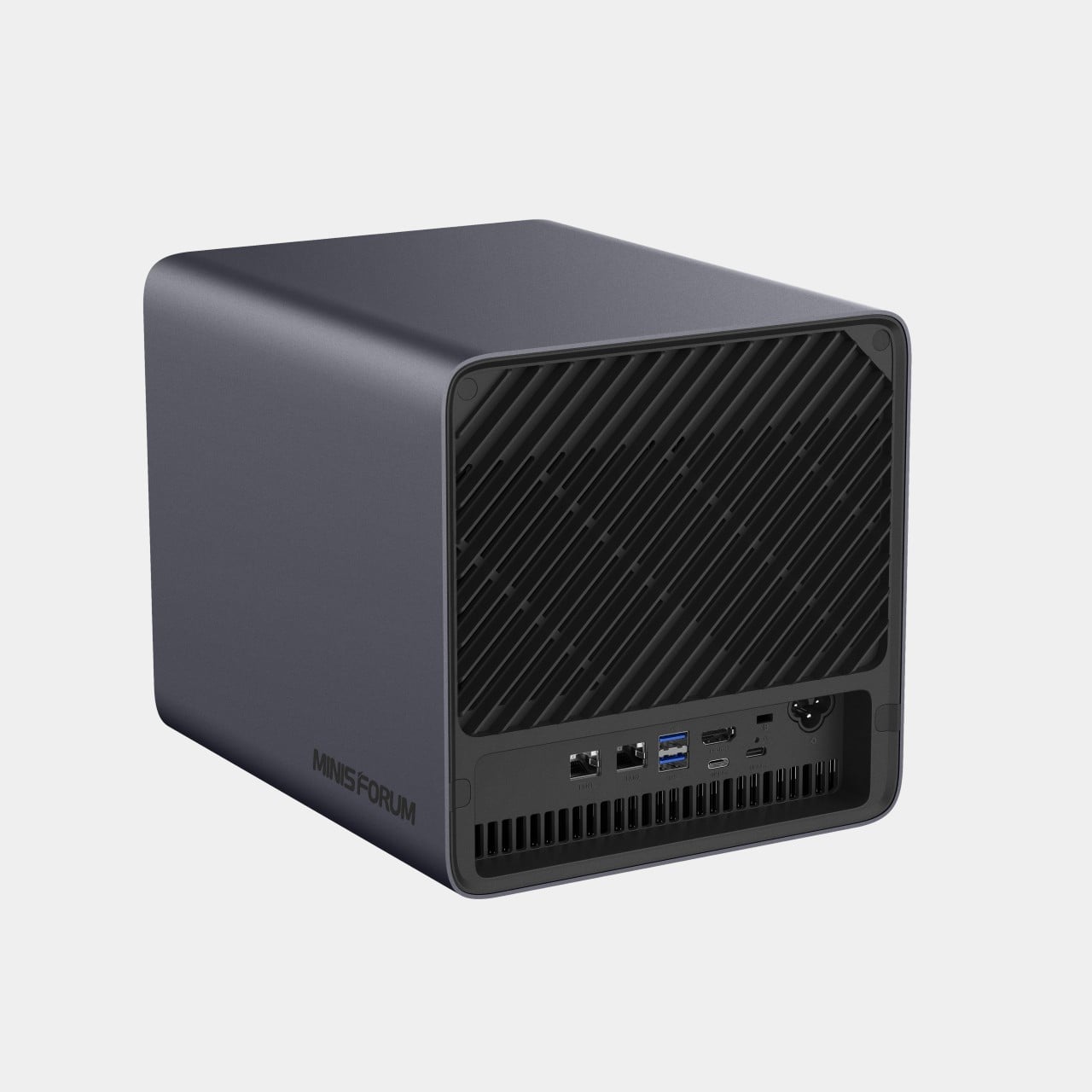
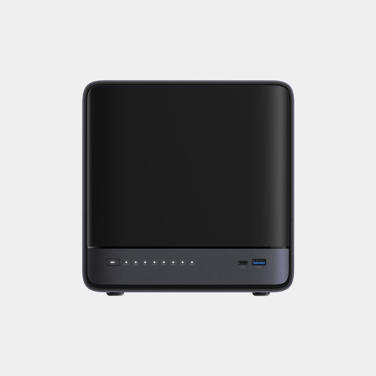
The N5 MAX-P495 takes the shape of a compact black cube, but what it holds inside matters more than how it looks sitting on a shelf. It combines powerful AI computing with up to 200TB of local storage, enabling users to store, manage, and process large volumes of data within a single AI platform. That capacity turns a spare corner of an office into a private archive large enough to hold years of project files, footage, or research without ever touching a third-party server.

Designer: MINISFORUM

Storage alone doesn’t make an AI system useful, so MINISFORUM built the N5 to run the AI itself. From RAG knowledge bases and AI models to embeddings, databases, and AI agents such as OpenClaw and Hermes, N5 MAX-P495 keeps data and AI workloads local, enabling continuous and private AI operations. A small business could lean on that setup to run its own customer-support agent without routing conversations through an outside company’s servers.

That local-first approach extends to how the N5 fits into a larger setup. Designed to work alongside AI computing devices, N5 MAX-P495 serves as a centralized backend for data, models, knowledge, and long-running AI workloads, bringing storage and computing together at the edge. It’s less a standalone gadget and more a quiet engine room, built to keep working in the background while something faster handles the parts people actually interact with.

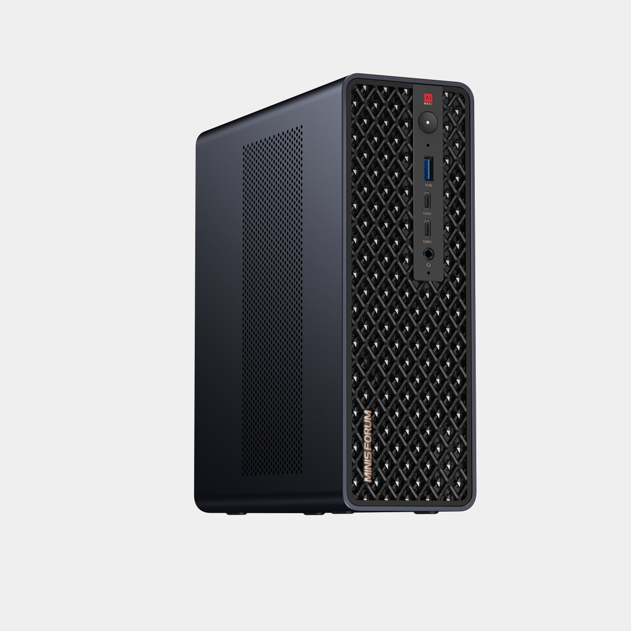
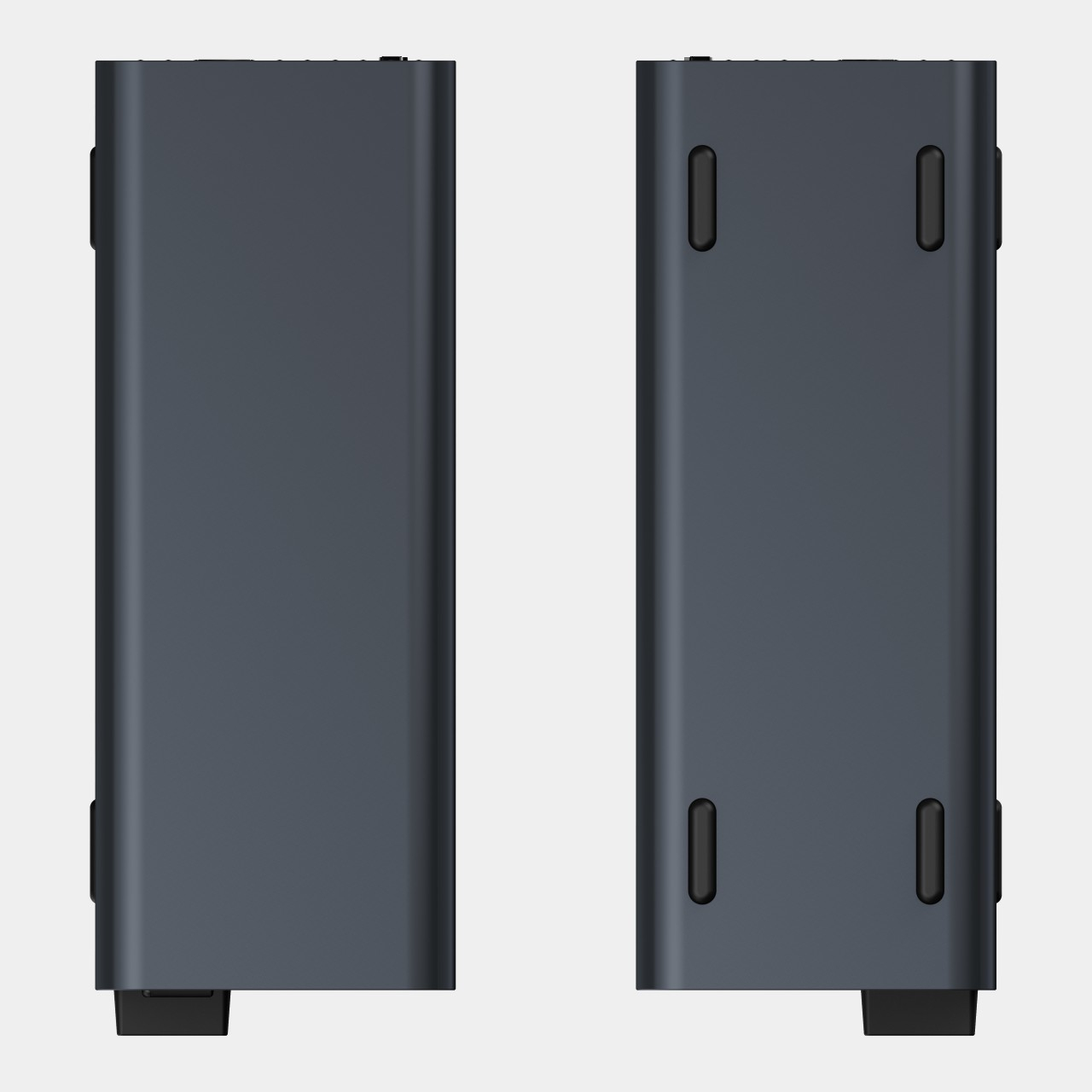
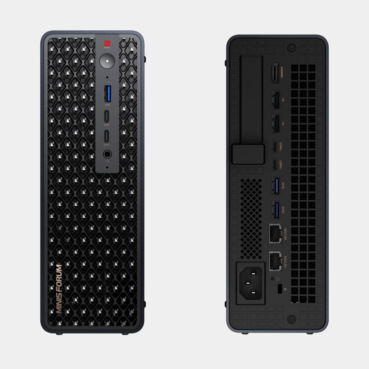
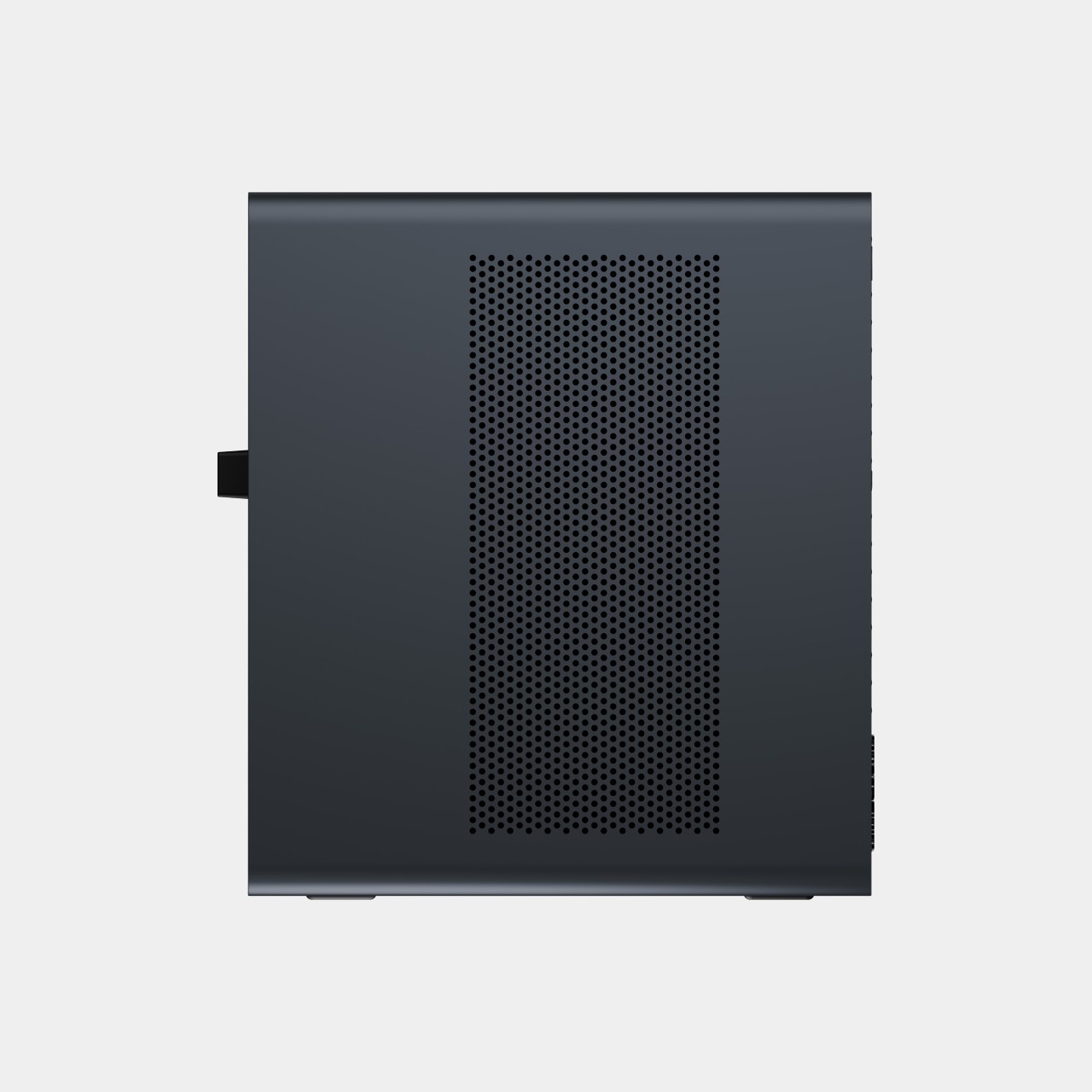
That faster half of the pairing is the MS-S1 MAX-P495, a compact tower wrapped in a ventilated, diamond-textured front panel that looks more like a piece of desk sculpture than a workstation. It delivers powerful local AI computing for demanding model inference, AI development, and computationally intensive workloads, built for intensive local AI tasks, engineering, and workflows in an ultra-compact footprint. Developers get workstation-class muscle without giving up desk space to a full tower case.

Speed matters just as much as raw power for certain jobs, and MINISFORUM designed the MS-S1 with that in mind. Designed for low-latency AI workloads, MS-S1 MAX-P495 enables responsive local inference for AI agents, computer vision, generative AI, and other real-time applications. A security camera system or a live creative tool built on generative AI benefits directly from that kind of immediate response instead of waiting on a round trip to the cloud.

Connectivity rounds out the workstation’s role in a larger setup. With extensive connectivity and expansion capabilities, MS-S1 MAX-P495 serves as a powerful AI compute frontend, supporting models, applications, and connected devices across flexible edge AI environments. That flexibility means the same box can sit at the center of a home lab or plug into a small studio’s existing hardware without forcing a rebuild.

Paired together, the two devices split the work the way a good team would. The MS-S1 MAX-P495 and N5 MAX-P495 form a complete edge AI computing system, delivering high-performance AI compute at the frontend while integrating compute, massive storage, data, and AI knowledge at the backend, providing a powerful foundation for real-time inference, persistent AI workloads, and scalable local AI applications. It’s a compact answer to a question more households and small teams are starting to ask: whether AI still needs to live somewhere else at all.

The post Cloud AI Means Someone Else Has Your Data, MINISFORUM Fixes That first appeared on Yanko Design.
  •  

Get a Laptop or Get a Tablet, TECNO MEGABOOK T15 360 Pro Is Already Both

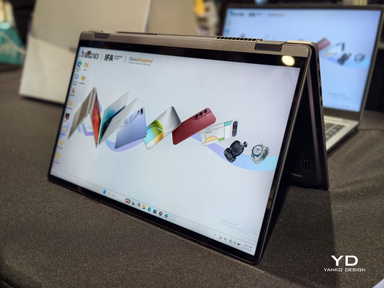
A laptop that only knows one shape stops being useful the moment the day changes its mind. TECNO built the MEGABOOK T15 360 Pro around that exact problem, wrapping a full 360-degree hinge inside an all-metal body machined with precision CNC tooling. The screen folds all the way back, turning one device into four distinct working postures without asking anyone to carry a second gadget.

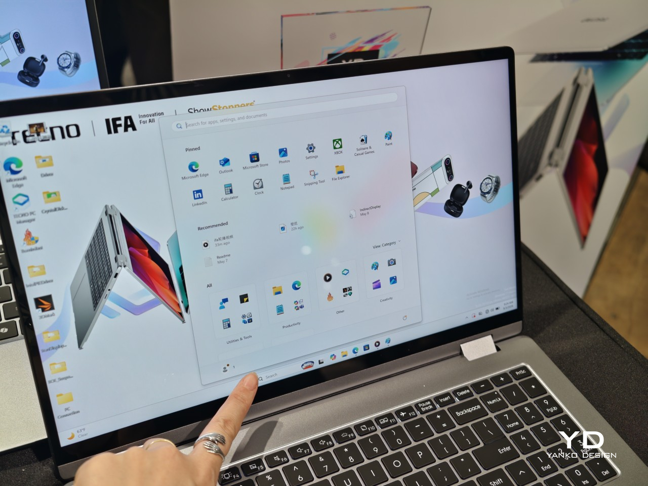
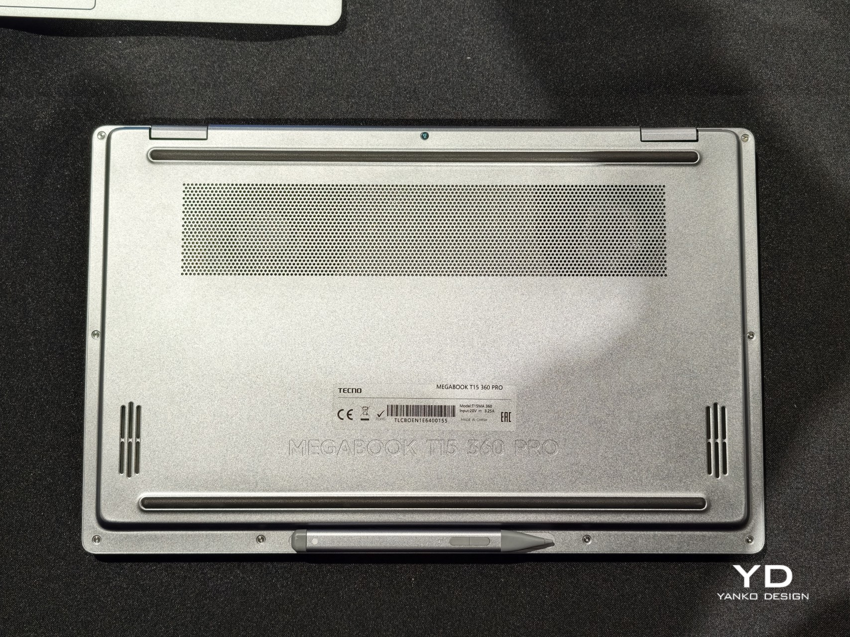
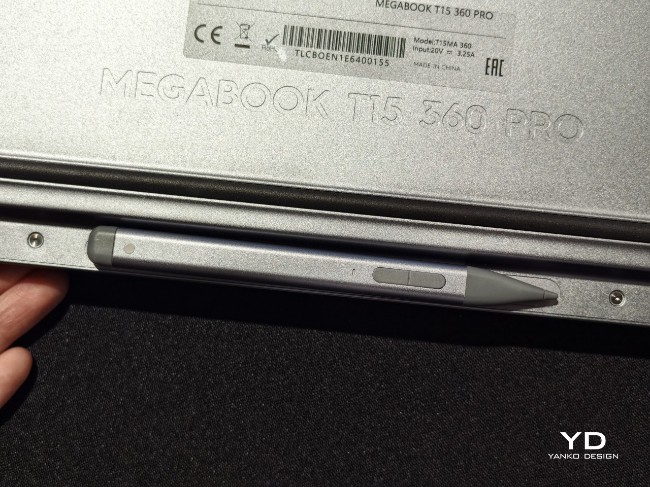
Flip it flat into Laptop mode, and it behaves like any focused productivity machine, keyboard ready and screen upright for spreadsheets or long email threads. Push the display back further and Tablet mode takes over, letting fingers or an optional MPP 2.0 active pen sketch, annotate, and jot notes directly onto the 15.6-inch touchscreen. The same hardware just keeps reshaping itself around whatever task shows up next.

Designer: TECNO

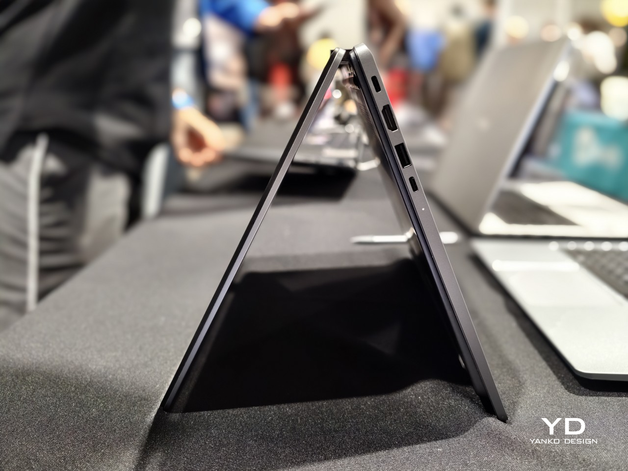
Fold it into a triangle and Tent mode appears, propping the screen up on a cramped tray table or a corner of a crowded desk where a full laptop footprint would not fit. Stand it up the other way and Stand mode turns the same hinge into a presentation tool, angling the display toward a room full of people instead of a single set of eyes typing at a keyboard.

None of those positions would matter much without a screen worth looking at, and TECNO gave the Pro model a 2.5K panel running at 120Hz across 2560 by 1440 pixels, covering 100% of the sRGB color space at 350 nits brightness. Colors hold up during video edits, photo review sits closer to accurate, and scrolling through documents in Tablet mode feels noticeably smoother than on a standard 60Hz screen.

Under the hood, configurations climb as high as an Intel Core Ultra 9 185H processor paired with LPDDR5X memory running at up to 7,467MHz, enough headroom for video exports or a dozen open browser tabs without slowdown. A PCIe M.2 2280 SSD handles storage, and select configurations add a second M.2 slot, giving anyone running out of space room to expand rather than shop for an external drive.

Powering all of that is a 70Wh battery paired with a compact 65W PD GaN charger, a combination built to survive a full workday of meetings, note-taking, and streaming without hunting for an outlet. The included charger sheds the bulk of older power bricks, and the 1.8-meter cable gives enough slack to keep the laptop charging from across a conference table instead of right next to the wall.

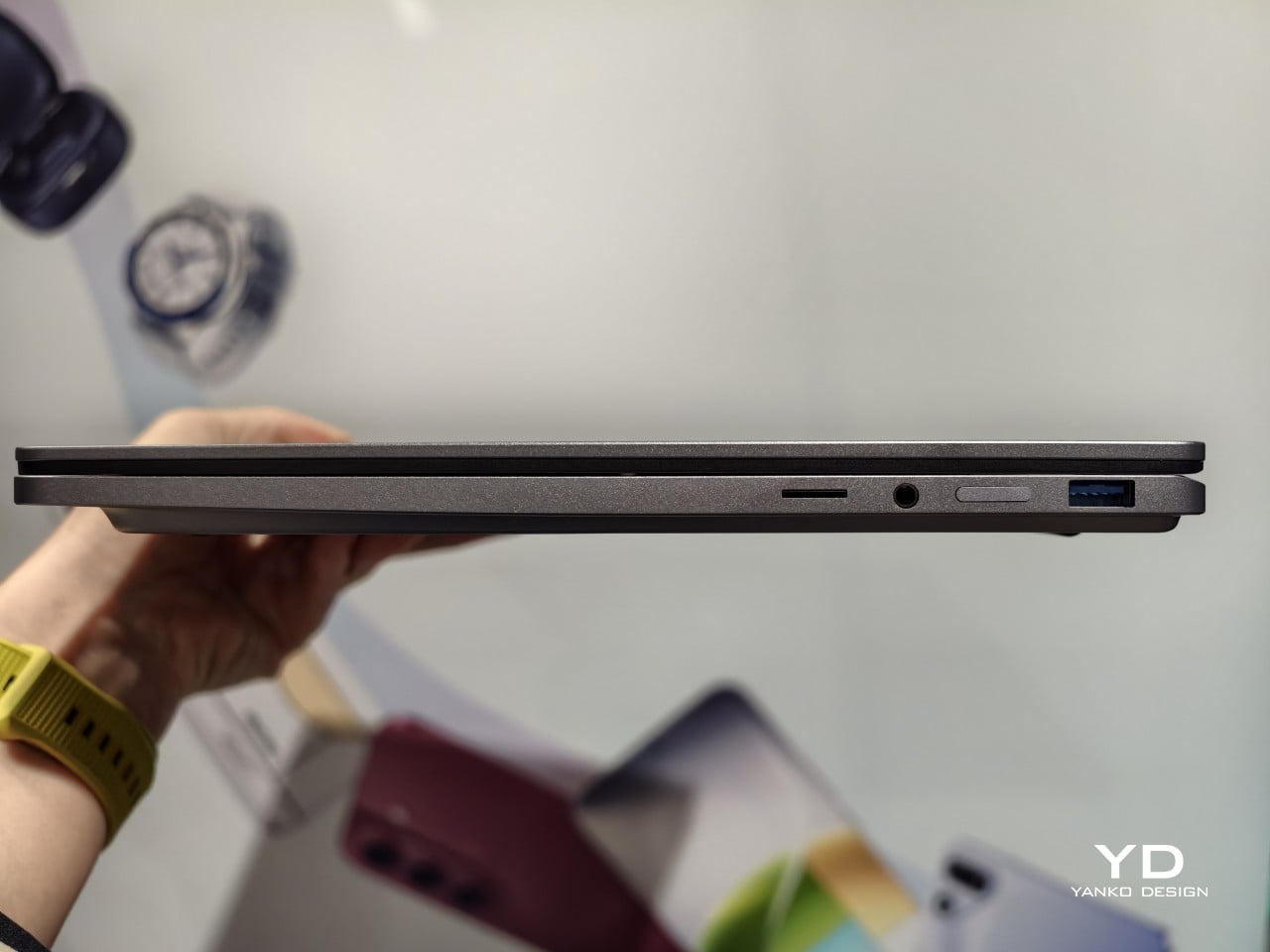
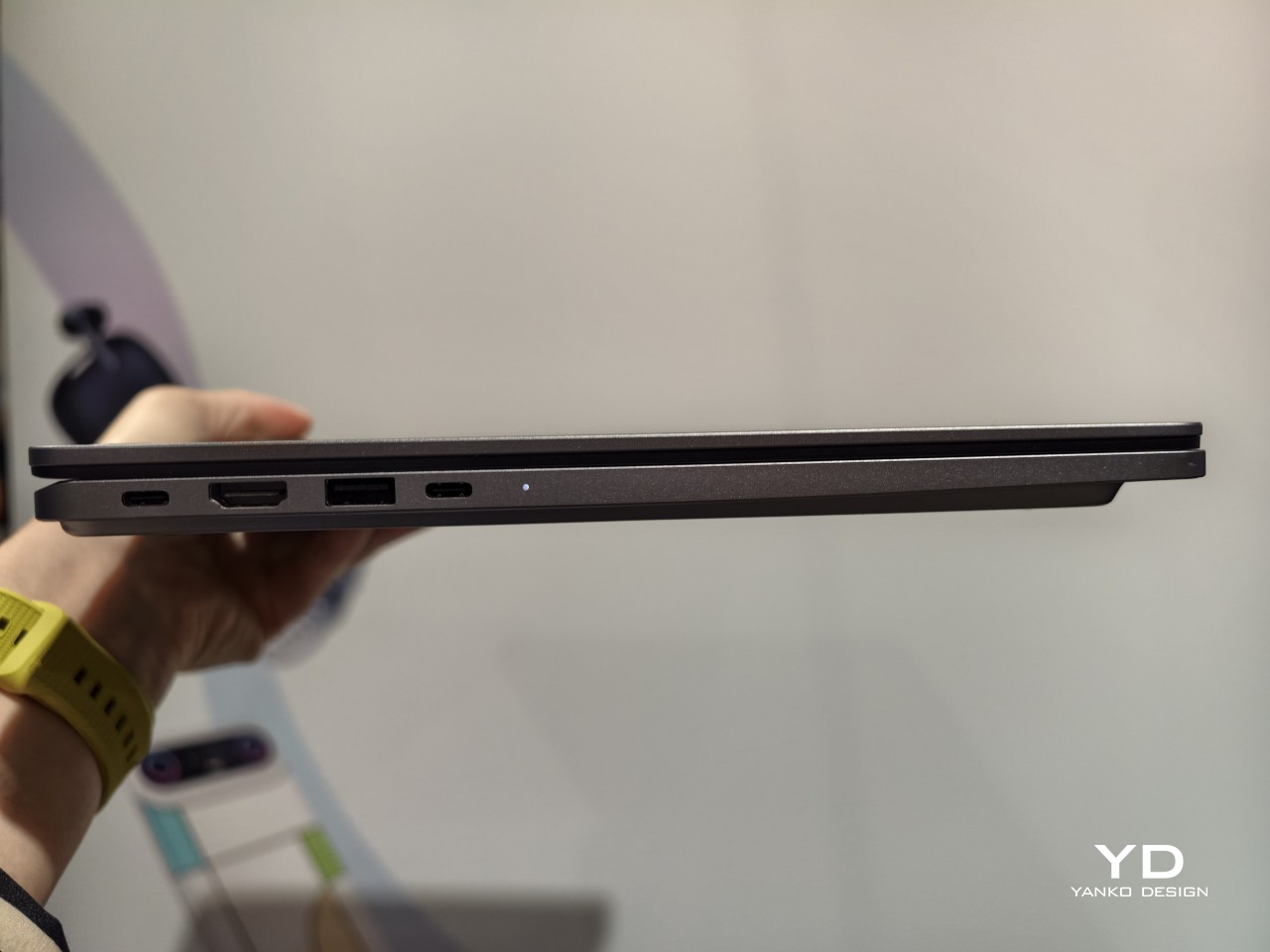
Connectivity keeps pace with the rest of the machine. Wi-Fi 6E and Bluetooth 5.4 handle wireless duties, while seven physical ports, including two Type-C connections rated for 10Gbps data and display output, cover everything from external monitors to storage drives. TECNO OneLeap ties the laptop into phones, tablets, and other PCs, letting files and clipboard content move between devices without emailing anything to yourself first.

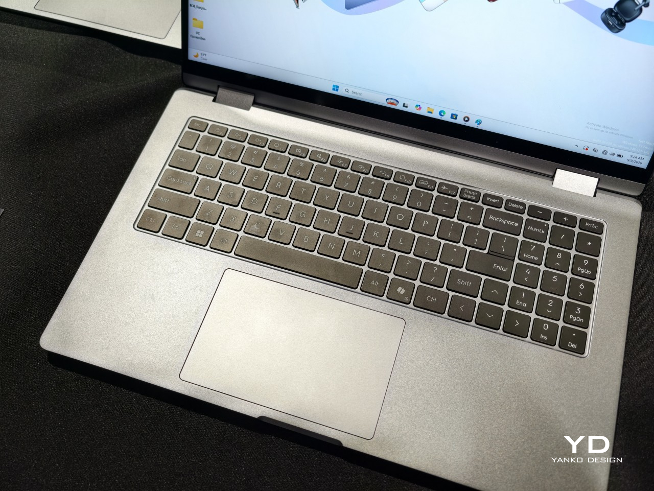
Smaller touches round out daily use. A backlit keyboard with its own numeric keypad handles spreadsheet-heavy work, and a fingerprint reader built into the power button skips the password screen entirely with one press. Dual speakers tuned for DTS:X Ultra and a pair of digital microphones back up video calls and casual media playback, so switching between a meeting and a lunchtime show does not require headphones.

TECNO prices the MEGABOOK T15 360 Pro at €1,099 (around $1,280), with European availability starting in the fourth quarter of 2026. That price sits closer to a well-specced conventional laptop than a premium convertible, positioning the T15 360 Pro as the rare 2-in-1 that does not ask for a luxury markup just because the hinge bends further than everyone else’s.

The post Get a Laptop or Get a Tablet, TECNO MEGABOOK T15 360 Pro Is Already Both first appeared on Yanko Design.
  •  

Scosche’s GloBright Is the Lava Lamp That Also Charges Your Phone

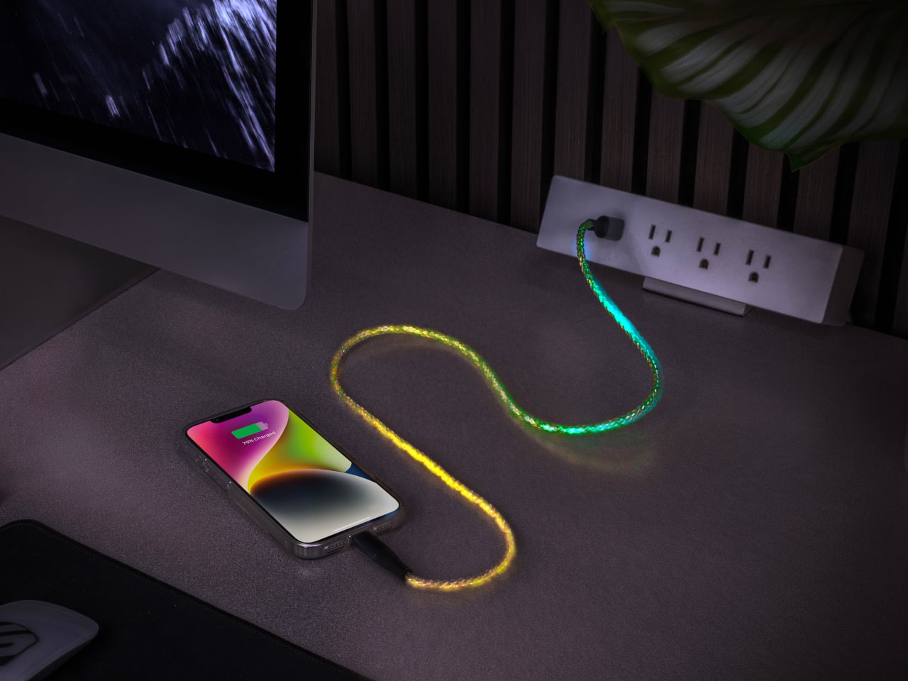
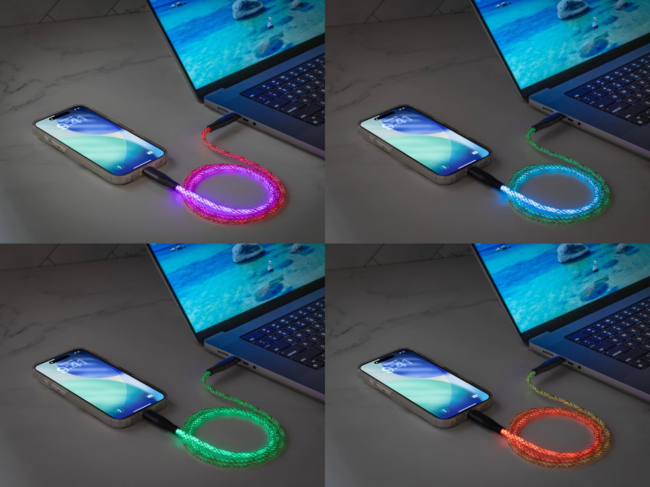
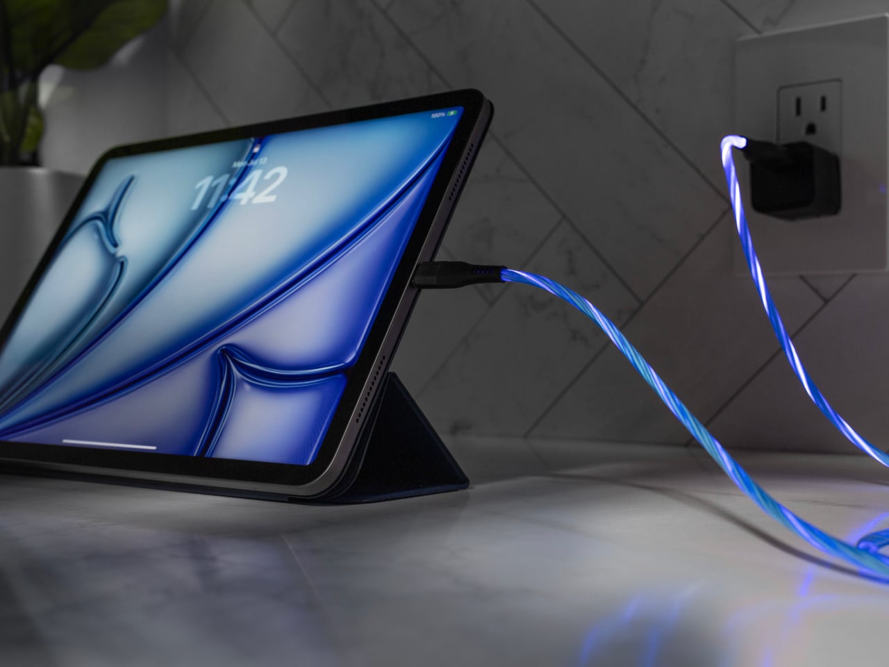
Scosche built a charging cable that refuses to hide once the lights go out. The GloBright MultiColor Glowing LED Charging Cable, developed with Statik and introduced at IFA 2026, takes the most overlooked object on any desk and turns it into something that actually draws the eye. Instead of a black cord disappearing into shadow behind a laptop, this one glows its way across the room.

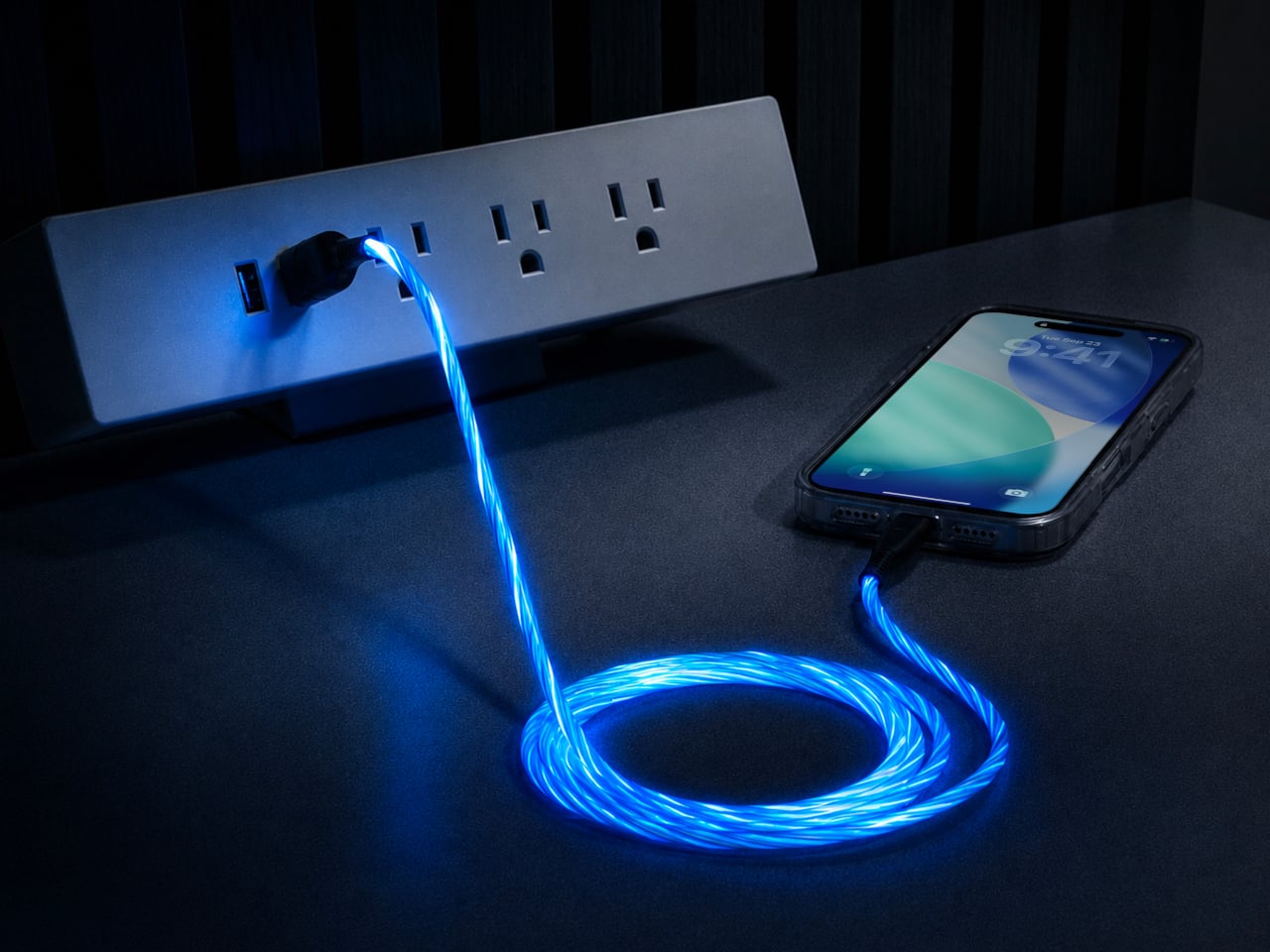
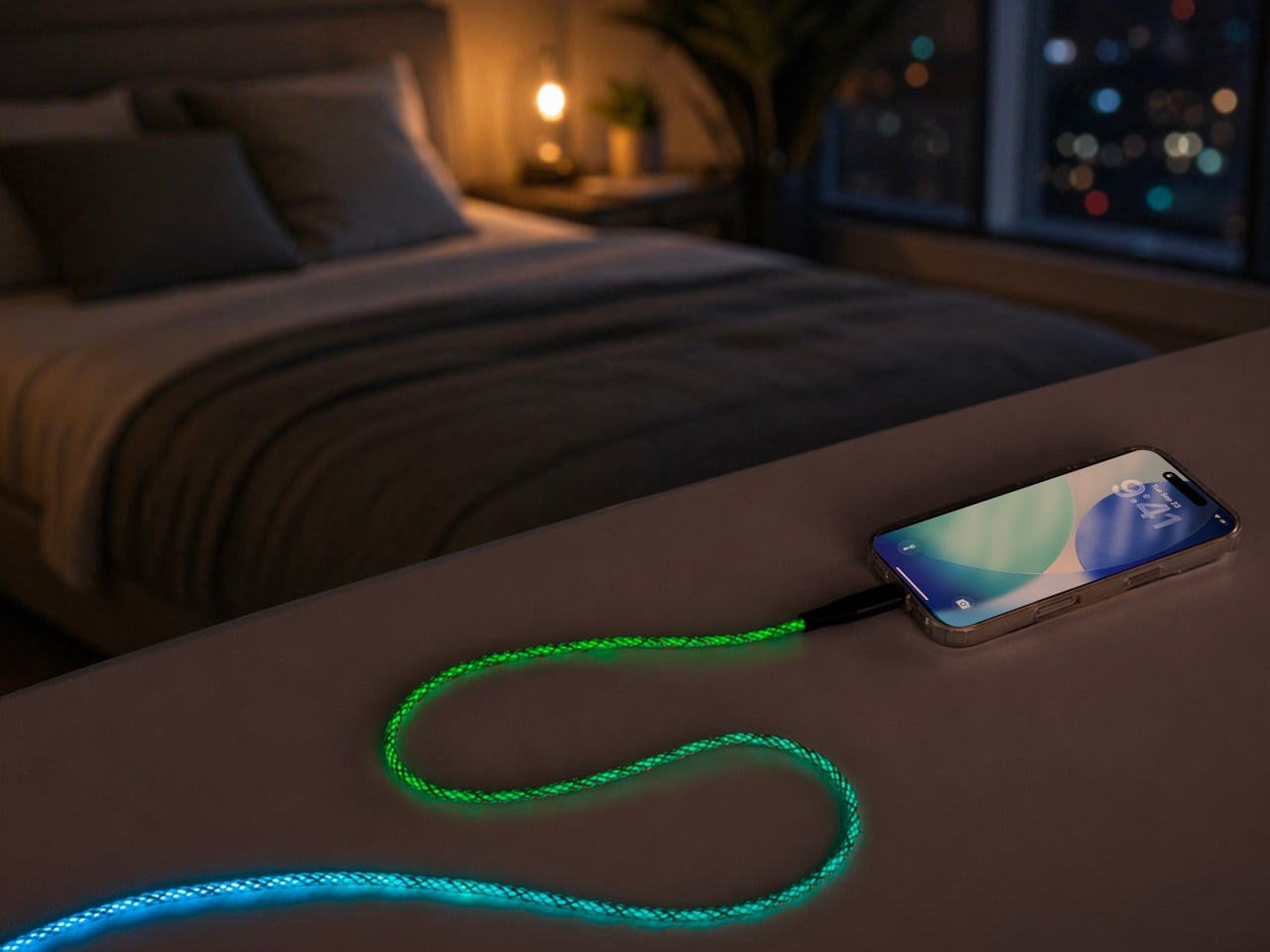
That glow runs through the cable’s full length rather than sitting confined to the connector tips, so a coiled loop on a nightstand reads more like a lit sculpture than a charging accessory. Colors shift gradually along that length too, pink bleeding into purple, blue fading toward teal, giving the cable a slow-motion animation instead of a static single hue that gets boring after the first week of ownership.

Designer: Scosche

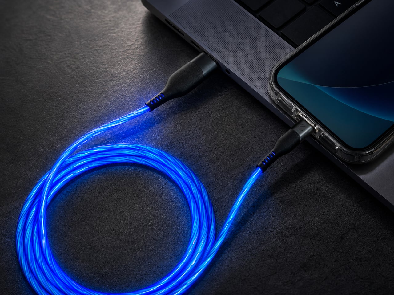
None of that visual flair comes at the cost of actual charging performance. Scosche built the GloBright cable to support up to 60W of fast charging for USB-C devices, alongside reliable data transfer, so a phone plugged in overnight wakes up fully charged just like it would with any premium braided cable. The lighting effect runs as a bonus layer on top of specs that already hold up on their own.

Durability gets equal attention. The 3-foot cable relies on premium materials throughout its construction, aiming for a build that survives the daily abuse of getting yanked out of a bag, wound around a charger, or stepped on near a bed frame. Scosche also sells a companion Blue Glowing LED cable in a longer 4-foot option, giving anyone who prefers a single steady color an alternative to the multicolor version’s shifting palette.

Where this cable earns its keep is in the spaces most charging accessories try to disappear from. A gaming setup gets an extra strip of ambient light without needing a separate RGB kit. A bedside table gets a soft, shifting glow that also happens to be topping off a phone overnight. Even a cluttered desk benefits, since a glowing cable is far easier to locate in a tangle of cords than a plain black one ever was.

Scosche prices the GloBright MultiColor cable at $17.99, positioning it well within impulse-purchase territory for anyone shopping for a charging cable anyway. At that price, the lighting effect functions less like a premium upsell and more like a free upgrade bundled into a cable people needed regardless. Buying a charging cable rarely feels like a decision worth thinking about, and Scosche seems to be betting that a little glow is enough to change that.

The post Scosche’s GloBright Is the Lava Lamp That Also Charges Your Phone first appeared on Yanko Design.
  •  

Acer’s Packard Bell Crashed IFA 2026 Like a Box of Crayons

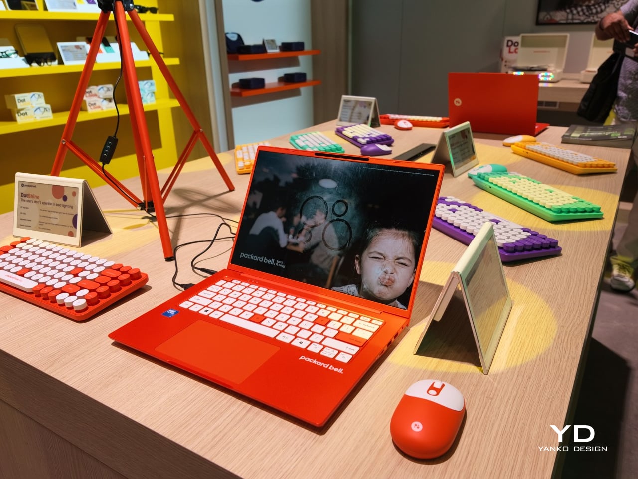
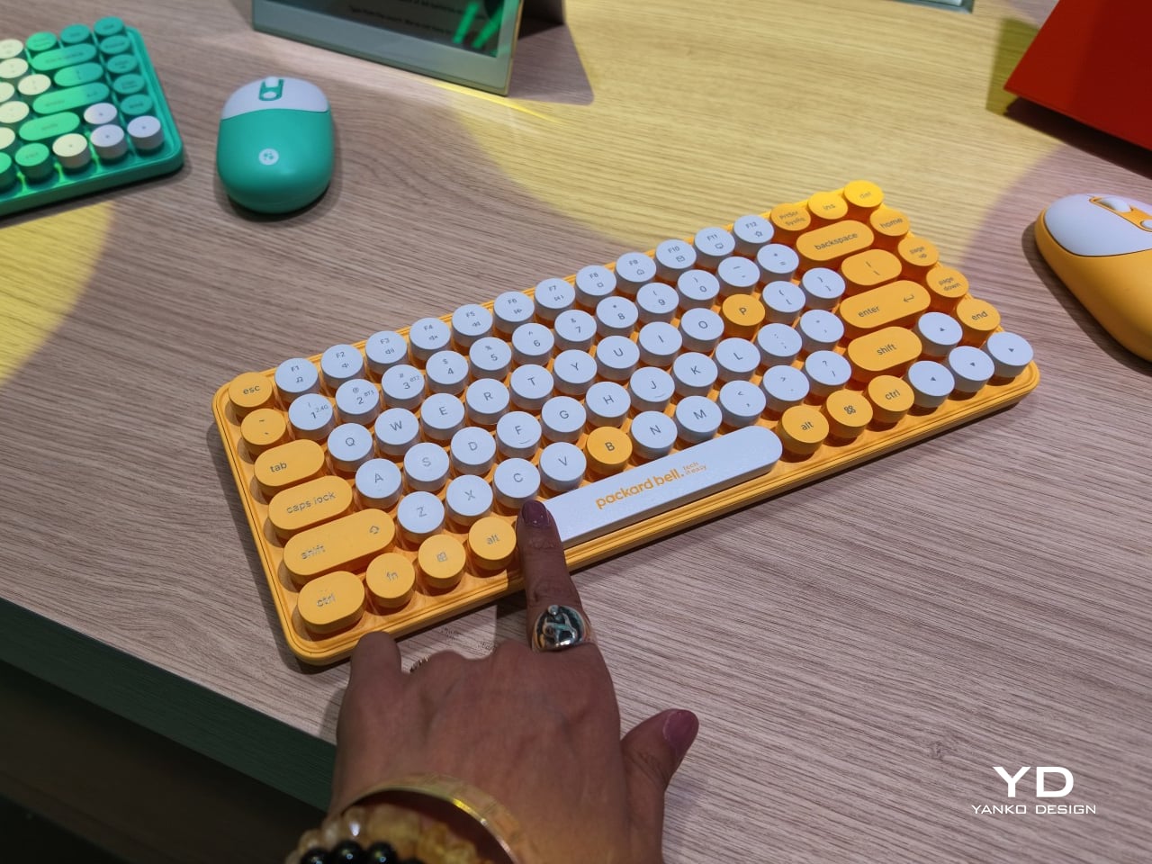
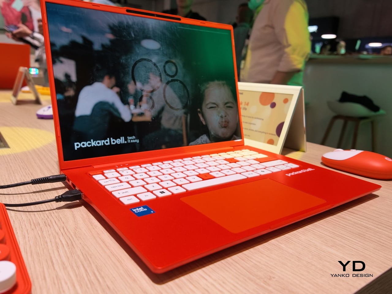
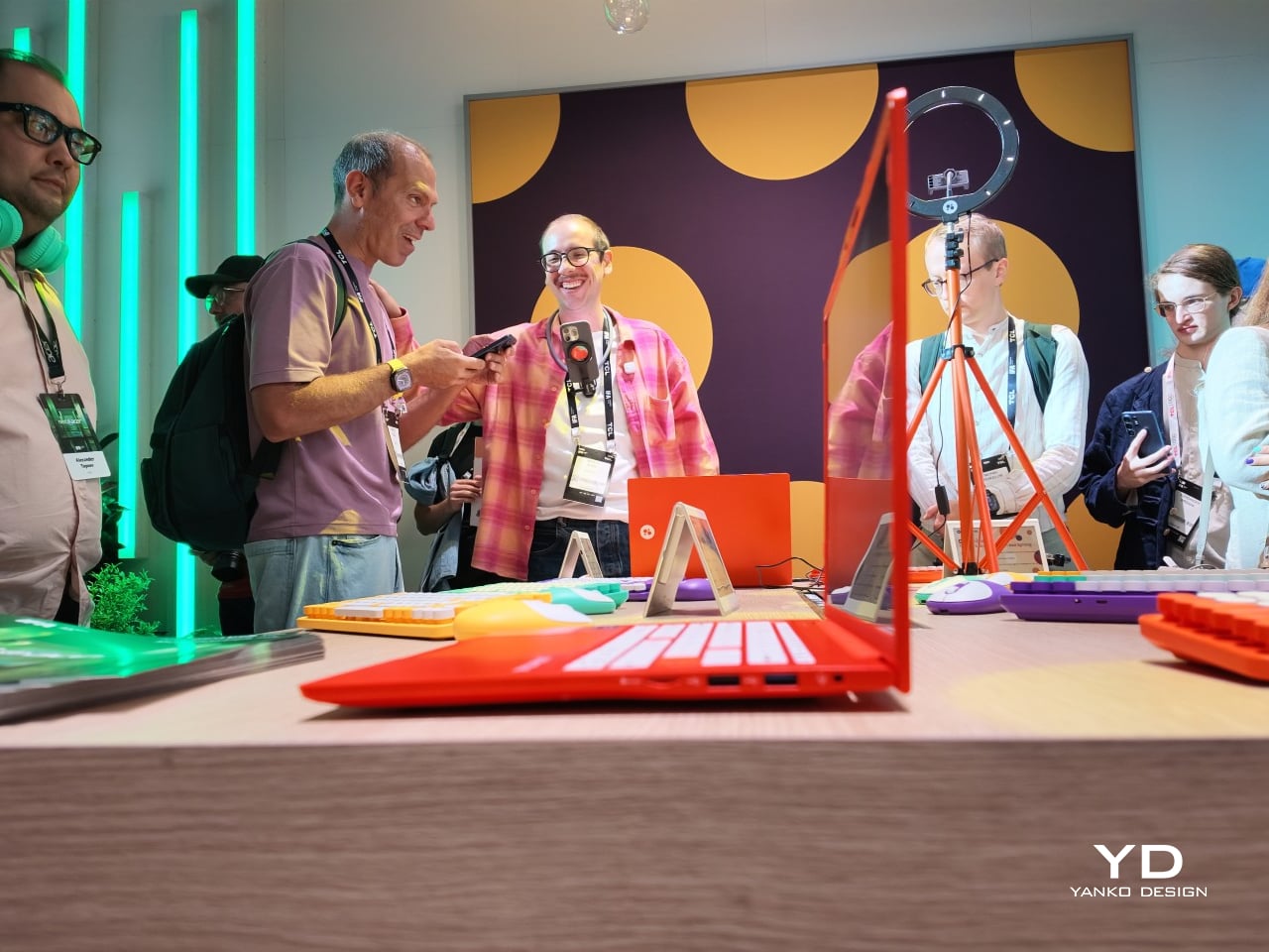
Packard Bell spent a century teaching people that new technology doesn’t have to feel intimidating, and its 100th birthday present to itself leans hard into that idea. Under Acer’s ownership, the brand relaunched at IFA 2026 with a philosophy it calls “Tech it easy,” built around a lineup that trades beige plastic and quiet corporate design for colors loud enough to notice from across a room. Four products anchor that comeback, and each one argues that everyday tech gains something when it stops taking itself so seriously.

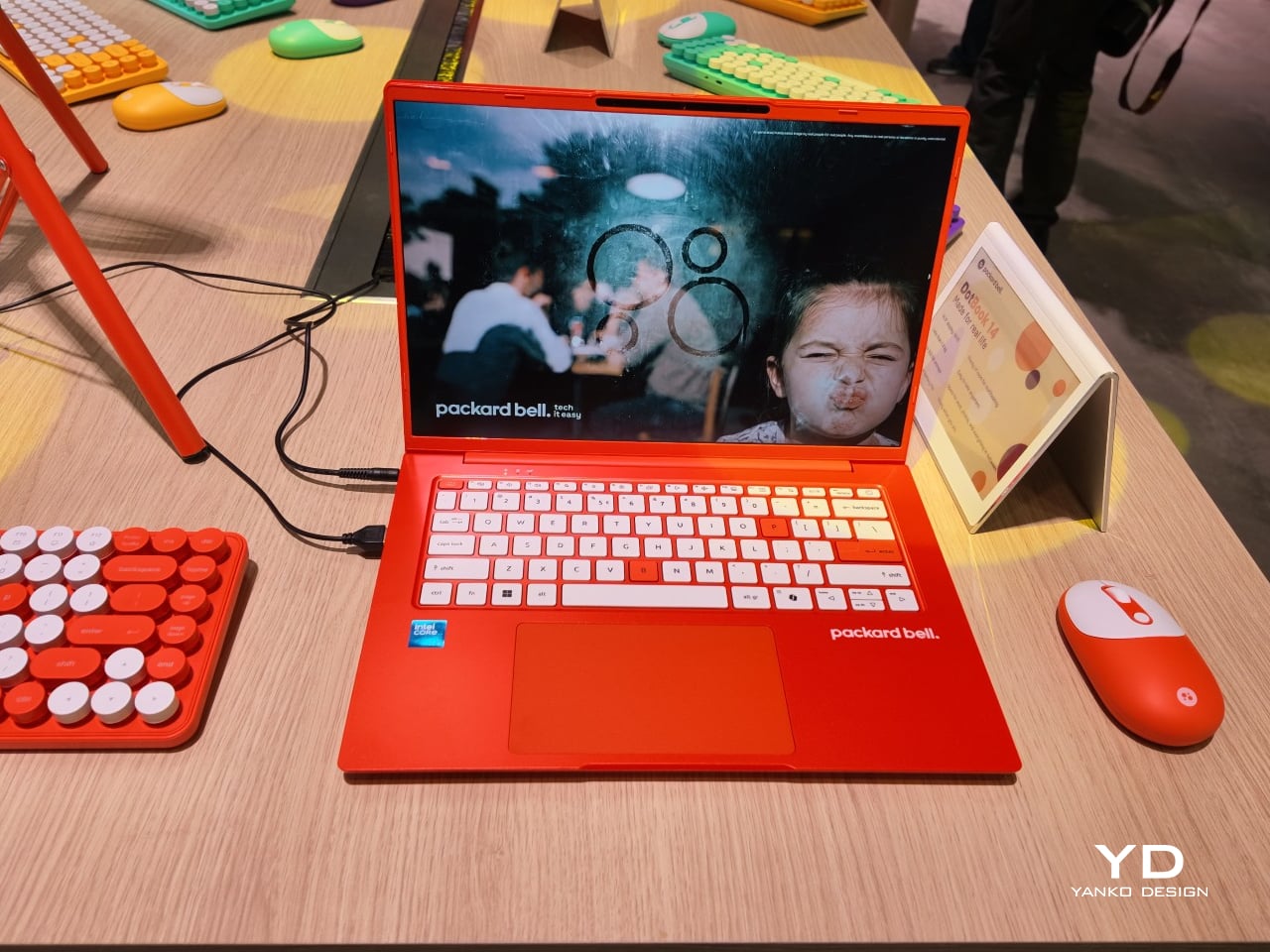
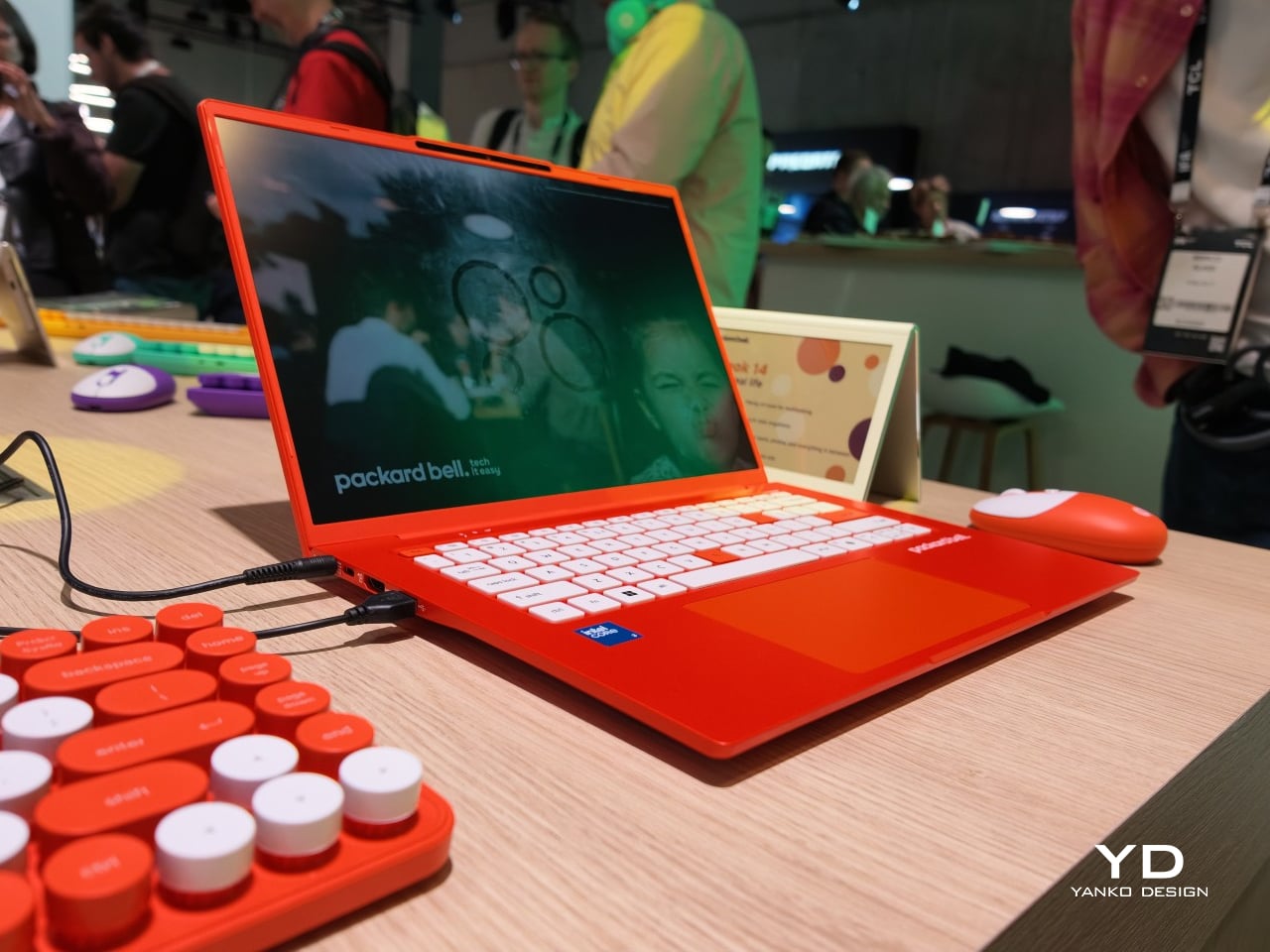
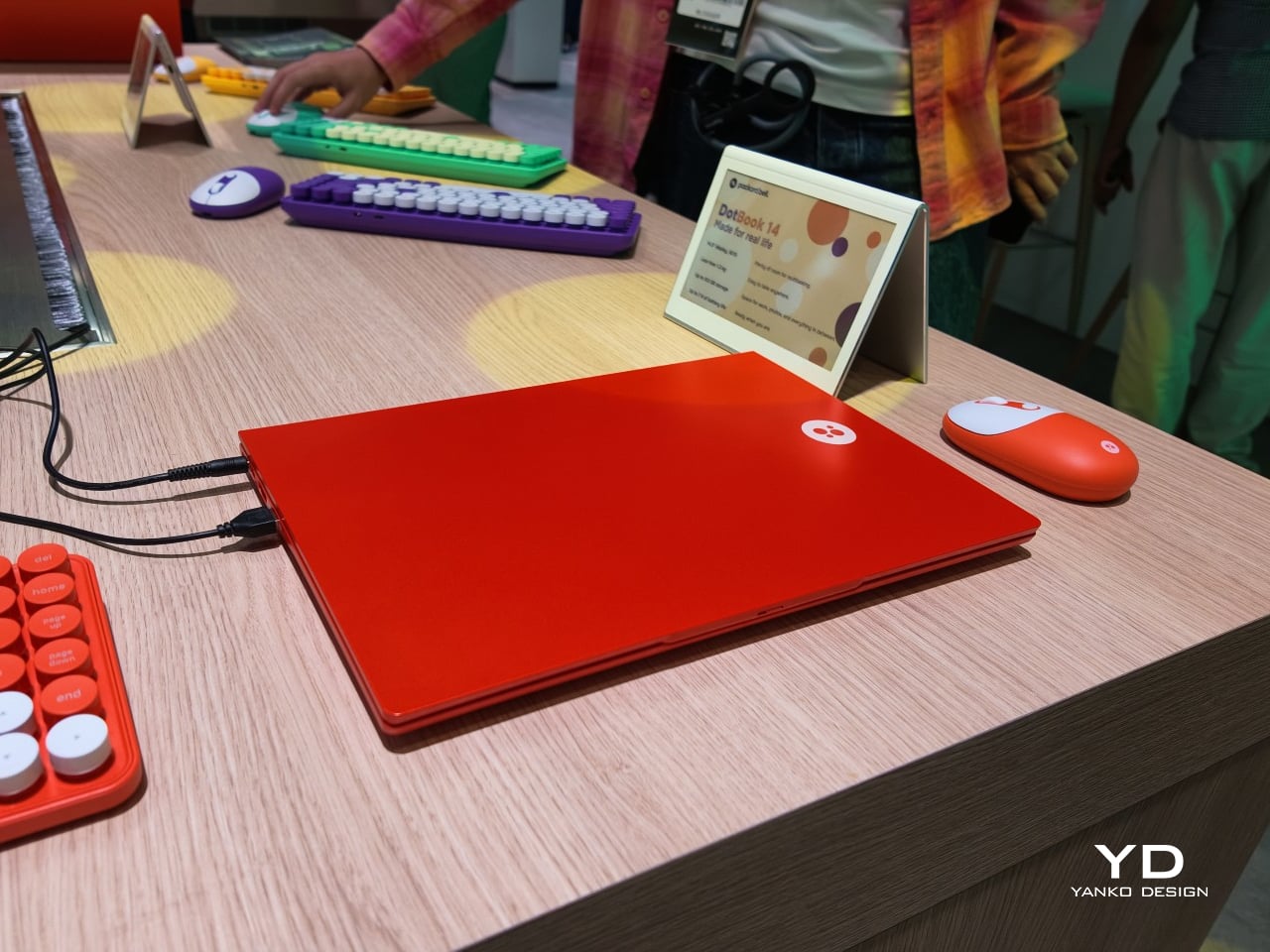
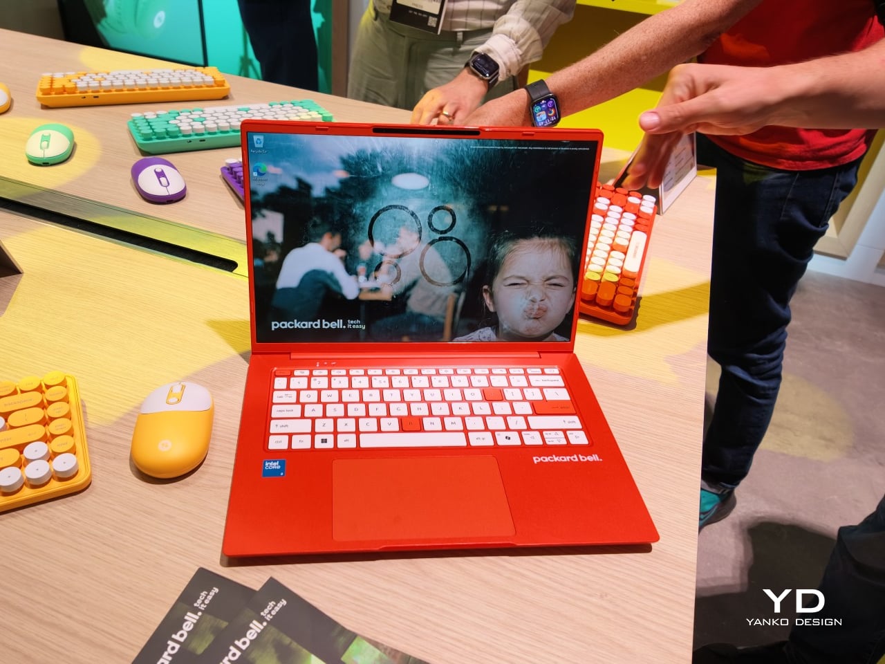
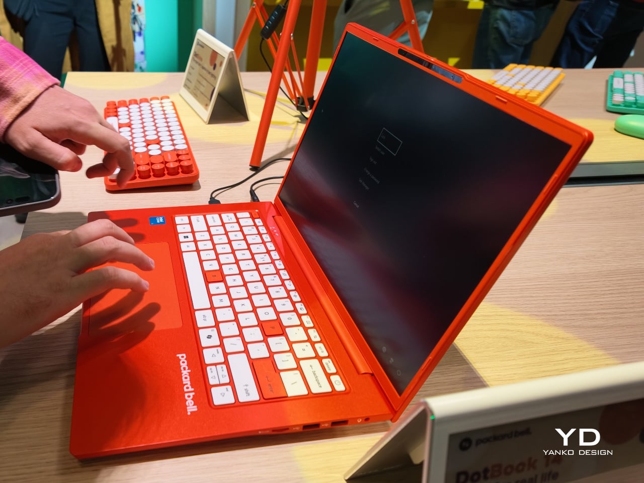
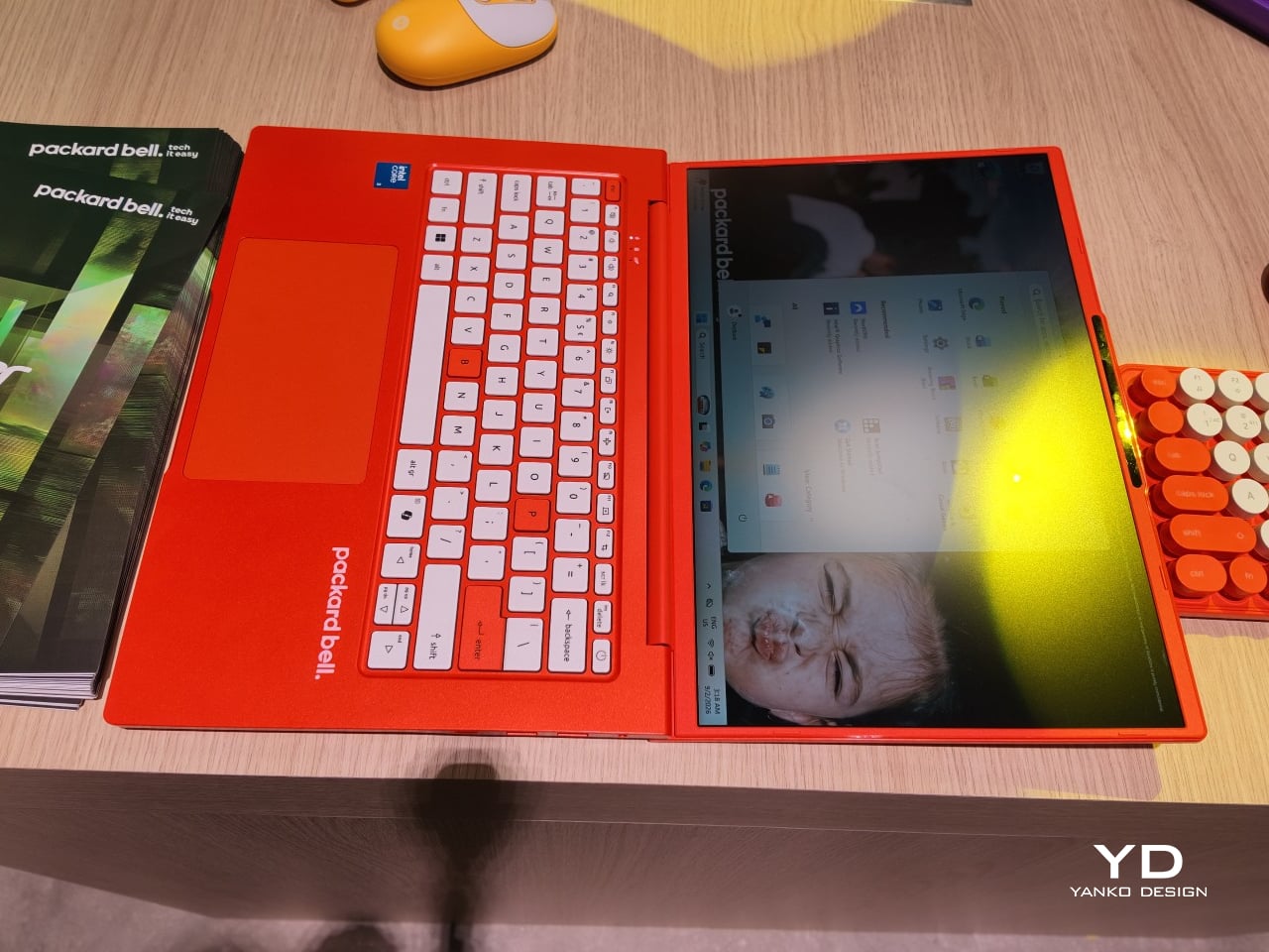
The DotBook carries the heaviest expectations as the collection’s flagship, a 14.5-inch laptop finished in a red-orange shell bright enough to spot on a crowded coffee shop table. Weighing under 1.3 kg and measuring just 17.9mm thin, it’s built for browsing, streaming, and everyday work rather than chasing benchmark scores, backed by up to 512GB of storage and 16GB of memory running quietly under Windows 11. It’s a laptop designed to disappear into a bag, not a spec sheet debate.

Designer: Acer

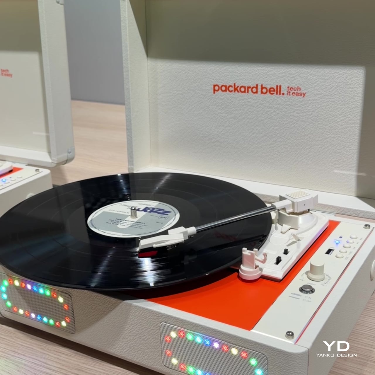
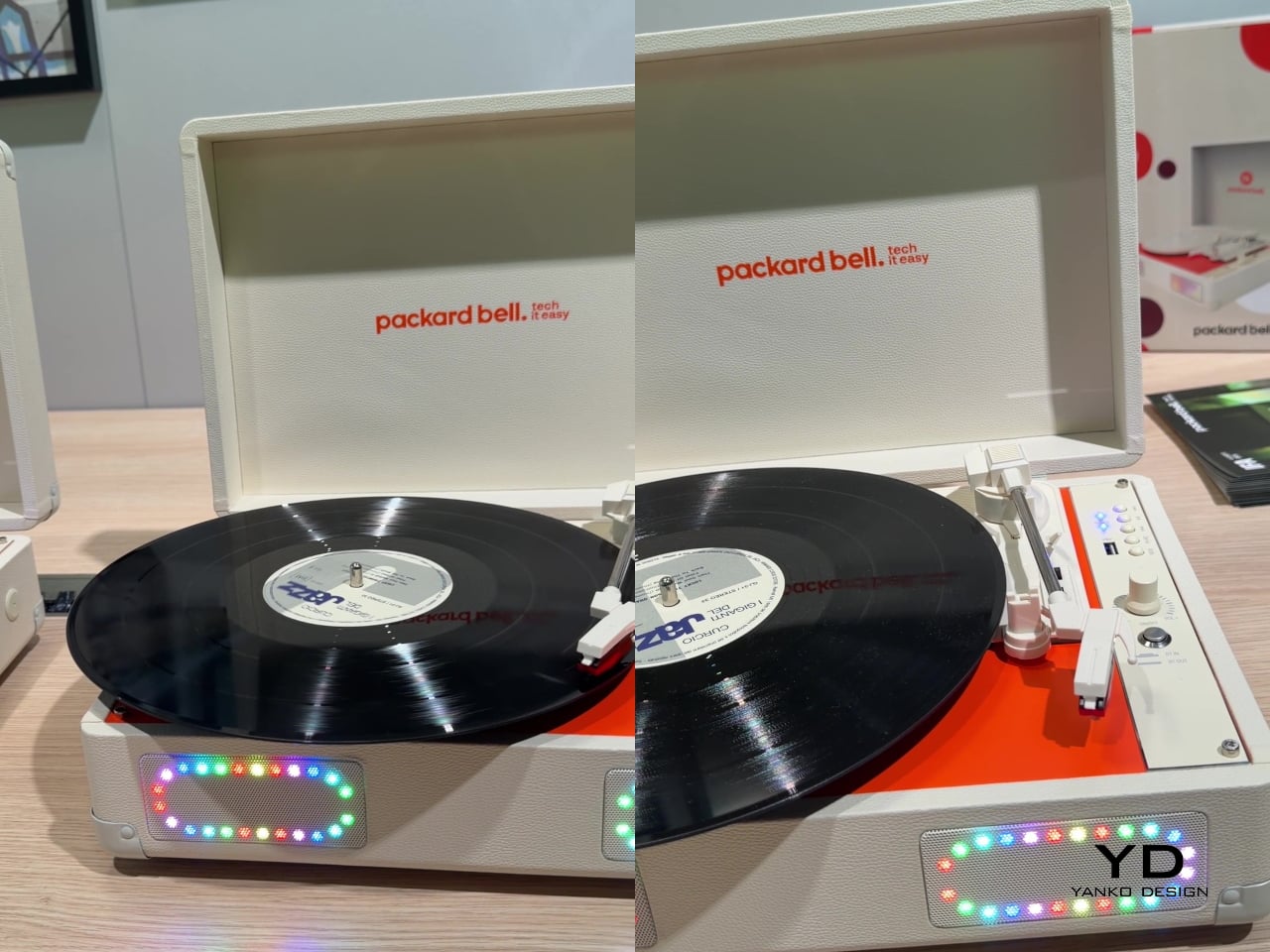
Where the DotBook plays it relatively straight, the DotLoop commits fully to spectacle. Housed inside an actual briefcase shell with a 1970s silhouette, the turntable pops open to reveal a working tonearm flanked by RGB-lit speaker grilles that glow while a record spins. Two built-in 3W speakers handle sound on their own, though Bluetooth and RCA outputs let the DotLoop hand audio off to a proper stereo system whenever the moment calls for something louder.

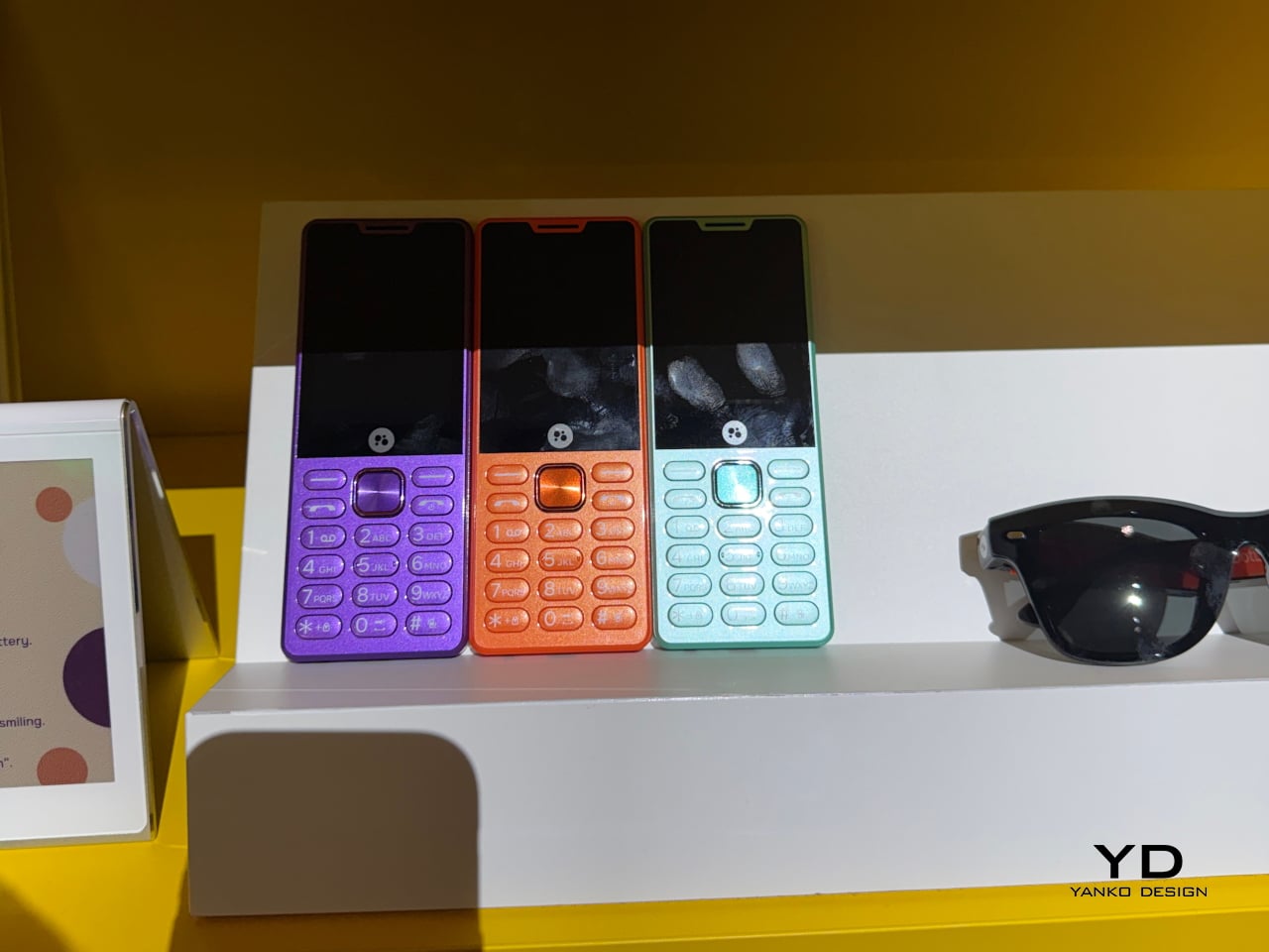
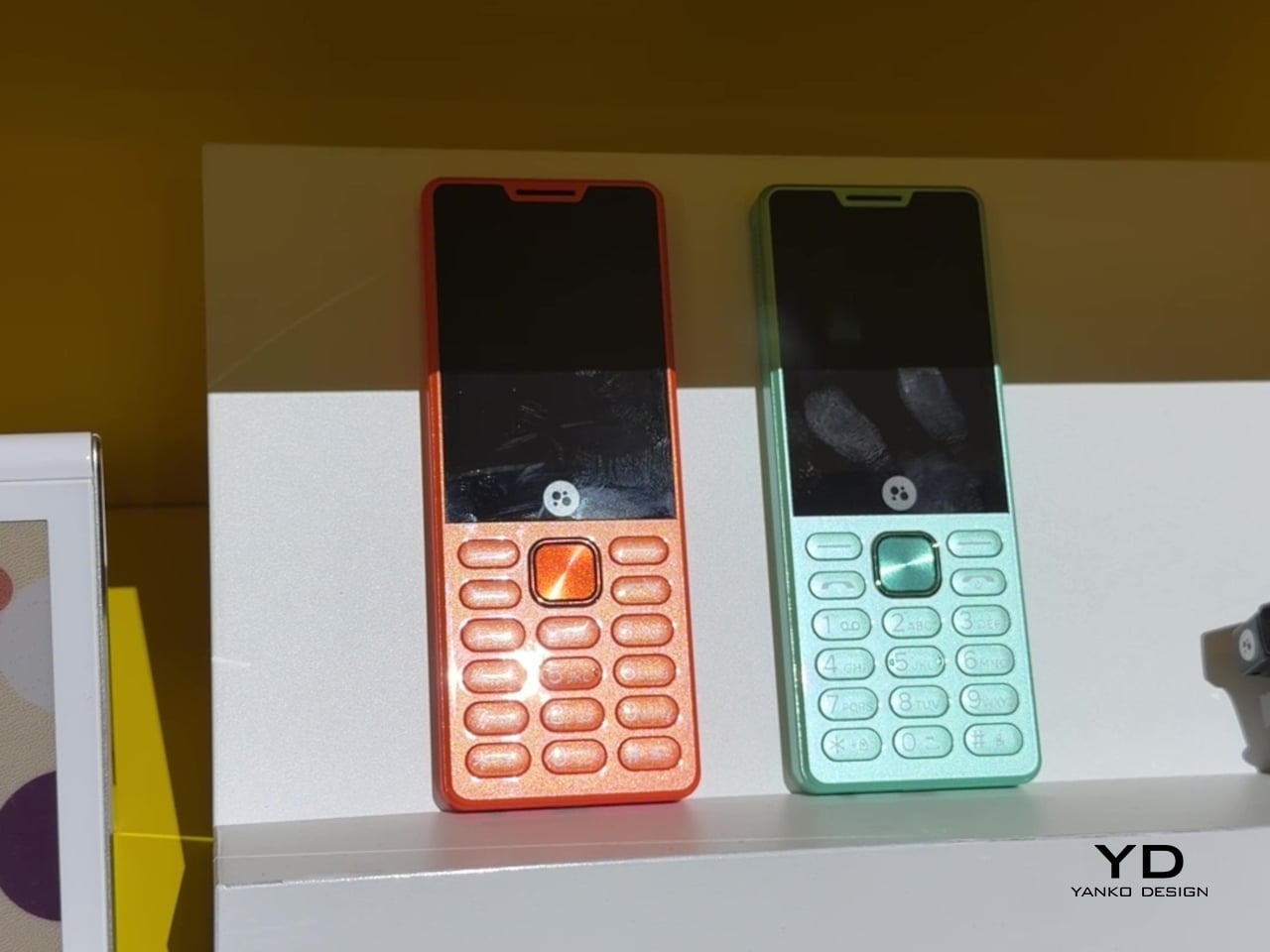
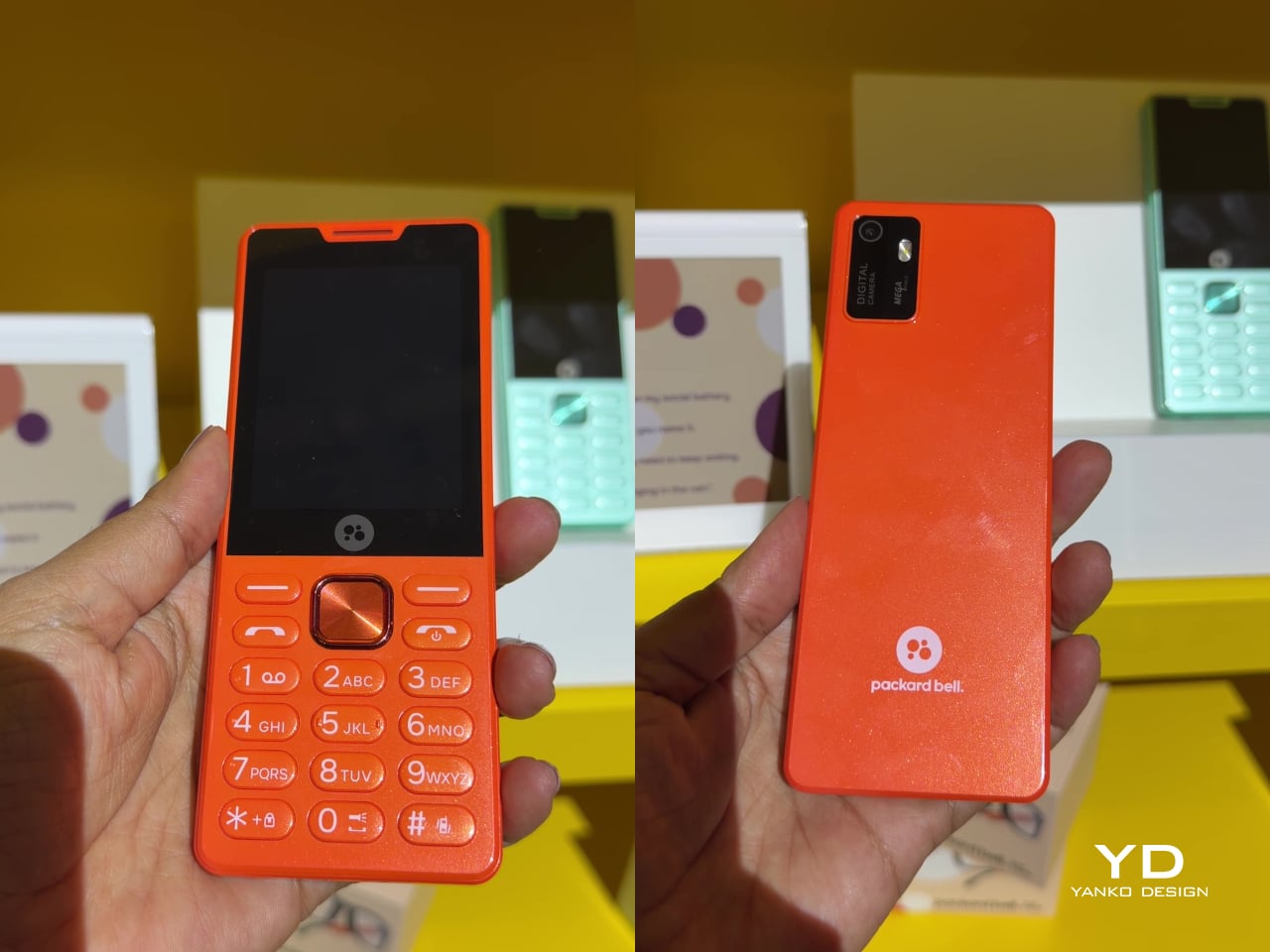
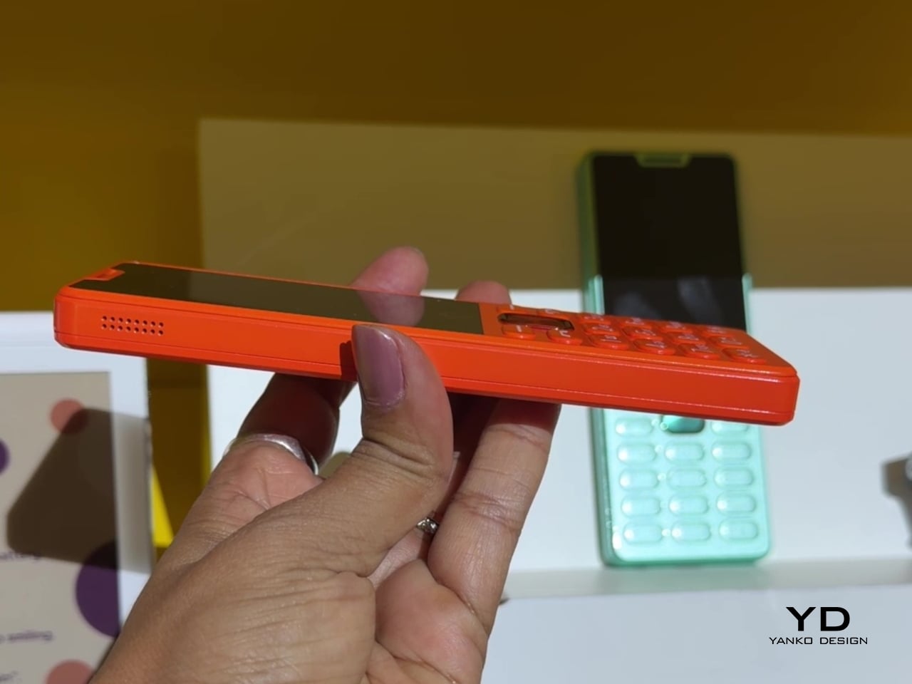
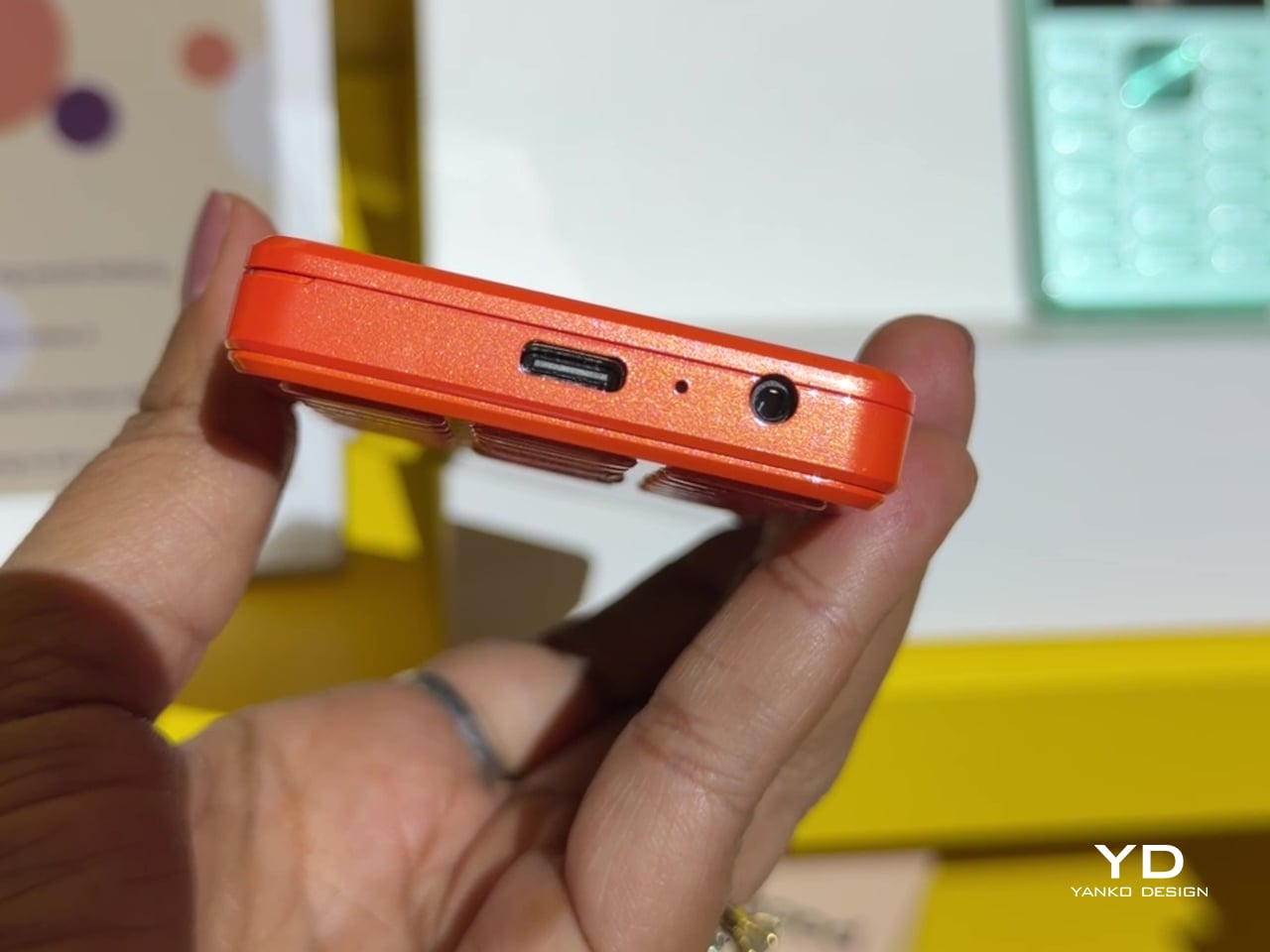
That willingness to have fun with format extends into the DotLine, a feature phone built for anyone tired of feeding a smartphone’s constant appetite for attention. A 2.8-inch display and physical keypad keep the experience deliberately simple, while an 1800mAh battery stretches across roughly two weeks between charges, a number that sounds almost mythical next to a modern flagship’s overnight anxiety. Four color options keep it from feeling like a consolation prize.

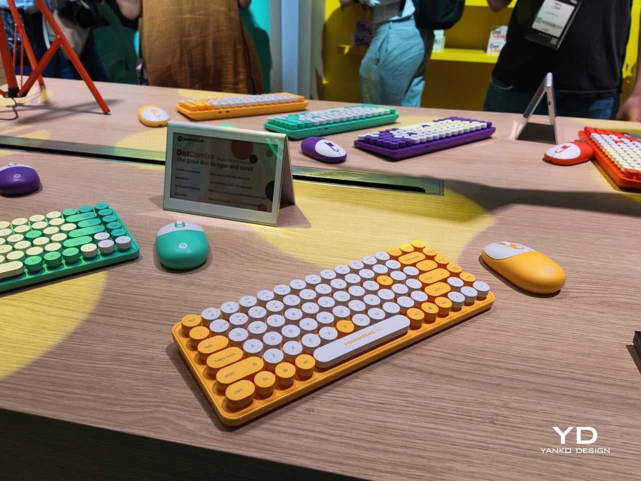
Rounding out the focus lineup, the DotCombo bundles a keyboard and mouse into a single color-matched purchase, eliminating the usual mismatched beige-on-black desk setup that so many peripherals default to. Both pieces run on rechargeable batteries good for hundreds of charge cycles, connecting over Bluetooth or a 2.4GHz receiver without a single AA battery required. Round keycaps borrowed from typewriter design give the whole thing a tactile, almost toy-like presence on a desk.

Beyond these four, Packard Bell rounds out its centennial collection with a portable speaker (DotTune), audio glasses (DotLook), a ring light for creators (DotShine), matching headphones (DotBass), and even a countertop food steamer (Steasy), all sharing the same saturated color palette and straightforward pricing. None of them ask for much attention individually, but together they paint a lineup unwilling to blend into a beige office shelf.

Pricing stays approachable across the board, with the DotBook starting around €499 (around $578), the DotLoop at €149 (around $173), the DotLine at €69 (around $80), and the DotCombo at just €39 (around $45). Packard Bell’s return proves that a century-old brand can still find something new to say, mostly by refusing to whisper it.

The post Acer’s Packard Bell Crashed IFA 2026 Like a Box of Crayons first appeared on Yanko Design.
  •  

This 32oz Bottle Carbonates Your Water in 3 Seconds, Wherever You Are

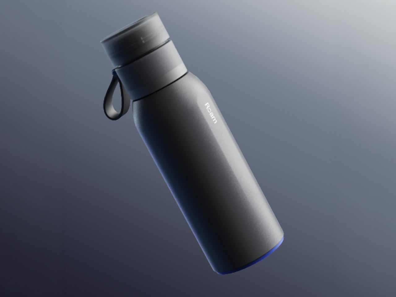
Most people who drink sparkling water have settled into one of two habits. They either haul home cans and bottles from the grocery store every week, or they own a countertop soda maker that never leaves the kitchen. The Roam SodaTop is designed for everyone caught between those options: a 32oz insulated bottle that carbonates still water on demand, wherever you happen to be.

The home soda maker does what it promises, but it’s also a fairly large appliance with a permanent spot on the counter and plastic bottles that aren’t built to travel. Your sparkling water stays fresh for however long it sits in the fridge. Step outside, and you’re back to buying packaged drinks. It’s a frustratingly common situation for something meant to be a simple habit.

Designer: Mohini Boparai

Click Here to Buy Now: $119 $199 ($80 off). Hurry, only 46/1150 left! Raised over $359,000.

That’s the gap the SodaTop fills. The system pairs a stainless-steel bottle with a compact carbonation mechanism powered by small CO2 canisters. The bottle was engineered to handle carbonation pressure, with specially threaded fittings that most regular water bottles simply aren’t built for. Roam describes it as the world’s first insulated bottle that instantly carbonates water, and looking at the category, it’s hard to argue with that framing.

Using it takes just a few steps: fill the bottle to the marked interior line, drop in the CO2 canister, and twist the cap into place. The water is sparkling in about three seconds, and a pressure-release mechanism keeps the carbonation locked inside until you’re ready to drink. There’s no pumping, no separate carafe, and the whole thing takes less time than opening a can.

What makes that genuinely useful is the size. The SodaTop is roughly one-fifth the footprint of a standard countertop unit, compact enough to slip into a bag or a kitchen drawer without drama. Whether it’s on a work desk, a hotel table, or brought along on a day out, fresh sparkling water goes wherever the bottle goes, which is something no countertop soda maker can claim.

The bottle itself does more than hold the mechanism in place. Triple-wall construction keeps drinks cold for up to 24 hours and ice for up to 48 hours, well ahead of the plastic bottles that come standard with most home soda systems. That thermal advantage also matters for carbonation, since cooler water retains CO2 more efficiently and keeps the fizz from fading before the bottle is empty.

On the inside, Roam uses what it calls MirrorTech, a mirror-polished steel surface that the brand says keeps carbonation crisp for longer, resists odor buildup between uses, and discourages flavor transfer. The wide-mouth opening makes adding ice and pouring easy, while a visible fill line inside takes the guesswork out of how much water to add for consistent carbonation every time.

The CO2 canisters are made from recycled steel and are fully recyclable, so when they’re empty, they go straight into the recycling bin with no return shipping involved. Roam positions the ongoing cost at as little as $0.55 per canister for subscribers, framing that as roughly half the cost of buying pre-packaged sparkling water. Cutting out single-use cans and bottles also noticeably reduces household waste.

Roam also offers Natural Flavor Essence Drops designed to pair with the SodaTop, available in eight varieties: Ginger Root, White Peach, Sicilian Lemon, Yuzu Lime, Blood Orange, Strawberry, Grapefruit, and Mango. All are zero calorie, zero sugar, and plant-based. They’re also certified keto, paleo, vegan, gluten-free, kosher, and non-GMO, so they turn sparkling water into a flavored drink without any of the sugar baggage.

The SodaTop comes in three finishes: Pebble, Sage, and Charcoal, each with a contrasting accent at the base that gives it a quietly distinctive look. The silhouette reads more like premium drinkware than a gadget, which is probably the whole point. It’s the kind of object that fits on a desk, gets tossed in a bag, and doesn’t look out of place in either setting.

Click Here to Buy Now: $119 $199 ($80 off). Hurry, only 46/1150 left! Raised over $359,000.

The post This 32oz Bottle Carbonates Your Water in 3 Seconds, Wherever You Are first appeared on Yanko Design.
  •  

This Foldable A2 Scanner Fits in a Bag and Doubles as a Live Presenter

Scanners haven’t changed much in how they occupy a workspace. A flatbed sits in the middle and claims that real estate whether it’s in use or not. Overhead models are more flexible, but they still tend to take up a fixed spot in any setup. For anyone working from a compact home office or shared studio, that trade-off rarely gets a proper answer.

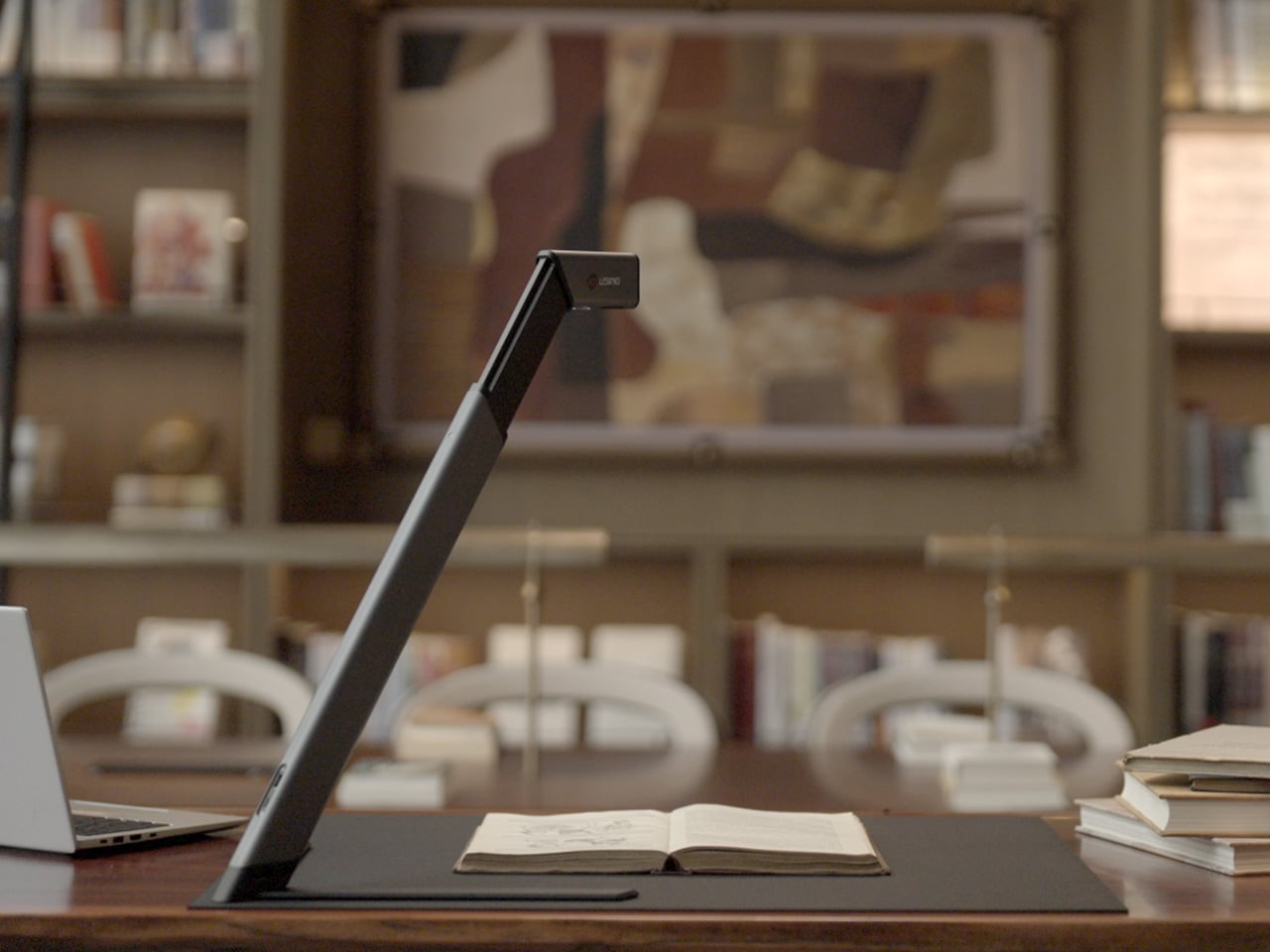
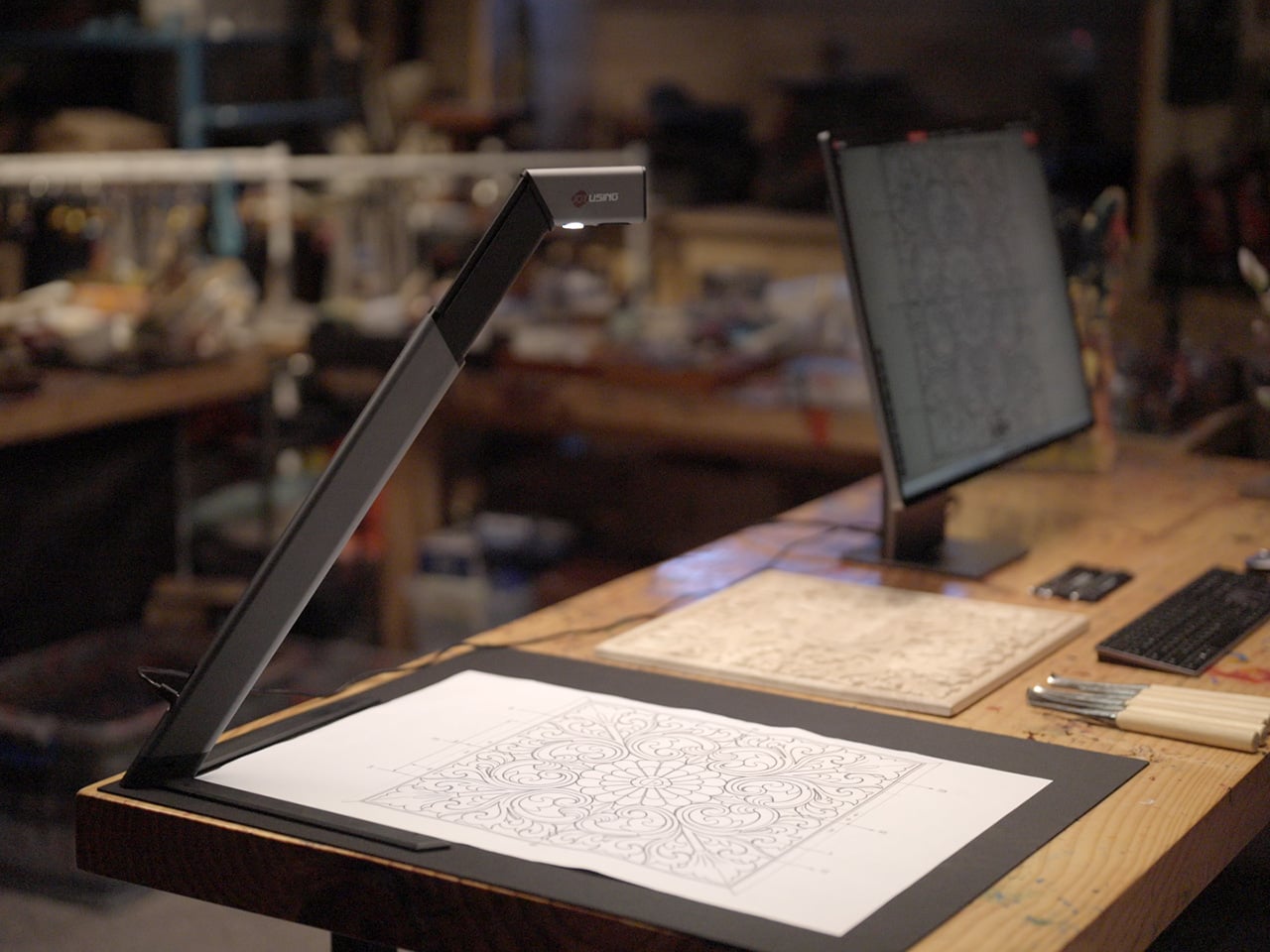
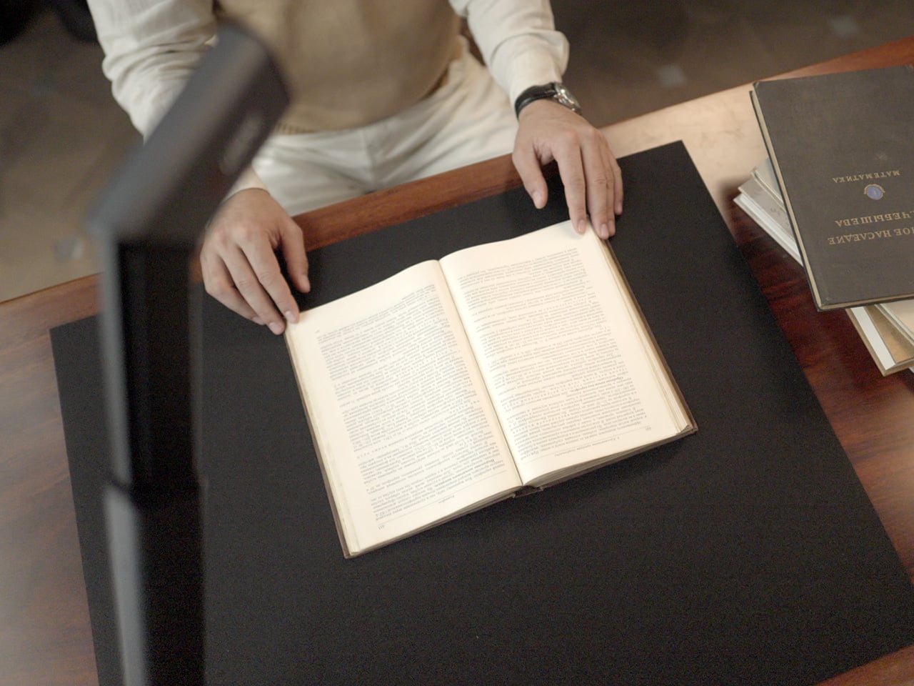
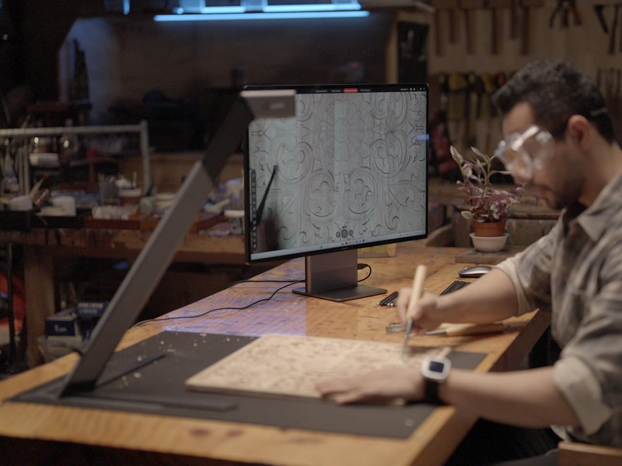
Joyusing’s ScanMax 320 approaches the problem from a different angle, quite literally. Rather than occupying the center of a workspace, it’s built to sit at the edge of a desk, positioned in the corner while its arm reaches overhead. It handles documents, books, artwork, and large-format materials up to A2 size, without taking over the surface it’s meant to serve.

Designer: JOYUSING

Click Here to Buy Now: $379 $649 (42% off). Hurry, only 32/220 left! Raised over $88,000.

Folded down, the ScanMax 320 measures 355mm x 68mm x 51mm, slim enough to slip into the included carrying bag and move between rooms without any effort. It runs entirely on USB-C power, so getting started means plugging in a single cable. There’s no proprietary adapter to hunt down, no driver installation ritual, and nothing complicated to deal with before the first scan. You can directly use the ScanMax 320 as a live presenter camera, and scanning as well as other advanced features simply require the free Joyusing Scanner intelligence software.

The shooting area extends to a full A2, or 594mm x 420mm, with a 32-megapixel sensor capturing at up to 380 DPI. That covers blueprints, double-page book spreads, large technical drawings, and oversized artwork in a single pass. An intelligent auto-switching system detects whether the material is A2 or A3 and adjusts accordingly, so there’s no manual input needed between sessions.

Overhead scanners tend to have a lighting problem, particularly near edges or when capturing materials that aren’t perfectly flat. The ScanMax 320 uses a rectangular illumination system shaped to match the scanning area, distributing light evenly and keeping shadows from washing out fine detail near the sides. Three brightness levels, at 30%, 70%, and 100%, are accessible with a single touch for quick adjustments in different environments.

Book scanning is where overhead devices tend to earn their keep, and also where they tend to frustrate. Pages curve at the spine, fingers get in the way, and binding shadows creep in from the edges. The ScanMax 320’s software handles most of this automatically, applying auto-flattening, finger removal, de-skewing, and shadow removal without manual adjustment. Book mode, paired with the included finger cots, keeps pages steady for continuous capture.

Once everything is captured, the software’s OCR engine converts printed text into editable, searchable files, with support for 180 languages and export options including Word, PDF, and TXT. A page of Japanese text, a technical report, or a multilingual research paper can go from physical to fully searchable in seconds, turning raw captures into documents you can actually search, copy, and share.

What’s less obvious about the ScanMax 320, and arguably more interesting, is that it also functions as a live visual presenter. Point it at a printed page, a hand-drawn sketch, or a physical object, and the feed goes live to whatever screen or projector it’s connected to. For a teacher going through annotated notes or a designer reviewing a layout with a client, that extra mode earns its place quickly.

Software compatibility covers Windows, macOS, and several Linux distributions including CentOS, Ubuntu, and Debian, though macOS users will find some features limited compared to the Windows version. Everything connects over USB-C, keeping the setup free of dongles and extra cables. Built-in annotation tools allow for direct markup of scanned content, which makes it easier to prepare materials before presenting or sharing them.

There’s something refreshingly considered about a scanner built to work with your desk rather than on top of it. The ScanMax 320 doesn’t ask you to clear space or rearrange anything. It folds, parks at the edge, and gets on with the job. Whether you’re archiving a collection, digitizing a sketchbook, or presenting something in a meeting, the fact that it stays in its corner is, in itself, the point.

Click Here to Buy Now: $379 $649 (42% off). Hurry, only 32/220 left! Raised over $88,000.

The post This Foldable A2 Scanner Fits in a Bag and Doubles as a Live Presenter first appeared on Yanko Design.
  •  

This $99 Trackball Has Gesture Controls That Work Without Any Software

The computer peripheral market has always been more experimental at its edges than in the mainstream. Ergonomic trackballs, in particular, have attracted a devoted following among power users, but the options tend to cluster at two extremes: consumer-facing products with locked-down firmware, and niche open-source hardware that trades polished finish for deep customizability. Finding something that genuinely does both has rarely been straightforward.

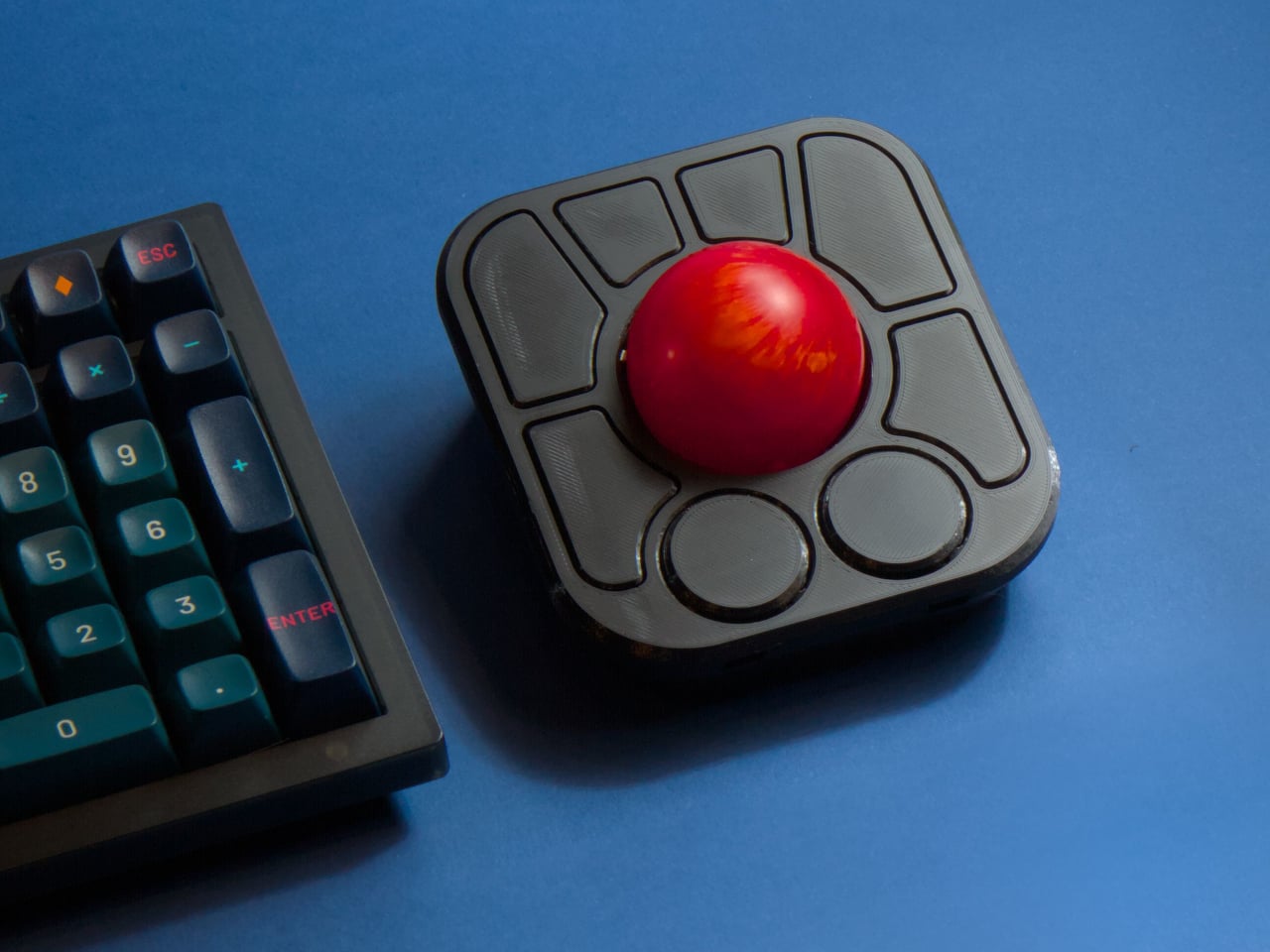
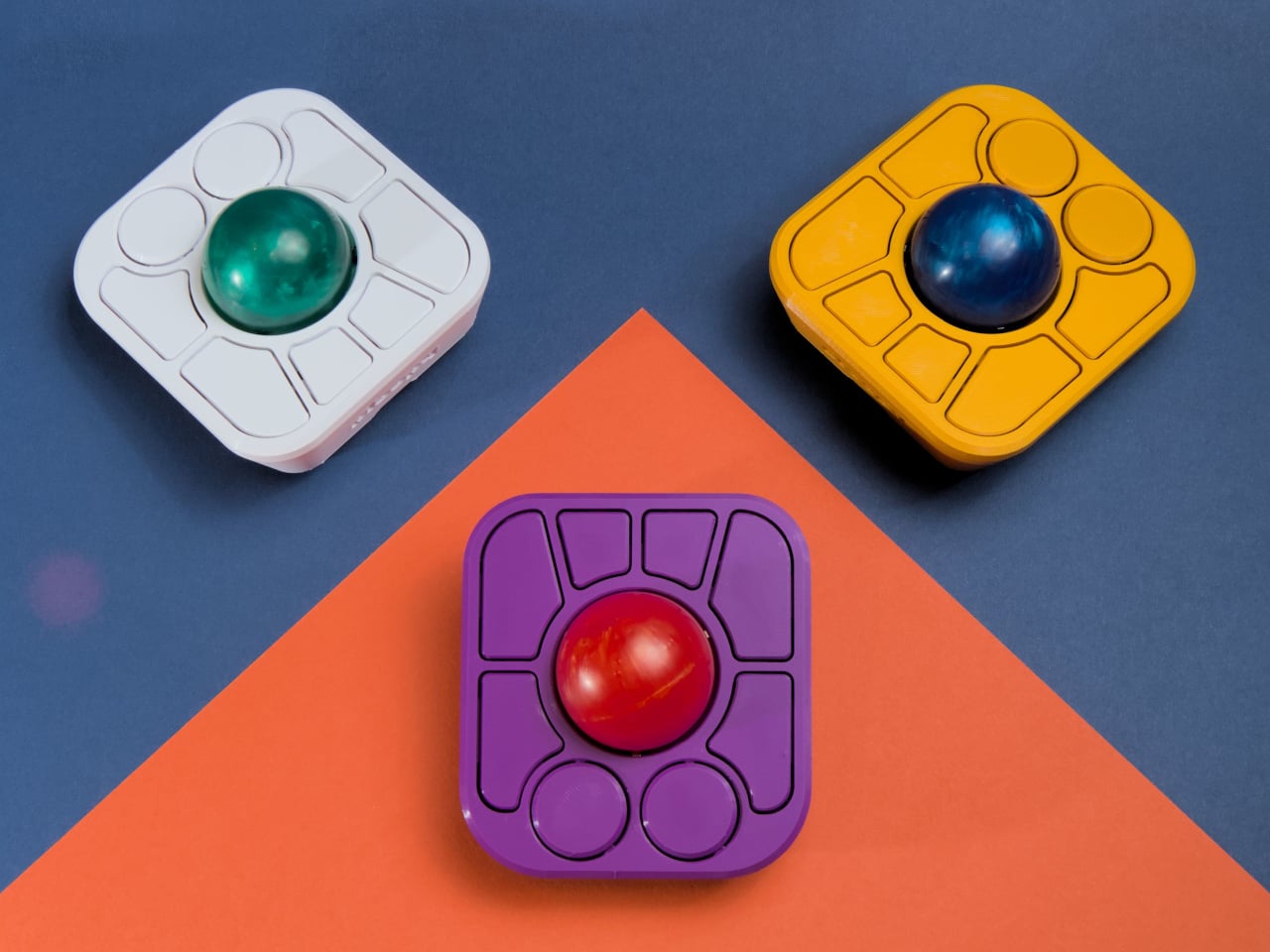
Ploopy’s Adept trackball made a compelling case for the latter category, earning a loyal following with its open-source, 3D-printed design and QMK compatibility. But it always felt like it had more to say. Its circuit board had always reserved space for two more switches that never made it to production, and the base had slots for a wrist rest that never materialized. The A+ is that unfinished story, now finished.

Designer: Ploopy

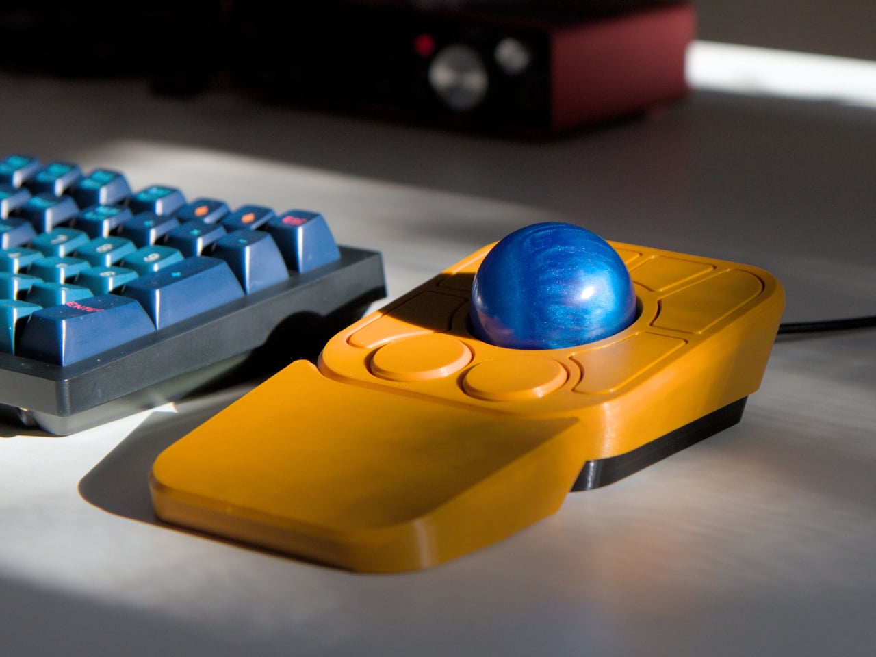
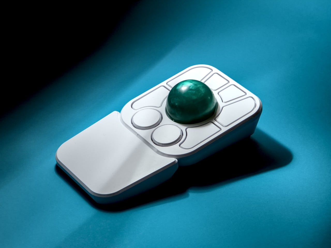
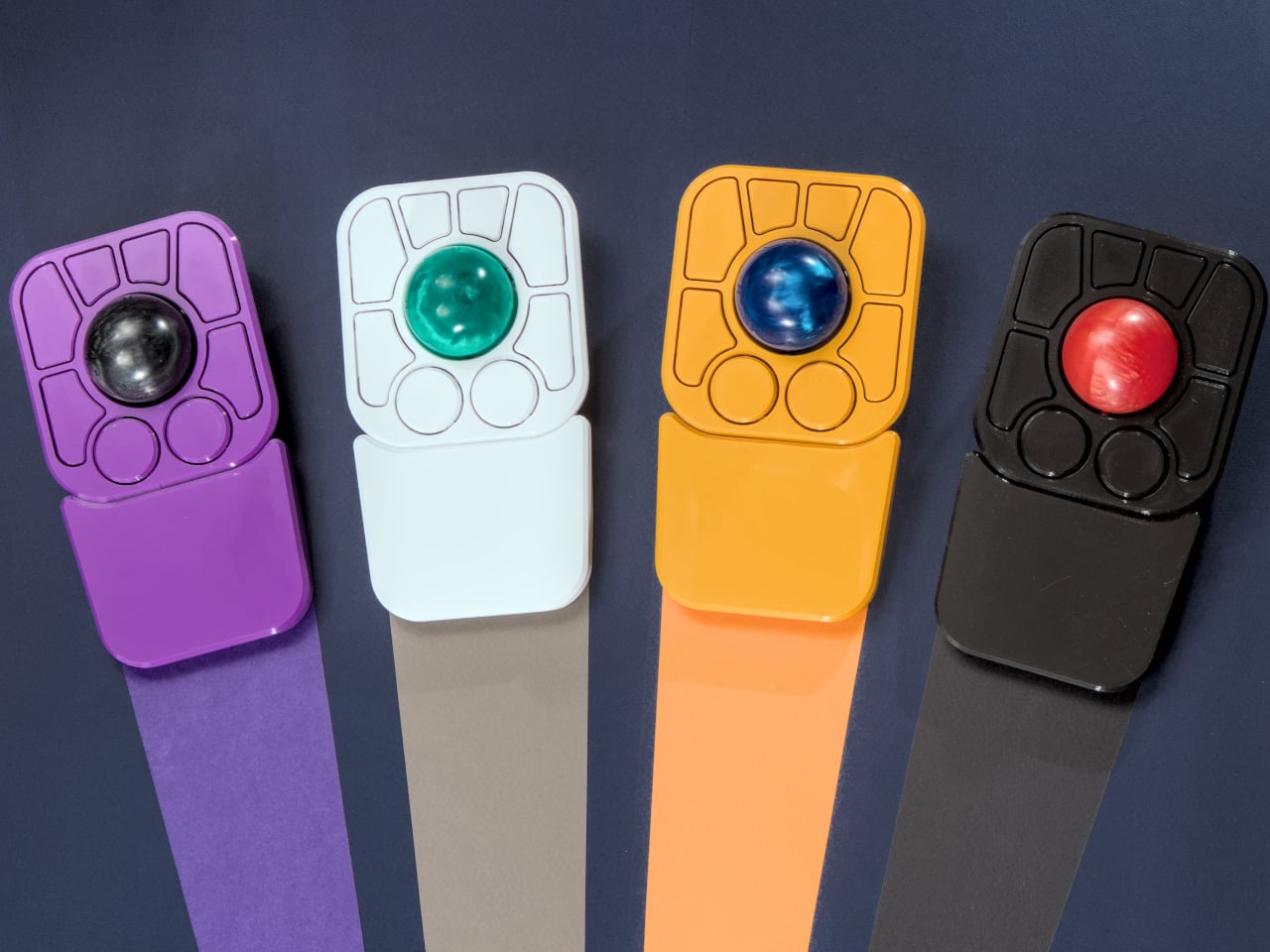
The most visible addition is the button count. The Adept had six; the A+ has eight, two of which also function as knobs. Out of the box, the knobs handle high-resolution vertical and horizontal scrolling, but both are fully reprogrammable for other functions. That dual-purpose approach keeps navigation and control within a single hand without needing a separate scroll wheel or accessory sitting alongside it.

The gesture system is arguably the more interesting addition. Hold a button and flick the ball in any of eight directions, and the device fires a command. By default, the left knob activates cut, copy, paste, desktop switching, and media controls. For someone who lives inside a browser and a text editor all day, that’s a significant amount of functionality without ever lifting a hand off the device.

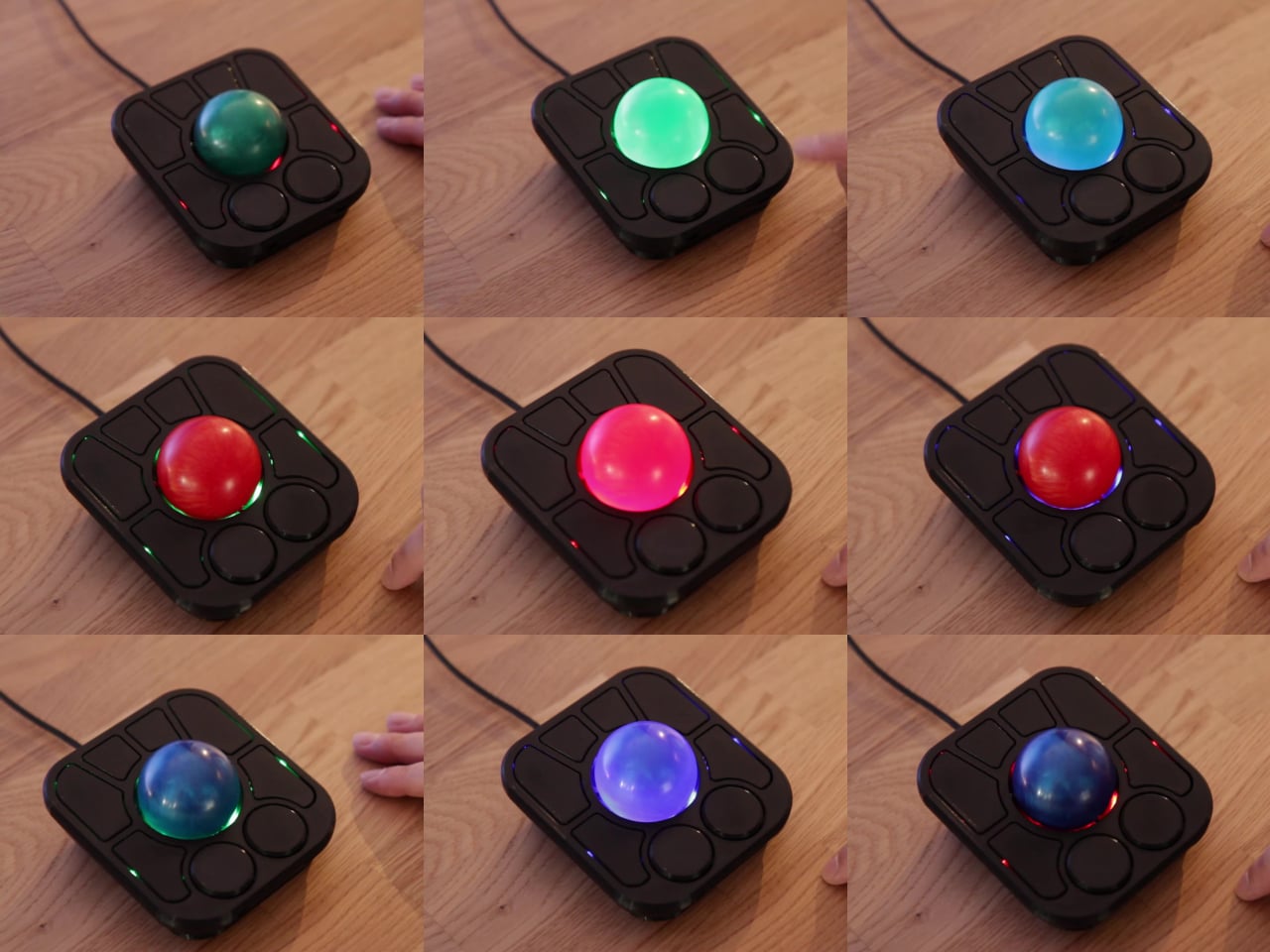
Layers add another dimension. The A+ has two: a navigation layer for everyday use and a control layer accessed via the right knob. The control layer handles on-device configuration, covering left-hand mode switching, toggling between high-resolution and stepped scrolling, and other adjustments. It’s the first trackball to bring this kind of layered behavior, working entirely without any software running on the host computer. There are also two bright LEDs that can be used to visually tell you what layer you’re on without having to rely on some embedded screen.

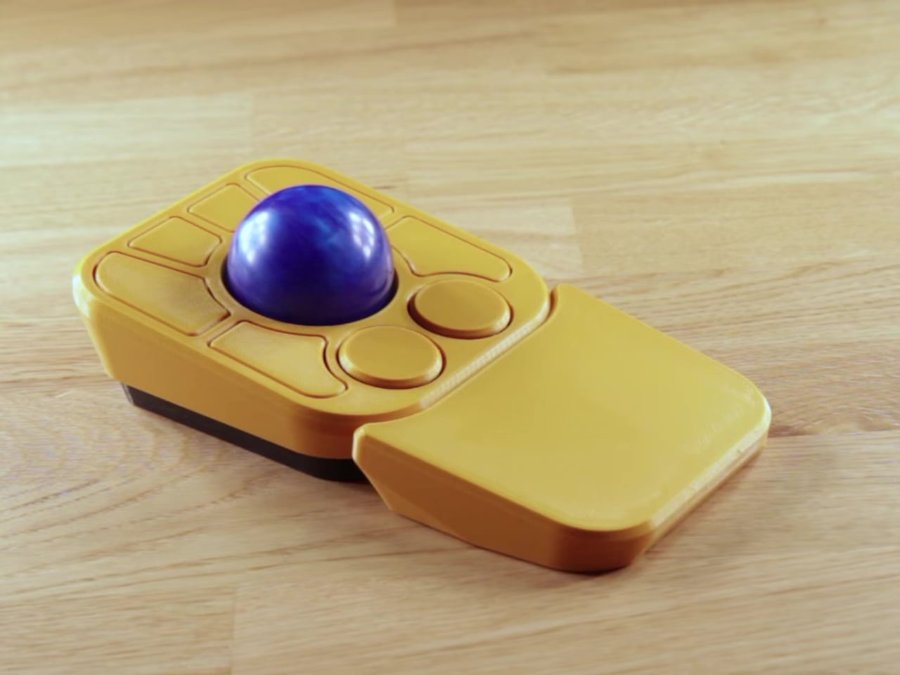
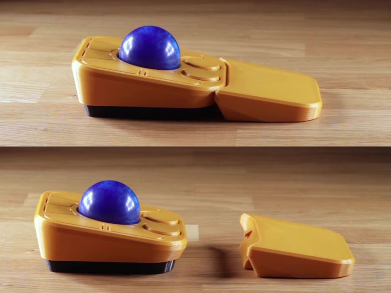
The detachable wrist rest is another long-promised feature that finally arrives with the A+. It slots in or out during use and can be screwed on permanently if preferred. The device stays ambidextrous throughout, and its 3D-printed shell means the community can print modified bodies, alter the layout, or swap in custom colors. That kind of adaptability isn’t an afterthought; it’s part of how the whole thing is designed.

The Pixart PMW-3360 sensor carries over from the Adept, running at a 1,000Hz polling rate with the tracking accuracy that has made it a standard for performance-oriented pointing devices. Omron D2LS-21 switches handle the physical buttons. The firmware remains QMK, configurable through VIA, with all design files, firmware, and assembly instructions freely available on GitHub. Kits start at $99 CAD.

The post This $99 Trackball Has Gesture Controls That Work Without Any Software first appeared on Yanko Design.
  •  

This Desk Lamp Puts a Spotlight in a Ring Light With One Knob

Desk lighting has long been a compromise between task and atmosphere. Professional lamps tend to lean one way or the other: too directional and harsh for extended use, or too diffuse to support fine detail work. A lamp that’s good for examining physical samples often isn’t comfortable over long stretches, and one that’s gentle on the eyes doesn’t always deliver when you need a hard, directed beam.

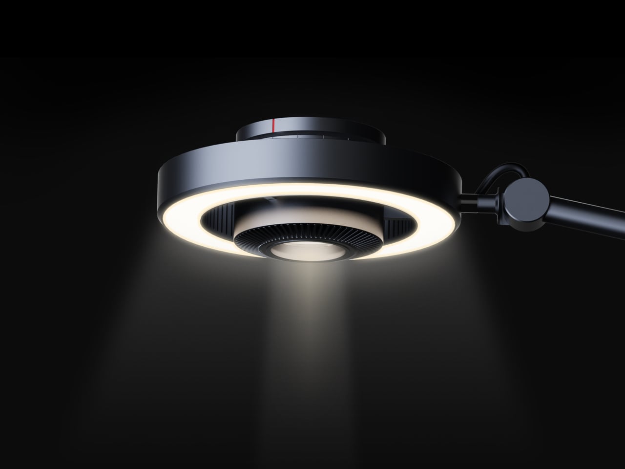
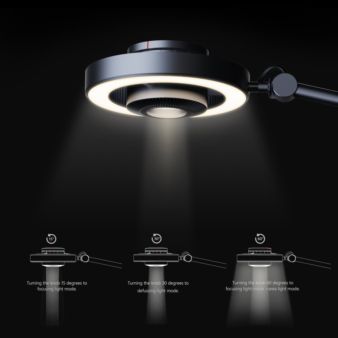
The Focus Light is a desktop lamp concept built around a different premise. Rather than committing to one kind of output, it combines two independent light sources into a single lamp head, giving the user the ability to shift between a precise, concentrated beam and a broad ambient glow, or run both at once. All of it’s controlled by a single rotary knob, and there aren’t any menus, apps, or extra switches involved.

Designers: Zhen Yang, Siting Lin

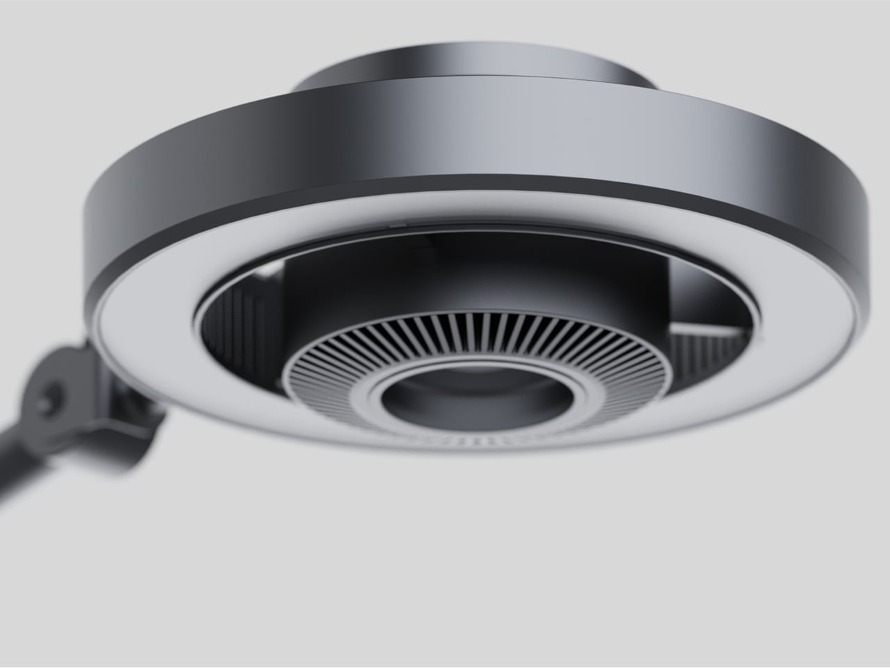
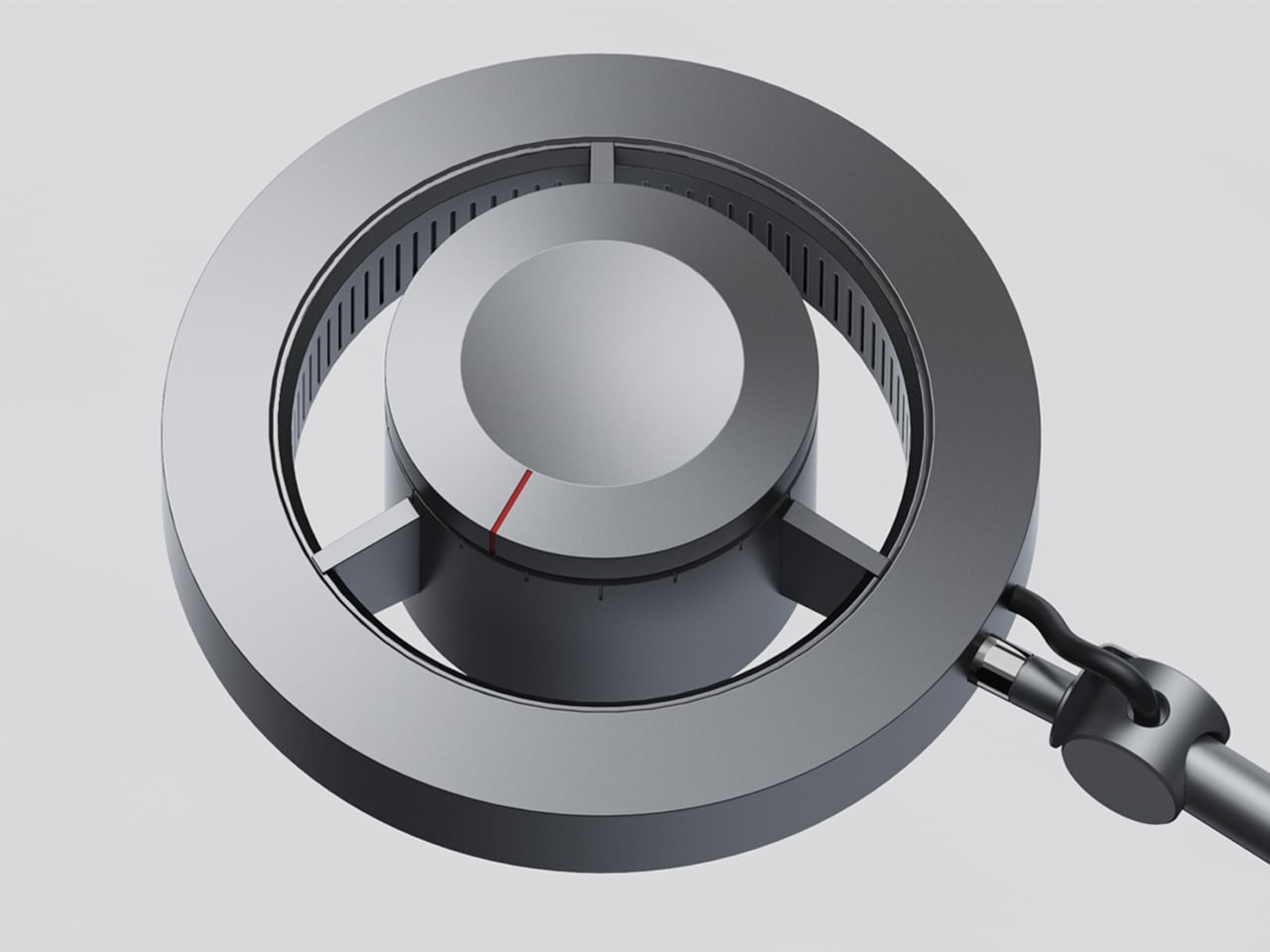
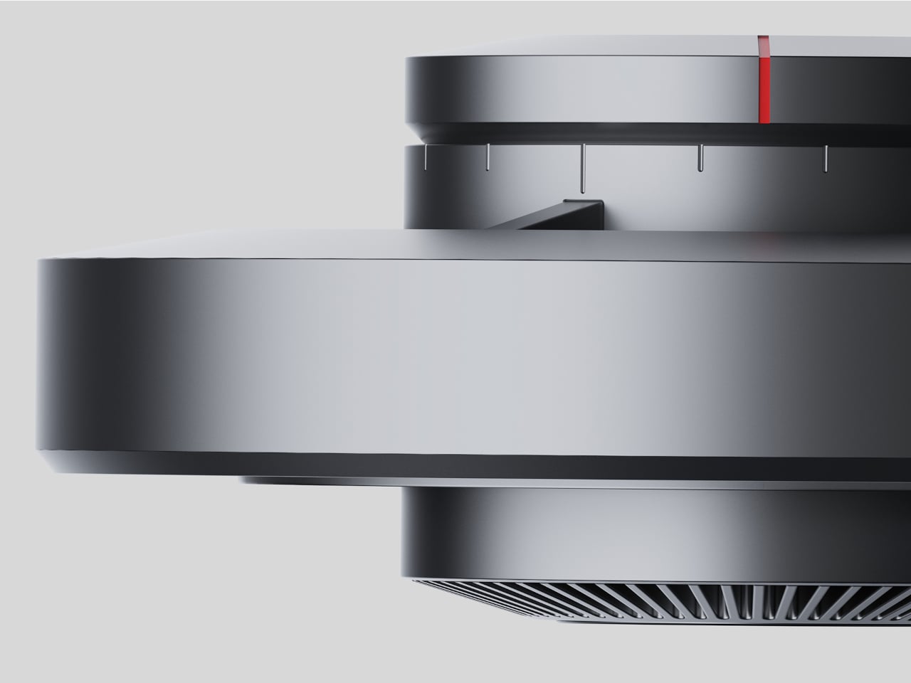
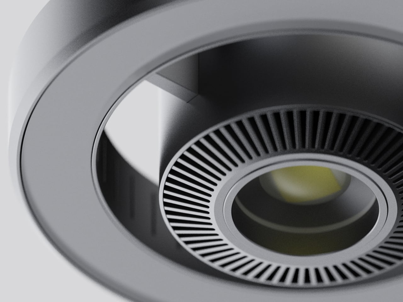
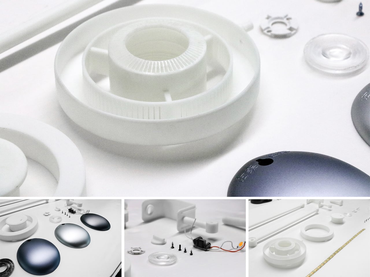
The lamp head is organized concentrically: an outer ring delivers ambient light while a central optical lens handles the focused beam. That layout has both functional and visual logic to it. Both sources sit in deliberate, concentric relation to each other, and the overall form looks as precise as it performs. The whole thing is finished in space gray metal, which lends it a professional, precision-tool character.

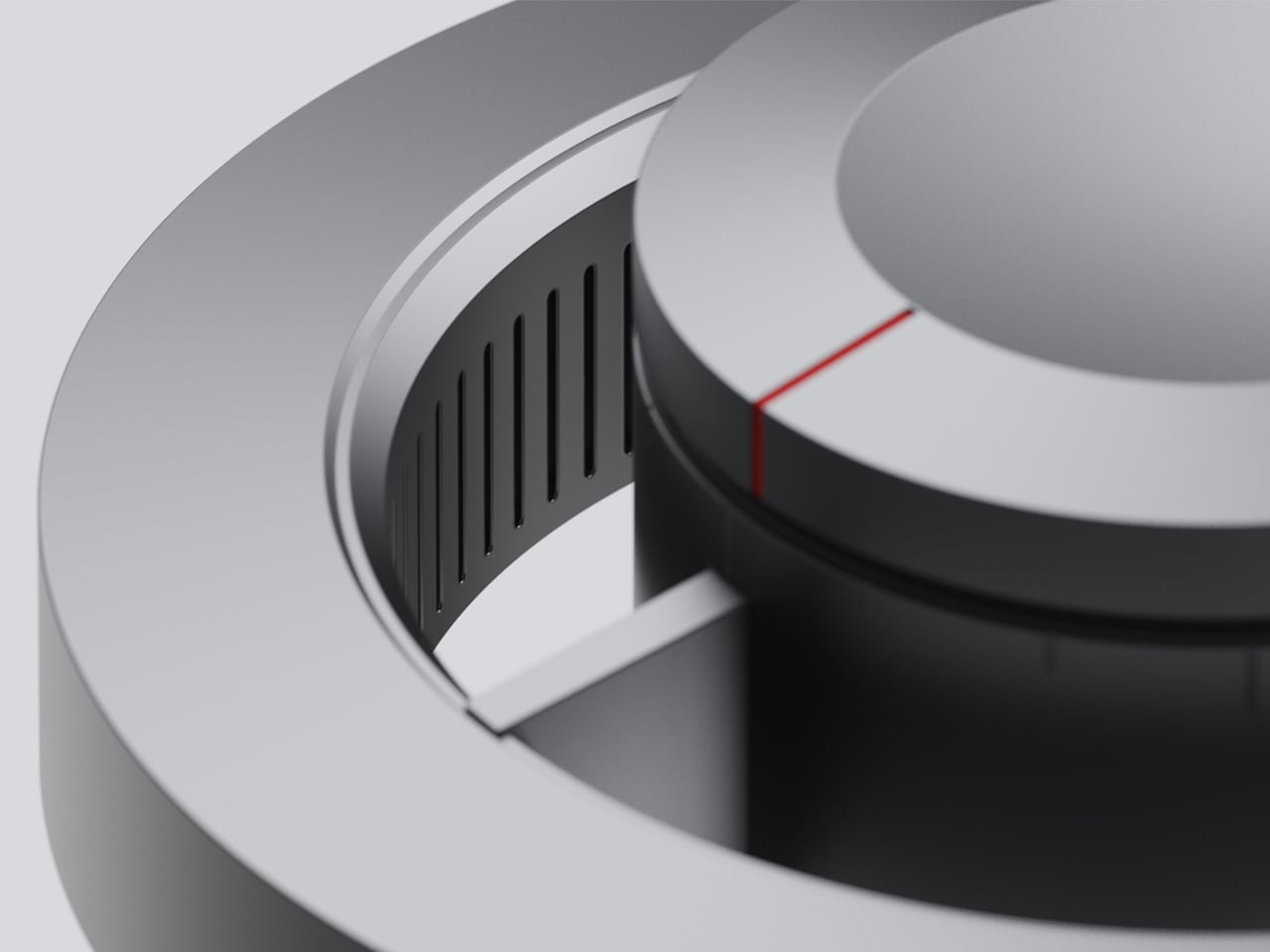
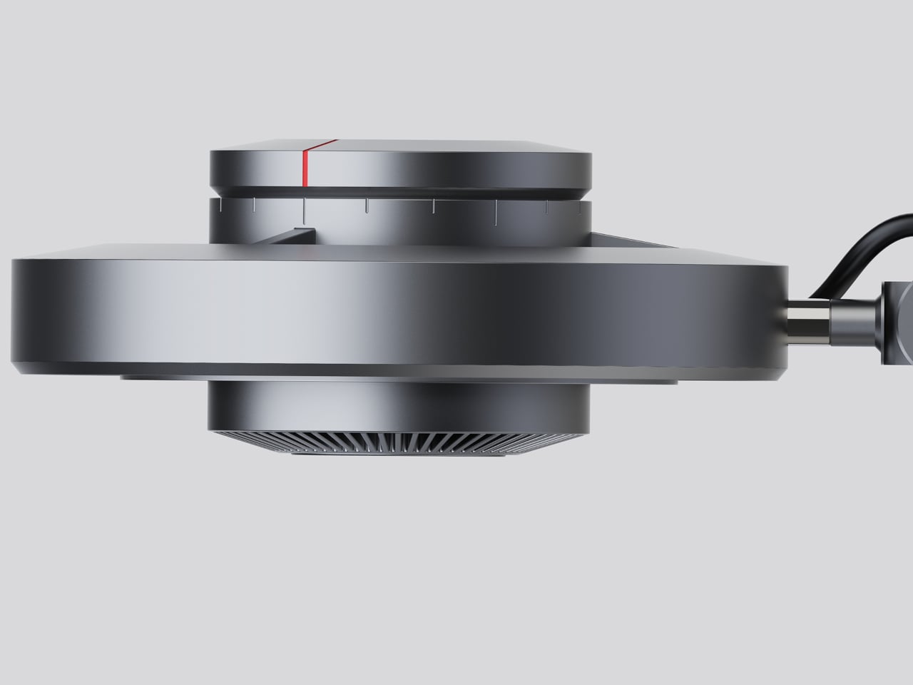
Control comes from a rotary knob on top, marked with a red indicator line. Rotating it 15 degrees activates focusing mode, sending a tight, concentrated beam straight down. At 30 degrees, the lamp shifts into diffusing mode, spreading the output into something closer to fill light. Push it to 60 degrees, and both sources run simultaneously, combining the central spot with the ambient ring for a layered workspace light.

For detailed hands-on tasks, being able to shift between modes without touching an app or dimmer panel makes a real difference. An illustrator tracing fine lines benefits from the precision of the focused beam, but that same beam creates harsh contrast against a dark surrounding surface. Bringing in the ambient ring softens that contrast, and having both running at once makes moving between close-up precision work and wider desk visibility much more seamless.

The same flexibility serves anyone who switches between different types of work at the same desk. Reading calls for something even and non-glare; marking up documents or working with small physical components benefits from a harder, more directed light. The Focus Light doesn’t ask the user to swap lamps or reposition the arm for each shift. The knob handles it, and the change is immediate.

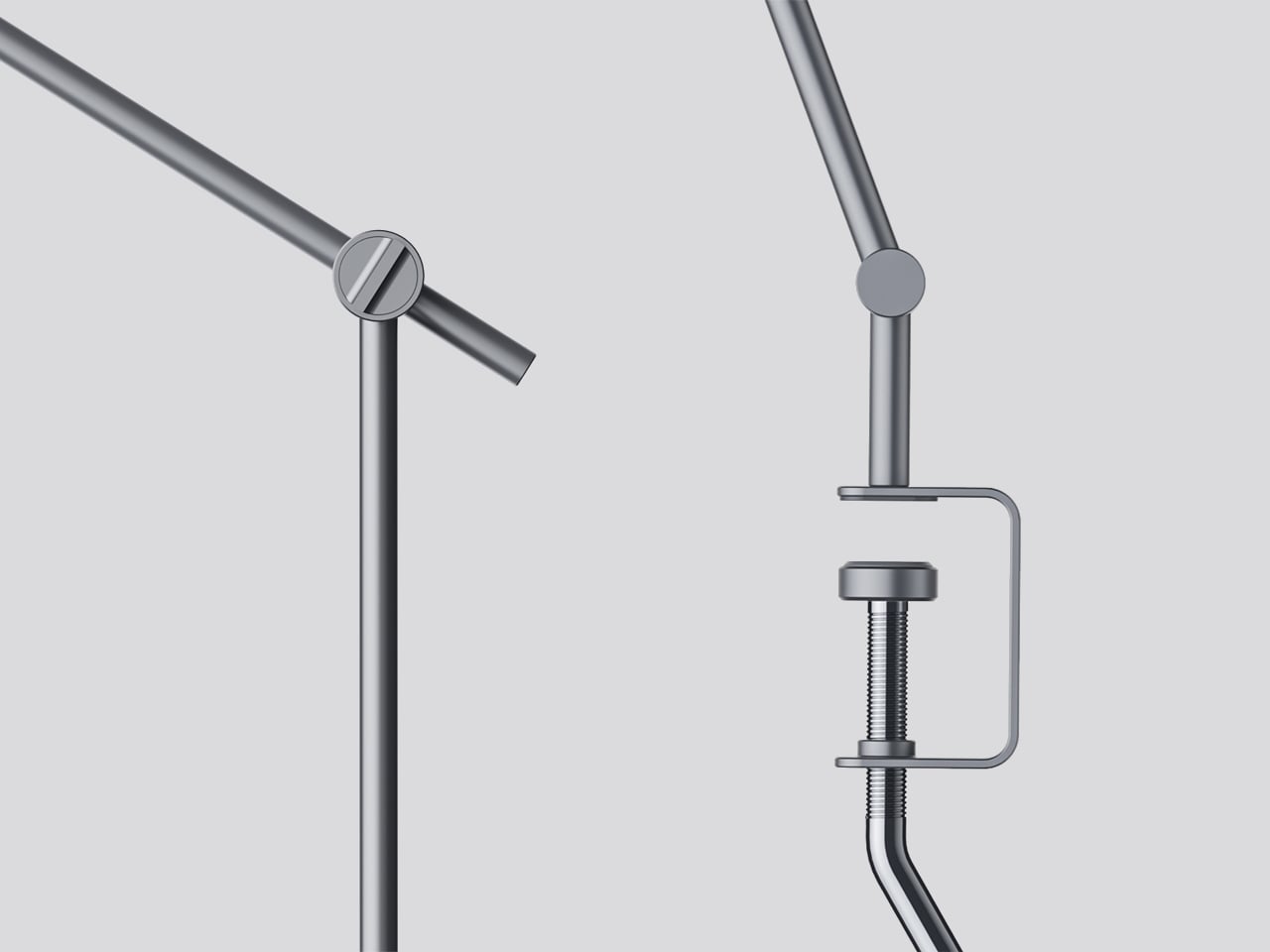
The physical form reflects the precision the lamp is meant to support. The lamp head is a clean disc with radiating heat fins arranged around the inner lens assembly, and the arm connects at a ball joint that allows repositioning without loosening a series of screws. A threaded desk clamp handles the mounting, so it doesn’t demand a grommet hole or take up surface area with a weighted base.

What stands out about the concept isn’t just the dual-source setup, but that a single physical control manages both. There’s no menu to scroll, no app to open. The red indicator on the knob tells you exactly where you are, and the three positions are distinct enough that you’d find your way back to any of them by feel after just a few days.

The post This Desk Lamp Puts a Spotlight in a Ring Light With One Knob first appeared on Yanko Design.
  •  

Droplet Finally Built the Audio Amplifier for Your Home Fragrance

Home fragrance, for the most part, has been a market of compromises. Scented candles are warm and atmospheric but burn through a fragrance’s more delicate top notes in the process, gone with the smoke. Reed diffusers take a gentler approach but dilute the oil with water, delivering something noticeably thinner than what was originally intended. Neither gives much meaningful control over how much scent actually fills a space.

Droplet’s Scent Amplifier takes a fundamentally different approach, one that borrows more from audio than from aromatherapy. The idea is to treat scent the way a good amplifier treats sound: amplify it faithfully without altering what’s already there. Instead of heat or water, the device uses pressurized air to atomize neat fragrance oil into micro-particles, so what reaches you is the fragrance exactly as it was composed.

Designer: Droplet

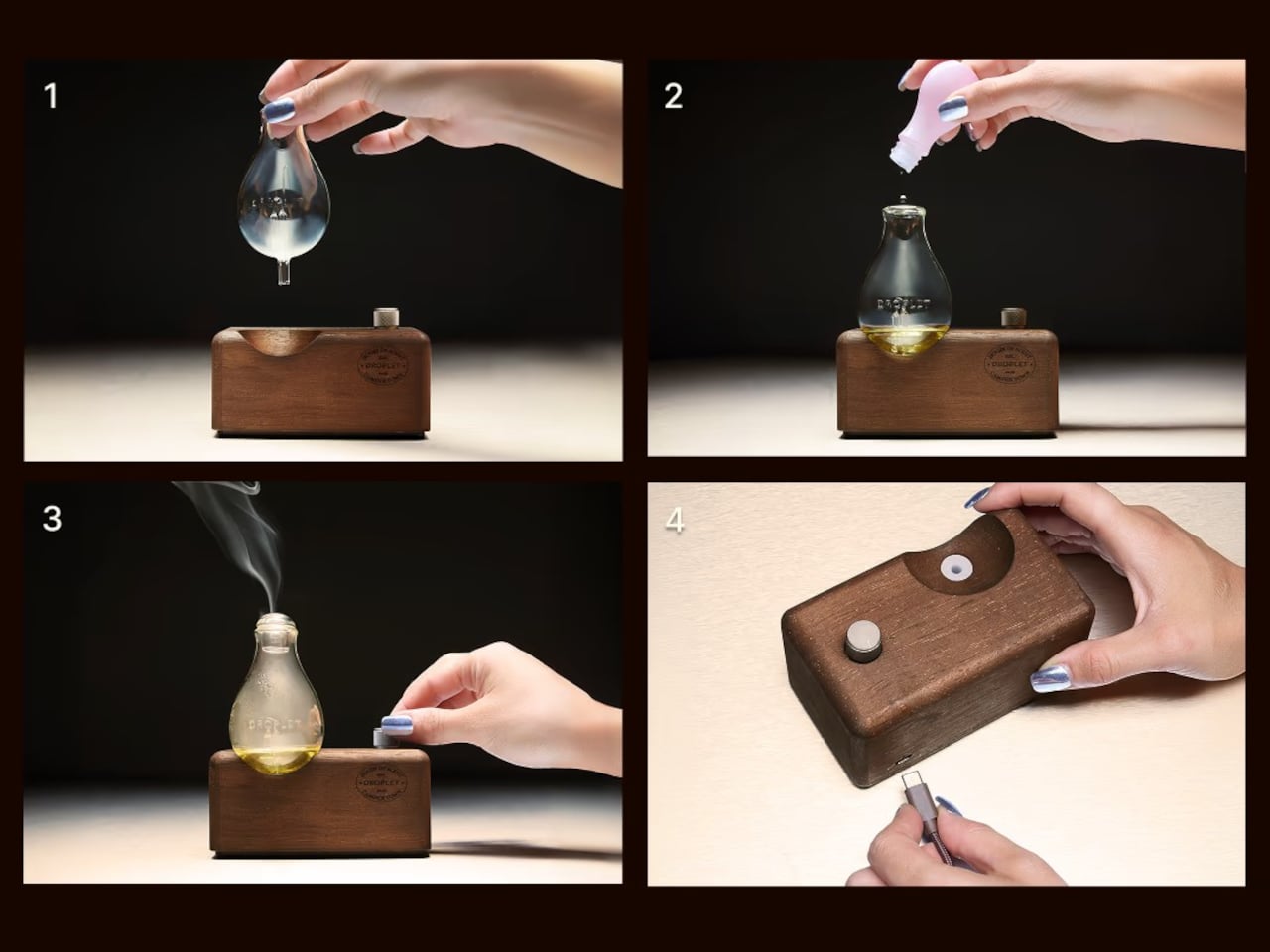
That analogy isn’t just conceptual; the physical form carries it well, too. The Scent Amplifier is built around a walnut-toned wooden base, with a hand-blown crystal glass vessel sitting on top that’s shaped much like a vintage light bulb. A single oxidized silver dial handles all the control. When switched on, the base emits a warm, tungsten-like glow that rounds out the valve-amp look completely.

Unlike most home-fragrance gadgets that quietly get shuffled out of sight, this one’s meant to be displayed. Droplet designed it to sit in a living space as a sculptural object rather than pass as a functional appliance. And it holds up to that treatment. It has the quiet confidence of something that belongs in a room rather than something that just happens to be sitting in one.

Using it is simple enough. Fill the glass vessel with oil, turn the dial to the preferred level, and the device handles the rest. It diffuses fragrance for three minutes, rests for two, and repeats, keeping the scent consistent rather than releasing it all at once. Only four to six drops are needed for an average-sized room, and a 10ml bottle lasts roughly a month.

On a full USB-C charge, it runs for up to 15 hours of cordless diffusion, which means it isn’t tied to a wall socket or any fixed spot. That’s a more practical detail than it might seem. You can move it to the bedroom before winding down for the night, or take it out of the study when you’re done working, without losing anything.

The six fragrance oils that pair with it were developed in Grasse, France, essentially the historical heartland of perfumery. The range covers floral, fruity, citrus, earthy, and woody profiles, each tied to a specific place in the world. You can go from fig leaf and cedarwood to orange blossom and tuberose, or something brighter like wild berry and bergamot, without much fuss. All six are vegan and cruelty-free.

The glass vessel is refillable, and switching between scents takes under a minute with no residue left behind. The Scent Amplifier costs £80 on its own, with the full six-oil set running £125. That’s not bad for something that does away with all the usual trade-offs, keeps the fragrance pure, and looks good enough on a sideboard that you’d actually want to leave it out.

The post Droplet Finally Built the Audio Amplifier for Your Home Fragrance first appeared on Yanko Design.
  •  

This Cork Cactus Looks Like Decor and Acts Like 3 Pieces of Furniture

Coat stands have always occupied an awkward position in a room. They’re functional enough to keep around but rarely considered anything beyond a place to pile things on the way out the door. Pin boards face a similar problem, useful at a desk but hard to integrate into a living space without making it feel like an office. Objects that try to do both tend to resolve that tension poorly.

Corctus starts from a different premise. The name merges “cork” and “cactus,” which is also a fair summary of the concept: a floor-standing object shaped like a saguaro cactus, made entirely from cork, and quietly capable of handling most of what people need to keep close at hand. Rather than solving the storage problem with hooks and brackets, it solves it by making the form itself the function.

Designer: Liam de la Bedoyere (boredeye)

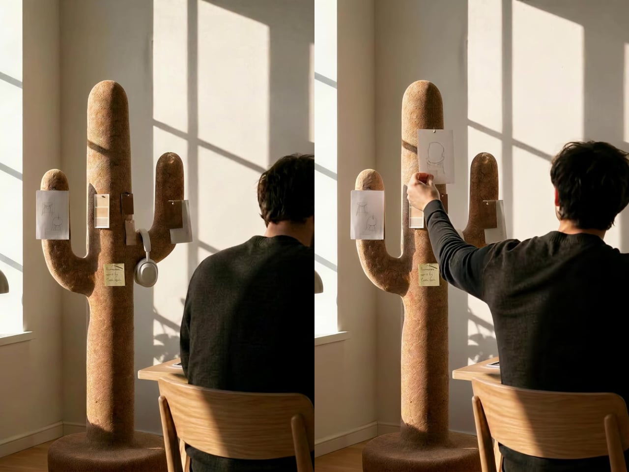
Cork is the central material here, both practically and conceptually. The surface is textured enough to grip a pair of sunglasses on the rounded top without anything extra, and receptive to pins without reinforcement or a backing board. A sketch, a sticky note, or a reference card pins straight into the body of the object wherever it’s needed, with no designated zone for it.

The cactus arms extend outward with a slight upward curve that happens to work exactly like a hook. A backpack hangs from one, a tote bag from another, a scarf draped over without sliding off. Headphones sit naturally over an arm when not in use. None of this requires any hardware, any dedicated accessories, or any particular intention. The geometry of the form handles all of it.

The disc-shaped base adds one more surface. Magazines stack on it, a few books sit within reach, and it grounds the form without demanding much floor space. The compact proportions keep the whole object from reading as a coat stand, which is deliberate. The intention was always a sculptural companion rather than a piece of utilitarian furniture, and the scale reflects that.

That distinction matters in practice. Next to a desk, the Corctus functions as an immediate, physical task board without a screen. Move it into a living room or hallway and it shifts roles without changing character. The warm texture of the cork sits alongside the kinds of materials, and its sandy color sits comfortably against most interior palettes.

Most multifunctional objects succeed at one thing and compromise on everything else. Corctus earns its place as a sculptural form first, and the utility follows naturally from the shape rather than being imposed on it. There are no brackets, no hooks, no panels, and no assembly decisions to make. It stands where it’s put, and the room tends to organize itself around it.

The post This Cork Cactus Looks Like Decor and Acts Like 3 Pieces of Furniture first appeared on Yanko Design.
  •  

This Mod Made a Steam Machine Faceplate Charge Your Steam Controller

The Steam Machine has swappable faceplates, which is a genuinely good idea that Valve doesn’t appear to have fully exploited. The concept is essentially that the front panel of the console is a blank cosmetic slate, open to third parties and hobbyists to design around. So far, most of what’s been proposed has leaned on that word: cosmetic. Different textures, different graphics, different visual personalities for what is otherwise a matte black gaming cube.

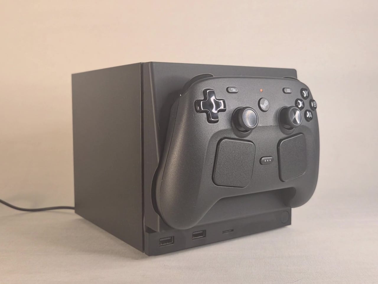
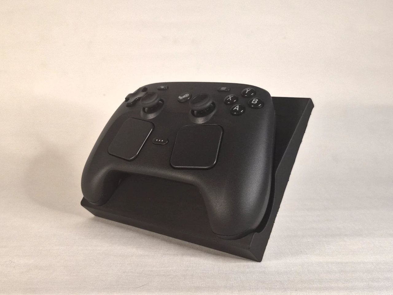
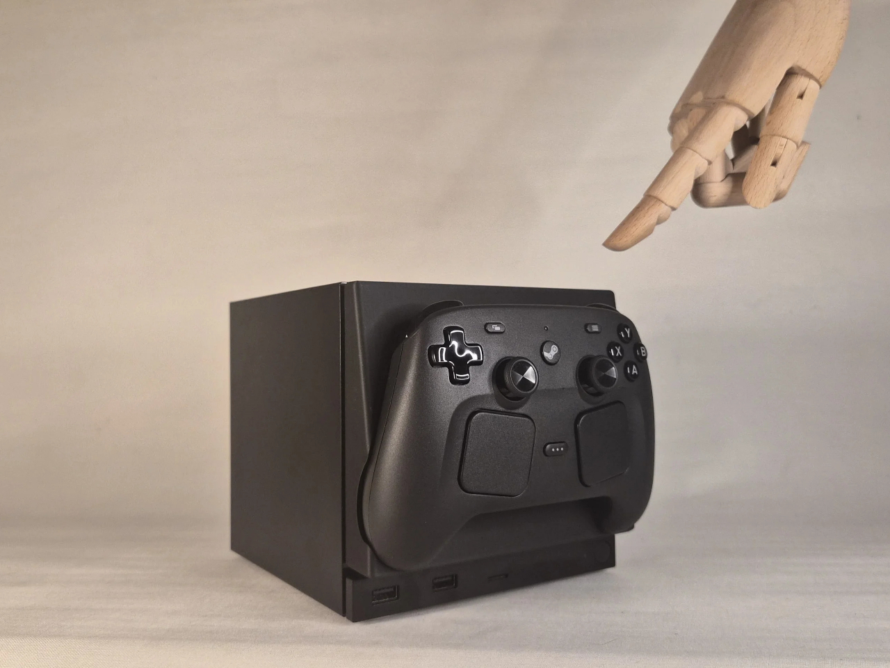
This faceplate mod takes a different approach by asking what the panel could actually do. The result is a replacement front cover that integrates a charging cradle for the Steam Controller directly into the face of the console, turning what would normally be dead real estate into a functional docking station. Set the controller down, it charges. Pick it up, it’s ready. No separate charging puck dangling off to the side.

Designer: NefariousnessWhole25

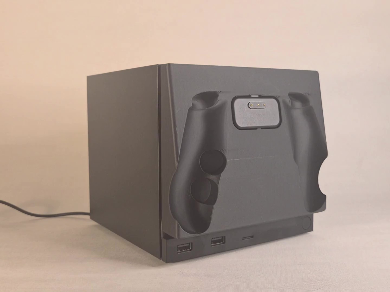
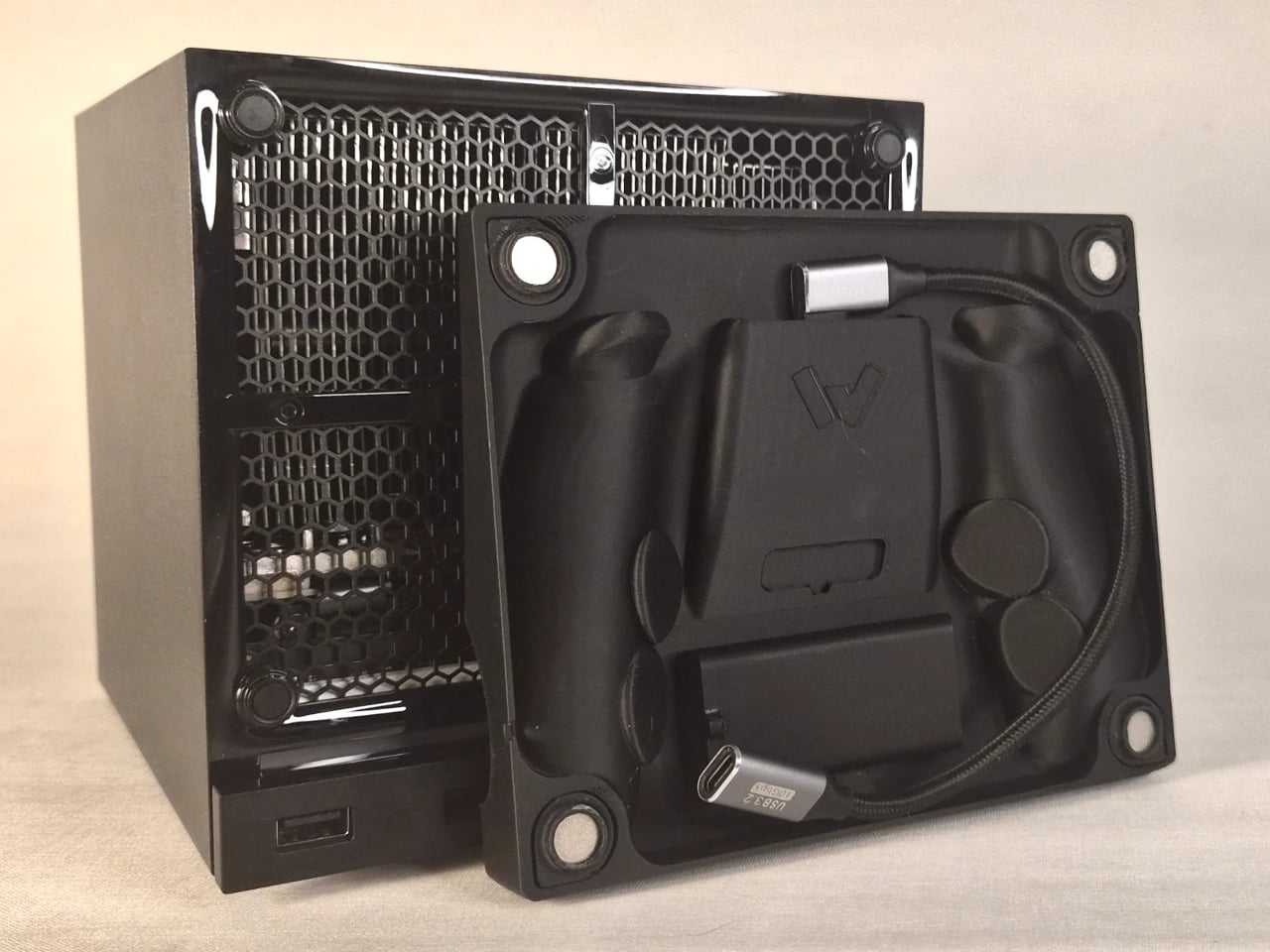
The charging mechanism uses the Steam Controller’s own wireless puck seated inside the faceplate cradle, with a USB cable routed discreetly around the inside edge of the panel and into one of the Steam Machine’s existing USB ports. It’s a routing solution rather than a rewiring one, which keeps the electrical side simple and reversible. The puck sits in the cradle, the controller sits on the puck, and the whole arrangement slots onto the front of the machine like any other faceplate.

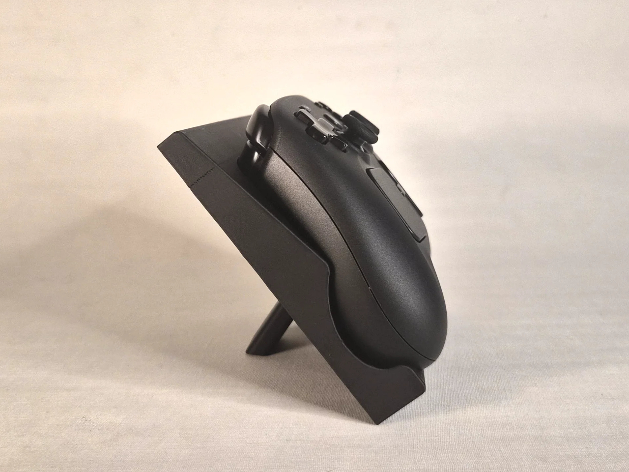
What makes it more than a wall mount with ambition is the kickstand built into the rear of the panel. It folds out from the back of the faceplate, propping the cradle up at an angle, turning the entire assembly into a standalone desk dock that works independently from the Steam Machine. Take the faceplate off the console and prop it up on a table, and it functions as a charging stand on its own terms.

The inspiration came partly from Valve’s own demonstration of an e-ink faceplate, which showed that the panel slot was capable of doing more than holding a decorative cover in place. That demonstration didn’t ship as a product, but it established the idea that the faceplate system had functional potential beyond aesthetics. This mod picks up that thread and takes it somewhere more immediately useful for anyone who has both pieces of Valve’s current hardware sitting on the same desk.

Design files haven’t been released yet, and there are no confirmed plans to sell finished units. The prototype is out, it works, and it raises a question worth asking about Valve’s approach to the faceplate ecosystem: if a single modder can turn the front panel into a functioning charging dock over a weekend, what would a dedicated accessory program actually look like at scale?

The post This Mod Made a Steam Machine Faceplate Charge Your Steam Controller first appeared on Yanko Design.
  •  

The Luxury Hotel Concept That Works Like a Food Truck for Wilderness

Luxury hotels have always had a location problem. The kinds of places that would make the most extraordinary backdrops, remote desert plains, rolling highland meadows, dramatic canyon edges, are almost never the places where a hotel can legally or practically be built. Extending infrastructure to those sites, from power grids to road access to permanent foundations, tends to either cost too much or damage the very landscape that made the location worth visiting.

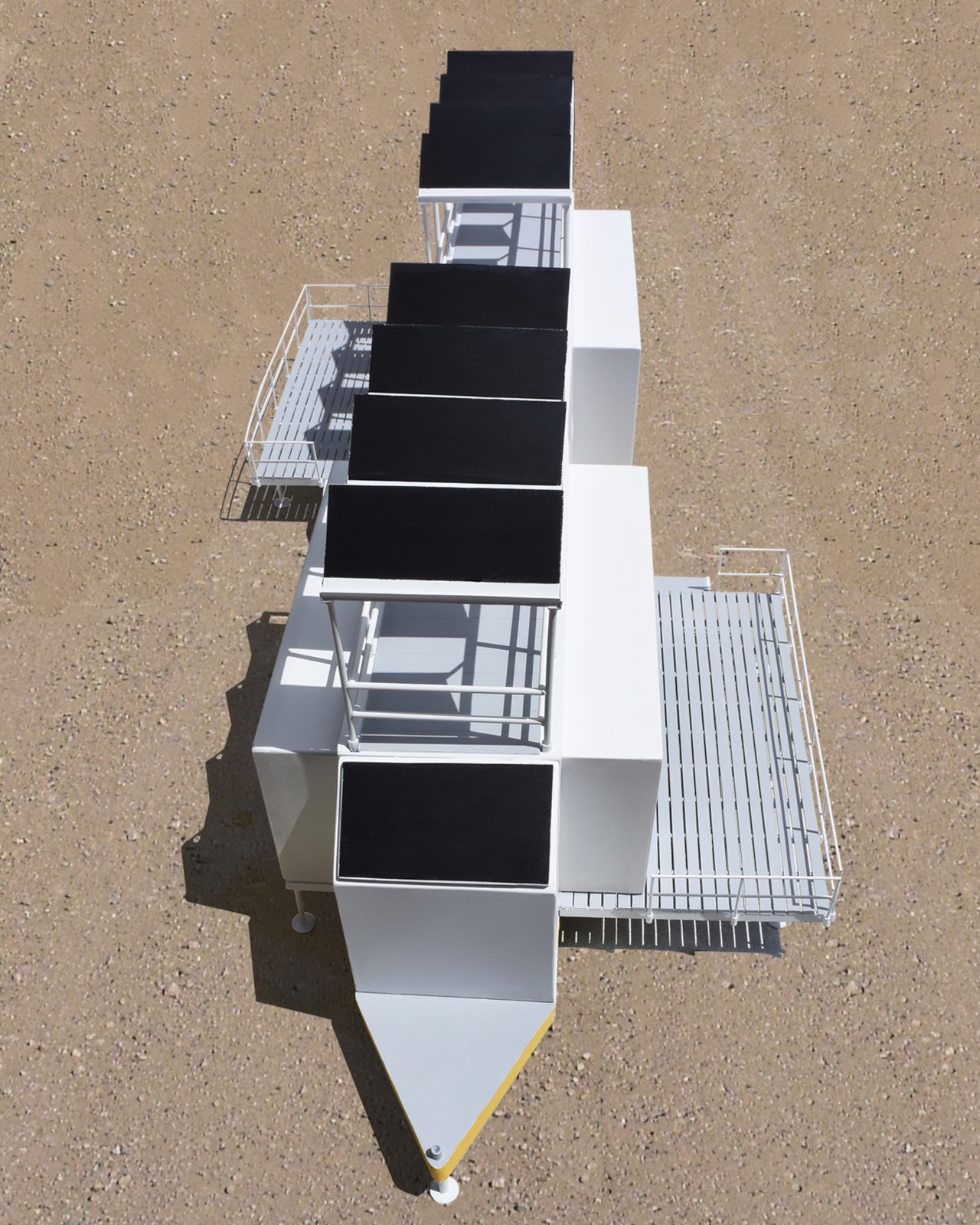
The Mobiltels concept approaches hospitality from a completely different direction. Rather than building a permanent structure and hoping the location is compelling enough, each Mobiltel unit is designed to fold into a compact, truck-towable trailer, be driven to wherever the landscape is most remarkable, and then unfold into a functioning luxury accommodation. When the stay is over, it packs up and leaves without leaving much evidence behind.

Designer: Michael Jantzen

Three distinct unit types make up the proposed resort ecosystem. The first is the guest accommodation module, which deploys into two full hotel-style rooms, each with a private bath and its own private deck. The roof extends into a communal deck shaded by solar panels that generate the electricity to power the unit, while a second panel mounted on the exterior heats the water. The entire structure, decks and all, folds back into a trailer tight enough to tow down a highway.

The second unit is a solar-powered café and coffee shop that unfolds to reveal four outdoor dining decks with full kitchen and restroom facilities. The third is a large shade structure intended for gatherings, private events, and communal lounging, built as a striking open lattice that collapses into a flat-load trailer for transport. Additional unit types can theoretically follow the same logic, meaning a full resort amenity list could be assembled and disassembled as needed.

The off-grid energy system is what makes the location independence real rather than theoretical. Every unit generates and manages its own power and heated water from the sun, which means no connecting to local utilities and no requiring a serviced campsite. A Mobiltel cluster can go where a road exists and terrain is flat enough to level a trailer, which is a much lower bar than conventional construction.

The environmental argument is also embedded in the temporariness. A permanent hotel in a wilderness setting modifies that setting permanently. Roads are built, foundations are poured, and the land around the structure gradually changes to accommodate the infrastructure. A Mobiltel unit lands on a site for a season, its occupants absorb the specific quality of that place, and it leaves. The landscape recovers. The next location gets the same treatment.

There’s something quietly subversive about applying a mobile home chassis to a luxury hospitality concept. Mobile homes occupy a very specific cultural position, one that doesn’t usually include rooftop communal decks and solar-heated private baths. The Mobiltels concept borrows the transport logic of one and applies it to the aesthetic ambitions of the other, with the result that a high-end resort becomes as relocatable as a food truck. The result sits somewhere between architecture and expedition equipment, which is probably exactly the right place for it.

The post The Luxury Hotel Concept That Works Like a Food Truck for Wilderness first appeared on Yanko Design.
  •  

Phones Turn Reminders Into Distractions, This Magnetic Display Won’t

Smartphones have made information permanently accessible, but that accessibility comes at a price. The same device that shows you a reminder also delivers a notification for something unrelated, which leads to one more app opened, one more five-minute detour, and one more afternoon where the task you meant to remember sits unfinished somewhere in a mental stack. The problem isn’t access to information. It’s the medium through which it arrives.

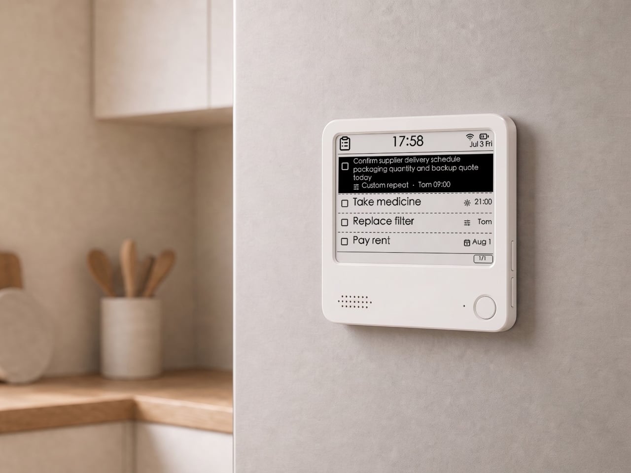
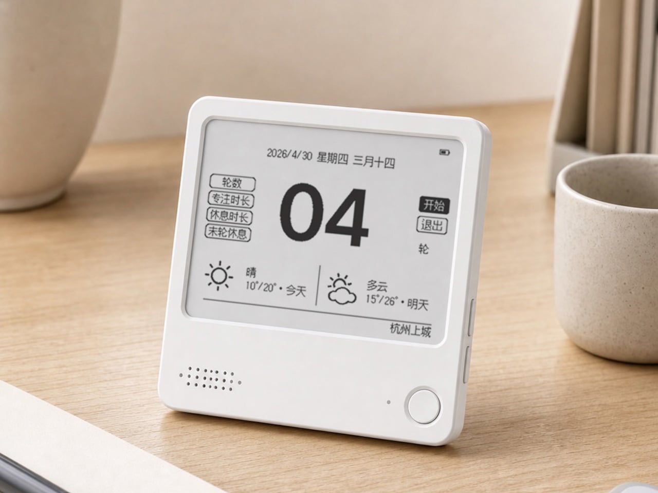
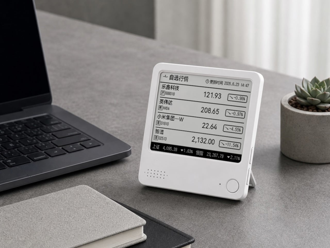
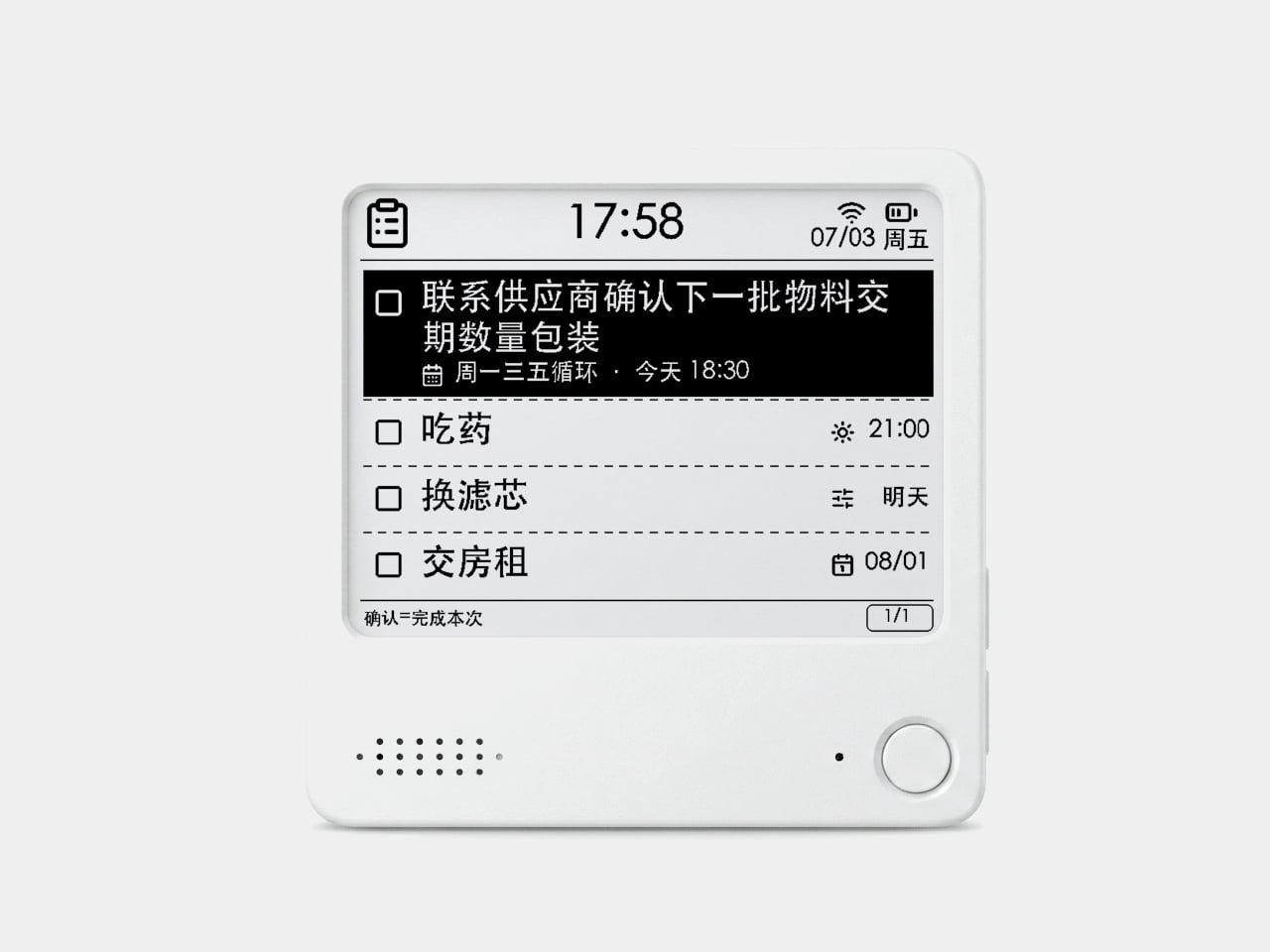
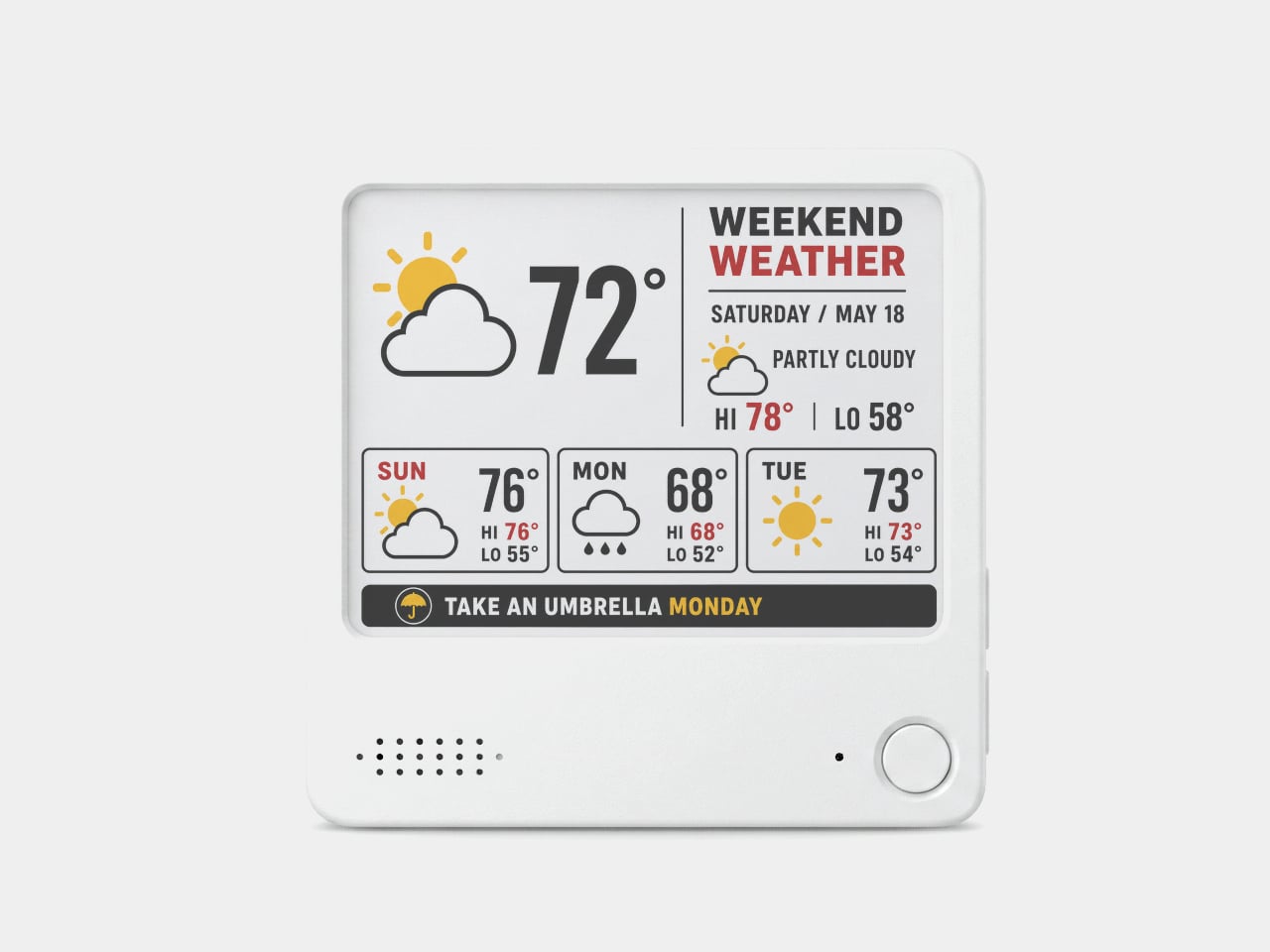
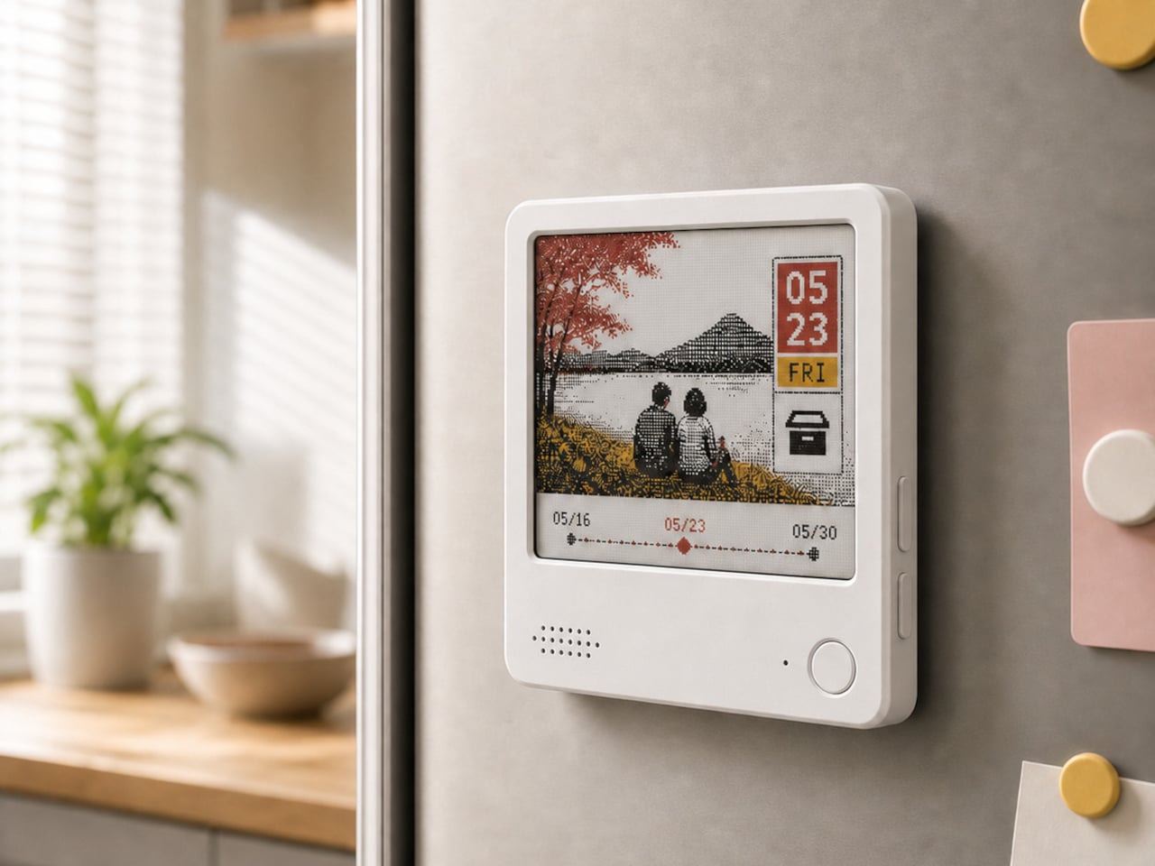
The ZecTrix Note 4 approaches that with a different premise: what if the display that shows your tasks doesn’t connect to your attention the same way a phone screen does? It’s a 4.2-inch e-paper smart display, about the size of a palm, that attaches magnetically to a metal surface and stays there showing whatever you most need to remember, using almost no power to do it.

Designer: ZecTrix

The interaction model is deliberately minimal. Press the physical button, speak your task or reminder, and the device converts that into text and adds it to the display. The built-in AI voice assistant handles the transcription and task management, and the e-paper screen holds whatever it’s showing without any power draw between updates. The display also handles weather, clocks, focus timers, handwritten notes, images, and custom templates.

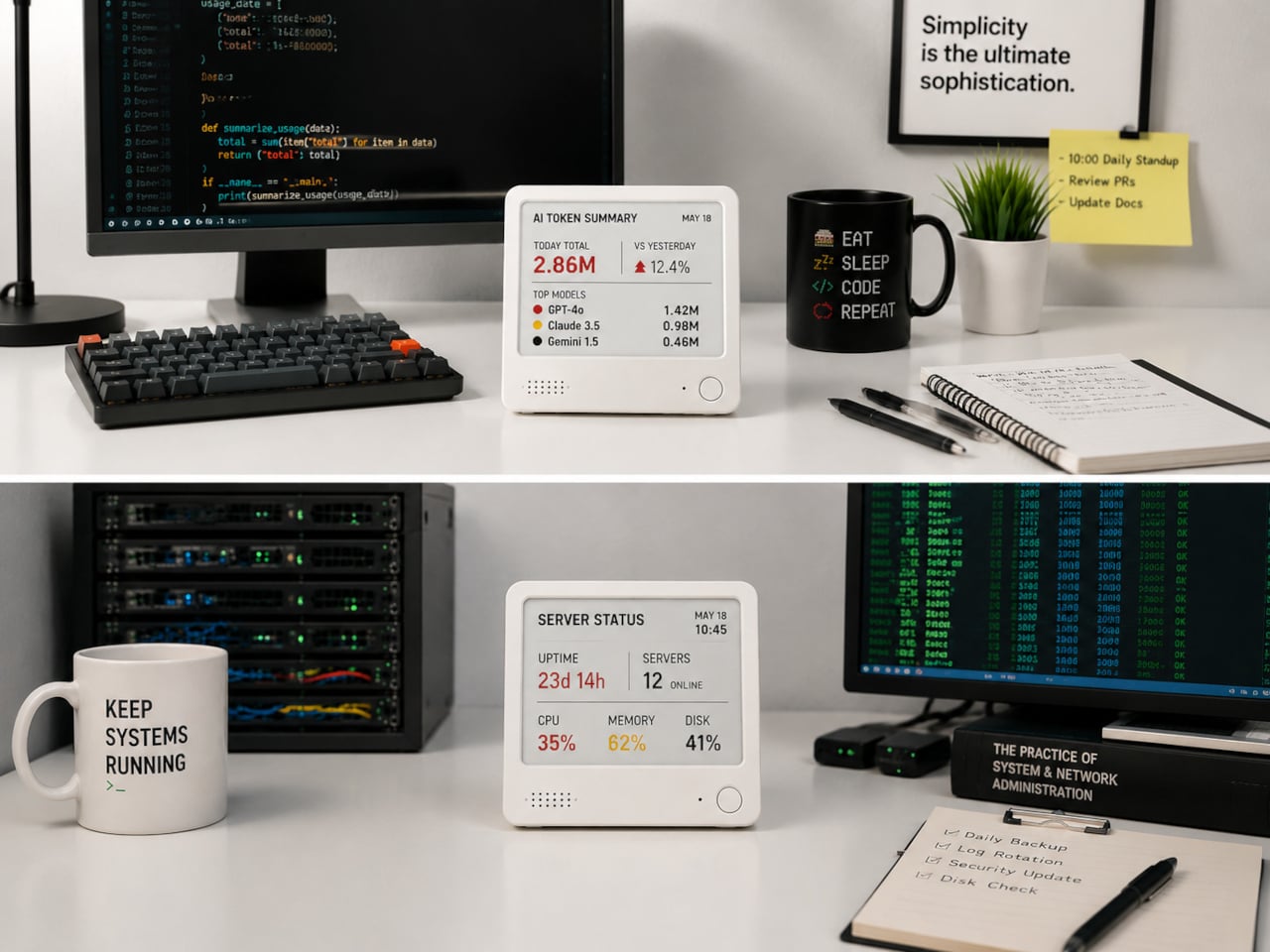
Hardware underneath is solid for something this compact. An ESP32-S3 dual-core processor with 8 MB of PSRAM and 16 MB of flash handles the AI processing and connectivity, backed by a 2,000 mAh battery, 2.4 GHz Wi-Fi, Bluetooth 5.0, NFC, a speaker, a microphone, and a USB Type-C port for charging. GPIO expansion is also available, which opens the platform to custom hardware additions.

The 97mm x 97mm x 8.75mm square chassis comes in three enclosure variants: an injection-molded Minimal Premium Edition designed for clean desk or kitchen wall placement, a standard Everyday Edition for DIY-minded users, and a Color Edition with open-source 3D model files for those who want to print their own. The magnetic backplate sticks firmly to any suitable metal surface without adhesive or mounting hardware.

For users who want more than a black-and-white display, there’s the Note 4C, which replaces the monochrome panel with a four-color E Ink screen that adds red and yellow to the palette. It runs on the same hardware platform but ships without the consumer AI firmware, positioning it instead as an open development device for people with ESP32 experience. The color panel is slower to refresh, typically over ten seconds per full update, making it better suited to status labels, family photo cards, or API dashboards that update occasionally rather than continuously.

The two products are deliberately distinct rather than tiered versions of the same thing. The Note 4 is a finished product with a lifetime AI voice service included; the Note 4C is an open starting point for a custom build. Both share the same physical form, so the choice comes down to how much of the software someone wants to supply themselves.

The post Phones Turn Reminders Into Distractions, This Magnetic Display Won’t first appeared on Yanko Design.
  •  

The $33 Box That Locks Your Phone and Judges You for Opening It Early

Screen time management has spawned an entire industry of apps, built-in focus modes, notification filters, and weekly usage reports that most people glance at and promptly ignore. The fundamental problem with all of them is that they live on the same device you’re trying to avoid, which keeps willpower in charge of the whole arrangement. And willpower, predictably, tends to lose that particular argument somewhere around the third notification.

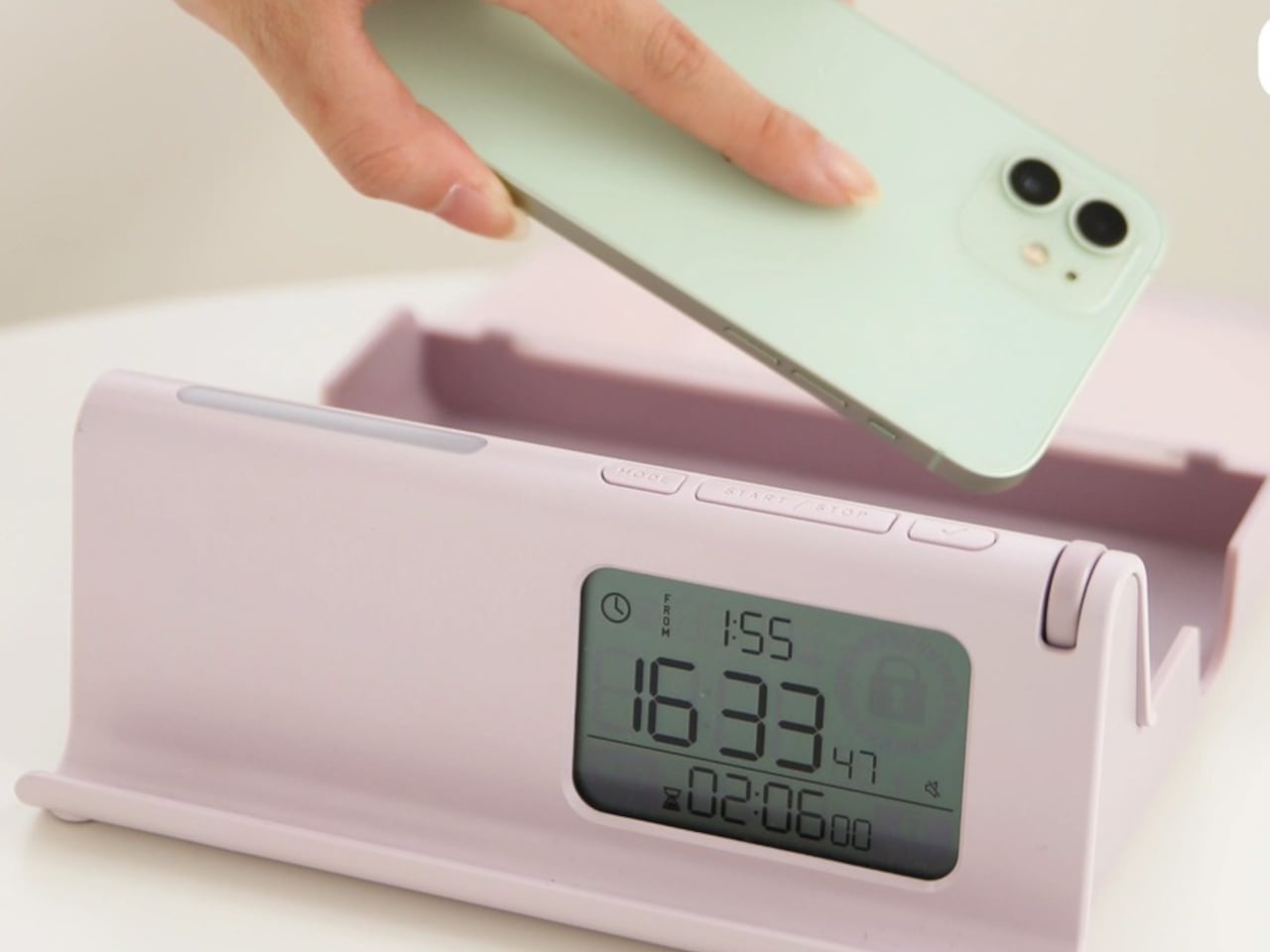
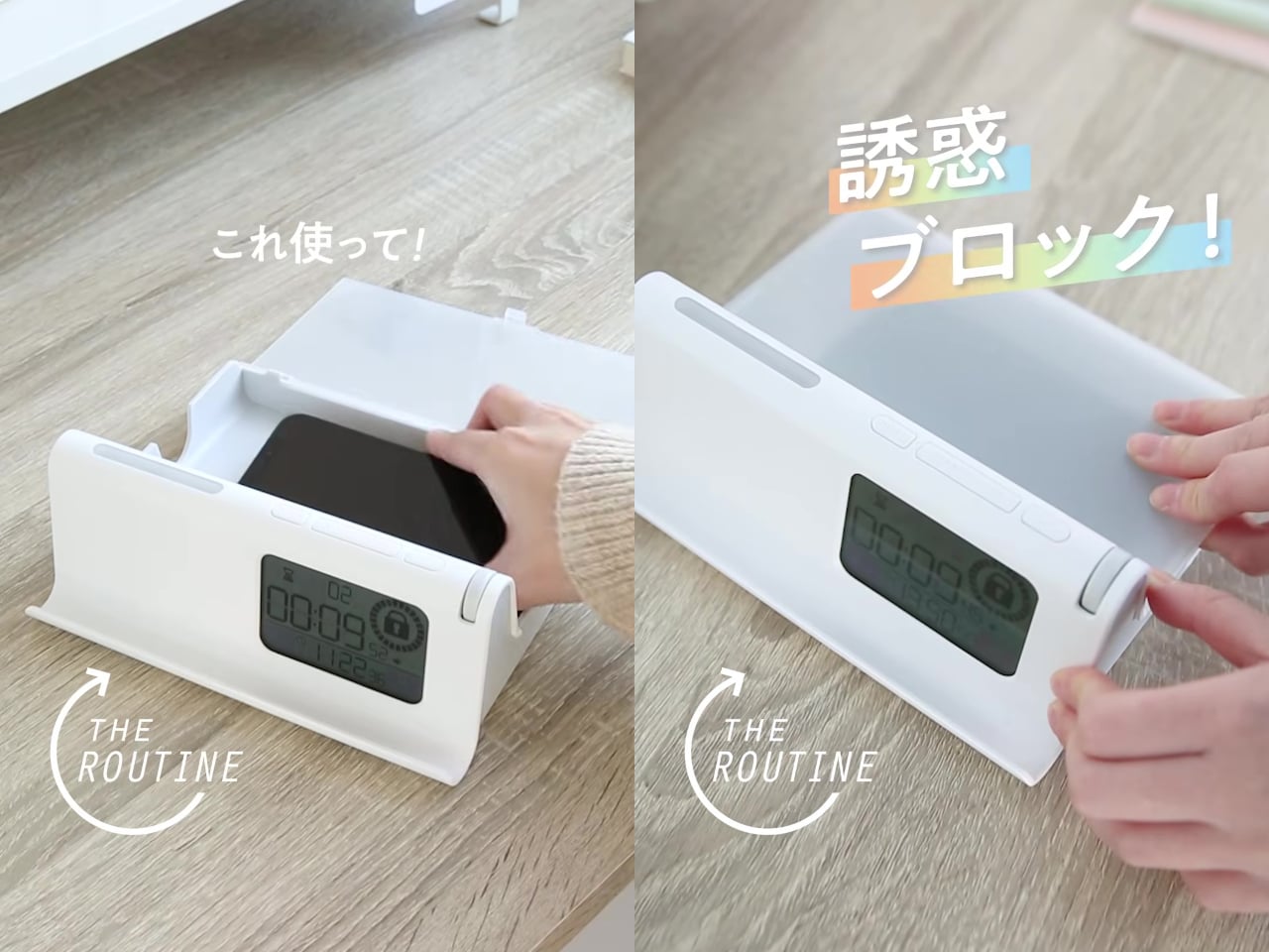
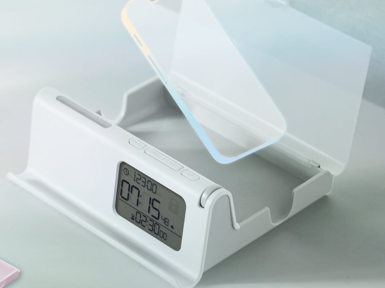
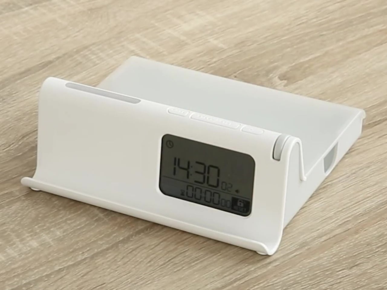
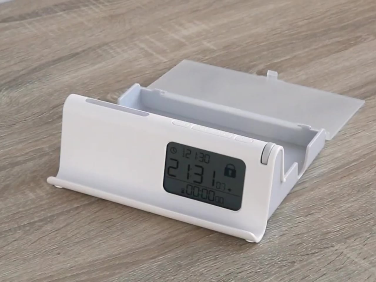
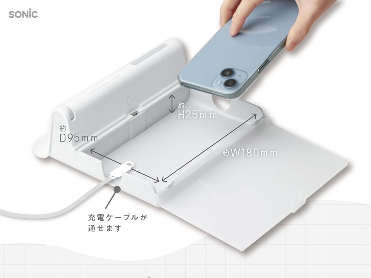
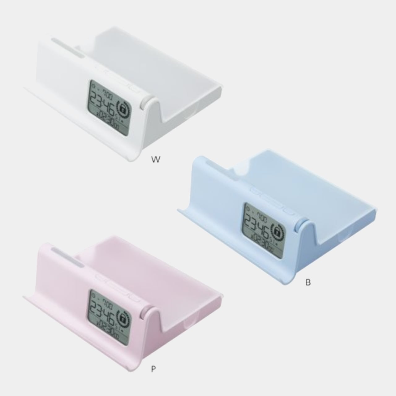
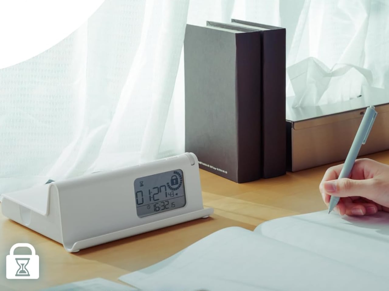
The Sonic Digitox The Routine sidesteps that problem entirely by making your phone physically unreachable for as long as you decide. It’s a timed lock case with no app to disable, no passcode to talk yourself into entering, and no settings menu to rationalize your way through. You put the phone in, set the lock, and that’s the end of your access until the timer says otherwise.

Designer: Sonic

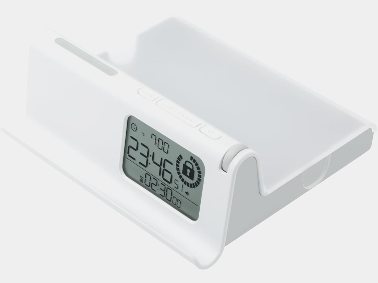
Two lock modes handle different approaches to the problem. Routine Lock works on a schedule, letting you define repeating daily windows during which the case locks automatically and signals each transition with light and sound. If 11 PM to 7 AM is meant to be phone-free, the case enforces that without asking for your cooperation every night, which is precisely the point.

Timer Lock handles the more immediate situation where you need to focus right now, without a preset schedule. You set a countdown of up to 99 hours and 59 minutes, and the phone stays sealed until it runs out. For a study session, a focused work morning, or a dinner where nobody at the table needs to be somewhere else digitally, it removes the option before the habit has a chance to argue back.

Neither mode traps you completely. An emergency reset function exists for genuine urgency, but it isn’t quiet about it. Triggering it sounds a one-minute alarm and leaves a RESET mark displayed on the case for 24 hours afterward. The friction is deliberate, designed to make the difference between an actual emergency and a momentary craving feel tangible rather than theoretical.

Two additional modes round out the four-mode system for lighter use. Time Display shows the time without any lock, while a Timer mode runs a count-up or countdown without physically securing the phone. The case also includes a goal sticker and a smartphone contract form, a pairing that makes it a practical tool for parent-child agreements around device time, where putting terms in writing and then sealing the phone inside creates a layer of accountability that app-based controls don’t quite replicate.

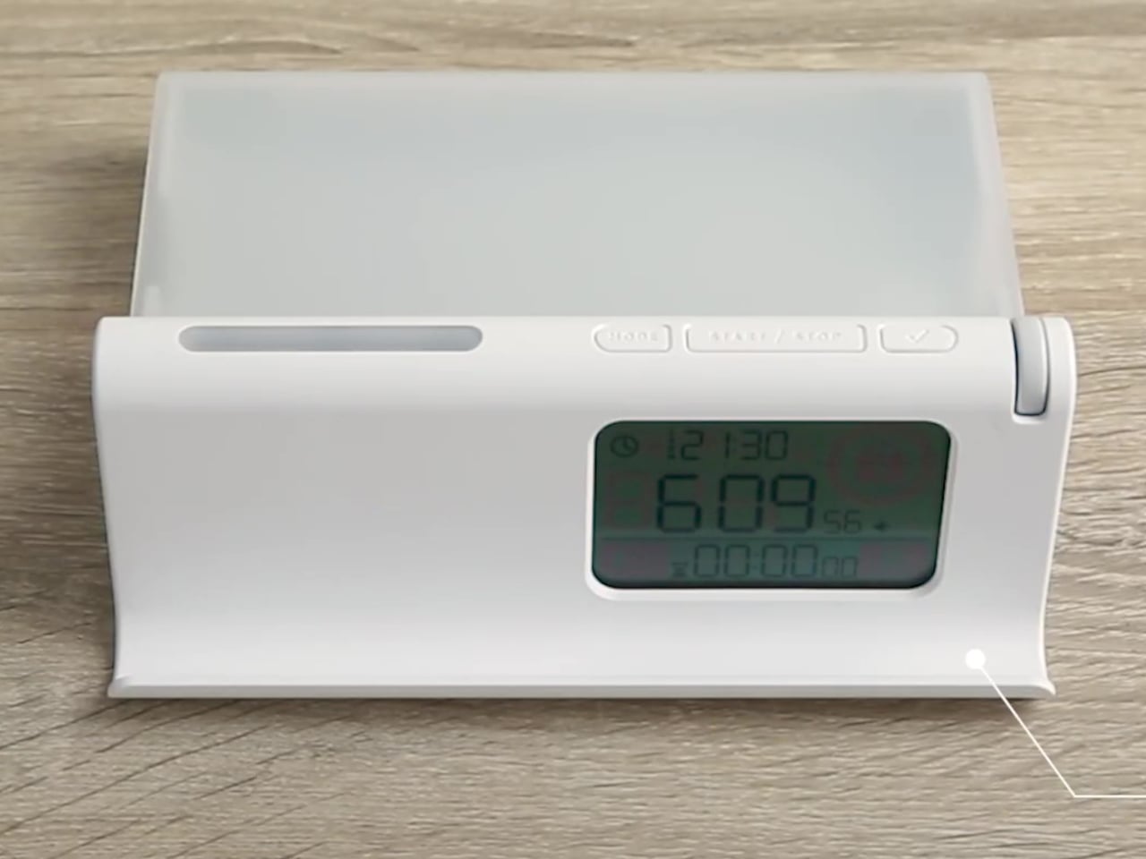
The body is ABS plastic with a polycarbonate lid, running on three AAA batteries, and the whole thing measures approximately 190mm x 70mm x 170 mm. It comes in white, blue, and pink, and was recognized with a category award at the 2026 Japanese Stationery Awards, which is about as specific an endorsement as a phone lock case can hope for.

There’s a refreshing bluntness to what the Digitox offers. Most products in the digital wellness space treat phone overuse as a behavioral settings problem, one more toggle away from being solved. This one treats it as a custody problem, and the solution is handing custody over to a box that doesn’t negotiate. At roughly $33, it costs less than a single month of most productivity apps and requires no subscription to keep working.

The post The $33 Box That Locks Your Phone and Judges You for Opening It Early first appeared on Yanko Design.
  •  

Motorola’s Patent Isn’t a Phone You Wear, It’s a Watch You Unfold

The idea of merging a smartwatch and a smartphone into a single device has been floating around the industry for years, mostly because the obvious inconvenience is right there: two screens on two separate devices, one tiny and worn on the wrist, the other large and kept in a pocket, each doing essentially half the job the other can’t. The logical question is whether one of those devices could do both jobs depending on the situation.

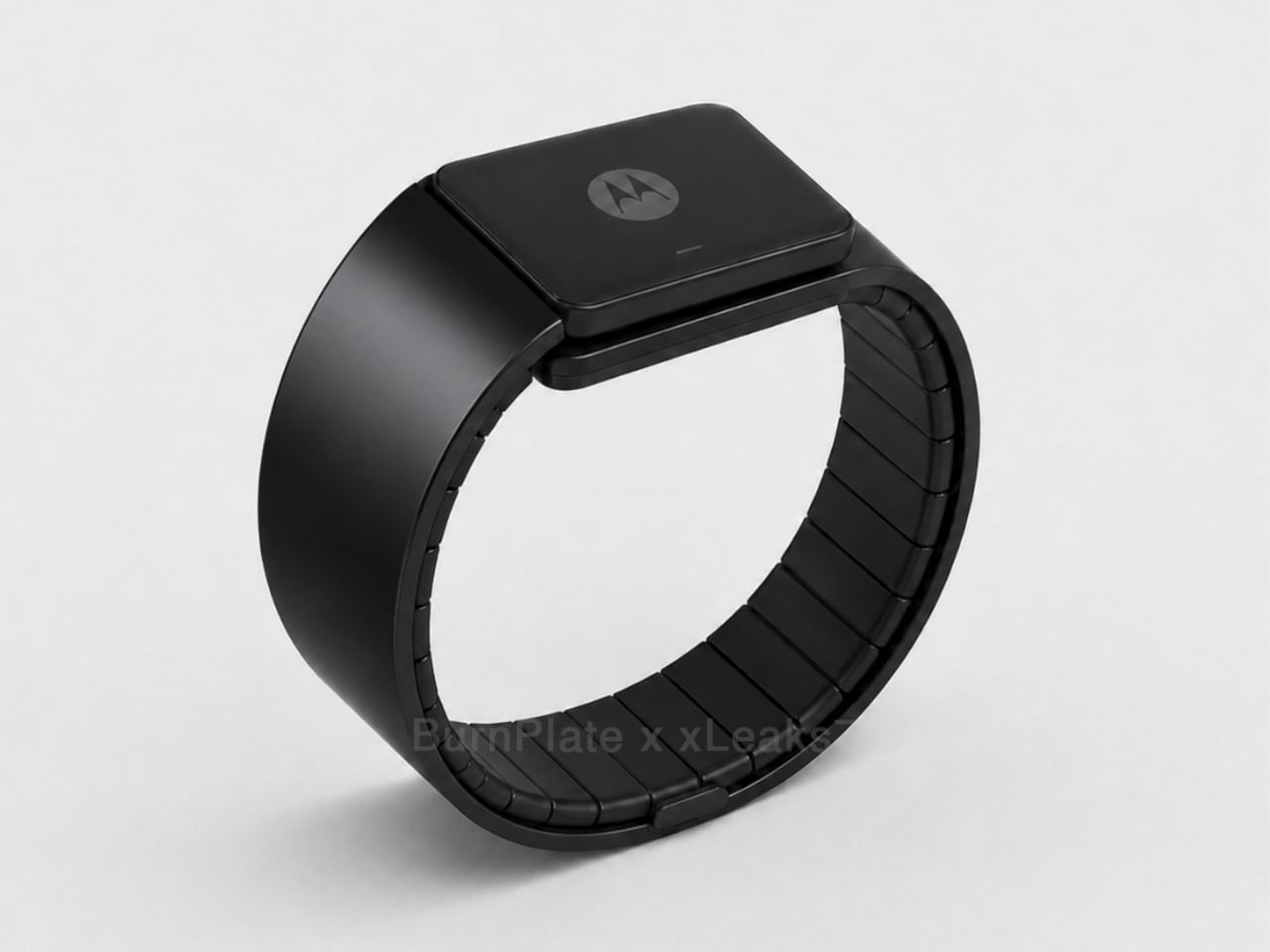
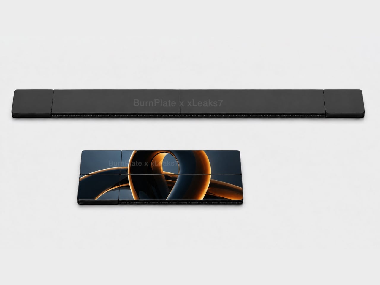
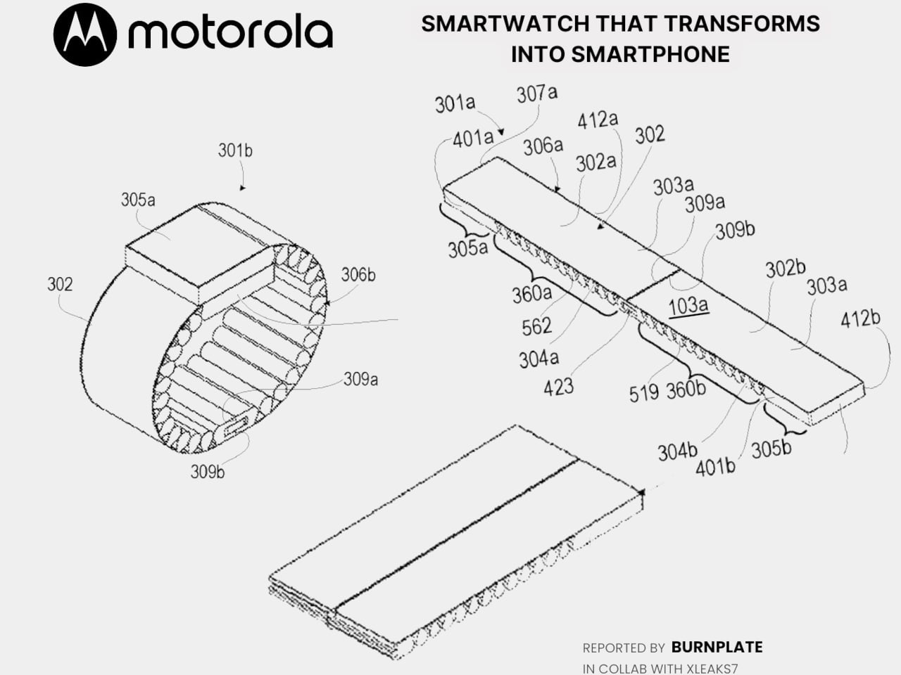
Motorola’s latest patent, officially registered as US12,693,705 under the title “Pivoting wearable reconfigurable screen,” proposes exactly that. The device starts on the wrist as a conventional smartwatch, its flexible display curved around the band. When more screen real estate is needed, the strap pivots and unfolds, flattening into a short, wide display format that functions as a handheld device. A third configuration folds the bottom quarter into an “L” shape, turning the unit into a self-standing desk display.

Designer: Motorola (via Burnplate, David Kowalski/xeaks7)

The mechanism that makes it possible is the strap itself. Rather than housing a traditional watch face with a fixed display, almost the entire outer surface of the band carries a flexible screen. Worn, it reads like a standard wearable. Removed and unfolded, that same surface becomes the display area of a compact, landscape-oriented device. The pivot point is what separates this from simply being a wrist-wrap phone like earlier concepts.

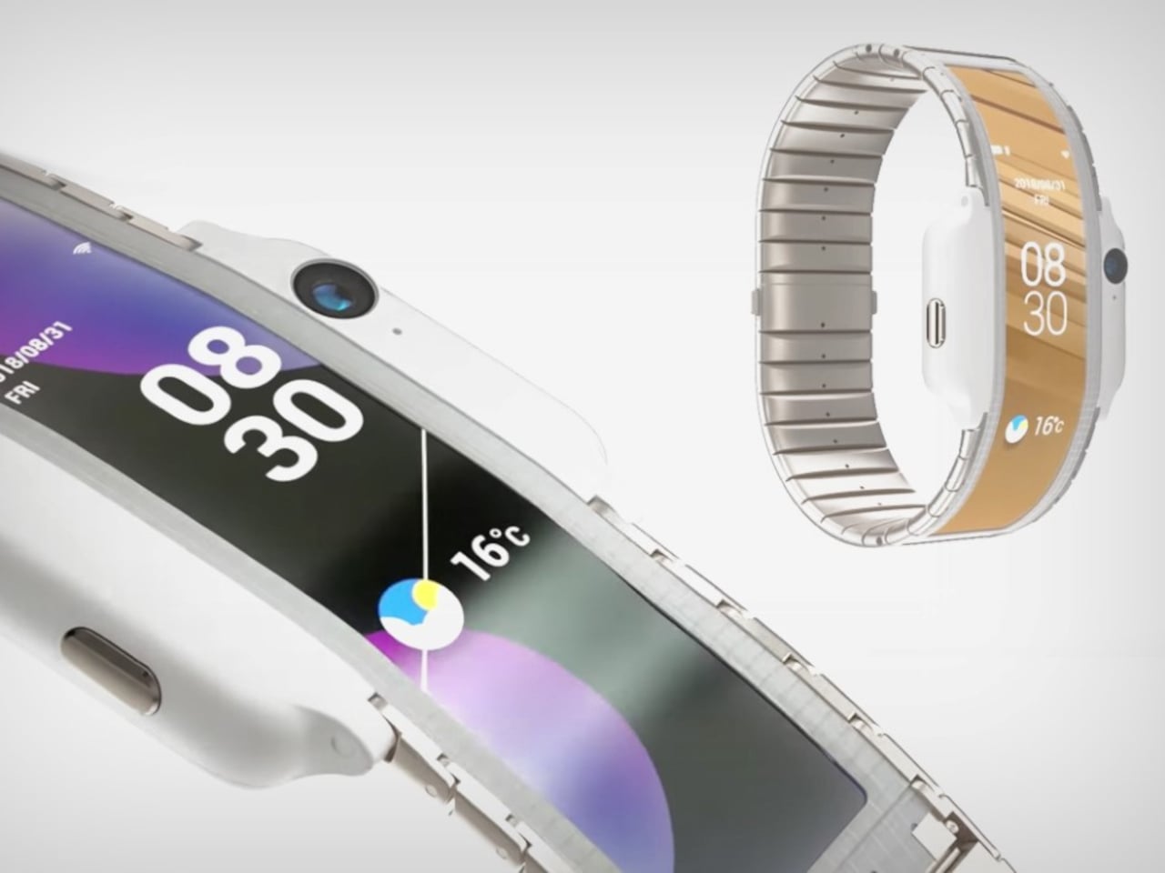
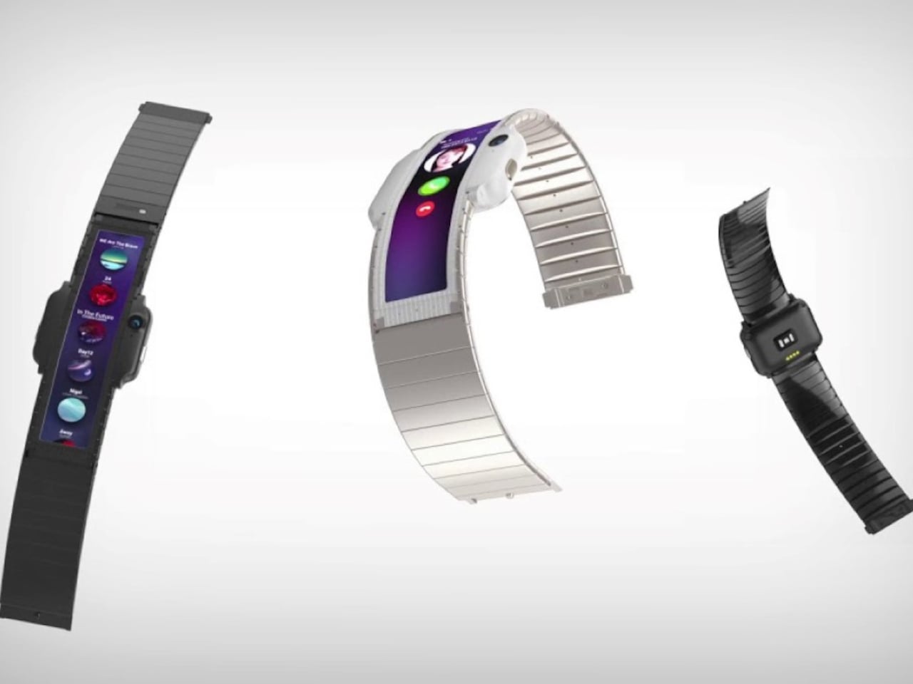
That distinction matters because Nubia tried the wrist-phone idea back in 2018 with the Alpha, and the result was a fascinating but limited object. The Alpha wrapped a 4.01-inch OLED display around the upper wrist, delivering more screen real estate than any smartwatch before it, but the display stayed wrapped. It curved beautifully, could make calls, take photos, and run apps, but it never transformed into anything. The watch was the watch, full stop.

Nubia Alpha

Motorola’s patent reverses the logic. Rather than making a phone you can wear, it proposes a watch you can unfold. The distinction isn’t purely semantic. A device that starts as a watch and transforms into a handheld is solving a different problem than one that starts as a phone and straps to your wrist. The first carries a reasonable identity in both states; the second always feels like a compromise in one of them.

Nubia Alpha

The Nubia Alpha’s sticking point wasn’t the display, which was genuinely impressive and ahead of its time. It was the software, the battery, and the form factor’s limits in practice. Nubia never took the concept further after the original and a 2020 follow-up. The flexible display remained horizontal and wrist-bound, never taking the step toward becoming a genuinely detachable, self-sufficient screen.

Whether Motorola’s patented concept eventually ships as a real device is a separate question entirely. Patents are filed routinely without becoming products, and this one would require flexible display technology durable enough to handle daily wrist bending and regular unfolding, a battery that fits within strap dimensions, and software that transitions cleanly between modes. None of those are trivial problems.

Still, the direction of thinking has clearly shifted since 2018. Nubia asked what happens when a smartphone lives on your wrist. Motorola is asking what happens when a watch becomes a screen the moment you need one.

The post Motorola’s Patent Isn’t a Phone You Wear, It’s a Watch You Unfold first appeared on Yanko Design.
  •  

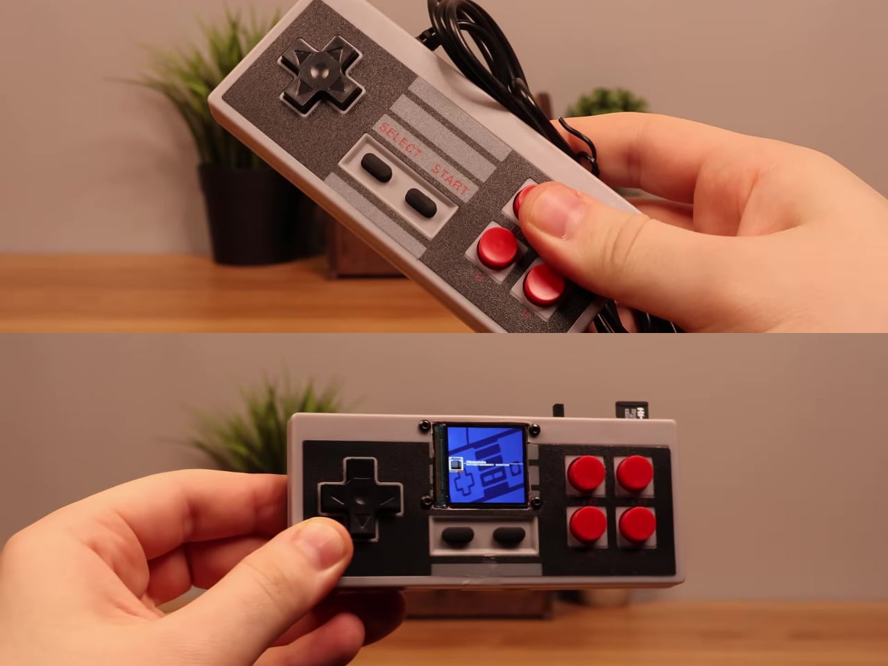
Someone Stuffed a Full Retro Console Inside an NES Controller for $17

Most original NES controllers haven’t seen active duty in decades. They survive in storage bins and attic boxes, physically intact and perfectly functional as controllers, but with nothing left to plug them into. The consoles they were paired with have long since been replaced or decommissioned. The hardware was always well built, but the form factor has been sitting idle for years.

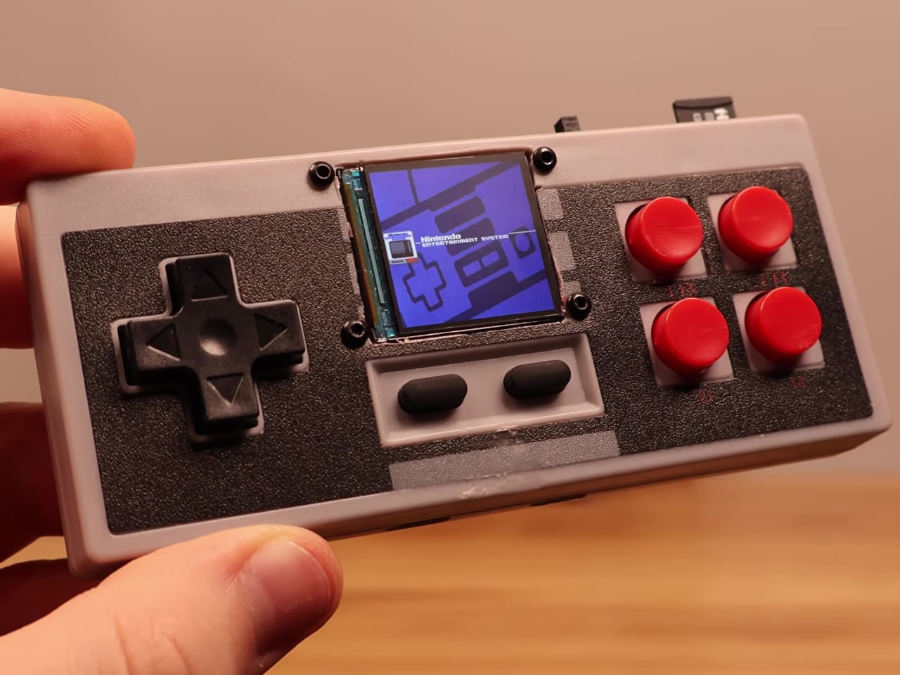
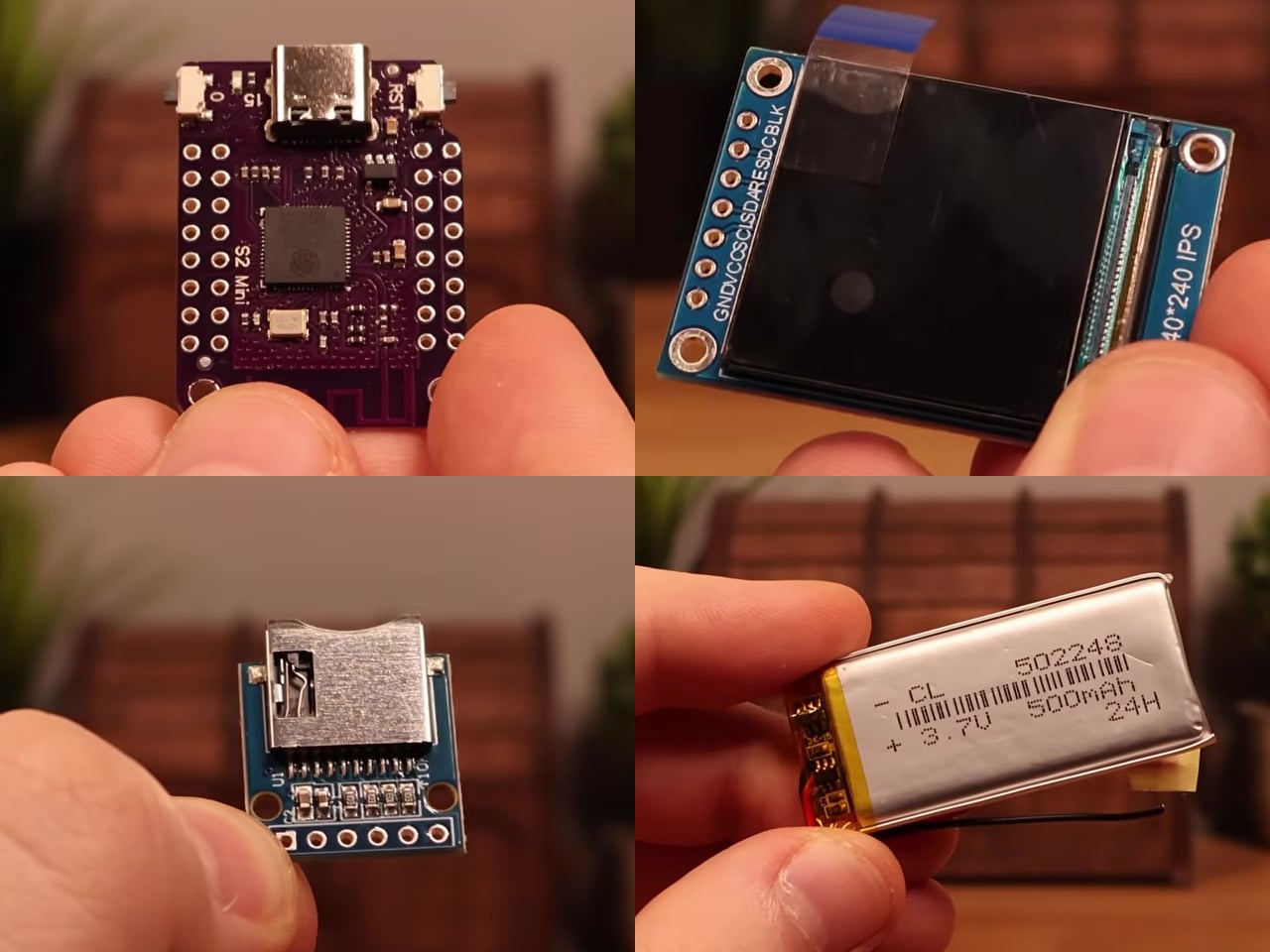
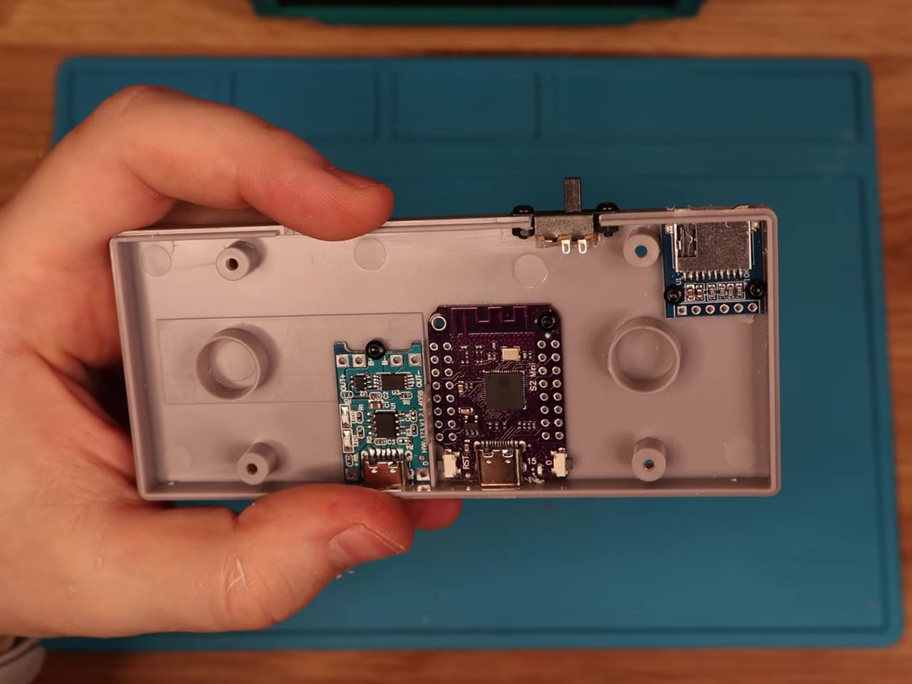
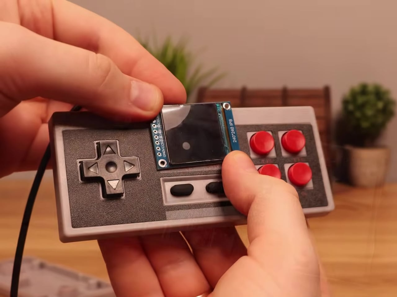
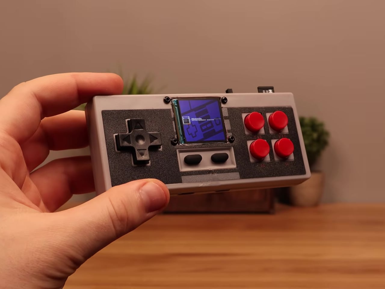
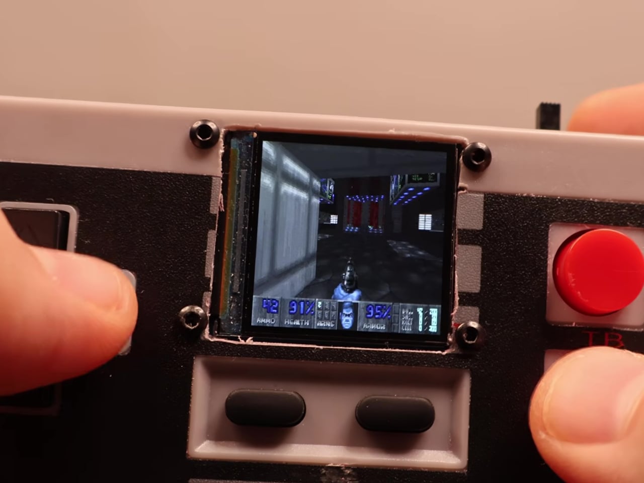
This mod changes the job description of that controller shell entirely. The electronics inside a standard NES-style gamepad were stripped out and replaced with a Wemos ESP32-S2 Mini development board, a 1.54-inch 240×240 TFT display, a MicroSD card module, a 500 mAh lithium-polymer battery, a charging board, a speaker, and a slide power switch. From the outside, it still looks exactly like an NES controller.

Designer: Logic Gate Labs

Choosing the right processor was essentially a geometry problem. A larger ESP32-S3 would have offered dual-core performance and enough PSRAM to keep entire game ROMs in memory, but it was too big to fit inside the housing. Smaller ESP32 variants without PSRAM lacked the memory for smooth emulation. The ESP32-S2 Mini landed in the narrow window between board size and processing capability that the build required.

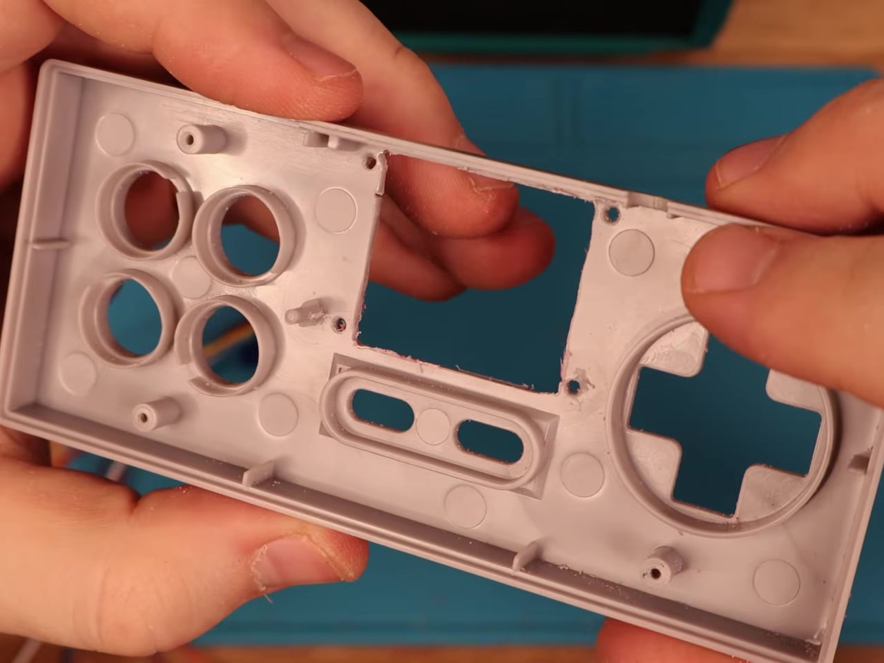
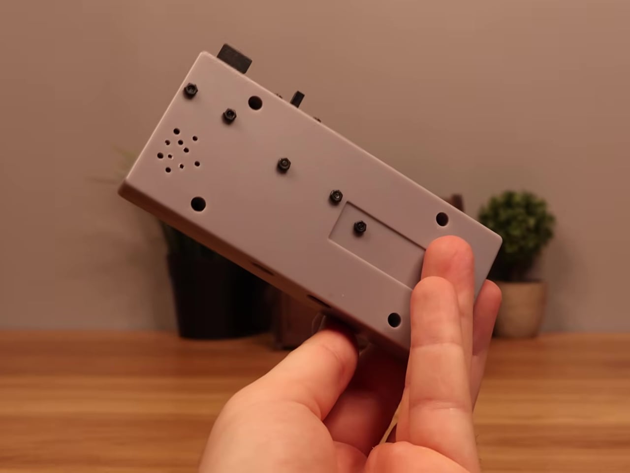
Getting everything to fit required real surgery on the shell. Internal plastic supports had to be trimmed back to make room for the display, and new openings were drilled for the screen, USB charging port, MicroSD slot, speaker, and power switch. A bare copper wire serves as a central ground distribution rail, cutting the number of individual ground wires needed and making it possible to actually close the controller afterward.

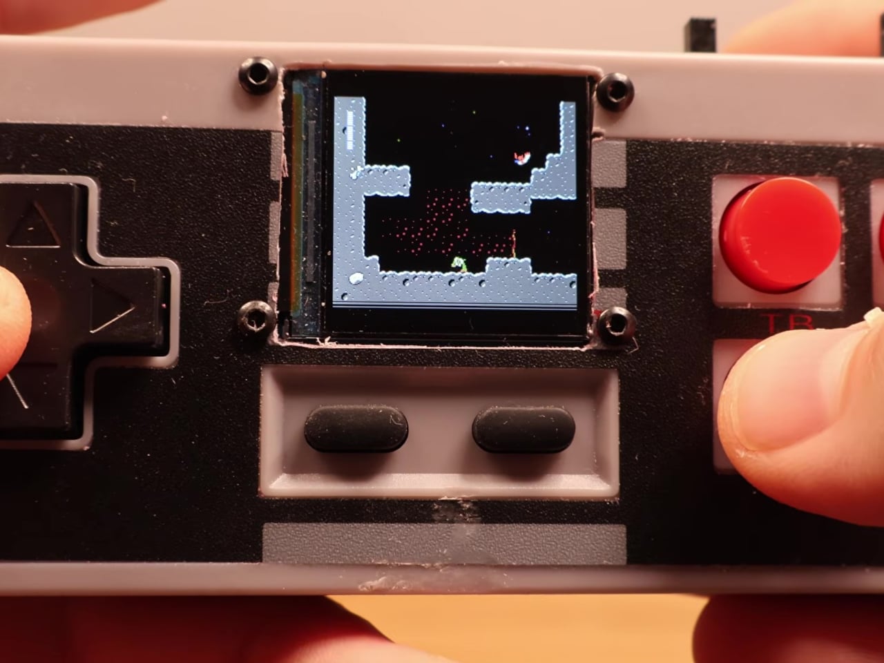
On the software side, the device runs the Retro-Go emulator framework, compiled using ESP-IDF and CMake since the ESP32-S2 isn’t a standard Retro-Go target. The result handles a range of classic 8-bit systems comfortably. As a bonus, Doom runs via PrBoom-Go from a Freedoom WAD file loaded on the MicroSD card, managing somewhere between five and 15 frames per second depending on the scene.

The total build cost runs about $17 using common suppliers, or closer to $8 when sourcing directly from overseas markets. That puts the project well under the price of a single modern game release. Flip the power switch, select a ROM from the MicroSD card, and the screen loads games that once required a dedicated console and television setup. No additional hardware is needed.

What makes this more than a novelty is how it reconsiders a form factor most people already have muscle memory for. The D-pad clicks the same way it always did, and the A and B buttons carry the same spring. What changed is where the signal goes after the press. Instead of traveling to a console that no longer exists, the controller now processes it directly inside its own shell.

The Retro-Go framework is open source, the parts are widely available, and the NES controller shell is one of the most common pieces of vintage hardware still circulating through the secondhand market. Nothing about this build required specialized equipment or proprietary components. The total part list costs less than a single new game on any current platform and fits inside hardware that most people already own.

The post Someone Stuffed a Full Retro Console Inside an NES Controller for $17 first appeared on Yanko Design.
  •  

Camera Batteries Go Missing, So This $70 One Tracks Itself

Camera batteries are one of those accessories that photographers never think about until something goes wrong. They’re small enough to vanish into the bottom of a bag or a jacket pocket, common enough to own several of and regularly mix up, and important enough that losing one mid-trip can force an early stop to a shoot. The solution most people reach for is buying more of them, which only increases the number of things to keep track of.

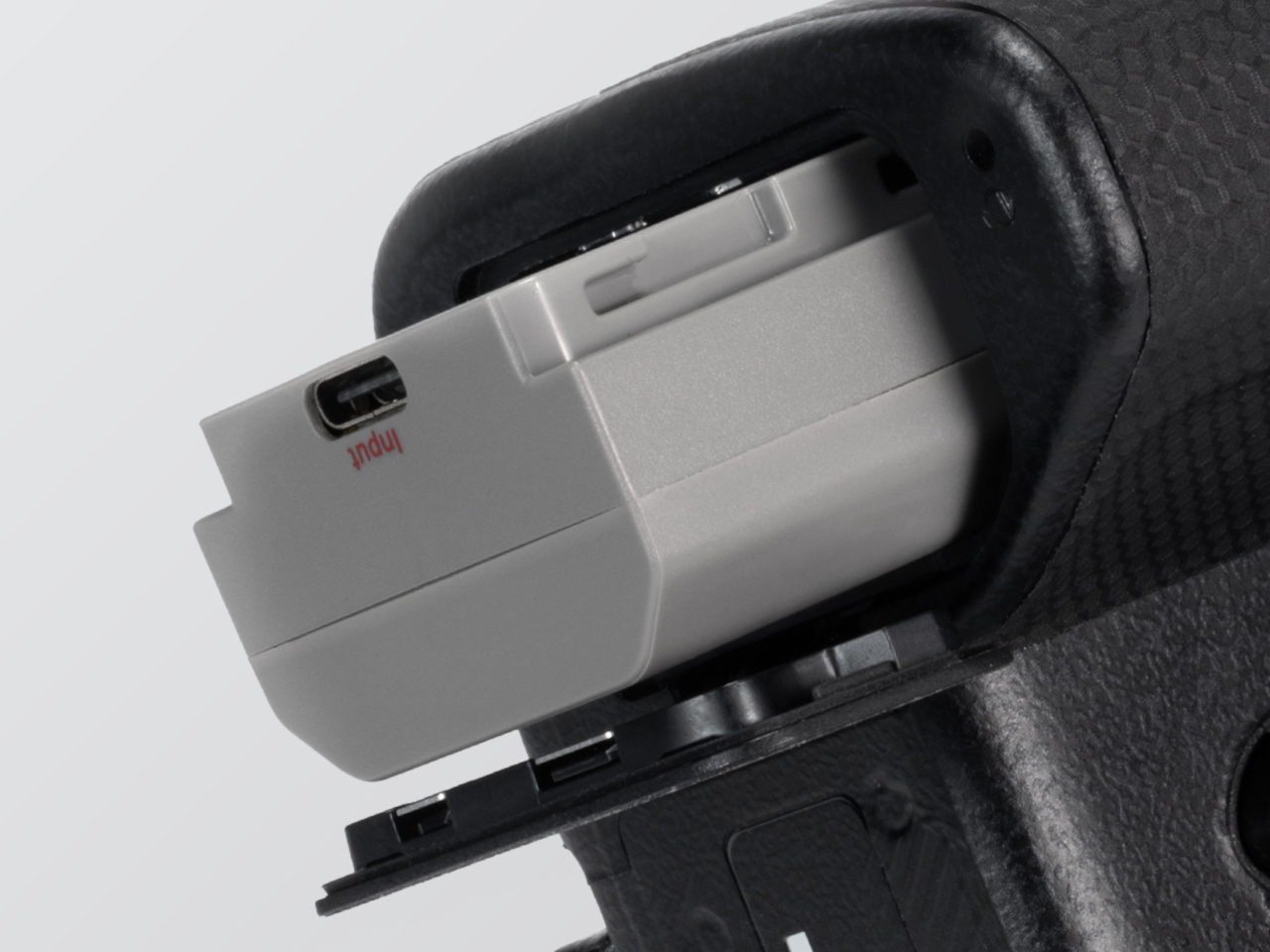
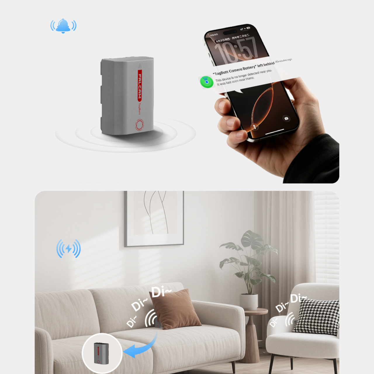
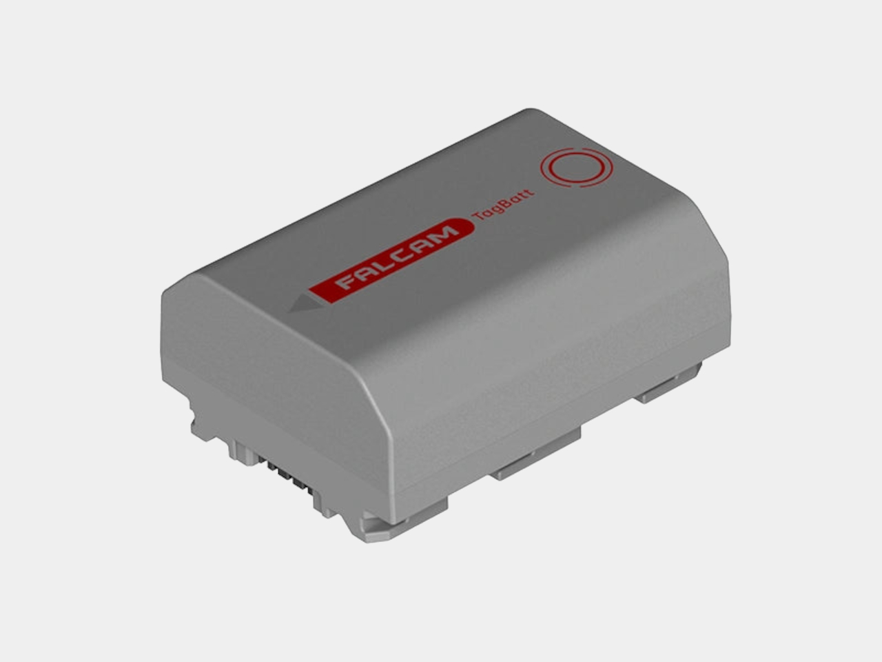
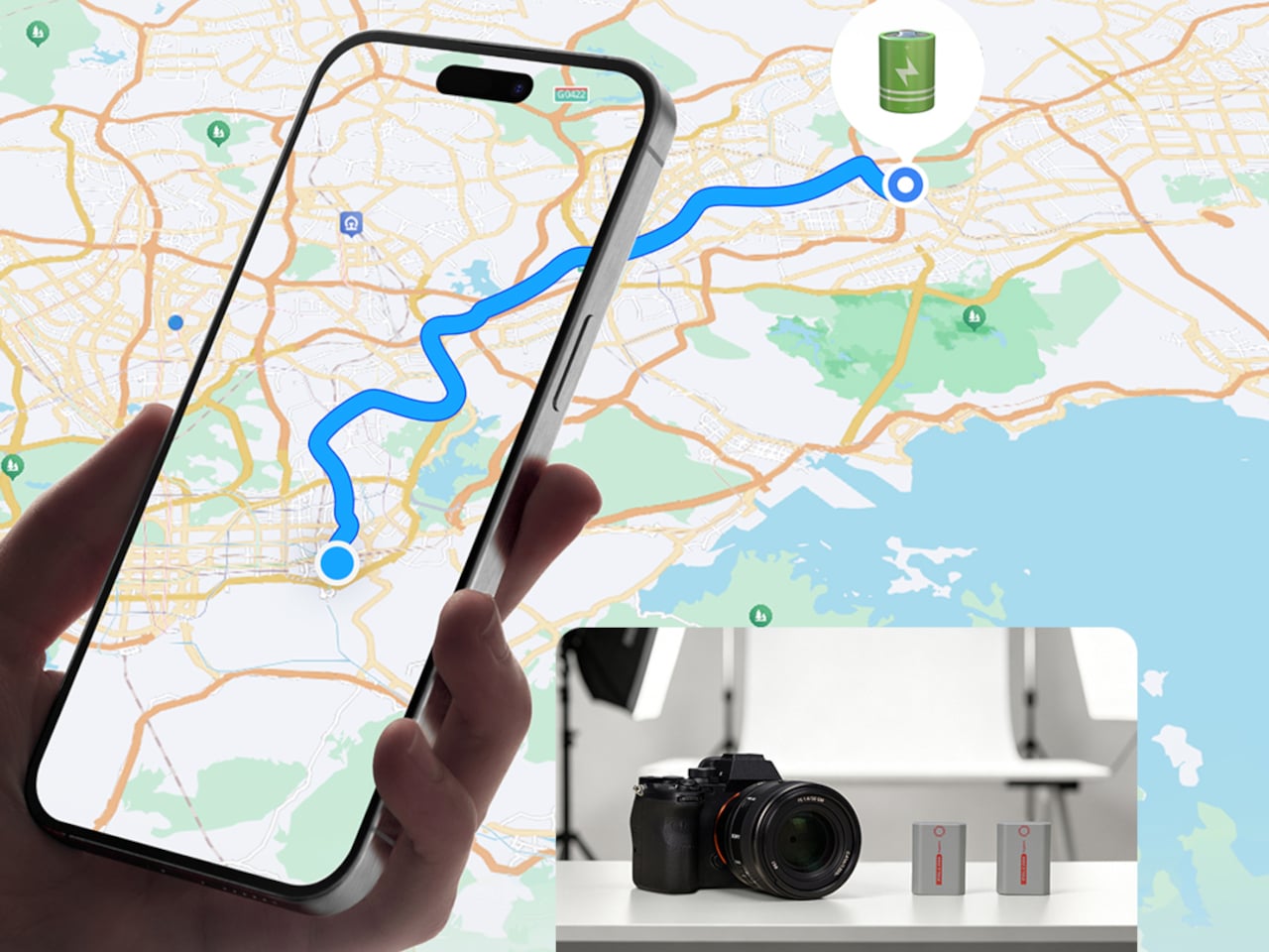
The FALCAM TagBatt addresses the problem from inside the battery itself. Compatible with Sony’s NP-FZ100 form factor, it integrates Apple’s Find My tracking technology directly into the cell, so the battery carries its own location data wherever it goes. If it ends up left behind at a studio, a venue, or the seat pocket of a flight, the Find My app will flag it and show its last known position.

Designer: FALCAM

Because the tracker lives inside the battery rather than clipped to a camera strap or screwed into a cage mount, it’s considerably harder to spot. An opportunistic thief who grabs a camera bag and removes any obvious Bluetooth puck from the outside can’t strip out what’s already built into the power source. It’s the kind of discreet integration that external trackers can’t quite replicate, no matter how small they get.

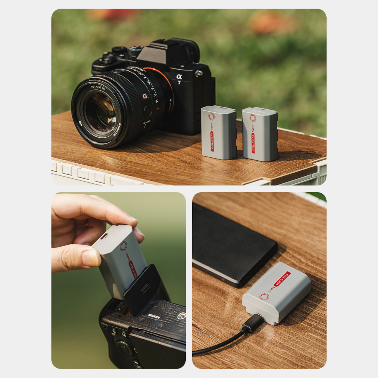
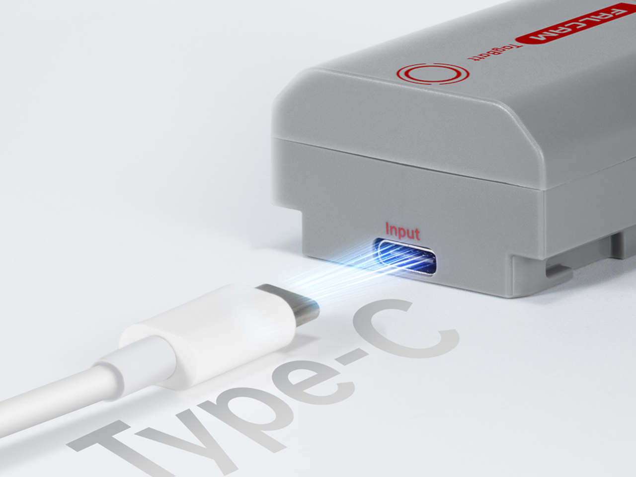
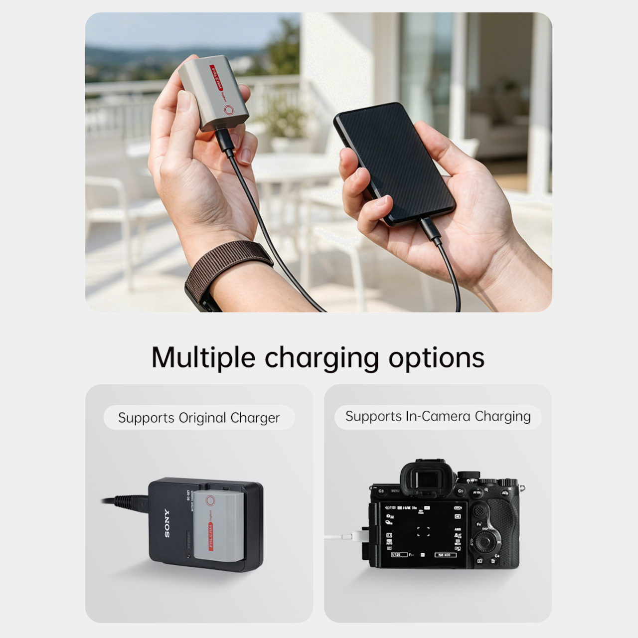
The tracking isn’t the only thing the TagBatt changes about how a camera battery behaves. A built-in USB-C port lets it charge directly from any standard USB-C source, including a power bank or a travel adapter, without needing the dedicated Sony battery charger that typically takes up its own space in a kit bag. Pop it out of the camera, plug it in overnight, and it’s ready in the morning without routing around a charger at all.

Capacity comes in at 2,600mAh against the OEM Sony NP-FZ100’s 2,280mAh, which translates to a modest but real advantage per charge. An advanced decoding chip handles the communication with the camera’s internal systems so the body treats it as it would any genuine battery, with accurate charge-level reporting and none of the “non-genuine battery” warning messages that typically accompany third-party cells.

Compatibility covers a wide sweep of Sony’s current lineup, including the Alpha 7 series through the Alpha 7 V, the Alpha 9 series, the Alpha 6700, the FX3 and FX30, and the ZV-E1, among others. A Canon LP-E6 version is also available now, with Nikon EN-EL15 and Fujifilm NP-W235 versions confirmed to be in development.

At $69.99, the TagBatt costs more than a standard third-party replacement but considerably less than the Sony original, and it comes with two capabilities that the original simply doesn’t offer. For photographers who travel frequently, work in locations where gear occasionally goes astray, or are just tired of carrying a charger they’d rather leave at home, the trade-off makes a fairly straightforward case.

The post Camera Batteries Go Missing, So This $70 One Tracks Itself first appeared on Yanko Design.
  •  
❌