Vue lecture

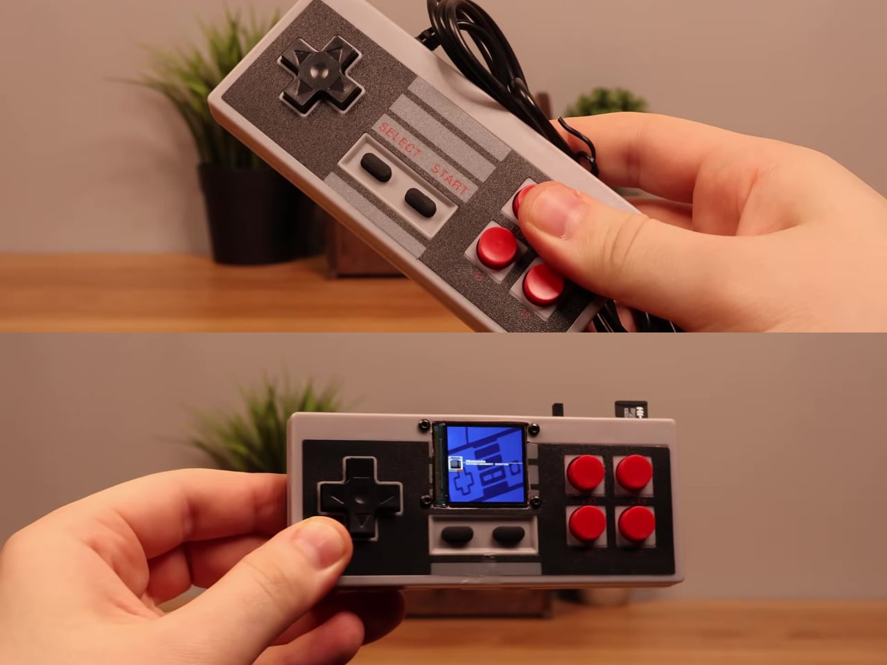
Someone Stuffed a Full Retro Console Inside an NES Controller for $17

Most original NES controllers haven’t seen active duty in decades. They survive in storage bins and attic boxes, physically intact and perfectly functional as controllers, but with nothing left to plug them into. The consoles they were paired with have long since been replaced or decommissioned. The hardware was always well built, but the form factor has been sitting idle for years.

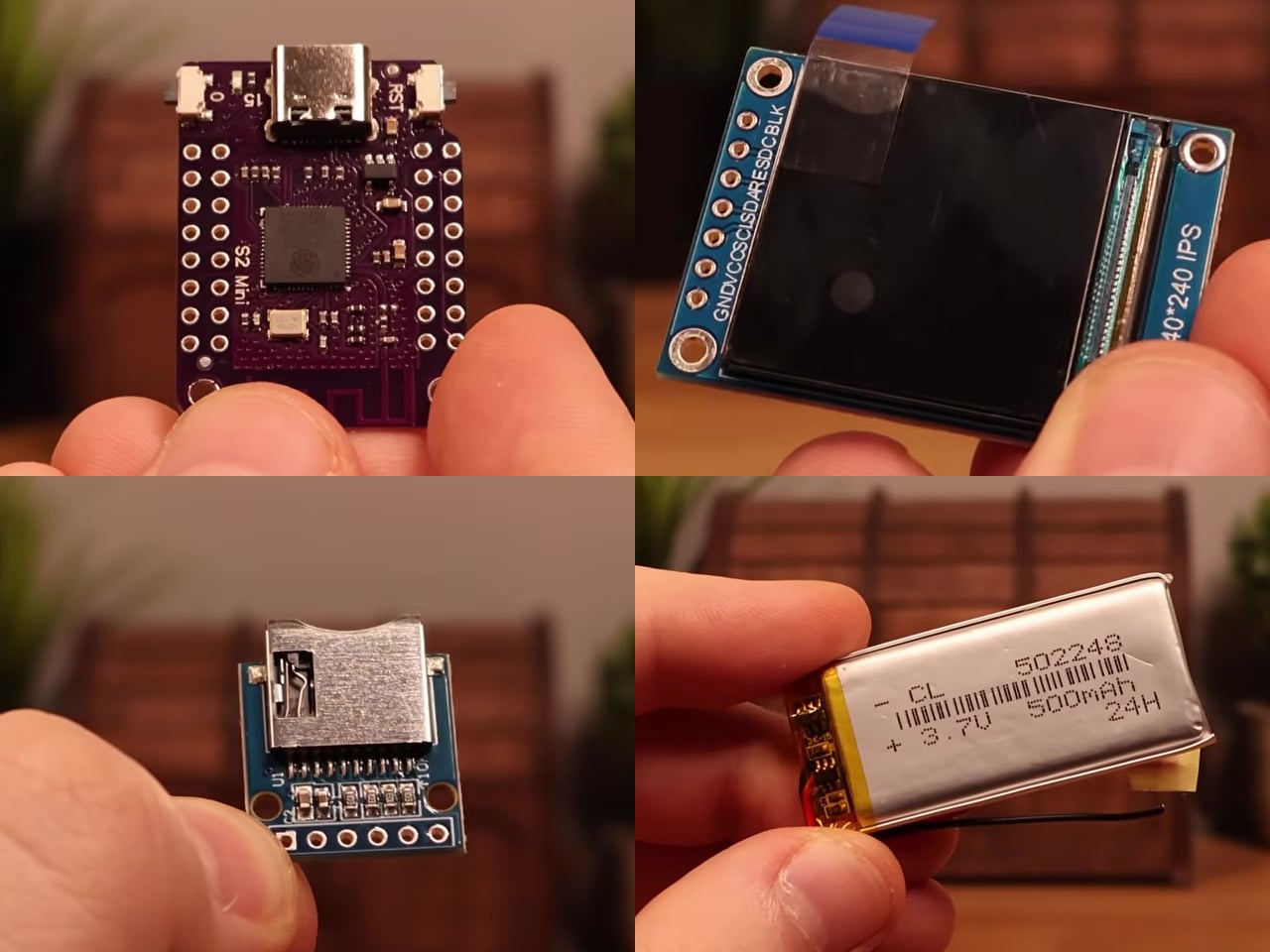
This mod changes the job description of that controller shell entirely. The electronics inside a standard NES-style gamepad were stripped out and replaced with a Wemos ESP32-S2 Mini development board, a 1.54-inch 240×240 TFT display, a MicroSD card module, a 500 mAh lithium-polymer battery, a charging board, a speaker, and a slide power switch. From the outside, it still looks exactly like an NES controller.

Designer: Logic Gate Labs
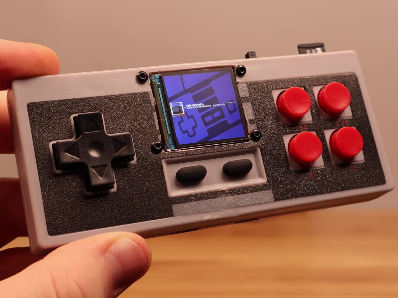
Choosing the right processor was essentially a geometry problem. A larger ESP32-S3 would have offered dual-core performance and enough PSRAM to keep entire game ROMs in memory, but it was too big to fit inside the housing. Smaller ESP32 variants without PSRAM lacked the memory for smooth emulation. The ESP32-S2 Mini landed in the narrow window between board size and processing capability that the build required.
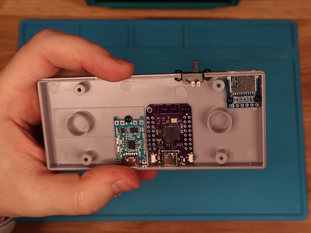
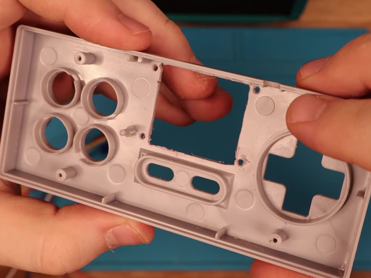
Getting everything to fit required real surgery on the shell. Internal plastic supports had to be trimmed back to make room for the display, and new openings were drilled for the screen, USB charging port, MicroSD slot, speaker, and power switch. A bare copper wire serves as a central ground distribution rail, cutting the number of individual ground wires needed and making it possible to actually close the controller afterward.
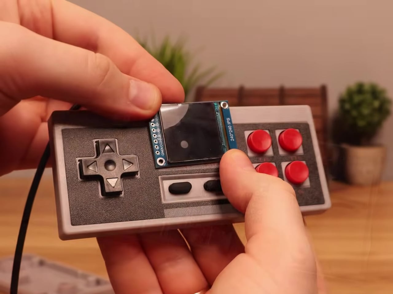
On the software side, the device runs the Retro-Go emulator framework, compiled using ESP-IDF and CMake since the ESP32-S2 isn’t a standard Retro-Go target. The result handles a range of classic 8-bit systems comfortably. As a bonus, Doom runs via PrBoom-Go from a Freedoom WAD file loaded on the MicroSD card, managing somewhere between five and 15 frames per second depending on the scene.
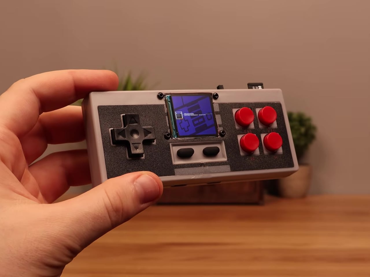
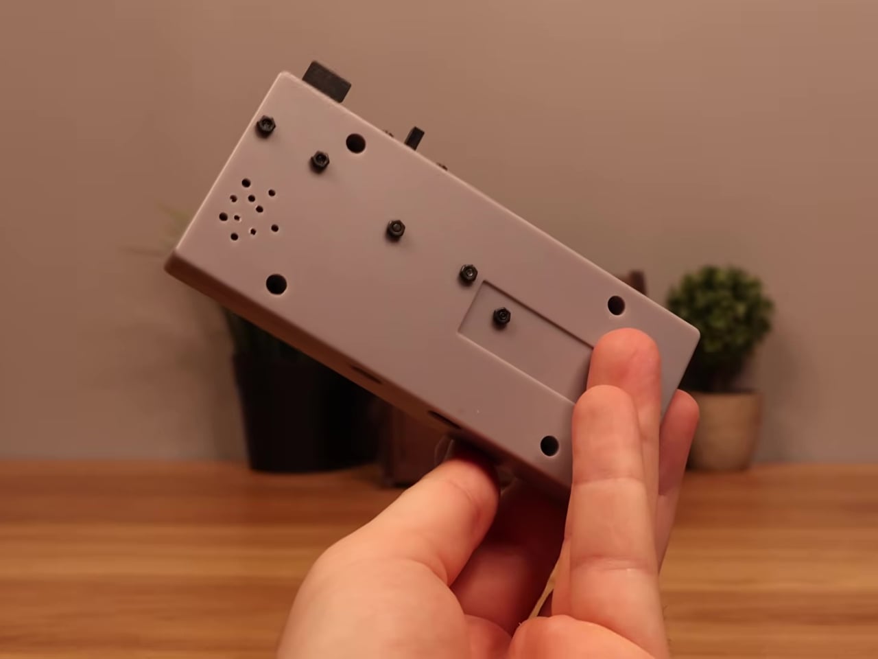
The total build cost runs about $17 using common suppliers, or closer to $8 when sourcing directly from overseas markets. That puts the project well under the price of a single modern game release. Flip the power switch, select a ROM from the MicroSD card, and the screen loads games that once required a dedicated console and television setup. No additional hardware is needed.

What makes this more than a novelty is how it reconsiders a form factor most people already have muscle memory for. The D-pad clicks the same way it always did, and the A and B buttons carry the same spring. What changed is where the signal goes after the press. Instead of traveling to a console that no longer exists, the controller now processes it directly inside its own shell.
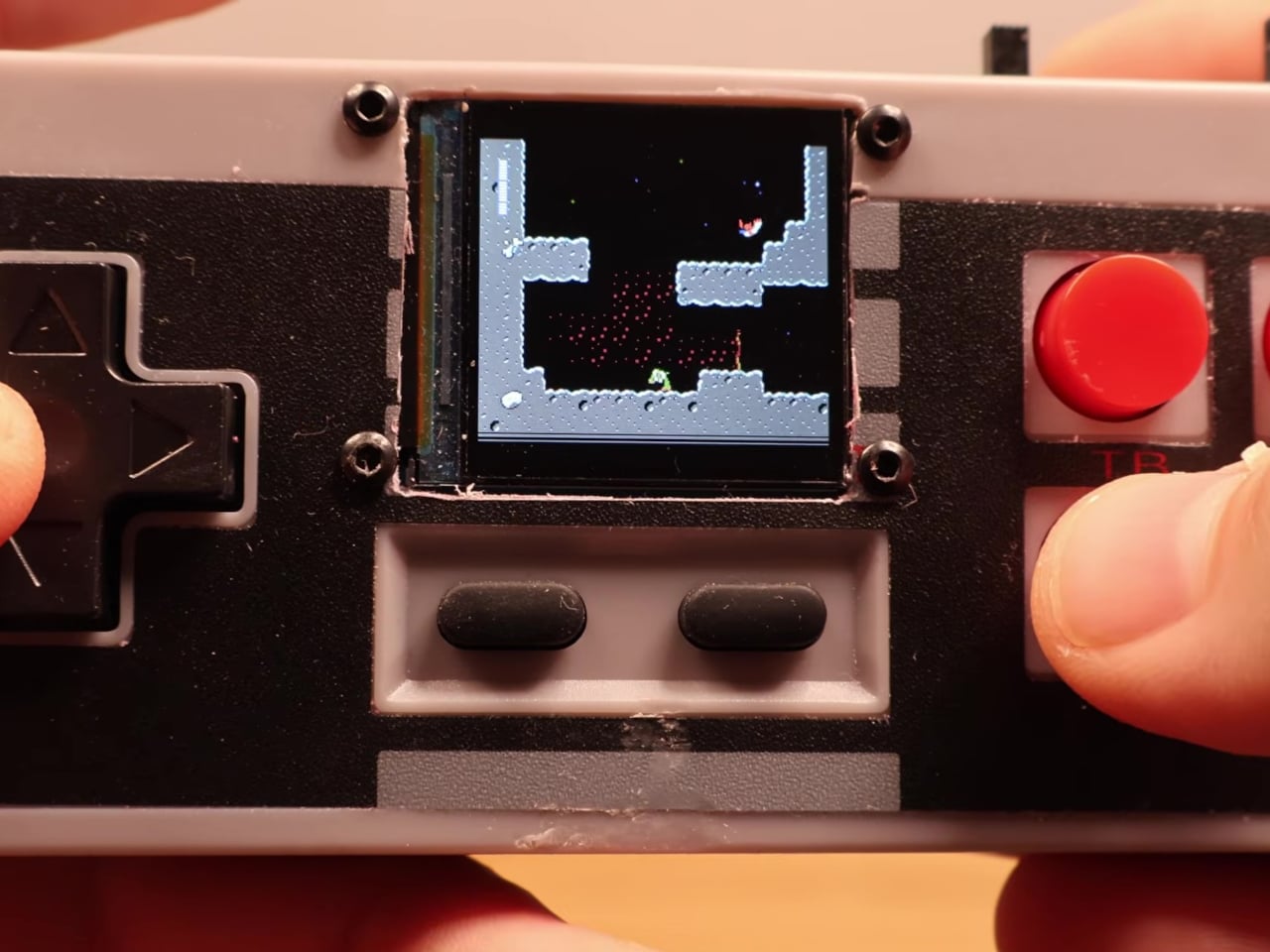
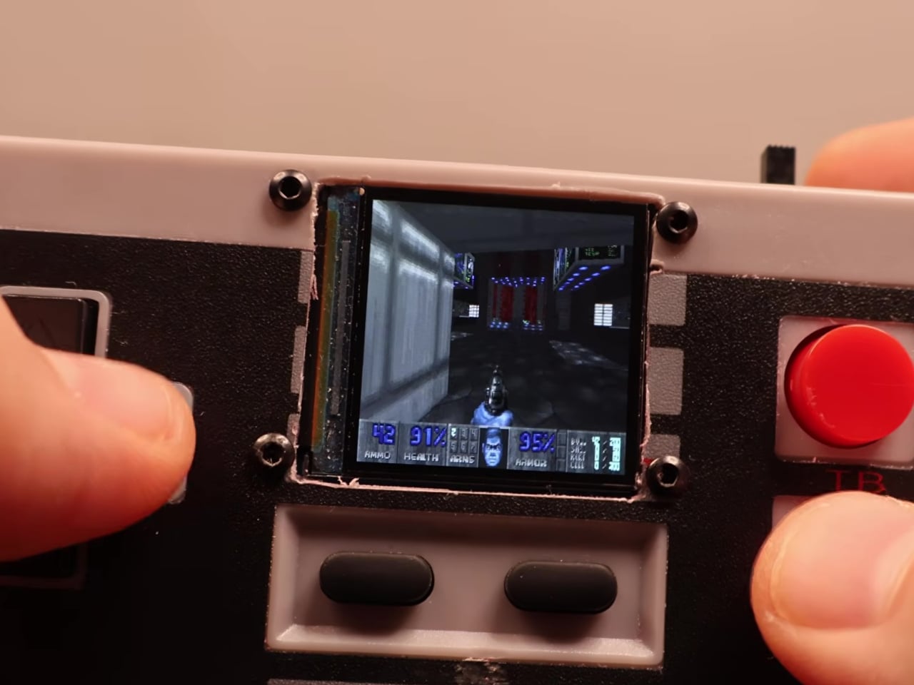
The Retro-Go framework is open source, the parts are widely available, and the NES controller shell is one of the most common pieces of vintage hardware still circulating through the secondhand market. Nothing about this build required specialized equipment or proprietary components. The total part list costs less than a single new game on any current platform and fits inside hardware that most people already own.

The post Someone Stuffed a Full Retro Console Inside an NES Controller for $17 first appeared on Yanko Design.
  •  

Camera Batteries Go Missing, So This $70 One Tracks Itself

Camera batteries are one of those accessories that photographers never think about until something goes wrong. They’re small enough to vanish into the bottom of a bag or a jacket pocket, common enough to own several of and regularly mix up, and important enough that losing one mid-trip can force an early stop to a shoot. The solution most people reach for is buying more of them, which only increases the number of things to keep track of.

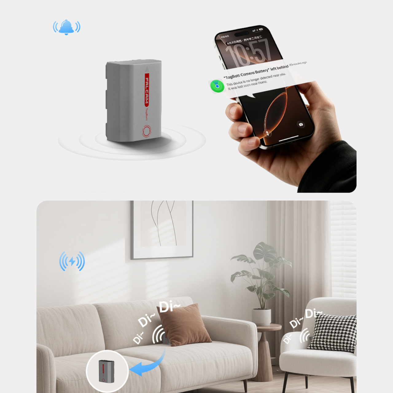
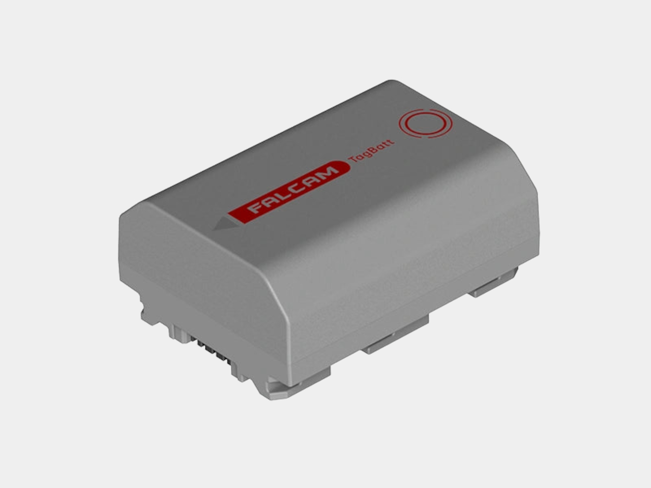
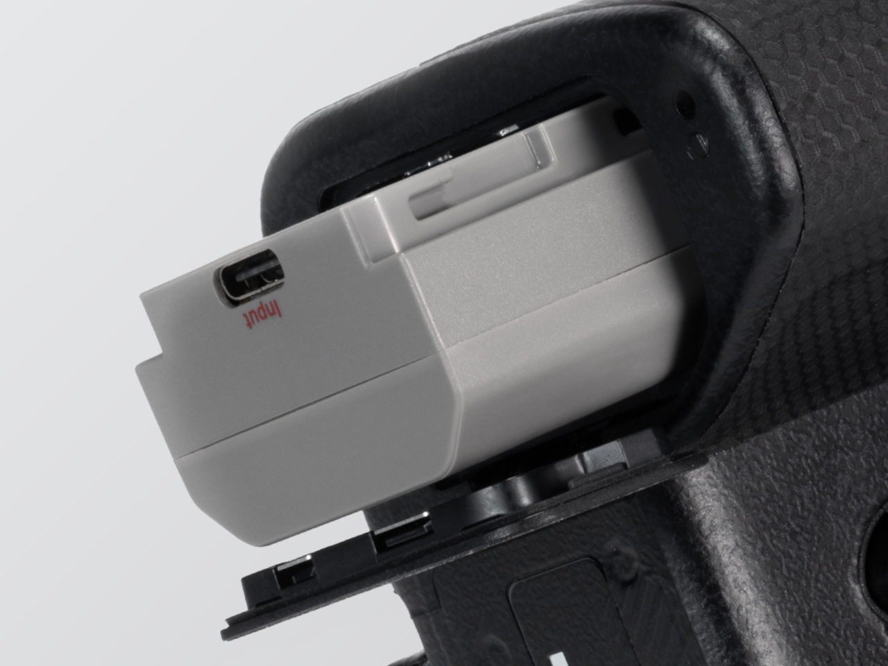
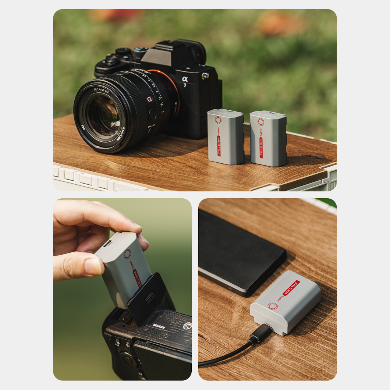
The FALCAM TagBatt addresses the problem from inside the battery itself. Compatible with Sony’s NP-FZ100 form factor, it integrates Apple’s Find My tracking technology directly into the cell, so the battery carries its own location data wherever it goes. If it ends up left behind at a studio, a venue, or the seat pocket of a flight, the Find My app will flag it and show its last known position.

Designer: FALCAM

Because the tracker lives inside the battery rather than clipped to a camera strap or screwed into a cage mount, it’s considerably harder to spot. An opportunistic thief who grabs a camera bag and removes any obvious Bluetooth puck from the outside can’t strip out what’s already built into the power source. It’s the kind of discreet integration that external trackers can’t quite replicate, no matter how small they get.

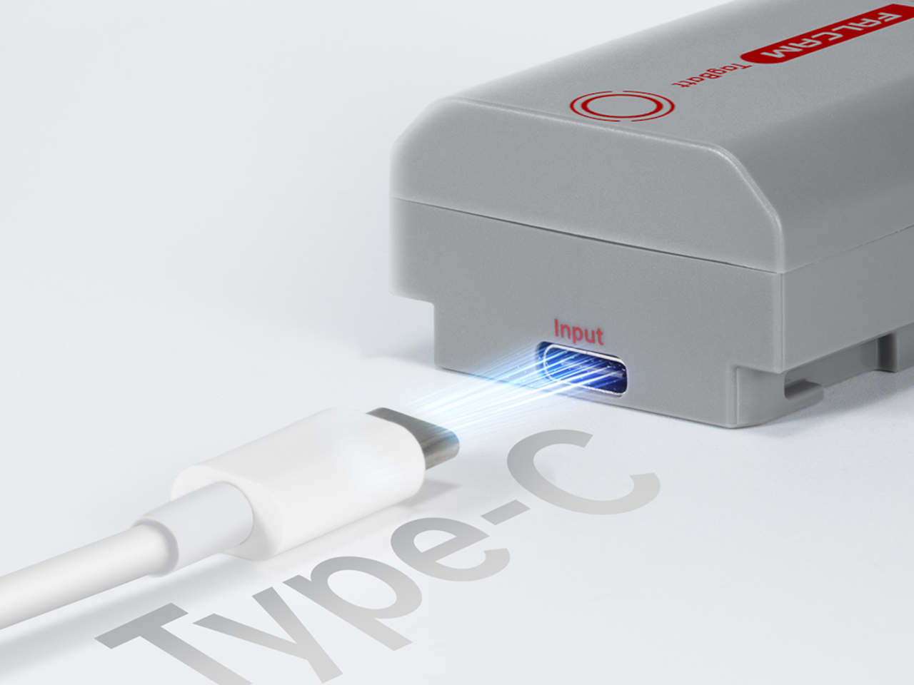
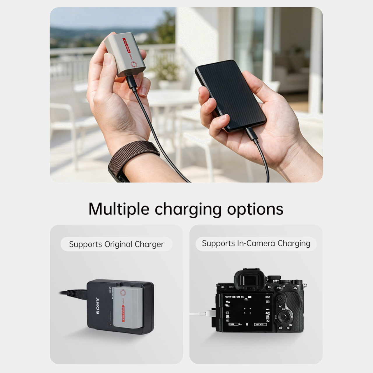
The tracking isn’t the only thing the TagBatt changes about how a camera battery behaves. A built-in USB-C port lets it charge directly from any standard USB-C source, including a power bank or a travel adapter, without needing the dedicated Sony battery charger that typically takes up its own space in a kit bag. Pop it out of the camera, plug it in overnight, and it’s ready in the morning without routing around a charger at all.

Capacity comes in at 2,600mAh against the OEM Sony NP-FZ100’s 2,280mAh, which translates to a modest but real advantage per charge. An advanced decoding chip handles the communication with the camera’s internal systems so the body treats it as it would any genuine battery, with accurate charge-level reporting and none of the “non-genuine battery” warning messages that typically accompany third-party cells.

Compatibility covers a wide sweep of Sony’s current lineup, including the Alpha 7 series through the Alpha 7 V, the Alpha 9 series, the Alpha 6700, the FX3 and FX30, and the ZV-E1, among others. A Canon LP-E6 version is also available now, with Nikon EN-EL15 and Fujifilm NP-W235 versions confirmed to be in development.

At $69.99, the TagBatt costs more than a standard third-party replacement but considerably less than the Sony original, and it comes with two capabilities that the original simply doesn’t offer. For photographers who travel frequently, work in locations where gear occasionally goes astray, or are just tired of carrying a charger they’d rather leave at home, the trade-off makes a fairly straightforward case.

The post Camera Batteries Go Missing, So This $70 One Tracks Itself first appeared on Yanko Design.

  •  

The 3 Best Japanese Kitchen Tools You Need to Buy August 2026

Japanese kitchen tools tend to arrive with a very specific philosophy attached. They do less than you expect on paper and more than you realize until you’ve used them for a week. The three objects below cover different ends of that idea: a precision appliance from one of Japan’s most storied engineering brands, a pair of scissors built for the demands of serious kitchen prep, and a clay pot that has been doing its job correctly since the Kamakura period.

What connects them isn’t aesthetic or price point. It’s the sense that each was designed by someone who had a genuine opinion about what the object should do, then made it do exactly that. August is a good month to pay attention to the kitchen — the produce is at its best, the cooking is more instinctive, and the tools you reach for most tend to reveal themselves. These three are worth reaching for.

1. Mitsubishi Bread Oven

The name requires a moment. Mitsubishi, the Japanese conglomerate better known for cars and precision electronics, makes one of the most exacting home bread ovens available. The machine applies the same engineering discipline to baking that Mitsubishi Electric brings to everything else it builds: controlled heat, precise internal timing, and an attention to the baking chamber environment that consumer appliances from Western brands rarely match. The result is a loaf with a crust and crumb structure most countertop machines simply cannot produce, regardless of recipe.

What makes it worth covering in a design publication isn’t only the output. The form is unmistakably Japanese in its restraint — minimal, white, without the button complexity that clutters European bread makers at comparable prices. It occupies counter space the way well-considered appliances should: as an object with a clear visual point of view rather than a machine that apologizes for being there. Bread that comes out of it tastes like something was genuinely thought about. Because it was.

What We Like

  • Precision heat management produces a crust and crumb that typical home bread makers don’t come close to replicating
  • The minimalist appliance design treats the machine as a considered object rather than a utility box competing for counter attention

What We Dislike

  • Sourcing outside Japan requires import channels, which adds cost and complicates any warranty or service process
  • The price point places this firmly in investment appliance territory — this is a deliberate purchase, not a casual one

2. Precision Chef Kitchen Scissors

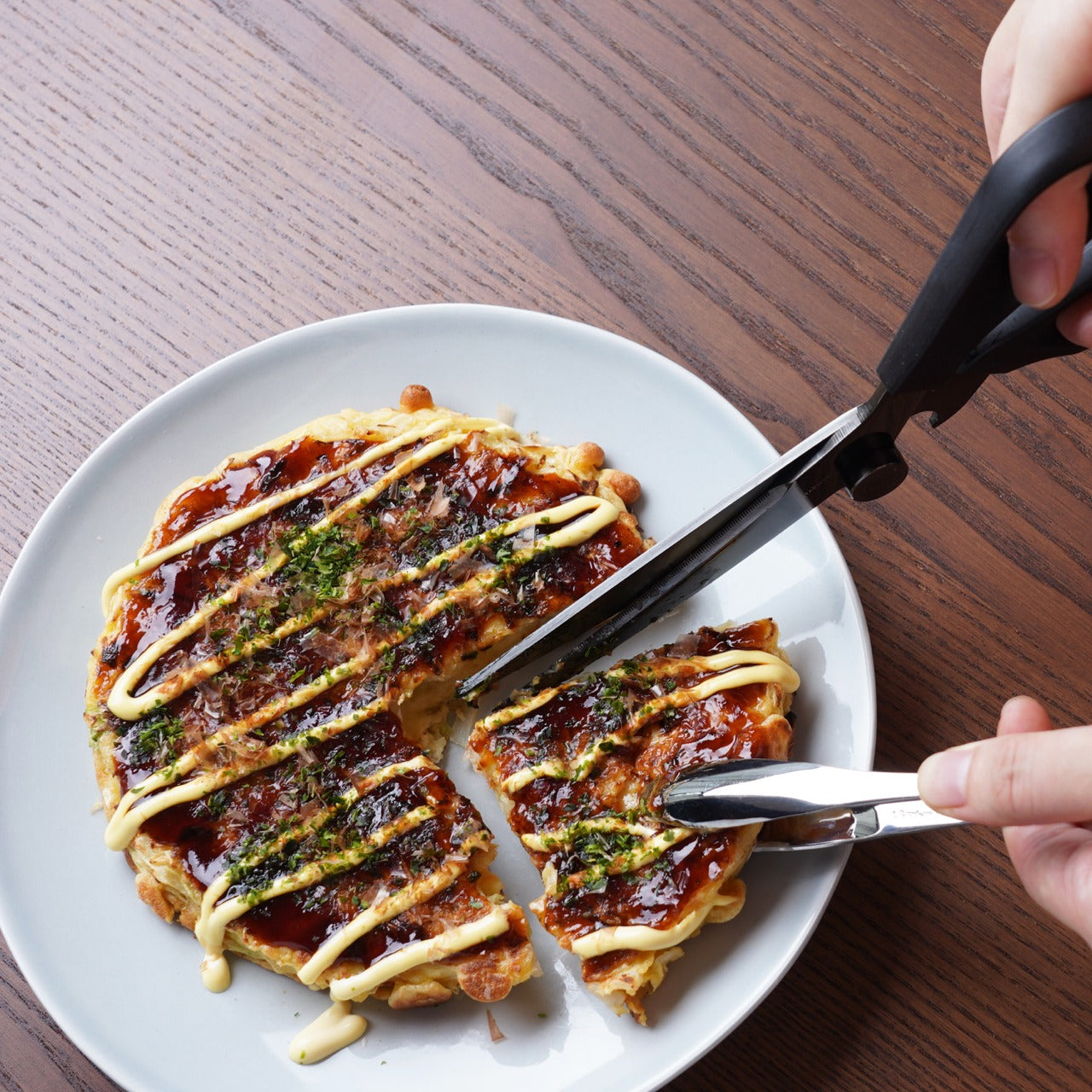
Kitchen scissors are one of those tools most cooks underestimate until they own a genuinely good pair. The Precision Chef Kitchen Scissors make the case for re-evaluation. Built with the material standards and blade geometry you’d expect from Japanese cutlery, they work through herbs, spring onions, dried chilies, and butcher twine without the handle torque that cheaper scissors force you to compensate for on every cut. Edge retention is where the quality gap between these and a supermarket pair becomes immediately obvious.

The design is deliberately restrained, which is exactly the right call for a kitchen tool that needs to sit in a drawer and get used without ceremony. Nothing superfluous in the grip, nothing decorative in the blade. Japanese kitchen scissors at this level function as precision instruments that happen to look like scissors. Once you’ve used a pair built this well for a full week of regular prep, the ones you owned before start to feel like a different category of object entirely.

Click Here to Buy Now: $95.00

What We Like

  • Edge retention and blade geometry handle repeated kitchen use without the performance drop that cheaper alternatives show within weeks
  • The restrained design means these function as tools first, rather than objects performing the idea of quality

What We Dislike

  • The refined aesthetic means they can disappear in a crowded kitchen drawer — worth designating a fixed home for them
  • Like most professional kitchen scissors, they require hand-washing to preserve edge quality, which adds a small but real step to cleanup

3. Iga-yaki Donabe Clay Pot

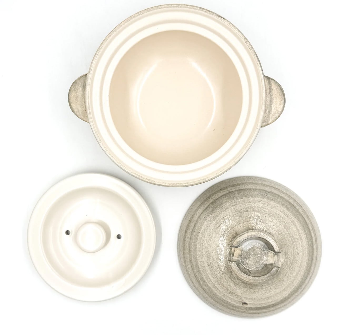
Iga clay comes from Mie Prefecture in Japan, where the local earth has been used for ceramics since at least the Kamakura period. The porous structure of Iga-yaki absorbs heat slowly and releases it with a consistency that metal pots structurally cannot replicate. Rice cooked in it sweetens. Broth deepens over a lower flame than you’d expect to produce it. The exterior stays rough and unfinished while the interior is glazed smooth — two surfaces on the same vessel, each doing exactly what it should.

Available from TOIRO Kitchen in several sizes, the donabe asks for a single seasoning step before first use — simmering rice water in the vessel — and then becomes one of the most reliable pots in the kitchen. It handles rice, hot pot, steaming, and slow braise with equal competence, which makes it the rare piece of cookware that earns its space by quietly replacing three other things. Store it with the lid off after washing, and it will be in your kitchen for decades.

What We Like

  • Iga clay’s heat retention produces results in rice and broth that no metal pot at any price point genuinely replicates
  • Real versatility across rice, hot pot, steaming, and slow cooking means one vessel covers what several usually would

What We Dislike

  • Requires a seasoning step before first use that the packaging doesn’t always communicate clearly upfront
  • The porous clay absorbs strong cooking odors over time and needs to be stored with the lid off after washing to stay fresh

Make the Kitchen Better, Not Faster

Three tools, three distinct registers of Japanese kitchen culture. Mitsubishi brings precision engineering to something as ordinary as a morning loaf. The scissors bring professional blade standards to daily prep work. The donabe brings centuries of ceramic craft to the kind of cooking that rewards patience over speed. None of them are trying to make the kitchen faster or more efficient. They’re trying to make it better, which is a different ambition and one worth paying for.

August is when most kitchens are running at full capacity — markets are abundant, evenings stretch long enough to cook properly. The tools you own in that window shape what’s actually possible in it. These three share a conviction that how something is made matters as much as what it does, and that conviction shows up every single time you reach for them. Start with whichever one your kitchen is currently missing most.

The post The 3 Best Japanese Kitchen Tools You Need to Buy August 2026 first appeared on Yanko Design.

  •  

The Hanoi House With 100 Windows and No Two the Same

The name alone stops you. 100 Windows. Not “The Pavilion House” or “House No. 7” or something equally poetic and vague. Just a count. A blunt, almost confrontational declaration of exactly what you’re getting, and yet somehow, the moment you see it, the name feels like the most understated thing about it.

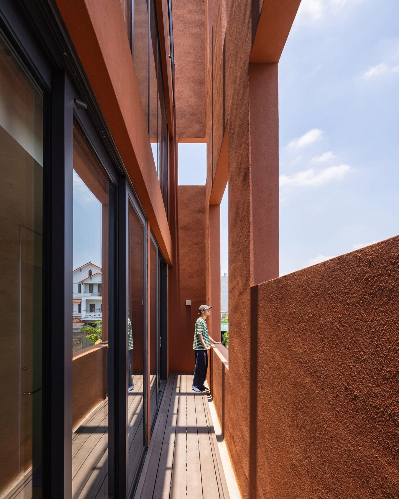
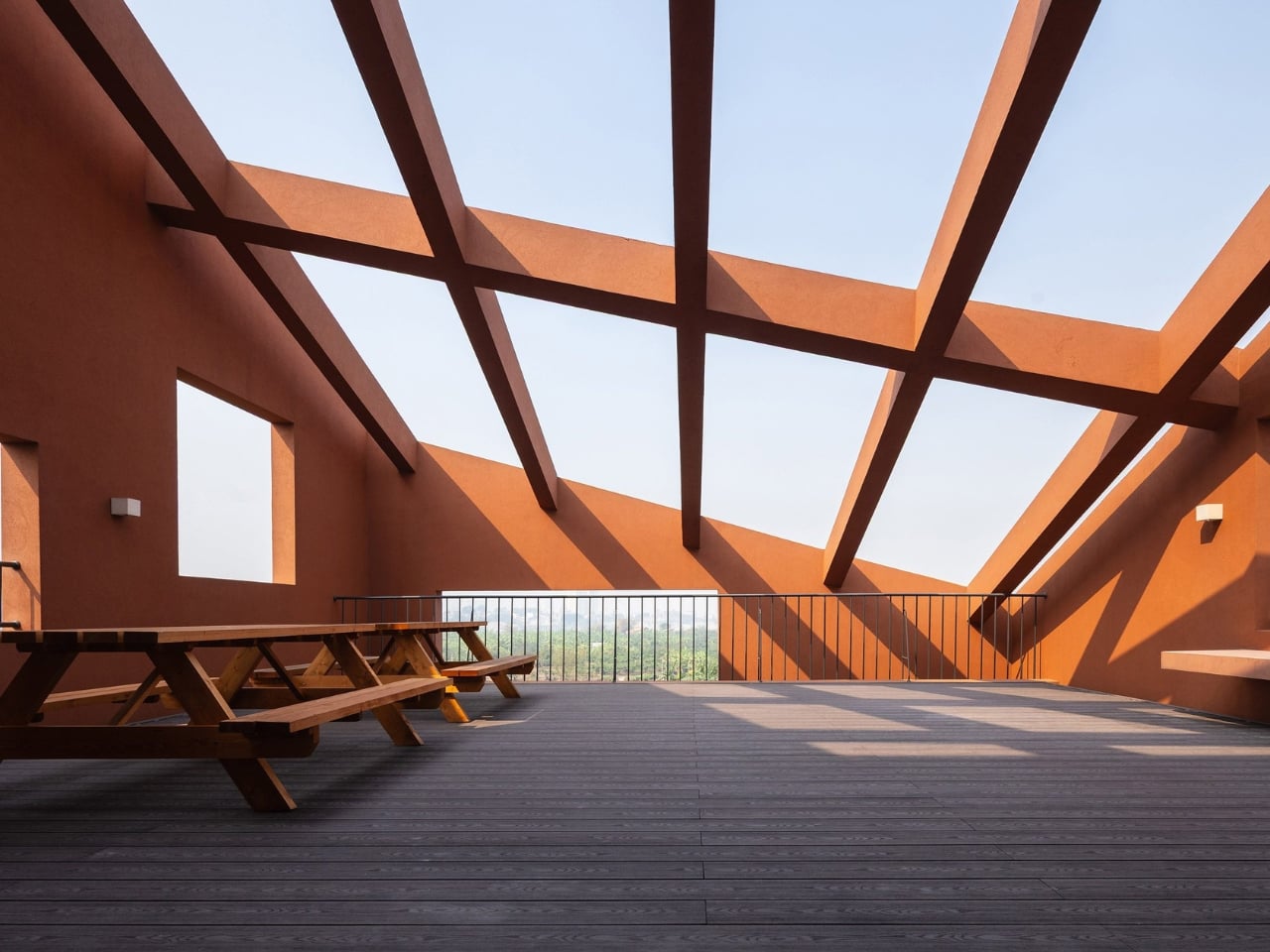
Designed by Hanoi-based architecture practice Inrestudio, this multi-generational home is wrapped in a terracotta-toned, double-layered exterior punctured by irregularly placed, mismatched openings. The windows aren’t uniform. They don’t line up in neat rows or follow a rational grid. They appear across the facade like a scatter of thoughts, some large, some small, some square, some elongated, placed with an intention that reveals itself slowly the longer you look. It’s controlled disorder, the kind that only happens when someone has thought very carefully about where chaos is allowed to go.

Designer: Inrestudio

The project sits within one of Vietnam’s most distinctive and genuinely challenging housing typologies: the tube house. These long, narrow urban homes are a product of Hanoi’s history, born from a time when property taxes were levied on street frontage, pushing families to build deep and vertical rather than wide. The tube house is, by nature, a compromise. You work with what the city gives you. What Inrestudio does here is refuse to let that constraint become a ceiling.

The double-layered envelope is the key move. By wrapping the home in two skins instead of one, the architects create what they call “in-between spaces,” zones that exist between the inner living areas and the outer facade. These aren’t wasted margins or dead air. They’re transitional, purposeful areas where the house breathes, where light filters and shifts through the day, where the rigid boundary between inside and outside softens into something more generous. It’s the kind of spatial thinking that doesn’t photograph easily but completely transforms the experience of actually being in a building.

This matters especially because 100 Windows was designed for multiple generations living under one roof, a reality that remains far more common in Vietnam than it does in most Western countries. Designing for multi-generational life is genuinely hard. You’re negotiating different rhythms, different needs for privacy and togetherness, different relationships to noise, light, and air. Architecture that understands this doesn’t just divide a floor plan into labeled rooms. It creates conditions where people can be near each other without being on top of each other, where the house itself does some of the social negotiating.

The terracotta tones feel right for this, too. The palette connects the building to its climate, to the warmth and humidity of Hanoi, to the earth tones of traditional Vietnamese buildings without becoming a costume or a nostalgia piece. It reads as contemporary without trying to distance itself from its own context, which is a balance a lot of architecture gets wrong in either direction.

What you take away from 100 Windows isn’t really about the windows, or at least not literally. It’s about the idea that a constraint, whether it’s a narrow plot, a shared family life, or a hundred openings that need to somehow feel cohesive, can become the source of design rather than the obstacle to it. The windows are a by-product of a layered system, not a stylistic decision made in isolation. That’s what earns it attention beyond the aesthetic.

Architecture like this tends to get filed under “interesting regional work” and not looked at as broadly as it deserves. But the conversation 100 Windows is having about density, family, and what a facade actually owes its inhabitants is one that any city grappling with urban housing should be paying attention to. It’s not proposing a universal solution. It’s doing something more useful: showing what happens when designers take the specific conditions of a place seriously enough to build something genuinely shaped by them. The result is a house that looks singular because it is.

The post The Hanoi House With 100 Windows and No Two the Same first appeared on Yanko Design.

  •  

A $2,699 Gaming PC That Doubles as a Display Case for Figurines

Cables are the dirty secret of PC building. No matter how carefully chosen the components are, or how expensive the case gets, the tangle of power, data, and fan connectors that crisscross the interior of most gaming desktops eventually undermines every effort at a clean aesthetic. The glass side panel that was supposed to show off the build ends up framing a web of wires that even the most diligent cable manager struggles to fully tame.

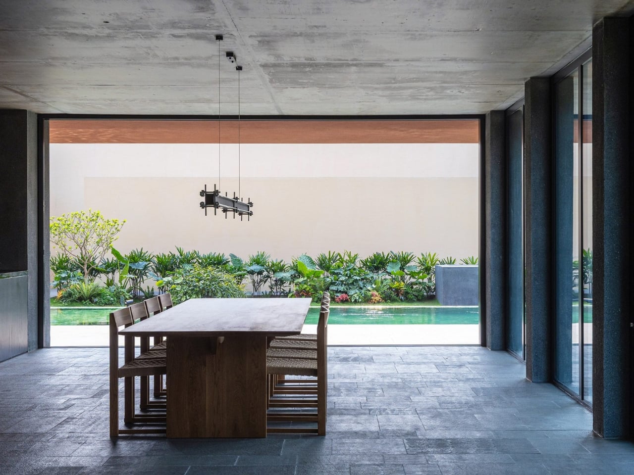
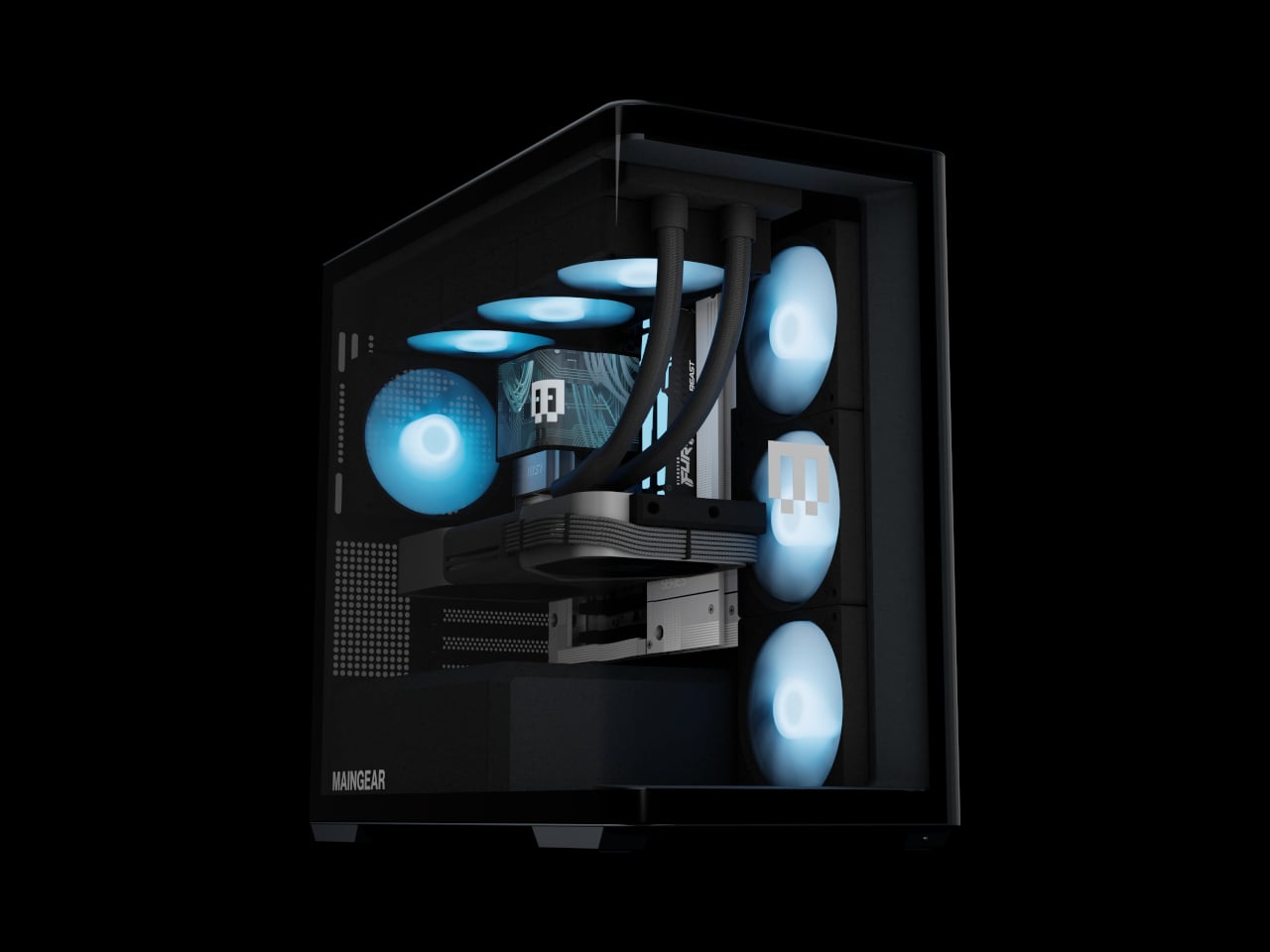
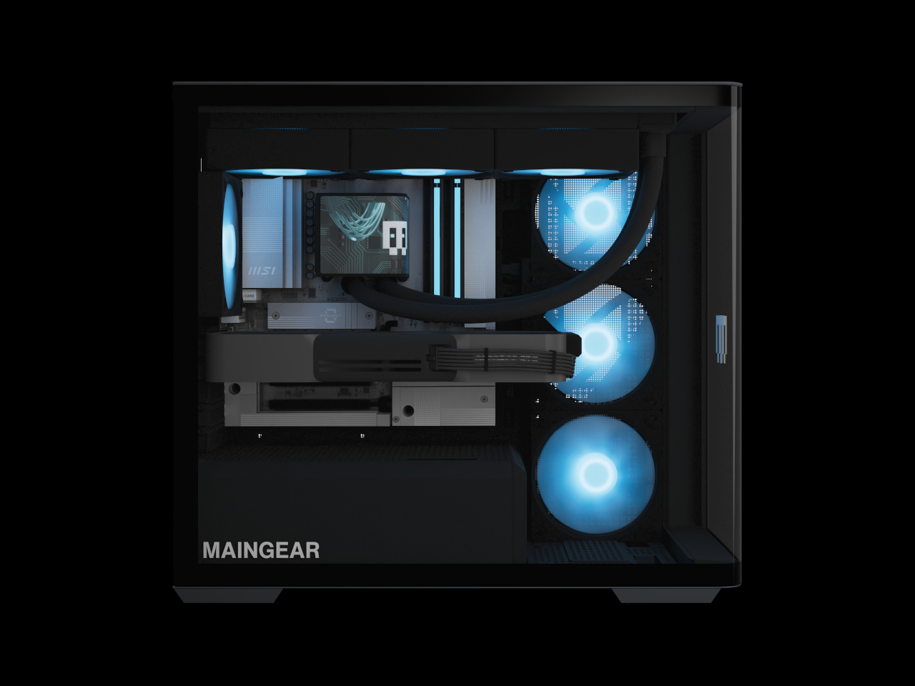
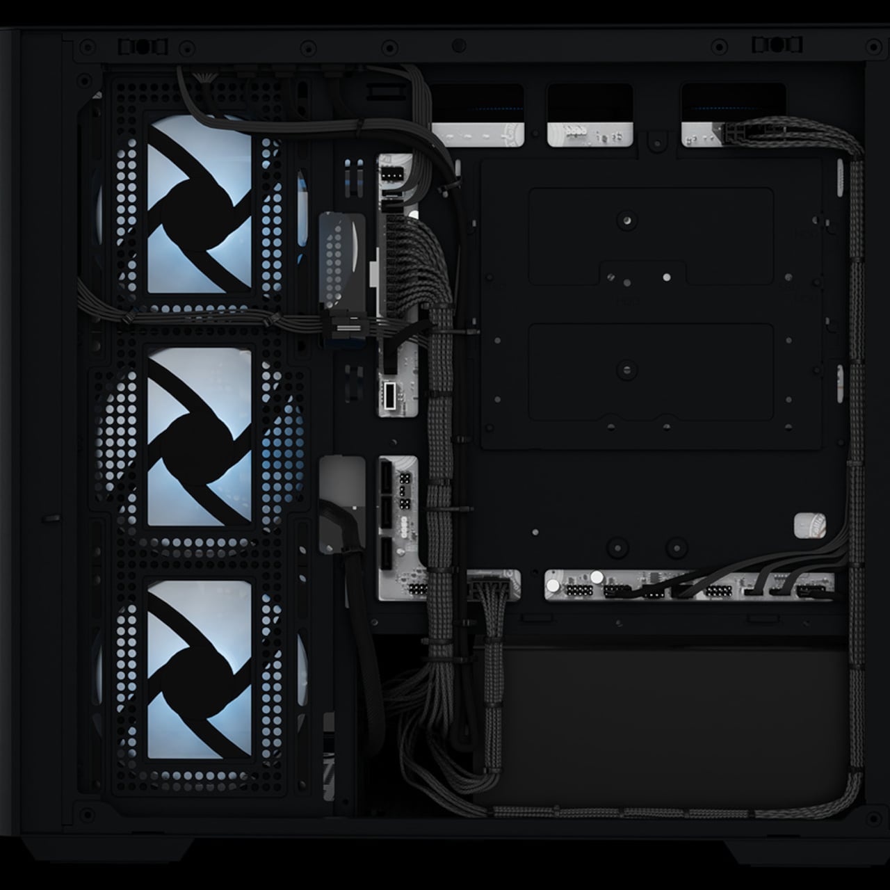
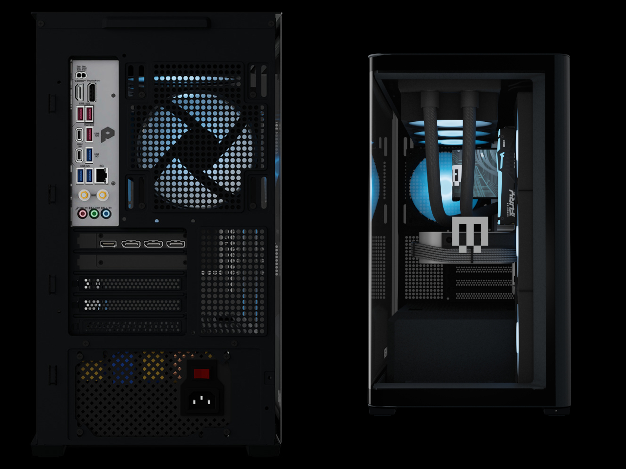
The Maingear Zero treats that problem as the actual design brief. Its patented MG-RC, or Rear Connection, system moves every motherboard connector to the back and underside of the board, clearing the visible interior of cables entirely. Paired with a single, seamless 4 mm tempered glass curve that wraps the front and side of the chassis without a single seam or pillar, the result is a desktop that looks like it has nothing to hide, because it genuinely doesn’t.

Designer: Maingear

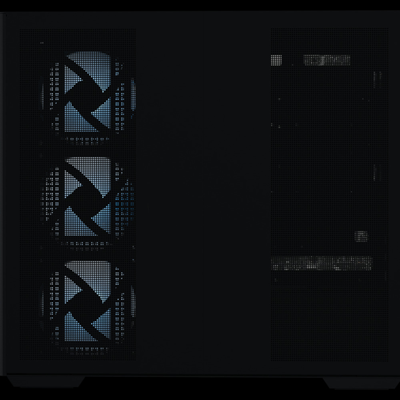
Seven fans work to keep the hardware running at full performance without drawing much attention to themselves. A mix of standard and reverse-blade units pushes cool air in through the front and exhausts it out through a 360mm AIO liquid cooler at the top, all following a single front-to-back airflow path. The reverse-blade intakes are specifically designed so the fan blades themselves don’t interrupt the view through the glass, which is a level of detail that most cases simply don’t think to address.

All RGB lighting inside the Zero is diffused rather than sourced from visible diodes, meaning the light saturates the interior without any glowing point of origin to break the illusion. The whole package measures 236mm wide, 421mm tall, and 460mm deep, which is more compact than a traditional mid-tower while still accommodating a full-sized GPU and the 360mm cooler overhead. It doesn’t look like a PC that compromised on size to achieve the aesthetic.

The hardware ceiling is genuinely high. Configurations top out at an NVIDIA GeForce RTX 5090 paired with an AMD Ryzen 7 9850X3D or Intel Core Ultra 7 270K Plus, 32GB of DDR5 memory, and a 2TB NVMe SSD. The chassis uses standardized mATX components throughout, with no proprietary parts, so future upgrades don’t require a trip back to the manufacturer.

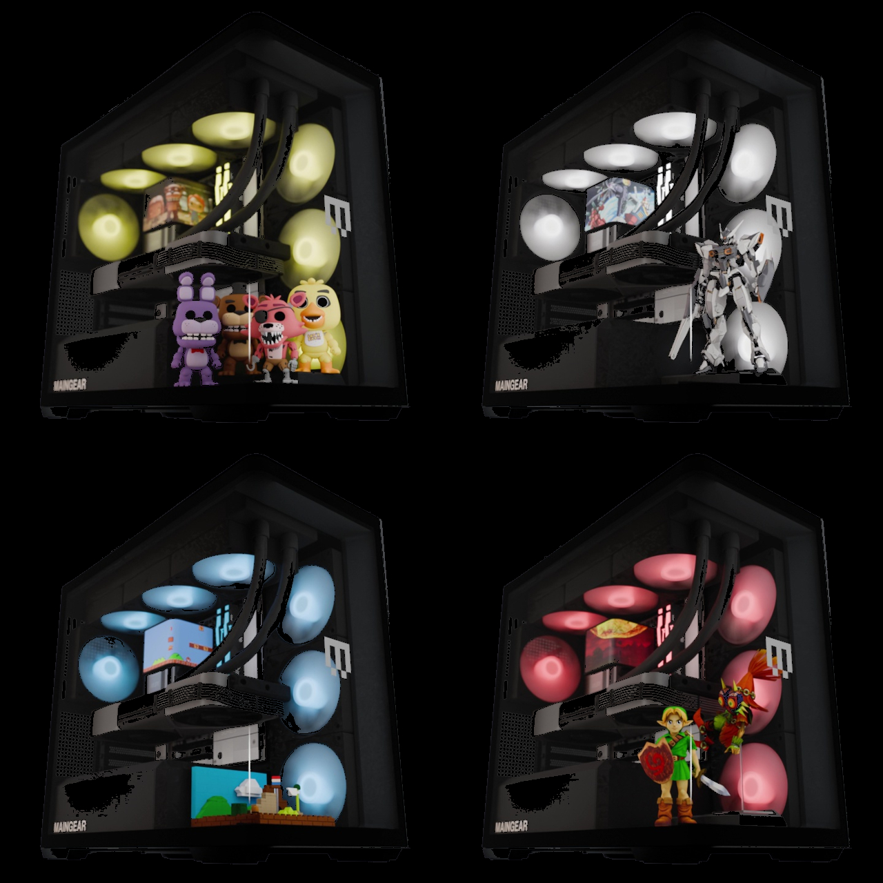
Beyond the hardware, the Launch Edition adds a pair of tool-free snap-in display stands inside the chassis, one for figurines and one for brick builds. The stands sit inside the case floor where passive airflow keeps whatever’s displayed inside dust-free. It’s the kind of feature that turns the interior from a hardware showcase into something closer to a display cabinet, which only makes sense given how much effort went into eliminating everything else that wasn’t worth looking at.

Every system is hand-built in New Jersey and ships with no bloatware pre-installed. Pricing starts at $2,699 for the base configuration, with the top-end Launch Edition Champion reaching $6,799. Built around the premise that nothing inside should be hidden, the Zero demonstrates how the best-looking gaming PC doesn’t have to sacrifice anything to get there.

The post A $2,699 Gaming PC That Doubles as a Display Case for Figurines first appeared on Yanko Design.

  •  

A Coin-Sized Disc Just Reinvented the Multi-Tool Nobody Could Fix

The multi-tool has been around long enough that most people have developed a frustrated relationship with it. You carry one because having a blade, a screwdriver, and a bottle opener in one place sounds practical, and then you grumble when you actually need something. Getting to the right tool means prying at a tightly packed frame with both hands, and that dynamic hasn’t changed much in decades.

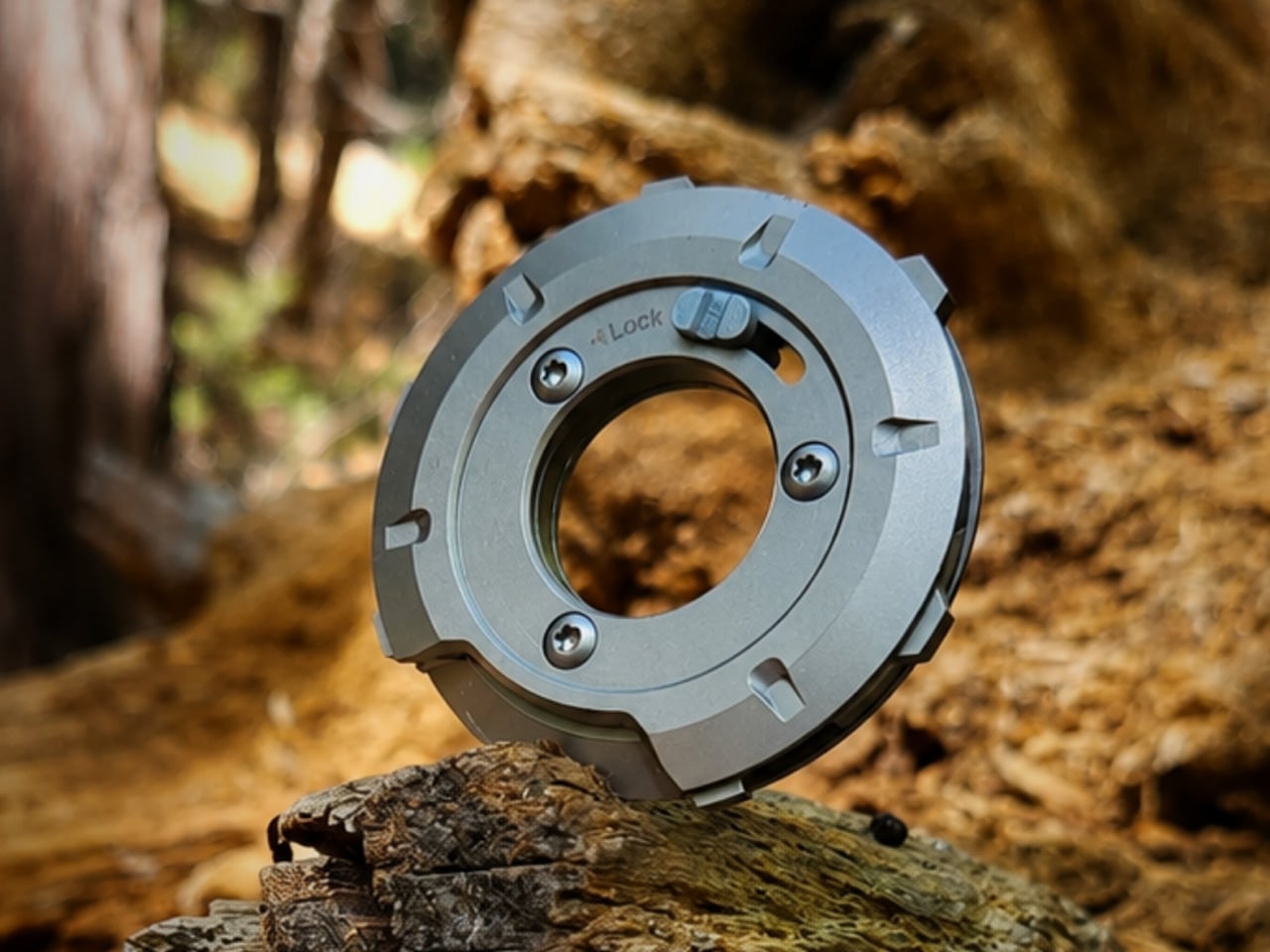
GEO, designed by Invento Design, takes issue with that familiar frustration. Rather than folding tools out from a layered frame, it uses a patent-pending rotating disc mechanism that cycles through five tools, exposing each one through a single opening. It’s a deceptively simple reframing of an old idea, and one that makes you wonder why nobody had taken this approach before.

Designer: Francisco Molina (Founder of Invento Design)

Click Here to Buy Now: $45 $70 (36% off). Hurry, only a few left!

The way it works is fairly intuitive. Outer index levers let you rotate the internal mechanism until the tool you want lines up with the access window. A sliding lock then holds the selected tool in position before you start. The whole operation happens in one hand, without setting anything down first or needing a second hand to hold the frame steady.

The five tools cover a surprisingly practical range of everyday needs. You’d reach for the blade and scraper when a label refuses to peel cleanly, the box opener when a taped-up package isn’t cooperating, the bottle opener at the end of a long day, the flathead driver for a loose screw or a stubborn paint can lid, and the string cutter when scissors aren’t anywhere nearby.

Carrying something with a blade in your pocket raises the obvious question of what happens when it isn’t in use. GEO handles this with a dedicated safety mode, a neutral rotational position where no edges are exposed. The sliding lock serves a separate purpose, preventing the mechanism from turning mid-task. Together, they make it safe enough to pocket, clip to a belt, or drop into a bag.

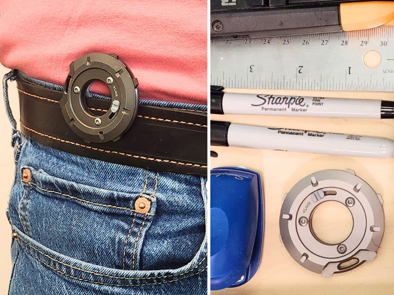
The form factor makes carrying it a fairly easy decision. At 53.5mm in diameter and only 8.7mm deep, GEO lands somewhere between a large coin and a watch face. The integrated belt clip adds some depth but keeps the total thickness under 15mm. It fits in a jeans pocket, clips to a gear bag, or disappears into a drawer without demanding much space.

There’s something worth noting about how it actually feels to use, too. The rotation isn’t purely functional but also incredibly satisfying. Each position clicks into place with enough tactile feedback that you know exactly where you’ve landed, and the smooth lever action makes it oddly enjoyable to cycle through even when nothing needs doing. It tends to stay in your hand a bit longer than the task requires.

The construction does a good job of reinforcing the premise. GEO’s tool body is milled from 440C stainless steel hardened to 57–59 HRC, placing it in the same material territory as quality kitchen blades. Cover panels come CNC-machined from either 6061-T6 aluminum or Grade 5 titanium, with internal hardware in 304 stainless steel throughout, a quietly serious specification for something this compact.

GEO isn’t meant to replace the full-size tools sitting in workshop drawers or on a fully loaded belt. It’s better understood as something for the other moments: the stubborn tape, the loose screw, the cord that needs a clean cut. Its compact, circular form makes it easy enough to keep close that reaching for it becomes the natural first move rather than an afterthought.

Click Here to Buy Now: $45 $70 (36% off). Hurry, only a few left!

The post A Coin-Sized Disc Just Reinvented the Multi-Tool Nobody Could Fix first appeared on Yanko Design.
  •  

Nothing killed the Glyph Interface. This Teenage Engineering synth concept argues that was a mistake

Nothing spent three phone generations convincing us that a few light strips on the back of a device counted as a personality. The Glyph Interface was the whole brand in one gesture, a Morse code of notifications you could read with the phone face-down on a bar table. Then Phone (3) arrived in July 2025 with the Glyph Matrix instead, a small dot matrix circle tucked in the corner, and the comment sections held a funeral. “NO GLYPH” became the shortest and angriest review of the year. Which makes it pretty funny that the most convincing argument for reviving that light language has come from a fan concept for a synthesizer.

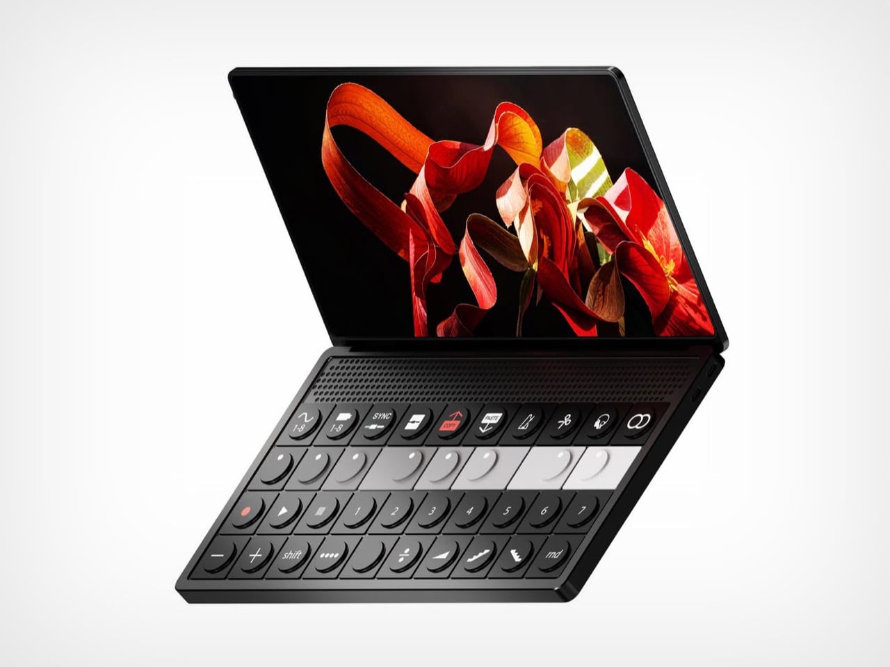
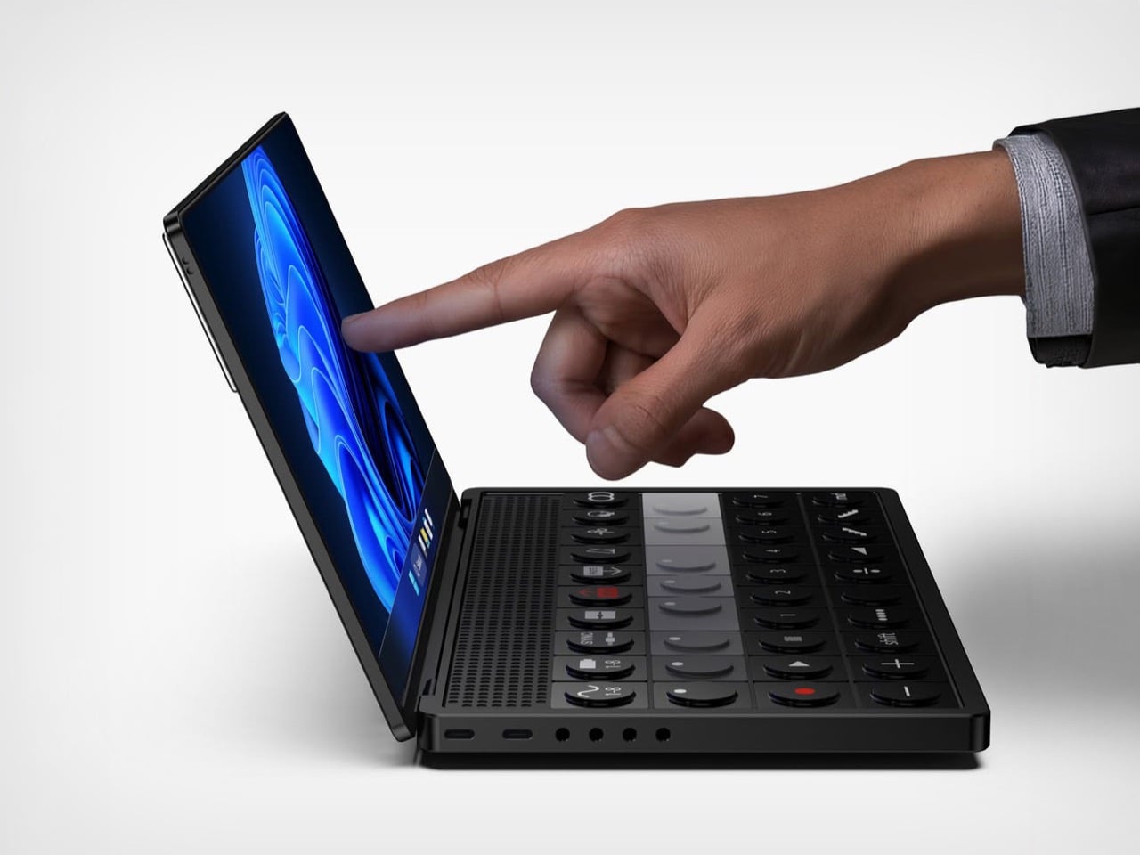
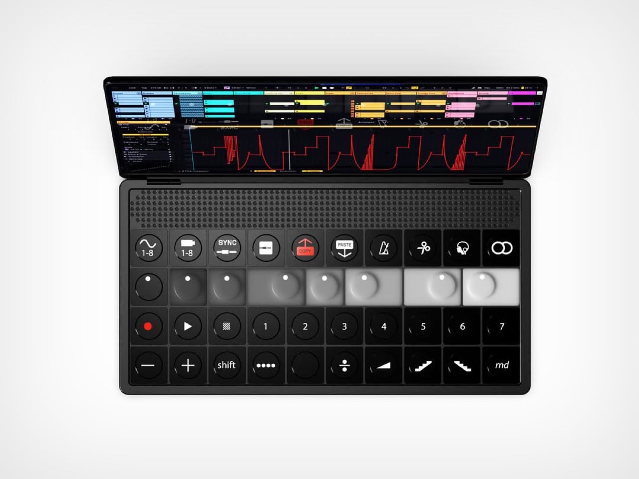
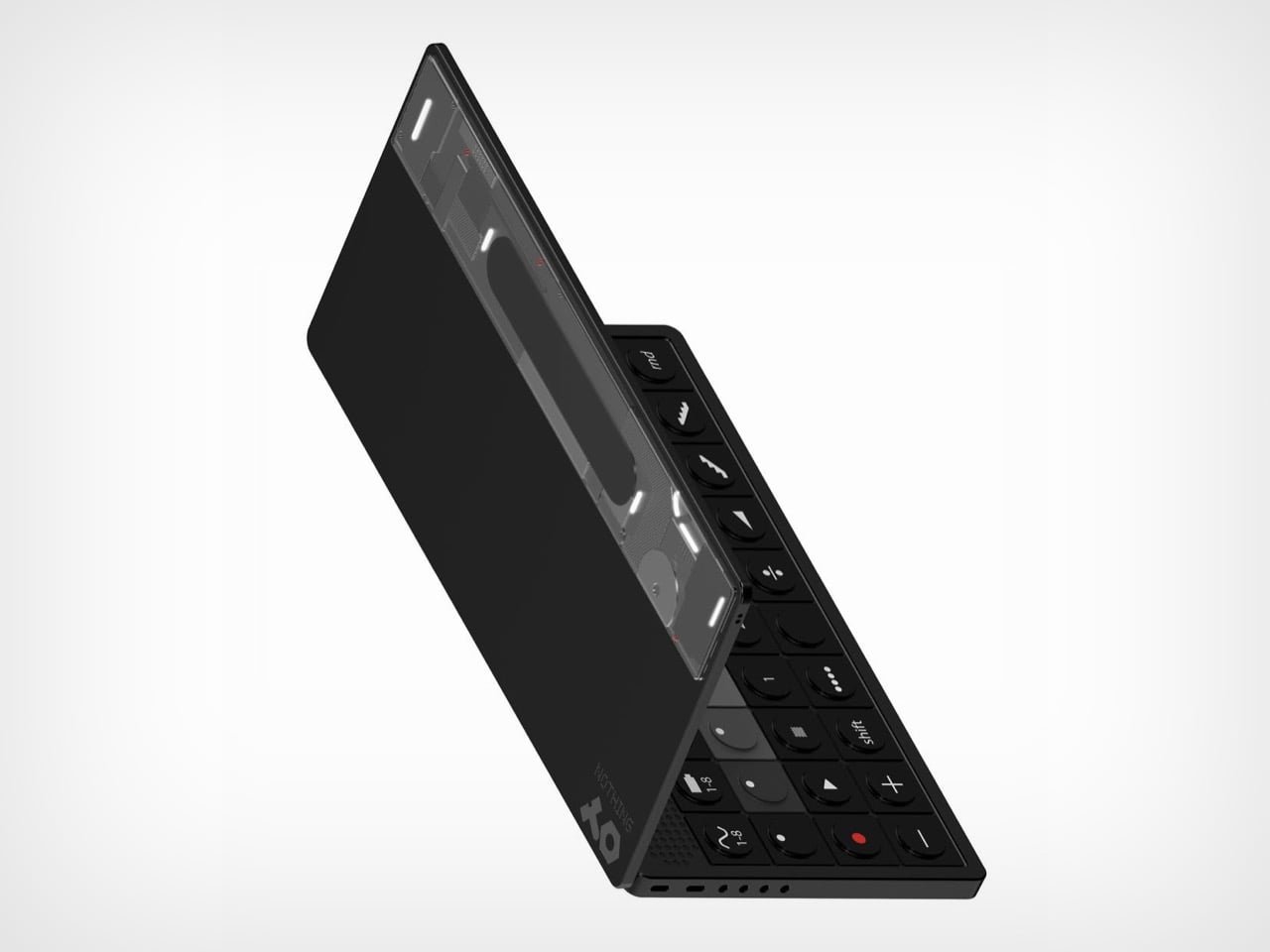
Abdelrahman Shaapan’s Mini OP-3 wraps a semi-transparent rear panel around a compact synth, with LED effects and dynamic graphics that pulse along to whatever you’re playing. Flip it over and the front is pure Teenage Engineering, a clamshell with a touchscreen lid and a control deck of encoders, transport keys, numbered pattern buttons, and one red COPY key doing a lot of emotional labor. Shaapan calls the project an exercise in translating the design DNA of both brands into a single object. He also added a charm attachment point on the screen corner, because it is 2026 and everything needs a little guy hanging off it. The pitch is a smaller OP that keeps you off your laptop during production and live sets.

Designer: Abdelrahman Shaapan

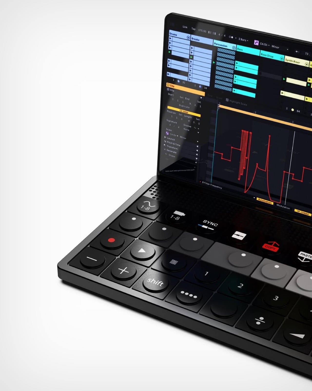
Ten function keys run across the top of the deck, covering waveform and tape banks, sync, split, copy, paste, metronome, scissors, monitoring, and loop. Below them sit eight encoders arranged in a greyscale gradient from black to white, which is the single most OP-1 gesture available to any designer working in this language. A transport row follows with record, play, and numbered pattern keys, then a modifier row carrying shift, divide, ramp, and a random button. The hinge hides a perforated speaker band, and the front edge packs two USB-C ports beside four 3.5mm jacks. Every control is round, tactile, and spaced like it expects to be hit fast in a dark room.

Nothing built its identity on light as an interface, then retired it on the Phone (3) in favour of a dot matrix that most owners still describe as a downgrade. Shaapan’s rear panel puts that language back to work, running LED effects and dynamic graphics that respond to your audio in real time. On a phone, reactive lighting was always slightly decorative, a party trick for incoming calls and little else. On an instrument, it has an actual job, giving you a visual read on your track from across a stage or a crowded studio. Relocating the Glyph to the one product category where it earns its keep is a sharper piece of brand analysis than most fan concepts manage.

Shaapan rendered the whole thing in KeyShot. The soft-touch black body, the subtle sheen on the encoder caps, and that partially translucent rear panel with internals showing through all read as convincingly manufacturable rather than aspirational. The charm attachment point is the detail I keep coming back to, since TE has always sold straps and cases as identity objects and phone charms are having a genuine cultural moment. We covered a Teenage Engineering DJ console concept a couple of years back, and this one clears that bar comfortably. The presentation is good enough to be mistaken for a leak.

One thing undercuts the pitch. Shaapan says the goal was minimizing laptop dependence, but three renders show Ableton Live running on the touchscreen, which means the device became a laptop instead of replacing one. Ableton’s own Push 3 already solves the standalone problem and charges around two thousand dollars for it. That gap between the stated intent and the renders is the part a real product team would have to close first. Everything else here, though, is a better Nothing product than Nothing’s last one.

The post Nothing killed the Glyph Interface. This Teenage Engineering synth concept argues that was a mistake first appeared on Yanko Design.

  •  

A 355-Square-Foot Tiny Home With Room to Actually Walk Around

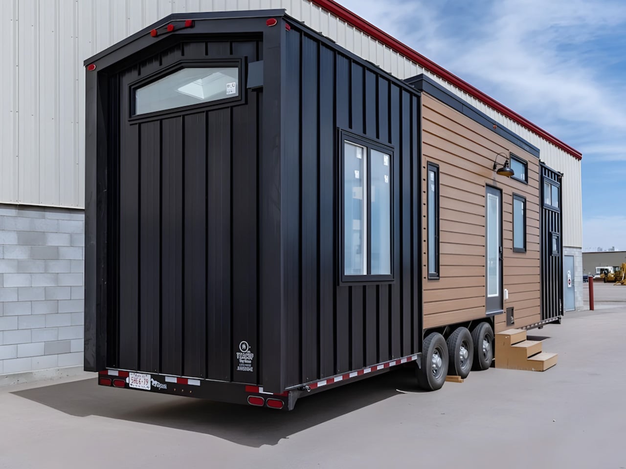
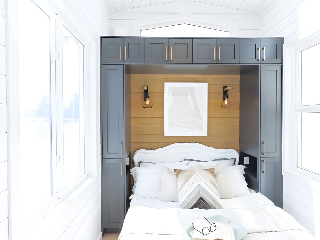
Most tiny homes are upfront about their limitations. The Florence isn’t interested in that conversation. The Florence, by Alberta-based Teacup Tiny Homes, is the argument against all of that. Sitting on a triple-axle trailer, the Florence stretches 36 feet long and 8.5 feet wide, placing it at the roomier end of the towable tiny home spectrum. Its 355 square feet of interior space is arranged with the kind of logic you’d expect from a full-size home — not an afterthought. That discipline in planning is what separates it from the crowd.

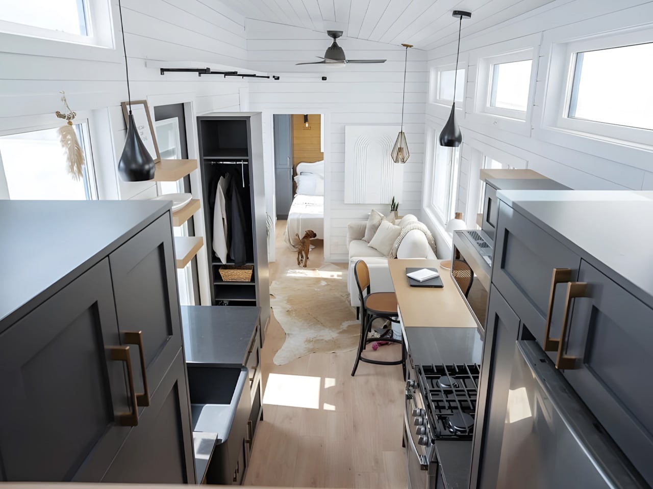
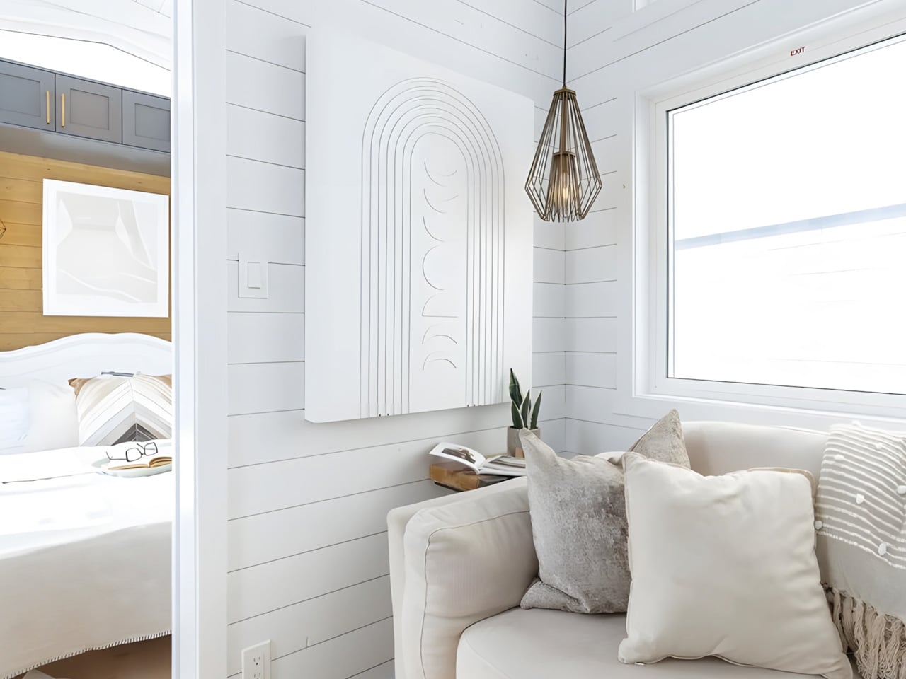
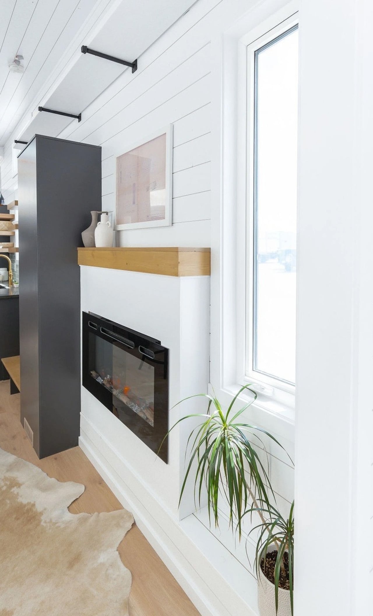
Step inside and the first thing you notice is light. White tongue-and-groove paneling wraps the walls, 11-foot vaulted ceilings push the space upward, and generous windows pull the outdoors in. The living area anchors the layout, centered around a sofa and electric fireplace, with room for a television and a large built-in storage unit near the entrance. It doesn’t read like a compromise. It reads like a considered home.

Designer: Teacup Tiny Homes

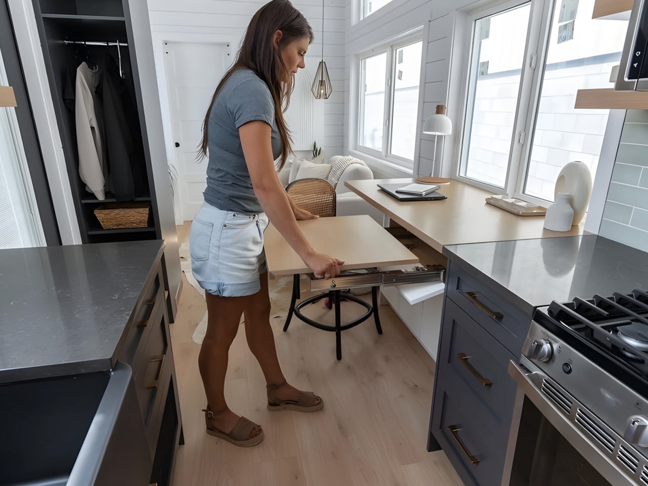
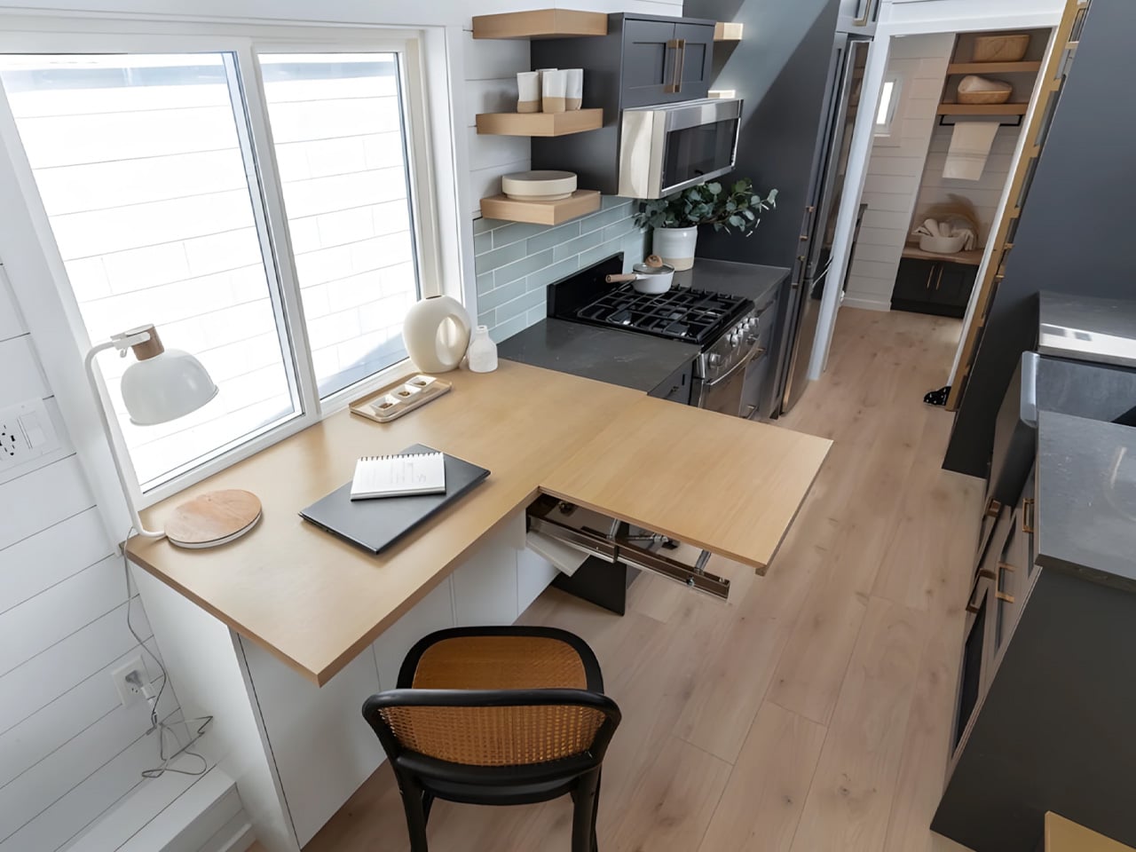
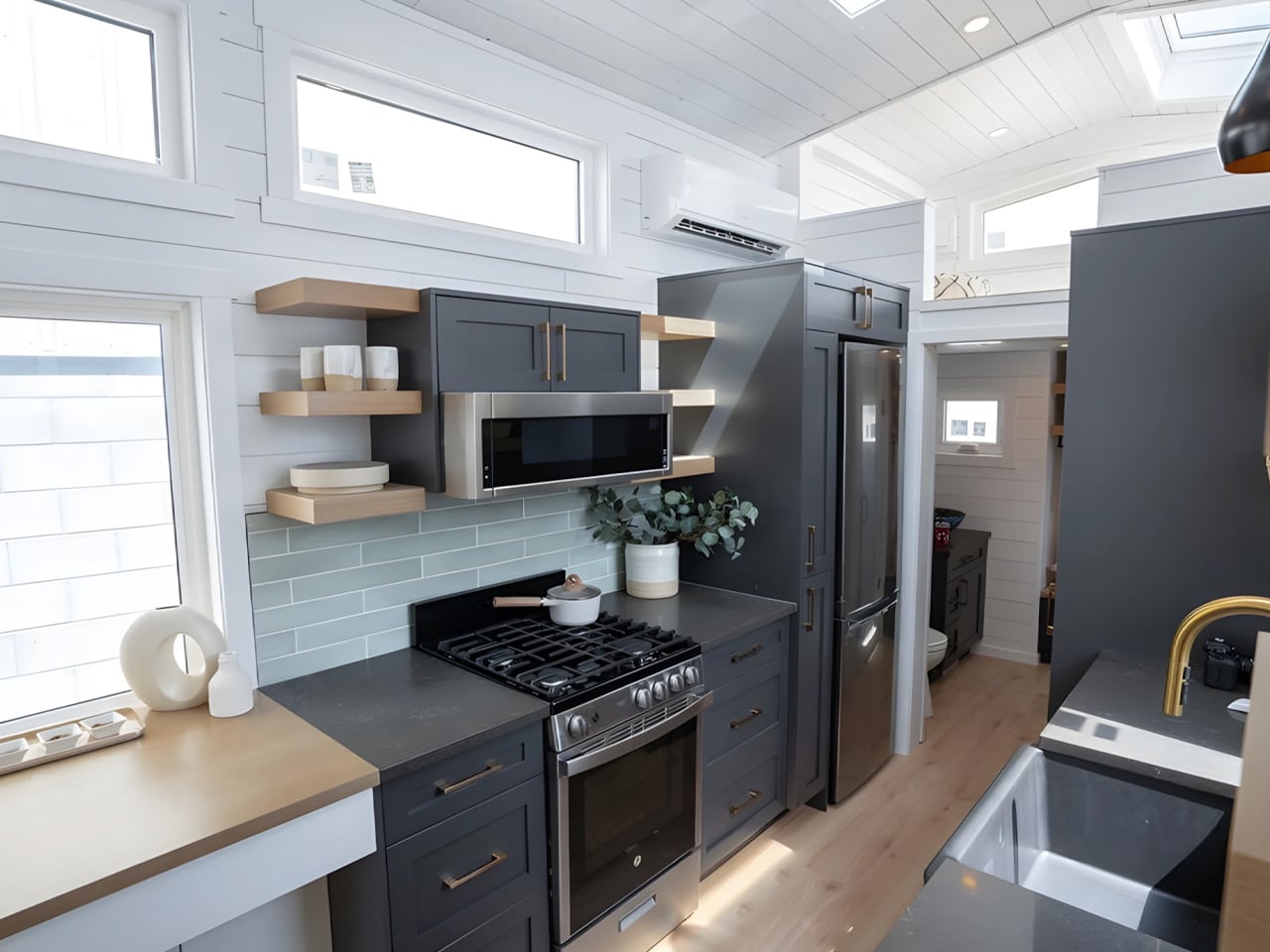
Immediately adjacent is one of Florence’s more thoughtful touches — a dining nook that doubles as a home office, complete with an extending desk and integrated storage. For remote workers or anyone who needs a dedicated workspace without sacrificing a room, this dual-function zone is quietly brilliant. The kitchen runs along the galley wall nearby, equipped with a four-burner propane stove, oven, microwave, fridge/freezer, a large sink, and storage that actually holds things.

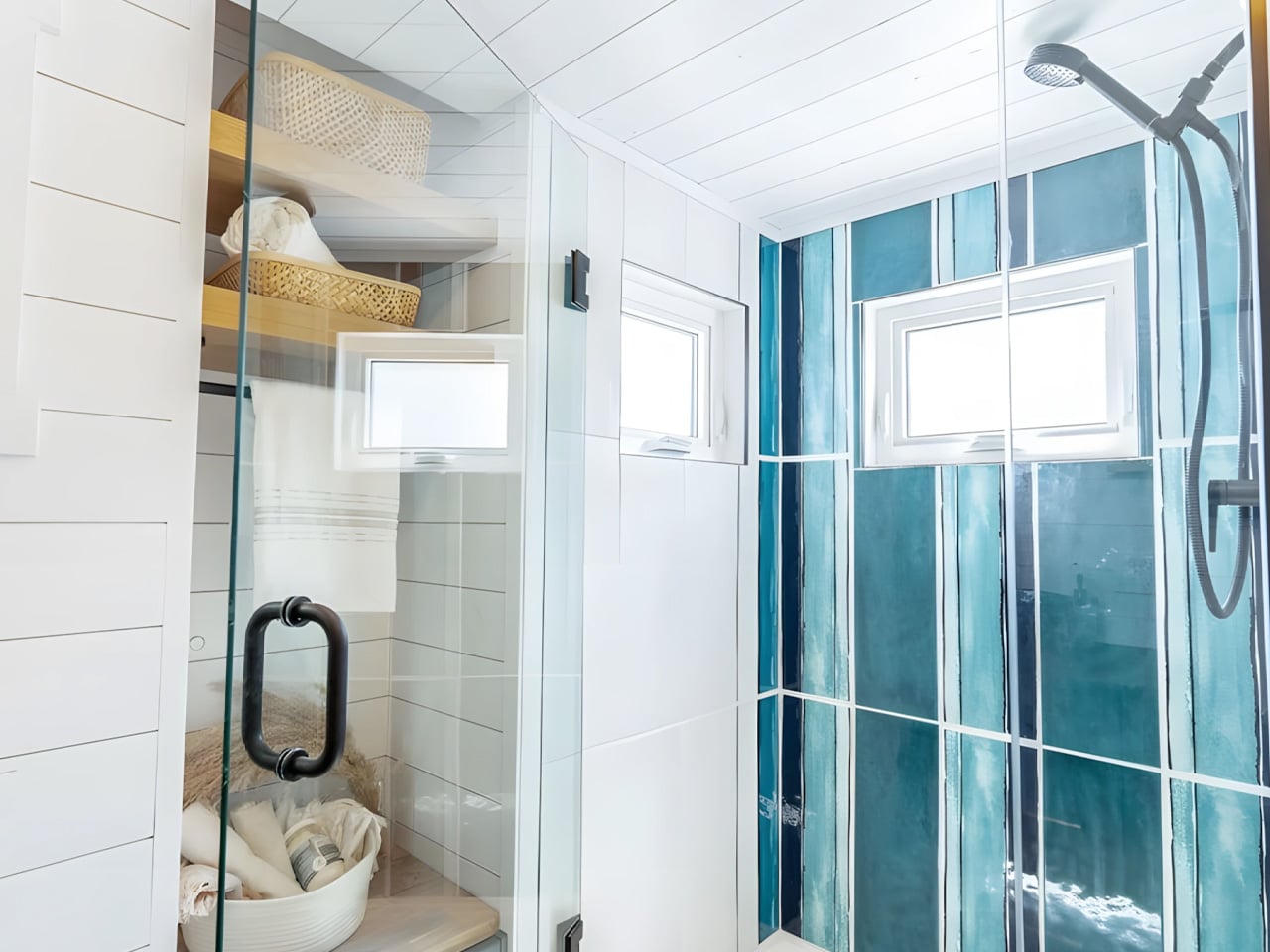
The master bedroom is located on the main floor, which is rarer than it should be in the tiny home world. Positioned next to the living area, it fits a double bed with genuine walking clearance on both sides and enough built-in storage to feel like a real room. A secondary sleeping loft sits above the kitchen and bathroom, accessed by a removable wooden ladder, offering space for a second double bed. The bathroom, tucked between the kitchen and bedroom, features a glass-enclosed shower, flushing toilet, and vanity sink.

Teacup Tiny Homes, a 100% female-owned and operated company founded in 2016, offers the Florence with a range of customization options — a soaking tub in place of the shower, choice of materials and furnishings, and permanent foundation installation if mobility isn’t the priority. Delivery runs across both the US and Canada. The Florence starts at roughly US $122,000. For a home this size, it’s a number that’s easier to justify than it might first appear.

The post A 355-Square-Foot Tiny Home With Room to Actually Walk Around first appeared on Yanko Design.
  •  

The Echo Chair Makes 3D Printing Feel Refined

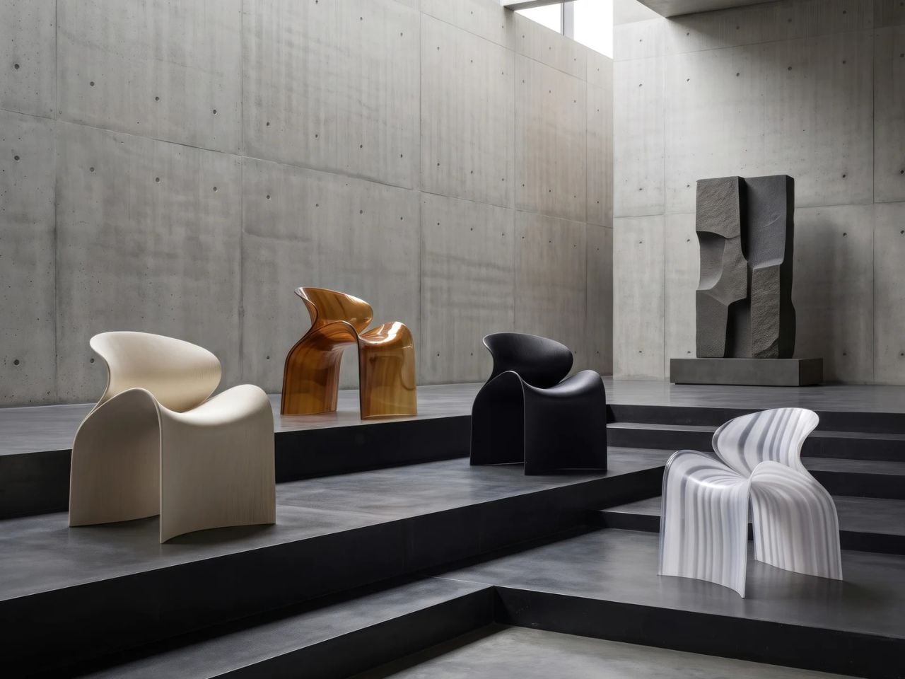
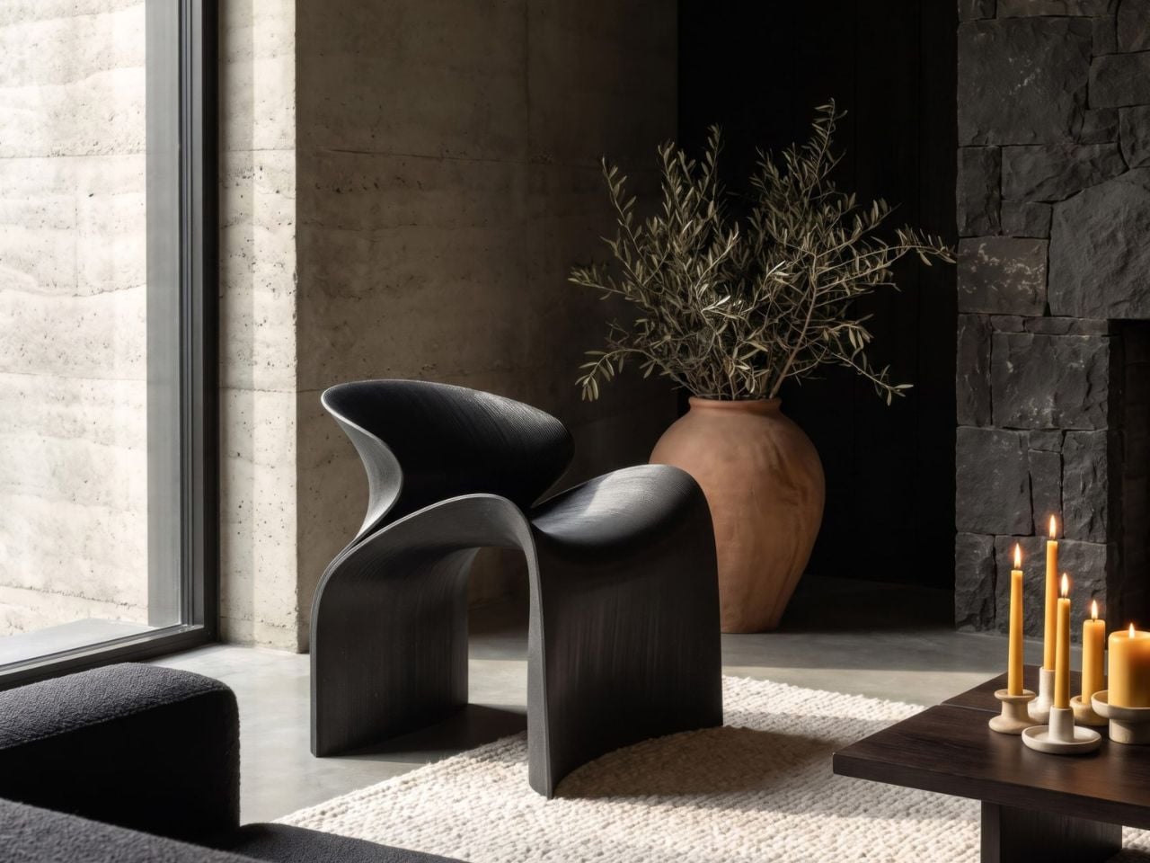
ZHA has collaborated with Spanish design brand Nagami to create the Echo Chair, a 3D-printed seat made from recycled plastic waste. Formerly known as Zaha Hadid Architects, the studio developed the chair through parametric design and large-scale additive manufacturing. Its form is fluid and sculptural, with an arched backrest that extends towards the floor and a seat that curves upwards at the sides.

The two parts look separate at first, but they are printed as one continuous piece. Both surfaces grow from the same structural edge and share the same underlying geometry. One becomes the seat, while the other rises to form the backrest and support.

Designer: ZHA and Nagami

This continuous construction gives the chair a clear sense of logic. The shape is doing several jobs at once: supporting the body, holding the structure together, and defining the overall visual character.

The Echo Chair was developed through an iterative research process at ZHA Lab and manufactured by Nagami, a brand known for its work in large-format 3D printing. The studios used recycled PETG sourced from industrial waste, including single-use medical plastics.

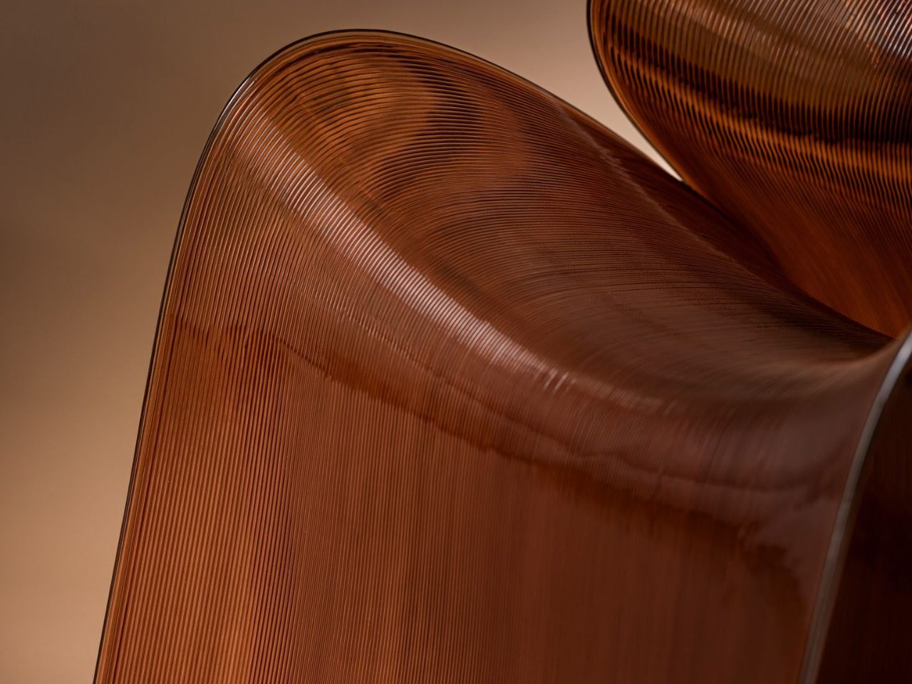
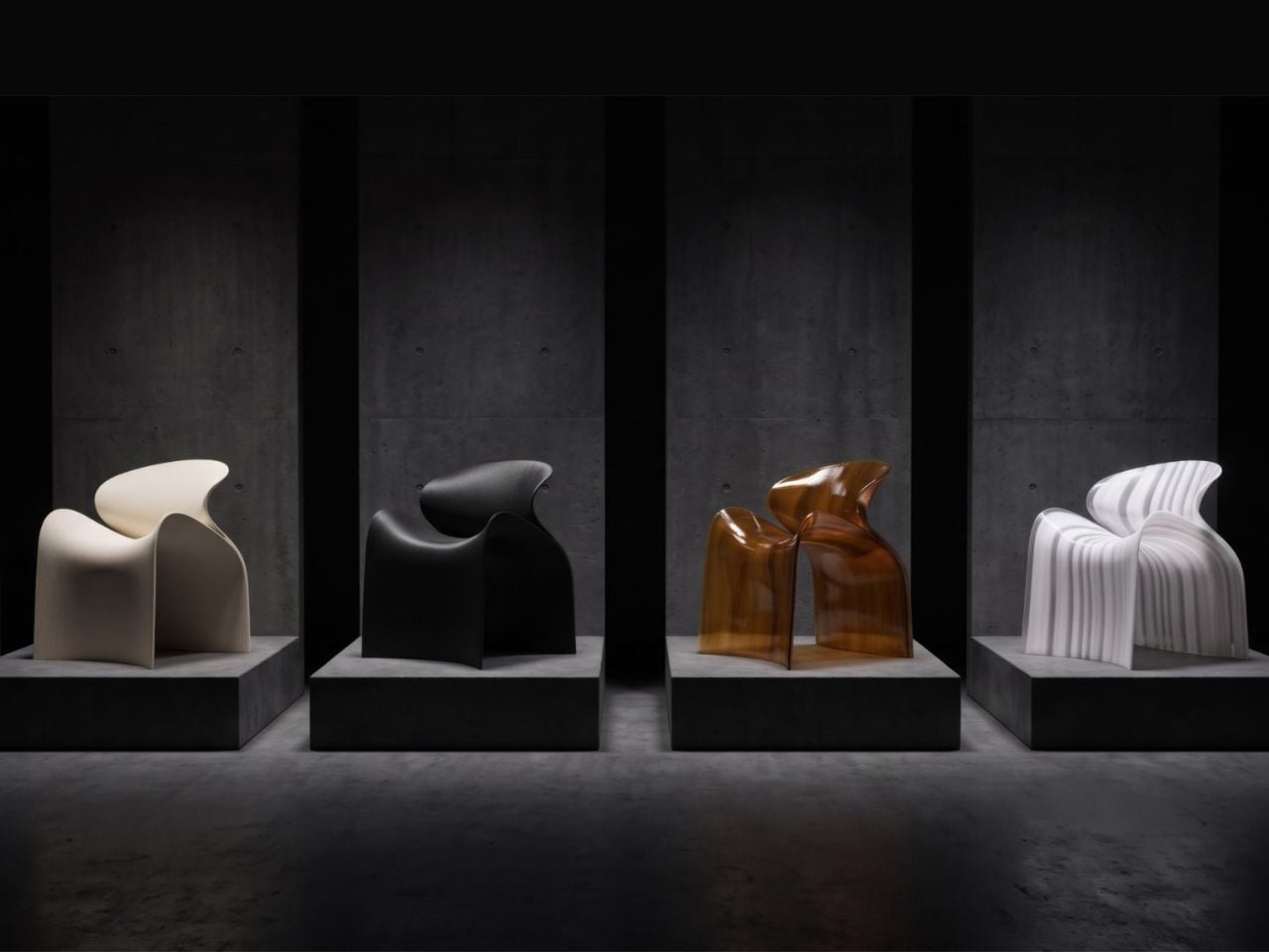
As the chair is printed layer by layer, the process leaves a ribbed texture across its surface. Those lines have been kept visible rather than hidden or polished away. That decision gives the chair much of its character. The texture follows the curves closely and makes the manufacturing process easy to read. It also gives the recycled plastic a more tactile, less generic appearance.

There is something useful in that honesty. The material is not being forced to look like timber, stone or metal. It keeps the visual qualities created by the printing process and uses them as part of the design. The surface does still reference natural materials in a subtle way. Its layered finish recalls mineral formations and carved stone, which helps the chair feel less industrial when placed in an interior.

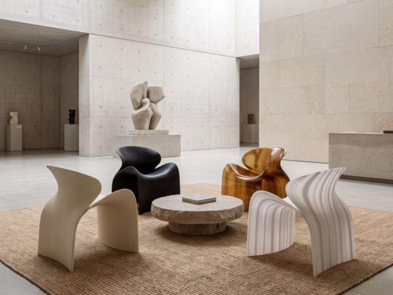
ZHA and Nagami developed four colourways for the chair: white, black, a white-to-translucent gradient and a caramel tone made using a bio-based cork composite. The colour choices help shift the mood of the design. White makes the form feel lighter and more architectural, while black gives it a stronger, more graphic presence. The translucent version draws attention to the printing layers, and the caramel finish adds warmth to what could otherwise feel like a very technical object.

The caramel version is especially successful because it softens the synthetic quality of the plastic. It feels easier to imagine in a home, hotel lobby or lounge space, rather than only in a gallery or design exhibition. According to ZHA project design director Sebastian Andia, the goal was to turn an abundant and overlooked material into something people would genuinely want to live with. That idea matters because recycled material alone is rarely enough to make a product successful. People still need to like the object, find it comfortable and see a place for it in their environment.

The Echo Chair handles this well. Its sustainable story supports the design, rather than becoming the whole design. The seat’s raised sides create a more enclosed sitting position, while the curved backrest gives the chair a supportive and almost cocooned feel. The shape is expressive, but it still looks usable. Its scale and neutral colour options also make it easier to place than the form might suggest. It has enough presence to work as a statement piece, yet it does not depend on bright colour or decoration to stand out.

The 3D-printing process allows the chair to be produced without visible joints or separate components. This gives it a seamless appearance and keeps the connection between the digital model and final object very direct.

That connection is one of the strongest parts of the project. The manufacturing process does not sit behind the design. It shapes the design. The ribs, curves and continuous structure all come from the same production method. Each part of the chair feels related because it has been developed through the same system.

The Echo Chair continues ZHA and Nagami’s existing collaboration. Nagami launched its first collection of 3D-printed chairs in 2018, which included two designs by the architecture studio. Their latest project shows how much more refined large-scale 3D printing has become. The chair feels less like a technical experiment and more like a finished product with a clear place in contemporary interiors.

The Echo Chair is currently on display as part of London Creates at The Truman Brewery. What makes the chair interesting is the way it brings together material, form and manufacturing without overcomplicating the idea. Recycled plastic is treated as a starting point for the design, rather than something that needs to be disguised.

The post The Echo Chair Makes 3D Printing Feel Refined first appeared on Yanko Design.

  •  

Michelangelo’s iconic David bust gets recreated in LEGO, turning plastic into sculpted marble

If you ever took a drawing class, you have met this face. Art schools spent about two centuries buying plaster casts of David’s head and parking them on shelves so students could sit there for six hours learning to render a nostril. The Victoria and Albert Museum owns a full size cast of the whole statue, and famously kept a plaster fig leaf on standby in case Queen Victoria dropped by and needed the shock absorbed. So David has been getting copied, shrunk, cast, and occasionally censored for a very long time. Turning him into a toy is not the sacrilege it sounds like. It’s basically the family business.

Which brings us to Ysien, a LEGO Ideas builder who decided the next material in that lineage should be ABS plastic. The build renders David’s head, neck, shoulders and upper chest as a classical bust, entirely in white, sitting on a proper stepped pedestal. No color, no minifigure, no cheeky accessories. Just light and shadow doing all the work, exactly like the plaster casts it descends from.

Designer: Ysien

The hair is the whole reason this MOC (My Own Creation) works. Hair is where sculptors get found out, because faces have anatomy underneath that you can reason your way through, while hair is a mass of overlapping nothing that somehow has to read as soft. Michelangelo’s answer was a tangle of deep drilled curls. Ysien’s answer is a genuinely absurd stack of curved slopes and half arch elements layered at varying depths, so each curl throws its own little shadow instead of flattening into texture. “The hair was one of the greatest challenges, with each curl contributing to the overall silhouette, depth, rhythm, and movement,” he says, which is a very polite way of describing what must have been several evenings of quiet suffering.

My favorite decision, though, is that the seams stay visible. Ysien could have chased a smooth marble finish and lost, because bricks do not do smooth. Instead he let the geometry become part of the sculpture, so the thing reads as a portrait from across the room and as unmistakable LEGO up close. The eyes get a similar treatment, built from inverted round elements that give David that vacant classical stare, which is a nice accident given the real statue has heart shaped pupils drilled into it. Monochrome white does the rest, forcing every bit of the anatomy to be described by shadow alone. There’s no piece count listed yet, although I wouldn’t be surprised if it was in the high hundreds.

Ysien’s David is currently sitting at just over 400 supporters with 424 days on the clock, which means there is a long road to the 10,000 votes that trigger an official LEGO review. LEGO Ideas is where fan builds get their shot at becoming retail sets, and this one deserves a look. The only thing I’d add is a black variant, because a basalt David would be an absolute menace on a shelf. You can head to the LEGO Ideas page and cast your vote!

The post Michelangelo’s iconic David bust gets recreated in LEGO, turning plastic into sculpted marble first appeared on Yanko Design.

  •  

The Sculptural Rocking Chair That Started as a Single Idea

Most furniture design starts with a question: How do people sit? Aleks Forystek Studio started with a completely different one. What happens when a heavy sphere presses into a structural loop? The answer, it turns out, is a chair. But not just any chair. It’s Dooal, and it might be the most conceptually satisfying piece of furniture I’ve seen this year.

The premise sounds almost too simple. A sphere meets a loop. The loop yields under the weight, compressing and curving into a form that becomes, all at once, a backrest, a seat, a leg rest, and a rocking base. One gesture, one cause-and-effect sequence, and suddenly you have a fully resolved object. The audacity of that economy is hard not to admire.

Designer: Aleks Forystek Studio

I’ll admit my first instinct when I saw the images was purely aesthetic. The black and white photography does everything right. The curves catch light in a way that makes the chair look more like a cast sculpture than a functional object, and the close-up shots reveal a fine-lined ribbed texture that layers real depth onto an already commanding silhouette. Shot in near-darkness, Dooal looks cinematic. It has the kind of presence that makes you stop mid-scroll and just sit with it for a moment.

But the longer I looked, the more the concept started doing something to me. Forystek’s Chicago-land studio describes its work as committed to “destabilizing the familiar,” and that phrase lands differently once you understand the logic behind Dooal. The chair is familiar enough, a seat you can rock in, a shape the body immediately recognizes. Yet the process that created it is almost foreign to how we typically think about furniture. No separate components engineered together. No piece-by-piece assembly of form and function. Just a single physical interaction, preserved.

That’s a philosophical statement as much as a design one. The studio’s whole methodology centers on finding the latent potential within ordinary objects, pushing past the surface of what something is to explore what it could become when a single variable changes. With Dooal, that variable is weight. Pressure. The simple, undeniable force of a sphere doing exactly what gravity asks it to do.

What makes this feel significant right now is the context we’re sitting in. We live in an era of maximal complexity, where products get layered with features, materials compete for attention, and design often signals effort rather than intelligence. Dooal does the opposite. It argues that constraint is where creativity actually lives. That stripping a design down to one decisive action can produce something richer and more resolved than a process built on a dozen competing decisions.

And it’s not just theoretical. The rocking chair is one of the oldest, most human pieces of furniture we have. It exists in farmhouse porches and modernist living rooms with equal ease. It’s comfort distilled into motion. The fact that Dooal arrives at that form through a logic of compression rather than craft tradition feels both subversive and strangely inevitable. Like the chair was always there, waiting to be discovered rather than designed.

That sphere at the base of the loop is easy to overlook in the photographs. It’s small, nestled low, nearly swallowed by shadow. But without it, none of this exists. It’s the cause the entire object is an effect of, and the fact that it remains visible in the final form is a choice that rewards people who look closely. That kind of embedded storytelling, where the origin of an object is literally written into its body, is rare in furniture design. It elevates Dooal from chair to argument.

Aleks Forystek Studio is not a household name yet. But Dooal is the kind of work that earns attention quietly. Not because it’s loud, but because it’s precise. Because it asks a stubborn, specific question and then answers it completely. Whether you care about objects for their beauty, their ideas, or the story behind them, this chair has all three. And it got there with one moment of contact.

The post The Sculptural Rocking Chair That Started as a Single Idea first appeared on Yanko Design.
  •  

The Redwood by Tiny Timber Homes Proves Small Living Doesn’t Mean Settling

Wood has a way of telling you exactly where it’s been — and the Redwood by Tiny Timber Homes wears that history well. The Redwood leans into that quality completely — and the result is a tiny house that feels less like a compromise and more like a choice you’d make twice.

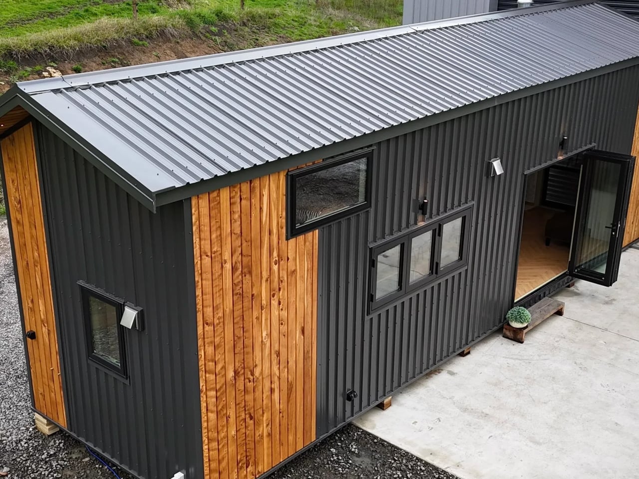
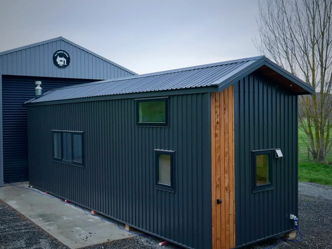
Tiny Timber Homes has built its reputation on one idea: that small spaces deserve the same craftsmanship as full-sized ones. The Redwood is perhaps the clearest expression of that philosophy. Its exterior reads immediately as intentional — warm wood cladding, clean rooflines, and a silhouette that sits confidently without trying to mimic a traditional house. It’s not cosplaying a cabin. It’s its own thing.

Designer: Tiny Timber Homes

Step inside and the material language continues without interruption. Exposed timber framing lines the interior walls, giving every room a structural honesty that most tiny homes paper over with drywall and distraction. Natural light does the heavy lifting here — strategically placed windows pull the outdoors in and keep the interior from ever feeling like a box you’re trapped inside.

The kitchen is compact but considered. Counter space is used with real intention, storage is tucked where you’d actually look for it, and the layout doesn’t ask you to turn sideways to reach the sink. It’s the kind of kitchen that rewards a slower pace — coffee in the morning, dinner from scratch, no dishwasher you don’t need.

The sleeping loft sits above it all, accessible by a stair ladder that doubles as storage. From up there, the whole space reads differently. You see the structure, the grain of the wood, the way everything fits without forcing. It’s a perspective that makes you appreciate the design more, not less.

What separates the Redwood from the growing noise in the tiny home market is restraint. There’s no attempt to cram in features that don’t belong, no feature list that sacrifices livability for a spec sheet. What you get instead is a home that understands its own scale and works with it — not against it.

Tiny Timber Homes builds for people who’ve thought seriously about what they actually need from a home. The Redwood answers that question with timber, light, and a layout that respects the person living inside it. In a category full of aspirational renderings and underwhelming follow-through, that’s worth something. It looks like a home. It lives like one too.

The post The Redwood by Tiny Timber Homes Proves Small Living Doesn’t Mean Settling first appeared on Yanko Design.
  •  

Forget Tracking Kids After School, This Cute Device Lets Them Check In

Working parents of school-age children face a particular kind of worry during the hours between the end of the school day and the end of the workday. Phone calls get missed, text messages go unread, and the ones that do get through usually carry just enough information to confirm a child made it home. What they rarely carry is any sense of how the child is actually doing, and that gap tends to get filled with parental anxiety rather than reassurance.

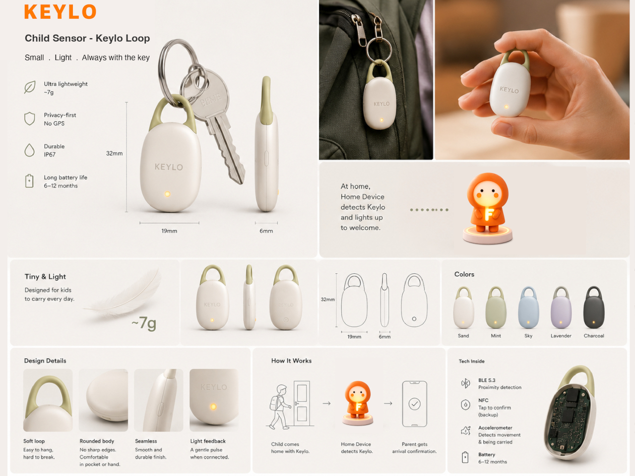
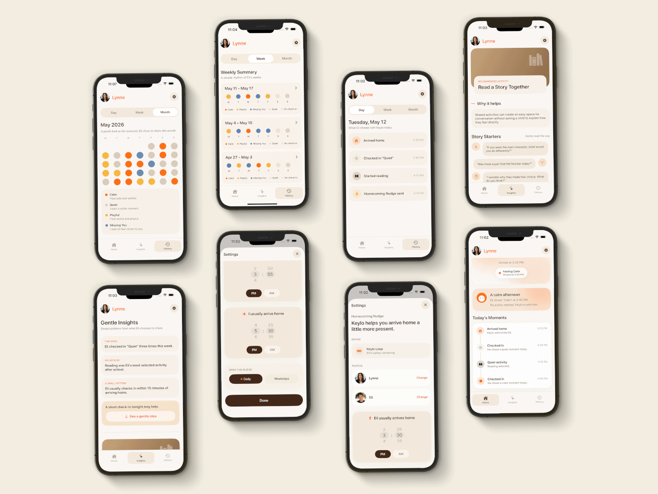
Keylo is a conceptual companion device designed around that specific gap. Rather than giving children another screen to manage or another app to navigate, it offers a single, tactile interaction: a tap that lets them express how they’re feeling. No typing, no calling, no notification chain. The child touches the device, cycles through a color to represent their emotional state, and the parent’s app receives it.

Designer: Miaonan Li

The system consists of three physical parts. The main companion unit sits on a home dock, usually somewhere a child passes when they get home. A smaller key fob clips to a backpack and travels with the child throughout the day. Both are made from soft matte silicone and deliberately avoid any screen or complex interface, giving the object a quality that’s closer to a familiar household item than a piece of consumer electronics.

The four emotional states Keylo recognizes are kept intentionally broad. A soft orange glow indicates the child feels relaxed; bright yellow signals something more playful or energetic; a neutral white tone signals a preference for quiet or personal space; and a calm blue light carries a specific message from child to parent: I’m thinking of you. Each one is simple enough for a young child to understand and expressive enough to actually mean something when it arrives on a parent’s phone.

That arrival is handled by the companion app, which mirrors the same color language as the physical device. The distinction the project draws between this and conventional parental monitoring is deliberate. Rather than showing parents a location, a screen time report, or a camera feed, the app delivers a single emotional moment. A notification that says a child is feeling calm and playful carries a different quality of information than a location ping, and it asks for a different kind of response.

The device is designed to work without any input from the child beyond that single tap. There are no prompts to answer, no questions to read, and no follow-up required. For a child who has just walked in the door after school, the low threshold is significant; the gesture stays small enough that it doesn’t feel like a chore, which is probably the main reason most family communication apps get abandoned within a few weeks of being set up.

What Keylo explores through its design is how much emotional information can be conveyed through the simplest possible interaction. A color chosen by a child carries less data than a voice call but far more than no contact at all, and it arrives without interrupting anyone’s afternoon in the way a ringing phone does. The project makes a case for the idea that the volume of communication matters less than whether it happens at all, and on terms that feel natural to the person sending it.

The post Forget Tracking Kids After School, This Cute Device Lets Them Check In first appeared on Yanko Design.
  •  

The $599 AI Guitar That Finally Makes Playing Easy

At some point in their life, almost everyone has picked up a guitar, struggled with a C chord for ten minutes, and quietly put it back down. The fingertip pain. The out-of-tune strings. The YouTube tutorial that somehow assumes you already know what a fret is. Learning guitar has always had a steep and slightly humiliating entry curve, and most of us just gave up. The TemPolor Melo-D thinks that’s a problem worth solving, and the design it came up with is genuinely hard to ignore.

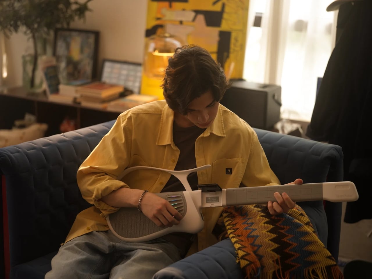
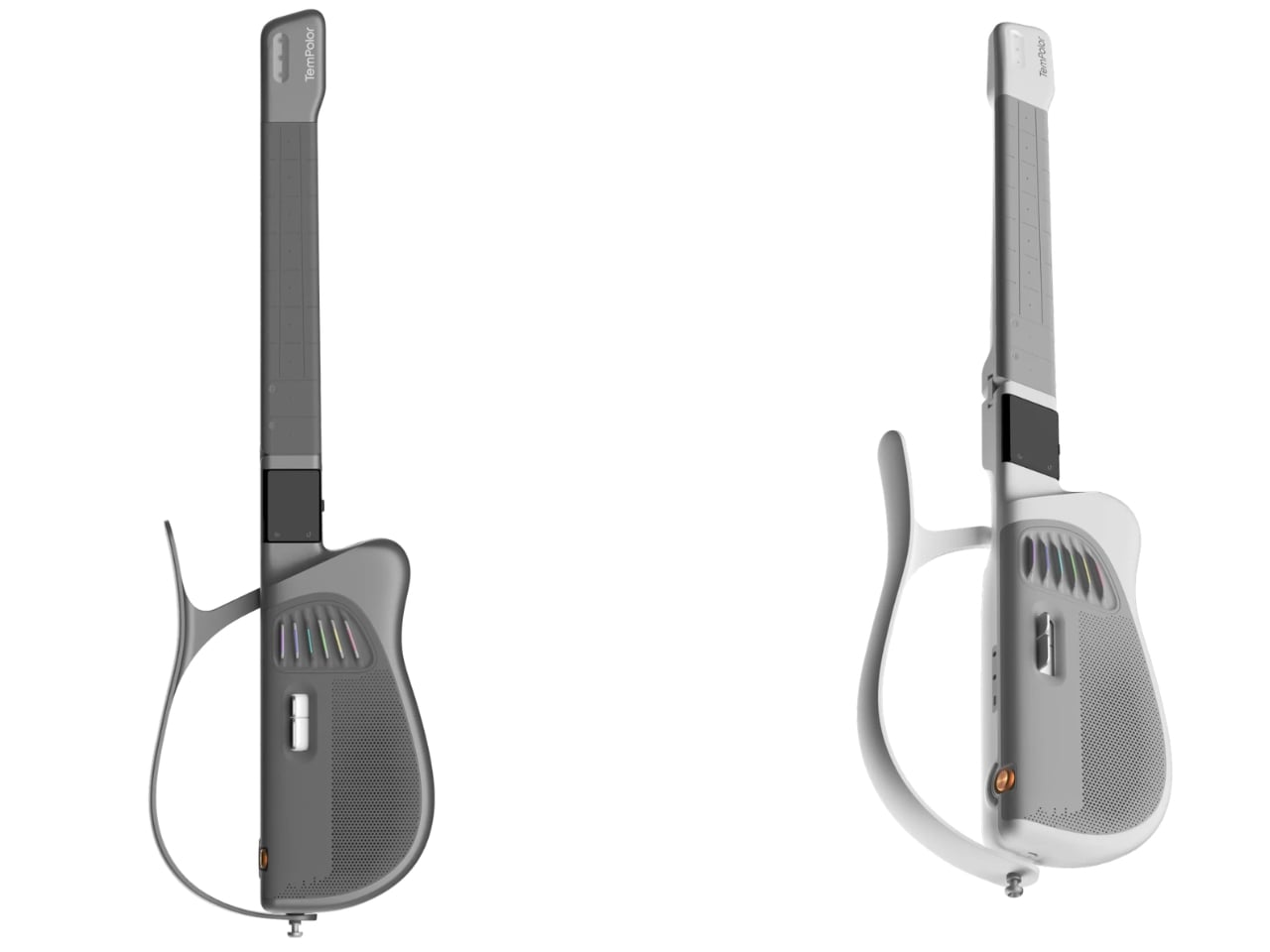
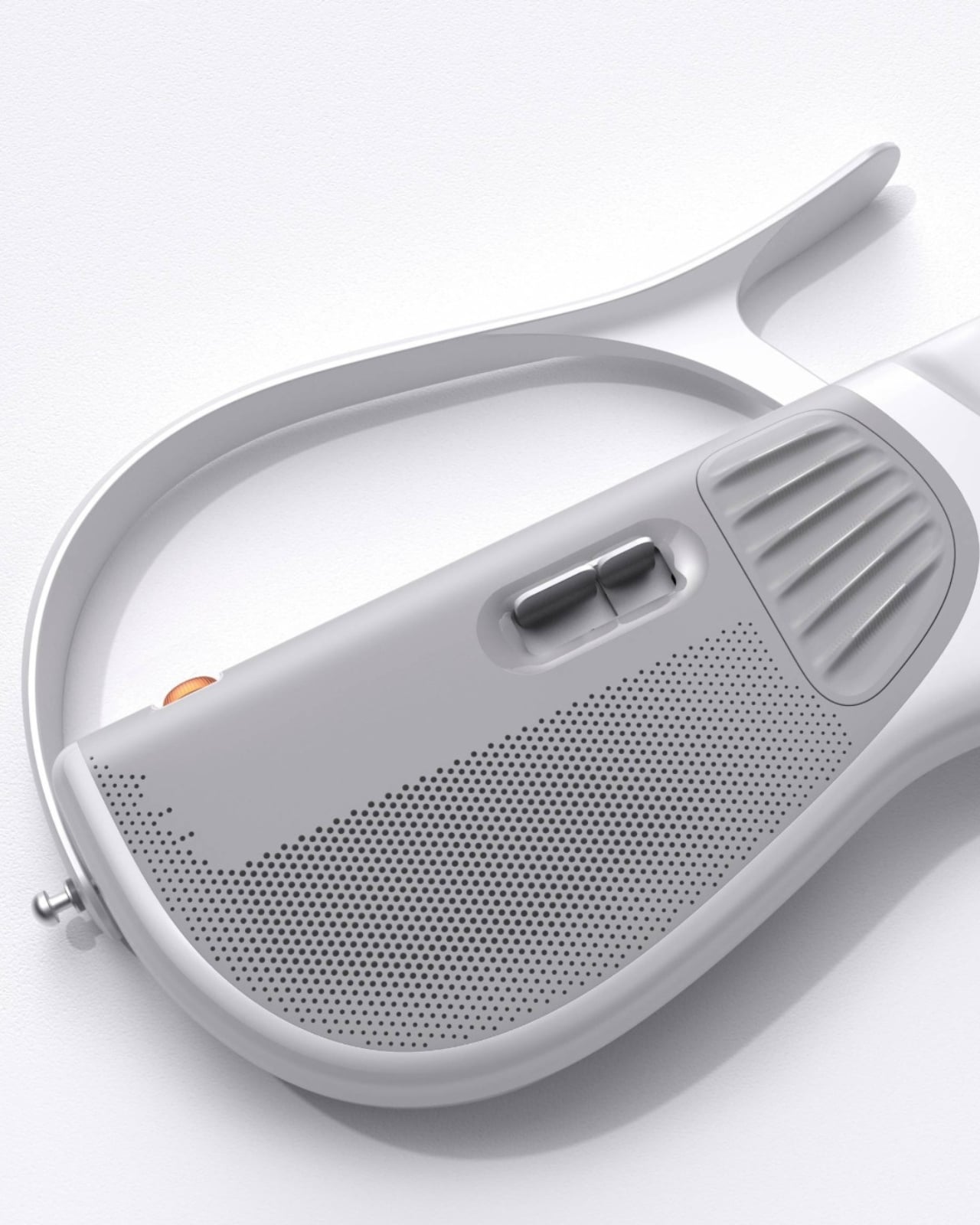
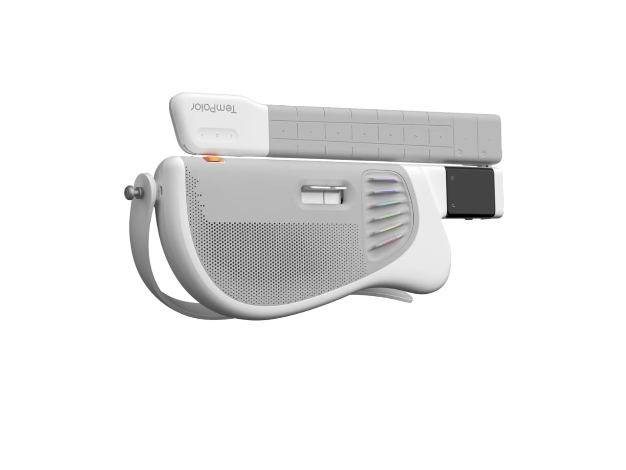
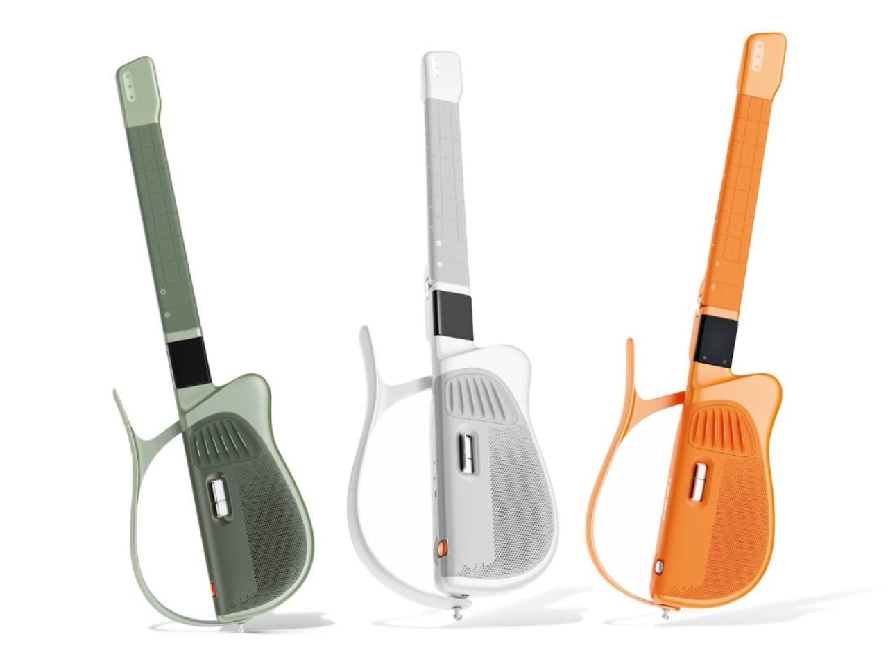
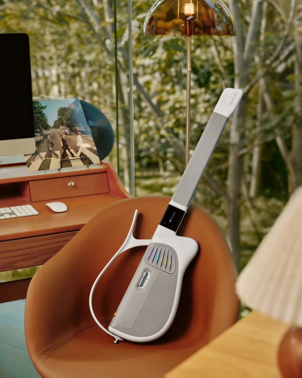
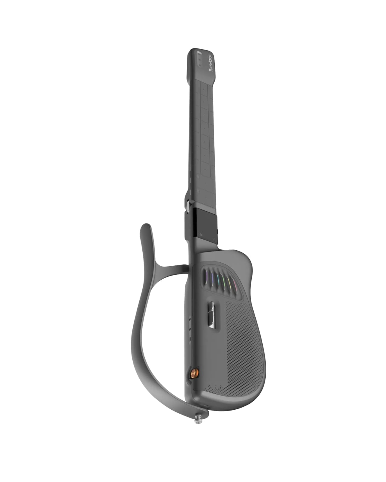
Designed by inDare Design Strategy Limited, the Melo-D is billed as the world’s first generative AI guitar, and even that description barely scratches the surface of what it actually is. On the outside, it looks like a guitar that a product designer and a tech enthusiast co-parented together. The body is sleek, the finish is pearl white, and it has a foldable build that makes it compact enough to take almost anywhere. But the real story is what happens when you turn it on.

Designer: inDare Design Strategy Limited

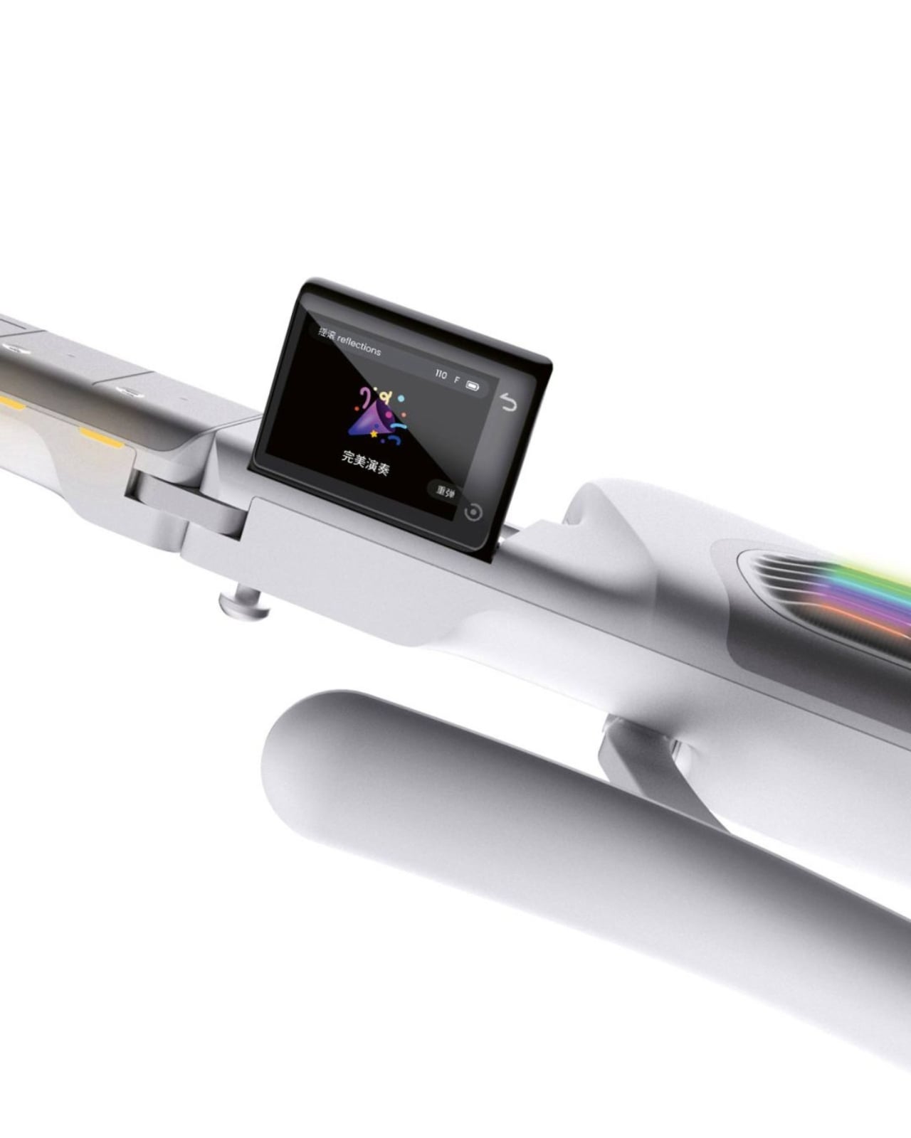
The neck is embedded with LED lights that illuminate exactly which notes to press, removing the guesswork for beginners entirely. A built-in 2.4″ LCD flip screen on the body handles chord guidance and ambient visuals without you ever needing to prop up a phone nearby. These feel like small details, but they represent a real design philosophy: the instrument itself should carry the full experience. You shouldn’t need a separate ecosystem of apps and accessories just to get started.

What makes the Melo-D genuinely interesting is the AI engine running underneath all of it. The guitar operates in three modes: solo, sing-along, and AI creation. In AI creation mode, you can hum a melody and the guitar transcribes it into a guitar solo. You can type a text prompt and it generates a song. Upload an audio file and it converts the music into playable tabs or chord charts. It even generates personalized backing tracks using emotional tags, so the sound starts to feel like yours rather than something borrowed from a practice app.

The “AI everything” wave has made it easy to be skeptical every time a product slaps the word generative onto its marketing. But the Melo-D doesn’t read as a gimmick dressed up in smart-instrument clothing. The six-string silicone system allows for real, note-by-note playing, which means it isn’t just a toy approximating the feel of music. It’s an actual instrument with training wheels you can choose to remove. The goal isn’t to replace the skill of playing guitar. It’s to lower the barrier enough that more people actually get through the door.

inDare’s design work here deserves its own mention. The studio, known for thoughtful human-centered industrial design, brought a lot of restraint to a product that could have easily become overcrowded with features. The foldable form factor, the integrated flip screen, and the silicone strings all feel like deliberate decisions, not afterthoughts. The Melo-D has also earned recognition at the iF Design Awards, which makes sense, because from a design standpoint it reads as a product with a clear and confident point of view rather than a collection of specs looking for a shell to live in.

At $599, it’s available for pre-order now with an expected ship date in September 2026. For a piece of hardware this layered, that number asks you to take it seriously, which feels appropriate for what it’s trying to do.

Learning guitar used to mean a real commitment: years of practice, a teacher, calluses, patience, and a certain willingness to sound terrible for a while. The Melo-D isn’t trying to skip all of that, but it is offering a more honest entry point for people who actually want to try. Whether you’re a complete beginner or someone who has quietly given up on the guitar more than once, it meets you where you are. And sometimes, that’s exactly the invitation you need to actually show up.

The post The $599 AI Guitar That Finally Makes Playing Easy first appeared on Yanko Design.
  •  

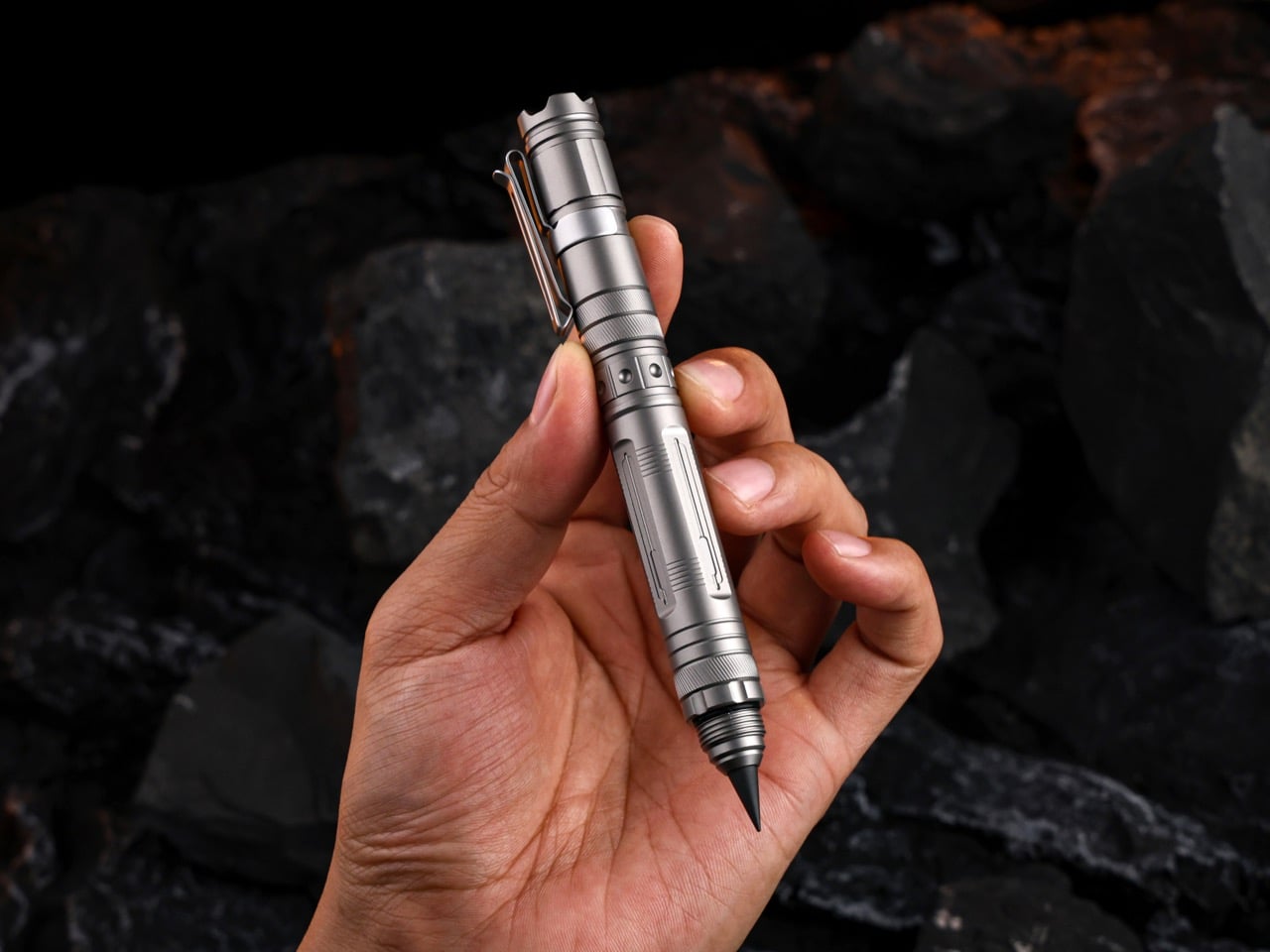
This 60g Titanium Pen Doubles as a Pocket Repair Station With a Detachable Flashlight and 3-Slot Toolbox

The humble pen is one of the most perfectly designed objects in everyday human history. It’s a simple, durable, pocket-friendly cylinder that most of us carry without a second thought, right up until the moment we actually need it. Its form is so familiar that we rarely stop to question its potential as anything other than a writing instrument. But what if the pen’s silhouette was actually the perfect chassis for something far more ambitious? What if its main job wasn’t to record problems, but to solve them?

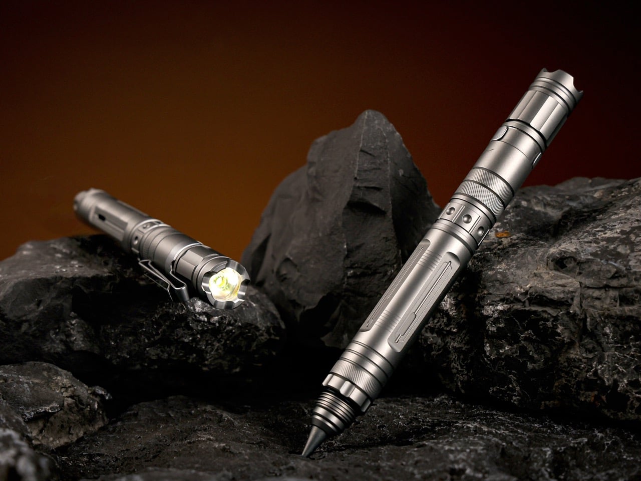
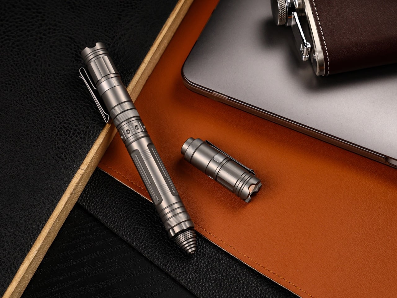
TiMate, the Redwood City-based EDC team behind the BoltLite and CoreLite, spent three design generations building toward exactly this: a Grade 5 titanium pen organized around a four-step repair workflow of illuminating, marking, cutting, and repairing. The body is CNC-machined, IPX-8 waterproof, and houses a detachable flashlight, a three-slot magnetic toolbox, a dual-tip marking system, and a utility blade, all in a 60-gram, 5.31-inch frame. The VeroLite also writes. That’s almost a punchline. But genuinely, it writes well.

Designer: TiMate

Click Here to Buy Now: $85 $119 (30% off) Hurry! Only 69 of 100 units left.

The flashlight module runs a Cree XPG4 LED at a neutral 5000K color temperature with 70+ CRI, which is the difference between reading a wire’s color accurately and just guessing. Three modes cover the range: 9 lumens for close inspection, 150 lumens for repairs and outdoor use, and a strobe for emergencies. IPX-8 waterproof, it charges over USB-C in 40 minutes, running 12 hours on low from a 100mAh lithium cell. The module detaches completely from the pen body via a magnetic joint rated at 3.8 kilograms, redesigned after users flagged the earlier version as too loose. Clip it standalone to a carabiner, rotate the dual-direction clip to aim the beam, or separate it so both hands are free for the repair.

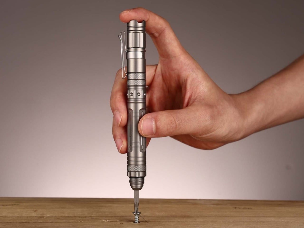
Previous TiMate pens dedicated this midsection to a fixed blade; the VeroLite converts it into a three-slot magnetic platform for standard 4mm screwdriver bits. The compartment is sealed, waterproof, and ships with a Y3, PH2, and PZ1 set. Any standard 4mm bit fits, so your existing collection is already compatible. Three working modes follow: quick-fix with a bare bit in hand, full precision with the pen body as a handle, and two-handed work with the flashlight detached and aimed. Swapping bits is fast.

A single twist of the gear-textured tip selector switches between a graphite core and a tungsten carbide scribe. The graphite is rated for 10 miles of writing, needs no ink or refills, and will outlast the pen in most people’s hands. The tungsten carbide scribe marks metal, ceramic, glass, and stone cleanly and permanently, surfaces where a marker would just skid. One twist separates a quick note from a precise cut line on tile, without looking down. The tactile texture means you can switch mid-repair without losing your grip.

The utility blade is a 1/6-inch chrome steel cutter that loads into the magnetic storage like any other bit, making blade swaps meaningfully safer than a standard box cutter. On a traditional utility knife, the swap puts your fingertips millimeters from the fresh edge; on the VeroLite, the blade handles identically to a screwdriver bit. The clip end functions as a pry tool for paint cans, stuck lids, and loose nails. The tungsten carbide tip doubles as an automotive side-window breaker, so the same tool scribing tile in the morning can shatter a car window later. TiMate calls it a pocket repair station, and the label earns itself.

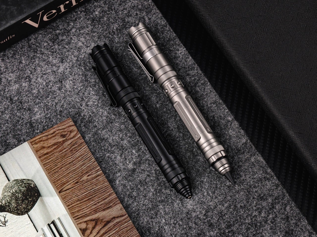
The body is CNC-machined Grade 5 titanium, 134.9mm long and 14.6mm wide, available in Titanium Gray (sandblasted matte) and Tactical Black (PVD-coated, scratch-resistant). At 60 grams, it’s 15% lighter than the CoreLite, a change driven directly by user feedback about hand fatigue. A recessed contour at the grip zone gives your fingers a natural landing spot, so it feels like a tool rather than a tube. Both finishes share the same machining process, so structural quality is identical. A leather sleeve option swaps the clip for a cleaner desk-carry profile.

The VeroLite retails at $119 and is currently available at a discounted $85 for a single unit. Add-ons include a 20-piece alloy bit set, extra graphite and tungsten tips, replacement blades, a stainless steel necklace for neck carry, and a leather pouch. A Leatherman Skeletool costs around $90 with seven tools, but lacks an integrated light, a marking system, or modular storage. TiMate’s argument is simple discipline: fewer tools, all of which you’ll actually use, organized around a clear workflow. If you’ve ever wished your pen could fix the problem you’re staring at, this one finally does.

Click Here to Buy Now: $85 $119 (30% off) Hurry! Only 69 of 100 units left.

The post This 60g Titanium Pen Doubles as a Pocket Repair Station With a Detachable Flashlight and 3-Slot Toolbox first appeared on Yanko Design.
  •  

This Tiny House on Wheels Lives Bigger Than It Has Any Right To

Most tiny homes ask you to make peace with the compromise. Wind River Built’s Rogue Mini skips that conversation entirely. Built in Tennessee by one of the most respected names in the tiny home space, the Rogue Mini is a trailer-mounted dwelling that treats small square footage not as a limitation, but as a design brief.

From the outside, the Rogue Mini reads clean. Board-and-batten siding, a pitched roofline, and restrained exterior detailing give it the visual composure of something far more permanent than its wheels suggest. Wind River Built has always leaned into quality construction over novelty, and the Rogue Mini reflects that. Every edge feels considered. Nothing about the exterior screams “novelty camper” — it looks like a house someone actually wants to live in.

Designer: Wind River Built

Step inside, and the interior continues that conversation. Wood-paneled walls and vaulted ceiling lines open the space upward, drawing the eye in a way that makes the square footage feel more generous than it is. The kitchen is compact but functional, with enough counter space to cook a real meal rather than reheat one. The sleeping loft sits above, accessible by a staircase or ladder depending on configuration, and offers a surprisingly comfortable retreat that feels separated from the main living area in the way a bedroom should.

What Wind River Built understands — and what a lot of tiny home builders get wrong — is that smallness only works when the details are right. Inadequate storage, poor natural light, and awkward transitions between zones make a small home feel punishing. The Rogue Mini sidesteps most of those pitfalls. Windows are placed deliberately, throwing light into corners that would otherwise collapse. Storage is woven into the structure rather than bolted on as an afterthought.

The Rogue Mini isn’t designed for the weekend warrior or the festival-goer chasing Instagram backdrops. It’s designed for someone who has genuinely decided to live differently — to trade square footage for mobility, and square footage for intention. That kind of design decision requires a builder who takes the task seriously, and Wind River Built clearly does.

At a time when housing feels increasingly abstract — prices climbing, spaces shrinking, and permanence fading — the Rogue Mini offers something rare. It chooses to make living small feel like an upgrade rather than a retreat. That’s not an easy thing to design. Wind River Built pulls it off.

The post This Tiny House on Wheels Lives Bigger Than It Has Any Right To first appeared on Yanko Design.
  •  

This Glowing Jello Table Lamp Balances Softness and Structure

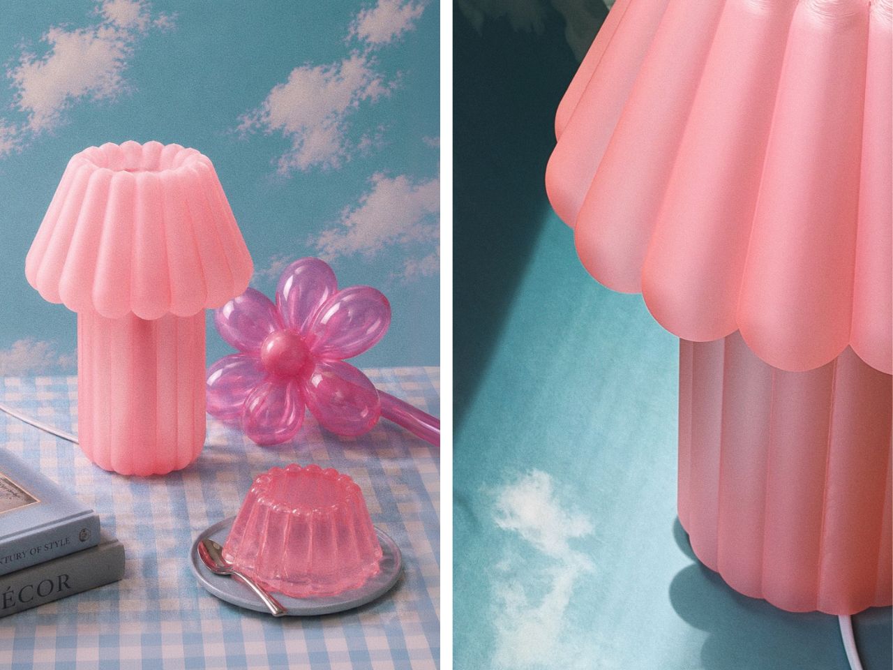
There is something inherently temporary about jello. It trembles, folds, and gives way under the slightest pressure. Balloon sculptures behave much the same way, holding their shape only until the air begins to escape. MAJU’s Jello Lamp takes these fleeting forms and gives them permanence.

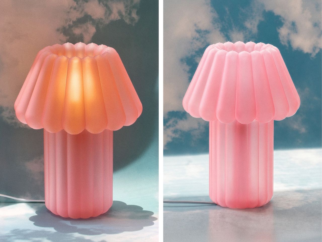
Designed by Hyu Lim, the sculptural table light translates the soft wobble of gelatin desserts and the inflated curves of balloon animals into a 3D-printed object. The result is playful without becoming novelty-driven, balancing generous proportions and rounded edges with the visual precision of digital fabrication. The lamp’s form is built around repetition. A fluted shade expands outward in soft, scalloped volumes, while the base continues the same inflated geometry below. Together, the two elements create a silhouette that appears almost compressible, despite being printed as a rigid, continuous body.

Designer: MAJU

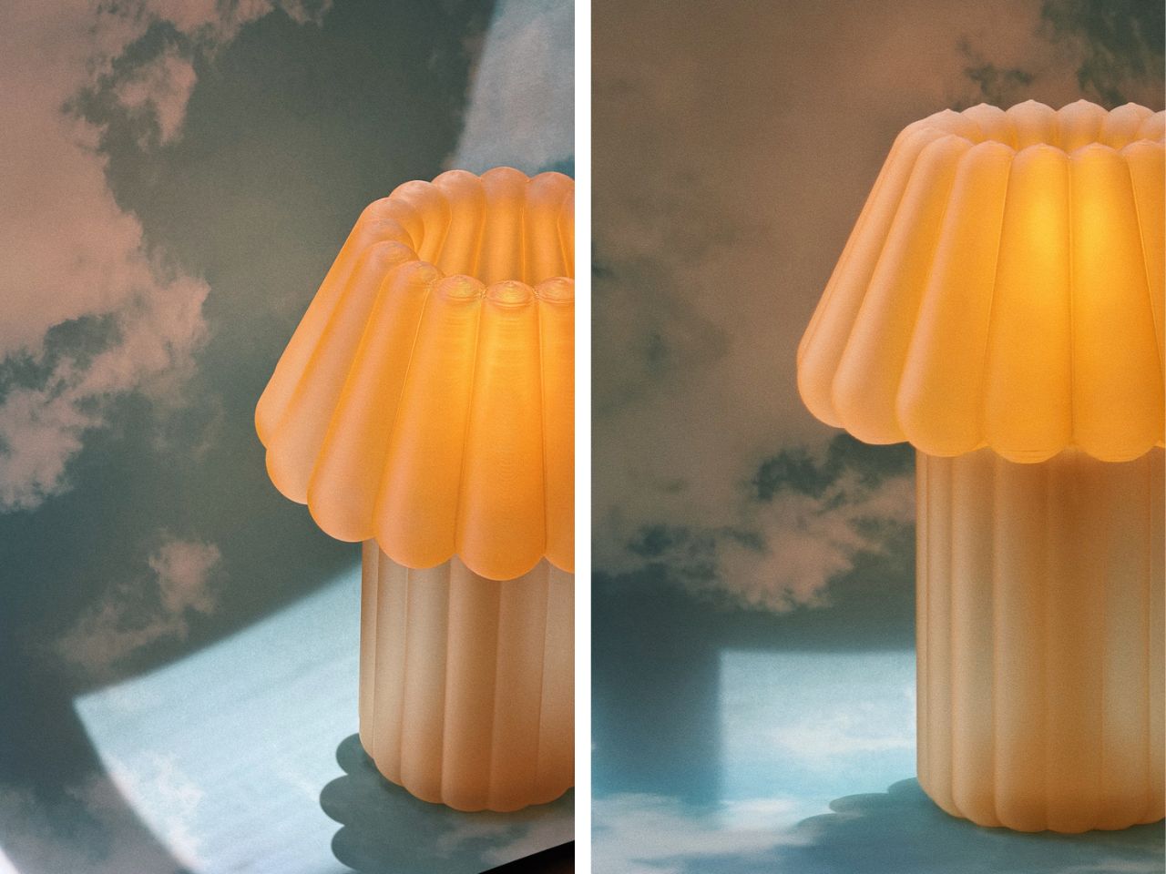
That tension gives the lamp much of its character. Its shape suggests movement, softness and instability, while its construction fixes those qualities in place. MAJU uses one of the most controlled contemporary production methods to capture something loose and unpredictable. When illuminated, the object begins to soften again. Light passes through the translucent shade, diffusing into a warm 2700K glow that gathers along the ridged surface. The flutes become less defined, and the lamp takes on a fluid, almost edible quality.

It is here that the Jello Lamp moves beyond a visual reference. Rather than simply resembling a moulded dessert, it recreates its translucency and sense of suspended volume. The light source becomes part of the form, turning the lamp into an illuminated sculpture rather than a fixture with a decorative shade. Each piece is 3D printed to order in MAJU’s workshops in California and Singapore using plant-based, biodegradable PLA. The process allows the studio to produce the lamp’s curved geometry without conventional moulds, while also reducing excess inventory and material waste.

The visible texture of additive manufacturing is not concealed. Fine printed ridges run across the surface, catching light and revealing how the object was made. Instead of disrupting its softness, they add another layer of detail, sitting somewhere between the grooves of a dessert mould and the traces of a machine-built object.

The lamp is also designed as a modular system. Its shade and base can be replaced or upgraded independently, extending the life of the object rather than treating it as a sealed product. An integrated cord organiser is built into the base, keeping the cable from interrupting the lamp’s compact silhouette. Measuring 9.5 × 9.5 × 12.25 inches and weighing approximately half a pound, the Jello Lamp is light enough to move easily through domestic spaces. Its 2.9W bulb is intended to produce ambient illumination, positioning it as a quiet atmospheric object rather than a primary source of light.

Shown in Cottage Core Pink, the design leans into its confectionery associations. The colour, rounded profile and luminous surface recall something sweet and familiar, while the printed construction keeps the object rooted in contemporary production.

The Jello Lamp forms part of MAJU’s broader collection of plant-based home objects, shaped by the studio’s position between Singapore and California and by a combination of Eastern and Western design influences. Its most compelling quality, however, lies in a simpler contradiction. The lamp gives durability to forms that are usually defined by their impermanence. A balloon loses air. Jello collapses. Here, their softness is held in place, glowing quietly on a table.

The post This Glowing Jello Table Lamp Balances Softness and Structure first appeared on Yanko Design.
  •  

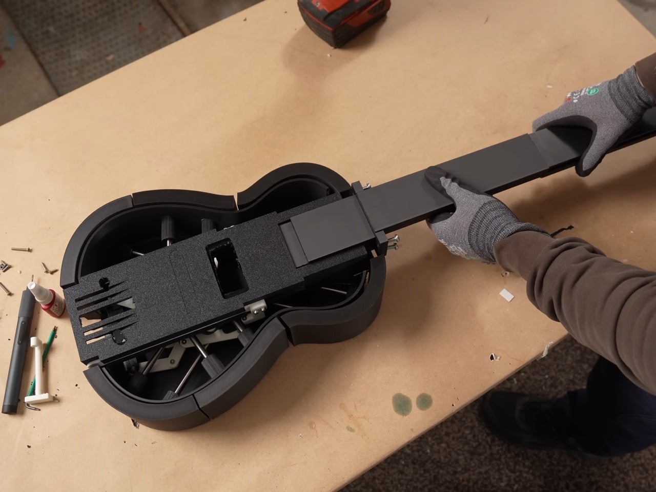
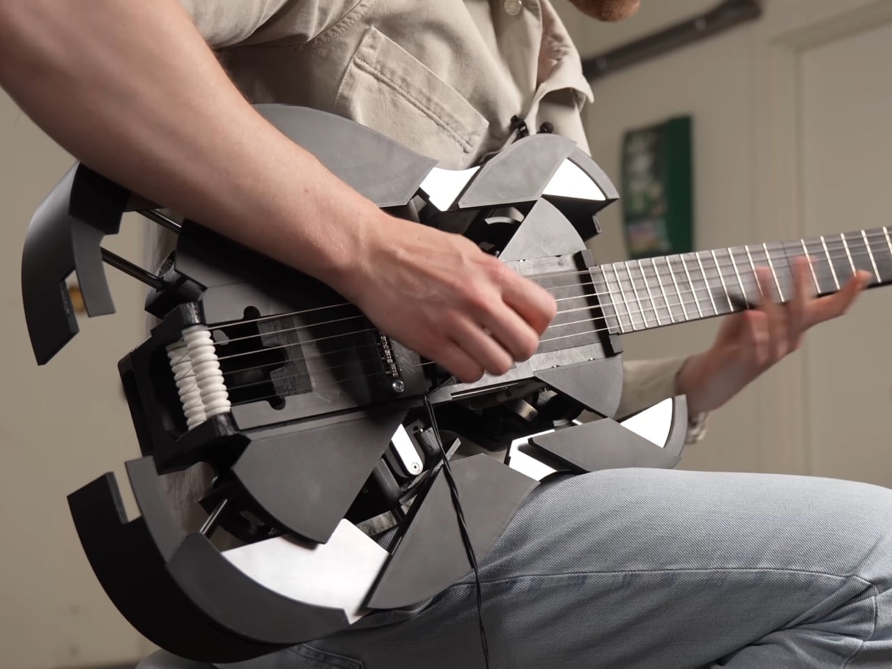
3D-Printed Ukulele Transforms Into an Electric Guitar In Just 2 Seconds

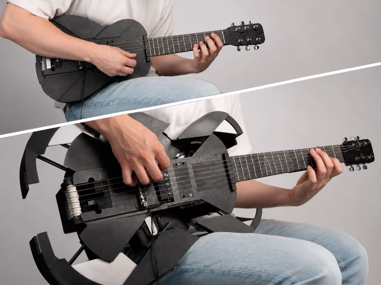
Every kid who grew up watching cars turn into robots has a soft spot for things that are not what they seem. Musician and maker Mattias Krantz never quite grew out of that phase, except instead of turning a truck into Optimus Prime, he set his sights on something smaller and arguably harder to pull off without CGI. He wanted a ukulele that could become a full size guitar on command, without falling apart in his hands. That meant solving three problems at once: growing the neck by roughly ten inches, keeping the strings in tune through that change, and expanding the body into a real guitar shape instead of a symmetrical blob. Each one turned out to be its own small nightmare.

The motivation was refreshingly petty. Ukulele players get less respect than guitar players no matter how good they get, and Krantz wanted to flip that on its head. Getting there took months of failed prototypes and a collaboration with mechanical engineer Adam Damato, who stepped in once the physics of a growing, string bearing neck got too gnarly to solve alone. What began as a joke became a real feat of mechanical design, borrowing tricks from telescoping tools, fishing reels, and an obscure folk instrument. By the end, the ukulele fit in a backpack and unfolded into a stage ready guitar in seconds.

Designers: Mattias Krantz, Adam Damato

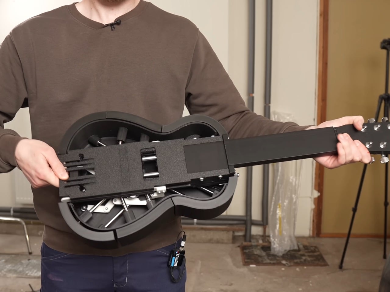
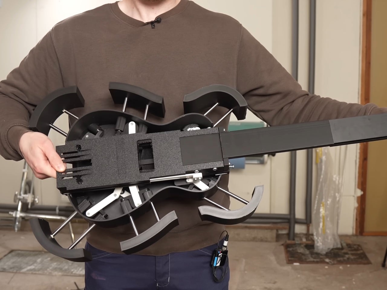
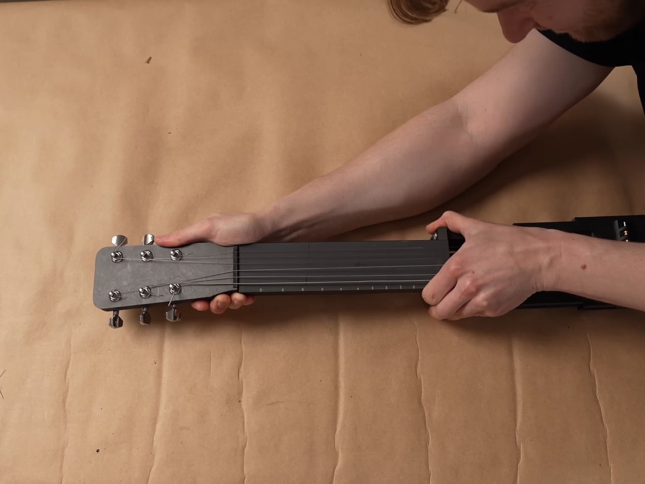
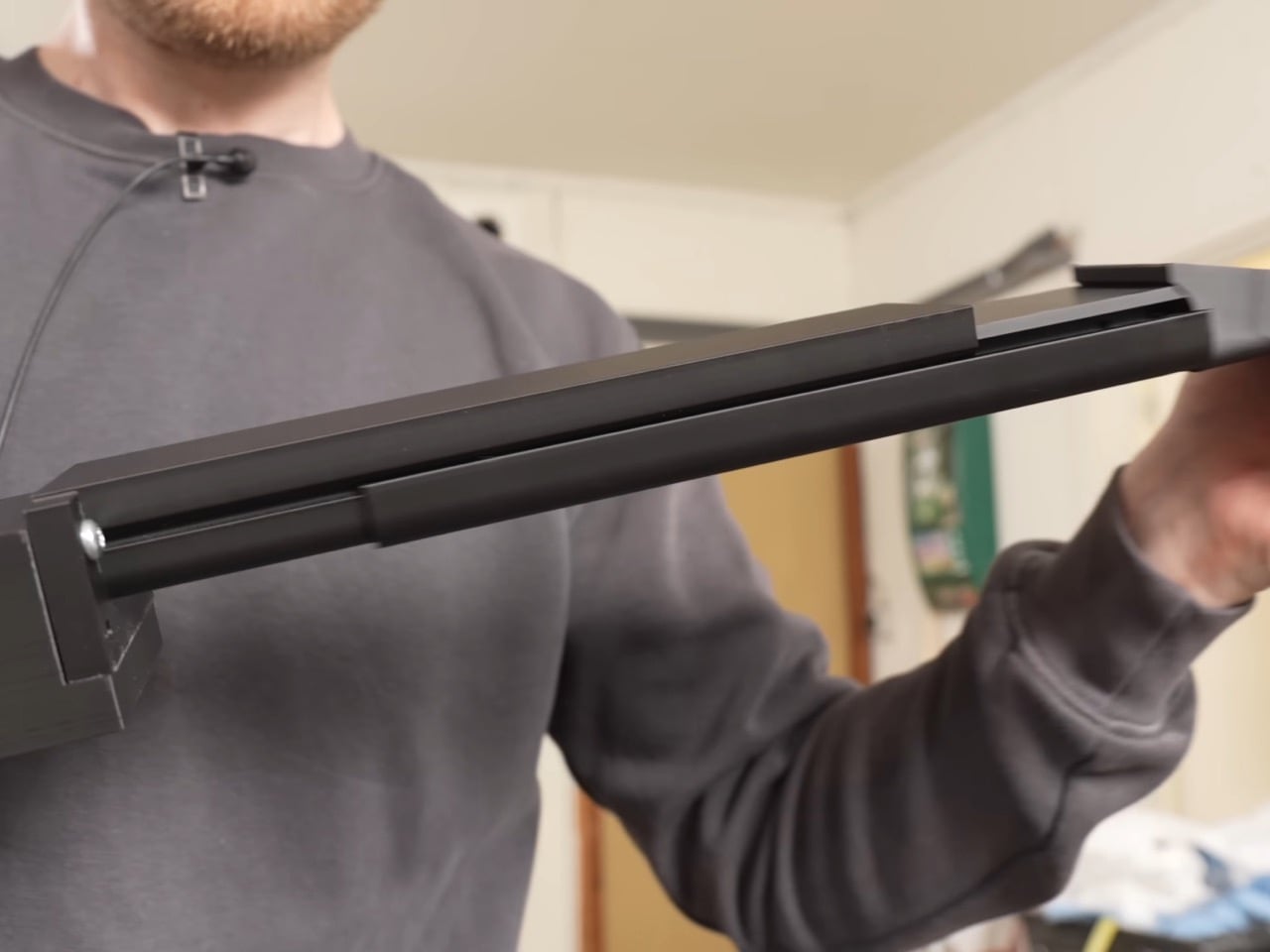
The neck telescopes straight out of the ukulele’s tiny frame, sliding one section into the next until it locks at full guitar length, gaining roughly ten inches without ever detaching from the body. A steel core runs through the sliding sections, and the joints are cut so they interlock and brace against each other the instant the neck reaches full extension. That bracing is what lets it survive eighty pounds of string tension without bowing like a fishing rod. Getting there took two failed attempts first. A folding neck, borrowed from an old instrument called the cithara orbo, worked fine on a full size guitar but was useless on a ukulele, since half a neck sat exactly where a hand needed to grip. The telescoping version solved the length problem right away, but only stopped bending once Damato worked in the steel core and reinforced joints.

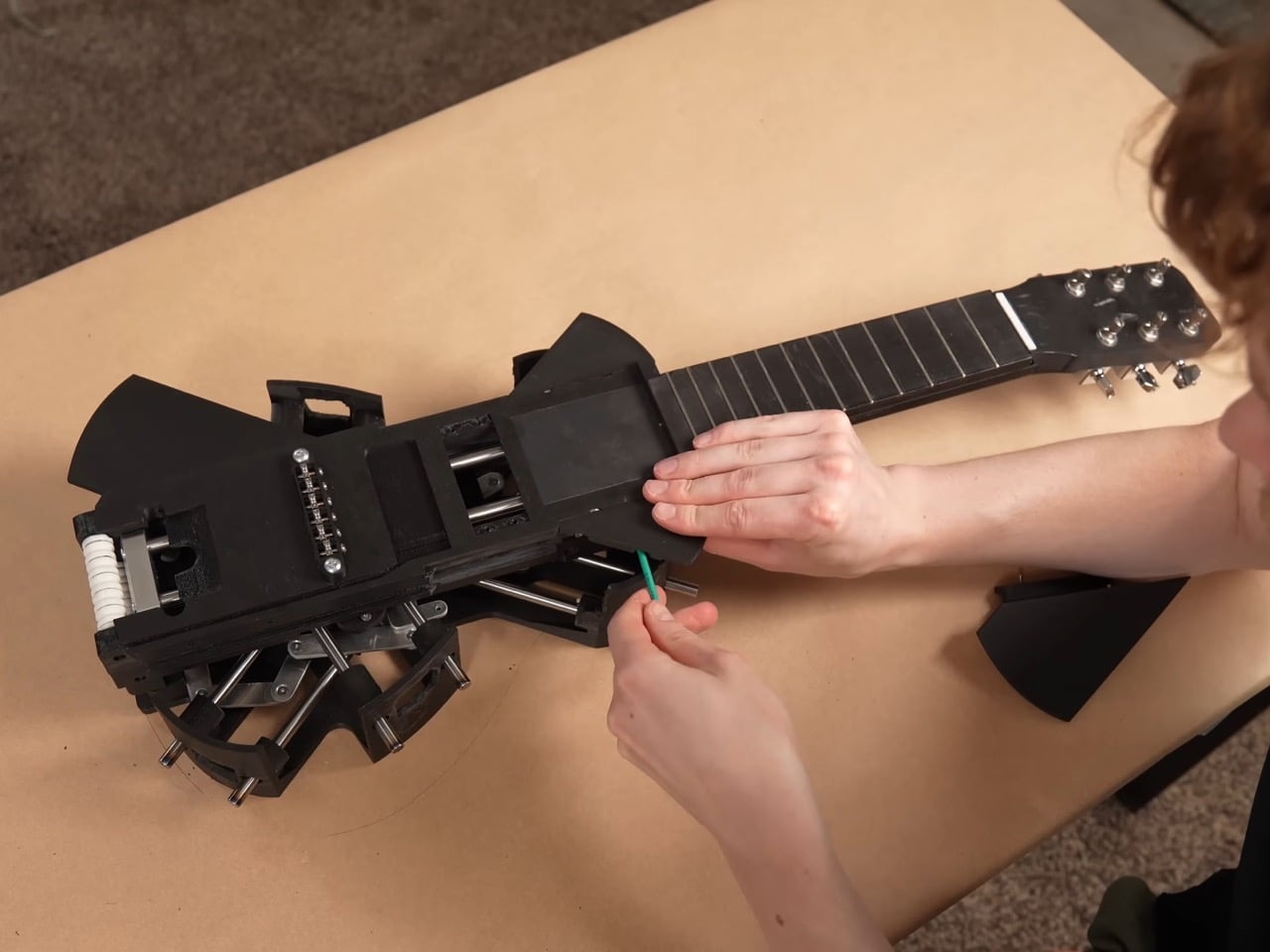
The strings are custom made, roughly twice the length of a normal set, and thread onto strategically placed rollers hidden inside the neck and body. Pull the neck out and the rollers feed slack forward, push it back in and they wind the excess back up, so the same six strings carry the instrument through both tunings without coming off. That roller system only exists because everything simpler failed first. Rubber bands solved the stretch problem but sounded worse than the ukulele they replaced. A fishing reel style rig using rope worked until the rope itself stretched, turning every transformation into tuning roulette, and swapping in non stretch rope traded that for a rope that kept snapping, once badly enough to take the guitar apart. Custom strings, ordered special and worth a twenty day wait, were the fix that finally held.

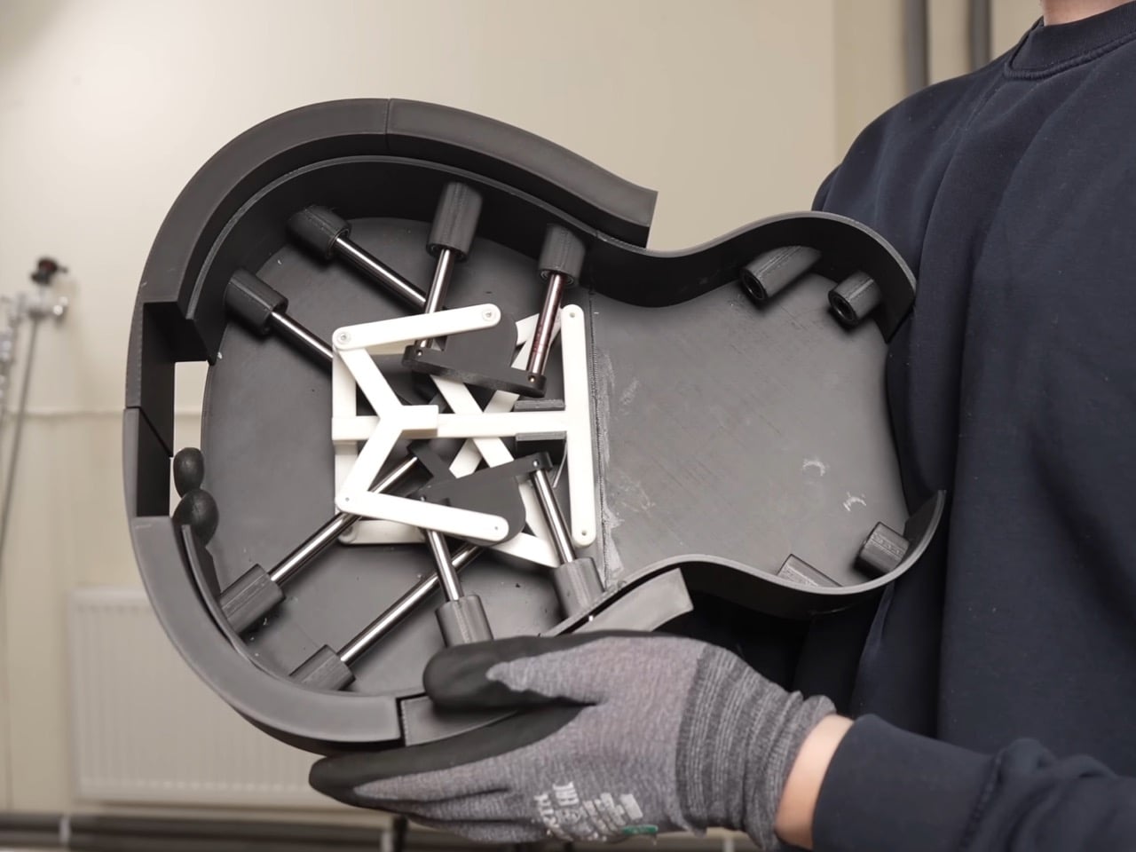
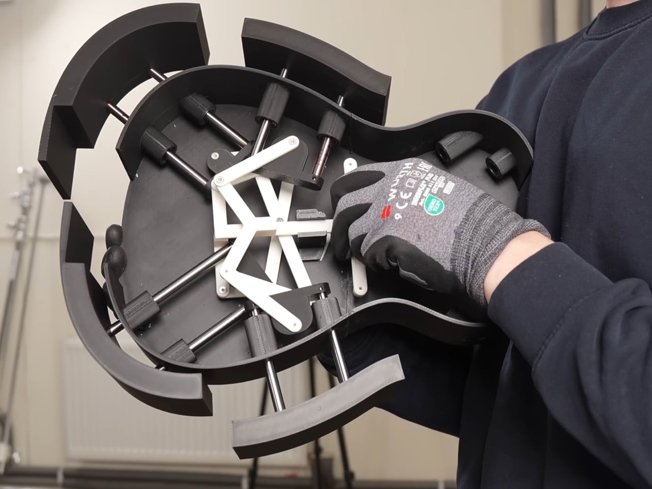
The body expands through six independently moving panels that fan outward from the ukulele’s compact shell, each one traveling a different distance and angle so the outline settles into a real guitar’s curves instead of a bloated circle. An early version of that mechanism grew symmetrically in every direction, fine for something like a banjo but wrong for an instrument with a pinched waist. Getting six panels to move independently instead of in lockstep turned one mechanical problem into six. The first panel alone took three attempts before it worked reliably, and even then only about ninety percent of the time. Adding the rest of the panels made things worse, since a hub inside was quietly blocking outward movement and jamming the whole assembly. Swapping plastic components for metal fixed it, and two days assembling hundreds of parts produced a body that finally held its shape.

None of this would matter if the transformation felt gimmicky in person, but the reception says otherwise. Onlookers at Krantz’s street performances wrote it off as just another ukulele until it unfolded mid song and changed their opinion of him. A band let him bring it on stage, and the transformation held together well enough to draw applause rather than confusion. Transforming gadgets are nothing new, but the engineering here, steel joints, custom rollers, six moving panels, earns real attention over a gimmick label. Krantz and Damato spent months on problems most builders would abandon, and the payoff works under tension, every time.

The post 3D-Printed Ukulele Transforms Into an Electric Guitar In Just 2 Seconds first appeared on Yanko Design.
  •  

BIG Wraps Dymak’s Headquarters in Solar-Powered Timber

BIG’s new headquarters for Danish material supplier Dymak turns environmental performance into architecture. Rather than treating sustainability as a technical layer hidden within the building, the studio makes it central to the project’s form, materiality and identity.

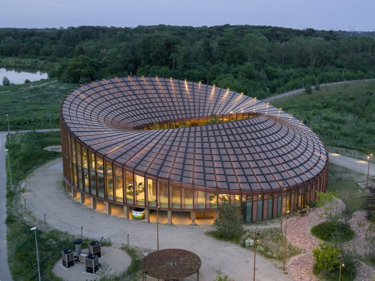
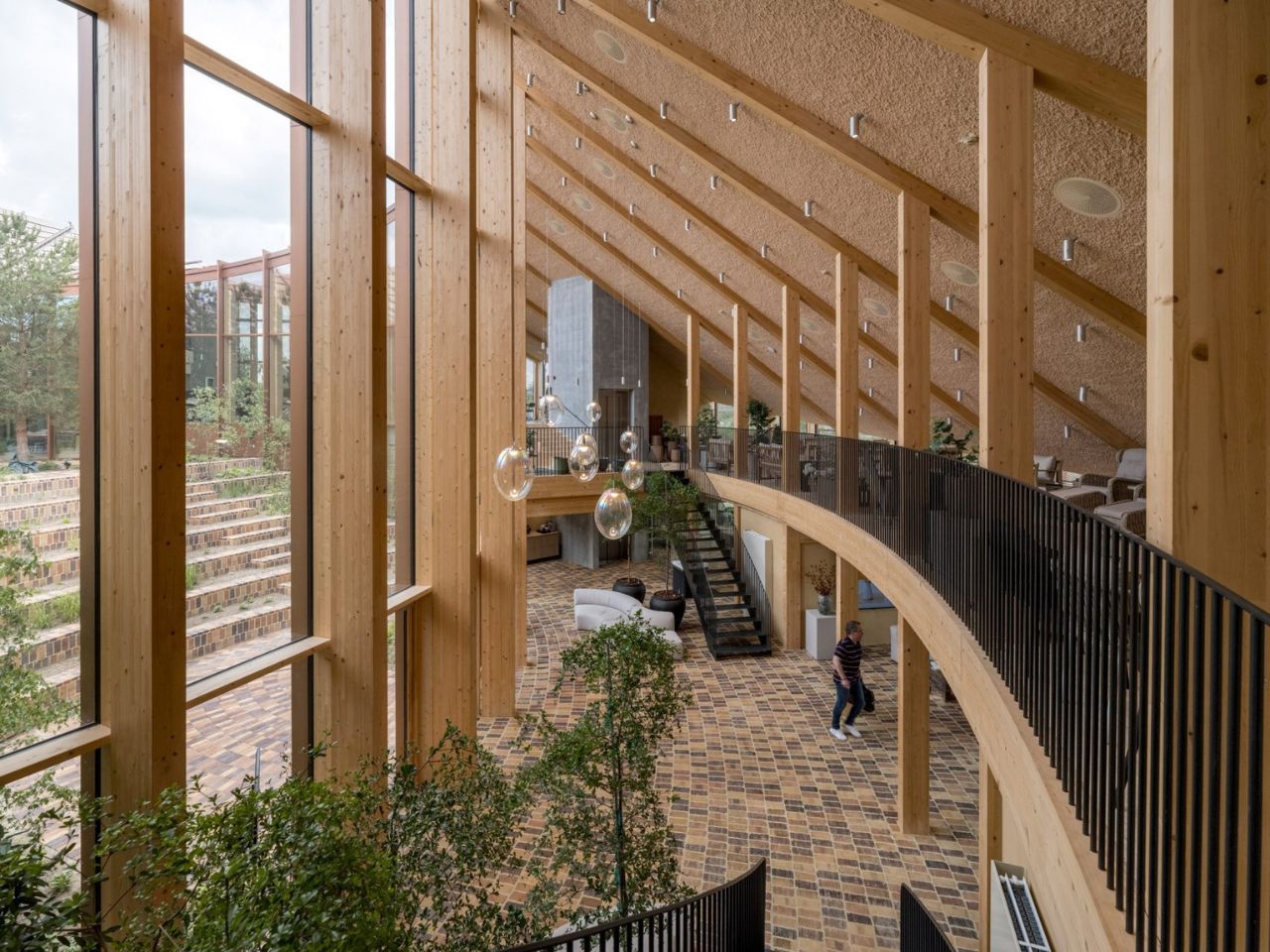
Located beside Glisholm Lake in Odense, Denmark, the 2,800-square-metre headquarters is organised as a circular mass-timber structure around an open-air courtyard. Above it, an undulating roof rises and falls across the building, creating a form that recalls a Möbius strip. The result is sculptural and highly recognisable, but it is also shaped by practical concerns.

Designer: BIG

The roof rises towards the north to open views of the lake and surrounding forest, while sloping towards the south to provide shade and reduce solar heat gain. Its surface is covered with 880 custom-shaped photovoltaic panels, turning the roof into both an energy-producing system and the building’s main visual feature.

This combination of performance and spectacle is characteristic of BIG. The studio often transforms practical constraints into clear architectural gestures, and the Dymak headquarters follows the same approach. Solar orientation, shading and landscape views are not treated as separate problems. Instead, they are brought together within one continuous form.

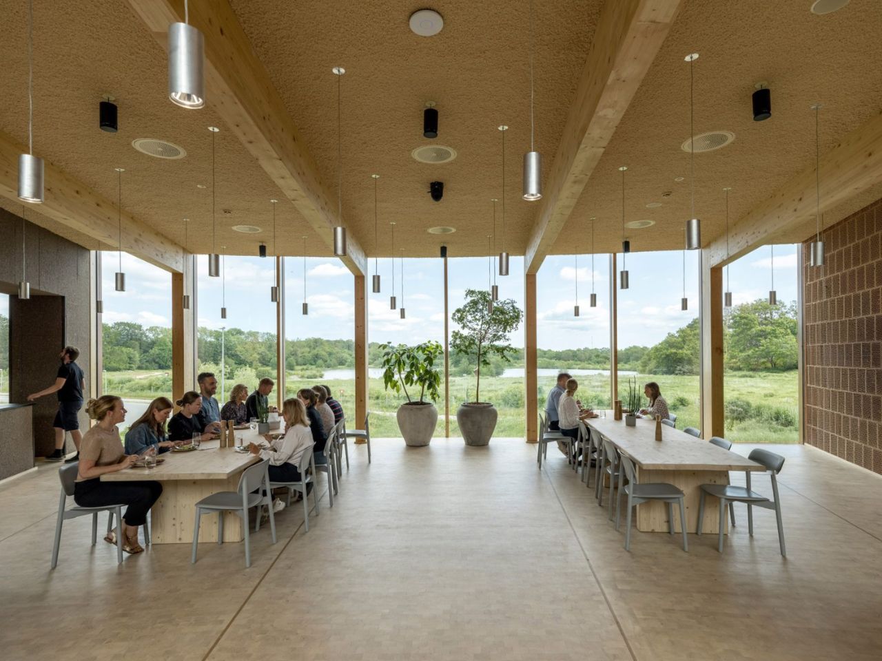
The project also functions as a full-scale showcase for Dymak’s material portfolio. Mass timber forms the primary structure, while clay, cork, eelgrass and recycled paper fibres are used throughout the building. These materials are not displayed as isolated samples. They appear across the floors, ceilings, walls and structural elements, allowing visitors to experience them through texture, sound and scale.

BIG describes the building as a “living catalogue”, and the phrase captures its dual role. It is both a workplace and a demonstration of what Dymak’s materials can achieve. The architecture becomes part of the company’s identity, communicating ideas of craftsmanship, sustainability and material innovation.

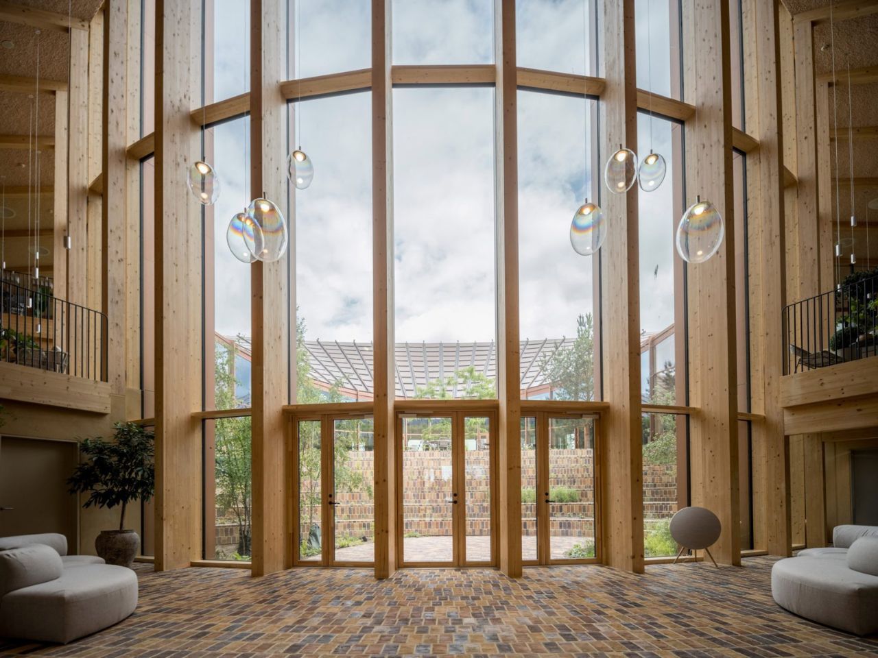
This gives the headquarters a warmer atmosphere than the polished glass-and-steel language commonly associated with corporate buildings. Timber remains visible, brick-tiled flooring extends across interior and exterior spaces, and natural fibres soften the ceilings. The materials create a sense of tactility that reinforces the company’s focus while making the workplace feel less formal.

At the same time, the building clearly operates as a branding tool. Its solar roof, natural finishes and landscaped spaces present Dymak as environmentally responsible and forward-looking. Sustainability is not simply part of the building’s performance; it becomes part of the company’s public image.

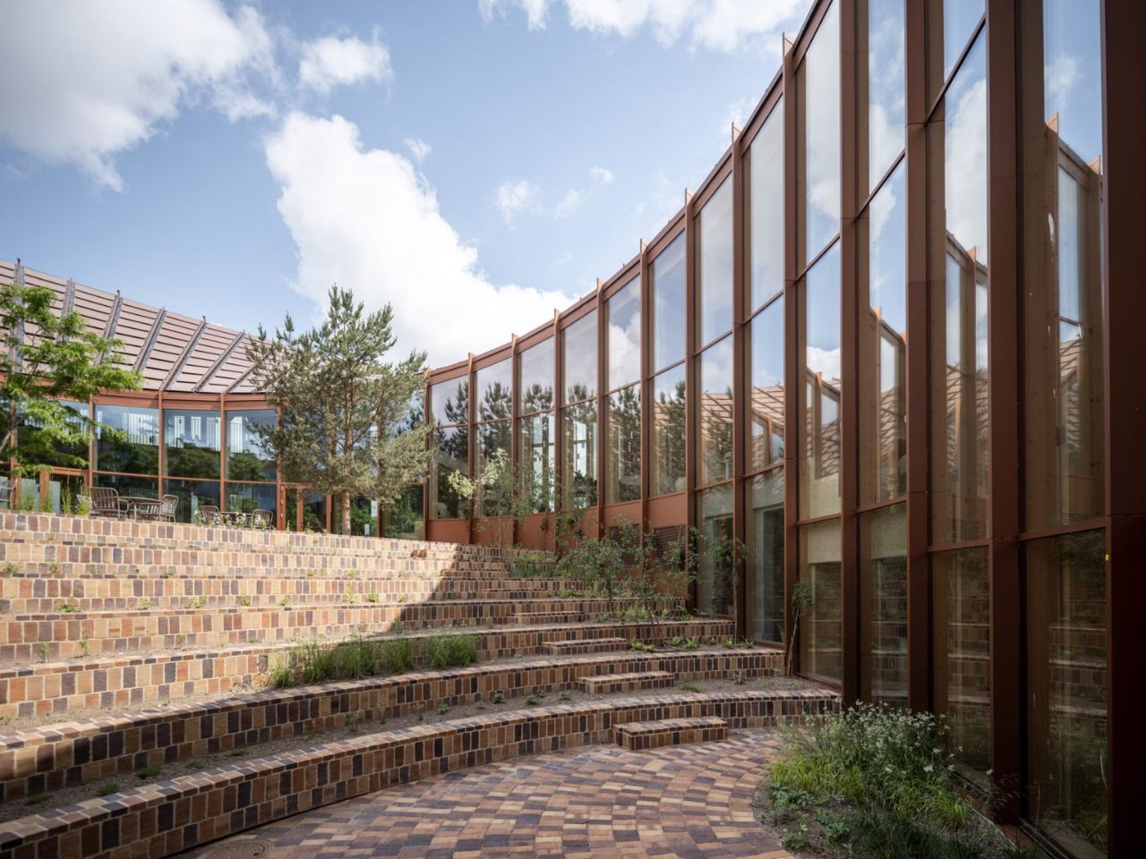
At the centre of the circular plan is a landscaped courtyard conceived as a green amphitheatre. Planted terraces and stepped seating create space for informal meetings, gatherings and moments of rest. The courtyard is surrounded by glazing, allowing daylight and vegetation to remain visible from the surrounding interiors.

Unlike the dramatic roof, the courtyard does not rely on a strong visual metaphor. Its value is more direct. It creates a protected outdoor space, brings nature into the workplace and offers an alternative to desks and enclosed meeting rooms. Brick flooring continues across the threshold, reducing the distinction between inside and outside and making the garden feel like an extension of the office.

The ground floor contains a showroom, photo studio and fitness facilities, while the upper level includes open-plan workspaces, meeting rooms and lounge areas. A mezzanine connects the two floors, and the circular layout creates a continuous route around the courtyard.

The headquarters succeeds most when its sustainable ideas are experienced rather than simply announced. The warmth of timber, the shaded interiors, the continuity of the brick flooring and the presence of landscape all influence how the building feels in everyday use.

Still, the roof is likely to dominate how the project is remembered. Its Möbius-strip form is visually striking and easy to communicate, but it risks overshadowing the building’s quieter achievements. The use of low-carbon and bio-based materials, the creation of shared social spaces and the careful relationship with the surrounding landscape may ultimately be more significant than the headline image.

The project is not a universal model for office design. Its custom roof, circular plan and carefully selected materials make it highly specific to Dymak. Yet this specificity is also what makes it persuasive. By presenting timber, clay, eelgrass and recycled fibres within a polished corporate environment, the headquarters shows that low-carbon materials can support both technical performance and architectural ambition.

BIG’s Dymak headquarters does not attempt to disappear into the Danish landscape. It performs, advertises and turns sustainability into a statement. Its strength lies in showing that environmental responsibility can shape not only how a building performs, but also how it looks, feels and represents the organisation within it.

The post BIG Wraps Dymak’s Headquarters in Solar-Powered Timber first appeared on Yanko Design.
  •  

Bang & Olufsen’s New Speaker Concept Is a Ritual, Not a Device

Most speakers are designed to disappear. They sit on a shelf, blend into a bookcase, or hide in a cabinet, quietly doing their job until you need them and then fading back into the background. Mårten Malmnäs, a graduate from the Umeå Institute of Design, designed something that pushes back against all of that.

The Beosound Tableau is a wall-mounted audio object developed in collaboration with Bang & Olufsen. Malmnäs calls it “a fireplace for music,” an instrument not just for listening, but for living. The moment I read that, I had to stop. Because I’ve never heard a speaker described that way before, and suddenly, I couldn’t think of a more fitting comparison.

Designer: Mårten Malmnäs

Think about what a fireplace actually does. Yes, it produces heat, but that’s almost beside the point. A fireplace creates presence. It becomes the thing a room organizes itself around. People pull their chairs toward it, conversations happen because of it, and its absence is genuinely felt. That’s a completely different design brief than “fits on your desk” or “connects to your phone.”

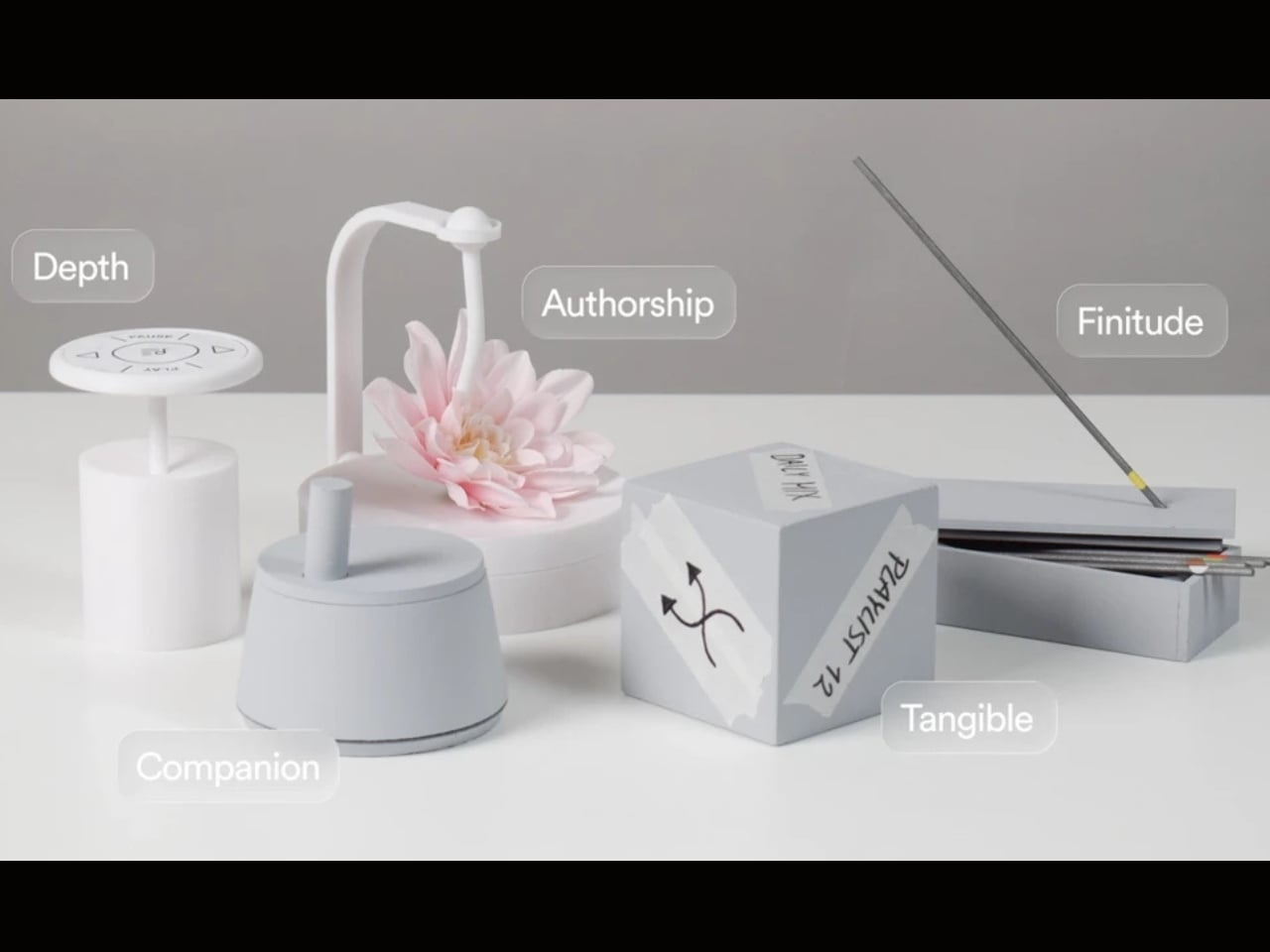
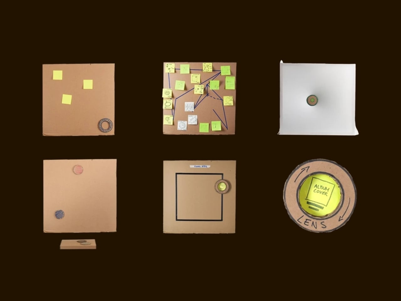
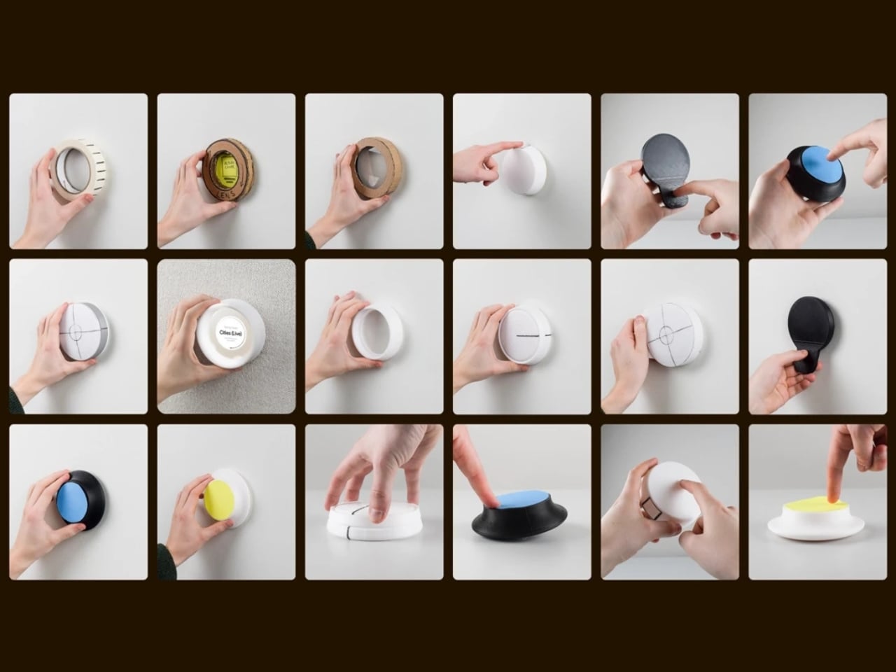
Malmnäs started the project with a design probe, a research method that explores the relationships people have with their homes, and from that came a set of experiments around values and behaviors. Eight experimental directions emerged from the ideation phase, spanning different input and output formats. Three of those directions clearly answered the design responsibilities he’d set for the project, and their shared qualities pointed toward one resolved object.

Here’s where it gets interesting. The original concept for the Tableau was screen-based, but a method called Wizard of Oz testing, where a human simulates the system to observe how people actually interact with it, pushed the design somewhere more honest. The interaction model shifted from screens to navigation by sound. And the principle that came out of it became the foundation of the whole concept: the most honest interface for a music object is music itself.

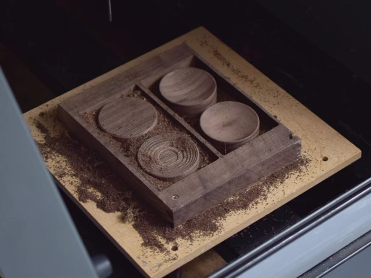
That’s a provocative idea. We’ve spent years layering more and more visual UI on top of audio experiences. Every streaming service competes on the complexity of its recommendation algorithm, the visual polish of its playlist covers, the grid of album art. Malmnäs argued the opposite, that sound should speak for sound. The result is the Sonic Token, a physical object that mediates between the listener and the Tableau. Tactile, intentional, and completely different from scrolling a touchscreen.

The Tableau is positioned as a focal thing for the home. An object to gather around and tend to. That language is deliberate, and it’s also a little radical. “Tending” to an audio object implies care and attention, a relationship rather than a transaction. You don’t tend to a Bluetooth speaker. You don’t gather around an app.

Bang & Olufsen has always occupied a rare space in the audio world, where design and sound hold equal weight, and where a product can belong in a design museum and still deliver extraordinary sound. But even by B&O’s standards, the Tableau concept asks a genuinely new question: what if the speaker were the focal point of the room, rather than just a feature of it?

There are fair questions about how a concept like this survives beyond a graduate show. The hands-on, material-driven process Malmnäs used, with 1:1 mock-ups and rigorous testing of the Sonic Token’s form and function, suggests this isn’t a vague idea dressed up in renders. It was built and tested as a real object. Whether it eventually reaches production or stays as a collaborative concept between a student designer and one of the world’s most revered audio brands is another matter.

But the value of the Beosound Tableau isn’t only in whether it ships. It’s in the question it refuses to let go of: why have we settled for speakers that ask nothing of us? The alternative, a speaker that earns its place on the wall, makes music feel like a gathering, and treats sound like something worth being present for, sounds like exactly what the living room has been missing.

The post Bang & Olufsen’s New Speaker Concept Is a Ritual, Not a Device first appeared on Yanko Design.
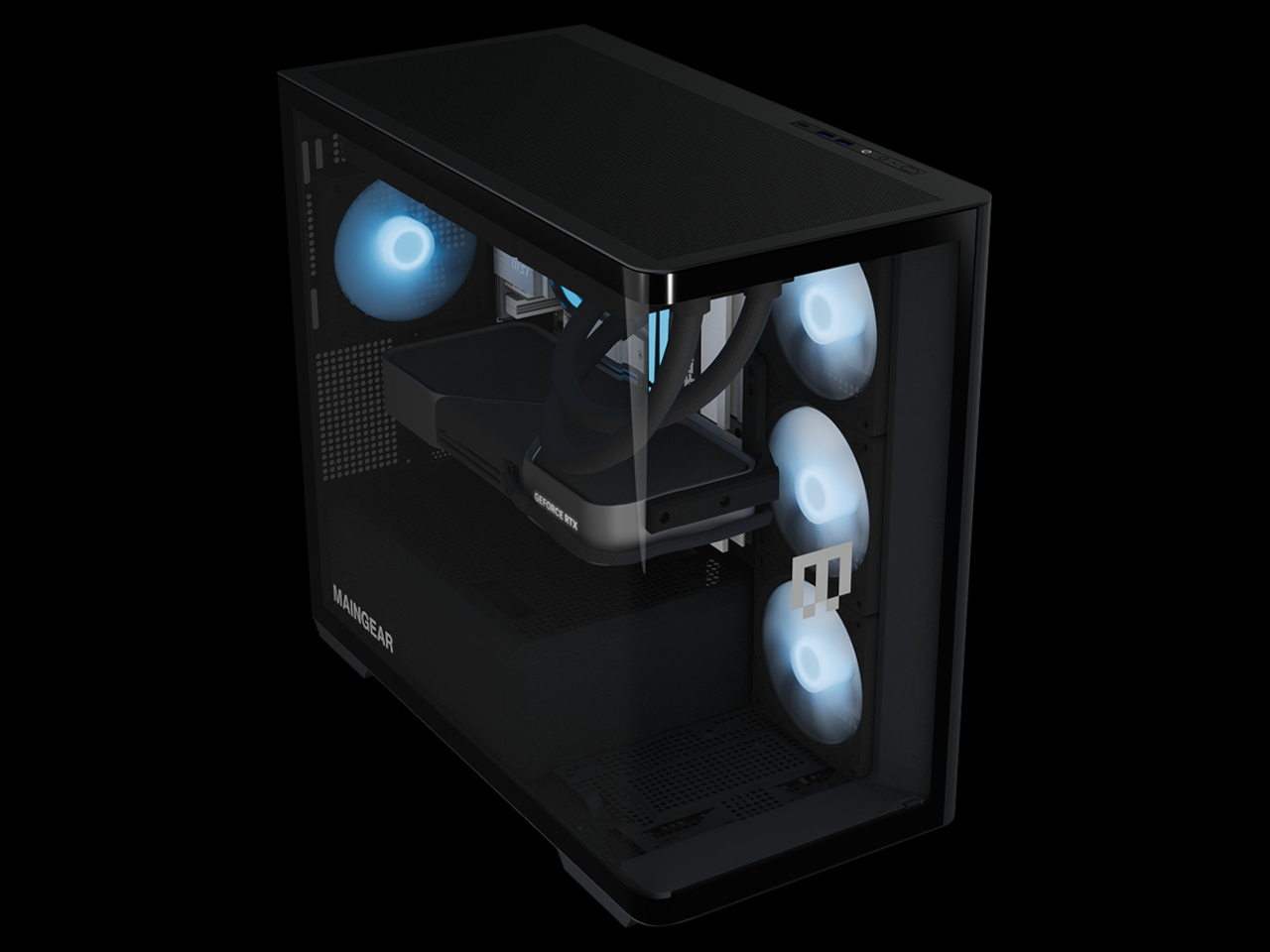
  •  
❌