Vue lecture

Forget Tracking Kids After School, This Cute Device Lets Them Check In

Working parents of school-age children face a particular kind of worry during the hours between the end of the school day and the end of the workday. Phone calls get missed, text messages go unread, and the ones that do get through usually carry just enough information to confirm a child made it home. What they rarely carry is any sense of how the child is actually doing, and that gap tends to get filled with parental anxiety rather than reassurance.

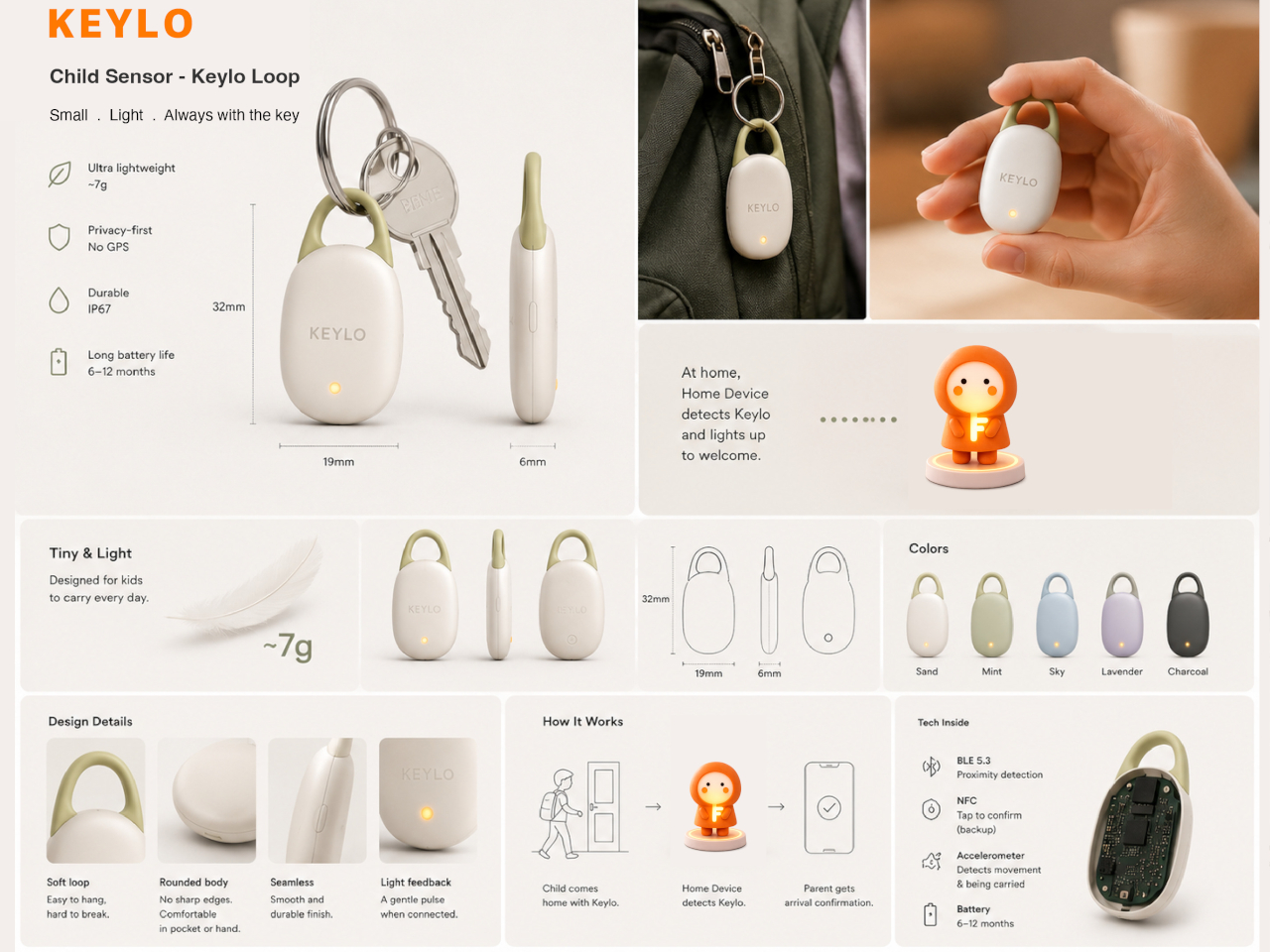
Keylo is a conceptual companion device designed around that specific gap. Rather than giving children another screen to manage or another app to navigate, it offers a single, tactile interaction: a tap that lets them express how they’re feeling. No typing, no calling, no notification chain. The child touches the device, cycles through a color to represent their emotional state, and the parent’s app receives it.

Designer: Miaonan Li

The system consists of three physical parts. The main companion unit sits on a home dock, usually somewhere a child passes when they get home. A smaller key fob clips to a backpack and travels with the child throughout the day. Both are made from soft matte silicone and deliberately avoid any screen or complex interface, giving the object a quality that’s closer to a familiar household item than a piece of consumer electronics.

The four emotional states Keylo recognizes are kept intentionally broad. A soft orange glow indicates the child feels relaxed; bright yellow signals something more playful or energetic; a neutral white tone signals a preference for quiet or personal space; and a calm blue light carries a specific message from child to parent: I’m thinking of you. Each one is simple enough for a young child to understand and expressive enough to actually mean something when it arrives on a parent’s phone.

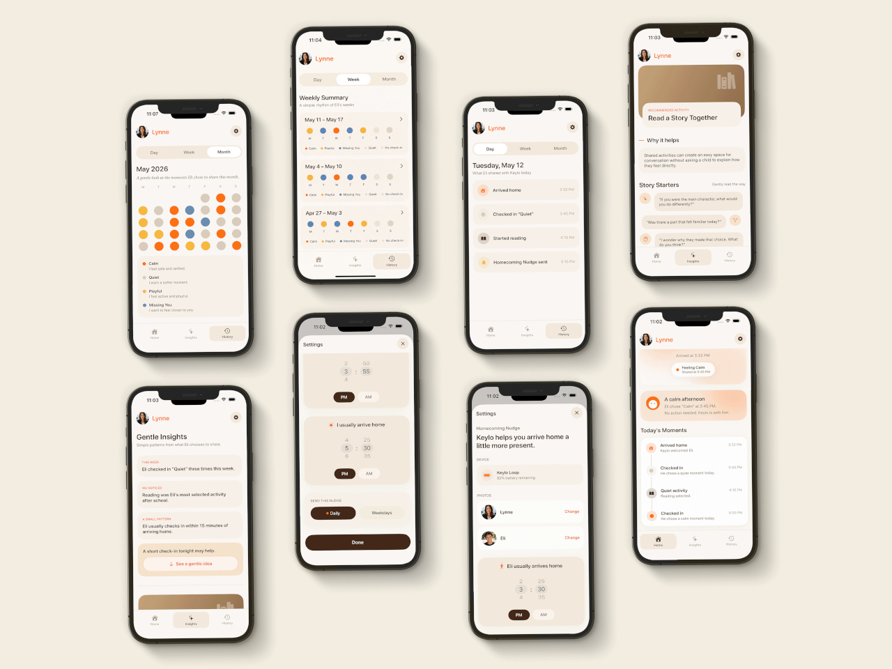
That arrival is handled by the companion app, which mirrors the same color language as the physical device. The distinction the project draws between this and conventional parental monitoring is deliberate. Rather than showing parents a location, a screen time report, or a camera feed, the app delivers a single emotional moment. A notification that says a child is feeling calm and playful carries a different quality of information than a location ping, and it asks for a different kind of response.

The device is designed to work without any input from the child beyond that single tap. There are no prompts to answer, no questions to read, and no follow-up required. For a child who has just walked in the door after school, the low threshold is significant; the gesture stays small enough that it doesn’t feel like a chore, which is probably the main reason most family communication apps get abandoned within a few weeks of being set up.

What Keylo explores through its design is how much emotional information can be conveyed through the simplest possible interaction. A color chosen by a child carries less data than a voice call but far more than no contact at all, and it arrives without interrupting anyone’s afternoon in the way a ringing phone does. The project makes a case for the idea that the volume of communication matters less than whether it happens at all, and on terms that feel natural to the person sending it.

The post Forget Tracking Kids After School, This Cute Device Lets Them Check In first appeared on Yanko Design.

  •  

The Foldable E Ink Book Is Finally Taking Shape

The e-reader has been one of the most static product categories of the past two decades. Since the first Kindle appeared in 2007, the form factor has barely evolved: a single screen, a flat back, and dimensions roughly matching a paperback. These devices have gotten lighter, sharper, and more waterproof, but the fundamental design assumption has stayed the same. They’re books without the book part.

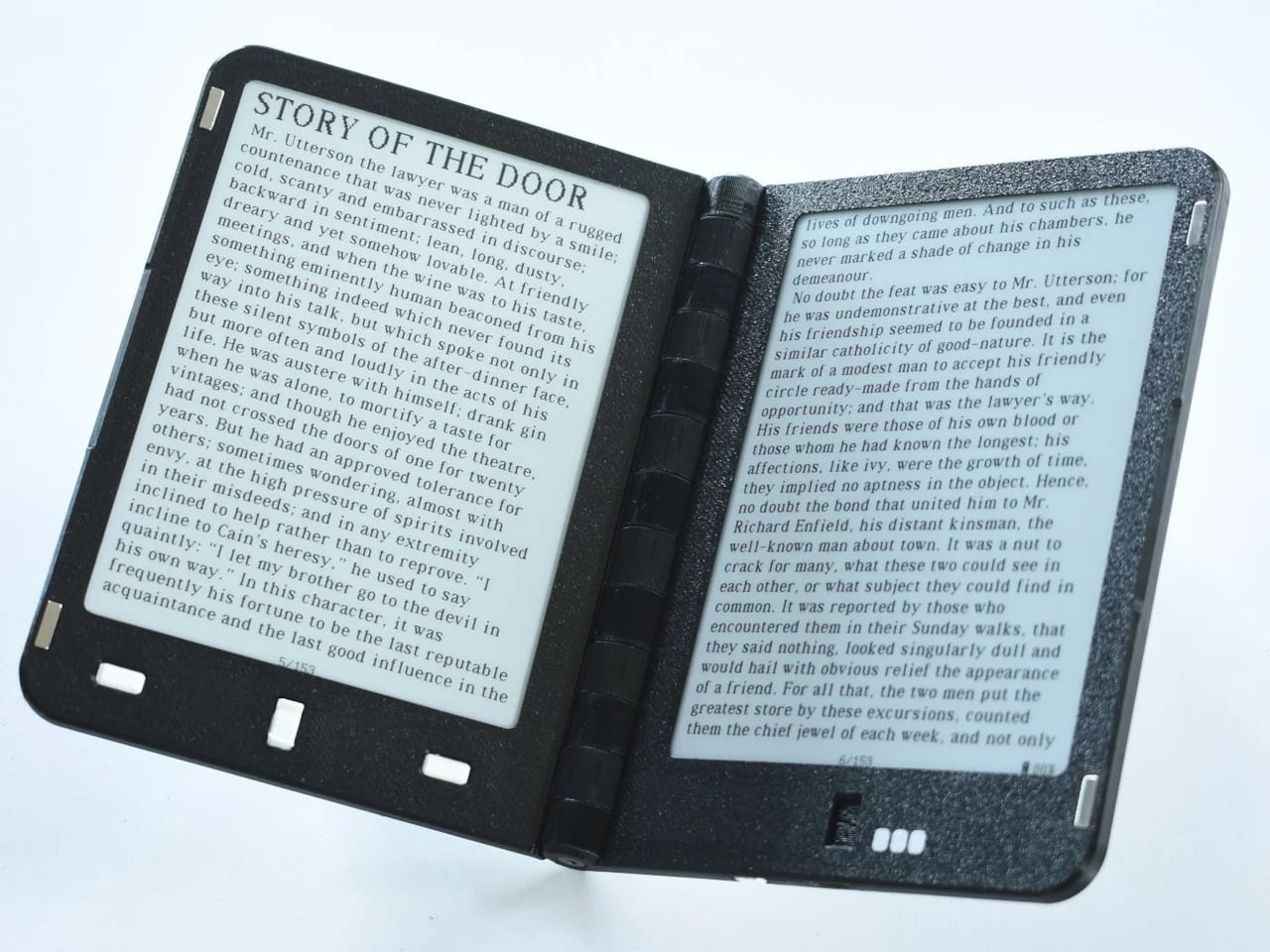
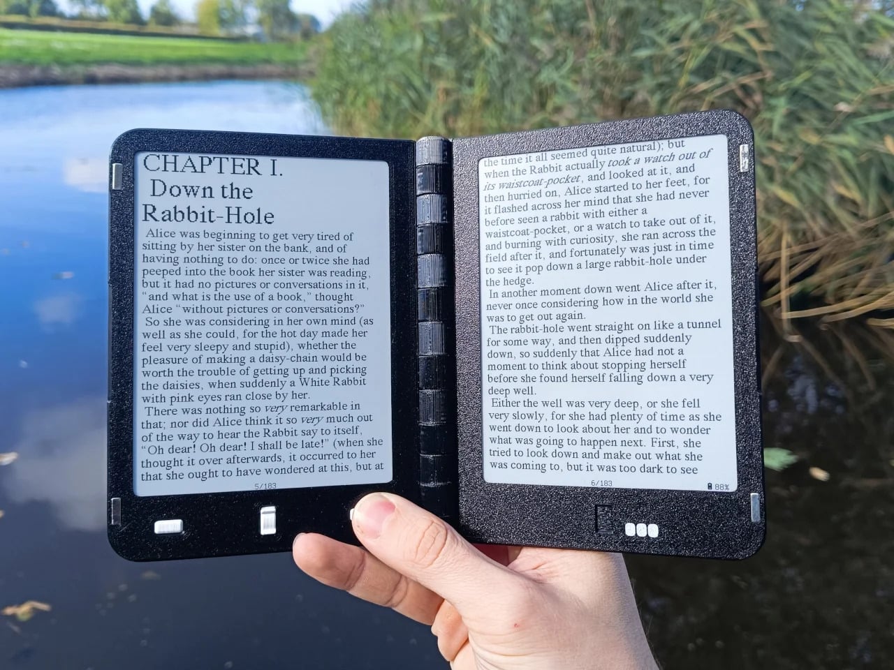
A growing number of designers have been working on a different premise: what if an e-reader actually opened like a book? One with two E Ink panels and a real hinge, held the way you’d hold a paperback, where left and right pages exist as physical space. That shared ambition has driven a small but serious cluster of projects building quietly over the past five years.

The proof that e-paper could bend

The idea of folding an E Ink display isn’t new. Back in 2020, E Ink Corporation demonstrated a hinged prototype showing that a bending e-paper panel could survive the mechanical stress of being folded. It never reached retail shelves, but it answered the one question that mattered most at the time: whether the material itself could handle the geometry of a real book.

Designer: E Ink

That prototype didn’t solve everything. It was a controlled demonstration with no commercial roadmap, no software, no battery life to speak of, and no clear form factor beyond the fold itself. What it gave the industry was proof that flexible e-paper was a viable building block rather than a permanent research curiosity. Every foldable E Ink project that came after built on that understanding.

The book illusion finally made real

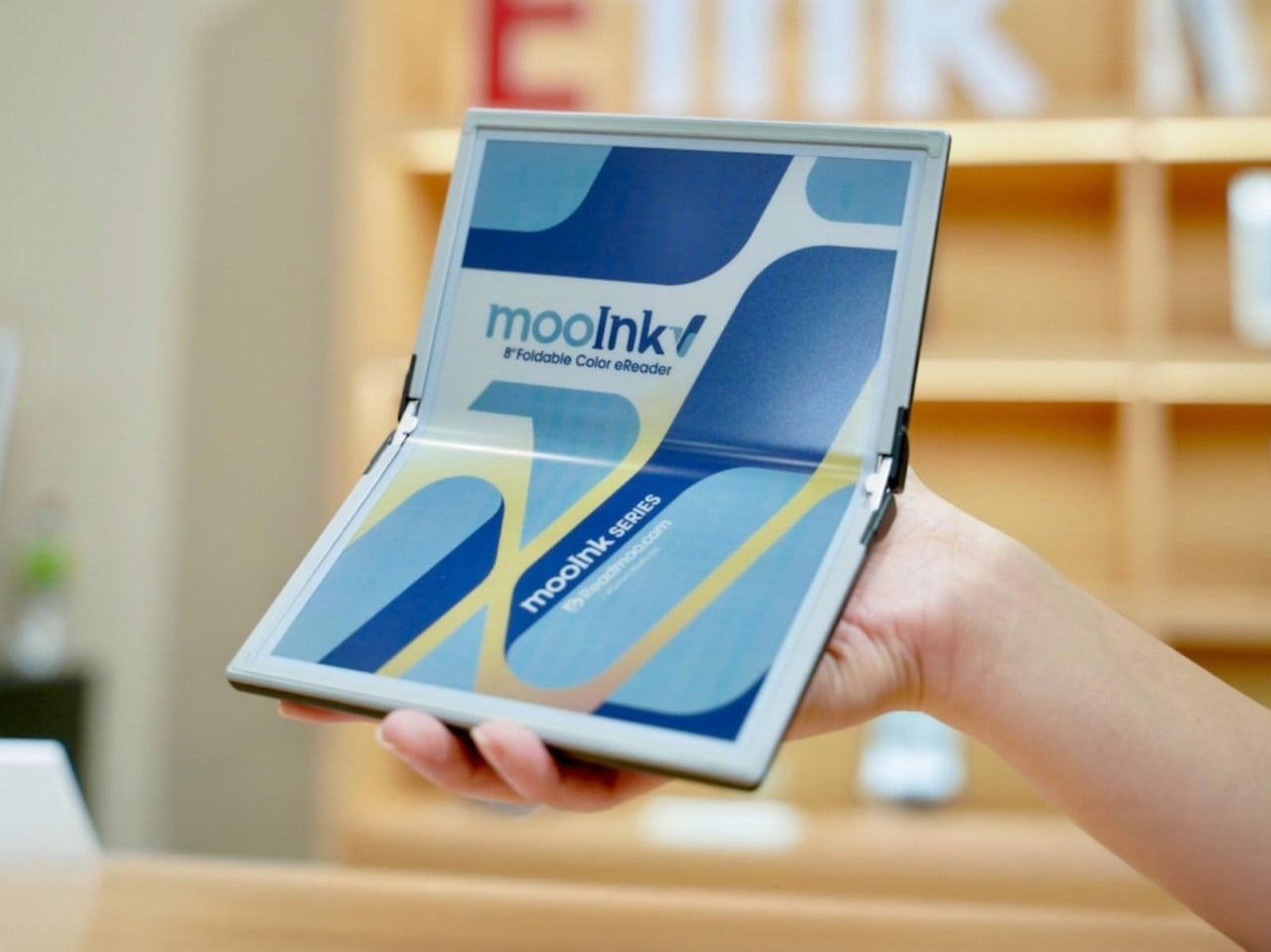
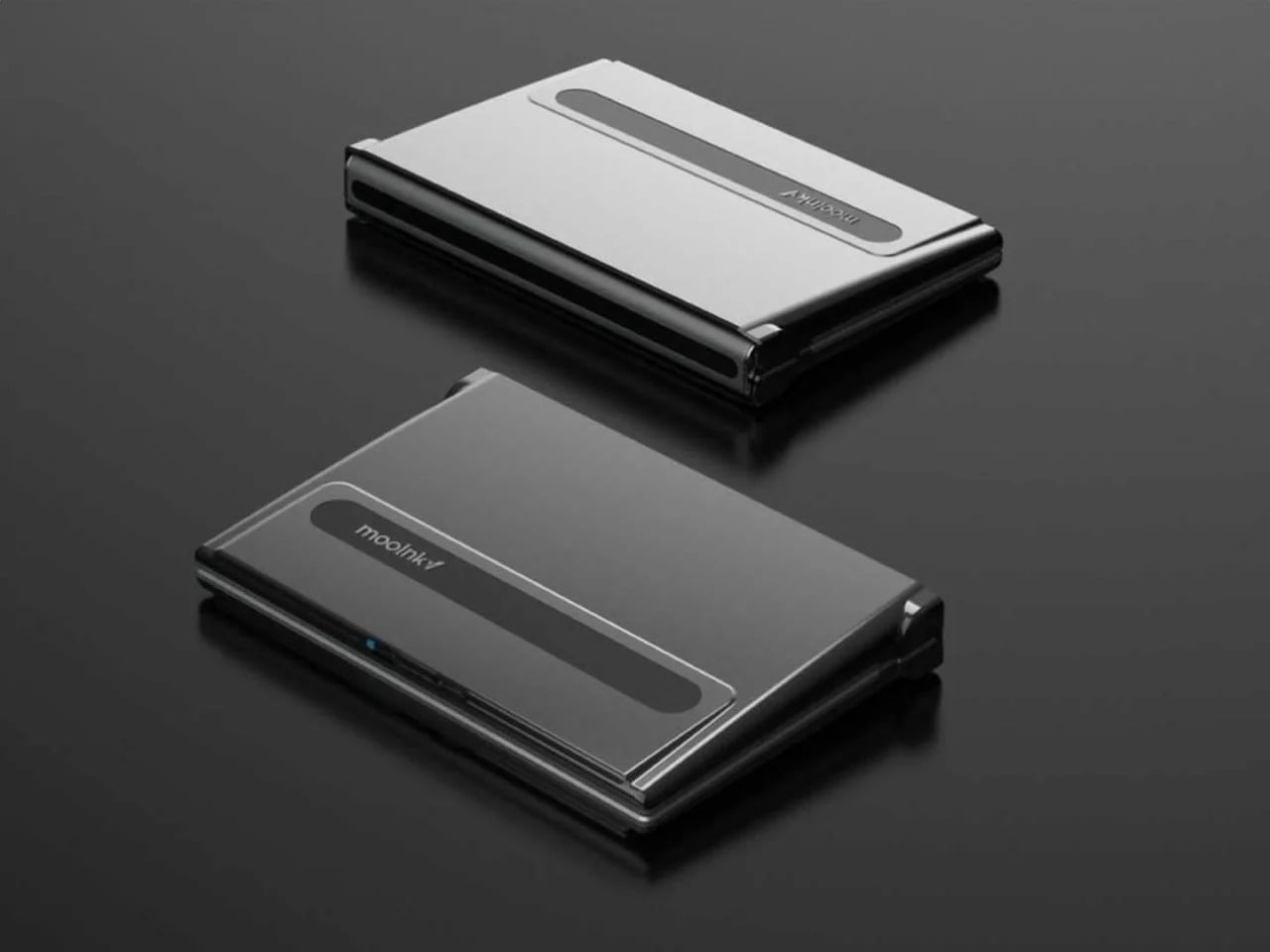
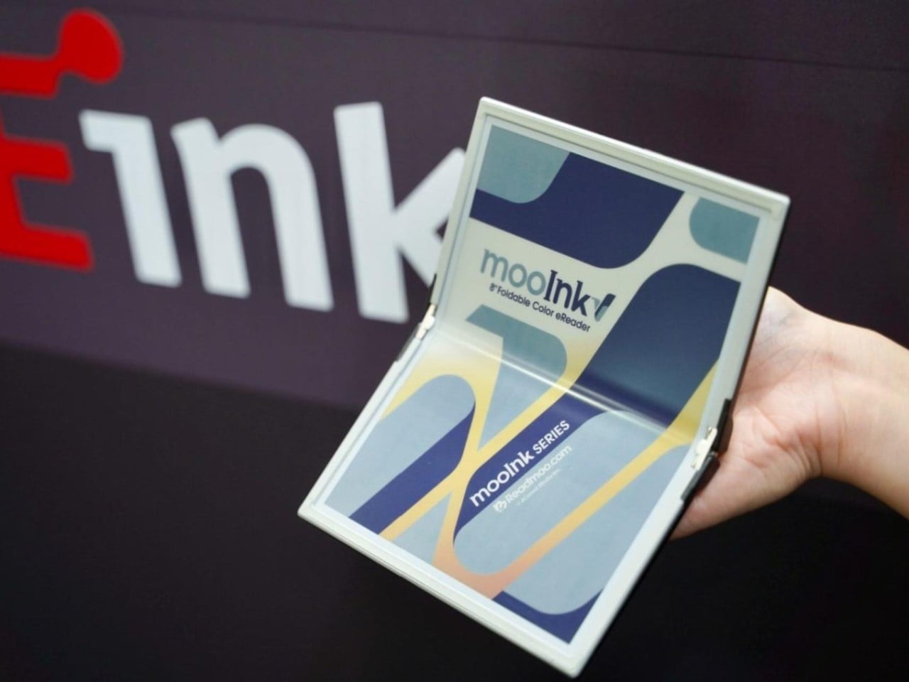
Readmoo’s Mooink V was the first design to make the flexible E Ink concept feel emotionally legible to a general audience. It’s built around an 8-inch Gallery 3 color e-paper display developed in collaboration with E Ink, one that folds down the middle to make the device small enough to pocket when closed and wide enough to feel like a slim paperback when open.

Designer: Readmoo

The color display matters more than it might seem. Gallery 3 renders close to 50,000 colors at 300 PPI, expanding the format beyond plain text to illustrated books, comics, and magazines. The fold reportedly passed 200,000 bending tests during development, and when fully open, the crease isn’t dramatic enough to register as a flaw so much as an honest design trade-off.

Mooink V hasn’t had the smoothest road to market, though. Despite genuine buzz at trade shows including Touch Taiwan and SID Display Week, no confirmed retail availability or street price had materialized as of mid-2026. The design made the foldable E Ink book look and feel tangible in a way earlier prototypes hadn’t. Whether it gets there commercially is a different and still open question.

Two screens, no crease

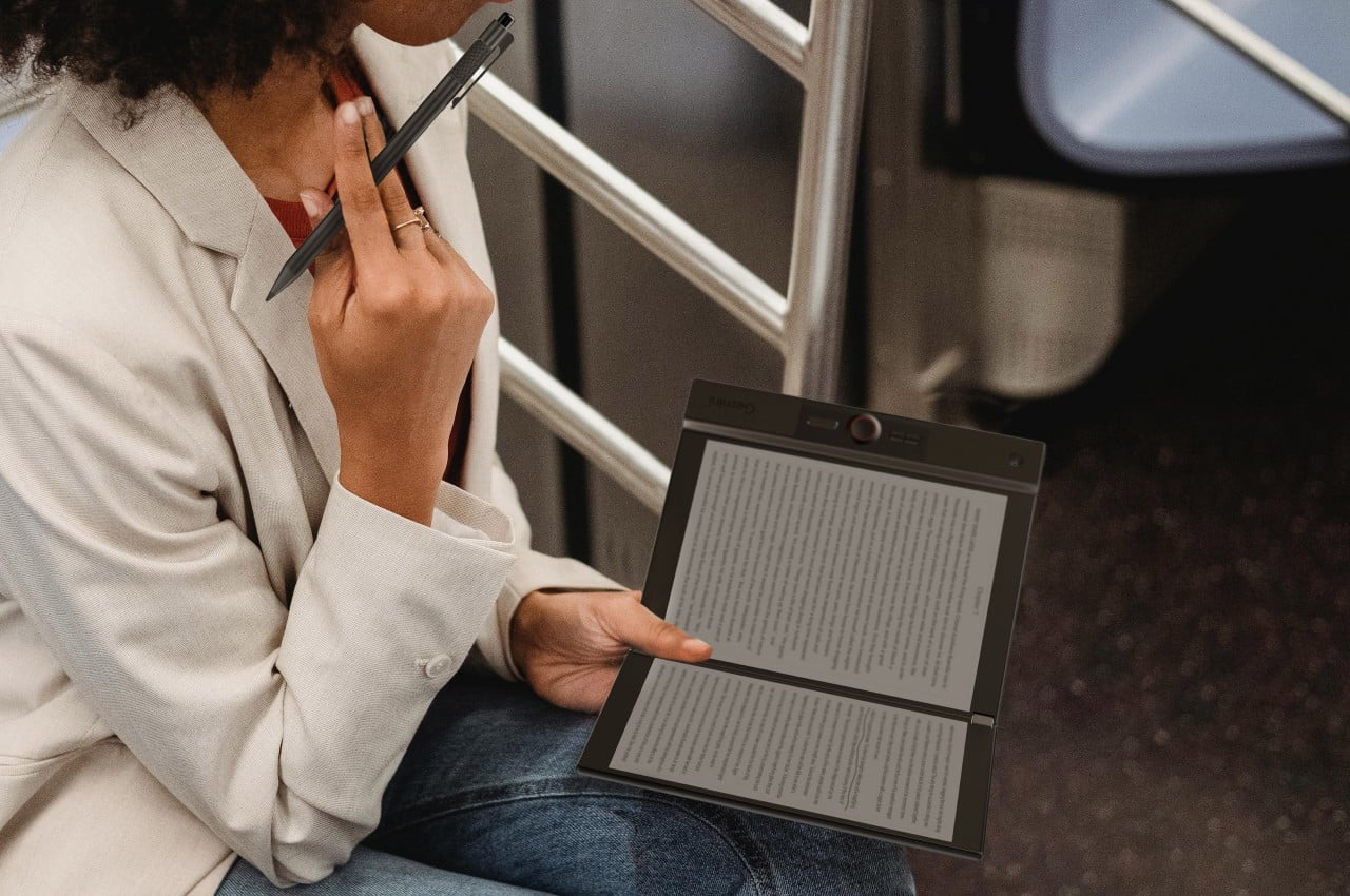
Not everyone building a book-shaped e-reader was willing to bet on a single flexible panel. A parallel design school took a more pragmatic approach: pair two conventional E Ink screens with a well-engineered hinge and let the gutter do the work. The result avoids crease anxiety entirely since neither panel has to bend, though it trades the seamless page illusion for a visible seam you’d have to accept.

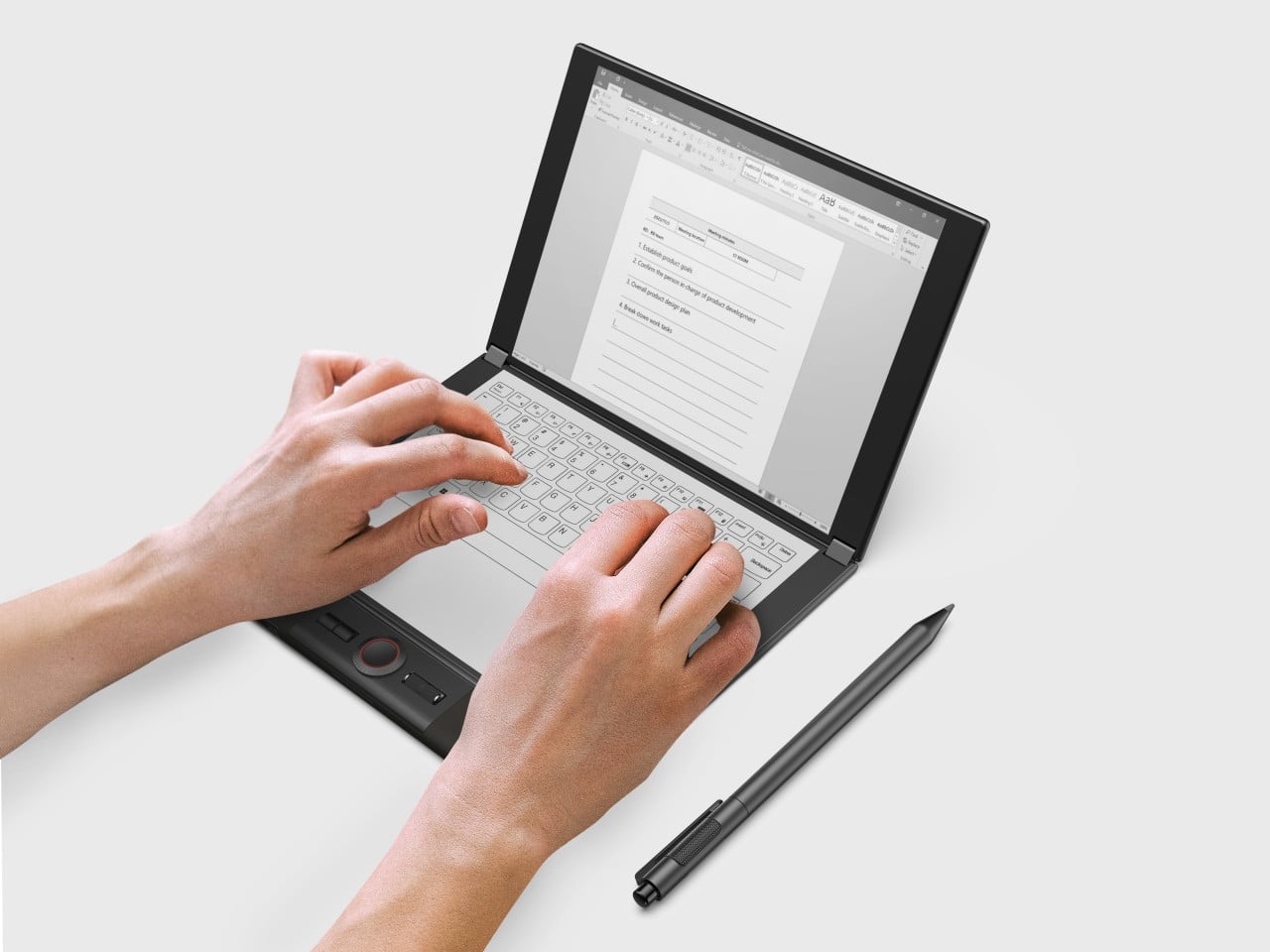
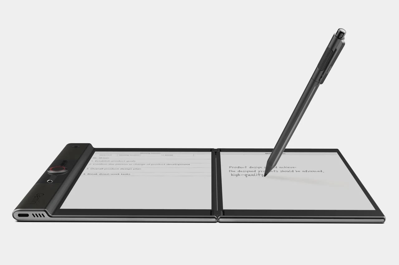
Designer: LCFC (Hefei) (a Lenovo Subsidiary)

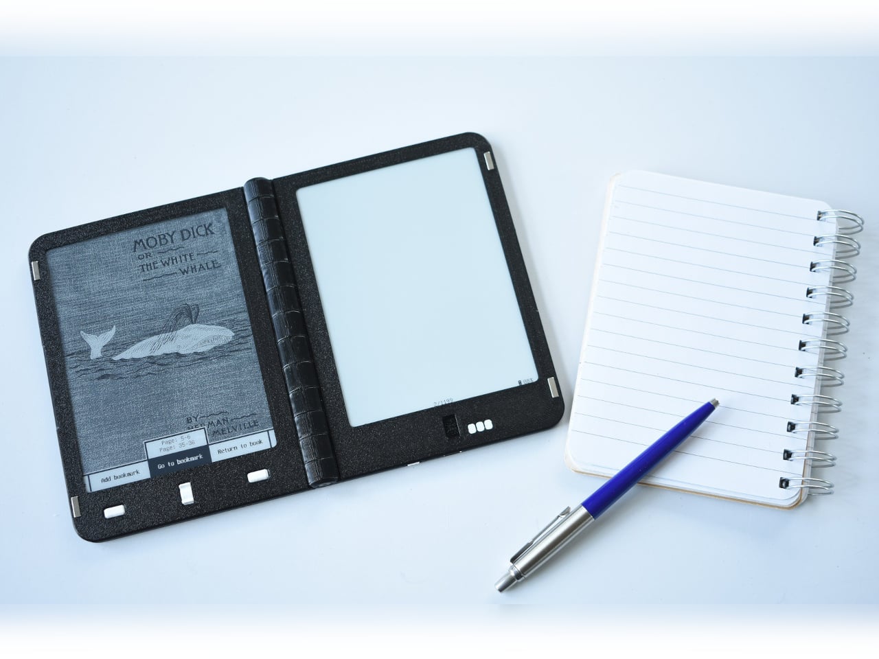
LCFC’s Gemini took the productivity angle furthest, giving both E Ink panels enough real estate to function almost like a laptop, with reading material open on one side and an active workspace on the other. The InkReader Duo concept took a more compact approach, fitting two E Ink screens into a phone-sized form, which made it feel less like a desk tool and more like a pocket notebook.

Diptyx went in a different direction altogether. Rather than chasing consumer polish, the project leaned into open-source principles, building a two-panel hinged e-reader without the lock-in that defines most commercial platforms. It isn’t the most refined interpretation of the book-shaped reader, but it made a clear point: the hardware problem was increasingly solvable, and the real challenge was getting the software and ecosystem right.

Designer: Martijn den Hoed

When a second screen isn’t enough

Not every dual-screen device fits cleanly into this story. The Bluegen OKPad pairs an E Ink panel with a regular LCD screen, which makes for a versatile tablet but undermines the unified reading experience that makes an E Ink book feel coherent. Switching between two fundamentally different display types introduces a visual disconnect that software bridging alone can’t fully smooth over.

Designer: Bluegen

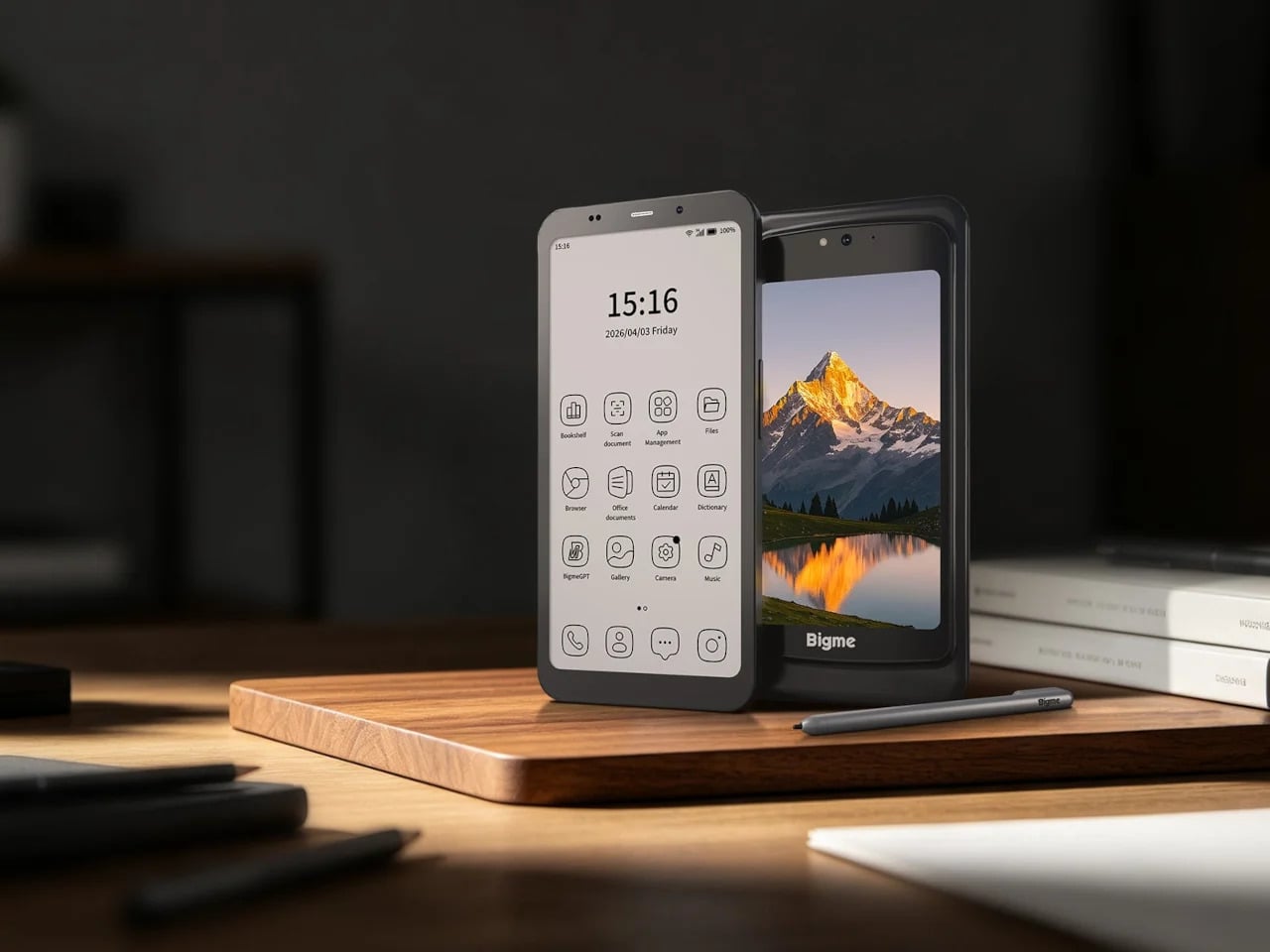
Bigme’s HiBreak Dual 2 runs into a different kind of problem. It’s a smartphone with a secondary E Ink display on the back, which is a genuinely clever idea for managing notifications and extending battery endurance, but it’s shaped and used like a phone rather than a book. A second screen doesn’t automatically recreate the spatial logic of reading a bound object.

Designer: Bigme

Inkleaf and the case for two pages

Inkleaf is the most pragmatic entry in the foldable E Ink space so far. Instead of chasing a seamless fold, it pairs two 10.3-inch Carta E Ink panels in a notebook-style hinge, with one side for reading and the other for writing. The seam between them works as a gutter rather than a flaw, and the design doesn’t try to hide it.

That workflow proposition is what makes Inkleaf interesting beyond its form factor. Having reference material on one panel while taking notes on the other removes a friction point that every single-screen reader quietly ignores. You don’t need to switch apps, scroll back, or memorize what you just read before writing something down. It’s aimed at a different kind of reader than a Kindle typically serves.

Designer: Kameron Yu

Inkleaf is currently collecting early-access signups ahead of an August 2026 launch, with a broader public release targeted for 2027. That’s a staggered timeline worth noting: the hardware still has to prove itself beyond initial demos, and the software will matter as much as the panels themselves. Carta E Ink is a sensible fit for a writing-focused device, but actual daily use remains the real test.

What Kindle still has to answer for

None of this means the Kindle is suddenly irrelevant. Amazon’s device still wins on price, ecosystem depth, and a friction-free reading experience built up through years of software refinement. If all you want to do is buy a book and read it on a train, nothing in this group of foldable experiments beats a Paperwhite for simplicity. The incumbents aren’t losing sleep yet.

What these devices do expose is a design gap Amazon hasn’t seriously tried to close. A Kindle displays text efficiently, but it doesn’t recreate the spatial logic of reading a bound book: two visible pages, a sense of position, a natural place for margin thoughts. Those aren’t features that get patched in through a software update, which is why the form-factor conversation is overdue.

That’s what this group of foldable and dual-screen E Ink devices has been quietly building toward for the past five years. Not a product category defined by any single winner, but a shared argument about what a digital reading device could look like if it started from the book rather than the screen. Whether any of them fully delivers on that is a question 2027 will help answer.

The post The Foldable E Ink Book Is Finally Taking Shape first appeared on Yanko Design.

  •  

Twelve South Just Built a $130 Charger That Won’t Ruin Your Nightstand

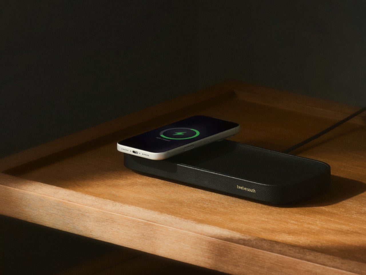
The nightstand has become one of the messiest surfaces in a home. A charging cable snaking across the top, a phone lying flat or propped against whatever happens to be nearby, maybe a watch charger completing the pile. Most accessories designed to address this solve the function while ignoring the furniture, leaving something clinical and plastic sitting next to things that actually belong in a bedroom.

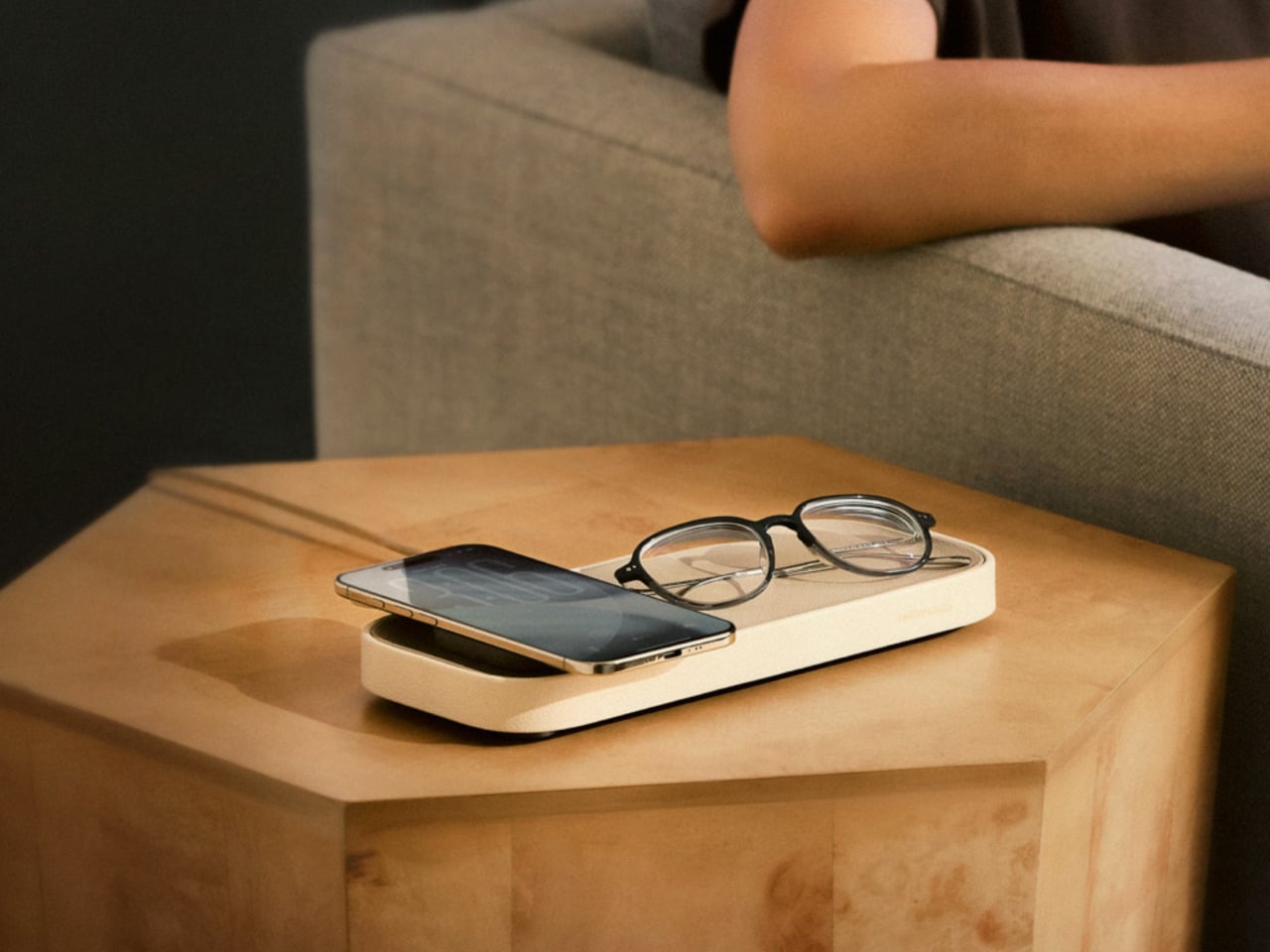
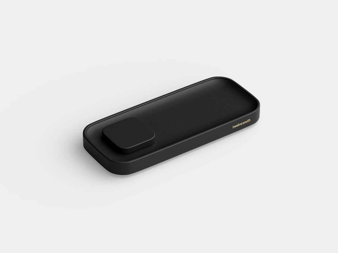
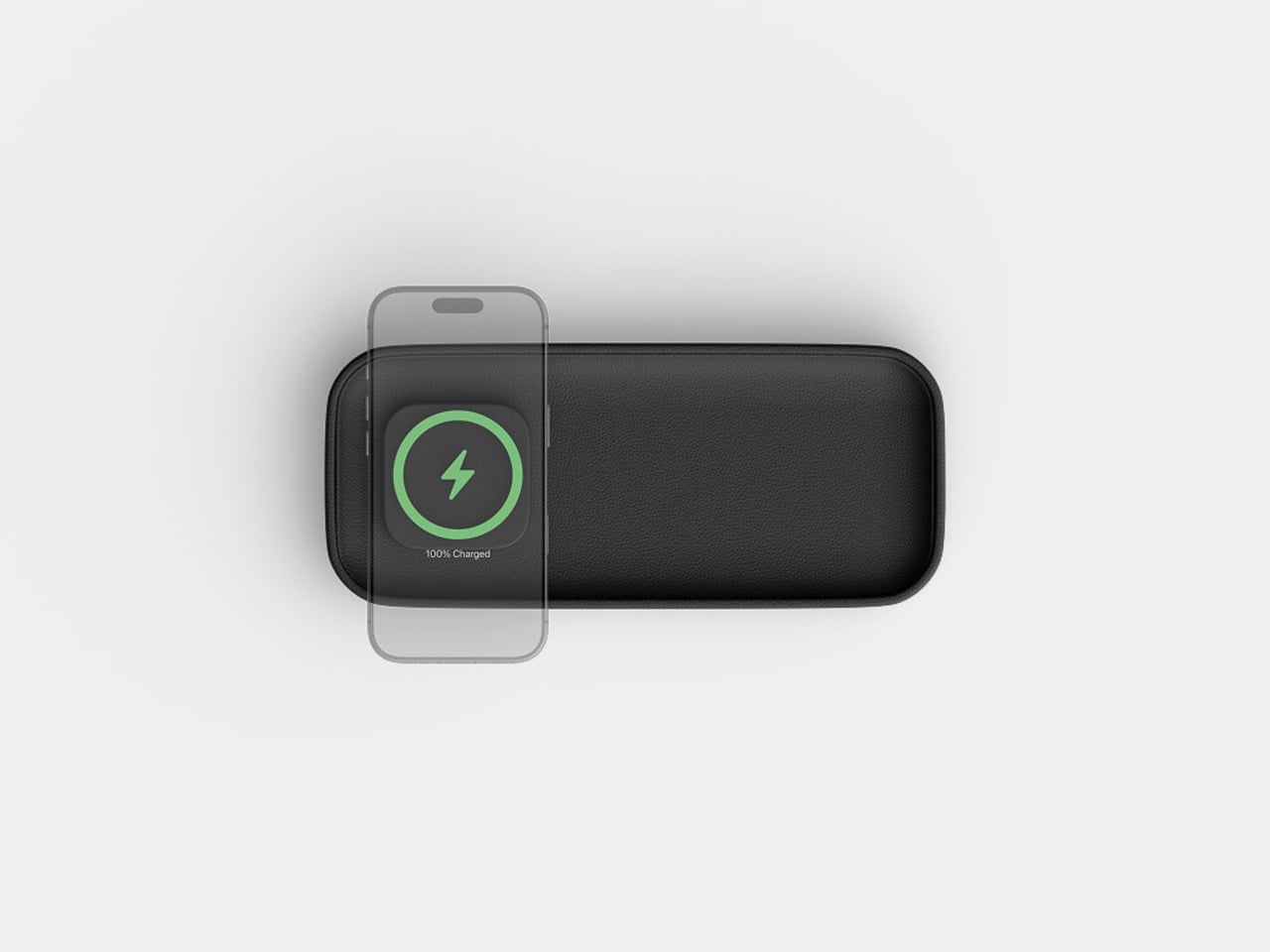
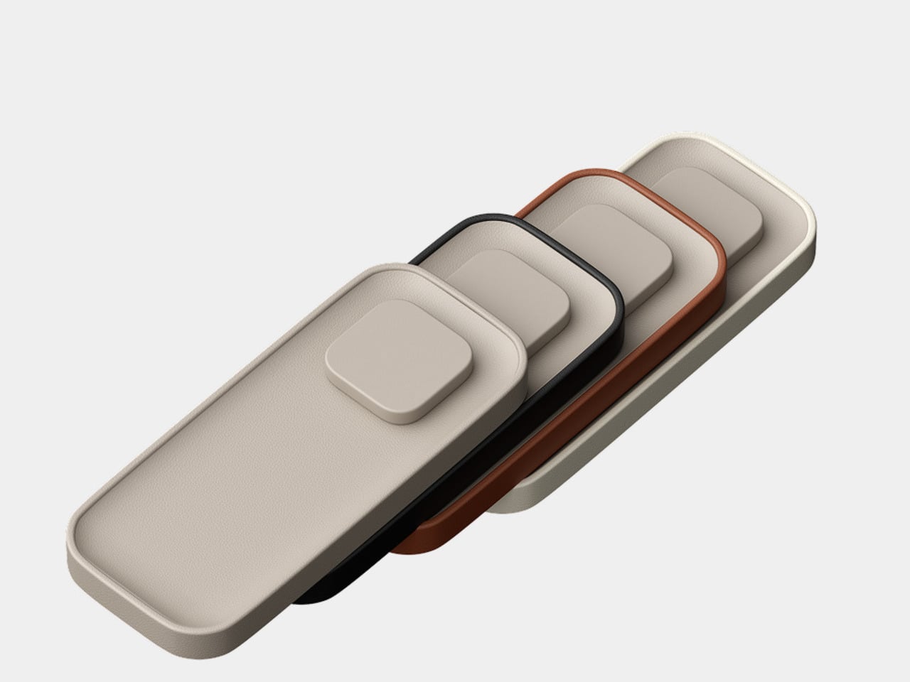
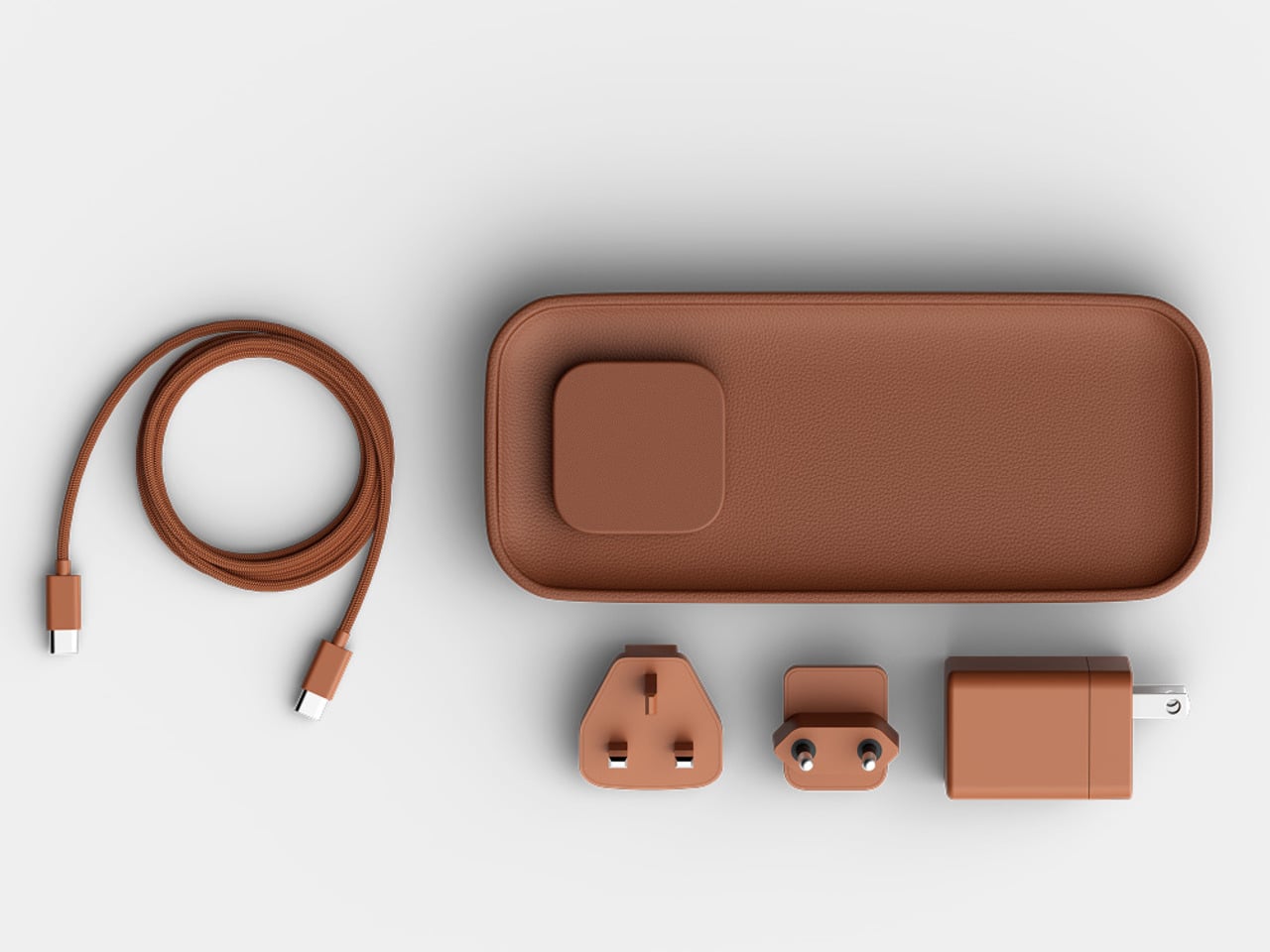
The Valet 4.25 from Twelve South approaches the problem differently. It’s a compact leather catchall tray with a 25W Qi2 wireless charger built into one end, sized specifically for nightstands and bedside tables. The idea isn’t to be a charger that fits in a room; it’s to be an object that actually belongs there, starting with its materials and ending with how it behaves overnight.

Designer: Twelve South

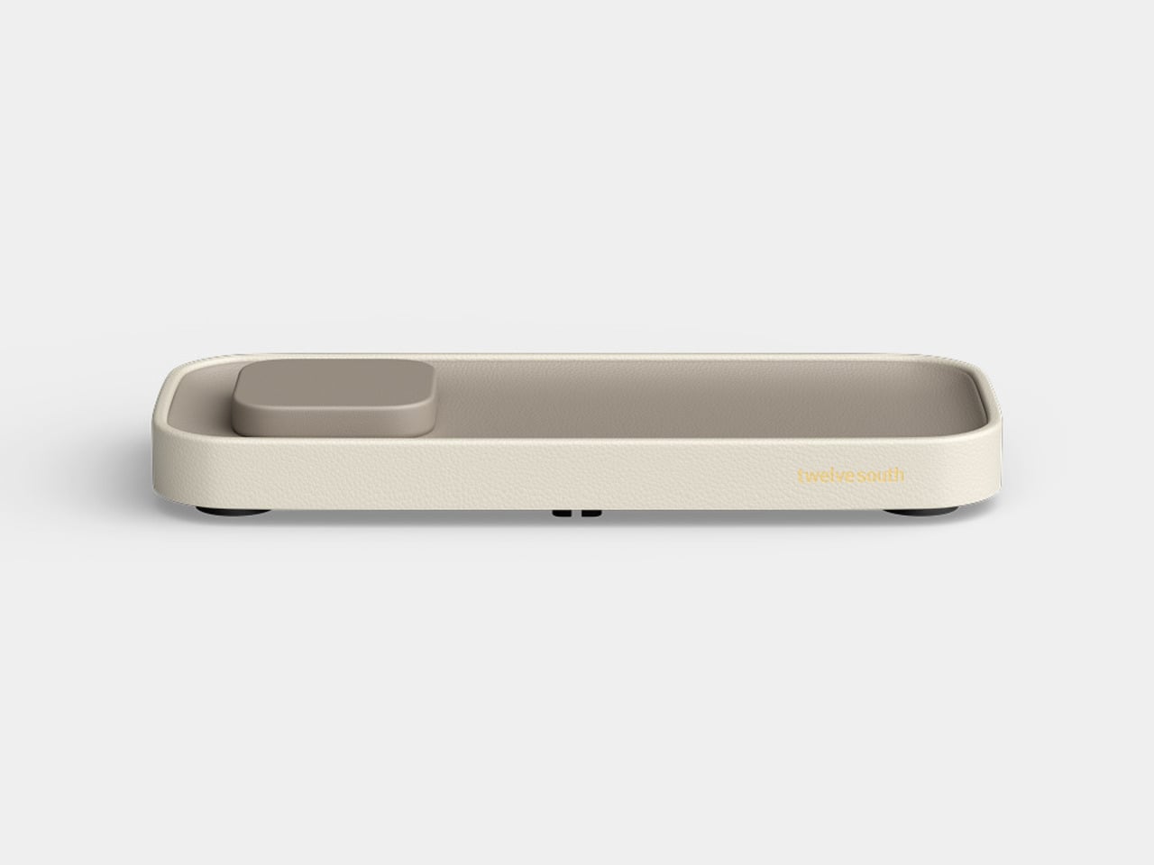
The base is a weighted zinc alloy frame wrapped entirely in Nappa leather, which keeps it planted on the surface without rubber feet or suction tricks. The tray measures 4.25 inches across, making it a tighter proposition than the brand’s original 7.5-inch Valet but considerably more appropriate for the average nightstand, where every spare inch is already committed to something else.

There’s a small but deliberate feature called the Goodnight Glow. When you set your phone down to charge, the tray pulses a soft light for eight seconds to confirm the connection, then fades completely. It doesn’t stay lit through the night. For something sitting beside you while you sleep, that restraint is more considered than it sounds, and it makes double-checking whether your phone is actually charging almost unnecessary.

The wireless output is a meaningful upgrade over the original Valet, which topped out at 15W via Qi2. The new model delivers 25W, which is the full MagSafe speed that newer iPhones can receive. The smaller size doesn’t come at the expense of performance; if anything, it corrects the one technical criticism that followed the larger model since it launched at CES earlier this year.

The outer frame is removable and interchangeable, available in four leather colors: black, taupe, brown, and ecru. The body itself comes in either black or taupe Nappa leather, giving you enough combination room to match most bedroom furniture without much deliberation. The tray can also be oriented four ways, letting you position the charging pad on either side or rotate the whole thing to fit a narrower nightstand.

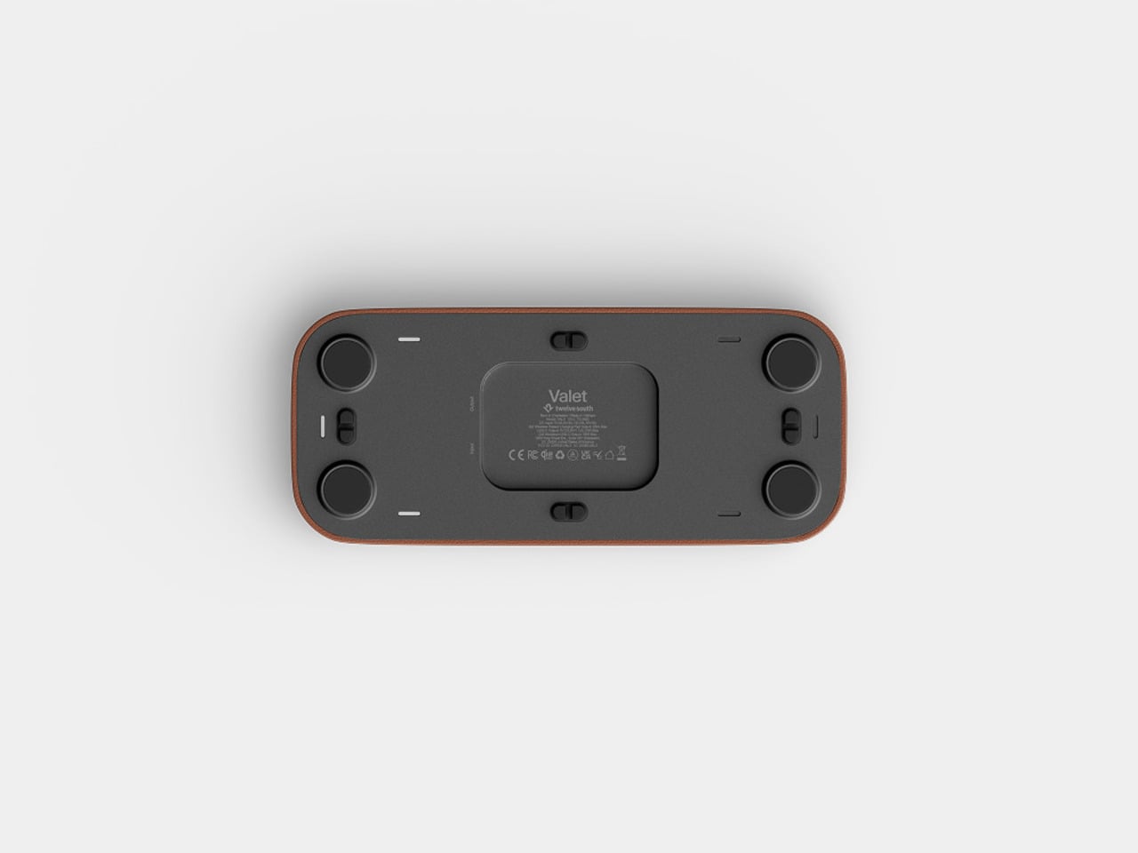
There’s a USB-C port tucked under the base for a second device, though at 10W it’s a step down from the 35W the larger Valet offers. It’ll handle a pair of earbuds or a smartwatch overnight, but it’s not fast-charging territory. The smaller tray is the other concession, reducing the landing area for everyday items compared to what the 7.5-inch version can comfortably hold alongside a phone.

At $129.99, it’s $50 less than the larger model and carries the same premium material finish. The Valet 4.25 is narrowly focused for a specific spot in the home, the kind where spending more on something you see every morning is easier to justify when it actually looks right. The Nappa leather and zinc alloy construction give it a permanence that most chargers, regardless of cost, rarely manage.

The post Twelve South Just Built a $130 Charger That Won’t Ruin Your Nightstand first appeared on Yanko Design.

  •  

Health Apps Know You’re Stressed, HealingFit TWS Helps You Act on It

Health apps and wearables have become remarkably precise at reading the human body. They can tell you how restorative last night’s sleep was, how stressed your body was during a presentation, and whether your recovery is on track after a hard week. What most of them don’t do, at least not in any concrete way, is hand you a tool to act on what they’ve just told you.

That’s the gap MobiFren founder and CEO Juwon Heo set out to address with the HealingFit TWS, a true wireless earbud built to go beyond standard listening. It earned a CES 2026 Innovation Awards recognition in Headphones and Personal Audio, but the more compelling aspect isn’t the accolade. It’s the design thinking underneath it, and what that thinking could mean for the broader world of digital health.

Designer: Juwon Heo, Founder & CEO, MobiFren

Click Here to Buy Now: $169 $300 (44% off). Hurry, only 11/290 left! Raised over $67,000.

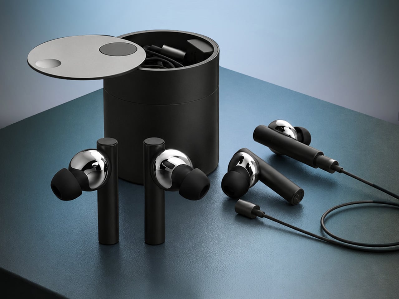
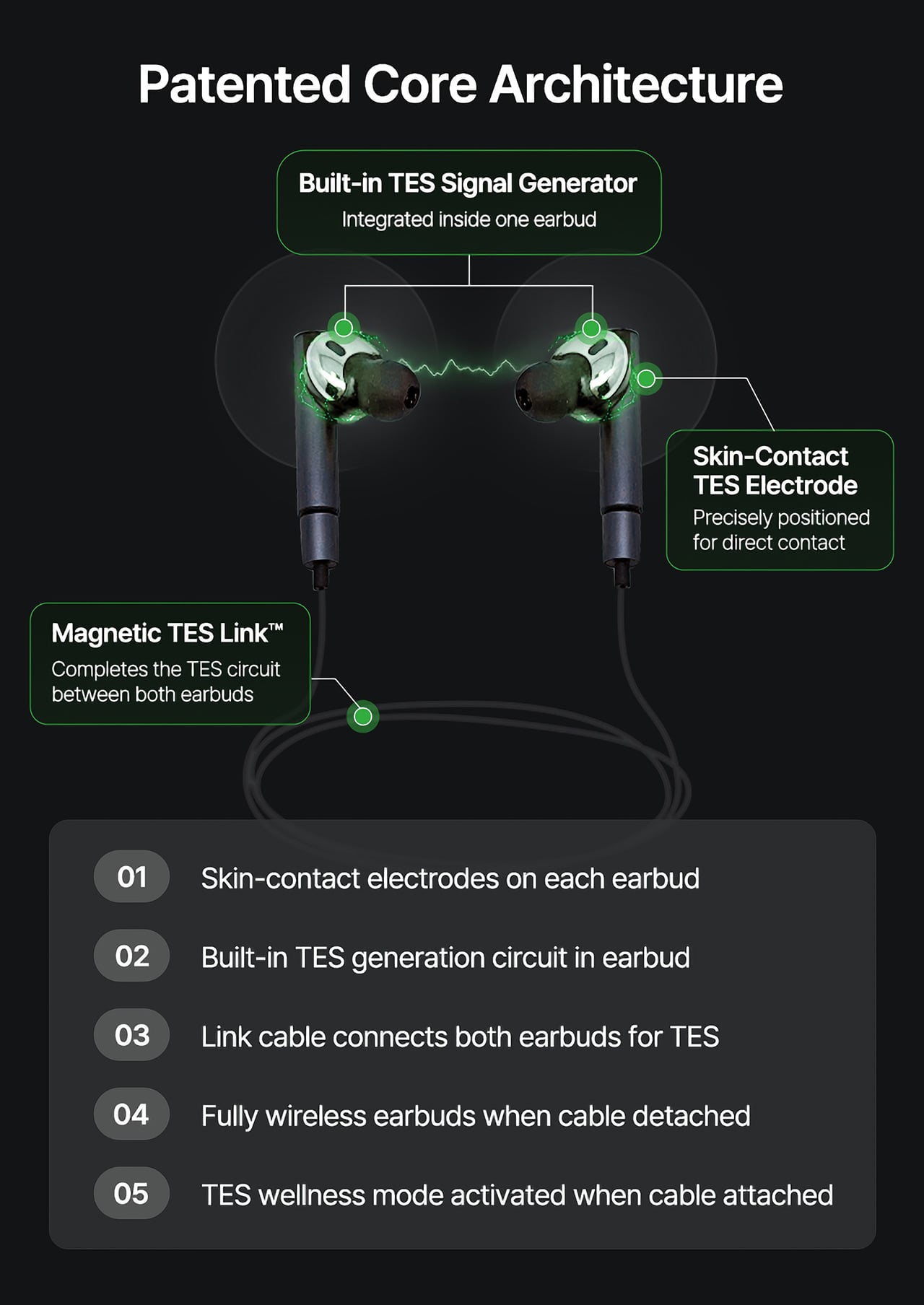
During normal use, HealingFit TWS functions as a premium pair of true wireless earbuds with Bluetooth 6.0, Hybrid ANC, and five tunable sound modes built on MobiFren’s own MSTS sound tuning system. The shift into wellness mode happens when you attach the Magnetic TES Link, a cable that snaps magnetically onto both earbuds. There’s no separate gadget involved, and no new category of hardware to carry.

TES, or Transcranial Electrical Stimulation, is a non-invasive approach widely studied in neuroscience. HealingFit TWS translates it into a controllable daily routine, running calibrated microcurrents through skin-contact electrodes built into each earbud. The intensity is adjustable across 15 levels, and most people describe the sensation as a subtle, rhythmic pulse. It’s designed to support the nervous system’s natural shift toward rest or focus, not force it there.

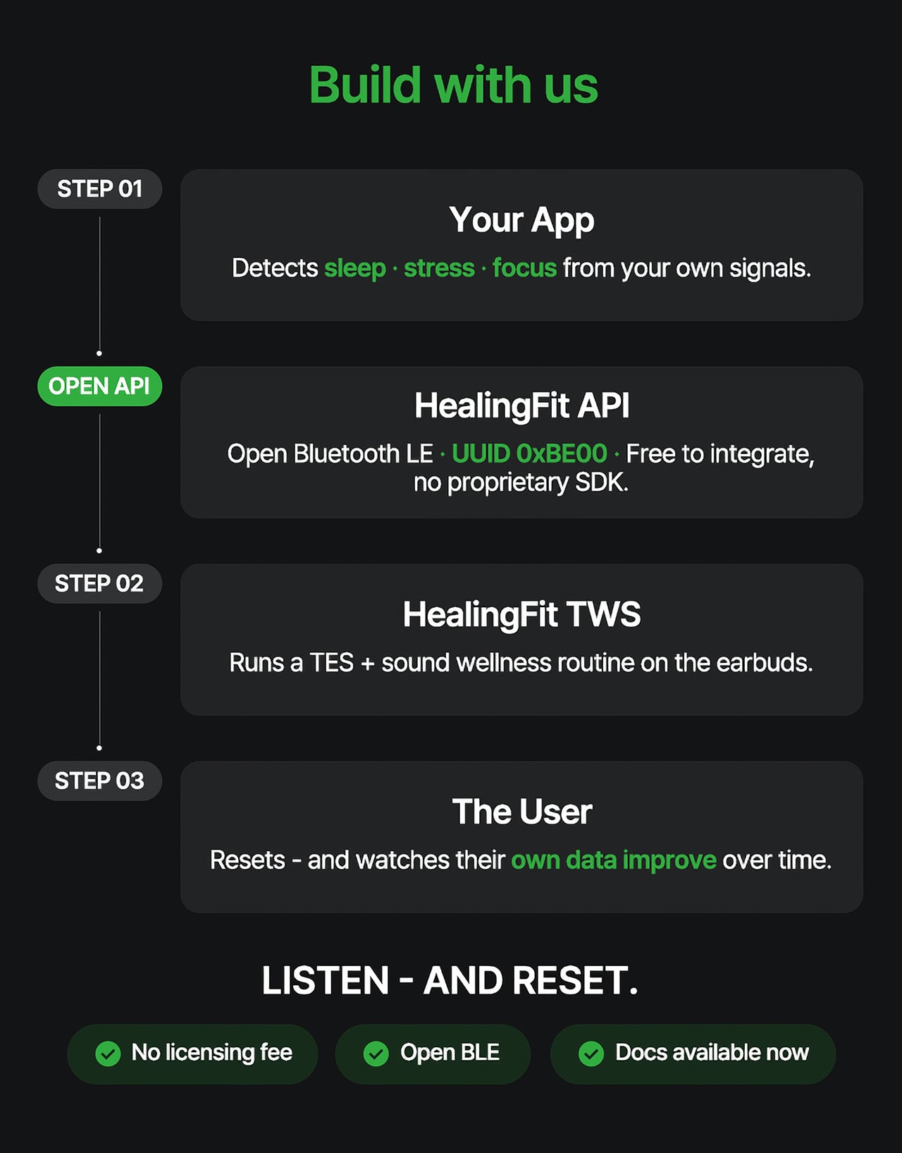
Three wellness modes organize the experience. Sleep is the bedtime routine, pairing TES with binaural audio tracks to help you gradually settle for the night. Healing is a shorter session for mid-afternoon or post-work moments when the day has felt relentless. Study is a focus-priming routine to run before anything demanding real concentration. Each mode comes with five dedicated tracks, though you can also layer TES over your own music.

That three-mode framework reads differently from the perspective of a digital health platform. Platforms like Samsung Health, Apple Health, Google Health, and Fitbit have become genuinely capable at detecting sleep quality, stress levels, recovery readiness, and daily activity. They generate scores, flag patterns, and surface recommendations. What they don’t typically offer is a connected, device-level way to act on those signals in the moment they appear.

HealingFit TWS addresses that with an open Bluetooth LE interface that developers and platform teams can connect to without a licensing fee or a proprietary SDK. The technical entry point is UUID 0xBE00, and documentation is publicly available through mobifrenglobal.com. The intent is clear: the earbud becomes the intervention hardware, while the app or platform provides the health context that determines when and which session a user might benefit from.

Think about what that could look like in practice. A sleep app detecting elevated pre-bed stress could suggest a Sleep session. A recovery platform flagging low readiness after a demanding training week could prompt a Healing routine. A focus tool that spots declining concentration before a deadline could surface the Study mode. In each case, the platform has done its analysis. HealingFit TWS handles what comes after.

The core architecture places a TES-generating circuit inside one earbud, with electrodes on the front of each earbud that contact the ear canal, and a TES Link cable that connects both earbuds. Detached, it functions as flagship-grade wireless earbuds; connected, it transforms into a wellness device designed to support sleep, stress relief, focus, and memory.

What makes the TES architecture appealing to hardware teams isn’t just the open API. The circuit that generates TES signals relies on entirely standard, commercially available components, totaling just 18 parts: a dual-transistor chip, one FET, and a set of RLC components. The earbud’s existing charging contacts also serve as the TES link contacts, so no extra contact points or major structural changes are needed.

The design has received formal IP recognition across multiple jurisdictions. The U.S. patent application covering the core architecture has been allowed and is proceeding to registration, with the patent expected to be granted soon. There are also registered patents in Korea and Japan, as well as a published application in Europe. FCC certification was granted on July 1, 2026.

Heo founded MobiFren in February 2002, originally as a contract developer for Samsung Electronics feature phones. The company started building its own Bluetooth audio products in 2005 and brought its first Bluetooth earphones to market in 2006. MobiFren has maintained an ongoing relationship with Samsung through smartphone software verification work ever since. That two-decade grounding in Bluetooth audio is what gives HealingFit TWS its engineering footing.

The choice to build this platform on earbuds specifically is, in that context, a deliberate one. Earbuds are already the personal technology closest to the human body for most of the waking day. They’re phone-paired, habitually worn, and typically owned by the same people most likely to be using a health app. Embedding TES therapy into a device people already carry daily removes most of the adoption barrier entirely.

The hardware reflects that audio-first foundation. Alongside the TES system, HealingFit TWS delivers up to 6.5 hours of playback and up to 4.5 hours in TES mode, with Hybrid ANC, three microphones per side, and wear detection for auto-pause when an earbud is removed. Both earbuds and the Magnetic TES Link cable dock in a cylindrical charging case finished in anodized aluminum, designed to carry without fuss.

What Heo is ultimately proposing is a platform category that doesn’t quite have a name yet. His comparison is to how true wireless earbuds, from AirPods to Galaxy Buds, turned personal audio into a mainstream daily habit. The longer ambition is for this patented TES architecture to be adopted into future products from those same companies, giving their health platforms a connected hardware layer for the signals they already detect.

The more compelling case might be for the health platforms themselves. Apple Health, Google Health, Samsung Health, and Fitbit have spent years becoming sophisticated at detecting when something is off: poor sleep, elevated stress, slow recovery. What they don’t yet widely offer is a hardware path from that detection to user-controlled action. HealingFit TWS was built to be exactly that path, and it’s open to anyone willing to test it.

That’s a bold bet, and the category he’s describing doesn’t fully exist yet. But HealingFit TWS makes a credible early case for it, with a patent-allowed architecture, open developer access, and a hardware design that doesn’t ask users to change anything about how they already carry and use earbuds every day.

Click Here to Buy Now: $169 $300 (44% off). Hurry, only 11/290 left! Raised over $67,000.

The post Health Apps Know You’re Stressed, HealingFit TWS Helps You Act on It first appeared on Yanko Design.

  •  

This USB-C Dongle Just Let You Control an iPhone From Windows

Remote work has fundamentally changed how often people need access to devices they aren’t sitting in front of. The tools built for this, however, haven’t kept up. Software-based remote access drops the moment a device sleeps or the screen locks, traditional KVMs demand a tangle of HDMI, USB, power, and Ethernet cables, and phones and tablets have been left out of the picture entirely.

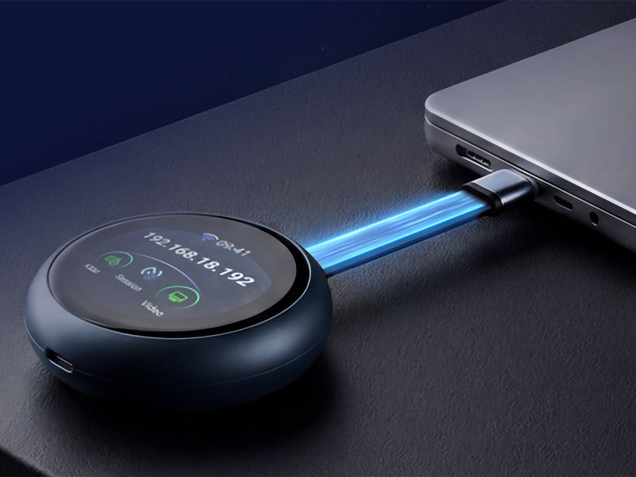
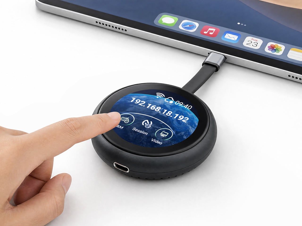
GL.iNet, the Hong Kong-based networking company behind a range of popular OpenWrt routers, has built the Comet Q to tackle all three of those problems at once. Officially designated the GL-RMQ1, it’s described as the world’s first browser-based, pocket-sized remote-control device built specifically for USB-C devices, covering laptops, phones, tablets, and Mac minis. You plug it in, open a browser, and you’re in.

Designer: GL.iNet

Click Here to Buy Now: $89 $129.9 (31% off). Hurry, only 866/2500 left! Raised over $1 million.

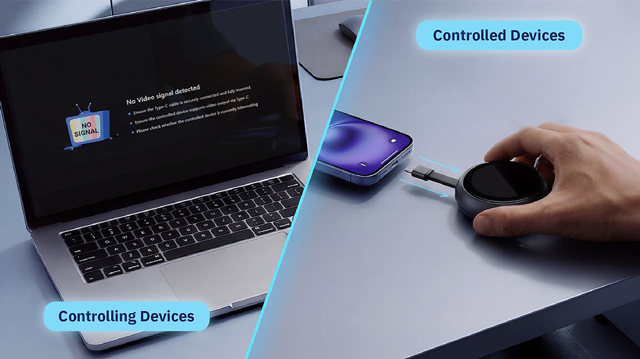
What sets the Comet Q apart is that it operates at the hardware level, not through software installed on the target device. That distinction matters more than it sounds. Traditional remote desktop software relies on the operating system and an active network connection, failing the moment a device sleeps, locks, or loses Wi-Fi. The Comet Q keeps working through all of that, as long as the device stays powered on and hasn’t entered a hibernation state that cuts off its HDMI/USB output.

That control comes through a single USB-C cable that simultaneously carries video, data, and power, doing away with the HDMI dongle and USB hub that traditional KVMs require. Video output reaches up to 2K at 60 fps with two-way audio, and a built-in USB-C passthrough port means the device being controlled stays charged throughout the session. It’s a genuinely pocket-sized setup that actually earns that description.

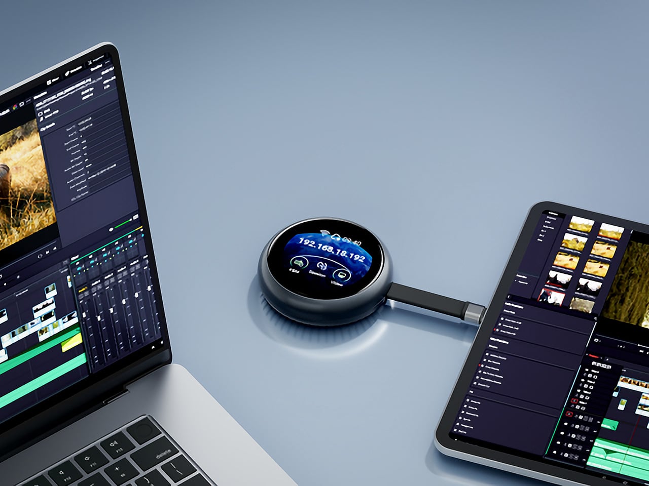
Where the Comet Q breaks new ground is with mobile devices. No KVM was ever built for them, and if something went wrong remotely, there was no clean solution short of being physically present. It connects directly through the USB-C port, working with iPhones from the iPhone 15 onward (excluding the iPhone 16e and later budget models), iPads, and a wide range of Android phones and tablets, provided the port supports DisplayPort Alt Mode.

All of that also means the OS combination no longer matters. Users can control an iPhone from a Windows PC, a MacBook from an Android tablet, or an iPad from a Linux machine. Developers can manage test devices without being at their desks, IT teams can monitor a fleet of phones from one interface, and content creators can run a dedicated recording device from anywhere in the same room.

There’s a surprisingly personal side to this. If you’ve ever tried walking a parent through a tech problem over the phone, knowing you could take over their screen remotely would have saved everyone a lot of stress. The Comet Q makes that possible, and since Wi-Fi credentials can be preset before shipping the device, the person receiving it doesn’t need to set it up.

Accessing the Comet Q doesn’t require any downloads. From a laptop or desktop, any browser pointed to glkvm.com is enough to take full control, with no account creation needed. When controlling from a phone or tablet, the GLKVM app, available on Windows, macOS, App Store, and Google Play, handles touch gestures more precisely. A 1.8-inch circular touchscreen on the device also makes initial setup possible without opening a laptop.

Security runs through every layer of the design. Each session ends the moment the Comet Q is physically disconnected, leaving no residual access or background processes behind. Built-in support for Tailscale, ZeroTier, and WireGuard VPN keeps remote connections encrypted and firewall-friendly, while two-factor authentication adds yet another layer on top. Remote access that works through hardware rather than software has been a long time coming for phones and tablets.

Click Here to Buy Now: $89 $129.9 (31% off). Hurry, only 866/2500 left! Raised over $1 million.

The post This USB-C Dongle Just Let You Control an iPhone From Windows first appeared on Yanko Design.

  •  

The Jerry Can That’s Actually a 300W Party Speaker With a Guitar Input

Portable party speakers have settled into a comfortable but predictable aesthetic: boxy, rugged, cylindrical, occasionally translucent. They compete mostly on specs, with loudness and battery life doing most of the heavy lifting in marketing copy. The design rarely causes a double-take. Most of them look like pieces of gear that belong in a hiking backpack, not a conversation starter you’d voluntarily carry to a campsite because someone just had to see it.

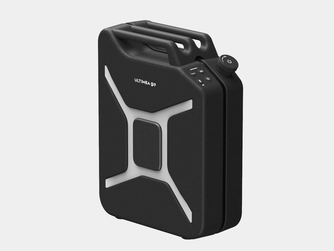
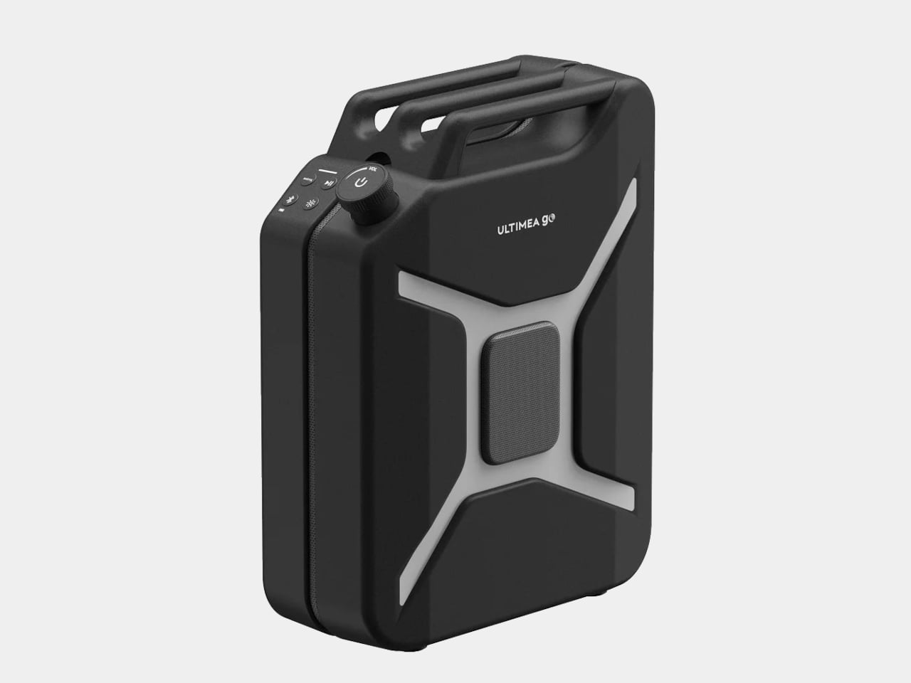
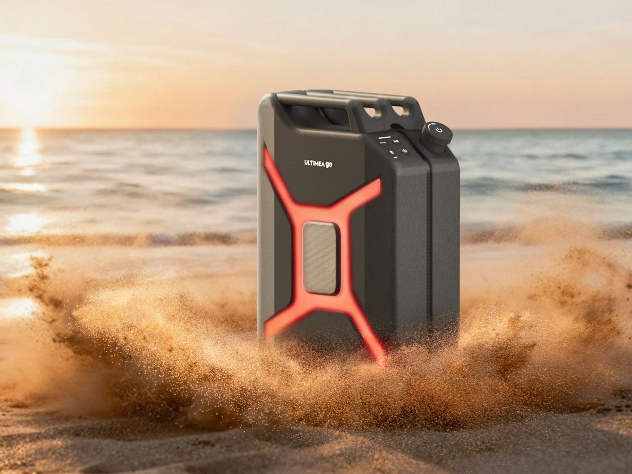
The Ultimea Go throws all of that out by doing something nobody asked for but nobody can really argue with: it looks exactly like a jerry can. The resemblance isn’t a stretch or a loose visual metaphor. It’s a deliberate full-scale commitment to the fuel container form, right down to the handle and the boxy proportions. The gimmick and the product are the same thing here, and it lands.

Designer: Ultimea

Under the shell, the speaker pulls its weight acoustically. The driver setup includes dual 5-inch woofers, dual 3-inch full-range drivers, and a 1-inch tweeter, all contributing to a 300 W peak output that Ultimea says is loud enough for groups of 10 to 20 people. The 360° omnidirectional design means the sound radiates in all directions rather than projecting from one face, which matters when a crowd is gathered around rather than sitting in front of it.

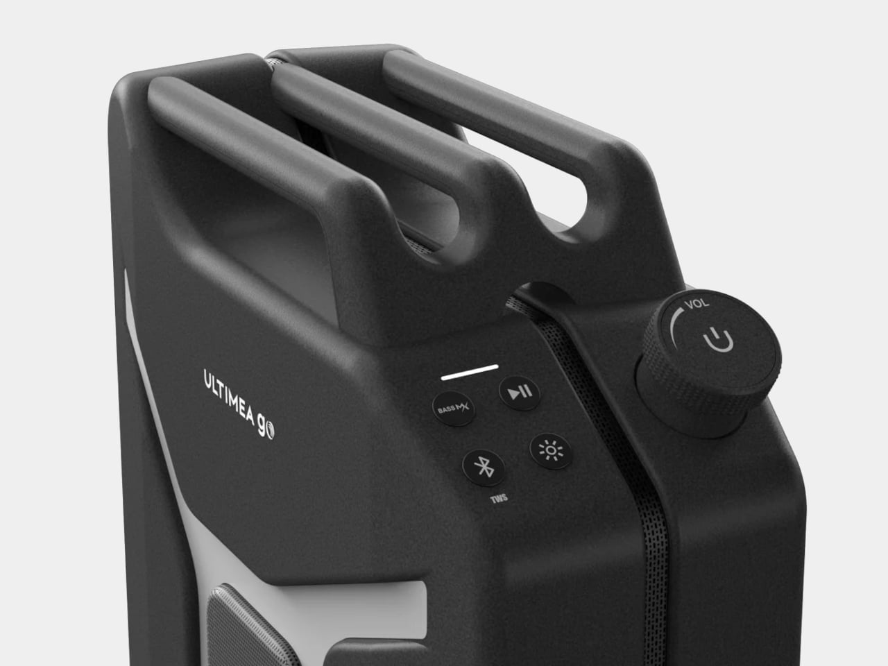
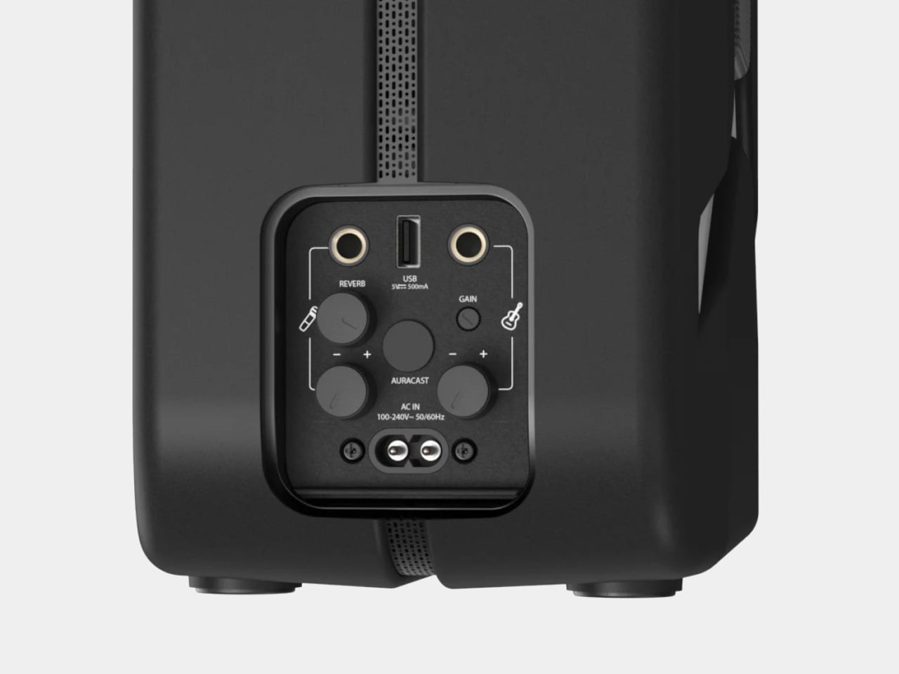
What tips it further toward the unexpected is the inclusion of two microphone inputs and a guitar input alongside the standard Bluetooth 5.4 connection. That turns it from a passive playback device into something a busker could plug into on a street corner or a backyard musician could use for a spontaneous after-dinner set. The inputs don’t feel like afterthoughts; they actively expand what the speaker is for.

For anyone who wants to scale up, Auracast support allows playback to sync across up to 100 devices simultaneously. Practically, that means linking multiple speakers across a large space without the usual signal degradation or timing offsets that come with daisy-chaining Bluetooth units together. Two Ultimea Go speakers can also be paired in TWS mode for true stereo output, making the jerry can a unit that can grow with the occasion.

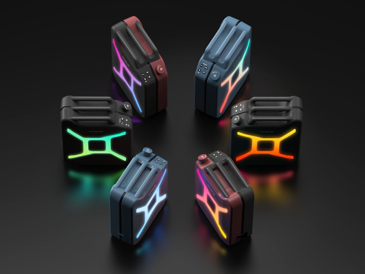
The battery runs for up to 16 hours on a single charge, which holds through a full outdoor day without needing a top-up. IPX4 water resistance adds a reasonable layer of protection against splashes and light rain, so setting it near a pool or leaving it outside during a light drizzle isn’t cause for panic. RGB lights add the requisite visual flair without being the only thing the design has going for it.

An app handles the finer controls, and a bass boost function gives the low end an extra push when the situation calls for it. The speaker ships in black, with the jerry can silhouette doing most of the visual work in any setting. It’s the kind of thing that gets spotted across a campsite and prompts a walk over to find out what it actually is.

The post The Jerry Can That’s Actually a 300W Party Speaker With a Guitar Input first appeared on Yanko Design.

  •  

Wacom MovinkPad Pro 14 Review: The $900 Sketchbook Designers Needed

PROS:


  • Minimalist design streamlined for focused work on the go

  • Paper-like experience when drawing or writing

  • Comes with Wacom Pro Pen 3 in the box

  • Large, bright, color-accurate OLED screen with anti-reflective surface


CONS:


  • Quite a significant investment

  • Uncertain software update roadmap

  • Instant Pen Display Mode is currently offered as a beta feature

RATINGS:

AESTHETICS
ERGONOMICS
PERFORMANCE
SUSTAINABILITY / REPAIRABILITY
VALUE FOR MONEY

EDITOR'S QUOTE:

The Wacom MovinkPad Pro 14 isn't another Android tablet. It's a sketchbook that happens to run one.
award-icon

For decades, Wacom has held an almost unchallenged grip on the drawing tablet and pen display market. Its products are so trusted that studios and design firms often keep them running for years, sometimes long after they’ve been discontinued. Lately, though, its rivals have been gaining a lot of attention, pushing increasingly attractive prices and expanding into new product categories.

That doesn’t mean Wacom has been idling. The company is finally wading into standalone Android tablet territory with the MovinkPad 11 and the more premium MovinkPad Pro 14, a proper portable drawing machine aimed squarely at working creatives. We’ve been spending time with the larger of the two, along with the new Wacom Art Pen 2, and the question is whether it’s worth every dollar of its price tag.

Designer: Wacom

Aesthetics

Right out of the box, the MovinkPad Pro 14 doesn’t dazzle the way other tablets in its price range tend to. There are no flashy colors, no ultra-thin borders, no polished surfaces. The bezels are noticeably wide, the default wallpaper is a solid, flat light gray, and the whole thing carries a stubbornly plain look that feels almost out of step with the competition.
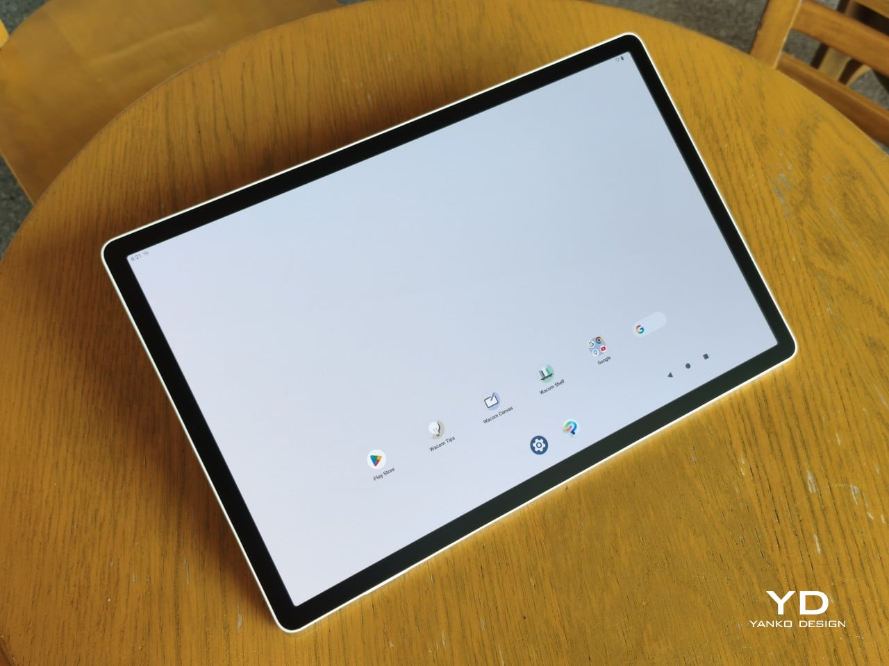
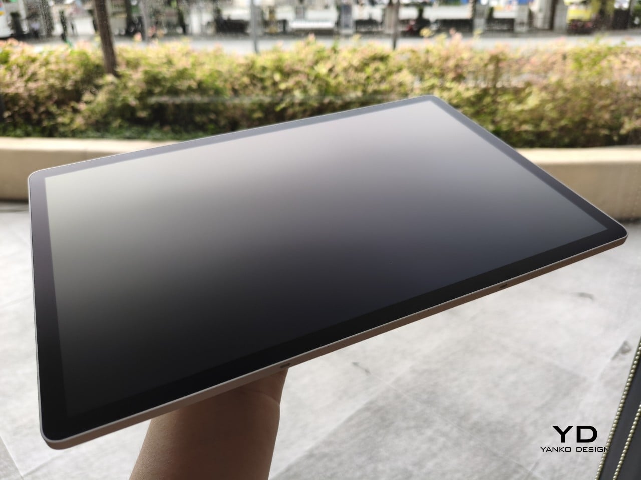
It’s all very much by design. Wacom’s intent is to mimic the look and feel of a physical sketchbook, the kind artists, designers, and architects carry everywhere. The device comes in one color, light gray, which echoes the tone of most sketchbook paper. Its rectangular form, wide borders included, also closely mirrors the footprint of an A4 pad, binding and all.
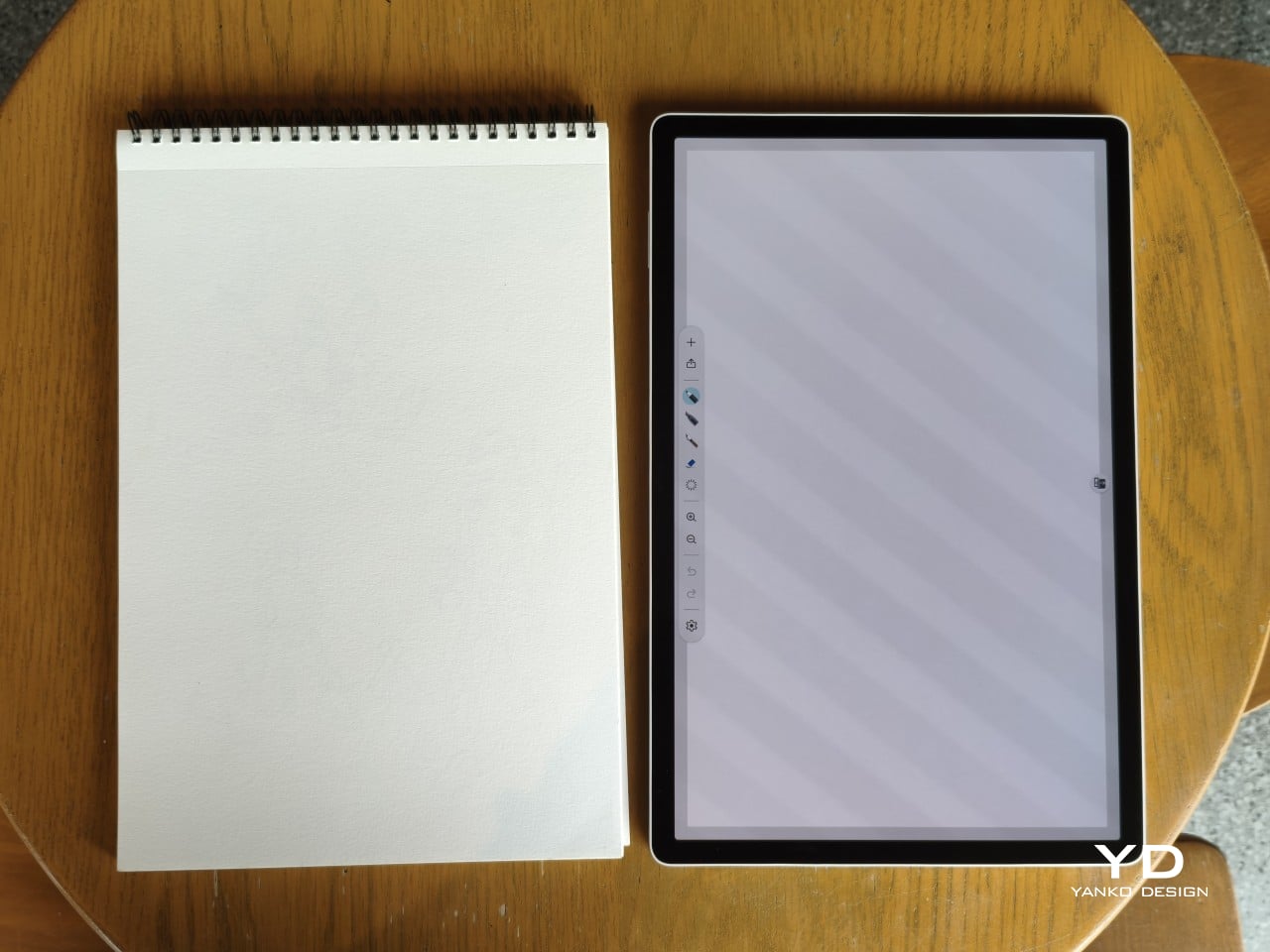
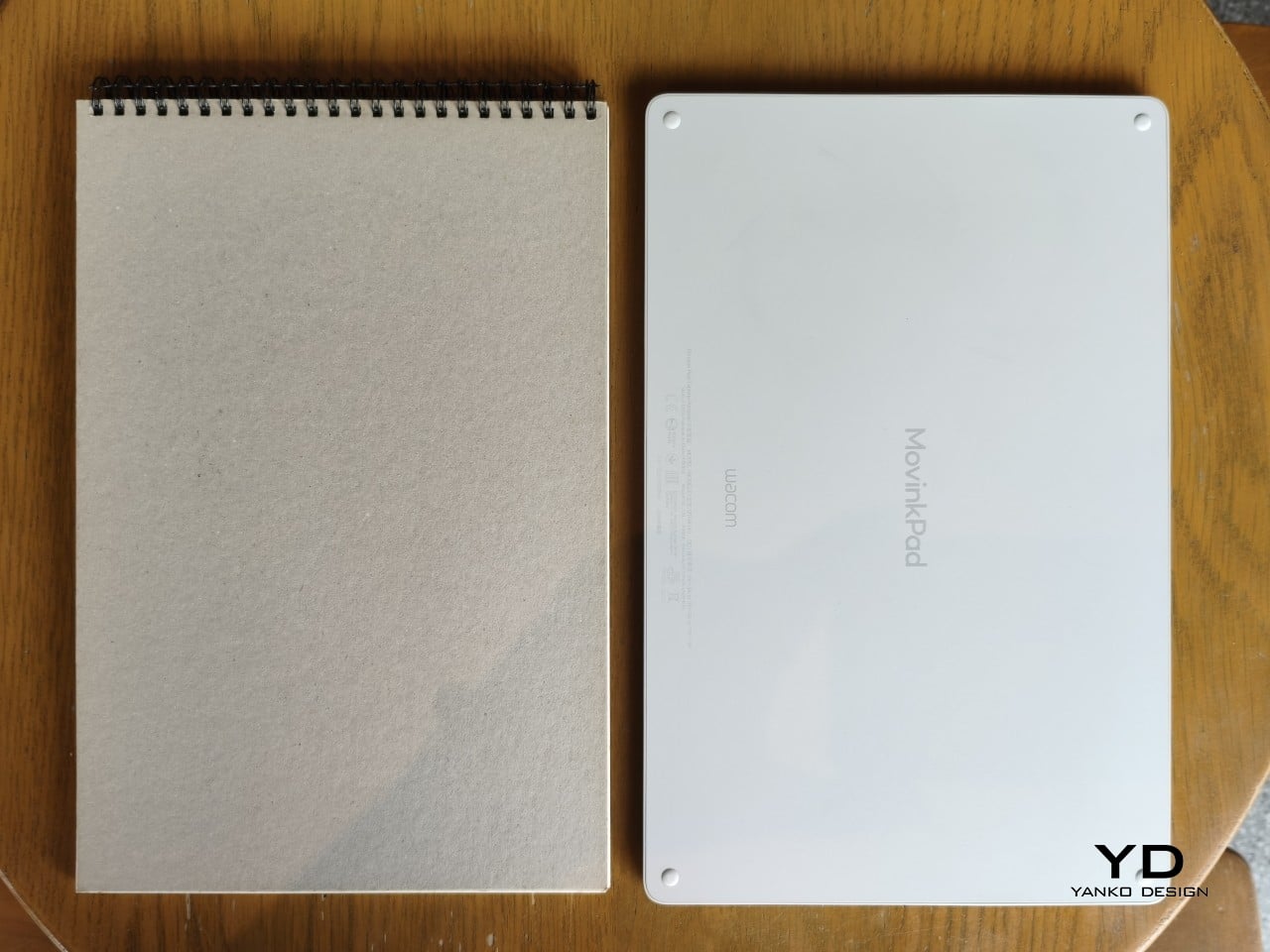
The sides of the device carry that same restraint. One long edge holds the power button, volume rocker, and microSD slot, while the opposite edge features connectors for the optional cover accessory. The short edges house the speakers, and the bottom is reserved for branding, regulatory inscriptions, and four rubber feet. There’s nothing extraneous, nothing decorative, and nothing that distracts from the task you’re there to do.
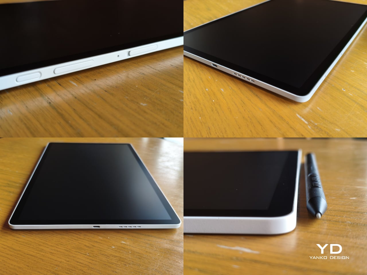
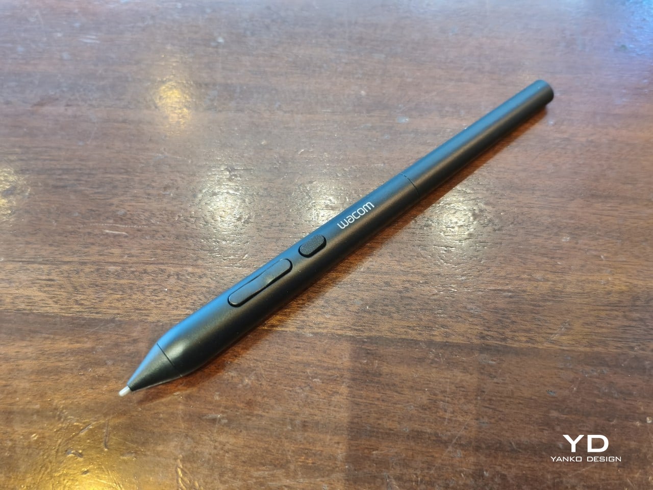
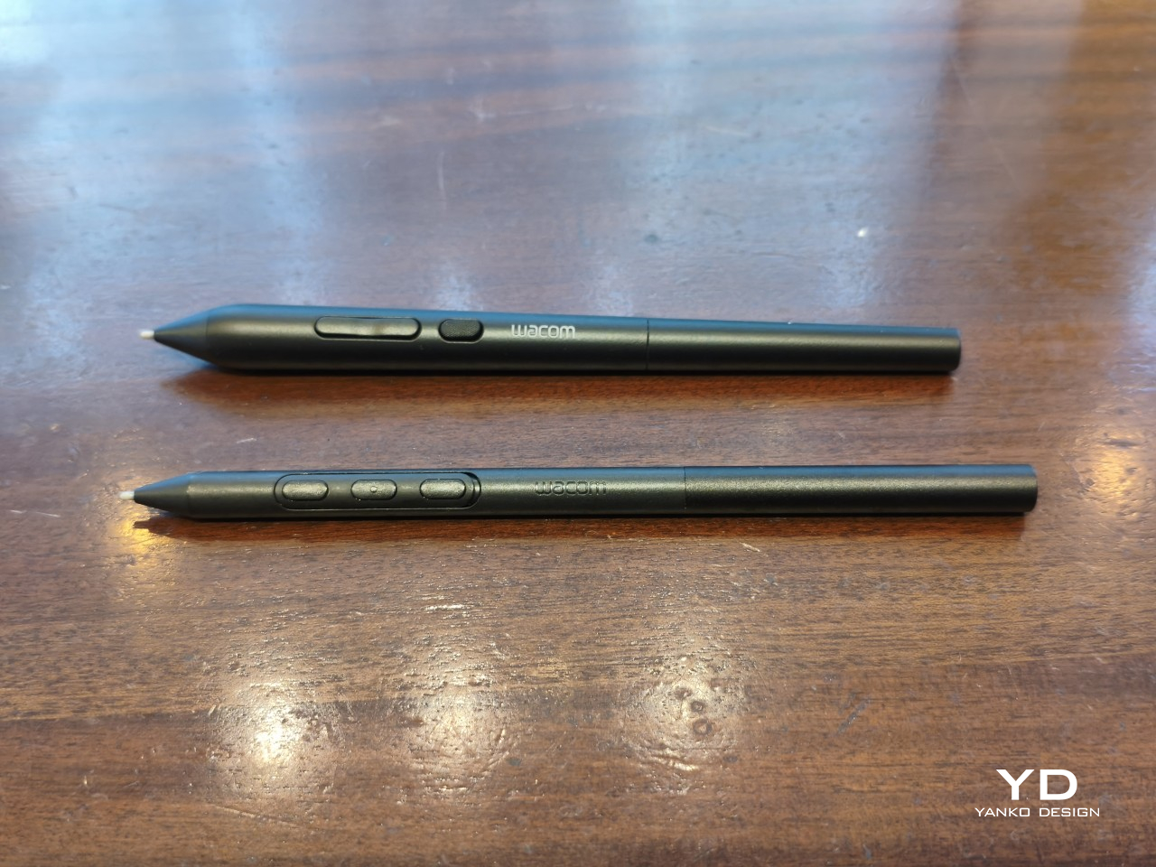
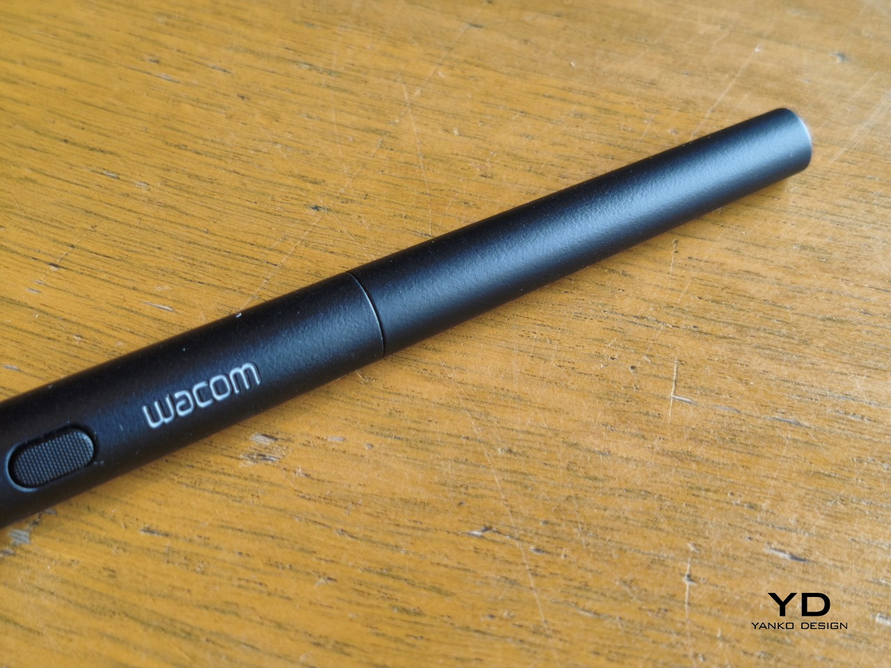
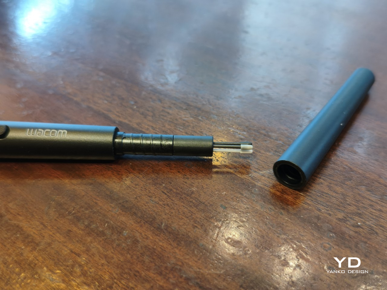
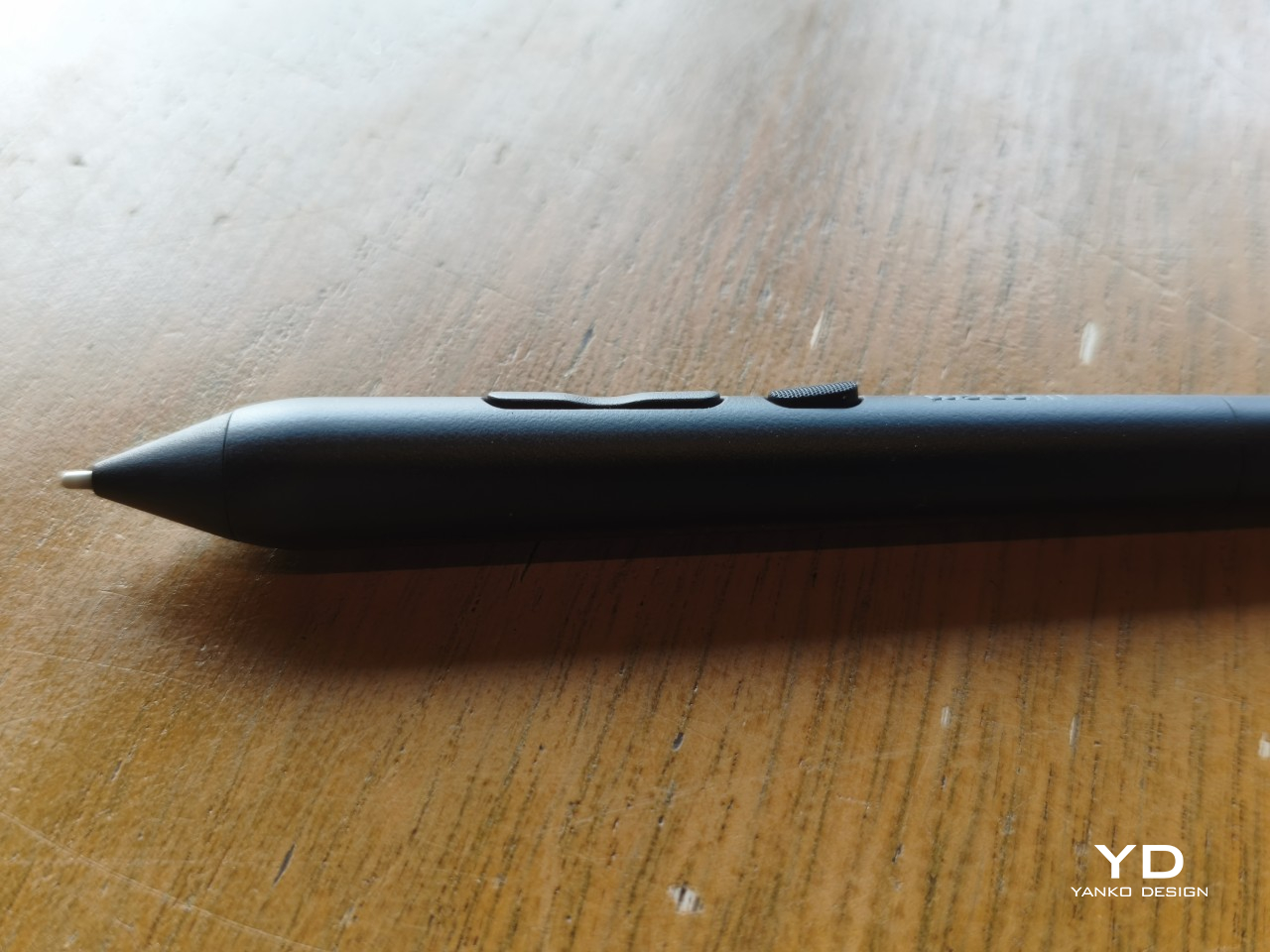
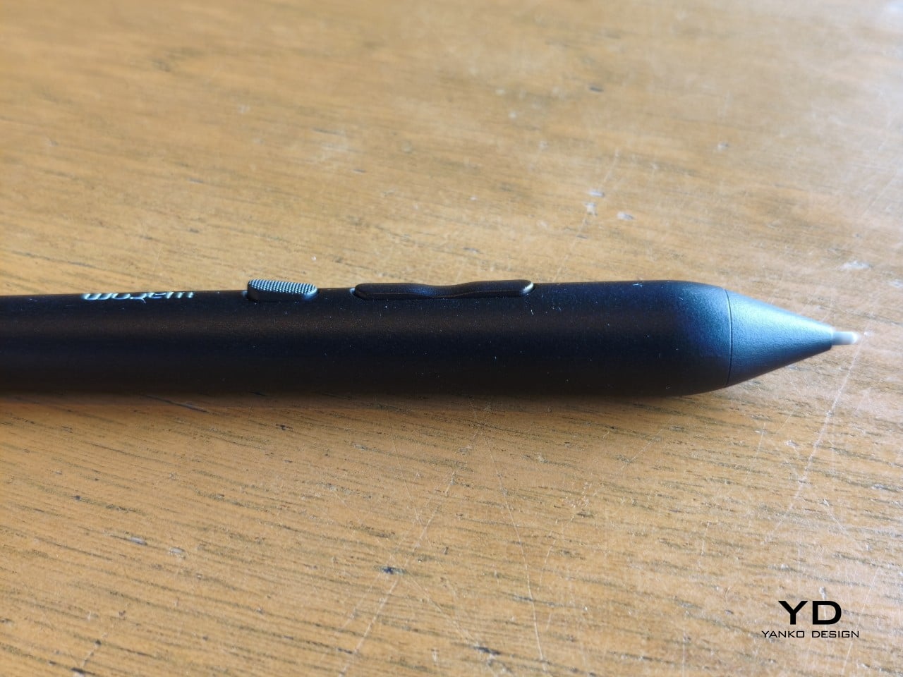
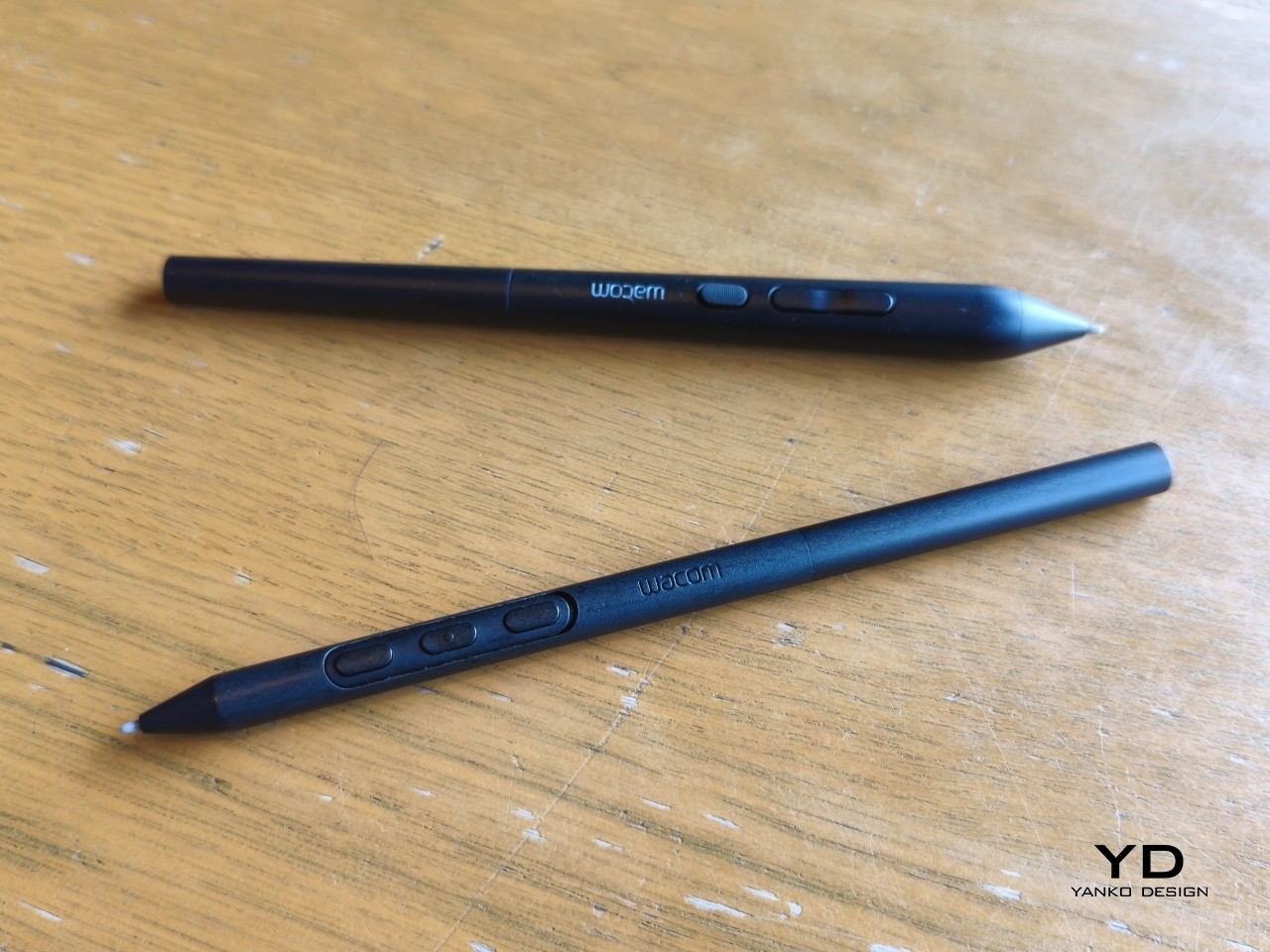
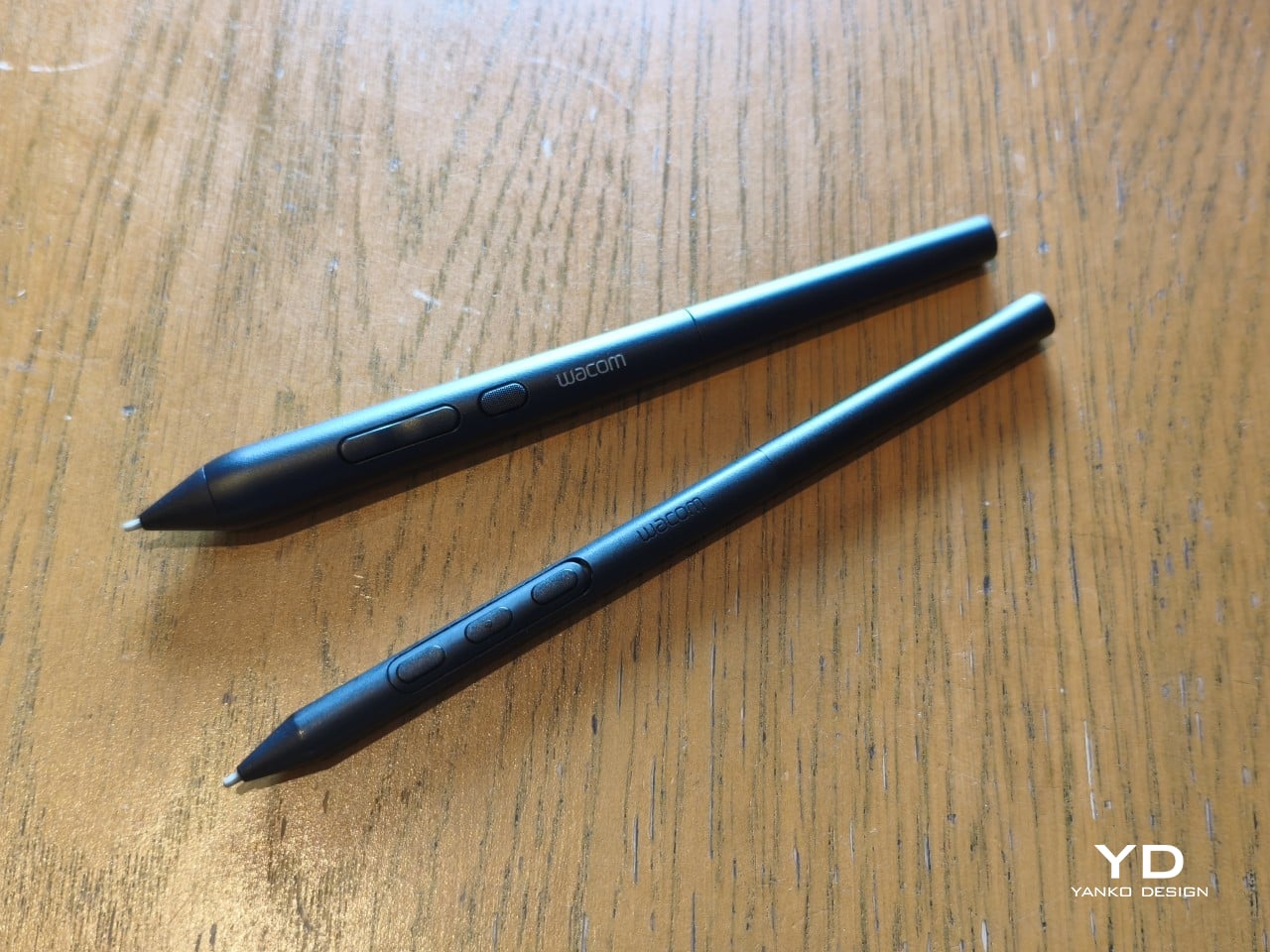
The included Pro Pen 3 follows the same philosophy. It’s all black, slim, and cylindrical, with a body so uniform it almost looks like a high-end mechanical pencil. The three side buttons are barely raised, sitting nearly flush against the barrel for a cleaner look. Unscrewing the rear half reveals three replacement nibs tucked inside: a Carbon Shaft nib, a Felt nib, and a POM nib.
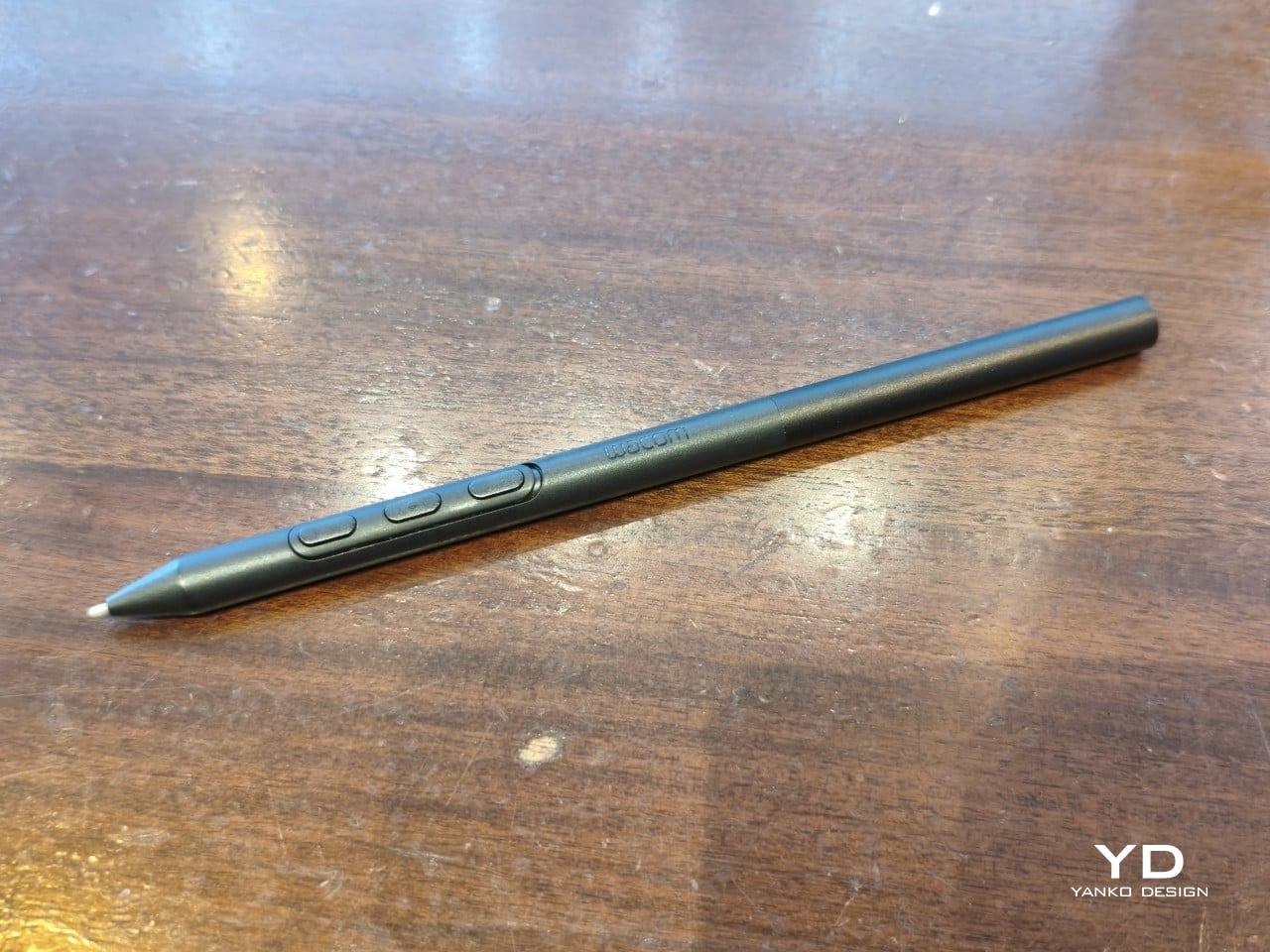
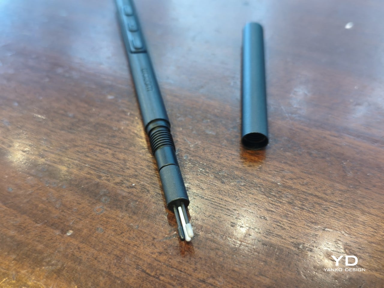
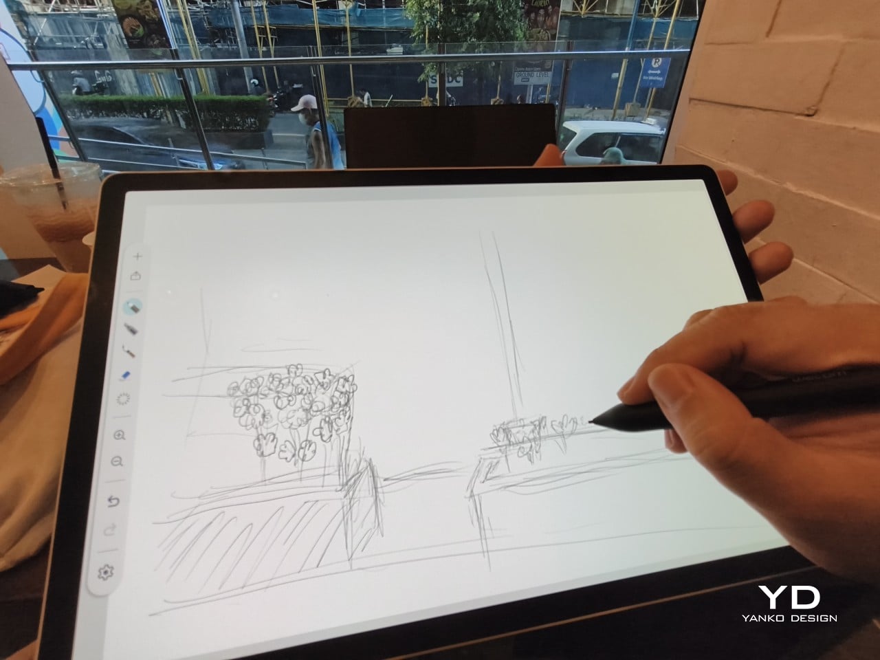
Wacom’s vision for the MovinkPad Pro 14 is to replicate the feeling of picking up a sketchbook, flipping to a fresh page, and getting straight to work. That intent comes through clearly because the tablet removes just about every visual, physical, and digital distraction it can. It doesn’t try to be the slickest-looking device in the room. It tries to be the one you reach for first.

Ergonomics

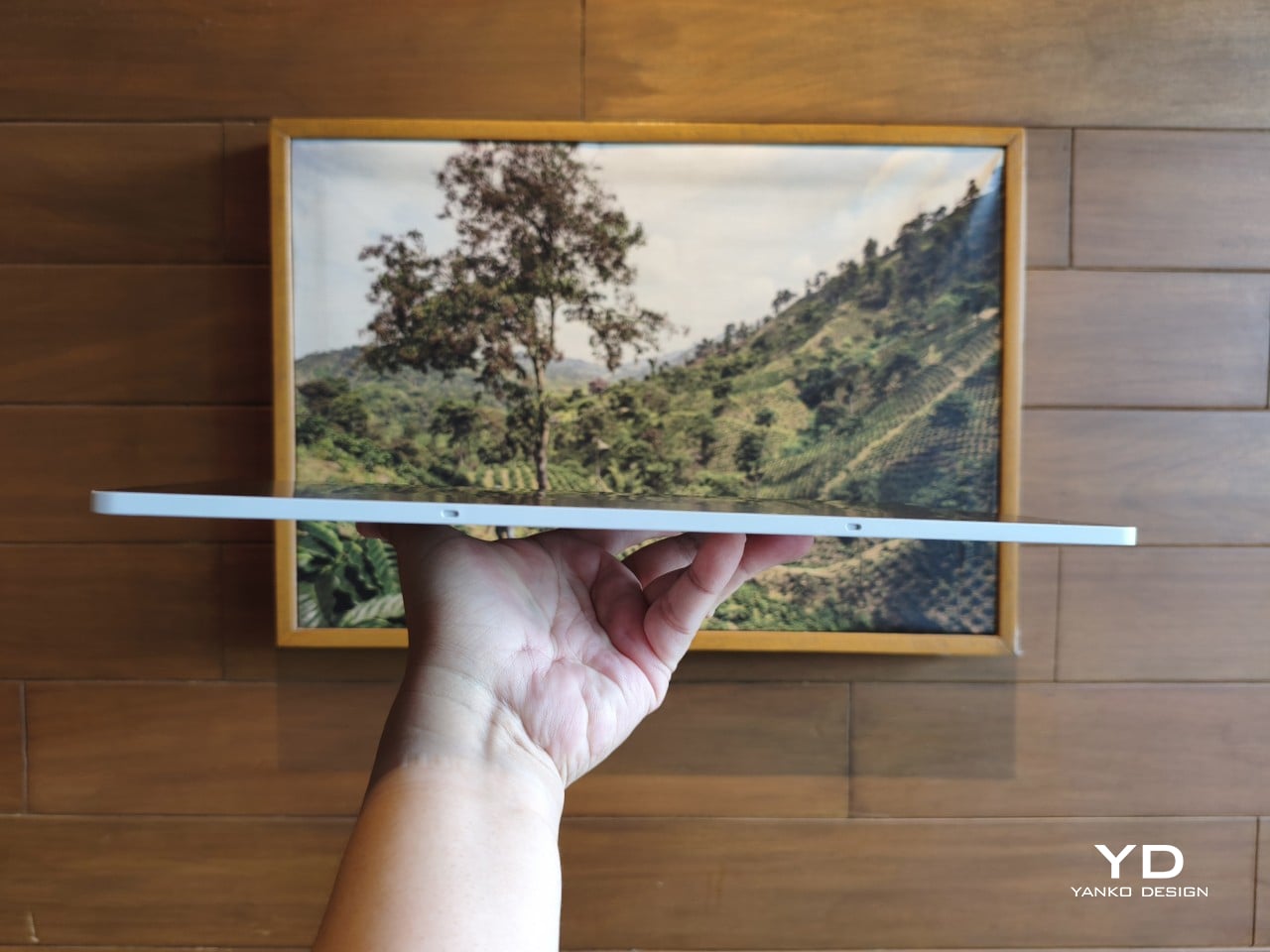
At 14 inches, the MovinkPad Pro 14 isn’t something you’d hold up one-handed for long, but at just 699 grams and 5.9mm thin, it slips easily into any bag. Resting it on your arm or lap doesn’t feel like a chore either. For creatives who move between locations throughout the day, that combination of size and lightness goes a long way toward making it a genuinely portable tool.
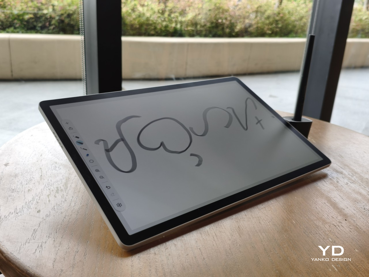
The four rubber feet on the underside keep the tablet from sliding around on a desk and slightly raise the back off the surface, which helps with airflow. There’s no built-in kickstand or angled stand, so if you prefer working at a tilt, you’ll need to source one separately, either from Wacom’s own accessory line or from a third-party option. It’s a small gap in an otherwise thoughtful package.
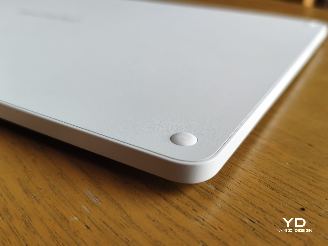
Those wide bezels, which might seem like a design quirk at first, actually earn their place here. They give you a comfortable inactive area to rest your palm or fingers when gripping the tablet from the sides, so your touch input doesn’t accidentally interfere with whatever you’re drawing. It’s the kind of practical thinking that tends to reveal itself only once you’re deep into a long session.
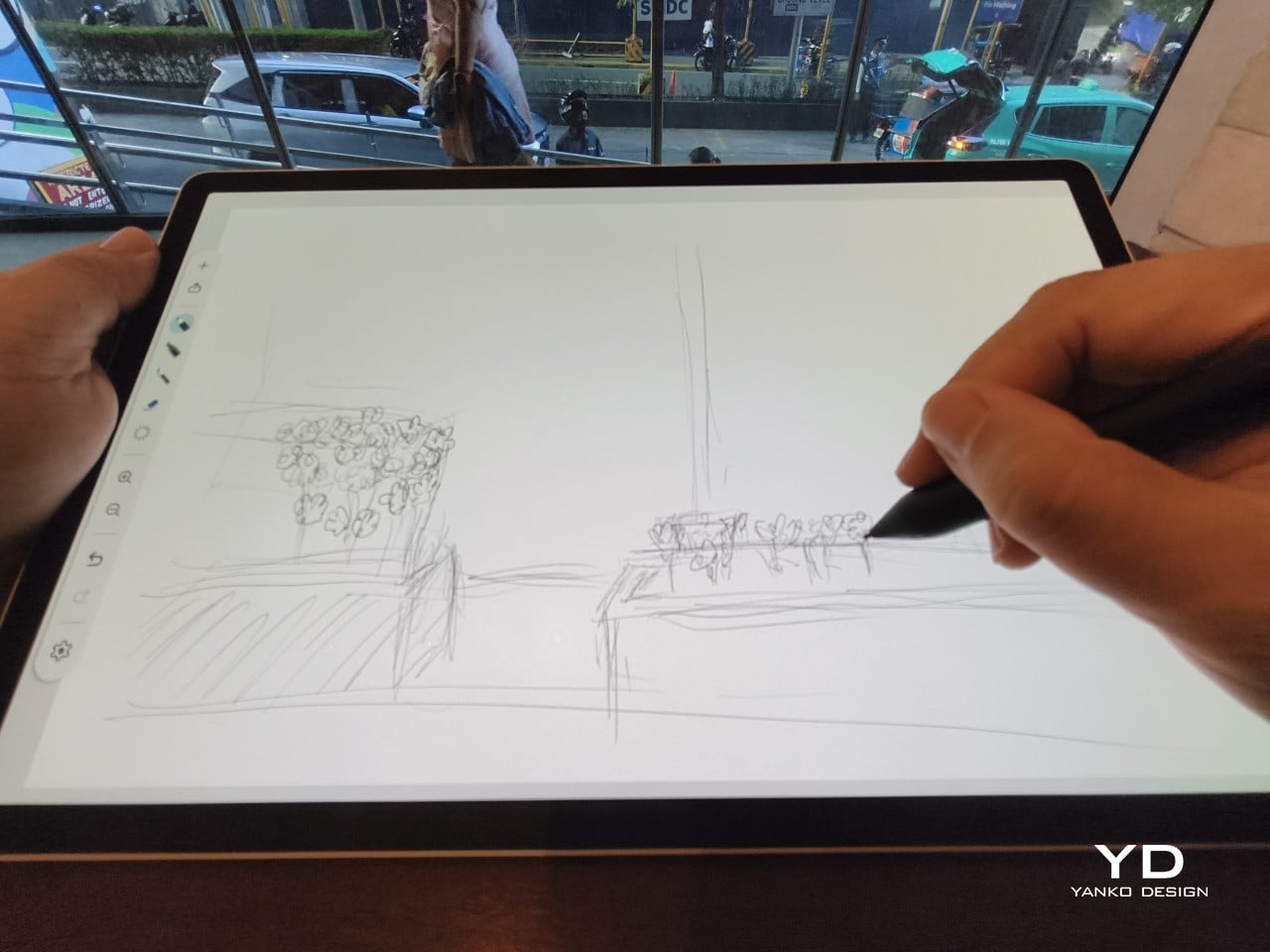
That said, the MovinkPad Pro 14’s footprint means it isn’t something you’d pull from a bag and start sketching on at a moment’s notice. For that kind of spontaneous work, the smaller MovinkPad 11 is probably the better fit. The Pro 14 is better suited to longer, more involved sessions away from the desk, as long as you’ve found a comfortable spot to settle in.
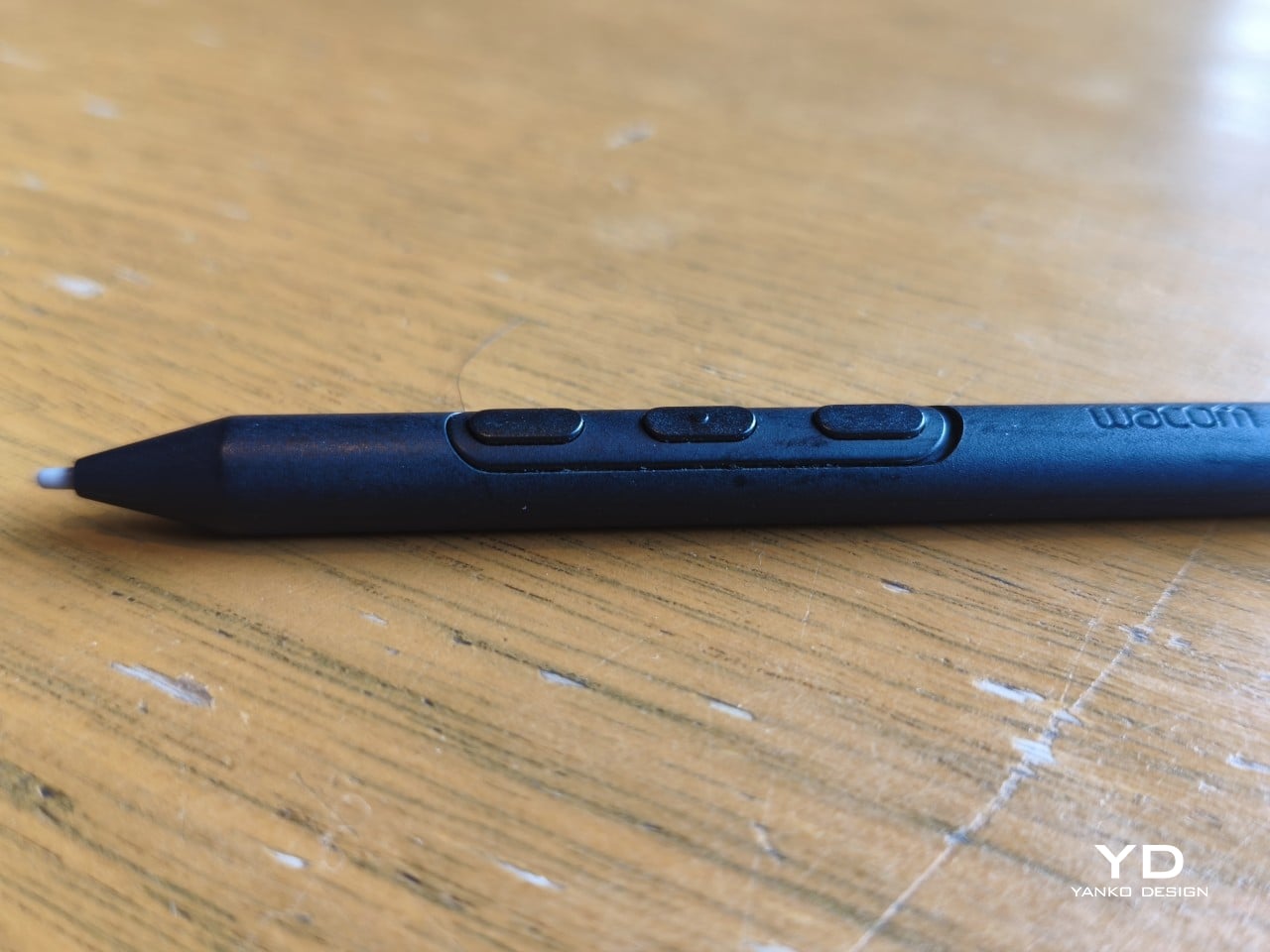
The Pro Pen 3 is well-balanced and comfortable enough in the hand, though your experience will vary depending on what you’re used to. Its slim, pencil-like build can lead to some cramping over long sessions for those accustomed to thicker tools. Official grips are available but aren’t cheap. The nearly-flushed buttons are also too easy to press accidentally. The Art Pen 2, which we’re also reviewing, offers a wider barrel as an alternative but is sold separately.
Performance

Under the hood, the MovinkPad Pro 14 runs on a Qualcomm Snapdragon 8s Gen 3 with 12GB of RAM and 256GB of storage, expandable via microSD up to 2TB. The processor isn’t the newest available, but it handles everything thrown at it with ease. Multitasking is smooth, app switching is fluid, and there’s no sense that the hardware is struggling to keep pace with anything.
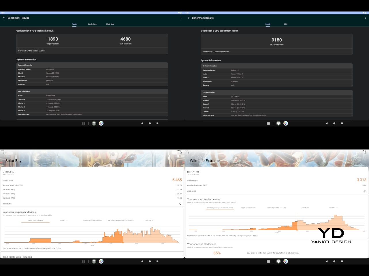
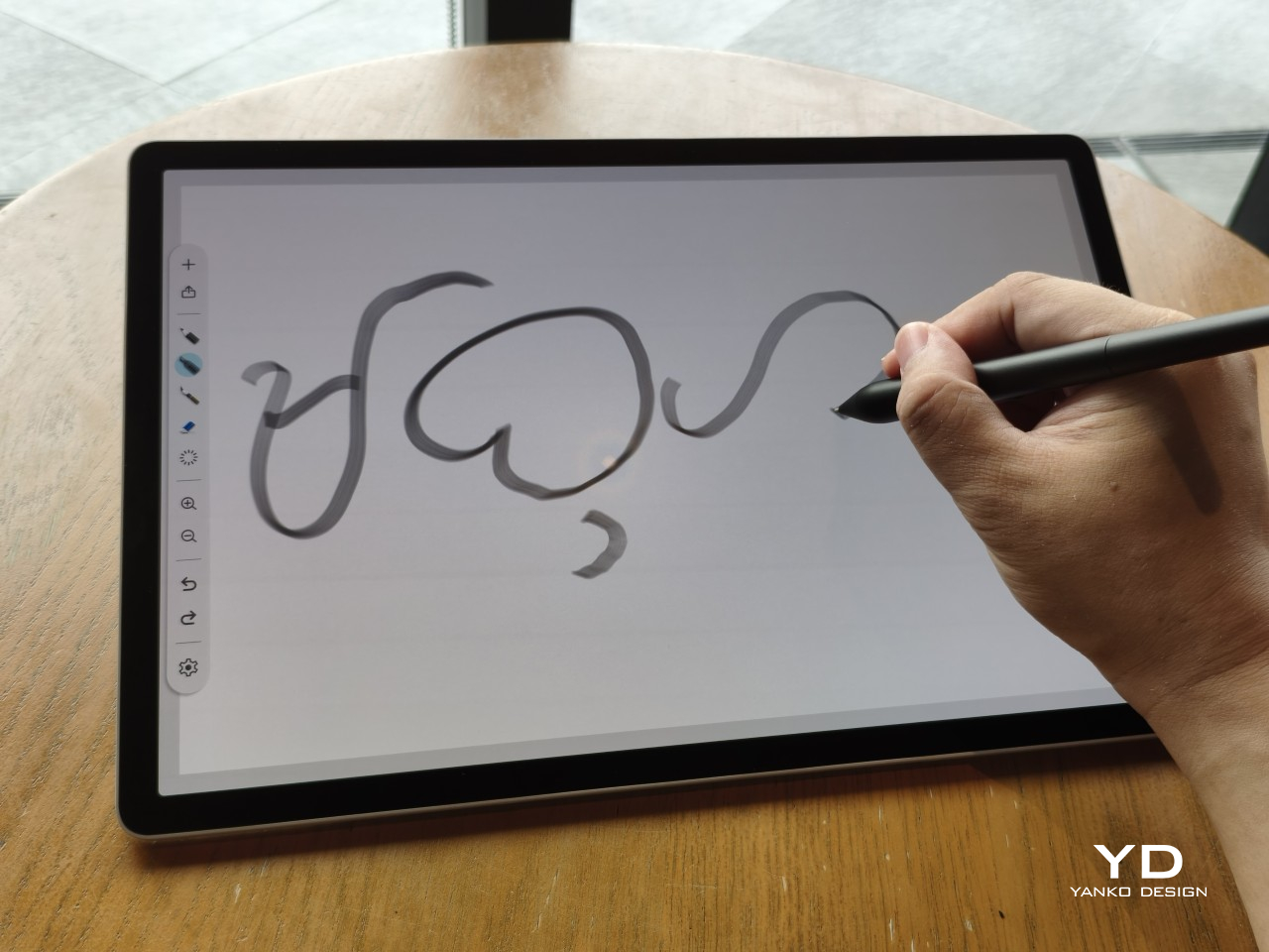
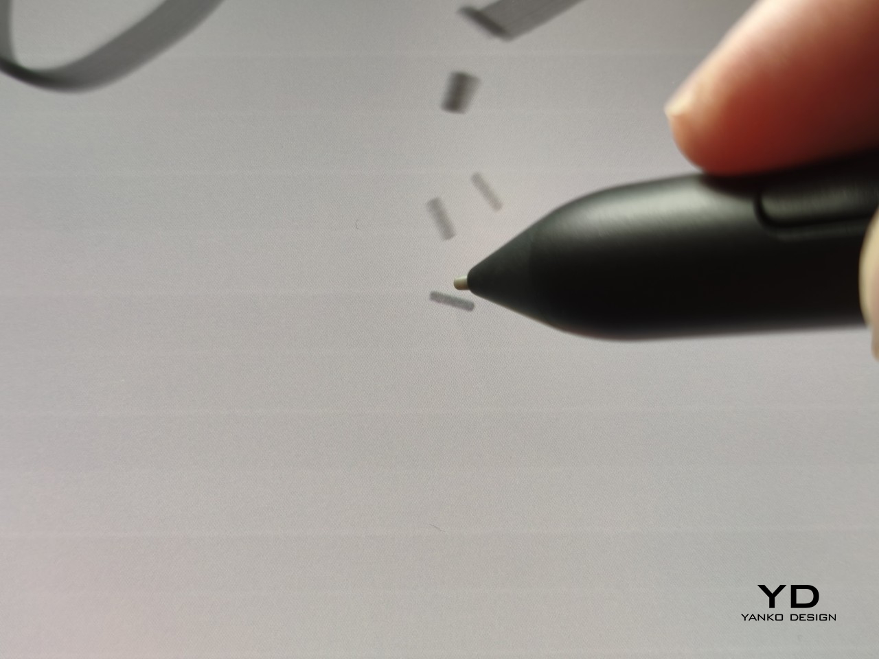
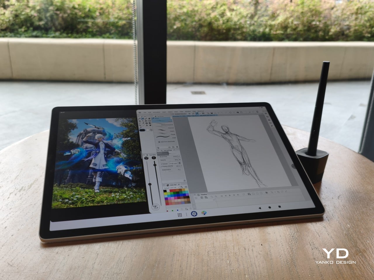
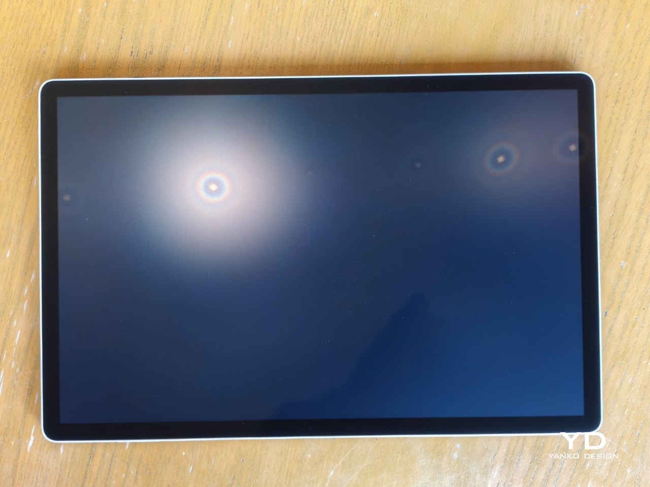
The 14-inch OLED display runs at a 2880×1800 resolution with a 120Hz refresh rate, treated with anti-fingerprint, anti-reflective, and anti-glare textured glass. The wide rectangular aspect ratio works in favor of drawing apps that line their UI panels along the sides, something squarish iPad screens can’t accommodate as cleanly. The textured coating adds a satisfying scratchiness to each stroke, and pen accuracy is, naturally, exactly what you’d expect from Wacom.
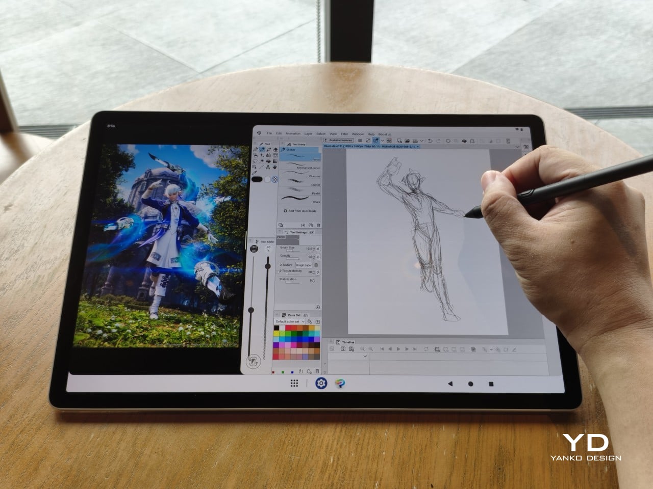
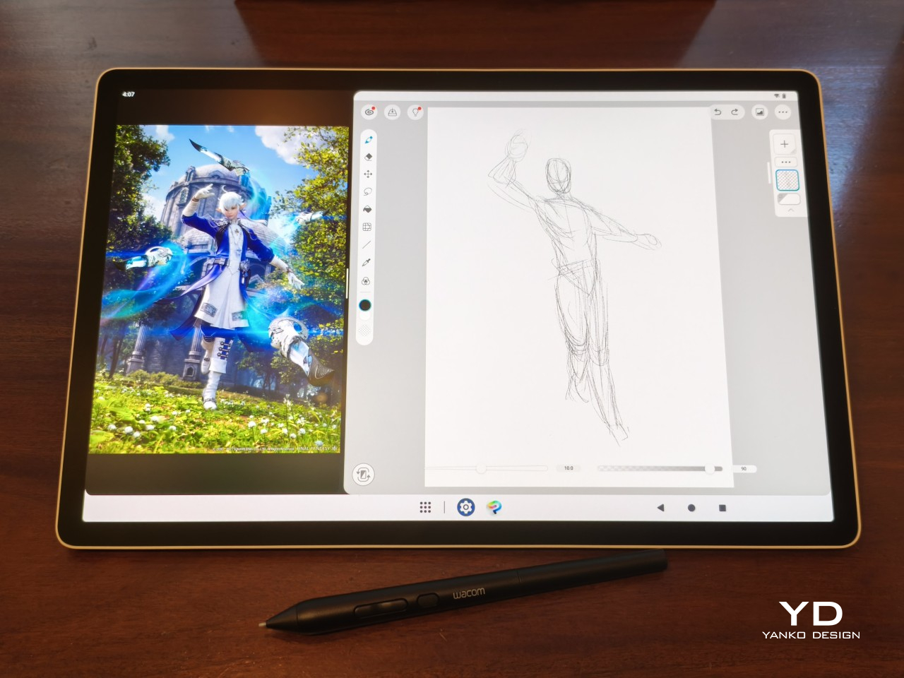
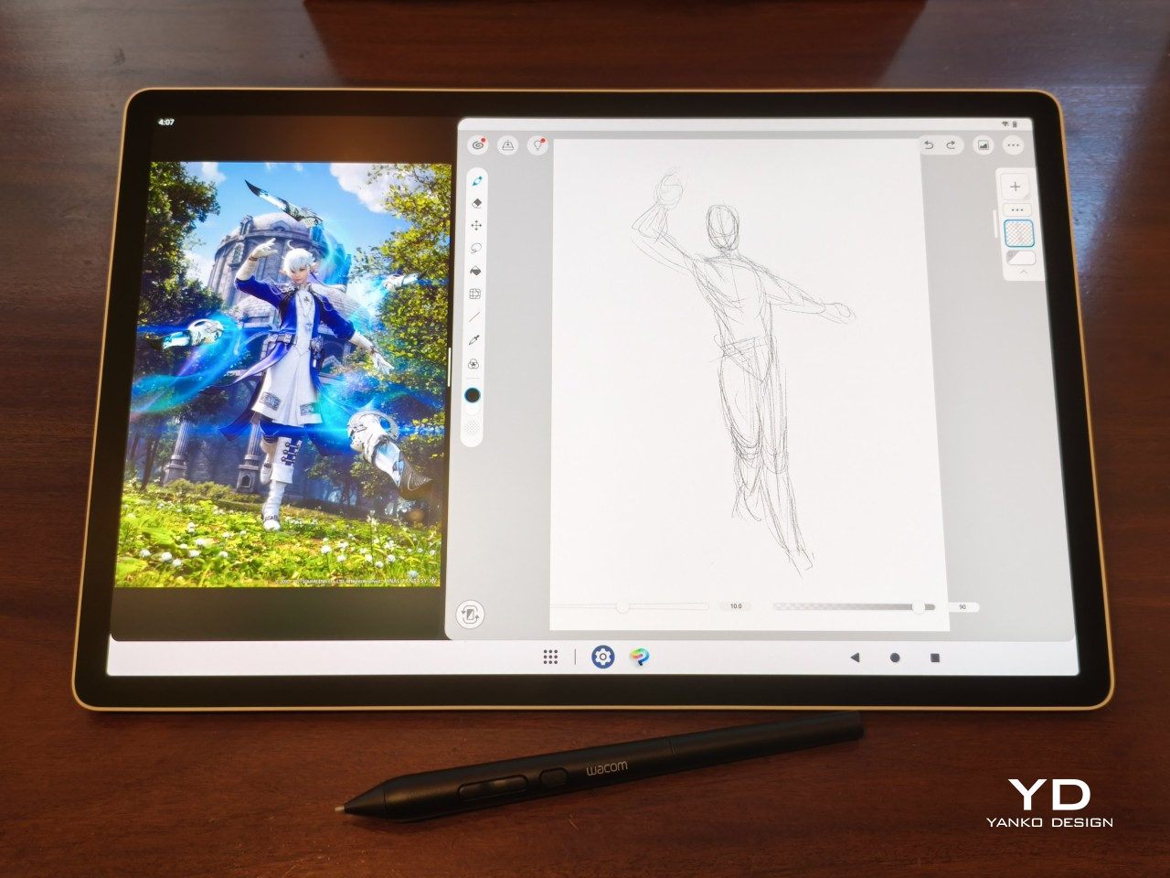
There are no cameras on the MovinkPad Pro 14, front or back. That’s a deliberate choice. There’s no temptation to flip over to social media, no accidental video calls, nothing that pulls focus away from what you’re there to do. Passively watching a tutorial in a corner of the screen is about as off-task as it gets, which, honestly, isn’t a bad thing for anyone prone to distraction. Split-screen functionality makes it easy to have a reference off to the side while you work.
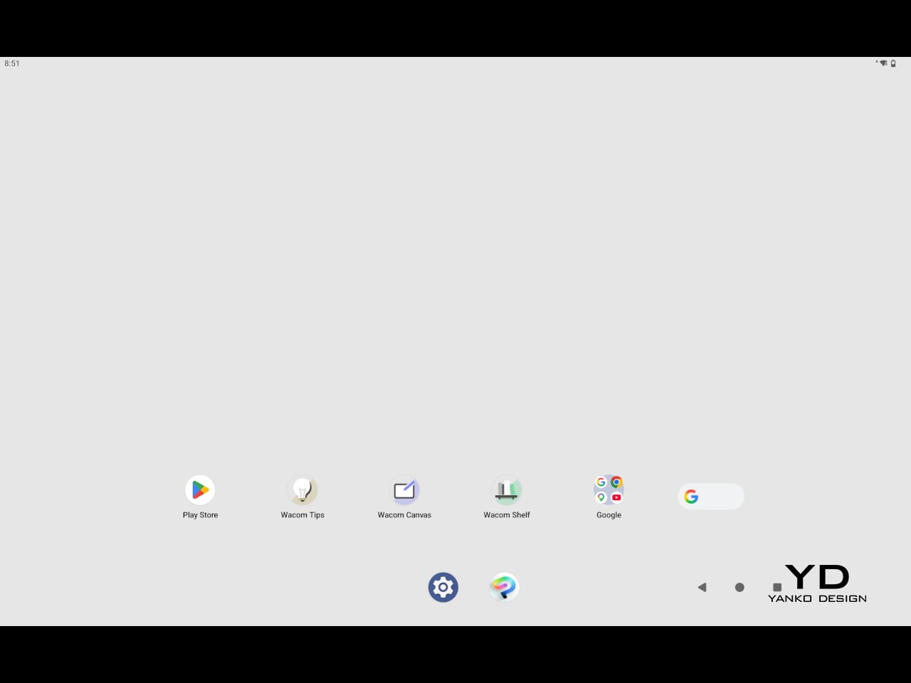

The software side is equally stripped down. Android 15 comes installed with zero bloatware and just three Wacom-made apps: Shelf for your gallery, Tips for settings, and Canvas, a quick sketching surface that wakes directly from sleep with a tap of the pen. It’s intentionally bare-bones for capturing fleeting ideas, though a few more brush options would genuinely be welcome. From Canvas, you can instantly send your sketch to an Android app, though it seems to be limited to Clip Studio Paint, iBisPaint, and Autodesk Sketchbook. Hoping it will offer some flexibility in the future.
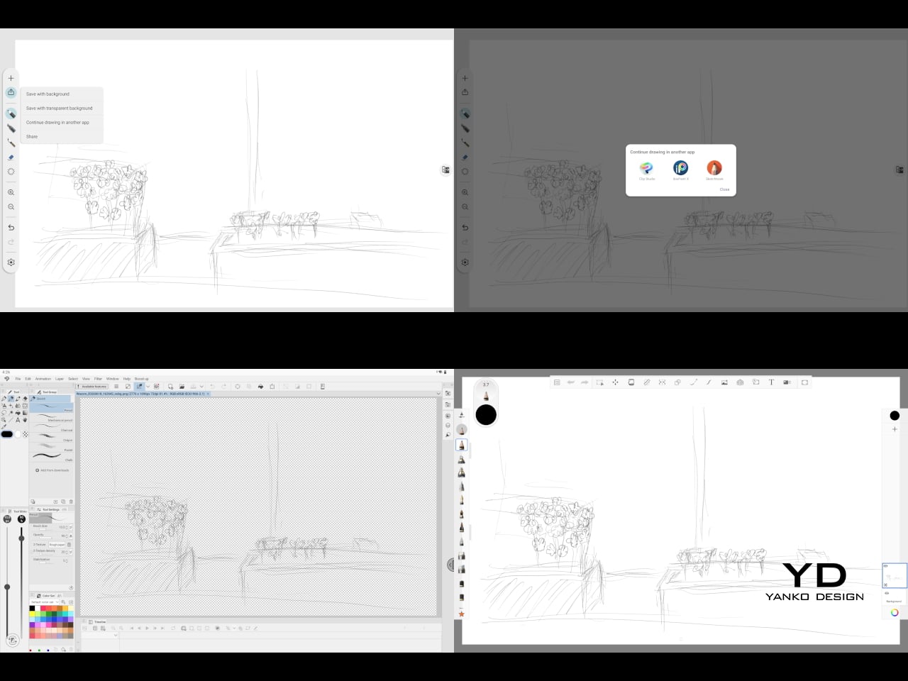
Speaking of apps, desktop-grade drawing applications like Clip Studio Paint and Krita run without issue. The broader Android ecosystem opens up a decent range of options, though it’s worth remembering that anything exclusive to Windows or Mac won’t be available here. Customizing the pen buttons is also off the table, a limitation of the Android platform rather than any fault of the hardware itself.
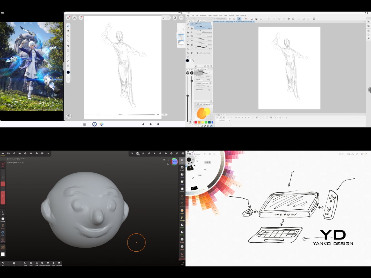
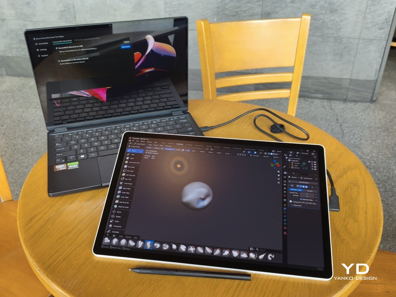
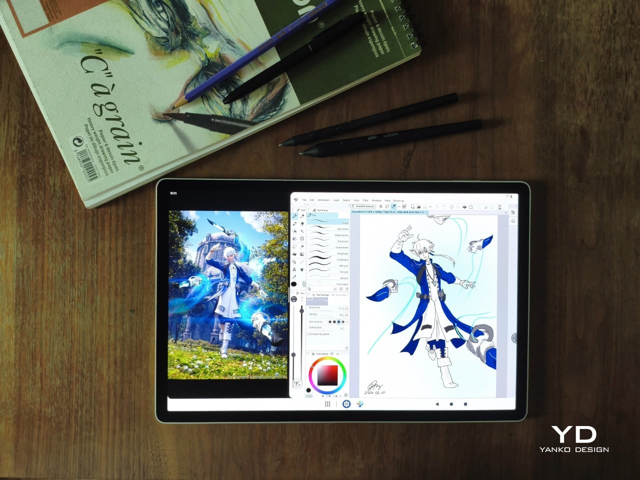
The Instant Pen Display Mode is arguably the most intriguing feature here. It converts the tablet into a secondary display for a Windows or Mac computer, via USB or Wi-Fi, turning it into a portable, makeshift Cintiq. It’s part of Wacom Lab, an experimental creator community that lets users explore and provide feedback on new creative possibilities through beta features. As of this writing, the setup process involves quite a number of steps, and pen button support is currently limited to toggling a small side panel for common modifier keys. It definitely shows promise, so hopefully development will be quick.
Battery life is genuinely impressive. The 10,000mAh cell can sustain nearly five days on standby and supports 65W fast charging, though you’ll need to bring your own charger since none is included in the box. The USB-C port is only 2.0, so it doesn’t charge as quickly as the spec might suggest, but an hour or more of active drawing barely makes a dent in the battery.

Sustainability

Wacom doesn’t use recycled or notably sustainable materials in the MovinkPad Pro 14 itself, but the company does meet several other environmental benchmarks worth noting. Its packaging is compact, minimal, entirely plastic-free, and fully recyclable, while the device is built with the kind of durability Wacom products are known for, the sort that keeps them in active use long after most gadgets would have been binned.
That longevity argument holds well for Wacom’s drawing tablets and pen displays, which tend to outlast their useful lives many times over. A standalone Android tablet is a different matter, though. Apps like Clip Studio Paint have already dropped Android 12 support, making regular OS updates critical. Wacom has committed to keeping the MovinkPad Pro 14 current, but no clear update schedule or roadmap has been shared publicly yet.

Value

At $899.95, the MovinkPad Pro 14 isn’t an impulse buy, but it’s a reasonably grounded one. An equivalent iPad would require buying the Apple Pencil separately, while a comparable Samsung Galaxy Tab tends to run noticeably higher. For a tablet built specifically around the drawing experience, with Wacom’s pen technology at its core, the price lands in a range that’s genuinely difficult to argue against.
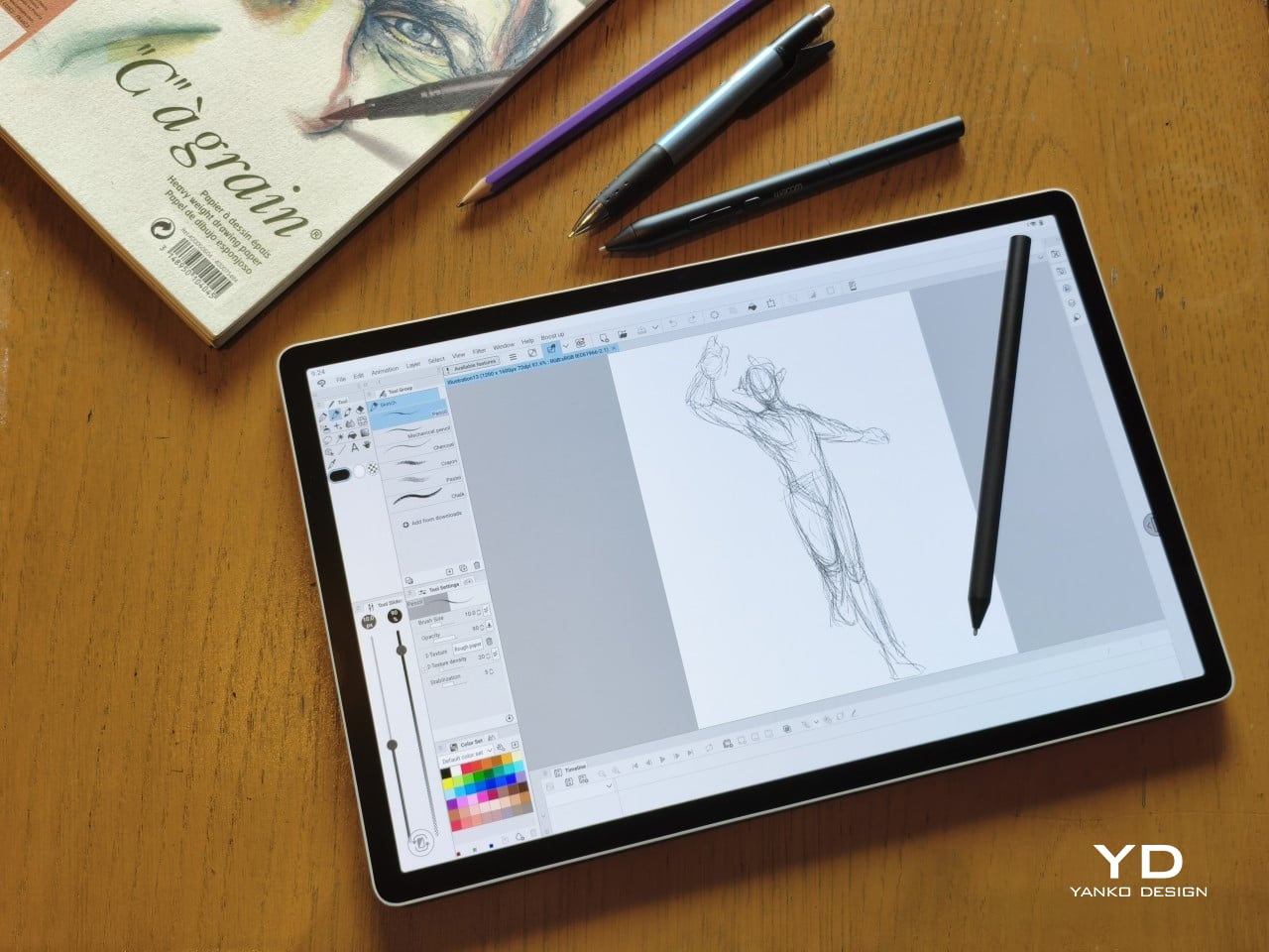
The large screen and capable hardware make it a compelling option for creatives who frequently work away from their desks. It doesn’t sacrifice quality for the sake of portability. With the right app installed, it functions as a capable mobile workstation wherever you happen to be. And when a PC or Mac app becomes unavoidable, Instant Pen Display Mode is there to bridge the gap.
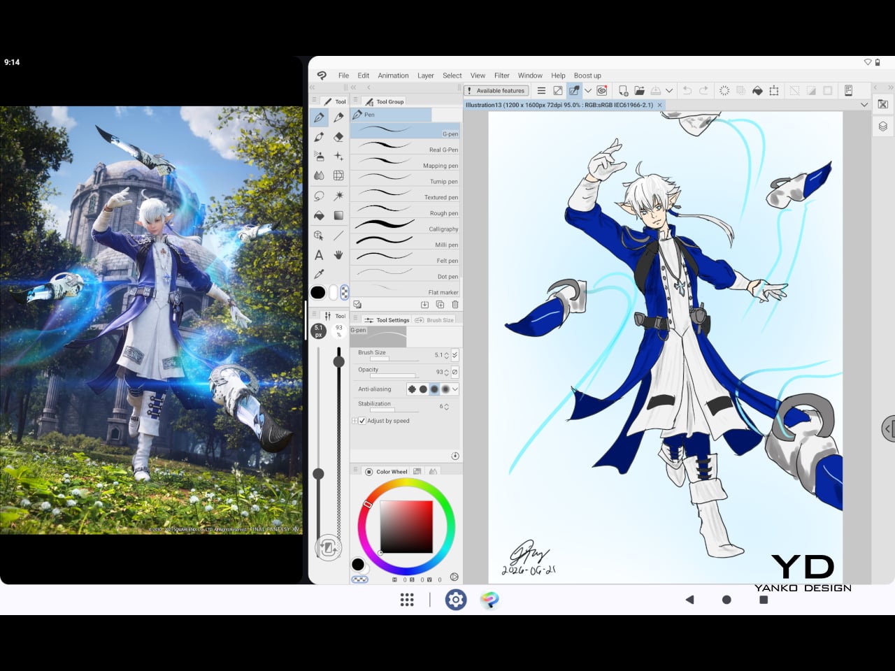
There are caveats, of course. The beta status of Instant Pen Display Mode means it’s not quite ready to be a daily driver feature. You’ll also need to feel at home with Android’s drawing ecosystem for this workflow to really make sense. And the uncertainty around long-term Android updates is a concern that Wacom will need to address more concretely before most buyers can put it fully to rest.

Verdict

The MovinkPad Pro 14 isn’t Wacom’s first stab at a standalone portable device. Veterans will remember the Windows-based Cintiq Companions and the MobileStudio Pros. But this is by far the most portable and clearly focused version of that idea. It doesn’t try to cram Windows into a pen display. It’s a purpose-built mobile experience that happens to carry a Cintiq-like trick discreetly tucked away.

At the same time, it doesn’t operate like an Android tablet with a Wacom digitizer tacked on, which is essentially what Samsung’s Wacom-enabled slates are. Wacom has built something around a specific, coherent idea: a true digital sketchbook. Some software edges still need ironing out, but for artists and designers craving genuine creative freedom outside the studio, the MovinkPad Pro 14 offers something few tablets in its class can match.
The post Wacom MovinkPad Pro 14 Review: The $900 Sketchbook Designers Needed first appeared on Yanko Design.

  •  

Wacom Art Pen 2 Review: A Stylus That Finally Moves Like a Real Brush

PROS:


  • Ergonomic design with raised and angled buttons

  • 360-degree barrel rotation sensitivity
  • Iconic Wacom flared grip design

  • Accessible price point for a pro tool

CONS:


  • Limited compatibility with Wacom drawing tablets

  • No option for custom weight swapping


RATINGS:

AESTHETICS
ERGONOMICS
PERFORMANCE
SUSTAINABILITY / REPAIRABILITY
VALUE FOR MONEY

EDITOR'S QUOTE:

The Wacom Art Pen 2 proves that sometimes one feature is all it takes to make a tool feel irreplaceable.
Digital drawing has matured to a point where the pen you use often defines the kind of work you’re capable of. Most tablets ship with a capable stylus included, and pressure sensitivity has become nearly standard. Where real differences emerge is in the finer details: tilt support, button placement, barrel thickness, and the nuanced control that separates a general sketching tool from something more professional.

Wacom knows this territory well, having refined its pen technology across decades of products. The Art Pen 2 is its latest attempt to push that nuance even further, reviving a feature from its predecessor that dedicated artists genuinely missed: 360-degree barrel rotation. It’s an accessory designed not for everyone, but for those who want their digital brushes to behave as closely as possible to the real thing.

Designer: Wacom

Aesthetics

The Art Pen 2 carries Wacom’s iconic flared grip design, widening toward the tip and tapering toward the back. It gives the pen more visual character than a plain cylinder, while the two raised side buttons, set at a slight angle, add a bit of intentional texture to an otherwise clean barrel. The shape looks distinctly professional without being flashy, which suits the kind of serious work it’s built for.

Unscrew the back half, and a small nib compartment is tucked inside, keeping replacement tips within arm’s reach during a session. It’s a detail borrowed from the Pro Pen 3 and one that makes swapping nibs far less disruptive mid-drawing. The pen comes in an all-black finish, which keeps things clean and consistent, and makes the angled buttons stand out just enough to locate them quickly by sight.

Ergonomics

The pen is well-balanced and feels substantial in the hand without being heavy. The wider barrel suits anyone who finds slimmer pens like the Pro Pen 3 a bit uncomfortable during long sessions, though that’s always a personal call. The three raised, angled buttons make accidental presses nearly impossible and are effortless to identify by feel, which matters when your eyes are glued to the canvas.

The flared shape does come with a trade-off. It won’t sit easily in most pen loop accessories or grip covers, and there’s no way to slim it down if the barrel feels too wide. That’s the opposite situation from the Pro Pen 3, where an aftermarket grip can always bulk things up. The Art Pen 2’s shape is fixed, and you work with it or find something else.

Performance

Pressure sensitivity sits at 8,192 levels with full tilt support, putting it on par with the best pens at any price. Accuracy and response are exactly what you’d expect from Wacom, meaning there’s nothing to second-guess. What sets the Art Pen 2 apart, though, is the 360-degree barrel rotation, which picks up precisely how much and in which direction the pen shaft is turned.

For tools like calligraphy brushes or natural-media simulations, barrel rotation is genuinely transformative. It’s worth noting, though, that it’s also a fairly niche feature and not many drawing apps currently support it. Casual users probably won’t miss it at all. Where it resonates most is as an upgrade path for those who owned and relied on the original Art Pen before it was discontinued.

Compatibility is currently limited to a specific set of devices: the Wacom MovinkPad Pro 14, select Cintiq models (DTK168, DTK246, DTH246), and three Intuos Pro variants (PTK470, PTK670, and PTK870). Wacom has said that support for additional Pro Pen 3-enabled devices will be added over time, but for now, buyers should double-check their tablet is on the list before committing.

Sustainability

Like most professional accessories, the Art Pen 2 is plastic and metal, with nothing notably sustainable about the materials themselves. There’s no recycled content or eco-conscious material choice to speak of. Packaging tells a different story, though. It’s minimal, plastic-free, and fully recyclable, which aligns with what Wacom has been doing across its more recent product releases. A small step, but a consistent one.

What does count in the pen’s favor is Wacom’s track record for longevity. The original Art Pen was in production and active support for close to 16 years, an almost unheard-of lifespan for a digital accessory. If the Art Pen 2 follows a similar path, the investment stretches well beyond what most accessories can promise, and that kind of durability is its own quiet form of sustainability.

Value

The barrel rotation feature does limit the Art Pen 2’s broader appeal. Plenty of artists won’t need it, and for those users, there’s still a reasonable case for sticking with the more standard Pro Pen 3. If rotation has never factored into your workflow, the Art Pen 2’s most distinctive selling point simply won’t move the needle for you, and that’s worth being honest about.

That said, there’s a hidden value worth considering. At $99.95, the Art Pen 2 is $30 cheaper than the Pro Pen 3, with nearly identical core performance and barrel rotation on top. For those who prefer a thicker grip, it also sidesteps the added cost of official grip accessories. As a package, it makes considerably more financial sense than it first appears.

Verdict

The Wacom Art Pen 2 is a well-considered accessory for a specific type of creative. It doesn’t try to replace the Pro Pen 3, and it’s clearly not aimed at casual sketchers. What it offers is a combination of pro-level pressure sensitivity, a comfortable and distinctive grip, and a rotation feature that no competing pen at this price comes close to matching.

The limited compatibility list is a real constraint, and Wacom should address it sooner rather than later. But for those drawing on a supported device, particularly the MovinkPad Pro 14, the Art Pen 2 is a genuinely valuable add-on that earns its asking price without much argument. Especially at $99.95, it delivers a kind of brush-like expressiveness through barrel rotation that no standard pen, regardless of price, can replicate.

The post Wacom Art Pen 2 Review: A Stylus That Finally Moves Like a Real Brush first appeared on Yanko Design.

  •  

Art-ware Is the Dining Set That Never Has to Go in a Cabinet

Tableware has always had a storage problem. A complete set of cups, bowls, and cutlery takes up a cabinet’s worth of space for the privilege of being used a few times a week. The rest of the time, it sits behind closed doors, out of sight and contributing nothing to the space around it. That’s a lot of material devoted to a fairly passive existence.

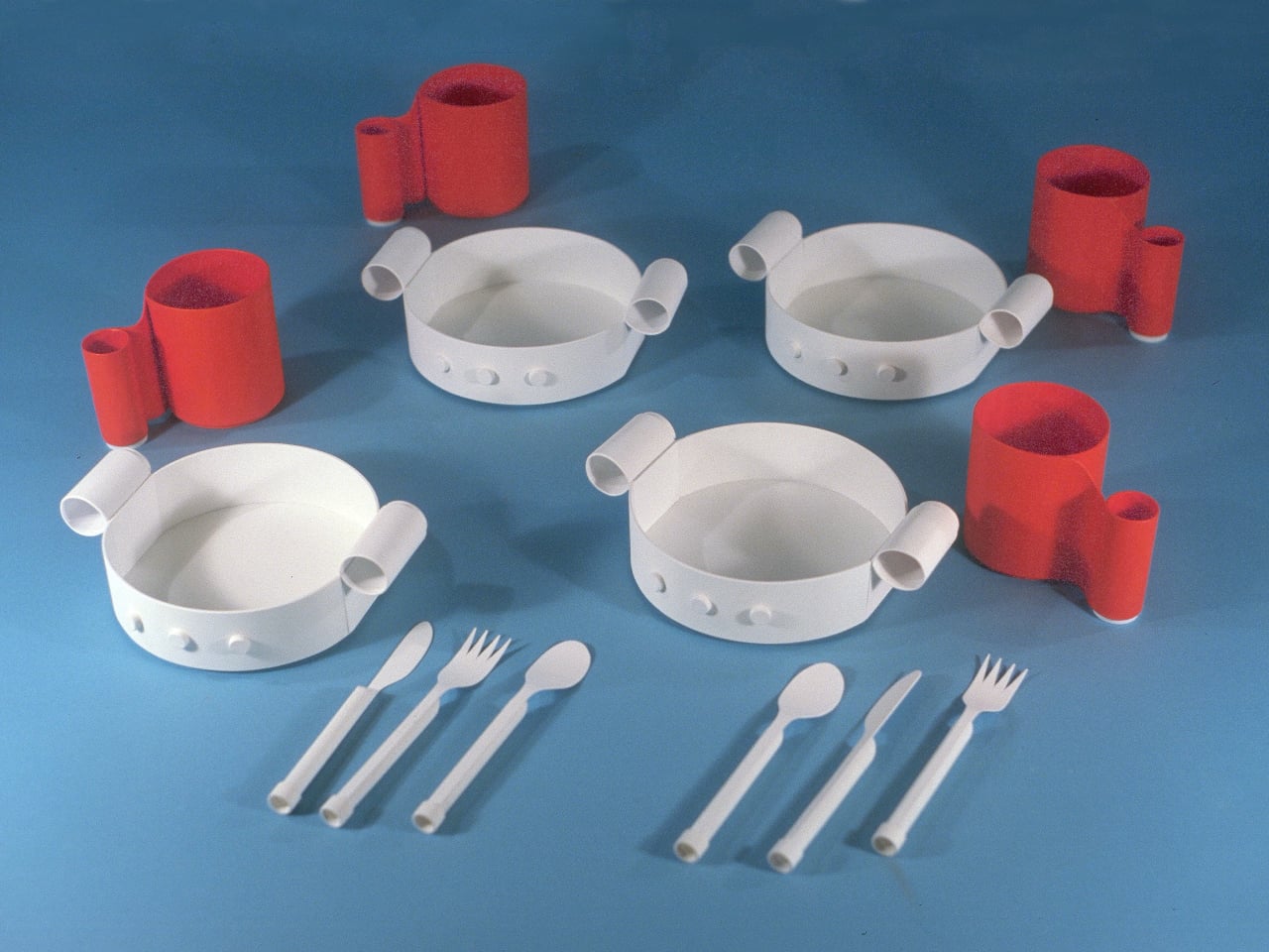
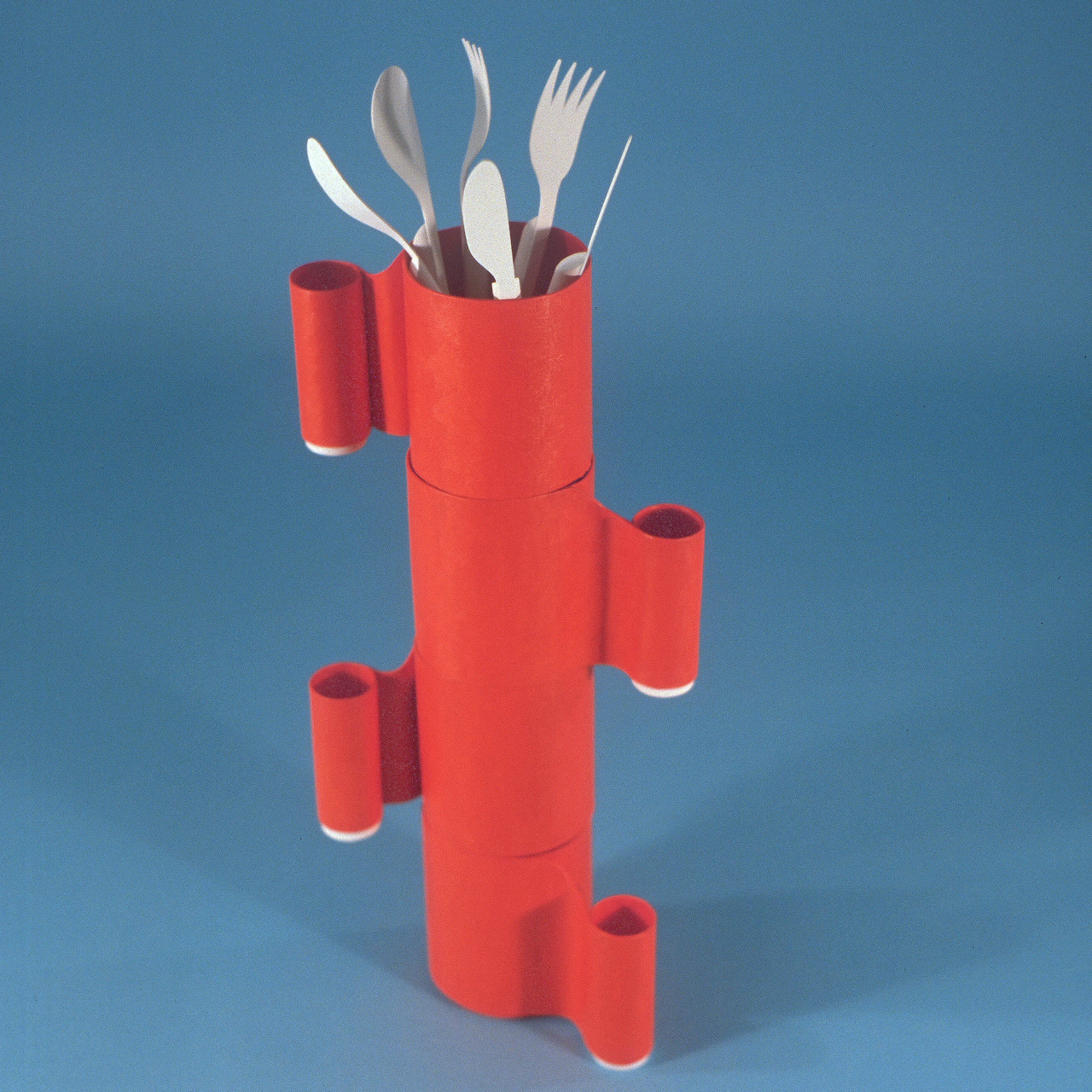
Michael Jantzen’s Art-ware prototype takes a different approach to the same set of objects. Rather than designing tableware that gets put away after a meal, he designed a system where the dishes, cups, and cutlery connect to each other and become something else entirely: freestanding abstract sculptures that live out in the open, doubling as décor when they’re not being used for eating and drinking.

Designer: Michael Jantzen

The key to the whole system is a set of male and female connectors molded directly into each piece. These are simple protrusions that stick out from the surfaces of the bowls, cups, and cutlery handles, allowing any component to plug into or stack onto any other. A bowl can lock onto a cup, a cup onto another cup, cutlery can stand upright in an opening or connect through a handle, and the whole assembly stays together without any separate hardware.

The configurations that result don’t look accidental. Cups stacked and plugged together form vertical columns; bowls assembled at various orientations create clusters that read as organic, almost biomorphic forms. Slide cutlery upright through the assembled pieces, and the resulting structure starts to resemble a piece of abstract art you’d find mounted in a gallery, not something you’d normally find next to a kitchen sink.

That’s precisely what Jantzen is after. The Art-ware set doesn’t need to be stored in a cabinet because the assembled form is meant to sit on a shelf or table as a decorative object, a sculpture that also happens to be a dining set. You pull it apart before a meal and reassemble it afterward in whatever configuration suits you that day. No two arrangements have to be the same.

The material is recyclable plastic, and Jantzen frames the concept in straightforward sustainability terms: one product that performs multiple functions uses fewer resources than two separate products doing the same jobs independently. There’s no dedicated storage unit needed, no extra display piece required. The dining set is the décor, and the décor is the dining set.

Art-ware is a prototype and the first in a planned series of designs that expand the idea further. The concept is broad enough to go well beyond tableware, and Jantzen has spent decades applying this kind of thinking to furniture, architecture, and public installations. The dining set is a compact version of the same logic: objects that commit fully to their function while quietly doing something else on the side.

The post Art-ware Is the Dining Set That Never Has to Go in a Cabinet first appeared on Yanko Design.

  •  

The Memdock G3 Is the 13-Port Dock You Don’t Have to Hide Anymore

Modern desks have never looked better. Sit-stand tables, cable management trays, and ultra-thin laptops have turned the average workspace into something worth showing off. But for all the effort that goes into making a desk look clean and intentional, the accessories that actually power it are often still a mess, and docking stations, in particular, tend to be boxy, generic things that most people try to hide.

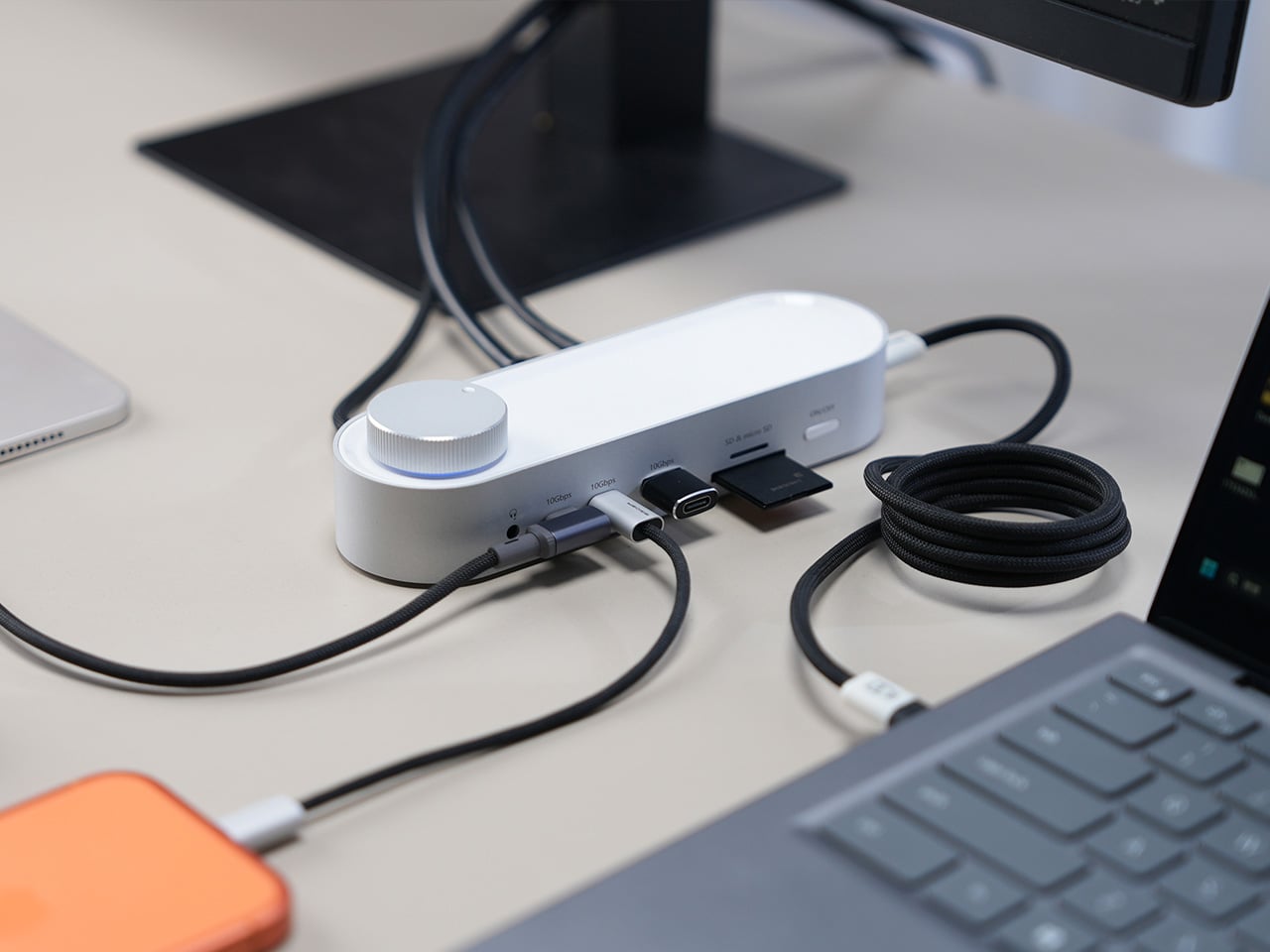
That habit of hiding docks makes sense, since most of them aren’t exactly something you’d want on display. The Memdock G3 takes a different approach. It’s a 13-in-1 docking station that doesn’t look the part in the way most docks do, and that’s a compliment. With a rounded aluminum body and a physical volume knob at one end, it’s designed to sit on the desk, not behind it.

Designer: Memdock

Click Here to Buy Now: $89 $189 ($100 off). Hurry, only 135/200 left! Raised over $50,000.

The aluminum shell is both light and sturdy. Weighing just 175g and measuring 17cm in length, it won’t crowd any desk. The silver-white finish sits comfortably alongside a MacBook or a Surface without looking out of place. A one-touch power switch keeps things simple, while the knurled volume knob doubles as a status indicator with a blue ring glowing softly at its base.

Where the G3 separates itself from generic hubs is with its dual HDMI outputs, both capable of 4K at 60Hz. Whether you’re juggling two monitors or spreading your workspace across screens, the setup doesn’t need extra adapters or complicated display routing. It works across Windows and macOS without additional drivers, so plugging in is genuinely all you need to get a full dual-screen arrangement running.

Charging is another area where the G3 keeps things clean. The 100W PD port can keep a laptop topped up while everything else stays connected, which means you don’t need a separate charger taking up another outlet. Pass-through charging also stays active even when the dock is switched off, so your devices keep charging overnight without you having to think about it.

On the data side, the G3 carries multiple 10Gbps connections, including USB-C, which is meaningfully faster than the 5Gbps typical of most docks in its category. Moving a batch of raw photos or offloading footage from an external drive feels noticeably quicker, cutting the time you’d otherwise spend watching a progress bar crawl. Two USB-A ports handle the everyday stuff, from keyboards and mice to thumb drives.

Photographers and video shooters will appreciate having both an SD and a TF slot built in, which removes the hassle of hunting for a separate card reader every time they need to pull files off a camera. Pair that with a Gigabit Ethernet port for a steadier wired connection, and the G3 handles a range of workflows that most hubs can’t without reaching for yet another dongle.

The volume knob deserves a separate mention, not just as a feature, but as a design choice that says something about the G3’s priorities. Instead of digging through a settings panel every time you want to nudge the audio on a call, you just reach over and turn it. It’s a small thing, but it’s the kind of immediate, tactile control that feels obvious once you have it.

Docking stations rarely get treated like products worth designing with real care. They sit at the junction of display, power, data, and audio, making them genuinely central to how a desk functions, yet they’re almost always designed as if nobody will ever look at them. The Memdock G3 is a reminder that the things holding a workspace together can be just as thoughtfully considered as anything else on the desk.

Click Here to Buy Now: $89 $189 ($100 off). Hurry, only 135/200 left! Raised over $50,000.

The post The Memdock G3 Is the 13-Port Dock You Don’t Have to Hide Anymore first appeared on Yanko Design.

  •  

This Ceramic Vase Is Actually a Phone Speaker That Needs No Power

The home has become increasingly cluttered with gadgets that need charging, pairing, and their own dedicated spaces. Even something as simple as playing music from a smartphone often involves a Bluetooth speaker sitting on a shelf, waiting for its battery to drain. There’s been a quiet counter-movement in product design, where objects do their jobs without power and sit in a room the way a vase or a mug would.

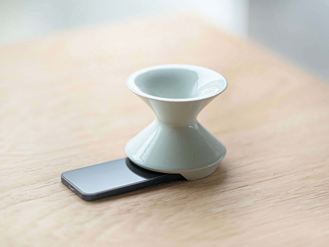
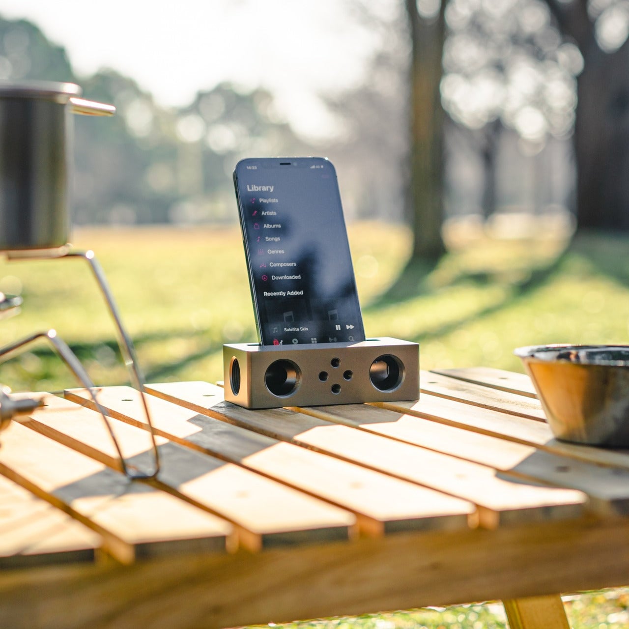
Kenji Abe’s ECHO is exactly that kind of object. It’s an analog speaker that amplifies smartphone audio simply by being set on top of the phone, requiring no power, no pairing, and no setup beyond placing it down. The concept takes its cues from wind instruments and seashells, two forms that have been shaping and projecting sound for centuries without the help of electricity.

Designer: Kenji Abe

The inside of ECHO works like a chamber, built to catch the phone’s audio and carry it outward in soft, diffused waves rather than projecting it directly. The geometry draws from the same logic as a cupped hand, but with more control over how sound travels. The result isn’t a dramatic volume boost so much as a room-filling quality that feels warmer than a powered speaker on a desk.

The choice of material makes as much of a statement as the form. Abe uses glazed ceramic, the same material found in vases, mugs, and tableware, giving ECHO a texture and presence that belongs in a home rather than on a tech shelf. It doesn’t look like an accessory. It looks like something that was always there, something that simply happened to be placed near a phone.

That quality matters when the phone is on the kitchen counter and you want music while cooking, or on a desk where you’d rather not have a speaker taking up permanent residence. ECHO doesn’t need to live next to a charging cable or be put away between uses. It sits on the table and becomes part of the room, as unobtrusive as any other ceramic piece nearby.

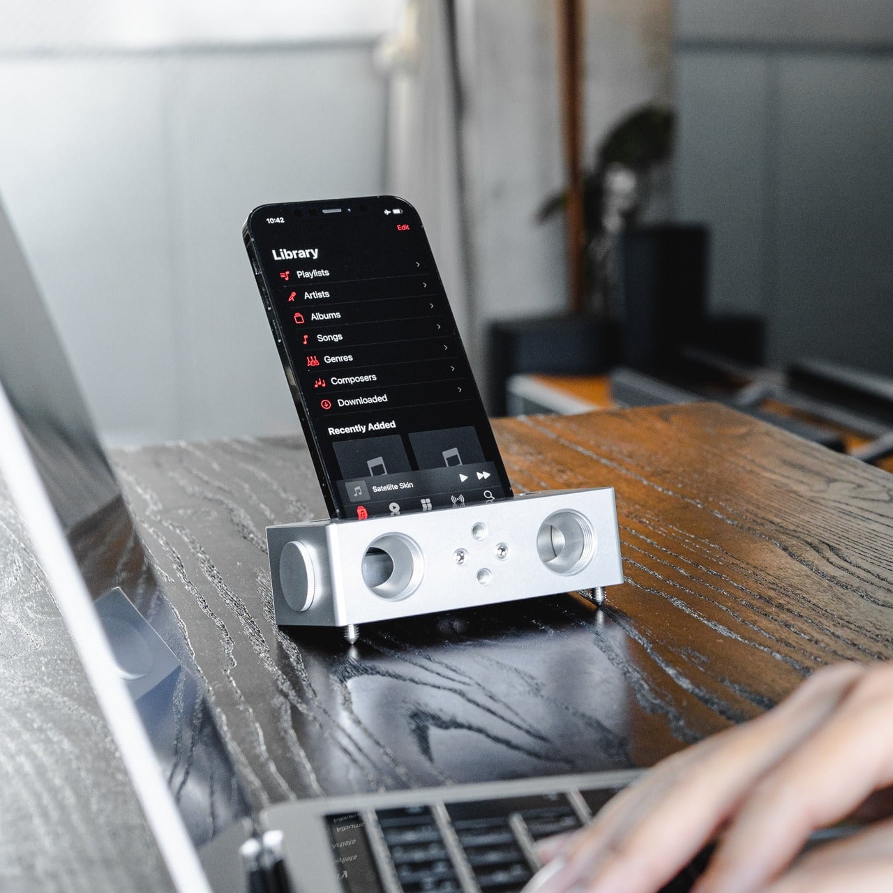
A guest walking in wouldn’t necessarily clock it as a tech product. That’s partly the point. The glazed surface catches light the way pottery does, and the form is quiet enough to sit beside books or plants without demanding attention. When a phone is slid underneath it, it starts doing its job. When the phone is gone, it just stays there, still looking like it belongs. The same underlying principle runs through the Battery-free Amplifying iSpeakers, where a Duralumin metal enclosure amplifies a smartphone’s audio without any power.

Abe designed ECHO to exist comfortably in a room even when it isn’t doing anything, a goal most speakers never consider. Most audio accessories announce themselves. This one quietly waits, and when a phone is close enough to fill the cavity with sound, the room gets a little warmer and a little fuller without anyone having to reach for a power button.

The post This Ceramic Vase Is Actually a Phone Speaker That Needs No Power first appeared on Yanko Design.

  •  

d64 Just Packed an Entire Dice Collection Into a Tiny 1980s Computer

Tabletop roleplaying games have an accessory problem. The dice alone can take over a corner of any gaming table, each one representing a different die type that the rules will inevitably call for at the least convenient moment. Tracking down the right d10 mid-session, or explaining to a new player why there are two different ten-sided dice in the bag, is just one of those small but reliable annoyances that experienced players have long since stopped questioning.

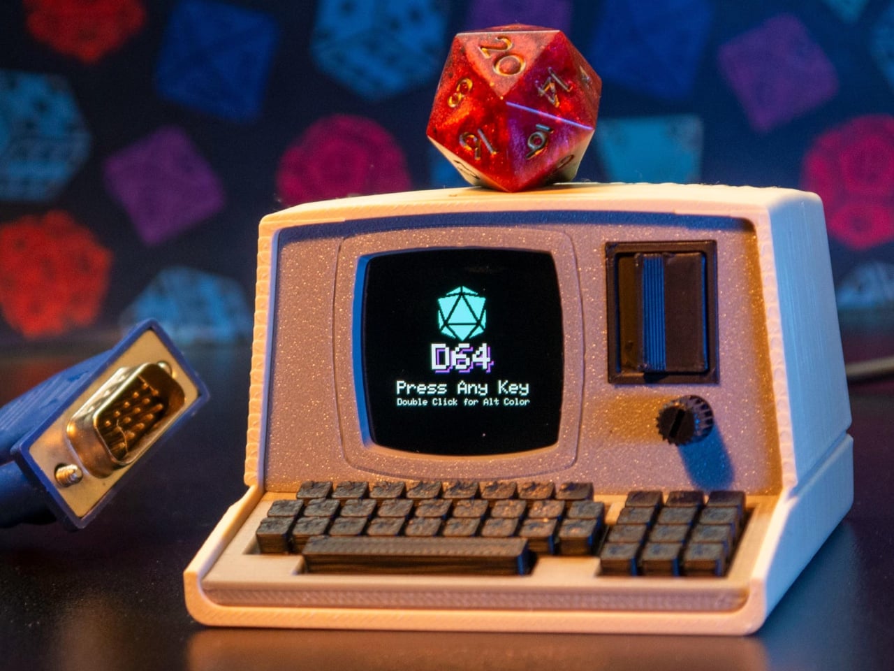
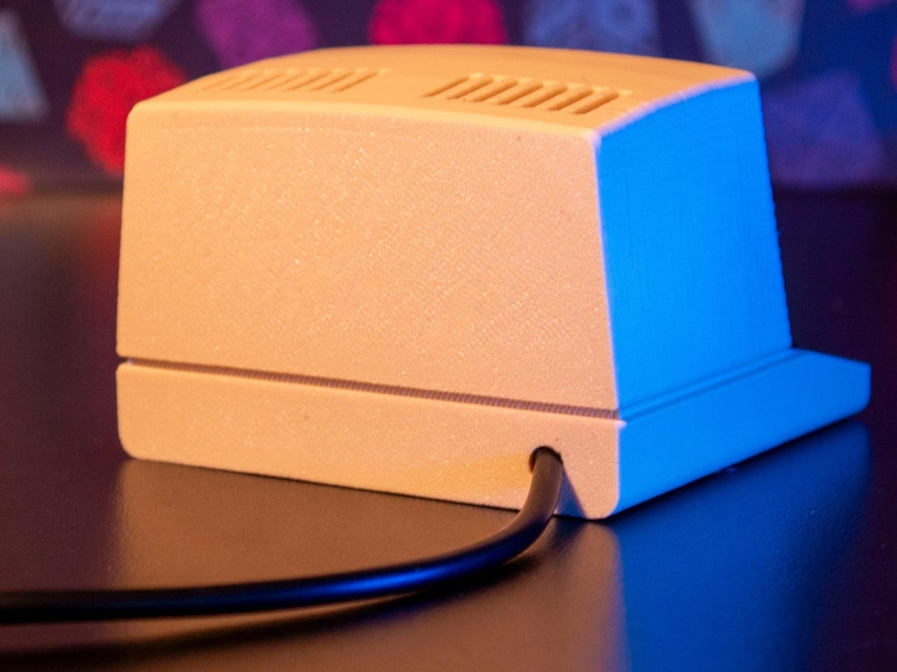
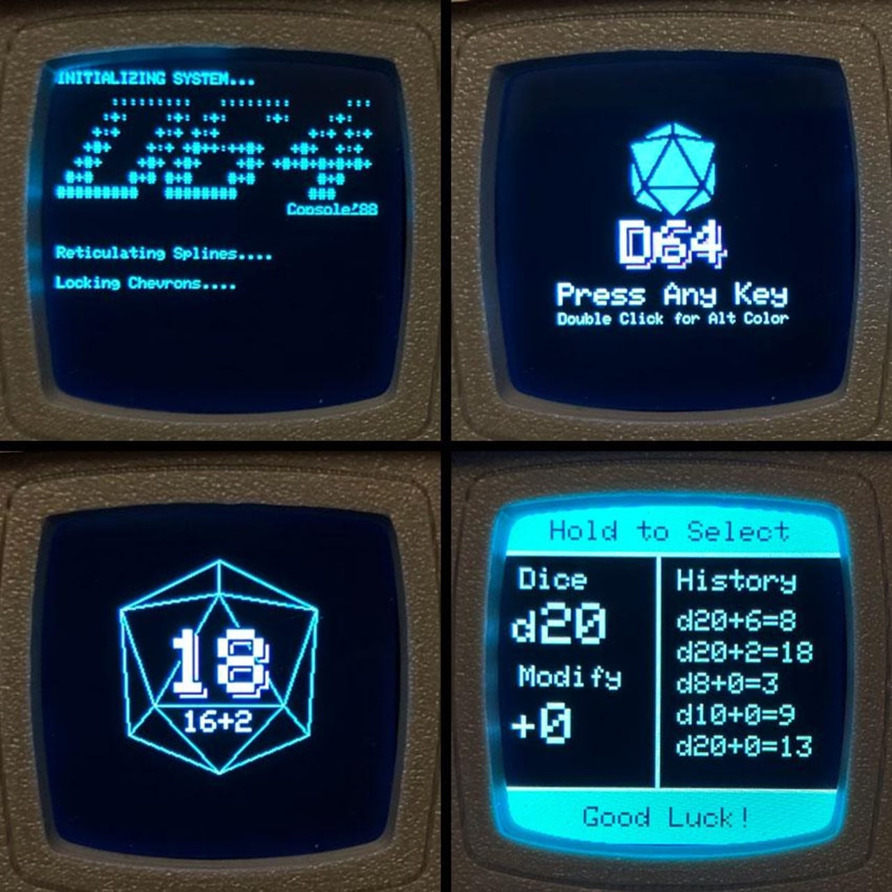
The Console’88 from d64Computing is a compact digital dice roller that handles the entire set from d4 through d100 in a single device, the size of a pocket calculator. What makes it genuinely interesting, though, isn’t just the function; it’s that the designer chose to dress it up as a miniature 1980s computer, complete with a CGA color display, vector graphics, boot-screen text, and the kind of visual language that looks like it was pulled straight out of a 1984 computer catalog.

Designer: d64Computing

Selecting a die type is done through a rotary dial and a button underneath the faux keyboard, which fits the era aesthetically and keeps the interaction simple. Spin it to the die you want, and get your result. The randomness runs at microsecond precision, so the results are genuinely unpredictable rather than cycling through a predictable sequence. For anyone who’s ever side-eyed an app-based roller and wondered about its actual randomness, that’s a meaningful detail.

The sounds are what push it over from clever gadget into something with real personality. The Console’88 plays 1980s video game audio when you roll, and it apparently has dedicated sound effects for critical successes and critical failures, which is the kind of contextually appropriate design decision that’s easy to appreciate at an actual gaming table. A crit that’s announced by a triumphant eight-bit jingle lands differently than a number quietly appearing on a phone screen.

There’s an argument to be made for physical dice that has nothing to do with practicality. Rolling actual dice is tactile, dramatic, and central to the experience for a lot of players. But for anyone who travels frequently to gaming sessions, runs games for beginners without their own dice, or simply wants something that takes up less space on an already crowded table, a single device covering every die type is a reasonable swap to make.

The design commitment here is what separates the Console’88 from a generic electronic dice app. This thing looks like it belongs on a desk next to a Commodore 64, and reviews consistently call out the visual quality of the vector graphics and the charm of the retro computer case. It’s a product that clearly started from an aesthetic vision rather than pure function, and the function turned out to be genuinely good on top of it.

The post d64 Just Packed an Entire Dice Collection Into a Tiny 1980s Computer first appeared on Yanko Design.

  •  

Phone Cases Are Boring, This One Puts a Living Terrarium Inside

Phone cases have largely settled into two camps: the ones that protect your phone without anyone noticing they exist, and the ones that make a statement with printed graphics, colors, or textures. Neither approach has found a way to make the back of a phone genuinely interesting rather than just decorated. Designer Daniel Idle found a third option that neither camp seems to have considered.

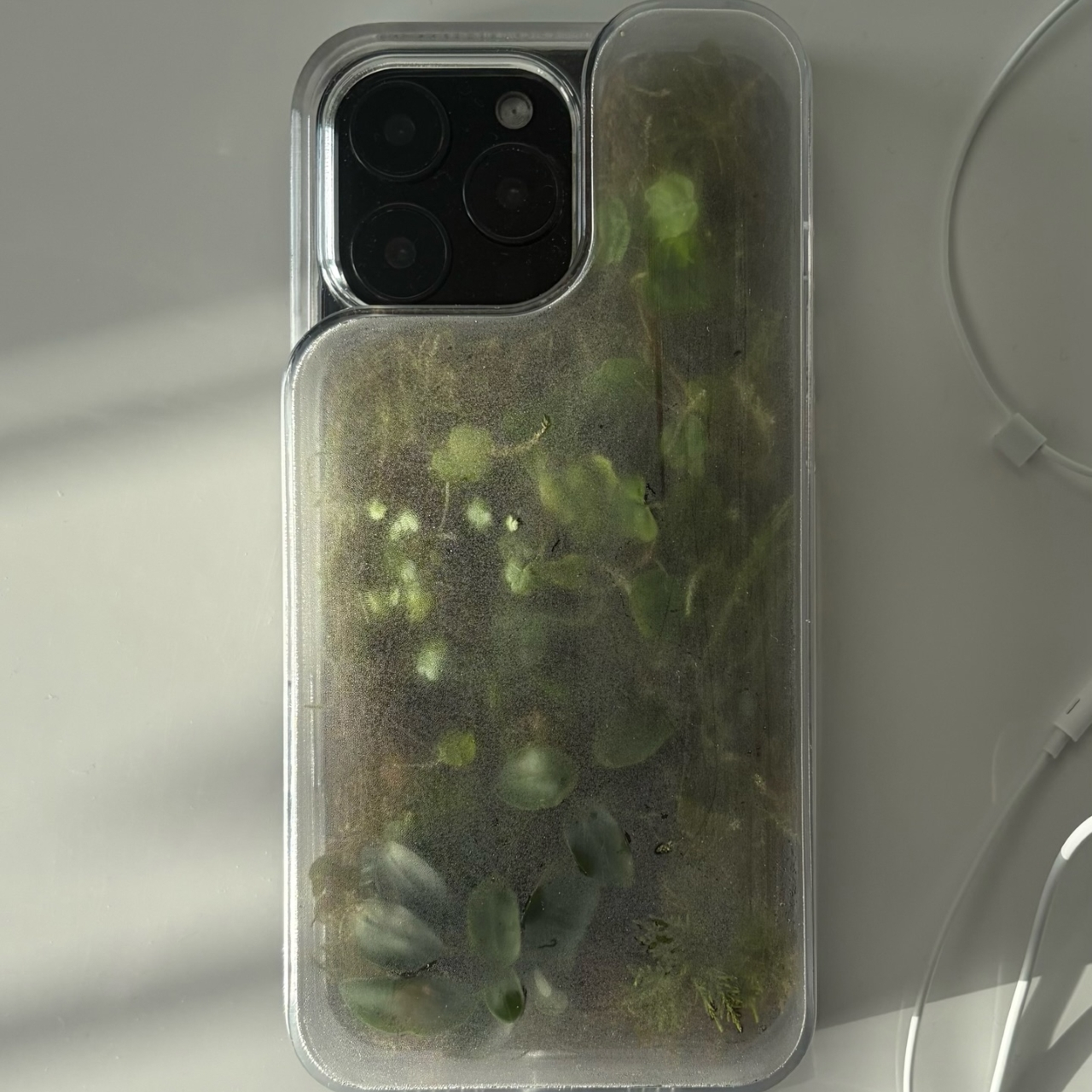
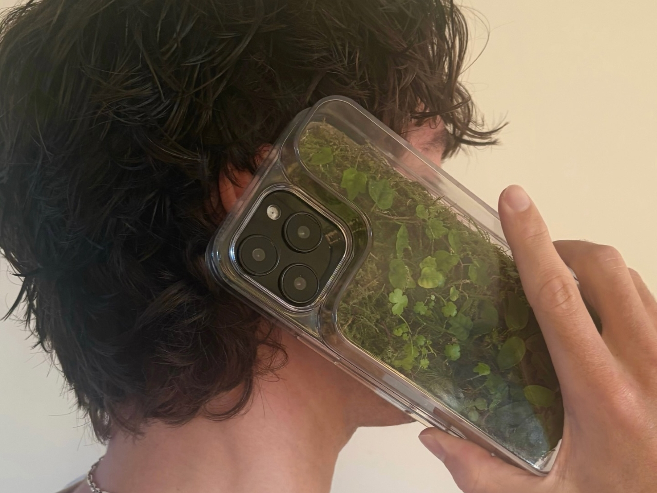
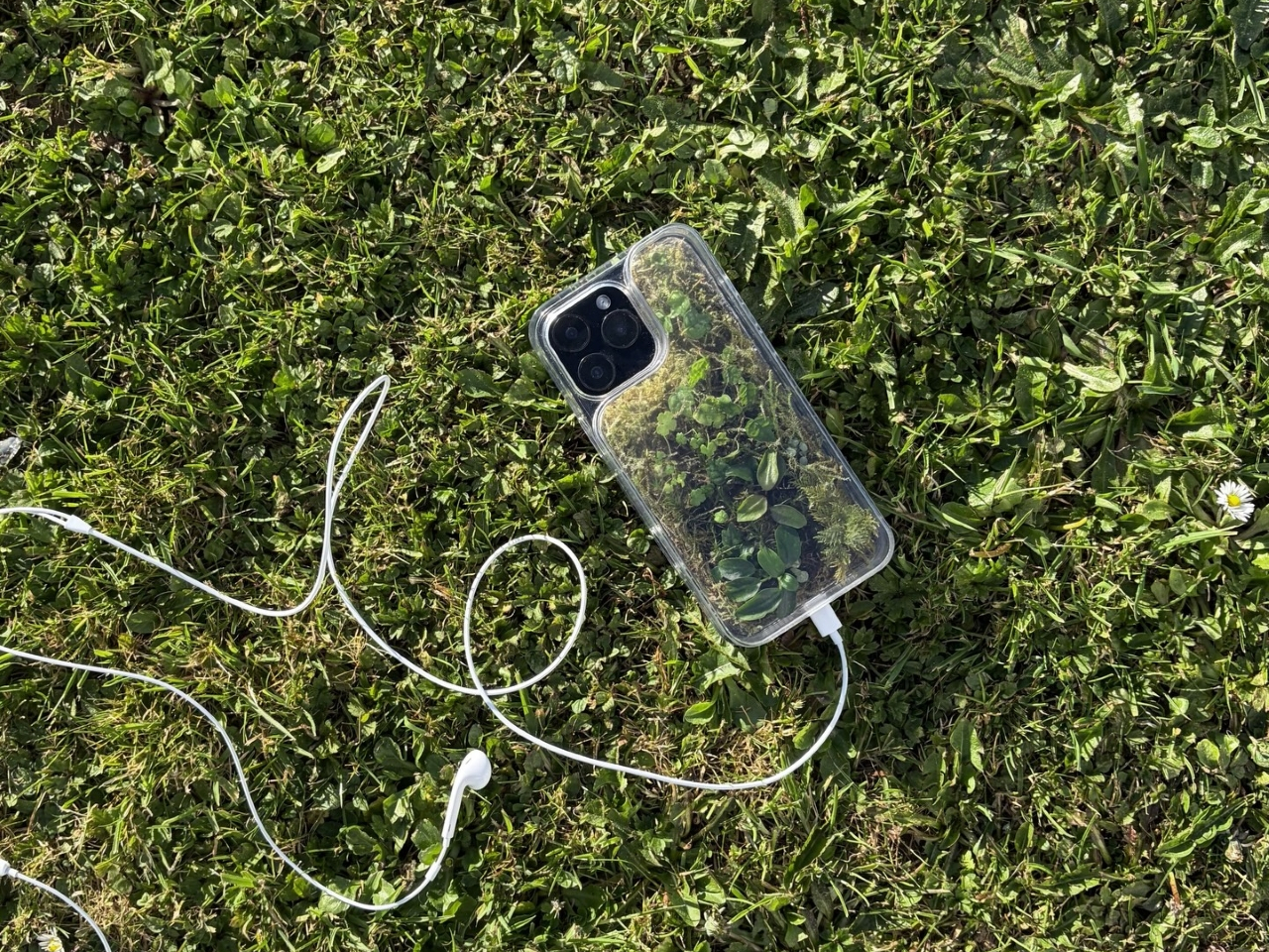
The Terrarium Phone Case is a clear resin case for the iPhone 16 Pro Max with an actual planted environment sealed inside the back cavity. Moss, small-leafed plants, and a stabilized soil substrate are embedded within the transparent shell, creating a thin cross-section of living terrain that you carry around with you wherever the phone goes. It’s a working phone case, a functional terrarium, and an oddly calming thing to have in your pocket all at once.

Designer: Daniel Idle

The construction involved 3D modeling and fabrication in clear resin, producing a case with enough depth in the back wall to house soil, roots, and plant matter. The plants are packed using a stabilized substrate that keeps the arrangement intact when the phone is picked up, rotated, tilted, or slipped into a bag. The camera cutout is fully preserved; the charging port at the bottom remains accessible; the phone continues to work exactly as it always did.

What keeps everything alive inside the sealed cavity is a closed-loop moisture system. The plants and soil generate humidity, which evaporates toward the inner surface of the resin, condenses back into droplets, and cycles down again. Light passing through the clear shell feeds the plants from outside, while the substrate provides gradual nutrient release. The whole thing is, in a fairly literal sense, a miniature ecosystem that sustains itself without any intervention from the person carrying it.

The condensation that forms on the inside of the shell during high-humidity moments is part of the visual appeal rather than a flaw to be engineered away. Seeing that vapor cycle through the case is a reminder that something in there is alive, actively breathing and responding to its environment, in the same pocket or bag as a device specifically engineered to minimize all biological interference.

There’s a running thread through design culture about bringing nature back into objects and spaces that have drifted too far from it. Biophilic design has become a recognizable term for everything from moss walls in offices to plant-filled shelving in apartments. Most of those applications treat plants as decoration layered on top of an existing design. Idle’s approach is different because the plant system isn’t decoration; it’s structural, sealed directly into the object’s body as a core component rather than an afterthought.

Of course, there will be some reservations about putting moisture and soil so close to your phone, which might be resistant to water and dust, but only from brief encounters. Good thing, then, that it’s still a concept project right now. But as a thought experiment about what a phone case could reasonably contain, it lands somewhere between genuinely novel and gently absurd, which is probably the most honest place for a good idea to start.

The post Phone Cases Are Boring, This One Puts a Living Terrarium Inside first appeared on Yanko Design.

  •  

This AC Does 5 Jobs at Once and Looks Like Furniture on Your Wall

The split air conditioner is one of the least loved objects in any home, which is a strange thing to say about something most people couldn’t live without. It works, technically, but it tends to make its presence known in all the wrong ways. The air is too direct, the noise is a constant background irritant, and the plastic box on the wall rarely belongs in any thoughtfully designed interior.

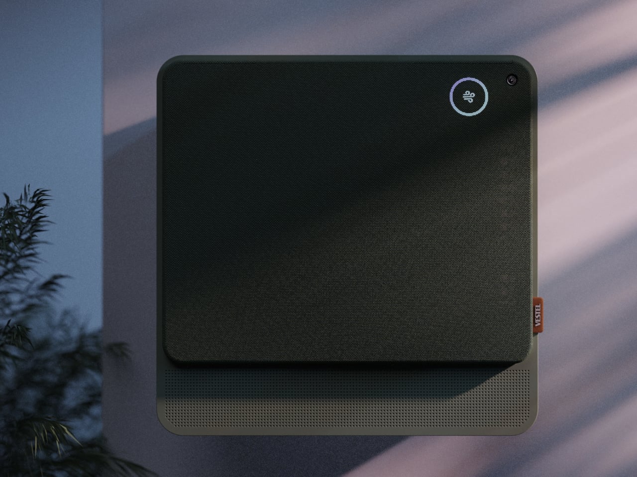
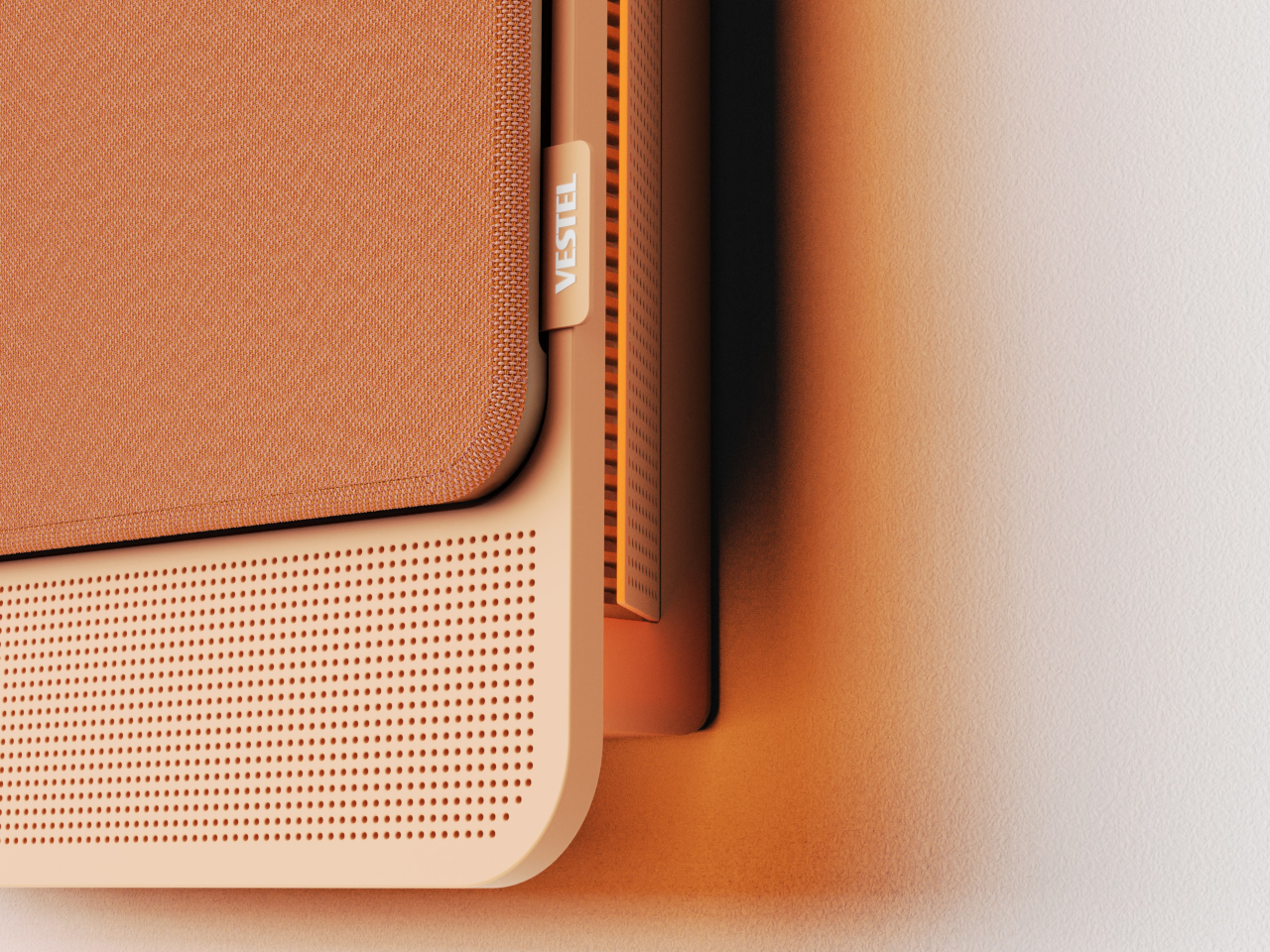
From that frustration comes WellFlow, a concept that reframes what air conditioning is supposed to do for the people living around it. Rather than engineering a better cooling box, the designers built something closer to a wellness device. It’s a concept that received validation through the iF Design Award in 2026 and was first revealed at IFA Berlin 2025.

Designer: Merve Nur Sökmen, Zehra Sarıarslan

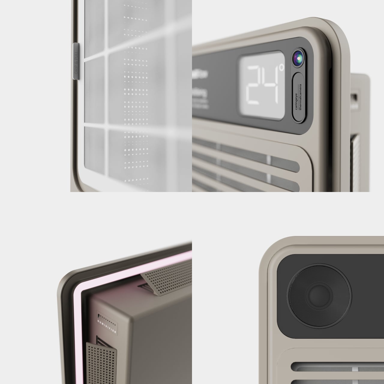
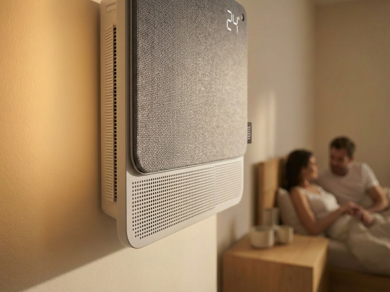
The most immediate shift is in how air actually moves. Conventional units push output in one direction, landing directly on whoever is in the room. WellFlow uses four-way diffusion to spread conditioned air from all sides without targeting anyone in particular. Sensors also monitor occupancy and steer airflow accordingly, so the unit quietly adapts to the room rather than expecting the room to tolerate it.

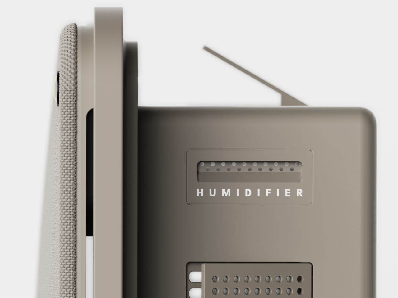
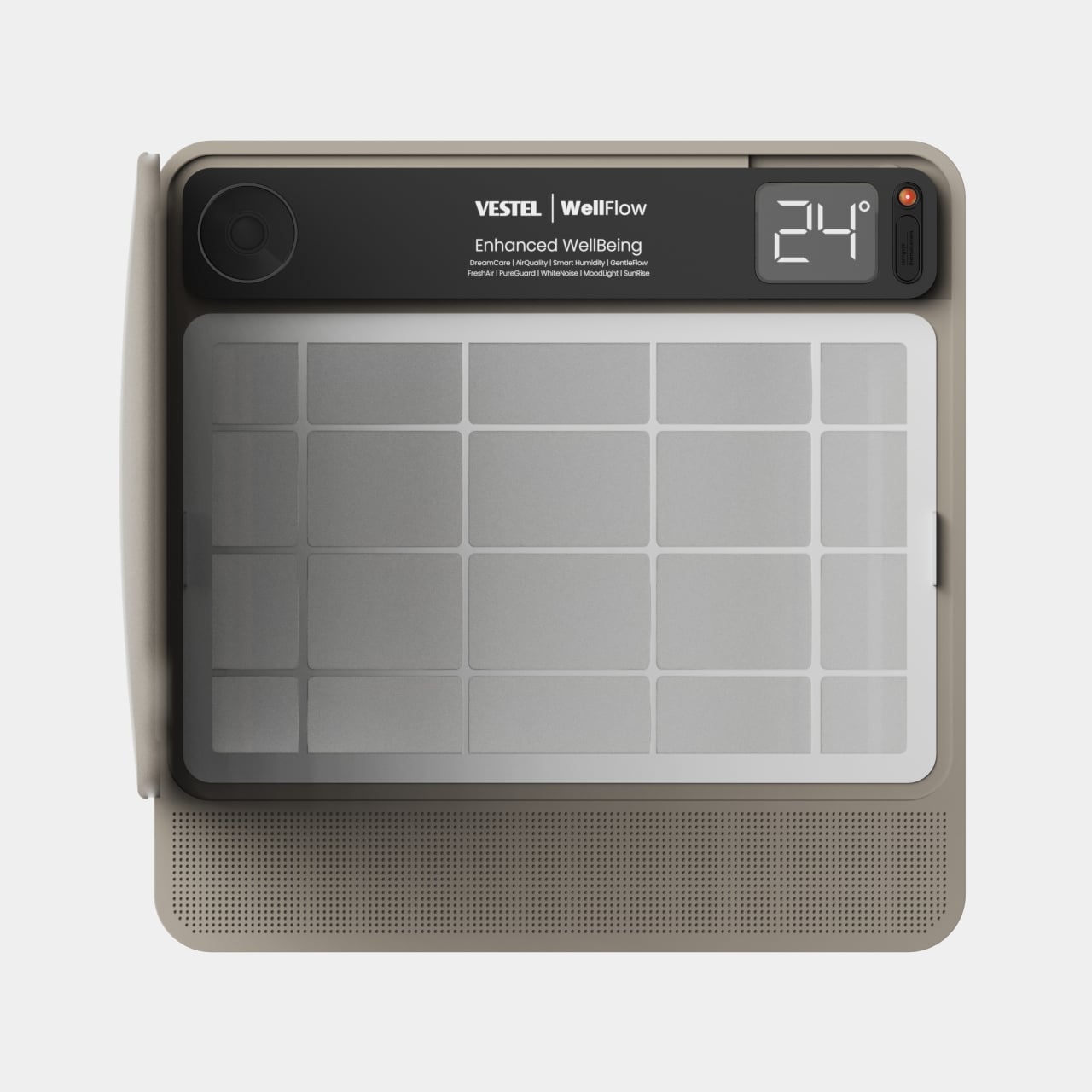
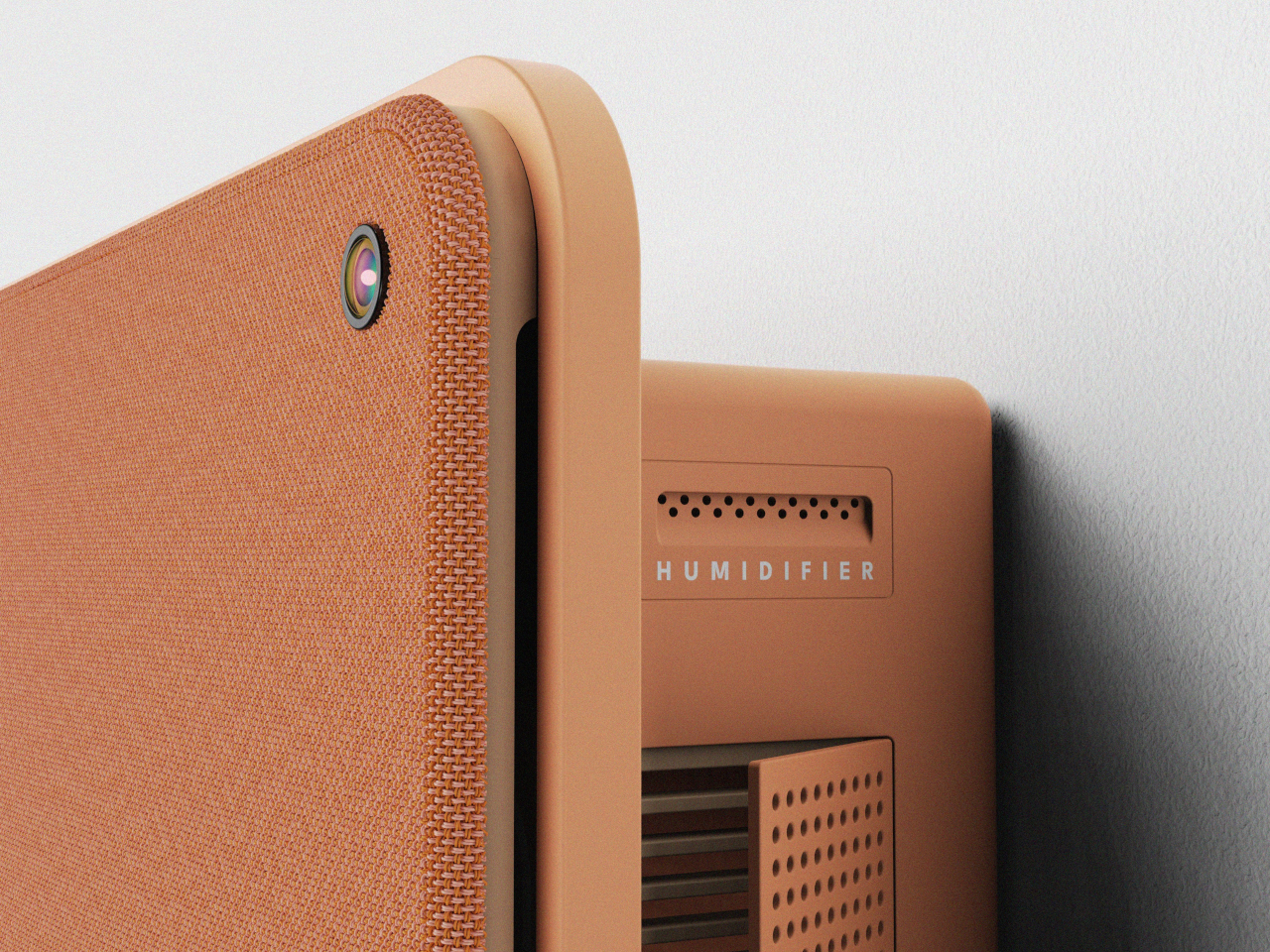
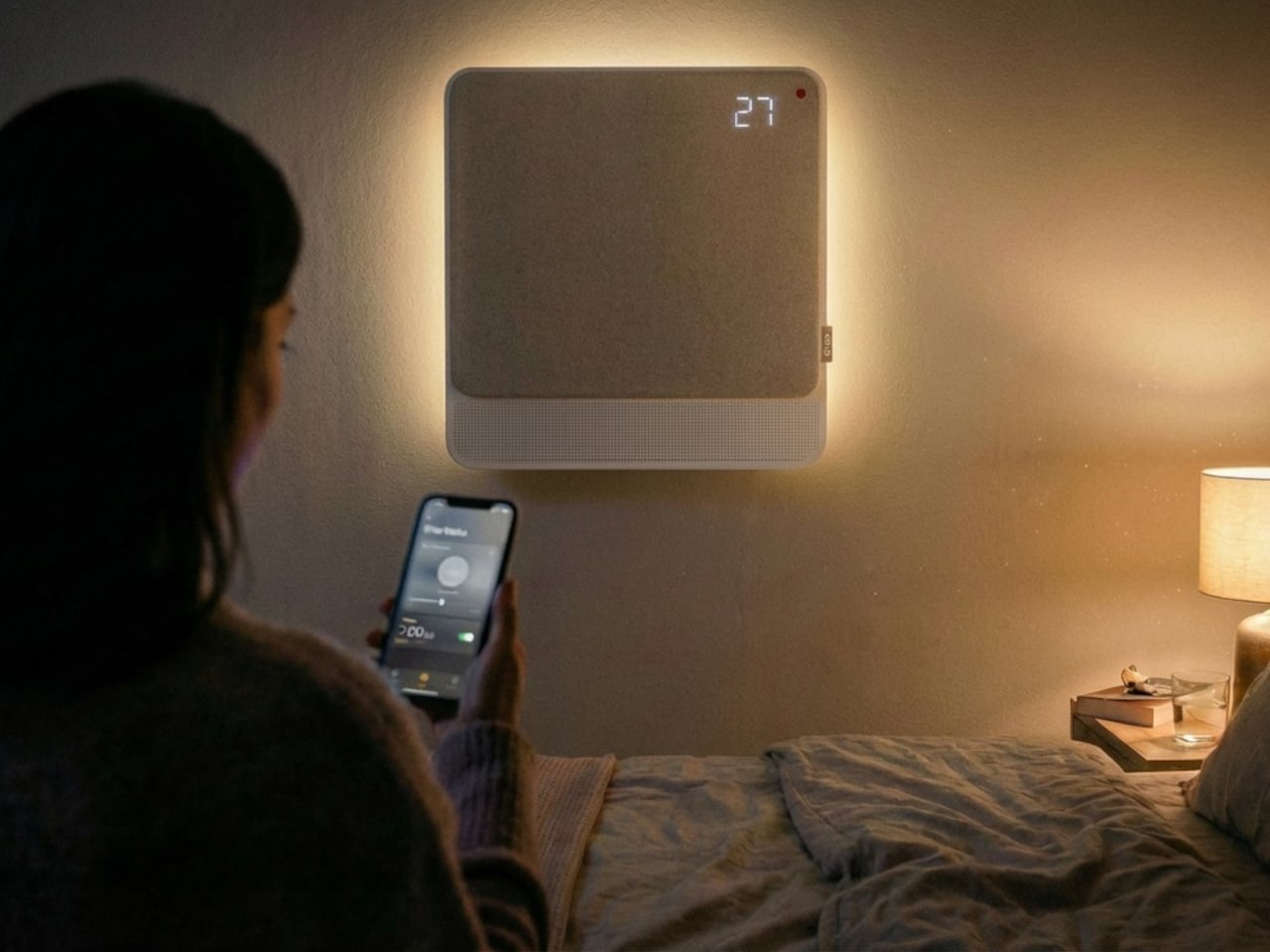
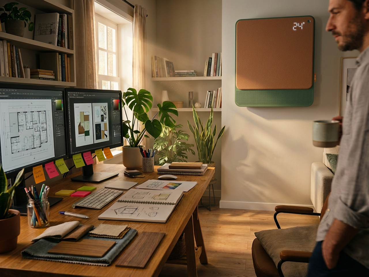
Beyond airflow, the system also handles humidity, air purity, ambient lighting, and sound. A built-in humidifier balances moisture levels rather than leaving the air artificially dry, which is one of the most common complaints about running a conventional unit through the night. Circadian lighting and integrated speakers complete the picture, creating conditions that support sleeping, concentrating, or quietly winding down, depending on what the moment calls for.

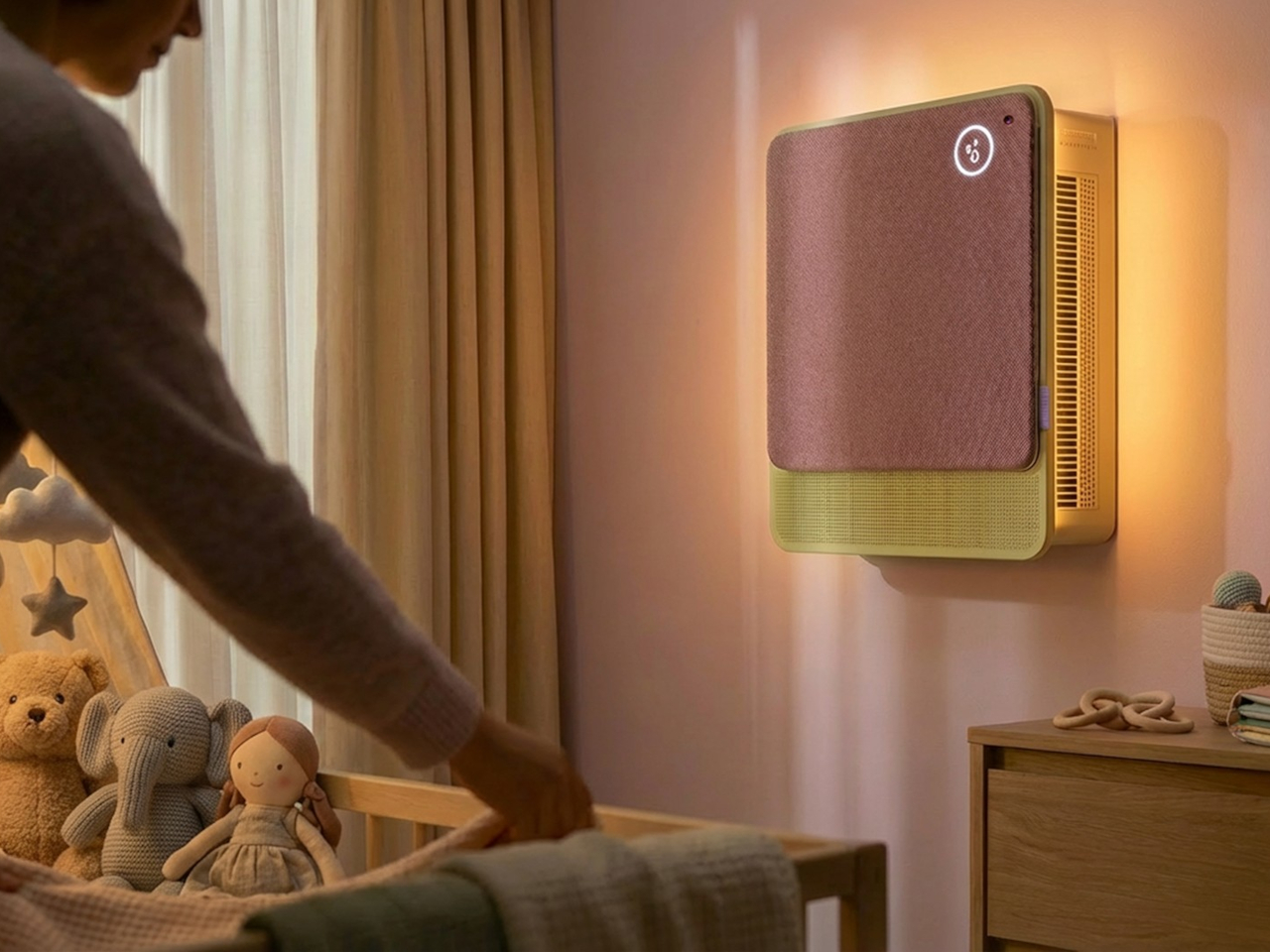
All of this adjusts automatically. The system continuously monitors temperature, humidity, and air quality, then fine-tunes its output without any manual input. A baby’s room needs different conditions than a home office or a gym corner, and WellFlow is designed to recognize those differences. Its behavior was shaped through user research spanning new parents, older adults, and people with respiratory sensitivities, groups that conventional air conditioners routinely fail to address.

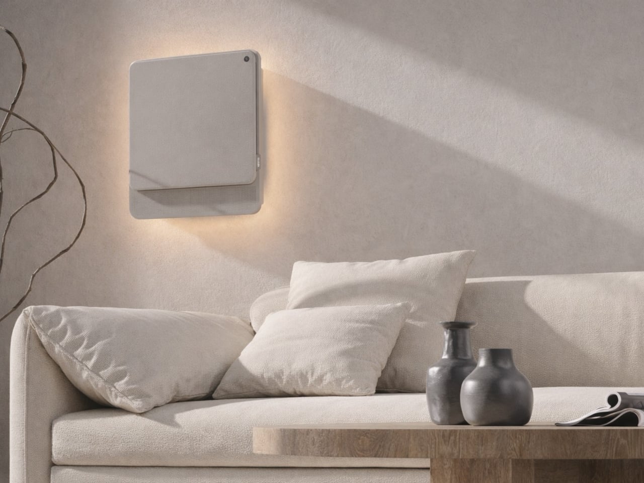
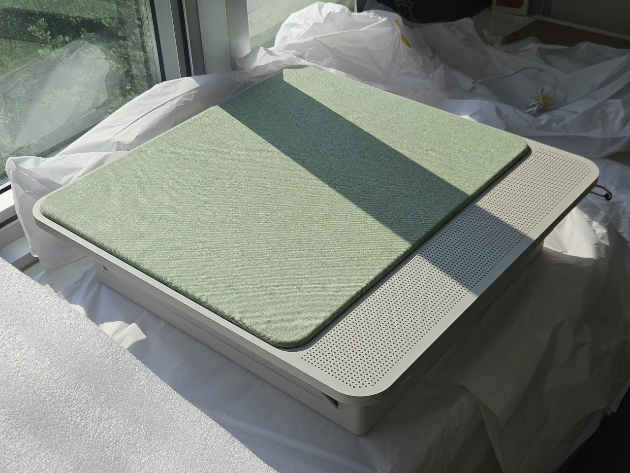
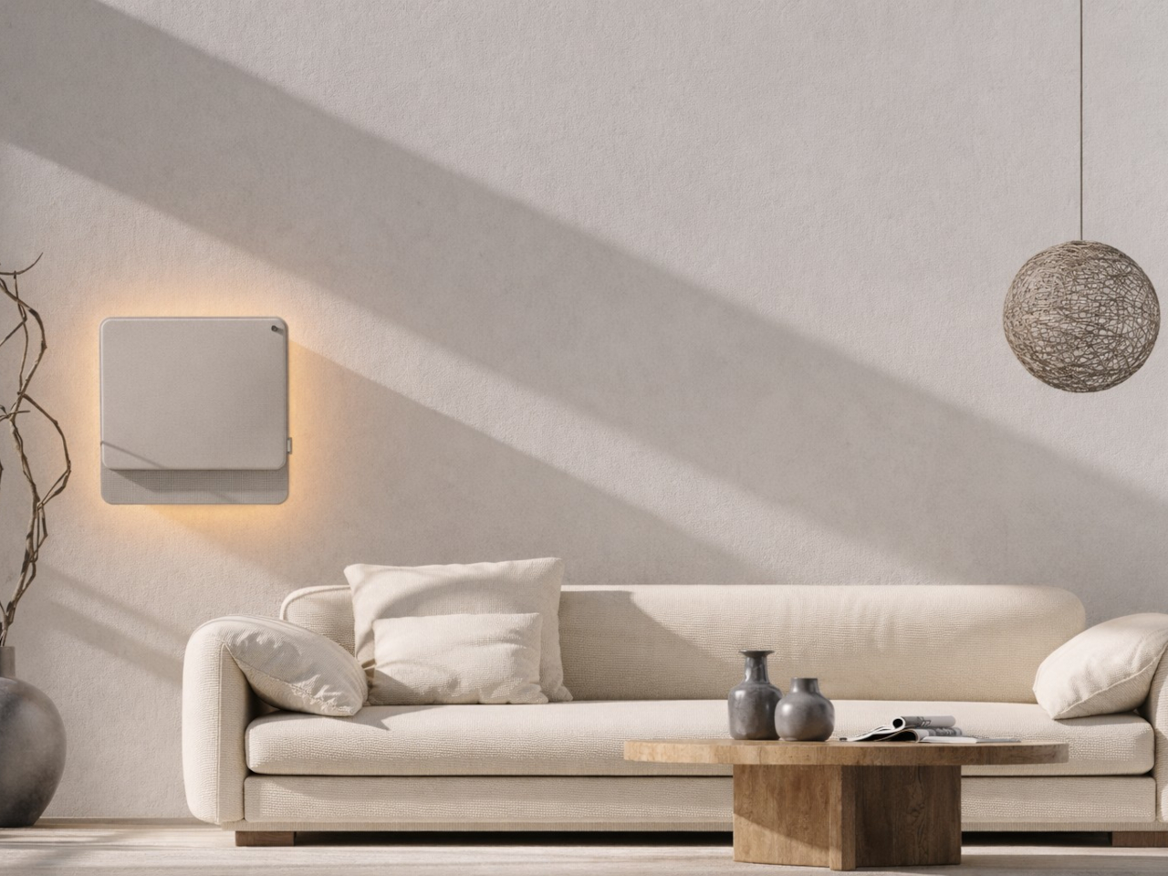
The physical form is just as deliberate as the behavior. Most air conditioners are conspicuously technical, with plastic housings that fight against any interior aesthetic. WellFlow uses a woven textile front panel with rounded corners and a matte finish, giving it a material quality far more associated with furniture than appliances. An ambient light halo behind the unit softly signals its presence on the wall without demanding any attention.

A pull-out front filter makes maintenance visible and intuitive, addressing something the design team identified as a recurring trust issue with conventional units. People often aren’t sure when or how to clean their filters, and that uncertainty quietly chips away at confidence in the device. WellFlow removes that ambiguity. For a machine designed around human comfort, even that seemingly small detail ends up mattering quite a lot.

The post This AC Does 5 Jobs at Once and Looks Like Furniture on Your Wall first appeared on Yanko Design.

  •  

Samsung Just Turned a Theme Park Queue Into a 3D Safari, No Glasses

Waiting in line at a theme park is one of those unavoidable experiences that nobody designs for enthusiastically. The physical infrastructure exists, the rope lines are laid out, and in the best-case scenario, there’s some signage or ambient music to occupy the time. But the queue is fundamentally dead space, a stretch of minutes that happens before the experience begins rather than as part of it. That’s a design problem, and most parks accept it as one that can’t really be solved.

Samsung’s Spatial Signage installation at Everland in South Korea offers a different answer. At the newly renovated Safari World: The Wild attraction in Yongin, the company installed its glasses-free 3D display directly in the queue area, where life-scale tigers and lions appear to surge toward visitors without so much as a pair of 3D glasses required. The wait effectively becomes the opening act.

Designer: Samsung

The technology making that possible is Samsung’s patented 3D Plate system, which uses binocular parallax to deliver separate images to each eye, tricking the brain into perceiving depth the same way it does when looking at real objects at real distances. Unlike the boxy, space-hungry installations that most 3D signage has historically required, the Spatial Signage display slots into the queue corridor in an 85-inch, portrait-oriented panel with a 52 mm profile. There’s nothing protruding into the space, and no hardware for visitors to interact with.

The content for the Everland installation was developed by Klleon, whose team prioritized capturing the natural movement rhythms of the animals rather than exaggerated cinematic effects. The result is a quality of realism that works specifically because of the environment: a queue is typically a narrow, enclosed space where visitors are already looking forward and standing relatively still, which happens to be exactly the viewing geometry where the 3D depth effect lands best.

What that means practically is that the queue line stops being something guests endure and starts being something they talk about. Anticipation for an attraction is one of the least exploited moments in the theme park visit. Visitors heading toward Safari World already have the right frame of mind for a wildlife encounter, and the display capitalizes on that readiness by delivering a preview of that encounter before anyone boards a vehicle or rounds a corner.

The broader implication is about how display technology fits into destination entertainment design. For years, attractions have used projection mapping, animatronics, and theatrical sets to build immersion during rides and shows, but the queue almost always remains a visual afterthought. A display that can occupy a narrow corridor at wall depth, require no headgear, and show content at true-to-life scale without any spatial awkwardness changes what’s possible in that format.

Everland isn’t a retail shelf or a shopping center atrium. The animals aren’t selling anything. They’re there because a flat screen in that corridor would register as background noise, and a three-dimensional tiger at eye level does not. That distinction, between content that is present and content that actually commands attention, is the problem Spatial Signage was built to solve, and the queue turned out to be a rather fitting test.

The post Samsung Just Turned a Theme Park Queue Into a 3D Safari, No Glasses first appeared on Yanko Design.

  •  

The TrackPoint Was Always Laptop-Only, This $52 Bean Changes That

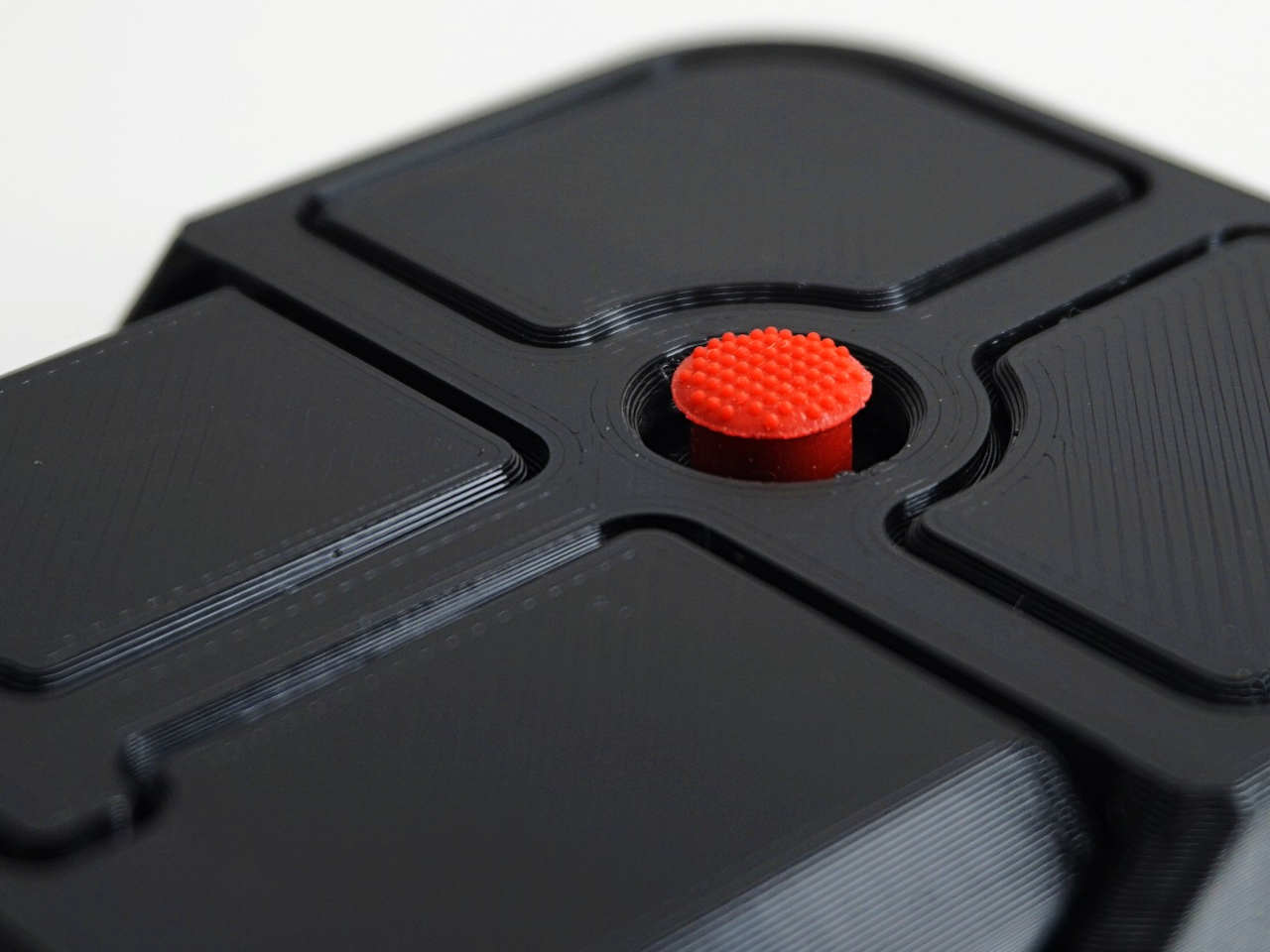
The pointing stick is one of the more divisive input devices in computing history. Lenovo’s TrackPoint has a devoted following, built around people who never want to lift their hands off the keyboard home row just to move a cursor. Everyone else finds the red nub somewhere between baffling and genuinely annoying. Either way, it has stayed locked to laptop keyboards for decades, with essentially no standalone options available.

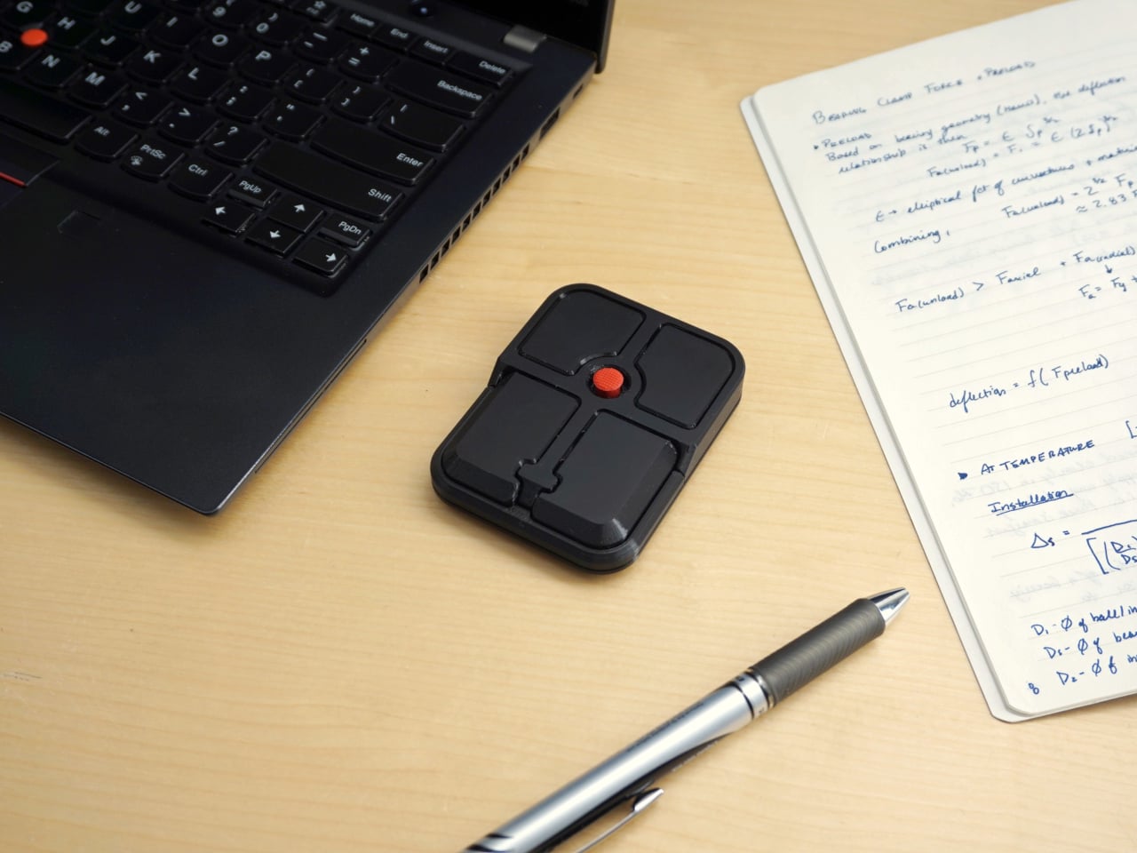
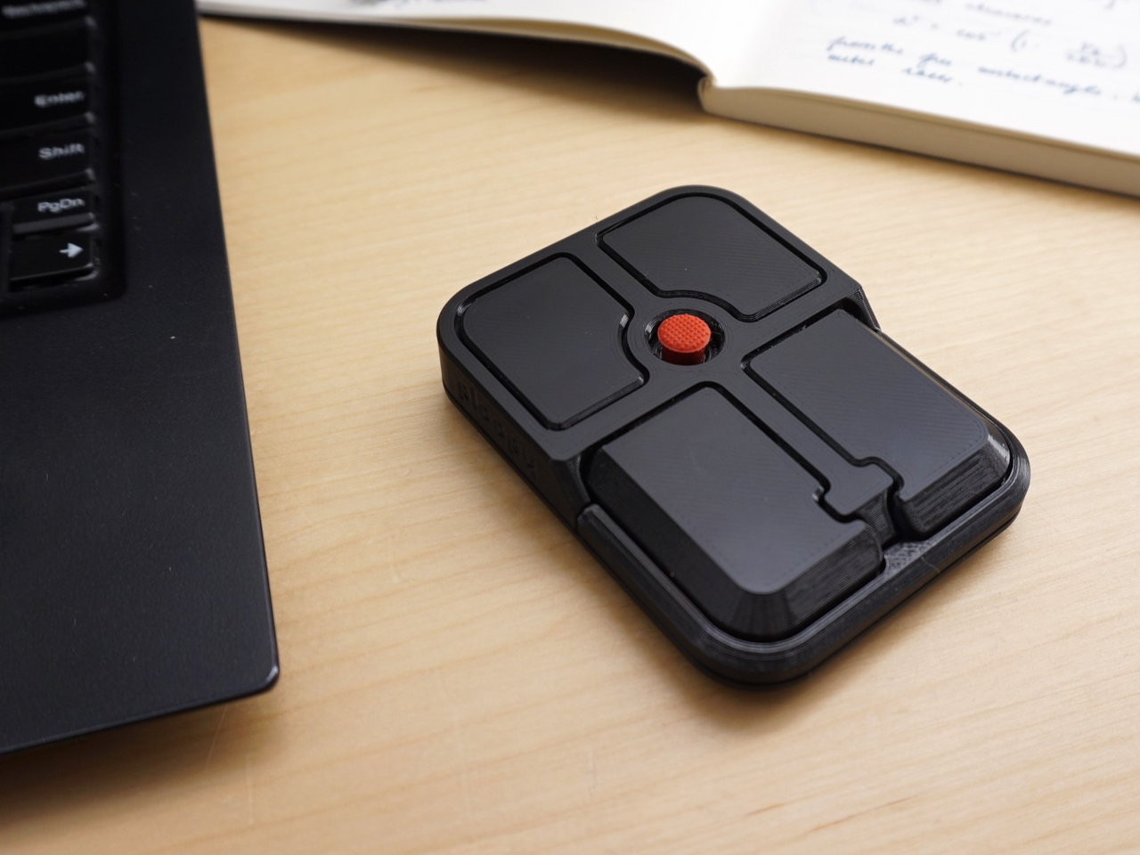
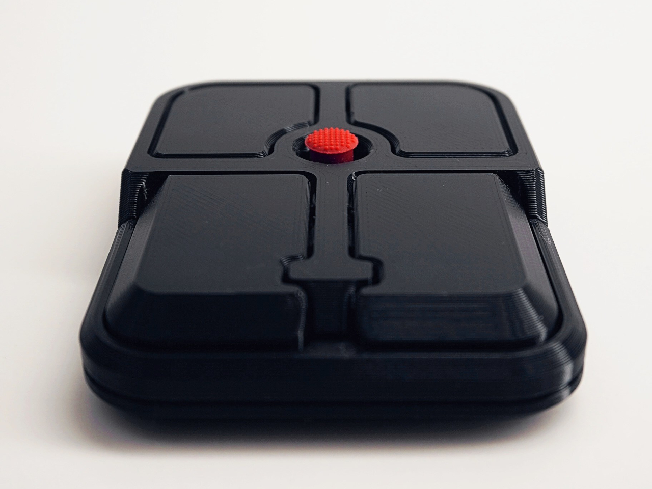
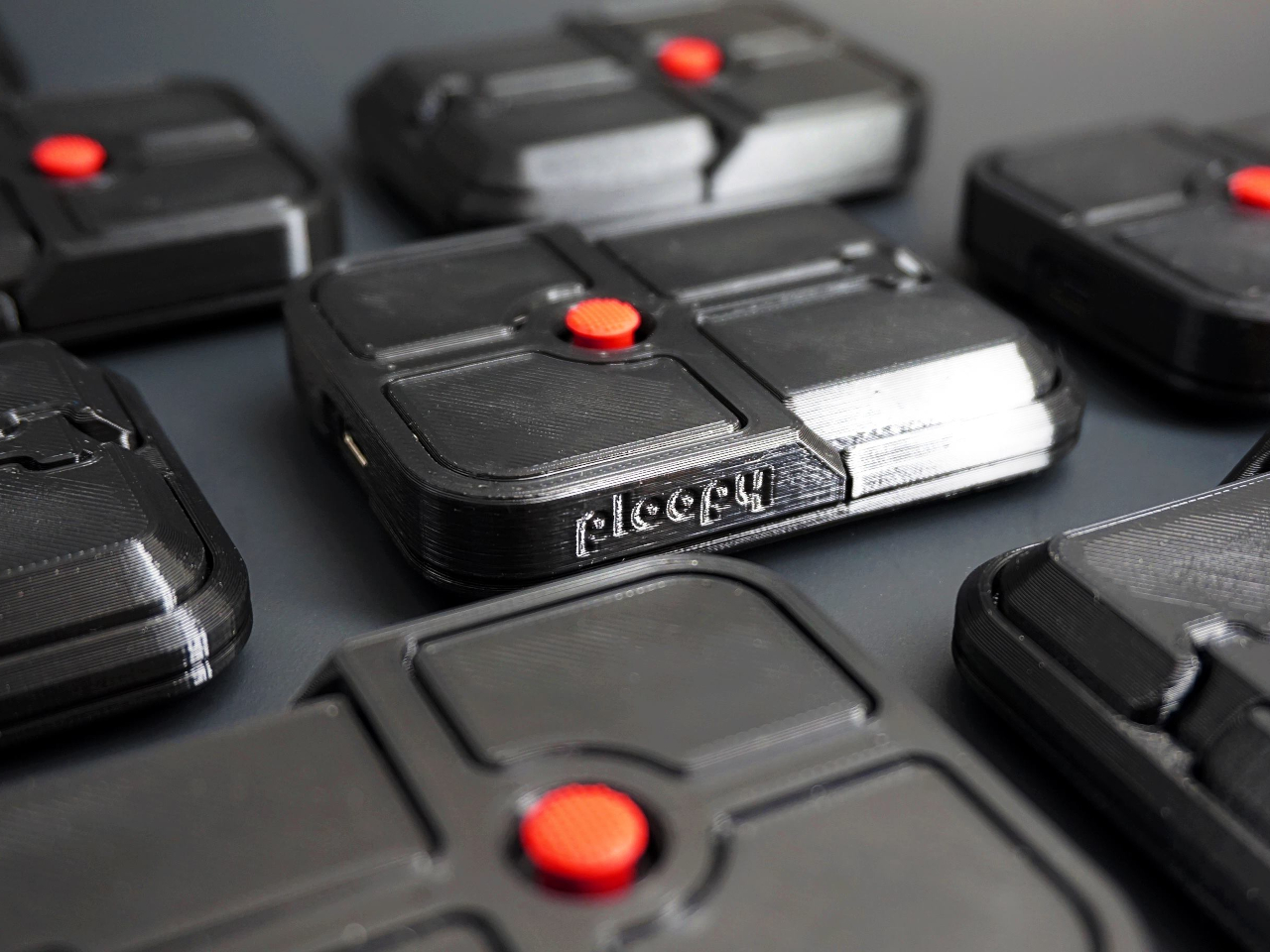
Ploopy, the Canadian open-source hardware company known for its lineup of trackballs and trackpads, has changed that with the Bean. It’s a standalone external pointing stick that connects over USB-C and sits flat on a desk. Think of it as a TrackPoint you don’t have to buy a ThinkPad to access, with a few deliberate improvements added to address the weaknesses that nub has always had.

Designer: Ploopy

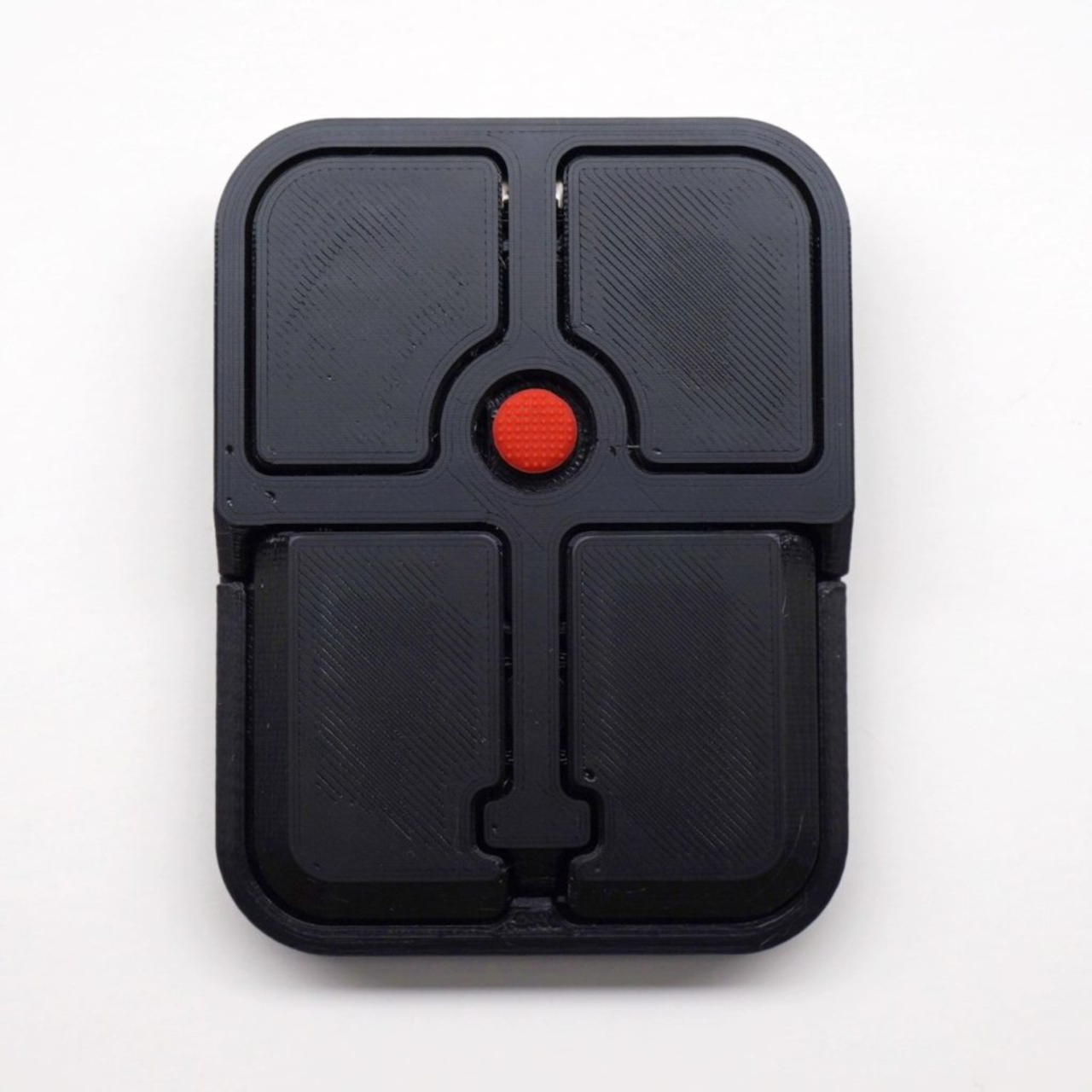
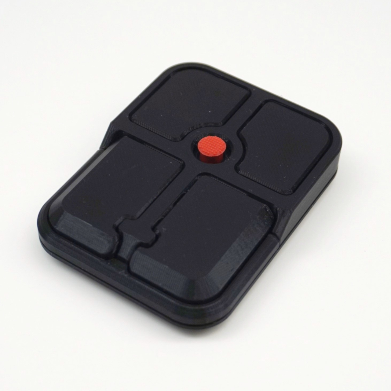
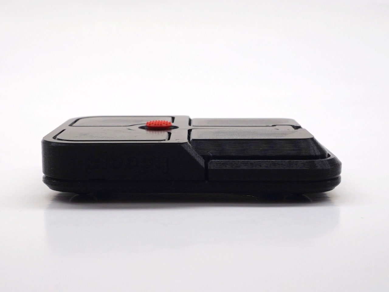
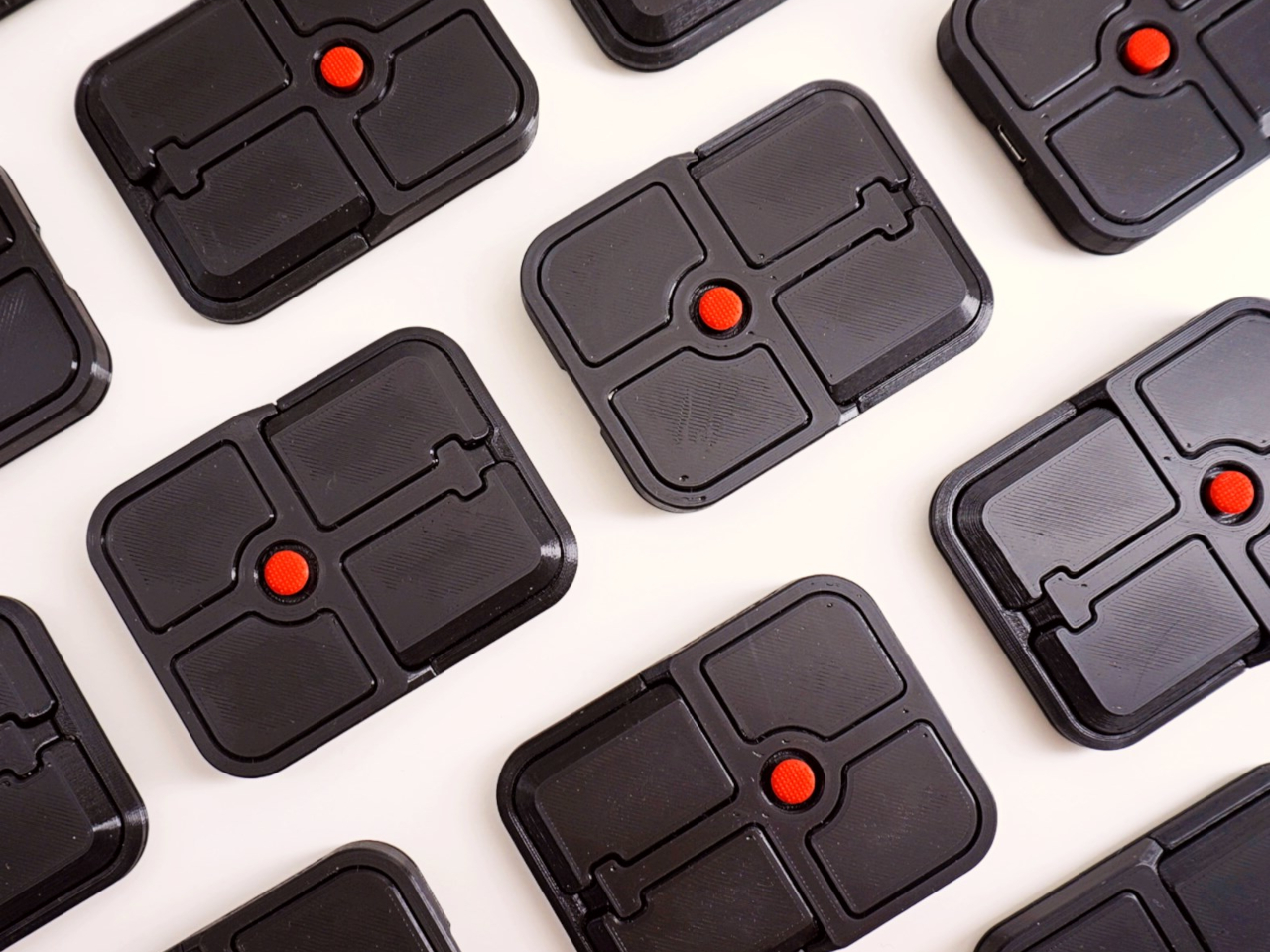
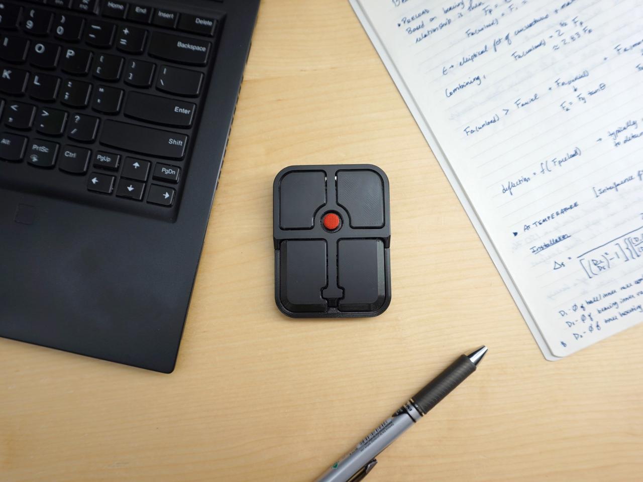
The Bean measures 84mm x 64mm x 16mm and houses a red pointing nub near the center of its flat, 3D printed case. Unlike the fixed nubs built into laptop keyboards, this one has additional travel in its movement, which Ploopy says helps reduce fatigue from pushing a stiffer stick over long sessions. Four buttons flank the nub, covering the standard left, right, middle click, and scroll by default.

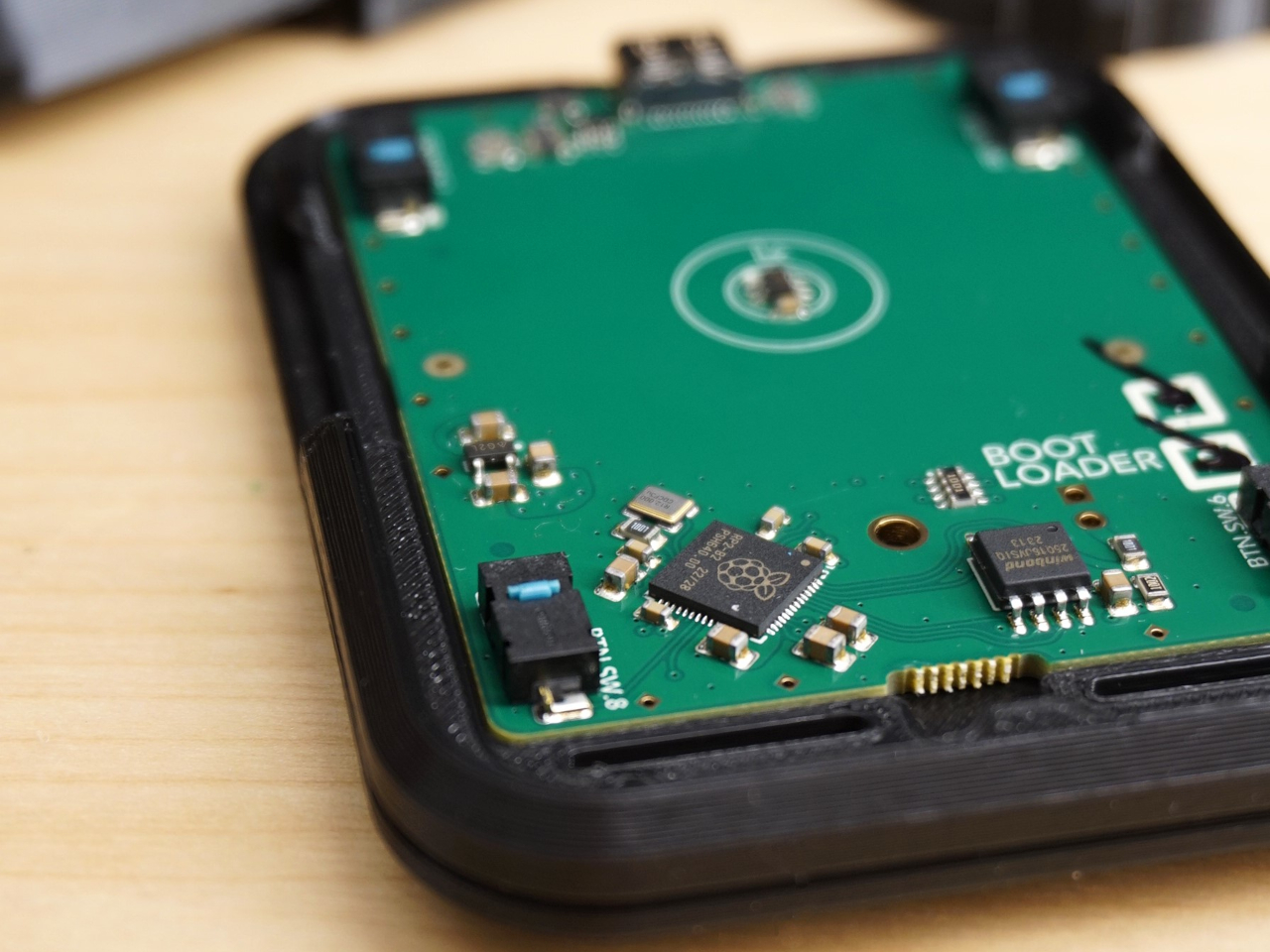
None of those defaults is locked in. The Bean runs QMK open-source firmware on a Raspberry Pi RP2040 microcontroller, and remapping any of the four Omron D2LS-21 buttons takes just a few minutes using the free VIA web app. There are no drivers to install and no proprietary software to deal with, just a browser-based tool that reads the device and lets you assign functions however you like.

For anyone who finds the conventional mouse hard on their wrist, or simply prefers keeping their hands positioned in front of them rather than reaching out to one side constantly, a pointing stick can make a noticeable difference over long sessions. You nudge the nub, and the cursor moves without your palm going anywhere. It’s a small thing until it isn’t, especially for people managing repetitive strain concerns.

Like everything else Ploopy makes, the Bean is completely open source. Hardware design files and firmware are both on GitHub, so anyone who wants to print their own case, modify the button layout, or write custom firmware from scratch has everything they need to do it. That kind of transparency is unusual for any consumer input device and puts Ploopy in a different category from virtually every competitor.

The Bean is available now for $70 CAD (around $52 USD), which is reasonable for a device with this much flexibility built in. It isn’t going to pull in anyone who has never thought about pointing sticks before, but for the enthusiast crowd that has been waiting for a standalone option this customizable and this open, it’s about as close to a purpose-built answer as anyone has delivered.

The post The TrackPoint Was Always Laptop-Only, This $52 Bean Changes That first appeared on Yanko Design.

  •  

A Mouse You Can Squeeze Like a Stress Ball While You Work

The computer mouse hasn’t changed much in decades. Still mostly hard plastic, still shaped like a bar of soap, still asking your hand to grip something that gives absolutely nothing back. The rest of the desk setup has evolved, ergonomic chairs, standing desks, wrist rests, but the one device your hand touches for eight hours straight has remained stubbornly rigid and deeply uninteresting.

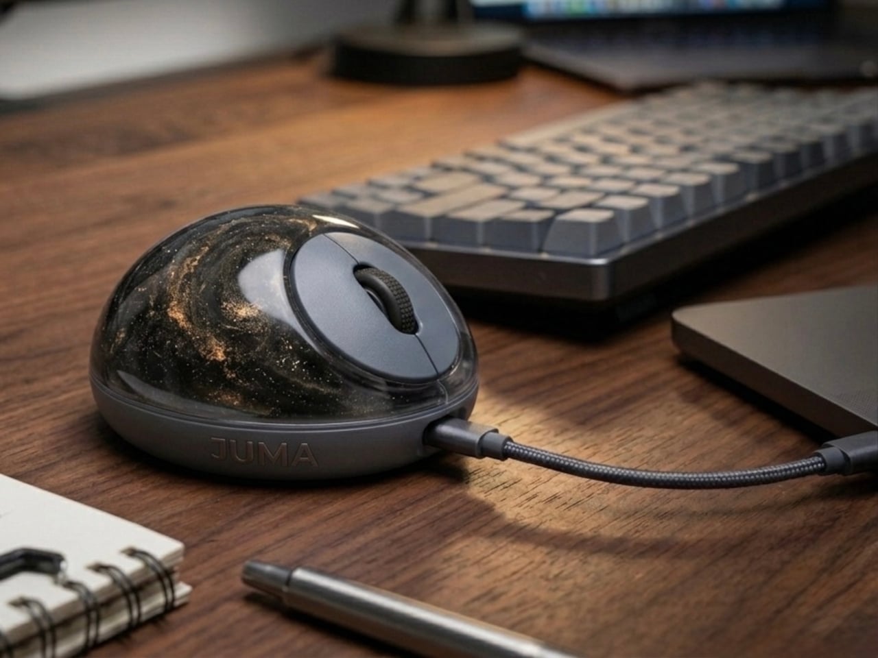
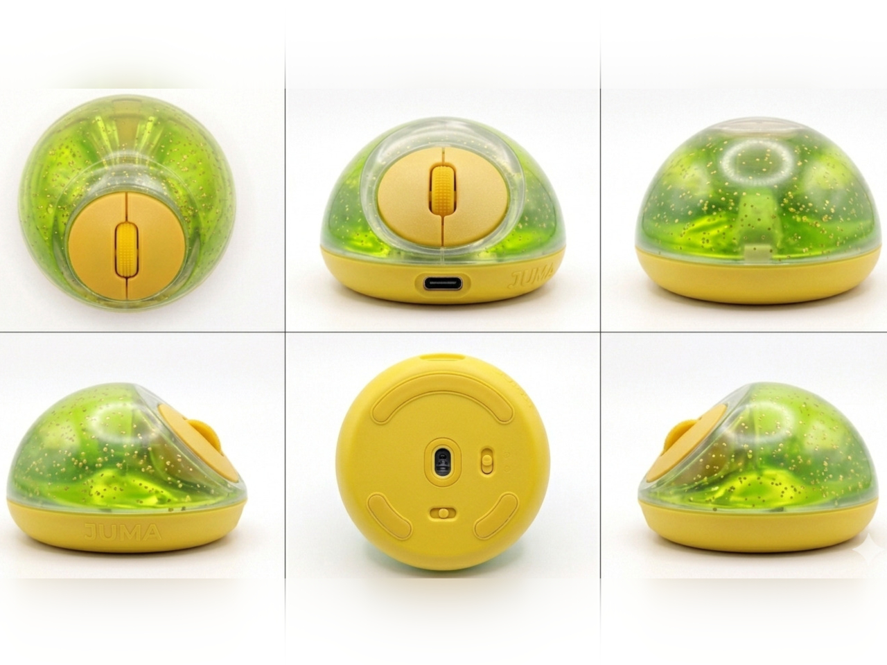
The PILLIGA mouse concept makes a fairly obvious argument for why that should change. Instead of hard plastic, the entire upper chassis is a squishy, flexible membrane packed with a viscous, translucent gel. It’s the same basic impulse that makes people reach for a stress ball mid-meeting, except it’s also the thing you need to get any work done.

Designer: Guillermo Gonzalez

The thinking behind it is straightforward enough. Deadline pressure builds, calls run long, and the urge to fidget becomes almost impossible to ignore. Rather than keeping a stress ball in the desk drawer as a separate ritual, the mouse folds that habit directly into the tool that’s already in your hand. You can squeeze, press, or knead the gel without ever lifting your hand off your workflow.

The dome shape isn’t just for show, either. It follows the natural arch of your palm rather than forcing your hand flat against a hard surface, and the gel underneath absorbs the kind of low-level muscular strain that builds up quietly over hours of clicking and scrolling. It’s the sort of ergonomic consideration that usually requires its own dedicated accessory, not just a different material.

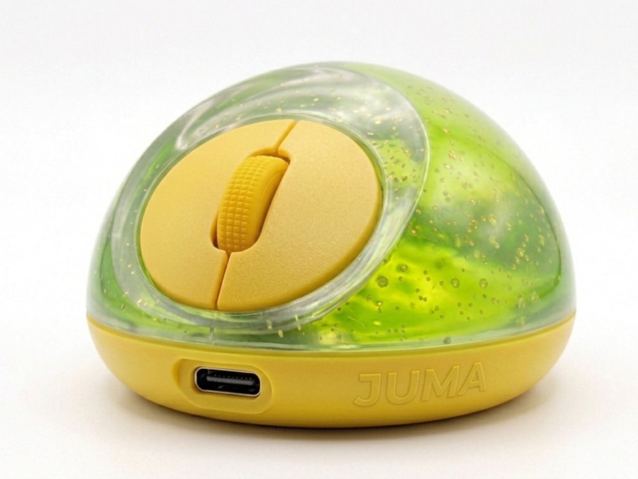
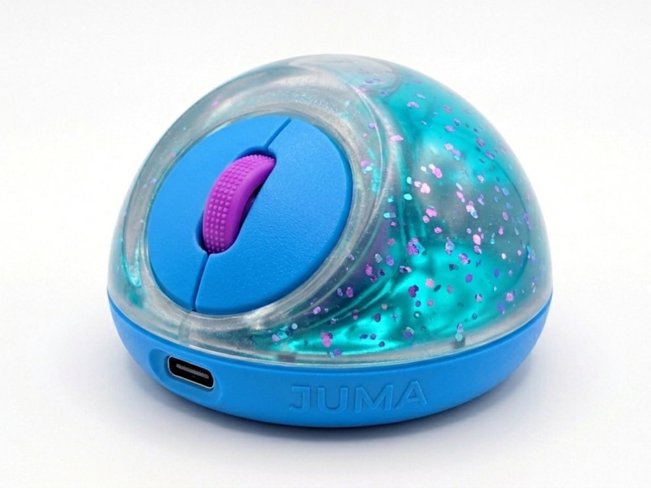
The controls themselves are sensibly laid out. A flat circular interface sits embedded in the front of the mouse, cleanly split for left and right clicks, with a textured, rubberized scroll wheel running between them. A USB-C port at the front handles charging, keeping the wireless design intact without the inconvenience of a separate charging dock. The bottom carries the optical sensor and power switch.

What makes the PILLIGA mouse concept genuinely interesting is how far it extends color as a design element. The gel comes in several variants, from vivid green with gold flecks and a blue version scattered with purple glitter, to darker, more subdued options that look considerably more at home on a professional desk. Each colorway pairs with a matching base and click interface, making the whole thing feel deliberate.

That range matters. The more reserved colorways hint that this isn’t a novelty item for a niche corner of the internet; it works just as comfortably on a professional desk as it does on a creative’s workstation. The gel doesn’t make it look cheap. It makes it look like something designed by someone who gave serious thought to what a mouse should feel like.

Concepts like the PILLIGA are more useful as provocations than promises. Computer mouse design has been coasting on the same assumptions for decades, and the idea that your primary input device could also be physically satisfying to hold hasn’t come up often enough. The gel-filled body raises the question, and that’s honestly more than most peripheral design manages to do.

The post A Mouse You Can Squeeze Like a Stress Ball While You Work first appeared on Yanko Design.

  •  

This 3D-Printed Lamp Has a Shell That Opens and Closes to Shape Light

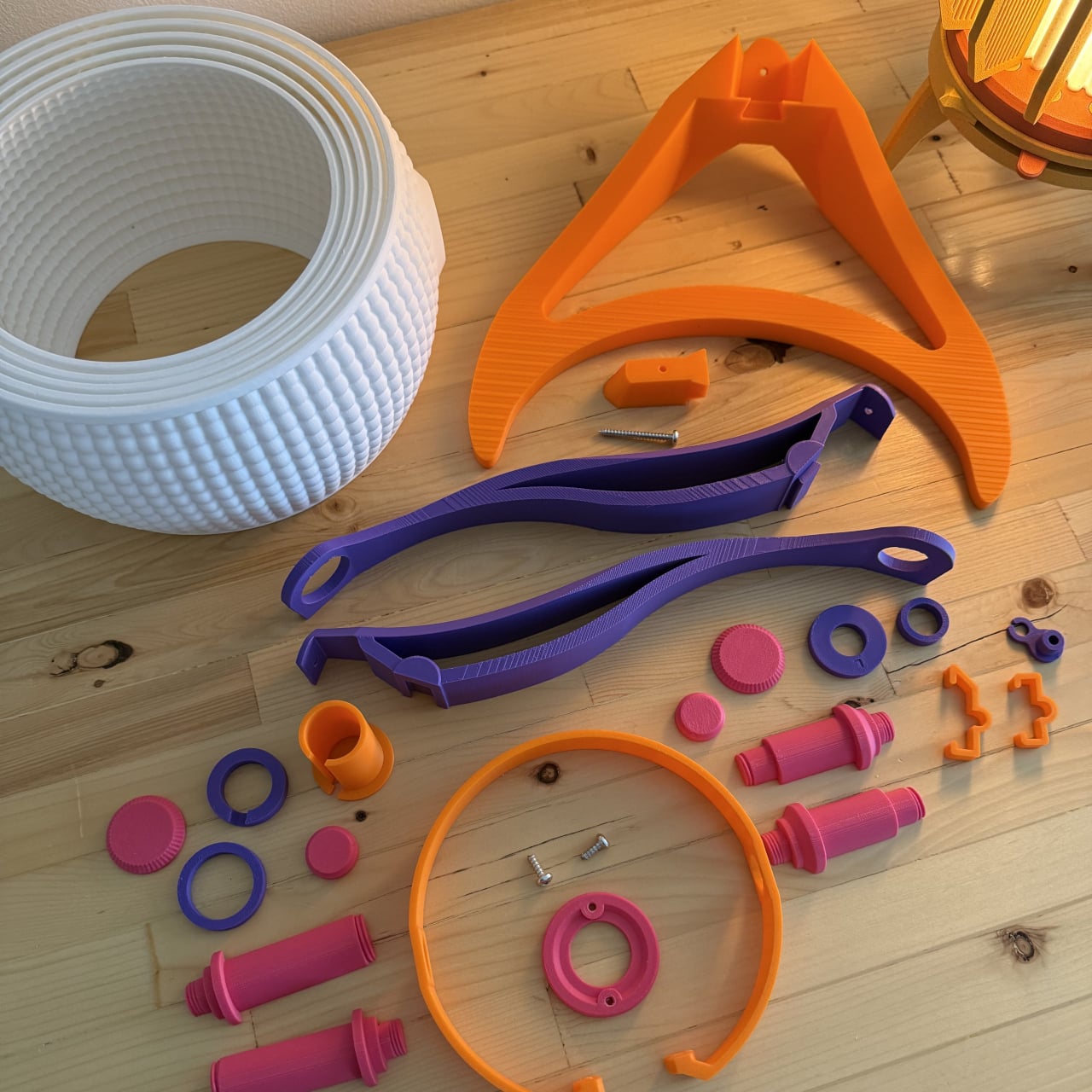
The 3D printing community has spent years trying to prove that a printer can produce more than desk trinkets and cable organizers. Lighting has always been the harder sell, where aesthetics and function have to work together in ways that cheap plastic usually undermines. The better designers in that space have been quietly closing that gap, and the results are starting to look like things you’d want to live with.

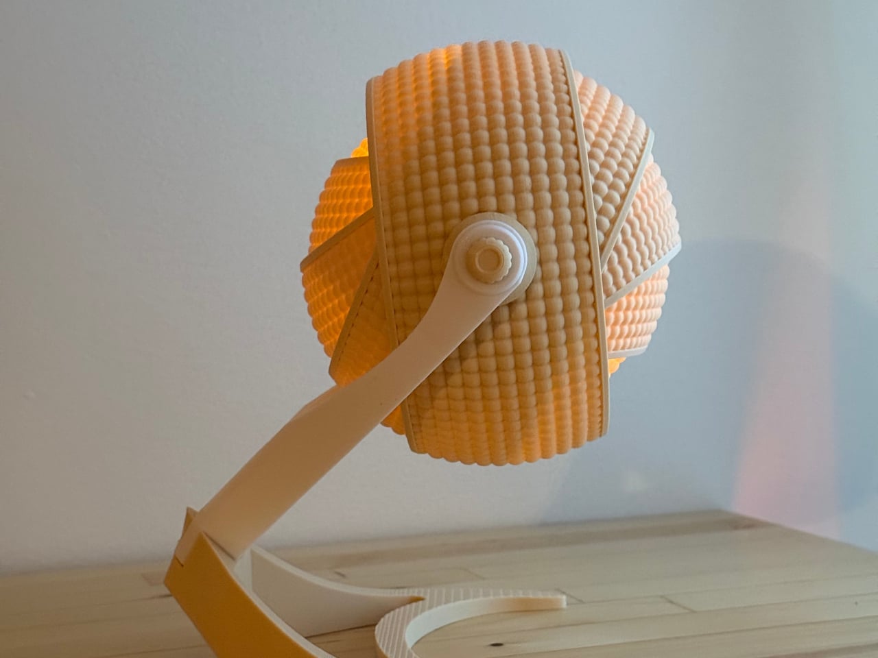
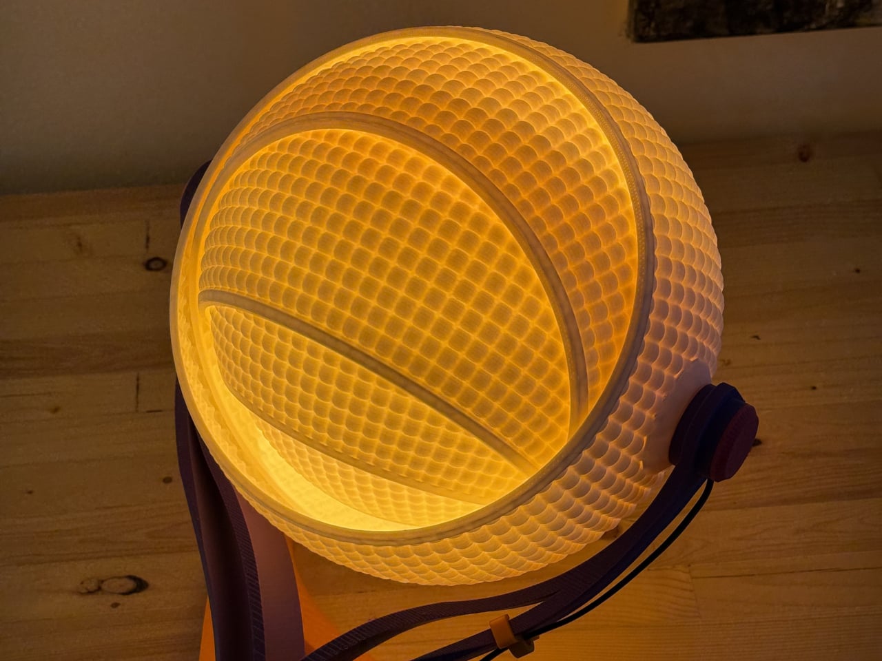
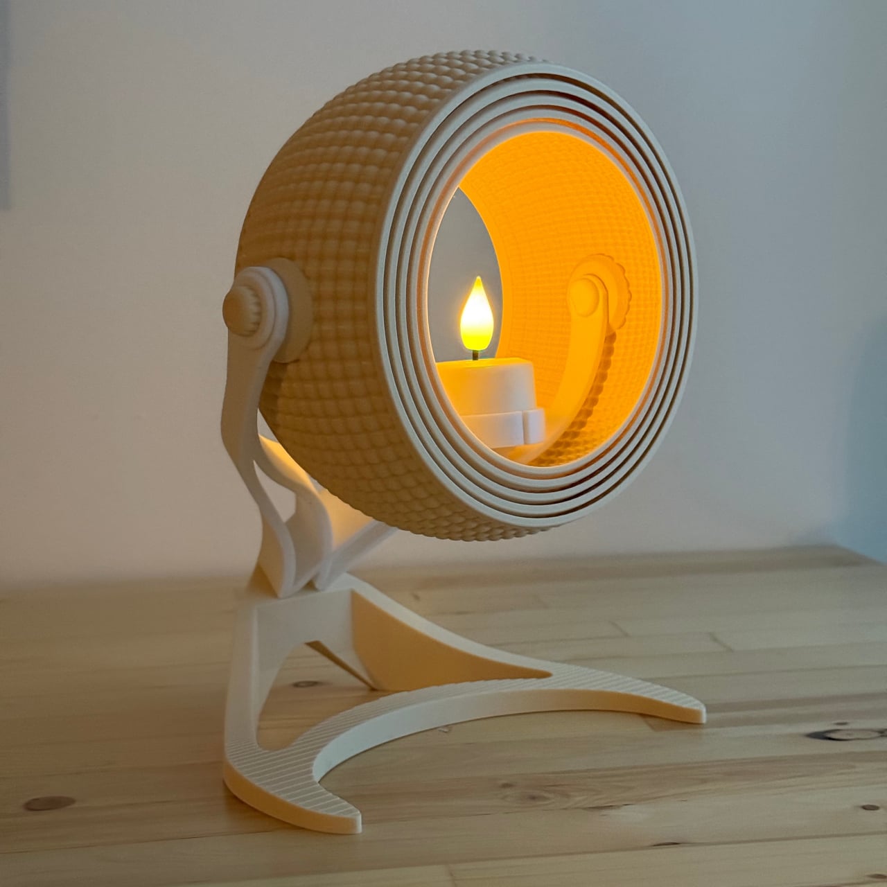
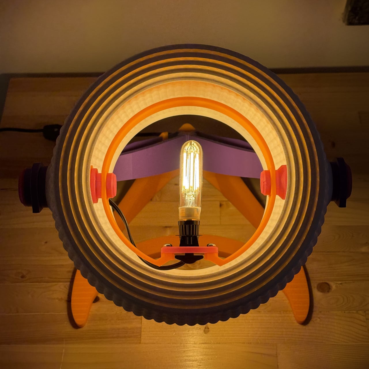
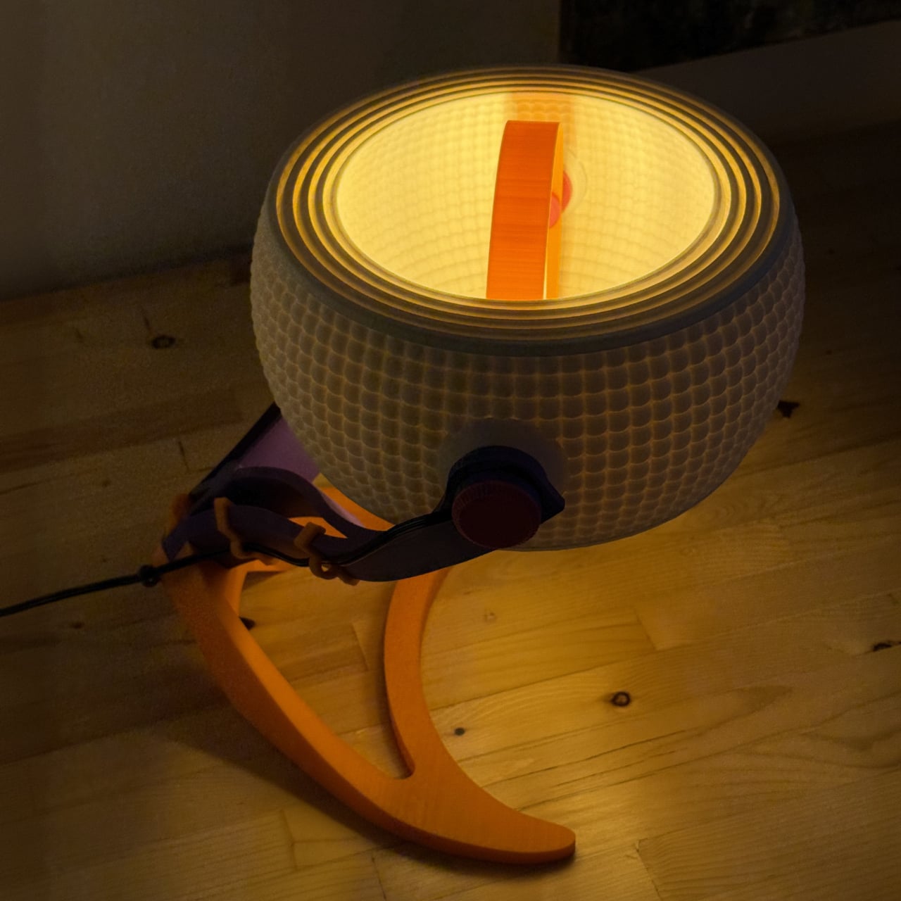
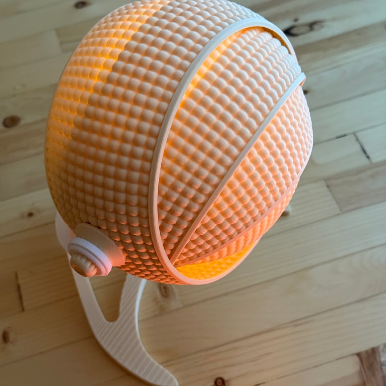
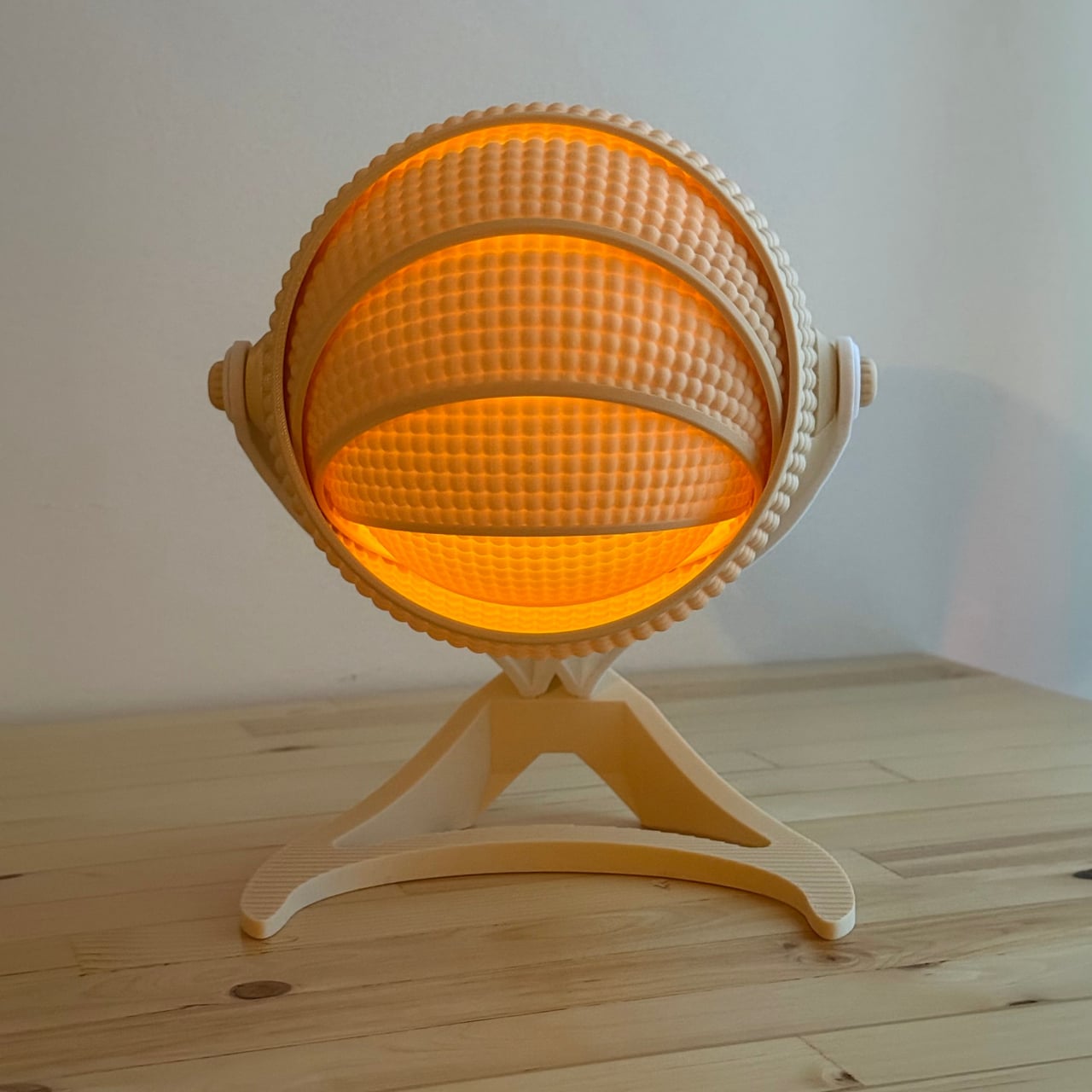
OHR Design, a Canadian 3D printing studio, is a good example of what that progress looks like. Its Armadillo series takes inspiration from one of nature’s most recognizable shapes, the segmented, overlapping bands of the armadillo shell, and turns it into a lamp shade that adjusts depending on how much, or how little, light you want in a room. And it all started from a tea light holder.

Designer: OHR Design

The original Armadillo grew from an earlier OHR Design called the OHRB, and it’s since inspired a whole family of spin-offs. True to its origins, the Armadillo wraps a tea light in a series of concentric rings that tilt forward to close the shade down or pull back to widen it. At 240mm tall, it’s compact enough for a bedside table or a bookshelf without demanding much real estate.

For those who want the same aesthetic energy at a bigger scale, the Armadillo XL scales the concept up into a proper desk lamp. At 373.8mm tall and 283.9mm wide, it makes a statement on a desk without being overwhelming. It accepts a real light bulb rather than a tea light, making it far more practical for anyone who actually needs their lamp to pull its weight.

What gives both versions their character is the adjustable ring system. The segmented shade isn’t just decorative; opening and closing the rings changes how the light spreads through the room, softening the glow when the rings are fully open or concentrating it when they’re pulled shut. It’s the kind of thing that turns a simple on/off appliance into something you keep reaching over to tweak.

What’s equally interesting is how OHR Design sells these. You aren’t buying a finished lamp; you’re buying the STL files to print one yourself. The original Armadillo fits on a 180mm × 180mm print bed, making it accessible on smaller machines like the Prusa Mini or Bambu Lab A1 Mini. The Armadillo XL, being larger, requires a 256mm × 256mm build volume.

The filament choice is entirely yours, which means the lamp can be as neutral or as bold as you want. OHR Design has been spotted using Overture’s Super PLA+ in various colors, from muted naturals to vivid hues, all of which change how the diffused light reads. Not many lamps invite you to physically shape the light they cast, and fewer still can be reimagined entirely based on the color spool you have on hand. The Armadillo family puts creative control squarely in the hands of whoever prints it, and that’s a genuinely refreshing place to land.

The post This 3D-Printed Lamp Has a Shell That Opens and Closes to Shape Light first appeared on Yanko Design.

  •  

vivo X300 FE Review: The Compact Flagship That Earns Its Keep

PROS:


  • Compact, comfortable, and premium design

  • Powerful 50MP main and telephoto cameras

  • Large battery with fast wired and wireless charging

  • Long-term software support

CONS:


  • Mediocre 8MP ultra-wide camera

  • Uncommon horizontal camera design

  • A bit pricier than most "small flagships"

RATINGS:

AESTHETICS
ERGONOMICS
PERFORMANCE
SUSTAINABILITY / REPAIRABILITY
VALUE FOR MONEY

EDITOR'S QUOTE:

The vivo X300 FE proves that a compact phone doesn't have to feel like a lesser one.

Premium smartphones have been trending bigger, heavier, and more visually imposing for years. It’s reached the point where “flagship” is almost synonymous with large, and carrying one all day feels less like convenience and more like a commitment. The compact phone hasn’t disappeared, but finding one that doesn’t sacrifice performance, battery life, or camera quality in exchange for a smaller footprint has been genuinely difficult.

That’s the gap the vivo X300 FE is aiming to fill. It pairs a 6.31-inch flat display with a Snapdragon 8 Gen 5 chipset, a 6,500 mAh battery, and a ZEISS co-engineered camera system, all within a compact design that stays remarkably light for its class. On paper, it reads like a phone that shouldn’t be this compact. But does it actually work in practice? We give it a spin to find out.

Designer: vivo

Aesthetics

The X300 FE follows a flat-design language that’s become increasingly standard among more expensive flagships. There aren’t any curved glass edges or aggressively contoured surfaces, just a clean, rectangular form with ultra-narrow bezels, an aerospace-grade aluminum frame, and a front face that looks symmetrical and composed. The centered punch-hole is small and unobtrusive, and those slim borders give the display a neat, purposeful presence that doesn’t need theatrics to feel premium.

Our review unit came in white, which turns out to be a great choice for a phone this carefully considered. The matte rear panel uses vivo’s Metallic Sand AG glass treatment, giving it a soft, slightly chalky texture that resists fingerprints well and picks up ambient light in a way that shifts subtly between warm and cool tones. It doesn’t try to be eye-catching; it just looks well-made.

The flat aluminum frame wraps cleanly around the body, with edges that make it comfortable to grip without feeling sharp or slippery. The white model measures 8.10mm thick and weighs 192g, a hair more than the other colorways, but those differences don’t register in hand. What does register is the overall sense of a phone that’s been assembled with genuine attention to detail.

The camera module deserves its own mention. Rather than going for the oversized circular island that’s become visual shorthand for “serious camera phone,” vivo opted for a horizontal bar that spans the upper portion of the back. Three lenses are arranged neatly across it, with a ZEISS badge centered between them. It’s recognizable and distinctive without domineering the rest of the design. Admittedly, it’s going to be a divisive design, but it at least lets the vivo X300 FE easily stand out from the competition.

Ergonomics

At 150.83mm tall and 71.76mm wide, the X300 FE sits firmly in one-handed territory. It isn’t trying to be a miniature phone. It’s simply sized more sensibly than most flagships on the market. You can reach across the screen without adjusting your grip, slip it into a front pocket without thinking, and hold it for extended periods without the wrist fatigue bigger phones tend to bring.

The 192g weight for the white model falls in a range that feels present without being burdensome. There’s enough substance here to reinforce the premium feel of the materials, but not so much that you’re constantly aware of it. The 8.10mm profile isn’t exactly wafer-thin, though that’s a reasonable trade-off for a 6,500 mAh cell packed inside a frame this compact.

The flat-sided frame also contributes more to the ergonomic experience than it might seem. It gives your palm a stable, consistent surface to press against during typing and scrolling, which feels more controlled than on rounded-edge designs. The compact footprint, flat back, and balanced weight distribution all work together to make this a phone that feels designed around how it’s actually used.

Performance

The Snapdragon 8 Gen 5 inside doesn’t need much introduction. It’s a flagship-class mobile processor, and the X300 FE puts it to good use. The 12GB RAM, expandable with another 12GB taken from the generous 512GB storage, clearly marks it as a class above your typical mid-tier compact phone. It runs Origin OS 6, based on the current Android 16 release, embracing a more minimalist and flat aesthetic that perfectly matches the phone’s design.

Day-to-day tasks feel completely effortless, from switching between apps and browser tabs to occasional gaming sessions, and nothing about the experience suggests the compact body is in any way holding the hardware back. Thermals are pretty impressive, given the vivo X300 FE’s size, but its compact form factor might work against it when it comes to how you hold it during those long periods.

Thankfully, the display backs that up well. It’s a 6.31-inch LTPO AMOLED panel with an adaptive refresh rate of 1 to 120 Hz, a 1.5K resolution at 460 PPI, and a local peak brightness of 5,000 nits. The 2,160 Hz PWM dimming also makes prolonged reading and scrolling noticeably more comfortable on the eyes, a detail that matters far more than most spec sheets would have you believe.

Then there’s the battery, arguably the X300 FE’s most impressive engineering accomplishment. A 6,500 mAh cell in a phone this slim and light isn’t something you see every day, and in practice, that capacity means genuine all-day endurance with room to spare. The 90W wired and 40W wireless charging mean you’re rarely stuck waiting long when it runs low, at least with the appropriate chargers.

The camera system is led by a 50 MP ZEISS main camera and a 50 MP ZEISS super-telephoto camera, with an 8 MP ultra-wide rounding out the rear. The main and telephoto cameras handle portraits, street photography, and concert scenes with real confidence. An optional telephoto extender accessory also exists for those who want extended reach, though it’s firmly in niche territory.

The results are impressive, especially when starting to zoom in on subjects. Even without the telephoto extender, you can enjoy clear and detailed shots, even at night. The 8MP ultra-wide, though usable, is a bit of a letdown, but vivo had to cut some corners to bring down the price and differentiate this model from its more powerful and more expensive siblings. You do have a ton of settings to tweak to get your perfect shot, but even the defaults are good enough to make fleeting moments more memorable.

Sustainability

The X300 FE carries IP68 and IP69 dust and water resistance ratings, alongside an SGS five-star drop resistance certification, giving it a reassuring level of durability for daily use. It also carries an SGS five-star drop resistance certification, which gives it more formal durability credentials than most phones in its class. Together, those ratings make a convincing case for a phone built to survive daily life without requiring any particularly careful handling.

Software longevity is where the X300 FE makes its strongest long-term case. On that front, vivo is committing to five years of OS upgrades, seven years of security maintenance, and a five-year smooth experience promise. That support window is competitive with the best in the Android space, and it signals that this phone is meant to be genuinely used for years, not replaced the moment something newer comes along.

Value

At around €1,000, The X300 FE isn’t a budget phone, and it doesn’t try to be. It competes in the premium compact flagship space, where the particular combination it offers is harder to find than you’d expect. A current-generation chipset, a genuinely large battery, fast wired and wireless charging, ZEISS-branded imaging, and a durable premium build in a package that remains notably light for a flagship is a rare and coherent offering.

The person this phone is designed for isn’t shopping for the biggest or most spec’d-out device available. It’s someone who wants a phone that keeps pace with their life without dominating it, one that fits in a jacket pocket, lasts a full day, and still takes genuinely good photos. Frequent travelers, urban commuters, and anyone who’s tired of unwieldy flagships will feel right at home here.

Verdict

The vivo X300 FE is the kind of compact flagship that doesn’t feel like a compromise once you’re actually using it. The design is restrained and coherent, the battery is frankly impressive for the size, the chipset handles everything you throw at it, and the camera does its best work in exactly the situations most people find themselves in, out in the world rather than on a lab bench.

What the X300 FE offers is a phone that’s easy to carry, genuinely long-lasting, and capable enough for the photography and day-to-day demands you’ll actually encounter. It’s well built, well supported, and clearly designed with a specific kind of person in mind. That clarity of purpose is refreshing, and for the right buyer, it’s exactly what makes this phone worth serious consideration.

The post vivo X300 FE Review: The Compact Flagship That Earns Its Keep first appeared on Yanko Design.

  •  

Air Purifier Filters Cost $100 a Year, but CUE Uses Water Instead

Air purifiers have become a common fixture in homes and offices, quietly working to keep indoor air breathable. Most of them follow the same basic formula, drawing air through a dry filter that captures dust, pollen, and airborne particles over time. When that filter reaches its limit, you throw it away and buy a replacement, or wash it if it’s the reusable kind. It’s a familiar routine, but not exactly a thoughtful one.

CUE Air Washer from Watervation is a 2-in-1 purifier and humidifier that takes a noticeably different approach. Rather than filtering air through a dry medium that slowly fills with grime, it washes the air with water, borrowing from how rain naturally clears the atmosphere of dust and pollen. It’s a concept that sounds simple in hindsight but actually changes quite a bit about how air care works.

Designer: Watervation

Click Here to Buy Now: $299 $575 (48% off). Hurry, only 41/975 left! Raised over $411,000.

The idea at the heart of CUE is surprisingly intuitive. Instead of holding contamination inside a dry filter, the device draws air through a water-based medium that strips airborne particles and gases from the air. Once the water turns dirty, you empty it, rinse the tank, and refill it, giving the device a clean start every day. There’s nothing to replace, and nothing to accumulate.

The technology behind CUE is Watervation’s patented RainTec system, and its most notable quality is what it doesn’t rely on. Most air washers need motorized water pumps to circulate liquid, but RainTec uses fluid dynamics instead. A spinning rotor generates a vacuum that draws water upward without any pump, eliminating the most common failure point in these devices and keeping the design considerably simpler.

What makes CUE genuinely practical is how naturally it handles two common problems at once. Dry air and airborne pollutants tend to go hand in hand, especially in bedrooms during winter or in home offices that don’t have great ventilation. Instead of running two separate appliances for purification and humidity, CUE handles both, covering spaces up to 300 sq ft, which fits most personal and domestic environments.

The ownership story is where CUE makes the strongest case for itself. Conventional air purifiers can cost over $100 per year in filter replacements alone, a figure that doesn’t stop growing the longer you use the device. CUE cuts that entirely by using water as its only medium. The maintenance routine comes down to emptying the tank, rinsing it, and refilling it with fresh water.

CUE is also one of those rare appliances that’s genuinely pleasant to leave out in the open. The cylindrical device has a dark upper housing and a clear lower tank that lets you watch the water action inside. There’s something calming about it. The swirling motion of water being spun and atomized gives the cleaning process a visible, almost meditative quality that isn’t common in this product category.

Performance testing by Korea Conformity Laboratories gives the product’s claims some independent backing. Results showed a 93.5% reduction in fine particulate matter, a 99.5% reduction in acetic acid, a 99% reduction in ammonia, and a 90% reduction in formaldehyde. The device also includes a built-in UV-C sterilization module that continuously disinfects the water tank while running, keeping the water hygienic throughout each cycle.

There’s a growing appetite for home appliances that earn their place on a shelf rather than hiding behind it. CUE Air Washer fits that thinking, handling air quality in a way that’s quieter, cleaner, and far less dependent on consumables than what came before. Watervation’s direction with this product hints at what home air care could look like when the design is as considered as the engineering behind it.

Click Here to Buy Now: $299 $575 (48% off). Hurry, only 41/975 left! Raised over $411,000.

The post Air Purifier Filters Cost $100 a Year, but CUE Uses Water Instead first appeared on Yanko Design.

  •  
❌