Vue lecture

Never Lose Your Keys Again With a Tracker That Glows in the Dark

For forgetful people like me, trackers have basically become a must-have. Whether you’re clipping one onto your wallet, your car keys, your backpack, or whatever it is you absolutely cannot afford to lose, these little devices help you do exactly what they promise: keep track. The only catch is that a lot of trackers tend to look alike, and if you’re relying on appearance alone instead of the connected app, it’s easy to accidentally grab the wrong one.

If you’re after a tracker that actually stands out, and one that can even glow in the dark, Pebblebee’s latest Evercolor drop might be exactly what you need. Evercolor is the brand’s limited-edition color program built exclusively for its Clip 5 tracker, and the newest release, called Neon Pulse, comes in two eye-catching shades: Techno Lime and Hotline Pink. Pebblebee describes the collection as perfect for “bold self-expression and a fresh-season reset,” and honestly, it’s hard to disagree.

Designer: Pebblebee
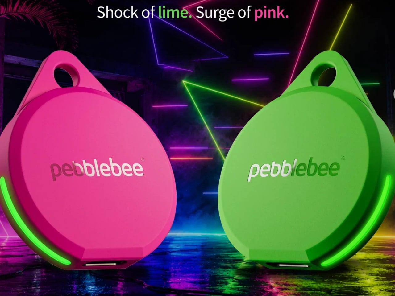
Evercolor has rolled out plenty of standout colors before, but Neon Pulse marks the first time the program has added glow-in-the-dark accents. That means your tracker stays visible even after its LED switches off, so you’re not just relying on the app to tell you where your item is. You can actually spot it in the dark, as long as it’s somewhere within eyesight.
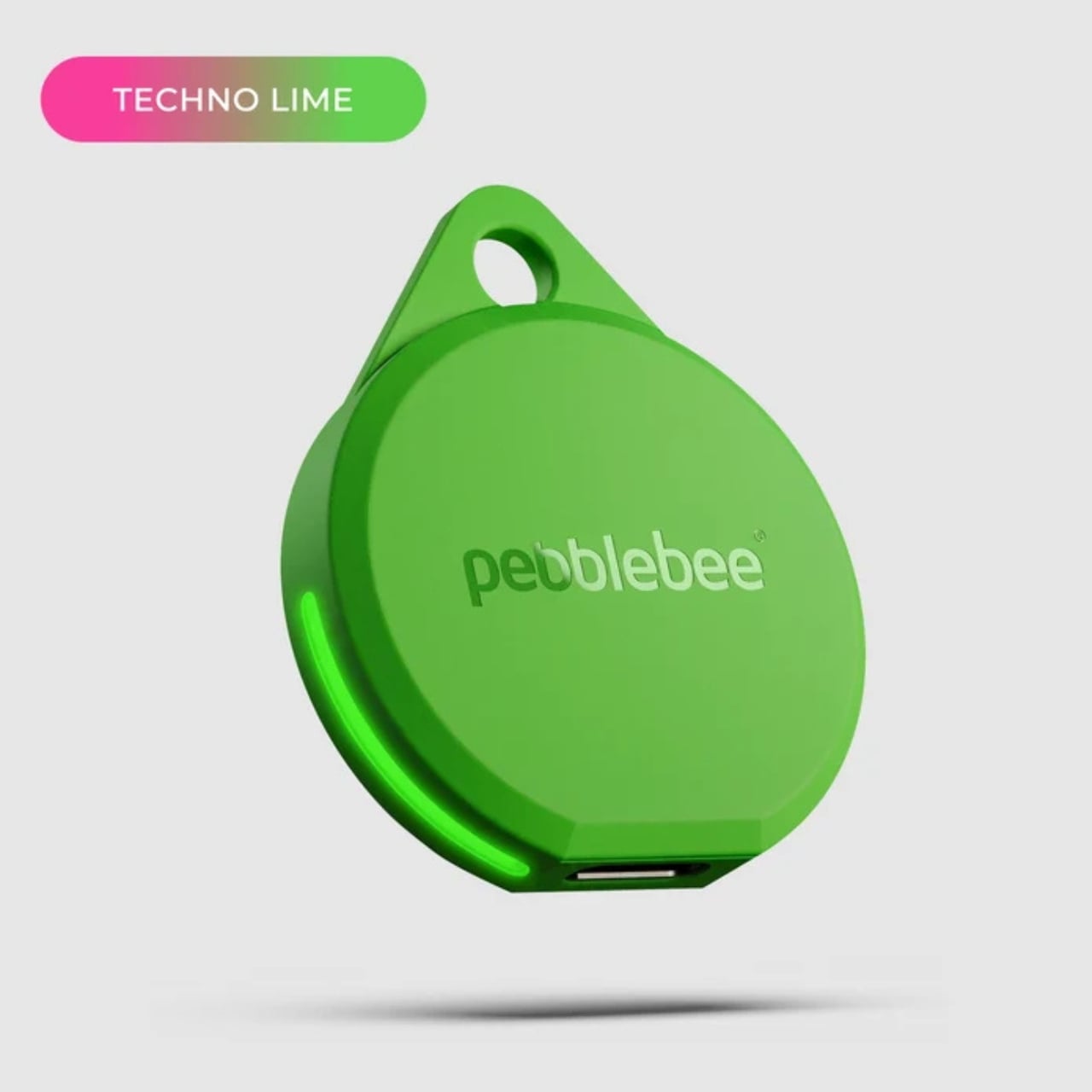

Keep in mind that this is a limited-edition release, so if hot pink and neon green happen to be your colors, you’ll want to grab them soon. Pebblebee rolls out new Evercolor shades every twelve weeks, and once a drop sells out, it’s gone for good, no restocks. Previous collections like Freeze Frame and Heatwave Hijinks have already sold out, so if Neon Pulse catches your eye, don’t wait too long to add it to your cart.


Underneath all that color, though, it’s still the same reliable Clip 5 that Pebblebee originally released. It works with both Apple and Android devices, so you don’t have to worry about switching phones down the line. The rechargeable battery lasts up to a year on a single USB-C charge, which means no more digging through drawers for spare coin batteries. It also boasts a direct Bluetooth range of about 500 feet, roughly double what a lot of competitors offer, plus access to a global crowd-network for finding your stuff even farther away. On top of that, you get a 130dB siren, a bright LED strobe, and IP66 water resistance, so it can handle a little rain or an accidental splash without missing a beat.


It’s also worth noting that Neon Pulse still costs the same $34.99 as the standard Clip 5, so you’re not paying extra just for the fresh colorway. There’s also a free built-in safety feature called Alert, which can notify you if an unfamiliar tracker seems to be following you, a nice bit of peace of mind on top of everything else. Design-wise, the compact clip-on shape makes it look less like a tech gadget and more like an accessory for your bag, wallet, or keychain. Add in the bright, playful colorway, and it becomes even more fashionable, dare we say, kind of cool. So if your main complaint about trackers has always been that they all look the same, Neon Pulse is built to solve exactly that problem.
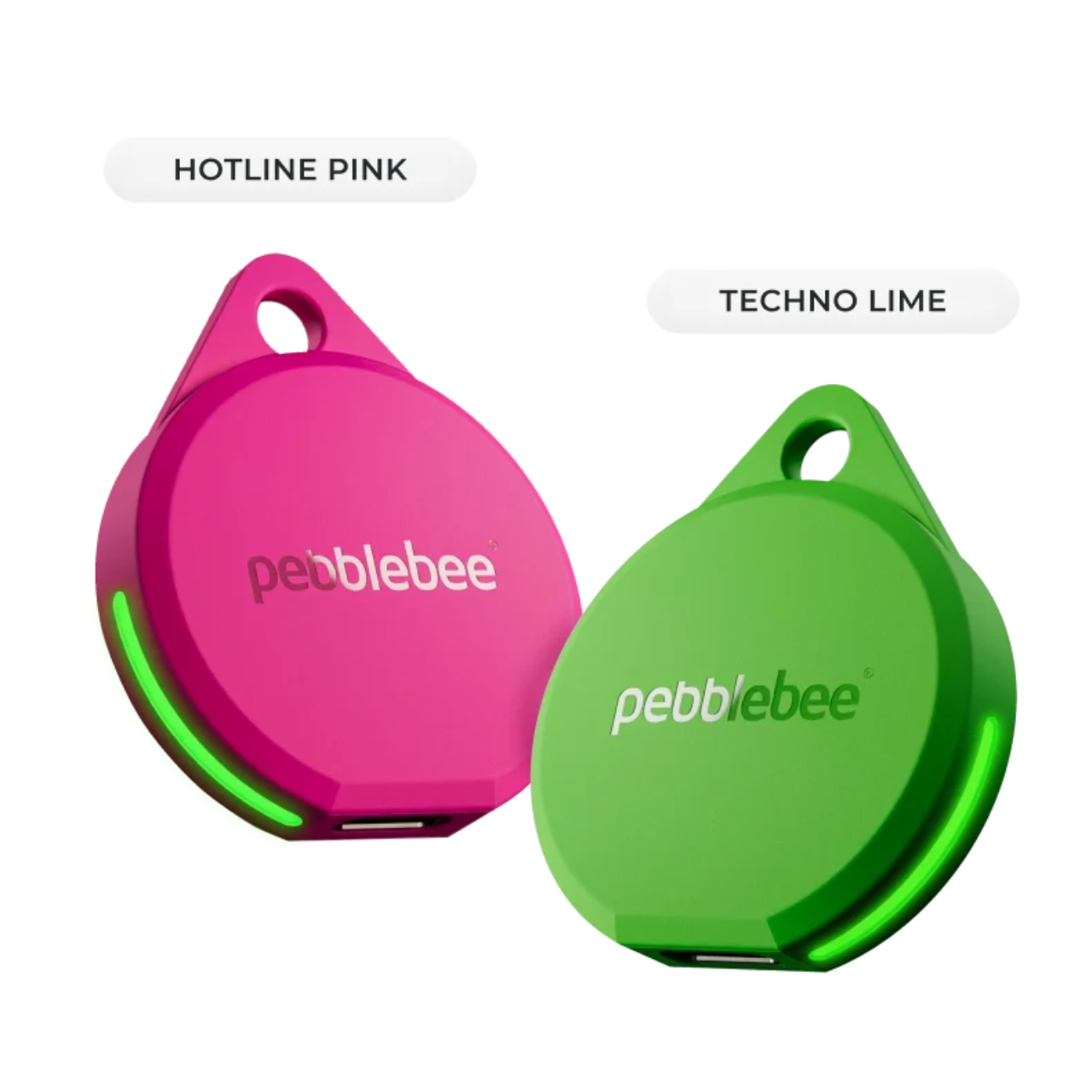
At the end of the day, a tracker is only useful if you can actually tell it apart from the pile of identical black and white gadgets everyone else seems to own, and if you enjoy using it enough to keep it clipped on in the first place. Pebblebee’s Neon Pulse drop checks both boxes, combining genuine utility with a design that feels personal rather than generic. Whether you’re the type who loses your keys weekly or you just want your tech to match your personality, this drop is worth a look before it disappears for good. And if pink and green aren’t quite your vibe, it might be worth keeping an eye on Pebblebee’s page anyway. With a new Evercolor drop landing every twelve weeks, there’s a good chance your perfect color combo is just around the corner.
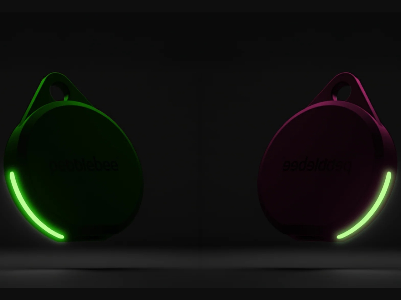
The post Never Lose Your Keys Again With a Tracker That Glows in the Dark first appeared on Yanko Design.

  •  

This Photographer Spent Weeks in a Suzhou Silk Studio. Here’s What He Found

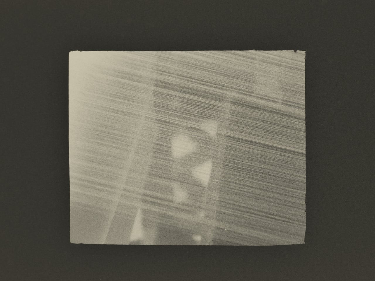
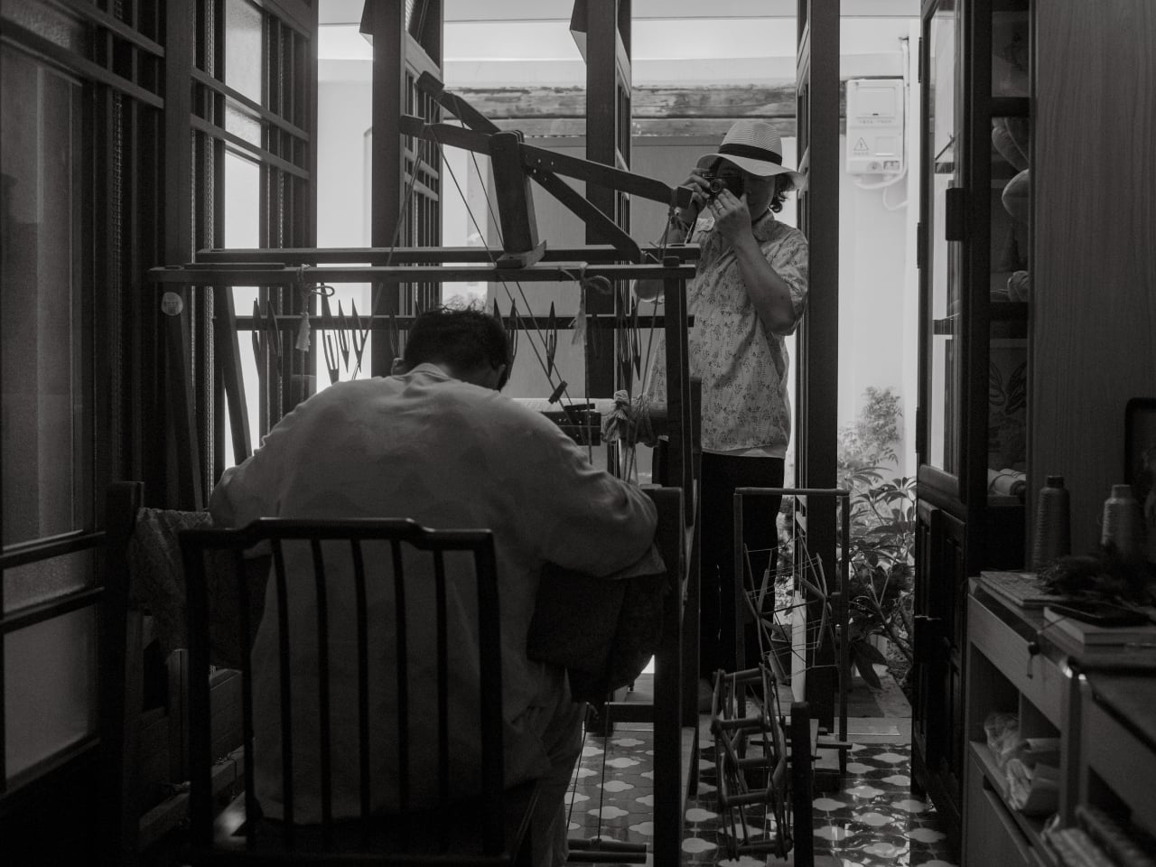
When Jing Huang walked into a kesi weaving studio in Suzhou, China, he made a decision that runs counter to almost everything happening in photography right now. He put away the instinct to explain and just started watching. For most photographers working today, that would feel like leaving something on the table. In a studio where a finished piece can take months to complete, it turned out to be the only approach that made sense.

Huang is a photographer with serious credentials. He won the Leica Oskar Barnack Newcomer Award in 2011 for a series called Pure of Sight, and his visual style has always leaned toward stillness, restraint, and negative space rather than the kind of maximalist documentation that tends to flatten its subject. So when Lexar and Leica brought him to Suzhou to photograph kesi artist Hao Naiqiang, known professionally as Jingwei, the choice made sense on paper. What’s harder to predict is what happens when a photographer with that kind of discipline actually sits with a craft as slow and precise as kesi.

Artist: Hao Naiqiang (Jingwei) for Lexar and Leica

Photographer: Jing Huang

Kesi is a Chinese silk weaving technique that’s been around for centuries, and it operates on a logic completely alien to the way most things get made today. The artisan builds a piece thread by thread against a fixed warp, making constant decisions about color, contour, and rhythm with no automation, no shortcuts, and no undo button. There’s an old Chinese saying that captures it better than any technical description: an inch of kesi is worth an inch of gold. Jingwei has been practicing it for more than a decade and is formally recognized as a representative inheritor of the Suzhou tradition. Every finished piece represents a depth of time investment that genuinely earns that comparison.

What Huang found in that studio wasn’t a process to document. It was an atmosphere to respond to. His photographs don’t walk you through kesi step by step the way a documentary would. They move between Jingwei’s hands, the threads, the studio details, and the quieter visual textures of Suzhou itself, using the same painterly restraint that shapes his broader work. He described his own approach in a way that cuts straight to the point: photography, he said, is sometimes about forgetting time rather than recording it. What stays in an image isn’t when it was taken but whether it still carries beauty once the moment is gone.

That’s a fairly specific thing to believe in 2026, when the surrounding conversation about images is almost entirely about speed and generation. Anyone can produce a technically competent photo of silk threads in soft light right now without a camera, a plane ticket, or a studio. What that won’t produce is the weeks of presence, of actually being in a room watching another person work, that shapes how Huang sees and frames a subject.

This is where Lexar’s role in the project stops being a footnote. Grace Su, who heads Lexar’s European operations, made the point directly: before any photograph becomes a print, a press image, or a cultural archive, it first exists as an original file that needs to survive. Leica captures the moment. Lexar protects the file behind it. It’s a clean division of labor that gives the brand a genuine reason to be part of this story rather than just attached to it for the optics.

The show itself, titled Threads of Time: A Journey Through Silk and Lens, is presented at Leica Gallery Amsterdam and runs September 11 to 15. Curator Linda Warmerdam framed the exhibition as a dialogue between the photographer’s eye and the artisan’s hand, and that framing holds up, because both of those things require a body in a specific place at a specific time. No model trained on existing images can reproduce that.

You don’t need to care about textile history or gallery culture for the underlying point to land. Some things take real time, happen once, and mean something precisely because they can’t be convincingly faked. Huang spent weeks in a Suzhou studio to understand what kesi actually is. The photographs are what he brought back.

The post This Photographer Spent Weeks in a Suzhou Silk Studio. Here’s What He Found first appeared on Yanko Design.

  •  

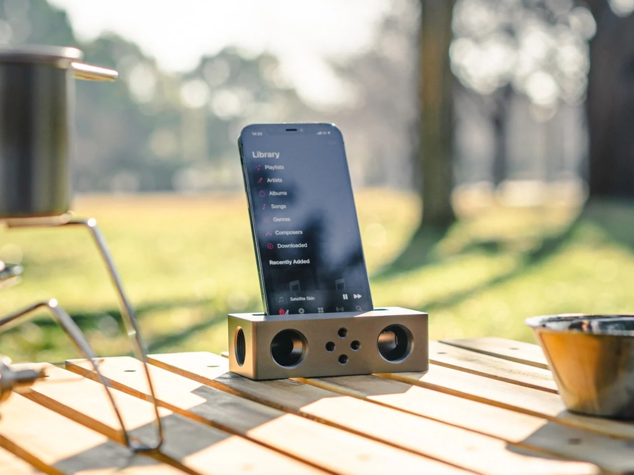
The $179 iPhone Speaker That Never Needs Charging

You’ve been waiting for your favorite artist to release their latest album, counting down the hours until it finally drops on your streaming service of choice. You open your phone and press play… and you’re a little disappointed. It’s not that the album isn’t great, it’s that your phone’s speaker doesn’t do it justice. You want something to amplify that sound right now, but your external Bluetooth speaker hasn’t been charged in weeks.

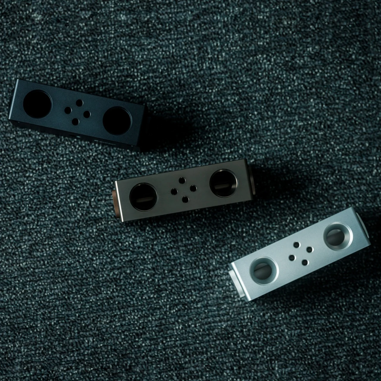
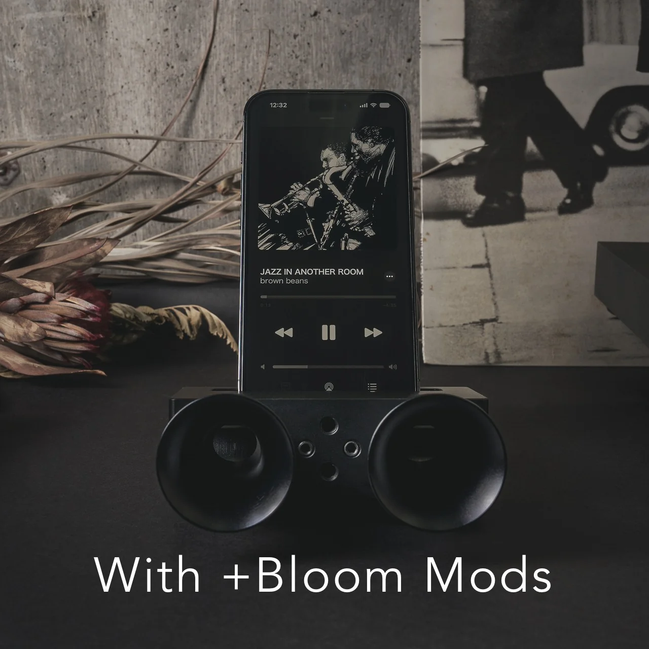
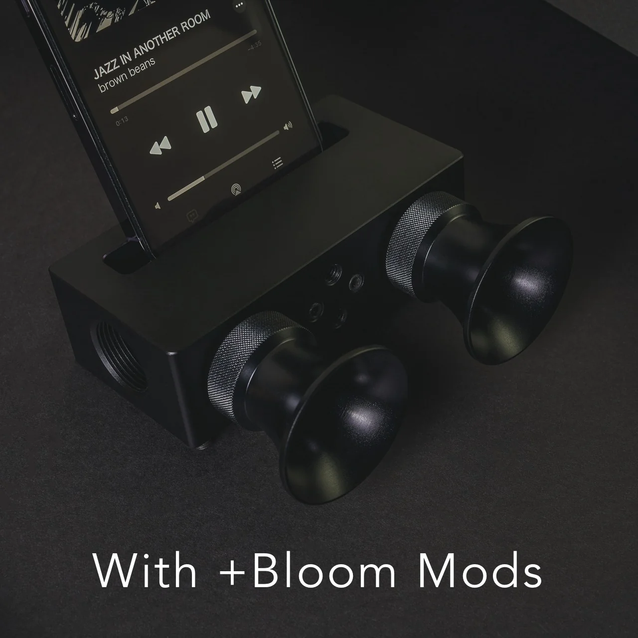
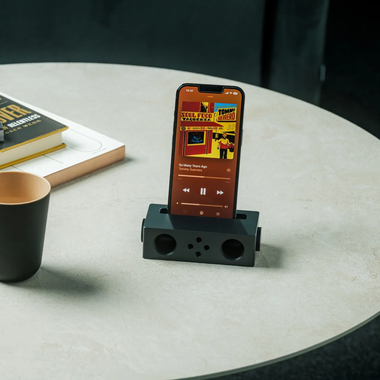
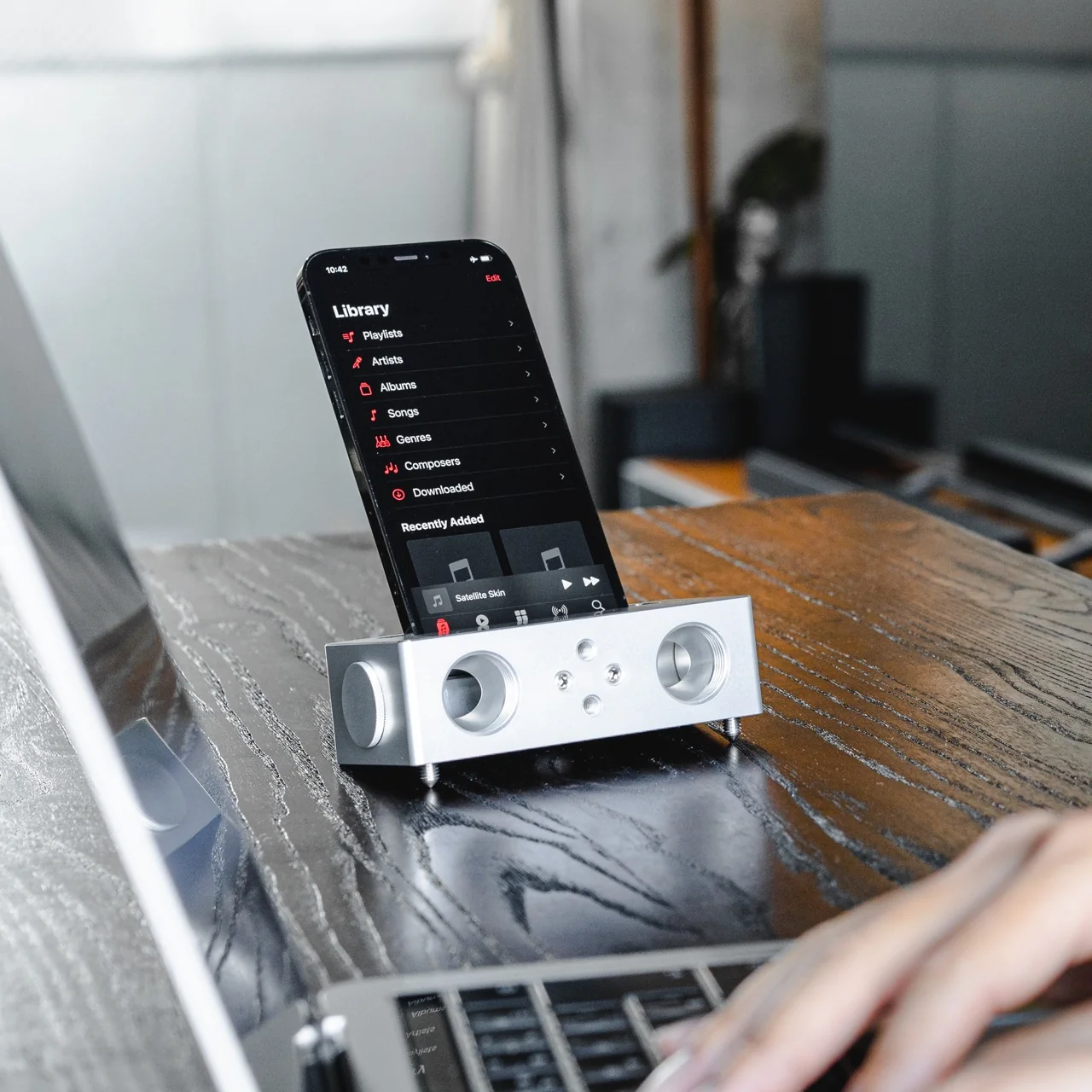
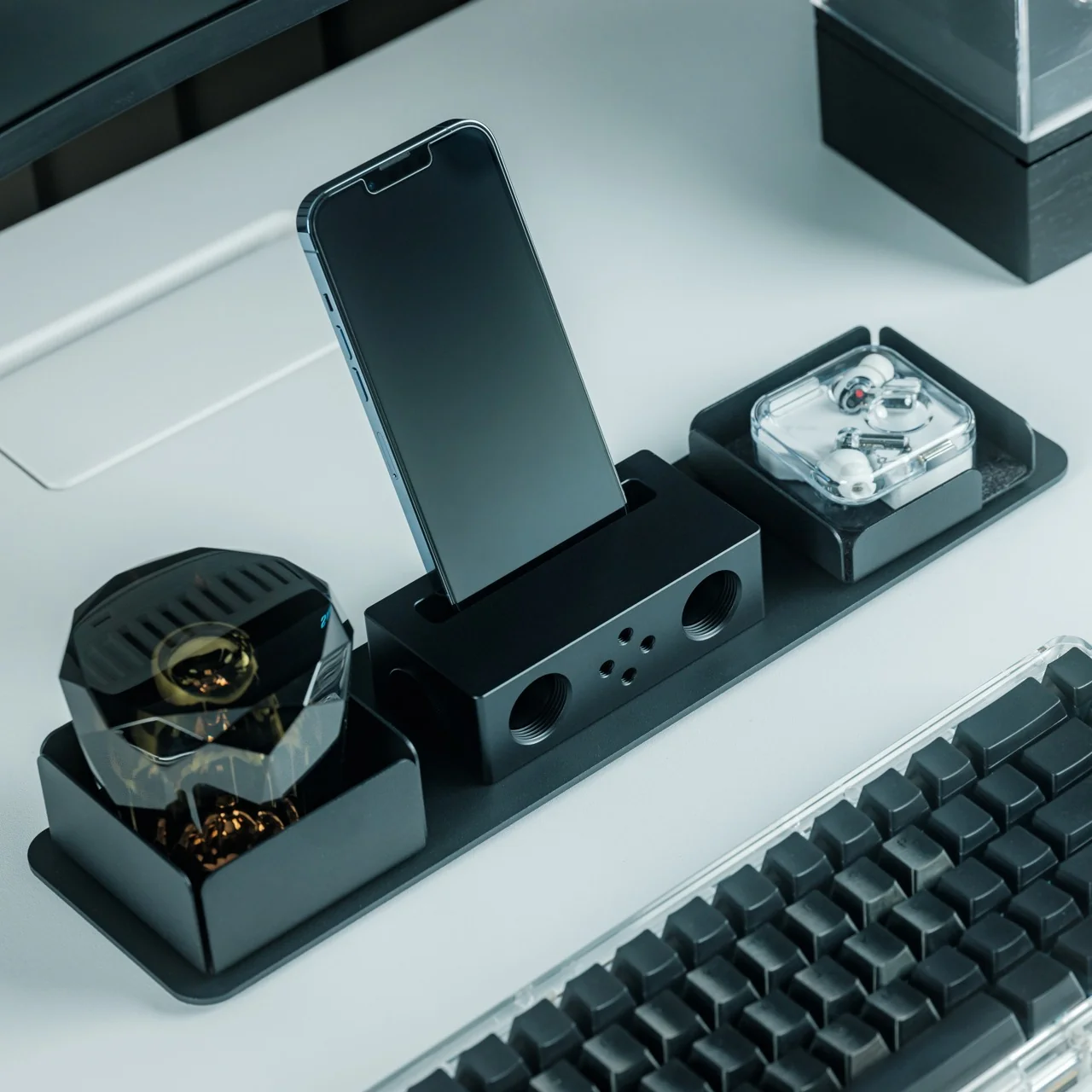
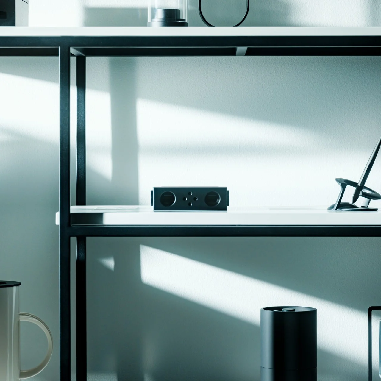
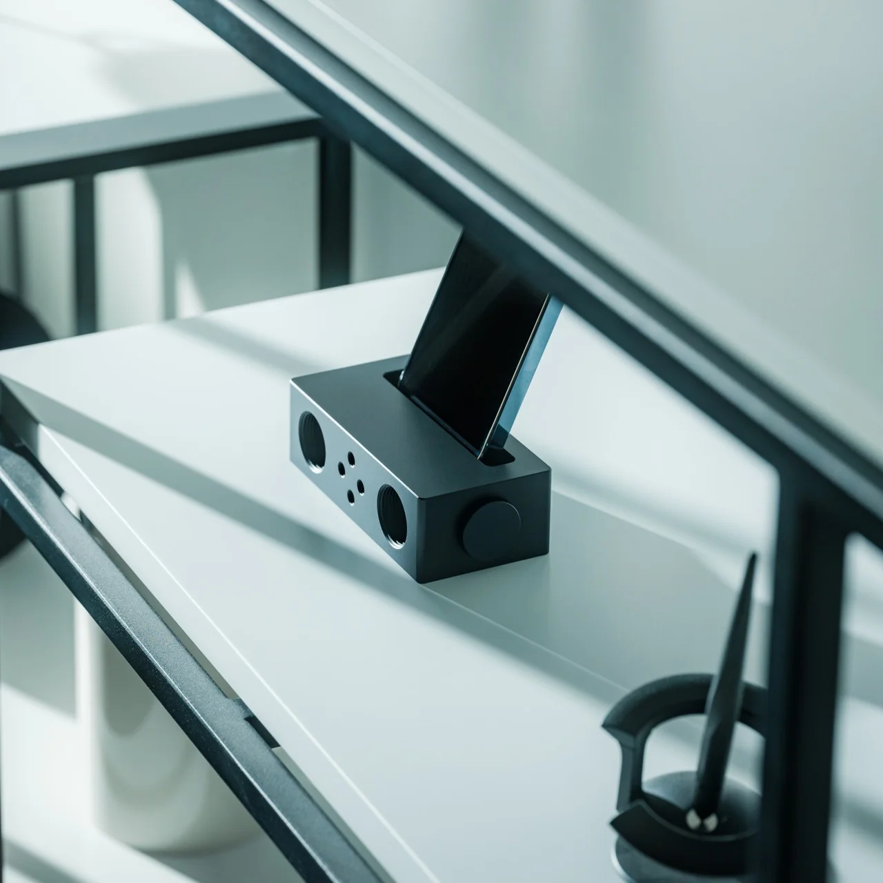
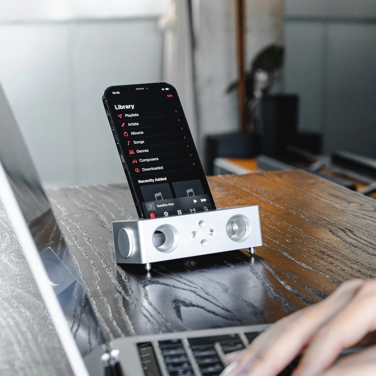
The Battery-free Amplifying iSpeakers can solve that problem for you, and you won’t need a single cable or Bluetooth connection to make it happen. This “dumb” speaker is actually smart enough to rely purely on acoustic engineering, channeling and amplifying the sound waves coming out of your phone so your music, podcast, or call sounds noticeably fuller than it would through your built-in speaker alone.

Click Here to Buy Now: $179.00

Designed by Ooi Masato and made in Japan, this battery-free device lives up to its name: it uses a precision-machined metal slot that cradles whatever phone you own, instantly amplifying whatever you’re playing. There’s no pairing process, no cord to plug in, and no anxious glance at a battery icon wondering if your speaker will cut out mid-song. You set your phone down, and it just works.

Design-wise, the iSpeakers follow a clean, minimalist aesthetic that looks just as at home on a cluttered work desk as it does on a nightstand or a bookshelf. The body is shaped around the golden ratio, giving it a visual balance that feels intentional rather than accidental (the kind of object you’d leave out on display rather than tuck into a drawer). It’s compact enough to toss in a bag, so you can bring your amplified sound with you to a picnic, a hotel room, or a friend’s backyard without hunting for an outlet. And because there’s no port, connector, or wireless protocol involved, it works with virtually any phone you own, including Apple’s freshly announced iPhone 18 Pro lineup and its first ever foldable, the iPhone Ultra, unveiled at today’s “Surprise and Shine” event. All you have to do is let the speaker slot cradle your phone’s speaker grille; there’s no compatibility chart to check and no software update to wait on.

The speaker itself is milled from Duralumin, the same lightweight, vibration resistant alloy used in aircraft construction. That means you’re getting a premium feel along with genuine durability. This isn’t a flimsy accessory that’ll crack after a few drops in your bag. The Japanese craftsmanship and golden ratio proportions give it a quiet sophistication that fits in seamlessly next to your laptop or coffee mug. If you want to get more out of it, you can also pick up the +Bloom and +Jet attachments, which let you customize how the sound projects, whether that means directing it upward for a fuller room fill or downward for a more intimate listening experience.

So how does this stack up against the Bluetooth speakers already crowding your shelf? Take a brand like JBL, whose Flip series has become a go-to for portable audio. Those speakers sound great and pump out serious volume, but they still ask you to charge them, remember to pair them, and eventually deal with a battery that won’t hold a charge like it used to. The iSpeakers skip all of that by design. You’re trading a bit of raw volume and bass depth for something Bluetooth speakers simply can’t offer: a device that will sound exactly the same in ten years as it does today, with zero maintenance and zero electronic waste. At $179, it’s priced closer to a premium Bluetooth speaker than a budget one, but you’re paying for a very different kind of value: permanence, craftsmanship, and simplicity over specs and app connectivity.

At the end of the day, the Battery-free Amplifying iSpeakers isn’t trying to replace your Bluetooth speaker for a backyard party. It’s solving a much smaller, more common frustration: the moment when you just want your phone to sound better, right now, without any setup. For anyone tired of charging cords, pairing screens, and speakers that die at the worst possible moment, this is a refreshingly simple fix, and a genuinely beautiful object to boot. Sometimes the smartest tech is the kind that doesn’t need power at all.

The post The $179 iPhone Speaker That Never Needs Charging first appeared on Yanko Design.

  •  

Felipe Pantone’s Tennis Court Refuses to Look the Same Twice

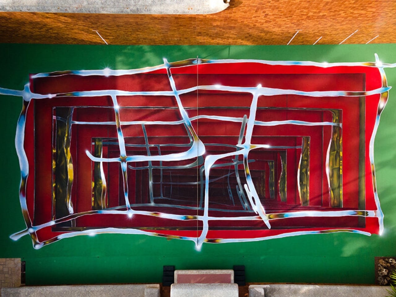
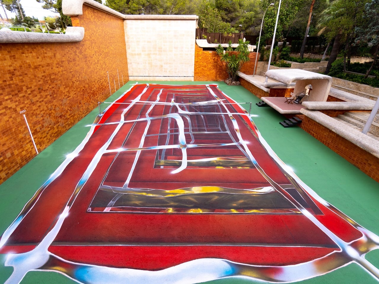
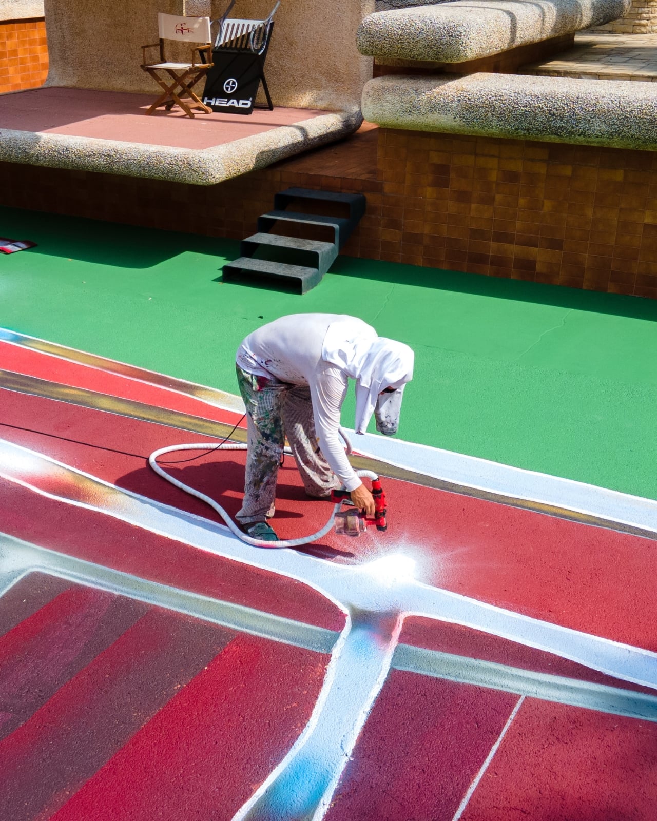
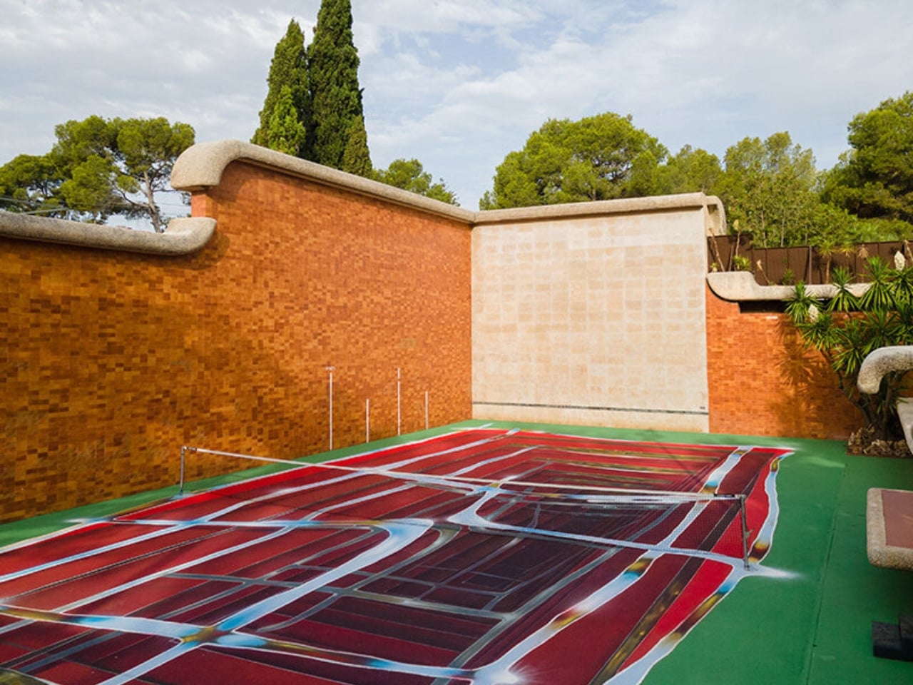
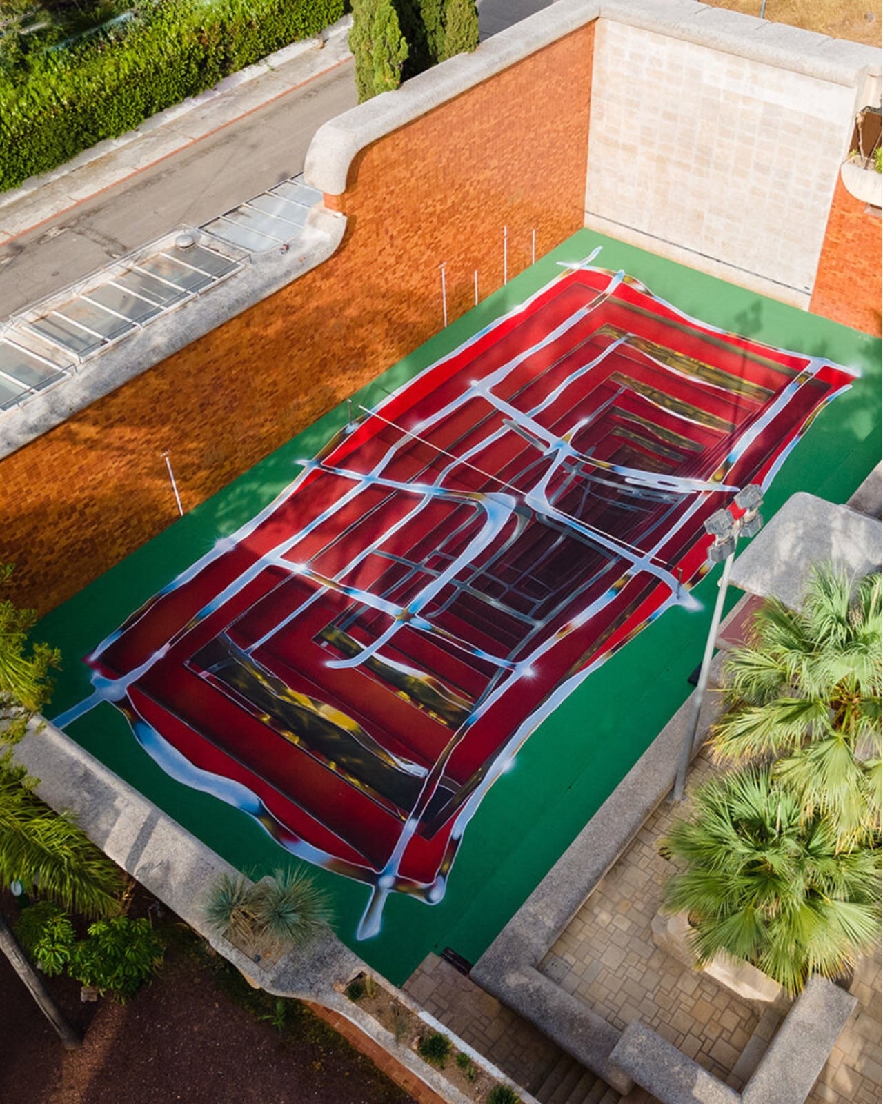
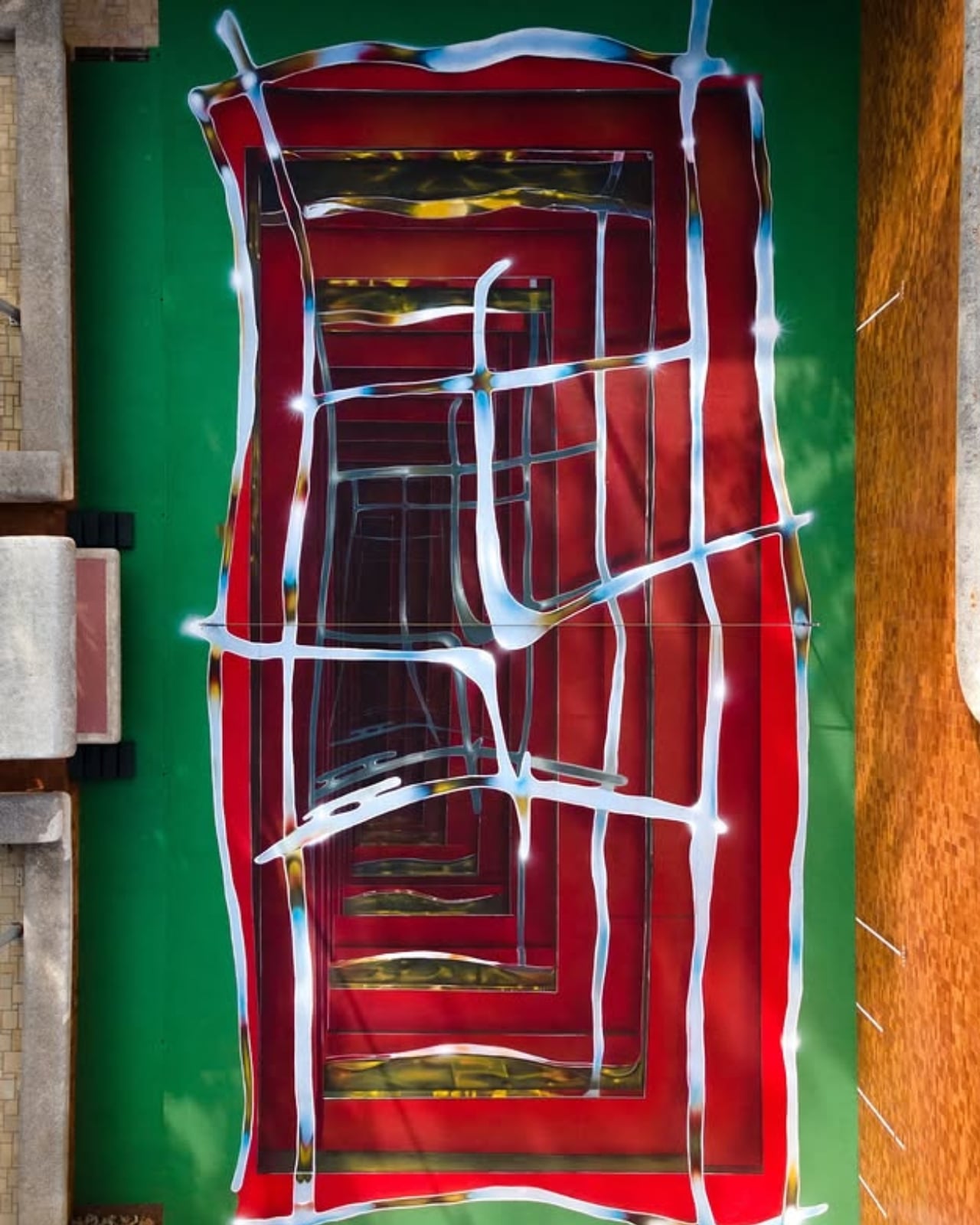
A tennis court in Valencia currently looks like it’s sinking into the ground. Walk up to the edge of the one at Casa Axis and the white lines that normally just mark boundaries start pulling inward, stacking through fake layers of chrome and burgundy until the whole surface reads like a hallway you could fall down. It’s called Hard Court 2, painted by Spanish artist Spok Brillor, and it treats a sports court like a living canvas instead of a slab of asphalt everyone stops noticing the week after the ribbon gets cut.

That’s usually the fate of most site-specific art. A muralist gets a wall, a brand throws a launch party, and within a year the piece turns into background noise nobody actually looks at anymore. Sports facilities have it worse. A court gets painted once, and it stays that exact shade of green or blue for a decade, because nobody budgets for touch-ups, let alone reinvention. Casa Axis, the art and design space Felipe Pantone runs out of a 1975 house outside Valencia, didn’t fix that with a bigger maintenance budget. It fixed it with a rule: the court has to change, every single year, by design.

Designer: Spok Brillor

The rule lives inside C.A.I.O., the Casa Axis International Open, a scrappy little tennis tournament for artists that launched in June 2026. No rankings, no categories, no portfolios required. Just instinct, apparently, and a healthy amount of frustration. The twist is what the winner actually takes home. Instead of a trophy, they get handed the responsibility of repainting the court before the next tournament. Win the match, inherit the canvas.

Lucas Benarroch, known as MRKA, painted the first version in 2025, loosening the court’s regulation markings into loose, hand-drawn lines that felt more like a sketch than a sports surface. He then went on to win the inaugural C.A.I.O., which technically put him back in charge of the next transformation. He passed the job to Spok Brillor instead, who had competed against him in the same tournament. That handoff is the part I find genuinely clever. The competition doesn’t just crown a winner, it forces the winner to make a choice about who gets to shape the space next, which quietly turns a tennis match into a succession plan for an ongoing art piece.

Spok took the opposite approach from MRKA. Where MRKA loosened the geometry, Spok tightened it, repeating the court’s own markings inward through metallic gradients until the actual boundaries get harder to read. Deep reds and burgundies contract through rectangular planes, pale blue and yellow lines cross the surface like reflected metal, and the whole thing sits somewhere between an architectural shaft and a painted portal. It took twelve days to finish, and it’s already scheduled to disappear under whoever wins next year.

I like that this thing is built to be temporary on purpose. Most design work chases permanence, a piece that survives, a brand that lasts forever, a finish that never fades. Hard Court 2 does the opposite. It’s designed to be beaten, literally, by the next person good enough to win a tennis match on top of it. That’s a genuinely strange model for how art gets commissioned, and it works specifically because nobody involved is trying to make something that outlives its usefulness.

There’s also something honest about tying the transformation to actual competition rather than a curator’s calendar. Nobody at Casa Axis decided in advance that the court needed a refresh this September. It changed because someone won a match and had to make good on the assignment. That’s a small distinction, but it changes how the whole project feels. It’s less a rotating gallery and more a living structure that happens to have paint on it.

Whether this idea scales beyond one backyard court in L’Eliana is a fair question, and probably a “no” for most places. But the instinct behind it, building change into the rules instead of hoping someone remembers to update things later, feels like it’s worth stealing for a lot more than tennis courts.

The post Felipe Pantone’s Tennis Court Refuses to Look the Same Twice first appeared on Yanko Design.

  •  

The Laptop Bag That Finally Doubles as Your Desk

Gone are the days when you have to stay inside a cubicle the entire day just to get your work done. A lot of jobs now give people the freedom to work wherever they want, setting up a mini mobile office at a café, in the park, or in the middle of the airport. The challenge for those lucky enough to have that kind of job is lugging around all their so-called tools of the trade.

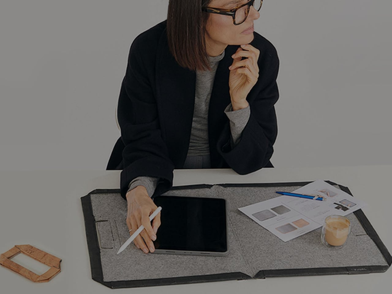
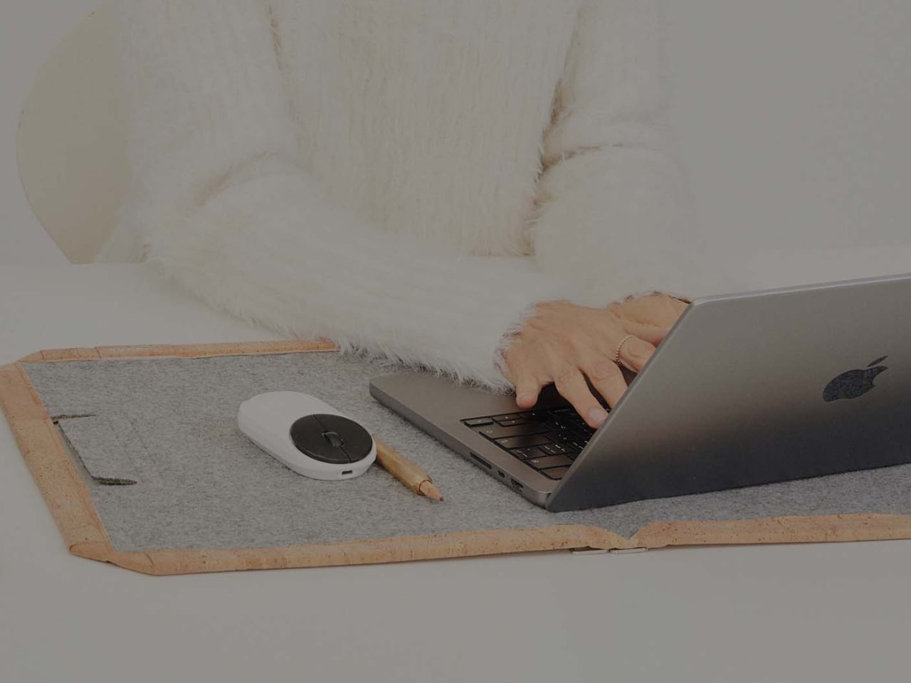
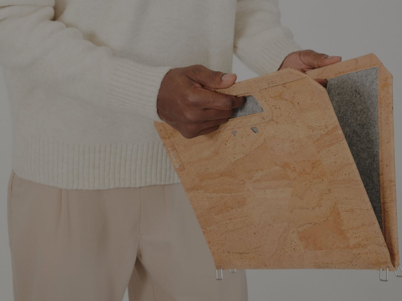
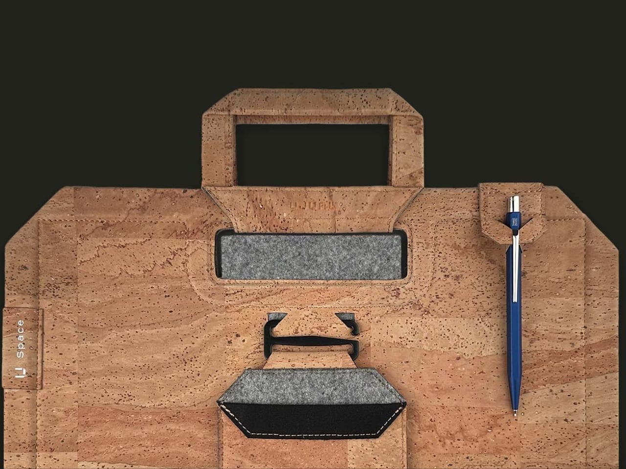
U Space is one of those things you can use to set up a temporary office wherever you need to work. It’s a Swiss-designed laptop bag also inspired by the Japanese art of origami. It doesn’t just serve as storage while you’re walking around; it transforms into a mini workspace the moment you unfold it.

Designer: UJUAL

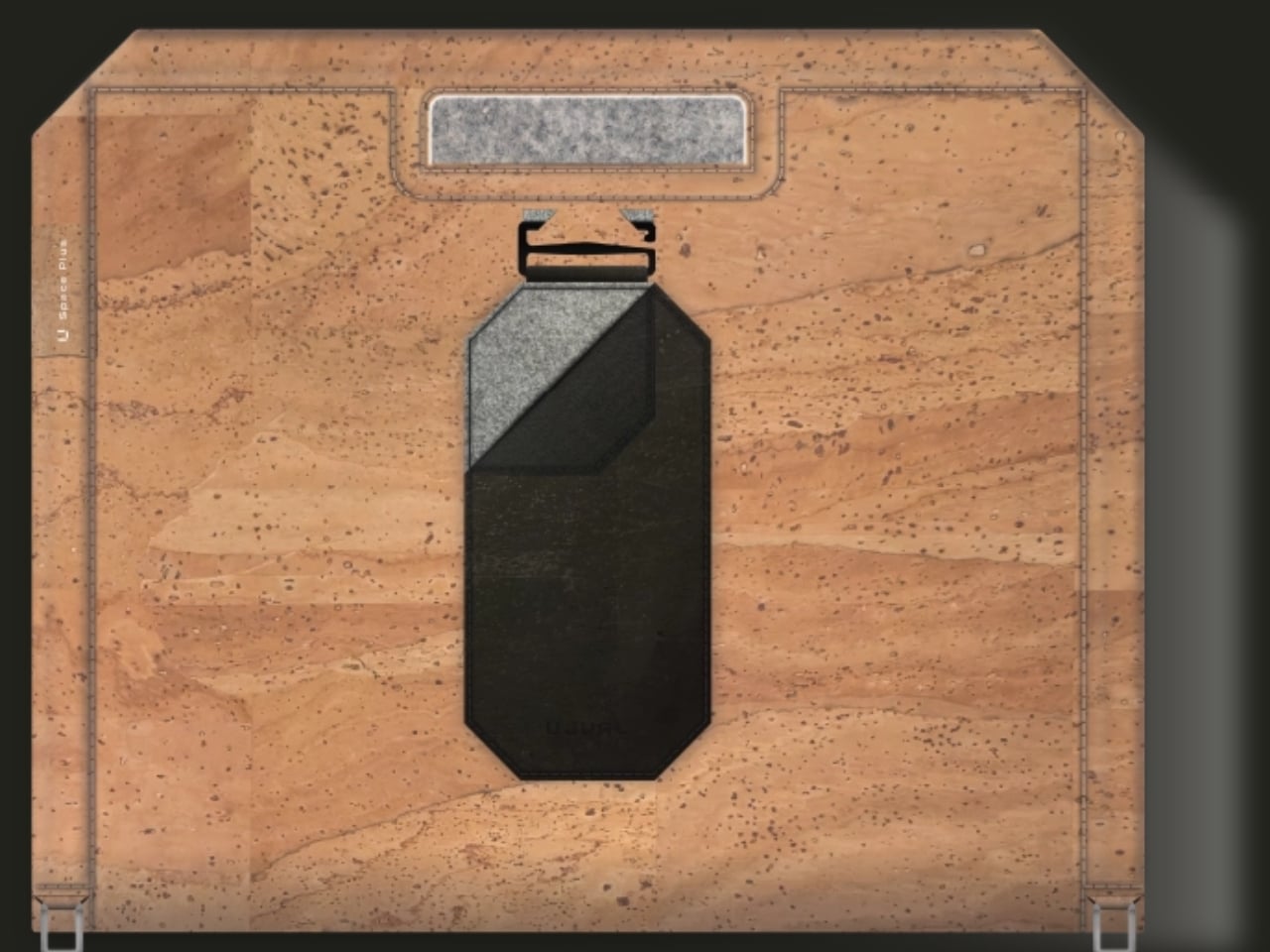
U Space is a “bag that becomes a desk,” and it lets you work in places where it can otherwise be hard to set up office. Even though it’s inspired by origami, it isn’t nearly as complicated as the Japanese art can be. In just one flip-and-fold motion, it unfolds into a flat working surface, making it far more convenient to work on your laptop or notebook while sitting on a chair, at a café table, on a park bench, or even on your lap if there’s nowhere else to work.

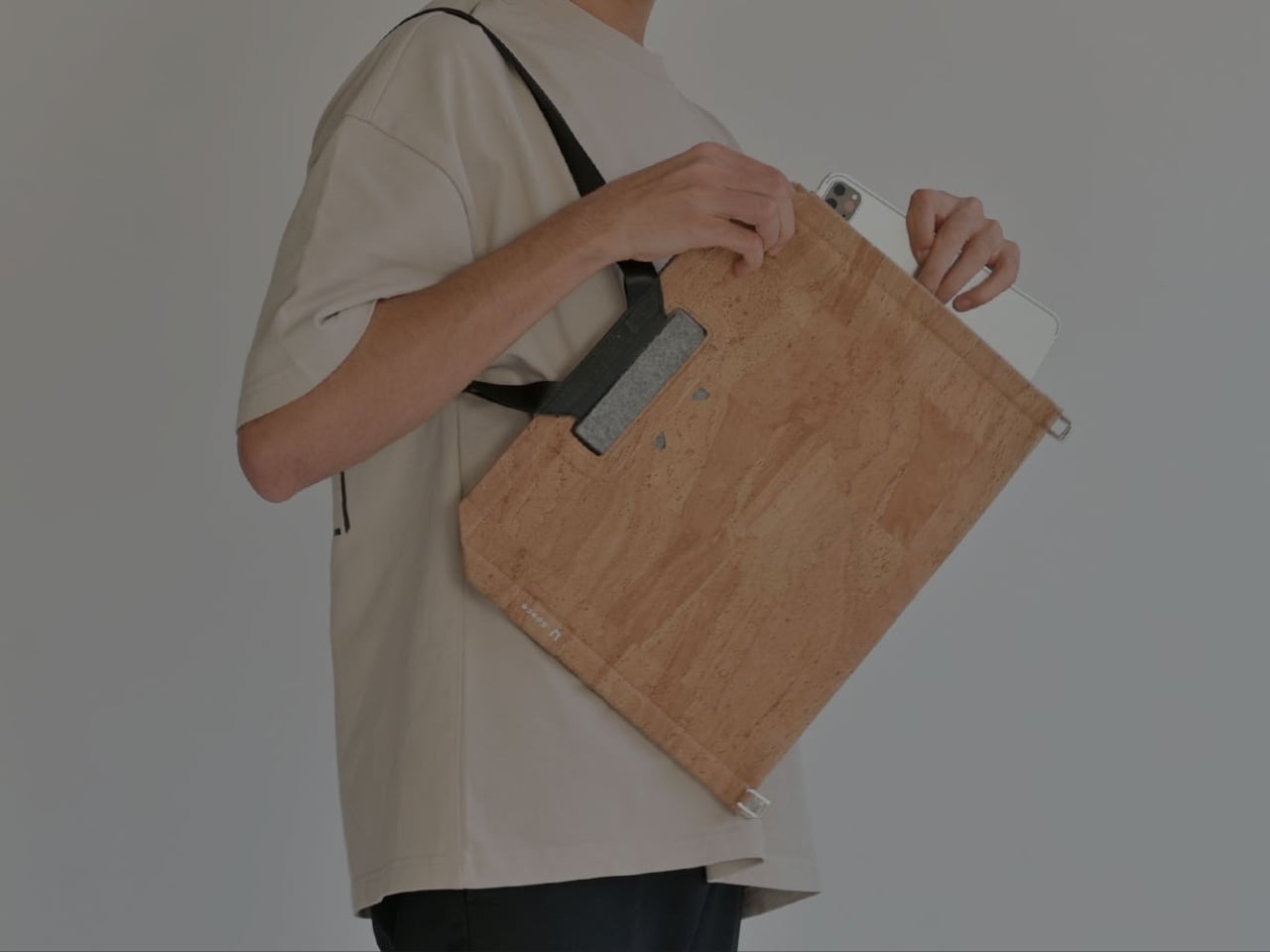
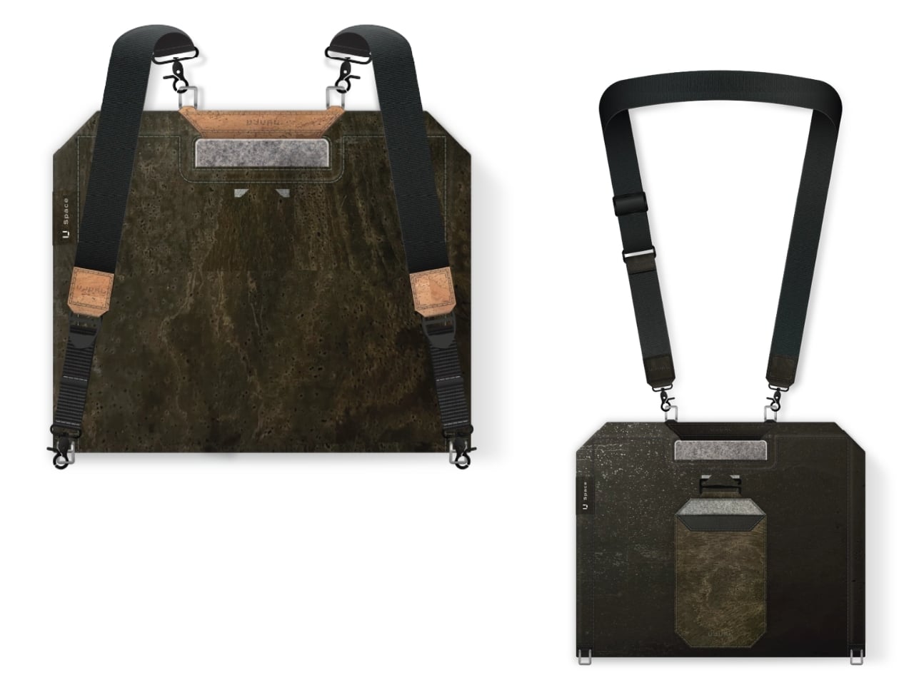
When it’s not doubling as your mobile desk, U Space is a multi-mode bag you can wear as a briefcase, messenger bag, or backpack. It’s versatile enough to carry with you whether you’re commuting, walking, or getting around any other way. It also has a three-layer magnet system, so you can quickly grab items like your phone, cables, or pens without digging through the whole bag or even unzipping it.

The bag can carry around 44 pounds (20 kilograms) of gear securely and is built using sustainable, durable materials. It’s available in finishes like Oak Beige, Ebony Black, Sumac Kaki, and Beech Grey, but it can also be customized with different colors and artwork. U Space also comes in a few different sizes, so there’s a version to fit whatever device you’re carrying, whether that’s a compact tablet or a full-size 16-inch laptop.

How does U Space measure up against the competition? Compared to established names like Peak Design, known for its modular Everyday Backpack lineup and its own magnetic accessory system, U Space is playing in a similar space of minimalist design and thoughtful organization. Peak Design has built a loyal following among photographers and digital nomads for how well-organized its bags are, but at the end of the day, even its most versatile bags are still just really good bags. U Space, on the other hand, pushes the idea further by literally changing what a bag can be. Rather than just holding your gear more efficiently, it unfolds into a physical work surface, something you won’t find in mainstream backpack brands. That single feature is what sets U Space apart in a crowded market of laptop bags competing mostly on pockets, zippers, and padding.

At a time when more people are trading their desks for whatever surface is available, U Space offers a genuinely useful solution instead of just another bag with a fresh coat of paint. It’s the kind of product that quietly earns its price by solving a problem you didn’t realize had such a simple fix: not having anywhere to actually put your laptop down. Whether you’re a freelancer bouncing between coffee shops, a student who needs a stable surface between classes, or a frequent traveler tired of balancing a laptop on your knees at the gate, U Space is built with that lifestyle in mind. It’s proof that good design isn’t always about adding more features; sometimes it’s about rethinking the object itself. For anyone whose “office” changes location every day, U Space might be the one accessory that finally keeps up.

The post The Laptop Bag That Finally Doubles as Your Desk first appeared on Yanko Design.

  •  

IKEA’s Tiny Houses Quietly Admit Your Messy Home Is Fine

Even though I have enough space to have people over, the fact that my place is terribly messy stops me from inviting family and friends. I don’t want to spend an entire day just stuffing stuff I want to hide into my boxes and closets. That’s not a design problem. That’s a me problem and more specifically, a modern life problem, and it happens to be the exact one IKEA just built a series of dollhouses to talk about.

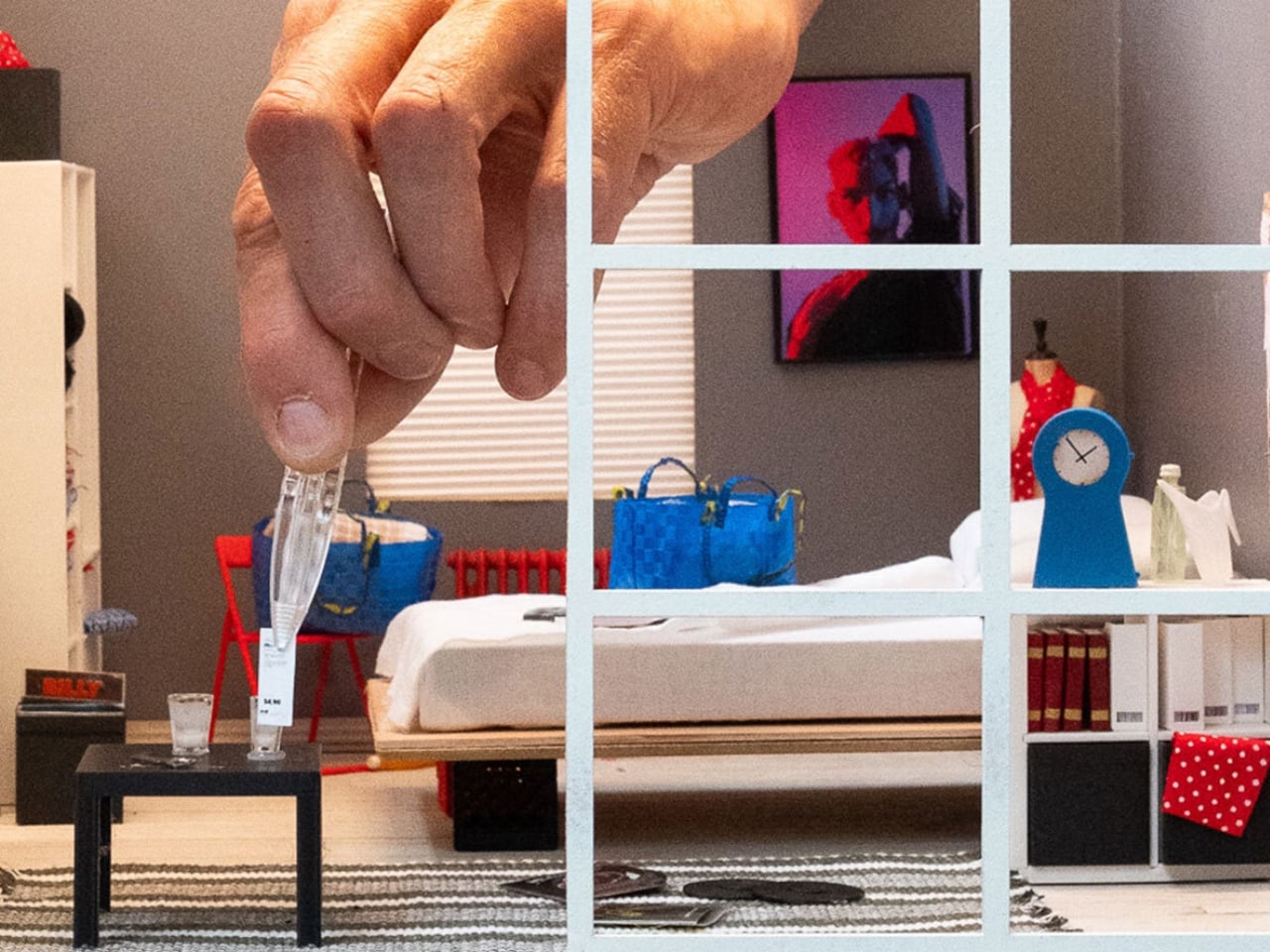
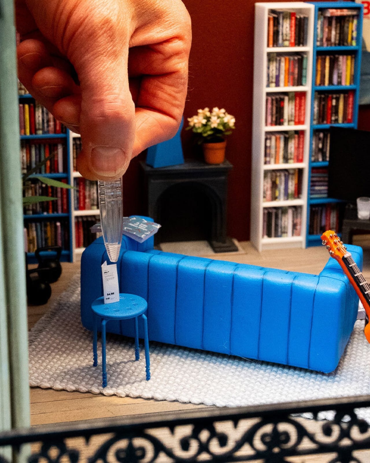
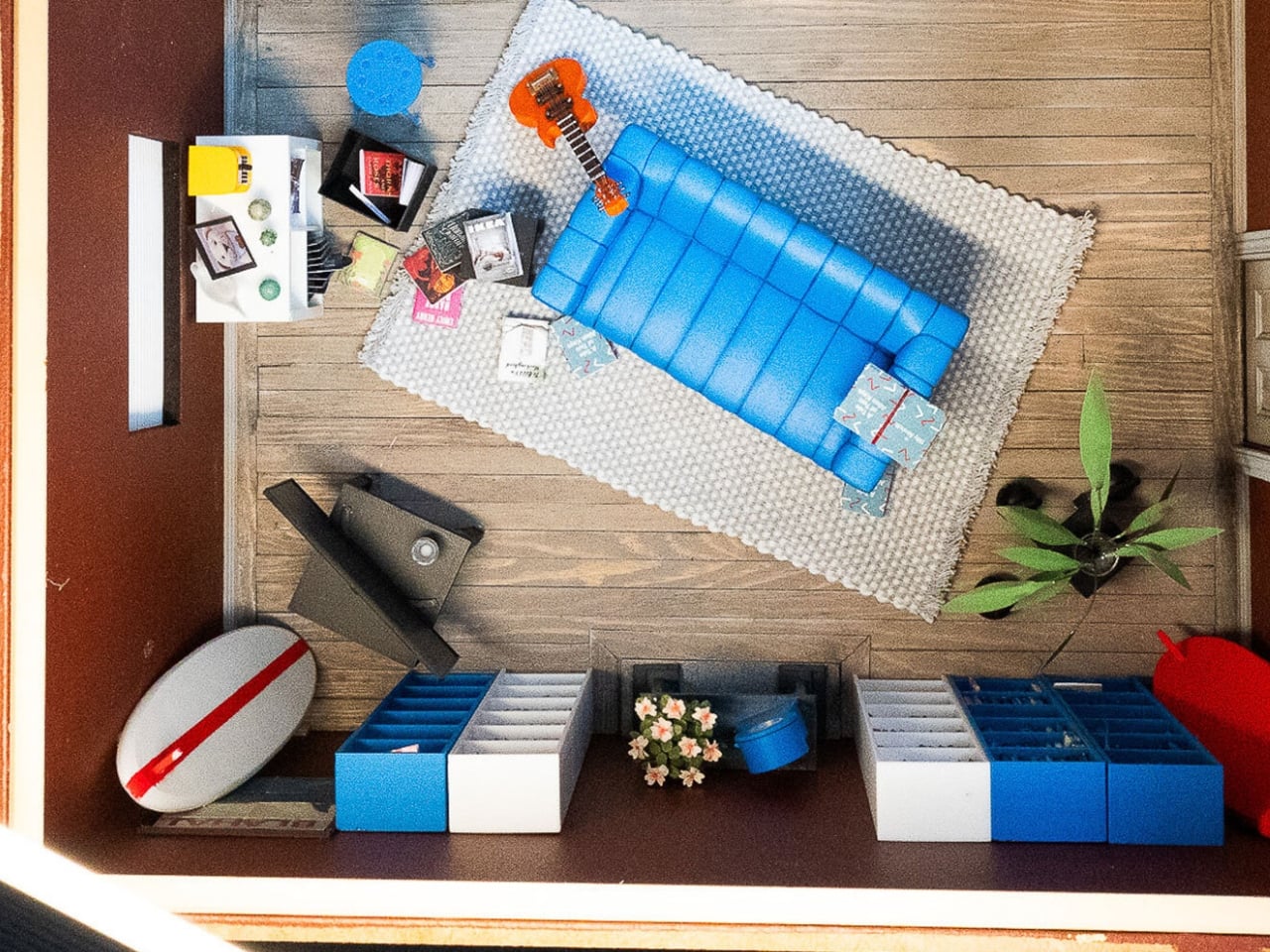
The company recently installed handcrafted miniature homes, built at a precise 1:12 scale, in public spaces across Melbourne, Chengdu, and Beijing. They’re gorgeous, obsessively detailed little things made by Stockholm-based miniature artist Christopher Robin Nordström, who goes by TokyoBuild online. But they’re not really about scale-model furniture. They’re about the fact that our homes are now expected to be office, gym, classroom, and sanctuary all at once, in the same square footage we’ve always had, while somehow still looking like a magazine spread. That expectation is exhausting, and most of us already know it.

Designer: Christopher Robin Nordström for IKEA

IKEA backed this up with a survey of more than 30,000 people across 31 countries, and the headline number is the kind of thing you want to text a friend: 59 percent said they’d rather live somewhere characterful than somewhere manicured. Not a landslide, but a real majority, and a fairly clear rejection of the sterile, everything-matches aesthetic we’ve been sold for the last decade.

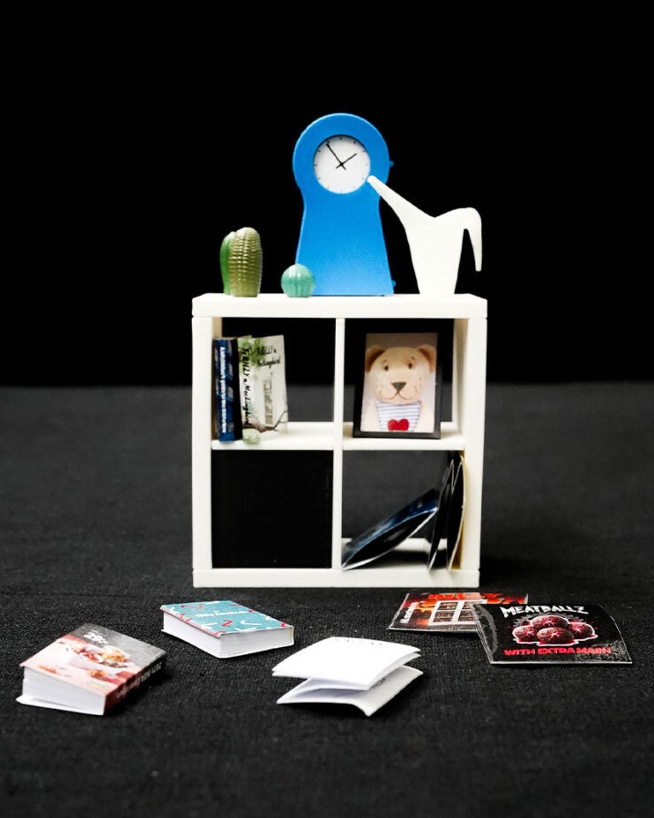
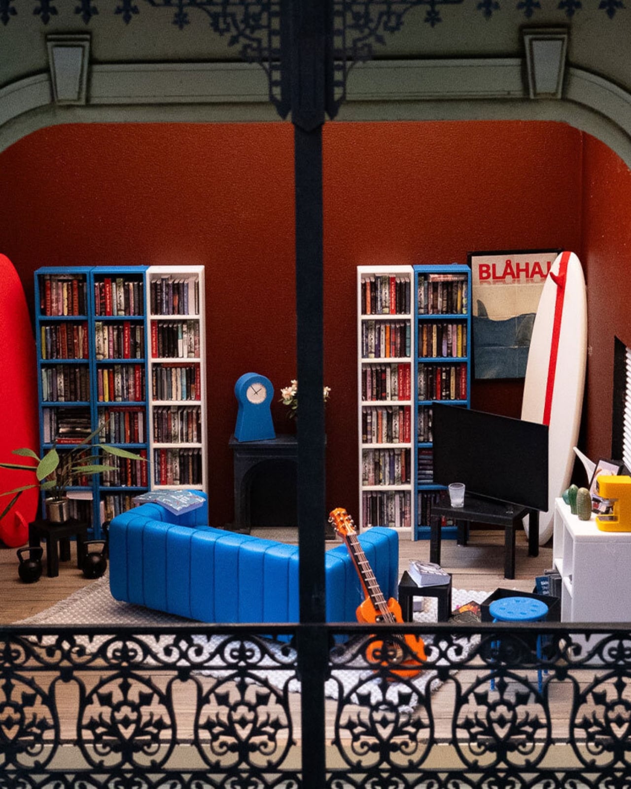
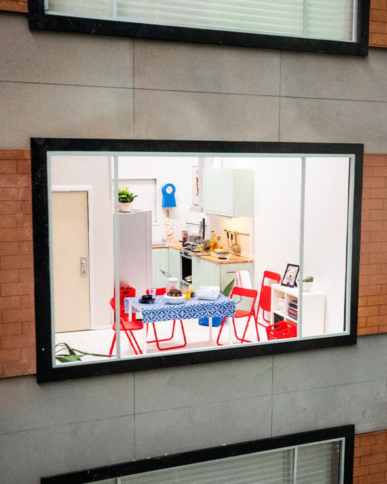
I like that the tiny houses lean into locality instead of pretending every home looks the same everywhere. The Melbourne model has a miniature BILLY bookcase stacked with tiny novels and sports memorabilia. The Chengdu and Beijing versions center on scaled-down METOD kitchens instead, because that’s where those homes actually live and breathe. It’s a small choice, but it says the quiet part out loud: nobody’s home is supposed to look like a showroom, because nobody’s life actually happens in a showroom.

Nordström said something that stuck with me more than any stat in the report. He explained that when you build in miniature, you can’t include everything, so every object has to earn its place, and you realize a home isn’t defined by how much it contains but by what people choose to make room for. That’s a graceful way to describe editing your life down to what matters, and it applies just as well at full scale as it does at one twelfth of it.

The behavioral data is where this stops feeling like a marketing campaign and starts feeling like a mirror. Nearly one in five people admit to keeping gifts they never wanted, just to avoid hurting someone’s feelings. More than a quarter hide mementos from past relationships, a habit slightly more common among men. Ten percent have actually canceled plans with friends because their place felt too messy to host, and over a third shuffle clutter from room to room right before guests arrive. Some people use their oven purely for storage, which, if I’m honest, sounds familiar to at least one junk drawer I refuse to open around visitors.

What strikes me isn’t that people are messy. It’s that so many of us are quietly performing tidiness for other people instead of actually living in our own space. IKEA’s pitch, wrapped up in tiny bookshelves and miniature kitchens, is refreshingly modest: you don’t need a renovation to fix that. You need smarter storage and permission to stop apologizing for your actual life.

The tiny houses tour wraps up soon, but IKEA Open House continues in stores through September, built around the same idea at real scale, with the kind of affordable, small-footprint fixes most of us can actually use. Whether or not you ever walk through it, the message is worth sitting with. Perfect homes are rare. Honest ones are just about everywhere, once you stop hiding them.

The post IKEA’s Tiny Houses Quietly Admit Your Messy Home Is Fine first appeared on Yanko Design.
  •  

Japanese Designers Just Solved the Dead Battery Diffuser Problem

There are several times a day when you’ll want to sit down and take in the aroma of your favorite essential oils. It might be early in the morning to help you wake up, right when you start work and need a boost of energy, at the end of the day when you’re relaxing, journaling, or reading, or right before bed so the scent can help you settle into a good night’s sleep. At any of those moments, your oil diffuser is your best friend, that is, unless it runs out of battery or charge right in the middle of your routine.

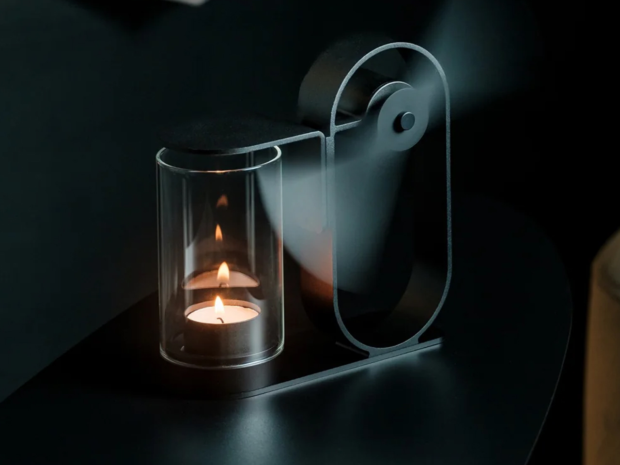
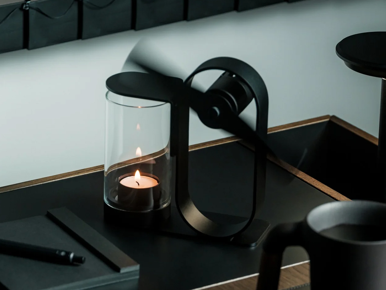
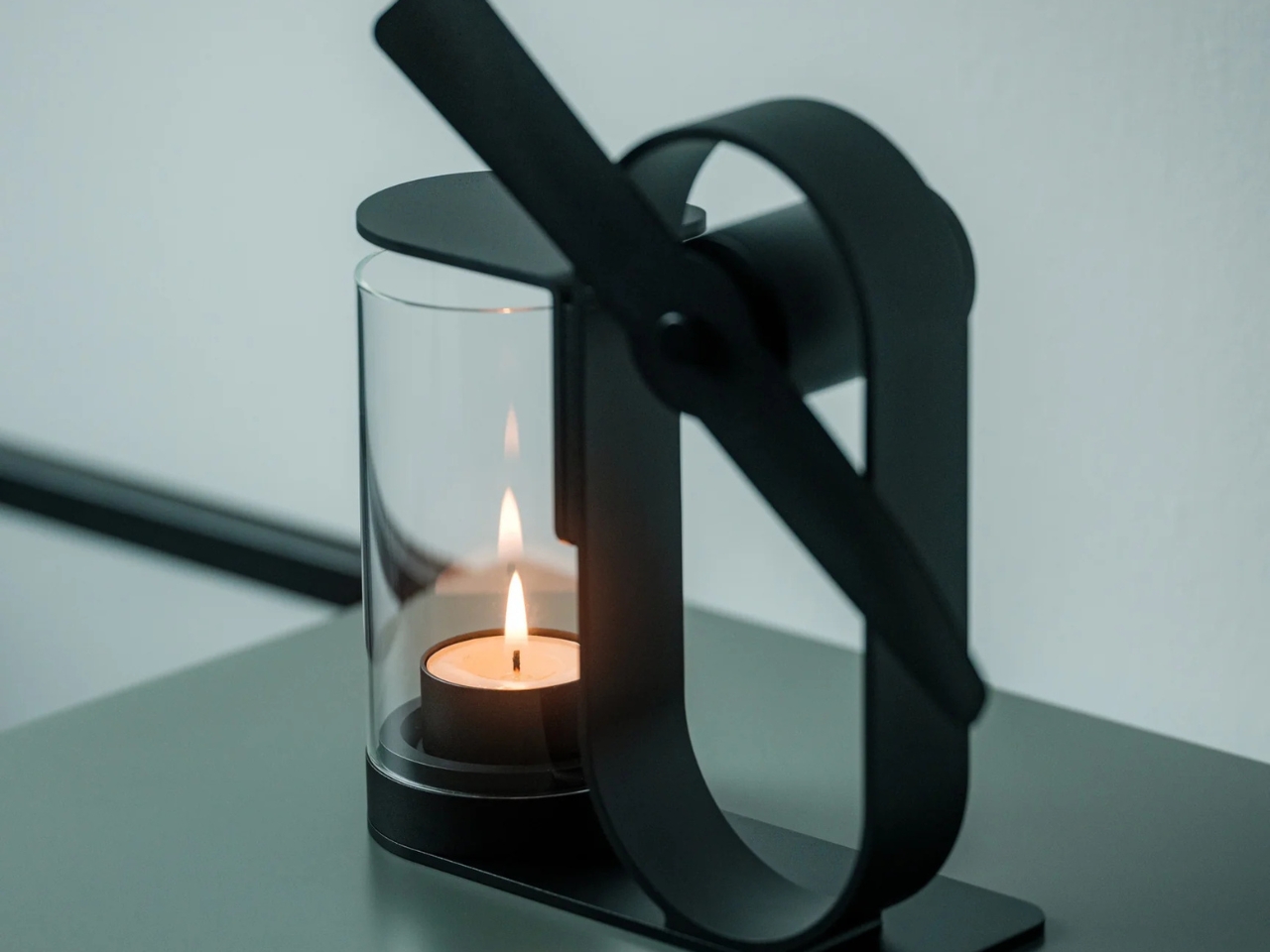
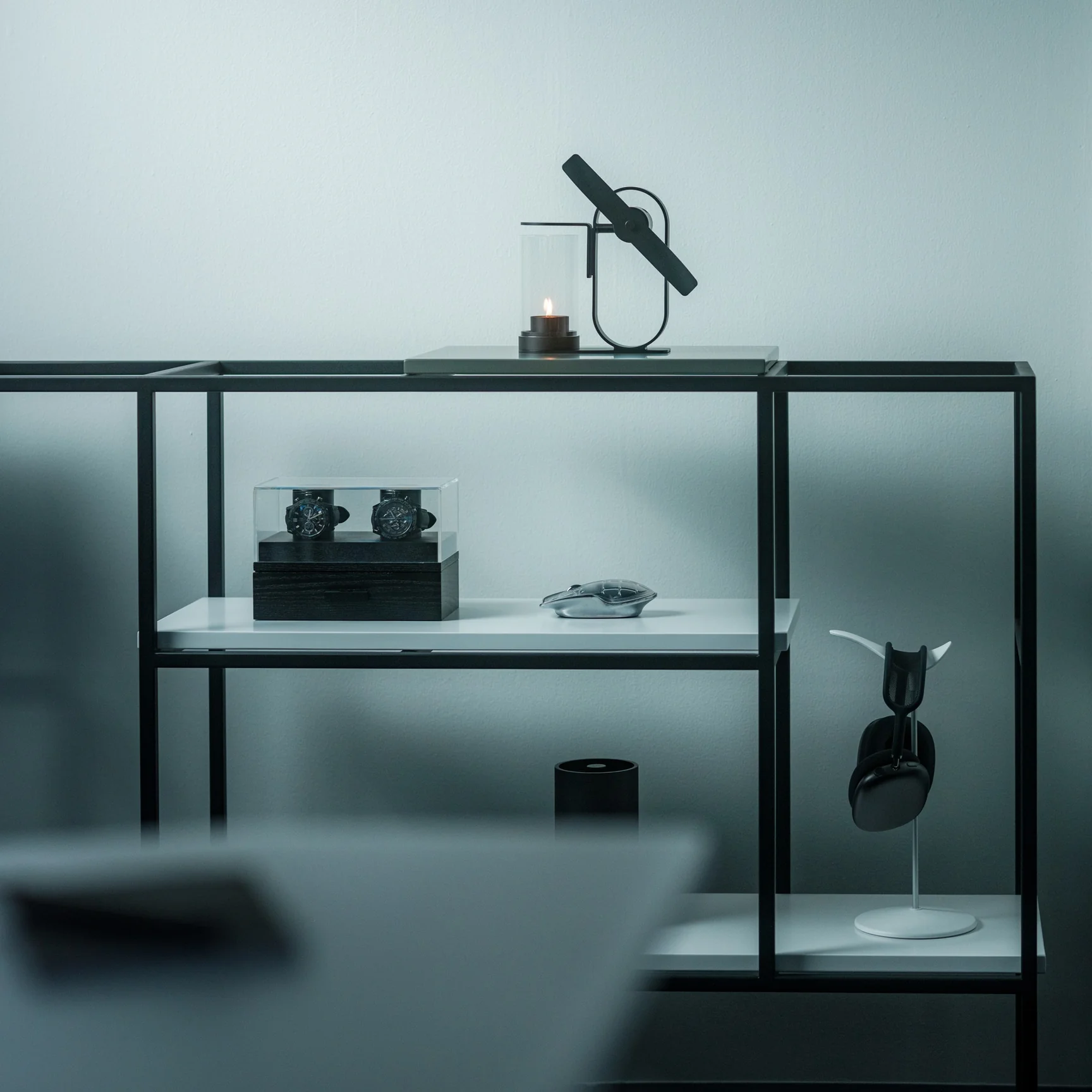
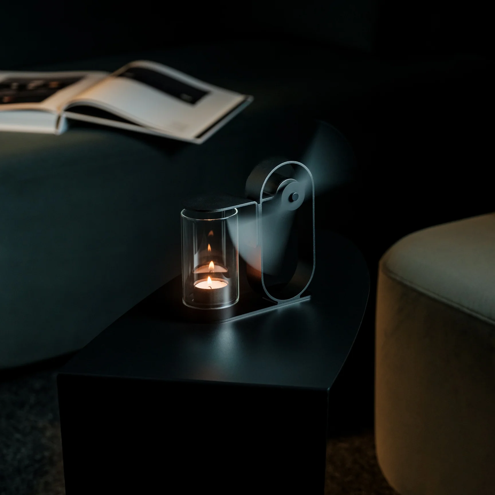
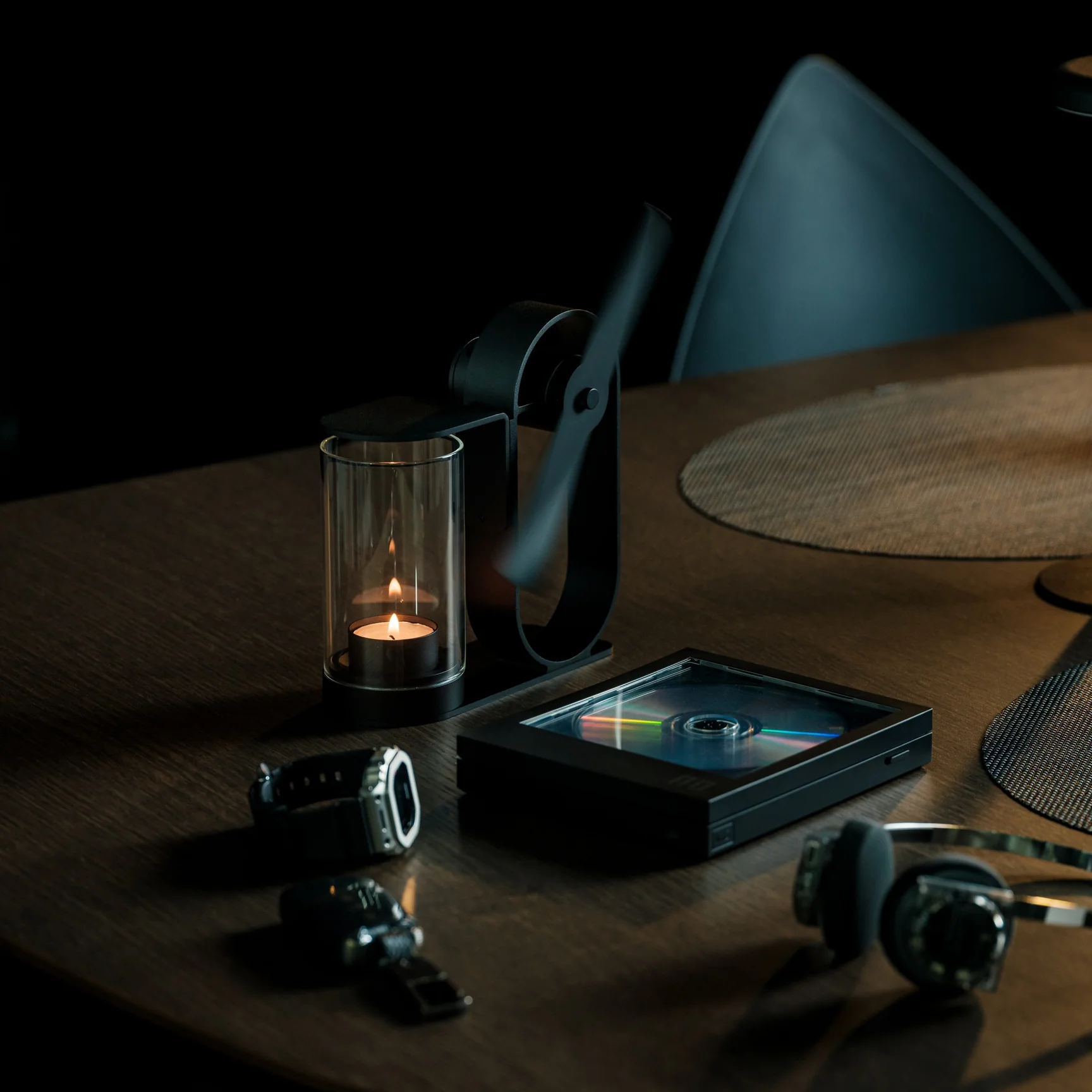
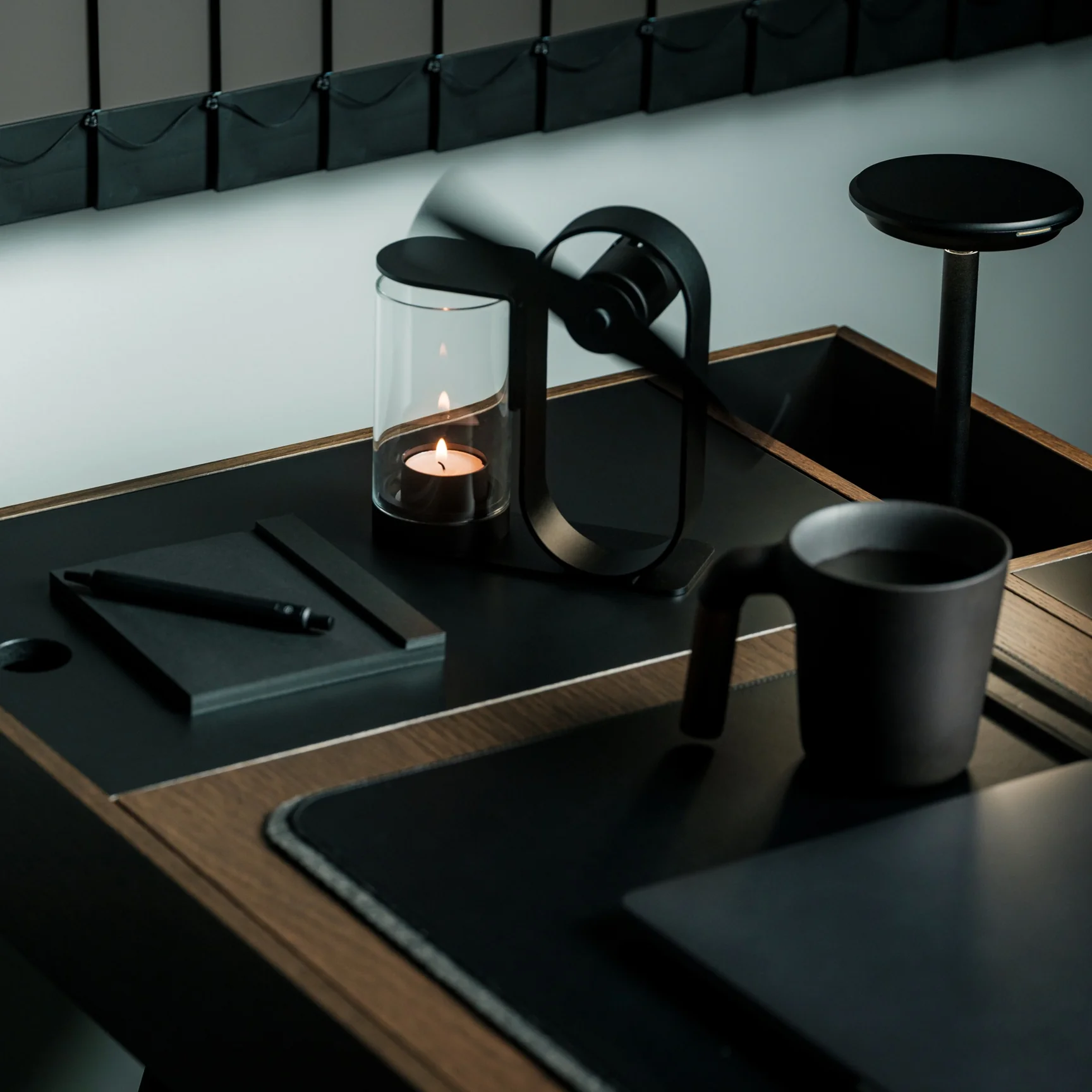
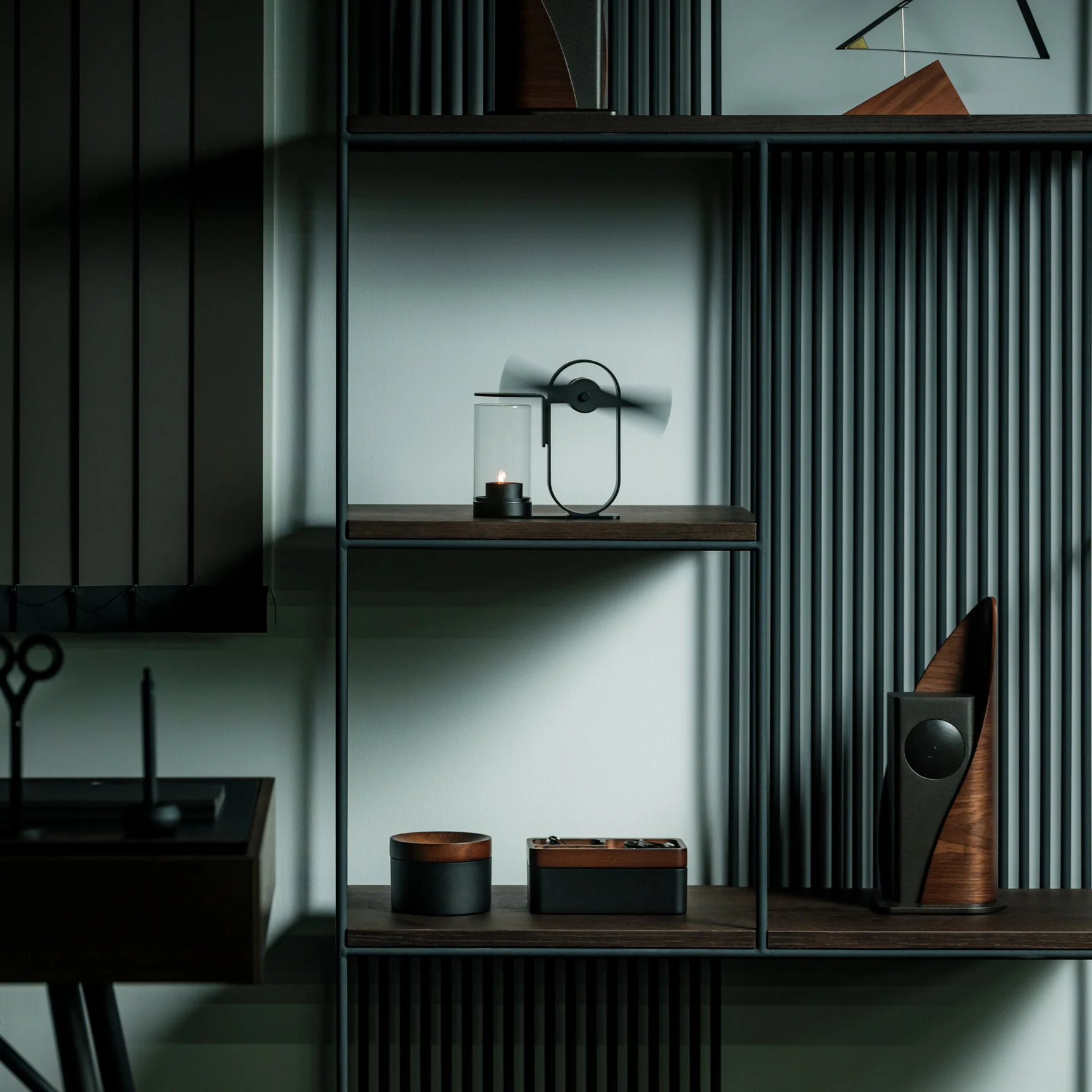
If you’re using the Battery-Free Aroma Diffuser, that’s one problem you’ll never have. As the name suggests, it’s completely battery-free and skips the fancy ultrasonic tech found in most diffusers on the market. All you need is a candle; its rising heat spins a built-in propeller that carries the scent of your essential oil of choice, and you’re all set to relax or recharge, whichever one you need. Setting it up becomes part of your morning or nighttime ritual, giving you what’s been called “magic powered by a single flame.”

Click Here to Buy Now: $290.00

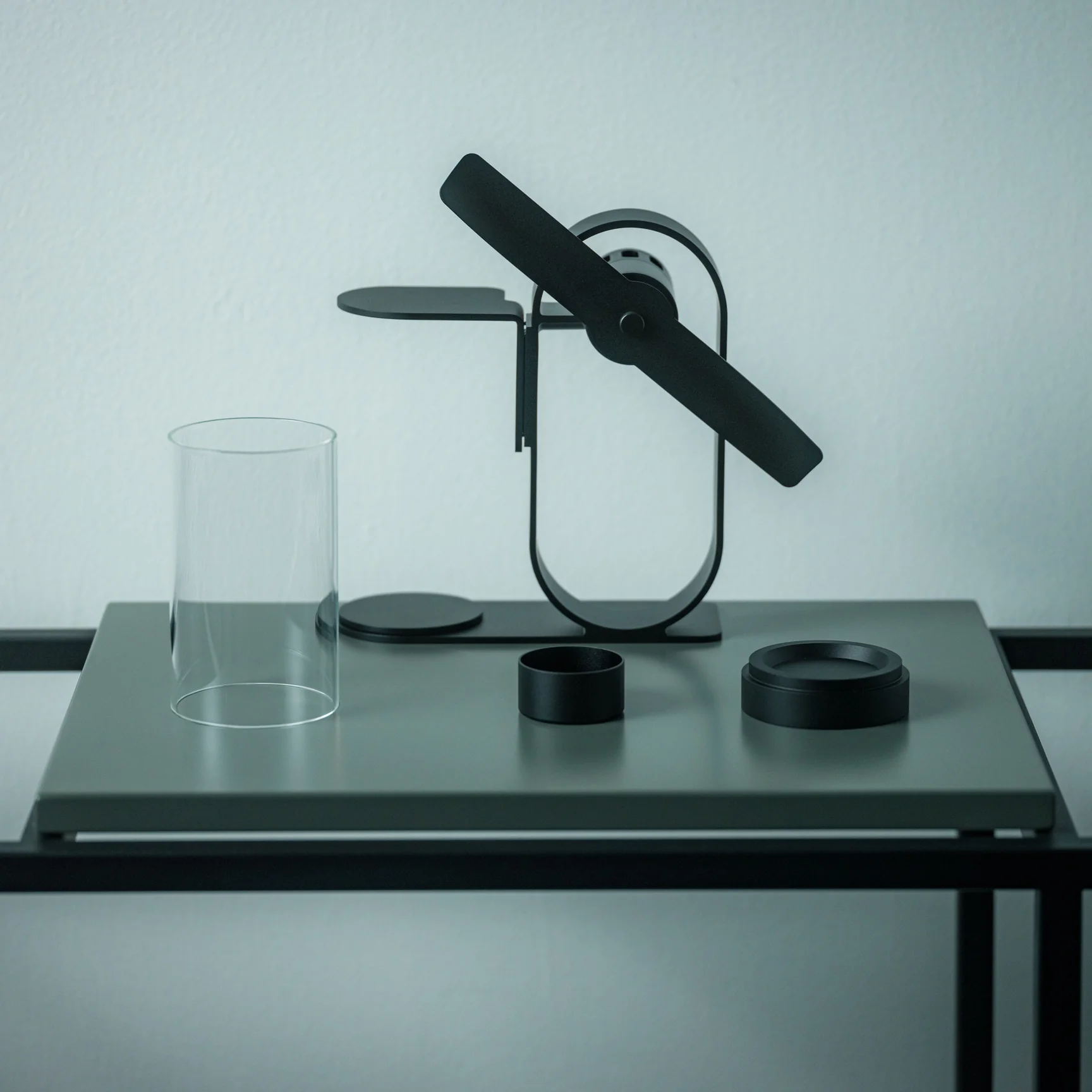
This diffuser was designed by Yu Ito and Yoshimi Kemmotsu of SOL style. Most diffusers on the market run on batteries, charging cables, and plastic ultrasonic components. This one skips all of that and works on nothing more than physics, heat, and fire. Its minimalist, elegant design only adds to the “magic” of the experience, as you watch your essential oils fill the room in a way that feels almost mystical. Because so much of the piece is transparent, you can see exactly how it works, from the flickering candle flame to the visibly spinning propeller above it.

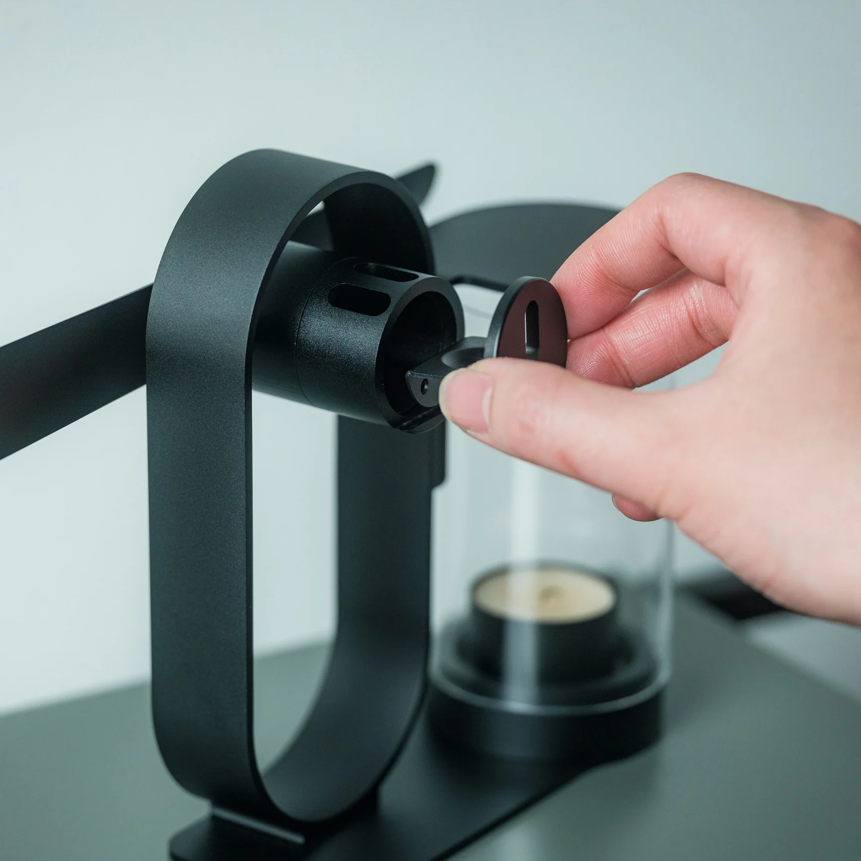
The process of using the diffuser is refreshingly simple and doesn’t involve a lot of steps. Start by placing your essential oil of choice in the dedicated compartment located at the center of the propeller. Light a candle and set the cover in place. Wait about two to three minutes for the rising heat to spin the built-in propeller, and once it’s turning, it will carry the scent of your oils and fill the space around you.

The diffuser itself is built from aluminum, glass, and iron, materials chosen for being sustainable and long-lasting, so you’re not contributing to the pile of dead batteries or broken plastic housings that come with most electric diffusers. Because it needs no outlet and no batteries, it’s also completely portable. Set it up on your dining table, your nightstand, or even take it outside for a quiet evening on the patio.

If you’ve shopped for a diffuser before, you’ve likely come across a big name like Vitruvi, whose Stone Diffuser is frequently ranked among the best overall by outlets like Wirecutter and InStyle. Vitruvi’s design is genuinely beautiful, but it’s still an electric, ultrasonic device that needs to be plugged in or charged to run. More budget-friendly brands like InnoGear and Urpower take a similar ultrasonic approach at a much lower price, but they typically trade craftsmanship and material quality for affordability, leaning on plastic components that don’t hold up as well over time.

The Battery-Free Aroma Diffuser doesn’t try to compete on mist output, app connectivity, or color-changing lights. Instead, it carves out its own lane by focusing on ritual, sustainability, and craftsmanship. You won’t get smart features or adjustable settings, but you also won’t ever need to charge it, replace a battery, or worry about internal electronics failing. It does come at a premium, priced around $249 compared to the roughly $30 to $130 range most ultrasonic diffusers occupy, but for design lovers and sustainability-minded shoppers, that price reflects a genuinely different kind of product rather than just another gadget competing on specs.

At the end of the day, the Battery-Free Aroma Diffuser isn’t trying to be the most powerful or the most tech-forward diffuser on your shelf, it’s trying to be the most memorable. Whether you’re using it to ease into your morning coffee, get into a work groove, unwind after a long day, or settle in before bed, lighting that single candle and watching the propeller slowly spring to life feels far more intentional than simply pressing a power button. It won’t die mid-session, won’t need a replacement battery, and won’t end up as e-waste a few years down the line. For anyone looking to turn aromatherapy into an actual experience rather than just another appliance to switch on, this quiet, flame-powered design might be one of the most beautiful ways to get there.

The post Japanese Designers Just Solved the Dead Battery Diffuser Problem first appeared on Yanko Design.

  •  

This Japanese Bottle Opener Catches the Cap So You Never Chase It Again

When you come home after a long, hectic day, sometimes all you want to do is sink into the couch, scroll through your phone, and crack open a cold drink. But when that “cold one” happens to be a bottle of beer or soda, things do not always go according to plan. The opener slips, the cap bends and gets mangled, or it pops off and goes skittering across the counter or under the couch. It is a minor inconvenience, sure, but it has a funny way of taking a little of the relaxation out of what should be a simple, satisfying moment.

The First Pour Bottle Opener was built to fix exactly that. Made by Suwada, a legendary Japanese blacksmith house, it is an elegantly crafted tool designed to let you enjoy your drink in peace. Its flowing, sculptural silhouette also makes it a genuine piece of design rather than a purely functional gadget you shove in a drawer and forget about.

Click Here to Buy Now: $65.00

The bottle opener is forged from solid, corrosion-resistant stainless steel and finished with a hand-applied satin coat that gives it a soft, understated shine. Its shape isn’t flashy or complicated, and that’s exactly the point: the stripped-down, minimalist form is what makes it look right at home sitting out on your kitchen counter, bar cart, or shelf, instead of buried in a drawer with your corkscrews and other odds and ends. It’s also a quiet nod to Suwada’s roots. The company has been forging blades and metal tools in Tsubame-Sanjo, a Japanese region famous for generations of metalworking mastery, so the craftsmanship behind this little opener runs a lot deeper than its price tag might suggest.

Where the First Pour really earns its keep is in the details. It opens bottle caps cleanly without bending or denting them, so you’re not left with a crushed, jagged souvenir every time you crack open a drink. It also has a built-in magnet that catches the cap the instant it pops free, rather than letting it clatter onto the counter, roll under the fridge, or scuff up your countertop. It’s a small addition, but it’s the kind of thoughtful touch a lot of openers skip entirely, and one that makes a genuine difference every single time you use it.

For comparison, a mainstream option like the OXO Good Grips Bottle Opener retails for around $10 and gets the job done just fine, thanks to a soft, non-slip handle built for everyday comfort. It’s a reliable, no-frills tool, and there’s nothing wrong with that. But it is purely utilitarian: there’s no magnet to catch the cap, no display-worthy design, and no real story behind how it’s made. At $65, the First Pour Bottle Opener costs several times more, but you’re paying for hand-applied craftsmanship, a heritage that spans centuries, corrosion-resistant stainless steel, and a magnetic cap-catch that solves a problem most openers on the market, including OXO’s, simply don’t address. It’s less an “opener versus opener” comparison and more a question of whether you want a tool that just works, or one that works beautifully and looks the part while doing it.

I don’t usually think much about something like a bottle opener when I’m shopping for my kitchen. It’s one of those tools you buy once and only think about again when it fails you. But something like the First Pour Bottle Opener makes you reconsider how small changes, whether to design or function, can matter more than you’d expect. Using it turns a mundane, thoughtless task into a small, satisfying ritual, one you can look forward to with that end-of-day (or, let’s be honest, middle-of-the-day) cold drink. Sometimes it really is the small things that make a good moment feel a little better, and this humble little tool is proof that even the objects we take for granted deserve a second look.

The post This Japanese Bottle Opener Catches the Cap So You Never Chase It Again first appeared on Yanko Design.

  •  

A Clock That Refuses to Just Tell You the Time

I check the time roughly forty times a day, and I couldn’t tell you what any of those glances felt like. A phone screen lights up, a number flashes, and I move on before the information even registers. That’s the strange thing about how we live with time now: we have more ways than ever to know what hour it is, and less reason than ever to actually notice it. Digital displays don’t ask anything of us. They just report, and we absorb, and nothing about the moment sticks.

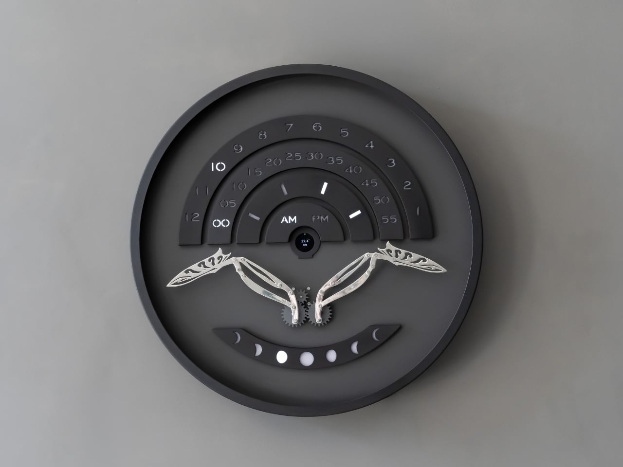
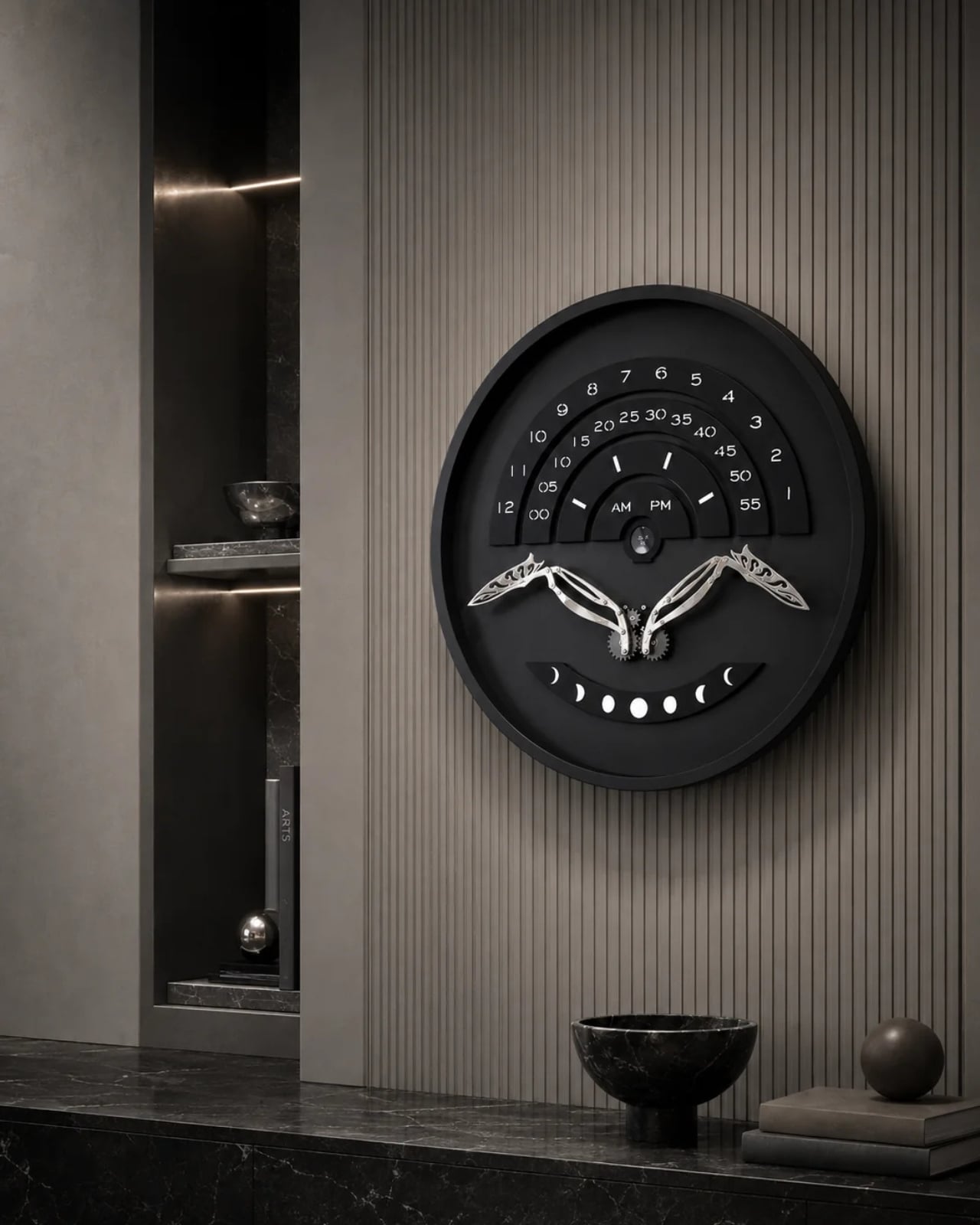
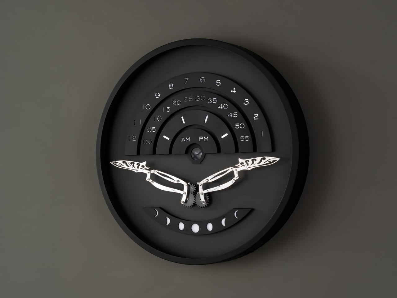
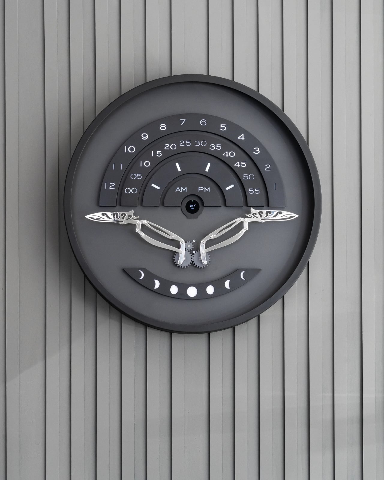
That’s the gap a new piece from Istanbul studio Omora Lusso seems built to close. Instead of showing the hour as flat information, it makes you wait for it, watch for it, and experience it as something closer to a small performance than a readout. The studio calls it Muvaqqit 60, and as the press materials put it, it’s a 60-centimetre kinetic time artwork that transforms the reading of time into a recurring physical ritual.

Designer: Omora Lusso

The name itself carries weight before the mechanism even moves. Muvaqqit takes its name from the historical timekeeper responsible for determining and regulating time through astronomy and exact observation, and in Ottoman cities, muvakkithanes were dedicated timekeeping rooms, often associated with mosque complexes, where prayer times were calculated and astronomical knowledge was practised. I appreciate that Omora Lusso didn’t try to costume this piece in false antiquity. The studio does not reproduce the instruments or forms of these spaces; instead, it reinterprets their culture of precision, contemplation and measured time through contemporary kinetic design. That distinction matters. It would have been easy, and a little lazy, to slap old astronomical symbols onto a modern object and call it heritage. This is a harder, more honest route: borrowing the spirit of a tradition rather than its skin.

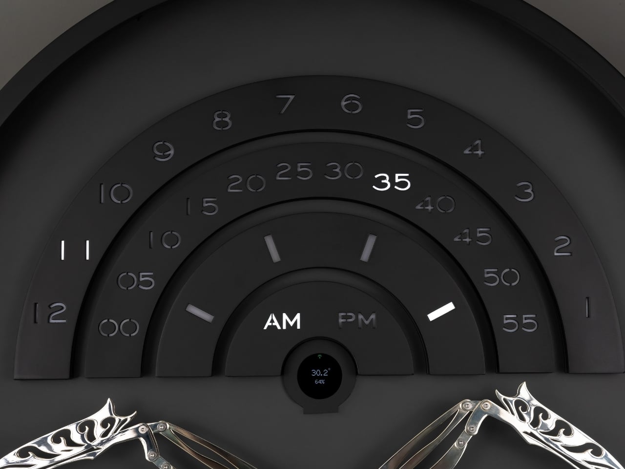
The piece itself only reveals what it can do once a minute, and that restraint is the whole point. Once each minute, Muvaqqit performs a time-indication sequence: a comet-like progression of light moves through its layered scales as a mirror-silvered kinetic bird rises into position, while the hour, five-minute interval and minute increment are read across three curved scales, with an AM/PM display and an illuminated moon-phase arc completing the temporal composition. The rest of the time, it stays quiet on purpose. Between these moments, the work remains visually restrained, allowing anticipation to become part of the experience. There’s a kind of confidence in a product that chooses to stay dark and still for fifty-nine seconds just so the sixtieth means something. Most gadgets are terrified of silence. This one leans into it.

Omer Fatih Sevinctekin, the studio’s founder, frames the whole project as a question rather than a solution, which I found refreshing given how many product launches arrive dressed as answers. He describes it as beginning with the question of whether time can be experienced as a ritual rather than simply read as information, wanting the work to connect Istanbul’s culture of precise timekeeping with a contemporary language of motion, light and material.

Materially, the Noir Silver edition plays a straightforward but effective contrast game. It pairs a soft-black metal frame and anthracite inner dial with a hand-polished, mirror-silvered brass bird, presented behind a four-millimetre glass front, with a controlled palette designed to sharpen the contrast between stillness and movement, and between the dark architectural body and the brief illumination of the time ritual. Nothing about it is loud until the moment it needs to be.

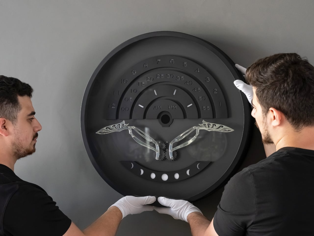
This isn’t a mass object, and it was never going to be. Muvaqqit 60 Noir Silver is limited to 50 pieces worldwide, offered at USD 6,000, with each work produced in Istanbul and accompanied by a Certificate of Authenticity, a dedicated wooden presentation case, art-handling gloves and operating materials. That price and scarcity will keep it out of most homes, and I won’t pretend otherwise. But the idea underneath it, that time deserves a moment of attention instead of a passing glance, doesn’t require owning the object to land. The studio’s broader collection treats time not as a static reading but as an event, a sequence that can be anticipated, observed and remembered, and that’s a quietly radical stance in a culture that mostly wants its information delivered instantly and forgotten just as fast.

The post A Clock That Refuses to Just Tell You the Time first appeared on Yanko Design.

  •  

Finally Focus Without Your Phone: The $54 Wooden To-Do Kit

As someone who enjoys making lists, whether it’s productivity lists, pop culture rankings, journaling spreads, or actual listicles for work, I have accumulated more notebooks and apps than I probably need. Sometimes, though, what you really need isn’t another app or another notebook. What you need is something that forces you to focus on the one task that actually matters instead of getting distracted by pop-up windows, social media notifications, or the colorful pens and stickers calling your name from the journaling aisle.

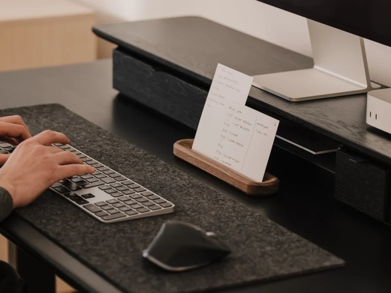
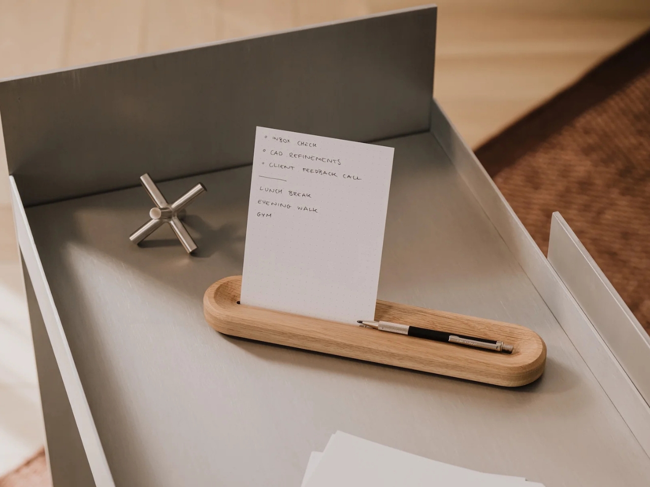
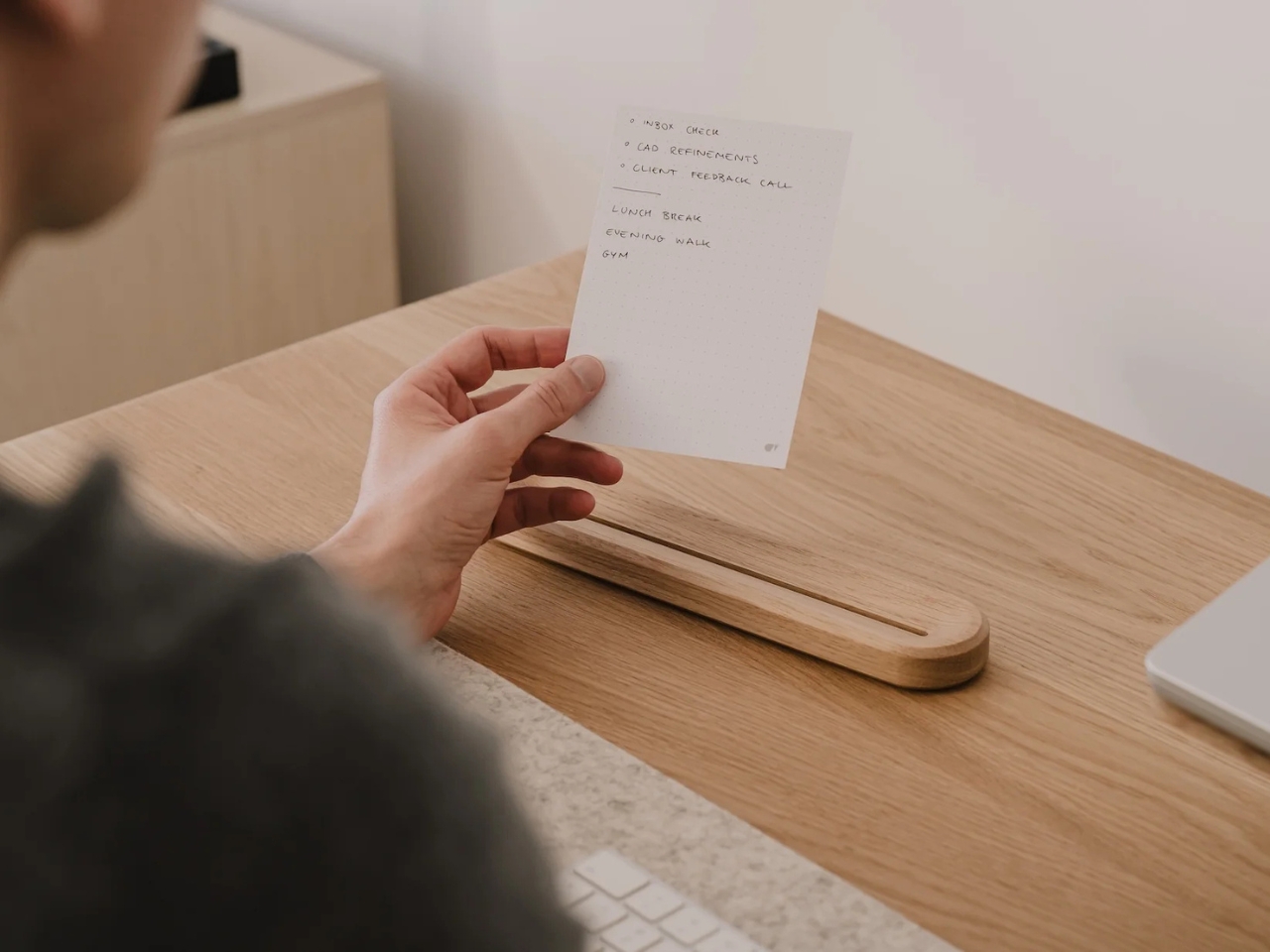
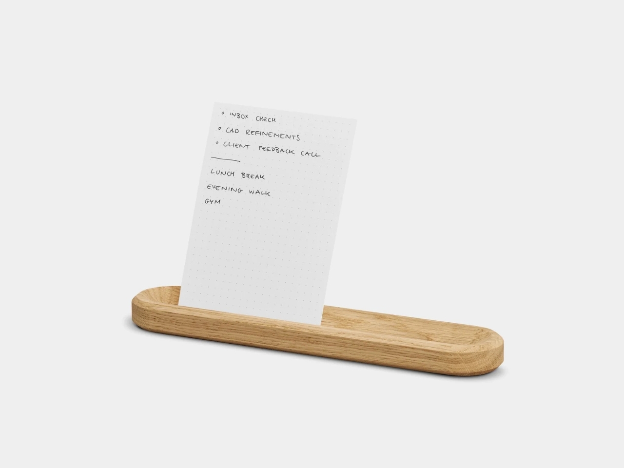
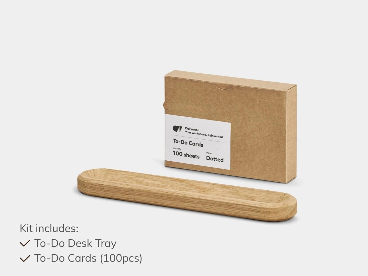
The To-Do Desk Kit from Oakywood wants to solve exactly that problem by narrowing your focus down to a single piece of paper, placed on a small wooden card holder, sitting right at eye level on your desk. It’s a simple, minimalist tool, but it’s designed with a clear purpose: to bring a bit of analog calm back to what is probably a screen-cluttered and object-cluttered workspace. Sure, you could just grab a notepad or scribble on a whiteboard, but this is a far more aesthetic and intentional way to work on your productivity, and it looks good doing it.

Design: Oakywood

Oakywood, the brand behind the kit, is known for handcrafted wooden desk accessories, and this piece fits right into that world. The holder itself is made from solid oak or solid walnut, with a black finish also available if you prefer a more subdued look. There’s a slot to hold one or two cards vertically at eye level, so you can glance over whenever you need a reminder of what you’re supposed to be accomplishing, whether you’re deep in work on your computer or handling something entirely analog. Behind that visible card, the holder can actually stack up to eight more, so you’re never digging through a pile of loose paper to find your list.

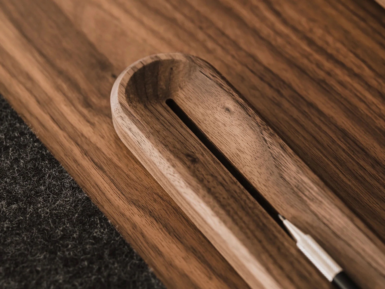
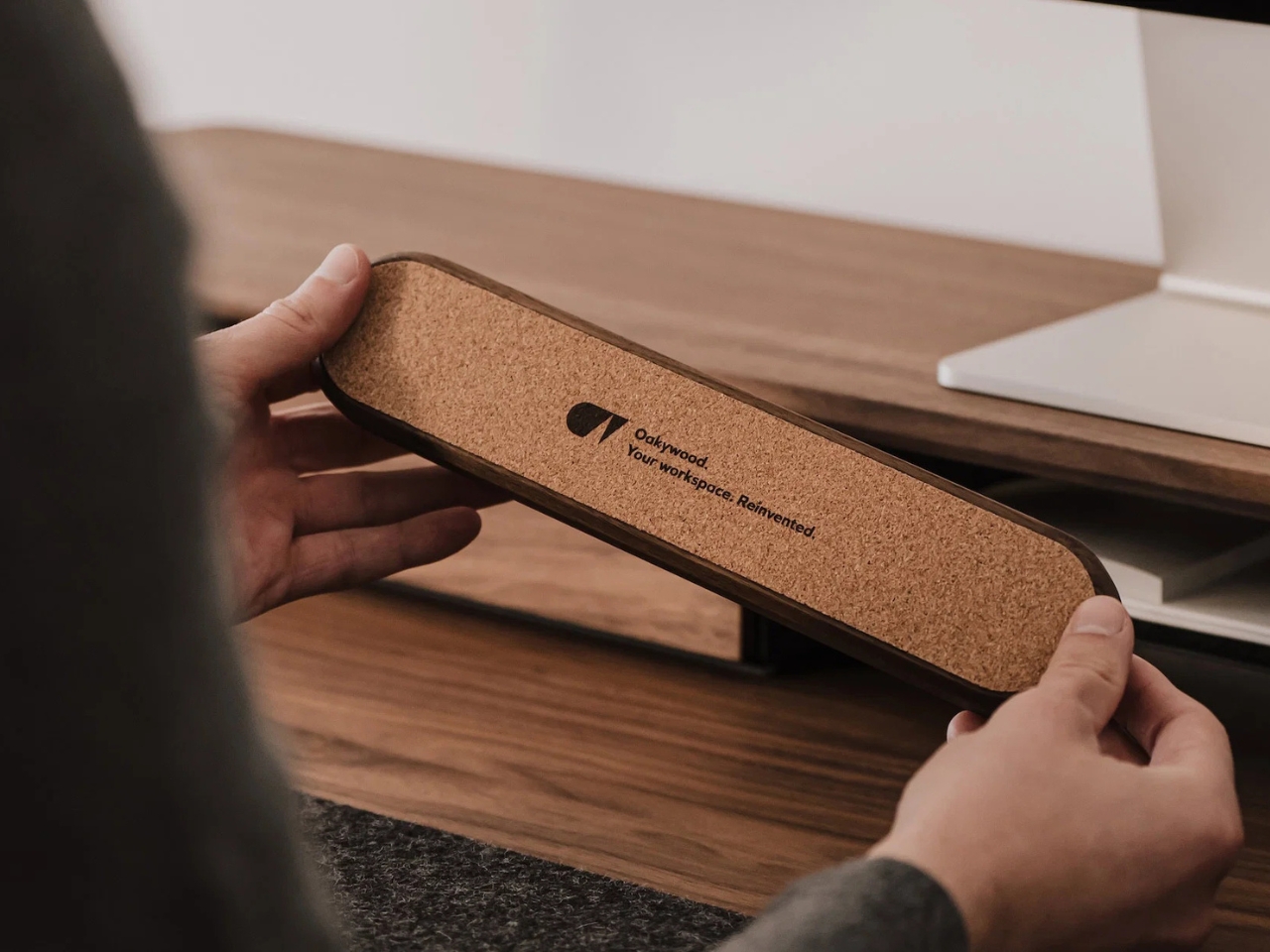
One of my favorite small details is the contoured groove carved into the block, which doubles as a pen dock. Instead of hunting around your desk for a pen every time you want to add a task or cross one off, it’s already sitting right there, built into the design. The base is lined with natural cork, too, which means it stays put on your desk and won’t leave scratches behind, no matter what material your desk is made of. It’s a small touch, but it shows the kind of thoughtful design that Oakywood puts into all of its pieces.

The kit also comes with a starter pack of 100 To-Do Cards, printed with a soft dotted grid on the front, similar to what you’d find in a bullet journal, and a completely blank back if you want more freedom. That blank side is a nice bonus for anyone who occasionally needs to sketch out an idea, map out a plan, or jot down something that does not fit neatly into a to-do list format. The cards are printed on premium 250-gram uncoated, FSC-certified offset paper, so pens, pencils, and even fountain pens will not smudge or bleed through. Refill packs are sold separately once you run through the starter set, though you could just as easily swap in your own card stock if you want to write your own affirmations, motivational quotes, or reminders instead.

It’s also worth mentioning that Oakywood plants a tree for every product sold, and the cards themselves are made from FSC-certified paper. If you already own an Oakywood laptop stand, pen tray, or wireless charger, the To-Do Desk Kit fits right into that same warm, wood-toned ecosystem, making your desk feel like one cohesive space instead of a pile of mismatched gadgets.

Priced at around fifty dollars, give or take a discount depending on when you catch it on sale, the To-Do Desk Kit isn’t just a productivity gadget. It’s a small, tactile object that makes sitting down to work feel a little more intentional. For anyone who loves collecting beautifully made desk pieces as much as they love checking things off a list, this feels like an easy addition to a growing collection, and an even easier way to talk yourself into finally starting that task you have been putting off. Sometimes all it takes is one card, one pen, and one clear line of sight to get moving again.

The post Finally Focus Without Your Phone: The $54 Wooden To-Do Kit first appeared on Yanko Design.

  •  

Finally, a Smart Home You Can Control Without Your Phone

For some years now, the idea of a smart home has been more than just science fiction. We’ve watched lights, thermostats, speakers, security systems, and countless other devices become “smarter.” One issue with these connected homes, though, is that most of their controls are app-based, meaning you always need your phone handy just to turn something on or off. That’s why a dedicated smart home hub is such a welcome idea: a control center that doesn’t live inside your phone.

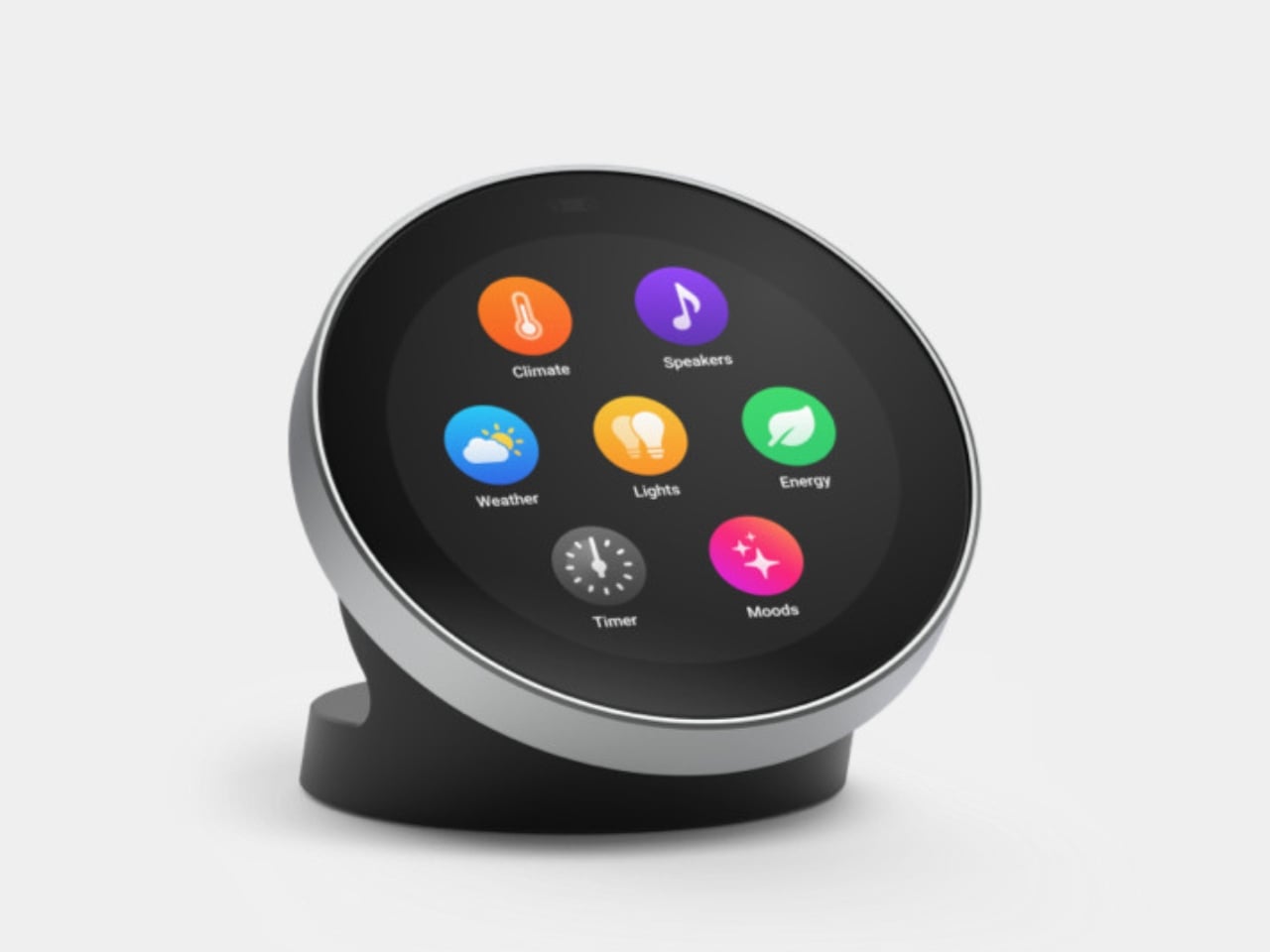
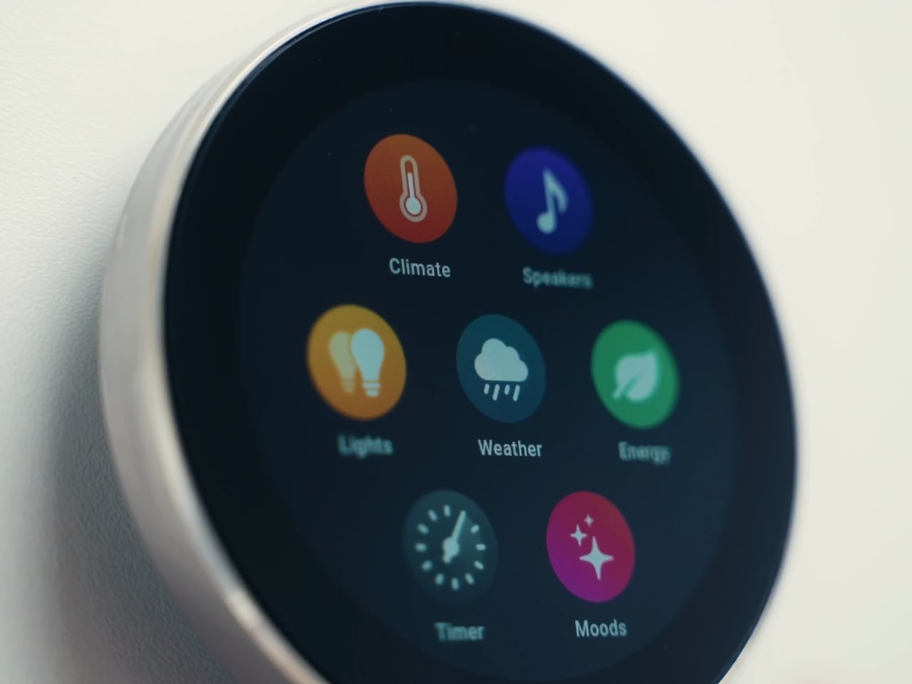
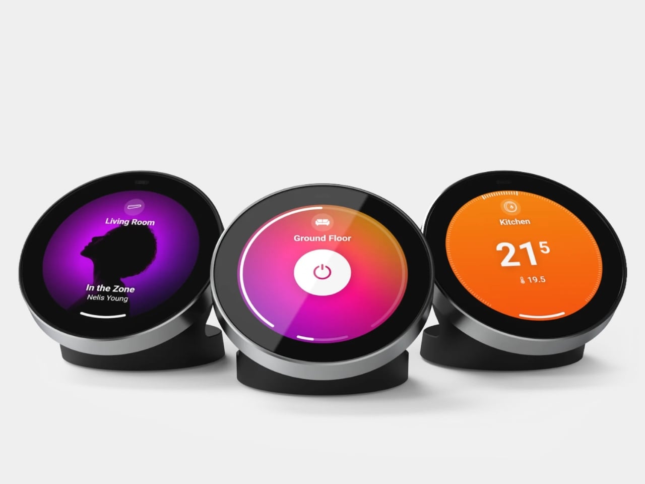
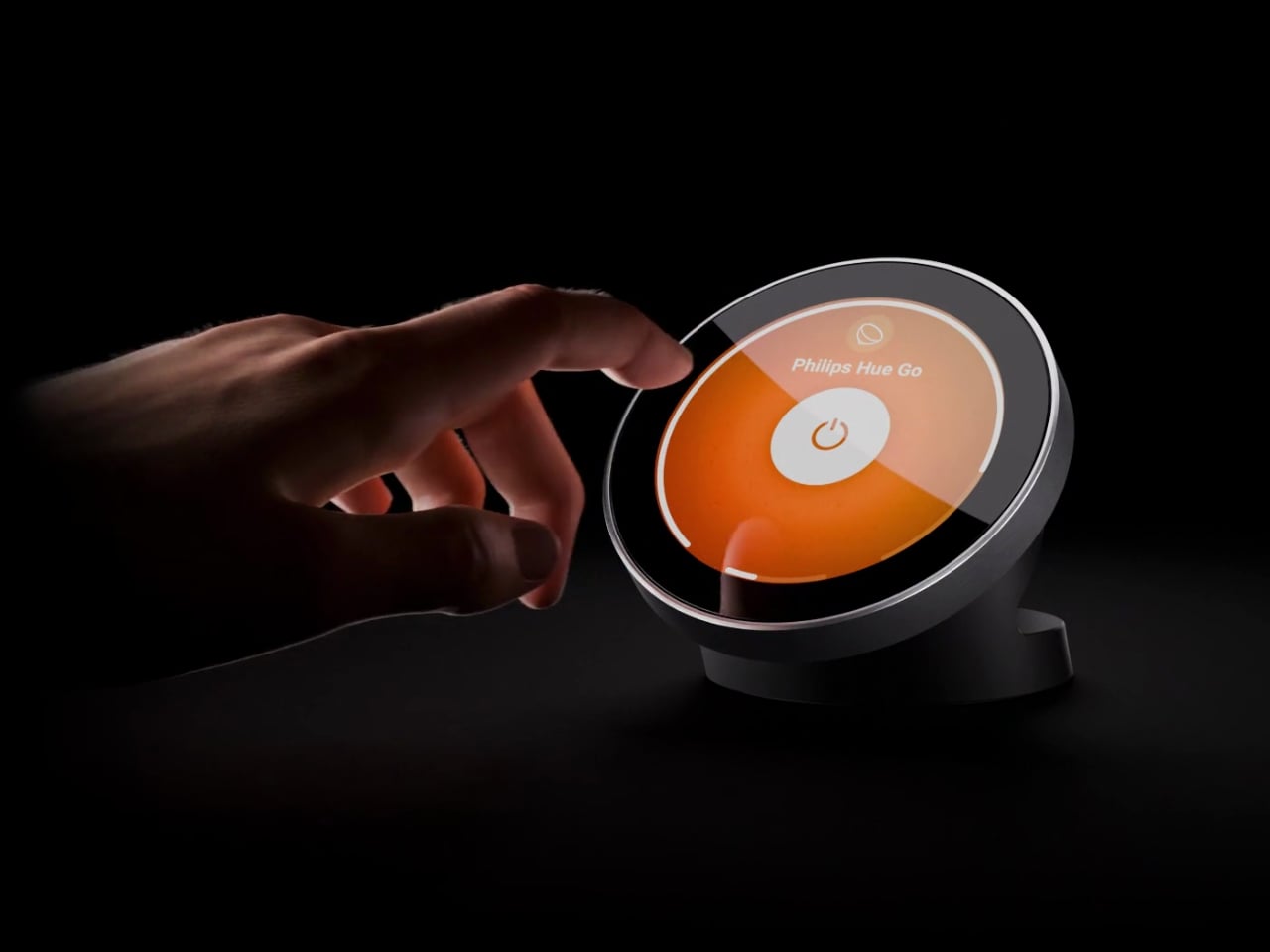
The Homey Portal, created by Dutch company Athom, is a physical smart home controller with a tactile surface that helps you manage all your connected devices. It lets anyone in your household do things like turn the lights on or off, see who’s at the door, check how much energy you’re using, find out what’s playing on your speaker, and trigger various other smart functions you’ve set up.

Designer: Athom

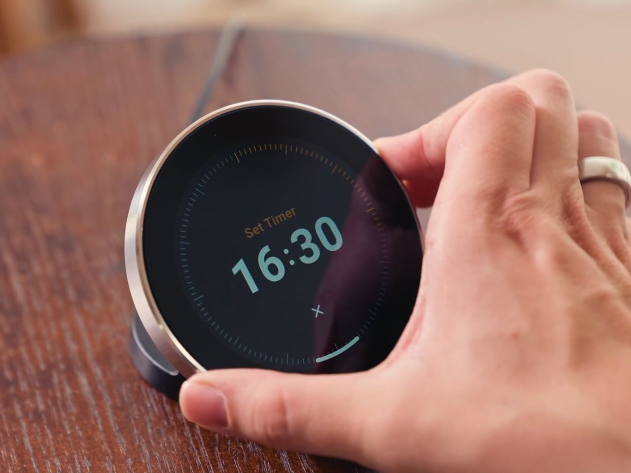
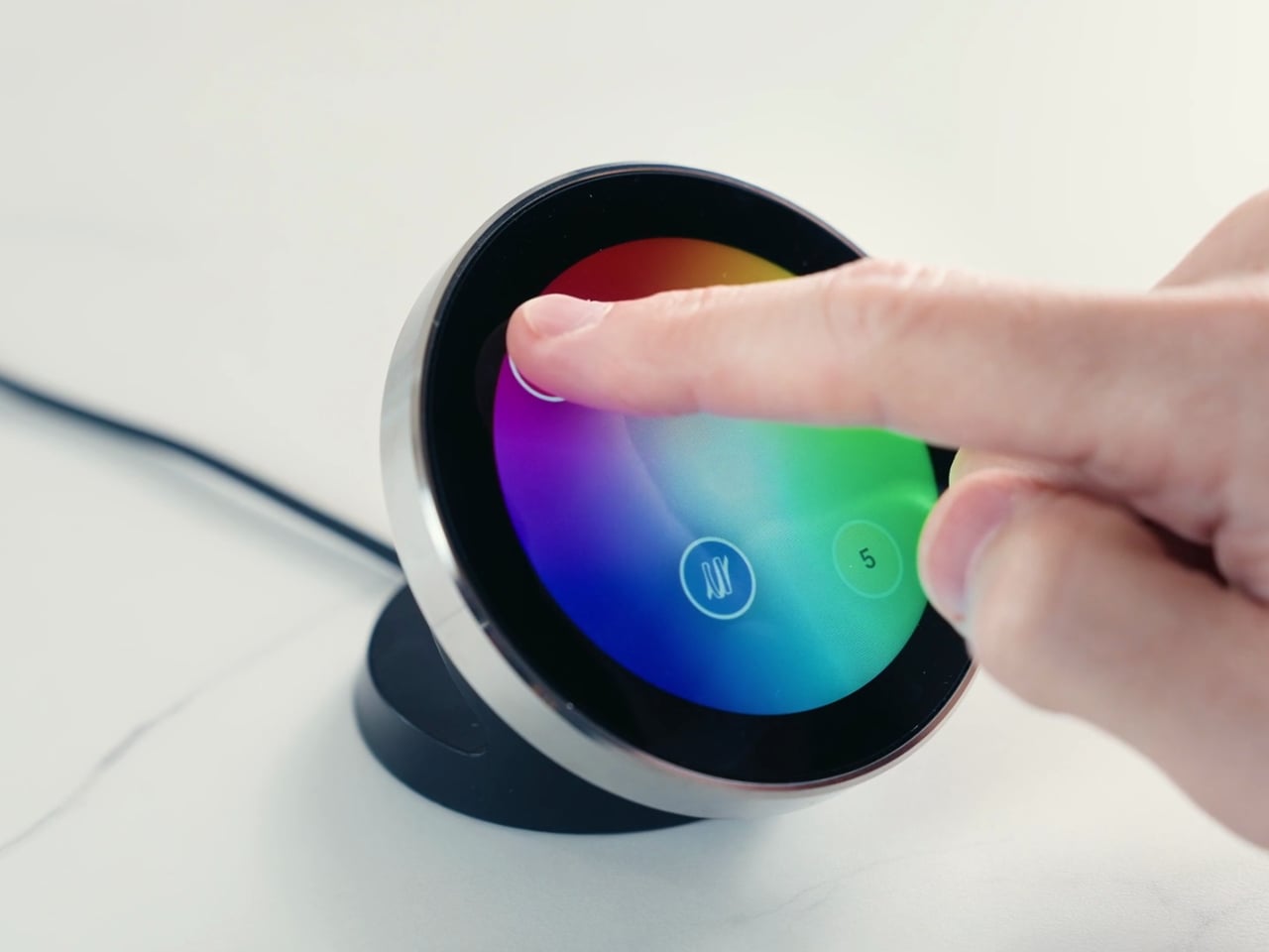
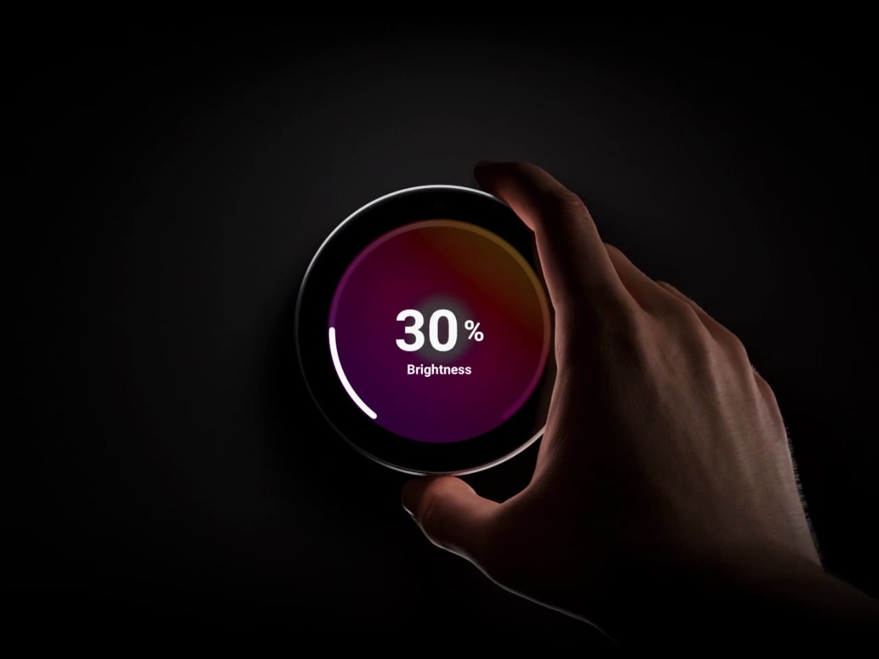
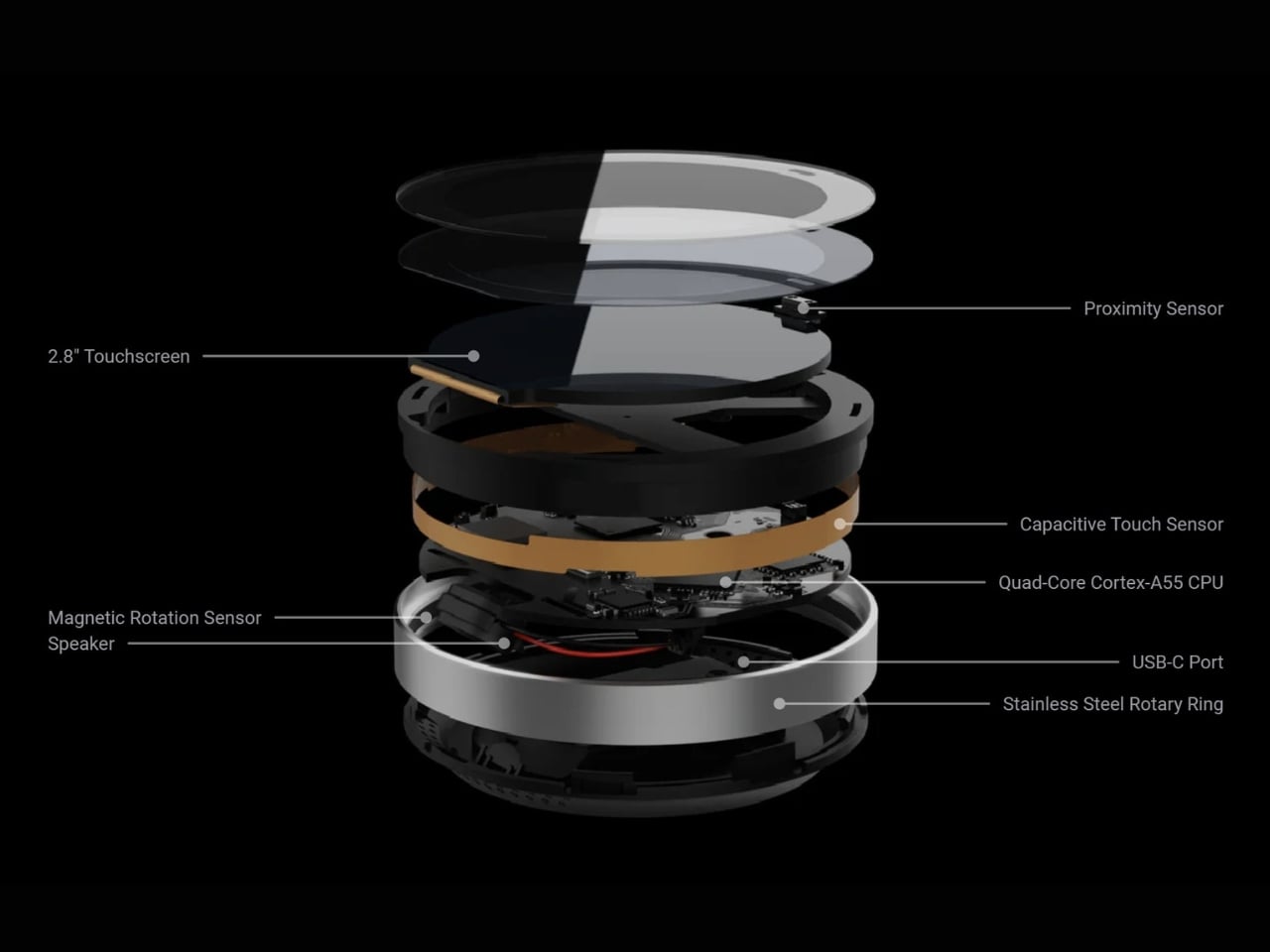
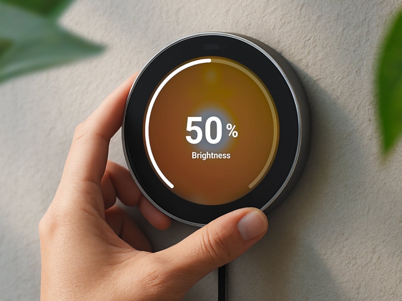
Having a physical smart home controller can be more convenient than relying on a phone-based one, and Homey proves it with this newly launched device. It features a 2.8-inch round touchscreen wrapped in a stainless-steel rotary ring. You can tap the screen to select and toggle your smart devices on or off, then twist the rotary dial to adjust things like brightness, volume, and temperature.

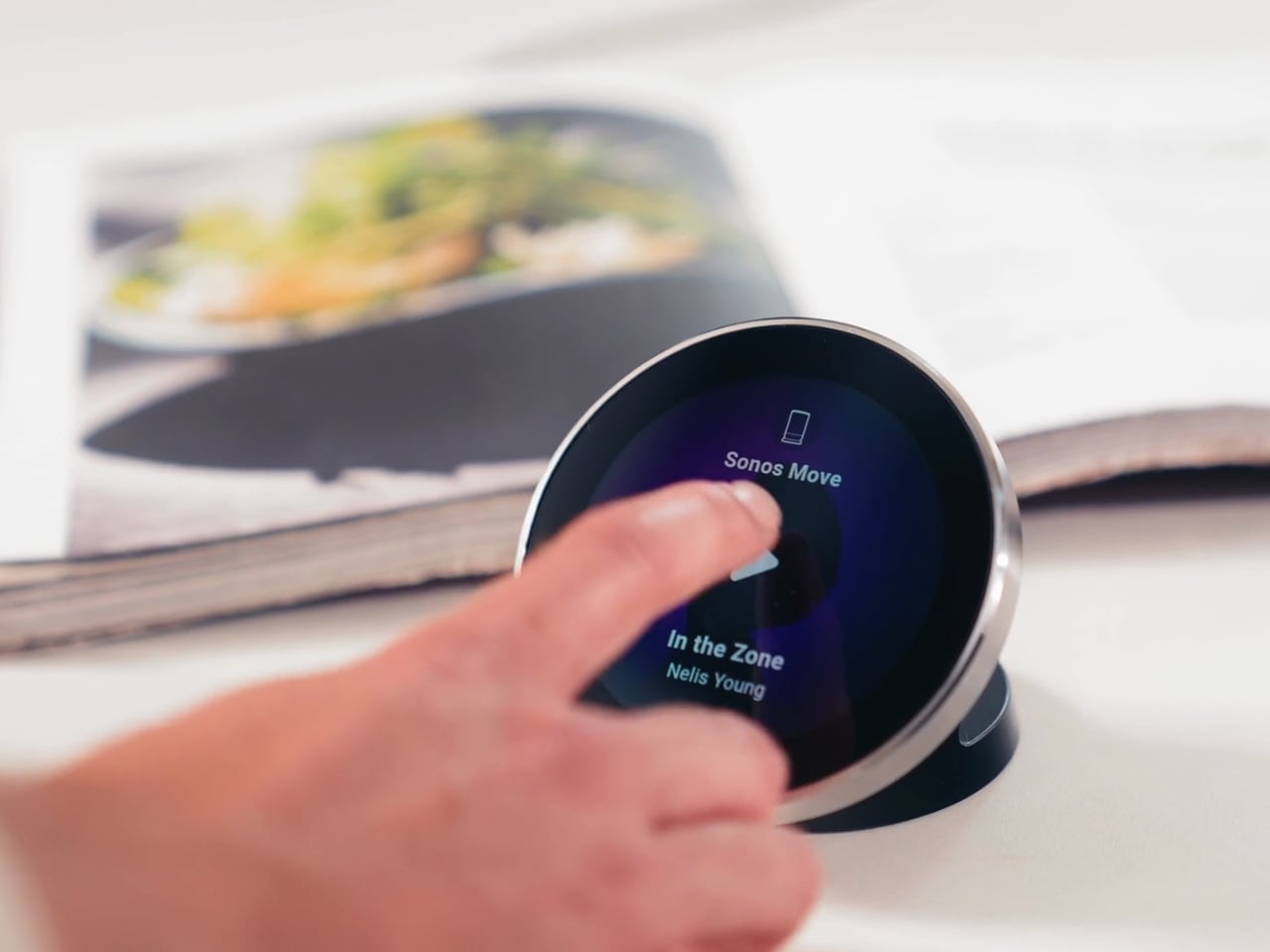
There’s a lot you can do with this little hub. If you have smart lights, you can turn them on and off and then twist the dial to dim or brighten them. It can also show the real-time temperature and humidity of your room, and you can twist the dial to adjust the temperature accordingly. If you’re playing something on your smart speaker, the screen displays the artist, track, and even the album art. From there, you can twist the dial to adjust the volume or swipe on the touchscreen to skip to the next song or go back to the previous one.

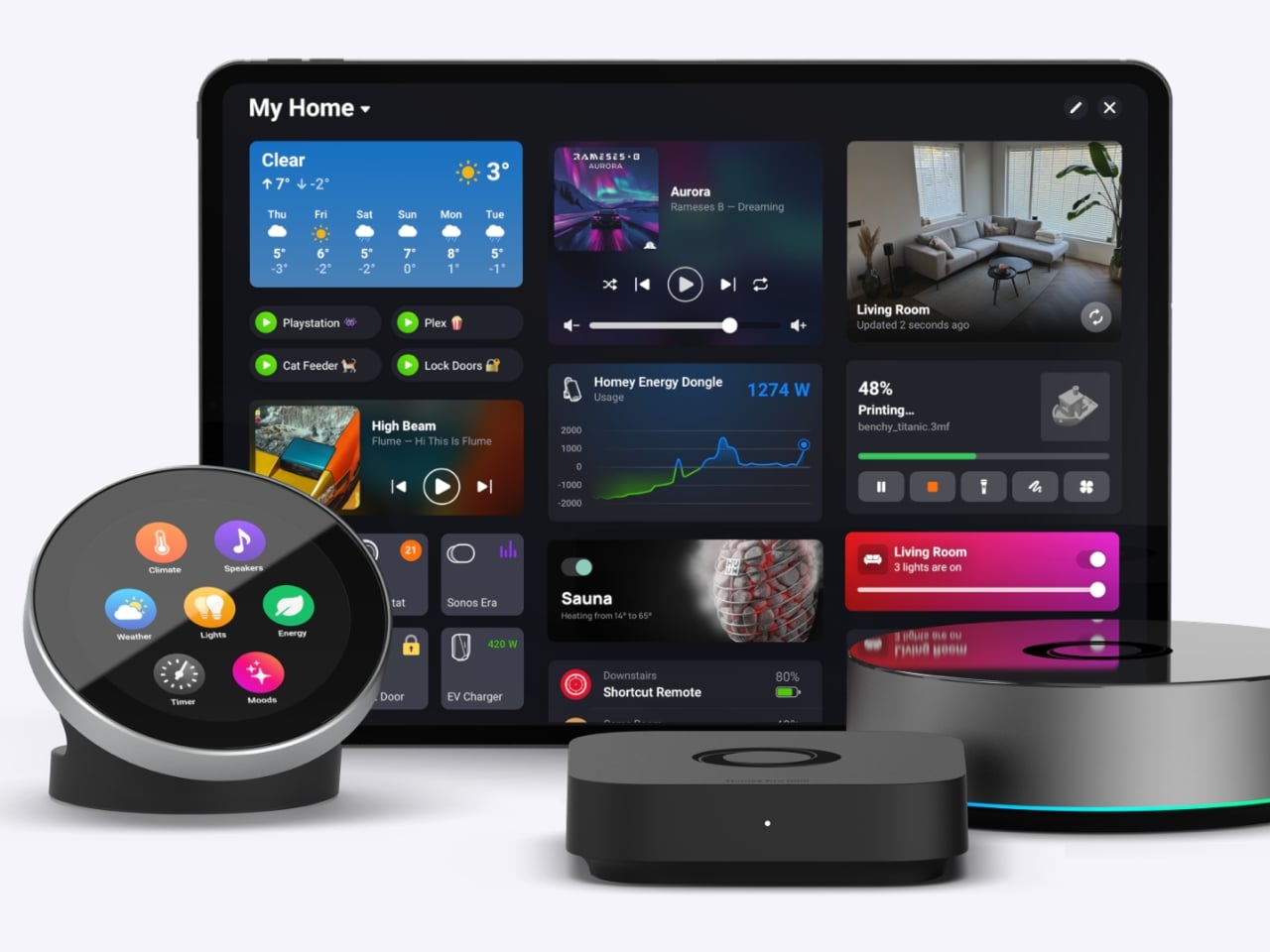
You can also set up Flow-based alerts, like a reminder to water your plants or a snapshot from your doorbell camera showing who just rang the bell. If you pair the Portal with a Homey Energy Dongle or another supported energy tracker, you can even check real-time household wattage, solar yield, and the cheapest hours to run your appliances.

The device itself is small enough to mount on a wall or simply place on your desk, side table, or countertop, whichever works best for you and the people you live with. It’s designed to work with the more than 70,000 devices from 2,000-plus brands that Homey already supports, as well as the broader Homey ecosystem, including Homey Pro, Homey Pro Mini, and Homey Cloud. The Homey Portal is available for pre-order now at an introductory price of $249, with the regular price set to rise to $299 once the first batch sells out. Orders are expected to start shipping before the end of the year, and every unit comes with both a desk stand and a wall mount included in the box, so you won’t need to buy any extra accessories to set it up wherever you like.

At its core, the Homey Portal is trying to solve a problem most of us didn’t even realize we’d accepted: that “smart” homes had quietly made simple tasks more complicated. Turning on a light shouldn’t require unlocking a phone, opening an app, and tapping through menus, and the Portal brings back the simplicity of just walking up to a dial and giving it a twist.

It also solves a more personal problem, since not everyone in a household wants to install an app or learn a new system just to turn off a lamp. Because each Portal can be placed in a specific room and used by anyone who walks by, it turns the smart home into something the whole family can actually share, not just the one person who set it all up. Whether it ends up on a kitchen wall, a bedroom nightstand, or a home office desk, it’s a small device aiming to make an increasingly complicated corner of our homes feel simple again.

The post Finally, a Smart Home You Can Control Without Your Phone first appeared on Yanko Design.

  •  

This CD Player Doesn’t Hide Its Mechanism, It Puts It on Display

If you think compact discs are a thing of the past, you probably haven’t been around a K-pop fan or a hoarder who still has their CDs from decades ago. Then there are people like me who have a stack of CDs collected over the years but no actual CD player to enjoy them on, since options that are strong on both quality and design are hard to come by.

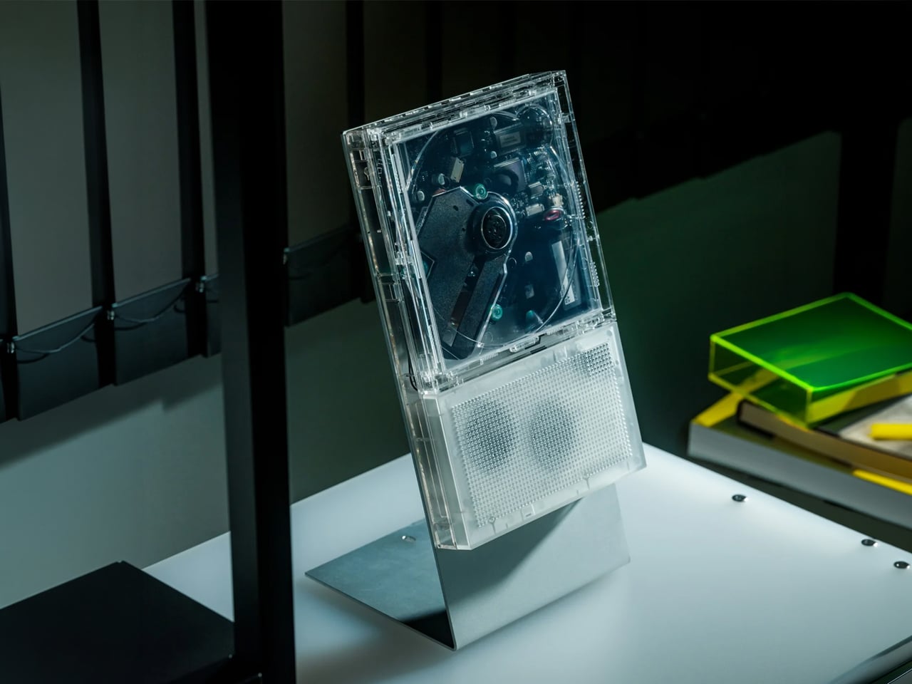
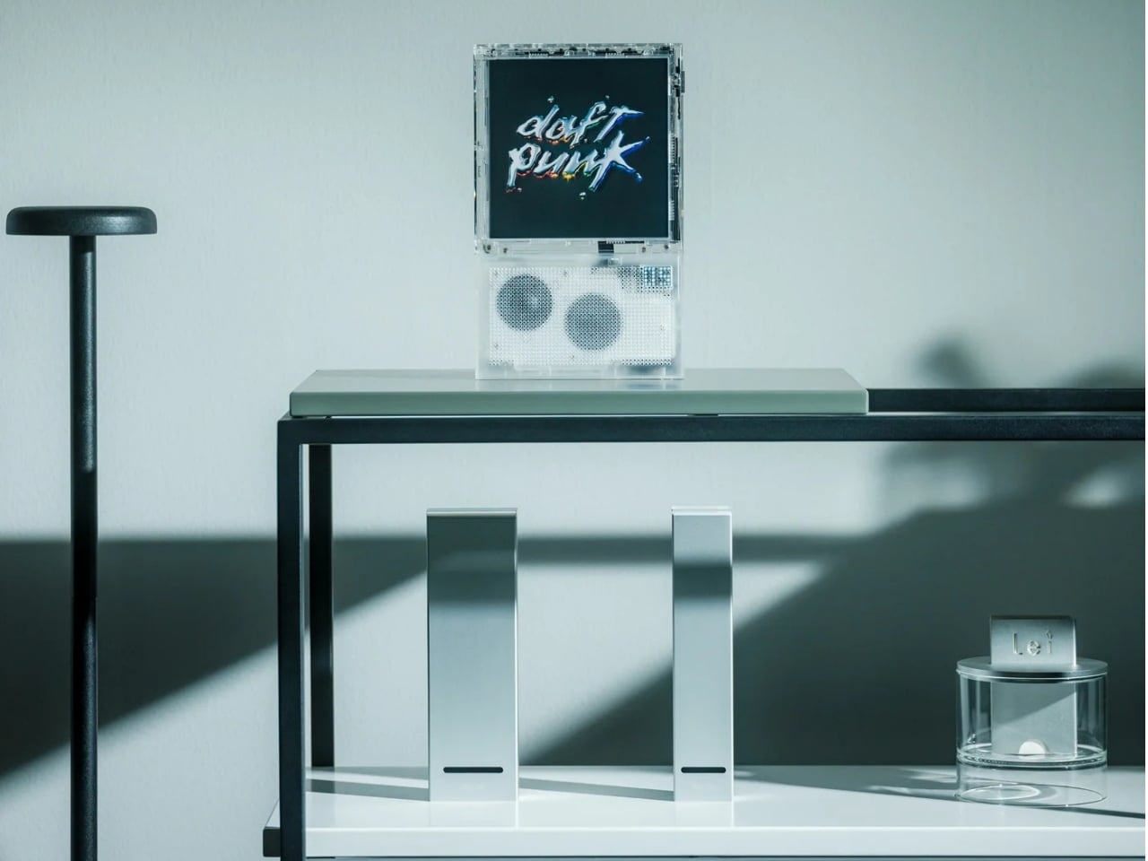
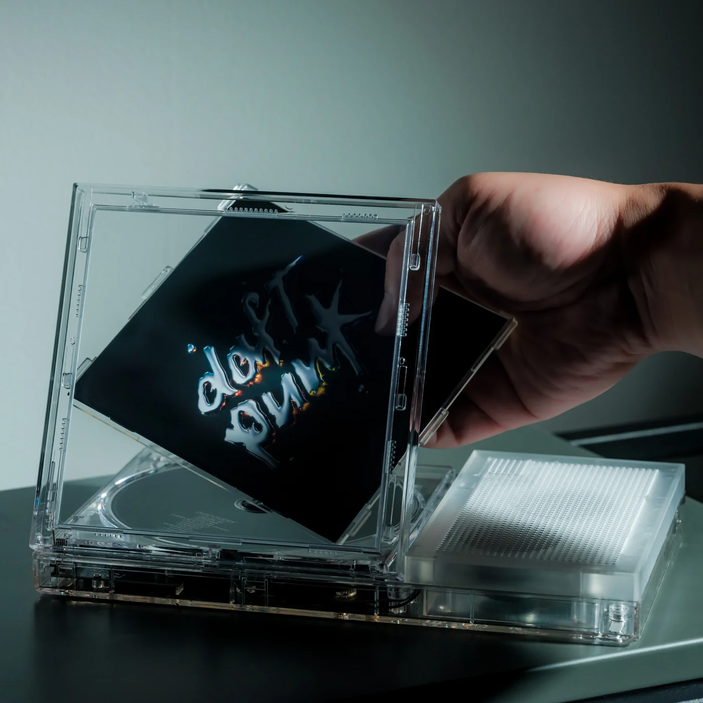
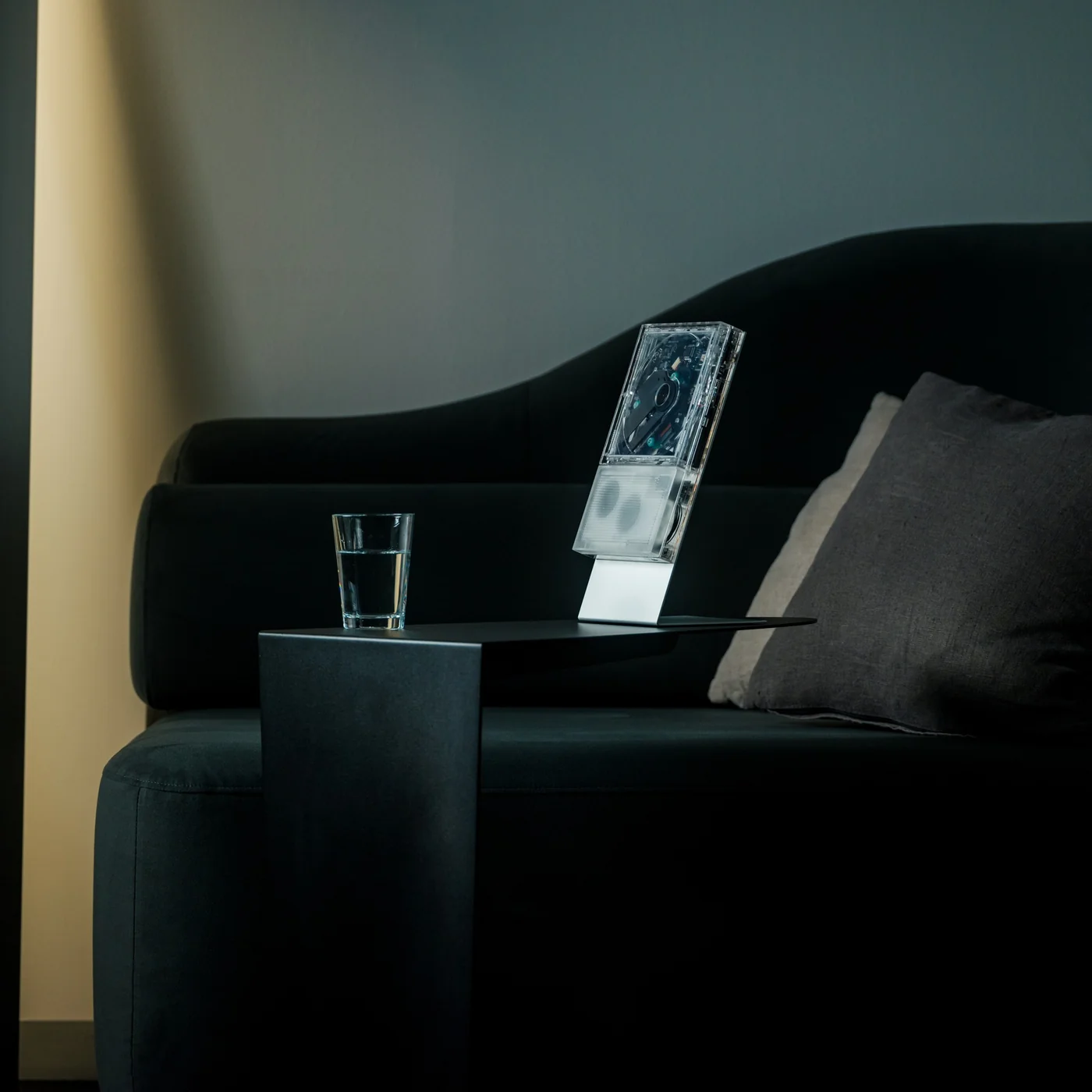
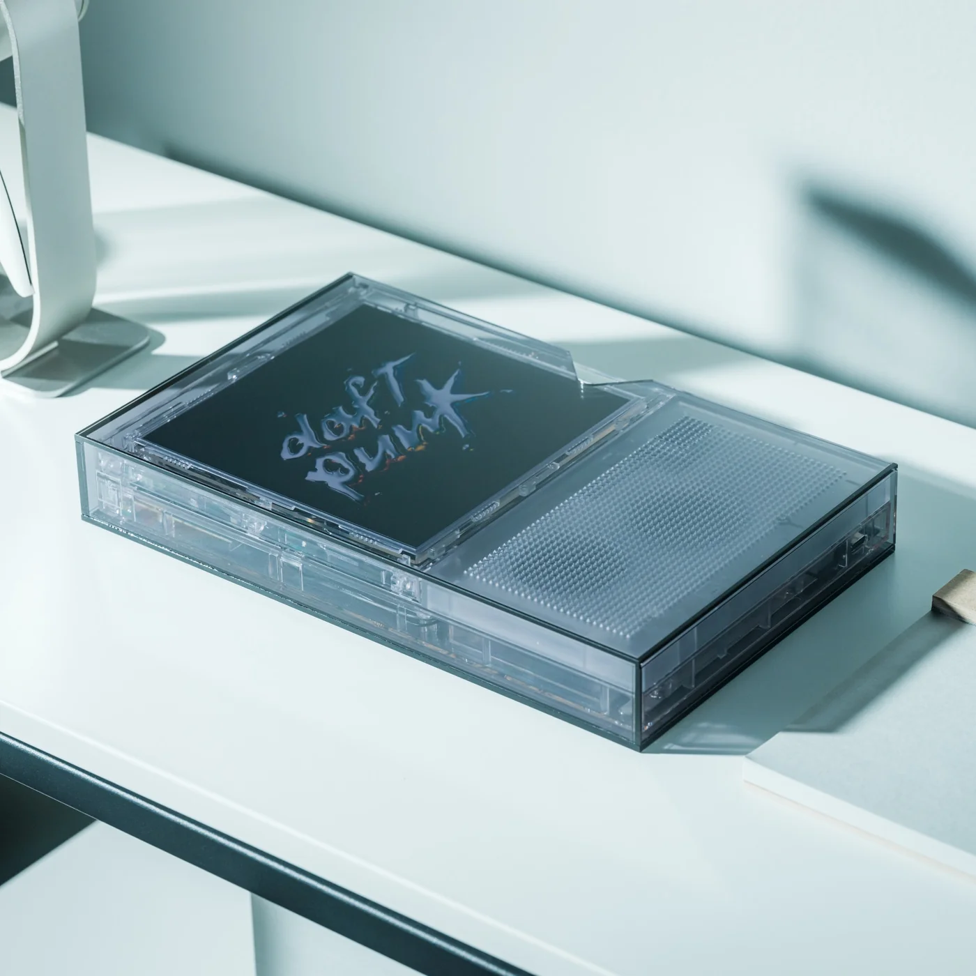
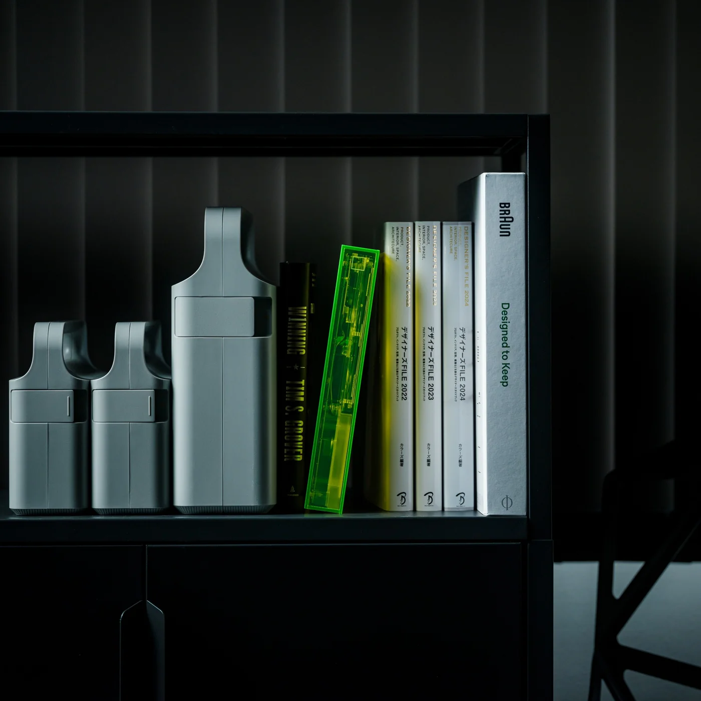
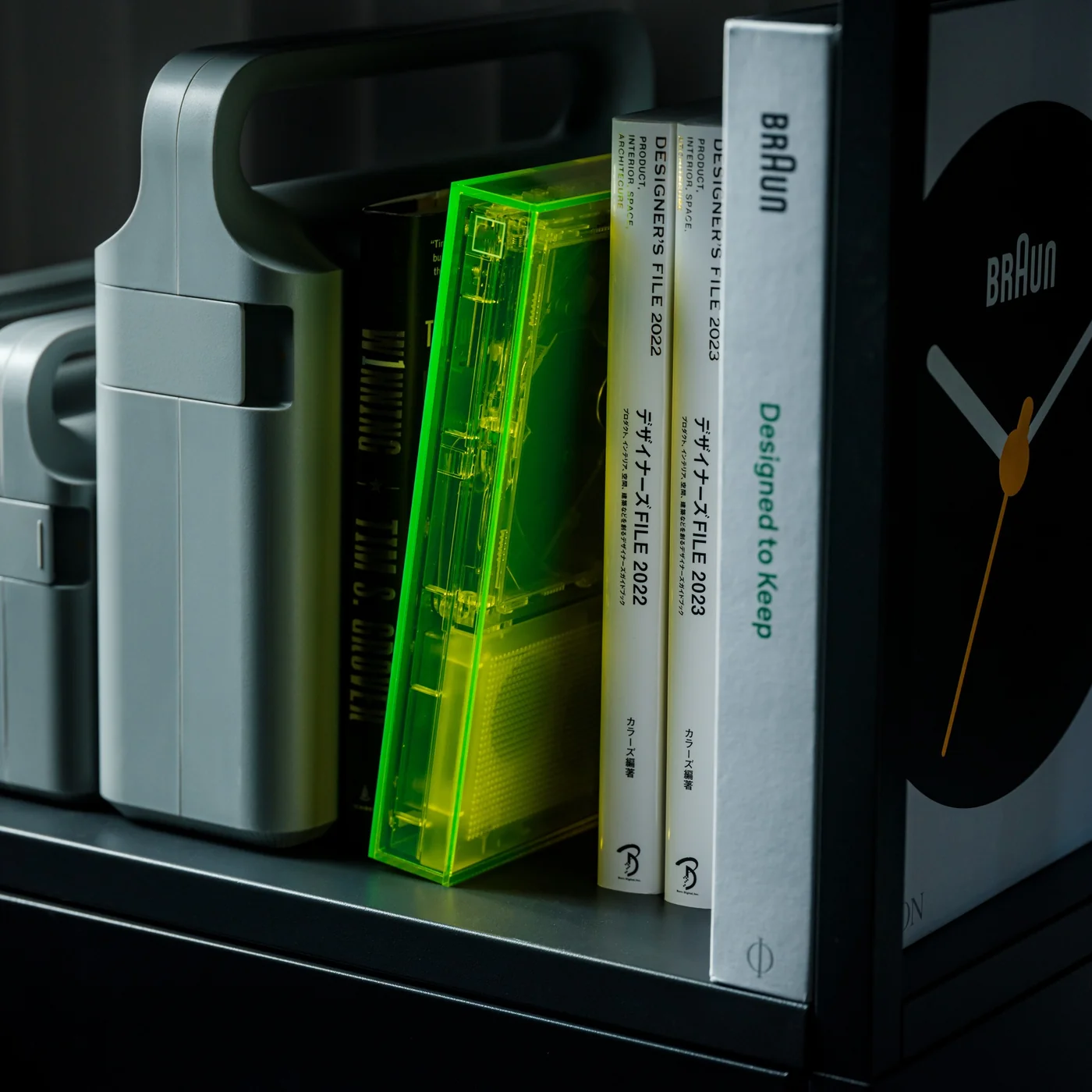
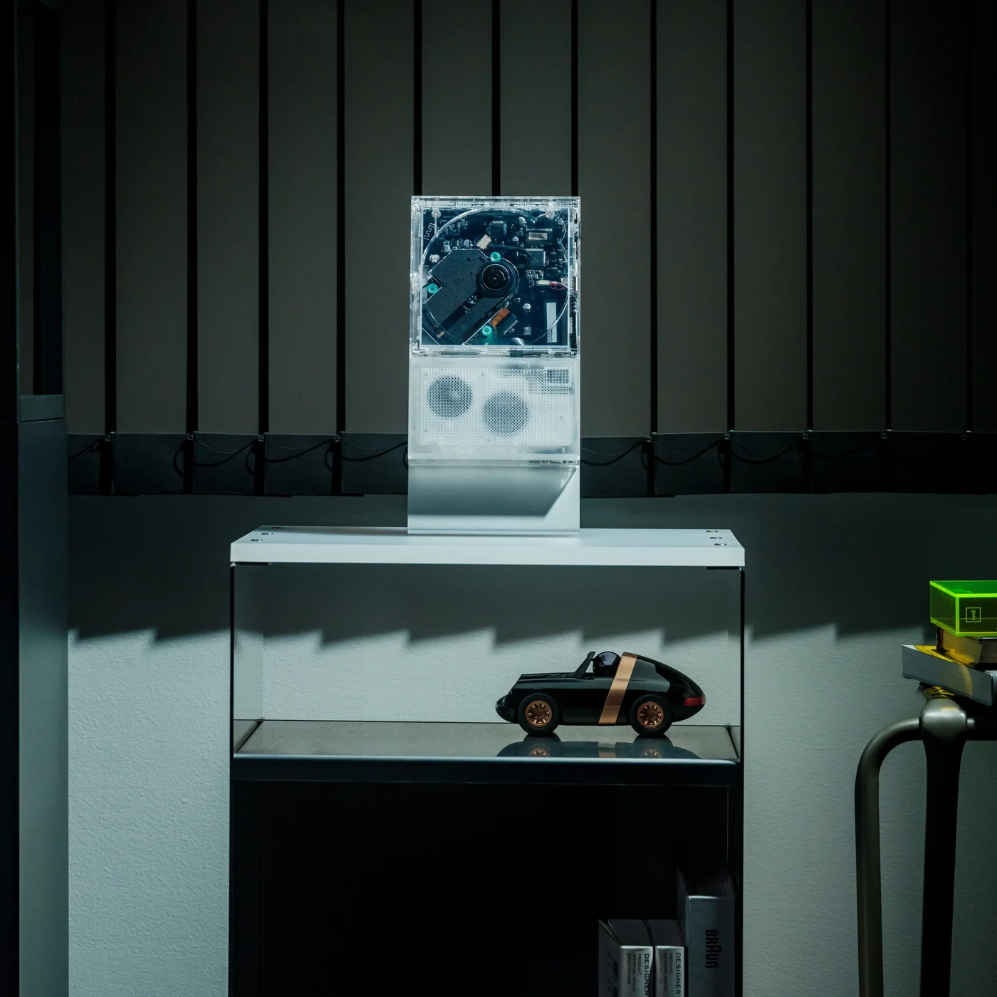
The ClearFrame Speaker CD Player is a solid choice for anyone looking for a visually stunning player that won’t let a CD’s album art go to waste. It lets you slot the jacket art onto the front of the player so it becomes a rotating piece of wall or shelf art. Or, if you’d rather show off the mechanics, you can leave the artwork out and display the transparent body itself, watching your CD spin with all its moving (and non-moving) parts in full view.

Click Here to Buy Now: $240.00

Whenever I come across beautiful album art, I can’t help but think it’s wasted if it only ever gets seen as a tiny digital thumbnail on a streaming app. A player like the ClearFrame Speaker CD Player lets you put that kind of artwork on full display while you’re enjoying the music in your room. Seeing something that the artist, and the album art designer, worked hard on come to life while it spins gives it the justice it deserves. And if you’d rather see the clear, polycarbonate-style body become a piece of art in its own right, just take out the album cover and let it shine in all its transparent glory.

This is also an upgraded version of the original, and already popular, ClearFrame CD Player, since it now comes with a built-in speaker. That means you no longer need to hook it up to an external Bluetooth speaker or wired setup, which makes it even more flexible to display anywhere in your home. You actually have three ways to listen to your favorite CDs: through the built-in 40mm speaker, with wired headphones through the 3.5mm jack, or over Bluetooth 5.3 to external speakers or headphones if you already have a better setup you’d like to use.

Beyond the listening options, the ClearFrame Speaker CD Player was clearly designed with portability in mind. At just 454 grams (about a pound) and roughly the size of a hardcover book, it’s light enough to carry from your bedroom to your living room without a second thought. Its 1,800mAh battery gives you around six to seven hours of playback through the built-in speaker, or seven to eight hours if you’re streaming over Bluetooth, so you can enjoy a few albums back-to-back before needing to recharge via USB-C. There’s even a retro-style LED Nixie tube display that adds a warm, nostalgic touch to the whole experience, plus a 2MB SDRAM anti-shock buffer so accidental bumps won’t make your music skip.

For collectors, this player also solves a real problem: what to do with all the CDs sitting untouched in a drawer somewhere. Instead of treating them like outdated clutter, the ClearFrame gives them a reason to come back out, whether that’s a K-pop photocard-era album, a mix your best friend burned for you in high school, or a boxed set you’ve been meaning to revisit. It turns “old technology” into a genuine decor piece you’d be proud to leave out on a shelf.

If you’re looking to gift this to someone (or, let’s be honest, treat yourself), the ClearFrame Speaker CD Player comes in a few configurations depending on how you plan to display it. You can pick it up on its own, or add a wall mount, book case, or display stand, so it fits neatly into whatever corner of your home you have in mind. It isn’t the cheapest CD player on the market, but if you have a stack of CDs with nowhere to go and album art too good to keep hidden, this one earns its price tag by turning something you already own into something worth looking at every single day.

The post This CD Player Doesn’t Hide Its Mechanism, It Puts It on Display first appeared on Yanko Design.

  •  

Finally, a Compass That Works Without Opening Google Maps

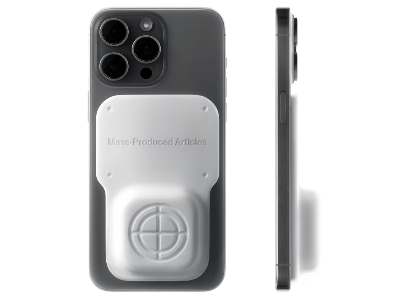
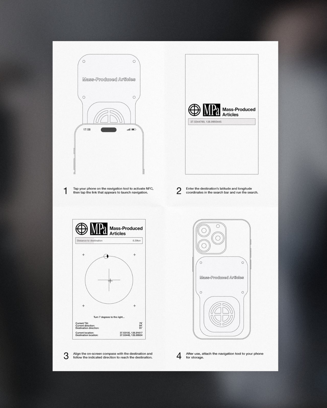
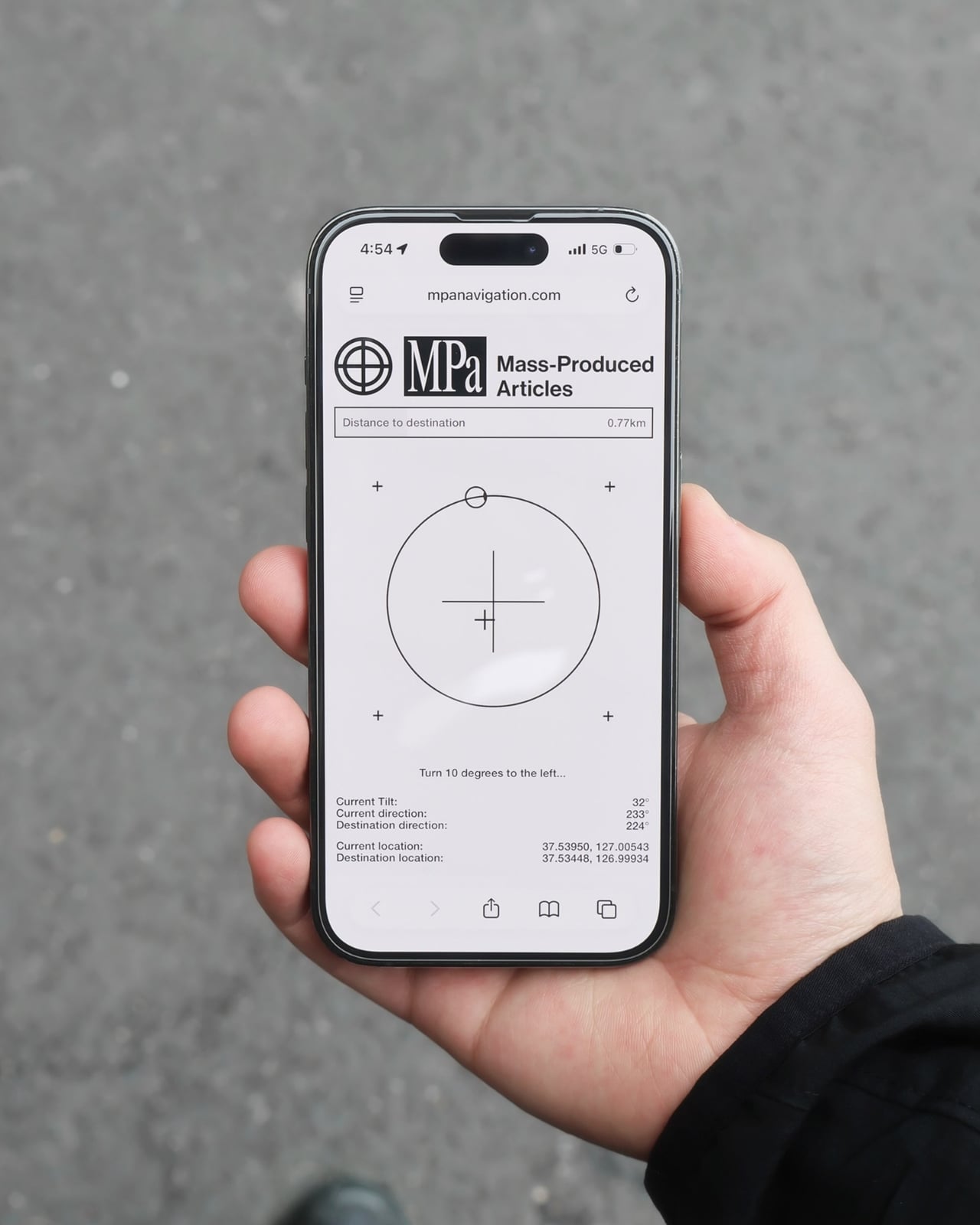
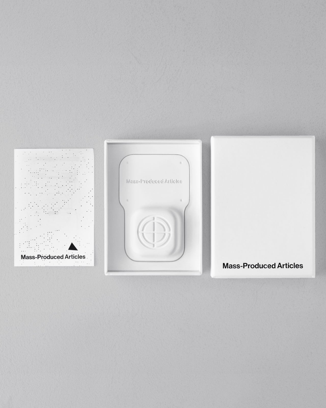
Anyone who has wandered around an unfamiliar neighborhood searching for a boutique that Google Maps insists is “on your left” when it is actually tucked behind a parking garage knows the specific frustration I am talking about. Small, independent stores rarely have the budget for a flashy storefront, and a pin on a map that is close enough to be tantalizing and far enough to be maddening is usually all you get. A Pow Studio designed something to fix exactly that: a small NFC-embedded fixture called the Navigation Tool that turns a single phone tap into a live compass, guiding you down the block to a physical destination without asking you to download anything.

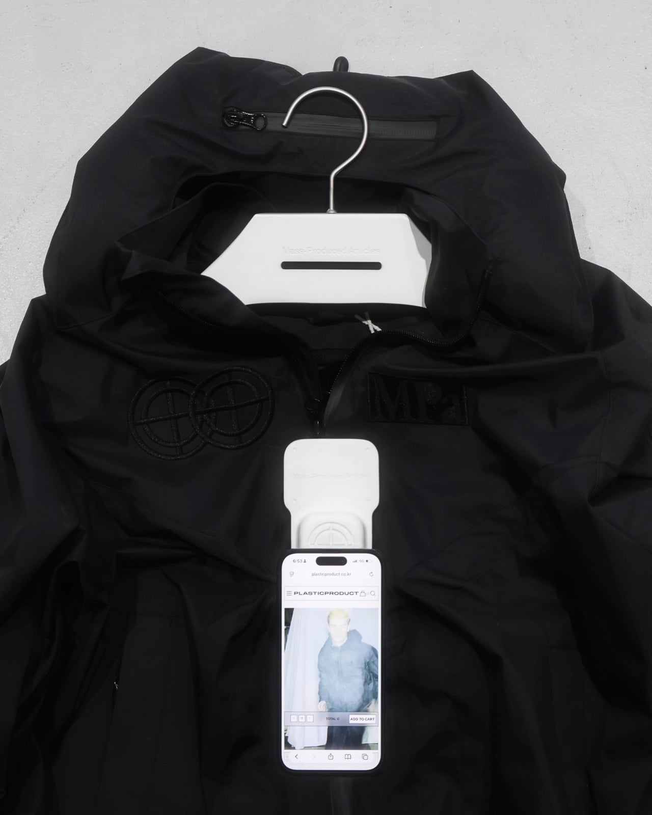
That solves the first problem. The second one is subtler but just as real. Even after you find the store and walk through the door, most brands have no clean way to hand you off to their digital world. You try something on, feel vaguely inspired, and leave with no easy path to the website, the product specs, or the broader catalog. The Navigation Tool closes that gap too. The same NFC chip, this time embedded into the store’s hanging display system, redirects your phone tap to an online page loaded with product details and brand information. Two taps, two problems solved, zero apps required.

Designer: A Pow Studio

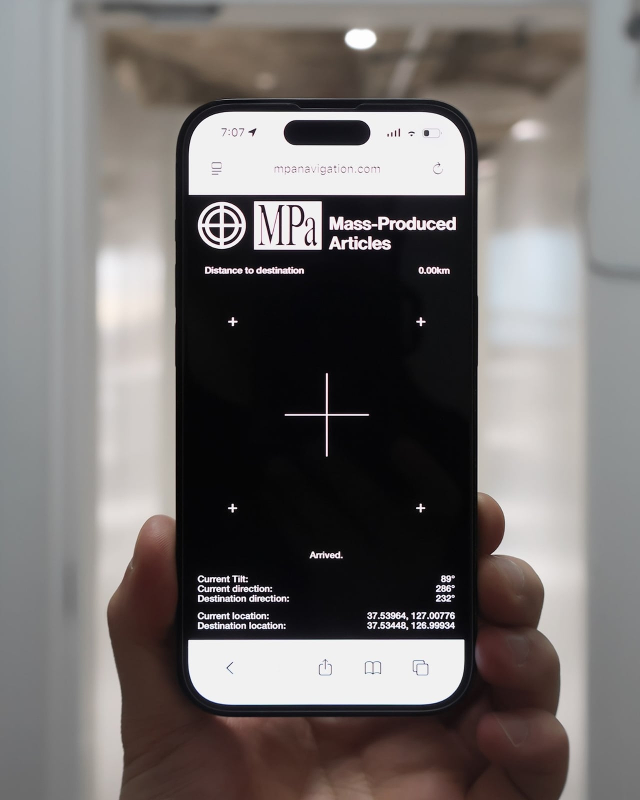
The mechanics are genuinely elegant. Outside, you tap your phone on the tool and a search bar appears asking for the coordinates of your destination. The system pulls from Location-Based Services and your phone’s built-in gyroscope to calculate real-time distance and direction, then renders everything as a clean, minimal compass interface on your screen. MagSafe compatibility is built in so the phone can physically attach to the tool while you navigate, which is a small detail but the kind that signals someone actually thought about what your hands are doing when you are half-lost and moving.

No app to download, no QR code cluttering a window decal, no clunky onboarding screen asking you to create an account you will use exactly once. You tap, and it works, the same quiet mechanism already living in Apple Pay or a subway fare card, just pointed at a completely different problem. American shoppers are already fluent in tap-to-pay and tap-to-unlock behavior, so repurposing that same gesture for navigation feels less like a gimmick and more like an overdue extension of something we already trust.

It also lands at an interesting moment for retail. Brick-and-mortar shopping has been quietly reasserting itself as something people actually want, not just tolerate, but brands still need their physical spaces to feed the digital ecosystem that keeps the business running. A tool like this treats the store not as a dead end or a photo backdrop but as one stop in a longer, connected journey. That feels like a more honest way to think about retail design than another Instagram wall ever could.

The visual language matches the intention. The compass interface on screen is stripped back to the point of being almost architectural: a circle, a crosshair, a tilt reading, a direction bearing. Nothing decorative, nothing unnecessary. It looks like something a navigator or a cinematographer would recognize before a tech blogger would, which feels right. Precise without being cold, minimal without being precious.

I do wonder about scale. A single boutique installing this is a lovely, considered gesture. A mall trying to retrofit hundreds of storefronts with individual NFC compass units is a different logistical conversation entirely, and I am not convinced every brand needs this level of ceremony just to get someone through the door. But as a proof of concept, it is a genuinely smart answer to a problem most retailers pretend does not exist. Sometimes the best design solution is not a flashier app. It is a small, physical object that refuses to overcomplicate the walk from curiosity to the front door.

The post Finally, a Compass That Works Without Opening Google Maps first appeared on Yanko Design.

  •  

A Ceramic Lamp That Refuses to Stay the Same

Most lamps ask you to commit. You pick a shade, a finish, a mood, and that’s what you’re stuck with until the bulb burns out or you get sick of it and drag the whole thing to a donation bin. For anyone who likes to rearrange a room the way some people rearrange their playlists, that’s a real limitation, and it’s one nobody really talks about because we’ve just accepted lighting as a fixed decision rather than a flexible one.

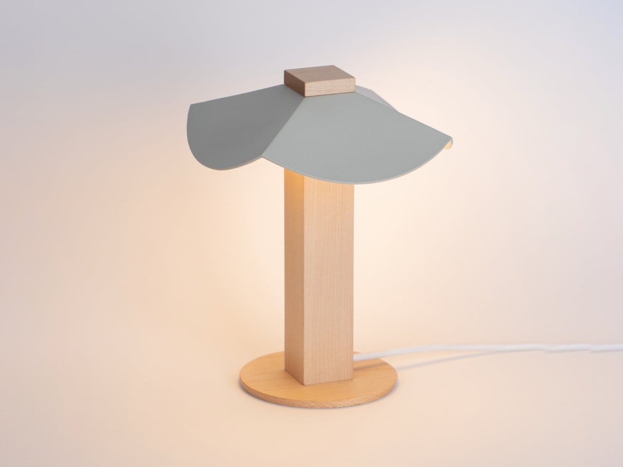
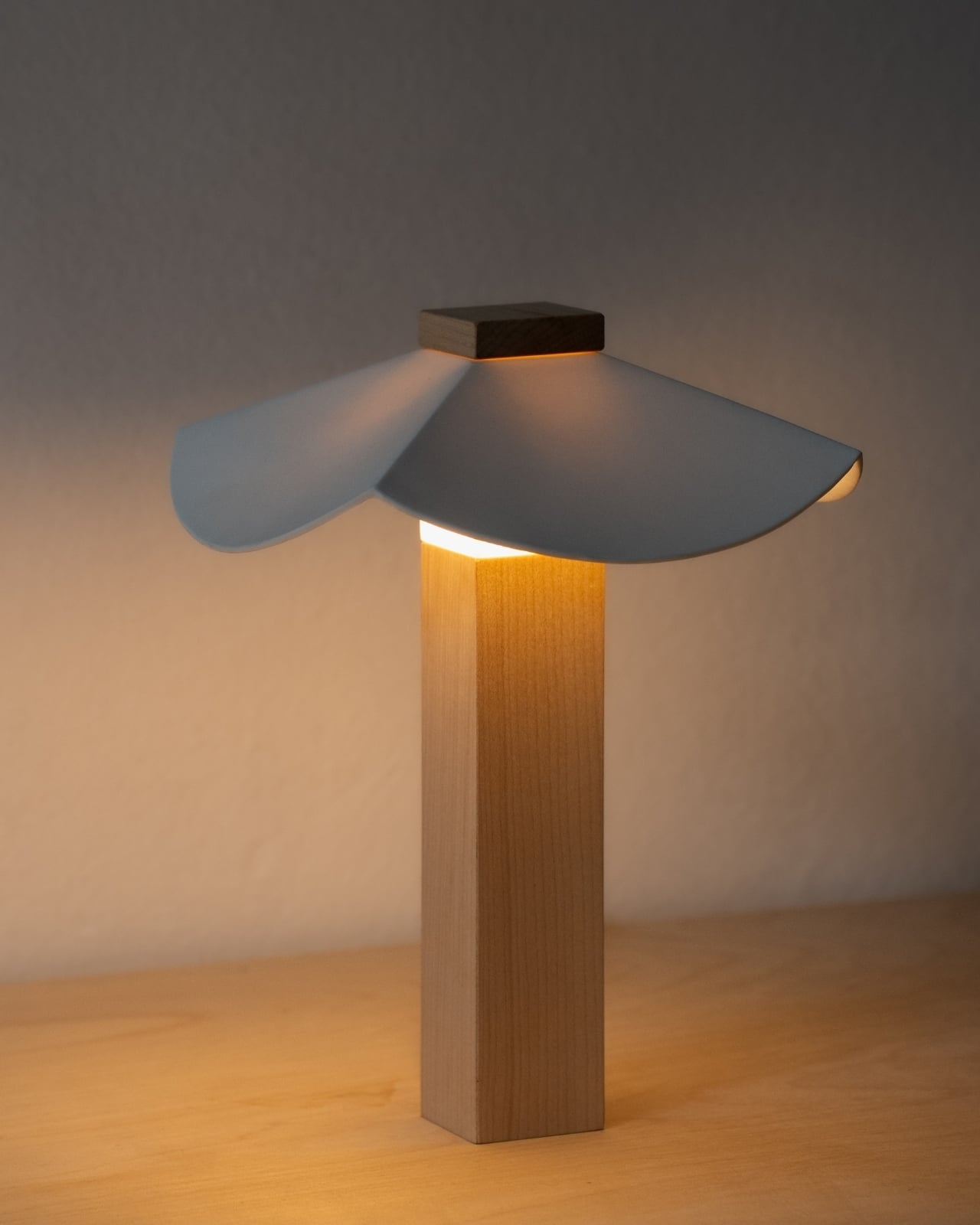
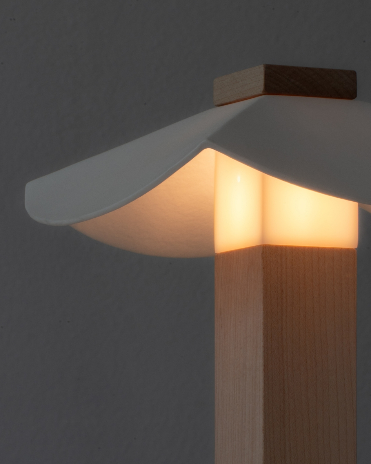
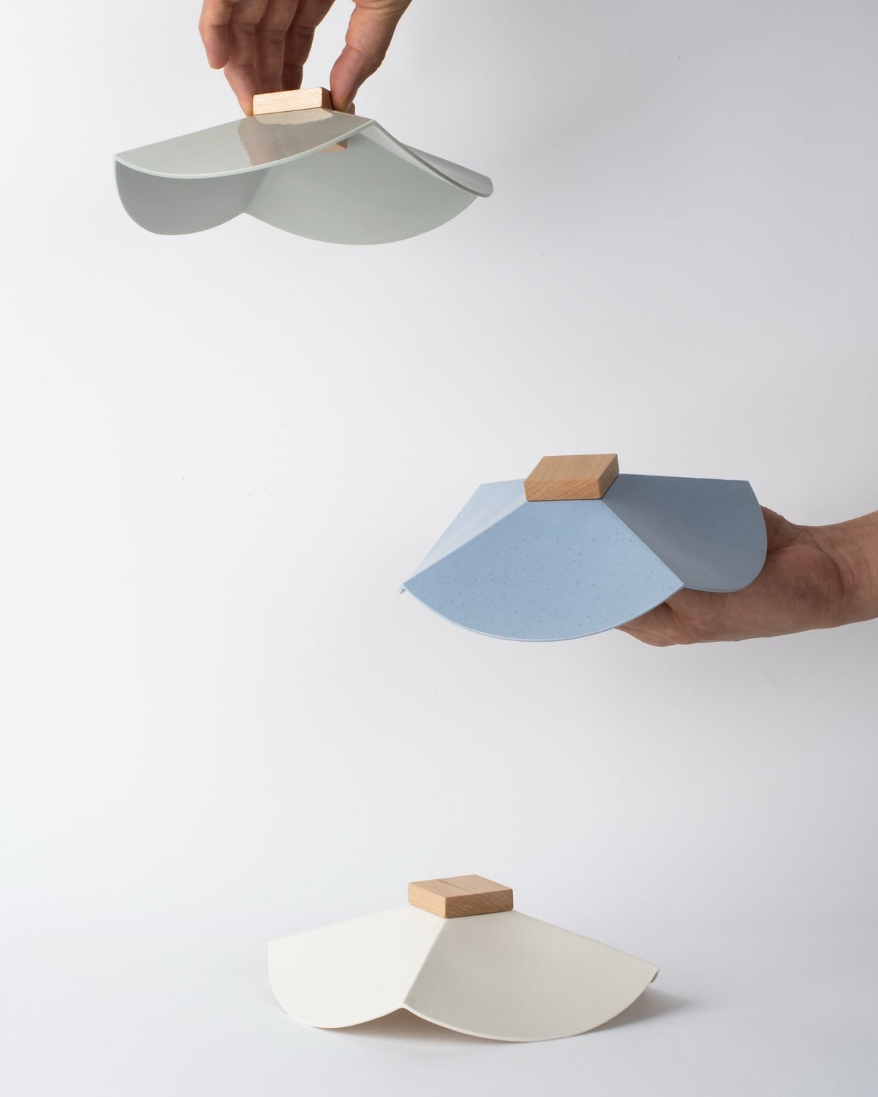
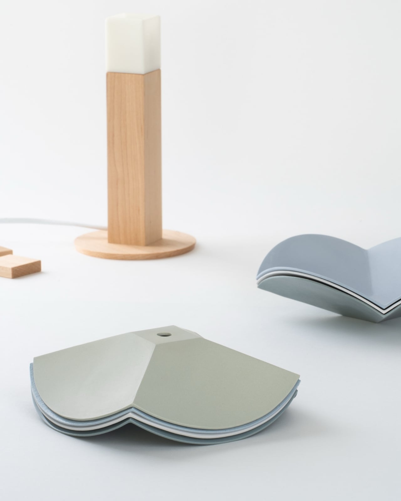
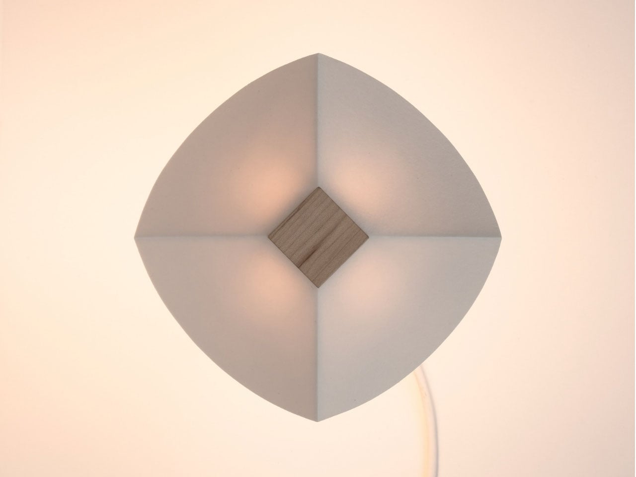
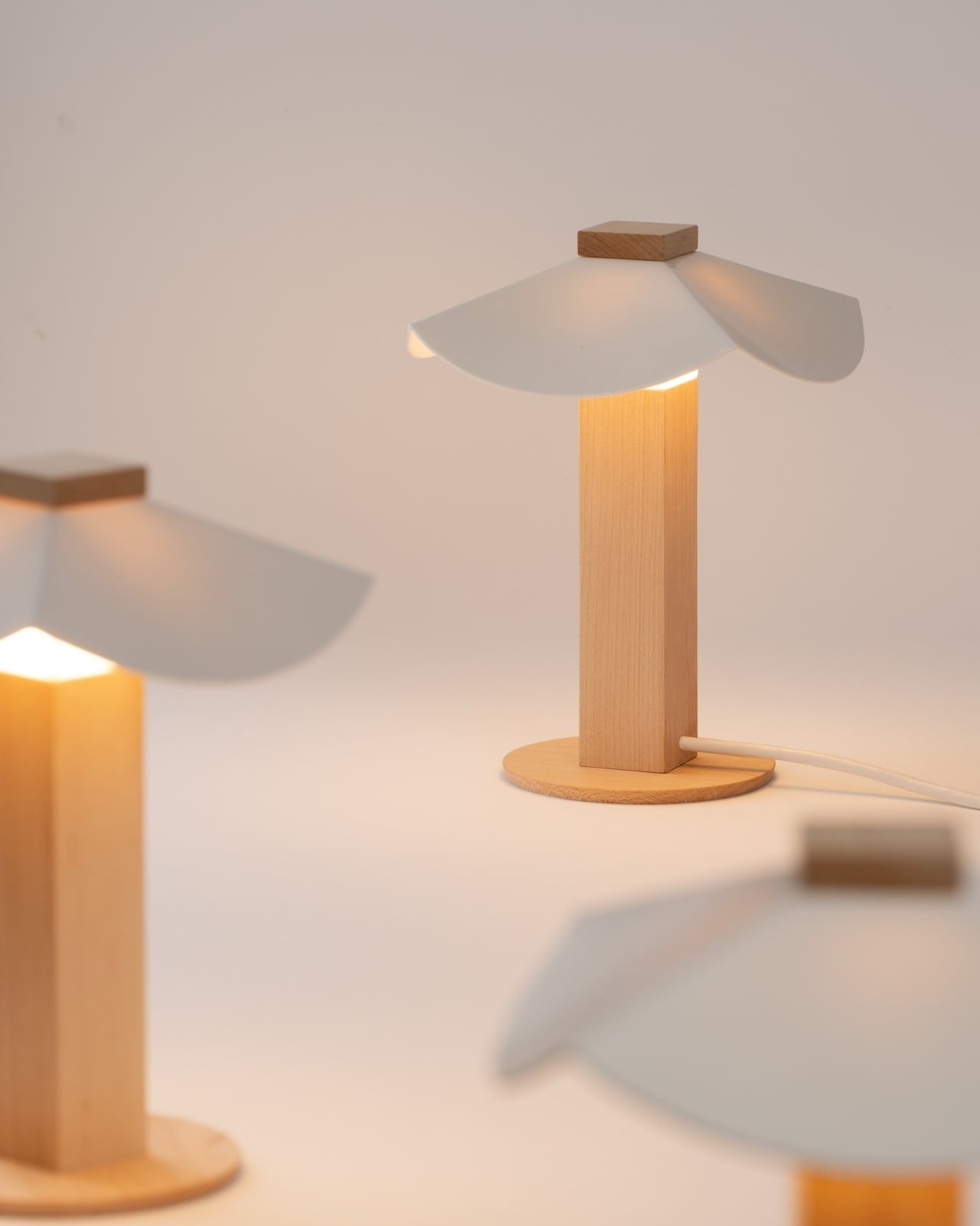
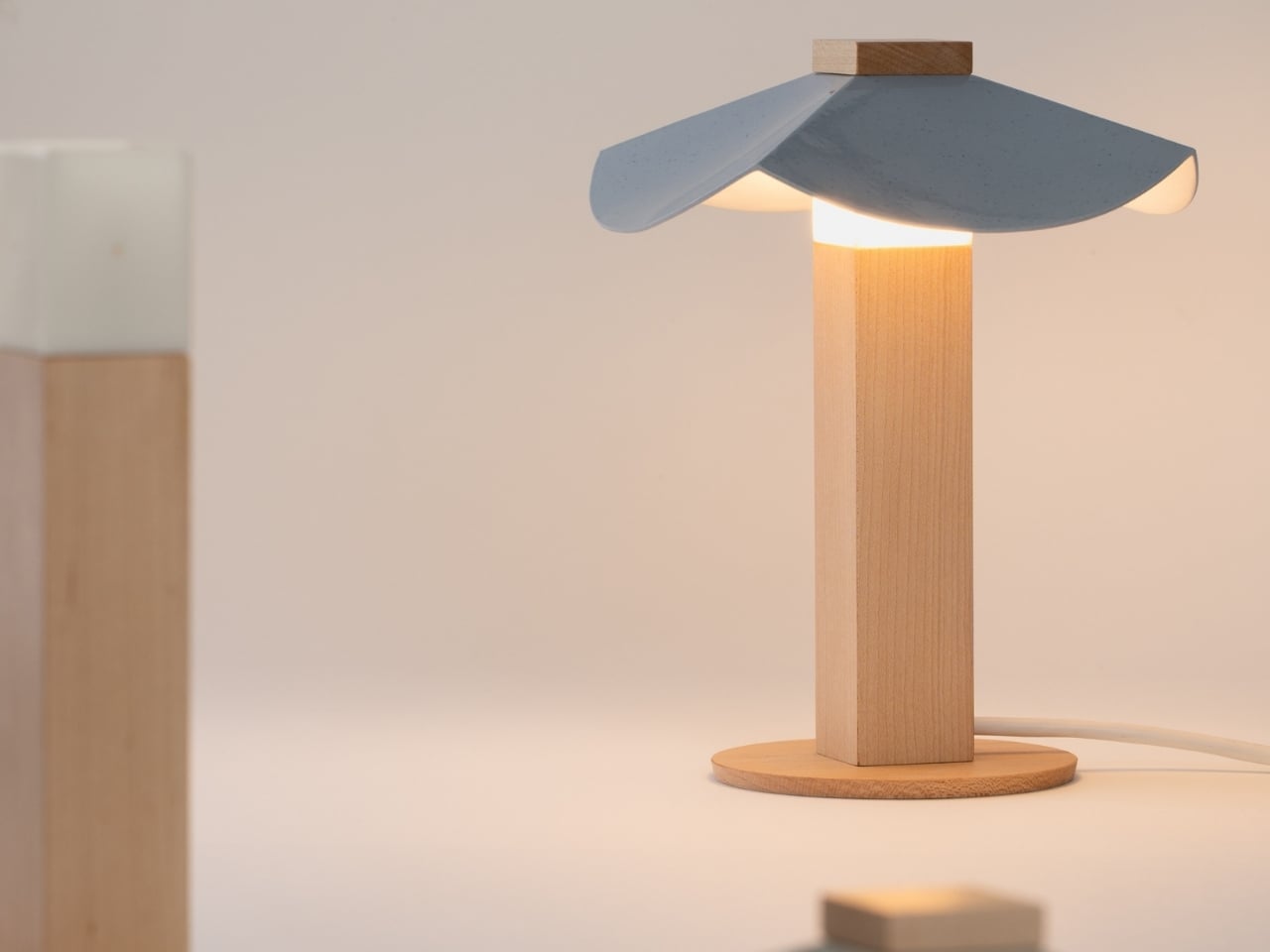
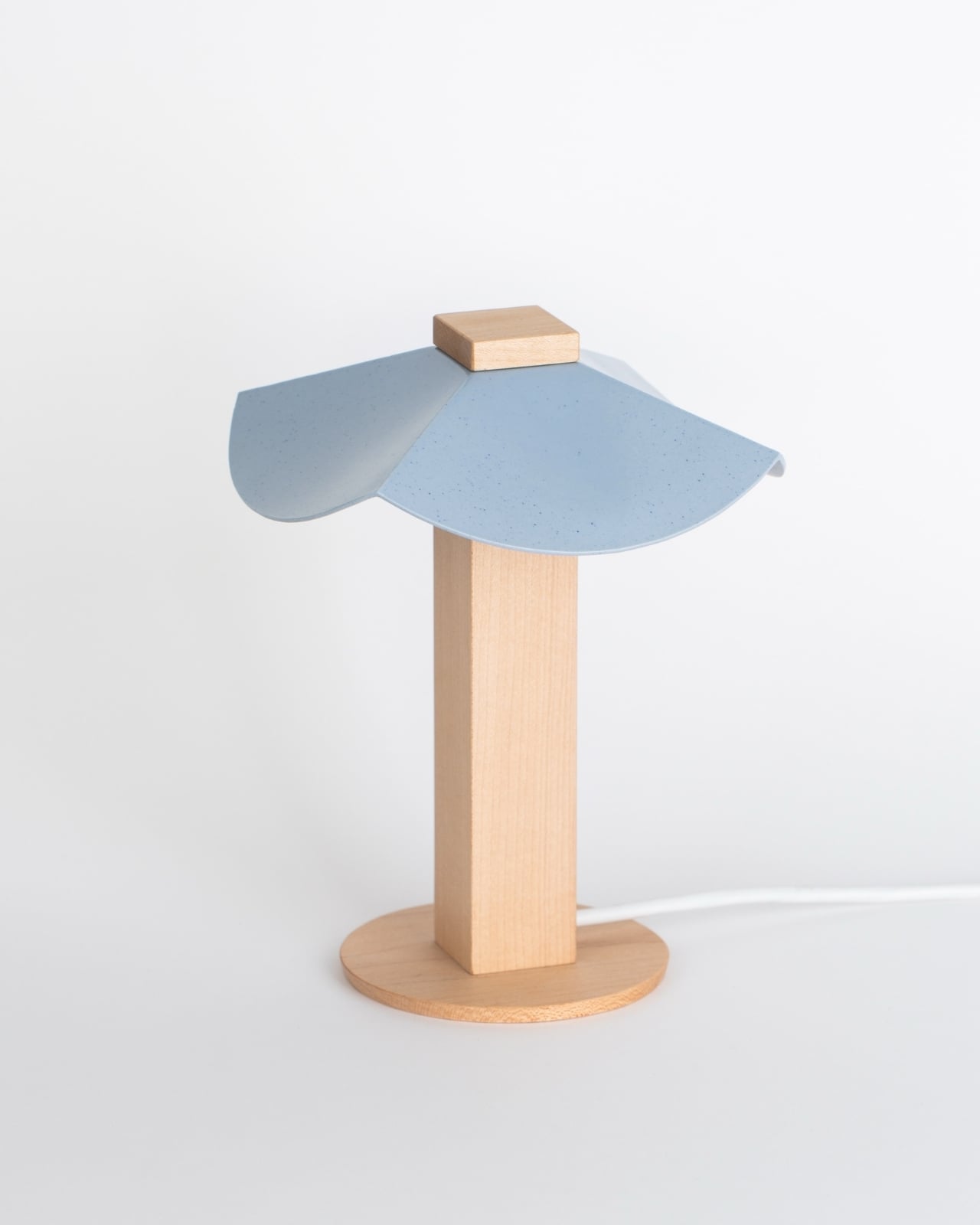
Seoul-based designer Byunggwon Na looked at that problem and did something refreshingly simple about it. His new piece, ALIT, is a lamp built from two honest materials, slip-cast ceramic and solid wood, and it’s designed so the ceramic shade can be lifted off and swapped for another one entirely. The wooden column stays put. The ceramic changes. One base, endless personalities.

Designer: Byunggwon Na

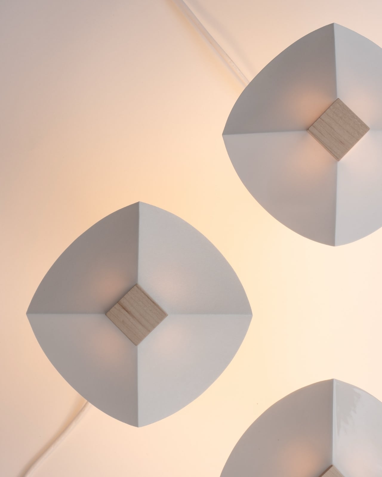
I’ll admit I’m a sucker for objects that do more with less, and ALIT is a good example of that instinct done right. It isn’t trying to be smart, connected, or app-controlled, which honestly feels like the correct move in a market saturated with lighting products chasing the “smart home” label. Instead, Na leaned into contrast: the coolness of ceramic against the warmth of wood, the matte against the grain, the handmade against the geometric. The square wooden column reads almost architectural, a quiet, upright form that could disappear into a Scandinavian-leaning living room or a mid-century one just as easily. The ceramic shade sitting on top is where the personality lives, and because it’s removable, that personality isn’t permanent.

This piece treats color and light together, not separately. A pale, unglazed ceramic shade lets light spill out soft and even, almost like paper. A darker or glazed version holds the light closer, letting it glow through in patches instead of flooding the room. So the same base lamp can go from a reading-corner glow to something moodier for a dinner table, just by switching the top. That’s not a gimmick. That’s actual utility dressed up as good design, and those two things don’t always travel together.

American interiors have leaned hard into modularity over the past few years, from sectional sofas you can rearrange endlessly to shelving systems that grow with you. Lighting has lagged behind that trend, still mostly sold as one fixed object per mood. ALIT fits into where the category is quietly heading: fewer disposable purchases, more pieces designed to be lived with and adjusted rather than replaced. For a design market that talks a lot about sustainability but rarely builds it into something this tactile, that matters.

There’s also something to be said for the fact that Na didn’t overcomplicate the engineering. No magnets, no proprietary mounts, no fragile clip system to break after six months. The shade simply rests on the column, held by gravity and good proportions. It’s the kind of restraint that separates designers who understand materials from those who just decorate around them.

I don’t think ALIT is going to reinvent the lighting industry, and I don’t think it’s trying to. What it does is solve a small, specific annoyance, the fact that changing a lamp’s mood usually means buying a whole new lamp, and it solves it with a design vocabulary that feels considered rather than trend-chasing. In a category full of objects competing for attention, ALIT seems more interested in earning a long-term place in a room. That’s a rarer ambition than it should be, whether this one ends up in a Seoul studio or an apartment in Brooklyn.

The post A Ceramic Lamp That Refuses to Stay the Same first appeared on Yanko Design.

  •  

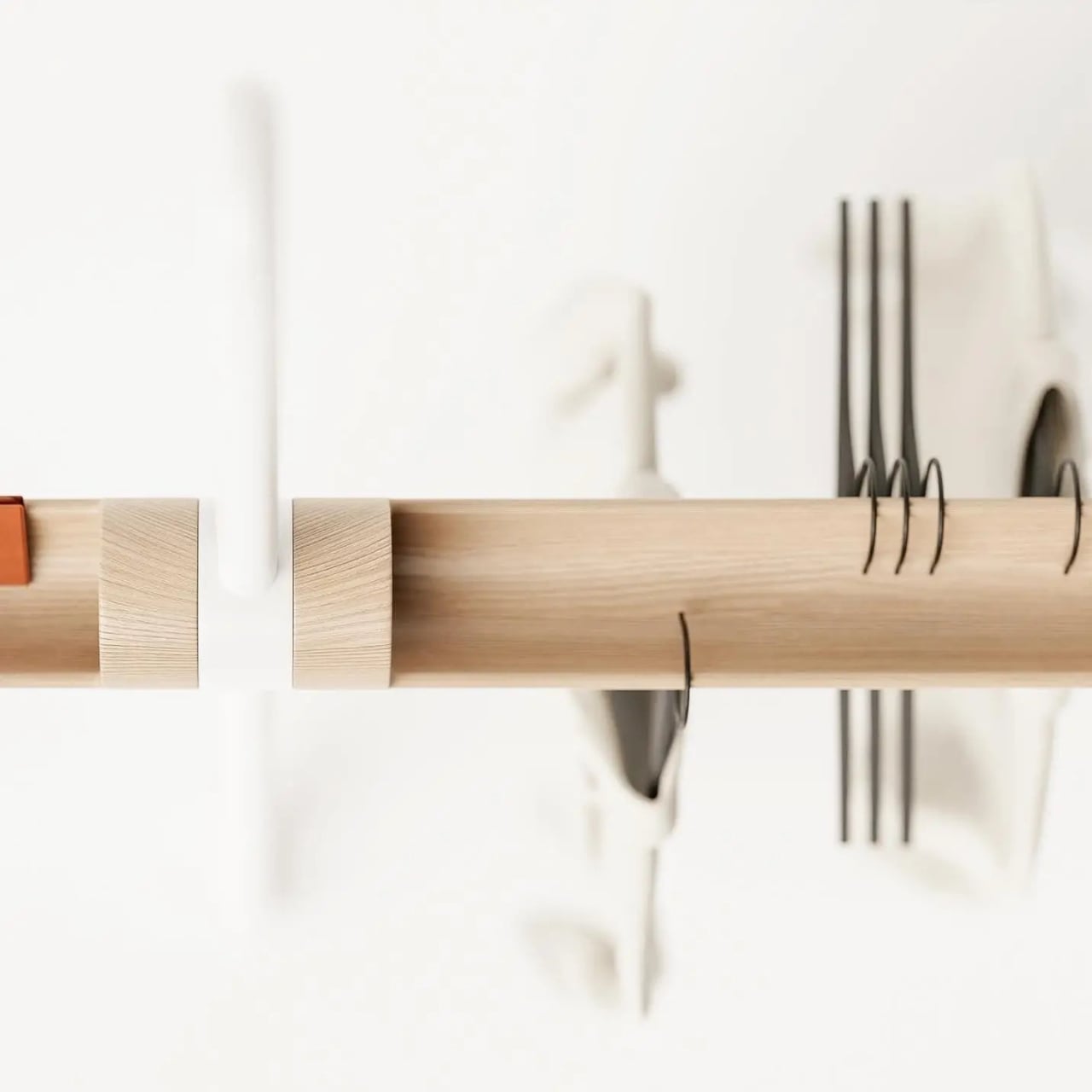
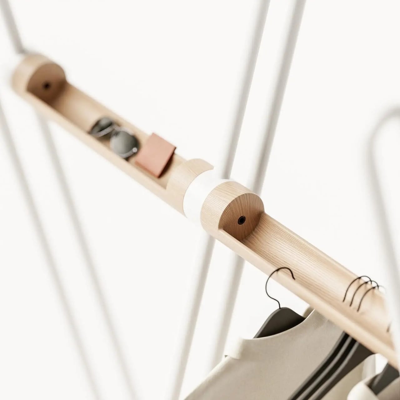
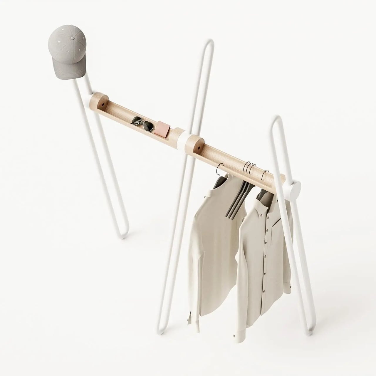
The Coat Rack That Doubles as a Sculpture for Your Entryway

Most coat racks have one job and barely manage it. They accumulate coats, yes, but also that one bag you keep meaning to put away, the umbrella you forgot about, and eventually the kind of low-level visual clutter that makes the entryway feel like it quietly surrendered. The Acrobat, designed by João Teixeira of Teixeira Design Studio, takes the opposite approach entirely. It starts by asking what a coat rack actually needs to do, then builds something genuinely beautiful around that answer.

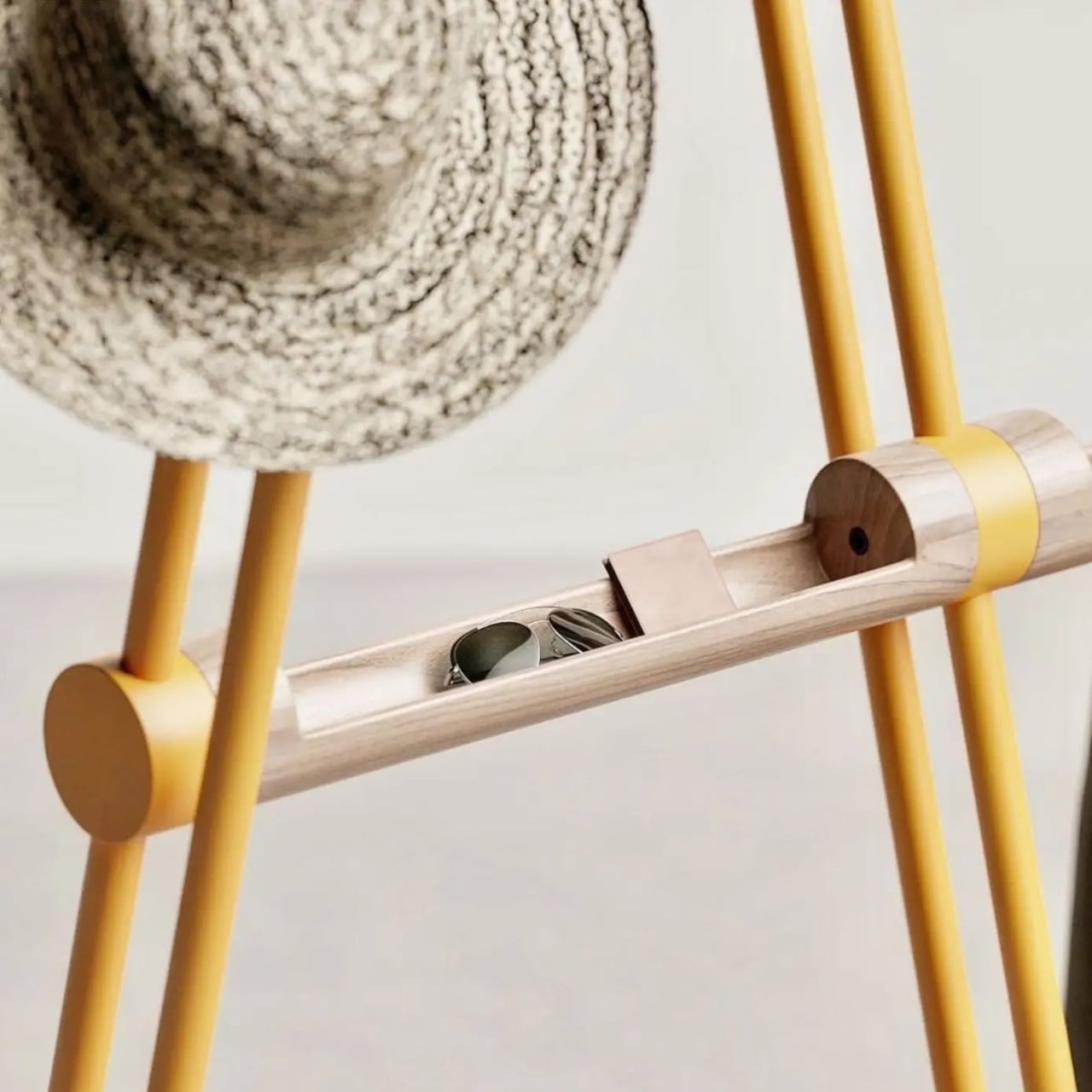
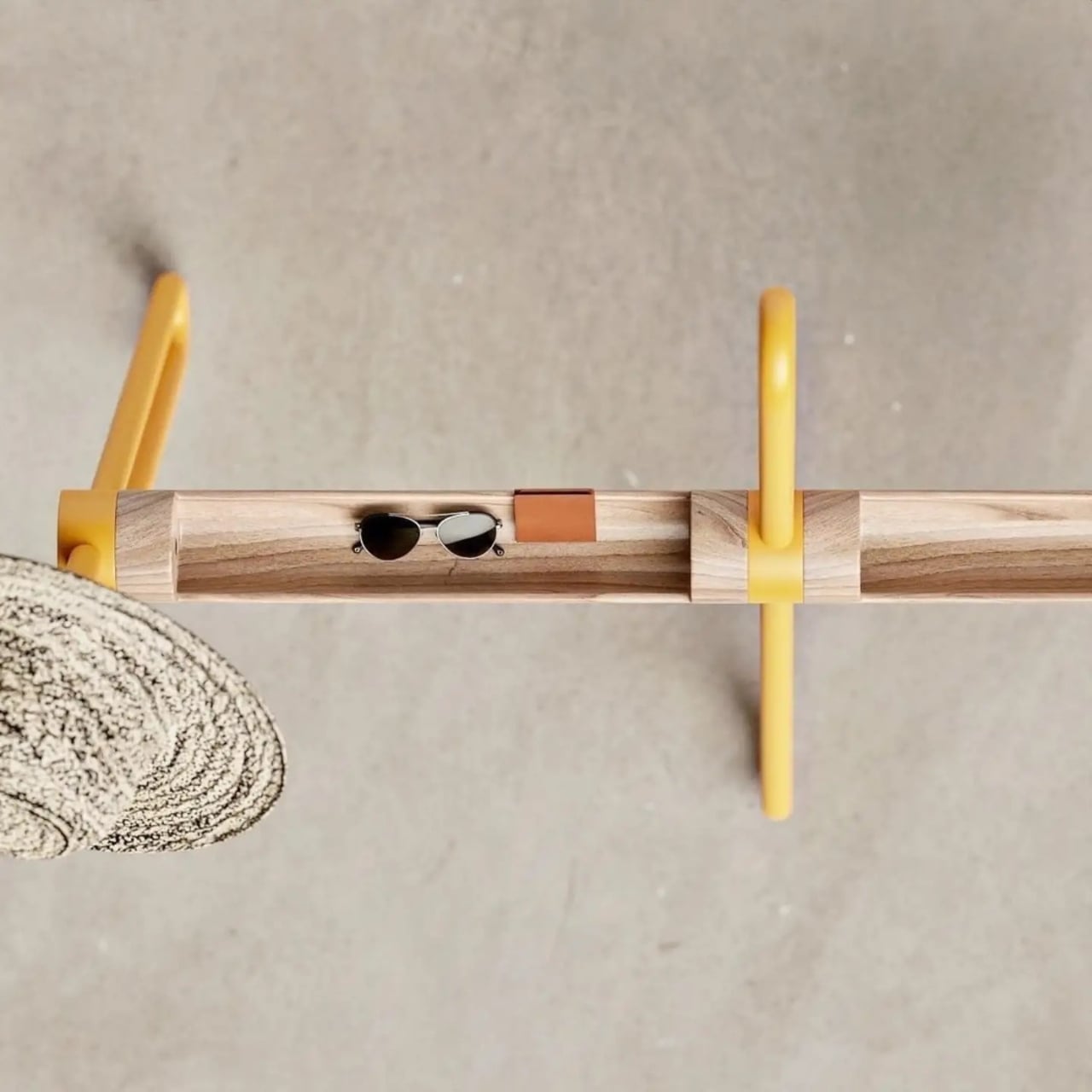
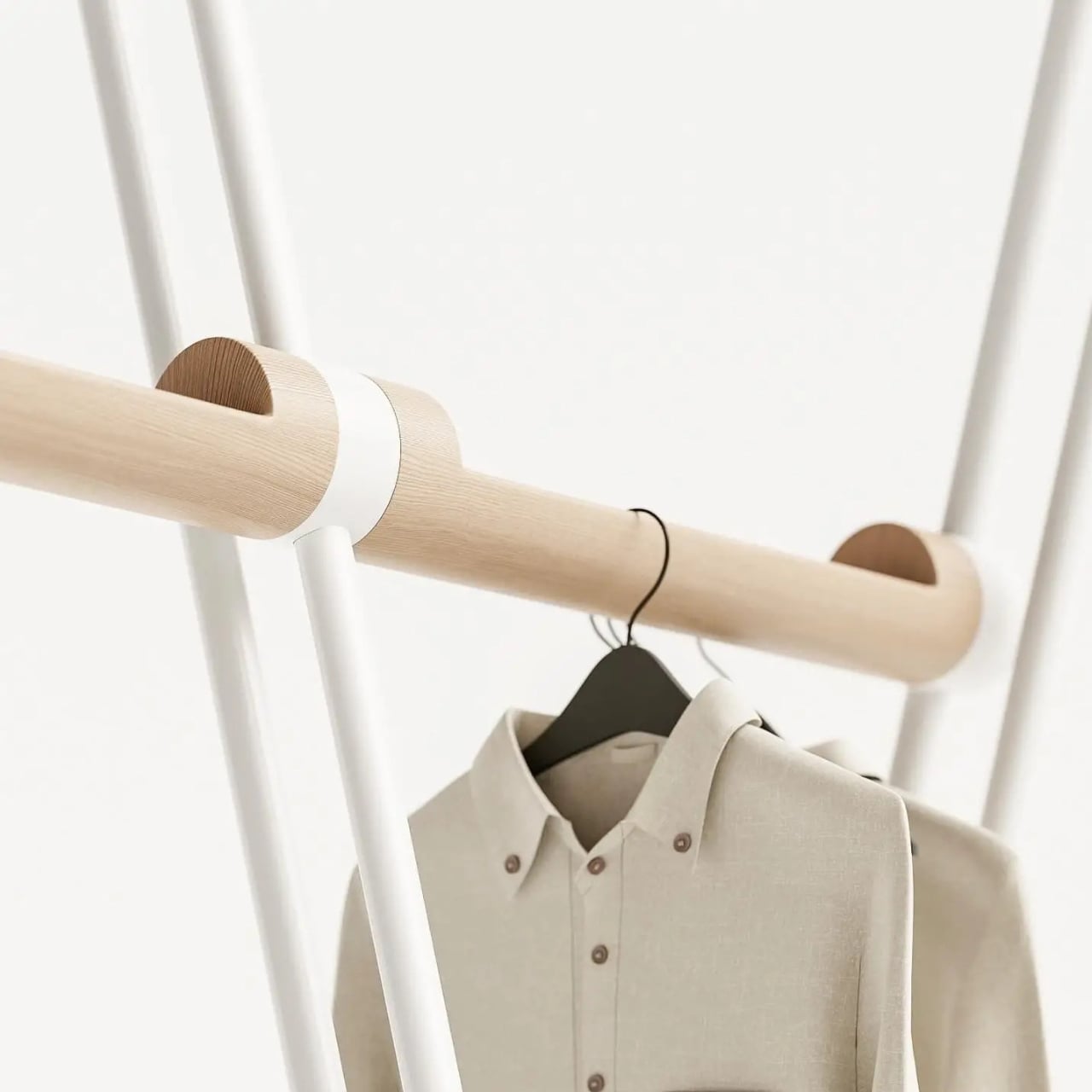
The name earns itself the moment you see the full form. A tripod base anchors the piece with quiet confidence, while a continuous bent metal tube rises and loops around it, creating a silhouette that reads as more gesture than furniture from across the room. It has the quality of something mid-motion, a figure caught mid-step that decided to stay exactly like that. Sculptural is an overused word in design writing, but it applies here without apology. The wood bar running through the center connects the metal structure while doing its own separate work: carved openings along its length are sized to hold the daily essentials that would otherwise migrate to whatever flat surface is nearest. Keys, wallet, sunglasses, the objects that technically belong somewhere but never quite find a place. Here, they do.

Designer: Teixeira Design Studio

The two-material pairing is deliberate in the best way. The metal tube handles the structural work and the hanging functions, its looped tops wide enough for coat shoulders and the brim of a hat. The wood handles texture and warmth, softening what could easily tilt too industrial for a home setting. Together they read as a genuine material conversation rather than a design decision arrived at by committee or trend-following. Each element is doing something specific, and you can read that in the form without anyone explaining it to you.

I appreciate that the Acrobat resists the pull toward the purely minimal. A lot of contemporary furniture design seems to mistake reduction for sophistication, stripping objects down until they barely register as functional at all. The Acrobat keeps everything it needs and nothing it doesn’t, but the form is generous rather than austere. The bent metal loops repeat and layer against each other depending on your viewing angle, creating a depth that a straight rail or a standard row of hooks simply wouldn’t offer. The piece looks different at 8 AM when you’re grabbing your bag on the way out than it does at night when it’s holding coats in a still room. That kind of visual behavior in an everyday object is rare.

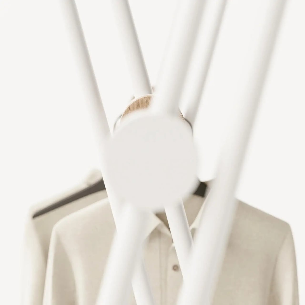
The colorways matter too, more than they might initially seem. The white version has a graphic, almost architectural quality that would hold its own in a very considered interior. The mustard yellow version is something else entirely. It pushes the Acrobat from understated into genuinely expressive territory, the kind of color decision that takes equal confidence from the designer and the person buying it. A yellow coat rack is a commitment to a room’s character, not a neutral addition to it. I think that’s the right instinct. The best designed objects have a point of view, and this one clearly does.

Entryway design gets far less attention than it deserves relative to the rest of the home. The kitchen gets renovated, the living room gets considered, but the entry is often left to whatever hooks were already on the wall. It’s an oversight that matters, because the entry sets the tone for everything beyond it. The Acrobat makes a case for treating that space with the same intention you’d bring to any other room.

Teixeira Design Studio seems to be arguing, through this piece, that functional objects don’t need to apologize for being beautiful, and beautiful objects shouldn’t have to sacrifice the practical to justify their presence. The Acrobat does both, quietly and without laboring the point. It stands in the corner, holds everything you carry in from the outside world, and looks like it belongs in a gallery while doing it. For a coat rack, that’s a remarkable thing to pull off.

The post The Coat Rack That Doubles as a Sculpture for Your Entryway first appeared on Yanko Design.
  •  

The Georgia Art Show Turning 9 Broken 3D Prints Into Music

Every fabrication lab in the country is quietly accumulating a problem. Failed prints, test runs, leftover filament, the ghost of every prototype that didn’t make the cut. Most of it ends up in the bin. Architect Hyojin Kwon noticed this and, instead of moving on, asked a different question: what if all that discarded plastic could hold a note?

The result is Ninefold: A Distributed Resonant Field, a collaboration between Kwon’s design studio Pre- and Post-, percussionist and composer Jeremy Muller, and architect and material researcher Misri Patel. It’s currently on view at the Reeves House Visual Arts Center in Woodstock, Georgia, through September, and it is one of the more quietly radical things happening in design right now.

Designers: Hyojin Kwon × Jeremy Muller x Misri Patel

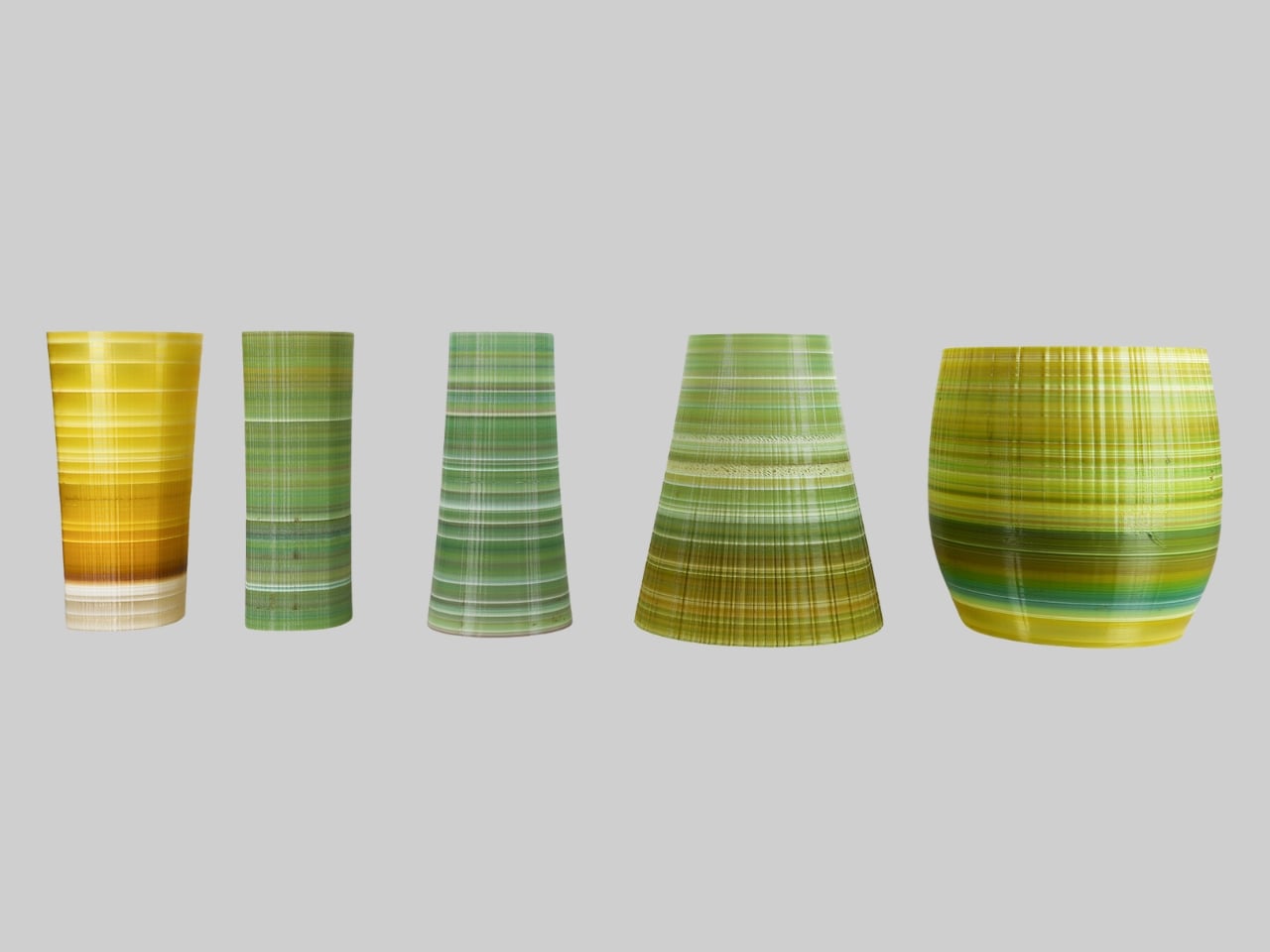
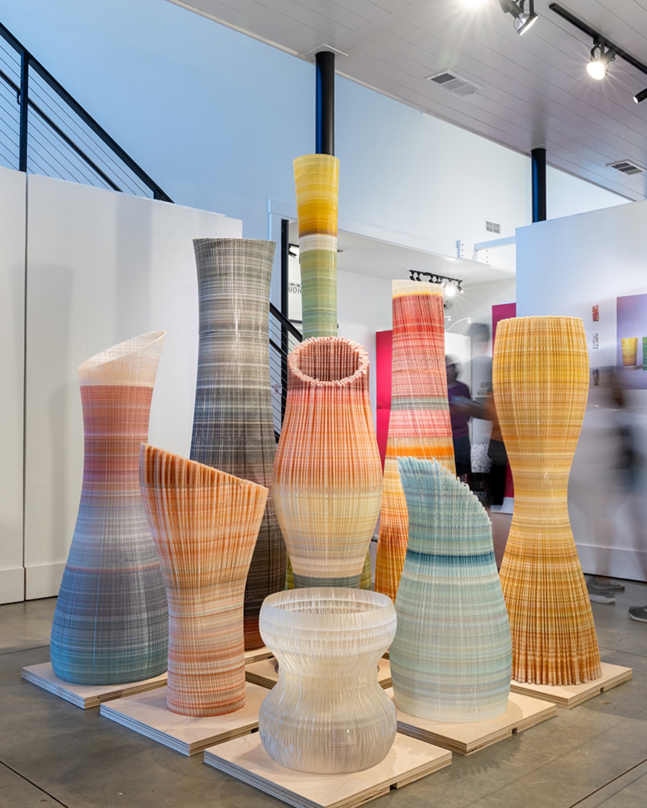
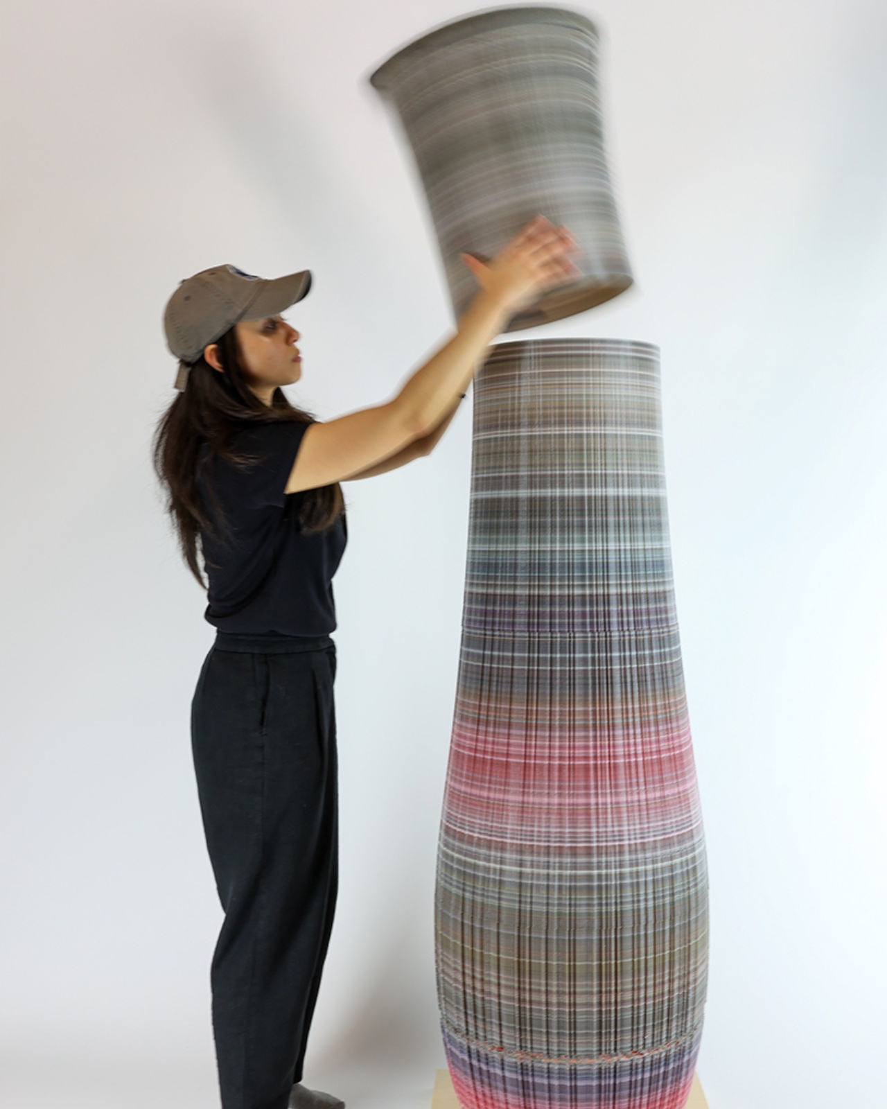
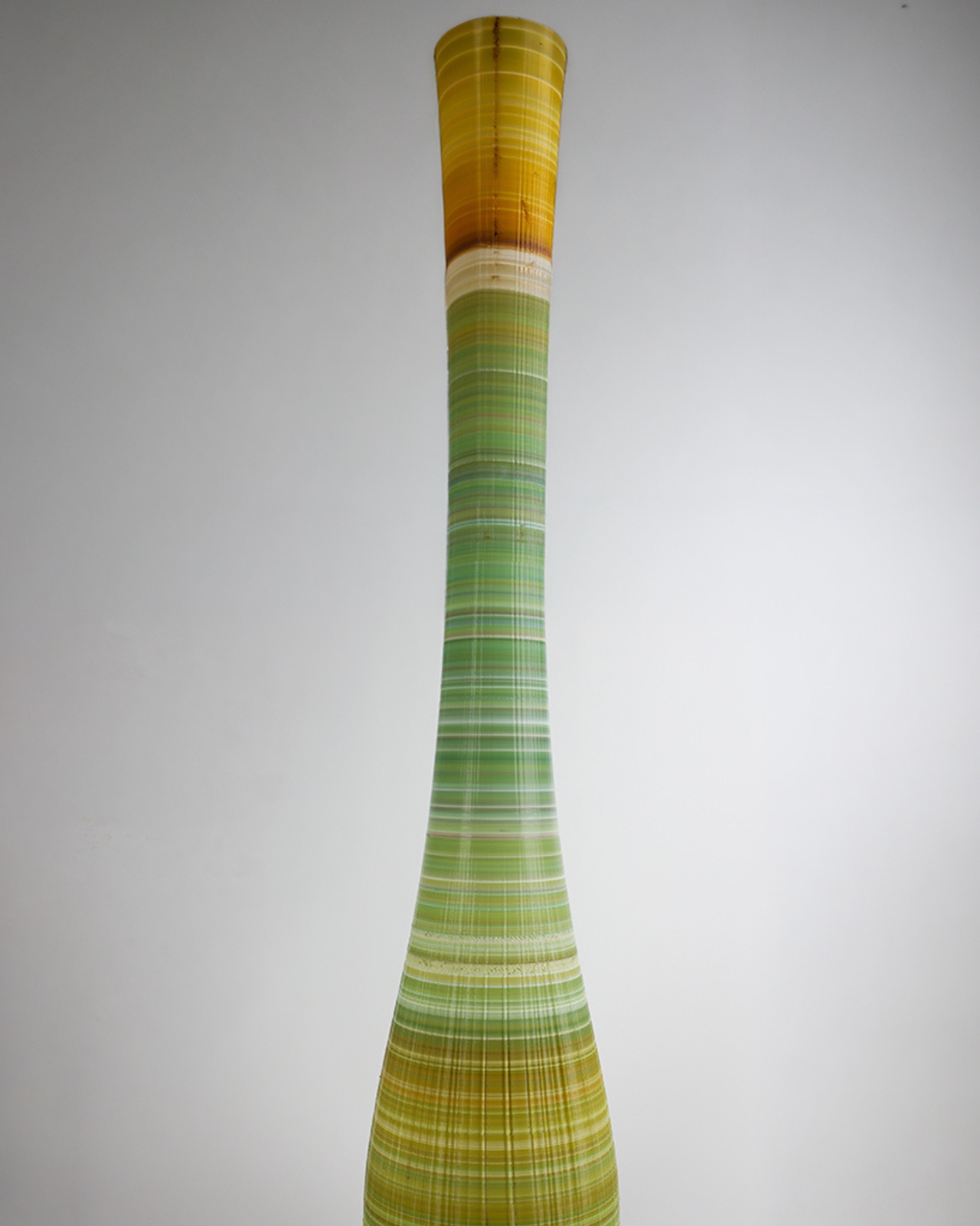
The installation is made up of nine large-scale forms, each one 3D-printed from discarded PLA collected from campus makerspaces and fabrication labs. The team shredded that waste into pellets, blended it with virgin material, and ran it through a pellet-based additive manufacturing process. The resulting objects are not identical. Some grow into tall, slender columns. Others widen into chambers or narrow toward their centers. Each carries its own texture, its own layered color variation from the mixed-batch sourcing, and its own distinct harmonic frequency. Together, they form a distributed sound field, meaning the sound is never coming from one place. It moves with you.

That last part is what makes this more than a sculpture show with a good concept. As you walk through the space, your position changes the acoustic picture entirely. Tones overlap, separate, recede. You’re not passively observing nine objects; you’re completing the field. The project draws on the thinking of composer Edgard Varèse, who called for “organized sound” as architecture, and on the spatial music systems of Iannis Xenakis and Le Corbusier. Those are not small reference points. They’re pointing at a lineage that treats space itself as a musical instrument, and Kwon, Muller, and Patel are building within that tradition using material that would have otherwise ended up as landfill.

The aspect of Ninefold that deserves real attention is how seriously it takes the material. The layered plastic isn’t hidden or smoothed over into something that looks deliberately “designed.” The texture is part of the expression. You can see the deposition, the color shifts, the history of what it was made from. The project doesn’t pretend the recycling didn’t happen; it foregrounds it. That honesty feels important at a moment when sustainability has become more of a marketing category than an actual practice.

The nine forms were also fabricated in modular sections, which means they can be transported, reconfigured, and reinstalled elsewhere. That might seem like a logistical footnote, but it matters: an installation about material longevity should probably have a long life. These objects weren’t made to be shown once and archived.

Ninefold is part of a dual exhibition that also includes Plastic Reimagined: Material Agency & Circular Design, developed with students from Georgia Tech’s graduate architecture program and curated by Carolina Cuevas. The full show runs through September at the Reeves House, and admission is free. If you’re near Woodstock, Georgia, it’s worth the trip. If you’re not, the images alone carry something worth sitting with. A lot of projects right now wear sustainability as a label. Ninefold actually earns it, and then manages to also be beautiful, which is rarer than it should be.

The post The Georgia Art Show Turning 9 Broken 3D Prints Into Music first appeared on Yanko Design.
  •  

Konny Just Solved the One Thing Baby Slings Never Could

I am not a parent myself, but I have been around enough parents that I make some unsolicited observations (to myself, to be fair), especially when it comes to them carrying babies and toddlers. Whenever I see them carrying babies on a sling, I keep thinking, “That doesn’t seem to be that comfortable for both the parent and the kid.” So it’s interesting to see baby brands try to come up with design solutions for this kind of problem, since it’s something that will be around forever.

South Korean baby brand Konny’s contribution to easing the life of parents is the Dual Support Hip Seat Carrier. It aims to solve two of the prevalent problems that they face when using slings. First, it has a foldable hip pad and back pad to make it more comfortable for the kid. Second, the parent doesn’t just bear the weight on one shoulder because of this carrier’s Dual Support.

Designer: Konny

This portable baby hip seat carrier’s main purpose is to replicate the security of a parent’s arms so the baby is upright, safe, and comfortable. It has a foldable hip pad combined with a back pad to give this sense of security. It even has a non-slip bottom so the kid will not slide off the seat, which I sometimes see happen with other seat carriers. The seat is made of soft 3D mesh, giving a more comfortable feeling for your baby as you carry them around.

It also takes into consideration the comfort of the parents since they’re carrying the heavy load, so to speak. The carrier has wide shoulder straps that are able to spread the weight evenly across the back to avoid the one-shoulder strain that a lot of parents experience. You also have the option to carry the baby from a hip position or a front-facing hold. The fabric used is the same stretch-and-resilience material that the other Konny Baby Carriers use, a fabric tested and trusted through over one million carriers sold.

The Dual Support Hip Seat Carrier weighs only 0.5 lbs and can be folded into a small enough item to put in a purse or a diaper bag. But when not being used to carry a baby, it can actually function as a chic and stylish bag that you can carry stuff around with. It claims to be a one-size-fits-all accessory as it is accessible for all kinds of body types.

What I find particularly reassuring, especially for those who aren’t baby gear experts, is that the Dual Support Hip Seat Carrier is IHDI certified. The International Hip Dysplasia Institute recognizes baby carriers that actively support healthy hip development in infants, so this isn’t just a comfort win for parents; it’s a safety win for babies, too. That kind of certification adds a layer of trust that goes beyond just good design.

And speaking of good design, the carrier actually won the 2024 Good Design Award, one of the most prestigious design honors in the world. The jury praised it for achieving a “near-perfect balance between infant safety and parental convenience,” and honestly, it’s easy to see why. The fact that it doubles as a bag when you’re not carrying a baby is already a clever touch, but knowing that the structure was the result of dozens of prototypes and extensive real-world customer testing makes it even more impressive.

The Dual Support Hip Seat Carrier is available on konnybaby.com starting at $59.99, and it comes in a range of colors, from classic Charcoal and Black to more playful options like Green Tea and Blue Grey, as well as a Corduroy version for something a little more textured.

As someone who has watched many a parent struggle with a squirming toddler and a lopsided sling, I’d say this is the kind of product that makes you think, “Finally.” It may not replace the full-on baby carrier for long hauls, but for that “carry me now” stage, when your toddler suddenly decides their legs no longer work, this seems like exactly the right tool for the job.

The post Konny Just Solved the One Thing Baby Slings Never Could first appeared on Yanko Design.
  •  

The Italian Lamp That Uses Toy Race Cars as Light Bulbs

Most lighting gets chosen the same way people pick curtains: functional, inoffensive, and quickly forgotten. You walk through a showroom, you point at something that won’t clash with the sofa, and that’s more or less the end of the design conversation. That’s not a criticism of how people live; it’s just an observation of how light, despite being the single most transformative element in any space, rarely gets to have fun.

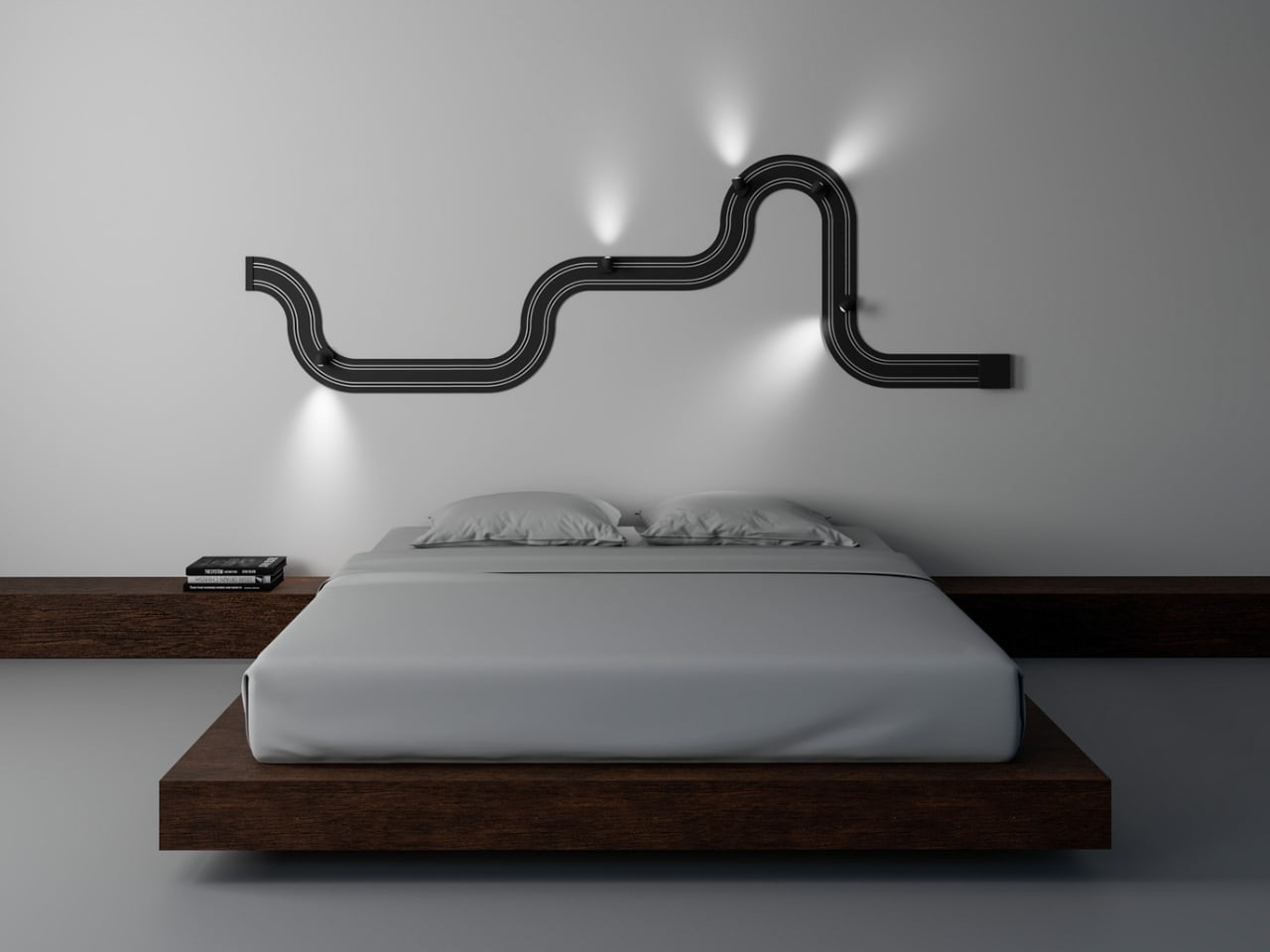
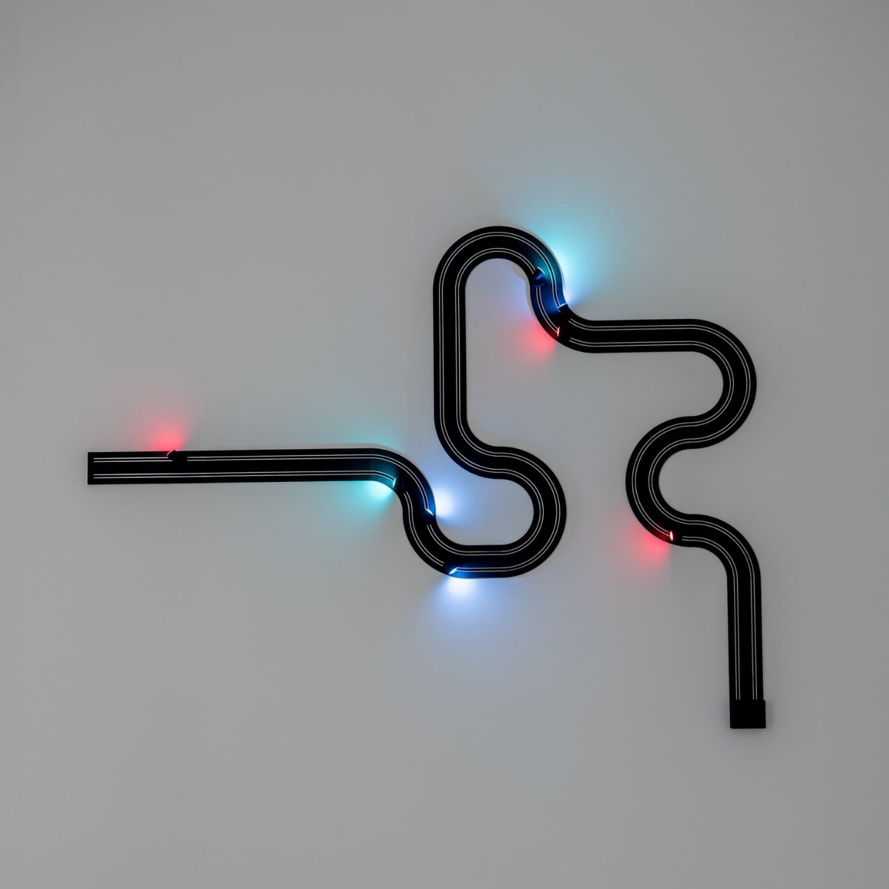
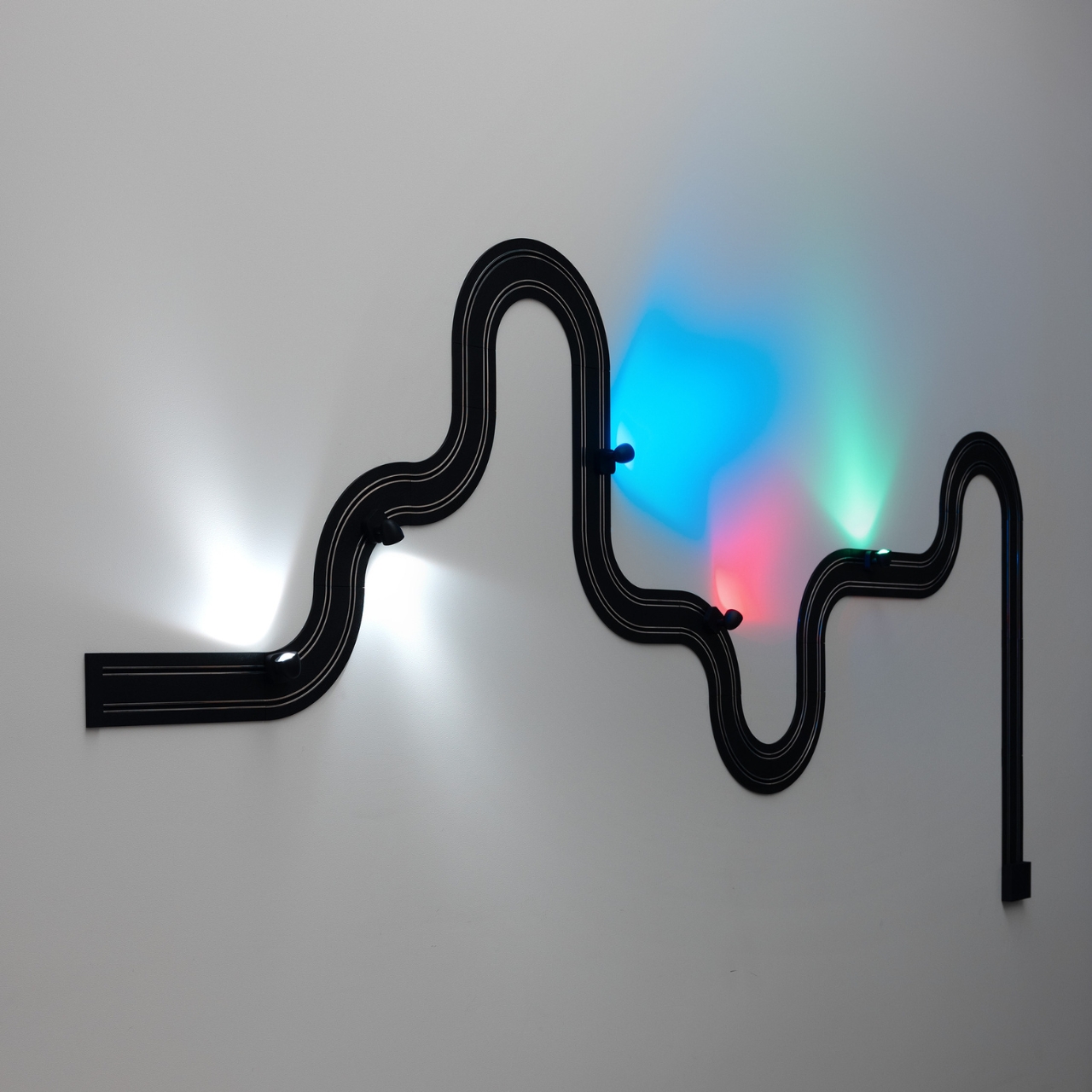
Davide Groppi’s Race of Lights is the exception to all of that. The Italian lighting brand, based in Piacenza and known for making some of the most quietly radical lamps in contemporary design, released Race of Lights in 2025. On paper, it is a modular wall lamp. In reality, it is a slot-car racing track that someone decided should also be your light source, and the whole thing somehow works beautifully.

Designer: Davide Groppi

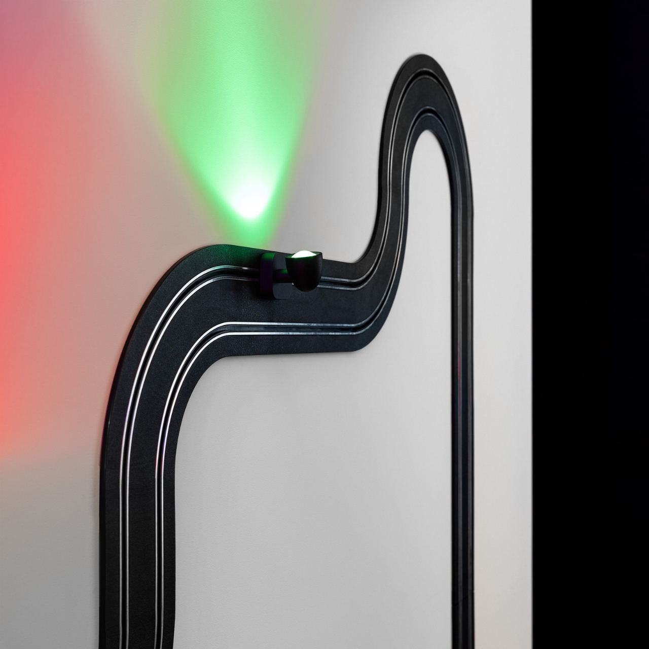
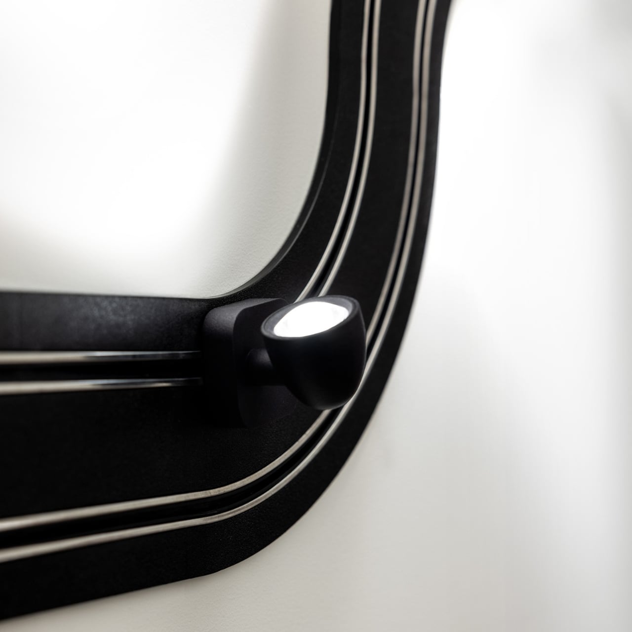
The concept is exactly what it sounds like. An electrified track, made from textured matte black polyethylene, gets mounted on the wall in whatever configuration you want. The track carries current, and the light sources are tiny car-shaped spotlights that snap into place magnetically and can be moved, repositioned, or rearranged any time the mood strikes. The basic kit includes two short straight modules, four longer sections, six curves, and four colored light-cars in green, white, blue, and red. The whole system can run up to five metres across your wall and power up to eight spotlights, each with an adjustable head so you can direct the beam exactly where you want it. This is, objectively, absurd. It is also one of the most genuinely exciting things to come out of the lighting world in years.

What makes Race of Lights so interesting to think about is how it sits within Davide Groppi’s broader body of work. This is a designer who built his reputation on doing less. His lamp Nulla, which won the Compasso d’Oro in 2014, measures just 18 millimetres in diameter and is practically invisible in a ceiling. The name literally translates to “nothing.” The philosophy has always been that the lamp should disappear so the light can remain. Race of Lights does not disappear. It sits on your wall, looped and curved, with little colored cars parked along the track. It makes a statement in the exact opposite direction of everything Groppi has been doing, and yet it makes complete sense.

Because the brand has never really been about minimalism for minimalism’s sake. The design language has always carried a sense of emotion. Groppi has spoken about light as a tool for seduction and curiosity, about design emerging from the heart as much as the mind. Race of Lights just takes that emotional dimension and makes it literal. The inspiration was childhood, specifically the memory of electric slot-car racing sets, the kind where small cars zip around a winding track spread across the living room floor. The track moves to the wall; the cars stay put and illuminate. Play becomes design, and the object retains the spirit of the original thing it was borrowing from.

The result is a piece that functions as a legitimate lighting solution and as a conversation starter and as something closer to a sculptural installation. You can compose it in a new shape whenever you want. That kind of flexibility tends to age well in a space, because you never quite exhaust the possibilities.

Cynics will say it is a gimmick. I understand the instinct, but I think that reading misses the point. Good design has always borrowed from play. The best chairs make sitting feel effortless. The best lamps make light feel intentional. Race of Lights makes light feel like something you chose with genuine enthusiasm rather than resigned practicality.

Lighting does not have to be a decision you make and then stop thinking about. Davide Groppi has spent decades proving that point in quietly different ways. Race of Lights is just the first time the argument came painted in red, white, blue, and green, with tiny cars attached.

The post The Italian Lamp That Uses Toy Race Cars as Light Bulbs first appeared on Yanko Design.
  •  

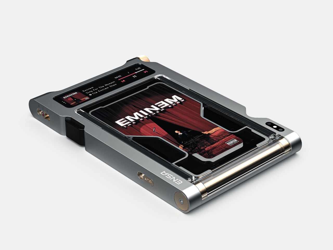
Streaming Took Something From Us. The ENSA T1 Wants It Back

Do you remember the last time music actually demanded something of you? Not just your attention while you scrolled, but your hands. The deliberate pull of a record from its sleeve. The small, mechanical click of a CD case. The unhurried ritual that came before every song, every mood shift, every late-night session on the floor with the volume just loud enough. Vladimir Dubrovin remembers. The California-based multidisciplinary designer has been quietly building a case for returning physicality to the act of listening, and with the ENSA T1, his latest concept design, the argument gets considerably harder to dismiss.

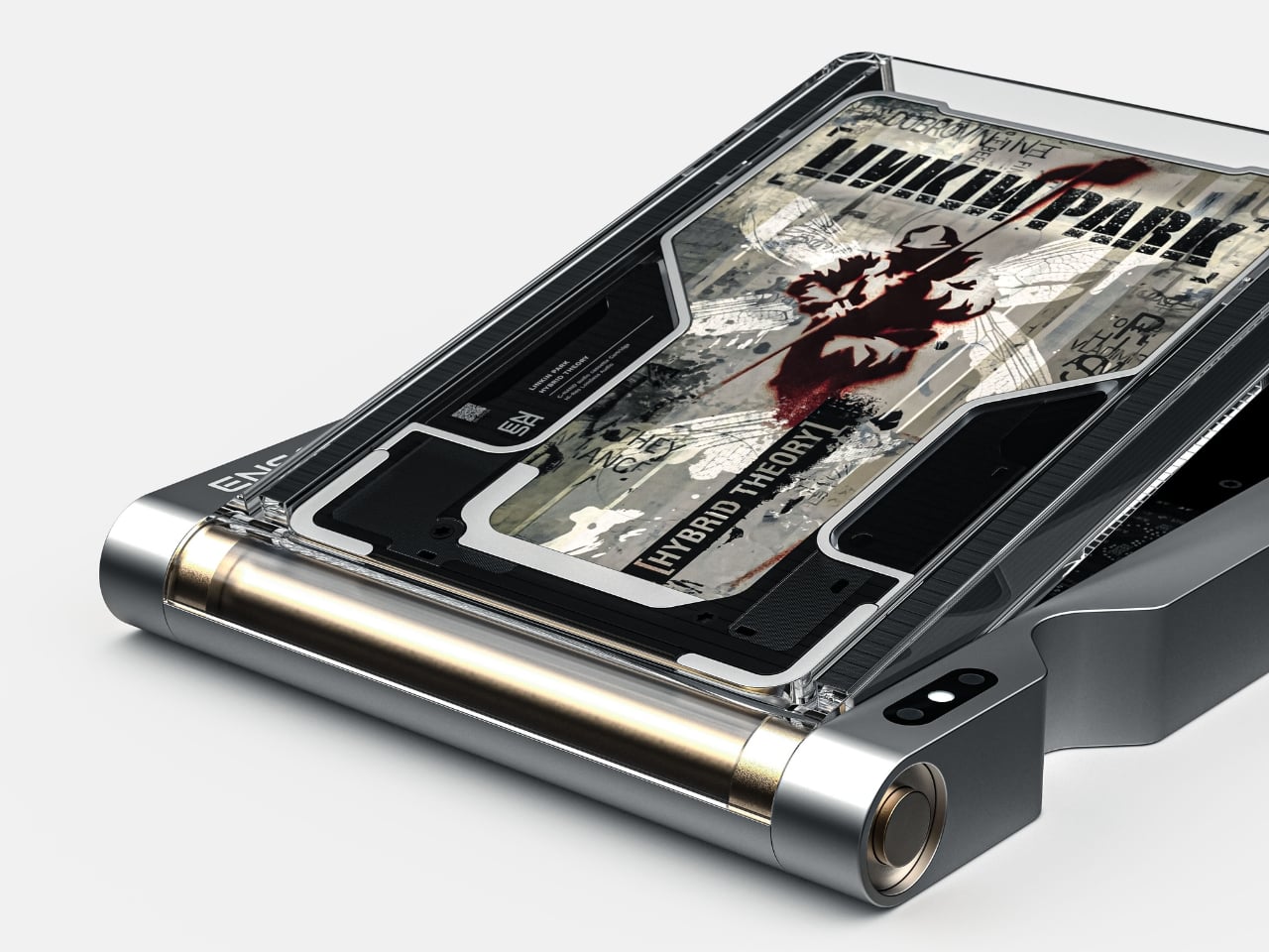
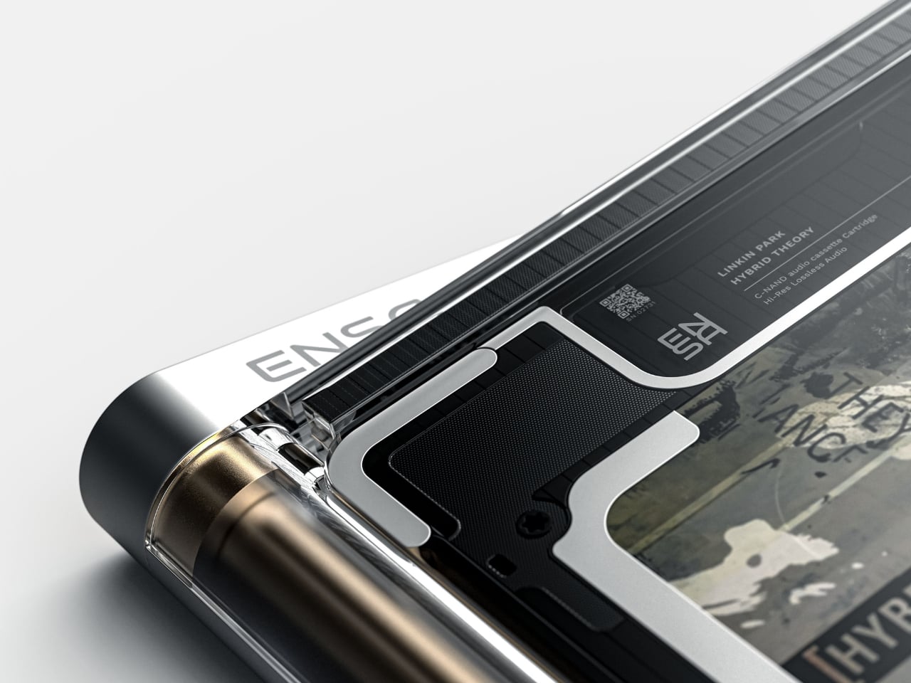
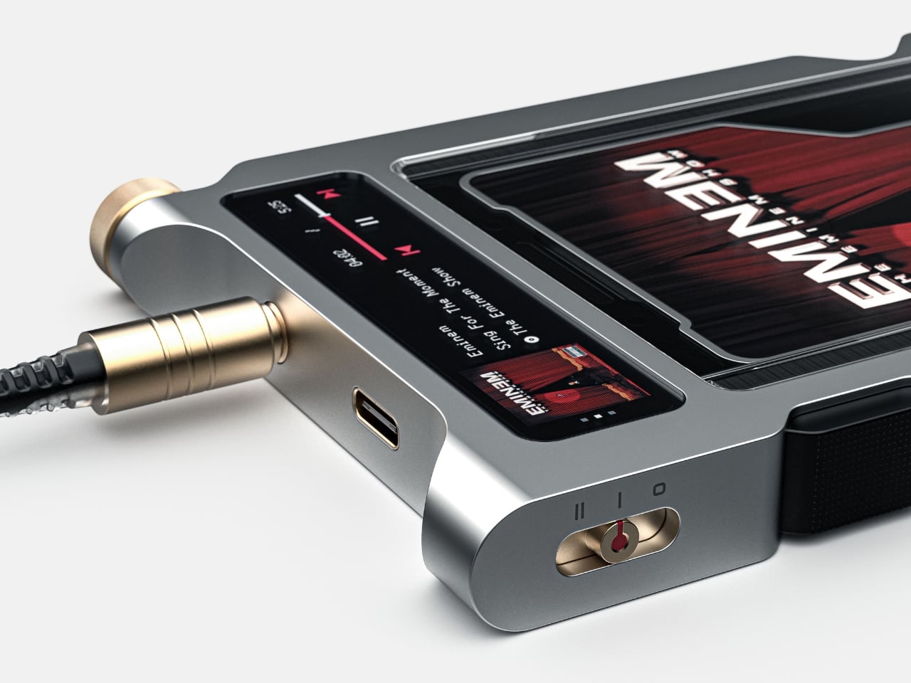
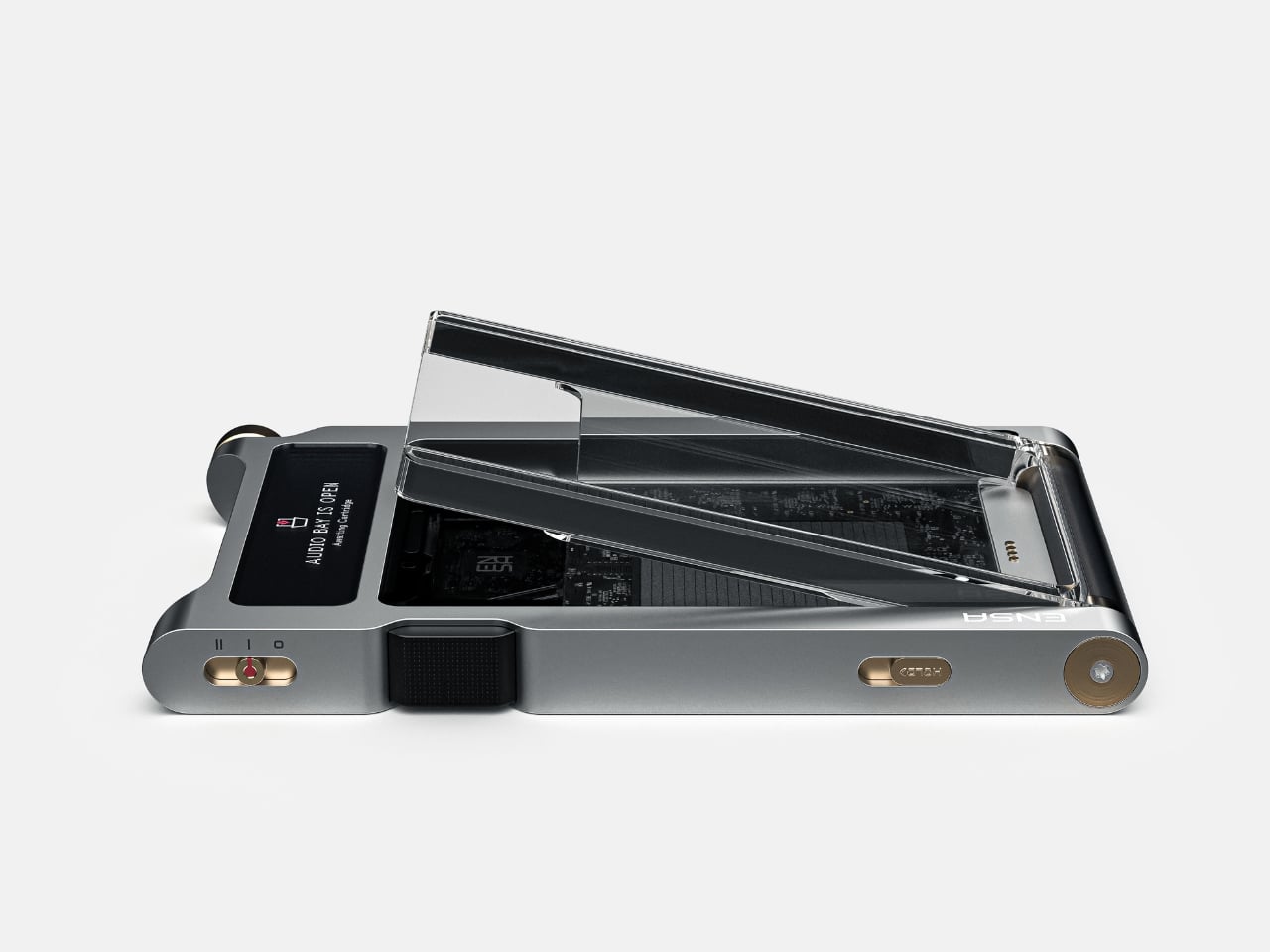
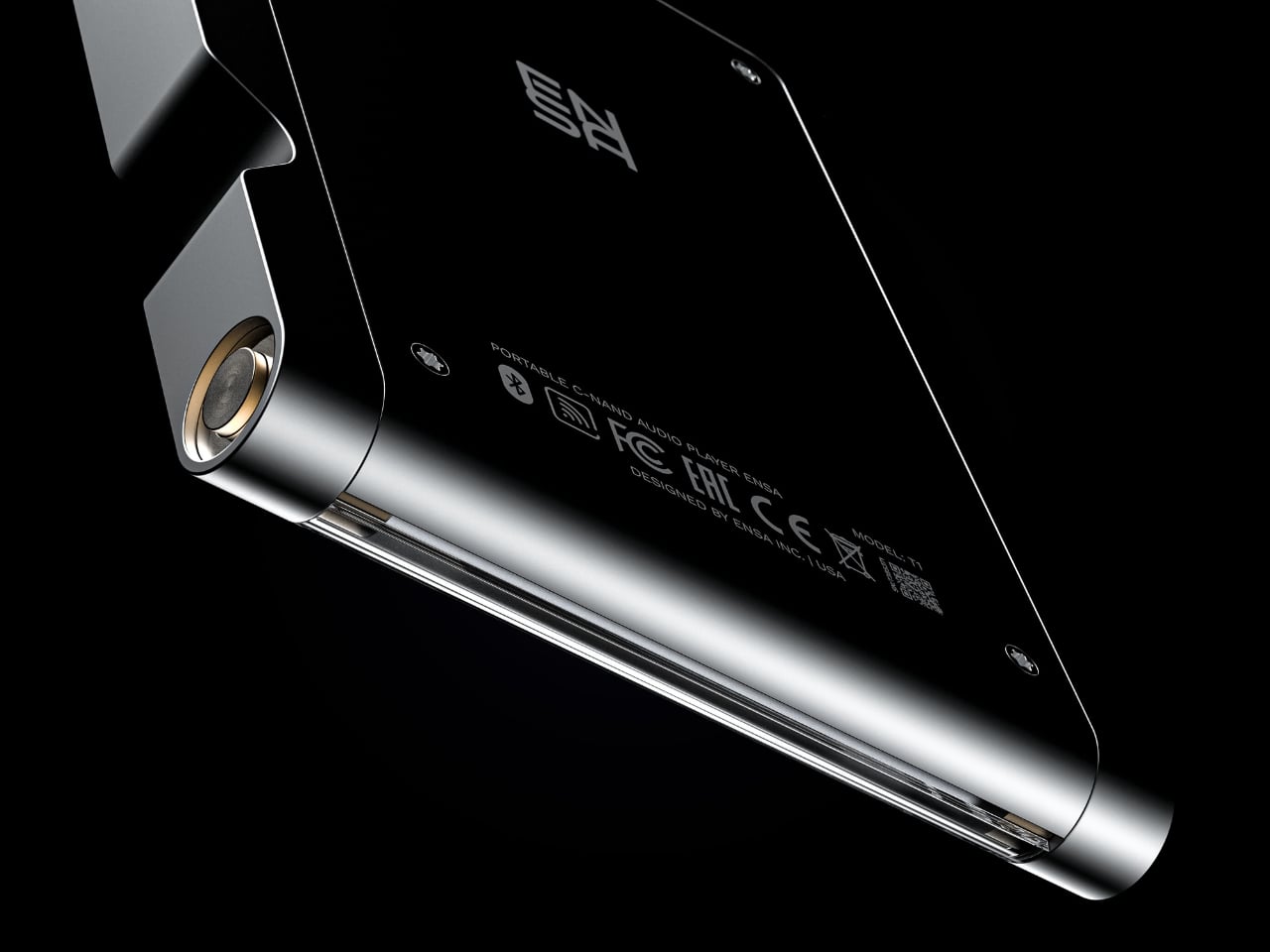
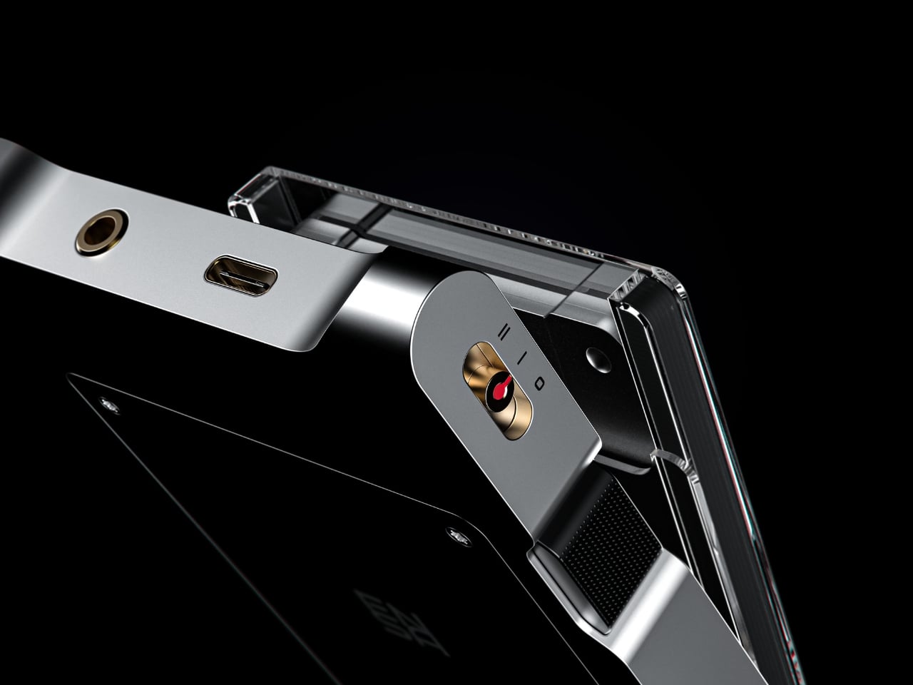
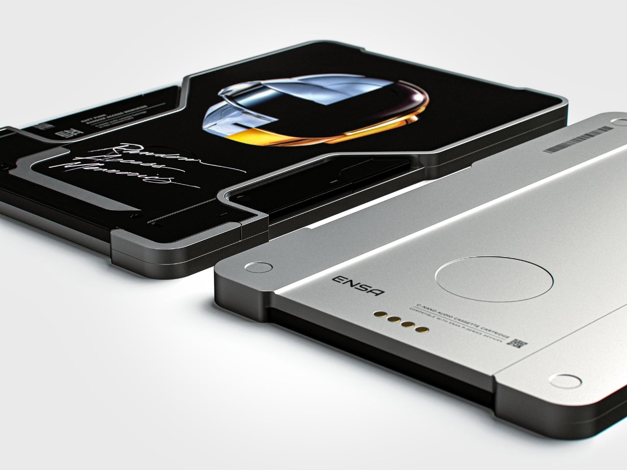
The T1 is the newest addition to Dubrovin’s ENSA line, an evolving design series that began with the ENSA P1, a portable audio player concept that reimagined what a music device could look and feel like in the post-streaming era. The P1 introduced Dubrovin’s concept of C-NAND cartridges: small, disc-shaped, solid-state storage units where each cartridge holds one complete album. There are no moving parts, no spinning mechanisms. They’re fully digital in how they handle audio, but they exist in the physical world the way vinyl does. You pick one up, turn it over, look at it, choose it. The act of choosing your music becomes deliberate again, and that matters more than it sounds.

Designer: Vladimir Dubrovin

Where the P1 was built for portability and kept its design trim and pocketable, the T1 feels like the next chapter. Visually and conceptually, it carries the same DNA: clean, considered industrial design with an aluminum body and restrained detailing. But the T1 reads as something more anchored, a device you set somewhere permanent and return to, rather than slip into a bag. It’s a design that seems to understand the difference between music you consume and music you actually sit down for.

Aesthetically, Dubrovin’s approach has always felt less like tech product design and more like furniture-level thinking. The ENSA devices belong to the same visual conversation as early Braun electronics or a Dieter Rams concept sketch, where every detail either earns its place or gets removed entirely. The T1 continues that restraint. Its form doesn’t shout, which is precisely why it catches your eye. In a market saturated with speakers shaped like pebbles and smart displays with glowing rings, an audio device that looks like it was designed by someone who genuinely thought about what it means to own a piece of music is genuinely refreshing.

The broader question Dubrovin keeps posing with the ENSA project is one worth sitting with: what did we actually lose when music went weightless? Streaming solved convenience so completely that most of us never stopped to notice what the tradeoff cost. We gained access to everything and lost the kind of focus that comes from committing to a single album, from having music you could see, hold, or lend to a friend. The ENSA T1 is not trying to compete with Spotify. It’s asking whether the experience of music could mean something again, even if you have to build an entirely new format to get there.

It’s a concept project, not a product you can buy, and the realist in me knows that’s a significant caveat. Building out a new physical media format in 2026 is an uphill proposition at best. The infrastructure alone, manufacturing cartridges, convincing labels, and getting devices into homes, would require a level of industry commitment that’s difficult to imagine right now. But design concepts don’t have to ship to matter. The best ones articulate a desire most people feel but haven’t named yet, and the ENSA T1 does exactly that. The desire for music that has weight, that takes up space, that gives you something to do with your hands before the first note plays.

That’s why Dubrovin’s work keeps getting attention. The ENSA line isn’t nostalgic in the way that feels defensive or retrograde. It’s just honest about the fact that we traded something real for something convenient, and it’s asking, politely but persistently, if we’d like it back.

The post Streaming Took Something From Us. The ENSA T1 Wants It Back first appeared on Yanko Design.
  •  

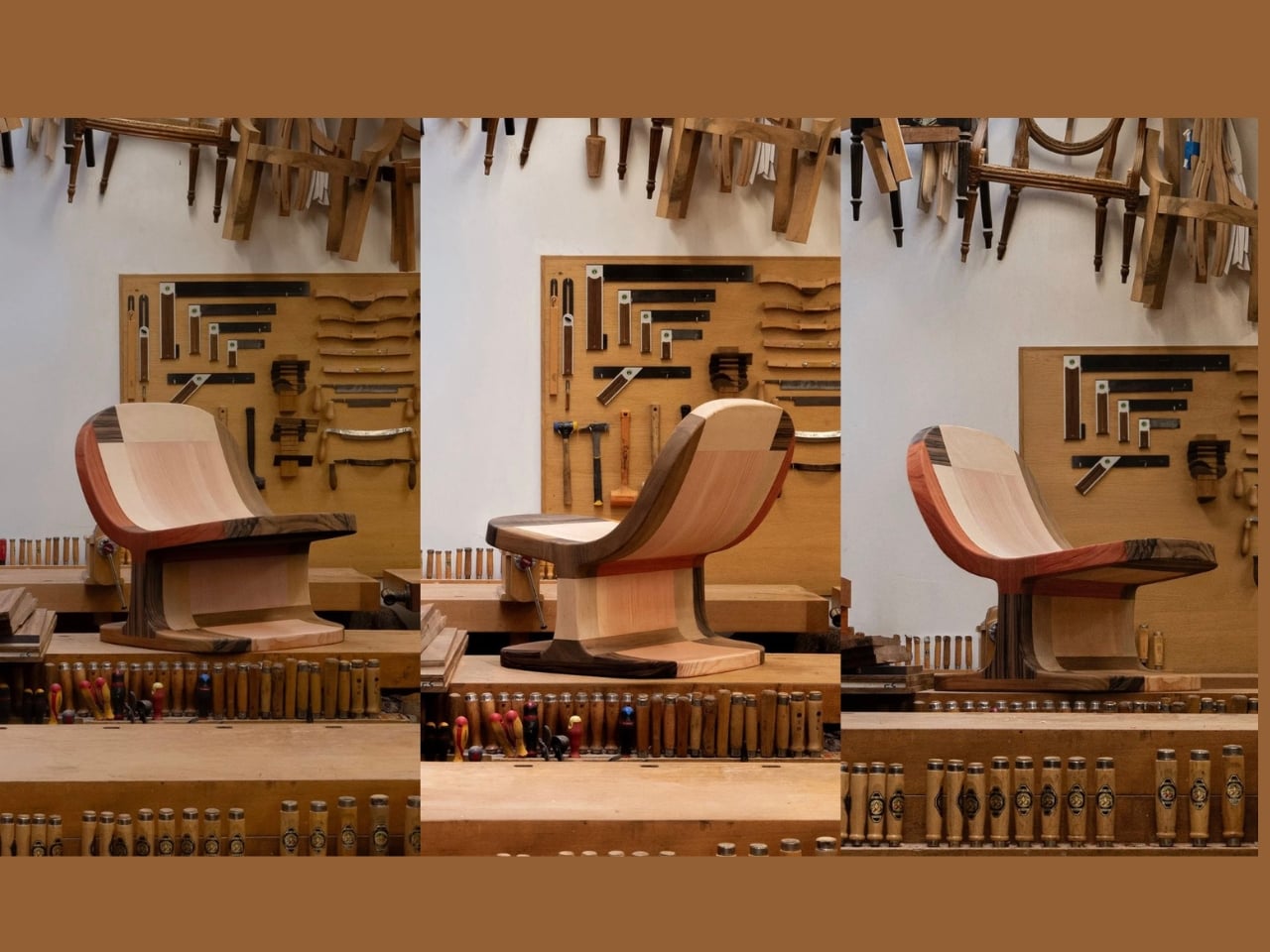
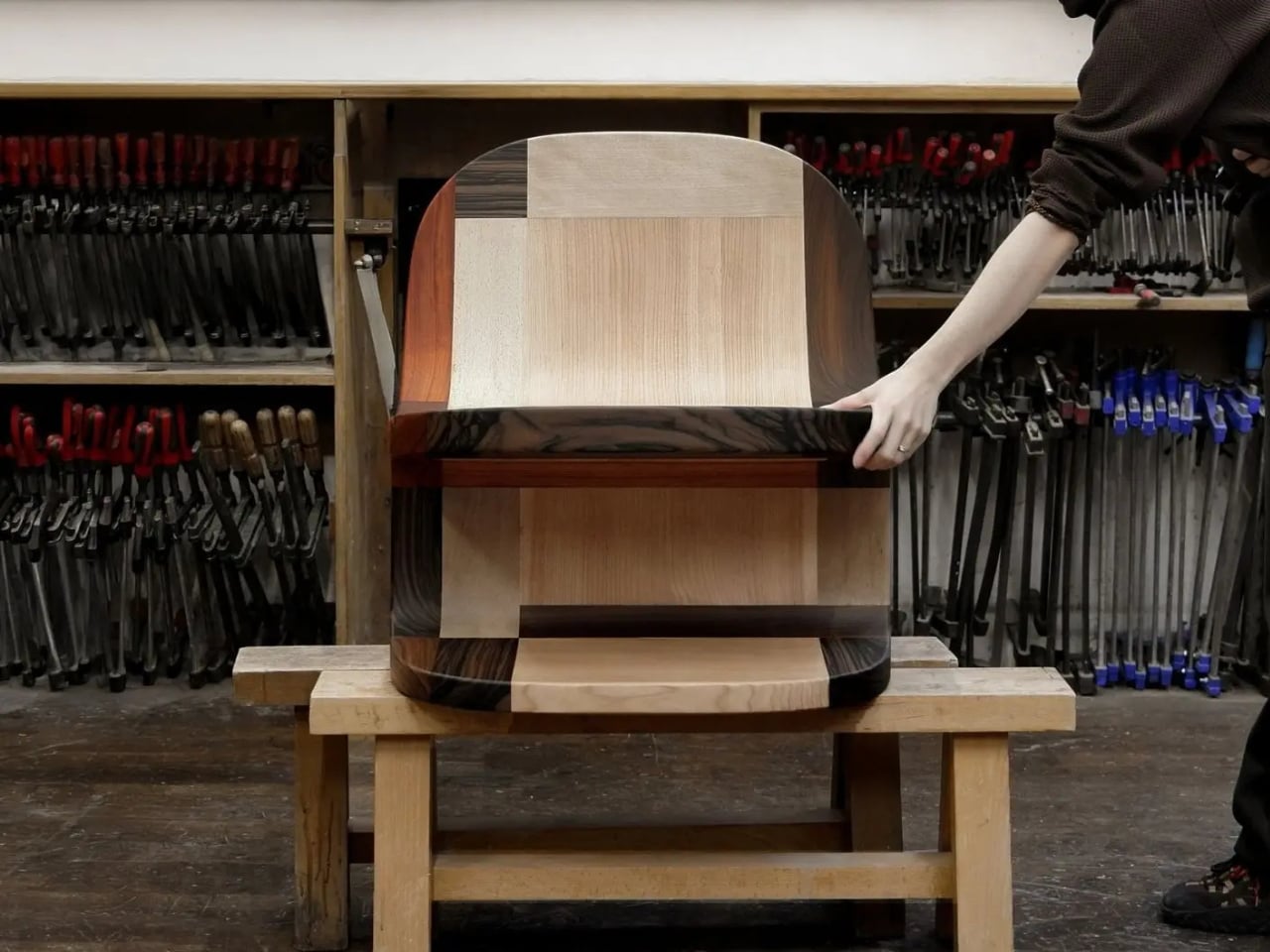
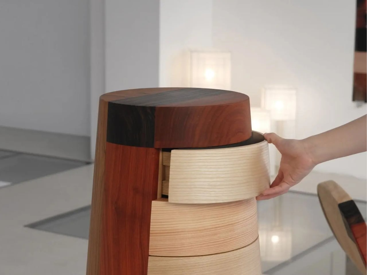
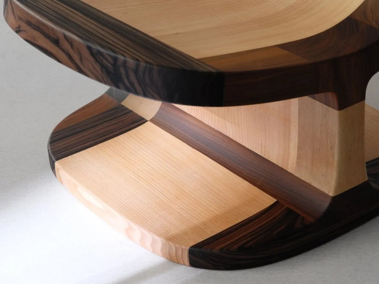
Furniture Made From Wood Scraps You’d Actually Pay For

Every furniture workshop generates a particular kind of guilt. There are the offcuts, the trimmings, the odd-shaped remainders of boards that got cut to size and are now too small for anything useful, or so we assume. Most of them end up as kindling, compost, or landfill. We’ve accepted that as the cost of making things, a small fine paid for the privilege of precision. Studio Booboon is not interested in paying that fine.

The Copenhagen-based studio, founded by Richard Bone and Jisu Yun, two designers who both trained under Japanese studio Nendo, released their latest collection, Fragments Becoming, and it’s exactly the kind of work that makes you wonder why no one thought to do it this way sooner. The collection is built entirely from timber offcuts, and before you picture something rustic or deliberately imperfect, let me be clear: these pieces are stunning. A cabinet, a dining table, and a lounge chair, each constructed from assembled fragments of discarded wood arranged with such precision and intention that the effect is closer to fine art than furniture-as-apology for sustainability.

Designer: Studio Booboon

The concept the studio uses is something they call “3D marquetry,” which sounds technical but is actually a fairly elegant idea once you sit with it. Traditional marquetry, the kind you’d see on antique furniture or decorative boxes, applies a pattern to a surface. It’s essentially decoration laid on top of structure. What Studio Booboon does instead is treat each fragment of wood as the structure itself. The pattern isn’t on the cabinet door; the door is the pattern. It runs through the object’s entire volume, which means the visual logic and the physical construction are the same thing. That’s not a subtle distinction. That’s a fundamentally different philosophy.

What I appreciate about this approach is that it removes the option to hide mistakes. The studio works with unstained wood, which means every fragment has to earn its place on its own terms, no pigment masking a poor match, no stain blurring the edges. Each piece has to work compositionally before it works functionally. That kind of constraint tends to produce either chaos or brilliance, and in this case, it’s clearly the latter.

Bone and Yun bring a cross-cultural sensibility to the work that shows up in the details. Their debut collection, Playful Reappropriation, released at Milan Design Week 2024, pulled from Korean craft traditions, and Fragments Becoming continues that thread. The materials include hanji (traditional Korean paper), canvas, silk, and Ottchil, a Korean lacquer technique that adds depth without dominating the natural tones of the wood. The combination of a British RCA education, Korean craft heritage, and a shared apprenticeship at Nendo, one of the most conceptually rigorous studios in contemporary design, explains a lot about why this work feels so considered without ever feeling cold.

The collection premiered at Milan Design Week 2026 and later showed at Other Circle 2026 during 3daysofdesign in Copenhagen. That double-billing matters. Milan tends to reward spectacle, while the Copenhagen circuit rewards ideas. The fact that Fragments Becoming landed well in both contexts suggests it’s doing something more than just looking good in photographs, which, for the record, it absolutely does.

Sustainability in design has become such an overused talking point that the word barely registers anymore. Every brand gestures toward it. But there’s a difference between sustainability as a value and sustainability as a method, and Studio Booboon’s work lives in the second category. They’re not telling you the collection is responsible and letting the aesthetics carry a different message. The responsible practice is the aesthetic. The offcut isn’t hidden. It’s the whole point.

That feels rare enough to be worth paying attention to. Design tends to celebrate the new, the seamless, the perfect. Fragments Becoming makes a quiet argument that the incomplete, the leftover, and the discarded might be where the most interesting work is still waiting to happen.

The post Furniture Made From Wood Scraps You’d Actually Pay For first appeared on Yanko Design.
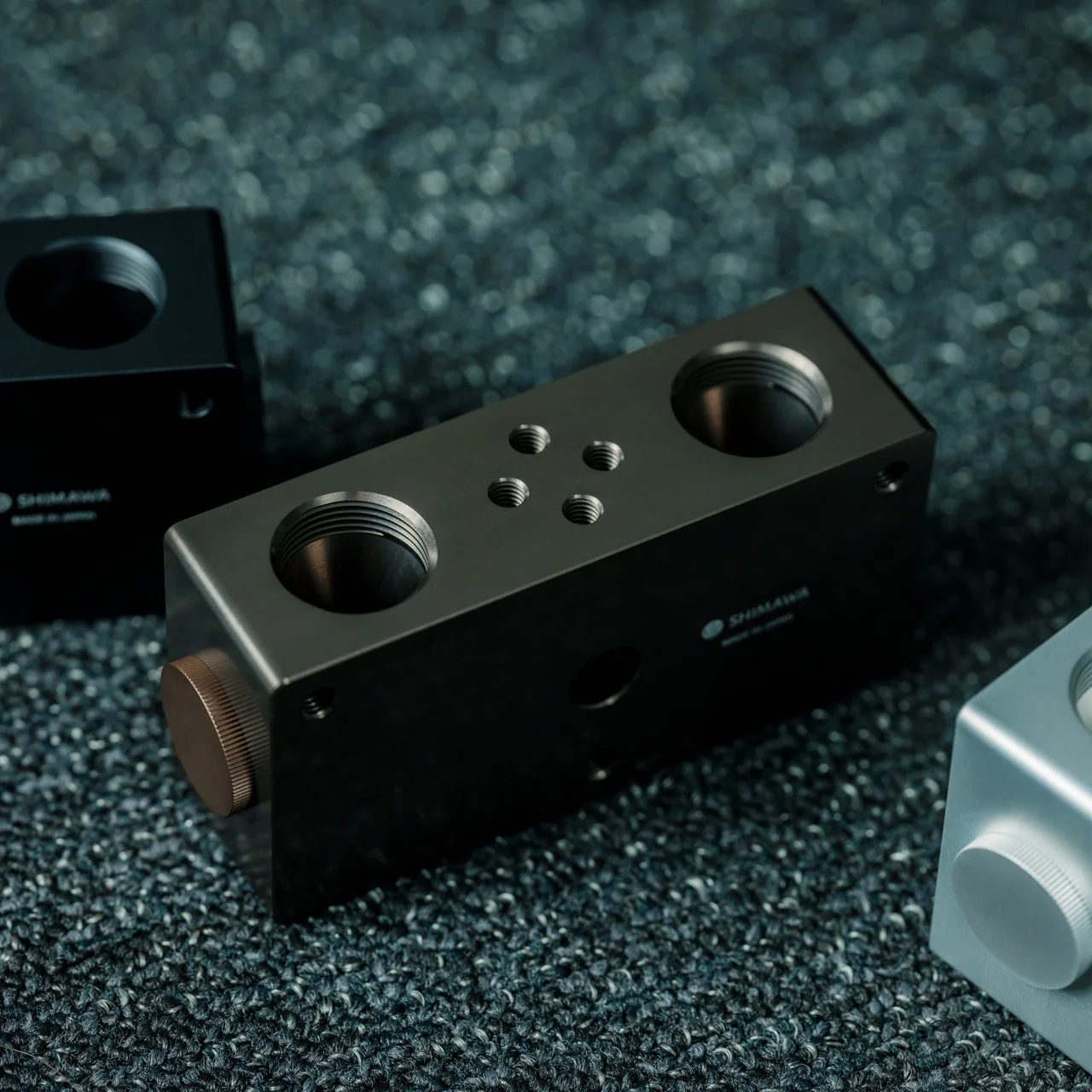
  •  
❌