❌

Vue lecture

The 5 Best EDC Designs of November 2026
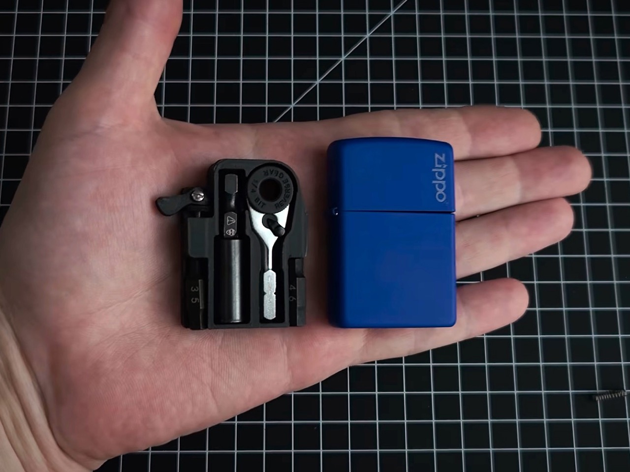
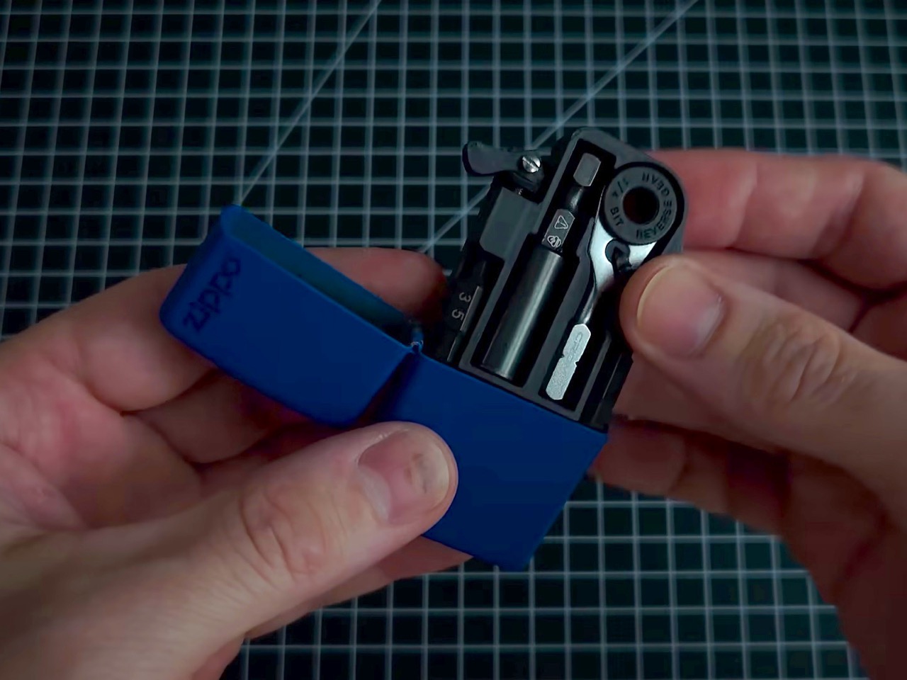
The most interesting EDC upgrade here begins with something that already fits a pocket: a Zippo case. Open the lid, and there’s no lighter inside, just a miniature ratchet and carefully arranged bits. That little reversal sets the tone for this November selection. These designs aren’t trying to turn you into a survivalist. They reconsider the objects you reach for when something needs tightening, illuminating, carrying, organizing, or writing down.

We’ve brought together one DIY project and four retail designs, including a swiveling flashlight, a cork wallet, and a pencil that skips sharpening. This is our November edit of existing designs, not a roundup of November launches. The common thread is thoughtful use of limited space, whether that means fitting tools inside a familiar shell or removing an annoyance from something as ordinary as the keys you carry every day.

1. DIY Zippo Toolkit
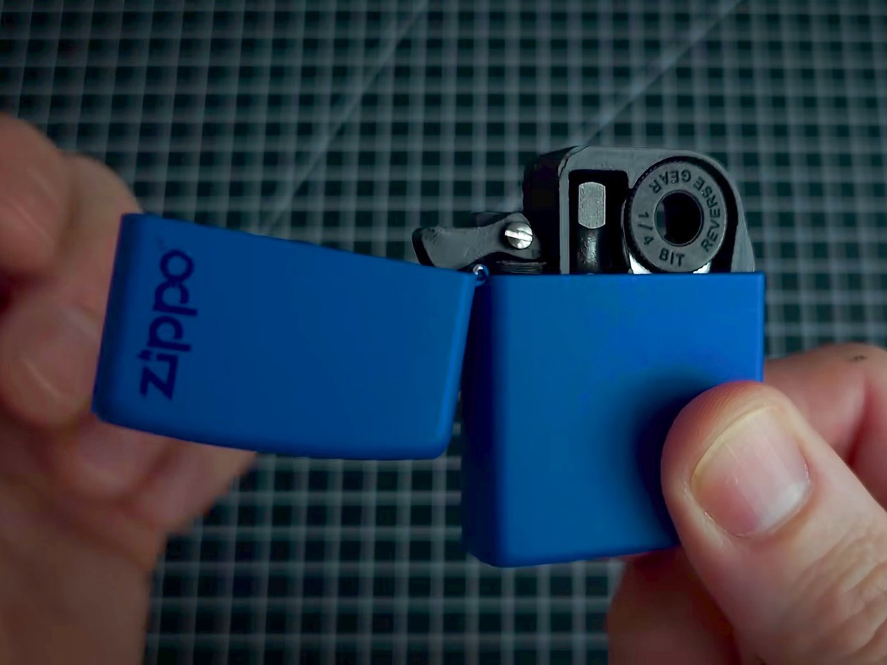
Tiny Tool Shop’s Zippo conversion makes a persuasive case for designing around an enclosure rather than starting again. A custom-printed insert holds a micro ratchet, two Steinwhale bits, and a Klein utility knife extension inside the emptied lighter shell. Each component gets its own recess, turning the interior into a fitted tray rather than a loose collection of hardware. The recognizable metal case supplies the hinge, lid, and compact outline, while the insert gives it an entirely different purpose.

The best detail addresses the obvious drawback of tight packing: getting the ratchet back out. A spring salvaged from a disposable Bic lighter helps push it through an opening in the case. It’s a satisfying piece of resourcefulness, but this remains a maker project, not a finished product sold by Zippo. Reproducing it involves sourcing compatible tools, producing the insert, and modifying the shell. It also replaces the lighter function completely, trading a flame for a very small repair kit.

What we like

  • Reuses a familiar hinged enclosure with a fitted layout for the tools.
  • Spring-assisted retrieval makes tightly packed components easier to access.

What we dislike

  • Requires fabrication, compatible components, and modifications to the case.
  • The insert’s dedicated recesses limit flexibility when changing the tool selection.

2. Painless Key Ring

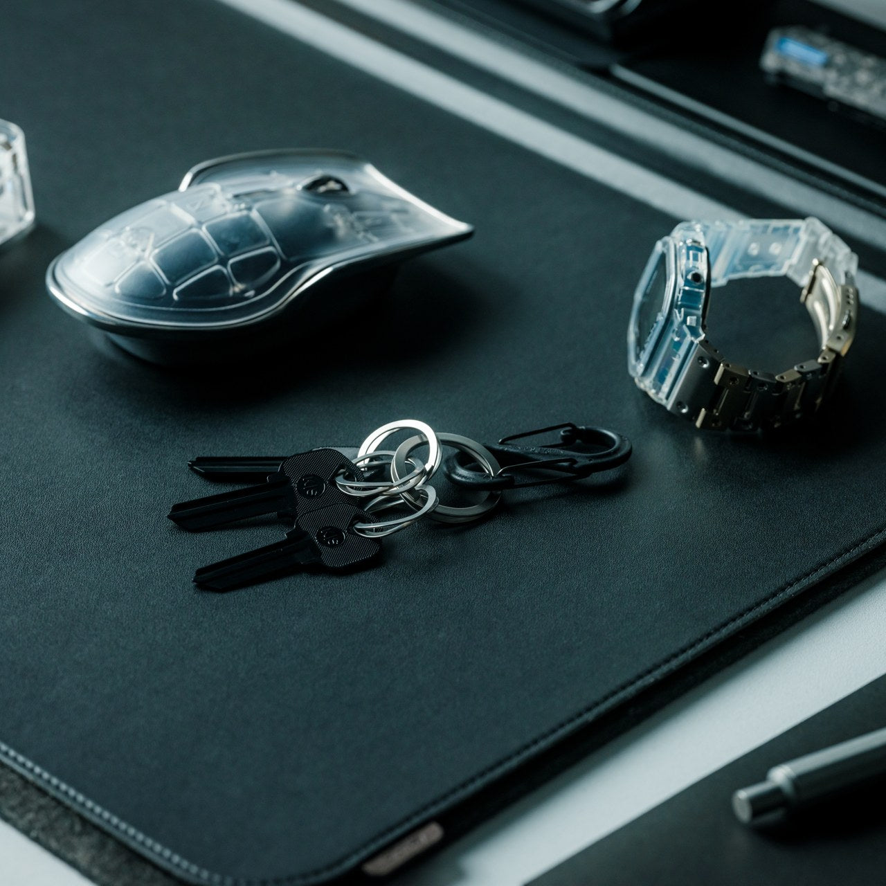
Most key rings make you use your fingernails as miniature pry bars. The Painless Key Ring changes the entry geometry instead, using a continuous wave shape to guide a key onto the ring. You’re still working with a springy metal loop, but without the same tightly stacked starting point as a conventional split ring. It’s a modest redesign with a clear purpose: make changing keys less fiddly without turning the key ring into another complicated mechanism you need to carry around.

Made from stainless spring steel, the ring is listed at 0.8mm thick and weighs three grams. The silver set costs $30 and includes one large ring plus three small ones, giving you separate attachment points for different keys. The appeal isn’t adding another tool to your pocket. It improves the connection between what you already have. If you rarely change keys, the benefit may not justify the price. For someone regularly swapping house, office, and shared keys, the geometry is more compelling.

Click Here to Buy Now: $30.00

What we like

  • Wave-shaped entry offers an alternative to prying apart a conventional split ring.
  • The set includes smaller rings for organizing separate keys.

What we dislike

  • At $30 for the silver set, it’s a deliberate upgrade to a basic accessory.
  • Keys still need threading around the ring rather than releasing through a gate.

3. WUBEN G5 Compact Flashlight
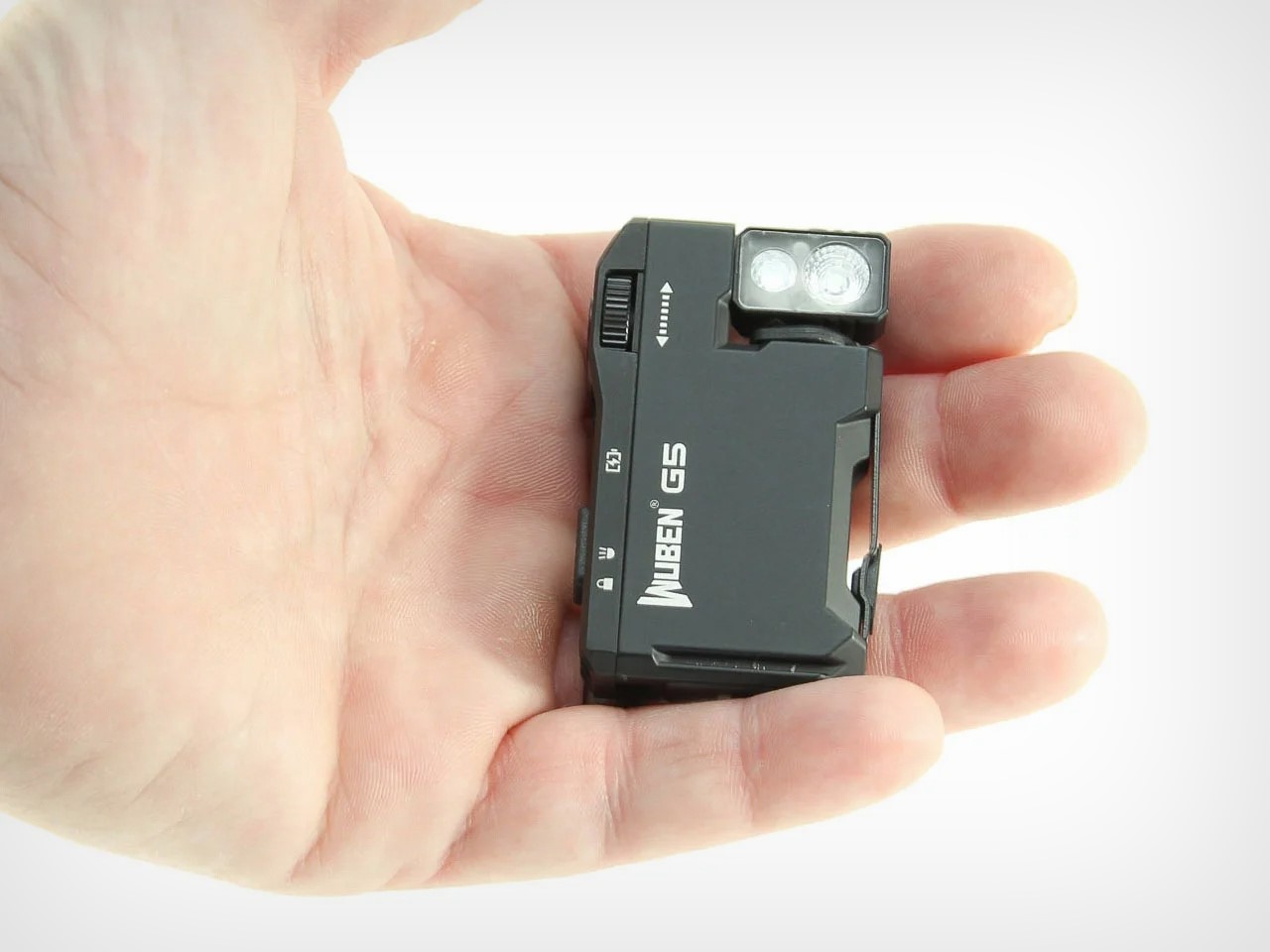
The WUBEN G5 puts its most useful feature above the body: a head that rotates through 180 degrees. Rather than repositioning the entire flashlight whenever the beam misses your work, you can change its direction while the body stays attached. An adjustable clip and tail magnet give you different mounting options, particularly useful when both hands are occupied. The flat form also avoids the rolling habit of cylindrical flashlights, making this a small lighting tool with several sensible working positions.

WUBEN lists the standard G5 at approximately 52 grams, with USB Type-C charging and maximum white output of 400 lumens. Its current specification gives an IP65 rating, which means this is not a light to treat as submersible. At $19.99 for standard colors, it’s an accessible alternative to reaching for your phone. The limitation is endurance: WUBEN’s longest runtime figure belongs at the lowest output, not maximum brightness. Choose it for short tasks rather than prolonged use at maximum brightness.

What we like

  • Rotating head, clip, and magnet provide several ways to position the beam.
  • The compact, flat body suits pocket carry without rolling away when set down.

What we dislike

  • Maximum brightness and maximum runtime describe different operating settings.
  • Its IP65 rating does not cover immersion.

4. Pocket Everlasting All-Metal Pencil
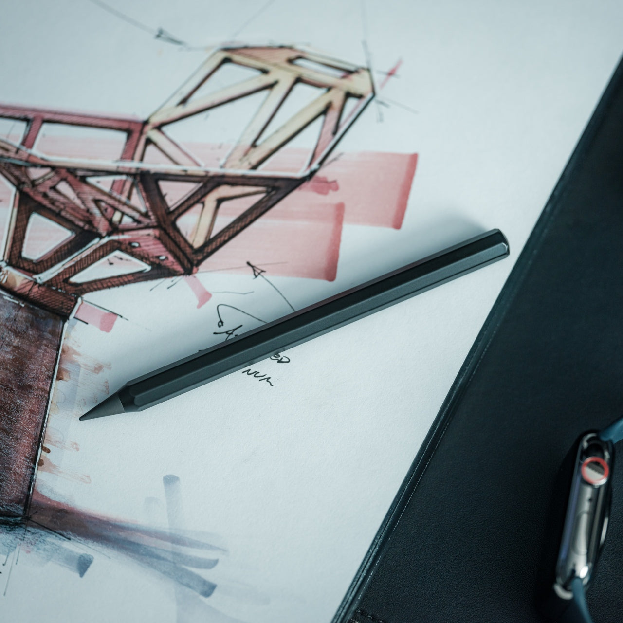
A pocket pencil needs to survive being carried before it can be useful on paper. Sun-Star’s Pocket Everlasting All-Metal Pencil approaches that problem with a metal body, protective cap, and a writing tip that doesn’t need sharpening. At 4.7 inches long, it gives you a dedicated place to put a measurement, sketch, or passing thought without unlocking a screen. There’s no elaborate deployment mechanism, just a compact writing instrument ready to accompany a notebook.

The tip uses graphite and alloy particles to make an erasable mark. That makes it better understood as an alternative pencil technology than a pen that happens to look metallic. At $19.95, it’s also one of the less expensive objects in this selection. The name needs a little perspective: “Everlasting” isn’t a literal promise of infinite use. Its appeal is avoiding routine sharpening, while your preference for line darkness and feel still determines whether it earns space beside your keys.

Click Here to Buy Now: $19.95

What we like

  • A capped metal body gives the writing tip protection during carry.
  • Erasable marks and no routine sharpening make it an interesting notebook companion.

What we dislike

  • At 4.7 inches, it still needs more space than a miniature keychain tool.
  • Pencil marks aren’t a substitute for ink when permanent writing is needed.

5. Corkor Front-Pocket Cork Wallet
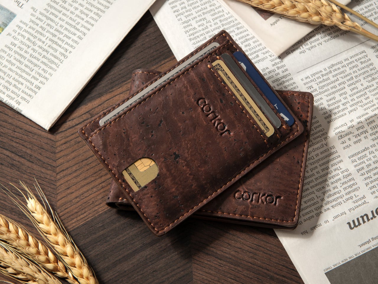
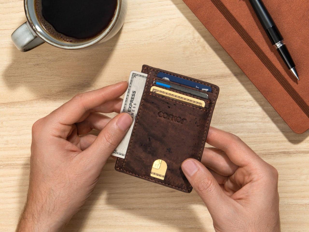
Corkor’s Front-Pocket Cork Wallet provides a welcome break from machined metal. Its cork fabric exterior has an irregular grain that gives a familiar card holder a distinct material identity. The layout stays straightforward: three card slots, an ID window, and two compartments for folded bills. Rather than adding moving parts to make a wallet interesting, Corkor keeps the construction restrained and lets the surface do the work. It suits an edited daily carry better than a collection of forgotten receipts.

The Portuguese maker lists an empty weight of 20 grams and dimensions of 110 by 80 by 10 millimeters. That last figure matters: adding cards and folded notes will change how much room it occupies. Corkor makes the $59 holder in Portugal and includes RFID-blocking construction, though the more tangible benefit is its simple organization. There’s no coin pocket, and cash takes more preparation than sliding notes into a full billfold. Those are deliberate compromises for someone who wants to downsize.

What we like

  • Cork fabric offers an animal-free alternative to a conventional leather exterior.
  • Separate card, ID, and cash compartments keep the layout easy to understand.

What we dislike

  • There’s nowhere dedicated to loose change.
  • Bills must be folded, making cash less convenient to sort.

Small Improvements Worth Carrying

The Zippo conversion is the conversation starter, but the quieter designs may make the bigger difference to a particular routine. A ring that’s easier to load helps someone changing keys. A swiveling light helps someone working with both hands. A simpler wallet helps someone trying to carry less. None needs to solve every problem to justify its place; it just needs to address one you actually encounter with some regularity.

These five designs aren’t a checklist to buy in full. The Zippo project asks for making time rather than a quick checkout, while the wallet asks you to reconsider what deserves carrying at all. Start with the small frustration you already recognize, then consider the space, upkeep, and setup its solution requires. A useful everyday carry should make your day feel less encumbered, not simply leave your pockets more fully equipped.

The post The 5 Best EDC Designs of November 2026 first appeared on Yanko Design.

  •  

SOM’s Sany IROOTECH Headquarters Hangs Its Floors From a Giant Steel Exoskeleton

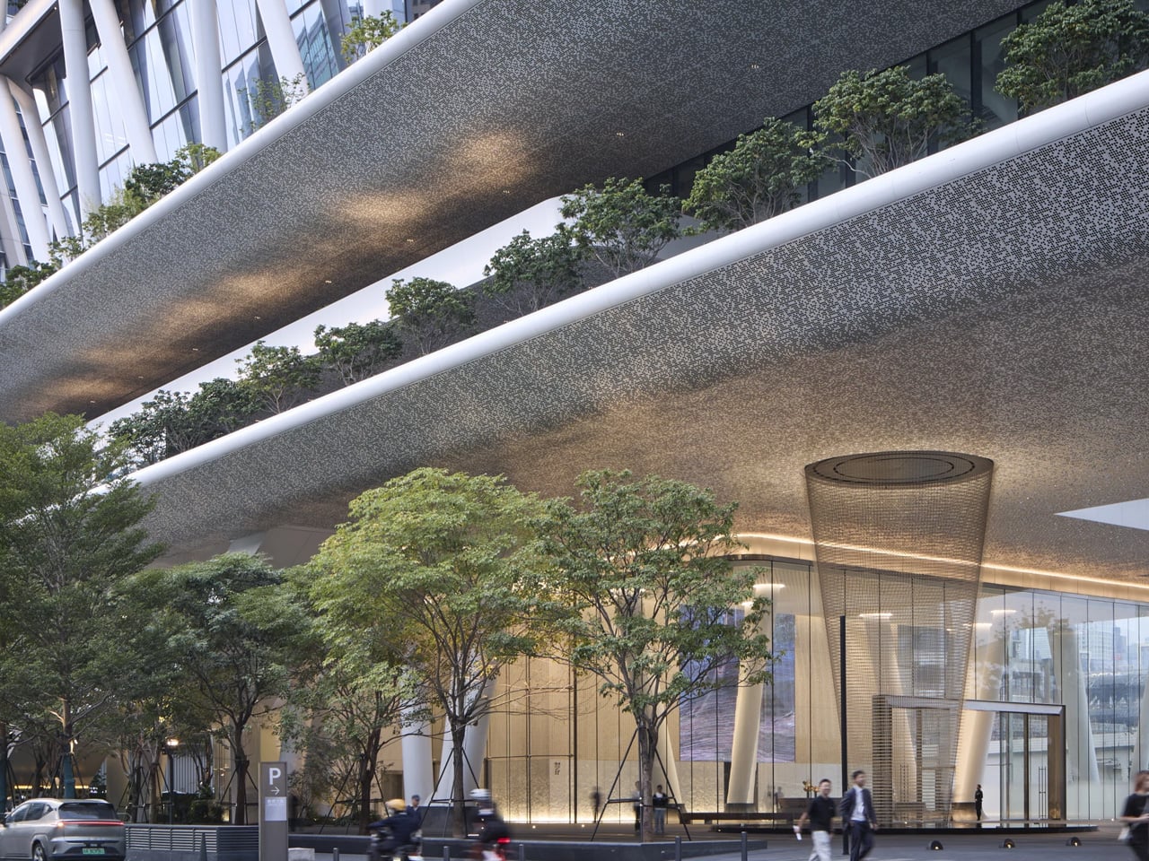
The most interesting space at Sany IROOTECH Headquarters might be the gap underneath it. In Guangzhou’s Pazhou business district, Skidmore, Owings & Merrill has connected two towers with an elevated podium, leaving room below for a shaded public plaza. Commissioned for construction equipment manufacturer Sany’s cloud technology venture, the completed complex gives a corporate headquarters something worth noticing at street level: space that people can enter without working there.

Designed with the Beijing Institute of Architectural Design serving as architect of record, the development makes its engineering unusually legible. A diamond-patterned steel exoskeleton wraps both towers, expressing the construction expertise behind the client’s business. Its purpose goes beyond establishing a recognizable silhouette. The external framework supports suspended floors, creating column-free interiors that can accommodate changing uses.

Designer: Skidmore, Owings & Merrill

SOM organizes the towers into five-story modules, with floors suspended from perimeter ring beams. Moving that supporting structure outward gives the interiors greater planning flexibility. According to SOM, the arrangement accommodates office, hotel, and residential programs, making the framework useful beyond the original headquarters brief. The architecture’s identity remains consistent even when what happens behind the glass changes.

That adaptability has already mattered. The client changed parts of the program during development, introducing plans for hotel and residential accommodation. The inward-leaning curtain walls also create terraces at the bottom of each five-level module while reducing direct solar exposure. These repeated outdoor spaces give the towers a rhythm tied to their construction, rather than an applied decorative pattern.

Guangzhou’s exposure to typhoons and seismic activity also shaped the engineering. SOM incorporated its patented pin-fuse joint system, which uses controlled movement and friction to dissipate earthquake energy. The firm describes rapid reoccupancy after extreme events as a design goal, an important distinction from claiming that the buildings have demonstrated that performance in an actual earthquake.

The podium extends the project’s structural ambition horizontally. Multistory trusses span 65 meters between the towers, sheltering the plaza beneath. A courtyard opening brings daylight into this covered space, while dimpled aluminum panels across the underside reflect light. Transparent glass lobbies keep the entrances visually separate from the heavier structure surrounding them.

Above, dining, retail, and exhibition spaces overlook the plaza. A public elevator operating around the clock connects the podium with the district’s covered walkway network. That connection is the project’s clearest civic gesture: the headquarters becomes part of a pedestrian route through Pazhou, giving people a reason to use its spaces beyond arriving for work or attending a meeting. The towers’ imposing frame makes the landmark; their lifted base makes the everyday connection.

The post SOM’s Sany IROOTECH Headquarters Hangs Its Floors From a Giant Steel Exoskeleton first appeared on Yanko Design.

  •  

Tiny Wooden Living Units Stack Into a Three-Story Tower

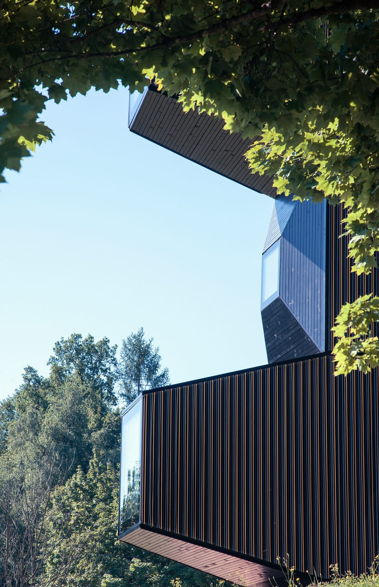
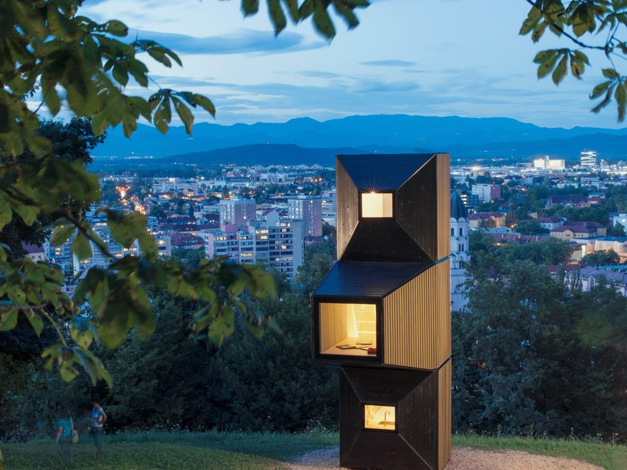
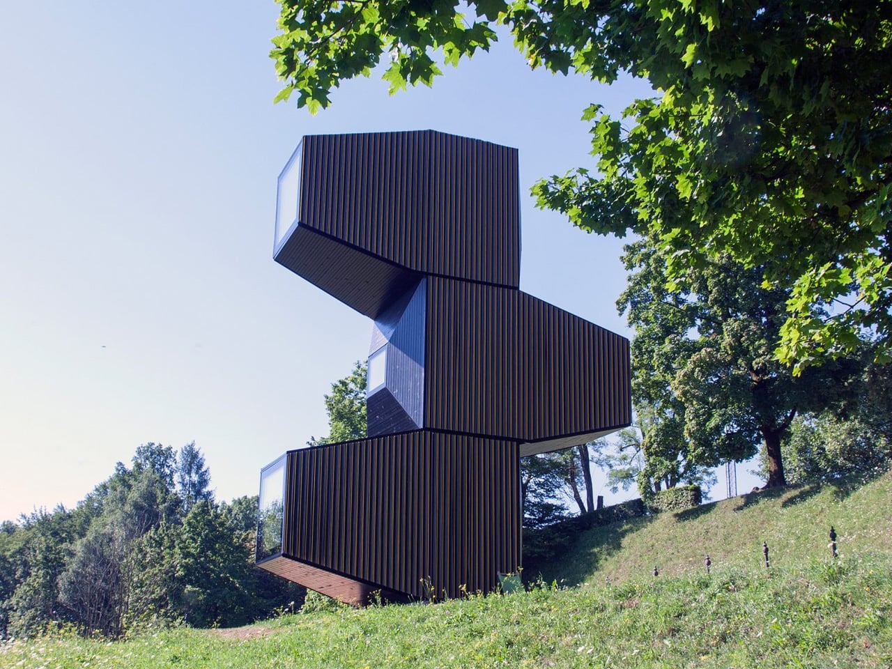
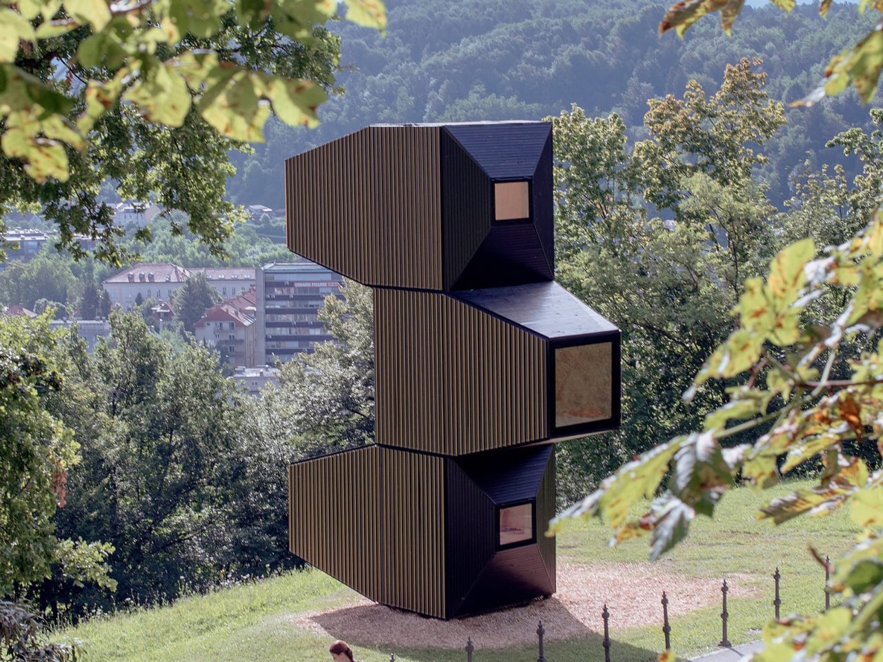
At Ljubljana Castle, three wooden rooms stack into a slender tower, their angular ends pointing toward the city. This built installation from 2017 demonstrates Living Unit, a modular architecture system developed by OFIS Arhitekti with C+C, C28, structural engineers AKT II, and contractor Permiz. The idea begins with a small, repeatable wooden shell.

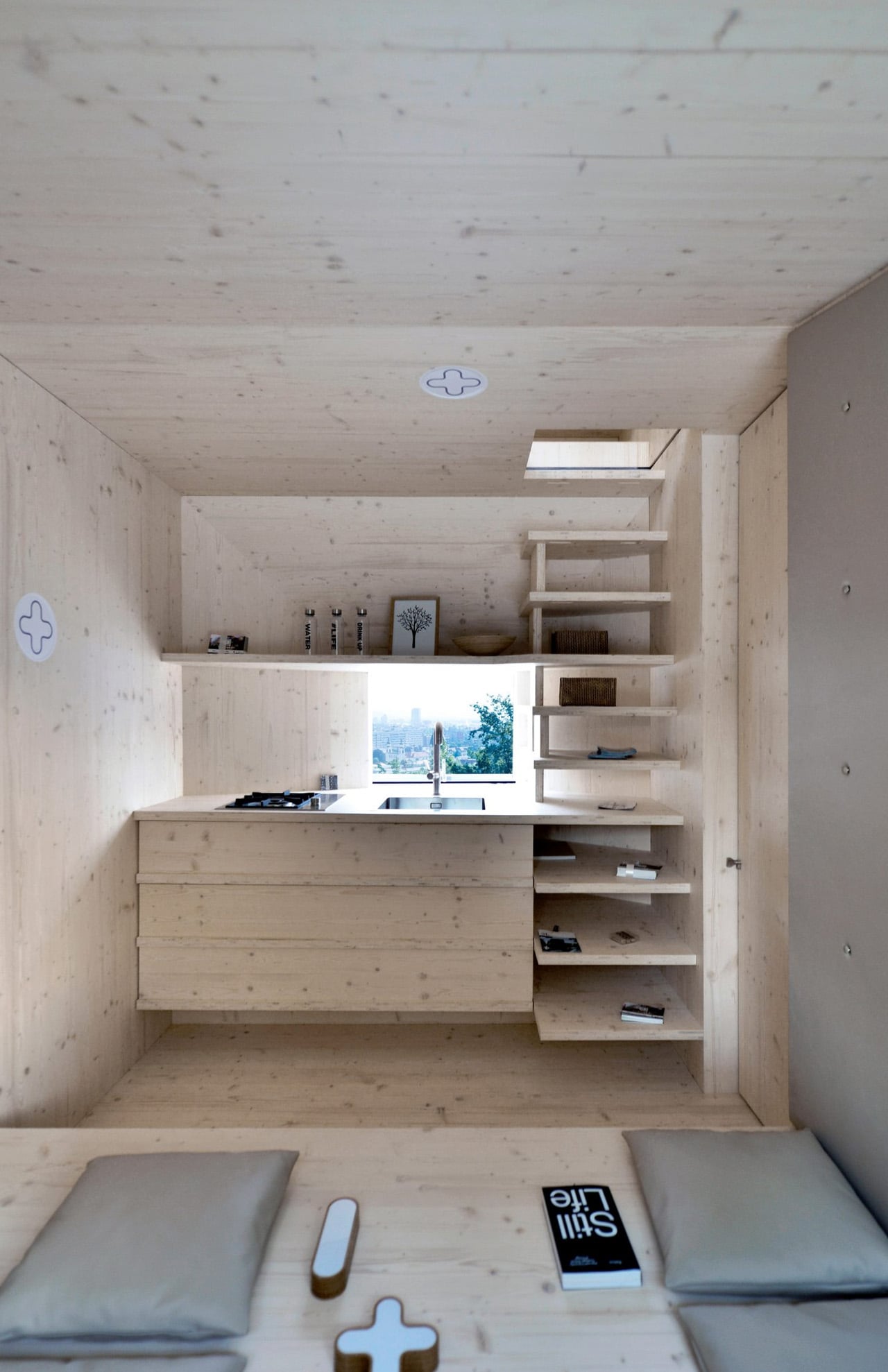
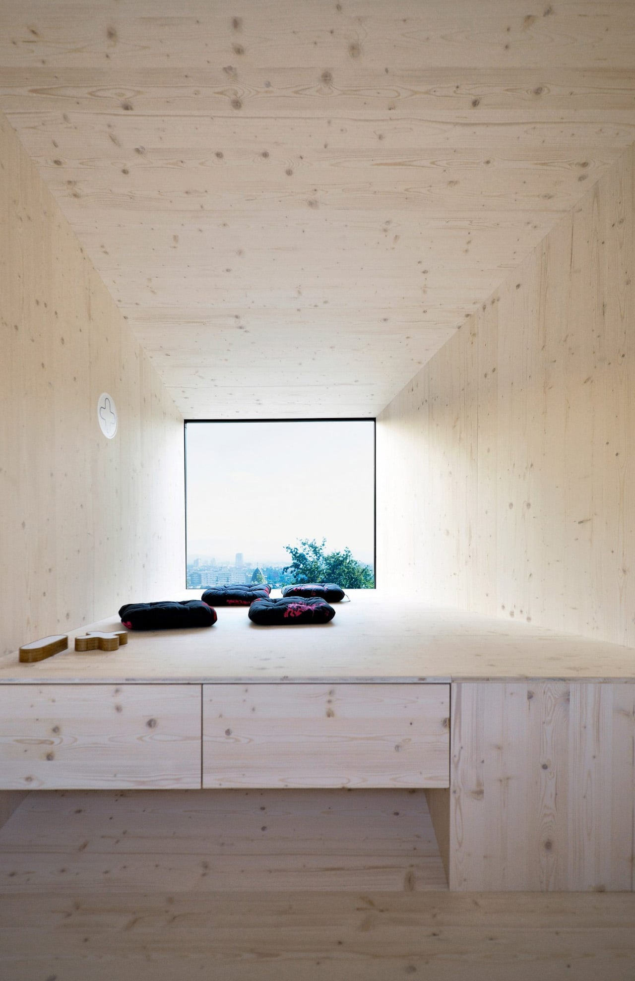
Each basic module measures 4.5 meters long, 2.5 meters wide, and 2.7 meters high, roughly 14.8 by 8.2 by 8.9 feet. Designed to accommodate two people, it can hold a double bed, wardrobe, table, and chairs, with provision for a bathroom and kitchenette. Those are compact cabin dimensions, rather than the proportions of a conventional apartment.

Designer: OFIS Arhitekti

The useful move is allowing that initial room to become part of something larger. Modules can connect horizontally or vertically, with combinations intended to accommodate four to six occupants. A single cabin might suit a short stay; several connected shells allow the domestic functions to spread out. The system therefore offers different arrangements without requiring an entirely different building vocabulary.

Its pointed geometry gives the project much of its character. The ends taper into truncated pyramids, with glazing at their tips. AKT II explains that these projecting forms add internal storage space while expressing the structure’s strength. Seen from outside, the alternating projections make the stacked version read as individual rooms, rather than one uninterrupted shaft.

Behind that silhouette is a prefabricated timber frame reinforced with plywood boards on both sides. The architects allow the exterior and interior finishes to change according to context. That distinction matters: the repeated element is the structural shell, not a compulsory decorative package. Different settings need not receive an identical-looking cabin simply because they share its underlying construction.

Ground connections are similarly adaptable. The units can be secured using steel anchors or removable concrete cubes instead of permanent foundations. The team proposes uses including holiday cabins, research accommodation, tourism, and shelter. These are intended applications, though, rather than proof that one specification will perform equally well across every climate and terrain.

The castle installation gives the system another role: a temporary library, with books organized across its levels and nearby outdoor areas intended for reading. It’s a useful demonstration of how the same shell can support a public program rather than accommodation. Here, the architecture supplies a small vertical destination within an existing landscape.

The sectional drawings also expose the compromise behind the tower’s small footprint. Compact steps and ladders connect its levels, making circulation an active part of occupying the stack. Horizontal expansion would avoid that particular arrangement but require more ground. Living Unit’s strongest proposition is this choice: repeat the room, then decide where the extra space should go.

The post Tiny Wooden Living Units Stack Into a Three-Story Tower first appeared on Yanko Design.
  •  

This 400-Square-Foot Tiny Cabin Opens Onto a Full-Width Porch

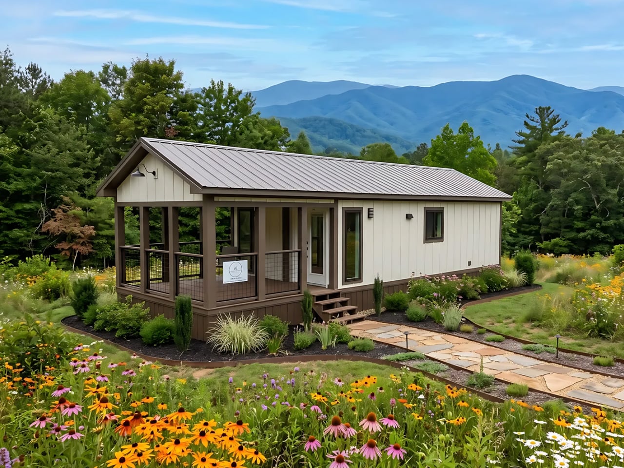
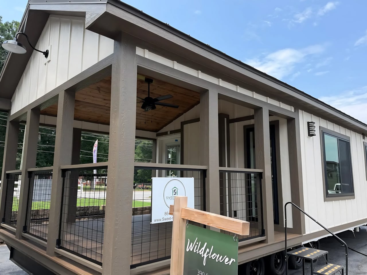
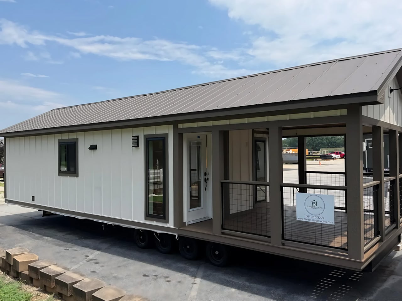
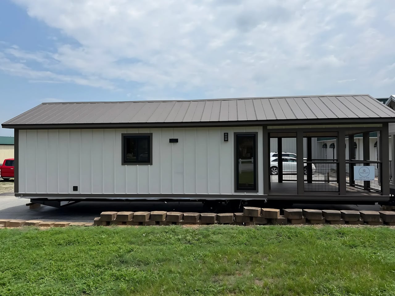
The Wildflower makes room for something tiny homes can easily squeeze out: a proper front porch. Built by South Carolina’s Sweet-Haus Tiny Cabin Company, this 400-square-foot park model pairs one bedroom and one bathroom with a covered outdoor sitting area. It’s an available model, starting at $115,000, with a layout that keeps daily life on one level.

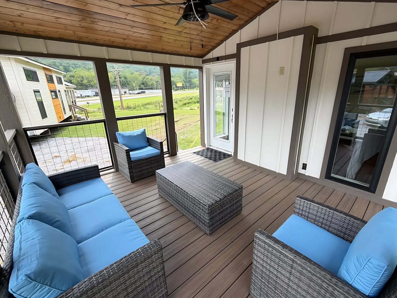
That porch spans the cabin’s width, sitting beneath the same gabled roof as the enclosed rooms. In the builder’s photographs, timber-toned posts and dark mesh railings frame an outdoor sofa and chairs. Trex composite decking is specified for the floor. Giving outdoor furniture its own sheltered zone means the indoor living room doesn’t have to accommodate every gathering when the weather cooperates.

Designer: Sweet-Haus Tiny Cabin Company

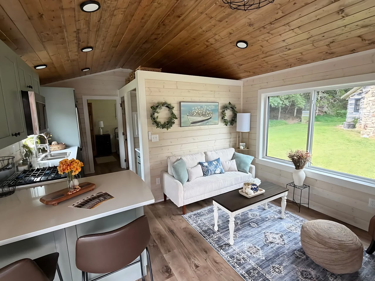
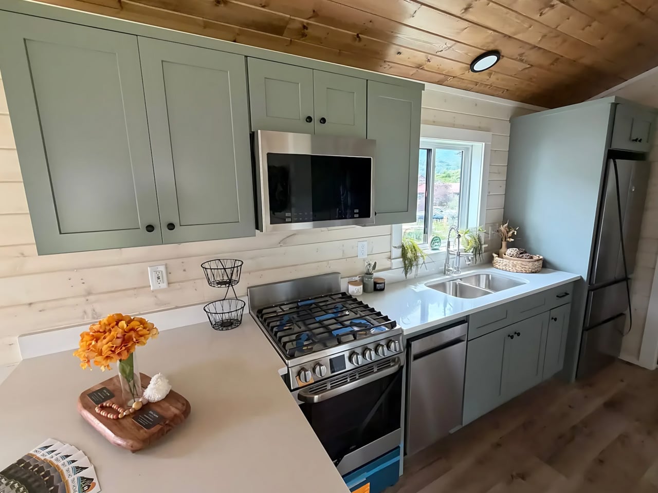
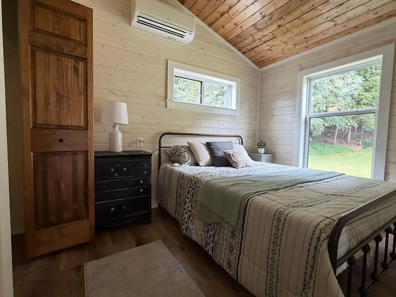
Inside, the photographed cabin has pale horizontal wall paneling, muted green cabinetry, and a wood ceiling that follows the roof’s pitch. The contrast gives the upper half of the room a stronger visual presence without covering every surface in dark timber. A breakfast counter provides seating beside the kitchen, leaving the opposite side available for a sofa, coffee table, and a large window.

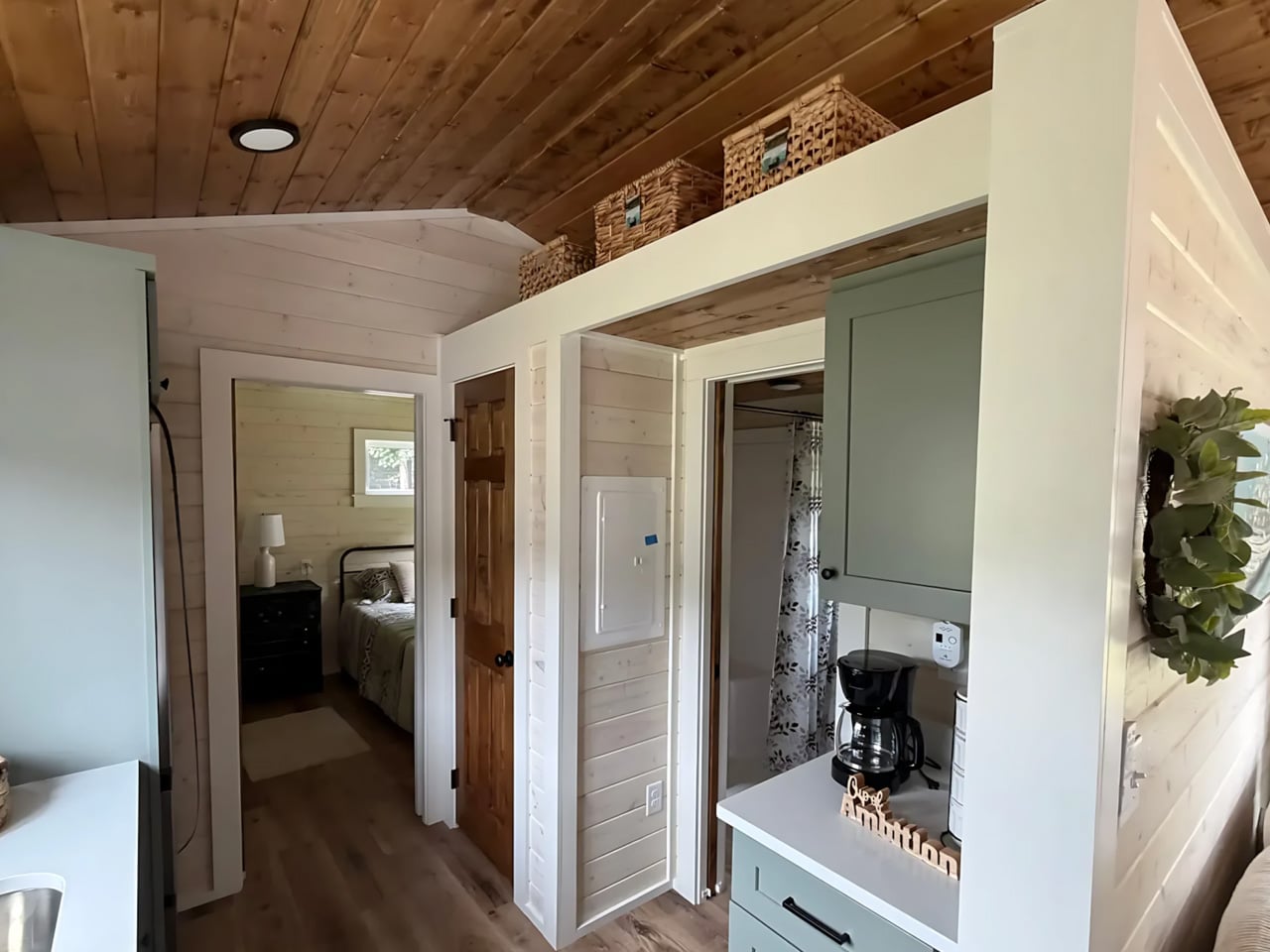
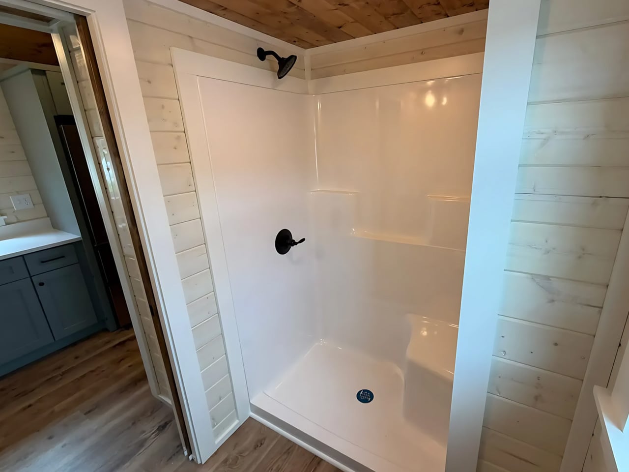
The published floor plan places the bedroom at the rear, beyond the kitchen, with the bathroom tucked alongside the route between them. A stacked washer and dryer occupy a dedicated position near the bedroom closet, while the bathroom includes a shower labeled 60 inches wide. A separate bedroom means going to bed doesn’t require converting the shared living area into a sleeping space each night.

Storage gets more attention than the footprint might suggest. Sweet-Haus lists a built-in pantry and two full closets, plus an electric fireplace feature wall with concealed storage. That last detail is particularly useful: a decorative focal point also earns its floor area by holding things. Custom soft-close cabinetry continues the approach, keeping everyday necessities behind doors rather than on display.

The construction package includes LP SmartSide siding, metal roofing, Low-E argon-filled windows, and a mini-split HVAC system. Buyers can choose finishes and explore upgrades, including a screened porch or built-in bed with nightstands. Those choices matter in a small cabin, where adding permanent furniture can settle the layout early. The photographs show one interpretation, rather than a fixed palette every buyer must accept.

The starting price covers the cabin, not a finished property. Delivery, setup, skirting, steps, and upgrades are separate charges, and Sweet-Haus says buyers must confirm local placement and occupancy rules for its park models. Land and utility preparation also need their own budget. Within those limits, the Wildflower’s most convincing decision is straightforward: it preserves a private bedroom, useful storage, and somewhere sheltered outside to sit, instead of making every activity compete for the same limited patch of indoor floor.

The post This 400-Square-Foot Tiny Cabin Opens Onto a Full-Width Porch first appeared on Yanko Design.
  •  
❌