Vue lecture

The $100 Keypad That Puts Each AI Coding Tool Behind Its Own Button

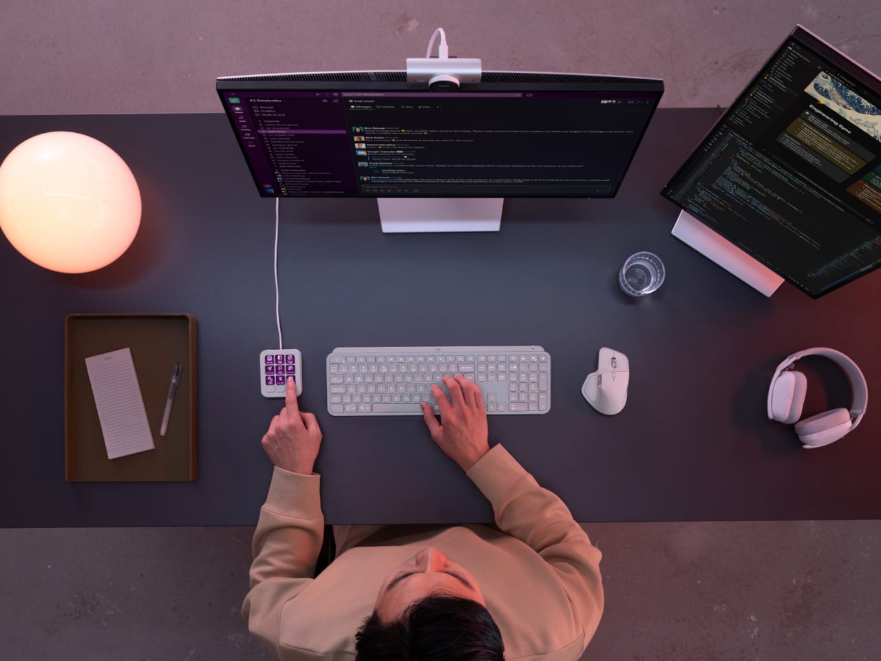
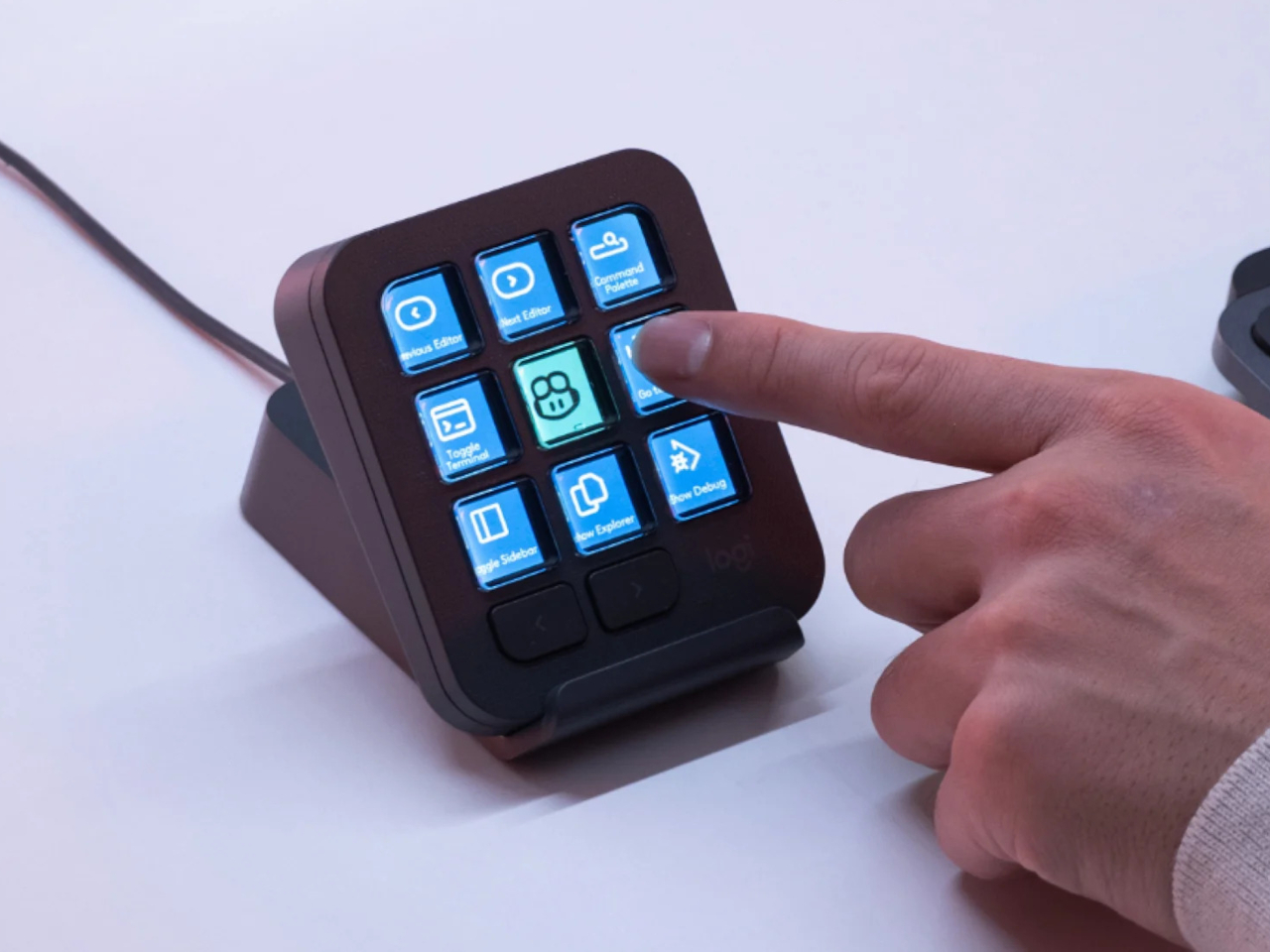
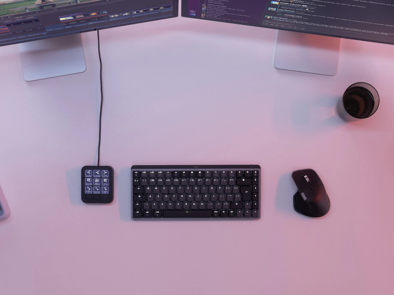
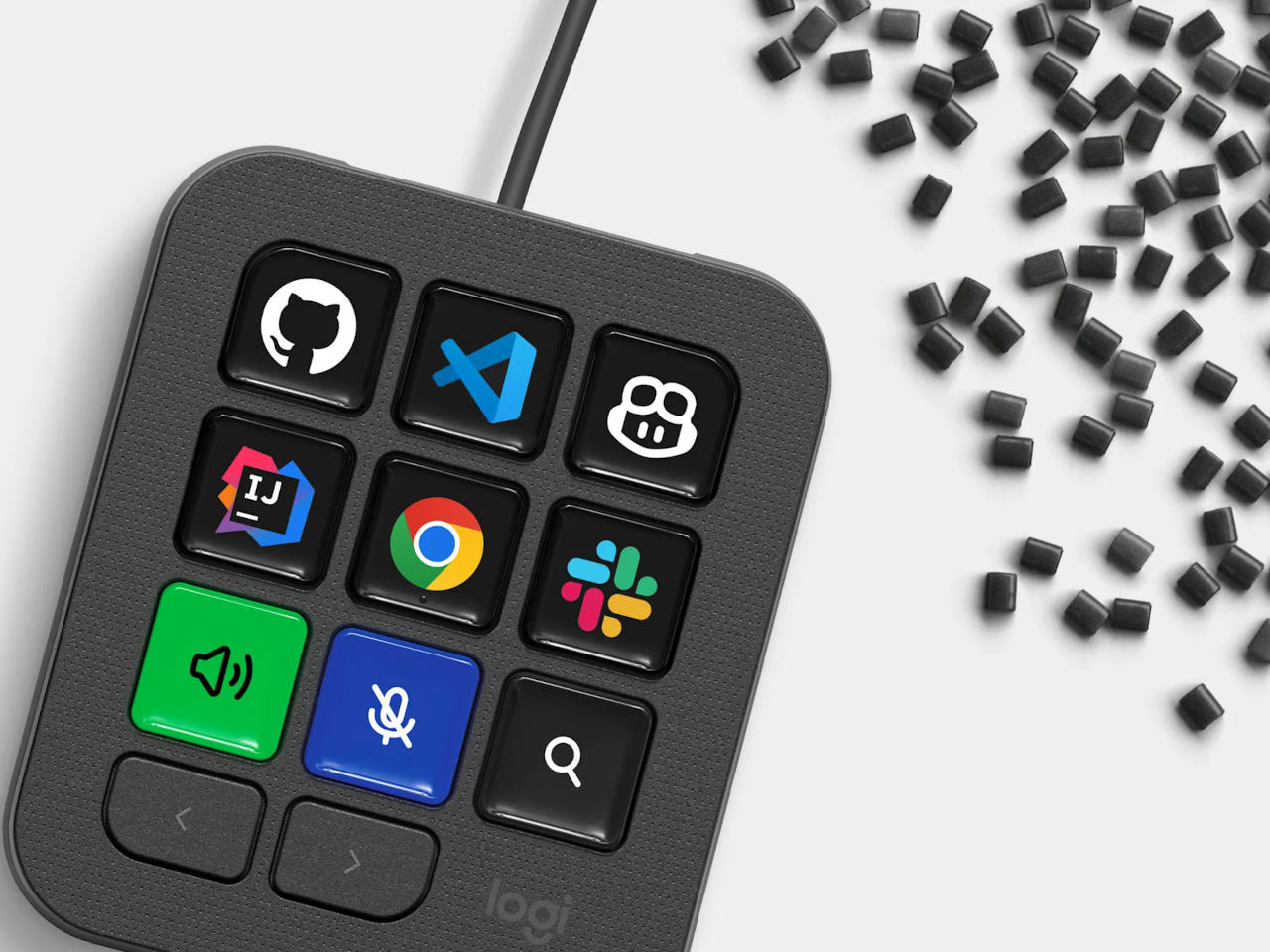
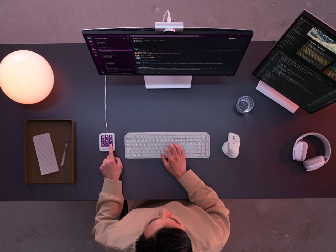
Every developer juggling AI agents right now knows the feeling of context switching until the whole workflow blurs together. Copilot suggests something in one window, Claude Code runs a task in another, and a dozen prompts live scattered across notes and muscle memory. The Logitech MX Keypad exists to collapse all of that into nine small screens sitting next to the keyboard, each one a physical shortcut into a specific piece of that chaos.

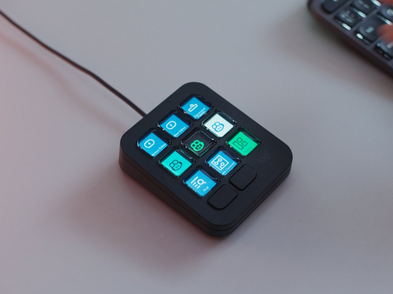
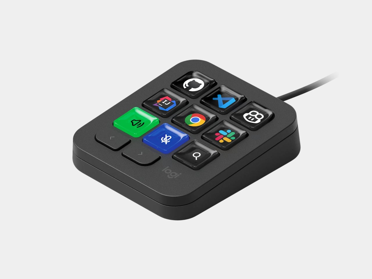
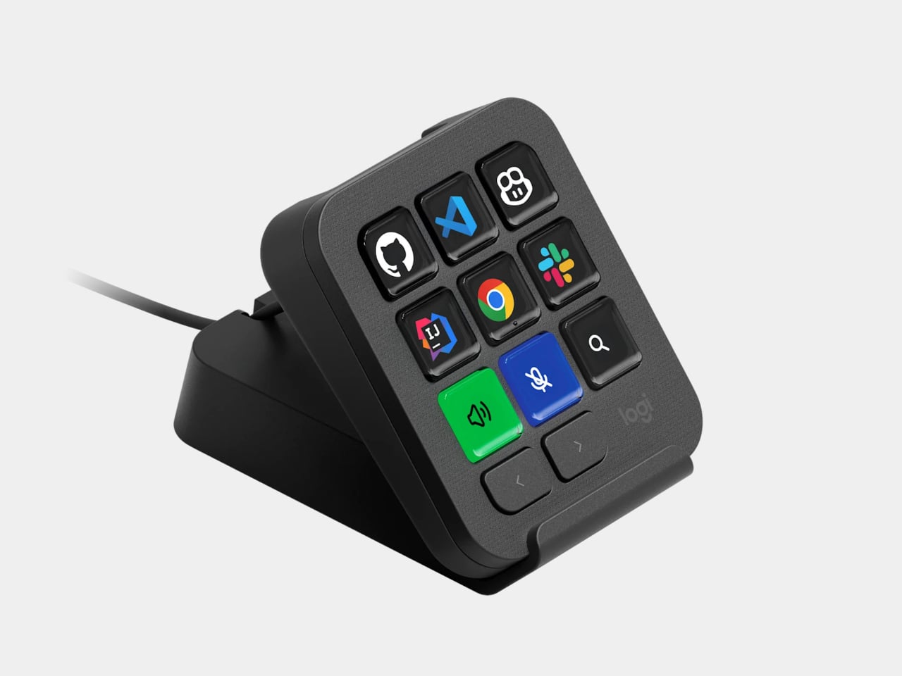
Every key on the keypad carries its own full-color LCD display, so instead of memorizing which function key does what, you glance down and see an icon that actually represents the command underneath it. Press one, and it can refactor a function, trigger a prompt macro, or hand off a task to an AI agent entirely. That small visual feedback loop turns an abstract keyboard shortcut into something closer to a labeled button on a control panel.

Designer: Logitech

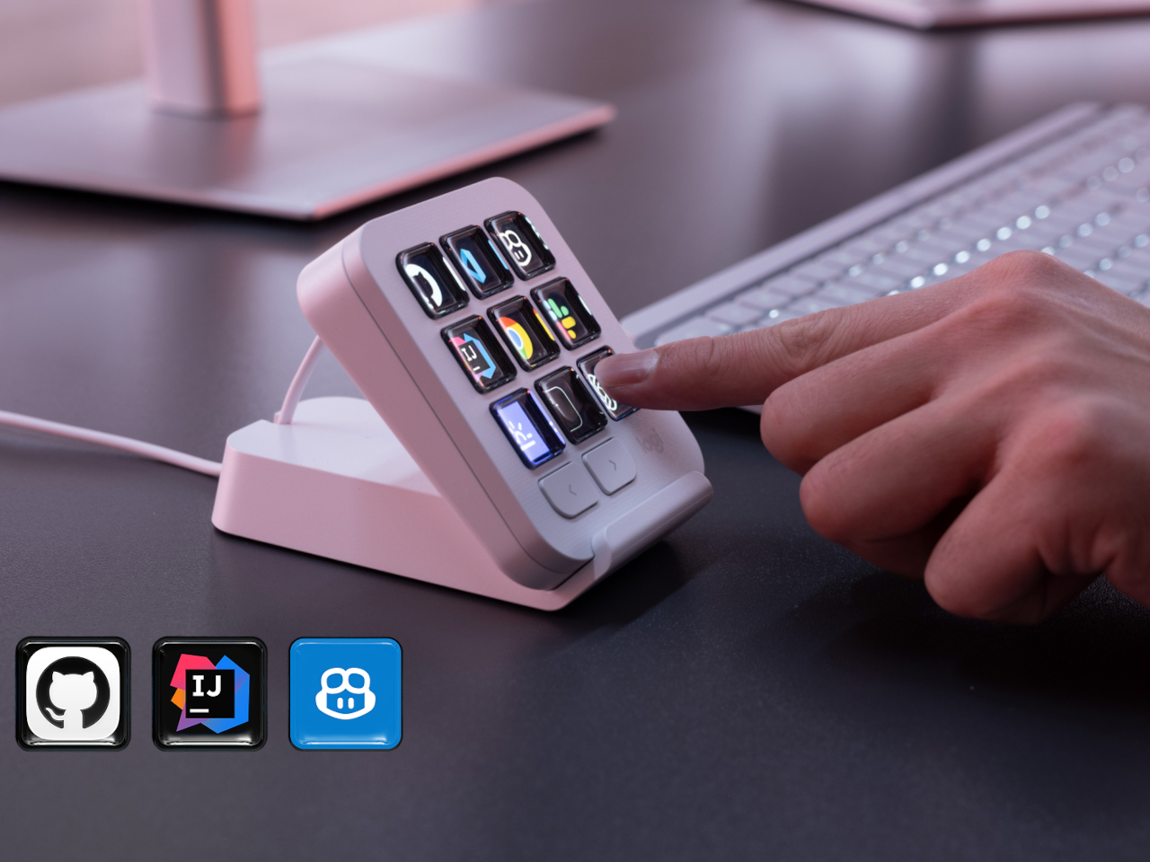
What makes the hardware worth paying attention to is where Logitech chose to draw the compatibility line. Instead of building this around one coding environment, the MX Keypad works across GitHub Copilot, Claude Code, VS Code, and IntelliJ IDEA at once. A developer bouncing between an IDE and a terminal-based AI agent doesn’t need separate tools for each, just a different page of keys pulled up on the same nine buttons.

That pattern of paging matters more than it sounds. The keypad can hold multiple profiles, so switching from a Python project running through Copilot to a JavaScript refactor handled by Claude Code becomes a single tap rather than a mental reset. Anyone who has lost a train of thought hunting through browser tabs for the right prompt will recognize the value in never breaking eye contact with the code itself.

Underneath the surface, the MX Keypad ships with prebuilt plugins that Logitech had developers test directly against real coding platforms, rather than shipping generic templates and hoping they fit. An SDK opens the door further, letting teams build their own tools around internal workflows, while a community marketplace means the plugin library keeps growing without waiting on Logitech’s own release schedule.

None of that ambition comes wrapped in bulky, wasteful materials either. The body is made with recycled plastics, keeping the hardware in line with the sustainability commitments Logitech has built into its broader MX ecosystem. It is a small detail, but for a device meant to live permanently on a desk, it matters that the object itself doesn’t feel disposable.

At $99.99, the MX Keypad occupies a strange but clarifying position in a developer’s setup. It doesn’t replace a keyboard, and it doesn’t try to be an AI tool in its own right. Instead, it works like a translator between fast-moving human intent and the growing swarm of coding agents developers now manage daily, one labeled key at a time.

The post The $100 Keypad That Puts Each AI Coding Tool Behind Its Own Button first appeared on Yanko Design.

  •  

An Android Drawing Tablet With 127 Layers That Still Feels Like Paper

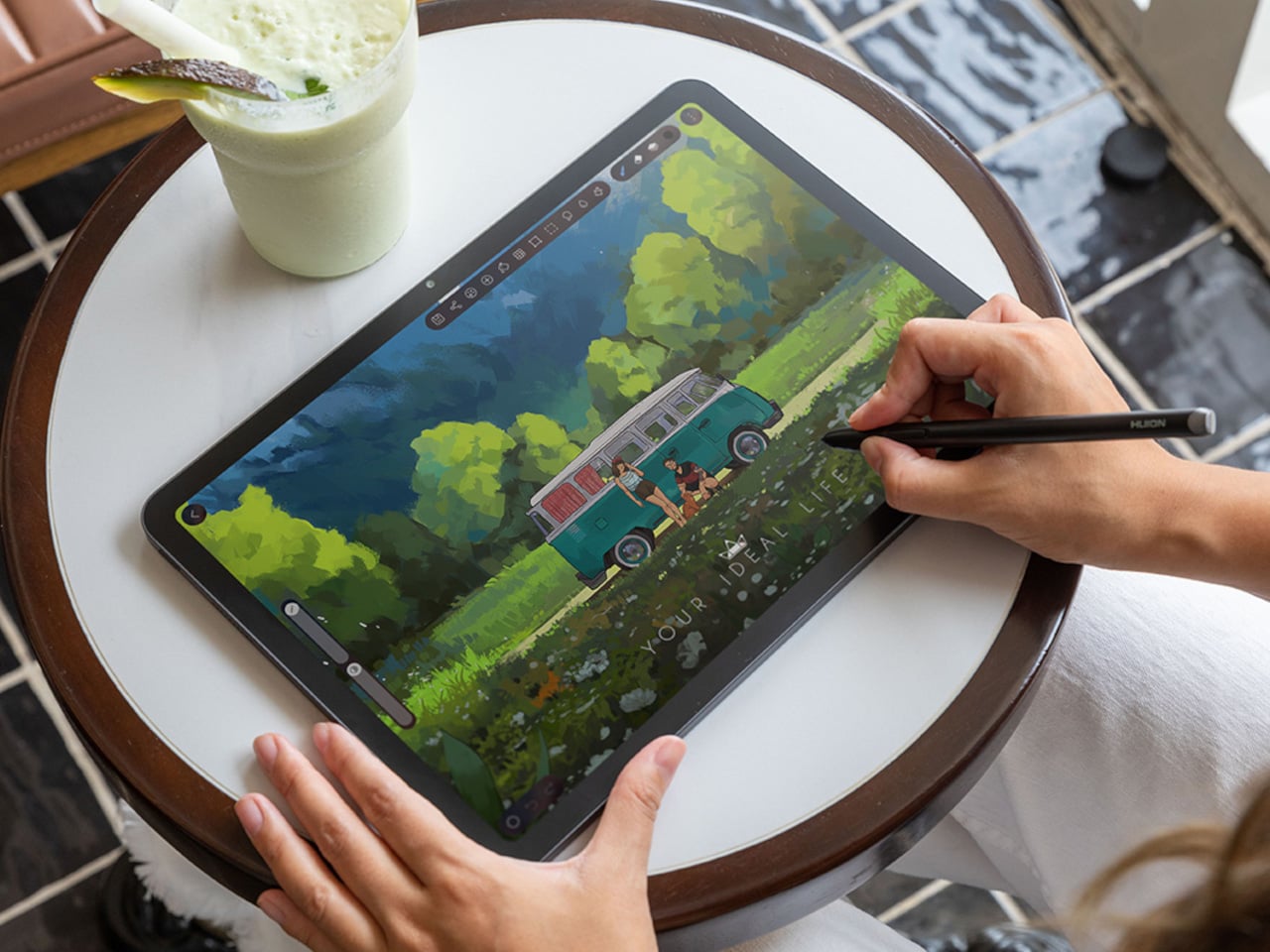
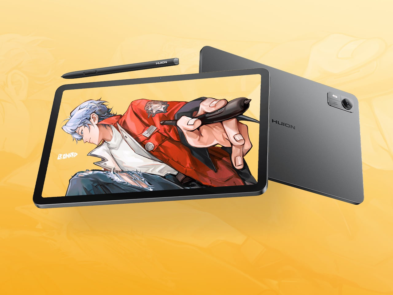
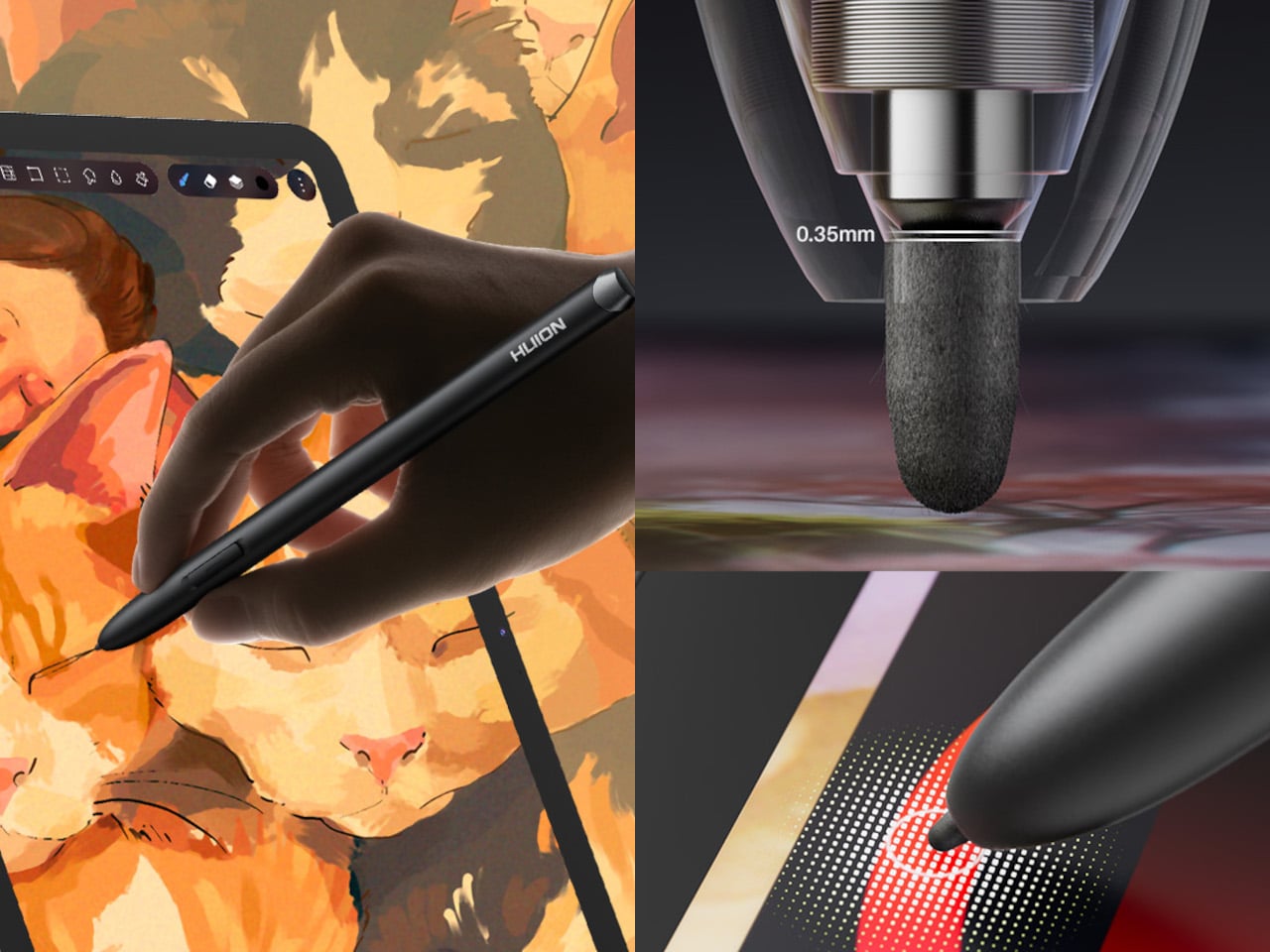
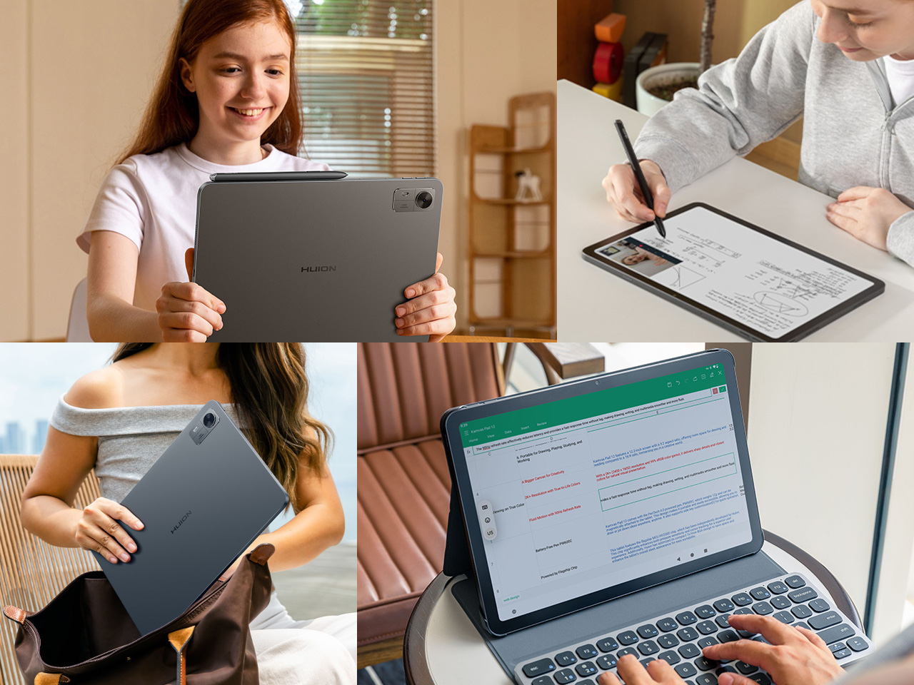
Most Android drawing tablets make you choose between a screen that feels like paper and hardware fast enough to keep up with a real workflow. The Kamvas Pad 12 refuses that trade-off. Huion built a 12.2-inch standalone tablet around a textured, paper-like display and paired it with enough processing power to hold 127 layers open without stuttering, treating the screen as a genuine canvas rather than a stylus afterthought.

That screen runs a 3:2 aspect ratio instead of the usual 16:9, and the difference shows up the moment you start sketching. A wider canvas means fewer awkward crops when composing a portrait or a page layout, and it doubles as a better shape for reading documents or comics without letterboxing. Combined with a 90Hz refresh rate, linework tracks the pen smoothly instead of lagging a beat behind your hand.

Designer: Huion

Canvas Glass 3.0 does the quieter work here. The surface is nano-etched for texture, so the pen tip grips the way it would on actual paper, while a soft-light treatment and anti-glare coating keep long sessions from turning into eye strain. Setting up near a window or working outdoors doesn’t wash out the display, which matters more than most spec sheets give it credit for.

The PW600C pen leans into that same philosophy of getting out of the way. It’s battery-free, weighs just 12 grams, and snaps magnetically onto the tablet body instead of needing a separate case or loop. Someone sketching on a train can toss the pen against the tablet’s edge between stops and trust it’ll still be there, without fishing through a bag for a charging cable or a lost cap.

Underneath, an eight-core MediaTek Genio 720 chip and 8GB of RAM handle the kind of multitasking that used to choke budget Android tablets, running multiple layers and apps without the frame drops that make digital painting frustrating. At 16,384 pressure levels and 60-degree tilt support, the stylus itself translates a feather-light highlight or a bold ink stroke with the kind of nuance that used to be reserved for pricier displays.

Storage tops out at 256GB onboard with room to expand to 1TB, so a growing library of finished pieces, reference photos, and half-done sketches doesn’t force anyone into constant cleanup. Android 16 and full Google Play access mean the tablet isn’t locked into a single app either. Clip Studio Paint, ibisPaint X, MediBang Paint, and Huion’s own HiPaint all come preloaded, ready for whichever workflow fits the project at hand.

Battery life rounds out the case for treating this as a genuine mobile setup instead of a tethered accessory. An 8,000mAh cell inside a 7.8mm metal body keeps the Kamvas Pad 12 running for roughly eight hours, long enough for a full day of sketching at a café or a cross-country flight without hunting for an outlet. That kind of stamina turns a drawing tablet into something closer to a sketchbook you never outgrow.

The post An Android Drawing Tablet With 127 Layers That Still Feels Like Paper first appeared on Yanko Design.

  •  

The 5 Home Upgrades Every Pet Parent Actually Uses (Not Just Buys)

Pet furniture & products have operated under a different standard than everything else in the home for too long. The scratchy beige tower. The plastic bowl by the radiator. The mat that looks like an afterthought. That gap between what owners expect from their own furniture and what they accept for their pets is closing, and the designs collected here are evidence of that shift. These are objects that take the animal’s life seriously without surrendering the room.

This is not a list for owners who want to spoil their pets. It is a list for owners who want their home to feel coherent, and who understand that coherence includes the animal living in it. A vacuum that maps your dog’s favourite spots. A bowl that keeps a fast eater honest. A table built around the fact that the cat is going to be there anyway. Five upgrades, and one shared premise.

1. Chunky Cat Tree
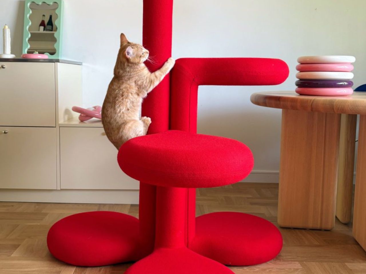
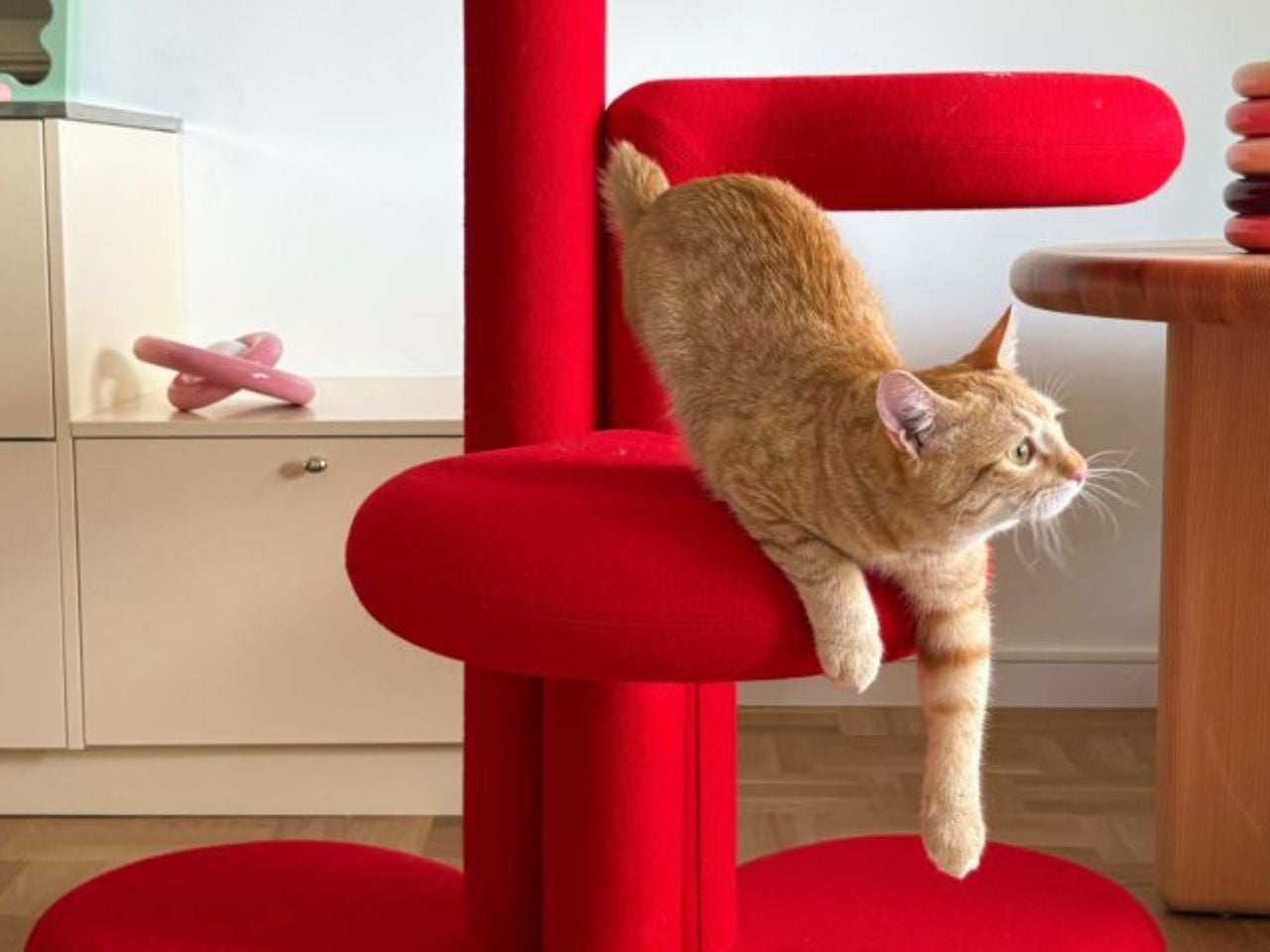
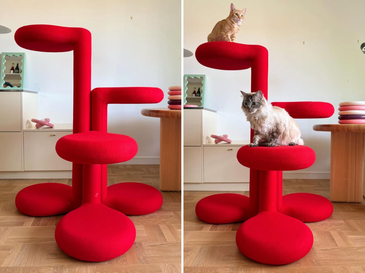
Cat trees solve a specific problem and fail at everything else. They anchor the room in exactly the wrong way, and most owners spend years working around them rather than with them. Gustaf Westman’s Chunky Cat Tree asks whether the category has to operate this way at all. The Swedish designer, known for his Chunky collection of ceramics, glassware, and home objects, has applied that same rounded vocabulary to a cat climbing structure. The result is a piece you place rather than hide.

The form carries all of Westman’s signatures: stacked volumes, inflated proportions, a material presence that reads as warm and deliberate. Made to order in Sweden, the tree is upholstered in wool across five colourways: red, yellow, purple, blue, and cobalt blue. Westman has said he designed it after years of seeing ugly cat trees and deciding the category deserved better. The comment captures the larger idea behind the object. Everything can be designed better, including the things we have come to accept as visually unpleasant.

What we like:

  • Treats cat furniture as a design category worth the same formal attention as any other home object
  • Wool upholstery and sculptural proportions earn placement in the room rather than tolerance of it

What we dislike:

  • Made to order in Sweden means lead times and pricing that will not suit everyone who falls for the visual
  • No confirmed US retail availability or price at time of writing

2. Narwal Flow 2 White
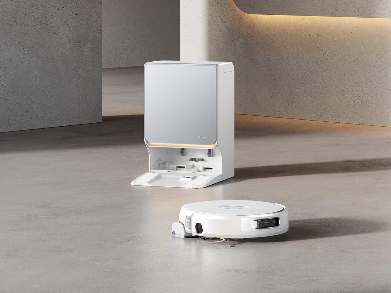
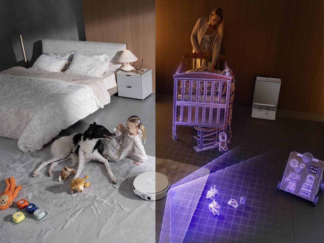
Robot vacuums and pet homes have always had a complicated relationship. Hair wraps around the brush, filters clog faster than the maintenance schedule allows, and the machine ends up parked in the corner half the time. The Narwal Flow 2 White addresses that at the hardware level before asking for any trust. A certified detangling system eliminates hair tangling. A 31,000 Pa motor handles the volume that stops most competitors mid-session. Pet Mode maps your animal’s active zones and adjusts cleaning paths accordingly.

The white colourway matters more than it sounds. Most robot vacuums read as appliances, objects you notice when working and ignore otherwise. The Flow 2 White sits closer to quiet luxury, a thing you leave in the room rather than hiding beneath furniture. Find My Pet uses the onboard camera to locate your animal from your phone on demand. A FlowWash mopping system heats water to 140 degrees for a result that goes well beyond what surface-level mop attachments typically deliver at any price.

Click Here to Buy Now: $1069.99 $1499.99 ($430 off, use coupon code “YDNARWAL”). Hurry, deal ends in 48-hours! Website Link Here.

What we like:

  • Pet Mode and the certified detangling system treat pet ownership as a design constraint rather than a marketing hook
  • Find My Pet and AI Floor Tag add genuine daily utility beyond the core cleaning function

What we dislike:

  • At $1,099.99 launch price, the commitment is significant for a category with a historically patchy reliability record

3. Sloddy
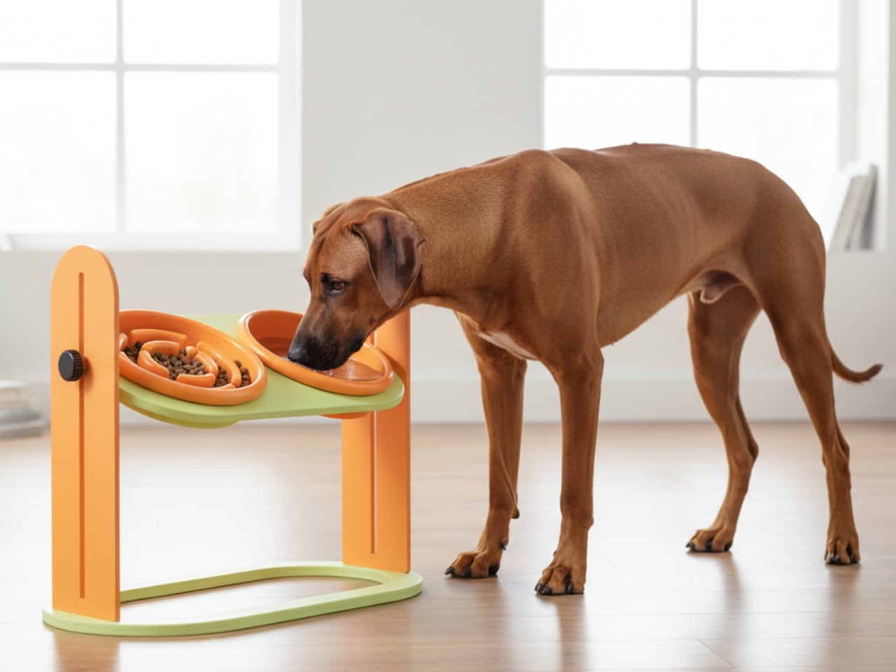
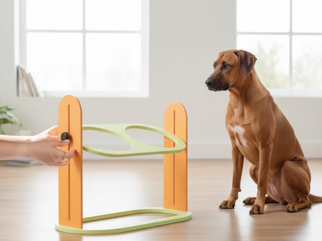
Slow feeders solve the problem once. Most dogs need about a week to learn the maze, and then mealtime returns to its previous five-second format. Designer Kyung-seo Yoo built Sloddy around that specific failure mode. The bowl ships with multiple interchangeable puzzle inserts at increasing difficulty levels, and you rotate them as the dog adapts. The challenge stays real. The eating pace stays controlled. It is a straightforward idea that the rest of the category never thought to try.

An adjustable MDF wood stand raises or lowers the bowl to match shoulder height, addressing a posture and digestion concern that most pet owners encounter long after they needed the fix. Every component disassembles fully for cleaning, with no corners that trap food beyond reach. The peachy-orange palette and warm wood base sit somewhere between kitchen object and design piece, and the recyclable cardboard packaging doubles as a storage shelf for the spare inserts once the box is opened.

What we like:

  • The modular difficulty system is the first meaningful update to the slow feeder format in years
  • Full disassembly for cleaning eliminates the trapped-food problem that makes most slow feeders a short-term purchase

What we dislike

  • The modular system only works if the owner actively manages the insert rotation — it requires consistent owner effort, and most households will default to leaving the same insert in indefinitely
  • The MDF wood stand, while visually warm, is vulnerable to water damage and splashing at feeding time, which is a daily reality with most dogs

 4. Pet Paws
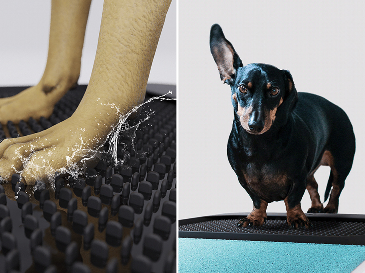
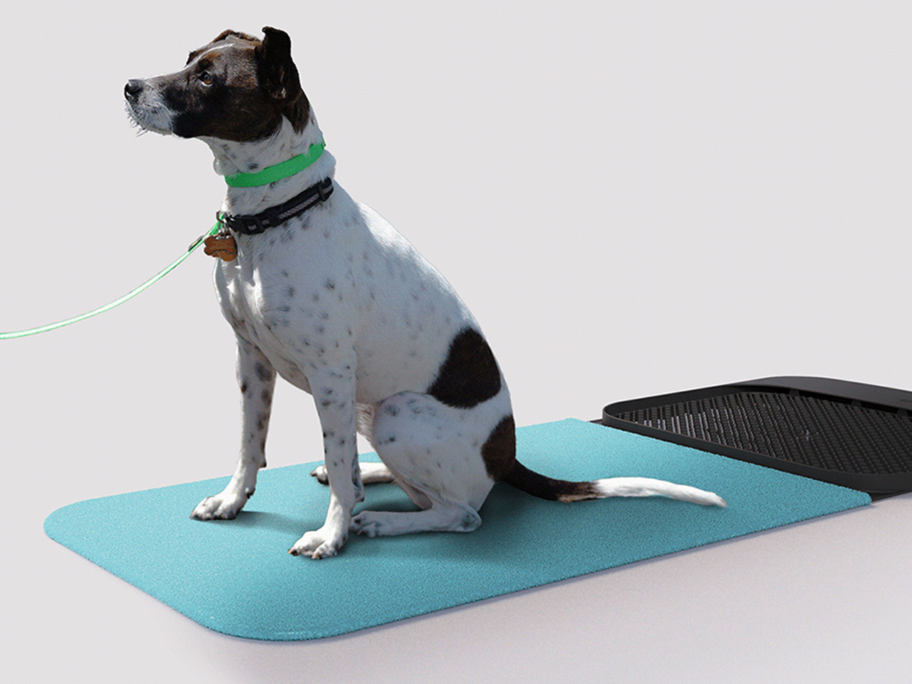
Paws are how the outdoors follows your dog into every room. Mud, grit, bacteria, and allergens come in with every return from outside, and a doormat or a towel handles it partially at best. This portable mat was designed to close that gap by combining three functions- cleaning, drying, and disinfecting- in a single object that sits where the problem actually begins. The all-in-one approach trades the multi-step routine by the door for something that takes seconds and requires nothing else.

The portability is part of the logic. A fixed solution only works at one entry point; a mat you can move adapts to wherever the animal actually comes in, which is rarely the same door every day. For households where paw hygiene connects directly to allergy management or general cleanliness standards, shortening the threshold routine without eliminating it offers something most door products never attempt: cleaning, drying, and treating in the same step, without a trip to the sink.

What we like:

  • Three-in-one functionality handles the most repetitive daily pet hygiene task without multiple products
  • Portable format adapts to wherever the animal actually enters, not just the main door

What we dislike:

  • The disinfecting function almost certainly requires a cleaning solution or refill, adding an ongoing cost and supply dependency that the headline promise of a single portable mat quietly glosses over
  • Dogs that resist paw handling or unfamiliar textures underfoot will need consistent training before the mat becomes a reliable part of the routine rather than something they walk around

5. Dinos Cat WFH Table

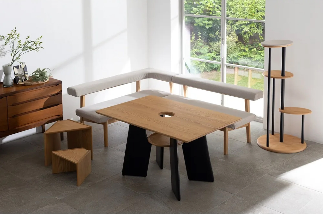
Anyone who works from home with a cat recognizes the pattern. The animal locates the warmest, most centrally placed surface in the room and treats it as its own. The desk. The keyboard. The notebook. Japanese furniture company Dinos designed a table that accepts this behavior as a given and builds around it rather than against it. A center cavity in the tabletop creates a through-hole, and a hidden perching shelf beneath gives the cat a settled spot at the same level as everything happening above.

The logic is quiet and functional. Rather than competing with the animal for desk space, the table distributes the surface so both uses fit without interrupting each other. The cat sits close enough to its owner to settle down, without walking across the keyboard to get there. For anyone who has rearranged a work setup around a cat’s habits anyway, this just makes the accommodation honest, building it into the object rather than improvising it daily with a cardboard box and a folded blanket.

What we like:

  • Treats the cat as a design parameter from the start rather than an inconvenience to be managed around
  • The hidden perching shelf reduces desk negotiation without requiring any behavioral change from the animal

What we dislike

  • The center cavity is sized and designed specifically for cats, making it a non-starter for dog owners and narrowing the audience of this roundup in a way worth flagging before recommending
  • The table assumes the cat will use the designated perch, and cats are reliably indifferent to designated anything, meaning the design works best for animals already inclined to settle rather than roam

Good Design Has No Exceptions

Pet ownership has changed faster than the objects designed around it. The animals have moved into bedrooms, onto sofas, into daily routines in ways the existing product categories have not kept pace with. What this list represents is a small group of designers who noticed that gap and decided to close it, not by producing novelties, but by applying real design thinking to objects that have been overlooked or tolerated for too long.

None of these are impulse purchases or quick fixes. They are considered responses to specific problems, and that distinction matters. A cat tree that earns its spot. A vacuum that accounts for hair before it becomes a problem. A bowl that stays challenging. A mat that completes the threshold routine in one step. A table that accepts the cat before it ever arrives. That is what good design looks like when it reaches the right problems.

The post The 5 Home Upgrades Every Pet Parent Actually Uses (Not Just Buys) first appeared on Yanko Design.

  •  

Xiaomi 18 Fold Hands-On: Got Here Before Apple, Can It Beat Samsung?

Xiaomi has chosen an interesting moment to return to foldables. The company has not released a book-style foldable since the Mix Fold 4, which launched in 2024, and now it is back with the Xiaomi 18 Fold just as compact foldables are starting to get more attention. Samsung has also added a foldable in this compact format to its lineup, and Apple is widely expected to unveil its first foldable iPhone at its September 9 event with a similar form factor in mind.

That puts the Xiaomi 18 Fold in an interesting spot. It is not just Xiaomi coming back to foldables after a break. It is also arriving just as this smaller book-style format looks like it could become the next big thing.

Designer: Xiaomi

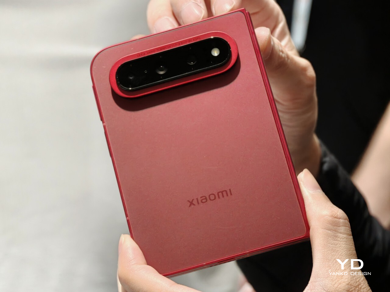
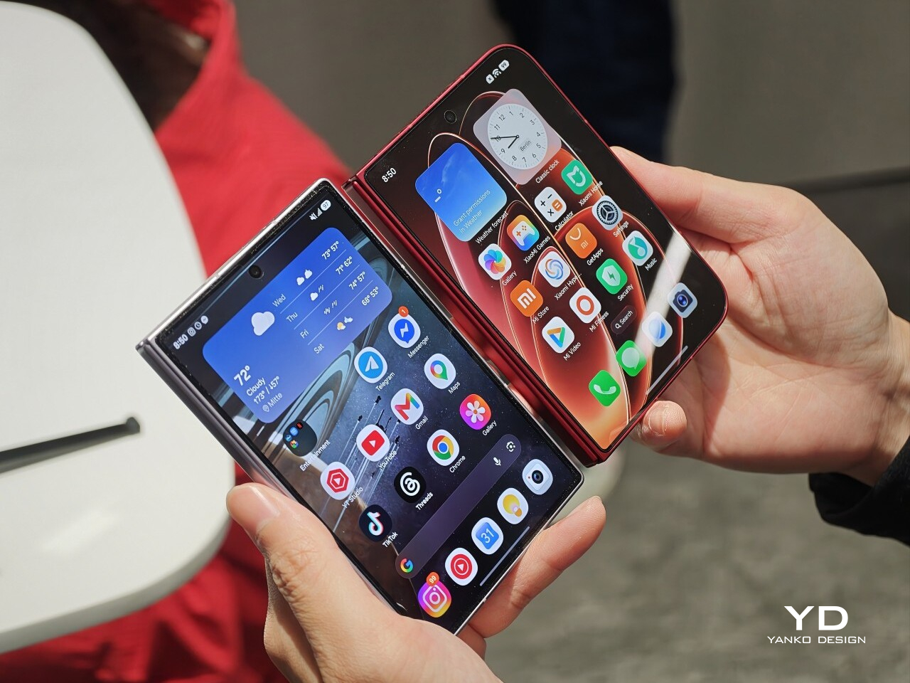
Xiaomi is positioning the 18 Fold as its first mid-size flagship foldable. It weighs 7.73 ounces (219g), measures 0.42 inches thick when folded (10.68mm), and opens out to just 0.20 inches thick (5.02mm), with a folded footprint of 4.64 x 3.29 inches (117.8 x 83.6mm). In person, it feels thin, though not unusually thin by the standards of today’s premium foldables. More importantly, it feels expensive in a good way. The matte texture on the back and frame gives it a softer, understated finish, while the rounded corners and flat frame help the phone look clean and modern.

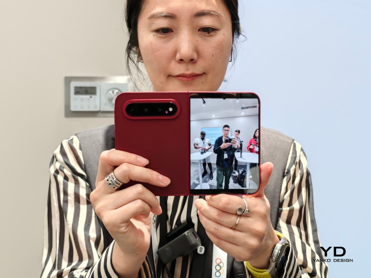
The unit I handled was the deep red version, and it is a bold color in person. It stands out more than the usual black or silver foldable palette without feeling too loud. It also happens to echo the deep red finish rumored for Apple’s first foldable, which makes the comparison hard to miss. The 18 Fold comes in Black, White, Red, and a Ceramic Version.

In practice, though, this is still a two-handed phone whether it is folded or unfolded. Even closed, the body is compact in one sense but still broad enough that I did not think of it as something built for easy one-handed use. That is not really a criticism. It just comes with the territory.

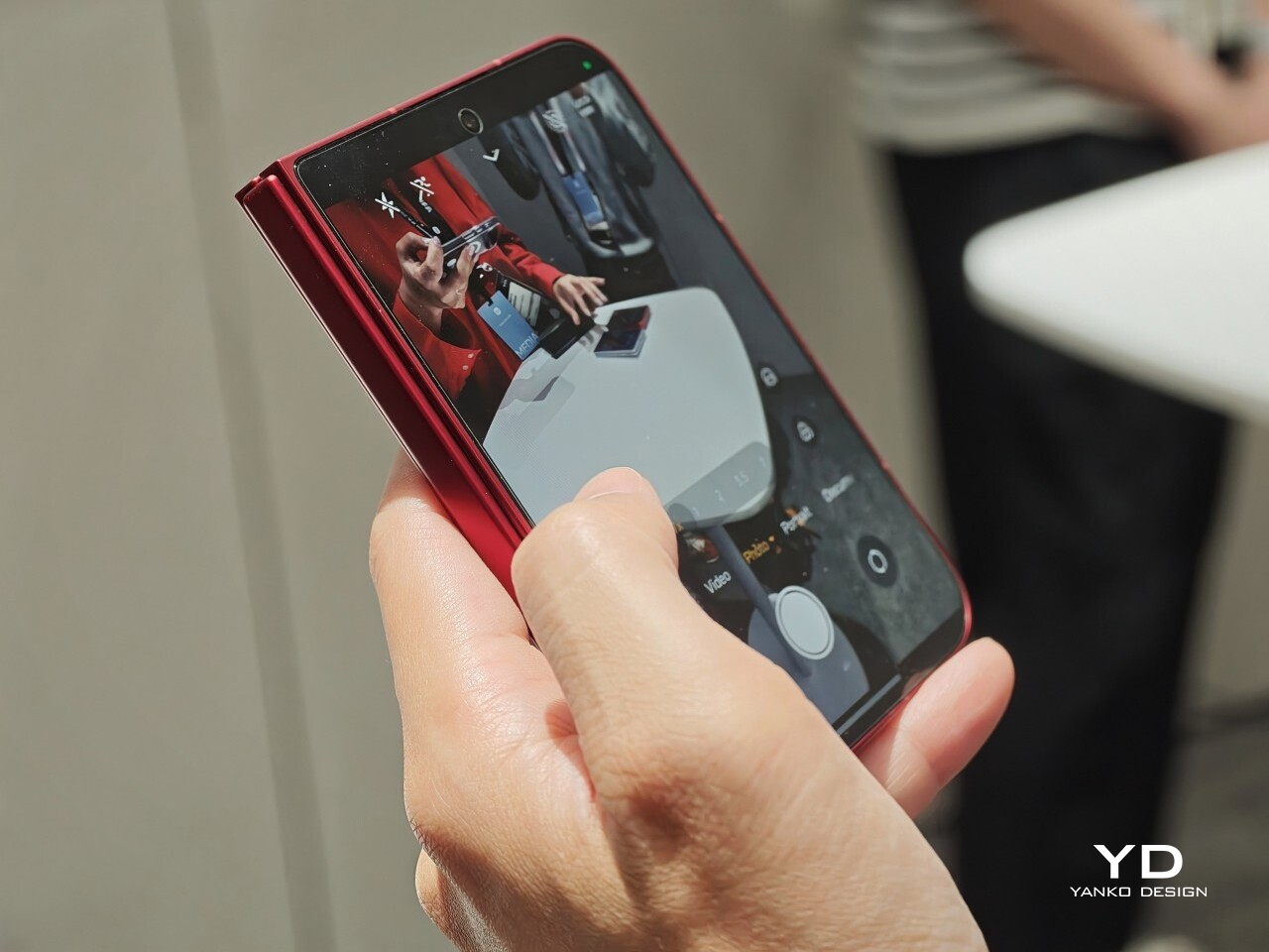
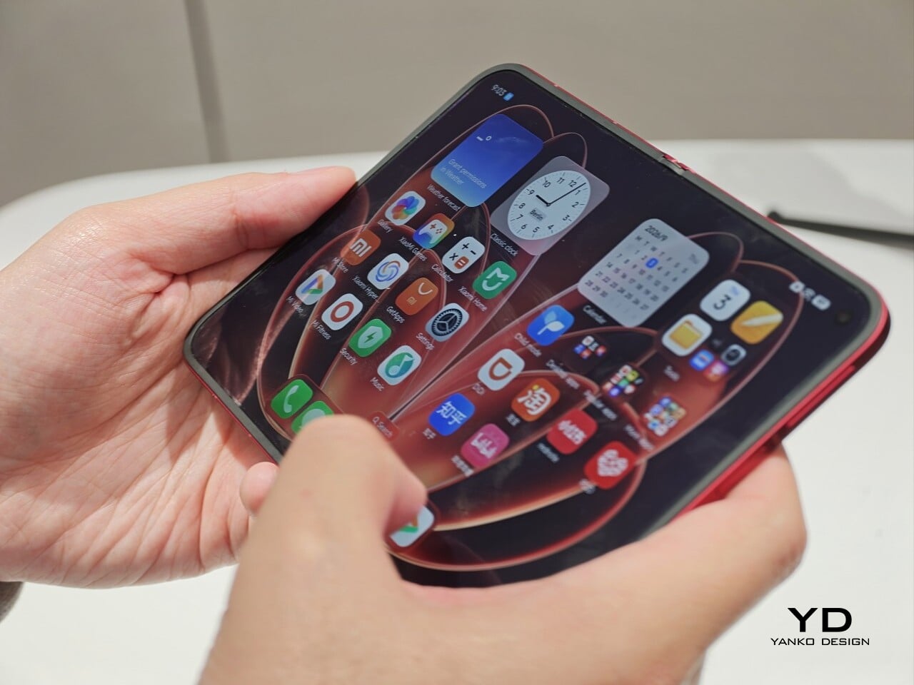
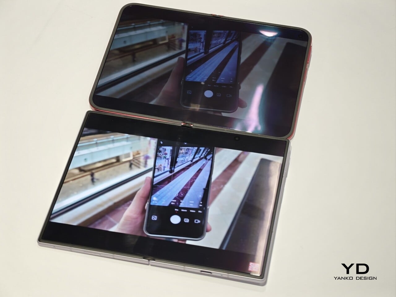
The outer display is a 5.38-inch panel, while the inside opens up to a 7.58-inch main screen. Xiaomi says both displays share the same aspect ratio, which is meant to make the transition from one to the other feel more natural. I could not fully judge how well that works in daily use from a short demo, but one benefit stood out right away. Video felt more immersive than on squarer foldables because there was less black bar space above and below the image.

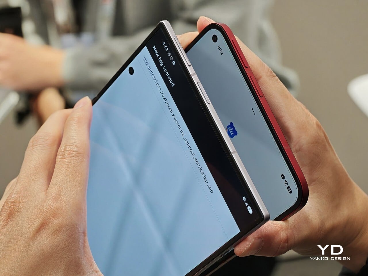
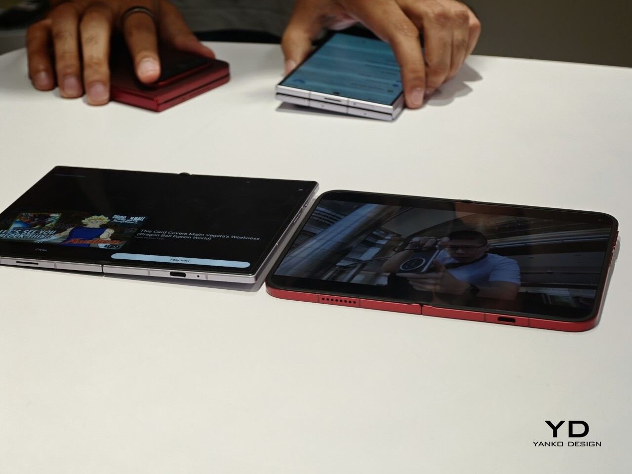
The software also looked well suited to the shape. Animations felt smooth in my brief demo, and I did see split-screen and floating window support in action. The unfolded UI felt more like a small tablet than a stretched phone, which is what you want on a device like this. Xiaomi has also placed one speaker on the top edge and another on the bottom edge on the opposite side, which should help give the phone a more balanced stereo effect when it is open.

The hinge left a good first impression too. I cannot really say whether it felt especially firm or especially smooth, because my time with the device was limited, but it did feel sturdy. The crease was handled well too. Looking straight at the display, I only really noticed it from certain angles rather than all the time. More importantly, I could barely feel it when running a finger across the center, which was better than I expected.

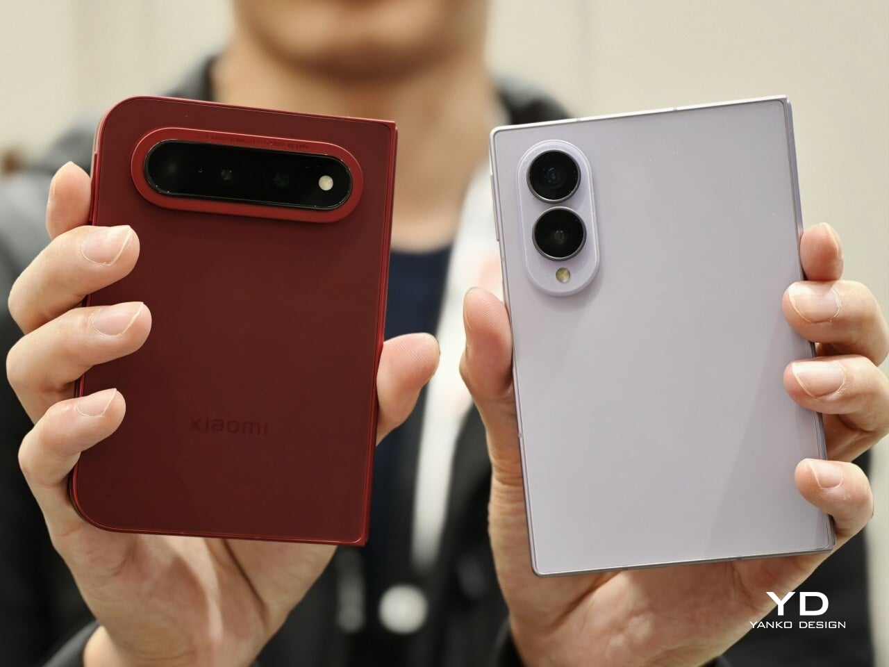
Left: Xiaomi 18 Fold, Right: Galaxy Z Fold 8

Left: Galaxy Z Fold 8, Right: Xiaomi 18 Fold

Left: Galaxy Z Fold 8, Right: Xiaomi 18 Fold

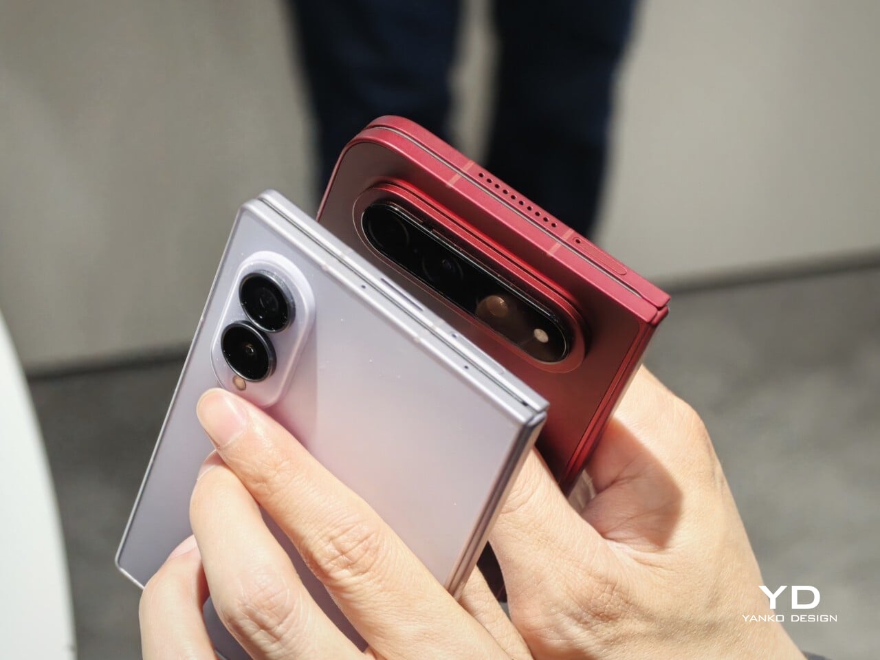
I also compared the Xiaomi 18 Fold side by side with Samsung’s Galaxy Z Fold 8. Samsung’s device measures 4.88 x 3.22 x 0.38 inches when folded (123.9 x 81.9 x 9.7mm), 6.35 x 4.88 x 0.18 inches when unfolded (161.4 x 123.9 x 4.5cm), and weighs 7.09 ounces (201g), so it is a little lighter and a bit thinner than Xiaomi’s foldable in some areas. But the difference was not just about dimensions. Samsung’s inner screen was noticeably brighter to my eyes. At the same time, the Xiaomi 18 Fold had one practical advantage that stood out immediately. When placed on a desk, it did not wobble, while the Samsung did.

Left: Galaxy Z Fold 8, Right: Xiaomi 18 Fold

Left: Galaxy Z Fold 8, Right: Xiaomi 18 Fold

Top: Xiaomi 18 Fold, Bottom: Galaxy Z Fold 8

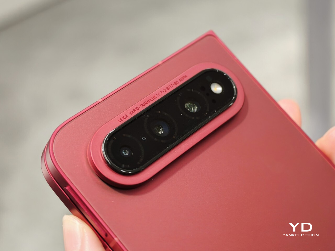
The biggest surprise for me was the camera. Xiaomi is using a 200MP Leica triple-camera system, led by a 200MP main camera and backed by a 50MP Leica periscope telephoto with an 80mm equivalent focal length. In my short time with the phone, the telephoto camera was the part that stuck with me most. I tried zoom, and the 3.5x telephoto setup immediately felt like one of the most interesting parts of the device. Stability also felt good even at higher magnification, which made the zoom feel more usable, not just more dramatic. The camera bump also did not seem overly large, and its oval-shaped, two-step raised design gives it some presence without taking over the whole back.

My time with the Xiaomi 18 Fold was brief, and this hands-on really only scratched the surface. Even so, the phone already feels like a polished return to book-style foldables. Pricing starts at RMB 10,999, or roughly $1,640, for the 12GB/256GB model, and Xiaomi said it will be available in China only for now.

The post Xiaomi 18 Fold Hands-On: Got Here Before Apple, Can It Beat Samsung? first appeared on Yanko Design.

  •  
❌