Vue lecture

The Soviet Union Built UFO-Shaped Circuses. Now You Can Fold One.
The Soviet Union had a complicated relationship with spectacle. Everything about Soviet ideology pointed toward collective purpose, practical function, and the rejection of excess. And then they went and built circus arenas shaped like flying saucers, out of raw concrete, in capital cities across Central Asia and Eastern Europe. If that is not a contradiction worth paying attention to, I do not know what is.

Cirk, a new book from David Navarro and Martyna Sobecka of Zupagrafika, makes that contradiction its entire subject. The Poznań-based design duo have spent over a decade documenting the brutalist and modernist architecture of the former Eastern Bloc, and Cirk is their latest, most playful entry in that ongoing project. The book surveys the permanent circus arenas built across the former USSR from the 1960s through the 1980s, buildings that, as Zupagrafika puts it, combined “socialist modernism, experimental engineering, and choreographed spectacle.” It is an architectural typology most people have never thought about, and yet once you see these buildings, you cannot stop looking.

Designers: David Navarro and Martyna Sobecka
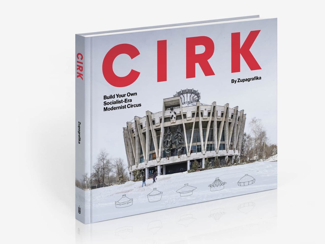
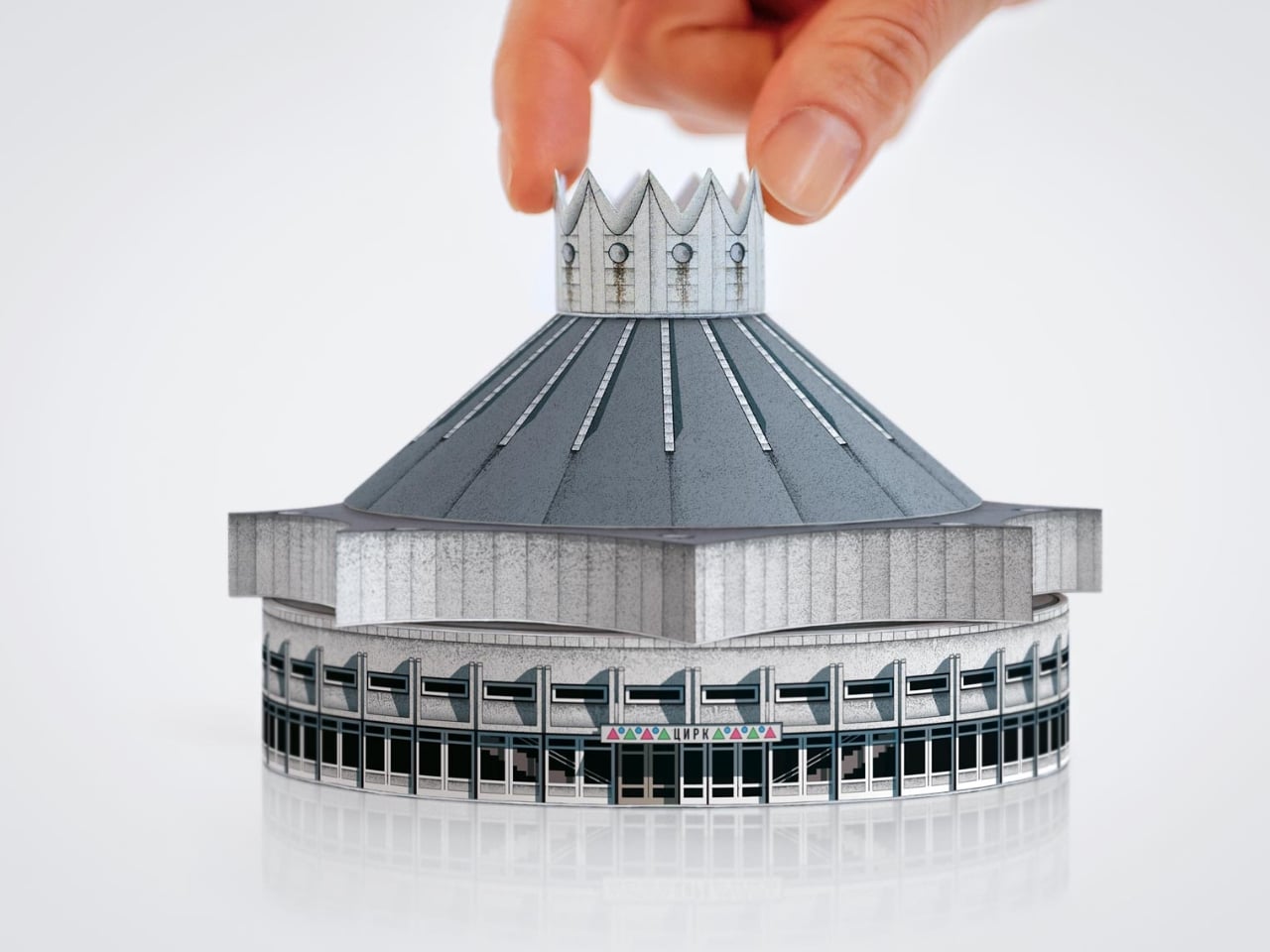
But the part of Cirk that has people talking is not the photography, gorgeous as it is. It is the second half of the book: five press-out paper models of actual circus buildings, designed for readers to punch out and assemble with nothing but glue. The five models represent the Kyrgyz State Circus in Bishkek, the Chișinău State Circus in Moldova, the Dnipro State Circus in Ukraine, the Great Moscow State Circus, and the Tashkent State Circus in Uzbekistan. Five buildings. Five cities. Five strikingly different pieces of architecture, each one reduced to a miniature you can hold in your hands.
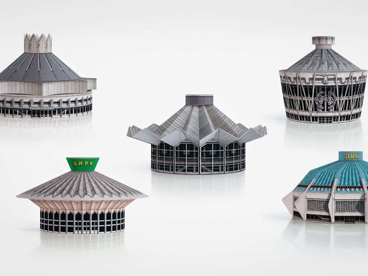
I have a genuine soft spot for paper models, and I think their reputation as a “children’s activity” has always undersold what they actually are. A well-designed paper model is an act of translation. Someone has to study a real building, understand its geometry from every angle, figure out how to collapse it into a flat sheet, and do it in a way that holds together when you fold it back up. That is not trivial when the buildings in question are full of curves, cantilevers, and circular geometry. The circus arenas in Cirk are not simple boxes. Many have sweeping domed roofs and wide cylindrical bases, and the kind of sculptural confidence that makes them look like props from a science fiction film. Getting that geometry to behave on paper requires real design skill, and Zupagrafika clearly has it.
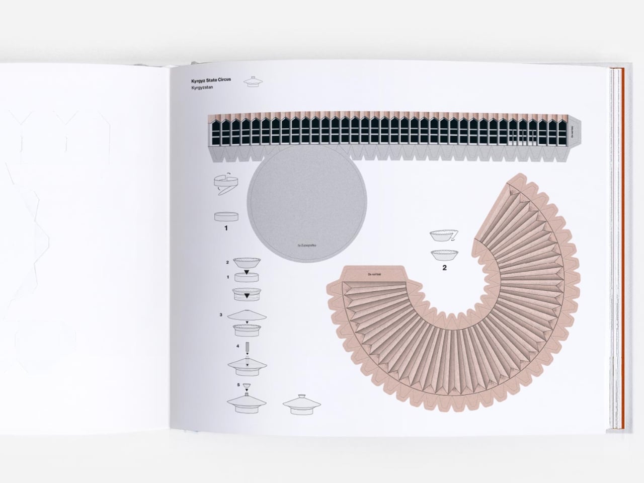
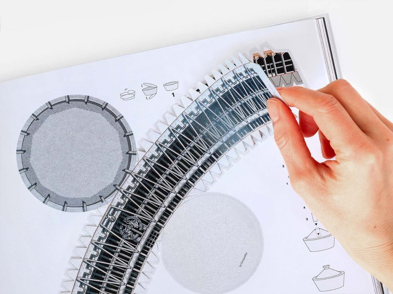
The studio has been producing paper model kits alongside their books for years, so this is familiar territory. But tucking five models into the back of a hardcover book feels like a deliberate choice, not an afterthought. The models are not a gimmick. They are an argument. You can look at photographs of the Great Moscow State Circus for a long time, and it will remain something abstract and distant. When you press out those perforated shapes and fold them into a miniature version of that building, something shifts. The scale changes. The building becomes tactile and personal. You start to understand its proportions in a way that a photograph simply cannot deliver.
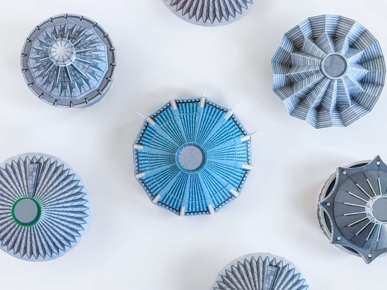
There is also something quietly political about the whole exercise. These arenas were built as monuments to Soviet power, intended to be overwhelming and permanent. Reducing one to a paper model is almost cheeky. It takes these grand gestures of ideological architecture and makes them domestic, approachable, collectible. The Soviet state is long gone. Someone is now folding the Great Moscow State Circus on their kitchen table. History has a strange sense of humor.
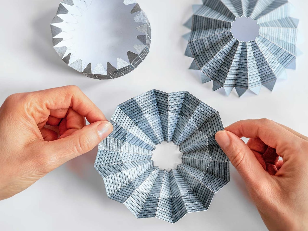
Cirk is a hardcover running 88 pages, sized generously at 30 by 24 centimeters, giving the models room to breathe on the page. The first half carries photography and historical essays, with a foreword from writer Jelena Prokopljević. It is a complete package: context, visual archive, and the hands-on satisfaction of making something. For anyone drawn to architecture, Cold War history, or just the very specific pleasure of a perforated page coming apart cleanly, Cirk is a book that earns its shelf space. The flying-saucer buildings are absolutely worth it.

The post The Soviet Union Built UFO-Shaped Circuses. Now You Can Fold One. first appeared on Yanko Design.
  •  

Fiore Is a Wall Light, a Vase, and a Fragrance All at Once

Most lighting does one thing: it illuminates. If it’s beautiful, that’s a bonus. If it fits the space, you’re winning. But every once in a while, a design comes along and quietly expands the definition of what an object is supposed to be, and Fiore by Jimmy Rojas is doing exactly that.

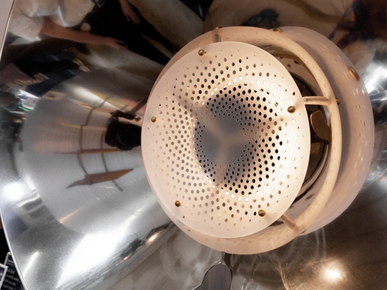
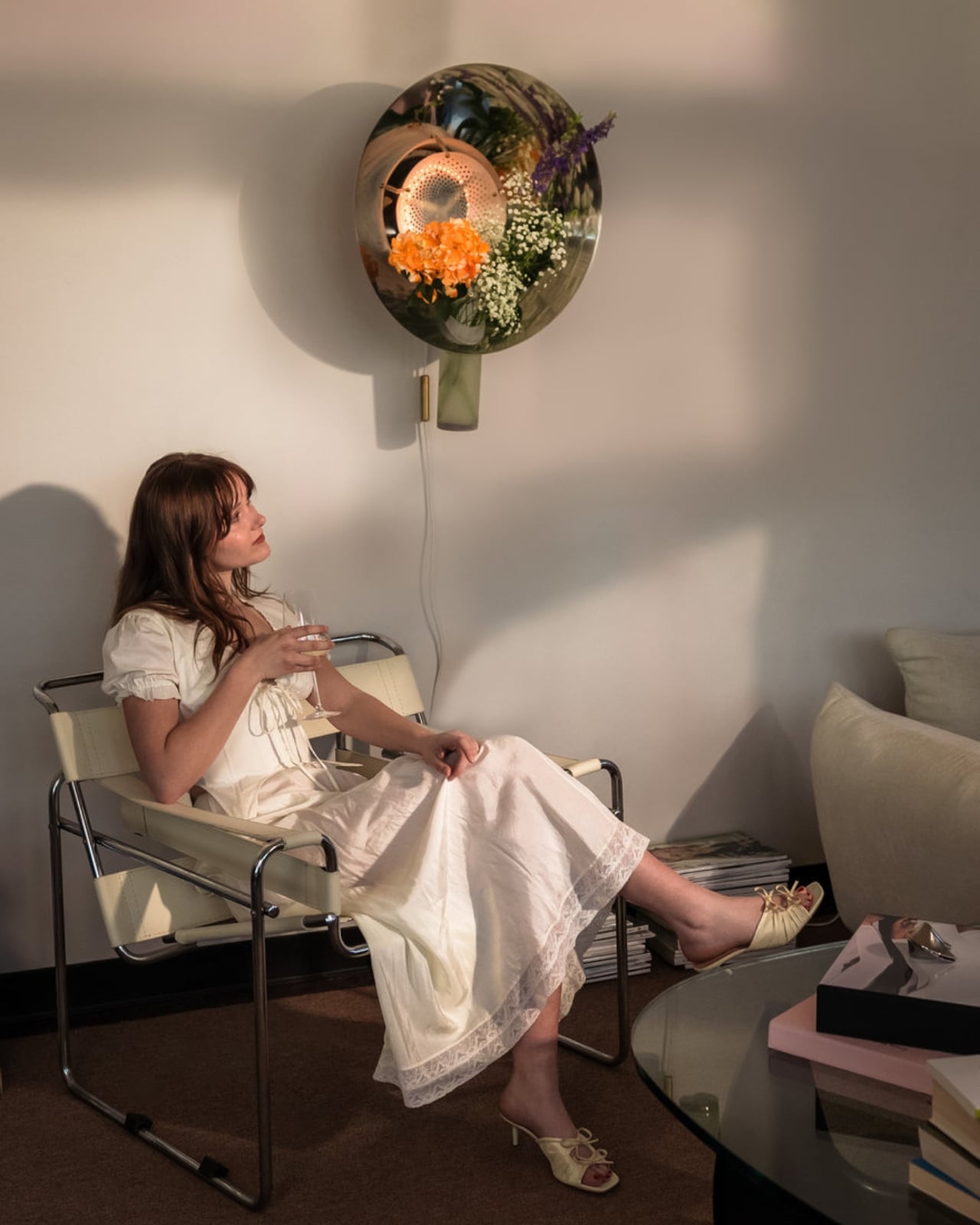
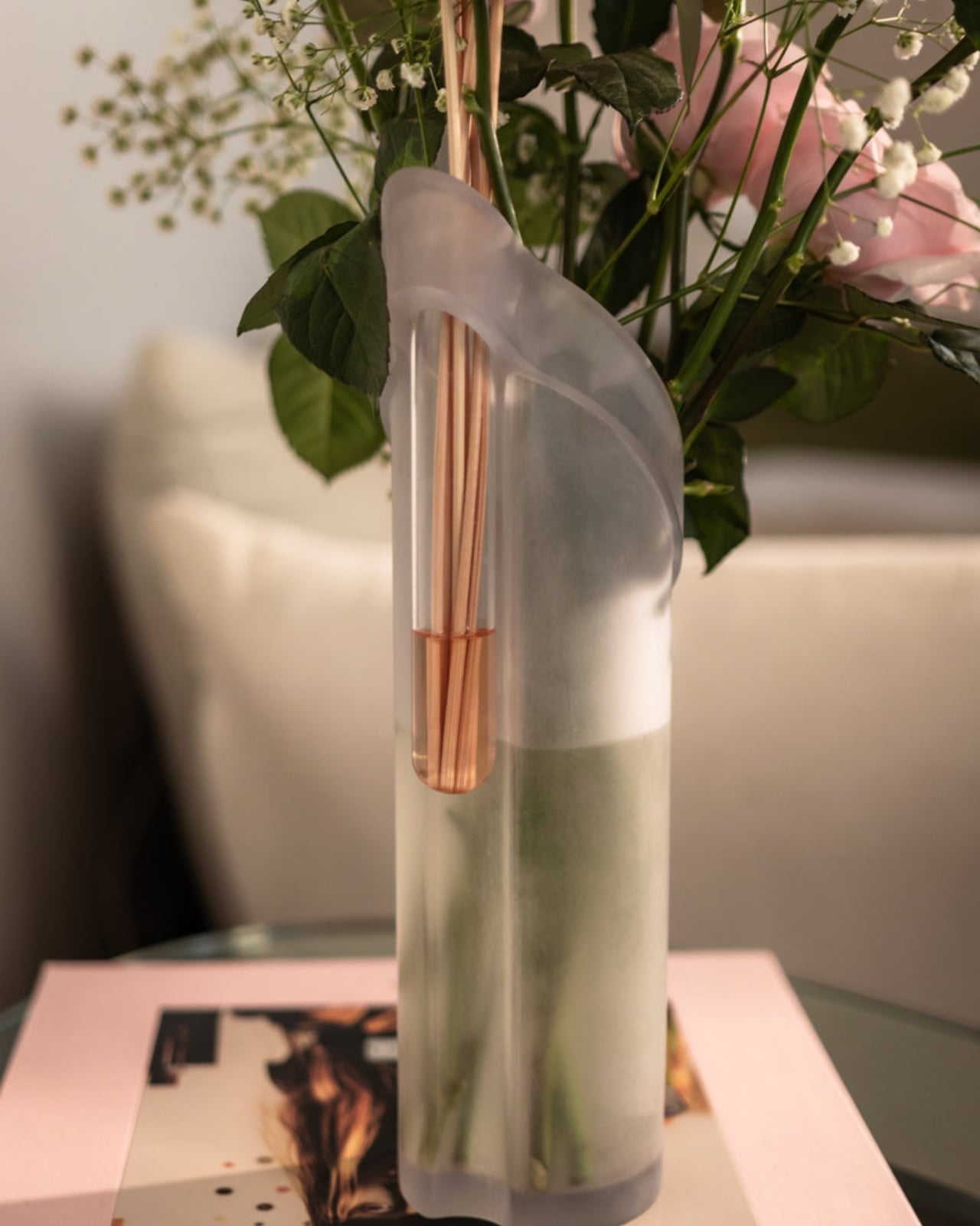
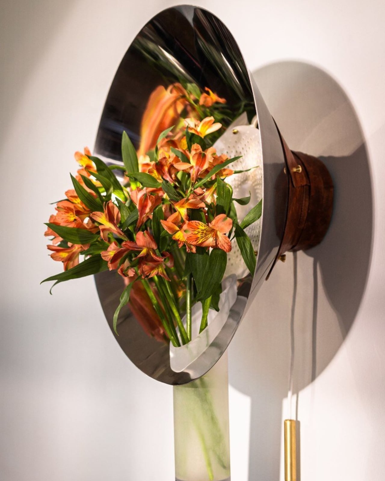
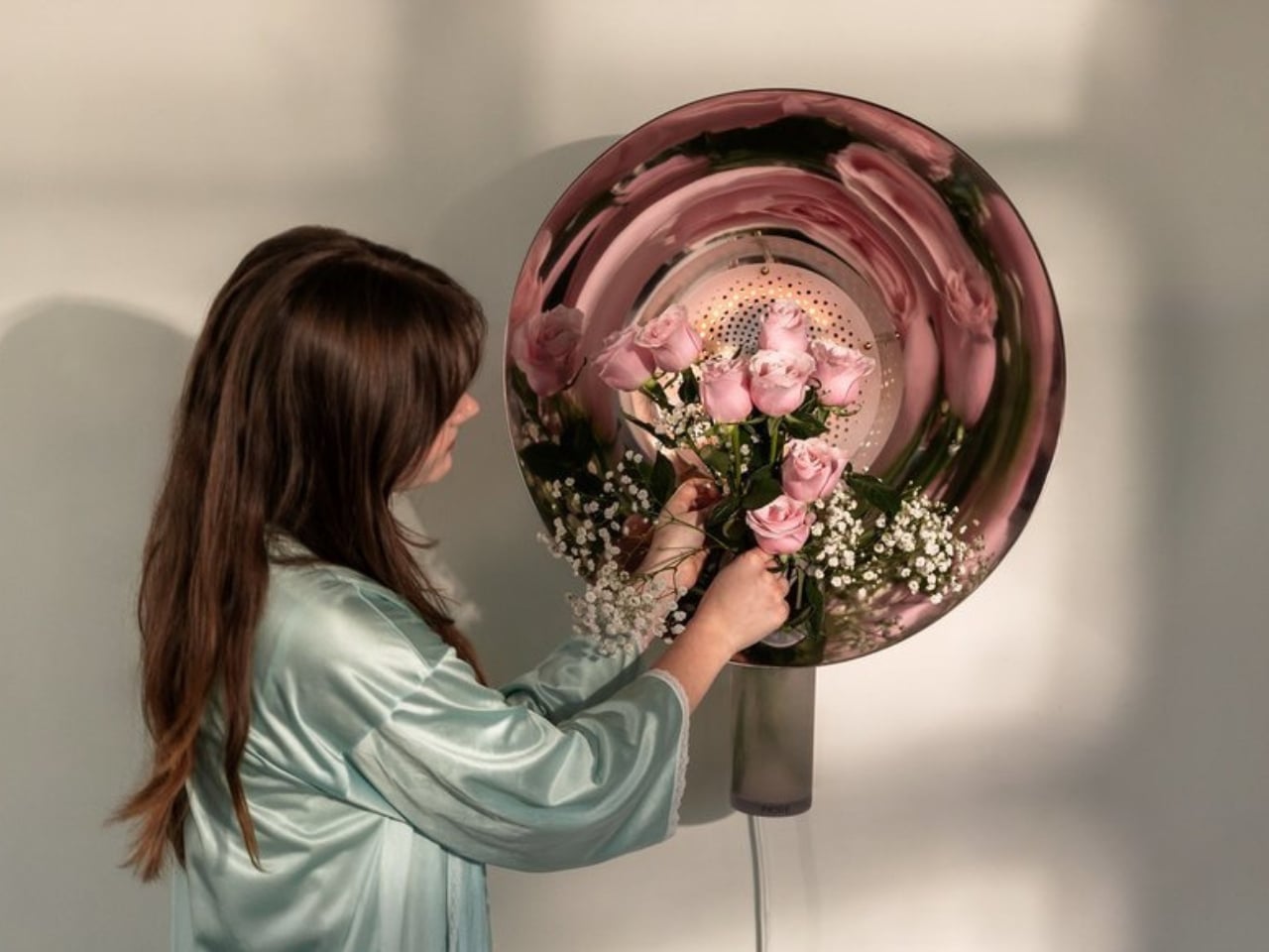
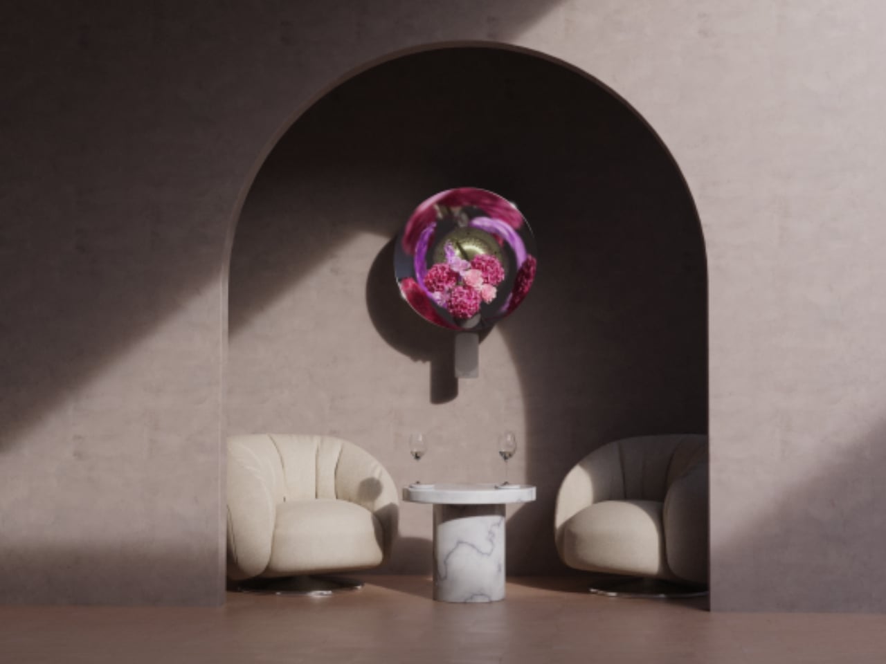
Fiore is a wall-mounted sconce, but to call it only that would be selling it short. At its core, it’s a multisensory piece that combines light, living flowers, and fragrance into a single wall-mounted object. The concept is elegantly simple: a built-in vase holds real blooms, and a signature scent designed to complement their natural aroma diffuses into the room. You’re not just looking at a beautiful light fixture; you’re experiencing it. You smell it. You watch the flowers change as the week goes on.

Designer: Jimmy Rojas

The design came out of Jimmy Rojas’ time at the Savannah College of Art and Design, and it’s been collecting recognition ever since. Fiore earned a Silver at the International Design Awards in the Conceptual Products category, was a People’s Choice honoree at the 2025 NYCxDESIGN Awards, and made its way to Salone Satellite in Milan, one of the most competitive stages for emerging designers in the world. These aren’t small accolades. They signal that the design community is paying attention, and for good reason.

What makes Fiore feel particularly relevant right now is the way it taps into something a lot of us are quietly craving: interiors that actually engage more than just our eyes. Biophilic design, the idea of bringing natural elements into our living spaces, has been a conversation in design circles for years. But Fiore takes that concept and makes it literal in the most delicate way possible. A real flower in your wall, radiating fragrance into the room. No screen, no app, no complicated setup. Just nature, light, and scent.

I’ll be honest, I have a slight bias here. I’ve always believed that the best design doesn’t announce itself loudly. It earns its place in a room by making life feel slightly better, slightly richer, in ways you notice over time rather than all at once. Fiore operates on that frequency. It’s the kind of object you come home to and slowly appreciate more as the days pass.

It’s also worth looking at how Fiore fits into the current interior design moment. Maximalism is back with force, from statement furniture to bold wallpapers to gallery walls stacked floor to ceiling. Within that landscape, Fiore manages to feel both bold and restrained. It’s wall-mounted, so it doesn’t compete for floor or shelf space. But it holds living flowers and diffuses scent, so it commands presence in a way that a standard sconce never could. Balancing those two qualities is genuinely difficult to pull off.

Rojas clearly understands that fragrance is one of the most underused tools in interior design. Candles and reed diffusers have long dominated the home fragrance space, and while they work well, they’re objects that sit on a surface and do their thing passively. Fiore integrates scent into the architecture of the room itself, into the wall, which feels like a genuinely new idea. The fact that the fragrance is designed to pair specifically with the real flowers in the vase adds another layer of intentionality that sets this apart from a concept piece that’s merely clever.

If Fiore moves into full production, there are real-world questions worth asking: how often do the flowers need replacing, what happens in winter when fresh blooms are harder to source, and whether the fragrance component can be made refillable and sustainable. Those aren’t dealbreakers, just the details that turn a great concept into a great product. But as a concept, Fiore is one of the more complete design ideas in recent memory. It knows what it wants to be, and it commits fully. Lighting has always been foundational to how a space feels. Fiore is simply asking whether it couldn’t also shape how a space smells, and how alive it feels. The answer, apparently, is yes.

The post Fiore Is a Wall Light, a Vase, and a Fragrance All at Once first appeared on Yanko Design.
  •  

India’s Anthill House Has No AC and Stays Cool Anyway

We’ve been building houses wrong. Not structurally, not legally, and not in any way that’s easy to name. But somewhere along the line, the conversation around home design shifted away from how does this building breathe toward what does this building look like on a feed. That’s why The Anthill, a new brick residence in Ahilyanagar, Maharashtra by Kaushal Tatiya Architects, feels like such a pointed correction. Not a provocation. A correction.

The premise sounds deceptively simple: a house modeled after an ant mound. Not the insect itself, but the engineering intelligence of what it builds. Ants have been solving thermal regulation, cross-ventilation, and spatial hierarchy problems for millions of years, with no blueprint, no software, and no electricity required. Kaushal Tatiya, the firm’s founder, described the anthill not as a literal form but as “an intelligent climatic organism,” one able to “regulate temperature, create ventilation through voids, and function through a network of interconnected chambers without any imposed geometry.” That single observation is what the entire project is built on, and it shows.

Designer: Kaushal Tatiya Architects (Photos by Avesh Gaur)

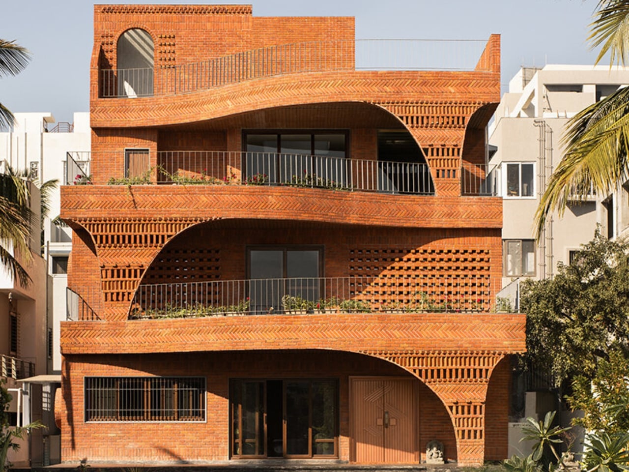
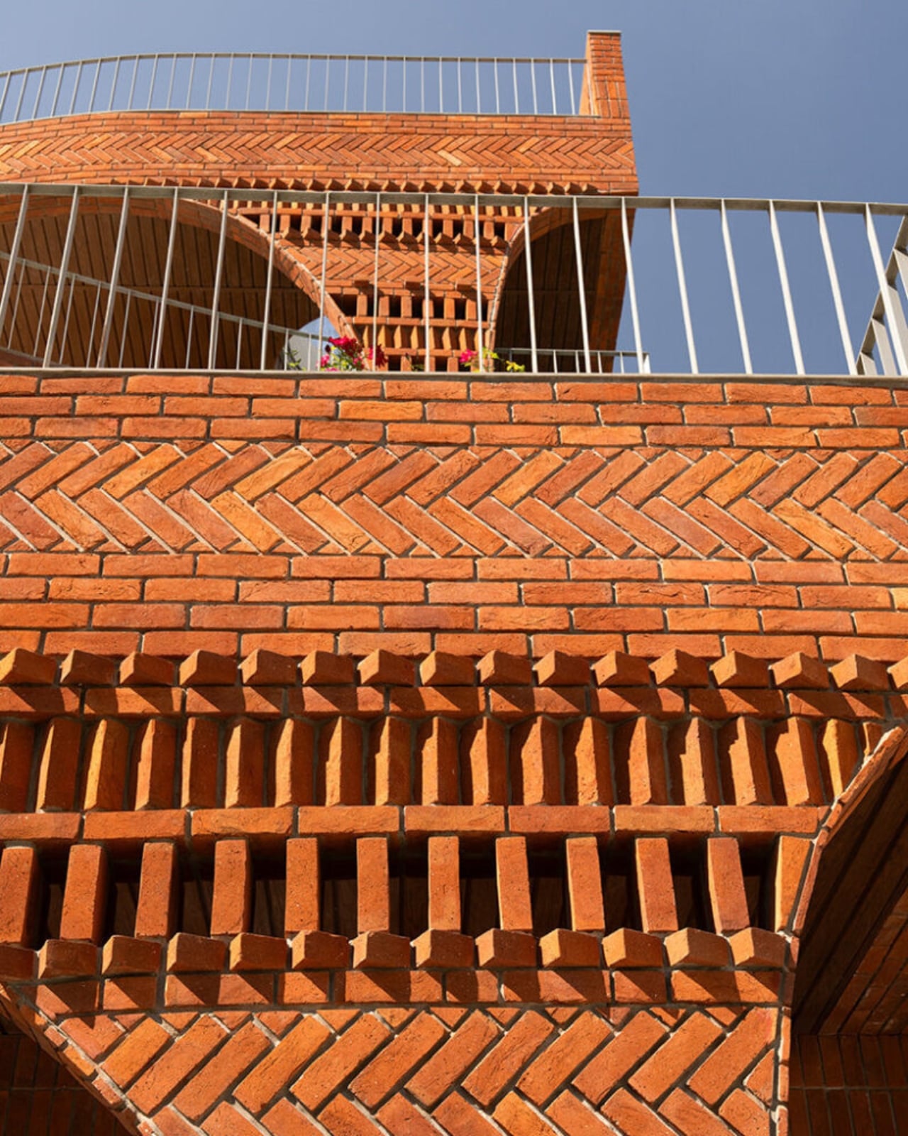
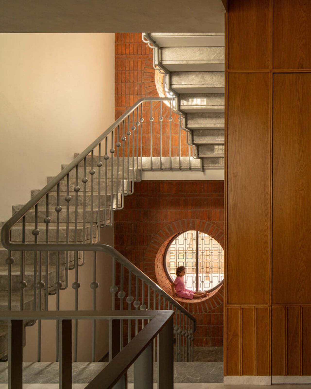
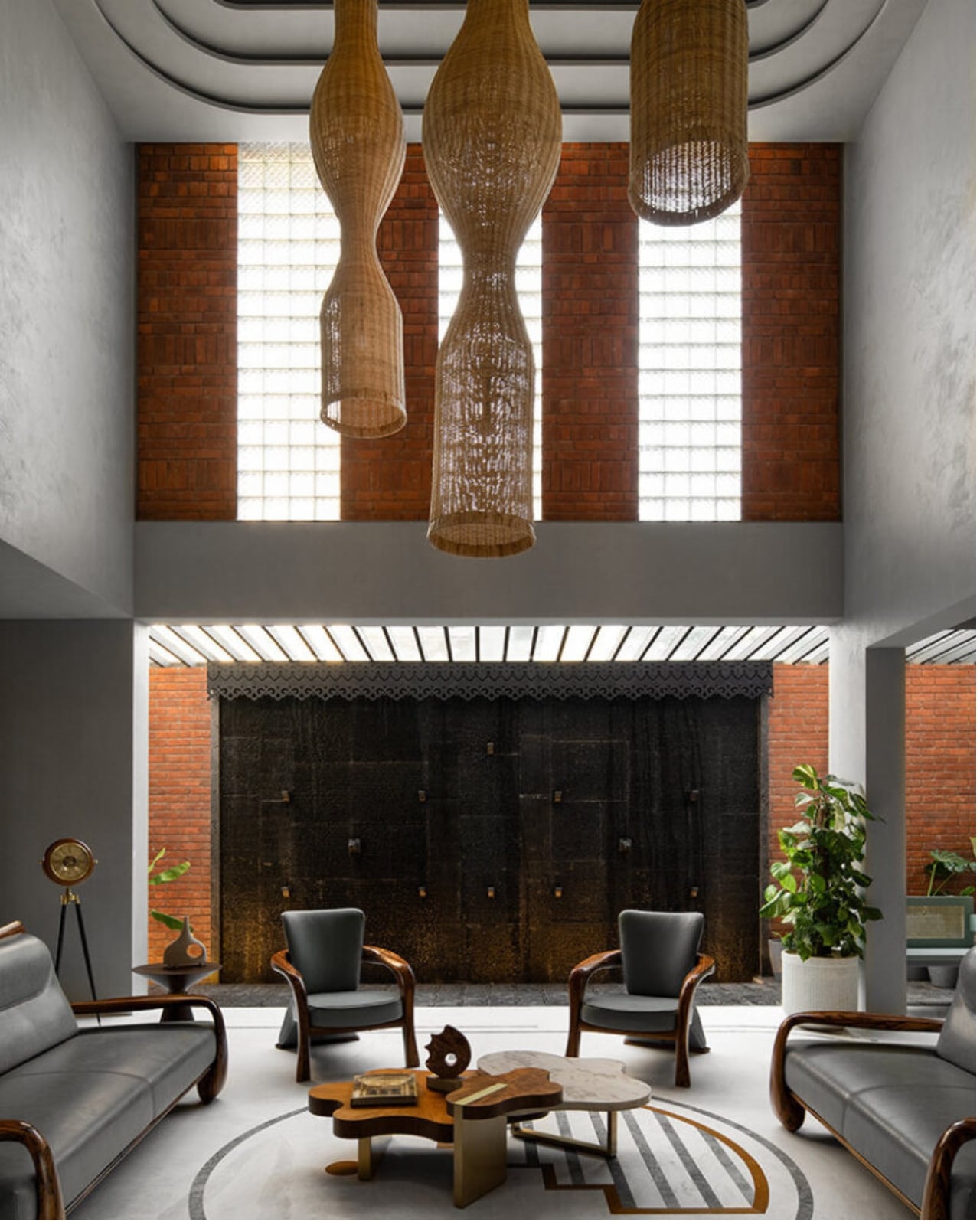
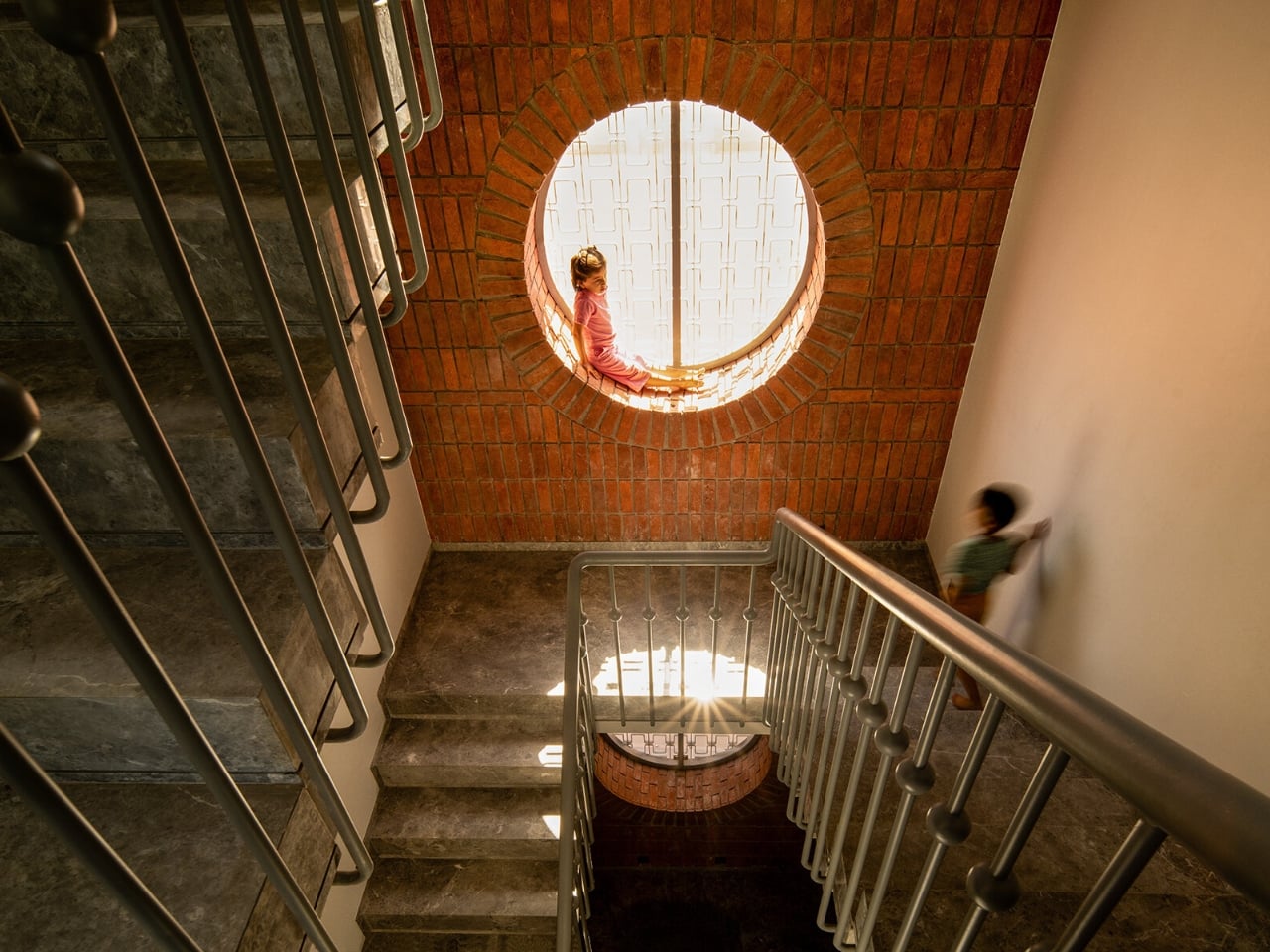
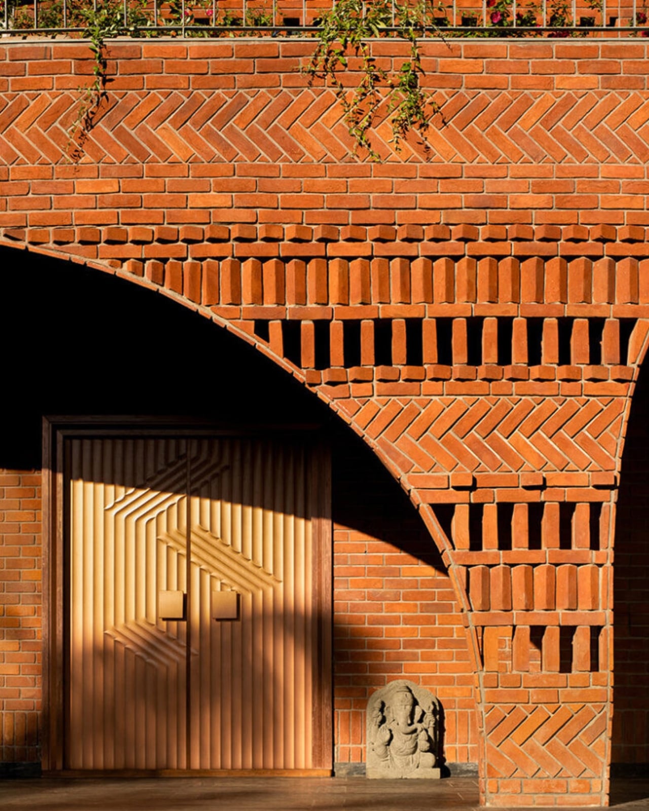
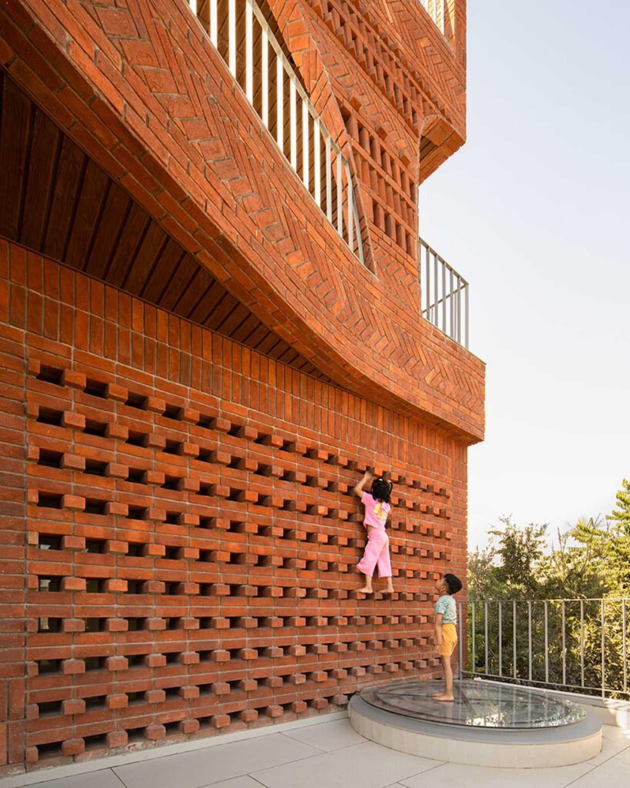
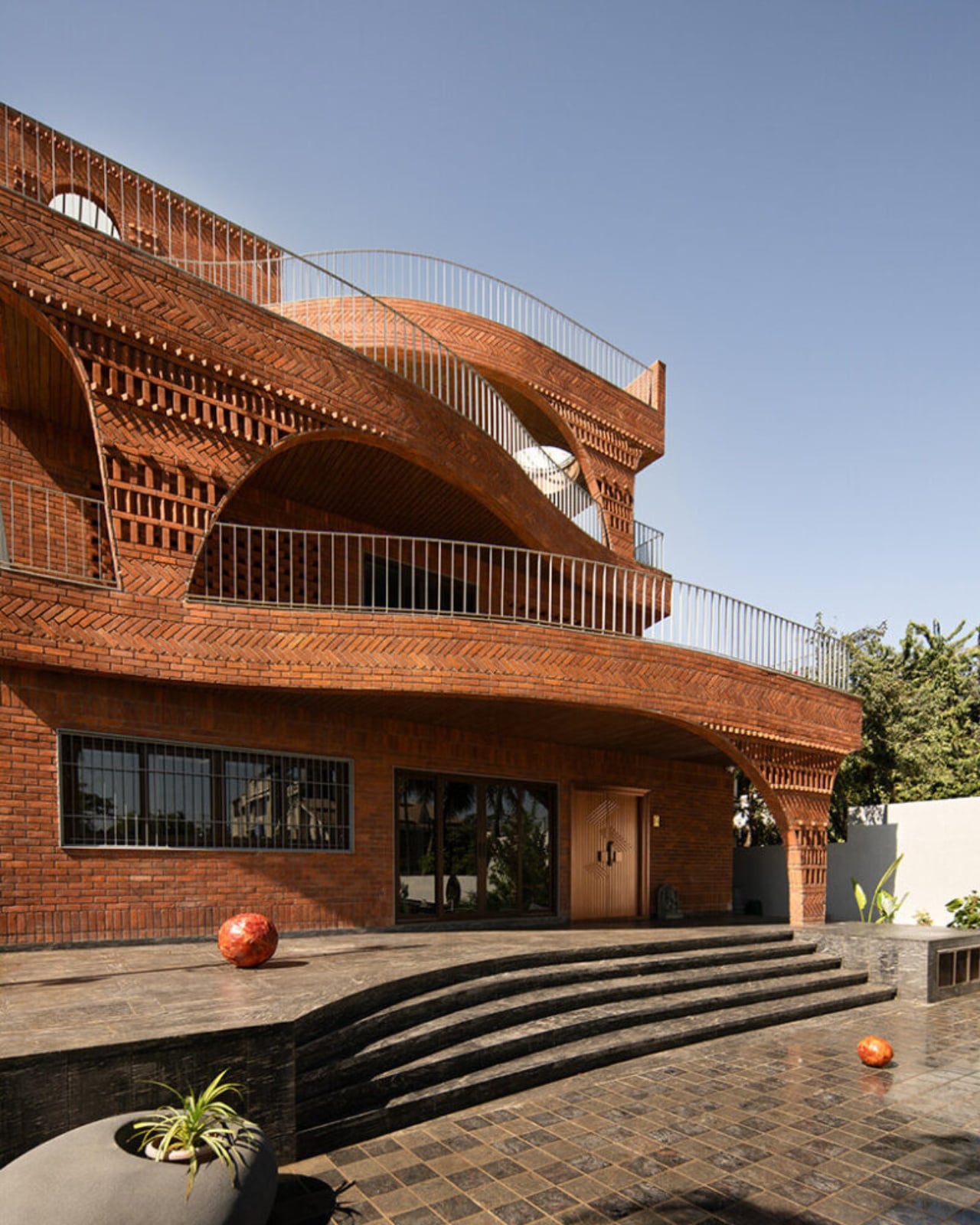
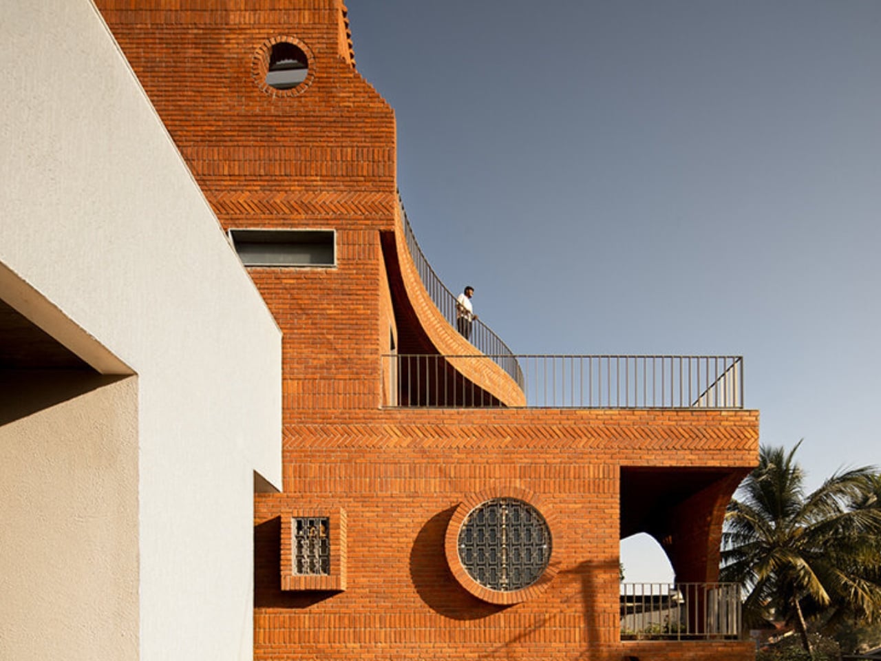
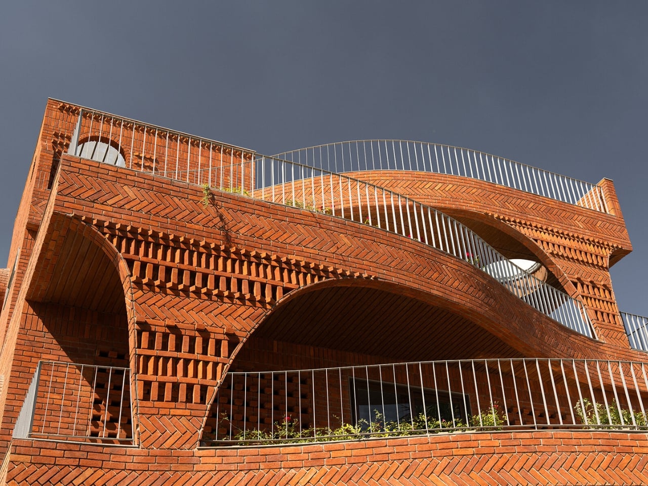
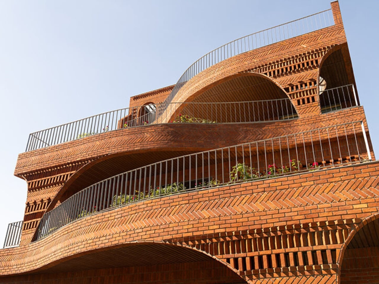
The house sits low in the landscape, almost terrain-like, its exposed brick facade functioning as much as an environmental filter as it does a structural shell. From the outside, it reads as deliberately introverted: solid walls and perforated surfaces that hold back the glare before it ever reaches the living spaces inside. The real architecture begins once you start moving through it. Rooms branch off from larger communal volumes, ceiling heights shift unexpectedly, and natural light arrives filtered and softened rather than harsh. The passage between spaces becomes the experience, not just a means of getting from one room to another.

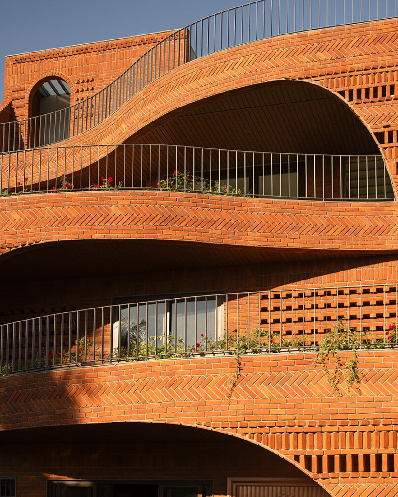
This is a design principle modernism largely traded away in favor of open-plan everything and maximum sight lines. The Anthill doesn’t make that trade. Its stepped terraces and alternating balconies recall the traditional Indian rooftop concept of the chhat, creating layered, shaded thresholds that do the cooling work before the sun reaches the interior. A 12-foot cantilevered slab, supported through brick in compression, adds a more deliberate architectural gesture to the otherwise organic composition.

It’s worth pausing on the sustainability side of this project, because it earns more than a passing mention. The Anthill operates entirely on passive systems: cross ventilation, thermal mass, and shaded courtyards. No mechanical ventilation. In a region defined by extreme heat and intense sunlight, that isn’t a compromise. It’s a design strategy that trusts the building’s own intelligence. The idea that architecture should outlast any power grid it’s connected to feels increasingly important, and The Anthill makes that case without saying a word about it.

I think what gets undersold in conversations about sustainable design is how genuinely radical simplicity is. We’ve normalized a model where buildings are essentially sealed boxes, then mechanically conditioned to be habitable. That approach is energy-intensive, expensive, and fragile in ways we rarely acknowledge. The Anthill argues the opposite: that a building designed with enough spatial intelligence doesn’t need to fight its climate. It learns to negotiate with it instead.

The visual language of the project carries all of this without being heavy-handed. The brick is warm and earthy, the curves are organic without being theatrical, and the overall effect is of a building that looks like it belongs to the land rather than placed on top of it. Photography by Avesh Gaur shows a house that reads differently from every angle, which is always a sign that the architecture is meant to be inhabited rather than just photographed.

What The Anthill ultimately puts on the table is a question worth sitting with: what if the most intelligent design move isn’t to add more technology, but to study what natural systems already perfected? The answers, in this case, are sophisticated enough to build a house around. We talk a lot about future-proofing design. The Anthill is a case where the most forward-looking move was to look at something ancient.

The post India’s Anthill House Has No AC and Stays Cool Anyway first appeared on Yanko Design.
  •  
❌