Vue lecture

Tesla Left a Glaring Gap in Every Model 3 and Model Y. This $379 HUD Fixes It.

Fighter pilots have had heads-up displays since the 1950s, because asking a human to look down at instruments while traveling at 600 miles per hour and making life-or-death decisions is an engineering failure, not a pilot failure. The technology migrated to production cars in 1988 when GM offered the first automotive HUD in the Oldsmobile Cutlass Supreme, and every generation of premium vehicle design since has treated it as table stakes. Tesla rewrote so many conventions of the automobile that it’s easy to forget it left one important capability behind. For all the innovation packed into the Model 3 and Model Y, their dashboards direct critical driving data to a screen mounted nowhere near where human eyes naturally rest during forward motion. TrantorVision built NeuroHUD to close that gap, and the Kickstarter campaign funded in 30 minutes.

Built alongside a community of over 4,000 Tesla owners from mid-2025 through early 2026, NeuroHUD projects Tesla driving data directly into the driver’s forward sightline rather than leaving it on a screen at center console height. Installation takes about one minute, requires no tools and no disassembly, and leaves the factory wiring completely untouched, keeping the manufacturer’s warranty intact. The compute module clips behind Tesla’s center screen and draws power through a single USB-C cable, with no hardwired connections and no vehicle modifications of any kind. From there, a dual-channel data system reads Tesla’s screen directly through AI cameras and simultaneously pulls deeper vehicle telemetry through the Tesla API, creating a richer information layer than either method could supply alone. The result covers speed, navigation, gear state, battery range, blind-spot alerts, and takeover warnings, all projected directly in the driver’s line of sight.

Designer: TrantorVision

Click Here to Buy Now: $379 $629 (40% off). Hurry, only a few left! Raised over $474,000.
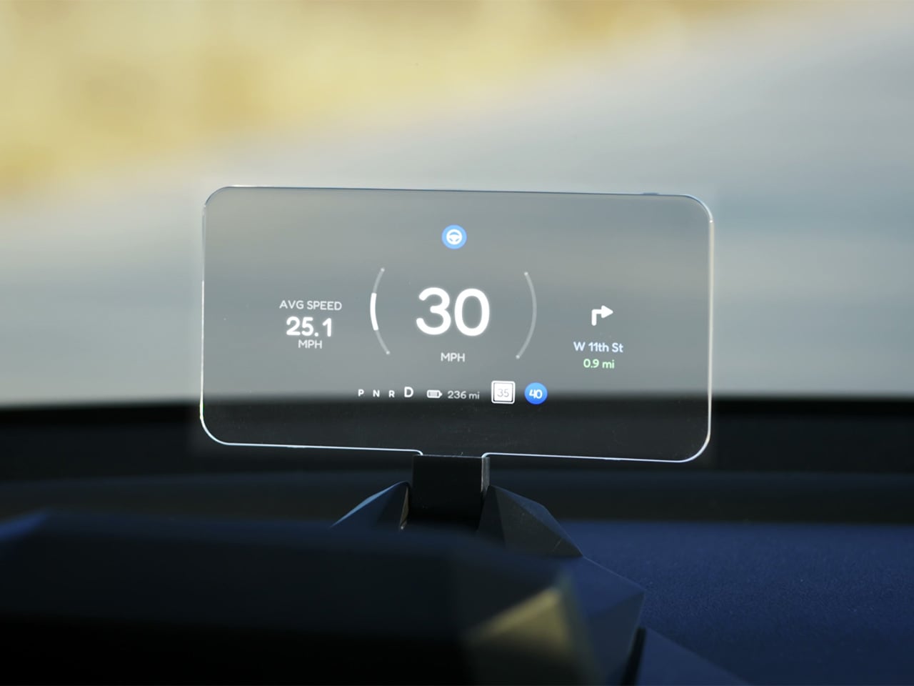
A pair of 150-degree AI fisheye cameras face Tesla’s display and read high-frequency data like speed at 50 Hz, fast enough to keep the HUD readout synchronized with the car’s actual state without perceptible lag at any velocity. Lower-frequency information, covering gear position, battery range, and navigation turns, arrives through the Tesla API on a separate channel, and the system routes each data type through the appropriate pipeline based on how quickly it needs to update. End-to-end latency on the AI vision side sits as low as 20 milliseconds, tighter than many production-fitted HUDs achieve through direct hardware integration. The onboard processor is a 6-core Arm DynamIQ chip paired with an Arm Mali G610 MP4 GPU and 4GB of LPDDR4 RAM, running Ubuntu Core Linux with Wi-Fi 6 and Bluetooth 5.4 connectivity. That compute specification would look comfortable in a mid-range Android tablet, which gives a sense of how much processing headroom TrantorVision has reserved for future OTA feature additions.

At 1,500 nits of peak brightness, NeuroHUD’s 4-inch TFT LCD panel is engineered specifically around the failure mode that sinks most aftermarket HUDs in real-world use: direct sunlight washout. The panel runs at 480×800 resolution with a 140-degree viewing angle, keeping displayed information legible across a wide range of driver head positions without requiring precise alignment to a narrow sweet spot. The modular Light Engine gives drivers a genuine choice of projection method rather than committing them to a single approach. Combiner Mode positions a semi-transparent screen in the driver’s sightline for the sharpest image quality, with projected information appearing to float in the forward visual field at a focal distance that keeps eyes aimed naturally at the road. Windshield Projection Mode throws the image directly onto the glass for a more immersive overlay, and both modes switch without tools or any hardware intervention.

HomeControl is a GPS-triggered garage automation system that learns the driver’s RF remote signal, geolocates the home driveway, and fires the garage door automatically as the car turns in, with a physical button for manual override available at any time. Screen Mirroring turns the HUD into a secondary phone display, meaning Google Maps or Waze can be projected directly onto the combiner or windshield without any dependency on Tesla’s native navigation system. UI customization runs three levels deep: a mobile app for toggling individual elements, a full UI editor for precise sizing and positioning of each data element, and an open API interface for users who want to build a custom renderer entirely from scratch. A community layer lets drivers share layouts or download configurations built by other NeuroHUD owners worldwide, making the display experience as much a living software product as a hardware one. The combination of GPS automation, open API access, and a community-driven layout library gives NeuroHUD a software depth that compounds as its user base grows.

TrantorVision began the project in January 2025 with the goal of building a heads-up display designed around Tesla’s unique display architecture from the ground up. By May 2025 an engineering prototype was assembled and the AI vision system validated through real-world road testing; by July the product was publicly announced with a community already exceeding 4,000 Tesla owners across multiple platforms. Production design locked in December 2025, with the first batch of production samples arriving in January 2026. The device supports Model 3 from 2017 to 2023, Model Y from 2020 to 2025, Model 3 Highland from 2023 onward, Model Y Juniper from 2025 onward, and the Cybertruck from 2023 onward, covering both left-hand-drive and right-hand-drive configurations with Model 3/Y Standard trim included. An OTA Compatibility Upgrade Service is built in, meaning the hardware is designed to receive future software capabilities without requiring a new unit.

The standard NeuroHUD carries an early bird price of $379 against a retail MSRP of $629, covering Tesla data integration, mobile app control, UI community access, the custom UI editor, screen mirroring, and CarPlay and Android Auto support. The NeuroHUD Pro steps to $429 at early bird pricing, down from $729 retail, adding HomeControl, Windshield Projection Mode, deeper Tesla API integration, and enhanced hardware built to grow its feature set through over-the-air updates. Both tiers ship with a windshield film, USB-C power cable, Thunderbolt cable, 12V car adapter, cable clips, and a quick start guide, backed by a one-year warranty. Shipping is free to the continental United States and Canada, with a flat $10 covering the EU, UK, Australia, Hong Kong, and all other worldwide regions, with customs fees covered for most major markets. Global delivery is scheduled to begin between September and October 2026.

Click Here to Buy Now: $379 $629 (40% off). Hurry, only a few left! Raised over $474,000.

The post Tesla Left a Glaring Gap in Every Model 3 and Model Y. This $379 HUD Fixes It. first appeared on Yanko Design.
  •  

Starbucks built a Yeti cooler for your Venti Iced Lattes, but you can’t buy one yet

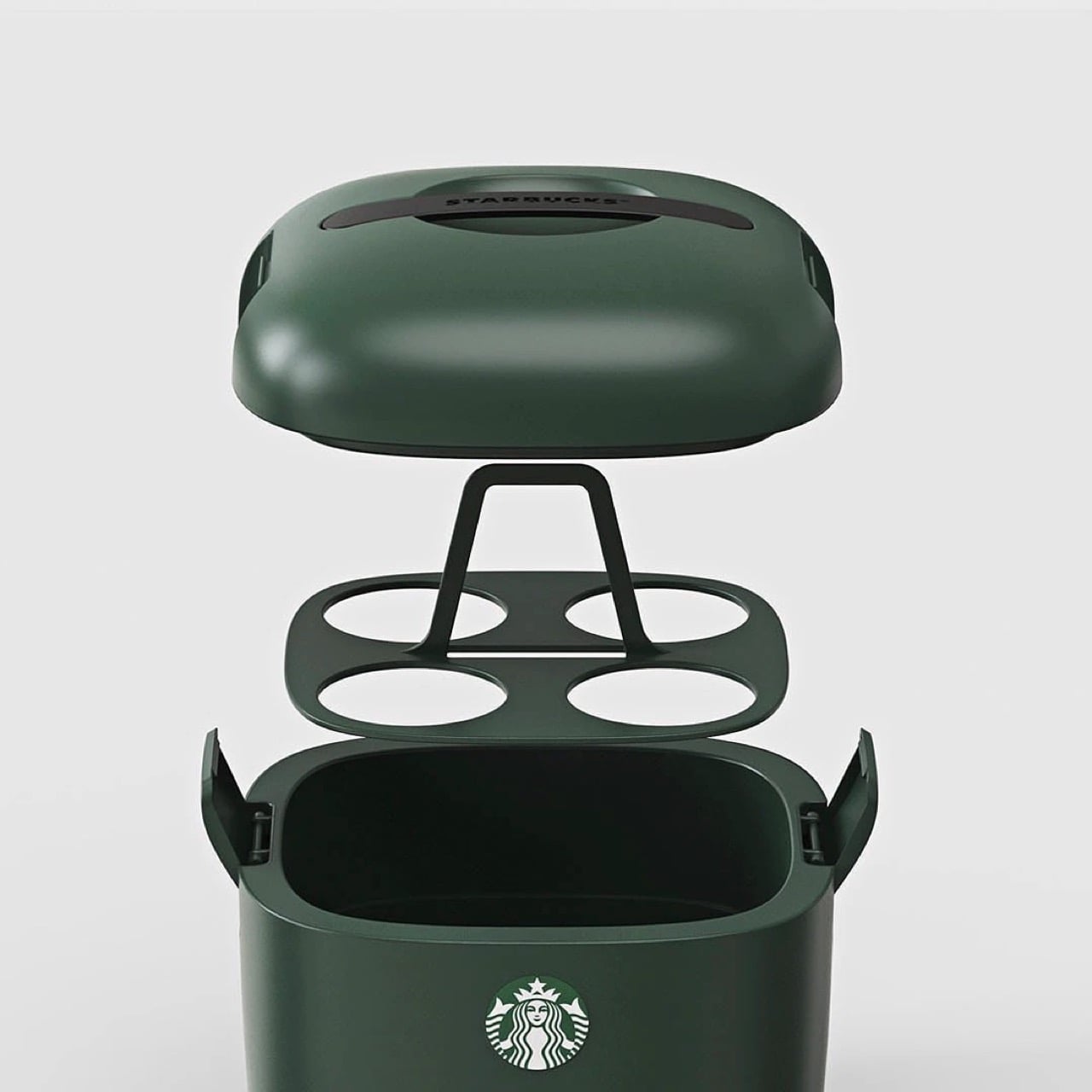
You know what’s ‘vertical integration’? Starbucks building its own cooler box for its own beverages. Meet the Yeti-alternative that’s designed not for your Budweisers, but for your venti iced lattes. It’s called the Starbucks Ice Box, and while it looks perfect from top to bottom, it has one problem: it’s only available in South Korea.

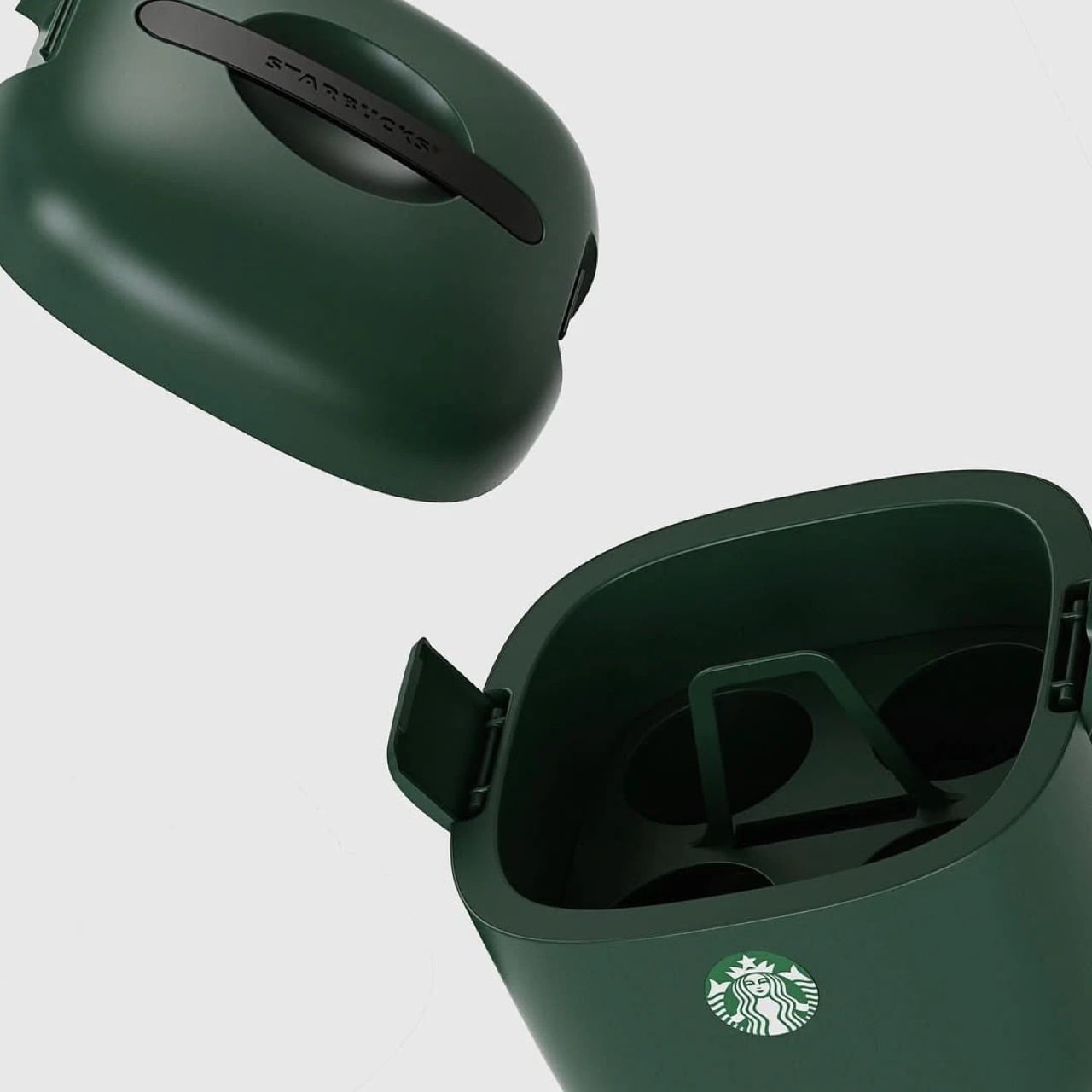
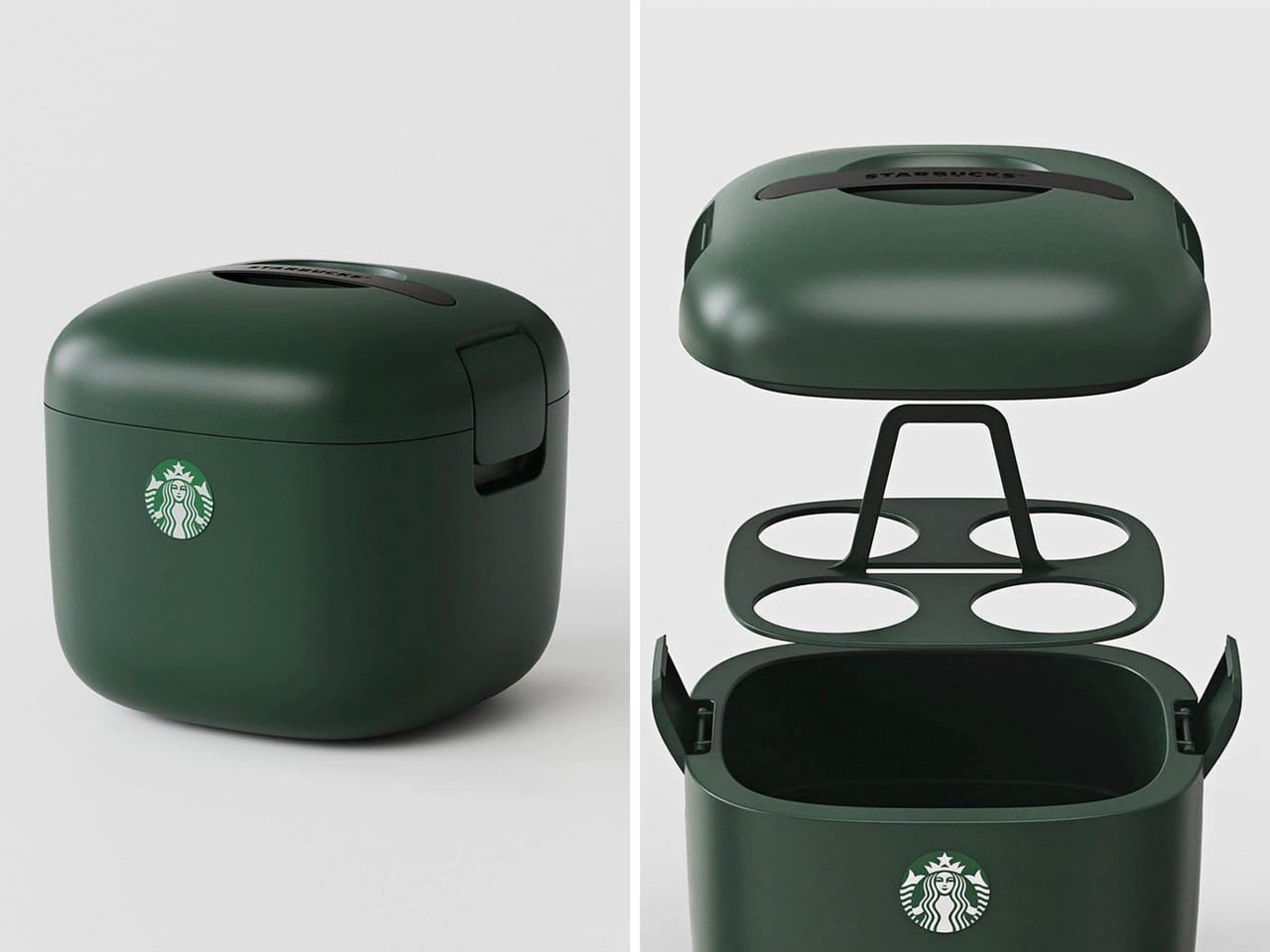
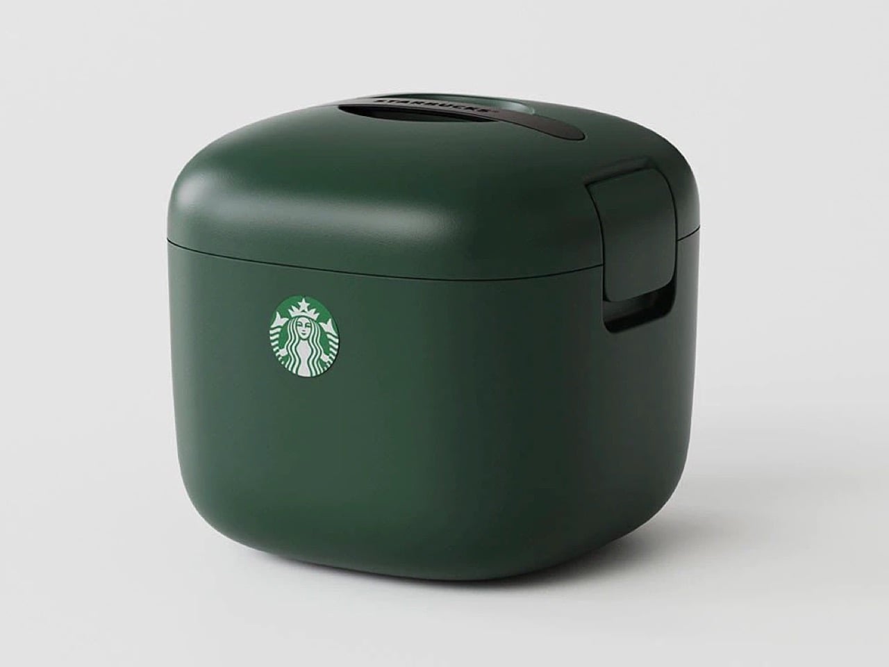
The design is deceptively simple but gets every detail right. Four individual cup slots keep drinks stable and separated, eliminating the float-and-tip chaos that happens when you throw tall cups into a standard cooler. A dedicated ice compartment sits at the bottom, isolated from the drinks themselves so you’re not fishing cups out of melted ice water an hour later. The domed lid has ventilation slots that allow air circulation without sacrificing insulation, and those side latches look substantial enough to actually keep everything secure when you hit a pothole. It’s wrapped in Starbucks’ forest green colorway, compact enough to fit behind a car seat or in a trunk corner, and clearly designed by people who have done the group coffee run enough times to know exactly where the pain points are. The proportions feel right in a way that general-purpose coolers never quite nail when you’re dealing with tall, narrow vessels.

Design: Starbucks Korea

This isn’t Starbucks’ first merch attempt. They’ve consistently pushed out loads of accessories over the years, mostly in eastern markets (like these TWS earbuds in collaboration with Samsung, and these $28 retro cameras that they debuted in China) although this one feels way more purposeful than any of their other launches. It’s something people will buy and use for years, rather than becoming just another collectible, and you know that if someone’s buying a Starbucks cooler, they’re a customer for life. Vertical integration for the win!

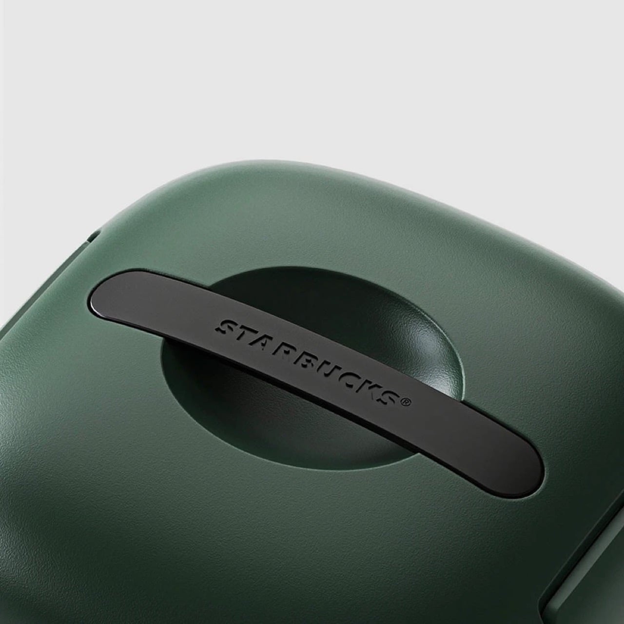
The design is as simple as it gets. The insulated walls keep the insides whatever temperature you want. Although built for iced drinks, you can put your hot beverages in too and have them piping even after hours. For iced drinks, you can also add ice packs into the cooler to chill them down further – just be careful they don’t drip or the cups could get soggy. A lift-out tray holds four venti drinks, because if you’re the kind to drink regulars, you probably wouldn’t be keeping them for hours. The clamp-lid ensures everything is locked in tight, and a Starbucks-branded handle sits flush against the top, giving the entire thing a gorgeously monolithic design.

The only place you can grab this right now is on obscure sites online. A Japanese website has it listed for ¥26,530 or $169 USD, not including shipping. If anyone in Starbucks’ global team is reading this, consider it your sign to manufacture this for the American and European audiences too, trust me, your annual turnover will thank you!

The post Starbucks built a Yeti cooler for your Venti Iced Lattes, but you can’t buy one yet first appeared on Yanko Design.
  •  

The SOMA Is the Three-Bedroom Tiny Mansion Families Have Been Waiting For

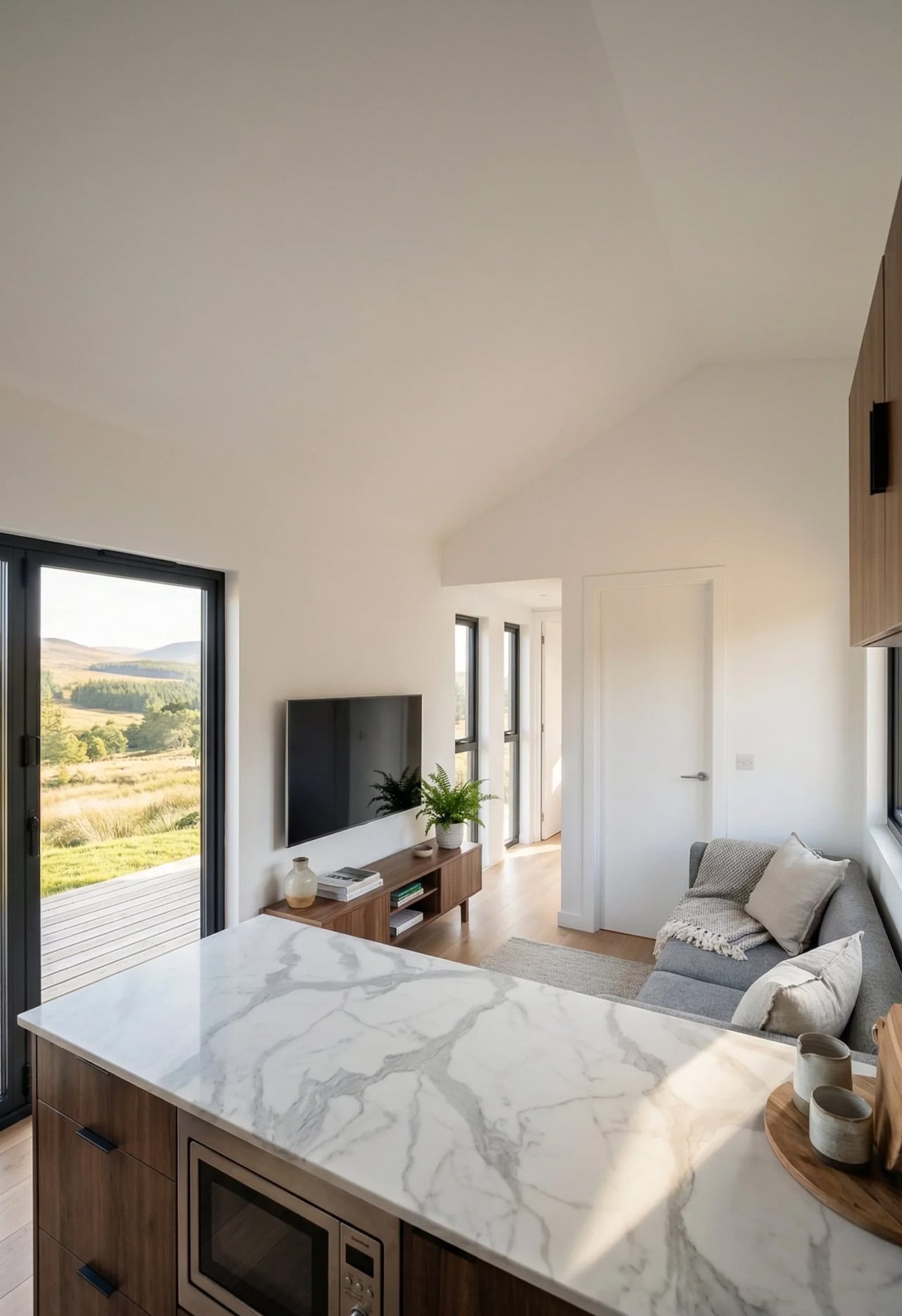
The tiny home movement has never quite figured out what to do with families. Removed Tiny Homes, a Brisbane-based builder specializing in off-grid, sustainable builds, has decided to challenge that assumption head-on. Their latest model, the SOMA, is a towable tiny house designed with families firmly in mind — three bedrooms, a generous open-plan layout, and a level of finish that earns the word “mansion” without irony.

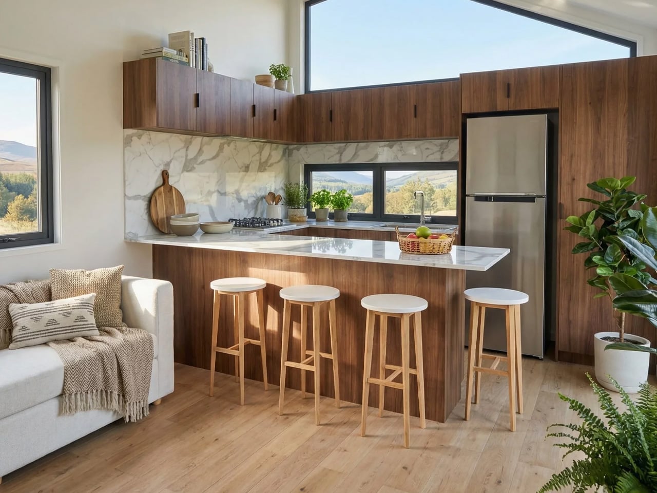
The numbers tell a compelling story. The SOMA measures 10m x 3.4m x 4.5m, with an interior footprint of 52 square meters (560 sq ft). That 3.4-meter width is notably wider than the standard tiny house, and it shows — the interior breathes more like an apartment than a caravan. The bulk of that space is given to a large open-plan kitchen and living area, which anchors the home and keeps the social energy flowing between the kitchen island and the lounge, rather than forcing it through a narrow corridor.

Designer: Removed Tiny Homes

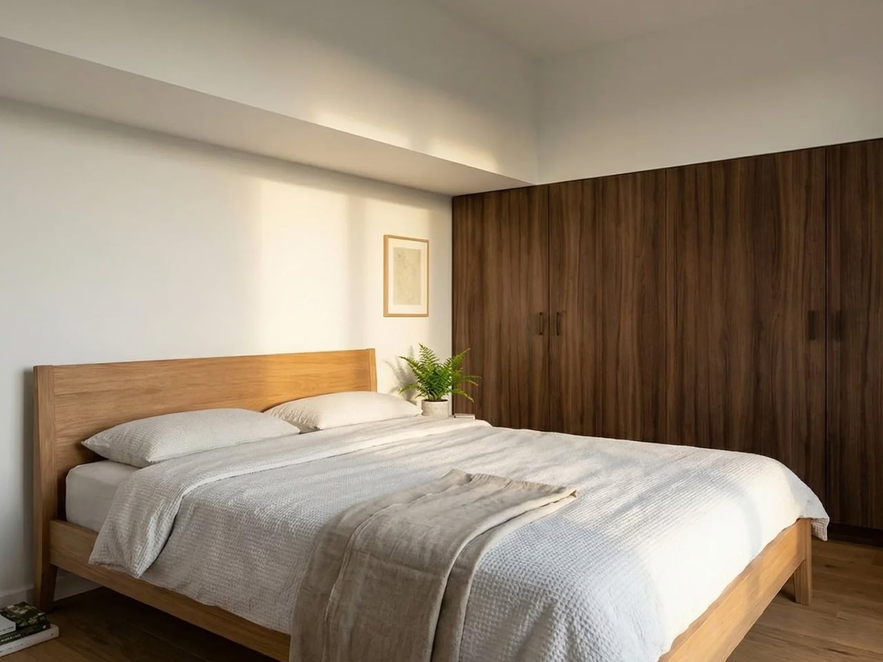
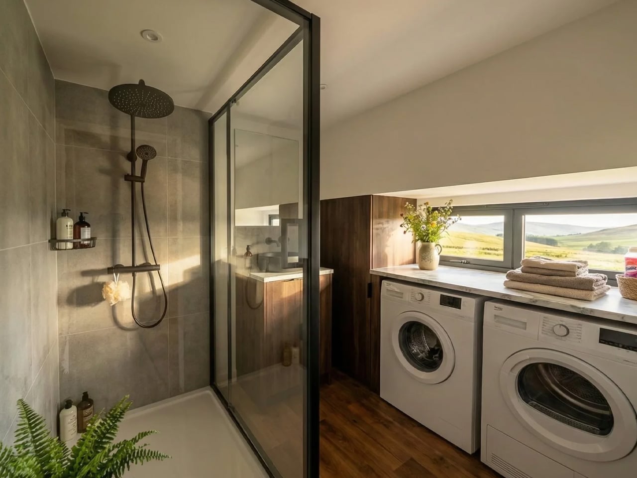
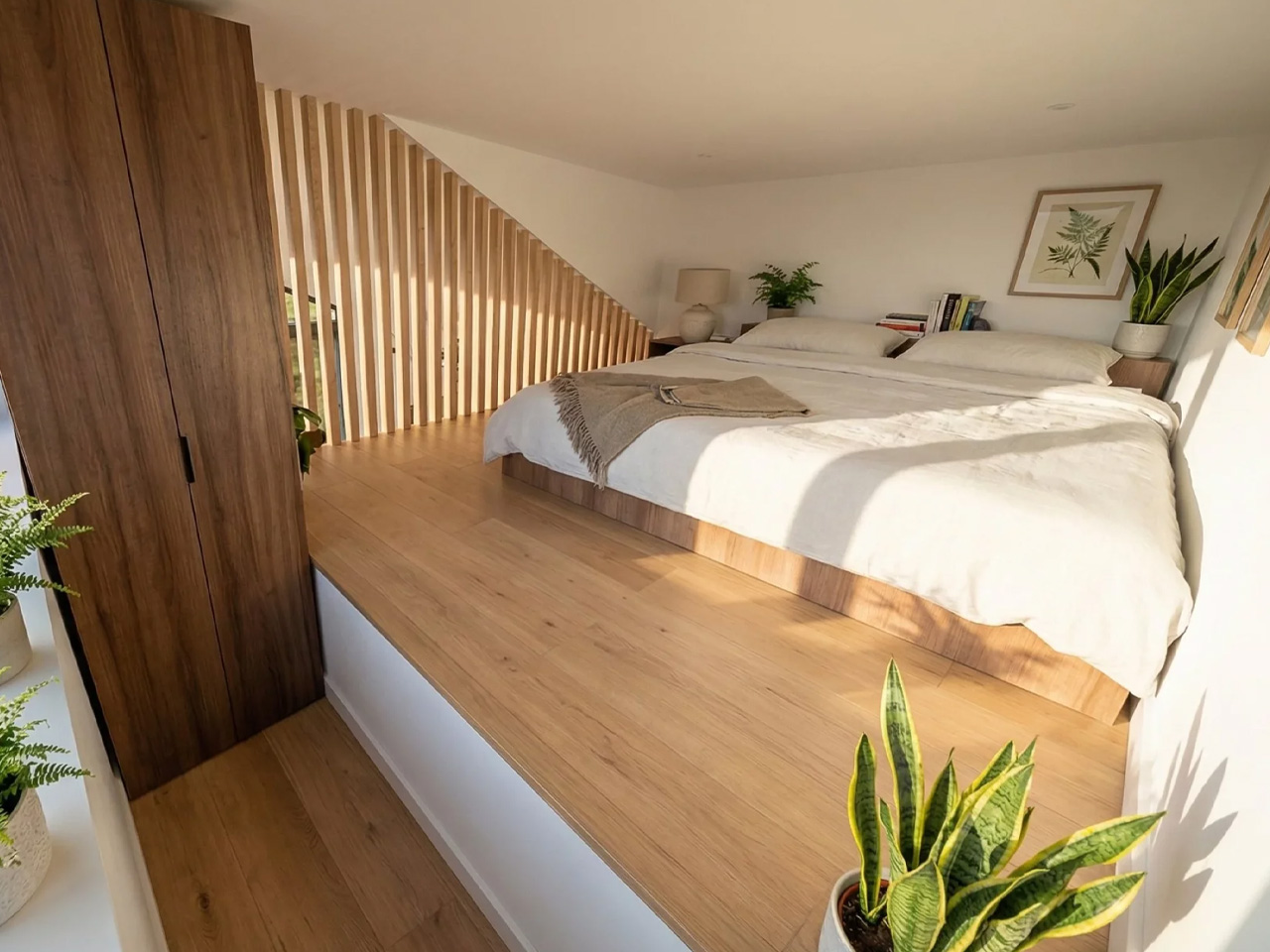
Three bedrooms is the headline, and it’s a legitimate one. One sits on the ground floor, while two loft bedrooms occupy the upper level — a layout that gives adults and children a sense of separated territory without requiring a second building. The bathroom is fully tiled, and early buyers receive a Luxury Living Upgrade Pack that layers in skylights and stone kitchen benchtops, elevating the interiors well beyond what you’d expect at this price point.

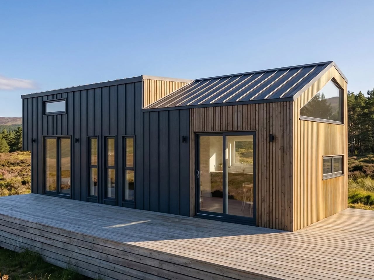
Outside, the SOMA arrives with a dual-siding facade — Colorbond metal panels paired with warm-toned composite or wood cladding — alongside a split roof profile and large sliding glass doors that open the interior to the outdoors. The display unit shown on the builder’s website sits on a large wooden deck, which extends the liveable footprint considerably and makes the home feel rooted, even when it isn’t.

Pricing starts at roughly USD $145,200, with further customization available at additional cost. For a three-bedroom, road-legal home of this caliber, that figure sits in a competitive space — especially when the alternative is a conventional build on land you may not be able to afford. The SOMA isn’t trying to squeeze a family into a clever floor plan. It’s making the case that tiny living, done right, doesn’t require compromise — just a smarter conversation about what space actually means.

The post The SOMA Is the Three-Bedroom Tiny Mansion Families Have Been Waiting For first appeared on Yanko Design.
  •  

James Bond-inspired Scubacraft SC3 turns your underwater adventure fantasy into reality

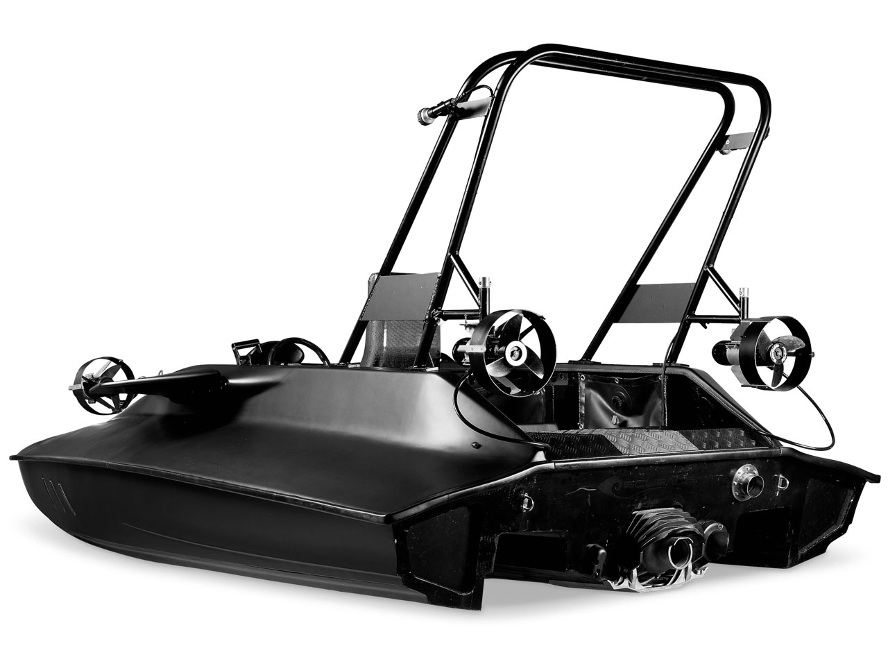
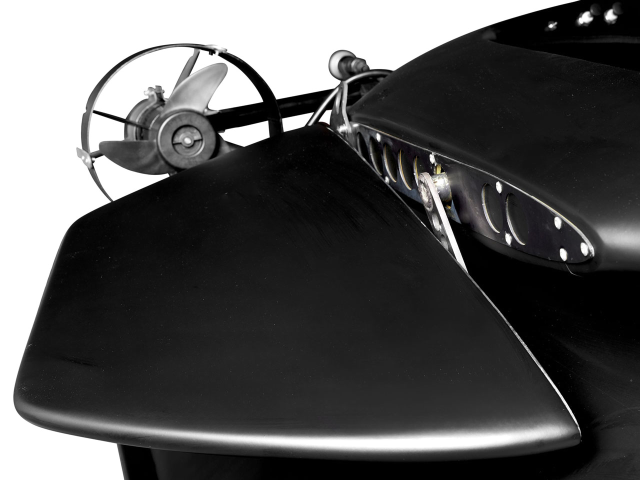
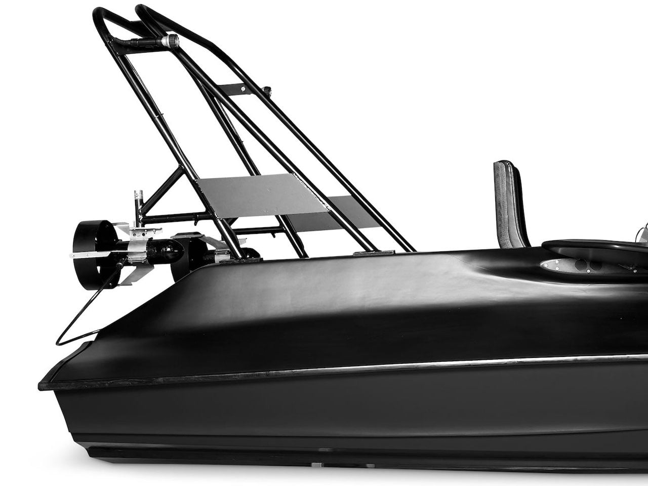
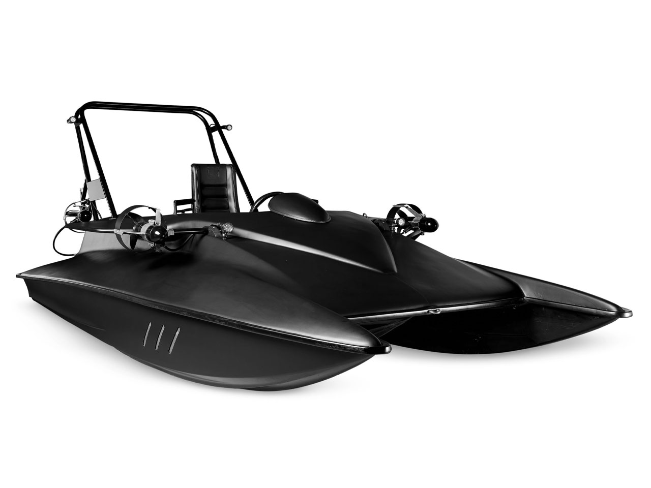
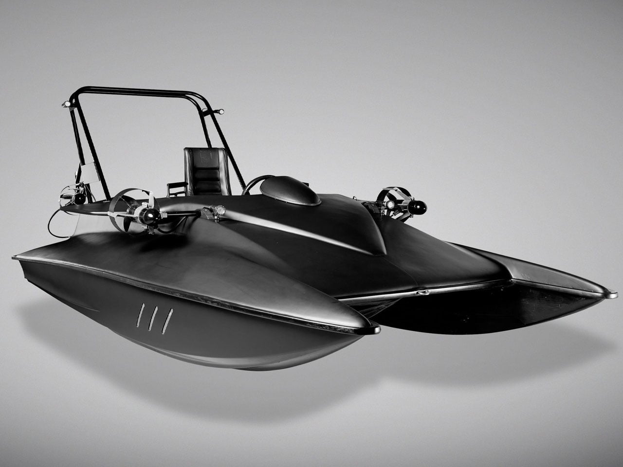
What you actually see here is a one-off submersible that is equally capable above the surface as it is underwater. For anyone who remembers the futuristic watercraft showcased in the James Bond film Spectre, there is now a rare opportunity to own one of the strangest and most ambitious vehicles ever built. Called the Scubacraft SC3, the experimental vessel was developed during the late 2000s as a functioning prototype that blurred the line between speedboat and personal submarine.

Unlike many fictional gadgets seen in Bond movies, the SC3 was not a movie prop designed solely for visual appeal. It was engineered as a real-world concept capable of operating both on the water’s surface and beneath it. The project reportedly attracted interest from the UK Special Boat Service and even DARPA because of its unconventional capabilities and military-style versatility before eventually making its way into the Bond universe. In Spectre, the matte-black machine appeared in Q’s workshop alongside the iconic Aston Martin DB10, instantly becoming one of the more memorable background vehicles in the film.

Designer: Bonhams

Now heading to auction through Bonhams, the SC3 remains the only prototype ever produced, making it less of a practical recreational craft and more of a collectible piece of engineering history. Its rarity is amplified by the fact that no production version ever followed, despite the concept demonstrating genuine functionality both above and below the waterline.

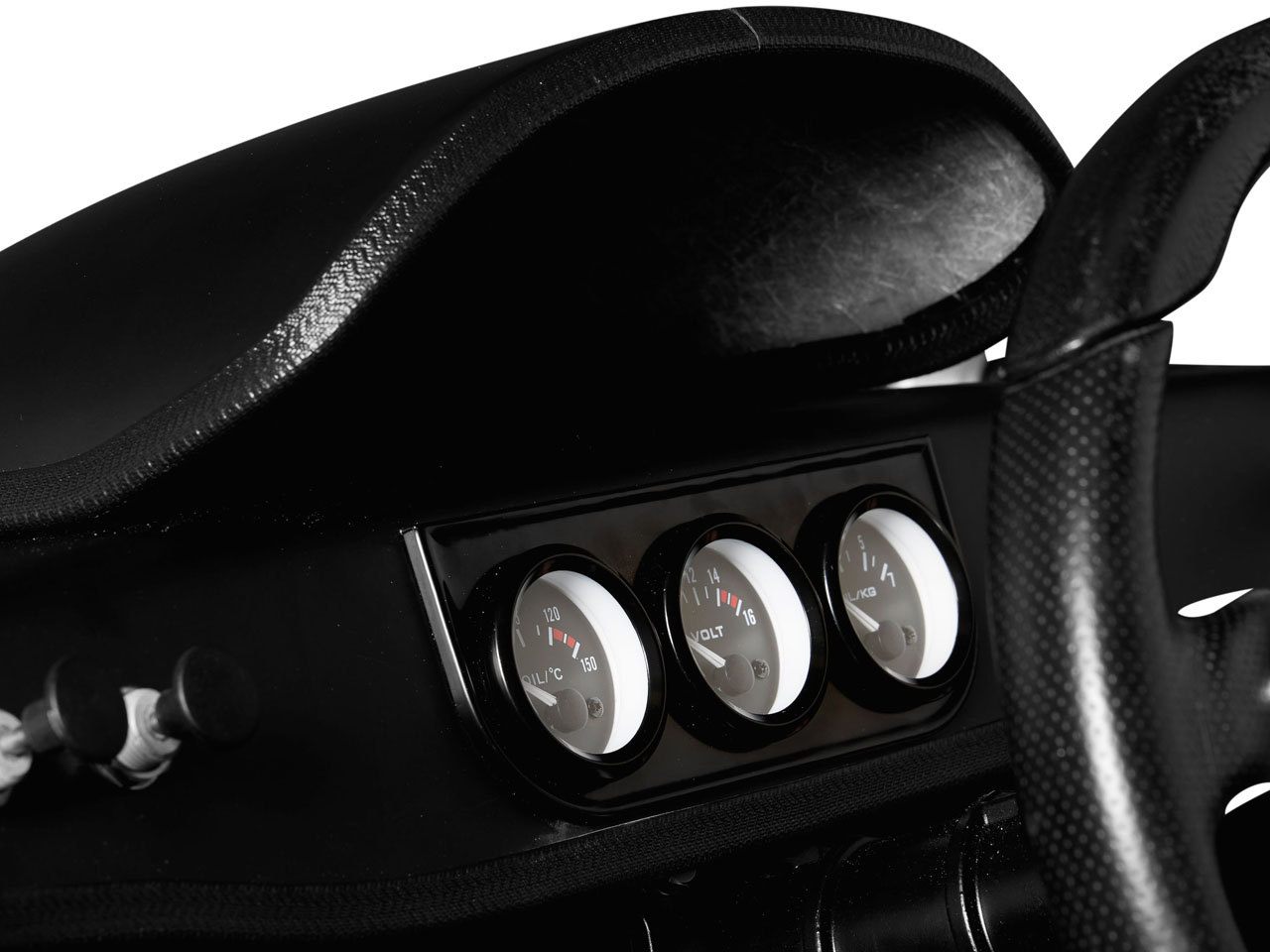
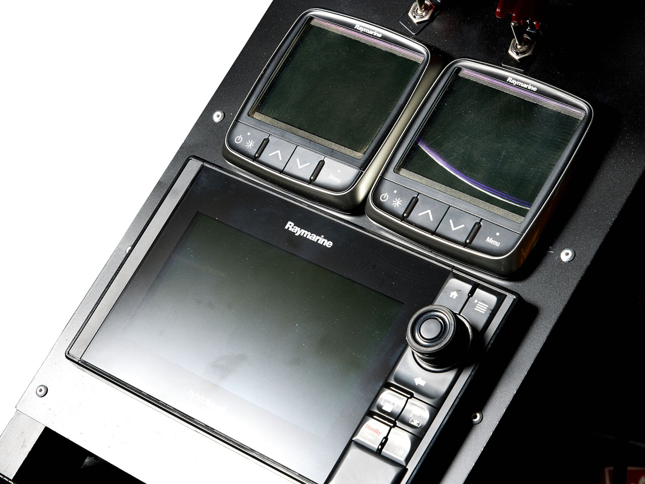
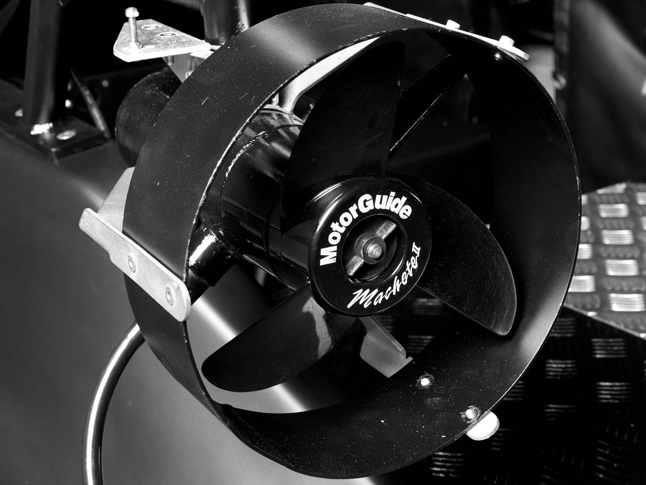
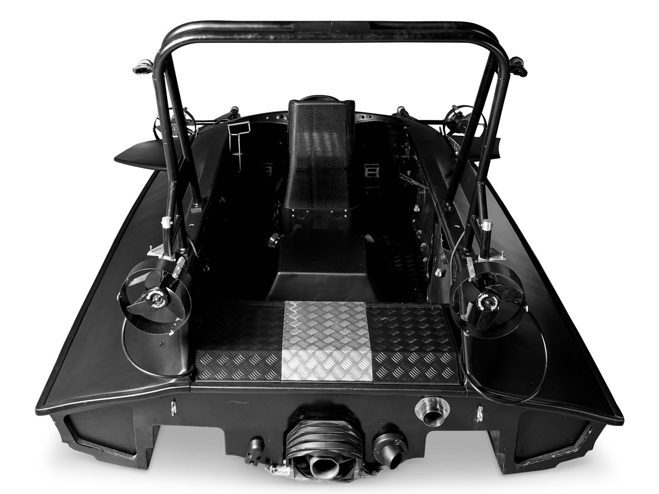
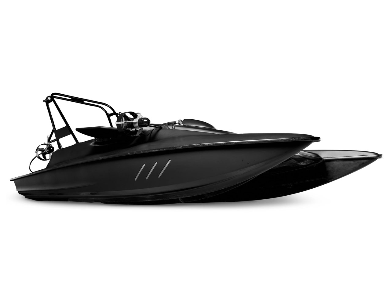
On the surface, the SC3 behaves much like a high-performance jet boat. It is powered by a Kawasaki 1,498cc inline four-cylinder engine connected to a jet-drive propulsion system, allowing it to skim across the water at impressive speeds. The real transformation begins once the craft enters deeper waters. With the underwater mode activated, electrically powered thrusters take over while hydrodynamic control surfaces guide the vessel beneath the surface at speeds of around three knots.

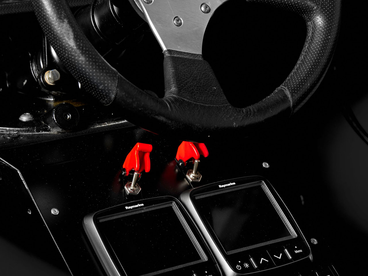
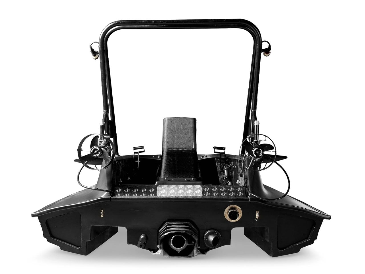
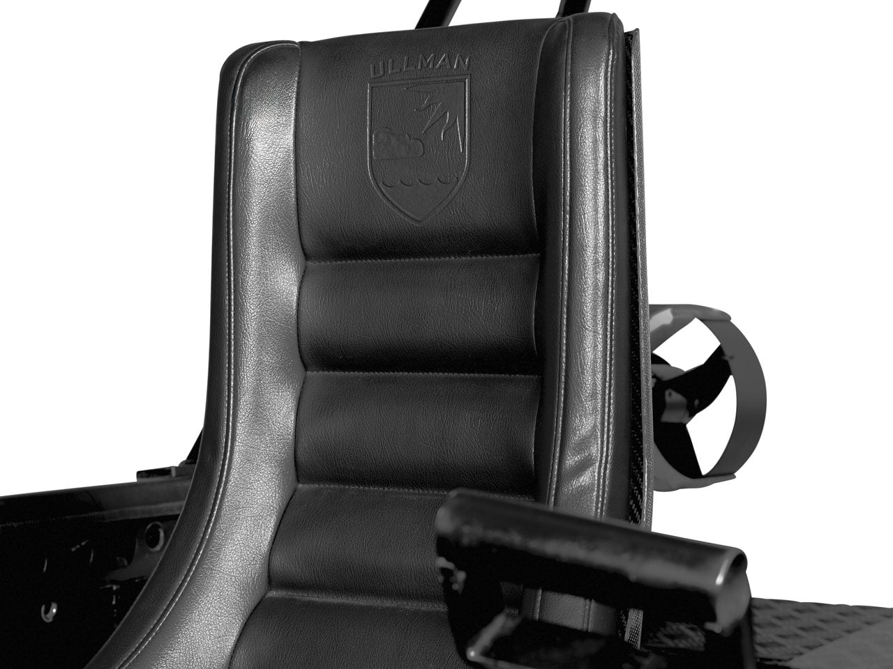
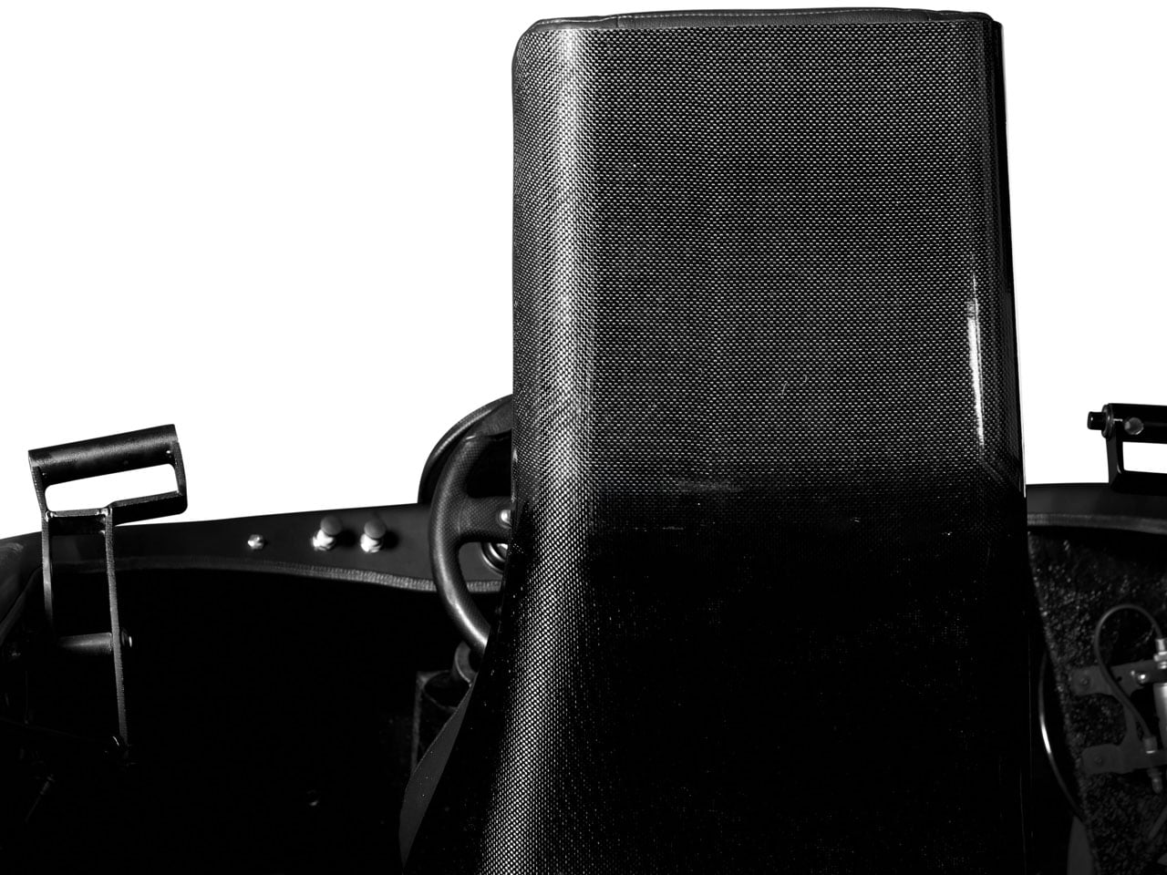
Unlike traditional submarines, however, the SC3 does not feature a sealed or pressurized cabin. Occupants are exposed directly to the surrounding water and must wear full diving gear before submersion. This open-water diving approach significantly reduces complexity and weight while creating an experience closer to underwater flight than conventional submarine travel. The setup accommodates three people, including the driver and two passengers, all seated in exposed racing-style seats integrated into the craft’s lightweight body.

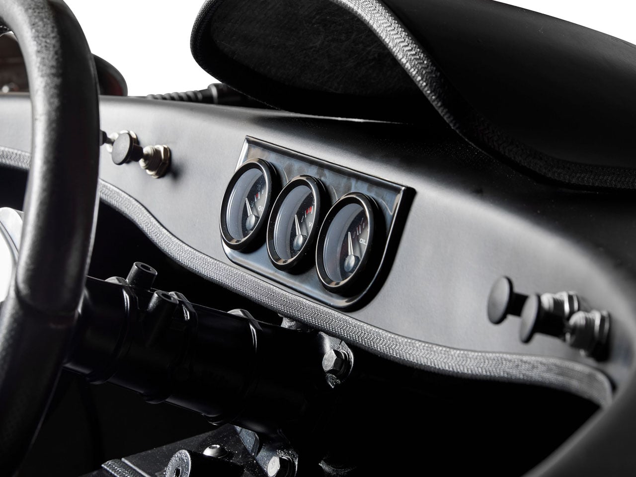
Visually, the SC3 still looks every bit like a futuristic Bond vehicle. The original composite plastic bodywork remains intact, paired with carbon-fiber construction elements and upholstered leather racing seats that reinforce its cinematic personality. Its aggressive low-slung silhouette, combined with stealth-inspired matte-black paintwork, gives it an appearance that still feels ahead of its time more than a decade after it was built.

Vehicles attempting to combine marine and underwater transportation are exceptionally rare because of the engineering compromises involved. The SC3 stands out precisely because it became a fully operational prototype rather than a concept sketch or film mock-up. That achievement alone makes it one of the most unusual experimental watercraft ever created and an undeniably fascinating piece of Bond-related automotive history.

The post James Bond-inspired Scubacraft SC3 turns your underwater adventure fantasy into reality first appeared on Yanko Design.
  •  

Honor launched a $193 Kid-focused iPad Alternative with 22 Hours of Battery and Parental Controls Already Set Up

Setting up an iPad for a child costs $350 and about forty-five minutes of your life. You disable iCloud so your camera roll stays off their screen, lock down the App Store so in-app purchases don’t silently drain your card, configure Screen Time, and then spend the next six months re-configuring it every time an iOS update quietly resets something. Apple makes extraordinary tablets, but the parental infrastructure is clearly designed for adults who already know where to look. HONOR looked at that friction and built a tablet where none of that setup exists, because the kids-first architecture is the factory state, not a layer you construct yourself.

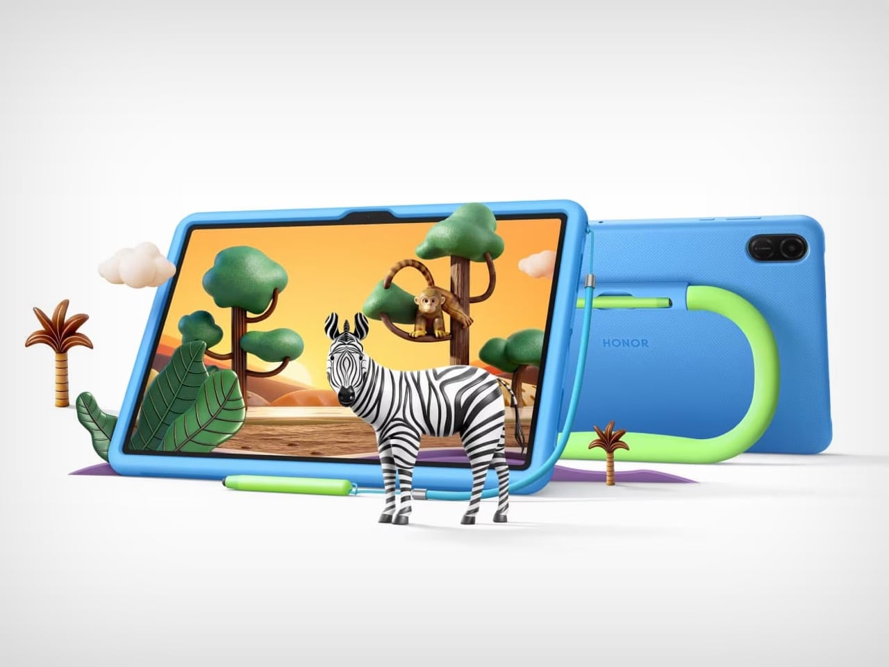
The Pad X8b Kids Edition starts at $193, landing it well under the entry iPad, and arrives with a dedicated Honor Kids OS environment, SGS 5-star drop resistance, a built-in kickstand handle, an integrated stylus silo, and a 10,100mAh battery that makes weekly charging a realistic schedule rather than an aspiration. The value proposition assembles itself pretty quickly.

Designer: HONOR

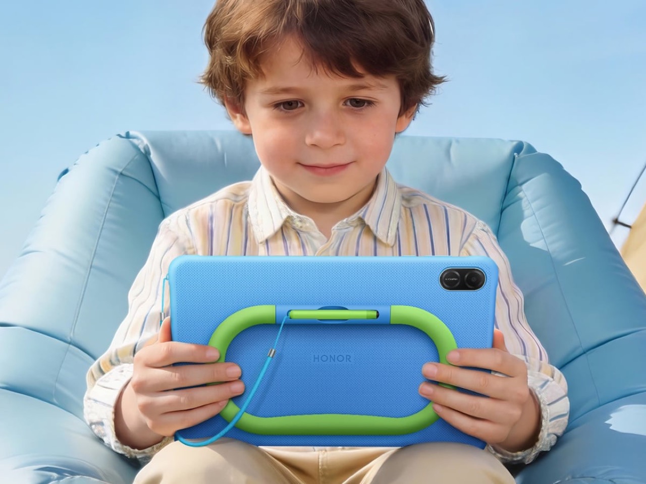
The blue silicone case with its lime-green handle does double duty as a carry grip and kickstand, which maps directly to how children actually use tablets: they’re either holding it or propping it against something. No separate folding stand, no accessory that gets left in a drawer. The handle is the stand. The Doodle Pen slots into a silo built into the case back so it travels with the device rather than disappearing within 48 hours of unboxing. FDA food-grade silicone throughout, SGS 5-star drop and crush resistance certification, and a construction that has clearly been tested against the kind of physical punishment children deliver with remarkable consistency and zero remorse.

The 11-inch panel runs at 1920×1200 with a 90Hz refresh rate, 500 nits of brightness, and carries TÜV Rheinland certifications for both low blue light and flicker-free performance. On a kids device those certifications carry more weight than on an adult one, given how close children hold screens and how many hours they log. The eye protection goes further than badges, though. Distance alerts, posture monitoring, brightness adjustments, and bumpy road detection that nudges kids away from reading in a moving car all run continuously without a parent needing to remember to enable anything.

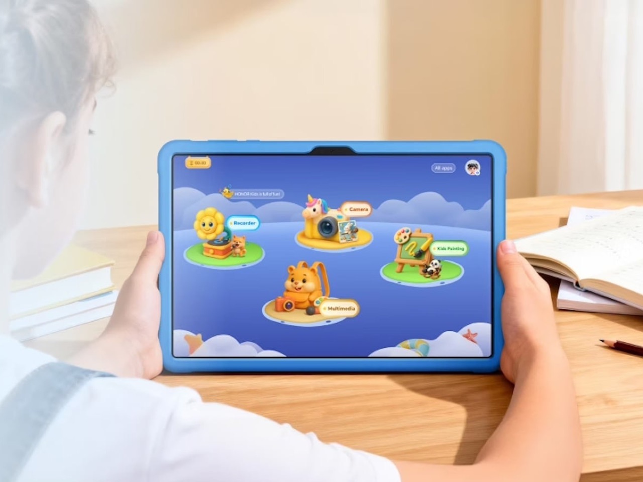
The Honor Kids OS runs as a fully separate environment rather than a locked launcher sitting on top of the standard interface. The home screen uses cartoon island-style icons for Camera, Recorder, Kids Painting, and Multimedia, and parents manage the whole thing remotely through the HONOR Parental Assistant app, setting time slots and reviewing activity through visual charts. One tap activates Kids Mode, and getting back out requires authentication. None of this requires a Saturday afternoon in Settings.

The 10,100mAh battery is the unsung hero of the package. Twenty-two hours of continuous video playback means roughly eleven days of two-hour screen time sessions before a charge becomes urgent, and the 97-day standby figure means a tablet left on a shelf over a school break actually comes back to life when you pick it up. For a device category where battery anxiety is a genuine daily friction point, those numbers change the ownership experience in a way that a spec sheet undersells.

At $193, the Pad X8b Kids Edition sits in a position where competing options either underdeliver on hardware or ask parents to retrofit a general-purpose tablet for child use on their own time. HONOR made the child-safe design brief the starting point, and the result is a device that earns its price before you’ve even opened the box.

The post Honor launched a $193 Kid-focused iPad Alternative with 22 Hours of Battery and Parental Controls Already Set Up first appeared on Yanko Design.
  •  

The Hermès Birkin Finally Has a LEGO Version and It Opens to Reveal A Secret Runway Inside

The Hermès Birkin has one of the most theatrical purchasing rituals in luxury retail. You cannot simply walk into a boutique on Rue du Faubourg Saint-Honoré and buy one. Hermès makes you earn it, building a relationship with a sales associate over months, sometimes years, demonstrating cultural fluency with the house before they’ll even have the conversation. The result is an object that carries as much mythology as it does resale value, a handbag that has become shorthand for a particular kind of aspirational excess that the internet finds endlessly fascinating.

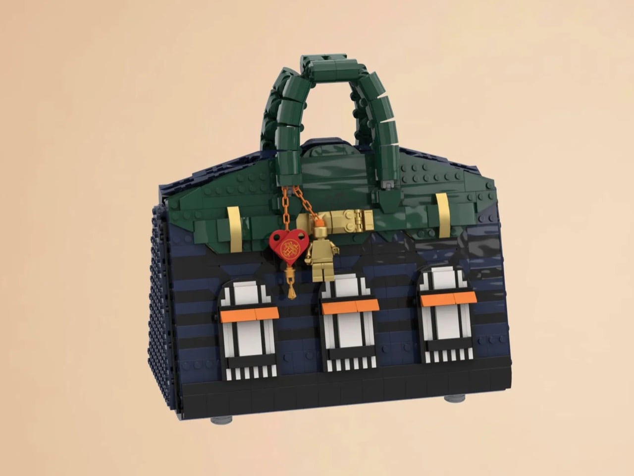
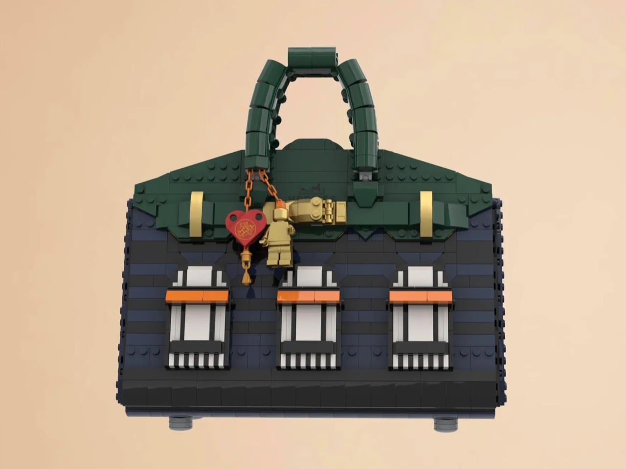
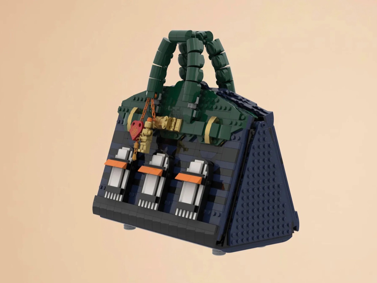
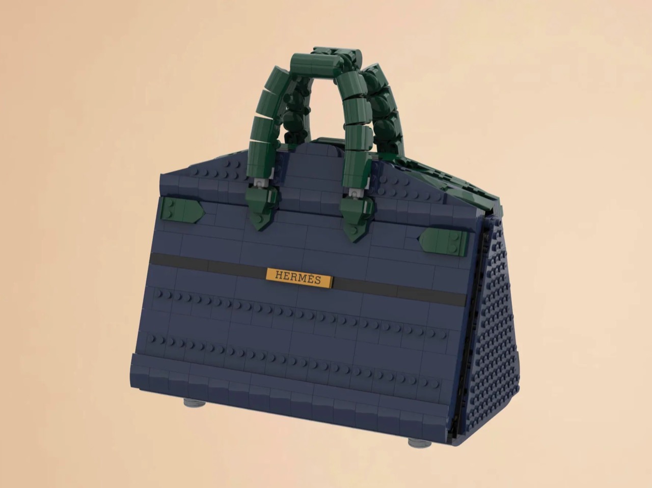
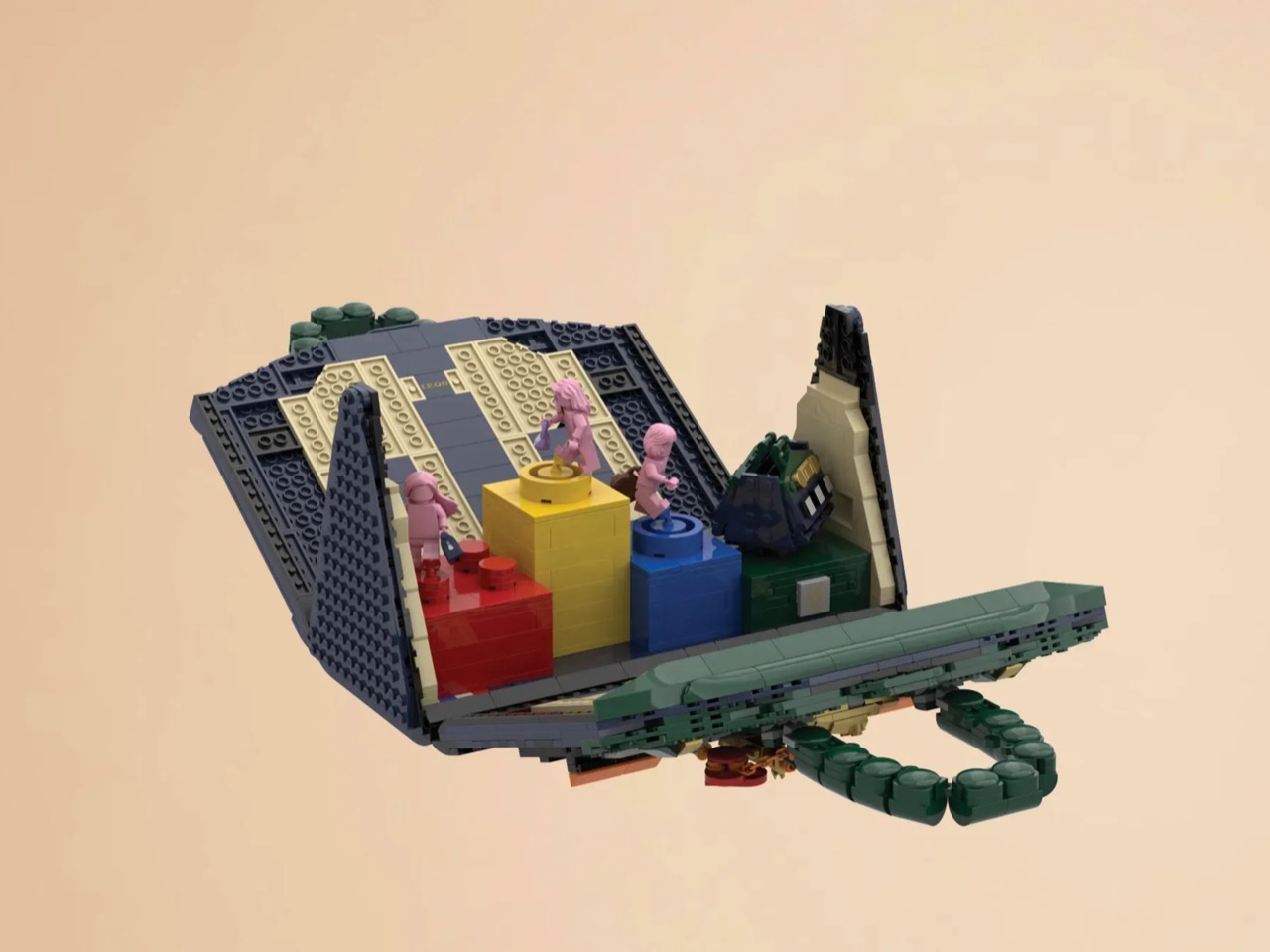
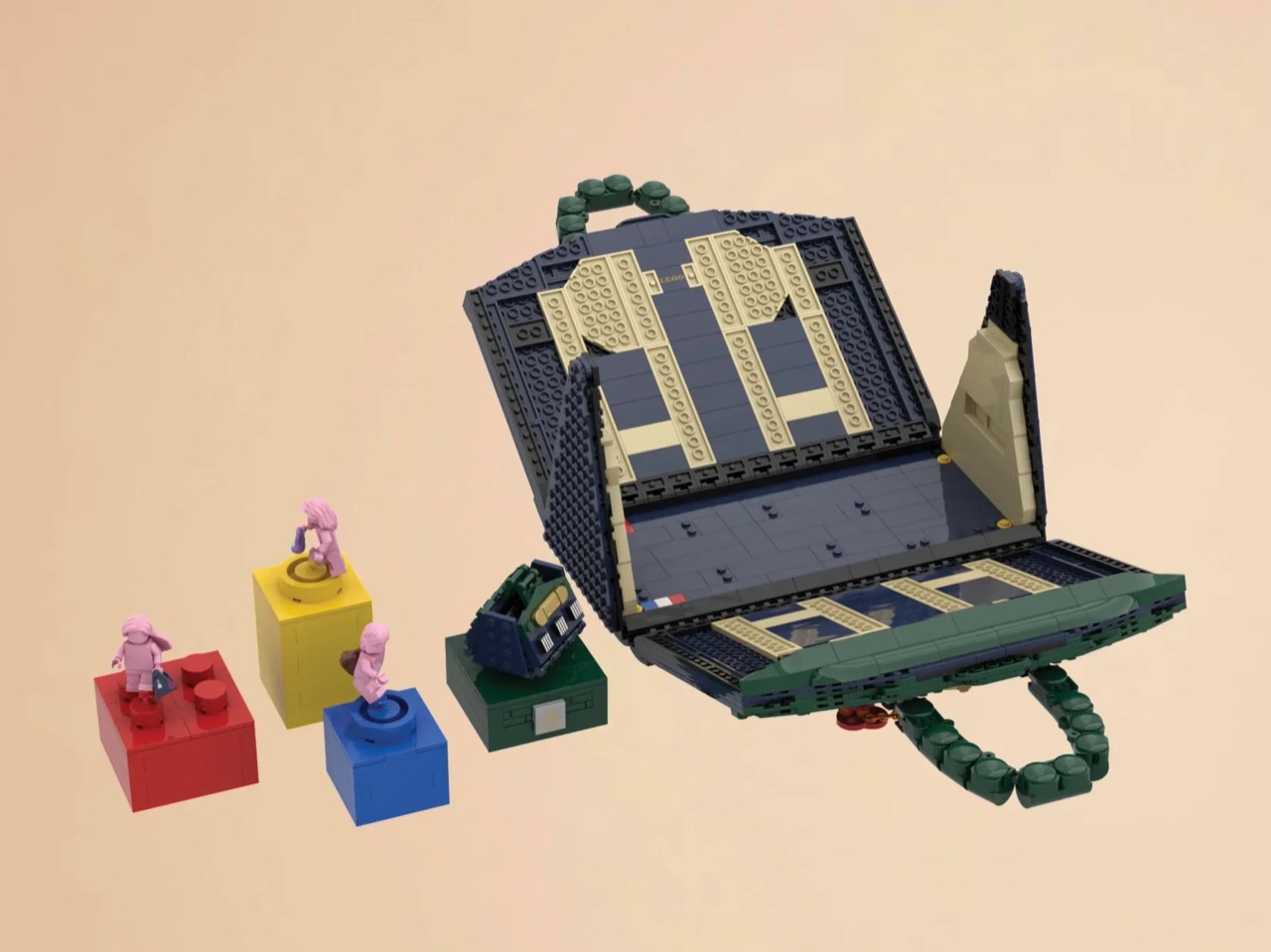
LEGO Ideas builders BOI_Design and KittyJW found a rather elegant workaround. Their MOC (My Own Creation) reimagines the Birkin 20 Faubourg, the special edition inspired by Hermès’s flagship Paris store, as approximately 1,400 bricks of deep navy, dark green, and gold. The exterior facade doubles as a miniature rendering of 24 Rue du Faubourg Saint-Honoré itself, complete with arched boutique windows and orange awnings. And it opens.

Designers: BOI_Design and KittyJW

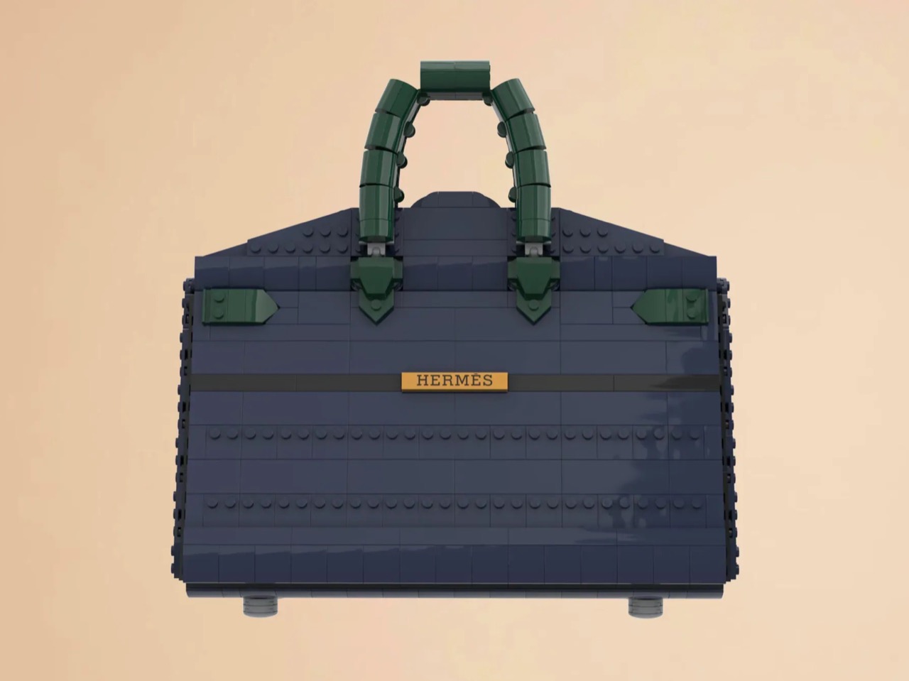
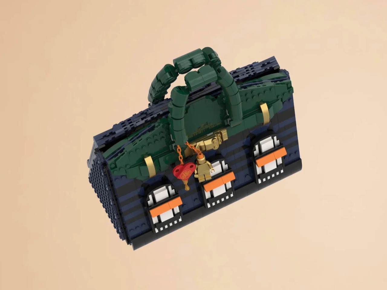
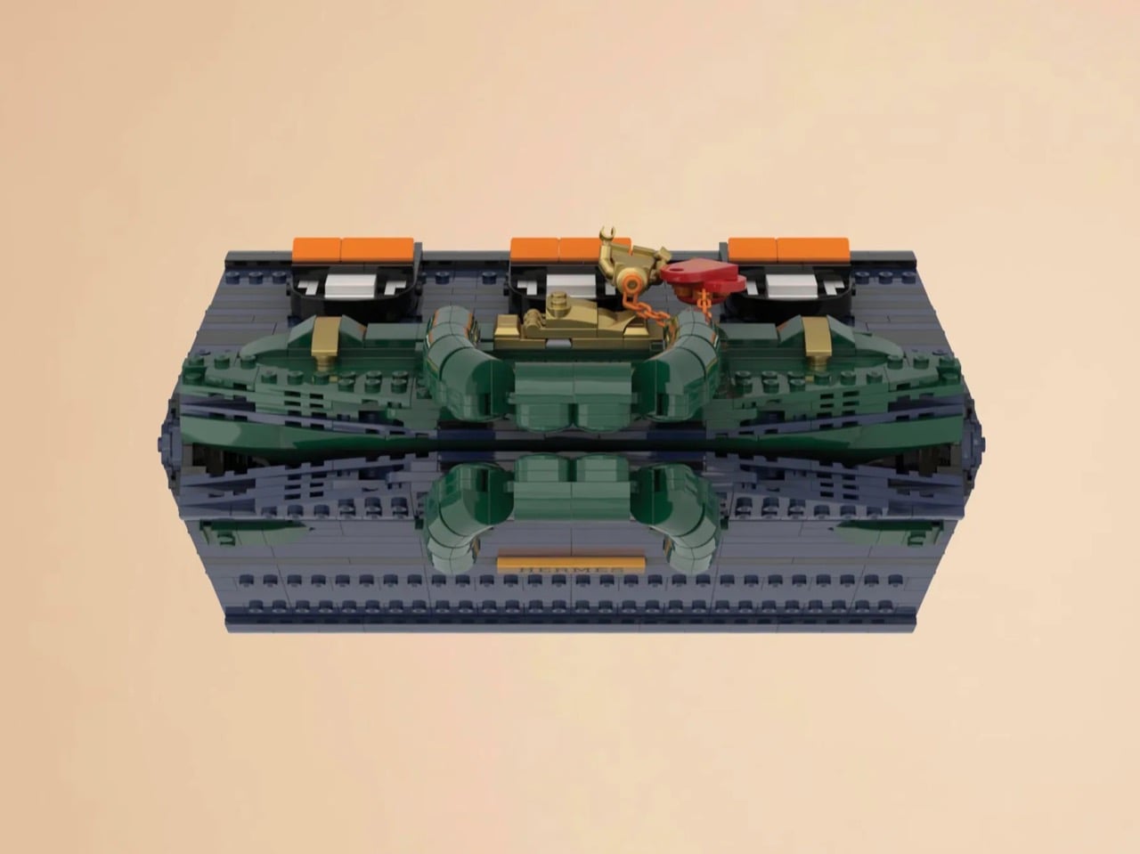
The silhouette is immediately recognizable to anyone who has spent time in the vicinity of luxury retail, or, more realistically, scrolled past one on Instagram. The trapezoidal body is rendered in deep navy blue tiles, layered with a subtle horizontal banding that gives the surface genuine texture and depth. The handles arc overhead in dark green, assembled from linked Technic-adjacent elements that convincingly mimic the soft curve of the real bag’s leather grip. Gold hardware details sit at the clasp, at the side buckles, and along the turnlock assembly, and a tiny linked orange chain drops a red heart charm and a gold minifigure pendant in a detail that reads as both playful and surprisingly precise. Flip the bag around and the back panel is clean and quiet, just navy tiles and a gold Hermès tile sitting on a dark strap, which is exactly how the real thing looks.

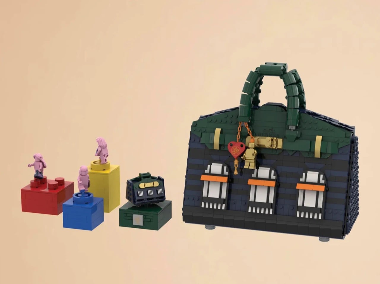
The front face depicts three arched windows dressed with crisp white frames and orange awnings are spaced across the lower body, referencing the Haussmannian rhythm of the actual boutique facade at Faubourg Saint-Honoré. It takes a second to fully resolve in your eye, this thing that is simultaneously a handbag and a building, and that slight double-take is very much the point. The builders describe it as merging fashion and architecture into a single object, and looking at it straight on, that framing holds up completely.

My favorite detail, however, is what happens when you open it. The lid swings up to reveal a hidden interior scene that commits fully to the bit. Three pink minifigures, each carrying a tiny handbag, are posed on oversized primary-color bricks in red, yellow, and blue, the kind of bold, joyful color blocking that feels distinctly LEGO while also evoking a fashion week runway setup. Nestled alongside them is a miniature Birkin 20 Faubourg bag rendered at a smaller scale, a self-referential easter egg that will land immediately with anyone paying attention. The interior lining is lined in cream and tan tiles, a genuinely considered touch that mirrors how a real Birkin’s suede interior contrasts against its exterior leather. At 28.5 centimeters wide and 29 centimeters tall, the whole thing has real physical presence on a shelf.

The build is currently gathering votes on LEGO Ideas, the community platform where fan submissions need to reach 10,000 supporters before LEGO’s internal team will formally review them for potential production. It’s early days for this one, but the concept has the kind of crossover appeal, fashion collectors, LEGO enthusiasts, Paris romantics, people who just want the Birkin experience without the two-year waitlist, that could carry it a long way. You can head to the LEGO Ideas page here to cast your vote.

The post The Hermès Birkin Finally Has a LEGO Version and It Opens to Reveal A Secret Runway Inside first appeared on Yanko Design.
  •  

Samsung Just Turned a Theme Park Queue Into a 3D Safari, No Glasses

Waiting in line at a theme park is one of those unavoidable experiences that nobody designs for enthusiastically. The physical infrastructure exists, the rope lines are laid out, and in the best-case scenario, there’s some signage or ambient music to occupy the time. But the queue is fundamentally dead space, a stretch of minutes that happens before the experience begins rather than as part of it. That’s a design problem, and most parks accept it as one that can’t really be solved.

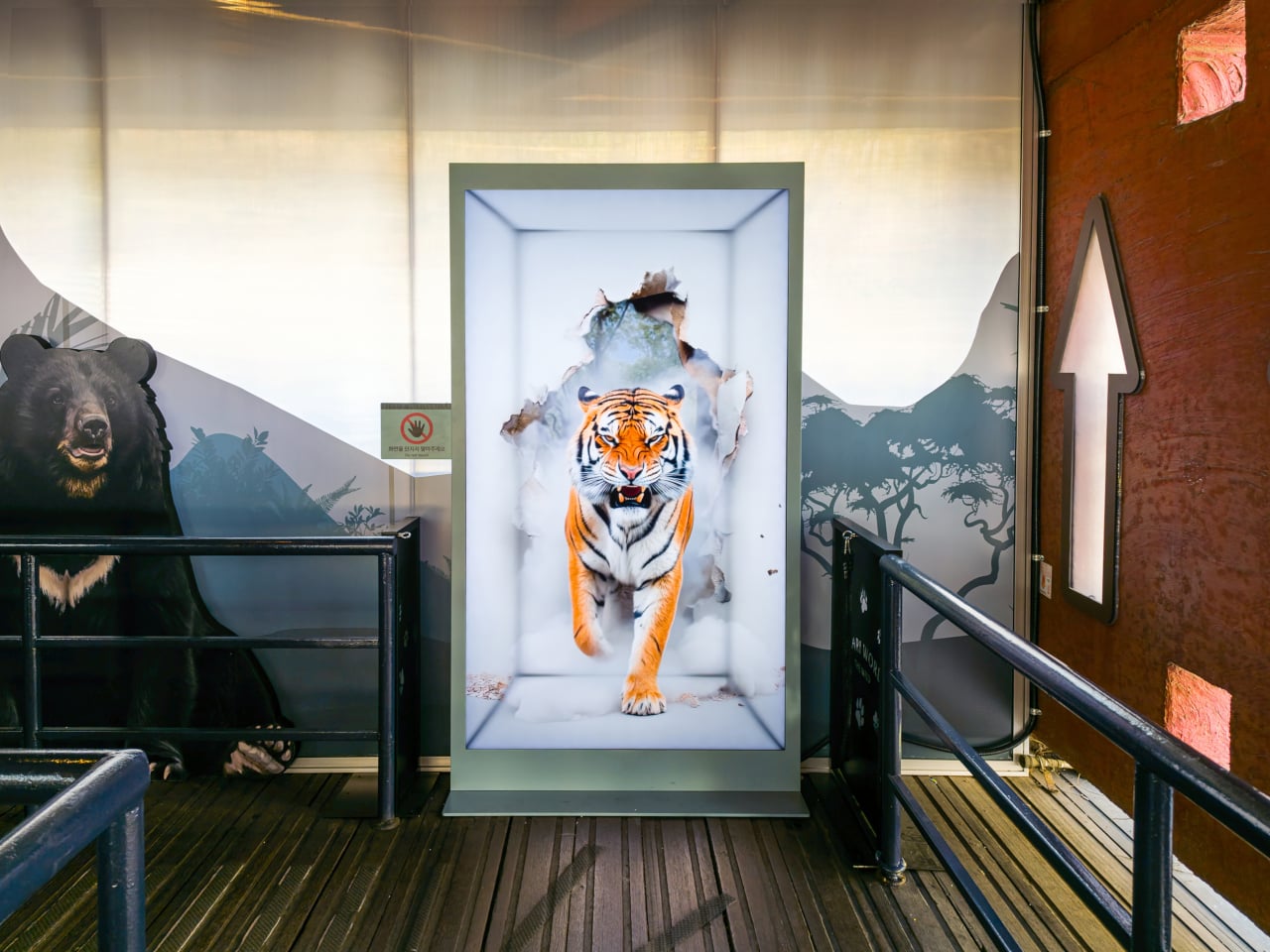
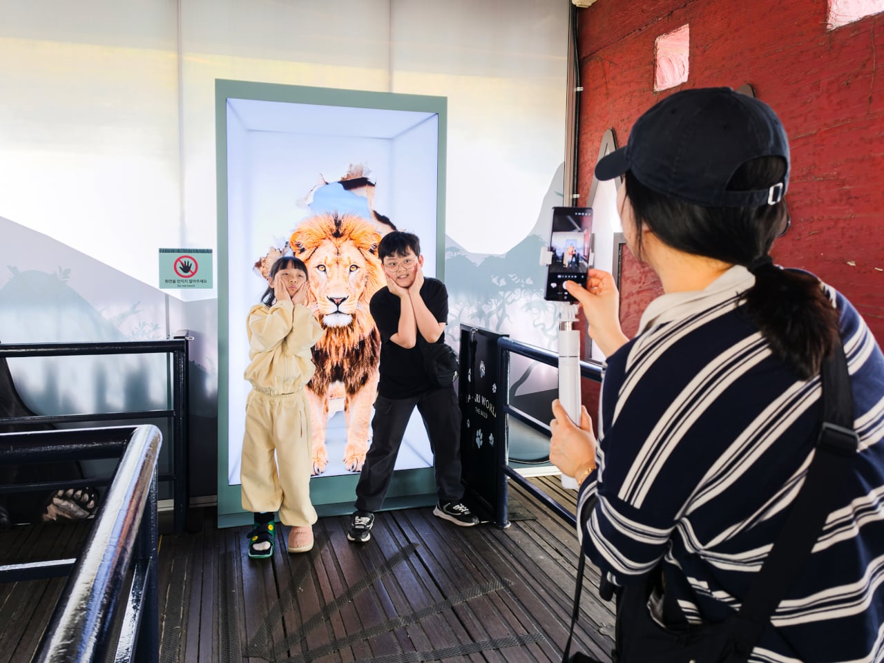
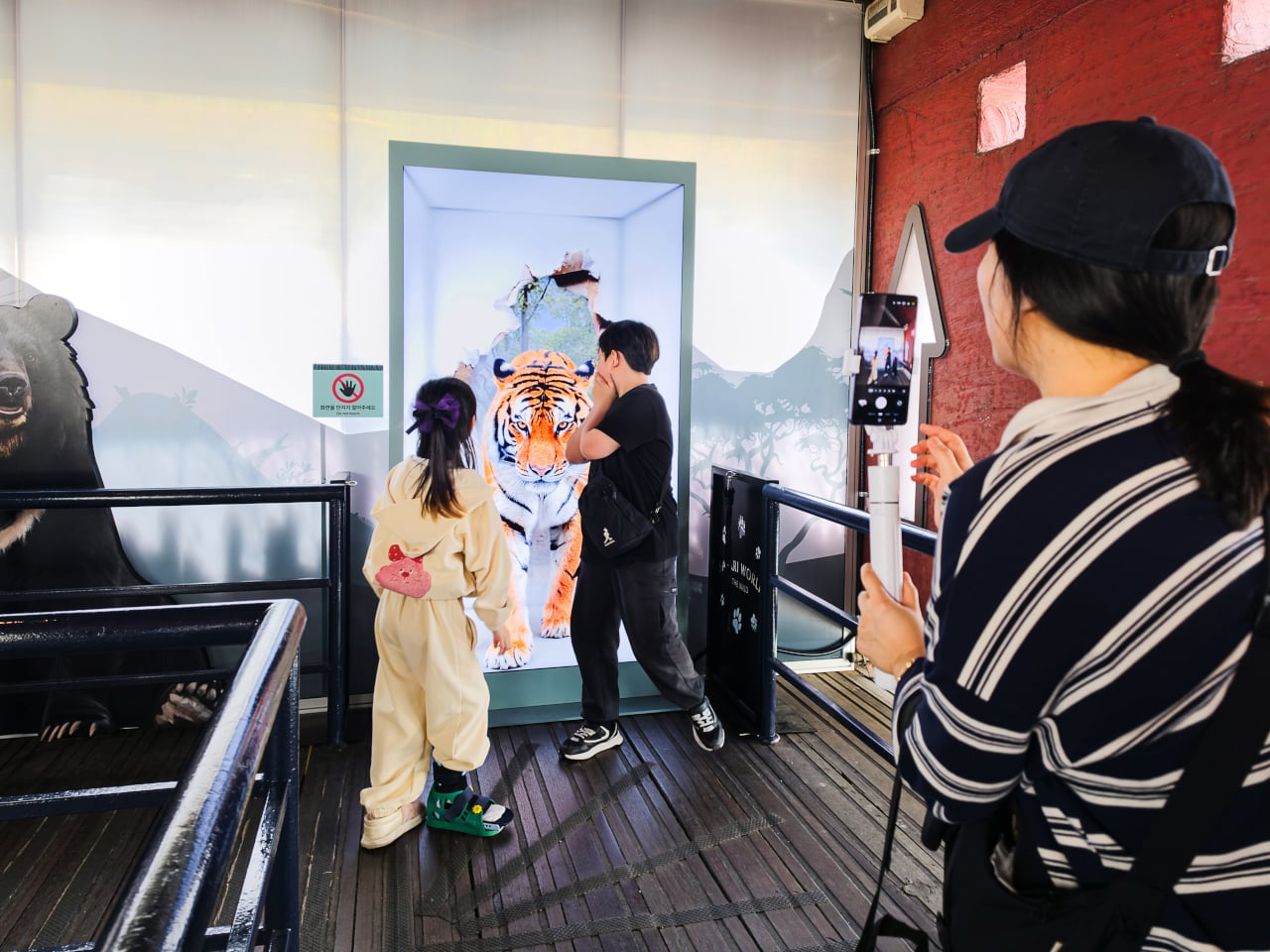
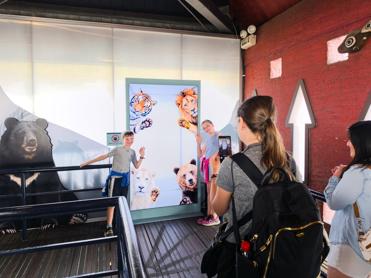
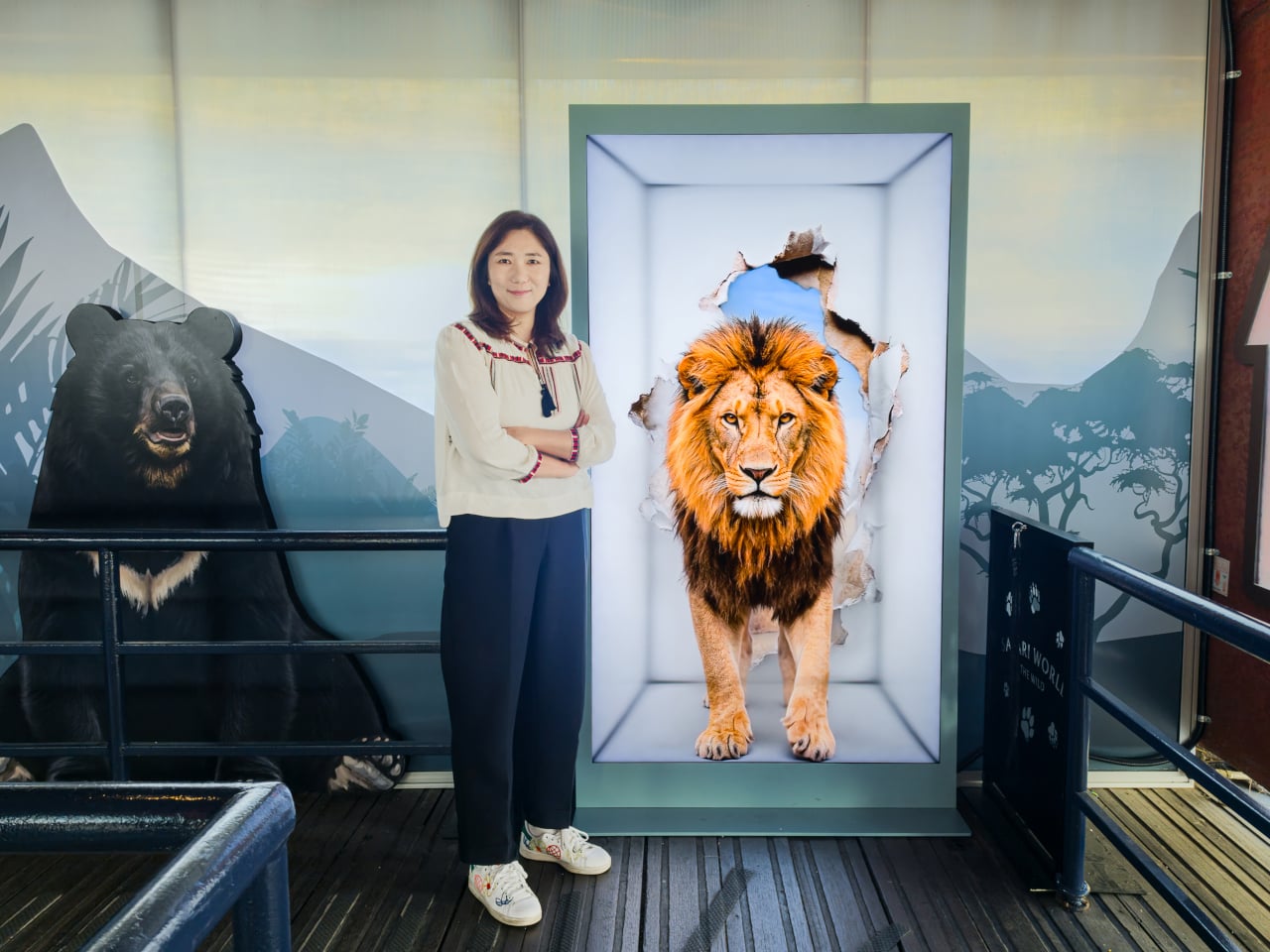
Samsung’s Spatial Signage installation at Everland in South Korea offers a different answer. At the newly renovated Safari World: The Wild attraction in Yongin, the company installed its glasses-free 3D display directly in the queue area, where life-scale tigers and lions appear to surge toward visitors without so much as a pair of 3D glasses required. The wait effectively becomes the opening act.

Designer: Samsung

The technology making that possible is Samsung’s patented 3D Plate system, which uses binocular parallax to deliver separate images to each eye, tricking the brain into perceiving depth the same way it does when looking at real objects at real distances. Unlike the boxy, space-hungry installations that most 3D signage has historically required, the Spatial Signage display slots into the queue corridor in an 85-inch, portrait-oriented panel with a 52 mm profile. There’s nothing protruding into the space, and no hardware for visitors to interact with.

The content for the Everland installation was developed by Klleon, whose team prioritized capturing the natural movement rhythms of the animals rather than exaggerated cinematic effects. The result is a quality of realism that works specifically because of the environment: a queue is typically a narrow, enclosed space where visitors are already looking forward and standing relatively still, which happens to be exactly the viewing geometry where the 3D depth effect lands best.

What that means practically is that the queue line stops being something guests endure and starts being something they talk about. Anticipation for an attraction is one of the least exploited moments in the theme park visit. Visitors heading toward Safari World already have the right frame of mind for a wildlife encounter, and the display capitalizes on that readiness by delivering a preview of that encounter before anyone boards a vehicle or rounds a corner.

The broader implication is about how display technology fits into destination entertainment design. For years, attractions have used projection mapping, animatronics, and theatrical sets to build immersion during rides and shows, but the queue almost always remains a visual afterthought. A display that can occupy a narrow corridor at wall depth, require no headgear, and show content at true-to-life scale without any spatial awkwardness changes what’s possible in that format.

Everland isn’t a retail shelf or a shopping center atrium. The animals aren’t selling anything. They’re there because a flat screen in that corridor would register as background noise, and a three-dimensional tiger at eye level does not. That distinction, between content that is present and content that actually commands attention, is the problem Spatial Signage was built to solve, and the queue turned out to be a rather fitting test.

The post Samsung Just Turned a Theme Park Queue Into a 3D Safari, No Glasses first appeared on Yanko Design.
  •  

Your Knife Block Has No Business Looking This Good

Most kitchen accessories come with an unspoken agreement: you accept that they look utilitarian, and in return, they do their job quietly in the background. Knife holders, in particular, have always been the least glamorous residents of the countertop. The wooden block is fine. The magnetic wall strip is practical. But neither has ever made anyone stop and stare. Samyuktha S’s Eclipse Edge concept breaks that agreement entirely, and I’m genuinely glad it does.

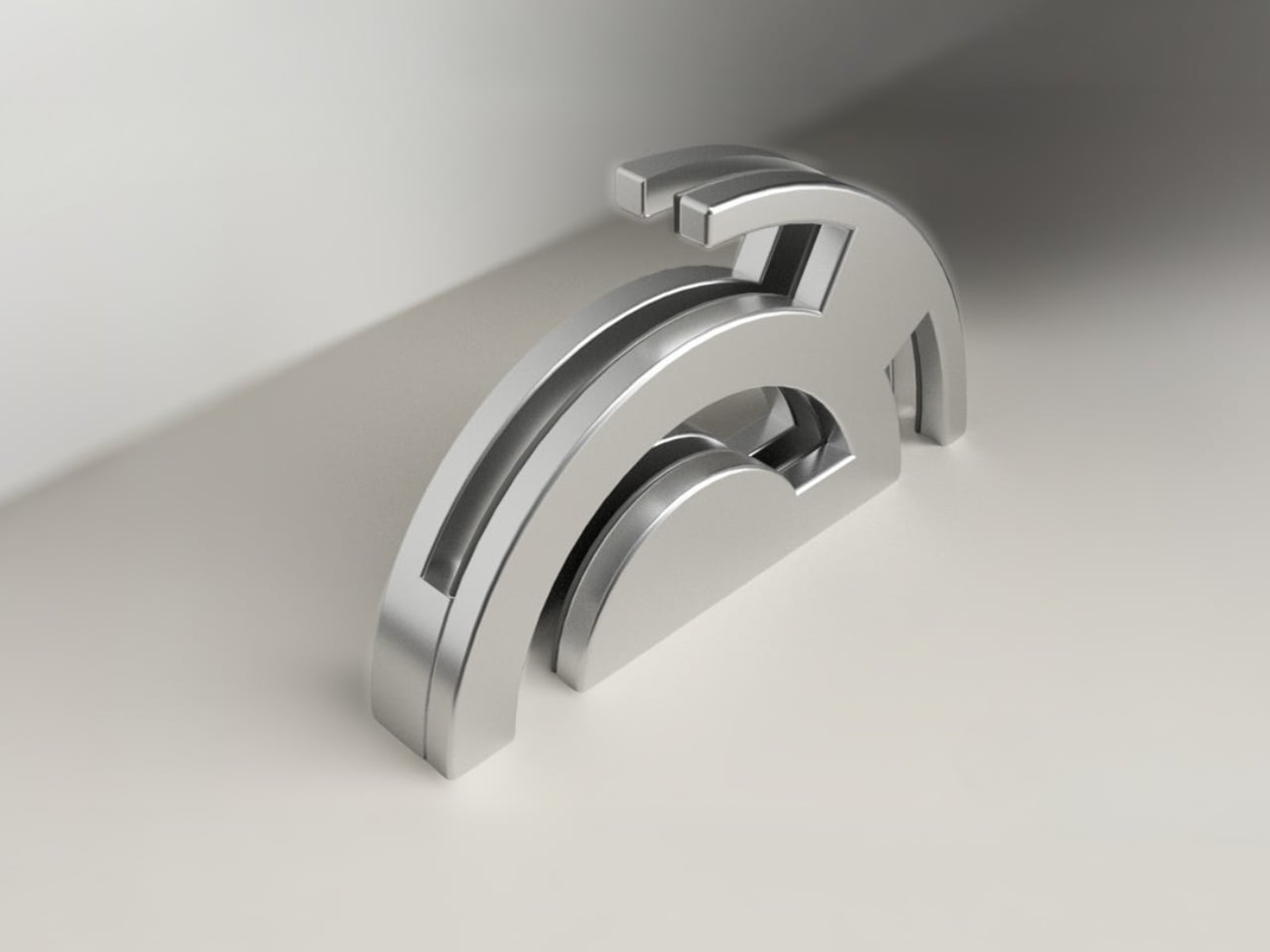
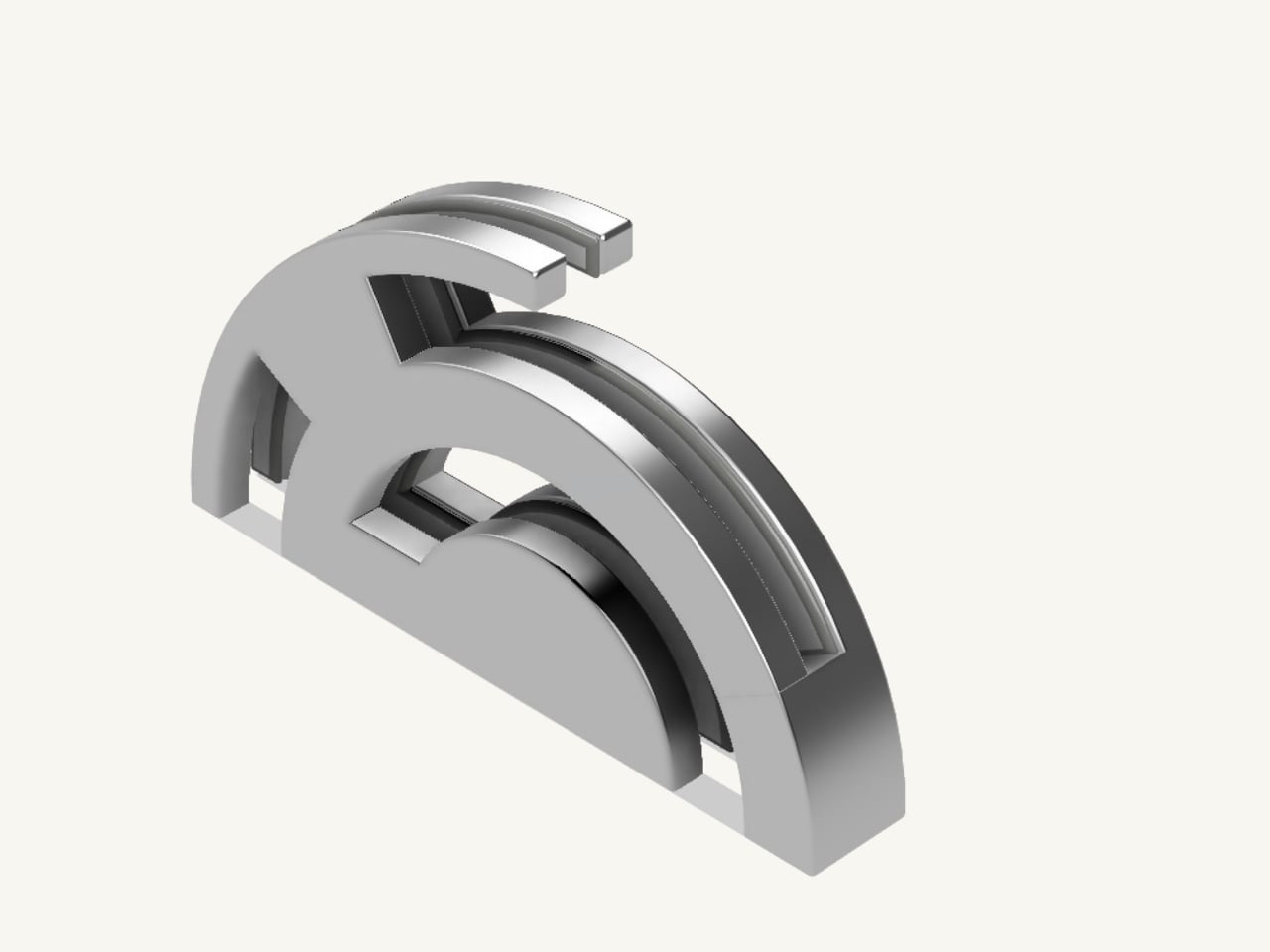
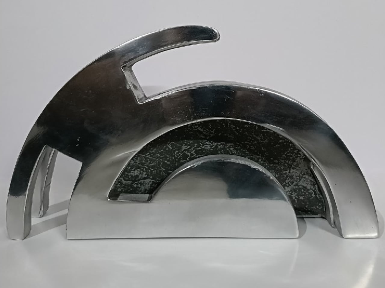
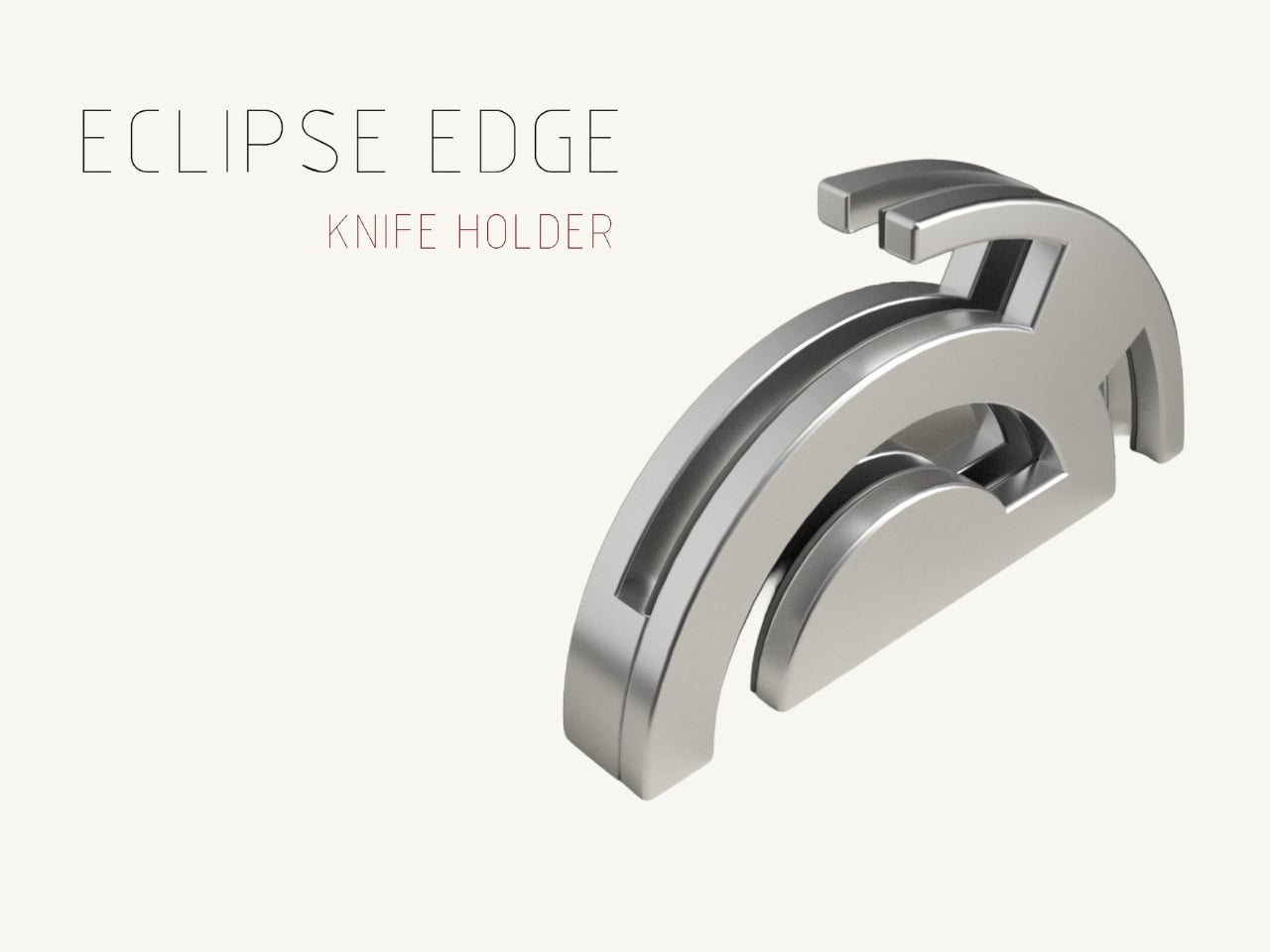
The Eclipse Edge is a magnetic knife holder inspired by the geometry of a lunar eclipse, specifically the moment when Earth aligns between the sun and moon, casting that iconic half-shadow silhouette into the sky. That form, an abstracted arc built from layered, concentric half-circles, becomes the entire design language here. Looking at it on a countertop, you wouldn’t immediately guess what it does. You’d probably assume it was a sculpture. That confusion is precisely the point.

Designer: Samyuktha S

Samyuktha’s design brief was direct: create a kitchen storage accessory that bridges functional utility and structural statement decor. The goal was to reimagine a standard tool organizer as a decorative landmark within the home, elevating it to a high-end sculptural piece. She achieved this without resorting to the usual tricks of adding color or unconventional materials. The Eclipse Edge is sand-casted aluminum with a hand-carved finish, and it leans entirely into that material’s dual nature: raw and refined at the same time.

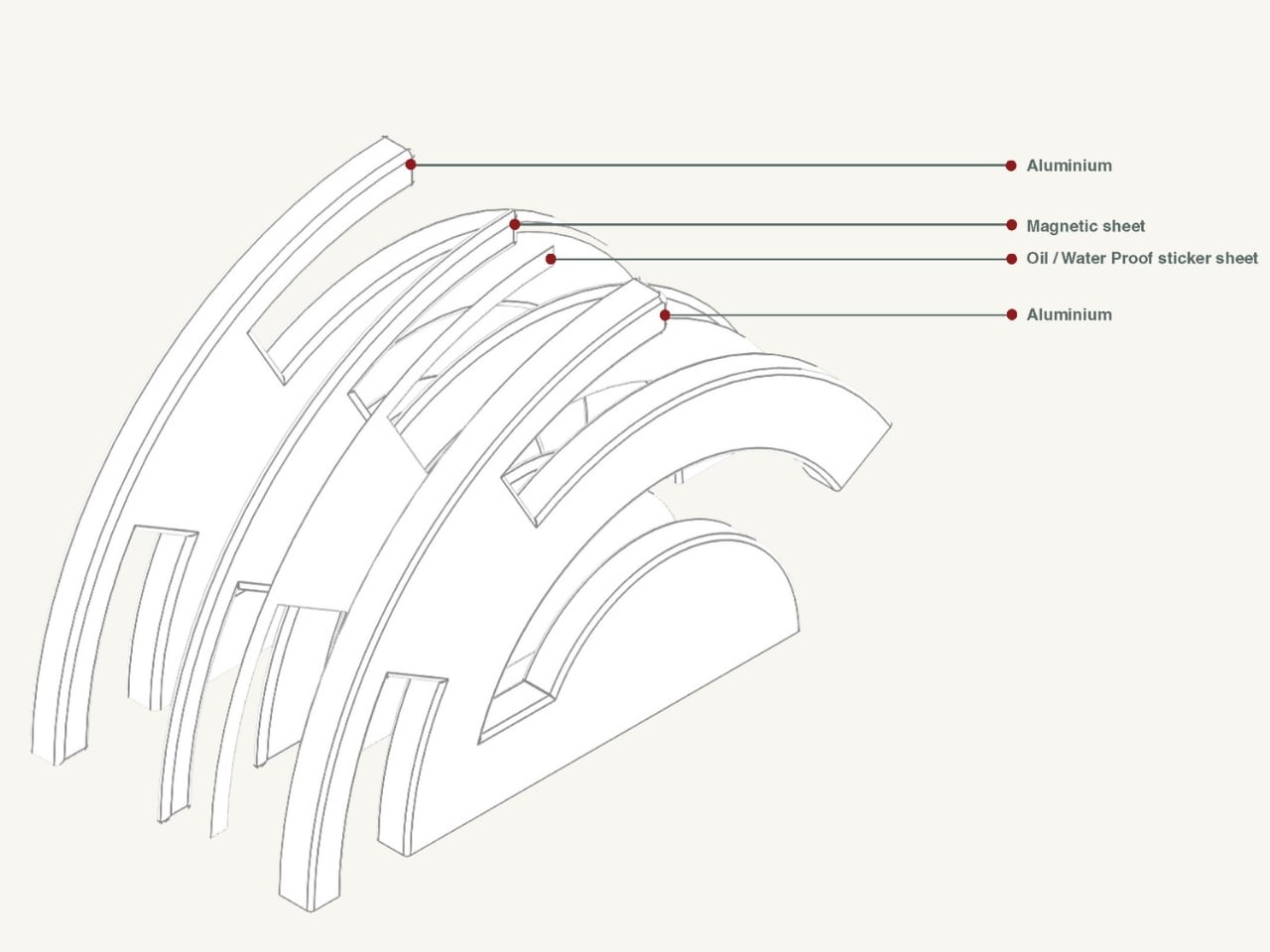
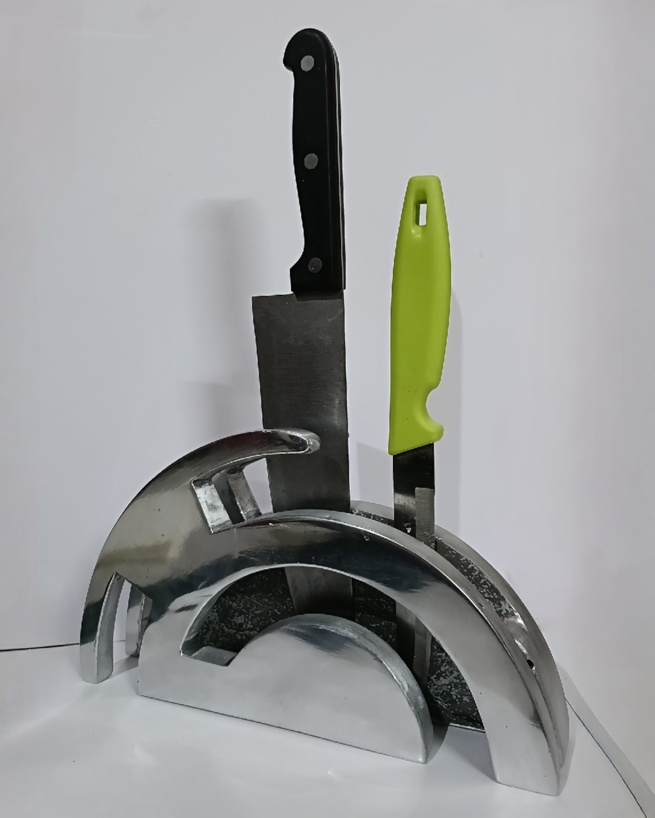
The mechanics are equally considered. Hidden magnetic sheets inside the form hold knives parallel to the surface, which means blades are secured safely without any visible hardware or slots cutting into that clean silhouette. The oil and waterproof protective layering is built into the construction. Multiple knife sizes are accommodated without compromising the holder’s structural integrity or visual lines. It’s the kind of detail work that separates a pretty sketch from a design that actually holds up under scrutiny.

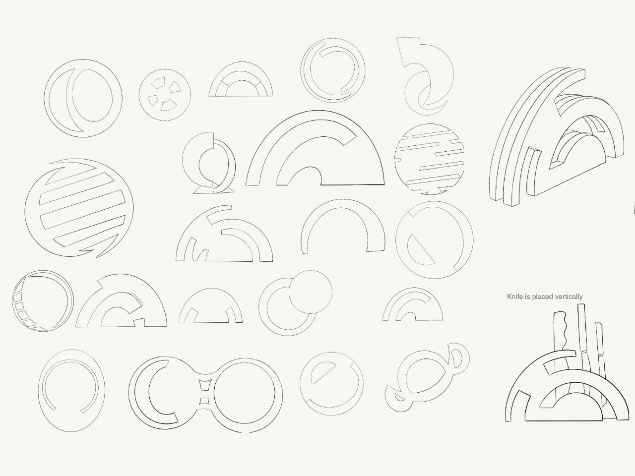
The ideation pages on Samyuktha’s Behance project tell you a lot. There are dozens of iterations, circular forms, crescent variations, abstracted lunar shapes explored and discarded before arriving at the stacked arch that became the final concept. Getting from a celestial reference to something that can hold a chef’s knife at the right angle and still look like contemporary sculpture takes a specific kind of problem-solving patience. The sketches make clear that nothing was accidental.

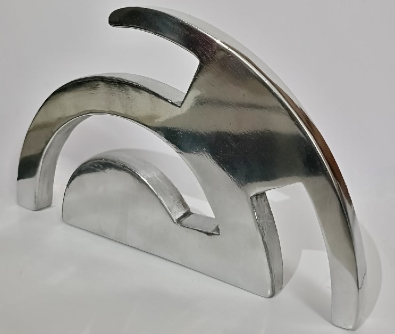
A physical prototype was also produced through aluminum sand casting using an MDF pattern, which means this design was tested in the real world, not just rendered beautifully and left to live on a screen. Seeing the actual object in photos alongside actual kitchen knives brings the concept into sharp focus. It looks grounded and serious in person, the kind of object that would hold its own on any well-styled countertop without asking for too much attention.

I do think about the practical day-to-day reality of owning something like this. Keeping polished aluminum pristine in a working kitchen takes effort, and the hand-carved finish, while gorgeous, would need care. But that’s not necessarily a flaw in the design. High-end kitchen objects have always required a little more commitment. A copper pot needs polishing. A cast iron pan needs seasoning. The Eclipse Edge feels like it belongs in that same category of objects you choose deliberately and tend to over time.

The broader conversation around kitchenware has been shifting for a while now. People increasingly want their kitchen tools to reflect how they live and what they care about, not just what they cook. The Eclipse Edge speaks to that shift with real confidence. It doesn’t apologize for being beautiful. It doesn’t hide its utility behind a costume. It just quietly insists that a knife holder can be, at the same time, an object worth looking at. Samyuktha S’s Eclipse Edge is a concept for now, but it’s the kind of concept that feels ready. The thinking is there. The craft is there. The prototype is there. Sometimes the only thing standing between a student project and a product is someone willing to bet on it.

The post Your Knife Block Has No Business Looking This Good first appeared on Yanko Design.
  •  

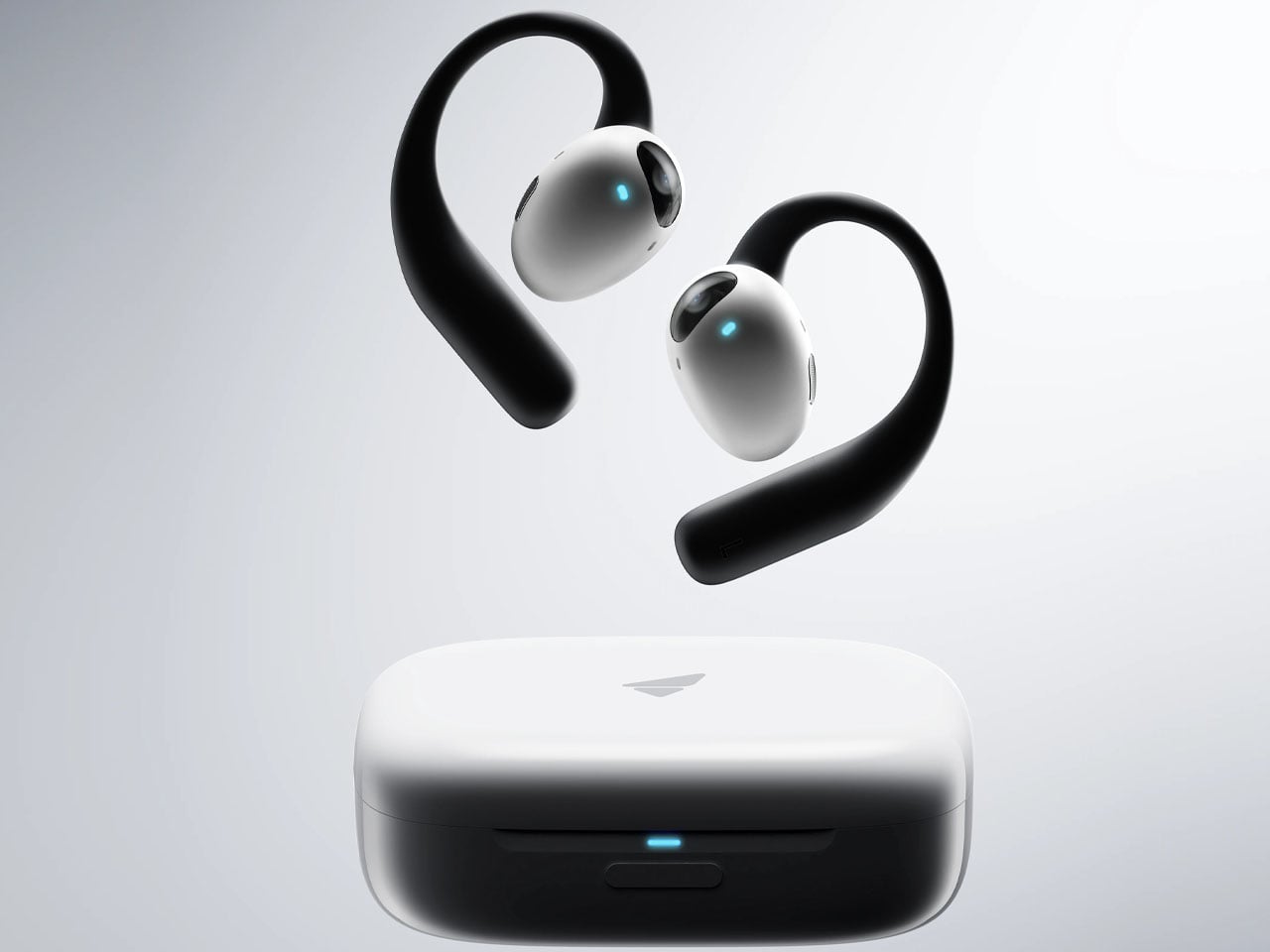
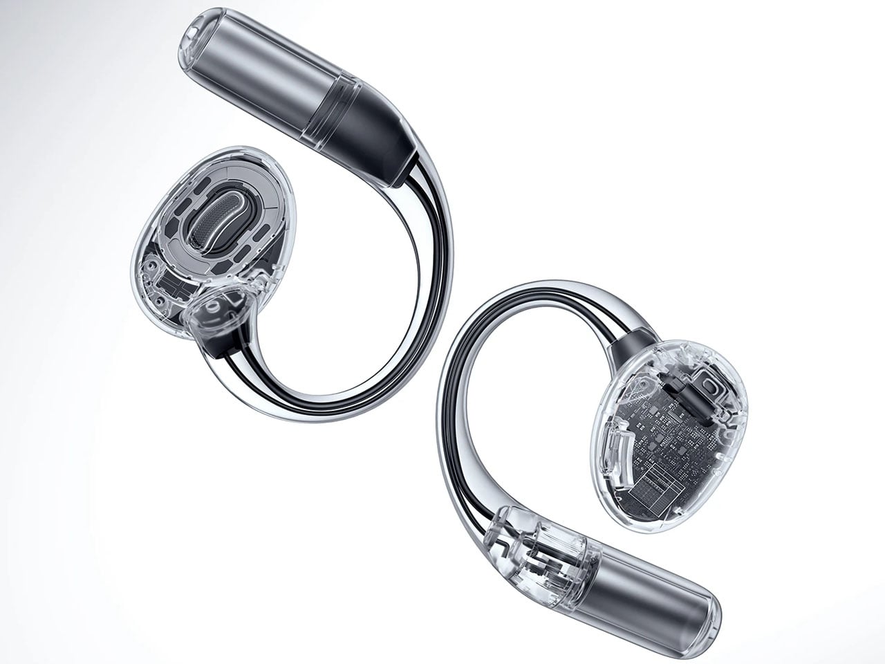
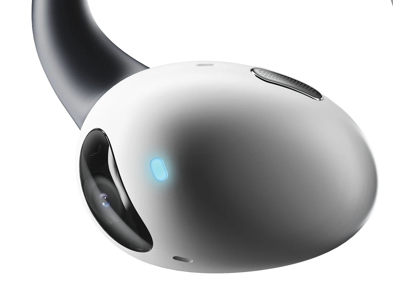
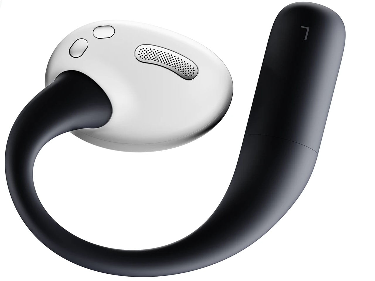
AI-powered earbuds with built-in camera expand your capabilities in the real world

Headphones and earbuds have, over the last couple of years, become staples of this fast-paced world for good reason. The little audio gear essentials can do a multitude of tasks with just the push of a tactile button or pinch gesture. They can trigger smart assistant support for a smarter you, and if this concept were to be imagined, they can give you a pair of smart eyes, too.

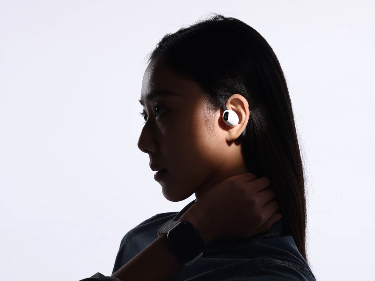
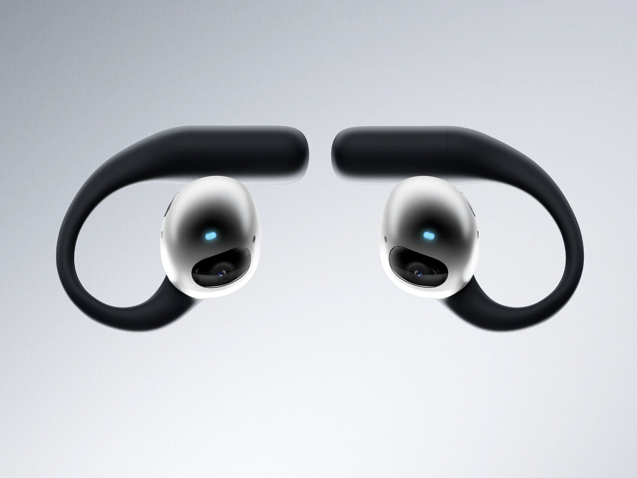
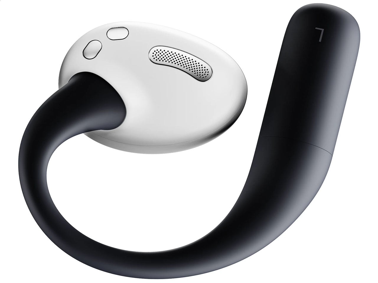
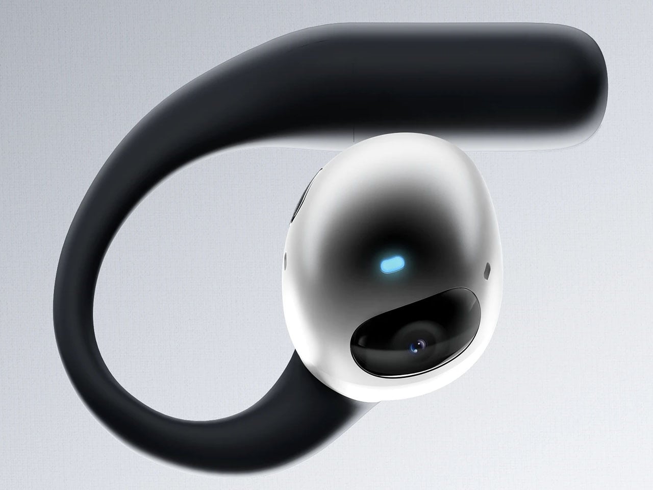
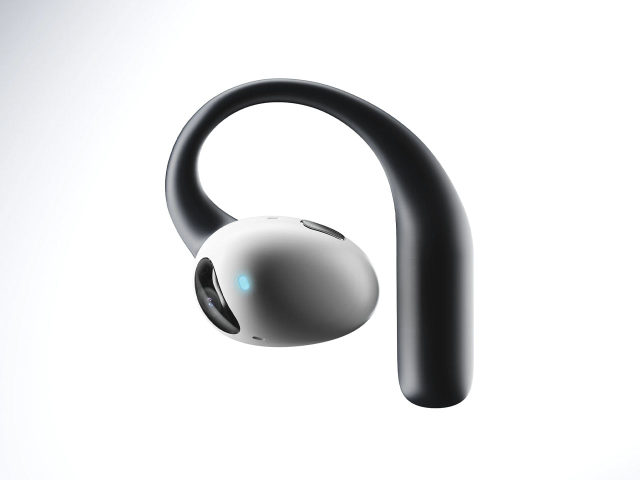
The idea of a pair of earbuds with integrated cameras is not new, as Emil Lukas imagined, and now another concept reinforces the merit in having a pair of lenses on earbuds. Dubbed Lightwear, the earbuds look something straight out of a sci-fi flick, but underneath, they are a pair of smart assistant earphones that enhance your environmental perception in real time.

Designer: Suosi Design

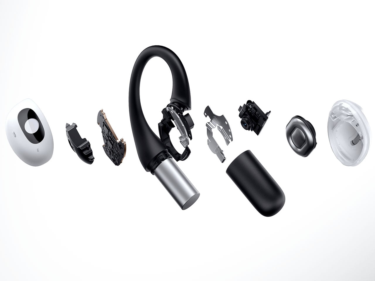
Touted as the world’s first AI-powered earphones, Lightwear comes with a set of HD camera lenses to expand the sense perception as a vision module to interpret the surroundings and deliver the desired result. One can detail them via voice command about any information required in real time, and the buds respond with a detailed set of instructions or navigation guidance. Having gesture control support, the buds can control the connected home devices remotely using just gesture commands. All the data fed into the smart data system is end-to-end encrypted and stored locally. For enhanced privacy and protection, the sensitive data is automatically cleared on a scheduled cycle.

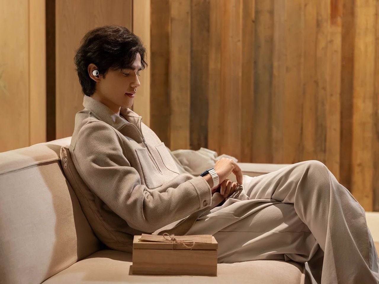
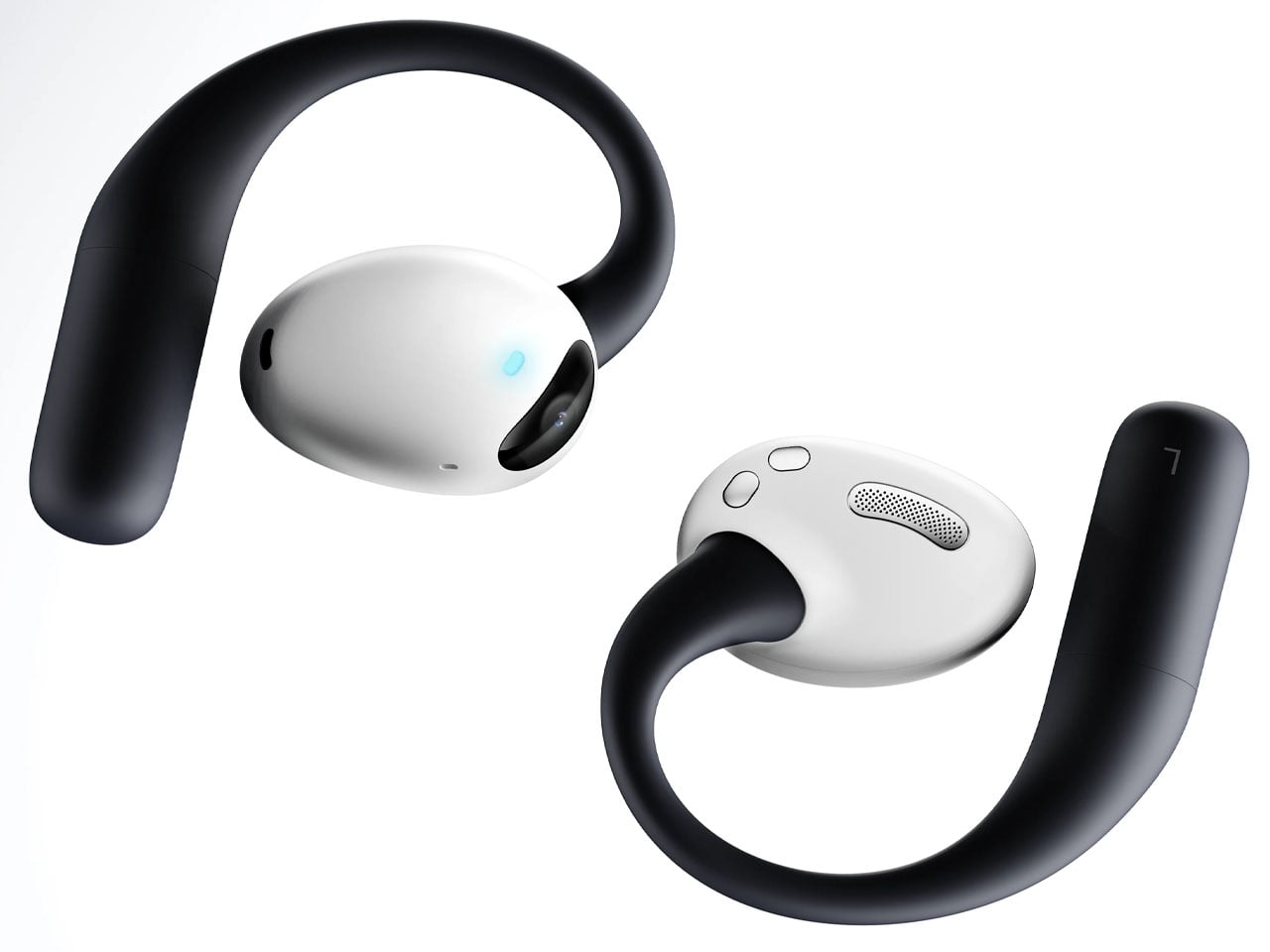
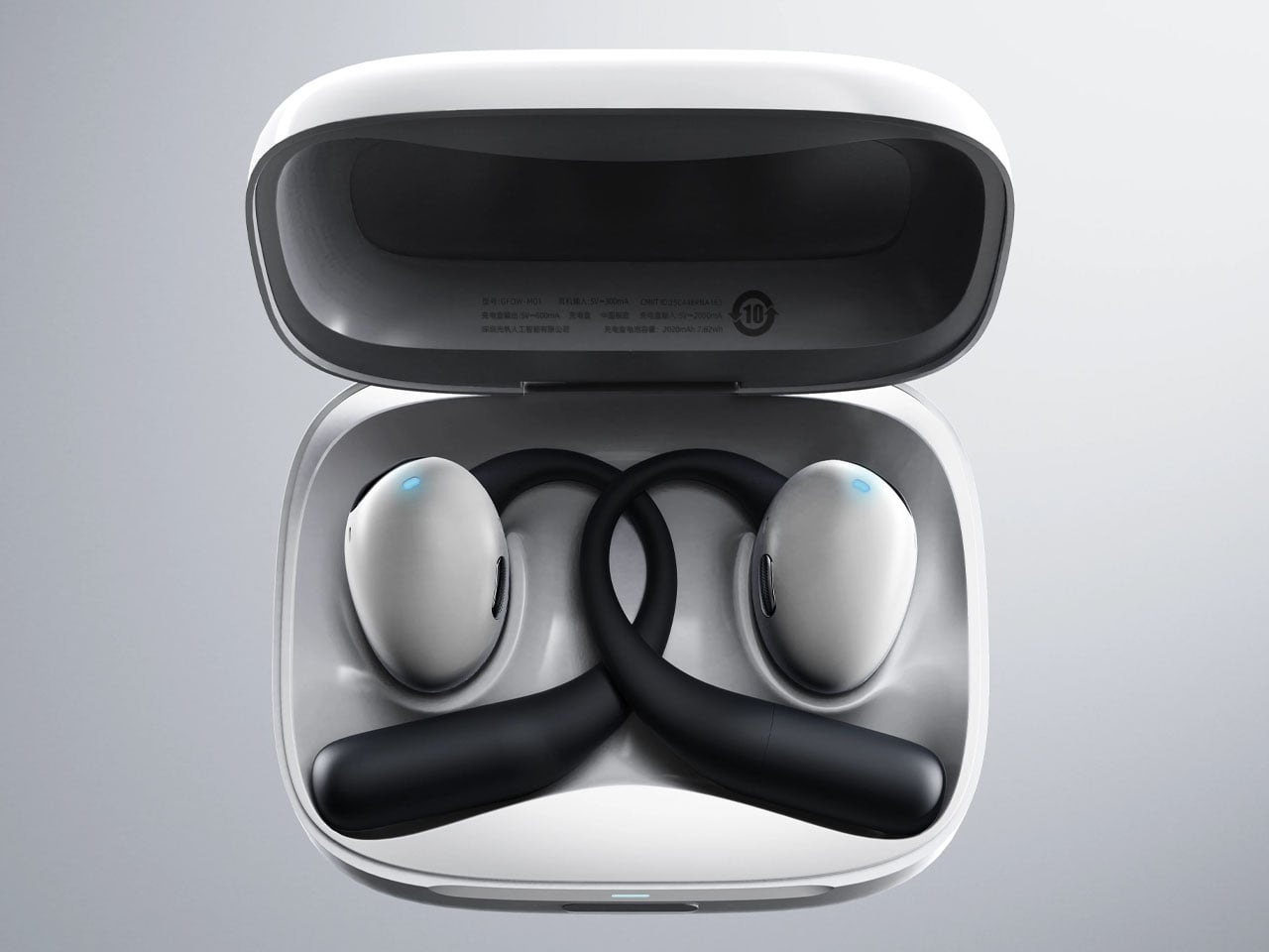
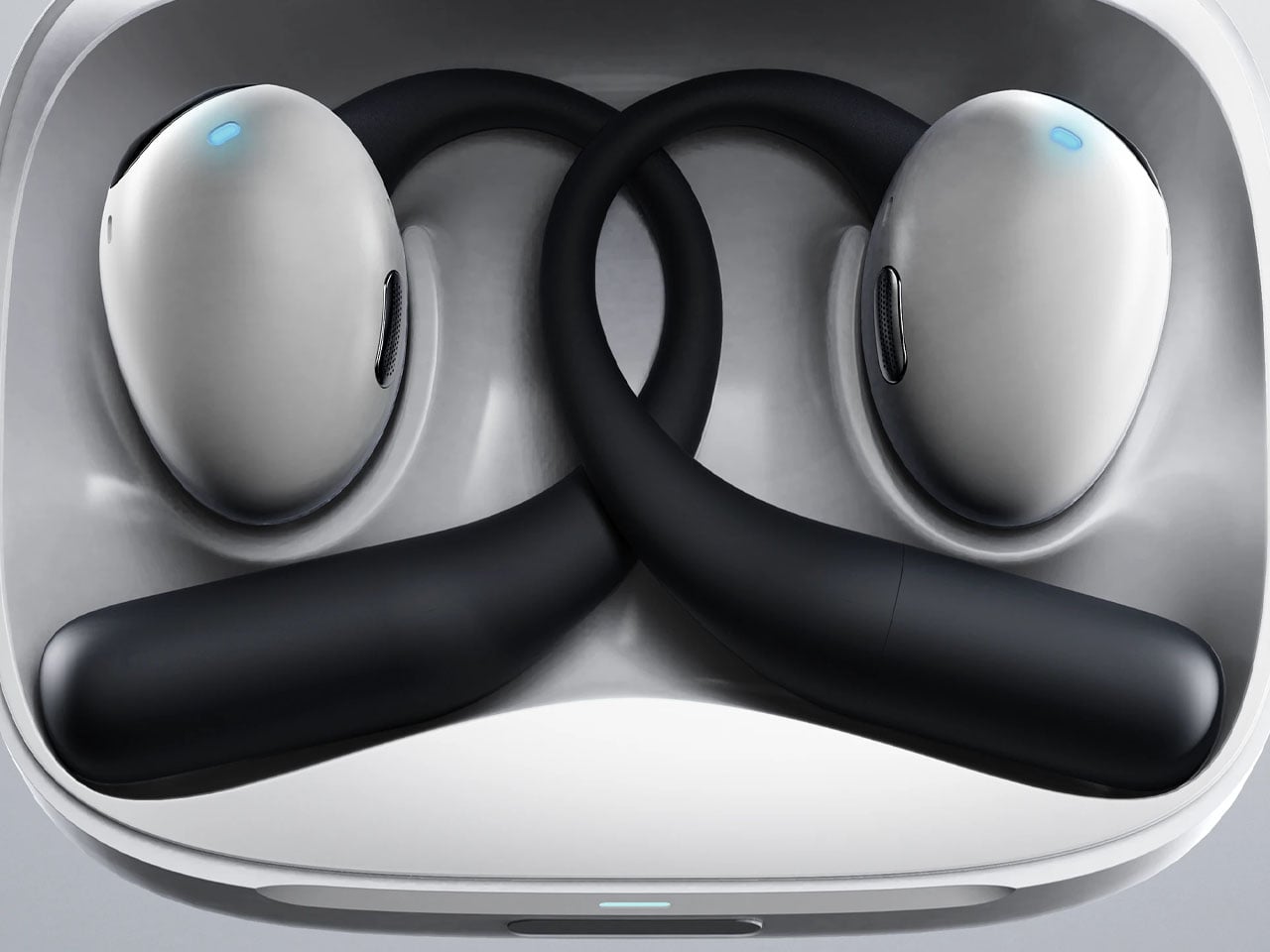
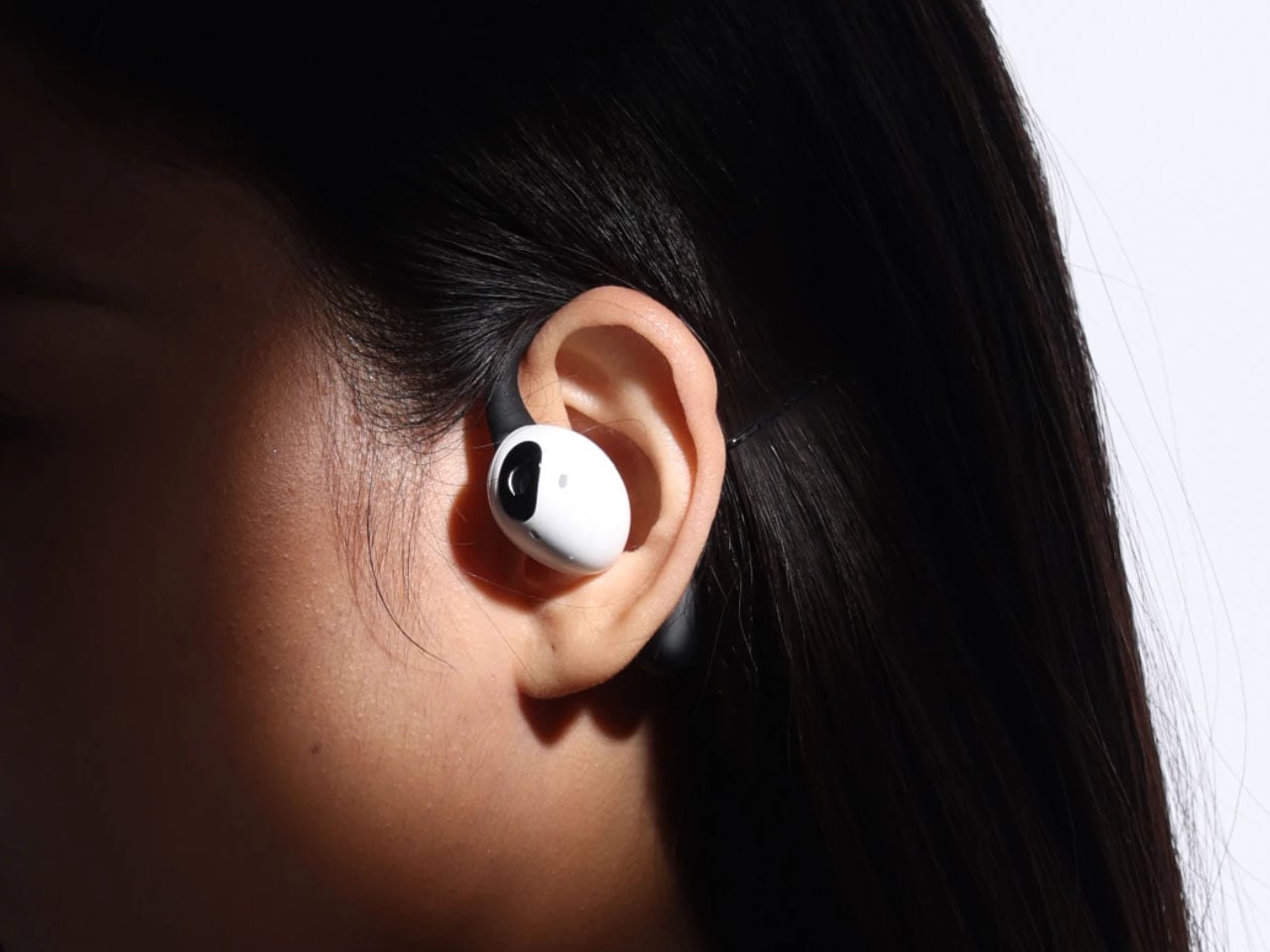
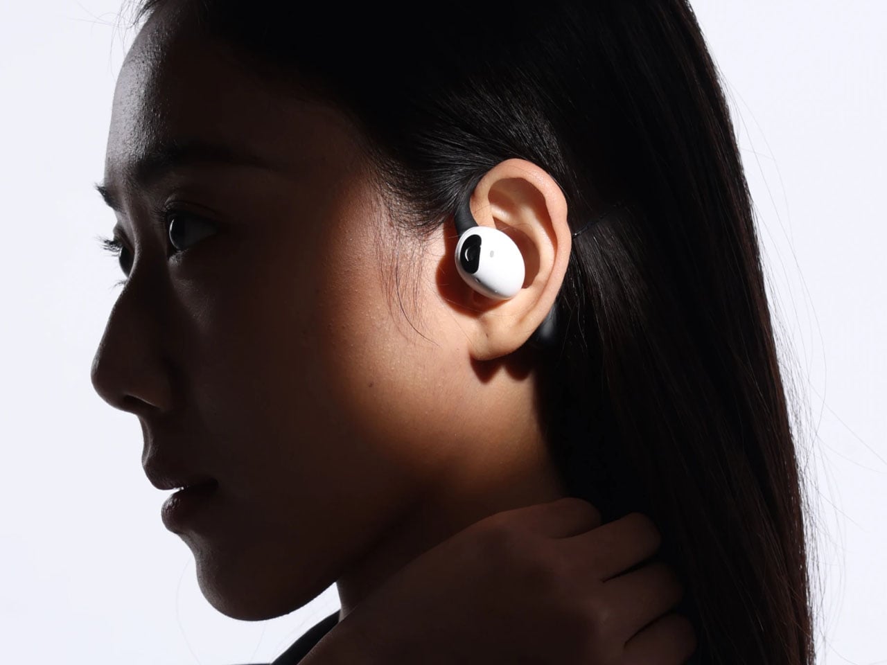
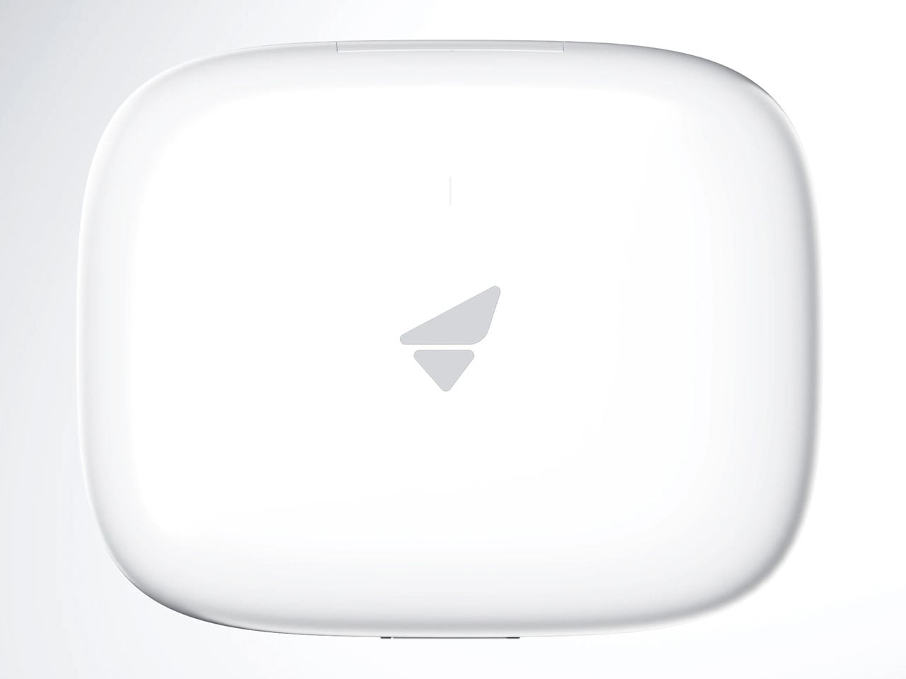
Compared to Emil’s version, these earbuds have a very downplayed camera presence, which I prefer. They look and feel just like any normal earbud, but have a function that makes them stand out from most pairs of earbuds that have the predictable features. Unlike other AI-powered earbuds, these stand true to their name as they come with the added visual apparatus to put forth better results. The use of AI functions is not limited to the earbuds, since the charging case does the same. This removes the use-case scenario to just when the earbuds are being worn. Loaded with highly sensitive microphones, the AI features can be triggered anytime the user wants. Privacy is also taken care of, as the user can opt to activate the fingerprint unlock module to prevent any unauthorized use.

These have an over-the-ear design, reminiscent of the way IEMs sit flush on the ears. The battery resides in those lobes, and although the designers don’t specifically talk about the usage time, these should last longer than TWS earbuds. Nor is there a specific word about the sound quality, ANC levels, or the app features. But then it’s just a concept centred on the form factor and usability.

The post AI-powered earbuds with built-in camera expand your capabilities in the real world first appeared on Yanko Design.
  •  

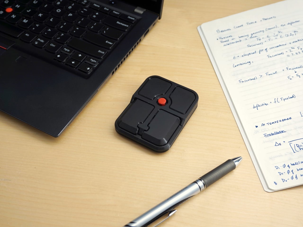
The TrackPoint Was Always Laptop-Only, This $52 Bean Changes That

The pointing stick is one of the more divisive input devices in computing history. Lenovo’s TrackPoint has a devoted following, built around people who never want to lift their hands off the keyboard home row just to move a cursor. Everyone else finds the red nub somewhere between baffling and genuinely annoying. Either way, it has stayed locked to laptop keyboards for decades, with essentially no standalone options available.

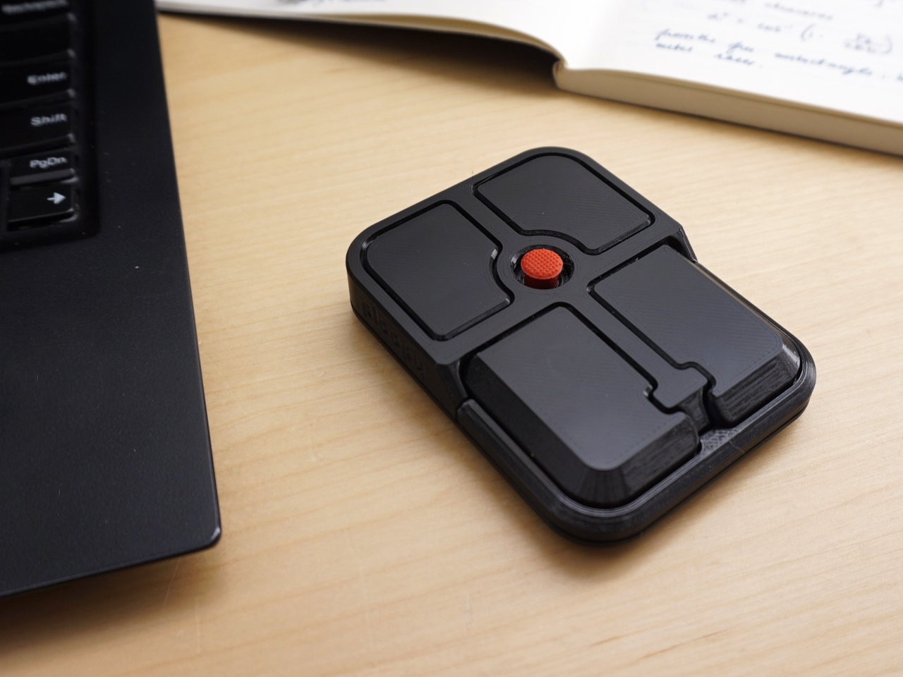
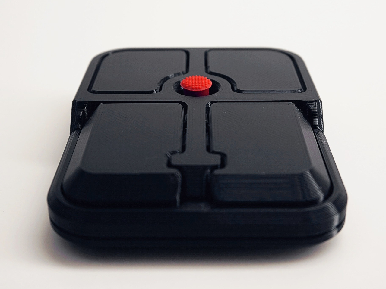
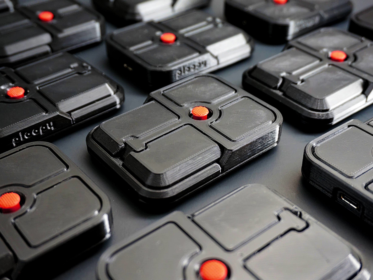
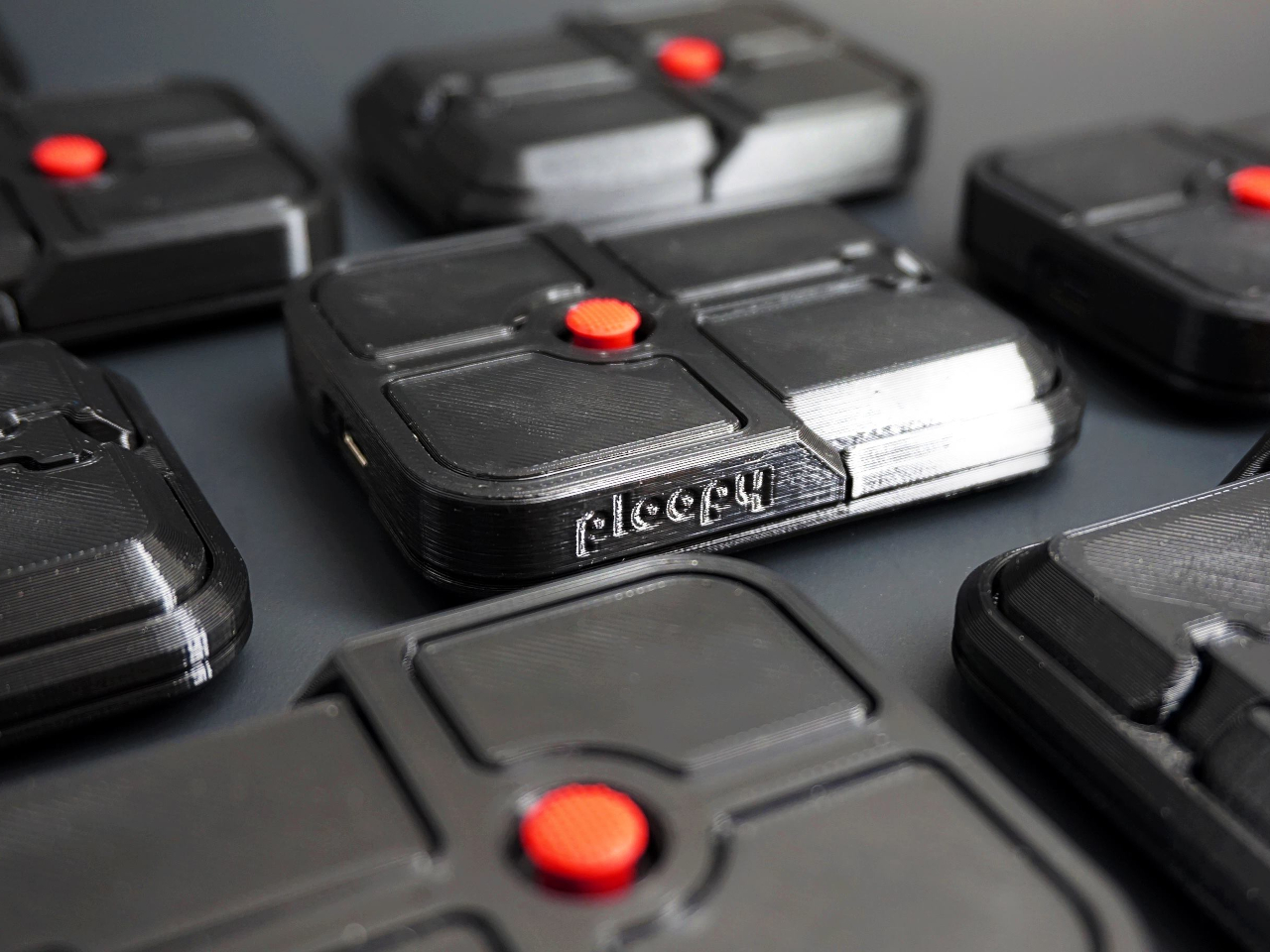
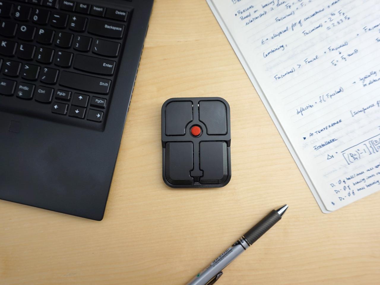
Ploopy, the Canadian open-source hardware company known for its lineup of trackballs and trackpads, has changed that with the Bean. It’s a standalone external pointing stick that connects over USB-C and sits flat on a desk. Think of it as a TrackPoint you don’t have to buy a ThinkPad to access, with a few deliberate improvements added to address the weaknesses that nub has always had.

Designer: Ploopy

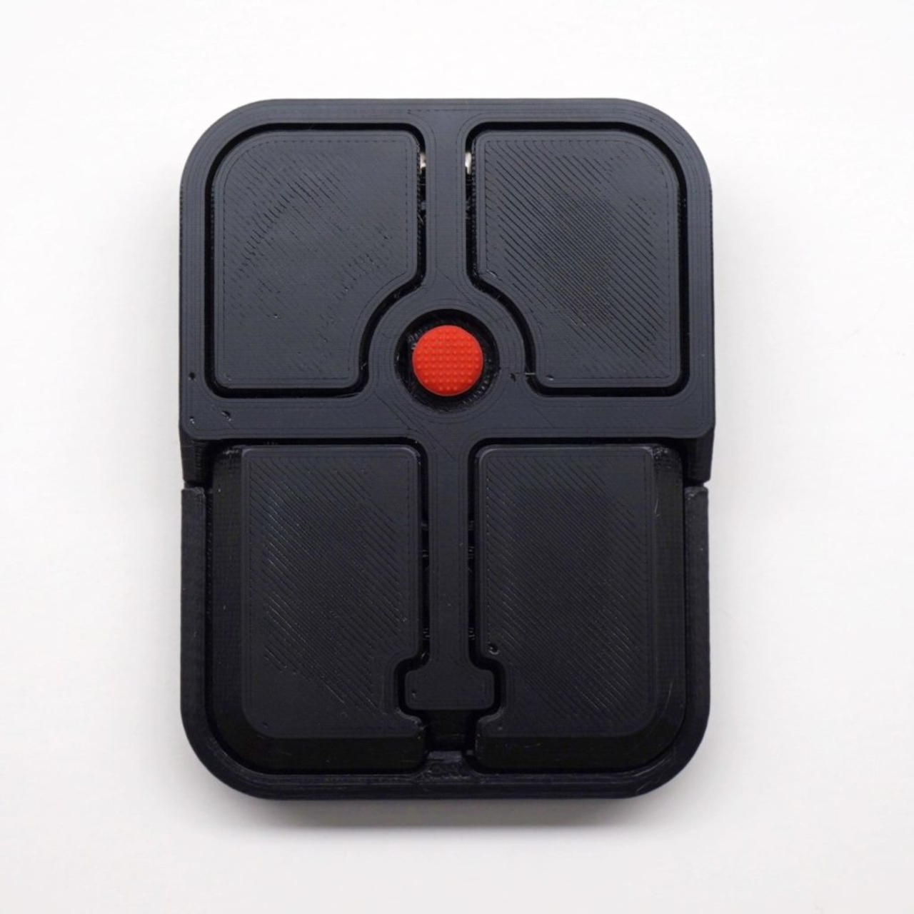
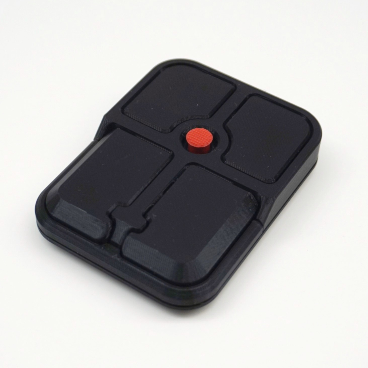
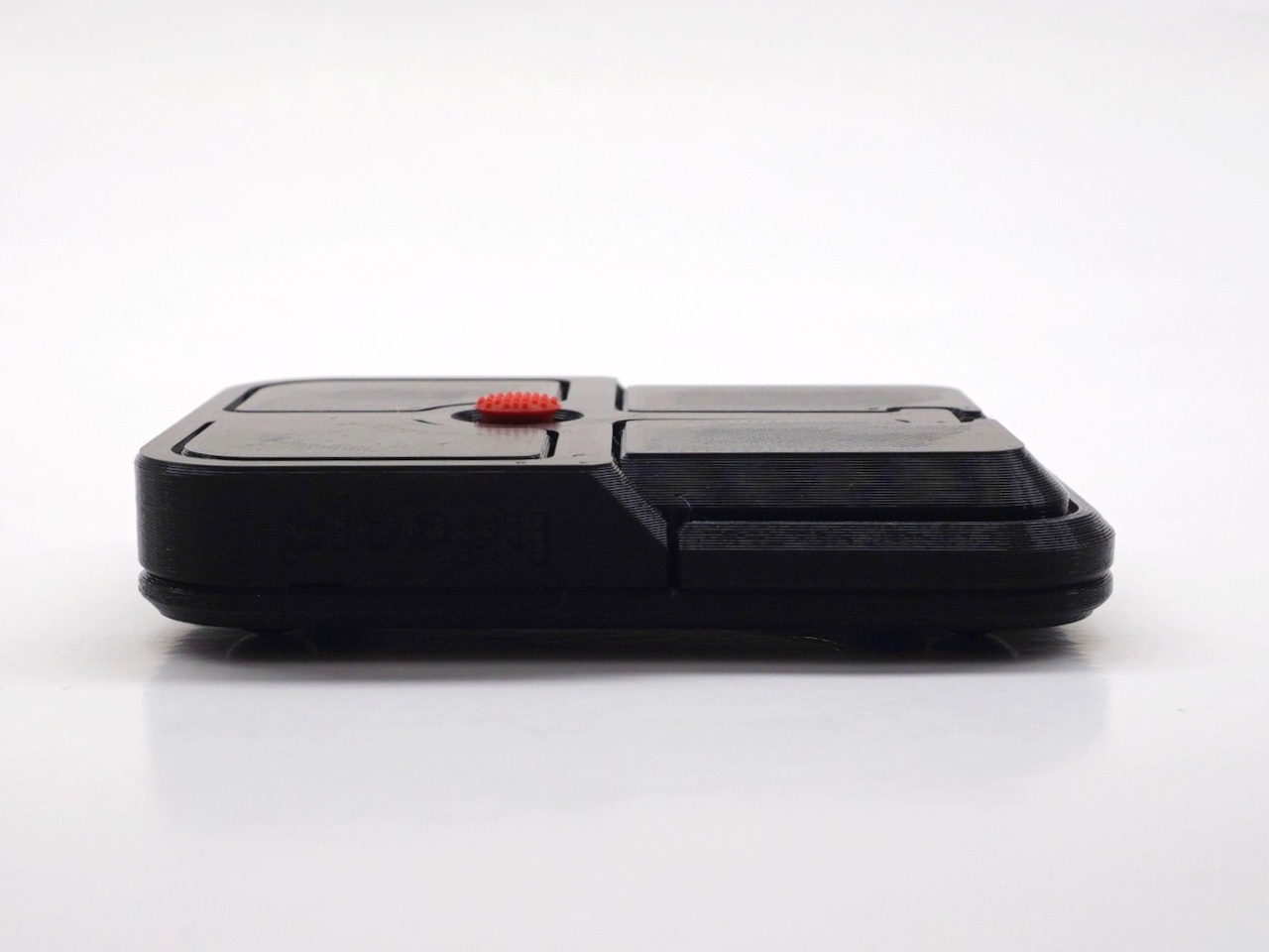
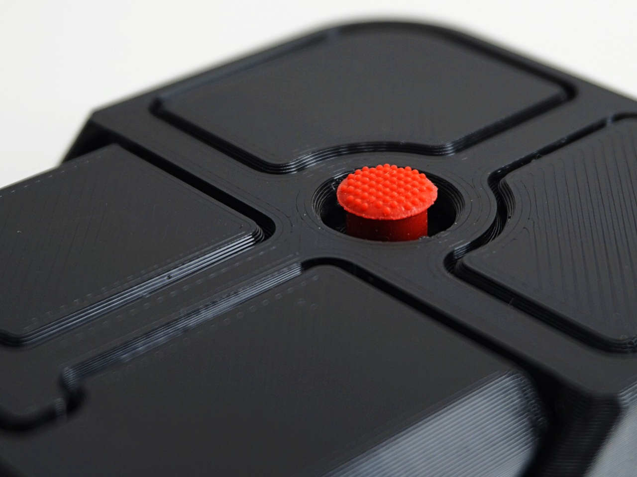
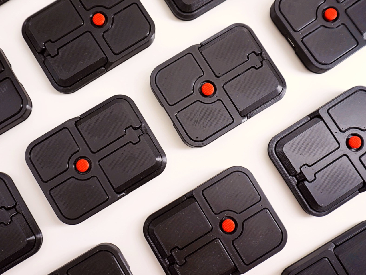
The Bean measures 84mm x 64mm x 16mm and houses a red pointing nub near the center of its flat, 3D printed case. Unlike the fixed nubs built into laptop keyboards, this one has additional travel in its movement, which Ploopy says helps reduce fatigue from pushing a stiffer stick over long sessions. Four buttons flank the nub, covering the standard left, right, middle click, and scroll by default.

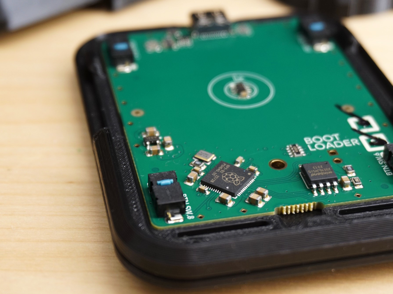
None of those defaults is locked in. The Bean runs QMK open-source firmware on a Raspberry Pi RP2040 microcontroller, and remapping any of the four Omron D2LS-21 buttons takes just a few minutes using the free VIA web app. There are no drivers to install and no proprietary software to deal with, just a browser-based tool that reads the device and lets you assign functions however you like.

For anyone who finds the conventional mouse hard on their wrist, or simply prefers keeping their hands positioned in front of them rather than reaching out to one side constantly, a pointing stick can make a noticeable difference over long sessions. You nudge the nub, and the cursor moves without your palm going anywhere. It’s a small thing until it isn’t, especially for people managing repetitive strain concerns.

Like everything else Ploopy makes, the Bean is completely open source. Hardware design files and firmware are both on GitHub, so anyone who wants to print their own case, modify the button layout, or write custom firmware from scratch has everything they need to do it. That kind of transparency is unusual for any consumer input device and puts Ploopy in a different category from virtually every competitor.

The Bean is available now for $70 CAD (around $52 USD), which is reasonable for a device with this much flexibility built in. It isn’t going to pull in anyone who has never thought about pointing sticks before, but for the enthusiast crowd that has been waiting for a standalone option this customizable and this open, it’s about as close to a purpose-built answer as anyone has delivered.

The post The TrackPoint Was Always Laptop-Only, This $52 Bean Changes That first appeared on Yanko Design.
  •  
❌