Vue lecture

The World’s Smallest 100W Charger Fits in Your Palm and Charges MacBooks at Full Speed

There’s a reason it’s called a charging ‘brick’. It charges, and it’s honestly brick-shaped. Laptops and phones have gotten thinner in the past decade, but their chargers honestly haven’t. GaN technology changes that. I’ve sung praise for GaN chargers in the past, and I swear by the one in my laptop bag right now, which replaces 4 different chargers while being the size of a hockey puck. Now Rolling Square’s gone and made the GaN charger even smaller.

Holding the title of the world’s smallest 100W charger, the aptly named Supertiny is 65% smaller than Apple’s 96W charging brick, but packs enough power to fast-charge your laptop without breaking a sweat. At just 2 inches long and 1.38 inches wide, the Supertiny is as small as your Airpods case, fitting in your palm or even your pocket. It comes in three global plug formats (US with foldable prongs, EU, and UK), weighs between 100 and 115 grams depending on the variant, and packs a single USB-C port to supercharge your laptop. But pair it with Rolling Square’s inCharge Life 2in1 cable and you can now fast-charge your laptop as well as your phone together.

Designer: Rolling Square

Click Here to Buy Now: $52 $70 (25% off). Hurry, only a few units left! Raised over $672,000.

Gallium Nitride has been around since the 1990s, first used in LEDs and satellite solar cells, but it took decades for the tech to migrate into consumer charging. The advantage is straightforward: GaN produces significantly less heat than traditional silicon, which means you can push more power through a smaller chipset without needing massive heat sinks or bulky casings to prevent thermal meltdown. Silicon-based chargers lose a chunk of energy as heat, which is why your old laptop brick could double as a hand warmer after an hour of use. GaN flips that equation. It’s ruthlessly efficient, converting around 95% of the energy from the wall into actual charging power, with only 5% lost to heat. That efficiency gain is what allows Rolling Square to cram 100W of power delivery into a form factor that genuinely feels like it shouldn’t be possible.

The Supertiny measures 2 inches long on the US version with foldable prongs, 3.19 inches on the EU model, and 2.81 inches on the UK variant (the EU and UK versions come with fixed prongs). To achieve this ridiculously compact format, the company rebuilt the internal voltage transformer from scratch, optimizing how components align to reduce wasted space and lower operating temperatures. Advanced heat conduction silicon and thermal sheets route heat away from critical areas, and the exterior design plays a functional role too. The ribbed pattern running along the sides prevents your fingertips from making full contact with the surface when you unplug it after charging. Flat surfaces conduct heat directly to your skin, ribbed surfaces don’t. It’s a small detail, but it’s the kind of thing that separates thoughtful industrial design from spec-sheet engineering.

The charger outputs 100W max through its single USB-C port, with support for Power Delivery 3.0 and PPS (Programmable Power Supply) that adjusts voltage between 3.3V and 21V depending on what your device needs. That means it’ll fast-charge a MacBook Pro, a Dell XPS, a Lenovo ThinkPad, or any other USB-C laptop at full speed. In case you’re wondering, yes, it can handle e-bikes and e-scooters too, albeit at 100W. For phones and tablets, it delivers fast charging across iPhones, Samsung Galaxy devices, Google Pixels, and pretty much anything else with a USB-C port. The lack of multiple ports is deliberate. Rolling Square designed this charger for people who want maximum power in minimum space, and adding extra ports would have inflated the size.

If you need to charge two devices simultaneously, Rolling Square offers the inCharge Life 2in1 cable as an optional add-on. This modular cable splits the 100W output intelligently between two devices, letting you charge your laptop and phone together from a single power source. The cable stretches 1.5 meters (about 5 feet), features a durable nylon braid reinforced with aramid fiber, and uses premium metal connectors built to last. Rolling Square backs it with a lifetime replacement guarantee: if the cable ever fails, you submit a short video showing it fully cut along with your order number, and the company ships a replacement immediately. No returns, no forms, no hassle.

Rolling Square is a Switzerland-based company that’s been refining everyday tech problems since 2014, starting with the original inCharge keyring cable that packed multiple charging connectors into a tiny form factor you could attach to your keys. The company followed that up with the AirCard wallet tracker, the TAU keyring power bank, and a lineup of modular MagSafe accessories under the EDGE Pro branding. The Supertiny is their 19th product launch, and it fits the company’s design philosophy cleanly: solve one specific problem extremely well, make it as small as physics allows, and build it to last. Rolling Square products tend to be the kind of gear you don’t notice until you need them, at which point you wonder how you ever lived without them.

The Supertiny 100W GaN Charger comes in three versions: US, EU, and UK plugs. Early pricing starts at $46 for a single unit, or a $68 bundle that also includes the inCharge Life 2in1 cable. Rolling Square is shipping the chargers globally starting in May 2026, and all three versions carry full international safety certifications including TUV Rheinland. The company backs the product with a two-year warranty and a 30-day return policy. I touted GaN chargers as a tech must-have in 2025, so if you’re reading this now and you still don’t own one, take it from me. You, your cluttered workdesk, and your heavy laptop bag will thank me.

Click Here to Buy Now: $52 $70 (25% off). Hurry, only a few units left! Raised over $672,000.

The post The World’s Smallest 100W Charger Fits in Your Palm and Charges MacBooks at Full Speed first appeared on Yanko Design.
  •  

Your Phone Has 12 Calendar Apps. None of Them Look Like This

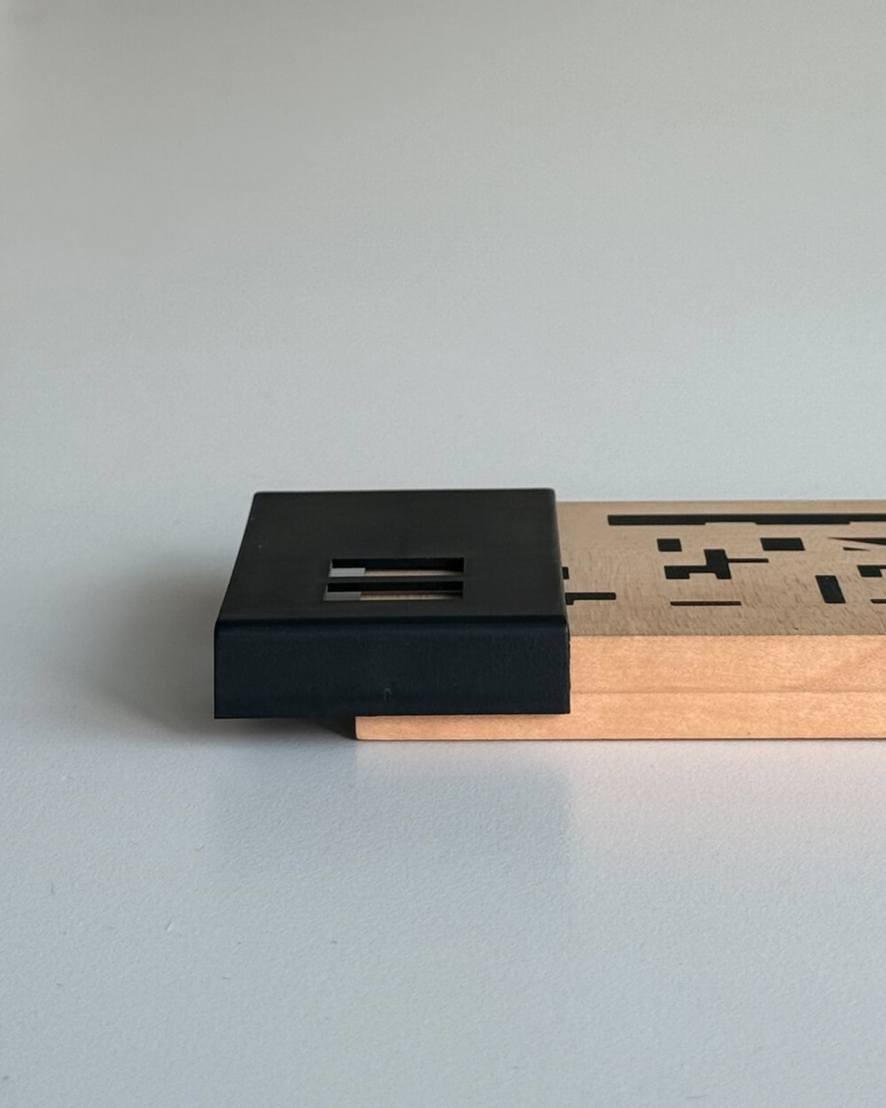
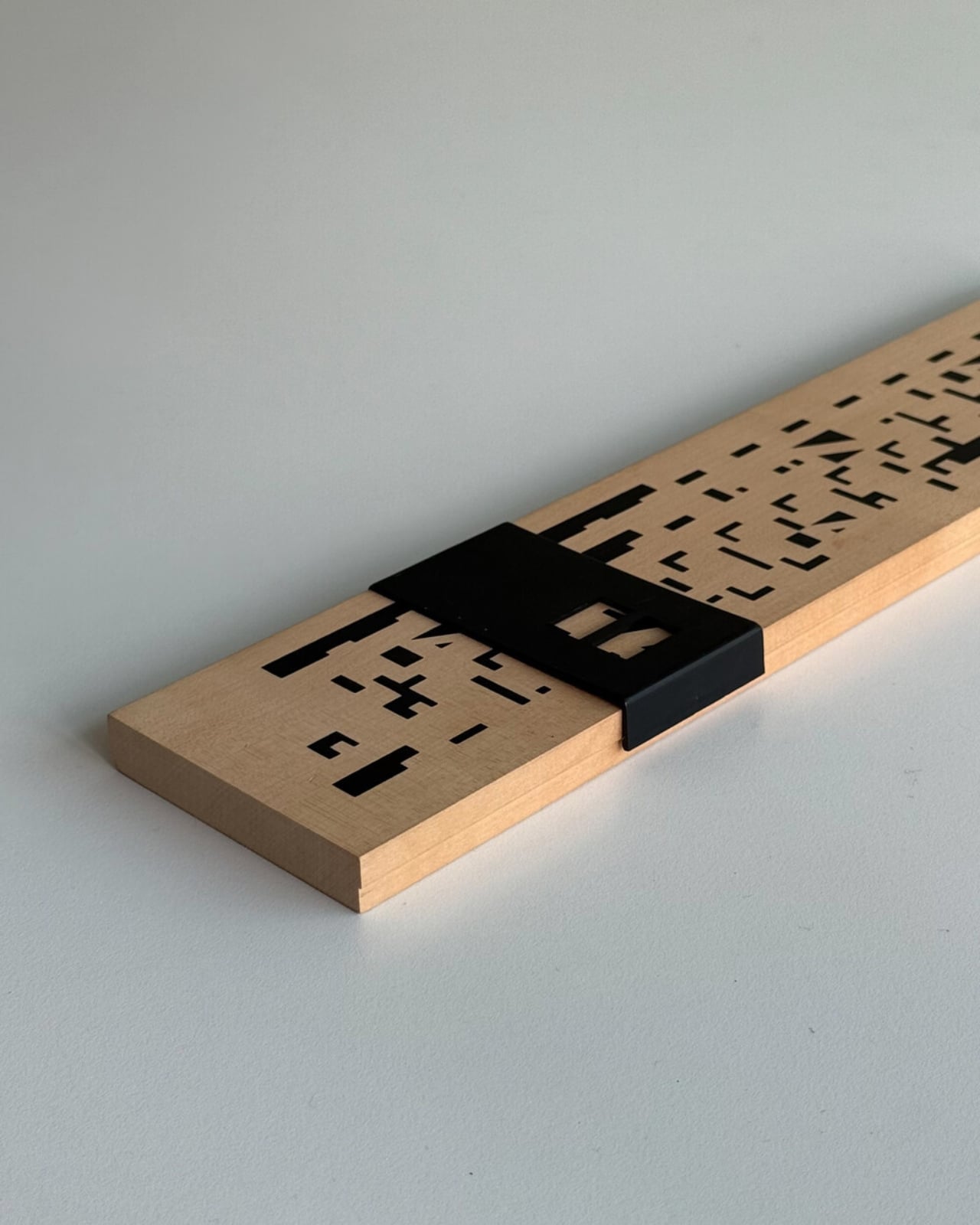
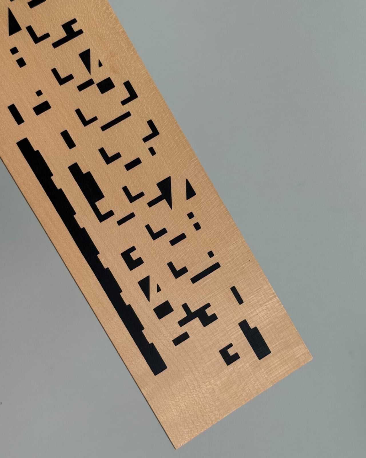
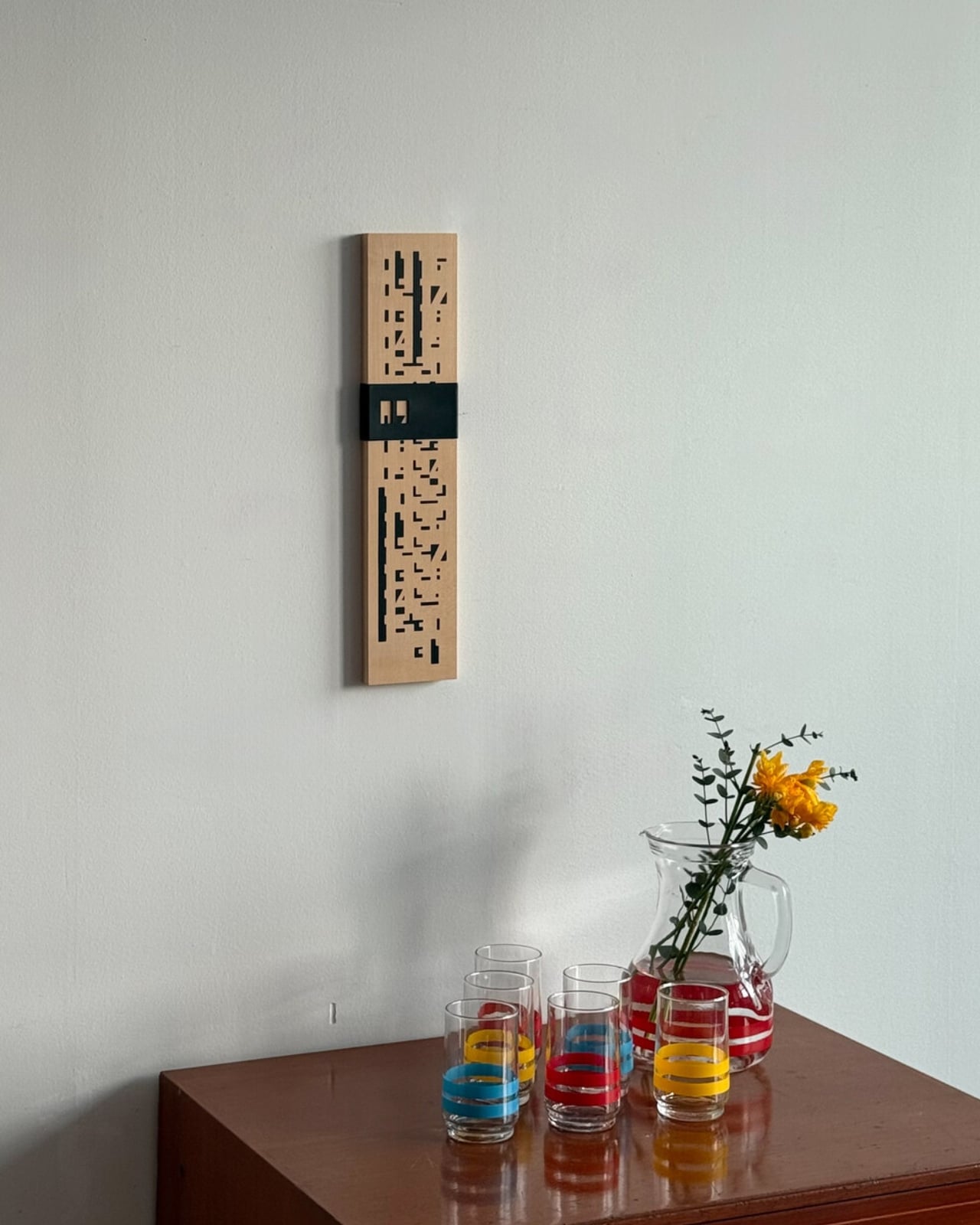
We are living through a slow, quiet rebellion against digital everything. Vinyl record sales have been climbing for years. Film cameras are back on shelves. People are buying paper planners again. And now, a wooden perpetual wall calendar made in France in the 1970s is having a moment through a Korean design shop called Wertwerk, and I am completely on board.

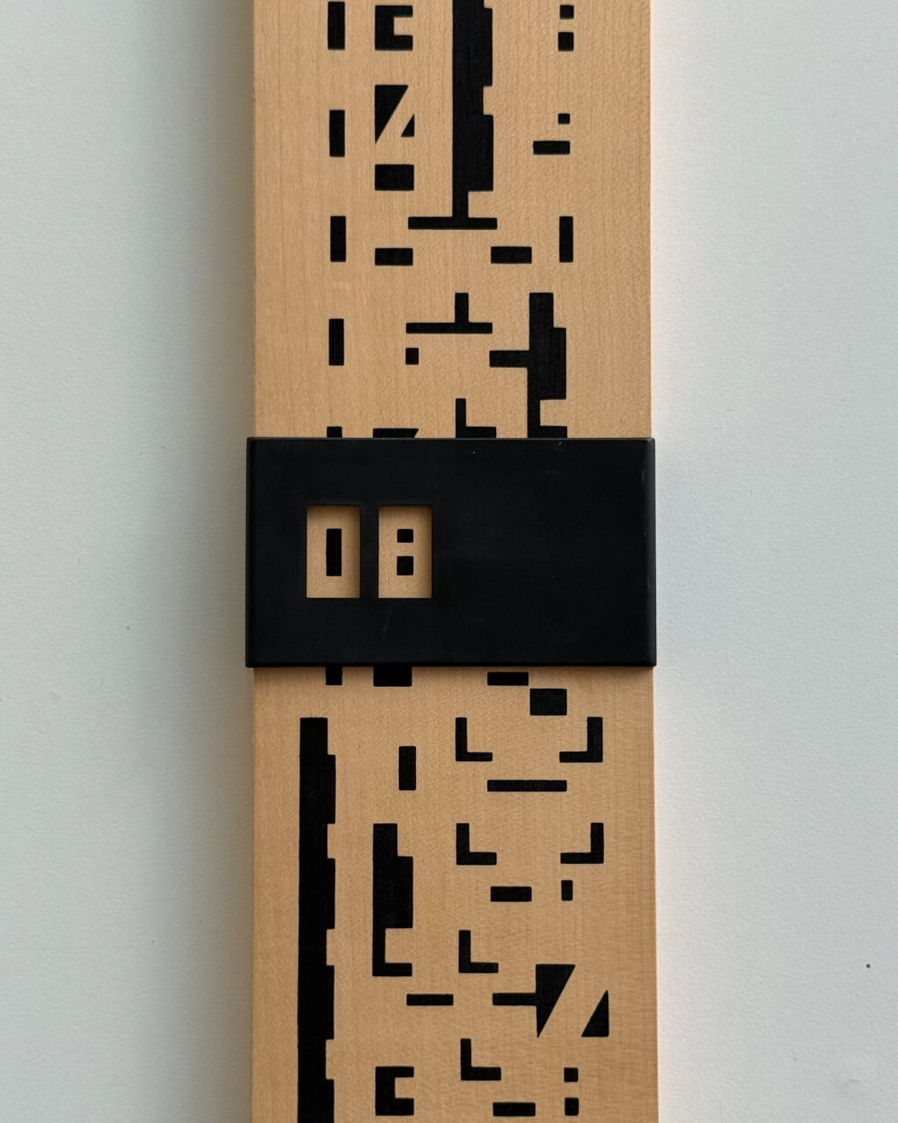
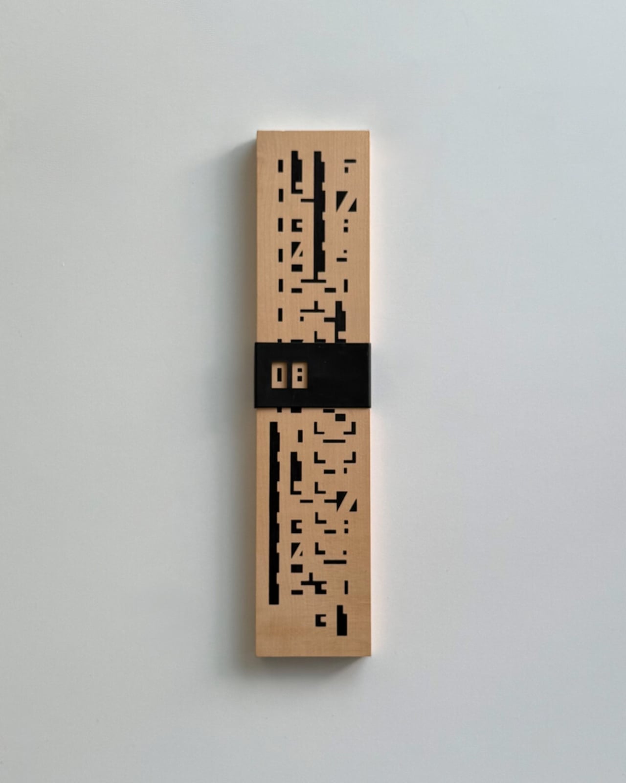
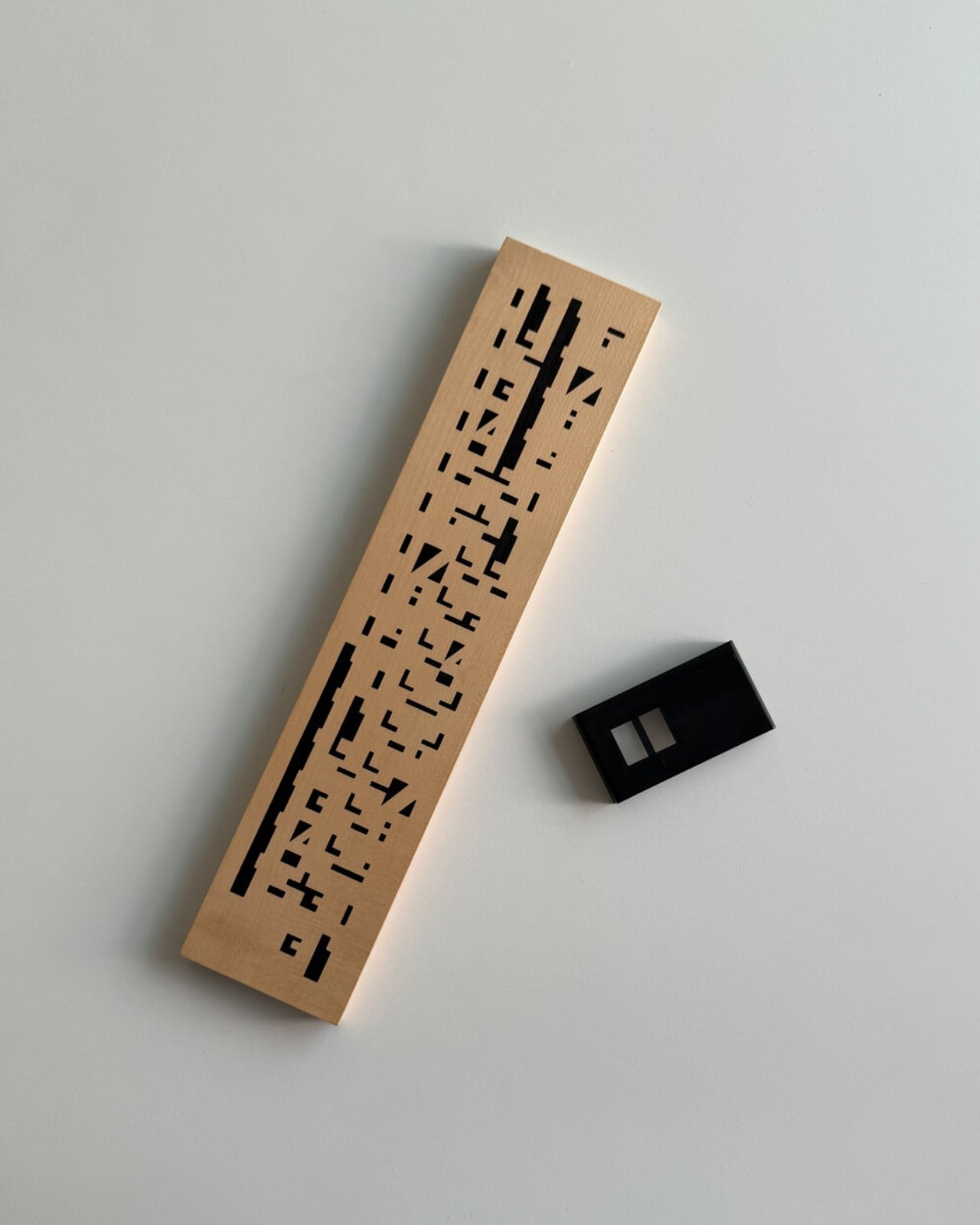
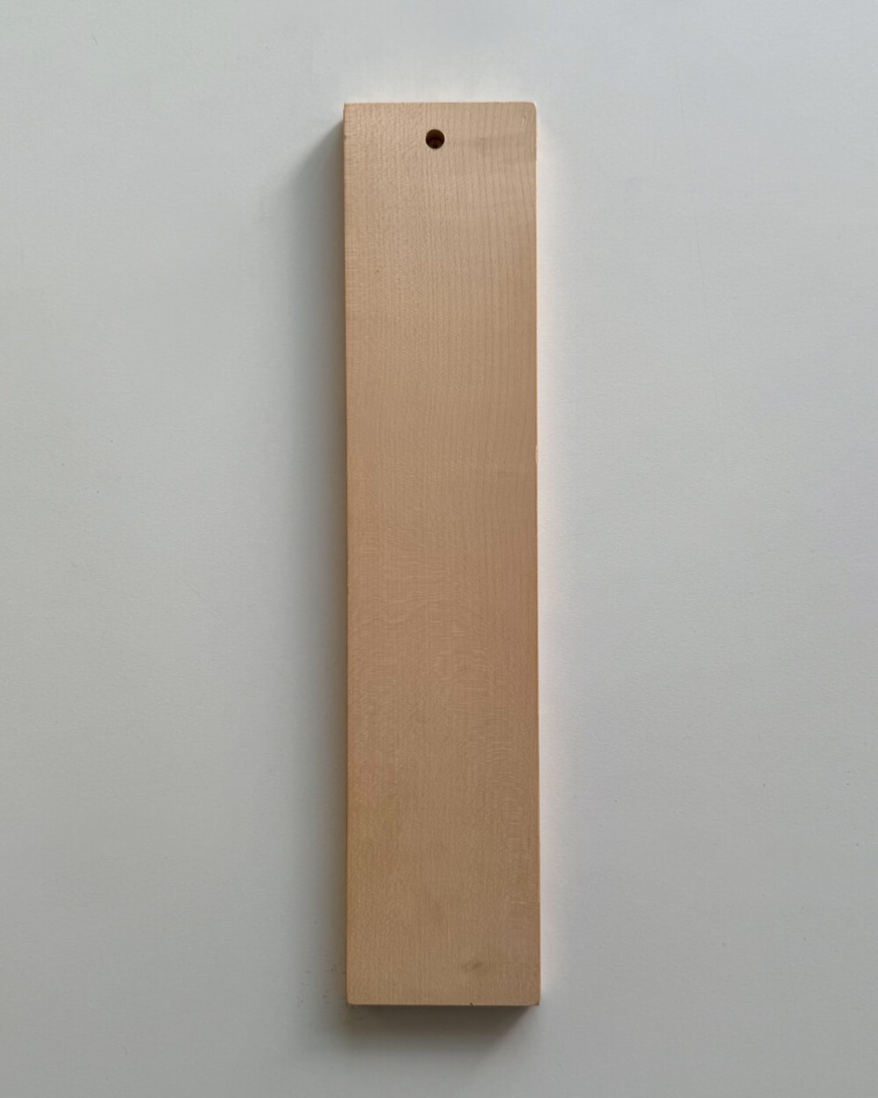
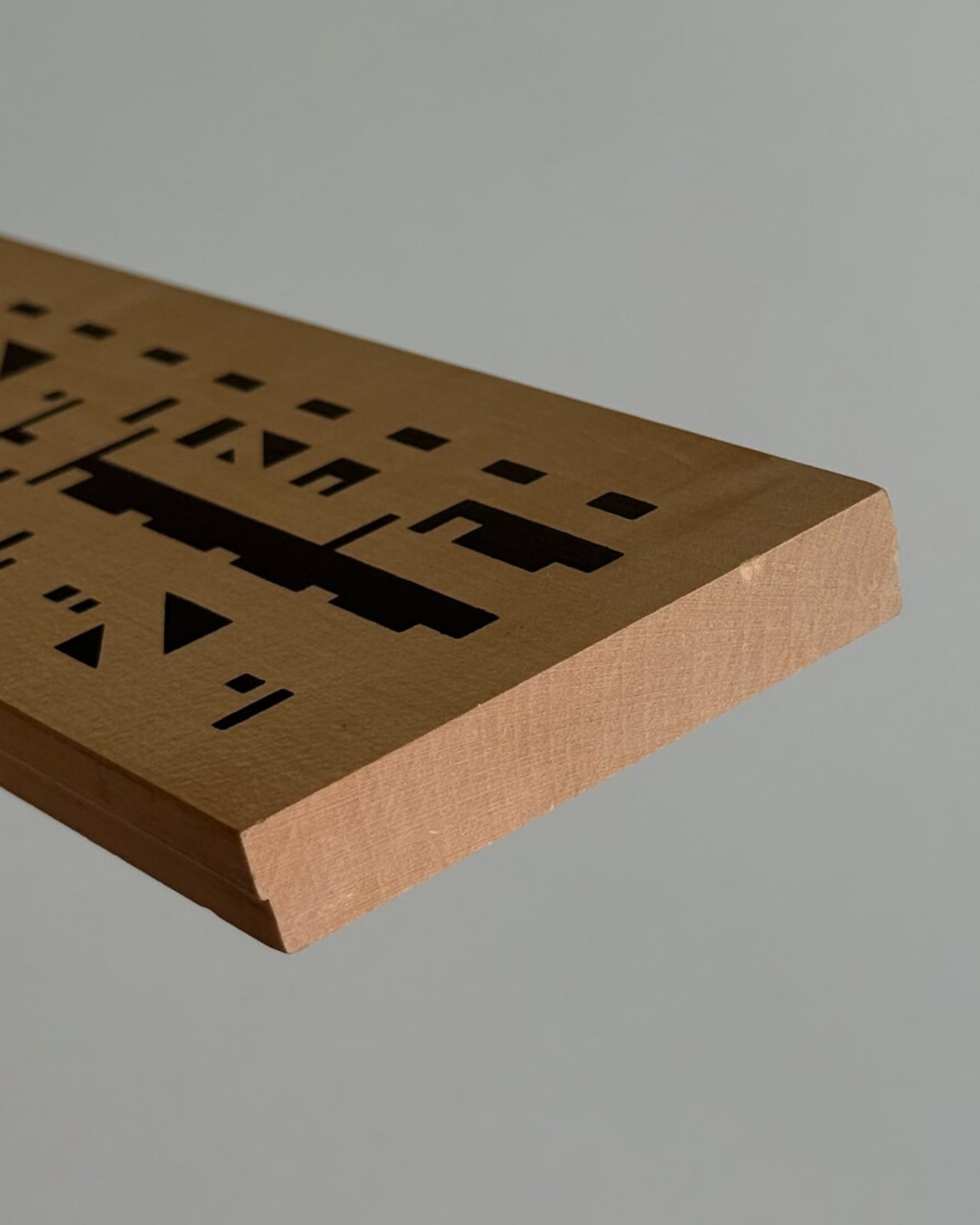
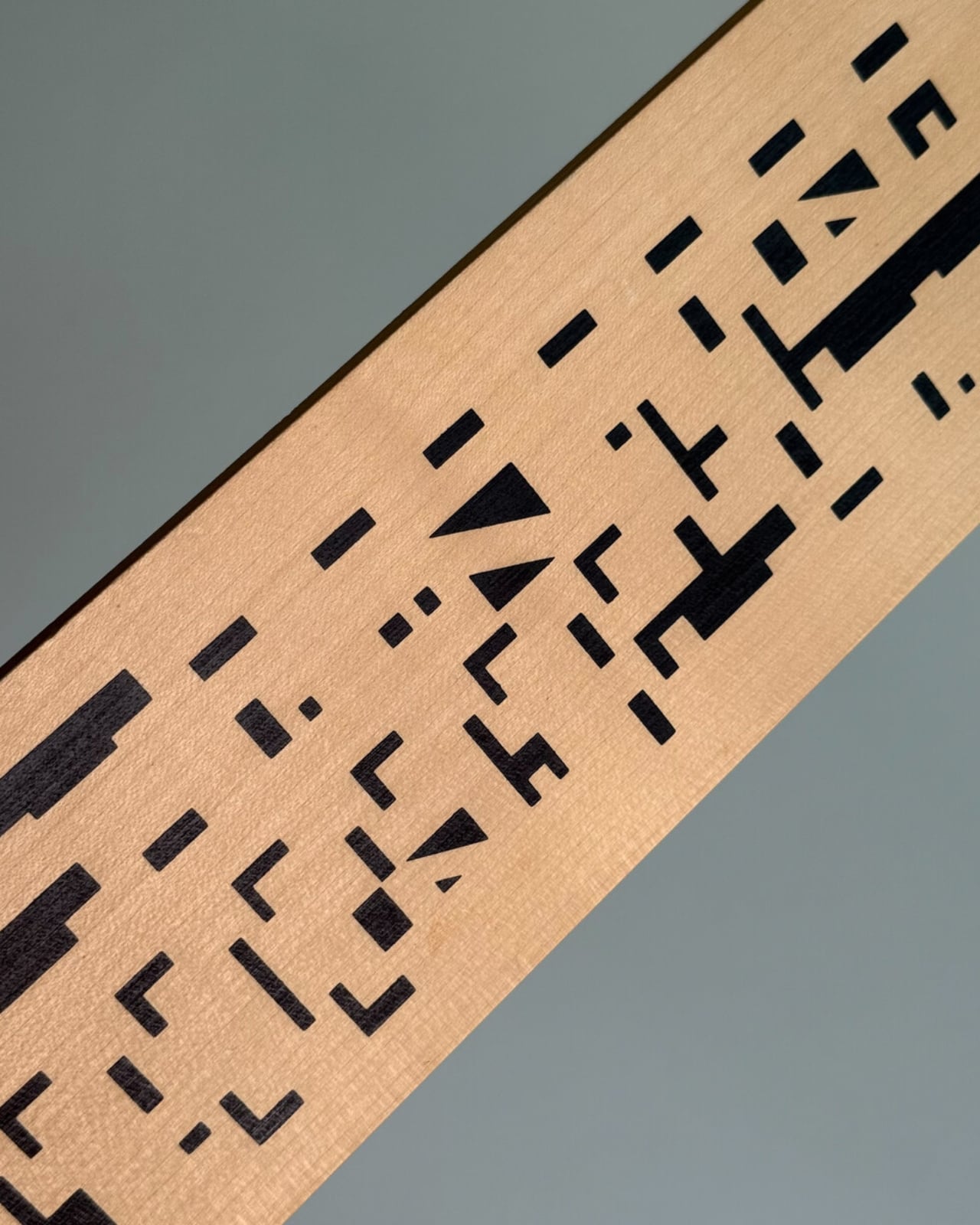
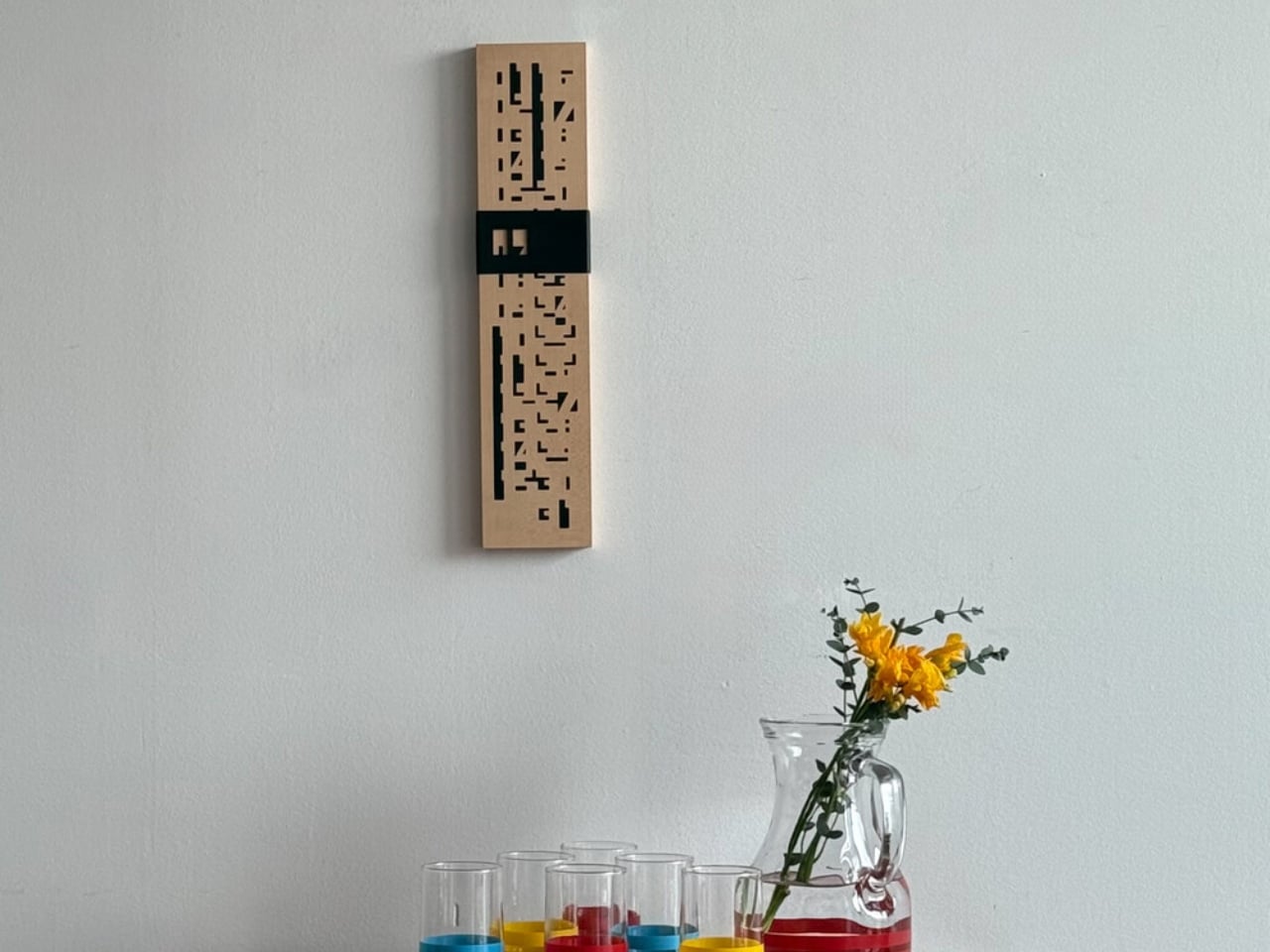
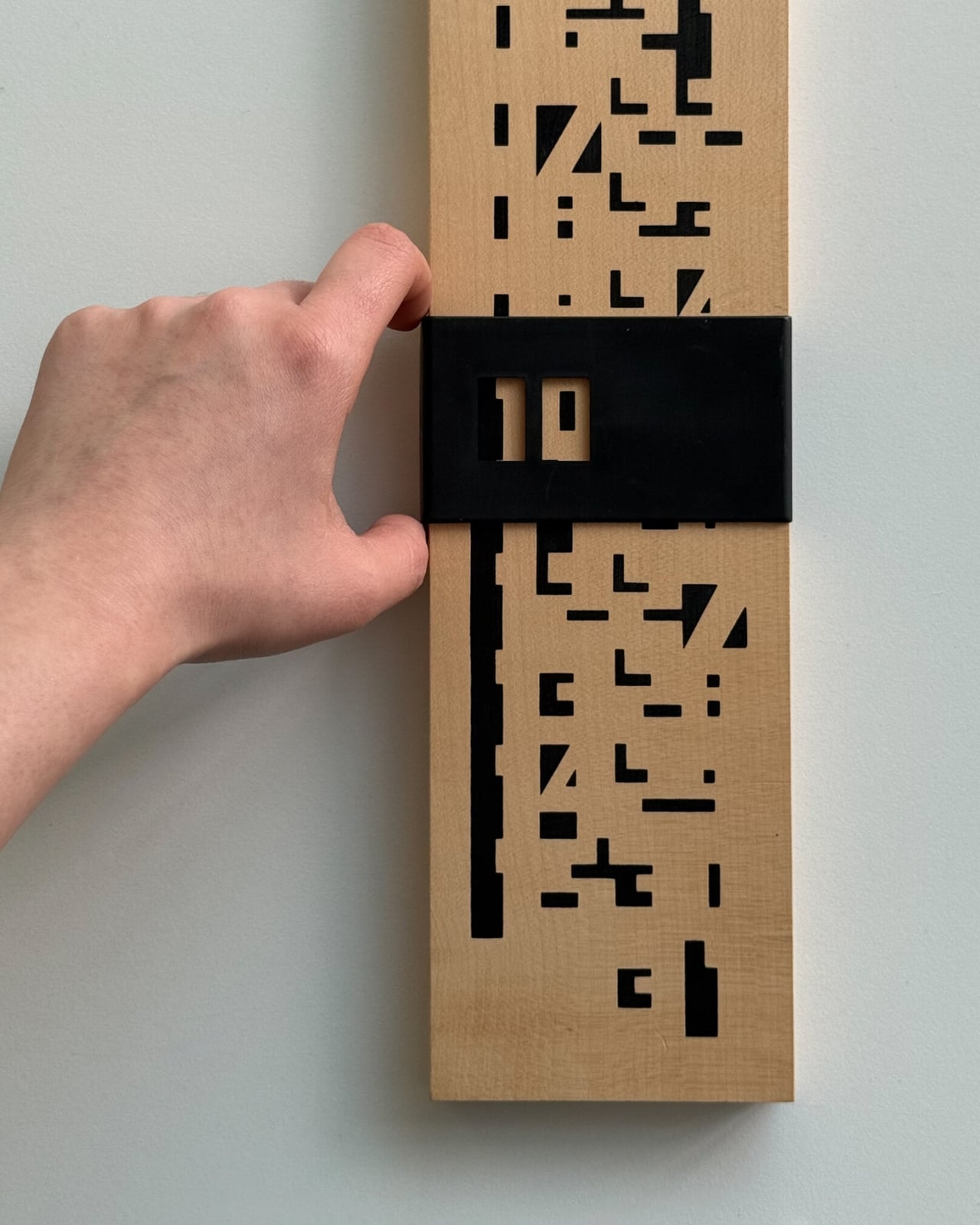
The piece is exactly what it sounds like: a wall-mounted calendar built from a warm wood base, with a row of plastic sliders numbered 1 through 31 that you manually shift to mark the date. No batteries. No notifications. No algorithm nudging you toward anything. Just wood, a little plastic, and the deliberate act of moving a slider every morning. That’s the whole thing. And yet, it manages to do something almost no digital tool can: make you stop and actually notice what day it is.

Designer Name: Wertwerk

What makes this particular object so interesting is the decade it comes from. The 1970s were a sweet spot in product design, especially in France, where makers were beginning to marry natural materials like wood with the new optimism of plastic. The result was objects that felt warm and industrial at the same time, organic and modern, useful and beautiful. A wooden calendar with plastic sliders is a textbook example of that tension. It doesn’t feel like a throwback. It feels like a design decision that simply worked the first time and never needed revisiting.

The word “perpetual” is doing a lot of heavy lifting here, and it deserves a moment. A perpetual calendar doesn’t expire. It doesn’t have a year printed on it. It covers every day and every month indefinitely, because those numbers don’t change; only the arrangement does. You can hang this on your wall and it will be just as functional in 2045 as it was in 1975. Compare that to your phone’s calendar app, which will feel dated in five years and be incompatible with something in ten. The perpetual calendar was designed with an understanding that good things don’t need to be replaced, just updated slightly, by hand, once a day.

Wertwerk is the Seoul-based shop behind this particular find, and they deserve full credit for the eye. Their name pulls from the German words for “worth” and “work,” and that philosophy runs through everything they source. They’ve built a devoted following by seeking out vintage objects that carry actual value beyond nostalgia. Their pieces sell out fast, sometimes within hours. They’re not selling aesthetics for aesthetics’ sake. They’re making a case that a well-made object from fifty years ago can do something a new one cannot: carry the evidence of its own history.

I’ll admit I’m biased toward objects that reward you for paying attention to them. The wooden perpetual calendar does exactly that. Each time you slide the date, you’re reminded that time is something you track, not something that tracks you. It’s a small distinction, but it adds up over days and months. Moving a physical date marker is categorically different from glancing at a lock screen, and not in a pretentious way. It’s just more deliberate.

The design also photographs beautifully, which is partly why it’s gaining traction in design communities. The wood grain set against the geometric order of numbered sliders reads as both nostalgic and contemporary. It’s the kind of object that looks intentional in a space, not decorative for decoration’s sake, but genuinely considered.

If you’ve ever bought something because it made you feel a certain way before you even used it, this is that kind of object. It quietly tells anyone who notices it that you care about how things are made and how long they last. Not everyone reads a wall calendar that way. But for those who do, this one from Wertwerk is worth finding before it disappears, and based on how fast their inventory moves, that won’t take long.

The post Your Phone Has 12 Calendar Apps. None of Them Look Like This first appeared on Yanko Design.

  •  

Genji Kyoto Is a Hotel You Read Like a 1,000-Year-Old Book

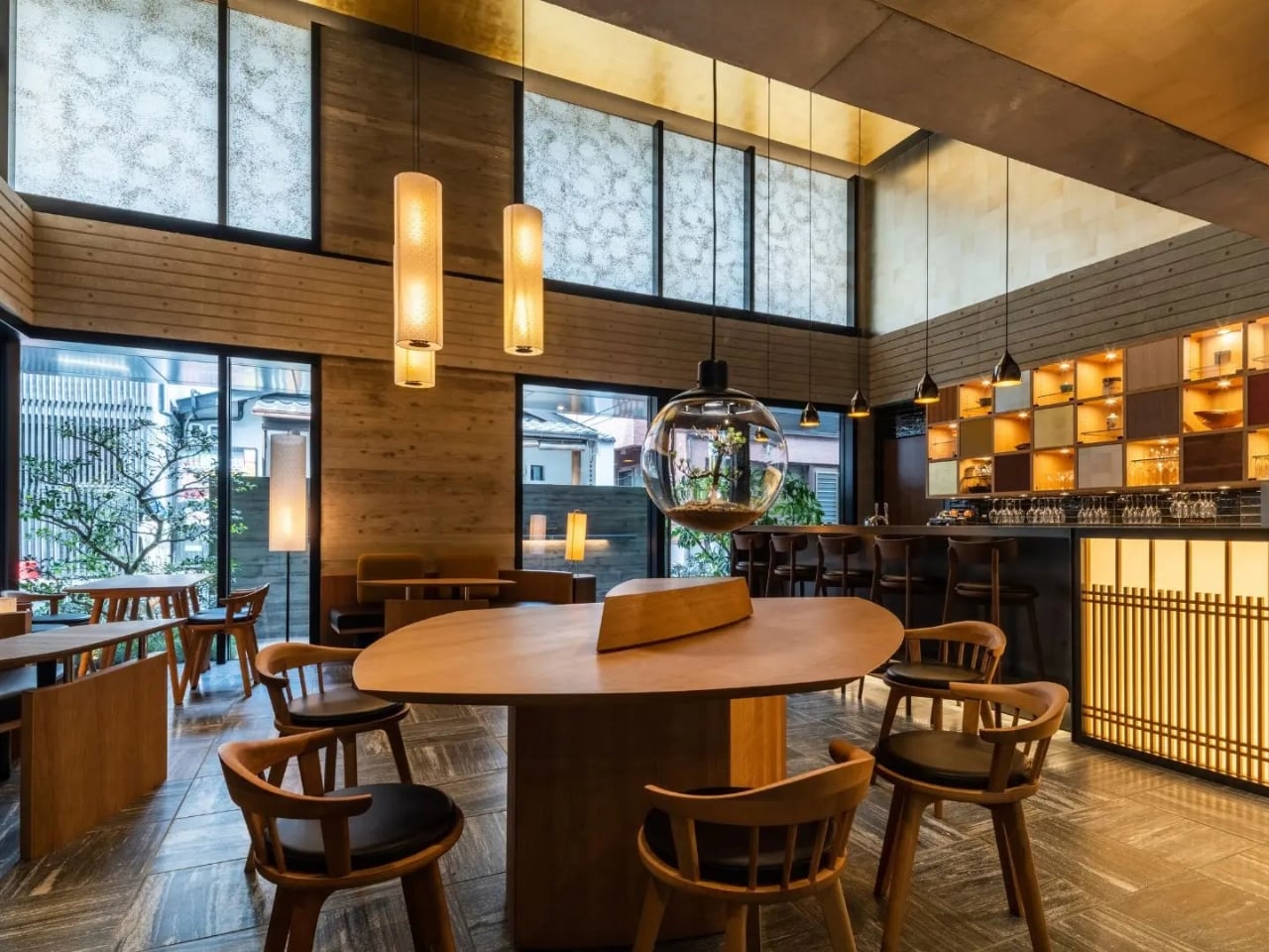
Most hotels ask you to check in. Genji Kyoto asks you to pay attention. Nestled along the Kamo River in Kyoto, Japan, this 19-room boutique hotel is the kind of place that architects talk about in hushed, reverent tones. And for good reason. It was designed by Geoffrey P. Moussas of Design 1st, a New York-born, MIT-trained architect who has called Kyoto home since 1994. That detail matters more than it might seem.

Moussas didn’t fly in with a mood board and a deadline. He has spent over three decades restoring and redesigning more than 40 traditional Japanese structures: machiya townhouses, tearooms, kura storehouses, and even a 400-year-old Buddhist temple. His work has been featured in the Financial Times, CNN, and NHK, and exhibited at Kiyomizu Temple and Nijo Castle. When someone like that builds a hotel, you’re not just booking a room. You’re stepping into a lifetime of accumulated understanding.

Designer: Geoffrey P. Moussas of Design 1st

The concept behind Genji Kyoto traces back to an 11th-century Japanese novel, The Tale of Genji, widely considered one of the world’s first novels. When the design team discovered that the hotel’s site was historically tied to the story’s actual locations in Kyoto, the whole project shifted. The design moved away from a simple machiya prototype and toward the aesthetic world of the Heian period, over a thousand years ago. But Moussas wasn’t interested in imitation. His approach was to distill the spirit of Heian architecture, specifically the Shinden Zukuri style, characterized by pavilions woven through interconnected gardens, rather than recreate its surface. That distinction is everything. It’s the difference between a themed restaurant and a genuinely good one.

The guiding philosophy here is a Japanese concept called Teioku Ichinyo, which translates roughly to “building and garden are one.” Every spatial decision at Genji Kyoto flows from this idea. Gardens aren’t decorative; they’re structural. They guide movement, frame views, and carry what the Japanese call ki, the life force that animates a space. Even the small tsubo pocket gardens tucked around the guest rooms, a tradition dating back to Heian palace residences, do serious work, turning what could be a blank interior wall into a living, breathing view.

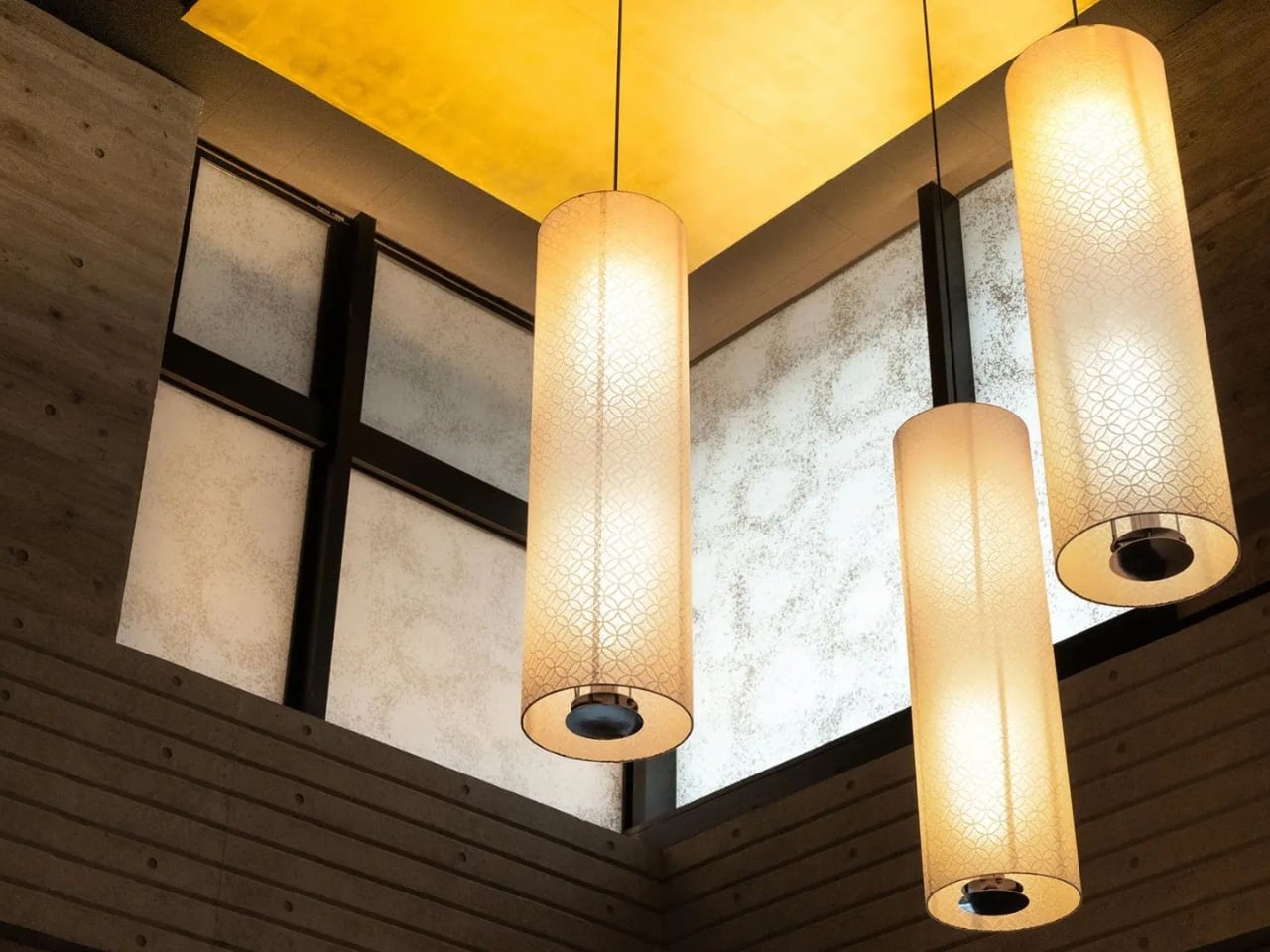
The materials are just as considered. Cedar-imprinted concrete shows up throughout the hotel, hard surfaces pressed with the warmth of wood grain, creating a tension that reads as both ancient and completely new. Large-scale washi paper panels function as architectural elements, not just decoration. Guest rooms have solid cherry wood floors, tatami mats made from natural rush, and furniture entirely handmade by Kyoto craftsmen. Jun Tomita, who handled interior design alongside Moussas, drew motifs directly from The Tale of Genji for every custom piece. And then there’s the detail I keep coming back to: during construction, a heritage water basin and a small shrine were discovered on-site. Rather than remove them, the team built the garden around them. That kind of decision tells you everything about where the priorities were.

There are 19 rooms in total, each one different. River views, city views, garden views. No two stays are the same, and that’s by design. Each room also features an original painting by a Kyoto artist, with every piece drawing on a different theme from The Tale of Genji, so even the art tells a chapter of the same story. Moussas has said he wanted guests to have a different experience every time they return, and the hotel is built to make that true. The rooftop garden and bar take it further still, offering panoramic views that make the hotel feel like it belongs to the entire city, not just its footprint.

Genji Kyoto’s real achievement isn’t any single detail. It’s the commitment to depth over spectacle. A lot of contemporary design is about the first impression, the photograph, the wow moment. This hotel asks for more time than that. It reveals itself in layers, the way a good book does. You have to slow down. You have to look twice. That’s a rare ask in hospitality. And it’s a rarer thing to pull off.

The post Genji Kyoto Is a Hotel You Read Like a 1,000-Year-Old Book first appeared on Yanko Design.

  •  

A Transforming Table-Chair That Turns Tradition into Space-Saving Intelligence

At a time when living spaces are shrinking while expectations from them continue to expand, this design presents a thoughtful response that is both rooted in tradition and aligned with contemporary needs.

Emerging from the context of rising housing pressures in Taiwan, where compact homes are increasingly becoming the norm, the project addresses a fundamental question: how can furniture adapt to limited space without compromising comfort or experience? Rather than treating furniture as static, single-purpose objects, the designer reimagines them as dynamic systems capable of transformation.

Designer: Che-Chia Hsu

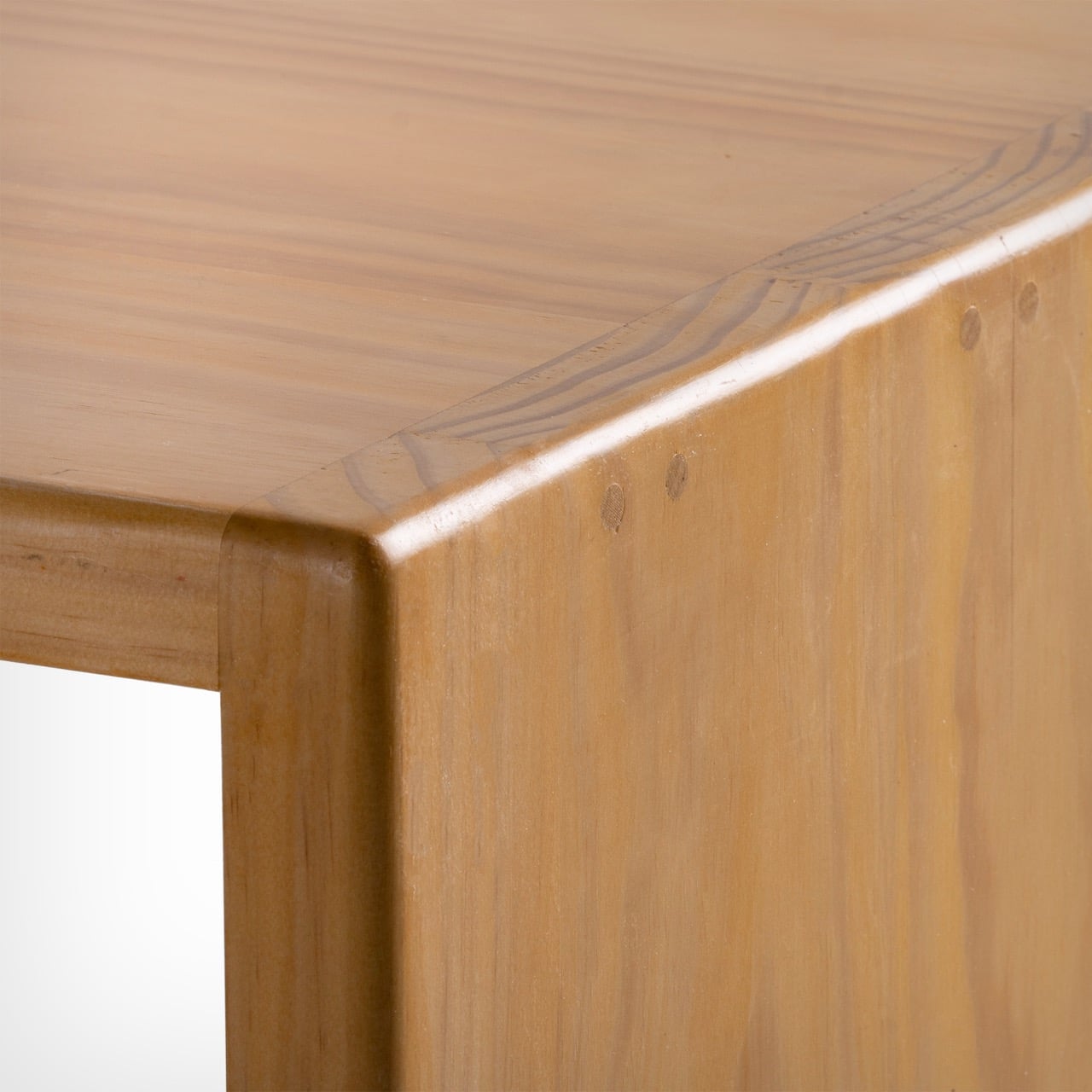
At the heart of this piece lies a deep engagement with traditional Chinese woodworking techniques, particularly the precision of tenon joints. These joints move beyond being structural solutions and become expressions of calculated craftsmanship, where geometry, material behavior, and human interaction converge. The result is a construction that feels both minimal and robust, relying on accuracy instead of excess.

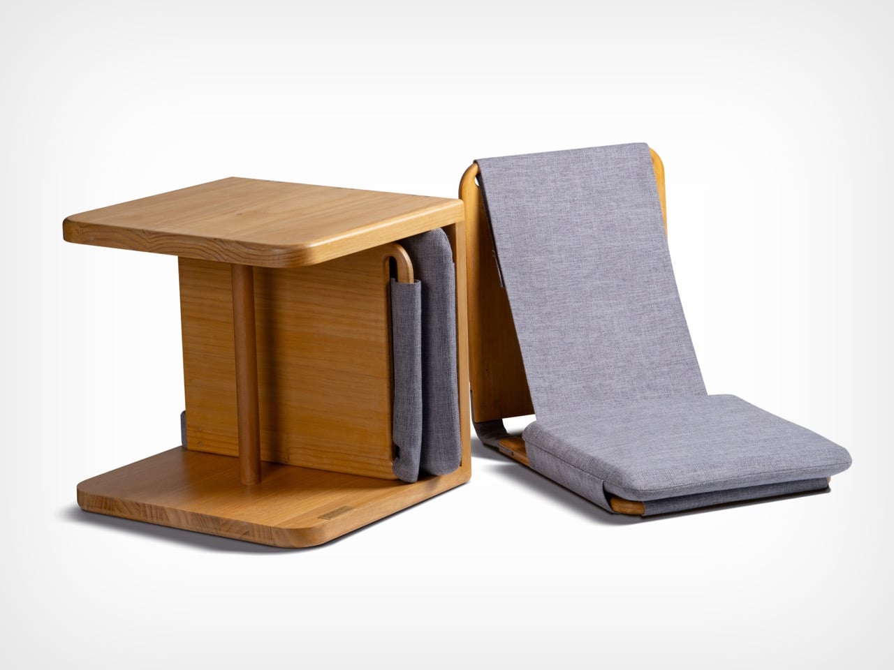
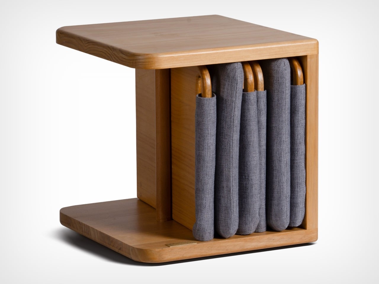
The furniture set is designed to integrate storage and seating within a compact footprint. A chair is concealed within the table and can be pulled out, unfolded, and expanded into a functional seat. The process is intuitive: the chair is extracted, the seat and backrest are opened, and the backrest angle is adjusted using velcro. The transformation is smooth and unobtrusive, allowing the object to shift roles effortlessly.

What distinguishes this design is its reliance on the user’s own body as part of the structural system. Instead of depending entirely on rigid supports, the chair uses the tension generated by the sitter to stabilize the backrest. This introduces a subtle interaction between user and object, where the act of sitting becomes integral to how the design performs. The experience feels efficient, responsive, and quietly intelligent.

Material choices reinforce this balance between function and experience. Lightweight pine wood panels provide durability while ensuring ease of movement. Paired with gray cotton linen fabric, the design introduces a tactile softness that enhances comfort. The fabric is breathable and visually understated, complementing the natural warmth of the wood. Together, these materials create a calm, cohesive aesthetic suited to contemporary interiors.

The development of the project reflects a layered and rigorous process. The designer began by studying traditional joinery techniques through literature, followed by hands-on training under a woodcraft master. This immersion enabled a deeper understanding of the craft beyond theory. Building on this foundation, the designer explored ways to translate these techniques into a modern, functional context through research and experimentation.

What emerges is a design that treats constraint as a starting point rather than a limitation. The piece brings together traditional knowledge and contemporary living patterns, shaping an object that adapts, responds, and participates in everyday use. It reflects a way of designing where space, material, and human interaction are considered together, resulting in furniture that feels considered, purposeful, and in tune with the realities of modern living.

The post A Transforming Table-Chair That Turns Tradition into Space-Saving Intelligence first appeared on Yanko Design.

  •  

iPhone 18 Pro Leaks Reveal a 2nm A20 Pro Chip, 35% Smaller Dynamic Island, and a Deep Red Color

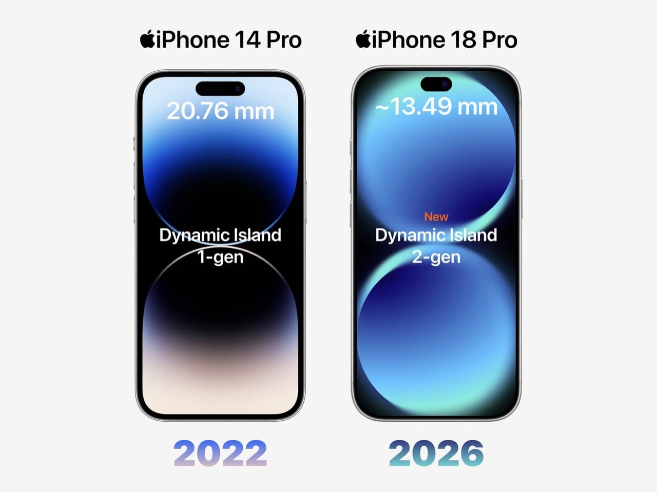
Apple has spent four years refusing to touch the Dynamic Island, treating it like some untouchable monument to software-hardware integration. Samsung cycled through three foldable generations in that time. Google rebooted the Pixel lineup twice. Nothing went from startup curiosity to legitimate competitor. And the iPhone 14 Pro’s pill-shaped cutout just sat there, exactly the same width, height, and visual footprint on the 15 Pro, 16 Pro, and 17 Pro. Leaked screen protectors sourced from Weibo now suggest Apple has finally decided four years is long enough, and the company is gearing up to shrink the Dynamic Island by roughly 35 percent on the iPhone 18 Pro. The mechanism is straightforward: move the Face ID flood illuminator under the display, leave only the infrared camera and front lens in the cutout, and suddenly that wide pill becomes a narrow sliver sitting unobtrusively at the top of the screen. The infrared flood illuminator that powers Face ID is moving under the display on the iPhone 18 Pro, leaving only the infrared camera requiring a physical cutout alongside the front-facing lens.

But the Dynamic Island shrinkage is hardly the headline here, because the iPhone 18 Pro is also the phone where Apple trades in its most iconic color for something it has never tried before on a Pro model. Bloomberg’s Mark Gurman reports that Apple is testing a deep red finish for the 18 Pro lineup, a shade closer to burgundy than the bright Product Red tones the company used on standard models years ago. Apple removed black from the Pro lineup with the iPhone 17 Pro, the first time in the series’ history that no dark option existed, and the 18 Pro appears set to continue that direction rather than course-correct. September 2026 is the expected launch window, which makes this arguably the most important incremental iPhone in years. It is widely believed to be the last model in this design language before Apple delivers a radical overhaul for the 20th anniversary iPhone in 2027, so whatever ships this fall is likely your final chance to buy an iPhone that looks like an iPhone has looked since 2017.

Designer: Volodymyr Lenard

Leaker Ice Universe claimed the Dynamic Island cutout on the iPhone 18 Pro models will be approximately 35% narrower than it is on the iPhone 17 Pro models, with a width of around 13.5mm down from around 20.7mm. That figure refers to the default on-screen Dynamic Island width including surrounding black pixels, not the physical hardware cutout itself, but the visual difference should be immediately apparent in daily use. The iPhone 17 Pro’s Island is a wide, commanding presence even at rest. The 18 Pro’s leaked cutout reads almost delicate by comparison, a narrow pill sitting unobtrusively at the top of the screen. Apple will still need to revisit four years of Live Activities design and the entire interaction vocabulary built around the existing Island’s dimensions, which is a reasonable explanation for why this transition is taking as long as it is. Android manufacturers have shipped under-display cameras for years, with visible quality tradeoffs that Apple’s user base simply would not accept on a thousand-dollar phone. Holding the line until the technology meets the standard, rather than shipping it to win a spec sheet argument, is the kind of call that frustrates people in the short term and builds loyalty over time.

Under the hood, the A20 Pro chip built on TSMC’s advanced 2nm process promises roughly 15% faster performance and up to 30% better power efficiency compared to the current 3nm A19 Pro. Paired with 12 GB of RAM across the lineup, the new silicon should power smoother Apple Intelligence features, enhanced on-device AI processing, and better multitasking. Connectivity upgrades include Apple’s first in-house C2 5G modem, replacing reliance on Qualcomm components. The modem supports improved mmWave performance and expanded satellite connectivity, potentially enabling always-connected cellular service via NR-NTN standards for emergency messaging and basic data in remote areas without traditional coverage. Battery life stands out as a major highlight, especially for the iPhone 18 Pro Max. Leakers report a capacity jump to 5,100 to 5,200 mAh, the largest ever in an iPhone, enabled by a slightly thicker chassis measuring around 8.8mm up from 8.75mm on the iPhone 17 Pro Max. The added thickness and weight would accommodate the bigger cell while the more efficient 2nm chip helps stretch usage even further. Some projections suggest up to 40 hours of mixed use on a single charge.

The deep red finish represents a significant departure for a Pro lineup that has historically favored controlled, conservative colors like graphite, silver, gold, and muted titanium shades. Rumors of purple and brown finishes have also circulated, but Gurman believes those are just variants of the same red idea. The decision to skip black for a second consecutive year has already generated polarized reactions among enthusiasts, with some welcoming the bold direction and others mourning the loss of the classic understated aesthetic. For buyers who want black, Gurman specifically noted that the foldable iPhone is being designed with conservative space gray and silver finishes, suggesting Apple is deliberately separating its color identity across product lines. The iPhone 18 Pro may read as a modest update on paper, but as the final iteration of a design language that has defined the modern iPhone for nearly a decade, it carries more symbolic weight than any spec sheet can communicate.

The post iPhone 18 Pro Leaks Reveal a 2nm A20 Pro Chip, 35% Smaller Dynamic Island, and a Deep Red Color first appeared on Yanko Design.

  •  

Beethoven Gets a 200th Anniversary LEGO Set Complete With Für Elise Sheet Music

Beethoven composed his Ninth Symphony completely deaf. He never heard a single note of it performed, yet it remains one of the most emotionally overwhelming pieces of music ever written. That particular detail about his life has a way of stopping people cold, the idea that the instrument of his perception was gone, and yet the music kept coming, arguably better than ever. There are very few stories in human history that capture creative resilience quite like his.

Fan designer CousinExcitedCactus has channeled that legacy into a 358-piece LEGO Ideas set timed to a significant milestone: March 26, 2027 marks the 200th anniversary of Beethoven’s passing. The result is a compact, modular display set with a grand piano, a Beethoven minifigure, a candlelit writing table, and a removable “Für Elise” sheet music backdrop, plus a surprisingly moving recreation of his grave monument in Vienna.

Designer: CousinExcitedCactus

The piano is the heart of this build, and it’s different from your average modern day grand piano. The design draws from two instruments Beethoven actually owned and played: the Érard grand gifted to him in 1803, and the Conrad Graf fortepiano he used in his final years, by which point his hearing was almost entirely gone. Both instruments were period pieces with a lighter, more intimate tone than the thundering concert grands of today, and the LEGO recreation captures that sense of a working composer’s instrument rather than a showpiece. The lid is propped open, strings are visible inside, and a small sheet of music rests on the stand, the kind of atmospheric detail that makes a display scene feel lived-in rather than staged.

The candelabra beside the piano is a three-flame setup rendered with white cylinder candles and transparent flame elements, casting the whole scene in an implied warm glow. The Beethoven minifigure stands on a warm-toned wooden stage floor, white hair, dark formal coat, red cravat, with his signature in gold script on a nameplate tile at the front edge. Behind everything, a large printed tile carries the full opening bars of “Für Elise” in period calligraphy, functioning simultaneously as a backdrop panel and the set’s most immediately recognizable design element. It is a clever piece of dual-purpose design, the kind of thing that looks obvious only after someone else has already thought of it.

My favorite detail, though, is the grave monument. The builder has included a fully separate modular sub-build recreating Beethoven’s actual resting place at Vienna’s Zentralfriedhof, a white obelisk on a columned base with “Beethoven” lettered across the front, pink flowers at the perimeter, and a golden butterfly at the apex. The reverse side of the “Für Elise” sheet music tile features a printed reproduction of the grave, which means the backdrop itself does double duty depending on which way you face it. That is a genuinely thoughtful design decision.

The set currently sits at 720 supporters on LEGO Ideas, the fan platform where community-made MOCs (My Own Creations) gather votes toward the 10,000-vote threshold required to trigger an official LEGO design review. With 414 days left on the clock, there is plenty of time to get it there. If you want to see this one make it to store shelves in time for the 2027 anniversary, head to the LEGO Ideas page and cast your vote here.

The post Beethoven Gets a 200th Anniversary LEGO Set Complete With Für Elise Sheet Music first appeared on Yanko Design.

  •  

Ari 458 Pro is Germany’s smallest electric camper and we love its approach

It’s rare to come across a capable mobile living unit built onto the back of a Midsize Light Commercial Vehicle (LCV). The versatile delivery truck platform has the power and capacity to carry a living unit, but it’s not a preferred conversion choice for obvious reasons: It wouldn’t go beyond the convenient city and semi-urban paths.

If you’re someone who is content with camping in designated sites and parks at accessible distances over a weekend; the Ari 458 Pro electric camper van is tailored for your ‘compact, efficient and consistently sustainable’ lifestyle. For those who prefer the rugged wilderness, look over for other options.

Designer: Ari Motors

Created in Germany by Ari Motors, the Ari 458 Pro doesn’t have the rugged appearance: It’s not meant to be a mean adventure rig. The docile appearance may not be German, but the quality of what you get onboard the motorhome – space-saving design with maximum flexibility for living and traveling – is definitely German, if you know what I mean.

Designed to be Germany’s smallest electric camper van out there, Ari 458 Pro is created keeping in mind adventurers and family campers interested in short vacations. The mini-camper with 30 square feet of living space has a top speed of 70 km/h (44 mph) and about 230 kilometers (143 miles) range. It draws power from a solitary 23.5kWh electric motor, which produces up to 20 horsepower.  A choice of 15kWh battery is also available. It will perhaps reduce the range from 143 to roughly 112 miles.

It comes based on a resilient chassis with an integrated power supply, solar and water systems, while the interior is left out as a blank canvas for the individual to customize to their different requirement. Users can choose to customize the 12.5 feet long, 4.9 feet wide, and 6 feet high (headroom) camper interior from a minimalist solution for sleeping to a fully-equipped home with kitchenette, storage, couch, bed and other necessities.

Created small and compact, the Ari 458 Pro camper van can park conveniently in any parking space, and as the company says, ‘fit narrow roads where larger motorhomes cannot go.’ Its cockpit is interestingly furnished with two seats, a digital display, and a reversing camera to ensure safety. The camper van is currently available in Germany and is priced at €30,381 ($35,100). We do not have a word on the Air 458 Pro’s international availability, but for the interested, the Ari 458 Pro is available in the country in over 30 different variants: food truck, box van, flatbed, tipper, or even a compact garbage truck. These configurations start at €15,790 ($18,200).


The post Ari 458 Pro is Germany’s smallest electric camper and we love its approach first appeared on Yanko Design.

  •  

Anker’s $70 Power Strip Clamps to Your Desk, Keeps Cables Off Floors

Desks have gotten more crowded. Between the laptop, the monitor, the phone, and whatever Bluetooth peripherals have accumulated over the past few years, keeping everything charged without making a mess has become its own challenge. Power strips have always been the go-to solution, but most still end up on the floor or behind furniture, at the end of a cable that creates the very clutter it was supposed to fix.

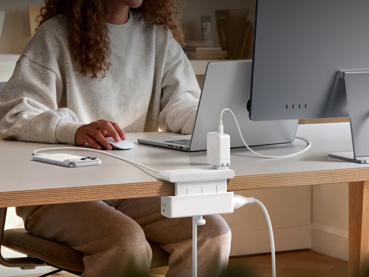
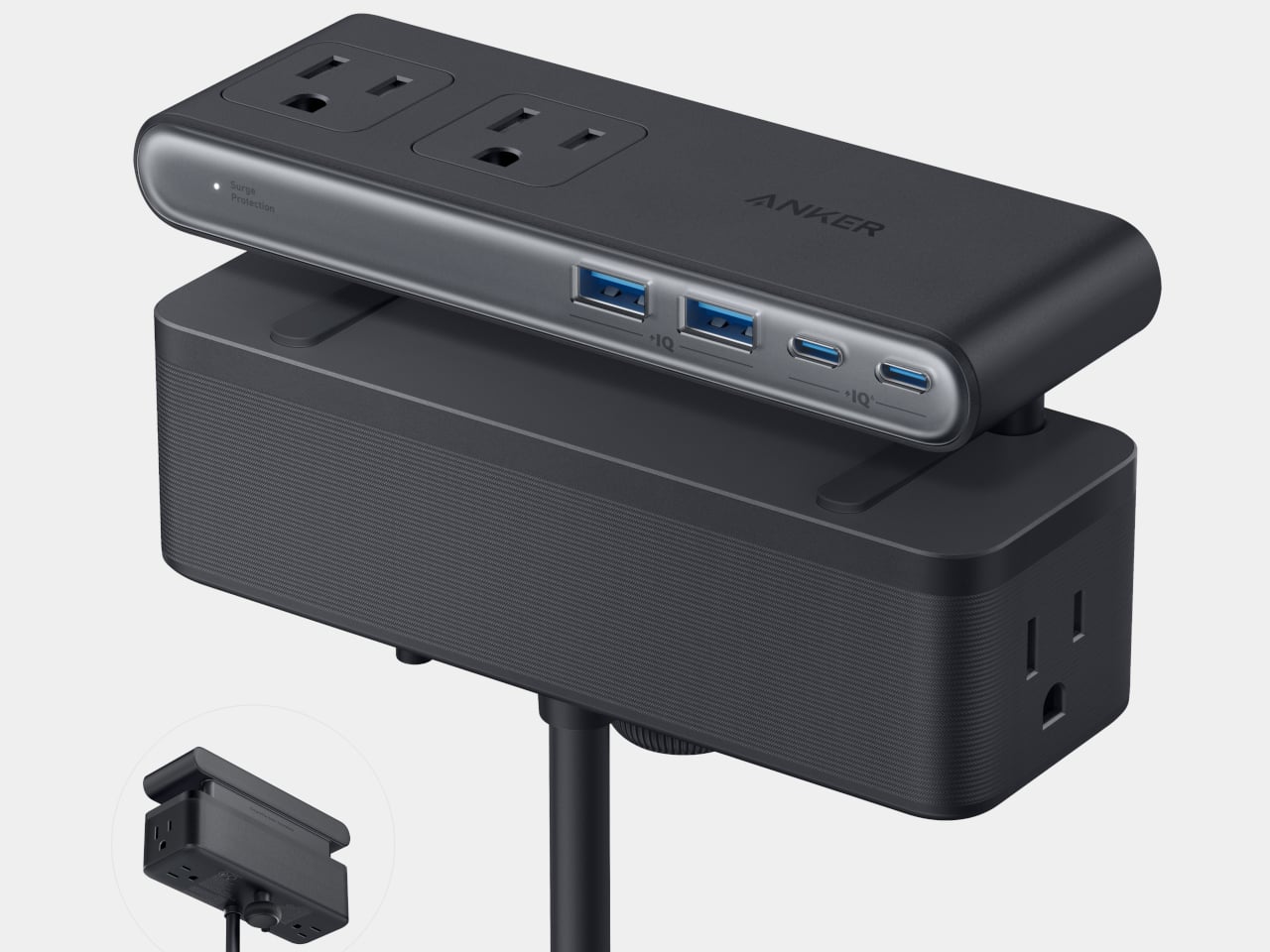
Anker’s Nano Power Strip (10-in-1, 70W, Clamp) approaches that problem from a different angle, quite literally. Instead of sitting on a surface or hiding under a desk, it clamps onto the desk edge, putting 10 ports right where they’re actually useful. First unveiled at CES 2026 and now available in the US for $69.99, it aims to reduce the mess that most power strips quietly make worse.

Designer: Anker

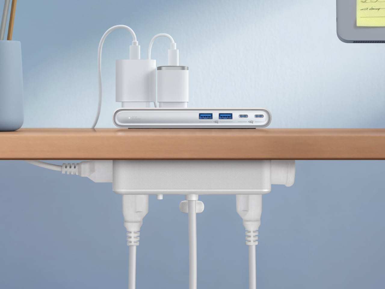
The clamp structure sits on either side of the desk edge, with ports distributed across its upper and lower sections. Six AC outlets handle the larger plugs, while two USB-A and two USB-C ports take care of smaller devices. Splitting the ports between two zones keeps things from crowding on one side, a small but practical detail that makes the strip feel properly considered rather than just generously stocked.

The USB-C charging capability is where the performance stands out. A single USB-C port can deliver up to 70W, enough to run a MacBook or most other laptops without needing a separate wall adapter. That output relies on GaN technology, which keeps the strip slim at just 0.75 inches thick despite the power output, and avoids the extra heat and bulk that older charging components tend to generate.

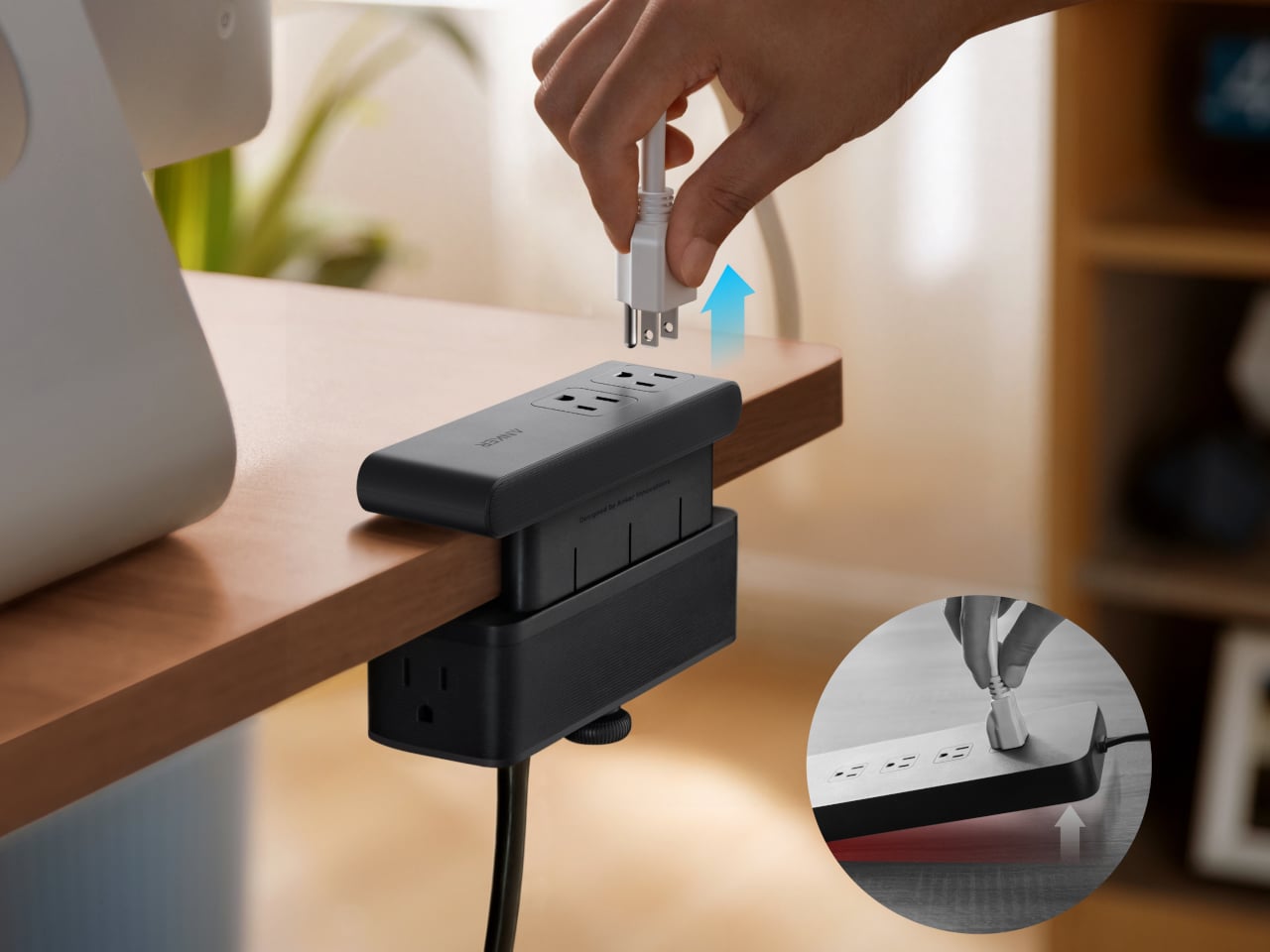
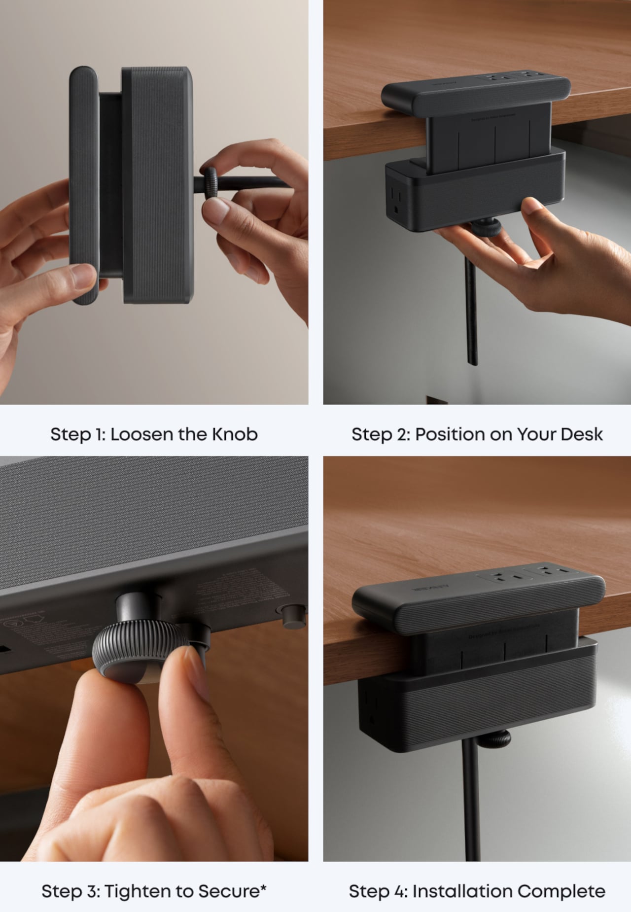
Installing it takes seconds. The adjustable clamp fits desk edges between 0.6 and 1.8 inches thick, covering most standard desks, and locks in firmly enough for one-hand use. That might sound like a minor detail, but plugging in a cable while the strip shifts around is exactly the kind of daily irritation that compounds. A stable mount means you’re not bracing the strip with your other hand every single time.

Anker also built in 1,500J of surge protection, along with a smart overload mechanism that includes a reset button. When it trips, the button pops out to cut power instantly. Press it again, and it’s back to normal. It’s a simple failsafe, but a useful one on a strip mounted at desk height, where a sudden power surge or overloaded circuit could easily go unnoticed until something stops working.

Anker markets it for gaming and office setups alike, and it’s easy to see why. Gaming desks accumulate powered accessories faster than most, from peripherals to controllers to headset chargers. The dual-zone layout helps spread those cables rather than pile them in one corner, and the 0.75-inch profile doesn’t take up surface space or interfere with the kind of clean, organized desk that people actually put effort into building.

Cable clutter isn’t going anywhere, but it can at least be contained. The Nano Power Strip doesn’t reinvent the power strip so much as it rethinks where one should live. At $69.99, it’s a reasonable ask for 10 ports, 70W of GaN-powered fast charging, and a desk-mounted solution that keeps the tangle off the floor and closer to where it actually gets used.

The post Anker’s $70 Power Strip Clamps to Your Desk, Keeps Cables Off Floors first appeared on Yanko Design.

  •  

These Steel Chairs Are Too Big to Sit In: Walk Through Them Instead

Most public art earns its place on a pedestal and stays there. It asks you to look, maybe photograph it, and walk away. The relationship between viewer and work rarely extends beyond that brief transaction. That’s been the convention for a long time, but there’s a growing push for installations that don’t just occupy public space but actually do something within it.

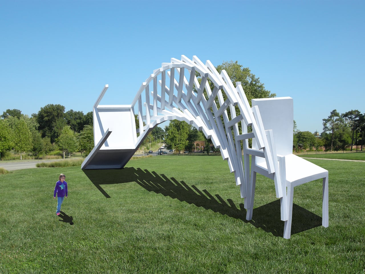
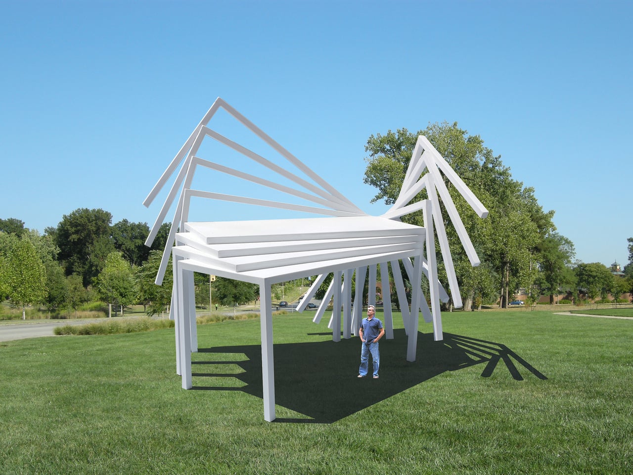
Michael Jantzen has been exploring that tension for years. His Moving Furniture series applies a simple idea to ordinary chairs and tables: take each object’s form and repeat it in progressive intervals as if capturing it mid-movement, then connect those moments into a single piece. The result is something you can still sit in or set a drink on, even if it no longer looks quite built for that.

Designer: Michael Jantzen

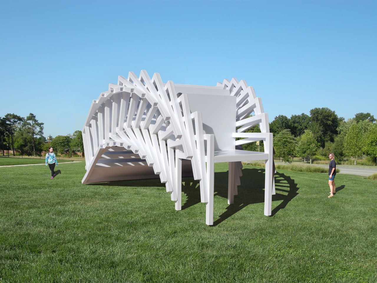
Monumental Moving Furniture takes that same concept into architectural territory. Built from painted steel, the series consists of abstracted chair and table forms, each generated by moving the original object through space and time and locking its path into a chain of connected segments. At this scale, what started as a reference to everyday objects feels closer to a building than a piece of furniture.

The method behind each piece is consistent. A chair or table is set in motion through space and time, with each interval frozen and joined to the next. Some pieces move only part of the original form; others shift the whole thing. The result is a structure that stops belonging to any single discipline and starts reading as furniture, sculpture, and architecture at once.

Despite being too large to sit in, these sculptures aren’t purely decorative. Each is large enough to walk under and through, giving it a practical function as a pavilion and shelter. That’s not something most public art can claim. Instead of asking people to observe from a polite distance, these structures pull you in, turning a passive encounter into something more physical and immediate.

The series covers both chair forms and table forms, each treated with the same sequential abstraction. Individual pieces have also been grouped into configurations that suggest more complex structures, as if each were a building block for something larger. Painted in vivid, solid colors like white, orange, and yellow, each structure commands attention from a distance and rewards a closer look once you’re standing beneath it.

Public spaces deserve more than objects to look at. They deserve things to experience. Monumental Moving Furniture earns its place on both counts, offering structures large enough to shelter visitors while giving them something genuinely puzzling to engage with. These forms don’t demand reverence. They invite curiosity, exploration, and the kind of slow, circling attention that good public space has always been designed to encourage.

The post These Steel Chairs Are Too Big to Sit In: Walk Through Them Instead first appeared on Yanko Design.
  •  

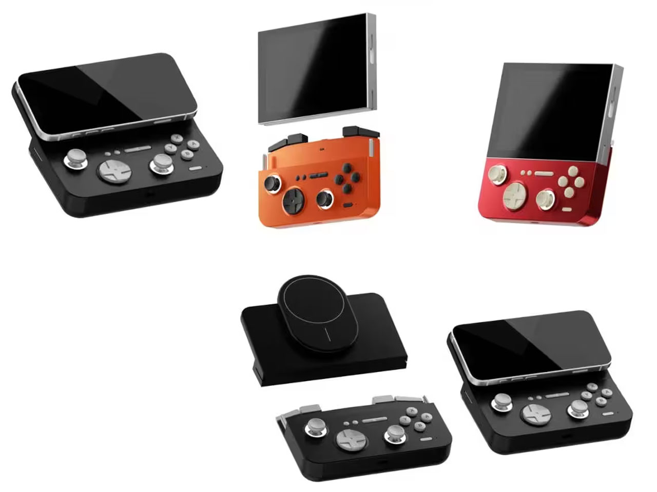
GAMEMT E5 MODX handheld’s detachable control module can be connected to Magsafe phones

The craze for handhelds over the last 24 months has driven a surge in portable gaming consoles. We’ve seen it all, right from retro handheld devices to modern consoles that can handle AAA titles without breaking a sweat. GAMEMT has been in the thick of things with a Android handheld released last month and a unique portable console with a dial knob.

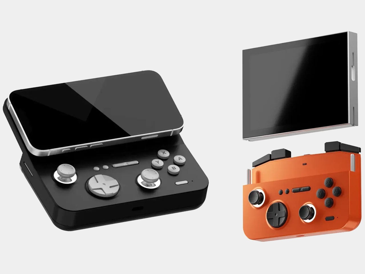
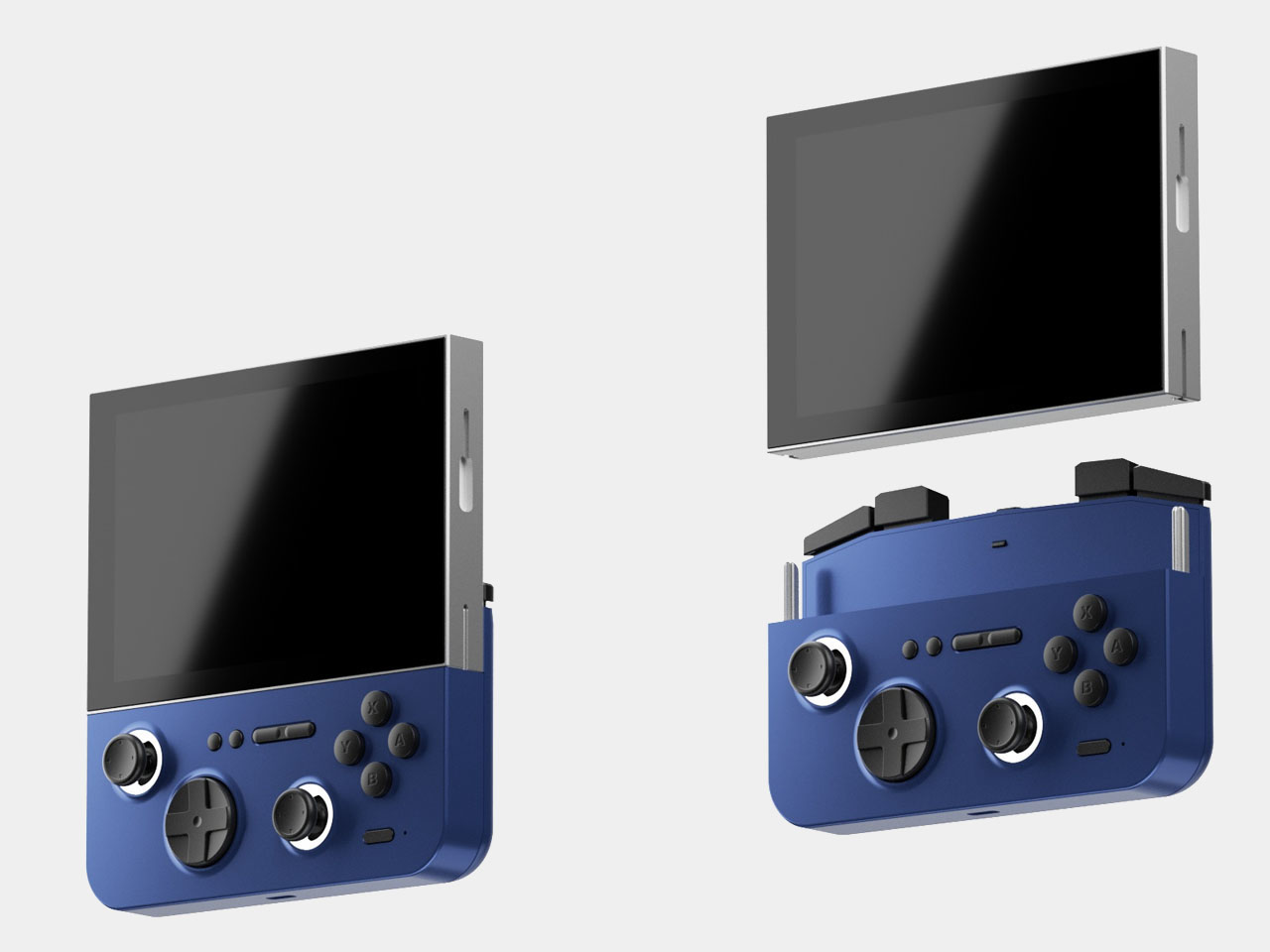
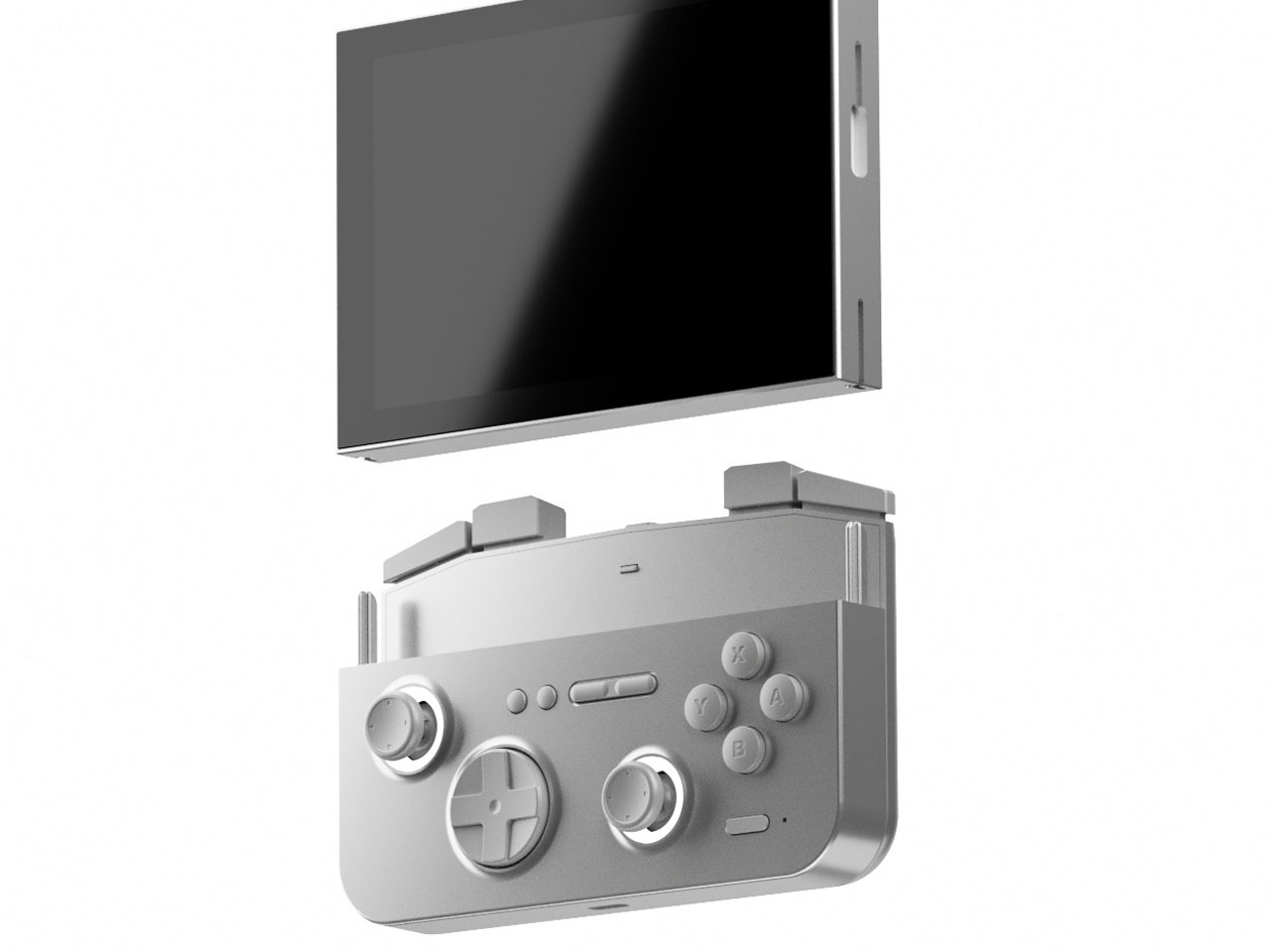
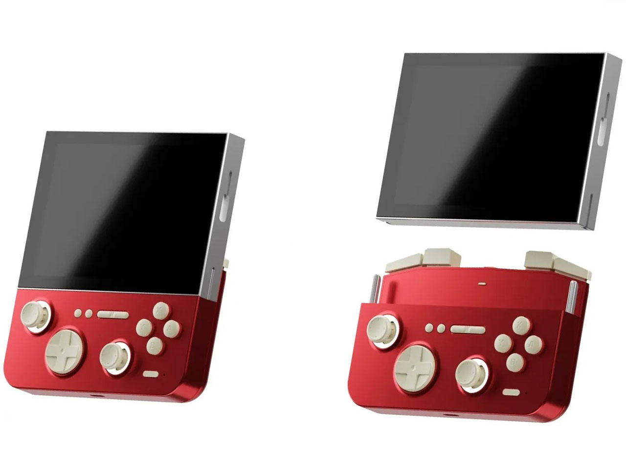
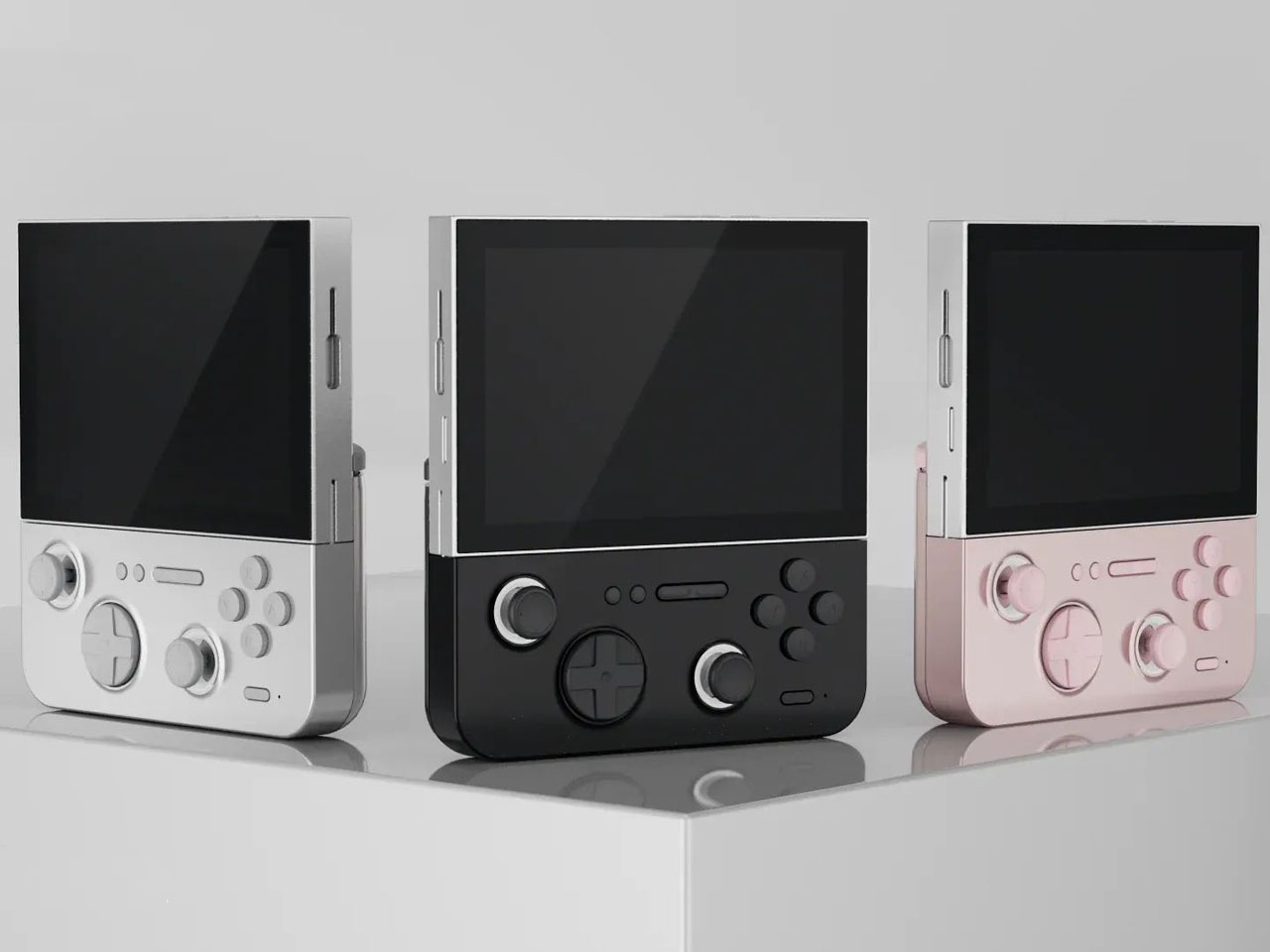
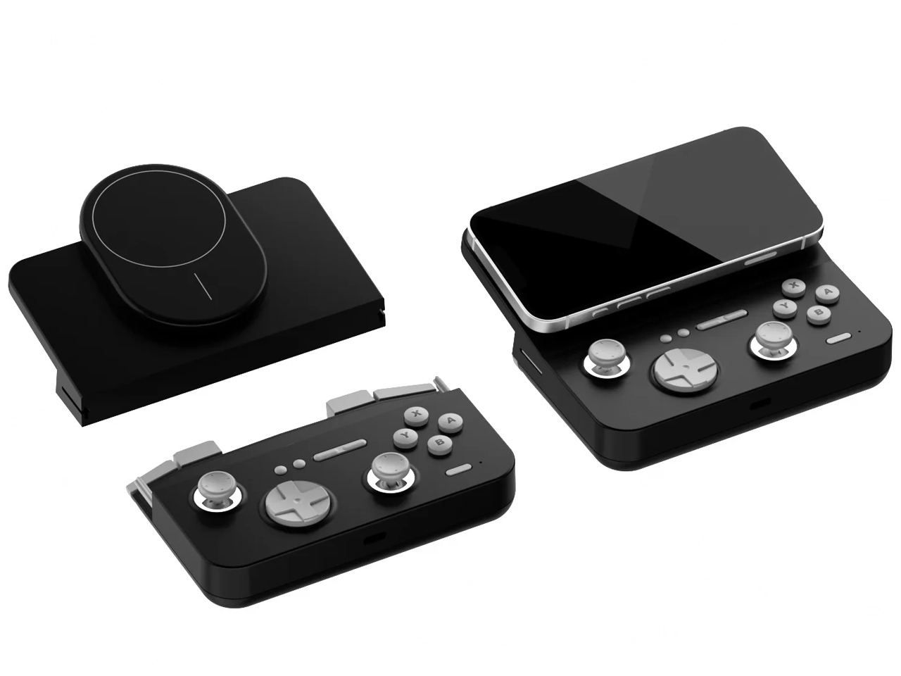
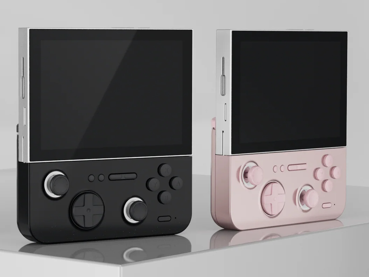
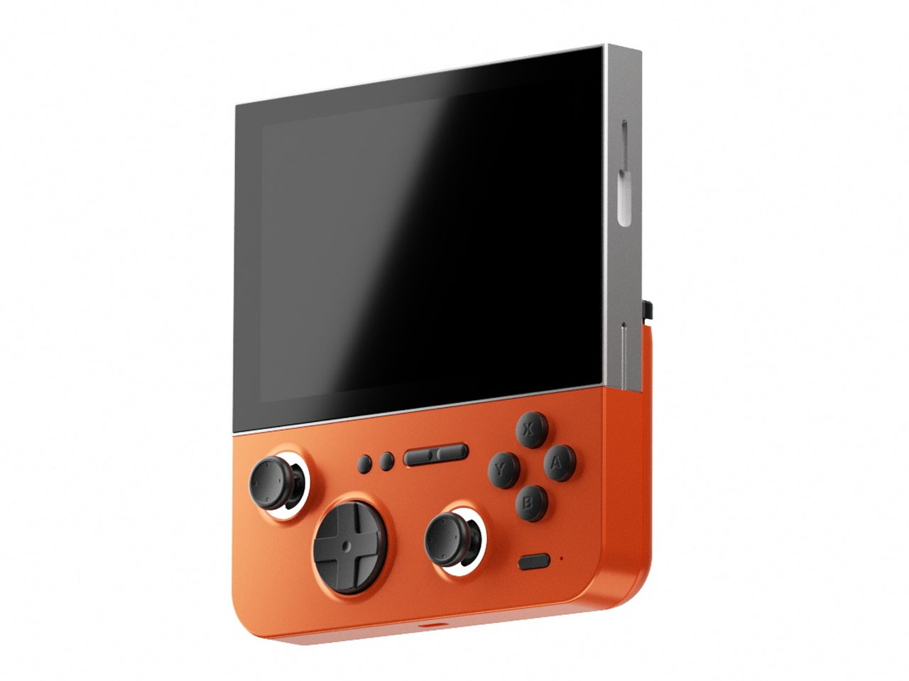
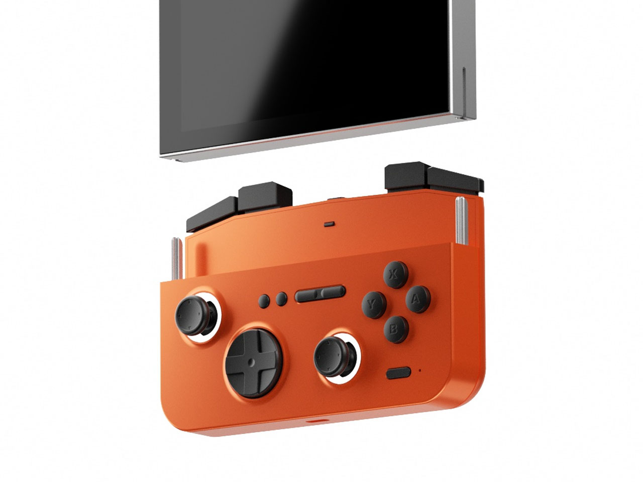
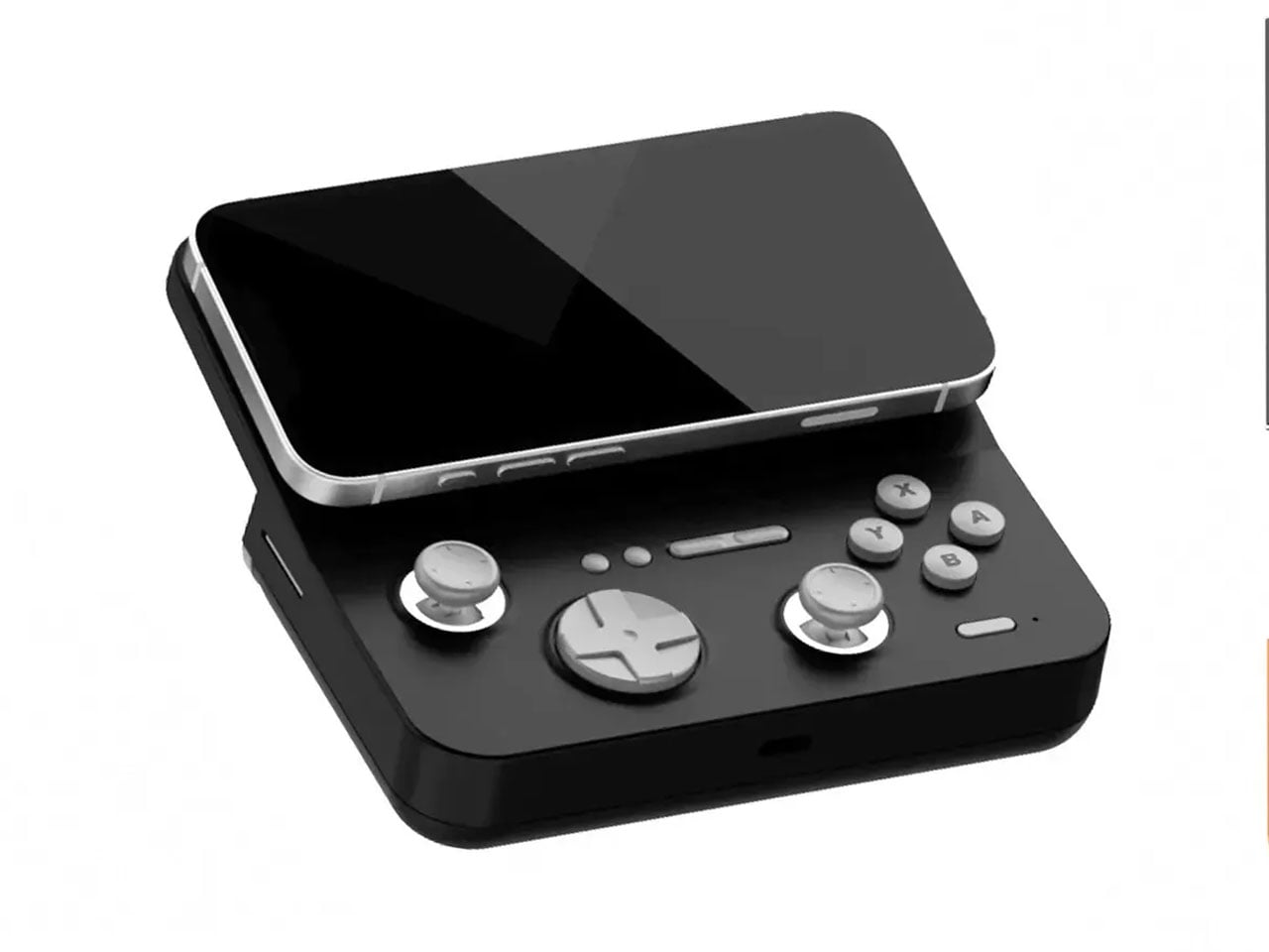
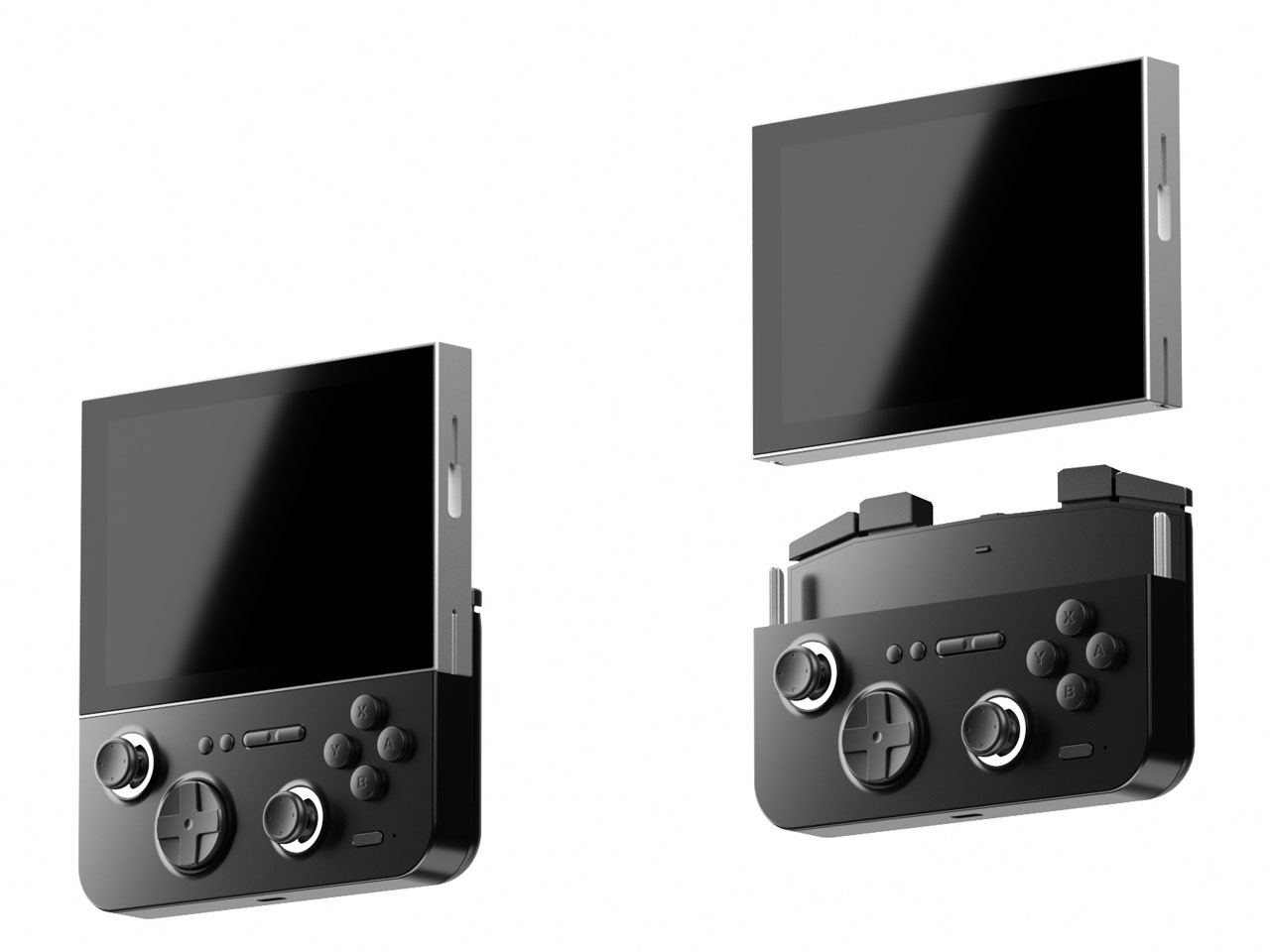
Now the Chinese manufacturer has revealed yet another handheld, which is an eye turner for sure. This is the E5 MODX console based on the original E5 released in 2024. The console has a removable modular display that can be connected to your MagSafe-compatible smartphone. It would be safe to say that the handheld draws inspiration from the MCON controller, but we haven’t seen a detachable-display handheld yet. Now, that’s downright cool.

Designer: GAMEMT

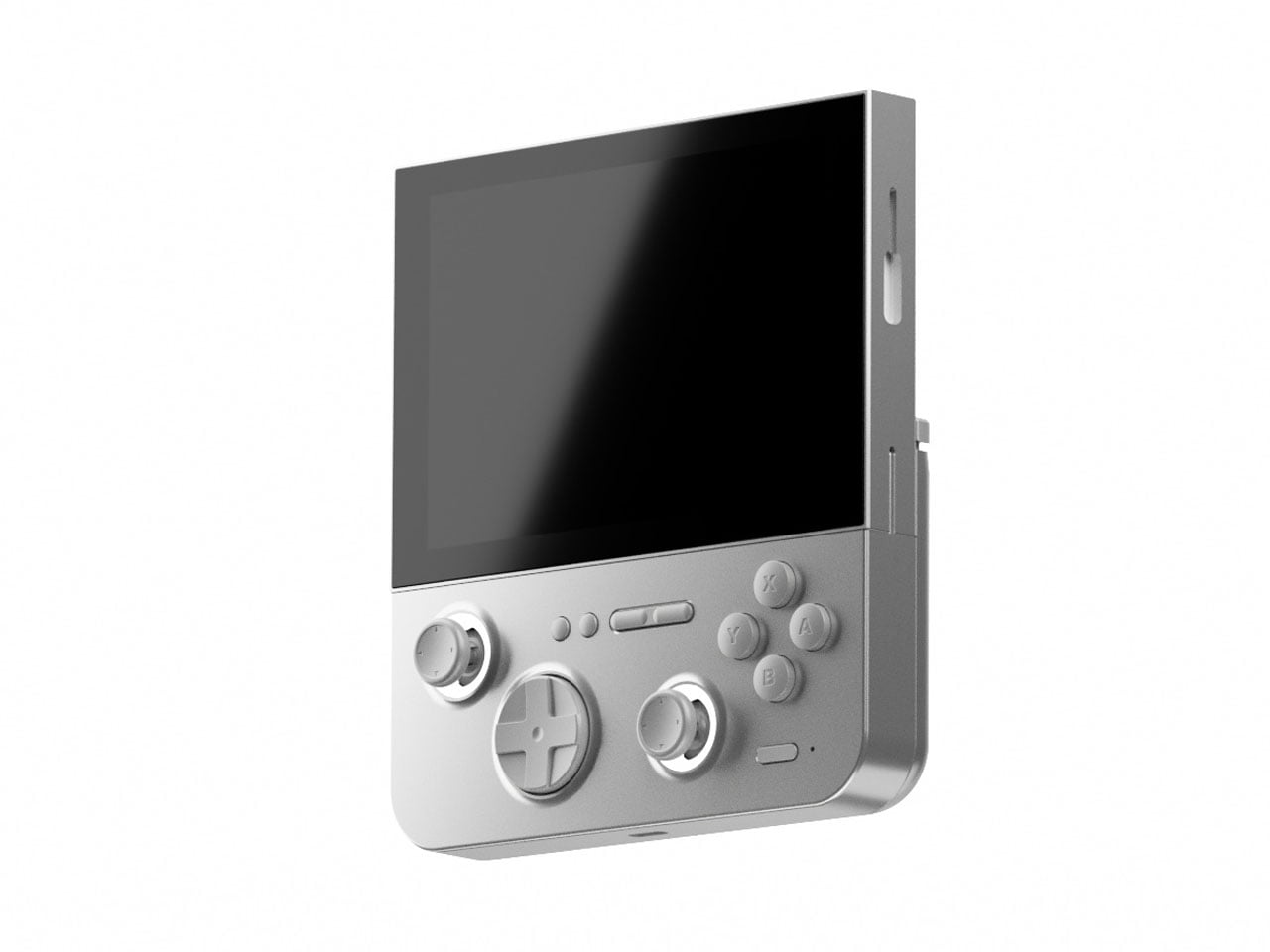
In its native form, the handheld looks and feels just like any other 3:4 display device. However, when you detach the 5.5″ screen (1024 x 768) and connect its controller module magnetically to a mobile phone, it turns into an altogether different beast. The gaming machine comes with the MTK6771 Helio P60 chipset, which is not that highly rated in the tech circles, given its inconsistent performance. Still, it’ll be interesting to see what GAMEMT has managed to achieve with this microchip in terms of hardware and software compatibility in the E5 MODX. The chipset is paired with a 3GB RAM for optimized performance, and 32 GB internal memory is more than enough to store the suite of AA games.

You can expect to emulate PS1 games, or the option to pair with the Dreamcast/N64/PS2 and GameCube emulation. Clearly, you would better explore the retro arcade game library with this one, to be honest. The real magic happens when you connect the device to your flagship smartphone, and the fun of playing AAA games is again real. For now, it is unclear whether the magnetically detachable accessory pairs via Bluetooth or works with the physical connection, and also for low latency.

According to GAMEMT, the first 3D prototype of the E5 Modx is in the works, and there is no word yet on when the handheld will be released. For now, the idea sounds very interesting, given the landscape of handheld consoles that gamers now can choose from.

The post GAMEMT E5 MODX handheld’s detachable control module can be connected to Magsafe phones first appeared on Yanko Design.
  •  
❌