Vue lecture

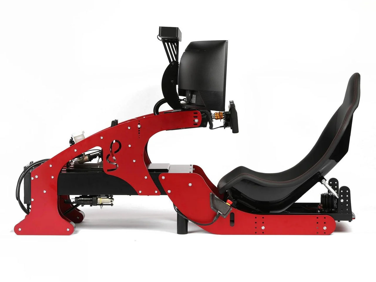
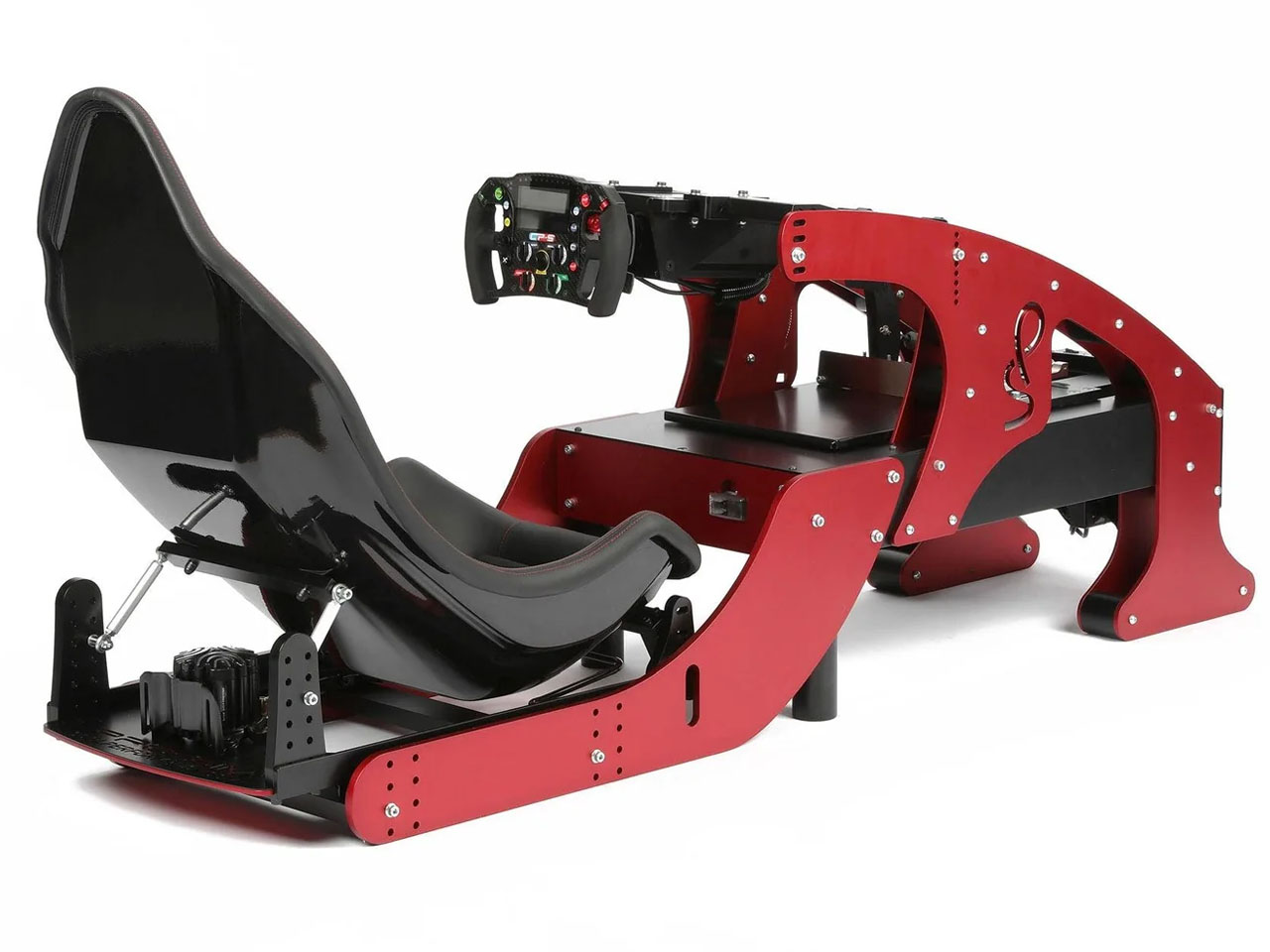
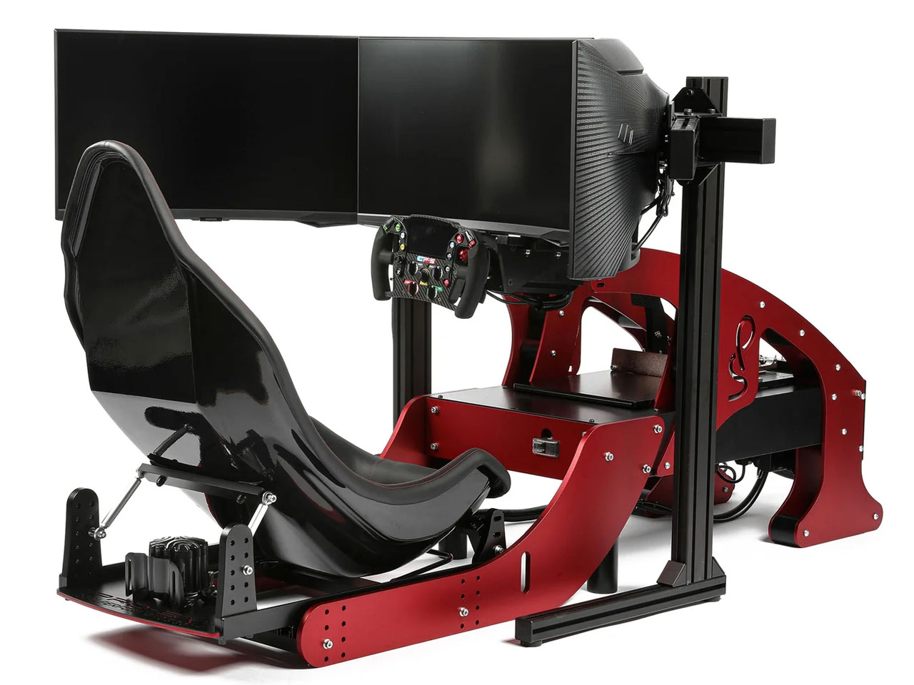
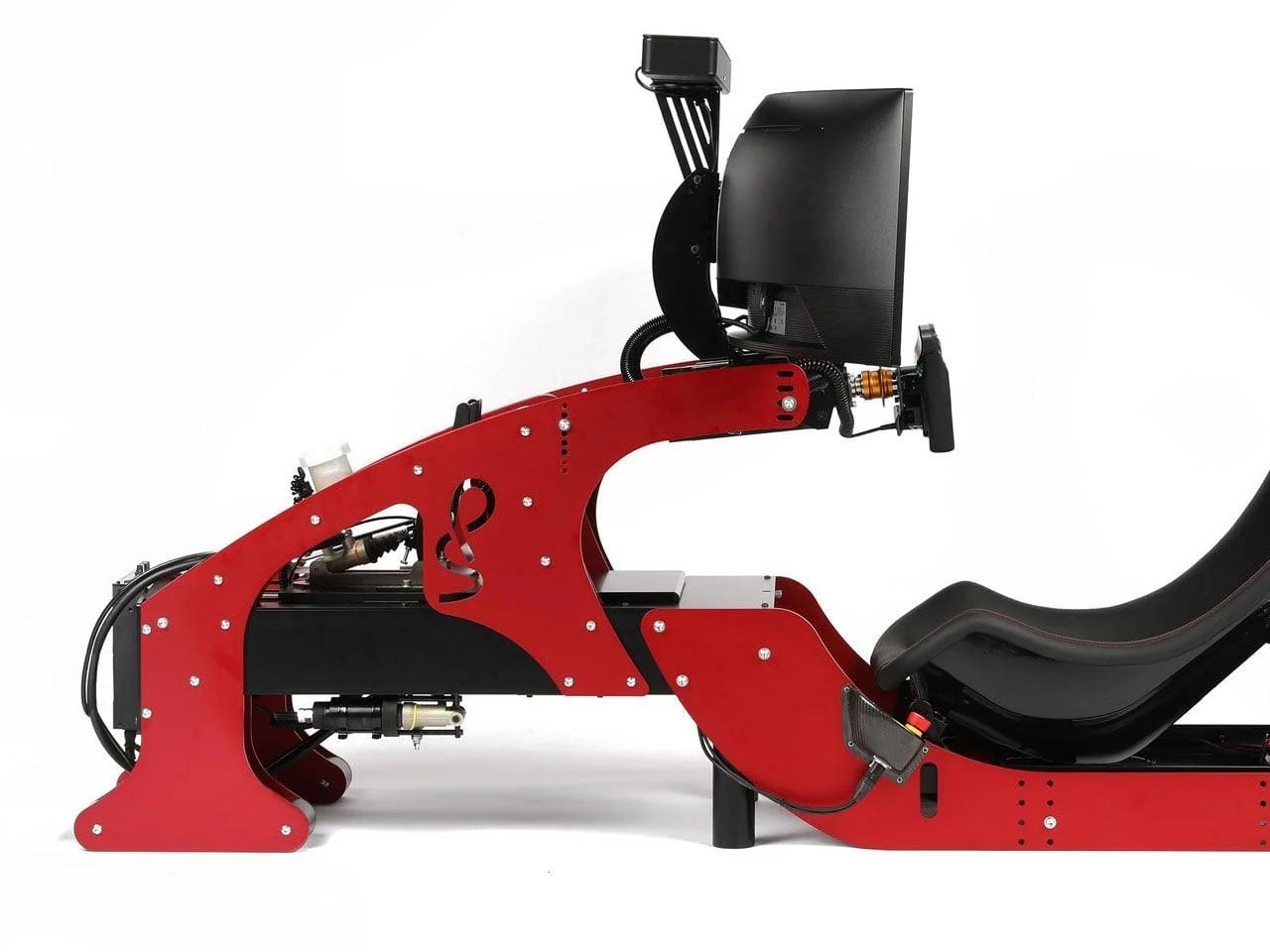
Formula Pro simulator with ultra-realistic controls emulates F1 racing fun in your living room

In the world of Formula-1 world championships are won by the slender margin of milliseconds that turn into big margins after every passing lap. The level of engineering in the pinnacle of Motorsports is unparalleled, and the drivers competing for the top podium step do every little thing that gives them a strategic advantage over their rivals.

Personal training is a part of the drill to stay in top shape, but the real deal is to polish the skills and gain telemetry data in the racing sims that very closely mimic the nuances of each track on the season calendar. With the hybrid era, the need for simulating the real track conditions has become even more important, given the metamorphosis this sport is undergoing.  A good simulator plays a vital role in giving the F1 and F2 drivers a fair idea of areas to improve, or develop strategic maneuvers that can be finally implemented on the track.

Designer: Cool Performance

With over two decades of motorsport experience and trusted by over 250 professional racers, Cool Performance now brings its most advanced F1 sim racer for professionals and motorsports fans. Current F1 drivers who train their driving skills on the Formula Pro Simulator include Lando Norris, Carlos Sainz, Sebastian Vettel and Alex Albon. Founder Oliver Norris has designed the simulator from the ground up with tons of experience in his own Motorsports journey and his brother Lando’s last couple of successful F1 seasons.

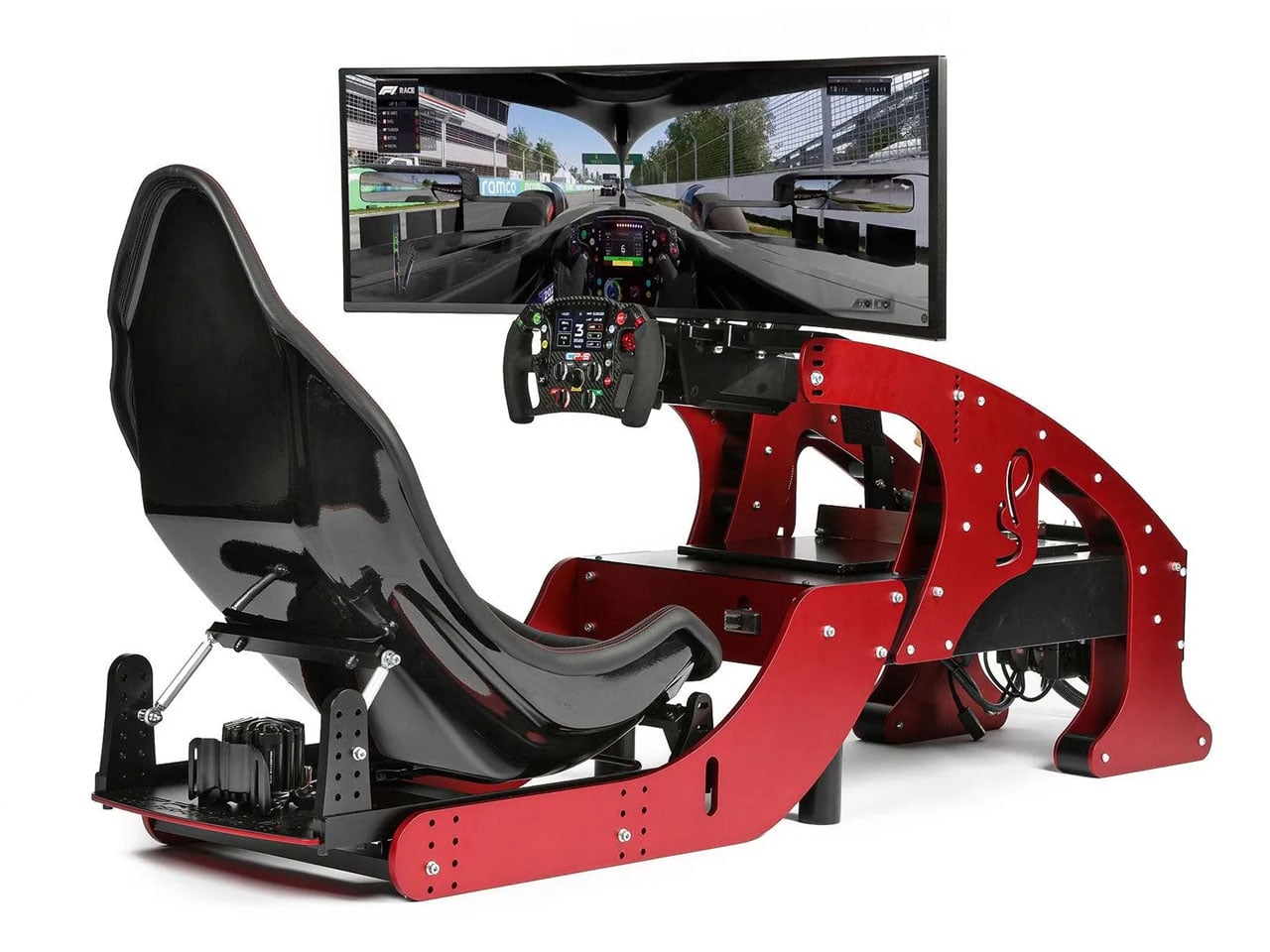
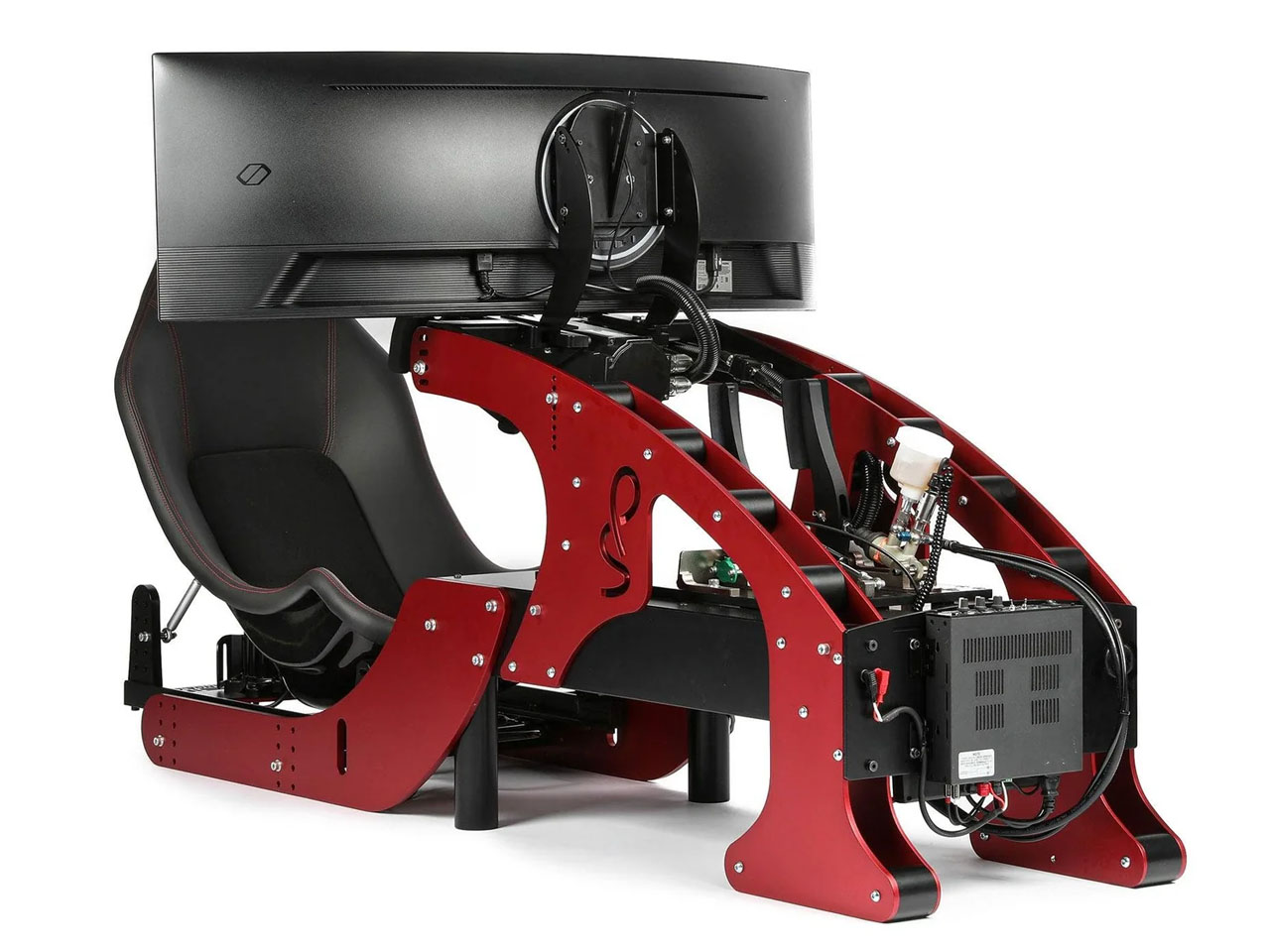
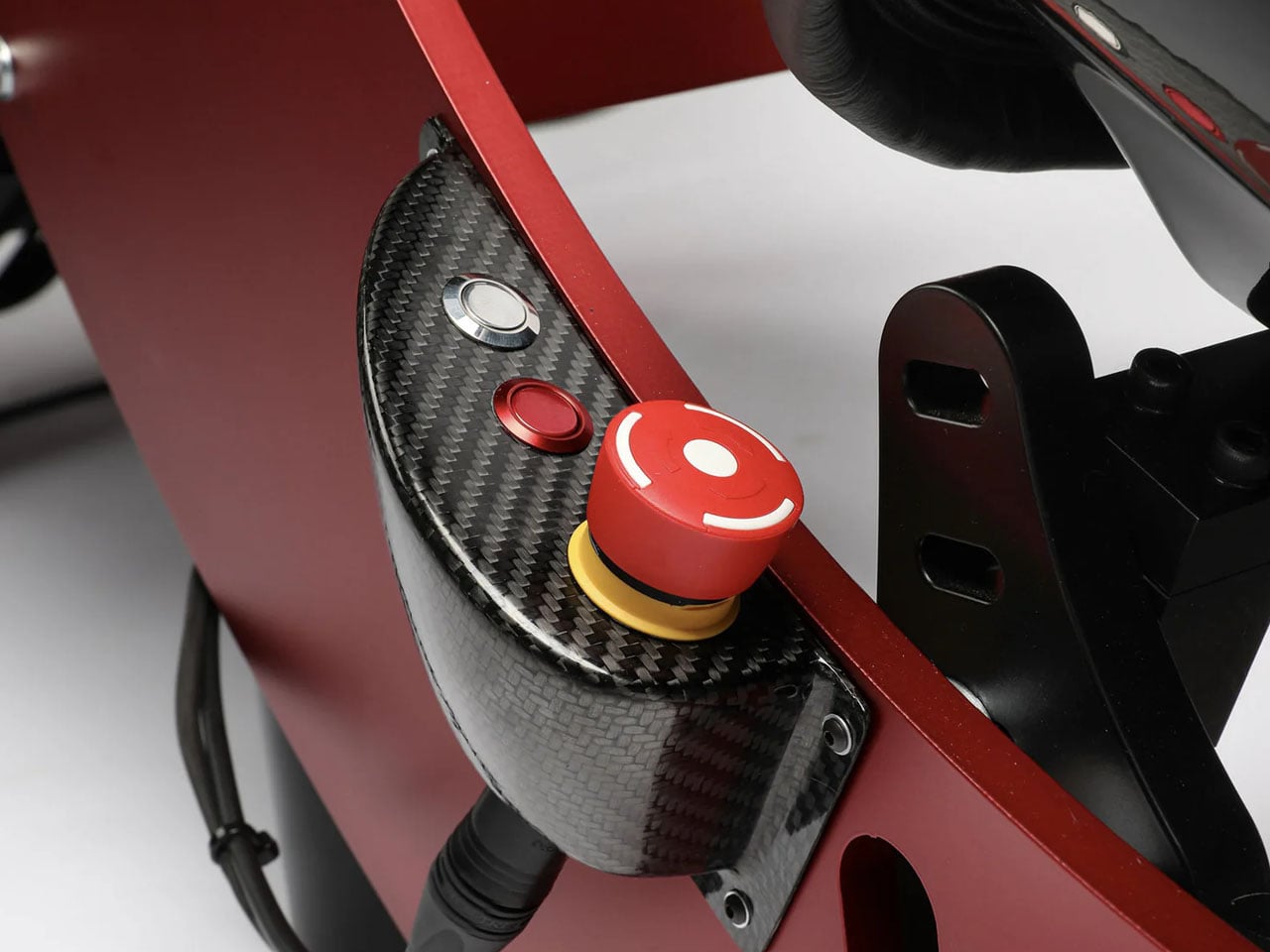
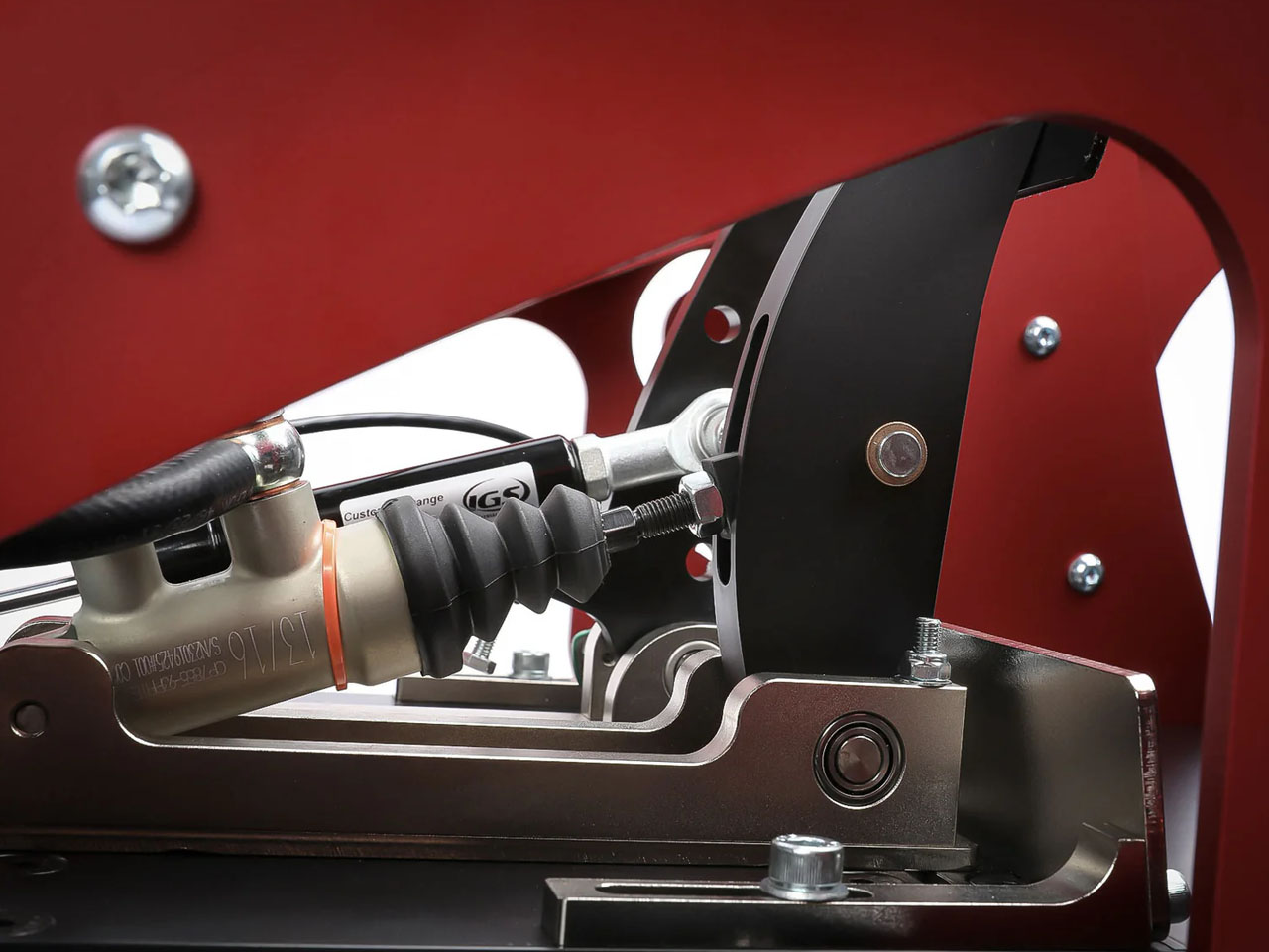
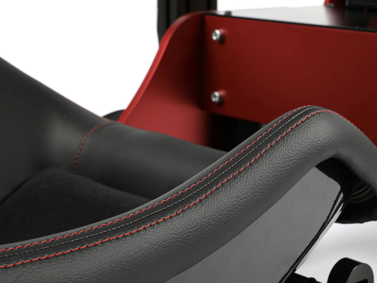
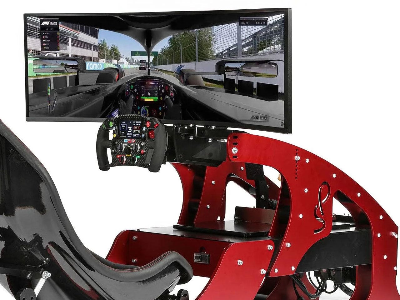
The professional-grade simulator has a precision-designed cockpit and race seat to recreate the realism of FPV in the single-seater racer. To simulate the nuances of a Formula -1 car riding the tarmac, the simulator has a high-torque force feedback steering and a Leo Bodnar SimSteering 2 base. This lets the sim racer feel every little bump of the chicane or the minute grip changes when the car is steered off the racing line. Braking in Formula 1 is way more challenging than your average SUV. That is mimicked by the CP-S hydraulic pedals with an AP Racing master cylinder support, which can simulate 200 kgs of braking force. For that, you’ll require immense strength in your core and lower body.

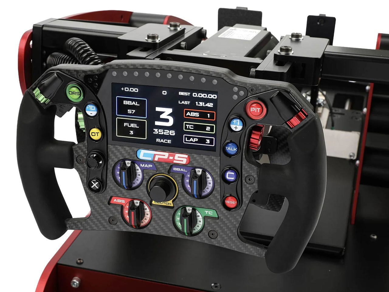
Every little detail of this F1 simulator is narrowed down to the last millimeter, much like the Formula 1 cars. Right from the highly technical CP-S Formula steering wheel that has virtually everything right at arms distance for the driver, to the CP-S custom hydraulic pedals, nothing gets better than the Cool Performance’s option. Clearly, if you want to feel the realism and the tiny details of Formula 1, this is it. Each one of the Formula Pro F1 simulators is custom-manufactured and tested by Oliver and Adrian Quaife-Hobbs in Kent, United Kingdom.

Eager buyers can opt for a single curved screen setup or a multiscreen array for better realism. If you are a purist, then the UK-based manufacturer can create a bespoke version of the sim to fit your specific needs. The Formula Pro simulator price starts from $40,950 and can go higher depending on the add-ons demanded or the bespoke modifications required.

The post Formula Pro simulator with ultra-realistic controls emulates F1 racing fun in your living room first appeared on Yanko Design.

  •  

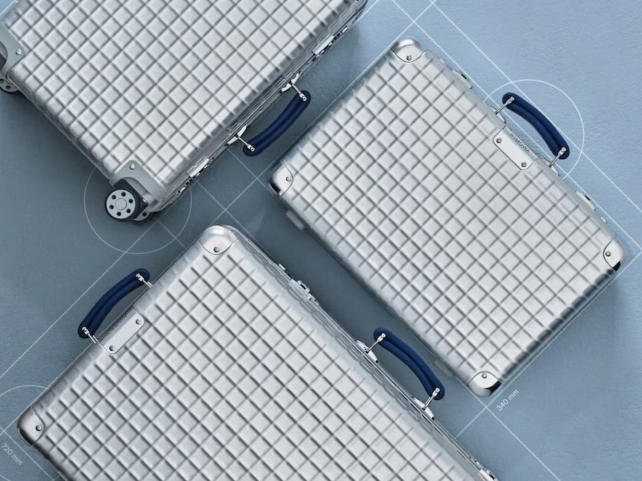
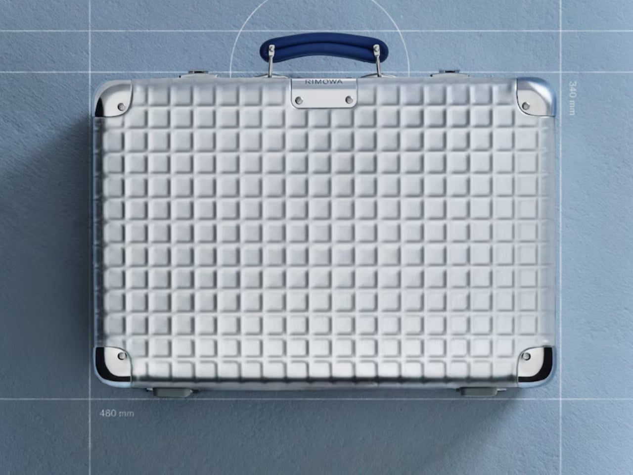
Rimowa Classic Aluminium Grid Revives a Forgotten 1969 Design

Most luggage brands don’t have a 127-year-old story to draw from. Rimowa does, and it seems to know exactly when it’s worth pulling from that history and when to let the present speak for itself. With the Classic Aluminium Grid, they’ve clearly decided the archive deserves a second act.

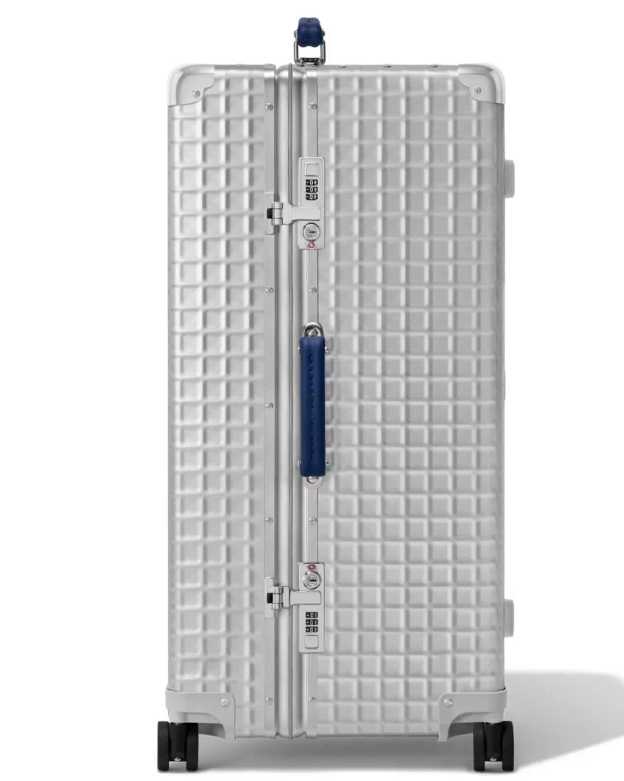
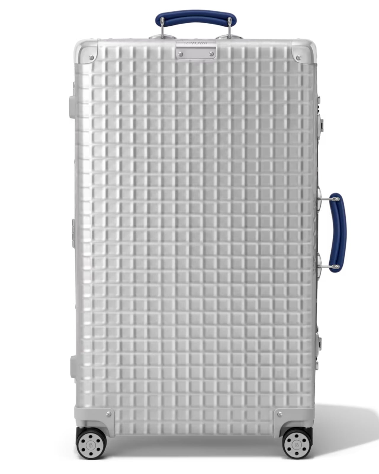
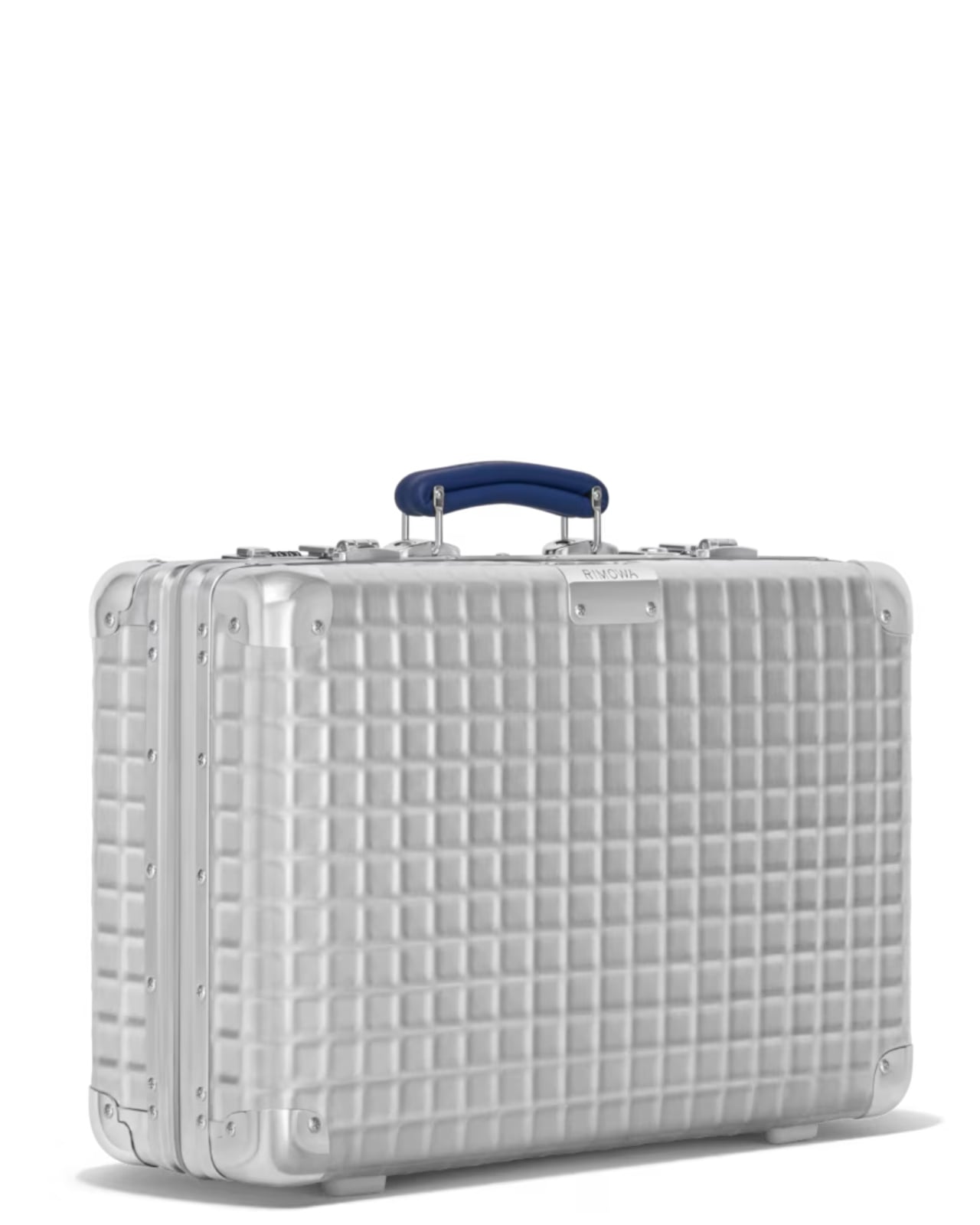
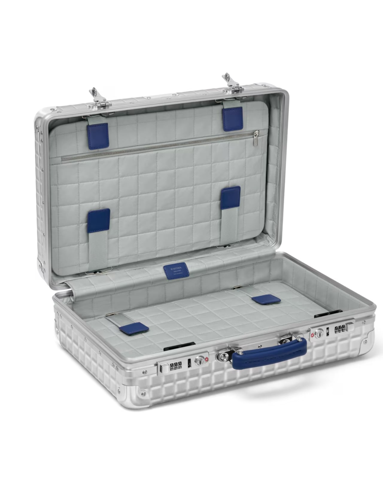
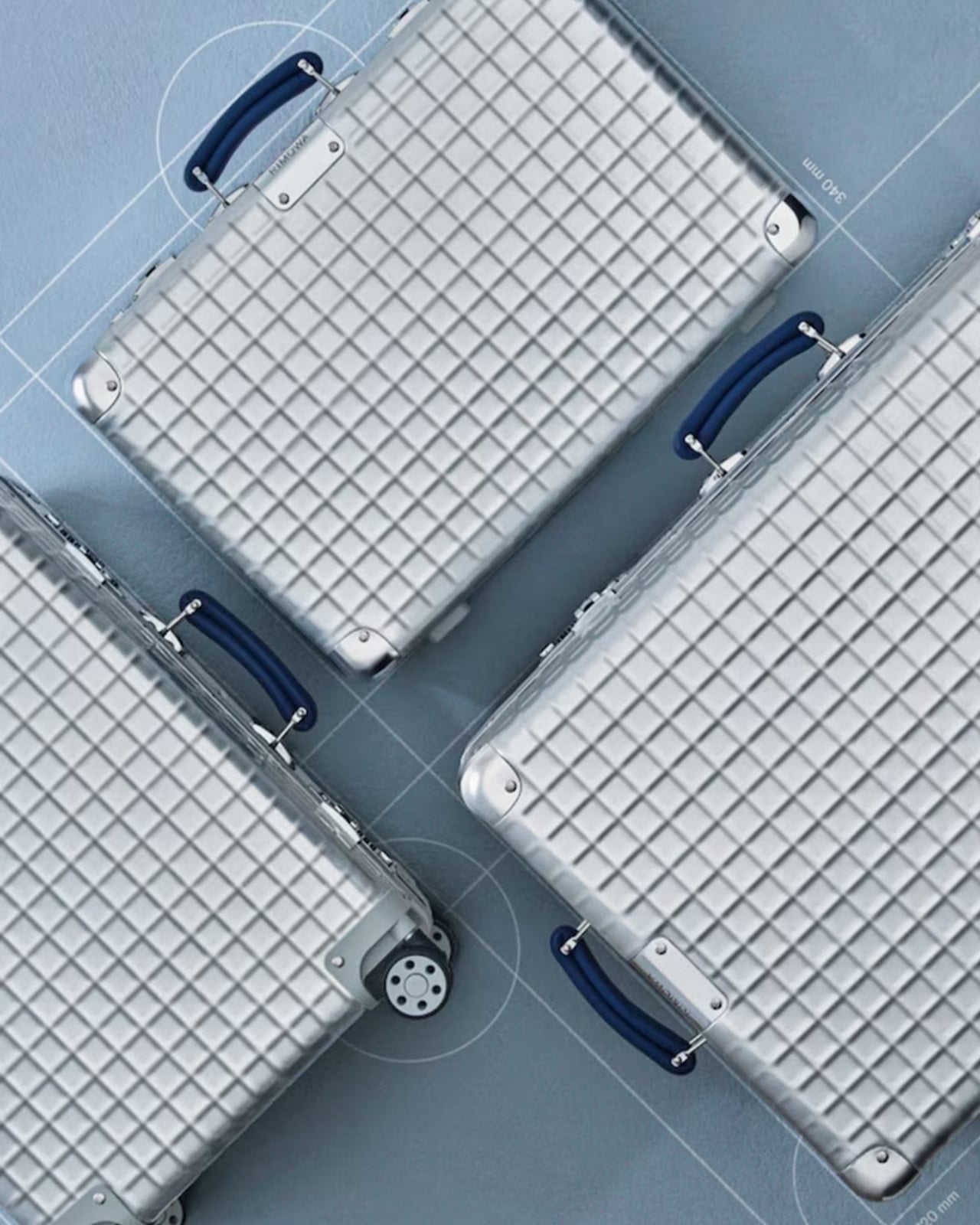
The Classic Aluminium Grid is the German brand’s latest limited-edition release, and it’s generating the kind of quiet excitement that reserved design circles usually save for restored mid-century furniture or a first-edition book that resurfaces at auction. The reason is simple: Rimowa didn’t just design something new. They reached back to 1969, pulled out a hand-carry case design that had been sitting in their archives, and asked what it would look like today if it were treated with the same reverence they give to the grooves.

Designer: Rimowa

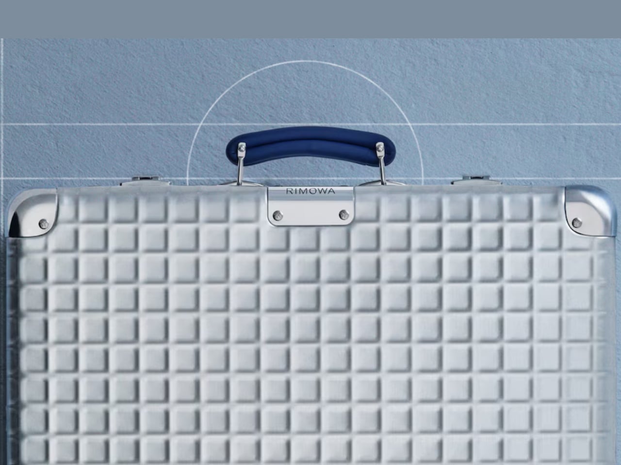
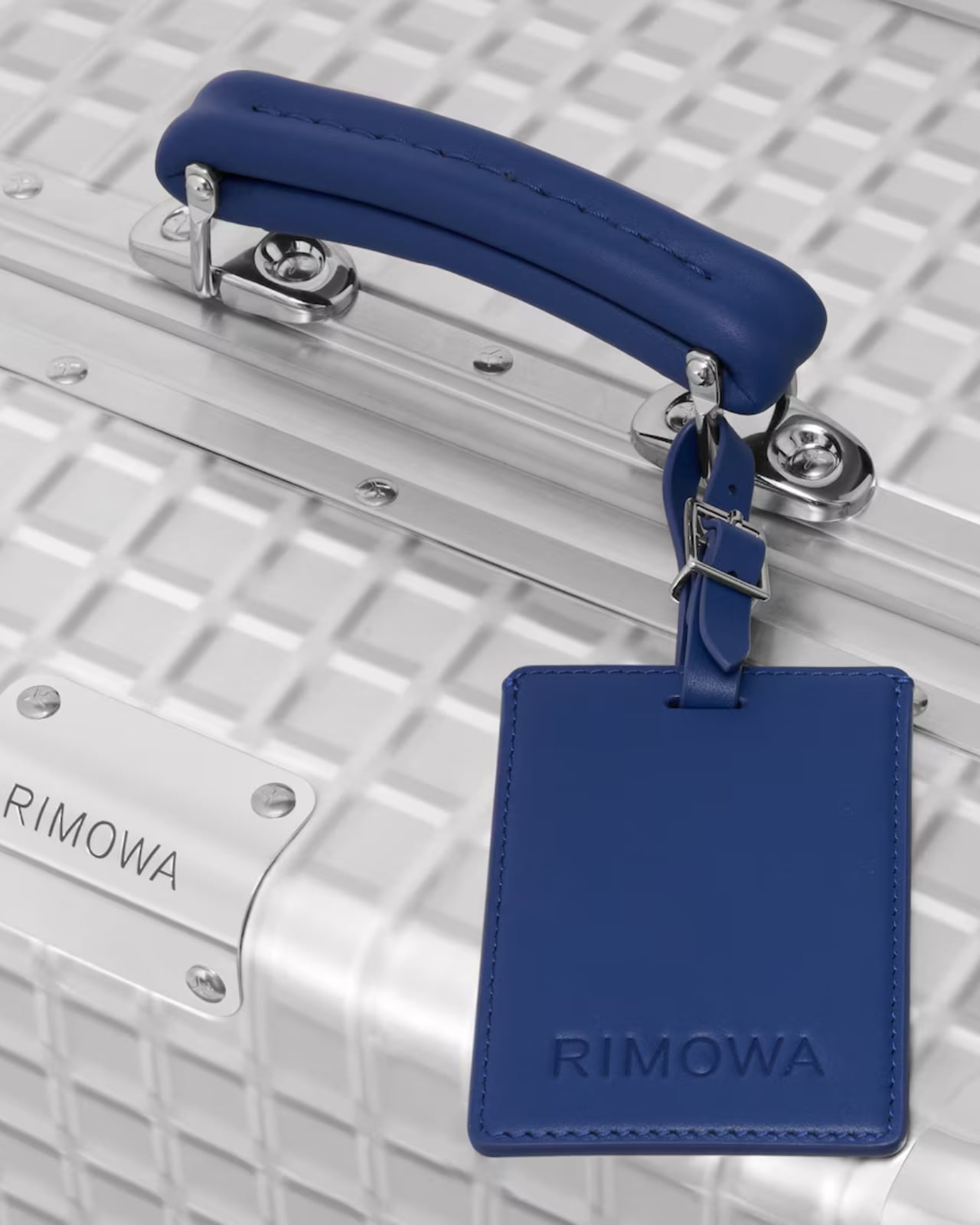
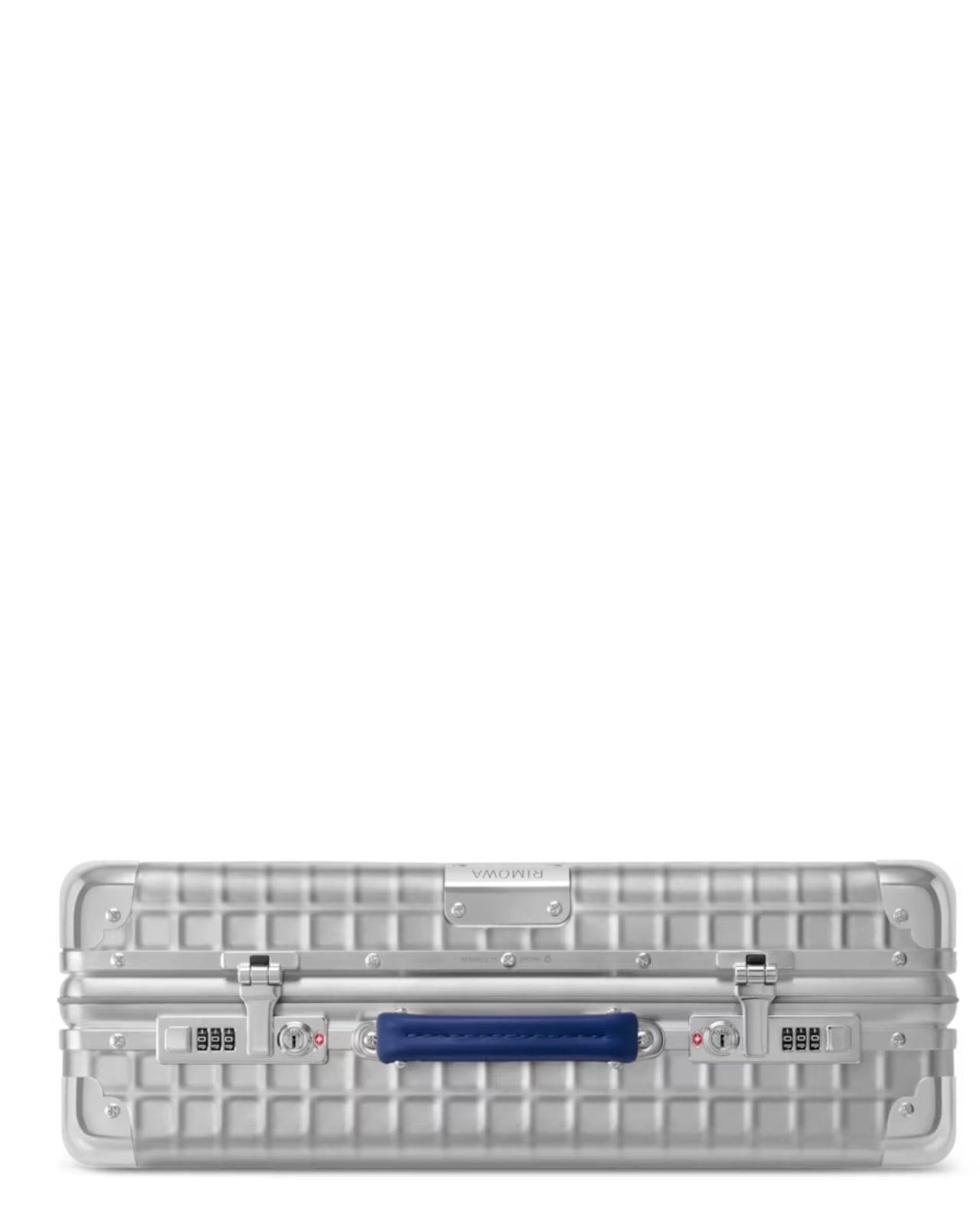
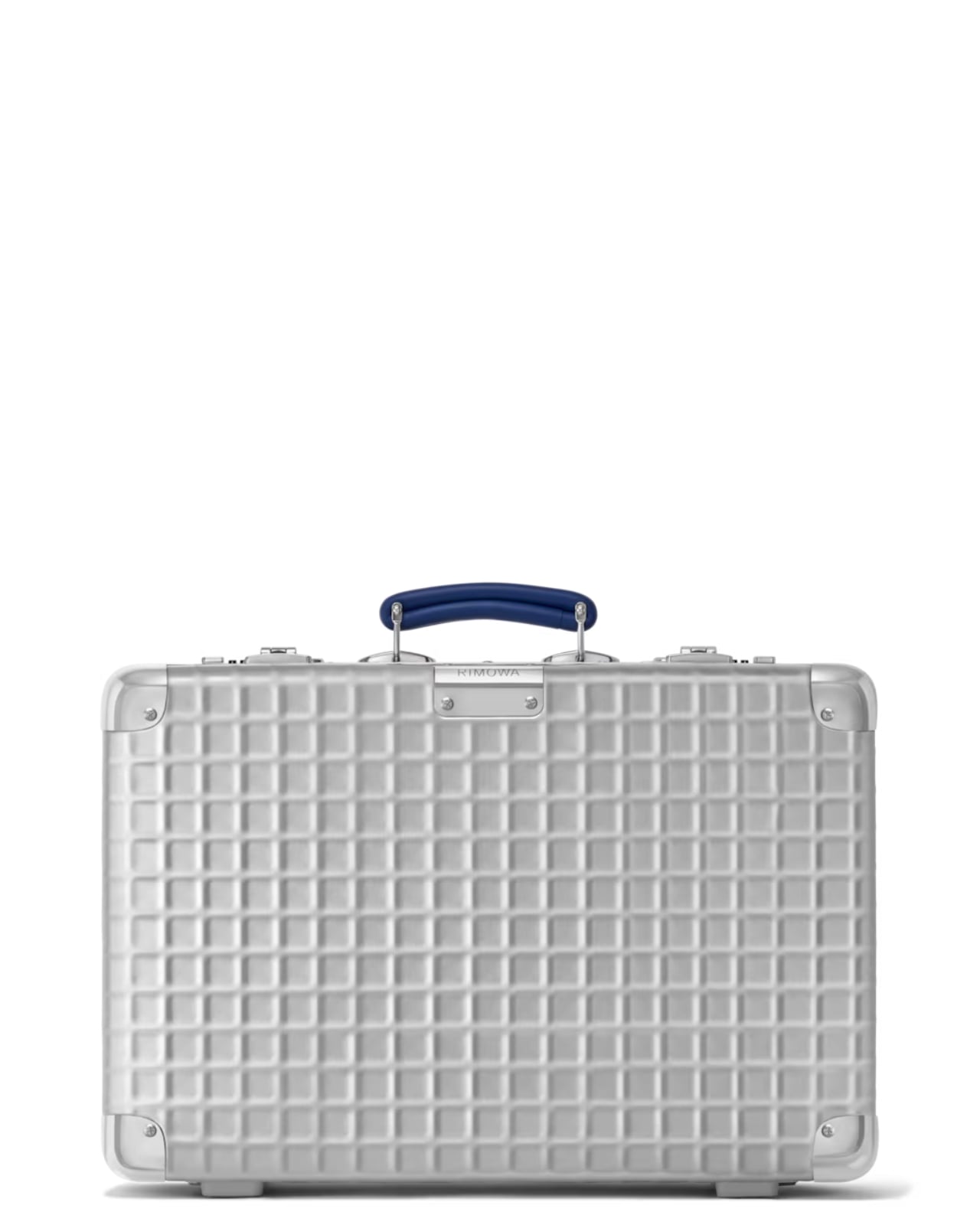
That grooved shell, by the way, is practically synonymous with the brand itself. You know a Rimowa from across an airport terminal. Those parallel ridges running down the aluminium surface are one of the most recognizable design signatures in travel goods, and they’ve been that way for decades. So when the brand quietly steps away from them and replaces the lines with a grid, a structured, geometric, embossed pattern pressed right into the aluminium shell, it feels like a real statement. It’s not a gimmick. It’s a choice that speaks to a different kind of confidence.

The grid comes from a real place. In 1969, Rimowa was producing hand-carry cases featuring this geometric pattern: practical, modular, and rooted in the kind of technical precision that defined that era’s design thinking. There’s a reason so much design from that decade still holds up. It wasn’t chasing aesthetics for their own sake. Form followed function, and it did so elegantly. Reviving that spirit in 2026 doesn’t read as nostalgia pandering. It reads as a brand that knows exactly where its DNA lives and isn’t afraid to dig for it.

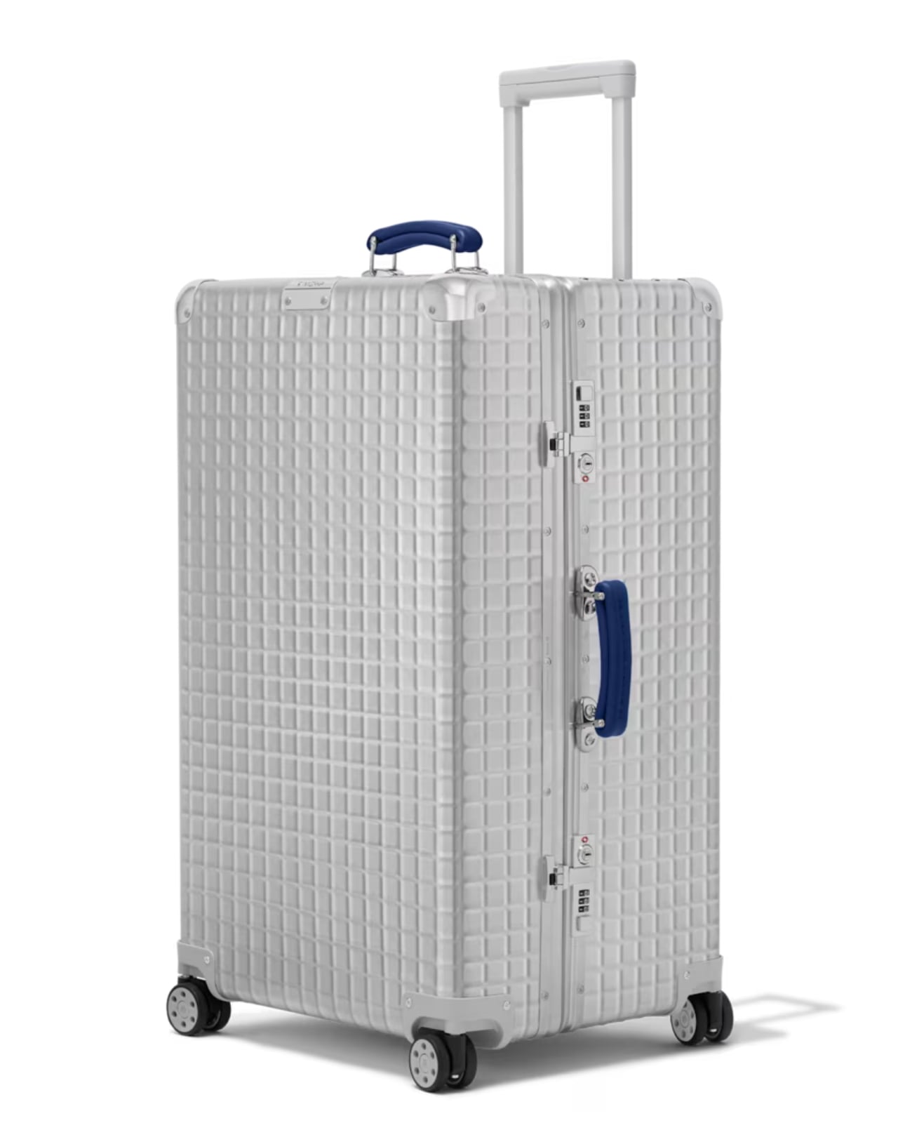
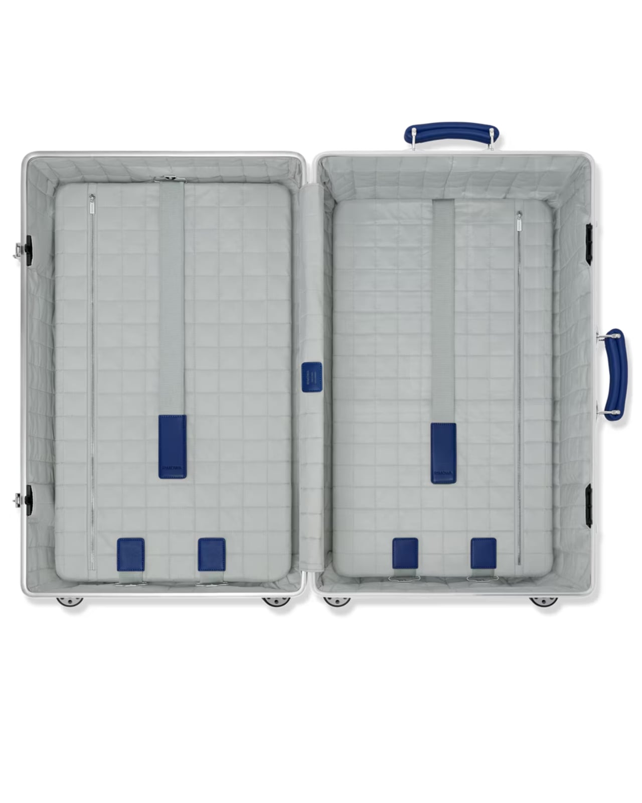
The collection comes in three sizes: the Classic Hand-Carry Case, the Classic Cabin, and the Classic Trunk. All three are made in Cologne, Germany, which matters more than it might seem. Manufacturing location is one of those details that’s easy to gloss over until you’re actually holding the product, and with Rimowa, the German-made quality is part of the whole point. The embossed grid pattern, the blue leather handles, the individually numbered serial number patch on each case: these aren’t details you’d notice in a thumbnail. They’re details you notice after living with the piece and realising it only gets better over time.

And yes, price matters here. The Classic Aluminium Grid sits in the $2,725 to $3,225 range, which puts it firmly in the territory of deliberate, considered purchasing. That’s not casual spending, and it shouldn’t be. This is the kind of purchase that functions as an heirloom more than a travel accessory, something you keep, care for, and eventually pass along. The lifetime guarantee Rimowa extends to all its suitcases reinforces that framing. They’re not selling you a bag built for a few trips. They’re selling you something built to outlast most things currently in your home.

What makes this collection feel genuinely compelling rather than just another limited drop is the restraint behind it. Rimowa didn’t add bright colour for the sake of attention. They didn’t partner with a streetwear brand or commission someone’s artwork across the shell. They went to their own archive, found something worth preserving, and let the design carry the weight. The grid is subtle enough that it won’t read as flashy at baggage claim, but anyone paying close attention will recognise it as something different. Something that doesn’t quite look like everything else on the carousel.

That’s a hard balance to strike in design. Loud enough to be interesting, quiet enough to be enduring. The Classic Aluminium Grid lands squarely in that space, and for a brand with over a century of aluminium behind it, that feels less like luck and more like a brand that knows exactly what it’s doing.

The post Rimowa Classic Aluminium Grid Revives a Forgotten 1969 Design first appeared on Yanko Design.

  •  

These Ceramic Lamps Look Like 90s Caramel Candy and Stack Any Way

The interiors most people aspire to these days tend to share a common trait: they’re clean, restrained, and almost aggressively neutral. Scandinavian minimalism, Japandi aesthetics, and muted palettes have dominated home design for years, and while there’s nothing wrong with a well-curated beige room, a lot of modern spaces have started to feel emotionally flat, like showrooms rather than places where people actually live.

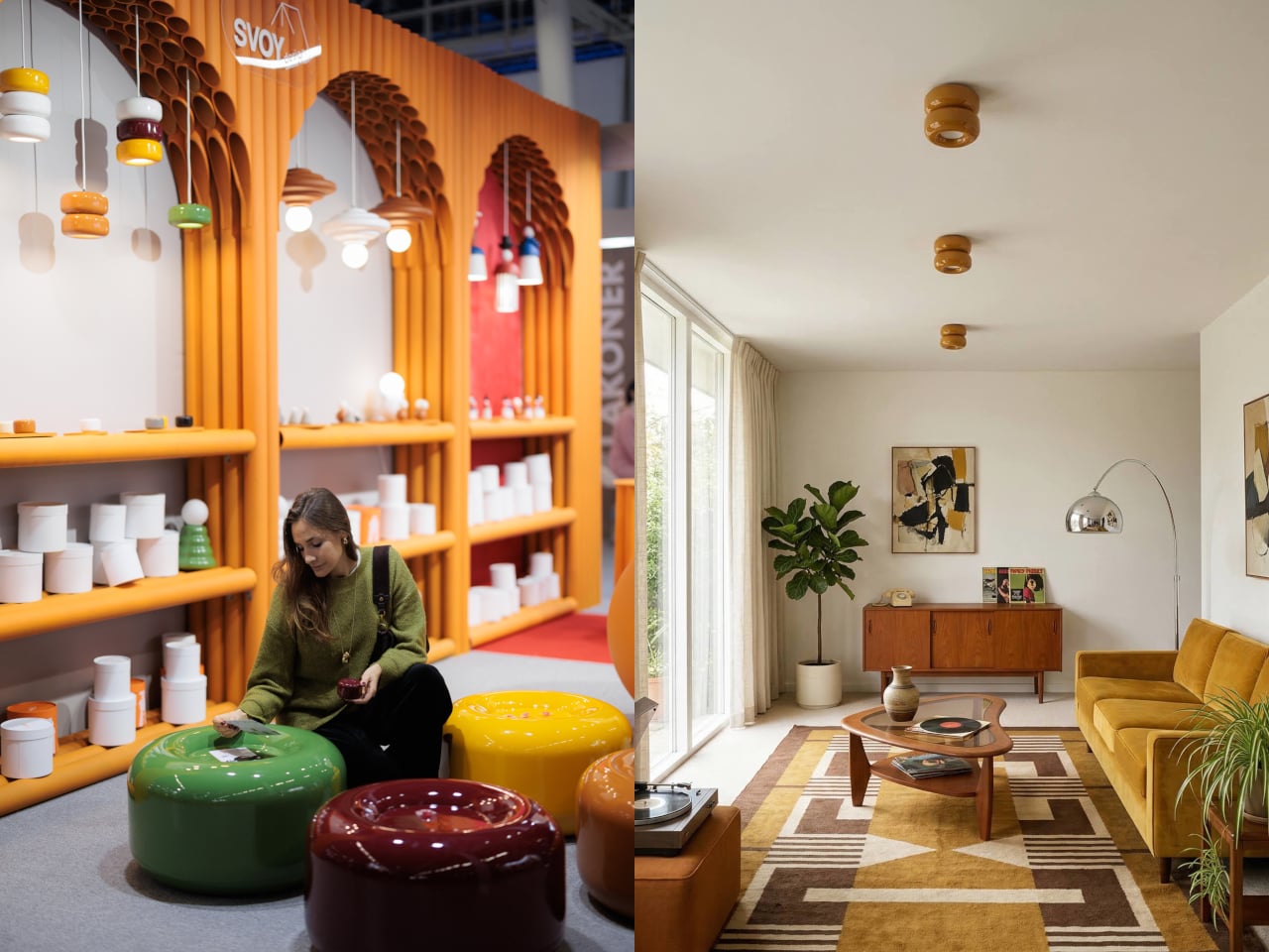
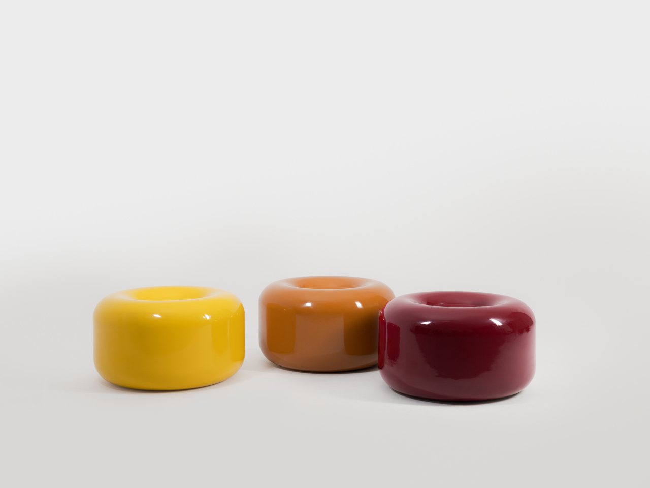
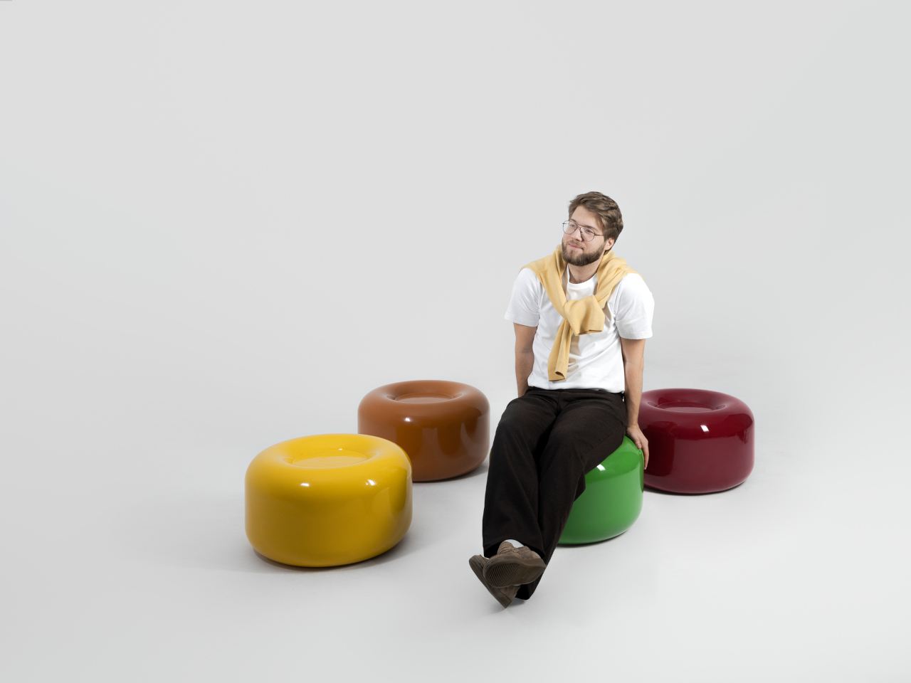
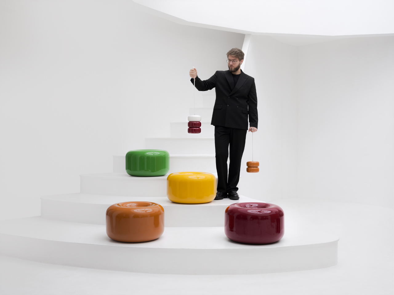
That’s where the Caramel collection comes in. Designed by Moscow-based product designer Maxim Tatarintsev in collaboration with Russian brand Svoy Design, this new series of ceramic lighting and furniture takes a very different approach to interior objects. Rather than adding another understated piece to a polished shelf, it reaches back to a simpler, sweeter time, asking whether a lamp or a side table can carry something as intangible as joy.

Designer: Maxim Tatarintsev

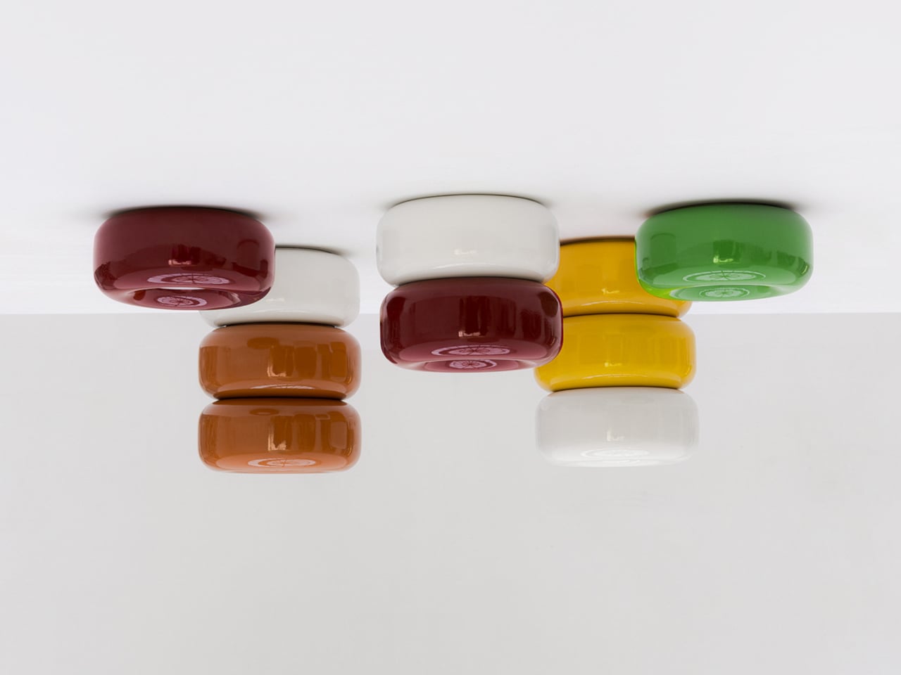
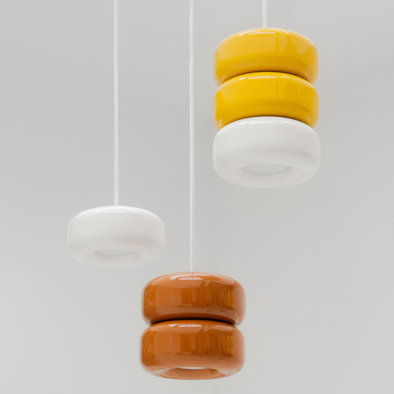
Tatarintsev’s inspiration came from a period of deep personal reflection. Amid what he describes as the noise of contemporary life, he looked inward and found his answer in childhood, specifically in the candy that practically every kid growing up in the 90s and early 2000s would recognize. That small, glossy, jewel-toned caramel sweet became both his muse and his design vocabulary, shaping everything from the forms to the color palette.

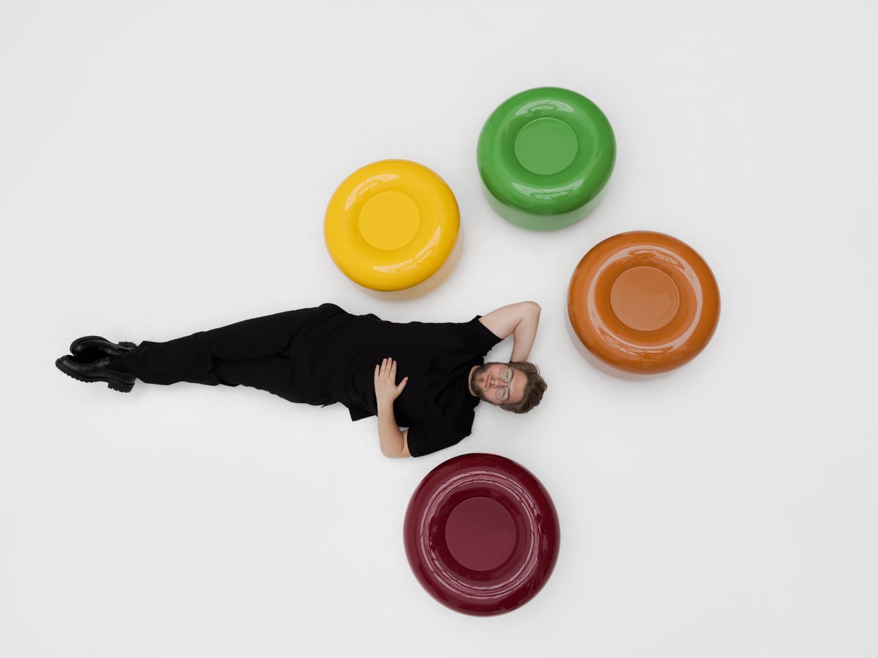
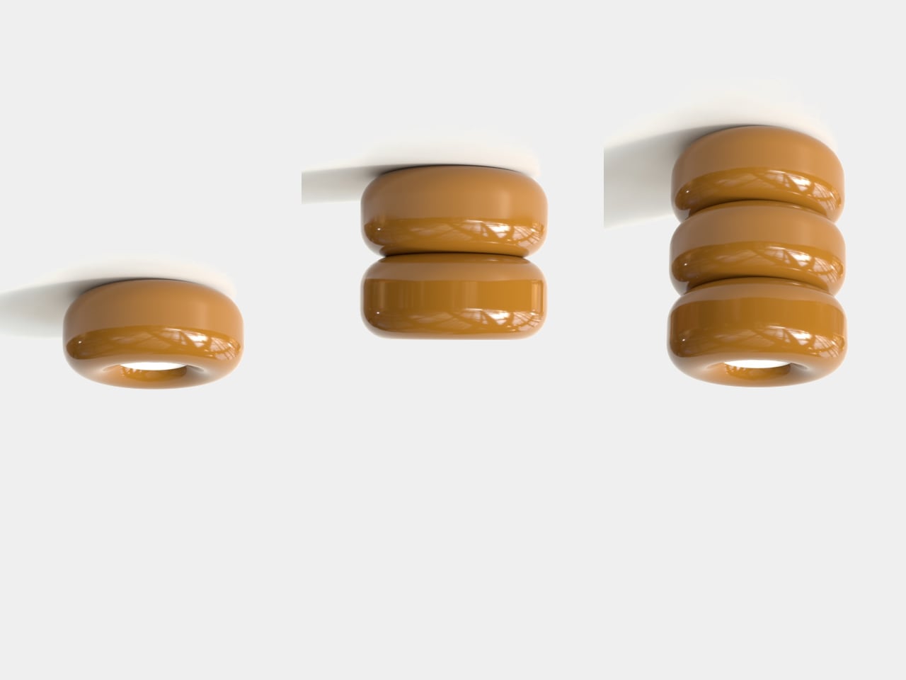
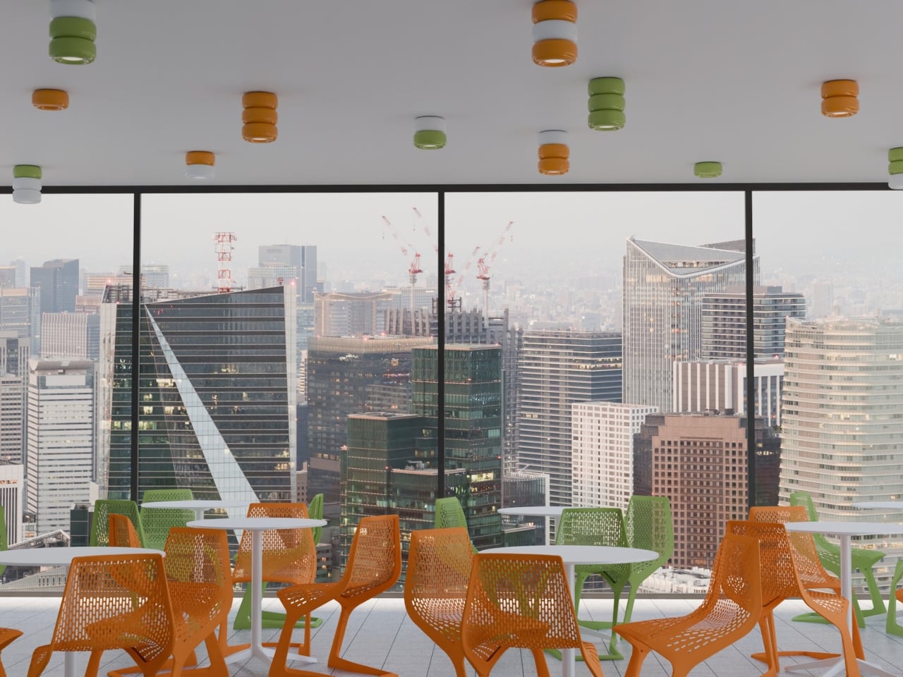
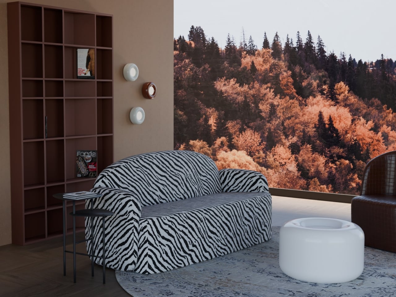
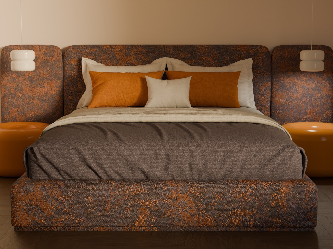
The collection spans pendant lights, ceiling fixtures, and wall-mounted lamps, all crafted from semi-porcelain, as well as a low-profile side table made from a proprietary composite material. What stands out is the modular approach: each ceramic unit can be combined and reconfigured, letting you stack or cluster them into different lighting arrangements depending on the mood or corner of the room you’re working with.

Think of it like assembling your own arrangement from a jar of sweets. One configuration might call for a single pendant above a kitchen island; another might cluster a few units along the ceiling of a reading nook. The point isn’t to follow a prescribed layout but to put that creative decision in the hands of the person actually living in the space, not just the designer who furnished it.

The craftsmanship behind the lighting is traditional and deliberate. Each piece starts as a slip-cast semi-porcelain form, drying for several days before being fired at 1,100°C inside a muffle furnace. A coat of glaze and paint follows, giving the finished modules their signature smooth, candy-like sheen. It’s a fairly labor-intensive process for what might look like a simple geometric shape, but that’s precisely what gives each piece its quiet depth.

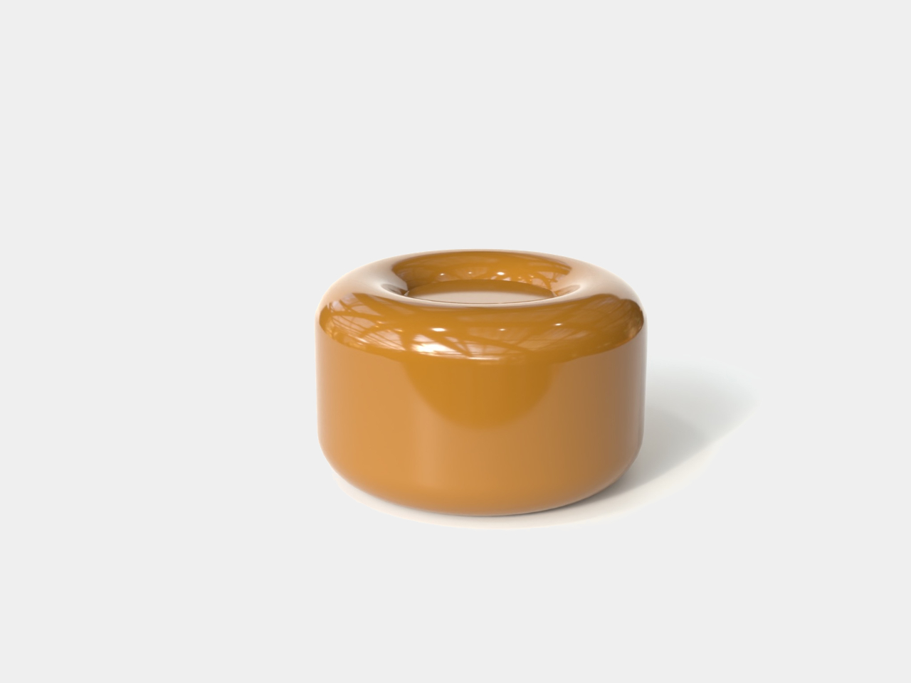
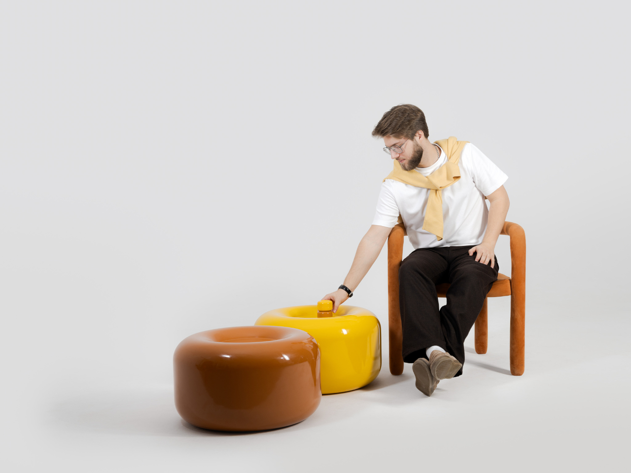
The side table takes a different manufacturing route altogether. Made from a proprietary composite rather than ceramic, it’s significantly more durable and comes in two versions, one for indoor use and one for covered outdoor settings. At first glance, it reads as a low, rounded ottoman, and people will probably be unable to resist using it as a delicious seat instead.

None of that is accidental. Tatarintsev’s stated goal wasn’t to produce pretty objects but to create what he calls “emotional anchors,” pieces capable of sparking a genuine reaction in whoever encounters them. A set of lamps you can rearrange on a whim, a table that moonlights as a seat, and a color palette borrowed from childhood treats make for a collection that gives any room a personality it actually earned.

The post These Ceramic Lamps Look Like 90s Caramel Candy and Stack Any Way first appeared on Yanko Design.

  •  

PlayStation Moon Legacy Edition TV Stand brings Retro PS1 style to your modern gaming setup

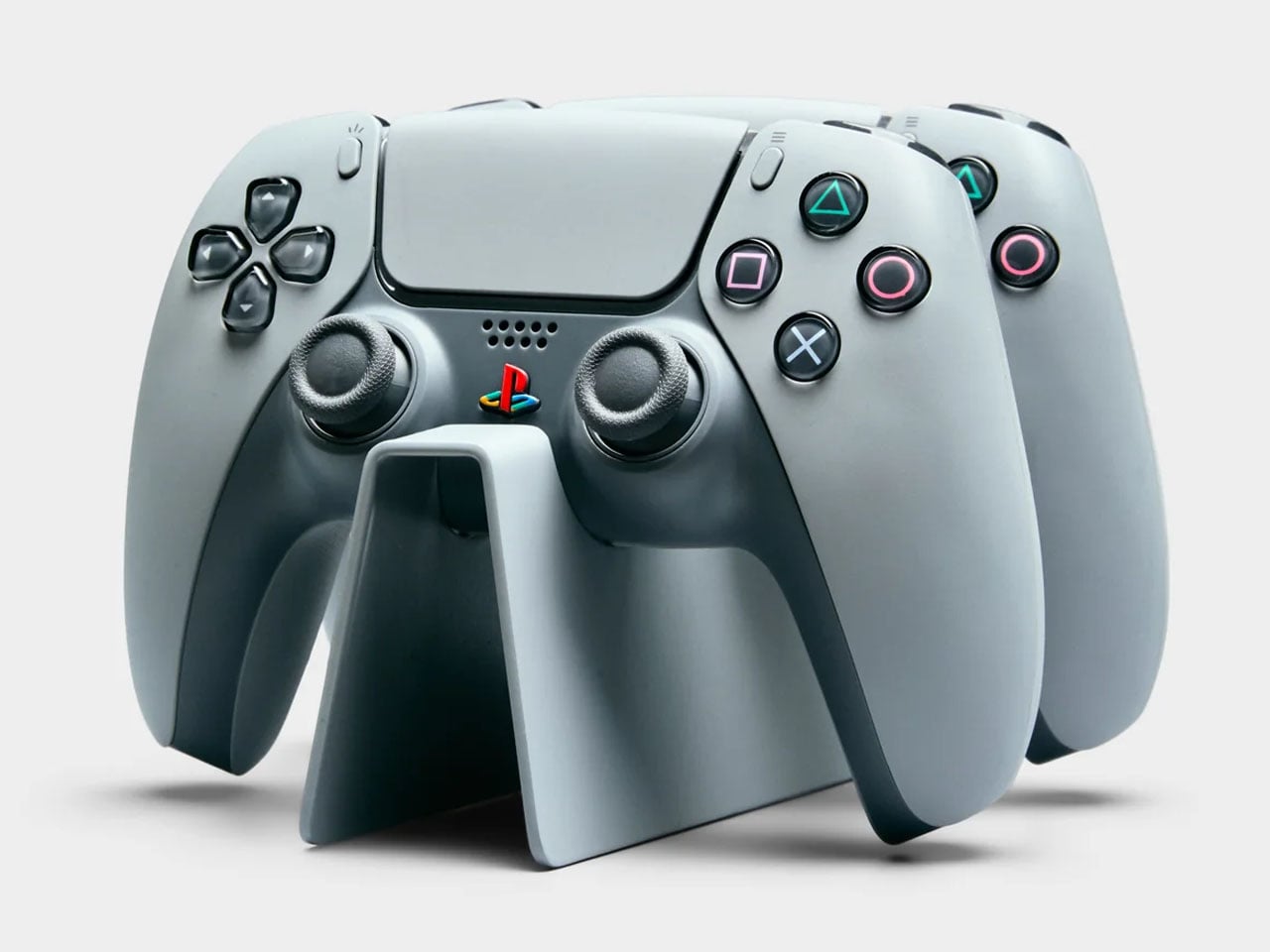
PlayStation turned 30 a couple of years ago, and milestones like this rarely pass quietly in the consumer electronics world. Sony marked the occasion with a special edition PlayStation 5 and accompanying accessories finished in a nostalgic gray tone inspired by the original PS1 console. If you were among the lucky few who managed to get hold of that anniversary edition styled after the classic PlayStation color scheme, there is now an equally themed piece of furniture designed to show it off in the living room.

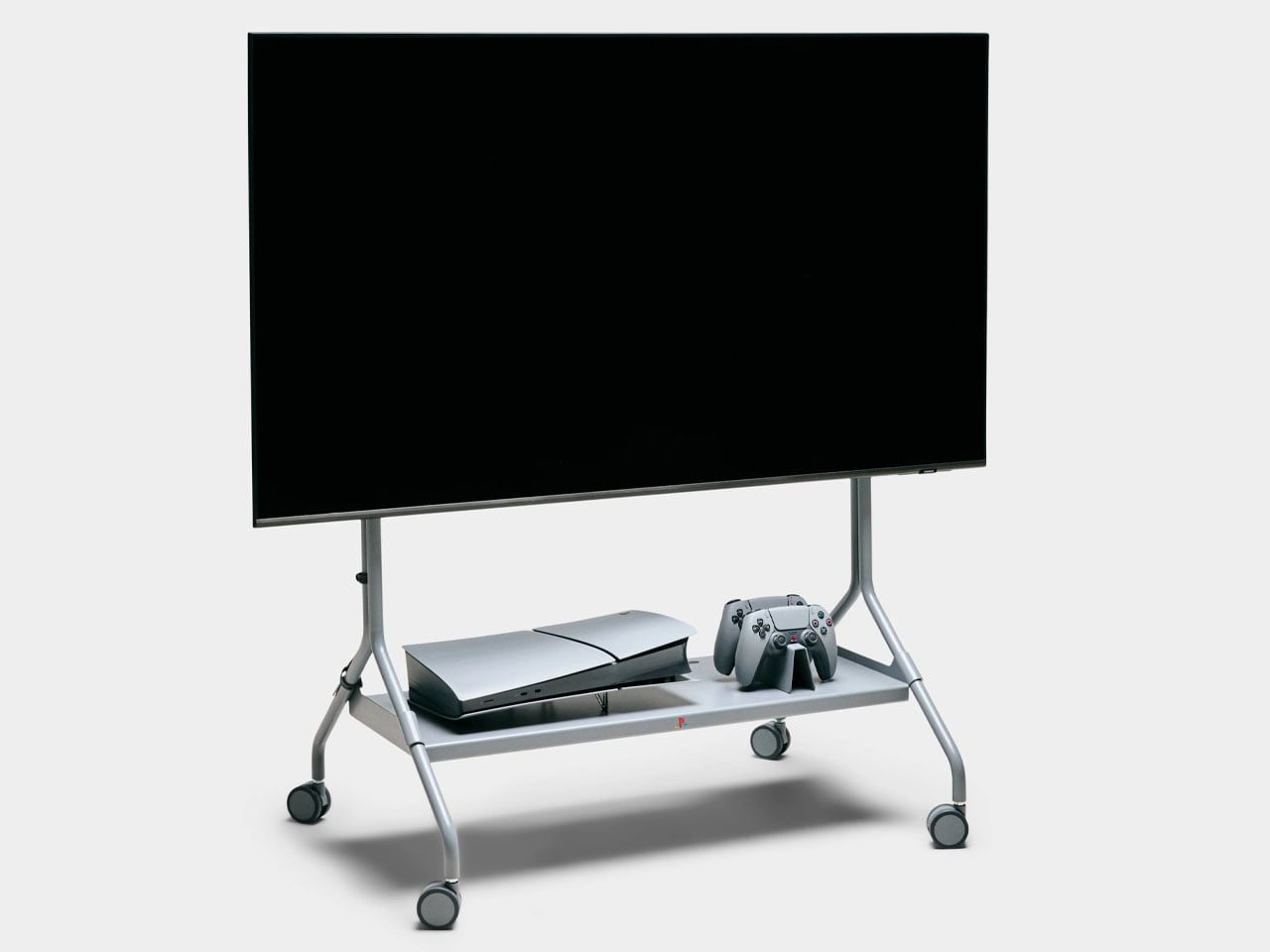
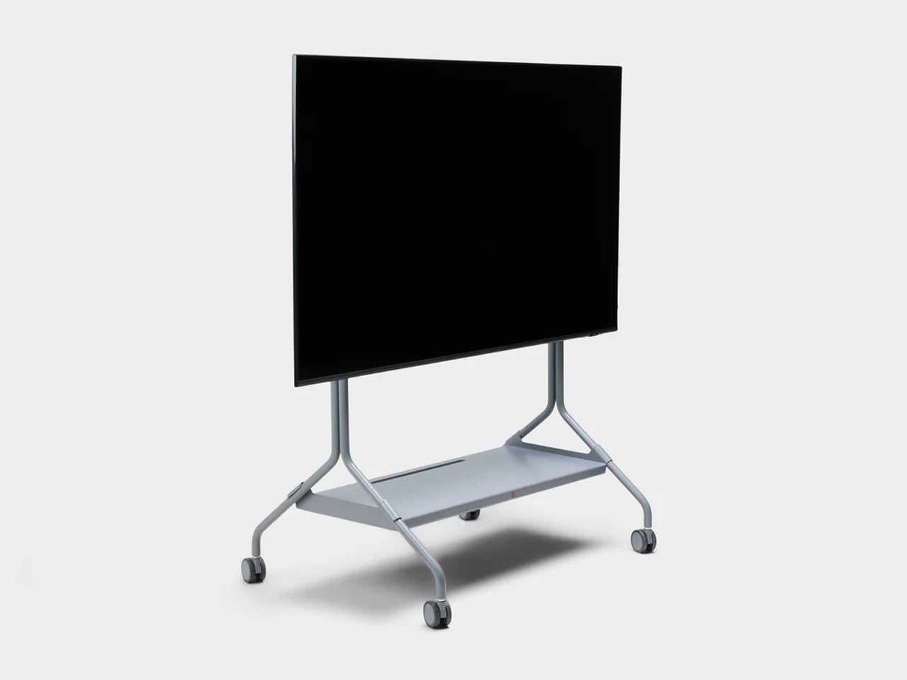
Designed in collaboration with Danish furniture maker Pedestal, PlayStation Norway has introduced a statement accessory that celebrates gaming culture as much as it serves a functional purpose. The Moon Legacy Edition TV stand arrives in a muted “Legacy Gray” finish that reflects the iconic tone of the original PlayStation console. The visual connection immediately creates a retro aesthetic, making it particularly appealing for collectors who appreciate the history of gaming as much as the hardware itself.

Designer: Pedestal and PlayStation Norway

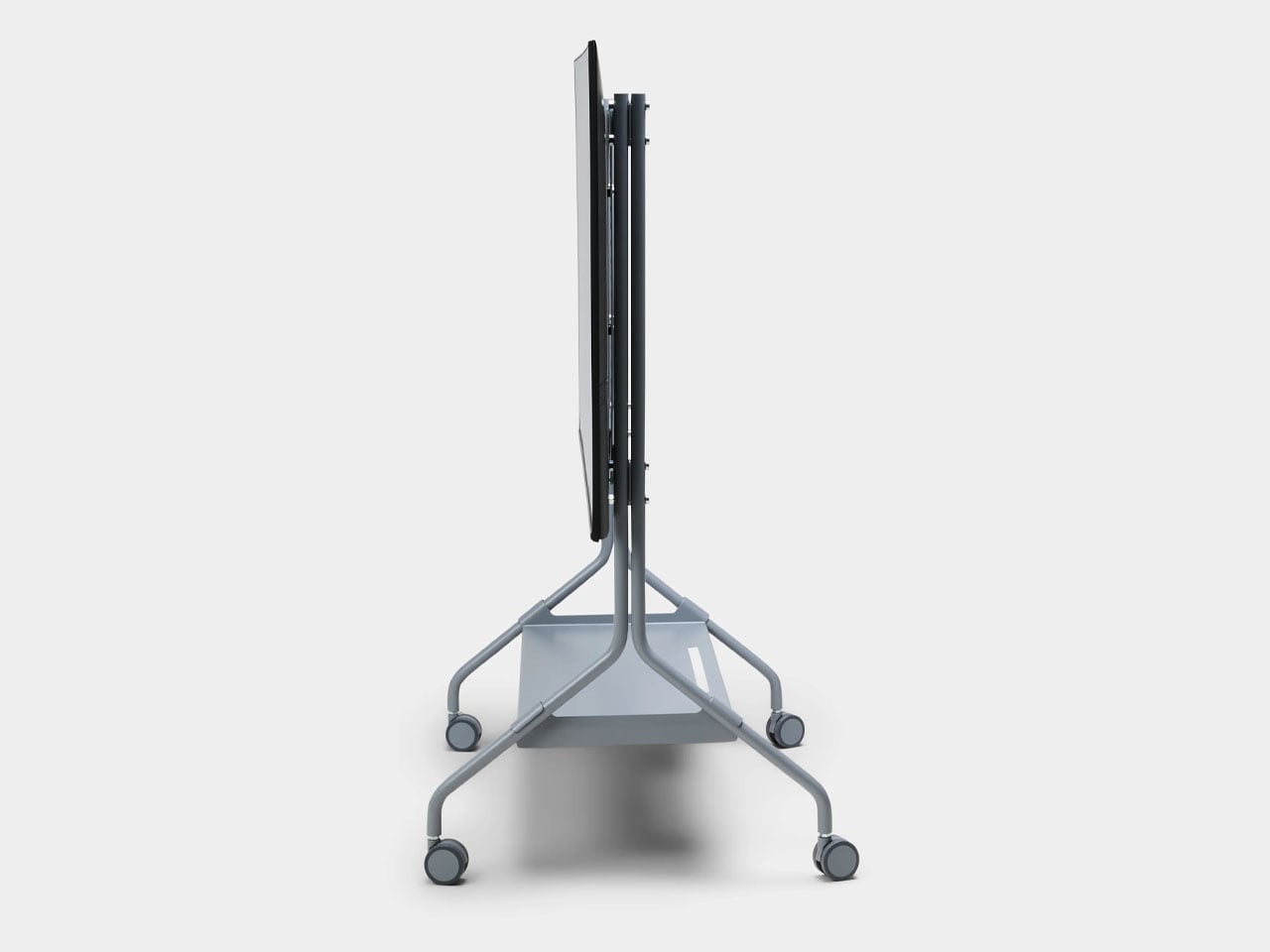
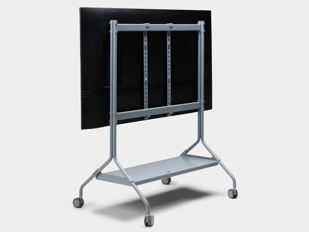
Beyond the nostalgic color palette, the stand follows Pedestal’s minimalist Scandinavian design philosophy. The frame is constructed from powder-coated steel with a satin finish, giving the structure a sturdy and refined appearance while maintaining a relatively lightweight build. Despite the industrial material choice, the design remains clean and understated, allowing the console and TV setup to remain the visual focus. The stand measures roughly 42 inches high, 31 inches wide, and 21 inches deep, and weighs just under 33 pounds, making it substantial enough for stability without feeling overly bulky. It supports flat-screen televisions between 40 and 70 inches and can handle loads of up to about 110 pounds, which comfortably covers most modern TVs and gaming setups.

The Moon Legacy Edition sits on premium furniture wheels with soft polyurethane coating, allowing the entire entertainment setup to move easily between spaces. For users who rearrange their living room or occasionally shift their gaming setup to different areas, the wheeled base offers flexibility that traditional TV cabinets often lack. The stand also adheres to the widely used VESA mounting standard, meaning it is compatible with most flat-screen television brands currently on the market.

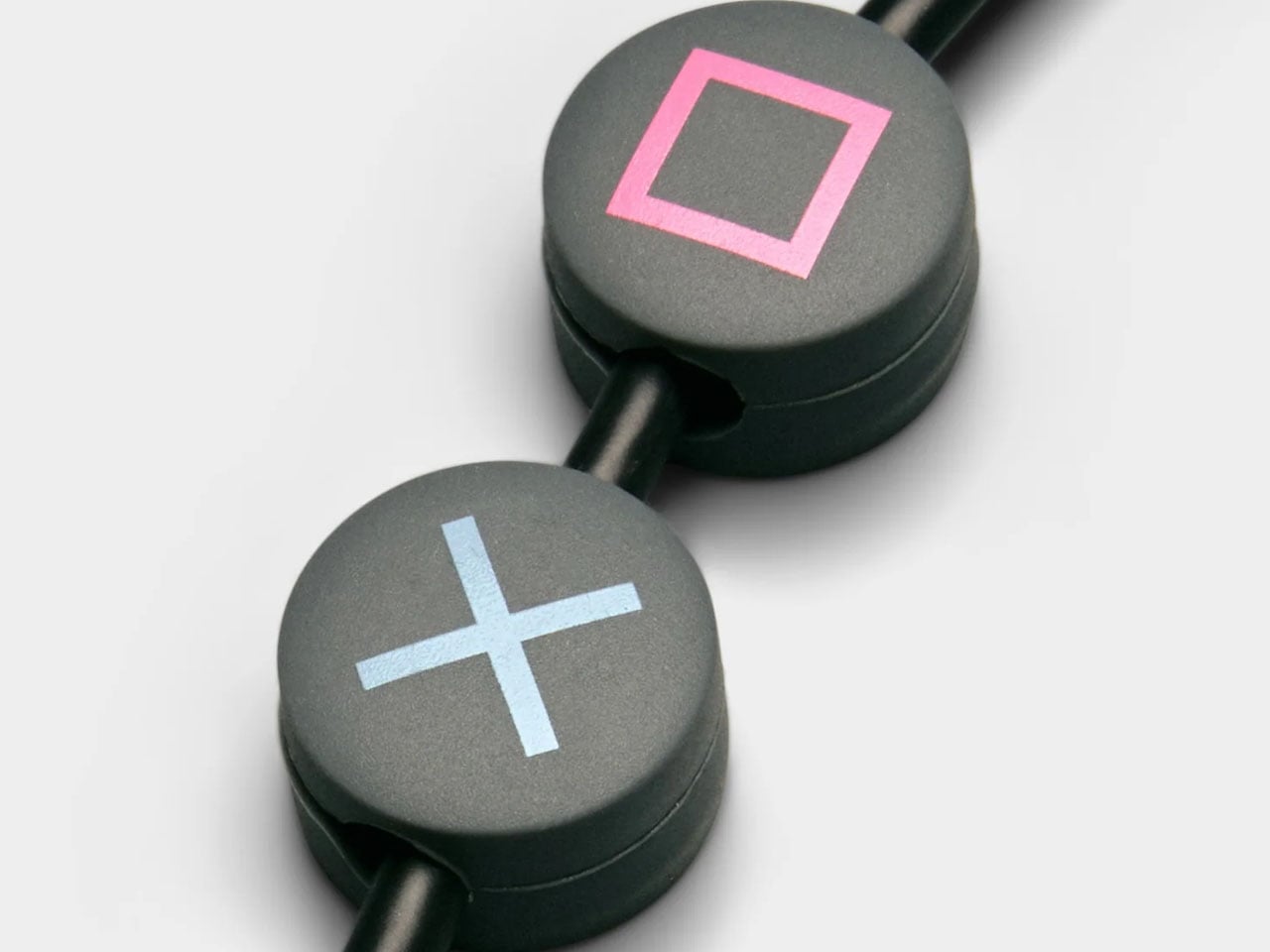
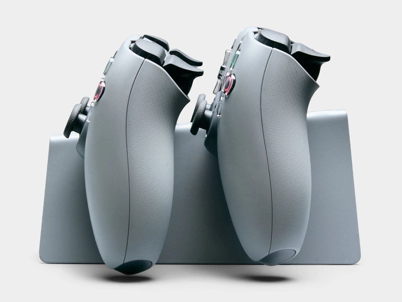
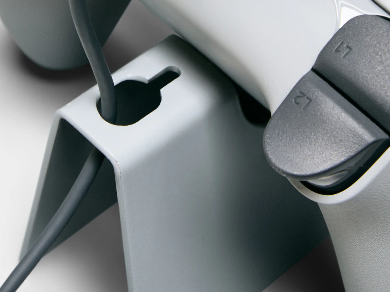
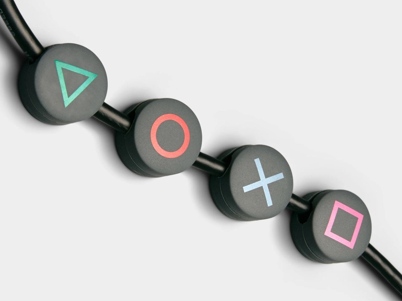
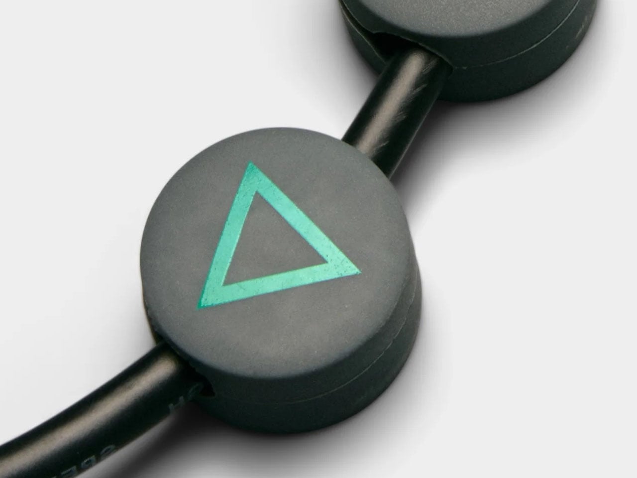
Functionality extends beyond simply holding a TV. The limited-edition package includes a matching Legacy Shelf and a controller stand, giving players a dedicated place to display a controller or store accessories. Additional cable management accessories, such as cable dots and cable ties, are also included to help keep wires organized and out of sight. The shelf adds a subtle display area that can hold game cases, collectibles, or other gaming gear without interrupting the stand’s minimal design language.

The Moon Legacy Edition TV stand is priced significantly higher (approximately $775) than the normal version, which costs $385, reflecting its limited-edition status. The price covers only the stand and included accessories; neither the television nor the PlayStation console is part of the package. As a result, the stand clearly targets dedicated fans and collectors who value the design connection to PlayStation history rather than simply looking for a functional TV stand.

The post PlayStation Moon Legacy Edition TV Stand brings Retro PS1 style to your modern gaming setup first appeared on Yanko Design.

  •  

The Philosopher Wanted Silence. The Artist Built on Water.

In 1914, Ludwig Wittgenstein did something that, depending on your perspective, was either the most logical or the most eccentric thing a Cambridge-trained philosopher could do. He left England behind and built a tiny wooden cabin on the steep shoreline of Lake Eidsvatnet in Skjolden, Norway. The only way to reach it was by boat, or by walking across ice in winter. His mentor Bertrand Russell reportedly told him it would be lonely. Wittgenstein replied that he “prostituted his mind talking to intelligent people.” The anecdote is funny, but the philosophy behind it was completely serious.

What Wittgenstein found in that remote hut was the particular kind of quiet that forces real confrontation with your own thoughts. He was productive there in ways he couldn’t replicate anywhere else, later writing to a colleague that he “couldn’t imagine working anywhere as he did there,” and that the place had “a quiet seriousness” he found nowhere else. Some of his foundational thinking for Tractatus Logico-Philosophicus took shape in that small space, part of it on a boat his friend David Pinsent sailed across the Sognefjord. A philosopher doing his deepest work on open water, surrounded by mountains. That image stays with you.

Designer: Dionisio González

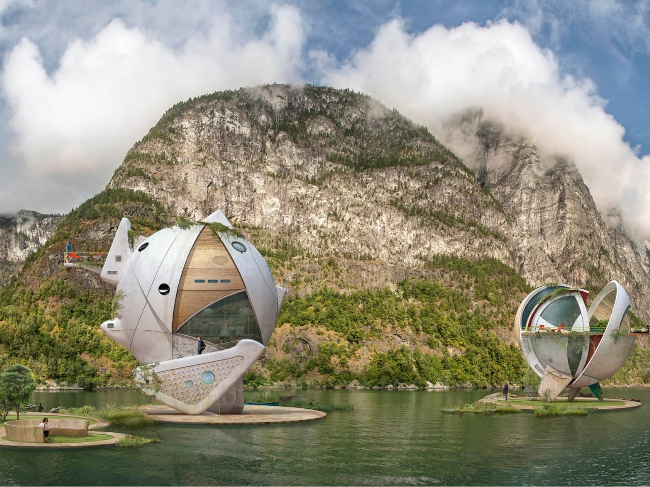
Spanish artist Dionisio González clearly felt it too. His series, Wittgenstein’s Cabin, takes that founding image as both premise and provocation. González works across photography, digital manipulation, and what you might call architectural fiction, and his practice has long focused on reimagining how people live in extreme or overlooked conditions. For this project, he envisioned a cluster of amphibious dwellings set directly on the Norwegian fjords, floating on artificial islands against the same vast and indifferent landscape that Wittgenstein once sought out. They are not proposals for construction. They are something closer to visual arguments.

The structures themselves are striking. Made primarily of weathered metal, they feel industrial and oddly organic at the same time. Each one has its own distinct form, but they share a visual family resemblance, like siblings built from the same strange blueprint. They sit on the water in ways that feel simultaneously precarious and deliberate. González has spoken about being drawn to “the confrontation, the frontality” of Wittgenstein’s original cabin with the fjord. For Wittgenstein, the water wasn’t backdrop. It was the actual condition of his solitude. González takes that thought and makes it architectural.

The project keeps pulling me back to one of the more persistent tensions in design conversation: the relationship between isolation and creative thought. The idea that you need to escape in order to think clearly is ancient, but it feels newly charged when genuine silence has become a luxury most people can’t really access. González frames philosophy itself as an “amphibian endeavour,” something that lives between the stable and the fluid, the settled and the speculative. His floating cabins give that metaphor a shape and a weight. They’re not quite houses. They’re more like habitable hypotheses.

None of these structures are intended to be built, and I think that’s precisely where their power lies. Architectural fiction as a practice asks you to sit with ideas rather than just objects. It creates room to think seriously about how we want to inhabit the world, even when the answer falls outside what’s commercially or technically possible. González’s designs carry a visual seriousness that separates them from pure fantasy, a quality that makes them feel genuinely worth spending time with.

Wittgenstein wanted to disappear from the world in order to think more clearly inside it. González takes that same instinct and places it on open water, wrapped in oxidized metal, asking what solitude actually looks like when landscape isn’t just a setting but a condition of being. The answer he offers is beautiful and strange, which feels entirely fitting for a project named after one of the twentieth century’s most beautiful and strange minds.

The post The Philosopher Wanted Silence. The Artist Built on Water. first appeared on Yanko Design.

  •  

Galaxy Z Fold 8 Renders: Same Look, Bigger Battery, and S Pen Is Back

Foldable phones have reached a point where the form factor itself is no longer the talking point it once was. The big, dramatic “look how it folds” moment has settled into a quieter rhythm of iterative refinement, with each generation tweaking dimensions and chasing thinner profiles. Most buyers know what a modern book-style foldable looks like, and the language of change has shifted from shape to substance.

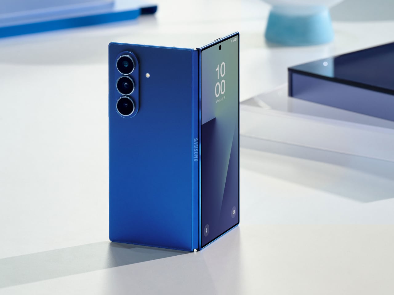
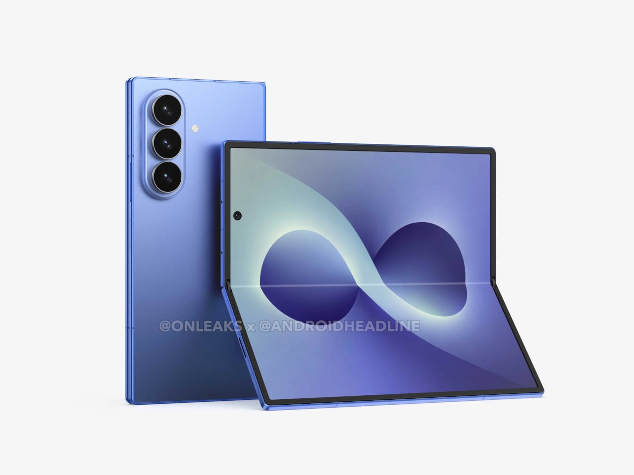
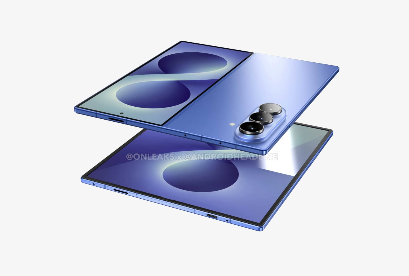
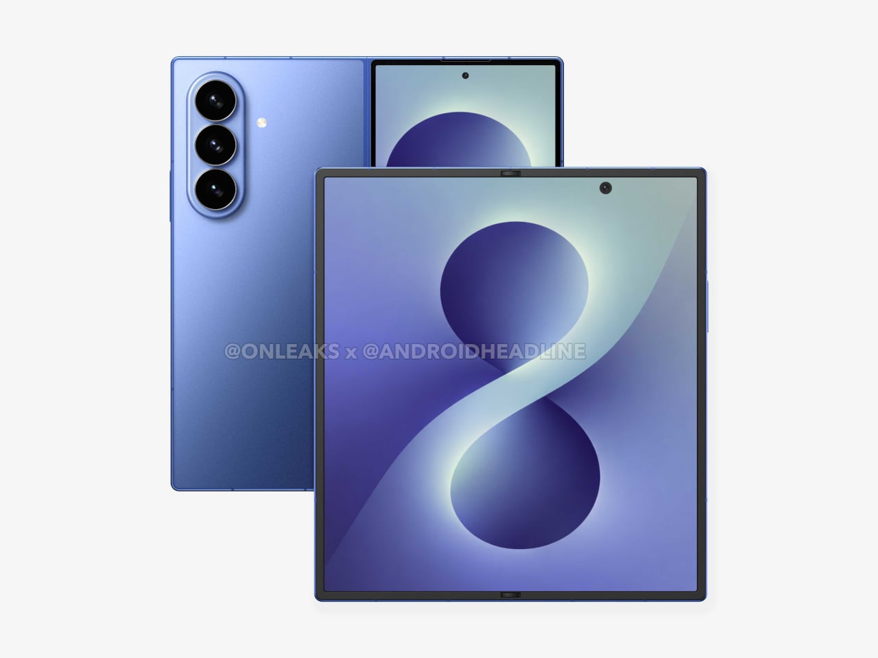
That’s the situation shaping the Samsung Galaxy Z Fold 8 conversation right now. Leaked CAD-based renders show a design that’s nearly indistinguishable from the Z Fold 7 pictured above: same flat sides, same sharp corners, same camera layout. The cover screen sits at 6.5 inches and the inner display at 8 inches, both unchanged. If you handed someone these renders without context, they’d probably just guess it was another angle of last year’s model.

Designer: Steve Hemmerstoffer/OnLeaks (Renders) via AndroidHeadlines

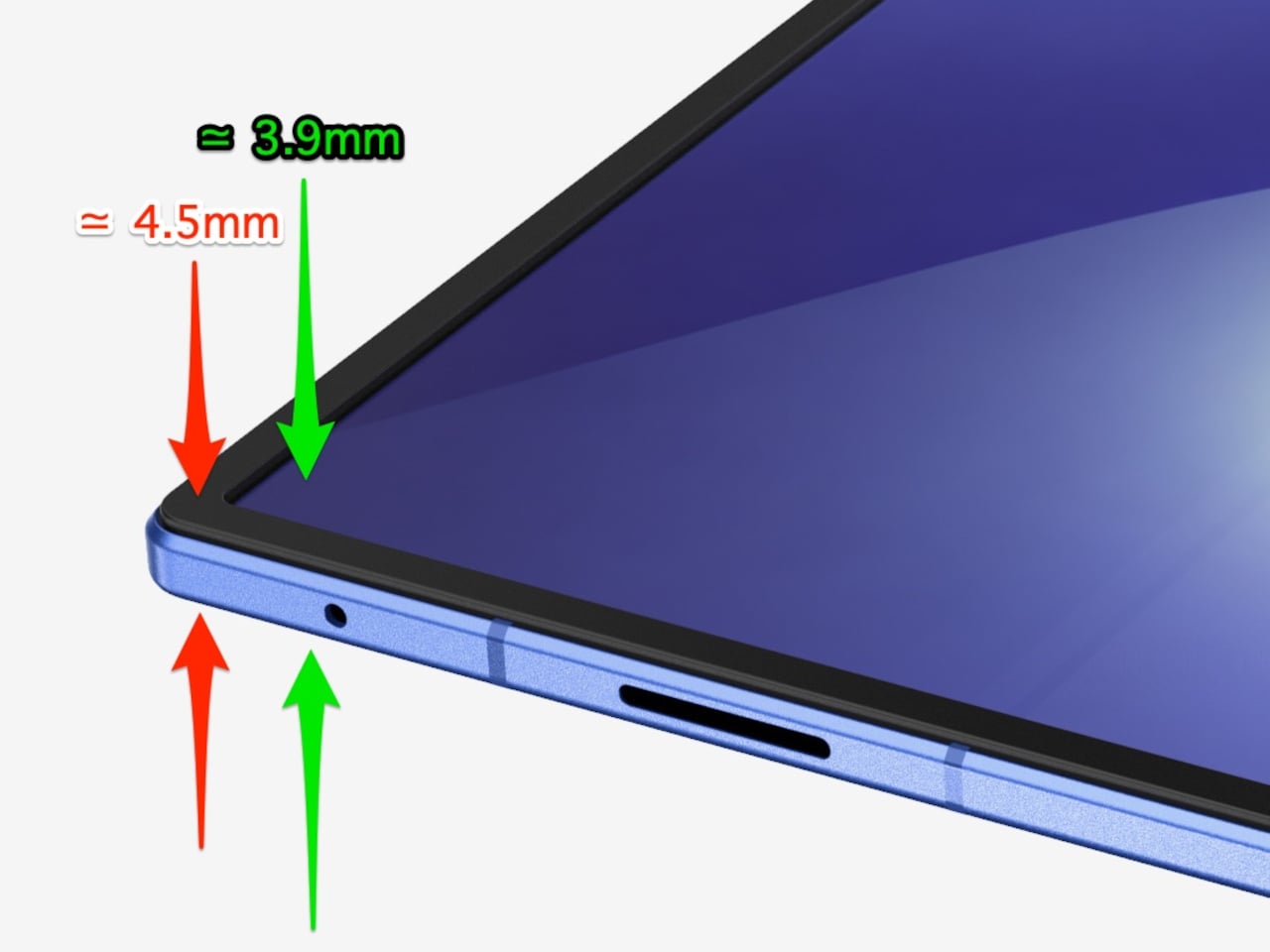
There’s one notable external difference, though, and it actually goes in the wrong direction. The leaked dimensions put the Z Fold 8 at 4.5mm thick when open and 9mm folded, compared to the Fold 7’s 4.2mm and 8.9mm. That’s a slight regression for a phone that went to considerable lengths to slim down the year prior. It’s not dramatic, but for a device that made a point of its thinness, it’s worth flagging. That said, the 4.5mm figure includes the protruding bezels around the display; it’s actually just 3.9mm thin.

The likely reason for that extra thickness is one of the better leaks so far: the possible return of S Pen support. Samsung dropped the stylus from the Fold 7, and that’s been a consistent complaint from the people who actually used it for note-taking or sketching on that wide inner canvas. If the S Pen does come back, a fraction of a millimeter is a fair trade for most of those users.

The battery theory, however, is probably more probable. A jump from 4,400 mAh to a rumored 5,000 mAh would mark the first capacity upgrade since the Galaxy Z Fold 3, and pairing that with 45W wired charging, up from 25W, addresses one of the more persistent frustrations with this lineup. Spending less time near an outlet matters more on a device you’re likely using across more tasks throughout the day.

The camera is also in line for a significant upgrade, according to the same leak. The main sensor is rumored to still be 200MP, and the ultrawide jumps from 12MP to 50MP. That ultrawide improvement in particular has been a long time coming. The gap between the Fold’s main and ultrawide cameras has been noticeable enough that it’s affected how people use the phone outdoors.

All of this is still leak territory, of course, pulled from CAD renders and a specs tipster ahead of what’s expected to be a July 2026 Unpacked announcement. Samsung hasn’t confirmed any of it, and final specs frequently shift between early renders and launch day. The Z Fold 8 is shaping up to be a phone that looks familiar and updates what actually needs updating, but none of that is official yet.

Galaxy Z Fold7

The post Galaxy Z Fold 8 Renders: Same Look, Bigger Battery, and S Pen Is Back first appeared on Yanko Design.

  •  

The 5 Best Furniture Designs of March 2026

March brought the kind of furniture that doesn’t need to announce itself. A student chair that shifts between sitting and lounging through physics alone. A coffee table whose legs look like they’re caught mid-step toward the door. A stool that opens from flat with a single press and no tools required. An office system built to reconfigure whenever the day asks for something different. A footstool that handles posture quietly, without making it your problem to manage.

What connects these five pieces isn’t a shared material or a shared aesthetic. What connects them is the absence of excess. Each one solves something real, and each one does it without layering on complexity to get there. That kind of restraint is harder to land than it looks. Most furniture design in 2026 is reaching for the new, for the bold, for the statement piece. These five reach for the right answer instead, and find it.

1. Tilt Chair
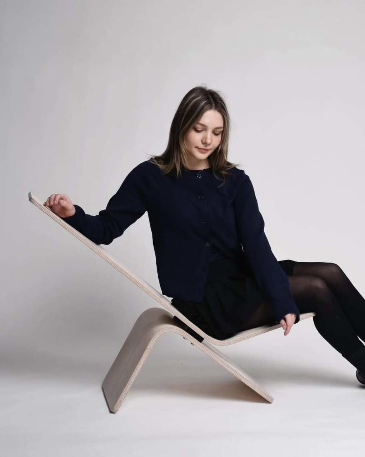
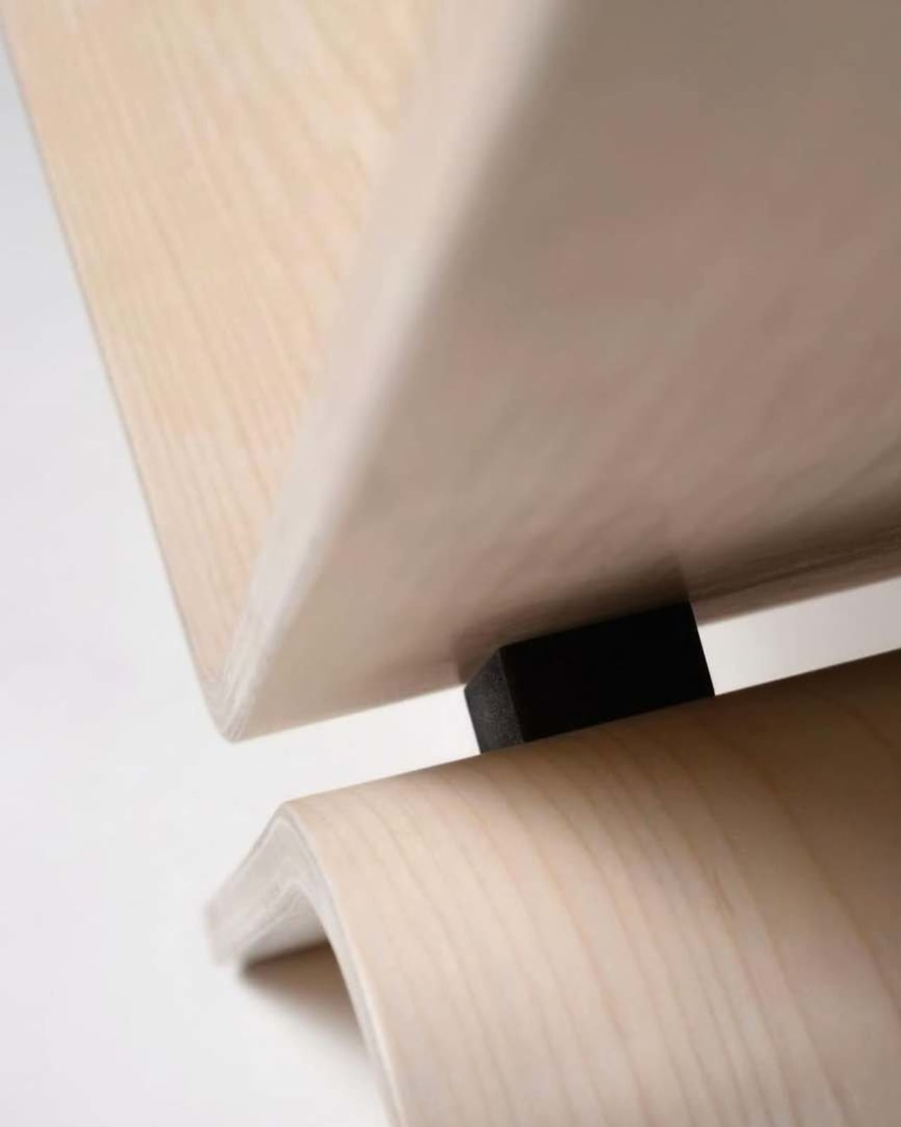
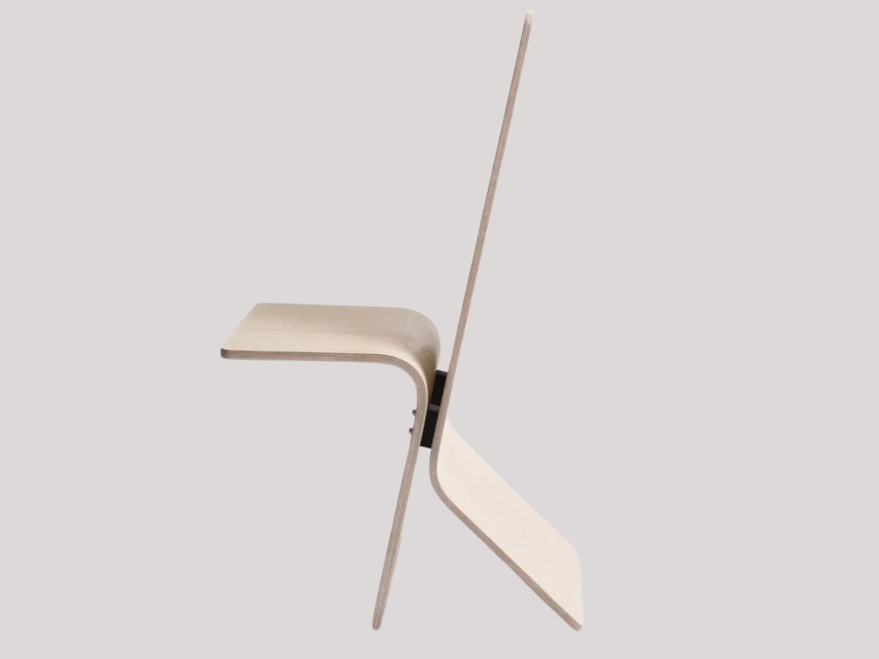
Manuela Hirschfeld is an industrial design student at Germany’s Hochschule Pforzheim, and her Tilt chair does exactly what the name suggests. Built from bent plywood, it shifts between upright and reclined with a single forward tilt. No levers, no hardware, just physics and balance. The restraint here is rare for student work. Most student designs reach for the complex or the speculative. Tilt strips everything back until the idea stands entirely on its own.

What makes it genuinely useful is how naturally it handles the shift between focused work and winding down. Most chairs make you choose one mode and stay there. Tilt lets your body make that call instead. Lean it forward, and the geometry changes. The bent plywood keeps it light and easy to move, so it works as well in a small apartment as it does in a studio or home office.

What We Like

  • No mechanical parts means nothing to replace or service over time
  • Dual function in a single lightweight form, no extra hardware needed

What We Dislike

  • The minimal plywood aesthetic may feel too sparse for warmer, more layered interiors
  • May not offer enough firm back support for users who need a fixed, stable position

2. Barefoot Collection
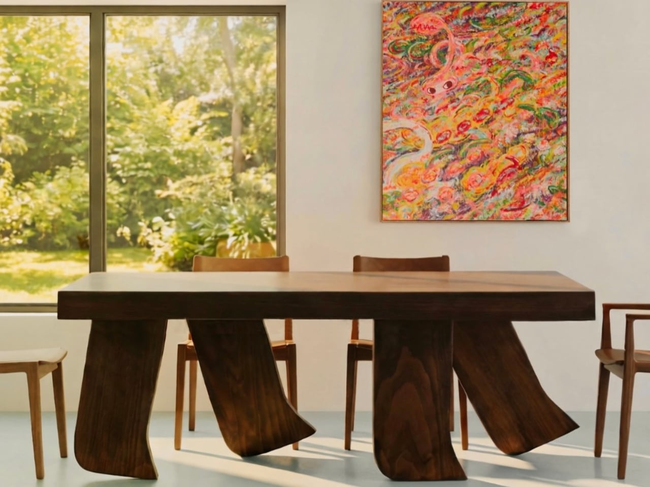
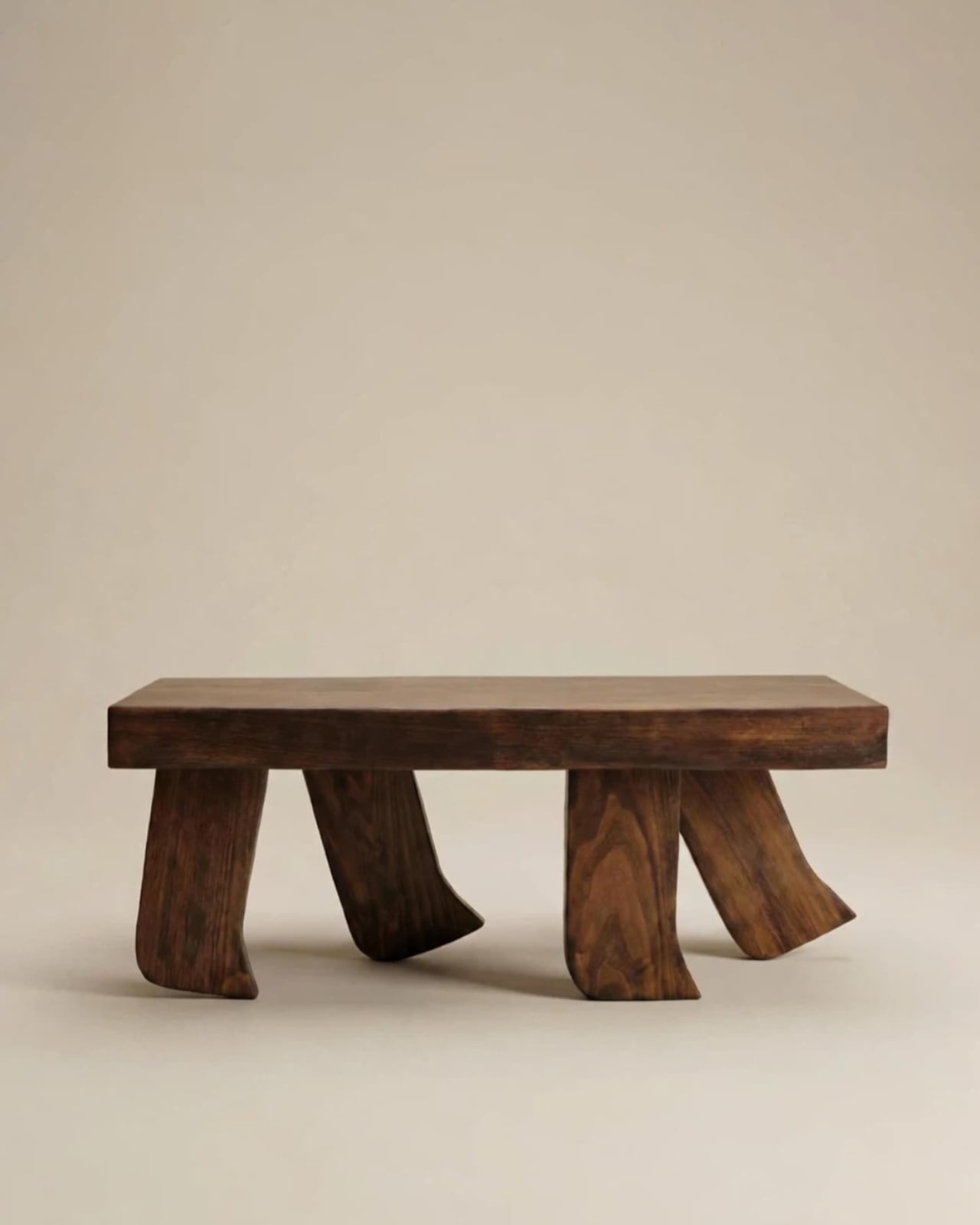
The Barefoot Collection started with a single image: a coffee table that looks like it’s walking away. The legs are carved from solid wood to simulate the arc and flex of a bare foot mid-step, while the tabletop stays completely flat and rectilinear. Stillness above, motion below. That contrast is the whole point, and it works better than it has any right to. The piece reads as coherent long before it reads as clever.

What you actually get is a coffee table that functions without apology and sparks a real conversation without ever trying to. Set a cup on it and forget the concept entirely. Then a guest walks in, does a double-take, and suddenly the room is talking. Most concept-led furniture exhausts you after a few weeks. Barefoot earns its place by being genuinely useful first and genuinely interesting second. That’s always the right order.

What We Like

  • Solid wood construction gives it real longevity, well beyond its visual appeal
  • Works as a fully functional surface while quietly holding a strong point of view

What We Dislike

  • The sculpted legs make it difficult to pair with more conventional, straight-lined furniture
  • The level of craft involved likely puts it at a higher price point

3. Press Stool
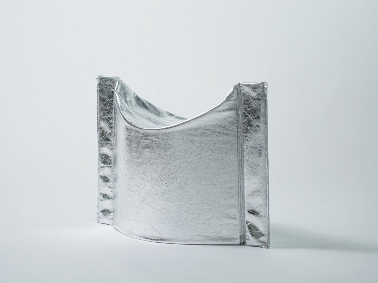
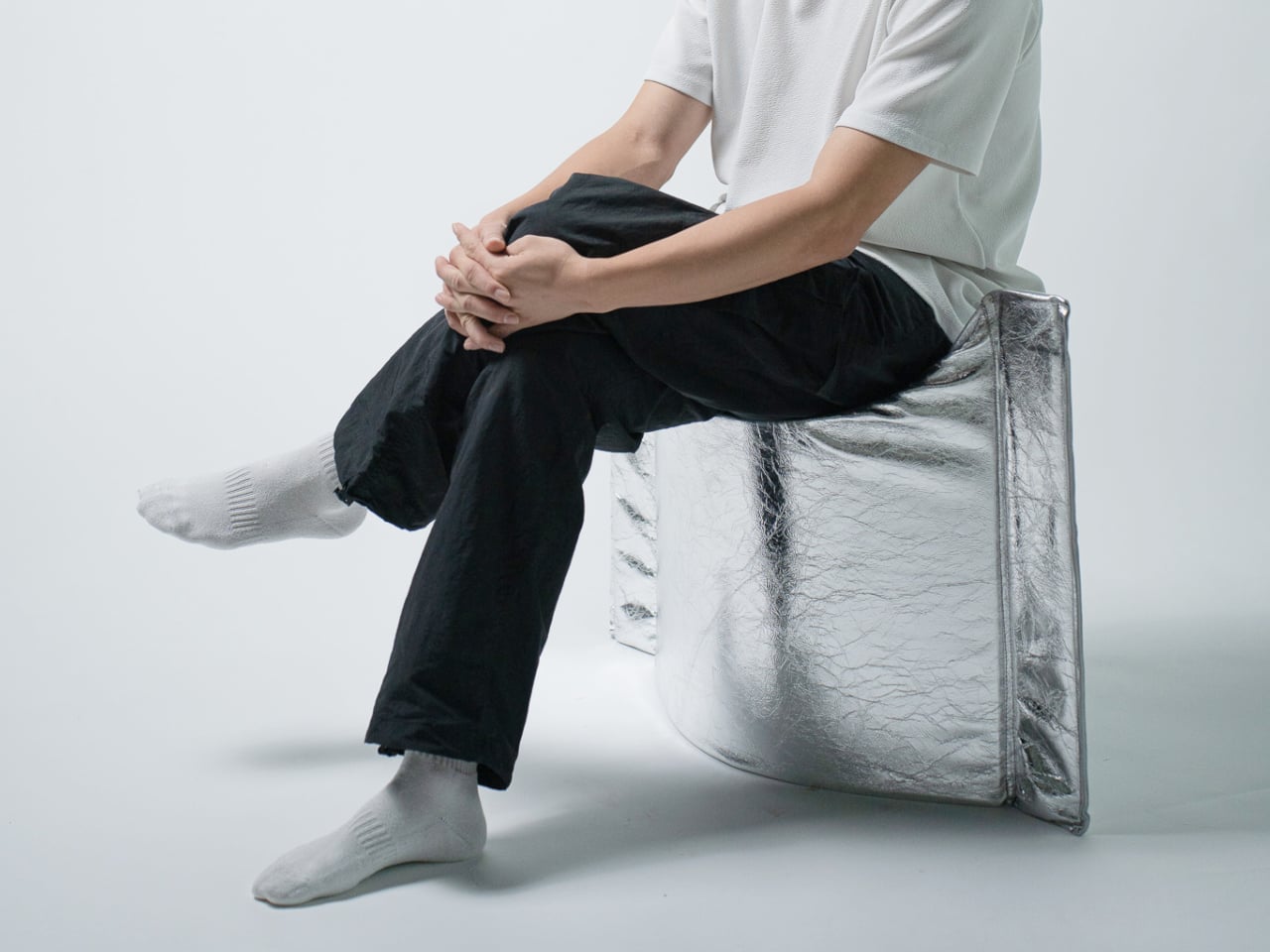
The Press Stool borrows its structural logic from folded paper. A flat sheet has no load-bearing strength, but fold it, and the forces redistribute across the geometry. Crease it further, and the form resists compression. That principle does all the work here. In its flat state, it collapses into a wide oval with a crinkled metallic silver surface that lands somewhere between industrial foil and fabric. One press and it opens. No legs, no bolts, no tools.

For anyone in a small apartment, it solves a storage problem while putting something worth looking at in the room. It ships flat, weighs little, and can slide under a bed or lean against a wall when it isn’t needed. Most fold-flat furniture looks like a compromise. The Press Stool looks intentional. The crinkled surface and gathered folded ends give it a presence that holds up even when it’s closed.

What We Like

  • Ships and stores completely flat, ideal for smaller homes and tight living spaces
  • No assembly required, the folded form does all the structural work

What We Dislike

  • The metallic silver finish is a strong statement that won’t suit every interior palette
  • Load capacity may be more limited compared to stools with conventional structural frames

4. Kylinc Modular Office System
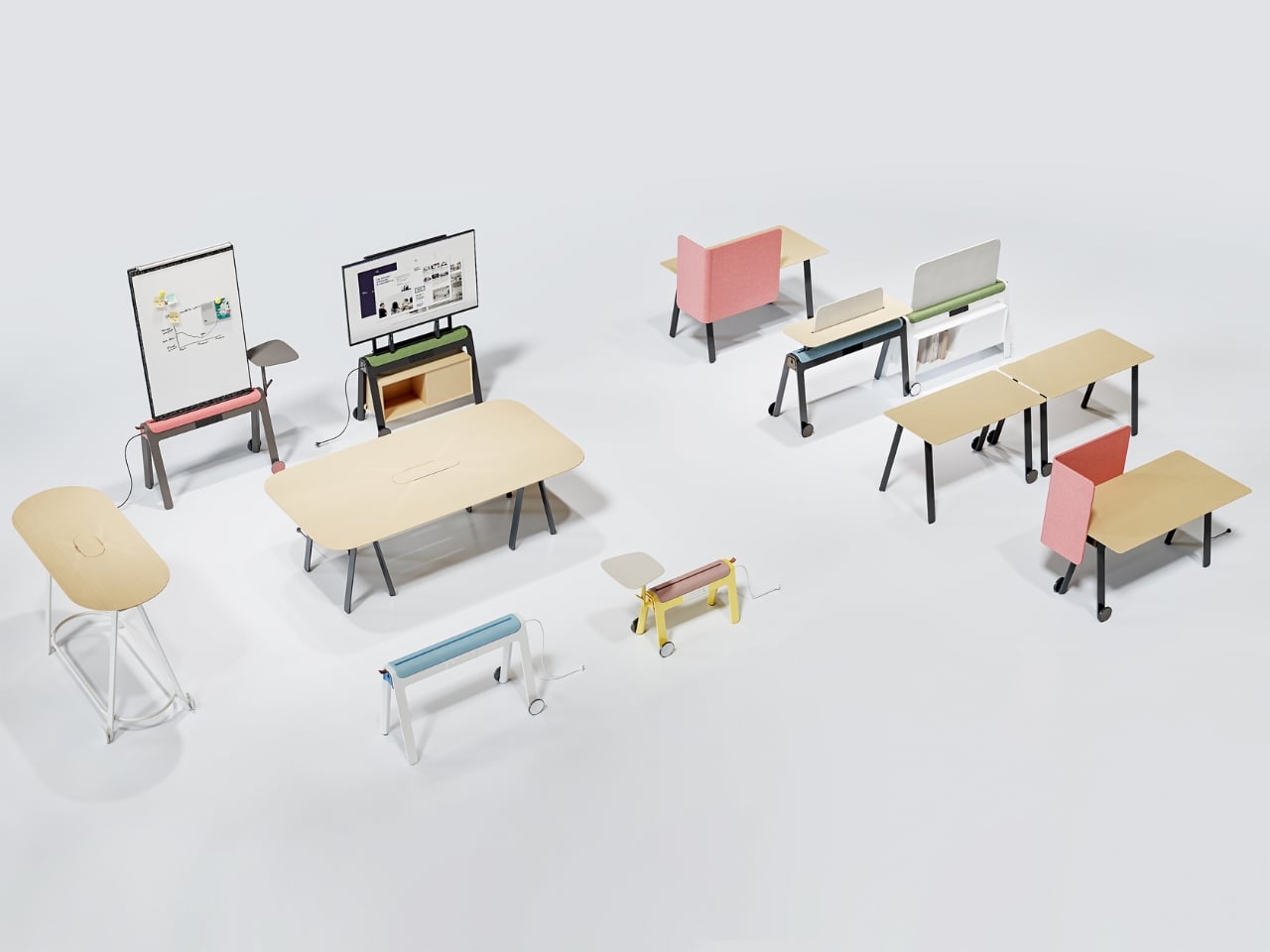
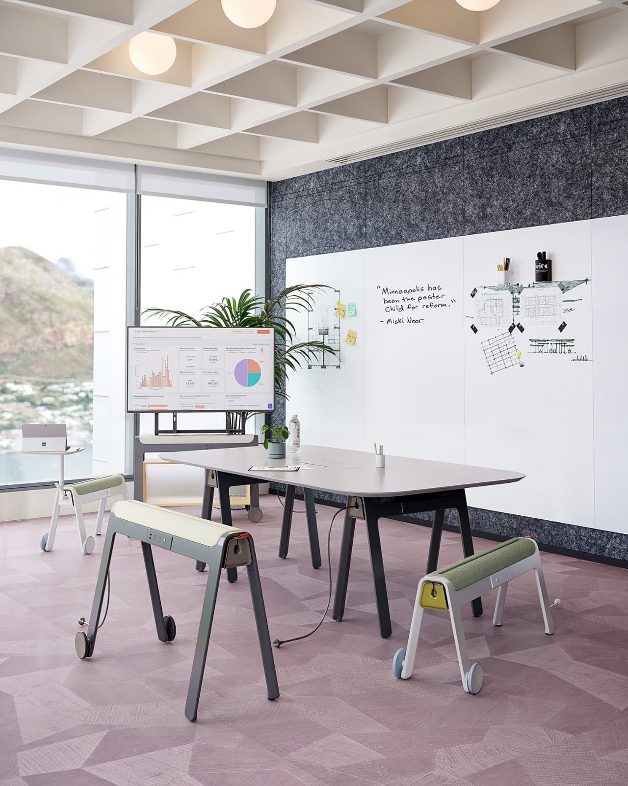
Kylinc treats the workspace like something that should change whenever the day asks it to. Each piece rolls on oversized wheels, which makes reconfiguring your office feel genuinely effortless rather than theoretically possible. Push pieces apart for a collaboration zone, pull them together for focused work. Power management is built directly into the furniture, with smart cable organization that keeps surfaces clean without any additional accessories to track down or manage.

The benefit shows up most for people working from home across a day that never asks the same thing twice. A static configuration works well some of the time and poorly the rest. Kylinc changes that without requiring much effort, which is the real difference between a system that actually gets used and one that stays fixed out of habit. The built-in cables move with the furniture. Your layout becomes something you actually control.

What We Like

  • Oversized wheels make real reconfiguration effortless, not just possible on paper
  • Integrated power and cable management keep the workspace clean without extra accessories

What We Dislike

  • Rolling furniture may feel less stable than fixed pieces for users who prefer an anchored setup
  • A full modular system likely carries a significantly higher upfront cost than standard office furniture

5. OTTO Footstool
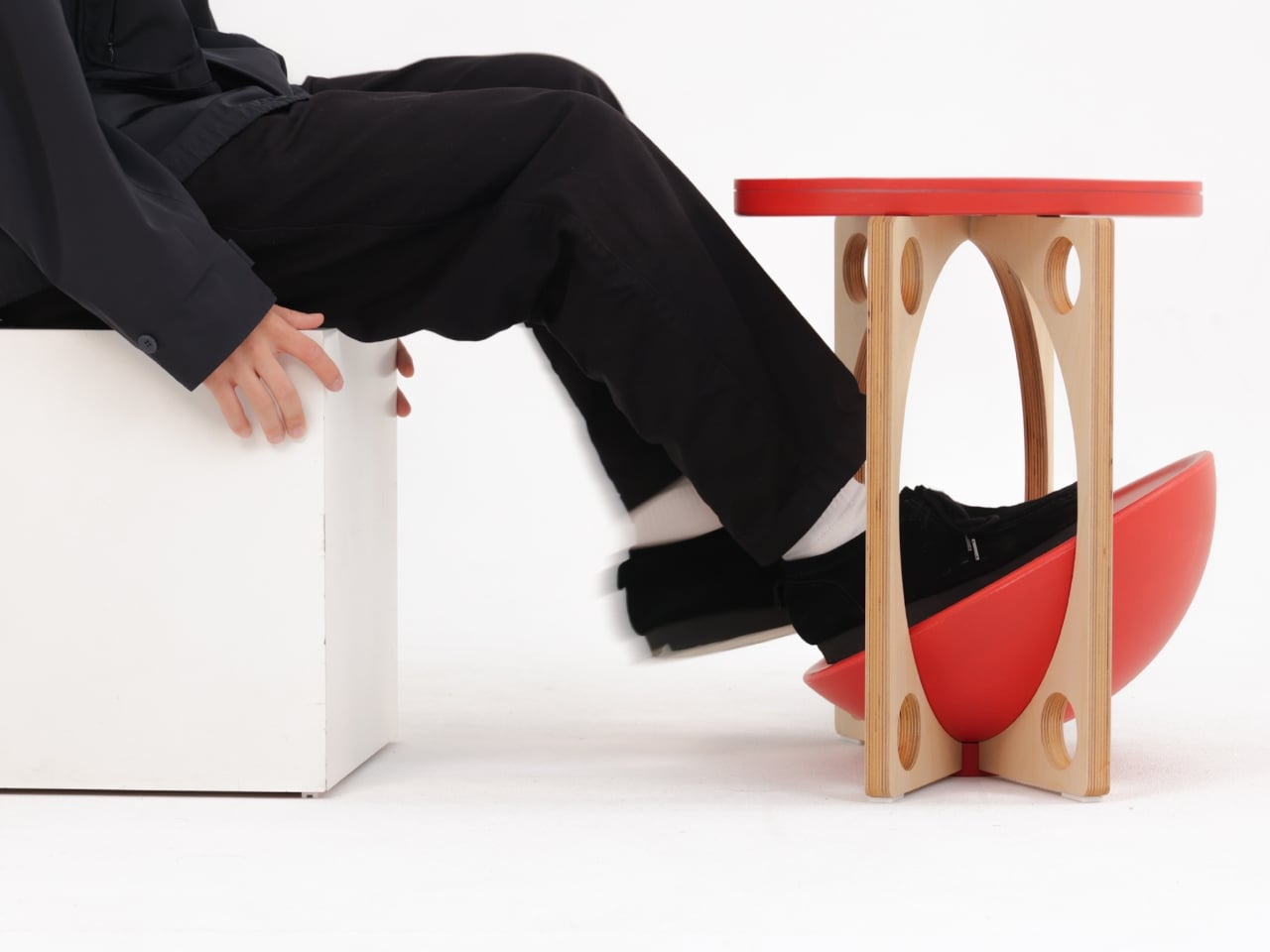
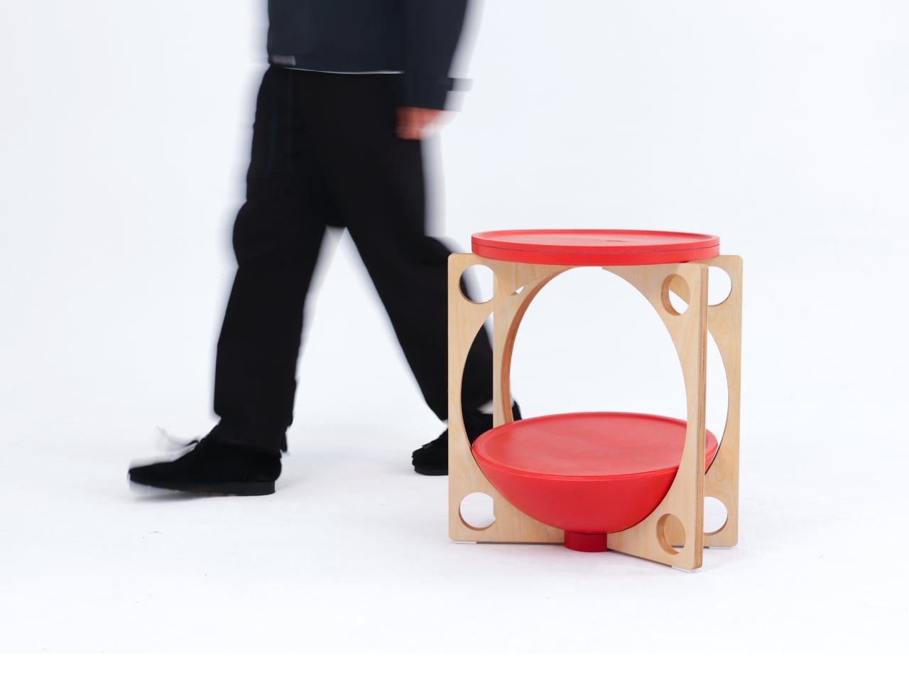
OTTO takes its name from the Korean roly-poly toy Ottogi, a round-bottomed figure that always rights itself because of its convex base. Designer Woonghee Ma applied that same logic to a footstool. The convex base means it rocks and shifts as your body moves throughout a long sitting session. No adjustment needed, no settings to configure. You shift weight, the stool moves with you, and that’s the whole mechanism.

For a home office that needs to support you without making a production of it, OTTO is exactly right. Most ergonomic products demand your attention to work. OTTO doesn’t. The passive rocking base handles posture support quietly while you stay focused on everything else. It also looks good, which matters more than it might seem for something you’ll look at every working day. Clean, compact, and entirely unpretentious about what it is.

What We Like

  • Passive rocking base provides ergonomic support through natural weight shifts, no settings required
  • Compact and well-proportioned, it works equally well in home and professional office settings

What We Dislike

  • The rocking motion may feel unfamiliar at first for users accustomed to fixed support
  • May not suit very low seating arrangements where foot elevation isn’t part of the setup

March Didn’t Make a Noise. It Made a Point.

What connects these five pieces isn’t an aesthetic or a material. It’s restraint. A chair that changes mode with one gesture. A table that earns its concept by being useful first. A stool that ships flat and opens in a second. A workspace that adapts without asking for your help. A footstool that supports you without ever drawing your attention to the fact that it’s doing so. That quiet confidence is what good design actually looks like in practice.

Most design coverage this month was busy chasing the big swing. The sculptural statement, the unexpected material, the idea that needs a paragraph of explanation before it lands. What these five pieces share is something quieter. They ask less of you. They make their case by fitting into your life rather than reshaping it around themselves. March didn’t produce the loudest furniture of the year. It produced some of the most considered. That’s always the better result.

The post The 5 Best Furniture Designs of March 2026 first appeared on Yanko Design.

  •  

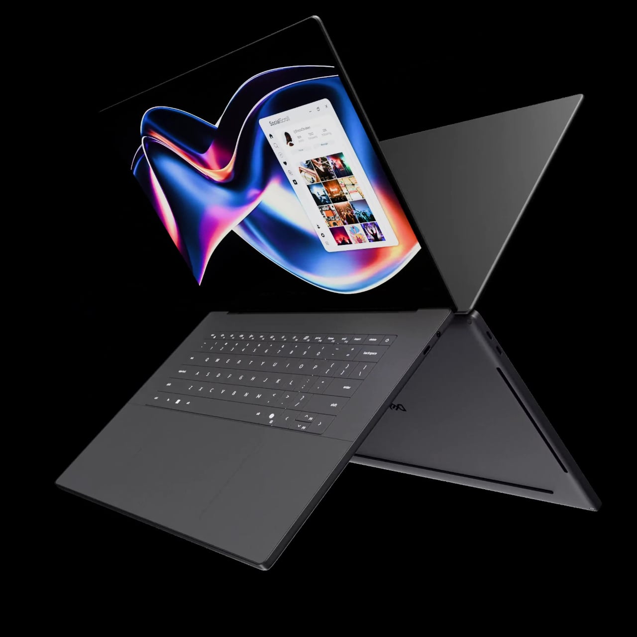
LG’s World-First 1Hz Panel Gives the Dell XPS 48% More Battery

Battery life has been one of the laptop industry’s most persistent design headaches, especially among Windows notebooks. Despite significant gains in chip efficiency, the display consistently ranks among the biggest power consumers in any portable computer. Most laptop screens refresh at a fixed rate regardless of what’s actually on them, which means the panel keeps drawing full power even when you’re sitting completely still, reading a document with nothing on screen changing at all.

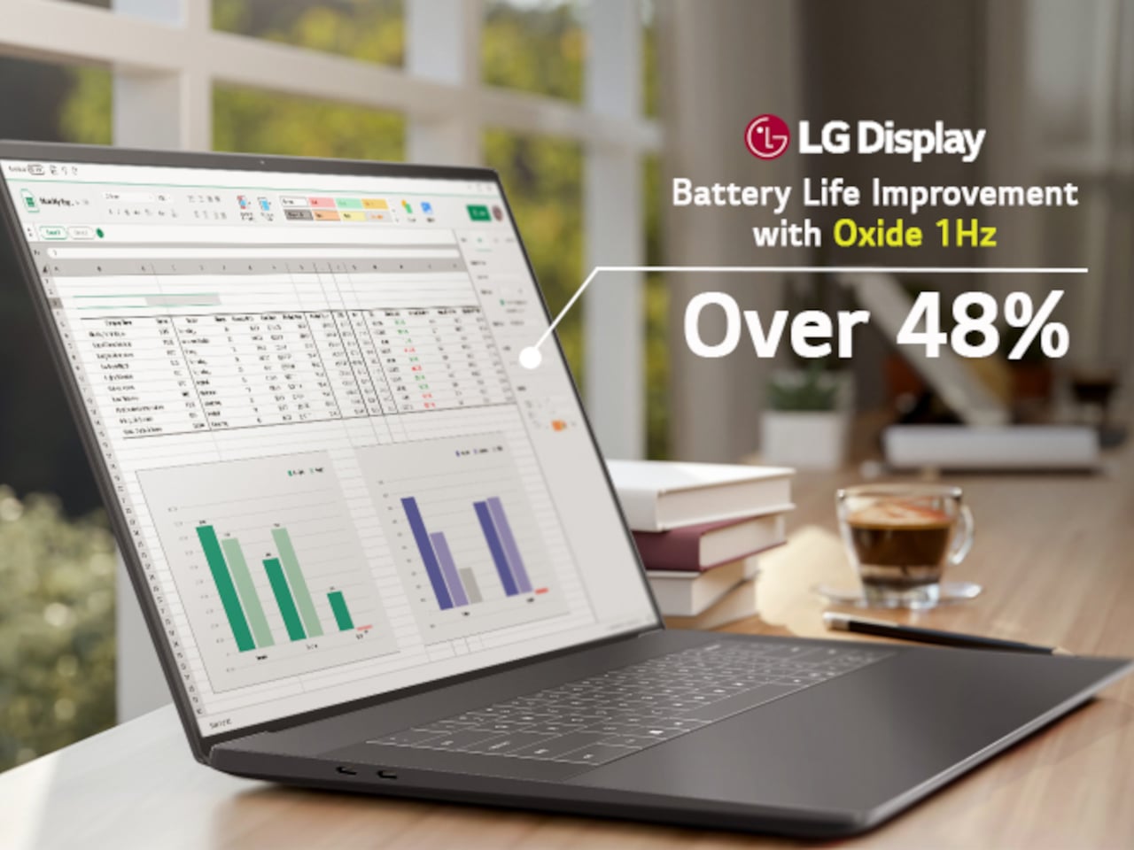
LG Display’s new Oxide 1Hz panel is the first mass-produced LCD laptop screen that doesn’t work that way. Rather than holding a fixed rate, it reads what’s on screen and drops to 1 Hz when the content is static, then scales back up to 120 Hz for video or gaming. LG began mass production on March 22, 2026, claiming the first-ever achievement of this at scale.
Designer: LG, Dell

The technology relies on custom circuit algorithms and a new oxide material applied to the panel’s thin-film transistor. That oxide holds an electric charge longer than conventional LCD materials, letting the screen maintain a still image without continuously refreshing it. LG claims the result is up to 48% more use on a single charge versus existing solutions, which is a significant number if it holds up in everyday use.
In practice, this matters most during the parts of a workday you spend the bulk of your time in. Checking emails, reading through documents, and sitting on a static slide during a meeting are all moments where a 60 Hz or 120 Hz screen burns power for no real benefit. The Oxide 1Hz panel handles those scenarios at a fraction of the usual draw without any visible difference.

When you do pull up a video or launch something that demands smooth motion, the panel doesn’t hesitate. It detects the change and jumps back up to 120 Hz automatically. There’s no mode to switch into, no setting to toggle, and no trade-off to manage. It just adjusts based on what’s happening on screen, which is how this kind of feature should work in the first place.

The first laptops to ship with this panel are the Dell XPS 14 and Dell XPS 16 for 2026, both unveiled at CES 2026 in January. The LCD option on both models runs at 1920 x 1200 pixels and 500 nits of brightness. Dell’s OLED option only drops as low as 20 Hz, which means the more affordable LCD configuration actually wins on low-power behavior.

Here’s where it gets interesting from a design standpoint. The display is one of the biggest power consumers in any laptop, so a screen drawing significantly less power during typical use creates real headroom for designers. They can use that headroom to maintain battery size and gain extra runtime, or to trim the battery slightly for a lighter, thinner chassis without giving up the battery life buyers already expect.

Of course, LG is already planning a 1 Hz OLED version of this technology for 2027, which is when things could get more interesting. OLED handles contrast and color in ways LCD can’t match, and pairing that quality with proper low-refresh-rate behavior could push portable laptop design further than it’s been able to go. For now, the Oxide 1Hz LCD is in something you can actually go out and buy.

The post LG’s World-First 1Hz Panel Gives the Dell XPS 48% More Battery first appeared on Yanko Design.

  •  

KFC’s Pickle Puffer Is Fashion’s Weirdest Power Move

At some point, the line between fashion and performance art quietly dissolved, and I think we need to have a serious conversation about who’s holding the needle. Because KFC just debuted a puffer jacket filled with real sliced gherkins and acid-green brine, and it is fully, sincerely, unapologetically real.

The Pickle Puffer is exactly what it sounds like. A clear plastic puffer jacket, entirely see-through, packed with floating slices of pickled cucumber and brine so vividly green it almost looks radioactive. The insulation is gone, replaced with hundreds of actual pickles that shift and float with every movement.

Designer: KFC

Picture a standard puffer silhouette, the kind you’d wear on a cold commute, except every quilted chamber is sealed, transparent, and filled with floating pickle slices suspended in green liquid. The jacket moves the way a lava lamp moves. Tilt left and the gherkins drift. A hydration hose runs along the chest like something from a trail runner’s kit, except it feeds into a reservoir of pickle juice. The zipper pull is shaped like a pickle. The whole thing is lurid and weirdly beautiful in the way that only objects with absolutely no interest in being subtle can be.

I genuinely don’t know whether to call this genius or absurdist theatre, and I’m starting to think the distinction doesn’t matter anymore. What makes the Pickle Puffer particularly fascinating is its origin story. It didn’t start in a brand meeting or a creative studio. It started with an AI-generated video on TikTok of a man handing out gherkin slices from a pickle-filled puffer jacket. The video had barely a hundred likes. A hundred. And yet something about it triggered that very specific brand instinct that says: we should make this real.

The fact that KFC actually followed through says a lot about where we are right now. We’ve officially entered an era where a low-engagement AI fantasy can become a physical product, and the feedback loop between online imagination and real-world manufacturing has compressed to almost nothing. KFC UK brand manager James Channon was refreshingly candid, calling it “a bit unhinged, but that’s the point.”

And it is unhinged. But it’s also timed to perfection. The jacket dropped alongside KFC’s new Pickle Mania Menu in the UK, which includes Pickle Loaded Fries and a Pickle Pepsi, riding the wave of a full-blown cultural obsession. The #pickles hashtag on TikTok has racked up billions of views, and apparently the correct brand response is to wear that moment on your body, literally soaked in brine.

Now, this is a one-off. You can’t buy it. You have to win it through an Instagram giveaway, which is its own kind of genius because the scarcity makes it collectible and the competition makes it content. KFC isn’t really selling a jacket. They’re selling a news story, a talking point, and a social media moment that will keep circulating long after the pickles start to turn. That’s the actual product here.

It also puts the Pickle Puffer in the company of a growing category of fashion-as-marketing stunts increasingly committed to the bit. Aldi’s Jacket Potato Jacket came before it. Lidl has played in this space too. There’s a whole lane developing for grocery and fast-food brands to use absurdist outerwear as their loudest advertising medium, and it’s clearly working. I’m writing about a pickle jacket right now, so there’s your proof.

What I keep coming back to is how genuinely well it’s designed for what it’s supposed to do. The translucency is intentional. The floating pickles are the visual. The hydration hose is the punchline that also happens to be functional. Every element is deliberate and considered, even if the whole thing is engineered to make you laugh first and think second. Plenty of brands try for weird and land on confusing. KFC landed on weird and made it covetable. Fashion has always been partly spectacle. The Pickle Puffer just has better snacks.

The post KFC’s Pickle Puffer Is Fashion’s Weirdest Power Move first appeared on Yanko Design.

  •  

This Tungsten-tipped Nutcracker Works On Walnuts, Seafood, and even Car Windows in an Emergency

Think for a moment about three common tools: the nutcracker that sends shell fragments flying across the room, the bulky hammer you have to retrieve for the simple task of hanging a photo, and the emergency window breaker you bought for your car but have since forgotten about. Each serves a purpose, yet each comes with its own inconvenience, whether it’s mess, cumbersomeness, or the simple fact that it’s never around when you actually need it. These are the kinds of minor but persistent frustrations that we tend to accept as normal, the small design flaws in our daily routines.

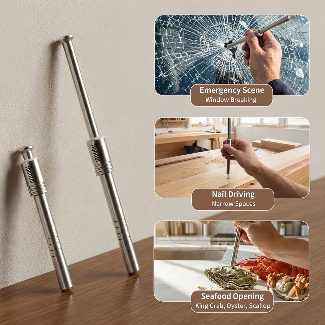
The Hamtel was born from a refusal to accept those flaws. It was conceived as a direct answer to these distinct problems, elegantly combining their solutions into a single, compact device. Its core function is a spring-loaded impact mechanism that cracks nuts with precision, eliminating mess and preserving the kernel. With a simple adjustment, that same tool becomes a capable mini-hammer for light-duty tasks. Finally, its tungsten steel tip provides the reliable performance of a dedicated car safety hammer, creating a single tool that is practical enough for daily use and critical in an emergency.

Designer: Hamtel

Click Here to Buy Now: $66 $124 (47% off) Hurry! Only 9 days left.

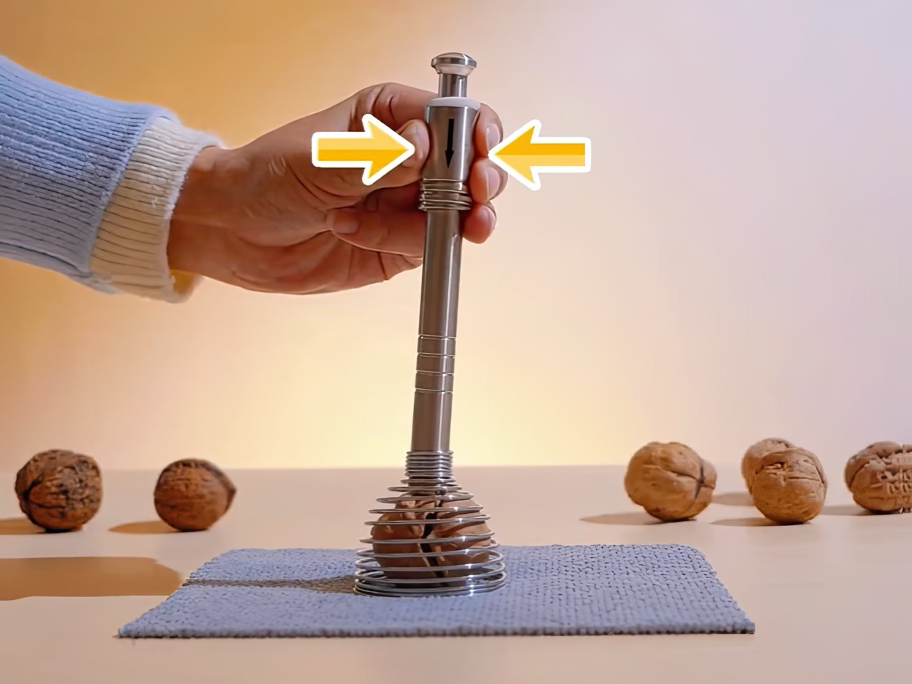
The real draw for anyone with an appreciation for good gear is the sheer tactile satisfaction of its action. You pull back the plunger to arm the manganese alloy steel spring, a process that feels deliberate and mechanical, like chambering a round. Placing the tip on the target and pressing down unleashes an explosive force reportedly moving at over 530 meters per second. This impact-driven deployment is what separates it from every dull lever-action cracker on the market. It’s a clean, contained, and frankly, an incredibly cool way to apply force. This is the kind of thoughtful engineering that gets EDC enthusiasts talking, turning a mundane kitchen task into an opportunity to use a well-made instrument.

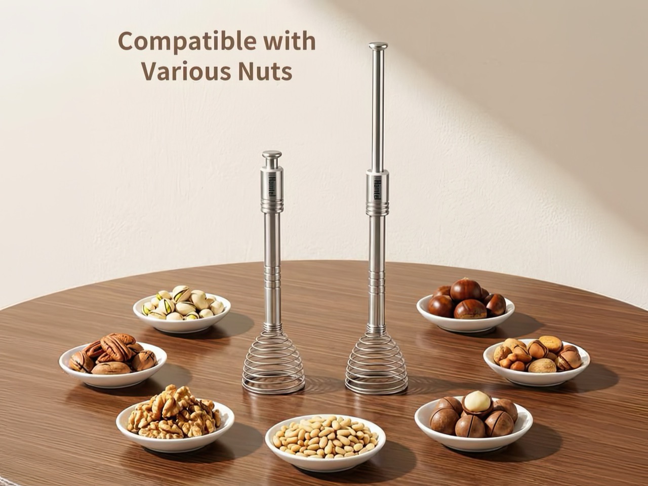
The body is stainless steel, providing a solid, weighted feel in the hand, while the business end features a high-hardness tungsten steel tip rated at HRC60+. This is the material specification you expect in high-end cutting tools or industrial equipment, not something designed to crack walnuts. This choice is critical for its dual-purpose role as a car window breaker, ensuring the tip remains sharp and effective even after repeated use. That effectively means your walnut or macadamia or brazil nut stands absolutely no chance. The tip works remarkably well against seafood too, letting you crack into crab and lobster claws/shells without breaking out industrial equipment.

This precision translates directly to its performance in the kitchen. It boasts a 95% kernel preservation rate, a number that seems ambitious until you consider the physics at play. Instead of crushing a shell with slow, brute force, the Hamtel delivers a sharp, localized impact that fractures the shell without pulverizing the contents. This makes it just as effective for delicate jobs, like cracking open crab legs or lobster claws without shredding the meat inside. It brings a surprising level of finesse to a category of tools typically defined by their crudeness, making it a genuinely useful upgrade for any kitchen.

Initial pricing puts the Hamtel at $66, which is a compelling entry point considering its planned retail is set at $124. Logistics are refreshingly simple, with a flat $9 shipping fee for delivery anywhere in the world. An optional nut pick can be added for just a few dollars, making it a complete package for dealing with stubborn shells. For the price of a single-purpose emergency tool, you’re getting a device that serves three distinct functions, some life-changing, others life-saving. But for most of the time, bon appetit!

Click Here to Buy Now: $66 $124 (47% off) Hurry! Only 9 days left.

The post This Tungsten-tipped Nutcracker Works On Walnuts, Seafood, and even Car Windows in an Emergency first appeared on Yanko Design.

  •  

OMO X self-balancing electric scooter employs AI and Robotics to refresh urban riding experience

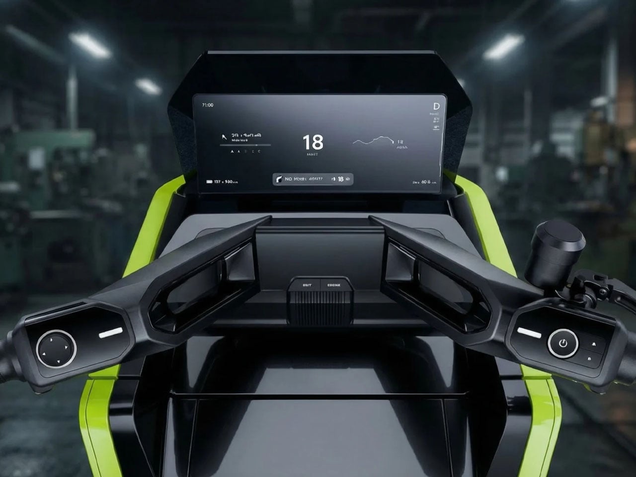
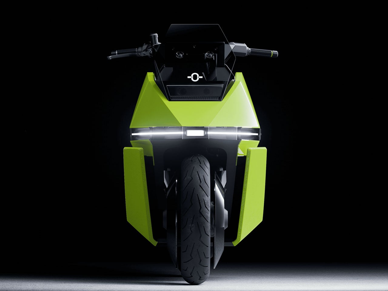
Two-wheelers have always demanded a certain level of skill and balance from riders, especially at low speeds or when navigating crowded city streets. OMO X by Omoway attempts to change that equation by introducing what the company describes as the world’s first mass-produced self-balancing electric motorcycle. Designed around advanced robotics and artificial intelligence, the new age electric bike blends traditional scooter convenience with autonomous technology that aims to make urban mobility easier and safer.

At the core of the two-wheeler is Omoway’s newly introduced OMO-ROBOT architecture, a full-stack control platform that integrates sensors, perception systems, decision-making software, and mechanical actuation into a unified framework. The system combines aerospace-grade gyroscope technology with reinforcement-learning models to continuously stabilize the motorcycle. This architecture allows the OMO X to maintain balance on its own, even when stationary, eliminating one of the biggest challenges riders face on two-wheeled vehicles.

Designer: Omoway

The balancing capability is achieved through a Control Moment Gyroscope (CMG) module. Using the principle of angular momentum, the spinning gyroscope actively stabilizes the vehicle, keeping it upright without rider input. Beyond simply preventing tip-overs, the system also supports a range of riding assistance features. These include slip prevention on wet surfaces, assistance while cornering, and obstacle-avoidance capabilities designed to enhance safety during everyday riding.

Omoway is also positioning the OMO X as a highly intelligent mobility device. The scooter incorporates a network of sensors and cameras that continuously monitor the surrounding environment and feed data into an AI-based riding system. This enables features such as adaptive speed adjustments, hazard detection, and automated safety responses if the system identifies a potential risk. Some demonstrations have even shown the scooter maneuvering on its own, driving onto a stage without a rider, and responding to remote commands through a smartphone app.

Another notable capability is automated parking. Instead of requiring riders to maneuver the bike into tight urban spaces manually, the OMO X can guide itself into a parking spot once a location is selected. The system relies on its self-balancing capability and onboard sensors to navigate safely, a feature that reflects the growing overlap between robotics and personal transportation.

The electric scooter’s futuristic design further reinforces its technological identity. Its sharp, angular styling and distinctive lighting signature give it a modern aesthetic that stands apart from traditional scooters. In a way, it carries the Tesla Cybertruck aesthetic, with a continuous front light bar replacing a conventional headlamp and creating a visually striking presence on the road.

Production plans for the OMO X are already underway. The company announced that the model has entered mass production following its global launch event in Singapore, with pre-orders expected to open in April 2026. Indonesia has been selected as the first launch market, where the electric scooter will debut commercially in Jakarta shortly afterward. Omoway is reportedly working with multiple regional distributors and plans to establish a dealer network of more than 100 locations in the country.

The post OMO X self-balancing electric scooter employs AI and Robotics to refresh urban riding experience first appeared on Yanko Design.

  •  
❌