Vue lecture

The Pixel 11’s Coolest New Feature Is Actually 10 Years Old

The Pixel 11 lineup arrived this week with a genuinely great redesign. The camera bar is 40 percent thinner, the glass runs edge to edge, and for the first time in a while a Pixel actually looks like it evolved instead of just got a new coat of paint. And then there’s HiLight, the one piece of new hardware Google actually wants you to talk about. A small LED cluster tucked into the corner of that same camera bar, ready to glow when Gemini is thinking or when someone you love is calling.

It is, in essence, Google finally admitting it missed the old Nexus notification LED and bringing it back. Five colors, a glow for Gemini, a glow for your favorite caller, and that’s the whole feature list on day one. Nothing to complain about here, except that Nothing exists. The London phone brand has spent years turning its own version of this idea into an actual playground, mini-games, custom widgets, an SDK anyone can build on. Google clearly has the engineering muscle to do something just as ambitious with HiLight down the line. It just chose not to, at least not yet.

Designer: Google
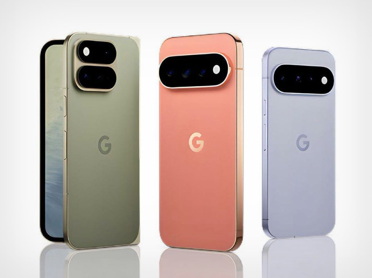
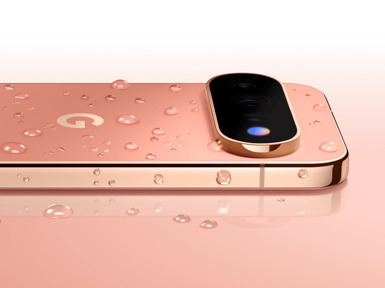
Before we get into that though, credit where it’s due. Hold a Pixel 11 next to a Pixel 10 and the difference is immediate, not the kind that only shows up in marketing photos. The bar sits almost flush now, and Google’s claim that it’s basically bumpless with a case on actually checks out in person. Under that glass, Tensor G6 lands on a 2nm node, Google’s first, promising 25 percent faster browsing, 15 percent quicker app launches, and on-device AI running up to 3.5 times faster while using less power. The Pixel 11 gets a new 48MP main sensor with 56 percent more light sensitivity and a telephoto stretching to 30x Super Zoom. This is a very complete phone before you even get to the Pro models.
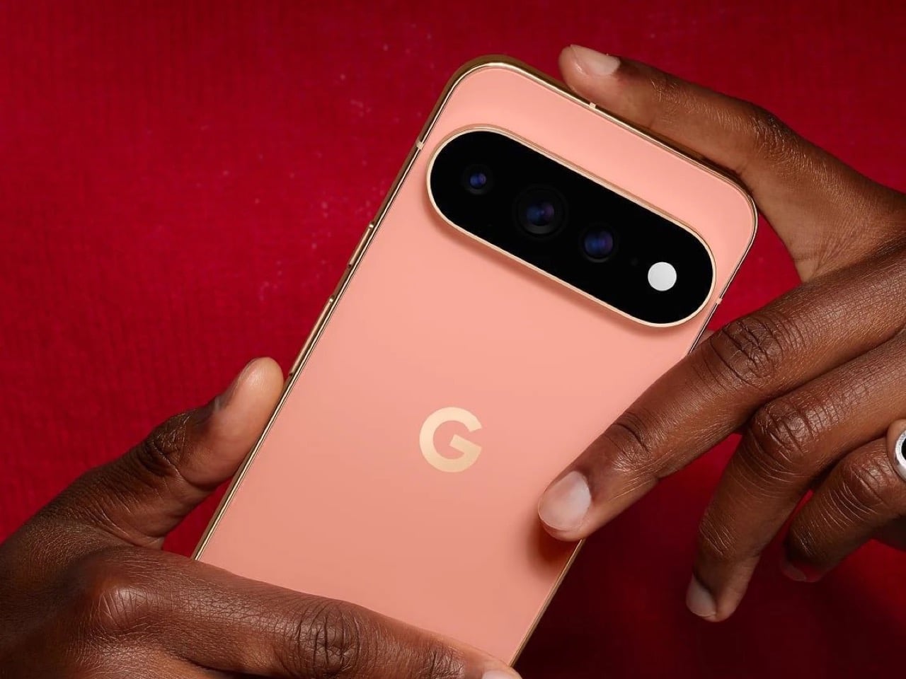
The Pro and Pro XL push further with a 50MP main sensor, a redesigned 48MP telephoto, Portrait Mode at 5x, and 120x Pro Zoom, sitting under a 3,600-nit display that Google claims is twice as scratch resistant as last year’s. Titan M3 adds quantum-safe boot security on top. The Pixel 11 Pro Fold deserves its own mention here too. It shed almost 10 percent of its weight and a millimeter of thickness, down to 10.1mm closed, while Google claims triple the durability thanks to a redesigned gearless hinge. The crease is genuinely harder to spot than last year’s, and the whole thing folds flat enough to stop feeling like a novelty. If you told me a year ago Google would have the most convincing foldable in its own lineup, I would not have believed you.
Now, the part everyone will bring up regardless of how the rest of this goes: RAM. The Pro and Pro XL start at 12GB in their base 256GB configs, down from 16GB last year, and Google is blaming this on a supplier RAM shortage hitting the entire industry. Memory manufacturers have been shifting production capacity toward AI server chips, and consumer RAM and NAND prices have spiked hard enough this year that people are half-jokingly calling it RAMageddon. It is a real problem, and Google is far from the only phone maker feeling it. Storage doubling to 256GB as a base softens the blow a little, but a $100 price bump alongside a RAM cut is still a hard sell. Fair enough on the supply chain excuse. Less fair asking Pro buyers to pay more for less unless they climb a storage tier.
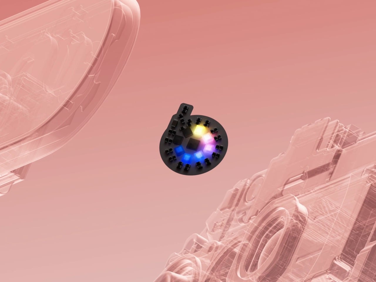
Back to HiLight, because it deserves the real estate. That LED cluster sits right where the temperature sensor used to live on older Pixels, which is a strange trade to make for something this limited. Google’s official pitch is that HiLight keeps you informed without the distraction of staring at a screen, which is a very polished way of saying there weren’t enough ideas to fill the space. Glowing when Gemini talks and flashing a color for favorite callers is a fine start, not an entire feature. Compare that to what’s happening across the pond. Nothing’s Glyph Matrix on the Phone (3) packs 489 individually lit LEDs into what functions as a tiny secondary screen, complete with an open SDK that lets anyone build their own widgets and games. People made a working ball maze. A tilt-controlled Magic 8 Ball. A contact dialer you can use without touching the main display. None of it is essential, but all of it is fun, and fun counts for something when you’re asking someone to pay a premium for a light.

Google clearly has the horsepower for something bigger here. Tensor G6 alone proves the company isn’t short on engineering muscle, and the camera bar redesign shows the industrial design team knows exactly what it’s doing right now. HiLight feels like the output of a team that had a great idea, then stopped one meeting short of making it good. I want to see where this goes in a year or two, because the foundation Google just built, the hardware, the placement, even the name, is genuinely solid. It just needs an actual reason to exist beyond telling you Gemini is thinking.


The post The Pixel 11’s Coolest New Feature Is Actually 10 Years Old first appeared on Yanko Design.


  •  

JCB Hydromax sets a new hydrogen land speed record at 406.320 mph

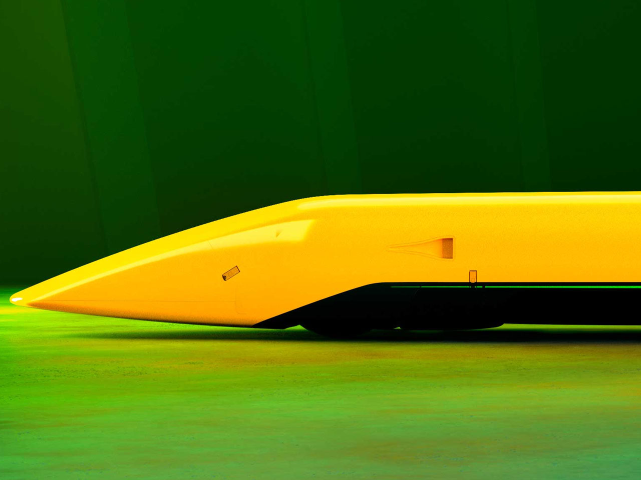
A pair of hydrogen-powered engines developed for construction machinery has just been pushed into territory normally reserved for purpose-built speed machines. JCB’s Hydromax has reached an astonishing 406.320 mph (653.6 km/h) at Utah’s Bonneville Salt Flats, becoming the fastest hydrogen-powered vehicle of any kind and setting a new world land speed record for a hydrogen internal-combustion car.

The 32-foot-long streamliner is powered by two production-based JCB hydrogen combustion engines, each tuned to produce 800 horsepower for a combined 1,600 bhp. Rather than using hydrogen in a fuel cell to generate electricity, Hydromax burns hydrogen directly in its internal-combustion engines. The engines are manufactured at JCB’s factory in Foston, Derbyshire, and are based on the same production engines powering JCB machines in the UK.

Designer: JCB

Its record-setting run was completed under FIA rules, requiring two passes in opposite directions within an hour. Driven by Wing Commander Andy Green OBE, Hydromax recorded 400.623 mph on its first run and 412.135 mph on the return, producing the official average of 406.320 mph. The result comfortably surpassed the previous FIA-officiated hydrogen internal-combustion record of 185.5 mph, set by the BMW H2R in 2004. It also moved beyond the 303 mph hydrogen fuel-cell record, making Hydromax the fastest hydrogen-powered vehicle in history. The record remains subject to formal FIA ratification.

According to project lead, JCB Engineering Director Ryan Ballard, “This record belongs to the engineering team which took a hydrogen digger engine and made it the fastest of its kind on earth. This has been an amazing challenge from the outset, with it being set in February last year. We came here fully prepared, and the car delivered.”

The achievement follows an earlier milestone at the 2026 Bonneville Speed Week, where Hydromax averaged 368.347 mph over two runs to establish an SCTA record in the Blown Gas Streamliner class. Its first run reached 367.141 mph, followed by 369.554 mph on the return. That result surpassed the previous 348.342 mph class benchmark, while giving JCB an important test of the car before its FIA attempt.

Much of the car’s engineering focuses on making extreme speed controllable. Hydromax drives all four wheels through twin transmissions and clutches, while its body was shaped around aerodynamic efficiency and stability. JCB says the suspension, traction control, aerodynamics and camera placement were all stress- and simulation-tested before the attempt. Prodrive handled the car build, Ricardo worked on engine tuning and Xtrac supplied the transmission expertise.

The record also carries a strong sense of continuity for JCB. Exactly 20 years after Andy Green drove the JCB Dieselmax to a 350.092 mph diesel land speed record at Bonneville, he has returned to the same salt flats to establish an even faster mark using hydrogen. The Hydromax project was conceived in 2025 as a demonstration of JCB’s hydrogen combustion technology, turning engines developed for working machines into a record-breaking powertrain.


The post JCB Hydromax sets a new hydrogen land speed record at 406.320 mph first appeared on Yanko Design.

  •  

Google’s Pixel Tag is making the same ‘boring’ design mistake that Apple, Samsung, and Xiaomi made

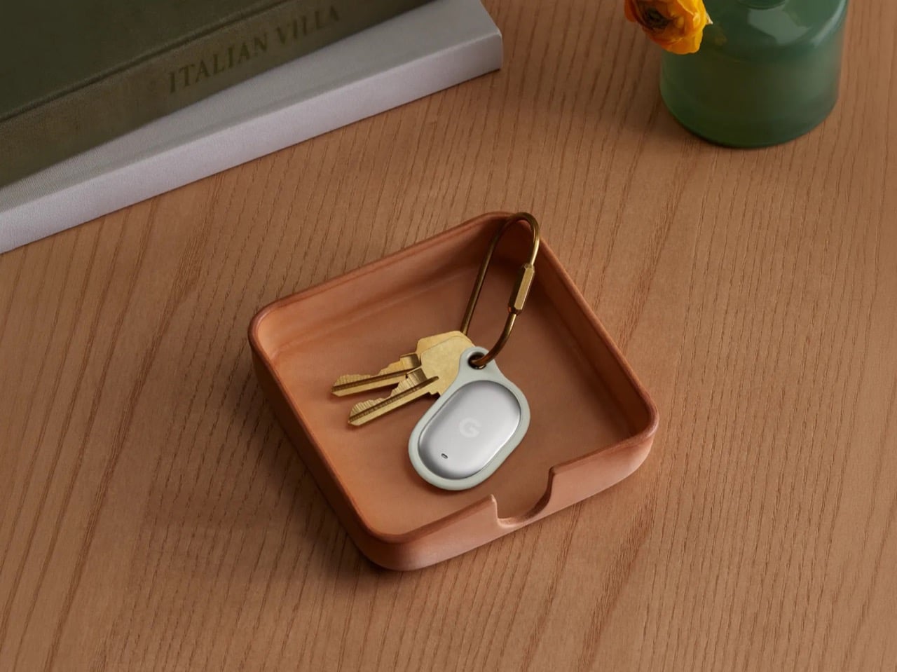
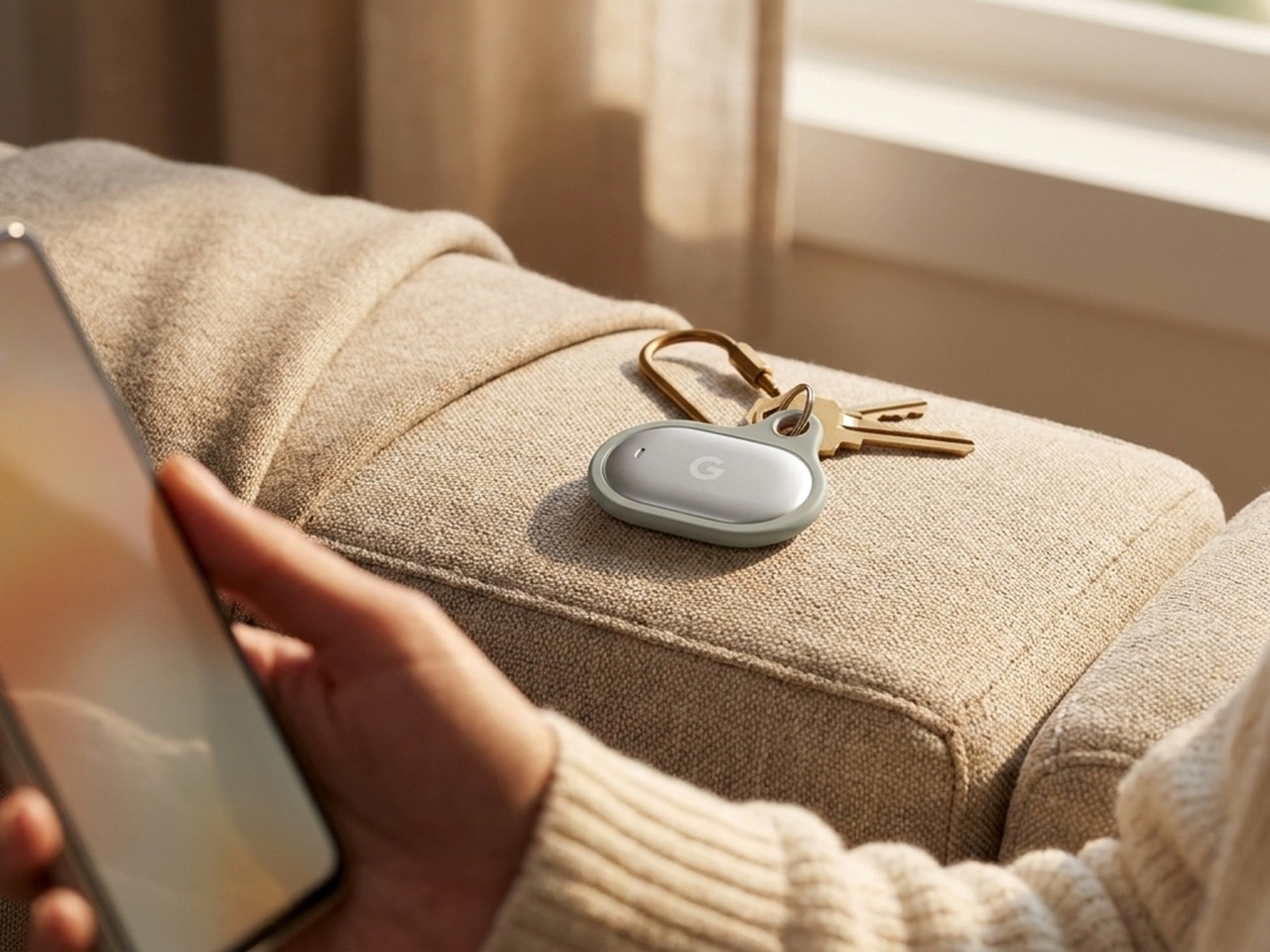
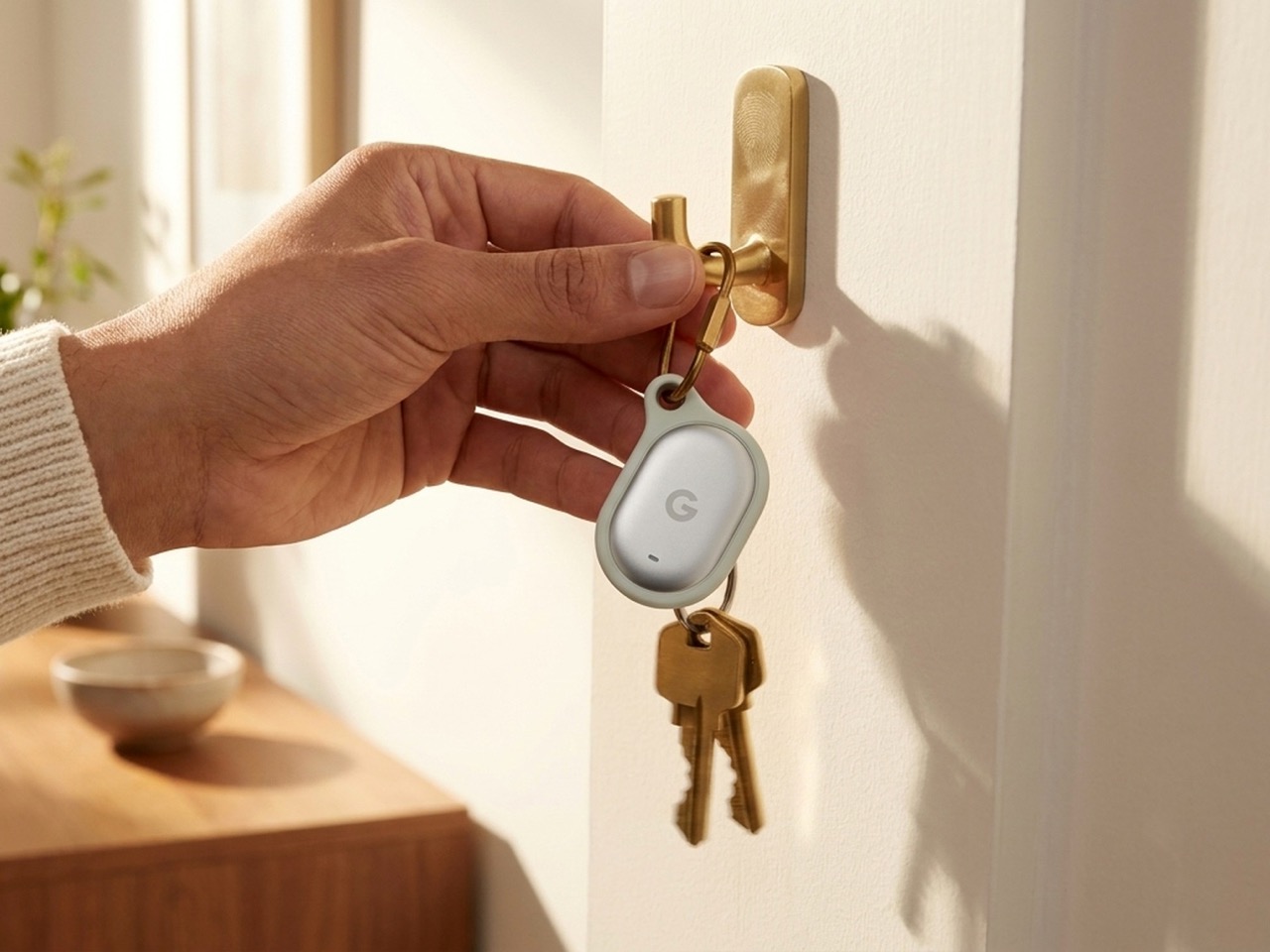
The Pixel Tag comes in exactly one color, a grey green called Fog, wrapped around stainless steel with a G logo stamped right on the front. It’s the same script Apple wrote with the AirTag and Samsung copied with the SmartTag2. A tracker spends its entire life clipped to your keys or your dog’s collar or tucked into a backpack pocket, which makes it one of the most personal objects you own. Google, of all companies, knows how to make hardware feel less like hardware. It just didn’t bother here.

Somebody at DJI figured out that a $60 microphone could come with snap-on decals, because apparently even a tiny accessory deserves a little personality. Motorola figured out something similar with the Moto Tag, which actually ships in sage green and a soft blue instead of the usual black or white default. So it’s not like nobody in tech has thought about this. It’s just that almost nobody applies it to trackers, and now Google has joined the long list of companies that had the chance and passed.

Designer: Google

The excuse I keep hearing, and I use that word deliberately, is durability. Metal survives drops, fabric doesn’t, case closed. Except my phone survives daily abuse inside a woven case, and so does yours, and so does every rugged Kevlar sleeve sold by the millions for devices far more fragile than a coin sized tracker. Nobody worries their phone case is going to disintegrate because it has some texture on it. A tracker being too delicate for color or grip is not a real constraint. It’s a decision that got dressed up as one.

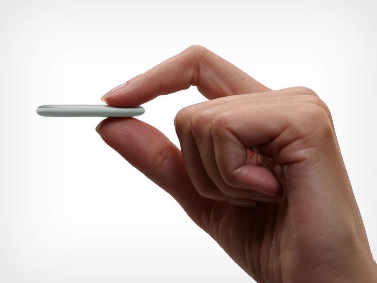
Underneath that decision is genuinely solid engineering, for what it’s worth. The Pixel Tag measures 1.8 by 1.1 inches and just 5.4mm thick, which makes it noticeably slimmer than the AirTag’s 8mm body. It runs on a replaceable CR2032 battery rated for about a year, carries an IP67 rating for dust and water, and pairs instantly over Fast Pair with any Android 9 device or newer. The headline feature is Ultra Wideband combined with Bluetooth Channel Sounding, which gives you a literal on-screen arrow and distance reading instead of a vague “getting warmer” signal, though that trick needs Android 16 and Bluetooth 6.0 to actually work. It taps into Find Hub, Google’s network of over a billion Android phones, so a lost item can get spotted even when it is nowhere near your own devices. You can share access with up to ten people, ring it from a Pixel Watch, or ask Gemini through your Pixel Buds to ring it for you. All of that ships November 11 for $29, or $99 for a four pack.

Google already knows how to wrap good engineering in an object people actually want to look at, because it solved the exact same brief years ago with its speakers. The Nest Mini gets a soft, woven top because Google understood people don’t want to display a hunk of bare plastic on their kitchen counter. The Nest Audio does the same thing, fabric front, rounded edges, an object designed to belong in a room rather than announce itself as a gadget in one. That instinct exists inside the same company that just shipped a keychain accessory in one shade of grey with a logo dead center, like it needed to remind you it’s tech.

A tracker’s entire job is to sit quietly on the stuff you actually care about. It should feel like something you chose, not something you tolerated because the tech underneath happened to be good. Find Hub integration, UWB precision finding, a battery that lasts a year, all of that is genuinely solid work. But solid engineering wrapped in a logo stamped on steel isn’t a finished product. It’s half of one, and Google, weirdly, is the company with the least excuse for stopping there.

The post Google’s Pixel Tag is making the same ‘boring’ design mistake that Apple, Samsung, and Xiaomi made first appeared on Yanko Design.

  •  

5 Best Back-to-Work EDC Upgrades That Actually Make Carrying Less Feel Like More

Summer does a reliable job of exposing what is wrong with your carry. Thinner clothes mean shallower pockets, and whatever has been accumulating since January starts demanding justification it cannot provide. The wallet that has been stretching since February, the key ring that jingles through every meeting corridor, the flashlight that has been dead for three weeks – they all resurface together as you pack a bag and head back. The loadout that survived winter is not the one that deserves September.

The five upgrades here share a single argument: fewer objects doing more work, or one object doing something with enough precision that the supporting cast stops being necessary. None of them ask you to carry more. Each one consolidates something you were already carrying into a form that earns its pocket space so completely you stop thinking about it. That is the standard. That is what back-to-work EDC should actually look like.

1. Olight Baton 4 Premium Edition

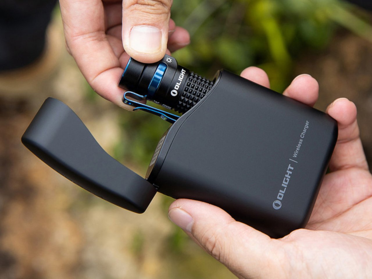
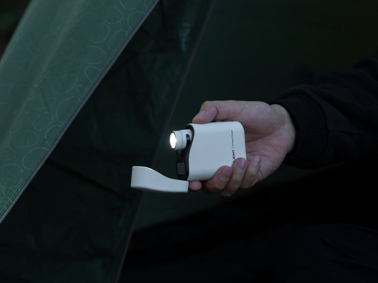
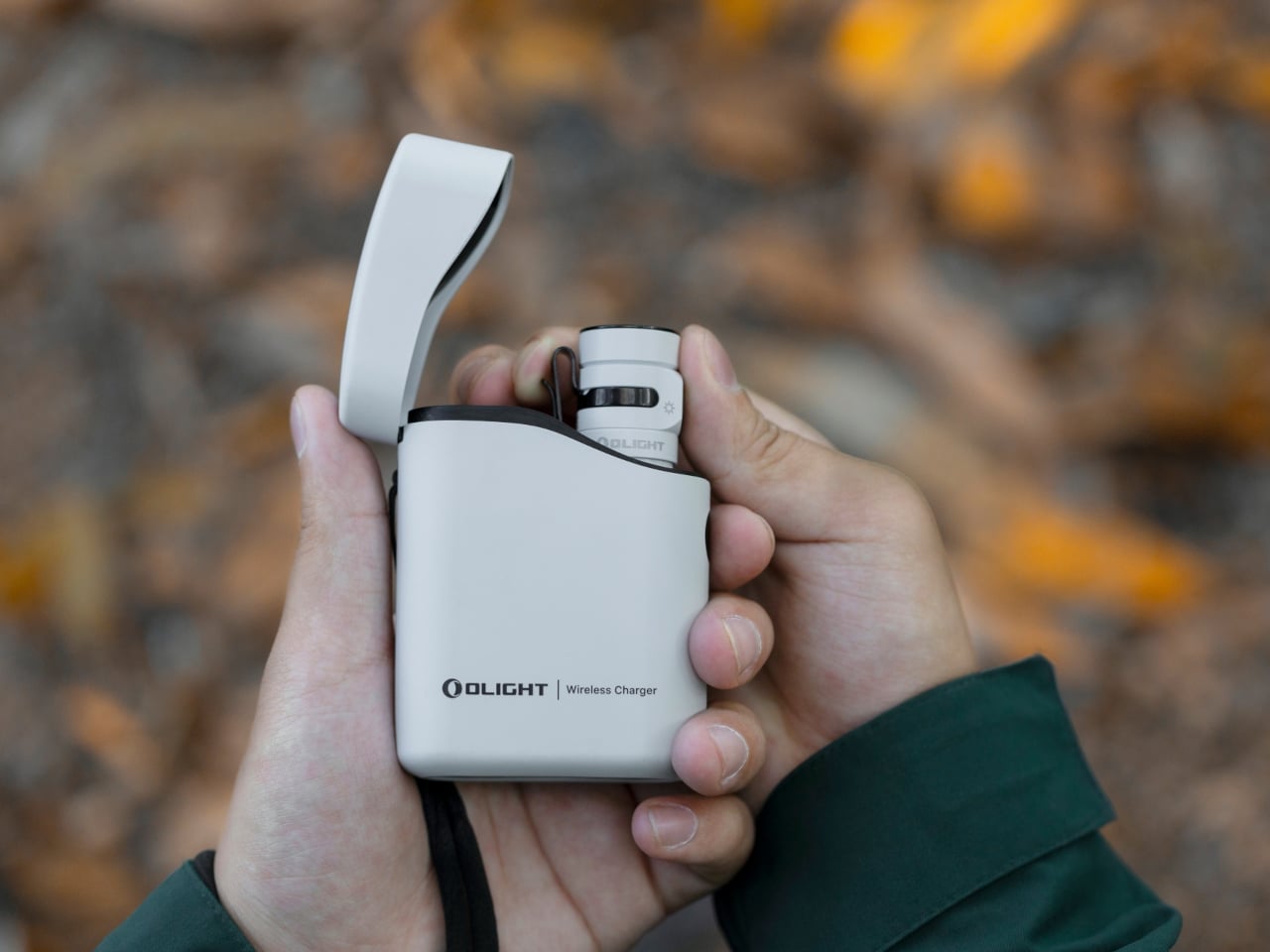
Most people heading back to work carry a flashlight and a power bank as two separate objects, in two separate compartments, with two separate charging cables neither of them can ever locate. The Baton 4 Premium settles that argument by making the charging case the second object, not the flashlight and the power bank as distinct things. The flip-top case carries 5,000mAh, recharges the Baton 4 up to five times, and allows you to activate the light without removing it from the case at all. Open the lid, press the side button, and the light fires. That single interaction collapses the gap between a flashlight that lives in a bag and one that is actually ready when something happens.

The 1,300-lumen output and IP68 waterproof rating handle the practical end of what a flashlight needs to do. The magnetic tail cap converts it into a freestanding lantern by sticking to any steel surface, removing the need for a separate camp light in most outdoor situations and proving genuinely useful in an office during a power outage. For a loadout returning to structure after a summer of loose carry habits, the Baton 4 Premium makes the case that two carry problems can be resolved by a single considered object. That is the only standard that matters right now.

What we like

  • The charging case serves as a functional 5,000mAh power bank and activates the flashlight without removing it – two carry problems resolved by one object instead of two
  • The magnetic tail cap frees both hands during stationary tasks without requiring any additional accessories, stands, or setup

What we dislike

  • Maximum brightness draws battery down faster than lower output modes, which means more frequent recharging on heavy-use days and more reliance on the case as a compensating mechanism
  • The case adds volume to the carry; users wanting the flashlight alone will need to leave the power bank function behind, which partially defeats the premise of carrying less

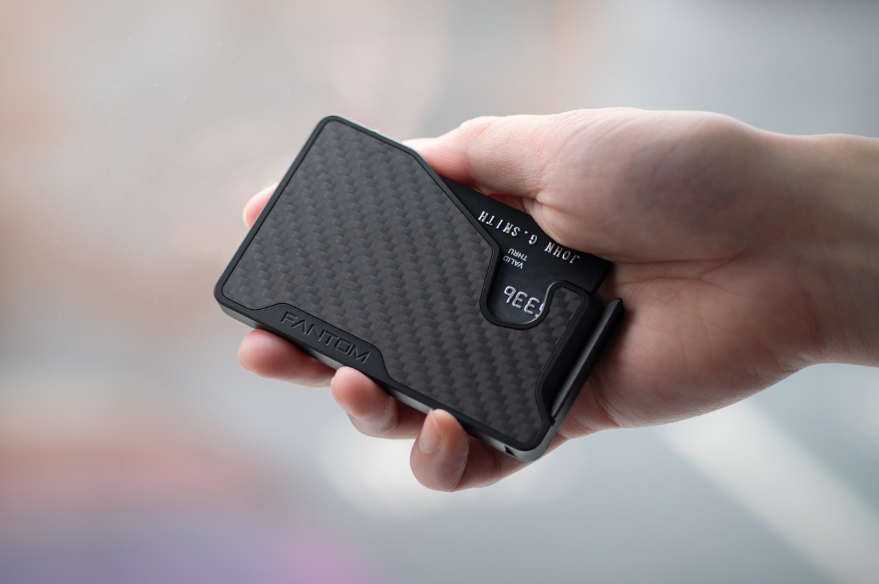
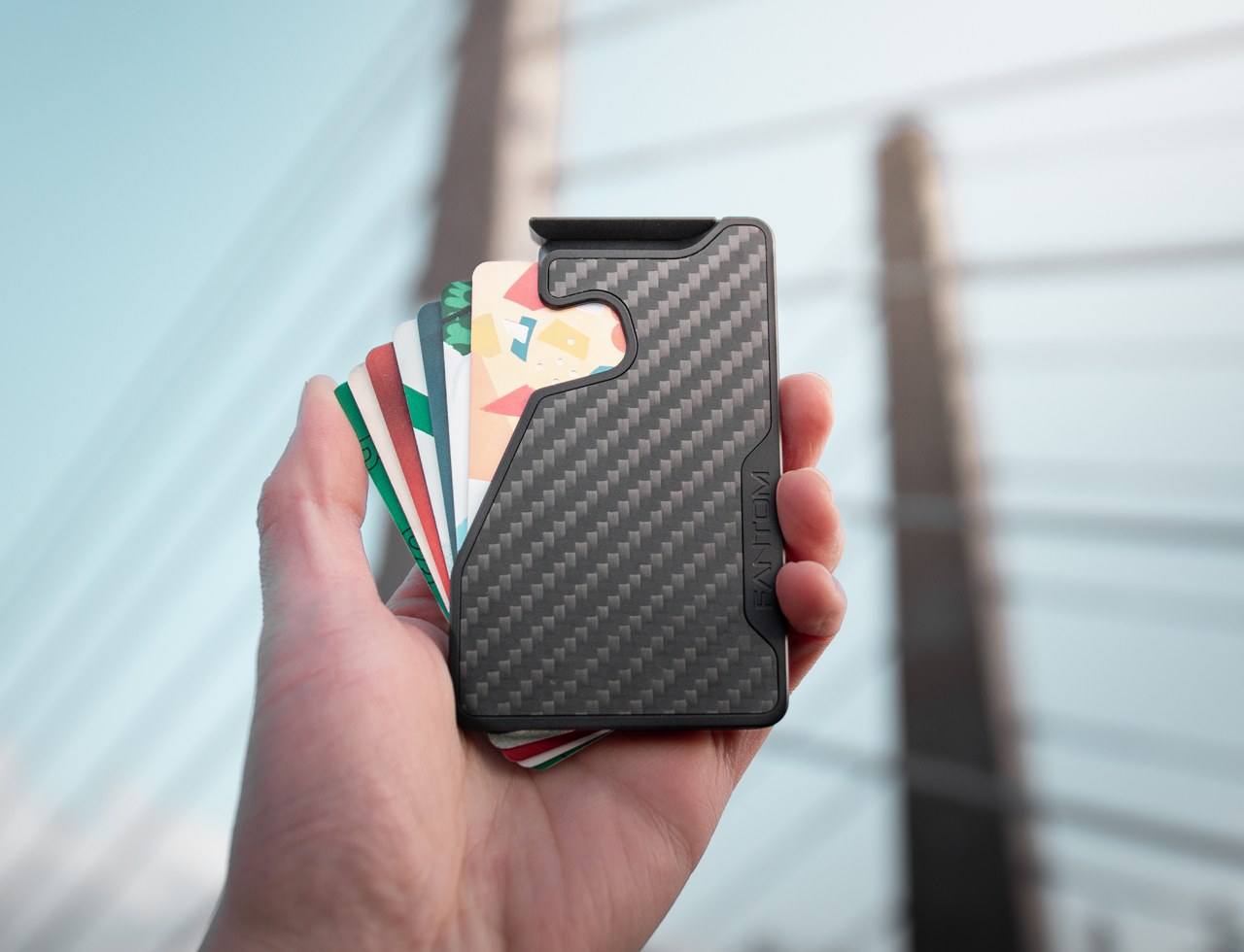
2. Fantom X Wallet

The wallet category has been failing quietly for decades. Leather stitching stretches, bifolds accumulate receipts nobody asked for, and elastic bands lose tension in months rather than years. The Fantom X approaches the problem as an engineering challenge rather than a craft one, building the chassis from machined aluminum, retaining cards mechanically, and adding a spring-loaded ejection system that fans your cards in sequence at the press of a button. Nothing in its construction is soft, which means nothing in this wallet degrades.

The design logic is borrowed from product categories where material failure is not tolerated. A bead-blasted aluminum body carries the same engineering rationale as the titanium tools that dominate the better end of the EDC market: fewer materials, one mechanism, no organic components that can rot or stretch under daily use. Cards are organized by ejection sequence rather than pocket habit, which introduces a useful kind of intentionality about what actually deserves a slot. Heading back to work with a wallet this considered makes the chaos of a stretched billfold feel like a problem you solved rather than one you are still living with.

What we like

  • Machined aluminum construction eliminates the stretching, cracking, and wear patterns that define the lifespan of leather and fabric wallets across every price bracket
  • The spring-loaded ejection fans cards in sequence, removing the fumbling that every other slim wallet format still requires at the checkout counter

What we dislike

  • The mechanical ejection system has a learning curve for anyone switching from a traditional bifold, and the first week of carry involves genuine reorientation
  • Cash carry is minimal depending on configuration, which limits practicality for anyone who still moves through the day with notes in their pocket

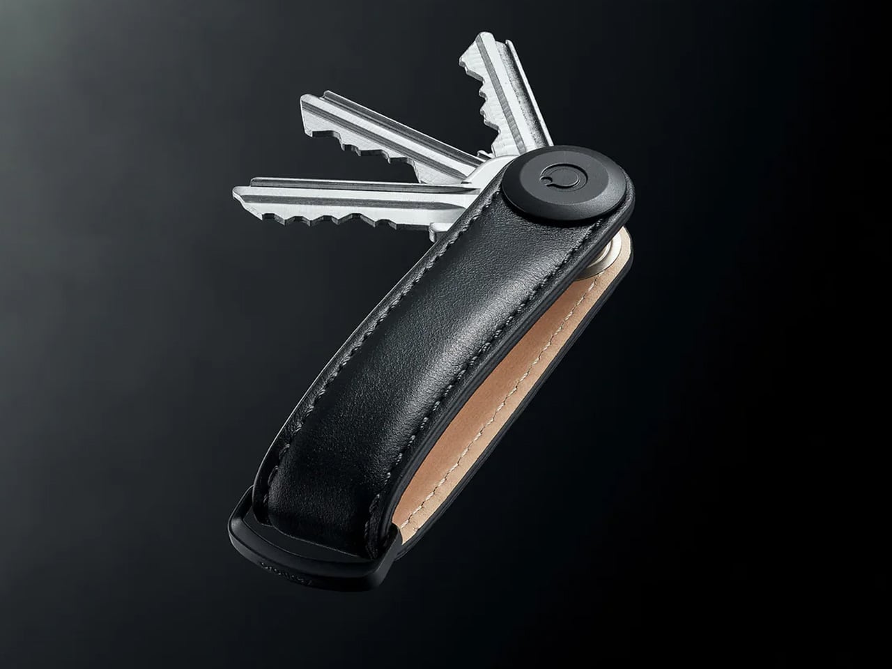
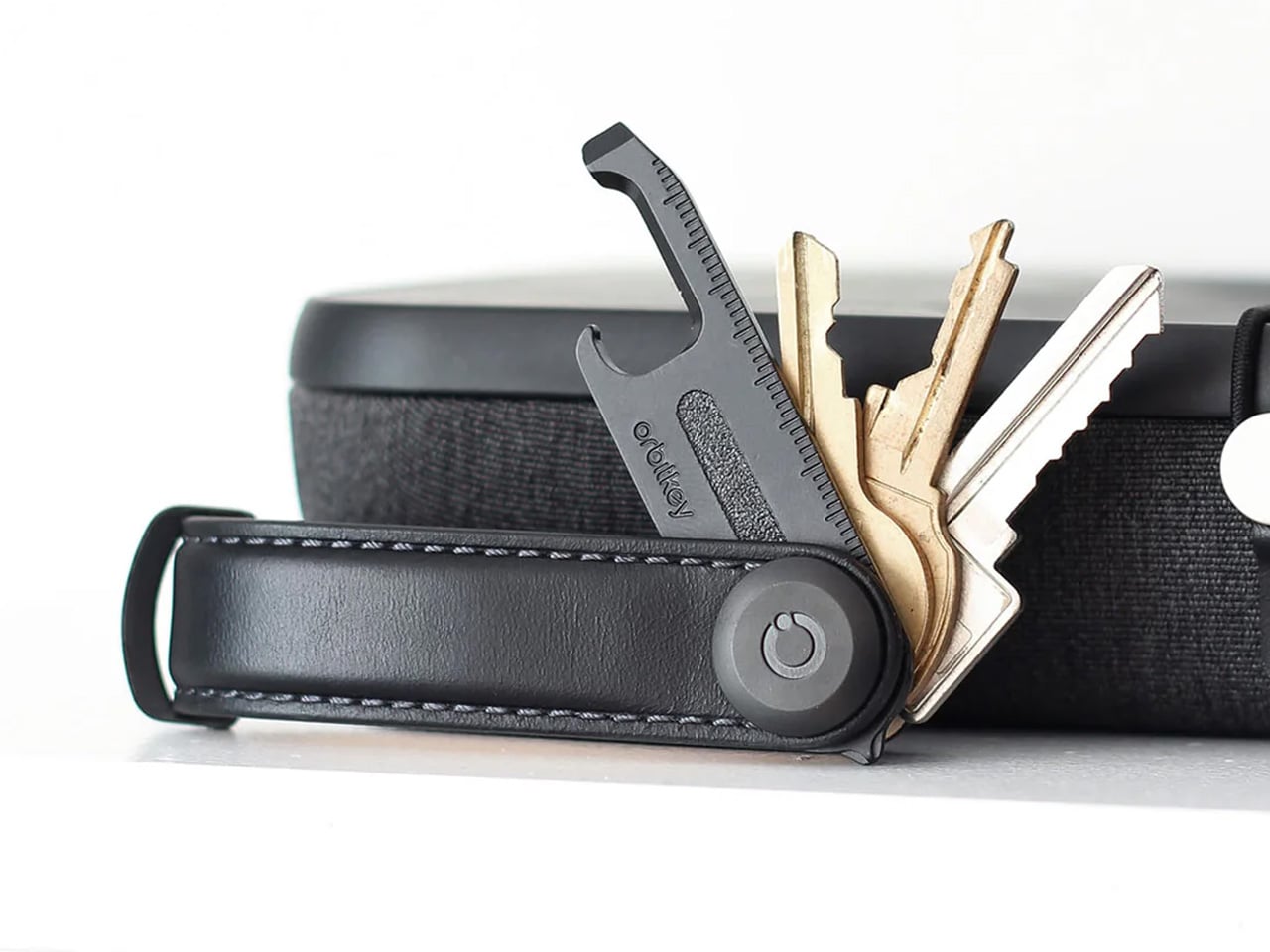
3. Orbitkey Key Organiser

A standard key ring solves the organizational problem with the bluntness of something designed before pockets had size constraints. Keys stack against each other, jingle against everything nearby, and press ridges into the thigh pocket of work trousers for eight hours straight. The Orbitkey stacks two to seven keys flat inside a full-grain leather spine secured with stainless steel hardware, held under tension, producing no movement and no sound when the system is closed. In a pocket, it disappears entirely.

The leather exterior develops its own grain and wear pattern over years of daily use, an explicit design position about longevity that most keychain products never bother taking. The two-screw expansion system accommodates keys confidently up to its rated capacity, and a small ring attachment handles anything that does not stack flat inside the body. Five colorways run from black dress leather to warmer cognac tones, covering the full range of what a work bag demands. Heading to the office with the Orbitkey in your pocket for the first time, the first thing you notice is the absence of sound from your keys. Then you stop noticing it, and that is the point.

What we like

  • The tension stacking system eliminates key jingle, which sounds like a minor quality-of-life gain until you experience the cumulative quiet of a full working day without it
  • Full-grain leather construction ages into character rather than showing damage, signaling a product built to outlast the annual trend cycle by a significant margin

What we dislike

  • Initial key installation involves a screwdriver and careful threading – not difficult, but the setup time is a real first-use commitment that catches some buyers off guard
  • Oversized or irregularly headed keys may not stack cleanly within the system’s geometry, which is worth confirming before purchase rather than after

4. KeyUnity KK08 Titanium Carabiner Knife

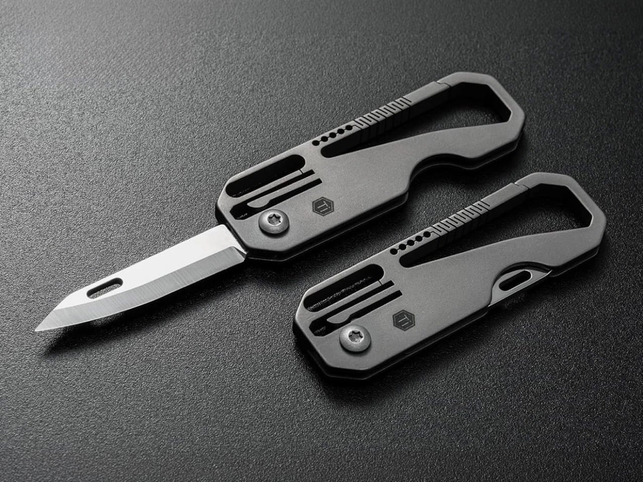
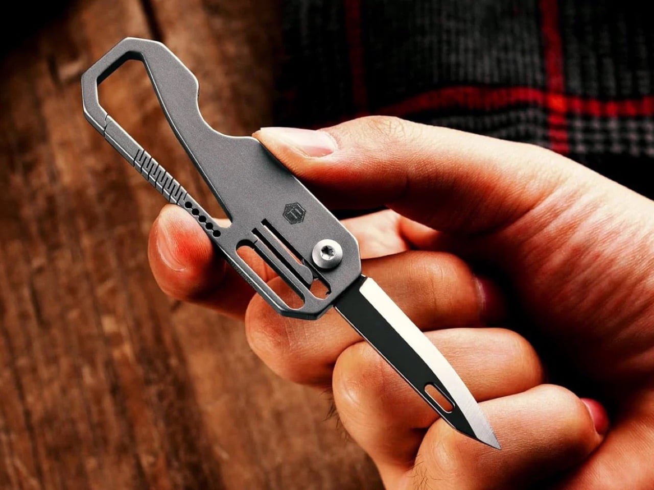
The carabiner is one of the most underutilized platforms in everyday carry. Most examples handle clipping and nothing else, occupying keychain real estate without justifying it with more than a single function. The KeyUnity KK08 corrects that by integrating a deployable blade directly into the gate of a TC4 Grade 5 titanium carabiner. One object handles clipping, carrying, and cutting without requiring any tool swap. The blade locking mechanism operates independently from the carabiner gate, keeping both functions discrete and deliberate rather than tangled.

TC4 titanium earns its place here for the same reason it appears throughout the better end of the EDC market. Corrosion-resistant, strong relative to its weight, and completely indifferent to the wear conditions that define outdoor carry. On a carabiner that lives clipped to the outside of a bag or attached to belt hardware, that resistance matters considerably more than it does for something sitting at the bottom of a pocket. The KK08 simplifies the question of what to clip things with by answering a second question at the same time – the most honest argument any carry tool can make.

What we like

  • Two functions in one form factor means the carabiner earns twice the keychain space it would otherwise occupy, which is the cleanest possible argument for carrying it daily
  • TC4 Grade 5 titanium construction handles outdoor exposure and weather without the corrosion concerns that affect steel alternatives over extended carry

What we dislike

  • The integrated blade deployment requires some familiarity with the gate mechanism before it feels genuinely intuitive in the moment you actually need it
  • Carabiner knives occupy a legal gray area in certain jurisdictions, so confirming local blade regulations before daily carry is worth the time it takes

5. Titaner Swing Ratchet System

A standard ratchet needs 15 to 30 degrees of swing arc to advance a single tooth. That is a workable trade-off in open space and a complete failure in the places where screws actually live: behind cables, inside recessed housings, angled into corners that no straight tool can reach. The Titaner Swing Ratchet compresses that arc to 4 degrees, which means it can cycle in gaps where conventional ratchets physically cannot complete a single turn. CNC-engraved directional markers on both sides of the core remove any guesswork from direction selection.

At 29.8 grams, it sits 40 percent lighter than a traditional ratchet while delivering full torque through a modular system that accepts different bit configurations. Back-to-work projects – tightening workstation hardware, adjusting studio furniture, building out a new desk setup – involve screws in confined locations far more often than they involve screws in clear, open space. A ratchet that reaches those positions at under 30 grams earns its pocket space across a full working season rather than waiting in a tool bag for a task large enough to justify the trip back to get it.

What we like

  • A 4-degree swing arc allows operation in spaces so confined that standard ratchets cannot cycle at all, solving the one problem no other tool in this roundup attempts to address
  • At 29.8 grams, it is genuinely light enough for daily carry rather than tool-bag-only use, which changes how often it actually gets reached for

What we dislike

  • The ultra-compact ratchet head can feel less assured under heavy torque loads compared to a full-sized alternative with more leverage to draw from
  • It earns its pocket space most clearly when fastener access is a regular part of your week; for purely occasional use, the weight-to-frequency ratio may not always close the argument

Editor’s Choice: ClearSlide Box Opener

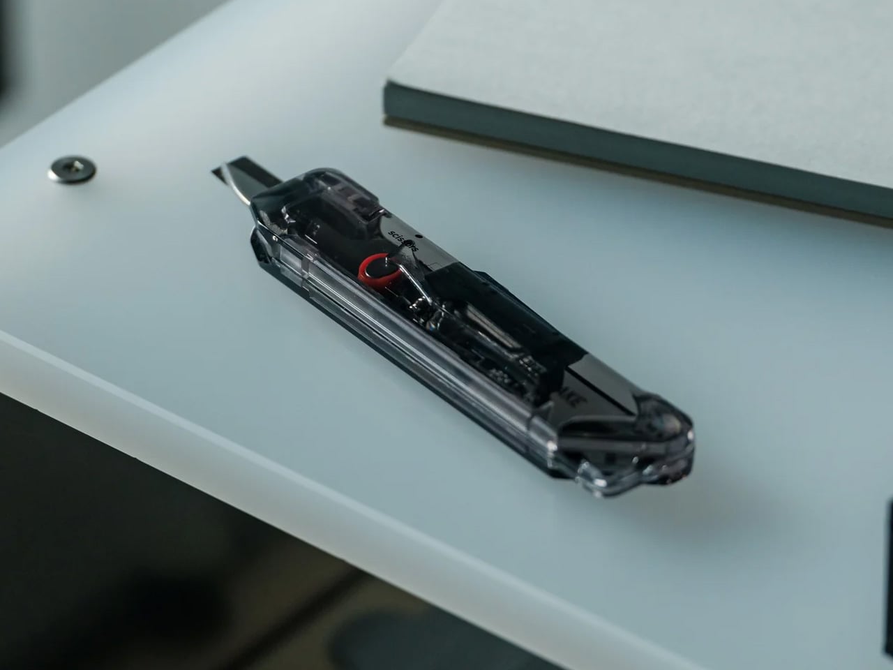
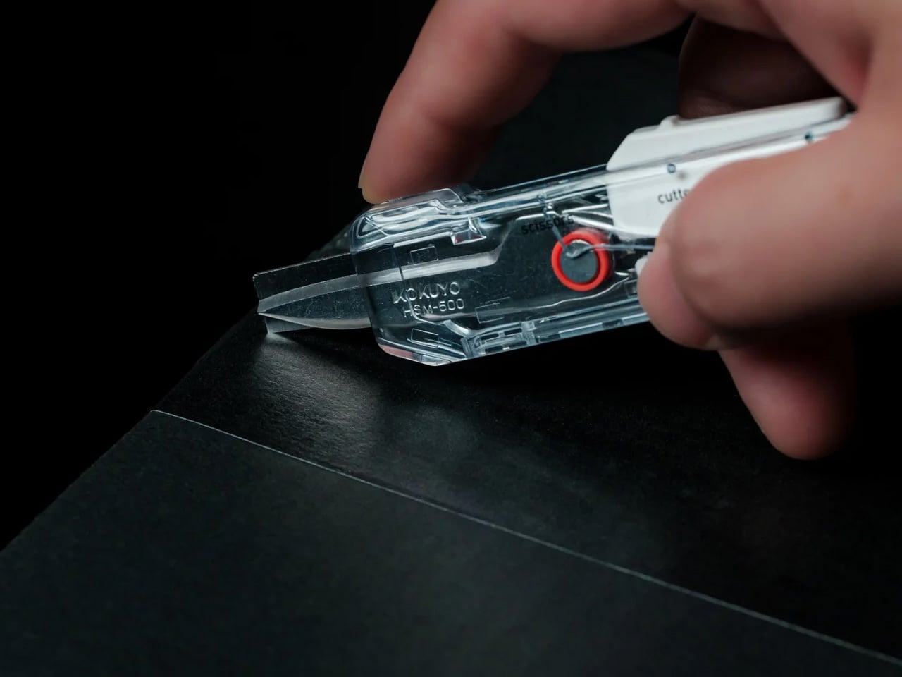
Every back-to-work loadout eventually faces the same moment: a delivery arrives, you reach for a box cutter, realize you also need scissors to deal with the tag inside, and end up setting the box down to find a second tool. The ClearSlide was designed specifically to end that exchange. A smooth sliding thumb mechanism switches between lock, cutter, and scissors in a single hand motion, then cuts with the same thumb – without ever putting the box down. It is a two-tool problem resolved by one object small enough to live on a desk or disappear into a pocket.

The 0.12-inch blade extension is deliberate rather than conservative. It slices through packaging tape cleanly while keeping enough distance from the contents that you are not second-guessing every cut. But the detail that earns it Editor’s Choice is the transparent body. The red slider and internal mechanism are fully visible through the shell as you cycle through positions, each one locking with a crisp click before releasing with a clean spring action. Instead of hiding the engineering, the ClearSlide makes watching it work part of using it – a small thing that changes the object from a utility purchase into something you actually want to keep on your desk. At $30, it is also the most straightforward decision on this entire list.

Click Here to Buy Now: $30.00

What we like

  • The single-hand sliding mechanism switches between box cutter and scissors without setting the package down – the exact problem it promises to solve, solved completely
  • The transparent body exposes every shift of the internal mechanism, turning a functional action into something worth noticing

What we dislike

  • The 0.12-inch blade is optimized for tape and packaging, not heavier cutting tasks that need more blade depth
  • Only a few units currently available, so if the ClearSlide catches your attention, the window to order without waiting is short

The Best Carry Is the One You Stop Thinking About

The best September loadout is not a longer list. It is five objects that between them cover a light, a wallet, keys, a clip, and a ratchet – each doing its job well enough that nothing else feels necessary – plus one desk tool that quietly removes a daily frustration you have been tolerating since the last time boxes started arriving. Nothing is left over. Nothing is missing. The edit is worth making now.

What changes when you get this right is not just the weight, though the weight does drop. What changes is the feeling of moving through the day without friction from the objects that are supposed to be helping you. The Baton 4 charges and illuminates from a single case. The Fantom X does not stretch. The Orbitkey does not jingle. The KK08 clips and cuts. The Titaner reaches where nothing else can. The ClearSlide handles the desk. That is the carry.

The post 5 Best Back-to-Work EDC Upgrades That Actually Make Carrying Less Feel Like More first appeared on Yanko Design.

  •  

This Cork Cactus Looks Like Decor and Acts Like 3 Pieces of Furniture

Coat stands have always occupied an awkward position in a room. They’re functional enough to keep around but rarely considered anything beyond a place to pile things on the way out the door. Pin boards face a similar problem, useful at a desk but hard to integrate into a living space without making it feel like an office. Objects that try to do both tend to resolve that tension poorly.

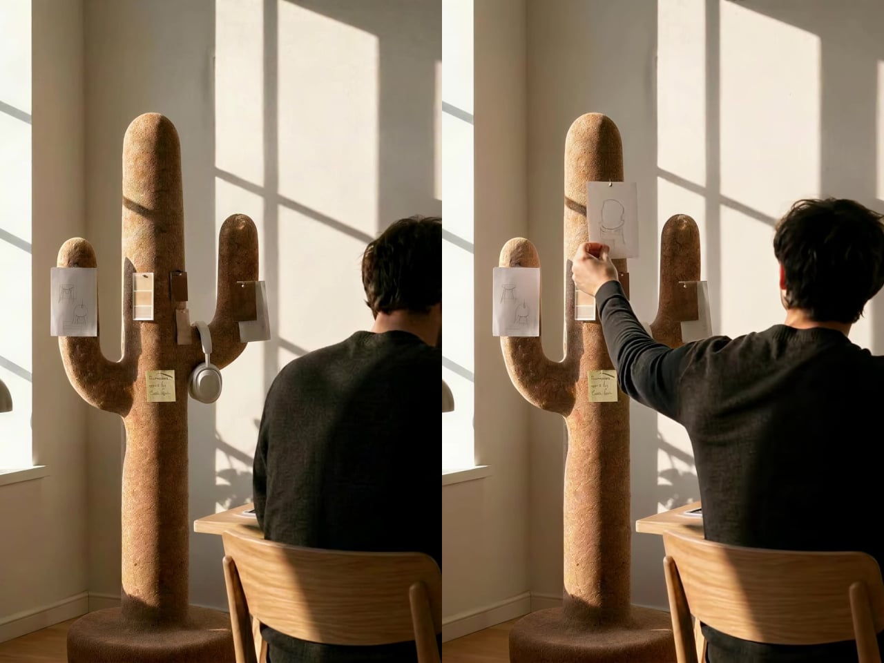
Corctus starts from a different premise. The name merges “cork” and “cactus,” which is also a fair summary of the concept: a floor-standing object shaped like a saguaro cactus, made entirely from cork, and quietly capable of handling most of what people need to keep close at hand. Rather than solving the storage problem with hooks and brackets, it solves it by making the form itself the function.

Designer: Liam de la Bedoyere (boredeye)

Cork is the central material here, both practically and conceptually. The surface is textured enough to grip a pair of sunglasses on the rounded top without anything extra, and receptive to pins without reinforcement or a backing board. A sketch, a sticky note, or a reference card pins straight into the body of the object wherever it’s needed, with no designated zone for it.

The cactus arms extend outward with a slight upward curve that happens to work exactly like a hook. A backpack hangs from one, a tote bag from another, a scarf draped over without sliding off. Headphones sit naturally over an arm when not in use. None of this requires any hardware, any dedicated accessories, or any particular intention. The geometry of the form handles all of it.

The disc-shaped base adds one more surface. Magazines stack on it, a few books sit within reach, and it grounds the form without demanding much floor space. The compact proportions keep the whole object from reading as a coat stand, which is deliberate. The intention was always a sculptural companion rather than a piece of utilitarian furniture, and the scale reflects that.

That distinction matters in practice. Next to a desk, the Corctus functions as an immediate, physical task board without a screen. Move it into a living room or hallway and it shifts roles without changing character. The warm texture of the cork sits alongside the kinds of materials, and its sandy color sits comfortably against most interior palettes.

Most multifunctional objects succeed at one thing and compromise on everything else. Corctus earns its place as a sculptural form first, and the utility follows naturally from the shape rather than being imposed on it. There are no brackets, no hooks, no panels, and no assembly decisions to make. It stands where it’s put, and the room tends to organize itself around it.

The post This Cork Cactus Looks Like Decor and Acts Like 3 Pieces of Furniture first appeared on Yanko Design.

  •  

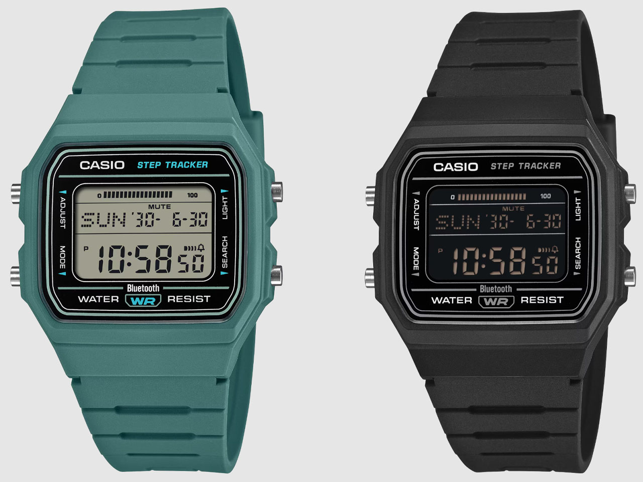
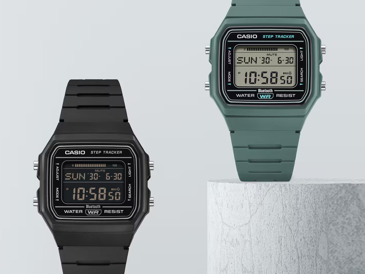
Casio upgrades the classic F-91W watch with smart functions, and it’s already sold out in Japan

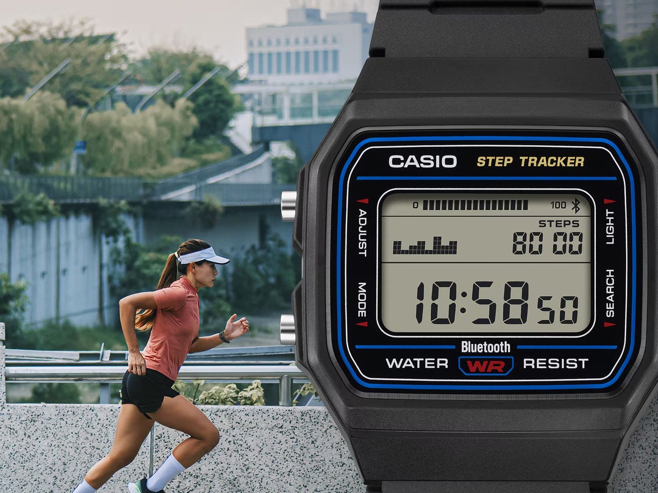
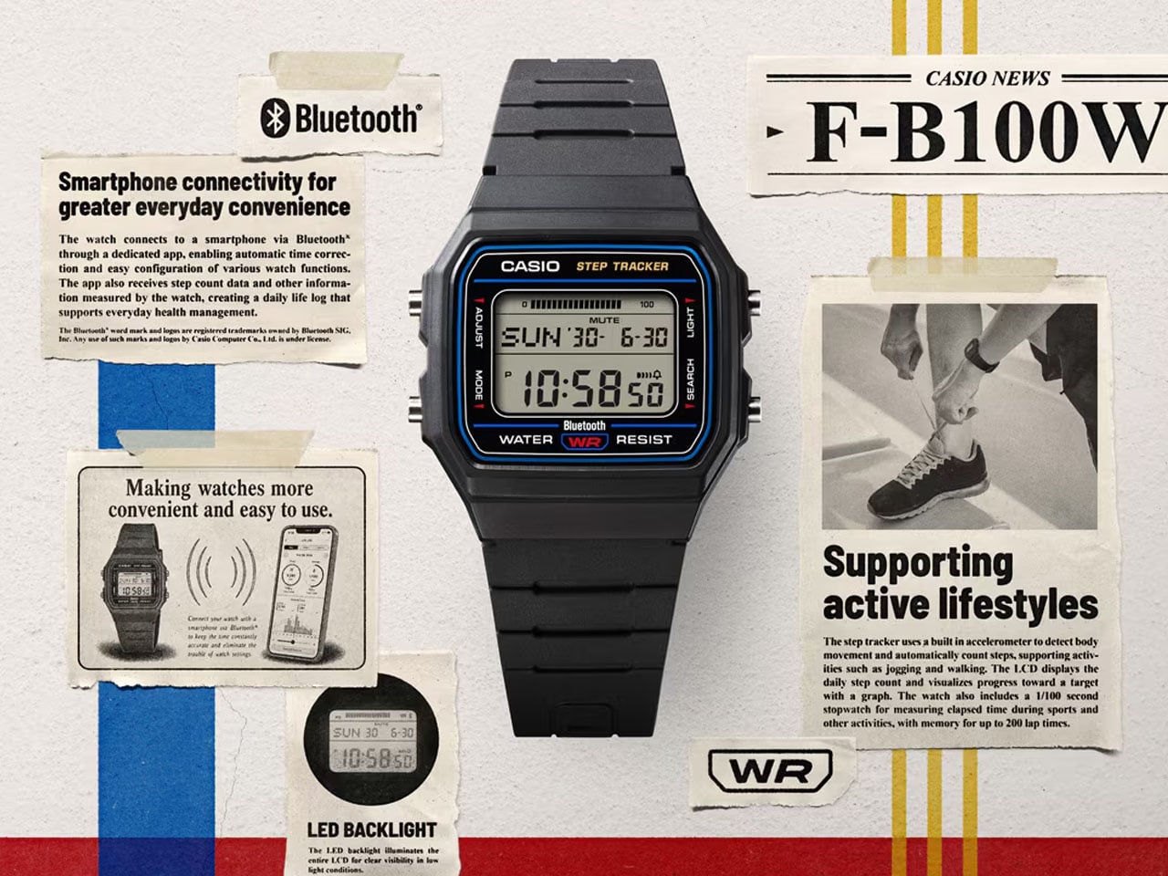
Without a doubt, the Casio F-91W is a legendary timepiece that is still available to buy for $20. While the digital watch has retained its nostalgic charm all these years, it is indeed a little left behind when it comes to smart functionality. Casio is set to change that now with the F-B100W timepiece, which adapts the modern functions expected in a smart timekeeper. The classic 1980s digital watch in the rectangular silhouette, upgraded with the goodness of step counting – I’ll take that any day!

On the outside, this Casio timepiece looks like the trusted F-91W, but inside it has more to offer, making it a sweet deal. For now, the watch is available in Japan for ¥8,800 (around $55), and it’s not surprising it has already been sold out, at least for now. That’s almost double the price tag of the original, which is still up for $22, but you’ll also have to factor in the generational leap in smart features this new model touts.

Designer: Casio

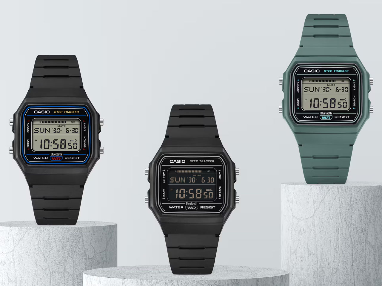
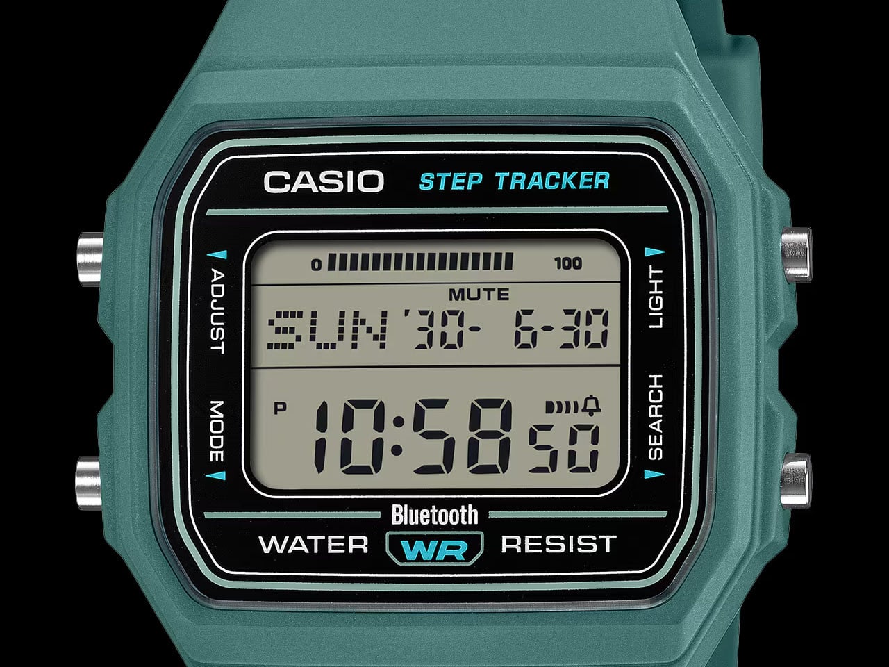
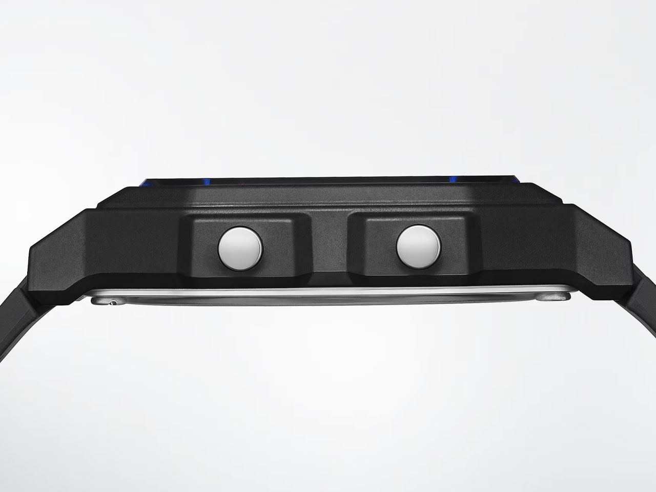
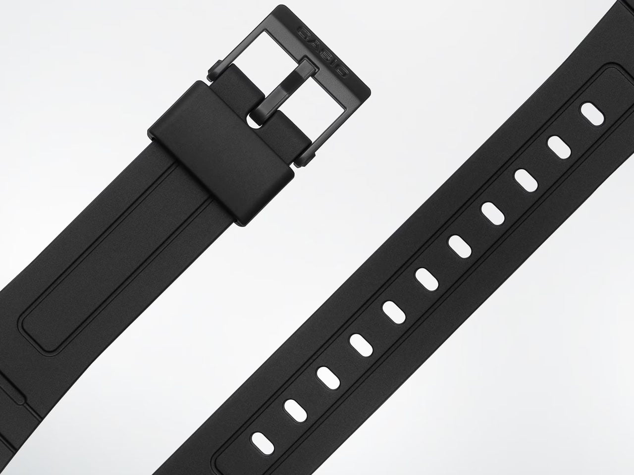
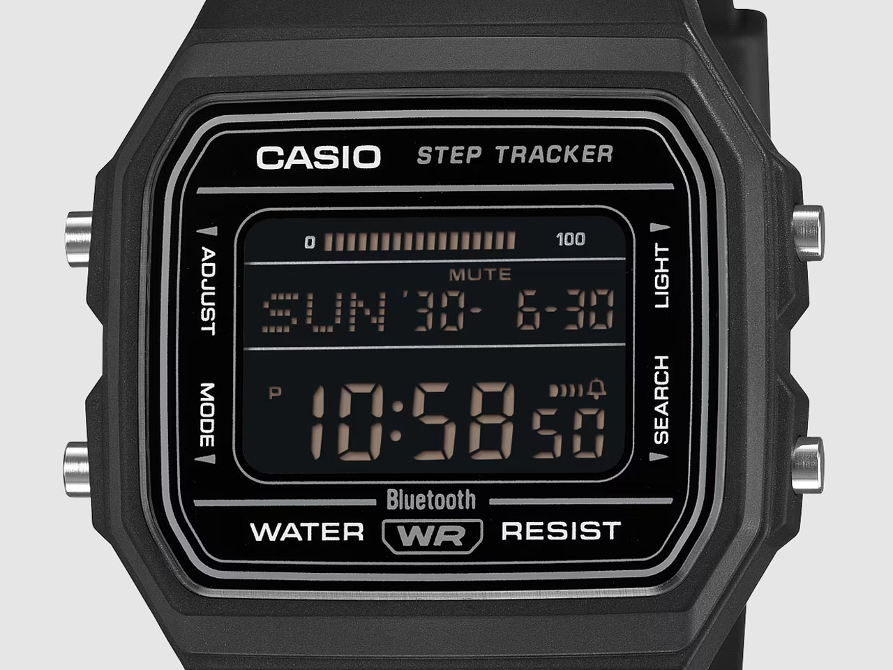
Most of the F-B100W’s functions are fairly straightforward, and the specifications are also very close to the original, measuring 41.9 × 38.1 × 8.8 mm and weighing 26 grams. The timepiece retains features including an amber LED backlight with adjustable glow, water resistance, an hourly time signal, and five daily alarm options. For improved comfort during long hours, the bio-based plastic strap now has improved ventilation slits. Major changes come in the form of a watch battery (as opposed to a rechargeable cell), which lasts for almost two years.

What’s making this Casio timepiece a big buzz already is the inclusion of Bluetooth, which automatically syncs time or toggles the alarms or dual time display. In the mix is the phone finder feature, which can be a really useful addition without all the unwanted nuances. What I’m most excited about is the addition of the step counter and lap split time function, which can be directly synced to your phone with the companion app. You can set goals, record up to 200 laps, and monitor the progress on the watch screen as well. For times when you get too engrossed in work, the F-B100W also sends an inactivity alert via a beep and on-screen prompt. Of course, that is an optional feature that can be turned off as well.

It doesn’t have any other smartwatch features like a heart rate monitor, sleep diagnosis, or even BP monitoring, but that’s the point. The retro-modern Casio watch has all the timekeeping functions, and the most essential smart features without making the wearer too finicky about the vitals. F-B100W comes in three color variants: 1AJF, 1BJF, and 3AJF, which have a black case with a positive LCD and retro blue, red, and yellow dial accents, and all black with a negative display and gray text, respectively.

The post Casio upgrades the classic F-91W watch with smart functions, and it’s already sold out in Japan first appeared on Yanko Design.

  •  

Streaming Took Something From Us. The ENSA T1 Wants It Back

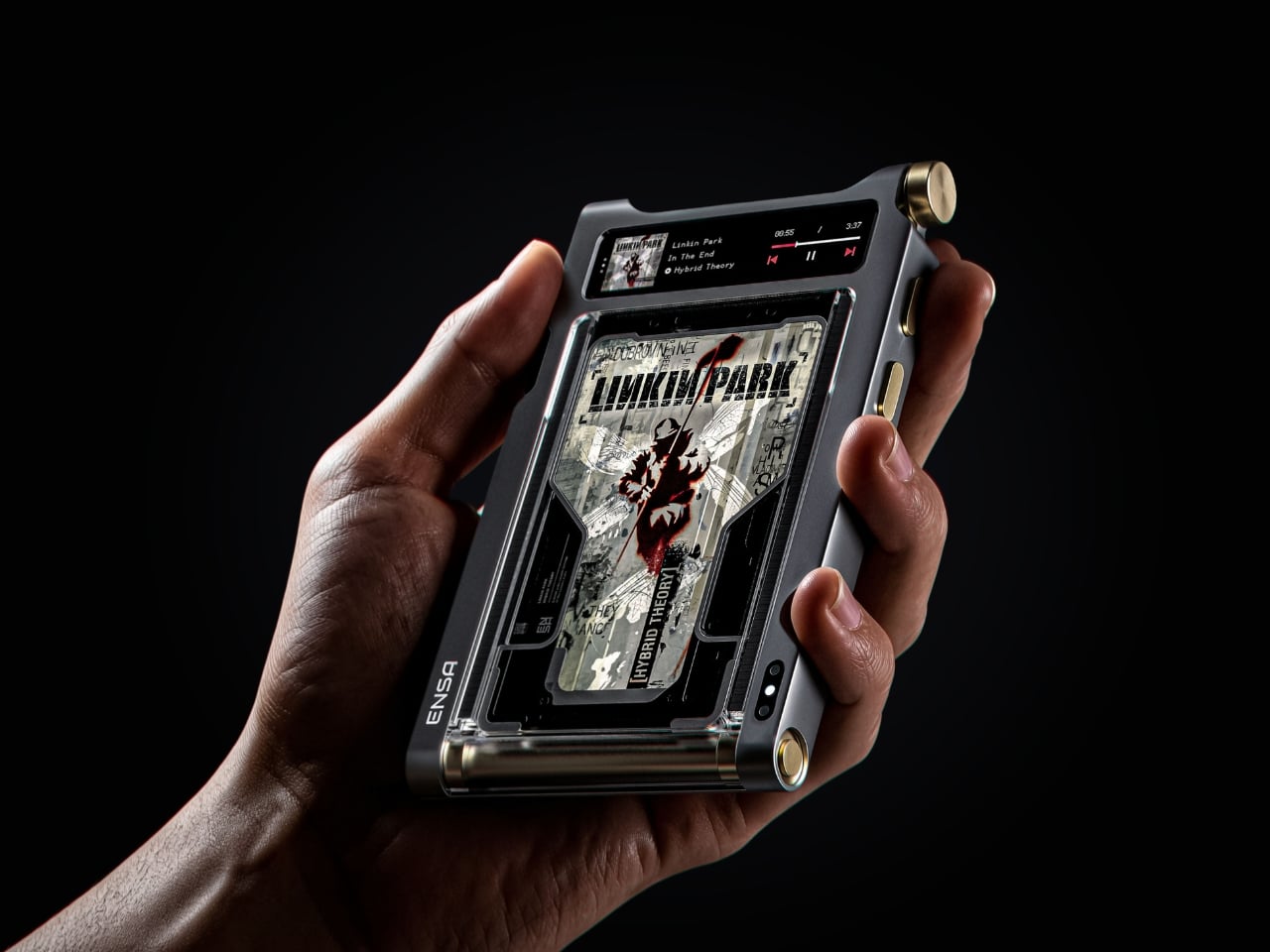
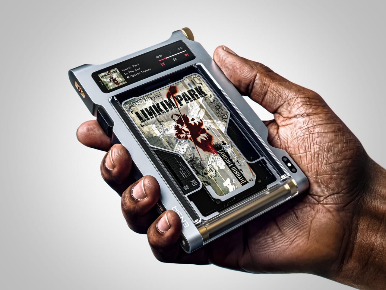
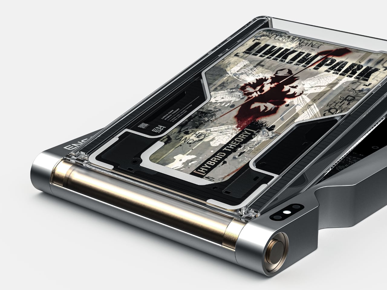
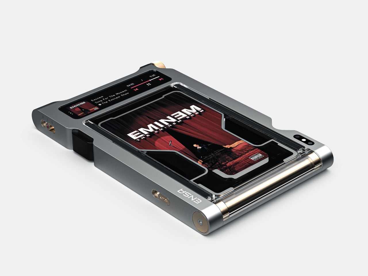
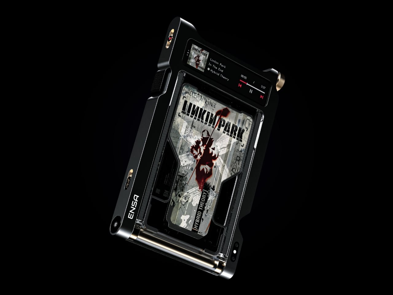
Do you remember the last time music actually demanded something of you? Not just your attention while you scrolled, but your hands. The deliberate pull of a record from its sleeve. The small, mechanical click of a CD case. The unhurried ritual that came before every song, every mood shift, every late-night session on the floor with the volume just loud enough. Vladimir Dubrovin remembers. The California-based multidisciplinary designer has been quietly building a case for returning physicality to the act of listening, and with the ENSA T1, his latest concept design, the argument gets considerably harder to dismiss.

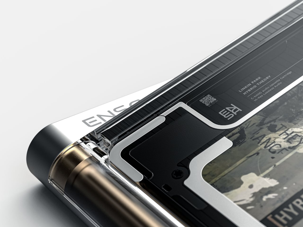
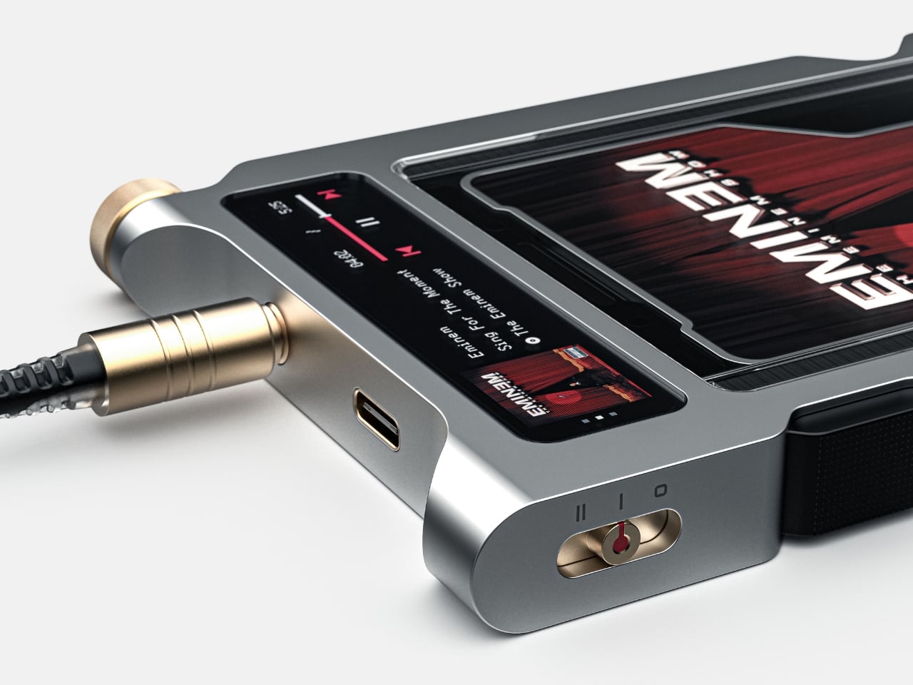
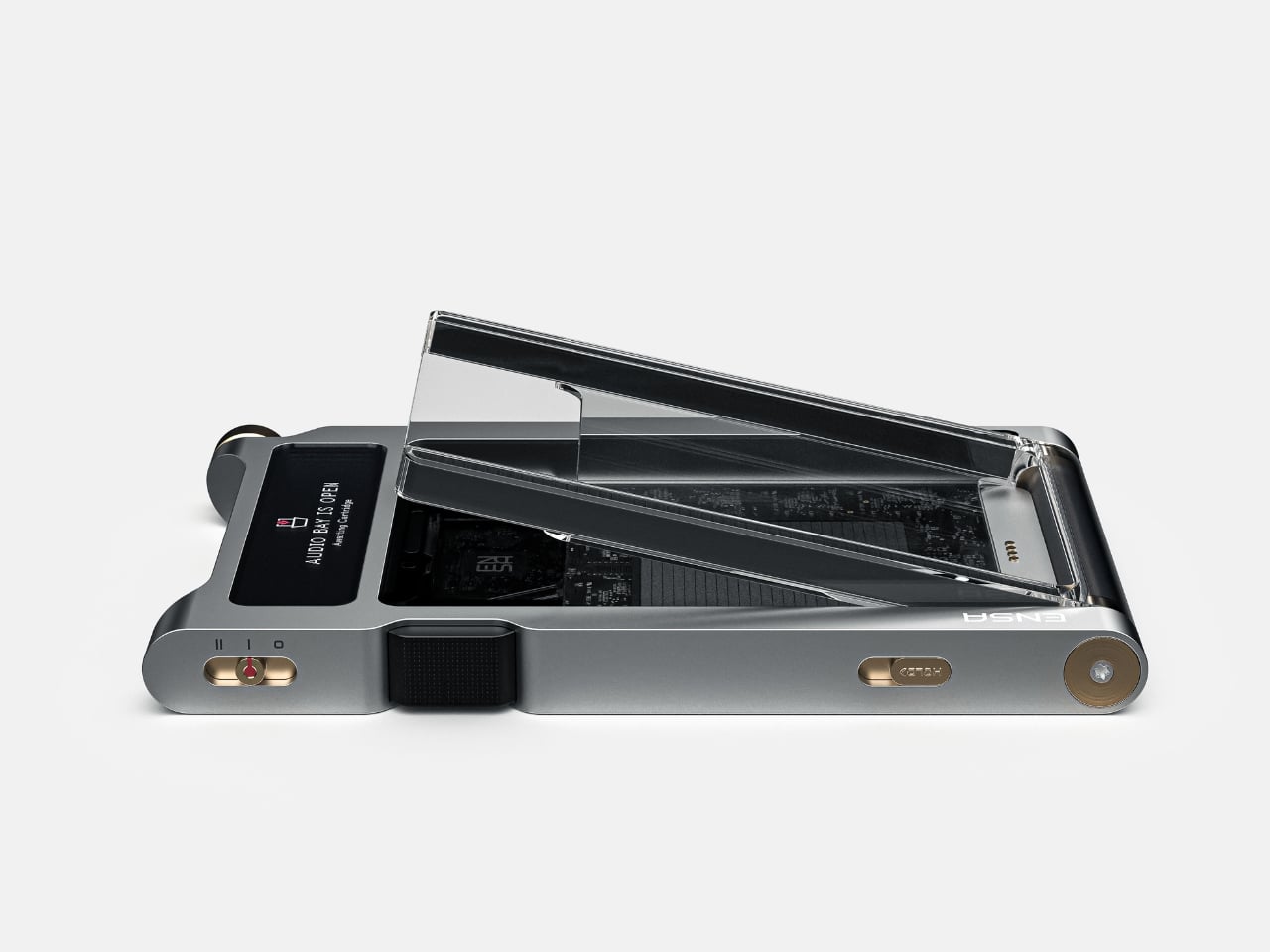
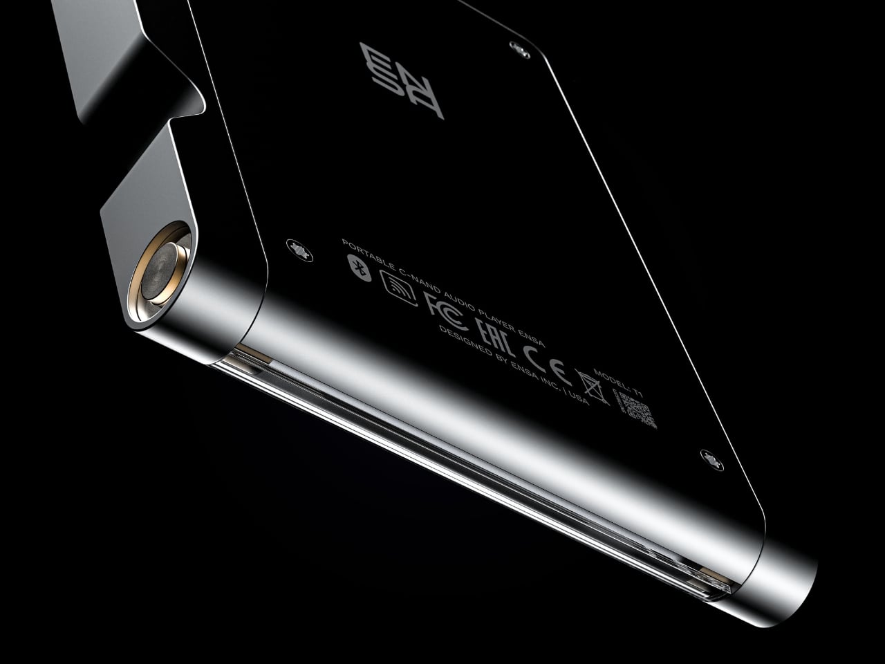
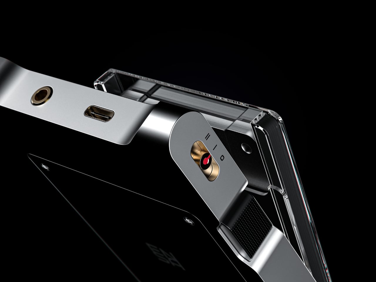
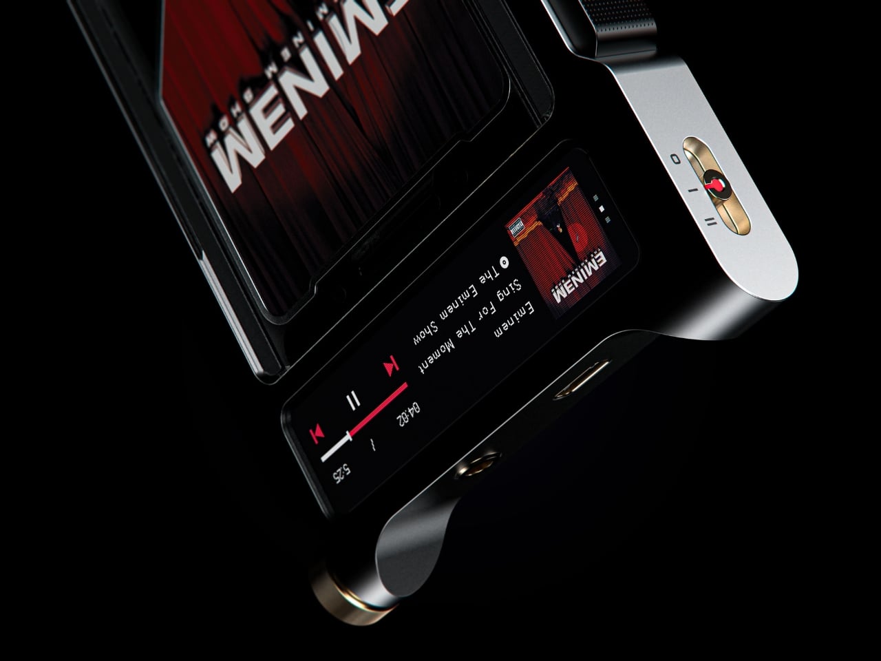
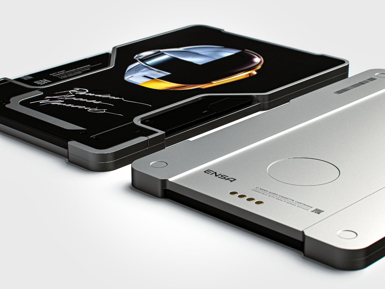
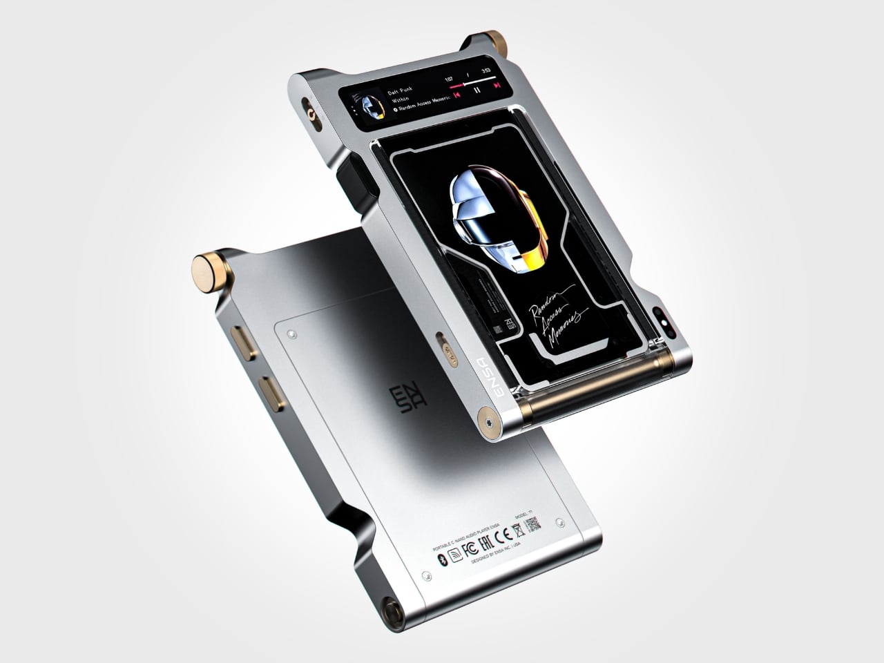
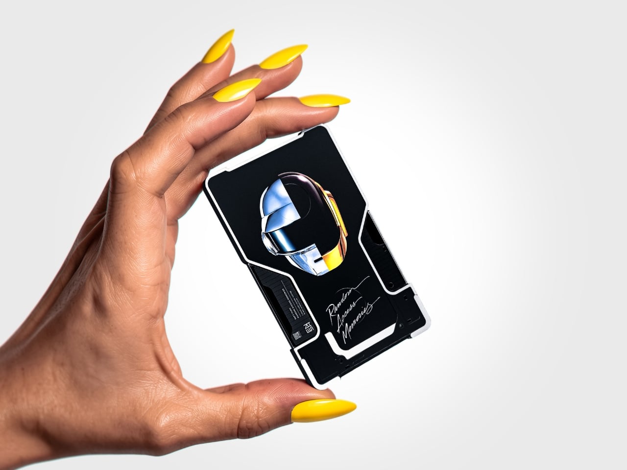
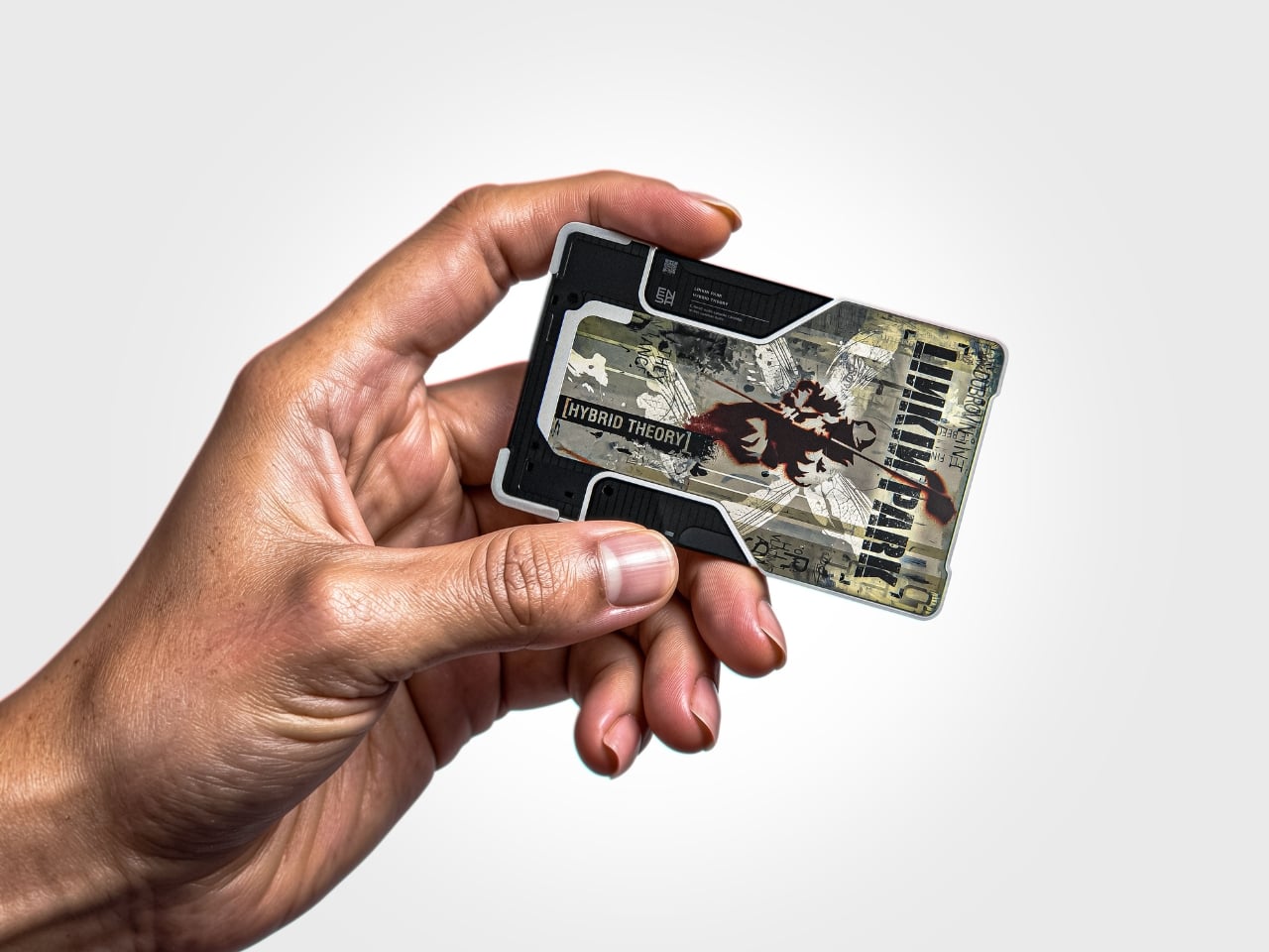
The T1 is the newest addition to Dubrovin’s ENSA line, an evolving design series that began with the ENSA P1, a portable audio player concept that reimagined what a music device could look and feel like in the post-streaming era. The P1 introduced Dubrovin’s concept of C-NAND cartridges: small, disc-shaped, solid-state storage units where each cartridge holds one complete album. There are no moving parts, no spinning mechanisms. They’re fully digital in how they handle audio, but they exist in the physical world the way vinyl does. You pick one up, turn it over, look at it, choose it. The act of choosing your music becomes deliberate again, and that matters more than it sounds.

Designer: Vladimir Dubrovin

Where the P1 was built for portability and kept its design trim and pocketable, the T1 feels like the next chapter. Visually and conceptually, it carries the same DNA: clean, considered industrial design with an aluminum body and restrained detailing. But the T1 reads as something more anchored, a device you set somewhere permanent and return to, rather than slip into a bag. It’s a design that seems to understand the difference between music you consume and music you actually sit down for.

Aesthetically, Dubrovin’s approach has always felt less like tech product design and more like furniture-level thinking. The ENSA devices belong to the same visual conversation as early Braun electronics or a Dieter Rams concept sketch, where every detail either earns its place or gets removed entirely. The T1 continues that restraint. Its form doesn’t shout, which is precisely why it catches your eye. In a market saturated with speakers shaped like pebbles and smart displays with glowing rings, an audio device that looks like it was designed by someone who genuinely thought about what it means to own a piece of music is genuinely refreshing.

The broader question Dubrovin keeps posing with the ENSA project is one worth sitting with: what did we actually lose when music went weightless? Streaming solved convenience so completely that most of us never stopped to notice what the tradeoff cost. We gained access to everything and lost the kind of focus that comes from committing to a single album, from having music you could see, hold, or lend to a friend. The ENSA T1 is not trying to compete with Spotify. It’s asking whether the experience of music could mean something again, even if you have to build an entirely new format to get there.

It’s a concept project, not a product you can buy, and the realist in me knows that’s a significant caveat. Building out a new physical media format in 2026 is an uphill proposition at best. The infrastructure alone, manufacturing cartridges, convincing labels, and getting devices into homes, would require a level of industry commitment that’s difficult to imagine right now. But design concepts don’t have to ship to matter. The best ones articulate a desire most people feel but haven’t named yet, and the ENSA T1 does exactly that. The desire for music that has weight, that takes up space, that gives you something to do with your hands before the first note plays.

That’s why Dubrovin’s work keeps getting attention. The ENSA line isn’t nostalgic in the way that feels defensive or retrograde. It’s just honest about the fact that we traded something real for something convenient, and it’s asking, politely but persistently, if we’d like it back.

The post Streaming Took Something From Us. The ENSA T1 Wants It Back first appeared on Yanko Design.

  •  

Furniture Made From Wood Scraps You’d Actually Pay For

Every furniture workshop generates a particular kind of guilt. There are the offcuts, the trimmings, the odd-shaped remainders of boards that got cut to size and are now too small for anything useful, or so we assume. Most of them end up as kindling, compost, or landfill. We’ve accepted that as the cost of making things, a small fine paid for the privilege of precision. Studio Booboon is not interested in paying that fine.

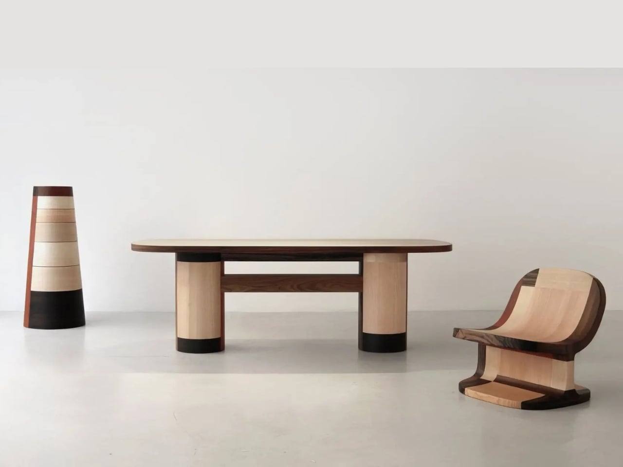
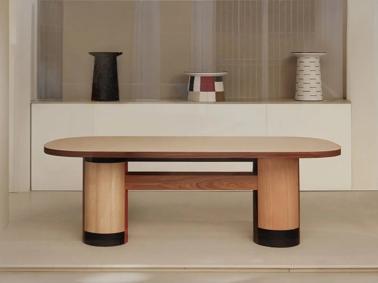
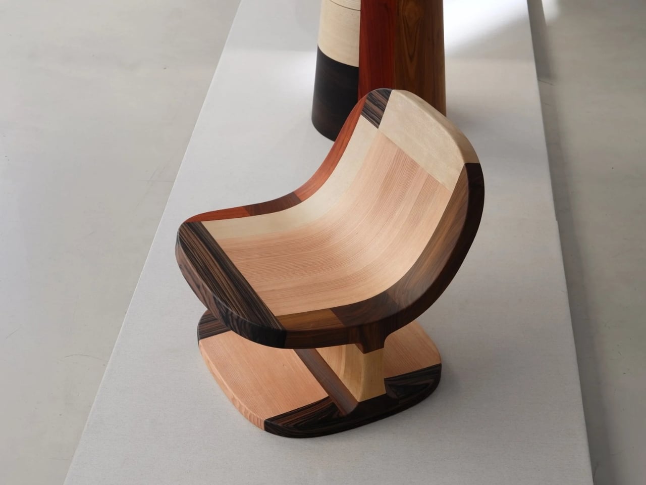
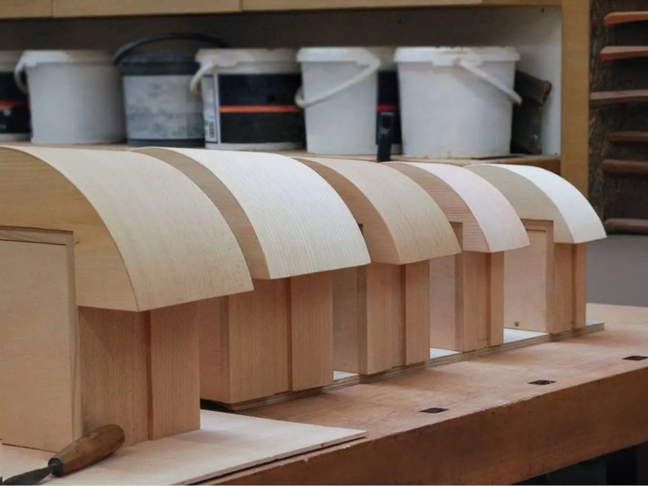
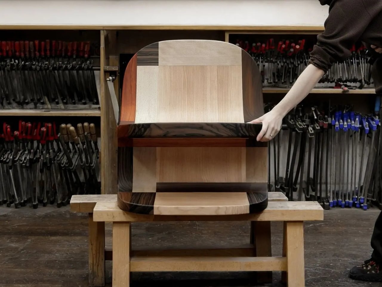
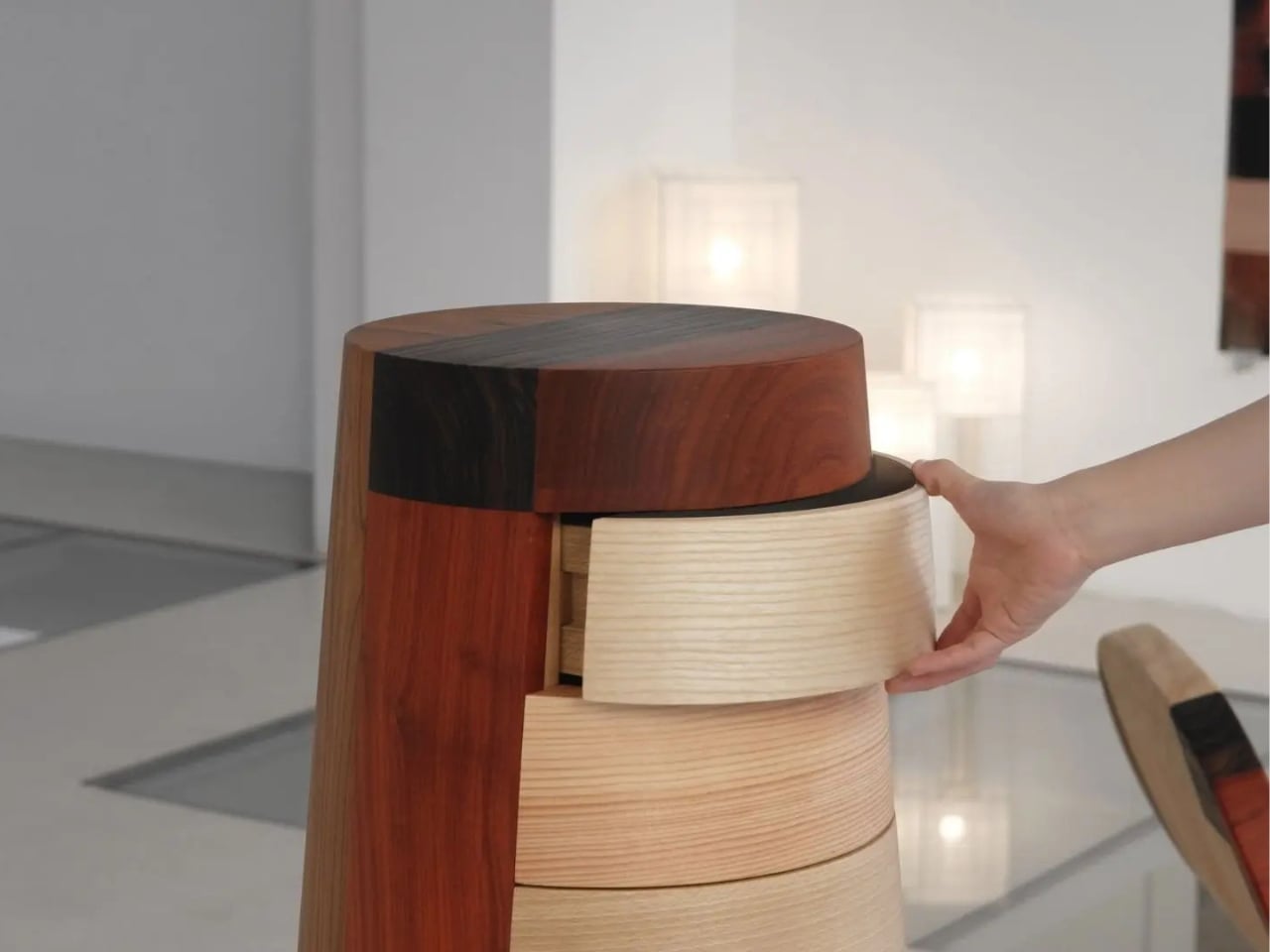
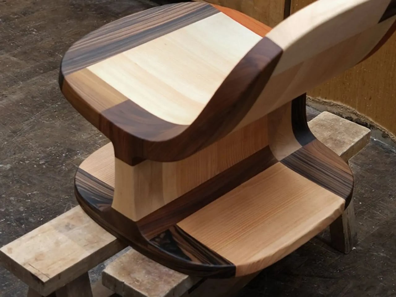
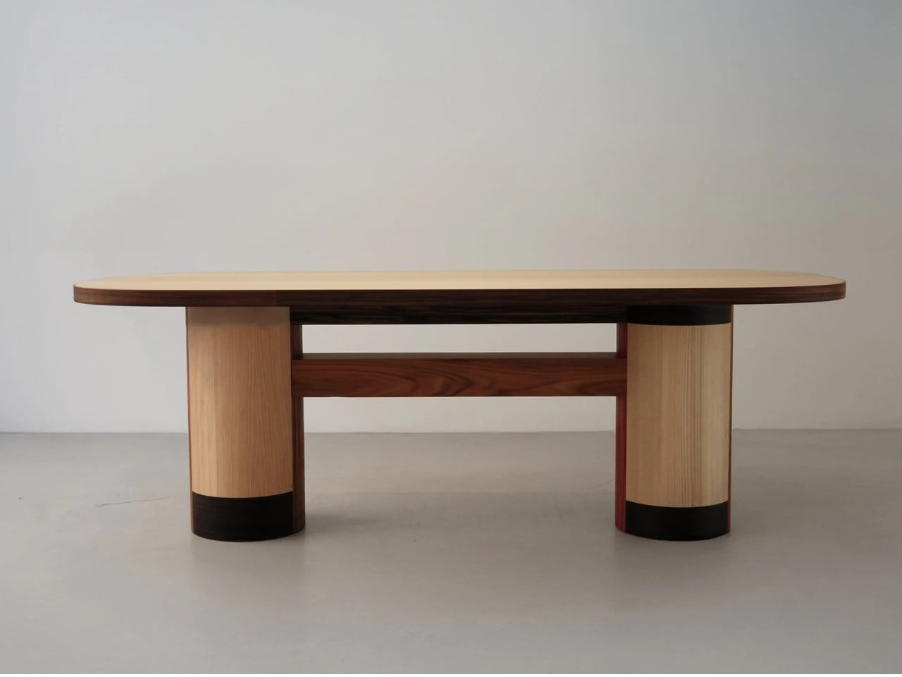
The Copenhagen-based studio, founded by Richard Bone and Jisu Yun, two designers who both trained under Japanese studio Nendo, released their latest collection, Fragments Becoming, and it’s exactly the kind of work that makes you wonder why no one thought to do it this way sooner. The collection is built entirely from timber offcuts, and before you picture something rustic or deliberately imperfect, let me be clear: these pieces are stunning. A cabinet, a dining table, and a lounge chair, each constructed from assembled fragments of discarded wood arranged with such precision and intention that the effect is closer to fine art than furniture-as-apology for sustainability.

Designer: Studio Booboon

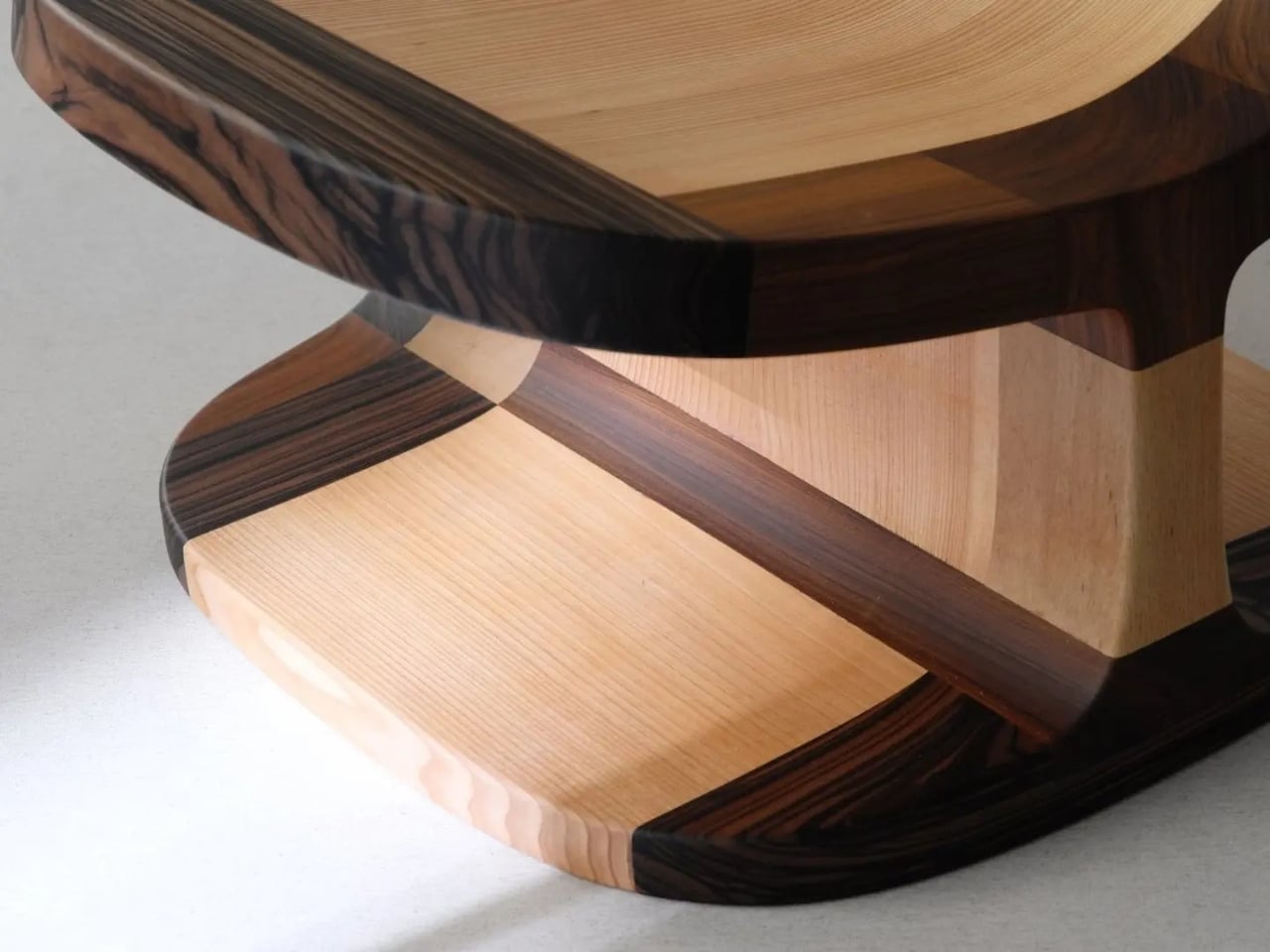
The concept the studio uses is something they call “3D marquetry,” which sounds technical but is actually a fairly elegant idea once you sit with it. Traditional marquetry, the kind you’d see on antique furniture or decorative boxes, applies a pattern to a surface. It’s essentially decoration laid on top of structure. What Studio Booboon does instead is treat each fragment of wood as the structure itself. The pattern isn’t on the cabinet door; the door is the pattern. It runs through the object’s entire volume, which means the visual logic and the physical construction are the same thing. That’s not a subtle distinction. That’s a fundamentally different philosophy.

What I appreciate about this approach is that it removes the option to hide mistakes. The studio works with unstained wood, which means every fragment has to earn its place on its own terms, no pigment masking a poor match, no stain blurring the edges. Each piece has to work compositionally before it works functionally. That kind of constraint tends to produce either chaos or brilliance, and in this case, it’s clearly the latter.

Bone and Yun bring a cross-cultural sensibility to the work that shows up in the details. Their debut collection, Playful Reappropriation, released at Milan Design Week 2024, pulled from Korean craft traditions, and Fragments Becoming continues that thread. The materials include hanji (traditional Korean paper), canvas, silk, and Ottchil, a Korean lacquer technique that adds depth without dominating the natural tones of the wood. The combination of a British RCA education, Korean craft heritage, and a shared apprenticeship at Nendo, one of the most conceptually rigorous studios in contemporary design, explains a lot about why this work feels so considered without ever feeling cold.

The collection premiered at Milan Design Week 2026 and later showed at Other Circle 2026 during 3daysofdesign in Copenhagen. That double-billing matters. Milan tends to reward spectacle, while the Copenhagen circuit rewards ideas. The fact that Fragments Becoming landed well in both contexts suggests it’s doing something more than just looking good in photographs, which, for the record, it absolutely does.

Sustainability in design has become such an overused talking point that the word barely registers anymore. Every brand gestures toward it. But there’s a difference between sustainability as a value and sustainability as a method, and Studio Booboon’s work lives in the second category. They’re not telling you the collection is responsible and letting the aesthetics carry a different message. The responsible practice is the aesthetic. The offcut isn’t hidden. It’s the whole point.

That feels rare enough to be worth paying attention to. Design tends to celebrate the new, the seamless, the perfect. Fragments Becoming makes a quiet argument that the incomplete, the leftover, and the discarded might be where the most interesting work is still waiting to happen.

The post Furniture Made From Wood Scraps You’d Actually Pay For first appeared on Yanko Design.

  •  

Honor Robot Phone Hands-on: Bold Phone With A Moving Camera Few Can Buy

After many teasers and demos, the Honor Robot Phone has finally and officially launched in China. It is also staying exclusive to the Chinese market for now, with Honor not planning an international release at this stage. That alone will make it a frustratingly out-of-reach device for many, because this is one of the rare smartphones that feels genuinely different at first glance.

Part of the reason the launch has drawn so much interest is that Honor first revealed the Robot Phone at MWC earlier this year, where it quickly became one of the event’s biggest conversation pieces. Even in a show packed with concept hardware and camera claims, this was the device that made people stop, stare, and ask how it actually worked. Now that it has moved from trade show reveal to commercial launch, the Robot Phone still feels just as unusual.

Designer: HONOR

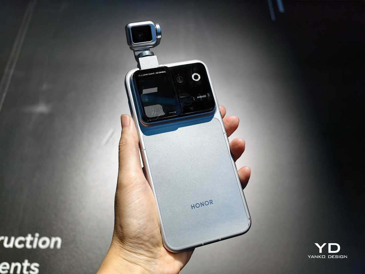
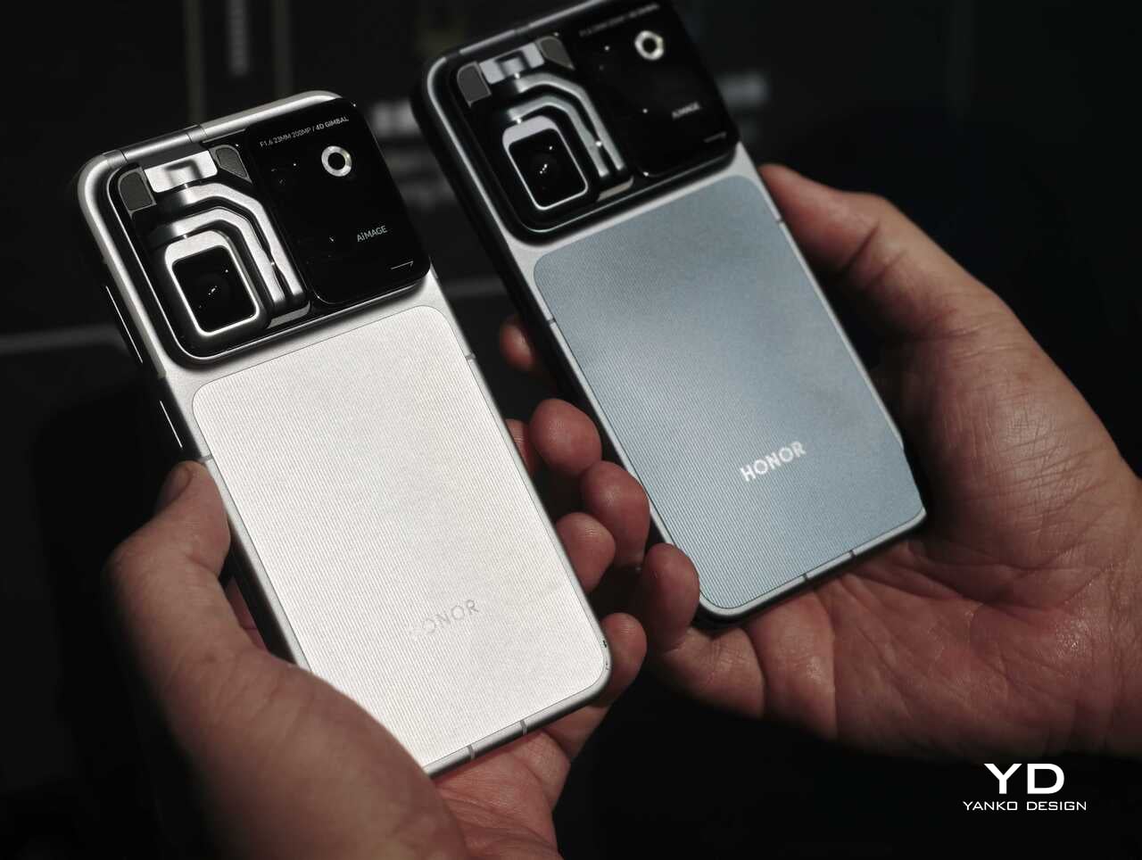
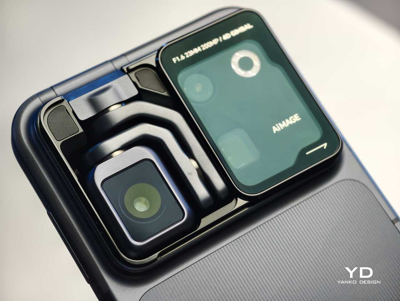
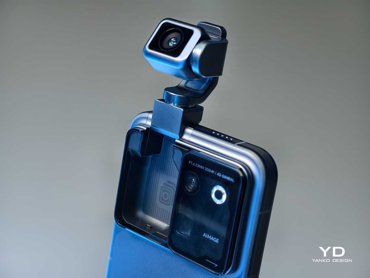
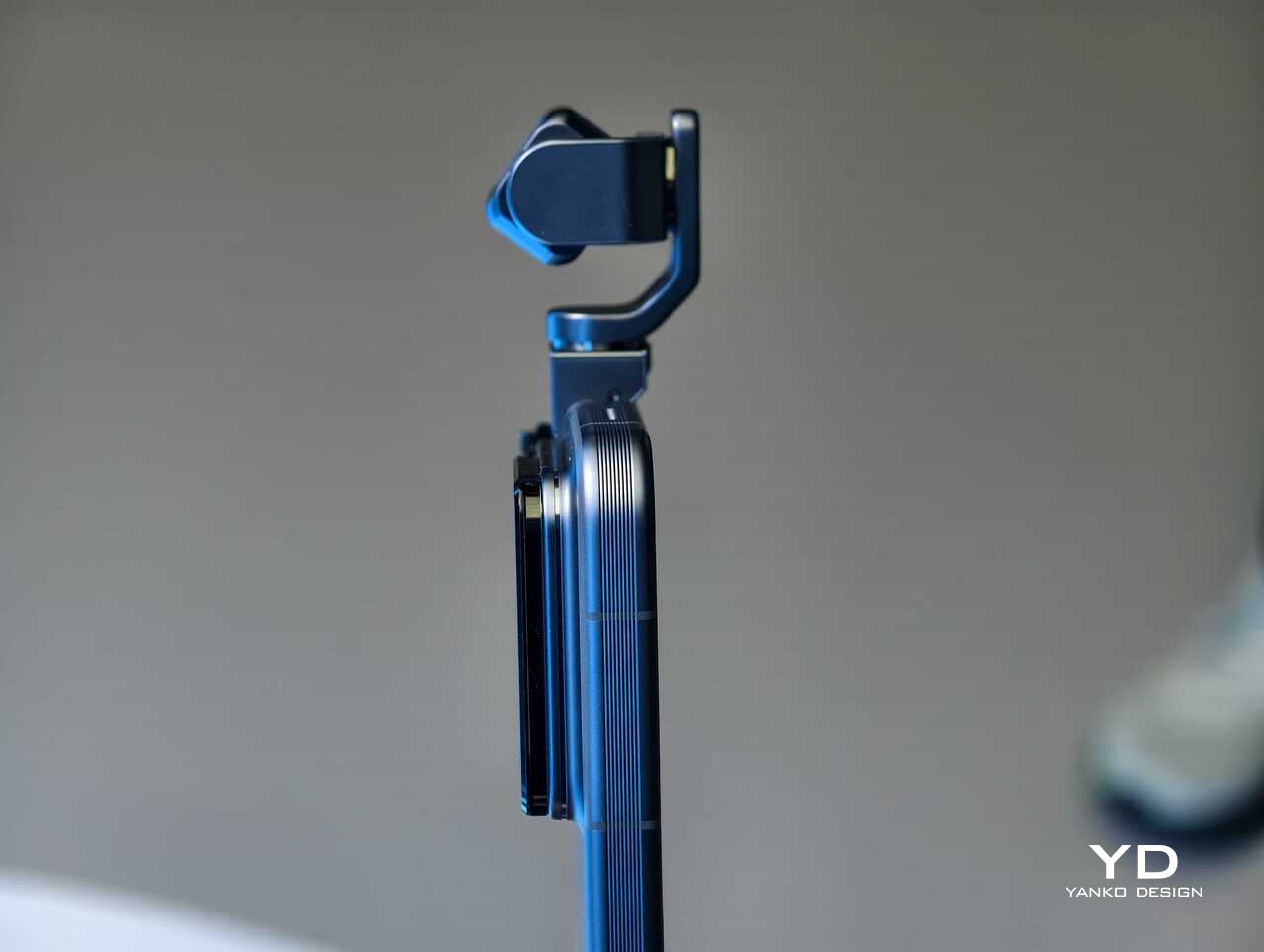
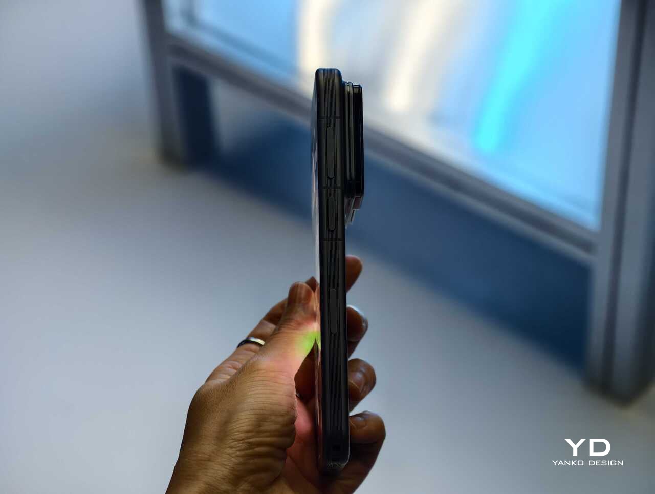
Rather than chasing attention with another familiar camera bump or an incremental spec upgrade, Honor has built a robotic gimbal directly into the phone itself. The result is a camera system that can physically move, track, tilt, and stabilize in ways a conventional flagship simply cannot. After spending time with the device, it is clear the Robot Phone is not just trying to be another premium handset with a long feature list. It is trying to pitch a new idea for what a creator-focused smartphone can be.

The big story is movement, not just megapixels

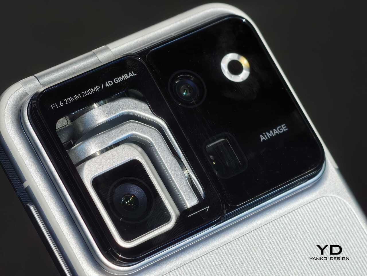
The core pitch behind the Honor Robot Phone is easy to understand once you see it in person. Honor has integrated what it calls a 4DoF Titanium Agile Gimbal into the phone, effectively turning the camera into an active moving system rather than a static sensor setup. The company says the module is 65 percent smaller than traditional gimbal solutions while also offering a 200 percent increase in structural strength, allowing it to fit inside a premium smartphone body without turning the device into a bulky experiment.

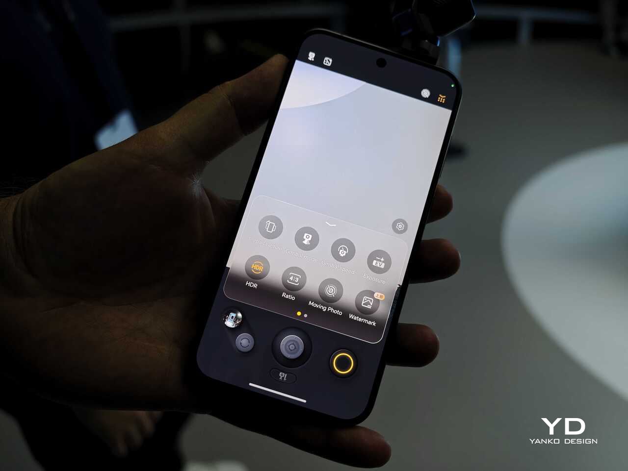
That change in hardware philosophy is what makes the Robot Phone immediately stand out. In practice, the moving camera module is meant to deliver smoother stabilization and more dynamic motion than a normal smartphone can manage on its own. Honor is also building in multiple movement modes, including Tilt Lock, First Person View, FPV Vertical, and AI SpinShot, all of which are designed to make mobile footage look more deliberate and more cinematic.

Honor is aiming this squarely at creators

The second half of the launch story is imaging. Honor says the Robot Phone is the first major product from its Cinematic Imaging Partnership with ARRI, bringing selected elements of ARRI Image Science and professional cinema workflow ideas into a smartphone. That includes ARRI LogC3 recording in ARRI CINEMA mode on the main gimbal camera, alongside ARRI Wide Gamut 3 and ARRI Looks.

On paper, the camera hardware is also extremely ambitious. The rear setup pairs a 200MP Agile Gimbal Main Camera with a 1/1.28-inch sensor and F1.6 aperture with a 200MP periscope telephoto camera using a 1/1.4-inch sensor and 2.7x optical zoom. A 50MP ultra-wide camera completes the setup. Honor is also claiming AI noise reduction improvements, up to 14 stops of dynamic range, and a video pipeline designed to preserve more usable information for post-production.

That is a lot of technical language, but the broader message is straightforward. Honor does not want the Robot Phone to be seen as a novelty. It wants this to be taken seriously as a compact filmmaking and creator tool.

Hands-on: The Honor Robot Phone feels different right away

The most striking thing about the Robot Phone in person is that its main feature is visible. So many smartphone launches revolve around internal improvements that are difficult to appreciate without extensive testing. Here, the big idea is immediately obvious. The camera module moves. It tracks. It gives the phone a sense of physical intention that most handsets simply do not have.

That makes the Robot Phone more memorable than most new flagships before you even get into image quality. Instead of relying entirely on software stabilization and fixed hardware, Honor is trying to introduce actual camera movement into the smartphone experience. In a short hands-on session, that makes the device feel less like a standard phone with a flashy camera and more like a compact production tool that happens to fit in your pocket.

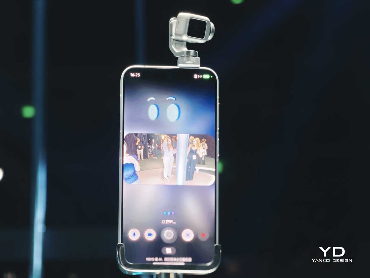
The tracking and movement features are also easier to appreciate in person than they are on a spec sheet. AI Live-Tracking, gesture controls, and voice-directed movement all sound abstract on paper. Once you see the phone physically following a subject or repositioning itself, the concept becomes much easier to understand. Whether that turns into something essential in everyday use is a bigger question, but as a first impression, the idea lands more convincingly than I expected.

Using the on-screen virtual joystick, I was able to adjust the gimbal with surprising precision. The interface crams in a lot of features, so it does take some time to learn. Even so, the gimbal feels very responsive, which helps the controls feel more intuitive once you settle in.

There is still a full flagship wrapped around the concept

Outside the headline camera hardware, Honor is still treating the Robot Phone like a proper premium device. It is powered by the Snapdragon 8 Elite Gen 5, backed by a custom cooling system that is meant to keep performance stable during longer recording sessions. There is also a 7060mAh silicon-carbon battery, with support for 120W wired charging and 50W wireless charging.

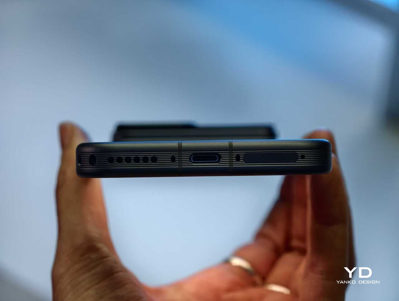
The rest of the hardware sounds suitably high-end too. Honor is using an all-metal unibody design paired with a 6.31-inch LTPO OLED display, an adaptive 1 to 120Hz refresh rate, and a claimed peak brightness of 6800 nits. On paper at least, this is not a concept phone built around one attention-grabbing trick. Honor is trying to package an experimental camera idea inside a full flagship experience.

China-only for now, and that is a shame

For now, the Honor Robot Phone is launching only in China, where it might be staying indefinitely. Honor is not planning to release the device outside China at this stage, which means this unusually creator-focused phone is set to remain a domestic-market curiosity rather than a broader global play.

That is disappointing, because the Robot Phone feels like exactly the kind of launch the smartphone market needs more of. It may not be for everyone, and there are obvious questions about durability, long-term usefulness, and whether creators will trust a built-in robotic camera system over dedicated gear. Even so, it is difficult to dismiss because the concept is so easy to understand once you see it in action.

Early thoughts

After a brief hands-on, my early take is that the Honor Robot Phone feels niche but genuinely fresh. The robotic gimbal is not just a visual gimmick for launch-day headlines. It changes the way the device presents itself, and potentially the way some people shoot with it. Whether that translates into a truly great camera phone will need more time to answer, but as a statement of intent, Honor has made one of the boldest smartphone moves of the year.

The bigger frustration is that, for now, it is a bold move that most of the world will only be able to watch from a distance. First teased at MWC earlier this year and now officially on sale in China for 9,999 yuan (roughly $1,483) for the 12GB+512GB variant and 12,999 yuan (around $1,928) for the 16GB+1TB variant, the Robot Phone is not about to become the next mainstream global flagship. Still, even as a limited-market release, it stands out as one of the most unusual and ambitious smartphones to arrive this year.

The post Honor Robot Phone Hands-on: Bold Phone With A Moving Camera Few Can Buy first appeared on Yanko Design.

  •  

A Maker Spent Months Building a Pokéball That Jumps and Shoots Smoke

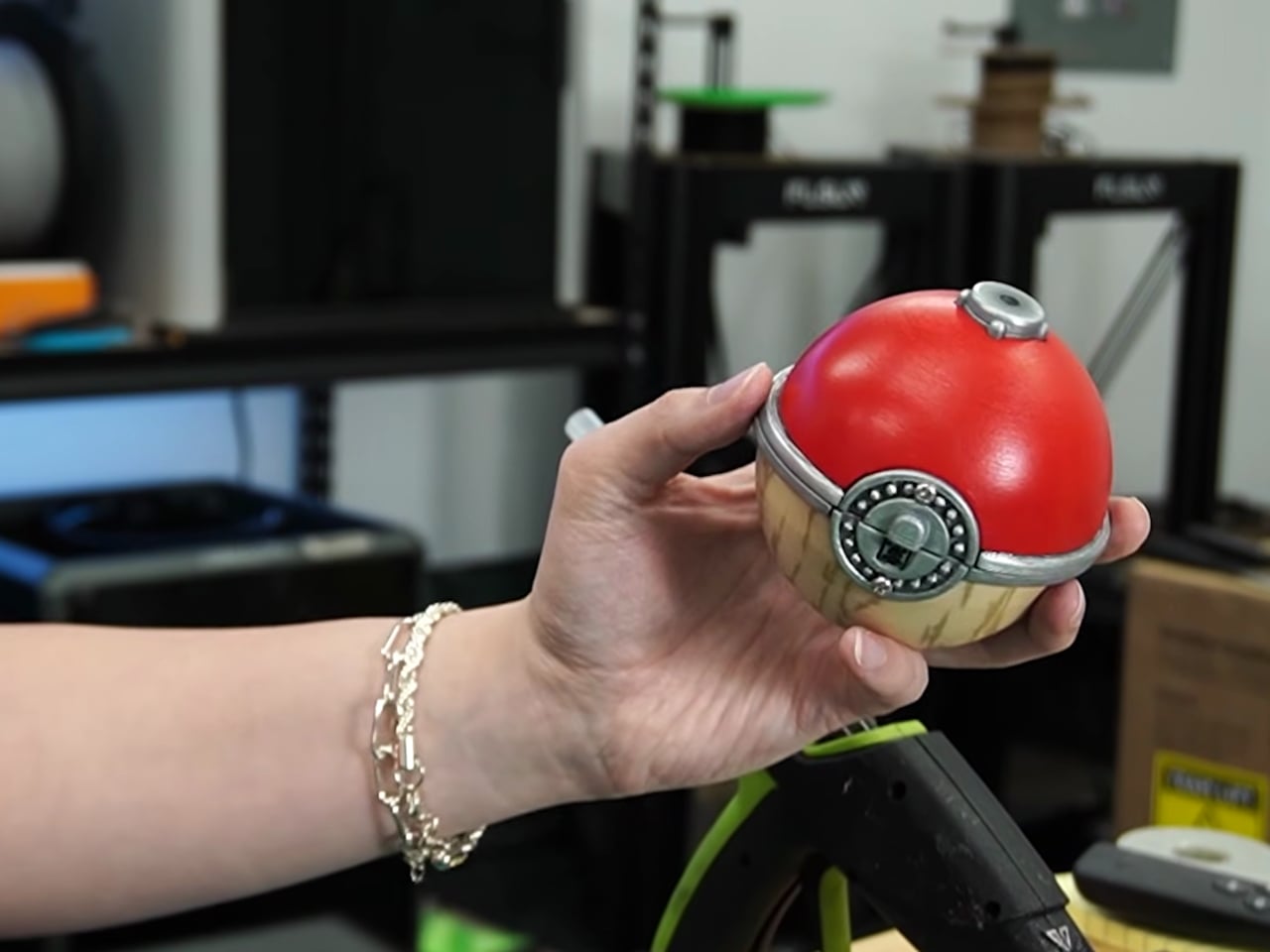
Pokémon has always sold us a very specific fantasy: a compact sphere you can throw into tall grass, watch shimmy three times, and hear that satisfying click. The wiggle is practically cultural shorthand at this point. So when maker Kiara’s Workshop decided to skip the wiggle entirely and build the far stranger, far older Arceus ball instead, the resulting creation landed somewhere between prop design, mechanical engineering, and sheer stubbornness. The kind of project that sounds manageable until you’re three failed prototypes deep.

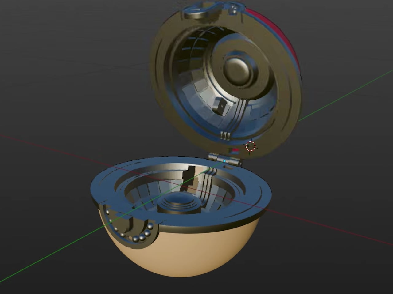
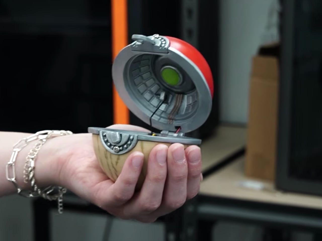
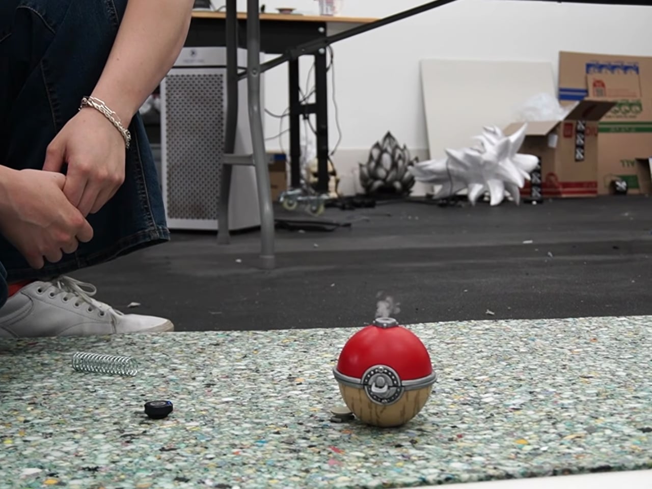
For context: the Arceus ball comes from Pokémon Legends: Arceus, a game set in a much earlier era of the Pokémon world. This isn’t the sleek, mass-produced Pokéball most of us grew up clicking in handheld games. It’s a more primitive artifact, made from Apricorns and Tumblestones in the game’s lore, with an aesthetic that leans ancient and earthy rather than factory-fresh. And its in-game behavior is notably different too. Instead of the classic wiggle sequence, the Arceus ball shoots into the air during a catch and releases a burst of smoke. It’s more dramatic, more theatrical, and a far more interesting design brief.

Designer: Kiara’s Workshop

Kiara’s Workshop had already built functional Pokéballs before, putting out a V1 and V2 that earned a loyal following and a comment section full of people asking when she’d make more. The V3 of the standard Pokéball was still on her list when she decided to take a detour and come back to Pokéballs a different way. The Arceus ball seemed like the simpler bet. It doesn’t have the same intricate mechanical catch sequence as the modern version, so how hard could it be? The answer, as it turned out, was very hard. The build required research, iteration, and a willingness to start over.

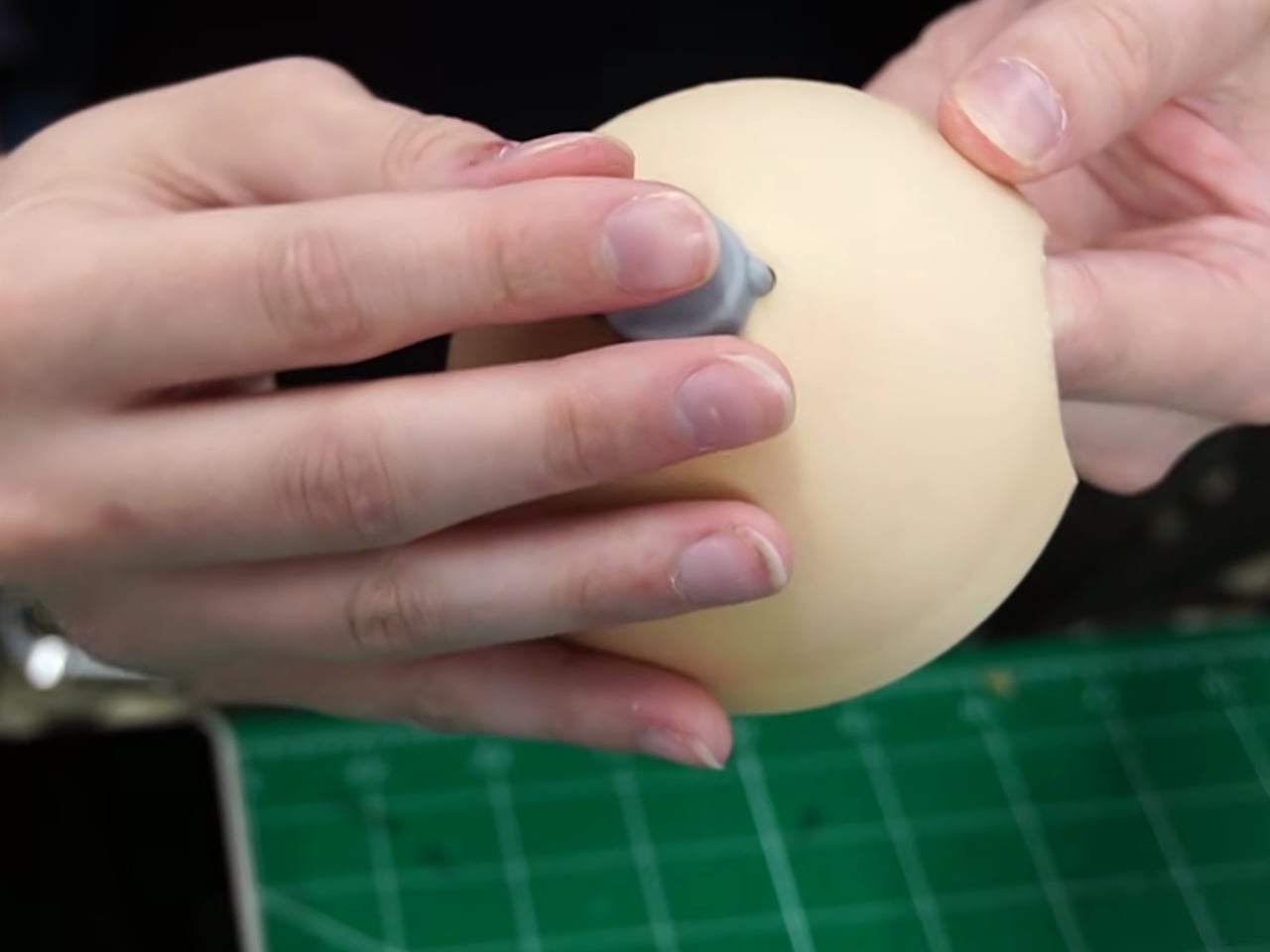
Getting a physical object to jump on cue and simultaneously release smoke on command is not exactly a weekend project. The ancient aesthetic of the ball adds another layer of complexity: it can’t look like it came out of a clean resin mold. It needs texture, weight, and a certain handmade quality that actually complicates production rather than simplifying it. Every element Kiara worked through pointed back to how much thought went into the original game design, even for something that appears on screen for only a few seconds at a time.

Here’s the thing about maker culture that doesn’t get enough attention: it forces a kind of reverse-engineering that’s deeply respectful of the original design, whether that original designer was a game developer or a prop team. When you have to physically build something that only existed as a rendered animation, you start noticing all the decisions that went into it. Kiara’s build is less about having a cool collectible on a shelf (though it would absolutely win any shelf) and more about understanding how design translates, or refuses to translate, between worlds. That’s a genuinely underrated form of design criticism.

Pokémon as a franchise has always been smart about its own mythology. The progression from handcrafted Apricorn balls to industrially manufactured ones mirrors real-world design evolution, from artisanal craft to mass production. What Kiara’s Workshop did was reverse that arc entirely, going from the pixel back to the physical, from the streamlined modern version to the awkward, jumping, smoke-releasing ancient one. It’s a move that requires understanding both the fiction and the fabrication. The result is genuinely impressive, not because it’s a perfect replica, but because it functions on its own terms. It jumps. It smokes. It exists in a way it never was supposed to.

Plenty of makers are building Pokéballs right now, probably on multiple continents simultaneously. But most are going for the one everyone recognizes. Choosing the Arceus ball, with all its mechanical demands and its ancient visual language, says something about what excites Kiara’s Workshop: not the familiar, but the forgotten. And for anyone who’s ever quietly preferred the stranger corners of a franchise over its most iconic pieces, that’s a choice worth appreciating.

The post A Maker Spent Months Building a Pokéball That Jumps and Shoots Smoke first appeared on Yanko Design.

  •  

This Mod Made a Steam Machine Faceplate Charge Your Steam Controller

The Steam Machine has swappable faceplates, which is a genuinely good idea that Valve doesn’t appear to have fully exploited. The concept is essentially that the front panel of the console is a blank cosmetic slate, open to third parties and hobbyists to design around. So far, most of what’s been proposed has leaned on that word: cosmetic. Different textures, different graphics, different visual personalities for what is otherwise a matte black gaming cube.

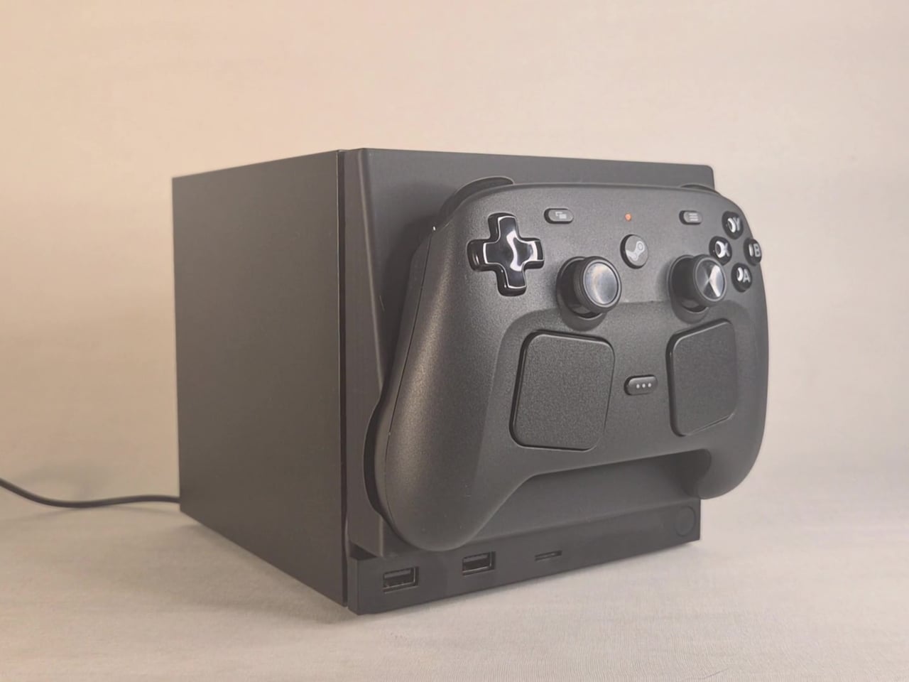
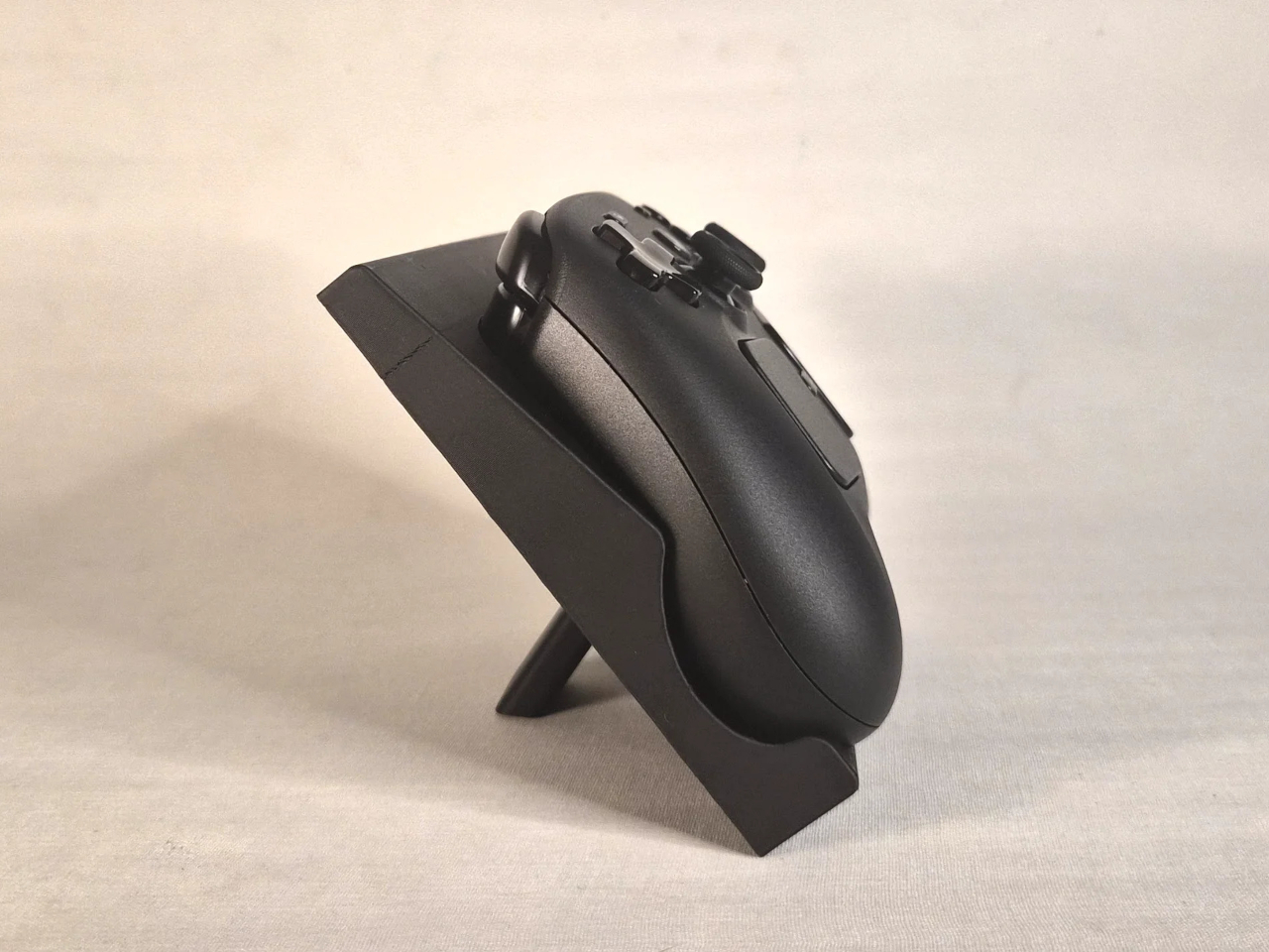
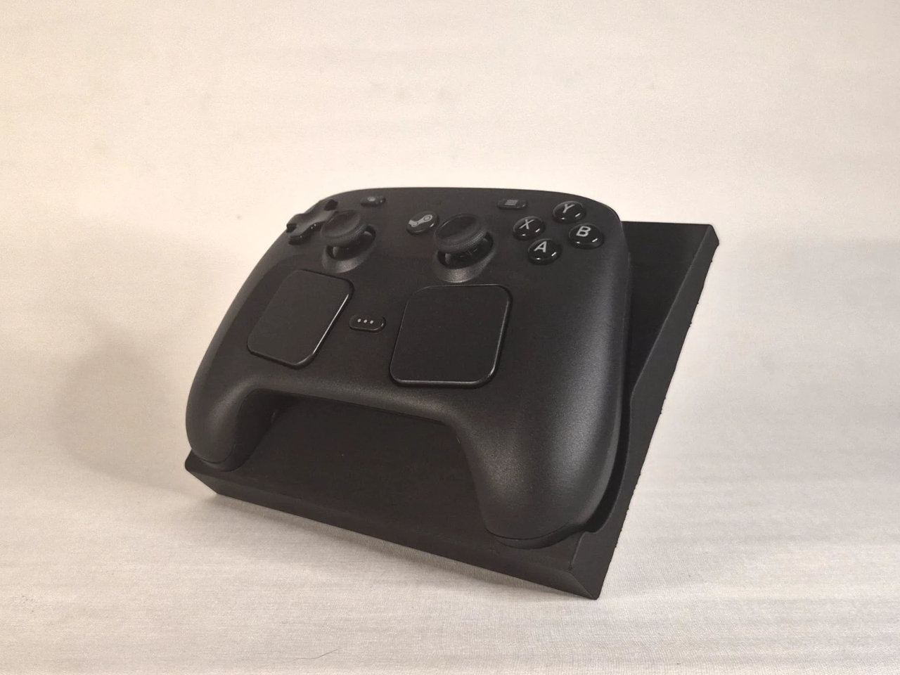
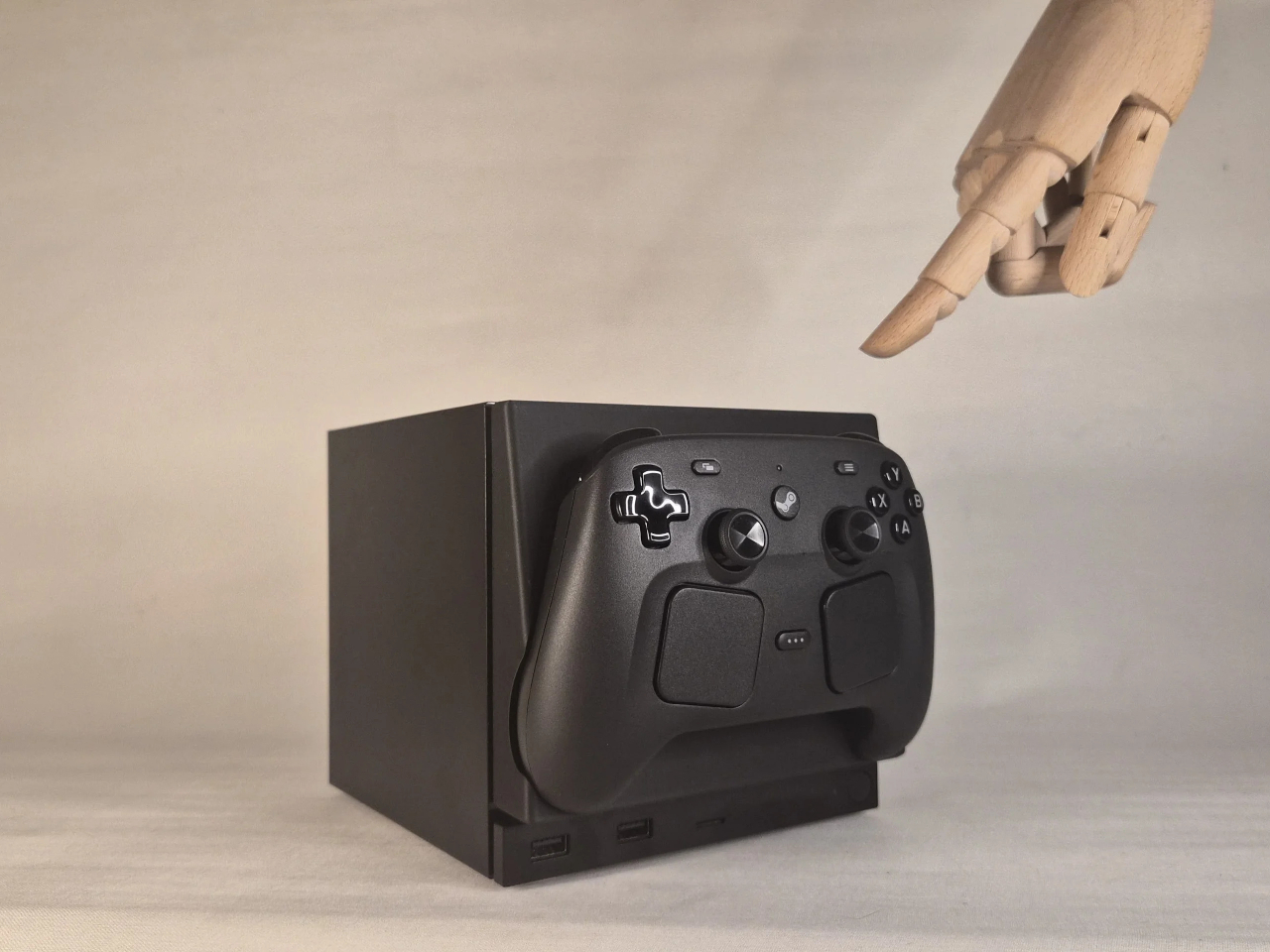
This faceplate mod takes a different approach by asking what the panel could actually do. The result is a replacement front cover that integrates a charging cradle for the Steam Controller directly into the face of the console, turning what would normally be dead real estate into a functional docking station. Set the controller down, it charges. Pick it up, it’s ready. No separate charging puck dangling off to the side.

Designer: NefariousnessWhole25

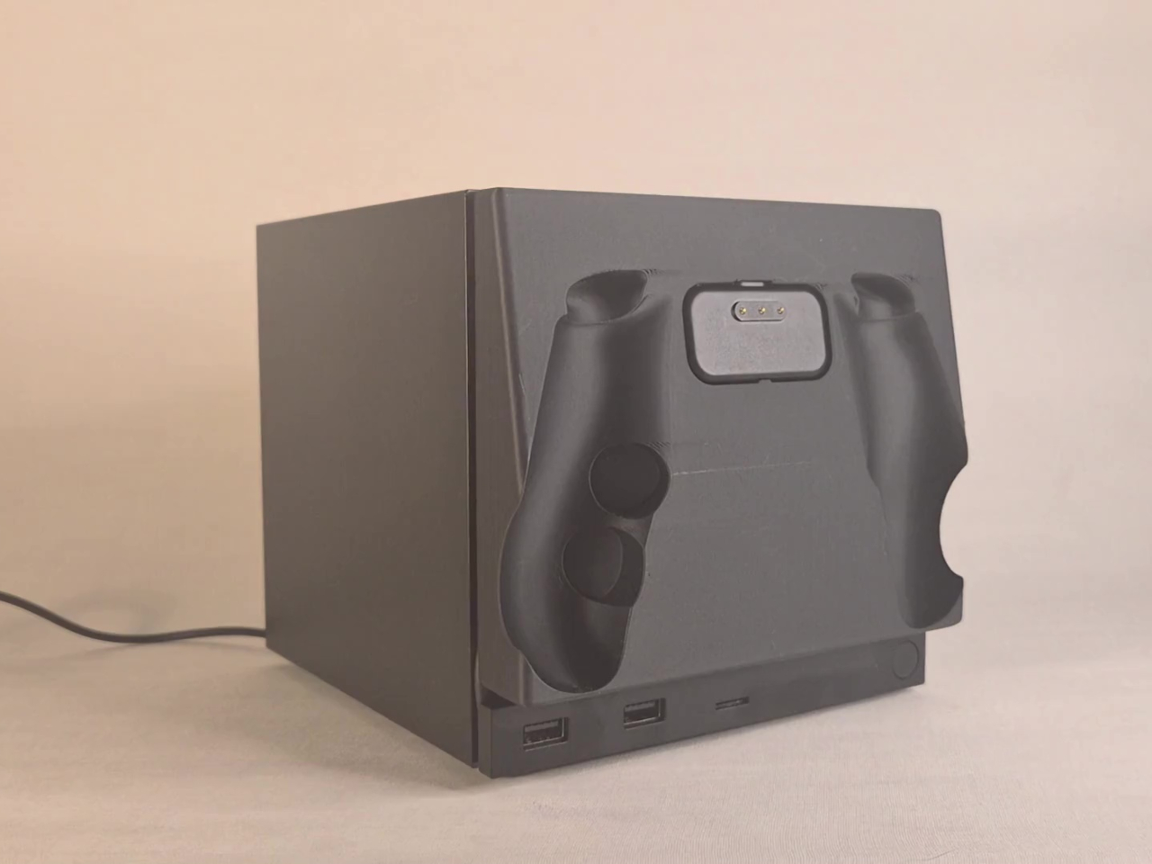
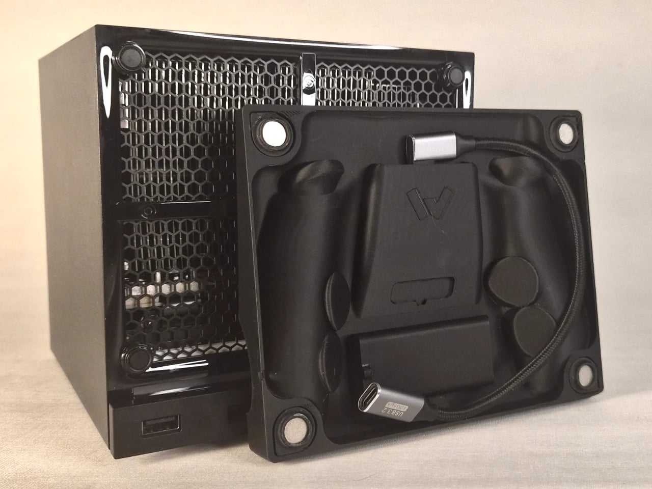
The charging mechanism uses the Steam Controller’s own wireless puck seated inside the faceplate cradle, with a USB cable routed discreetly around the inside edge of the panel and into one of the Steam Machine’s existing USB ports. It’s a routing solution rather than a rewiring one, which keeps the electrical side simple and reversible. The puck sits in the cradle, the controller sits on the puck, and the whole arrangement slots onto the front of the machine like any other faceplate.

What makes it more than a wall mount with ambition is the kickstand built into the rear of the panel. It folds out from the back of the faceplate, propping the cradle up at an angle, turning the entire assembly into a standalone desk dock that works independently from the Steam Machine. Take the faceplate off the console and prop it up on a table, and it functions as a charging stand on its own terms.

The inspiration came partly from Valve’s own demonstration of an e-ink faceplate, which showed that the panel slot was capable of doing more than holding a decorative cover in place. That demonstration didn’t ship as a product, but it established the idea that the faceplate system had functional potential beyond aesthetics. This mod picks up that thread and takes it somewhere more immediately useful for anyone who has both pieces of Valve’s current hardware sitting on the same desk.

Design files haven’t been released yet, and there are no confirmed plans to sell finished units. The prototype is out, it works, and it raises a question worth asking about Valve’s approach to the faceplate ecosystem: if a single modder can turn the front panel into a functioning charging dock over a weekend, what would a dedicated accessory program actually look like at scale?

The post This Mod Made a Steam Machine Faceplate Charge Your Steam Controller first appeared on Yanko Design.

  •  

The Luxury Hotel Concept That Works Like a Food Truck for Wilderness

Luxury hotels have always had a location problem. The kinds of places that would make the most extraordinary backdrops, remote desert plains, rolling highland meadows, dramatic canyon edges, are almost never the places where a hotel can legally or practically be built. Extending infrastructure to those sites, from power grids to road access to permanent foundations, tends to either cost too much or damage the very landscape that made the location worth visiting.

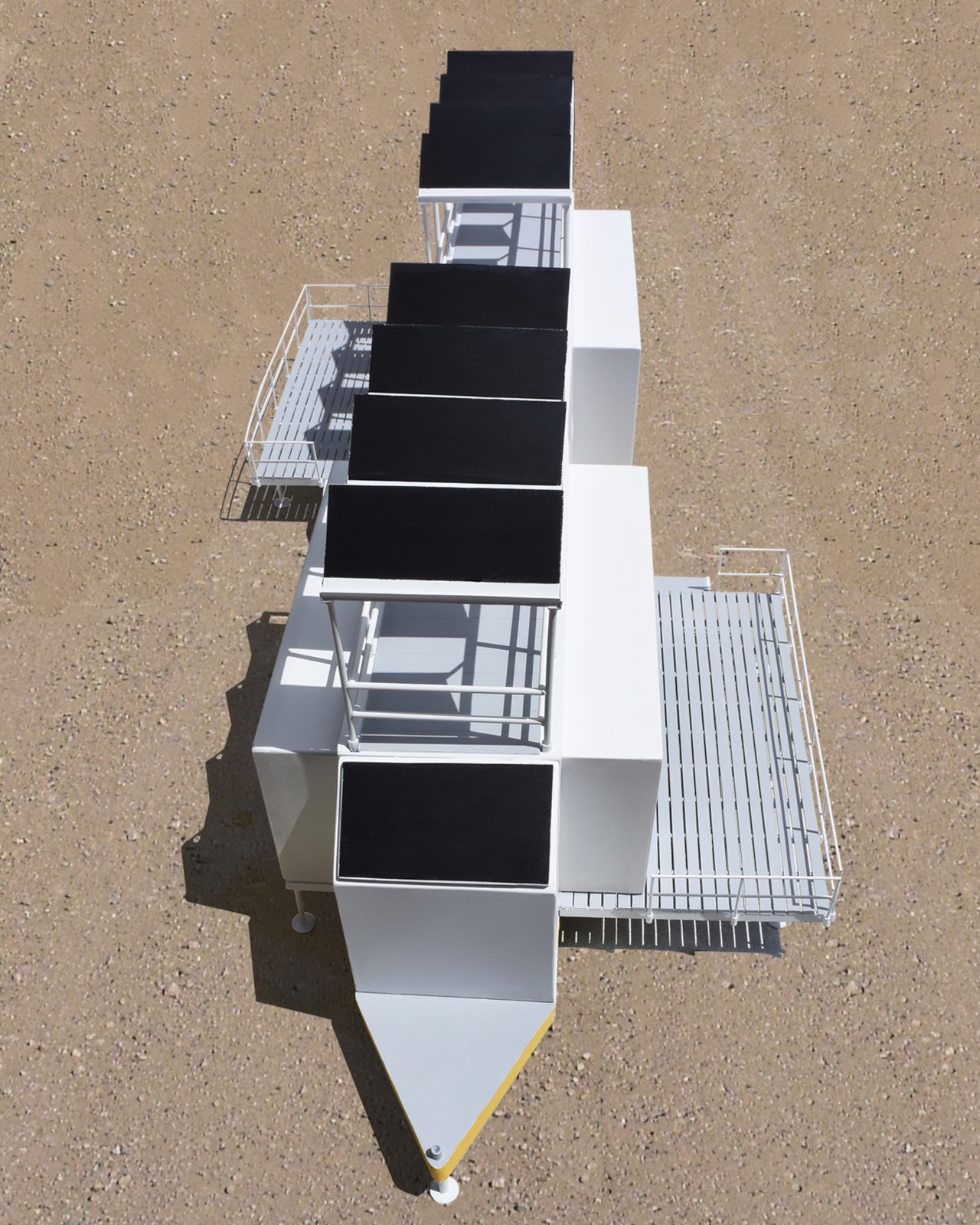
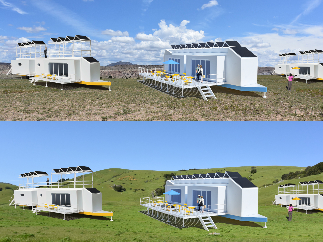
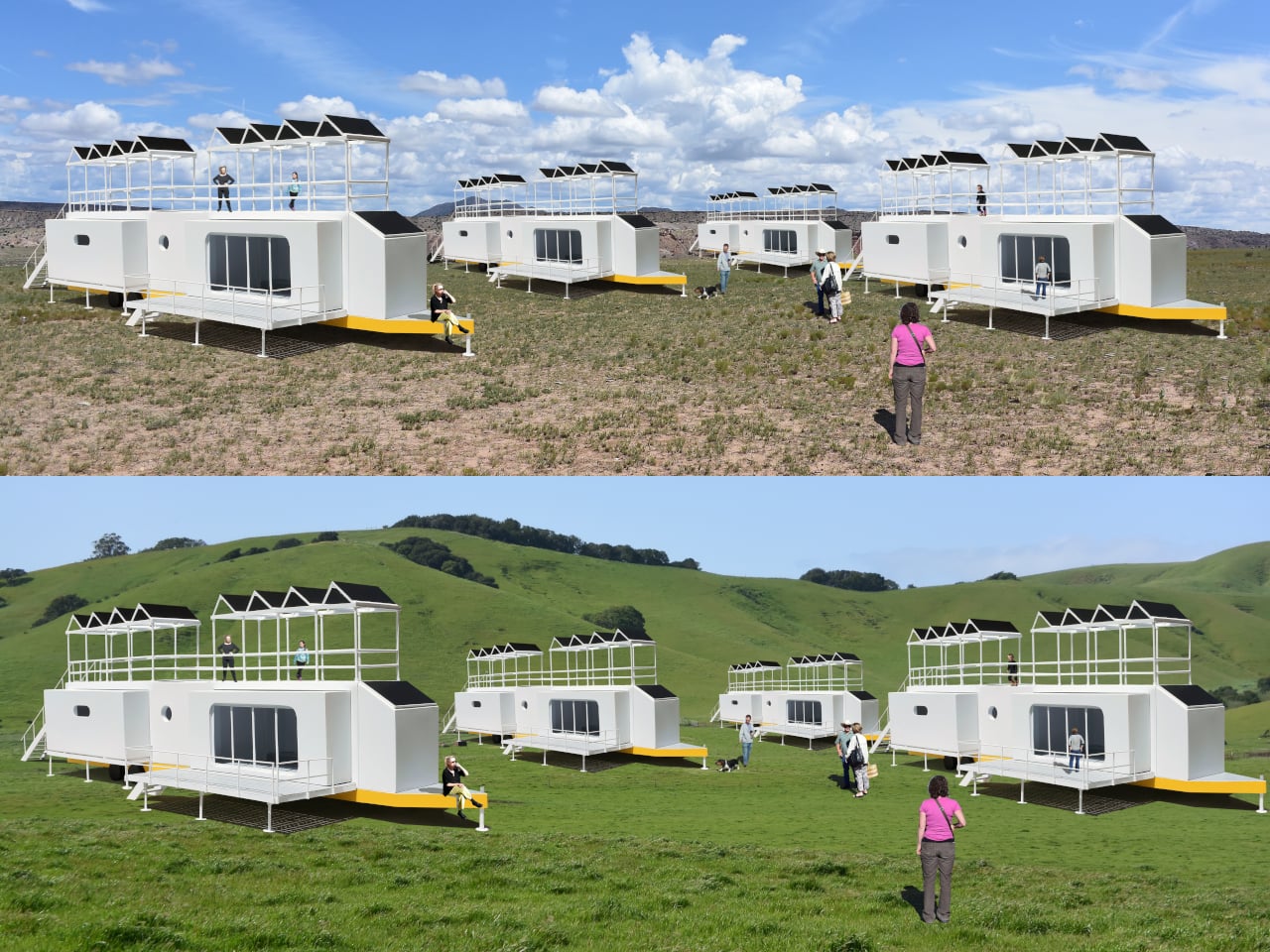
The Mobiltels concept approaches hospitality from a completely different direction. Rather than building a permanent structure and hoping the location is compelling enough, each Mobiltel unit is designed to fold into a compact, truck-towable trailer, be driven to wherever the landscape is most remarkable, and then unfold into a functioning luxury accommodation. When the stay is over, it packs up and leaves without leaving much evidence behind.

Designer: Michael Jantzen

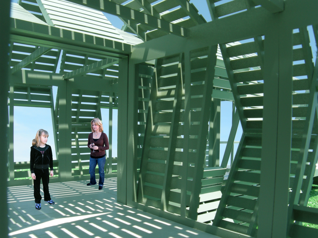
Three distinct unit types make up the proposed resort ecosystem. The first is the guest accommodation module, which deploys into two full hotel-style rooms, each with a private bath and its own private deck. The roof extends into a communal deck shaded by solar panels that generate the electricity to power the unit, while a second panel mounted on the exterior heats the water. The entire structure, decks and all, folds back into a trailer tight enough to tow down a highway.

The second unit is a solar-powered café and coffee shop that unfolds to reveal four outdoor dining decks with full kitchen and restroom facilities. The third is a large shade structure intended for gatherings, private events, and communal lounging, built as a striking open lattice that collapses into a flat-load trailer for transport. Additional unit types can theoretically follow the same logic, meaning a full resort amenity list could be assembled and disassembled as needed.

The off-grid energy system is what makes the location independence real rather than theoretical. Every unit generates and manages its own power and heated water from the sun, which means no connecting to local utilities and no requiring a serviced campsite. A Mobiltel cluster can go where a road exists and terrain is flat enough to level a trailer, which is a much lower bar than conventional construction.

The environmental argument is also embedded in the temporariness. A permanent hotel in a wilderness setting modifies that setting permanently. Roads are built, foundations are poured, and the land around the structure gradually changes to accommodate the infrastructure. A Mobiltel unit lands on a site for a season, its occupants absorb the specific quality of that place, and it leaves. The landscape recovers. The next location gets the same treatment.

There’s something quietly subversive about applying a mobile home chassis to a luxury hospitality concept. Mobile homes occupy a very specific cultural position, one that doesn’t usually include rooftop communal decks and solar-heated private baths. The Mobiltels concept borrows the transport logic of one and applies it to the aesthetic ambitions of the other, with the result that a high-end resort becomes as relocatable as a food truck. The result sits somewhere between architecture and expedition equipment, which is probably exactly the right place for it.

The post The Luxury Hotel Concept That Works Like a Food Truck for Wilderness first appeared on Yanko Design.

  •  

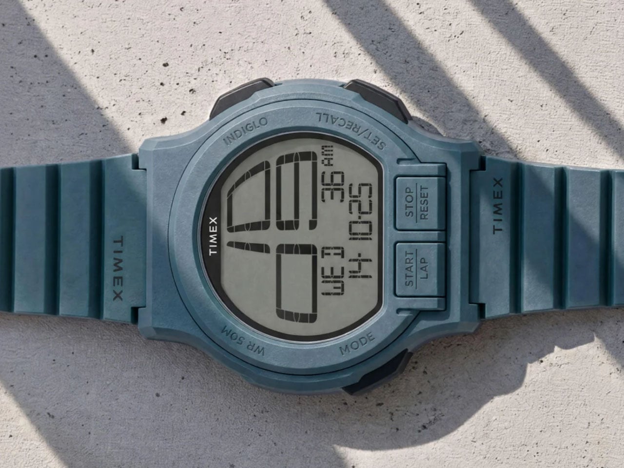
The new Timex Retroware Digital Watch Just Rekindled My Childhood Memory

When I was growing up in the 1990s, there was a Timex I would kill for. If you remember the Timex Men’s Ironman Triathlon, you’d know what I mean. Not only was it the first to introduce the Indiglo backlight, but it was also the dominant sports watch, slayed with its rugged resin case. I owned one briefly before my brother, who had more muscle than me back then, coerced it out of my wrist to his advantage one day.

I had, in the last three decades, almost forgotten about it, but the moment the new Timex Retroware Digital showed up on my screen this morning, some memories were definitely rekindled. Thriving on the old digital sports watch charm of the ‘90s, the Retroware Digital is nowhere close to the Ironman for me, but it has its own retro vibe, which will find takers. Me… maybe, maybe not!

Designer: Timex

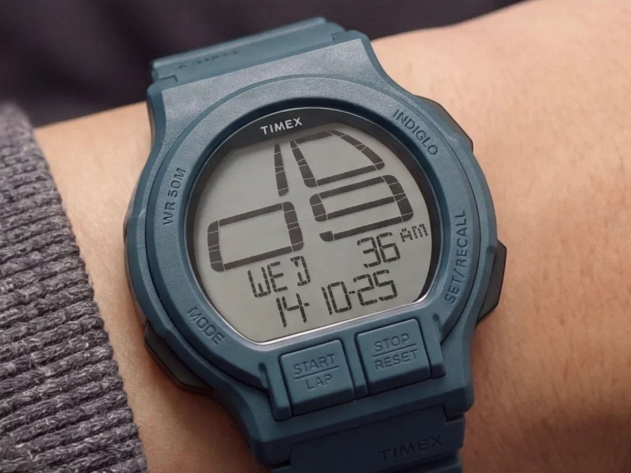
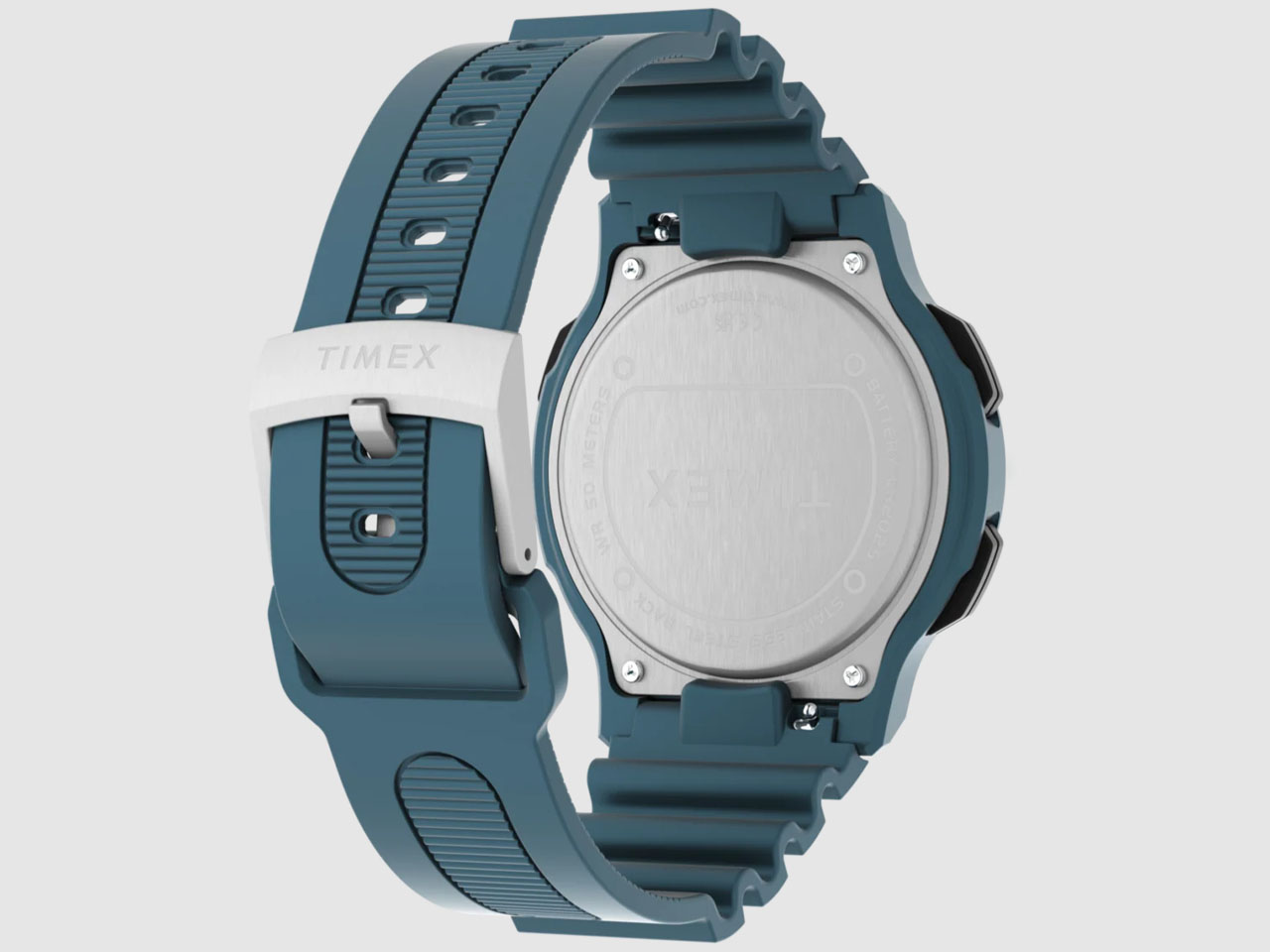
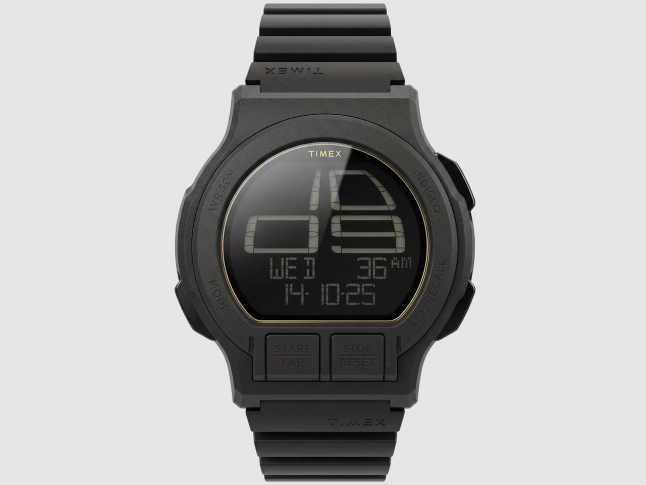
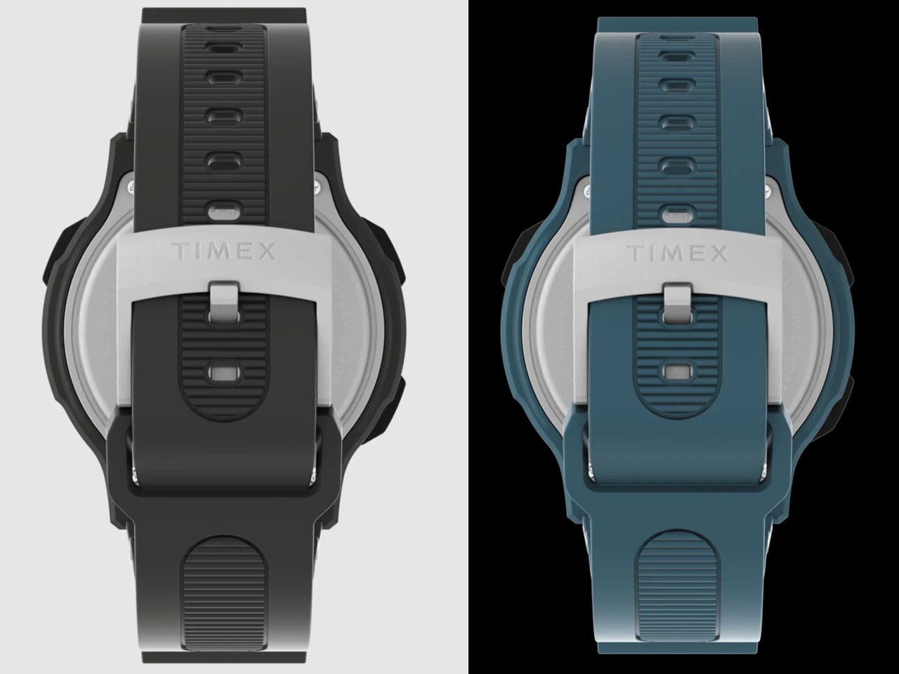
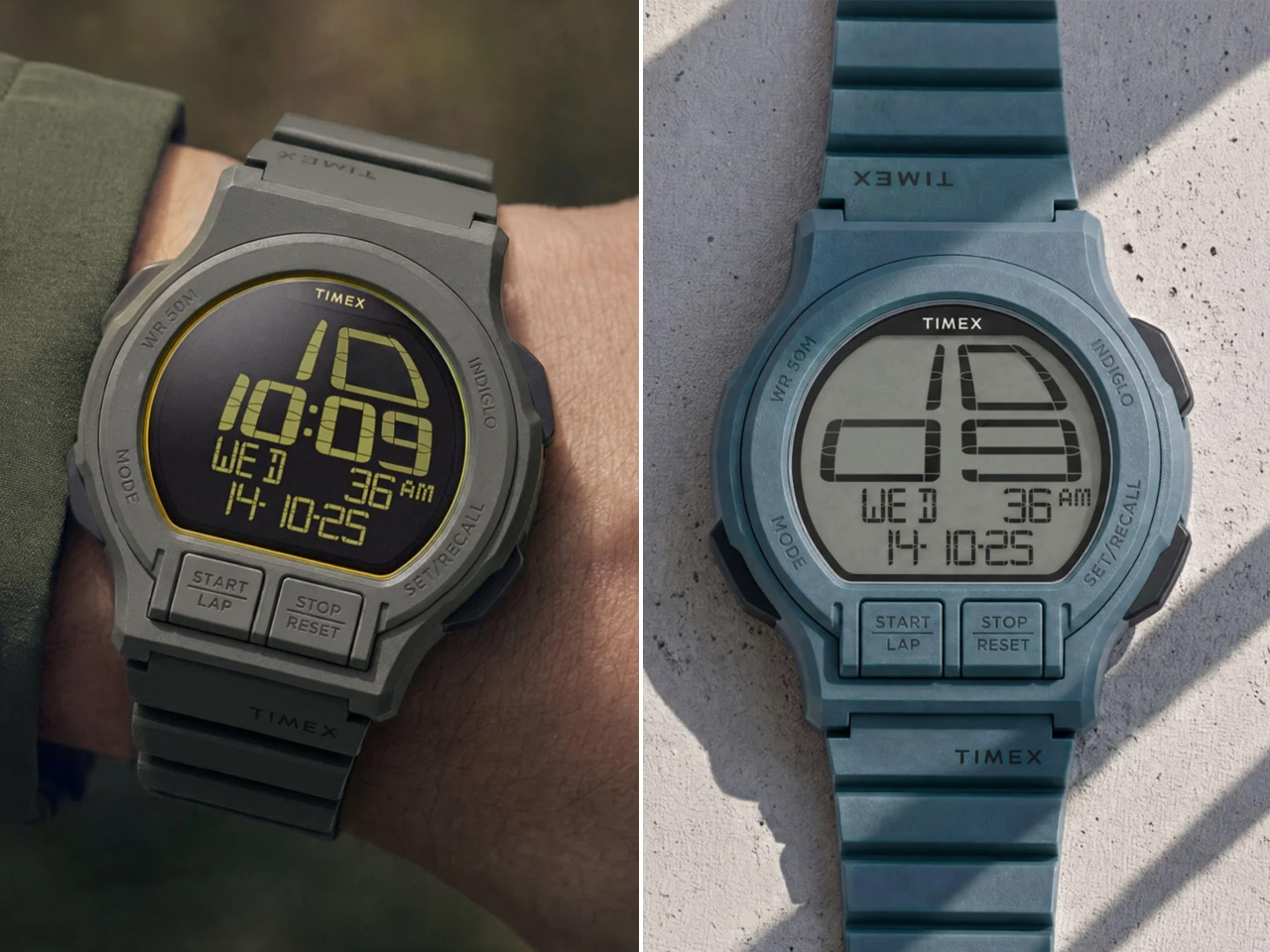
Taking nothing away from the new Timex sports watch, let me walk you through what’s changed in approach for the company and how this one, with retro looks, has a way forward to chime with Gen Z. It starts right at the bold and oversized display featuring huge, curved numerals that occupy the larger part of the dial. And this display we are talking about is not small by any means. It’s set in a 46 mm lightweight resin case. The size gives the watch a strong wrist presence, while the curved numerals remain arguably easy to read.

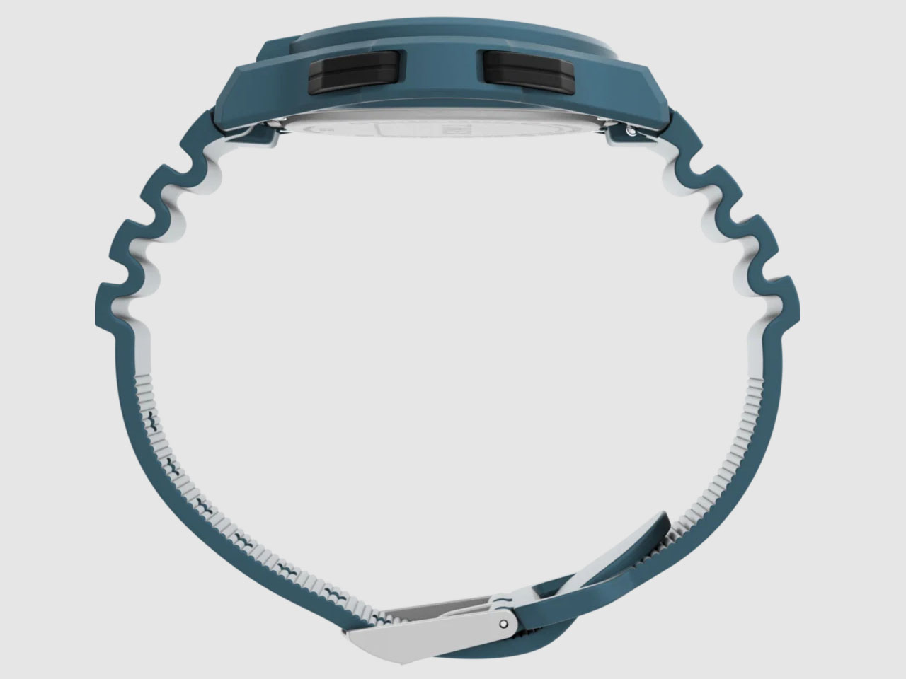
The Retroware Digital watch has a large case, but it’s not very thick, even for not-so-big wrists. It measures only 11 mm high and the 46 mm case ensures the distance from lug-to-lug is a large 50 mm. So, you definitely have a great Timex you’re dealing with. That said, it’s packed with features you’d appreciate whether you’re an ‘80s kid or a young athlete setting pace on a 400-meter track.

The watch is equipped with a chronograph and has a timer to make sure you’re never late for practice. The retro charm on the dial is rekindled by the Indiglo backlight. For the unaware, INDIGLO (how it’s stylized) was developed by Timex in 1992 for the, yes, Ironman Triathlon. It is an electroluminescent blue-green night light onboard that allows a wearer to tell the time in low light conditions with the push of a button.

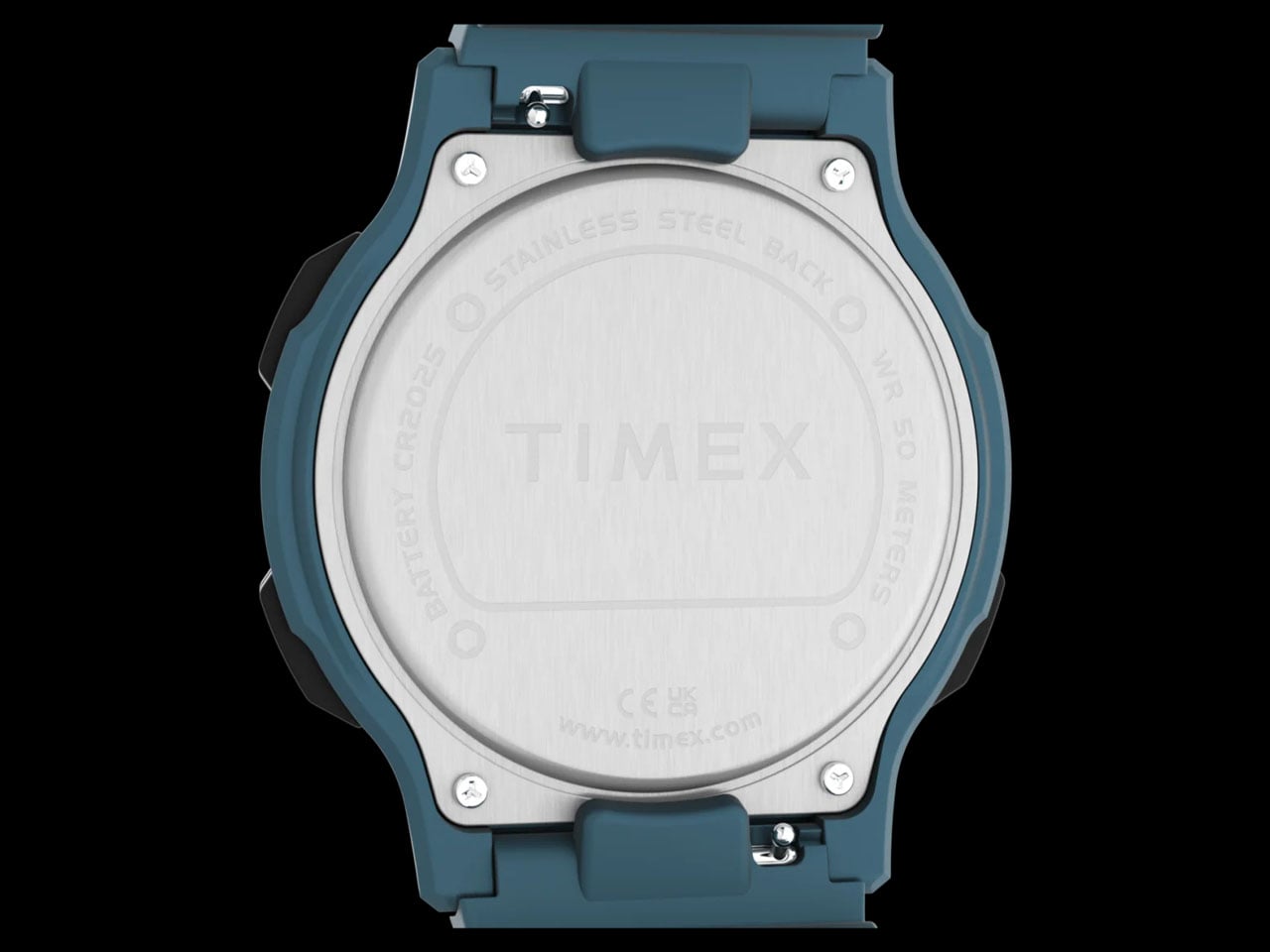
The large display of the Timex Retroware perpetually ticks with the power of a quartz digital movement inside, which is driven by a CR2025 battery under the hood. The watch is 50-meter water-resistant, so you can definitely take it for a light swim in the pool or to shower later. Don’t go deep diving with it or try and set the stopwatch underwater. If you’re interested, Timex offers the Retroware Digital watch in two colors, blue and green-gray, with matching resin straps for $149.

The post The new Timex Retroware Digital Watch Just Rekindled My Childhood Memory first appeared on Yanko Design.

  •  

Phones Turn Reminders Into Distractions, This Magnetic Display Won’t

Smartphones have made information permanently accessible, but that accessibility comes at a price. The same device that shows you a reminder also delivers a notification for something unrelated, which leads to one more app opened, one more five-minute detour, and one more afternoon where the task you meant to remember sits unfinished somewhere in a mental stack. The problem isn’t access to information. It’s the medium through which it arrives.

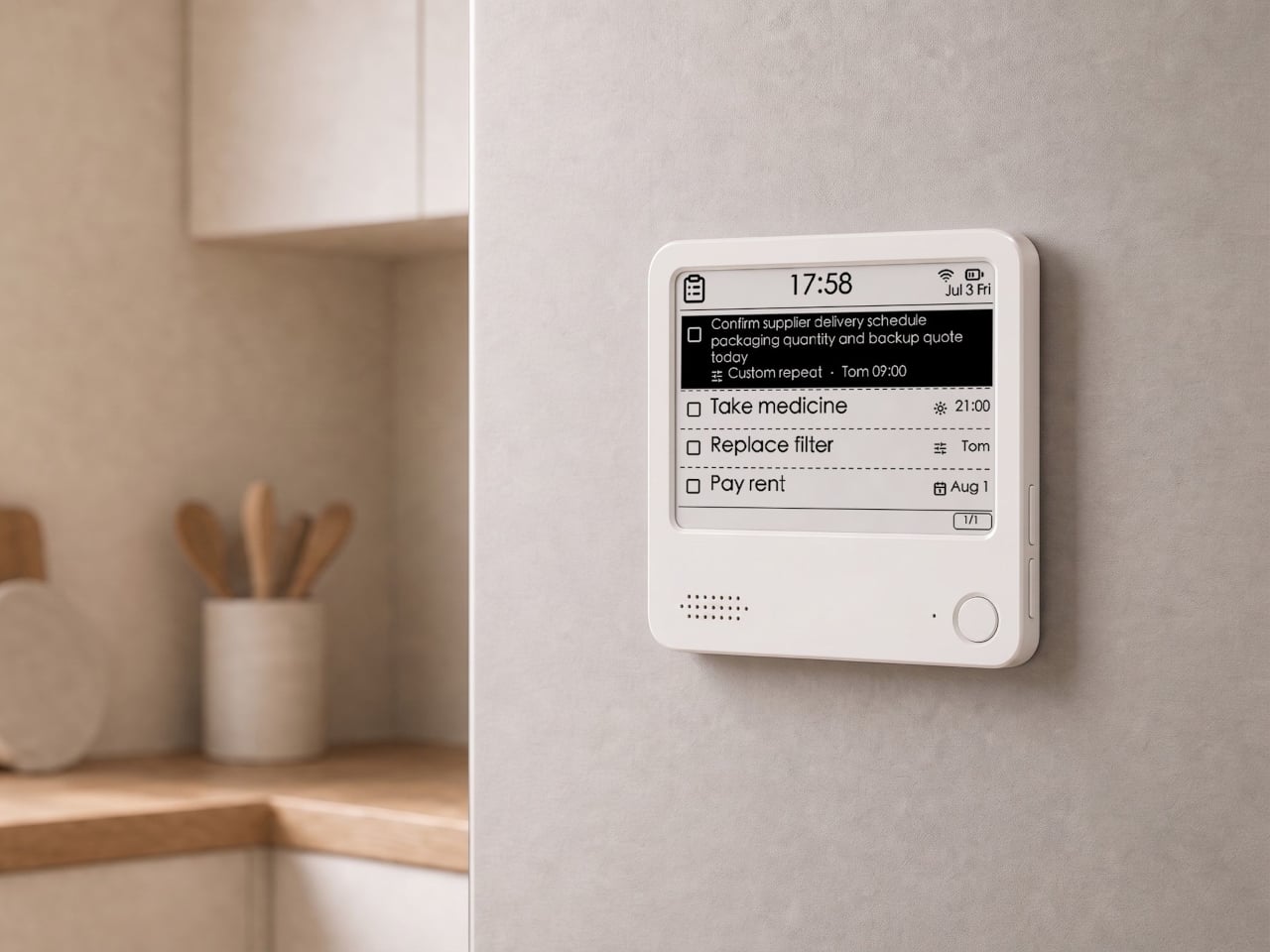
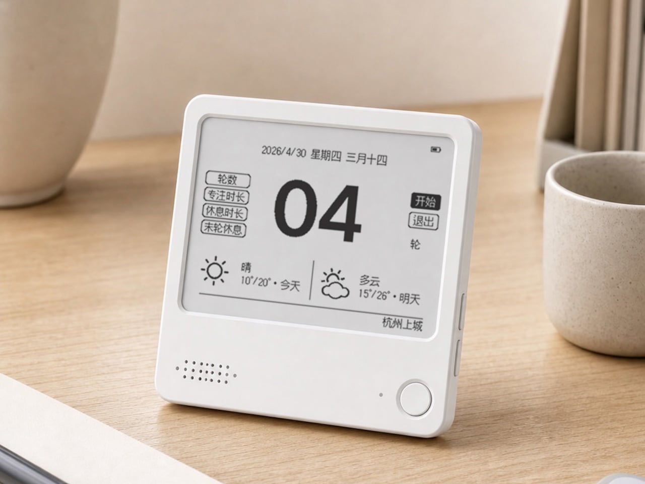
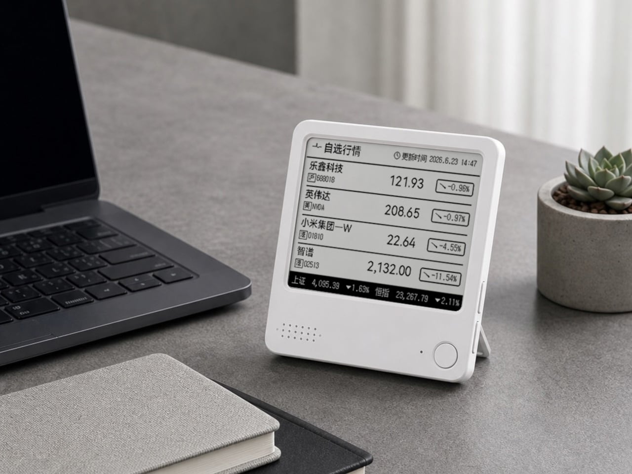
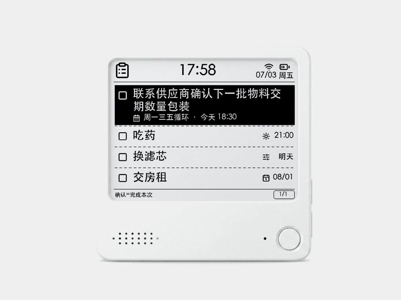
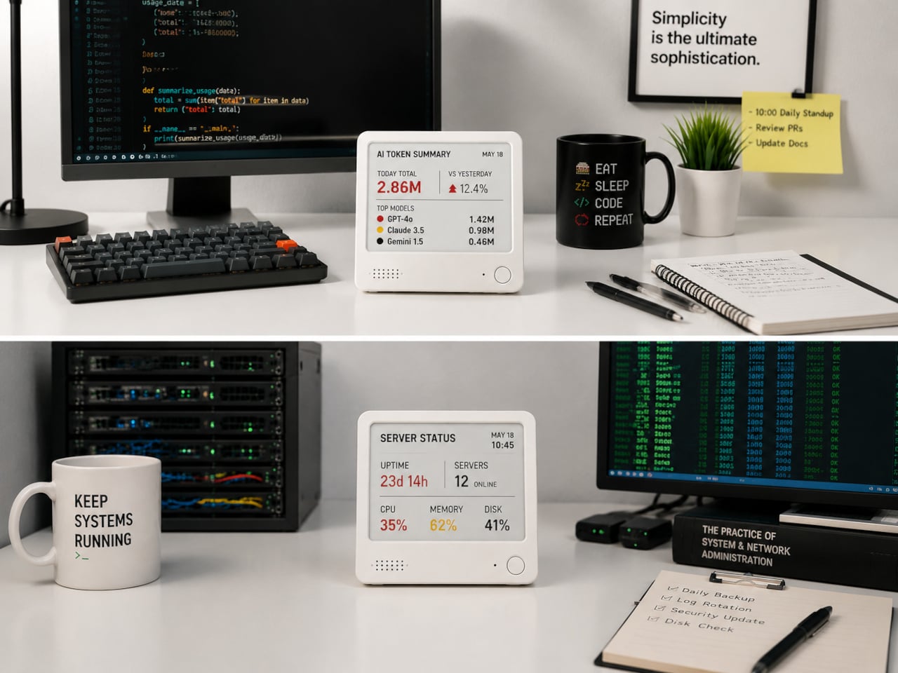
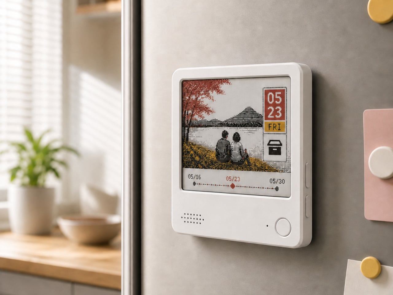
The ZecTrix Note 4 approaches that with a different premise: what if the display that shows your tasks doesn’t connect to your attention the same way a phone screen does? It’s a 4.2-inch e-paper smart display, about the size of a palm, that attaches magnetically to a metal surface and stays there showing whatever you most need to remember, using almost no power to do it.

Designer: ZecTrix

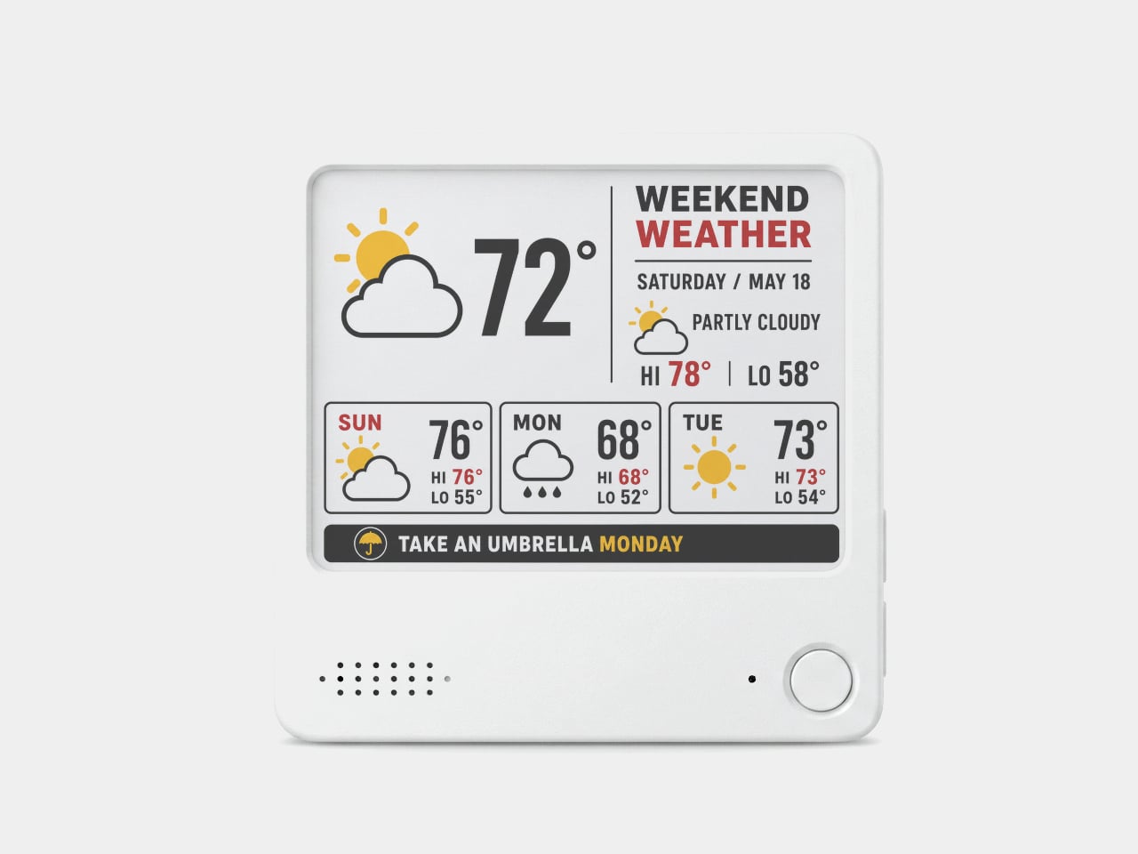
The interaction model is deliberately minimal. Press the physical button, speak your task or reminder, and the device converts that into text and adds it to the display. The built-in AI voice assistant handles the transcription and task management, and the e-paper screen holds whatever it’s showing without any power draw between updates. The display also handles weather, clocks, focus timers, handwritten notes, images, and custom templates.

Hardware underneath is solid for something this compact. An ESP32-S3 dual-core processor with 8 MB of PSRAM and 16 MB of flash handles the AI processing and connectivity, backed by a 2,000 mAh battery, 2.4 GHz Wi-Fi, Bluetooth 5.0, NFC, a speaker, a microphone, and a USB Type-C port for charging. GPIO expansion is also available, which opens the platform to custom hardware additions.

The 97mm x 97mm x 8.75mm square chassis comes in three enclosure variants: an injection-molded Minimal Premium Edition designed for clean desk or kitchen wall placement, a standard Everyday Edition for DIY-minded users, and a Color Edition with open-source 3D model files for those who want to print their own. The magnetic backplate sticks firmly to any suitable metal surface without adhesive or mounting hardware.

For users who want more than a black-and-white display, there’s the Note 4C, which replaces the monochrome panel with a four-color E Ink screen that adds red and yellow to the palette. It runs on the same hardware platform but ships without the consumer AI firmware, positioning it instead as an open development device for people with ESP32 experience. The color panel is slower to refresh, typically over ten seconds per full update, making it better suited to status labels, family photo cards, or API dashboards that update occasionally rather than continuously.

The two products are deliberately distinct rather than tiered versions of the same thing. The Note 4 is a finished product with a lifetime AI voice service included; the Note 4C is an open starting point for a custom build. Both share the same physical form, so the choice comes down to how much of the software someone wants to supply themselves.

The post Phones Turn Reminders Into Distractions, This Magnetic Display Won’t first appeared on Yanko Design.

  •  

This Umbrella Is Actually a 500-Year-Old Korean Hat in Disguise

Anyone who has seen K-Pop Demon Hunters or an episode of a Korean historical drama is familiar with what a gat is. Even if you don’t know what it’s actually called, it’s pretty recognizable: the black hat with its cylindrical crown and wide, dramatic brim that sometimes hides the eyes or even the entire face. It was traditionally worn by men of high social standing during the Joseon era, serving as a marker of Confucian values, refinement, and status. It’s rarely worn now unless someone is shooting a drama or attending some sort of costume party, though the gat did have a major pop culture moment thanks to Netflix’s Kingdom, where it became instantly iconic worldwide.

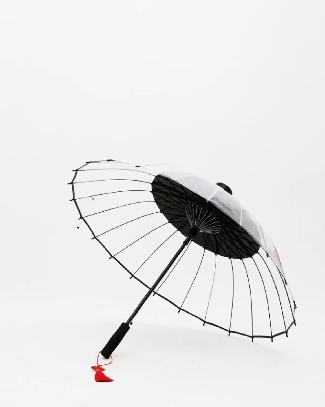
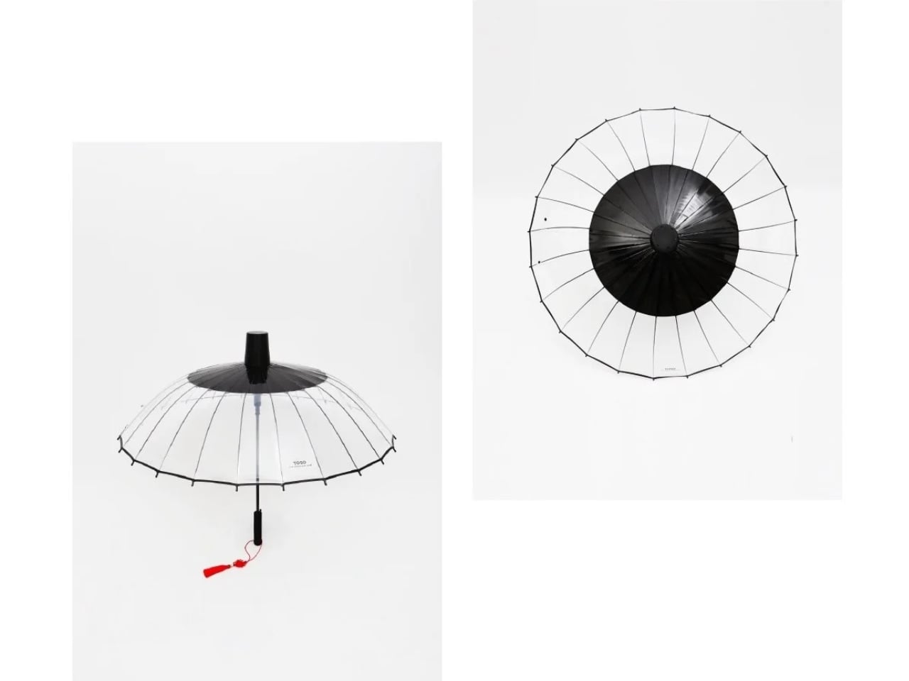
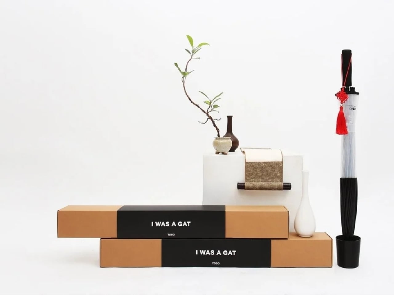
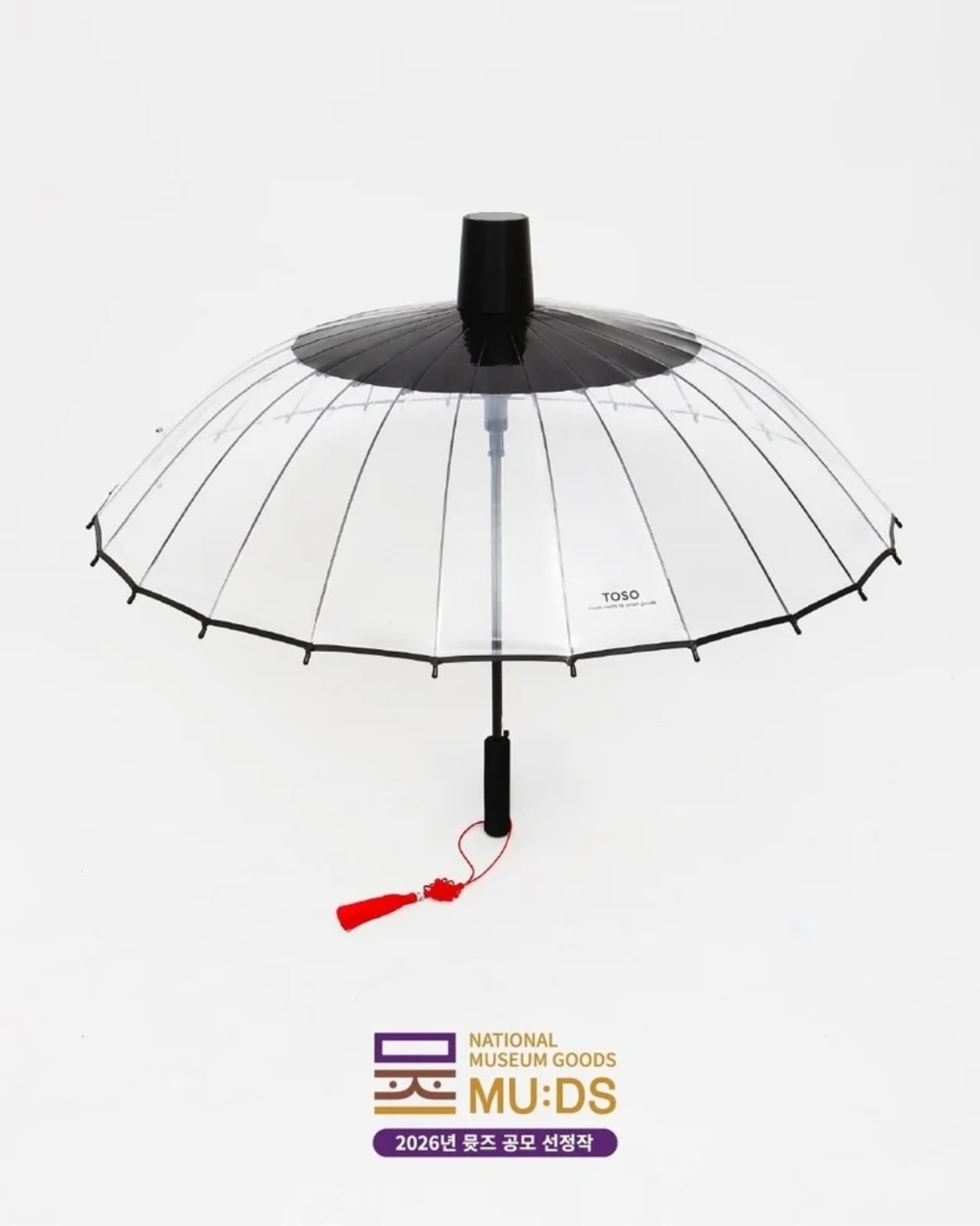
The National Museum of Korea called for designers to reimagine the gat for a modern setting. Design studio TOSO created the winning entry, the Gat Umbrella, which is exactly what it sounds like. This is part of the MU (the official merchandise brand of the National Museum Foundation of Korea) competition that invites designers to reinterpret historical objects into something that can actually be used in modern times. It’s a brilliant initiative that bridges Korea’s rich cultural heritage with contemporary everyday life.

Designer: TOSO

The Gat Umbrella looks like a regular umbrella when folded, but when opened, it looks like you’re standing under a huge gat, with the added bonus of an actual canopy to keep you dry. It’s around 33 inches long and has a width of 1,050 millimeters when opened. The canopy is made from PVC with a fiberglass-reinforced frame, its tip from polypropylene, and the handle from EVA material. The deep black canopy is a direct callback to the traditional color of the gat, and the proportions of the brim have been carefully scaled to capture that wide, commanding silhouette. When held up against a grey sky, you can almost picture the Joseon-era scholar it was inspired by.

Aside from being a status symbol, the original gat was also used to protect its wearer from the sun, rain, and wind, which makes this reimagining feel even more intentional. Anyone who has watched enough K-dramas knows those dramatic scenes where characters brave storms with a gat firmly in place, rain streaming off its wide brim. So this transformation of the headwear is still a clever nod to its origins. It’s just more modern looking and has the added protection of a proper canopy, since the elements now tend to be a lot more mercurial.

What makes the Gat Umbrella especially appealing is how it straddles the line between functional product and cultural artifact. It’s not just a novelty item you display on a shelf. It’s something you actually take out on a rainy Tuesday and suddenly feel like the most stylish person on the street. There’s something deeply satisfying about a design that takes centuries of history and makes it wearable (or in this case, holdable) in the most practical way possible. And given the global reach of Korean culture right now, something tells us this won’t stay a niche item for long.

It also arrives at a moment when the global appetite for Korean culture is at an all-time high. From K-dramas to K-pop to Korean food, the world is paying attention, and the Gat Umbrella is exactly the kind of conversation starter that lets people engage with that culture in a tangible, everyday way. It’s not just merchandise; it’s a story you carry with you. The kind of thing that makes strangers stop you in the street and ask where you got it.

Whether you’re a K-culture enthusiast, a design collector, or simply someone who appreciates carrying a piece of history through a rainstorm, this is the kind of purchase that feels both indulgent and meaningful. It’s proof that heritage doesn’t have to stay locked behind glass. Sometimes, the best way to honor the past is to take it out into the rain.

The post This Umbrella Is Actually a 500-Year-Old Korean Hat in Disguise first appeared on Yanko Design.

  •  

5 Home Objects That Look Like They Belong in a Design Museum but Cost Less Than a Dinner Out

The design museum makes one quiet argument. Certain objects deserve to be looked at, and how a thing is made can matter as much as what it does. Most people accept this on a Saturday afternoon in front of a Noguchi lamp or an Eames chair, then go home to a shelf full of things nobody chose with the same intention. That gap is worth closing, and it does not require a renovation budget.

These six objects cost somewhere between a round of drinks and a dinner for two. None are functional in the way a charging cable is functional. They are functional in the way a good room is, changing how a space reads and getting noticed before anyone can articulate why. That quality has very little to do with price and everything to do with knowing where to look for it.

1. Carte Blanche Ceramics

Dutch designer Annebet Philips began this collection in cardboard rather than clay, cutting shapes with deliberately uneven edges and treating the paper prototype as the design language itself rather than a step to be discarded. Belgian brand Serax carries the result through to porcelain: a coffee and tea service that has since grown to include plates, a breakfast bowl, an egg cup, and a salt and pepper set. Every piece started as a childlike cutout on a blank page. Nothing about that origin was smoothed away in production.

What makes each piece genuinely strange is that it reads as a drawing of itself. Hand-painted black lines trace every fold and seam, giving cups and saucers the flattened quality of ink on paper rather than fired ceramic. Photographed straight on, a cup collapses into what looks like a quick sketch, the handle reading as a doodled loop rather than a ceramic ear. Everything is microwave and dishwasher safe, which keeps the concept in daily use rather than retreating to a shelf nobody touches.

What we like

  • The trompe-l’oeil effect holds in person, not only in photographs
  • Dishwasher safe at a design level that rarely permits it

What we dislike

  • Sold through Serax stockists rather than one direct channel, which makes sourcing specific pieces more work than it should be
  • Hand-painted lines vary slightly between pieces, which is part of the concept but can feel inconsistent in a matched set

2. ECHO Ceramic Speaker

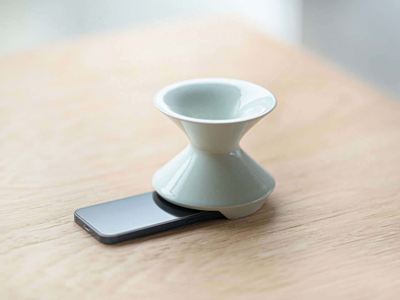
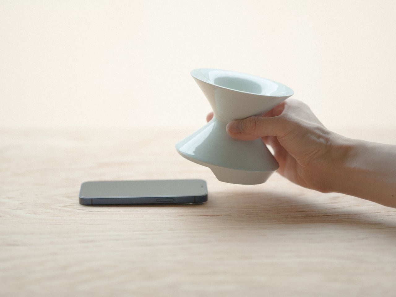
Most speakers announce themselves. They sit on surfaces with blinking lights and trailing cables, with the general suggestion of being placed there temporarily. Kenji Abe’s ECHO arrives from the opposite direction. It is a glazed ceramic chamber built on the acoustic logic of a seashell and a cupped hand that looks exactly like a small vase. Slide a phone underneath, and the cavity carries audio outward in soft, diffused waves. No power. No pairing. Nothing to charge or set up.

The decision to use ceramic was not incidental. Ceramic belongs to the visual grammar of a home, the language of objects that have simply always been there, and ECHO uses that familiarity to disappear into a room entirely. A guest would not identify it as a speaker. The glazed surface catches light the way pottery does, and when the phone is gone, it stays on the shelf with the composure of something that was never trying to perform in the first place.

What we like

  • Looks like a ceramic piece because it is one, not a speaker wearing a vase disguise
  • No charging, no pairing, no batteries to deplete or replace

What we dislike

  • The amplification is warm and subtle rather than loud, better suited to a quiet kitchen than a busy room
  • Designed for smartphones placed directly underneath, which limits where in a room it can be used

3. Petal Vase

Every day, thousands of tons of cut flowers are incinerated at flower markets because they reached the end of their shelf life before a buyer arrived. Rebloom Studio, a Korean design practice, collects those discarded blooms, processes them into pulp with Korean paper pulp and a natural binder, and molds the result around an interior glass cylinder. The finished piece is a vase made entirely from flowers that never got the chance to be seen by anyone.

No two Petal Vases look alike. The flowers used to make each one determine its final color, texture, and edge profile. The jagged rim, the petal compression visible in the walls, the slight asymmetry in the silhouette- all of it is preserved deliberately rather than corrected in finishing. When the vase reaches the end of its life, the biodegradable shell returns to the earth. It is one of those rare objects where the material story requires no explanation because you can already see exactly where it came from.

What we like

  • Every piece is genuinely one of a kind, not in the marketing sense but the literal one
  • The biodegradable origin is visible in the object itself rather than printed on the packaging

What we dislike

  • Availability depends on Rebloom Studio’s production schedule, and stock from a small Korean studio can be intermittent
  • The rough, irregular surface is the whole point, but buyers expecting a conventional smooth ceramic finish may need to adjust

4. Delicato Tray

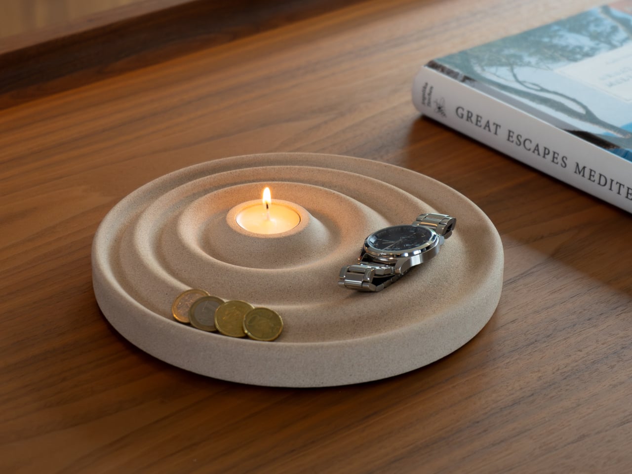
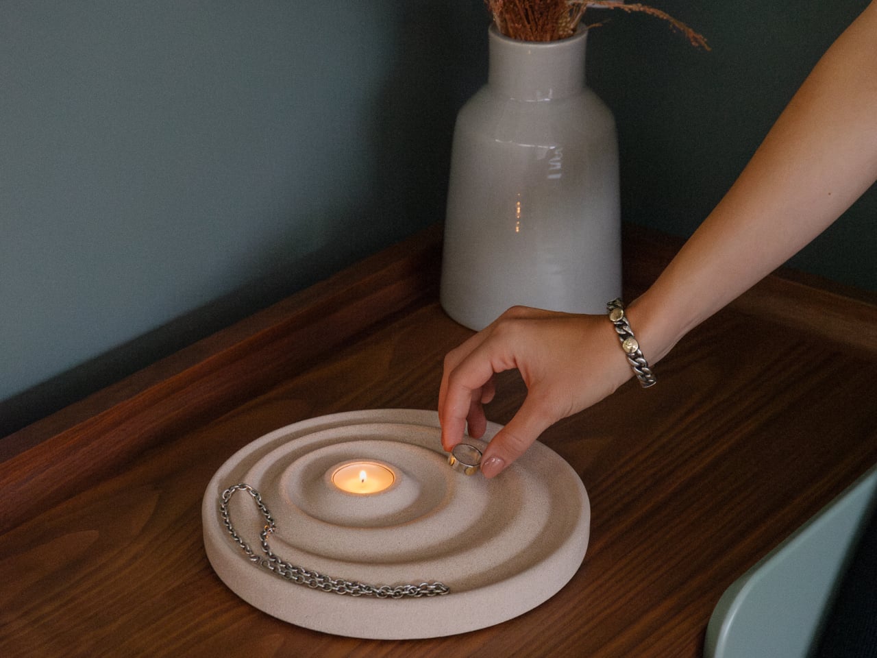
The entryway surface tells a familiar story, and it is rarely flattering. Keys land wherever there is space, coins scatter to the edges, a watch ends up beside a receipt from last week. Joao Teixeira’s Delicato Tray for Oftwise is cast from Jesmonite AC730, a water-based, fire-rated stone composite, in the form of a rippled disc. The concentric waves are asymmetric by design: wider at the outer ring for keys and glasses, tighter toward the center for rings and coins.

At the center of those ripples sits a recessed pocket sized for a tealight candle, turning the daily ritual of dropping your things at the door into something closer to a ceremony. Because the tray is hand-cast, no two are identical. Small air bubbles, subtle texture variations, and minor color shifts are natural byproducts of the process. The result is two kilograms of warm sandy stone that makes a surface look deliberately arranged before anything has been placed on it at all.

What we like

  • The hierarchy is built into the form itself, so organization becomes almost unconscious
  • Hand-cast production means no two pieces are identical, in the way that actually matters

What we dislike

  • At €235 it sits at the very top of the dinner framing, and that math depends on which dinner you have in mind
  • Currently available in one color, which limits how it integrates into darker or cooler interiors

5. Luna

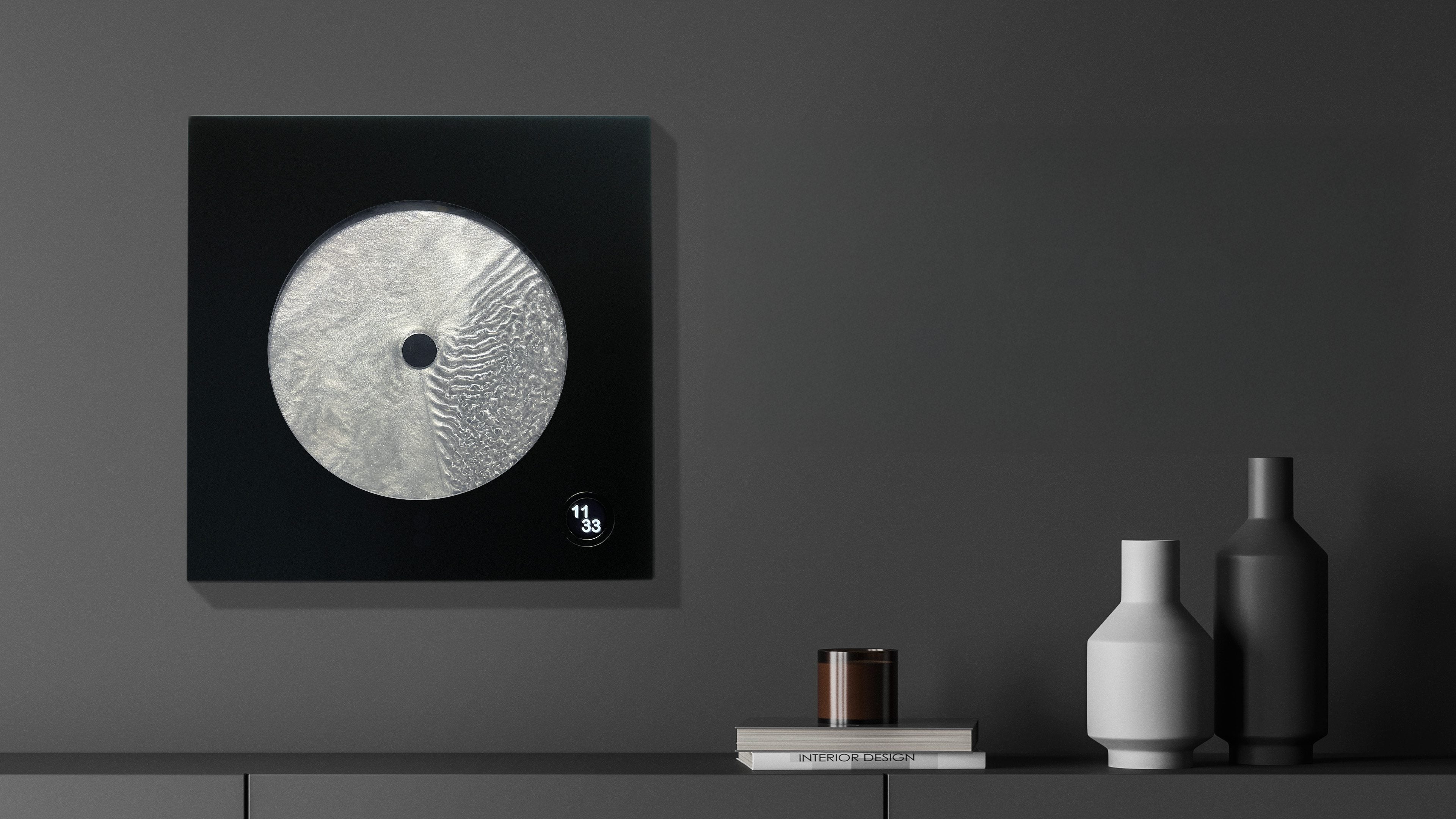
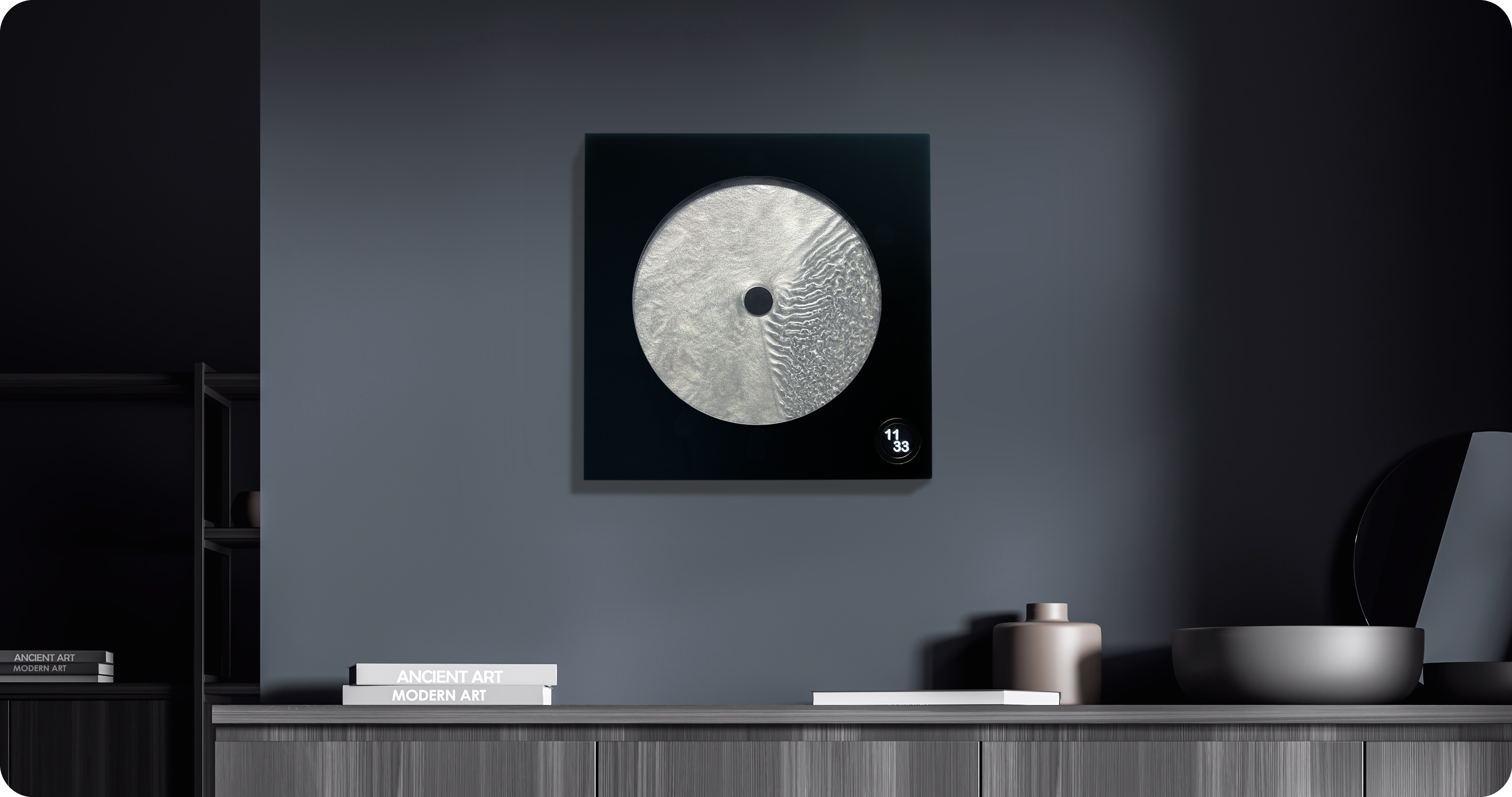
Robert Spillner spent years building components for Formula 1 teams before reversing the entire premise of his career. Instead of measuring speed, he built an object that stages time. Luna is a 400 x 400mm wall piece framed in matte black solid wood with a cast acrylic pane at its center. Inside, a single pointer moves through Zero Flow Technology, Spillner’s proprietary fluid made from distilled water, additives, micro-particles, and a small quantity of genuine lunar dust. Behind the pointer, turbulent patterns mark what has passed. Ahead of it, the liquid sits completely undisturbed.

The exact composition of the fluid is deliberately undisclosed, and that is the right call. The lunar dust is certified and billions of years old, documented with a certificate of authenticity that ships with each piece. Every Luna is signed, numbered, and limited to 99 per year, all made on demand in Germany. A small LCD touchscreen adjusts time and brightness without competing visually with the fluid. Spillner describes it as an art object with a time function, and the order of those words is correct.

What we like

  • The past-and-future visual logic is legible in the object itself, not only in the written description of it
  • Lunar dust certification and a limit of 99 per year make each piece traceable and unrepeatable

What we dislike

  • No public price is listed; the limited edition, handmade production profile suggests it sits above the other objects in this list
  • The 400mm square format demands a wall that can hold it as a singular focal point rather than one object among several

Editor’s Choice: Japanese Lantern Candle

The paper lantern is one of the oldest resolved problems in lighting design. How do you carry warmth from a candle flame into a room without losing it to the hardness of the fixture? Japanese designers worked through that question for centuries and arrived at a form that required almost no further development: a collapsible structure of thin ribs and translucent paper that diffuses candlelight into a soft, directionless glow.

What separates a well-made Japanese lantern from a decorative replica is the quality of light it produces and how it behaves in a room. Warm and sourceless, candlelight filtered through translucent paper fills a corner the way natural light from a small window does, without the hard edge of a focused lamp or the flatness of overhead lighting. On the floor beside a chair or a side table, it becomes the kind of object people notice and comment on before they have thought to ask what it is.

Click Here to Buy Now: $70.00

What we like

  • The quality of diffused candlelight it produces is genuinely different from any other fixture in a room
  • Stores flat, which matters in a small apartment where every permanent object has to earn its place

What we dislike

  • Works best as ambient lighting rather than a primary source for reading or close work
  • The candle paired with it needs to suit the scale and material to get the full effect

The Best Things in a Room Are the Ones Nobody Can Quite Explain

None of these objects ask for much. A shelf, a corner, a spare stretch of counter. They do not need a gallery to earn the attention they receive. What they share is the quality of being genuinely chosen, the sense that someone worked through a problem not just until it was functional but until it was right. That difference is immediately visible and, unlike most things in a home, it does not fade with time.

The museum argument is that certain objects deserve to be seen. These six make the same case from a kitchen counter, an entryway shelf, a bedroom wall. The price point is almost beside the point, though it helps. What matters is that buying thoughtfully and buying well tend to produce the same result: a home that feels assembled by someone who paid attention, rather than one that simply accumulated things over time.

The post 5 Home Objects That Look Like They Belong in a Design Museum but Cost Less Than a Dinner Out first appeared on Yanko Design.

  •  

The $33 Box That Locks Your Phone and Judges You for Opening It Early

Screen time management has spawned an entire industry of apps, built-in focus modes, notification filters, and weekly usage reports that most people glance at and promptly ignore. The fundamental problem with all of them is that they live on the same device you’re trying to avoid, which keeps willpower in charge of the whole arrangement. And willpower, predictably, tends to lose that particular argument somewhere around the third notification.

The Sonic Digitox The Routine sidesteps that problem entirely by making your phone physically unreachable for as long as you decide. It’s a timed lock case with no app to disable, no passcode to talk yourself into entering, and no settings menu to rationalize your way through. You put the phone in, set the lock, and that’s the end of your access until the timer says otherwise.

Designer: Sonic

Two lock modes handle different approaches to the problem. Routine Lock works on a schedule, letting you define repeating daily windows during which the case locks automatically and signals each transition with light and sound. If 11 PM to 7 AM is meant to be phone-free, the case enforces that without asking for your cooperation every night, which is precisely the point.

Timer Lock handles the more immediate situation where you need to focus right now, without a preset schedule. You set a countdown of up to 99 hours and 59 minutes, and the phone stays sealed until it runs out. For a study session, a focused work morning, or a dinner where nobody at the table needs to be somewhere else digitally, it removes the option before the habit has a chance to argue back.

Neither mode traps you completely. An emergency reset function exists for genuine urgency, but it isn’t quiet about it. Triggering it sounds a one-minute alarm and leaves a RESET mark displayed on the case for 24 hours afterward. The friction is deliberate, designed to make the difference between an actual emergency and a momentary craving feel tangible rather than theoretical.

Two additional modes round out the four-mode system for lighter use. Time Display shows the time without any lock, while a Timer mode runs a count-up or countdown without physically securing the phone. The case also includes a goal sticker and a smartphone contract form, a pairing that makes it a practical tool for parent-child agreements around device time, where putting terms in writing and then sealing the phone inside creates a layer of accountability that app-based controls don’t quite replicate.

The body is ABS plastic with a polycarbonate lid, running on three AAA batteries, and the whole thing measures approximately 190mm x 70mm x 170 mm. It comes in white, blue, and pink, and was recognized with a category award at the 2026 Japanese Stationery Awards, which is about as specific an endorsement as a phone lock case can hope for.

There’s a refreshing bluntness to what the Digitox offers. Most products in the digital wellness space treat phone overuse as a behavioral settings problem, one more toggle away from being solved. This one treats it as a custody problem, and the solution is handing custody over to a box that doesn’t negotiate. At roughly $33, it costs less than a single month of most productivity apps and requires no subscription to keep working.

The post The $33 Box That Locks Your Phone and Judges You for Opening It Early first appeared on Yanko Design.

  •  

Motorola’s Patent Isn’t a Phone You Wear, It’s a Watch You Unfold

The idea of merging a smartwatch and a smartphone into a single device has been floating around the industry for years, mostly because the obvious inconvenience is right there: two screens on two separate devices, one tiny and worn on the wrist, the other large and kept in a pocket, each doing essentially half the job the other can’t. The logical question is whether one of those devices could do both jobs depending on the situation.

Motorola’s latest patent, officially registered as US12,693,705 under the title “Pivoting wearable reconfigurable screen,” proposes exactly that. The device starts on the wrist as a conventional smartwatch, its flexible display curved around the band. When more screen real estate is needed, the strap pivots and unfolds, flattening into a short, wide display format that functions as a handheld device. A third configuration folds the bottom quarter into an “L” shape, turning the unit into a self-standing desk display.

Designer: Motorola (via Burnplate, David Kowalski/xeaks7)

The mechanism that makes it possible is the strap itself. Rather than housing a traditional watch face with a fixed display, almost the entire outer surface of the band carries a flexible screen. Worn, it reads like a standard wearable. Removed and unfolded, that same surface becomes the display area of a compact, landscape-oriented device. The pivot point is what separates this from simply being a wrist-wrap phone like earlier concepts.

That distinction matters because Nubia tried the wrist-phone idea back in 2018 with the Alpha, and the result was a fascinating but limited object. The Alpha wrapped a 4.01-inch OLED display around the upper wrist, delivering more screen real estate than any smartwatch before it, but the display stayed wrapped. It curved beautifully, could make calls, take photos, and run apps, but it never transformed into anything. The watch was the watch, full stop.

Nubia Alpha

Motorola’s patent reverses the logic. Rather than making a phone you can wear, it proposes a watch you can unfold. The distinction isn’t purely semantic. A device that starts as a watch and transforms into a handheld is solving a different problem than one that starts as a phone and straps to your wrist. The first carries a reasonable identity in both states; the second always feels like a compromise in one of them.

Nubia Alpha

The Nubia Alpha’s sticking point wasn’t the display, which was genuinely impressive and ahead of its time. It was the software, the battery, and the form factor’s limits in practice. Nubia never took the concept further after the original and a 2020 follow-up. The flexible display remained horizontal and wrist-bound, never taking the step toward becoming a genuinely detachable, self-sufficient screen.

Whether Motorola’s patented concept eventually ships as a real device is a separate question entirely. Patents are filed routinely without becoming products, and this one would require flexible display technology durable enough to handle daily wrist bending and regular unfolding, a battery that fits within strap dimensions, and software that transitions cleanly between modes. None of those are trivial problems.

Still, the direction of thinking has clearly shifted since 2018. Nubia asked what happens when a smartphone lives on your wrist. Motorola is asking what happens when a watch becomes a screen the moment you need one.

The post Motorola’s Patent Isn’t a Phone You Wear, It’s a Watch You Unfold first appeared on Yanko Design.

  •  

This $2,999 Device Turns Your Desktop Into A Custom Apparel Printing Factory (With Air Purification)

Let’s talk about the math for starting a small apparel brand. You have the designs, the drive, and a growing list of people who want to buy your stuff. Then you look up the gear. Aside from the thousands in hardware, materials, and a good air-purification system (because breathing is generally a good thing), you’re also looking at a massive space investment. Suddenly, you’re nearly $10k in, and need an entire garage for something the XtraMaker M1 Series offers in a tabletop format for a fraction of the price. With a modular printhead design no less, allowing for customization all within the form factor of a large microwave oven.

This is where the XtraMaker M1 Series finally brings apparel creation into the desktop factory era. It takes that sprawling, expensive production line and collapses it into a single, self-contained unit for $2,999. This is the micro-factory for fabric we’ve been waiting for, handling everything from printing the transfer to curing the adhesive inside a fume-filtered system that fits on a desk. It’s the machine that makes the business plan finally make sense, shrinking the startup cost by two-thirds and proving that the next big apparel brand doesn’t need an industrial loan to get started; it just needs a desktop.

Designer: XtraMaker

Click Here to Buy Now: $2999 $6499 ($3500 off). Hurry, only 38/50 left! Raised over $331,000.

The M1’s core innovation is condensing the entire five-step DTF relay race into a single, autonomous sprint. It prints, powders, shakes, cures, and purifies its own air without any manual handoff between stages. This integrated workflow is critical for a desktop machine, as it eliminates the mess and fumes that make traditional DTF printing impossible in a home or small studio. The enclosed system uses a multi-layer filter to capture stray adhesive powder and neutralize the chemical smell from the curing process, keeping the workspace clean and breathable. This turns what was once a multi-machine, garage-only operation into a clean, one-click process you can run from a spare room.

Print quality is anchored to commercial standards, with G7 Master-certified color accuracy ensuring that on-screen RGB designs translate faithfully to the final CMYK print. At a resolution of 1440×1440 DPI, the M1 Series produces sharp, detailed transfers where fine lines and photo-realistic gradients come through cleanly. The resulting prints are just 0.5mm thick, allowing them to blend seamlessly with the fabric’s texture rather than sitting on top like a stiff, plastic patch. This professional-grade output works across a huge range of materials, from cotton, denim, and polyester to more delicate fabrics like silk, giving creators a massive canvas for their ideas.

XtraMaker’s engineers clearly obsessed over reliability, building in a suite of defensive systems to prevent common failures. The most notorious issue in DTF printing, white ink clogging, is addressed by the LoopMaster™ system, which uses automatic 15-minute circulation cycles and continuous cartridge stirring to keep the dense ink from settling and drying in the lines (the white ink circulation system operates with zero ink consumption too). Even more impressive is the built-in UPS battery. If power cuts out, the battery instantly triggers a flush, replacing the ink with a protective fluid to save the printhead from drying out. The UPS battery also powers the printer’s auto-maintenance system while the machine is on standby or powered off. This enables the machine to automatically fill the ink channels with moisturizing liquid and keep the white ink stirring continuously for up to 30 days. Combined with over 20 sensors that monitor the machine’s health and ink levels in real-time, all this creates a system that actively works to prevent the most expensive and frustrating problems before they happen.

The entire package is tailored for small business growth, from the software to the hardware options. The XtraMaker Studios app includes a cost estimation tool that calculates ink and film usage, giving you a precise per-print cost so you can price your products profitably. A 3D preview feature also lets you see how a design will look on a finished garment, saving time and materials. The M1 itself comes in two sizes: the standard M1 for A4-sized prints, perfect for logos and chest graphics, and the larger M1 Pro, which handles A3+ prints for full-back designs on hoodies and jackets. This gives a growing brand a clear upgrade path as their product line and ambitions expand.

XtraMaker’s M1 Series is aimed squarely at the new wave of creators: Etsy sellers, independent streetwear labels, and craft fair operators who need professional output without the industrial overhead. While other desktop DTF printers exist, none integrate the entire five-step workflow, the advanced anti-clog and power-loss protection, and the built-in air purification into a single unit at this price. It’s a machine that understands that for a small business, the real costs are complexity, downtime, and mess.

Click Here to Buy Now: $2999 $6499 ($3500 off). Hurry, only 38/50 left! Raised over $331,000.

The post This $2,999 Device Turns Your Desktop Into A Custom Apparel Printing Factory (With Air Purification) first appeared on Yanko Design.

  •  

The $195K Tiny Home That Finally Makes Sense for Families

The tiny house movement has always been better at Instagram than at parenting. A couple, a dog, maybe a sourdough starter on the counter: that’s the fantasy it learned to sell. The moment a child enters the picture, the aesthetic dream quietly dissolves into a very real problem: where does anyone actually sleep, and who gets the bathroom first? Unplgd Tiny Homes, the Blue Mountains studio behind the original 26-foot Kookaburra, has spent the past year trying to answer that question seriously, and their answer is the Kookaburra 2.0.

The new model stretches to 8.5 metres long, 3 metres wide, and 4.5 metres at the gable (27.8 × 9.8 × 14.7 feet), adding just over half a metre to the original footprint but reorganising almost everything inside. Where the first Kookaburra was designed around two people working from home, the 2.0 reframes the interior around four distinct zones: cook, wash, store, and what the studio calls “reset after a big day.” That last phrase tells you exactly who this is for. Not minimalists chasing freedom, but parents chasing a moment of quiet.

Designer: Unplgd Tiny Homes

Structurally, the design’s smartest move is the dual-loft layout. A double-height void anchors the centre of the home, with the queen master loft at one end and a children’s single loft at the other, each reached by the same staircase-storage unit that doubles as the home’s main organisational spine. The queen loft offers standing headroom on three sides, which sounds like a minor detail until you’ve spent a morning in a traditional tiny house loft hunched over trying to find your socks. The kids’ loft sits separately, with its own clerestory window band that pulls in light while keeping privacy intact. On paper, the spatial hierarchy is genuinely considered.

The bathroom is getting a lot of attention, and for good reason. A full-size freestanding bathtub in a home under 28 feet is a confident choice, paired with an integrated laundry nook that treats domestic routine as a design problem worth solving. The L-shaped kitchen with breakfast bar follows the same logic. Outside, VJ panelling meets cream corrugated steel, a material palette that signals a specific aesthetic position in 2026 Australian residential design: not rough-hewn bush shack, not cold minimalist box, but something closer to considered coastal warmth.

AU$195,000 is the turnkey starting price, which puts it squarely in the range where comparisons to conventional housing become unavoidable. For roughly the same budget in regional New South Wales, you could find a small permanent house with a yard, without the towing and zoning complications that come with any road-legal tiny home. The 3-metre width is legal for towing across most Australian states without a wide-load permit, but regulations shift the moment you cross certain state borders, and the logistics follow. That’s not a dealbreaker, but it’s a real calculation that the breathless expo coverage tends to skip past.

It’s also worth naming the elephant in the room: no family has actually lived in this house yet. Every piece of coverage, including this one, is written from a display unit that toured the Hawkesbury Show circuit. The questions that matter most are the ones that can’t be answered from photos: whether noise transfers between lofts, whether the staircase is negotiable at 2am with a toddler, whether two adults and one child can share a morning bathroom without losing their minds. Unplgd deserves credit for thinking the brief through more carefully than most in this space, but the gap between a stunning expo build and a liveable family home is exactly the gap that gets papered over by beautiful photography.

One last thing worth flagging: search “Kookaburra tiny home” right now and you’ll pull up at least three different brands. Unplgd, Adapt Homes, and Kookaburra Tiny Homes AU are all trading under variations of the same bird name. They are completely unrelated companies. Do your research before you request a quote. The Kookaburra 2.0 is a genuinely promising design pushing against a real limitation in the tiny house category. Whether it delivers on the promise is a question only a family who actually lives in one can answer.

The post The $195K Tiny Home That Finally Makes Sense for Families first appeared on Yanko Design.

  •  
❌