Vue normale

  • ✇Yanko Design
  • The 3 Best Japanese Kitchen Tools You Need to Buy August 2026
    Japanese kitchen tools tend to arrive with a very specific philosophy attached. They do less than you expect on paper and more than you realize until you’ve used them for a week. The three objects below cover different ends of that idea: a precision appliance from one of Japan’s most storied engineering brands, a pair of scissors built for the demands of serious kitchen prep, and a clay pot that has been doing its job correctly since the Kamakura period. What connects them isn’t aesthetic or pr
     

The 3 Best Japanese Kitchen Tools You Need to Buy August 2026

5 août 2026 à 07:40

Japanese kitchen tools tend to arrive with a very specific philosophy attached. They do less than you expect on paper and more than you realize until you’ve used them for a week. The three objects below cover different ends of that idea: a precision appliance from one of Japan’s most storied engineering brands, a pair of scissors built for the demands of serious kitchen prep, and a clay pot that has been doing its job correctly since the Kamakura period.

What connects them isn’t aesthetic or price point. It’s the sense that each was designed by someone who had a genuine opinion about what the object should do, then made it do exactly that. August is a good month to pay attention to the kitchen — the produce is at its best, the cooking is more instinctive, and the tools you reach for most tend to reveal themselves. These three are worth reaching for.

1. Mitsubishi Bread Oven

The name requires a moment. Mitsubishi, the Japanese conglomerate better known for cars and precision electronics, makes one of the most exacting home bread ovens available. The machine applies the same engineering discipline to baking that Mitsubishi Electric brings to everything else it builds: controlled heat, precise internal timing, and an attention to the baking chamber environment that consumer appliances from Western brands rarely match. The result is a loaf with a crust and crumb structure most countertop machines simply cannot produce, regardless of recipe.

What makes it worth covering in a design publication isn’t only the output. The form is unmistakably Japanese in its restraint — minimal, white, without the button complexity that clutters European bread makers at comparable prices. It occupies counter space the way well-considered appliances should: as an object with a clear visual point of view rather than a machine that apologizes for being there. Bread that comes out of it tastes like something was genuinely thought about. Because it was.

What We Like

  • Precision heat management produces a crust and crumb that typical home bread makers don’t come close to replicating
  • The minimalist appliance design treats the machine as a considered object rather than a utility box competing for counter attention

What We Dislike

  • Sourcing outside Japan requires import channels, which adds cost and complicates any warranty or service process
  • The price point places this firmly in investment appliance territory — this is a deliberate purchase, not a casual one

2. Precision Chef Kitchen Scissors

Kitchen scissors are one of those tools most cooks underestimate until they own a genuinely good pair. The Precision Chef Kitchen Scissors make the case for re-evaluation. Built with the material standards and blade geometry you’d expect from Japanese cutlery, they work through herbs, spring onions, dried chilies, and butcher twine without the handle torque that cheaper scissors force you to compensate for on every cut. Edge retention is where the quality gap between these and a supermarket pair becomes immediately obvious.

The design is deliberately restrained, which is exactly the right call for a kitchen tool that needs to sit in a drawer and get used without ceremony. Nothing superfluous in the grip, nothing decorative in the blade. Japanese kitchen scissors at this level function as precision instruments that happen to look like scissors. Once you’ve used a pair built this well for a full week of regular prep, the ones you owned before start to feel like a different category of object entirely.

Click Here to Buy Now: $95.00

What We Like

  • Edge retention and blade geometry handle repeated kitchen use without the performance drop that cheaper alternatives show within weeks
  • The restrained design means these function as tools first, rather than objects performing the idea of quality

What We Dislike

  • The refined aesthetic means they can disappear in a crowded kitchen drawer — worth designating a fixed home for them
  • Like most professional kitchen scissors, they require hand-washing to preserve edge quality, which adds a small but real step to cleanup

3. Iga-yaki Donabe Clay Pot

Iga clay comes from Mie Prefecture in Japan, where the local earth has been used for ceramics since at least the Kamakura period. The porous structure of Iga-yaki absorbs heat slowly and releases it with a consistency that metal pots structurally cannot replicate. Rice cooked in it sweetens. Broth deepens over a lower flame than you’d expect to produce it. The exterior stays rough and unfinished while the interior is glazed smooth — two surfaces on the same vessel, each doing exactly what it should.

Available from TOIRO Kitchen in several sizes, the donabe asks for a single seasoning step before first use — simmering rice water in the vessel — and then becomes one of the most reliable pots in the kitchen. It handles rice, hot pot, steaming, and slow braise with equal competence, which makes it the rare piece of cookware that earns its space by quietly replacing three other things. Store it with the lid off after washing, and it will be in your kitchen for decades.

What We Like

  • Iga clay’s heat retention produces results in rice and broth that no metal pot at any price point genuinely replicates
  • Real versatility across rice, hot pot, steaming, and slow cooking means one vessel covers what several usually would

What We Dislike

  • Requires a seasoning step before first use that the packaging doesn’t always communicate clearly upfront
  • The porous clay absorbs strong cooking odors over time and needs to be stored with the lid off after washing to stay fresh

Make the Kitchen Better, Not Faster

Three tools, three distinct registers of Japanese kitchen culture. Mitsubishi brings precision engineering to something as ordinary as a morning loaf. The scissors bring professional blade standards to daily prep work. The donabe brings centuries of ceramic craft to the kind of cooking that rewards patience over speed. None of them are trying to make the kitchen faster or more efficient. They’re trying to make it better, which is a different ambition and one worth paying for.

August is when most kitchens are running at full capacity — markets are abundant, evenings stretch long enough to cook properly. The tools you own in that window shape what’s actually possible in it. These three share a conviction that how something is made matters as much as what it does, and that conviction shows up every single time you reach for them. Start with whichever one your kitchen is currently missing most.

The post The 3 Best Japanese Kitchen Tools You Need to Buy August 2026 first appeared on Yanko Design.
  • ✇Yanko Design
  • A Coin-Sized Disc Just Reinvented the Multi-Tool Nobody Could Fix
    The multi-tool has been around long enough that most people have developed a frustrated relationship with it. You carry one because having a blade, a screwdriver, and a bottle opener in one place sounds practical, and then you grumble when you actually need something. Getting to the right tool means prying at a tightly packed frame with both hands, and that dynamic hasn’t changed much in decades. GEO, designed by Invento Design, takes issue with that familiar frustration. Rather than folding to
     

A Coin-Sized Disc Just Reinvented the Multi-Tool Nobody Could Fix

Par : JC Torres
4 août 2026 à 21:45

The multi-tool has been around long enough that most people have developed a frustrated relationship with it. You carry one because having a blade, a screwdriver, and a bottle opener in one place sounds practical, and then you grumble when you actually need something. Getting to the right tool means prying at a tightly packed frame with both hands, and that dynamic hasn’t changed much in decades.

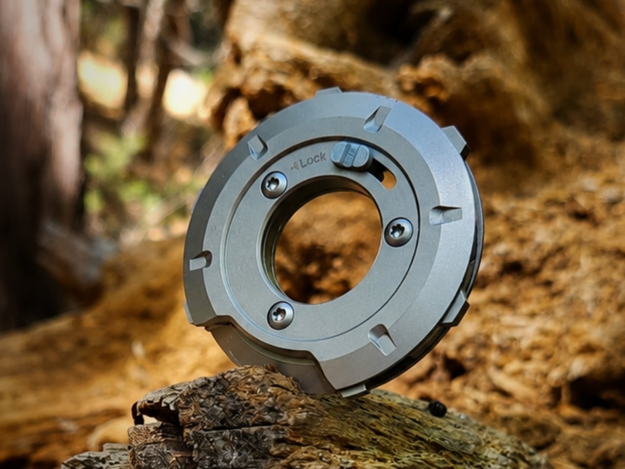
GEO, designed by Invento Design, takes issue with that familiar frustration. Rather than folding tools out from a layered frame, it uses a patent-pending rotating disc mechanism that cycles through five tools, exposing each one through a single opening. It’s a deceptively simple reframing of an old idea, and one that makes you wonder why nobody had taken this approach before.

Designer: Francisco Molina (Founder of Invento Design)

Click Here to Buy Now: $45 $70 (36% off). Hurry, only a few left!

The way it works is fairly intuitive. Outer index levers let you rotate the internal mechanism until the tool you want lines up with the access window. A sliding lock then holds the selected tool in position before you start. The whole operation happens in one hand, without setting anything down first or needing a second hand to hold the frame steady.

The five tools cover a surprisingly practical range of everyday needs. You’d reach for the blade and scraper when a label refuses to peel cleanly, the box opener when a taped-up package isn’t cooperating, the bottle opener at the end of a long day, the flathead driver for a loose screw or a stubborn paint can lid, and the string cutter when scissors aren’t anywhere nearby.

Carrying something with a blade in your pocket raises the obvious question of what happens when it isn’t in use. GEO handles this with a dedicated safety mode, a neutral rotational position where no edges are exposed. The sliding lock serves a separate purpose, preventing the mechanism from turning mid-task. Together, they make it safe enough to pocket, clip to a belt, or drop into a bag.

The form factor makes carrying it a fairly easy decision. At 53.5mm in diameter and only 8.7mm deep, GEO lands somewhere between a large coin and a watch face. The integrated belt clip adds some depth but keeps the total thickness under 15mm. It fits in a jeans pocket, clips to a gear bag, or disappears into a drawer without demanding much space.

There’s something worth noting about how it actually feels to use, too. The rotation isn’t purely functional but also incredibly satisfying. Each position clicks into place with enough tactile feedback that you know exactly where you’ve landed, and the smooth lever action makes it oddly enjoyable to cycle through even when nothing needs doing. It tends to stay in your hand a bit longer than the task requires.

The construction does a good job of reinforcing the premise. GEO’s tool body is milled from 440C stainless steel hardened to 57–59 HRC, placing it in the same material territory as quality kitchen blades. Cover panels come CNC-machined from either 6061-T6 aluminum or Grade 5 titanium, with internal hardware in 304 stainless steel throughout, a quietly serious specification for something this compact.

GEO isn’t meant to replace the full-size tools sitting in workshop drawers or on a fully loaded belt. It’s better understood as something for the other moments: the stubborn tape, the loose screw, the cord that needs a clean cut. Its compact, circular form makes it easy enough to keep close that reaching for it becomes the natural first move rather than an afterthought.

Click Here to Buy Now: $45 $70 (36% off). Hurry, only a few left!

The post A Coin-Sized Disc Just Reinvented the Multi-Tool Nobody Could Fix first appeared on Yanko Design.

  • ✇Yanko Design
  • Nothing killed the Glyph Interface. This Teenage Engineering synth concept argues that was a mistake
    Nothing spent three phone generations convincing us that a few light strips on the back of a device counted as a personality. The Glyph Interface was the whole brand in one gesture, a Morse code of notifications you could read with the phone face-down on a bar table. Then Phone (3) arrived in July 2025 with the Glyph Matrix instead, a small dot matrix circle tucked in the corner, and the comment sections held a funeral. “NO GLYPH” became the shortest and angriest review of the year. Which makes
     

Nothing killed the Glyph Interface. This Teenage Engineering synth concept argues that was a mistake

4 août 2026 à 20:30

Nothing spent three phone generations convincing us that a few light strips on the back of a device counted as a personality. The Glyph Interface was the whole brand in one gesture, a Morse code of notifications you could read with the phone face-down on a bar table. Then Phone (3) arrived in July 2025 with the Glyph Matrix instead, a small dot matrix circle tucked in the corner, and the comment sections held a funeral. “NO GLYPH” became the shortest and angriest review of the year. Which makes it pretty funny that the most convincing argument for reviving that light language has come from a fan concept for a synthesizer.

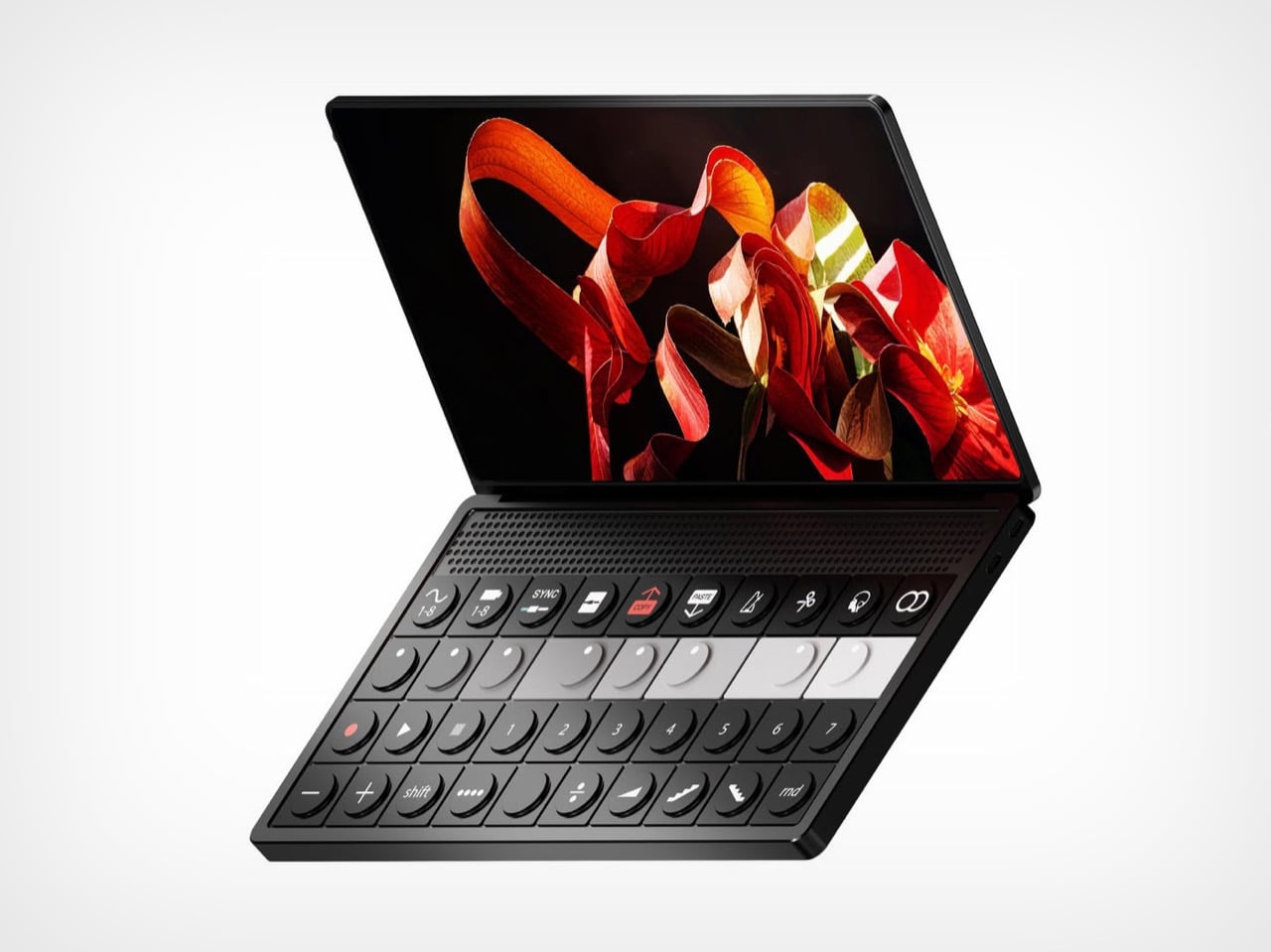
Abdelrahman Shaapan’s Mini OP-3 wraps a semi-transparent rear panel around a compact synth, with LED effects and dynamic graphics that pulse along to whatever you’re playing. Flip it over and the front is pure Teenage Engineering, a clamshell with a touchscreen lid and a control deck of encoders, transport keys, numbered pattern buttons, and one red COPY key doing a lot of emotional labor. Shaapan calls the project an exercise in translating the design DNA of both brands into a single object. He also added a charm attachment point on the screen corner, because it is 2026 and everything needs a little guy hanging off it. The pitch is a smaller OP that keeps you off your laptop during production and live sets.

Designer: Abdelrahman Shaapan

Ten function keys run across the top of the deck, covering waveform and tape banks, sync, split, copy, paste, metronome, scissors, monitoring, and loop. Below them sit eight encoders arranged in a greyscale gradient from black to white, which is the single most OP-1 gesture available to any designer working in this language. A transport row follows with record, play, and numbered pattern keys, then a modifier row carrying shift, divide, ramp, and a random button. The hinge hides a perforated speaker band, and the front edge packs two USB-C ports beside four 3.5mm jacks. Every control is round, tactile, and spaced like it expects to be hit fast in a dark room.

Nothing built its identity on light as an interface, then retired it on the Phone (3) in favour of a dot matrix that most owners still describe as a downgrade. Shaapan’s rear panel puts that language back to work, running LED effects and dynamic graphics that respond to your audio in real time. On a phone, reactive lighting was always slightly decorative, a party trick for incoming calls and little else. On an instrument, it has an actual job, giving you a visual read on your track from across a stage or a crowded studio. Relocating the Glyph to the one product category where it earns its keep is a sharper piece of brand analysis than most fan concepts manage.

Shaapan rendered the whole thing in KeyShot. The soft-touch black body, the subtle sheen on the encoder caps, and that partially translucent rear panel with internals showing through all read as convincingly manufacturable rather than aspirational. The charm attachment point is the detail I keep coming back to, since TE has always sold straps and cases as identity objects and phone charms are having a genuine cultural moment. We covered a Teenage Engineering DJ console concept a couple of years back, and this one clears that bar comfortably. The presentation is good enough to be mistaken for a leak.

One thing undercuts the pitch. Shaapan says the goal was minimizing laptop dependence, but three renders show Ableton Live running on the touchscreen, which means the device became a laptop instead of replacing one. Ableton’s own Push 3 already solves the standalone problem and charges around two thousand dollars for it. That gap between the stated intent and the renders is the part a real product team would have to close first. Everything else here, though, is a better Nothing product than Nothing’s last one.

The post Nothing killed the Glyph Interface. This Teenage Engineering synth concept argues that was a mistake first appeared on Yanko Design.
  • ✇Yanko Design
  • The Echo Chair Makes 3D Printing Feel Refined
    ZHA has collaborated with Spanish design brand Nagami to create the Echo Chair, a 3D-printed seat made from recycled plastic waste. Formerly known as Zaha Hadid Architects, the studio developed the chair through parametric design and large-scale additive manufacturing. Its form is fluid and sculptural, with an arched backrest that extends towards the floor and a seat that curves upwards at the sides. The two parts look separate at first, but they are printed as one continuous piece. Both surfac
     

The Echo Chair Makes 3D Printing Feel Refined

4 août 2026 à 18:30

ZHA has collaborated with Spanish design brand Nagami to create the Echo Chair, a 3D-printed seat made from recycled plastic waste. Formerly known as Zaha Hadid Architects, the studio developed the chair through parametric design and large-scale additive manufacturing. Its form is fluid and sculptural, with an arched backrest that extends towards the floor and a seat that curves upwards at the sides.

The two parts look separate at first, but they are printed as one continuous piece. Both surfaces grow from the same structural edge and share the same underlying geometry. One becomes the seat, while the other rises to form the backrest and support.

Designer: ZHA and Nagami

This continuous construction gives the chair a clear sense of logic. The shape is doing several jobs at once: supporting the body, holding the structure together, and defining the overall visual character.

The Echo Chair was developed through an iterative research process at ZHA Lab and manufactured by Nagami, a brand known for its work in large-format 3D printing. The studios used recycled PETG sourced from industrial waste, including single-use medical plastics.

As the chair is printed layer by layer, the process leaves a ribbed texture across its surface. Those lines have been kept visible rather than hidden or polished away. That decision gives the chair much of its character. The texture follows the curves closely and makes the manufacturing process easy to read. It also gives the recycled plastic a more tactile, less generic appearance.

There is something useful in that honesty. The material is not being forced to look like timber, stone or metal. It keeps the visual qualities created by the printing process and uses them as part of the design. The surface does still reference natural materials in a subtle way. Its layered finish recalls mineral formations and carved stone, which helps the chair feel less industrial when placed in an interior.

ZHA and Nagami developed four colourways for the chair: white, black, a white-to-translucent gradient and a caramel tone made using a bio-based cork composite. The colour choices help shift the mood of the design. White makes the form feel lighter and more architectural, while black gives it a stronger, more graphic presence. The translucent version draws attention to the printing layers, and the caramel finish adds warmth to what could otherwise feel like a very technical object.

The caramel version is especially successful because it softens the synthetic quality of the plastic. It feels easier to imagine in a home, hotel lobby or lounge space, rather than only in a gallery or design exhibition. According to ZHA project design director Sebastian Andia, the goal was to turn an abundant and overlooked material into something people would genuinely want to live with. That idea matters because recycled material alone is rarely enough to make a product successful. People still need to like the object, find it comfortable and see a place for it in their environment.

The Echo Chair handles this well. Its sustainable story supports the design, rather than becoming the whole design. The seat’s raised sides create a more enclosed sitting position, while the curved backrest gives the chair a supportive and almost cocooned feel. The shape is expressive, but it still looks usable. Its scale and neutral colour options also make it easier to place than the form might suggest. It has enough presence to work as a statement piece, yet it does not depend on bright colour or decoration to stand out.

The 3D-printing process allows the chair to be produced without visible joints or separate components. This gives it a seamless appearance and keeps the connection between the digital model and final object very direct.

That connection is one of the strongest parts of the project. The manufacturing process does not sit behind the design. It shapes the design. The ribs, curves and continuous structure all come from the same production method. Each part of the chair feels related because it has been developed through the same system.

The Echo Chair continues ZHA and Nagami’s existing collaboration. Nagami launched its first collection of 3D-printed chairs in 2018, which included two designs by the architecture studio. Their latest project shows how much more refined large-scale 3D printing has become. The chair feels less like a technical experiment and more like a finished product with a clear place in contemporary interiors.

The Echo Chair is currently on display as part of London Creates at The Truman Brewery. What makes the chair interesting is the way it brings together material, form and manufacturing without overcomplicating the idea. Recycled plastic is treated as a starting point for the design, rather than something that needs to be disguised.

The post The Echo Chair Makes 3D Printing Feel Refined first appeared on Yanko Design.
  • ✇Yanko Design
  • Michelangelo’s iconic David bust gets recreated in LEGO, turning plastic into sculpted marble
    If you ever took a drawing class, you have met this face. Art schools spent about two centuries buying plaster casts of David’s head and parking them on shelves so students could sit there for six hours learning to render a nostril. The Victoria and Albert Museum owns a full size cast of the whole statue, and famously kept a plaster fig leaf on standby in case Queen Victoria dropped by and needed the shock absorbed. So David has been getting copied, shrunk, cast, and occasionally censored for a
     

Michelangelo’s iconic David bust gets recreated in LEGO, turning plastic into sculpted marble

4 août 2026 à 17:30

If you ever took a drawing class, you have met this face. Art schools spent about two centuries buying plaster casts of David’s head and parking them on shelves so students could sit there for six hours learning to render a nostril. The Victoria and Albert Museum owns a full size cast of the whole statue, and famously kept a plaster fig leaf on standby in case Queen Victoria dropped by and needed the shock absorbed. So David has been getting copied, shrunk, cast, and occasionally censored for a very long time. Turning him into a toy is not the sacrilege it sounds like. It’s basically the family business.

Which brings us to Ysien, a LEGO Ideas builder who decided the next material in that lineage should be ABS plastic. The build renders David’s head, neck, shoulders and upper chest as a classical bust, entirely in white, sitting on a proper stepped pedestal. No color, no minifigure, no cheeky accessories. Just light and shadow doing all the work, exactly like the plaster casts it descends from.

Designer: Ysien

The hair is the whole reason this MOC (My Own Creation) works. Hair is where sculptors get found out, because faces have anatomy underneath that you can reason your way through, while hair is a mass of overlapping nothing that somehow has to read as soft. Michelangelo’s answer was a tangle of deep drilled curls. Ysien’s answer is a genuinely absurd stack of curved slopes and half arch elements layered at varying depths, so each curl throws its own little shadow instead of flattening into texture. “The hair was one of the greatest challenges, with each curl contributing to the overall silhouette, depth, rhythm, and movement,” he says, which is a very polite way of describing what must have been several evenings of quiet suffering.

My favorite decision, though, is that the seams stay visible. Ysien could have chased a smooth marble finish and lost, because bricks do not do smooth. Instead he let the geometry become part of the sculpture, so the thing reads as a portrait from across the room and as unmistakable LEGO up close. The eyes get a similar treatment, built from inverted round elements that give David that vacant classical stare, which is a nice accident given the real statue has heart shaped pupils drilled into it. Monochrome white does the rest, forcing every bit of the anatomy to be described by shadow alone. There’s no piece count listed yet, although I wouldn’t be surprised if it was in the high hundreds.

Ysien’s David is currently sitting at just over 400 supporters with 424 days on the clock, which means there is a long road to the 10,000 votes that trigger an official LEGO review. LEGO Ideas is where fan builds get their shot at becoming retail sets, and this one deserves a look. The only thing I’d add is a black variant, because a basalt David would be an absolute menace on a shelf. You can head to the LEGO Ideas page and cast your vote!

The post Michelangelo’s iconic David bust gets recreated in LEGO, turning plastic into sculpted marble first appeared on Yanko Design.

  • ✇Yanko Design
  • This 60g Titanium Pen Doubles as a Pocket Repair Station With a Detachable Flashlight and 3-Slot Toolbox
    The humble pen is one of the most perfectly designed objects in everyday human history. It’s a simple, durable, pocket-friendly cylinder that most of us carry without a second thought, right up until the moment we actually need it. Its form is so familiar that we rarely stop to question its potential as anything other than a writing instrument. But what if the pen’s silhouette was actually the perfect chassis for something far more ambitious? What if its main job wasn’t to record problems, but
     

This 60g Titanium Pen Doubles as a Pocket Repair Station With a Detachable Flashlight and 3-Slot Toolbox

2 août 2026 à 21:45

The humble pen is one of the most perfectly designed objects in everyday human history. It’s a simple, durable, pocket-friendly cylinder that most of us carry without a second thought, right up until the moment we actually need it. Its form is so familiar that we rarely stop to question its potential as anything other than a writing instrument. But what if the pen’s silhouette was actually the perfect chassis for something far more ambitious? What if its main job wasn’t to record problems, but to solve them?

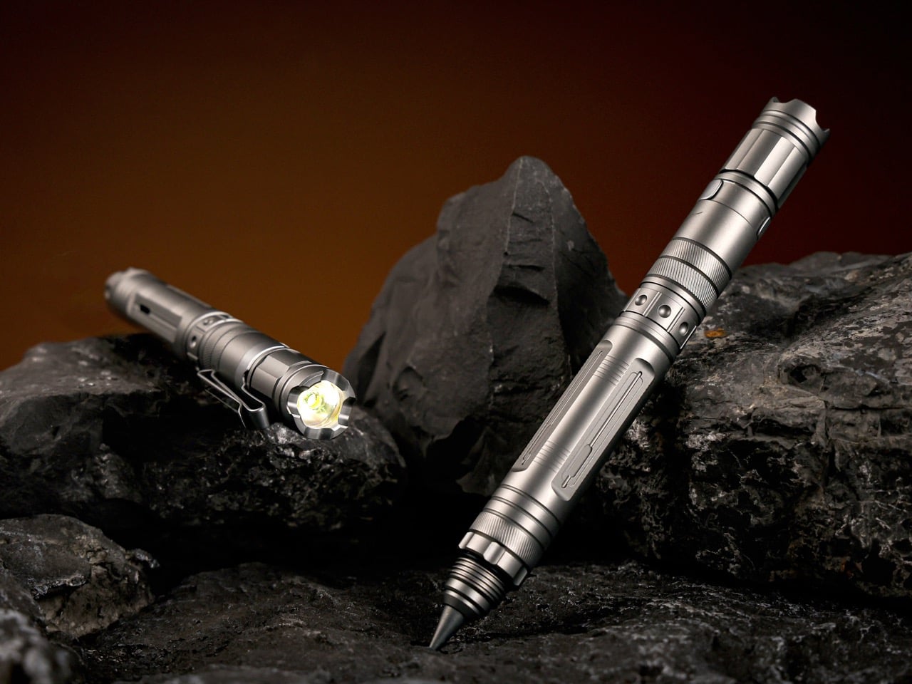
TiMate, the Redwood City-based EDC team behind the BoltLite and CoreLite, spent three design generations building toward exactly this: a Grade 5 titanium pen organized around a four-step repair workflow of illuminating, marking, cutting, and repairing. The body is CNC-machined, IPX-8 waterproof, and houses a detachable flashlight, a three-slot magnetic toolbox, a dual-tip marking system, and a utility blade, all in a 60-gram, 5.31-inch frame. The VeroLite also writes. That’s almost a punchline. But genuinely, it writes well.

Designer: TiMate

Click Here to Buy Now: $85 $119 (30% off) Hurry! Only 69 of 100 units left.

The flashlight module runs a Cree XPG4 LED at a neutral 5000K color temperature with 70+ CRI, which is the difference between reading a wire’s color accurately and just guessing. Three modes cover the range: 9 lumens for close inspection, 150 lumens for repairs and outdoor use, and a strobe for emergencies. IPX-8 waterproof, it charges over USB-C in 40 minutes, running 12 hours on low from a 100mAh lithium cell. The module detaches completely from the pen body via a magnetic joint rated at 3.8 kilograms, redesigned after users flagged the earlier version as too loose. Clip it standalone to a carabiner, rotate the dual-direction clip to aim the beam, or separate it so both hands are free for the repair.

Previous TiMate pens dedicated this midsection to a fixed blade; the VeroLite converts it into a three-slot magnetic platform for standard 4mm screwdriver bits. The compartment is sealed, waterproof, and ships with a Y3, PH2, and PZ1 set. Any standard 4mm bit fits, so your existing collection is already compatible. Three working modes follow: quick-fix with a bare bit in hand, full precision with the pen body as a handle, and two-handed work with the flashlight detached and aimed. Swapping bits is fast.

A single twist of the gear-textured tip selector switches between a graphite core and a tungsten carbide scribe. The graphite is rated for 10 miles of writing, needs no ink or refills, and will outlast the pen in most people’s hands. The tungsten carbide scribe marks metal, ceramic, glass, and stone cleanly and permanently, surfaces where a marker would just skid. One twist separates a quick note from a precise cut line on tile, without looking down. The tactile texture means you can switch mid-repair without losing your grip.

The utility blade is a 1/6-inch chrome steel cutter that loads into the magnetic storage like any other bit, making blade swaps meaningfully safer than a standard box cutter. On a traditional utility knife, the swap puts your fingertips millimeters from the fresh edge; on the VeroLite, the blade handles identically to a screwdriver bit. The clip end functions as a pry tool for paint cans, stuck lids, and loose nails. The tungsten carbide tip doubles as an automotive side-window breaker, so the same tool scribing tile in the morning can shatter a car window later. TiMate calls it a pocket repair station, and the label earns itself.

The body is CNC-machined Grade 5 titanium, 134.9mm long and 14.6mm wide, available in Titanium Gray (sandblasted matte) and Tactical Black (PVD-coated, scratch-resistant). At 60 grams, it’s 15% lighter than the CoreLite, a change driven directly by user feedback about hand fatigue. A recessed contour at the grip zone gives your fingers a natural landing spot, so it feels like a tool rather than a tube. Both finishes share the same machining process, so structural quality is identical. A leather sleeve option swaps the clip for a cleaner desk-carry profile.

The VeroLite retails at $119 and is currently available at a discounted $85 for a single unit. Add-ons include a 20-piece alloy bit set, extra graphite and tungsten tips, replacement blades, a stainless steel necklace for neck carry, and a leather pouch. A Leatherman Skeletool costs around $90 with seven tools, but lacks an integrated light, a marking system, or modular storage. TiMate’s argument is simple discipline: fewer tools, all of which you’ll actually use, organized around a clear workflow. If you’ve ever wished your pen could fix the problem you’re staring at, this one finally does.

Click Here to Buy Now: $85 $119 (30% off) Hurry! Only 69 of 100 units left.

The post This 60g Titanium Pen Doubles as a Pocket Repair Station With a Detachable Flashlight and 3-Slot Toolbox first appeared on Yanko Design.

  • ✇Yanko Design
  • This Glowing Jello Table Lamp Balances Softness and Structure
    There is something inherently temporary about jello. It trembles, folds, and gives way under the slightest pressure. Balloon sculptures behave much the same way, holding their shape only until the air begins to escape. MAJU’s Jello Lamp takes these fleeting forms and gives them permanence. Designed by Hyu Lim, the sculptural table light translates the soft wobble of gelatin desserts and the inflated curves of balloon animals into a 3D-printed object. The result is playful without becoming novel
     

This Glowing Jello Table Lamp Balances Softness and Structure

2 août 2026 à 18:30

There is something inherently temporary about jello. It trembles, folds, and gives way under the slightest pressure. Balloon sculptures behave much the same way, holding their shape only until the air begins to escape. MAJU’s Jello Lamp takes these fleeting forms and gives them permanence.

Designed by Hyu Lim, the sculptural table light translates the soft wobble of gelatin desserts and the inflated curves of balloon animals into a 3D-printed object. The result is playful without becoming novelty-driven, balancing generous proportions and rounded edges with the visual precision of digital fabrication. The lamp’s form is built around repetition. A fluted shade expands outward in soft, scalloped volumes, while the base continues the same inflated geometry below. Together, the two elements create a silhouette that appears almost compressible, despite being printed as a rigid, continuous body.

Designer: MAJU

That tension gives the lamp much of its character. Its shape suggests movement, softness and instability, while its construction fixes those qualities in place. MAJU uses one of the most controlled contemporary production methods to capture something loose and unpredictable. When illuminated, the object begins to soften again. Light passes through the translucent shade, diffusing into a warm 2700K glow that gathers along the ridged surface. The flutes become less defined, and the lamp takes on a fluid, almost edible quality.

It is here that the Jello Lamp moves beyond a visual reference. Rather than simply resembling a moulded dessert, it recreates its translucency and sense of suspended volume. The light source becomes part of the form, turning the lamp into an illuminated sculpture rather than a fixture with a decorative shade. Each piece is 3D printed to order in MAJU’s workshops in California and Singapore using plant-based, biodegradable PLA. The process allows the studio to produce the lamp’s curved geometry without conventional moulds, while also reducing excess inventory and material waste.

The visible texture of additive manufacturing is not concealed. Fine printed ridges run across the surface, catching light and revealing how the object was made. Instead of disrupting its softness, they add another layer of detail, sitting somewhere between the grooves of a dessert mould and the traces of a machine-built object.

The lamp is also designed as a modular system. Its shade and base can be replaced or upgraded independently, extending the life of the object rather than treating it as a sealed product. An integrated cord organiser is built into the base, keeping the cable from interrupting the lamp’s compact silhouette. Measuring 9.5 × 9.5 × 12.25 inches and weighing approximately half a pound, the Jello Lamp is light enough to move easily through domestic spaces. Its 2.9W bulb is intended to produce ambient illumination, positioning it as a quiet atmospheric object rather than a primary source of light.

Shown in Cottage Core Pink, the design leans into its confectionery associations. The colour, rounded profile and luminous surface recall something sweet and familiar, while the printed construction keeps the object rooted in contemporary production.

The Jello Lamp forms part of MAJU’s broader collection of plant-based home objects, shaped by the studio’s position between Singapore and California and by a combination of Eastern and Western design influences. Its most compelling quality, however, lies in a simpler contradiction. The lamp gives durability to forms that are usually defined by their impermanence. A balloon loses air. Jello collapses. Here, their softness is held in place, glowing quietly on a table.

The post This Glowing Jello Table Lamp Balances Softness and Structure first appeared on Yanko Design.

  • ✇Yanko Design
  • 3D-Printed Ukulele Transforms Into an Electric Guitar In Just 2 Seconds
    Every kid who grew up watching cars turn into robots has a soft spot for things that are not what they seem. Musician and maker Mattias Krantz never quite grew out of that phase, except instead of turning a truck into Optimus Prime, he set his sights on something smaller and arguably harder to pull off without CGI. He wanted a ukulele that could become a full size guitar on command, without falling apart in his hands. That meant solving three problems at once: growing the neck by roughly ten in
     

3D-Printed Ukulele Transforms Into an Electric Guitar In Just 2 Seconds

2 août 2026 à 16:45

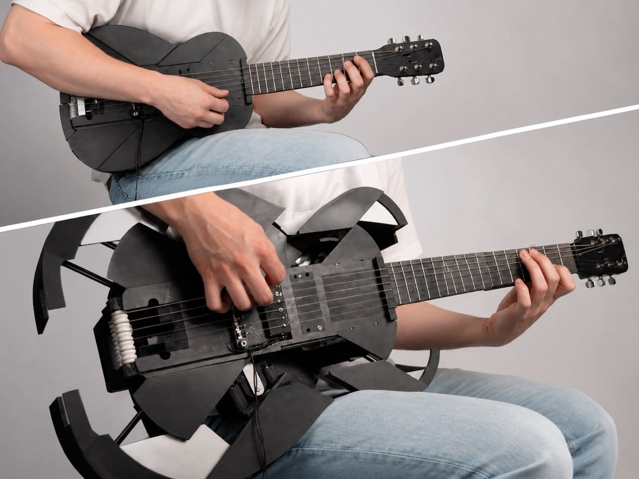
Every kid who grew up watching cars turn into robots has a soft spot for things that are not what they seem. Musician and maker Mattias Krantz never quite grew out of that phase, except instead of turning a truck into Optimus Prime, he set his sights on something smaller and arguably harder to pull off without CGI. He wanted a ukulele that could become a full size guitar on command, without falling apart in his hands. That meant solving three problems at once: growing the neck by roughly ten inches, keeping the strings in tune through that change, and expanding the body into a real guitar shape instead of a symmetrical blob. Each one turned out to be its own small nightmare.

The motivation was refreshingly petty. Ukulele players get less respect than guitar players no matter how good they get, and Krantz wanted to flip that on its head. Getting there took months of failed prototypes and a collaboration with mechanical engineer Adam Damato, who stepped in once the physics of a growing, string bearing neck got too gnarly to solve alone. What began as a joke became a real feat of mechanical design, borrowing tricks from telescoping tools, fishing reels, and an obscure folk instrument. By the end, the ukulele fit in a backpack and unfolded into a stage ready guitar in seconds.

Designers: Mattias Krantz, Adam Damato

The neck telescopes straight out of the ukulele’s tiny frame, sliding one section into the next until it locks at full guitar length, gaining roughly ten inches without ever detaching from the body. A steel core runs through the sliding sections, and the joints are cut so they interlock and brace against each other the instant the neck reaches full extension. That bracing is what lets it survive eighty pounds of string tension without bowing like a fishing rod. Getting there took two failed attempts first. A folding neck, borrowed from an old instrument called the cithara orbo, worked fine on a full size guitar but was useless on a ukulele, since half a neck sat exactly where a hand needed to grip. The telescoping version solved the length problem right away, but only stopped bending once Damato worked in the steel core and reinforced joints.

The strings are custom made, roughly twice the length of a normal set, and thread onto strategically placed rollers hidden inside the neck and body. Pull the neck out and the rollers feed slack forward, push it back in and they wind the excess back up, so the same six strings carry the instrument through both tunings without coming off. That roller system only exists because everything simpler failed first. Rubber bands solved the stretch problem but sounded worse than the ukulele they replaced. A fishing reel style rig using rope worked until the rope itself stretched, turning every transformation into tuning roulette, and swapping in non stretch rope traded that for a rope that kept snapping, once badly enough to take the guitar apart. Custom strings, ordered special and worth a twenty day wait, were the fix that finally held.

The body expands through six independently moving panels that fan outward from the ukulele’s compact shell, each one traveling a different distance and angle so the outline settles into a real guitar’s curves instead of a bloated circle. An early version of that mechanism grew symmetrically in every direction, fine for something like a banjo but wrong for an instrument with a pinched waist. Getting six panels to move independently instead of in lockstep turned one mechanical problem into six. The first panel alone took three attempts before it worked reliably, and even then only about ninety percent of the time. Adding the rest of the panels made things worse, since a hub inside was quietly blocking outward movement and jamming the whole assembly. Swapping plastic components for metal fixed it, and two days assembling hundreds of parts produced a body that finally held its shape.

None of this would matter if the transformation felt gimmicky in person, but the reception says otherwise. Onlookers at Krantz’s street performances wrote it off as just another ukulele until it unfolded mid song and changed their opinion of him. A band let him bring it on stage, and the transformation held together well enough to draw applause rather than confusion. Transforming gadgets are nothing new, but the engineering here, steel joints, custom rollers, six moving panels, earns real attention over a gimmick label. Krantz and Damato spent months on problems most builders would abandon, and the payoff works under tension, every time.

The post 3D-Printed Ukulele Transforms Into an Electric Guitar In Just 2 Seconds first appeared on Yanko Design.

  • ✇Korben
  • Firefox ressort le mode compact du placard, 5 ans après
    En 2021, Mozilla a estimé que le mode compact de Firefox intéressait trop peu de monde pour mériter sa place dans l'interface. Le bug qui actait sa suppression a énervé pas mal de monde, mais la justification à l'époque, c'était que cette densité est "difficile à découvrir, et on suppose qu'elle est peu utilisée". Faut dire que ce mode compact réduit sacrément l'espacement des barres d'outils et des onglets pour gagner de la place à l'écran. Mozilla le destine explicitement aux petits écrans. Ma
     

Firefox ressort le mode compact du placard, 5 ans après

27 juillet 2026 à 13:00

En 2021, Mozilla a estimé que le mode compact de Firefox intéressait trop peu de monde pour mériter sa place dans l'interface. Le bug qui actait sa suppression a énervé pas mal de monde, mais la justification à l'époque, c'était que cette densité est "difficile à découvrir, et on suppose qu'elle est peu utilisée".

Faut dire que ce mode compact réduit sacrément l'espacement des barres d'outils et des onglets pour gagner de la place à l'écran. Mozilla le destine explicitement aux petits écrans.

Mais devant la levée de boucliers, Mozilla a dû faire machine arrière mais à moitié ^^. En avril 2021, un second bug acte le compromis : ceux qui utilisaient déjà le mode compact le gardent, les autres doivent aller l'activer à la main dans about:config via browser.compactmode.show.

Puis au bout d'un moment dans le menu de personnalisation, l'option réapparaît en juin 2021 dans Firefox 89 sous le doux nom de "Compact (not supported)". C'est la version qui embarquait la refonte Proton dont je vous parlais à l'époque .

Nous sommes 5 ans plus tard, et Mozilla remet le couvert avec le mode compact ! En effet, le nouveau design de Firefox est arrivé aujourd'hui dans Nightly, et ce mode compact fait partie du package. "Les gens nous ont dit que ça leur manquait, et on les a écoutés", explique l'équipe.

Sauf que ce n'est pas exactement un retour à la case départ. Dans le code de Nightly 155, le mode compact ne revient pas dans le menu de personnalisation. En réalité, il déménage dans les réglages, sous une rubrique "Window density" qui propose Automatique, Standard, Compact et Tactile.

Mais surtout Firefox sait maintenant basculer en compact tout seul. C'est une préférence fraîchement débarquée, browser.compactmode.auto.threshold, qui fixe le déclencheur à 0.05. Cela veut dire que si la barre d'onglets s'apprête à bouffer plus de 5 % de la hauteur de votre fenêtre, le navigateur passe en densité réduite sans rien vous demander.

Même logique sur la largeur avec la barre latérale repliée avec un garde-fou plutôt propre qui fait que si un utilisateur a choisi lui-même une densité, il ne se fait jamais écraser son réglage.

Le reste de la refonte, baptisée Project Nova en interne , n'est pas mal non plus. Les onglets prennent une forme plus douce avec un léger dégradé sur l'onglet actif, la palette s'inspire du feu avec des violets fumés, et les icônes sont redessinées pour tenir la route en thème clair comme en sombre. Mozilla a d'ailleurs publié les teintes avec leurs codes, du Cream #FFF4EE au Midnight Purple #210340.

Les réglages sont réorganisés au passage, avec une entrée dédiée aux contrôles IA pour couper entièrement ces fonctions, et un réglage du niveau de protection contre le pistage. Mozilla annonce aussi 9 % de gain sur les temps de chargement du contenu principal des pages sur un an.

Bon voilà, ce que je peux vous dire, c'est que comme d'habitude, avec Firefox, les gens vont encore gueuler pour rien. En 2014, la refonte Australis avait provoqué le même genre de problème, au point qu' une extension entière avait été codée pour restaurer l'ancienne apparence .

La différence, cette fois, c'est que Mozilla range la personnalisation du côté des réglages officiels au lieu de la laisser aux extensions et à about:config.

Pour voir tout ça, il vous faut la version Nightly et rien d'autre. Dans le code source, la préférence globale browser.nova.enabled n'est activée que sur les builds Nightly, elle reste à false partout ailleurs. Le déploiement large est annoncé pour cette année, sans date. En attendant, la branche stable continue d'avancer de son côté avec les conteneurs natifs arrivés dans Firefox 153 .

Source

  • ✇Yanko Design
  • Insta360’s foldable drone patent targets DJI Neo 2 at sub-250g
    Insta360 built its reputation on cameras that see in every direction at once. It’s literally in their name. The X series made 360-degree capture accessible; the Luna Ultra brought Leica optics to a handheld gimbal. Flying something, though, is a different category of challenge, and the patent images that appeared in July 2026 show the company working through what a foldable drone looks like with Insta360 DNA. The illustrated design at the bottom shows folding arms, a ring-shaped propeller guard
     

Insta360’s foldable drone patent targets DJI Neo 2 at sub-250g

29 juillet 2026 à 17:30

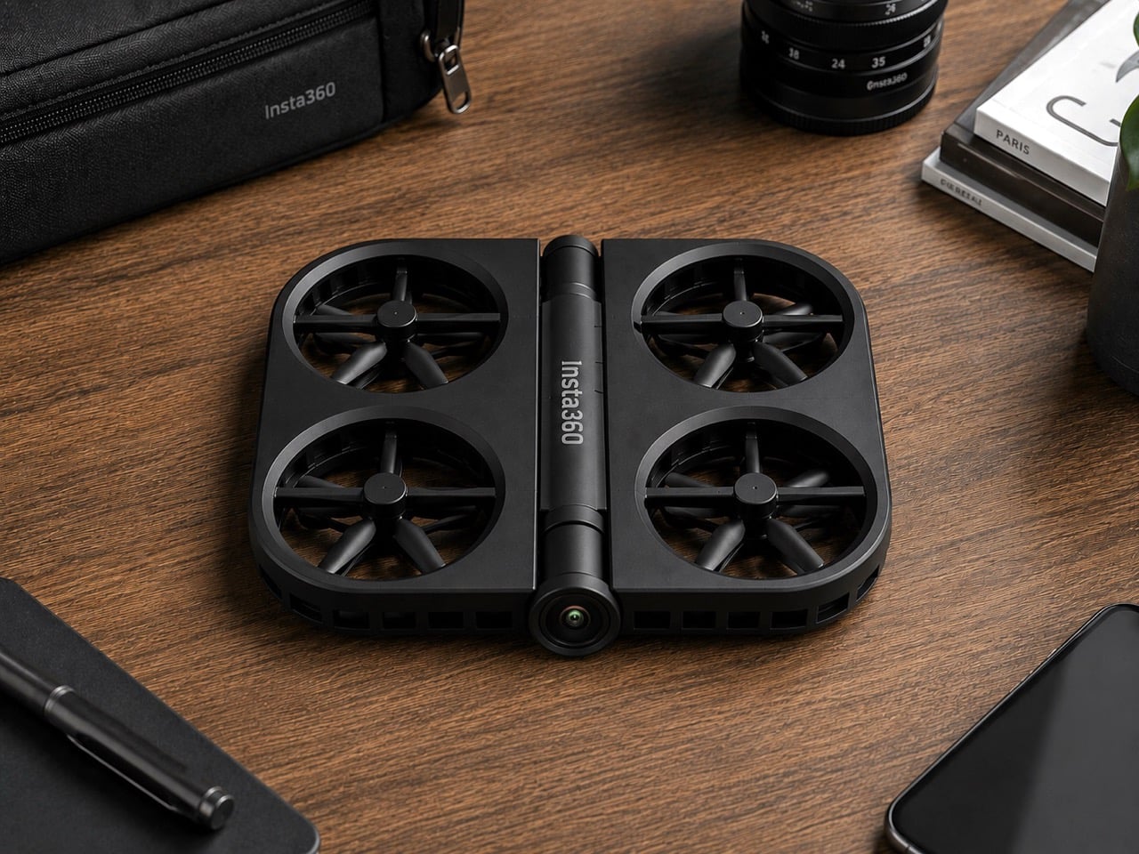
Insta360 built its reputation on cameras that see in every direction at once. It’s literally in their name. The X series made 360-degree capture accessible; the Luna Ultra brought Leica optics to a handheld gimbal. Flying something, though, is a different category of challenge, and the patent images that appeared in July 2026 show the company working through what a foldable drone looks like with Insta360 DNA. The illustrated design at the bottom shows folding arms, a ring-shaped propeller guard, and a dedicated locking mechanism, a form factor that prioritizes the moment of packing away just as much as the moment of takeoff.

DJI’s Neo 2 has the casual drone segment largely to itself in the sub-250g category, with a rigid one-piece frame and a 19-minute flight time that have made it a reliable default for creators who want aerial footage without the complexity of a serious drone setup. Insta360 entering that space would break what has effectively been a two-player market, with Zero Zero Robotics’ HoverAir as the only real alternative. The folding design alone gives Insta360 a structural argument against the Neo 2; a potential 360-degree camera, if it materializes, would give it a creative one. What a wonderful year for foldables, eh? We’re expecting a folding iPhone in September, and Insta360 might give us a folding drone too!

This isn’t just some forum rumor, either. The patent images (from patent file CN223865117U), which started making the rounds on July 16th and were highlighted by outlets like Tech Court, are pretty specific. They show a drone body with the “Insta360” logo stamped on it, with fully folding arms that tuck into the chassis and a distinctive ring-shaped guard protecting the propellers. There’s even a dedicated locking mechanism detailed, which tells you just how seriously they’re taking the whole “fold-and-go” concept. This is a design that screams it was made to be stuffed into a pocket, not carefully placed in a bespoke case.

But here’s the thing: this isn’t Insta360’s first aerial rodeo. Before they decided to put their own name on a drone, they sent in a scout team under the sub-brand Antigravity. The A1 drone they launched was, frankly, a bit of a monster: a sub-249g drone with a wild dual-lens setup that shot 8K 360-degree video and made the drone itself invisible in the footage. It was a spec-sheet beast and a clear shot across DJI’s bow, proving Insta360 had the engineering chops to compete in the sky. It was their way of testing the waters.

Now, it looks like they’re done testing. This new patent is the second, more direct shot. And here’s the kicker: for a company obsessed with 360-degree video, the patent images don’t show a fisheye lens. At all. It’s a huge question mark hanging over the whole project. Are they hiding the tech, or are they planning to launch a drone that, for the first time, doesn’t have their signature feature? If they’re aiming for a rumored sub-$200 price point, leaving the 360 camera on the cutting room floor might be the only way to get there. It’s a move that would be both shocking and, in a weird way, perfectly logical.

You also can’t forget that this is all happening while the two companies are actively suing each other in China. This isn’t friendly competition; it’s a full-blown hardware rivalry. Insta360 came for DJI’s gimbals, tested the drone market with a sub-brand, and is now preparing a direct assault on DJI’s most accessible drone. With a release window expected somewhere between late 2026 and early 2027, we’re not just watching a new product being born. We’re watching the next chapter in a tech soap opera, and it’s about to get very, very interesting.

The post Insta360’s foldable drone patent targets DJI Neo 2 at sub-250g first appeared on Yanko Design.

  • ✇Yanko Design
  • Stanley doesn’t make gym equipment… but this stylish kettlebell proves it should
    Fill a Stanley tumbler with a yogurt-based smoothie from bottom to top and you actually end up getting an arm workout. A 40oz Stanley cup can weigh close to 4lbs or upwards of 1.5 kilograms if filled to the brim with something dense like a smoothie or a thick latte. Jane Morelli just decided that if she was gonna give her arms a workout, why simultaneously rely on ugly looking kettlebells? Morelli superimposed Stanley’s design language onto kettlebells and the result looks just gorgeous. Every
     

Stanley doesn’t make gym equipment… but this stylish kettlebell proves it should

29 juillet 2026 à 15:15

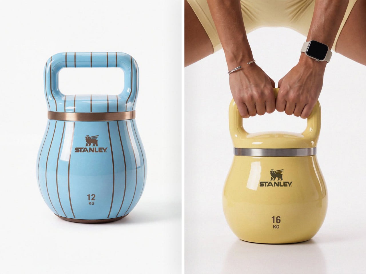
Fill a Stanley tumbler with a yogurt-based smoothie from bottom to top and you actually end up getting an arm workout. A 40oz Stanley cup can weigh close to 4lbs or upwards of 1.5 kilograms if filled to the brim with something dense like a smoothie or a thick latte. Jane Morelli just decided that if she was gonna give her arms a workout, why simultaneously rely on ugly looking kettlebells? Morelli superimposed Stanley’s design language onto kettlebells and the result looks just gorgeous.

Every gym equipment I’ve used has looked boringly functional. The kettlebells at my gym come in bright colors, but that’s just a color-code so you know the difference between a lighter and a heavier kettlebell even if the number on it wears off (it almost always does). Morelli’s design merely bridges two worlds together, and I won’t lie – the results look like the most seamless collab ever imagined. My only gripe is, I wish these kettlebells were actually tumblers too!

Designer: Emanuele Jane Morelli

Haute gym equipment might not be a category but these kettlebells definitely make a case for it. Each one is styled with chic curves, and a color palette I’d only expect from companies like Hermès or Stanley. Subtle pastel shades, punctuated by just one hot pink color for the yoga-moms who need their gym equipment to be as flashy as their gym outfits. Each kettlebell has a lacquer-like sheen on it, along with the Stanley logo emblazoned on the front, larger than the weight units below it because that’s what matters more. The style statement.

I get that I can sound a little ironic, but I’m all for brand crossovers. (The only time I really object is when Tesla does stuff like manufacturing vodka or whistles because they seem to be obsessed with side quests and not really making any cars). This one piques my fancy because Stanley isn’t just a social statement, it’s perfect for fitness-freaks too who love chugging protein shakes from their 30-40oz cups, or sharing Strava stats superimposed against their Stanley cups just to paint a picture of how much ‘aura’ they have.

Morelli’s done a pretty remarkable job of simply yet effectively distilling Stanley’s brand language onto a piece of gym equipment, without necessarily caricaturing the Stanley cup’s silhouette. The kettlebells have a separate, distinct character, and the dual-band colors on each individual kettlebell represents a palette that feels distinctly high-fashion yet accessible. Quite like the company’s big, beautiful, nearly indestructible tumblers.

The post Stanley doesn’t make gym equipment… but this stylish kettlebell proves it should first appeared on Yanko Design.
  • ✇Yanko Design
  • Your Phone and Laptop Stand Could Be Made From Recycled Coffee Grounds
    Every morning, millions of people brew their coffee, toss the grounds, and move on. It’s such a routine act of disposal that few of us stop to think about where all that spent coffee actually goes. MOFT apparently did think about it, and the result is one of the more genuinely interesting design stories to come out of the tech accessories space in recent memory. The MOFT MOVAS-E Coffee Collection is a new line of accessories built from a bio-based leather crafted from recycled coffee grounds. M
     

Your Phone and Laptop Stand Could Be Made From Recycled Coffee Grounds

29 juillet 2026 à 09:20

Every morning, millions of people brew their coffee, toss the grounds, and move on. It’s such a routine act of disposal that few of us stop to think about where all that spent coffee actually goes. MOFT apparently did think about it, and the result is one of the more genuinely interesting design stories to come out of the tech accessories space in recent memory.

The MOFT MOVAS-E Coffee Collection is a new line of accessories built from a bio-based leather crafted from recycled coffee grounds. MOFT combined spent coffee grounds with waterborne bio-based polyurethane to create what they’re calling a new generation of bio-based leather. The material replaces both conventional leather and traditional synthetic alternatives, which makes the origin story feel less like a marketing angle and more like an actual shift in how the brand approaches materials.

Designer: MOFT

MOFT has already built a strong reputation for thoughtful material choices. Their MOVAS vegan leather line has been a staple in the premium accessories space for a while now, known for that soft, slightly textured finish that feels surprisingly luxurious on a phone MagSafe stand. The MOVAS-E Coffee Collection takes that established foundation and adds a genuine layer of purpose to it, pushing the material story well beyond aesthetics and into something more intentional.

The collection includes products like a laptop Carry Sleeve, all finished in warm, coffee-toned colorways that look like they were pulled straight from a specialty café mood board. The tones are earthy and rich without veering into something overly minimal or clinical. If you’ve ever wished your tech accessories matched the aesthetic of a beautifully lit coffee shop corner, MOFT seems to have designed this one with exactly that feeling in mind. The tagline for the collection is “Brewed for Flow,” and it’s hard to argue with that framing.

The packaging is also part of the story. MOFT went with a frosted, minimalist design they describe as food-safe, durable, and fully recyclable. It’s the kind of packaging decision that often goes unnoticed by most buyers, but it signals that the sustainability angle here isn’t just surface-level. When a brand puts the same thought into the box as the product inside, that’s usually a sign the commitment runs deeper than a trend cycle.

I’ll be honest: the sustainable materials conversation in tech accessories can feel exhausting. Every other brand is slapping the word “eco” on something and calling it a revolution. MOFT’s approach feels different, not because they’ve reinvented the wheel, but because the product doesn’t sacrifice anything to get there. The MOVAS-E Coffee Bio-Leather still delivers the same premium tactile quality that made their original MOVAS line popular. It’s stain-resistant, smooth, and has that matte finish that photographs well without ever looking cheap. The material carries its origins gracefully.

The timing of this collection feels culturally right, too. Coffee has become more than a beverage. It’s an aesthetic, a lifestyle marker, a ritual that people build their mornings around. The idea that your phone stand or laptop sleeve could be a physical extension of that daily ritual is a small but clever act of brand storytelling. It doesn’t feel forced. It feels like a natural fit for the kind of person who already gravitates toward MOFT: someone who pays attention to the things they carry.

Whether or not bio-based leather made from coffee grounds becomes a broader standard for tech accessories, MOFT is asking the right questions here. What do we do with the waste streams already woven into our daily lives? How do we make sustainable choices feel desirable rather than merely dutiful? The MOVAS-E Coffee Collection doesn’t answer everything, but it’s a compelling and well-designed start.

If you’ve been looking for a reason to upgrade your tech carry, this collection offers one that goes a little deeper than color options. It’s the kind of purchase that earns a second look, and a story that’s surprisingly easy to tell when someone asks where you got your case.

The post Your Phone and Laptop Stand Could Be Made From Recycled Coffee Grounds first appeared on Yanko Design.
  • ✇Yanko Design
  • Gage Roads Just Turned a Surfboard Into a Beer Tap
    The last debate you expected to find at the heart of a design story was a surfing one, but here we are. For years, the surf community has been at odds over something surprisingly technical: should surfboards be measured in volume, using litres? It sounds like a niche argument, but for shapers and surfers, the stakes are genuinely real. Leave it to an Australian brewery to turn that argument into one of the most interesting design objects of the year. Gage Roads Brew Co. partnered with legendary
     

Gage Roads Just Turned a Surfboard Into a Beer Tap

19 juillet 2026 à 11:20

The last debate you expected to find at the heart of a design story was a surfing one, but here we are. For years, the surf community has been at odds over something surprisingly technical: should surfboards be measured in volume, using litres? It sounds like a niche argument, but for shapers and surfers, the stakes are genuinely real. Leave it to an Australian brewery to turn that argument into one of the most interesting design objects of the year.

Gage Roads Brew Co. partnered with legendary board shaper Chris Garrett of Phantom Surfboards to create the Beerboard, a custom single-fin surfboard built with a sealed internal chamber capable of holding 10 litres of Gage Roads Summer Ale Single Fin. Yes, it actually surfs. And yes, it actually pours beer. That’s the whole glorious point.

Designer: Chris Garrett with Gage Roads Brew Co

The concept itself is brilliantly simple, but the execution was anything but. The engineering challenge of making a surfboard capable of storing pressurised beer without leaking, or worse, imploding mid-session, required serious work. Garrett’s decades of experience as a shaper came into play here in ways that go well beyond surface aesthetics. He’s been crafting boards since 1979, and Phantom Surfboards has been his life’s work since 1984. Designing the Beerboard meant rethinking the interior construction entirely, embedding a food-safe chamber that could handle pressurisation while preserving the board’s hydrodynamics. The build process reportedly came with a few explosions along the way, which is either alarming or just the most Australian development story imaginable.

The board draws inspiration from the iconic Greenough Spoon, a shape dating back to the 1960s. Choosing that reference wasn’t accidental. The Spoon was itself a radical rethink of what a surfboard could be, and the Beerboard follows directly in that spirit. It doesn’t look like a novelty item. It looks like a real board, clean and purposeful, and that restraint is exactly where the design succeeds. A gimmick slapped together for a social media moment would have felt cheap. This doesn’t feel cheap at all.

Once the board was finished, Gage Roads called in Olympic surfing medalist and part-owner Jack Robinson alongside legendary free surfer Brendan “Margo” Margieson for sea trials. The fact that professional surfers actually took it into the ocean, rode it, and then presumably poured a cold one from it afterward is a key part of why the Beerboard registers as more than a marketing stunt. It works, both as a surfboard and as a beer dispenser. That functional integrity is what elevates the whole project.

Is the Beerboard a practical product? Not remotely. You’re not about to wax this thing down and paddle out for your morning session while worrying about keeping your lager cold. But practicality is the wrong lens here entirely. The most interesting design objects rarely exist to solve a purely utilitarian problem. They exist to reframe one. The Beerboard reframes the entire surfboard volume debate by making it physical and playful, by literally filling a surfboard with the very unit of measurement causing all the fuss. It’s design as commentary, and it genuinely lands.

It also matters who made this. Chris Garrett isn’t an ad agency prop designer. He’s a craftsman with nearly 50 years in the industry, someone whose boards have been trusted by some of the world’s top surfers across decades. Bringing his expertise to a project like this gives the Beerboard a credibility it wouldn’t have had otherwise. It’s the difference between a concept and a creation.

I’ve seen plenty of branded design collaborations that felt hollow or performative, where the “design” was really just a logo slapped on a limited-edition container. The Beerboard isn’t that. It required genuine engineering, real craft expertise, and the confidence to commit fully to a ridiculous idea until it became a remarkable one. That, I think, is what good design actually looks like. Sometimes it just happens to come with a tap.

The post Gage Roads Just Turned a Surfboard Into a Beer Tap first appeared on Yanko Design.

  • ✇Yanko Design
  • Health Apps Know You’re Stressed, HealingFit TWS Helps You Act on It
    Health apps and wearables have become remarkably precise at reading the human body. They can tell you how restorative last night’s sleep was, how stressed your body was during a presentation, and whether your recovery is on track after a hard week. What most of them don’t do, at least not in any concrete way, is hand you a tool to act on what they’ve just told you. That’s the gap MobiFren founder and CEO Juwon Heo set out to address with the HealingFit TWS, a true wireless earbud built to go be
     

Health Apps Know You’re Stressed, HealingFit TWS Helps You Act on It

Par : JC Torres
18 juillet 2026 à 21:45

Health apps and wearables have become remarkably precise at reading the human body. They can tell you how restorative last night’s sleep was, how stressed your body was during a presentation, and whether your recovery is on track after a hard week. What most of them don’t do, at least not in any concrete way, is hand you a tool to act on what they’ve just told you.

That’s the gap MobiFren founder and CEO Juwon Heo set out to address with the HealingFit TWS, a true wireless earbud built to go beyond standard listening. It earned a CES 2026 Innovation Awards recognition in Headphones and Personal Audio, but the more compelling aspect isn’t the accolade. It’s the design thinking underneath it, and what that thinking could mean for the broader world of digital health.

Designer: Juwon Heo, Founder & CEO, MobiFren

Click Here to Buy Now: $169 $300 (44% off). Hurry, only 11/290 left! Raised over $67,000.

During normal use, HealingFit TWS functions as a premium pair of true wireless earbuds with Bluetooth 6.0, Hybrid ANC, and five tunable sound modes built on MobiFren’s own MSTS sound tuning system. The shift into wellness mode happens when you attach the Magnetic TES Link, a cable that snaps magnetically onto both earbuds. There’s no separate gadget involved, and no new category of hardware to carry.

TES, or Transcranial Electrical Stimulation, is a non-invasive approach widely studied in neuroscience. HealingFit TWS translates it into a controllable daily routine, running calibrated microcurrents through skin-contact electrodes built into each earbud. The intensity is adjustable across 15 levels, and most people describe the sensation as a subtle, rhythmic pulse. It’s designed to support the nervous system’s natural shift toward rest or focus, not force it there.

Three wellness modes organize the experience. Sleep is the bedtime routine, pairing TES with binaural audio tracks to help you gradually settle for the night. Healing is a shorter session for mid-afternoon or post-work moments when the day has felt relentless. Study is a focus-priming routine to run before anything demanding real concentration. Each mode comes with five dedicated tracks, though you can also layer TES over your own music.

That three-mode framework reads differently from the perspective of a digital health platform. Platforms like Samsung Health, Apple Health, Google Health, and Fitbit have become genuinely capable at detecting sleep quality, stress levels, recovery readiness, and daily activity. They generate scores, flag patterns, and surface recommendations. What they don’t typically offer is a connected, device-level way to act on those signals in the moment they appear.

HealingFit TWS addresses that with an open Bluetooth LE interface that developers and platform teams can connect to without a licensing fee or a proprietary SDK. The technical entry point is UUID 0xBE00, and documentation is publicly available through mobifrenglobal.com. The intent is clear: the earbud becomes the intervention hardware, while the app or platform provides the health context that determines when and which session a user might benefit from.

Think about what that could look like in practice. A sleep app detecting elevated pre-bed stress could suggest a Sleep session. A recovery platform flagging low readiness after a demanding training week could prompt a Healing routine. A focus tool that spots declining concentration before a deadline could surface the Study mode. In each case, the platform has done its analysis. HealingFit TWS handles what comes after.

The core architecture places a TES-generating circuit inside one earbud, with electrodes on the front of each earbud that contact the ear canal, and a TES Link cable that connects both earbuds. Detached, it functions as flagship-grade wireless earbuds; connected, it transforms into a wellness device designed to support sleep, stress relief, focus, and memory.

What makes the TES architecture appealing to hardware teams isn’t just the open API. The circuit that generates TES signals relies on entirely standard, commercially available components, totaling just 18 parts: a dual-transistor chip, one FET, and a set of RLC components. The earbud’s existing charging contacts also serve as the TES link contacts, so no extra contact points or major structural changes are needed.

The design has received formal IP recognition across multiple jurisdictions. The U.S. patent application covering the core architecture has been allowed and is proceeding to registration, with the patent expected to be granted soon. There are also registered patents in Korea and Japan, as well as a published application in Europe. FCC certification was granted on July 1, 2026.

Heo founded MobiFren in February 2002, originally as a contract developer for Samsung Electronics feature phones. The company started building its own Bluetooth audio products in 2005 and brought its first Bluetooth earphones to market in 2006. MobiFren has maintained an ongoing relationship with Samsung through smartphone software verification work ever since. That two-decade grounding in Bluetooth audio is what gives HealingFit TWS its engineering footing.

The choice to build this platform on earbuds specifically is, in that context, a deliberate one. Earbuds are already the personal technology closest to the human body for most of the waking day. They’re phone-paired, habitually worn, and typically owned by the same people most likely to be using a health app. Embedding TES therapy into a device people already carry daily removes most of the adoption barrier entirely.

The hardware reflects that audio-first foundation. Alongside the TES system, HealingFit TWS delivers up to 6.5 hours of playback and up to 4.5 hours in TES mode, with Hybrid ANC, three microphones per side, and wear detection for auto-pause when an earbud is removed. Both earbuds and the Magnetic TES Link cable dock in a cylindrical charging case finished in anodized aluminum, designed to carry without fuss.

What Heo is ultimately proposing is a platform category that doesn’t quite have a name yet. His comparison is to how true wireless earbuds, from AirPods to Galaxy Buds, turned personal audio into a mainstream daily habit. The longer ambition is for this patented TES architecture to be adopted into future products from those same companies, giving their health platforms a connected hardware layer for the signals they already detect.

The more compelling case might be for the health platforms themselves. Apple Health, Google Health, Samsung Health, and Fitbit have spent years becoming sophisticated at detecting when something is off: poor sleep, elevated stress, slow recovery. What they don’t yet widely offer is a hardware path from that detection to user-controlled action. HealingFit TWS was built to be exactly that path, and it’s open to anyone willing to test it.

That’s a bold bet, and the category he’s describing doesn’t fully exist yet. But HealingFit TWS makes a credible early case for it, with a patent-allowed architecture, open developer access, and a hardware design that doesn’t ask users to change anything about how they already carry and use earbuds every day.

Click Here to Buy Now: $169 $300 (44% off). Hurry, only 11/290 left! Raised over $67,000.

The post Health Apps Know You’re Stressed, HealingFit TWS Helps You Act on It first appeared on Yanko Design.

  • ✇Yanko Design
  • Forget Smart Homes, Moooi Is Designing Homes That Feel Alive
    Light moves through trees. Shadows stretch and shrink. No two afternoons ever look quite the same. Moooi wants your living room to borrow that same restlessness. In a conversation with Yanko Design, the Dutch design house laid out a vision for interiors that respond to time, mood and the people living inside them, rather than staying frozen in one fixed arrangement from the day they’re installed. It is a strange kind of ambition for a furniture brand to have. Strange but brilliant. Moooi has sp
     

Forget Smart Homes, Moooi Is Designing Homes That Feel Alive

18 juillet 2026 à 13:20

Light moves through trees. Shadows stretch and shrink. No two afternoons ever look quite the same. Moooi wants your living room to borrow that same restlessness. In a conversation with Yanko Design, the Dutch design house laid out a vision for interiors that respond to time, mood and the people living inside them, rather than staying frozen in one fixed arrangement from the day they’re installed.

It is a strange kind of ambition for a furniture brand to have. Strange but brilliant. Moooi has spent 25 years refusing to make boring things, and its next chapter looks less like a product catalog and more like a philosophy for how homes should feel. Not smarter. Not more automated. Just more alive, in the same unpredictable way the outside world already is.

Designer: Moooi

The concept has a name, The Living Room, and it started as a simple question the brand kept circling back to. What if an interior never sat still, but moved through a day the way the world outside a window does, gradually and without announcing itself. Lighting could soften as morning turns to afternoon. Objects could shift subtly in response to who’s in the room and what they’re doing. Nothing about it reads as gimmick or gadgetry, which is deliberate, since Moooi keeps insisting this has nothing to do with sensors or automation. It reads instead like weather indoors, a mood that drifts rather than a setting you toggle. That distinction matters more than it sounds.

Atmosphere has subtly become the real product Moooi sells, and everything else follows from it. The brand says its process now starts with a single question, how do people want to feel the moment they walk in, long before anyone picks a fabric or a finish. That thinking explains why Moooi’s catalog has crept well past furniture and lighting into wallcoverings, carpets, ceramic tiles and even bespoke scent. Each addition exists to thicken the sensory layer of a room rather than decorate its surface. Building a mood board was never the goal. Building an entire world was.

Personalization is where the philosophy stops being poetic and starts getting genuinely strange, in the best sense. Moooi’s collaboration with EveryHuman uses AI to translate a person’s mood into a custom room fragrance, treating scent as another material a designer can shape rather than an afterthought sprayed in before guests arrive. That same instinct extends to digitally printed carpets and layered surfaces built around individual taste instead of a single house style. The brand frames this as giving creative tools to people rather than finished products, which flips the usual furniture relationship on its head. You are not buying a chair here. You are being handed the freedom to keep shaping a space as your own taste evolves.

None of this would land without Moooi’s oldest habit, which the brand still describes as an ambition to stop the boring business. That mantra showed up loudly at the brand’s 25th anniversary installation in Milan this year, a mirrored, multi sensory environment built at Superstudio Più with choreographer Yoann Bourgeois, layering light, movement and scent into something meant to be felt rather than simply viewed. Marcel Wanders has said there’s no one who walks through a Moooi installation feeling nothing, and that stubborn refusal to be neutral is the connective tissue between a 2001 startup and a 2026 AI fragrance experiment.

Where this goes next is of more consequence than where it started. Moooi has been clear that technology should function as another creative material, sitting alongside craft and color rather than steering the whole show. If The Living Room concept ever leaves the realm of installation and lands inside actual homes, it will be a genuinely different pitch than anything coming out of the smart home industry right now. Not a house that watches you. A house that keeps you company.

The post Forget Smart Homes, Moooi Is Designing Homes That Feel Alive first appeared on Yanko Design.

Apple’s iPhone Air 2 Could Get a Major Battery Upgrade

10 juillet 2026 à 12:00

The iPhone Air 2 could gain a larger battery, an A20 chip, and a second camera as Apple reportedly works to improve endurance without adding bulk.

The post Apple’s iPhone Air 2 Could Get a Major Battery Upgrade appeared first on TechRepublic.

iPhone 18 Pro Max: New Battery May Make It Apple’s Heaviest in Years

10 juillet 2026 à 10:26

The iPhone 18 Pro Max could become thicker and heavier as Apple reportedly plans a larger battery and upgraded cooling system.

The post iPhone 18 Pro Max: New Battery May Make It Apple’s Heaviest in Years appeared first on TechRepublic.

  • ✇Yanko Design
  • This USB-C Dongle Just Let You Control an iPhone From Windows
    Remote work has fundamentally changed how often people need access to devices they aren’t sitting in front of. The tools built for this, however, haven’t kept up. Software-based remote access drops the moment a device sleeps or the screen locks, traditional KVMs demand a tangle of HDMI, USB, power, and Ethernet cables, and phones and tablets have been left out of the picture entirely. GL.iNet, the Hong Kong-based networking company behind a range of popular OpenWrt routers, has built the Comet
     

This USB-C Dongle Just Let You Control an iPhone From Windows

Par : JC Torres
27 juin 2026 à 21:45

Remote work has fundamentally changed how often people need access to devices they aren’t sitting in front of. The tools built for this, however, haven’t kept up. Software-based remote access drops the moment a device sleeps or the screen locks, traditional KVMs demand a tangle of HDMI, USB, power, and Ethernet cables, and phones and tablets have been left out of the picture entirely.

GL.iNet, the Hong Kong-based networking company behind a range of popular OpenWrt routers, has built the Comet Q to tackle all three of those problems at once. Officially designated the GL-RMQ1, it’s described as the world’s first browser-based, pocket-sized remote-control device built specifically for USB-C devices, covering laptops, phones, tablets, and Mac minis. You plug it in, open a browser, and you’re in.

Designer: GL.iNet

Click Here to Buy Now: $89 $129.9 (31% off). Hurry, only 866/2500 left! Raised over $1 million.

What sets the Comet Q apart is that it operates at the hardware level, not through software installed on the target device. That distinction matters more than it sounds. Traditional remote desktop software relies on the operating system and an active network connection, failing the moment a device sleeps, locks, or loses Wi-Fi. The Comet Q keeps working through all of that, as long as the device stays powered on and hasn’t entered a hibernation state that cuts off its HDMI/USB output.

That control comes through a single USB-C cable that simultaneously carries video, data, and power, doing away with the HDMI dongle and USB hub that traditional KVMs require. Video output reaches up to 2K at 60 fps with two-way audio, and a built-in USB-C passthrough port means the device being controlled stays charged throughout the session. It’s a genuinely pocket-sized setup that actually earns that description.

Where the Comet Q breaks new ground is with mobile devices. No KVM was ever built for them, and if something went wrong remotely, there was no clean solution short of being physically present. It connects directly through the USB-C port, working with iPhones from the iPhone 15 onward (excluding the iPhone 16e and later budget models), iPads, and a wide range of Android phones and tablets, provided the port supports DisplayPort Alt Mode.

All of that also means the OS combination no longer matters. Users can control an iPhone from a Windows PC, a MacBook from an Android tablet, or an iPad from a Linux machine. Developers can manage test devices without being at their desks, IT teams can monitor a fleet of phones from one interface, and content creators can run a dedicated recording device from anywhere in the same room.

There’s a surprisingly personal side to this. If you’ve ever tried walking a parent through a tech problem over the phone, knowing you could take over their screen remotely would have saved everyone a lot of stress. The Comet Q makes that possible, and since Wi-Fi credentials can be preset before shipping the device, the person receiving it doesn’t need to set it up.

Accessing the Comet Q doesn’t require any downloads. From a laptop or desktop, any browser pointed to glkvm.com is enough to take full control, with no account creation needed. When controlling from a phone or tablet, the GLKVM app, available on Windows, macOS, App Store, and Google Play, handles touch gestures more precisely. A 1.8-inch circular touchscreen on the device also makes initial setup possible without opening a laptop.

Security runs through every layer of the design. Each session ends the moment the Comet Q is physically disconnected, leaving no residual access or background processes behind. Built-in support for Tailscale, ZeroTier, and WireGuard VPN keeps remote connections encrypted and firewall-friendly, while two-factor authentication adds yet another layer on top. Remote access that works through hardware rather than software has been a long time coming for phones and tablets.

Click Here to Buy Now: $89 $129.9 (31% off). Hurry, only 866/2500 left! Raised over $1 million.

The post This USB-C Dongle Just Let You Control an iPhone From Windows first appeared on Yanko Design.

  • ✇Yanko Design
  • This Compact Grill Plate Cooks a Perfect Steak Over Any Heat Source & Packs Flat When You’re Done
    Some grill pans spend their days at the back of a cabinet, too heavy to bother with and too uneven to trust. Then there are the ones that earn a place on the stove every single time. The Compact Modular Grill Plate belongs to the second category. Built with a three-layer steel construction that spreads heat evenly across its entire surface, it closes the gap between a proper kitchen sear and a campfire meal, without making you choose between the two. What makes it worth owning is the adaptabili
     

This Compact Grill Plate Cooks a Perfect Steak Over Any Heat Source & Packs Flat When You’re Done

27 juin 2026 à 19:30

Some grill pans spend their days at the back of a cabinet, too heavy to bother with and too uneven to trust. Then there are the ones that earn a place on the stove every single time. The Compact Modular Grill Plate belongs to the second category. Built with a three-layer steel construction that spreads heat evenly across its entire surface, it closes the gap between a proper kitchen sear and a campfire meal, without making you choose between the two.

What makes it worth owning is the adaptability. Handles swap out depending on the situation. The plate runs on campfires, gas burners, and induction stoves without modification. When cooking is done, the whole setup packs flat, small enough to fit in a bag without reorganizing everything around it. That level of flexibility does not happen by accident. It is the result of a design that actually solves the problem rather than merely describing it.

Click Here to Buy Now: $100.00

Even Heat, Everywhere

The three-layer steel plate is where the performance begins. Single-layer pans burn where the flame sits and fade everywhere else, which is how a good cut of meat ends up patchy and dry in the wrong places. The layered construction here distributes heat uniformly from the edge to the center, keeping the temperature consistent across the entire cooking surface. The result is a better sear, better moisture retention, and food that actually tastes the way it should. Compatible with campfires, gas burners, and induction stoves, it performs just as well in a small apartment kitchen as it does over an open fire on uneven ground.

Modular, Compact, Actually Practical

Most portable cookware treats portability as a footnote. The Compact Modular Grill Plate starts there. The handle system swaps out depending on the setting, so the plate adjusts to whatever the cook needs rather than the other way around. Remove the handles for cleaning, and pack everything flat for travel. There is a specific kind of satisfaction in gear designed to disappear when you are done with it, and this plate earns that cleanly. It comes in a Basic set and a Special set for those who want more to work with from the start.

What We Like

  • Three-layer heat distribution: a properly engineered cooking surface that keeps temperature uniform for consistent sears and better moisture retention from edge to center
  • Multiple heat source compatibility: campfire, gas, and induction in one plate with no adapters and no compromise between settings
  • Swappable handle design: takes seconds to change and genuinely adapts the plate to whatever situation the cook is working in
  • Compact pack-down: flat storage with handles removed; the kind of practical detail that determines whether gear actually makes the trip

What We Dislike

  • No surface treatment specified: the product does not clarify whether the cooking surface has a non-stick finish, which matters for cooking delicate proteins and for cleanup expectations
  • Limited set configuration: Basic and Special cover the range well, but there is no option to add a single accessory without committing to a full set upgrade

The Cookware That Goes Where You Go

The Compact Modular Grill Plate was built for cooking that happens outside the ideal. An unpredictable campfire. A countertop induction burner in a small space. A situation where the cookware needs to adapt before you do. It handles all three without changing what it is, which is a rarer quality in portable cookware than it should be.

If what you are currently cooking with makes the meal harder than it needs to be, this is the straightforward fix. Pick up the Basic or Special set and take the guesswork out of the next meal.

The post This Compact Grill Plate Cooks a Perfect Steak Over Any Heat Source & Packs Flat When You’re Done first appeared on Yanko Design.

  • ✇Yanko Design
  • 5 Portable Bluetooth Speakers for Summer 2026 That Sound as Good Outside as They Look
    Most portable speakers resolve the outdoor brief in one of two ways. They build something tough enough to survive whatever summer throws at it, then let design take care of itself. Or they craft something that looks considered and hope it never meets moisture. These five refuse that tradeoff. Each earns its place outdoors on visual merit alone, a bar that very few speakers in this category have the confidence to clear. The selection spans passive acoustic amplification to hard-anodized Danish a
     

5 Portable Bluetooth Speakers for Summer 2026 That Sound as Good Outside as They Look

27 juin 2026 à 07:40

Most portable speakers resolve the outdoor brief in one of two ways. They build something tough enough to survive whatever summer throws at it, then let design take care of itself. Or they craft something that looks considered and hope it never meets moisture. These five refuse that tradeoff. Each earns its place outdoors on visual merit alone, a bar that very few speakers in this category have the confidence to clear.

The selection spans passive acoustic amplification to hard-anodized Danish aluminum, retro broadcast aesthetics to science fiction metalwork, and an outdoor warrior that floats face-up in a swimming pool. What ties them together is a conviction that a portable speaker should be worth looking at when the music stops. Whether you pack one for the long weekend or set one up on the rooftop, these speakers make the setup look considered before anyone hits play.

1. Retrowave Radio

There is a specific pleasure in a speaker that looks like it predates Bluetooth by thirty years. The Retrowave Radio brings that cabinet sensibility into a summer that runs on playlists and wireless connectivity, giving you the best of both. Its proportions and analog-styled face sit more comfortably on a picnic blanket or campsite ledge than most modern speakers manage, which tend to read as tech accessories rather than objects genuinely worth looking at.

The FM tuner adds a layer the streaming era forgot. Scanning local frequencies somewhere without a strong data signal is its own kind of discovery, the kind no algorithm delivers. Bluetooth connectivity keeps it relevant to every device you already own, so the retro shell is not a compromise so much as a philosophy about what listening outdoors should feel like. It is the speaker most likely to draw a question from whoever walks past, which is the highest compliment any piece of audio design can receive.

Click Here to Buy Now: $89.00

What We Like

  • The retro cabinet reads as a considered aesthetic statement rather than a novelty gimmick, and holds its own in any outdoor setting
  • Dual functionality as a Bluetooth speaker and FM radio opens it up to genuine off-grid situations where streaming is not an option

What We Dislike

  • The analog-inspired styling may not suit those who prefer a contemporary minimal look in their audio gear
  • FM reception quality depends entirely on local signal strength, which varies considerably depending on where summer takes you

2. Anker Soundcore Boom 3i

The Soundcore Boom 3i solves a problem most outdoor speakers refuse to acknowledge. Pools, lakes, and beaches are exactly where you want music most and also the worst possible environments for most electronics. Anker’s answer is a speaker that floats and self-orients so the audio always faces upward, keeping sound clear whether it was placed there deliberately or went in during a particularly competitive game of volleyball. That kind of design honesty about actual use is rare.

Beyond the floating, it includes Buzz Clean, a feature where the speaker vibrates on command to shake sand and debris out of the grille. It is a small addition that solves a genuine frustration without tools or disassembly. Sixteen hours of battery life and LED lighting that pulses with your music make it a speaker clearly built by a team that has spent time at actual beaches, not imagined them from an office.

What We Like

  • The self-orienting float design solves a real outdoor audio problem rather than just marketing waterproofing that most owners never actually test
  • Buzz Clean is genuinely useful in sandy environments and requires no tools, disassembly, or anything beyond pressing a button

What We Dislike

  • The LED lighting, while effective at night, adds visual busyness that may not appeal to those who prefer their gear to sit quietly in the background
  • Its larger footprint makes it less suited to compact bags or minimalist packing situations where every cubic inch matters

3. Bang & Olufsen Beosound Explore

Bang & Olufsen built the Beosound Explore from hard-anodized aluminum, and that material choice explains everything else about it. Reaching for aluminum where every competitor defaults to polycarbonate communicates a specific set of values about longevity, texture, and what outdoor gear can look like when it is not trying to appear durable but simply is. At 631 grams with a rubberized base and carabiner strap, it travels without ceremony and arrives looking like it belongs wherever you set it down.

The True360 sound from dual full-range drivers means there is no bad angle at a campsite or on a rooftop, and 27 hours of battery life removes the anxiety that shadows every other portable speaker on a long weekend. IP67 water resistance covers submersion up to one meter for thirty minutes, which handles every realistic outdoor scenario. Designed in Denmark and built to outlast seasons rather than one summer, the Beosound Explore is the speaker you eventually stop having to replace.

What We Like

  • Hard-anodized aluminum construction gives it a material quality and cool-to-the-touch feel that no polycarbonate competitor comes close to matching
  • 27-hour battery life is genuinely class-leading at this form factor, removing charging from the weekend equation entirely

What We Dislike

  • The price sits at the premium end of the portable speaker category, which may not align with every budget on this list
  • The compact driver configuration prioritizes audio fidelity over sheer volume ceiling, so those expecting a party speaker may find it more refined than powerful

4. Battery-Free Amplifying iSpeakers

The Battery-Free Amplifying Speaker starts from the most honest premise in portable audio: what if the speaker needed nothing from you except the sound you already had? Using passive acoustic amplification, it channels audio from your device through a shaped resonance chamber without a Bluetooth receiver, a charging cable, or a battery to manage. The result is a speaker that is always ready because there is genuinely nothing about it that can run out.

Its design logic sits closer to a musical instrument than a consumer gadget. Every curve and internal chamber proportion is there to do acoustic work, which means every formal decision has a functional one sitting behind it. For a long morning on the balcony or an afternoon at the beach where you forgot to charge everything, it removes the one variable that always causes friction. You set it down, rest your phone inside, and the sound arrives without a single button pressed.

Click Here to Buy Now: $179.00

What We Like

  • Zero dependency on charging makes it genuinely grab-and-go in a way no battery-powered speaker on this list can claim
  • Passive acoustic construction makes it one of the most durable options here by virtue of having no electronics to fail

What We Dislike

  • Volume ceiling is naturally limited compared to powered speakers, making it less suited to larger outdoor gatherings where you are competing with ambient noise
  • Performance is tied directly to the speaker quality of the host device, which varies considerably from one phone to the next

5. GravaStar Mars Pro

The GravaStar Mars Pro does not attempt to blend in, and it is entirely correct not to try. Its zinc alloy body, war-damaged finish options, tripod legs, and exposed mechanical detailing sit somewhere between industrial design and a film prop, which is precisely what makes it worth owning. Most portable speakers are designed to disappear into their surroundings. The Mars Pro is designed to become the focal point of wherever it is placed, and its 20W dual speaker system backs that visual confidence with real audio substance.

A full-range driver paired with a passive bass radiator gives the Mars Pro low-end presence that its dimensions should not produce. The RGB lighting system runs through six dynamic modes, pulsing with your music and making it a natural fit for evening rooftops and outdoor gatherings. At 5.5 pounds, it is the heaviest option here, which places it at the center of a setup rather than inside a bag. That is exactly where it wants to be.

What We Like

  • The zinc alloy construction and sculpted mech aesthetic make it one of the most visually distinctive portable speakers available at any price point
  • 20W dual speaker output delivers bass presence well beyond what the physical size suggests is acoustically possible

What We Dislike

  • At 5.5 pounds, it is not a speaker you carry around a site; it is the one you set up and gather around, which limits where it fits on a summer itinerary
  • The dramatic visual language is polarizing and will not appeal to anyone who wants their audio gear to sit quietly in the background

The Best Summer Speaker Is the One Worth Looking At When the Music Stops

A portable speaker is one of the few objects that has to perform twice over. It has to sound right and look right in the same moment and the same light. The five here clear that bar without any of them feeling like a compromise in either direction. Summer is short enough that whatever you bring outdoors should be worth the trip, and each of these makes that case without any difficulty.

Whether you reach for the passive simplicity of the battery-free amplifier, the engineered restraint of the Beosound Explore, or the unapologetic presence of the Mars Pro, the underlying conviction is the same. Good design does not ask you to choose between form and function. These speakers already made that decision, and it shows from the moment you set them down somewhere they have no business looking this good.

The post 5 Portable Bluetooth Speakers for Summer 2026 That Sound as Good Outside as They Look first appeared on Yanko Design.

❌