Vue normale

  • ✇Yanko Design
  • Objects With Opinions: Ronen Kadushin’s Pieces
    There are designers who make beautiful things, and then there are designers who make things that make you think. Ronen Kadushin belongs firmly in the second camp, and his latest collection, Pieces, is proof that a home accessory can be both genuinely useful and quietly subversive. The collection consists of three objects: a candle holder called Echoes, a tealight holder called Reality TV, and a Piggybank. On paper, that sounds like a fairly ordinary lineup for a home accessories range. In pract
     

Objects With Opinions: Ronen Kadushin’s Pieces

16 mai 2026 à 09:20

There are designers who make beautiful things, and then there are designers who make things that make you think. Ronen Kadushin belongs firmly in the second camp, and his latest collection, Pieces, is proof that a home accessory can be both genuinely useful and quietly subversive.

The collection consists of three objects: a candle holder called Echoes, a tealight holder called Reality TV, and a Piggybank. On paper, that sounds like a fairly ordinary lineup for a home accessories range. In practice, it’s anything but. The Pieces collection is an elegantly formed, humorously thought-provoking group of home accessories that highlight the tension between function and cultural narrative.

Designer: Ronen Kadushin

Each piece starts life as a flat sheet of laser-cut stainless steel, executed with Kadushin’s signature Twist-Hinge detail, making them easy and intuitive to bend by hand. They invite you to engage with the designs and co-create pieces that are an aesthetic statement with an edgy commentary. It’s a deliberate choice, not a shortcut. By asking you to participate in the assembly, Kadushin is making a point about who gets to be part of the creative process. You’re not just buying a finished object; you’re completing it.

That philosophy runs through everything he does. Kadushin is a pioneer of Open Design, freely sharing his designs to promote creativity, personal expression, and a positive social and economic impact. He embraces a “from the machine to the customer” approach, where extra manual processes and finishes are minimal, with pieces self-produced in Berlin in small-batch runs from high-grade stainless steel. There’s no bloated supply chain, no mass-market compromise. Just precision fabrication and a designer who has thought very carefully about what he wants his objects to communicate.

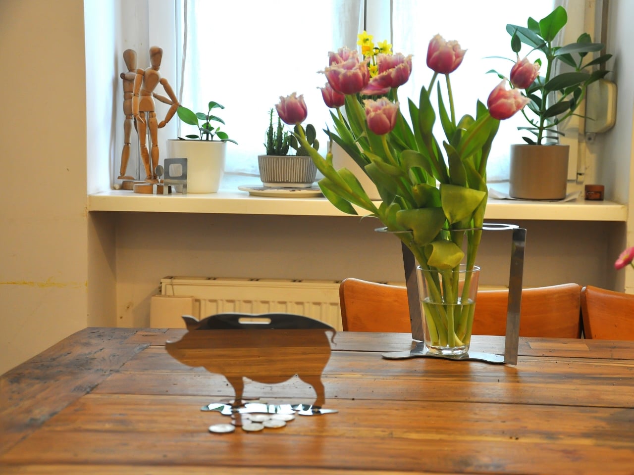
And communicate they do. The Piggybank is perhaps the most pointed piece in the collection. A traditional object redesigned to reflect a reality where saving is an illusion, it wears its cynicism openly. The pig is rendered as a flat stainless steel silhouette with a coin slot at the top, but there’s no belly to hold anything. Your coins rest on the surface. It’s funny, and it’s bleak, and it manages to be both of those things at once in the way that only good design pulls off. At a time when most people are watching their savings get swallowed by inflation, putting this on your shelf feels less like irony and more like cathartic honesty.

The Reality TV tealight holder takes a different angle. Shaped like a boxy, retro television set, it frames a tealight where the screen should be. When the flame is lit, you’ve got a broadcast. “Reflecting reality live, 24/7.” The concept is sharp without being heavy-handed. It makes you smirk, and then, a moment later, makes you think about the fact that we genuinely do stare at glowing rectangles all day as a form of comfort. Having a warm, flickering version of that sitting on your dinner table feels like Kadushin winking at us all.

Echoes, the candle holder, is the most sculptural of the three. A nuanced sculptural object echoing iconic 60s and 70s aesthetics with a contemporary edge, it’s the kind of object that earns a second and third look. The stacked, interlocking forms feel almost architectural, like a detail pulled from a midcentury design catalogue and rebuilt in stainless steel. Placed on a shelf without a candle, it still looks like it belongs in a gallery. With one lit, it earns its keep.

What ties Pieces together is the refusal to be decorative for decoration’s sake. Kadushin’s work is sculptural and communicates clever wit and free expression, and he designs user-assembled pieces that are an invitation to enjoy and participate in the creative process. The objects are funny, but they’re not novelty items. They’re precise, considered, and built from high-grade stainless steel that will still look good long after the trend cycle has moved on.

If you’re the kind of person who thinks about what your home objects say about you, and more and more people are, then Pieces is a collection worth paying attention to. Good design doesn’t just fill space. At its best, it holds an opinion. Kadushin’s does both.

The post Objects With Opinions: Ronen Kadushin’s Pieces first appeared on Yanko Design.
  • ✇Yanko Design
  • The Memdock G3 Is the 13-Port Dock You Don’t Have to Hide Anymore
    Modern desks have never looked better. Sit-stand tables, cable management trays, and ultra-thin laptops have turned the average workspace into something worth showing off. But for all the effort that goes into making a desk look clean and intentional, the accessories that actually power it are often still a mess, and docking stations, in particular, tend to be boxy, generic things that most people try to hide. That habit of hiding docks makes sense, since most of them aren’t exactly something y
     

The Memdock G3 Is the 13-Port Dock You Don’t Have to Hide Anymore

Par : JC Torres
15 mai 2026 à 21:45

Modern desks have never looked better. Sit-stand tables, cable management trays, and ultra-thin laptops have turned the average workspace into something worth showing off. But for all the effort that goes into making a desk look clean and intentional, the accessories that actually power it are often still a mess, and docking stations, in particular, tend to be boxy, generic things that most people try to hide.

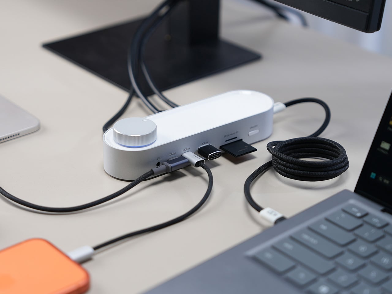
That habit of hiding docks makes sense, since most of them aren’t exactly something you’d want on display. The Memdock G3 takes a different approach. It’s a 13-in-1 docking station that doesn’t look the part in the way most docks do, and that’s a compliment. With a rounded aluminum body and a physical volume knob at one end, it’s designed to sit on the desk, not behind it.

Designer: Memdock

Click Here to Buy Now: $89 $189 ($100 off). Hurry, only 135/200 left! Raised over $50,000.

The aluminum shell is both light and sturdy. Weighing just 175g and measuring 17cm in length, it won’t crowd any desk. The silver-white finish sits comfortably alongside a MacBook or a Surface without looking out of place. A one-touch power switch keeps things simple, while the knurled volume knob doubles as a status indicator with a blue ring glowing softly at its base.

Where the G3 separates itself from generic hubs is with its dual HDMI outputs, both capable of 4K at 60Hz. Whether you’re juggling two monitors or spreading your workspace across screens, the setup doesn’t need extra adapters or complicated display routing. It works across Windows and macOS without additional drivers, so plugging in is genuinely all you need to get a full dual-screen arrangement running.

Charging is another area where the G3 keeps things clean. The 100W PD port can keep a laptop topped up while everything else stays connected, which means you don’t need a separate charger taking up another outlet. Pass-through charging also stays active even when the dock is switched off, so your devices keep charging overnight without you having to think about it.

On the data side, the G3 carries multiple 10Gbps connections, including USB-C, which is meaningfully faster than the 5Gbps typical of most docks in its category. Moving a batch of raw photos or offloading footage from an external drive feels noticeably quicker, cutting the time you’d otherwise spend watching a progress bar crawl. Two USB-A ports handle the everyday stuff, from keyboards and mice to thumb drives.

Photographers and video shooters will appreciate having both an SD and a TF slot built in, which removes the hassle of hunting for a separate card reader every time they need to pull files off a camera. Pair that with a Gigabit Ethernet port for a steadier wired connection, and the G3 handles a range of workflows that most hubs can’t without reaching for yet another dongle.

The volume knob deserves a separate mention, not just as a feature, but as a design choice that says something about the G3’s priorities. Instead of digging through a settings panel every time you want to nudge the audio on a call, you just reach over and turn it. It’s a small thing, but it’s the kind of immediate, tactile control that feels obvious once you have it.

Docking stations rarely get treated like products worth designing with real care. They sit at the junction of display, power, data, and audio, making them genuinely central to how a desk functions, yet they’re almost always designed as if nobody will ever look at them. The Memdock G3 is a reminder that the things holding a workspace together can be just as thoughtfully considered as anything else on the desk.

Click Here to Buy Now: $89 $189 ($100 off). Hurry, only 135/200 left! Raised over $50,000.

The post The Memdock G3 Is the 13-Port Dock You Don’t Have to Hide Anymore first appeared on Yanko Design.
  • ✇Yanko Design
  • This Ceramic Vase Is Actually a Phone Speaker That Needs No Power
    The home has become increasingly cluttered with gadgets that need charging, pairing, and their own dedicated spaces. Even something as simple as playing music from a smartphone often involves a Bluetooth speaker sitting on a shelf, waiting for its battery to drain. There’s been a quiet counter-movement in product design, where objects do their jobs without power and sit in a room the way a vase or a mug would. Kenji Abe’s ECHO is exactly that kind of object. It’s an analog speaker that amplifie
     

This Ceramic Vase Is Actually a Phone Speaker That Needs No Power

Par : JC Torres
12 mai 2026 à 12:20

The home has become increasingly cluttered with gadgets that need charging, pairing, and their own dedicated spaces. Even something as simple as playing music from a smartphone often involves a Bluetooth speaker sitting on a shelf, waiting for its battery to drain. There’s been a quiet counter-movement in product design, where objects do their jobs without power and sit in a room the way a vase or a mug would.

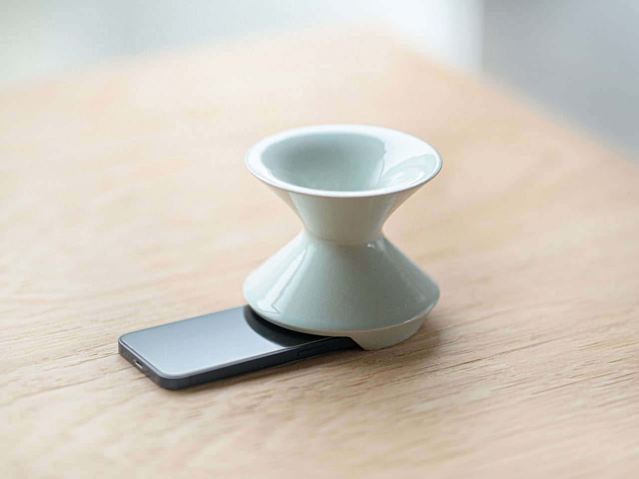
Kenji Abe’s ECHO is exactly that kind of object. It’s an analog speaker that amplifies smartphone audio simply by being set on top of the phone, requiring no power, no pairing, and no setup beyond placing it down. The concept takes its cues from wind instruments and seashells, two forms that have been shaping and projecting sound for centuries without the help of electricity.

Designer: Kenji Abe

The inside of ECHO works like a chamber, built to catch the phone’s audio and carry it outward in soft, diffused waves rather than projecting it directly. The geometry draws from the same logic as a cupped hand, but with more control over how sound travels. The result isn’t a dramatic volume boost so much as a room-filling quality that feels warmer than a powered speaker on a desk.

The choice of material makes as much of a statement as the form. Abe uses glazed ceramic, the same material found in vases, mugs, and tableware, giving ECHO a texture and presence that belongs in a home rather than on a tech shelf. It doesn’t look like an accessory. It looks like something that was always there, something that simply happened to be placed near a phone.

That quality matters when the phone is on the kitchen counter and you want music while cooking, or on a desk where you’d rather not have a speaker taking up permanent residence. ECHO doesn’t need to live next to a charging cable or be put away between uses. It sits on the table and becomes part of the room, as unobtrusive as any other ceramic piece nearby.

A guest walking in wouldn’t necessarily clock it as a tech product. That’s partly the point. The glazed surface catches light the way pottery does, and the form is quiet enough to sit beside books or plants without demanding attention. When a phone is slid underneath it, it starts doing its job. When the phone is gone, it just stays there, still looking like it belongs. The same underlying principle runs through the Battery-free Amplifying iSpeakers, where a Duralumin metal enclosure amplifies a smartphone’s audio without any power.

Abe designed ECHO to exist comfortably in a room even when it isn’t doing anything, a goal most speakers never consider. Most audio accessories announce themselves. This one quietly waits, and when a phone is close enough to fill the cavity with sound, the room gets a little warmer and a little fuller without anyone having to reach for a power button.

The post This Ceramic Vase Is Actually a Phone Speaker That Needs No Power first appeared on Yanko Design.
  • ✇Yanko Design
  • This 4-in-1 Hands-free Flashlight Clips To Clothes, Snaps to Your Phone, and Stands on Its Own
    A Red Dot Design Award and a $210,000 Kickstarter campaign are two very different kinds of validation. One comes from a jury of design professionals evaluating form, function, and coherence. The other comes from tens of thousands of people who looked at a product and handed over money before it shipped. SparkO, the compact wearable EDC flashlight from California’s ScoutLite, earned both. That combination suggests something specific about the object: it reads clearly to designers and solves some
     

This 4-in-1 Hands-free Flashlight Clips To Clothes, Snaps to Your Phone, and Stands on Its Own

11 mai 2026 à 21:45

A Red Dot Design Award and a $210,000 Kickstarter campaign are two very different kinds of validation. One comes from a jury of design professionals evaluating form, function, and coherence. The other comes from tens of thousands of people who looked at a product and handed over money before it shipped. SparkO, the compact wearable EDC flashlight from California’s ScoutLite, earned both. That combination suggests something specific about the object: it reads clearly to designers and solves something real for everyday people. At $45.99 and 40 grams, the barrier to entry is low enough that hesitation becomes difficult to justify.

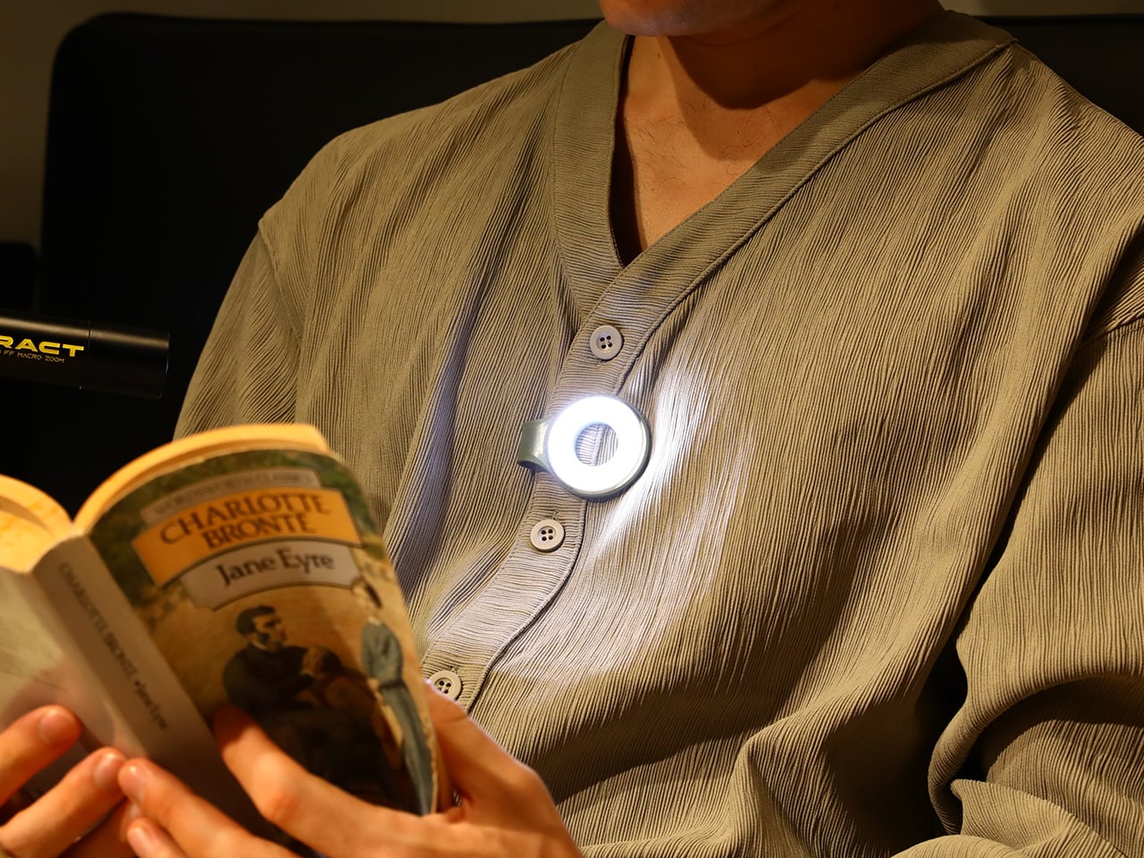
Two photos of SparkO are enough to grasp the concept: a disc-shaped body, a silicone loop that clips and doubles as a kickstand arm, and a circular LED array wrapped in a fine prismatic lens ring. The anodized metal bezel is color-matched to whichever of the four options you pick, Forest Moss, Basalt Black, Glacier Blue, or Canyon Clay. It clips to a bag strap or jacket, snaps magnetically to a MagSafe iPhone, props upright on the optional ring stand, or rides on clothing as a hands-free wearable. That range of deployment is the whole argument for SparkO, and ScoutLite backs it with 300 lumens, three color temperatures, four brightness levels, a red light mode, CRI 95+ rendering, a 14.5-hour runtime, and USB-C charging. At a campsite, a workbench, or a dim restaurant table, the light adapts to the situation rather than demanding you adapt to it.

Designer: Ten

Click Here to Buy Now: $41.40 $45.99 (10% off, use coupon code “YK10”). Hurry, deal ends in 48-hours!

The disc form is a real departure from the cylindrical tube that has defined flashlight design for over a century. A cylinder forces you to hold it; a disc invites you to wear it, clip it, or set it down facing wherever light needs to go. The silicone loop is soft enough to flex over thick fabric and structured enough to hold position once seated, its geometry doubling as the kickstand arm when the magnetic ring base enters the picture. The circular LED face is surrounded by a concentric prismatic lens ring that distributes light broadly and evenly, borrowing visual language from photography ring lights rather than from tactical torches. That framing signals the breadth of SparkO’s intended audience: the tradesperson and the camper, but equally the commuter, the hobbyist, and the photographer working in low light.

Clipped to a chest pocket or jacket collar, SparkO illuminates whatever your hands are working on without requiring you to hold anything, which is the core use case that conventional EDC lights have historically fumbled. Snapped to the back of an iPhone Pro via the magnetic base, it becomes a fill light for close-up photography, turning a phone into something resembling a professional lighting rig for the cost of a decent lunch. The ring stand converts the same unit into a bedside reading lamp or a compact task light with a footprint smaller than a drink coaster. Each scenario calls for a different mounting method, and the transitions between them take seconds rather than a setup ritual. Four modes sounds like a marketing stretch right up until you’ve run through all of them in a single day, and then it starts to feel like the accurate count.

Three hundred lumens is the right range for a light this size: capable outdoors, tolerable at close range, and not so aggressive that it becomes a problem in tight spaces. The three color temperature options matter more than the lumen figure in daily use, covering the gap between a warm amber reading mode and a cooler beam suited to detailed work. CRI 95+ color rendering is what sets SparkO apart from most of the EDC lighting field, reproducing colors accurately enough that the light reads close to natural daylight, which makes a genuine difference for craftspeople and photographers. The red mode preserves night-adapted vision on a trail or at a campsite, a small but real addition for outdoor use. Runtime at 14.5 hours and USB-C charging put SparkO on a weekly recharge cycle with a cable it shares with everything else in a modern carry kit.

ScoutLite has built a product that lands on the right side of the three virtues the EDC community consistently responds to: compact, accessibly priced, and solving a problem the existing field handles poorly. The Red Dot Award carries credibility for an audience that pays attention to such things, while the $210,000 Kickstarter result is a harder signal to argue with, because crowdfunding backers are betting on a design that communicates its own value clearly enough that waiting feels unnecessary. At $45.99, the decision practically makes itself, especially given that the clip, the magnet, the stand, and the wearable mode collectively cover more scenarios than most EDC kits manage with multiple dedicated tools. Whether ScoutLite follows this up with accessories or a higher-output variant, SparkO sets a credible benchmark for what a wearable EDC light should cost, weigh, and do. The category has needed something this considered for a while.

Click Here to Buy Now: $41.40 $45.99 (10% off, use coupon code “YK10”). Hurry, deal ends in 48-hours!

The post This 4-in-1 Hands-free Flashlight Clips To Clothes, Snaps to Your Phone, and Stands on Its Own first appeared on Yanko Design.
Forget cat ears, I want this awesome gaming headset themed after one of my favorite Pokémon — especially now that it and other accessories are on sale

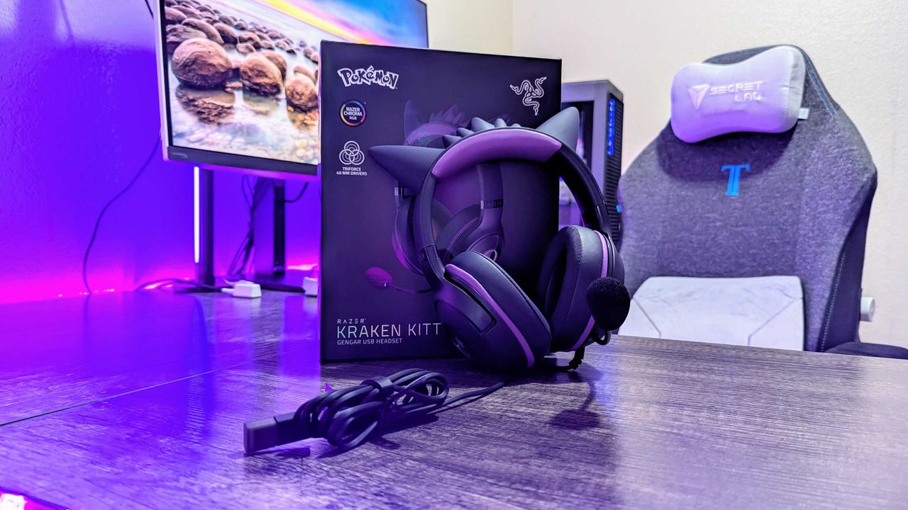
Several Razer gaming accessories themed after the classic Pokémon Gengar, including a gaming headset, gaming mice, and a mouse pad, are all enjoyable limited-time bargains at Amazon.

Purple-lit gaming setup featuring a boxed Razer Kraken Kitty headset with cat ears on a desk, alongside a gaming chair and monitor in the background.

Gengar lovers will love this gaming headset.

Introducing the Tom’s Guide Savings Squad — and why Windows Central readers should absolutely care

The Tom’s Guide Savings Squad is officially live, officially useful, and officially ready to help you stretch your tech budget further than you thought possible.

Five diverse individuals stand closely together against a gradient blue background. A logo with "tg Savings Squad" is on the right. They appear friendly and approachable.

Five diverse individuals stand closely together against a gradient blue background. A logo with "tg Savings Squad" is on the right. They appear friendly and approachable.

  • ✇Yanko Design
  • Phone Cases Are Boring, This One Puts a Living Terrarium Inside
    Phone cases have largely settled into two camps: the ones that protect your phone without anyone noticing they exist, and the ones that make a statement with printed graphics, colors, or textures. Neither approach has found a way to make the back of a phone genuinely interesting rather than just decorated. Designer Daniel Idle found a third option that neither camp seems to have considered. The Terrarium Phone Case is a clear resin case for the iPhone 16 Pro Max with an actual planted environme
     

Phone Cases Are Boring, This One Puts a Living Terrarium Inside

Par : JC Torres
10 mai 2026 à 13:20

Phone cases have largely settled into two camps: the ones that protect your phone without anyone noticing they exist, and the ones that make a statement with printed graphics, colors, or textures. Neither approach has found a way to make the back of a phone genuinely interesting rather than just decorated. Designer Daniel Idle found a third option that neither camp seems to have considered.

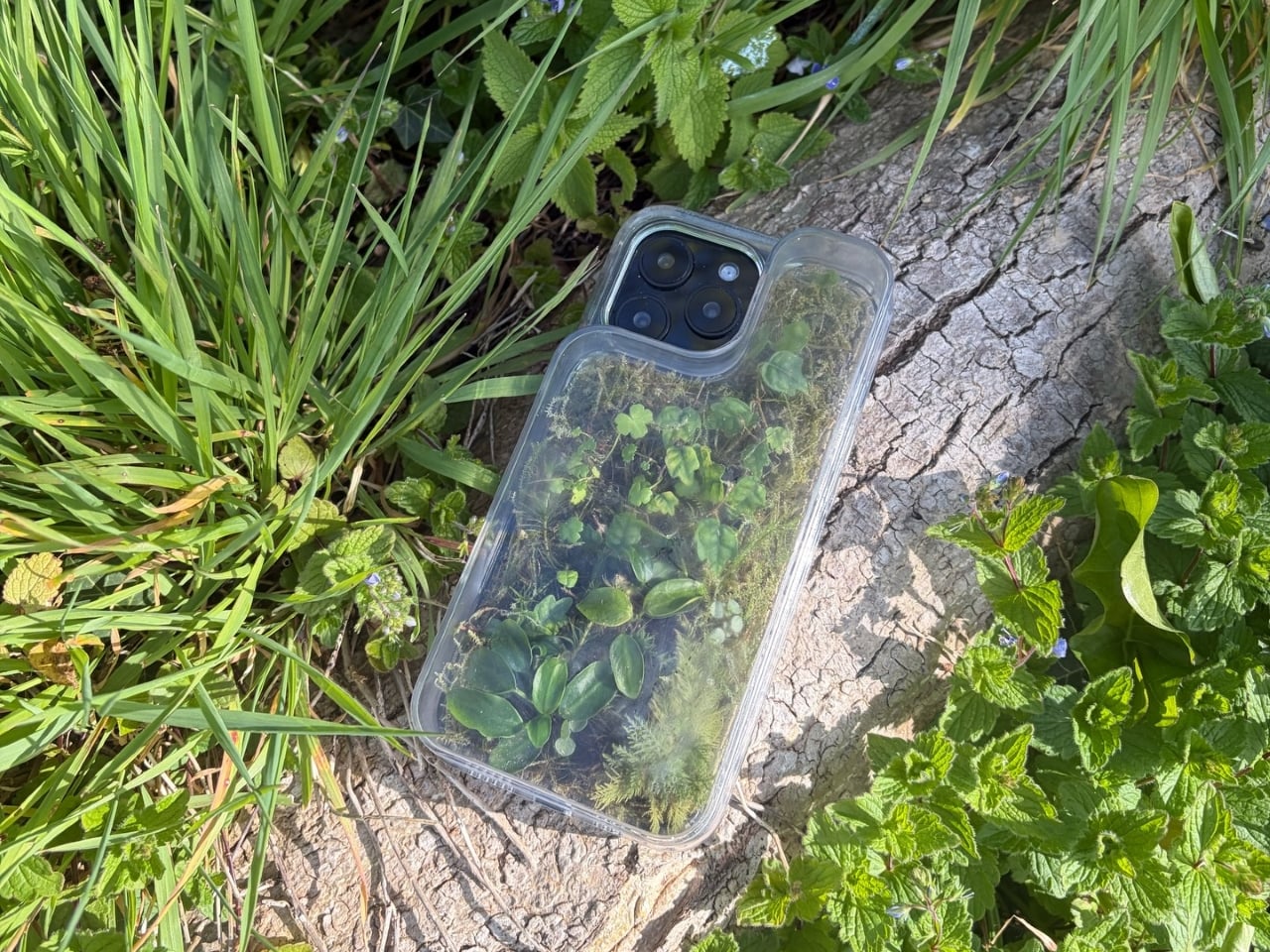
The Terrarium Phone Case is a clear resin case for the iPhone 16 Pro Max with an actual planted environment sealed inside the back cavity. Moss, small-leafed plants, and a stabilized soil substrate are embedded within the transparent shell, creating a thin cross-section of living terrain that you carry around with you wherever the phone goes. It’s a working phone case, a functional terrarium, and an oddly calming thing to have in your pocket all at once.

Designer: Daniel Idle

The construction involved 3D modeling and fabrication in clear resin, producing a case with enough depth in the back wall to house soil, roots, and plant matter. The plants are packed using a stabilized substrate that keeps the arrangement intact when the phone is picked up, rotated, tilted, or slipped into a bag. The camera cutout is fully preserved; the charging port at the bottom remains accessible; the phone continues to work exactly as it always did.

What keeps everything alive inside the sealed cavity is a closed-loop moisture system. The plants and soil generate humidity, which evaporates toward the inner surface of the resin, condenses back into droplets, and cycles down again. Light passing through the clear shell feeds the plants from outside, while the substrate provides gradual nutrient release. The whole thing is, in a fairly literal sense, a miniature ecosystem that sustains itself without any intervention from the person carrying it.

The condensation that forms on the inside of the shell during high-humidity moments is part of the visual appeal rather than a flaw to be engineered away. Seeing that vapor cycle through the case is a reminder that something in there is alive, actively breathing and responding to its environment, in the same pocket or bag as a device specifically engineered to minimize all biological interference.

There’s a running thread through design culture about bringing nature back into objects and spaces that have drifted too far from it. Biophilic design has become a recognizable term for everything from moss walls in offices to plant-filled shelving in apartments. Most of those applications treat plants as decoration layered on top of an existing design. Idle’s approach is different because the plant system isn’t decoration; it’s structural, sealed directly into the object’s body as a core component rather than an afterthought.

Of course, there will be some reservations about putting moisture and soil so close to your phone, which might be resistant to water and dust, but only from brief encounters. Good thing, then, that it’s still a concept project right now. But as a thought experiment about what a phone case could reasonably contain, it lands somewhere between genuinely novel and gently absurd, which is probably the most honest place for a good idea to start.

The post Phone Cases Are Boring, This One Puts a Living Terrarium Inside first appeared on Yanko Design.
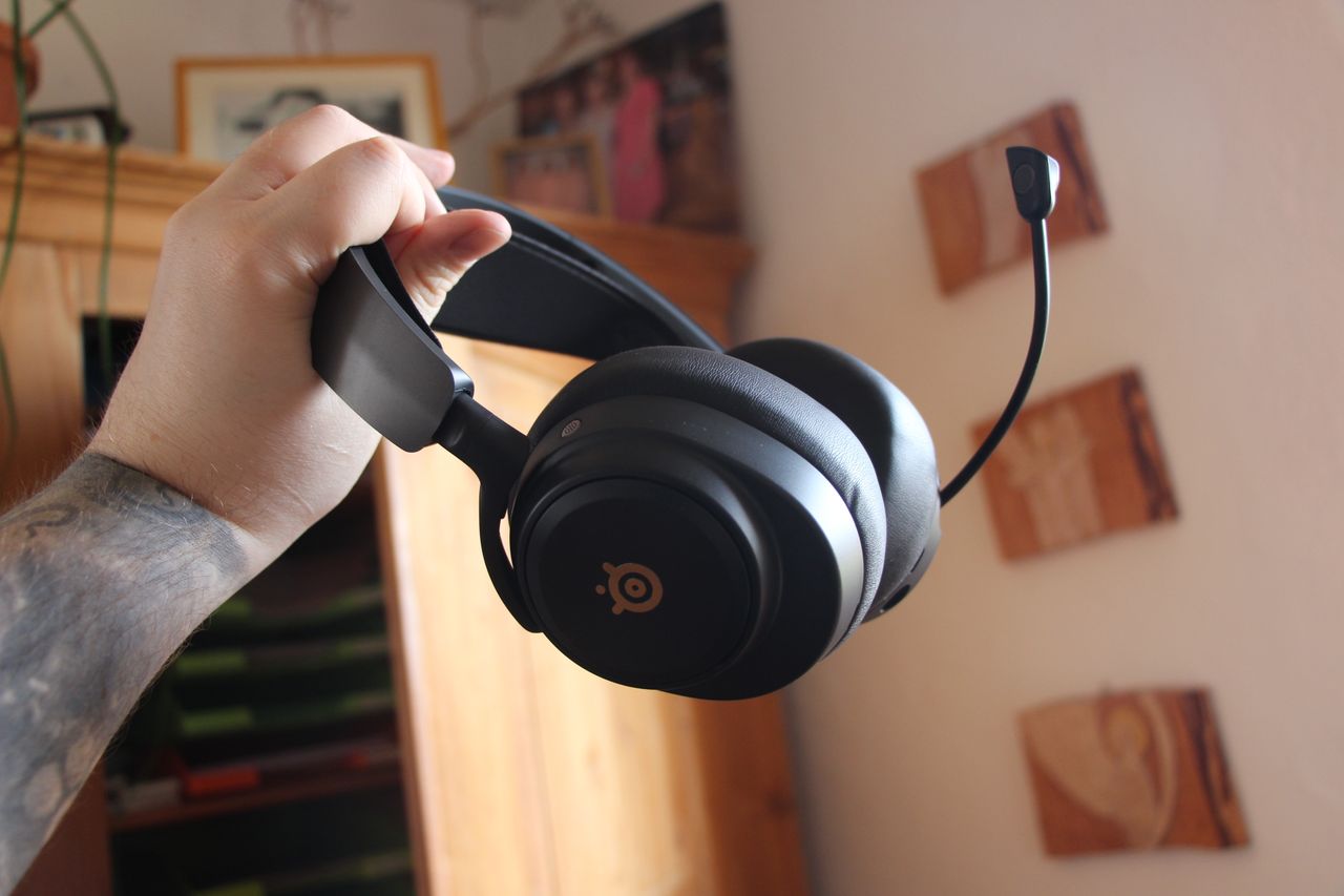
"SteelSeries finally helped me retire my battered 2015 Astro A50": This is the multiplatform headset, perfected

Finally, after almost a decade, I've replaced my battered Astro A50 headset. The Arctis Nova Pro Omni ticks every single box for multiplatform gamers, in an option far more affordable than its Elite cousin.

SteelSeries Arctis Nova Pro Omni photographs

Headset ascending.

This hybrid headset earned respect for "great sound quality on all fronts" — and we think so too now that it's 44% off

The Razer Barracuda Pro is a special premium headset that elevates the sound of music and video games with great sound and the ability to connect to devices simultaneously, and it's now on offer for a 44% discount.

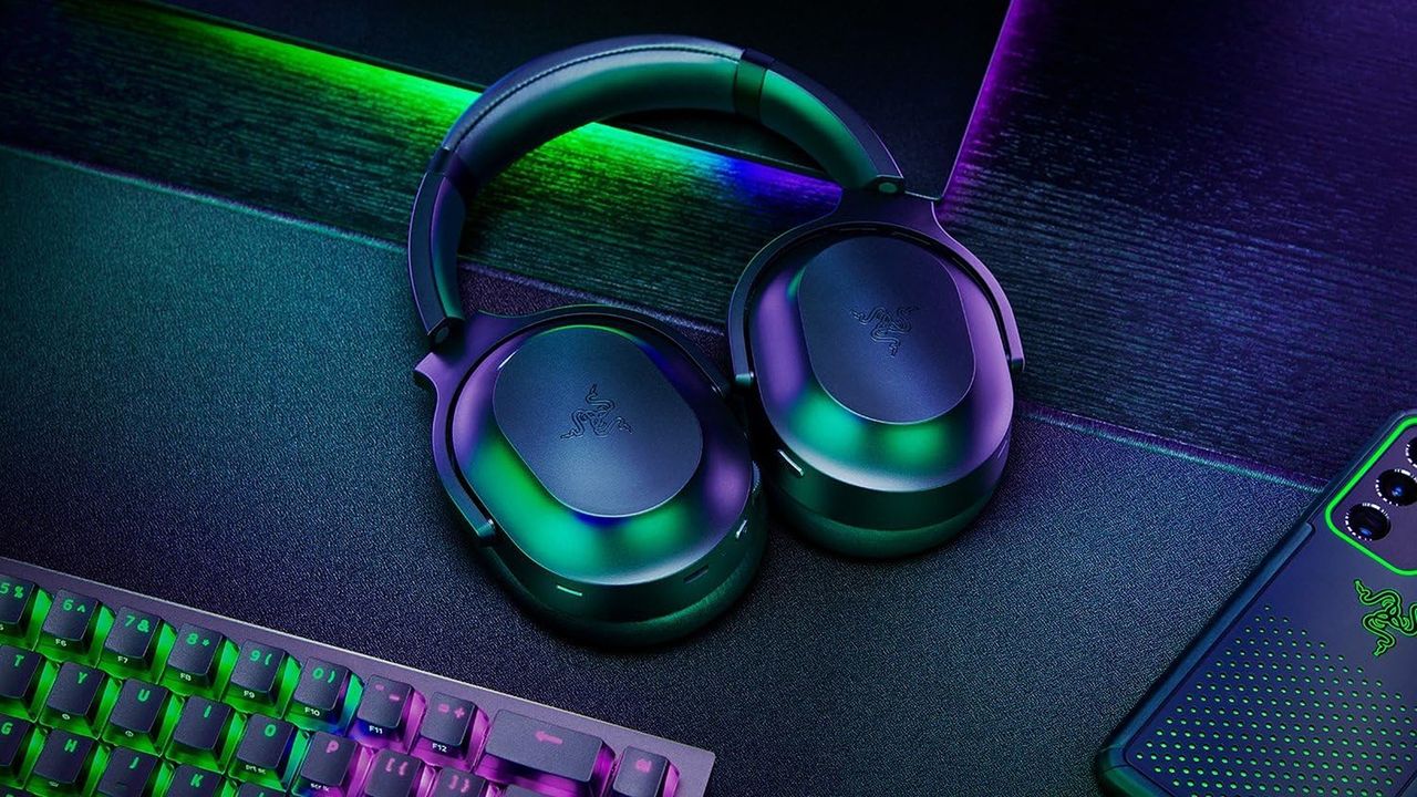
Sleek gaming headphones in green and purple hues sit on a dark desk, surrounded by a glowing RGB keyboard and a smartphone, creating a vibrant tech ambiance.

Stylish and functional headset for gaming and music

  • ✇Yanko Design
  • Tesla Left a Glaring Gap in Every Model 3 and Model Y. This $379 HUD Fixes It.
    Fighter pilots have had heads-up displays since the 1950s, because asking a human to look down at instruments while traveling at 600 miles per hour and making life-or-death decisions is an engineering failure, not a pilot failure. The technology migrated to production cars in 1988 when GM offered the first automotive HUD in the Oldsmobile Cutlass Supreme, and every generation of premium vehicle design since has treated it as table stakes. Tesla rewrote so many conventions of the automobile that
     

Tesla Left a Glaring Gap in Every Model 3 and Model Y. This $379 HUD Fixes It.

8 mai 2026 à 21:45

Fighter pilots have had heads-up displays since the 1950s, because asking a human to look down at instruments while traveling at 600 miles per hour and making life-or-death decisions is an engineering failure, not a pilot failure. The technology migrated to production cars in 1988 when GM offered the first automotive HUD in the Oldsmobile Cutlass Supreme, and every generation of premium vehicle design since has treated it as table stakes. Tesla rewrote so many conventions of the automobile that it’s easy to forget it left one important capability behind. For all the innovation packed into the Model 3 and Model Y, their dashboards direct critical driving data to a screen mounted nowhere near where human eyes naturally rest during forward motion. TrantorVision built NeuroHUD to close that gap, and the Kickstarter campaign funded in 30 minutes.

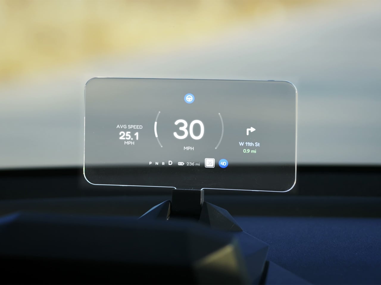
Built alongside a community of over 4,000 Tesla owners from mid-2025 through early 2026, NeuroHUD projects Tesla driving data directly into the driver’s forward sightline rather than leaving it on a screen at center console height. Installation takes about one minute, requires no tools and no disassembly, and leaves the factory wiring completely untouched, keeping the manufacturer’s warranty intact. The compute module clips behind Tesla’s center screen and draws power through a single USB-C cable, with no hardwired connections and no vehicle modifications of any kind. From there, a dual-channel data system reads Tesla’s screen directly through AI cameras and simultaneously pulls deeper vehicle telemetry through the Tesla API, creating a richer information layer than either method could supply alone. The result covers speed, navigation, gear state, battery range, blind-spot alerts, and takeover warnings, all projected directly in the driver’s line of sight.

Designer: TrantorVision

Click Here to Buy Now: $379 $629 (40% off). Hurry, only a few left! Raised over $474,000.

A pair of 150-degree AI fisheye cameras face Tesla’s display and read high-frequency data like speed at 50 Hz, fast enough to keep the HUD readout synchronized with the car’s actual state without perceptible lag at any velocity. Lower-frequency information, covering gear position, battery range, and navigation turns, arrives through the Tesla API on a separate channel, and the system routes each data type through the appropriate pipeline based on how quickly it needs to update. End-to-end latency on the AI vision side sits as low as 20 milliseconds, tighter than many production-fitted HUDs achieve through direct hardware integration. The onboard processor is a 6-core Arm DynamIQ chip paired with an Arm Mali G610 MP4 GPU and 4GB of LPDDR4 RAM, running Ubuntu Core Linux with Wi-Fi 6 and Bluetooth 5.4 connectivity. That compute specification would look comfortable in a mid-range Android tablet, which gives a sense of how much processing headroom TrantorVision has reserved for future OTA feature additions.

At 1,500 nits of peak brightness, NeuroHUD’s 4-inch TFT LCD panel is engineered specifically around the failure mode that sinks most aftermarket HUDs in real-world use: direct sunlight washout. The panel runs at 480×800 resolution with a 140-degree viewing angle, keeping displayed information legible across a wide range of driver head positions without requiring precise alignment to a narrow sweet spot. The modular Light Engine gives drivers a genuine choice of projection method rather than committing them to a single approach. Combiner Mode positions a semi-transparent screen in the driver’s sightline for the sharpest image quality, with projected information appearing to float in the forward visual field at a focal distance that keeps eyes aimed naturally at the road. Windshield Projection Mode throws the image directly onto the glass for a more immersive overlay, and both modes switch without tools or any hardware intervention.

HomeControl is a GPS-triggered garage automation system that learns the driver’s RF remote signal, geolocates the home driveway, and fires the garage door automatically as the car turns in, with a physical button for manual override available at any time. Screen Mirroring turns the HUD into a secondary phone display, meaning Google Maps or Waze can be projected directly onto the combiner or windshield without any dependency on Tesla’s native navigation system. UI customization runs three levels deep: a mobile app for toggling individual elements, a full UI editor for precise sizing and positioning of each data element, and an open API interface for users who want to build a custom renderer entirely from scratch. A community layer lets drivers share layouts or download configurations built by other NeuroHUD owners worldwide, making the display experience as much a living software product as a hardware one. The combination of GPS automation, open API access, and a community-driven layout library gives NeuroHUD a software depth that compounds as its user base grows.

TrantorVision began the project in January 2025 with the goal of building a heads-up display designed around Tesla’s unique display architecture from the ground up. By May 2025 an engineering prototype was assembled and the AI vision system validated through real-world road testing; by July the product was publicly announced with a community already exceeding 4,000 Tesla owners across multiple platforms. Production design locked in December 2025, with the first batch of production samples arriving in January 2026. The device supports Model 3 from 2017 to 2023, Model Y from 2020 to 2025, Model 3 Highland from 2023 onward, Model Y Juniper from 2025 onward, and the Cybertruck from 2023 onward, covering both left-hand-drive and right-hand-drive configurations with Model 3/Y Standard trim included. An OTA Compatibility Upgrade Service is built in, meaning the hardware is designed to receive future software capabilities without requiring a new unit.

The standard NeuroHUD carries an early bird price of $379 against a retail MSRP of $629, covering Tesla data integration, mobile app control, UI community access, the custom UI editor, screen mirroring, and CarPlay and Android Auto support. The NeuroHUD Pro steps to $429 at early bird pricing, down from $729 retail, adding HomeControl, Windshield Projection Mode, deeper Tesla API integration, and enhanced hardware built to grow its feature set through over-the-air updates. Both tiers ship with a windshield film, USB-C power cable, Thunderbolt cable, 12V car adapter, cable clips, and a quick start guide, backed by a one-year warranty. Shipping is free to the continental United States and Canada, with a flat $10 covering the EU, UK, Australia, Hong Kong, and all other worldwide regions, with customs fees covered for most major markets. Global delivery is scheduled to begin between September and October 2026.

Click Here to Buy Now: $379 $629 (40% off). Hurry, only a few left! Raised over $474,000.

The post Tesla Left a Glaring Gap in Every Model 3 and Model Y. This $379 HUD Fixes It. first appeared on Yanko Design.
  • ✇Yanko Design
  • Your Knife Block Has No Business Looking This Good
    Most kitchen accessories come with an unspoken agreement: you accept that they look utilitarian, and in return, they do their job quietly in the background. Knife holders, in particular, have always been the least glamorous residents of the countertop. The wooden block is fine. The magnetic wall strip is practical. But neither has ever made anyone stop and stare. Samyuktha S’s Eclipse Edge concept breaks that agreement entirely, and I’m genuinely glad it does. The Eclipse Edge is a magnetic kni
     

Your Knife Block Has No Business Looking This Good

8 mai 2026 à 12:20

Most kitchen accessories come with an unspoken agreement: you accept that they look utilitarian, and in return, they do their job quietly in the background. Knife holders, in particular, have always been the least glamorous residents of the countertop. The wooden block is fine. The magnetic wall strip is practical. But neither has ever made anyone stop and stare. Samyuktha S’s Eclipse Edge concept breaks that agreement entirely, and I’m genuinely glad it does.

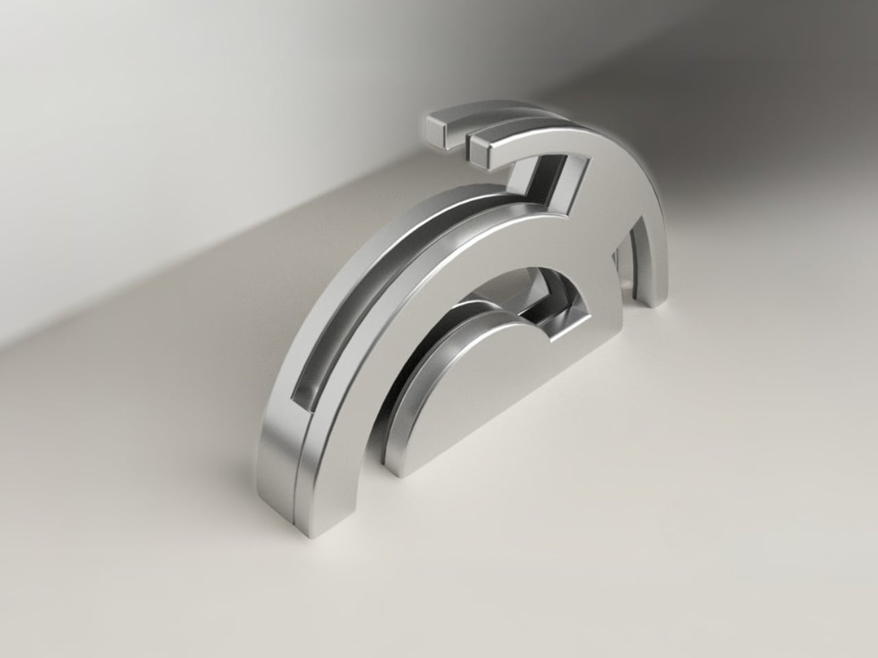
The Eclipse Edge is a magnetic knife holder inspired by the geometry of a lunar eclipse, specifically the moment when Earth aligns between the sun and moon, casting that iconic half-shadow silhouette into the sky. That form, an abstracted arc built from layered, concentric half-circles, becomes the entire design language here. Looking at it on a countertop, you wouldn’t immediately guess what it does. You’d probably assume it was a sculpture. That confusion is precisely the point.

Designer: Samyuktha S

Samyuktha’s design brief was direct: create a kitchen storage accessory that bridges functional utility and structural statement decor. The goal was to reimagine a standard tool organizer as a decorative landmark within the home, elevating it to a high-end sculptural piece. She achieved this without resorting to the usual tricks of adding color or unconventional materials. The Eclipse Edge is sand-casted aluminum with a hand-carved finish, and it leans entirely into that material’s dual nature: raw and refined at the same time.

The mechanics are equally considered. Hidden magnetic sheets inside the form hold knives parallel to the surface, which means blades are secured safely without any visible hardware or slots cutting into that clean silhouette. The oil and waterproof protective layering is built into the construction. Multiple knife sizes are accommodated without compromising the holder’s structural integrity or visual lines. It’s the kind of detail work that separates a pretty sketch from a design that actually holds up under scrutiny.

The ideation pages on Samyuktha’s Behance project tell you a lot. There are dozens of iterations, circular forms, crescent variations, abstracted lunar shapes explored and discarded before arriving at the stacked arch that became the final concept. Getting from a celestial reference to something that can hold a chef’s knife at the right angle and still look like contemporary sculpture takes a specific kind of problem-solving patience. The sketches make clear that nothing was accidental.

A physical prototype was also produced through aluminum sand casting using an MDF pattern, which means this design was tested in the real world, not just rendered beautifully and left to live on a screen. Seeing the actual object in photos alongside actual kitchen knives brings the concept into sharp focus. It looks grounded and serious in person, the kind of object that would hold its own on any well-styled countertop without asking for too much attention.

I do think about the practical day-to-day reality of owning something like this. Keeping polished aluminum pristine in a working kitchen takes effort, and the hand-carved finish, while gorgeous, would need care. But that’s not necessarily a flaw in the design. High-end kitchen objects have always required a little more commitment. A copper pot needs polishing. A cast iron pan needs seasoning. The Eclipse Edge feels like it belongs in that same category of objects you choose deliberately and tend to over time.

The broader conversation around kitchenware has been shifting for a while now. People increasingly want their kitchen tools to reflect how they live and what they care about, not just what they cook. The Eclipse Edge speaks to that shift with real confidence. It doesn’t apologize for being beautiful. It doesn’t hide its utility behind a costume. It just quietly insists that a knife holder can be, at the same time, an object worth looking at. Samyuktha S’s Eclipse Edge is a concept for now, but it’s the kind of concept that feels ready. The thinking is there. The craft is there. The prototype is there. Sometimes the only thing standing between a student project and a product is someone willing to bet on it.

The post Your Knife Block Has No Business Looking This Good first appeared on Yanko Design.
  • ✇Yanko Design
  • The TrackPoint Was Always Laptop-Only, This $52 Bean Changes That
    The pointing stick is one of the more divisive input devices in computing history. Lenovo’s TrackPoint has a devoted following, built around people who never want to lift their hands off the keyboard home row just to move a cursor. Everyone else finds the red nub somewhere between baffling and genuinely annoying. Either way, it has stayed locked to laptop keyboards for decades, with essentially no standalone options available. Ploopy, the Canadian open-source hardware company known for its line
     

The TrackPoint Was Always Laptop-Only, This $52 Bean Changes That

Par : JC Torres
8 mai 2026 à 10:20

The pointing stick is one of the more divisive input devices in computing history. Lenovo’s TrackPoint has a devoted following, built around people who never want to lift their hands off the keyboard home row just to move a cursor. Everyone else finds the red nub somewhere between baffling and genuinely annoying. Either way, it has stayed locked to laptop keyboards for decades, with essentially no standalone options available.

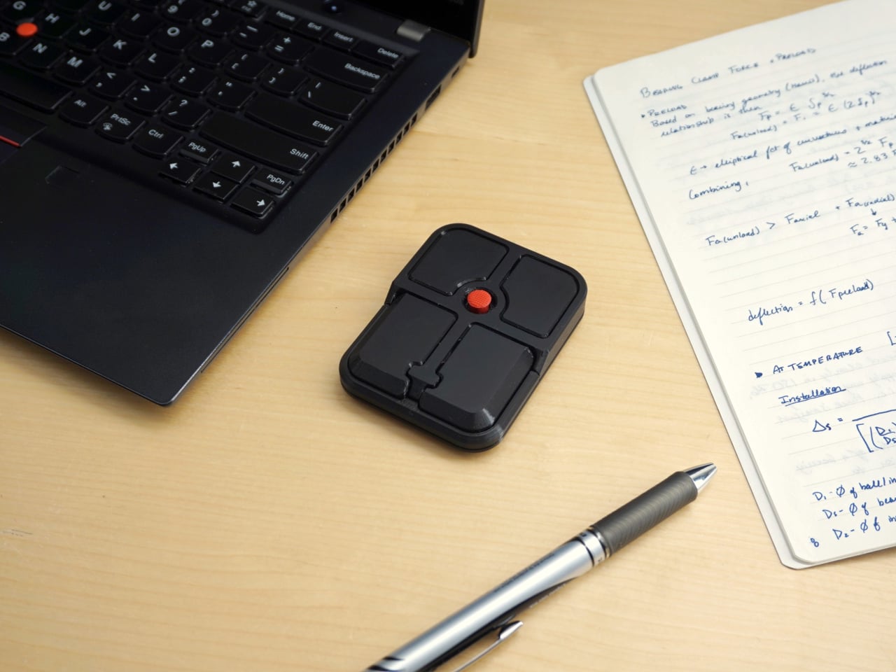
Ploopy, the Canadian open-source hardware company known for its lineup of trackballs and trackpads, has changed that with the Bean. It’s a standalone external pointing stick that connects over USB-C and sits flat on a desk. Think of it as a TrackPoint you don’t have to buy a ThinkPad to access, with a few deliberate improvements added to address the weaknesses that nub has always had.

Designer: Ploopy

The Bean measures 84mm x 64mm x 16mm and houses a red pointing nub near the center of its flat, 3D printed case. Unlike the fixed nubs built into laptop keyboards, this one has additional travel in its movement, which Ploopy says helps reduce fatigue from pushing a stiffer stick over long sessions. Four buttons flank the nub, covering the standard left, right, middle click, and scroll by default.

None of those defaults is locked in. The Bean runs QMK open-source firmware on a Raspberry Pi RP2040 microcontroller, and remapping any of the four Omron D2LS-21 buttons takes just a few minutes using the free VIA web app. There are no drivers to install and no proprietary software to deal with, just a browser-based tool that reads the device and lets you assign functions however you like.

For anyone who finds the conventional mouse hard on their wrist, or simply prefers keeping their hands positioned in front of them rather than reaching out to one side constantly, a pointing stick can make a noticeable difference over long sessions. You nudge the nub, and the cursor moves without your palm going anywhere. It’s a small thing until it isn’t, especially for people managing repetitive strain concerns.

Like everything else Ploopy makes, the Bean is completely open source. Hardware design files and firmware are both on GitHub, so anyone who wants to print their own case, modify the button layout, or write custom firmware from scratch has everything they need to do it. That kind of transparency is unusual for any consumer input device and puts Ploopy in a different category from virtually every competitor.

The Bean is available now for $70 CAD (around $52 USD), which is reasonable for a device with this much flexibility built in. It isn’t going to pull in anyone who has never thought about pointing sticks before, but for the enthusiast crowd that has been waiting for a standalone option this customizable and this open, it’s about as close to a purpose-built answer as anyone has delivered.

The post The TrackPoint Was Always Laptop-Only, This $52 Bean Changes That first appeared on Yanko Design.
"I can't go back to flat mice": Logitech MX Vertical ergonomic mouse drops to $74.99

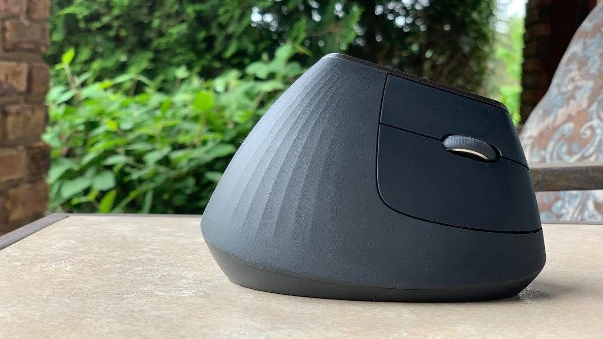
The Logitech MX Vertical is $45 off at Amazon and remains the ergonomic mouse I rely on for long workdays. Its vertical design keeps your wrist in a natural position, which makes a noticeable difference if you deal with stiffness or strain.

Logitech MX Vertical Mouse

The vertical design of the Logitech MX Vertical allows your hand and wrist to rest at a natural angle.

Razer's PS5 controller also makes for an amazing PC gamepad with TMR analog sticks and 2000Hz Polling Rates — and with this deal, it's a no-brainer

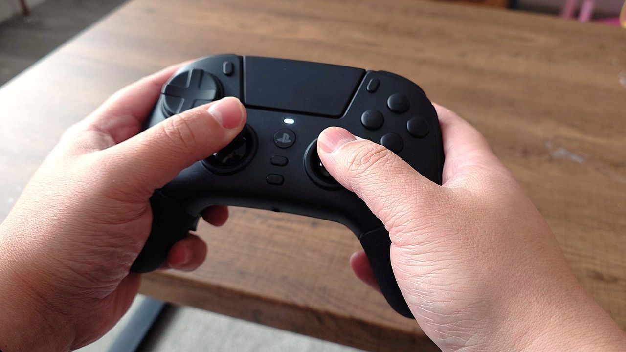
The Razer Raiju V3 Pro is an expertly crafted gamepad for PC and PlayStation 5 with fast and responsive controls, wide customizability, and a lightweight yet sturdy build. If you fancy this high-end controller, Amazon's currently selling it for a 23% discount for Amazon Gaming Week.

Hands holding a black gaming controller over a wooden table. The controller has visible buttons and an analog stick, suggesting gameplay action.

The Razer Jaiju V3 Pro is a must-have for PS5 and PC players.

"Still one of the best webcams with 4K and Windows Hello" — the Logitech BRIO 4K hits its lowest price in months

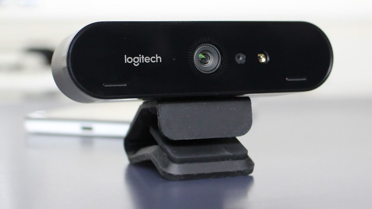
The Logitech BRIO 4K is on sale for $149.99, offering 4K video and Windows Hello support in a webcam that continues to hold up in 2026.

Logitech Brio 4K

The Logitech BRIO 4K still delivers sharp video and fast facial sign‑in years after launch.

This wireless mouse is still the "champion of Razer's high-end esports gaming lineup" — and it's even better during this event

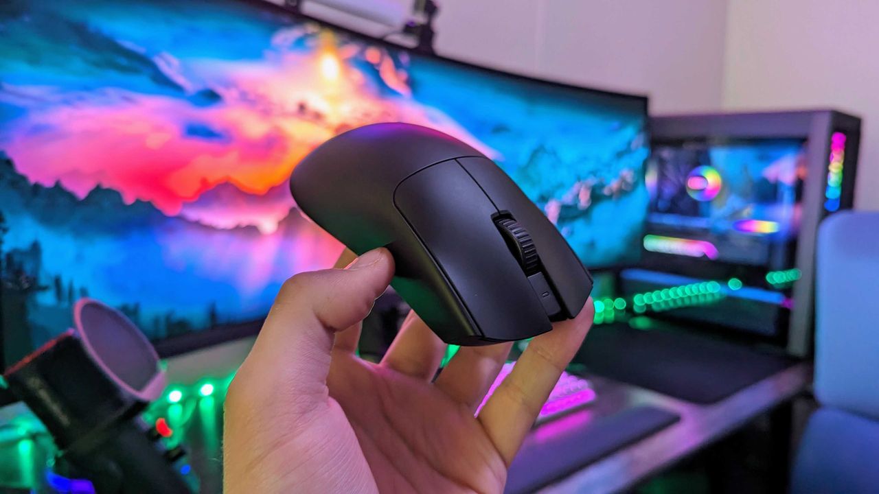
Amazon Gaming Week has a PC gamer's special discount for the Razer Viper V3 Pro gaming mouse. For just this week, you will be able to get your hands on this stellar accessory with 8K polling, 35,000 DPI, and comfy ergonomics at a 31% discount.

Image of the Razer Viper V3 Pro wireless gaming mouse.

The Razer Viper V3 Pro in hand.

  • ✇Yanko Design
  • This $45 Titanium Pocket Knife Uses Centrifugal Force and Neodymium Magnets Instead of A Button Lock
    Most pocket knives are designed for the moment you need to cut something. The TiNova II is designed for that moment, but also for the five minutes after, when you find yourself opening and closing it just because the mechanism feels satisfying. That shift in priorities is intentional, and it required Ideaspark to rethink the entire knife after the first version shipped to over 1,300 Kickstarter backers in 2025. The mechanism itself is straightforward. Two titanium handle scales connect at a sin
     

This $45 Titanium Pocket Knife Uses Centrifugal Force and Neodymium Magnets Instead of A Button Lock

2 mai 2026 à 21:45

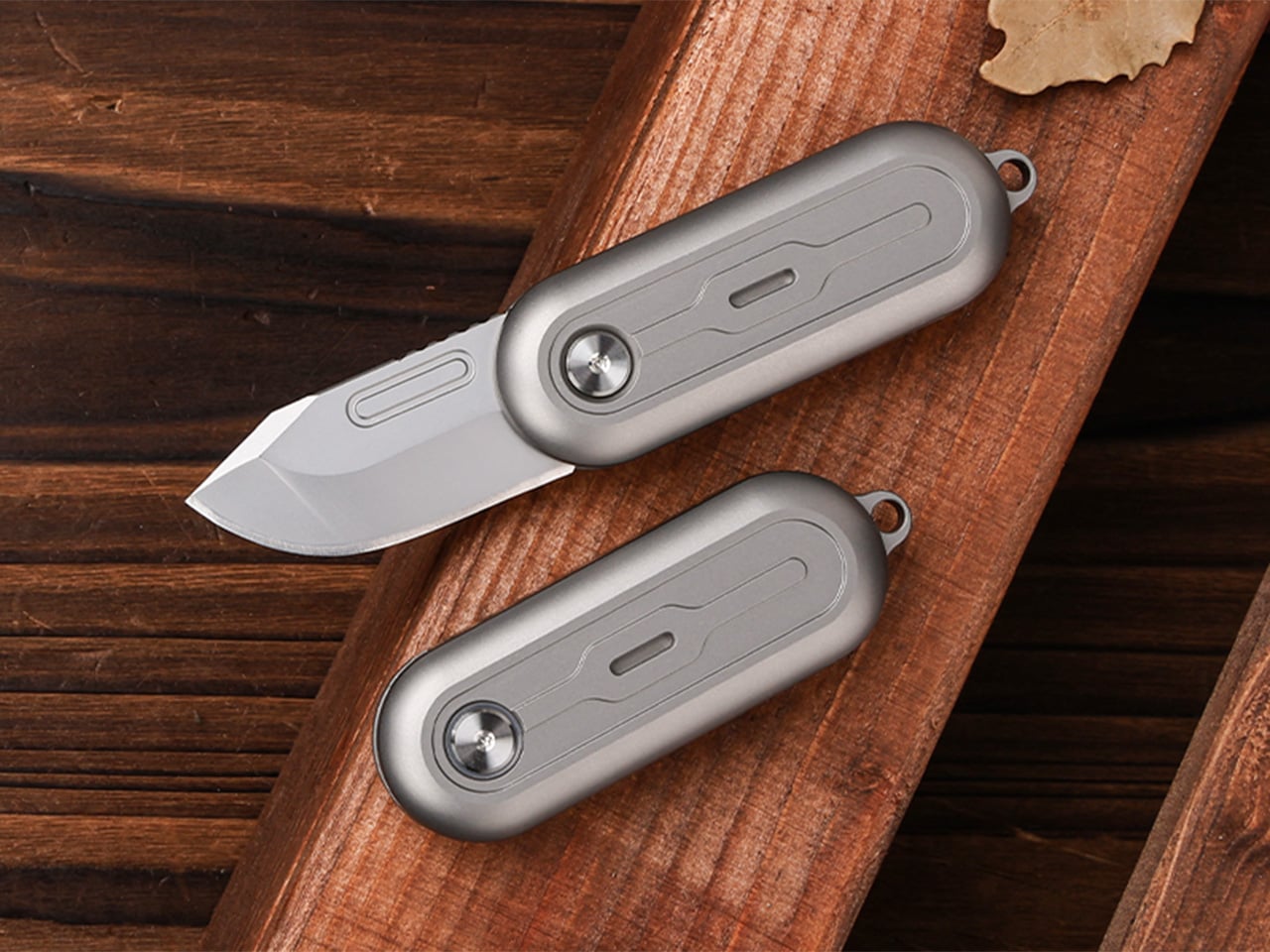
Most pocket knives are designed for the moment you need to cut something. The TiNova II is designed for that moment, but also for the five minutes after, when you find yourself opening and closing it just because the mechanism feels satisfying. That shift in priorities is intentional, and it required Ideaspark to rethink the entire knife after the first version shipped to over 1,300 Kickstarter backers in 2025.

The mechanism itself is straightforward. Two titanium handle scales connect at a single roller bearing pivot point. One scale stays fixed, the other rotates a full 360 degrees around it. Neodymium magnets sit at strategic positions to create resistance, so when the blade swings open or closed, you get a crisp magnetic snap that locks it in place. Flick your wrist and the momentum carries the blade through a smooth rotation with a satisfying ‘click’. Hold it differently and you can coax out a slower, weighted spin. What changed between Gen 1 and Gen 2 is the body shape. The original had flat sides and sharp edges like a traditional folding knife. The TiNova II uses an oval profile that matches the natural curve your hand makes when your fingers relax into a loose fist. That single geometry change makes the knife feel completely different when you’re holding it, which matters when the whole point is creating something you’ll keep picking up. The magnetic resistance is tuned tight enough to keep the blade from accidentally deploying in your pocket, but smooth enough that you can flip it open one-handed without effort.

Designer: Ideaspark

Click Here to Buy Now: $49 $70 (30% off). Hurry, only 64/100 left! Raised over $62,000.

The handle scales are machined from Grade 5 titanium, the aerospace alloy that shows up in everything from jet engine components to high-end bike frames. The material delivers the strength-to-weight ratio you’d expect (the entire knife weighs 59.3 grams, roughly two U.S. quarters), but the more interesting property is how it wears. Titanium doesn’t corrode, rust, or tarnish the way steel does. Instead, it develops a patina over time, recording scratches and scuffs as a visual history of use. Every mark becomes permanent, which means the knife you carry for a year looks distinctly different from the one that arrived in the mail. Ideaspark leans into this with two finish options: a raw sandblasted titanium that shows wear immediately, and a black PVD coating that creates higher contrast when the underlying metal starts to peek through.

The blade is D2 tool steel, heat-treated to HRC 58-60. D2 sits in an interesting zone within the steel hierarchy. It holds an edge longer than most budget steels (think 8Cr13MoV or AUS-8), and is a go-to choice for premium knives. The choice here makes even more sense for a keychain knife where you’re cutting tape, breaking down cardboard, trimming threads, or slicing through packaging, with practically negligible wear and tear over time compared to a knife that experiences the brunt of rugged outdoor use. The blade profile is a drop-point with a full belly, which gives you a long cutting edge relative to the 40.5mm blade length. The curve naturally guides material into the sharpest part of the edge, making it effective for slicing motions even when you’re working with something as small as this.

At 64.4mm closed, the TiNova II is shorter than a standard credit card (85.6mm). Opened, the entire knife measures 100mm, just under four inches. The thickness is 12.4mm, slimmer than a stack of three coins. These dimensions put it squarely in the micro-folder category alongside knives like the CRKT Pilar or the Kershaw Chive, but the deployment method sets it apart. Most compact folders use a flipper tab or a thumb stud, mechanisms that require deliberate engagement. The TiNova II uses rotational momentum, which feels closer to spinning a fidget toy than opening a knife. The roller bearing does most of the work. Ideaspark uses what they call a Kugellager bearing (the German term for ball bearing), which is a pretty great way of saying their precision-made bearings boast the kind of well-engineered frictionless movement you’d expect from the Germans. The result is a glide that feels even smoother than air, with no grinding or resistance as the handle rotates.

The magnetic system does several jobs simultaneously. First, it holds the knife closed when it’s in your pocket, preventing accidental deployment. Second, it provides tactile and audible feedback at both the open and closed positions, giving you a satisfying click that confirms the blade is locked. Third, it creates just enough resistance during the spin to make the motion feel controlled rather than loose. The magnets are arranged to pull at the end of each rotation, which is why the knife doesn’t just spin freely like a bearing on a shaft. You feel the mechanism working with you, and that feedback loop is what makes the fidget factor so addictive. The physics here are simple but effective. The magnetic force increases as the scales approach their final position, so the last few degrees of rotation feel like they’re being pulled into place.

An elliptical body shape means there’s no fixed orientation when you’re holding it. You can rotate the knife in your palm, flip it between fingers, or just run your thumb along the curved surface. The absence of sharp edges or defined corners makes it comfortable to manipulate for extended periods, which sounds trivial until you compare it to a traditional rectangular folder that starts digging into your hand after a few minutes. Ideaspark claims this design philosophy came directly from user feedback on the Gen 1 model, where backers loved the mechanism but found the angular body uncomfortable during long fidget sessions. The oval profile solves that problem by removing pressure points entirely.

Two tritium slots run along the length of each handle scale, sized for 1.5mm x 6mm tubes. Tritium is a self-luminous isotope that glows continuously for around 25 years without batteries, charging, or external light. Drop a pair of green, blue, or orange vials into those slots and the knife becomes visible in complete darkness, which is useful for finding it in a bag or on a nightstand. The glow is subtle, not the kind of thing that lights up a room, but enough to catch your eye when you’re fumbling around in the dark. The tritium slots also add a small visual detail that breaks up the otherwise minimal design.

The blade deployment works two ways depending on how you hold it. The long spin involves gripping one handle scale and flicking your wrist, which uses centrifugal force to carry the other scale through a full 360-degree rotation. The motion is slow, weighted, and deliberate. The short flip is faster: a quick wrist snap that sends the blade open with a crisp tick as the magnets engage. Both methods work one-handed, and both feel satisfying in different ways. The long spin has a hypnotic, rolling quality. The short flip is sharp and immediate. You’ll find yourself alternating between them depending on your mood or how much time you’re killing during a meeting.

The knife comes with a keychain hole at one end, sized for a standard split ring. Slip it onto your keys and it disappears into the cluster, weighing less than most car fobs. The compact dimensions mean it works equally well on a wallet chain, a backpack strap, or worn as a necklace pendant if you’re leaning into the EDC-as-jewelry aesthetic. The tritium glow makes it viable as a functional piece of illuminated jewelry, though calling it that probably annoys traditional knife collectors who prefer their folders utilitarian and unadorned.

The TiNova II ships in two finishes: sandblasted (raw titanium) and black coated (PVD). Both finishes come with the same lifetime warranty, which covers manufacturing defects and structural failures. The knife is available now starting at $45 for the launch day special (36% off the $70 MSRP), with free worldwide shipping included. International shipping is scheduled for August 2026.

Click Here to Buy Now: $49 $70 (30% off). Hurry, only 64/100 left! Raised over $62,000.

The post This $45 Titanium Pocket Knife Uses Centrifugal Force and Neodymium Magnets Instead of A Button Lock first appeared on Yanko Design.
  • ✇Yanko Design
  • A Mouse You Can Squeeze Like a Stress Ball While You Work
    The computer mouse hasn’t changed much in decades. Still mostly hard plastic, still shaped like a bar of soap, still asking your hand to grip something that gives absolutely nothing back. The rest of the desk setup has evolved, ergonomic chairs, standing desks, wrist rests, but the one device your hand touches for eight hours straight has remained stubbornly rigid and deeply uninteresting. The PILLIGA mouse concept makes a fairly obvious argument for why that should change. Instead of hard plas
     

A Mouse You Can Squeeze Like a Stress Ball While You Work

Par : JC Torres
2 mai 2026 à 18:30

The computer mouse hasn’t changed much in decades. Still mostly hard plastic, still shaped like a bar of soap, still asking your hand to grip something that gives absolutely nothing back. The rest of the desk setup has evolved, ergonomic chairs, standing desks, wrist rests, but the one device your hand touches for eight hours straight has remained stubbornly rigid and deeply uninteresting.

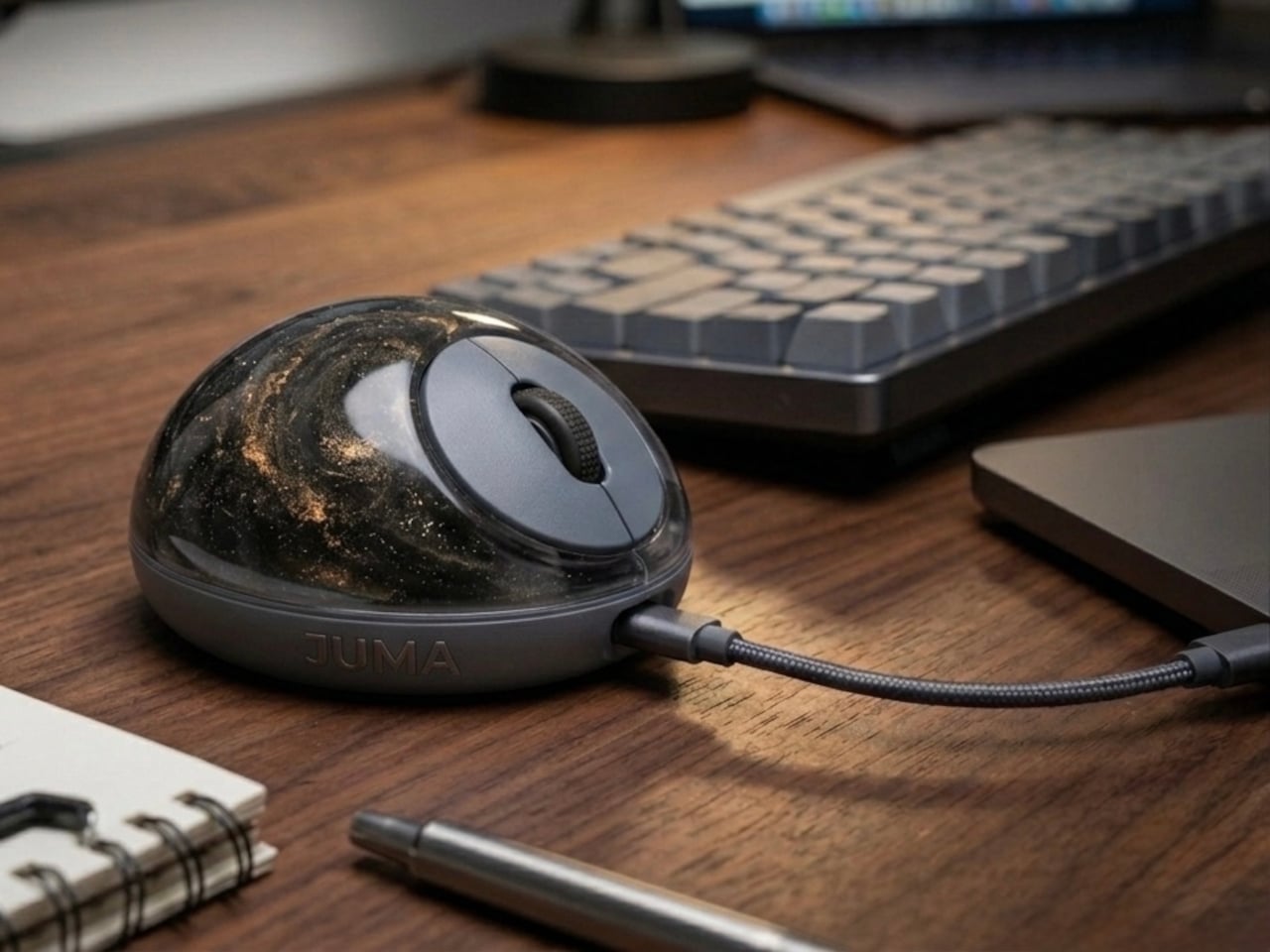
The PILLIGA mouse concept makes a fairly obvious argument for why that should change. Instead of hard plastic, the entire upper chassis is a squishy, flexible membrane packed with a viscous, translucent gel. It’s the same basic impulse that makes people reach for a stress ball mid-meeting, except it’s also the thing you need to get any work done.

Designer: Guillermo Gonzalez

The thinking behind it is straightforward enough. Deadline pressure builds, calls run long, and the urge to fidget becomes almost impossible to ignore. Rather than keeping a stress ball in the desk drawer as a separate ritual, the mouse folds that habit directly into the tool that’s already in your hand. You can squeeze, press, or knead the gel without ever lifting your hand off your workflow.

The dome shape isn’t just for show, either. It follows the natural arch of your palm rather than forcing your hand flat against a hard surface, and the gel underneath absorbs the kind of low-level muscular strain that builds up quietly over hours of clicking and scrolling. It’s the sort of ergonomic consideration that usually requires its own dedicated accessory, not just a different material.

The controls themselves are sensibly laid out. A flat circular interface sits embedded in the front of the mouse, cleanly split for left and right clicks, with a textured, rubberized scroll wheel running between them. A USB-C port at the front handles charging, keeping the wireless design intact without the inconvenience of a separate charging dock. The bottom carries the optical sensor and power switch.

What makes the PILLIGA mouse concept genuinely interesting is how far it extends color as a design element. The gel comes in several variants, from vivid green with gold flecks and a blue version scattered with purple glitter, to darker, more subdued options that look considerably more at home on a professional desk. Each colorway pairs with a matching base and click interface, making the whole thing feel deliberate.

That range matters. The more reserved colorways hint that this isn’t a novelty item for a niche corner of the internet; it works just as comfortably on a professional desk as it does on a creative’s workstation. The gel doesn’t make it look cheap. It makes it look like something designed by someone who gave serious thought to what a mouse should feel like.

Concepts like the PILLIGA are more useful as provocations than promises. Computer mouse design has been coasting on the same assumptions for decades, and the idea that your primary input device could also be physically satisfying to hold hasn’t come up often enough. The gel-filled body raises the question, and that’s honestly more than most peripheral design manages to do.

The post A Mouse You Can Squeeze Like a Stress Ball While You Work first appeared on Yanko Design.
  • ✇Yanko Design
  • McDonald’s New Drinks Come With a $58 Fashion Accessory
    Fast food collaborations have a way of catching me off guard at this point. I’ve accepted that pretty much any brand can team up with pretty much any designer, and the result will land somewhere between genuinely inspired and deeply confusing. But when McDonald’s announced a partnership with New York-based designer Susan Alexandra to launch a collection of hand-beaded drink carriers, I had to stop scrolling. The timing is intentional. McDonald’s is rolling out its first-ever lineup of Refresher
     

McDonald’s New Drinks Come With a $58 Fashion Accessory

2 mai 2026 à 09:20

Fast food collaborations have a way of catching me off guard at this point. I’ve accepted that pretty much any brand can team up with pretty much any designer, and the result will land somewhere between genuinely inspired and deeply confusing. But when McDonald’s announced a partnership with New York-based designer Susan Alexandra to launch a collection of hand-beaded drink carriers, I had to stop scrolling.

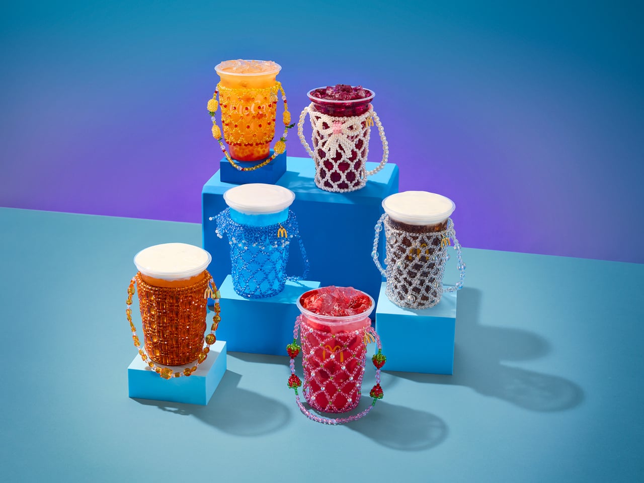
The timing is intentional. McDonald’s is rolling out its first-ever lineup of Refreshers and crafted sodas starting May 6, six new drinks that range from a Mango Pineapple Refresher to a Dirty Dr Pepper, each with a personality loud enough to inspire its own aesthetic. Think freeze-dried fruit, popping boba, cold foam. The drinks are clearly built for a generation that treats a beverage order as a mood, not just a thirst solution. And Susan Alexandra, who has spent years turning beaded bags and accessories into cult objects, is exactly the right collaborator for that energy.

Designer: McDonalds x Susan Alexandra

The collection includes six hand-beaded carriers, one for each new drink. Each design pulls color and texture directly from its corresponding flavor. The Strawberry Watermelon Refresher carrier is red and pink, soft and berry-bright. The Blackberry Passion Fruit version leans into dainty white beads. The Mango Pineapple has tropical warmth written all over it. These are not subtle pieces. They are made to be seen, and that is the entire point.

Susan Alexandra’s work has always operated in that specific visual register where maximalism meets handcraft. Her bags are the kind of thing you notice from across a room, the kind of accessories that start conversations. Matching that energy to a McDonald’s cup feels odd on paper, but when you actually look at the carriers, the logic holds. The drinks are colorful, slightly chaotic, and unapologetically fun. The accessories match.

Prices range from $48 to $58 depending on the design, which I know will prompt some eye-rolling. It’s a drink carrier. For McDonald’s. But that framing also misses the point. Susan Alexandra pieces are collectibles, objects that people hold onto not because they are practical but because they carry a specific cultural moment with them. A $48 beaded carrier that references a fast food soda is not a purely functional purchase. It is a souvenir. A more interesting souvenir, I’d argue, than most things that get sold under a collab banner.

The carriers are sold exclusively on SusanAlexandra.com starting May 6, in limited quantities. Each one also comes with a $10 McDonald’s Arch Card, which is a small but genuinely clever touch. The idea is that you buy the carrier, then go get the drink it was made for. As brand strategy goes, it’s actually pretty smart. It ties the accessory back to the experience rather than letting it float into the abstract realm of limited edition merch.

What makes this collaboration land is that it doesn’t feel like a desperation move from either side. McDonald’s is genuinely expanding its beverage program in a significant way, and it needs the launch to feel like a cultural moment rather than just a menu update. Susan Alexandra brings a specific visual language and a loyal customer base that overlaps with exactly the kind of person who cares about aesthetics down to what’s in their cup holder. The match is less random than it first appears, and the choice of collaborator signals how seriously McDonald’s is taking this particular moment.

I’m not saying everyone needs a hand-beaded carrier for their Sprite Berry Blast. But I do think there’s real craft in how this collaboration was conceived. The carriers are not just branded merchandise. They are wearable interpretations of a drink, which is a genuinely strange and interesting design brief that Susan Alexandra executed with her signature commitment to color and detail. Fast food has been flirting with fashion for a while now. This is one of the better executions I’ve seen, and I’ll be curious whether any of the six designs sell out before you even finish reading this.

The post McDonald’s New Drinks Come With a $58 Fashion Accessory first appeared on Yanko Design.
"A fantastic option for players of all skill levels": One of our favorite budget Xbox/PC controllers is having its biggest sale of 2026

The already affordable GameSir G7 SE Wired controller for Xbox just got even more inexpensive with this 15%, giving folks a chance to enjoy its rich features and responsive controls for dirt cheap.

A hand with purple-painted nails holds an Xbox controller in front of a TV displaying a gaming interface with apps like Netflix and YouTube. The setting conveys a cozy gaming atmosphere.

The GameSir G7 SE controllers puts most mid-range controllers to shame despite being wired only.

❌