Vue normale

Il y a de nouveaux articles disponibles, cliquez pour rafraîchir la page.
À partir d’avant-hierYanko Design

Rolls-Royce Firmament Concept Turns the Hood Into a Meteor Shower Chasing the Spirit of Ecstasy

Par : Sarang Sheth
19 juillet 2026 à 19:15

Every shooting star you have ever wished on was actually dying. What looks like a streak of pure light tearing across the sky is a rock disintegrating, burning up in its final seconds, and yet we treat that death as a gift, a wish granted. Stars carry the same contradiction. The calcium in your bones and the iron in your blood were forged inside a star that had to die violently to scatter those elements across the universe. Creation and destruction run on the same fuel line, not as metaphor but as literal astrophysics. French design student Gaspard Deveugle built an entire Rolls-Royce concept around that exact paradox.

Called Firmament, the concept deletes the vertical Pantheon grille that has anchored every Rolls-Royce face for a century. A low, pointed nose takes its place, tapering to a blade like a ship’s hull. Streaks of light rain across the hood and glass roof, dense near the windshield and scattering into faint dust toward the tip, the way a meteor burns brightest right before it disappears. The pattern converges on the Spirit of Ecstasy, as if she is the one point catching everything falling from the sky. It is the loudest thing on the car, and everything else has been quieted to let it read clearly.

Designer: Gaspard Deveugle

Deveugle is a 3D design student based in Valenciennes, France, with internship experience across BMW, Kingfisher, and RealNum, and Firmament sits inside a portfolio built almost entirely on reinterpreting storied marques. He has rendered a Bentley Speed 8 tribute, sketched a Bugatti Type 52, built cafe racer studies off Harley Davidson and Moto Guzzi platforms, and designed a yacht concept called Arcane. Firmament arrives as an internship project rather than a factory commission, posted on Behance alongside a companion breakdown of the sketch and modeling process behind it. That distinction matters here. Nobody at Goodwood signed off on deleting the grille, which frees the concept to treat Rolls-Royce’s most sacred design element as raw material rather than untouchable heritage.

Rolls-Royce has already flirted with turning night sky into physical form, just never on the outside of the car. The Ghost introduced its fiber-optic Starlight headliner in 2014, a swath of black leather stitched with over a thousand tiny points of light, and Spectre pushed that further with more than five thousand illuminated points woven into the dashboard fascia. Both live entirely inside the cabin, visible only to whoever paid for the seat. Firmament takes that same instinct and turns it inside out, moving the starfield from the headliner to the hood where anyone on the street can see it. That single move reframes a private luxury detail as the entire visual identity of the car.

The mood board Deveugle built around the idea, titled Power of Duality, leans on real astrophysics rather than loose poetry. Stars manufacture heavy elements inside their cores through nucleosynthesis, then have to die violently to scatter that material across the universe, meaning creation and destruction share the same fuel line by necessity, not metaphor. His reference imagery pairs a comet’s frozen tail with a supernova’s radial burst and a single meteor reflected over open water, the visual grammar he then translated onto sheet metal. That grounding shows in how the streak pattern behaves on the car itself. It thickens where energy would concentrate and thins where it would dissipate, following a logic borrowed from physics rather than instinct.

The rest of the surfacing supports that reading without competing for attention. A raised black spine splits the rear deck into twin fenders that taper to points, a quiet nod to Rolls-Royce’s own boat-tail coachbuilding, though it plays a supporting role here rather than the headline. Dark, turbine bladed wheels replace the static hubcaps Rolls-Royce is known for, hardware that stays upright on its axle no matter how fast the wheel spins, trading serenity for something closer to a hypercar’s stance. There are no visible door handles or shutlines anywhere in the renders, just one continuous poured surface running from nose to tail. Every panel gap that would normally interrupt a Rolls-Royce silhouette has been resolved into a single, unbroken skin.

None of this is destined for Goodwood’s production line, and that is fine. Firmament works precisely because it is unburdened by the things a real Rolls-Royce has to solve, crash structures, pedestrian safety, a grille that still needs to cool something even on an EV. What it offers instead is a sharp piece of brand thinking from a student still building his portfolio, taking a hundred-year-old grille and a hood ornament everyone stopped truly looking at and making both feel dangerous again. Rolls-Royce spends real engineering effort making its cars feel weightless and silent. Deveugle’s answer is to make one look like it just survived a meteor storm, closer to what the Spirit of Ecstasy was always chasing.

The post Rolls-Royce Firmament Concept Turns the Hood Into a Meteor Shower Chasing the Spirit of Ecstasy first appeared on Yanko Design.
Blackwing’s $400 Crate Is Every Writer’s Dream Gift Set

Par : Ida Torres
18 juillet 2026 à 20:15

Pencils don’t usually make people emotional. But Blackwing pencils have always been a little different. The brand, which revived the legendary Blackwing 602 after its original discontinuation in 1998, has spent years building something that goes beyond the pencil itself. It’s a whole philosophy about the act of writing by hand. And with the new Blackwing Crate Gift Set, priced at $400, they’ve essentially packaged that philosophy into a matte black box and sent it out into the world.

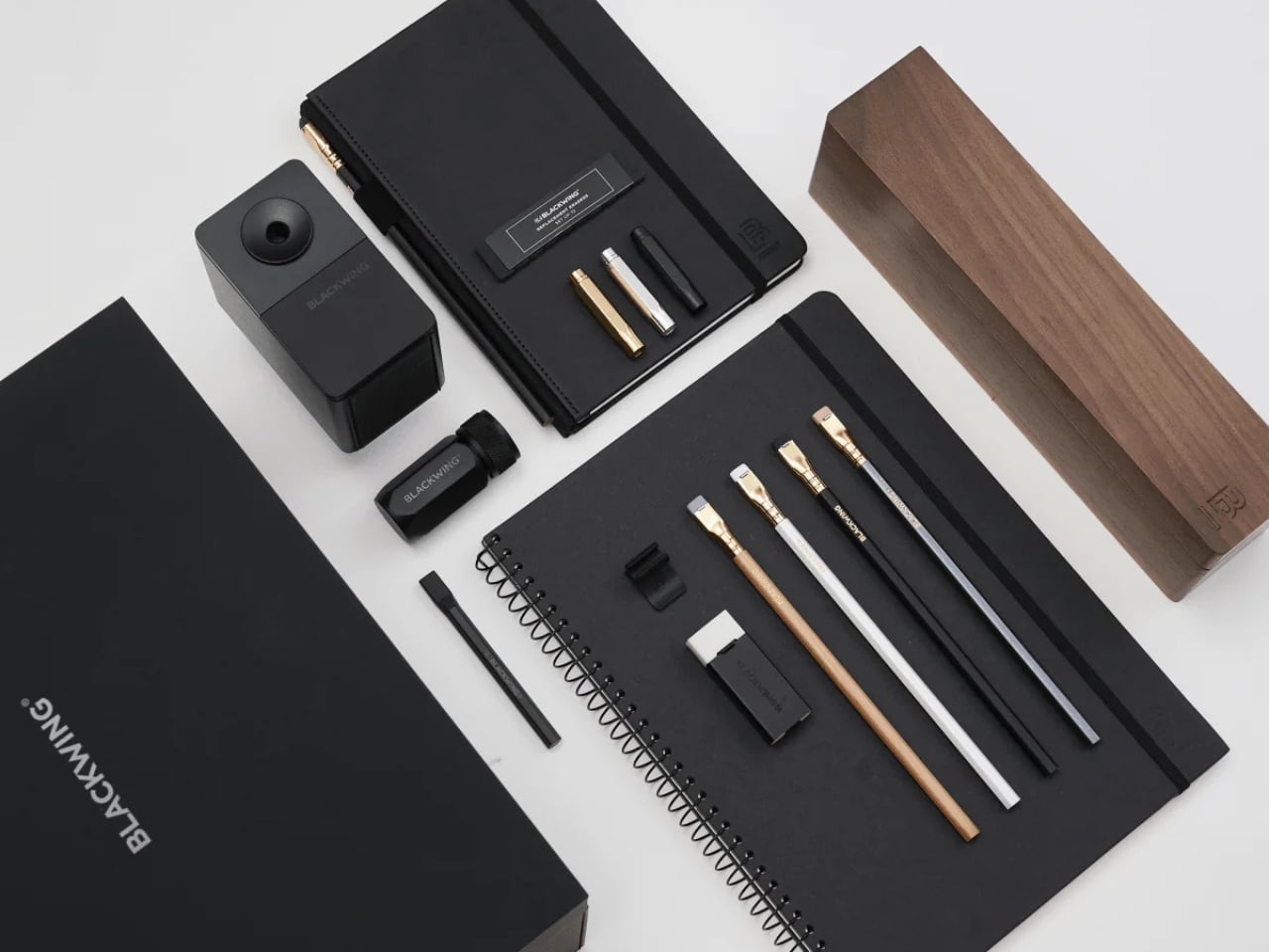
Let’s talk about what’s inside, because it’s genuinely a lot. The Crate includes 24 Blackwing pencils housed inside a walnut gift box, a One-Step Long Point Sharpener, a desktop sharpener, replacement erasers, a handheld eraser, three point guards, a pencil extender, a notebook clip, a Medium Slate Notebook in dot-grid, and an A4 spiral notebook in blank. If you’ve ever casually shopped the Blackwing site and found yourself adding one thing after another to your cart, this is essentially that cart, but curated and given a walnut home.

Designer: Blackwing

The walnut box alone is something worth pausing on. It has a cork-lined interior and a satisfying magnetic closure. It’s the kind of object you want to leave on your desk not because it needs to be there, but because it makes the desk look like it belongs to someone who takes their work seriously.

Blackwing’s four core pencils are all represented here: the 602, the firm-graphite original that built the brand’s reputation and was beloved by creatives from John Steinbeck to Stephen Sondheim; the Matte, which shares the same soft and expressive formula as the very first Blackwing; the Pearl, with its smooth and balanced Japanese graphite; and the Natural, a stripped-back version with an uncoated cedar body for a rawer, more honest feel. Each one writes differently. That variety isn’t just a marketing point. It means the set can genuinely work for a writer, an artist, a student, or someone who just wants their notes to feel a little more intentional.

I’ll admit there’s a case to be made that $400 is a lot for what is, technically, a pencil set. But I think that argument misses the point of what Blackwing has always been doing. These aren’t pencils in the same way a yellow No. 2 is a pencil. The brand occupies the same space as a well-made fountain pen or a leather-bound notebook: objects that are ordinary in function but considered in execution. When you buy something from Blackwing, you’re buying into a certain idea of how writing should feel, and the Crate makes that idea as complete and giftable as it’s ever been.

The packaging itself shows thought. The outer box is matte black with the Blackwing name in white. Clean, confident, minimal. It doesn’t shout. It doesn’t need to. The layered reveal inside, with a pull-out drawer for the notebooks, feels like the kind of unboxing experience that design enthusiasts and stationery lovers will genuinely appreciate. Gift sets at this price point need to justify themselves beyond just the contents, and the presentation here does a lot of that work.

What makes the Crate feel special rather than just expensive is how it covers every phase of the writing process. You have your pencils, your sharpeners for both at-desk and on-the-go use, your erasers, protection for your pencil tips when they’re not in use, and actual notebooks to write in. Nothing feels like filler. Everything has a job.

If you’re shopping for someone who already loves Blackwing, this is a clear yes. If you’re introducing someone to the brand for the first time and want to do it properly, this is also the move. And if you’ve been slowly accumulating Blackwing products one purchase at a time and wondering when you’ll finally have it all, the Crate is the answer to that question in one very satisfying delivery. The Blackwing Crate Gift Set is available now at blackwing602.com for $400.

The post Blackwing’s $400 Crate Is Every Writer’s Dream Gift Set first appeared on Yanko Design.

The Hermès Birkin Finally Has a LEGO Version and It Opens to Reveal A Secret Runway Inside

Par : Sarang Sheth
8 mai 2026 à 19:15

The Hermès Birkin has one of the most theatrical purchasing rituals in luxury retail. You cannot simply walk into a boutique on Rue du Faubourg Saint-Honoré and buy one. Hermès makes you earn it, building a relationship with a sales associate over months, sometimes years, demonstrating cultural fluency with the house before they’ll even have the conversation. The result is an object that carries as much mythology as it does resale value, a handbag that has become shorthand for a particular kind of aspirational excess that the internet finds endlessly fascinating.

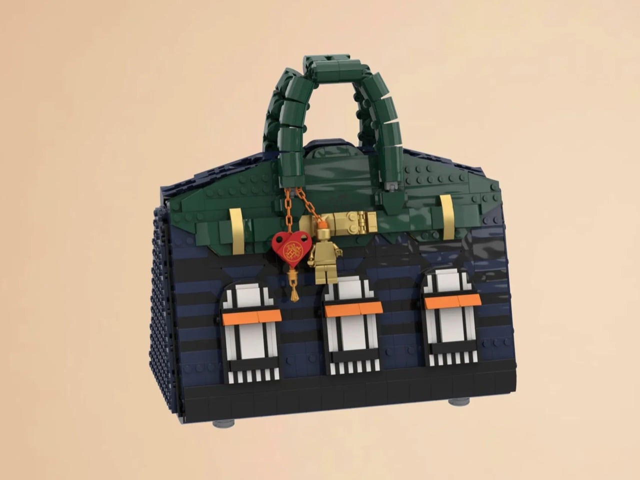
LEGO Ideas builders BOI_Design and KittyJW found a rather elegant workaround. Their MOC (My Own Creation) reimagines the Birkin 20 Faubourg, the special edition inspired by Hermès’s flagship Paris store, as approximately 1,400 bricks of deep navy, dark green, and gold. The exterior facade doubles as a miniature rendering of 24 Rue du Faubourg Saint-Honoré itself, complete with arched boutique windows and orange awnings. And it opens.

Designers: BOI_Design and KittyJW

The silhouette is immediately recognizable to anyone who has spent time in the vicinity of luxury retail, or, more realistically, scrolled past one on Instagram. The trapezoidal body is rendered in deep navy blue tiles, layered with a subtle horizontal banding that gives the surface genuine texture and depth. The handles arc overhead in dark green, assembled from linked Technic-adjacent elements that convincingly mimic the soft curve of the real bag’s leather grip. Gold hardware details sit at the clasp, at the side buckles, and along the turnlock assembly, and a tiny linked orange chain drops a red heart charm and a gold minifigure pendant in a detail that reads as both playful and surprisingly precise. Flip the bag around and the back panel is clean and quiet, just navy tiles and a gold Hermès tile sitting on a dark strap, which is exactly how the real thing looks.

The front face depicts three arched windows dressed with crisp white frames and orange awnings are spaced across the lower body, referencing the Haussmannian rhythm of the actual boutique facade at Faubourg Saint-Honoré. It takes a second to fully resolve in your eye, this thing that is simultaneously a handbag and a building, and that slight double-take is very much the point. The builders describe it as merging fashion and architecture into a single object, and looking at it straight on, that framing holds up completely.

My favorite detail, however, is what happens when you open it. The lid swings up to reveal a hidden interior scene that commits fully to the bit. Three pink minifigures, each carrying a tiny handbag, are posed on oversized primary-color bricks in red, yellow, and blue, the kind of bold, joyful color blocking that feels distinctly LEGO while also evoking a fashion week runway setup. Nestled alongside them is a miniature Birkin 20 Faubourg bag rendered at a smaller scale, a self-referential easter egg that will land immediately with anyone paying attention. The interior lining is lined in cream and tan tiles, a genuinely considered touch that mirrors how a real Birkin’s suede interior contrasts against its exterior leather. At 28.5 centimeters wide and 29 centimeters tall, the whole thing has real physical presence on a shelf.

The build is currently gathering votes on LEGO Ideas, the community platform where fan submissions need to reach 10,000 supporters before LEGO’s internal team will formally review them for potential production. It’s early days for this one, but the concept has the kind of crossover appeal, fashion collectors, LEGO enthusiasts, Paris romantics, people who just want the Birkin experience without the two-year waitlist, that could carry it a long way. You can head to the LEGO Ideas page here to cast your vote.

The post The Hermès Birkin Finally Has a LEGO Version and It Opens to Reveal A Secret Runway Inside first appeared on Yanko Design.

This Luxury Italian Watch Has a Triple-Axis Tourbillon and Looks Like a Ferrari Dashboard

Par : Sarang Sheth
7 avril 2026 à 20:30

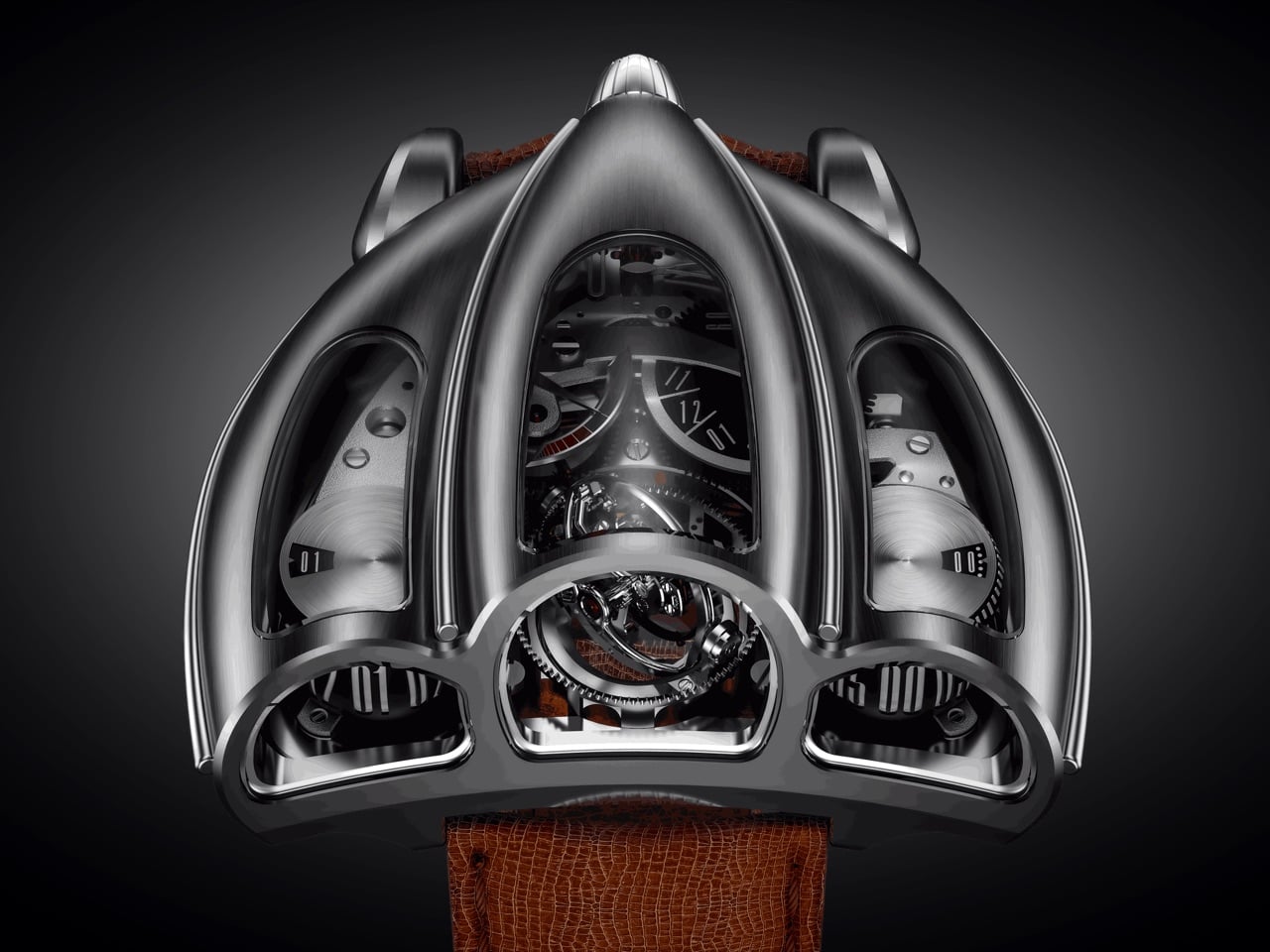
Old sports cars had analog instrument clusters that told you everything through three or four circular gauges mounted in brushed metal housings, each dial showing a different slice of what the engine was doing at any given moment. The information was direct, mechanical, and laid out with the kind of functional clarity that only made sense if you understood how the car worked. Tachometers sat next to oil pressure gauges, fuel levels next to coolant temps, all of it visible through a steering wheel while you were doing 140 km/h on a mountain pass. Desder’s D001 takes that exact visual language and translates it into a wristwatch with a triple-axis tourbillon spinning where the tachometer used to be.

The watch displays time on two separate cylinders, one for jumping hours and one for continuous minutes, flanked by a GMT indicator on the right and a power reserve gauge on the left. Luca Soprana, the master watchmaker who cofounded the Ateliers 7h38 workshop that builds complications for Jacob & Co, designed the caliber with the same obsessive attention to architectural clarity that defined mid-century dashboard design. Mo Coppoletta, the tattoo artist and designer behind collaborations with Bulgari and Montblanc, shaped the case to follow the teardrop aerodynamics of 1920s and 1930s race cars. The watch debuted in April 2026 from Modena, in the heart of Italy’s Motor Valley, limited to six unique pieces. The case wraps around the movement like a coachbuilt body over a chassis, every surface flowing from the mechanical geometry underneath.

Designers: Mo Coppoletta, Luca Soprana (Desder)

Soprana’s caliber is a study in mechanical complexity made legible. The triple-axis tourbillon sits dead center, rotating on three independent axes to counteract gravitational effects on timekeeping accuracy. The movement beats at 3Hz with a 45-hour power reserve, hand-wound through a crown that feels more like a machine interface than a watch component. German silver forms the mainplate and bridges, chosen for its rigidity and traditional finishing properties. Titanium components reduce weight where it matters, while phynox, a high-performance alloy known for extreme strength and corrosion resistance, handles stress points. The entire movement comprises 465 parts, every single one made by hand in Soprana’s Vaumarcus atelier near Neuchâtel. The jumping hour mechanism snaps forward with the kind of mechanical decisiveness that makes you want to watch it cycle through an entire day.

The case construction follows Italian coachbuilding philosophy, where form and function develop together rather than in sequence. Coppoletta designed the case around the movement’s architecture, letting the mechanical volumes dictate the external silhouette. The teardrop shape references 1920s and 1930s aerodynamics, when wind tunnel testing was still a decade away and designers shaped metal based on intuition about airflow. Flowing surfaces connect the cylindrical time displays, each one sitting under domed sapphire crystal that distorts and magnifies depending on viewing angle. The brushed metal finish catches light the way a hand-formed fender does, with subtle variations in surface texture that reveal the construction process. Sculpted lugs integrate directly into the case body without visible seams, continuing the coachbuilt language where every panel flows into the next.

Each of the six pieces carries subtle variations that make it genuinely unique. Coppoletta, whose background in tattooing taught him to treat every commission as an individual artwork, approached each watch as a separate design exercise within the same architectural framework. Different finishing patterns on the case, variations in how the sapphire crystals dome over the displays, minor differences in how the lugs taper into the case body. These aren’t the superficial variations you get when a brand changes dial colors across a limited run. These are structural differences that change how the watch sits on a wrist and how light interacts with the metal surfaces.

The D001 competes with MB&F and Greubel Forsey in the kinetic sculpture category, but carves its own space by grounding the design in automotive heritage rather than abstract futurism. Where MB&F builds machines that look like they belong in science fiction and Greubel Forsey chases chronometric precision with architectural movements, Desder anchors everything in the tangible history of Italian industrial design. The watch references a specific moment when cars were still shaped by hand and instruments were analog by necessity. Pricing is on request, which in this category typically signals seven figures. For collectors who view watches as functional art and value radical design integrated with mechanical innovation, the D001 delivers both. Just don’t expect to wear it through airport security without some explaining.

The post This Luxury Italian Watch Has a Triple-Axis Tourbillon and Looks Like a Ferrari Dashboard first appeared on Yanko Design.

100-Meter A100 concept yacht redefines luxury sailing with massive interior volume

Par : Gaurav Sood
7 avril 2026 à 19:15

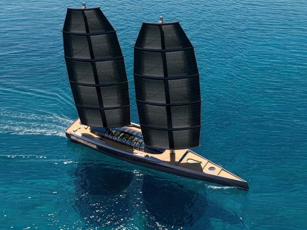
Modern sailing superyachts often struggle to balance two competing priorities: the elegance and efficiency of wind-powered travel and the expansive living spaces typically associated with large motor yachts. The A100 sailing yacht concept approaches this challenge with a bold rethink of traditional yacht architecture. Developed through a collaboration between Van Geest Design and Rob Doyle Design, the 100-meter vessel proposes a layout that delivers the interior volume of a motor yacht while maintaining the identity and performance of a sailing superyacht.

At the core of the concept is a design strategy that maximizes usable space. Traditional sailing yachts require wide side decks for crew movement and sail handling, which limits interior width. The A100 concept reduces the width of these side decks, allowing the main deck to stretch nearly the full beam of the yacht. This architectural shift creates significantly larger interior spaces than typically found on sailing yachts of comparable size.

Designer: Van Geest Design and Rob Doyle Design

The main deck is designed as the primary social and living area. Here, the owner’s suite occupies a substantial portion of the deck, offering a level of space rarely seen on sailing yachts. Adjacent to the suite is a central lounge and formal dining area intended for gatherings and entertaining. An additional space can function as a library or a private cinema, adding flexibility to the interior layout. Large sections of glass surround these living areas, filling the interior with natural light and offering uninterrupted views of the ocean.

Below deck, the yacht accommodates guest cabins along with a variety of leisure-focused facilities. This level also houses a dedicated diving room and storage for water toys such as jet skis and e-foils, allowing guests to transition between onboard relaxation and water activities easily. The layout is designed to maintain a strong visual connection with the surrounding seascape while ensuring privacy and comfort for those on board.

Outdoor areas play an equally important role in this larger-than-life superyacht design. The upper deck includes the navigation and steering stations, along with flexible lounge spaces for relaxation or wellness activities. At the stern, a large beach club spans the full width of the yacht, creating a welcoming space for guests to gather close to the water. Toward the bow, storage areas accommodate tenders and recreational equipment without disrupting the clean lines of the deck.

The sailing system is based on two free-standing DynaRig masts, a modern configuration used on some of the world’s largest sailing yachts. The system employs curved yards that support multiple sails, all of which can be deployed and adjusted electronically at the push of a button. The rotating masts simplify sail handling while maintaining efficient propulsion for a vessel of this scale.

Beyond its layout and sailing system, the A100 concept also reflects growing interest in more sustainable superyacht designs. By relying heavily on wind propulsion supported by advanced onboard energy systems, the concept explores ways to reduce reliance on conventional engine power. If brought to life, the A100 would stand among the largest sailing yachts ever built!

The post 100-Meter A100 concept yacht redefines luxury sailing with massive interior volume first appeared on Yanko Design.

❌
❌