Vue normale

Il y a de nouveaux articles disponibles, cliquez pour rafraîchir la page.
À partir d’avant-hierYanko Design

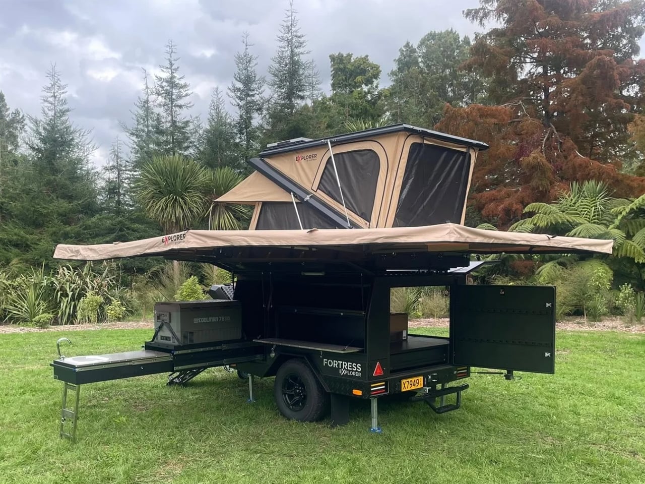
Explorer camping trailer is designed with comfort, convenience, and adventure in mind

Par : Gaurav Sood
27 juin 2026 à 00:30

We all have different adventure needs. If your lifestyle requires you to go beyond the paved roads and into the wild, you need a capable setup that’s designed with comfort and convenience to go where you want it to. A new entrant among the likes of Adventure Pro Mini 2.0 or the Polydrops P21X is the Fortress Explorer camping trailer that is built for genuine off-grid comfort.

The explorer gains off-grid capabilities without having to compromise on its comfort or the capability at any point. New Zealand-based Fortress Trailers says their trailers are “designed for Kiwi tradies who need a setup that works as hard as they do.” But this one is different; it’s designed to be tough and secure, always configurable to be more than a utility trailer: an adventure trailer!

Designer: Fortress Trailers

Over the years, Fortress has been developing very secure and rugged utility trailers. To be the mobile workstation you have always wanted, for the first time, the company has developed an outdoor trailer. The Explorer is built using aluminum panels and finished in scratch-resistant paint, as opposed to a steel body that other Fortress trailers are built with. The camping trailer, however, retains the hot-dipped galvanized steel chassis.

Measuring about 13.5 feet long, the Explorer makes for 6.9-foot headroom inside, and it rides comfortably on 15-inch wheels, ready to go just about anywhere. A great combination of convenience, adventure, and comfort, the Fortress Explorer camping trailer features a spacious rooftop tent to increase the sleeping capacity and offers a fully equipped slide-out kitchen with a 90L fridge, bench space, and storage for cooking essentials.

Packed with all the amenities that you need to be in the great outdoors, whether for a short weekend or for a slightly longer stay. It comes with a 270-degree awning to extend the living space beyond the interior, comprising a spacious queen-size memory foam bed. To take care of your living comfort like at home – away from home and far away from the grid – the Explorer features a 120W solar charging setup paired with a 100Ah battery, and a 1000W inverter.

The trailer with a 100L water tank features a DC-DC charger for powering 12V lighting and USB ports via the tow vehicle. Priced at NZ $42,990 (approximately $25,000), the trailer has a huge slide-out drawer for easy organization of camping gear and storage under stairs leading to the rooftop tent. The fuel is stored in a 9kg gas bottle and a pair of jerry cans. For that price, you also get, along with the Explorer, a shower tent for privacy and convenience.

Fortress Trailers, we learn, added the Explorer to its tradesman utility trailer lineup a few months ago. It is available now for the adventurers in New Zealand, but we have yet to hear whether the Explorer camping trailer will make it to North America or not.

The post Explorer camping trailer is designed with comfort, convenience, and adventure in mind first appeared on Yanko Design.

The Most Iconic Moment in American Railroad History Is Now a LEGO Set (Sort Of)

Par : Sarang Sheth
19 juin 2026 à 22:30

On May 10, 1869, a photographer named Andrew J. Russell set up his camera at Promontory Summit, Utah, and captured one of the most reproduced images in American history. Two locomotives facing each other, nose to nose, with a crowd of workers and dignitaries packed between them, bottles raised, hammers in hand. The image became shorthand for an entire era: the moment a nation stitched itself together with 1,776 miles of iron rail.

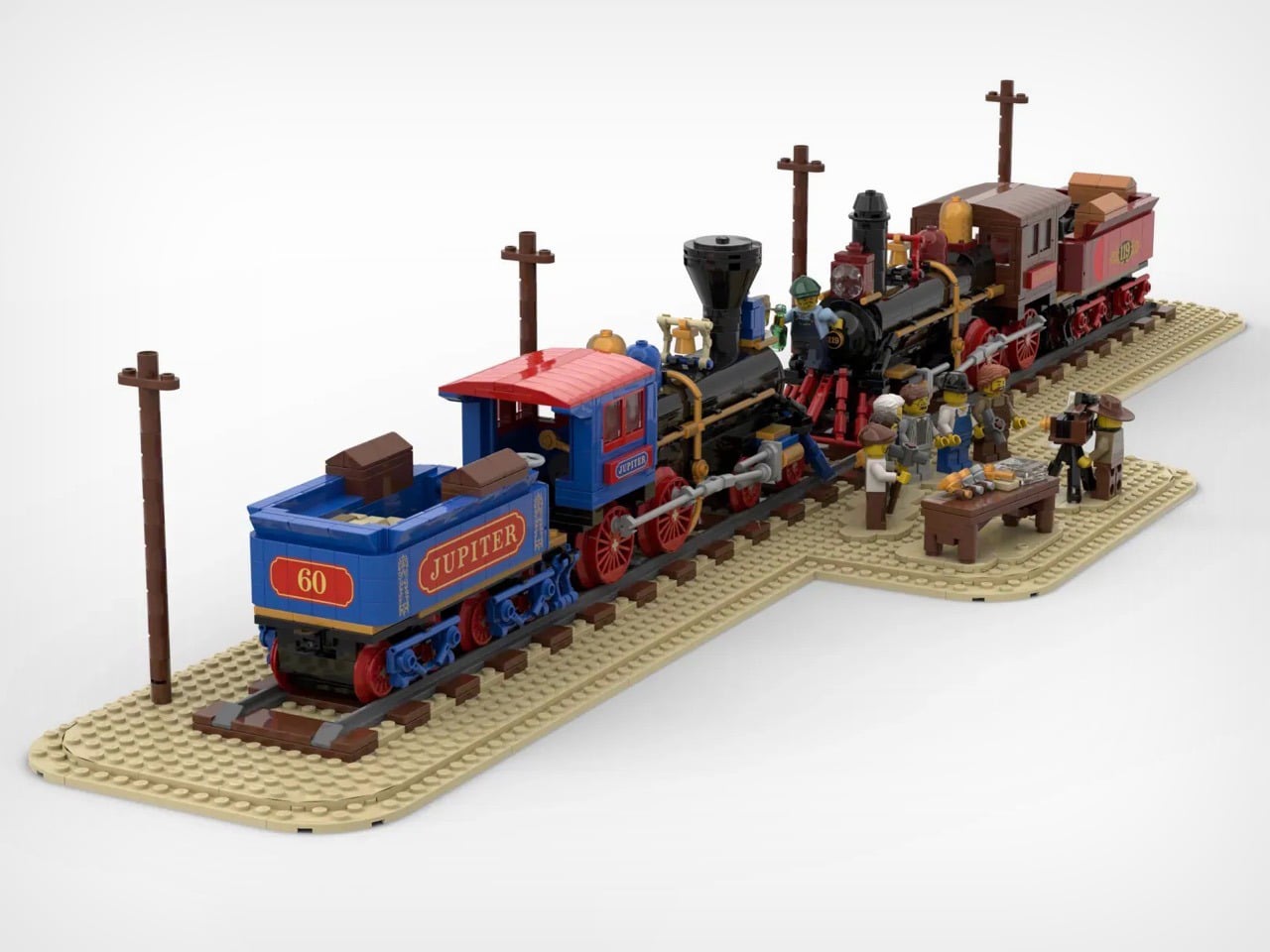
BrickBrain29 has recreated that exact image in LEGO, and the result is something that stops you cold. The Jupiter No. 60 in its distinctive blue and red livery faces off against the dark, brooding Union Pacific No. 119, with a cast of minifigures gathered at the meeting point, one of them manning a period camera on a tripod, capturing the moment all over again.

Designer: BrickBrain29

The two locomotives are the heart of the build – the Jupiter earns its visual dominance immediately: a cobalt blue boiler jacket with red cab and pilot, gold trim running along the body, and the name “JUPITER” printed across the tender in bold lettering. Facing it, the No. 119 goes darker and heavier, leaning into black and deep red with brass accents and spoked red driving wheels that both engines share. The wheel arrangements, smokestacks, domes, and coupling rods are all accounted for, and the side rods on both locomotives have that satisfying mechanical specificity that separates a serious train build from a toy approximation. Looking at the two engines nose to nose, you genuinely feel the drama of the occasion.

The tan baseplate evokes the dusty Utah landscape at Promontory Summit, and telegraph poles line the scene with the kind of environmental detail that grounds the whole thing in its 19th-century context. My favorite detail, though, is the small wooden table set between the locomotives, carrying gold and silver ceremonial spikes alongside what appears to be a telegraph key and a framed photographic print of the ceremony itself. It is a build within a build, a tiny artifact of the actual historical record tucked into a scene that is already recreating history.

The minifigure cast completes the picture – workers, dignitaries, and onlookers crowd the meeting point in period-appropriate dress, while two engineers perch on the pilots of their respective locomotives, bottles raised toward each other in a toast. The photographer on the right, camera mounted on a tripod, is a particularly sharp touch, referencing the Russell photograph that made this moment immortal.

This MOC (My Own Creation) is currently gathering votes on LEGO Ideas, the fan submission platform where community creations that reach 10,000 supporter votes get reviewed by LEGO’s internal team for potential production as a retail set. With its combination of historical weight, visual drama, and surprisingly rich scene-setting, BrickBrain29’s Golden Spike diorama makes a strong case for what LEGO Ideas does best: putting a beloved subject in the hands of someone who genuinely cares about getting it right. You can head to the page here to cast your vote!

The post The Most Iconic Moment in American Railroad History Is Now a LEGO Set (Sort Of) first appeared on Yanko Design.

The Fortune Cookie Redesigned With Braille Is Pure Genius

Par : Ida Torres
19 juin 2026 à 16:20

Fortune cookies are one of those small rituals that carry more weight than they should. You crack it open, fish out the slip of paper, and read whatever odd little prophecy is inside. It’s silly, sure. But it’s also communal. The whole table does it. Everyone compares fortunes, laughs at the vague predictions, and tucks the good ones into their wallets for luck. It’s a shared moment disguised as a throwaway snack. And for visually impaired individuals, that moment stops at the crack of the shell.

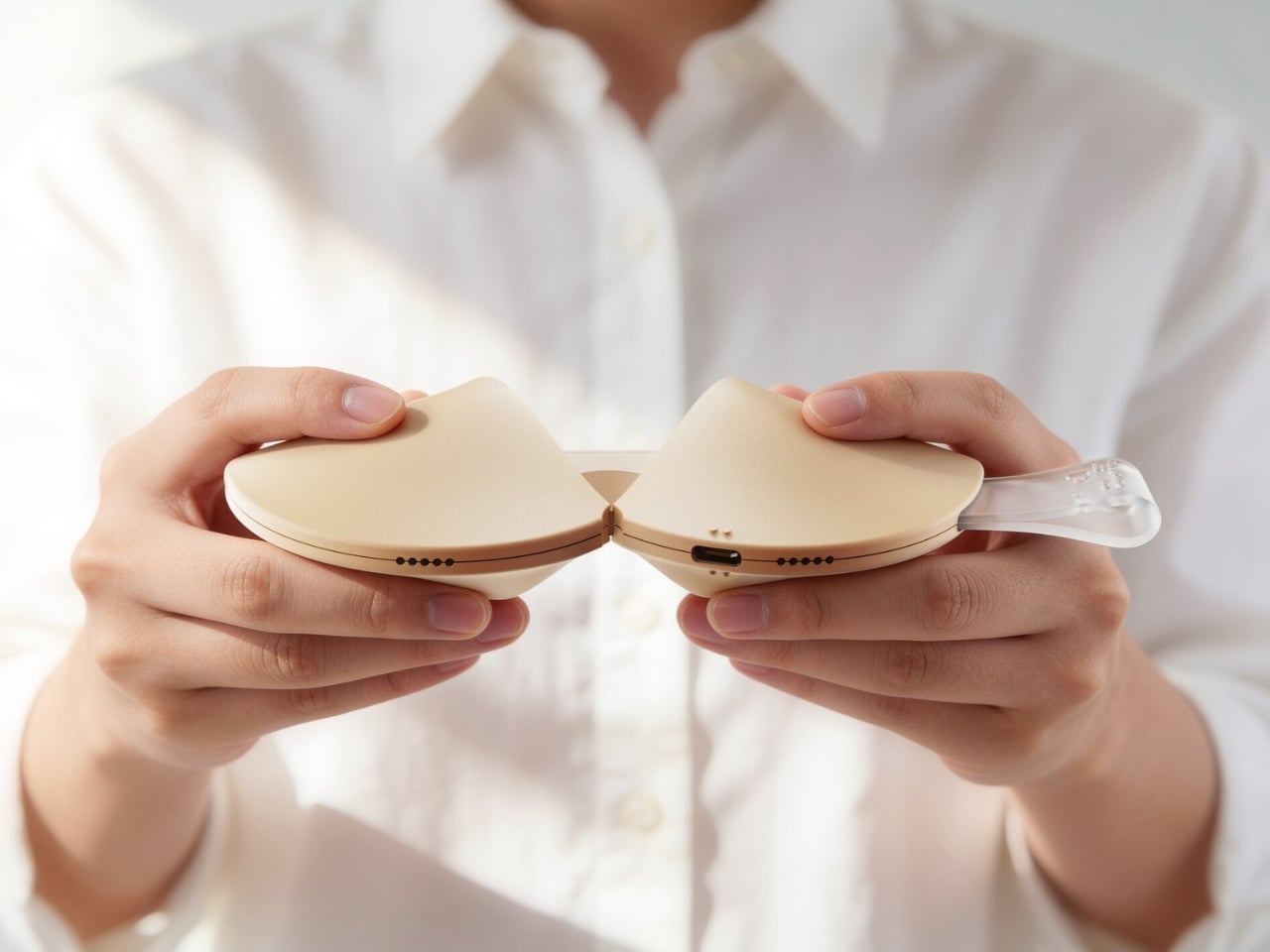
Korean designer Hyerim Yoo’s response to that gap is Fortune Dot, a tactile device that lets visually impaired users independently read a daily fortune in Braille. But describing it that way undersells what makes it genuinely remarkable. Because Yoo didn’t just solve the accessibility problem. She solved it beautifully.

Designer: Hyerim Yoo

The object is shaped exactly like a fortune cookie. Same rounded form, same warm beige palette, same satisfying heft. A small translucent tab sticks out from the side, the only visual tell that this isn’t actually food. That tab is the “fortune paper,” a design detail so considered it almost makes you laugh. When you pull the two halves apart, the gesture mirrors breaking a real cookie open, and what you find inside is a refreshable Braille display with raised pin cells arranged in neat rows across a recessed panel. The message is there, waiting to be read with your fingertips, exactly as Yoo’s tagline describes it: today’s luck, felt at your fingertips.

The engineering inside is worth pausing on. The exploded views of the device reveal individual Braille cell modules, each capable of raising and lowering their pins to form different characters. It’s a compact, mechanical system tucked into something that looks like it belongs on a dessert plate. The bottom edge carries a USB-C port for charging, nearly invisible from the outside. The whole thing is small enough to drop into a pouch alongside a pair of AirPods and a lip balm, which is apparently exactly what Yoo intended.

What makes this design stand apart from most inclusive design projects, though, is the color system. Fortune Dot comes in three variants named Soft Bake, Signature Bake, and Dark Bake. The names follow the logic of actual cookie baking, and the colors range from a pale cream to a deep chocolate brown. It’s a playful, smart branding decision that does real work. It removes any clinical association from the product. It makes Fortune Dot feel like something you’d want to own and carry, not something assigned to you by necessity.

The branding extends outward into a full identity system. The Fortune Dot logo uses a dot-based pattern that quietly references Braille without spelling it out. It appears on a branded coffee cup in one of the campaign shots, wrapped in wired earbuds, Fortune Dot perched on top. That image alone communicates something most accessible product design never manages to: that this object belongs in the texture of everyday life, not apart from it.

The packaging holds up the same way. A light blue box lid features Braille text running across the top, the Fortune Dot wordmark sitting below it in clean type, and a cutout that reveals the cookie silhouette inside. When you lift the lid, the device sits nested in a cream interior, the translucent fortune tab pointing upward. It’s the kind of unboxing that feels like it was designed to be experienced by touch as much as by sight, which, of course, it was.

I’ve seen a lot of inclusive design work that gets the intention right but misses in execution, products that function well but feel set apart, designed for a category of user rather than a person. Fortune Dot doesn’t feel like that. It feels like something a designer fell genuinely in love with, in the best possible way, the kind of love that shows up in every detail, from the baking-level color names to the translucent paper tab to the way the hinges split open just so. That level of care is rare. When you see it, you notice.

The post The Fortune Cookie Redesigned With Braille Is Pure Genius first appeared on Yanko Design.

This Expandable Popup Micro Camper Turns Your EV Into a Fully Equipped Tiny Home for Off-Grid Escapes

Par : Gaurav Sood
10 mai 2026 à 19:15

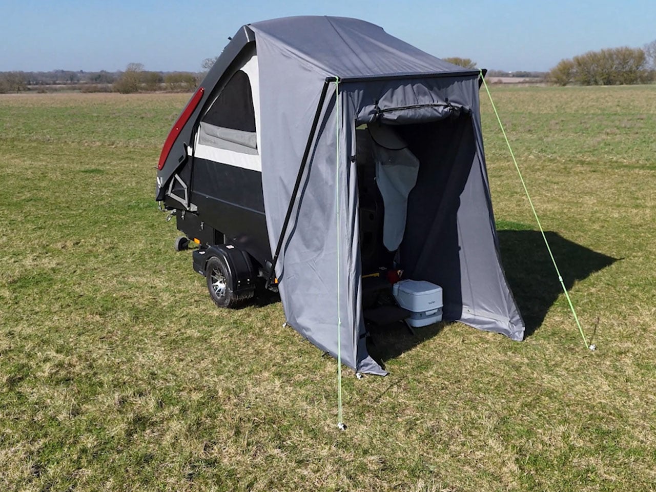
Wheelhome is a budding compact camping solutions enterprise in the United Kingdom. It is changing the way camping is perceived and how all-electric camping trips can be made more convenient. First, it launched the electric rooftop camper for the Tesla’s popular Model 3, and now it is offering other lighter vehicle owners an alternative for solo or two-person camping with the new Dashaway ECT micro camping trailers.

Designed for efficient electric camping trips, the Dashaway ECT trailer comes in two variants: a solo version and a two-person model. The campers are packed with all the amenities and facilities one needs, from a lounge to beds and a toilet to a kitchen, so they can be fully packed for all sorts of camping requirements.

Designer: Wheelhome

A provided awning is one of the major highlights of the Dashaway ECT series. It is part of the trailer and delivers an additional outer space that can be used for a portable toilet. Of course, it is optional, but with awning rolled up on the front of the trailer when riding, you have the option of expanding the living space. It can unfurl easily and attach to the roof and two side poles to create a sizable space. Besides the awning, the trailer is otherwise similar to the other options on the market, measuring 12.5 feet long and about 5.3 feet wide, but it differentiates itself in the convenience campers can have inside.

When in drive mode, the Dashaway ECTS one berth and the ECT 2 two berth pack down to a height of 3.8 feet. At the camp, both models can pop up to the height of 6 feet. Setting up the trailers is as easy as it can get. No additional tools or any specific training is necessary. The process takes a few minutes. First, using a motorized mover the trailer can be positioned using a remote control, without even the tow vehicle. When in place, the stabilizer legs are lowered and the roof can be lifted up using a gas strut-assisted crank and the fabric side-walled camp is ready to live.

However, before you start living, you can access the camper via single rear entry and layout the furniture and furnishing inside (which folds down when the camper is packed for the road). The interior has the kitchen setup at the entrance complete with an induction hob, kettle, air fryer, and microwave, and then is the seating lounge facing outward, toward the camp entry. The seat also accommodates a 12L fridge underneath. The lounge – depending on the berth configuration you have picked – is either one seat or two. the seats flatten down into a single or double bed at night. The sides are provided with large windows covered with mesh, which light up the interior.

Wheelhome provides the ECT series with ample storage cabinets and compartments under the seat(s). The trailer features a 3-kWh lithium battery, 200-watt rooftop solar panel connected to a 3,000 W inverter. Dashaway ECTS is available for a starting price of £19,750 (roughly $26,000), and the ECT2 is priced at £26,225 (about $35,000).

The post This Expandable Popup Micro Camper Turns Your EV Into a Fully Equipped Tiny Home for Off-Grid Escapes first appeared on Yanko Design.

Phone Cases Are Boring, This One Puts a Living Terrarium Inside

Par : JC Torres
10 mai 2026 à 17:20

Phone cases have largely settled into two camps: the ones that protect your phone without anyone noticing they exist, and the ones that make a statement with printed graphics, colors, or textures. Neither approach has found a way to make the back of a phone genuinely interesting rather than just decorated. Designer Daniel Idle found a third option that neither camp seems to have considered.

The Terrarium Phone Case is a clear resin case for the iPhone 16 Pro Max with an actual planted environment sealed inside the back cavity. Moss, small-leafed plants, and a stabilized soil substrate are embedded within the transparent shell, creating a thin cross-section of living terrain that you carry around with you wherever the phone goes. It’s a working phone case, a functional terrarium, and an oddly calming thing to have in your pocket all at once.

Designer: Daniel Idle

The construction involved 3D modeling and fabrication in clear resin, producing a case with enough depth in the back wall to house soil, roots, and plant matter. The plants are packed using a stabilized substrate that keeps the arrangement intact when the phone is picked up, rotated, tilted, or slipped into a bag. The camera cutout is fully preserved; the charging port at the bottom remains accessible; the phone continues to work exactly as it always did.

What keeps everything alive inside the sealed cavity is a closed-loop moisture system. The plants and soil generate humidity, which evaporates toward the inner surface of the resin, condenses back into droplets, and cycles down again. Light passing through the clear shell feeds the plants from outside, while the substrate provides gradual nutrient release. The whole thing is, in a fairly literal sense, a miniature ecosystem that sustains itself without any intervention from the person carrying it.

The condensation that forms on the inside of the shell during high-humidity moments is part of the visual appeal rather than a flaw to be engineered away. Seeing that vapor cycle through the case is a reminder that something in there is alive, actively breathing and responding to its environment, in the same pocket or bag as a device specifically engineered to minimize all biological interference.

There’s a running thread through design culture about bringing nature back into objects and spaces that have drifted too far from it. Biophilic design has become a recognizable term for everything from moss walls in offices to plant-filled shelving in apartments. Most of those applications treat plants as decoration layered on top of an existing design. Idle’s approach is different because the plant system isn’t decoration; it’s structural, sealed directly into the object’s body as a core component rather than an afterthought.

Of course, there will be some reservations about putting moisture and soil so close to your phone, which might be resistant to water and dust, but only from brief encounters. Good thing, then, that it’s still a concept project right now. But as a thought experiment about what a phone case could reasonably contain, it lands somewhere between genuinely novel and gently absurd, which is probably the most honest place for a good idea to start.

The post Phone Cases Are Boring, This One Puts a Living Terrarium Inside first appeared on Yanko Design.

This AC Does 5 Jobs at Once and Looks Like Furniture on Your Wall

Par : JC Torres
9 mai 2026 à 19:15

The split air conditioner is one of the least loved objects in any home, which is a strange thing to say about something most people couldn’t live without. It works, technically, but it tends to make its presence known in all the wrong ways. The air is too direct, the noise is a constant background irritant, and the plastic box on the wall rarely belongs in any thoughtfully designed interior.

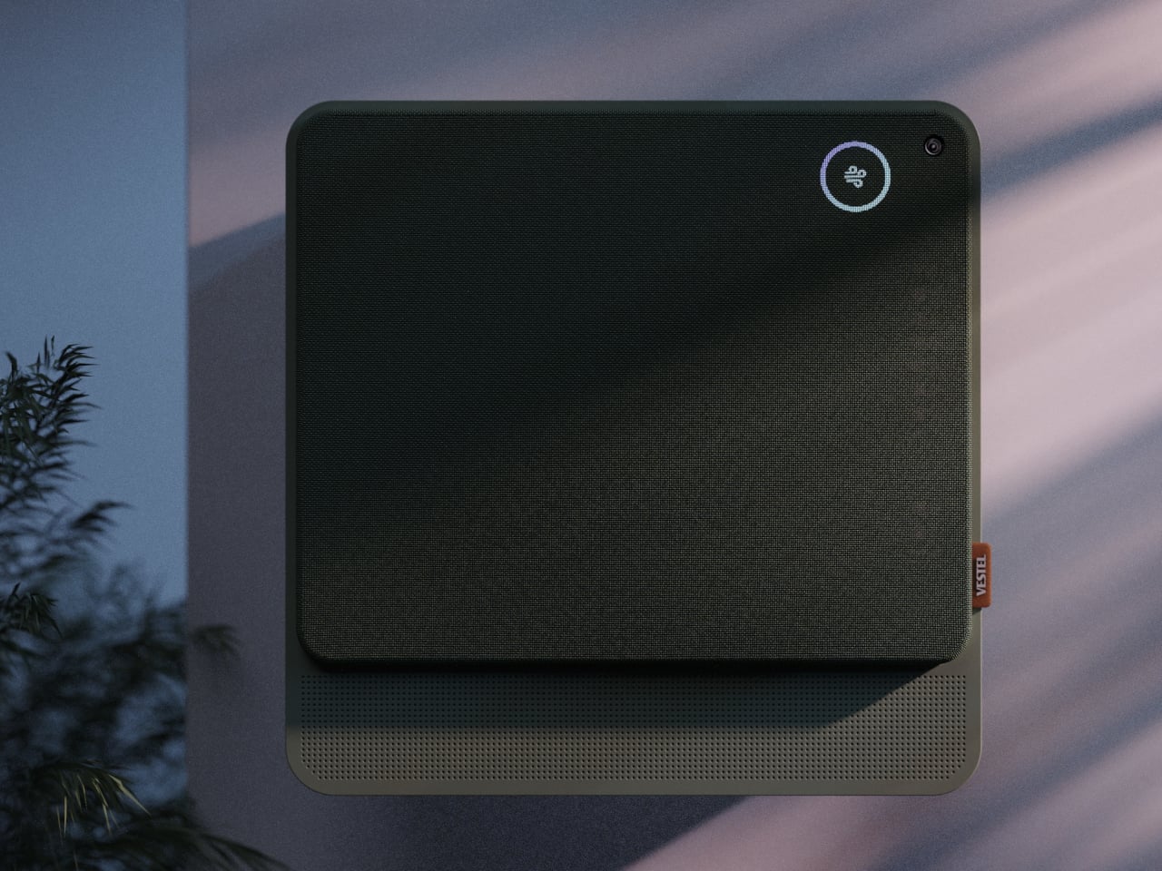
From that frustration comes WellFlow, a concept that reframes what air conditioning is supposed to do for the people living around it. Rather than engineering a better cooling box, the designers built something closer to a wellness device. It’s a concept that received validation through the iF Design Award in 2026 and was first revealed at IFA Berlin 2025.

Designer: Merve Nur Sökmen, Zehra Sarıarslan

The most immediate shift is in how air actually moves. Conventional units push output in one direction, landing directly on whoever is in the room. WellFlow uses four-way diffusion to spread conditioned air from all sides without targeting anyone in particular. Sensors also monitor occupancy and steer airflow accordingly, so the unit quietly adapts to the room rather than expecting the room to tolerate it.

Beyond airflow, the system also handles humidity, air purity, ambient lighting, and sound. A built-in humidifier balances moisture levels rather than leaving the air artificially dry, which is one of the most common complaints about running a conventional unit through the night. Circadian lighting and integrated speakers complete the picture, creating conditions that support sleeping, concentrating, or quietly winding down, depending on what the moment calls for.

All of this adjusts automatically. The system continuously monitors temperature, humidity, and air quality, then fine-tunes its output without any manual input. A baby’s room needs different conditions than a home office or a gym corner, and WellFlow is designed to recognize those differences. Its behavior was shaped through user research spanning new parents, older adults, and people with respiratory sensitivities, groups that conventional air conditioners routinely fail to address.

The physical form is just as deliberate as the behavior. Most air conditioners are conspicuously technical, with plastic housings that fight against any interior aesthetic. WellFlow uses a woven textile front panel with rounded corners and a matte finish, giving it a material quality far more associated with furniture than appliances. An ambient light halo behind the unit softly signals its presence on the wall without demanding any attention.

A pull-out front filter makes maintenance visible and intuitive, addressing something the design team identified as a recurring trust issue with conventional units. People often aren’t sure when or how to clean their filters, and that uncertainty quietly chips away at confidence in the device. WellFlow removes that ambiguity. For a machine designed around human comfort, even that seemingly small detail ends up mattering quite a lot.

The post This AC Does 5 Jobs at Once and Looks Like Furniture on Your Wall first appeared on Yanko Design.

Air Purifier Filters Cost $100 a Year, but CUE Uses Water Instead

Par : JC Torres
2 mai 2026 à 01:45

Air purifiers have become a common fixture in homes and offices, quietly working to keep indoor air breathable. Most of them follow the same basic formula, drawing air through a dry filter that captures dust, pollen, and airborne particles over time. When that filter reaches its limit, you throw it away and buy a replacement, or wash it if it’s the reusable kind. It’s a familiar routine, but not exactly a thoughtful one.

CUE Air Washer from Watervation is a 2-in-1 purifier and humidifier that takes a noticeably different approach. Rather than filtering air through a dry medium that slowly fills with grime, it washes the air with water, borrowing from how rain naturally clears the atmosphere of dust and pollen. It’s a concept that sounds simple in hindsight but actually changes quite a bit about how air care works.

Designer: Watervation

Click Here to Buy Now: $299 $575 (48% off). Hurry, only 41/975 left! Raised over $411,000.

The idea at the heart of CUE is surprisingly intuitive. Instead of holding contamination inside a dry filter, the device draws air through a water-based medium that strips airborne particles and gases from the air. Once the water turns dirty, you empty it, rinse the tank, and refill it, giving the device a clean start every day. There’s nothing to replace, and nothing to accumulate.

The technology behind CUE is Watervation’s patented RainTec system, and its most notable quality is what it doesn’t rely on. Most air washers need motorized water pumps to circulate liquid, but RainTec uses fluid dynamics instead. A spinning rotor generates a vacuum that draws water upward without any pump, eliminating the most common failure point in these devices and keeping the design considerably simpler.

What makes CUE genuinely practical is how naturally it handles two common problems at once. Dry air and airborne pollutants tend to go hand in hand, especially in bedrooms during winter or in home offices that don’t have great ventilation. Instead of running two separate appliances for purification and humidity, CUE handles both, covering spaces up to 300 sq ft, which fits most personal and domestic environments.

The ownership story is where CUE makes the strongest case for itself. Conventional air purifiers can cost over $100 per year in filter replacements alone, a figure that doesn’t stop growing the longer you use the device. CUE cuts that entirely by using water as its only medium. The maintenance routine comes down to emptying the tank, rinsing it, and refilling it with fresh water.

CUE is also one of those rare appliances that’s genuinely pleasant to leave out in the open. The cylindrical device has a dark upper housing and a clear lower tank that lets you watch the water action inside. There’s something calming about it. The swirling motion of water being spun and atomized gives the cleaning process a visible, almost meditative quality that isn’t common in this product category.

Performance testing by Korea Conformity Laboratories gives the product’s claims some independent backing. Results showed a 93.5% reduction in fine particulate matter, a 99.5% reduction in acetic acid, a 99% reduction in ammonia, and a 90% reduction in formaldehyde. The device also includes a built-in UV-C sterilization module that continuously disinfects the water tank while running, keeping the water hygienic throughout each cycle.

There’s a growing appetite for home appliances that earn their place on a shelf rather than hiding behind it. CUE Air Washer fits that thinking, handling air quality in a way that’s quieter, cleaner, and far less dependent on consumables than what came before. Watervation’s direction with this product hints at what home air care could look like when the design is as considered as the engineering behind it.

Click Here to Buy Now: $299 $575 (48% off). Hurry, only 41/975 left! Raised over $411,000.

The post Air Purifier Filters Cost $100 a Year, but CUE Uses Water Instead first appeared on Yanko Design.

This iPhone Air 2 Concept Adds Two Cameras and Suddenly the Phone Makes More Sense

Par : Sarang Sheth
17 avril 2026 à 20:30

Every first-generation Apple product is essentially a beta test with a premium price tag, and the iPhone Air was no exception. The engineering was genuinely remarkable: 5.6mm thin, a large ProMotion display, A19 Pro performance, and battery life that surprised nearly everyone who reviewed it. What wasn’t remarkable were the two omissions that showed up in every single hands-on: one camera and one speaker, on a phone that cost $999. Those two complaints alone handed buyers a perfectly logical reason to spend the same money on a Pro instead. The Air needed a second generation the moment the first one shipped.

Demon’s Tech has imagined exactly what that second generation could look like, and the concept renders suggest Apple already has a clear path to making the Air the phone it should have been from the start. The dual-camera bar is wide and confident across the top of the phone, housing two lenses with room to spare. The rest of the body is pure restraint, a flat back, centered Apple logo, and a color range vivid enough to give the phone a personality that its specs can now actually back up. If the rumored stereo speaker and efficiency-focused N2 chip join that camera upgrade, the Air 2 goes from interesting to genuinely compelling.

Designer: Demon’s Tech

Two 48-megapixel sensors reportedly sit inside the pill-shaped housing, one primary and one ultrawide, which aligns with leaks from Chinese tipster Digital Chat Station suggesting Apple is going for a main-plus-ultrawide configuration rather than a telephoto. That choice makes sense for the Air’s positioning. Telephoto glass demands physical depth that a sub-6mm chassis simply cannot accommodate, and ultrawide coverage is what most non-Pro users actually miss day-to-day. The original Air’s single-lens bar always looked slightly incomplete, like a sentence that trailed off mid-thought, and Demon’s Tech addresses that by stretching the new pill-shaped housing almost the full width of the phone’s upper third, sitting flush and purposeful rather than apologetic. It is a small change on paper that transforms the entire visual logic of the back panel.

Apple shipped the original Air in four relatively restrained options: cloud white, sky blue, light gold, and matte space black. Demon’s Tech blows that palette wide open, running through violet, cobalt, mint green, and vivid red alongside the sandy gold seen in the hero shots, which is closer to what the iPhone 5C attempted in 2013, a phone that led with color as a statement rather than a courtesy. The Air’s lifestyle positioning actually supports this approach in a way the 5C’s budget framing never quite did. A phone you buy partly because it is extraordinarily thin is a phone you buy to be noticed, and being noticed in muted gold is considerably less fun than being noticed in electric blue. The renders make a quiet argument that Apple’s colorway restraint on the original Air was a missed opportunity, not a deliberate choice.

Twelve gigabytes of RAM paired with the A20 Pro keeps the performance story simple: this is a phone that matches the Pro lineup on silicon even if it concedes on optics. The sleeper upgrade is Apple’s rumored N2 efficiency chip, because getting better battery life out of a body that physically has less room for cells requires exactly this kind of architectural work, the same discipline that let the original Air post competitive endurance numbers despite its dimensions. Add stereo sound from a bottom speaker alongside the existing top one, and the two most common complaints about the first Air evaporate inside a single product cycle. That is a more focused corrective than Apple managed with either the Mini or the Plus, both of which spent multiple generations struggling to justify their existence. If Apple lands all of this at the same $999 price point, the value math finally starts working in the Air’s favor.

Apple has confirmed the Air line continues, with the second generation reportedly targeting a spring 2027 release window, landing after the iPhone 18 Pro, Pro Max, and foldable models ship in fall 2026. That later window gives Apple’s engineering teams more time to solve the thermal and battery challenges that come with building capable hardware into an impossibly thin frame, and it gives the Air its own launch moment rather than forcing it to compete for attention against a foldable iPhone. Demon’s Tech’s concept is the best visual argument yet for what that launch moment could look like: a phone that carries its thinness as a given rather than an excuse, and finally has the camera system and audio to back up everything the form factor promises.

The post This iPhone Air 2 Concept Adds Two Cameras and Suddenly the Phone Makes More Sense first appeared on Yanko Design.

The ZERO Chair Has No Welds, No Joints, No Apologies

Par : Ida Torres
17 avril 2026 à 14:20

Most chairs are built on compromise. You stack the legs, screw the seat, bolt the back, and somewhere in that assembly, a little bit of the original idea gets lost to the necessity of structure. Davide Bozzo’s ZERO Chair refuses to play that game entirely.

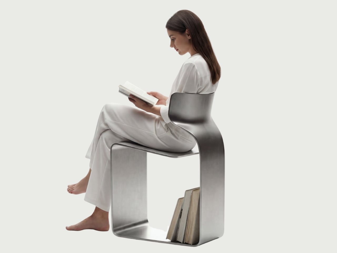
The concept is almost confrontationally simple: one single ribbon of metal, bent and curved into a complete chair. No welds holding two pieces together. No joints disguised under upholstery. No hardware quietly doing the heavy lifting behind the scenes. Just one continuous piece of material pushed into a form that includes the base, the cantilevered seat, and the backrest all at once. The name isn’t branding. It’s a philosophy.

Designer: Davide Bozzo

Looking at the photographs, the first thing I kept circling back to was the sheer audacity of the backrest. It doesn’t connect to the base through hidden brackets or clever joinery. It simply rises from the same ribbon, curving upward and backward in a motion that looks more like a wave caught mid-break than anything you’d typically call furniture. It’s graceful in a way that makes you slightly suspicious of it. How is this thing holding anyone’s weight?

The answer lies in what Bozzo describes as structural tension. Form doesn’t just follow function here. It is the function. The material itself carries the engineering logic. Every curve has a reason, and every bend is calculated to distribute load through the continuity of the form rather than through added components. It’s the same principle behind suspension bridge cables or the way a curved shell is structurally stronger than a flat panel. Applied to a chair, it feels almost radical.

I’ll be honest. My first instinct was skepticism. A single-piece metal chair sounds like one of those design school exercises that makes for great renderings but falls apart under real scrutiny. But looking at the close-up photographs, especially the one capturing the S-curve where the seat meets the backrest, you start to believe it. The brushed metal finish shows actual material depth and actual intentionality in how the surface was treated. This isn’t a concept render floating in a void. It has weight and presence.

That said, I do have questions. Comfort is conspicuously absent from the conversation. Metal, even beautifully formed metal, is hard. The cantilevered seat gives some flexibility, which should help, but a chair without cushioning asks something significant of the person sitting in it. Bozzo’s design makes a statement about material honesty and structural purity, which I respect deeply, but at some point a chair has to be sat in. That’s the tension that makes it interesting rather than just pretty.

The piece also reads as a quiet counterargument to the current era of maximalist furniture. We’ve spent years surrounded by bouclé armchairs, curved velvet sofas, and furniture dressed up in layers of texture and warmth. Bozzo’s chair strips all of that away and asks whether furniture can earn your attention through restraint and engineering alone. My honest opinion? It can. Whether it earns a place in your living room is a different question entirely.

The chair also does something that doesn’t get discussed enough in design coverage: it makes the negative space part of the design. The open rectangle formed by the base creates a void that’s almost as deliberate as the metal itself. In the lifestyle image set against a Japanese garden backdrop, that void frames the gravel and ground beyond it. The chair becomes a viewfinder. That’s not accidental. That’s a designer who understands that what you leave out is just as powerful as what you put in.

Bozzo has been building a reputation for material-forward work. His stainless steel pet bowl Dune explored similar ideas around fluid curves in a single medium, but the ZERO Chair feels like a significant step up in ambition. It’s the kind of piece that stops you mid-scroll, makes you set your phone down, and actually think. That, more than any material specification, is probably the point.

The post The ZERO Chair Has No Welds, No Joints, No Apologies first appeared on Yanko Design.

These Old Bike Frames Upcycled Into Armchairs Are The Coolest Thing You’ll See Today

Par : Sarang Sheth
7 avril 2026 à 23:30

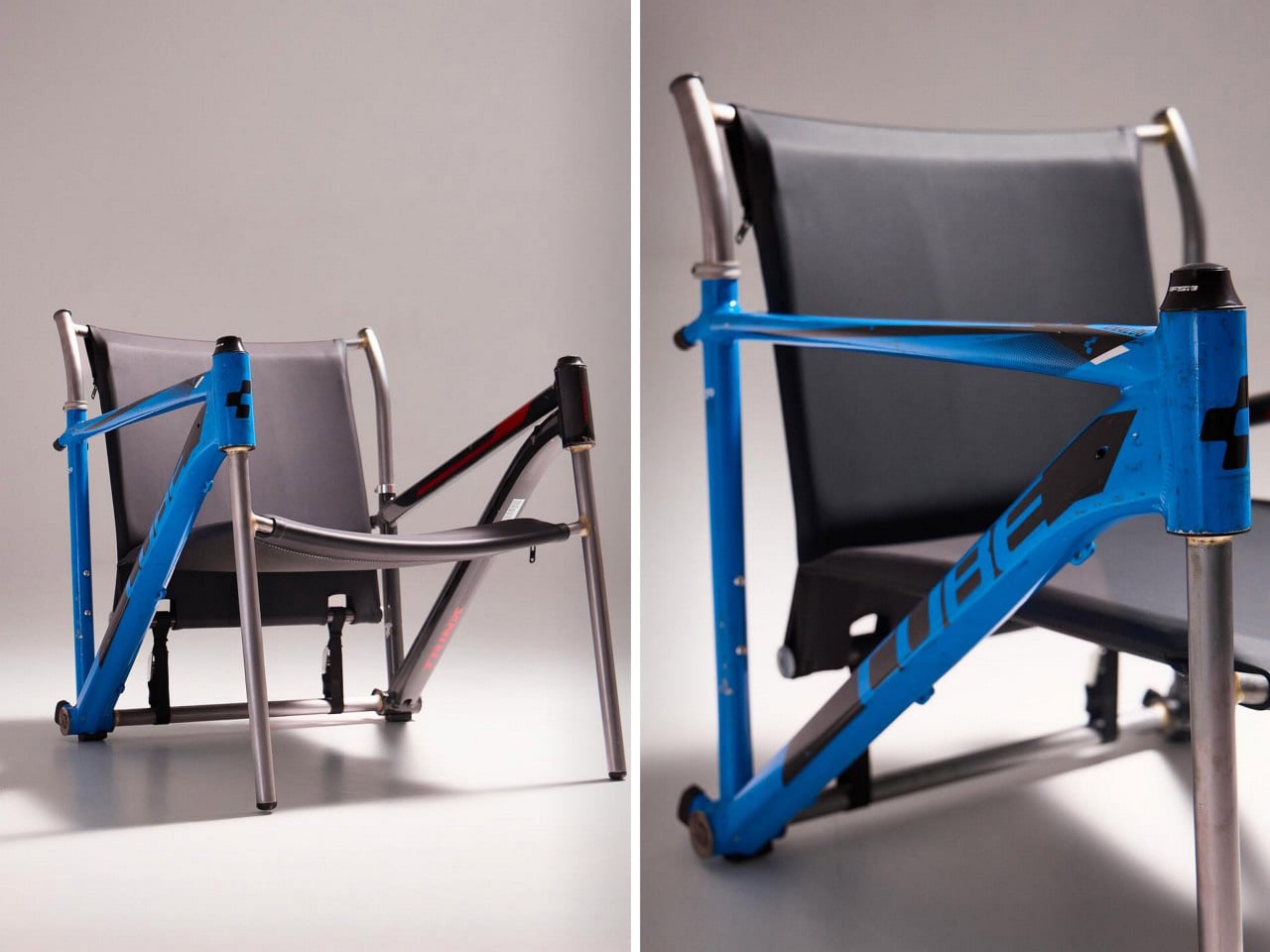
Most upcycling projects ask you to forget what something used to be. Omri Piko Kahan’s bike frame chairs ask the opposite. The geometry is still unmistakably a bicycle frame, the head tube, the top tube, the triangulated rear triangle, all of it present and accounted for, just oriented sideways and asked to hold a person instead of propel one. Kahan, an industrial designer based in Israel, builds lounge chairs from pairs of retired frames, and the whole point is that the donor material remains fully readable, repurposed without being disguised.

Structurally, the approach is clean and considered. Each frame pair is positioned symmetrically, fork and chainstay ends touching the floor as legs, the top tube running horizontally as an armrest. A slung seat and backrest in leather or canvas complete the form. The result has the relaxed posture of a Barcelona chair and the material honesty of something that was clearly built, not styled.

Designer: Omri Piko Kahan

Bicycle frames are absurdly overbuilt for what Kahan is asking them to do. A modern aluminum road frame is engineered to survive repeated impact loads from a rider pushing 300 watts through rough tarmac, and it does that while weighing somewhere between 1,000 and 1,400 grams. The structural surplus in that kind of engineering is enormous, which is why two of them positioned as a chair frame and asked to support a seated adult is, from a load-bearing standpoint, almost comically within spec. The geometry does the rest. Bicycle frames already resolve forces through triangulated sections, and a lounge chair asks for exactly that kind of lateral and compressive stability.

What Kahan has figured out is the orientation problem. Flip a frame on its side and the existing tube angles don’t automatically produce a useful chair geometry. The fork legs and chainstay ends need to hit the floor at the right height relative to each other, the top tube needs to land at armrest height, and the whole thing needs to produce a seat rake that doesn’t pitch you forward or swallow you whole. The matched top tube angles across both frames in the Cube and Trek build suggest this took real iteration, because they align with a precision that reads as deliberate rather than lucky. Filed fillets at the junctions and a custom setback upper support holding the sling confirm someone was paying close attention to finish quality.

The two builds photographed so far, one pairing a blue Cube road frame with a Trek, another combining a GT Transeo 3.0 with what appears to be a Supreme-branded MTB frame, show how much the donor bikes drive the final character of each piece. The GT build in particular has a longer wheelbase geometry that gives the chair a wider, more reclined stance than the Cube version. Kahan is taking custom orders, with pricing worked out per commission, which makes sense given that no two donor frame combinations will produce the same structural or ergonomic outcome.

The post These Old Bike Frames Upcycled Into Armchairs Are The Coolest Thing You’ll See Today first appeared on Yanko Design.

A Transforming Table-Chair That Turns Tradition into Space-Saving Intelligence

Par : Tanvi Joshi
6 avril 2026 à 22:30

At a time when living spaces are shrinking while expectations from them continue to expand, this design presents a thoughtful response that is both rooted in tradition and aligned with contemporary needs.

Emerging from the context of rising housing pressures in Taiwan, where compact homes are increasingly becoming the norm, the project addresses a fundamental question: how can furniture adapt to limited space without compromising comfort or experience? Rather than treating furniture as static, single-purpose objects, the designer reimagines them as dynamic systems capable of transformation.

Designer: Che-Chia Hsu

At the heart of this piece lies a deep engagement with traditional Chinese woodworking techniques, particularly the precision of tenon joints. These joints move beyond being structural solutions and become expressions of calculated craftsmanship, where geometry, material behavior, and human interaction converge. The result is a construction that feels both minimal and robust, relying on accuracy instead of excess.

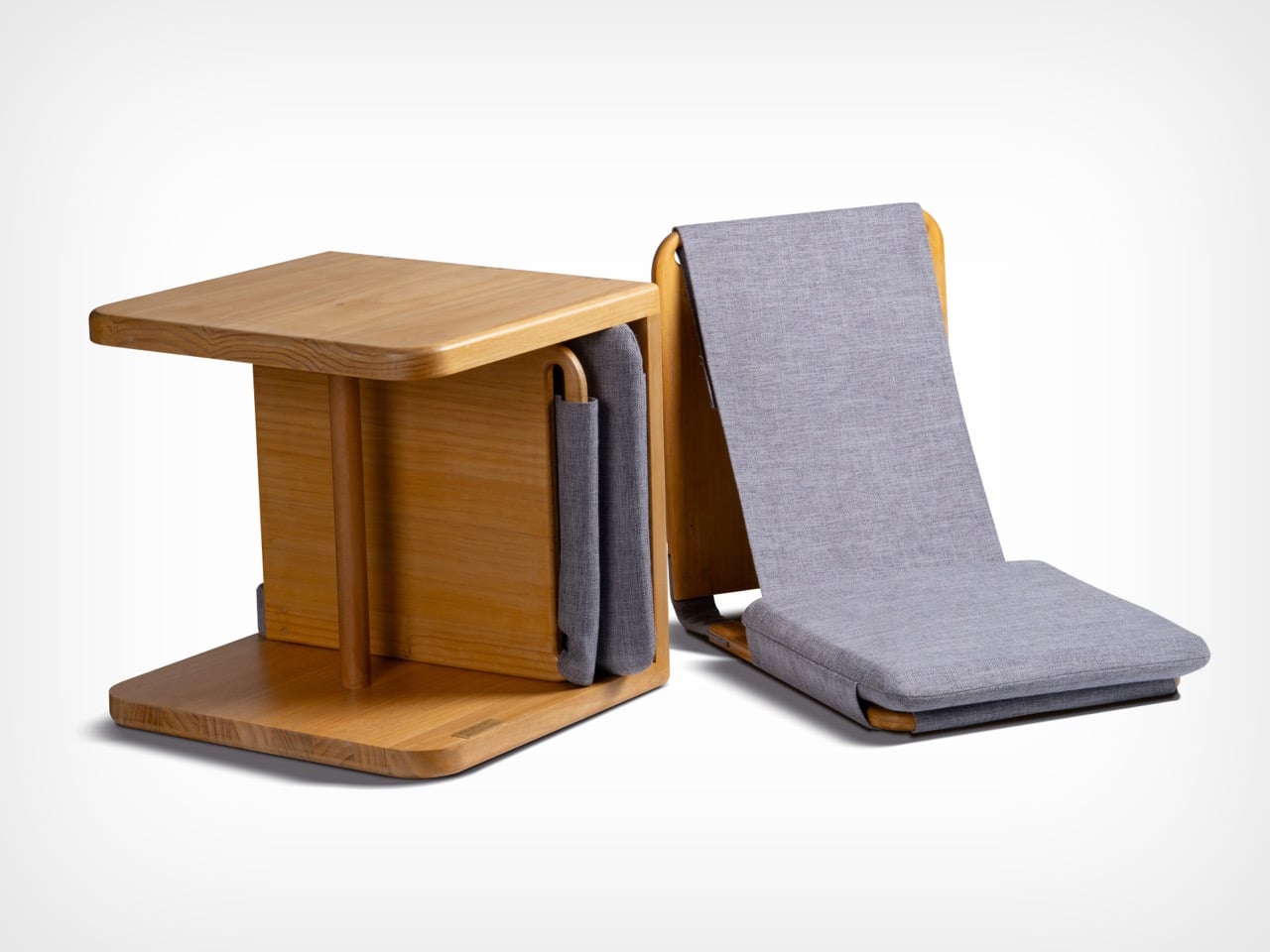
The furniture set is designed to integrate storage and seating within a compact footprint. A chair is concealed within the table and can be pulled out, unfolded, and expanded into a functional seat. The process is intuitive: the chair is extracted, the seat and backrest are opened, and the backrest angle is adjusted using velcro. The transformation is smooth and unobtrusive, allowing the object to shift roles effortlessly.

What distinguishes this design is its reliance on the user’s own body as part of the structural system. Instead of depending entirely on rigid supports, the chair uses the tension generated by the sitter to stabilize the backrest. This introduces a subtle interaction between user and object, where the act of sitting becomes integral to how the design performs. The experience feels efficient, responsive, and quietly intelligent.

Material choices reinforce this balance between function and experience. Lightweight pine wood panels provide durability while ensuring ease of movement. Paired with gray cotton linen fabric, the design introduces a tactile softness that enhances comfort. The fabric is breathable and visually understated, complementing the natural warmth of the wood. Together, these materials create a calm, cohesive aesthetic suited to contemporary interiors.

The development of the project reflects a layered and rigorous process. The designer began by studying traditional joinery techniques through literature, followed by hands-on training under a woodcraft master. This immersion enabled a deeper understanding of the craft beyond theory. Building on this foundation, the designer explored ways to translate these techniques into a modern, functional context through research and experimentation.

What emerges is a design that treats constraint as a starting point rather than a limitation. The piece brings together traditional knowledge and contemporary living patterns, shaping an object that adapts, responds, and participates in everyday use. It reflects a way of designing where space, material, and human interaction are considered together, resulting in furniture that feels considered, purposeful, and in tune with the realities of modern living.

The post A Transforming Table-Chair That Turns Tradition into Space-Saving Intelligence first appeared on Yanko Design.

These Steel Chairs Are Too Big to Sit In: Walk Through Them Instead

Par : JC Torres
6 avril 2026 à 16:20

Most public art earns its place on a pedestal and stays there. It asks you to look, maybe photograph it, and walk away. The relationship between viewer and work rarely extends beyond that brief transaction. That’s been the convention for a long time, but there’s a growing push for installations that don’t just occupy public space but actually do something within it.

Michael Jantzen has been exploring that tension for years. His Moving Furniture series applies a simple idea to ordinary chairs and tables: take each object’s form and repeat it in progressive intervals as if capturing it mid-movement, then connect those moments into a single piece. The result is something you can still sit in or set a drink on, even if it no longer looks quite built for that.

Designer: Michael Jantzen

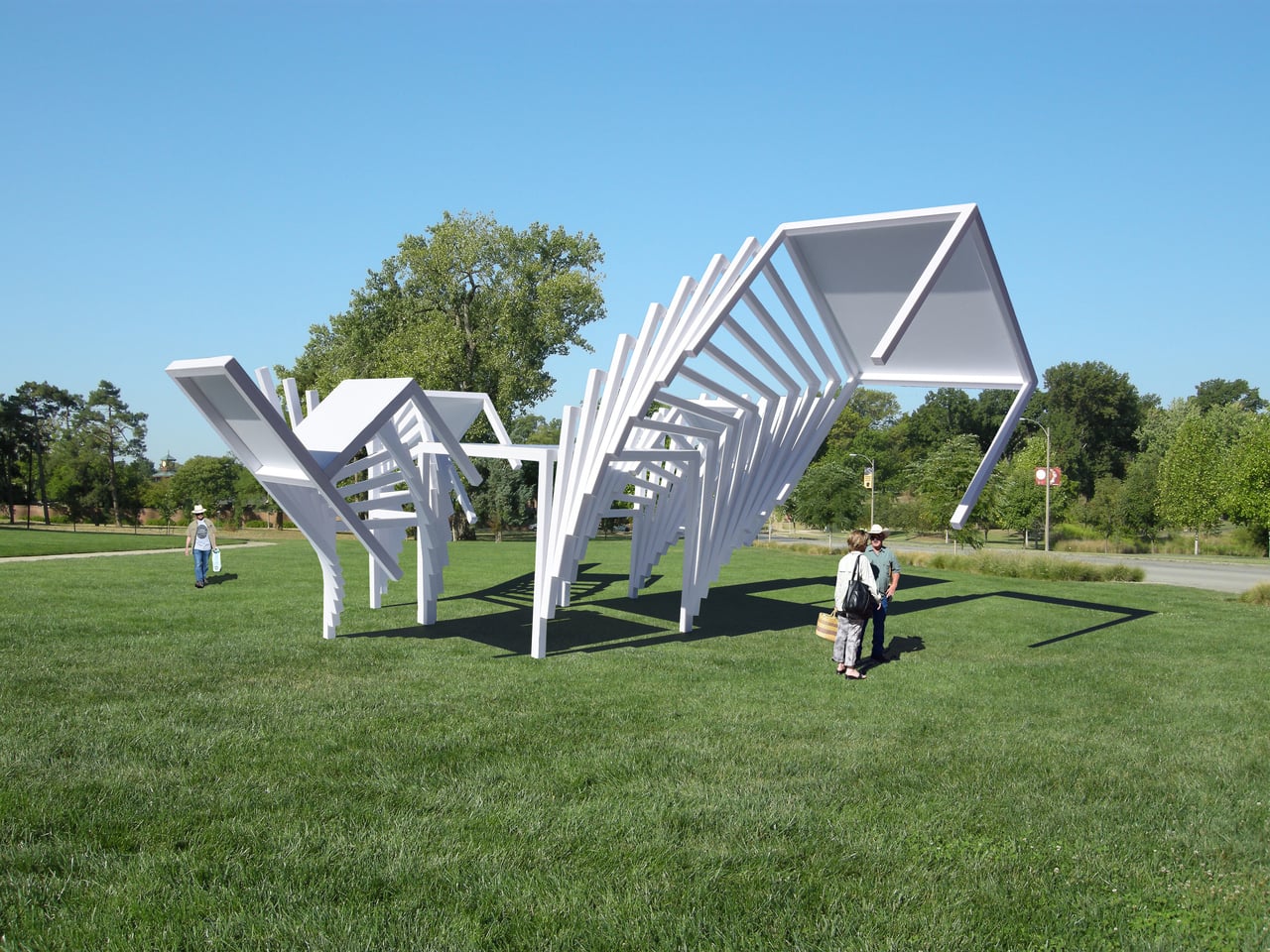
Monumental Moving Furniture takes that same concept into architectural territory. Built from painted steel, the series consists of abstracted chair and table forms, each generated by moving the original object through space and time and locking its path into a chain of connected segments. At this scale, what started as a reference to everyday objects feels closer to a building than a piece of furniture.

The method behind each piece is consistent. A chair or table is set in motion through space and time, with each interval frozen and joined to the next. Some pieces move only part of the original form; others shift the whole thing. The result is a structure that stops belonging to any single discipline and starts reading as furniture, sculpture, and architecture at once.

Despite being too large to sit in, these sculptures aren’t purely decorative. Each is large enough to walk under and through, giving it a practical function as a pavilion and shelter. That’s not something most public art can claim. Instead of asking people to observe from a polite distance, these structures pull you in, turning a passive encounter into something more physical and immediate.

The series covers both chair forms and table forms, each treated with the same sequential abstraction. Individual pieces have also been grouped into configurations that suggest more complex structures, as if each were a building block for something larger. Painted in vivid, solid colors like white, orange, and yellow, each structure commands attention from a distance and rewards a closer look once you’re standing beneath it.

Public spaces deserve more than objects to look at. They deserve things to experience. Monumental Moving Furniture earns its place on both counts, offering structures large enough to shelter visitors while giving them something genuinely puzzling to engage with. These forms don’t demand reverence. They invite curiosity, exploration, and the kind of slow, circling attention that good public space has always been designed to encourage.

The post These Steel Chairs Are Too Big to Sit In: Walk Through Them Instead first appeared on Yanko Design.

Forget Upholstery: Lærke Ryom Tailors Furniture Instead

Par : Ida Torres
26 mars 2026 à 10:07

Most upholstered furniture is essentially furniture under stress. Fabric gets stretched, stapled, pulled taut, and forced into submission over rigid frames. It is, fundamentally, a question of control. Danish designer Lærke Ryom looked at that process and decided to do the opposite. Her debut solo exhibition, Raiments, now open at Innenkreis gallery in central Copenhagen, is built entirely around that single act of refusal.

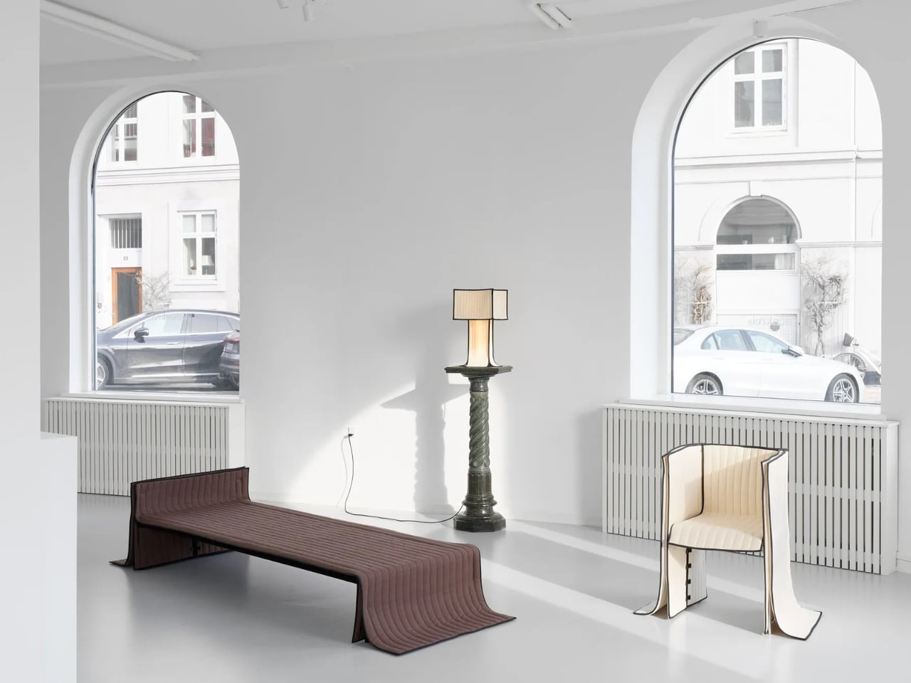
The collection includes a daybed, a chair, a bench, table lamps, a floor lamp, and wall lamps, all presented in soothing cream and chocolate-brown hues. The palette is calm and considered, which makes sense. These are pieces that ask you to slow down and look closely, because the detail is where the story actually lives.

Designer: Laerke Ryom

The daybed is probably the clearest expression of the concept. Long, low, and dressed in Kvadrat wool with visible quilting stitches running across its surface, it reads more like a made bed than a piece of showroom furniture. The fabric is not pulled over the form but rather allowed to settle onto it, the way a well-cut linen drapes over a body. The powder-coated steel frame beneath does its structural job quietly, without announcing itself.

The bench follows a similar logic. Compact and precise, it carries the same quilted wool surface and the same twill weave edge banding that appears across the collection. That edge band is a detail worth pausing on. Ryom chose it specifically because twill weave is a technique rooted in clothing and home textiles rather than furniture. “It places the upholstery pieces somewhere in between,” she has said, “adding to the feeling of a tailored piece rather than upholstery.” It is a small choice with a large effect on how the finished object feels.

The chair, built on an aluminium frame rather than steel, is the lightest piece structurally, and it shows. It sits with a kind of ease that heavier upholstered chairs rarely manage. The wool covers it without gripping it, and the stitching adds just enough surface interest to reward a second look without demanding one.

The lighting pieces are where the tailoring metaphor gets genuinely interesting. The floor lamp and table lamps, both on powder-coated steel bases, incorporate fabric shades that are constructed the same way as the seating pieces, draped and stitched rather than stretched and glued. The wall lamps, built on stainless steel bases, carry the same approach. Seeing the textile treatment applied to lighting as well as furniture makes the collection feel like a genuine system of thinking rather than a one-off experiment. Ryom is not just applying a technique to a single object type. She is testing a philosophy across an entire interior.

Underlying all of it is a material choice that matters. The Kvadrat wool she selected deliberately lacks visible weaving, which gives the stitching room to become the primary surface detail. The quilting is not decorative in a fussy sense. It is structural and honest, doing exactly what it appears to do, which is hold the fabric in place without adhesives or staples. The result is upholstery that can be disassembled, repaired, and eventually recycled. The clothes metaphor is not just aesthetic. It is practical in the most direct way possible.

Ryom, born in 1995 and working out of The Factory for Art and Design in Copenhagen’s Amager district, has been exploring alternative upholstery techniques for several years. Raiments feels like the point where that exploration becomes a fully formed position. The pieces are not minimal for the sake of it. They are restrained because restraint is what the concept requires. Every choice, from the aluminium chair frame to the stainless steel wall lamp bases to the twill edge banding, is in service of the same idea: that furniture should be dressed, not wrestled.

Whether or not that idea changes how people think about upholstery at large is probably too early to say. But Ryom has made a collection that is hard to look at and then go back to thinking about furniture the old way. That, for a debut solo show, is more than enough. Raiments is on show at Innenkreis, Herluf Trolles Gade 28, Copenhagen, through 23 May.

The post Forget Upholstery: Lærke Ryom Tailors Furniture Instead first appeared on Yanko Design.

Meet the World’s First Door Grown From Fungi, Not Cut From Wood

25 mars 2026 à 21:30

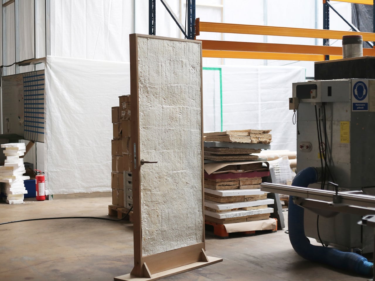
What if the door you walk through every day was grown from fungi? Danish mycelium company Rebound and architecture studio Det Levende Hus have partnered to create what they claim is the world’s first mass-produced interior door with a core cultivated from fungal mycelium. Currently in the prototype phase, the door is part of a broader collection of bio-based interior and sliding doors designed for modern living spaces, and it may quietly redefine what architectural materials can be.

The concept is straightforward but radical. Rebound cultivates the fast-growing root structure of fungi inside a mould, producing a rigid, lightweight panel with natural sound-absorbing qualities. That mycelium core is then enclosed within a timber frame built from reclaimed and surplus wood, including offcuts sourced from Danish flooring manufacturer Dinesen, meaning the door carries minimal material waste from start to finish.

Designer: Rebound & Det Levende Hus

Rebound co-founder Jon Strunge sees this as a direct challenge to the construction industry’s dependence on slow-growing hardwoods. “We wanted to demonstrate how regenerative, high-performance mycelium-based materials open opportunities for new, innovative, and scalable building components,” he said. The growing process takes roughly two weeks and is designed to scale industrially, making these doors a production-ready proposition rather than a one-off experiment.

What makes the design particularly noteworthy is its adaptability. Colour and surface texture can be altered during the growing process itself, removing the need for post-production finishing. The current prototype presents a smooth, silky surface, but the material can shift in tone and can also be finished with a layer of clay for a warmer, earthier aesthetic.

Structural performance was equally prioritised. A bio-based layer incorporated during the growing process stiffens the door and improves fire resistance, a bio-welding method that adds reinforcement without glue or additional manufacturing stages. The door was also designed to comply with current building standards for private homes, particularly around fire and moisture resistance, making it a credible candidate for real construction.

The first real-world application will be at Kaerhytten, a low-impact housing project in Ramloese, Denmark, designed by architect Jens Martin Suzuki-Højrup, scheduled for completion in 2026. The prototype also features a door handle by architect Bjarne Hammer for Danish brand Randi, the Moom handle cast from recycled seashells, adding a tactile detail that mirrors the door’s material ethos. Looking ahead, Rebound and Det Levende Hus are expanding into mycelium-based acoustic wall panels and ceilings. As Suzuki-Højrup put it, “It’s about how natural materials can transform our experience of space, visually, acoustically, even emotionally.”

The post Meet the World’s First Door Grown From Fungi, Not Cut From Wood first appeared on Yanko Design.

5 Rammed Earth Homes in 2026 That Make Concrete Walls Look Outdated

21 mars 2026 à 23:30

The architectural world is shifting toward materials that feel grounded, honest, and deeply connected to the earth. Instead of relying on high-energy industrial products, designers and homeowners are embracing approaches that honor the planet’s natural tectonics. In this movement toward true sustainability, rammed earth has re-emerged as a powerful, modern choice for those seeking beauty, integrity, and a low-carbon footprint.

Its tactile layers and sculptural warmth create spaces that feel rooted, calm, and inherently biophilic. Rammed earth offers durability, thermal comfort, and long-term value, transforming simple structures into timeless experiences and reflecting the five pillars driving its revival.

1. Low-Carbon Construction

Rammed earth stands out as a low-carbon building method because its main ingredient, subsoil, is often sourced directly from the construction site or nearby. This drastically cuts transportation emissions. Unlike concrete or brick, rammed earth requires no firing, kilns, or intensive chemical processes. Its formation relies on simple mechanical compaction and moisture, keeping the embodied energy among the lowest of any mainstream wall system.

This approach makes each project inherently more responsible and materially honest. By using local resources and eliminating energy-heavy manufacturing, rammed earth aligns with global decarbonization goals. It has become a preferred choice among forward-thinking firms committed to sustainable, large-scale performance.

Arquipélago Arquitetos’ Piracaia Eco-Village in rural São Paulo exemplifies sustainable home design, using rammed earth construction to create affordable, eco-friendly residences. Located in the village of Piracaia, the development currently includes three homes ranging from a 538-square-foot studio to a 1,245-square-foot two-bedroom unit. Each home features rammed-earth walls formed from local soil, providing structural strength and natural insulation. A modular design allows the system to be easily replicated or scaled, offering flexibility and efficiency.

Large clerestory windows bring in natural light while preserving privacy, and the aluminium roofs are designed to harvest rainwater for everyday use. Wood panels and steel tie rods ensure stability and structural integrity. Initiated by a resident who sought a deeper connection to nature and community, the project stands as a model for sustainable rural living—embracing local resources, traditional techniques, and modern architectural thinking to shape a more conscious way of life.

2. Honors Raw Materiality

Rammed earth’s signature beauty lies in its dramatic, layered texture, which is an architectural reflection of geological time. Each compacted lift reveals natural striations shaped by the soil’s mineral makeup, giving every wall a distinct, site-specific identity. This visual honesty creates an immediate sense of grounding, making the material feel ancient and deeply contemporary.

In double-height spaces, these walls do more than define boundaries as they hold light, absorb warmth, and shift subtly throughout the day. The result is an atmosphere that feels calm, elemental, and immersive. The wall becomes an artwork in itself, guiding the mood, rhythm, and spatial flow of the entire home.

Japanese architecture studio Lib Work has introduced the Lib Earth House Model B, a 1,076-square-foot home made primarily from 3D-printed soil. Located in Yamaga, Kumamoto Prefecture, and developed with Arup and WASP, this project represents a significant departure from traditional concrete construction. The single-story structure features gently curved walls and a ribbed exterior texture, showcasing the potential of combining ancient materials with advanced printing technology. Constructed from a mix of soil, sand, slaked lime, and natural fibres, the home cuts typical construction emissions by more than half while promoting durability and thermal performance.

Inside, the design balances minimalism and warmth, with natural light accentuating the earth walls’ varied textures. Embedded sensors monitor moisture and structural performance discreetly, improving long-term sustainability. The flat roof accommodates future solar or water systems, highlighting a practical integration of eco-friendly features.

3. Natural Temperature Control

Rammed earth excels in passive design because of its dense, high–high-thermal-mass composition. These walls act as natural thermal batteries, absorbing heat throughout the day and releasing it slowly at night. This steady modulation of indoor temperatures reduces sharp fluctuations and minimizes dependence on mechanical heating or cooling systems. For homeowners and designers, this means long-term savings and an impressive ROI on energy infrastructure.

Beyond performance, the material elevates the visual and spatial experience. Its ability to regulate climate naturally eliminates the need for excessive mechanical fixtures, creating cleaner lines and a more intentional aesthetic. Rammed earth becomes both structure and climate strategy in one.

The Rammed Earth House in Slovenia reimagines the early 20th-century farmhouse by combining ancient building methods with modern solar technology. Designed by architects Merve Nur Başer, Aslı Erdem, and Fatma Zeyneb Önsiper, the tiny home uses rammed earth, a sustainable technique dating back thousands of years – along with a concrete foundation and timber framework. Inspired by Slovenian architect Oton Jugovec’s floating roof, the house also features an extended green roof to protect the structure from erosion caused by Dobrava’s varied climate of rain, snow, and humidity.

Oriented to optimise passive heating and cooling, the Rammed Earth House is carefully positioned to capture winter sunlight and block summer heat. Strategically placed windows enhance natural ventilation throughout the year, while the roof supports solar panels, a rainwater harvesting system, and an integrated septic tank. The interior layout further improves efficiency, with fewer windows on the north side to minimize heat loss and more on the west to capture warmth when needed.

4. Built for Centuries

Modern rammed earth, lightly stabilized with cement, delivers exceptional compressive strength and long-term durability. Its dense composition makes it naturally fire-resistant, pest-resistant, and remarkably stable across changing climates. History reinforces this reliability with rammed-earth structures around the world having survived for centuries, proving the material’s endurance far beyond typical contemporary systems.

For homeowners, this resilience translates directly into value. The walls demand minimal upkeep and offer a long structural lifespan, financially sound over decades. Their inherent thickness also enhances acoustic comfort, reducing noise transfer and improving the quality of everyday living within the home.

Casa Covida is a modern reinterpretation of ancient building methods that merges traditional materials like mud, clay, and straw with advanced 3D-printing technology. Developed by Emerging Objects, the project showcases how earth-based architecture, used by nearly 30% of the global population, can be revived for contemporary living. Built in Colorado’s San Luis Valley using a SCARA robotic printer, the structure is made from an adobe blend and features three interconnected zones: a central space with a hearth, a sleeping area furnished with reclaimed beetle kill pine, and a bathing zone with a river-stone-embedded tub. An inflatable cactus-inspired roof adds weather protection and visual intrigue.

Designed for two people, Casa Covida acts as a prototype to explore how ancient techniques can coexist with digital fabrication. The 3D-printed walls, custom earthen cookware, and natural insulation demonstrate how sustainability and innovation can shape the future of housing.

5. Celebrates Nature-Rooted Architecture

Rammed earth grounds a home not just physically but culturally, drawing directly from the soil that defines its region. By using material sourced from the site itself, the architecture gains a deep sense of place and authenticity. This alignment with biophilic design principles creates a natural, instinctive connection between occupant and landscape, allowing the structure to feel both contextual and emotionally reassuring.

The experience is more than visual as it is tactile and psychological. The walls embody local history, climate, and geology, offering a timeless identity that outlasts design trends. In this way, rammed earth supports well-being while honoring the land it stands on.

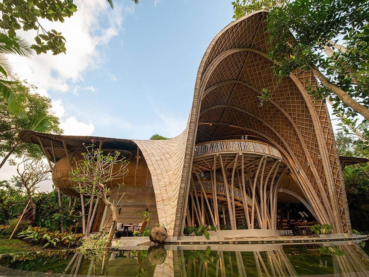
Contrary to the belief that sustainability requires sacrificing comfort, Ulaman Eco-Retreat Resort in Bali demonstrates that ecological responsibility can coexist with luxury. Designed by Inspiral Architects, this carbon-neutral resort is constructed primarily from bamboo and rammed earth, locally sourced materials that significantly reduce environmental impact.

Situated in Kaba-Kaba village, the resort showcases the structural and aesthetic potential of sustainable materials. Rammed earth, used for the ground-level walls, offers a low-emission alternative to concrete, while the curvilinear bamboo roofing blends cultural authenticity with structural beauty. Powered by hydroelectric energy from a nearby river, the resort includes a cliffside yoga studio and a meandering pool designed to reflect natural surroundings.

Rammed earth’s resurgence is not a design fad but a meaningful answer to today’s calls for beauty, sustainability, and lasting value. By choosing this ancient yet future-ready material, homeowners invest in sustainable luxury that elevates both life and environment. Its layered, monolithic presence creates a sanctuary that endures quietly elegantly, deeply responsible, and profoundly connected to the earth it rises from.

The post 5 Rammed Earth Homes in 2026 That Make Concrete Walls Look Outdated first appeared on Yanko Design.

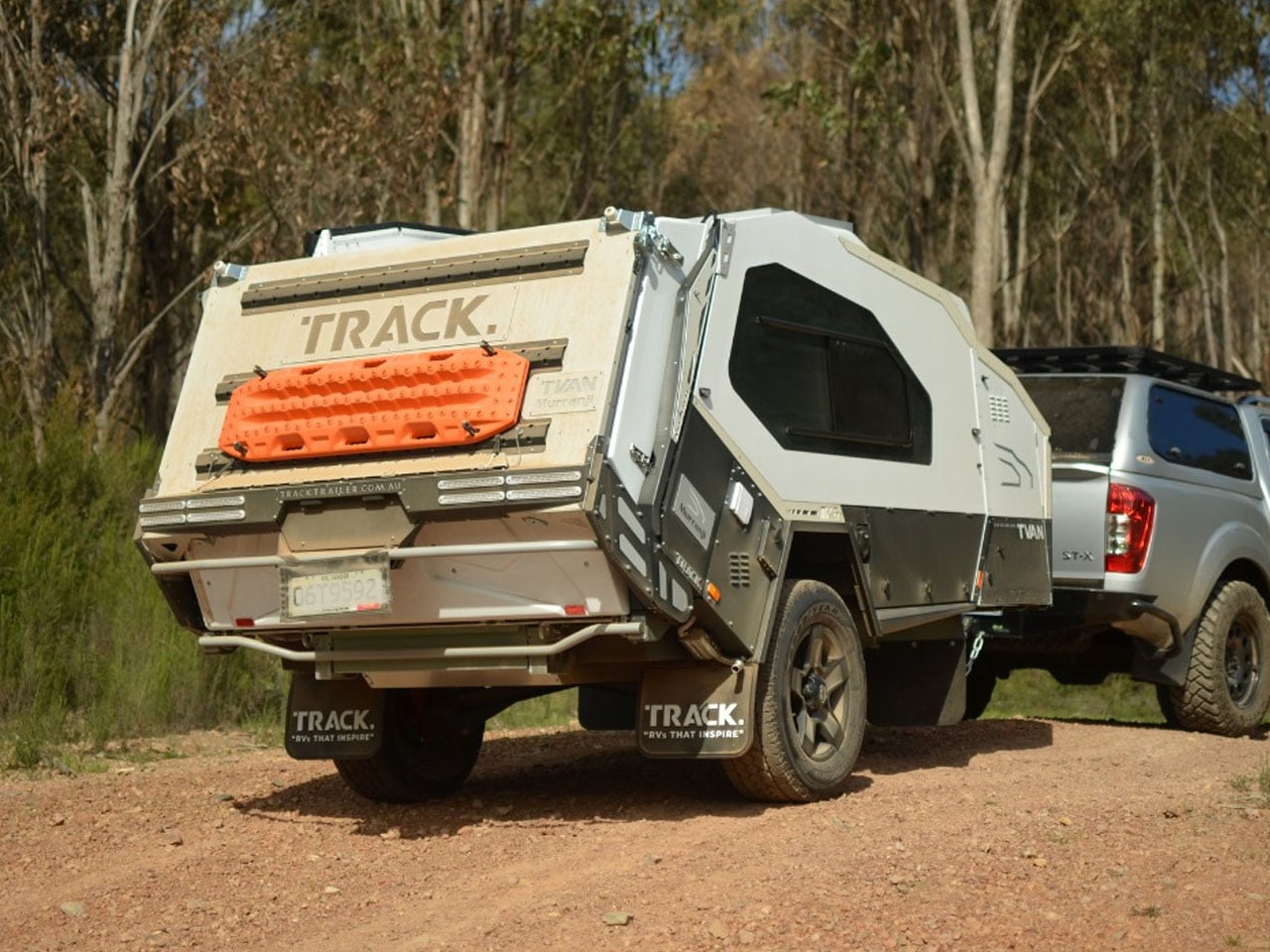
Track Trailer reinvents Tvan, one of the toughest off-roading trailers with roomier MK6 model

Par : Gaurav Sood
20 mars 2026 à 19:15

Track Trailer, the name behind the famous Tvan off-road camper trailers, needs little introduction. It has been powering the overlanding experience in Australia and worldwide for a good part of four decades now. Over the years, we have seen some interesting variants of the Tvan, which has now reached the MK6. The sixth iteration in the successful portfolio, Tvan MK6 Model, retains the same aluminum body, which runs in the bloodline, but is more spacious and even more comfortable.

As the appearance suggests, the new Tvan MK6 is available in four variants and is almost identical to its predecessors. What changes are the interior space and the headroom, which make the MK6 a different entrant in the same effective branding of the world’s toughest off-roading trailer.

Designer: Track Trailer

Track Trailer first tried reworking the interior space with the MK5 model. It was done staying within the confines of the Tvan styling: no pop-up roof attachment, but a slight raise in roof height. With the MK6, the company has also stayed true to its design ideology. It has only increased headroom, stretched the neck forward, and pushed the sides of the trailer outward to increase the interior space by up to 20%.

The expansion to the trailer permits more natural light inside the cabin, which is constructed using an aluminum sandwich-panel construction. Moreover, the MK6 features a durable chassis based on an advanced suspension system that enables it to roll comfortably on rugged terrains and off-road destinations. With its ruggedness assured, the camping trailer is ideal for all types of adventures, which is facilitated by its quick setup and clever storage designed throughout its exterior and also on the inside.

MK6 measures 16-foot-long and 6.3 feet wide, the trailer has an interesting storage cabinet in the extended nose up front, comprising a pantry and up to 95 liters fridge/freezer. Slightly further back is the slide-out kitchen with a three-burner gas stove, a full-size sink connected to a 108L fresh water tank, and a storage drawer topped with a prep area.

The most interesting part of the MK6 camping trailer is the rear hatch design. It features Track Trailer’s patented Skyward Lift Up Deck, which combines the hatch and the hard-floor deck. The electric lock system allows the two to lift up in unison for quick and direct access into the living space of the trailer. Just when you need it, a tent can be attached to the trailer to increase the living quarters.

Inside is a double bed surrounded by large windows and overhead and sidewall storage. LED lighting and dual roof hatches complete the design. Since the MK6 is available in four variants, each is designed differently for off-the-grid living. The entry-level Inspire features a 125Ah lithium battery that draws energy from a 200W rooftop solar panel, while a 350W inverter takes care of the power backup. Firetail accommodates a pair of 125Ah batteries, a 2000W inverter, and some premium features in the kitchen.

Tvan MK6 Murranji adds a 200W solar panel to the Firetail setup, but leaves out the inverter. The top-of-the-line, Lightning, on the other hand, comes with a 500Ah battery. It features a 2,000W inverter and a 360W solar panel to complete its all-electric setup. Each of these models can have further upgrades with add-ons like awnings and more. MK6 starts at AU$69,900 (approximately $50,000) with the mentioned amenities.

The post Track Trailer reinvents Tvan, one of the toughest off-roading trailers with roomier MK6 model first appeared on Yanko Design.

❌
❌