Vue normale

  • ✇Yanko Design
  • Finally Focus Without Your Phone: The $54 Wooden To-Do Kit
    As someone who enjoys making lists, whether it’s productivity lists, pop culture rankings, journaling spreads, or actual listicles for work, I have accumulated more notebooks and apps than I probably need. Sometimes, though, what you really need isn’t another app or another notebook. What you need is something that forces you to focus on the one task that actually matters instead of getting distracted by pop-up windows, social media notifications, or the colorful pens and stickers calling your
     

Finally Focus Without Your Phone: The $54 Wooden To-Do Kit

4 septembre 2026 à 06:07

As someone who enjoys making lists, whether it’s productivity lists, pop culture rankings, journaling spreads, or actual listicles for work, I have accumulated more notebooks and apps than I probably need. Sometimes, though, what you really need isn’t another app or another notebook. What you need is something that forces you to focus on the one task that actually matters instead of getting distracted by pop-up windows, social media notifications, or the colorful pens and stickers calling your name from the journaling aisle.

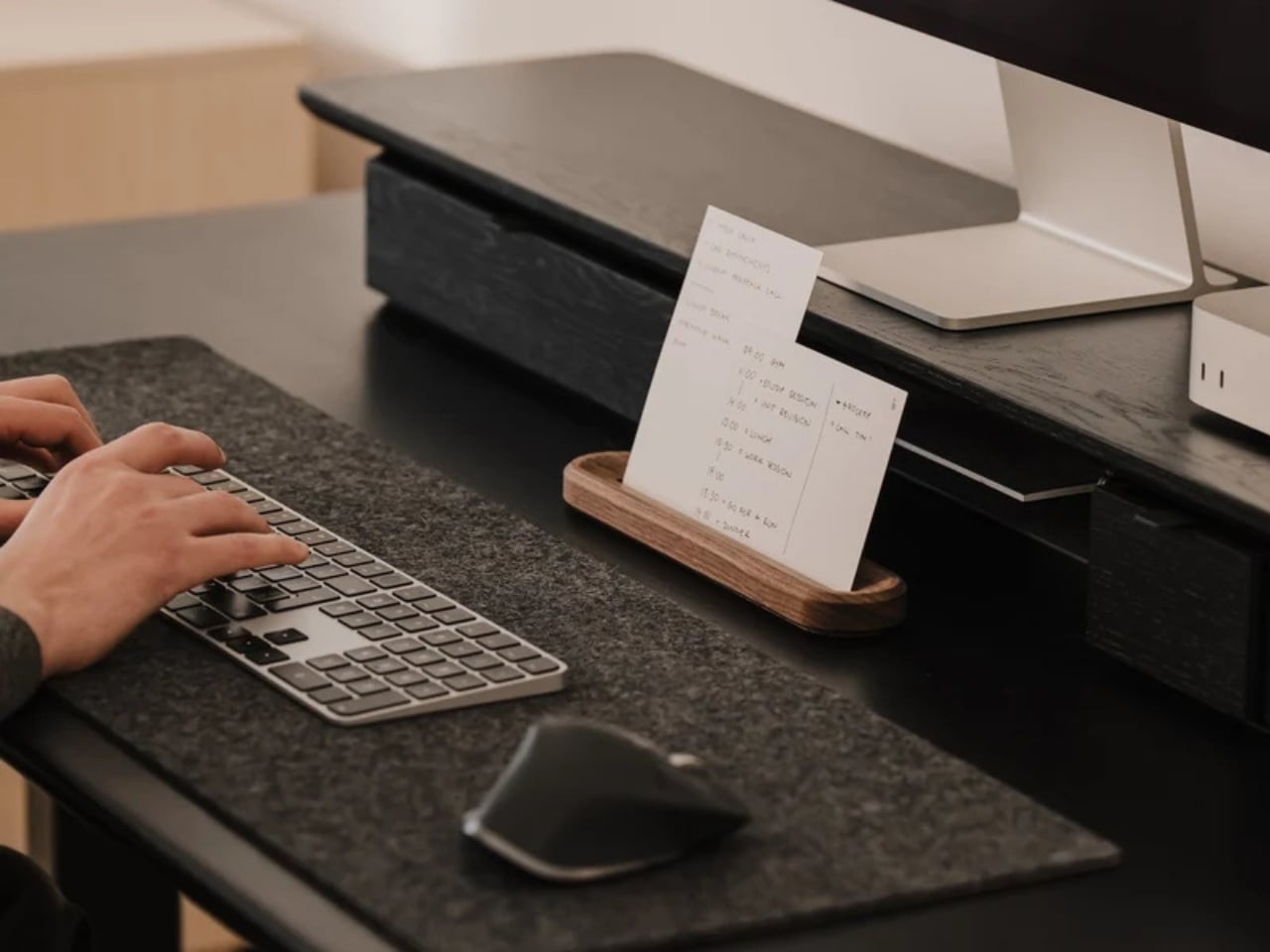
The To-Do Desk Kit from Oakywood wants to solve exactly that problem by narrowing your focus down to a single piece of paper, placed on a small wooden card holder, sitting right at eye level on your desk. It’s a simple, minimalist tool, but it’s designed with a clear purpose: to bring a bit of analog calm back to what is probably a screen-cluttered and object-cluttered workspace. Sure, you could just grab a notepad or scribble on a whiteboard, but this is a far more aesthetic and intentional way to work on your productivity, and it looks good doing it.

Design: Oakywood

Oakywood, the brand behind the kit, is known for handcrafted wooden desk accessories, and this piece fits right into that world. The holder itself is made from solid oak or solid walnut, with a black finish also available if you prefer a more subdued look. There’s a slot to hold one or two cards vertically at eye level, so you can glance over whenever you need a reminder of what you’re supposed to be accomplishing, whether you’re deep in work on your computer or handling something entirely analog. Behind that visible card, the holder can actually stack up to eight more, so you’re never digging through a pile of loose paper to find your list.

One of my favorite small details is the contoured groove carved into the block, which doubles as a pen dock. Instead of hunting around your desk for a pen every time you want to add a task or cross one off, it’s already sitting right there, built into the design. The base is lined with natural cork, too, which means it stays put on your desk and won’t leave scratches behind, no matter what material your desk is made of. It’s a small touch, but it shows the kind of thoughtful design that Oakywood puts into all of its pieces.

The kit also comes with a starter pack of 100 To-Do Cards, printed with a soft dotted grid on the front, similar to what you’d find in a bullet journal, and a completely blank back if you want more freedom. That blank side is a nice bonus for anyone who occasionally needs to sketch out an idea, map out a plan, or jot down something that does not fit neatly into a to-do list format. The cards are printed on premium 250-gram uncoated, FSC-certified offset paper, so pens, pencils, and even fountain pens will not smudge or bleed through. Refill packs are sold separately once you run through the starter set, though you could just as easily swap in your own card stock if you want to write your own affirmations, motivational quotes, or reminders instead.

It’s also worth mentioning that Oakywood plants a tree for every product sold, and the cards themselves are made from FSC-certified paper. If you already own an Oakywood laptop stand, pen tray, or wireless charger, the To-Do Desk Kit fits right into that same warm, wood-toned ecosystem, making your desk feel like one cohesive space instead of a pile of mismatched gadgets.

Priced at around fifty dollars, give or take a discount depending on when you catch it on sale, the To-Do Desk Kit isn’t just a productivity gadget. It’s a small, tactile object that makes sitting down to work feel a little more intentional. For anyone who loves collecting beautifully made desk pieces as much as they love checking things off a list, this feels like an easy addition to a growing collection, and an even easier way to talk yourself into finally starting that task you have been putting off. Sometimes all it takes is one card, one pen, and one clear line of sight to get moving again.

The post Finally Focus Without Your Phone: The $54 Wooden To-Do Kit first appeared on Yanko Design.

  • ✇Yanko Design
  • Finally, a Smart Home You Can Control Without Your Phone
    For some years now, the idea of a smart home has been more than just science fiction. We’ve watched lights, thermostats, speakers, security systems, and countless other devices become “smarter.” One issue with these connected homes, though, is that most of their controls are app-based, meaning you always need your phone handy just to turn something on or off. That’s why a dedicated smart home hub is such a welcome idea: a control center that doesn’t live inside your phone. The Homey Portal, cre
     

Finally, a Smart Home You Can Control Without Your Phone

3 septembre 2026 à 05:15

For some years now, the idea of a smart home has been more than just science fiction. We’ve watched lights, thermostats, speakers, security systems, and countless other devices become “smarter.” One issue with these connected homes, though, is that most of their controls are app-based, meaning you always need your phone handy just to turn something on or off. That’s why a dedicated smart home hub is such a welcome idea: a control center that doesn’t live inside your phone.

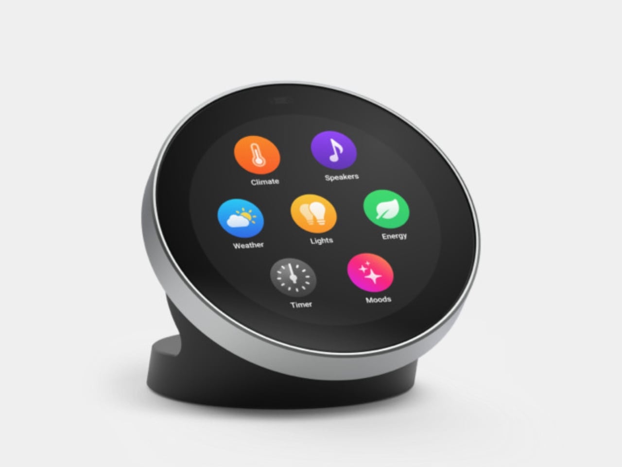
The Homey Portal, created by Dutch company Athom, is a physical smart home controller with a tactile surface that helps you manage all your connected devices. It lets anyone in your household do things like turn the lights on or off, see who’s at the door, check how much energy you’re using, find out what’s playing on your speaker, and trigger various other smart functions you’ve set up.

Designer: Athom

Having a physical smart home controller can be more convenient than relying on a phone-based one, and Homey proves it with this newly launched device. It features a 2.8-inch round touchscreen wrapped in a stainless-steel rotary ring. You can tap the screen to select and toggle your smart devices on or off, then twist the rotary dial to adjust things like brightness, volume, and temperature.

There’s a lot you can do with this little hub. If you have smart lights, you can turn them on and off and then twist the dial to dim or brighten them. It can also show the real-time temperature and humidity of your room, and you can twist the dial to adjust the temperature accordingly. If you’re playing something on your smart speaker, the screen displays the artist, track, and even the album art. From there, you can twist the dial to adjust the volume or swipe on the touchscreen to skip to the next song or go back to the previous one.

You can also set up Flow-based alerts, like a reminder to water your plants or a snapshot from your doorbell camera showing who just rang the bell. If you pair the Portal with a Homey Energy Dongle or another supported energy tracker, you can even check real-time household wattage, solar yield, and the cheapest hours to run your appliances.

The device itself is small enough to mount on a wall or simply place on your desk, side table, or countertop, whichever works best for you and the people you live with. It’s designed to work with the more than 70,000 devices from 2,000-plus brands that Homey already supports, as well as the broader Homey ecosystem, including Homey Pro, Homey Pro Mini, and Homey Cloud. The Homey Portal is available for pre-order now at an introductory price of $249, with the regular price set to rise to $299 once the first batch sells out. Orders are expected to start shipping before the end of the year, and every unit comes with both a desk stand and a wall mount included in the box, so you won’t need to buy any extra accessories to set it up wherever you like.

At its core, the Homey Portal is trying to solve a problem most of us didn’t even realize we’d accepted: that “smart” homes had quietly made simple tasks more complicated. Turning on a light shouldn’t require unlocking a phone, opening an app, and tapping through menus, and the Portal brings back the simplicity of just walking up to a dial and giving it a twist.

It also solves a more personal problem, since not everyone in a household wants to install an app or learn a new system just to turn off a lamp. Because each Portal can be placed in a specific room and used by anyone who walks by, it turns the smart home into something the whole family can actually share, not just the one person who set it all up. Whether it ends up on a kitchen wall, a bedroom nightstand, or a home office desk, it’s a small device aiming to make an increasingly complicated corner of our homes feel simple again.

The post Finally, a Smart Home You Can Control Without Your Phone first appeared on Yanko Design.

  • ✇Yanko Design
  • This CD Player Doesn’t Hide Its Mechanism, It Puts It on Display
    If you think compact discs are a thing of the past, you probably haven’t been around a K-pop fan or a hoarder who still has their CDs from decades ago. Then there are people like me who have a stack of CDs collected over the years but no actual CD player to enjoy them on, since options that are strong on both quality and design are hard to come by. The ClearFrame Speaker CD Player is a solid choice for anyone looking for a visually stunning player that won’t let a CD’s album art go to waste. It
     

This CD Player Doesn’t Hide Its Mechanism, It Puts It on Display

2 septembre 2026 à 19:30

If you think compact discs are a thing of the past, you probably haven’t been around a K-pop fan or a hoarder who still has their CDs from decades ago. Then there are people like me who have a stack of CDs collected over the years but no actual CD player to enjoy them on, since options that are strong on both quality and design are hard to come by.

The ClearFrame Speaker CD Player is a solid choice for anyone looking for a visually stunning player that won’t let a CD’s album art go to waste. It lets you slot the jacket art onto the front of the player so it becomes a rotating piece of wall or shelf art. Or, if you’d rather show off the mechanics, you can leave the artwork out and display the transparent body itself, watching your CD spin with all its moving (and non-moving) parts in full view.

Click Here to Buy Now: $240.00

Whenever I come across beautiful album art, I can’t help but think it’s wasted if it only ever gets seen as a tiny digital thumbnail on a streaming app. A player like the ClearFrame Speaker CD Player lets you put that kind of artwork on full display while you’re enjoying the music in your room. Seeing something that the artist, and the album art designer, worked hard on come to life while it spins gives it the justice it deserves. And if you’d rather see the clear, polycarbonate-style body become a piece of art in its own right, just take out the album cover and let it shine in all its transparent glory.

This is also an upgraded version of the original, and already popular, ClearFrame CD Player, since it now comes with a built-in speaker. That means you no longer need to hook it up to an external Bluetooth speaker or wired setup, which makes it even more flexible to display anywhere in your home. You actually have three ways to listen to your favorite CDs: through the built-in 40mm speaker, with wired headphones through the 3.5mm jack, or over Bluetooth 5.3 to external speakers or headphones if you already have a better setup you’d like to use.

Beyond the listening options, the ClearFrame Speaker CD Player was clearly designed with portability in mind. At just 454 grams (about a pound) and roughly the size of a hardcover book, it’s light enough to carry from your bedroom to your living room without a second thought. Its 1,800mAh battery gives you around six to seven hours of playback through the built-in speaker, or seven to eight hours if you’re streaming over Bluetooth, so you can enjoy a few albums back-to-back before needing to recharge via USB-C. There’s even a retro-style LED Nixie tube display that adds a warm, nostalgic touch to the whole experience, plus a 2MB SDRAM anti-shock buffer so accidental bumps won’t make your music skip.

For collectors, this player also solves a real problem: what to do with all the CDs sitting untouched in a drawer somewhere. Instead of treating them like outdated clutter, the ClearFrame gives them a reason to come back out, whether that’s a K-pop photocard-era album, a mix your best friend burned for you in high school, or a boxed set you’ve been meaning to revisit. It turns “old technology” into a genuine decor piece you’d be proud to leave out on a shelf.

If you’re looking to gift this to someone (or, let’s be honest, treat yourself), the ClearFrame Speaker CD Player comes in a few configurations depending on how you plan to display it. You can pick it up on its own, or add a wall mount, book case, or display stand, so it fits neatly into whatever corner of your home you have in mind. It isn’t the cheapest CD player on the market, but if you have a stack of CDs with nowhere to go and album art too good to keep hidden, this one earns its price tag by turning something you already own into something worth looking at every single day.

The post This CD Player Doesn’t Hide Its Mechanism, It Puts It on Display first appeared on Yanko Design.

  • ✇Yanko Design
  • Finally, a Compass That Works Without Opening Google Maps
    Anyone who has wandered around an unfamiliar neighborhood searching for a boutique that Google Maps insists is “on your left” when it is actually tucked behind a parking garage knows the specific frustration I am talking about. Small, independent stores rarely have the budget for a flashy storefront, and a pin on a map that is close enough to be tantalizing and far enough to be maddening is usually all you get. A Pow Studio designed something to fix exactly that: a small NFC-embedded fixture ca
     

Finally, a Compass That Works Without Opening Google Maps

2 septembre 2026 à 17:30

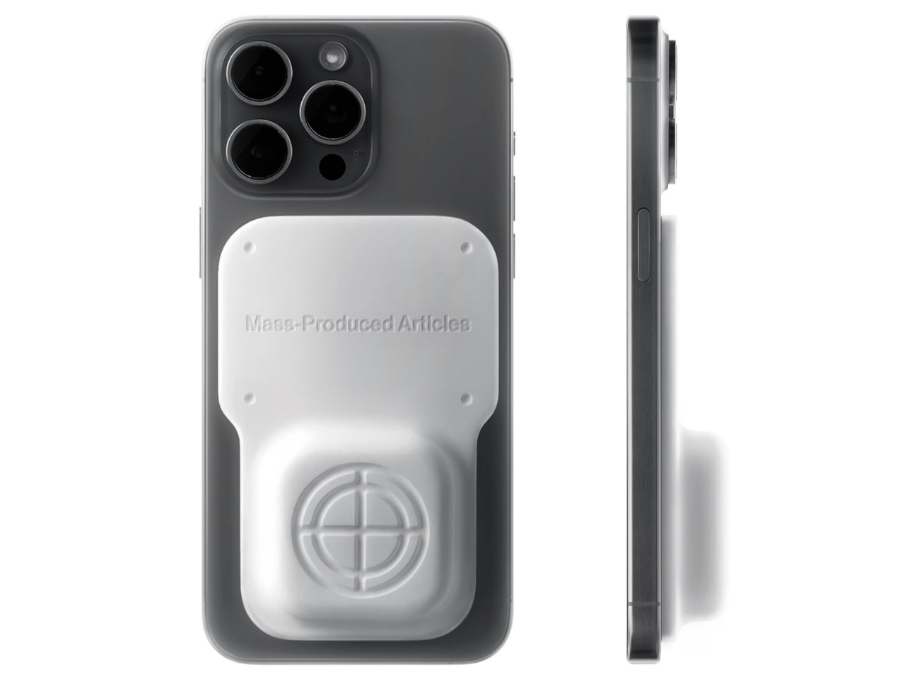
Anyone who has wandered around an unfamiliar neighborhood searching for a boutique that Google Maps insists is “on your left” when it is actually tucked behind a parking garage knows the specific frustration I am talking about. Small, independent stores rarely have the budget for a flashy storefront, and a pin on a map that is close enough to be tantalizing and far enough to be maddening is usually all you get. A Pow Studio designed something to fix exactly that: a small NFC-embedded fixture called the Navigation Tool that turns a single phone tap into a live compass, guiding you down the block to a physical destination without asking you to download anything.

That solves the first problem. The second one is subtler but just as real. Even after you find the store and walk through the door, most brands have no clean way to hand you off to their digital world. You try something on, feel vaguely inspired, and leave with no easy path to the website, the product specs, or the broader catalog. The Navigation Tool closes that gap too. The same NFC chip, this time embedded into the store’s hanging display system, redirects your phone tap to an online page loaded with product details and brand information. Two taps, two problems solved, zero apps required.

Designer: A Pow Studio

The mechanics are genuinely elegant. Outside, you tap your phone on the tool and a search bar appears asking for the coordinates of your destination. The system pulls from Location-Based Services and your phone’s built-in gyroscope to calculate real-time distance and direction, then renders everything as a clean, minimal compass interface on your screen. MagSafe compatibility is built in so the phone can physically attach to the tool while you navigate, which is a small detail but the kind that signals someone actually thought about what your hands are doing when you are half-lost and moving.

No app to download, no QR code cluttering a window decal, no clunky onboarding screen asking you to create an account you will use exactly once. You tap, and it works, the same quiet mechanism already living in Apple Pay or a subway fare card, just pointed at a completely different problem. American shoppers are already fluent in tap-to-pay and tap-to-unlock behavior, so repurposing that same gesture for navigation feels less like a gimmick and more like an overdue extension of something we already trust.

It also lands at an interesting moment for retail. Brick-and-mortar shopping has been quietly reasserting itself as something people actually want, not just tolerate, but brands still need their physical spaces to feed the digital ecosystem that keeps the business running. A tool like this treats the store not as a dead end or a photo backdrop but as one stop in a longer, connected journey. That feels like a more honest way to think about retail design than another Instagram wall ever could.

The visual language matches the intention. The compass interface on screen is stripped back to the point of being almost architectural: a circle, a crosshair, a tilt reading, a direction bearing. Nothing decorative, nothing unnecessary. It looks like something a navigator or a cinematographer would recognize before a tech blogger would, which feels right. Precise without being cold, minimal without being precious.

I do wonder about scale. A single boutique installing this is a lovely, considered gesture. A mall trying to retrofit hundreds of storefronts with individual NFC compass units is a different logistical conversation entirely, and I am not convinced every brand needs this level of ceremony just to get someone through the door. But as a proof of concept, it is a genuinely smart answer to a problem most retailers pretend does not exist. Sometimes the best design solution is not a flashier app. It is a small, physical object that refuses to overcomplicate the walk from curiosity to the front door.

The post Finally, a Compass That Works Without Opening Google Maps first appeared on Yanko Design.

  • ✇Yanko Design
  • A Ceramic Lamp That Refuses to Stay the Same
    Most lamps ask you to commit. You pick a shade, a finish, a mood, and that’s what you’re stuck with until the bulb burns out or you get sick of it and drag the whole thing to a donation bin. For anyone who likes to rearrange a room the way some people rearrange their playlists, that’s a real limitation, and it’s one nobody really talks about because we’ve just accepted lighting as a fixed decision rather than a flexible one. Seoul-based designer Byunggwon Na looked at that problem and did somet
     

A Ceramic Lamp That Refuses to Stay the Same

2 septembre 2026 à 15:20

Most lamps ask you to commit. You pick a shade, a finish, a mood, and that’s what you’re stuck with until the bulb burns out or you get sick of it and drag the whole thing to a donation bin. For anyone who likes to rearrange a room the way some people rearrange their playlists, that’s a real limitation, and it’s one nobody really talks about because we’ve just accepted lighting as a fixed decision rather than a flexible one.

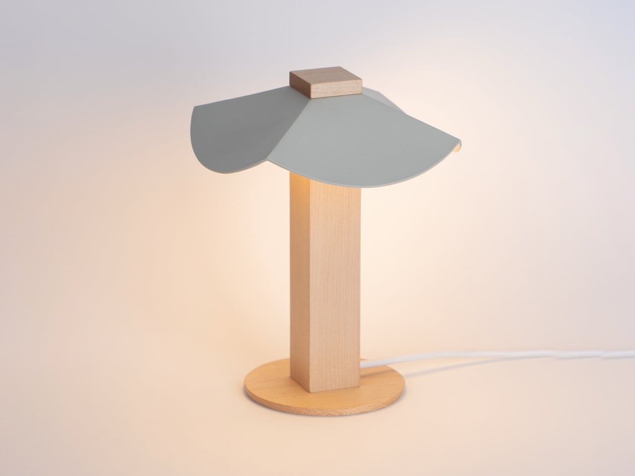
Seoul-based designer Byunggwon Na looked at that problem and did something refreshingly simple about it. His new piece, ALIT, is a lamp built from two honest materials, slip-cast ceramic and solid wood, and it’s designed so the ceramic shade can be lifted off and swapped for another one entirely. The wooden column stays put. The ceramic changes. One base, endless personalities.

Designer: Byunggwon Na

I’ll admit I’m a sucker for objects that do more with less, and ALIT is a good example of that instinct done right. It isn’t trying to be smart, connected, or app-controlled, which honestly feels like the correct move in a market saturated with lighting products chasing the “smart home” label. Instead, Na leaned into contrast: the coolness of ceramic against the warmth of wood, the matte against the grain, the handmade against the geometric. The square wooden column reads almost architectural, a quiet, upright form that could disappear into a Scandinavian-leaning living room or a mid-century one just as easily. The ceramic shade sitting on top is where the personality lives, and because it’s removable, that personality isn’t permanent.

This piece treats color and light together, not separately. A pale, unglazed ceramic shade lets light spill out soft and even, almost like paper. A darker or glazed version holds the light closer, letting it glow through in patches instead of flooding the room. So the same base lamp can go from a reading-corner glow to something moodier for a dinner table, just by switching the top. That’s not a gimmick. That’s actual utility dressed up as good design, and those two things don’t always travel together.

American interiors have leaned hard into modularity over the past few years, from sectional sofas you can rearrange endlessly to shelving systems that grow with you. Lighting has lagged behind that trend, still mostly sold as one fixed object per mood. ALIT fits into where the category is quietly heading: fewer disposable purchases, more pieces designed to be lived with and adjusted rather than replaced. For a design market that talks a lot about sustainability but rarely builds it into something this tactile, that matters.

There’s also something to be said for the fact that Na didn’t overcomplicate the engineering. No magnets, no proprietary mounts, no fragile clip system to break after six months. The shade simply rests on the column, held by gravity and good proportions. It’s the kind of restraint that separates designers who understand materials from those who just decorate around them.

I don’t think ALIT is going to reinvent the lighting industry, and I don’t think it’s trying to. What it does is solve a small, specific annoyance, the fact that changing a lamp’s mood usually means buying a whole new lamp, and it solves it with a design vocabulary that feels considered rather than trend-chasing. In a category full of objects competing for attention, ALIT seems more interested in earning a long-term place in a room. That’s a rarer ambition than it should be, whether this one ends up in a Seoul studio or an apartment in Brooklyn.

The post A Ceramic Lamp That Refuses to Stay the Same first appeared on Yanko Design.

❌