Vue normale

  • ✇Yanko Design
  • Rimowa Classic Aluminium Grid Revives a Forgotten 1969 Design
    Most luggage brands don’t have a 127-year-old story to draw from. Rimowa does, and it seems to know exactly when it’s worth pulling from that history and when to let the present speak for itself. With the Classic Aluminium Grid, they’ve clearly decided the archive deserves a second act. The Classic Aluminium Grid is the German brand’s latest limited-edition release, and it’s generating the kind of quiet excitement that reserved design circles usually save for restored mid-century furniture or a
     

Rimowa Classic Aluminium Grid Revives a Forgotten 1969 Design

25 mars 2026 à 13:20

Most luggage brands don’t have a 127-year-old story to draw from. Rimowa does, and it seems to know exactly when it’s worth pulling from that history and when to let the present speak for itself. With the Classic Aluminium Grid, they’ve clearly decided the archive deserves a second act.

The Classic Aluminium Grid is the German brand’s latest limited-edition release, and it’s generating the kind of quiet excitement that reserved design circles usually save for restored mid-century furniture or a first-edition book that resurfaces at auction. The reason is simple: Rimowa didn’t just design something new. They reached back to 1969, pulled out a hand-carry case design that had been sitting in their archives, and asked what it would look like today if it were treated with the same reverence they give to the grooves.

Designer: Rimowa

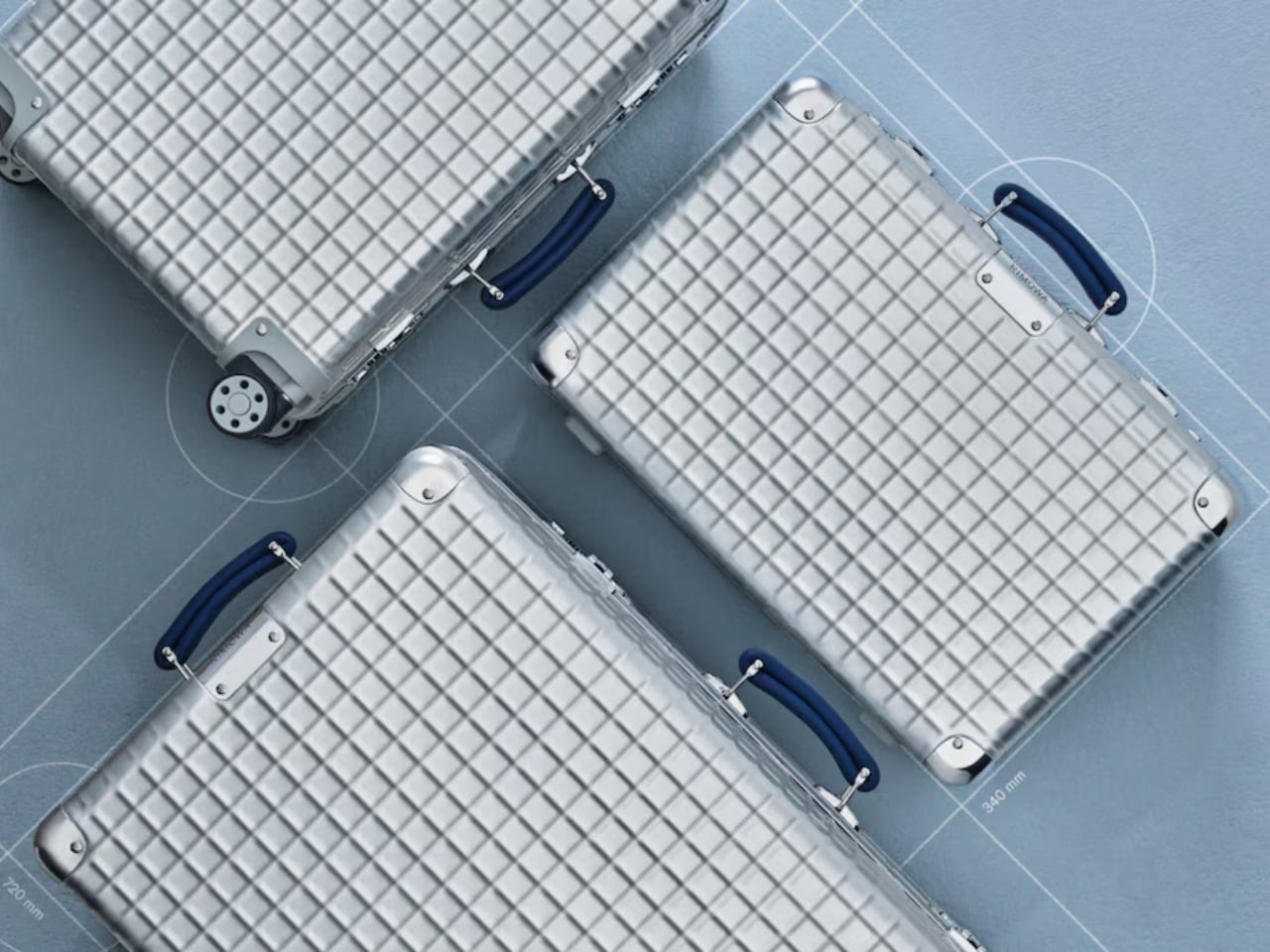
That grooved shell, by the way, is practically synonymous with the brand itself. You know a Rimowa from across an airport terminal. Those parallel ridges running down the aluminium surface are one of the most recognizable design signatures in travel goods, and they’ve been that way for decades. So when the brand quietly steps away from them and replaces the lines with a grid, a structured, geometric, embossed pattern pressed right into the aluminium shell, it feels like a real statement. It’s not a gimmick. It’s a choice that speaks to a different kind of confidence.

The grid comes from a real place. In 1969, Rimowa was producing hand-carry cases featuring this geometric pattern: practical, modular, and rooted in the kind of technical precision that defined that era’s design thinking. There’s a reason so much design from that decade still holds up. It wasn’t chasing aesthetics for their own sake. Form followed function, and it did so elegantly. Reviving that spirit in 2026 doesn’t read as nostalgia pandering. It reads as a brand that knows exactly where its DNA lives and isn’t afraid to dig for it.

The collection comes in three sizes: the Classic Hand-Carry Case, the Classic Cabin, and the Classic Trunk. All three are made in Cologne, Germany, which matters more than it might seem. Manufacturing location is one of those details that’s easy to gloss over until you’re actually holding the product, and with Rimowa, the German-made quality is part of the whole point. The embossed grid pattern, the blue leather handles, the individually numbered serial number patch on each case: these aren’t details you’d notice in a thumbnail. They’re details you notice after living with the piece and realising it only gets better over time.

And yes, price matters here. The Classic Aluminium Grid sits in the $2,725 to $3,225 range, which puts it firmly in the territory of deliberate, considered purchasing. That’s not casual spending, and it shouldn’t be. This is the kind of purchase that functions as an heirloom more than a travel accessory, something you keep, care for, and eventually pass along. The lifetime guarantee Rimowa extends to all its suitcases reinforces that framing. They’re not selling you a bag built for a few trips. They’re selling you something built to outlast most things currently in your home.

What makes this collection feel genuinely compelling rather than just another limited drop is the restraint behind it. Rimowa didn’t add bright colour for the sake of attention. They didn’t partner with a streetwear brand or commission someone’s artwork across the shell. They went to their own archive, found something worth preserving, and let the design carry the weight. The grid is subtle enough that it won’t read as flashy at baggage claim, but anyone paying close attention will recognise it as something different. Something that doesn’t quite look like everything else on the carousel.

That’s a hard balance to strike in design. Loud enough to be interesting, quiet enough to be enduring. The Classic Aluminium Grid lands squarely in that space, and for a brand with over a century of aluminium behind it, that feels less like luck and more like a brand that knows exactly what it’s doing.

The post Rimowa Classic Aluminium Grid Revives a Forgotten 1969 Design first appeared on Yanko Design.

  • ✇Yanko Design
  • The Philosopher Wanted Silence. The Artist Built on Water.
    In 1914, Ludwig Wittgenstein did something that, depending on your perspective, was either the most logical or the most eccentric thing a Cambridge-trained philosopher could do. He left England behind and built a tiny wooden cabin on the steep shoreline of Lake Eidsvatnet in Skjolden, Norway. The only way to reach it was by boat, or by walking across ice in winter. His mentor Bertrand Russell reportedly told him it would be lonely. Wittgenstein replied that he “prostituted his mind talking to i
     

The Philosopher Wanted Silence. The Artist Built on Water.

25 mars 2026 à 10:20

In 1914, Ludwig Wittgenstein did something that, depending on your perspective, was either the most logical or the most eccentric thing a Cambridge-trained philosopher could do. He left England behind and built a tiny wooden cabin on the steep shoreline of Lake Eidsvatnet in Skjolden, Norway. The only way to reach it was by boat, or by walking across ice in winter. His mentor Bertrand Russell reportedly told him it would be lonely. Wittgenstein replied that he “prostituted his mind talking to intelligent people.” The anecdote is funny, but the philosophy behind it was completely serious.

What Wittgenstein found in that remote hut was the particular kind of quiet that forces real confrontation with your own thoughts. He was productive there in ways he couldn’t replicate anywhere else, later writing to a colleague that he “couldn’t imagine working anywhere as he did there,” and that the place had “a quiet seriousness” he found nowhere else. Some of his foundational thinking for Tractatus Logico-Philosophicus took shape in that small space, part of it on a boat his friend David Pinsent sailed across the Sognefjord. A philosopher doing his deepest work on open water, surrounded by mountains. That image stays with you.

Designer: Dionisio González

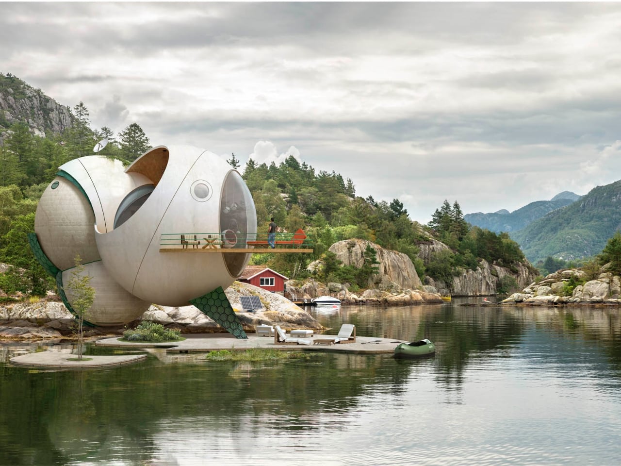
Spanish artist Dionisio González clearly felt it too. His series, Wittgenstein’s Cabin, takes that founding image as both premise and provocation. González works across photography, digital manipulation, and what you might call architectural fiction, and his practice has long focused on reimagining how people live in extreme or overlooked conditions. For this project, he envisioned a cluster of amphibious dwellings set directly on the Norwegian fjords, floating on artificial islands against the same vast and indifferent landscape that Wittgenstein once sought out. They are not proposals for construction. They are something closer to visual arguments.

The structures themselves are striking. Made primarily of weathered metal, they feel industrial and oddly organic at the same time. Each one has its own distinct form, but they share a visual family resemblance, like siblings built from the same strange blueprint. They sit on the water in ways that feel simultaneously precarious and deliberate. González has spoken about being drawn to “the confrontation, the frontality” of Wittgenstein’s original cabin with the fjord. For Wittgenstein, the water wasn’t backdrop. It was the actual condition of his solitude. González takes that thought and makes it architectural.

The project keeps pulling me back to one of the more persistent tensions in design conversation: the relationship between isolation and creative thought. The idea that you need to escape in order to think clearly is ancient, but it feels newly charged when genuine silence has become a luxury most people can’t really access. González frames philosophy itself as an “amphibian endeavour,” something that lives between the stable and the fluid, the settled and the speculative. His floating cabins give that metaphor a shape and a weight. They’re not quite houses. They’re more like habitable hypotheses.

None of these structures are intended to be built, and I think that’s precisely where their power lies. Architectural fiction as a practice asks you to sit with ideas rather than just objects. It creates room to think seriously about how we want to inhabit the world, even when the answer falls outside what’s commercially or technically possible. González’s designs carry a visual seriousness that separates them from pure fantasy, a quality that makes them feel genuinely worth spending time with.

Wittgenstein wanted to disappear from the world in order to think more clearly inside it. González takes that same instinct and places it on open water, wrapped in oxidized metal, asking what solitude actually looks like when landscape isn’t just a setting but a condition of being. The answer he offers is beautiful and strange, which feels entirely fitting for a project named after one of the twentieth century’s most beautiful and strange minds.

The post The Philosopher Wanted Silence. The Artist Built on Water. first appeared on Yanko Design.

  • ✇Yanko Design
  • KFC’s Pickle Puffer Is Fashion’s Weirdest Power Move
    At some point, the line between fashion and performance art quietly dissolved, and I think we need to have a serious conversation about who’s holding the needle. Because KFC just debuted a puffer jacket filled with real sliced gherkins and acid-green brine, and it is fully, sincerely, unapologetically real. The Pickle Puffer is exactly what it sounds like. A clear plastic puffer jacket, entirely see-through, packed with floating slices of pickled cucumber and brine so vividly green it almost lo
     

KFC’s Pickle Puffer Is Fashion’s Weirdest Power Move

25 mars 2026 à 04:45

At some point, the line between fashion and performance art quietly dissolved, and I think we need to have a serious conversation about who’s holding the needle. Because KFC just debuted a puffer jacket filled with real sliced gherkins and acid-green brine, and it is fully, sincerely, unapologetically real.

The Pickle Puffer is exactly what it sounds like. A clear plastic puffer jacket, entirely see-through, packed with floating slices of pickled cucumber and brine so vividly green it almost looks radioactive. The insulation is gone, replaced with hundreds of actual pickles that shift and float with every movement.

Designer: KFC

Picture a standard puffer silhouette, the kind you’d wear on a cold commute, except every quilted chamber is sealed, transparent, and filled with floating pickle slices suspended in green liquid. The jacket moves the way a lava lamp moves. Tilt left and the gherkins drift. A hydration hose runs along the chest like something from a trail runner’s kit, except it feeds into a reservoir of pickle juice. The zipper pull is shaped like a pickle. The whole thing is lurid and weirdly beautiful in the way that only objects with absolutely no interest in being subtle can be.

I genuinely don’t know whether to call this genius or absurdist theatre, and I’m starting to think the distinction doesn’t matter anymore. What makes the Pickle Puffer particularly fascinating is its origin story. It didn’t start in a brand meeting or a creative studio. It started with an AI-generated video on TikTok of a man handing out gherkin slices from a pickle-filled puffer jacket. The video had barely a hundred likes. A hundred. And yet something about it triggered that very specific brand instinct that says: we should make this real.

The fact that KFC actually followed through says a lot about where we are right now. We’ve officially entered an era where a low-engagement AI fantasy can become a physical product, and the feedback loop between online imagination and real-world manufacturing has compressed to almost nothing. KFC UK brand manager James Channon was refreshingly candid, calling it “a bit unhinged, but that’s the point.”

And it is unhinged. But it’s also timed to perfection. The jacket dropped alongside KFC’s new Pickle Mania Menu in the UK, which includes Pickle Loaded Fries and a Pickle Pepsi, riding the wave of a full-blown cultural obsession. The #pickles hashtag on TikTok has racked up billions of views, and apparently the correct brand response is to wear that moment on your body, literally soaked in brine.

Now, this is a one-off. You can’t buy it. You have to win it through an Instagram giveaway, which is its own kind of genius because the scarcity makes it collectible and the competition makes it content. KFC isn’t really selling a jacket. They’re selling a news story, a talking point, and a social media moment that will keep circulating long after the pickles start to turn. That’s the actual product here.

It also puts the Pickle Puffer in the company of a growing category of fashion-as-marketing stunts increasingly committed to the bit. Aldi’s Jacket Potato Jacket came before it. Lidl has played in this space too. There’s a whole lane developing for grocery and fast-food brands to use absurdist outerwear as their loudest advertising medium, and it’s clearly working. I’m writing about a pickle jacket right now, so there’s your proof.

What I keep coming back to is how genuinely well it’s designed for what it’s supposed to do. The translucency is intentional. The floating pickles are the visual. The hydration hose is the punchline that also happens to be functional. Every element is deliberate and considered, even if the whole thing is engineered to make you laugh first and think second. Plenty of brands try for weird and land on confusing. KFC landed on weird and made it covetable. Fashion has always been partly spectacle. The Pickle Puffer just has better snacks.

The post KFC’s Pickle Puffer Is Fashion’s Weirdest Power Move first appeared on Yanko Design.

  • ✇Yanko Design
  • Pencil Shavings Have Never Looked This Beautiful
    Most desk objects get ignored. They sit there doing their one job, collecting dust around the edges, and we never really think about them again. NEST, a conceptual pencil sharpener designed by a team of five students from TUST, UNNC, and CAU, is a direct challenge to that dynamic. It recently took home the winner prize at the 2025 European Product Design Award in the Conceptual Work & Office Product Design category, and the reason it won feels obvious the moment you understand what it actua
     

Pencil Shavings Have Never Looked This Beautiful

21 mars 2026 à 18:30

Most desk objects get ignored. They sit there doing their one job, collecting dust around the edges, and we never really think about them again. NEST, a conceptual pencil sharpener designed by a team of five students from TUST, UNNC, and CAU, is a direct challenge to that dynamic. It recently took home the winner prize at the 2025 European Product Design Award in the Conceptual Work & Office Product Design category, and the reason it won feels obvious the moment you understand what it actually does.

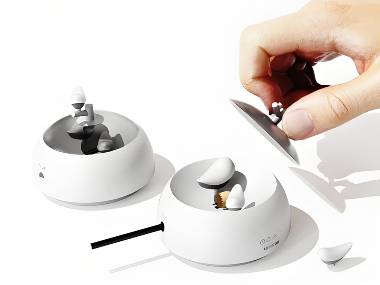
The concept is deceptively simple. A small bird figurine sits inside a rounded, bowl-shaped container. As you sharpen your pencil, the curling wood shavings collect beneath the bird, gradually building up like the gathered material of a real nest. By the time the container needs emptying, the little bird looks as if it has been nesting all along, settled into a soft, spiraling bed of wood ribbons. It is a beautifully accidental image that the design deliberately engineers into being, and once you picture it, it is very hard to unsee.

Designers: Zebin Qiao, Kaishuo Liu, Hongchen Guo, Zicheng Zhao, XiaoTongPan

The real strength of NEST is the intelligence of its metaphor. Lead designer Zebin Qiao and the team didn’t just borrow a visual from nature and paste it onto a product. They found a genuine structural parallel between the act of using the sharpener and the act of nest-building, then made sure the user experiences that parallel in real time. That is not an easy thing to pull off. Most product design that reaches for nature ends up with surface decoration or an illustrative graphic on a box. NEST earns its metaphor because the metaphor lives in the function, not on top of it.

The second layer of the design is the lid. It doubles as a perch, fitted with a minimal branch element. When you are not sharpening, the tiny bird figurine can be lifted out of the interior and placed on the branch, transforming the whole object into a quiet desktop ornament. This dual-state approach means the product shifts personality depending on how you use it. It is a working tool when you need it, and a miniature sculpture the rest of the time. I genuinely appreciate designs that respect both modes of being at a desk, the productive and the contemplative.

I will admit my first instinct when I encounter “award-winning conceptual product” is mild skepticism. Conceptual work can drift toward spectacle and lose interest in whether the thing would actually function. NEST sidesteps that problem by grounding every design choice in real, physical behavior. The shavings accumulate because that is what shavings do. The bird sits because the container holds it. Nothing is forced or artificially staged. The charm is a byproduct of the function, which is exactly the right way around. It gives the design an integrity that a lot of more expensive, more elaborate objects simply do not have.

The color variants are worth noting too. The design comes in white, a warm terracotta tone, and a soft powder blue, each with a matching bird. It is a small decision that makes the object feel personal rather than clinical, and it opens the door to something close to a collecting impulse. You are not just buying a sharpener. You are picking a companion for your desk, which is a particular kind of intimacy that few office products ever manage to create.

At its core, NEST is making an argument that utility does not have to be neutral. That the objects we interact with daily can carry meaning, invite attention, and reward a small amount of patience. A student design team from three Chinese universities made that argument with a pencil sharpener, and they made it convincingly enough to win a major European award. That is not nothing. If anything, it is the kind of design thinking we need more of, the sort that finds poetry in the ordinary without making you feel like you are trying too hard to appreciate it.

The post Pencil Shavings Have Never Looked This Beautiful first appeared on Yanko Design.

  • ✇Yanko Design
  • The Projector Concept That’s Almost Too Beautiful to Use
    Most concept designs exist to generate buzz, collect awards, and then quietly disappear. The BeoLens Horizon, a projector concept imagined by French industrial designer Baptiste Baumeister, feels different. It feels like a glimpse into a future that Bang & Olufsen should absolutely be building right now. If you’re not familiar with B&O, the short version is this: the Danish audio brand has been setting the benchmark for luxury consumer electronics since 1925. Their products don’t just s
     

The Projector Concept That’s Almost Too Beautiful to Use

21 mars 2026 à 16:45

Most concept designs exist to generate buzz, collect awards, and then quietly disappear. The BeoLens Horizon, a projector concept imagined by French industrial designer Baptiste Baumeister, feels different. It feels like a glimpse into a future that Bang & Olufsen should absolutely be building right now.

If you’re not familiar with B&O, the short version is this: the Danish audio brand has been setting the benchmark for luxury consumer electronics since 1925. Their products don’t just sound good; they’re designed to be desired as objects. The BeoSound Shape, the BeoVision Harmony, the Beosound Theatre, all of them treat your living room like a gallery wall. Baumeister clearly understands that DNA, and with BeoLens Horizon, he runs with it in a direction that feels genuinely exciting.

Designer: Baptiste Baumeister

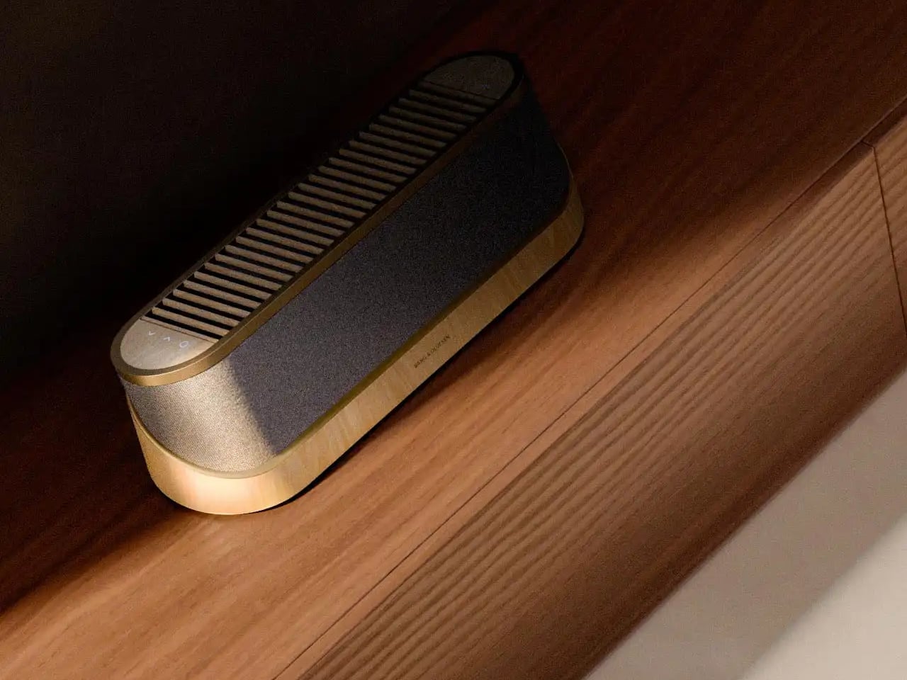
The design comes in two distinct configurations. The first is a horizontal, low-profile unit that sits flat on a surface like a refined soundbar crossed with a Scandinavian jewelry box. The second is a taller, cylindrical form that reads more like a speaker column or a sculptural object you’d place on the floor. Both share the same material vocabulary: light ash wood, brushed gold-toned aluminum, and tightly woven acoustic fabric in warm grey. It’s the kind of material combination that makes you think of an architect’s weekend house rather than a tech showroom.

The horizontal unit is particularly interesting because of how it conceals the projector itself. A wooden slat panel sits on top, almost like a miniature version of those slatted screens you see in high-end Japanese interiors, and the lens assembly slides out from beneath it. The 4K projection capability is written right into the design, quietly labeled without fanfare. There are no aggressive vents, no branding that screams for attention, no black plastic anywhere. It’s restrained in a way that feels almost provocative in a market where most projectors try hard to look “cinematic” and end up looking aggressive instead.

The controls are worth noting too. Rather than a touchscreen or a button cluster, Baumeister places minimal icon-etched controls directly into the wood panel. A Bluetooth symbol, a pair of directional arrows, a power circle. They’re barely visible until you know to look for them, which feels very much in keeping with how B&O has always approached interaction design, treating it as something that should feel intuitive and slightly magical rather than mechanical.

Looking at the exploded view of the horizontal model, you can see just how much thought went into the layering of components. The speaker array sits sandwiched between the wood base and the metal-framed top, with the projector mechanism occupying the central cavity. It’s genuinely elegant engineering, even if this is still a concept. Baumeister also developed a series of small-scale physical prototypes exploring the form from different angles, which you can see in a lineup of matte black study models. That process matters. It tells you this isn’t just a pretty render; it’s a design that was worked through with real hands.

Here’s my honest opinion: the TV industry has been coasting on size for years. Bigger screens, thinner bezels, more pixels. But the BeoLens Horizon asks a more interesting question. What if the device itself was worth looking at even when it was off? What if the experience of owning the hardware was part of the experience of using it? These aren’t new ideas in the B&O world, but a projector built around this philosophy feels like a genuinely fresh proposition, especially as ultra-short-throw technology continues to improve.

Baumeister is a young designer out of Strate, a design school in Lyon, and BeoLens Horizon joins a portfolio that already shows a real feel for the intersection of material craft and technology. Whether Bang & Olufsen ever picks this up or not, the concept makes a compelling case that the future of home cinema doesn’t have to look like a gadget. It can look like something you actually want to live with.

The post The Projector Concept That’s Almost Too Beautiful to Use first appeared on Yanko Design.

  • ✇Yanko Design
  • A $35,000 Swedish Pyramid That Goes Anywhere, Needs Nothing
    The first time I saw a photo of Klumpen, I thought someone had dropped a monolith into the Arctic tundra. A matte black pyramid, impossibly sharp against the snow, with a sliver of warm amber light cutting through its entrance. It looks like a prop from a science fiction film. But it is very much real, very much functional, and it is arriving very soon. Klumpen is the work of Himmelsfahrtskommando, a Swedish architectural duo that includes designer Hannah Mazetti, with a studio name that roughl
     

A $35,000 Swedish Pyramid That Goes Anywhere, Needs Nothing

21 mars 2026 à 15:15

The first time I saw a photo of Klumpen, I thought someone had dropped a monolith into the Arctic tundra. A matte black pyramid, impossibly sharp against the snow, with a sliver of warm amber light cutting through its entrance. It looks like a prop from a science fiction film. But it is very much real, very much functional, and it is arriving very soon.

Klumpen is the work of Himmelsfahrtskommando, a Swedish architectural duo that includes designer Hannah Mazetti, with a studio name that roughly translates to “suicide mission” in German. Whether that is a philosophical statement or a dark joke about building in the Nordic winter, I am genuinely not sure. What I do know is that the thing they have built is one of the more quietly radical design objects I have come across in years. It asks a deceptively simple question: what if you did not need permission to be somewhere?

Designer: Himmelsfahrtskommando

At just 7 square metres, Klumpen is technically a utility structure. But calling it that feels like calling the iPhone a phone. Inside this factory-built pyramid is a complete off-grid living infrastructure: a photovoltaic solar array running at 450 to 600 volts DC, a 7.5 kWh battery for storage, an air-to-water heat pump, a closed-loop greywater recycling system, satellite broadband, a shower, a lavatory, and a kitchen with two stoves, a sink, and a microwave. The pyramid shape, for the record, is not an aesthetic choice. The designers say it is simply the most efficient envelope for the specific stack of systems inside. Form follows function, very literally.

The prototype has already been tested through a real Arctic winter in northern Sweden, which tells you something important about how seriously they are taking this. It is one thing to announce a sleek off-grid concept on a design blog. It is another to actually freeze-test it in the dark of a Scandinavian January. The first production batch ships in September 2026, with a target retail price of $35,000.

That price will draw raised eyebrows, and fair enough. $35,000 is not nothing. But compare it to the cost of running utility lines to a remote plot of land, the legal labyrinth of planning permissions, the months of plumber schedules and contractor delays, and suddenly a plug-and-play pyramid starts to look like a reasonable proposition. You set it down on flat ground. You press ON. No permits. No plumbers. No waiting at the utility company. That is genuinely the promise.

I keep thinking about what that actually means for people. We have become so accustomed to depending on invisible infrastructures that we rarely stop to notice the stranglehold they have on where and how we can live. Want to build a simple structure on a piece of land you own? Prepare for months of negotiations with people who have never seen the land. Klumpen is not a protest against that system, exactly. It is something quieter. An elegant sidestep.

The designers frame this in terms of ownership and autonomy, drawing a line from ancient democracies, where property meant political voice, to a present where most people in the industrialised world either rent or carry mortgages on homes they will spend decades paying off. The argument is a little romantic, but it does not feel wrong. The degree to which we have outsourced control of our most basic needs, from electricity and water to warmth and connectivity, to external systems we cannot touch or meaningfully influence is worth taking seriously.

Is Klumpen going to solve the housing crisis? No. But the most interesting design objects rarely solve the biggest problems outright. What they do is shift the way people think about what is possible. A 7-square-metre pyramid that makes you genuinely independent of the grid, dropped in a meadow or on a hillside or beside a frozen lake in northern Sweden, does exactly that. It reframes a shed as a statement. The first batch launches in September. I would not be surprised if the waitlist fills fast.

The post A $35,000 Swedish Pyramid That Goes Anywhere, Needs Nothing first appeared on Yanko Design.

  • ✇Yanko Design
  • When Your Speaker Is Also a Puzzle, Music Hits Different
    Most speaker designs ask a pretty simple question: how do we make this thing louder and smaller? Merge asks a completely different one. How do we make music something you can actually take apart? Created by a five-person design team, Junchuan Shi, Junhao Lv, Xiangzhao Meng, Ping He, and Genghao Ma, from a cross-institutional collaboration across Sichuan Vocational and Technical College, CityU Macau, TUT, and QZUIE, Merge is a conceptual speaker system that just picked up a 2025 European Product
     

When Your Speaker Is Also a Puzzle, Music Hits Different

20 mars 2026 à 20:30

Most speaker designs ask a pretty simple question: how do we make this thing louder and smaller? Merge asks a completely different one. How do we make music something you can actually take apart?

Created by a five-person design team, Junchuan Shi, Junhao Lv, Xiangzhao Meng, Ping He, and Genghao Ma, from a cross-institutional collaboration across Sichuan Vocational and Technical College, CityU Macau, TUT, and QZUIE, Merge is a conceptual speaker system that just picked up a 2025 European Product Design Award in the Consumer Electronics category. It’s the kind of student concept that makes you wonder why no major brand has thought of it first.

Designers: Junchuan Shi, Junhao Lv, Xiangzhao Meng, Ping He, Genghao Ma

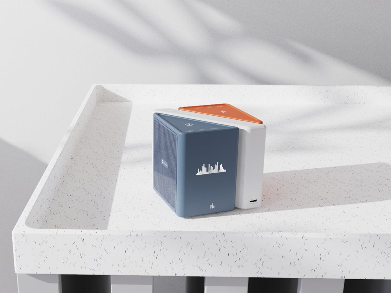
The central idea is deceptively clever. Merge physically separates music into its component layers: the accompaniment on one module, the vocals on another, and the full combined sound handled by the complete assembly. You choose what you hear depending on how the pieces are arranged. Pull the vocal module away, and you’ve got an instant karaoke track. Keep just the vocal module, and you hear a singer stripped back from all the production. Snap everything together and you get the whole song. It sounds gimmicky when you describe it that way, but it really isn’t. It’s an intuitive way to interact with music that streaming apps, for all their data and algorithms, still haven’t cracked with the same sense of physical satisfaction.

The three modules connect via electromagnetic induction, which also handles charging between units. That detail matters more than it sounds. It means the product doesn’t rely on fiddly clips or pins; the connection is seamless and the experience stays clean. When you hold all three pieces assembled, they sit together like a solid little object. When you pull them apart, you’re not wrestling with latches. You’re just… separating music.

Visually, the design is confident without being loud. The modules are geometric and compact: a rectangular flat piece, a squared speaker body, and a triangular wedge that caps the top when assembled. The whole thing sits in your palm like a premium toy, which is very much the point. The team describes the tactile experience of rearranging the modules as analogous to playing with building blocks, and that framing is spot on. Listening becomes a physical act rather than a passive one. You’re not adjusting a slider on an app; you’re literally picking up a piece of the song and putting it somewhere else.

The color language is considered too. The renders show options in slate blue, orange-coral, silver metallic, and white-grey, each colorway with its own character but all sharing the same graphic vocabulary: pixel waveform icons and quiet typography showing floating lyrics directly on the module surface. It reads like something between a well-designed toy and a serious piece of consumer electronics, which is an interesting space for a speaker to occupy.

I’ll be upfront: Merge is still a concept. It won in the EPDA’s conceptual category, and it hasn’t crossed into production territory yet. That’s a long road, and the audio technology behind splitting tracks in real time at the hardware level would require serious engineering. The images are renders and physical prototypes, not retail-ready products. But the best conceptual design has always worked like that. It shows an industry where something should go, even when the technology and the business case haven’t fully caught up yet.

What makes Merge genuinely compelling is that it treats the listener as someone with curiosity rather than just convenience-seeking habits. The assumption baked into most audio product design is that people want everything done for them, simplified, smoothed over. Merge assumes the opposite: that people might actually enjoy engaging with the layers of a song, touching them, moving them around. Given how obsessed the current cultural moment is with stems, remixes, and stripped-back sessions, that assumption feels exactly right.

Whether it ever becomes a product you can buy, Merge is already doing the thing good design is supposed to do. It makes you look at something ordinary and ask why it was never done this way before.

The post When Your Speaker Is Also a Puzzle, Music Hits Different first appeared on Yanko Design.

  • ✇Yanko Design
  • A Wind-Powered Tumbleweed That Heals the Desert as It Rolls
    I have to be upfront: I did not expect a tumbleweed to be one of the most exciting design concepts I’d encounter this year. Tumbleweeds, in the cultural imagination, belong to Westerns and dusty ghost towns. They’re the kind of thing that drifts across an empty street right before a showdown, the universal shorthand for desolation. So when I first came across the Wasteland Nomads: Bionic Tumbleweed Sower System by Yizhuo Guo, I laughed a little. But as I looked closer, I started getting impress
     

A Wind-Powered Tumbleweed That Heals the Desert as It Rolls

20 mars 2026 à 18:30

I have to be upfront: I did not expect a tumbleweed to be one of the most exciting design concepts I’d encounter this year. Tumbleweeds, in the cultural imagination, belong to Westerns and dusty ghost towns. They’re the kind of thing that drifts across an empty street right before a showdown, the universal shorthand for desolation. So when I first came across the Wasteland Nomads: Bionic Tumbleweed Sower System by Yizhuo Guo, I laughed a little. But as I looked closer, I started getting impressed.

Guo is a multidisciplinary designer with a master’s degree in Material Futures from Central Saint Martins, and she has previously collaborated with Google DeepMind. Her work appeared at Milan Design Week 2024. She is, in other words, someone who operates at the intersection of cutting-edge materials science and ecological design thinking. With Wasteland Nomads, developed alongside Daheng Chu through the University of the Arts London and Imperial College London, she took the one plant most associated with barren landscapes and used it as a blueprint for restoring them. The logic is almost poetic. The tumbleweed doesn’t fight the desert. It works with it. It uses wind as its engine and travels wherever the landscape allows. Guo’s question, essentially, was: what if we could engineer something that did exactly the same thing, but deliberately seeded the ground as it went?

Designer: yizhuo guo

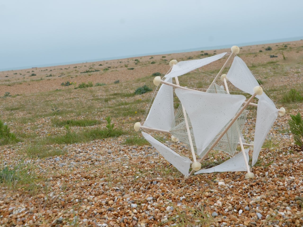
The result is a biomimetic seeding device built entirely on the principles of passive robotics. No batteries, no circuits, no external power source required. Lightweight biodegradable support rods form a tensile, hollow spherical structure that mirrors the tumbleweed’s own elastic form. The outer skin is made from a moisture-responsive biodegradable composite, and seeds are housed within it. When the device rolls into an environment where humidity conditions are right, the skin begins to break down and disperse those seeds directly into the soil. It boosts soil oxygen, contributes to carbon sequestration, and by the very end of its journey, the device has fully merged with the ground it was trying to restore. No waste. No remnants. Just land.

That last part is the detail I keep returning to. Most ecological technology, even the well-intentioned kind, still leaves something behind. A plastic housing. A metal component. A depleted battery that needs to go somewhere. This dissolves into the very ecosystem it is trying to rebuild. The design does not just mimic nature. It eventually becomes nature. That is a fundamentally different relationship between technology and environment than what we are used to seeing, and it matters more than it might initially seem.

The project took home a 2025 European Product Design Award in the Eco Design Products category, which feels well deserved, though I suspect this is only the beginning of the conversation around it. Guo has already accumulated a striking list of recognitions, including the iF Design Award in Germany and multiple honors from Chinese design institutions. She is clearly a designer who thinks at the systems level, not just asking what something looks like, but how it lives, decays, and eventually reintegrates.

Climate design can sometimes feel exhausting in its abstraction. We have all scrolled past enough speculative renderings of glowing, utopian landscapes to develop a healthy skepticism toward the genre. Wasteland Nomads doesn’t do that. It starts with a specific, urgent problem, the accelerating degradation of viable land across arid regions of the planet, and it finds the answer not in some new synthetic innovation but in a plant that has been quietly solving the same problem for millions of years. The tumbleweed has been moving seeds across hostile terrain since long before we were here to watch it. We just never thought to pay close enough attention.

That, I think, is what makes this design genuinely moving. Biomimicry at its most honest is not about clever engineering. It’s about being willing to slow down long enough to watch how the world already works, and being humble enough to follow what you find. Guo was clearly paying attention. Now let’s see where it rolls.

The post A Wind-Powered Tumbleweed That Heals the Desert as It Rolls first appeared on Yanko Design.

❌