
❌

Vue normale

  • ✇Yanko Design
  • Titanium Smart Glasses Concept Refuses to Hide Its Tech
    Fitting a computer into a pair of glasses creates an awkward design problem: the electronics need room, but the result still has to belong on someone’s face. Povilas Grigas approaches that tension without pretending it can disappear. His Glasses concept gives the hardware a deliberately different silhouette, treating smart eyewear as its own design category rather than ordinary frames with a technological secret. I like that starting point. Developed for his 2024 design BA thesis, the mixed-rea
     

Titanium Smart Glasses Concept Refuses to Hide Its Tech

25 octobre 2026 à 11:20

Fitting a computer into a pair of glasses creates an awkward design problem: the electronics need room, but the result still has to belong on someone’s face. Povilas Grigas approaches that tension without pretending it can disappear. His Glasses concept gives the hardware a deliberately different silhouette, treating smart eyewear as its own design category rather than ordinary frames with a technological secret. I like that starting point.

Developed for his 2024 design BA thesis, the mixed-reality concept imagines an alternative to being tethered to a phone or desktop screen. The ambition is to make computing available through something worn rather than something you continually look down at or sit in front of. That’s an appealing proposition, although moving digital information closer to your eyes doesn’t automatically make it less demanding of your attention.

Designer: Povilas Grigas

Visually, these glasses have enough personality to carry that discussion. The broad, rounded lens openings sit within a flowing silver-colored frame, while the bridge has two dark circular elements above an oval opening. In the front view, that arrangement almost resembles a tiny surprised face. It’s an unexpectedly playful detail in an otherwise polished object. To my eye, the overall effect lands somewhere between sculptural eyewear and a science-fiction costume department with unusually good taste.

Grigas specifies CNC-milled, polished grade 5 titanium for the frame and optically polished sapphire crystal for the lenses. Those are proposed material choices, not evidence that the finished glasses would feel featherlight or survive everyday abuse. Still, I appreciate the intention behind them. A computer worn this prominently deserves the material attention we give a watch or a favorite pair of glasses, especially if the expectation is that it becomes part of someone’s daily appearance.

The frame’s outline follows the bones around the eyes, according to Grigas, and the vision sensors occupy the bridge for a centered point of view. That placement gives the front a clear organizing feature. Rather than scattering visually competing details across the brow and corners, the design concentrates its most conspicuous technology near the middle. It’s a convincing composition, even if a convincing composition is only one part of making wearable computing practical.

From the side, the arms look substantial, with long, smooth surfaces that curve downward behind the ears. Their thickness is part of the visual identity rather than a detail the presentation tries to conceal. I’d rather see that volume handled deliberately than watch a designer chase thinness at the expense of the overall shape. Here, the broad arms and generous front feel like parts of the same object.

The personal question is whether I’d want such a distinctive object defining my face every day. I’m not sure, and that uncertainty is worth keeping in the conversation. Glasses are unusually intimate technology because people look through them while other people look at them. A frame can be beautifully resolved and still feel wrong for an individual wearer. I’d want more than an impressive image before deciding these belonged in my routine.

The proposed leather charging case helps make that routine easier to imagine. The glasses fold flat inside it, and the presentation shows a dark, textured exterior with visible stitching and a circular metal closure. It reads as an eyeglass accessory rather than a miniature electronics bag. More importantly, putting the glasses away feels like a recognizable action. I find that more reassuring than an expectation that a wearable computer should remain on your body indefinitely.

For now, this is an academic design proposal, not a demonstrated replacement for your laptop. Its presentation doesn’t establish battery endurance, display quality, or long-term comfort, so those questions remain open. What earns my interest is the willingness to give computing a visible presence without making the frame look apologetic. I wouldn’t ask these glasses to pass as ordinary eyewear. I would ask whether their eventual usefulness could earn the space they occupy on my face.

The post Titanium Smart Glasses Concept Refuses to Hide Its Tech first appeared on Yanko Design.
  • ✇Yanko Design
  • Neo-Brutalist Vases Look Like Tiny Towers, Even Without Flowers
    An empty vase can make a shelf look oddly unfinished, as though the flowers were supposed to do all the decorating. Aleksander Kozera’s Neo-Brutalist Vases offer a convincing way around that small domestic problem. Created under his Warsaw-based Yird Ceramics brand, these ceramic vessels have enough architectural detail to hold attention on their own. I’d be inclined to leave them empty before deciding what, if anything, belongs inside. Their cylindrical bodies are divided into rectangular pane
     

Neo-Brutalist Vases Look Like Tiny Towers, Even Without Flowers

24 octobre 2026 à 18:30

An empty vase can make a shelf look oddly unfinished, as though the flowers were supposed to do all the decorating. Aleksander Kozera’s Neo-Brutalist Vases offer a convincing way around that small domestic problem. Created under his Warsaw-based Yird Ceramics brand, these ceramic vessels have enough architectural detail to hold attention on their own. I’d be inclined to leave them empty before deciding what, if anything, belongs inside.

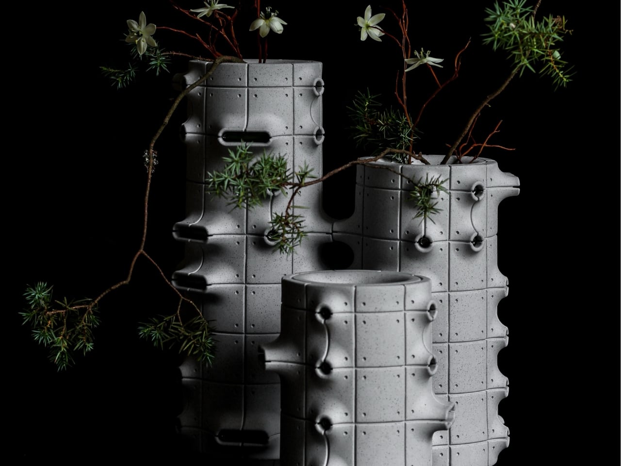
Their cylindrical bodies are divided into rectangular panels, with tiny indentations that suggest construction details on a concrete facade. Circular recesses interrupt that grid, while curved projections extend from the sides like abbreviated balconies or exposed joints. The effect lands somewhere between an architectural model and a piece of science-fiction set dressing. They look a little like infrastructure for a very small, very design-conscious civilization, which is part of their appeal.

Designer: Aleksander Kozera

The concrete resemblance comes from the ceramic body itself. According to the collection’s Łódź Design Festival description, Kozera uses porcelain casting slip with ceramic pigments and black grog to produce that raw, concrete-like finish. In the close-up photographs, dark speckles break up the gray surface. That texture matters visually: without it, the panel lines and repeated circles could read as a smooth plastic prop. Instead, the surface gives the geometry some grit.

The modular approach also makes the collection more interesting than a row of differently sized cylinders. The festival describes vessels that can be combined and arranged into larger compositions. In the photographs, neighboring forms create narrow gaps, overlapping projections, and changing silhouettes. I like the possibility of treating a shelf as a small architectural composition rather than lining up three matching accessories. The vessels share a vocabulary without looking identical from every angle.

Kozera’s broader studio process helps explain that controlled repetition. He describes beginning with digital modeling, then 3D-printing master forms used to make plaster molds for slip-casting porcelain. That’s a useful distinction for anyone assuming these are printed plastic objects or directly printed ceramics. Digital tools establish the geometry, while casting translates it into ceramic. The workshop photographs make that relationship tangible, showing shaped components and molds alongside vessels at different stages of production.

The finish introduces another layer of detail. The collection description specifies a translucent green glaze, with the small exterior “windows” individually glazed by hand. The green is restrained enough that the photographed pieces still read predominantly as gray architectural objects. I prefer that decision to an all-over glossy finish. Small glazed areas give the eye somewhere to pause without obscuring the panel divisions or competing with the speckled body.

Flowers change the balance considerably. In the styled photograph, branching stems stretch above and across the vessels, disrupting all those disciplined horizontal and vertical lines. The arrangement is sparse enough that the ceramic remains visible, which seems the right approach. A dense supermarket bouquet might conceal much of the detail that makes these worth looking at. A few irregular branches would let the architecture and the plant material each have some breathing room.

My reservation is mostly about where they would live. These are visually busy objects, even with their limited palette. On a shelf already crowded with books, collectibles, and patterned ceramics, the small recesses and projecting edges could get lost. I’d give one a relatively clear stretch of console or place a group against a plain wall. That’s a styling preference, but the design rewards enough space to read its silhouette.

These are physical ceramic works rather than render-only proposals, and the collection is listed as selected for the make me! 2026 exhibition at Łódź Design Festival. That listing does not establish retail pricing or US availability, so it shouldn’t be mistaken for a confirmed shopping announcement.

For me, the strongest choice is the attention given to the sides of each vessel. Turn one, and the relationship between grid, recess, and projection changes. That gives the object a reason to stay on display after the stems are gone, without asking an empty vase to pretend it’s waiting for its next assignment.

The post Neo-Brutalist Vases Look Like Tiny Towers, Even Without Flowers first appeared on Yanko Design.

❌