Vue normale

  • ✇Korben
  • Une IA a lu un rouleau carbonisé par le Vésuve il y a près de 2 000 ans
    Pour la première fois, on connaît le titre exact d'un livre antique sans avoir ouvert le livre. Les chercheurs de la Vesuvius Challenge ont lu, écrit en plein milieu d'un papyrus carbonisé, la mention "Sur les vices, livre 1", un traité de philosophie grecque signé Philodème, un penseur épicurien actif au Ier siècle avant notre ère, dont le rouleau était resté soudé sur lui-même depuis l'éruption du Vésuve en l'an 79. Ce rouleau, baptisé PHerc. 1667, vient d'être déchiffré d'un bout à l'autre. C
     

Une IA a lu un rouleau carbonisé par le Vésuve il y a près de 2 000 ans

26 juin 2026 à 04:38

Pour la première fois, on connaît le titre exact d'un livre antique sans avoir ouvert le livre. Les chercheurs de la Vesuvius Challenge ont lu, écrit en plein milieu d'un papyrus carbonisé, la mention "Sur les vices, livre 1", un traité de philosophie grecque signé Philodème, un penseur épicurien actif au Ier siècle avant notre ère, dont le rouleau était resté soudé sur lui-même depuis l'éruption du Vésuve en l'an 79.

Ce rouleau, baptisé PHerc. 1667, vient d'être déchiffré d'un bout à l'autre. C'est le premier lu en entier.

Pour comprendre l'exploit, il faut imaginer l'état de ces documents : retrouvés en 1752 dans une luxueuse villa d'Herculanum, probablement celle du beau-père de Jules César, les quelque 1 800 rouleaux ont été changés en bâtons de charbon par la chaleur de l'éruption, au point que les dérouler à la main revient encore aujourd'hui à les réduire en miettes.

D'où l'idée, mise au point en vingt ans par Brent Seales, informaticien à l'université du Kentucky, de ne jamais y toucher. On glisse le rouleau dans un accélérateur de particules qui en réalise un scanner à rayons X d'une finesse extrême, on reconstitue en 3D chacune des couches enroulées à l'intérieur, puis on les déplie virtuellement à l'écran comme on aplatirait une viennoiserie feuilletée sans la déchirer.

Restait le pire. L'encre de l'époque est faite de carbone, exactement comme le papyrus brûlé qui la porte, donc elle est quasiment invisible sur les scans, et c'est là qu'intervient une IA entraînée à repérer les infimes différences de texture laissées par les lettres pour redessiner peu à peu un texte que l'œil humain ne voit pas.

Le résultat est franchement fort, avec 70 nouvelles colonnes de texte exhumées et, sur un autre rouleau, la mention "Philodème, Sur les dieux, livre 8" qui révèle aux historiens que cet ouvrage comptait plusieurs tomes, ce que personne ne soupçonnait jusqu'ici.

Et pour les spécialistes de l'Antiquité, ça compte vraiment, parce que la bibliothèque carbonisée d'Herculanum est la seule de tout le monde gréco-romain à nous être parvenue à peu près complète, et non en fragments recopiés au Moyen Âge par des moines.

Honnêtement, lire 2 000 caractères tracés par un Romain juste avant que tout brûle, ça vaut largement tous les chatbots qui écrivent des e-mails à votre place.

Source : The Register , Scrollprize

  • ✇Yanko Design
  • The Soviet Union Built UFO-Shaped Circuses. Now You Can Fold One.
    The Soviet Union had a complicated relationship with spectacle. Everything about Soviet ideology pointed toward collective purpose, practical function, and the rejection of excess. And then they went and built circus arenas shaped like flying saucers, out of raw concrete, in capital cities across Central Asia and Eastern Europe. If that is not a contradiction worth paying attention to, I do not know what is. Cirk, a new book from David Navarro and Martyna Sobecka of Zupagrafika, makes that cont
     

The Soviet Union Built UFO-Shaped Circuses. Now You Can Fold One.

27 juin 2026 à 18:30

The Soviet Union had a complicated relationship with spectacle. Everything about Soviet ideology pointed toward collective purpose, practical function, and the rejection of excess. And then they went and built circus arenas shaped like flying saucers, out of raw concrete, in capital cities across Central Asia and Eastern Europe. If that is not a contradiction worth paying attention to, I do not know what is.

Cirk, a new book from David Navarro and Martyna Sobecka of Zupagrafika, makes that contradiction its entire subject. The Poznań-based design duo have spent over a decade documenting the brutalist and modernist architecture of the former Eastern Bloc, and Cirk is their latest, most playful entry in that ongoing project. The book surveys the permanent circus arenas built across the former USSR from the 1960s through the 1980s, buildings that, as Zupagrafika puts it, combined “socialist modernism, experimental engineering, and choreographed spectacle.” It is an architectural typology most people have never thought about, and yet once you see these buildings, you cannot stop looking.

Designers: David Navarro and Martyna Sobecka

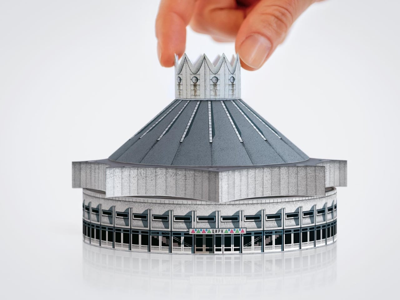
But the part of Cirk that has people talking is not the photography, gorgeous as it is. It is the second half of the book: five press-out paper models of actual circus buildings, designed for readers to punch out and assemble with nothing but glue. The five models represent the Kyrgyz State Circus in Bishkek, the Chișinău State Circus in Moldova, the Dnipro State Circus in Ukraine, the Great Moscow State Circus, and the Tashkent State Circus in Uzbekistan. Five buildings. Five cities. Five strikingly different pieces of architecture, each one reduced to a miniature you can hold in your hands.

I have a genuine soft spot for paper models, and I think their reputation as a “children’s activity” has always undersold what they actually are. A well-designed paper model is an act of translation. Someone has to study a real building, understand its geometry from every angle, figure out how to collapse it into a flat sheet, and do it in a way that holds together when you fold it back up. That is not trivial when the buildings in question are full of curves, cantilevers, and circular geometry. The circus arenas in Cirk are not simple boxes. Many have sweeping domed roofs and wide cylindrical bases, and the kind of sculptural confidence that makes them look like props from a science fiction film. Getting that geometry to behave on paper requires real design skill, and Zupagrafika clearly has it.

The studio has been producing paper model kits alongside their books for years, so this is familiar territory. But tucking five models into the back of a hardcover book feels like a deliberate choice, not an afterthought. The models are not a gimmick. They are an argument. You can look at photographs of the Great Moscow State Circus for a long time, and it will remain something abstract and distant. When you press out those perforated shapes and fold them into a miniature version of that building, something shifts. The scale changes. The building becomes tactile and personal. You start to understand its proportions in a way that a photograph simply cannot deliver.

There is also something quietly political about the whole exercise. These arenas were built as monuments to Soviet power, intended to be overwhelming and permanent. Reducing one to a paper model is almost cheeky. It takes these grand gestures of ideological architecture and makes them domestic, approachable, collectible. The Soviet state is long gone. Someone is now folding the Great Moscow State Circus on their kitchen table. History has a strange sense of humor.

Cirk is a hardcover running 88 pages, sized generously at 30 by 24 centimeters, giving the models room to breathe on the page. The first half carries photography and historical essays, with a foreword from writer Jelena Prokopljević. It is a complete package: context, visual archive, and the hands-on satisfaction of making something. For anyone drawn to architecture, Cold War history, or just the very specific pleasure of a perforated page coming apart cleanly, Cirk is a book that earns its shelf space. The flying-saucer buildings are absolutely worth it.

The post The Soviet Union Built UFO-Shaped Circuses. Now You Can Fold One. first appeared on Yanko Design.

  • ✇Yanko Design
  • Wacom MovinkPad Pro 14 Review: The $900 Sketchbook Designers Needed
    PROS: Minimalist design streamlined for focused work on the go Paper-like experience when drawing or writing Comes with Wacom Pro Pen 3 in the box Large, bright, color-accurate OLED screen with anti-reflective surface CONS: Quite a significant investment Uncertain software update roadmap Instant Pen Display Mode is currently offered as a beta feature RATINGS: AESTHETICSERGONOMICSPERFORMANCESUSTAINABILITY / REPAIRABILITYVALUE FOR MONEYEDITOR'S QUOTE:
     

Wacom MovinkPad Pro 14 Review: The $900 Sketchbook Designers Needed

Par : JC Torres
27 juin 2026 à 11:22

PROS:


  • Minimalist design streamlined for focused work on the go

  • Paper-like experience when drawing or writing

  • Comes with Wacom Pro Pen 3 in the box

  • Large, bright, color-accurate OLED screen with anti-reflective surface


CONS:


  • Quite a significant investment

  • Uncertain software update roadmap

  • Instant Pen Display Mode is currently offered as a beta feature

RATINGS:

AESTHETICS
ERGONOMICS
PERFORMANCE
SUSTAINABILITY / REPAIRABILITY
VALUE FOR MONEY

EDITOR'S QUOTE:

The Wacom MovinkPad Pro 14 isn't another Android tablet. It's a sketchbook that happens to run one.
award-icon

For decades, Wacom has held an almost unchallenged grip on the drawing tablet and pen display market. Its products are so trusted that studios and design firms often keep them running for years, sometimes long after they’ve been discontinued. Lately, though, its rivals have been gaining a lot of attention, pushing increasingly attractive prices and expanding into new product categories.

That doesn’t mean Wacom has been idling. The company is finally wading into standalone Android tablet territory with the MovinkPad 11 and the more premium MovinkPad Pro 14, a proper portable drawing machine aimed squarely at working creatives. We’ve been spending time with the larger of the two, along with the new Wacom Art Pen 2, and the question is whether it’s worth every dollar of its price tag.

Designer: Wacom

Aesthetics

Right out of the box, the MovinkPad Pro 14 doesn’t dazzle the way other tablets in its price range tend to. There are no flashy colors, no ultra-thin borders, no polished surfaces. The bezels are noticeably wide, the default wallpaper is a solid, flat light gray, and the whole thing carries a stubbornly plain look that feels almost out of step with the competition.

It’s all very much by design. Wacom’s intent is to mimic the look and feel of a physical sketchbook, the kind artists, designers, and architects carry everywhere. The device comes in one color, light gray, which echoes the tone of most sketchbook paper. Its rectangular form, wide borders included, also closely mirrors the footprint of an A4 pad, binding and all.

The sides of the device carry that same restraint. One long edge holds the power button, volume rocker, and microSD slot, while the opposite edge features connectors for the optional cover accessory. The short edges house the speakers, and the bottom is reserved for branding, regulatory inscriptions, and four rubber feet. There’s nothing extraneous, nothing decorative, and nothing that distracts from the task you’re there to do.

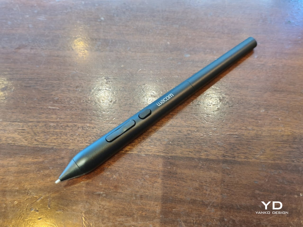
The included Pro Pen 3 follows the same philosophy. It’s all black, slim, and cylindrical, with a body so uniform it almost looks like a high-end mechanical pencil. The three side buttons are barely raised, sitting nearly flush against the barrel for a cleaner look. Unscrewing the rear half reveals three replacement nibs tucked inside: a Carbon Shaft nib, a Felt nib, and a POM nib.

Wacom’s vision for the MovinkPad Pro 14 is to replicate the feeling of picking up a sketchbook, flipping to a fresh page, and getting straight to work. That intent comes through clearly because the tablet removes just about every visual, physical, and digital distraction it can. It doesn’t try to be the slickest-looking device in the room. It tries to be the one you reach for first.

Ergonomics

At 14 inches, the MovinkPad Pro 14 isn’t something you’d hold up one-handed for long, but at just 699 grams and 5.9mm thin, it slips easily into any bag. Resting it on your arm or lap doesn’t feel like a chore either. For creatives who move between locations throughout the day, that combination of size and lightness goes a long way toward making it a genuinely portable tool.

The four rubber feet on the underside keep the tablet from sliding around on a desk and slightly raise the back off the surface, which helps with airflow. There’s no built-in kickstand or angled stand, so if you prefer working at a tilt, you’ll need to source one separately, either from Wacom’s own accessory line or from a third-party option. It’s a small gap in an otherwise thoughtful package.

Those wide bezels, which might seem like a design quirk at first, actually earn their place here. They give you a comfortable inactive area to rest your palm or fingers when gripping the tablet from the sides, so your touch input doesn’t accidentally interfere with whatever you’re drawing. It’s the kind of practical thinking that tends to reveal itself only once you’re deep into a long session.

That said, the MovinkPad Pro 14’s footprint means it isn’t something you’d pull from a bag and start sketching on at a moment’s notice. For that kind of spontaneous work, the smaller MovinkPad 11 is probably the better fit. The Pro 14 is better suited to longer, more involved sessions away from the desk, as long as you’ve found a comfortable spot to settle in.

The Pro Pen 3 is well-balanced and comfortable enough in the hand, though your experience will vary depending on what you’re used to. Its slim, pencil-like build can lead to some cramping over long sessions for those accustomed to thicker tools. Official grips are available but aren’t cheap. The nearly-flushed buttons are also too easy to press accidentally. The Art Pen 2, which we’re also reviewing, offers a wider barrel as an alternative but is sold separately.

Performance

Under the hood, the MovinkPad Pro 14 runs on a Qualcomm Snapdragon 8s Gen 3 with 12GB of RAM and 256GB of storage, expandable via microSD up to 2TB. The processor isn’t the newest available, but it handles everything thrown at it with ease. Multitasking is smooth, app switching is fluid, and there’s no sense that the hardware is struggling to keep pace with anything.

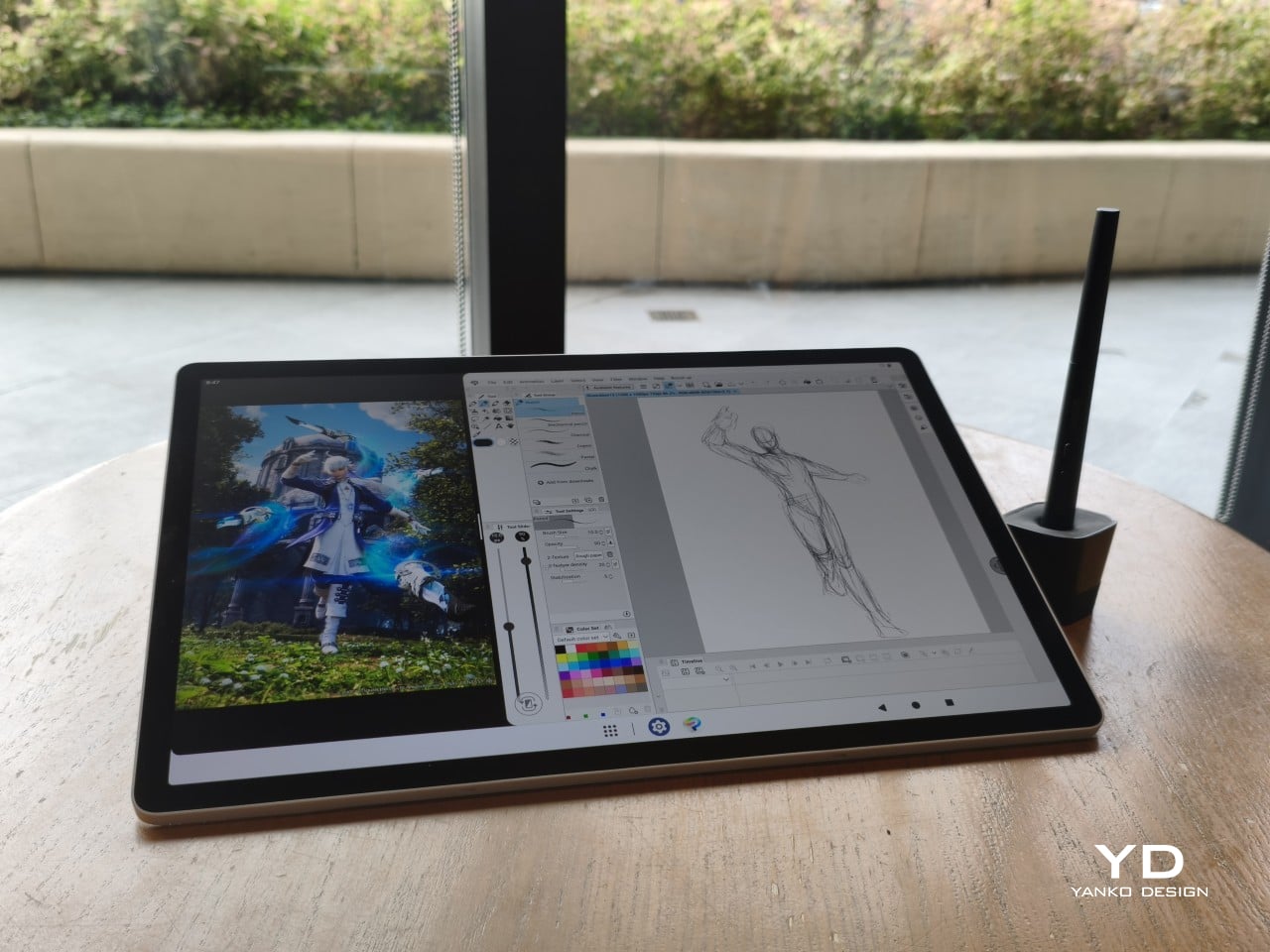
The 14-inch OLED display runs at a 2880×1800 resolution with a 120Hz refresh rate, treated with anti-fingerprint, anti-reflective, and anti-glare textured glass. The wide rectangular aspect ratio works in favor of drawing apps that line their UI panels along the sides, something squarish iPad screens can’t accommodate as cleanly. The textured coating adds a satisfying scratchiness to each stroke, and pen accuracy is, naturally, exactly what you’d expect from Wacom.

There are no cameras on the MovinkPad Pro 14, front or back. That’s a deliberate choice. There’s no temptation to flip over to social media, no accidental video calls, nothing that pulls focus away from what you’re there to do. Passively watching a tutorial in a corner of the screen is about as off-task as it gets, which, honestly, isn’t a bad thing for anyone prone to distraction. Split-screen functionality makes it easy to have a reference off to the side while you work.

The software side is equally stripped down. Android 15 comes installed with zero bloatware and just three Wacom-made apps: Shelf for your gallery, Tips for settings, and Canvas, a quick sketching surface that wakes directly from sleep with a tap of the pen. It’s intentionally bare-bones for capturing fleeting ideas, though a few more brush options would genuinely be welcome. From Canvas, you can instantly send your sketch to an Android app, though it seems to be limited to Clip Studio Paint, iBisPaint, and Autodesk Sketchbook. Hoping it will offer some flexibility in the future.

Speaking of apps, desktop-grade drawing applications like Clip Studio Paint and Krita run without issue. The broader Android ecosystem opens up a decent range of options, though it’s worth remembering that anything exclusive to Windows or Mac won’t be available here. Customizing the pen buttons is also off the table, a limitation of the Android platform rather than any fault of the hardware itself.

The Instant Pen Display Mode is arguably the most intriguing feature here. It converts the tablet into a secondary display for a Windows or Mac computer, via USB or Wi-Fi, turning it into a portable, makeshift Cintiq. It’s part of Wacom Lab, an experimental creator community that lets users explore and provide feedback on new creative possibilities through beta features. As of this writing, the setup process involves quite a number of steps, and pen button support is currently limited to toggling a small side panel for common modifier keys. It definitely shows promise, so hopefully development will be quick.

Battery life is genuinely impressive. The 10,000mAh cell can sustain nearly five days on standby and supports 65W fast charging, though you’ll need to bring your own charger since none is included in the box. The USB-C port is only 2.0, so it doesn’t charge as quickly as the spec might suggest, but an hour or more of active drawing barely makes a dent in the battery.

Sustainability

Wacom doesn’t use recycled or notably sustainable materials in the MovinkPad Pro 14 itself, but the company does meet several other environmental benchmarks worth noting. Its packaging is compact, minimal, entirely plastic-free, and fully recyclable, while the device is built with the kind of durability Wacom products are known for, the sort that keeps them in active use long after most gadgets would have been binned.

That longevity argument holds well for Wacom’s drawing tablets and pen displays, which tend to outlast their useful lives many times over. A standalone Android tablet is a different matter, though. Apps like Clip Studio Paint have already dropped Android 12 support, making regular OS updates critical. Wacom has committed to keeping the MovinkPad Pro 14 current, but no clear update schedule or roadmap has been shared publicly yet.

Value

At $899.95, the MovinkPad Pro 14 isn’t an impulse buy, but it’s a reasonably grounded one. An equivalent iPad would require buying the Apple Pencil separately, while a comparable Samsung Galaxy Tab tends to run noticeably higher. For a tablet built specifically around the drawing experience, with Wacom’s pen technology at its core, the price lands in a range that’s genuinely difficult to argue against.

The large screen and capable hardware make it a compelling option for creatives who frequently work away from their desks. It doesn’t sacrifice quality for the sake of portability. With the right app installed, it functions as a capable mobile workstation wherever you happen to be. And when a PC or Mac app becomes unavoidable, Instant Pen Display Mode is there to bridge the gap.

There are caveats, of course. The beta status of Instant Pen Display Mode means it’s not quite ready to be a daily driver feature. You’ll also need to feel at home with Android’s drawing ecosystem for this workflow to really make sense. And the uncertainty around long-term Android updates is a concern that Wacom will need to address more concretely before most buyers can put it fully to rest.

Verdict

The MovinkPad Pro 14 isn’t Wacom’s first stab at a standalone portable device. Veterans will remember the Windows-based Cintiq Companions and the MobileStudio Pros. But this is by far the most portable and clearly focused version of that idea. It doesn’t try to cram Windows into a pen display. It’s a purpose-built mobile experience that happens to carry a Cintiq-like trick discreetly tucked away.

At the same time, it doesn’t operate like an Android tablet with a Wacom digitizer tacked on, which is essentially what Samsung’s Wacom-enabled slates are. Wacom has built something around a specific, coherent idea: a true digital sketchbook. Some software edges still need ironing out, but for artists and designers craving genuine creative freedom outside the studio, the MovinkPad Pro 14 offers something few tablets in its class can match.

The post Wacom MovinkPad Pro 14 Review: The $900 Sketchbook Designers Needed first appeared on Yanko Design.

  • ✇Yanko Design
  • Wacom Art Pen 2 Review: A Stylus That Finally Moves Like a Real Brush
    PROS: Ergonomic design with raised and angled buttons 360-degree barrel rotation sensitivity Iconic Wacom flared grip design Accessible price point for a pro tool CONS: Limited compatibility with Wacom drawing tablets No option for custom weight swapping RATINGS: AESTHETICSERGONOMICSPERFORMANCESUSTAINABILITY / REPAIRABILITYVALUE FOR MONEYEDITOR'S QUOTE:The Wacom Art Pen 2 proves that sometimes one feature is all it takes to make a tool feel irreplaceable. D
     

Wacom Art Pen 2 Review: A Stylus That Finally Moves Like a Real Brush

Par : JC Torres
27 juin 2026 à 11:20

PROS:


  • Ergonomic design with raised and angled buttons

  • 360-degree barrel rotation sensitivity

  • Iconic Wacom flared grip design

  • Accessible price point for a pro tool

CONS:


  • Limited compatibility with Wacom drawing tablets

  • No option for custom weight swapping


RATINGS:

AESTHETICS
ERGONOMICS
PERFORMANCE
SUSTAINABILITY / REPAIRABILITY
VALUE FOR MONEY

EDITOR'S QUOTE:

The Wacom Art Pen 2 proves that sometimes one feature is all it takes to make a tool feel irreplaceable.

Digital drawing has matured to a point where the pen you use often defines the kind of work you’re capable of. Most tablets ship with a capable stylus included, and pressure sensitivity has become nearly standard. Where real differences emerge is in the finer details: tilt support, button placement, barrel thickness, and the nuanced control that separates a general sketching tool from something more professional.

Wacom knows this territory well, having refined its pen technology across decades of products. The Art Pen 2 is its latest attempt to push that nuance even further, reviving a feature from its predecessor that dedicated artists genuinely missed: 360-degree barrel rotation. It’s an accessory designed not for everyone, but for those who want their digital brushes to behave as closely as possible to the real thing.

Designer: Wacom

Aesthetics

The Art Pen 2 carries Wacom’s iconic flared grip design, widening toward the tip and tapering toward the back. It gives the pen more visual character than a plain cylinder, while the two raised side buttons, set at a slight angle, add a bit of intentional texture to an otherwise clean barrel. The shape looks distinctly professional without being flashy, which suits the kind of serious work it’s built for.

Unscrew the back half, and a small nib compartment is tucked inside, keeping replacement tips within arm’s reach during a session. It’s a detail borrowed from the Pro Pen 3 and one that makes swapping nibs far less disruptive mid-drawing. The pen comes in an all-black finish, which keeps things clean and consistent, and makes the angled buttons stand out just enough to locate them quickly by sight.

Ergonomics

The pen is well-balanced and feels substantial in the hand without being heavy. The wider barrel suits anyone who finds slimmer pens like the Pro Pen 3 a bit uncomfortable during long sessions, though that’s always a personal call. The three raised, angled buttons make accidental presses nearly impossible and are effortless to identify by feel, which matters when your eyes are glued to the canvas.

The flared shape does come with a trade-off. It won’t sit easily in most pen loop accessories or grip covers, and there’s no way to slim it down if the barrel feels too wide. That’s the opposite situation from the Pro Pen 3, where an aftermarket grip can always bulk things up. The Art Pen 2’s shape is fixed, and you work with it or find something else.

Performance

Pressure sensitivity sits at 8,192 levels with full tilt support, putting it on par with the best pens at any price. Accuracy and response are exactly what you’d expect from Wacom, meaning there’s nothing to second-guess. What sets the Art Pen 2 apart, though, is the 360-degree barrel rotation, which picks up precisely how much and in which direction the pen shaft is turned.

For tools like calligraphy brushes or natural-media simulations, barrel rotation is genuinely transformative. It’s worth noting, though, that it’s also a fairly niche feature and not many drawing apps currently support it. Casual users probably won’t miss it at all. Where it resonates most is as an upgrade path for those who owned and relied on the original Art Pen before it was discontinued.

Compatibility is currently limited to a specific set of devices: the Wacom MovinkPad Pro 14, select Cintiq models (DTK168, DTK246, DTH246), and three Intuos Pro variants (PTK470, PTK670, and PTK870). Wacom has said that support for additional Pro Pen 3-enabled devices will be added over time, but for now, buyers should double-check their tablet is on the list before committing.

Sustainability

Like most professional accessories, the Art Pen 2 is plastic and metal, with nothing notably sustainable about the materials themselves. There’s no recycled content or eco-conscious material choice to speak of. Packaging tells a different story, though. It’s minimal, plastic-free, and fully recyclable, which aligns with what Wacom has been doing across its more recent product releases. A small step, but a consistent one.

What does count in the pen’s favor is Wacom’s track record for longevity. The original Art Pen was in production and active support for close to 16 years, an almost unheard-of lifespan for a digital accessory. If the Art Pen 2 follows a similar path, the investment stretches well beyond what most accessories can promise, and that kind of durability is its own quiet form of sustainability.

Value

The barrel rotation feature does limit the Art Pen 2’s broader appeal. Plenty of artists won’t need it, and for those users, there’s still a reasonable case for sticking with the more standard Pro Pen 3. If rotation has never factored into your workflow, the Art Pen 2’s most distinctive selling point simply won’t move the needle for you, and that’s worth being honest about.

That said, there’s a hidden value worth considering. At $99.95, the Art Pen 2 is $30 cheaper than the Pro Pen 3, with nearly identical core performance and barrel rotation on top. For those who prefer a thicker grip, it also sidesteps the added cost of official grip accessories. As a package, it makes considerably more financial sense than it first appears.

Verdict

The Wacom Art Pen 2 is a well-considered accessory for a specific type of creative. It doesn’t try to replace the Pro Pen 3, and it’s clearly not aimed at casual sketchers. What it offers is a combination of pro-level pressure sensitivity, a comfortable and distinctive grip, and a rotation feature that no competing pen at this price comes close to matching.

The limited compatibility list is a real constraint, and Wacom should address it sooner rather than later. But for those drawing on a supported device, particularly the MovinkPad Pro 14, the Art Pen 2 is a genuinely valuable add-on that earns its asking price without much argument. Especially at $99.95, it delivers a kind of brush-like expressiveness through barrel rotation that no standard pen, regardless of price, can replicate.

The post Wacom Art Pen 2 Review: A Stylus That Finally Moves Like a Real Brush first appeared on Yanko Design.

❌