Vue normale

  • ✇Yanko Design
  • This iPhone Air 2 Concept Adds Two Cameras and Suddenly the Phone Makes More Sense
    Every first-generation Apple product is essentially a beta test with a premium price tag, and the iPhone Air was no exception. The engineering was genuinely remarkable: 5.6mm thin, a large ProMotion display, A19 Pro performance, and battery life that surprised nearly everyone who reviewed it. What wasn’t remarkable were the two omissions that showed up in every single hands-on: one camera and one speaker, on a phone that cost $999. Those two complaints alone handed buyers a perfectly logical re
     

This iPhone Air 2 Concept Adds Two Cameras and Suddenly the Phone Makes More Sense

17 avril 2026 à 16:30

Every first-generation Apple product is essentially a beta test with a premium price tag, and the iPhone Air was no exception. The engineering was genuinely remarkable: 5.6mm thin, a large ProMotion display, A19 Pro performance, and battery life that surprised nearly everyone who reviewed it. What wasn’t remarkable were the two omissions that showed up in every single hands-on: one camera and one speaker, on a phone that cost $999. Those two complaints alone handed buyers a perfectly logical reason to spend the same money on a Pro instead. The Air needed a second generation the moment the first one shipped.

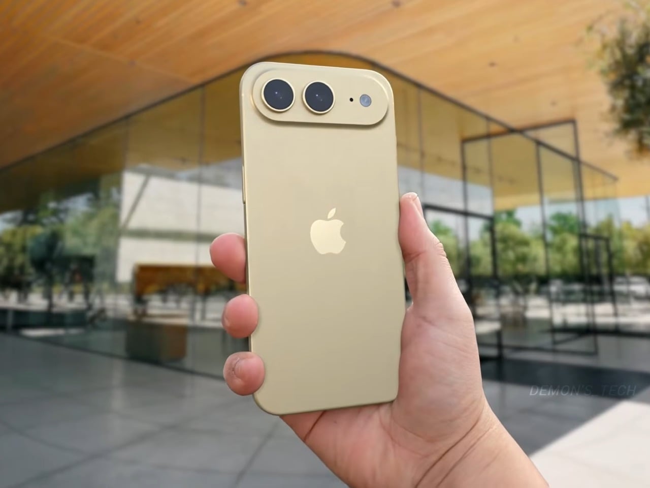
Demon’s Tech has imagined exactly what that second generation could look like, and the concept renders suggest Apple already has a clear path to making the Air the phone it should have been from the start. The dual-camera bar is wide and confident across the top of the phone, housing two lenses with room to spare. The rest of the body is pure restraint, a flat back, centered Apple logo, and a color range vivid enough to give the phone a personality that its specs can now actually back up. If the rumored stereo speaker and efficiency-focused N2 chip join that camera upgrade, the Air 2 goes from interesting to genuinely compelling.

Designer: Demon’s Tech

Two 48-megapixel sensors reportedly sit inside the pill-shaped housing, one primary and one ultrawide, which aligns with leaks from Chinese tipster Digital Chat Station suggesting Apple is going for a main-plus-ultrawide configuration rather than a telephoto. That choice makes sense for the Air’s positioning. Telephoto glass demands physical depth that a sub-6mm chassis simply cannot accommodate, and ultrawide coverage is what most non-Pro users actually miss day-to-day. The original Air’s single-lens bar always looked slightly incomplete, like a sentence that trailed off mid-thought, and Demon’s Tech addresses that by stretching the new pill-shaped housing almost the full width of the phone’s upper third, sitting flush and purposeful rather than apologetic. It is a small change on paper that transforms the entire visual logic of the back panel.

Apple shipped the original Air in four relatively restrained options: cloud white, sky blue, light gold, and matte space black. Demon’s Tech blows that palette wide open, running through violet, cobalt, mint green, and vivid red alongside the sandy gold seen in the hero shots, which is closer to what the iPhone 5C attempted in 2013, a phone that led with color as a statement rather than a courtesy. The Air’s lifestyle positioning actually supports this approach in a way the 5C’s budget framing never quite did. A phone you buy partly because it is extraordinarily thin is a phone you buy to be noticed, and being noticed in muted gold is considerably less fun than being noticed in electric blue. The renders make a quiet argument that Apple’s colorway restraint on the original Air was a missed opportunity, not a deliberate choice.

Twelve gigabytes of RAM paired with the A20 Pro keeps the performance story simple: this is a phone that matches the Pro lineup on silicon even if it concedes on optics. The sleeper upgrade is Apple’s rumored N2 efficiency chip, because getting better battery life out of a body that physically has less room for cells requires exactly this kind of architectural work, the same discipline that let the original Air post competitive endurance numbers despite its dimensions. Add stereo sound from a bottom speaker alongside the existing top one, and the two most common complaints about the first Air evaporate inside a single product cycle. That is a more focused corrective than Apple managed with either the Mini or the Plus, both of which spent multiple generations struggling to justify their existence. If Apple lands all of this at the same $999 price point, the value math finally starts working in the Air’s favor.

Apple has confirmed the Air line continues, with the second generation reportedly targeting a spring 2027 release window, landing after the iPhone 18 Pro, Pro Max, and foldable models ship in fall 2026. That later window gives Apple’s engineering teams more time to solve the thermal and battery challenges that come with building capable hardware into an impossibly thin frame, and it gives the Air its own launch moment rather than forcing it to compete for attention against a foldable iPhone. Demon’s Tech’s concept is the best visual argument yet for what that launch moment could look like: a phone that carries its thinness as a given rather than an excuse, and finally has the camera system and audio to back up everything the form factor promises.

The post This iPhone Air 2 Concept Adds Two Cameras and Suddenly the Phone Makes More Sense first appeared on Yanko Design.
  • ✇Yanko Design
  • This 2026 Lamborghini F1 Livery Proves the Raging Bull Belongs on the Grid (Even If It Never Happens)
    The 2026 F1 season marks the biggest technical reset the sport has seen in over a decade, with new power unit regulations that push electric deployment even harder and a reshuffled grid that includes Audi’s factory entry and Cadillac arriving as a legitimate constructor. It’s the kind of moment when the paddock genuinely opens up to new possibilities, when manufacturers who’ve been sitting on the sidelines start doing the math on whether an F1 program could actually make sense. Lamborghini will
     

This 2026 Lamborghini F1 Livery Proves the Raging Bull Belongs on the Grid (Even If It Never Happens)

17 avril 2026 à 15:15

The 2026 F1 season marks the biggest technical reset the sport has seen in over a decade, with new power unit regulations that push electric deployment even harder and a reshuffled grid that includes Audi’s factory entry and Cadillac arriving as a legitimate constructor. It’s the kind of moment when the paddock genuinely opens up to new possibilities, when manufacturers who’ve been sitting on the sidelines start doing the math on whether an F1 program could actually make sense. Lamborghini will almost certainly remain on those sidelines, because spending nine figures annually to race in a series where your parent company already fields a team (Audi, also owned by Volkswagen Group) would be corporate redundancy at its most wasteful. But that didn’t stop designer Daniel Rodriguez from asking what a Lamborghini livery would look like if Sant’Agata Bolognese decided to crash the party anyway. If it did, it would be the third bull-based team on the track after Red Bull and Racing Bulls!

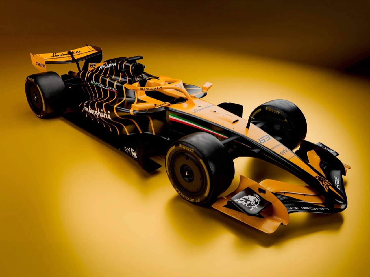
Rodriguez’s concept wraps a 2026-spec F1 car in Arancio Borealis and gloss black with a geometric lattice pattern that pulls directly from Lamborghini’s current design vocabulary. The hexagonal graphics echo the Revuelto’s taillight treatment and the angular obsession that defines the brand’s styling language, flowing from dense at the cockpit to sparse at the rear wing. Italian flag accents trace the halo and nose cone, sponsor logos for Macron and Eni add commercial credibility, and the raging bull emblem sits on the rear wing endplates where it would photograph beautifully in the pit lane even if TV cameras never caught it. The renders are good enough to pass for official press shots, lit with the kind of moody amber-to-black gradients that Lamborghini’s own marketing team would approve.

Designer: Daniel Rodriguez

What makes this livery work is that Rodriguez doesn’t try to make the F1 car look like a Lamborghini road car, because that’s impossible and also beside the point. An F1 car is a regulatory sculpture shaped by wind tunnel data and the FIA’s technical rulebook, and no amount of vinyl wrap changes that fundamental reality. Instead, the livery translates Lamborghini’s graphic and color vocabulary into a form factor that has nothing to do with mid-engine supercars, and it does so in a way that feels both authentic to the brand and appropriate for the paddock. The Arancio Borealis orange sits somewhere between molten lava and a traffic cone, instantly recognizable as Lamborghini without requiring the car to sprout scissor doors or a V12 exhaust note. The gloss black creates genuine visual tension rather than just contrast, breaking up the body in a way that emphasizes the car’s aerodynamic surfaces instead of fighting them.

The hexagonal lattice pattern running down the sidepods and over the engine cover is the detail that sells the whole concept. Lamborghini has been obsessed with hexagons since the Aventador introduced them as a recurring motif back in 2011, and they’ve since migrated to every surface the brand touches. Taillights, grilles, interior stitching, wheel designs, all of it hexagons. Rodriguez takes that obsession and applies it to the F1 car’s sidepods in a way that creates visual density without cluttering the canvas. The pattern starts tight and geometric at the front, creating a sense of structural integrity, then gradually opens up as it flows rearward, giving the eye a path to follow from cockpit to diffuser. It’s a graphic solution that respects both the brand’s identity and the car’s aerodynamic purpose.

The Italian tricolor is handled with restraint, running as a thin accent stripe that outlines the halo and reappears on the nose cone. It’s subtle enough to avoid looking like a generic tribute to the brand’s Sant’Agata Bolognese heritage, but prominent enough that the car reads as distinctly Italian when parked next to Ferrari’s red. The sponsor integration is equally thoughtful. Macron, the Italian sportswear brand that already kits out Bologna FC and the Italian national rugby team, appears on the sidepods and rear wing. Eni, the Italian energy giant with deep motorsport ties, gets placement on the engine cover. Both partnerships feel plausible rather than fantastical, the kind of commercial relationships Lamborghini could actually secure if they showed up to the grid tomorrow.

Even the mandated wheel covers, which the 2026 regulations require for aerodynamic efficiency and which most teams treat as blank canvases or necessary evils, get the hexagon treatment here. It’s a small detail that maintains visual consistency across every surface, ensuring the car reads as a cohesive design rather than a collection of sponsor panels held together by regulations. The raging bull emblem on the rear wing endplates is rendered in white against black, a detail that would be nearly invisible during race broadcasts but would photograph beautifully in static pit lane shots and pre-race media coverage.

Will Lamborghini actually enter F1 in 2026 or beyond? Almost certainly not. The economics don’t justify it, the brand’s identity doesn’t need F1 validation, and their motorsport budget is better spent on GT3 programs that connect directly to road car sales. But Rodriguez’s concept does something more valuable than predicting the future. It proves that Lamborghini’s design language is strong enough to survive translation into a form factor it was never intended for, and it shows what the 2026 grid would look like with a raging bull parked next to the prancing horse.

The post This 2026 Lamborghini F1 Livery Proves the Raging Bull Belongs on the Grid (Even If It Never Happens) first appeared on Yanko Design.

❌