❌

Vue normale

  • ✇Yanko Design
  • A Bamboo Armchair Glows After Dark Without Electricity
    Crocheted flowers usually belong on a blanket or a cardigan, not in a conversation about lighting. Peiyang (Camille) Li gives them another job with She Blooms in the Dark, a sculptural seating project that combines a woven bamboo armchair with hand-crocheted blossoms that glow after dark. I like the premise immediately: familiar craft doing something unexpected, without needing to look like a gadget. The problem it addresses is a small but recognizable one: finding a sense of personal space wit
     

A Bamboo Armchair Glows After Dark Without Electricity

3 novembre 2026 à 18:30

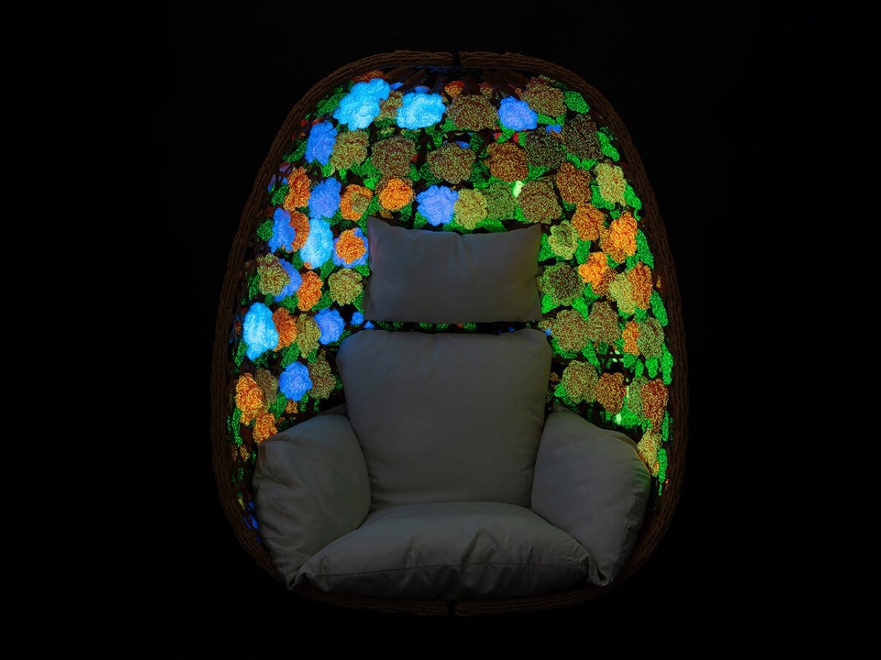
Crocheted flowers usually belong on a blanket or a cardigan, not in a conversation about lighting. Peiyang (Camille) Li gives them another job with She Blooms in the Dark, a sculptural seating project that combines a woven bamboo armchair with hand-crocheted blossoms that glow after dark. I like the premise immediately: familiar craft doing something unexpected, without needing to look like a gadget.

The problem it addresses is a small but recognizable one: finding a sense of personal space without having a separate room to escape into. Li frames the project around emotional vulnerability and protection. I read that as an attempt to make a seat feel like a boundary, a place where being alone might feel intentional rather than awkward. That’s a worthwhile ambition for a piece of furniture, even before the flowers start glowing.

Designer: Peiyang (Camille) Li

The curved, basket-like bamboo framework partially encloses the sitter, while its open lattice stops short of creating a solid shell. That balance matters. For a shared living room, I’d want a retreat that still lets me feel connected to the room, rather than a miniature booth. The shape suggests that possibility, although an open weave shouldn’t be mistaken for actual privacy. Think of it as a visual boundary, not a substitute for a door.

The glow comes from phosphorescent yarn, described in the project write-up as absorbing daylight and releasing a low-intensity glow in darkness, without electric fixtures. That’s an appealingly direct material choice: the flowers themselves provide the effect, instead of hiding a strip of LEDs underneath. I’m more drawn to that decision than I would be to a color-changing chair controlled through an app. The material gets to carry the surprise, and the premise is easy to understand.

It would be a mistake to treat it as a reading light, though. The published description doesn’t give brightness measurements or say how long the glow lasts. For me, the useful way to understand it is as an atmospheric effect, not a replacement for the lamp beside your favorite book. That distinction actually strengthens the idea. It lets the light remain intimate and decorative, rather than making a practical lighting promise the available information can’t support.

Crochet also makes sense here beyond the novelty of glowing yarn. A flower carries associations with care, growth, and decoration, at least in my reading, and working it by hand adds another layer to that impression. I appreciate that Li hasn’t chosen an abstract luminous panel. The floral language gives the project a slightly storybook quality. It could be too whimsical for a restrained living room, but I wouldn’t want that personality edited out.

That doesn’t mean the chair can promise calm on command. I’m wary of furniture being asked to solve an emotional condition simply because it wraps around a person. A more reasonable ambition is to offer an invitation: sit here, give yourself a moment, let this particular corner have a different purpose. She Blooms in the Dark makes sense to me on that modest scale. It doesn’t need a therapeutic claim to justify its existence.

There are everyday questions I’d want answered before imagining it at home. The published project information doesn’t include dimensions, a price, or purchasing details, and it isn’t enough to judge comfort or upkeep. I’d want to know how the flowers are attached and how you clean around them. Those aren’t objections to a sculptural project. They’re the questions that separate admiring a piece of furniture from deciding where it could live.

Still, I’m glad this chair takes such an idiosyncratic route to a familiar desire. I don’t need every quiet corner to look like a spa, and I don’t need every interesting light effect to arrive with another charger. A bamboo seat dressed in glowing crochet offers a more playful possibility. The appeal is being allowed a little enchantment at home, with enough recognizable craft to keep it from feeling like a special effect.

The post A Bamboo Armchair Glows After Dark Without Electricity first appeared on Yanko Design.
  • ✇Yanko Design
  • A Hidden Mechanism Turns the Scissor Chair Into a Lounger
    Buying a chair for conversation and buying one for an evening with a book can feel like two separate furniture decisions. One asks you to sit up; the other invites you to sink back. If your living room doesn’t have space for both, the Scissor Chair offers an appealing compromise. Produced by the German company Wilhelm Knoll, this mid-century design changes its sitting position while keeping the appearance of an ordinary upholstered armchair. Its designer remains unknown, but the problem it addr
     

A Hidden Mechanism Turns the Scissor Chair Into a Lounger

23 octobre 2026 à 17:30

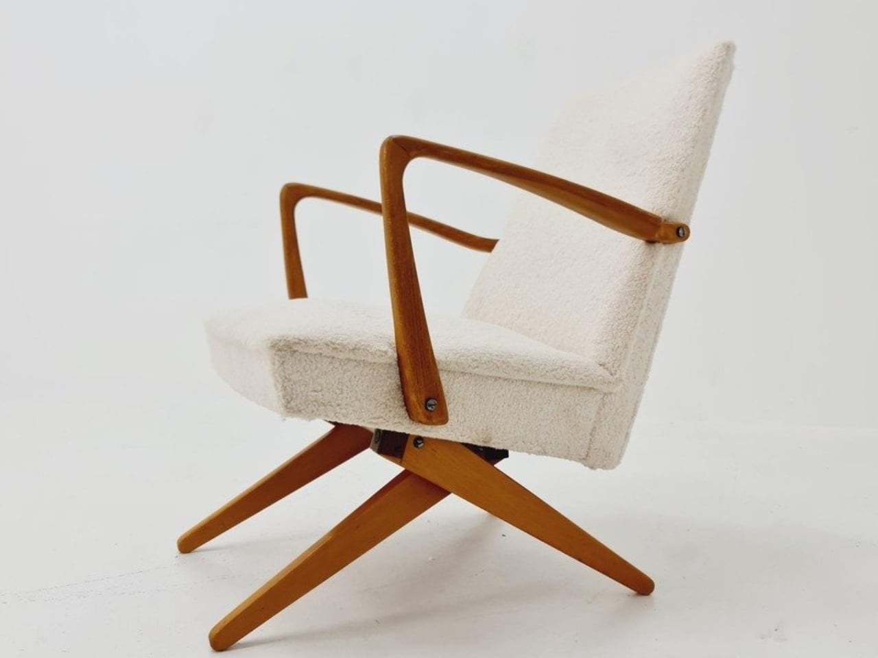
Buying a chair for conversation and buying one for an evening with a book can feel like two separate furniture decisions. One asks you to sit up; the other invites you to sink back. If your living room doesn’t have space for both, the Scissor Chair offers an appealing compromise. Produced by the German company Wilhelm Knoll, this mid-century design changes its sitting position while keeping the appearance of an ordinary upholstered armchair. Its designer remains unknown, but the problem it addresses is familiar.

The name gives away the basic geometry. According to a vintage dealer’s description, lifting the armrests allows the crossed legs to unfold. The chair moves between a taller, more upright configuration and a lower lounging position. Instead of leaving the legs stationary while only the backrest moves, the transformation changes the stance of the chair itself. I like that the supporting structure participates in the adjustment. Those wooden legs have a job beyond providing a handsome silhouette.

Designer: Unknown (produced by Wilhelm Knoll)

In photographs of a cream-upholstered example, the narrow wooden arms trace an open shape around the seat and back. There’s plenty of air beneath the upholstery, and the legs remain visually separate rather than disappearing inside a boxy base. In the upright position, it looks quite composed. Lowered, the crossed supports become more obvious, and the chair takes on a relaxed, backward-leaning posture. The useful surprise is how little visual fuss accompanies that change.

The adjustment is more substantial than a slight tilt. One dealer lists seat heights of 45 and 36 centimeters for an example, roughly 18 and 14 inches. That’s a difference of about three and a half inches, enough to make these visibly different seating arrangements. Those are seller-provided measurements for a vintage piece, rather than a universal specification, but they help explain the appeal. You’re choosing between two distinct positions, with different relationships to the floor and surrounding furniture.

Underneath, the mechanism is considerably busier than the silhouette suggests. A dealer’s underside photograph reveals pivoting metal links, brackets, and a coil spring tucked between the wooden supports. I’d happily leave that view to someone servicing it. From a design perspective, though, the separation makes sense: the mechanical assembly sits beneath the upholstered seat, where it can do its work without dictating the appearance of every surface above it. The chair doesn’t need to look like workshop equipment to have moving parts.

For a smaller living room, I see the attraction as flexibility rather than some miraculous recovery of square footage. A chair that changes posture still needs room around it, especially when its stance changes. The more convincing benefit is having one seat that can suit a conversation and then offer a lower position for unwinding. That’s a modest promise, and a useful one. I’d rather have two clearly differentiated options than an elaborate transformation with no obvious purpose.

The Knoll name deserves a little care here. Wilhelm Knoll was a German business whose roots go back to a Stuttgart leather shop founded in 1865. It shouldn’t be casually confused with the American company Hans Knoll established in 1938, although the businesses share family history. Vintage dealers date Scissor Chair examples to the 1950s. Keeping the manufacturer credit separate from the unidentified designer matters, particularly with an object whose mechanism deserves more attention than a famous surname alone.

Of course, photographs can’t tell me how smoothly a surviving example adjusts or how supportive it feels after an hour. With a vintage moving chair, I’d want the mechanism demonstrated and its condition checked before buying. That practical reservation doesn’t diminish the idea. The Scissor Chair appeals to me because its cleverness is so specific: lift the arms, alter the stance, settle into a different position. A living room doesn’t always need another chair. Sometimes the chair already there could simply offer another way to sit.

The post A Hidden Mechanism Turns the Scissor Chair Into a Lounger first appeared on Yanko Design.

  • ✇Yanko Design
  • Aery’s Office Chair Offers a Fit You Can Actually Fine-Tune
    A desk setup can look perfect and still feel wrong by lunch. The monitor is aligned, the cables are hidden, and the chair matches the room, yet you’re shuffling around trying to get comfortable. That gap between a workspace that photographs well and one that fits the person using it is the more interesting design problem to me. It’s where EFFYDESK’s Aery Ergonomic Chair makes its case. For anyone whose office occupies a bedroom corner or shares space with the living room, choosing a chair invol
     

Aery’s Office Chair Offers a Fit You Can Actually Fine-Tune

23 octobre 2026 à 04:15

A desk setup can look perfect and still feel wrong by lunch. The monitor is aligned, the cables are hidden, and the chair matches the room, yet you’re shuffling around trying to get comfortable. That gap between a workspace that photographs well and one that fits the person using it is the more interesting design problem to me. It’s where EFFYDESK’s Aery Ergonomic Chair makes its case.

For anyone whose office occupies a bedroom corner or shares space with the living room, choosing a chair involves a negotiation. You want something you can spend time in, but you also have to look at it after closing the laptop. The Aery approaches that compromise with a mesh back, a cushioned seat, and adjustments that let its proportions work around the person sitting in it.

Designer: effydesk

The mesh is doing some of the visual work here. A tall upholstered back can become a fairly imposing presence beside a small desk. With the Aery, the open surface allows the supporting structure to remain visible, breaking up what could otherwise read as one large block. It still looks like an office chair, especially with that separate headrest, but its outline has a little breathing room.

I appreciate that it doesn’t try to disguise its purpose. In black, the frame, armrests, and cushion form a straightforward piece of working furniture. It isn’t pretending to be a dining chair you could drag into a meeting. That distinction matters in a home office, where choosing something purely for the room’s aesthetic can leave you making compromises every time you sit down.

The fabric-covered cushion gives the design a softer counterpoint to the mesh back. It also offers a combination that may appeal to people who prefer padding beneath them without wanting an upholstered surface behind their entire torso. I like the visual balance between the two. The seat gives the chair some substance, while the open back keeps that substance from extending all the way upward.

The most useful adjustment is also one of the least visually dramatic: the seat slides forward and backward. Rather than changing the chair’s appearance in any meaningful way, it changes how the cushion sits beneath your legs. That’s worth paying attention to if you’ve ever loved the look of a chair but found yourself perched near its edge because sitting all the way back didn’t feel right.

The movable armrests follow the same thinking. They adjust in height, slide in different directions, and rotate, giving you some freedom to place the supports where your arms naturally rest. The appeal is less about collecting adjustment options than avoiding a fixed position that doesn’t suit you. A chair’s silhouette can look perfectly balanced while its armrests feel entirely wrong for the person using it.

The headrest and reclining back introduce a more relaxed posture into the design. I see the appeal for reading through a document or leaning back between tasks, particularly when the desk is where several parts of your day happen. Still, the headrest feels secondary to getting the seat and arms right. Those are the relationships you live with while doing the work.

I haven’t sat in the Aery, so its cushion comfort and the feel of its controls remain open questions. Images and adjustment lists can explain the design, but they can’t tell me whether an armrest stays put when I want it to. That’s what I’d want to check in person, along with how naturally the chair fits beneath my desk.

What appeals to me is how much of the Aery’s design can be put to an everyday use. The mesh changes its visual presence; the cushion changes the sitting surface; the adjustments offer room to work out a better fit. It gives a home-office buyer reasons to look beyond the styled photograph, while still acknowledging that the chair has to live in the room.

The post Aery’s Office Chair Offers a Fit You Can Actually Fine-Tune first appeared on Yanko Design.

  • ✇Yanko Design
  • Flat-Pack Furniture That Actually Survives Your Next Move
    Flat-pack furniture is easy to appreciate on the day it arrives. It fits through the door, and you can usually put it together without much help. The harder test comes later: can it survive a move, come apart cleanly, or be repaired when something goes wrong? FLAT/FORM, a collection by designer Satoshi Itasaka of h220430, is built around those questions. Its pieces use bolts and nuts so they can be assembled, disassembled, repaired, and transported again. That might sound like a modest ambition
     

Flat-Pack Furniture That Actually Survives Your Next Move

5 octobre 2026 à 04:15

Flat-pack furniture is easy to appreciate on the day it arrives. It fits through the door, and you can usually put it together without much help. The harder test comes later: can it survive a move, come apart cleanly, or be repaired when something goes wrong? FLAT/FORM, a collection by designer Satoshi Itasaka of h220430, is built around those questions. Its pieces use bolts and nuts so they can be assembled, disassembled, repaired, and transported again.

That might sound like a modest ambition, but it changes how I look at the furniture. A dining chair is rarely a one-time purchase for a single room. It may follow you through different apartments, sit beside several tables, and get carried up more stairs than you care to count. FLAT/FORM treats that ongoing life as part of the design brief, rather than leaving it to chance after the first assembly.

Designer: h220430

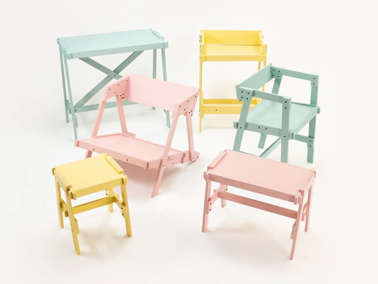
The material gives the project its character. FLAT/FORM uses 15-millimeter-thick veneer panels made from Japanese cedar trees more than 100 years old, with timber supplied by Miyazaki-based forestry company GROWTHRING. A dining chair and a low table are among the pieces in the collection. Both start from flat panels, a straightforward idea that lets the wood grain do some of the visual work while the construction remains easy to understand.

I like that balance. The collection does not try to disguise how it is made. Its flat planes and visible connections make assembly feel like a considered feature, not an awkward step between opening a box and enjoying the result. That distinction matters because a piece can be visually quiet without feeling anonymous. Here, the simple construction gives the furniture a recognizable point of view, while leaving room for the cedar to be the thing you notice first.

The choice of older cedar also invites a little care in how we talk about the project. Wood with a compelling history does not automatically make a product sustainable, and a furniture collection cannot solve every problem associated with consumption. What FLAT/FORM can offer is a more specific proposition: furniture intended to come apart, travel, and be repaired instead of being treated as finished when its first arrangement stops working. That seems more useful to me than a sweeping environmental promise.

There is a practical kindness to that approach. Moving is already expensive and tiring; furniture should not add a puzzle you are afraid to solve twice. Bolts and nuts are familiar hardware, and the collection’s assembly system is intended to make disassembly possible. None of that guarantees that every move will be effortless. It does mean the designer has acknowledged that people relocate and rearrange their lives, and that a chair ought to have some chance of keeping up.

I would still want to sit in the dining chair before making any grand claims about it. Photographs can tell you plenty about proportion and material, but not how a seat feels through a long dinner. Nor does an elegant assembly concept tell you what the collection costs or how its surfaces will age in a busy home. Those are fair questions for any furniture meant to last, particularly furniture whose appeal rests partly on the idea of keeping it around.

Even with those questions open, FLAT/FORM feels refreshing because it gives flat-pack design a different priority. Convenience at delivery is helpful, but convenience at every stage afterward may be the better measure. A table that can leave one home and settle into another without becoming a burden has a value that is easy to overlook when shopping by appearance alone. Itasaka’s collection makes that overlooked part of ownership visible.

Perhaps that is the quietest, strongest idea here: furniture should be allowed to have a future. FLAT/FORM does not need to look complicated to make that point. It uses flat cedar panels and ordinary fasteners to ask a sensible question of a familiar category: what if getting a piece into your home were only the beginning of a good design? That is a question worth asking before the next box arrives at the door.

The post Flat-Pack Furniture That Actually Survives Your Next Move first appeared on Yanko Design.

  • ✇Yanko Design
  • A 1908 New York building’s discarded fragments got turned into furniture instead of being demolished
    A renovation across the street from Rafael Prieto’s studio offered an unusually good view of his next project. As decorative pieces came off the facade of a Tribeca building, he arranged to save sixteen that were headed for disposal. Most of us would have watched the scaffolding go up and returned to our emails. Prieto, a Mexico-born designer and creative director based in Tribeca, had other ideas. The result is a furniture exhibition that keeps the building’s ornament alive in some very unexpe
     

A 1908 New York building’s discarded fragments got turned into furniture instead of being demolished

4 octobre 2026 à 09:20

A renovation across the street from Rafael Prieto’s studio offered an unusually good view of his next project. As decorative pieces came off the facade of a Tribeca building, he arranged to save sixteen that were headed for disposal. Most of us would have watched the scaffolding go up and returned to our emails. Prieto, a Mexico-born designer and creative director based in Tribeca, had other ideas. The result is a furniture exhibition that keeps the building’s ornament alive in some very unexpected forms.

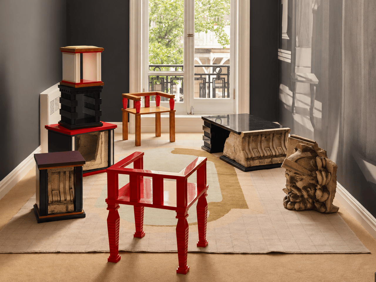
Prieto spent time with the fragments before turning them into the starting point for tables, chairs, and sculptural objects. Weathered ornament sits against painted birch, sometimes tucked inside a crisp new frame. The resulting furniture keeps its New York address close, even when its shape heads somewhere unexpected. Some pieces carry the actual stone; others borrow only its curves, grooves, and proportions. It is a show that rewards looking twice.

Designer: Rafael Prieto

The building across the street is 366 Broadway, now known as Collect Pond House, a twelve-story Beaux-Arts structure designed by Frederick C. Browne in 1908. It was once home to the Royal Typewriter Company, then became a residential co-op in 1979. The facade is densely ornamented: copper cornices, Greek key detailing, marble columns, and keystones carved into bearded faces that have been watching Tribeca change for over a century. A recent multi-year restoration replaced and conserved 65 terra cotta units. A handful of the pieces removed during that process did not make it back onto the building.

Before cutting anything, Prieto lived with the fragments in his studio for roughly a year and a half. He photographed and scanned each contour and ornament, then layered those images to pull out shapes and combinations that could inform new work. That process produced a design vocabulary rather than any direct copy of the originals. The stepped, ribbed profiles that climb the legs of the red lacquered chair came directly from this translation, somewhere between column fluting and abstracted skyline. It is a method closer to archaeology than furniture-making.

One of the standout pieces has a large carved stone cornice block sitting below a flat black painted tabletop, doing actual structural work. The stone is pale, dense, and loaded with repeating scroll forms, carrying roughly a century of New York weather on its surface. Another piece cages a smaller fragment between vertical black bars inside a cube-shaped form, the stone visible through the gaps like something on display. The medium listing for several works at the gallery confirms “Architectural Fragment” as a named material alongside painted birch. Not every piece carries original stone; some borrow only its shapes.

The all-red lacquered chair is the most confident piece in the show, its legs built from stacked, stepped planes that scanning and layering pulled from 366 Broadway’s fluted piers and molded profiles. Its natural birch counterpart deploys the same vocabulary in warm wood, swapping lacquer for grain and adding red geometric arm brackets at the joints. A console table makes the argument most literally: one end sits on a fabricated red plinth, the other rests on an actual salvaged Ionic stone volute, intact and weather-stained. The two supports are not supposed to match. The gallery describes this contrast as the central thread: the hard and the soft, the historic and the contemporary, running through every piece.

Several of the original keystones sit on the gallery floor unaltered, including one carved bearded face in a plumed helmet still stained with moss and a century of city air. Prieto’s analog photography wraps the walls in large-scale architectural murals, produced in collaboration with Wallpaper Projects. The room ends up feeling closer to a photographed ruin than a white-cube gallery, which is entirely the point. He told Family Style that “New York is its architecture,” and that most people talk about the skyline but “don’t look up.” The show does the looking for you.

‘The Future of the Past’ is Prieto’s second solo show with Emma Scully Gallery and runs through December 12 at the Upper East Side location, open Wednesday through Saturday. Pricing and availability are through the gallery directly. The question the collection keeps circling is whether furniture shaped by a building’s discarded ornament carries any of that building’s memory with it. Prieto does not seem interested in settling that question cleanly. The bearded face on the gallery floor looks like he has made his peace with the whole situation.

The post A 1908 New York building’s discarded fragments got turned into furniture instead of being demolished first appeared on Yanko Design.

  • ✇Yanko Design
  • Furniture Made From Wood Scraps You’d Actually Pay For
    Every furniture workshop generates a particular kind of guilt. There are the offcuts, the trimmings, the odd-shaped remainders of boards that got cut to size and are now too small for anything useful, or so we assume. Most of them end up as kindling, compost, or landfill. We’ve accepted that as the cost of making things, a small fine paid for the privilege of precision. Studio Booboon is not interested in paying that fine. The Copenhagen-based studio, founded by Richard Bone and Jisu Yun, two d
     

Furniture Made From Wood Scraps You’d Actually Pay For

12 août 2026 à 09:20

Every furniture workshop generates a particular kind of guilt. There are the offcuts, the trimmings, the odd-shaped remainders of boards that got cut to size and are now too small for anything useful, or so we assume. Most of them end up as kindling, compost, or landfill. We’ve accepted that as the cost of making things, a small fine paid for the privilege of precision. Studio Booboon is not interested in paying that fine.

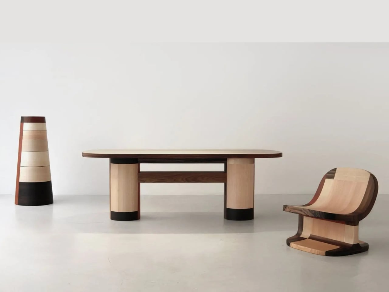
The Copenhagen-based studio, founded by Richard Bone and Jisu Yun, two designers who both trained under Japanese studio Nendo, released their latest collection, Fragments Becoming, and it’s exactly the kind of work that makes you wonder why no one thought to do it this way sooner. The collection is built entirely from timber offcuts, and before you picture something rustic or deliberately imperfect, let me be clear: these pieces are stunning. A cabinet, a dining table, and a lounge chair, each constructed from assembled fragments of discarded wood arranged with such precision and intention that the effect is closer to fine art than furniture-as-apology for sustainability.

Designer: Studio Booboon

The concept the studio uses is something they call “3D marquetry,” which sounds technical but is actually a fairly elegant idea once you sit with it. Traditional marquetry, the kind you’d see on antique furniture or decorative boxes, applies a pattern to a surface. It’s essentially decoration laid on top of structure. What Studio Booboon does instead is treat each fragment of wood as the structure itself. The pattern isn’t on the cabinet door; the door is the pattern. It runs through the object’s entire volume, which means the visual logic and the physical construction are the same thing. That’s not a subtle distinction. That’s a fundamentally different philosophy.

What I appreciate about this approach is that it removes the option to hide mistakes. The studio works with unstained wood, which means every fragment has to earn its place on its own terms, no pigment masking a poor match, no stain blurring the edges. Each piece has to work compositionally before it works functionally. That kind of constraint tends to produce either chaos or brilliance, and in this case, it’s clearly the latter.

Bone and Yun bring a cross-cultural sensibility to the work that shows up in the details. Their debut collection, Playful Reappropriation, released at Milan Design Week 2024, pulled from Korean craft traditions, and Fragments Becoming continues that thread. The materials include hanji (traditional Korean paper), canvas, silk, and Ottchil, a Korean lacquer technique that adds depth without dominating the natural tones of the wood. The combination of a British RCA education, Korean craft heritage, and a shared apprenticeship at Nendo, one of the most conceptually rigorous studios in contemporary design, explains a lot about why this work feels so considered without ever feeling cold.

The collection premiered at Milan Design Week 2026 and later showed at Other Circle 2026 during 3daysofdesign in Copenhagen. That double-billing matters. Milan tends to reward spectacle, while the Copenhagen circuit rewards ideas. The fact that Fragments Becoming landed well in both contexts suggests it’s doing something more than just looking good in photographs, which, for the record, it absolutely does.

Sustainability in design has become such an overused talking point that the word barely registers anymore. Every brand gestures toward it. But there’s a difference between sustainability as a value and sustainability as a method, and Studio Booboon’s work lives in the second category. They’re not telling you the collection is responsible and letting the aesthetics carry a different message. The responsible practice is the aesthetic. The offcut isn’t hidden. It’s the whole point.

That feels rare enough to be worth paying attention to. Design tends to celebrate the new, the seamless, the perfect. Fragments Becoming makes a quiet argument that the incomplete, the leftover, and the discarded might be where the most interesting work is still waiting to happen.

The post Furniture Made From Wood Scraps You’d Actually Pay For first appeared on Yanko Design.

❌