❌

Vue normale

  • ✇Yanko Design
  • An Oregon Parking Lot Was Transformed Into a Forest-Inspired Library
     At East County Library in Gresham, Oregon, timber columns rise through gaps in the acoustic ceiling, keeping the structure visually separate from the surfaces around it. Holst Architecture designed this detail to suggest tree trunks reaching toward a canopy. The forest reference is built into the architecture, rather than applied afterward as a decorative theme. Opened in May 2026, the approximately 95,000-square-foot library serves eastern Multnomah County. Holst led the design, collaborating
     

An Oregon Parking Lot Was Transformed Into a Forest-Inspired Library

6 novembre 2026 à 19:30

 At East County Library in Gresham, Oregon, timber columns rise through gaps in the acoustic ceiling, keeping the structure visually separate from the surfaces around it. Holst Architecture designed this detail to suggest tree trunks reaching toward a canopy. The forest reference is built into the architecture, rather than applied afterward as a decorative theme.

Opened in May 2026, the approximately 95,000-square-foot library serves eastern Multnomah County. Holst led the design, collaborating with Adjaye Associates through the design development phase. Its scale addresses a longstanding imbalance: more than 40 percent of county residents live east of Interstate 205, yet East County previously had the library system’s smallest footprint.

Designer: Holst

The project replaces an underused parking lot with a public destination connected to transit. A tree-lined pedestrian route links the MAX light rail stop and northern civic space to a terraced entrance plaza on Division Street. That arrangement makes the approach part of the project, giving pedestrians a defined route between transportation and the library’s entrances.

Inside, glulam beams and cross-laminated timber panels form the primary structural system. Double-height entrances and a central living room establish larger clearings within the column grid. Holst paired overhead beams and introduced recessed lines in the timber to give the ceiling depth and rhythm. These choices make the forest analogy legible through construction, without requiring literal representations of branches or leaves.

The building isn’t exclusively timber. Concrete shear walls around the auditorium and along the eastern side provide structural support, with concrete also used around acoustically sensitive spaces. This hybrid approach is worth noting: the material palette responds to different demands rather than treating exposed wood as the answer to every problem.

Holst organizes the plan from active spaces on the west toward focused reading and work areas on the east. Entrances, creative activities, and children’s play occupy the busier edge. Collections and specialized rooms sit toward the center, while window-lined seating provides a quieter destination. The layout acknowledges that a contemporary library needs room for conversation and concentration.

That range includes an audiovisual studio, a creative learning room, indoor and enclosed outdoor children’s spaces, and a rooftop terrace. Two sensory rooms, one oriented toward children and another toward adults, offer adjustable lighting and different ways to engage or withdraw. Community consultation helped shape these provisions, giving the expansive brief specific places to land.

Radiant flooring and rooftop solar panels accompany a LEED Gold target, not a confirmed certification. Beyond those systems, the useful architectural decision is spatial: a large civic building makes room for different levels of participation, including the simple wish to sit quietly with a book.

The post An Oregon Parking Lot Was Transformed Into a Forest-Inspired Library first appeared on Yanko Design.

  • ✇Yanko Design
  • The 5 Best Tiny Homes of November 2026
    A bedroom door can matter more than another clever storage compartment. So can a dining table that stays put, a bathroom you don’t have to share, or a living room with a view beyond the opposite wall. For November, we’ve selected five compact homes that give these everyday details serious attention. Their plans make downsizing easier to picture without treating the simple act of going to bed as a climbing exercise. This selection spans trailer homes, park models, and larger modular dwellings, i
     

The 5 Best Tiny Homes of November 2026

6 novembre 2026 à 07:40

A bedroom door can matter more than another clever storage compartment. So can a dining table that stays put, a bathroom you don’t have to share, or a living room with a view beyond the opposite wall. For November, we’ve selected five compact homes that give these everyday details serious attention. Their plans make downsizing easier to picture without treating the simple act of going to bed as a climbing exercise.

This selection spans trailer homes, park models, and larger modular dwellings, including a 700-square-foot option that stretches the tiny home label. We’re comparing their spatial decisions rather than reporting hands-on testing, with particular attention to privacy, usable rooms, and practical installation requirements.

1. Acadia

Sweet-Haus Tiny Cabin Company’s Acadia approaches downsizing through privacy rather than extreme compression. Its 700 square feet contain two bedrooms and two full bathrooms, all on one level, alongside an open kitchen and living area. That extra bathroom earns its place if two adults keep different schedules or regularly host overnight guests. The manufacturer currently identifies Acadia as a modular home for permanent installation in South Carolina and North Carolina, so think settled small house rather than roaming weekend cabin.

The kitchen supports that residential approach with a 24-inch Haier range, an 18-inch dishwasher, and a refrigerator with a bottom freezer. Custom solid wood cabinetry and drawers beneath the beds give storage an architectural role instead of leaving everything to loose furniture. Bedrooms accommodate queen or king bed bases, while bathroom configurations include showers or tub-and-shower combinations. It’s a persuasive option for people who want fewer rooms to maintain without abandoning familiar household routines or privacy.

What we like

  • Two full bathrooms make sharing a compact home a more practical proposition.
  • Both bedrooms stay downstairs, with storage incorporated beneath the beds.

What we dislike

  • At 700 square feet, it won’t satisfy anyone seeking a genuinely minimal footprint.
  • Permanent foundation requirements and availability limited to the Carolinas narrow its suitability.

2. Leah

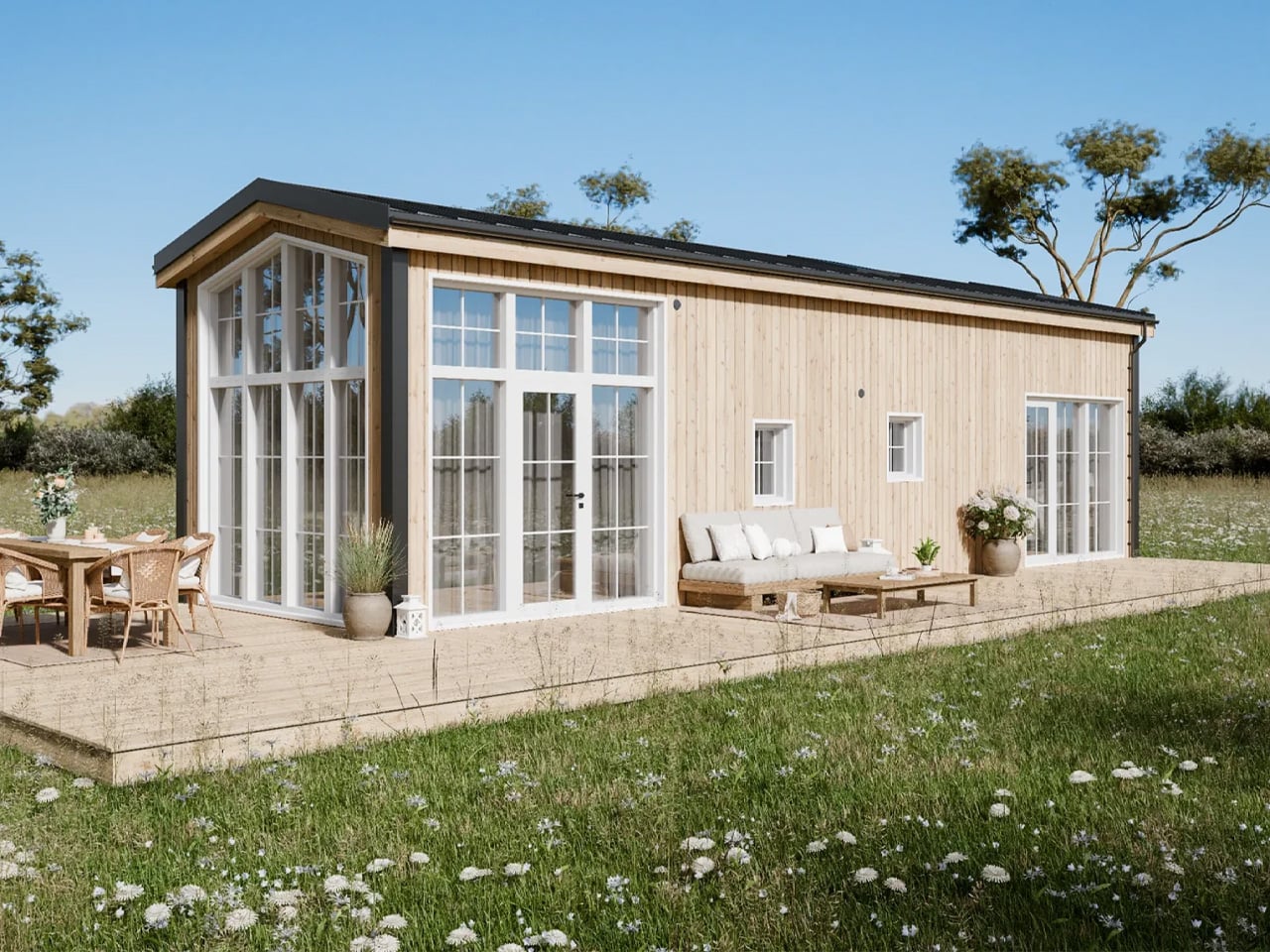
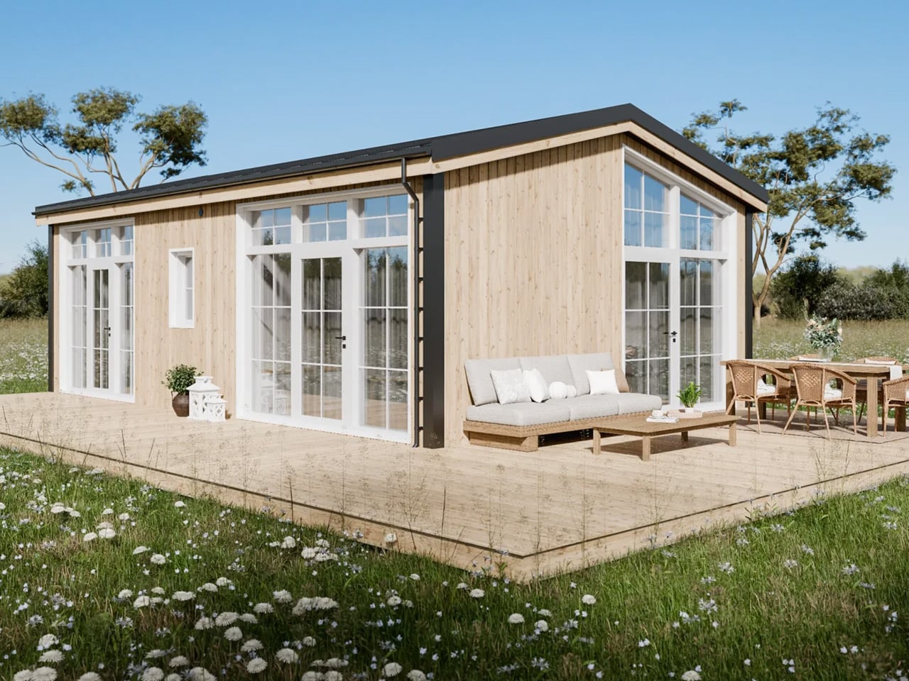
Leah puts its most expressive architecture around the living room. Tall, divided glazing wraps the corner beneath a pitched roof, making the shared space resemble a small garden pavilion in Vagabond Haven’s illustrations. The Swedish builder offers 52 square meters, approximately 560 square feet, including a sleeping loft, with a separate main bedroom downstairs. That arrangement makes sense for a couple who want a private bedroom for themselves and occasional sleeping space upstairs without climbing stairs every night before bed.

A corridor separates the main bedroom from the communal rooms, while the illustrated kitchen turns a corner to form an L. There’s space for a separate dining table rather than eating every meal at a counter. Vertical Thermopine siding, a steel roof, and triple glazing round out the specification. The practical catch is delivery: Leah has no wheels and needs a low-bed truck and crane. Its generous living room belongs to a planned site, not an impulsive road trip.

What we like

  • The downstairs main bedroom makes the loft optional for an owner’s nightly routine.
  • Concentrating the largest windows around the living room gives the shared space a distinct architectural identity.

What we dislike

  • The loft still comes with restricted headroom beneath the pitched roof.
  • The unfurnished starting specification excludes the kitchen and heating, so the illustrated interior requires a closer look at the options list.

3. Helena

Helena earns its place by giving both bedrooms ordinary doors on the same floor. Vagabond Haven’s modular design contains 45 square meters, roughly 484 square feet, and three sleeping places, with no loft to negotiate. For a parent and child, or a couple wanting a separate room for guests and desk work, that distinction is useful. The smaller bedroom can take a single bed, desk, and wardrobe, keeping those activities out of the lounge rather than making it serve everyone.

The trade-off is width. Helena measures 9.2 by 5.98 meters, making it a different proposition from a narrow trailer home. Its steel frame has no wheels, and transport requires a truck and crane. In the manufacturer’s illustrations, pale vertical siding and extensive glazing face an outdoor terrace, while the kitchen and dining area share the living zone. Triple glazing and mineral wool insulation are specified, but buyers need to distinguish the unfurnished model from the interior shown in the illustrations.

What we like

  • Two enclosed bedrooms provide separation without relying on upstairs sleeping space.
  • The smaller bedroom can accommodate a desk alongside its bed and wardrobe.

What we dislike

  • Its nearly six-meter width demands more site space than a slender trailer layout.
  • Despite having two bedrooms, the stated sleeping capacity is three, which may rule it out for a household of four.

4. eVista XL Limited Edition

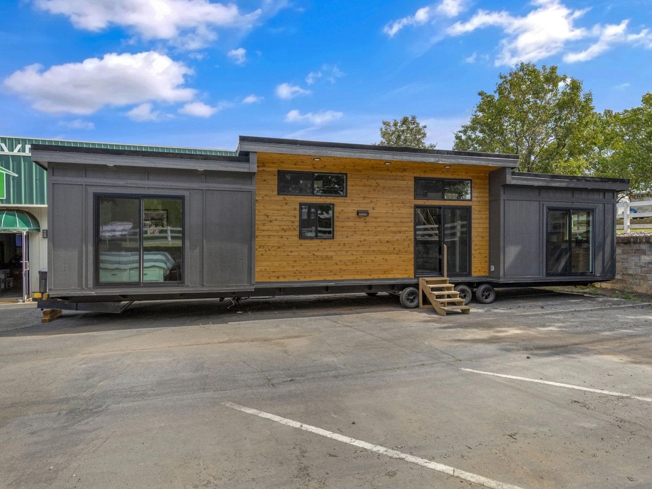
Escape’s eVista XL Limited Edition is the compact choice for someone who wants a bedroom door without giving up the trailer format. The 26-foot home keeps everything on one floor, with a walk-around queen bed separated from the living area by a sliding door. That access matters: getting up doesn’t require crawling across the mattress or descending from a loft. Dark timber cladding gives the exterior a restrained character, with the design’s effort concentrated on everyday interior arrangements.

Inside, drywall and maple trim accompany quartz counters, a two-burner induction cooktop, a combination microwave and convection oven, and a tall refrigerator. Flip tables open for meals or laptop work, then fold away to release floor space. Escape lists the completed Limited Edition at $75,365, with free delivery advertised, rather than presenting it as a future concept. The small bathroom and compact cooking area remain concessions to its size, so the private bedroom shouldn’t be mistaken for abundant space.

What we like

  • A separate bedroom with access around the queen bed avoids a common small home compromise.
  • Folding tables let dining and work surfaces disappear when circulation matters more.

What we dislike

  • The two-burner cooktop limits how many dishes can be cooked simultaneously.
  • The outdoor deck is optional, and Escape doesn’t handle site selection or preparation.

5. Winslow

Zook Cabins’ Winslow takes the cottage brief seriously, beginning with a covered porch instead of treating outdoor seating as an afterthought. The park model offers 400 square feet of finished interior space, with a private bedroom and no sleeping loft. Its 14-by-43-foot overall dimensions include the porch and roof overhangs, an important distinction from usable indoor area. Lap siding, shake accents, and white window frames establish the coastal character without requiring the house to sit beside water.

The floor plan places the bedroom at one end and the porch at the other, with living, dining, and kitchen functions grouped between them. Built-in cabinetry handles storage and display, while the dining arrangement includes seating around a proper table. A hall closet accommodates the water heater and laundry hookups, giving mundane equipment a designated home. For someone who values familiar domestic proportions over a loft’s extra sleeping capacity, Winslow keeps the daily essentials within an uncomplicated single floor.

What we like

  • The covered porch provides a dedicated outdoor room outside the finished interior footprint.
  • A private bedroom and designated utility closet give sleeping and household equipment their own places.

What we dislike

  • One enclosed bedroom and no loft leave limited separate sleeping space for guests.
  • The kitchen’s two-burner electric cooktop is a concession for anyone accustomed to a larger range.

Choose the Floor Plan, Then Check the Site

Before choosing a favorite, imagine two people using the plan at once. One is cooking while the other works, sleeps, or gets ready to leave. Check where doors open, which routes pass the bed, and whether the dining surface can stay in use during meal preparation. A small home’s floor plan becomes more revealing when you stop counting features and start following the movements those features are supposed to support.

Then give the site the same attention as the interior. Ask what delivery access, lifting equipment, foundations, and utility connections the particular model needs, and confirm permitted use with the relevant local authority before committing. An attractive starting price won’t answer those questions. The most convincing tiny home is the one whose layout fits your routines and whose installation requirements fit the place where you actually intend to put it.

The post The 5 Best Tiny Homes of November 2026 first appeared on Yanko Design.

  • ✇Yanko Design
  • San Siro’s Proposed Replacement Uses a Concrete X-Frame to Support Its Sweeping Roof
    I’m not a fan of either AC Milan or Inter Milan, but as a football fan, visiting Stadio Giuseppe Meazza, more popularly known as San Siro, is an item on my bucket list. However, time is running out for me to actually do that, as most of the iconic stadium is planned for demolition after its replacement opens. That’s because the clubs are planning Generali Stadium, the future shared home of two of the biggest football clubs in Italy. Now the proposed design for the 71,500-seat stadium, by archit
     

San Siro’s Proposed Replacement Uses a Concrete X-Frame to Support Its Sweeping Roof

4 novembre 2026 à 05:15

I’m not a fan of either AC Milan or Inter Milan, but as a football fan, visiting Stadio Giuseppe Meazza, more popularly known as San Siro, is an item on my bucket list. However, time is running out for me to actually do that, as most of the iconic stadium is planned for demolition after its replacement opens. That’s because the clubs are planning Generali Stadium, the future shared home of two of the biggest football clubs in Italy.

Now the proposed design for the 71,500-seat stadium, by architecture studios Foster + Partners and MANICA, has been unveiled. The clubs presented it on October 29, 2026. What’s most striking about the plans is how the X-frame makes the structure itself the architecture. The concrete frame extends from the colonnades, across the facade, and upward to support the roof. Its repeated geometry gives the building its identity while making its structural role visible.

Designers: Foster + Partners and MANICA

According to the clubs, that geometry draws on Italian engineering and the craftsmanship of Milan’s Duomo. The connection is an architectural reference rather than an attempt to reproduce the cathedral. What interests me more is the exposed supporting framework: the stadium’s most recognizable feature also explains something about how the enormous building stands up.

Inside, the focus shifts from concrete to the crowd. Two seating tiers form a continuous bowl around the field, with two steep supporter sections, or Curvas, behind the goals. Each would accommodate approximately 11,700 fans, with seating inclinations reaching 37 degrees. The arrangement is intended to bring supporters closer to the action. For a football fan, that relationship between the stands and the field is more compelling than another impressive exterior.

The double-curved roof also does more than shape the silhouette. The project website says it would incorporate 27,500 square meters of photovoltaic panels, while the clubs describe acoustic engineering intended to intensify the atmosphere. Those are useful ambitions, although the amount of solar electricity generated and the sound of a full stadium can’t be judged from renderings. A dramatic roof isn’t proof of either.

Arrival gets some attention, too. Diamond-shaped entrances would offer glimpses into the stadium before opening onto panoramic concourses with city views. Naturally ventilated colonnades form part of that approach. These spaces give the architecture a role before anyone reaches their seat, although open-looking entrances alone don’t establish how quickly thousands of spectators will actually move through them on matchday.

The plan also extends beyond the ticket gates. The stadium would anchor a 281,000-square-meter redevelopment incorporating public spaces, landscaped areas, retail, and leisure facilities. The aim is to give residents reasons to visit outside matchdays. That’s potentially the most useful part for people who aren’t interested in either club: somewhere to spend time without attending an event. Its everyday value will depend on how much space remains genuinely public and welcoming.

The clubs also promise enhanced accessibility, which deserves attention alongside the dramatic seating bowl. I’d want to know how step-free routes, companion seating, and views when neighboring supporters stand are handled. A designated space is only part of the experience; getting from the entrance to that space matters just as much.

For now, this remains a proposal moving through design and planning. Construction is expected to begin in 2028, with the first match targeted for the 2031/32 season, subject to approvals. That opening target should not be confused with a confirmed deadline for demolishing San Siro.

I can appreciate the logic of designing outward from the supporter sections, even while feeling reluctant about what this replacement means. Bringing fans closer and giving the neighborhood usable public space are worthwhile goals. The harder test will be whether ordinary supporters feel the new building belongs to them. The concrete frame will make the stadium recognizable; the experience of arriving, finding a seat, and watching a match will determine whether people want to return.

The post San Siro’s Proposed Replacement Uses a Concrete X-Frame to Support Its Sweeping Roof first appeared on Yanko Design.

  • ✇Yanko Design
  • SOM’s Sany IROOTECH Headquarters Hangs Its Floors From a Giant Steel Exoskeleton
    The most interesting space at Sany IROOTECH Headquarters might be the gap underneath it. In Guangzhou’s Pazhou business district, Skidmore, Owings & Merrill has connected two towers with an elevated podium, leaving room below for a shaded public plaza. Commissioned for construction equipment manufacturer Sany’s cloud technology venture, the completed complex gives a corporate headquarters something worth noticing at street level: space that people can enter without working there. Designed w
     

SOM’s Sany IROOTECH Headquarters Hangs Its Floors From a Giant Steel Exoskeleton

3 novembre 2026 à 20:30

The most interesting space at Sany IROOTECH Headquarters might be the gap underneath it. In Guangzhou’s Pazhou business district, Skidmore, Owings & Merrill has connected two towers with an elevated podium, leaving room below for a shaded public plaza. Commissioned for construction equipment manufacturer Sany’s cloud technology venture, the completed complex gives a corporate headquarters something worth noticing at street level: space that people can enter without working there.

Designed with the Beijing Institute of Architectural Design serving as architect of record, the development makes its engineering unusually legible. A diamond-patterned steel exoskeleton wraps both towers, expressing the construction expertise behind the client’s business. Its purpose goes beyond establishing a recognizable silhouette. The external framework supports suspended floors, creating column-free interiors that can accommodate changing uses.

Designer: Skidmore, Owings & Merrill

SOM organizes the towers into five-story modules, with floors suspended from perimeter ring beams. Moving that supporting structure outward gives the interiors greater planning flexibility. According to SOM, the arrangement accommodates office, hotel, and residential programs, making the framework useful beyond the original headquarters brief. The architecture’s identity remains consistent even when what happens behind the glass changes.

That adaptability has already mattered. The client changed parts of the program during development, introducing plans for hotel and residential accommodation. The inward-leaning curtain walls also create terraces at the bottom of each five-level module while reducing direct solar exposure. These repeated outdoor spaces give the towers a rhythm tied to their construction, rather than an applied decorative pattern.

Guangzhou’s exposure to typhoons and seismic activity also shaped the engineering. SOM incorporated its patented pin-fuse joint system, which uses controlled movement and friction to dissipate earthquake energy. The firm describes rapid reoccupancy after extreme events as a design goal, an important distinction from claiming that the buildings have demonstrated that performance in an actual earthquake.

The podium extends the project’s structural ambition horizontally. Multistory trusses span 65 meters between the towers, sheltering the plaza beneath. A courtyard opening brings daylight into this covered space, while dimpled aluminum panels across the underside reflect light. Transparent glass lobbies keep the entrances visually separate from the heavier structure surrounding them.

Above, dining, retail, and exhibition spaces overlook the plaza. A public elevator operating around the clock connects the podium with the district’s covered walkway network. That connection is the project’s clearest civic gesture: the headquarters becomes part of a pedestrian route through Pazhou, giving people a reason to use its spaces beyond arriving for work or attending a meeting. The towers’ imposing frame makes the landmark; their lifted base makes the everyday connection.

The post SOM’s Sany IROOTECH Headquarters Hangs Its Floors From a Giant Steel Exoskeleton first appeared on Yanko Design.

  • ✇Yanko Design
  • Tiny Wooden Living Units Stack Into a Three-Story Tower
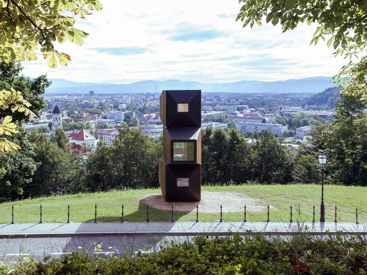
    At Ljubljana Castle, three wooden rooms stack into a slender tower, their angular ends pointing toward the city. This built installation from 2017 demonstrates Living Unit, a modular architecture system developed by OFIS Arhitekti with C+C, C28, structural engineers AKT II, and contractor Permiz. The idea begins with a small, repeatable wooden shell. Each basic module measures 4.5 meters long, 2.5 meters wide, and 2.7 meters high, roughly 14.8 by 8.2 by 8.9 feet. Designed to accommodate two peo
     

Tiny Wooden Living Units Stack Into a Three-Story Tower

3 novembre 2026 à 16:30

At Ljubljana Castle, three wooden rooms stack into a slender tower, their angular ends pointing toward the city. This built installation from 2017 demonstrates Living Unit, a modular architecture system developed by OFIS Arhitekti with C+C, C28, structural engineers AKT II, and contractor Permiz. The idea begins with a small, repeatable wooden shell.

Each basic module measures 4.5 meters long, 2.5 meters wide, and 2.7 meters high, roughly 14.8 by 8.2 by 8.9 feet. Designed to accommodate two people, it can hold a double bed, wardrobe, table, and chairs, with provision for a bathroom and kitchenette. Those are compact cabin dimensions, rather than the proportions of a conventional apartment.

Designer: OFIS Arhitekti

The useful move is allowing that initial room to become part of something larger. Modules can connect horizontally or vertically, with combinations intended to accommodate four to six occupants. A single cabin might suit a short stay; several connected shells allow the domestic functions to spread out. The system therefore offers different arrangements without requiring an entirely different building vocabulary.

Its pointed geometry gives the project much of its character. The ends taper into truncated pyramids, with glazing at their tips. AKT II explains that these projecting forms add internal storage space while expressing the structure’s strength. Seen from outside, the alternating projections make the stacked version read as individual rooms, rather than one uninterrupted shaft.

Behind that silhouette is a prefabricated timber frame reinforced with plywood boards on both sides. The architects allow the exterior and interior finishes to change according to context. That distinction matters: the repeated element is the structural shell, not a compulsory decorative package. Different settings need not receive an identical-looking cabin simply because they share its underlying construction.

Ground connections are similarly adaptable. The units can be secured using steel anchors or removable concrete cubes instead of permanent foundations. The team proposes uses including holiday cabins, research accommodation, tourism, and shelter. These are intended applications, though, rather than proof that one specification will perform equally well across every climate and terrain.

The castle installation gives the system another role: a temporary library, with books organized across its levels and nearby outdoor areas intended for reading. It’s a useful demonstration of how the same shell can support a public program rather than accommodation. Here, the architecture supplies a small vertical destination within an existing landscape.

The sectional drawings also expose the compromise behind the tower’s small footprint. Compact steps and ladders connect its levels, making circulation an active part of occupying the stack. Horizontal expansion would avoid that particular arrangement but require more ground. Living Unit’s strongest proposition is this choice: repeat the room, then decide where the extra space should go.

The post Tiny Wooden Living Units Stack Into a Three-Story Tower first appeared on Yanko Design.

  • ✇Yanko Design
  • This 400-Square-Foot Tiny Cabin Opens Onto a Full-Width Porch
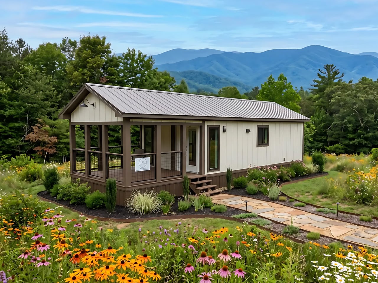
    The Wildflower makes room for something tiny homes can easily squeeze out: a proper front porch. Built by South Carolina’s Sweet-Haus Tiny Cabin Company, this 400-square-foot park model pairs one bedroom and one bathroom with a covered outdoor sitting area. It’s an available model, starting at $115,000, with a layout that keeps daily life on one level. That porch spans the cabin’s width, sitting beneath the same gabled roof as the enclosed rooms. In the builder’s photographs, timber-toned posts
     

This 400-Square-Foot Tiny Cabin Opens Onto a Full-Width Porch

3 novembre 2026 à 13:20

The Wildflower makes room for something tiny homes can easily squeeze out: a proper front porch. Built by South Carolina’s Sweet-Haus Tiny Cabin Company, this 400-square-foot park model pairs one bedroom and one bathroom with a covered outdoor sitting area. It’s an available model, starting at $115,000, with a layout that keeps daily life on one level.

That porch spans the cabin’s width, sitting beneath the same gabled roof as the enclosed rooms. In the builder’s photographs, timber-toned posts and dark mesh railings frame an outdoor sofa and chairs. Trex composite decking is specified for the floor. Giving outdoor furniture its own sheltered zone means the indoor living room doesn’t have to accommodate every gathering when the weather cooperates.

Designer: Sweet-Haus Tiny Cabin Company

Inside, the photographed cabin has pale horizontal wall paneling, muted green cabinetry, and a wood ceiling that follows the roof’s pitch. The contrast gives the upper half of the room a stronger visual presence without covering every surface in dark timber. A breakfast counter provides seating beside the kitchen, leaving the opposite side available for a sofa, coffee table, and a large window.

The published floor plan places the bedroom at the rear, beyond the kitchen, with the bathroom tucked alongside the route between them. A stacked washer and dryer occupy a dedicated position near the bedroom closet, while the bathroom includes a shower labeled 60 inches wide. A separate bedroom means going to bed doesn’t require converting the shared living area into a sleeping space each night.

Storage gets more attention than the footprint might suggest. Sweet-Haus lists a built-in pantry and two full closets, plus an electric fireplace feature wall with concealed storage. That last detail is particularly useful: a decorative focal point also earns its floor area by holding things. Custom soft-close cabinetry continues the approach, keeping everyday necessities behind doors rather than on display.

The construction package includes LP SmartSide siding, metal roofing, Low-E argon-filled windows, and a mini-split HVAC system. Buyers can choose finishes and explore upgrades, including a screened porch or built-in bed with nightstands. Those choices matter in a small cabin, where adding permanent furniture can settle the layout early. The photographs show one interpretation, rather than a fixed palette every buyer must accept.

The starting price covers the cabin, not a finished property. Delivery, setup, skirting, steps, and upgrades are separate charges, and Sweet-Haus says buyers must confirm local placement and occupancy rules for its park models. Land and utility preparation also need their own budget. Within those limits, the Wildflower’s most convincing decision is straightforward: it preserves a private bedroom, useful storage, and somewhere sheltered outside to sit, instead of making every activity compete for the same limited patch of indoor floor.

The post This 400-Square-Foot Tiny Cabin Opens Onto a Full-Width Porch first appeared on Yanko Design.

  • ✇Yanko Design
  • Old Bamboo Scaffolding Becomes a Retreat, but Not Forever
    The bamboo in Macau’s Bamboo Pagoda had already worked on construction sites before becoming a place to take a breather. I like that reversal. Scaffolding typically helps build the destination; here, it became the destination. Conceived as a temporary waterfront refuge, the pavilion addressed a familiar urban problem: having somewhere to go doesn’t necessarily mean having somewhere to pause. Its ambition was to give people that room. Designed by Impromptu Projects, the Macau practice led by Rit
     

Old Bamboo Scaffolding Becomes a Retreat, but Not Forever

3 novembre 2026 à 05:15

The bamboo in Macau’s Bamboo Pagoda had already worked on construction sites before becoming a place to take a breather. I like that reversal. Scaffolding typically helps build the destination; here, it became the destination. Conceived as a temporary waterfront refuge, the pavilion addressed a familiar urban problem: having somewhere to go doesn’t necessarily mean having somewhere to pause. Its ambition was to give people that room.

Designed by Impromptu Projects, the Macau practice led by Rita Machado and João Ó, Bamboo Pagoda stood approximately 43 feet tall along Sai Van Lake. Its roughly 270-square-foot footprint was modest for something with that much vertical presence. Organized by Ephemera Public Space Cooperative, the built installation had a short October 2026 program ending October 11. Permanence was never part of the brief.

Designer: Impromptu Projects (photos by Tang Kuok Hou, Gonçalo Lobo Pinheiro)

The structure borrowed from traditional pagoda geometry, rising from an octagonal base and tapering upward. Slender bamboo poles formed its exposed structural frame, joined using traditional scaffolding lashings. That construction gives the design its strongest architectural idea: the connections and supporting members remain part of the expression. I’d rather understand how a pavilion stands up than have its structure disappear behind a decorative surface. Here, the craft supplied both the framework and the character.

That craft also deserves more attention than a passing reference to tradition. Macau added bamboo scaffolding to its Inventory of Intangible Cultural Heritage in 2017, and local scaffolding contractor Seng Kei Pang Chong worked on the pagoda. Those credits matter. Architectural heritage depends on people who know how to make things, not simply designers who appreciate their appearance. Giving those skills a public-facing role strikes me as a meaningful way to keep them relevant.

A semi-translucent bamboo-fabric skin wrapped the frame, filtering daylight rather than enclosing it behind an opaque wall. The material choice makes sense for a place intended for contemplation: it establishes a boundary without treating the waterfront as something to shut out. I wouldn’t confuse that intention with proven acoustic quiet or weather protection. The more convincing proposition is spatial, giving visitors a defined place to stop beside the water.

Underfoot, the material story took an unexpected turn. Macau-based Zence Object Technology, also known as CHAZENCE, supplied composite floor panels made with recycled tea waste and discarded wood chips. Tea waste is an appealing detail, but its use as flooring is what makes it interesting. Here, a byproduct became part of a usable architectural surface. That’s a more substantial design decision than adding a recycled-material accent for visitors to admire and then forget.

Solar panels also powered the installation’s spotlights, according to local reporting. Alongside the previously used bamboo and tea-waste flooring, that gave the environmental intentions some specific substance. Still, those choices don’t establish the project’s total carbon footprint or prove that every component avoided waste. I find the individual decisions persuasive enough without asking them to support a sweeping sustainability claim. Knowing where a material came from is a useful place to start.

The brief lifespan is the tradeoff I’m less ready to romanticize. The public program lasted only a week, which limits the everyday usefulness of a space created for people to pause. A temporary pavilion can’t substitute for lasting access to welcoming public places. But it can make a proposal tangible. Instead of leaving the idea of a contemplative waterfront space in a planning document, the organizers gave visitors an actual structure to enter.

For me, Bamboo Pagoda’s appeal rests in the relationship between its scale and its purpose. A tower about 43 feet tall sounds like an attention-seeking gesture, yet the stated invitation was simply to stop and reconnect with the waterfront. The reused poles, visible construction, and small floor area kept that invitation grounded in a particular place and building culture. I’d like more public design to make room for an activity as undemanding as taking a pause.

The post Old Bamboo Scaffolding Becomes a Retreat, but Not Forever first appeared on Yanko Design.

  • ✇Yanko Design
  • This 400-Square-Foot A-Frame Tiny Home Makes Room for a King-Size Bed and a Soaking Tub
    A king-size bed and a freestanding soaking tub are generous starting points for a 400-square-foot cabin. Zook Cabins’ A-Frame Studio makes both central to its layout, giving this compact retreat priorities closer to a hotel suite than a miniature family house. Designed for vacation getaways and short-term rentals, it’s an existing park-model product, with completed installations including one at Congaree and Penn in Jacksonville, Florida. The floor plan keeps sleeping, cooking, and lounging tog
     

This 400-Square-Foot A-Frame Tiny Home Makes Room for a King-Size Bed and a Soaking Tub

2 novembre 2026 à 20:30

A king-size bed and a freestanding soaking tub are generous starting points for a 400-square-foot cabin. Zook Cabins’ A-Frame Studio makes both central to its layout, giving this compact retreat priorities closer to a hotel suite than a miniature family house. Designed for vacation getaways and short-term rentals, it’s an existing park-model product, with completed installations including one at Congaree and Penn in Jacksonville, Florida.

The floor plan keeps sleeping, cooking, and lounging together in one open room, with the bathroom enclosed at the opposite end from the glazed facade. There’s no loft ladder between the bed and a midnight bathroom trip. A sofa and chair occupy the window end, while the king-size bed sits farther back beside a wardrobe. Keeping those activities on one level avoids making daily circulation depend on climbing or rearranging furniture.

Designer: Zook Cabins

That arrangement also leaves a clear relationship between the sitting area and the large A-shaped window. In Zook’s published imagery, the glazing follows the pointed front profile, framed by a dark exterior. The cabin’s sides retain vertical walls beneath the roof, rather than carrying the slope down to the ground. Visually, it delivers the recognizable A-frame silhouette without turning the entire interior into a triangular tunnel.

The kitchenette stays compact, with an undercounter refrigerator, a two-burner electric cooktop, and a stainless steel sink set into a quartz countertop. Birch cabinetry has integrated bevel-edge handles, keeping projections off the cabinet fronts. Beside it, a built-in surface serves as either a desk or a dining table for two. Sharing that surface makes sense here: a separate workspace would compete directly with the open floor area around the bed.

The bathroom receives an unusually substantial allocation of space. Zook’s published plan labels it at 80 square feet, accommodating a separate shower and tub rather than asking one fixture to perform both jobs. Specifications include a tiled curbless shower with a glass door, a 59-inch freestanding tub, and a wall-mounted vanity. It’s a deliberate tradeoff: more room for bathing means less space available for another enclosed sleeping area.

Its transportable construction still requires a prepared destination. Zook specifies a compacted gravel pad or concrete slab, along with electrical, water, and wastewater connections. The company distinguishes its park-model RV standards from local building-code compliance, so prospective owners need to establish what their site permits before ordering. Delivery doesn’t remove those responsibilities, and the cabin shouldn’t be mistaken for an off-grid shelter ready to occupy anywhere.

For a couple’s retreat, the layout’s restraint is its strongest quality. It spends limited space on a bed, somewhere to sit, and a bathroom worth lingering in, rather than maximizing the number of overnight occupants.

The post This 400-Square-Foot A-Frame Tiny Home Makes Room for a King-Size Bed and a Soaking Tub first appeared on Yanko Design.

  • ✇Yanko Design
  • This Tiny Home Wraps Its Living Room in Glass and Keeps the Main Bedroom Downstairs
    Tall, divided windows wrap around Leah’s living room, giving this small home the appearance of a glazed garden pavilion. Offered by Swedish builder Vagabond Haven, the modular design combines an open living area with a separate downstairs bedroom and a sleeping loft. The company’s illustrations show a cottage-like interior, with white paneling, pale wood tones, and space for conventional furniture. Leah measures 12 meters long and 3.45 meters wide, with a stated living area of 52 square meters,
     

This Tiny Home Wraps Its Living Room in Glass and Keeps the Main Bedroom Downstairs

28 octobre 2026 à 13:20

Tall, divided windows wrap around Leah’s living room, giving this small home the appearance of a glazed garden pavilion. Offered by Swedish builder Vagabond Haven, the modular design combines an open living area with a separate downstairs bedroom and a sleeping loft. The company’s illustrations show a cottage-like interior, with white paneling, pale wood tones, and space for conventional furniture.

Leah measures 12 meters long and 3.45 meters wide, with a stated living area of 52 square meters, approximately 560 square feet, including the loft. It accommodates four sleepers. This isn’t a towable retreat: its timber structure sits on a steel chassis without wheels, and transportation requires a low-bed truck and crane. Choosing a site means planning for that delivery.

Designer: Vagabond Haven

The exterior uses vertical Thermopine siding beneath a steel-sheet roof. Vagabond Haven specifies 20 centimeters of mineral wool insulation in the walls and roof, alongside triple-glazed windows. Visually, the most consequential decision is concentrating the largest windows around the living area. That treatment gives the shared space a distinct identity, while smaller openings punctuate the more private rooms.

Inside, the illustrated kitchen follows an L-shaped arrangement, with a sink beneath a window and cabinetry extending around the corner. A freestanding dining table seats four beside the tall glazing. Keeping the table separate from the counter provides a dedicated eating surface, though it also occupies circulation space. Appliances and furnishings are configurable, so the pictured arrangement shouldn’t be mistaken for the base specification.

A corridor connects the communal area to the bathroom and main bedroom at the opposite end. That separation is useful: the bed doesn’t have to share the same open room as dinner, television, or visitors. The bedroom illustration includes a double bed, wardrobes, shelving, and a desk. Crucially, the primary sleeping space is downstairs, making the staircase optional for an owner’s nightly routine.

Upstairs, the loft is reached by stairs with integrated cabinets. The illustrated arrangement places a low bed beneath the pitched ceiling, with a desk nearby. Headroom remains the compromise here, particularly toward the roof edges. Roof windows are optional. Downstairs, bathroom choices include a glazed shower, washing machine provision, and flushing, composting, or incinerating toilets.

Leah costs approximately $66,300 unfurnished, $77,500 fully furnished, or $93,100 fully off-grid, excluding VAT. Those distinctions matter when budgeting: the lowest figure isn’t the illustrated, equipped interior. Leah’s strongest spatial choice is giving everyday living and the main bedroom proper downstairs rooms, while reserving the low-ceilinged loft for whoever actually wants to climb upstairs.

The post This Tiny Home Wraps Its Living Room in Glass and Keeps the Main Bedroom Downstairs first appeared on Yanko Design.

  • ✇Yanko Design
  • This 484-Square-Foot Tiny Home Fits Two Bedrooms Without a Loft
    The Helena makes a straightforward case for keeping a tiny home on one floor: both bedrooms are reached through ordinary doors, with no loft ladder involved. Offered by Swedish manufacturer Vagabond Haven, this configurable modular home provides 45 square meters, roughly 484 square feet, of living space. Its layout gives sleeping, cooking, and relaxing their own clearly defined places. Measuring 9.2 meters long and 5.98 meters wide, Helena occupies a broader footprint than its compact appearanc
     

This 484-Square-Foot Tiny Home Fits Two Bedrooms Without a Loft

27 octobre 2026 à 19:30

The Helena makes a straightforward case for keeping a tiny home on one floor: both bedrooms are reached through ordinary doors, with no loft ladder involved. Offered by Swedish manufacturer Vagabond Haven, this configurable modular home provides 45 square meters, roughly 484 square feet, of living space. Its layout gives sleeping, cooking, and relaxing their own clearly defined places.

Measuring 9.2 meters long and 5.98 meters wide, Helena occupies a broader footprint than its compact appearance might suggest. There are no wheels underneath its steel base. Delivery requires a low bed truck and a crane, and the house needs a foundation. That makes it a home to settle into, rather than something to hitch up for a weekend away.

Designer: Vagabond Haven

Vagabond Haven’s illustrations show pale vertical timber siding beneath a shallow pitched metal roof. Large glazed sections punctuate the facade, while a proposed terrace wraps around the exterior. The relatively plain rear elevation makes the contrast noticeable: Helena directs its biggest openings toward the outdoor living areas. The images are illustrative, so finishes and details can vary with the order.

Inside, the floor plan divides the house into a shared living zone and two enclosed bedrooms. The bathroom sits between the lounge and primary bedroom, while the entrance opens beside the smaller bedroom. This arrangement keeps the lounge out of the main arrival route. A dining table occupies the glazed corner near the kitchen, giving meals a dedicated spot without introducing another room.

The kitchen follows an L-shaped arrangement, with cabinetry defining its edge rather than a separate partition. Buyers can specify induction or gas cooking, an oven, a built-in dishwasher, and a tall integrated refrigerator. These are configuration choices, not equipment to assume comes with the starting price. The illustrated dining setup seats four, despite the home’s stated three sleeping places.

The primary bedroom accommodates a double bed, with optional lifting frames offering storage beneath the mattress. The smaller room can combine a single bed with a desk and wardrobe, making its footprint useful beyond sleeping hours. Bathroom choices include a glazed corner shower, washing machine provision, and several toilet systems. Underfloor heating is optional too, rather than a standard inclusion.

Vagabond Haven lists mineral wool insulation measuring 20 centimeters in the walls and 25 centimeters in the roof, alongside triple glazing. Helena starts at approximately US$91,200 unfurnished, rising to US$102,400 fully furnished or US$117,500 for the off-grid version, all excluding VAT. Helena’s appeal rests in its allocation of space: two private bedrooms without sacrificing the ground-floor living area. The cost is a wider, permanently sited footprint.

The post This 484-Square-Foot Tiny Home Fits Two Bedrooms Without a Loft first appeared on Yanko Design.

  • ✇Yanko Design
  • This Spanish Home Uses Curved Roofs and Cork Walls to Stay Naturally Cool
    Some houses make their presence known through bold shapes, while others seem to grow naturally from the landscape.  Casa Vereda, designed by L’Aura Ortín Architecture For Happiness, finds a balance between the two. Set in the Spanish countryside, the residence draws inspiration from regional construction traditions, agricultural heritage, and Mediterranean living. Its curved roofs, earthy materials, and distinctive green shutters give the home a contemporary identity that feels rooted in its su
     

This Spanish Home Uses Curved Roofs and Cork Walls to Stay Naturally Cool

25 octobre 2026 à 18:30

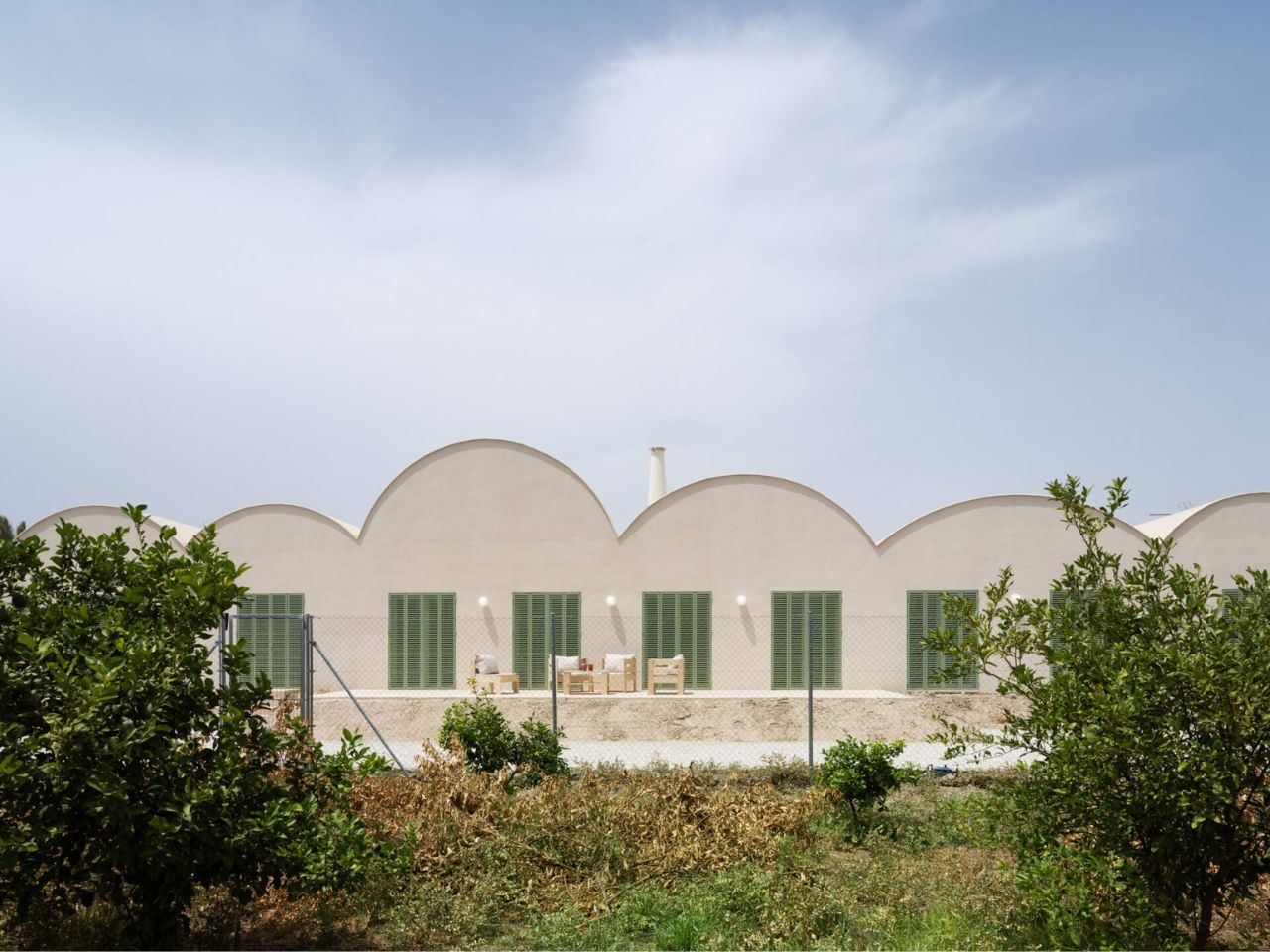
Some houses make their presence known through bold shapes, while others seem to grow naturally from the landscape.  Casa Vereda, designed by L’Aura Ortín Architecture For Happiness, finds a balance between the two. Set in the Spanish countryside, the residence draws inspiration from regional construction traditions, agricultural heritage, and Mediterranean living. Its curved roofs, earthy materials, and distinctive green shutters give the home a contemporary identity that feels rooted in its surroundings.

The architecture is defined by a succession of curved rooflines that ripple across the long, low structure. Constructed using traditional Catalan vaulting techniques and handcrafted bricks, these sculptural forms reference a building method deeply embedded in Spanish architectural history. The exterior is finished in pale sprayed cork, creating a continuous texture across the walls and roof while helping regulate temperature and moisture.

Designer: L’Aura Ortín Architecture For Happiness

A row of tall, leaf green shutters adds a vibrant contrast to the neutral facade. Inspired by traditional Mallorcan designs, the shutters were custom-designed by the architects and made from powder-coated aluminum to provide shade, privacy, and security. Surrounded by vegetation, the house takes on an almost agricultural appearance, recalling the farm buildings and cultivated terraces that characterize the region.

Alongside the residence, a spacious patio paved with handcrafted terracotta tiles creates an inviting outdoor gathering space. The earthy flooring references the area’s agricultural heritage, while large glass doors connect the terrace directly to the interiors. Adjustable shutters help control sunlight throughout the day, making the transition between indoors and outdoors comfortable even during warmer months.

Inside, the living room unfolds beneath a dramatic Catalan vaulted ceiling made from handcrafted bricks in varying shades of terracotta, pink, and sandy beige. The exposed brick brings warmth and texture to the spacious interior, contrasting with smooth white walls and polished terrazzo flooring. Beyond its appearance, the terrazzo contributes to passive temperature regulation by absorbing warmth from the winter sun and staying cool during summer when the shutters are closed.

Modular sofas and ottomans upholstered in rust colored fabric form a comfortable seating arrangement around a simple pine coffee table. A freestanding black fireplace separates the lounge from the dining area without interrupting the open layout. Tall glass doors flood the space with daylight, while cherry-toned timber doors and pale wooden cabinets complete the warm material palette.

The adjoining dining area features a long, pale timber table paired with matching chairs and benches. A simple white dome pendant hangs overhead, while a low wooden sideboard provides storage along the wall. The exposed brick ceiling stretches across the space, adding character to an otherwise minimal setting.

Beside the dining room, the kitchen introduces richer tones through pine cabinetry lacquered in a cherry finish. The reddish wood contrasts with light colored countertops, while a long island provides additional workspace and casual seating with timber stools. Integrated appliances and streamlined cabinetry maintain a clean appearance, allowing the natural materials and vaulted ceiling to remain the focal points.

The bedrooms continue the home’s restrained aesthetic, with exposed brick vaults, white walls, pale terrazzo floors, and natural timber furniture. Unlike the communal areas, these rooms have lower ceilings that create a more intimate atmosphere while making them easier to heat and cool. In the main bedroom, a simple wooden bed is accompanied by a floating bedside table, neutral bedding, and a full-length mirror. The second bedroom features a single timber bed, a compact desk, and a matching wardrobe, with a mustard colored throw adding a subtle pop of color. Glass doors fitted with slatted shutters provide natural light and ventilation while allowing occupants to adjust privacy and shade.

The bathrooms introduce a softer palette through pale gray rectangular wall tiles, warm pink cabinetry, and terracotta colored vessel sinks. One features a floating vanity with a white countertop and round mirror, while the other includes a wider vanity and a large rectangular mirror reflecting the walk-in shower opposite. Contemporary fixtures and minimal glass detailing keep the spaces open and bright, with exposed brick ceilings maintaining continuity throughout the interiors.

Architectural drawings reveal a long, single-story layout organized around everyday functionality. A two-car garage occupies one end, the open living, dining, and kitchen spaces form the center, and the bedrooms and bathrooms sit toward the opposite end. The communal spaces open directly onto the generous terrace, strengthening the home’s relationship with its garden and surroundings.

Casa Vereda finds its charm in the thoughtful reinterpretation of familiar architectural elements. The curved brick vaults, Mallorcan-inspired shutters, terracotta surfaces, and cork exterior serve practical purposes while giving the residence a distinctive identity. Through a careful balance of traditional craftsmanship, passive climate strategies, and contemporary interiors, L’Aura Ortín Architecture For Happiness has created a home that feels entirely at ease with its rural Mediterranean setting.

The post This Spanish Home Uses Curved Roofs and Cork Walls to Stay Naturally Cool first appeared on Yanko Design.

  • ✇Yanko Design
  • Bellavista 11 Folds Thin White Concrete Planes Down an Ibiza Hillside Toward the Sea
    Bellavista 11 makes a hillside feel like the starting point of a home rather than a problem to solve. Designed by Fran Silvestre Arquitectos in Roca Llisa, Ibiza, the villa descends toward the Mediterranean through a sequence of white horizontal planes. Its most striking feature is not its size or its pool, but the way its roofs, floors, and terraces appear to belong to one continuous architectural gesture. The house is the first completed residence in The Roca Views, a development of six homes
     

Bellavista 11 Folds Thin White Concrete Planes Down an Ibiza Hillside Toward the Sea

25 octobre 2026 à 13:20

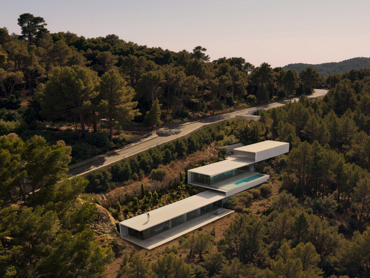
Bellavista 11 makes a hillside feel like the starting point of a home rather than a problem to solve. Designed by Fran Silvestre Arquitectos in Roca Llisa, Ibiza, the villa descends toward the Mediterranean through a sequence of white horizontal planes. Its most striking feature is not its size or its pool, but the way its roofs, floors, and terraces appear to belong to one continuous architectural gesture.

The house is the first completed residence in The Roca Views, a development of six homes by the studio. Across three low volumes, the arrangement follows the slope: arrival and garage at the top, shared living spaces in the middle, and five bedrooms below. This descending organization gives the building a legible rhythm, breaking its mass into layers rather than presenting one tall facade to the hillside.

Designer: Fran Silvestre Arquitectos

The defining white concrete plane is just 15 centimeters thick, approximately six inches. Its folds establish roof terraces above the lower volumes and extend outward to shelter outdoor areas. The appeal lies in this double duty: the geometry that gives the villa its identity also helps organize daily life around sun, shade, and time outside.

The central living level brings the kitchen, dining area, and lounge together beside the swimming pool. Full-height sliding glass doors use slender frames and concealed tracks to keep the threshold visually quiet. Open, they connect the rooms to their terraces; closed, they retain the expansive outlook. Below, the bedroom volume faces another outdoor seating area, giving the quieter part of the house its own relationship with the surrounding landscape.

Inside, the material palette softens the precision of the exterior. White walls sit alongside natural stone flooring, oak, and stretched textile ceilings, as detailed by the developer. These surfaces give sunlight different textures to move across, allowing warmth without relying on a busy mix of finishes. In the main bedroom, a private terrace extends the room outward, while motorized curtains offer control over daylight and privacy.

There is a practical counterpoint to all this apparent effortlessness: a house arranged down a slope moves to levels part of everyday living. The developer lists an elevator among the villa’s features, an important detail within such a strongly stepped plan. The project is therefore more interesting as a carefully organized hillside home than as an image of minimalism alone.

Bellavista 11 works best when its sculptural clarity is understood through those ordinary experiences: arriving, descending, opening a door, or finding shade beside the pool. The white planes provide a consistent frame, but the changing Mediterranean light and distant sea supply the variation. Its restraint gives the landscape room to remain the most compelling presence in the house every day.

The post Bellavista 11 Folds Thin White Concrete Planes Down an Ibiza Hillside Toward the Sea first appeared on Yanko Design.

  • ✇Yanko Design
  • Lavvu’s Tiny Home Has a Bathtub and Hidden Storage
    A full-size bathtub is a wonderfully stubborn thing to put inside a tiny home. Lavvu includes one in its published XL specification, despite having only about 237 square feet to work with. That choice gets straight to the problem these modular homes tackle: shrinking a dwelling without making everyday life feel like a series of concessions. I like that the answer leaves room for a soak. Lavvu offers four sizes, from roughly 108 to 237 square feet, with the XL credited to architecture studio Re:
     

Lavvu’s Tiny Home Has a Bathtub and Hidden Storage

25 octobre 2026 à 07:40

A full-size bathtub is a wonderfully stubborn thing to put inside a tiny home. Lavvu includes one in its published XL specification, despite having only about 237 square feet to work with. That choice gets straight to the problem these modular homes tackle: shrinking a dwelling without making everyday life feel like a series of concessions. I like that the answer leaves room for a soak.

Lavvu offers four sizes, from roughly 108 to 237 square feet, with the XL credited to architecture studio Re:Büro. The company is promoting the range for preorder, an important distinction between an appealing design and an immediately available place to live. These are furnished homes, but buyers shouldn’t assume that every size includes every feature shown in the company’s presentation. The XL is the clearest expression of the idea.

Designer: Lavvu

In the promotional imagery, rounded corners and vertically ribbed exterior surfaces give the cabins a slightly retro, almost transportation-inspired appearance. Inside, wood-toned surfaces soften that impression. The large glazed end is the visual centerpiece, framing the landscape rather than leaving it outside a small window. I prefer this approach to making a tiny house resemble a miniature suburban one. The proportions acknowledge that you’re occupying a compact space, while giving your eyes somewhere farther away to land.

The kitchen makes a more practical argument. Lavvu specifies a built-in refrigerator, dishwasher, and two-burner induction cooktop, along with a sliding island that adjusts to provide seated legroom or accommodate standing use. That movable surface is a detail I appreciate. A fixed counter has to commit to one relationship with your body. Letting it shift recognizes that breakfast, food preparation, and moving through a narrow room don’t all require the same arrangement. Small spaces need that kind of flexibility more than another decorative flourish.

Storage gets similar attention. The published XL description includes drawers beneath the bed, nearby shelves, and a wardrobe with hanging space and dedicated shoe storage. These aren’t especially glamorous features, which is precisely why they matter. I’m more persuaded by a place to put yesterday’s clothes than by an immaculate room with no visible possessions. Built-in storage gives the design a plausible way to absorb ordinary belongings, although it doesn’t remove the need to edit what you own.

All that glass makes the setting a meaningful part of the design decision, too. The imagery places the cabins beside water and trees, where openness is the attraction. I’d be less enthusiastic about the same arrangement facing a neighbor’s kitchen. For me, the panoramic end makes the most sense as a retreat with a carefully chosen outlook. Privacy deserves as much attention as the view when deciding where one belongs.

“Mobile” also needs a realistic reading here. Lavvu says its homes travel as fully assembled modules on a trailer or flatbed platform. That describes transportable architecture, not a camper you casually hitch up for a weekend. I see the appeal in having the interior assembled before delivery, but the destination still matters. Access arrangements and installation are questions to resolve with the maker, rather than details to mentally crop out of the scenic pictures.

The listed prices reinforce that this is a considered purchase: the smallest S module starts at €45,000, while the XL starts at €75,000, both before tax. Those are the company’s euro-denominated starting prices, not verified delivered prices for an American property. I’d want a site-specific quote, a confirmed equipment list, and delivery details before treating either number as a complete budget. The distinction matters more than a tempting headline price.

For me, Lavvu’s strongest idea is giving small routines enough space to remain recognizable. Sit at a counter with room for your knees. Put shoes away. Keep a book beside the bed. Take a bath if that’s your preferred way to end the day. I wouldn’t mistake this for an easy answer to every housing need, but as a compact retreat, its attention to ordinary domestic habits makes the design worth considering.

The post Lavvu’s Tiny Home Has a Bathtub and Hidden Storage first appeared on Yanko Design.

  • ✇Yanko Design
  • Inside Carl Maston’s Ventura Beach House, Built Around a Brick Chimney
    A substantial brick chimney rises through the center of Carl Maston’s Ventura beach house, giving the oceanfront home a surprisingly grounded heart. Completed in 1984, the Susman House sits above a sandy cove at Faria Beach, with views toward the Channel Islands. Its original brief was appealingly specific: preserve the spirit of a traditional California cabin within a contemporary home. That request came from Tracy “Babs” Susman, who commissioned the house with her partner on land previously o
     

Inside Carl Maston’s Ventura Beach House, Built Around a Brick Chimney

23 octobre 2026 à 18:30

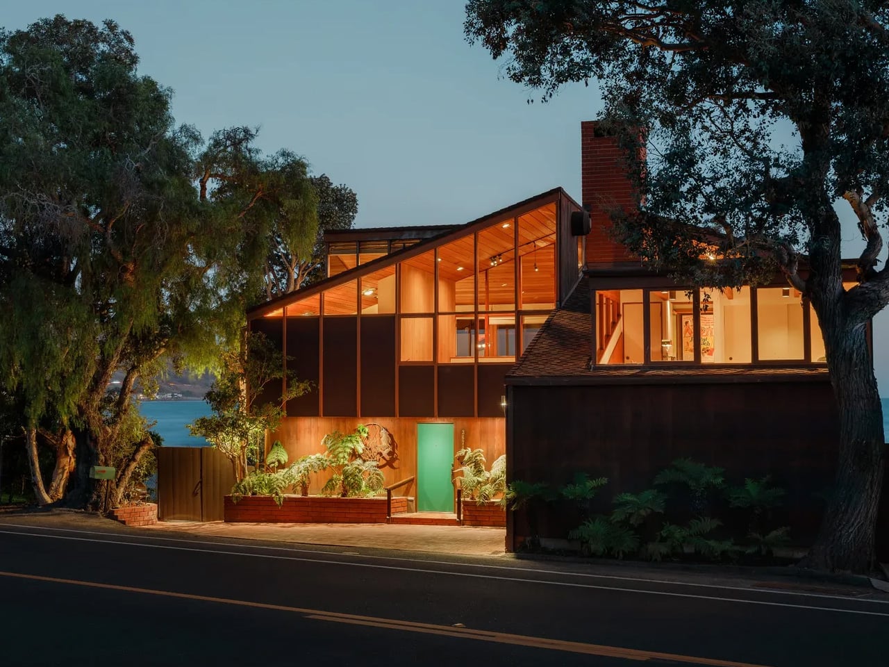
A substantial brick chimney rises through the center of Carl Maston’s Ventura beach house, giving the oceanfront home a surprisingly grounded heart. Completed in 1984, the Susman House sits above a sandy cove at Faria Beach, with views toward the Channel Islands. Its original brief was appealingly specific: preserve the spirit of a traditional California cabin within a contemporary home.

That request came from Tracy “Babs” Susman, who commissioned the house with her partner on land previously owned by her sister and brother-in-law. Maston answered with cedar siding, brick floors, generous glazing, and a roofline that creates a distinctive silhouette. The materials carry the cabin connection without making the house feel like an exercise in rustic nostalgia.

Design: Carl Maston

Across 2,640 square feet, the layout gives shared spaces a clear relationship to both the fireplace and the coastline. An informal lounge connects with the dining area and kitchen, while a double-sided fireplace also serves a den. A full bathroom sits behind a cedar wall. These divisions give the lower floor distinct places to settle without separating every activity into an enclosed room.

The living-room photographs reveal how much work the material palette does. Exposed timber beams establish a steady rhythm overhead, while brick flooring extends around the broad hearth. Wood paneling and shelving reinforce the sense of enclosure. Against that textured interior, the glazed openings become especially legible: they frame the coast while leaving plenty of solid, tactile surfaces around the seating area.

Floor-to-ceiling sliding doors open toward the ocean, and the brick paving continues onto the patio. Carrying the floor material outside gives the terrace a direct visual relationship with the rooms behind it. The kitchen keeps its own character through an original wood-slat ceiling, with a view of the bay available from the sink. Even the more ordinary household tasks have a place along the waterfront.

Upstairs, three bedrooms and a separate sitting area occupy the spaces beneath the sloping roof. A central atrium and landing wrap around the brick chimney, with internal glazing allowing light to reach deeper into the house. Rather than treating circulation as leftover space, Maston makes the route between rooms part of the architectural experience, linking the upper level visually with the living area below.

Photographs show timber-framed internal windows beside the chimney, their angular tops following the roof. That arrangement makes the building’s geometry readable from within. The house is currently listed for $5.1 million, and its selling appeal extends beyond the waterfront address. Maston gave the interior enough substance to hold attention even when the ocean is outside the frame.

The post Inside Carl Maston’s Ventura Beach House, Built Around a Brick Chimney first appeared on Yanko Design.

  • ✇Yanko Design
  • Hangzhou’s glowing glass museum takes its cues from 5,000-year-old jade
    Most museums are designed like very expensive shoeboxes. Art hates sunlight, so architects seal the walls, bolt on some skylights, and call it a day. Aedas went the other direction in Hangzhou and wrapped an entire museum in glass, then twisted it into two interlocking rings for good measure. The Yohoo Museum sits on an island in an artificial lake, glowing like a piece of polished jade, which is exactly the point. The shape is borrowed from the ritual jade rings of the Liangzhu culture, a Neol
     

Hangzhou’s glowing glass museum takes its cues from 5,000-year-old jade

20 octobre 2026 à 20:30

Most museums are designed like very expensive shoeboxes. Art hates sunlight, so architects seal the walls, bolt on some skylights, and call it a day. Aedas went the other direction in Hangzhou and wrapped an entire museum in glass, then twisted it into two interlocking rings for good measure. The Yohoo Museum sits on an island in an artificial lake, glowing like a piece of polished jade, which is exactly the point. The shape is borrowed from the ritual jade rings of the Liangzhu culture, a Neolithic civilization that thrived in this part of China around 5,000 years ago.

Ken Wai, Global Design Principal at Aedas, led the design of the 57,650-square-foot (5,356-square-meter) building, completed in 2024 inside Liangzhu Yohoo Park (that’s Yohoo, not Yahoo the search engine. I know, I made that mistake too). The glass is a translucent multilayer laminate Aedas calls “emerald glass,” and it filters daylight into a soft, even wash across the galleries. A steel frame lets the ends of the rings lift off the ground with no visible support, creating covered plazas underneath. The project won Architectural Design of the Year and a Gold in the Cultural category at the International Design Awards, a juried global competition for built work.

Designers: Aedas, Ken Wai

Liangzhu jade comes in two signature shapes, the bi and the cong. The bi is a flat disc with a hole in the center, while the cong is a chunky tube that’s square outside and round inside. Later Chinese tradition read the bi as heaven and the cong as earth, and archaeologists say both starred in royal ceremonies honoring the sky. Each of the museum’s rings wraps around an open void, and Aedas frames these circular light wells as a link between heaven and earth. From above, the voids read like the drilled centers of two bi discs, and the squared-off island underneath does a decent cong impression if you squint.

Aedas says the two interlocking rings stand for two separate heritages, Liangzhu culture and the Grand Canal. The lake around the island connects to that canal, a roughly 1,100-mile (1,776-kilometer) waterway whose oldest sections date back more than 2,500 years. Hangzhou sits at its southern end, and the canal is largely what turned the city from a sleepy town into a booming trade hub. UNESCO listed the canal in 2014 and the Liangzhu ruins in 2019, so the building is basically two World Heritage sites holding hands. That’s a lot of symbolism for one roofline, but the form carries it so gracefully that I’m happy to play along.

A single steel frame carries the whole building, and Aedas used it to peel both ends up off the ground like the corner of a sticker. Those lifted edges overhang the entrances and shelter a pair of public plazas, which in the photos are getting plenty of use. One shot shows a school group picnicking under the curved soffit while two kids sprint past the camera, presumably fleeing a teacher. The underside is wrapped in smooth white panels, and beneath it a diamond grid of glass slopes down to meet the pavement. The result is a shaded waterfront room open to anyone, whether or not they ever step inside the galleries.

Up top, the galleries sit under a dense white steel diagrid, with translucent glass filling every gap in the structure. Interior photos show a bright, nearly shadowless hall where two visitors look like they’ve wandered into a cloud. The entrance volume uses greener, more jade-toned glass in horizontal bands, so the building’s color shifts depending on which face you’re looking at. American readers might recognize the strategy from Steven Holl’s Bloch Building at the Nelson-Atkins Museum in Kansas City, where translucent channel-glass volumes glow like lanterns. Aedas stretches the idea across a twisting, double-curved envelope, and the firm says parametric modeling kept that geometry efficient to build.

A white boardwalk zigzags across the lake to the museum, swelling into circular viewing pods that repeat the ring motif at walking scale. It’s a slow, wiggly approach, and it hands visitors plenty of different angles on the building before they arrive. A broader bridge links the island to the main park on the other side, where curving paths and a petal-shaped flower garden keep the theme going. Aerial shots also show the less poetic context, with apartment towers and older industrial blocks crowding the shoreline. That backdrop works in the museum’s favor, because a glowing glass knot reads even louder next to rows of identical high-rises.

Yuhang already has one famous lake-bound jade museum. David Chipperfield’s Liangzhu Museum opened in 2008 as four travertine bars set on a lake, linked to the park by bridges, with an exhibition island off to the south. Tadao Ando added a concrete cultural center nearby in 2016. Both architects treated Liangzhu’s heritage as something heavy and permanent, which makes sense for artifacts that spent 5,000 years underground. Aedas kept the same lake, island, and bridge recipe and swapped the stone for light. I keep wondering which version the original jade carvers would prefer, since their whole craft was coaxing a soft glow out of solid stone.


The post Hangzhou’s glowing glass museum takes its cues from 5,000-year-old jade first appeared on Yanko Design.

  • ✇Yanko Design
  • Mini Domy Fits a Kitchen and Bathroom Into This 155-Square-Foot A-Frame Cabin
    A large triangular window fills one end of the Mini Brda With Bay Window, giving this compact cabin a generous outlook. The entrance sits on the side, beneath its own projecting roof section, leaving the glazed end uninterrupted. Offered by Polish company Mini Domy, the design keeps its distinctive A-frame silhouette while making room for more than a bed beneath a pitched roof. The model’s specification lists dimensions of 4.51 by 3.2 meters, giving it a footprint of approximately 155 square fe
     

Mini Domy Fits a Kitchen and Bathroom Into This 155-Square-Foot A-Frame Cabin

20 octobre 2026 à 18:30

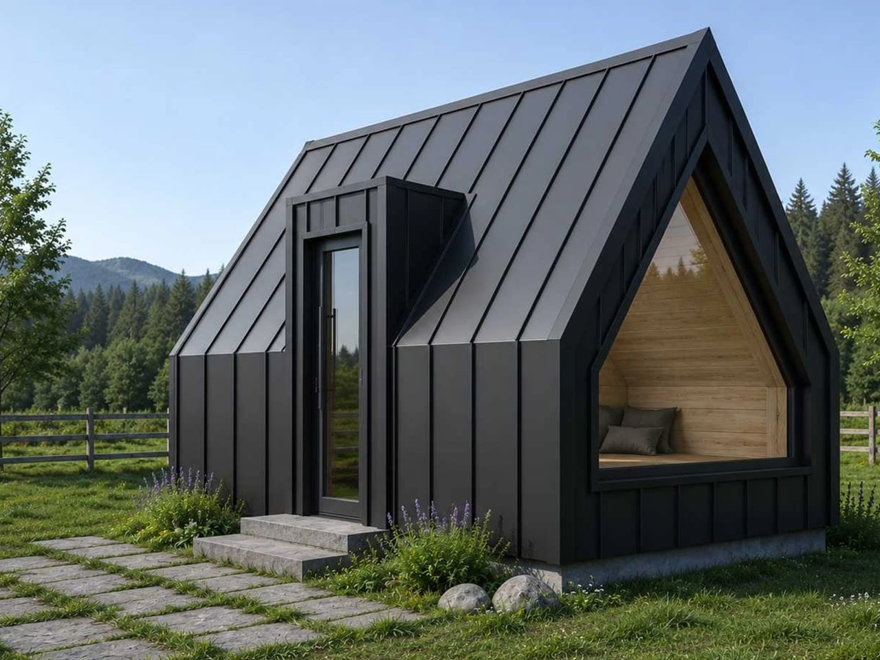
A large triangular window fills one end of the Mini Brda With Bay Window, giving this compact cabin a generous outlook. The entrance sits on the side, beneath its own projecting roof section, leaving the glazed end uninterrupted. Offered by Polish company Mini Domy, the design keeps its distinctive A-frame silhouette while making room for more than a bed beneath a pitched roof.

The model’s specification lists dimensions of 4.51 by 3.2 meters, giving it a footprint of approximately 155 square feet. Dark metal cladding covers the exterior, with pronounced seams emphasizing the steep roof. Those angled surfaces give the cabin its character, although they also make furnishing the edges less straightforward than arranging a conventional rectangular room.

Designer: Mini Domy

Inside, white-painted tongue-and-groove paneling follows the roof slopes, making the geometry visible rather than concealing it behind a flat ceiling. Wood-look flooring introduces a contrasting tone underfoot. Published photographs show the cabin before furnishing is complete, so the interior is best understood through a combination of construction images and the proposed layout.

Most of the accommodation occupies one shared room, combining cooking, lounging, and sleeping. A planned bed doubles as daytime seating, avoiding the floor-space demands of a separate sofa. There’s no sleeping loft or ladder to negotiate. The compromise is privacy: beyond the bathroom, daily activities share the same compact space, with little separation between preparing breakfast and making the bed.

The kitchen specification is modest but useful, listing cabinetry, a sink, and a camping-style stove. That suggests simple holiday cooking rather than an apartment kitchen shrunk to fit. The separate bathroom includes a shower, basin, toilet, and water heater. Photographs show a wall-mounted vanity with drawers, providing storage without taking the cabinet all the way down to the floor.

Mini Domy’s offer specifies 10 centimeters of mineral-wool insulation, double-glazed windows, and air conditioning with a heating function. These are meaningful provisions for a small cabin, but they aren’t enough to establish comfort in every climate. The company itself qualifies year-round use on the broader Mini Brda page with the need for appropriate insulation and heating.

A dedicated trailer is optional rather than integral to the version pictured. The downloadable offer lists the cabin at US$15,000, though it also gives the quotation a two-month validity period without a visible issue date. Buyers should confirm current pricing, equipment, transport, and installation directly rather than treating that figure as a complete project budget. As a weekend retreat, the arrangement makes sense: keep the bathroom enclosed, let furniture do double duty, and reserve the glazed end for the view. Longer stays would make the shared room’s limits harder to ignore.

The post Mini Domy Fits a Kitchen and Bathroom Into This 155-Square-Foot A-Frame Cabin first appeared on Yanko Design.

  • ✇Yanko Design
  • The Tinde Tiny House Gives Its Covered Porch a Dramatic A-Frame Roof
    The Tinde’s most distinctive space sits outside its front door. A steeply pitched roof stretches over a generous covered porch, giving this tiny house the entrance of a woodland cabin. Built by South Carolina’s Sweet-Haus Tiny Cabin Company, the customizable park model measures 48 feet long and 14 feet wide, with a main-floor bedroom, a loft, and a flexible bonus room. That porch gives the home a place to spread out without enclosing every available inch. In the photographed build, pale siding
     

The Tinde Tiny House Gives Its Covered Porch a Dramatic A-Frame Roof

19 octobre 2026 à 19:30

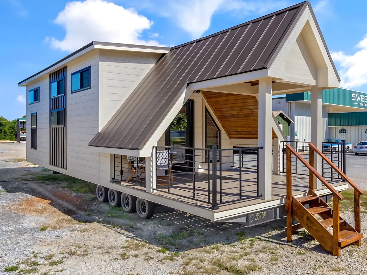
The Tinde’s most distinctive space sits outside its front door. A steeply pitched roof stretches over a generous covered porch, giving this tiny house the entrance of a woodland cabin. Built by South Carolina’s Sweet-Haus Tiny Cabin Company, the customizable park model measures 48 feet long and 14 feet wide, with a main-floor bedroom, a loft, and a flexible bonus room.

That porch gives the home a place to spread out without enclosing every available inch. In the photographed build, pale siding and dark railings frame the deck, while wood lining beneath the roof brings warmth to the entrance. The unusually sharp roofline dominates the front elevation, with a taller, more conventional volume rising behind it to accommodate the interior’s upper level.

Designer: Sweet-Haus Tiny Cabin Company

Inside, the extra width allows a living room furnished with a sofa, coffee table, and separate armchair. A built-in counter with stool seating provides a spot for meals or laptop work without introducing another freestanding table. The arrangement leaves the central floor comparatively open, an important distinction in a home where the living area also handles circulation between the entrance and kitchen.

The kitchen gathers an oven, four-burner propane cooktop, microwave, and refrigerator into a compact working area, supported by overhead and lower cabinetry. Farther back, the bathroom includes a bathtub and shower combination, vanity, and flushing toilet. A separate bedroom keeps the primary sleeping space downstairs, so occupants don’t have to climb to the loft every night. That makes the upstairs accommodation an option rather than a daily obligation.

The bonus room offers the most consequential choice in the floor plan. Sweet-Haus lists potential uses including bunks, laundry, an office, or storage, allowing buyers to prioritize the activity that would otherwise crowd the main living space. The company says the bedroom, loft, and bonus room can accommodate up to six sleepers, depending on configuration. That’s sleeping capacity, rather than six equally private bedrooms.

There are useful distinctions between the available configurations. The bonus room comes as an open space, with single upper-bunk and double-bunk arrangements listed as upgrades. Bathroom options include a tub-shower or a walk-in shower without an upcharge. These decisions matter more than a paint selection: each changes how the limited interior can serve a household, particularly when guests, laundry, and working from home compete for space.

Sweet-Haus currently lists a starting price of $131,000 for the Tinde, while its options page identifies the dramatic A-frame roof as a $15,000 upgrade. Buyers should distinguish the photographed cabin from the base specification. Its appeal is clear: the design devotes substantial space to gathering, indoors and out, while leaving one small room available for whatever the household needs most.

The post The Tinde Tiny House Gives Its Covered Porch a Dramatic A-Frame Roof first appeared on Yanko Design.

  • ✇Yanko Design
  • A Suspended Walkway Leads to This Tiny Cabin Overlooking the Salish Sea
    A cabin this small could easily become an exercise in clever storage. On Blakely Island, Wittman Estes has taken a more interesting approach.  The Seattle-based architecture studio designed a 400-square-foot guest retreat that feels less concerned with proving how much can fit inside and more interested in how little architecture is actually needed to make a place feel complete. Set within Washington’s San Juan Island Archipelago, the cabin occupies a dramatic piece of terrain between a mature
     

A Suspended Walkway Leads to This Tiny Cabin Overlooking the Salish Sea

13 octobre 2026 à 19:30

A cabin this small could easily become an exercise in clever storage. On Blakely Island, Wittman Estes has taken a more interesting approach.  The Seattle-based architecture studio designed a 400-square-foot guest retreat that feels less concerned with proving how much can fit inside and more interested in how little architecture is actually needed to make a place feel complete.

Set within Washington’s San Juan Island Archipelago, the cabin occupies a dramatic piece of terrain between a mature Douglas fir and a large glacial erratic boulder. Beyond the trees lies the Salish Sea. Rather than settling heavily into the rocky shoreline, the structure is lifted above it on slender supports, giving the impression that it has been carefully inserted into the forest rather than constructed over it.

Designer: Wittman Estes

The main studio measures just 16 by 20 feet, drawing from the tradition of simple shelters in the woods, from Thoreau’s Walden Cabin to Le Corbusier’s Cabanon. Yet the interior does not feel particularly austere. A kitchen, bathroom, Murphy bed, living area, and loft with two bunks all occupy the compact volume, each given a precise place within the plan.

The difficulty of the site helped shape the architecture. Blakely Island’s steep, rocky shoreline made conventional construction complicated, particularly if heavy machinery had to pass through the surrounding forest. Many components were therefore fabricated at the contractor’s yard in Everett before being transported to the island by barge. Modular steel frames were then lifted onto a minimal point foundation. Western red cedar siding, milled from trees on the island, was left unfinished so it could gradually weather into the landscape.

That sensitivity continues through the experience of arrival. A narrow suspended metal walkway threads through the trees toward the entrance, allowing views of Thatcher Bay to open gradually between the branches. Powder-coated steel railings line the path and deck, while a simple steel awning shelters the fir entry door.

Inside, the material palette becomes warmer. Birch plywood wraps the walls, fir beams remain exposed overhead, and solid ipe runs underfoot. The restrained finishes allow the view to dominate. Large sliding glass doors face the water, visually extending the living space far beyond its modest footprint.

Near the center of the cabin, a suspended black fireplace rotates through 360 degrees, allowing the fire to face either the interior or the cantilevered deck outside. In warmer weather, the open glass doors effectively turn the deck into another living room. During colder months, the same glazing keeps the forest and water present while the cabin becomes a sheltered place from which to watch the weather change.

Even the fireplace tools have been treated as part of the architecture. Wittman Estes designed a movable steel fire cart that slips neatly into an angled niche nearby. It is a small detail, but an important one in a room where visual clutter could quickly overwhelm the space.

The kitchen follows the same logic. Positioned beneath the sleeping loft, it occupies one of the lowest parts of the cabin, reserving the taller volume for the main living area. A cast-in-place concrete sink and countertop are paired with dark fixtures and discreet integrated appliances. Against the birch plywood and fir, the concrete provides enough contrast to define the kitchen without separating it visually from the rest of the interior.

The living room becomes the primary bedroom when a Murphy bed folds down from the wall. During the day, it nearly disappears, preserving the openness of the studio. At night, the bed faces east toward the morning light, while a felt headboard introduces softness to the otherwise restrained palette of wood, steel, and concrete.

At the northwest corner, the bathroom is given its own relationship with the landscape. A glass corner window looks directly into the surrounding forest, preventing the compact room from feeling enclosed. Above the kitchen, a sleeping loft adds two bunks without expanding the cabin’s footprint, accessed by a custom maple ladder.

This use of vertical space reflects the logic of the entire project. Nothing feels squeezed into an arbitrary corner. Each function occupies the part of the volume where it makes the most sense, while the architecture continues to work around the existing terrain rather than attempting to reorganize it.

What makes the Blakely Island Cabin compelling is not simply how much has been fitted into 400 square feet. Its greater achievement is making those 400 square feet feel secondary to the experience of being there. The folding bed, compact kitchen, and sleeping loft provide efficiency, but the architecture rarely asks you to admire that efficiency.

Instead, it directs attention outward: toward the Douglas fir beside the house, the rock beneath it, the changing weather, and the long stretch of Salish Sea beyond the glass. For a building inspired by the idea of living simply in the woods, that may be its most convincing gesture. The cabin does not try to provide more space than it has. It simply makes the space beyond its walls feel like part of the room.


The post A Suspended Walkway Leads to This Tiny Cabin Overlooking the Salish Sea first appeared on Yanko Design.

  • ✇Yanko Design
  • This Tiny Home Fits a Downstairs Bedroom and Two Lofts Into 24 Feet
    The updated Avalon 24 gives its most useful space-saving move to the bedroom: it keeps it downstairs. Dragon Tiny Homes pairs that main-level sleeping area with two lofts inside a 24-foot home on wheels, offering 204 square feet of floor space before counting the lofts. The completed, upgraded build is listed for sale, with built-in furniture and storage already fitted. Outside, blue and lavender wood cladding gives this version a cheerful identity, topped by a metal roof and supported by a dou
     

This Tiny Home Fits a Downstairs Bedroom and Two Lofts Into 24 Feet

13 octobre 2026 à 17:30

The updated Avalon 24 gives its most useful space-saving move to the bedroom: it keeps it downstairs. Dragon Tiny Homes pairs that main-level sleeping area with two lofts inside a 24-foot home on wheels, offering 204 square feet of floor space before counting the lofts. The completed, upgraded build is listed for sale, with built-in furniture and storage already fitted.

Outside, blue and lavender wood cladding gives this version a cheerful identity, topped by a metal roof and supported by a double-axle trailer. The color makes a welcome departure from the monochrome finishes common in compact housing, but the more consequential decisions happen inside. Here, sleeping space takes priority over a sprawling lounge.

Designer: Dragon Tiny Homes

The downstairs bedroom accommodates a double bed, a dedicated storage cabinet, and a wall-mounted television. Keeping the primary bed at floor level removes the nightly ladder climb, although the room remains snug. Above it sits the main sleeping loft, while a smaller loft over the bathroom provides another potential sleeping area or storage space. Removable ladders serve both upper levels, so these spaces demand more agility than the downstairs room.

The living area uses a built-in couch platform rather than leaving furniture placement entirely to the owner. Integrated sofa storage adds another place to tuck belongings away, and a large picture window opens the room toward the outdoors. White horizontal wall paneling and dark loft railings keep the interior visually legible, with the upper sleeping platform clearly separate from the space below.

In the kitchen, the upgraded build includes a 7.1-cubic-foot refrigerator housed in cabinetry with three drawers, alongside upper cupboards, a floating shelf, and a range hood. The Avalon’s induction cooktop has two burners, and its quartz surfaces include a bar top intended for dining or work. Laundry space is provided in the layout, though buyers should confirm the appliance package for their particular build. The cabinetry gives everyday objects assigned homes instead of relying entirely on loose shelving.

The bathroom contains a shower, vanity, and flushing toilet, with the upgraded unit adding a mirrored medicine cabinet and accent finishes. Dragon also lists upgraded insulation, a ceiling fan, and LED lighting with a night-light function. Those are useful specification details, though the listing doesn’t establish measured thermal performance or energy savings.

The featured inventory home is advertised at $63,500, including $10,100 in selected upgrades and a $6,600 discount from its configured price. Dragon lists a weight of 14,000 pounds and recommends an F350 or similar towing vehicle. That combination makes the Avalon’s tradeoff clear: its downstairs bedroom is appealing, but moving this small home still requires serious equipment.

The post This Tiny Home Fits a Downstairs Bedroom and Two Lofts Into 24 Feet first appeared on Yanko Design.

  • ✇Yanko Design
  • Zook Cabins Fits a Soaking Tub & Separate Shower Into a 470-Square-Foot A-Frame Retreat
    The A-Frame Retreat gives its most dramatic wall to glass, with windows climbing toward the roof’s sharp peak. Behind that familiar triangular silhouette, Zook Cabins has arranged 470 square feet of living space on a single floor, including a bathroom with a freestanding soaking tub. This is an available modular home, with a completed example at Zook Village in Gap, Pennsylvania, documented in March 2026. A black metal roof and thermally modified Lunawood siding establish the exterior’s restrai
     

Zook Cabins Fits a Soaking Tub & Separate Shower Into a 470-Square-Foot A-Frame Retreat

13 octobre 2026 à 13:20

The A-Frame Retreat gives its most dramatic wall to glass, with windows climbing toward the roof’s sharp peak. Behind that familiar triangular silhouette, Zook Cabins has arranged 470 square feet of living space on a single floor, including a bathroom with a freestanding soaking tub. This is an available modular home, with a completed example at Zook Village in Gap, Pennsylvania, documented in March 2026.

A black metal roof and thermally modified Lunawood siding establish the exterior’s restrained palette. The more interesting move is the lower, box-like volume alongside the steep roof. In the company’s exterior rendering, it gives the cabin a vertical side wall and a sheltered entrance, while the glazed gable retains the recognizable A-frame profile. An optional deck extends the space outward without changing the enclosed footprint.

Designer: Zook Cabins

Inside, the published king-bed floor plan reads as a studio rather than a conventional one-bedroom house. Living, dining, sleeping, and kitchen areas share an open room, with the bathroom enclosed at the rear. The bed sits opposite the kitchen, while seating occupies the glazed end. Keeping these functions together avoids carving the compact interior into smaller rooms, though it also means there’s no bedroom door to separate sleep from conversation or cooking.

Cathedral ceilings preserve the roof’s height indoors, while painted cabinet-grade birch plywood covers the walls and ceilings. Vinyl plank flooring runs throughout. The interior rendering pairs these pale surfaces with exposed-looking timber elements and wooden furniture, giving the room visual warmth without covering every surface in wood. Straight wall sections also leave usable edges for cabinetry and furniture beneath the taller central space.

The kitchen takes a modest portion of the plan. Zook specifies painted shaker-style cabinets, quartz countertops, and spaces for a compact refrigerator and microwave. Those provisions deserve attention: space allocated for an appliance doesn’t establish that the appliance is included. The arrangement leaves more of the shared room available for the bed, dining table, and sitting area.

The bathroom receives a surprisingly generous allocation. Alongside the 60-inch freestanding soaking tub, the specifications list a separate glass-doored shower and a 48-inch vanity. The floor plan places these fixtures in their own enclosed room, giving bathing more privacy than sleeping. That’s a revealing priority for a small retreat: floor space goes toward a leisurely bathroom rather than a separate bedroom or another sleeping level. Delivery still requires planning. Zook says the cabin travels in one truckload, with two A-frame roof sections lifted into place on site. Its modern cabins require a permanent foundation and prepared utility connections. The small footprint simplifies the accommodation, but the installation remains a building project.

The post Zook Cabins Fits a Soaking Tub & Separate Shower Into a 470-Square-Foot A-Frame Retreat first appeared on Yanko Design.

❌