❌

Vue normale

  • ✇Yanko Design
  • LiberNovo’s motorized office chair reclines to 160 degrees, has seat cooling, and is up to 42% discount
    In 1976, two designers gave the office a chair that moved when you did. The Met calls Emilio Ambasz and Giancarlo Piretti’s Vertebra the first automatically adjustable office chair. Fifty years later, plenty of us still tug knobs and crank levers like we’re docking a spaceship. LiberNovo’s Maxis picks up that old idea and sizes it for bigger frames. Its Black Friday sale opens November 19, with up to 42% off in the US. The Maxis is LiberNovo’s first line built from the ground up for big and tal
     

LiberNovo’s motorized office chair reclines to 160 degrees, has seat cooling, and is up to 42% discount

9 novembre 2026 à 21:45

In 1976, two designers gave the office a chair that moved when you did. The Met calls Emilio Ambasz and Giancarlo Piretti’s Vertebra the first automatically adjustable office chair. Fifty years later, plenty of us still tug knobs and crank levers like we’re docking a spaceship. LiberNovo’s Maxis picks up that old idea and sizes it for bigger frames. Its Black Friday sale opens November 19, with up to 42% off in the US.

The Maxis is LiberNovo’s first line built from the ground up for big and tall users, rated to 399 lbs (181 kg) and certified to BIFMA X5.11, and fitted for people between 5’10” and 6’7″ (178 to 200 cm). Instead of scaling up a standard chair, LiberNovo resized the parts that tend to fail on larger bodies, from the seat depth to the headrest travel. It comes in three versions: Manual, Electric, and Airflow. List prices run $1,299, $1,799, and $1,859, which makes for one big leap and one tiny hop. Let’s walk the staircase one step at a time.

Designer: LiberNovo

Click Here to Buy Now: Black Friday Deals End Soon!

What all three Maxis versions share

Maxis Manual

All three versions of the Maxis share the same big-body frame. The seat is 20.5 inches (52 cm) deep, with a multi-density cushion that runs firmer at the rear and softer at the front edge, where the backs of your thighs rest. The backrest spans 16.9 inches at the shoulders and flares to 20.5 inches at the waist. The U-shaped headrest travels 5.5 inches up and down and 4.7 inches in and out. Arc-shaped armrests open from 15.7 to 23.6 inches wide, so they don’t crowd your waist.

Lean back in a Maxis and the neck support, backrest, armrests, and seat all move together, a many-jointed cousin of the Vertebra’s idea. The eight-panel backrest flexes on 14 dual-link points and 16 ball joints. Six springs engage progressively by angle and weight, which LiberNovo says keeps the recline smooth under a heavier load. Five stops run from 105 degrees (Deep Focus) to 160 degrees (Spine Flow), and LiberNovo suggests 115 to 125 degrees for most of the day. Do the four-step setup once, and LiberNovo says you’ll rarely touch the controls again.

What the $500 step from Manual to Electric adds

Maxis Electric

The Manual keeps lumbar support on a dial, with no motor and no battery, which suits anyone who wants a chair that never needs charging. The Electric swaps that dial for the ErgoPulse motor and carries a 2,200 mAh battery. The motor moves the lumbar zone in or out until it meets your lower back, forming an S-curve, so there’s no reaching behind you to twist a knob. Lumbar is step one of the Maxis setup, so you’ll feel this feature on day one. That’s the first half of what the extra $500 buys.

OmniStretch is the other half, a five-minute motorized stretch sequence that runs while you’re in deep recline. Both the Electric and the Airflow include it, and the Manual skips it. LiberNovo describes it as an in-chair stretch and reset, which makes it a handy pause between long work sessions and the walk to the kitchen. Whether it’s worth a share of $500 depends on how often you’d actually use it. If the honest answer is every afternoon, the math gets friendly fast.

The $60 Airflow upgrade, and how the sale works

Maxis Airflow

The Airflow adds a seat fan to everything the Electric does. A 4,000 RPM centrifugal fan pulls air through a five-layer seat on two levels, and an occupancy sensor pauses it when you stand up, so it never spins for an empty chair. The battery grows from 2,200 to 3,000 mAh, and LiberNovo lists fan noise under 45 dB. The upholstery is Danish Gabriel Atlantic fabric, rated by its maker at more than 100,000 abrasion rubs. At list price, all of that sits $60 above the Electric, which is the easiest call on the page.

LiberNovo’s holiday sale opens November 19 and builds toward Black Friday and Cyber Monday, with up to 42% off in the US. Eligible purchases carry 30-day price protection, so buying early comes with a safety net for qualifying price changes. Every LiberNovo chair is backed by a 6-year frame warranty and a 2-year warranty on electronics. Orders unlock gift tiers by spending, topping out at a travel kit with an inflatable neck pillow, eye mask, and earplugs. US buyers can split the bill into four 0% Klarna payments. Fifty years after the Vertebra, the best pitch for a chair that moves with you is still the simplest: you stop thinking about it.

Click Here to Buy Now: Black Friday Deals End Soon!

The post LiberNovo’s motorized office chair reclines to 160 degrees, has seat cooling, and is up to 42% discount first appeared on Yanko Design.
  • ✇Yanko Design
  • Embru’s Patio Chair Can Get a New Seat Without a New Frame
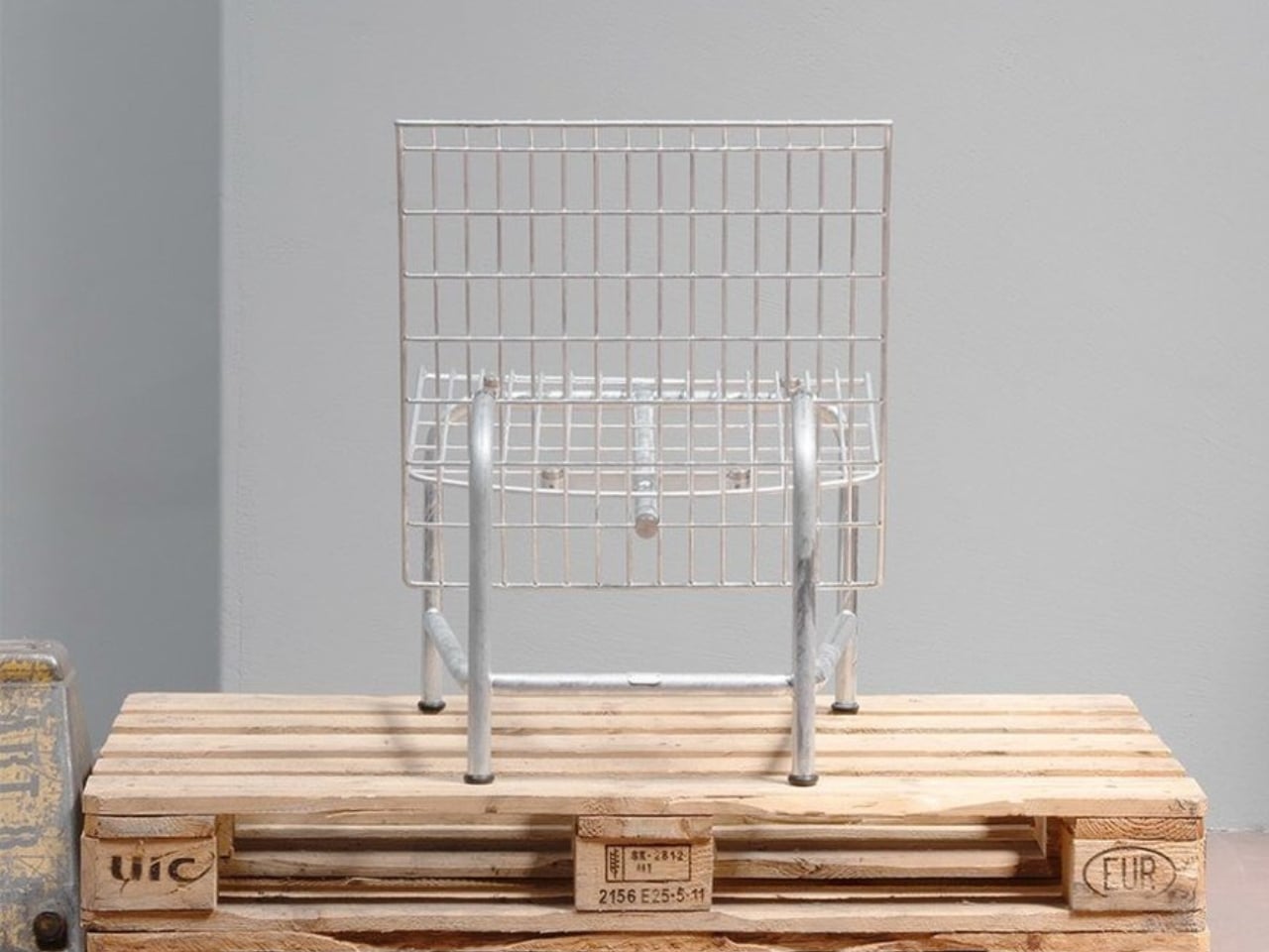
    A wire-grid lounge chair sounds like a hard sell for an afternoon off. Yet Moritz Schmid’s Patio Chair for Swiss furniture maker Embru has a visual ease that makes me want to give it a chance. The open seat and back leave much of the chair transparent, while the frame gives it a clear outline. Its more persuasive detail, though, addresses a familiar frustration: having to replace an entire object because one part has given up. Embru describes the construction as modular, with individual compone
     

Embru’s Patio Chair Can Get a New Seat Without a New Frame

8 novembre 2026 à 07:40

A wire-grid lounge chair sounds like a hard sell for an afternoon off. Yet Moritz Schmid’s Patio Chair for Swiss furniture maker Embru has a visual ease that makes me want to give it a chance. The open seat and back leave much of the chair transparent, while the frame gives it a clear outline. Its more persuasive detail, though, addresses a familiar frustration: having to replace an entire object because one part has given up.

Embru describes the construction as modular, with individual components that can be replaced or repaired. A specially developed mounting system accommodates different seating surfaces. That makes the announced chair interesting beyond its appearance. If the seat becomes damaged, the design allows the remaining structure to stay in use. I’d rather see that possibility built into a chair from the beginning than encounter it as an expensive customer-service question later.

Designer: Moritz Schmid for Embru

The visible connection between backrest and frame is worth a closer look. In Embru’s detail photograph, a circular metal fitting interrupts the blue grid, making the attachment point part of the composition. It’s a small, deliberate-looking piece of hardware, and I like that it hasn’t been disguised. You can read the chair as an assembly of parts. Visually, that gives the repairability story a little credibility before anyone starts explaining the engineering.

The material options give that construction another purpose. Embru plans an outdoor grid version and an indoor version with wood-veneer panels, including oak, ash, black ash, and walnut. Listed finishes include wine red, gray-blue, black, and silver hot-dip galvanizing. My preference would be the gray-blue grid: it gives the industrial geometry enough color to feel intentional without turning the chair into the loudest object on the patio.

The wood version changes the visual balance considerably. Where the grid lets the background pass through, the broad panels create solid planes. The rear view of the black version makes this especially clear: the backrest reads almost like a sheet suspended above the slender frame. That’s a useful distinction for anyone who likes the underlying shape but doesn’t want outdoor furniture setting the tone inside their living room.

Schmid has explored related territory with Embru before. His earlier Park Chair uses a tubular steel frame, with curved rear legs that give a straightforward garden chair an unexpectedly animated profile. Embru says that design was developed around the manufacturing capabilities at its Rüti factory. I appreciate that context because it makes the Patio Chair feel less like an isolated styling exercise. There’s an ongoing conversation here between a designer, a material, and the people equipped to shape it.

Appearance only gets a lounge chair so far, of course. I’d want to sit in the grid version before calling it an all-afternoon favorite. The photographs establish its shape, not how the seating surface feels after an hour with a book. For me, that’s the unresolved question that matters most. An appealing frame and replaceable parts are good reasons to pay attention, but neither substitutes for getting comfortable. The word “lounge” still has work to do.

Embru currently expects the Patio Chair to become available at the end of 2026. Its preview doesn’t provide a price or confirm US availability. I’d also want to know how replacement parts will be ordered and priced. Designing a component to come off is valuable; making its replacement straightforward to obtain is what turns that decision into a useful ownership benefit.

Still, the premise earns my interest. I don’t need every chair to become a family heirloom, and I’m wary of furniture being described as timeless before anyone has lived with it. I do want the option to keep a chair I like when one component wears out. The Patio Chair gives that ordinary expectation a considered form. Provided the parts support follows through, its most attractive feature may become apparent years after the first photograph.

The post Embru’s Patio Chair Can Get a New Seat Without a New Frame first appeared on Yanko Design.

  • ✇Yanko Design
  • Urban Desk Saves Space Without Making You Move Your Monitor
    A monitor is an awkward thing to put away at the end of a workday. The screen, stand, cables, and nearby lamp make packing up feel like a small relocation project. Leave everything out, though, and the living room keeps looking like an office long after you’ve closed your laptop. Urban Desk, from German furniture brand UrbanNature, addresses that everyday friction by letting part of the workspace retreat while the equipment stays put. Designed by Jörg Brachmann, the desk takes a refreshingly mo
     

Urban Desk Saves Space Without Making You Move Your Monitor

6 novembre 2026 à 12:20

A monitor is an awkward thing to put away at the end of a workday. The screen, stand, cables, and nearby lamp make packing up feel like a small relocation project. Leave everything out, though, and the living room keeps looking like an office long after you’ve closed your laptop. Urban Desk, from German furniture brand UrbanNature, addresses that everyday friction by letting part of the workspace retreat while the equipment stays put.

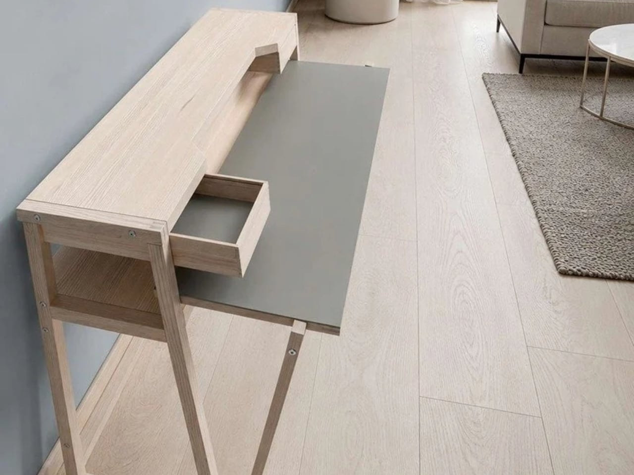
Designed by Jörg Brachmann, the desk takes a refreshingly modest approach to working in a room that also has other jobs. Its lower work surface pulls forward for use and slides back afterward. A fixed upper structure holds the monitor and other accessories, so changing the desk’s configuration doesn’t require rebuilding your setup. It’s an existing product offered through UrbanNature’s online store, rather than a concept asking us to imagine the practical details.

Designer: UrbanNature

The distinction between a moving surface and a stationary shelf is the important design decision here. According to the project’s Green Product Award entry, the tabletop extends horizontally without lowering or tilting, while the rigid upper structure accommodates a monitor. I like that the transformation has a limited, understandable purpose. You’re bringing more work surface toward you, then returning it when you’re done. The furniture doesn’t need to perform an elaborate disappearing act to earn its place.

UrbanNature lists the movable worktop at approximately 16.5 inches deep when retracted and 26 inches when extended. That’s roughly 9.4 inches of additional depth during use. The base itself is about 19.7 inches deep, so the smaller worktop measurement shouldn’t be mistaken for the entire desk’s footprint. Those distinctions matter when you’re measuring a bedroom corner or deciding how much passage space you’ll have beside a sofa.

For me, the appeal is permission to leave a functional setup alone. A space-saving design loses some of its usefulness if putting it away becomes another chore. Here, the separation between equipment and working surface suggests a less demanding routine. You still have to manage whatever you’ve spread across the moving section, of course. A notebook doesn’t file itself because the furniture has a clever mechanism.

The materials also suit that domestic role. UrbanNature specifies solid ash or oak alongside a blockboard worktop finished with linoleum, plus exposed wooden joints. Two A4-sized drawers sit beneath the monitor shelf. Those are useful places for notebooks, pens, and charging accessories, rather than an invitation to accumulate an entire office archive. I’d rather have a little storage close to hand than add another cabinet beside a desk chosen to save space.

There’s a fair compromise in the name of this arrangement: your office never fully disappears. The monitor remains visible, as does the desk. Core77 aptly describes it as a partial hideaway. That won’t satisfy someone who wants work equipment completely out of sight during dinner. Personally, I find the compromise reasonable. Keeping a screen ready for tomorrow can be worth more than achieving a perfectly office-free room tonight.

I’d want to check the setup against my own equipment before buying, particularly the monitor’s position and how comfortably the extended surface meets a chair. The fixed upper shelf establishes part of that arrangement for you. UrbanNature itself notes that an appropriate chair and correct screen height still matter. A compact footprint is useful, but it shouldn’t become the only measurement that gets your attention.

The online listing currently ranges from €995 to €1,429, including VAT. International buyers would need to confirm delivery and the total cost; the shipping policy notes possible additional charges outside the EU. At that price, I’d want the pull-out surface to earn its keep daily. The strongest argument for Urban Desk is simple: it lets you keep a ready-to-use workstation while asking a little less of the room once work is over.

The post Urban Desk Saves Space Without Making You Move Your Monitor first appeared on Yanko Design.

  • ✇Yanko Design
  • Pillowy Steel Furniture Without a Stitch of Upholstery
    The steel in Sarah Naghawi’s JAWF collection looks caught halfway between a box and a balloon. Surfaces bulge, dip, and crease, giving rigid metal the appearance of something you might squeeze. I like that moment of confusion, especially because the material remains so obviously metallic. Presented at Amman Design Week 2026, the Jordanian designer’s experimental collection explores how pressure can turn stainless-steel sheets into sculptural objects with their own internal spaces. The problem b
     

Pillowy Steel Furniture Without a Stitch of Upholstery

4 novembre 2026 à 06:07

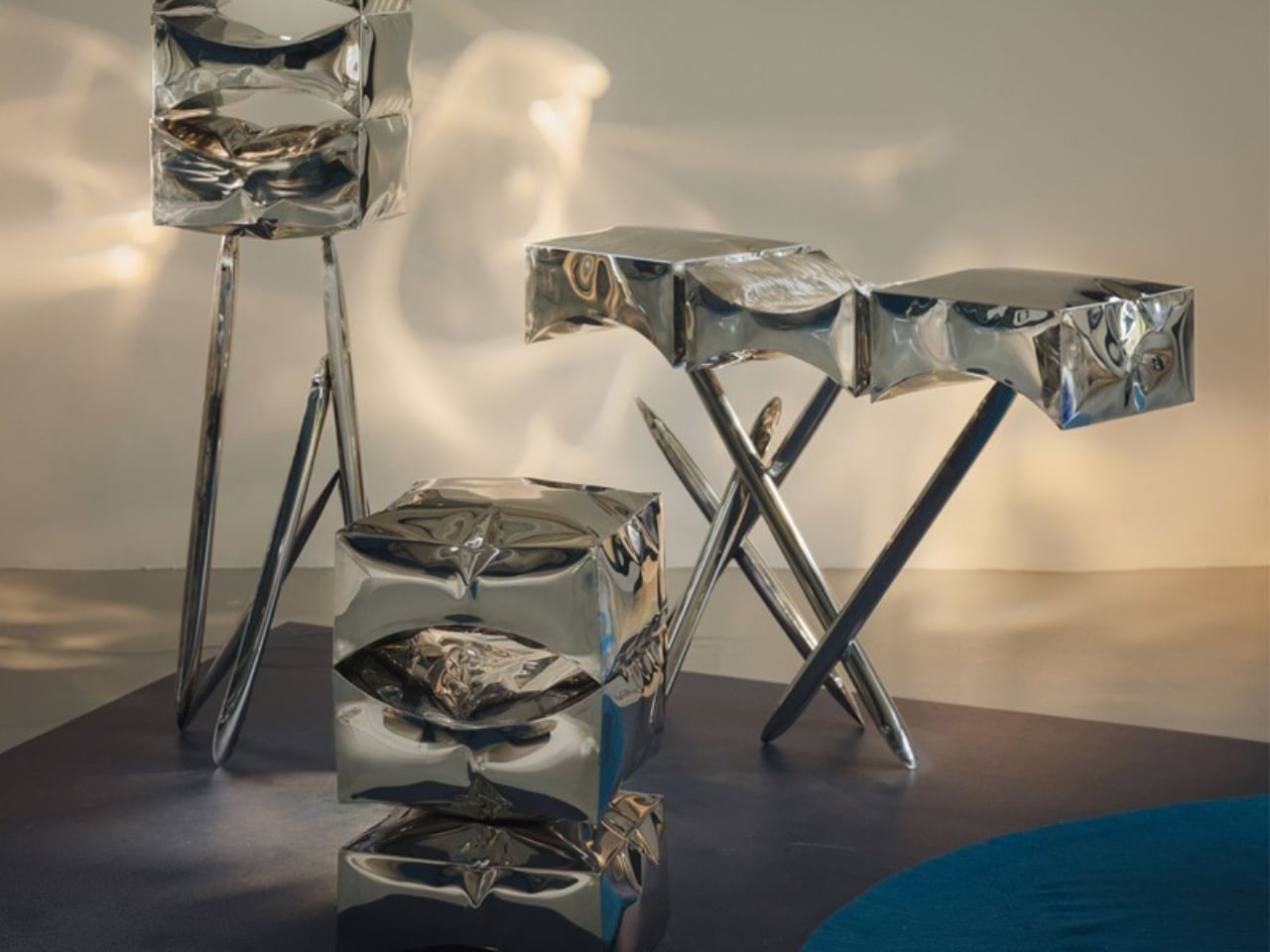
The steel in Sarah Naghawi’s JAWF collection looks caught halfway between a box and a balloon. Surfaces bulge, dip, and crease, giving rigid metal the appearance of something you might squeeze. I like that moment of confusion, especially because the material remains so obviously metallic. Presented at Amman Design Week 2026, the Jordanian designer’s experimental collection explores how pressure can turn stainless-steel sheets into sculptural objects with their own internal spaces.

The problem being explored belongs to the workshop rather than the living room: how to give sheet metal volume, depth, and an interior through the forming process itself. Naghawi uses hydromechanical forming, introducing hydraulic fluid pressure into welded sheet assemblies so the metal expands and deforms. Pressure becomes a shaping tool, pushing the steel beyond its original flat condition. The attraction is that the resulting surface helps define both the object’s exterior and the space within it.

Designer: Sarah Naghawi (photos by ASPIRE Ali Saadi Photography)

That industrial terminology sounds less approachable than the result. Think of the principle of inflation, except the steel permanently retains the deformation created during fabrication. Outward curves and inward hollows remain as evidence of the forces applied to the material. This gives the objects a physical history you can read in their surfaces. The process hasn’t been hidden beneath a decorative finish; its effects supply much of the visual character.

The name helps explain why those hollows matter. JAWF comes from an Arabic word referring to an inner chamber or protected cavity. Naghawi treats that interior space as a starting point for design, with recesses suggesting possibilities for storage and enclosure. I appreciate that emphasis because sculptural furniture can sometimes ask us to admire its silhouette while leaving its practical purpose unresolved. Here, the cavity is central to the investigation, even if everyday usefulness still needs closer examination.

In the exhibition photographs, a tall rectangular piece stands on slender, splayed legs, with three pronounced recesses arranged vertically across its face. Nearby, a horizontal piece stretches across angled supports, its upper surface rising and falling rather than settling into a conventional flat plane. A smaller stacked form brings the same swelling geometry closer to the floor. The family resemblance comes through clearly, but each silhouette gives the pressure-shaped surfaces a different setting.

The reflective finish makes those shapes particularly animated in photographs. Blue from the exhibition floor and bright patches of window light break across the steel, making some edges easy to follow and others surprisingly difficult to locate. To my eye, the pieces sit somewhere between furniture and oversized, crumpled silver packaging. That comparison is affectionate. The familiar shine draws you in, while the uneven geometry prevents the objects from becoming another exercise in polished metallic perfection.

The studio’s balloon reference feels especially useful here. A balloon’s skin and its interior volume develop together under pressure; JAWF translates that relationship into a material that holds the resulting shape. The resemblance stops short of literal imitation, which is a good choice. These aren’t novelty balloons recreated in steel. Their boxy outlines, compressed areas, and deep cavities give them a more awkward, interesting presence. They look like objects negotiating with the force that made them.

I’d want dimensions, weight, pricing, and evidence of everyday usability before treating JAWF as a furniture recommendation. A striking recess doesn’t automatically make a convenient shelf, and an expressive surface doesn’t establish how comfortably an object fits into a home. Those questions don’t diminish the experiment. They establish where the next stage of development would become interesting: translating a compelling material study into pieces whose proportions and functions feel equally considered.

For now, I’m persuaded by the decision to leave the steel’s deformation visible. JAWF gives the eye plenty to enjoy, but it also makes fabrication part of that enjoyment. You can follow a bulge into a hollow and understand that the two belong to the same event. That’s a satisfying reason to look twice, even before deciding where the object might live.

The post Pillowy Steel Furniture Without a Stitch of Upholstery first appeared on Yanko Design.

  • ✇Yanko Design
  • A Bamboo Armchair Glows After Dark Without Electricity
    Crocheted flowers usually belong on a blanket or a cardigan, not in a conversation about lighting. Peiyang (Camille) Li gives them another job with She Blooms in the Dark, a sculptural seating project that combines a woven bamboo armchair with hand-crocheted blossoms that glow after dark. I like the premise immediately: familiar craft doing something unexpected, without needing to look like a gadget. The problem it addresses is a small but recognizable one: finding a sense of personal space wit
     

A Bamboo Armchair Glows After Dark Without Electricity

3 novembre 2026 à 18:30

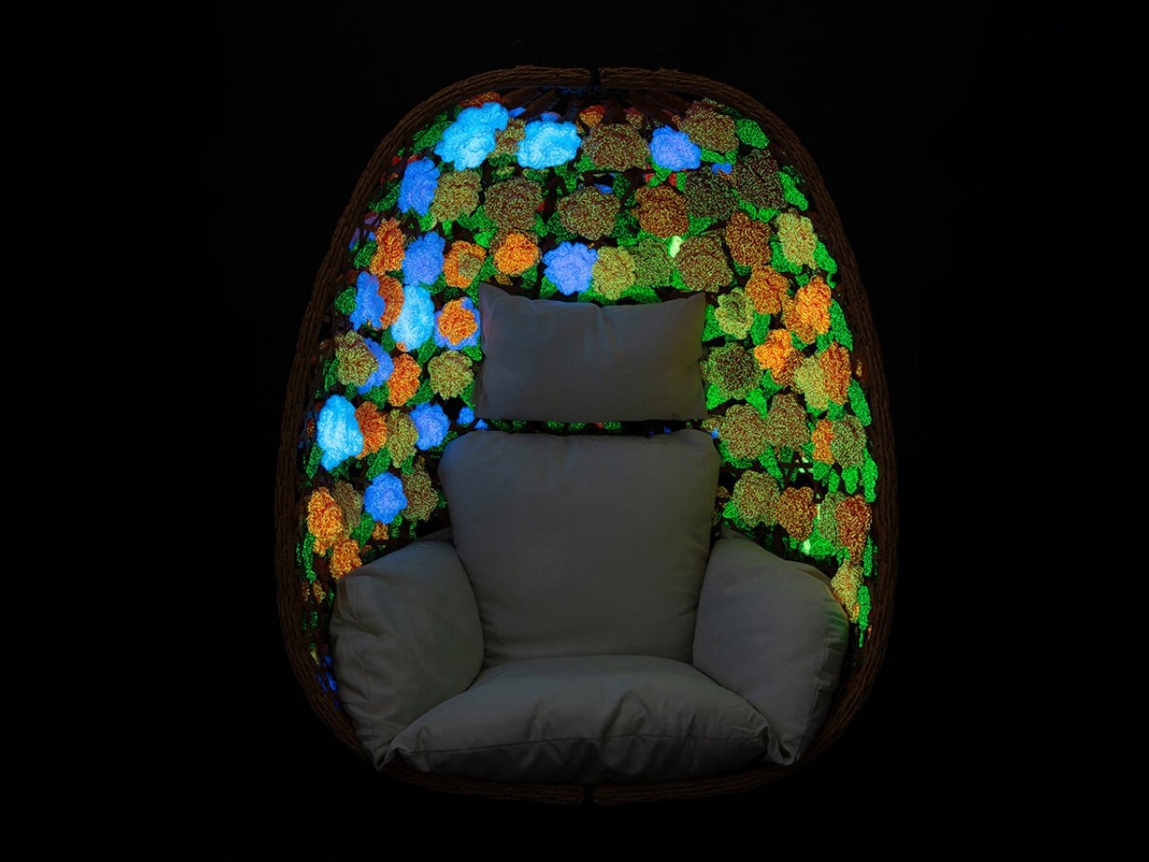
Crocheted flowers usually belong on a blanket or a cardigan, not in a conversation about lighting. Peiyang (Camille) Li gives them another job with She Blooms in the Dark, a sculptural seating project that combines a woven bamboo armchair with hand-crocheted blossoms that glow after dark. I like the premise immediately: familiar craft doing something unexpected, without needing to look like a gadget.

The problem it addresses is a small but recognizable one: finding a sense of personal space without having a separate room to escape into. Li frames the project around emotional vulnerability and protection. I read that as an attempt to make a seat feel like a boundary, a place where being alone might feel intentional rather than awkward. That’s a worthwhile ambition for a piece of furniture, even before the flowers start glowing.

Designer: Peiyang (Camille) Li

The curved, basket-like bamboo framework partially encloses the sitter, while its open lattice stops short of creating a solid shell. That balance matters. For a shared living room, I’d want a retreat that still lets me feel connected to the room, rather than a miniature booth. The shape suggests that possibility, although an open weave shouldn’t be mistaken for actual privacy. Think of it as a visual boundary, not a substitute for a door.

The glow comes from phosphorescent yarn, described in the project write-up as absorbing daylight and releasing a low-intensity glow in darkness, without electric fixtures. That’s an appealingly direct material choice: the flowers themselves provide the effect, instead of hiding a strip of LEDs underneath. I’m more drawn to that decision than I would be to a color-changing chair controlled through an app. The material gets to carry the surprise, and the premise is easy to understand.

It would be a mistake to treat it as a reading light, though. The published description doesn’t give brightness measurements or say how long the glow lasts. For me, the useful way to understand it is as an atmospheric effect, not a replacement for the lamp beside your favorite book. That distinction actually strengthens the idea. It lets the light remain intimate and decorative, rather than making a practical lighting promise the available information can’t support.

Crochet also makes sense here beyond the novelty of glowing yarn. A flower carries associations with care, growth, and decoration, at least in my reading, and working it by hand adds another layer to that impression. I appreciate that Li hasn’t chosen an abstract luminous panel. The floral language gives the project a slightly storybook quality. It could be too whimsical for a restrained living room, but I wouldn’t want that personality edited out.

That doesn’t mean the chair can promise calm on command. I’m wary of furniture being asked to solve an emotional condition simply because it wraps around a person. A more reasonable ambition is to offer an invitation: sit here, give yourself a moment, let this particular corner have a different purpose. She Blooms in the Dark makes sense to me on that modest scale. It doesn’t need a therapeutic claim to justify its existence.

There are everyday questions I’d want answered before imagining it at home. The published project information doesn’t include dimensions, a price, or purchasing details, and it isn’t enough to judge comfort or upkeep. I’d want to know how the flowers are attached and how you clean around them. Those aren’t objections to a sculptural project. They’re the questions that separate admiring a piece of furniture from deciding where it could live.

Still, I’m glad this chair takes such an idiosyncratic route to a familiar desire. I don’t need every quiet corner to look like a spa, and I don’t need every interesting light effect to arrive with another charger. A bamboo seat dressed in glowing crochet offers a more playful possibility. The appeal is being allowed a little enchantment at home, with enough recognizable craft to keep it from feeling like a special effect.

The post A Bamboo Armchair Glows After Dark Without Electricity first appeared on Yanko Design.

  • ✇Yanko Design
  • A Hidden Mechanism Turns the Scissor Chair Into a Lounger
    Buying a chair for conversation and buying one for an evening with a book can feel like two separate furniture decisions. One asks you to sit up; the other invites you to sink back. If your living room doesn’t have space for both, the Scissor Chair offers an appealing compromise. Produced by the German company Wilhelm Knoll, this mid-century design changes its sitting position while keeping the appearance of an ordinary upholstered armchair. Its designer remains unknown, but the problem it addr
     

A Hidden Mechanism Turns the Scissor Chair Into a Lounger

23 octobre 2026 à 17:30

Buying a chair for conversation and buying one for an evening with a book can feel like two separate furniture decisions. One asks you to sit up; the other invites you to sink back. If your living room doesn’t have space for both, the Scissor Chair offers an appealing compromise. Produced by the German company Wilhelm Knoll, this mid-century design changes its sitting position while keeping the appearance of an ordinary upholstered armchair. Its designer remains unknown, but the problem it addresses is familiar.

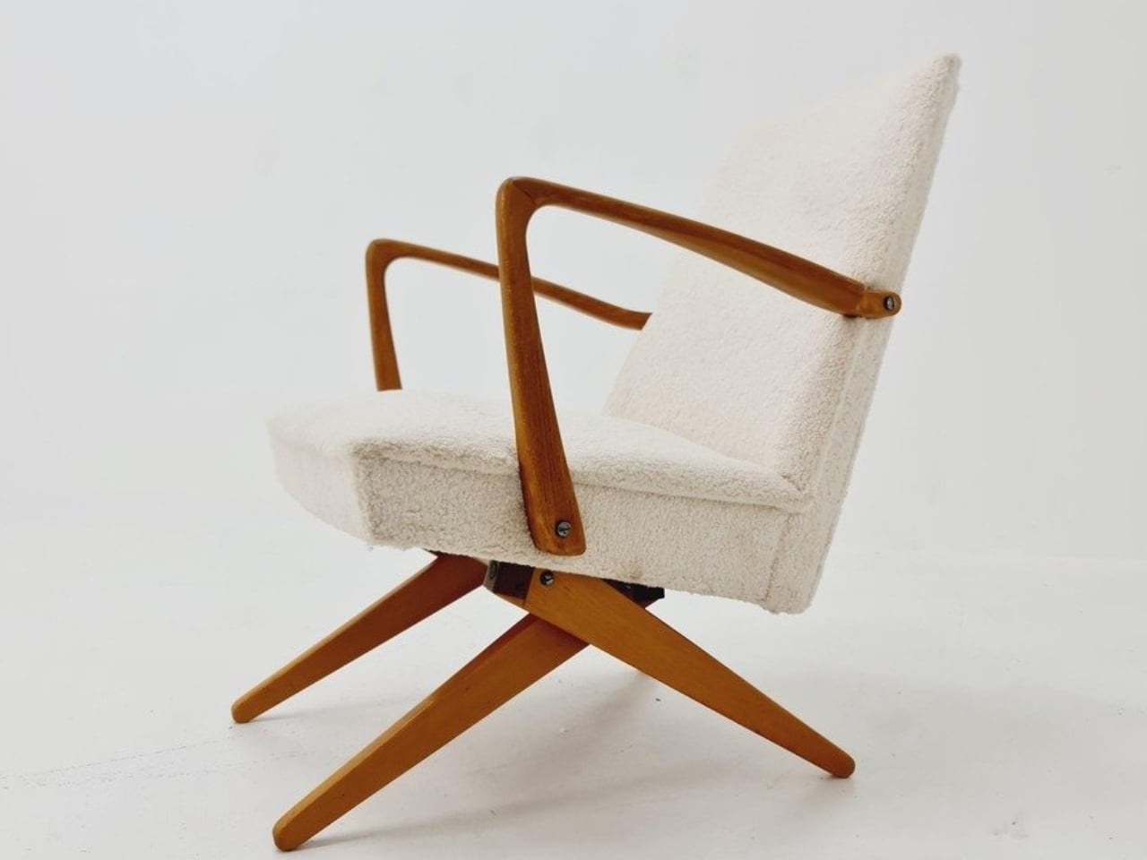
The name gives away the basic geometry. According to a vintage dealer’s description, lifting the armrests allows the crossed legs to unfold. The chair moves between a taller, more upright configuration and a lower lounging position. Instead of leaving the legs stationary while only the backrest moves, the transformation changes the stance of the chair itself. I like that the supporting structure participates in the adjustment. Those wooden legs have a job beyond providing a handsome silhouette.

Designer: Unknown (produced by Wilhelm Knoll)

In photographs of a cream-upholstered example, the narrow wooden arms trace an open shape around the seat and back. There’s plenty of air beneath the upholstery, and the legs remain visually separate rather than disappearing inside a boxy base. In the upright position, it looks quite composed. Lowered, the crossed supports become more obvious, and the chair takes on a relaxed, backward-leaning posture. The useful surprise is how little visual fuss accompanies that change.

The adjustment is more substantial than a slight tilt. One dealer lists seat heights of 45 and 36 centimeters for an example, roughly 18 and 14 inches. That’s a difference of about three and a half inches, enough to make these visibly different seating arrangements. Those are seller-provided measurements for a vintage piece, rather than a universal specification, but they help explain the appeal. You’re choosing between two distinct positions, with different relationships to the floor and surrounding furniture.

Underneath, the mechanism is considerably busier than the silhouette suggests. A dealer’s underside photograph reveals pivoting metal links, brackets, and a coil spring tucked between the wooden supports. I’d happily leave that view to someone servicing it. From a design perspective, though, the separation makes sense: the mechanical assembly sits beneath the upholstered seat, where it can do its work without dictating the appearance of every surface above it. The chair doesn’t need to look like workshop equipment to have moving parts.

For a smaller living room, I see the attraction as flexibility rather than some miraculous recovery of square footage. A chair that changes posture still needs room around it, especially when its stance changes. The more convincing benefit is having one seat that can suit a conversation and then offer a lower position for unwinding. That’s a modest promise, and a useful one. I’d rather have two clearly differentiated options than an elaborate transformation with no obvious purpose.

The Knoll name deserves a little care here. Wilhelm Knoll was a German business whose roots go back to a Stuttgart leather shop founded in 1865. It shouldn’t be casually confused with the American company Hans Knoll established in 1938, although the businesses share family history. Vintage dealers date Scissor Chair examples to the 1950s. Keeping the manufacturer credit separate from the unidentified designer matters, particularly with an object whose mechanism deserves more attention than a famous surname alone.

Of course, photographs can’t tell me how smoothly a surviving example adjusts or how supportive it feels after an hour. With a vintage moving chair, I’d want the mechanism demonstrated and its condition checked before buying. That practical reservation doesn’t diminish the idea. The Scissor Chair appeals to me because its cleverness is so specific: lift the arms, alter the stance, settle into a different position. A living room doesn’t always need another chair. Sometimes the chair already there could simply offer another way to sit.

The post A Hidden Mechanism Turns the Scissor Chair Into a Lounger first appeared on Yanko Design.

  • ✇Yanko Design
  • Aery’s Office Chair Offers a Fit You Can Actually Fine-Tune
    A desk setup can look perfect and still feel wrong by lunch. The monitor is aligned, the cables are hidden, and the chair matches the room, yet you’re shuffling around trying to get comfortable. That gap between a workspace that photographs well and one that fits the person using it is the more interesting design problem to me. It’s where EFFYDESK’s Aery Ergonomic Chair makes its case. For anyone whose office occupies a bedroom corner or shares space with the living room, choosing a chair invol
     

Aery’s Office Chair Offers a Fit You Can Actually Fine-Tune

23 octobre 2026 à 04:15

A desk setup can look perfect and still feel wrong by lunch. The monitor is aligned, the cables are hidden, and the chair matches the room, yet you’re shuffling around trying to get comfortable. That gap between a workspace that photographs well and one that fits the person using it is the more interesting design problem to me. It’s where EFFYDESK’s Aery Ergonomic Chair makes its case.

For anyone whose office occupies a bedroom corner or shares space with the living room, choosing a chair involves a negotiation. You want something you can spend time in, but you also have to look at it after closing the laptop. The Aery approaches that compromise with a mesh back, a cushioned seat, and adjustments that let its proportions work around the person sitting in it.

Designer: effydesk

The mesh is doing some of the visual work here. A tall upholstered back can become a fairly imposing presence beside a small desk. With the Aery, the open surface allows the supporting structure to remain visible, breaking up what could otherwise read as one large block. It still looks like an office chair, especially with that separate headrest, but its outline has a little breathing room.

I appreciate that it doesn’t try to disguise its purpose. In black, the frame, armrests, and cushion form a straightforward piece of working furniture. It isn’t pretending to be a dining chair you could drag into a meeting. That distinction matters in a home office, where choosing something purely for the room’s aesthetic can leave you making compromises every time you sit down.

The fabric-covered cushion gives the design a softer counterpoint to the mesh back. It also offers a combination that may appeal to people who prefer padding beneath them without wanting an upholstered surface behind their entire torso. I like the visual balance between the two. The seat gives the chair some substance, while the open back keeps that substance from extending all the way upward.

The most useful adjustment is also one of the least visually dramatic: the seat slides forward and backward. Rather than changing the chair’s appearance in any meaningful way, it changes how the cushion sits beneath your legs. That’s worth paying attention to if you’ve ever loved the look of a chair but found yourself perched near its edge because sitting all the way back didn’t feel right.

The movable armrests follow the same thinking. They adjust in height, slide in different directions, and rotate, giving you some freedom to place the supports where your arms naturally rest. The appeal is less about collecting adjustment options than avoiding a fixed position that doesn’t suit you. A chair’s silhouette can look perfectly balanced while its armrests feel entirely wrong for the person using it.

The headrest and reclining back introduce a more relaxed posture into the design. I see the appeal for reading through a document or leaning back between tasks, particularly when the desk is where several parts of your day happen. Still, the headrest feels secondary to getting the seat and arms right. Those are the relationships you live with while doing the work.

I haven’t sat in the Aery, so its cushion comfort and the feel of its controls remain open questions. Images and adjustment lists can explain the design, but they can’t tell me whether an armrest stays put when I want it to. That’s what I’d want to check in person, along with how naturally the chair fits beneath my desk.

What appeals to me is how much of the Aery’s design can be put to an everyday use. The mesh changes its visual presence; the cushion changes the sitting surface; the adjustments offer room to work out a better fit. It gives a home-office buyer reasons to look beyond the styled photograph, while still acknowledging that the chair has to live in the room.

The post Aery’s Office Chair Offers a Fit You Can Actually Fine-Tune first appeared on Yanko Design.

  • ✇Yanko Design
  • Road Barriers Become Benches Without Losing Their Warning Stripes
    A red-and-white safety barrier isn’t an object I’d normally consider inviting. It’s supposed to interrupt your plans. That’s why the stop! collection by Studio Martins Mezulis and creative 13_0663_tsx makes such a good first impression as a design idea. The outdoor benches and stools borrow the panels of Dutch traffic barriers to make places to sit, addressing a basic need in public space: somewhere to pause. Waiting for a friend shouldn’t require buying a coffee to justify occupying a chair. I
     

Road Barriers Become Benches Without Losing Their Warning Stripes

21 octobre 2026 à 05:15

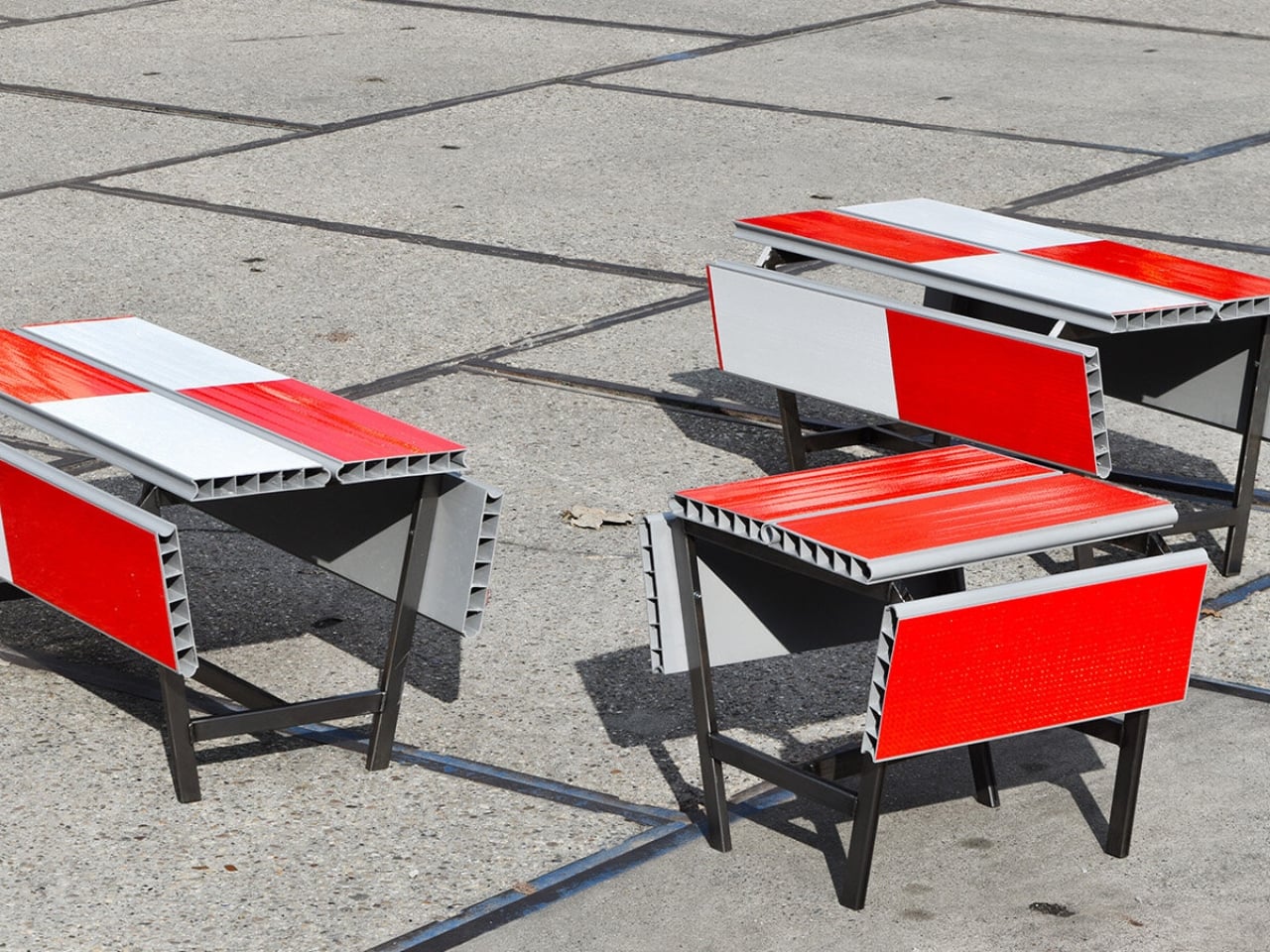
A red-and-white safety barrier isn’t an object I’d normally consider inviting. It’s supposed to interrupt your plans. That’s why the stop! collection by Studio Martins Mezulis and creative 13_0663_tsx makes such a good first impression as a design idea. The outdoor benches and stools borrow the panels of Dutch traffic barriers to make places to sit, addressing a basic need in public space: somewhere to pause.

Waiting for a friend shouldn’t require buying a coffee to justify occupying a chair. I like public seating that treats waiting, resting, and doing very little as perfectly legitimate activities. That’s the practical territory stop! occupies. Presented at Dutch Design Week in Eindhoven, running October 17–25, 2026, the collection invites people to stay for a while using an object associated with sending them elsewhere.

Designers: Studio Martins Mezulis and creative 13_0663_tsx

The starting point is the schrikhek, a red-and-white aluminum barrier used in the Netherlands to alert people to construction and redirect their route. You don’t need to recognize that Dutch term to understand the reference. The warning graphics do most of the explaining. Keeping them visible gives the furniture a little friction: your eyes register a restriction before your brain catches up with the seat.

It’s a fitting project for Studio Martins Mezulis, whose work spans graphic and spatial design. The stripes are doing both jobs here: defining a physical object and carrying a message that the designers are trying to change.

In the project’s render, long striped panels form the seating surfaces, with more panels running vertically along the sides. A narrow framework keeps the assembly visually open. The result looks deliberately assembled from infrastructure rather than dressed up to conceal its origins. I prefer that decision to a more polished makeover. Remove the red and white, and much of the reason to notice these benches disappears.

The published bench dimensions are 1,250 millimeters long, 500 millimeters wide, and 450 millimeters high, or approximately 49 by 20 by 18 inches. Road safety barriers and steel are listed as the materials. Those numbers describe a compact object rather than a sprawling park bench. Its proportions make the proposal easier to picture beside a pedestrian route or within a plaza, although placement would still need careful consideration.

The illustrated benches are also backless and lack armrests. That keeps their form simple and leaves the seat approachable from either side, but it doesn’t offer the support some people need. I’d read them as an invitation to take a short break rather than assume they’re suited to a long afternoon. The graphic wit is persuasive; comfort and durability would need evidence beyond a render.

That distinction matters because public furniture has a job beyond looking good in a design exhibition. Someone needs to understand that they can use it. Here, the same markings that make the collection memorable could initially make a passerby hesitate. I’d be interested to see how quickly people recognize the invitation. A bench occupied by one person might explain the idea better than a nearby project label.

The material story deserves similar precision. According to the project’s Dutch Design Week description, the designer hopes to work with construction infrastructure providers to reclaim decommissioned or discarded panels in the future. That isn’t confirmation that every panel in the current collection has already served at a construction site. Reuse is a proposed direction for expanding the collection, and it’s worth preserving that distinction rather than automatically labeling the furniture recycled.

For me, stop! works best as a modest adjustment to how a street communicates. It gives a familiar public object another use without erasing what made it recognizable. The humor gets your attention, but the seat has to justify keeping it. If the collection develops further, I’d rather see that effort go into making it useful to more people than into adding more visual tricks. A decent place to wait is already a worthwhile design brief.

The post Road Barriers Become Benches Without Losing Their Warning Stripes first appeared on Yanko Design.

  • ✇Yanko Design
  • A Coffee Bar Without a Remodel: UNITO’s Rolling Station
    A coffee grinder, a kettle, and a few favorite mugs can turn into a surprisingly territorial collection. Add filters, beans, and the tools that make a morning ritual feel worthwhile, and suddenly the kitchen counter has a second job. UNITO’s Coffee Station offers a dedicated home for that equipment, with wheels underneath so the coffee corner doesn’t have to become a permanent fixture. Designed by Unito, the station brings preparation space and storage together in a movable counter. Its appeal
     

A Coffee Bar Without a Remodel: UNITO’s Rolling Station

21 octobre 2026 à 04:15

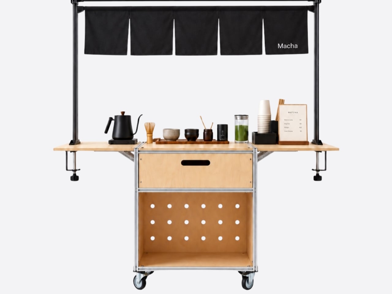
A coffee grinder, a kettle, and a few favorite mugs can turn into a surprisingly territorial collection. Add filters, beans, and the tools that make a morning ritual feel worthwhile, and suddenly the kitchen counter has a second job. UNITO’s Coffee Station offers a dedicated home for that equipment, with wheels underneath so the coffee corner doesn’t have to become a permanent fixture.

Designed by Unito, the station brings preparation space and storage together in a movable counter. Its appeal extends beyond reclaiming kitchen space. For a studio hosting clients or someone setting up a coffee pop-up, it could provide a more organized starting point than a table surrounded by supply boxes. Unito’s founder has described the Coffee Station as part of the brand’s move toward furniture and tools for small businesses.

Designer: Unito

The material combination gives that practical idea some personality. According to the supplied product description, silver anodized aluminum profiles form the frame, while light birch plywood supplies the panels. I like that the design lets both materials retain their identities. The metal outlines the structure with a workshop-like precision; the wood gives the broad surfaces enough warmth to keep the station from reading as purely institutional equipment.

That balance matters for something that might face customers. In the published photographs, the silver framework remains visible around the wooden drawer fronts, and side surfaces extend beyond the central cabinet on supporting brackets. Those extra surfaces look useful for separating preparation from pickup. A cup waiting to be served shouldn’t have to compete with the grinder for the same patch of counter.

Storage deserves as much attention as the equipment displayed above it. The described configuration includes two soft-close drawers, with an open compartment underneath. The photographs show wide finger-pull cutouts rather than projecting handles. I appreciate that restraint, but the more useful decision is giving small supplies somewhere to disappear. Filters, spoons, and towels could stay close without becoming part of the countertop display.

Then come the wheels, arguably the least glamorous and most consequential detail. The specifications list four locking stainless steel casters, and brake levers are visible in the photographs. That arrangement is intended to let the station move into position and then stay put. I’d still distinguish a rolling workstation from portable luggage. Moving across a suitable floor is a different proposition from negotiating stairs or loading it into a car.

The top also introduces an interesting possibility: it is specified to accept IGT panels or stoves. IGT refers to the Iron Grill Table system, whose modular approach combines frames with cooking and work-surface inserts. For UNITO, the appeal is a surface that could accommodate different tasks rather than permanently committing to one arrangement. Exact insert compatibility still needs confirmation before anyone starts ordering accessories.

The dedicated patio umbrella slot is another thoughtful detail. Published images show an umbrella rising above a fully arranged coffee setup, making the station read like a small service point rather than a kitchen cart parked outside. That could be useful for a temporary outdoor gathering. It doesn’t, however, establish that the plywood is weatherproof or that the station can anchor an umbrella safely in wind.

My favorite potential use is actually the less theatrical one: a shared studio where the coffee setup needs its own territory but the room changes throughout the week. A dedicated station could keep supplies together while allowing the host to rearrange the space. That feels like a convincing reason to put furniture on wheels, especially when building another fixed counter would make the room less flexible.

I wouldn’t call it a complete café or an outdoor kitchen. Those descriptions skip over water, power, cleanup, and the practical demands of serving people. Its more believable contribution is giving coffee equipment a coherent place to live and work. For someone who wants a serious setup without designing the room around it, that’s an appealing amount of commitment.

The post A Coffee Bar Without a Remodel: UNITO’s Rolling Station first appeared on Yanko Design.

  • ✇Yanko Design
  • LUMVIA Coffee Table Prototype Pairs a Customizable Mosaic With Hidden Drawers
    Choosing a coffee table usually means choosing a finish you’ll be living with for years. LUMVIA leaves that decision open a little longer, with interchangeable mosaic tiles that let you change the tabletop’s pattern instead of replacing the furniture. Developed by Romania’s mkt, the coffee table prototype puts that freedom inside a solid oak frame, with hidden storage underneath for the less decorative things. The top has a hexagonal outline, with a broad wooden border surrounding 24 triangular
     

LUMVIA Coffee Table Prototype Pairs a Customizable Mosaic With Hidden Drawers

Par : JC Torres
20 octobre 2026 à 06:07

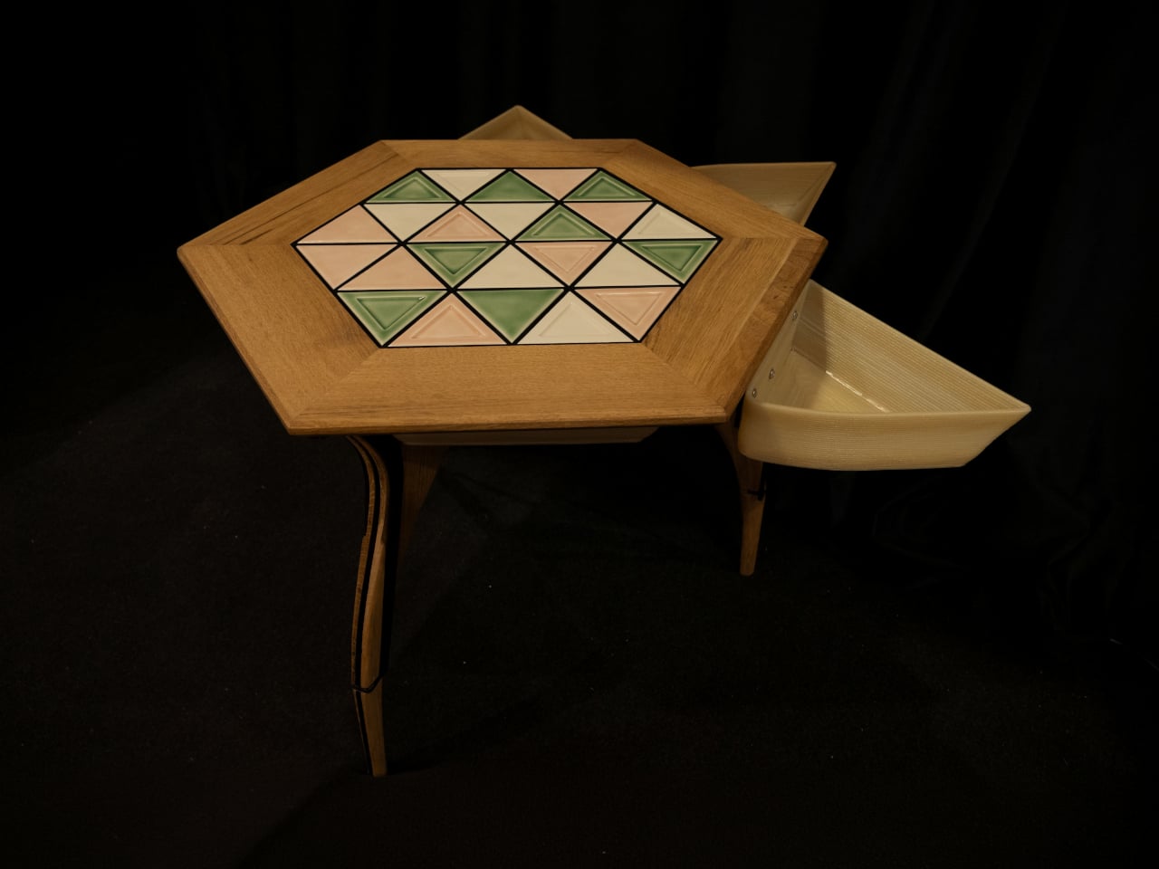
Choosing a coffee table usually means choosing a finish you’ll be living with for years. LUMVIA leaves that decision open a little longer, with interchangeable mosaic tiles that let you change the tabletop’s pattern instead of replacing the furniture. Developed by Romania’s mkt, the coffee table prototype puts that freedom inside a solid oak frame, with hidden storage underneath for the less decorative things.

The top has a hexagonal outline, with a broad wooden border surrounding 24 triangular tiles. Those repeated shapes give every arrangement a common structure, even when the colors change completely. You could group similar shades together or scatter contrasting pieces across the surface, turning the same geometry into a quiet backdrop or something that competes with the coffee cups for your attention.

Designer: mkt

There’s more to the customization than picking a favorite color, of course. Ceramic and glass provide different material options, while the lines between the tiles can be black or white. Dark separators make the individual triangles more pronounced against pale pieces; lighter ones soften that contrast. Even before rearranging anything, changing those lines alters how strongly the mosaic announces itself in a room.

That flexibility becomes particularly appealing when the rest of the room changes. A new rug might make yesterday’s tabletop feel a little too busy, while a neutral sofa could leave space for a bolder composition. LUMVIA’s removable tiles are intended to accommodate those shifts, letting owners revise the pattern over time rather than treating the original selection as a permanent decorating commitment.

The geometry continues underneath, where triangular drawers offer somewhere to tuck away the small objects that tend to collect around a sofa. Their shape follows the mosaic above, rather than introducing a rectangular box below it. There’s a practical tradeoff here, though: an angular compartment won’t suit everything, even if it gives keys or other small belongings a place away from the tabletop.

Both the drawers and the grid supporting the tiles are 3D-printed, placing digital manufacturing beneath the more familiar wood, ceramic, and glass. The approach gives the repeated triangular forms a role in construction as well as decoration. A separate wood version uses interlocking wooden tiles, offering another way to build a pattern without introducing ceramic or glass into the surface.

Still, a surface that invites rearranging also needs to work when you’re setting down a hot drink. Some tiles have recessed triangular details, while others are plain, making the choice about texture as well as color. How those pieces sit together, stay in place, and handle everyday spills will matter just as much as the pleasure of choosing which triangle goes where next.

LUMVIA remains a customizable prototype rather than a mass-produced table, and its configurator includes a step for selecting extra tiles. Having spare pieces could let you test different combinations without replacing the whole set every time your tastes change. You’ll still need somewhere to keep all the triangles that aren’t on display, though. Even a coffee table makeover can leave you with leftovers.

The post LUMVIA Coffee Table Prototype Pairs a Customizable Mosaic With Hidden Drawers first appeared on Yanko Design.

  • ✇Yanko Design
  • This Minimalist Bamboo Coffee Table Hides Everyday Clutter in Plain Sight
    A coffee table usually has a fairly straightforward job: hold a cup of coffee, a few books, and whatever else happens to accumulate in the living room. But what if it could accommodate everyday clutter without putting any of it on display? Designed by Marek Kounovský of MK Designers in collaboration with Prague-based furniture company Frayer, the Handle Table takes this familiar piece of furniture and gives it a more considered purpose. Made primarily from bamboo, the table incorporates conceal
     

This Minimalist Bamboo Coffee Table Hides Everyday Clutter in Plain Sight

19 octobre 2026 à 18:30

A coffee table usually has a fairly straightforward job: hold a cup of coffee, a few books, and whatever else happens to accumulate in the living room. But what if it could accommodate everyday clutter without putting any of it on display? Designed by Marek Kounovský of MK Designers in collaboration with Prague-based furniture company Frayer, the Handle Table takes this familiar piece of furniture and gives it a more considered purpose. Made primarily from bamboo, the table incorporates concealed storage, an integrated handle, and a restrained silhouette that allows its material and construction to take center stage.

The design takes inspiration from the Japanese principle of hodo-hodo, which loosely translates to the idea of “just enough.” Rooted in moderation and balance, the philosophy encourages appreciating things that serve their purpose without excess. Kounovský translates this thinking into furniture by reducing the table to its essential elements. Rather than introducing elaborate mechanisms or decorative features, he focuses on proportion, geometry, and the relationship between form and function. Every visible detail has a reason to exist, and the absence of unnecessary embellishment gives the table its distinct character.

Designer: MK Designers

One of its most interesting features is the concealed storage compartment, which is incorporated directly into the table’s geometry. Coffee tables often become gathering places for remote controls, magazines, chargers, and other small objects that are useful to have nearby but can quickly make a room feel cluttered. Handle Table addresses this familiar situation by providing a dedicated space for everyday belongings while preserving its clean exterior. The compartment remains visually discreet, allowing the table to maintain its sculptural appearance even as it performs an additional function.

The integrated handle is another subtle yet important element of the design. Rather than appearing as a separate attachment, it is incorporated into the tabletop itself, creating a functional feature that feels consistent with the overall composition. This detail makes the table easier to move and reposition, an especially relevant consideration for contemporary interiors where furniture frequently accommodates different activities throughout the day. The table can shift between spaces and arrangements without demanding a permanent position, extending its usefulness beyond that of a conventional stationary coffee table.

Material selection plays an equally significant role in the project. Bamboo forms the main structure, bringing its recognizable grain and natural texture into the otherwise reduced design. The surface is treated with an oil-based wood stain, developed through experimentation with application techniques suited specifically to bamboo. Instead of concealing the material beneath an opaque coating, the finish emphasizes its inherent structure and tactile qualities. The resulting surface gives the table a sense of depth while retaining the character of the bamboo itself.

This attention to finishing is particularly important in a design with so few visual elements. Without decorative distractions, the material becomes one of the primary ways the object communicates its identity. The stained bamboo, precise construction, and carefully controlled proportions work together to create visual interest through restraint. Even the concealed compartment contributes to this approach, demonstrating how practical considerations can become part of the furniture’s fundamental structure rather than additions made after the form has been established.

First presented at the 14th Czech Design Week international design festival in Prague, Handle Table reflects the collaboration between Kounovský’s design practice and Frayer’s approach to bamboo furniture. The project brings together an interest in thoughtful material treatment and an understanding of how furniture participates in everyday routines. Its simplicity is the result of deliberate decisions about what to include, what to conceal, and what can be left out altogether.

There is something appealing about furniture that makes room for the realities of daily life without constantly drawing attention to its cleverness. Handle Table does not attempt to reinvent the coffee table through an abundance of features. Instead, it refines the familiar object through a few carefully integrated gestures. The storage keeps essentials close, the handle makes movement easier, and the bamboo brings warmth and texture to its compact form. In a category where additional features are often presented as improvements, Kounovský offers a different proposition: perhaps a well-designed object needs only enough to do its job beautifully.

The post This Minimalist Bamboo Coffee Table Hides Everyday Clutter in Plain Sight first appeared on Yanko Design.
  • ✇Yanko Design
  • LAYER’s Ripple Dining Table Uses a Wavy Plywood Core to Cut Weight
    Large dining tables are useful right up until you need to move one, when their reassuring weight becomes somebody else’s lifting problem. LAYER’s Ripple research table explores a lighter construction by giving thin plywood a corrugated profile instead of relying on a thick slab. That said, the project keeps a flat surface for everyday use while putting the waves underneath, mostly hidden from view. The original table was specified at approximately 8.2 feet long and 39.4 inches wide, weighing ab
     

LAYER’s Ripple Dining Table Uses a Wavy Plywood Core to Cut Weight

Par : JC Torres
14 octobre 2026 à 06:07

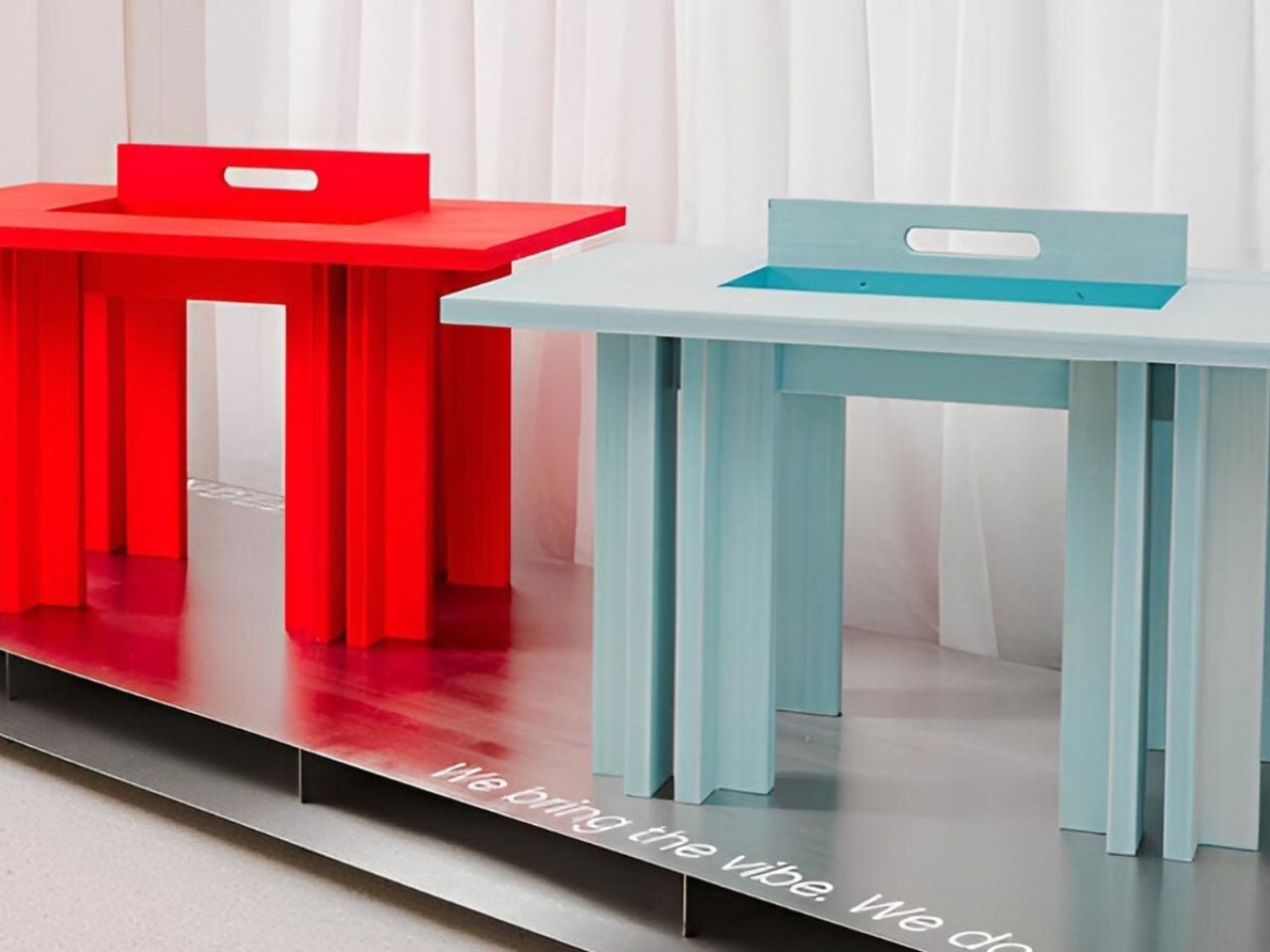
Large dining tables are useful right up until you need to move one, when their reassuring weight becomes somebody else’s lifting problem. LAYER’s Ripple research table explores a lighter construction by giving thin plywood a corrugated profile instead of relying on a thick slab. That said, the project keeps a flat surface for everyday use while putting the waves underneath, mostly hidden from view.

The original table was specified at approximately 8.2 feet long and 39.4 inches wide, weighing about 19.8 pounds. That’s a generous dining surface for something intended to be moved by one person. Bringing it across a room for guests or shifting it away from the wall could become less of a coordinated household event. Its footprint, however, doesn’t shrink along with its weight.

Designer: LAYER

The material comes from a collaboration with Canadian manufacturer Corelam, using pressure lamination to form the repeating curves. LAYER specifies plywood approximately 0.12 inches thick, although that isn’t the overall depth of the assembled tabletop. The distinction matters here: the design gets its structure from a shaped sheet and layered construction, rather than pretending a thin, flat board can do everything alone.

Of course, a wavy dining surface would be a fairly annoying place to balance your coffee. Ripple covers its corrugated structure with a flat plywood sheet, leaving the waves visible below and along the edge. Plates and laptops get the ordinary surface they need, while the underside carries the more unusual geometry. The useful part doesn’t have to look particularly experimental from above.

The legs follow the same preference for shape over bulk. A refined version uses hollow triangular profiles, designed to increase rigidity in two directions. The tabletop’s underside also curves gently across its length and width. Those changes address a fairly obvious concern with lightweight furniture: being easy to pick up is only useful if the table still supports what you put on it.

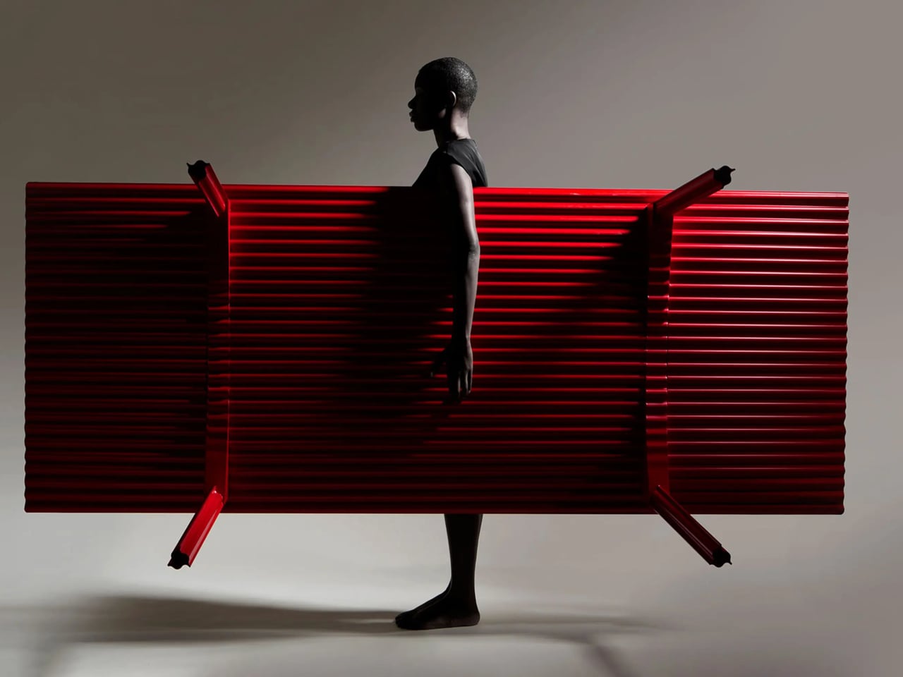
The red finish keeps Ripple from disappearing into the background, even with such a thin outline. From the side, the top appears almost like a sheet balanced on four narrow supports. Along the short edges, the repeating curves reveal why that impression is misleading. The structure supplies its own ornament, without adding a carved border or a heavier decorative frame.

Using less wood is part of the environmental argument, too. The project’s original documentation claims 70% to 80% less material than a standard timber table, but doesn’t establish a defined comparison for that figure. Less material isn’t automatically a complete environmental assessment, either. Adhesives, finishing, production, and working life still matter, even when the basic idea of doing more with less is appealing.

LAYER presents Ripple as a studio research project, without a current retail price or ordering details. The construction offers an answer for people whose furniture has to move with them, though size remains a constraint. You might no longer need help with the lifting, but you’d still need a clear route through the house before taking that tabletop around a corner.

The post LAYER’s Ripple Dining Table Uses a Wavy Plywood Core to Cut Weight first appeared on Yanko Design.
  • ✇Yanko Design
  • An Angled Public Bench for Hanging Out Without the Coffee Tab
    A bench can give you a place to sit and still make talking surprisingly awkward. Line up two people facing the street, and conversation requires a sideways turn. Add a third, and someone starts leaning around the person in the middle. Free to Face, a public seating project by Lim Junwoo and Hayoung Kang, addresses that everyday mismatch between having somewhere to sit and having somewhere to spend time together. The designers also frame the project around a larger concern: conversation becoming
     

An Angled Public Bench for Hanging Out Without the Coffee Tab

13 octobre 2026 à 18:30

A bench can give you a place to sit and still make talking surprisingly awkward. Line up two people facing the street, and conversation requires a sideways turn. Add a third, and someone starts leaning around the person in the middle. Free to Face, a public seating project by Lim Junwoo and Hayoung Kang, addresses that everyday mismatch between having somewhere to sit and having somewhere to spend time together.

The designers also frame the project around a larger concern: conversation becoming tied to consumption. Meeting over coffee is lovely, but buying a drink shouldn’t be the entry fee for sitting down with a friend. Free to Face proposes seating that gives people room to gather without a transaction attached. I like that ambition. It makes a modest, understandable request of public space: accommodate people who aren’t necessarily on their way somewhere else.

Designers: Lim Junwoo and Hayoung Kang

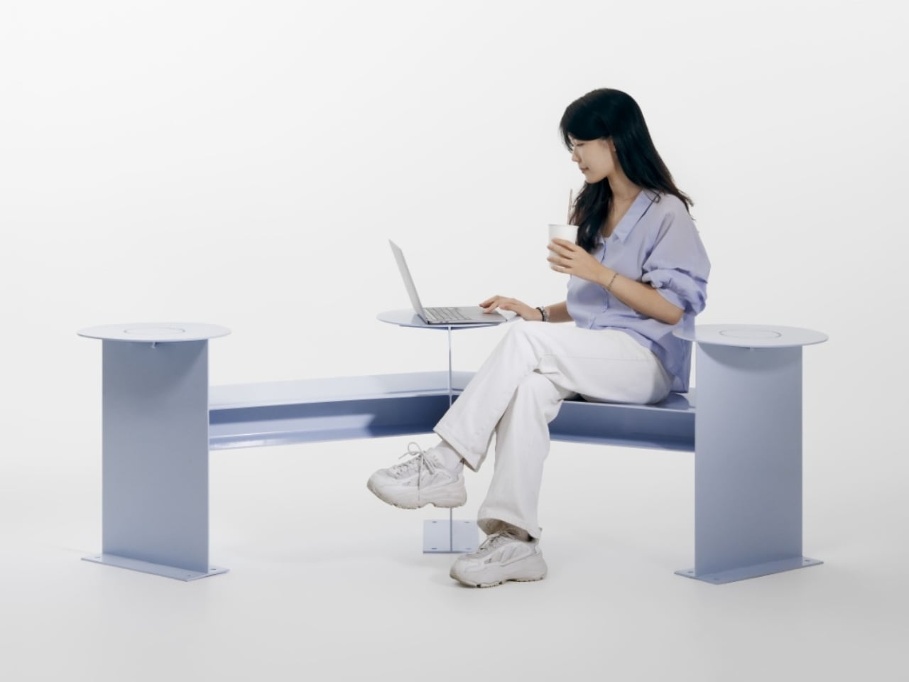
Its clearest design move is visible from above. Instead of a straight bench, the seating follows a shallow, angular bend, with round platforms punctuating the ends and middle. People sitting along the two arms can angle toward each other rather than share a single forward-facing view. The arrangement leaves an open area between them, giving conversation a physical center without enclosing the group or turning the furniture into a miniature booth.

That distinction matters to me. A seating arrangement can invite eye contact without making it compulsory. Free to Face’s photographs show people talking across the bend, but the backless layout also leaves room to choose another orientation. I’d rather have furniture that offers a social possibility than furniture that seems to assign everyone a role. A stranger sitting nearby shouldn’t automatically become your conversation partner, and a public bench shouldn’t feel like an icebreaker exercise.

The different surface heights make the project more interesting than its footprint alone suggests. The supplied description presents those levels as options for choosing a sitting position, with unused areas doubling as places for bags or food. In the photographs, one person occupies a raised circular platform while others sit lower. Elsewhere, a tote rests beside its owner. These are fixed surfaces, not an advertised height-adjustment mechanism, so the flexibility comes from how people occupy the structure.

Those little landing spots feel especially useful. A basic bench leaves your lunch, laptop, and bag competing with your lap or the seat beside you. Here, the circular surfaces provide alternatives, and the images demonstrate a shared meal arranged around the middle platform. I’m particularly fond of that use because it makes the social premise concrete. Two people splitting fries need somewhere to put the fries. Design doesn’t always need a more elaborate explanation than that.

Visually, Free to Face has a pale lavender finish, broad flat supports, and exposed structural geometry. The circular tops soften an otherwise angular assembly. A fabrication photograph shows the metal structure before finishing, although the supplied material doesn’t identify its alloy or coating specification. I like that the form remains readable: you can follow the bench’s bend, identify the raised surfaces, and understand several possible uses without consulting an instruction panel.

The studio setting does leave practical questions unanswered. The photographs establish a full-size physical build, not how it performs through rain, summer heat, or years of public use. Back support, comfortable seat heights, and room for someone using a wheelchair would all deserve attention before installation. I wouldn’t dismiss the design for lacking that documentation, but I also wouldn’t treat a staged lunch as proof of comfort or accessibility. Its strongest evidence is the arrangement itself, demonstrated through several uses.

One photograph shows a woman using a laptop alone, which is a welcome detail for a project about connection. Free public space needs to accommodate solitude, too. Sitting quietly shouldn’t count as using social furniture incorrectly. Free to Face appeals to me because its extra surfaces and angled layout offer choices beyond sitting in a row. I’d be happy to see more benches make that effort, especially if they let people linger without needing to order another coffee.

The post An Angled Public Bench for Hanging Out Without the Coffee Tab first appeared on Yanko Design.
  • ✇Yanko Design
  • Colheita Coffee Table Concept Shapes Its Steel Legs With Ant-Inspired Cuts
    Ants aren’t usually welcome around a coffee table, especially when there are snacks involved. The Colheita Coffee Table concept, however, borrows something more useful from them: the curved cuts left by leafcutter ants. Its steel surface folds downward to become its own legs, while movable wooden supports provide places for drinks. The nature reference gives the table its construction logic, rather than simply decorating it. The body starts with a single steel sheet, cut by laser and bent so th
     

Colheita Coffee Table Concept Shapes Its Steel Legs With Ant-Inspired Cuts

Par : JC Torres
12 octobre 2026 à 13:20

Ants aren’t usually welcome around a coffee table, especially when there are snacks involved. The Colheita Coffee Table concept, however, borrows something more useful from them: the curved cuts left by leafcutter ants. Its steel surface folds downward to become its own legs, while movable wooden supports provide places for drinks. The nature reference gives the table its construction logic, rather than simply decorating it.

The body starts with a single steel sheet, cut by laser and bent so three broad sections reach the floor. Those sections remain attached, leaving openings where a conventional tabletop would be solid. Rather than adding separate legs underneath, Colheita carries the tabletop material through to its base. The relationship is easy to follow, even if the resulting silhouette is rather unusual.

Designer: Fabrício Auler

That approach is intended to reduce component count and material waste, although it isn’t a claim of waste-free manufacturing. A smaller detail helps explain how the sheet takes shape: enlarged, rounded ends on the cuts provide relief during bending. They’re there to ease stress where flat metal becomes a leg. The graceful curves have a fabrication purpose alongside their resemblance to a harvested leaf.

The wooden pieces might look like little bowls at first, but their flat tops serve as platforms rather than containers. Each hemisphere has a groove that slots onto the folded steel, allowing it to move along the edge. The wood adds a warmer color and visible grain to the dark metal, while giving a glass or small object its own resting place.

That means the arrangement doesn’t have to stay the same after you’ve chosen where the table goes. Move a wooden support closer to your seat, or spread them around when friends gather on different sides. The system is also intended to help stabilize the upper surface. These small additions therefore have a job beyond making the steel look a little less austere.

Of course, all those openings leave less uninterrupted space for whatever usually accumulates on a coffee table. A book or tray needs a solid patch beneath it, and a loose remote won’t forgive careless placement. The gaps do leave room for trailing plants and allow light through. Colheita invites you to arrange its contents more deliberately, which won’t appeal to everyone’s housekeeping habits.

The project also explores an unfinished carbon steel version, letting oxidation change the surface’s colors and patterns over time. That’s a different proposition from furniture meant to keep an immaculate, uniform finish. It gives the table a changing appearance rather than a permanent shade of gray. The project presentation doesn’t explain how to manage that aging around spilled drinks or routine household cleaning.

Colheita means “harvest” in Portuguese, a nod to the ants and to gathering around the table. It remains a concept project with fabrication work documented, rather than a verified retail offering. Dimensions and load capacity aren’t provided. Before trusting one of those platforms with hot coffee, you’d want to know how securely it stays put when someone nudges the table.

The post Colheita Coffee Table Concept Shapes Its Steel Legs With Ant-Inspired Cuts first appeared on Yanko Design.
  • ✇Yanko Design
  • FUSEBOOX’s Hidden Home Office Slides Away After Work
    Putting a laptop away doesn’t solve every problem with working from home. A video call still needs some privacy, and recording a voiceover beside the dishwasher is a negotiation nobody particularly wants. I like furniture that helps a room do more, but a folding desk only addresses half the issue. Sometimes the missing piece is a door. FUSEBOOX, designed by Czech architect Vojtěch Kolínský of Prague studio Indivizual, proposes a home office that slides out when needed and retracts into the surr
     

FUSEBOOX’s Hidden Home Office Slides Away After Work

12 octobre 2026 à 09:20

Putting a laptop away doesn’t solve every problem with working from home. A video call still needs some privacy, and recording a voiceover beside the dishwasher is a negotiation nobody particularly wants. I like furniture that helps a room do more, but a folding desk only addresses half the issue. Sometimes the missing piece is a door.

FUSEBOOX, designed by Czech architect Vojtěch Kolínský of Prague studio Indivizual, proposes a home office that slides out when needed and retracts into the surrounding interior afterward. It’s a built-in acoustic workspace, presented at DesignBlok 2026, rather than another freestanding booth asking for permanent floor space. The problem it tackles is straightforward: finding somewhere to concentrate without dedicating an entire room to it.

Designer: Vojtěch Kolínský

The module has three positions. Open, it works as a desk within the larger room, so you can stay connected to whatever’s happening around you. Extended and closed, it becomes a private enclosure intended to reduce noise traveling in and out. Retracted, the workspace disappears behind its exterior panels. A custom-developed mechanism handles extension and retraction automatically, according to the maker. That’s a more useful distinction than simply calling it a disappearing desk.

In the supplied images, the interior looks invitingly domestic. Pale wood-grain surfaces, textured wall panels, a narrow shelf, and warm lighting surround a compact desk. The exhibition setup includes a microphone and a metronome, while another image shows a guitar mounted above the worktop. Those details suggest a space for practicing and making things, not merely surviving the next calendar invitation. I’d rather see that than a miniature corporate meeting room.

The acoustic ambition deserves a closer look. FUSEBOOX describes a multilayer construction with sealed contact edges that limits sound transmission, alongside treatment intended to control reflections and reverberation inside. In practical terms, keeping household noise out and reducing echo around a microphone are separate jobs, and the design aims to address both. The supplied release promises studio-quality sound, but provides no measured isolation figures or independent testing to establish that claim.

Ventilation and adjustable lighting are included, with the website specifying variable brightness and color temperature. These are sensible priorities for a small enclosed workspace. I’d want airflow and lighting considered alongside the moving panels, because a booth that looks good from the couch still has to make sense from the chair. The tall glazed side panels visible in the images also keep the enclosure from looking like an opaque cabinet.

The hidden position is the strongest part of the idea for me. Closing a laptop leaves the desk, cables, and unfinished work in view. Closing up an entire workspace could give the living room a more convincing end to the workday. That isn’t a promise of better productivity or instant relaxation. It’s a physical boundary you can see, which feels more useful than another reminder to log off.

Of course, the module doesn’t manufacture extra square footage. Its built-in portion still occupies space, and the extended enclosure needs clear floor area in front. A coffee table or an awkward circulation path could complicate the arrangement. I see it as borrowing space at different times, rather than making space disappear. That makes the surrounding room layout just as important as the mechanism.

FUSEBOOX is designed and made in the Czech Republic, with configurable layouts, materials, fittings, upholstery, and exterior finishes. The company plans to open preorders in January 2027; prices and detailed dimensions haven’t been published yet. Those omissions matter for anyone picturing it at home. A custom built-in belongs in a renovation conversation, and renters would need to discuss installation with their landlord.

I’m drawn to the restraint of the proposal. The images suggest you could finish the exterior to read as ordinary cabinetry, leaving the more elaborate engineering behind it. A home office doesn’t always need to announce itself from across the room. If the acoustics and installation prove convincing, FUSEBOOX could offer something genuinely useful: a place to work, followed by permission to stop looking at it.

The post FUSEBOOX’s Hidden Home Office Slides Away After Work first appeared on Yanko Design.
  • ✇Yanko Design
  • Bloom Built a Cat Tower Around the Cat You Haven’t Got Yet
    A kitten might be happy with a hideaway, but give it a few months and that same nook starts looking cramped. Add another cat, and a single perch becomes contested territory. Bloom takes that problem literally, building a cat tower from separate cylindrical modules that can be arranged as its occupants grow. It starts small instead of demanding space for a feline family. Most cat towers arrive as a collection of platforms, posts, and houses, whether your cat needs all of them or not. Their bulk
     

Bloom Built a Cat Tower Around the Cat You Haven’t Got Yet

Par : JC Torres
7 octobre 2026 à 12:20

A kitten might be happy with a hideaway, but give it a few months and that same nook starts looking cramped. Add another cat, and a single perch becomes contested territory. Bloom takes that problem literally, building a cat tower from separate cylindrical modules that can be arranged as its occupants grow. It starts small instead of demanding space for a feline family.

Most cat towers arrive as a collection of platforms, posts, and houses, whether your cat needs all of them or not. Their bulk can make a living room feel as if it has been furnished around the pet. Bloom swaps that predetermined silhouette for a cluster of open tubes, each one a place to curl up, climb through, or watch the room.

Designers: Joonseo Choi, Taewoon Kang

Those cylinders come in several diameters, so arranging them feels closer to stacking play objects than assembling pet furniture. A smaller cat can settle into a tighter opening, while a larger one has room to stretch out in a wider tube. The circles also give Bloom its character: soft, repeating forms that can take different shapes instead of committing your room to one tower.

Of course, loose tubes wouldn’t make much of a cat tower once the occupants started leaping about. Bloom uses orange straps to hold the modules together, with hook-and-loop fastening that makes them easier to attach and detach. The straps add a punch of color to the pale cylinders, but their important job is letting you change the arrangement without committing to a rebuild.

You might begin with two tubes near the sofa, then add another when your kitten starts climbing above everybody’s heads. If a second cat joins the household, a wider cluster could give each animal somewhere to pause without fighting over the same opening. The exact layout can follow the cats, rather than asking them to adapt to whatever configuration came in a box.

The holes along the sides serve another purpose beyond giving the straps somewhere to attach. Slide a toy toward one, and a cat tucked inside has something to investigate, while you get a way to join the game without reaching into the tube. It’s a detail, but it turns the enclosed space into somewhere for interaction rather than just another hiding place.

There are still questions a concept can’t answer. A tall arrangement would need to stay steady under a cat’s weight, especially if one launches itself at an upper opening. Bloom doesn’t specify load limits or explain how every possible configuration would be supported, so that flexibility shouldn’t be mistaken for unlimited stacking. For now, its flexibility remains an intriguing, unproven design proposition.

Still, Bloom understands something about cats that a fixed tower often misses: the creature you bring home won’t always be small, and it might not always be alone. Its tubes can be rearranged as that story changes, while its openings leave room for curiosity. The furniture doesn’t need to grow overnight; it can take shape alongside the animals that claim it.

The post Bloom Built a Cat Tower Around the Cat You Haven’t Got Yet first appeared on Yanko Design.
  • ✇Yanko Design
  • Flat-Pack Furniture That Actually Survives Your Next Move
    Flat-pack furniture is easy to appreciate on the day it arrives. It fits through the door, and you can usually put it together without much help. The harder test comes later: can it survive a move, come apart cleanly, or be repaired when something goes wrong? FLAT/FORM, a collection by designer Satoshi Itasaka of h220430, is built around those questions. Its pieces use bolts and nuts so they can be assembled, disassembled, repaired, and transported again. That might sound like a modest ambition
     

Flat-Pack Furniture That Actually Survives Your Next Move

5 octobre 2026 à 04:15

Flat-pack furniture is easy to appreciate on the day it arrives. It fits through the door, and you can usually put it together without much help. The harder test comes later: can it survive a move, come apart cleanly, or be repaired when something goes wrong? FLAT/FORM, a collection by designer Satoshi Itasaka of h220430, is built around those questions. Its pieces use bolts and nuts so they can be assembled, disassembled, repaired, and transported again.

That might sound like a modest ambition, but it changes how I look at the furniture. A dining chair is rarely a one-time purchase for a single room. It may follow you through different apartments, sit beside several tables, and get carried up more stairs than you care to count. FLAT/FORM treats that ongoing life as part of the design brief, rather than leaving it to chance after the first assembly.

Designer: h220430

The material gives the project its character. FLAT/FORM uses 15-millimeter-thick veneer panels made from Japanese cedar trees more than 100 years old, with timber supplied by Miyazaki-based forestry company GROWTHRING. A dining chair and a low table are among the pieces in the collection. Both start from flat panels, a straightforward idea that lets the wood grain do some of the visual work while the construction remains easy to understand.

I like that balance. The collection does not try to disguise how it is made. Its flat planes and visible connections make assembly feel like a considered feature, not an awkward step between opening a box and enjoying the result. That distinction matters because a piece can be visually quiet without feeling anonymous. Here, the simple construction gives the furniture a recognizable point of view, while leaving room for the cedar to be the thing you notice first.

The choice of older cedar also invites a little care in how we talk about the project. Wood with a compelling history does not automatically make a product sustainable, and a furniture collection cannot solve every problem associated with consumption. What FLAT/FORM can offer is a more specific proposition: furniture intended to come apart, travel, and be repaired instead of being treated as finished when its first arrangement stops working. That seems more useful to me than a sweeping environmental promise.

There is a practical kindness to that approach. Moving is already expensive and tiring; furniture should not add a puzzle you are afraid to solve twice. Bolts and nuts are familiar hardware, and the collection’s assembly system is intended to make disassembly possible. None of that guarantees that every move will be effortless. It does mean the designer has acknowledged that people relocate and rearrange their lives, and that a chair ought to have some chance of keeping up.

I would still want to sit in the dining chair before making any grand claims about it. Photographs can tell you plenty about proportion and material, but not how a seat feels through a long dinner. Nor does an elegant assembly concept tell you what the collection costs or how its surfaces will age in a busy home. Those are fair questions for any furniture meant to last, particularly furniture whose appeal rests partly on the idea of keeping it around.

Even with those questions open, FLAT/FORM feels refreshing because it gives flat-pack design a different priority. Convenience at delivery is helpful, but convenience at every stage afterward may be the better measure. A table that can leave one home and settle into another without becoming a burden has a value that is easy to overlook when shopping by appearance alone. Itasaka’s collection makes that overlooked part of ownership visible.

Perhaps that is the quietest, strongest idea here: furniture should be allowed to have a future. FLAT/FORM does not need to look complicated to make that point. It uses flat cedar panels and ordinary fasteners to ask a sensible question of a familiar category: what if getting a piece into your home were only the beginning of a good design? That is a question worth asking before the next box arrives at the door.

The post Flat-Pack Furniture That Actually Survives Your Next Move first appeared on Yanko Design.
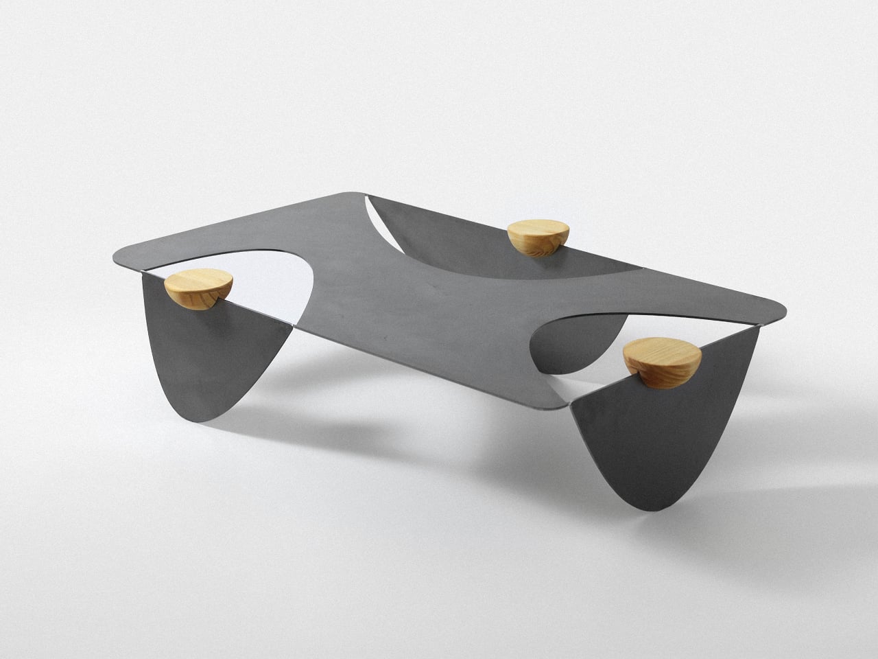
  • ✇Yanko Design
  • A 1908 New York building’s discarded fragments got turned into furniture instead of being demolished
    A renovation across the street from Rafael Prieto’s studio offered an unusually good view of his next project. As decorative pieces came off the facade of a Tribeca building, he arranged to save sixteen that were headed for disposal. Most of us would have watched the scaffolding go up and returned to our emails. Prieto, a Mexico-born designer and creative director based in Tribeca, had other ideas. The result is a furniture exhibition that keeps the building’s ornament alive in some very unexpe
     

A 1908 New York building’s discarded fragments got turned into furniture instead of being demolished

4 octobre 2026 à 09:20

A renovation across the street from Rafael Prieto’s studio offered an unusually good view of his next project. As decorative pieces came off the facade of a Tribeca building, he arranged to save sixteen that were headed for disposal. Most of us would have watched the scaffolding go up and returned to our emails. Prieto, a Mexico-born designer and creative director based in Tribeca, had other ideas. The result is a furniture exhibition that keeps the building’s ornament alive in some very unexpected forms.

Prieto spent time with the fragments before turning them into the starting point for tables, chairs, and sculptural objects. Weathered ornament sits against painted birch, sometimes tucked inside a crisp new frame. The resulting furniture keeps its New York address close, even when its shape heads somewhere unexpected. Some pieces carry the actual stone; others borrow only its curves, grooves, and proportions. It is a show that rewards looking twice.

Designer: Rafael Prieto

The building across the street is 366 Broadway, now known as Collect Pond House, a twelve-story Beaux-Arts structure designed by Frederick C. Browne in 1908. It was once home to the Royal Typewriter Company, then became a residential co-op in 1979. The facade is densely ornamented: copper cornices, Greek key detailing, marble columns, and keystones carved into bearded faces that have been watching Tribeca change for over a century. A recent multi-year restoration replaced and conserved 65 terra cotta units. A handful of the pieces removed during that process did not make it back onto the building.

Before cutting anything, Prieto lived with the fragments in his studio for roughly a year and a half. He photographed and scanned each contour and ornament, then layered those images to pull out shapes and combinations that could inform new work. That process produced a design vocabulary rather than any direct copy of the originals. The stepped, ribbed profiles that climb the legs of the red lacquered chair came directly from this translation, somewhere between column fluting and abstracted skyline. It is a method closer to archaeology than furniture-making.

One of the standout pieces has a large carved stone cornice block sitting below a flat black painted tabletop, doing actual structural work. The stone is pale, dense, and loaded with repeating scroll forms, carrying roughly a century of New York weather on its surface. Another piece cages a smaller fragment between vertical black bars inside a cube-shaped form, the stone visible through the gaps like something on display. The medium listing for several works at the gallery confirms “Architectural Fragment” as a named material alongside painted birch. Not every piece carries original stone; some borrow only its shapes.

The all-red lacquered chair is the most confident piece in the show, its legs built from stacked, stepped planes that scanning and layering pulled from 366 Broadway’s fluted piers and molded profiles. Its natural birch counterpart deploys the same vocabulary in warm wood, swapping lacquer for grain and adding red geometric arm brackets at the joints. A console table makes the argument most literally: one end sits on a fabricated red plinth, the other rests on an actual salvaged Ionic stone volute, intact and weather-stained. The two supports are not supposed to match. The gallery describes this contrast as the central thread: the hard and the soft, the historic and the contemporary, running through every piece.

Several of the original keystones sit on the gallery floor unaltered, including one carved bearded face in a plumed helmet still stained with moss and a century of city air. Prieto’s analog photography wraps the walls in large-scale architectural murals, produced in collaboration with Wallpaper Projects. The room ends up feeling closer to a photographed ruin than a white-cube gallery, which is entirely the point. He told Family Style that “New York is its architecture,” and that most people talk about the skyline but “don’t look up.” The show does the looking for you.

‘The Future of the Past’ is Prieto’s second solo show with Emma Scully Gallery and runs through December 12 at the Upper East Side location, open Wednesday through Saturday. Pricing and availability are through the gallery directly. The question the collection keeps circling is whether furniture shaped by a building’s discarded ornament carries any of that building’s memory with it. Prieto does not seem interested in settling that question cleanly. The bearded face on the gallery floor looks like he has made his peace with the whole situation.

The post A 1908 New York building’s discarded fragments got turned into furniture instead of being demolished first appeared on Yanko Design.
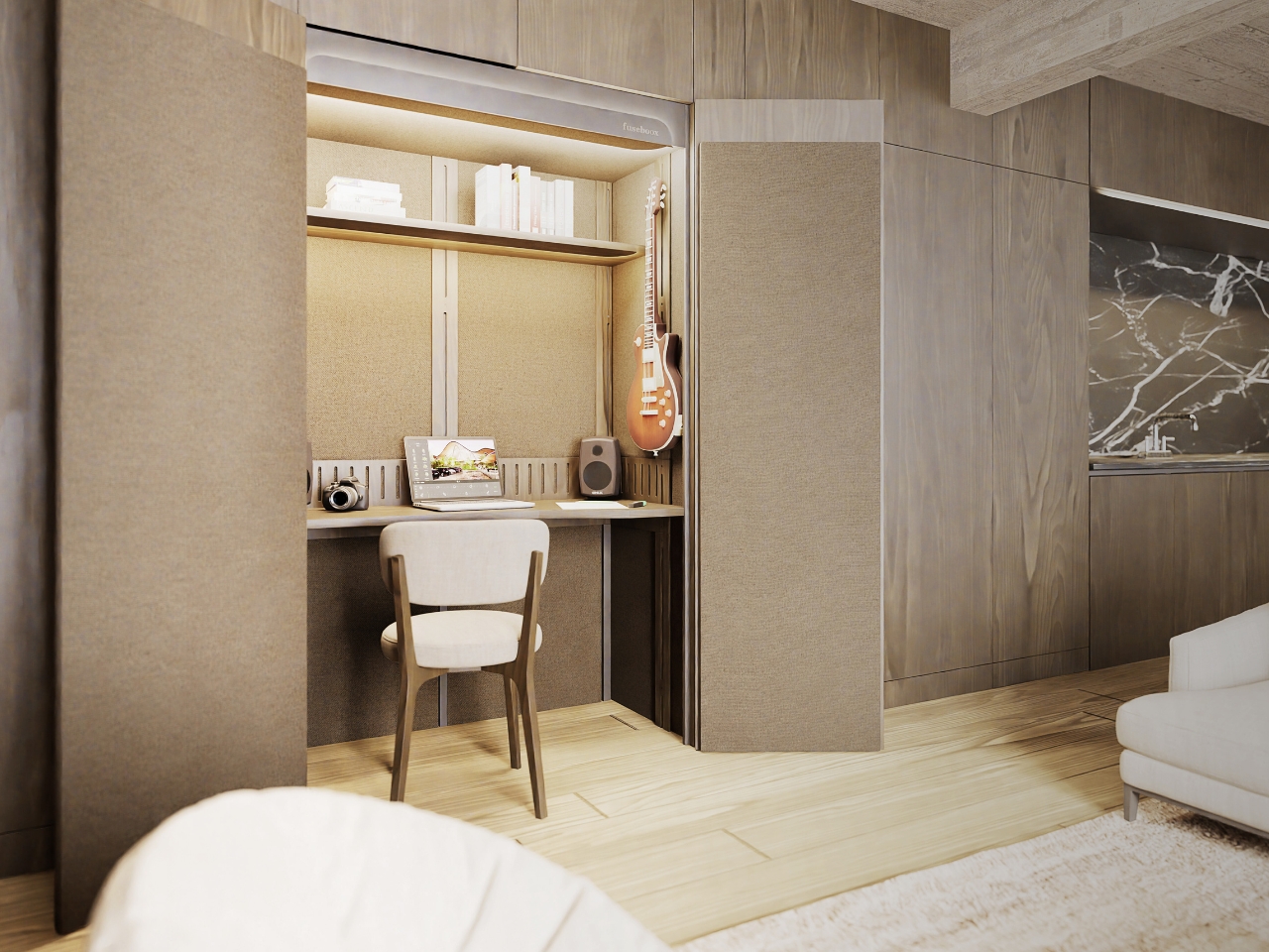
  • ✇Yanko Design
  • One Table, 3 Games, Nobody Needs a Game Room
    Most people who want a pool table and a dining table end up choosing neither. The math never works. A regulation pool table eats up roughly the same square footage as a small bedroom, a ping pong table needs its own dedicated stretch of floor to swing a paddle without hitting a wall, and a proper dining table has to look good enough to survive being seen by dinner guests. Pick two out of three and you’re already stretching a normal house. Pick all three and you need a room nobody actually has.
     

One Table, 3 Games, Nobody Needs a Game Room

28 septembre 2026 à 15:20

Most people who want a pool table and a dining table end up choosing neither. The math never works. A regulation pool table eats up roughly the same square footage as a small bedroom, a ping pong table needs its own dedicated stretch of floor to swing a paddle without hitting a wall, and a proper dining table has to look good enough to survive being seen by dinner guests. Pick two out of three and you’re already stretching a normal house. Pick all three and you need a room nobody actually has.

Sanne’s Department of Play looked at that math and decided it was wrong. The 3-in-1 Table is exactly what it sounds like: lift the top and a dining table becomes a full pool table, swap the surface again and it’s ping pong, complete with a cane-and-leather net that looks like it belongs in a much more expensive living room than most game tables ever see. It collapses three furniture purchases and three separate footprints into one object, which solves the actual problem that has quietly kept most people out of the game-room conversation entirely: there was never enough house for the fun stuff.

Designer: Sanne’s Department of Play (photos by Vitali Grishkov)

What gets me about this piece is that it doesn’t look like a compromise. Anyone who has shopped for a combo game table before knows the usual result, a pool table with a plywood lid bolted on top so it can technically also be a dining surface, priced around $800 and looking every bit like sports equipment wearing a costume. Sanne’s version starts somewhere else entirely. The scalloped edge running around the perimeter and down the legs, that repeating rounded bump pattern, looks like it was drawn first as a piece of sculpture and only later revealed to double as the ball guard for ping pong. Function followed form here instead of the other way around, and you can feel that order in every photo of it just sitting quietly as a dining table under a chandelier, giving away nothing about its second life.

The material choices back that up. The base is a deep walnut tone against lighter ash detailing, which reads more mid-century furniture than rec room. When it becomes a pool table, the felt is a rust orange rather than the standard casino green, which sounds like a small thing until you realize it’s the difference between a table that argues with your décor and one that sits right at home. Even the accessories got the same treatment. The cue rack is its own scalloped tower that matches the table instead of leaning against a wall wrapped in a canvas cover, the ping pong paddles are hand-painted with little leopards and floral motifs, and the ball tray is dovetailed like a keepsake box. Nobody asked for the ball tray to look nice. They built it that way anyway.

That attention to the parts nobody was going to scrutinize is what actually sells the bigger idea. Pricing puts the crafted-to-order version around $12,500, with a limited floorstock release closer to $7,500, so this sits firmly in collectible design furniture territory rather than impulse purchase territory. That framing matters more than it first appears. It’s less “we made a fun table” and more “we made a serious piece of furniture that happens to also be extremely fun,” and that distinction is the whole reason it works in a home that already has real art on the walls instead of only in a basement.

There’s a bigger shift happening around furniture like this, one where the game room stops being a separate destination and starts becoming part of the main living space instead of something hidden behind a closed door. A pool table tucked in a basement gets used four times a year. A pool table that is also the table where everyone already eats dinner gets used constantly, almost by accident, because nobody has to decide to go play. They just have to clear the plates.

The post One Table, 3 Games, Nobody Needs a Game Room first appeared on Yanko Design.
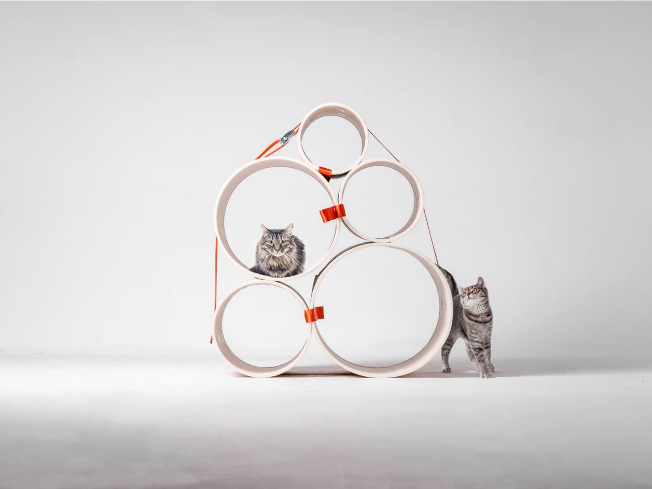
  • ✇Yanko Design
  • This Lounge Chair Is Built From Cork — and It’s Sturdier Than It Looks
    Cork is everywhere in design, and yet it’s almost always decorative. A tile floor. A pin board. A wine stopper. Copenhagen-based furniture designer Chiara Verde looked at that assumption and quietly dismantled it. Her Strata lounge chair doesn’t use cork as a finish — it uses cork as the architecture. The chair is built around a layered composite system: thin cork sheets alternated with natural fibre textiles, laminated together to form load-bearing shells. The textile reinforcement isn’t there
     

This Lounge Chair Is Built From Cork — and It’s Sturdier Than It Looks

18 septembre 2026 à 17:30

Cork is everywhere in design, and yet it’s almost always decorative. A tile floor. A pin board. A wine stopper. Copenhagen-based furniture designer Chiara Verde looked at that assumption and quietly dismantled it. Her Strata lounge chair doesn’t use cork as a finish — it uses cork as the architecture.

The chair is built around a layered composite system: thin cork sheets alternated with natural fibre textiles, laminated together to form load-bearing shells. The textile reinforcement isn’t there for aesthetics — it gives the cork directional stiffness and structural performance it simply doesn’t have on its own. A minimal metal frame handles only the points under concentrated load, leaving the cork shells to carry the rest. It reads, visually, like a chair slung from material intelligence rather than convention.

Designer: Chiara Verde

Verde’s background leans heavily into process. Her practice is built on material experimentation, prototyping, and structural research — work that treats the studio bench as an extension of the design itself. Strata wasn’t conceived and then executed. It emerged through months of testing, adjustment, failure, and recalibration. A cork stool came first — a full-scale testbed that validated the structural logic before Verde committed it to a larger form. The lounge chair is the result of everything that came before it.

What makes Strata worth paying attention to isn’t just the material provocation — it’s how restrained the final form is. The chair doesn’t announce itself. It holds the visual language of the natural world: organic in silhouette, warm in texture, quietly confident in its proportions. Cork has an inherent thermal quality to it, a softness underfoot and underhand that synthetic materials spend millions trying to replicate. Here, it’s simply doing its job.

The lineage of the slung chair runs deep — leather over steel tubing defined a generation of modernist seating in the early and mid-20th century. Verde is working in that same formal territory, proposing laminated cork as the next honest alternative to leather: a material that gives, breathes, and ages with use rather than against it.

Strata sits in a growing conversation around material-led design — not sustainability as branding, but sustainability as methodology. Verde isn’t marketing cork. She’s interrogating it, and the chair is the proof of concept. For a material that has spent decades on the periphery of furniture design, Strata might be the argument it needed all along.

The post This Lounge Chair Is Built From Cork — and It’s Sturdier Than It Looks first appeared on Yanko Design.
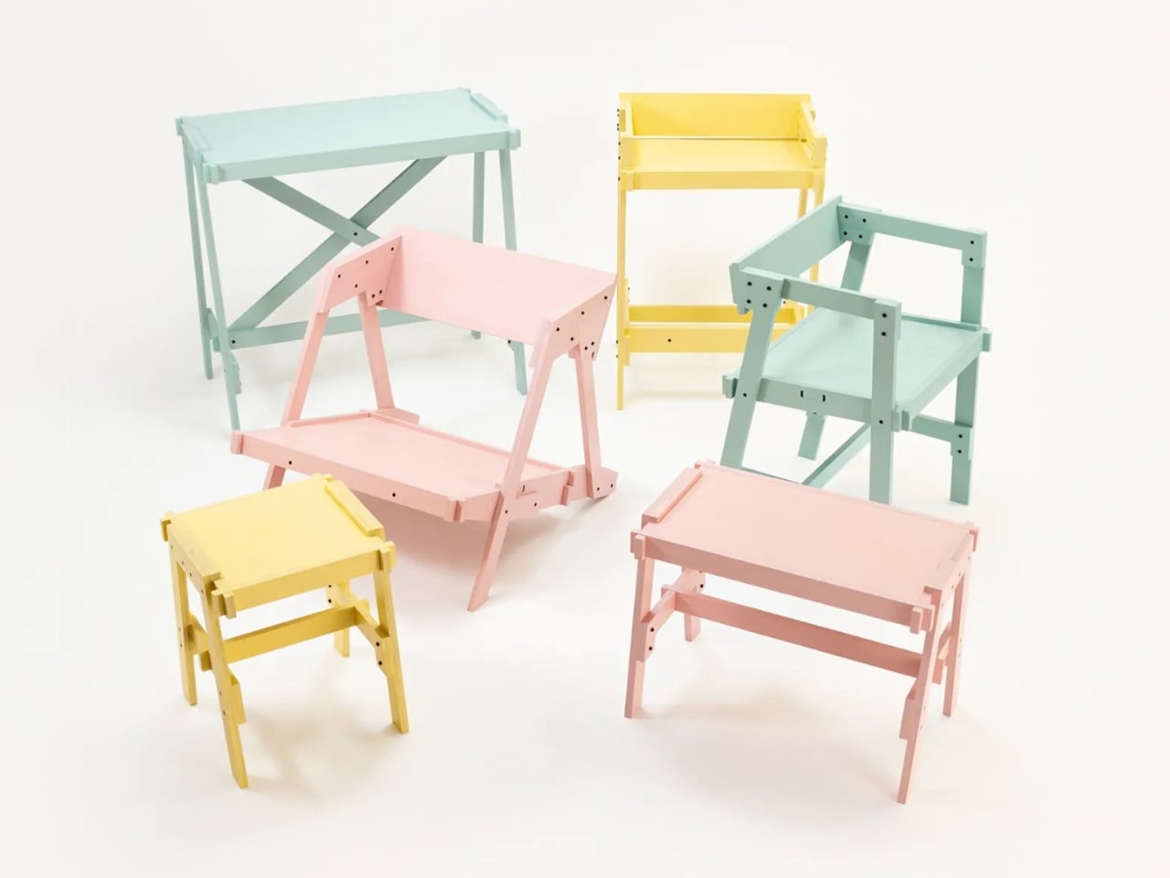
❌