Vue normale

  • ✇Yanko Design
  • Gage Roads Just Turned a Surfboard Into a Beer Tap
    The last debate you expected to find at the heart of a design story was a surfing one, but here we are. For years, the surf community has been at odds over something surprisingly technical: should surfboards be measured in volume, using litres? It sounds like a niche argument, but for shapers and surfers, the stakes are genuinely real. Leave it to an Australian brewery to turn that argument into one of the most interesting design objects of the year. Gage Roads Brew Co. partnered with legendary
     

Gage Roads Just Turned a Surfboard Into a Beer Tap

19 juillet 2026 à 11:20

The last debate you expected to find at the heart of a design story was a surfing one, but here we are. For years, the surf community has been at odds over something surprisingly technical: should surfboards be measured in volume, using litres? It sounds like a niche argument, but for shapers and surfers, the stakes are genuinely real. Leave it to an Australian brewery to turn that argument into one of the most interesting design objects of the year.

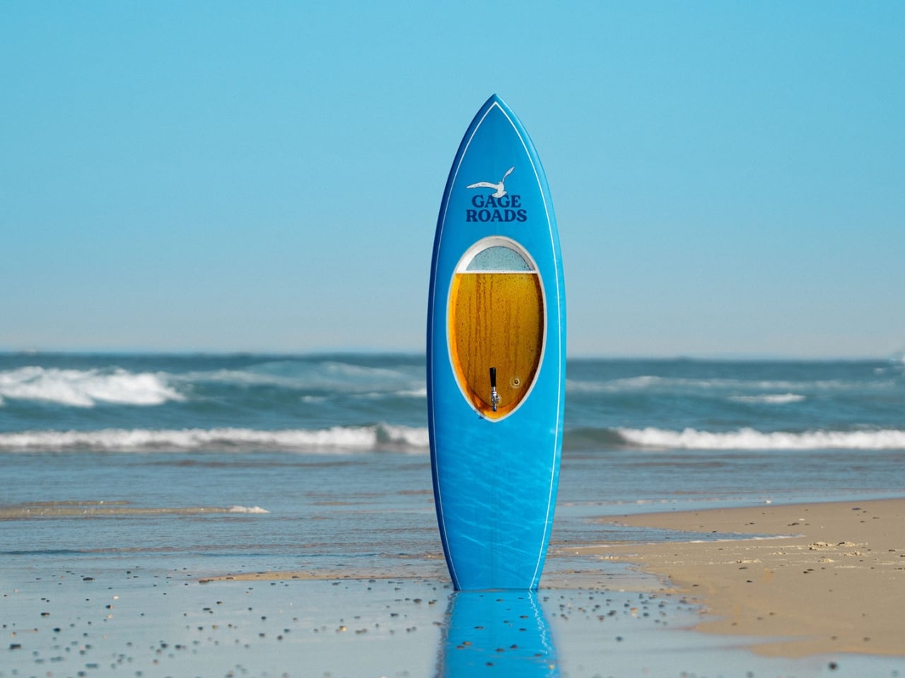
Gage Roads Brew Co. partnered with legendary board shaper Chris Garrett of Phantom Surfboards to create the Beerboard, a custom single-fin surfboard built with a sealed internal chamber capable of holding 10 litres of Gage Roads Summer Ale Single Fin. Yes, it actually surfs. And yes, it actually pours beer. That’s the whole glorious point.

Designer: Chris Garrett with Gage Roads Brew Co

The concept itself is brilliantly simple, but the execution was anything but. The engineering challenge of making a surfboard capable of storing pressurised beer without leaking, or worse, imploding mid-session, required serious work. Garrett’s decades of experience as a shaper came into play here in ways that go well beyond surface aesthetics. He’s been crafting boards since 1979, and Phantom Surfboards has been his life’s work since 1984. Designing the Beerboard meant rethinking the interior construction entirely, embedding a food-safe chamber that could handle pressurisation while preserving the board’s hydrodynamics. The build process reportedly came with a few explosions along the way, which is either alarming or just the most Australian development story imaginable.

The board draws inspiration from the iconic Greenough Spoon, a shape dating back to the 1960s. Choosing that reference wasn’t accidental. The Spoon was itself a radical rethink of what a surfboard could be, and the Beerboard follows directly in that spirit. It doesn’t look like a novelty item. It looks like a real board, clean and purposeful, and that restraint is exactly where the design succeeds. A gimmick slapped together for a social media moment would have felt cheap. This doesn’t feel cheap at all.

Once the board was finished, Gage Roads called in Olympic surfing medalist and part-owner Jack Robinson alongside legendary free surfer Brendan “Margo” Margieson for sea trials. The fact that professional surfers actually took it into the ocean, rode it, and then presumably poured a cold one from it afterward is a key part of why the Beerboard registers as more than a marketing stunt. It works, both as a surfboard and as a beer dispenser. That functional integrity is what elevates the whole project.

Is the Beerboard a practical product? Not remotely. You’re not about to wax this thing down and paddle out for your morning session while worrying about keeping your lager cold. But practicality is the wrong lens here entirely. The most interesting design objects rarely exist to solve a purely utilitarian problem. They exist to reframe one. The Beerboard reframes the entire surfboard volume debate by making it physical and playful, by literally filling a surfboard with the very unit of measurement causing all the fuss. It’s design as commentary, and it genuinely lands.

It also matters who made this. Chris Garrett isn’t an ad agency prop designer. He’s a craftsman with nearly 50 years in the industry, someone whose boards have been trusted by some of the world’s top surfers across decades. Bringing his expertise to a project like this gives the Beerboard a credibility it wouldn’t have had otherwise. It’s the difference between a concept and a creation.

I’ve seen plenty of branded design collaborations that felt hollow or performative, where the “design” was really just a logo slapped on a limited-edition container. The Beerboard isn’t that. It required genuine engineering, real craft expertise, and the confidence to commit fully to a ridiculous idea until it became a remarkable one. That, I think, is what good design actually looks like. Sometimes it just happens to come with a tap.

The post Gage Roads Just Turned a Surfboard Into a Beer Tap first appeared on Yanko Design.
  • ✇Yanko Design
  • A 35m² Summerhouse Designed Like a Space Habitat
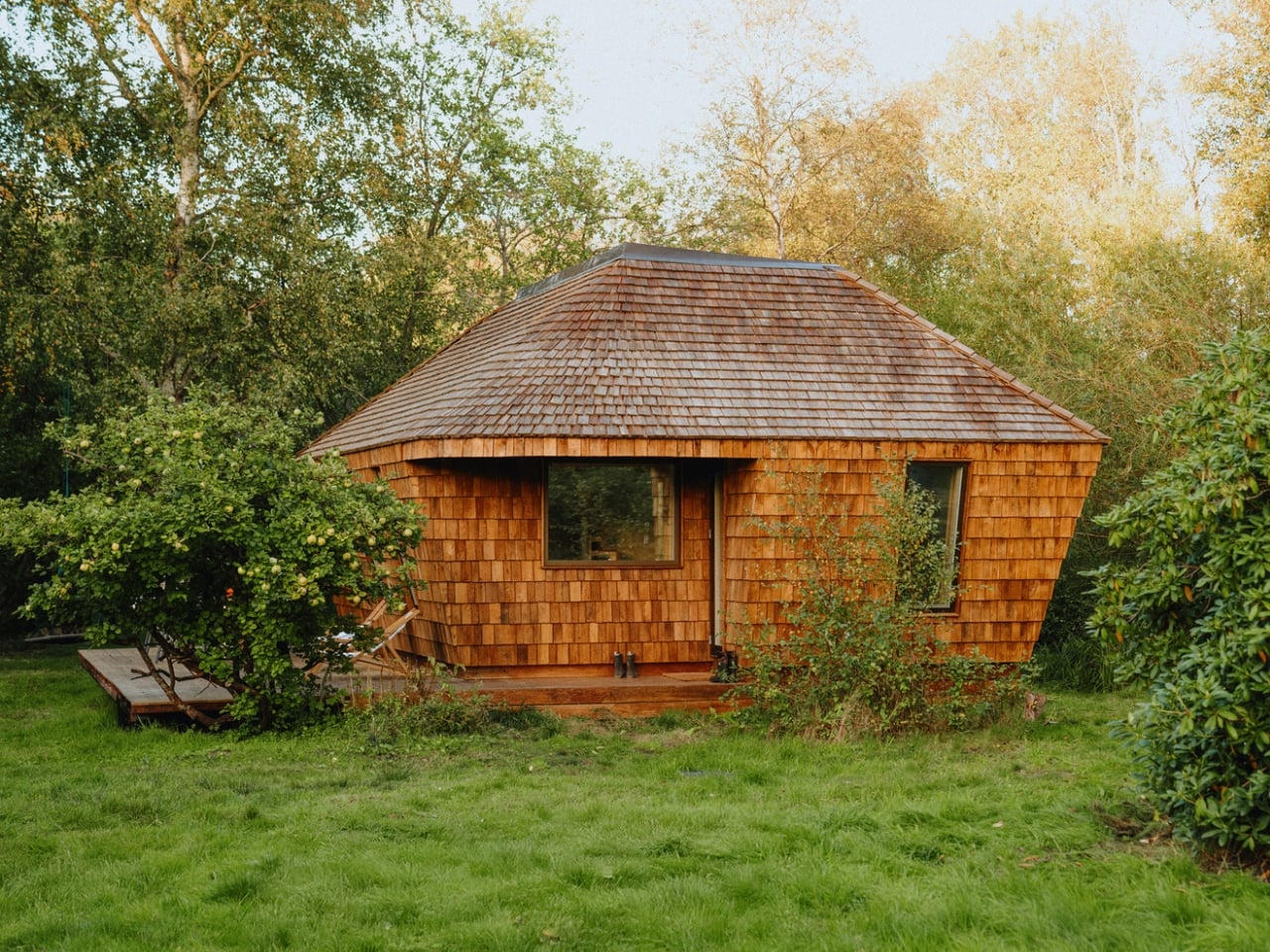
    Most summerhouses don’t start as thought experiments about the moon. EcoNeo did. Designed by SAGA Space Architects and sitting quietly in Asnæs on the Danish island of Zealand, it measures just 35 square meters and sleeps a family of six. It also has an indoor sauna. The fact that all of this coexists within a space roughly the size of a large studio apartment says everything about what SAGA is doing differently. This is a house designed by people who take small spaces very, very seriously. SAG
     

A 35m² Summerhouse Designed Like a Space Habitat

19 juillet 2026 à 09:20

Most summerhouses don’t start as thought experiments about the moon. EcoNeo did. Designed by SAGA Space Architects and sitting quietly in Asnæs on the Danish island of Zealand, it measures just 35 square meters and sleeps a family of six. It also has an indoor sauna. The fact that all of this coexists within a space roughly the size of a large studio apartment says everything about what SAGA is doing differently. This is a house designed by people who take small spaces very, very seriously.

SAGA Space Architects was founded in 2018 by Danish architects Sebastian Aristotelis and Karl-Johan Sørensen, and their portfolio reads nothing like a traditional residential practice. These are the people behind LUNARK, a simulated lunar habitat tested during a 100-day expedition in Greenland. They also developed the Circadian Light system installed on the International Space Station and built FLEXHab, a habitat prototype for the European Space Agency. Their methodology is built around extreme-environment logic, where every centimeter, every kilogram, and every watt is a decision that matters. EcoNeo takes that same discipline and applies it to a Danish holiday home, and the result is genuinely worth paying attention to.

Designer: SAGA Space Architects

The studio calls its approach “Terra-Tech,” a marriage of technical precision and material awareness that keeps the design grounded in lived experience rather than spectacle. EcoNeo is built from biogenic materials, including OSB panels, wood-fiber insulation, Douglas fir, oak, birch, and plywood, all chosen for their low environmental footprint and warm sensory quality. Digital fabrication shapes the structure with the kind of accuracy you don’t typically associate with a weekend retreat. The architects estimate EcoNeo reduces annual carbon emissions by roughly 80 percent compared to an average new Danish summerhouse. That is not a rounding error. That is a structural rethinking of what holiday architecture can be.

On the inside, the floor plan is organized around a central living space that works harder than most rooms twice its size. The ground floor brings together the kitchen, bathroom, integrated storage, the sauna, and a dining table that can seat the whole family. Upstairs, sleeping space is tucked in a way that feels considered rather than compromised. Every piece of the interior is designed to serve more than one purpose, because SAGA knows from its space habitat work that generosity of experience does not require generosity of space. You feel that difference the moment you look at the photographs. The rooms have a quietness to them, a sense that everything belongs exactly where it is.

That, to me, is where EcoNeo gets genuinely interesting as a cultural object. The conversation around sustainable housing often leans into austerity, as though living with a lighter footprint requires accepting a diminished quality of life. EcoNeo makes the opposite argument without raising its voice. The house does not look like a sacrifice. It looks like a place people would actually want to spend a summer in, with its warm timber surfaces, considered proportions, and an undeniable calm that reads clearly even in photographs. Sustainability, when done right, does not ask you to give anything up. It asks you to think more carefully about what you actually need.

The collaborators list tells its own story: Velux, Dinesen, GROHE, Svane Køkkenet, Velfac, and ThermoCell, among others. These are not budget-line names. SAGA was not chasing a price point with EcoNeo. They were chasing a standard, and it shows in every decision, from the material palette to the fabrication method.

Whether EcoNeo becomes a scalable template for sustainable residential housing or remains a singular prototype is a question worth watching. The studio intends to develop it further for broader residential applications. Given their track record of designing for environments where there is genuinely no margin for error, I would take that intention seriously. EcoNeo is proof that the best ideas about how to live on Earth might just be the ones we developed while thinking about how to live somewhere else entirely.

The post A 35m² Summerhouse Designed Like a Space Habitat first appeared on Yanko Design.

  • ✇Yanko Design
  • A Duck, Some Bent Tubes, and the Most Charming Lamp of 2026
    The first thing you notice is the yellow. Not a soft, hedging yellow, but a full-commitment, matte, warm yellow that coats every millimeter of the piece without apology. Then you notice the shape. A long, arching neck. Two sturdy legs. A horizontal head that doubles as the light source. Duke, the table lamp designed by Liam de la Bedoyere of Bored Eye Design, is a duck. More precisely, it’s a duck drawn by someone who decided that one continuous tube was all they needed. That’s the central idea
     

A Duck, Some Bent Tubes, and the Most Charming Lamp of 2026

18 juillet 2026 à 18:30

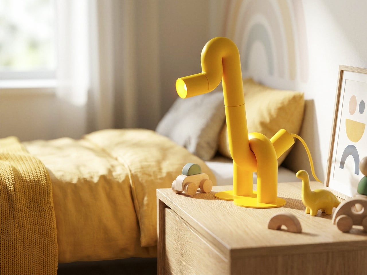
The first thing you notice is the yellow. Not a soft, hedging yellow, but a full-commitment, matte, warm yellow that coats every millimeter of the piece without apology. Then you notice the shape. A long, arching neck. Two sturdy legs. A horizontal head that doubles as the light source. Duke, the table lamp designed by Liam de la Bedoyere of Bored Eye Design, is a duck. More precisely, it’s a duck drawn by someone who decided that one continuous tube was all they needed.

That’s the central idea, and it’s worth sitting with. De la Bedoyere’s design vocabulary here is essentially a single rule: take a tube, bend it, and let the animal emerge from the bends. No additional elements, no decorative flourishes, no mixed materials. Just the tube, its curves, and the form they describe. The result is a piece that communicates immediately. You read it as an animal before you register that it’s a lamp, which is the correct order of things.

Designer: Liam de la Bedoyere

Up close, the construction rewards attention. The tubular sections connect in visible segments, and those joints give the piece a modular, almost architectural quality that tempers the playfulness with something more considered. The bends themselves are generous and smooth, with a radiused curve that keeps everything feeling soft rather than rigid. The head is a cylinder open at the end, functioning as the spotlight, and that detail is quietly clever. The light doesn’t interrupt the form. It completes it, pointing forward from the duck’s snout like the whole thing was always meant to do exactly this.

The base is a flat circular disc, minimal and low to the surface. Two legs rise from it and immediately branch into the body, giving the lamp a planted, grounded stance that stops it from reading as fragile. And then there’s the cord, a braided yellow cable that matches the body exactly, looping out near the base. Most designers treat the cord as a problem to solve or something to hide. Here it’s an afterthought that became a feature, trailing away from the lamp like a tail. It’s one of those small decisions that reveals how thoroughly this design was thought through.

The monochromatic yellow does something important for how the silhouette reads. By removing any tonal contrast within the piece itself, the animal form becomes purer and more immediate. Your eye traces the outline rather than getting pulled into detail, which is exactly what you want from a lamp that’s also functioning as sculpture. The color also travels. Looking at Duke placed against warm wood, concrete, white walls, and natural linen, it doesn’t clash with any of them. Yellow at this saturation and matte finish is warmer than it is aggressive, and it reads more like a material choice than a color choice.

The design is also genuinely versatile, which isn’t something you can say about most statement objects. Duke works in a child’s bedroom because it looks like a toy. It works on a bookshelf or a credenza in an adult living space because the construction is clean and the form is abstract enough to read as sculptural. Place it next to a magazine on a coffee table and it looks like something you’d find in a design gallery. That range of contexts isn’t accidental. It comes from the clarity of the underlying concept. When a design is resolved at the idea level, it adapts.

What makes Duke feel significant beyond its charm is that de la Bedoyere is clearly developing a language, not just making individual pieces. The Flamingo Lamp came first, and the same logic runs through both, which means the interest is in the system as much as the object. A lamp collection built entirely on the premise of one continuous tube tracing an animal is a genuinely interesting editorial position for a designer to take. It’s a constraint that produces rather than limits, and that’s the kind of thinking that tends to produce lasting work.

Duke doesn’t try to do many things. It tries to do one thing very well, and in design, that’s harder than it sounds.

The post A Duck, Some Bent Tubes, and the Most Charming Lamp of 2026 first appeared on Yanko Design.

  • ✇Yanko Design
  • Blackwing’s $400 Crate Is Every Writer’s Dream Gift Set
    Pencils don’t usually make people emotional. But Blackwing pencils have always been a little different. The brand, which revived the legendary Blackwing 602 after its original discontinuation in 1998, has spent years building something that goes beyond the pencil itself. It’s a whole philosophy about the act of writing by hand. And with the new Blackwing Crate Gift Set, priced at $400, they’ve essentially packaged that philosophy into a matte black box and sent it out into the world. Let’s talk
     

Blackwing’s $400 Crate Is Every Writer’s Dream Gift Set

18 juillet 2026 à 16:15

Pencils don’t usually make people emotional. But Blackwing pencils have always been a little different. The brand, which revived the legendary Blackwing 602 after its original discontinuation in 1998, has spent years building something that goes beyond the pencil itself. It’s a whole philosophy about the act of writing by hand. And with the new Blackwing Crate Gift Set, priced at $400, they’ve essentially packaged that philosophy into a matte black box and sent it out into the world.

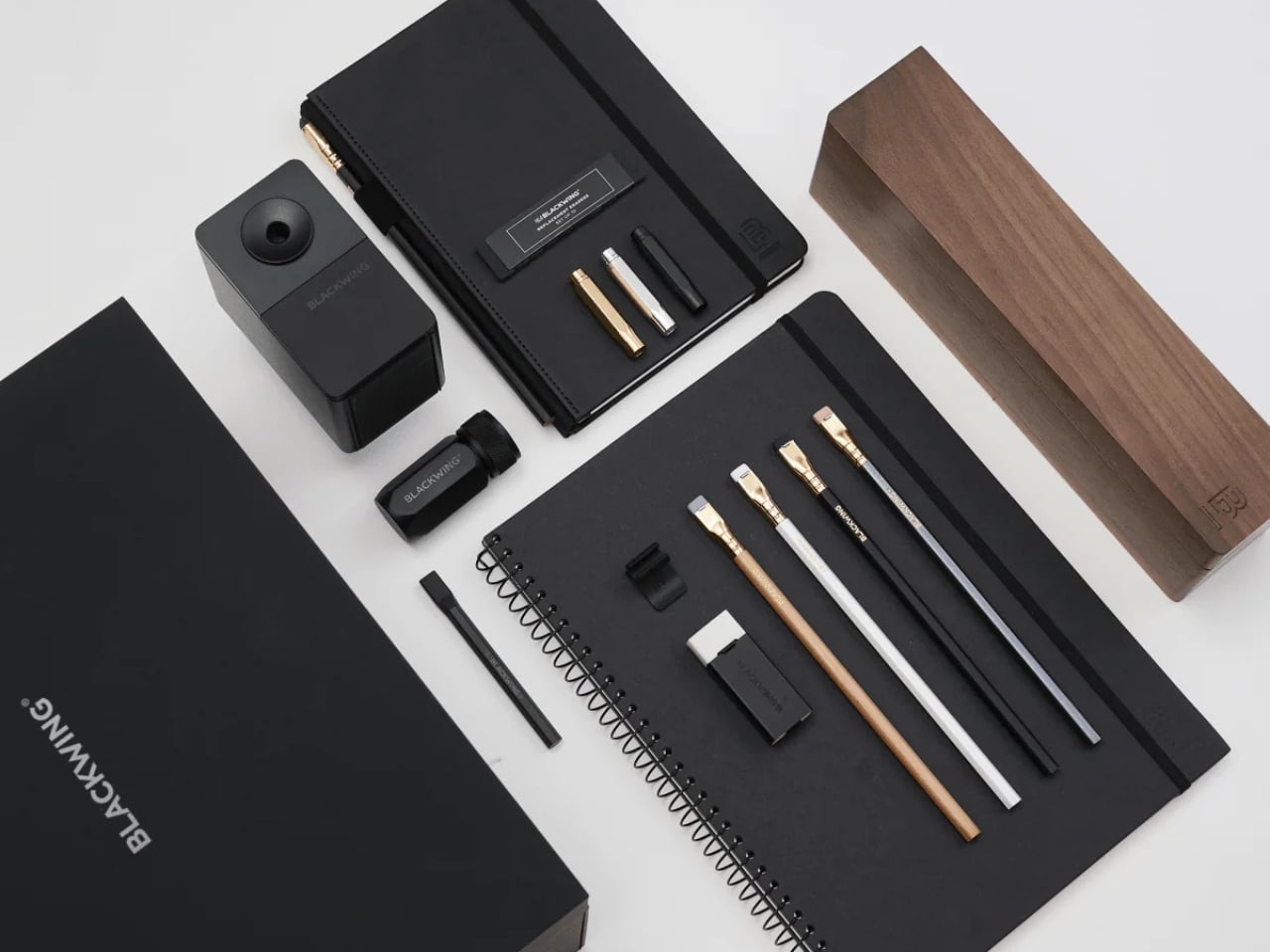
Let’s talk about what’s inside, because it’s genuinely a lot. The Crate includes 24 Blackwing pencils housed inside a walnut gift box, a One-Step Long Point Sharpener, a desktop sharpener, replacement erasers, a handheld eraser, three point guards, a pencil extender, a notebook clip, a Medium Slate Notebook in dot-grid, and an A4 spiral notebook in blank. If you’ve ever casually shopped the Blackwing site and found yourself adding one thing after another to your cart, this is essentially that cart, but curated and given a walnut home.

Designer: Blackwing

The walnut box alone is something worth pausing on. It has a cork-lined interior and a satisfying magnetic closure. It’s the kind of object you want to leave on your desk not because it needs to be there, but because it makes the desk look like it belongs to someone who takes their work seriously.

Blackwing’s four core pencils are all represented here: the 602, the firm-graphite original that built the brand’s reputation and was beloved by creatives from John Steinbeck to Stephen Sondheim; the Matte, which shares the same soft and expressive formula as the very first Blackwing; the Pearl, with its smooth and balanced Japanese graphite; and the Natural, a stripped-back version with an uncoated cedar body for a rawer, more honest feel. Each one writes differently. That variety isn’t just a marketing point. It means the set can genuinely work for a writer, an artist, a student, or someone who just wants their notes to feel a little more intentional.

I’ll admit there’s a case to be made that $400 is a lot for what is, technically, a pencil set. But I think that argument misses the point of what Blackwing has always been doing. These aren’t pencils in the same way a yellow No. 2 is a pencil. The brand occupies the same space as a well-made fountain pen or a leather-bound notebook: objects that are ordinary in function but considered in execution. When you buy something from Blackwing, you’re buying into a certain idea of how writing should feel, and the Crate makes that idea as complete and giftable as it’s ever been.

The packaging itself shows thought. The outer box is matte black with the Blackwing name in white. Clean, confident, minimal. It doesn’t shout. It doesn’t need to. The layered reveal inside, with a pull-out drawer for the notebooks, feels like the kind of unboxing experience that design enthusiasts and stationery lovers will genuinely appreciate. Gift sets at this price point need to justify themselves beyond just the contents, and the presentation here does a lot of that work.

What makes the Crate feel special rather than just expensive is how it covers every phase of the writing process. You have your pencils, your sharpeners for both at-desk and on-the-go use, your erasers, protection for your pencil tips when they’re not in use, and actual notebooks to write in. Nothing feels like filler. Everything has a job.

If you’re shopping for someone who already loves Blackwing, this is a clear yes. If you’re introducing someone to the brand for the first time and want to do it properly, this is also the move. And if you’ve been slowly accumulating Blackwing products one purchase at a time and wondering when you’ll finally have it all, the Crate is the answer to that question in one very satisfying delivery. The Blackwing Crate Gift Set is available now at blackwing602.com for $400.

The post Blackwing’s $400 Crate Is Every Writer’s Dream Gift Set first appeared on Yanko Design.

  • ✇Yanko Design
  • The Floating House Built From Strangers’ Wishes
    Most houses start with a blueprint. Jisoo Yoo’s Dream House started with a question: how do the dreams and desires we carry shape the landscape of the world we inhabit? The answer, it turns out, is a floating structure made of clothing. Yoo, a Seoul-born artist who lives and works in France, has been quietly building one of the more compelling bodies of work in contemporary art, one that orbits around the domestic, the ephemeral, and the barely-visible structures that hold our lives together. D
     

The Floating House Built From Strangers’ Wishes

18 juillet 2026 à 15:15

Most houses start with a blueprint. Jisoo Yoo’s Dream House started with a question: how do the dreams and desires we carry shape the landscape of the world we inhabit? The answer, it turns out, is a floating structure made of clothing.

Yoo, a Seoul-born artist who lives and works in France, has been quietly building one of the more compelling bodies of work in contemporary art, one that orbits around the domestic, the ephemeral, and the barely-visible structures that hold our lives together. Dream House, her latest installation presented at (F)ESTIVALES at Les Tanneries, Centre d’art contemporain, is exactly the kind of project that makes you stop and genuinely reconsider what a home actually is.

Designer: Jisoo Yoo

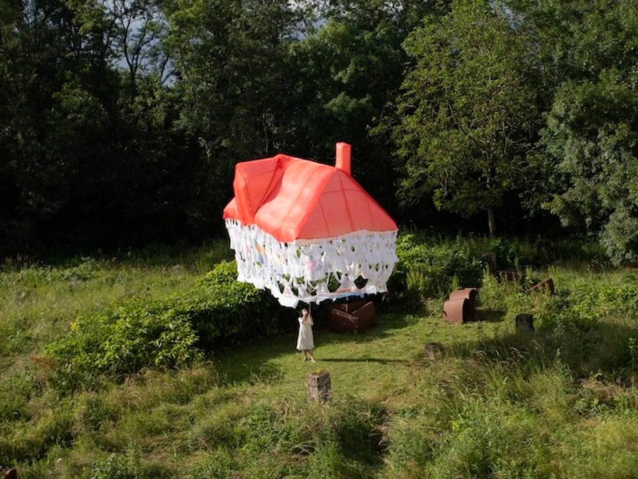
Here’s how it works. Participants are invited to contribute a garment, something personal, something worn, and mark it with handwritten texts and drawings. These pieces of clothing then become the literal building blocks of the structure, each one a personal archive, each one a load-bearing element. The result is a house that floats, literally and conceptually, held aloft not by concrete or steel, but by the private wishes of strangers.

That’s a beautiful idea, and I mean that without a trace of irony. We spend so much time thinking about homes in terms of square footage, property value, and interior aesthetics that we rarely stop to ask what a home is actually made of. Yoo forces the question. Her installation suggests that the answer has less to do with materials and more to do with desire, with the accumulated weight of what people want, need, and imagine for themselves and for each other.

Art that treats the domestic as a lens for examining social and cultural forces is nothing new. But Yoo brings something specific to it. Born in Seoul and trained in France, she operates between two very different cultural frameworks around the idea of home, and her practice reflects that quietly felt tension. Her works often feature spaces that feel familiar but refuse to stay solid. Rooms that waver. Houses that float. Structures that appear and then dissolve. It’s a recurring language across her portfolio, and with Dream House, it feels most fully realized.

Dream House is not trying to comfort you. It’s trying to make you notice something. The garments contributed by participants carry real personal weight: literal handwriting, actual drawings, the residue of real lives. And yet the house they form is temporary. It rises, exists briefly, and then it’s gone. Yoo describes the floating structure as embodying both the creative force of desire and the fleeting nature of existence. The house briefly emerges through people’s dreams, and that, apparently, is enough.

I think that’s the most honest thing any artist has said about housing in a long time. We build our ideas of home from desire, from inherited images of what shelter is supposed to look like, from what we were told to want, and from what we quietly imagine when no one is watching. And all of it is more temporary than we tend to admit. The average person moves multiple times in their life. Neighborhoods change. The house you grew up in gets renovated beyond recognition or torn down entirely. The physical structure of home has always been more fragile than we want it to be.

What Yoo does is make that fragility visible without making it tragic. The floating structure is genuinely striking to look at. The garments create a soft, almost organic texture that reads as intimate rather than architectural, which is exactly the point. You’re not looking at a building. You’re looking at a collective act of imagination, briefly held together by shared hope. Jisoo Yoo is an artist worth paying close attention to. Her work doesn’t announce itself loudly, but it asks questions that stick. Dream House is a reminder that the spaces we live in are not neutral. They are built, always, from something we wanted.

The post The Floating House Built From Strangers’ Wishes first appeared on Yanko Design.

❌